
Weekly Designers Update #434 https://muz.li/blog/weekly-designers-update-434
Key insights
Weekly update blog for designers.
Clean, highly legible fonts, strong color contrast, asymmetric layout, engaging visuals, heuristic design.
Weekly update blog for designers.
Clean, highly legible fonts, strong color contrast, asymmetric layout, engaging visuals, heuristic design.

Digital creative agency service presentation.
Dark mode aesthetic, parallax scrolling, effective imagery, interactive elements, immersive experience, use of geometric shapes, fluid animation, sans serif typography.

Hancom's Behance gallery presents a neatly designed identity for a technology brand.
Vibrant and bold blues, sharp geometric elements, fresh typography, symmetrical layout, minimalistic aesthetic, and creative iconography.
Corporate brand identity webpage for Hancom.
Flat design, monochromatic with accent color, asymmetrical layout, clean line geometry, modern sans-serif typography.
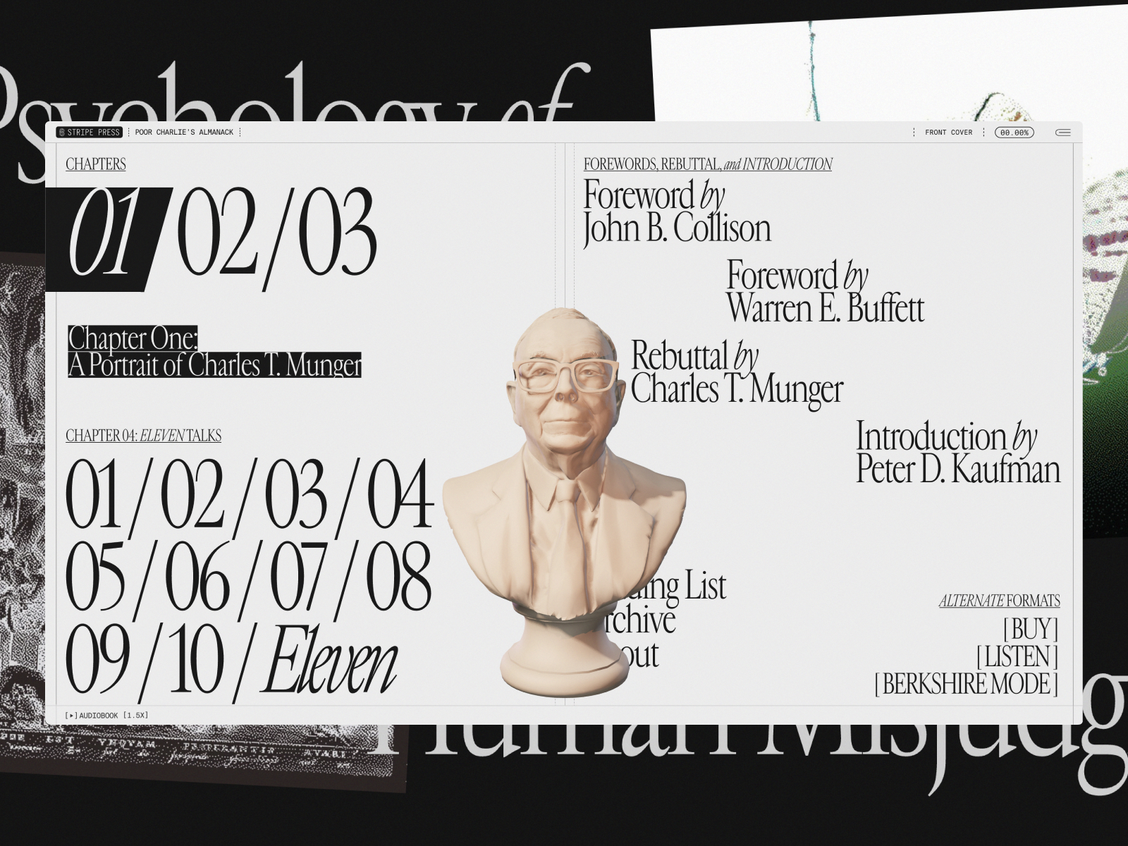
Poor Charlie's Almanack is an informative website aiming to disseminate knowledge about Charlie Munger's wisdom and investment philosophies.
Bold colors, asymmetrical layout, animated graphics, mixed typography, and playful interactions.

This webpage presents an elegant visual design studio striving to make a striking impression through edgy branding.
Bold pastel colors, grid-based layout, stylistic geometric illustrations, minimalist typography, high visual contrast.

An employee experience web app.
Bright, bold color palette, flat design, intuitive user interface, modern typography, organized layout, iconographic elements.
Professional project management tool.
Minimalistic, monochromatic color palette, clean layout, bold typography, purpose-driven design.
