Hey, Muzli lads and lasses!
I’m Eyal Zuri, a designer, and co-founder of Muzli, that yummy design inspiration tool. Besides wrestling pixels and obsessing over UX and UI in our beloved realm of design, I have to confess, I am somewhat of a fanboy of trends and, yes, Dark Mode.
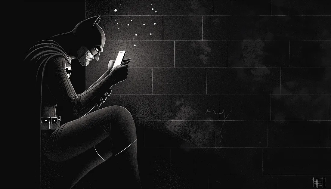
Enough about me though, let’s dive into the mystery that’s been looming in the design sphere like Batman over Gotham: the phenomenon of dark mode UI.
The question is, is dark mode simply an attractive pixeled outfit everyone wants to wear now, or does it hide some serious functional benefits under its sleek black garb? Grab your design goggles, because we are about to dive deep into the sea of dark mode UI!
There’s no denying the undeniable charm of the dark mode UI. It’s the James Bond of design — sleek, sophisticated, and seems to favor martinis served “shaken, not stirred”.
Dark Mode — the Trendsetter or Gamechanger? This is the question.
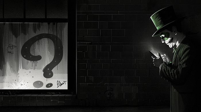
Dark mode, a.k.a the digital world’s ‘nightclub’ experience. Everyone is jumping into this dark ship, from Twitter and Whatsapp to individual app developers rapidly launching dark versions. But let’s face it: Just like in fashion, not all trends are necessarily practical or necessary (like those needle-thin ties or extra ripped jeans).
For instance, a good use case for dark mode can be found in a car navigation application. The darkened screen at night prevents glare and ensures the driver’s visibility remains uncompromised during travel.
On the contrary, a poor example of dark mode implementation might be seen in a blog featuring lengthy articles. Reading white text on a black background can strain the eyes and make it difficult for users to digest the content effectively.
Show me the (Dark) Money
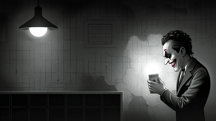
So, the real question is: To Dark Mode or not to Dark Mode? To answer this, let’s weigh the pros and cons.
Certainly, I’d love to expand on those points for you.
Pros:
1. Reduce Eye Strain: Dark mode is known for significantly lowering eye strain, particularly in low-light conditions. Late night web surfers and after-dark app users can heave a sigh of relief — no more squinting at brilliant white screens!
2. Save Energy: If you’re an environmentally conscious user or just looking to save on battery life, dark mode is your friend. Display technologies like OLED or AMOLED use less power while utilizing dark mode, giving a boost to your energy conservation efforts.
3. Aesthetically Pleasing: Done correctly, dark mode is a feast for the eyes. Its warmth and depth can give designs a sleek, modern, and often luxurious feeling, enhancing user engagement and delight.
4. Increase Focus: Some users report increased focus while working in a darker interface as it reduces the distraction caused by other elements on the screen.
5. Market Appeal: Dark mode isn’t just power-efficient and easier on the eyes, it can also be a total eye candy! A sleek, striking, and sexy interface can be a powerful tool to attract and retain users.
Cons:
1. Legibility Issues: While dark mode can ease eye strain, it doesn’t always guarantee easy readability. Contrast between the text and background needs careful calibration, otherwise, the text may become hard to decipher, causing user discomfort. A classic example is Google’s Calendar app, where the dark mode has made it harder to distinguish between past and upcoming events.
2. Inconsistent Results Across Displays: The effectiveness of dark mode depends largely on the type of screen it’s viewed on. While it may look splendid on OLED displays, the results can be underwhelming on LCD screens because of their incapacity to completely switch off pixels.
3. Color Distortion: Dark mode can lead to color distortion, particularly with bright, vibrant hues. It makes them appear more saturated, affecting the overall visual consistency.
4. Not Suitable For All Content Types: Some types of content are better suited for light mode. For instance, if an application is text-heavy, using light mode can enhance readability as dark texts on a light background are generally easier to read.
5. Outdoor Visibility: Outdoor lighting conditions can pose a challenge for dark mode users. In bright sunlight, it can be hard to see and work on a dark screen as it introduces heavy screen glare. The contrast issue also becomes prominent as it becomes tough to distinguish different elements on the screen. This means that if your users are frequently outdoors, they might not be as thrilled with the dark mode.
Summing it up — The Dark Mode Playbook
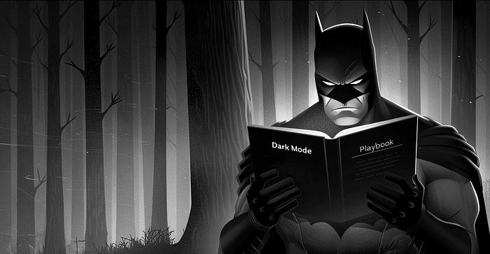
Like practically everything in life, there’s no one-size-fits-all answer. Sometimes, you might want to jump into the dark mode bandwagon, and sometimes not.
If you opt for the dark side, meticulously play around with contrast levels, typography sizes, and test it across multiple displays. Never compromise on the most important aspect: a smooth, user-friendly experience.
If you decide to keep things light, that’s alright too. Maybe top it up with a cheeky little ‘currently sunbathing’ notification. Add a little extra color to your user’s day!
So, dear Muzli-ans, till the next design trend makes its grand appearance, may your pixels be perfectly aligned, your colors be on point, and most importantly, may you keep loving every step of this glorious design journey!
Anyway, back to our dark mode discussion or should we say ‘light-hearted’ debate? 🥁 “Oh well, there goes Eyal, the Dark-Lord again!”
Alright, it’s time to sign off before my passion for puns freaks you out! See you around in the other side of the color spectrum!
P.S
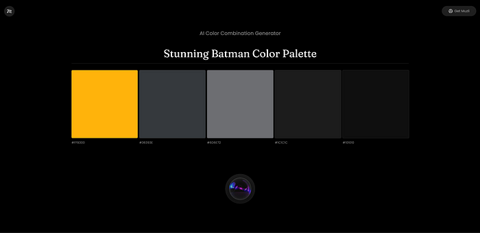
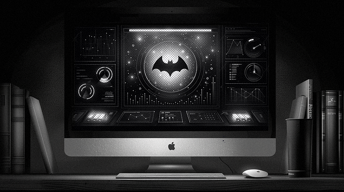
In any case, this entire post was actually an excuse to tell you that we have a new tool for creating color combination generator using AI, and guess what, its interface is a super sexy Dark mode.
Enjoy!
