Curated Dashboard Design Examples for UI Inspiration (2026)
Looking for more daily inspiration?
Download Muzli extension, your go-to source for design inspiration!
As 2026 approaches, dashboard design continues to balance functionality with creativity. The best examples today are not only clear and efficient but also visually engaging and full of character. To capture this diversity, we’ve gathered a mix of dashboards ranging from practical, real-world designs to experimental and artistic concepts that stretch the imagination.
Some of these examples focus on usability, structure, and smooth workflows, while others explore new visual directions, layouts, and interactions. Together, they show how dashboards can be both reliable tools and inspiring design canvases.
Take a moment to explore this collection, discover new ideas, and see how designers around the world are redefining what modern dashboards can look and feel like in 2026.
WanderWheels // Dashboard
by BL/S®
A visually striking booking dashboard that blends futuristic design with travel utility. The soft beige interface, bold orange highlights, and clean layout create a premium experience that feels both adventurous and refined.

.
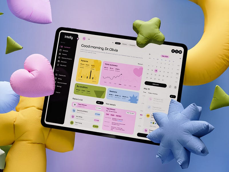
Intelly — HealthCare App Dashboard
A playful and uplifting medical dashboard that blends functionality with cheerful design. The use of soft pastels, rounded shapes, and friendly contrasts makes healthcare data feel approachable and full of positive energy.
.
LifeStats — Health Dashboard
by Sunny Rathod
A calm and futuristic fitness dashboard with glassmorphism effects and soft lighting. The transparent layers, subtle gradients, and clean data visualization create a sense of focus and serenity while presenting health stats in a visually engaging way.

.
Teaching LMS — Classroom Management Dashboard
by Khoa (JAK)
A smart classroom dashboard that visualizes attendance and participation in real time. The clean layout, soft colors, and intuitive seating map make managing lessons effortless while keeping the interface friendly and human-centered.

.
iHealth — Healthcare Tracker App Design
A futuristic health monitoring dashboard with a clean white interface and soft blue gradients. The 3D body visualization and minimal layout create a calm, clinical atmosphere that feels both advanced and reassuring.

.
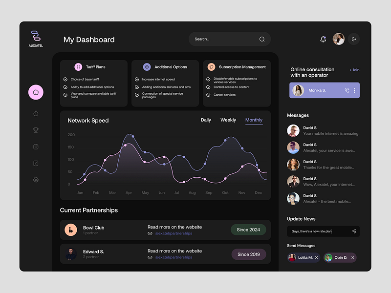
SaaS Dashboard Design
by Mirhayot
A dark, elegant telecom dashboard with soft lavender accents and smooth data visualization. The clear layout, refined color scheme, and subtle gradients create a polished interface that feels both modern and trustworthy.
.
Dashboard — Dark
by Felix
A clean and modern dark-mode dashboard that perfectly balances clarity and style. The soft gradients, bold typography, and clear visual hierarchy make data easy to digest while keeping the interface visually engaging and professional.

.
Hynex Healthcare Dashboard Design
by Orbix Studio
A sophisticated dark interface that blends fintech precision with futuristic healthcare design. The glowing accents, clean data cards, and balanced typography create a high-end look that feels intelligent, intuitive, and ready for AI-powered insights.

.
Dashboard — Modern Admin UI
by Felix
A bright and structured dashboard that balances clarity with energy. The soft color palette, clean spacing, and intuitive data visualization create a friendly yet professional interface that feels approachable and efficient.

.
Medical Admin Dashboard — ICarePro
by Riju Rajan
A clean and highly functional healthcare dashboard that prioritizes usability and clarity. The calm neutral tones, structured layout, and clear data visualization make complex medical information easy to navigate and understand.

.
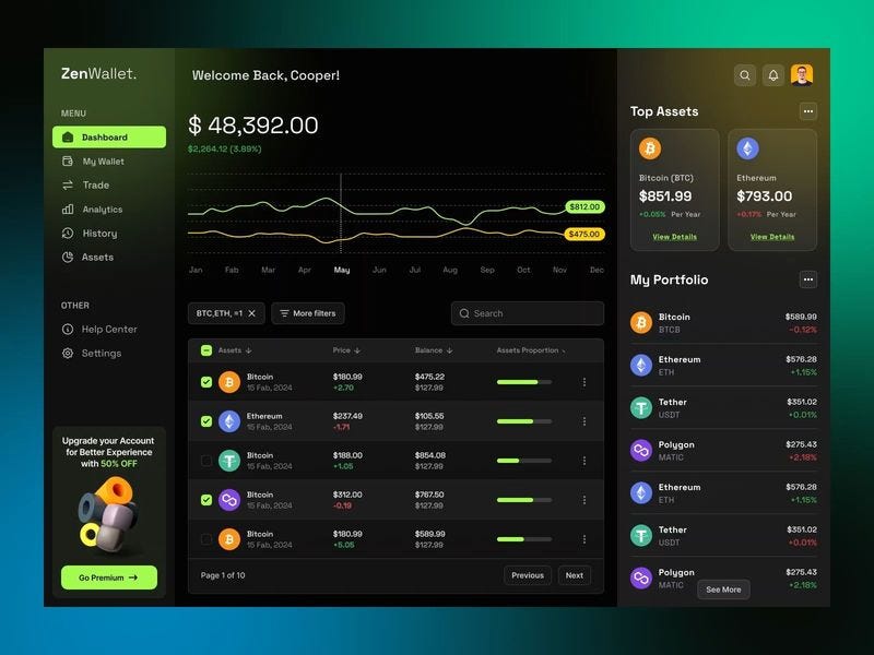
ZenWallet — CryptoZen Dashboard Design Animation
A sleek and modern crypto dashboard that merges dark elegance with vibrant highlights. The contrast between neon accents and minimal typography creates a futuristic feel while keeping portfolio data and performance metrics easy to track at a glance.
.
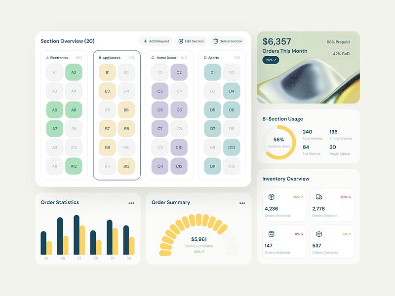
Warehouse Inventory Dashboard UI Design
A soft and elegant warehouse management dashboard that combines data visualization with smooth color coordination. The pastel tones, rounded shapes, and clear hierarchy create a calm, modern interface that feels both analytical and visually refreshing.
.
Fintech Wallet Dashboard UI Design
A bright and polished crypto dashboard with playful contrast and clean organization. The soft background paired with vivid highlights gives financial data a fresh, modern feel that makes complex information easy to follow.

.
CRM SAAS Dashboard UI Design
by Sayeed Hasan
A well-structured business dashboard with a clean, professional layout. The balanced use of color and typography enhances readability, while the subtle charts and cards create a clear, data-driven overview without visual clutter.

.
Rabbet — Smart Real Estate Dashboard Design
by Dhruv
A refined financial dashboard with a cinematic dark aesthetic and neon highlights. The use of contrast, grid precision, and sharp data visualization creates a sophisticated look that conveys clarity and control over complex metrics.

.
Charts Mega UI Kit — Dashboard UI
by Vlad Tyzun
A bold and futuristic finance dashboard that pairs deep blacks with vivid purple accents. The smooth gradients, clean typography, and clear modular structure give it a high-end, modern edge perfect for digital-first analytics tools.

.
Fobework — E-learning Dashboard & Course Platform UI
by Orbix Studio
An elegant education dashboard that combines a dark, focused atmosphere with luminous accent colors. Its clear hierarchy and card-based layout make complex information easy to follow while maintaining a polished, contemporary look that keeps users engaged.

.
NobleFinance — Smart Finance Dashboard UI Design
by Orbix Studio
This finance dashboard stands out with its refined dark palette and energetic green highlights. The clean typography, well-structured cards, and balanced data visuals create a sophisticated interface that feels professional, dynamic, and easy to navigate.

.
Modern Finance Management Dashboard | Financia
by Orbix Studio
A bold financial dashboard that combines dark tones with vibrant gradients for a dynamic look. The clear typography and structured data layout make it easy to analyze spending, savings, and income at a glance while maintaining a modern, high-tech feel.

.
Lumos — Energy Management Dashboard
Stan D. for RonDesignLab
A bright and sophisticated solar management dashboard that merges data visualization with architectural 3D elements. The soft lighting, warm gradients, and precise layout convey a sense of sustainability, innovation, and modern home efficiency.

.
AI-powered Cybersecurity Dashboard
A powerful cybersecurity dashboard with a dark, data-driven aesthetic and precise green accents. The structured layout and real-time analytics deliver a sense of control and confidence, perfectly suited for monitoring complex system health and threat activity.

.
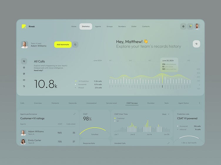
Rinesk — Call centre Dashboard Concept
by Anastasiia
A soft and elegant communication analytics dashboard with a pastel palette and smooth gradients. The minimalist charts and subtle highlights give it a calm, professional look that makes large amounts of data feel approachable and easy to interpret.
……
💡 Stay inspired every day with Muzli!
Follow us for a daily stream of design, creativity, and innovation.
Linkedin | Instagram | Twitter
Looking for more daily inspiration? Download Muzli extension, your go-to source for everything design.
Related articles

Weekly Designers Update #548

Weekly Designers Update #547

Weekly Designers Update #544

Weekly Designers Update #543

Weekly Designers Update #542

Best Free Variable Fonts for UI and Web Design (2026)

Best Free Google Fonts for 2026
More categories
Looking for more daily inspiration? Download Muzli extension your go-to source for design inspiration!
Get Muzli for Safari


