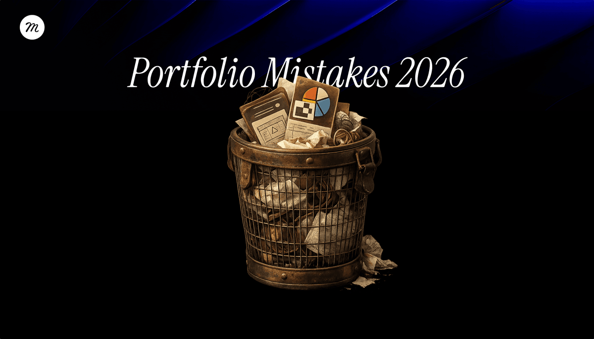
Portfolio Mistakes Designers Still Make in 2026
Most designers’ portfolios don’t fail because the work isn’t good.
They fail because reviewers can’t quickly understand what the designer actually did.
In 2026, product and UX portfolios are reviewed under real constraints: limited time, too many candidates, and constant visual noise. Good-looking design is no longer rare. What’s rare is being able to quickly tell whether there’s sound judgment behind it.
What keeps coming up in hiring conversations and portfolio reviews is a clear gap between two different stages:
Visuals open the door. Clarity and judgment determine whether you stay in the room.

The first threshold: attention
Before anything else, a portfolio has to clear a basic bar:
it needs to look good enough for someone to even open it.
There’s no way around this.
When a project doesn’t look strong visually, reviewers often don’t read, don’t dig deeper, and don’t look for context. They move on. In that sense, strong visuals absolutely open doors. They buy you time, patience, and the benefit of the doubt.
But that’s only the first step.

The second threshold: trust
Once the door is open, the criteria change.
At this stage, good-looking screens are no longer enough. Reviewers start trying to understand:
- what the designer actually did
- which decisions they owned
- and how they operated when things weren’t clear or perfect
This is where many portfolios break down.
In 2026, portfolios aren’t just evaluated as collections of screens. They’re read as signals of how a designer thinks, adapts, and operates over time.
We explored this broader change in more depth in
Beyond the Pixel: Why Your 2026 Portfolio Needs a DNA
No context, no story, no signal
This is one of the most common issues.
Many portfolios present polished outputs with very little explanation. The reviewer sees the result, but not the responsibility behind it. There’s no clear sense of what problem was being solved, what the designer owned, or which constraints shaped the work.
Screens don’t show judgment. They don’t show how someone thinks when trade-offs are required, when options are limited, or when something has to be cut.
When it’s unclear:
- what you were responsible for
- what decisions you made versus executed
- and how you arrived there
it’s hard to build trust, even if the visuals are excellent.
Treating the portfolio like a gallery, not a product

Another recurring pattern is portfolios that feel designed for show.
Large hero images, perfect grids, endless sequences of screens, and very little explanation. It looks impressive, but at the trust stage it often works against the designer.
At this point, reviewers aren’t looking for inspiration. They’re trying to understand whether this person:
- thinks clearly
- can explain decisions
- and can operate within real constraints
A portfolio that prioritizes aesthetics over understanding increases perceived risk, even when it looks great.
Treating the portfolio as a product means designing it for a very specific user: someone busy, scanning quickly, and deciding whether it’s worth investing more time.
That usually means leading with context and decisions, not just visuals.
Showing too many projects
Many designers assume that showing more work improves their chances.
In practice, it often signals a lack of focus.
Portfolios packed with projects from unrelated industries, uneven quality levels, or conflicting styles make it harder to understand where the designer is actually strong and where they fit.
What tends to work better, again and again, is the opposite:
- fewer case studies, tightly curated
- the most relevant work upfront
- anything that doesn’t support the story is removed
This isn’t hiding work. It’s editing for clarity.
No outcome, no change
Another pattern that keeps coming up is describing activity without showing what changed.
Some case studies include a lot of work, a lot of screens, and a lot of process, but never answer a simple question:
what was different after this shipped?
At the trust stage, reviewers want to understand whether the work moved something, even if there aren’t perfect metrics:
- user behavior
- product flow
- team decision-making
Hard numbers help, but they’re not required.
A clear outcome is.
When there’s no sense of change at all, the work tends to feel superficial, regardless of how polished it looks.
The portfolio itself makes reviewing harder
Another recurring issue is portfolios that are difficult to use.
Slow loading, confusing navigation, broken links, hidden contact details. Small things, but when time is limited, they add up quickly.
Your portfolio is your first product.
And like any product, it’s judged on usability as much as content.
What consistently works is basic, not flashy:
- fast load times
- clear structure
- visible contact information
- no unnecessary friction
What clears both thresholds

When a portfolio works, it’s almost always because it clears both stages.
At the first threshold, it looks good enough to earn attention.
At the second, it’s clear enough to build trust in the thinking behind the work.
Strong portfolios don’t try to impress everyone. They communicate clearly who the designer is, what they’re good at, and how they operate when things aren’t ideal.
In 2026, a good portfolio isn’t measured only by how polished it looks.
It’s measured by how quickly someone can understand what you did, why you did it, and what changed because of it.
When that’s clear, the chances of moving to a real conversation go up significantly.
When it isn’t, even great visuals don’t always carry you far enough.
……
💡 Stay inspired every day with Muzli!
Follow us for a daily stream of design, creativity, and innovation.
Linkedin | Instagram | Twitter
Looking for more daily inspiration? Download Muzli extension, your go-to source for everything design.
Related articles

How to Build a Personal Brand as a Designer (Without Being Cringe)

How to Make Your UI Accessible: A Practical Checklist for 2026

How to Build a Design System in Figma: A Practical Guide (2026)

Best AI Design Tools for UI/UX Designers in 2026

From Design to Code Without Losing Context: An MCP-First Workflow

How to Build a 2026 Design Portfolio: Why You Need More Than Just Pixels
Elevate marketing and sales by using Immersive Web experiences
More categories
Looking for more daily inspiration? Download Muzli extension your go-to source for design inspiration!
Get Muzli for Safari


