Best Free Google Fonts for 2026
Fonts shape how your message feels long before people start reading. The right typeface improves clarity, evokes emotion, and sets the tone for your brand. Google Fonts offers a vast library of free, high-quality families covering every design style, from timeless serifs to geometric sans-serifs and expressive scripts. Below are the top free Google Fonts to explore in 2026, organized by purpose and visual character.
Sans Serif Fonts for Body Text and UI
Clean, modern, and highly legible, perfect for digital interfaces and everyday reading.
Inter
A balanced and neutral sans-serif designed for screens. It performs beautifully in dashboards, apps, and multilingual interfaces. Its generous x-height ensures clarity at small sizes.

.
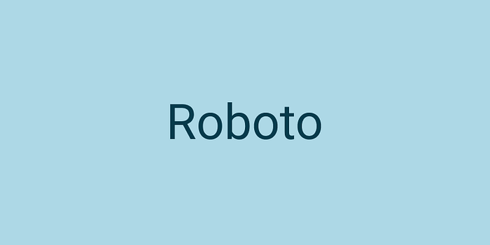
Roboto
A dependable classic with a friendly, modern rhythm. Ideal for websites and apps where clarity and familiarity matter. Works seamlessly with Roboto Slab for headings.
.
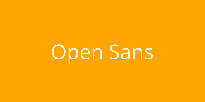
Open Sans
Soft curves and wide spacing make this font approachable and easy to read. Great for blogs, documentation, and general body text that must remain effortless on all devices.
.
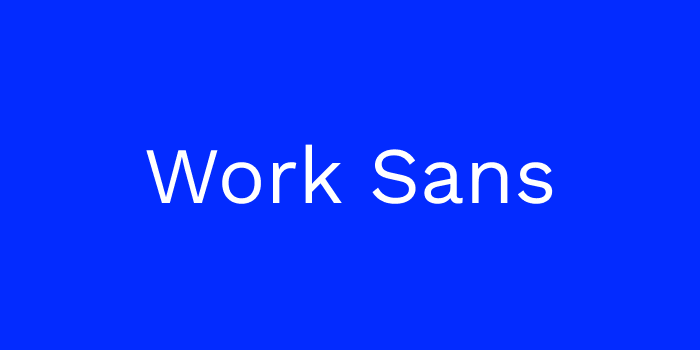
Work Sans
Contemporary proportions with a humanist feel. It is clear at medium sizes and well suited to modern UI layouts, startup sites, and product dashboards.
.
Serif Fonts for Editorial and Long-Form Reading
Elegant and trustworthy, these fonts bring refinement to articles, books, and sophisticated layouts.
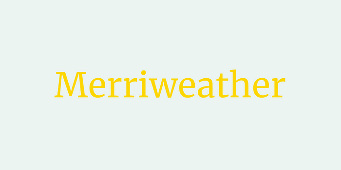
Merriweather
Designed specifically for on-screen reading, Merriweather combines classic structure with digital-era clarity. Excellent for long articles and editorial layouts.
.
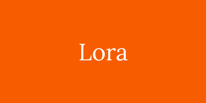
Lora
Warm and literary, with subtle contrast that adds depth without losing legibility. Perfect for blogs, magazines, and brand storytelling.
.
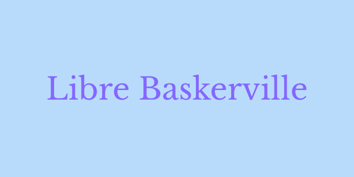
Libre Baskerville
Traditional yet fresh, echoing print heritage while staying crisp on screens. Ideal for long passages of text and polished brand communications.
.
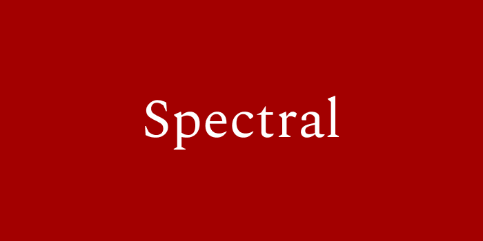
Spectral
A refined serif with expressive italics. It shines in essays, magazines, and thoughtful design systems that balance authority with artistry.
Display and Headline Sans-Serifs
Bold fonts that command attention in titles, hero sections, and campaign visuals.
Oswald
A condensed, impactful typeface that turns short headlines into strong statements. Perfect for banners and posters.
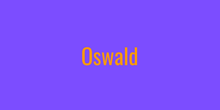
.
Anton
Powerful and confident, built to stand out. Use for hero text, announcements, or brand slogans that need instant presence.
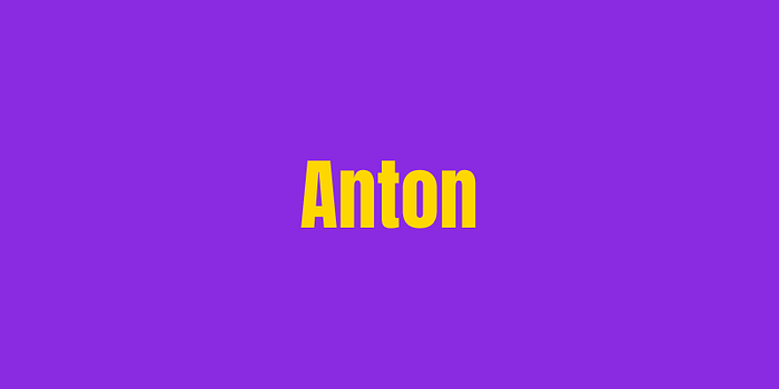
.
Montserrat
Geometric precision with a friendly tone. Its wide family of weights makes it a flexible choice for both titles and supporting text.
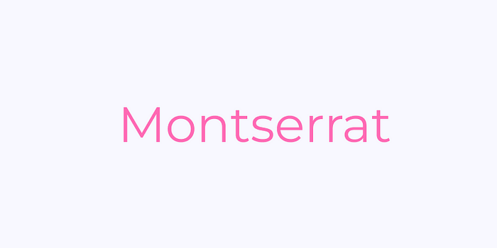
.
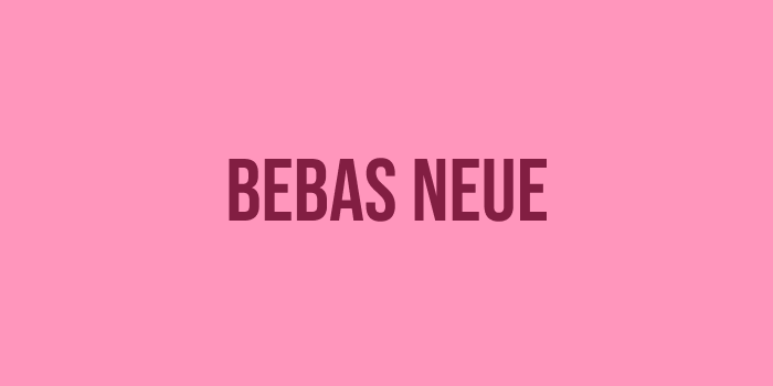
Bebas Neue
An all-caps classic with clean lines and tall proportions. Great for impactful titles, editorial covers, or numeric layouts.
Slab Serif Fonts for Structure and Character
Combining authority with warmth, these fonts add substance to headings and brand elements.
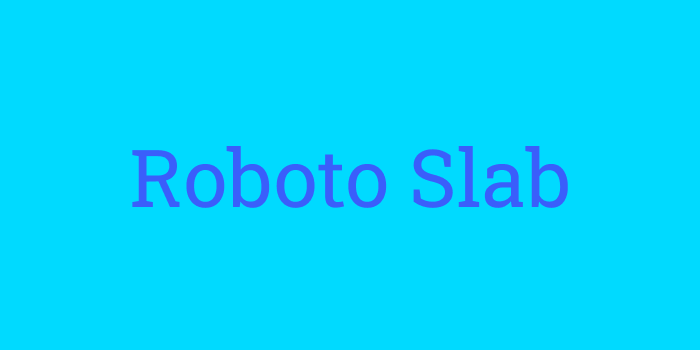
Roboto Slab
A straightforward slab that complements Roboto perfectly. Ideal for headings, product sections, and structured layouts.
.
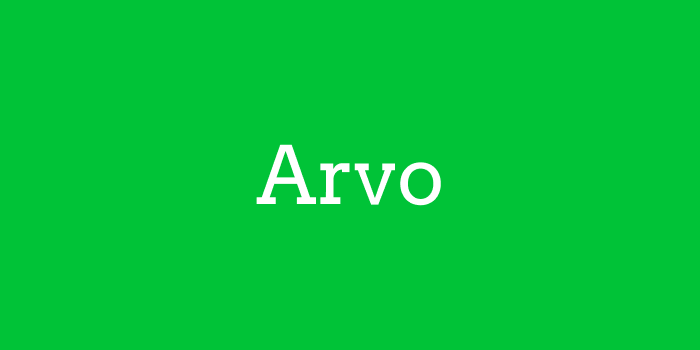
Arvo
Geometric slabs with a strong sense of stability. Great for technology or corporate brands that still want visual personality.
.
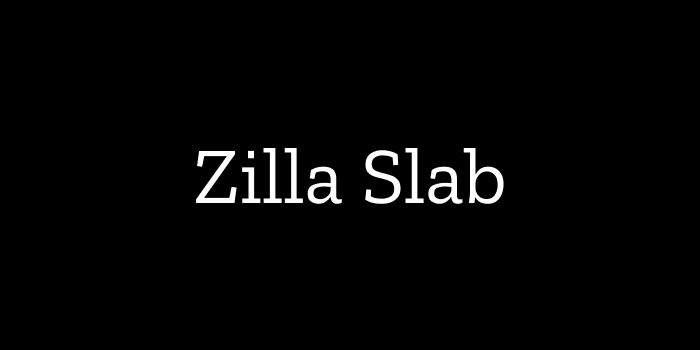
Zilla Slab
Modern and friendly, balancing the weight of slabs with gentle curves. Excellent for feature highlights and storytelling sections.
.
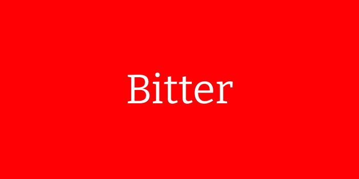
Bitter
Readable and sturdy, perfect for documentation, guides, or academic text where reliability matters.
Script and Handwritten Fonts for Personality
Use sparingly for logos, quotes, or highlights to add warmth or elegance.
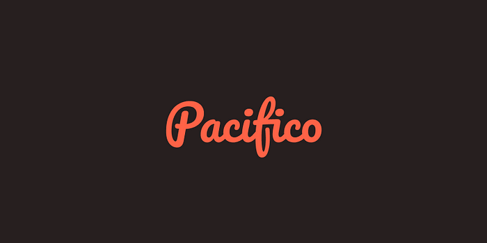
Pacifico
Playful and casual, ideal for creative branding and cheerful campaigns. Works best in short bursts.
.
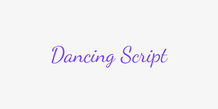
Dancing Script
Fluid and energetic, adding a handcrafted charm to invitations or lifestyle brands.
.
Great Vibes
Graceful curves that suggest elegance and romance. Perfect for high-end stationery or boutique branding.

.
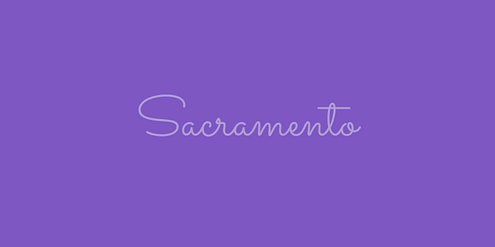
Sacramento
A lightweight monoline script with retro flair. Lovely for subtle accents, signatures, or tagline treatments.
Monospace Fonts for Code and Technical Content
Structured and clear, these fonts keep complex information readable.
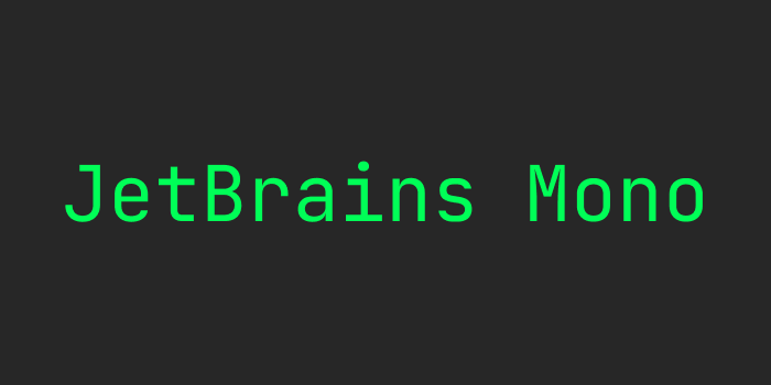
JetBrains Mono
Optimized for developers and technical interfaces, offering clarity without harshness.
.
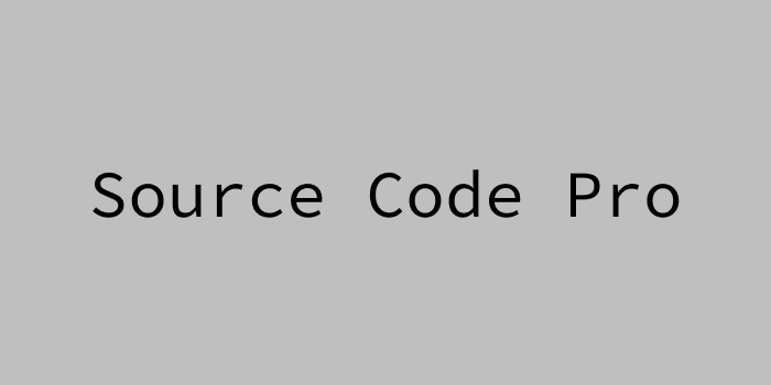
Source Code Pro
Clean alignment and clear character shapes make it ideal for code snippets and terminals.
.
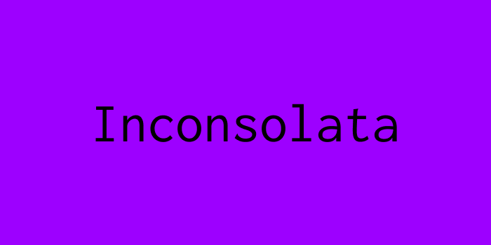
Inconsolata
Simple and balanced, ensuring legibility even at very small sizes. Perfect for inline code or data tables.
.
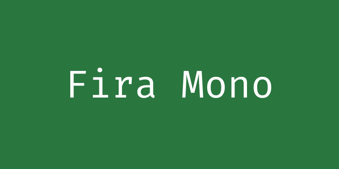
Fira Mono
Distinct letterforms and solid rhythm make it reliable in dashboards and analytics panels.
Best Practices
- Limit your palette to two families for visual harmony.
- Load only the weights you use to improve performance.
- Test readability on both desktop and mobile devices.
- Use variable font versions when available to streamline load time.
- Match tone to context: warm fonts for lifestyle brands, neutral for tech, elegant for editorial.
The free selection on Google Fonts in 2026 is stronger than ever, offering designers a professional foundation for any project. Whether you are crafting an app interface, a luxury brand identity, or a personal blog, these fonts deliver the right mix of clarity, personality, and performance. Thoughtful pairing and restraint will ensure your typography feels modern, intentional, and timeless.
……
Want even more inspiration?
Follow us on social media for your daily dose of design, innovation, and creativity right in your feed!
Linkedin | Instagram | Twitter
Looking for more daily inspiration? Download Muzli extension, your go-to source for everything design.
Related articles

Weekly Designers Update #547

Weekly Designers Update #544

Weekly Designers Update #543

Weekly Designers Update #542

Best Free Variable Fonts for UI and Web Design (2026)

Curated Dashboard Design Examples for UI Inspiration (2026)

Web Design Trends 2026
More categories
Looking for more daily inspiration? Download Muzli extension your go-to source for design inspiration!
Get Muzli for Your browser


