Claude Design, One Week In: Hacks, Best Practices & Tips From Real-World Use

A follow-up to Getting Started with Claude Design– what designers, marketers, and indie builders have actually learned after seven days of pushing the tool to its limits.
— -
It’s been a week since Anthropic Labs dropped Claude Design on April 17, and the design community has been busy. Pizza brands shipped in 30 minutes. Investor decks built in eight. Landing pages live in production by morning. Figma’s stock dropped 7% on launch day, and people are still arguing on X about what that means.
But the real story isn’t the headlines, it’s the patterns. The little workflow shifts that separate people who ship from people who burn through their weekly allowance in 30 minutes and rage-quit. After reading every hands-on review, every X thread, every Substack teardown, and every community gist I could find, here’s the distilled playbook.
If the first post was what Claude Design is, this one is how to actually use it well.
— -
1. The single biggest realization: the Tweaks panel is not the chat
Most people use Claude Design like a chatbot. They type, regenerate, type, regenerate. Then they wonder where their weekly allowance went.
Here’s the secret veterans like Anthropic’s own Austin Lau have been demoing on launch day: the Tweaks panel doesn’t burn chat tokens.
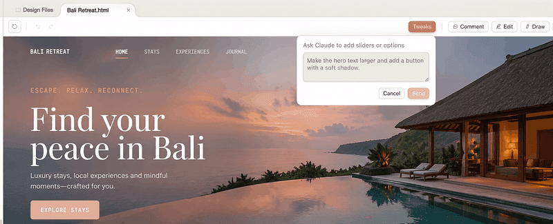
Sliders for typography scale, color temperature, spacing density, and section ordering live in a side panel that adjusts the design without round-tripping through the model. Reorder hero sections. Swap variant cards. Tighten density. None of it costs you a chat turn.
The rule: Use chat for structural and conceptual changes (“add a testimonial section,” “make it feel editorial instead of corporate”). Use Tweaks for everything else. If you can move a slider to fix it, never type it.
— -
2. Density beats brevity in your first prompt
The instinct from regular Claude chat , start vague, refine through conversation , is the wrong instinct here.
The pattern showing up across every walkthrough (Tom’s Guide, Peter Yang’s 16-minute everything-build, the Techsy 7-prompt teardown) is the same: dense, single-paragraph prompts that name the audience, the content, and the visual feel land usable first drafts roughly two-thirds of the time. Vague prompts land usable drafts roughly never.
A good first prompt looks like this:
“Design a 10-slide investor pitch deck for a pre-seed B2B fintech selling fraud detection to SMB lenders. Audience is sector-focused VCs at the early-stage stage. Tone: confident but not aggressive. Visual feel: editorial, restrained, type-led, no stock photos, no purple gradients. Use a serif display face with a geometric sans for body. Include problem, solution, market, traction, team, ask.”
Compare that to “make me a pitch deck” and you can see why density matters. Opus 4.7, the model under Claude Design , was specifically tuned to follow concrete specs and to need less hand-holding than 4.6. Use that. Front-load everything.
— -
3. Kill the “AI slop” aesthetic before it lands
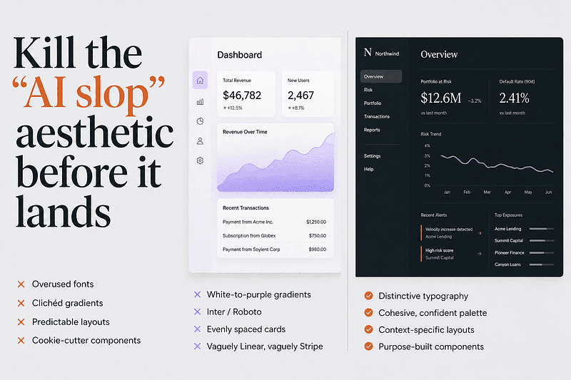
Without explicit constraints, Claude Design drifts toward what the community has named AI slop: Inter or Roboto, white-to-purple gradients, evenly-spaced cards, that vaguely-Linear-vaguely-Stripe SaaS feel.
The fix is documented directly in Anthropic’s own frontend-aesthetics cookbook. Drop something like this into your first prompt or your project’s CLAUDE.md / DESIGN.md:
“Avoid generic AI-generated aesthetics: overused fonts (Inter, Roboto, Arial, system fonts), clichéd color schemes (especially purple gradients on white or dark backgrounds), predictable layouts, cookie-cutter components. Make distinctive, context-specific choices. Pick one decisive font and use it confidently. Commit to a cohesive aesthetic with dominant colors and sharp accents rather than timid evenly-distributed palettes.”
Two follow-up tricks the community has converged on:
- Specify a concrete alternative, not a negative. “Don’t use cream backgrounds” tends to push the model to a different default. “Use pale silver-gray tones deepening into blue-gray, with 4px corner radius and a square angular sans-serif” actually works.
- Reference cultural aesthetics, not other websites. “Solarpunk,” “Swiss editorial,” “Japanese minimalism,” “early-2000s zine” gives the model a richer space to work in than “make it look like Linear.”
Opus 4.7 has its own house style it falls back to (warm cream backgrounds, Fraunces-style serifs, terracotta accents), beautiful for hospitality and editorial, wrong for fintech and dashboards. Override it explicitly.
— -
4. Build your brand kit on day one, and treat it as the foundation
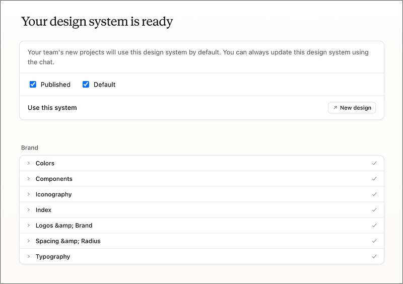
Every serious user who’s reviewed the tool independently arrived at the same conclusion: the brand kit is the highest-leverage thing you’ll do, and your first session should be dedicated to it.
Point Claude Design at your GitHub repo, your live site, or your existing slide deck. Let it explore the codebase, read your CSS files, identify your brand signatures (one reviewer’s heartbeat ECG motif from itbroke.dev got identified and turned into a live canvas component automatically). Let it generate the SKILL.md, the UI kit, the component patterns.
This will eat a chunk of your weekly allowance. That’s fine. It’s the most durable output you’ll make, every future project pulls from it, and the consistency it gives you across landing pages, decks, and emails is what makes Claude Design feel like a design system rather than a prompt-to-HTML toy.
A pro tip from Claudia + AI’s starter guide: if your assets are scattered, ask Cowork (Anthropic’s desktop product) to “produce a full design system document covering fonts, colors, graphical styles, component patterns, voice, and layout conventions, with anything missing flagged” first. Use the resulting clean DESIGN.md as input to Claude Design’s onboarding instead of feeding it raw assets. Coherent input, coherent output.
— -
5. Watch the weekly allowance, and know its quirks
This is the #2 community complaint after AI slop, and it’s worth understanding properly:
- It’s a separate meter from regular Claude chat. Burning your design allowance doesn’t affect your chat allowance and vice versa.
- It’s per-user, not pooled. Teams cannot share. Admins can’t redistribute leftover budget from a coworker.
- Weekly, not daily. Resets every seven days. There’s no dramatic warning when you hit the limit, the session just continues on paid overage credits if you have them enabled.
- Promotional credit gets consumed first. Anthropic shipped paying users a one-time credit at launch (roughly equivalent to a typical $20 prompt, expiring 2026–07–17). Spend it on experiments. Save the recurring weekly allowance for production work.
Real number from the wild: Josua Golden posted on X that two full design sessions burned through 58% of his weekly Pro limit. Plan accordingly. Treat each session as a planned production run, not an open sandbox.
— -
6. The comment-paste workaround (and why you’ll need it)
This is the single most-cited known bug, documented in the official help center and confirmed by basically every reviewer: inline comments occasionally vanish before Claude reads them.
The workaround is dumb but reliable: if a comment doesn’t get picked up after a beat, copy the text and paste it into the chat panel. Always works.
John Voorhees at MacStories went further and observed that “comment-on-element covered 95% of what I needed” once you adapt to it. The pattern that works:
- Inline comments for targeted, component-level tweaks. “This button text should be white.” “Add 8px padding here.” “Change this card to a horizontal layout.” Click the element, comment, done.
- Chat for structural changes, new sections, aesthetic shifts, or anything that requires explanation. “Save what we have and try a completely different approach” is a real command, Claude saves your current version and explores a new direction without losing the original.
— -
7. The /packages/ui pro-tip nobody talks about
Surfaced in ADPList community threads and quietly powerful: when you link a codebase, point Claude Design at the `/packages/ui` subdirectory if your repo is a monorepo, not the root.
Claude Design’s design-system extraction works by reading actual code — colors, typography tokens, component patterns. Pointing it at the root of a 50-package monorepo means it spends tokens spelunking through unrelated services. Pointing it directly at your UI package gives it exactly the surface area it needs and produces a noticeably tighter, more brand-accurate kit.
— -
8. Use the “show me three variations” command, always
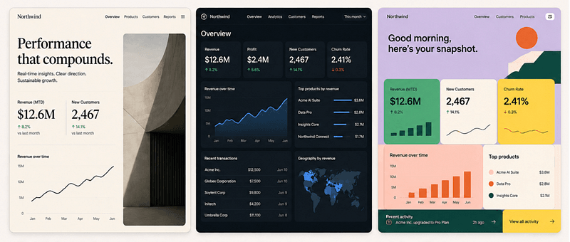
Two-thirds of reviewers independently called this out. When you’re not sure what you want, and most of the time you aren’t, don’t refine in a straight line. Ask for variations.
“Show me three versions of this dashboard: one editorial and type-led, one dense and data-forward, one playful with strong color blocks.”
Claude keeps each version accessible. You can mix pieces from different variants. You learn what you actually want by comparing, and comparison is exponentially faster than guessing-and-iterating.
Same logic applies inside a single design: “Give me 3+ atomic variations of the hero section” is a documented pattern in Claude Design’s own system prompt. The product is built to explore, not converge. Use that.
— -
9. Know what to skip Claude Design for
Honest constraints from a week of community testing:
- No native image generation. Claude Design renders SVG and HTML drawings, not Nano Banana or Midjourney output. SVGs are great for icons, diagrams, and brand illustrations. They’re terrible for photographic realism. The community fix is the “Unsplash swap” prompt, generate the layout with placeholder SVG, then swap in real Unsplash imagery via prompt.
- Video is weak. The feature exists and will produce a passable launch teaser. It’s nowhere near Veo or Runway. Don’t use it for assets that matter.
- No real multiplayer. Figma’s killer feature, multiple designers in the same file in real time, isn’t here. Team plans add workspace-level sharing, not co-editing. If your workflow is two designers in a file together, stay in Figma.
- No public API yet. As of launch, you can’t script generation, automate variant production, or embed Claude Design output programmatically. That’s coming “in the coming weeks” per Anthropic, but it’s not here yet.
- Production handoff for mature design systems. Claude Design is a brilliant starting point. For anything landing in a 50-screen production system with strict component governance, the source of truth still lives in Figma.
Tom Warren’s rule of thumb that’s emerging across reviewers: Claude Design for speed and intent. Figma for systems and source-of-truth. They coexist.
— -
10. The handoff to Claude Code is the actual superpower
If you take only one thing from this whole post, take this. The export options that get the most launch-week ink, PDF, PPTX, Canva , are useful but not new. Lots of tools do those.
The handoff to Claude Code is genuinely new. When you press “Hand off to Claude Code,” it doesn’t just dump HTML. It packages the design with the intent, component choices, and architectural decisions preserved as context. Claude Code then builds on top of the design instead of reinterpreting it.
Austin Lau’s launch-day workflow — recreate a live page in Claude Design, A/B test copy and layout in the Tweaks panel, hand off the winning variant to Claude Code, ship — is the single most production-ready demo of the tool I’ve seen. Marketing teams replacing the “designer + frontend dev + 2-week sprint” loop with “marketer + Claude Design + Claude Code + same afternoon” is happening right now, in production, at companies like Mercury and Datadog according to launch coverage.
This is the loop that makes Claude Design more than a prototype tool. It’s the design layer that finally talks fluently to the build layer.
— -
11. Small workflow hacks worth stealing
A grab bag from the community gists, X threads, and Substack teardowns:
- Edit your previous message instead of sending a new one. Same trick that works in regular Claude chat works here. Going back and editing a prompt replaces the old exchange instead of stacking it. Massive token savings on long iteration sessions.
- Speak your prompts, don’t type them. Voice-dictated prompts are naturally denser than typed ones. You’ll give Claude more context per turn, which means fewer back-and-forth corrections.
- Use “scrap this and try the elegant version, knowing what you know now” when a design is stuck in a mediocre place. Forcing a clean restart from accumulated context beats trying to push a bad version into a good one.
- Generate speaker notes from a generated deck. Once a pitch deck is built, ask Claude Design to extract delivery-ready speaker notes for each slide. Free deliverable, almost nobody does it.
- Always plan to rewrite the copy. Claude writes serviceable placeholder copy. Ship it as-is and you ship AI slop. The marketing-team consensus from Stack & Scale’s playbook: rewrite every word before publishing.
- Compact view triggers save errors on certain layouts. Switch to full view if a save fails. Documented bug, easy fix.
- Large codebases cause browser lag. Don’t link your entire enterprise monorepo. Link the UI package or a representative subset.
— -
What actually changed this week
The interesting thing about Claude Design’s first week isn’t that designers love it or hate it. It’s that it surfaced a different question altogether: what is design for now?
When a non-designer running a plant nursery in Sri Lanka can produce a launch-ready brand kit and pitch deck in an afternoon, the ground shifts. Not because designers go away, every reviewer who actually shipped something noted that taste, judgment, and rewriting the AI’s mediocre defaults was where the real work lived. But because the bottleneck moved.
Tool fluency mattered for a decade. It mattered less this week than last.
The designers having fun with Claude Design, the ones publishing the best work, the ones whose threads keep getting screenshotted, aren’t the ones who memorized Figma shortcuts. They’re the ones who can describe what they want with enough specificity and taste that the model can actually execute.
That’s a different skill. It’s also a more interesting one.
— -
What’s coming, what to watch
A few things on the watch list as Claude Design moves from preview to product:
- The custom integrations / API surface Anthropic flagged for “the coming weeks.” Once you can script this, the workflow story changes substantially.
- Export fidelity across PDF, PPTX, and Canva. HTML export is solid. The others have been spottier in community testing, fonts substitute on PPTX, individual slide export to Canva isn’t there yet.
- Whether Figma ships its competitive answer. They acquired Diagram, they have Make, and there’s clearly an integration story coming. Whatever they ship will have the design-system-source-of-truth advantage.
- Whether the weekly allowance gets reworked. The volume of complaints suggests pricing tweaks are likely.
This is a genuine version-one product. It shows in places. But the trajectory is right, the loop is real, and the design-to-code handoff is the first one that actually feels like it works.
The week-one verdict from the community is roughly: worth using now, worth planning your workflow around within a quarter, and a meaningful piece of how design happens in 2026.
Skip the hype. Pick three of the patterns above. Try them tomorrow. One that sticks is worth more than ten you bookmarked.
— -
Found this useful? The first post in this series, Getting Started with Claude Design, covers the fundamentals, the dual-canvas interface, and where Claude Design sits in the broader Vibe Design movement. Read it first if you haven’t.
#ClaudeDesign #AIDesign #DesignTools #VibeDesign #ProductDesign #DesignWorkflow`

Every new tab, full of fresh inspiration.
Join 800k+ creatives who start their day on Muzli.
Add Muzli — freeRelated articles

Figma AI Design Agent: What It Actually Does Inside Your Files

Getting Started with Claude Design: A Collaborator for Your Design Workflow

Vibe Design in 2026: What AI-Generated UI Means for Your Work

Figma Just Opened the Canvas to AI Agents – Here’s What It Means for Designers

Lovable for Designers: The Complete Guide to Building Apps with AI (2026)

Google Just Introduced “Vibe Design” with Stitch. Here’s What It Means for UI Designers

Weekly Designers Update #543
More categories
Looking for more daily inspiration? Download Muzli extension your go-to source for design inspiration!
Get Muzli for Chrome


