How to Build a UX Portfolio That Actually Gets You Hired (2026)
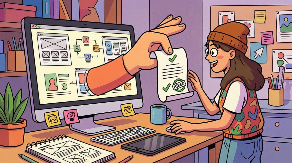
Your portfolio is probably too pretty for its own good.
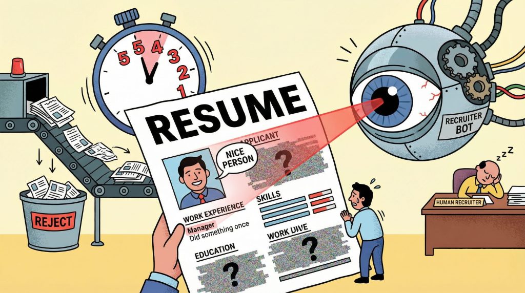
That sounds backwards. Designers are visual people. Polished work should speak for itself, right? But here’s the thing: in 2026, 78% of recruiters use AI-assisted screening to filter portfolios before a human ever opens your site. That means your carefully crafted hero animations and full-bleed case study images are being parsed by algorithms that don’t care about your grid system. They care about keywords, structure, and proof of impact.
The UX job market has recovered from the 2024–2025 drought, but it hasn’t returned to the “everyone’s hiring” energy of 2021–2022. Roles exist. Companies are building again. But hiring managers are pickier, budgets are tighter, and the bar for what “qualified” means has shifted. Generic portfolios that worked three years ago now disappear into a pile of 200 applications.
This guide is the portfolio you’d build if you understood how hiring actually works on the other side of the table. Not a gallery. Not a mood board. A portfolio that clears the AI filter, survives the 2–3 minute human scan, and makes someone want to call you.
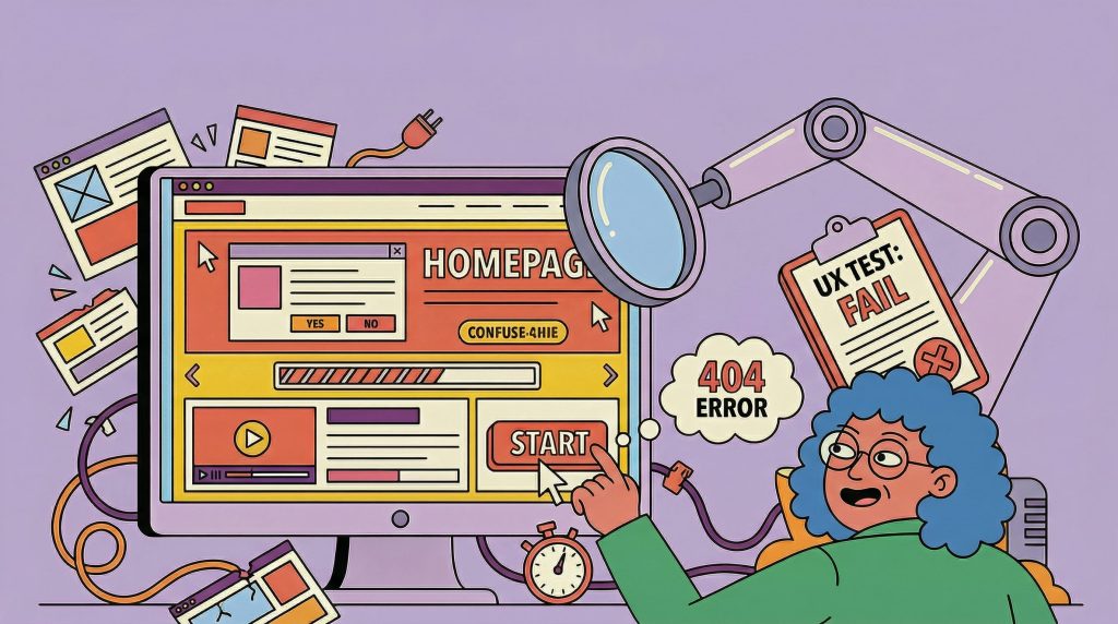
The 5-Second Test: What Recruiters Actually See First
Before anyone reads your case study, they’ve already decided whether to keep scrolling. The average initial portfolio review is 2–3 minutes. But within the first five seconds, a recruiter has answered three questions:
- What does this person do?
- Are they senior or junior?
- Is this relevant to what I’m hiring for?
If your homepage doesn’t answer all three instantly, you’ve lost the majority of your audience before they see any work.
Do this:
- Put your role and specialization above the fold. “Product Designer specializing in B2B SaaS” is better than “I create meaningful digital experiences.”
- Show 3–5 project thumbnails with one-line descriptions. Not titles. Descriptions. “Redesigned onboarding flow that reduced drop-off by 34%” beats “Project Athena.”
- Make your contact information visible without scrolling. Email. LinkedIn. No treasure hunts.
Not that:
- A full-screen animation that takes 4 seconds to load
- A mysterious single-word homepage with no context
- An “About” page that reads like a memoir
Here’s the uncomfortable math: if a recruiter reviews 40 portfolios in a session and gives each one 2–3 minutes, your homepage gets roughly 10–15 seconds of real attention. Design for that constraint, not against it.
Lead with Impact, Not Aesthetics
The biggest shift in portfolio expectations over the past two years is this: hiring managers now care more about what changed because of your work than how it looked. This doesn’t mean visuals are irrelevant. It means visuals are the entry fee, not the differentiator.
A beautiful redesign that shipped and moved no metrics is, from a hiring perspective, equivalent to a concept project. It might show craft, but it doesn’t show judgment.
The impact hierarchy (what reviewers look for, in order):
- Business outcomes. Revenue increased, conversion improved, support tickets dropped. Numbers with context.
- User behavior changes. Task completion rates, time-on-task reductions, adoption rates. Evidence that real people acted differently after your work.
- Team or process impact. You introduced a framework that the team still uses. You ran a research initiative that redirected the roadmap. You built a component library that reduced design-to-dev handoff time.
- Craft quality. Clean UI, thoughtful interaction design, consistent visual language. Important, but it’s the foundation, not the story.
Most portfolios lead with #4 and maybe mention #1 in a footnote. Flip that order. Lead with what changed. Show the craft inside the case study, not instead of the story.
Quick test: Read the first two sentences of each case study in your portfolio. If they describe what you designed (a dashboard, an app, an onboarding flow), rewrite them to describe what changed because of what you designed. That single edit will make your portfolio stronger than 80% of what’s out there.
The Case Study Formula That Works

Three to five case studies is the sweet spot. Not two (too thin). Not eight (no one reads that many). Pick the ones that show range and depth, not volume.
Every strong case study follows the same underlying structure. You can rearrange it, but if any of these pieces are missing, the case study underperforms.
The formula:
- The setup (2–3 sentences). What was the product? What was the problem? Why did it matter to the business? Don’t bury the lede. Open with the tension, not the company description.
- Your role and constraints (1–2 sentences). What were you responsible for? What couldn’t you change? Constraints are more interesting than freedom. “I was the sole designer on a 4-week sprint with no user research budget” tells a reviewer more about your capability than “I led the design.”
- The process (the bulk of the case study). This is where most portfolios either go wrong or go bland. Don’t show a linear design process diagram (Discover, Define, Design, Deliver). Nobody believes it actually happened that way.
- Instead, show decisions. What did you try first? What didn’t work? Where did you pivot? What trade-off did you make, and why? The messy middle is where trust is built.
- Do this: “We tested three navigation patterns. Version A tested well for discoverability but increased task time by 40%. Version B reduced task time but buried a key feature. We shipped a modified Version B with a persistent shortcut, which balanced both metrics.”
- Not that: “After conducting user research, I created wireframes and iterated on the design until we reached the final solution.”
- The outcome (2–3 sentences with numbers). What happened after launch? If you don’t have hard metrics, use qualitative signals: team adoption, stakeholder feedback, follow-up projects that were greenlit because of your work. Something measurable.
- The reflection (1–2 sentences). What would you do differently? This is optional but powerful. It shows maturity. A designer who can articulate what they’d improve next time is a designer who learns.
A note on confidential work: If you can’t show the actual UI, show the thinking. Anonymized flows, redacted wireframes, and documented decision trees are all valid. What you can’t do is show nothing and expect reviewers to trust you on faith.
What to Cut (And Why Cutting Hurts Good)
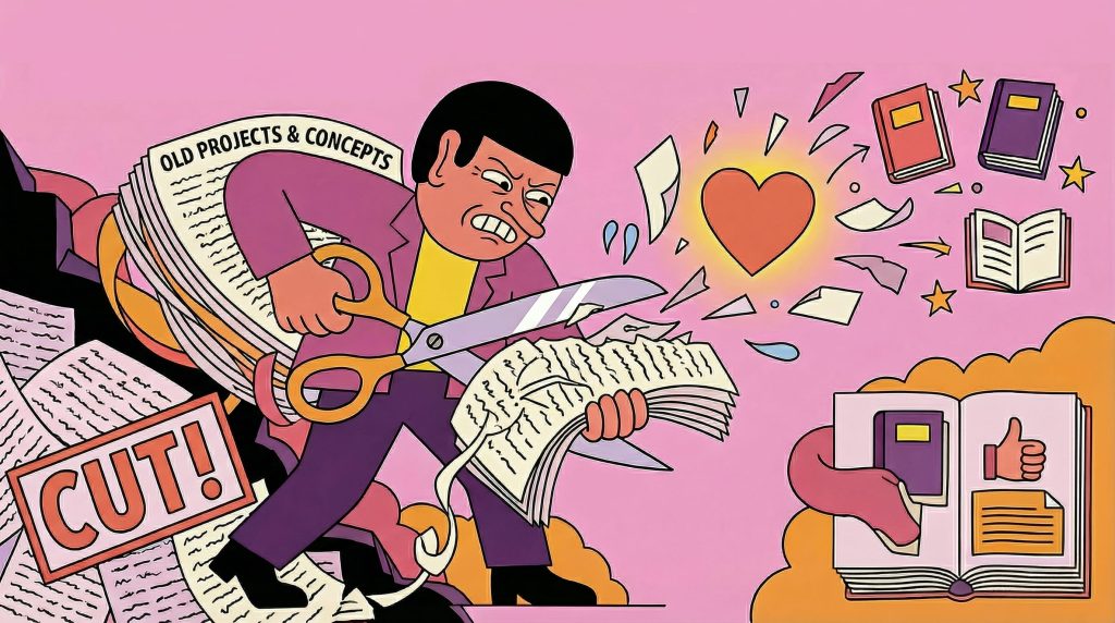
If cutting projects from your portfolio feels painful, you’re doing it right. The instinct to show everything you’ve done is natural but counterproductive.
Cut these:
- Student projects older than 2 years. Unless they’re genuinely exceptional, they signal inexperience rather than range.
- Concept projects without constraints. Fantasy redesigns of Spotify or Airbnb with no real users, no business constraints, and no accountability. They show craft but not judgment.
- Projects where your contribution was minimal. If you made the icons while someone else designed the system, that’s not a case study. That’s a contribution. List it on your resume, not your portfolio.
- Anything you can’t explain in conversation. If a recruiter asks “walk me through this project” and you struggle, it shouldn’t be in your portfolio. You’ll be asked.
- Duplicates in disguise. Three e-commerce checkout redesigns show repetition, not range. Pick the strongest one.
Keep these (even if they’re not “pretty”):
- Projects with clear constraints and creative solutions
- Work that shipped and had measurable results
- Projects where something went wrong and you adapted
- Cross-functional work that shows you can operate beyond Figma
Your portfolio should feel curated, not comprehensive. Three strong case studies beat seven mediocre ones every time.
Your Homepage Is Your First UX Test
Hiring managers notice the irony: a UX designer whose portfolio has bad UX. Your site is a product. Treat it like one.
The UX checklist for your own portfolio:
- Loads in under 3 seconds on mobile
- Role and specialization visible without scrolling
- Navigation is one level deep (no nested menus, no hamburger icons on desktop)
- Case studies are scannable: clear titles, one-line summaries, visual thumbnails
- Contact information is on every page (or in a persistent header/footer)
- Works on mobile without horizontal scrolling or broken layouts
- No auto-playing video or audio
- Accessibility basics: sufficient contrast, readable font sizes, alt text on images
What most designers overlook:
- Page speed. That 12MB hero video is costing you visitors. Recruiters on slow office Wi-Fi will close the tab.
- SEO basics. If your name and “UX designer” don’t appear in the page title and meta description, you’re invisible to search (and to the AI tools parsing your portfolio). Remember, 78% of recruiters now use AI-assisted tools. Those tools read your metadata.
- Clear information hierarchy. Your homepage should have one primary action: “See my work.” Everything else is secondary.
Here’s a useful exercise: send your portfolio URL to three friends who aren’t designers. Ask them to spend 30 seconds on your site and then tell you what you do, how senior you are, and what kind of work you’re looking for. If they can’t answer all three, your homepage needs work.
We covered some of these patterns in our earlier piece on portfolio mistakes designers still make in 2026. The common thread: your portfolio is a product, and your recruiter is the user.
Beyond the Portfolio: Building Your Design Identity
A portfolio is necessary, but in 2026 it’s rarely sufficient on its own. The designers who get hired fastest are the ones who are findable before they apply.
What this means practically:
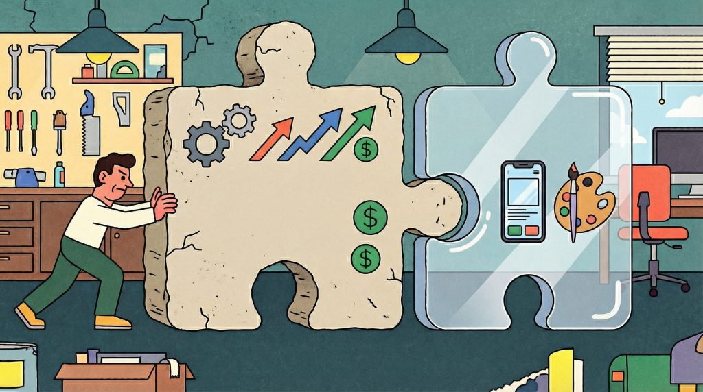
- Niche expertise beats generalist positioning. Hiring managers increasingly prefer candidates with demonstrated depth in a specific domain (health tech, fintech, design systems, developer tools) over candidates who claim to do everything. A portfolio that says “I’m a product designer” competes with everyone. A portfolio that says “I design complex data interfaces for enterprise SaaS” competes with a much smaller pool.
- AI proficiency is now a hiring filter. 78% of design managers consider AI tool proficiency when evaluating candidates. If you’re using AI tools in your workflow (for research synthesis, rapid prototyping, content generation, or design exploration), document it in your case studies. Not as a gimmick. As a demonstration that you understand the current toolkit.
- Your digital presence matters beyond your portfolio URL. Your LinkedIn profile, your Dribbble/Behance activity, your blog posts or conference talks, the articles you share and comment on. All of it creates a signal that hiring managers read before and after viewing your portfolio.
This is where your creative identity extends beyond a single website. Tools like Muzli Me exist specifically for this: a place to build and maintain your professional creative identity that connects your portfolio, your influences, your expertise, and your point of view into something cohesive. Think of it as the connective tissue between your portfolio, your social presence, and your professional reputation.
The point isn’t to be everywhere. It’s to be coherent everywhere you are.
The market is better than it was. Roles are opening. But the designers getting those roles aren’t the ones with the prettiest portfolios. They’re the ones who made it easy for a recruiter to understand, in under three minutes, exactly what they bring to the team.
Build for that. Everything else is decoration.
Want to get featured on Muzli Picks?
Create your profile on Muzli Me, upload your project, and it might get featured on Muzli Picks and seen by thousands of designers every day.
……
💡 Stay inspired every day with Muzli!
Follow us for a daily stream of design, creativity, and innovation.
Linkedin | Instagram | Twitter
Looking for more daily inspiration? Download Muzli extension, your go-to source for everything design.
Related articles

How to get more web design clients in 2024?
How to get a graphic design job? 6 tips + portfolio examples
More categories
Looking for more daily inspiration? Download Muzli extension your go-to source for design inspiration!
Get Muzli for Chrome


