How to Make Your UI Accessible: A Practical Checklist for 2026
A practical accessibility checklist for UI designers in 2026. No theory lectures. Real checks you can run on your designs today, organized by what matters most.
Accessibility guidelines were written for auditors. This article is written for designers.
The WCAG documentation is 150+ pages of criteria, exceptions, and conformance levels. Most designers read the first three paragraphs, feel overwhelmed, and go back to designing without thinking about it. That’s not a character flaw. It’s a documentation failure. The information exists, but it’s buried under a vocabulary that assumes you already know what “programmatically determined” means.
Here’s the reality: you don’t need to memorize WCAG to design accessible interfaces. You need a checklist that covers the 20 things that catch 90% of accessibility issues. That’s what this article is. Run through it once per project, and you’ll be ahead of most designers and most products shipping today.
Why 2026 Is the Year This Becomes Non-Negotiable
Two things happened that changed the math.
First, the legal landscape tightened. The US Department of Justice finalized rules requiring WCAG 2.1 Level AA compliance for state and local government websites by April 2026. The European Accessibility Act takes full effect in June 2025, affecting any digital product sold in the EU. Private lawsuits haven’t slowed either. Over 4,000 ADA-related digital accessibility lawsuits were filed in 2025. If your company serves the public, accessibility is no longer optional.
Second, the tools got better. Figma plugins like Stark and axe for Designers can catch contrast failures, missing labels, and focus order issues in seconds. Two years ago, accessibility testing required dedicated QA time. Now you can check the basics without leaving your design file.
The standard to aim for: WCAG 2.1 Level AA. Not AAA (that’s aspirational for most teams). Not 2.0 (that’s outdated). 2.1 AA is the legal and practical baseline in 2026.
Color and Contrast: The Foundation
Color contrast is the most common accessibility failure on the web. It’s also the easiest to fix.
The rules:
- ✓ Normal text (under 18px or under 14px bold): minimum 4.5:1 contrast ratio against background
- ✓ Large text (18px+ or 14px+ bold): minimum 3:1 contrast ratio
- ✓ UI components (buttons, inputs, icons that convey meaning): minimum 3:1 contrast ratio against adjacent colors
- ✓ Focus indicators: minimum 3:1 contrast against the background they appear on
- ✓ Never use color as the only way to convey information (red for error, green for success). Always pair with text, icons, or patterns
The context most designers miss: 8% of men and 0.5% of women have some form of color vision deficiency. That’s not a small edge case. In a product with 100,000 users, roughly 4,000 of them see your color choices differently than you do. Red/green color blindness is most common, which means your red error states and green success states look identical to a significant portion of your users.
How to check: Install Stark or Contrast in Figma. Run a contrast check on every text/background combination in your design. It takes five minutes. For a deeper look at color tools and accessible palette generators, check our color palette tools guide.
Quick fix that handles most cases: Build your color system with accessibility baked in. Define your grays, backgrounds, and text colors with contrast ratios verified from the start. If the system is accessible, every component using it is automatically accessible.
Typography and Readability
Bad typography isn’t just ugly. It’s exclusionary.
The rules:
- ✓ Body text: minimum 16px. Not 14px. Not 12px. 16px is the floor for comfortable reading on screens
- ✓ Line height: minimum 1.5x the font size for body text. Tighter line heights are acceptable for headings only
- ✓ Line width: maximum 80 characters per line (roughly 600–700px for body text). Lines wider than this cause tracking errors when the reader’s eye jumps back to the next line
- ✓ Paragraph spacing: at least 1.5x the line height between paragraphs. Dense text walls discourage reading
- ✓ No all-caps for sentences or paragraphs. All-caps is acceptable for short labels (buttons, tabs, badges) but reduces reading speed by 13–20% for longer text
- ✓ Font choice: avoid decorative fonts for body text. Choose typefaces with clear letterform distinction (easy to tell I/l/1 apart, clear difference between O/0)
The context: 15% of the global population has some form of dyslexia. Readable typography isn’t just a design preference. The combination of adequate size, generous spacing, and clear typefaces makes text accessible to the broadest possible audience.
How to check: Read your designs on an actual phone. Not a Figma preview on your 27-inch monitor. If you squint at any text on a phone screen, it’s too small or too tight.
Interactive Elements: Buttons, Links, Forms
This is where accessibility failures hurt the most, because inaccessible interactive elements mean users literally cannot complete tasks.
The rules:
- ✓ Touch targets: minimum 44×44px. This applies to buttons, links, icons, toggle switches, and any tappable element. 24×24px icons are fine visually, but the tappable area around them must be at least 44×44px
- ✓ Focus states: every interactive element must have a visible focus indicator. The default browser outline works. A custom focus state works better. No focus state at all fails accessibility
- ✓ Form labels: always visible. Never use placeholder text as the only label
- ✓ Error messages: specific and actionable. “Something went wrong” is not accessible. “Email address must include an @ symbol” is
- ✓ Error identification: connect error messages to the specific field
- ✓ Link text: descriptive. “Click here” tells screen reader users nothing. “Read our accessibility guide” tells them everything
- ✓ Button labels: describe the action. “Submit your application” is clearer than “Go”
The context: 2.5% of the global population has significant motor impairments that affect how they interact with touch screens and pointing devices. Small touch targets, imprecise hit areas, and tiny close buttons aren’t just annoying for everyone. They’re barriers for people with tremors, limited dexterity, or alternative input devices.
How to check: Navigate your entire design using only Tab, Enter, Escape, and Arrow keys. Can you reach every interactive element? Can you see where focus is at all times? Can you complete every task? If not, those are accessibility failures.
Motion and Animation
Animation is a design tool, not a decoration. When it’s used without restraint, it becomes an accessibility hazard.
The rules:
- ✓ Respect the
prefers-reduced-motionsystem setting. Users who turn on “reduce motion” in their OS settings have a reason. Your animation preferences don’t override theirs. - ✓ No auto-playing video with sound. Ever. Auto-play without sound is acceptable if there’s a visible pause control.
- ✓ Nothing flashes more than 3 times per second. This is a seizure risk for people with photosensitive epilepsy. It’s not a guideline. It’s a medical safety requirement.
- ✓ Provide pause, stop, or hide controls for any content that moves, blinks, or scrolls automatically (carousels, ticker tapes, animated backgrounds).
- ✓ Animations should be less than 5 seconds or have user control. Infinite loops without a stop mechanism are disorienting for users with vestibular disorders.
The context: Approximately 5% of adults experience vestibular disorders (dizziness, nausea, or disorientation from visual motion). Parallax scrolling, zoom transitions, and sliding panels that move fast enough can trigger physical symptoms. This isn’t about preference. It’s about preventing harm.
How to check: Turn on “reduce motion” in your OS accessibility settings and use your product. Does everything still work? Is information still conveyed? If an animation carries meaning (not just decoration), make sure that meaning is preserved when the animation is disabled.
Navigation and Structure
Good structure is invisible when it works. When it doesn’t, users get lost.
The rules:
- ✓ Heading hierarchy: H1, then H2s, then H3s. Never skip levels (don’t jump from H1 to H3). Screen readers use headings as a navigation shortcut. Broken hierarchy breaks that shortcut.
- ✓ Keyboard navigation: every interactive element reachable via keyboard in a logical order. Tab moves forward, Shift+Tab moves backward. The focus order should match the visual reading order.
- ✓ Skip navigation: a “Skip to main content” link at the top of the page that lets keyboard users bypass repeated navigation. It can be visually hidden until focused.
- ✓ Consistent navigation patterns: the main navigation should be in the same position on every page. If a feature exists in the header on one page, it should be in the header on every page.
- ✓ Breadcrumbs: for sites with more than two levels of hierarchy, breadcrumbs help users understand and navigate the structure.
- ✓ Page titles: every page needs a unique, descriptive title. “Dashboard” is better than “Home.” “Order History: Last 30 Days” is better than “Page 2.”
How to check: Use your product with a screen reader for five minutes. On Mac, turn on VoiceOver (Cmd + F5). Navigate through your page. Do the headings make sense in order? Can you find the main content quickly? Is the focus order logical? Five minutes of screen reader testing reveals more accessibility issues than an hour of visual inspection.
Testing Your Designs (Without Being an Expert)
You don’t need to be an accessibility specialist. You need to run five tests.
Test 1: Contrast check. Install Stark or Contrast in Figma. Run it on your design. Fix everything that fails AA. Time: 5 minutes.
Test 2: Keyboard navigation. Tab through your live interface (or prototype). Can you reach everything? Can you see where you are? Can you go back? Time: 10 minutes.
Test 3: Screen reader scan. Turn on VoiceOver (Mac) or TalkBack (Android). Listen to your page being read aloud. Does it make sense? Are images described? Are buttons labeled? Time: 10 minutes.
Test 4: Zoom to 200%. In your browser, zoom to 200%. Does the layout break? Is text still readable? Can you still use the navigation? WCAG requires content to be usable at 200% zoom. Time: 3 minutes.
Test 5: The squint test. Squint at your design until it’s blurry. Can you still see the visual hierarchy? Can you distinguish primary actions from secondary ones? If everything blurs into the same level of visual weight, your hierarchy isn’t strong enough for users with low vision. Time: 1 minute.
Total testing time: under 30 minutes. That’s less time than most designers spend choosing a hero image.
The Quick-Start Checklist
Bookmark this. Run through it before every handoff.
Color and Contrast:
- All body text meets 4.5:1 contrast ratio
- All large text meets 3:1 contrast ratio
- All UI components meet 3:1 contrast ratio
- Color is never the only indicator of meaning
- Color blindness simulation reviewed
Typography:
- Body text is 16px minimum
- Line height is 1.5x minimum
- Line width is 80 characters maximum
- No all-caps paragraphs
Interactive Elements:
- All touch targets are 44x44px minimum
- All elements have visible focus states
- All form fields have visible labels (not just placeholders)
- Error messages are specific and next to the field
- Link text is descriptive
Motion:
- prefers-reduced-motion is respected
- No content flashes more than 3 times per second
- All auto-playing content has pause controls
Navigation:
- Heading hierarchy is logical (no skipped levels)
- Keyboard navigation works in logical order
- Skip-to-content link exists
- Page titles are unique and descriptive
Testing:
- Contrast check passed
- Keyboard navigation tested
- Screen reader scan completed
- 200% zoom tested
Common Pitfalls (What Designers Get Wrong)
Even well-intentioned designers make these mistakes:
- Modal dialogs that trap focus. When a modal opens, focus should move to it. When it closes, focus should return to the element that opened it. Broken focus trapping means keyboard users can get stuck behind an invisible wall.
- Infinite scroll without keyboard access. If new content loads as the user scrolls, keyboard users need a way to reach that content too. Provide a “Load more” button as a keyboard-accessible alternative.
- Custom components without ARIA labels. If you build a custom dropdown, slider, or toggle, it needs ARIA roles and labels to be readable by assistive technology. Native HTML elements come with accessibility built in. Custom ones don’t.
- Icons without text labels. A magnifying glass icon means “search” to sighted users. To a screen reader, it’s nothing unless it has an aria-label. Every icon that functions as a button needs a text alternative.
- Hiding content visually but not from screen readers (or vice versa).
display: nonehides from everyone.visibility: hiddenhides from everyone..sr-only(visually hidden but screen-reader accessible) is what you want for text alternatives. - Assuming hover states are enough. Hover doesn’t exist on touch devices. Every hover interaction needs a tap-based equivalent.
- Forgetting about dark mode contrast. Your light theme passes contrast checks. Does your dark theme? Check both.
Accessibility isn’t a feature you add at the end. It’s a quality standard you maintain from the start. The checklist above takes 30 minutes to run. The cost of fixing accessibility issues after launch takes weeks.
Start with the checklist. Run it once. Fix what fails. Then do it again on the next project. That’s how accessibility becomes a habit, not a project.
Explore more design resources and tools at Muzli
……
💡 Stay inspired every day with Muzli!
Follow us for a daily stream of design, creativity, and innovation.
Linkedin | Instagram | Twitter
Looking for more daily inspiration? Download Muzli extension, your go-to source for everything design.
Related articles

How to Build a Design System in Figma: A Practical Guide (2026)

Best AI Design Tools for UI/UX Designers in 2026

Portfolio Mistakes Designers Still Make in 2026

From Design to Code Without Losing Context: An MCP-First Workflow

How to Build a 2026 Design Portfolio: Why You Need More Than Just Pixels
Elevate marketing and sales by using Immersive Web experiences
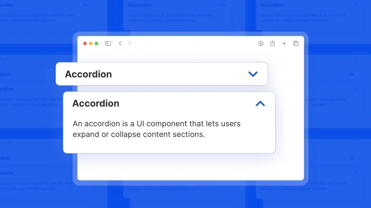
The Ultimate Accordion Design Playbook
More categories
Looking for more daily inspiration? Download Muzli extension your go-to source for design inspiration!
Get Muzli for Chrome


