How to choose the ultimate color palette for your next project
Understanding and utilizing colors to their full potential is no less than a science. One must navigate through color theory, the interplays of the color wheel, and the interpretations derived from color psychology while selecting the appropriate colors for a project. This comprehensive guide will provide in-depth insight into these components, helping you transform your project into a masterpiece.
Understanding Color Theory
Color theory is an amalgamation of art and science. It offers a conceptual structure for understanding color interaction and influences. A grasp of color theory is instrumental in designing and creating appealing color patterns.
The key elements of color theory include:
-
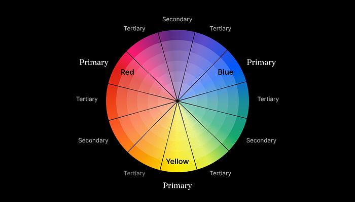
- Primary Colors: Red, blue, and yellow from which all other colors are derived.
- Secondary Colors: Formed by mixing equal parts of two primary colors like green (blue + yellow), orange (red + yellow), and purple (red + blue).
- Tertiary Colors: These arise from the combination of primary and its adjacent secondary color, such as red-orange.
- Complementary Colors: Colors positioned opposite each other on the color wheel. They contrast and make each other appear brighter, like red and green.
- Analogous Colors: Colors positioned close on the color wheel, they form a harmonious scheme, like yellow, yellow-green, and green.
Exploring the Color Wheel

The color wheel is a color theory’s visual representation, that showcases a spectrum of colors arranged based on their chromatic correlations.
The facets of the color wheel are:
-
- Standardization: The universal format presents 12 colors, inclusive of primary, secondary, and tertiary colors.
- Color Mixing: Colors could be mixed to form different colors or shades and get a range of hues.
- Diversification: Colors can be divided into warm (red to yellow) and cool colors (green to purple). Warm colors exude energy and cool colors convey calmness.
- Monochromatic: This scheme utilises various shades and tints within a specific hue.
Through a better understanding of the color wheel, compelling and visually aesthetic color schemes can be crafted.

Unlocking Color Psychology
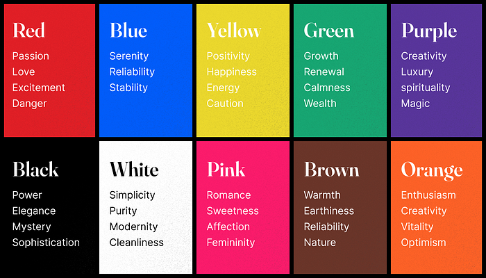
Color psychology is the study of how colors influence human behaviour and emotion. Each color can stir specific feelings and convey certain messages. Common associations include:
-
- Red: Represents feelings like passion and love, excitement, or danger. It is bold and attention-grabbing.
- Blue: Symbolizes serenity, reliability, and stability, rendering it ideal for professional establishments.
- Yellow: Emanates positivity, happiness, and energy, but can also signify caution.
- Green: Generally stands for growth, renewal, and calmness, and also signifying wealth.
- Purple: Often linked to creativity, luxury, spirituality and magic.
- Black: Signifies power, elegance, mystery and sophistication.
- White: Stands for simplicity, purity, modernity and cleanliness.
- Pink: Associated with romance, sweetness, affection and femininity.
- Brown: Evokes warmth, earthiness, reliability and nature.
- Orange: Represents enthusiasm, Optimism, creativity, and vitality.
By integrating color psychology, designers can use colors to manipulate emotions and behaviors subtly, enhancing the way users interact with a design.
Remember, these interpretations can vary based on cultural and individual differences; hence, stay aware of your target audience’s possible perceptions.

Tools for Creating Color Palettes
Among the plethora of resources to assist with creating color palettes, Muzli Colors stands out owing to its user-friendly interface. It allows for endless color combinations to help you find the perfect palette for your project. You can build your own color schemes or choose from a hoard of pre-generated palettes.
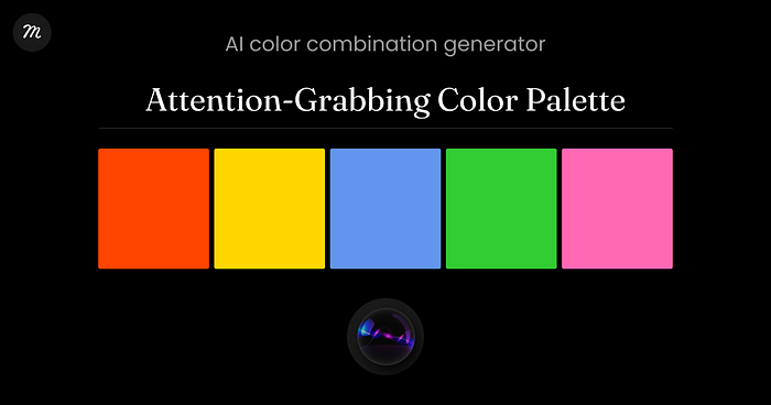
A newer addition to the color palette realm is the Muzli AI Color Combination Generator. It increases the precision and range of available combinations, adding innovation and variety to your design project.
Choosing the Right Color for Your Design
The selection process for coloring your project is highly subjective. It greatly depends on the product type and the target audience. The choice of color sends a psychological message; hence, consider choosing colors that represent your brand personality and impact your audience as envisaged.
Conclusion
The art of color selection is progressive, combining color theory principles, color psychology, and creative intuition to breathe life into your design. The chosen color scheme should not only represent the product harmoniously but also synergize with your brand’s personality and drive user engagement.
While this guide serves as a comprehensive manual to assist you in your color selection process, sea of creativity offers endless room for exploration. Remember, uniqueness and personal touch are key to standing out in the world of design. It is experimentation and the will to break the conventional that often lead to the conception of exceptionally successful designs. Your color choice journey, thus, does not end here. Continue to explore, experiment, and express, for the world of colors is vast an.


