Accordion UI Design: Best Practices, Examples and Common Mistakes
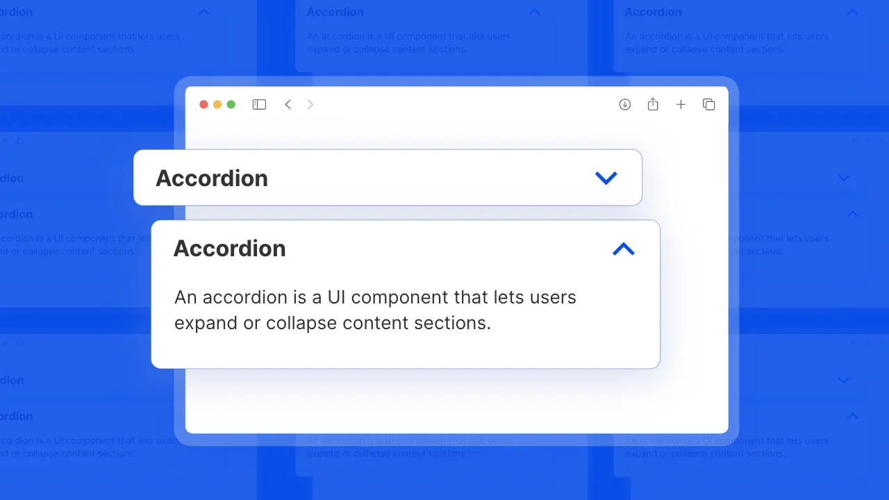
Unlock the Power of Interactive, Flexible, and Stylish Accordion
An accordion is a vertically stacked list of headers that reveal or hide associated sections of content. Accordion components are great for displaying content in a collapsible format, making them ideal for managing large amounts of information in a compact way. They typically consist of a series of expandable sections or panels.
Accordion Anatomy
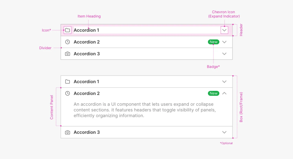
The accordion component is composed of several key elements:
Header: The Header is the clickable area that users interact with to expand or collapse the accordion. It typically includes a title and may also feature additional elements like icons (e.g., chevron, status indicators, or settings icons) to provide context or functionality. The header ensures proper alignment and spacing of its elements for a clean and organized layout.
Chevron Icon: A directional icon located at the end of the header, indicating the current state of the accordion (collapsed or expanded). It points down when collapsed and up when expanded.
Additional Icon: An optional icon near the title within the header container, providing further context or functionality (e.g., a user avatar, status indicator, or settings gear).
Content Panel/Container: The section that holds the detailed content of the accordion, revealed or hidden when the header is clicked. It ensures proper layout and organization of the content for clarity and readability.
Divider: A visual separator between different accordion sections or headers, often a line or space that helps delineate sections and improve readability.
Badge: A small visual indicator, typically placed near the header, showing additional information like counts or status. This enhances usability by providing extra data at a glance.
Box: The outer container that surrounds the entire accordion component, including the header and content panel. It provides a structural framework and may include styling like borders, shadows, or background colors.
These elements work in tandem to provide an organized, visually appealing, and interactive user experience, allowing users to manage large amounts of information in a compact and efficient format.
Accordion States & Behavior

The accordion component has several key states that define its interaction.
Collapsed State
Default (Collapsed)
Appearance and Behavior: The accordion header is visible with no content displayed. It typically features a collapsed icon (e.g., downward-facing arrow or plus sign) and is styled to indicate it can be interacted with.
Hover (Collapsed)
Appearance and Behavior: When the user hovers over the collapsed header, it visually changes (e.g., background color shift or border highlight) to indicate that it can be expanded.
Pressed (Collapsed)
Appearance and Behavior: The header shows a pressed effect (e.g., darker shade or inset shadow) when clicked, indicating that the section is in the process of expanding.
Focused (Collapsed)
Appearance and Behavior: The header features a focus ring or outline to indicate keyboard focus, helping users understand that the section can be expanded with a key press.
Expanded State
Default (Expanded)
Appearance and Behavior: The header is visible along with the expanded content. The icon (e.g., upward-facing arrow or minus sign) indicates the section is open and the content is fully displayed.
Hover (Expanded)
Appearance and Behavior: When hovering over the expanded header, visual feedback is provided (e.g., background color or shadow effect), indicating that the section can be collapsed.
Pressed (Expanded)
Appearance and Behavior: The header appears pressed when clicked, showing that the section is in the process of collapsing. The icon transitions to indicate the change.
Focused (Expanded)
Appearance and Behavior: The expanded header has a focus ring or outline, similar to the collapsed focus state, helping users navigate via keyboard while keeping the content visible.
Disabled Accordion

A disabled accordion cannot be interacted with, expanded, or collapsed. It appears visually distinct, often grayed out, and does not respond to clicks or keyboard navigation. Its content and toggle icon are hidden, and it does not receive focus during navigation.
Accordion Variations
Accordions come in various styles to suit different user needs and content types. Here’s an overview of different accordion designs
Text Accordion

A text accordion, also known as a default, basic or standard accordion, features sections with text-based headers that users can click to expand or collapse. Each header is clearly labeled with text, making it easy for users to understand the content of each section. This design helps organize information efficiently and enhances readability by allowing users to view only the sections they are interested in.
Icon Accordion

An icon accordion includes icons alongside the text or header of each section. The icons represent the content or function of the section, enhancing visual recognition. The accordion expands or collapses content as needed, with icons helping users quickly identify and navigate between sections. This design improves usability and provides a more engaging and intuitive interface.
Image Accordion

An image accordion features images within the header of each section, visually representing the content or purpose. This design is particularly useful for user profiles, team directories, or messaging apps where visual identification enhances the user experience. By making headers more engaging and easier to identify, it provides a more intuitive way for users to navigate and interact with the content.
Accordion Enhancements
Expand Indicator Icon
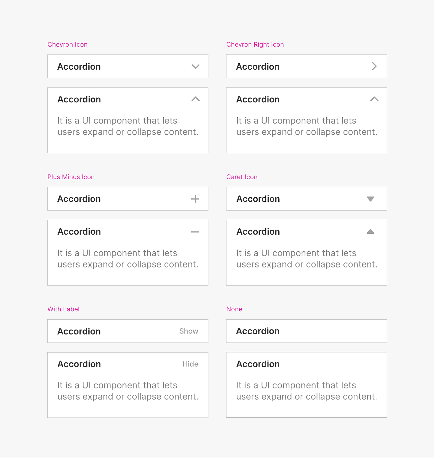
The expand indicator icon in an accordion automatically rotates to show the state of the section — down when collapsed and up when expanded. This icon is crucial for signaling whether content can be revealed or hidden. Common types of icons used include arrows (e.g., chevrons), plus/minus icons, and caret icons, each providing a clear visual cue about the accordion’s current state.
Expand Indicator Icon Position

The expand indicator icon in an accordion can be positioned in several ways depending on the design and layout. It is often placed to the left of the header, making it immediately visible when the section header is clicked. Alternatively, it may be positioned to the right of the header, providing a clear visual cue after the header text. In some designs, the icon is integrated within the header, aligning with or adjacent to the text for a more compact appearance.
Accordion Text Alignments
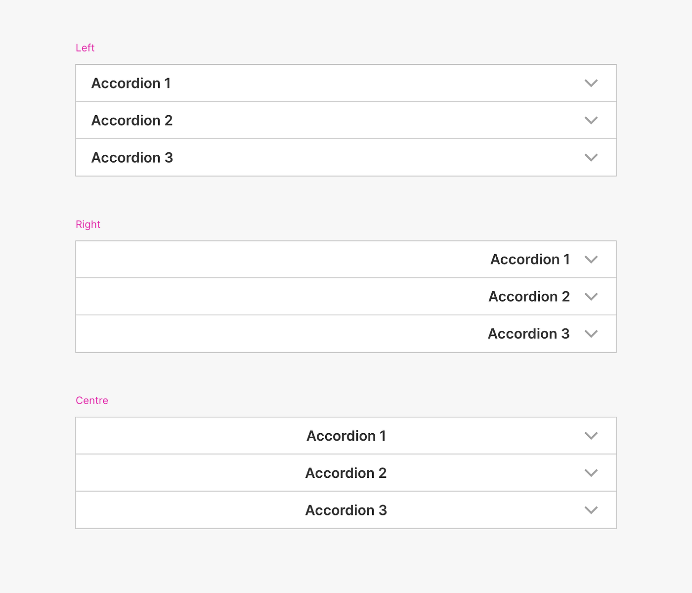
In an accordion, text alignment within the header can vary to meet different design needs. Left-aligned text is placed at the left edge of the header, making it suitable for designs with icons or badges on the right. Center-aligned text is positioned in the middle of the header, ideal for minimalistic designs or short titles. Right-aligned text is aligned to the right edge, which works well for designs featuring icons or badges on the left and for supporting right-to-left language layouts.
Accordion with Title

A main title for an accordion is the primary heading that defines the overall theme of the content. It helps users quickly understand the purpose of the sections below. Positioned at the top, it’s more prominent than section headers, providing a clear sense of what information or settings are contained in the expandable sections, such as “Frequently Asked Questions” or “User Account Overview.”
Accordion with Sub header

A sub-header in an accordion provides additional context or information below the main header. This can help clarify the content of each section or offer more details without overwhelming the main header. If the sub-header text exceeds the width of the accordion, it may truncate and show a tooltip on hover for complete information.
Accordion Text Display

Accordion Text Display focuses on how text is managed and presented within accordion headers. Key techniques include:
A truncated accordion uses ellipses to shorten titles that exceed a set length, maintaining a compact design. Full titles can be revealed through interactions like hovering or expanding.
In a wrapped text accordion, long titles automatically wrap to the next line, adjusting the container’s height to fit the full text. This approach ensures readability and accommodates extended titles while keeping the design responsive.
Accordion with Show Number Prefix

A number accordion uses numbers as prefixes in the headers to organize and sequence sections. Each header starts with a number, such as “1. Introduction,” “2. Features,” and “3. FAQs,” helping users easily navigate and identify the order of sections within the accordion.
Accordion Spacing
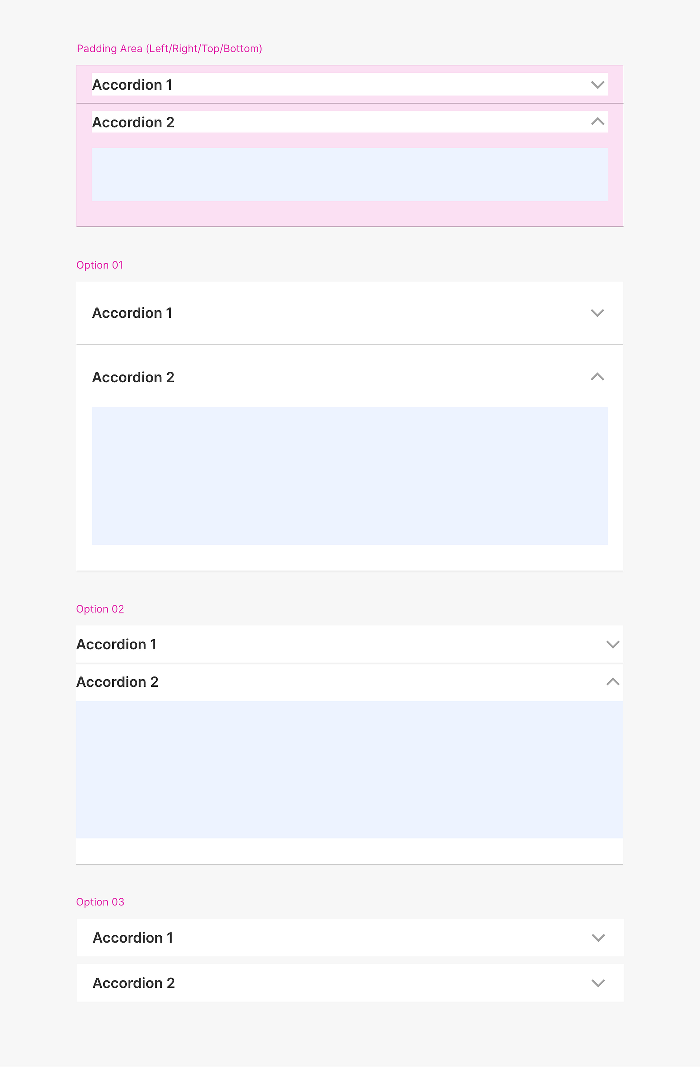
Accordion Spacing involves adjusting the padding and margins within and around accordion components to achieve a clean and modern look. This includes setting section padding to keep content from touching the edges of each section, margins between individual accordion sections to ensure clear separation, and header spacing with adequate top, bottom, left, and right margins to enhance readability and prevent clutter. Proper spacing improves the visual appeal and usability of the accordion, creating a well-organized and balanced layout.
Accordion Fluid

Accordion Fluid refers to an accordion design that adapts dynamically to fit its container, allowing it to resize fluidly based on available space. This approach ensures that the accordion maintains a responsive and flexible layout, adjusting both horizontally and vertically to accommodate varying screen sizes or container dimensions. Fluid accordions enhance usability by ensuring that content is always displayed effectively, regardless of changes in the viewing environment.
Accordion Sizes

Accordion with Border

An accordion with a border features sections enclosed by a border around the box. This design provides a clear visual boundary for each section, enhancing organization and focus. The rounded border creates a softer, more modern look, making the accordion visually appealing and easy to distinguish from surrounding elements.
Floating Accordion
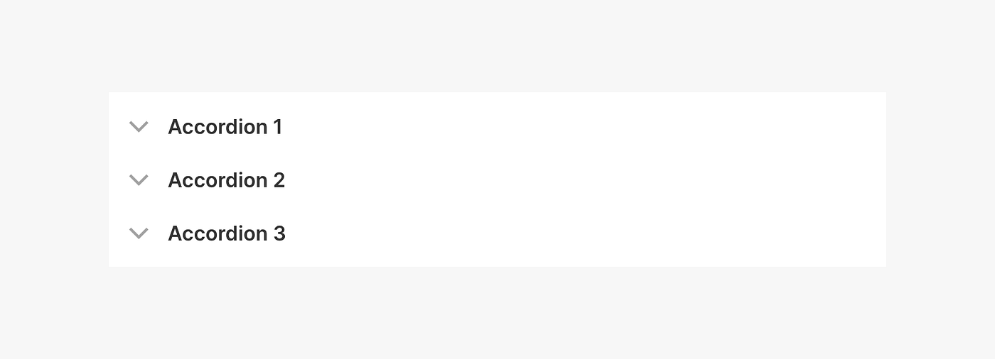
A Floating Accordion, also known as “borderless,” “bare,” or “ghost,” removes background and borders, offering a clean, unobtrusive design. This style is ideal for modals or when space is limited, providing a sleek appearance that integrates seamlessly with the surrounding content.
Shadow on Accordion Box and Header
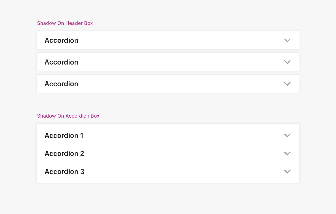
Shadows enhance an accordion component by adding depth and emphasis. Applying a shadow to the accordion box makes it stand out from the background, creating an elevated effect. A shadow on the accordion header highlights its prominence and improves its visual distinction. These effects help make the accordion more engaging and visually appealing.
Accordion Contextual Information
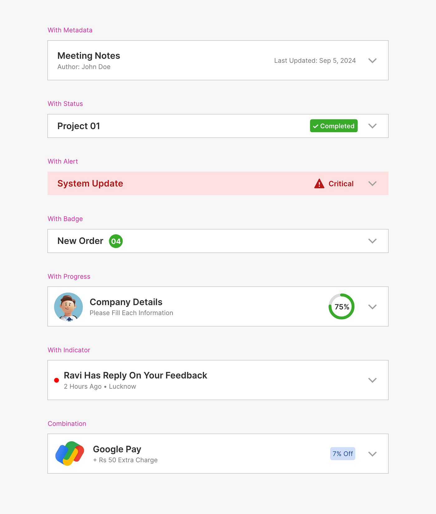
Badges, Alerts, Status, Metadata, and Progress each enhance accordions by providing additional contextual information:
Badges: Small visual indicators that display counts, notifications, or quick information, such as the number of unread messages or pending tasks. They offer a concise way to convey key details at a glance.
Alerts: Visual or textual messages that highlight important notifications, warnings, or errors. Alerts are designed to draw attention to critical information, ensuring users are promptly aware of urgent issues or updates.
Status: Indicators that show the current state or condition of each section, such as “In Progress,” “Completed,” or “Pending.” They help users quickly understand the progress or state of various items within the accordion.
Unread Indicators: Highlight sections with unread or new content to help users quickly identify updates. Common indicators include badges with counts, background highlights, or small icons, enhancing usability by drawing attention to sections that need review.
Metadata: Additional contextual information about each section, such as timestamps, labels, or data points. Metadata provides extra detail that helps users better understand or categorize the content.
Progress: Displays progress indicators within each section, allowing users to track task completion or status. Common features include progress bars, progress circles, or status labels like “In Progress” or “Completed,” which help users monitor and manage ongoing tasks more effectively.
Combination: Badges, alerts, status, and metadata can be combined in an accordion to provide users with a comprehensive overview of information, improving clarity and interaction.
Accordion Interactions
Always Open

In this behavior, multiple sections of the accordion can be expanded at once, allowing users to view several or all sections simultaneously. This provides greater flexibility for users who want to access large amounts of content without closing any sections.
Only One Expanded at a Time
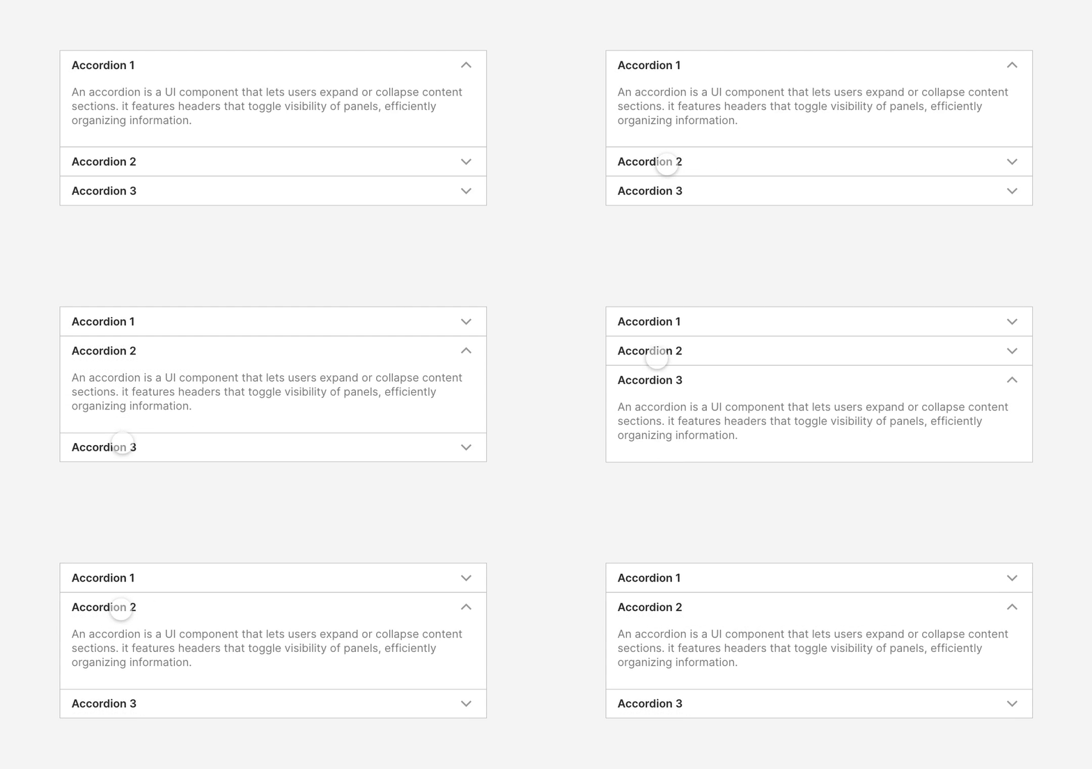
In this interaction, only one section of the accordion can be open at a time. When the user expands a new section, the previously open section automatically collapses. This is ideal for keeping content organized and minimizing clutter, particularly when space is limited.
By Default, One Open
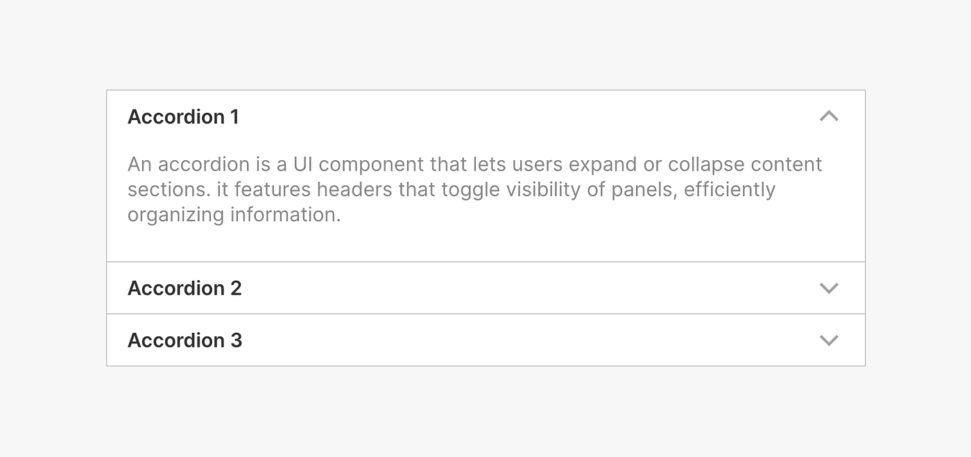
When the page loads, one section is expanded by default. This can guide users by highlighting the most important or commonly accessed information first. Other sections remain collapsed until the user manually interacts with them.
Auto-Collapse

With this interaction, expanding one section automatically collapses all other open sections. It is similar to “one at a time” behavior but focuses on minimizing the need for user clicks by closing other sections immediately.
Sequential Expansion

Sequential Expansion requires users to complete accordion sections in a specific order, often used in multi-step forms or onboarding processes. This method ensures a logical flow, making sure users address each section sequentially before moving to the next. It is effective in scenarios where each section builds upon the previous one, such as in detailed forms, surveys, or step-by-step tutorials.
Accordion Control Button
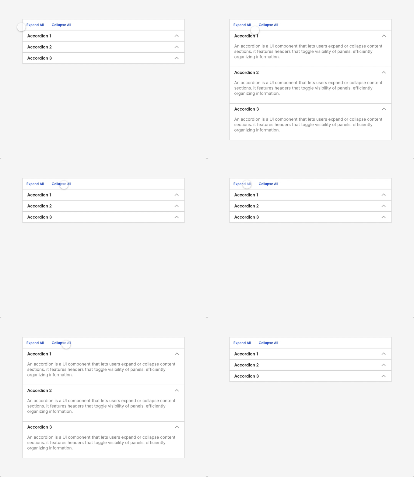
The accordion control buttons include “Expand All” and “Collapse All”. The “Expand All” button, placed above the accordion, expands all sections to reveal all content. Conversely, the “Collapse All” button collapses all sections, hiding the content. Both buttons should be implemented with proper state management to ensure consistent and simultaneous expansion or collapse of all sections.
Accordion with Tooltip
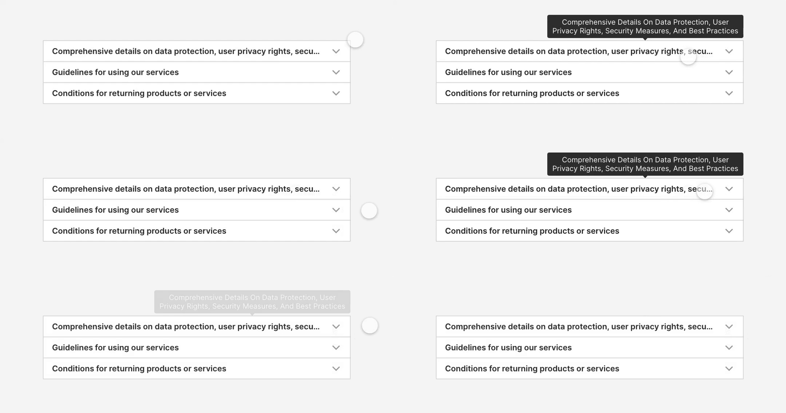
An accordion tooltip is a feature that provides additional context or information when a user hovers over or interacts with an accordion header or section. Tooltips can enhance the user experience by offering hints or explanations without cluttering the interface.
Advanced Features
Nested Accordion
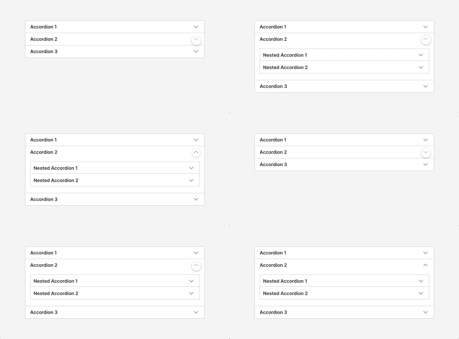
A nested accordion includes an accordion within another accordion, allowing multiple layers of collapsible sections. This design helps organize complex, hierarchical content by expanding or collapsing top-level sections and revealing additional nested sections as needed.
Accordion Reorder
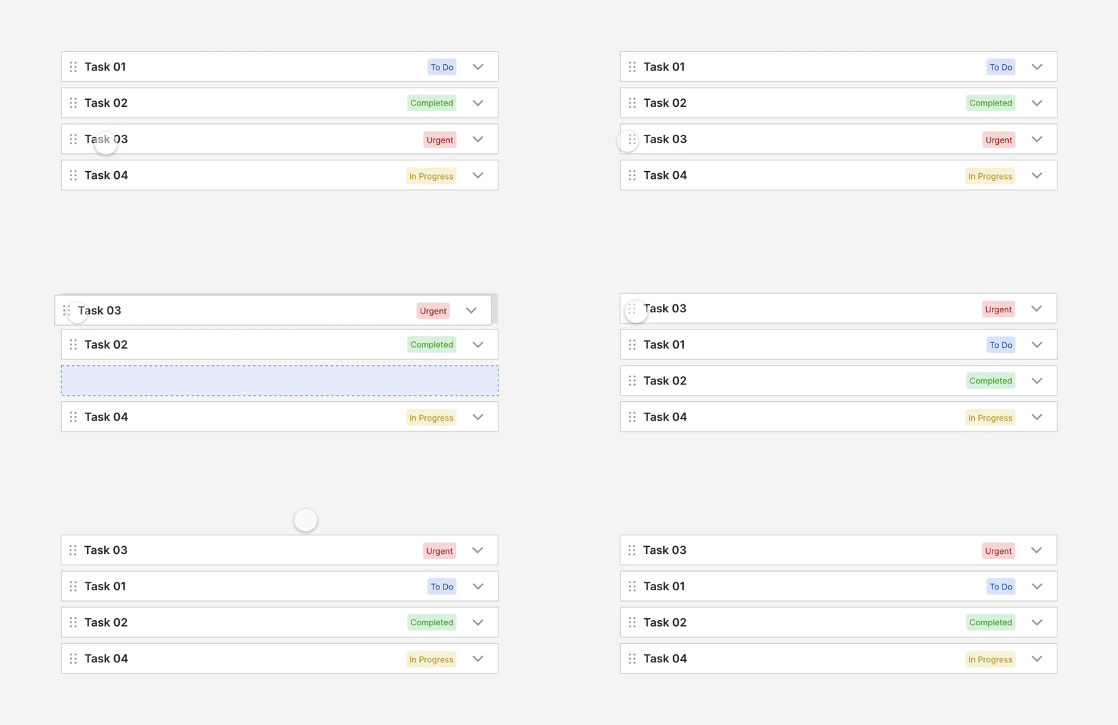
Reordering Accordion allows users to rearrange accordion sections to better suit their needs. Users can drag and drop sections or use navigation buttons to adjust their order, enhancing flexibility and content organization. For example, in a project management dashboard, moving the “Urgent” section to the top helps prioritize critical tasks.
Accordion with Actions

Accordion Actions refer to the interactive elements that allow users to manipulate and interact with accordion components. Key actions include:
Icon Button: Uses graphical icons to represent actions visually, such as a plus sign for “Create,” a pencil for “Update,” or a trash can for “Delete.” Icon buttons are compact and save space while conveying actions through universally recognized symbols.
Text Button: Utilizes textual labels like “Create,” “Update,” or “Delete” to clearly indicate the action. Text buttons are straightforward and easily understood, making them suitable for explicit commands.
Toggle Button: Provides an on/off switch to enable or disable features or settings within the accordion. It allows users to change the state of a section or its contents clearly.
Radio Button: Allows users to select one option from a set of mutually exclusive choices. This is useful for scenarios where only one option can be chosen from several available within the accordion.
Checkbox: Used for actions such as accepting terms or confirming selections. It allows users to toggle between checked and unchecked states to indicate agreement or completion.
Conclusion
Accordions are a powerful UI component for organizing and managing large volumes of information in a compact, user-friendly format. By allowing users to expand or collapse content sections as needed, accordions improve usability, reduce visual clutter, and enhance content discoverability. The design flexibility — ranging from simple text-based accordions to those featuring icons, images, and contextual information — ensures they can be adapted to suit various content types and user needs. By incorporating thoughtful design elements such as indicators, tooltips, and control buttons, and supporting various interaction patterns, accordions create an intuitive and engaging experience that helps users quickly find and focus on the information most relevant to them.
Credit
“While researching this topic, I was fortunate to receive valuable insights from Kusumit Goyal (Product Manager) and Shashanka Behera (UX Designer) , whose expertise in UX design & UX Research helped refine my understanding of user interfaces.”
Sources:
https://mui.com/material-ui/react-accordion
https://www.nngroup.com/articles/accordions-on-desktop
https://ant.design/components/collapse#collapse-demo-mix
https://rei.github.io/rei-cedar-docs/components/accordion
https://design.talend.com/?path=/docs/navigation-accordion–docsx
https://blade.razorpay.com/?path=/docs/components-accordion–docs
https://doc.wikimedia.org/codex/latest/components/demos/accordion.html
Want even more inspiration?
Follow Muzli on social media for your daily dose of design, innovation, and creativity right in your feed!
Linkedin | Instagram | Twitter
Looking for more daily inspiration? Download Muzli extension your go-to source for design inspiration!
Get Muzli for Safari


