Embarking on the road to becoming a UX/UI designer, one quickly discovers that the journey predominantly pivots around the presentation and quality of one’s design portfolio. It serves as your primary interface with prospective employers or clients, allowing you to exhibit your talents, showcase your design approach, and reflect your unique personality. This article seeks to provide comprehensive guidance on how to curate a portfolio that is technically robust, aesthetically captivating, and aligned with your career goals.
1. Defining Your Design Portfolio Goals

As with any journey you embark on, the one to curating your UX/UI design portfolio starts with defining your objectives. These are not merely statements of your desires but powerful driving forces that shape your portfolio and provide it with a unique direction. Appropriately identifying your portfolio’s goals can be an exciting exploration of your profession and the aspirations you hold for the future.
The purpose behind developing a portfolio can range from seeking employment to simply showcasing a broad range of skills. Each goal subtly dictates the content, layout, style, and organized arrangement of your design portfolio. As such, it is vital to begin your portfolio journey with strong self-awareness and a clear definition of these aspirations.
When targeting a specific job or company, every element of your portfolio needs to echo the ethos and expectations of such an organization. It’s about demonstrating how your abilities, expertise, and experiences are particularly suited for their requirements. Analyze the organization, understand their needs, and articulate these insights into your portfolio.
Alternatively, your portfolio’s objective could focus on a certain industry or market segment. This approach demands showcasing your adaptability to meet the challenges and grasp the nuances of this industry. It’s like speaking the industry’s language in design, encapsulating its demands, its evolution, and its future in the form of visual aesthetics and usability elements.
Lastly, it could very well be that you wish to feature a broad skill-set, seeking to attract diverse opportunities. In such cases, the goal is to display versatility. Your portfolio feels like a world tour, where each origination–each project–represents a different set of skills, addressing unique challenges but together weaving a coherent narrative of your abilities.
Among all these tangible objectives, one critical element overshadows them all, authenticity. Regardless of your portfolio’s goal, it should genuinely signify who you are as a designer. The need for it to resonate your stylistic tendencies, your design philosophy, and essentially reflecting your professional DNA cannot be overemphasized.
Defining your portfolio goals might appear simple, but involves a deep dive into your capabilities, desires, and the target audience. Once done rightly, however, it’s like setting down the foundation for your dream house. It sets the base for your portfolio, lending it a lucid narrative, and giving you a clear roadmap to follow. Remember, your design portfolio isn’t just a collection of your works, it’s your brand, your story.
2. Harmonizing Layout & Content

As a UX/UI designer, the essence of your work lies in shaping a harmonious relationship between aesthetics and functionality. Consequently, your design portfolio should be a testament to this very ethos. Its appearance, in terms of layout and overall design, can be immensely influential, often as significant as the projects it comprises.
A substandard or convoluted portfolio design can serve as a significant distraction, potentially drawing attention away from the high-quality work samples it contains. Viewers, particularly potential employers and clients, could get lost amid a cluttered layout or imbalanced color schemes. Such a distraction not only diminishes appreciation for your projects but could also inadvertently reflect on your design sensibilities.
Maintaining a clean and engaging layout is fundamental. It’s about optimizing content placement and negative space, ensuring a natural flow of information that guides viewers through your work, allowing them to fully grasp your expertise and innovative concepts. This requires a sensible selection of fonts and colors, astute understanding of hierarchy in design elements, and a fine balance between text and visuals.
A crucial aspect to remember is that your portfolio’s design must resonate with your individual style. Your layout and your design elements, in their totality, should paint an authentic picture of who you are as a designer, acting as a mirror to your design philosophy. This distinctive style reflection, when embedded across your portfolio, ensures consistency and forms an integral part your personal brand.
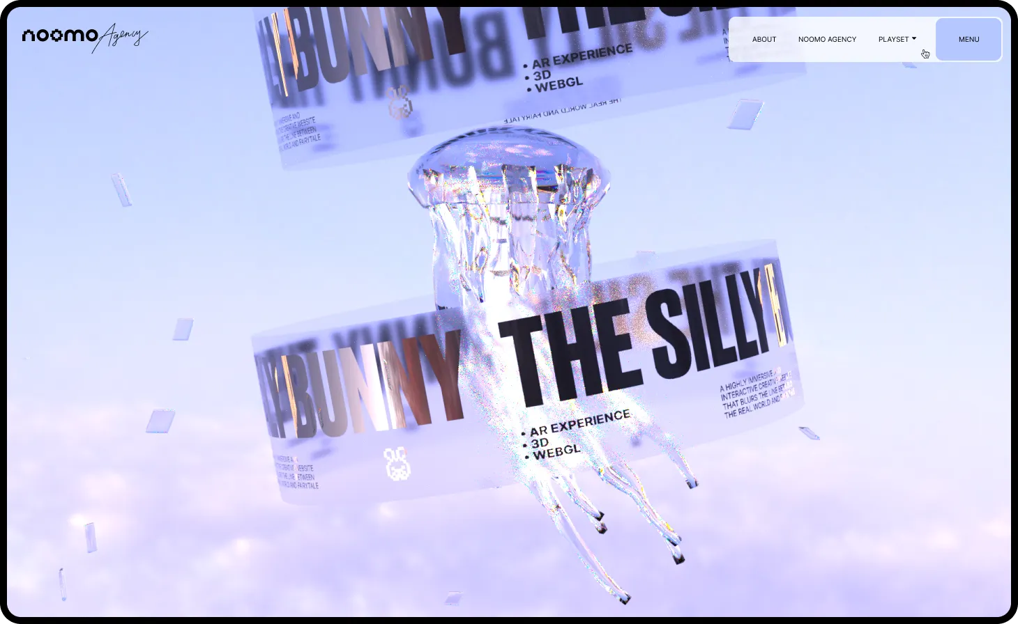
Moreover, incorporating unique visual elements that stand out, adds a layer of intrigue and creates a memorable impression. These could range from interactive elements, original graphics, to even the use of transitions and animations. Each of these details, although may seem minor in isolation, collectively help make your portfolio not just another webpage but an engrossing visual experience representative of you, setting you apart in the sea of designers.
The key lies in creating harmony between all these elements — a seamless blend of eye-catching design, clear organization, engaging content, and unique, memorable elements, that together present an impressive face to your portfolio. With judicious planning and thoughtful design, your portfolio can become a true extension of your capabilities, visually compelling and functionally uncompromised.
3. Choose the right projects

Curating Excellence: Strategically Selecting Projects for your Design Portfolio
One of the crucial undertakings when creating a UX/UI design portfolio is meticulously choosing the projects that will be displayed. This process is not merely about showcasing your most aesthetically appealing works but strategically selecting projects that align with and accentuate your portfolio goals.
The principle of ‘Quality over Quantity’ is significant but should be augmented by the concept of ‘Relevance over Range’. If your portfolio goal is to secure employment with a tech giant, your best fashion industry project may not be the right fit despite its outstanding design. Similarly, if your objective is to cater to the B2B market, your B2C projects, even though executed impressively, might not resonate as effectively with your target audience.
The selection of projects essentially becomes a judicious exercise in understanding your target audience and aligning your display to meet their interests and needs. In this case, featuring more of the relevant B2B projects would provide a closer demonstration of how you tackle design problems typical to their industry.
This doesn’t mean you disregard your other exceptional projects. The goal is to craft a balanced showcase which prominently features projects that are highly aligned with your target, while still exhibiting your range. This helps you come across as a specialist in their area without being pigeonholed into one type of project.
If you are in the early stages of your career and feel that your relevant ‘real-world’ projects are limited, remember that your personal or academic projects can also be strategically tailored. These projects often provide the creative freedom to explore areas of interest and can be structured to demonstrate the skills and thinking a specific audience appreciates.
Ultimately, it’s important to remember that irrespective of the relevance, each project needs to vividly illustrate your design process, empathetic understanding of users, and the impact of your design solutions. Each chosen project is an opportunity to demonstrate the unique value you bring as a UX/UI designer.
Never underestimate the power of strategic curation. A thoughtfully curated portfolio that resonates with your target audience can serve as a compelling narrative of your potential and ensure you leave a lasting impression.
4. Optimizing Your Project Page

The structure of each project in your portfolio functions as the backbone to your narrative, setting the stage for an engaging showcase of your abilities. The right structure enables your portfolio to navigate beyond aesthetics, diving into the depth of your work methodically.
The significance of captivating images in a portfolio’s project presentation is undeniable. They immediately draw attention and create a visual impact, providing an immediate appreciation of your design aesthetics. Yet, their power is amplified manifold when stacked onto a solid framework of textual context. This brings us to the 80/20 rule, in which 80% of your project is dedicated to compelling visuals, while the remaining 20% is a concise, informative narrative about the project.
The textual content offers a detailed breakdown of the project, letting viewers peek behind the design curtain. It’s about highlighting the context, the problem statement you were addressing, your understanding of the targeted user base, and the design strategy you adopted. It provides an opportunity for potential employers or clients to catch a glimpse of your cognitive journey from the initial idea to the final execution.
Moreover, for roles such as UX researchers or design thinkers, the textual explanation is paramount. These roles demand a comprehensive unveiling of your methodological know-how, strategy development, and the iterative process, detailing how you generate insights from user-research, sketch your ideas, prototype them, and validate solutions with users.
However, while meticulous detailing is vital, brevity has its own charm. An overly verbose explanation can easily bore the viewer. A well-written concise project description is worth its weight in gold. Break down the process into easily digestible elements, let the images do most of the talking, and let the words fill in for the missing gaps.
Infusing your personality into the project story could be the cherry on top. Adding a touch of your thought process, your moments of revelation, and your personal contributions can make the project narrative authentic and relatable.
A thoughtful project structure creates a user journey within your design portfolio, leading the viewer from intrigue to comprehension, and finally, admiration. There lies the power of an effective narrative — the ability to captivate your audience and ensure your work resonates long after they have left your portfolio behind.
5. Do Your Magic, Incorporate Unique Elements

As you embark on the journey of curating your UX/UI design portfolio, one aspect that holds paramount importance is authenticity. What truly sets apart an impressive portfolio from a good one is its ability to encapsulate the personality and unique design approach of the designer, beginning from broad brush strokes down to the minutest detail.
The addition of an ‘About Me’ section is an excellent opportunity to break the ice with your potential employers or clients. This is where you can express your design philosophy, your inspirations, your interests, preferences, even a sneak peek into your journey. The world of design is as much about creativity as it is about connection. A section that reveals a bit about your history, your ideals, your vision for designing, is a way to establish a bond with your prospective audience.
Furthermore, personalizing your portfolio isn’t limited only to textual content. Delve deep and think about how your design style, choice of colors, typography, and the overall aesthetic of your portfolio can reflect your personality and stylistic tendencies. Revisit everything. Do you like minimalism? Or, perhaps, abstract designs make your heart beat faster. Do you love balance? Or do you rather appreciate asymmetry? There’s no one-size-fits-all answer here. The key is ensuring that each decision aligns with and reflects your unique style and approach.
One often neglected section in the portfolio is the display of your process sketches, notes, wireframes, and design iterations. Outlining your process not only showcases your thoroughness and attention to detail but also encapsulates your problem-solving skills and design thinking. It’s a peek into your mind, your problem-solving techniques, strategy development, and your meticulousness — all of which contribute to your individuality as a designer.
Keep in mind, though, that striking a balance is vital. While personalization can make your portfolio memorable, an overly extravagant or self-focused portfolio can distract from your actual work. Aim for subtlety —
use personalization to enhance the impact of your work, not overshadow it.
6. Don’t forget to update

In the rapidly evolving realm of UX/UI design, continuous adaptation forms the keystone for staying relevant. As your skills expand and experiences intensify, your design portfolio must be attuned to this progression. As such, regularly updating your portfolio isn’t just recommended, it’s imperative.
However, before delving into the ‘why’, it’s essential to address a pre-emptive ‘how’. The efficiency of updating your portfolio can be significantly influenced by the platform you choose to build it on. Tools like Framer, Wix Studio or Webflow are not merely construction means, but play a crucial role in maintaining your portfolio. They offer tremendous flexibility and ease of use, allowing you to seamlessly add, remove, or modify content. This feature becomes crucial as you endeavour to keep your portfolio a dynamic reflection of your abilities and accomplishments.
Beyond merely displaying new creations, updating your portfolio is a conscientious curatorial effort. This involves careful evaluation and selection of projects that depict your present abilities and align with your evolving aspirations. Some aging projects may not bear the same relevance over time and could be candidates for elimination.
In addition, the fast-paced UX/UI design world is characterized by transient trends, both aesthetically and functionally. A Portfolio that evolves to encompass these changes is a testament to your adaptability and up-to-date knowledge, invaluable traits for any UX/UI designer.
Remember to weave in your recent accomplishments and newly acquired skills or accolades, adding further substance and credibility to your portfolio. Each such update serves as a chapter in your growth narrative, encapsulating your dedication and enriching your story.
Seeking and incorporating feedback is also a transformative aspect of portfolio updates. It fosters improvement through diverse perspectives, catching blind spots, and refining your viewer’s experience.
In summary, frequent portfolio updates signal your active and ongoing engagement within the industry. It keeps your portfolio fresh, relevant, and compelling, ensuring it creates an impactful first impression. By choosing a user-friendly and flexible platform for your portfolio, and scheduling regular revisions, you can ensure your design portfolio remains an authentic, dynamic reflection of your talent, dedication, and progress in the ever-evolving domain of UX/UI design.
In conclusion, creating an exceptional UX/UI design portfolio is a strategic and creative process. It requires defining clear goals, harmonizing layout with content, thoughtfully selecting and structuring projects, infusing personal touches, and regular updates. The perfect blend of these factors not only showcases your technical and artistic skills, but also conveys your unique brand. Above all, an effective portfolio resonates with authenticity, making your work resonate long after a viewer leaves your portfolio behind.


