Newsletter design often is a controversial topic. There are generally two kinds of people: those who think email is the best form of communication and those who despise it with all their hearts. Which one are you?
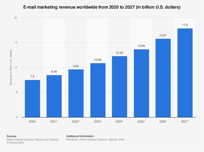
Love it or hate it, when it comes to marketing, research shows that email and newsletters remain some of the most effective channels. While most social media networks have engagement rates lower than 1%, a study by email marketing leader Mailchimp shows that the current average email open rate is 35.63%. Newsletter design is one of the key aspects in turning these opens into conversions.
If effectiveness is out of equation, the remaining question is — how to design a newsletter that your readers will love?
In today’s post, we will cover:
- Tips on designing effective newsletters that drive reader actions.
- How to create actionable CTA buttons that users click.
- Newsletter design inspiration from top designers in the industry.
Is newsletter design still worth the effort?
Let’s answer the big question first. People have been saying that email is dead for probably a decade now. However, in reality, it’s not going anywhere — statistics say that there are around 4.48 billion email users in the world.
Let that number sink in for a second. Half. Of. The. World.
It’s important to remember that designing for email marketing doesn’t mean just creating promotional newsletters. It also includes welcome emails, order updates, customer support messages, user surveys, and other communications that a brand conveys through email.
While aesthetics and creativity are always at the top of Muzli’s priority lists, the key mission for email designers is to maintain clarity and consistency across all the different types of material. Visual consistency is what contributes to developing your brand’s trust and credibility in the long run. Clarity is what helps you achieve your business goals.
The secret ingredient good newsletter design is simplicity
We know that our audience reading this post is super creative, but we have to say this… newsletter design might not always be the best place to showcase fancy ideas. Our experience shows that black-on-white simplicity can often be a more effective choice when it comes to email marketing.
But no need to be discouraged; there’s also a bright side to it. While email design structure is pretty limited, it can serve as a helpful guideline to create simple yet effective campaigns. You know what they say — limitation breeds creativity.
Design-wise emails usually focus on clear hierarchy and a simple one-column design to be easily scrolled through on both desktop and mobile. Newsletter designers should remember that the main focus of a quality email should be conveying your message effectively.
A few tips to keep your newsletters simple and clear
- Do not overwhelm your users with complicated design elements.
- Ensure a clear focus on call-to-action buttons and make them stand out.
- Stick to simple fonts. While elegant handwritten fonts might work well in other mediums, they generally don’t work well in emails, especially for mobile. Here’s what free fonts we recommend.
- Choose colors carefully for the best readability. HINT: Red on green is not the best idea.
- Stick to plain backgrounds. Avoid bright colors and patterns.
By the way, if you’re looking for perfectly matching colors and aren’t sure what would fit best, the free Muzli Color Palette Generator is is a great tool to help you discover your vibe.
Now let’s dive deeper into the main element of a killer newsletter design: creating an effective call to action that will drive your readers toward your desired goal.
Newsletter design is all about the right CTA buttons
We have to remember that first and foremost, newsletters are marketing and communication tools. It means that the main goal here is to convey a message or drive your users to another page — an external website, landing page, product page, signing up for a service, etc.
This is why designing compelling and clear call-to-action buttons is crucial for emails.
What does a good CTA button look like?
- It stands out visually. Use contrasting colors, button sizes, and fonts.
- It uses catchy phrases. Think about the one thing users could benefit from the most and state it clearly. For example, “Read our report” or “Use this code to save.”
- It has enough space to stand out from other content. This one is pretty self-explanatory — don’t bury your main item in a pile of content.
PRO TIP: While the temptation might be there, don’t forget that too many call-to-action buttons might have the opposite effect and distract the user from your primary goal. It’s recommended to focus each newsletter on a single goal.
While it doesn’t mean that your emails should only have one link, the hierarchy should be clear, and the main message should immediately stand out from the rest of the content.
Blocked images might ruin your emails
While the most common email service providers such as Google or Yahoo enable the images on newsletters that are not marked as spam by their filters by default, this might not always be the case.
If you are running a B2B campaign and a significant part of your email audience is using company email addresses, the images might get blocked, turning your meticulously designed newsletter into a bland mess.
The good news is that with a few tricks, it’s pretty easy to avoid this inconvenience:
- Make sure that your main message is written in a text format; avoid incorporating important text into an image.
- Add ALT texts to your images describing what’s in the picture. If they get blocked, users will still understand the context.
- Keep the text/image ratio oriented towards text. A general rule of thumb is 60/40.
Don’t forget to test different newsletter design ideas
Modern marketing is all about testing different approaches to find ideas that click with your audience. The same principle applies to email marketing. Most of the newsletter service providers today allow you to run A/B testing campaigns where you can test out different design solutions.
Key design elements you should test in your newsletter:
- Call-to-action buttons. Try different sizes, different colors, and different CTA messages.
- Above-the-fold content. Try experimenting with straightforward messages right at the top or try out more subtle messages incorporated into the email.
- Length of the newsletter. Does your audience prefer short and straightforward emails or do they want to read longer personal stories? There’s only one way to find out.
PRO TIP: Don’t forget to send a test email to yourself or your colleagues after finishing your design to see the final result in the real world and real inboxes.
The best online tools to create your newsletter
Struggling to find ideas to make your newsletter design stand out? The good news is that your email service provider probably already has dozens of professionally designed templates. The bad news? Even though their demos look great, it almost never translates 100% to what you need in the real world.

This means that you will have to manually adjust the provided templates to fit your goal. That’s why we recommend keeping this in mind when choosing your newsletter provider. A feature-rich and easy-to-use drag-and-drop editor could save you loads of time in the long run. Additionally, saving your custom templates will allow you to easily keep the visual consistency higher.
Here are a few platforms that offer flexible newsletter builders:
Newsletter design inspiration ideas from top creators
Finally, once the basics are in place, we can focus on creating the design itself. To get inspired to start, check out the favorite modern designs that we have picked.
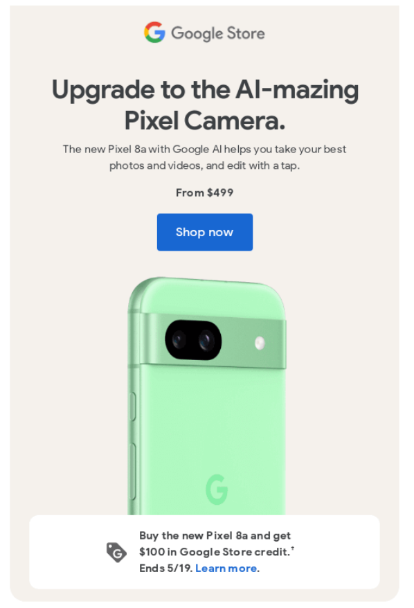
1. Pixel newsletter from Google
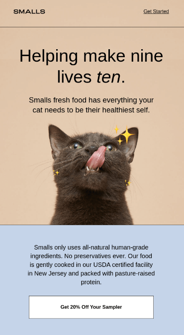
2. Newsletter design my SMALLS
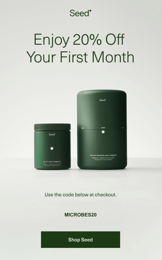
3. Minimalistic design by Seed
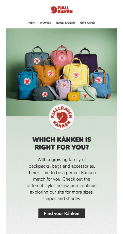
4. Fjalraven product line showcase newsletter
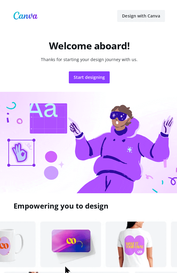
5. Introduction mail by Canva
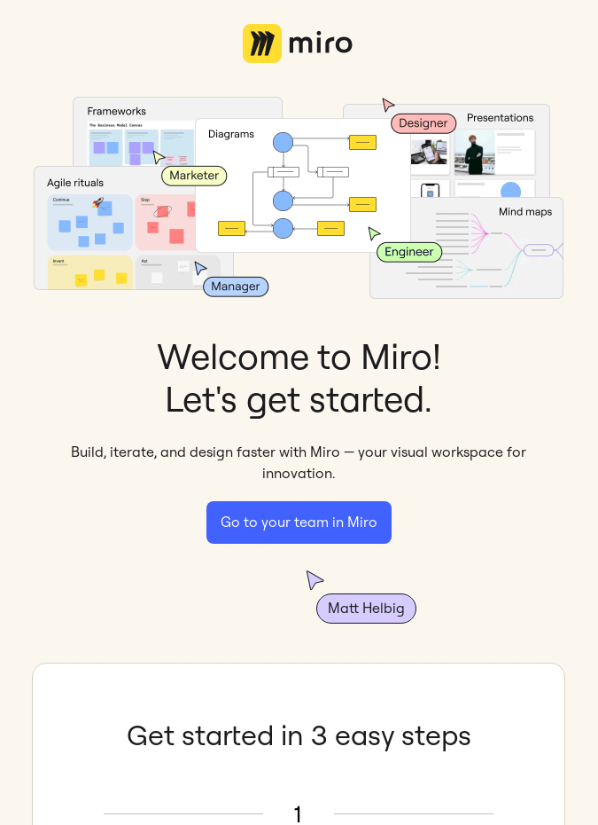
6. User onboarding mail by Miro
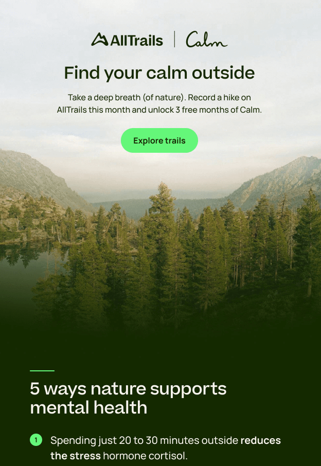
7. Alltrails mental health tips newsletter
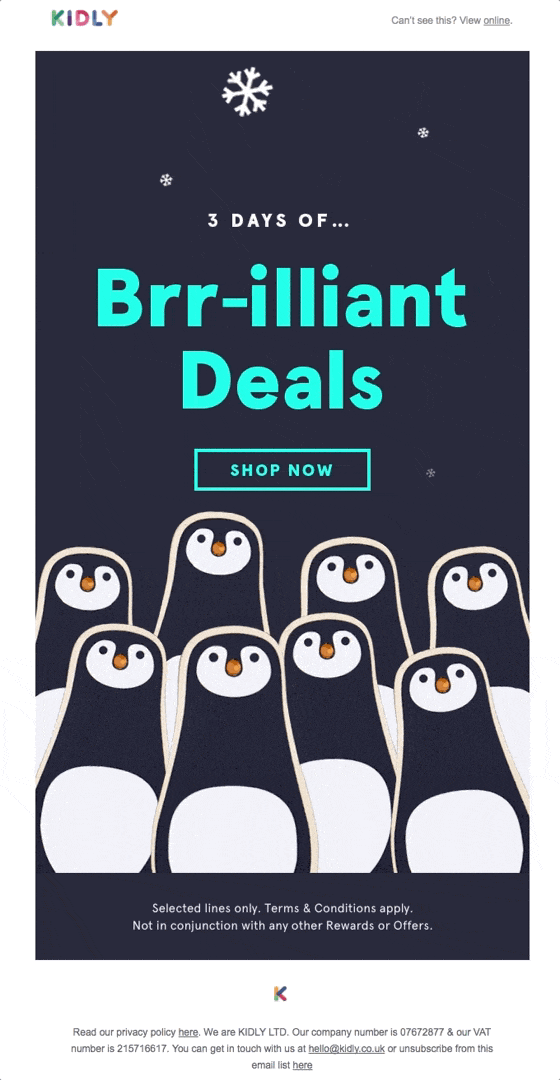
8. Black Friday newsletter by Kidly
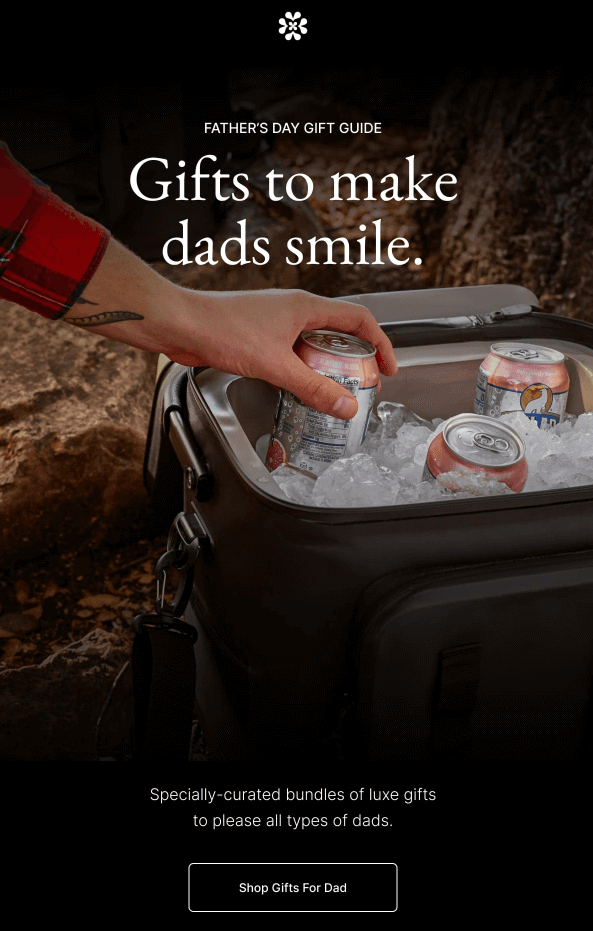
9. Father’s day promotion by Italic
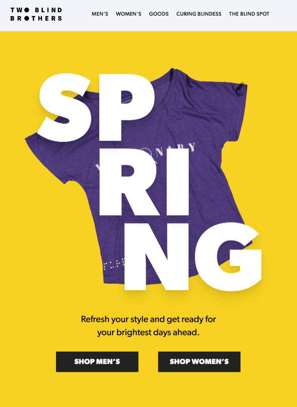
10. New collection newsletter by Two Blind Brothers
11. Cart recovery email by Rael

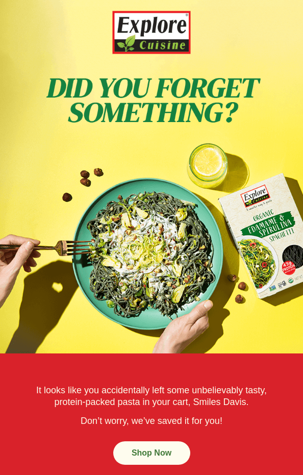
12. Cart recovery email by Explore Cuisine
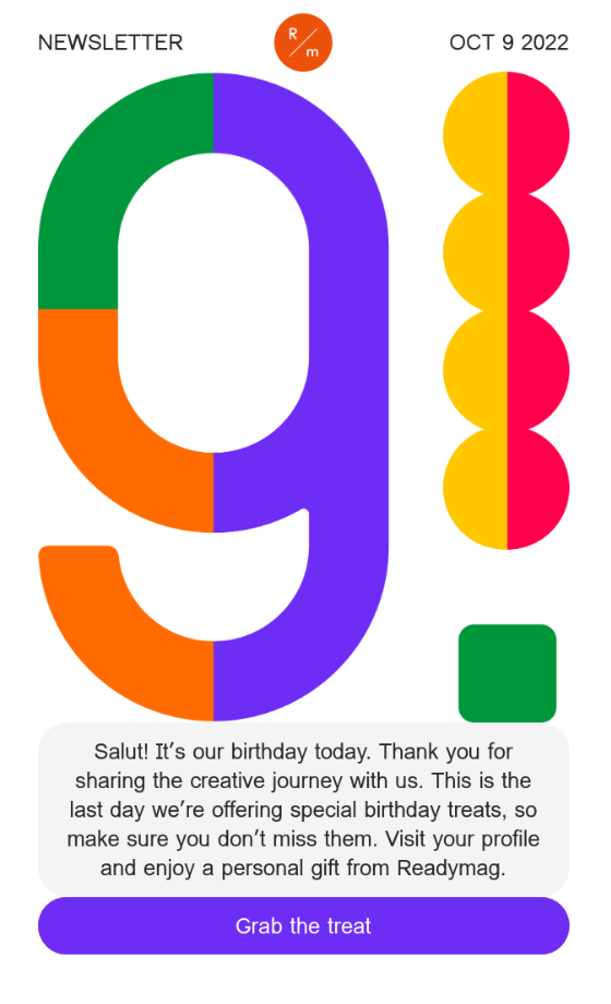
13. Birthday newsletter by Readymag
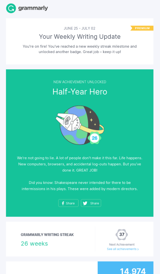
14. Personalized email by Grammarly
15. Welcome email by Headspace

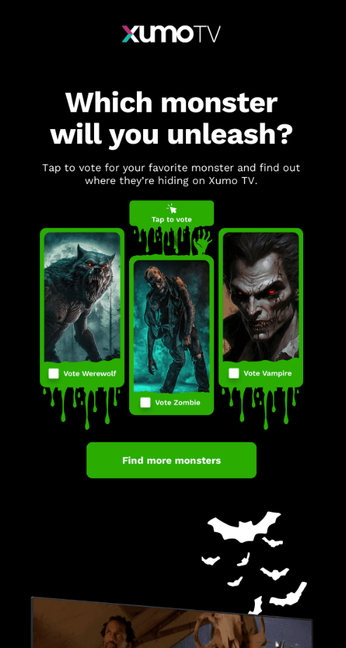
16. Email voting contest by XumoTV
17. Tubi awards newsletter

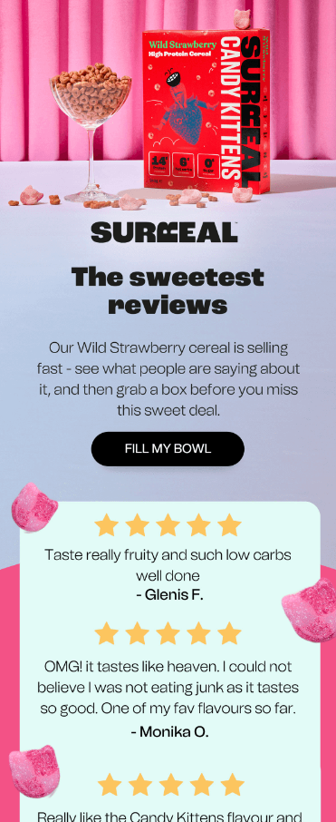
18. User testimonial mail by Surreal
19. Personalized mail by Netflix

20. Thank you email by Swan Dive

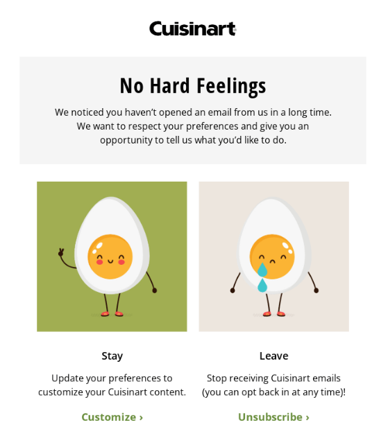
21. Unsubscribe mail by Cuisinart
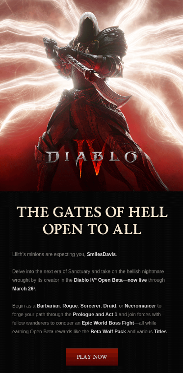
22. Diablo IV announcement by Blizzard