Creating a visually appealing and user-friendly website can be challenging. However, there are common mistakes that can detract from the user experience and negatively impact your site’s performance. Here are ten common web design mistakes and how to avoid them.
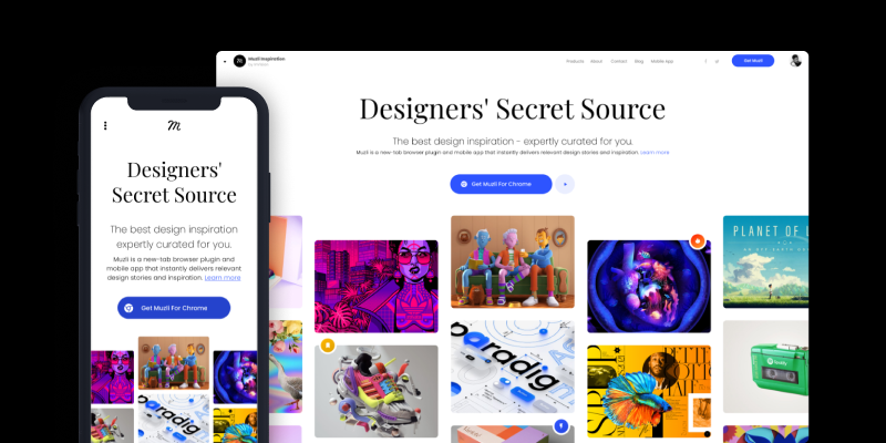
1. Ignoring Mobile Responsiveness
Mistake: Many designers focus solely on desktop versions of their websites, neglecting the growing number of mobile users.
Solution: Use responsive design techniques to ensure your website looks great on all devices. Tools like CSS media queries can help you create a flexible layout that adapts to different screen sizes.
2. Overloading with Content
Mistake: Crowding your pages with too much text and too many images can overwhelm visitors and obscure your message.
Solution: Keep your design clean and simple. Use whitespace strategically to give your content room to breathe, and focus on delivering concise, impactful information.
3. Poor Navigation
Mistake: Complicated or unclear navigation can frustrate users and make it difficult for them to find what they’re looking for.
Solution: Design an intuitive navigation system with clear labels and a logical hierarchy. Consider including a search bar for added convenience.
4. Slow Load Times
Mistake: Slow websites frustrate users and lead to high bounce rates.
Solution: Optimize images, use efficient coding practices, and leverage caching to improve your site’s load times. Tools like Google PageSpeed Insights can help identify areas for improvement.
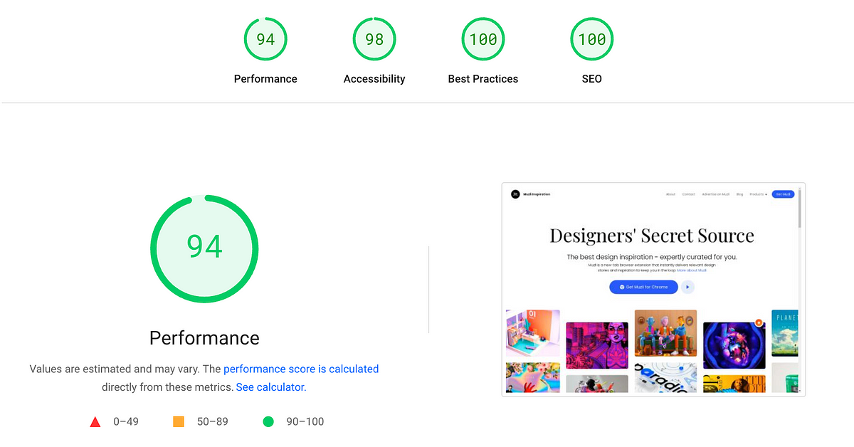
5. Ignoring SEO Principles
Mistake: Neglecting SEO can make your website difficult to find through search engines.
Solution: Incorporate basic SEO principles, such as using descriptive titles, meta descriptions, and alt tags for images. Ensure your content is keyword-rich but natural-sounding.
6. Inconsistent Design Elements
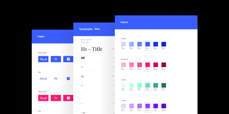
Mistake: Using inconsistent fonts, colors, and styles can create a disjointed user experience.
Solution: Establish a style guide for your website and stick to it. Consistency in design helps build a cohesive and professional look.
7. Lack of Accessibility
Mistake: Failing to design for accessibility excludes users with disabilities.
Solution: Follow Web Content Accessibility Guidelines (WCAG) to make your site accessible to all users. Use features like alt text for images, keyboard navigation, and readable fonts.
8. Not Testing Across Browsers
Mistake: Designing for only one browser can lead to compatibility issues on others.
Solution: Test your website across multiple browsers to ensure a consistent experience. Tools like BrowserStack can help with cross-browser testing.

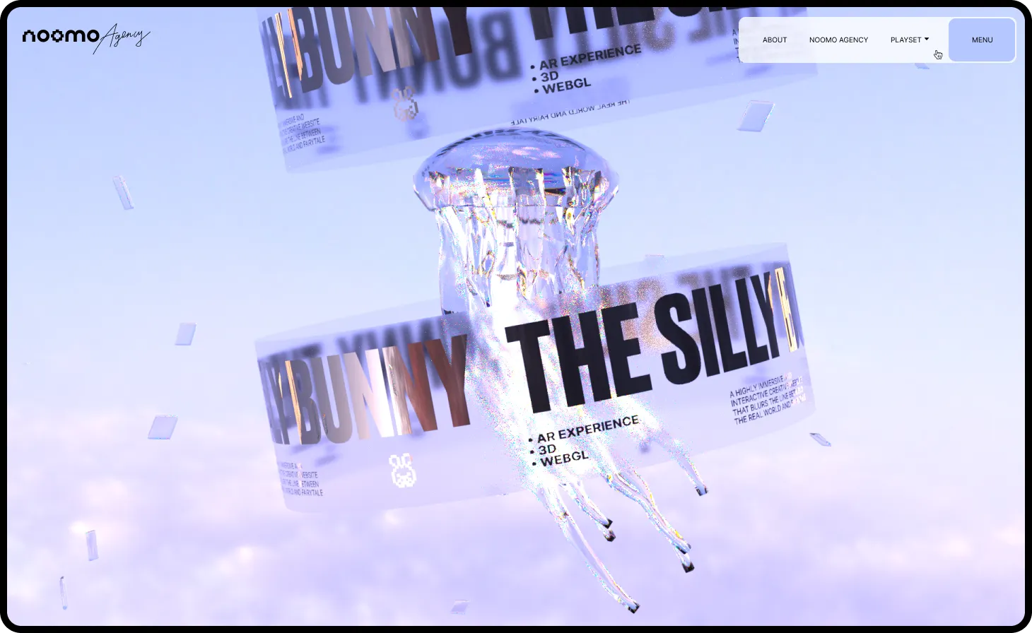
9. Overuse of Animations
Mistake: Excessive animations can distract users and slow down your site.
Solution: Use animations sparingly and ensure they serve a functional purpose. Avoid using heavy animations that can impact performance.
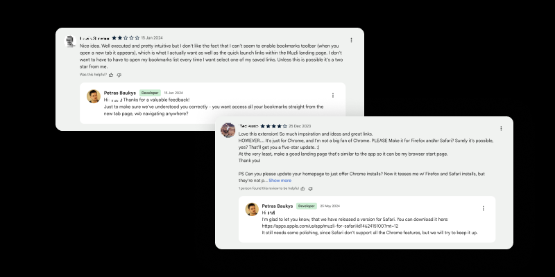
10. Ignoring User Feedback
Mistake: Not considering user feedback can result in a website that doesn’t meet user needs.
Solution: Collect and analyze user feedback to make informed design improvements. Use surveys, usability testing, and analytics to gather insights.
