Font pairings 2026: we checked the fonts on 2,190 websites designers loved. Most of them used just one.
TL;DR
- 🔍 We counted instead of guessing. 2,190 websites featured on Awwwards, SiteInspire, Land-book and 21 other galleries this year, each loaded in a browser that reported the font every line of text is drawn in. Plus 1,466 Fonts In Use entries for print and branding.
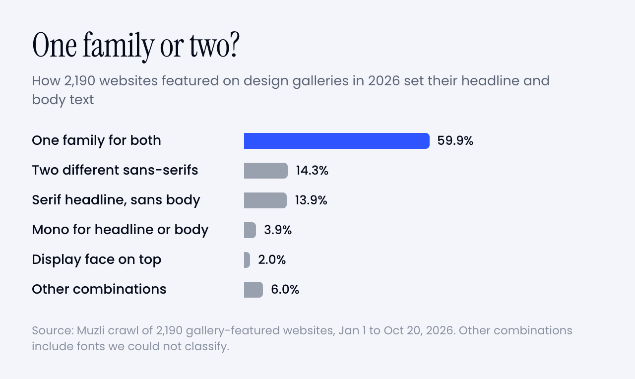
- 1️⃣ The most popular pairing is one font. 60% of sites set the headline and the body in the same family. The contrast moved from the typeface to the size.
- 🥇 Inter is still number one. It’s on 13% of the sites, and on 24% of Framer sites, where it’s the default. PP Neue Montreal is the paid favourite. Roboto, Open Sans and Montserrat barely show up.
- 🤝 When designers do pair, nobody copies anybody. 871 paired sites, 811 different pairs. The classic listicle pairs, Montserrat + Lora and friends, appeared zero times.
- ⌨️ The third font is a mono. 23% of sites add a monospace for labels and small print. Geist Mono leads.
- 📏 How they set it. Headlines at regular weight, tracked a little tight, four times the body size. Body at 16 pixels with a 1.4 to 1.5 line height.
- 🆓 You can copy most of it for free. A live playground, AI prompts and CSS at the end, with free stand-ins for the paid favourites.
A long one, with charts, real examples and a playground. Every TL;DR point jumps to its section, so go straight to the part you came for.
Every January the internet publishes the same article. “25 perfect font pairings for the new year.” Montserrat with Lora. Playfair Display with Source Sans. Oswald with Roboto.
The Muzli blog ran one too, back in 2024. Montserrat and Lora were number one.
These lists almost never check whether designers actually use the pairs. So this year I did.
I checked 2,190 websites that design galleries featured in 2026 and asked the browser which font every piece of text is drawn in. Montserrat + Lora showed up zero times. Playfair + Source Sans, Raleway + Open Sans, Oswald + Roboto: zero, zero, zero.
What designers did instead is more interesting, and a lot easier to copy than a list. Here’s what they used, how they set it, and how to steal it for your next project.
How we counted
Every day the Muzli feed pulls in the websites design galleries feature: Awwwards, CSS Design Awards, SiteInspire, Land-book, One Page Love and 19 more, plus our own Muzli Picks. From January 1 to October 20 that came to 7,079 gallery posts, or 4,176 unique websites once you count each site once.
I loaded 2,506 of them, spread across the whole year, in headless Chrome. That’s a real browser with no window, driven by a script. For every line of text on each page I asked two things. How big is it? And which font is Chrome actually drawing it in?
That second question matters more than it sounds. CSS asks for a font and lists fallbacks, and sites rename their fonts all the time: “primary”, “brand-sans”, “custom_131815”. The browser knows which font file it really used, so that’s what we counted.
Each site then got two roles:
- Headline font. The family of the big type: the main h1 if there is one, otherwise the largest text on the page.
- Body font. The family with the most characters at paragraph sizes, 12 to 22 pixels.
If the two match, the site uses one family. If they differ, that’s a pairing.
316 sites didn’t count. They were offline, blocked the visit, or drew their text on a canvas or as images, which a browser can’t read back as text. That leaves 2,190 websites.
For everything that isn’t a website, I used Fonts In Use, the archive where type nerds document typefaces in the wild. 2,715 of its entries came through the Muzli feed this year, and 1,466 of them show work made in 2025 or 2026.
Sixty seconds of vocabulary
- Typeface, font, family. A typeface is the design (Inter). A font is one style of it (Inter Bold). A family is all the styles together. This article counts families.
- Grotesk. The plain, no-nonsense sans-serif family tree Helvetica belongs to. Most of the fonts below are grotesks.
- Serif. Letters with the little feet at the end of the strokes. Think newspapers and book covers.
- Mono. Short for monospace. Every letter takes the same width, like code.
- Variable font. One file that holds every weight, so you can pick 450 instead of choosing between 400 and 500.
- Foundry. A studio that designs and sells typefaces, like Pangram Pangram or Dinamo. Free fonts mostly come from Google Fonts and Fontshare.
OK. Let’s see what designers picked.
The most popular pairing is one font
60% of the sites set the headline and the body in the same family. No pairing at all.
That doesn’t mean the pages look flat. The contrast just moved.
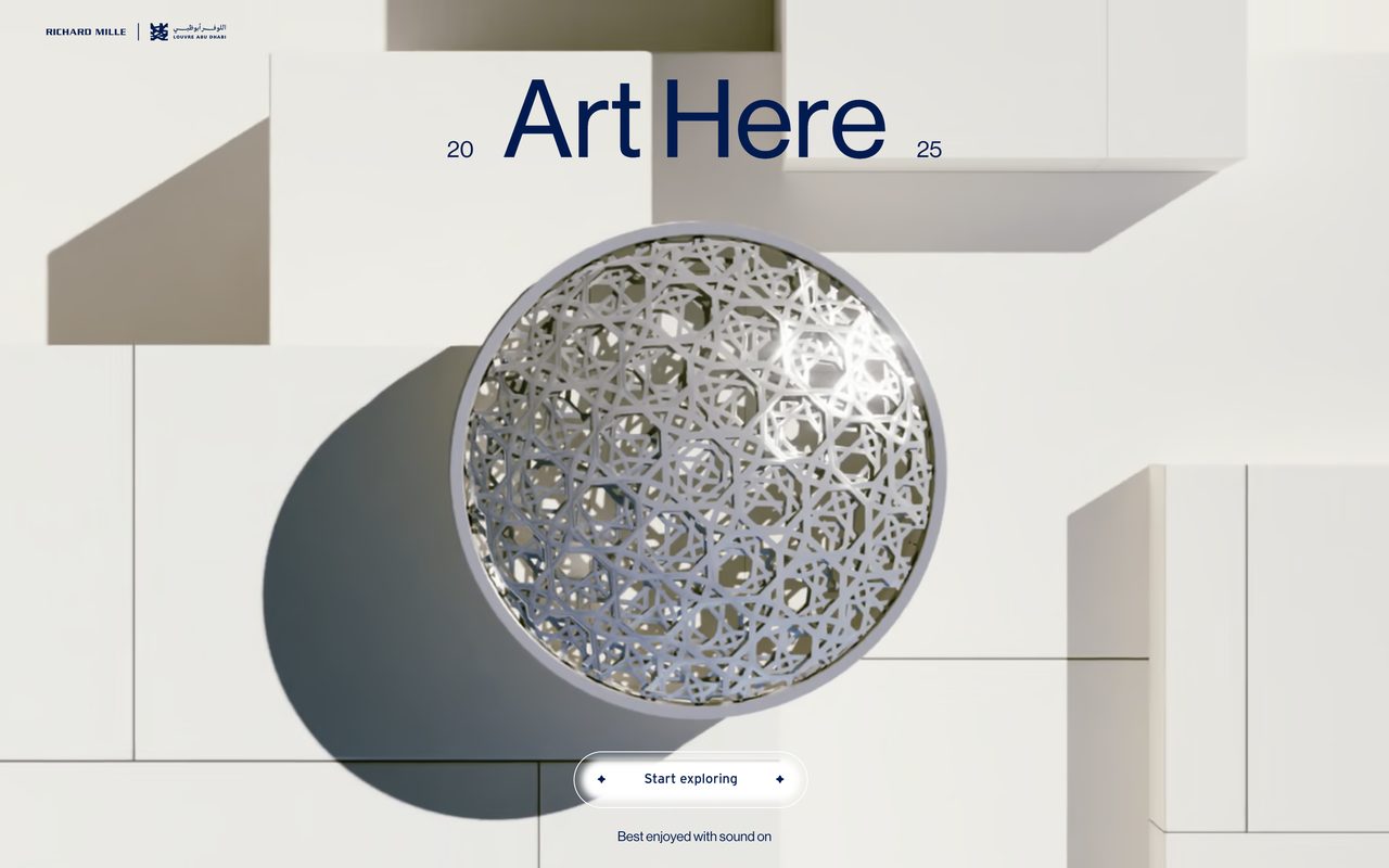
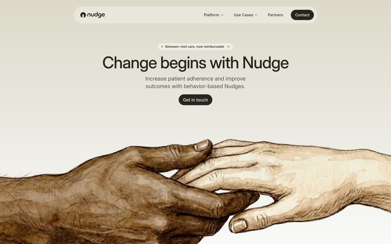
The headline is now four times the body size. The median headline on these sites is 64 pixels over 16-pixel body text. At that scale, the jump in size does the job a second typeface used to do.
Modern families also bring their own contrast. Inter has optical sizes that run from text to display, so big headlines get tighter, crisper letters. Neue Haas Grotesk comes in Display and Text versions. A variable font gives you every weight in between. You get a headline that feels different from the body without inviting a second personality to the party.
Think of a good suit. One fabric, cut differently for the jacket and the trousers, instead of a tweed jacket with jeans.
Matthew Butterick put it bluntly: “Most documents can tolerate a second font. Few can tolerate a third.” In 2026 most sites skipped the second one as well.
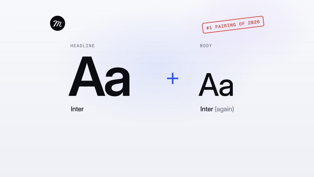
So the honest answer to “what should I pair with Inter?” is, more often than not, more Inter.
Which fonts are all these one-family sites using? That’s where the list gets surprisingly short.
The typefaces designers used the most
🥇 Inter
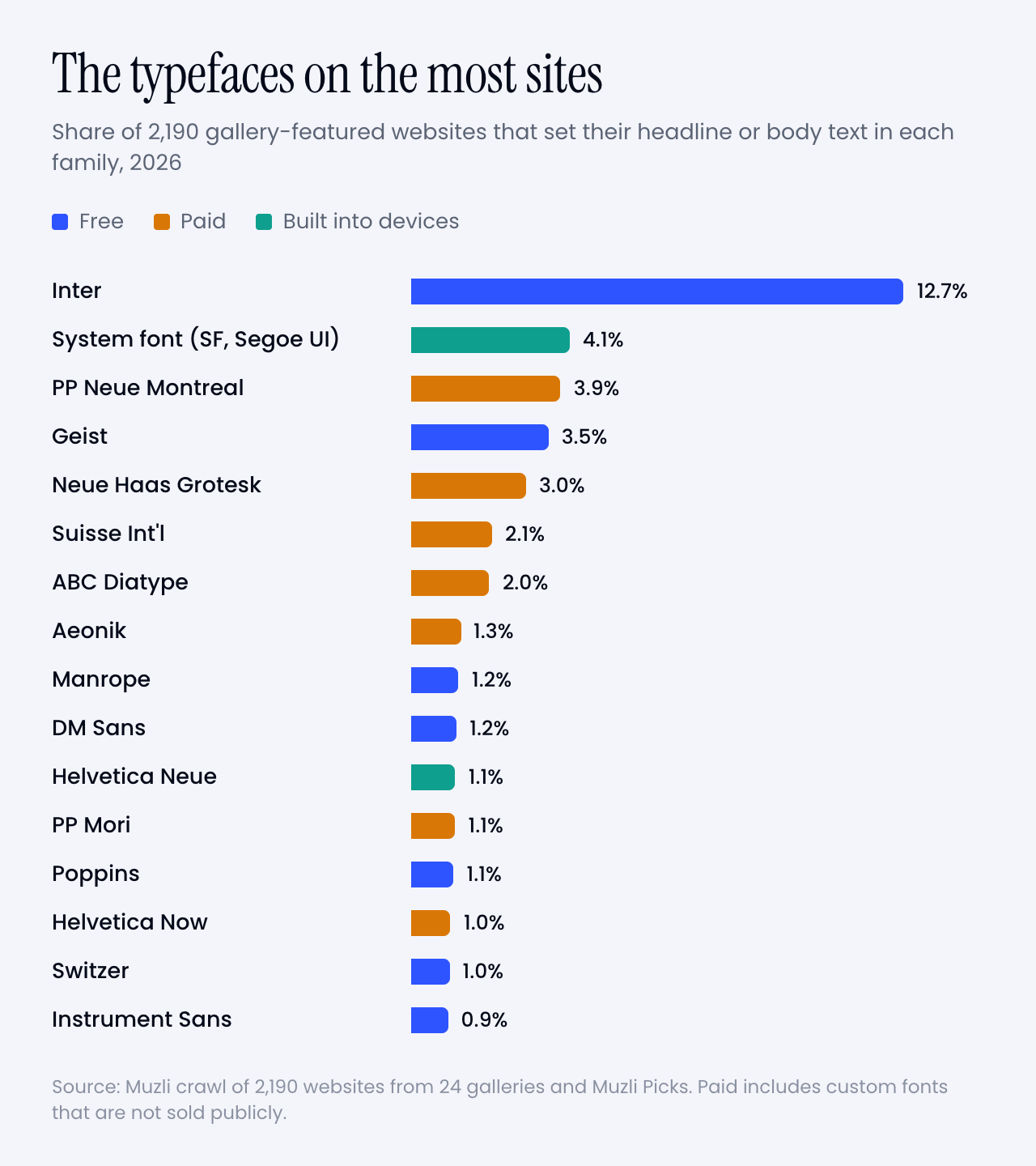
Inter sets the headline or the body on 13% of the sites, more than three times as often as PP Neue Montreal, the next family down. It’s free and open source, and Rasmus Andersson built it as a workhorse for everything from dense interfaces to signage.
It also has a secret weapon. It’s the default. Framer’s help pages say new text blocks start in Inter and Inter Display, and on the Framer sites in this crawl 24% use Inter. On Webflow sites it’s 10%. Never underestimate a default.
And when designers do pair, Inter is everybody’s favourite partner. It’s the body font under 15% of all pairings, quietly carrying the paragraphs while a serif or a display face takes the headline.
🍏 No web font at all
Second place goes to no web font at all. 4% of the sites set their headline or body in the system font, the one your device already has: San Francisco on a Mac or iPhone, Segoe UI on Windows, Roboto on Android. It loads instantly, costs nothing and looks native everywhere.
Count Helvetica, Helvetica Neue, Arial and Times New Roman straight from the operating system too, and 7% of these designer sites set a headline or body without loading a single font file for it.
💸 PP Neue Montreal and the paid grotesks
The most used paid family is PP Neue Montreal from Pangram Pangram, on 3.9% of the sites. Behind it sits a tight cluster of paid grotesks: Neue Haas Grotesk (3.0%), Suisse Int’l (2.1%), ABC Diatype from Dinamo (2.0%), Aeonik (1.3%) and Helvetica Now (1.0%).
Put them side by side and they’re cousins. Neutral, a little tight, at their best at big sizes. The designer look of 2026 is a well-made grotesk, set large.
▲ Geist
Geist is Vercel’s free family, on 3.5% of the sites. It lives mostly on product sites: 59% of the Geist sites came from SaaS landing-page galleries like Land-book and Saaspo. Its sibling Geist Mono is even more common, on 4.1%, which is a clue to the third font.
🌍 Meanwhile, on the rest of the web
The Web Almanac 2025, which measures millions of sites, finds Roboto on about 10% of pages, Poppins on 6%, Open Sans on 5% and Montserrat on 3 to 4%. Inter sits at 1.4%.
On the sites designers put in galleries, it’s the other way round. Roboto sets the headline or the body on 0.7% of them. Open Sans on 0.3%, Montserrat on 0.5%, Poppins on 1.1%. Inter, meanwhile, is about 9 times as common here as on the web at large.
The fonts the web uses most are the fonts designers avoid. If you want a page to look designed in 2026, that’s the cheapest tip in this article.
When designers pair, nobody copies anybody
40% of the sites do use two families. Here’s the twist: 871 paired sites, 811 different pairs. 94% of the pairs appear on exactly one site, and the most repeated one appears on 4.
Fonts converge, pairs don’t. Everyone shops in the same small store and leaves with a different outfit.
The handful of pairs that did repeat, none of them on more than 4 sites:
- Oswald over Inter: 4 sites
- Playfair Display over Inter: 4 sites
- Fraunces over Inter: 3 sites
- Instrument Serif over DM Sans: 3 sites
- PP Editorial New over PP Neue Montreal: 3 sites
- PP Editorial New over Inter: 3 sites
- Instrument Serif over Inter: 3 sites
- Instrument Sans over Inter: 3 sites
- GT Alpina over Season Sans: 3 sites
- STK Bureau Serif over STK Bureau Sans: 3 sites
Yes, Playfair Display made the list. Just not over Source Sans.
Fonts In Use tells the same story about print and branding. Of its 623 recent designs that use exactly two typefaces, 565 use a pair no other entry uses. Yet the single fonts repeat. Inter, Neue Haas Grotesk, Suisse Int’l, Helvetica and Neue Montreal top that list too.
So stop hunting for “the pairing of the year”. It doesn’t exist. What repeats is the pattern, and there are only a handful.
📰 Serif headline, grotesk body
About a third of the pairs (35%) put a serif on top of a sans, and that sans is Inter more often than anything else.
The serifs vary far more than the sans. Instrument Serif leads, then Displaay’s Season Mix, GT Alpina, PP Editorial New, Fraunces and Commercial Type’s Feature. Nearly all of them are high-contrast display serifs, set big at regular weight, often with one word in italic for flavour.
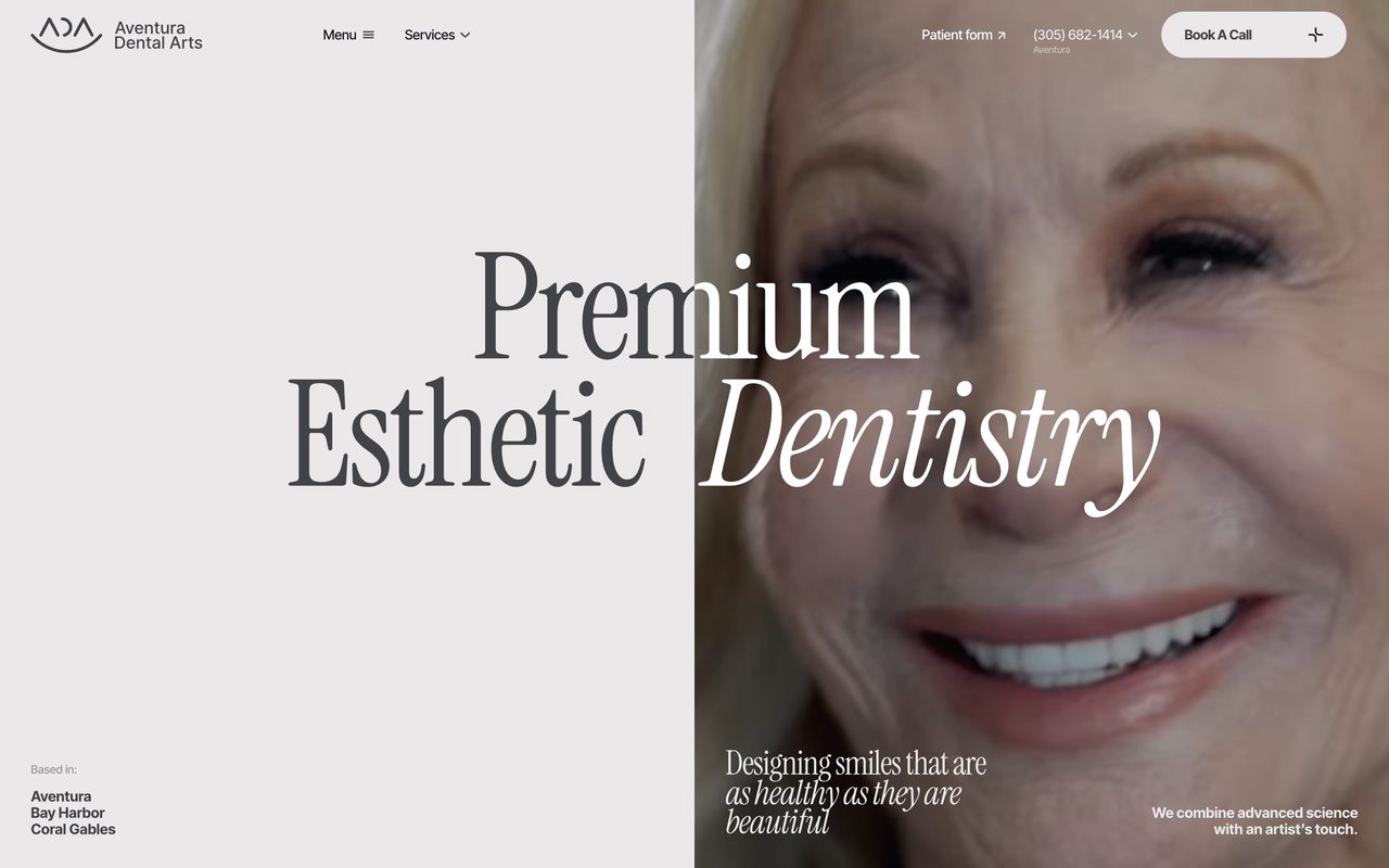
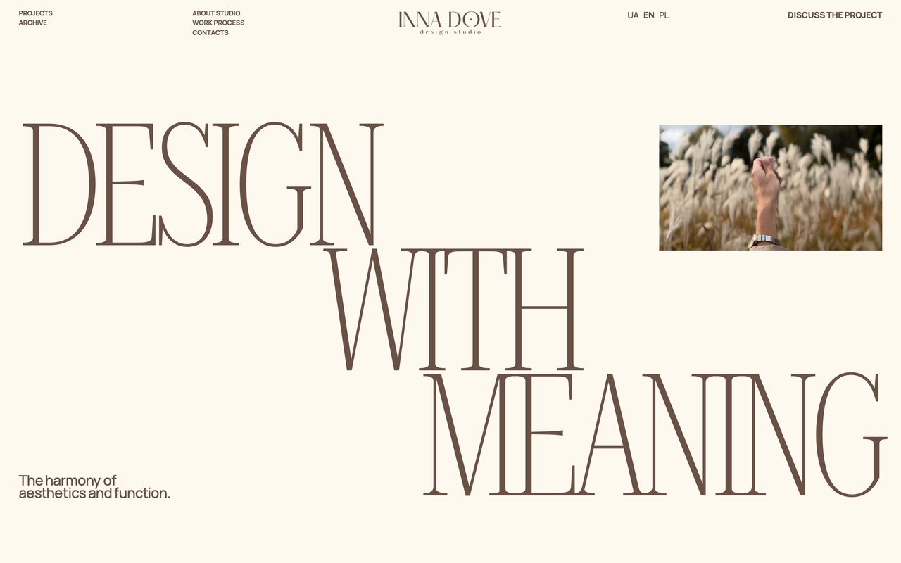
A word on Instrument Serif. It’s free on Google Fonts, it’s the top-ranked serif in Google Fonts’ own popularity sort, and last November Creative Bloq reported designers complaining it’s “starting to look lazy”. In our crawl it’s on 0.9% of sites. Popular, sure. Everywhere, not yet.
🧱 Two grotesks, one loud, one quiet
Another third (36%) are two sans-serifs. That sounds like a contradiction until you look at them. A grotesk with character on top, a neutral workhorse underneath: Neue Haas Grotesk over PP Neue Montreal on Sutera, Aeonik over Inter on ToDesktop, Archivo over Manrope on the Museum of Money.
The contrast is in personality, not in category. If the two look like siblings, use one.
👯 Same designer, two styles
Butterick’s one rule of thumb for mixing fonts is to “combine fonts by the same font designer”. A small group of sites follows it: Klim’s Martina Plantijn over Founders Grotesk, PP Editorial New with PP Neue Montreal, Untitled Serif with Untitled Sans, Displaay’s Season Mix with Season Sans. 5% of the pairs come from a single foundry.
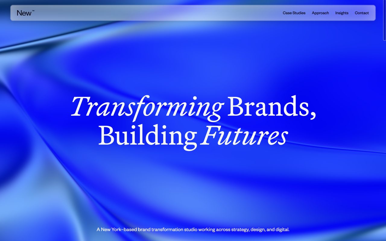
It’s the safest way to pair two very different typefaces. The same hand drew both, so the proportions already agree.
📣 A display face on top
The loudest pattern and one of the rarest. 5% of the pairs put a display face like Anton, Oswald, Bebas Neue or Unbounded on top. It works when the headline is a poster, and almost nowhere else.
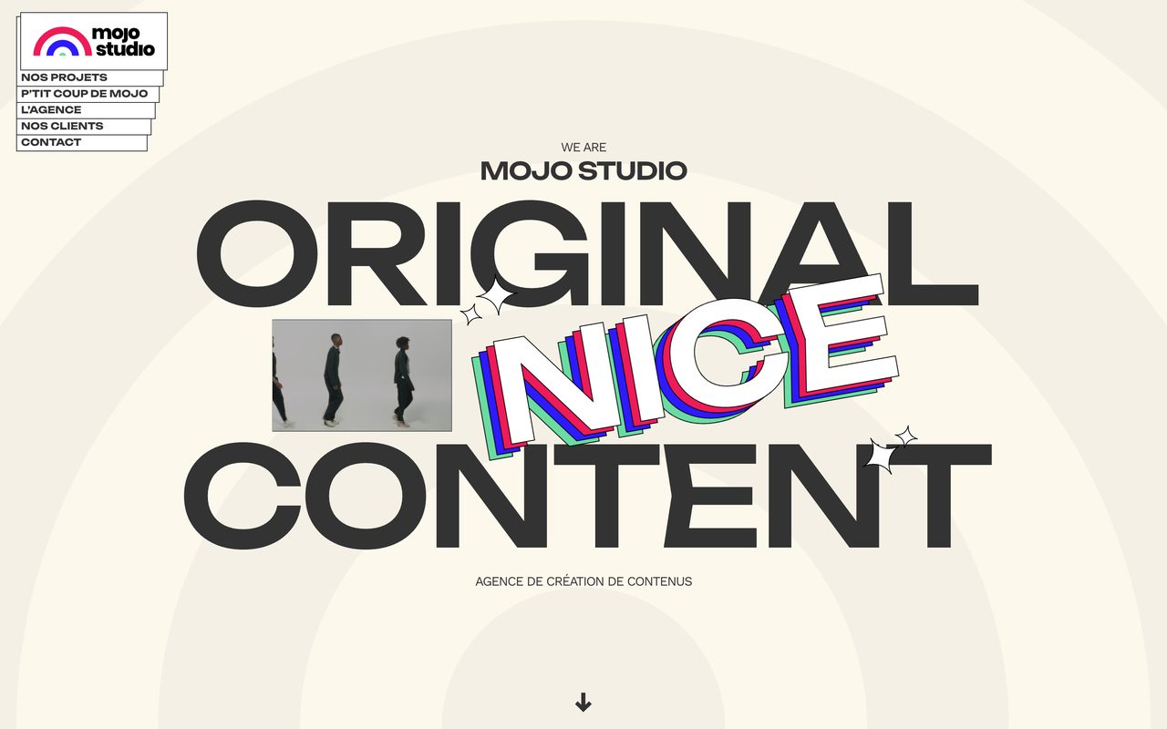
The third font is a mono
23% of the sites use a monospace somewhere, and hardly ever for code. It’s for the small stuff: navigation, labels, dates, prices, the “Est. 2026” line.
Geist Mono is the favourite, then IBM Plex Mono and JetBrains Mono, then DM Mono, Roboto Mono and Space Mono, plus plenty of sites that simply use the system’s own mono. The usual move is a grotesk with its own mono sibling (Geist with Geist Mono, Diatype with Diatype Mono) or with a free mono from Google Fonts.
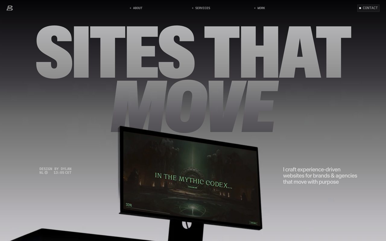
Why it works: a mono label says “precise, technical, considered” in eleven pixels. It’s the typographic version of a lab coat. If your one-family page needs a little extra, add a mono before you add a second sans or serif.
How they set it
The browser also reports how each headline is set, so here are the numbers designers actually ship.
headline: weight 400 · tracking −1.4% · line height 1.0 · 64px
body: 16px · line height 1.4 · weight 400
Headlines are regular, not bold. 42% of them are set at weight 400 and another 16% at 500. Only 17% go bold or heavier. When the type is four times bigger than the body, weight stops being the thing that makes it a headline.
58% of headlines are tracked tighter than default, mostly by 1 to 3%, and the median line height is 1.0. Big type set at its default spacing looks loose. Tighten it until the words hold together as one shape.
The favourites each have their own habits:
- Inter:
weight 600 · tracking −2.5% · line height 1.05 - PP Neue Montreal:
weight 500 · tracking 0% · line height 1.0 - Neue Haas Grotesk:
weight 400 · tracking 0% · line height 1.0· uppercase on 20% of sites - Geist:
weight 500 · tracking −2.5% · line height 1.0 - Instrument Serif:
weight 400 · tracking −2.0% · line height 1.0
Paid or free
Here’s the uncomfortable bit. 67% of the headline fonts on these sites are paid or custom-made, and so are 56% of the body fonts. Free fonts cover 29% of headlines and 37% of body text, and system fonts the rest.
That’s a big part of the gap between a gallery site and a template. If you can’t license the favourites, these free fonts get you into the same neighbourhood:
- PP Neue Montreal → Switzer from Fontshare, or Inter
- Neue Haas Grotesk, Helvetica Now, Suisse Int’l → Inter, with its display optical size for headlines
- ABC Diatype → Geist
- PP Editorial New → Instrument Serif
They’re not clones, and a trained eye will spot the difference. But scale, spacing and restraint carry most of the look, and those cost nothing.
Try it this week
Start with the playground. Every recipe in it uses free fonts and the settings we measured, so you can see the patterns from this article with your own words in them. Click the text to edit it, switch recipes, and hit Get CSS when one clicks.
Three ways in, depending on how you build.
🎨 No code, 15 minutes.
- Open three sites you admire, from Muzli or Awwwards. Check their fonts with Inspect → Computed → Rendered Fonts. Count how many families each one uses. My bet: one or two.
- Take your current project and set everything in one family. Make the headline four times the body size, drop it to a regular or medium weight, and tighten the tracking a little. Only add a second font if the page still feels flat.
- Try the recipes in the playground above, with your own headline typed in.
🤖 With AI tools. Paste one of these into Claude, Lovable, v0 or Framer AI. They name the font, the source and the measured settings, which is what stops the model falling back to its favourite default.
Set this page in ONE typeface family: Inter from Google
Fonts. Headlines: weight 600, letter-spacing -0.025em,
line-height 1.05, about 4x the body size
(clamp(40px, 7vw, 64px)). Body: 16px, weight 400,
line-height 1.5. Build hierarchy with size and weight
only. Do not add a second typeface.
Pair a serif headline with a sans body. Headlines:
Instrument Serif (Google Fonts), weight 400,
letter-spacing -0.02em, line-height 1.0, about 4.5x the
body size. Body: Inter 16px/1.5. Small labels: Inter 500,
12px, uppercase, letter-spacing 0.08em. Keep everything
else in Inter.Use Geist for headings and body text and Geist Mono for
labels, navigation, dates and numbers (12px, uppercase,
letter-spacing 0.02em). Headlines: Geist 500,
letter-spacing -0.025em, line-height 1.0. Both fonts are
free from Google Fonts.💻 Writing the code yourself. The playground’s “Get CSS” button gives you any recipe as a ready snippet. Here’s the most common setup on the sites we checked, in its free version:
@import url("https://fonts.googleapis.com/css2?family=Inter:opsz,wght@14..32,100..900&display=swap");

body {
  font-family: "Inter", system-ui, sans-serif;
  font-size: 16px;
  line-height: 1.5;
}

h1 {
  font-size: clamp(40px, 7vw, 64px);
  font-weight: 600;
  letter-spacing: -0.025em;
  line-height: 1.05;
  font-optical-sizing: auto; /* big sizes get Inter Display */
}
Where taste comes from
Yes, this is the ad break. But it’s a relevant one.
Every website in this study reached me the same way it can reach you: through the Muzli feed. Muzli turns your browser’s new tab into a stream of the best design from more than 200 sources, including the galleries above, plus the Picks that Eyal Zuri, our Co-Founder and Creative Director, chooses by hand. More than 900,000 people have signed up.
That matters for type because taste in typography is mostly mileage. You learn what “tight but not cramped” looks like by seeing a few thousand headlines, not by reading a pairing chart. Open a new tab twenty times a day and you get those miles for free.
And when a site stops you, do what my crawler did. Right-click the headline, choose Inspect, open the Computed tab and scroll to the bottom. Under “Rendered Fonts” Chrome tells you exactly which font it’s drawing, even when the CSS calls it “primary-font”.
Get Muzli for your browser, it’s free.
Worth bookmarking
🆓 The free ones from this list
- Inter. The designer’s own page. Free, open source, with optical sizes from text to display.
- Geist and Geist Mono. Vercel’s family, free, and the most used mono on these sites.
- Instrument Serif. The serif of the moment. Use it before everyone calls it lazy.
- Fontshare. “Quality fonts. Free.” Satoshi and Switzer live here.
💸 The paid favourites
- PP Neue Montreal. Pangram Pangram’s grotesk, the most used paid family here. Free to try before you buy.
- ABC Diatype. Dinamo’s grotesk with a mono sibling.
- Suisse Int’l. Swiss Typefaces’ workhorse.
- Neue Haas Grotesk. Monotype’s grotesk, with separate Display and Text cuts.
🔎 Check for yourself
- Fonts In Use. Every entry names its typefaces. Search a font, see who used it with what.
- Typewolf’s usage lists. Another count from curated sites, with a different method and a lot of overlap.
📚 Go deeper
- Mixing fonts by Matthew Butterick. Why one font is enough more often than you think.
- Web Almanac 2025: Fonts. What the rest of the web uses, measured on millions of pages.
The verdict
The font pairing, the way the listicles sell it, is mostly dead on designer websites. 60% use one family, the rest invent their own pairs, and nobody is setting Montserrat over Lora.
What’s alive is craft inside one family: scale, weight, tracking, an optical size, maybe a mono for the small print.
One thing to watch: the serif headline. It’s the pattern most likely to tip into cliché next year, and Instrument Serif is the font most likely to take the blame.
So here’s your homework. Open your current project, delete the second font and make the headline four times the body size. If the page still needs something, you’ve earned your pairing.
Pick one family. Make the second one earn its place.
Sources: Muzli crawl of 2,190 websites featured on 24 galleries and Muzli Picks between January 1 and October 20, 2026, with shares weighted by month; Fonts In Use; HTTP Archive Web Almanac 2025, Fonts; Framer Help; Butterick’s Practical Typography. Images: the sites named in each caption.
Written by

Petras Baukys
Co-Founder and CTO at Muzli · View profile on Muzli

Every new tab, full of fresh inspiration.
Join 800k+ creatives who start their day on Muzli.
Add Muzli — freeRelated articles

AI didn’t kill the design process. It made being dirt cheap. The new workflow, the tools, and what you should do today.

GPT-6.1 Sol built our 3 Opus 5.5 briefs for $1.88. Here are the live demos, the prompts and what else OpenAI’s DevDay gave designers.

Opus 5.5 builds Muzli Picks-level websites. Here are 3 live demos, the prompts and how to make your own.

Three.js threw its first conference. The best thing on stage was a button.

Apple finally folded. Designers got the homework | Apple Event 2026

Weekly Designers Update #568

Weekly Designers Update #567
More categories
Looking for more daily inspiration? Download Muzli extension your go-to source for design inspiration!
Get Muzli for Chrome