Are we out of new things? No. We’re all copying the same homework.

Lately, digging through new design content on the web, I nod, think “nice, seen it”, and scroll on.
A big grotesk headline, one font for everything, a quiet grey grid, a screenshot floating on a blurry photo. It’s good work, some of it great, and every second one still feels like a rerun.
Music does the same thing to me. I put on a new release, and by the second chorus my brain is already humming something I heard years ago.
So either the world ran out of new things, or I got old.
I read everyone who complained about this before me, and the first one beat me to it by about 2,200 years. Then I ran more than 6,000 Muzli Picks from 2015 to 2026 through an image model to see if they got more alike.
My answer is that there are still new things out there, and we’re all looking at the same ones at the same time.
The long answer has data, a mullet, and a man who mistook a stranger’s photo for himself.
Everyone got here before me
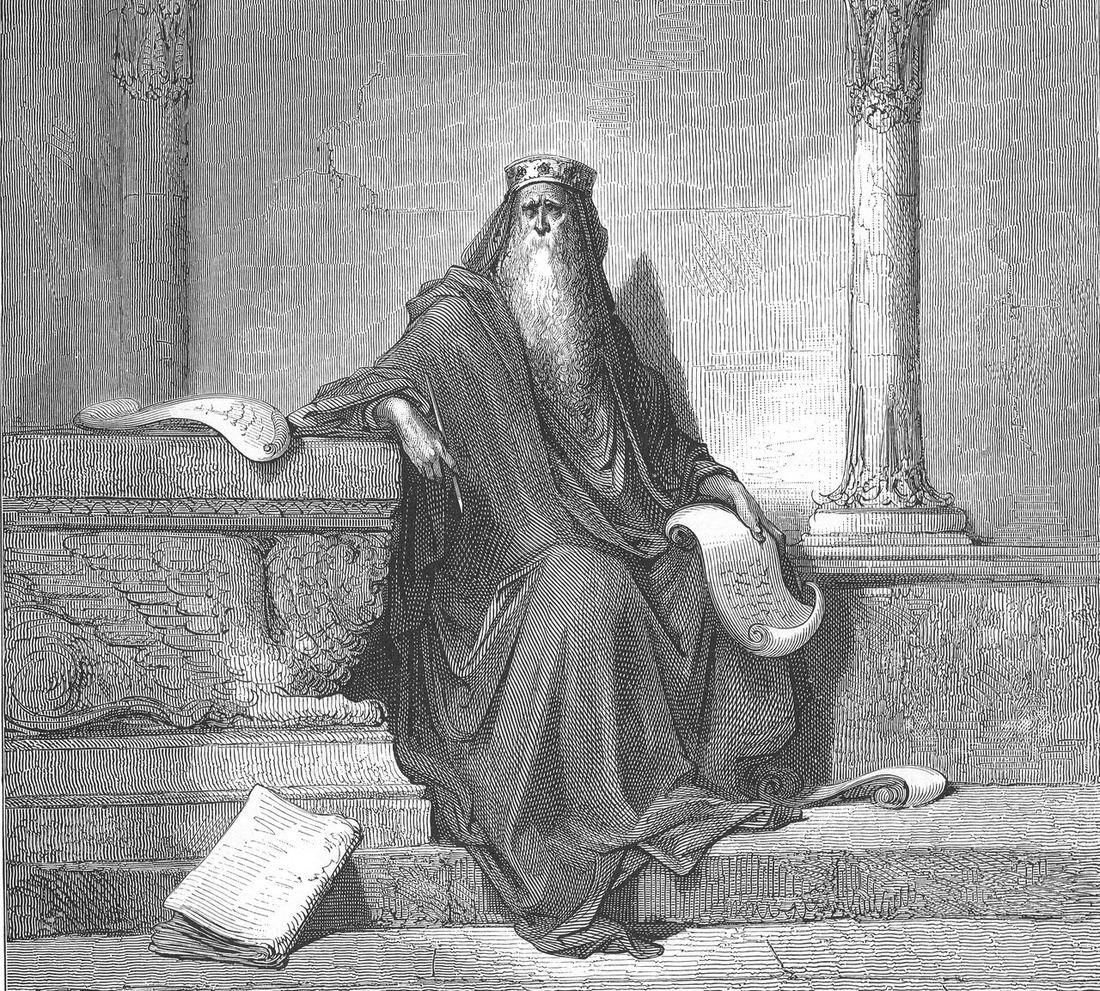
The first guy to post this take got in at least 2,200 years ago, and he landed the best distribution deal in history, the Bible. Ecclesiastes 1:9 says “there is no new thing under the sun.”
Somewhere between 450 and 180 BCE (scholars can’t pin it down), a man with no Dribbble and no Wi-Fi looked around and went, meh, seen it.
Design caught the bug later, and hard:
- 🏀 2013. Paul Adams at Intercom, in The dribbblisation of design: “A huge majority of the product design work on Dribbble looks the same.” And then: “Blur your eyes and try and tell the difference.”
- ☕ 2016. Kyle Chayka named AirSpace, the same reclaimed-wood coffee shop in every city on earth. In 2024 Chayka wrote the book Filterworld, whose rule of culture is “Go viral or die.”
- 🌐 2018. Boris Müller, on the web: “The visual blandness of the world wide web is disheartening. Everything looks the same.” Medium retitled it “Why Do All Websites Look the Same?” and it got 200,000 views in two weeks.
- 🎵 2022. Ted Gioia, on music: “old songs now represent 70% of the US music market.”
- 📉 2023. Alex Murrell, The age of average: “In every field we look at, we find that everything looks the same.”
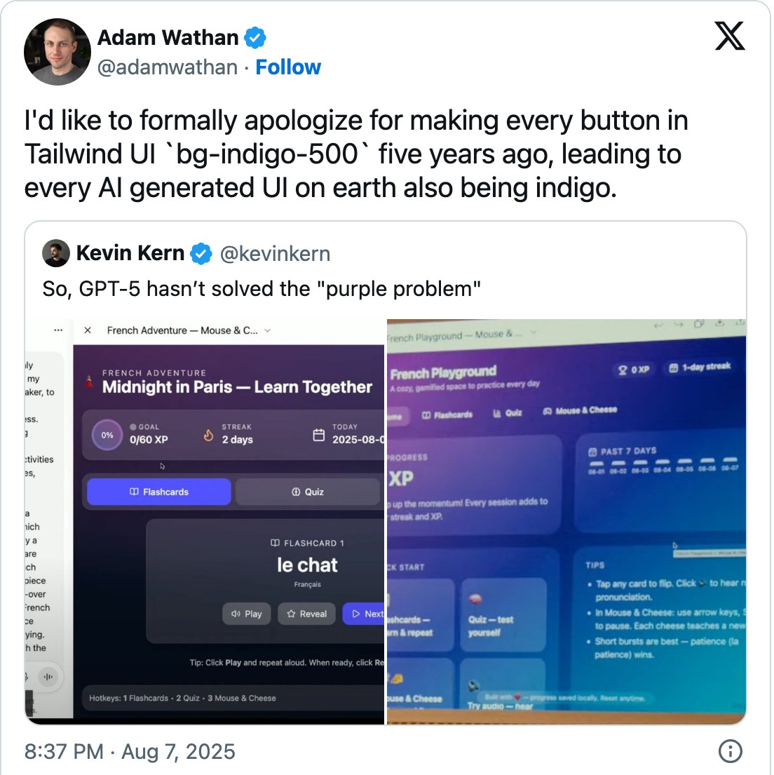
The complaint is older than the tools we blame now. The AI era added a new suspect. In August 2025 Adam Wathan, the guy who made Tailwind CSS, posted an apology “for making every button in Tailwind UI bg-indigo-500 five years ago, leading to every AI generated UI on earth also being indigo.” The post was half a joke and got one and a half million views.
I lined up four suspects.
🪣 Suspect one: the well ran dry
In 2019 technology lawyer and musician Damien Riehl and programmer Noah Rubin wrote an algorithm that generated every possible 8-note, 12-beat melody, at 300,000 melodies a second. That’s 8 to the power of 12, about 68.7 billion tunes. Saving them to disk made them copyrighted automatically. Then they gave every single one away to the public domain.
In his TEDx talk Riehl said “no song is new.”
They built the archive to stop songwriters from suing each other over melodies they came up with on their own. Courts agree. In the Katy Perry “Dark Horse” appeal the 9th Circuit wrote that “building blocks belong in the public domain”, and Ed Sheeran said it better after winning his own case: “nobody owns the color blue.”
All the songs ever published don’t come close to 68.7 billion. Vsauce did similar math back in 2012 and ended on my favourite line in this whole story: “new, popular music will always remind us a bit of home.”
Design has its own building blocks, like the grid, the type scale and the button that looks like a button. A small shared set still makes a huge number of combinations, same as 8 notes made 68.7 billion tunes.
Verdict: not guilty. The parts have always been shared, and the combinations keep coming.
🎡 Suspect two: the wheel
Then there’s my mullet theory.
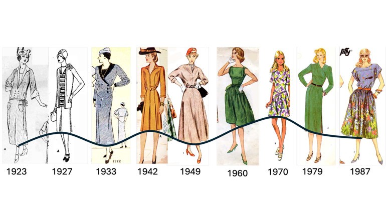
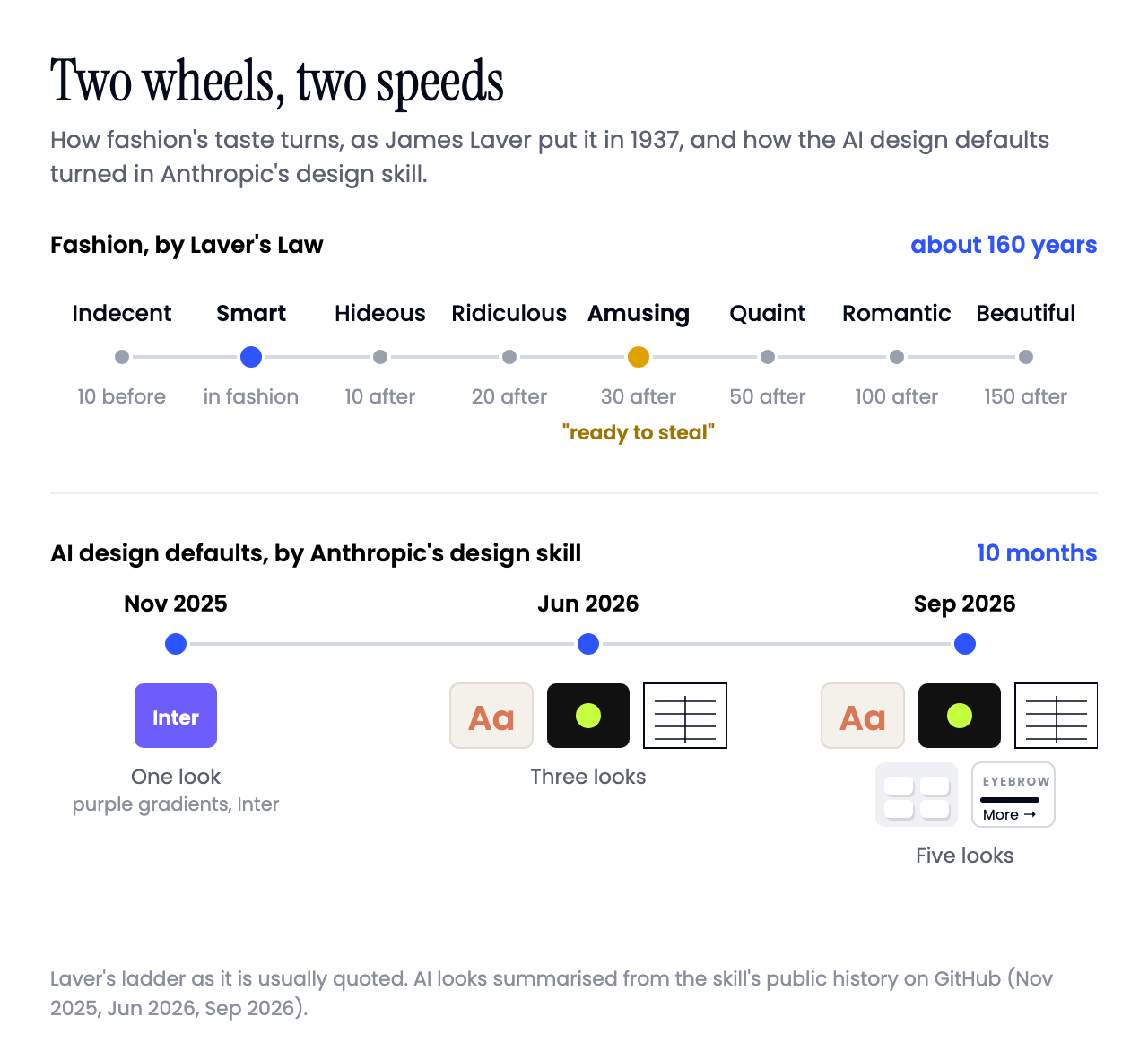
In 1937 the fashion historian James Laver wrote down a timeline that people still quote as Laver’s Law. A look is “indecent” ten years before its time, “smart” when it’s in, “hideous” ten years after, “ridiculous” at twenty, “amusing” at thirty and, give it 150 years, “beautiful”.
Mullets follow it to the letter. They were huge in the 80s and a punchline in the 2000s, and in 2019 The Guardian announced “mullets are back”, with some help from Stranger Things. Since 2020 the US even has a mullet championship.
This March, scientists at Northwestern put numbers on the wheel. They went through roughly 37,000 images of women’s clothing from 1869 to today and found that trends come back about every 20 years.
Design spins the same wheel. Look at how Apple described its own interfaces, 25 years apart:
- 2000, Aqua: “luminous and semi-transparent elements such as buttons, scroll bars and windows.”
- 2013, iOS 7 goes flat, and still promises “translucency”.
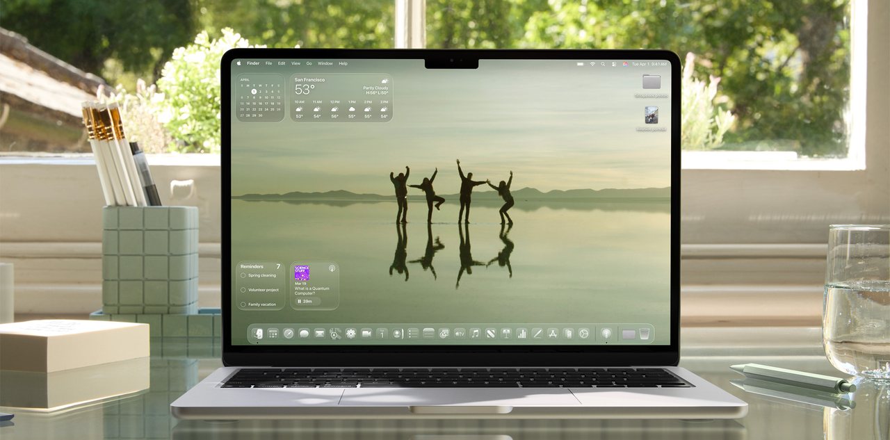
- 2025, Liquid Glass: “This translucent material reflects and refracts its surroundings.”
Web Designer Depot called Liquid Glass “skeuomorphism in disguise”.
Logos do it too. Burberry went sans-serif in 2018, like half of fashion, then brought back its century-old Equestrian Knight and a serif in 2023.
AI defaults have a wheel too. Anthropic, the company behind Claude, publishes a design skill for its coding agent, a page of instructions that tells the model how to design. The page is on GitHub, so you can read its history and watch the average move.
- November 2025: never use Inter, Roboto or Arial, and especially no “purple gradients on white backgrounds”. Also, please don’t all land on Space Grotesk.
- June 2026: AI design “right now clusters around three looks”: a cream background with a big serif and a terracotta accent, near-black with one acid-green accent, and a newspaper layout with hairline rules.
- September 2026: a list of five. The new ones are the SaaS card kit (identical rounded cards, the same soft grey shadow under each) and “template chrome”: an ALL-CAPS label over every heading, little dots between words, an arrow glued to every button. The cream look also got a footnote saying its terracotta is often near #D97757, which is Claude’s own orange.
It reads like whack-a-mole. Purple gets banned, cream shows up, and by September the list has five entries. Fashion needed about 30 years to bring the mullet back, and the AI default changes every few months.
Verdict: guilty, and that’s fine. Every comeback changes something. Liquid Glass moves in ways Aqua never could, and the 2026 mullet looks nothing like your uncle’s.
🤖 Suspect three: the averaging machines
Suspect three is uncomfortable, because the machines are the tools we use every day.
Defaults first. Researchers ran website screenshots from 2003 to 2019 through computer vision and found sites became “significantly more similar since 2007”, with page layouts more than 30% closer together. The main cause, they wrote, was shared libraries like Bootstrap and their default options.
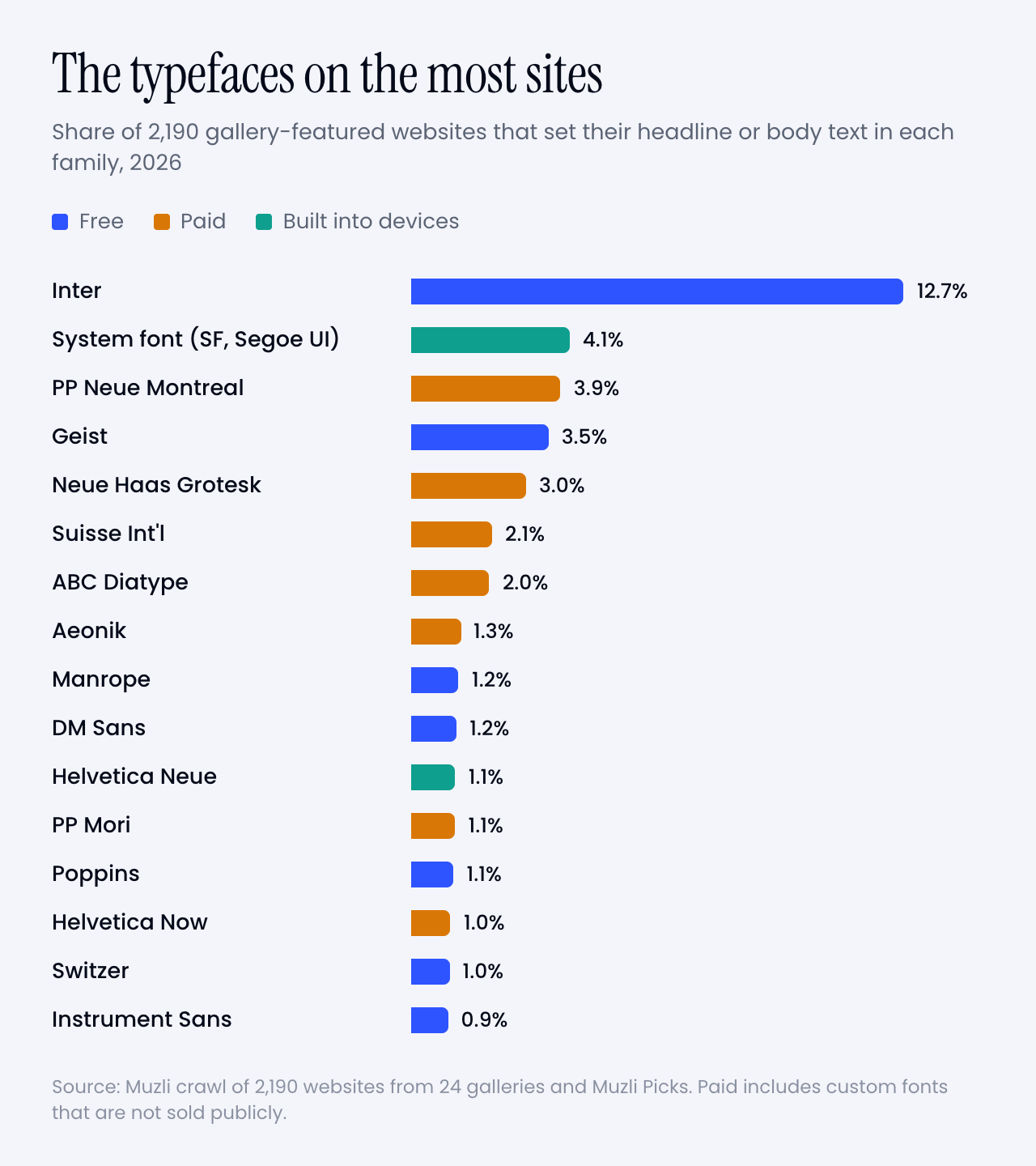
We saw it in our own font study this month. Inter sits on 13% of the 2,190 sites designers loved, and on 24% of Framer sites, where it’s the default. Put that next to Tailwind’s indigo button from above, and you can see how far one default travels.
Then the feed. Feeds show you what got clicked, and people click what they already like. Chayka’s book is about that engine.
Then AI. Anthropic calls the effect “distributional convergence”. Safe choices dominate the training data, so “without direction, Claude samples from this high-probability center.”

A 2025 study adds a second cause. The people who rate chatbot answers “systematically favor familiar text”, so the models learn that typical means good.
Working with these models pulls people toward the middle too. In a 2024 experiment, writers who got GPT-4 story ideas wrote stories rated up to 8.1% more novel, and more like each other. Each writer came out “better off”, and together they produced “a narrower scope of novel content.”
A 2024 Nature paper showed that models trained on generated content lose the “tails of the original content distribution” first. The tails are where the weird stuff lives.
Verdict: guilty.
📊 So I measured our own Picks
After all that reading I wanted to know if my déjà vu was real.
I took 6,346 Muzli Picks from 2015 to 2026, without our own roundups and duplicates. An image model, SigLIP 2, compared every cover with every other cover from the same year. When two came out very close, I counted them as look-alikes, and checked samples by eye.
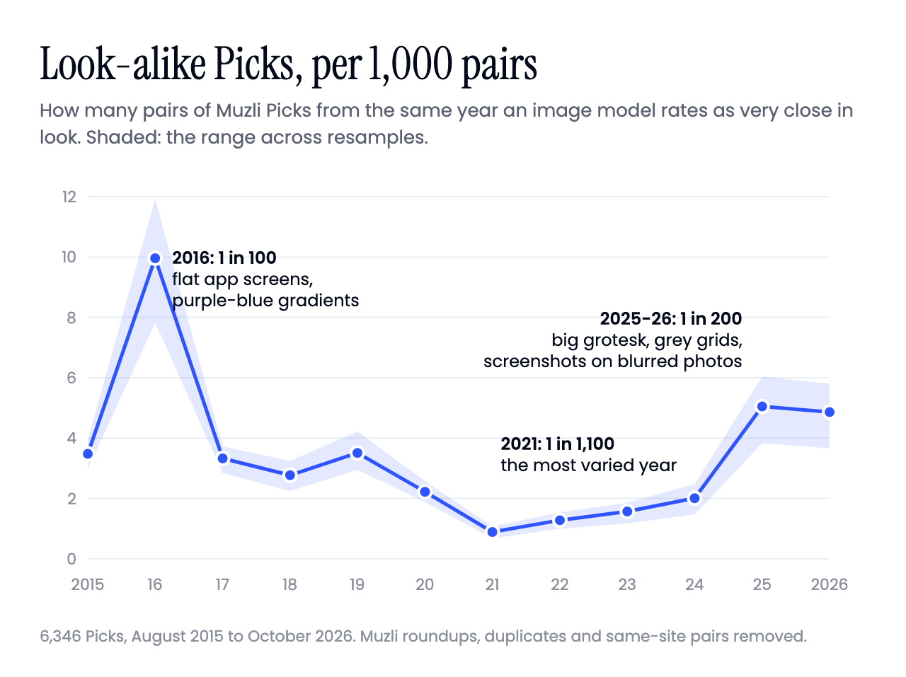
1. My déjà vu is real, but it’s a wave. In 2021 about 1 in 1,100 pairs of Picks from the same year were look-alikes. In 2025 and 2026 it’s about 1 in 200, more than five times as many. 2016 was twice as bad as today at about 1 in 100, the year of flat app screens, phones floating in perspective and purple-to-blue gradients.
2. The sameness is inside each year. For every Pick I also looked for its closest match among all older Picks. That match is no closer in 2026 than it was in 2018, while look-alikes inside the same year went up. We’re syncing up with each other.
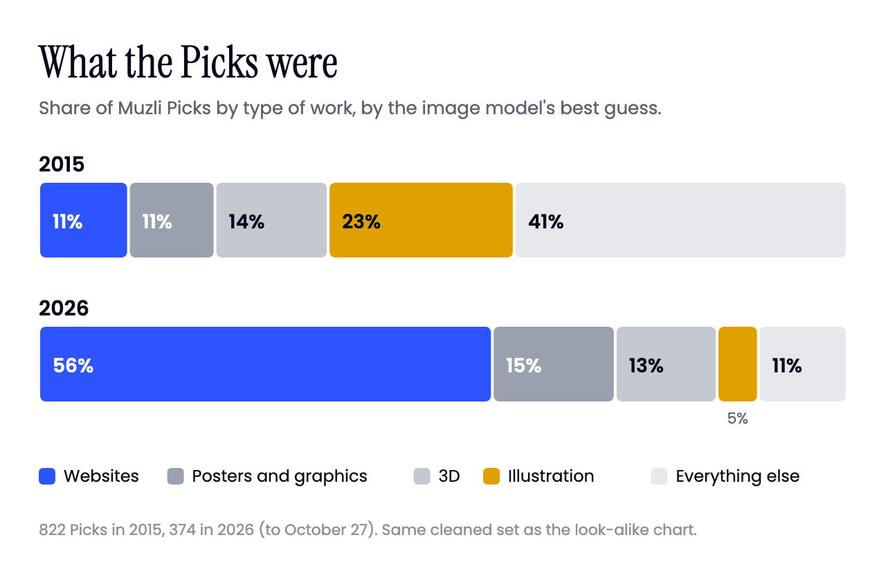
3. What we pick got narrower. By the same model’s best guess, in 2015 about 1 in 9 Picks was a website and almost 1 in 4 an illustration. In 2026 more than half are websites, and illustration is down to 1 in 20. Some of that is where the energy in design went. The rest is on us.
In 2019 mathematician Jonathan Touboul gave point two a name, the hipster effect. People who try hardest not to follow the mainstream end up, as MIT Technology Review put it, “synchronized with each other in opposing the mainstream.”
The magazine illustrated the story with a stock photo of a bearded guy in a hat. A reader emailed, furious that the magazine had used his photo without asking. Getty checked the model release, and the man in the photo was somebody else, a stranger who looked just like him.
The 2026 portfolio site has the same problem. Everyone is trying to be different, from the same references, in the same month.
🪞 Suspect four: me
Before I blame the robots, I should check the guy holding the phone.
I have a running joke with my friends. I ask them to name one artist who got famous after 2000 that the world will remember forever. The Beatles, Bowie, Queen and Michael Jackson come out in two seconds. After 2000 it gets quiet. And if someone does come back with a name, I can always say I’ve officially entered old fart territory.
For me AC/DC is the GOAT. Will there ever be anything better? I doubt it.
Funny, until you remember that the guy asking has a GOAT that started out in 1973.

A 2018 Deezer survey claimed we stop discovering new music somewhere between 28 and 30. A New York Times analysis, as reported by Stereogum, found the songs we love most were hits when we were about 14 (men) or 13 (women).
So when a new song “sounds like everything”, part of it is my brain filing it next to whatever it learned at 14.
Design works the same way. I’ve been designing and building software for more than twenty years, so to me Liquid Glass is the comeback tour. Laver would put Aqua, 25 years on, somewhere between “ridiculous” and “amusing”. Sounds about right.
The industrial designer Raymond Loewy explained why good work feels familiar with MAYA: Most Advanced Yet Acceptable. In 2003 a team from TU Delft tested it on product design and found that people “prefer novel designs as long as the novelty does not affect typicality”. So the work that wins is new, up to a point. Picks are chosen to be loved, so every Pick is a little familiar by design.
Verdict: partly guilty. Some of the sameness is real, and some of it is twenty years of looking.
New to whom?
I caught myself while writing this. I’ve spent this whole article asking if “we” are out of new things, and that “we” is a guy with twenty years of scrolling behind him. That’s a pretty biased jury.
Most of this field hasn’t seen what I’ve seen. Jakob Nielsen estimated there were about 1,000 UX people in 1983 and about 1 million in 2017. In a 2022 salary survey of UX people, 48% had seven years in the field or less, and surveys like that probably lean senior.
Someone starting a UX career today has no clue what we saw back in the day. They never shipped a linen texture or lived through the great flattening of 2013. Skeuomorphism, brutalism and shiny glass are reruns for me and season one for them.
My wheel left out the people who turn it. Patrick Metzger’s nostalgia pendulum says it takes about 30 years “for a critical mass of people who were consumers of culture when they were young to become the creators of culture in their adulthood.” The kids who grew up with a look get the job, and they bring it back.
The newcomers have their own memories too. Frutiger Aero, the glossy look of 2000s software, came back in 2023 as a Gen Z object of nostalgia. Researchers found something close in music. Young adults feel attached to their own years and to the music of their parents’ generation. They call it “cascading reminiscence bumps”, which sounds like a skin condition.
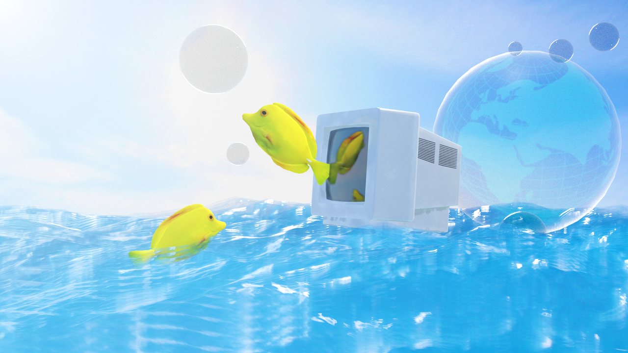
When something shiny and skeuomorphic lands in the Picks and I love it, is that nostalgia or my taste?
The research stings a little:
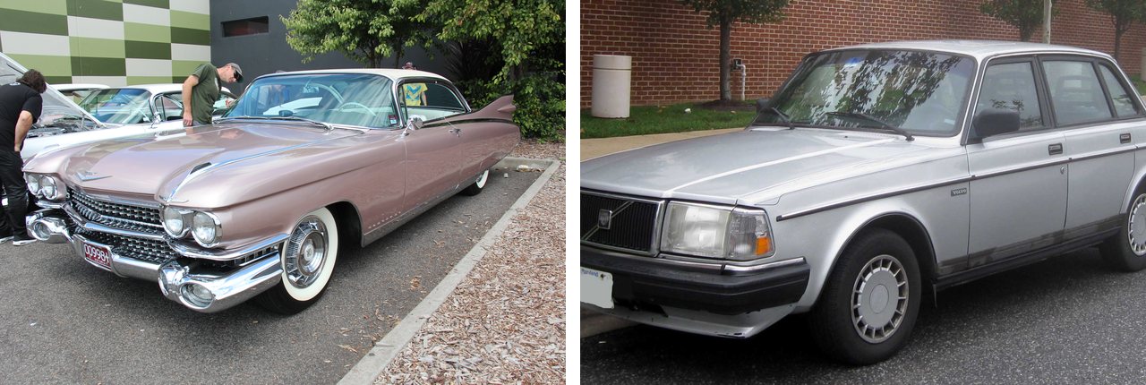
- 🚗 Cars. Researchers tested it on car styling. Men preferred the styles of their youth, women didn’t, and nostalgia-prone people showed it more. So it reaches design, at least for men and the nostalgia-prone.
- 🧠 Brains. In a brain scan study, the reward circuitry was more active for familiar music than for unfamiliar music. Sometimes “I love this” means “I know this”.
- 📐 Beauty. People rated car designs from 1950 to 1999. Cars got boxier until the 1980s and curvier after, and appreciation followed the same curve.
I can’t split nostalgia from taste, and I doubt anyone can. What I call good is everything I’ve seen, filtered through twenty years of deciding what I liked. Taste is nostalgia that went to design school. I’m fine with that, as long as I stop using my “seen it” as the measure of what’s new.
The look-alike numbers don’t care how old I am, so the syncing is real. Whether that adds up to “nothing new” depends partly on who’s looking.
My take: average in, average out
Nothing was ever new from scratch. Mark Twain wrote to Helen Keller in 1903 that “substantially all ideas are second-hand”. Jim Jarmusch made it a rule: “Nothing is original. Steal from anywhere that resonates with inspiration or fuels your imagination.” Kirby Ferguson made a whole series about it, Everything is a Remix: copy, transform, combine.
So new things always came from mixing old things. The mix felt new because everyone stole from different places. One designer had a weird record collection, another had her grandmother’s embroidery.
Now we all steal from one shared pool of feeds, galleries, a few AI models trained on the same web, and tool defaults, in the same week.
Average in, average out. We ran out of different inputs.
In our own data the sameness comes in waves, and waves turn. 2016 was worse than today, and 2021 to 2023 was the most varied stretch in our archive. My guess is people got bored of the gradients and went looking somewhere else.
What I’m doing about it
I can’t fix the feed or retrain the models, so I’m working on what goes into my own head.
🗂️ Steal from further away. Pick references from outside design, and older than 20 years. Laver’s wheel says 30-year-old stuff is “amusing”, which is a polite word for “ready to steal”.
🚫 Kill the defaults before you start. Write down what your tools do when you don’t decide, like Inter, indigo, rounded cards with the same soft shadow, an ALL-CAPS label over every heading, an arrow on every button and fade-up on every scroll. Then decide each one on purpose, and keep the ones you like.
🎲 Ask AI for the tails. The Verbalized Sampling researchers got 1.6 to 2.1 times more variety out of chatbots by asking for five answers with probabilities and accepting only the unlikely ones. I adapted their idea for a design brief:
Give me 5 different visual directions for [your project].
For each one, say how likely a typical AI would be to
suggest it, as a probability. Only include directions
with a probability below 0.10. For each direction, name
one concrete reference that is not a website and is
more than 20 years old.
✋ Let AI do the average, and spend your hours on the one weird thing. The familiar part (navigation, forms, the button that looks like a button) is what AI is good at, and MAYA says users want it there. The part nobody would predict is your job now.
👀 Borrow younger eyes. Before you kill an idea as tired, show it to someone who started after 2020. Before you fall in love with a revival, ask if you’d still like it without the memory. If the answer is no, you’re feeling nostalgia. Enjoy it and call it by its name. And if you’re the new one, go look at what came before, so you know what you’re remixing.
🔁 If you bring something back, change it. Burberry paired its old knight with a new serif, and Apple made the glass move.
Yes, I see the irony
I know, an inspiration feed writing about sameness.
Muzli is one of the places everybody looks. This June Creative Bloq told designers to “start your references outside the algorithm”, and they have a point.
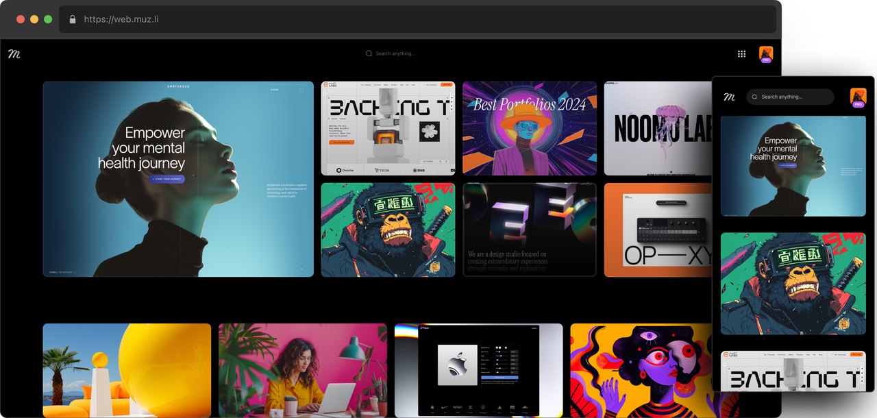
The Picks at least have a person behind them. Eyal Zuri, our co-founder and creative director, chooses them by hand, so the odd one out can get in on purpose, which rarely happens in a click-ranked feed. The rest of the feed pulls from more than 200 design sources, so your new tab is a wider diet than any single gallery.
Our own data gave us homework too. More than half of this year’s Picks are websites, which is a lot of one medium for a feed whose job is to widen what you see. That one’s on us.
Yes, this is the ad break. If you want 200+ sources and a human editor in your new tab, get Muzli. More than 900,000 people have signed up already.
So, are we out of new things?
There’s still room, 68.7 billion melodies’ worth, and our archive shows the wave turns. Our references sit too close together. For whoever opens Figma for the first time today, all of it is still new.
Keep an eye on the AI defaults. Anthropic’s list of them went from one look to five in ten months. When the next update lands, you’ll know what 2027 will be tired of.
This week, before you open any feed, write down three references that are older than you or come from a field you don’t work in. Then open Muzli and see what still looks new.
Pick your references before the feed picks them for you.
Further reading: Alex Murrell, The age of average. Kyle Chayka, Welcome to AirSpace. Adam Mastroianni, Pop culture has become an oligopoly. Patrick Metzger, The nostalgia pendulum.
Picks data: 6,346 Muzli Picks, August 2015 to October 2026, cover images compared with SigLIP 2. Muzli’s own roundup posts, duplicate images and same-site pairs removed. Look-alike means a cosine similarity above 0.7. Analysis by Muzli.
Title image: an AI-generated mullet, made with GPT-5.4 Image 2. I see that irony too.
Written by

Petras Baukys
Co-Founder and CTO at Muzli · View profile on Muzli

Every new tab, full of fresh inspiration.
Join 800k+ creatives who start their day on Muzli.
Add Muzli — freeRelated articles

AI didn’t kill the design process. It made being dirt cheap. The new workflow, the tools, and what you should do today.

GPT-6.1 Sol built our 3 Opus 5.5 briefs for $1.88. Here are the live demos, the prompts and what else OpenAI’s DevDay gave designers.

Opus 5.5 builds Muzli Picks-level websites. Here are 3 live demos, the prompts and how to make your own.

Figma AI Design Agent: What It Actually Does Inside Your Files

Claude Design, One Week In: Hacks, Best Practices & Tips From Real-World Use

Getting Started with Claude Design: A Collaborator for Your Design Workflow

Vibe Design in 2026: What AI-Generated UI Means for Your Work
More categories
Looking for more daily inspiration? Download Muzli extension your go-to source for design inspiration!
Get Muzli for Chrome
