Opus 5.5 builds Muzli Picks-level websites. Here are 3 live demos, the prompts and how to make your own.

This is a long article about my week with Opus 5.5. Every point in the TL;DR below links to its section, so skip straight to the part you’re most interested in.
TL;DR
- 🤖 Claude Opus 5.5 shipped on 22 September. Anthropic says it matches Fable 5.1 on most work and costs 40% less to run than Opus 5. The launch post is about code. The design jump is what people found once they built things.
- 🧪 We tested it the way a studio would. Three briefs, one prompt each: a product website, a title sequence and a gesture prototype. All three run below, next to their prompts.
- 😬 Designers are worried, and it is a fair worry. Five days after launch, an r/Design post was just the Claude logo and one line: “Jokes aside, I’m seriously questioning my whole career as a designer!” The demos show what is still yours.
- 🧭 It changes how you prototype, spec and pitch. Build what Figma can’t show, hand over motion specs that run, and pitch the moment instead of a mood board.
- 🧰 The setup is small. Claude Code, Anthropic’s free frontend-design plugin, and a browser Claude can look through. Claude Design if you never want to see code.
- 🧠 Taste is still the bottleneck. Left alone, the model falls back on a house style, and Anthropic’s own docs tell you to ban it by name.
- 🏆 Made something good? Nominate it. In the last 30 days, 25 of our 40 Muzli Picks came from designers on Muzli Me.
Every model launch comes with the same promise about the front end. Better at UI. More taste.
Then you ask for a landing page and get a cream background, one italic word in the headline, “01 / 02 / 03” above every section and pill-shaped buttons.
That list is not my opinion, by the way. It comes from Anthropic’s own documentation for Opus 5.5, which warns that without design direction the model “falls back on a few default styles”. Last November, Anthropic’s blog described the previous uniform: “Inter fonts, purple gradients on white backgrounds, and minimal animations”.
The uniform changed. The habit did not.
So when Opus 5.5 landed, I skipped the benchmark charts. We wrote three briefs, the kind a studio gets from a client, and gave each one to Opus 5.5 once.
Here is what came back, live, with the prompts. Then how to use it in your own work, what to install, what to know before you prompt, and what it means for a career a lot of designers are suddenly questioning.
Sixty seconds of vocabulary
- Opus 5.5. Anthropic’s new model. Claude is the assistant, Opus is its big everyday tier, 5.5 is the release.
- Fable 5.1. The Anthropic model Opus 5.5 gets measured against.
- Claude Code. The version of Claude that works on files on your computer. It writes the code, opens it in a browser, looks and fixes. It runs in a terminal, a desktop app, your code editor or the browser.
- Skill. Written instructions Claude loads when a task calls for them. A brand book it actually reads.
- Plugin. A bundle of skills and tools you install with one command.
- MCP. A connector that lets Claude drive another app, like Figma or a browser.
- Effort. How long the model thinks before it answers. Opus 5.5 defaults to medium, and you can turn it up.
- WebGL and shaders. How a web page draws with the graphics card. Every liquid hero and glass blur you have saved is a shader.
- GSAP. The animation library behind a large share of award sites. Free, plugins included.
That is the whole glossary.
🤖 What actually changed in Opus 5.5
Released 22 September 2026 · $4 in, $20 out per million tokens · 30% faster output · Claude apps, Claude Code, API
Tokens are the meter AI is billed by. The price matters less than what it buys. The same budget now gets you more attempts, and Anthropic also raised the five-hour usage limits on the Pro, Max and Team plans, which is the wall most designers actually hit.
Read the launch post and you would think this is a model for migrating codebases. It is almost all code, cost and safety. There is exactly one sentence about visuals: “A different tester had several Claude models build a game from a single prompt; Opus 5.5 scored higher than any other model on the strength of its graphics and polish.”
One customer line matters more for design work than any benchmark. Column’s Mitch Fierro says it “checks its own work in creative ways”. For us that means it can screenshot a page, notice the headline breaking badly on a phone, and fix it before you see it.
🤖 What the testers found
Anthropic’s 230-page system card does not test design at all. No layout, no motion, no taste. So the evidence comes from people who built things.
- Every liked it for visual work. Anthropic gave Every early access, and its Vibe Check says to reach for Opus 5.5 if “you build things you can look at”. Tyler Nishida, a designer there: “My jaw dropped at least five or six times this week.”
- Every also found the limits. A deck built from Every’s own template “used the wrong logo, replaced Every’s green with dark purple, added its own background art”. It is better at looking right than at being right about your brand.
- Motion is the big jump. Charlie Hills built 16 motion graphics with it and called motion “the biggest jump”, while admitting “it wasn’t one prompt. I needed the exact states, a good reference and a few rounds of fixes to get there.”
- Effort matters, up to a point. On threejseval, where people vote blind on 3D scenes built from the same prompt, Opus 5.5 on high effort ranks first on the board and on the default medium ranks fourth. At max, Simon Willison‘s pelican test ran nearly 20 minutes, cost $2.56 a try and returned nothing.
- The long builds are real. Ryan Sael built The Plane of Focus, a camera lens you rack through a miniature valley, in “1 hour 26 minutes in one shot, $25.66 API cost”, by his own account.
🧪 Three briefs, one prompt each
Each prompt went to Opus 5.5 in Claude Code, in a fresh session, with three things set up. Anthropic’s frontend-design skill. A browser it could take screenshots with. And one standing instruction to check its work in that browser and fix what it saw, at least twice. We also told it the page would be embedded here, about 720 pixels wide.
No references, no Figma file, no notes from us. What you see is what came back.
🎨 A website: sea salt, and a hero made of water
Picture the client every studio turns down. Two people with a great story and no budget. The brief:
Build a one-page website for Lenn, a two-person sea salt
harvest on the salt marshes of Guérande, in Brittany.
Visitors are chefs and food lovers who might order a tin
or come and visit.

Mood: quiet, tidal, tactile. Grey Atlantic light, not
beach kitsch. Pick distinctive type, one or two families.

The one memorable thing: the hero is water. A real-time
WebGL water surface fills the screen and ripples where the
cursor moves, with the Lenn wordmark under the surface,
refracting. As you scroll, the tide drains away and salt
crystals appear on the clay.

After that: how the salt is raked by hand (a short
scroll-driven story in three moments), the three salts and
what to cook with each, visiting the marsh, and ordering.

Motion: one orchestrated page load, then scroll-linked
scenes with GSAP ScrollTrigger and Lenis. No fade-up on
every section. Respect prefers-reduced-motion. It must work
on a phone. Quality bar: a site we would feature on Muzli
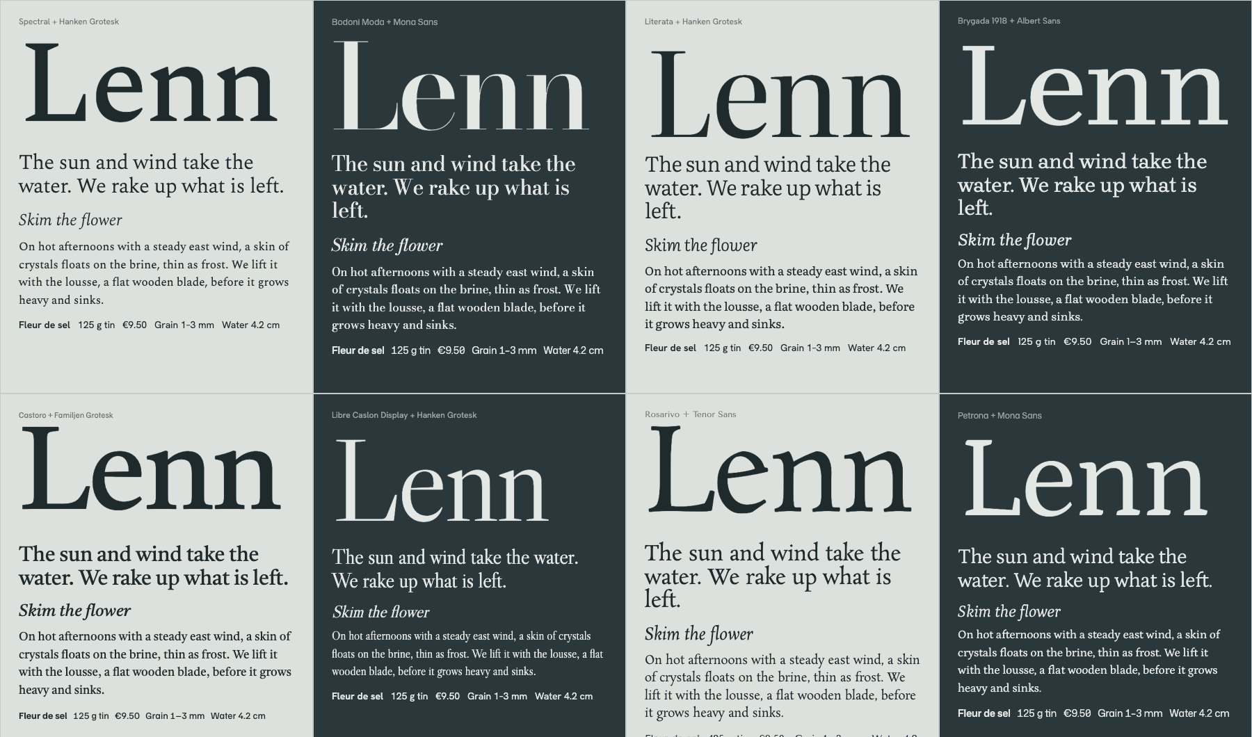
Picks. Single HTML file, libraries from a CDN.Before it wrote a line of the site, it did what a designer would do. It set the wordmark and real copy in eight type pairings, looked at them, ran a second round, and chose Spectral because its sharp serifs “echo salt crystals”.
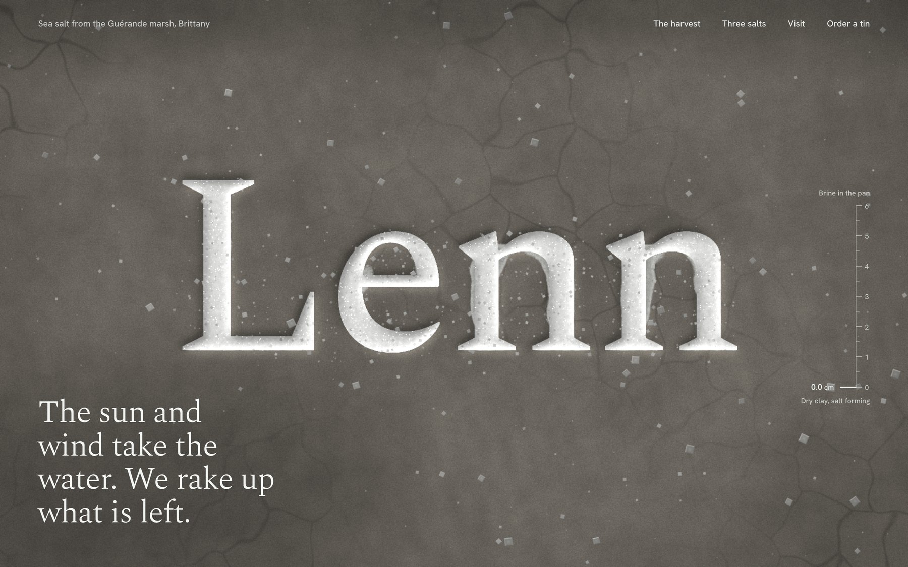
Then the hero. The water is a live simulation running on the graphics card. The wordmark sits under it, carved into the clay as grooves full of salt, and bends as the ripples pass. A tide gauge on the right reads 4.8 cm. Scroll and it falls to zero. The letters hold the last pools, then dry white while crystals grow out of them. The brief asked for one memorable thing, and it spent all its boldness there.
The harvest story is one pinned cross-section of the marsh, from the Atlantic through each basin to the pan, labelled with how salty the water gets. Then it zooms into a single pan for the two harvests. The vocabulary is real. Vasière, cobier, œillet, lousse, las, ladure: I checked every term against a Guérande salt maker’s own glossary.
It also caught what a reviewer would have caught. A tin it drew with two wavy lines “read as a beach logo”, the exact kitsch the brief banned, so it redrew it. In a blog embed its smooth scroll trapped the reader’s wheel, so now it hands the scroll back to the page.
It ran for about 80 minutes with nobody watching, through four rounds of screenshots and fixes, and listed what it could not check: how the scroll feels on a real phone, and how the water runs on an older laptop.
What it unlocks: the site you pitch with instead of a mood board. For a two-person brand, it might just be the site.
🎬 Motion: a title sequence you can scrub
Motion lives in After Effects, the product lives in the browser, and something always gets lost on the way. The brief:
Make a 12-second looping title sequence for a fictional
design festival called Offset, as a web page.

Think opening titles, not a website: kinetic type on a
strict grid. Letters slide in along the grid, the grid
itself rotates and stretches, colours swap in hard cuts on
the beat, and it resolves into the Offset lockup with the
dates (14-16 May, Vilnius) before looping cleanly.

Build it on one GSAP timeline. Add a small After Effects
style transport bar at the bottom: play/pause, a scrubber I
can drag, the current time, and 0.25x / 1x speed. Easing
should feel designed, so name the curves you use in a code
comment. Single HTML file. No stock fade-ins.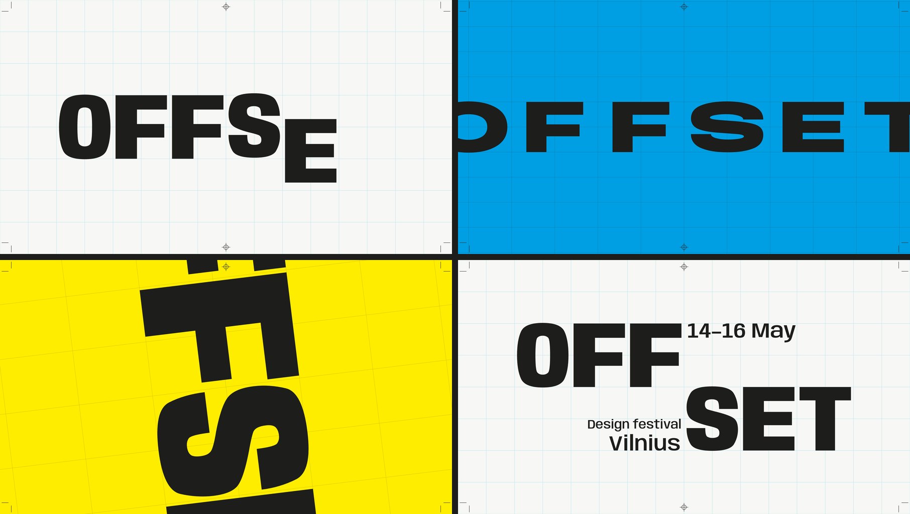
This is the part that made me sit up. It read the festival’s name and built a concept out of it. Offset is a printing method, so the loop became a print run. There is a paste-up board with crop and registration marks, and the hard cuts are the four ink plates, cyan, magenta, yellow and black. Halfway through, the word reels one letter per beat until it reads SETOFF, which in printing is another word for offset. None of that was in the brief.
The craft holds up. When the grid stretches, the letters are not squashed. It moves the width axis of Anybody, a variable font, so each letter is redrawn to fit its cell. The cuts sit on a 120 BPM grid, and the transport bar shows each ink plate as a coloured strip on the timeline.
It named its curves, as asked, at the top of the file:
rail   (0.16, 1, 0.30, 1)  arrivals. Leaves at full
                           speed, brakes hard into the
                           cell.
shunt  (0.80, 0, 0.12, 1)  lane changes. Heavy start,
                           fast middle, locked stop,
                           like a wagon being shunted.
crank  (0.72, 0, 0.18, 1)  grid rotation. Slow wind-up,
                           long mechanical settle.
cut    none                colour. Changes on the frame
                           of the beat.
That is a motion spec a developer can use. The numbers are the curve and the words are the intent.
One prompt, no notes. It ran three rounds of screenshots and fixes on its own and caught that the dates were still on screen when the loop jumped back to zero. It could not tell how the curves feel at full speed, and said so. That part is still your eyes.
What it unlocks: motion you design, review and hand off in one file. Scrub to the frame that bothers you, leave a note with the timecode, and the fix lands in the thing that ships.
👆 Interaction: a player you can catch mid-spring
A Figma prototype shows where a screen ends up. It cannot show how it feels to throw it there. The brief:
Prototype the mini player to full player transition of a
music app, in a phone frame, as a web page I can use with
a mouse or a finger.

The mini player sits above a tab bar. Drag it up and the
album art grows out of it into the full player, following
my finger 1:1, then settles with a spring. Fling it down to
dismiss; the release speed decides whether it closes. In
the full player: a waveform I can scrub, a like button with
a small burst, and a queue I can reorder by dragging.

Everything must be interruptible: grab it mid-animation and
it stops where it is. Add a "slow motion" switch that runs
all motion at 10% speed so I can review the curves.
Draw the album art in code. Single HTML file.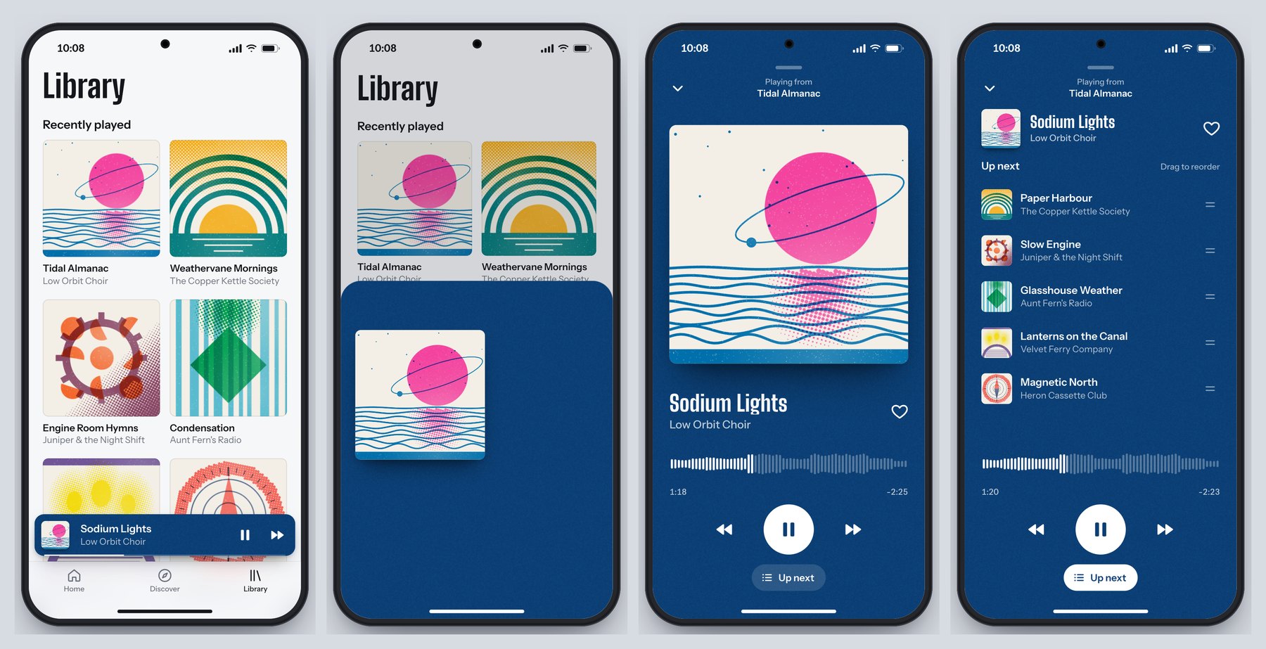
It invented an app to prototype in. Hummock, six made-up bands, and album covers drawn in code as two-colour risograph prints, down to the slightly-off registration and the paper grain. The player takes its colours from the cover’s inks, and the mini bar and the full player are one surface, so the transition reads as one object growing instead of one screen replacing another.
The physics are real. It is a damped spring set by response and damping, the way SwiftUI describes springs: 0.52 seconds at 0.76 damping to open, about 2.5% overshoot. Your release speed comes from the last tenth of a second of movement. Everything runs on one clock, so grabbing it mid-flight freezes it exactly where it is, and slow motion slows every single thing at once.
It caught its own bugs, too. Fast flings sprang back open because its first speed estimate was fragile, so it rebuilt the estimate. Mid-drag, the player’s header faded in underneath the growing cover, so now the controls wait until the sheet is 62% open.
One prompt, no notes, two rounds of its own fixes. What it could not judge is how the spring feels in the hand. It had numbers, not a thumb.
What it unlocks: you stop writing “make it bouncy” in a ticket. You hand over a prototype and two numbers, and the developer builds the feel you signed off.
🧭 How to use it in your work
Forget “AI will design for you”. The useful question is which parts of your week just got cheaper. Six did.
- Prototype what Figma can’t show. Springs, drag physics, scroll-linked scenes, a hover that reacts to speed. Send a link instead of a screen recording and a page of notes. Your developer gets a working reference, and your client gets something to touch.
- Write motion specs that run. A timeline with named curves is a spec a developer can lift into the product. Review it at quarter speed and leave notes with timecodes.
- Pitch the moment, not a mood board. Most concepts die at “imagine if the hero…”. Build the hero. One evening, one brief, and the room stops imagining.
- Ship the portfolio you actually want. A lot of our recent Picks are personal portfolios, like Jesper Landberg, Mathis Biabiany and Léo Parpeix. That level used to mean learning WebGL or hiring someone who knew it. The gap between a designer’s portfolio and a creative developer’s just got a lot smaller.
- Build tools for yourself. A type tester with sliders, a grid generator, a palette explorer tuned to how you work. A stranger on Reddit makes this case better than I can, further down.
- Keep your design system in charge. Claude Design reads your codebase and design files and builds a design system from them, so every prototype after that “uses your colors, typography, and components automatically”, per Anthropic’s launch post.
🧰 Skills, plugins and tools
You do not need all of it. Pick the row that fits how you work.
🧰 Where to work
- Claude Design, if you never want to see code. You describe a visual, Claude builds a first version on a canvas, and you refine it by chat, comments or dragging things around. It exports PDF, PPTX and HTML and hands off to Claude Code when it is time to build. In beta on paid plans, and now it opens “from inside any conversation with Claude”.
- The Claude Code desktop app, if you want real files. Claude Code “with a graphical interface”, in Anthropic’s words, so you can point it at a folder “without using a terminal”. Pro plan and up. Our demos were built in Claude Code.
🧰 Skills and plugins worth installing
Each is one command in Claude Code:
claude plugin install frontend-design@claude-plugins-official
claude plugin install playground@claude-plugins-official
npx skills add jakubkrehel/make-interfaces-feel-better- frontend-design, by Anthropic. The house rules against looking generated: a palette and type chosen for the subject, a plan before building, one bold moment, screenshots and self-critique. Over 1.1 million installs. Read the file even if you never install it. It is the best short brief on AI taste I have seen.
- playground, by Anthropic. Builds single-file tools with controls on one side, a live preview on the other and a prompt you copy back out. It is the type tester the Reddit reply below describes.
- make-interfaces-feel-better, by Jakub Krehel. The small stuff: concentric corner radii, optical alignment, press states, animation you can interrupt.
🧰 Give it eyes
- Claude in Chrome. Start Claude Code with
claude --chromeand it can open, click and screenshot pages in your own browser. Anthropic calls it “especially useful for design verification”, meaning a check of the Figma mock against the built page. - Chrome DevTools MCP, from Google’s Chrome team, does the same without the extension and adds console errors and performance traces:
claude mcp add chrome-devtools --scope user npx chrome-devtools-mcp@latest.
🧰 Bring Figma in
- The Figma MCP server lets Claude read your frames and, on a Full seat, write frames, components and variables back to the canvas. Install it with
claude plugin install figma@claude-plugins-official. - Figma Motion, in open beta since June, adds a keyframe timeline to Figma. Through the MCP server, Claude gets your keyframes as ready CSS and motion.dev code, so the animation you designed is the one that ships.
🧰 Name these in your prompts
- GSAP for scroll stories, pinned sections and kinetic type. It is “100% free for all users, thanks to Webflow’s support”, ScrollTrigger and SplitText included.
- Motion for micro-interactions, layout animation and springs. Free and MIT licensed.
- Three.js for 3D, particles and shaders. Our Three.js Conf piece covers what changed there this month.
- Lenis for smooth scroll that keeps GSAP and WebGL in step.
- Rive for interactive vector animation, and Remotion when the output is a video. Remotion is free for individuals and companies of up to three people.
🧠 What to know before you prompt
The model got better. Most bad results still come from a five-word prompt. This is what kept our demos out of the house style.
- Write a brief, not a wish. Who the visitors are, the mood, the one memorable thing, the sections, how things move, and the quality floor: phone layout, reduced motion, keyboard focus. Each of our prompts is under 200 words, and every line is a decision.
- Ban the defaults by name. Anthropic’s docs say a general “avoid a generic AI look” “mostly swaps one default for another”. Naming patterns works. Their frontend-design skill has a longer list that reads like a design critique: a warm cream background with a serif and a terracotta accent, near-black with one acid-green accent, identical rounded cards with “the same soft grey shadow”. Paste the ones you hate into your brief. When the first result finds a new default, add that too.
- Ask for options, then pick. Nate Parrott, the Anthropic designer who built Claude Design, says to “ask for ten options, then remix. Most of them won’t be good, and that’s fine; one or two will be.” Our salt site did this unprompted with its type specimen.
- Spend your boldness in one place. In the same skill’s words, a single orchestrated moment “lands better than scattered effects”. Fade-up on every section is the tell.
- Name the tools. “Scroll-linked scenes with GSAP ScrollTrigger and Lenis” gets you a scroll story. “Make it animated” gets you fade-ups.
- Let it look, then look slower. Connect a browser so it can screenshot its own page at desktop and phone size, because “a picture is worth 1000 tokens”, as Anthropic’s skill puts it. Then do what Jakub Krehel’s skill tells the model to do, and “replay motion at 10% speed”. That is why our player has a slow-motion switch.
- Turn effort up, not to max. For the one hero you care about, type
/effort highin Claude Code. Anthropic’s docs say to “reserve xhigh and max for work where you’ve measured a quality gain”, and Simon Willison’s empty max run shows why. - Tell it when to stop. Every’s advice is to “define what ‘done’ and ‘enough’ mean, set a budget, and impose a stopping point”. Left alone it keeps polishing on your usage.
- Give notes like an art director. “The wordmark refracts too much at rest, halve it” works. “Make it pop” does not. A screenshot with an arrow on it beats three adjectives.
- Check what you are shipping. GSAP and Motion are free for commercial work. Remotion needs a paid licence once your company has four people. Ask the model to list every font and library it pulled in.
😬 “Well, it’s awesome, but… I’m seriously questioning my whole career”
Five days after launch, someone posted the Claude logo to r/Design. No text, just a title: “Jokes aside, I’m seriously questioning my whole career as a designer!”
It is a fair question, and the demos above do not make it go away. Production work, turning a finished Figma file into a working page, just got cheap. If that was the whole job, the job changed this month.
The top reply is the best career advice I read all week. “Designer is unfortunately now a role that incorporates AI heavily. That’s why you’re seeing so much slop everywhere these days. On the other end of that is all of the pro designers using ai to build tools for themselves and clients that are actually useful and don’t look like ai slop.”
Then the practical part: “try vibe coding a tool (it is very easy) to let you play with type in a way you can’t with illustrator and then once you land on something cool in the tool you made, try recreating the effect in illustrator, the hard skills aren’t going away at all.”
Now look at what our three demos needed from a person. It was never the code. It was the decisions.
Every brief above is a stack of them. That the hero of a salt company is the sea. That the tide drains as you scroll. That titles cut on the beat instead of fading. That a prototype needs a slow-motion switch so you can judge the curve. Then someone had to look at what came back and decide it was good enough to show you.
Anthropic says as much, in its own way. In the system card’s section on the model’s character, it writes that Opus 5.5 “somewhat lags behind other models on measures like humor and creative mastery”. The people who built it are telling you the creative part is not where it leads.
And look at our side of the table. In the last 90 days, 190,636 items came through Muzli. Our editors picked 114.
The model can build the site. Deciding which site is worth building is still yours, and so is deciding which one deserves an audience.
🏆 Made something good? Nominate it
We love this stuff. In the last 30 days, 25 of our 40 Muzli Picks came from designers who shared their own work on Muzli Me. We do not care which tool wrote the code. We care whether it makes us stop scrolling and send it to someone.
Getting it in front of us takes three steps:
- Put it online. Drag the file or its folder onto Netlify Drop and you get a live link, no account needed. GitHub Pages is free for public projects.
- Share it on Muzli Me. Paste the link. If your site allows embedding, it comes in as the live site, not a screenshot, so people can scroll it right there.
- Nominate it for Muzli Picks at me.muz.li/nominate. Free accounts get one nomination, PRO accounts get three a month, and our team usually reviews within 24 hours.
Picks go into the Muzli new tab. Tell us how you made it in the description. The prompt is part of the craft now.
Try it this week
🛠️ If you do not write code: the fifteen-minute tour
- Open the three demos above full screen. Scroll the salt site slowly, then fast. Set the titles to 0.25x and scrub. Grab the player halfway through its spring.
- Open your current project and find one moment you explained with words or a screen recording because a static frame could not show it. A transition, a hover, a scroll.
- Write it up like our briefs: who it is for, the mood, the one memorable thing, what moves and how. Paste it into Claude Design, which opens from any Claude conversation on a paid plan.
- Judge the result the way you would judge a junior’s first pass. Then give it notes.
🛠️ If you build with AI tools
Install the three plugins above, start Claude Code with claude --chrome so it can see its work, and paste one of our prompts to see where you land. Then write your own. Fill the brackets and delete what you do not need:
Build [what] for [who].
Visitors are [audience] who want to [job].

Mood: [three words]. Not [the cliché you fear].
Type: [families, or "pick distinctive type"].

The one memorable thing: [the moment people will
screenshot]. Everything else stays quiet.

Sections: [in order].

Motion: [the one orchestrated moment, and the library,
e.g. GSAP ScrollTrigger]. Respect prefers-reduced-motion.
Works on a phone.

Do not use: [cream background, italic accent words,
01/02/03 labels, monospace labels, pill buttons, plus
anything the first attempt did that you hated].
Single HTML file, libraries from a CDN.
The follow-up that does most of the work:
Take screenshots at 1440 and 390 pixels wide and at
three scroll depths. List the three weakest things you
see, as an art director would, then fix them. Do not
touch anything I have not mentioned.
🛠️ If you write code
Put your taste where every session will read it. Claude Code loads a CLAUDE.md file from your project at the start of every session, so rules you write once stop being rules you repeat:
## Design rules
- Display: [family]. Text: [family]. Scale 1.25.
- Motion: one orchestrated moment per page. Entrances
  expo.out, 600ms max. Anything the user drags uses a
  velocity-aware spring and can be interrupted.
- Never: fade-up on every section, ALL-CAPS eyebrows,
  identical card grids, arrows appended to buttons.
- Always: prefers-reduced-motion, a 390px layout,
  visible focus. Screenshot at 1440 and 390 before
  calling anything done.
If you ask for GSAP and Lenis together, check it wired them the way the Lenis docs do, or smooth scroll and scroll triggers fight each other:
const lenis = new Lenis();
lenis.on('scroll', ScrollTrigger.update);
gsap.ticker.add((time) => lenis.raf(time * 1000));
gsap.ticker.lagSmoothing(0);
Worth bookmarking
🤖 The model
- Introducing Claude Opus 5.5. Prices, availability and the one line about graphics.
- Prompting Claude Opus 5.5. Scroll to “Frontend design defaults” for the looks to ban by name.
- Get started with Claude Design. The place to begin if you never want to see code.
🧰 Install
- frontend-design skill. Anthropic’s design rules for the model. Read it as a designer, it takes five minutes.
- playground plugin. For building your own tools with sliders.
- make-interfaces-feel-better. Jakub Krehel’s polish skill.
- Claude in Chrome for Claude Code. So it can see what it built.
- Figma MCP server. Your frames in, new frames out.
🎬 Motion and graphics
- GSAP. Timelines, scroll and text animation.
- Motion. Springs, gestures and layout animation.
- Figma Motion. Keyframes in Figma that hand off as code.
- Lenis. Smooth scroll that plays well with the rest.
🏆 Get picked
- Share your work on Muzli Me. Paste a link, get a project page.
- Nominate for Muzli Picks. One free nomination, three a month on PRO.
The landing
Here is my verdict. Opus 5.5 is the first model I would hand a real brief. Not a wish. A brief with an audience and one idea worth building. What came back belongs in the same feed as the sites we pick every day.
The thing to watch is Sonnet 5.5, the cheaper tier, due “in the coming weeks” with “many of the same improvements”. When this level of build gets cheap, expect far more of these sites, most of them in the same cream-and-serif uniform. The ones that stand out will come from better briefs.
So do not wait for it. Take the idea you cut from your last project because nobody would build it. Write it up like our briefs. Run it tonight, give it two rounds of notes, and nominate it tomorrow.
Anyone can build a Pick now. Picking is still the job.
Sources: Anthropic, Introducing Claude Opus 5.5, Prompting Claude Opus 5.5, Claude Opus 5.5 system card, Anthropic, Improving frontend design through Skills, Every, Vibe Check, Charlie Hills, Simon Willison, threejseval, Ryan Sael, Anthropic, Claude Design, Nate Parrott, anthropics/skills, Figma, GSAP, Remotion, Les Artisans du Sel, r/Design. Muzli Picks figures from Muzli’s own data, 28 September 2026. Demos and images: Muzli, built with Claude Opus 5.5.
Written by

Petras Baukys
Co-Founder and CTO at Muzli · View profile on Muzli

Every new tab, full of fresh inspiration.
Join 800k+ creatives who start their day on Muzli.
Add Muzli — freeRelated articles

AI didn’t kill the design process. It made being dirt cheap. The new workflow, the tools, and what you should do today.

GPT-6.1 Sol built our 3 Opus 5.5 briefs for $1.88. Here are the live demos, the prompts and what else OpenAI’s DevDay gave designers.

Figma AI Design Agent: What It Actually Does Inside Your Files

Claude Design, One Week In: Hacks, Best Practices & Tips From Real-World Use

Getting Started with Claude Design: A Collaborator for Your Design Workflow

Vibe Design in 2026: What AI-Generated UI Means for Your Work

Figma Just Opened the Canvas to AI Agents – Here’s What It Means for Designers
More categories
Looking for more daily inspiration? Download Muzli extension your go-to source for design inspiration!
Get Muzli for your browser

