
Design Inspiration
404 (page not found) design inspiration
A curated collection of 404 pages to inspire you in your web or mobile UI/UX design process.
We curate topical collections around design to inspire you in the design process.
This constantly-updated list featuring what we find on the always-fresh Muzli inventory.
Last update:
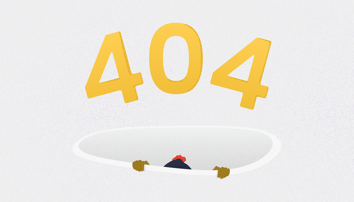
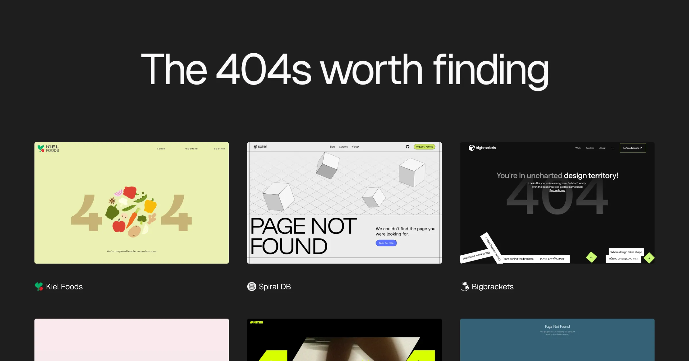
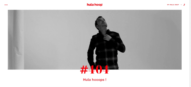
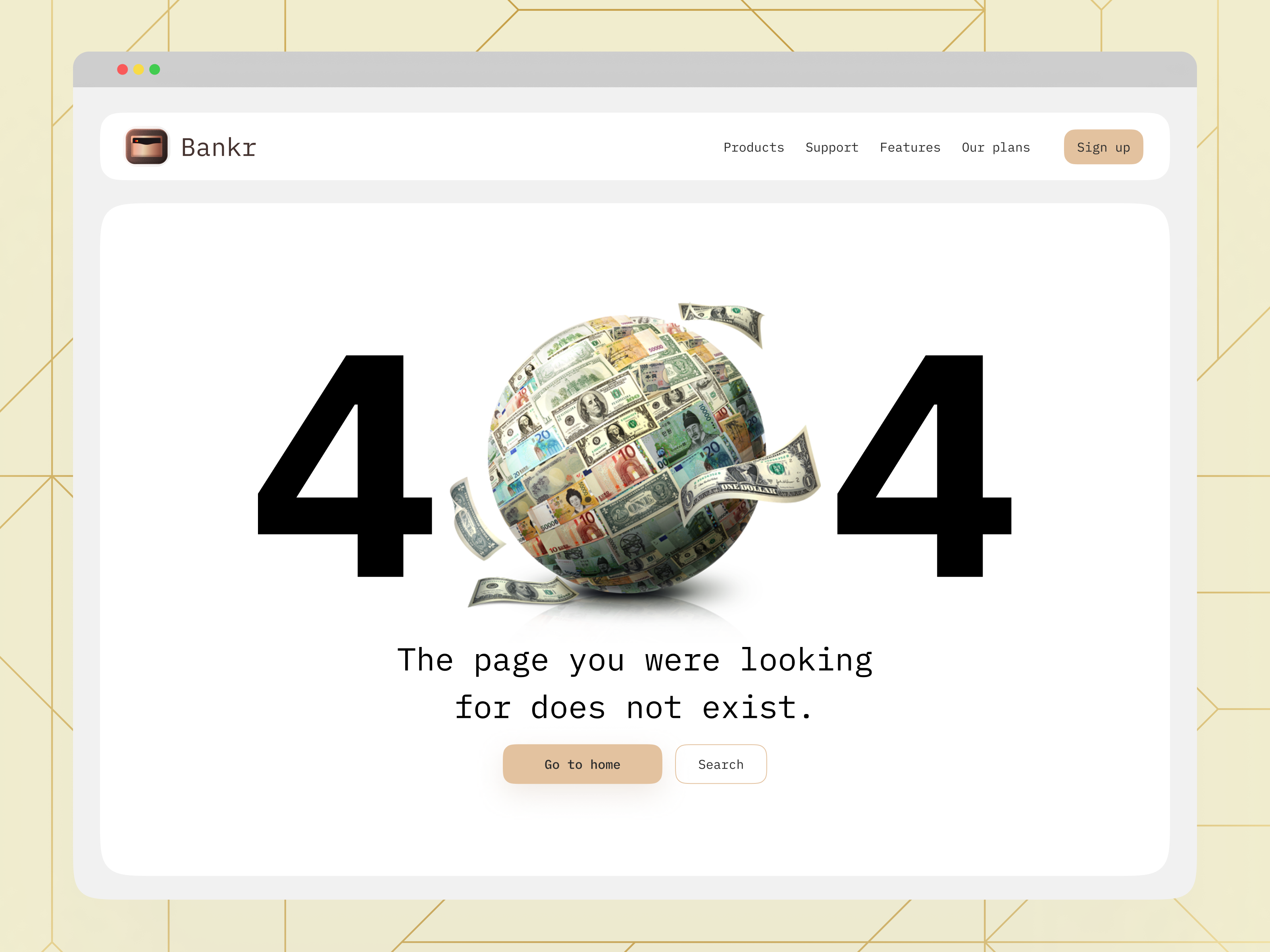
404 Creatives: Exploring the Artistry of 404 Error Page Design
via Muzli design inspiration hubLooking for more daily inspiration?Download Muzli extension — your go-to source for design inspiration!Is there a pattern for designing good 404 UI?Welcome to the realm of 404 pages, also known as “404, Page Not Found”, where error messages transcend mere notifications and transform into canvases of creativity. These seemingly mundane digital dead-ends have evolved into captivating showcases of artistic expression, reflecting the ingenuity and personality of their creators.In this article, we delve into the significance of 404 pages, exploring how they serve as more than just error prompts but as opportunities for brands to engage, entertain, and leave a lasting impression on visitors. Broken links are a common occurrence on the web, often leading users to encounter the dreaded 404 error page when attempting to access a non-existent or moved page. While initially perceived as a frustration, these error pages have evolved into crucial elements of web design and user experience.From whimsical illustrations to witty quips, each 404 page offers a glimpse into the brand’s character and commitment to user experience. Incorporating humor, creativity, or helpful navigation options into a 404 page can transform a moment of disappointment into a memorable interaction.Join us on a journey through some of the most imaginative and thought-provoking 404 pages across the web, where every error becomes an invitation to explore the unexpected and embrace the delightful quirks of digital mishaps. By embracing creativity and functionality in their design, website owners can transform these error pages into valuable touchpoints that enhance user experience, reinforce brand identity, and contribute to overall site performance.404 Creative examples:https://www.somefolk.co.uk/404https://springsummer.dk/404https://prand-n.ava-case.com/404https://www.santateresafest.ca/en/404/https://brewdistrict24.com/404https://letude.group/404https://alphamark.design/404errorhttps://www.flawgallery.com/404https://www.niccolomiranda.com/404https://makepill.com/404https://www.powell-studio.com/404https://gapsystudio.com/serices/https://www.depo.studio/404https://eventiveagency.com/404errorhttps://www.rawlab.co/404https://studio.playgoals.com/404https://www.dfy.co.kr/404/https://wildcatterla.com/404https://control.chipsa.ru/404https://www.epic.net/404/https://lunchbox.io/404https://c2montreal.com/sdfhttps://alongside.vahrushev.eu/404/https://search.muz.li/404https://www.designisfunny.co/404https://lemma.studio/404https://empiempi.me/404https://humbleteam.com/404https://www.goodkidsagency.com/404https://gentilhomme.com/en/404/https://www.haritos.co/404https://marioecg.com/404https://flecto.io/404https://speedy.io/404https://www.proxymadesign.com/404https://www.rockystudio.pt/404https://www.graphichunters.com/404https://www.henrynorthington.com/404https://www.gubrica.com/404https://fabbricagroup.fr/404https://maelanlemeur.com/404https://www.avroko.com/404https://www.rcarecords.com/404https://katyasmolianinova.com/errorhttps://marsbranding.com/404https://www.planet-lizard.com/404https://altsdigital.com/404https://www.landbrukskvartalet.no/404https://abhishekjha.me/404https://momset.store/404/https://www.castoretpollux.com/404https://www.giuligartner.com/404https://notoriousnooch.co/404https://www.keepgrading.com/404https://bear-rabe.com/404https://thisismagma.com/404https://www.humanastudio.com/404https://significa.co/404https://hematogenix.com/404https://secretsgravityfalls.tilda.ws/en/oopshttps://olhauzhykova.com/spaceneedle.htmlhttps://www.clouarchitects.com/404https://www.k95.it/en/404https://basement.studio/404https://www.howdy.gr/404https://microwaver59.com/404https://annoyingmuseum.zendesk.com/404https://arcr.ru/404-404/https://mediainnovatiecampus.nl/404https://chirpley.ai/404.htmlhttps://www.aquerone.com/404https://advanced.team/404https://www.magnetism.fr/en/404https://craiecraie.com/404https://etiennebarbedette.com/404404 Creatives: Exploring the Artistry of 404 Error Page Design was originally published in Muzli - Design Inspiration on Medium, where people are continuing the conversation by highlighting and responding to this story.
404s — gallery of error 404 page designs

404 Error Example #1

Personal Project /// Error 404

404 Error Example #3

Master 404 Error Page Designing #12hacks
I’m going to share the complete hacks regarding designing 404 page but before that understand why it’s happening and what are the consequences we have to face due to this. After understanding this as a designer we can design the best 404 pages with better user experience.Real-Life ScenarioWhen you are at an unknown place, and you get lost there, and neither you have the map. Now, you start getting frustrated.And at the time, if someone helps you to find your path. That’s feeling is great, agree?404 Error Page is similar to real-life problems and you just have to deal with it the same way as other problems.You can take 404 Page as an opportunity to make as welcoming, as engaging as possible to offer a variety of solutions to reduce customer frustration and let them stay on the site/app much longer.Default 404 Error PageIf you don’t take 404 Page seriously, not giving that much importance as another page then you have to face consequences.Bad NewsAs research concluded, 74% of customers leave the site after they face a 404-error pageGood NewsOnly 23% of visitors that encounter a 404 page make a second attempt to find the missing page.Understanding of ErrorTo create a best 404 page, you have to understand:The type of 404 errorWho causes this error?Type of 404 ErrorError 404 | HTTP 404404 File Not FoundThe page cannot be foundThe requested URL not found on this serverHTTP 404 Not Found | 404 Page Not FoundWho causes this error?Either it’s come from the user side or it's from the website side. Right?If the error is from the user side then they typed the link incorrectly. You can’t control what person type into their keyboard.Simple Categorization of ErrorSimple we can categorize 404 Errors in 3 Simple Parts:Page is deletedUser Type wrong URLThe link does not exist nowDiagrammatic View: 404 ConsequencesBut we have to understand that “Mistakes are a part of our lives"Now, after understanding what’s 404 is all about. Start designing it with proper hacks.Hack 1: Maintaining brand consistencyAlways maintain consistency with your fonts, themes, logo, header, footer like other pages. So, that you’ll find thisa page similar to others.Real website example:Qatar 404 Error pageHack 2: Provide NavigationProvide navigation on the 404 page so that users can navigate from that page to another page while remaining on your site.Real website example:Pexels 404 Error pageHack 3: Provide Search boxProviding a search box, you can easily navigate from the 404 page to any other page. It’ll give the opportunity to the user to type.Real website example:GitHub 404 Error pageHack 4: Showing emotionsYou can provide emotions to your 404-page design so that it’ll look more original and realistic like “oops”, “Ohh”, “Awhhk”, “Hmmm”. Here your main goal is to target people’s emotions.Real website example:Pixar 404 Error PageHack 5: Be ApologeticThe more important part of designing a 404 page always shows an apology, even if it’s user fault. The main goal of apology is that you are showing your user that you really value them.Real website example:Amazon 404 Error PageHack 6: Keep your error message simpleDon’t’ show scary text and image here. Always provide a simple and clear message to your user. “Minimalism is best for any design”. Plain language helps every user to understand why they are getting this 404 error page.Real website example:Linkedin 404 Error PageHack 7: Add useful links onlyAdd a popular page of your website or any other important links on your 404 Page. Don’t try to overload your 404 Page with too many links.Real website example:Airbnb Pixar 404 Error PageHack 8: Give Homepage Link [CTA]Adding the home page button is important to add to your 404 page so that users come back to the main page because they are lost. So, you’ve to guide them and bring them back.Real website example:Udacity Pixar 404 Error PageHack 9: Add a bit of fun by adding Image | Animation | IllustrationYou can use illustration/images/illustration, images related to your theme or product by combining 404 in mind.Real website example:Grammarly Pixar 404 Error PageHack 10: Show Popular PostsAdding a popular page on your 404 page provide varieties to the users to maintain their interest.Real website example:Flickr Pixar 404 Error PageHack 11: Use of interactivityProviding interactivity like adding games, quizzes, drawing, etc so that users can interact with your 404 page and don’t feel bore while seeing it.Real website example:Dev Pixar 404 Error PageDribbble Pixar 404 Error PageHack 12: Show matching resultsThis trick is also helpful as if your user did a mistake by typing ountain then you can show other results matching with the term that the user wrote. It'll also give varieties to users to explore.Real website example:Medium Pixar 404 Error PageIt doesn’t mean include all these elements on one page. The designer can make the decision base upon the requirement/priority.”404 Error Page Design: Don’ts Checklist1. Not treating the same way as other website pages.2. Blaming users that it's their mistake.3. Not giving enough information about the error.4. Not telling how to recover from the error.5. Overloading the page with many links6. Using the server's language for telling errors not user's language404 Error Page Design: Do’s Checklist1. Maintaining brand consistency2. Provide Navigation3. Keep your error message simple4. Show matching results5. Provide a Search box6. Give Homepage Link [CTA]7. Be Apologetic8. Show Popular Posts9. Add useful links only10. Add a bit of fun by adding Image | Animation | Illustration11. Showing emotions12. Use of interactivityIf you love this post, please give a like to boost my confidence to write more posts for this community. I’m also sharing a short microblog on my Instagram(designer.akash) page also.RegardsAkashMaster 404 Error Page Designing #12hacks was originally published in Muzli - Design Inspiration on Medium, where people are continuing the conversation by highlighting and responding to this story.

Error 404 Page design BOOTSTRAP

Sunlight 404 Error Page
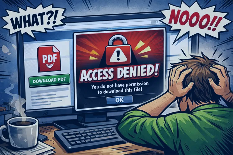
How to Create an Effective 404 Error Page
Details are often the most interesting aspects of a product. Little details make up the product as the whole. But no matter what these details are — preloaders, icons, or error pages — they must complement the general look and feel of your app. In this article, we unfold how to create a beautiful and effective error page. An […] The post How to Create an Effective 404 Error Page appeared first on Design your way.

How to Create an Effective 404 Error Page
404 Error Page for Fintech Platform
This is 1% of what Muzli shows you.
Get the rest — fresh design inspiration on every new tab, free.
Add Muzli — free
Error Screens and Messages: Tips and Practices
Any way to success is made of not only achievements but also failures and errors. With digital products it works the same way: only in the perfect world, do people and apps communicate with no mistakes, misunderstandings, technical faults, and unpredictable scenarios. Well, none of us is there, we are in the real world. Here diverse errors present an integral part of any user experience, so there is no chance for designers and developers to avoid dealing with them.Let’s get well-prepared: today we’ve gathered an article devoted to various errors in user interfaces. Here we’ll talk about types and reasons for errors as well as design strategies and practices for reducing the negative effect they may bring up.What Is Interface ErrorInterface error is the state or condition when the app cannot do what the user wants. It usually happens in three typical cases:the app fails to do what’s requested (literally, like there is no such a technical possibility or function)the app cannot understand the input from the user (or the input is invalid)the user tries to combine operations that cannot work together (that usually happens because the user isn’t aware of the processes inside the app)Sure, errors present a kind of annoying or even frustrating part of the user experience. Yet, there is no way to avoid them, so designers, developers, and UX writers have to think about ways to make that kind of interaction more user-friendly and smooth. Why is that important? Because as well as in real life, virtual mistakes make a significant psychological impact and form a negative emotional background. For example, the research measuring the psychological stress caused by smartphone interactions showed the direct connection between appearing error messages and the level of cortisol, a known biomarker of stress. It can increase the anxiety feeling and provoke a user to stop trying to interact with the product before they even start analyzing what’s the reason. So, let’s see what to do with those situations.This is what the error of filling the subscription form on the Tubik Blog website looks likeBest UX Practices for ErrorsErrors are like fights: the best one is the one that never happened. There are different strategies for error prevention, like tooltips, prompts, tutorials, directional cues, suggestions, highlights, limitations, and the like. Yet, what should you do with users that already experience the error? Let’s cover some points that are effective in designing errors that wouldn’t make the user instantly turn their back to your app.Make the error instantly noticeableIt may seem obvious, but don’t get tricked by it: what seems obvious has to be thought about twice. The worst thing that may happen about the error is the user totally uninformed about what’s going on and gets lost in the process. Be always honest with the user and don’t try to mask the error. Even if the interface is super minimalist and any alien inclusion hurts your perfectionist designer’s eye and soul. Beauty doesn’t matter if it doesn’t work.For example, if the user is filling the form made of 10 different fields, don’t just inform them that the form is not filled correctly, don’t make them search from one field to another where they made a mistake, and don’t hope they will do it. Make the field with a mistake super visible and save users’ energy and time.Use well-recognized visual markersKnowing mental models and well-known patterns of user behavior, user experience designers can reduce the cognitive load. That’s particularly essential in the error situations that are quite unpleasant by default. Error screens and messages may be not the best place for experiments, so consider markers that are quickly recognized by most users. The red color and exclamation marks are still among the most popular ways to attract users’ attention to the errors. Yet, be careful using the color as the only way to mark the error: check if it works for color-blind users. Also, mind the high level of readability on different devices.Here’s how the registration error is marked on ArtStation: the system marks the field with color and explains the issue with a text prompt.Explain what happenedWhatever is the reason for the error, you may feel the urge not to explain anything, just to proceed with solving the issue. And that’s a mistake. Firstly, you risk getting a user back in this error situation again and again as they don’t understand what is wrong with their actions or app response. Secondly, we’ve already mentioned that errors literally provoke a psychological state of anxiety, and you may not predict if this error becomes a part of the wrong interaction pattern. So, be sure to find a way to quickly explain the nature of the error and keep users informed. For instance, instead of just informing (“You cannot log in to the app”) make the message explanatory like (“The username or password do not match”).Don’t add more actions than neededAnother thing you may feel like doing is putting all the errors on separate pages or pop-up windows to make them as catchy as possible. Don’t overplay with it: in most cases, it’s enough just to make a color contrast marker in the interactive zone instead of popping up the additional modal window with the message requiring another unnecessary click to get the user back to the same page. Imagine that you are filling in the registration form and get that kind of pop-up for errors; no doubt, you will hate it very fast. Don’t make your users experience that: aim at providing inline validation and keep the message close to the field in error.Yet, a pop-up window will be helpful if the user needs to be redirected to another page because of the error. So, for each case take into account all pros and cons and target your solutions well.This is how the error is marked on the Tubik website when the user tries to complete sending the contact form without adding an email.Write simplyIt’s crucial to make the error message as simple and clear as possible. Clear for the target user, not for the designers or developers creating that product. Avoid special terminology and jargon which you may use with QA engineers, for example (Like “Error 4.7 occurred” or “syntax error happened”). Don’t use long complex sentences. Don’t make long and ornate introductions, it’s not the best place for them. Go quick to the point and make it decent.Don’t blame a userThere’s an easy way to make a bad situation even worse: just tell the users that they are not clever enough to interact with this app and that is why the errors happen. Offensive, isn’t it? Whatever form you wrap this message in, it will hurt the user who is already worried about things going not the way they wanted. So, don’t blame a user, be polite, friendly, and helpful, that’s important for setting the right emotional background of the situation. Try using clear instructions instead of blaming: for example, say “Enter the valid email address” instead of “You’ve entered the invalid email address”.Be constructiveInforming the user about the error in the right way is not enough: whatever friendly is the information that you got lost, it isn’t super worthy if you don’t know what to do next. So, be quick to let the user know how to solve the issue. Some of the popular practices are the following:If that’s a web interface, give the options to move to other pages of the website, first of all, the home pageIn the mobile interface, make it easy to take a step back or quickly connect to the spot of the errorIn case of complex forms and processes, do it for each step instead of at the end of all the processesThis 404 page of the fashion brand's e-commerce website gives the visitor various options to jump to, marking the ability to get back to the home page as the main call-to-actionConsider using images and iconsIt’s not a secret that people perceive and decode images faster than words. So, thoughtful use of an icon or image on the error screen can make communication faster saving the users’ energy and good mood. What’s more, images have a big potential for emotional appeal which can reduce the tension of dealing with an error.https://medium.com/media/33ce2d875fa61260198c9fcfcb88ebbb/hrefTest and analyzeDon’t have an illusion that work on error presentation is finished with the UI/UX design stage of the project. It never stops, because the feedback from real users is the best way to improve the user flow. A/B test different options, analyze carefully what are the most vulnerable zones and interactions, and use the findings to prevent errors where possible and smoothen the process where the mistakes are unavoidable.Add fun if that’s appropriateThe page or screen of an error message can use gamification, interactive content, or other ways to add fun and this way reduce the negative effect. One of the good examples is the 404 page on Dribbble: as its target audience is designers, the resource uses their natural creative curiosity to add fun to the error situation, so users can see the collection of popular designs organized along with a similar color palette. On the page, users can continue the game and try other colors or search for what they need using the search field integrated into the error page.Well-Done Errors ChecklistSo, to sum up, well-crafted errors would rather stick to the following points:readable and cleareasily noticedconstructiveeffort-savingpolite and friendlyreasonably emotionalWe will continue the theme of dealing with errors in interfaces effectively in our next article, stay tuned!Useful UX Design ArticlesHere’s the set of articles on more aspects and best practices of user experience design.The Anatomy of a Web Page: Basic ElementsMotion in UX Design: 6 Effective Types of Web Animation5 Basic Types of Images for Web ContentAesthetic Usability: Beauty on Duty for User ExperienceTypes of Contrast in User Interface Design5 Pillars of Effective Landing Page DesignHow to Make Web Interface ScannableHow to Design Effective SearchWeb Design: 16 Basic Types of Web PagesBasic Types of Buttons in User InterfacesOriginally written by Marina Yalanska for Tubik BlogWelcome to check designs and art by Tubik via:WebsiteDribbbleBehanceTubik ArtsError Screens and Messages: Tips and Practices was originally published in Muzli - Design Inspiration on Medium, where people are continuing the conversation by highlighting and responding to this story.

Illustration as UX: How Custom Spot Illustrations Guide Users, Build Brand Personality, and Reduce Cognitive Load
Too often, illustration is treated as digital decoration, a nice-to-have layer added at the end of a project to make things “pretty.” This is a costly misunderstanding. When strategically integrated, custom illustration is a core component of the user experience, directly impacting usability, comprehension, and brand loyalty. It is not an expense; it is a high-ROI interface asset. Here is the business case for treating illustration as essential UX. 1. The Cognitive Shortcut: Explaining Complex Ideas Faster Than Text The human brain processes images 60,000 times faster than text. In a digital product, where user patience is measured in seconds, a well-crafted illustration can replace paragraphs of explanation. The Principle: Pictorial Superiority EffectUsers are far more likely to remember and understand information presented as an image versus text alone. UX in Practice: Complex Onboarding: A fintech app explaining “tax-loss harvesting” can show an abstract illustration of a scale balancing gains and losses with visual metaphors, instead of a dense block of financial text. Empty States: A project management tool’s “No tasks yet” screen. Instead of just text, a simple illustration of a calm figure planting a flag on a blank landscape conveys “a fresh start” and the action to take (“plant your first task”) with immediate emotional resonance. Feature Introduction: A new “end-to-end encryption” feature in a messaging app. An illustration showing a message turning into a sealed, unique envelope as it travels between two phones is instantly understandable, building trust faster than a technical footnote. 2. The Wayfinding System: Creating Visual Anchors for Navigation Illustrations can serve as intuitive, memorable landmarks in a digital space, aiding spatial memory and reducing the cognitive load of navigation. The Principle: Recognition Over RecallIt is easier for users to recognize a visual cue than to remember which textual menu item they need. UX in Practice: Category Differentiation: In a banking app, “Savings Goals” could be represented by a mountain summit flag, “Investments” by a growing sapling, and “Insurance” by a shield. These become intuitive icons users scan for, not just labels they read. Progress Indicators: A multi-step setup process uses a cohesive illustrated story. For a fitness app, the user moves from an illustration of putting on shoes (Profile Setup), to stretching (Goal Setting), to running (Connection to Devices). This creates a narrative journey that feels rewarding, not bureaucratic. Error State Identification: A “404” page with a custom illustration of a broken robot or a lost explorer not only softens the frustration but creates a unique, brand-specific memory point. Users remember the friendly broken robot, not the error code. 3. The Brand Personality Engine: Injecting Warmth and Building Trust In a world of sterile, template-driven interfaces, custom illustration is the primary vehicle for expressing brand voice, humanity, and emotional intelligence. The Principle: Affective ComputingThe emotional response a product elicits directly influences a user’s perception of its usability and value. UX in Practice: Tone Management in Stressful Contexts: A tax software company using friendly, approachable cartoon characters to guide users through stressful financial forms reduces anxiety and builds a “helpful guide” persona, directly increasing completion rates. Differentiation in Commoditized Markets: Two CRM tools may have identical features. The one that uses a distinct, quirky illustration style to represent “lead pipelines” or “contact management” feels more human and memorable, reducing perceived fungibility. Building an Emotional Bridge: A health app tracking a sensitive journey like pregnancy or mental health uses gentle, abstract, and inclusive illustrations to create a sense of safety and empathy that photography or UI components alone cannot achieve. The Strategic Framework: How to Integrate Illustration as UX For illustration to function as UX, it must be systemic, not sporadic. 1. Define Its Functional Role: For every illustration, ask: Is this decorative, communicative, or navigational? Only “communicative” and “navigational” illustrations are UX-critical. A background pattern is decorative. An illustration showing how to connect a device is communicative UX. 2. Establish a Visual Language Library: Create a strict system, just like your design system.* Character System: Consistent rules for anatomy, proportion, and expressiveness.* Metaphor Library: Approved visual metaphors for key concepts (e.g., “security” = shield, “growth” = sapling, “connection” = interlocking gears).* Spot vs. Scene Rules: When to use a simple spot icon vs. a narrative scene. 3. Pair Copy and Image as a Single Unit: The text and illustration should be conceived together. The illustration should not just repeat the text; it should enhance or clarify it. Write the microcopy, then brief the illustrator. 4. Measure Its Impact: Track UX metrics for screens with key functional illustrations.* Time on Task: Does the illustrated onboarding explain the feature faster?* Error Rates: Do users make fewer mistakes in a complex flow with illustrative guidance?* User Sentiment: In surveys, do users cite the illustrations as “helpful” or “reassuring”? The Bottom Line A custom illustration is not a cost on a line item. It is an investment in: Reduced Support Costs: Fewer users confused by complex features. Increased Engagement: A more emotionally resonant product people return to. Brand Equity: A distinct visual language that is impossible for competitors to copy. When you treat illustration as UX, you stop asking, “What should we put in this empty corner?” and start asking, “What user problem can we solve with a visual story?” The result is an interface that doesn’t just work, but connects, explains, and delights. It becomes a product with a soul. The post Illustration as UX: How Custom Spot Illustrations Guide Users, Build Brand Personality, and Reduce Cognitive Load appeared first on Designer Daily: graphic and web design blog.
Adding value to our client’s platform and brand
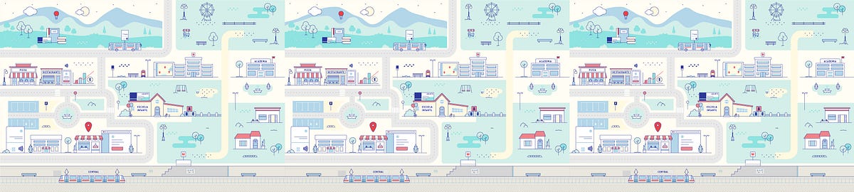
How to make a brand thrive along with the siteNot every brand guidelines include definitions for the usage of photography, illustrations, or image styles. Far from being a problem, this could mean a great opportunity for a redesign project. While filling the requirements for a software development project, we discovered the chance to create and explore a visual universe to enlarge our client’s identity.On every website, we find common spaces to communicate the users what is happening. Places where the message is simple but we can tell a story. Some of them include logins, error pages, and loadings, they communicate the same on every site, and that is what let us space to release some creativity.The starting pointOur client’s business is about offering services to other companies, along with a platform to manage them all internally. Our job was to redesign and rethink that custom service platform. At the moment we started, they had this website that was built some years ago, it had an old design and some performance problems. They needed a fresh start from the visual and technical perspectives; something simple, fast, and easy to use.It was not the typical product site with a homepage that explains what they do and try to sell it. The end-user of this platform is a customer that already bought our client’s services and uses this platform to manage them in their own company. When they reach this site it’s because they have credentials and they already know what the site is about and what it is for.On a good side, the users are somehow prepared for what they are going to find in the link. They will come to this platform (maybe more than once a day) with a task to complete. So it’s important that we don’t distract the user from what they’re trying to achieve.We wanted to make the design visually attractive without cluttering the site, so we had to pick the right moments and the right ways to do that. Our goal was to find those places where we could make the site friendlier and integrated into the brand, keeping in mind that the main purpose of this platform was to manage services in a simple way without disturbing.The client’s brand was defined with a color palette, typography, and style for icons, but there wasn’t a strict guideline for images and illustrations, and that’s where we saw an opportunity.Choosing the right formatWe discarded the usage of photography; photographs are more suitable for products, more literal and grounded in reality. This site was neither about selling a product nor describing it, but to improve the experience of the current users and help them achieve their tasks easily. Illustrations work better to express concepts and we could easily include our client’s color palette to make them part of the brand. Besides vectors can perform much better than raster images (we’ll talk more about this later).Our proposal was to build a graphic universe with illustrations to show all these services in a friendlier way and also to communicate when something was happening on the site. By building this graphic universe we are adding a new ingredient to their guidelines, a different solution to approach any possible visual communication problem. We are not offering a set of images, but a set of rules for a language that they can continue to develop and make part of their brand.References FirstWe started by showing the client some references for illustrations with a small description so they could decide which style represented them the most. Some of these images included different perspectives, dimensions, depths, characters, stroke styles, gradients, and solid combinations, rounded and sharp edges, between others. From the beginning, we discarded any complex texture, effects, or super realistic illustrations. We knew that performance will pay if we keep it simple from the beginning.Illustration referencesTest the idea with the styleThe client picked two options, so we delivered some small sketches to start testing the styles and at the same time, talking about the ideas to represent. The Login is the first page the user will see, and also the one with more space available for creation. Here, we wanted to show a city where all our client’s services coexist, so we sent some drafts of the city with both styles:First drafts for stylesAs we mentioned before: when the users reach the login, they are aware of what the site is about. We didn’t need to explain the services in detail but to think about how the illustration could reinforce their benefits.After they picked one final style and the idea of the city was approved, we started discussing which elements to show and how to represent them.Drafts of illustrations and Login pageThis phase was about getting the best way to show all the scenes of the city until the login design was finished. That is when we started focusing on the code and choosing the best way to implement those illustrations on the site.Using SVGAs soon as the illustration was approved, we exported the file from Illustrator to SVG as it’s the best format to use vector images on the web. We decided to use the SVG code inline in our document because this approach allows us to make use of animations. Let’s review some of the benefits of inline SVG:Very low file size with the best resolutionFlexible options for responsive designGreat performanceRenders immediatelyAccessible through the DOM so we can interact with any group of vectorsAllows control of some attributes through a stylesheetAllows CSS animationThere are a few ways to export the SVG, the easiest one is to copy the vectors from Illustrator and paste them in a text editor. As simple as that:Copy/paste from Illustrator to text editor.The software adds a lot of code that is not necessary and hurts legibility and performance. That’s why a tool like SVGOMG helps us optimize the file in a fast and easy way. Going deeper in that direction, manual optimization is usually part of our process. Another important thing to keep in mind is that SVG is a great ally for accessibility.Now we have our code clean and we can start adding classes to the elements we want to animate. In this case, CSS animations were enough to build these simple animations.This was the result for the Login page, the SVG illustration weights only 42k after optimization:Login with micro animations.Note: The gif is displaying in a loop but some animations where playing just once.After the main animation was ready, smaller instances were easier to build. Once users get into the site, different scenarios of the city appear as they navigate it. Other instances included a loading animation, an error message, and a 404 error page:Loading.Error message.404 error page.Using the same illustration language we started building a graphic universe, communicating different messages with the same visual identity. We are able to enrich any instance in the site in a non-verbal way, without losing identity but widening our possibilities of expression.Two valuable conclusionsVector graphics gave us the possibility to work with SVG and CSS animations. This way we could deliver low file sizes with the best quality resolution and performance that adapt to every viewport.Agile methodologies were not only used in the development instance of this project, but also in the UI/UX definition phase. We made the illustration process part of our sprints, which helped us to get the client involved at every point of the process. Their input was key, they gave us the freedom to propose a new language, they guide us through the way to make it work with their current brand and committed with every detail of each illustration.Adding value to our client’s platform and brand was originally published in Muzli - Design Inspiration on Medium, where people are continuing the conversation by highlighting and responding to this story.

Selected projects | Spring 2019
Some recent works. - American pilot - Runner - Error 404 - Online shopping - Car repair shop

project in meetoo 2018 by Jianwen Liu
In 2018 I went to work for meetoo to create a act game called JUMPING HERO. It was a very happy and fulfilling time . Everything is almost the first time , every thing is a big challenge , I have learned a lot in this project .since then , I have formally become a character designer. Big thanks to the art director BEE who hired me and taught me how to bring the characters to life . No one knows how important this is to me in that difficult time. https://www.artstation.com/beeee Thanks to ERROR404 who is a great talented artist. He is still an example for me to follow. https://www.artstation.com/error-404 thanks to hailei the PM who had helped me with the loading painting. It is my first time to do it. We have tried so many versions of it .You can see that my first version is very simple, but the last version semms to have improved a lot. I also tried to do some character action design and props design. These are very interesting experiences for me.
Alike short film

Electric Dreams | UE5 GDC 2023 - PCG by Jack McKelvie
I was brought on to the Opal team near the beginning of production to RnD how PCG could be leveraged to quickly make a new GDC demo for 2023. I created numerous works that were axed in favor of another direction lead by the PCG team, however I'm very excited to be able to share those works today as it's part of the story in how the team got to where it landed the project. I worked on a background PCG forest, PCG microscatter (non-GPU scattering), a landscape auto blend material, and I worked on making and polishing up some assemblies for the PCG team. The assemblies and the auto blend material made it into the final demo, whereas the PCG content did not. This was a monumental team effort, and here's a shoutout to some of those involved. I can't credit everyone here, so I've limited it to people who I worked with directly. Daniel Woje Wiktor Ohman Jakob Keudel Isac Crafoord Galen Davis Mathew OHalloran Majid Azim Adam Rosengren Jean-Sebastien Guay Huw Bowles Robert Osborne Marien Elalaoui The sample is available for download now, check it out here: https://unrealengine.com/marketplace/en-US/error-404?e=/marketplace/en-US/product/electric-dreams-env

PRESS BUTTER SAND

Rivian

Seed • The Evolution of Probiotics

Photos of Japanese Playground Equipment at Night by Kito Fujio

Naba - I'll be that for you. I want the connection, the vulnerability.
This is 1% of what Muzli shows you.
Get the rest — fresh design inspiration on every new tab, free.
Add Muzli — free
All the small things: creating appealing digital products with microcopy
What if you had a friend who helped you quickly find what you are looking for, simplified tedious tasks, made you smile and inspired creativity?All these wonderful things are the mission of microcopy, tiny text fragments that give a voice to digital products and services and help users accomplish their goal in the most efficient and pleasant way.We put this article together to explain how microcopy works and why you need it, look at the most common mistakes and share a few awesome examples.Meditation app Headspace and VPN service provider TunnelBear use cute images to make their calls to action even friendlier.Why do we need microcopy in the first place?Interface copy is a part of the brand that needs to be developed and thought through along with your brand book, logo, fonts, colours and icons. Frequently forgotten and deprioritized, it has the power to dramatically improve your UX, boost your customers’ loyalty, and, eventually, increase your earnings.Microcopy makes products appealing and memorable and has the power to save the day even when they fail to function.Texts in the interface are an important tool for the emotional journey. They can explain how something works, inform about a potential error and build trust. Microcopy adds a personal touch to your interaction and shows that you care about every detail.Here is the emotional journey on the website of HURU — Ukrainian brand of functional backpacks. Bachoo Design Studio created the page.After all, microcopy is just fun; we all enjoy finding Easter eggs and sharing them with friends. However, you shouldn’t overdo it: excessive jokes or word plays may distract or annoy the user.Ok microcopy, make people fall in love with my productThe key mission of interface texts is to facilitate a smooth user journey with non-intrusive interface notifications, pop-ups, hints and simple text explanations. Microcopy can also nudge the users in the right direction, inspire with sample passwords and creative file names, encourage to provide more information or use the product more frequently.Booking.com encourages to write more detailed reviews. The message changes as you write more.Dropbox thanks you for creating digital documents and saving the trees.Create rituals and share useful factsMicrocopy can be a source of helpful or inspiring additional information. You can add a few “did you know” facts about your company to the functional pages or share the statistics that highlight the benefits of your service.A couple of ‘Did you know?” facts on the loading screen of Duolingo, one of the most popular language-learning apps.If your users need to repeat the same operations every now and then, surprise them with various images or texts.Show empathy in challenging situationsWhenever users have to wait for a page to load or cannot accomplish a task on the website or in the app, they get frustrated. Support them with a friendly message, virtual hug or a cheering gif. Don’t apologize, rather show gratitude for bearing with you: “thank you for your patience” sounds better than “sorry for waiting”.Give your users choice and space and avoid being patronizing: the task of your microcopy is to delicately stand aside and only jump in when asked for help. Explain to the users why they need to provide particular information and give preference to soft words like “may” or “might” over more restrictive “must” and “have to”.Headspace wants to learn more about your meditation habits and asks a few questions to offer the most appropriate routine.Make “dead ends” work for youAccording to UX Collective, 74% of users encountering a 404 error page immediately leave the website. Most content management systems offer generic page templates which you should absolutely customize. Use your brand color, experiment with the message or simply link to the functional website pages.Collect feedback and offer incentives on your payment confirmation and unsubscribe pages to encourage the next purchase or convince the customers to give your newsletter or service another try.When there is an error or a bug on your website or in your app, communicate in plain text what happened, when it will be fixed and what is the current workaround. It is important for the users to understand whether they can resolve an issue on their own or have to wait for a resolution from your side.Handle objectionsIf your users may have concerns regarding their private data utilization, hidden payments or opt-ins, address them proactively in your microcopy.Let your users easily enable or deactivate particular features based on their preferences.Let’s make UX great again with microcopyInterface texts are a result of a joint cooperation between a UX designer, copywriter, product owner and customer-facing support team. As a first step, you need to fully dive into the tasks and expectations, fears, complications and challenges that users face on every stage of their interaction with the interface.To do this in a structured way, we create an emotional journey map. Once we understand which emotions our users experience on every stage, it gets clear which type of copy will be helpful in these scenarios.Based on the emotional journey map, a UX designer identifies the user flow as well as the sequence of screens while a copywriter establishes the tone of voice and consistent terminology.As a next step, we invite a few inexperienced users and watch them interact with our product.Remember that covering the basic needs along the user journey is just the first step: Many users don’t know exactly what they want and cannot voice their concerns. Observations help: write down every scenario where the users visibly struggle, fix all the issues and repeat this step a few more times.Once you launch the product, remain in touch with the tech support team: collect their actionable feedback and improve the parts that caused trouble.One of Bachoo clients aimed to create a mobile application with a lot of jargon for a particular target audience. We conducted a series of in-depth interviews with various user groups to align the terminology and build an equally appealing interface for both seasoned users and newbies.Base your decisions on data: Google Analytics or equivalent reports will help you identify the pages that contribute to your bounce rate. You can use Time on Page, Scroll Depth and Bounce Rate metrics to evaluate the efficiency of every page. For more advanced insights, use heat maps or usability tests with eye-tracking.Use consistent language and brand voiceHow would you like to sound: friendly or straightforward? Informative or playful? There is no one-size-fits-all: you can be equally successful with Queen’s English and urban dictionary memes as long as your audience speaks the same language. If your target group is too diverse, better play it safe.VPN service provider TunnelBear is using a friendly tone of voice and matching visuals to stand out from other, more conservative providers.Take time to define dedicated terms for every service feature and create a brand manual before moving on to copywriting. Here is how guys at Mailchimp describe their voice and done.If you are launching a one-of-a-kind innovative product or solution, you will have to come up with words for actions that haven’t existed before (think of googling, photoshopping or skyping). Create an internal glossary for the team and explain the terms to your users via FAQ or pop-up notifications to ensure you all are on the same page.What else you can do:If you write in English, choose between British and American version and stick to respective spellingBe consistent in the languages with two different words for formal and informal “you”Align the typography, punctuation and upper & lower case letter across all the interface textsThere are many synonyms for positive and negative actions: confirm, approve, agree versus cancel, decline or reject. Make sure all your action buttons have consistent labels.Choose active over passive and actionable over vague.Dive into local culturesCulture-specific content and references work magic if your market is homogenous. In other cases, you either need to use local references for every user group or replace them with universally accepted examples.If you write copies for diverse markets, find out how local citizens call specific things and which habits and prejudices might impact their interaction with your product.When Bachoo Design Studio worked on Airfox, a financial application targeting Brazilian citizens with lower-middle to low income, we needed to identify local transaction language, habits and instruments. Our designers worked closely with the local UX research team from Brazil that was in touch with the end-users.In the Airfox app interface, we left only the most critical information and eliminated all the other numbers. Users see how many instalments they need to pay, what is the amount of every fare and when it is due.In the Airfox app interface, we left only the most critical information and eliminated all the other numbers. Users see how many installments they need to pay, what is the amount of every fare and when it is due. — Yulia Snitko, Head of DesignRespect every userCommunicate carefully around these sensitive topics:EthnicityReligionGender self-identificationIncomeEducation levelShow your attitude in details: use simple English if your website or app does not offer separate language versions, choose open fields over predefined drop-downs in the forms that require personal data, create an accessible version of your product and give preference to neutral third person pronouns (they rather than he/she). Here are a few more great tips from Slack.Show what you expectWhen you need users to fill in the template or application form in a particular format, inspire them with a good example: suggest a creative name and indicate the valid date format, whether it is YY/MM/DD or the other way round.If they still make an error in the data input, highlight the section in question, explain what exactly went wrong and give an example of a correct answer.Mailchimp is using actual questions that sound more natural than classic “Your organization” and “Your website” fields. Typeform starts off with an informal greeting and shows a fictional character’s name as a sample email address.Mailchimp is using actual questions that sound more natural than classic “Your organization” and “Your website” fields. Typeform starts off with an informal greeting and shows a fictional character’s name as a sample email address. — Vlad Orlov, Art DirectorBe predictableThe users should know exactly where they land after clicking any of your website or app buttons. Will they have a chance to review their order once again? How will their data be used? “Click here” does not explain the action that follows. “Click to pay now” is more straightforward.Build multi-level structuresIf your copy targets both advanced users and newbies, work with focus groups representing every customer segment. Create multilevel information blocks with prominent hints and subtle second-level pop-ups that only appear on demand. If your system is extremely complex, consider creating a step-by-step self-learning tutorial.And please stay away from theseGeneric placeholdersForgotten “Lorem ipsums” and generic texts which were meant to be a placeholder yet stayed for good make your product look unkempt and less credible.Trick to subscribeSome websites use deceptive wording to make users subscribe to their newsletters or share their data unwillingly. That is not how you get a loyal customer base.Pressuring into decisionYou may indicate that your offer is time-limited, but don’t overpressure users with endless pop-ups, flashing letters or text manipulation. Also, don’t make your “unsubscribe” or “not now” buttons hidden or hardly accessible.Author: Elena Galitsky, founder and CEO at Bachoo Design StudioAll the small things: creating appealing digital products with microcopy was originally published in Muzli - Design Inspiration on Medium, where people are continuing the conversation by highlighting and responding to this story.

NASA’s Webb Space Telescope Reveals Astounding, Unprecedented Views of the Universe

DUNKIRK – Experience Dunkirk Site – In theaters July 21, 2017

Visions for the Future Internet · Nesta

Creddy
How To Protect Media Files Uploaded to WordPress
The WordPress Media Library is a handy tool for managing images, documents, and multimedia content. It arranges uploaded files into date-based folders and creates multiple image sizes. All great features for a basic website. There are a few drawbacks, however. The content management system’s (CMS) predictable file structure makes it easy to guess where a file is stored. For instance, a UK budget document leaked before its official release. How did this happen? A journalist was able to guess the file name based on last year’s version: The BBC was able to access the PDF version of the OBR’s key report at 11:45 on Wednesday by replacing the word ‘March’ with ‘November’ in the web address of a previous edition. Search engines can also index your site’s media files. This can be a benefit to your SEO strategy, but it’s not always desirable. Consider a membership website that requires registration to access specific files. A user may stumble upon a file via search, defeating the purpose of hiding files behind a login. None of this means that there’s a security flaw. Rather, WordPress wasn’t built with private media storage in mind. Thankfully, there are easy ways to improve media file security. Let’s review some tools and techniques for protecting your WordPress media files. They’ll keep your files away from prying eyes and might even save you some hosting bandwidth. Available Methods of File Protection The first thing to know about protecting your media files is that there are multiple types of protection. The method(s) you use will depend on your specific needs. We’ll break this section down by common scenarios. Note that none of the following options will guarantee file security in high-stakes situations such as the UK government leak above. Rather, they are basic measures that will make it harder for someone (or something) to access your files. With that in mind, here are a few ways to improve file security. Block Direct File Access From Outside Sites (Hotlinking) Let’s say you have a large PDF file on your website. By default, an external website could link directly to that file (a.k.a. hotlinking). It may seem harmless, but every time a user clicks that link, the file access counts against your hosting bandwidth. Even worse, the user never visits your website. The solution is to block hotlink access at the server level. Add the following snippet to your website’s .htaccess file: # Deny direct access to uploads unless navigated from your site (change example.com to your domain name) <IfModule mod_rewrite.c> RewriteEngine On # Only apply to files inside uploads directory RewriteCond %{REQUEST_URI} ^/wp-content/uploads/ [NC] # Allow requests from your own domain RewriteCond %{HTTP_REFERER} !^https?://(www\.)?example\.com/ [NC] # Block direct access to specified file types RewriteRule \.(mp3|mp4|pdf|zip)$ - [F,NC,L] </IfModule> If your website runs on an NGINX server, add this snippet to the nginx.conf file: # Deny direct access to uploads unless navigated from your site (change example.com to your domain name) # File types protected: mp3, mp4, pdf, zip location ~* ^/wp-content/uploads/.*\.(pdf|zip|mp4|mp3)$ { valid_referers none blocked server_names *.example.com example.com; if ($invalid_referer) { return 403; } } Be sure to change example.com to match your domain name and edit the included file extensions to match your needs. Note: We don’t recommend protecting image files this way, as it may lead to undesirable results. For instance, you won’t be able to include images or file links from the server in your email newsletter without adding some exceptions to the code above. Prevent Search Engines From Indexing Your Media Files Uploaded WordPress media files can easily end up in search results. This can be undesirable for a few reasons: Direct links to large files can eat up bandwidth. Users aren’t visiting your website, just downloading files. Members-only files could be exposed to the public. Part of any file protection strategy should include preventing (or discouraging) search engine indexing. As such, there are a few methods to implement. First, we can add the following to our site’s robots.txt file to discourage crawling of the /wp-content/uploads/ folder: User-agent: * Disallow: /wp-content/uploads/ This won’t prevent indexing of your files, just crawling. The main benefit is reducing the load on your server. To fully prevent indexing, we can use the X-Robots-Tag header. For Apache servers, add this snippet to your site’s .htaccess file: # Prevent indexing of media files in /wp-content/uploads/ <IfModule mod_headers.c> <FilesMatch "\.(pdf|doc|docx|xls|xlsx|ppt|pptx|zip|rar|7z|mp3|m4a|wav|mp4|mov|avi|webm)$"> Header always set X-Robots-Tag "noindex, nofollow, nosnippet, noarchive" </FilesMatch> </IfModule> NGINX users can add this to their nginx.conf file: # Prevent indexing of media files in /wp-content/uploads/ location ~* ^/wp-content/uploads/.*\.(pdf|doc|docx|xls|xlsx|ppt|pptx|zip|rar|7z|mp3|m4a|wav|mp4|mov|avi|webm|jpg|jpeg|png|gif|webp|svg)$ { add_header X-Robots-Tag "noindex, nofollow, nosnippet, noarchive" always; } The above methods will reduce bot traffic and reduce the likelihood that your files will appear in search results. Prevent Access to WordPress Attachment Pages By default, WordPress creates a post for every media file you upload. It may come in handy for some niche use cases, but it is most often a forgotten feature. Without further action, these posts can be indexed by search engines. Some SEO plugins, such as Yoast SEO, RankMath, and All in One SEO, offer settings to disable attachment pages. This is the simplest way to prevent search engines or users from accessing them. Short of that, you can also use a code snippet in your theme’s functions.php file or a custom plugin. We’ll share a couple of them that cover common scenarios. Return a 404 Error on Attachment Pages: If you’d like to deny access to attachment pages, the following snippet will do just that. Visitors will see a 404 page, rather than the attachment. <?php /** * Force attachment pages to 404. */ add_action( 'template_redirect', function () { if ( ! is_attachment() ) { return; } global $wp_query; $wp_query->set_404(); status_header( 404 ); nocache_headers(); // Load your 404 template. include get_query_template( '404' ); exit; } ); Redirect Attachment Pages to Parent Post: Here’s a slightly different approach that redirects users to the attachment’s parent post. This is handy for blogs and other online publications looking to ensure users see their content, rather than media files. <?php /** * Redirect attachment pages to their parent post when available. */ add_action( 'template_redirect', function () { if ( ! is_attachment() ) { return; } $attachment_id = get_queried_object_id(); $parent_id = wp_get_post_parent_id( $attachment_id ); if ( $parent_id ) { wp_safe_redirect( get_permalink( $parent_id ), 301 ); exit; } // No parent: redirect to file URL if it exists. $url = wp_get_attachment_url( $attachment_id ); if ( $url ) { wp_safe_redirect( $url, 301 ); exit; } wp_safe_redirect( home_url( '/' ), 302 ); exit; } ); If you don’t need WordPress attachment pages, there’s no reason to keep them around. Thankfully, you have several options for giving them the heave-ho. Use a Plugin for Media File Protection You can also use a plugin to protect your WordPress media files. The right plugin can do some or all of the above functions to keep your files safer. For example, Download Monitor offers multiple functions, including file protection. Among its features: Disable or enable specific folders for file downloads. Create randomly-generated URLs for files you want to protect. Attempting to access a file directly will result in a 404 error. Require users to log in before accessing a file. Keep track of how many times a file has been downloaded. The free version of the plugin covers common use cases. A premium version goes the extra mile by integrating with popular form plugins and adding CAPTCHA protection. Meanwhile, many membership plugins come with some form of file protection. Check out the plugin’s documentation to see what’s available. Take Control of Your Files and Gain Peace of Mind There are several reasons for locking down your WordPress media files, even if you aren’t posting sensitive information. For one, the rise of AI bot traffic means higher bandwidth usage. Restricting access to large files can prevent surprise charges on your hosting bill. Plus, media files and attachment pages can be taken out of context. A simple redirect can help by pointing users toward your content. That could be the difference between a one-time visitor and a loyal reader. Say hello to lower bounce rates! The above solutions are easy to implement into your existing website. What’s more, they bring a little peace of mind. You won’t have to worry about the wrong people accessing your files or causing a traffic nightmare on your server. Consider your file protection needs and how they might impact your SEO strategy. From there, you can create a plan that works for you. The post How To Protect Media Files Uploaded to WordPress appeared first on Speckyboy Design Magazine.

The Enterprise Design Sprint - DesignBetter.Co

Star Wars 360 Interactive Experience

PLANETS ILLUSTRATION

Digital Design Days + Offf Italia Milano 1 2 3 June 2017 La Fabbrica del Vapore

Spotting Good, Bad & Ugly Error Messages: A UX Guide
How to write better error messages that communicate better with the users.Something went wrong.Three words…Yet they might be the most frustrating words in digital products.Not because something failed.But because the product stopped communicating.For years, UX designers have been taught to write better error messages:Be clear.Be concise.Be helpful.That’s still good advice.But in the age of AI, it isn’t enough anymore.The real question has changed from:“How do we write a better error message?”to“How do we help users recover before they even feel stuck?”That’s a completely different design challenge.The Ugly Error MessagesLet’s start with the worst offenders.❌ Something went wrong.❌ Unknown Error.❌ Error 500.❌ Operation Failed.Technically, these messages are accurate; practically, they’re useless.Every user immediately asks the same questions:What happened?Why did it happen?Can I fix it?What should I do next?The system knows the answer.It simply chooses not to share it.The Bad Error MessagesBad error messages reveal what happened, but hide why.Examples:🚫 Upload failed.🚫 Payment unsuccessful.🚫 Password incorrect.These messages are better……but they’re still incomplete.Imagine a restaurant telling you,We can’t serve your meal.Naturally, your next question would be:Why?Out of stock?Kitchen closed?Wrong order?Users deserve the same clarity from digital products.The Good Error MessagesGood error messages don’t just report problems, they reduce uncertainty.Instead of saying:❌ Upload failed.Say:✅ Your file is larger than the 25 MB limit. Try compressing it or upload a smaller file.Instead of:❌ Invalid email.Say:✅ Please enter a valid email address, such as name@example.com.Notice the difference?The user immediately knows what happened and how to move forward.A great error message answers three questions:What happened?Why did it happen?What should I do next?If one of those answers is missing, the message still has work to do.We’ve Been Designing Error Messages for SystemsTraditional interfaces treat every user exactly the same.Whether you’re a first-time user or an expert or whether you’re on your first mistake or your tenth, everyone sees identical text.But this “one-size-fits-all” approach doesn’t work. Because the error is the same, but the people aren’t.That’s the limitation of static interfaces.From Static Errors to Dynamic ConversationsImagine two people entering the wrong password.User AFirst login attempt.Your password doesn’t match this account. Double check for typing mistakes or reset your password if you’ve forgotten it.User BSix failed attempts.We’ve noticed several unsuccessful login attempts. For your security, your account has been temporarily locked. Reset your password to continue.It’s the same error, but different conversations.That’s what dynamic error messaging looks like.AI Changes the RulesAI gives products something they’ve never really had before — Context.Instead of showing one predefined message, AI can understand things like:Is this the user’s first attempt?Have they encountered this error before?What are they trying to accomplish?What happened immediately before the error?Are they a beginner or an experienced user?Which recovery option is most likely to work?Instead of reporting failure…The product can respond intelligently.The Most Overlooked UX OpportunityHere’s something we rarely discuss.Most error messages appear after users fail.But AI allows us to intervene much earlier.Imagine someone repeatedly uploading a file that’s too large.Traditional UX keeps saying:File exceeds 25 MB.Again.And again.And again.An AI-powered product could recognize the pattern and respond differently:It looks like you’ve run into this a couple of times. Would you like me to compress the file automatically before uploading?The interface has evolved.It no longer explains the problem.It solves it.That’s a fundamental shift in UX thinking.Think Beyond Error MessagesMaybe we’ve been using the wrong term all along.They’re not really error messages.They’re recovery experiences.The goal isn’t to explain failure.The goal is to get users back on track as quickly and confidently as possible.A simple framework for designing them is:Understand → Explain → Guide → PreventUnderstand what the user is trying to achieve.Explain what interrupted that goal — in plain language.Guide them with the clearest next step.Prevent the same problem from happening again.That final step is where AI creates entirely new possibilities.The Next Generation of Error MessagesImagine booking a flight.You accidentally enter a passport number with one missing digit.Traditional UX:Invalid passport number.AI-powered UX:Your passport number seems shorter than expected. It looks like one digit may be missing. Would you like me to highlight where?Or imagine an AI writing assistant.Instead of saying:Prompt too vague.It could respond:I can help with that. Try adding your audience, tone, or desired outcome so I can generate something more useful.One reports an error.The other guides.That’s the difference between an interface and an intelligent assistant.A Better Question to AskThe next time you’re designing an error message, don’t start with: “What should this message say?”Start with:“What does the system already know that could help this user recover faster?”That one question changes everything.Because the future of UX isn’t about writing friendlier error messages.It’s about designing systems that understand people, adapt to context, and turn moments of failure into moments of guidance.In the AI era, the best error message isn’t the one that’s written best.It’s the one users barely notice because the product helped them recover before frustration ever had a chance to grow.In the AI era, the best error message isn’t the one that’s written better, it’s the one users never need because the product helped them succeed before they failed.💡 Stay inspired every day with Muzli!Follow us for a daily stream of design, creativity, and innovation.Linkedin | Instagram | TwitterSpotting Good, Bad & Ugly Error Messages: A UX Guide was originally published in Muzli - Design Inspiration on Medium, where people are continuing the conversation by highlighting and responding to this story.

EVS wishes you an innovative 2018!
This is 1% of what Muzli shows you.
Get the rest — fresh design inspiration on every new tab, free.
Add Muzli — free
20 Inspirational Examples of Interactive Maps and Street View experiences in Web Design

Rainy Australian Cityscapes by Mike Barr

Aurélia Durand – Portfolio
Making GitHub’s new homepage fast and performant

Miu Miu - The new fragrance Twist
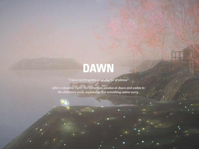
Turn of the Screw

Serkonan Legends
The types of design research every designer should know

*** L I V E *** DDD20 - DAY 3

Neurohive

Techtak
How we built the GitHub globe
This is 1% of what Muzli shows you.
Get the rest — fresh design inspiration on every new tab, free.
Add Muzli — free
A Human-Shaped Pool Reflects the Sky Over Tbilisi by Icy & Sot
Hand UI

Google Design's Best of 2017

Soar Above Iceland’s Otherworldly Landscape in an Atmospheric Short Film by Vadim Sherbakov
Russian photographer and videographer Vadim Sherbakov travels the world in search of unforgettable images for both personal and client projects. A recent short film, Islandia, transports the viewer to the island nation and highlights the timeless beauty of Iceland’s natural landscape. Cavernous fjords, rushing waterfalls, and winding rivers cut through the island’s rugged terrain. Sherbakov used a DJI Mavic 2 Pro drone to shoot the aerial film, and licensed original music by Luke Atencio and Ryan Taubert. More

Endless Stories

A Private Sanctuary Hidden in the Rainforest in Byron Bay
A hidden retreat for guests is built within a rainforest with views of the Pacific Ocean.

If modern internet companies existed in 1970s - early 1990s
Uber.Design

Iron Velvet - Digital experiences studio from France

Winter Is Coming: A Photographic Tribute to ‘Game of Thrones’ by Kilian Schönberger
In honor of the final season of Games of Thrones, German photographer Kilian Schönberger (previously) has translated his ethereal photography of central Europe’s icy landscapes, mystical castles, and foggy forests into a photographic tribute. Inspired by the frozen fantasy world of George R.R. Martin’s books and by the geography of his native lands, Schönberger’s alternate storyline imagines snow-covered trees as menacing White Walkers, towering mountain ranges as The Wall, and ancient stone structures as home to the highborn families of Westeros. More

Motion Design and Typography: Liquid Calligraphy

C I S T E R N E R N E
This is 1% of what Muzli shows you.
Get the rest — fresh design inspiration on every new tab, free.
Add Muzli — freeC I S T E R N E R N E
Get access to thousands of freshly updated design inspiration pieces by adding Muzli to your browser.
Loved by 800k designers worldwide, Muzli is the leading go-to browser extension for creative professionals.
How to design a great and effective 404 page not found
Error pages can have diverse designs: it can be minimalist, funny, or reserved. Its design depends on your product and the mood you aim to create. For example, error page can have diverse designs: it can be minimalist, funny, or reserved. Its design depends on your product and the mood you aim to create.
We have a great article about 404 error page design principles you can't afford to ignore.