Design Inspiration
Dashboards, admin panels & analytics design inspiration
In an increasingly data-driven world, designing charts and dashboards with clean and insightful displays is quickly becoming one of the most in-demand skills on the market. Dashboarding uses a variety of different displays - both static and interactive - to convey information in easy-to-understand, logical ways.
We curate topical collections around design to inspire you in the design process.
This constantly-updated list featuring what we find on the always-fresh Muzli inventory.
Last update:
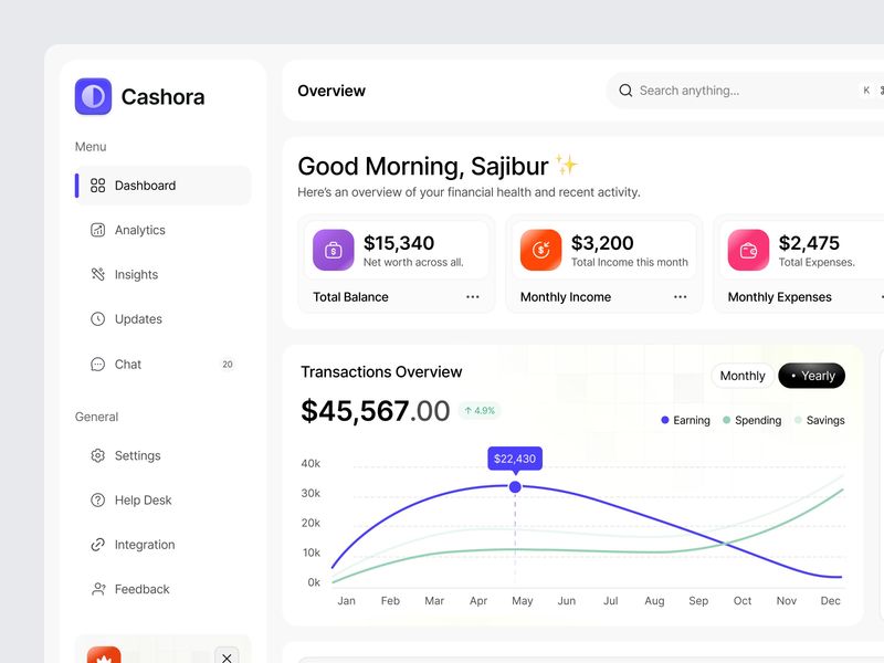
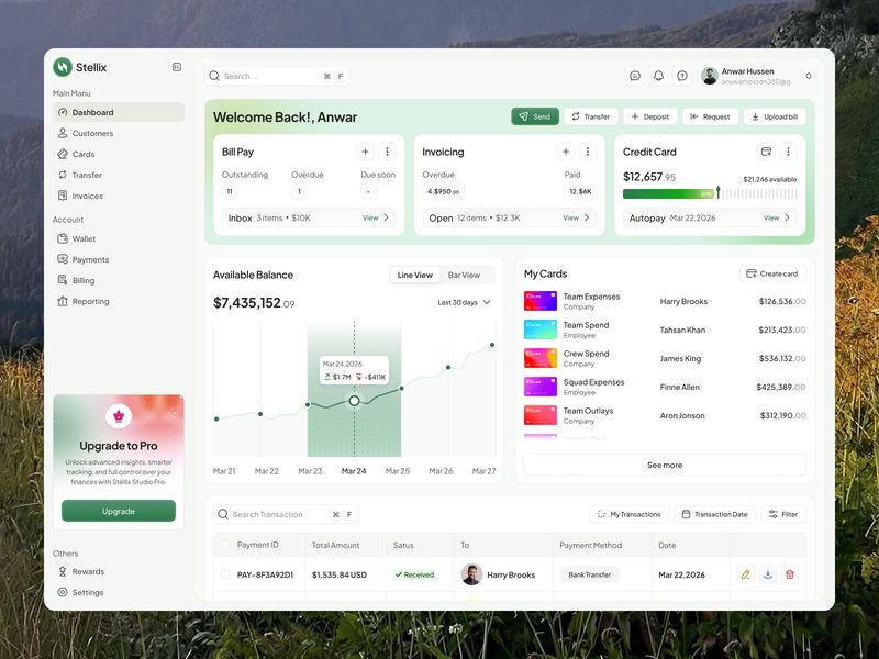
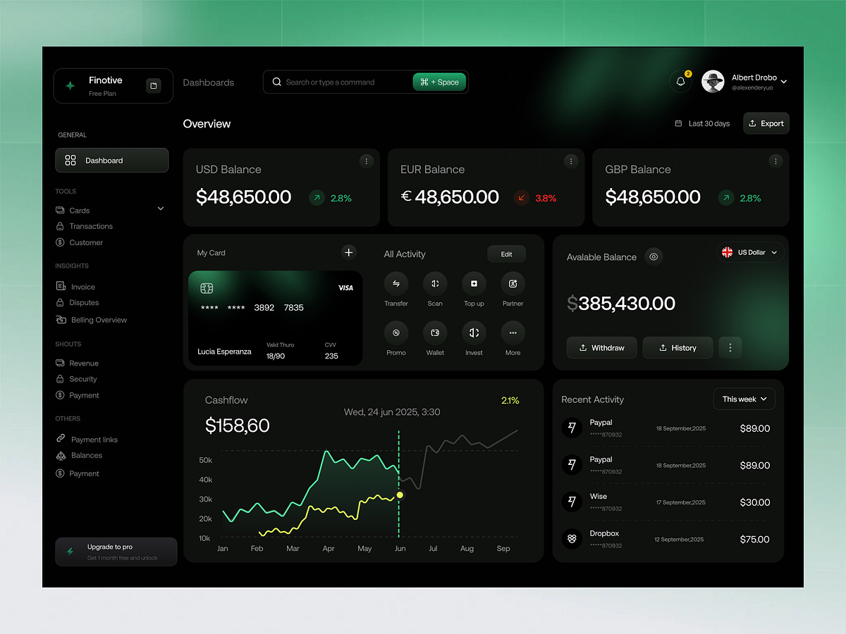
Finance Dashboard Design
Finance Dashboard Design

FIFA 2026 Live Center - Sports Analytics Dashboard Design

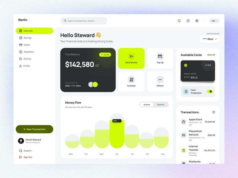
Fintech Banking Dashboard Design
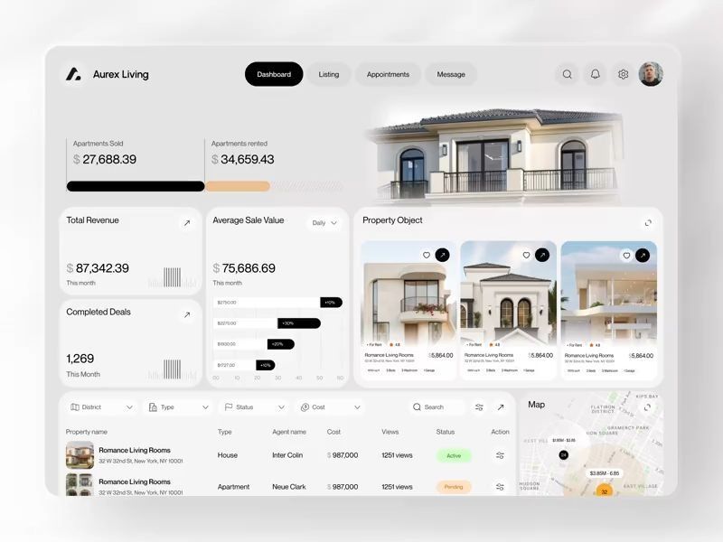
Aurex Living – Real Estate Dashboard Design
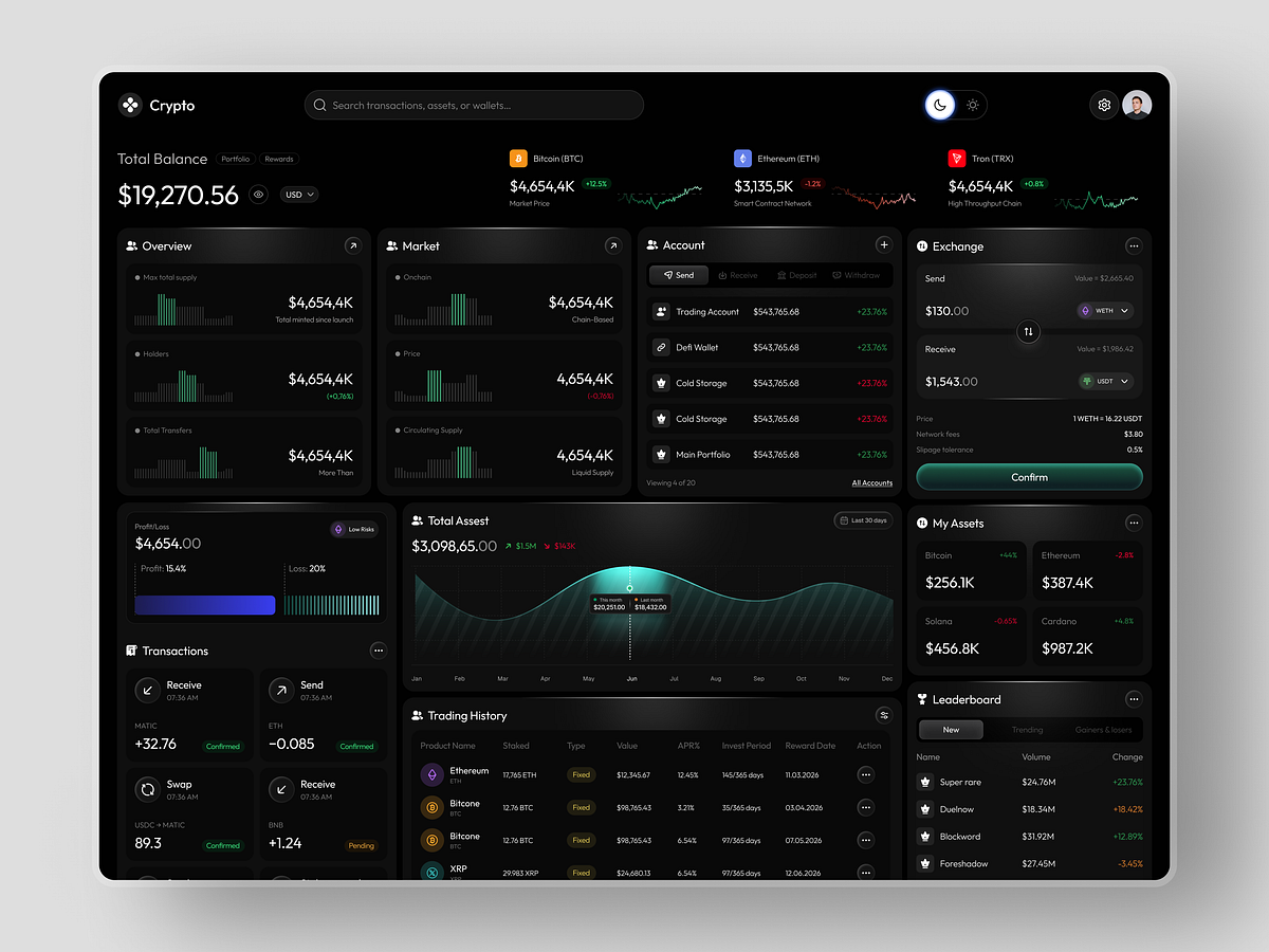
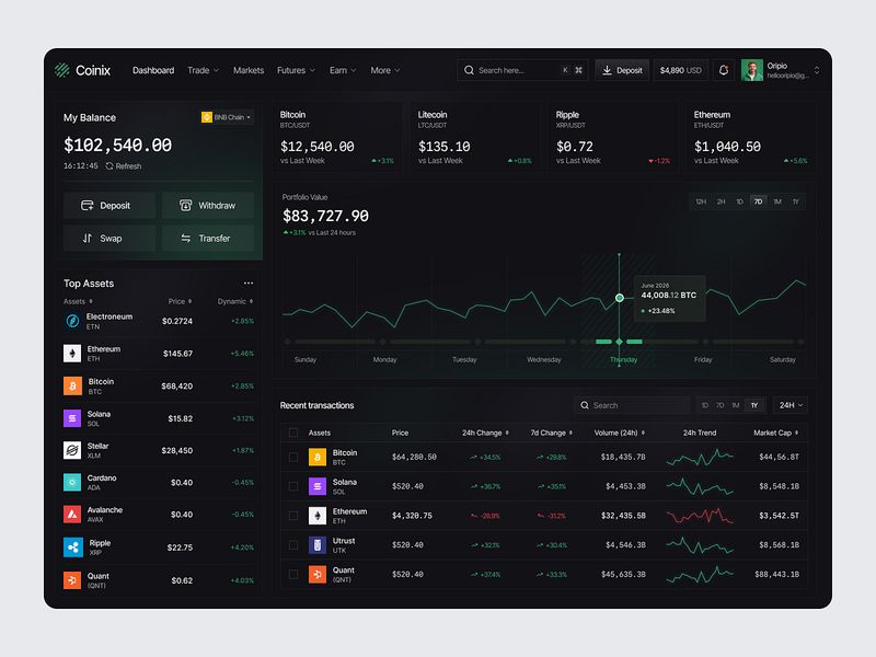
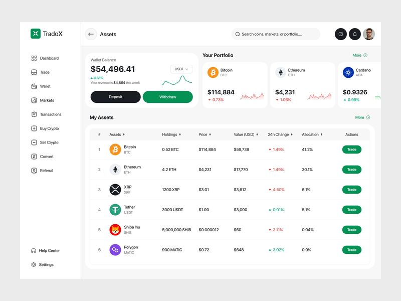
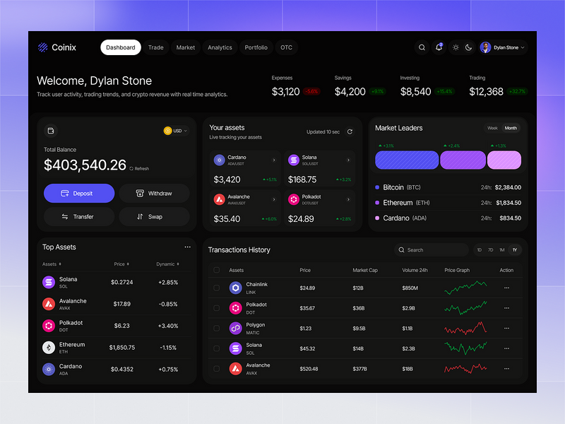
Crypto Wallet Dashboard Design🔥

Crypto Wallet Dashboard Design🔥
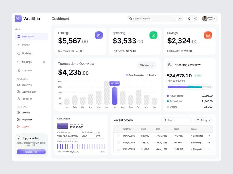
Finance Dashboard Design
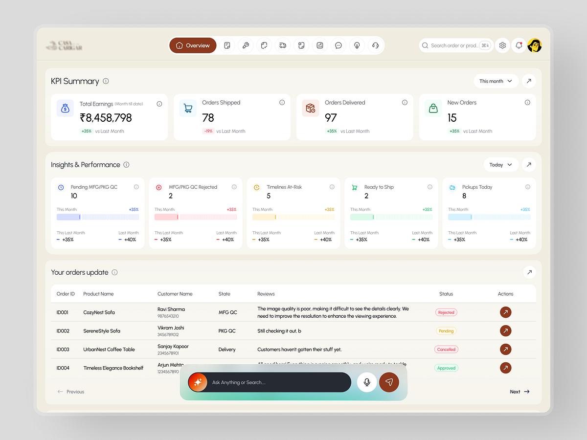
E-commerce operations dashboard

Medihelp — AI Healthcare Dashboard
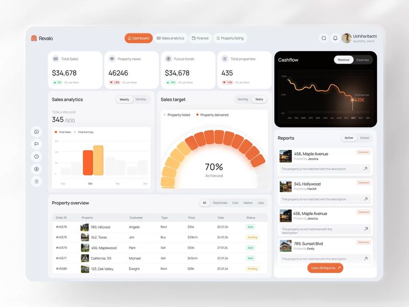
Revalo — Real Estate Analytics & Property Management Dashboard
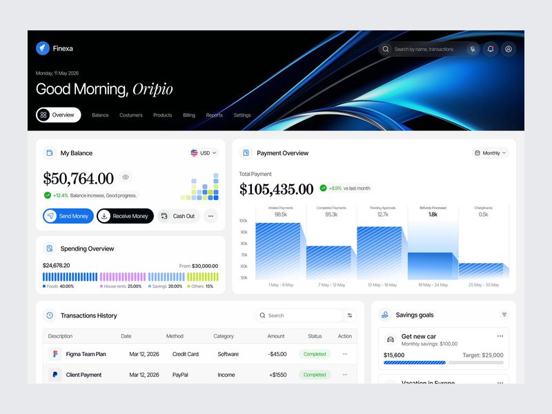
Global Payments & Financial Dashboard
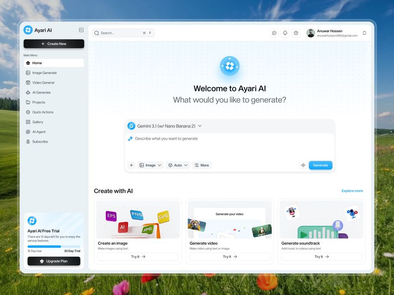
AI-Powered Image Generate Dashboard
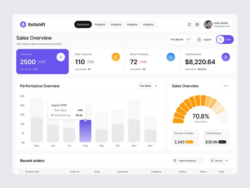
Sales Dashboard Design
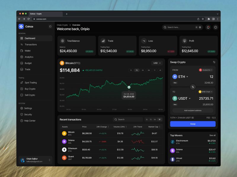
Coinza - Crypto Modern and Minimal Dashboard
Sales CRM Tasks Dashboard

Modern SaaS Analytics Dashboard
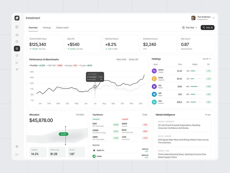
Investment Dashboard
AI Voice Intelligence Dashboard
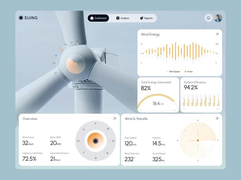
SUING — Wind Energy Dashboard | Energy Monitoring UI Design
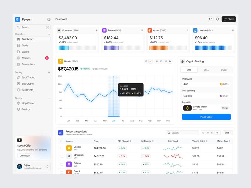
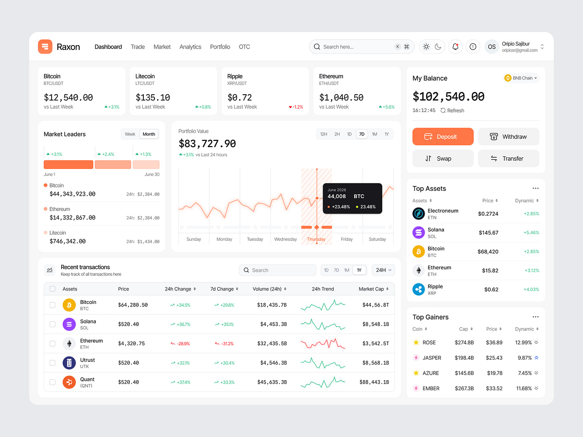
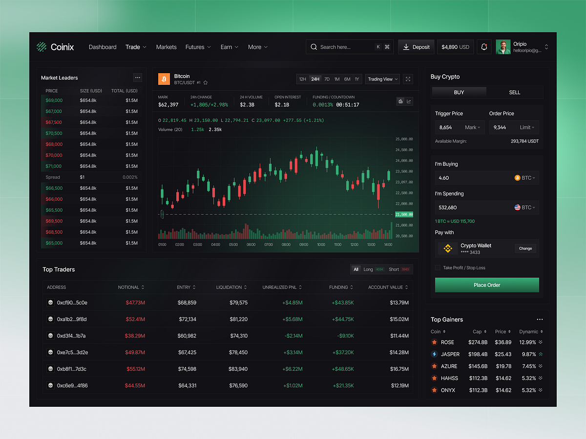
Crypto Trading Dashboard Design
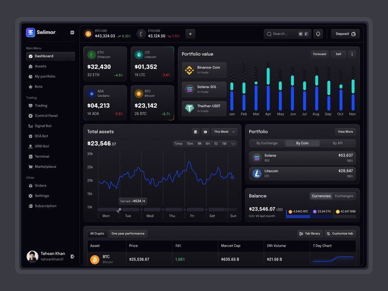
AI Crypto Trading Dashboard Design
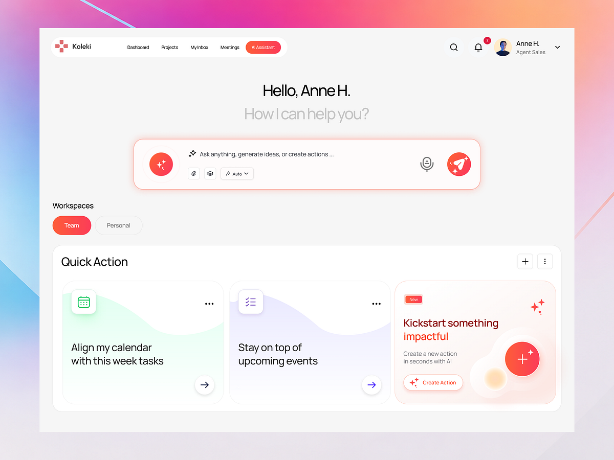
Koleki – AI Task Management Dashboard
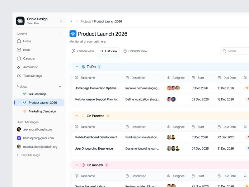
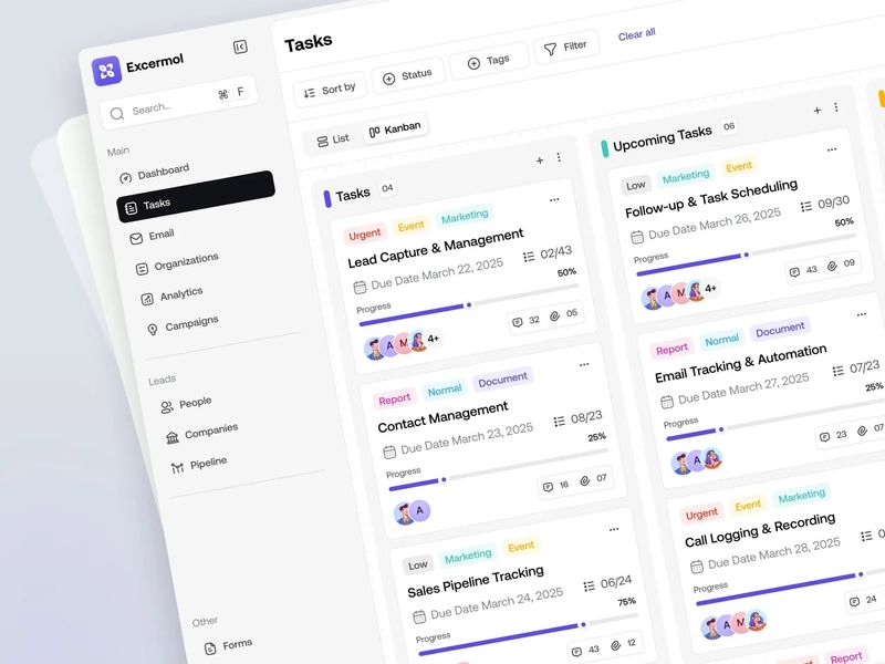
Task Management Dashboard
Finance Dashboard Design

CRM Dashboard
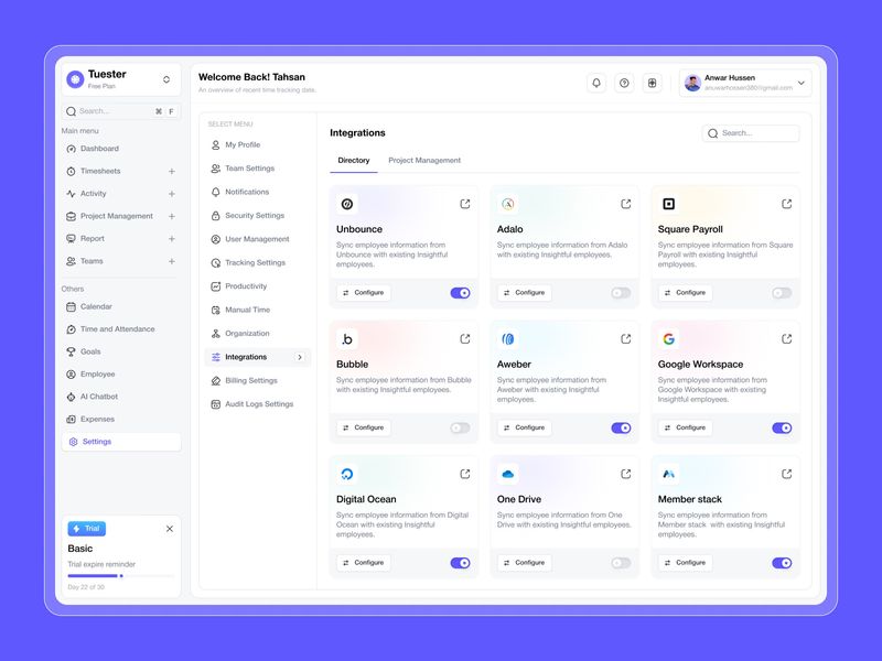
AI-Powered Time Tracking Integration Dashboard Design
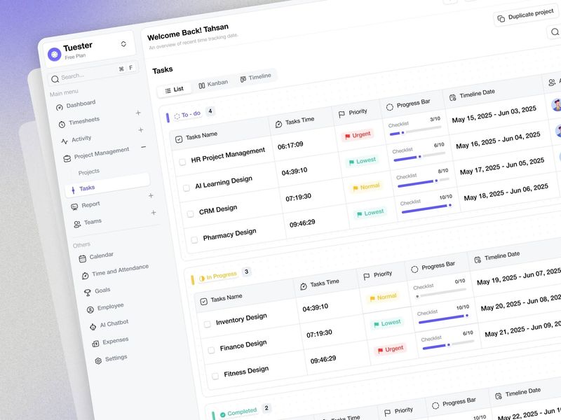
AI-Powered Time Tracking Tasks List Dashboard Design
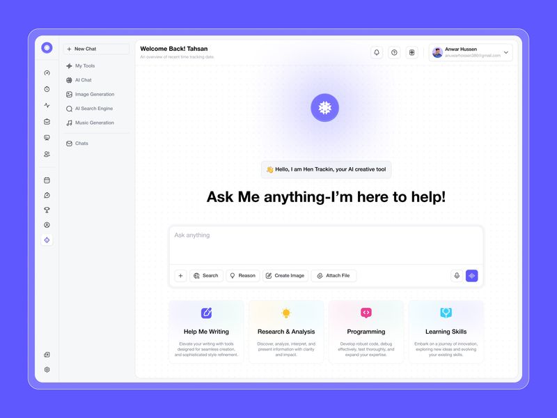
AI-Powered Time Tracking & AI Chat Dashboard Design
AI Crypto Trading Marketplace Details Dashboard Design
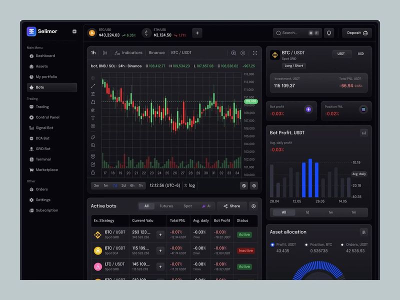
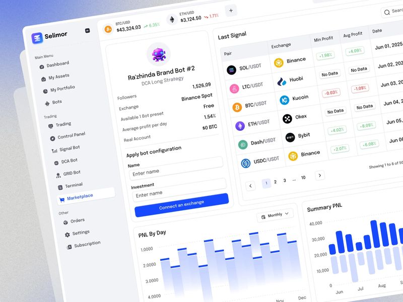
AI Crypto Trading Bot Dashboard Design
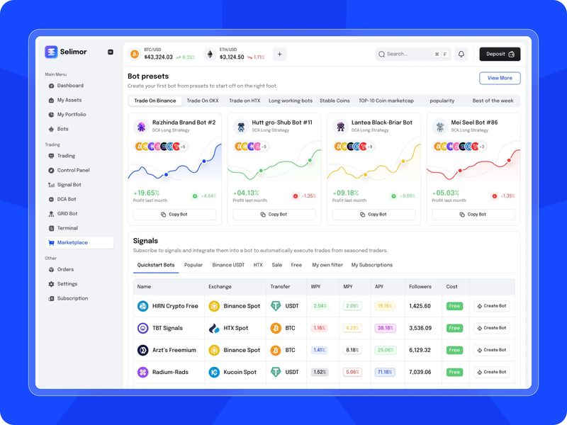
AI Crypto Trading Marketplace Dashboard Design
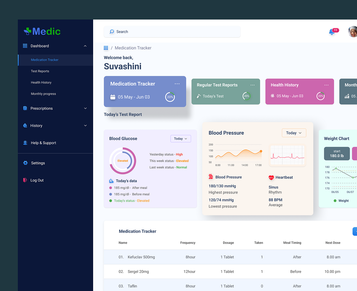
Medication Tracker Dashboard
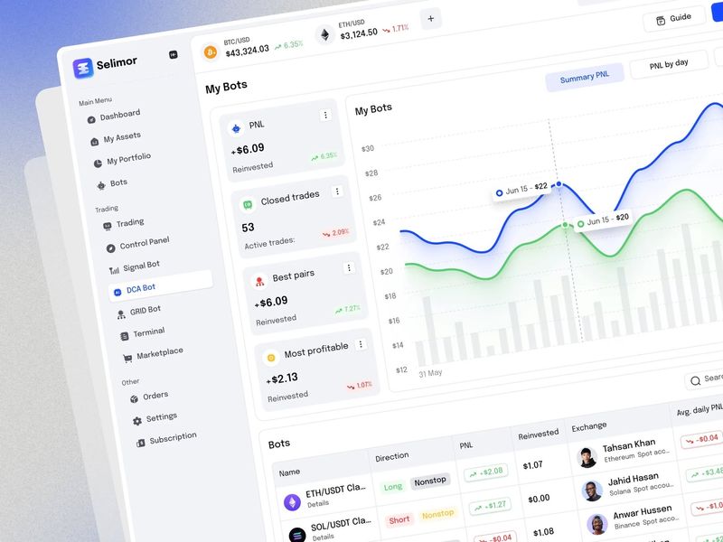
AI Crypto Trading DCA Bot Dashboard Design
Finance Dashboard Design
Sales Management Dashboard
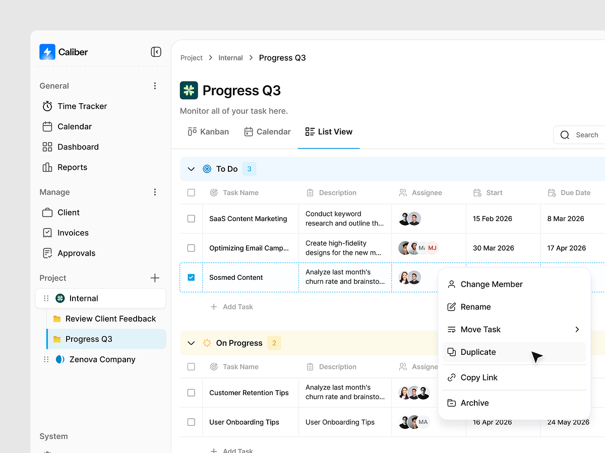
Caliber - Task Management Dashboard
Crypto Dashboard

PeopleFlow — HR Management Dashboard

Sales Management Dashboard

Social Media Analytics Dashboard
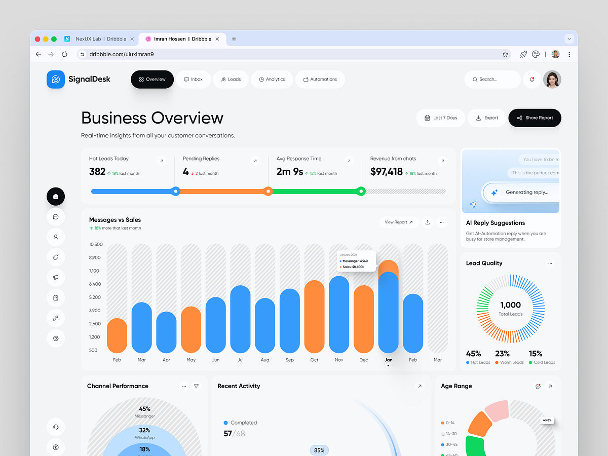
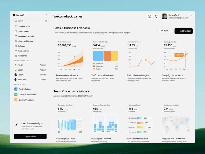
AI Lead Management Dashboard
Dashboard Design for a Shopify Intelligence Platform
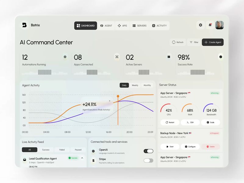
Botrix – AI Command Center Dashboard
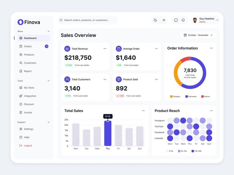
Finova – Sales Analytics Dashboard UI

Finance Dashboard
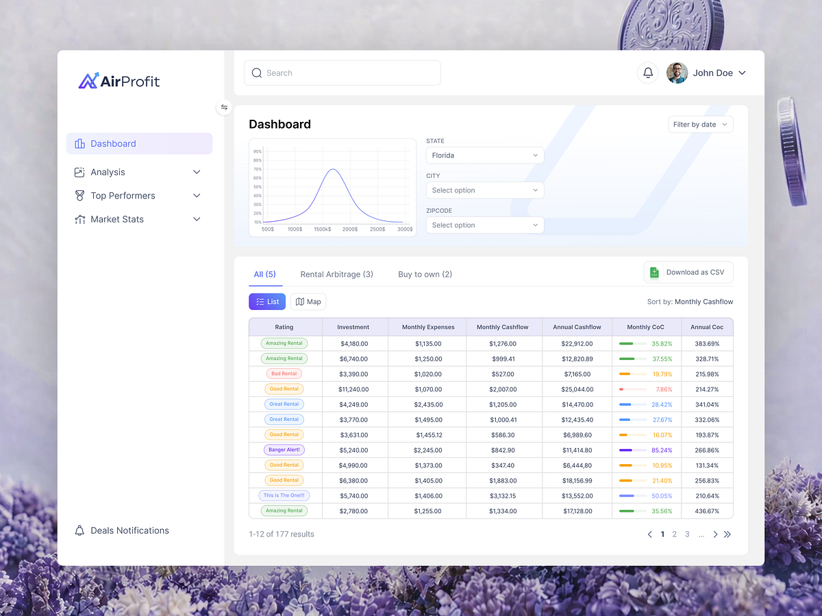
Analytics Dashboard UI for Real Estate & Investment Insights
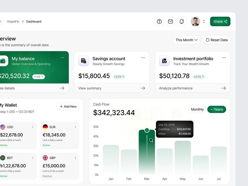
Financial Management Dashboard
Crypto dashboard
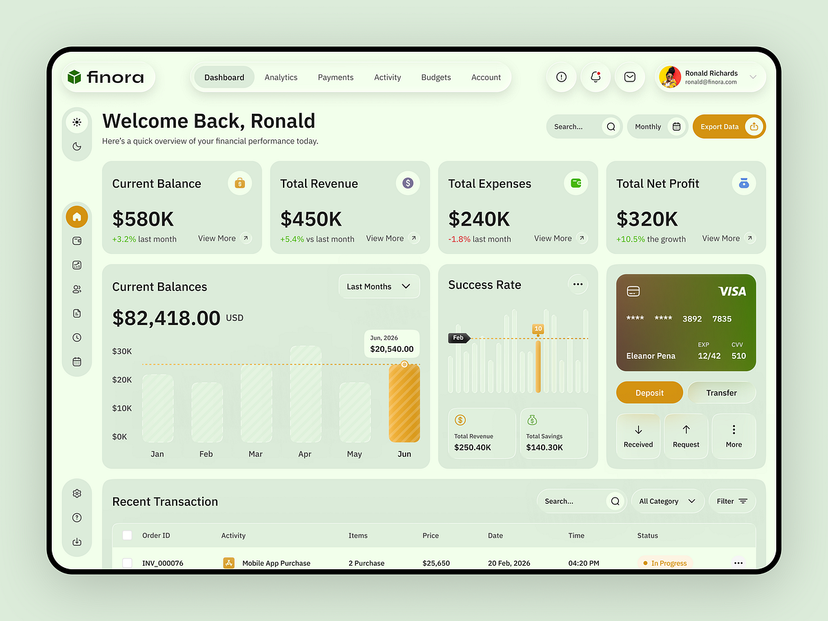
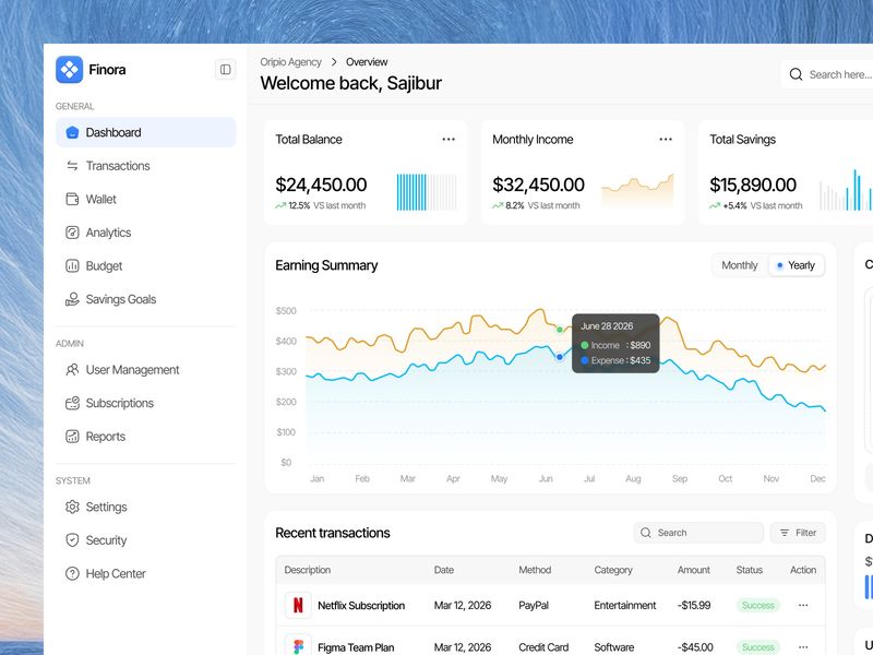
Finora — Finance Dashboard UI
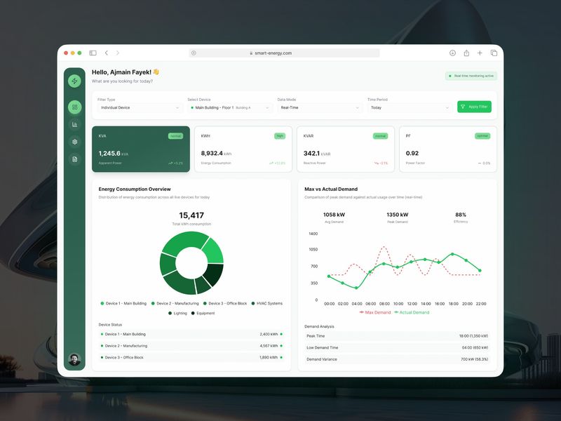
Smart Energy Dashboard
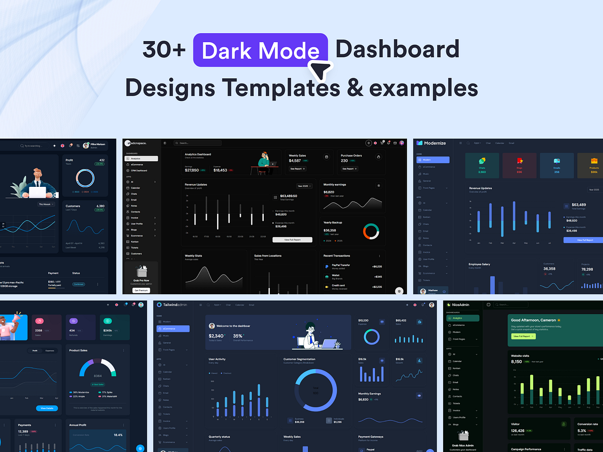
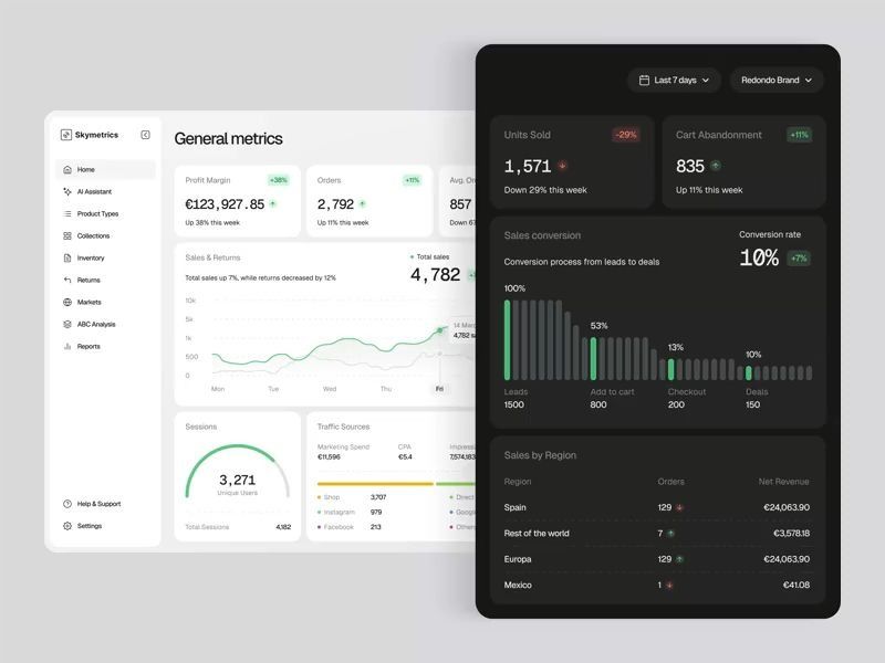
Explore the Best Dark Mode Dashboard Designs, Templates & Examples
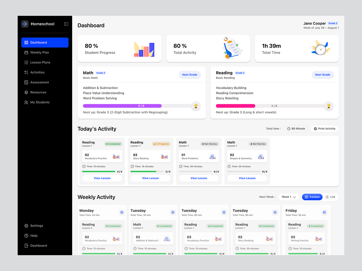
Homeschool - Study Dashboard
Finance Dashboard Design

PivotQ - Dashboard for Career Consultation with AI

AI Assistant // Dashboard
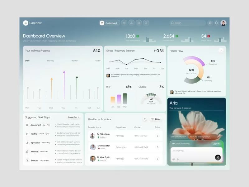
CareNest | Healthcare Dashboard Design
Crypto Dashboard
Crypto Dashboard
Crypto Dashboard
Get access to thousands of freshly updated design inspiration pieces by adding Muzli to your browser.
Loved by 800k designers worldwide, Muzli is the leading go-to browser extension for creative professionals.
How do you design dashboards that communicate data clearly under real usage conditions?
Dashboard design fails most often because it was designed for a demo, not for daily use. A demo dashboard looks good with evenly distributed, typical data; a real dashboard must handle missing data, extreme values, very long text labels, and hundreds of concurrent users with different screen sizes. Good dashboard design anticipates these real conditions from the first wireframe — it's the difference between a dashboard users actually rely on and one they open once and abandon.
How do you choose the right data visualization types for a dashboard?
Match the chart to the question it answers: KPI cards for headline numbers that need instant comprehension; bar charts for comparing values across categories; line charts for trends over time; scatter plots for correlation and distribution; tables when users need to look up individual records. Dashboard design anti-patterns include: pie charts with more than 4 segments, 3D chart effects, dual-axis charts (almost always misleading), and decorative visualizations that fill space without informing decisions.
How do you manage information density and cognitive load in dashboard design?
Cognitive load in dashboards is managed through grouping, hierarchy, and progressive disclosure. Group related metrics into visible sections with clear labels. Establish a visual hierarchy where the 3–5 most important metrics read first before supporting detail. Use progressive disclosure for secondary data: collapsible sections, drilldown from summary to detail, and tabbed sub-views prevent the dashboard from trying to show everything at once. Dashboard whitespace significantly improves comprehension speed in user testing.