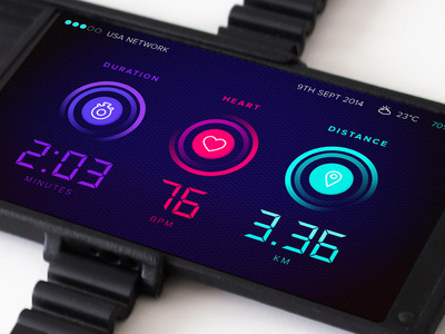
Design Inspiration
App icon design examples
Hundreds of creative, innovative, well designed user app icon ideas & examples.
We curate topical collections around design to inspire you in the design process.
This constantly-updated list featuring what we find on the always-fresh Muzli inventory.
Last update:
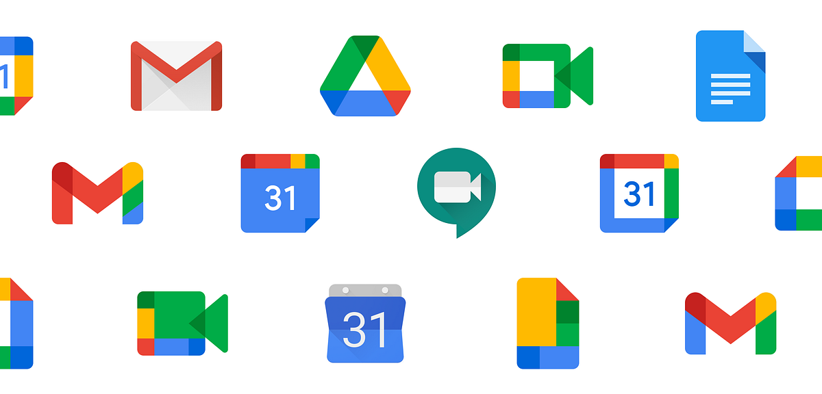
Flat app icons.
Flat App icons collection 2018

Redesigning the Office App Icons to Embrace a New World of Work
Let’s talk about white app icons
Redesigning the Office App Icons to Embrace a New World of Work
Best App Icons by Ramotion
The best app icons designed by Ramotion design agency
App Icons March 2012 March
App Icons March 2012 March 2013 on Behance ipad design icons iphone app
Mobile app icons
A small set of icons that are an integral part of our mobile applications!
The design guide to iOS and Android app icons
Despite the small size, an icon promotes an application in the App Store and Google Play, presents the user with it and also helps to find it on the Home screen after installation. It’s a great responsibility, and it depends on a designer if an icon can cope with that.When I faced the challenge of drawing an app icon for the first time, I had a lot of questions. I found answers on some of them only after a couple of completed projects. I decided to write this article to help the same beginners as I was, but I hope that experienced designers will find it useful too. Well, let’s get started!Why every app needs an iconAn app icon is a unique image added for every mobile application. It’s the first users see when they find an app on the App Store and Google Play. At this stage, the user decides if he wants to find more about an app; if not — he scrolls further. A good icon generates interest, provide confidence, assure the user that an app might be useful for him. At the same time, a bad icon does twice as much, but the other way around. It confuses and casts doubt on the benefit of an app. When the user installs an app, the icon’s goal changes. Now it assists in the search for the app on the Home screen among other icons. But what makes an app icon “good”?There are a lot of articles on the topic and most of them relate to Paul Rand’s design principles. And that’s not surprising! An app icon is a piece of branding. However, it’s not a logo.A logo and an app icon have different goals, ways of using and requirements respectively. It doesn’t mean a logo can’t overlap with an icon. Not at all! Popular applications often use logos in icons: Twitter, Medium, Reddit and others. But they don’t do it for no reason. They are a number of aspects that we need to take into account. Let me tell you about them by drawing on the experience and using beautiful headlines.ScalabilityAn app icon has to be small. That’s the point, and the user can’t stretch it to examine. Therefore, it’s important that an icon maintains its legibility regardless of size. Look, how small app icons are in Settings!App icons in iOS and Android SettingsThe user shouldn’t strain his eyes trying to understand the designer’s idea. Make sure to try out an icon on real devices in multiple sizes and, if necessary, finalize it. The loss of details due the reduction in the number of pixels is inevitably, but the idea has always to be clear. And that brings us to the second aspect of an app icon.RecognizabilityIf the user can’t understand your idea, you can’t hook him and he’ll move on to the next app. Designers advise simplifying app icons to increase recognizability. And it’s important to understand it right. Simplify doesn’t mean to make primitive. Look, aren’t these icons detailed?Hello Neighbor, Tiny wings, Prune, Pandora Music, Silly Sausage in Meat Land, Old Man’s JourneySimplify means to concentrate on an idea and get rid of unnecessary and repeating elements. Everything should work for the idea and help the user to understand it. However, the user hasn’t only to understand it, but also has to get interested in it.UniquenessThere are almost 2 million applications in the App Store and 2,1 million in Google Play, and each of them has an app icon. All these icons compete for the user’s attention. Big brands use their logos to draw attention, but what to do less-known applications? Show something new and unusual!Todoist uses the standard for task managers tick in an interesting compositionSpend some time on a research before starting to draw, search for the main competitors and simply applications from the same category. Think of how to stand out! If most icons are colourful, consider using a monochrome palette. If there are a lot of images of one particular item — abandon it and show something different. Always search for your way to solve problems!It’s difficult to come up with something new. Make mood boards, create mind maps, ask friends and coworkers for advice. You never know where you’ll find a great idea. But it is important not to lose touch with an application in the pursuit of originality.ConsistencyAn icon is the part of an application, they have to work hand-in-hand. An icon should describe an app and show its main features. This is especially important for games where an app can get 1 million downloads because of only one game mechanic.Slack is a good example of consistency between app and iconNo one will like if he gets a different application than expected. Don’t include screenshots and interface elements in an icon — it can mislead the user. Instead, insinuate the functionality of an app, use the same style and colours. There should not be any doubts to which app relates an icon. And guidelines can help you to achieve this!Compliance with guidelinesDespite the fact that iOS and Android starting to look the same, there are still a lot of differences which prevent us from using the same app icon on both operating systems: proportions, visual techniques and special features. Users get used to their operating systems. The less we distance from it, the more trust to an app is given.iOS (on the left) and Android (on the right) icons of the same appsIt doesn’t mean you need to draw different app icons; rather, big differences will reduce app recognition. Sometimes it’s enough to adjust the size, but in some cases it’s better to make more changes.Phew! That’s what we should pay attention to when developing an app icon. Now it’s time to create! Of course, if you don’t have even more questions along the way… What size a canvas should be? How to use grids? How to export an icon? It’s time to go deep into the technical part and find answers. Let’s start with iOS.iOS app iconsThere is much useful information in the iOS Human Interface Guidelines, but we’ll focus on the App Icon section where Apple describes technical requirements and makes recommendations on a design. We’ll follow the path of creating icons and get to the bottom of this. I use Sketch, but any other graphics editor will work too.Drawing an iOS app iconThere are many templates for creating icons, but we won’t use them for now. Let’s say we already studied the market, identified the idea, perhaps, even made a sketch by hand. And of course, created a new document in the editor.Let’s choose a canvas size first. In iOS, an icon can be found in different sizes from 40px × 40px to 1024px × 1024px. Because it’s always easier to reduce the image size, we’ll create a larger canvas. Designers who work in Sketch can cheat and create twice smaller canvas (512px × 512px) and increase it later on export.The next step is to add a grid. You can download it, find in templates and even draw. Grids help to maintain unity and integrity of the composition, control sizes and spacing. Try to place the main object within a large circle. If a grid interferes and limits your creative impulse — break it. Even structure should be limited.Finally, we can start drawing! I won’t bore you with the details, but my icon went through the manager and came back with feedback from the client a couple of times until it was ready:To present the icon, I made a simple animation:This and other stuff I share on DribbbleThe icon is ready! Let’s export it.Export an iOS app iconBefore exporting we need to remove rounded corners and stroke because the system adds it automatically. Don’t forget to hide the grid too.An icon should be exported in png with no transparency. But what about various sizes? Do we really need to do it manually? Thanks to our community, we don’t! For example, we can use Sketch plugin AEIconizer to multiply it. Besides, there are a lot of websites like MakeAppIcon, App Icon Maker and App Icon Generator that can do the same. And templates! For instance, template by Every Interaction not only exports an icon in various sizes but also shows how it’ll look on the Home screen and in the App Store.It wasn’t as hard as it looked. The next is an Android app icon!Android app iconsIn the material design specification, Google split information about Android app icons into two sections: about the style and technical requirements.Drawing an Android app iconIn Android, app icons are used in various sizes too and the largest is identical to iOS: 1024px × 1024px.Adding a grid, pay attention to a safe zone. Depending on the device, Android applies different shaped masks. Place an image within a safe zone so it won’t be clipped. The grid itself shows all the basic shapes which are used in the system: circle, square, vertical and horizontal rectangles.The final version of my icon:Export an Android app iconBefore exporting we also remove rounded corners, stroke and grid.Android Studio can multiply an icon in all required sizes, so we need only one png image with no transparency.Android Oreo introduced a new app icon format with parallax and scale effects. You can separate the foreground from the background, so then these layers will move independently on the device applying the effects. Accordingly, the foreground may include transparency.https://medium.com/media/0347507ebe7b693722c88a204c8a7c80/hrefParallax effect cannot be seen on a solid background, but it can bring dynamic in your design if you have a complex composition. In that case, you need to provide two png images for both layers. Just be ready that not all users will see the effects. At the time of writing, only 12% of all Android users use Android Oreo.Instead of a thousand wordsThe user starts to get know an app with an icon which accompanies his journey up to the end. The role of an icon is important and multifaceted, that’s why the designer should put emphasis on it. Yet never forget about an app itself! After all, it only takes a few taps to delete an app. No matter how cool your icon is, if an app isn’t useful, the user will delete it.Don’t forget to find out how to design an accessible user interface. You can find more stuff from me here: Dribbble, Behance, Instagram, Medium.The design guide to iOS and Android app icons was originally published in Muzli - Design Inspiration on Medium, where people are continuing the conversation by highlighting and responding to this story.
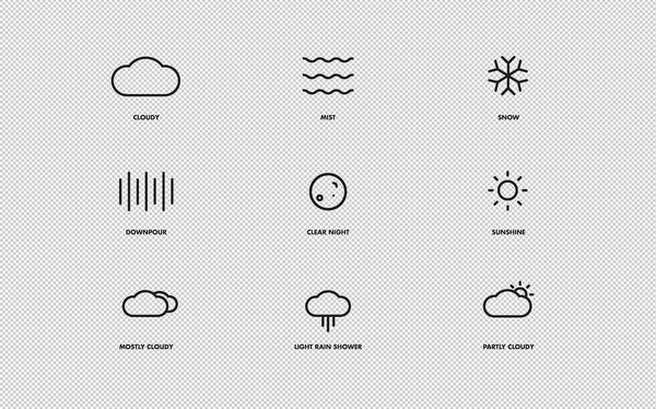
WHTR sneak peak #screensaver #weather #icon #icons #set #app #concept #layout #osx

Naughty Icons Set from the FUTURAMO ICONS App to boost your appetite ;-)
iOS App Icons on Behance #ipad #design #icons #iphone #app
This is 1% of what Muzli shows you.
Get the rest — fresh design inspiration on every new tab, free.
Add Muzli — free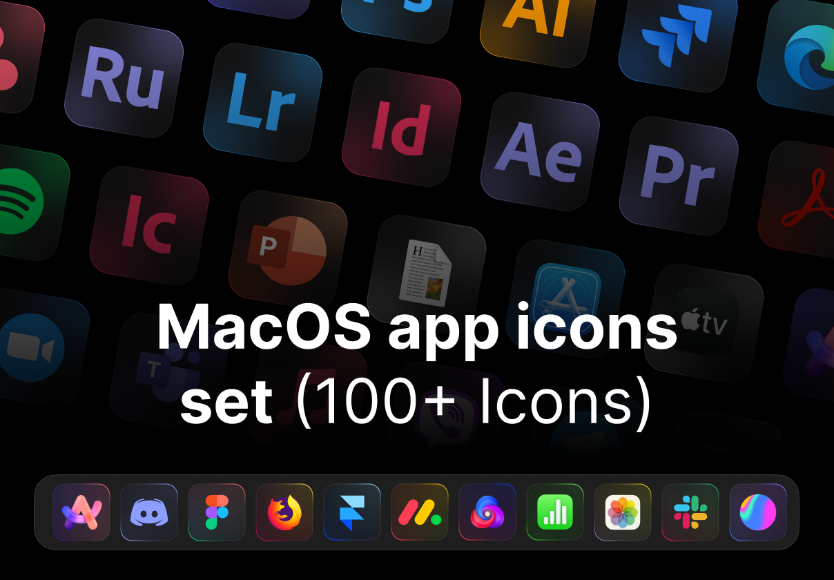
MacOS app icons set

How to use animated icons on a website or a mobile app
Mobile app icons
trading app / icons
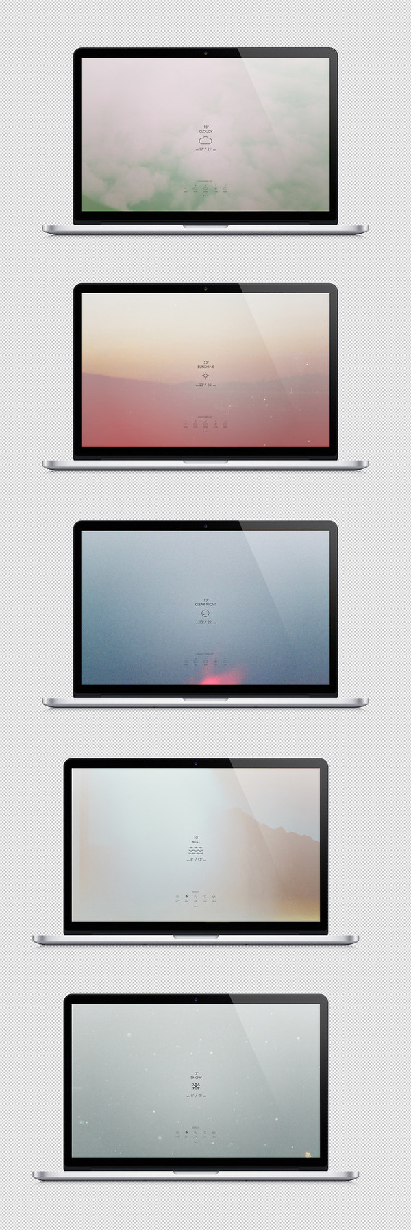
//// #screensaver #weather #icon #icons #photography #app #concept #osx

An Inside Look at How We Refreshed Yelp’s Logo & App Icons

Download Retro iOS App Icons That Nod To Apple’s History
Product designer Ben Vessey developed 110 black and white, pixelated icons for today’s most popular apps, including Twitter, Tinder and Netflix. Dubbed the “iOS (Old School)” project, Vessey looked to Apple’s history to inform his clever designs. In addition to the app icons, Vessey created six monochromatic wallpapers. Together, the backgrounds and icons can be purchased for a little over $5 and installed on any …
Food App Icons on the Behance Network #icon #iphone #app

Modern app icons Design
Dribbble - New iPhone app design | Settings UI,UX interface by Julien Renvoye #interface #icons #iphone #illustration #app

Colorful App Icons Design
Mac App Icons on Behance app
Mac App Icons on Behance app icons
This is 1% of what Muzli shows you.
Get the rest — fresh design inspiration on every new tab, free.
Add Muzli — free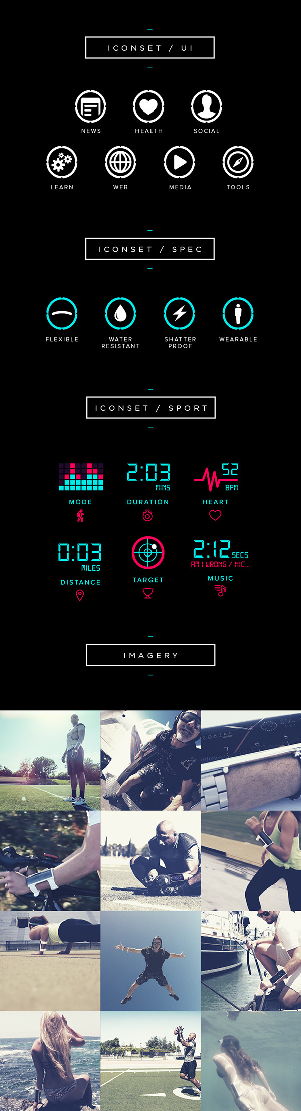
PORTAL™ // Inspire Greatness https://www.indiegogo.com/projects/portal-by-arubixs-flexible-wearable-smartphone #phone #weather #portable #ux #icon #ios #branding #design #interface #icons #ui #iphone #app #mobile #android #sport
Icono App Iphone on Behance #ipad #design #icons #iphone #app
20 Fantastically Detailed Icons | Inspiration #icon #design #iphone #app #mobile #device
Best App Icons by Ramotion
iOS Icons on Behance #design #iphone #ipad #app #icons
PORTAL™ // Sport UI #portable #ux #icon #ios #design #interface #icons #ui #app #mobile #android #sport
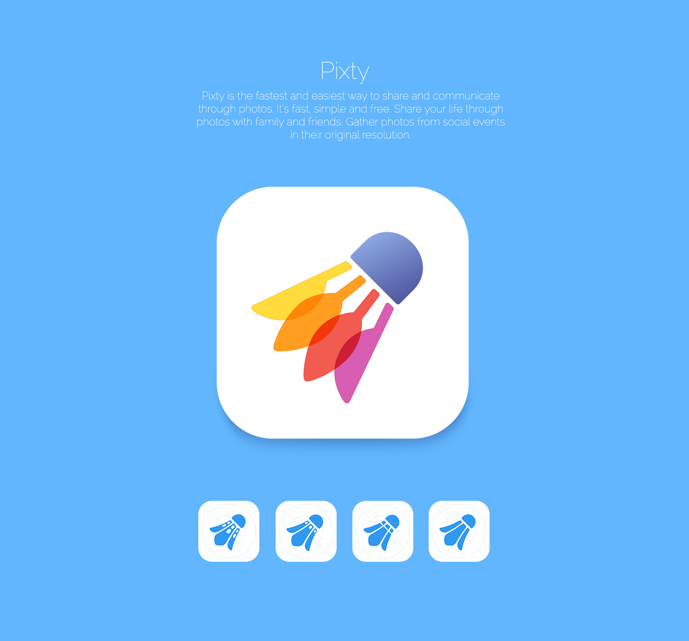
App icons - concepts

App Icons for Stardust

SJQHUB™ Visual Data 7 - Statistics Development of my iconset/app concept. Working on different ways to illustrate statistics from each sk #gotham #ipad #design #icons #interface #website #clock #web
Discover Backpacker Planner Final #icons #ui #simple #app #minimal #web
Food App Icons on the Behance Network #icon #iphone #app #food
Best App Icons by Ramotion
This is 1% of what Muzli shows you.
Get the rest — fresh design inspiration on every new tab, free.
Add Muzli — free
Peak iOS 18 app icons
Color overlays / imagery #phone #weather #portable #ux #icon #ios #branding #design #interface #icons #ui #iphone #app #mobile #android #sport
About hdr #joel #beukelman #photo #design #icons #hdr #app #blnce
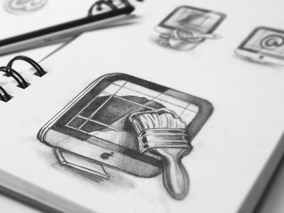
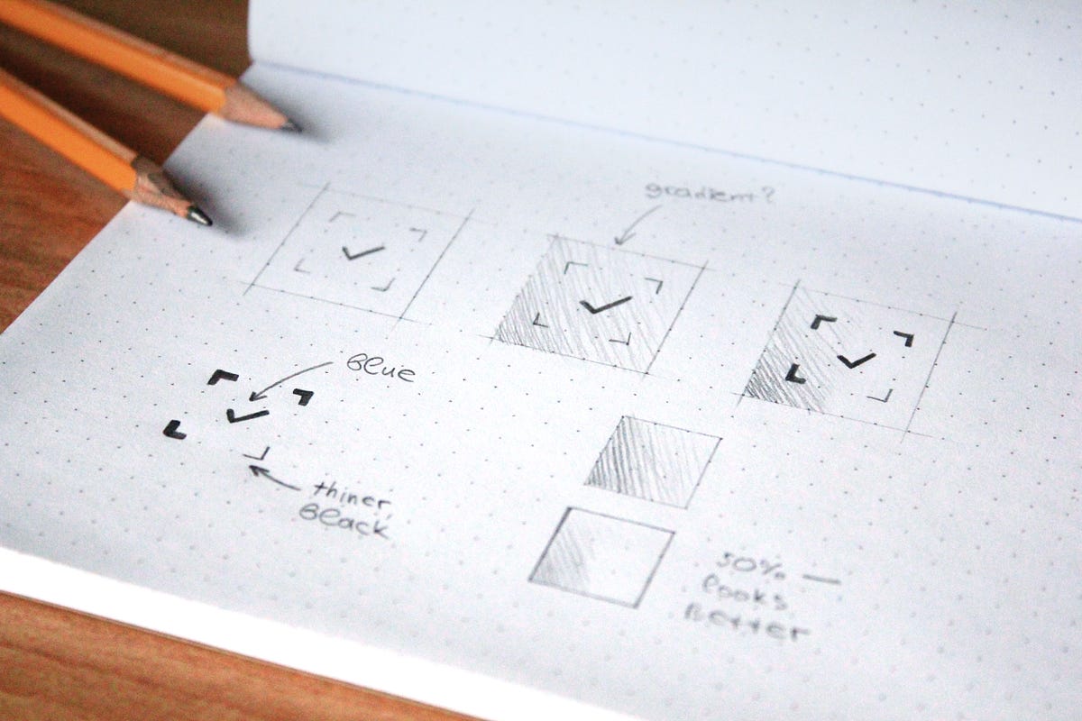
Mac App Icon Sketches #process #icon #macintosh #ramotion #design #application #icons #appstore #macos #app #pencil #sketch #mac
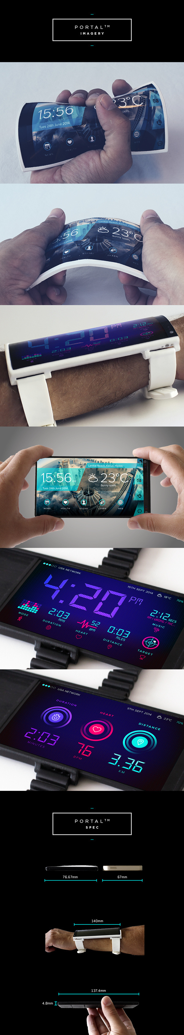
PORTAL™ // Inspire Greatness https://www.indiegogo.com/projects/portal-by-arubixs-flexible-wearable-smartphone #phone #weather #portable #ux #icon #ios #branding #design #interface #icons #ui #iphone #app #mobile #android #sport
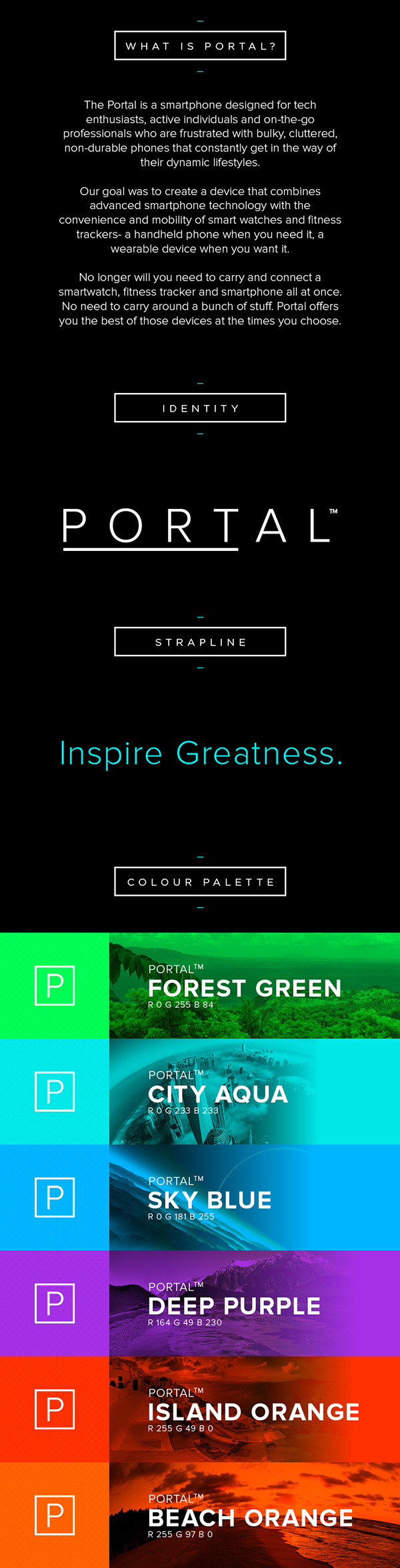
PORTAL™ // Inspire Greatness https://www.indiegogo.com/projects/portal-by-arubixs-flexible-wearable-smartphone #phone #weather #portable #ux #icon #ios #branding #design #interface #icons #ui #iphone #app #mobile #android #sport
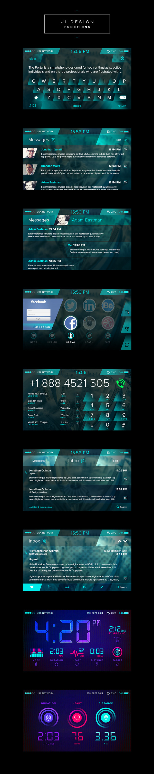
PORTAL™ // Inspire Greatness https://www.indiegogo.com/projects/portal-by-arubixs-flexible-wearable-smartphone #phone #weather #portable #ux #icon #ios #branding #design #interface #icons #ui #iphone #app #mobile #android #sport
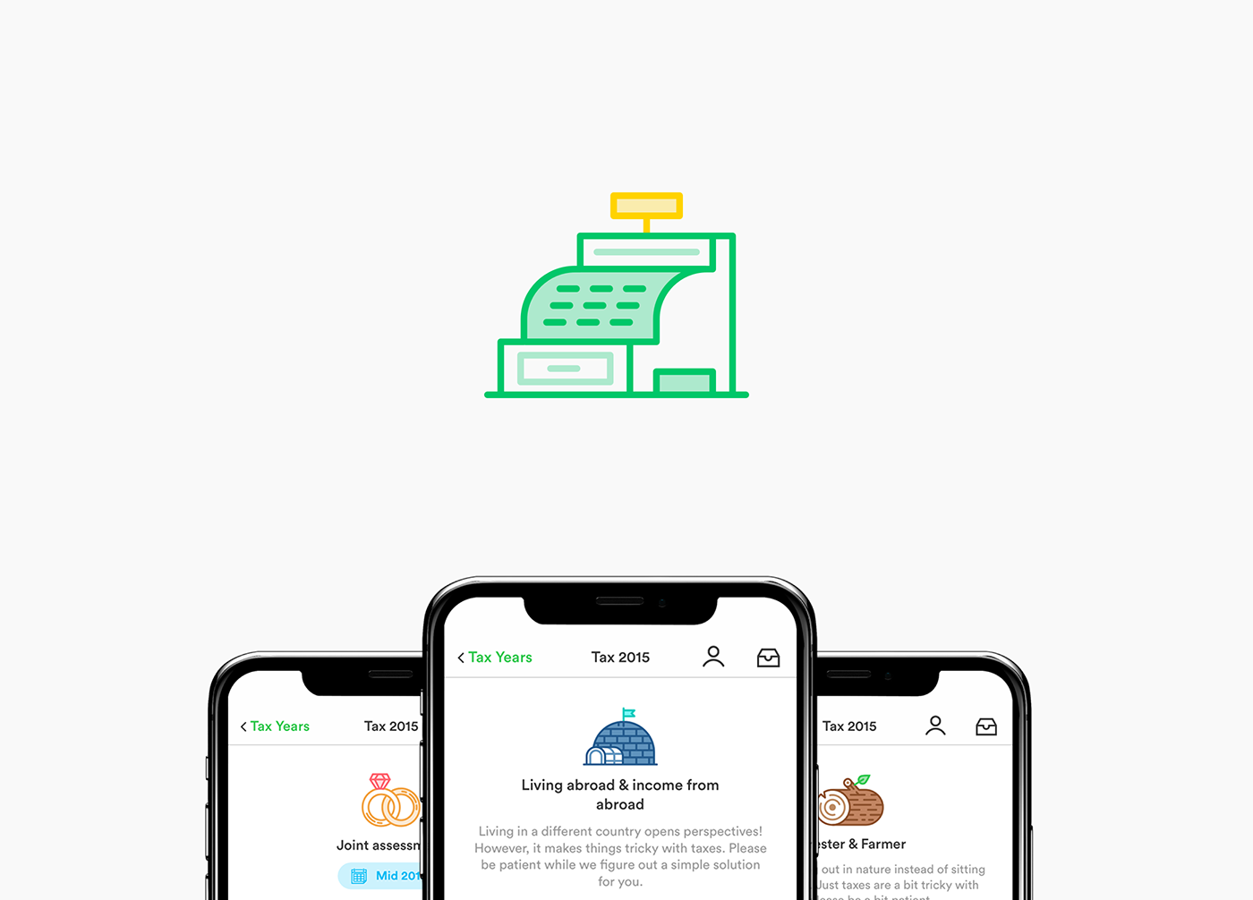
taxfix :: app for tax declarations
PIXEL-PERFECT ICON SET FOR TAXFIX – Taxfix made tax declarations not just easy but actually fun. The Berlin based company combined a chat-like questionnaire with icons and progress driven animations. The app is available for iOS and Android and lets you do your taxes of the last 4 years. The download is free of charge, only if you are getting a tax refund and decide to send to the tax office, they'll charge you a fix amount. Since 2017, beside some help for the UI, my main focus is illustrating icons for the different usages of the app. The two most prominent ones, are the one for the questionnaire and the different tax exemptions.
2019 Biggest UI Design Trend
2019 Biggest UI Design Trend abduzeedoJun 20, 2019 So we have a new UI design trend all over us and it deserves a post here on ABDZ. It’s quite clear to notice it, just spend some time on Dribbble and you will spot it right away. This post is literally from three or for Dribbble pages of beautiful mocks. The interesting thing, and what drove me to write this post was when I saw the new Facebook product called Calibra. It features all the same UI patterns, rounded corners that in some way match the phone and screen rounded corners. My interpretation is that as phones become bezeless the screens now match the hardware form, so the software follows the same direction. Apple and Samsung have been exploring this for quite a bit, but now it seems to be all over the place. Anyways, enough talk and here is a collection of designs with the new super rounded corner widgets. UI Design Trends
Case Study: Happiness AI app. How to create one of a kind design that brings happiness
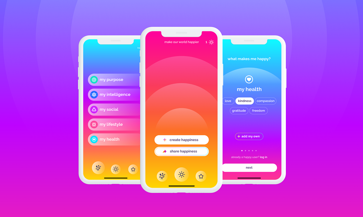
Case Study: Happiness AI app. How to create one of a kind design that brings happinessHappiness AI Version 2.1Back in April, I was on a self-discovery adventure in Nepal hiking, drinking masala tea, and sketching nature. Little did I know it all turned out into 3 weeks of a “got stranded” state though it’s a completely different story. What was an interesting coincidence is that while I was on my personal “find a right way in life” path next to the magnificent Himalayas, I got a letter. And it really found me well.It mentioned an opportunity to create “a technology that will help people reach their highest potential and happiness in life” while “happy and colorful vibes” are a must-go thing. That sounds exactly like my kind of job.TaskTo update the visual design of the existing app with the new branding and work further on the MVP version of the product.The mission of the appTo advance human happinessKey factors to rememberThe main target audience is Gen Z;The unique design (both visual and UX) is really a crucial element of the app;Openness to be able to create multiple concepts is much appreciated.Step #1. Discuss a present-day state of the appHappiness AI Version 1.0My client already had an existing Happiness AI app on the market and first of all, I explored and analyzed the way it worked. Before our first call these are the issues I’ve noticed:overfilled onboarding screens — too many elements on one page which needs to be further divided into smaller and simpler steps;the low contrast of white text on the yellow background;the main screen feels empty while there are two equally bright CTAs;the feedback emojis’ inactive state confuses because of desaturation.Also, I’ve noticed too strong shadows and a side menu which potentially could turn into bottom navigation.Step #2. Bring a new visual style and update the UX of onboardingI call myself a full-time color ambassador as you can see on my Dribbble page but when it comes to the first steps in the new project, sometimes I do prefer to start with a moderate approach. This way it helps me to understand the client’s preferences better — test the waters. Whether it’s enough level of brightness or it can be even more colorful or bright?That’s why at first, I chose a pastel color palette. Based on the existing gradient I’ve made the colors cleaner and slightly brighter. Following the first gradient, the next screens got a smaller color gradation focusing more on the elements.First three screens of the appThe onboarding flow was divided into:Splash screen;Add your name;Level #1 What makes you happy?—the choice of the interests;Level #2 The choice of categories in few interests.This way each time we ask a user to make a simple choice—just a few clicks for each page instead of choosing altogether on one page with a chance of not checking all the items at all.Interests and categoriesThe idea was also to create a color code where each interest has its’ own color—Purple for Arts, Green for Lifestyle, Pink for Love, and so on. It all followed with the icons for each chapter which in the further updates, will become even more simplified and minimalistic.What was the feedback?“Great! But how about more bright colors?”Step #3. Moving into a brighter versionAdding more contrast the flow also got the change. It was decided to focus on 5 main interests: Health, Lifestyle, Social, Intelligence, and Purpose. Thus, we don’t need a screen with the choice of interests anymore.The updated flowWhile it was added a hint for a user to swipe the list of categories in each interest page, the category itself wasn’t distinctive enough. The solution?The full-body unique gradient for each interest.Adding different gradients for each categoryYes, that was definitely a turning point in the design process! From now on, we started to explore how to combine the interests’ gradients with other screens of the app.Further, we made it even brighter. But first, let’s take a look at the details.Happiness in the details1. Interests iconsThe idea was to create minimalistic icons that won’t take too much attention while at the same time, will add to the distinction of each interest.Interests iconsEach icon consists of the circle as the main basic element. Looking more precisely at the row of these icons you can notice how each of them has a different number of elements, from 2—circle and a heart for Health, to 6+ for Intelligence.Here’s how the first concept with more standard icons looks like compared to the current design:Comparison of the first iteration with the current design2. “How do I feel” iconsAsking for the feedback we’re asking to get the user’s emotion. We’re used to stars as a common icon in such cases but what if we combine them with expressions of emotions?The feedback emojisOnce again, the power of color is limitless. Being placed on the solid white area we can clearly distinguish a certain emotion not only by the order they’re placed but with the help of the color too.3. CTAs active statesHere, the first state is the page with Today’s Happiness AI idea and the following options “where to start” and “share”. Such a page can have a different background gradient depending on the interest category and thus, the best way to emphasize CTA buttons is to make them white. But how about the active pressed state?“where to start?” active stateHere we came up with the solution to darken the whole page focusing specifically on this action. And, voilà! We got a chance to bring more gradients, the one with cold colors gradation for “earn more” and the one with warm colors for “take action”. Icons there add into a quicker “reading” of the area.4. Font styleThe two main fonts are Raleway and Backslash—a rounded friendly sans-serif for the main text vs. an elegant serif for numbers to bring an emphasis.After a few tests, we’ve come up with the solution to use lowercase letters only. It’s not a big secret that most of us are used to typing in lowercase. It’s quicker and easier indeed. Also, that’s the most common way to use for Gen Z, the main target audience of the Happiness AI app.Lowercase is also about simplicity in a conversation, more honest and casual way and this is exactly what we want the app to sound like.The core functionalityCurrently, the core functionality you can see in the existing app is focused on such things like:receive daily happy quotes;create your own happy ideas with the plan of actions;specify “what makes me happy?” to help AI technology be more precise to your lifestyle.The screens from the current appWe’re working on more chapters of the app that will be included soon. The future updates will have some fun and entertaining functionality as well as more ways to keep your happy and life moments in one place.When it comes to navigation, the idea is to have intuitive transitions and flows, and thus, some chapters aren’t shown all the time but hide after a few seconds. Other parts are reached with a simple swipe.Brand positioning on the marketBrandingSimplicity is a key and so is the app icon—the first element you see. The main idea was to have it as simple as possible and in the end, it consists of the main full gradient and a circle. Thy symbol of sunrise and the colors of the sky.What also helps you to get an impression before installing the app are the screenshots. Short description followed with the actual screens. As we also want to bring the right impression about Happiness AI as a bright and unique app, it was decided to add even more gradients to the screenshots.What are the ways to make a unique app? Check Dare to Be a Bright Brand article to find the answers.How the app looks like in App StoreCurrently, the main audience of the app is early adopters—people who instantly catch the vibe. While there’s still a lot to be developed to bring the full idea they already can see the potential. Also, they’re capable to share feedback, a much-needed answer from your audience on any stage of the app’s development.ConclusionIn the following case study, I presented the up-to-date version of the app and certain milestones which were passed. While I’m extremely pleased with the overall idea of the app—advance human happiness—I also enjoy the compelling work process where I, as a designer, am often challenged to find more variations and to look from a different angle.I like how thanks to this approach the app feels alive and evolving, the thing that doesn’t happen often when you’re working on a more classic work process where the fresh ideas aren’t appreciated at all.Once while I was looking for happiness in the Himalayas, I found a project with a mission that expands horizons of happiness not only for me but for a hundred thousand people in the whole world too. That’s a really exciting journey.I will keep you updated with the future app versions in the next articles.Be happy!If you want to see my designs and stay connected, follow me on Dribbble, Instagram, TwitterYou might also like:Playful UI Runs the WorldOh Mamma, I’m in love with GradientMeet His Majesty, the ColorHappiness AI app Case Study: How to create one of a kind design that brings happiness was originally published in Muzli - Design Inspiration on Medium, where people are continuing the conversation by highlighting and responding to this story.
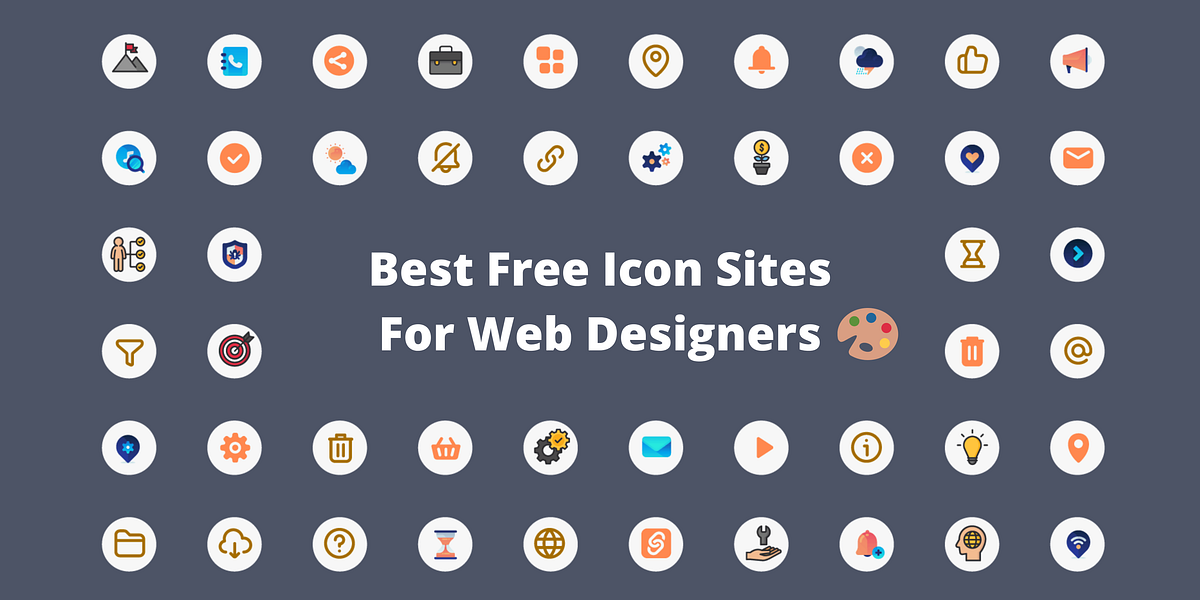
15+ Best Free Icon Sites for Web Designers
Looking for some best free icon sites that have unique and astonishing icons? If yes, then you are at the correct post.As a Designer, icons play a very crucial role in web design, app design, and many other graphic designs. Icons are everywhere and they are very useful for helping your users to understand your content.Now, either you can create icons on your own (A time-consuming process we know!) or you should go for the websites that provide free as well as Premium Icons. Moreover, these websites not only save your search time but also offers you a wide range of varieties in icons to choose from the best for your project.Hence, we have created a list of useful sites that offer Free and Premium (Alternative) that offers high-quality free icons covering hundreds of styles, concepts, and uses which will be suitable for your projects.In addition, before directly jumping to the collection let’s dig deeper into Icons and the uses of itWhat is Icon?It is a graphical representation of a program, feature, or file. They are the small elements that are needed to indicate information. It helps to catch the user’s engagement and direct them to perform the targeted action.Advantages of using Icons.- User Attention- To Understand the meaning- No need to translate for International users- Save Visual Space- Navigate the Interface and many more...Types and Formats in Icon.There are generally three types of icons based on the impact of the user’s experienceUniversal Icons: Icons that have universal recognition among the users. Eg: Home, Search, Printing, etc.Unique Icons: Icons generally do not have strong visual representations but you need to describe their unique object or action.Eg: Apple Game Center, Google’s user interface for the desktop.Conflicting Icons: Icons that have contradictory looks but the same meanings or vice versa.Eg: For Favorites, A Heart and Star both are used. A message Icon can be used for the comment box icon.Formats of Icon :Icons are available in many formats but depending upon the designer’s software, they are available in AI, PNG, EPS, PSD, SVG, JPG, and other file types.Best Free Icon SitesNow, we are starting the list of best free icon sites. According to us, these are the best site and in case you have any recommendations kindly let us know in the comment section.Icons8Icons8 is a library of Free and Premium icons that offer a wider range of variety in their icons. Their main aim is to provide creative elements and tools for the designer community.Moreover, all of their designs are made in-house and they have a team of 40 that runs the website. They also offer a free design software called Lunacy which is vector graphic software for UI, UX, and web design.Icons8 has more than 35+ Design styles in their Free Icons section. You can also search for any icons in the search bar from 1,061,200 icons.Furthermore, they offer a request icon page in which you can submit a request for your icon. Submit the idea of the icon and the designers will draw out the top requests each day.Number of Icons : 1,061,000+Available Formats: SVG, PNG, PDF, EPS, & JPSLicenseIconScoutIconScout from Lottieflies is a design resource marketplace that has more than 4.5 Million+ Design Assets on its website. Moreover, icons have more than 3.9 Million Free and Premium Icons.IconScout comes with integrated Plugins, conversion Tools, and simple, powerful Editors that will help you to improve your workflow. You can select your favorite icon and then quickly change the colors, and backgrounds easily by using their SVG and Lottie editors.Furthermore, you can also choose your required icon according to the styles that match your requirement. There are many styles like Colored outline, Doodle, Dual-tone, Flat, Gradient, Rounded, and many more.Number of Icons: 3.9+ millionAvailable Formats: SVG, PNG, PDF, EPS,ICO, & ICNSLicenseStreamline HQStreamline is one of the best free icon sites which has the largest sets of consistent icons and illustrations. In addition, it has more than 1,40,000+ icons, illustrators, and elements, which you can customize as per your need and requirements.All of the resources found on streamline are built from scratch by the Streamline team. You can search their resource easily from their app or plugin for Figma, Sketch, and Adobe XD.Furthermore, when you select your icons you can easily customize the color of the icon pack before downloading it and getting the preview. This will help you get clarity while selecting the correct icon pack.Number of Icons : 1,40,000+Available Formats: PNG, SVG, & PDFLicenseFree LicensePremium LicenseMuzli InspirationI would also like to recommend here a powerful new-tab browser plugin Muzli. It is also available in the mobile app. Moreover, it instantly delivers the latest and cutting-edge designs and news each time you open a new tab.Here you can discover the best web design inspiration, best websites, best logos, web trends, best mobiles sites and applications, minimalist websites, brutalist websites, innovative illustrations, design features, unique websites, photography projects, and visual art, as well as opinions and articles from design experts across the world.IconoirIconoir is one of the best free icon site libraries which is packed with lots of unique icons. It does not require any email sign-up, just one click away by copying the SVG Code. Moreover, You can access all the icon packs directly from their Github page.In addition, all the icons are available in SVG format, React and React Native libraries, Figma, and Framer. If you are looking for a simple one-line design type of icons for your project then you can consider using Iconoir.Iconoir has more than 2.7k+ stars on Github and 101 Forks.Number of Icons: 1151+Available Formats: SVGLicense :MIT LicensedIconfinderIconfinder is one of the most popular icons and illustrator resources on the internet. As the name suggests it's a search engine for the icons. Moreover, it offers 6M+ Icons with a wide range of styles and categories.As I said, Iconfinder is a search engine in which you can find icons by their keyword & Designers. After selecting the icon or icon pack you can easily customize the colors and shapes with an online editor before you download them.In addition, using this pre-edit option you can easily select the best option for yourself.Number of Icons: 6 Million+ IconsAvailable Formats: PNG & SVGLicenseFlaticonFlaticon is one of the largest libraries of free icons on the web. It is a subsidiary of Freepik which offers a large variety of Icons, Stickers, Interface icons, Animated icons, and Logos.Moreover, from all over the world hundreds of creators craft the icons and cover many different styles and concepts. Flaticon also offers more than 2,000 UI icons for web, iOS, and Android.Furthermore, it has also a built-in editor in which you can customize the color of your icons and download them in a suitable format.This makes Flaticon the most popular and free icon site among developers and designers.Number of Icons:6 Million+ IconsAvailable Formats:PNG, SVG, EPS, PSD & BASE64LicenseBoxIconsBoxicon is an open-source free icon site that provided high-quality web icons for developers and designers. It has more than 1500+ icons which are very carefully designed to give a premium experience to the website/app experience.Boxicons offers a wide range of categories in the icon like Brands, buildings, businesses, code, communication, etc. You can search from these all categories and choose your require Icon.Furthermore, when you select an icon it gives you many customizing options like animate, solid, rotates, and change the color. Hence, after customizing you can easily download the icon in sizy and can copy the HTML code also.You can also access the icons of Boxicons from their GitHub page very easily. It has more than 1.9k stars on GitHub. For more information, you can check the Sneat Bootstrap 5 Admin Template in which Boxicons is used.Number of Icons: 1600 IconsAvailable Formats: PNG & SVGLicense and Pricing: Free and MIT Licensed.The Noun ProjectThe Noun Project has the most comprehensive Icon collection with over 3 million icons on its site. Moreover, all of the icons are built by designers from all over the world.They not only offer a wide range of icons and photos but with their add-ons available for Mac, Adobe, Microsoft, and Google you can easily drag and drop their icons.Icons available on Noun Project are available in SVG and PNG formats, and most of the icons are in black and white styles. In addition, you can easily customize the icon by changing the color, and background and rotating it with its pro version.Furthermore, it’s a site where as a designer you can also submit your icons and collaborate by selling your creatives.Number of Icons: 3 Million+Available Formats: PNG & SVGLicenseIconShockIconShock from Creative Toolkit is one of the most popular icon libraries on the web. It has about 2 million icons with 400+ icon sets in more than 30 styles like Flat, Material, iOS, Glyph, Colorful, Window 10, Revamped Office, 3D Realistic, 3D trendy, Isometric, and many more.All of the basic icons are available for free in low resolution and you must provide attribution while using these icons.In addition, they have collected all the Free Icons which are free and open-source in which you can customize the icon as per your need.Number of Icons3 Million+Available Formats:PNG, SVG, & EPSLicenseFreeIconsFreeIcons provides a wide range of variety of high-quality icons of different styles and sizes with SVG, PNG, AI, EPS, PSD, and BASE 64 formats.It has the largest database of vector icons on the web. All of their icons can be used for both personal and commercial projects.Moreover, you can also browse the icons by the styles and categories which can help you to see the variety in the icons. You can browse Styles like 3D, Badge, Blue Line Cartoon, Duo-Tone, and many more.FreeIcons helps the user to discover exclusive illustrations and graphic resources which are designed perfectly by their designers.Number of Icons: 1 Million+Available Formats: PPNG, SVG, EPS, PSD, and BASE 64 formats.Pricing:Free Icon:Free for commercial use(Include a link to the author's website)FontawesomeFontawesome is an icon library and toolkit that comes with lots of varieties in both free and premium icons. They have a total of 6 versions of the icon library in which the first four versions are open source and available on GitHub.Font Awesome 5 comes with 4 unique styles — solid, regular, light, and duotone and more than 70 categories. It comes with both free and premium icons and handy documentation to learn how to use these icons in your projects.The Latest Font Awesome 6 has more than 5 new icon styles and 68 categories. You can download both free and pro versions for the web and access the icons easily in Web Fonts + SVG-based Frameworks.Number of Icons: 16000+Available Formats: SVG and PNGLicenseSVG RepoIf you are looking for the best fitting icons or vectors for your projects then you can find a wide variety of vector libraries on SVG Repo. Moreover, you can use these free vectors and icons for commercial use.You can get the right icon through their ML-powered search engine on the website. After selecting the icon you can easily make basic changes to it without using design software.Furthermore, all of the icons are optimized with an SVGO-based compressor. There are about 433 pages with icon collections with many different types of styles like support line, survey duo tone, Audio and Media Filled Icons, etc.Number of Icons: 300,000+Available Formats: SVG and PNGLicenseiconmonstriconmonstr provides a good amount of free resources for simple icons. There are about 316 collections of icons that are clean and precise in icon designon a 24-pixel grid.All the icons are lightweight and are best optimized for web use. It also comes with a search bar, so search for your favorite icon. After selecting the icon you can customize the icon by changing the size, color, and background shape in PNG format.In addition, icons are available in PNG and SVG formats. You can also embed the icon easily by HTML Snippets in SVG as inline or Base64.Number of Icons: 4665+Available Formats: SVG and PNGLicenseDribbbleDribbble is the heart of the designer community where you will find millions of designers around the world showcasing their work. You will find graphics, animation, UI, Web, illustrations, and icons with a wide range of varieties.It provides high-quality icons and icon sets with a variety of styles and themes. In addition, it includes both free and paid sources of icons that you can search within the website.Although, Each icon's information is listed on each icon’s detail page. If you want more details about the icon pack you can visit their official page.Number of Icons: 10,000+Available Formats: Changes according to the Icon PackLicense and Pricing: Depends on Icon PackUxWingUxWing provides handcrafted vector icons created by their experienced icon designers. With Uxwing icons, you can create a great-looking mobile app, website design, web app design, and product design for clear visibility on high-resolution devices.Furthermore, all the icons are free and can be used for commercial use without any attribution. In addition, they are available in SVG, PNG, and web font icon format.There have three main categories of icons i.e solid, line, color, and 150+ subcategories which help find instant icons.You can also create your icon from their online SVG-Icon editor in which you can also customize the icon and use it in your project.Number of Icons: 5000+Available Formats: PNG and SVGLicenseLiconsIf you are looking for simple and light icons then Licons is the best choice for you. It has 224 icons which are simple and clean in design and you can choose your size directly from the site.In addition, it comes with 1px,1.5px, and 2px sizes. Also, you can download the SVG and copy the SVG code with a single click.Licons is one the best open source icon library that will help you to provide the best simple and clean icon designs for your web apps.Number of Icons: 224Available Formats: SVGLicense: Free and Open Source.Material Design IconsMaterial Design Icon is also an open-source icon library with different types of categories like Action, alert, Audio & Video, Communication, content, and many more in their icons.Moreover, you can download the individual icons and customize the size and color(Black and White) as per your need and download it in PNG and SVG format. There is also an option for using the icon in Android, Ios, Web, and Flutter.Hence, you can use Material Design Icon for any kind of project you need. You can also access the icon file directly from GitHub. In addition, it has 46k start and 9.3k forks.Number of Icons: 26k+ IconsAvailable Formats: Webfont, SVG, PNG, XAMLLicense: Apache 2.0 Licensed and FreeWrap up!Now, while looking up these best free site icons where you’ll find millions of icons. While selecting these sites quality of the icons is always given a top priority. Hence, you’ll find the best resources of icons on these websites with a wide range of styles and categories.We have given both Free and premium sites that offer high-quality icons. Besides, some of them provide premium icons for free but you need to provide an attribute with a backlink. Icon sites like Icons8, and Iconfinder will need an attribute for using their premium icons.There are also many Open-Source icon libraries like UxWing, Icnoir, BoxIcons, and Material Design Icon which can be used for any kind of project without any credit.In the end, we would like to recommend that you must select those icons that best suit your project theme. It will help you make your web apps more interactive and more engaging.We hope you find this list of best free icon sites helpful. Please do appreciate it by sharing it with your friends and colleagues.About UsWe, at ThemeSelection, provide selected high-quality, modern design, professional and easy-to-use premium and free bootstrap admin templates, React Admin Templates, VueJS Admin Templates, and UI Kits.If you want to download free admin templates, UI kits and themes then do visit our site…!!15+ Best Free Icon Sites for Web Designers 🎨 was originally published in Muzli - Design Inspiration on Medium, where people are continuing the conversation by highlighting and responding to this story.
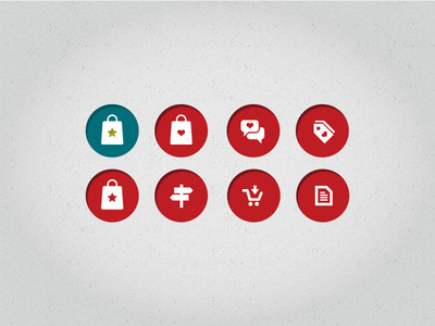
Iconset for shopping app 2 ux
Iconset for shopping app 2 ux icon design icons texture interface ui iphone product photoshop app mobile visualization
This is 1% of what Muzli shows you.
Get the rest — fresh design inspiration on every new tab, free.
Add Muzli — free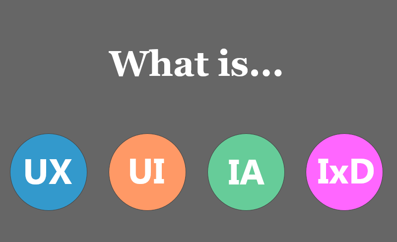
UX vs UI vs IA vs IxD: 4 Confusing Digital Design Terms Defined
We explained What is UX design? What is UI design? What is Interaction Design and What is Information Architecture in this article.Once upon a time, if you said the word “design”, the odds were overwhelmingly likely you were talking about graphic design. But nowadays, the digital world is becoming increasingly more complicated and a lot of new job positions appearing, which lead to confusion for people outside or new to the design industry. Here’s a quick overview on What is UX design? What is UI design? What is Interaction Design and what is Information Architecture in this article to help you understand what they mean.UI Design (User Interface Design)“User interface design (UI) or user interface engineering is the design of user interfaces for machines and software, such as computers, home appliances, mobile devices, and other electronic devices, with the focus on maximizing usability and the user experience. The goal of user interface design is to make the user’s interaction as simple and efficient as possible, in terms of accomplishing user goals (user-centered design).”A good user interface can greatly improve productivity and bring enjoyment to users.The user interface is the level of communication between user and machines. It can be divided into two levels: feeling and emotion. In short, the user interface design is to achieve an easy-to-use and pleasure user interface for users and user-centered design.Author and founder of Adaptive Path — a user experience consultancy, Jesse James Garrett, defines interface design as being all about selecting the right interface elements — like text, buttons, text fields, color-coded lists, etc — for the task the user is trying to accomplish and arranging them on the screen in a way that will be readily understood and easily used. The goal is to make the user’s interaction as efficient and simple as possible.Interface elements include but are not limited to:Input Controls: buttons, text fields, checkboxes, radio buttons, dropdown lists, list boxes, toggles, date fieldNavigational Components: breadcrumb, slider, search field, pagination, slider, tags, iconsInformational Components: tooltips, icons, progress bar, notifications, message boxes, modal windowsContainers: accordionTools of the trade: Photoshop, Sketch, Illustrator, Fireworks, InVisionPrototype Faster, Smarter and Easier with MockplusPrototype faster, smarter and easier with Mockplus!What is the role of UI designer?1. UI designer needs to deal with the user, interface, and the logical relationship between the user and interface. In short, UI designer should make a pleasure interface and easy-to-use product to meet the user's needs.2. UI designer should have a plan for the product style, interaction design, interface structure, and operation process according to the product demands.3. UI designer is responsible for design the project in an interactive interface, icons, logo, buttons, and other related elements.4. UI designer can communicate with the developers smoothly, and promote the ultimate realization of interaction design and user interface.5. UI designer is responsible for the art design of the software interface. He/she can always come up with a new creative idea and make it real.6. UI designer should optimize the webpage to make the operations more user-friendly.UX Design (User Experience Design)As is found on Wikipedia “User experience design (UXD, UED or XD) is the process of enhancing user satisfaction by improving the usability, accessibility, and pleasure provided in the interaction between the user and the product. User experience design encompasses traditional human–computer interaction (HCI) design, and extends it by addressing all aspects of a product or service as perceived by users.”UX designer is the person in charge with creating the products “logic” via wireframes and prototypes via software like Axure, JustInMind, Mockplus etc. Communication is one of the critical skills of the UX designers. They also conduct research, competitive analysis at the beginning as well as usability testing and A/B testing after the project has launched. UX designers are primarily concerned with how the product feels. If your website or app is difficult to use, users will probably be frustrated and move on to something else. If they have a great experience, they’re more likely to come back and tell their friends how great your app is.Deliverables: Wireframes, Prototypes, Storyboards, Sitemap, Written specifications.Tools of the trade: Sketch, Axure, Mockplus, Fireworks, UXPinIA (Information Architecture)Information architecture (IA) involves the way a website/app is structured and how the content is organized. The goal is to help users find information and complete tasks. “In other words, information architecture is the creation of a structure for a website, application, or other projects, that allows us to understand where we are as users, and where the information we want is in relation to our position. Information architecture results in the creation of site maps, hierarchies, categorizations, navigation, and metadata. When a content strategist begins separating content and dividing it into categories, she is practicing information architecture. When a designer sketches a top-level menu to help users understand where they are on a site, he is also practicing information architecture”- from uxbooth.comSome qualifications for IA:1. Experience documenting complex digital properties (websites, mobile apps, products, and system services)2. Extremely detailed documentation, ability to find discrepancies, cracks, etc. amongst complex site documentation3. Proficient with Axure, Omnigraffle, Keynote, as well as Visio and any other programs directly related to IA4. Analyze available information and assets to assess optimal IA approachStrong communication skills (written and verbal), and an ability to present effectively to agency and client staff5. Needs to be analytical, hardworking, creative, curious and interested in people and ideas6. Must be a confident and motivated self-starterIxD (Interaction Design)Definition of IxD: “Interaction Design (IxD) defines the structure and behavior of interactive systems. Interaction Designers strive to create meaningful relationships between people and the products and services that they use, from computers to mobile devices to appliances and beyond. Our practices are evolving with the world.”- from ixda.orgInteraction designer is the people in charge of the websites/apps moving elements & interactions. If you’ve seen a cool animation on a website or app, that made you say wow or that is really cool, that’s the stuff motion designers do.Job description of IxD designer at Google:In an Interaction Designer role, you’ll tackle complex tasks and transform them into intuitive, accessible and easy-to-use designs for billions of people around the world-from the first-time user to the sophisticated expert. Achieving this goal requires collaboration with teams of Designers, Researchers, Engineers and Product Managers throughout the design process-from creating user flows and wireframes to building user interface mockups and prototypes. At each stage, you will anticipate what our users need, advocate for them and ensure that the final product surprises and delights them.So in an oversimplified and user-friendly nutshell, UX Design is how a user feels about the apps, UI Design is what, where and how elements work on the apps, Information Architecture is how an app is organized, and Interaction Design is how the user and app act and react to each other.Last but not least, the boundaries between each of these various design roles are very fluid. The IxD is quite similar to UX design in its approach as it’s part of the UX design cycle, so in some cases, these roles may have a lot of overlap.Mockplus iDoc, Handoff Designs with Accurate Specs, Assets, Code Snippets AutomaticallyLog inGet Started for FREE with the code: mockplususerActivate for free here: https://idoc.mockplus.com/get-idoc/?hmsr=gracemediumUX vs UI vs IA vs IxD: 4 Confusing Digital Design Terms Defined was originally published in Muzli - Design Inspiration on Medium, where people are continuing the conversation by highlighting and responding to this story.

Case Study: Mayple. Web Design for Marketplace of Marketing Services
A new creative story is up: welcome to check the case study on website design by tubik design agency for Mayple, the marketplace helping businesses find and hire well-vetted marketing specialists.ProjectMayple is the creator of a fully-managed marketing services marketplace designed to help businesses work with experts best suited to their needs and goals.The task was to create a new website design, intuitive and straightforward, to effectively tell the target audience about the service’s advantages and help expand sales. The work done includes the UX and UI stages with implementation on the Webflow platform.Web DesignWorking on the user experience for the Mayple website, the creative team was focused on delivering a clean, intuitive, and clear design that helps to quickly engage visitors and present the core benefits of the service for them. Most pages are based on light and airy background, solid visual hierarchy, and readable typography to make it easy for visitors to scan the pages. Core navigation is put into the website header together with the call-to-action button instantly noticeable due to color contrast.Another interesting point to mention is brand identity integration into web design. Except for featuring the brand logo in the header to make it seen immediately and also apply external consistency with the pattern of getting visitors back to the home page by clicking the logo in the header, designers also added the shapes echoing the brand sign on the website pages this way supporting the integrity of visual identity.The above-the-fold area of the home page features the bold tagline enabling the visitor to catch the idea of the service in no time, the search field as the primary call-to-action element echoing the same in the header, and checkboxes marking core benefits. The right part of the page presents the animated slider giving the idea of choosing the experts, showing their profiles supported with prominent photos. In addition, this part of the page features the contrasting block featuring the service’s clients to increase trust.https://medium.com/media/57045d57161bffd807f8380c846a9d22/hrefThe Mayple website is an excellent example of how images of different types can effectively work together. This design combines realistic photos with custom illustrations, and each type does its own task. Headshots help to humanize the service and set the instant connection with the idea of enabling clients and specialists to get together and do interesting things, while playful illustrations and icons set the foundation for the visual storytelling to present the benefits of the marketplace and add strong emotional appeal to all the interaction experience.https://medium.com/media/694c94f9f80bcaffaa07c21a18a462b7/hrefDifferent sections of web pages use background color as an effective visual divider. The designers apply various approaches to organize and visualize various data in the digestible, not overloaded blocks of content and spice them with beautiful graphics to make communication not only informative but also emotional and friendly.https://medium.com/media/6e78b59a6145e51505b33def654ea69a/hrefCustom GraphicsVarious studies prove that most people perceive, process, and memorize images faster than words. So, wisely supporting text with graphics, the design enhances the user experience. Also, consistent graphic elements applied throughout the website pages allow for setting the integrity and clarity of the whole digital experience.With that goal in mind, the creative team worked out a diverse set of custom icons flexible for various web design goals. In addition, the special set of illustrations echoing the same style and color accents was developed to be used on different web pages illustrating taglines and presenting the benefits of the marketplace.Mobile VersionAnother must-do for any web design project is thinking over its elegant and effective mobile adaptation to make it accessible and easy to use from any device. Here’s how the Mayple website looks on mobile.https://medium.com/media/9950af818723606ddd94d81f2b3aa7e6/hrefMayple website was another great experience for our team to work on the design for business goals and organize a lot of various content into a clear, emotional, and visually appealing system.New design case studies from our team are coming soon. Stay tuned!More Design Case StudiesHere’s a set of more case studies sharing the design solutions and approaches for some of the branding and UX design projects done by Tubik.Crezco. Brand Identity and UI/UX Design for Fintech ServiceFarmSense. Identity and Web Design for Agricultural TechnologyOtozen. Mobile App Design for Safe DrivingUplyfe. Identity Design for Health AppCarricare. Identity and UX Design for Safe Delivery ServiceSynthesized. Web Design for DataOps PlatformMayple. Website Design for Marketing MarketplaceAnnual Awwwards Website DesignGNO Blankets. Branding and Web Design for EcommerceOriginally written for Tubik Design BlogWelcome to check designs and art by Tubik via:WebsiteDribbbleBehanceTubik ArtsCase Study: Mayple. Web Design for Marketplace of Marketing Services was originally published in Muzli - Design Inspiration on Medium, where people are continuing the conversation by highlighting and responding to this story.
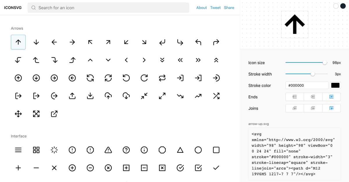
ICONSVG
Well executed One Page web app by Gaddafi Rusli to help simplify the process of finding and generating SVG icons for your next project. Full Review
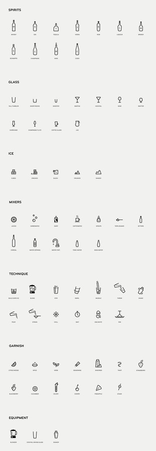
Mixionary MAUD iconography
Mixionary MAUD iconography icon icons system app
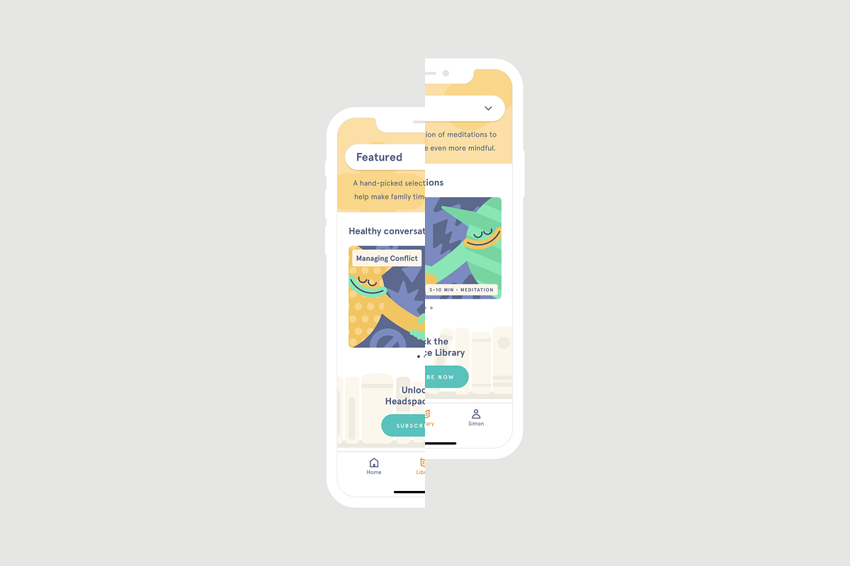
The Headspace app achieves design zen
User expectations are high and attention spans are short, so it’s more important than ever to pay attention to the finer details of starting up a business.The backgroundHeadspace is a mindfulness app that is focused on improving our digital health by providing digestible meditation sessions that fit right into busy lives.We’re seemingly living through busier routines than ever before, which means an app like this is perfectly positioned to provide the kind of respite most of us crave.Does it work for its audience?The most important point to start with here — and this is critical in such a busy, modern world — is that Headspace’s value proposition is immediately clear from the get-go. It takes seconds to understand that it serves its customers’ needs (you might even argue that it takes half a second, given the suitability of the snappy moniker it goes by — it does what it says on the tin).Any app that allows you to sign up in a single screen with form-filling kept to a minimum gets a tick in my book. It gets to the point about what you might need from such an app and isn’t restrictive when it comes to the personal experience; you can answer a short series of nicely designed questions with large icons to personalise the experience from the very beginning, which leaves the first impression that you will get a great user experience out of it.The basic course offers a smooth introduction to the app and it is clear that there is something for everyone — this is reflected in the variety of the reviews on the app stores, which we’ll come onto a bit later.How does it sit in the market?Headspace has come along at a time in which digital health and wellbeing is a hot topic in the tech industry. We all spend plenty of time immersed in some kind of digital experience — so much so that both Google and Apple have recently integrated user-facing usage dashboard features for their phone operating systems. Their idea is to open our eyes to how much we use our devices by giving us stats down to the detail of how many times we’ve unlocked them in any given day, which makes it a perfect time for Headspace to enter the frame.Headspace has come along at a time in which digital health and wellbeing is a hot topic in the tech industry.With ‘mindfulness’ being such a buzzword at present, it’s no surprise to see a number of apps emerging in the market. The likes of Calm and Aura are giving you the chance to put you first with quickfire meditative sessions for the digitally obsessed amongst us.Headspace has before reached the top spot in both the Google Play Store and Apple App Store, however, so it’s clearly striking a pleasant chord in the market. Reviews on the App Store are extremely positive in many cases, with a number of people stating that it has helped them get through some rather difficult times in their lives. What more can you ask for from an app if it provides perspectives like that?When we take a look at overall interest in the topic of ‘mindfulness’ in the United Kingdom alone, we can see that it has almost tripled in the last five years on Google Trends:Google Trends: Interest in ‘mindfulness’ (2012–2017)Mindfulness trends in the United States were recently reported by CNBC, too; significant increases in the practising of yoga and meditation were recorded in the five years between 2012 and 2017 and Headspace’s competitor, Calm, was also reported to be worth a cool $250 million (apparently a lot to do with having Donald Trump in the White House, but let’s not get into that…).The market is a busy one for meditation-focused startups, which means the differentiators have to be based on the in-app user experiences — let’s take a look at that in Headspace to see how it fares.iOS Headspace app designs as of Nov 2018What are the UI and UX like?The interface is clearly kept to a minimum to keep things simple — there are three main sections: Home, Library and Profile.The Home screen provides the portal into your meditation course with current sessions highlighted above the necessary social proof to show that hundreds of thousands of people have benefited from Headspace throughout the day.The Library section provides the deep dive into the features, which are divided into an abundance of categories. Over time, you’ll no doubt become familiar with the structure of its content, but for early starters, a search function with additional filters could be helpful for getting to grips with it.The Profile section highlights the gamification aspect of the app, which is altogether necessary if you are going to get any long-term benefits out of this kind of activity.On the whole, the UX is very good and it’s a pleasure to simply explore the app. High response rates and engaging content make for the kind of experience you actually want to come back to and, with the indications of session or course duration, you know from the off how much of your time you’ll be committing to it.High response rates and engaging content make for the kind of experience you actually want to come back toOne of Headspace’s greatest strengths is that it has a truly unique identity. It’s all been so well-considered from a design point of view; everything from the muted colour palette to the beautiful illustrations help to communicate a distinctive and calming presence.How does it fit into the company’s customer journeys?Whether your first encounter with Headspace is through the website, the app or the sponsored social posts, it’s immediately clear how it could fit into your digital life. There appears to have been a pretty seamless branding exercise behind launching the app and the mostly positive media coverage is testament to that. It’s easy to navigate between the app and its website, as well as jumping seamlessly from ads to meditation in just a couple of steps if you’re new to the concept.Room for improvementOn first impressions, the £10/month fee seems a little steep to me, so I can’t help but think that a free 30-day trial or even a refer a friend scheme with a free first month would go down well. New users could have a grace period in which they explore the richness of the content to decide whether or not to part with their money, but everybody is different so it depends on how much you might need such easy access to meditative techniques in your daily routine.Bad reviews are hard to come by for both iPhone and Android, but those who do have gripes are typically down to bugs and glitches that cause audio to cut out halfway through a session and the progress fails to update.Headspace is walking a digital tightrope in the sense that the slightest hint of annoyance or inconvenience for the user causes a major wobble in the distraction-free experience it is trying to create.Headspace is walking a digital tightrope…the slightest annoyance causes a major wobble in the distraction-free experience…It seems to have mastered it in the most part; nevertheless, some people are disappointed enough to write two-or-three-star reviews online, but the creators of the app seem to be on the case almost every time.Reasons to be waryThe aforementioned fact that ‘mindfulness’ is so hot right now means that Headspace’s main cause for concern is the high level of competition it faces from the likes of Calm, which has similarly raving reviews across the board.There’s no doubt that Headspace occupies a pretty clear space in the market, but the freshness of the content and the responsiveness to the bugs and glitches will be key to maintaining its position as a sought-after app around the world.Whether or not it is clinically proven to work remains to be seen, so this might be one to address as the popularity of ‘digital health’ continues to rise.Final thoughtsThe range of content available in Headspace coupled with a fantastically designed UX means that it succeeds in having a broad appeal to people interested in meditation. Whether you’re a beginner or a zen master, Headspace seems to have the content for you.The price-point is the only apparent concern that could hold it back, but the sheer number of downloads and positive reviews might quash that argument in one fell swoop.SummaryThe good stuffA beautiful design that makes great content accessibleThe smooth onboarding process means you can be meditating within secondsOverwhelmingly positive reviews mean that it’s clearly providing a useful gateway to meditation for a range of peopleThe not-so-good stuffThe lack of a free trial might put some meditation newbies offThe £10/month subscription fee seems a little steep on first impressionsMany reviews report bugs and glitches that ruin the ‘meditative’ experience for someThis article represents the opinion of experienced design consultant, Simon McCade, who has no association or affiliation with the company or the app in question.Originally published at www.simonmccade.com.The Headspace app achieves design zen was originally published in Muzli - Design Inspiration on Medium, where people are continuing the conversation by highlighting and responding to this story.
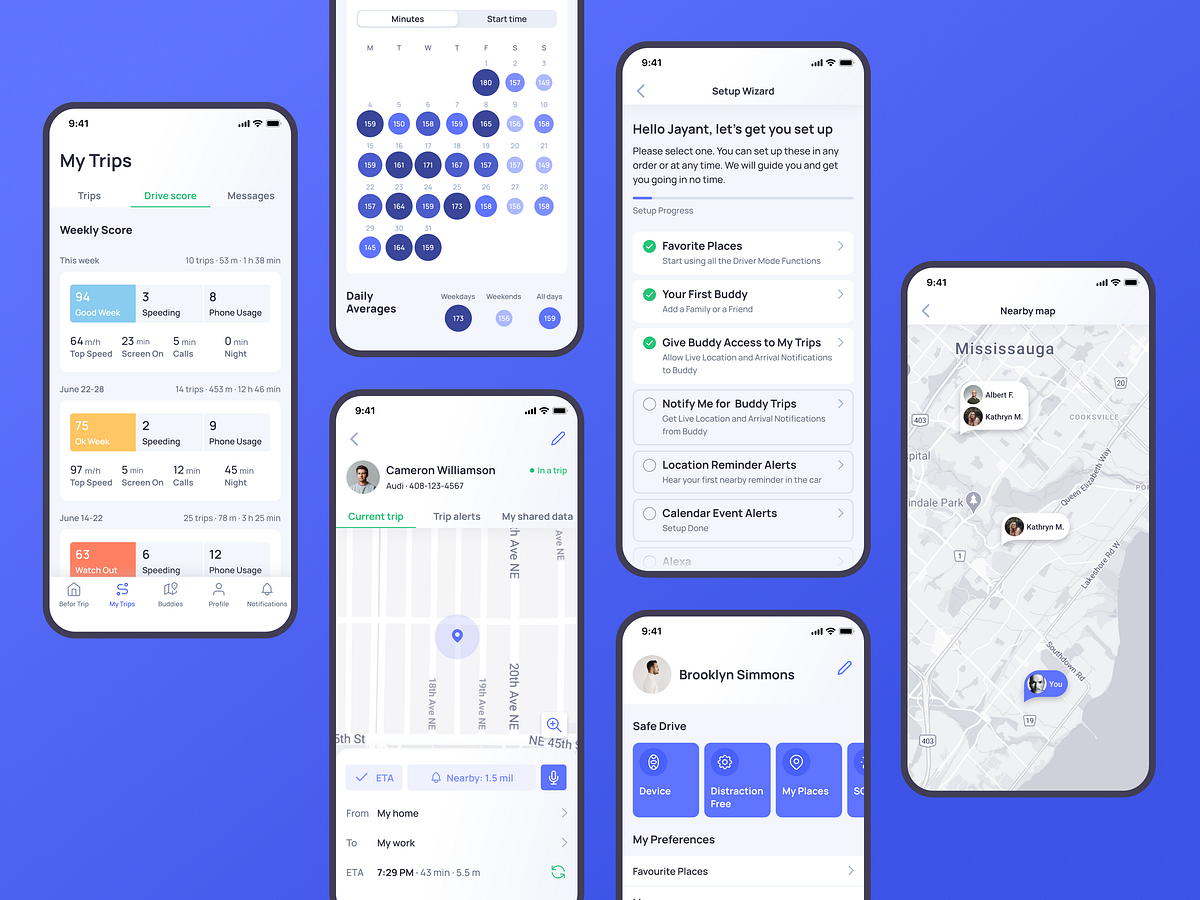
Case Study: Otozen. Mobile Application Design for Safe Driving
“The one thing that unites all human beings, regardless of age, gender, religion, economic status, or ethnic background, is that, deep down inside, we all believe that we are above-average drivers,” famous author and columnist Dave Barry once mentioned, and this point is getting more and more influence on people’s lives all over the world. Our new design case study also touches on that issue: let us unveil the story of user experience design by tubik agency for Otozen, the technology that strives to support the idea of safe driving.ProjectOtoZen is an innovative technology for safe driving, operating via a hardware device connected with a mobile application. It helps users to turn any car into a smart, distraction-free vehicle. It is the all-in-one safe driving assistant that keeps drivers focused, organized, and connected to friends and family. Users can quickly pair the OtoZen device with their Apple or Android phones via Bluetooth and install the OtoZen Pod in split seconds, with no tools, wiring, or professional installation required.In this project, tubik specialists were involved in auditing and improving UI and UX design for the mobile application, as well as creating custom graphics and a website that would strengthen the product’s web presence.App DesignFrom the perspective of user experience design, the Otozen application was a complex project that included a diversity of manipulations with different data, some of which are changing in real-time mode and should be updated and distributed appropriately. Another concern was dealing with a lot of personal data security and privacy issues. So, the design process had to start with diving deep into the slightest details of functionality and user problems solved by the application. This is what the application looked like at the start of the process.The client came to us with the prototype that had to be reviewed, discussed, and reconsidered. In general, the technology is built around the following primary directions:safe, distraction-free driving: texting-while-driving prevention, reduced audio distractors, high-speed alerts, feedback on driving safety level, autodial to call help for emergencywell-used driving time and organized reminders: location/time-based reminders, audio calendar alerts, joining meetings hands-free, simplified expense reports with mileage trackingconvenient connection and communication with other people, for example, family and friends: requesting live location and ETA of other drivers, getting easily updated with automated notifications, full control of privacy and visibilitySo, having analyzed the diverse functionality and data the app had to process, considering the objectives behind the application, our team made a deep review of the pain points and blind spots in the existing prototype. That process of design audit was grounded on constant communication with clients to find out the slightest details that could have an effect on user experience and grew into tons of graphs, charts, tables, and schemes. That’s a good example demonstrating that a huge part of the user experience design process is not about visuals but about analyzing, structuring, connecting the dots, considering details, and building systems. Here’s a look at just a small part of the process.A part of multiple systematic tables textually organized different information about the product, questions and issues to discuss, and suggestions that could improve user experience, to support collaboration between the clients and the creative team and let them stay on the same page.A glance at the process of analysis and structuring user interactions with the application and issues arising in the processThe process of building a particular piece of user scenarioSo, the core tasks for the UX designer were to think over data organization, visualization, and navigation which would make complex flows of information and functions feel intuitive and straightforward and wouldn’t overwhelm users. Supporting that idea, the choice was made on a light and airy interface with contrasting but not overbright colors for critical visual elements, and buttons, and a highly-readable sans-serif font to make the screens scannable and easy to use on the go.One of the significant points for the user experience design of the mobile application was effective onboarding and registration flow. The account creation process is divided into several simple steps, with a progress indicator keeping the user updated about the current stage.My Trips section opens the feed and gives an opportunity to easily tune what the user wants to see. This application is a good example of how well-crafted icons support the usability and navigability of the mobile interface and help set instant visual connections with different types of information. The map screen shows the trip details. It also uses color marking for the various points, such as speeding or telephone usage, this way visualizing quickly how often the issue happened during a particular trip.Opening the calendar, the user can see daily time stats in minutes. The drive score section opens the information on issues that influence driving safety.The tab bar lets users switch between five core interactive zones: Alerts, My Trips, Buddies, Profile, and Notifications. To maximize the influence and make it clear for users, it combines elegant line icons and text labels to quickly inform what users will find in each tab.And here’s a glance at the flow of interactions with the app.https://medium.com/media/d1aefb31f75aae28c1397608ba7a8426/hrefThe Alerts section organizes all types of incoming alerts and helps to switch between them smoothly.Profile screen shows different data about settings and preferences, neatly organized in groups. Here users also can add, edit, and review their emergency contacts, vehicle details, and places.One more important and valuable feature of the Otozen application is Buddies. This function allows users to connect, make their trips trackable, and notify the chosen buddy about the needed information, such as the current point on the route or arrival. It can be super helpful for various issues, for example, when the app user needs to know where the family member is but doesn’t want to distract them from driving with calls or messages.One of the points the technology creators describe as the most essential and show deep care on is personal data security. So, in the Buddies functionality, this aspect had to be well-thought-out, and sharing/accepting access to tracking the other users’ trip, OtoZen users needed to be sure that they can control the level to which they open data to their buddy in the app. That resulted in another neatly organized set of settings in the application that had to be clear and straightforward.The major challenge behind the application UX design was to get together all the multiple flows of information, notifications, alerts, macro and micro settings, and decide upon the most user-friendly way to organize them.Web DesignOne of the well-checked tools for building a solid mobile application brand and effective promotion is creating a landing page or website to present the benefits and connect users to the product in an efficient, informative, and captivating way. So, the website was another task for our team to allow the OtoZen product to cover this aspect of digital marketing and set another major channel of communication with its users, letting them catch the idea and uncovering the answers to all the questions that may arise.The general layout and website style echo basic color accents and the airy, light layout of the application. The information about the technology is divided into concise sections to be scannable and skimmable. The hero section presents the immediate visual connection to the technology via the prominent image demonstrating both the device and the app and giving the main idea about the product and its value for users via an informative tagline and short description. The call-to-action button in the hero section is instantly visible due to the color contrast. It works in pair with the ghost button, allowing visitors who want more information to watch the video.For the last few years, original illustrations applied to user interfaces have been one of the most popular and solid UX design trends. Not only do original graphics contribute to the general brand image and enhance its recognizability and memorability, but also they set a solid emotional connection between the product and its user. What’s more, they add much to the usability and visual storytelling, especially when consistent photos cannot be obtained for all the necessary demonstration needs, especially in the cases of highly technological products. The Otozen website took advantage of the custom illustrations keeping a consistent style and effectively supporting information blocks. Also, many of the pictures feature people, adding a human element to the communication. Mobile adaptation of the website makes it look attractive and work effectively from any device.“We are very pleased with the outcome. The app UI/UX is well received by our customers. There was a consistent app UI/UX theme that was maintained throughout the development, and having the same designer working with us helped us achieve this,” the client company’s CEO wrote in his review on Clutch; what could be the better way to finish the design story?New design case studies from our team are coming soon. Stay tuned!More Design Case StudiesHere’s a set of more case studies sharing the design solutions and approaches for some of the design projects done by the Tubik team.PointZero25. Identity and Website Design for Event AgencyNonconventional Show. Website Design for PodcastuMake. Branding and Website for 3D Design ToolBEGG. Brand Packaging and Web Design for Food Product EcommerceUplyfe. Identity Design for Health AppOK Boomer. Trivia Game Design and BrandingCrezco. Brand Identity and UI/UX Design for Fintech ServiceReal Bitcoin. Creating Website IllustrationsFarmSense. Identity and Web Design for Agricultural TechnologyCarricare. Identity and UX Design for Safe Delivery ServiceOOP. Brand Identity Design for Online Flea MarketOriginally written for Tubik BlogWelcome to talk to us and check designs by Tubik via:WebsiteDribbbleBehanceTubik ArtsCase Study: Otozen. Mobile Application Design for Safe Driving was originally published in Muzli - Design Inspiration on Medium, where people are continuing the conversation by highlighting and responding to this story.

Pet Yo — UI/UX Case study
Pet Yo — UI/UX Case study🐶🐱Pet Yo — App for those who love pets.Research 🔎📈A research conducted by “ACT” has found that 20% of the Tbilisi population owns domestic animals / birds.The most common pets appear to be dogs (60%). The second most popular were not cats (10%), but parrots (28%).ACT conducted the online survey. Through random sampling method, 400 adult residents of Tbilisi were interviewed. Statistical error of the data does not exceed 4.9%, interviewing method — face-to-face interviewsThere are many groups on facebook, where people join to share their experience about their pets. According facebook we have many pet lover clubs.-Dogo lover clubs-Cat lover clubs-Parrot lover clubsProblems 🛑A lot of people wants to get in touch with experienced pet lowers.To share or see lovely pet’s stuff.Find the trusted vet’s and food for our lovely friends.It’s important to feed your pet regularly, so people want to track food/water.Competitors 📱🔎People like to share their pet’s stuff, there are main big competitors. Their key problem is geolocation, content is from around the world, user can’t understand who posts, people want to see local pet lovers. Another problem is messy IA. I found that you can add only one pet on “yummy pets”.Main problem is Feed, Content is not understandable.Personas 🕵🏻I have interviewed several types of people: those who just love dogs and those who have their favorite pets at home. Interview was Q/A style. I asked them about the difficulties that come while owning and taking care of the pets, what does please them most and in general what does their daily life looks like. Based on the answers three types of User persona are revealed:Persona 1Persona 2Persona 3User flow 🗺Creating a User Story Map helped to build the structure for the app. My main challenge was to simplify the number of steps needed for each user to complete their key tasks within the product.Sketches/Wireframes 💭✏️After clarifying the User Flows, I started sketching process to imagine details.This was the first step to help me outline the app and visually imagine it. I finalized a sketches of each view and divided them up to translate into low fidelity designs on Adobe XD.After many iterations, got final wireframes.UI 🚀MoodboardUnlike wireframes and prototypes, moodboards don’t show the detailed picture of a future project. This is the most delicious part for me. Moodboards are a good way to experiment with a color palette, fonts, and style.Detailsselected Color paletteIcons,IllustrationsHi-fidelity designAdd Pet flowFind Vet housePet’s profileDiet schedule, Food/Water trackerFeed for those who just love dogsConclusion 💭I faced the challenge of creating an engaging app both from the user experience & visual perspective. Now you can scroll news feed with your pet, they need friends like as humans. Users can make daily schedule for their beloved pets, Find local vet’s.Follow me on Dribbble, LinkedIn or Instagram to get notified when I publish something new ⚡️Pet Yo — UI/UX Case study was originally published in Muzli - Design Inspiration on Medium, where people are continuing the conversation by highlighting and responding to this story.
UX Case Study: Designing a Food Delivery App
A quick and easy way to order your mealsYummies is a food delivery mobile app created for a hypothetical restaurant that provides its customers with good hearty meals, snacks and drinks.The ProblemPeople are pressed for time and often struggle to make out time to cook or sit down for a nice meal at a restaurant. As a User Experience designer, the challenge here was to find a unique solution that helps these people get their meals quickly and easily.The GoalMy goal was to design an accessible and inclusive mobile app that lets users order meals from Yummies Restaurant quickly and easily at their own convenience.My Design ProcessUnderstanding the UserI conducted a competitive analysis and interviewed five people who have some experience with ordering food via online platforms, to truly understand the needs, behaviours and motivations of the users I’m designing for.My research identified four (4) pain points:AccessibilityLanguage barrierEase of useTimeCreating the solutionAs part of the ideation process, I mapped out a user flow to create a visual representation of the steps a user would take to reach their end goal. This also helped identify all the screens to be included in the design.User flowPaper wireframesWith an idea of all the necessary screens, I put pen to paper and sketched several iterations of each screen.To make the experience fast and stress-free for the users, I prioritised ease of use and a quick ordering process while sketching.Several iterations of the home screen were sketched on paperGoing digitalI then proceeded to create a digital version of the screens in Figma.Usability Testing“It doesn’t matter how good a product is if, in the end, nobody uses it”.- Don Norman (The Design of Everyday Things)My aim was to design a product that people can actually use. Therefore, usability testing was one of the most important parts of my design process. I conducted two (2) rounds of usability studies. I was also constantly testing the product with friends and colleagues to identify seemingly small usability issues that might affect the user experienceUsability study (Round 1):For the first round of usability studies, I connected the screens of the lo-fi digital wireframes to create a low-fidelity prototype. This prototype was then tested with five participants, including one with limited technical skills.For details of the usability study and findings, you can view the usability study report hereUpdated digital wireframesUsability study (Round 2)For the second round of usability studies, I used a high-fidelity prototype of the design.High-fidelity mockupsI tested the design at this stage to observe an interaction with the app that most closely resembles a real-life interaction with the final product.Again, I recruited five participants for the study. This time, I included one participant with low vision so as to learn how the colours in the app might affect accessibility.There were two main usability issues identified:The contrast ratio is not high enough for users with low visionThere are no considerations in place for returning usersThe following changes were made the fix them:I darkened the accent colour to improve the colour contrast ratioI added a “remember me” feature so that returning users can skip the onboarding process.Final designView the high-fidelity prototype here.Straightforward, no-gimmick onboarding process to save timeHome screenSimple menu screen. Details screen consists of food description, price, quantity, recommended sides (anticipating the user’s needs), ratings and reviews.An easy ordering process with added shortcuts for returning users. Pay on delivery option included.Accessibility & inclusion considerationsI used sufficiently contrasting colours to ensure that the app’s content can be read by everyone.I used images with descriptive text, appropriate hierarchy & emphasis to aid users with screen readers.I used images and easily recognizable icons across the design to provide visual context.For a more detailed description of my design process, you can view the case study here.Special thanks to Sonya Lewis (UX Researcher, accessibility advocate and mentor on adplist.org) who reached out to me after coming across this case study on LinkedIn, and thought it stood out amongst other case studies because it focuses on accessibility. She was kind enough to offer expert advice on how to “put my best foot forward” while presenting my work.Thank you for reading!🤗Wanna get in touch? You can send me a mail via cuzegbu@gmail.com or connect with me on LinkedIn,UX Case Study: Designing a Food Delivery App was originally published in Muzli - Design Inspiration on Medium, where people are continuing the conversation by highlighting and responding to this story.
UI/UX Case Study: Adapting an app design for Android & iOS
Context: The high fidelity design part (UI) of this application was created by me. After creating the high-fidelity designs for this app, we decided to go one step further. By converting these designs into HIG & Material guideline-specific designs.I won’t go into much detail on the process of designing this app. Long story short, we got a problem statement and a user group (farmers of age 18 and above). So we went through the process of user research, ideation, wireframing, and creating high-fidelity designs.Some final screensSo let’s go on the journey of understanding the differences between both iOS and Android design guidelines and implementing those in our application.I have studied both Human interaction Guidelines (HIG) and Material design systems before. In simple words, HIG focuses on flat, simple, and light design whereas Material embraces lively, intentional, animating, and flexible designs. Before implementing these two, I had to study them even deeper.Implementation in popular applications: Before studying theory and a plethora of data, I wanted to see if these kinds of conversions are worth it. If it does, what does it look like? So I went to Mobbin to study iOS and Android versions of some popular applications (Eg: Instagram, Twitter, Spotify). Here are some important design differences I found:NavigationAlignment of titles, subtitlesAny input field or button (Padding, Size, Corner Radius)iOS uses text for navigation instead of iconsDifferent font styles for the same type of elementMargin, column, & gutter differencesI could see the differences clearly. So I went ahead and started learning about the two design systems. I won’t describe it here, instead of me copy-pasting, you can go to the official sites of HIG & Material design systems to learn it in depth. Here, I’m going to describe the learnings I applied to the application.Official pages of HIG & MaterialScreen Size: While researching what screen size to design for so that my design can cover all the screens, I got to know some key points: For India, currently most common screen ratio is 360*800px with a ratio of 16:9 (source). For android, the top 5 best-selling phones have a screen ratio of 20:9. For iPhone, a large group of users uses the 375*812pt screen size (1pt = 1.33px). So I started accordingly. I planned to create the 360*800px version for Android and a 375*812pt version for iOS.Layout Grid: A layout grid is something that defines the structure of the screen. It can be in form of columns, rows, or a combination of both. Most designers and design systems use the column form of layout grids. While researching the layout grids, I came to a conclusion: In HIG, there is no use of grids and the side margin is 16px from each side. In Material, the grid has four columns with 16px of gutter and 16px of margin from each side.Screen sizes for iOS and Android with their layout guidelinesTypography: In terms of typography, both design systems have their own guidelines. One thing that sets their standard on the same level is the use of DYNAMIC TYPE fonts. Dynamic fonts change their weight based on the system settings. In simple words, static fonts have a defined set of font styles (Thin, normal, bold, etc.) whereas dynamic fonts respond to the weight input and change their properties accordingly. The default typeface used in HIG is SF Pro and in Material, it is Roboto. The design system also provides a detailed description of all the font sizes (Eg: Font size, line height, letter spacing, etc.).Typography GuidelinesThere’s no compulsion of using the system typeface for your project, but in this project, I’ve used the same typefaces used in the respective design systems.The typography used in the applicationNavigation: Navigation is an important part of the user experience. The HIG and Material design systems have clearly different navigation styles and in my opinion, they both work perfectly well. As you can see in the navigation components shown below, HIG uses text as navigation buttons so much more than Material whereas, in Material, the use of icons for navigation is applied a lot more than in HIG. (We can’t say which one works better than the other because both work and both of them are loved.)Navigation differences in both design systemsComponents: When it comes to differentiating between HIG and Material design patterns, the components play a major role. The material design just revamped its design system. In this design system, most of the components are changed. The new system is named “Material 3”. HIG brings small changes to its design system with every update of its OS. So based on the measures and standards provided in both design systems, I created all the needed elements for the HIG and Material Version. Here’s a list of elements created for both versions:Components used in the iOS version of the applicationComponents used in the Android version of the applicationConclusion: After all the learning and implementations, here are some of the outcomes we produced.This journey taught me a lot. Pioneers, rivals, or whatever you can say but these two systems are competing and learning from each other to provide a better user experience. I think designers should have a thorough knowledge of at least these two design systems so that they can create a phenomenal experience for their users by using or breaking these design rules.Peace!UI/UX Case Study: Adapting an app design for Android & iOS was originally published in Muzli - Design Inspiration on Medium, where people are continuing the conversation by highlighting and responding to this story.
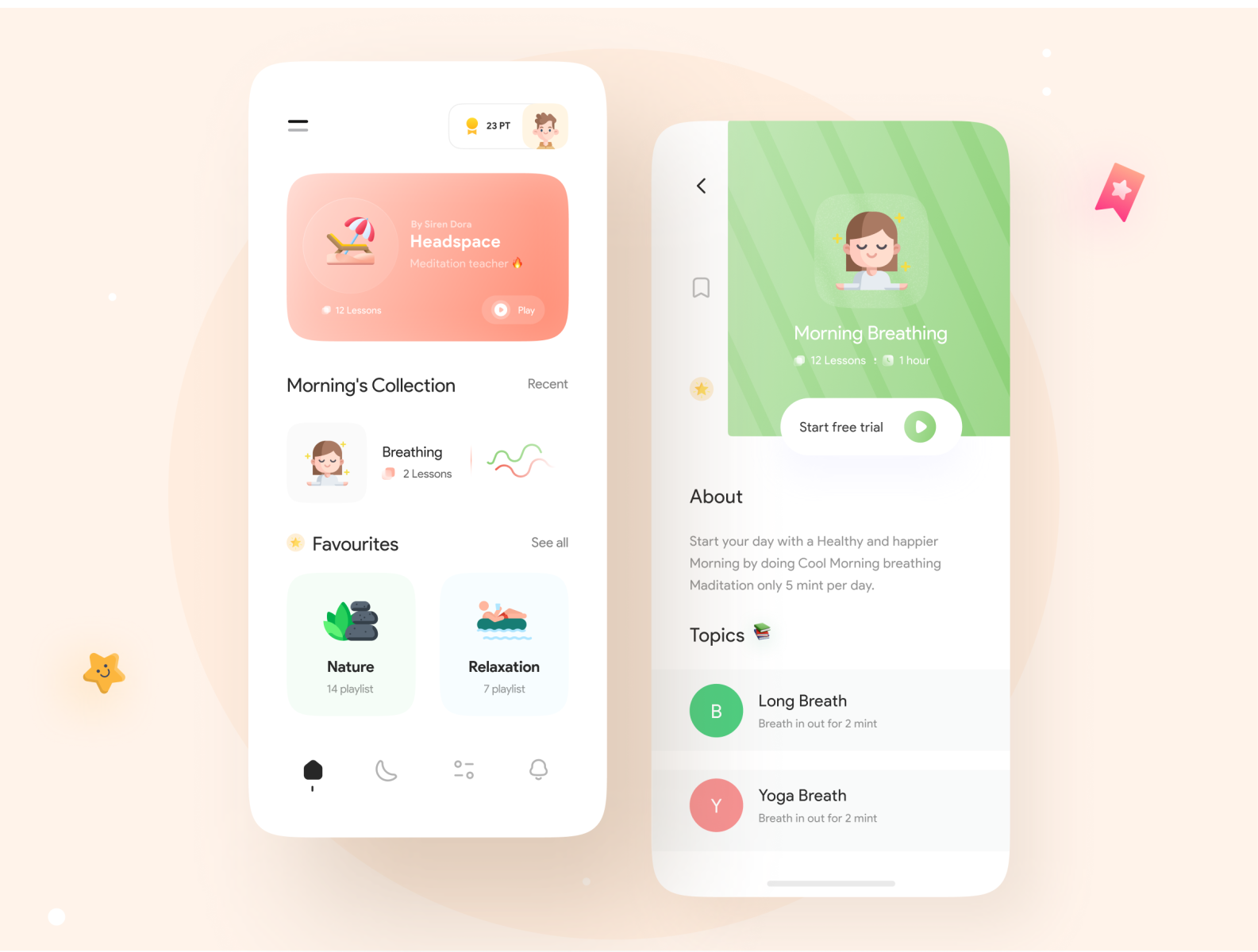
Stress Relaxation App
Hey guys ✌️Here is the Stress relaxation App, hope you will like it, and Press F to show some love ❤️ Icons (icopin) by : Arshia | Follow my instagram Page Follow lupinus Design: UI8 | Instagram | Behance | Twitter | Uplabs Thank you ✌️
Write - Free UI Kit for Sketch and Adobe XD
Introducing Write a UI Kit for Sketch and Adobe XD with 15 iOS app screens designed in vector format, based on symbols. 😎 GET IT FOR FREE Free for personal use. Pay whatever you want to show the support. Press L to show some love More freebies on DesignerMill Icons: Google Material Design Fonts: San Francisco / Playfair Display Poetry by Maya Angelou

MIOPS Mobile Application
The MIOPS MOBILE application utilizes the smartphone's capabilities to offer creative modes like Vibration, Sound, Motion and Distance, or even various Timelapse modes to trigger your camera. The most extraordinary feature is what we call "Scenario" mode, which combines any of the available trigger options to create magic. You can take photos with your DSLR or mirrorless camera using various modes within the MIOPS MOBILE smartphone app. It will fire your camera while you relax. Creathive was responsible for creating the MIOPS brand and interfaces for tablet and mobile app. Its sophisticated features required a simple and easy to follow interface. Intricate icons, combined with a dominant color scheme, created a simplistic yet cool look.
This is 1% of what Muzli shows you.
Get the rest — fresh design inspiration on every new tab, free.
Add Muzli — freeMIOPS Mobile Application
Get access to thousands of freshly updated design inspiration pieces by adding Muzli to your browser.
Loved by 800k designers worldwide, Muzli is the leading go-to browser extension for creative professionals.
Mobile App Icon: Do's and Don'ts
The mobile app icon is often the first interaction users have with your app. It acts as the digital 'face' of your application and plays a crucial role in influencing user impressions and download decisions. Crafting a compelling icon requires attention to detail and an understanding of design best practices. Let's delve into the do's and don'ts of mobile app icon design.
Do's:
1. Prioritize Simplicity
Choose a clean and straightforward design that clearly represents your app's purpose. Avoid overly intricate details that can be lost on small screens.
2. Ensure Recognizability
Design an icon that stands out in a sea of other apps. It should be memorable and instantly associated with your app's functionality or brand.
3. Maintain Consistency with Your Brand
Ensure that the app icon aligns with your brand's colors, style, and ethos. Consistency reinforces brand recall and trustworthiness.
4. Test Across Different Backgrounds
Ensure your icon looks good against both light and dark backgrounds, considering the various themes users might have on their devices.
5. Update Periodically
As design trends evolve, consider refreshing your app icon to stay modern and relevant.
Don'ts:
1. Avoid Using Words or Letters
Text can be challenging to read at small sizes. Rely on visual imagery rather than words or letters, unless it's a recognized brand logo or initial.
2. Don't Neglect Sizing and Resolution
Icons may appear on various devices with differing resolutions. Ensure you provide high-quality icons that look crisp on all screens.
3. Avoid Generic Designs
Steer clear of overused motifs or generic imagery. Your icon should uniquely represent your app and not be easily confused with others.
4. Don't Overcomplicate with Colors
While color is essential, using too many can make the icon appear chaotic. Stick to a limited color palette that aligns with your brand.
Conclusion:
Designing a captivating mobile app icon is a blend of art and strategy. By following these do's and don'ts, designers can create compelling icons that not only attract users but also encapsulate the essence of the app and the brand it represents.