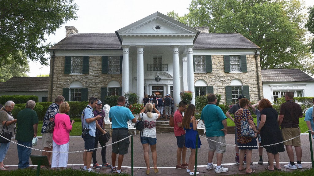
How Elvis Presley’s Graceland is a mood board of 1950s Americana that bridges cultural divides
Nearly 50 years have passed since Elvis Presley died; save for an annual August observance to commemorate the anniversary of the singer’s death, most days produce little news about Presley or his estate, Graceland, which became a National Historic Landmark in 2006.
Fans, then, were unprepared in late May 2024 when a mysterious private investment company issued a public notice to foreclose on Graceland. The property appeared to have been used as collateral on a nearly $4 million unpaid loan.
Suddenly, it seemed like a piece of history could disappear with the rap of an auctioneer’s gavel.
Many of the details of the episode are still unclear, though the courts suspected fraud and promptly suspended the sale. An identity thief later took credit for the attempted grift from the shadows of the dark web.
But the anxiety over the possibility that Presley’s home might fall out of family control raises an important question: Why does Graceland matter?
It’s the second-most-visited home in the U.S., topped only by the White House. According to the U.S. Interior Department, which granted Graceland landmark status, “American culture and music changed irreversibly because of Elvis. It would be difficult to tell the story of the 20th century without discussing the many contributions made by this legendary, iconic artist.”
The department’s account is certainly correct, but the saga of Graceland provides more nuance than the decree suggests.
In my two books on Presley, I argue that the singer did, indeed, make significant contributions to American society. However, at the same time, many have viewed the singer’s life, output, and legacy with a sneer.
Nowhere is this condescension more evident than in patronizing references to his home.
From East Memphis to Whitehaven
Graceland wasn’t the first home Elvis bought.
In 1956, he purchased a house for his parents in an upper-middle-class suburb in East Memphis. The family had moved at least 16 times since Elvis’s birth, mostly into boarding rooms, subsidized apartments, and rental houses.
At each stop, the Presleys were accustomed to bringing along their cultural mores.
At their new East Memphis address, this didn’t go over well with the neighbors, even though Elvis had become a superstar through his music, TV appearances, and film roles.
Upon receiving notice from his well-to-do neighbors that they didn’t approve of his mother hanging out clothes to dry and raising chickens in the backyard, Elvis began looking for a home where he and his family would not suffer the injuries of social class.
In 1957, when he was just 22 years old, he settled on Graceland.
Elvis Presley strolls the grounds of Graceland in 1957, the year he purchased the home. [Photo: Michael Ochs Archives/Getty Images]
Graceland had been built in 1939 as a 10,266-square-foot, two-story, five-bedroom, four-and-a-half bathroom colonial revival “mini-mansion,” four years after Elvis was born in a two-room East Tupelo, Mississippi, shotgun shack a few steps away from the family outhouse.
The estate was not a plantation, but it did encompass 13 acres of what had been a large cattle farm situated in Whitehaven, a hamlet located several miles from downtown Memphis and named after Colonel Francis White, who helped establish the Mississippi and Tennessee Railroad.
The Whitehaven neighborhood had developed in the late 19th century and attracted as residents the Memphis gentry. By the mid-1950s, real estate developers arrived and began subdividing formerly large estates. While still considered the “country,” it began to resemble a conventional middle-class suburb. At the end of the decade, Whitehaven and the adjacent Levi neighborhood were about two-thirds white and one-third Black.
In 1970, Memphis annexed Whitehaven. By the time the Memphis City Council renamed the section of U.S. Route 51 that intersected the community as Elvis Presley Boulevard in 1971, desegregation and school busing spurred the arrival of new Black students, residents, and businesses. This activated the white flight that eventually saw Whitehaven become a predominantly Black suburb.
Today, when tourists visit Graceland they’ll find the “mini-mansion” situated in a predominantly Black community. Many of the associates who work at the tourist complex are Black.
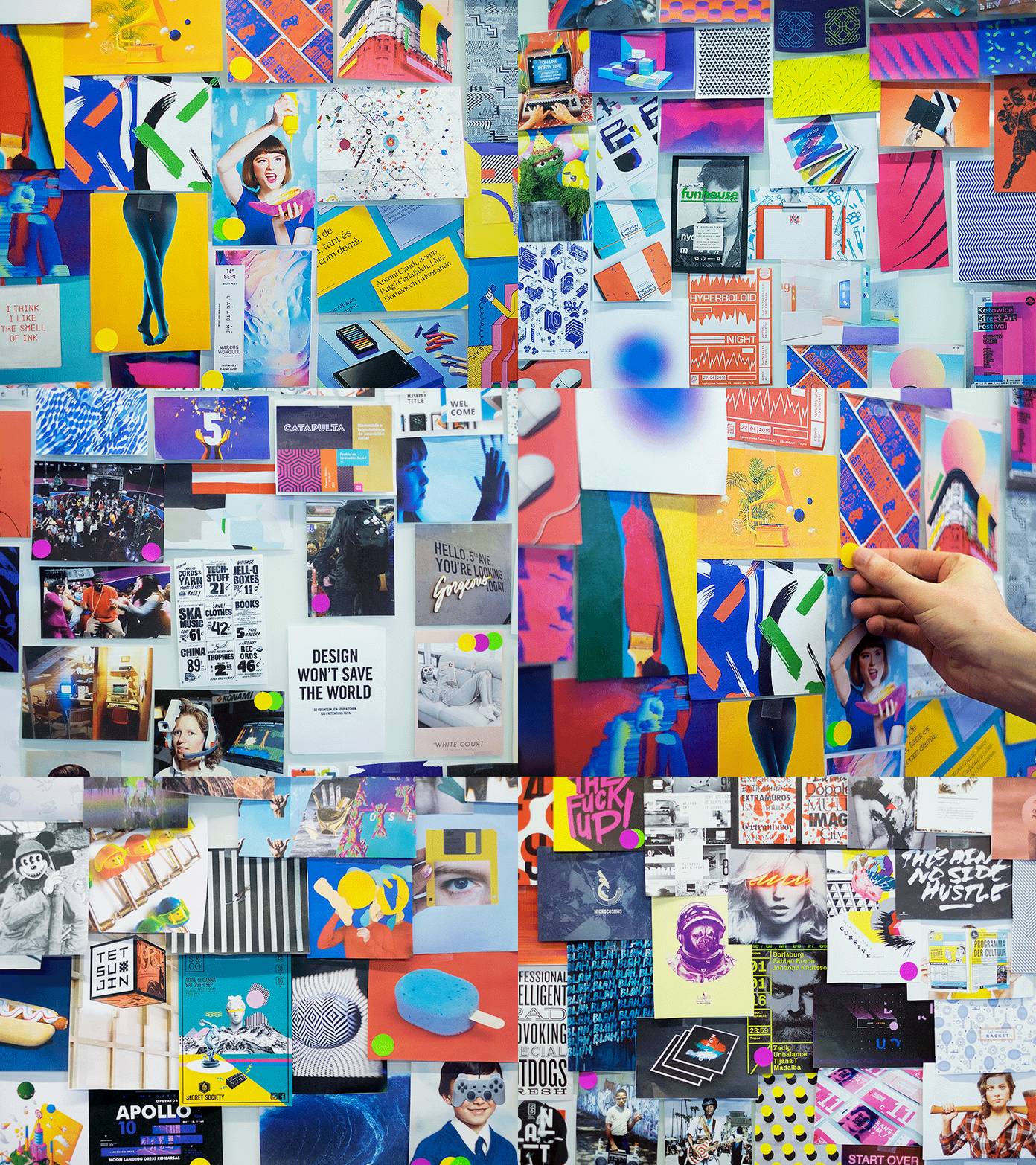
A mood board of 1950s Americana
Immediately after moving into Graceland in 1957, Elvis began renovations. He added rooms, a swimming pool, a stone fence, and the now-iconic wrought-iron gates emblazoned with musical notes.
As he did when he chose his attire, Elvis approached home decor with the verve of a true postwar American consumer. If he liked something he saw in a magazine, movie, or TV show, there was a good chance a version of it would appear in one of the home’s 23 rooms.
Inspired by President Lyndon Johnson’s three television sets in the Oval Office, the singer placed the same number in his basement media center. Having spent a lot of time working and vacationing in Hawaii, Elvis redecorated a den with flagstone waterfalls, fake ferns, and tiki-styled furnishings while lining the floor and ceiling with green shag carpeting.
Elvis Presley was inspired by his trips to Hawaii when he designed his “Jungle Room.” [Photo: Paul Natkin/Getty Images]
The overall result of Presley’s intuitive home design was a mishmash of furniture, decor, and art of various styles and quality. Visitors expecting the grandeur of a luminary have been surprised by the house’s relatively modest size and its wholehearted embrace of the trappings of popular culture. (Prince Harry, apparently, wasn’t impressed when he paid a visit to Graceland.)
He never got above his raisin’
Graceland—flashy and unrestrained—personified Elvis.
He may have been the most successful performer of his generation, but the cultural establishment always saw him as an outsider: He was too provincial, too Southern for a mainstream conditioned, rightly or wrongly, to see the South in a negative light. Any success he attained was accompanied by an asterisk lampooning him as a “Horatio Alger in drawl.”
Elvis considered Graceland his refuge. It reminded him of his mother, Gladys, who died in 1958. It was where he was most comfortable in his Southernness, where he could just be himself without fear of being put down.
But he was also isolated. Elvis and Graceland exemplified a duality. They both reflected the rags-to-riches arc of the American Dream, yet each also exhibited cultural qualities that were never perceived as dignified enough.
Perhaps this duality can illuminate the cultural tensions that dominated the 20th century—and continue to do so in the 21st.
Many critics judge Elvis’s refusal to abandon a rural, working-class culture as backward and benighted, tempering his artistic success. In a nation whose story—at least the one told by polite society—emphasizes progress, Presley’s unwillingness to change was inexcusable, his indulgences in the latest gadgets or trends sneered at as ostentatious and tasteless.
Yet for many others, both inside and outside of the U.S., who struggle to balance the demands of tradition and modernity, of past and present, Elvis meant something else. They admire his attachment to home and family, and to an ethic to never get above your raisin’—all while selling more than a billion records.
Oh, yeah, and he could carry a tune pretty well, too.
Michael T. Bertrand is a professor of history at Tennessee State University.
This article is republished from The Conversation under a Creative Commons license. Read the original article.
One Design Concept Is Treating Your Plate Like a Mood Board
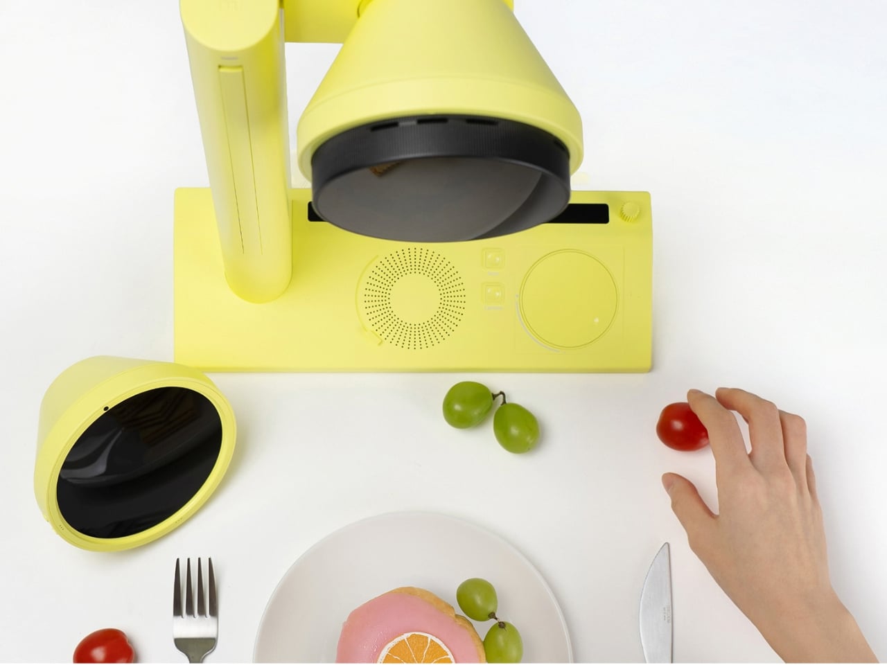
We’ve seen AI make itself comfortable in our music, our fashion, and our skincare routines. It was only a matter of time before it pulled up a chair at the dinner table. Kitune, a design concept by Seoul-based designer Jiyeon Choi, is exactly that moment, arriving in the form of a compact, butter-yellow device that looks more like a studio prop than a kitchen appliance. As a concept, it’s already asking a question that most kitchen technology doesn’t bother with: what if the way your food looks was just as personal as the way you dress?
The premise is deceptively simple. Food, Choi argues, has crossed well beyond the realm of taste and into the realm of visual expression. That’s a hard argument to push back on. You only need to spend thirty seconds on any social feed to see that the way a dish looks now carries as much cultural weight as what it actually tastes like. Plating is styling. Styling is identity. Food shows up in fashion editorials, in art installations, in luxury brand campaigns. It has become its own visual language, and Kitune is a concept built entirely around that reality.
Designer: Jiyeon Choi
Here’s how the concept works. The device takes in personal data you’ve selected and tuned, your aesthetic preferences, your current mood, your lifestyle references, and uses it to generate a visual concept for how your dish should look. Not a vague suggestion, but a specific, styled direction. From there, a built-in projector casts a real-time plating guide directly onto your surface, showing you where each element should land. There are also mood-matched visual overlays that let you feel the overall atmosphere of the dish before you commit to placing a single garnish. It’s a feedback loop between your data and your plate.
That last part sounds theatrical, but I think that’s deliberately the point. Kitune isn’t trying to make you a more efficient cook. It’s trying to make cooking feel more like creative expression, and that’s a meaningful shift in what kitchen technology usually promises. Whether as a concept or an eventual product, that distinction matters.
The hardware design is genuinely considered. Kitune is conceived as a portable device that works in two configurations: a handheld form for close, controlled work and a standing version where an arm suspends the projector above your plate. Both modes carry the same cheerful yellow finish, which matters more than it might seem. That color choice softens what could easily feel like cold, clinical AI tech in a space that’s historically been warm and human. It signals that this device belongs to the experience of cooking, not just the logistics of it.
The interface is also worth attention. Instead of typing prompts or navigating flat touchscreen menus, the concept proposes interacting with a circular dial loaded with mood and lifestyle imagery that you physically rotate and select. It’s tactile, and that decision feels very deliberate. Choi seems to understand that the kitchen is not a place where people want to feel like they’re operating software. The interaction needs to feel as intuitive and sensory as the act it’s guiding.
Where Kitune really makes its case as a concept is in how it reframes what personalization means. Most AI products personalize around efficiency, faster, smarter, more optimized. Kitune personalizes around feeling. The output isn’t a quicker route or a better recommendation. It’s a visual mood built from your data that’s meant to feel like you, on a particular day, in a particular state of mind. That’s a genuinely different kind of design ambition, and one that feels more honest about the role food actually plays in people’s lives.
There are real questions the concept raises. How much data does it need to work well? Does it develop a sharper sense of you over time, or does each session reset? These are the practical gaps between a compelling concept and a working product. But Kitune doesn’t need to answer all of them right now to be worth paying attention to. As a design statement, it’s already saying something clear: that the future of kitchen technology might have less to do with what you’re cooking, and a lot more to do with how it makes you feel.The post One Design Concept Is Treating Your Plate Like a Mood Board first appeared on Yanko Design.
Fujifilm’s $170 Instax mini Link+ printer now lets you directly print moodboards from Pinterest
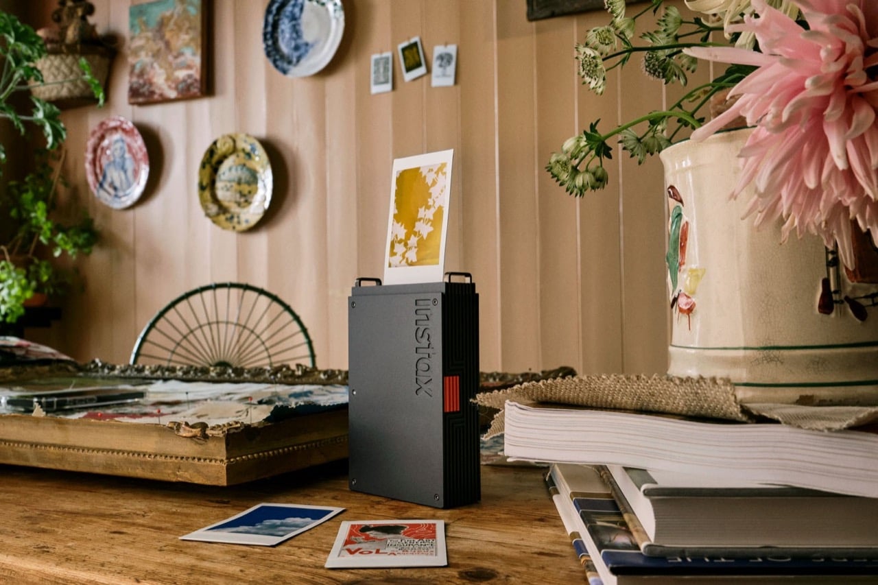
The smartphone has killed the photo album, turned memories into infinite scrolls, and made physical prints feel almost quaint. But there’s something about holding a tangible photograph that a camera roll of 10,000 images can’t replicate. Fujifilm’s new Instax Mini Link+ smartphone printer bridges this gap with a sophistication that previous models lacked, trading playful pastels for matte black and orange industrial design.
What sets the Link+ apart isn’t just its grown-up aesthetic. The printer introduces a Design Print Mode specifically engineered for text-heavy layouts, graphic work, and intricate illustrations. Whether you’re printing Pinterest inspiration boards, magazine layouts, or poster designs, the enhanced resolution captures fine details that earlier models struggled to render. At $169.95, it positions itself as the premium option in Fujifilm’s smartphone printer lineup, targeting creators who want more than just snapshot printing.
Designer: Fujifilm
Here’s the thing about instant film printers: they’ve always been terrible at text. The Link 3 and its predecessors could handle photos decently enough, but try printing anything with small type or fine line work and you’d get a blurry mess. The Link+ solves this with what Fujifilm calls Design Print Mode, which optimizes the 318 dpi OLED exposure system for sharp edges and clean letterforms. I’ve seen the sample prints, and the difference is immediately obvious. That “FUN THRILLING RIDES” graphic they keep showing in the promo shots actually maintains readability, which sounds basic but represents a genuine technical improvement over previous models.
The printer outputs on standard Instax Mini film, so you’re working with a 2.4 by 1.8 inch image area. Small, yes, but that constraint forces you to think carefully about composition. The app now includes two color modes: instax-Natural for muted, film-like tones, and instax-Rich for saturated colors that pop. You can batch print up to 10 images at once, which makes creating a cohesive series actually practical instead of tedious. Each print takes about 12 seconds from exposure to ejection, and a full charge gives you roughly 100 prints.
And here’s the surprising part – the camera comes with Pinterest integration. You can pull images directly from your boards and print them as mini mood boards or inspiration cards. The app also lets you extract frames from videos, which opens up interesting possibilities for grabbing stills from footage without needing a separate video editor. Frame it, add a text caption or sticker if you want, then print. The whole process happens via Bluetooth 4.2, which means no cables but also means you’re limited to the bandwidth and occasional connectivity hiccups that come with wireless protocols.
The Link+ It measures slim enough to toss in a bag without much bulk, and the vertical printing orientation means you can watch your image emerge from the top slot like a tiny vending machine dispensing art. Fujifilm clearly wants this in design studios and on styled shelves, not just at birthday parties.
The question becomes whether the improvements justify the price premium over the Link 3, which still works perfectly fine for standard photo printing and costs about $30 less. If you primarily print snapshots, probably not. But if you’re printing graphics, working with text, or treating instant film as a legitimate creative output medium, the $169.95 Link+ delivers capabilities the older models simply cannot match. Sometimes maturity means gaining new skills, not just changing your outfit.
The post Fujifilm’s $170 Instax mini Link+ printer now lets you directly print moodboards from Pinterest first appeared on Yanko Design.