
Design Inspiration
Button design examples
A button tells users what they can do and what will happen when they do it. These examples show button styles, sizes and states from live products and design systems.
We curate topical collections around design to inspire you in the design process.
This constantly-updated list featuring what we find on the always-fresh Muzli inventory.
Last update:
/ce35576f-13c6-4bf3-9a93-7582c752d4ee-thumb.jpeg)
CTA Button. 📆

Button Design Over the Years - The Dribbble Timeline

button Design Inspiration - HTML & CSS Snippets

UI Button Design System
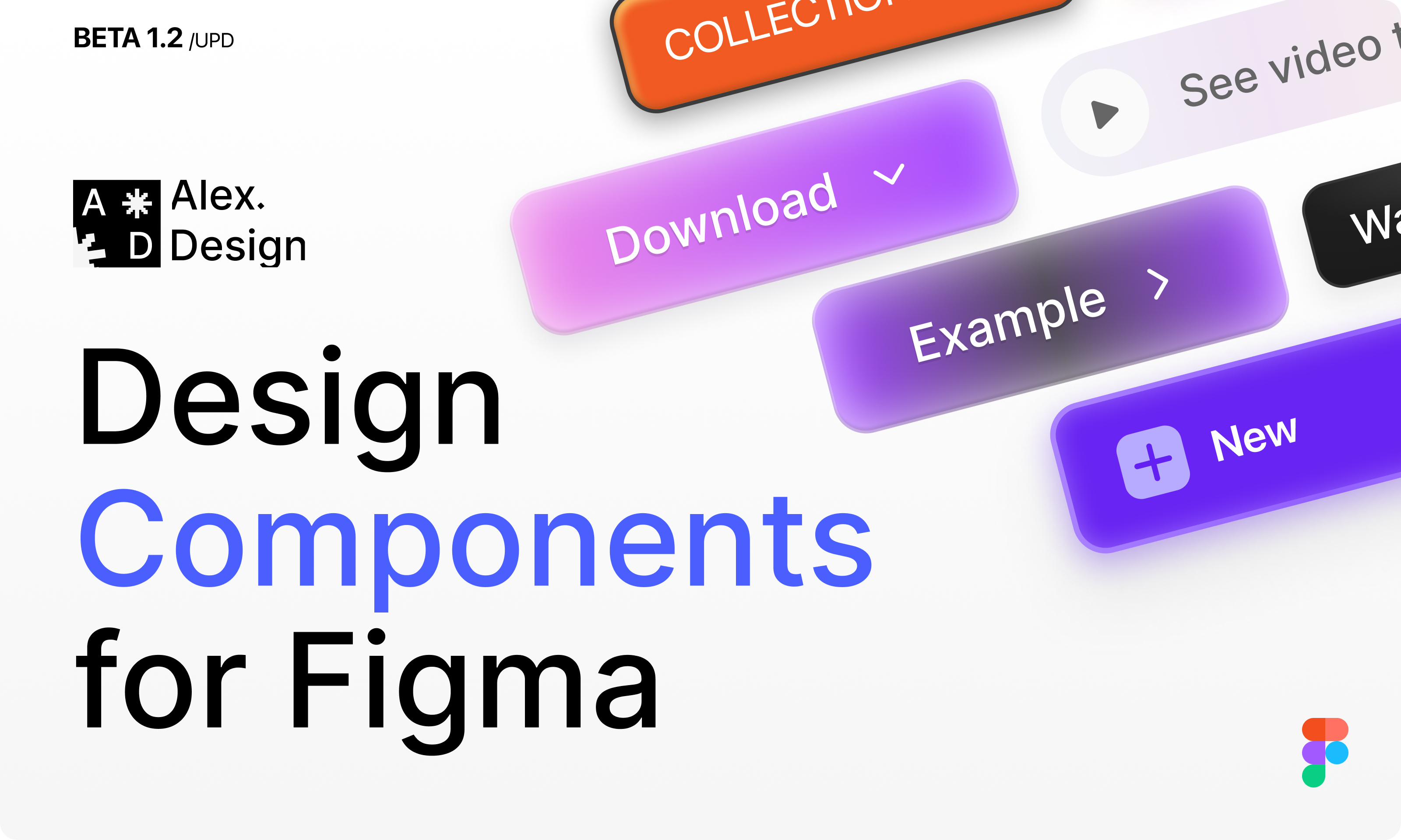
❖ Button design collection
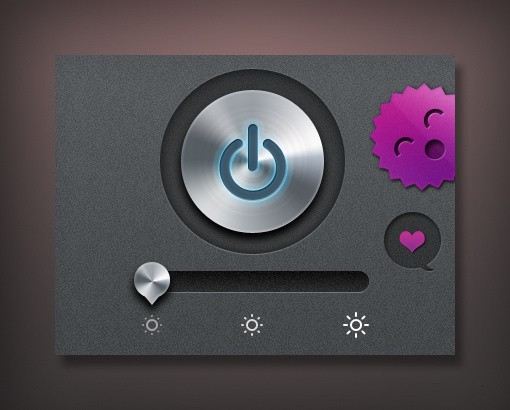
screenshot off ux button ui
screenshot off ux button ui iphone on

Bubbly button (Design by Gal Shir)
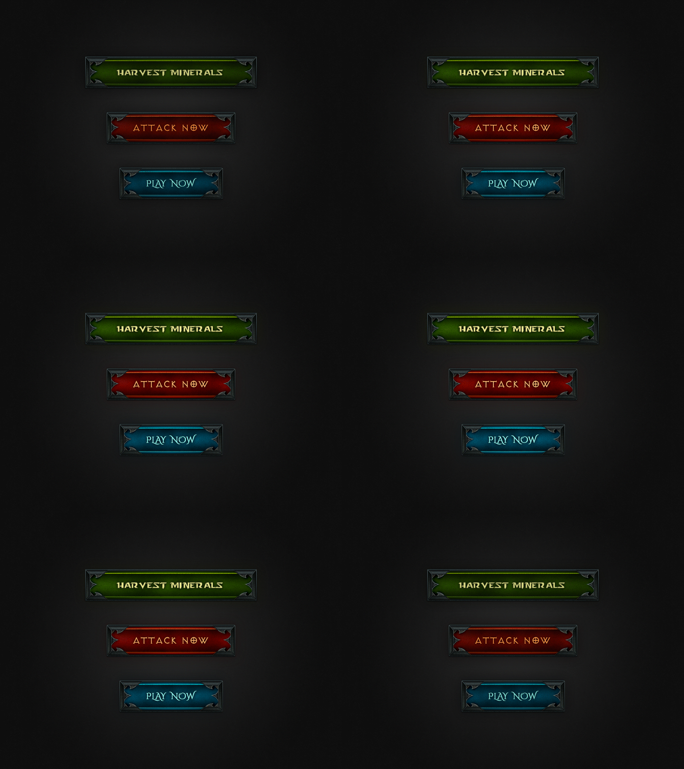
Diablo CTA Button
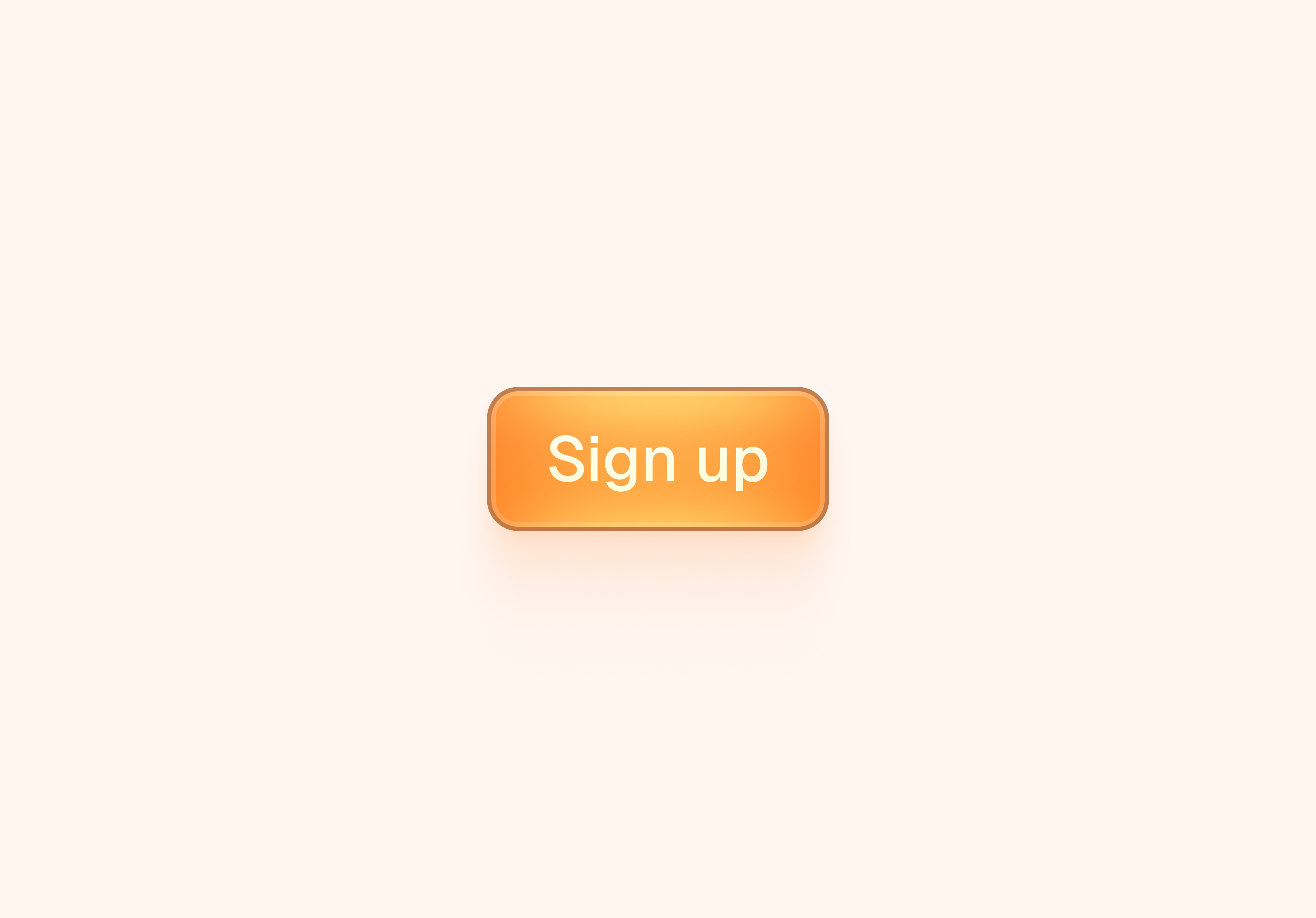
Button Design
Futuristic button design
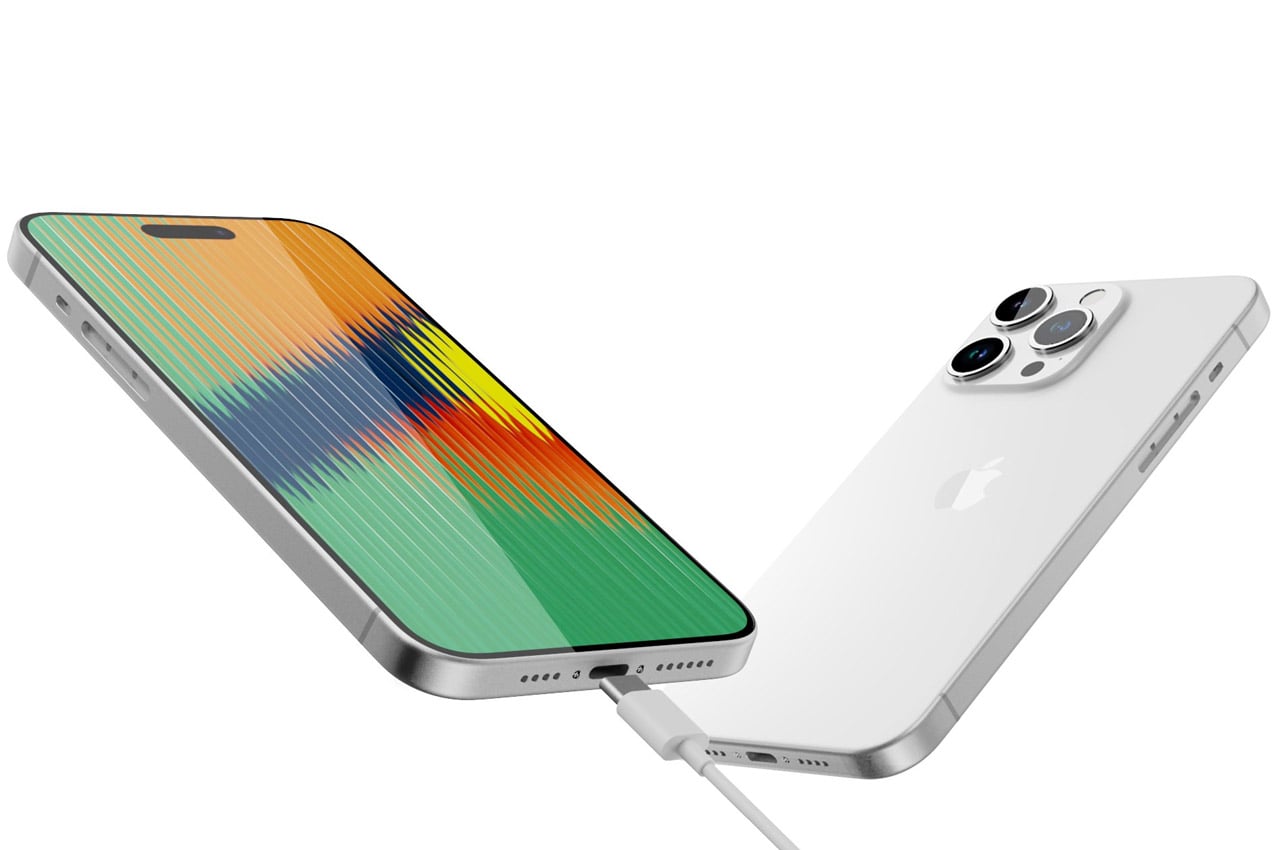
iPhone 15 Pro Max renders show thinner camera bump, no physical button design
iPhone 15 Pro Max renders show thinner camera bump, no physical button designA new year, a line-up of new iPhones, and a host of rumors before their September release. This is a storyline that plays out like...
This is 1% of what Muzli shows you.
Get the rest — fresh design inspiration on every new tab, free.
Add Muzli — free
Category: Talents » Jonas Eriksson #button #design #graphic #web

paper plane send massage account ui web button. ui elements. paper plane send massage vector icons on trendy gradients for web, mobile and user interface design

full screen account ui web button. ui elements. full screen vector icon for web, mobile and user interface design

CTA button (All actions)

login logout account ui web button. ui elements. login logout vector icons on trendy gradients for web, mobile and user interface design
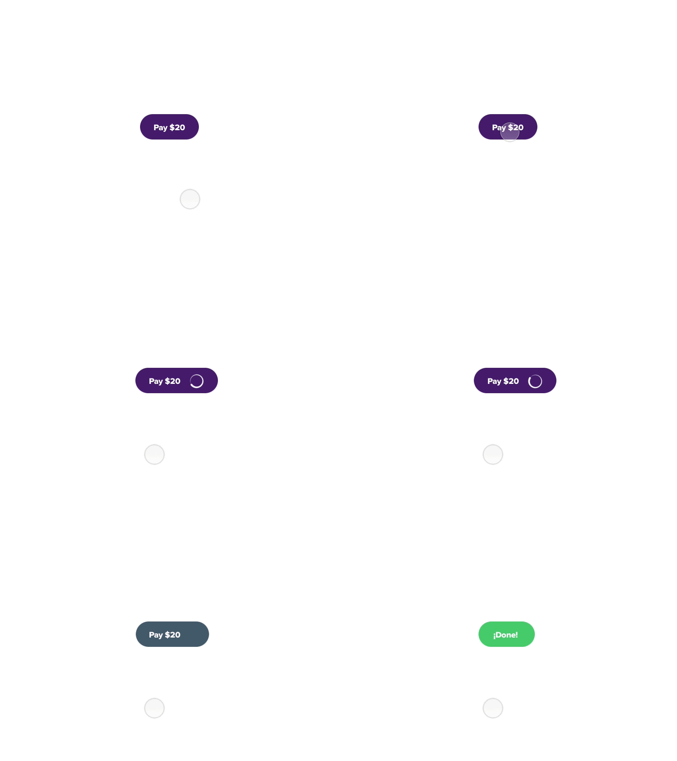
CTA Button interaction
Easy way to give user interactions trough CTA buttons animations to process payments, made in Principle app Let me know what you think... Don't forget press "L" Bye!

paper plane send massage account ui web button. ui elements. paper plane send massage vector icons on trendy gradients for web, mobile and user interface design
full screen account ui web button. ui elements. full screen vector icon for web, mobile and user interface design

Light UI Elements Part 3: Round button. UI set. In default and pushed state. Round buttons with glowing arrows.

full screen account ui web button. ui elements. full screen vector icon for web, mobile and user interface design

cloud download upload account ui web button. ui elements. cloud download upload vector icon for web, mobile and user interface design

gear wheels account ui web button. ui elements. gear wheels vector icons on trendy gradients for web, mobile and user interface design
This is 1% of what Muzli shows you.
Get the rest — fresh design inspiration on every new tab, free.
Add Muzli — free
Venom Button UI/UX Design
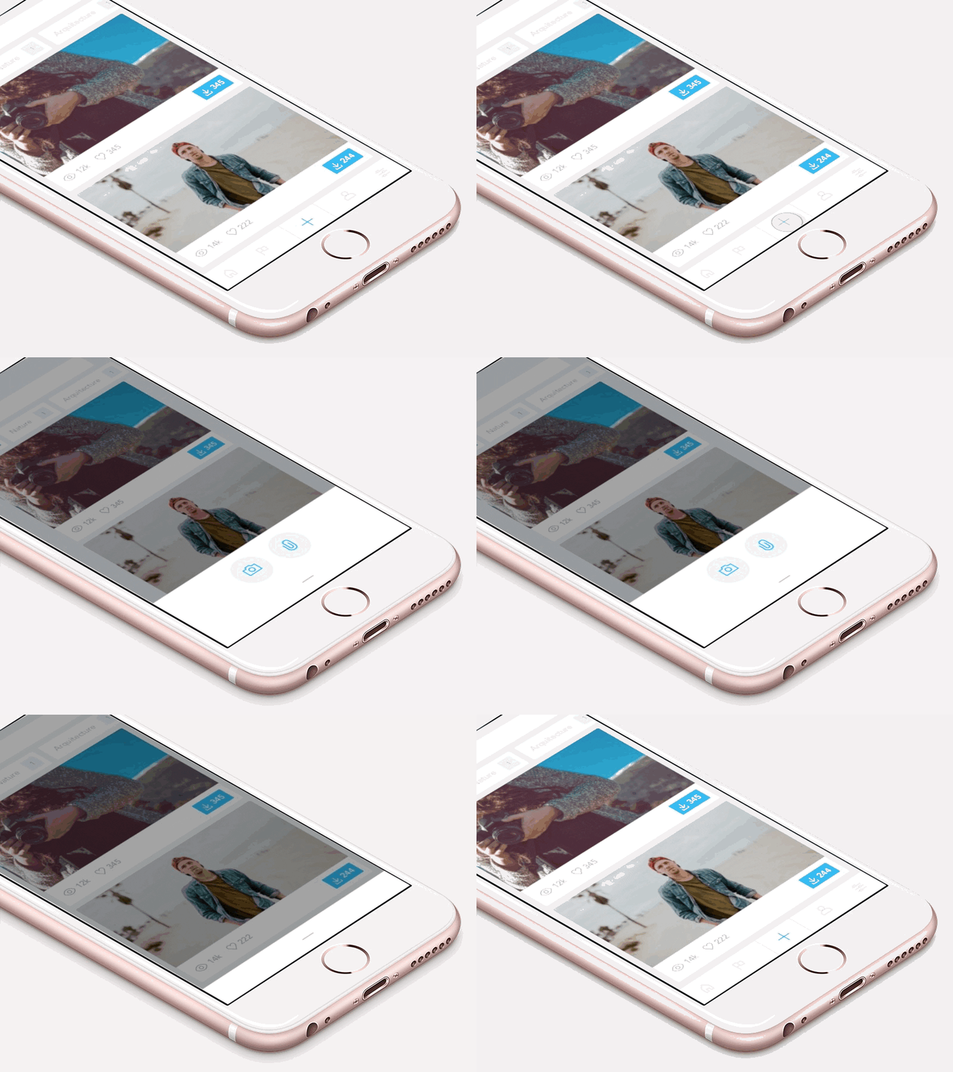
Mobile menu button UI interaction (animated)

Account Button UI Design
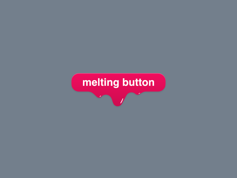
Melting Button Design *free Affinity Designer file

AI voice Button design

AVA Haptic button design

Circular Animation CG Render Concept Button UI/UX Physical
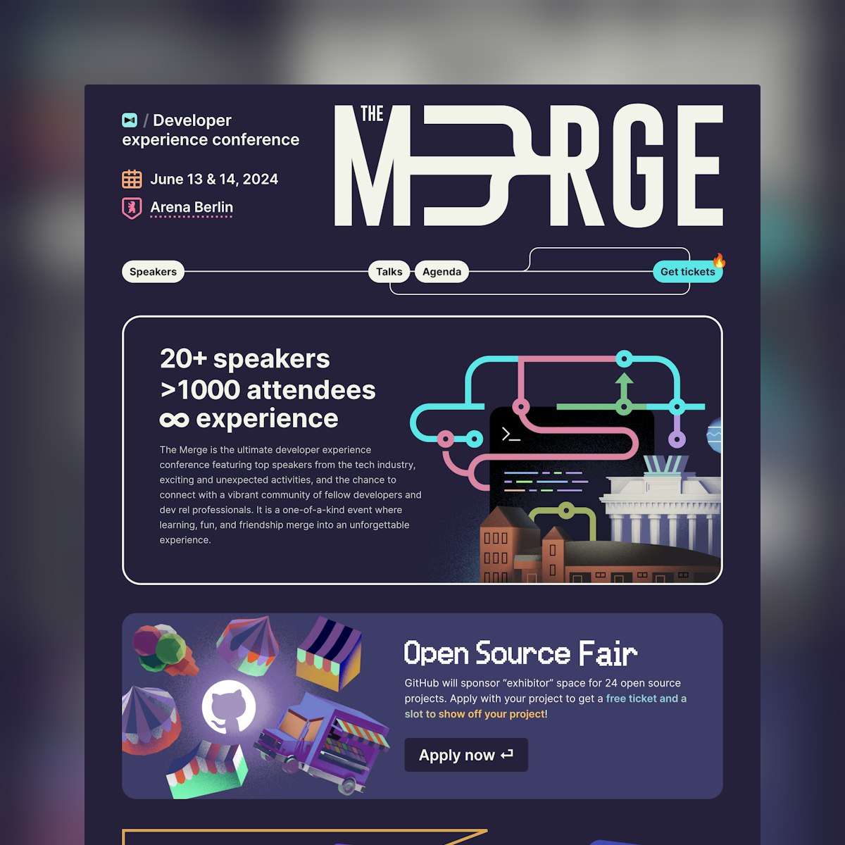
The Merge
Big fan of this strong (and sticky) CTA button as you scroll this One Pager for The Merge developer experience conference. That’s also one of the best looking speaker layout grids I’ve seen out the dozens I’ve reviewed. Full Review

Interactive Website AI Prompt Button UI

Website Inspiration: Bruno Membership
Loads of delicious elements within this Landing Page (built with Framer) promoting the new unlimited request Bruno membership. Note the icon tilts on hover, how the footer navigation CTA button expands, the ? cursor when reading the FAQs, the quick-fire previews when hovering over the services and how the work section features colourful cards changing […]

Writebook
Long-scrolling Landing Page with a crystal clear sticky CTA button encouraging the download of Writebook – a free bit of software to help you publish and host your own books on the web. This is the second (once-off pricing) drop by the Once team — big fan of what they are doing! Full Review
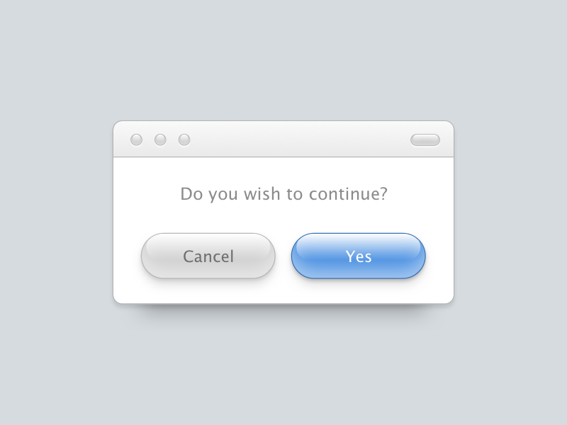
Aqua Buttons UI
This is 1% of what Muzli shows you.
Get the rest — fresh design inspiration on every new tab, free.
Add Muzli — free
Div Block Studio
Neat One Pager (built with Webflow) for Div Block Studio. Fun touch integrating the Silicon Valley celebration clip in the background of the main CTA button (on hover). Those testimonials look great too with the avatars with alongside brand logos. Full Review

Button UI Design guide: States, Styles, Usability and UX
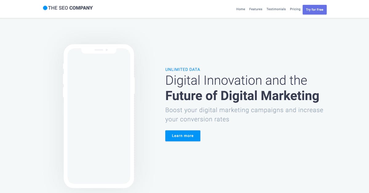
The SEO Company
‘The SEO Company’ is a free One Page HTML template for a digital agency wanting a clean online presence. Features include a sticky header navigation (with visible CTA button at all times), testimonials, pricing table and a clear CTA button in the footer area. Cheers Diego Velázquez for this neat freebie! Full Review | Direct […]

Power Button UI
Power button icon designed such as UI. Attractive designs wait for you at below links. Behance profile: https://www.behance.net/ulvinomerov and instagram: https://www.instagram.com/ulvin.omerov/?hl=en

Devouring Details
One Pager announcing the launch of the Devouring Details course, featuring a unique scroll progress bar paired with a sticky CTA button. Very clever! Full Review

Website Inspiration: Magic Rename
Brilliant launching soon (and marketing) page teasing the upcoming Magic Rename function of the Magician “Design AI Assistant” Figma plugin. The interactive CTA button renames the sample group layers into a logical set of names (that would relate to your design elements). Exactly what we want. Full Review
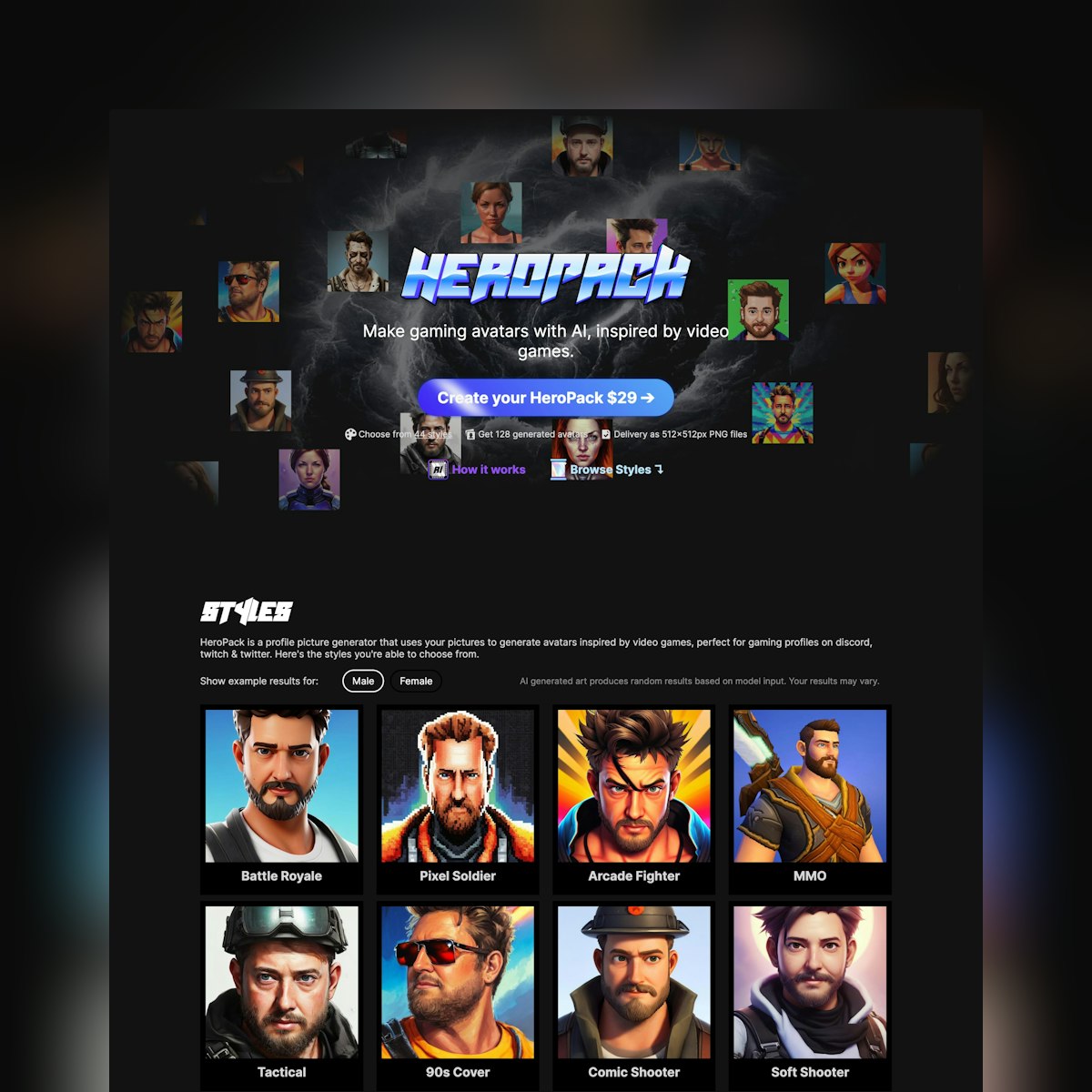
Website Inspiration: Hero Pack
Dark-schemed Landing Page with an ultra shiny CTA button for Hero Pack, an AI-powered profile picture generator inspired by video games. Full Review

Website Inspiration: Feel Good Productivity
Good positive energy in this Landing Page (built with Webflow) for Ali Abdaal’s much anticipated debut book, Feel Good Productivity. Neat touch adding a sticky CTA button with “B” keyboard shortcut to kick off the Amazon pre-order page. Full Review

Website Inspiration: UIForms
Long-scrolling Landing Page for UIForms – a collection of form UI templates for Sketch. Note the useful sticky CTA button as you scroll. Full Review

Website Inspiration: YGGY
Unique CTA button interactions in this One Pager for YGGY technologies. Neat touch as well including custom icons alongside the copy explaining their platform module offering. Full Review
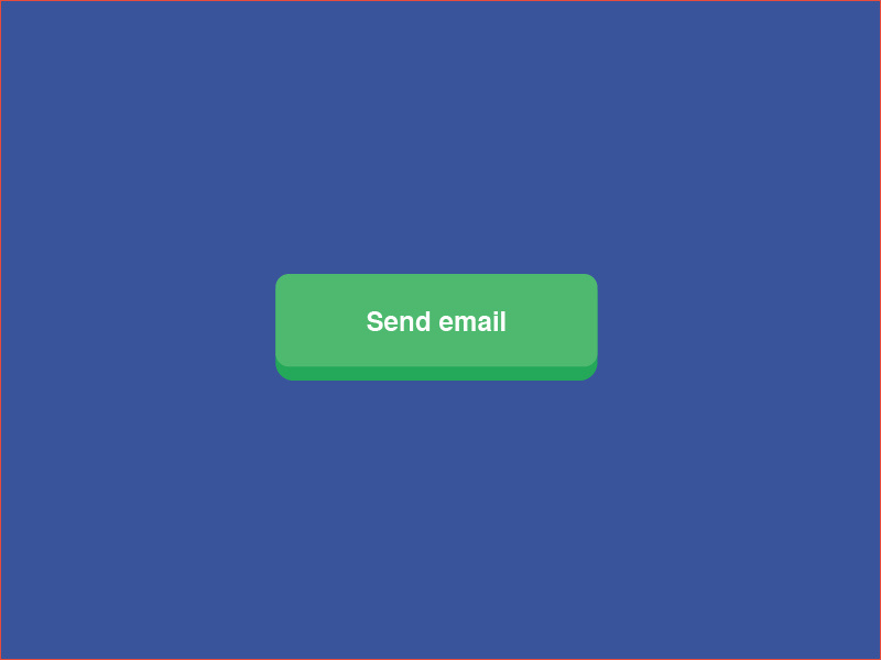
100 DAYS OF ICONS | DAY 09: 3D BUTTON DESIGN

Swish
Neat little One Pager page with lovely attention-to-detail for upcoming Crypto app, Swish. Note the spinning logo on hover, the sonar effect on CTA button, the background shrink when modal loads and also how the device repositions and flattens on smaller screens. Well played! Full Review
This is 1% of what Muzli shows you.
Get the rest — fresh design inspiration on every new tab, free.
Add Muzli — free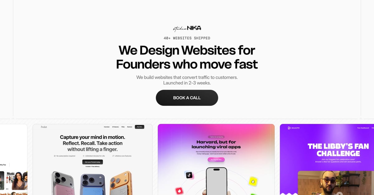
Studio Nika
One Page portfolio (built with Framer) for Studio Nika featuring a sticky footer navigation to browse page sections. Make sure you hover the hero CTA button to experience the creative animation! Full Review

Easyfast
So many lovely on-brand touches throughout this One Pager (built with Framer) for Easyfast agency led by Nick Stepuk. The CTA button has a carrot icon, the load-website custom cursor has rabbit ears and the FAQs have 2 dedicated questions covering “how easy” and “how fast”. Really fun! Full Review
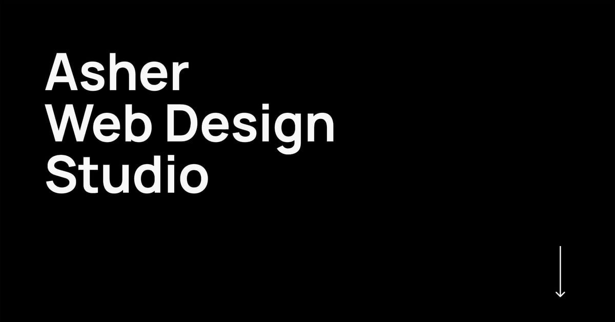
Website Inspiration: Asher Web Design Studio
Dark-schemed One Page portfolio for Dallas-based web designer Asher Zahid. Note how he has a quote about slow speed and clicking the CTA button below it pre-populates the contact form with I need help with website optimisation. Full Review

Switch Button UI | Daily UI 015

Website Inspiration: Copilot
Strong dark-schemed Landing Page for finance app Copilot. Lovely touch with the faded top shadow in the fixed header (containing a sticky CTA button) and how the light mode feature block reveals a light device scroll. Lastly I want to point out below the Tweet testimonials is “Read more Tweets” linking to a custom domain […]

Website Inspiration: Designing User Interfaces
Bit of a persistent CTA button in the header but a comprehensive Landing Page with a great looking pricing table for the ‘Designing User Interfaces’ eBook. Full Review
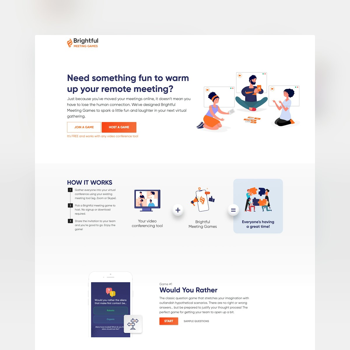
Website Inspiration: Brightful Meeting Games
Long scrolling Landing Page for a suite of fun icebreaker games to liven up remote meetings. Can really appreciate how there are no signups to get things going. Just hit the CTA button of the game you want to start. Full Review

Jades Agency
Neat One Pager (built with Framer) promoting the design services of Jades Agency. Make sure you check out how the nav transforms as you scroll, sliding out a strong CTA button to see the plans. Real nice. Full Review

HPQ Frankfurt
Engaging One Pager with a brutalist design for HPQ Frankfurt, a portfolio of luxury residencies in Frankfurt. Also note the sticky CTA button (contact) position in the footer, not header. Full Review
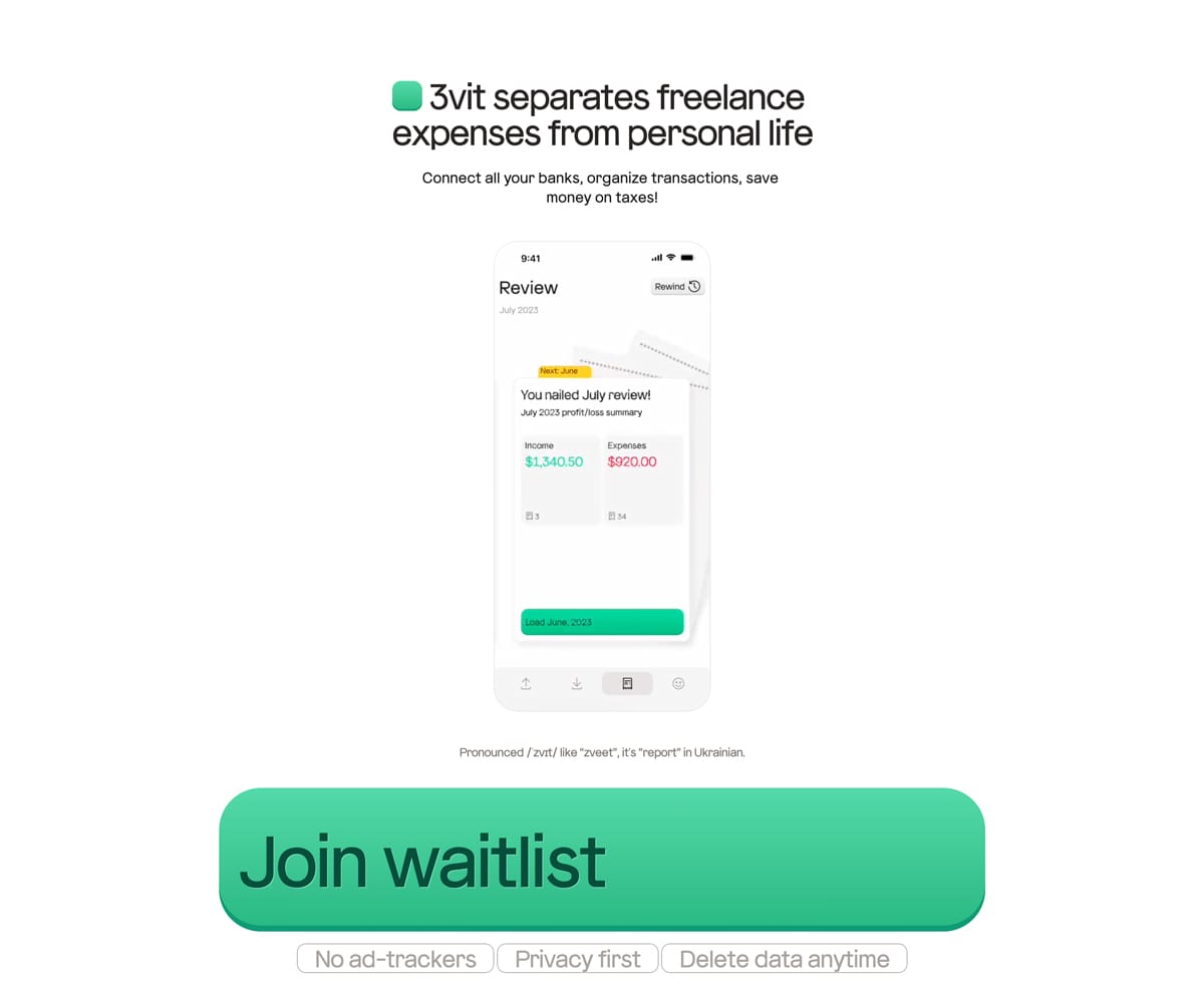
Website Inspiration: 3vit
Unique design elements in this One Pager (built with Framer) for 3vit, a SaaS to help separate your freelance expenses from personal finances. That might be the biggest CTA button I’ve ever seen Full Review
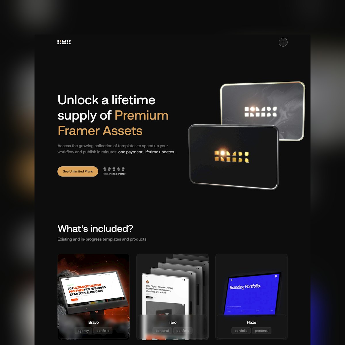
Remix.Supply Unlimited Access
Dark-schemed Landing Page (built with Framer) promoting the one-time (lifetime access) payment to unlock all the Remix.Supply Framer assets. Note the changing social proof next to the hero CTA button, switching between ratings, awards and discount. Slick. Full Review

Lisplogics
Good whitespace in this One Pager taking waitlist requests for the launch of Lisplogics, a mobility operations startup. Nice touch with the friendly face in the sticky CTA button and that’s a refreshingly spacious waitlist sign up box. Full Review
This is 1% of what Muzli shows you.
Get the rest — fresh design inspiration on every new tab, free.
Add Muzli — freeLisplogics
Get access to thousands of freshly updated design inspiration pieces by adding Muzli to your browser.
Loved by 900k designers worldwide, Muzli is the leading go-to browser extension for creative professionals.
What makes a good button design?
A good button looks clickable, says what it does and is easy to hit. The label is a verb that names the result, such as "Save changes" or "Create account". The size meets the platform minimum, 44 by 44 points on iOS and 48 by 48 dp on Android. The contrast between the button and its background is at least 3 to 1, the WCAG minimum for interface components.
How many button styles does a product need?
Three levels cover most interfaces. A primary button for the main action on a screen, used once. A secondary button for alternatives. A tertiary or text button for low-priority actions such as "Cancel". A destructive style for delete actions is the usual fourth.
Which button states should be designed?
Six: default, hover, focus, pressed, disabled and loading. Focus is the one teams forget and keyboard users depend on. A loading state that keeps the button's width stops the layout from jumping while a request is in flight.
Where do these button examples come from?
Most are buttons from shipped apps documented by Mobbin, with button components and explorations from the Framer marketplace and Layers. Muzli follows more than 200 design sources and lists up to 60 matching pieces here, favouring recent work.