
Bento
false
We curate topical collections around design to inspire you in the design process.
This constantly-updated list featuring what we find on the always-fresh Muzli inventory.
Last update:
false
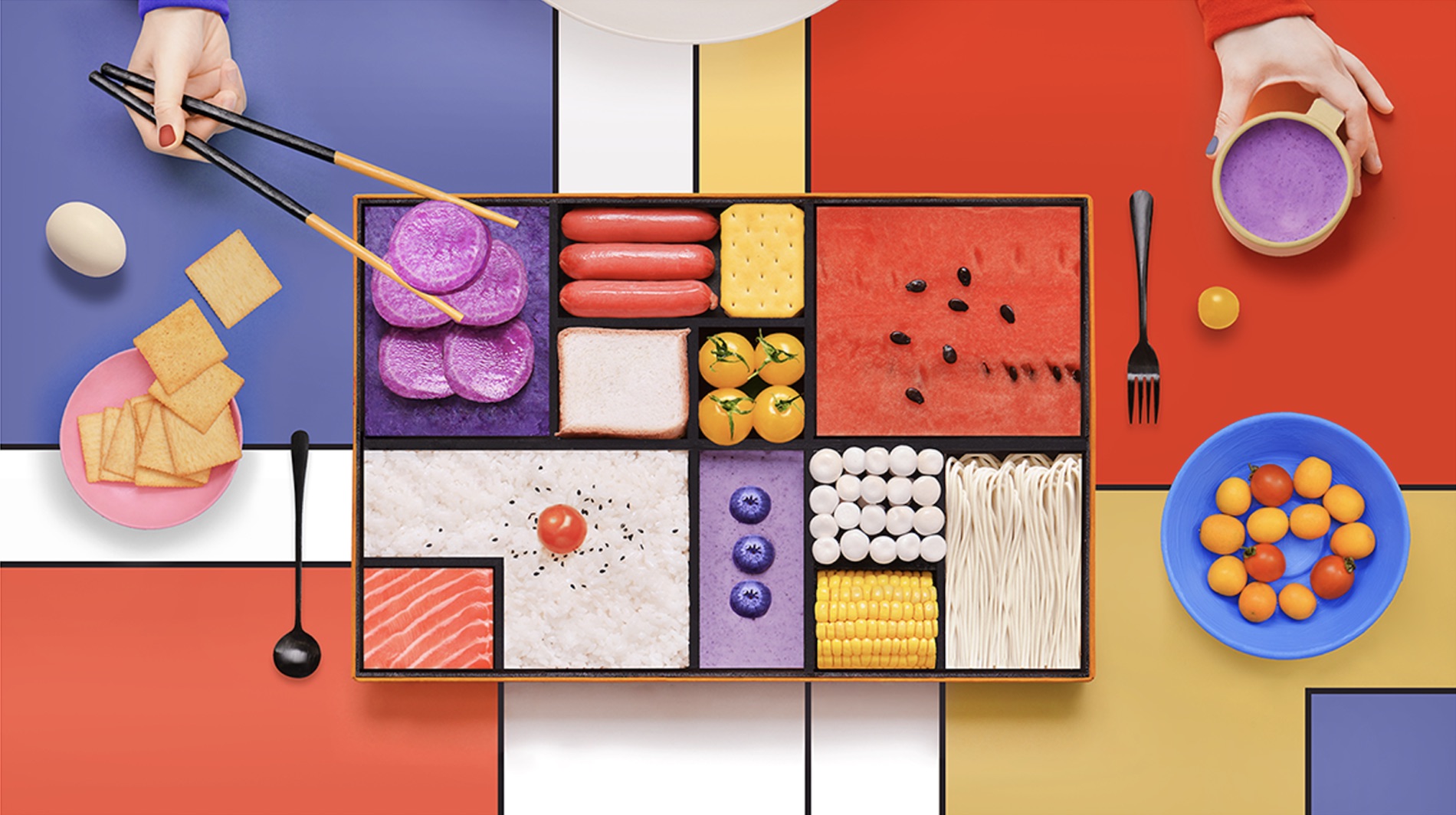
Amazing Mondrian Inspired Bento Box Industrial Design abduzeedoJan 21, 2019 One of my favorite artists of all time is Piet Mondrian. He is known for being one of the pioneers of 20th-century abstract art, as he changed his artistic direction from figurative painting to an increasingly abstract style until he reached a point where his artistic vocabulary was reduced to simple geometric elements. That is exactly the phase I am the biggest fan. I painted a few pieces recreating some of his iconic pieces like the Composition II in Red, Blue, and Yellow from 1930 for example. So it’s not a surprise if every time I see something that resembles the master Mondrian it will inevitably catch my attention. That’s exactly the case of the industrial design for a bento box, yes you read it right, created by Yum tang inspired by Mondrian. Yum experiment with the idea of using Mondrian’s abstract geometry mixed with food colors to recreate the inspired Bento Box. It’s quite creative and definitely beautiful, especially the examples that she listed on her Behance profile. Mondrian’s abstract geometry mixed with food colors to recreate the inspired Bento Box In addition to that, apparently there was a partnership with Thinkpad, I couldn’t understand quite well because the post was Chinese and the translation was a bit all over the place. Industrial Design Inspiration Bento Box Design For more information make sure to check out Yum Tang's work at https://www.behance.net/yumyang



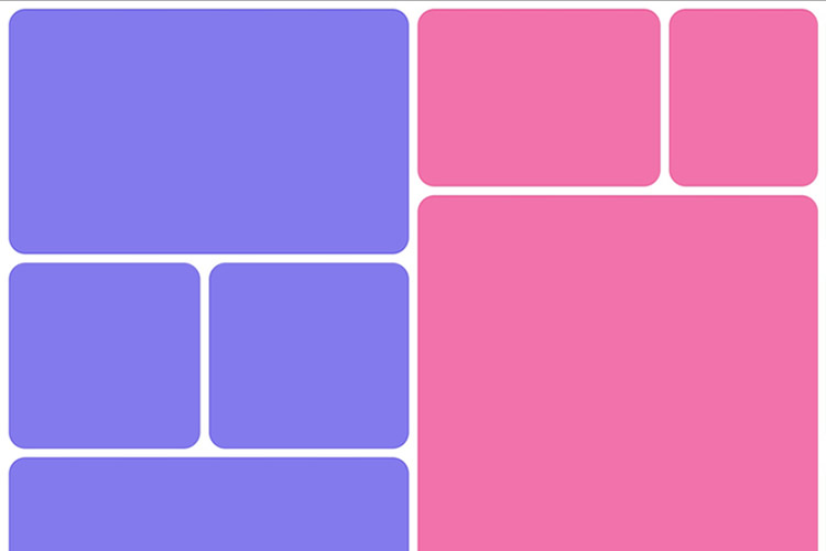
Another day, another design trend! Bento grid layouts are the subject this time around. They’re bold and beautiful. Plus, they satisfy those with a need for symmetry. So, what exactly... The post 8 CSS Snippets for Creating Bento Grid Layouts appeared first on Speckyboy Design Magazine.

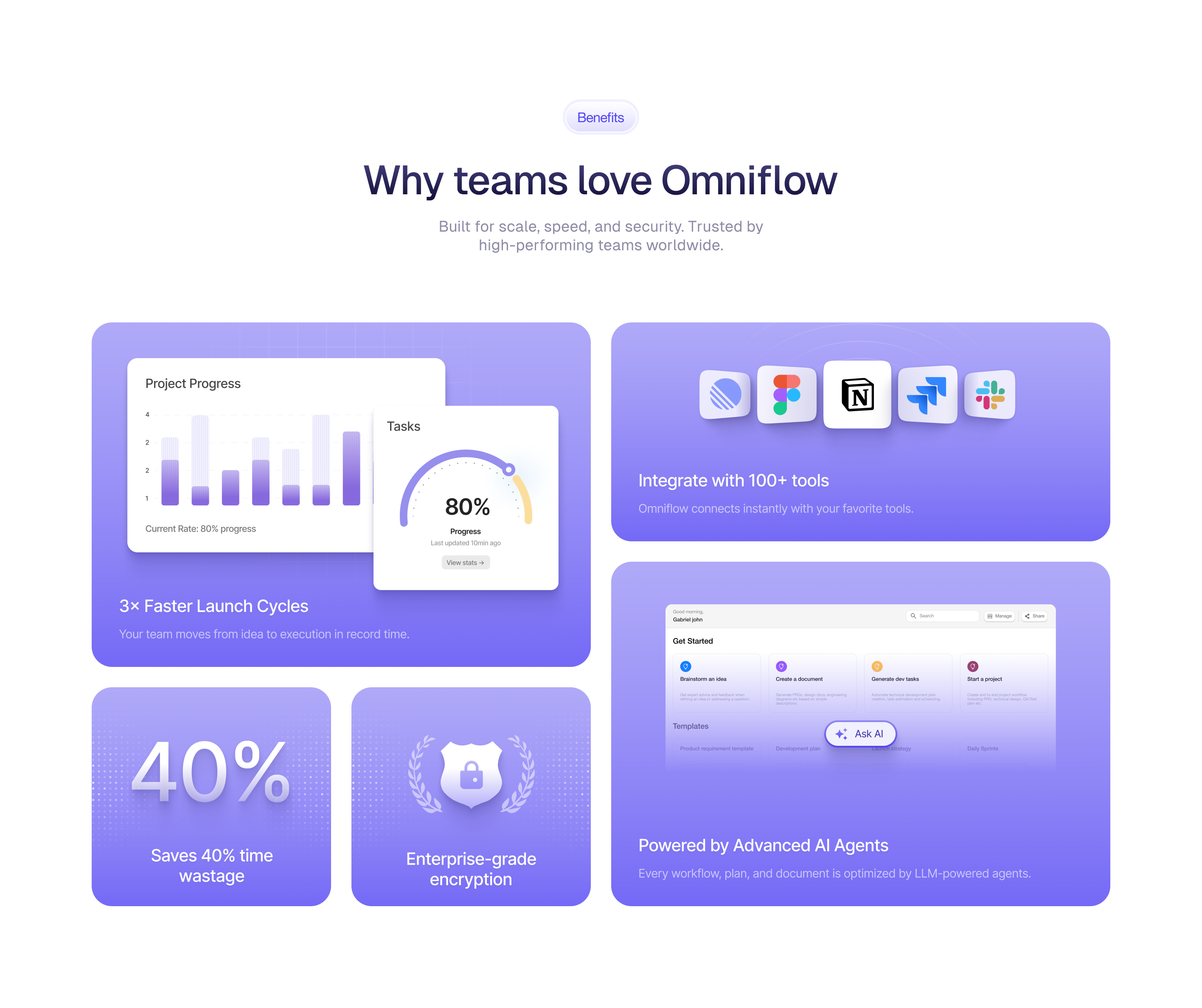
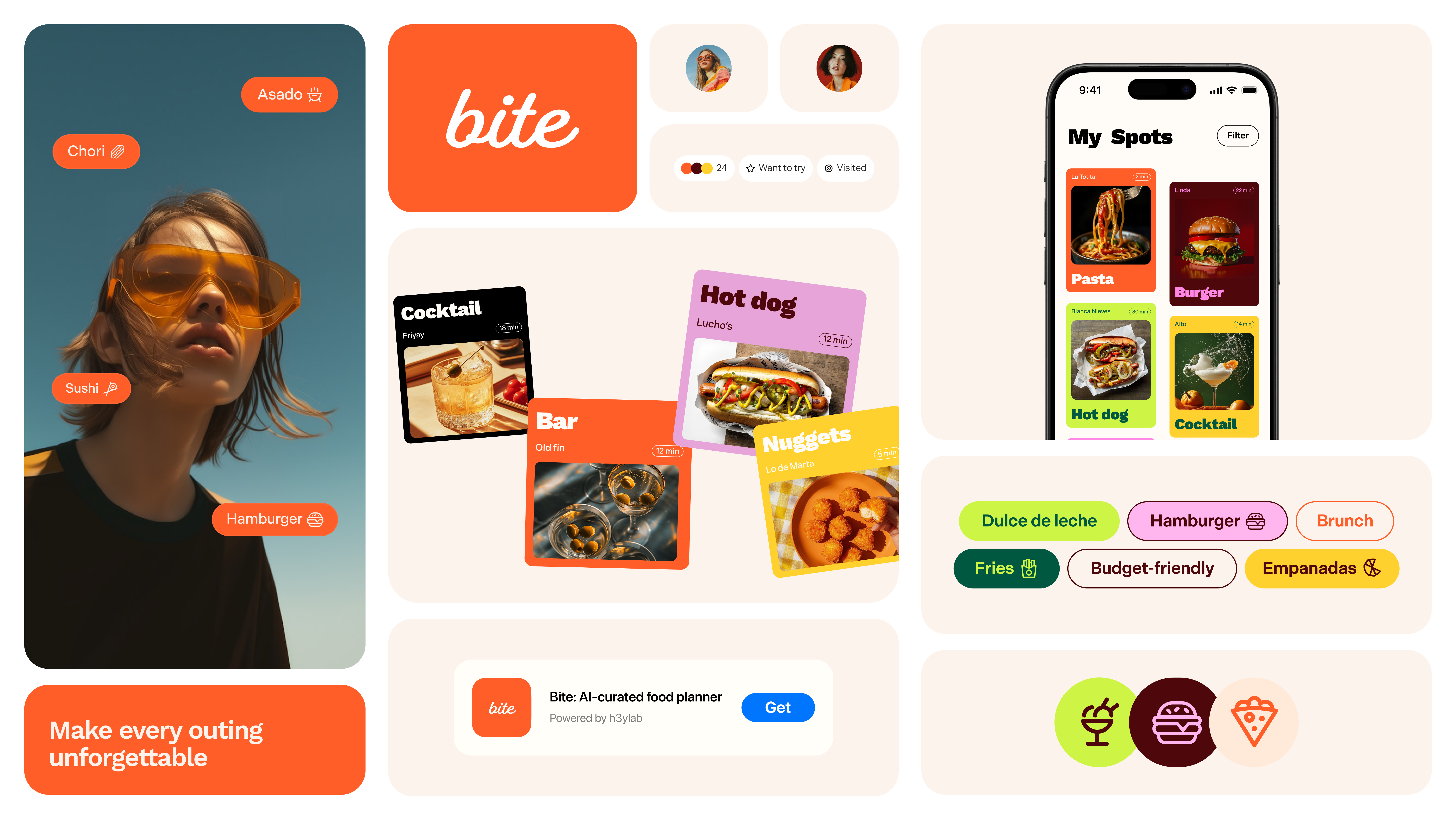
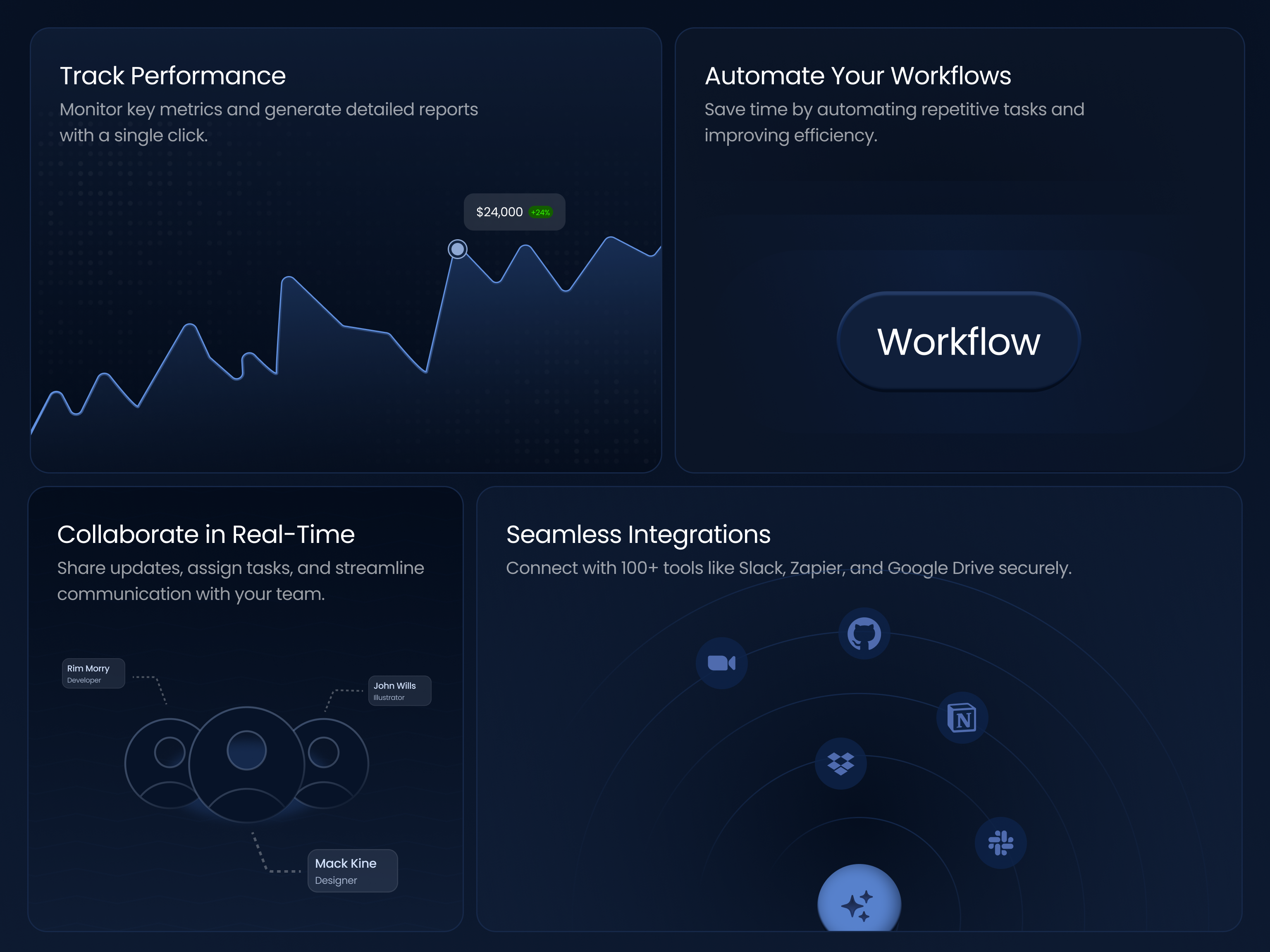
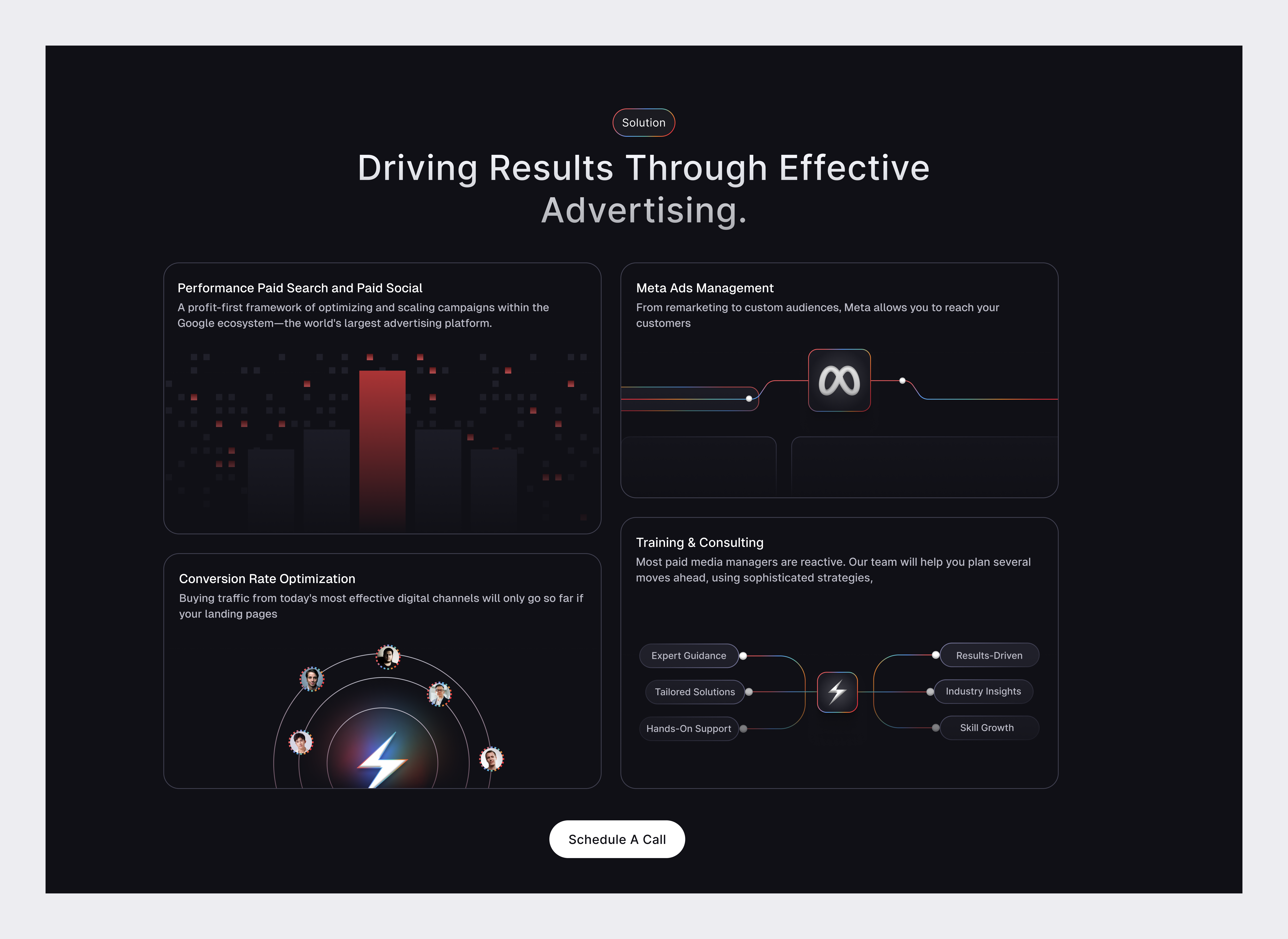
Let’s dive into a design trend that has become an integral part of the UI/UX world — Bento Grids. Although these grids are no longer new to the design landscape, they remain relevant, efficient, and popular among designers and developers.Inspired by traditional Japanese bento boxes, Bento Grids offer a structured and clear organization of content, making it easier for users to navigate. With a combination of well-defined visual hierarchy and minimalist design, Bento Grids provide a smooth and organized user experience. Their clean and functional design makes them an ideal choice for websites and applications that aim to offer an intuitive and aesthetic interface.In the following post, we’ve gathered some stunning visual examples for inspiration.Bento grids by @cactusuiThe RDBP branding by Gal ShirBento grid by @kacperfyiBoostio Branding, Brand Identity Design by Halo Branding for HALO LABApple Event September 2022: iPhone 14 ProBento Grid Usage for WhatsApp Case StudyW2E Conference Visual Identity by Halo BrandingHelper brand bento grid by bryangmotionBento at GivingliBento grid at Rise CalendarBento grid by @PJadeszkoBento boxes by Nicolas Solerieu for GitHubBento Footer by Kyle Anthony Miller for Brass HandsGitHub profile by Nicolas SolerieuKaine, Branding Mockups by Ruslanlatypov for ls.graphicsBento grid v2.0 by Ghulam Rasool 🚀 for Upnow StudioYou can also try using the following tools and templates to start and build your Bento grid.Boost your Framer projects with versatile Bento CardsRevolutionize your projects with Bento Cards v2: AIBentoX is a portfolio template designed with a stunning & trendy bento grid style made in Framer. It empowers you to create your online presence and proudly showcase your finest work.Introducing Zento: a sleek Framer portfolio template. With Bento grid structure, Compact yet powerful.Create stunning presentations in the style of Apple’s keynotes with the Figma Bento Grid Keynote template.Bentos Grid for Web & UI Design : This is a demo bento screen design created for a school assignment. The design utilizes an 8×8 square grid with a calming purple and blue theme.This plugin creates Bento Grid templatesOriginally published at https://muz.li.Bento UI Grids was originally published in Muzli - Design Inspiration on Medium, where people are continuing the conversation by highlighting and responding to this story.

This clever two-in-one lip kit from Kaja (meaning “let’s go” in Korean) comprises a strawberry-scented and flavored scrub with a flavor-free lip balm. Unscrew the bottom to use the gentle scrub, and flip the cap to reveal the creamy balm—which also provides a subtle gloss. With the aid of grape seed oil, strawberry extract, vitamin E and olive squalane, lips feel super-smooth and nourished after …


I would like to share this project that was very special for me, new challenges in mixing two games that I really like. In this project I could better understand rig concepts and procedural textures. I hope you enjoy it, most of the process has been recorded and is available on youtube https://www.youtube.com/playlist?list=PLIanEQfSB65X7zl5UXWU5cgXad1bVYX4F
This is 1% of what Muzli shows you.
Get the rest — fresh design inspiration on every new tab, free.
Add Muzli — free/filters:quality(100)/b112f72d-9efc-45c2-8896-1dfde0d6cad4-Bento-2x.png)
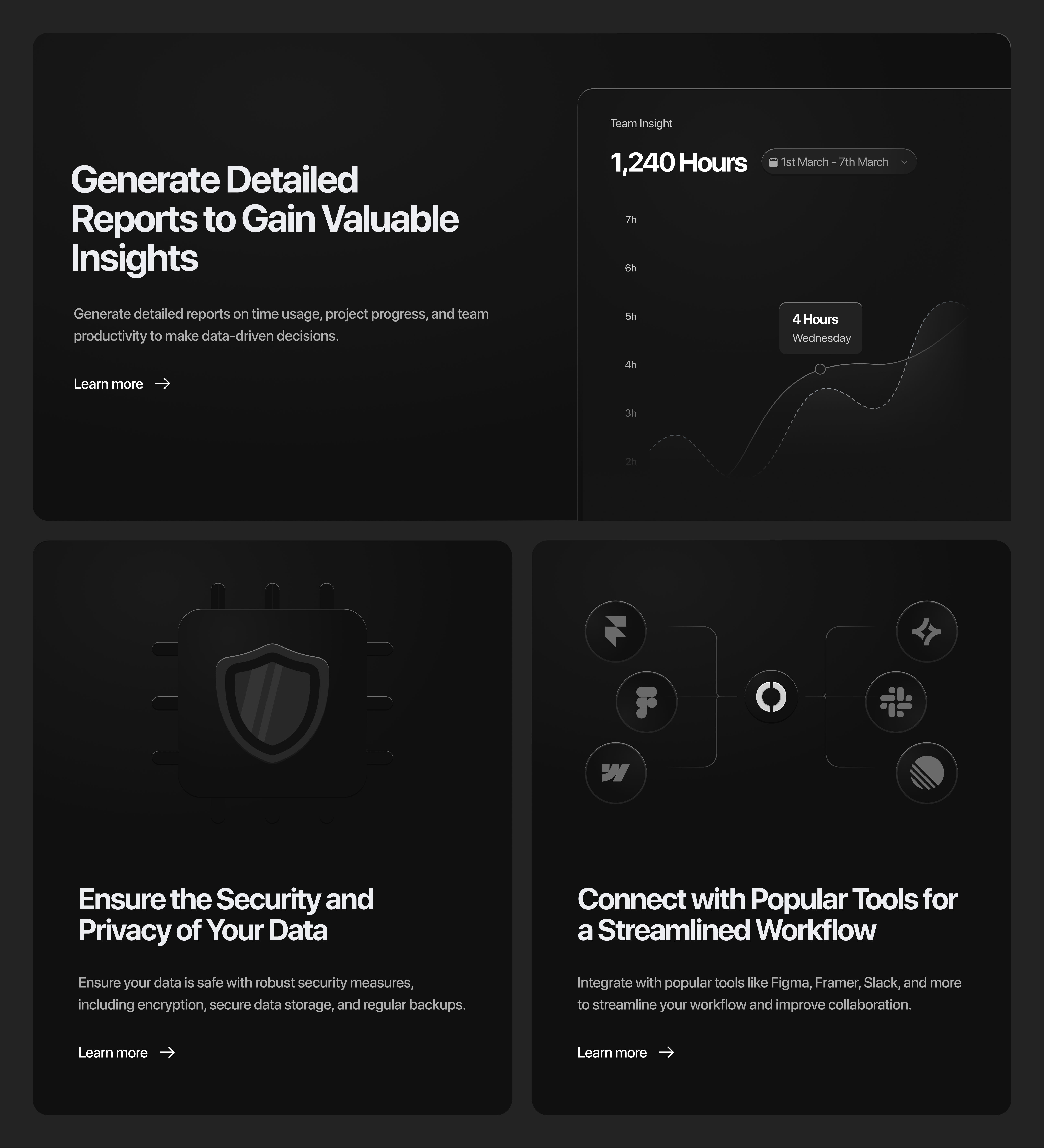
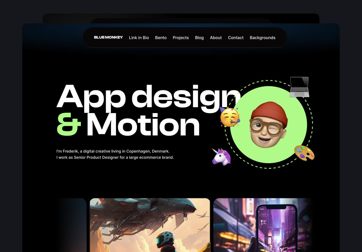
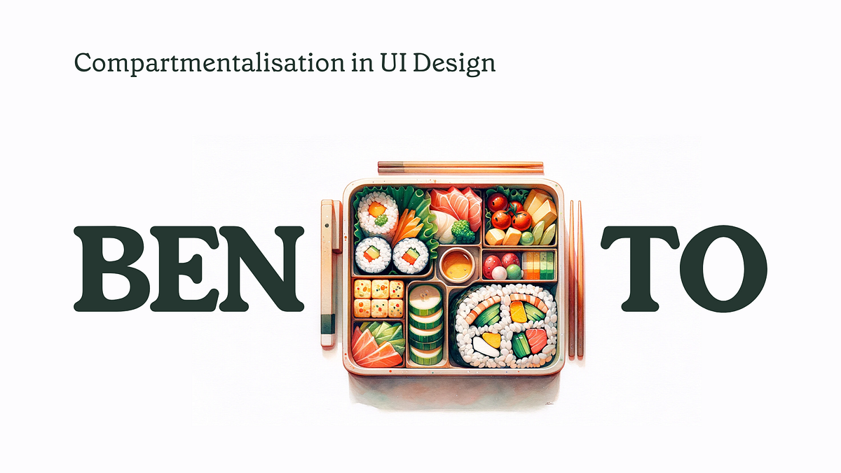
Whenever I think back to my visits to my aunts’ place outside the city during the New Year, this one memory always pops up. It’s usually the second or third day of the new year, and I’m getting ready to head back home. My aunt always insists on packing some home-cooked meals for me and my cousin. I usually don’t want more stuff in my luggage, feeling anxious about the additional load, but my aunts are up early in the morning, diligently packing and repacking food and treats into a really small bag. They somehow manage to squeeze what looks like a week’s worth of meals into that tiny space.If you’re a perfectionist like my aunts, this might not seem all that unusual. But now, as an adult, when I think about it, I realize they were like us, designers without even knowing it. I’ve always been fascinated by the concept of packing, or fitting stuff into places where it doesn’t seem to fit unless it’s well thought out. From playing Tetris to packing your own luggage, there’s this sense of happiness you get when all the pieces are in the right places and everything just looks right.This fascination with packing isn’t just about getting things into a bag; it’s about organizing them in a way that makes sense, where every item has its place and purpose. This, in a lot of ways, mirrors the principles of compartmentalization in UI design.Compartmentalization: More Than Just PackingIn UI, compartmentalization is about more than just fitting things into a designated space; it’s about making sure that each element is accessible, usable, and serves a clear purpose. Just like how my aunts carefully chose which dish went into which compartment of the bag, ensuring that the flavors wouldn’t mix and that the more delicate items wouldn’t get crushed, a UX/UI designer arranges the elements of a website or app to optimize user interaction.User Interface is Like a Well-Packed BagThink of a well-designed app or website as a perfectly packed bag. When you open it, you instantly know where everything is. You can find what you need without rummaging around. Everything feels intuitive, like it’s in its natural place. That’s the essence of good compartmentalization in UI design — it’s about creating a user experience that feels intuitive and effortless.Bento Design in UI: Aesthetic Meets FunctionThe Bento design style, in web and user experience/interface design, refers to a card-based design or grid layouts, where information is presented in distinct sections or containers for clarity and ease of use. This structuring approach that is inspired by the concept of a Japanese Bento box. A Bento box is a single-portion box containing a variety of different dishes, each in its own compartment, making for a balanced and visually appealing meal. Similarly, in Bento design style for websites or applications, content and features are compartmentalized into distinct sections or “compartments.” This style emphasizes organization, clarity, and aesthetic appeal.iPhone 14 promotional pageGlide dashboard and Bento links pagesWhat makes the Bento Design Style so effective in UI is its ability to offer visual clarity and organizational elegance. Each compartment, like the sections of a bento box, is clearly defined and separate from the others. This separation ensures that the user isn’t overwhelmed by information or choices. Instead, they are presented with a clear, organized interface where finding what they need is intuitive and straightforward.https://bentogrids.com/Enhancing User Experience with Intuitive Layouts: Why Bento grids?Imagine opening an app and being greeted by a cluttered, disorganized interface. It’s like opening a lunchbox to find all your food mixed up. The Bento Design Style in UI is the antithesis of this. It’s about creating intuitive layouts where users can easily navigate and find what they’re looking for. Each compartment in the UI is like a different dish in the bento box, uniquely flavored but part of a cohesive whole.If I had to characterize key moments in these types of layouts, I’d say Bento design’s key characteristics are:Key Characteristics of Bento Design Style:Compartmentalization: Just like a Bento box, the design divides the page into different sections, each dedicated to a specific piece of content or functionality.Clarity and Organization: The layout is clean and well-organized, making it easy for users to find what they are looking for.Visual Balance: The design ensures a harmonious balance between different elements, contributing to a pleasing user experience.Variety within Unity: While each compartment can have distinct content, the overall design maintains a unified look and feel.I don’t want to speak only about the best part of this style, every design layout has its Pros and Cons:Pros:Enhanced User Experience: The clear division of content can enhance usability and make the interface more intuitive.Aesthetic Appeal: Bento designs are often visually appealing, which can improve user engagement.Flexibility: This style can be adapted to various content types, making it versatile.Cons:Space Limitations: Compartmentalization might limit the amount of content that can be displayed in each section.Complexity in Design: Achieving a balanced and cohesive look can be challenging, especially for complex websites.Potential for Over-Segmentation: If overdone, it can lead to a fragmented user experience.ConclusionReflecting on those New Year visits to my aunts, I realize now that their skill in packing a small bag with a week’s worth of meals was more than just an act of love; it was a lesson in efficiency and precision. The Bento Design Style in UI, much like their meticulous packing, taught me that there’s a place for everything, even in the smallest of spaces.This style isn’t just about fitting things together; it’s about creating a space where every element, no matter how small, has its purpose and place. It’s a reminder that in design, as in life, simplicity and order can bring not only beauty but also the functionality.Bento Style & Compartmentalisation in UI Design was originally published in Muzli - Design Inspiration on Medium, where people are continuing the conversation by highlighting and responding to this story.


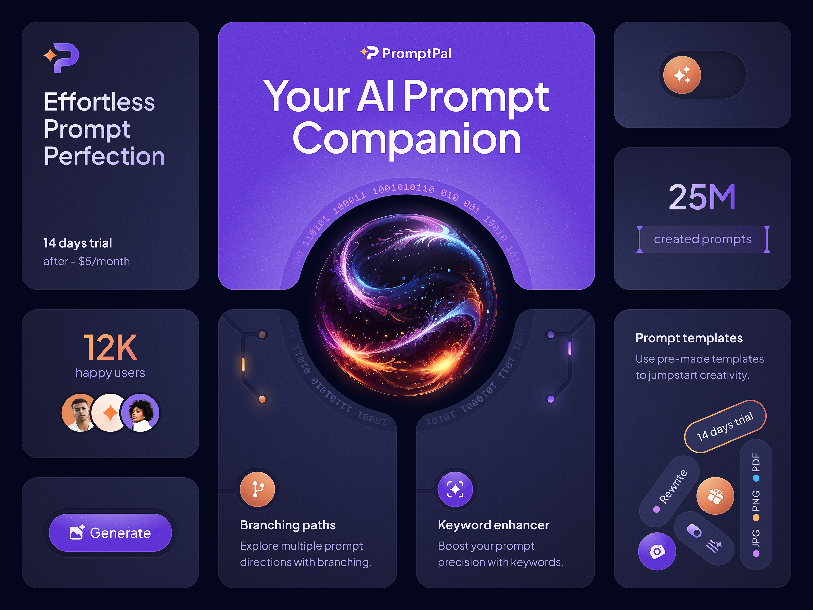
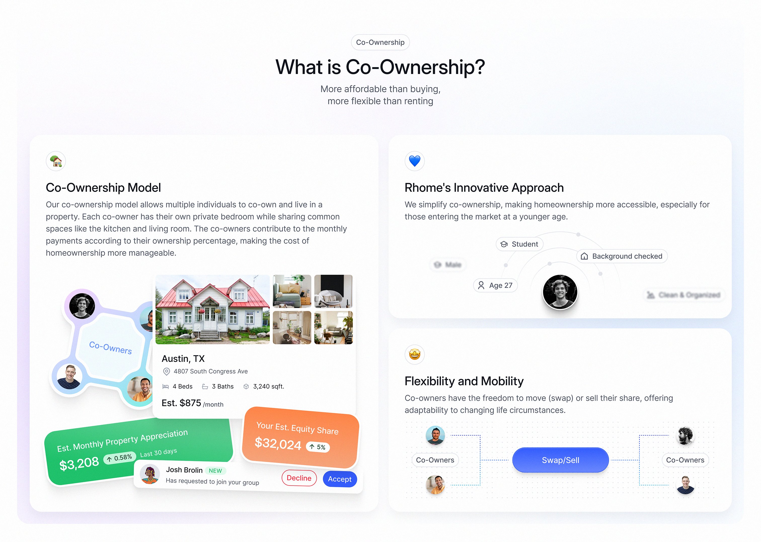


The term Bento Box originates in Japan, where it refers to a meal divided into its constituent parts and packed into a box. But in the design world, Bento Box is a design trend that is having a huge impact on how we design user interfaces.
This is 1% of what Muzli shows you.
Get the rest — fresh design inspiration on every new tab, free.
Add Muzli — free
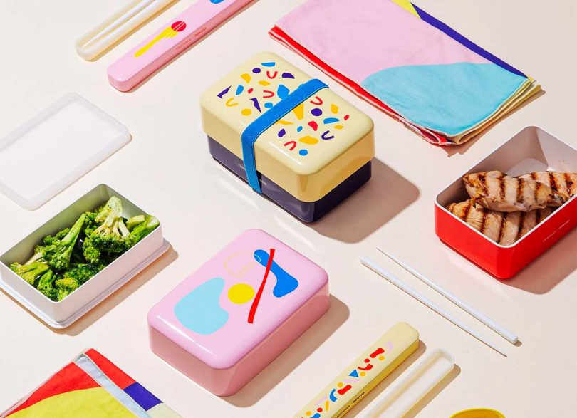
Poketo and Takenaka have teamed up to bring you an exciting collaboration: colorful bento boxes with creative designs.

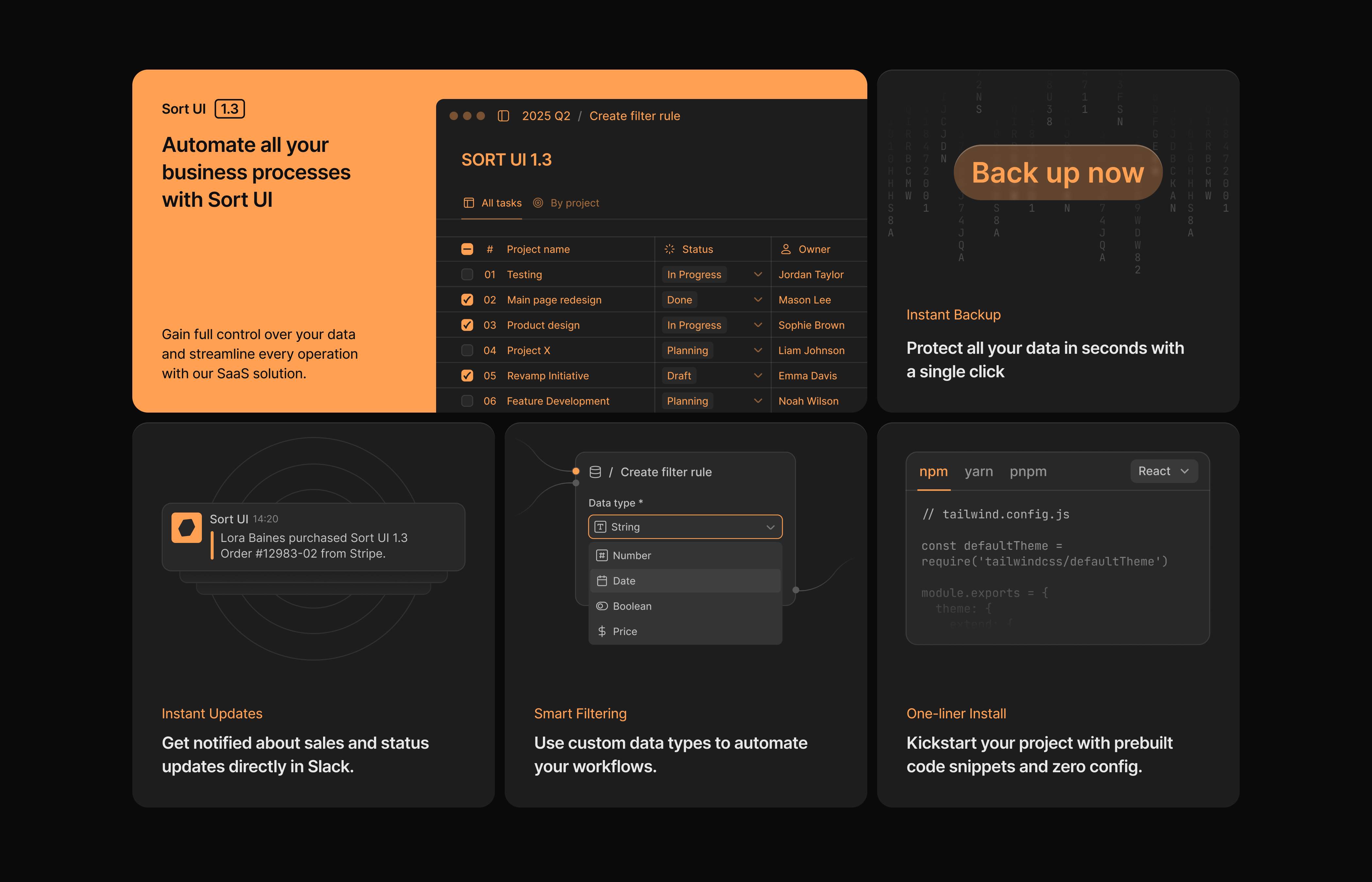
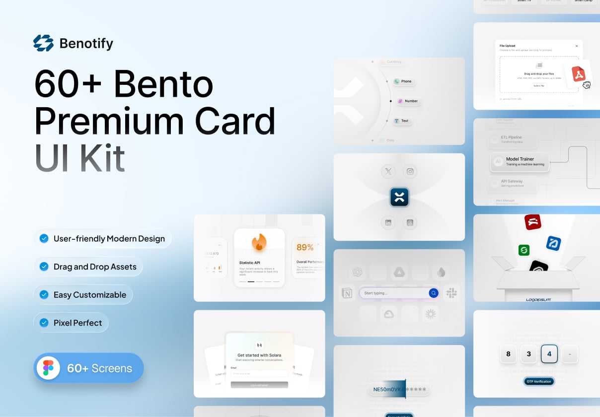
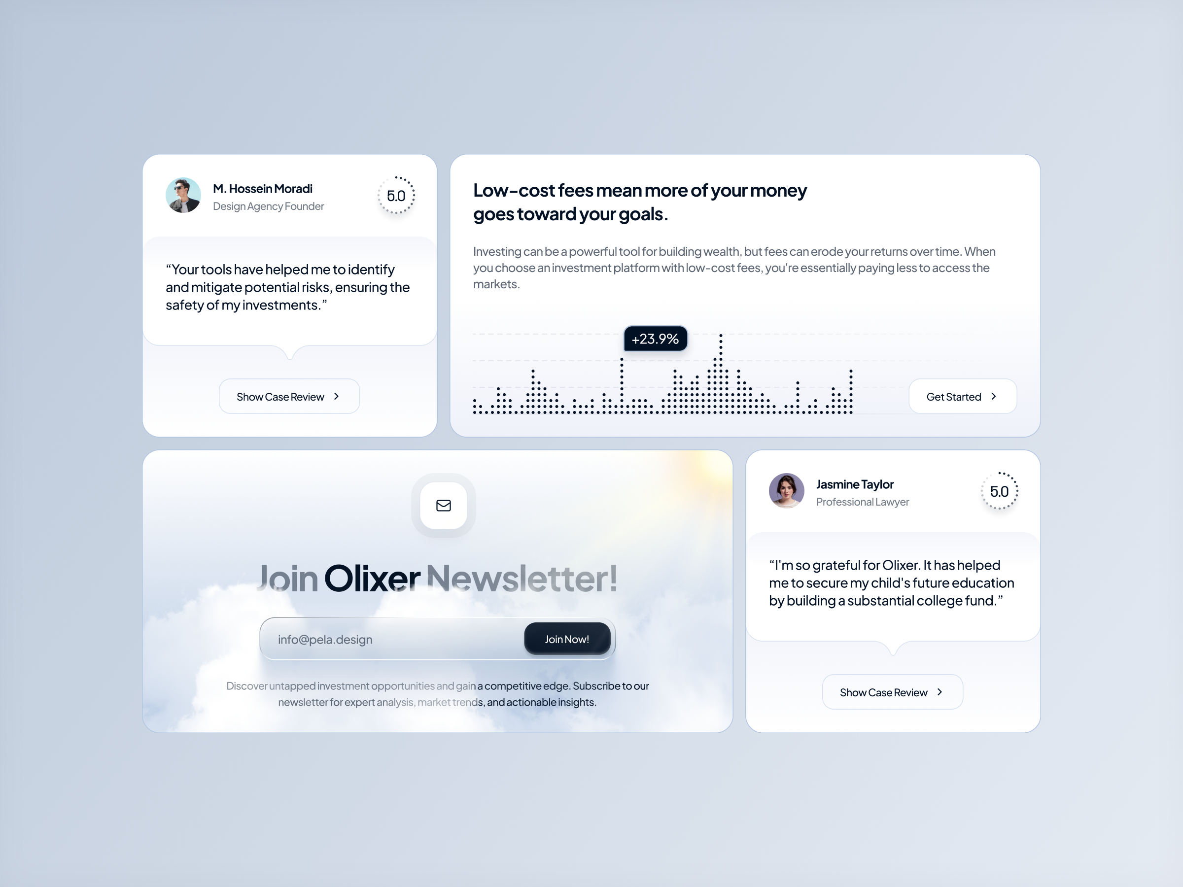
This is 1% of what Muzli shows you.
Get the rest — fresh design inspiration on every new tab, free.
Add Muzli — free
/67ccffc3-755e-4d82-acea-de6cd4e9b6b8-thumb.jpeg)
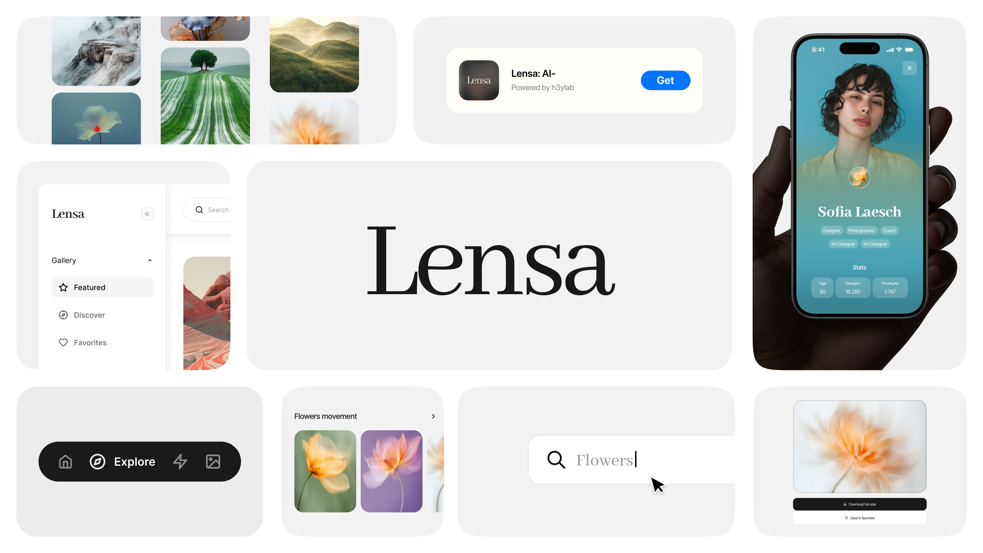


This is 1% of what Muzli shows you.
Get the rest — fresh design inspiration on every new tab, free.
Add Muzli — free

/b94349ed-aeb6-4066-b7a9-983c07e6272e-thumb.jpeg)

/filters:quality(100)/13af6729-367b-44bd-9cd7-aa57bbcc6b2c-mockup-22.png)
/e9579017-fd3e-4cc9-a201-35cf220403e2-thumb.jpeg)
This is 1% of what Muzli shows you.
Get the rest — fresh design inspiration on every new tab, free.
Add Muzli — free Get access to thousands of freshly updated design inspiration pieces by adding Muzli to your browser.
Loved by 900k designers worldwide, Muzli is the leading go-to browser extension for creative professionals.
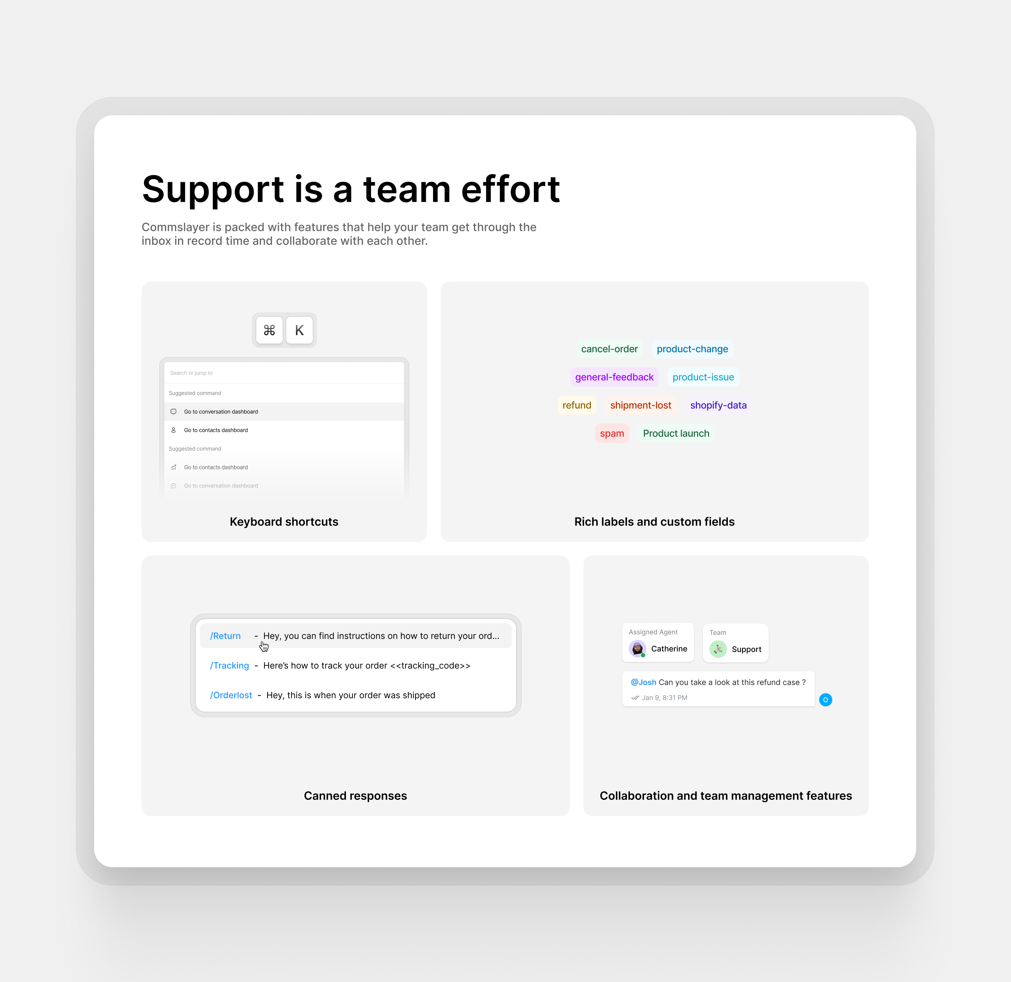
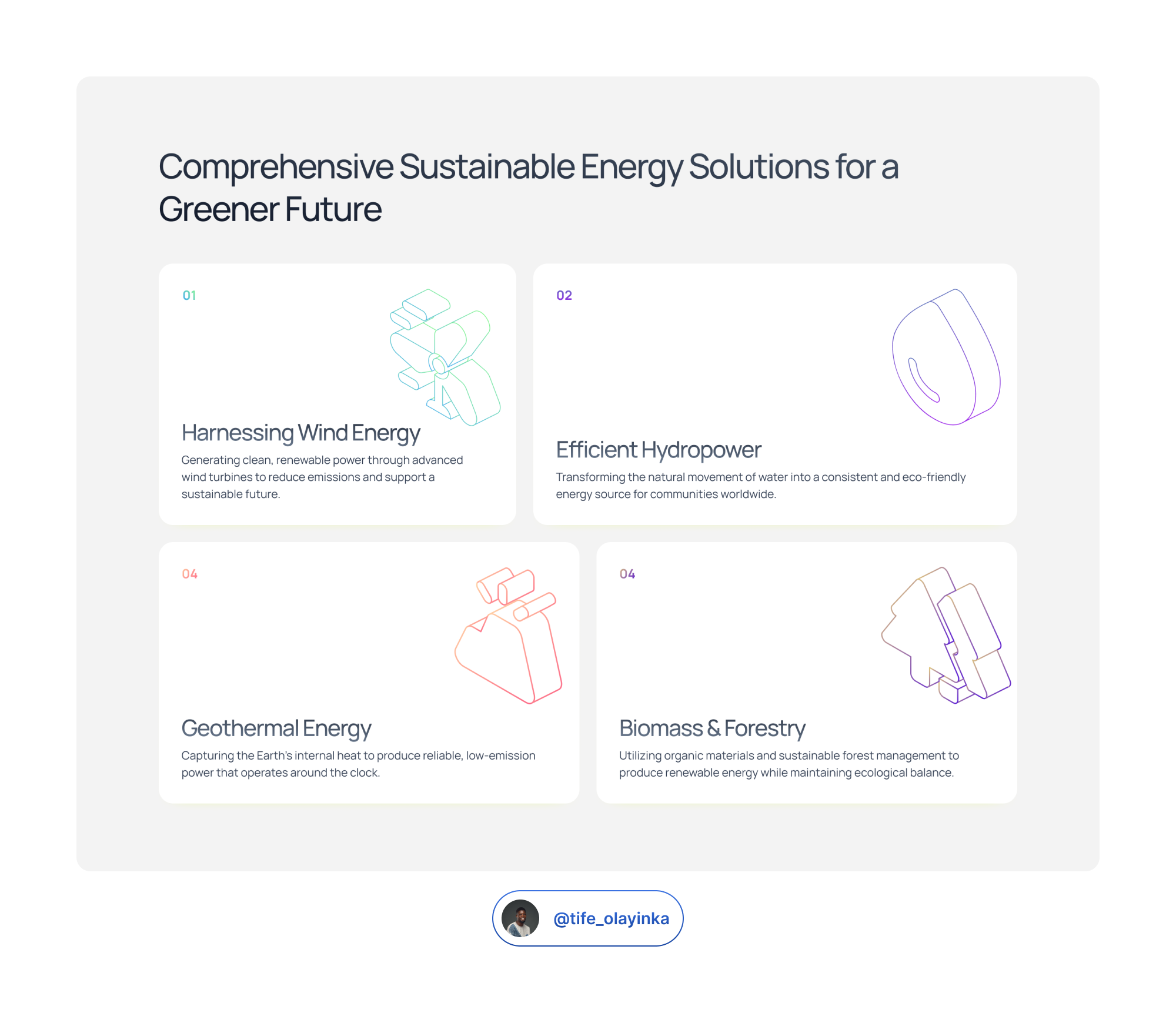
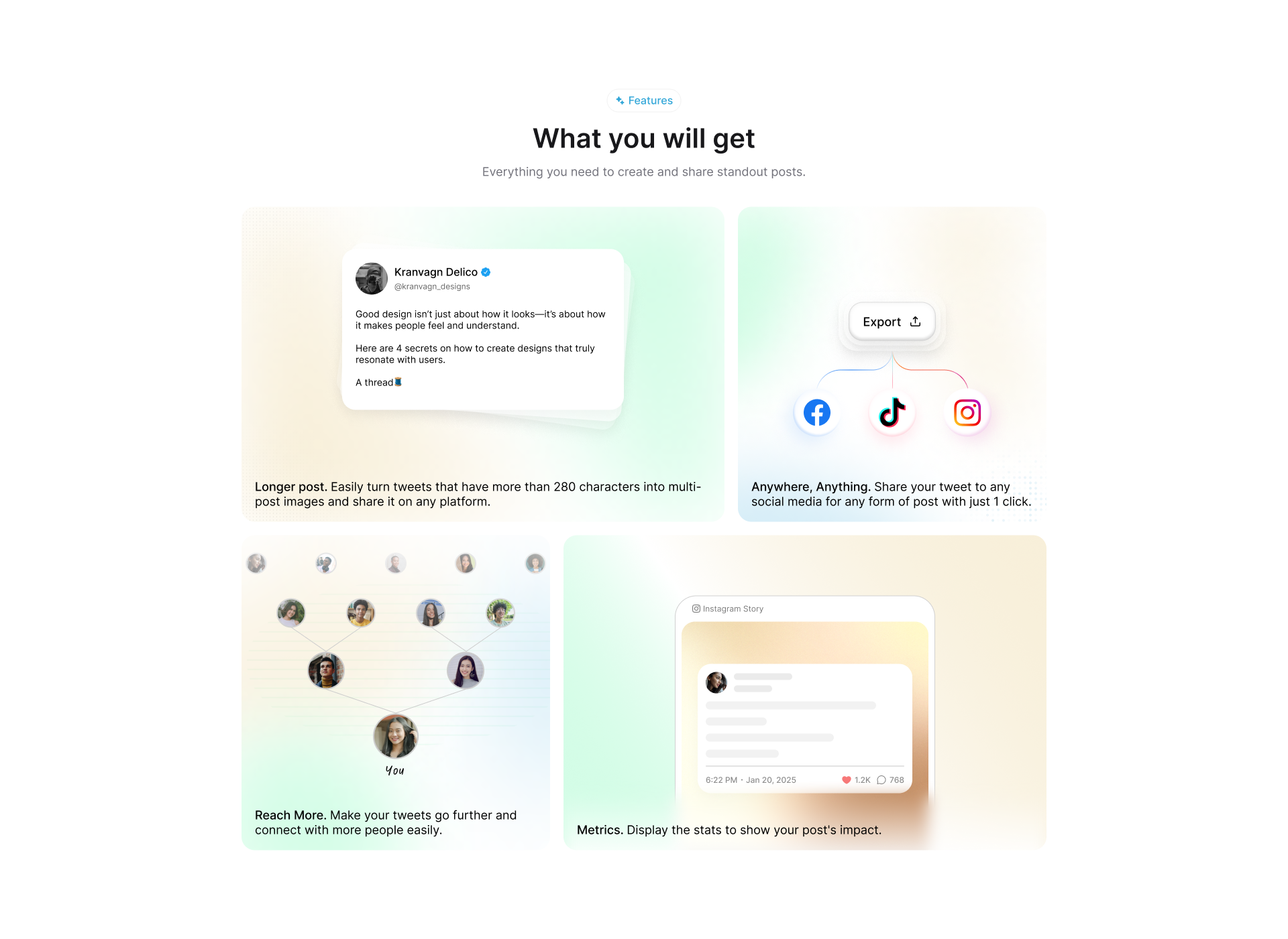
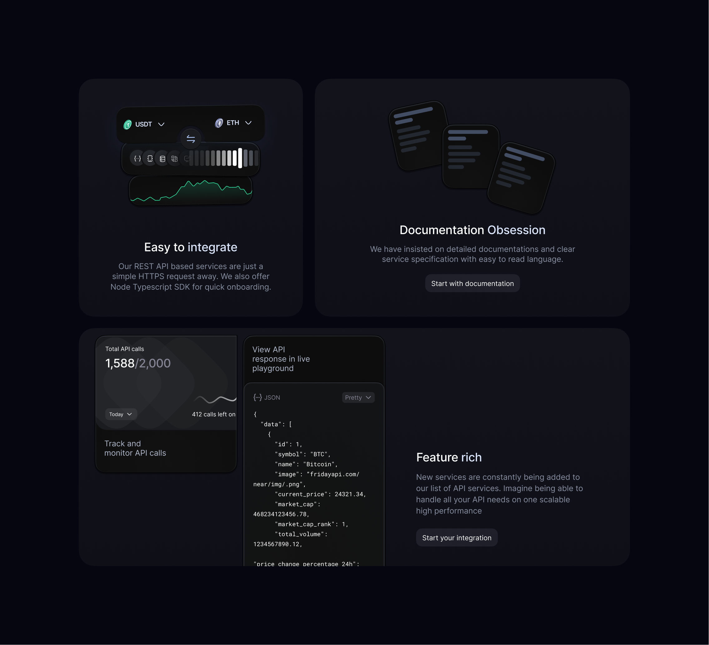
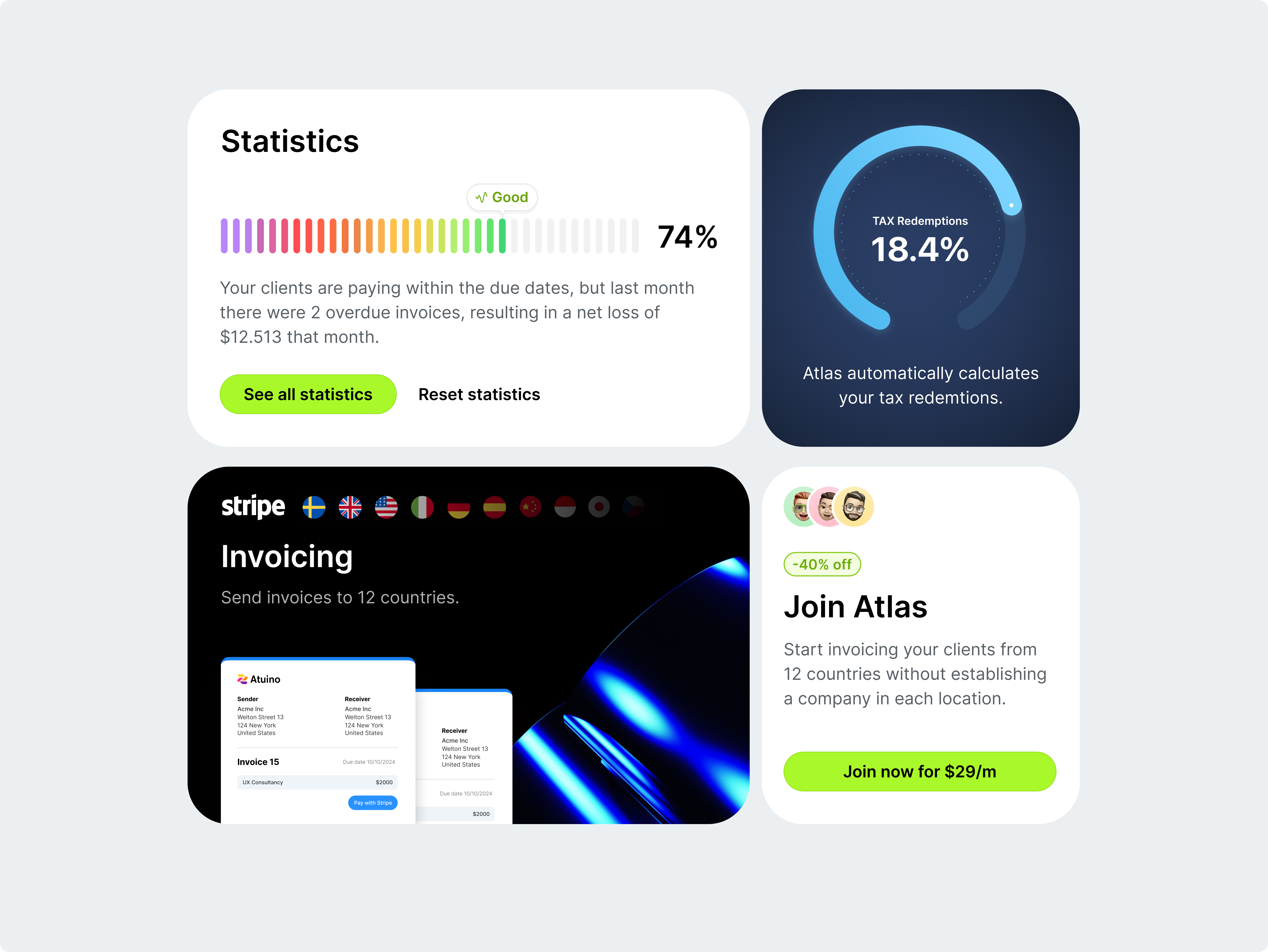
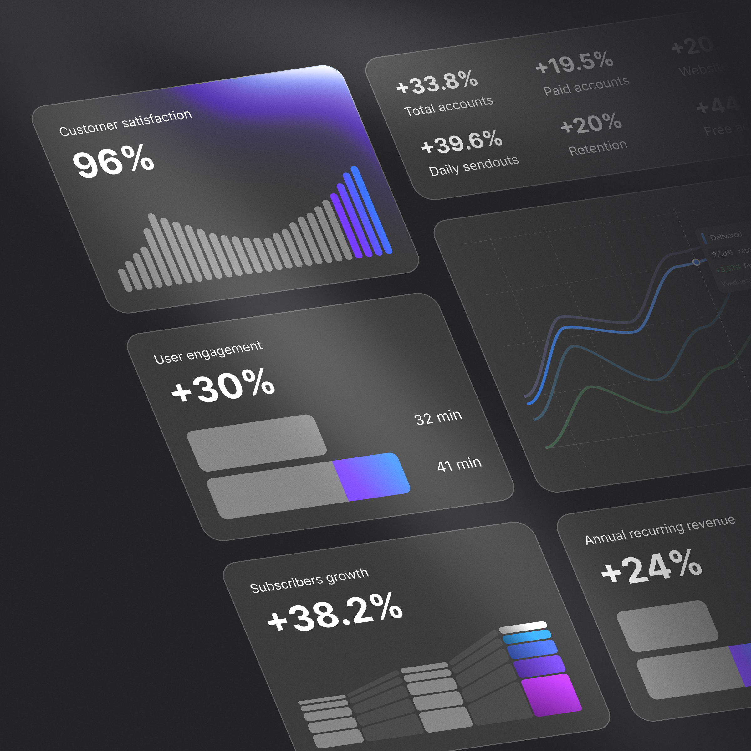
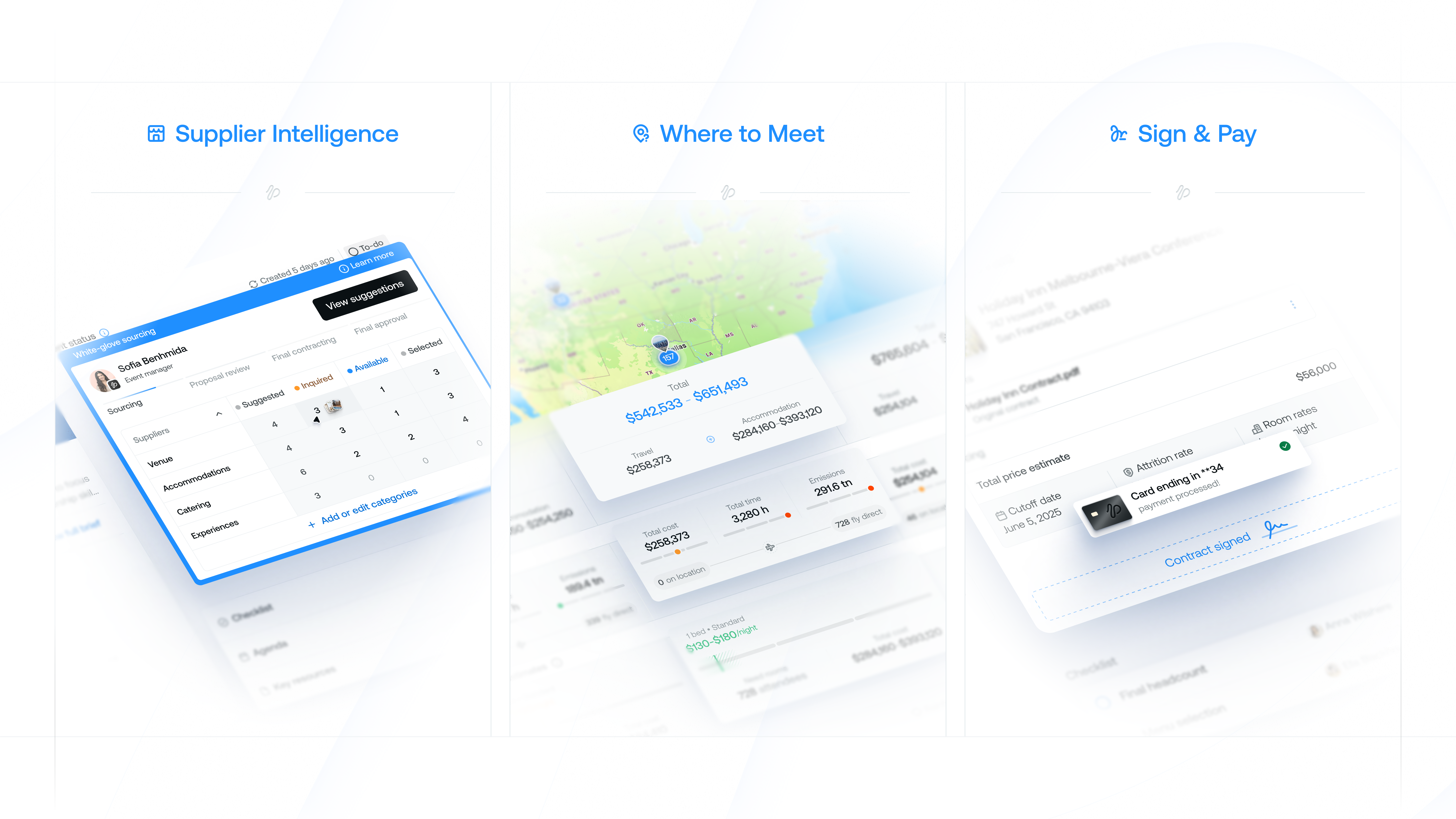
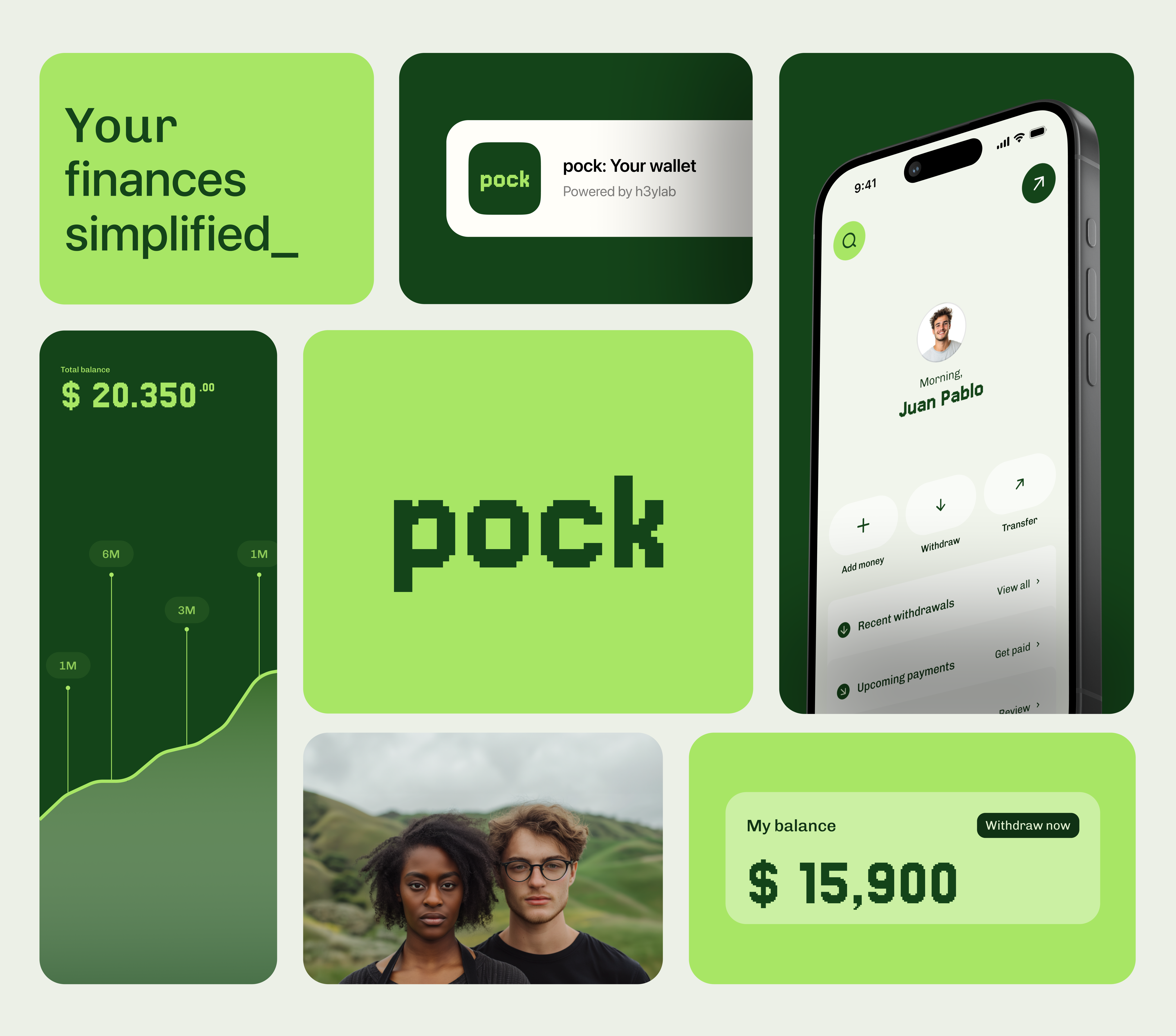
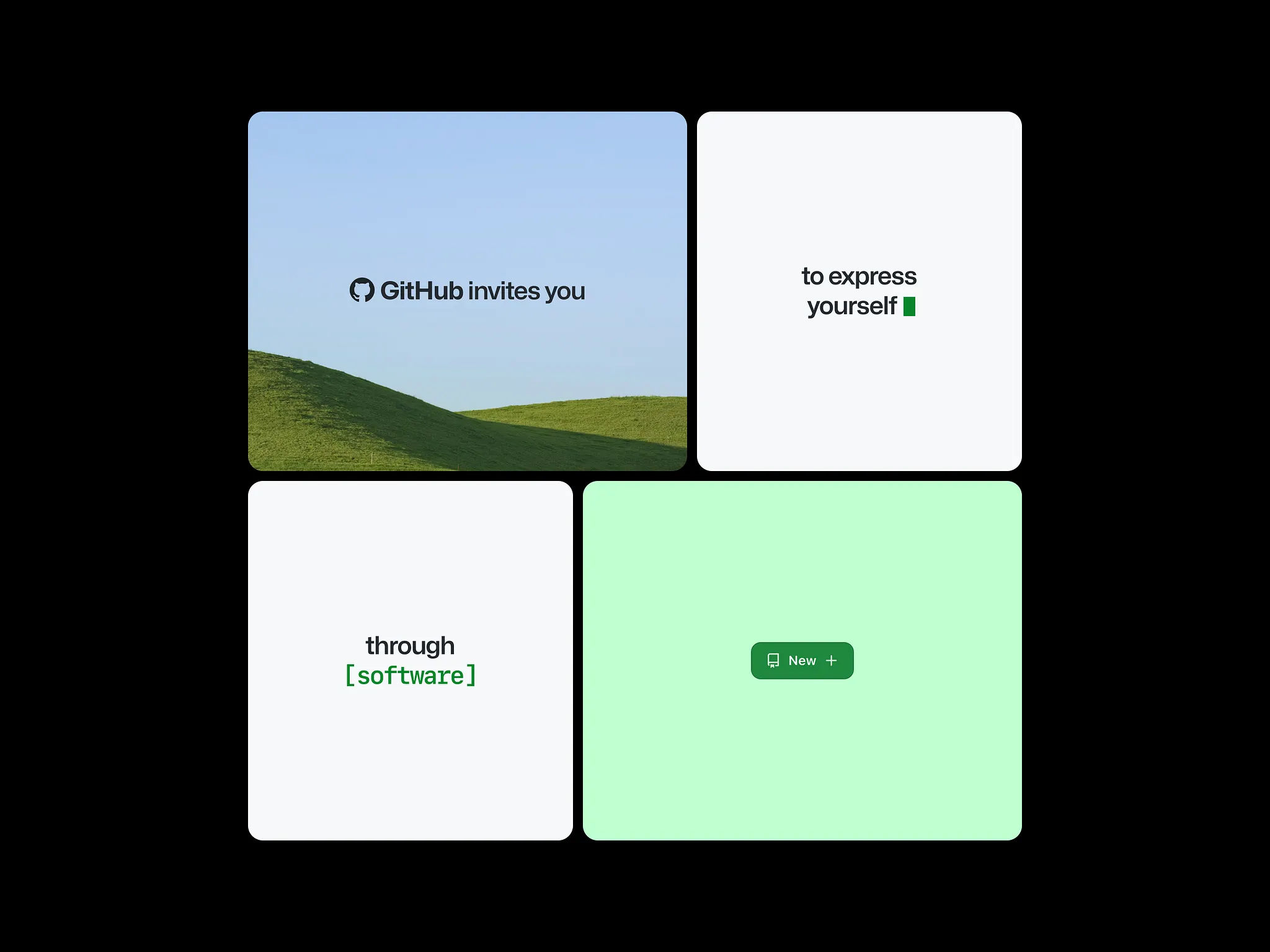
A bento grid is a layout made of rectangular tiles of different sizes that fit together into one block, named after the compartments of a Japanese bento box. Each tile holds one idea: a feature, a number, an image or a short interaction. Apple's product pages and keynote summary slides made the style familiar, and it is now a standard way to present product features.
Use it when you have several points of roughly equal weight and no strict reading order, such as a feature overview. Tile size sets importance, so the main feature gets the largest tile. It is a poor fit for a story that must be read in sequence, or for long text.
Design it on a simple column grid, often four or six columns on desktop, with tiles spanning whole columns and rows. On a phone the tiles stack into one or two columns, so each tile has to make sense alone and in any order. Keep the gap and the corner radius the same everywhere. That consistency is what makes the grid read as one object.
Most are bento sections and cards published on Layers, with bento components from the Framer marketplace and UI kits from UI8. Muzli follows more than 200 design sources and lists up to 60 matching pieces here, favouring recent work.