Design Inspiration
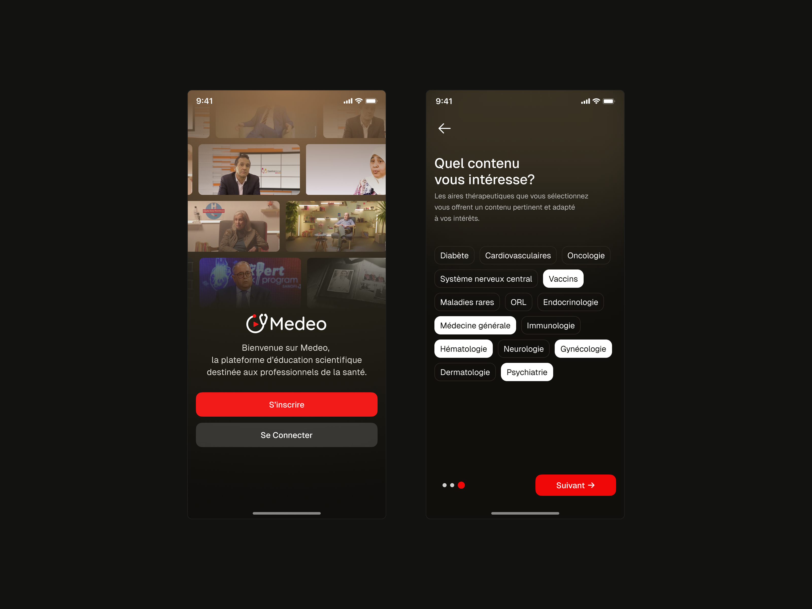
Onboarding screen examples
Onboarding screens are the first screens a new user sees: the welcome, the setup steps and the short tour that lead to the product's first useful moment. These are recent examples from real apps.
We curate topical collections around design to inspire you in the design process.
This constantly-updated list featuring what we find on the always-fresh Muzli inventory.
Last update:

Onboarding Inspiration 2017

Coded Onboarding Screens for iOS

welcome screen animation

Bulletproof User Onboarding

From First Mile To Nth: Onboarding Beyond User Onboarding

4 Creative Mobile Onboarding Concepts

Onboarding experience
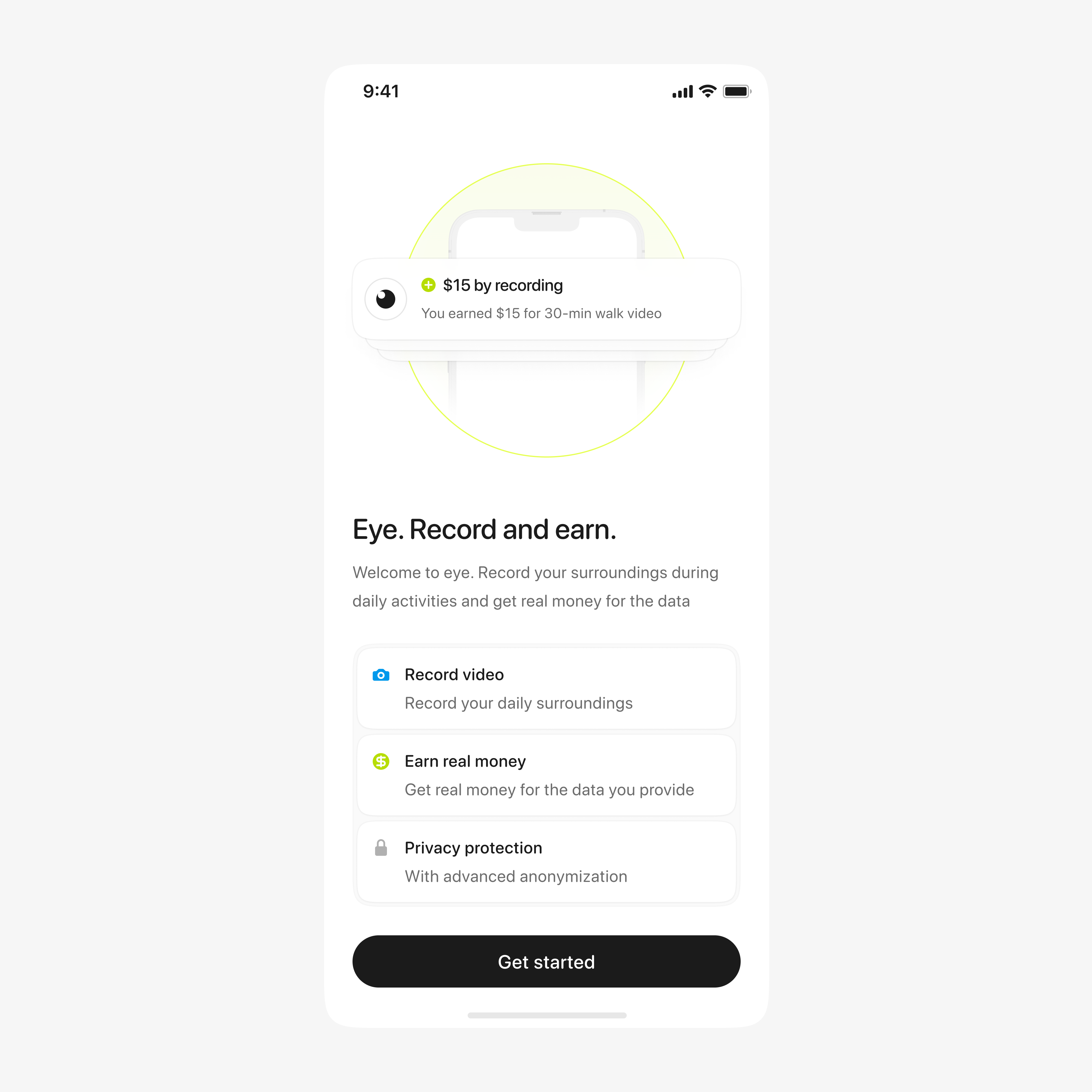
welcome screen
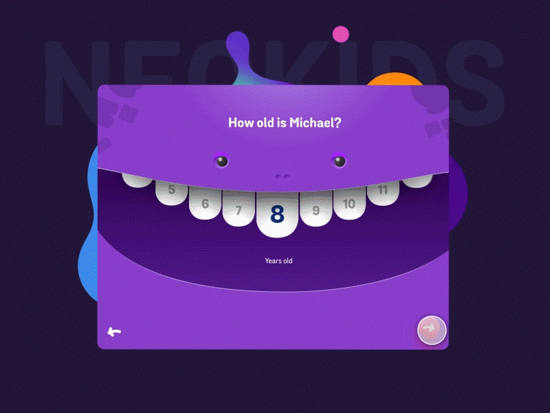
Neo Kids - Onboarding Concept by Minh Pham
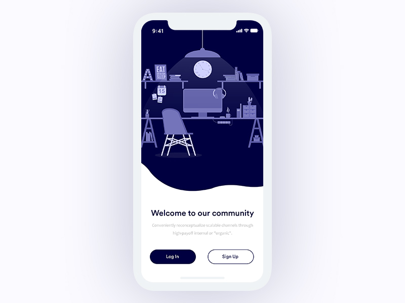
Welcome Screen
Hey Guys, This is the collaboration project with Shamima Nasrin. Thanks for her beautiful illustration. Let us know the feedback on design & don't forget to like the project. Ping me if you have any similar kind of work. email: nazirulhoque669@gmail.com skype: nazirul.hoque2 Thanks
Writing the onboarding experience
This is 1% of what Muzli shows you.
Get the rest — fresh design inspiration on every new tab, free.
Add Muzli — free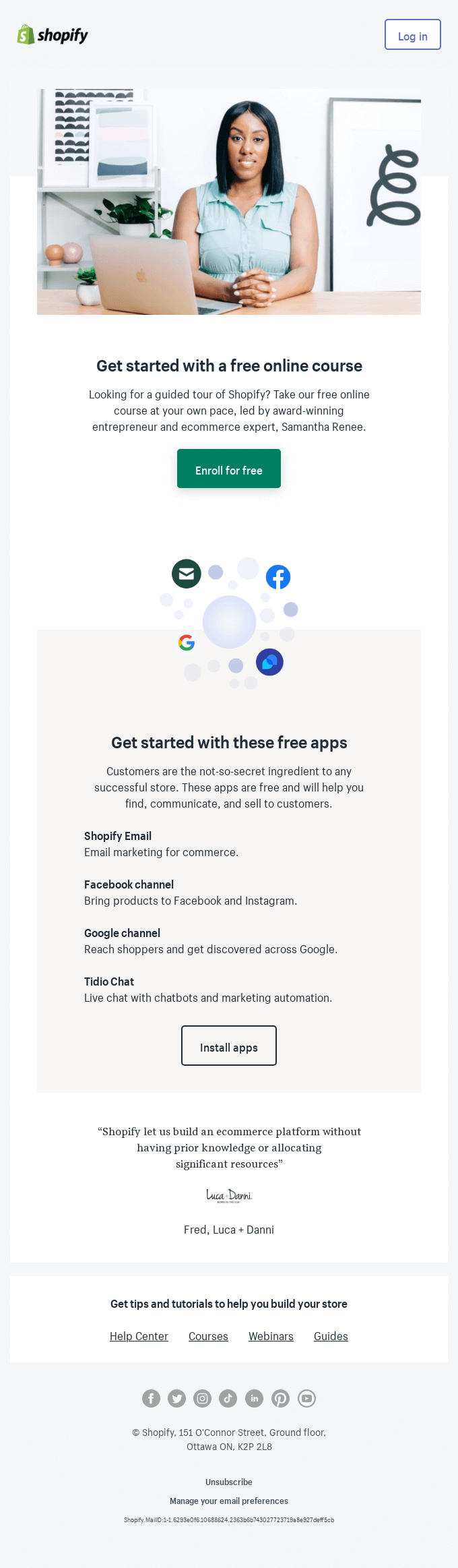
Set up Marketing Operations with a guided tour of Shopify
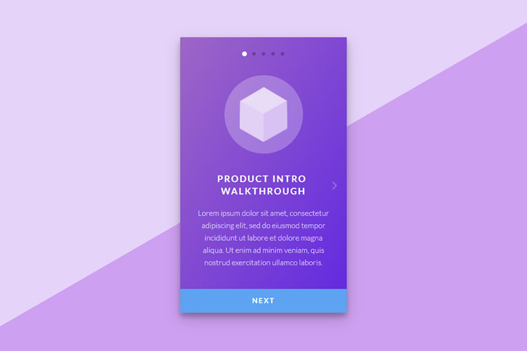
10 Free Onboarding UIs Built With CSS & JavaScript
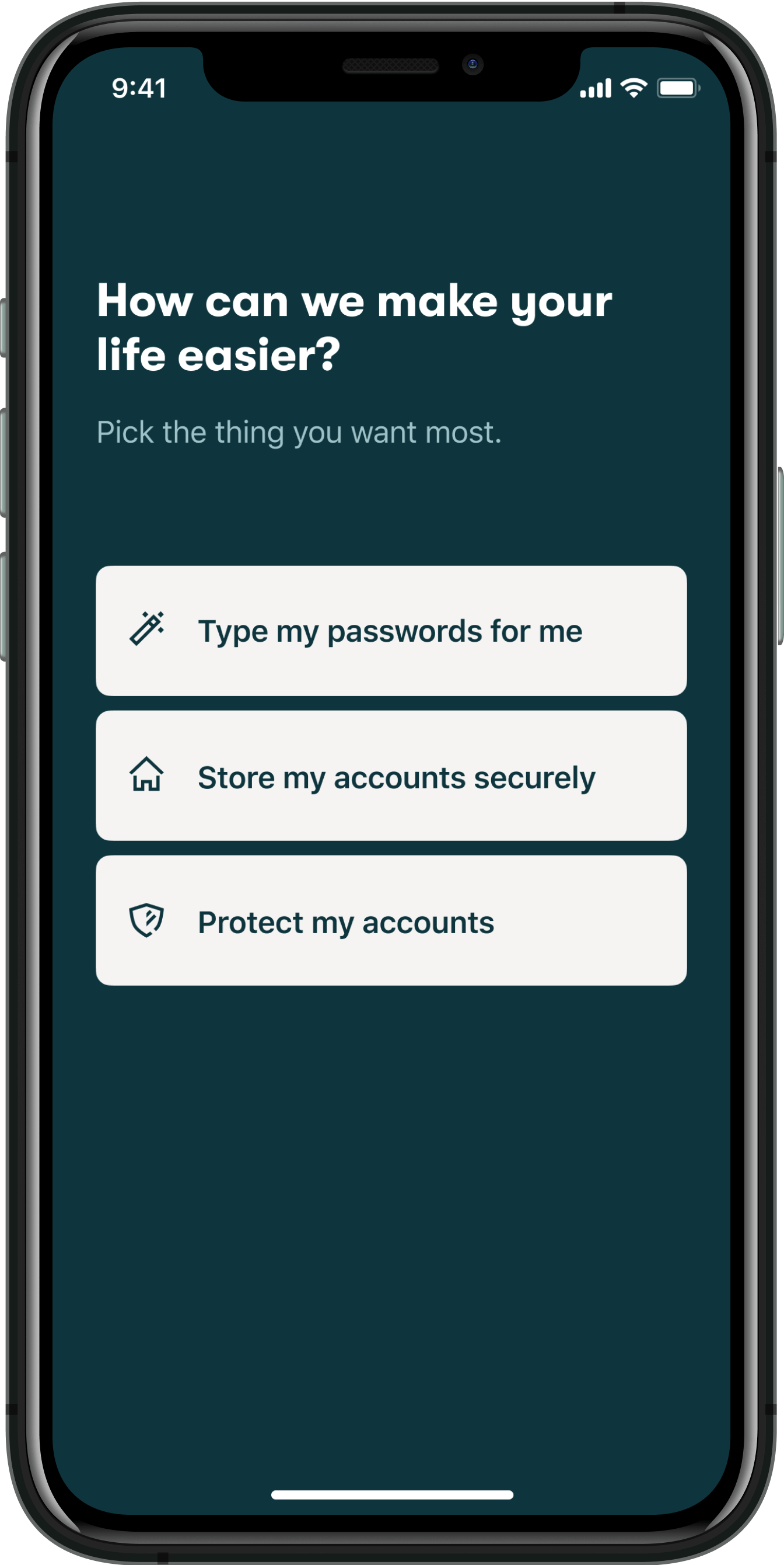
How to build trust during onboarding

How better onboarding cut our drop-off rate dramatically
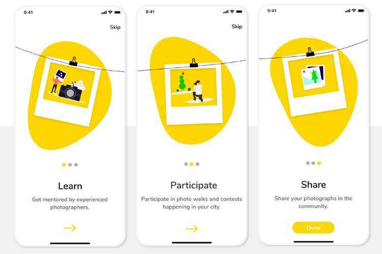
8 Beautifully Illustrated Onboarding Screens in Mobile Design
To understand the value of your application and enjoy its features, modern web programs need to have an onboarding process. It is not just a whim. It is a crucial... The post 8 Beautifully Illustrated Onboarding Screens in Mobile Design appeared first on Speckyboy Design Magazine.

Trello User Onboarding: 7 Tactics To Inspire You
3 lessons from Bumble’s onboarding
User Onboarding: Is HEY Email Worth It?
How To Design An Effective User Onboarding Flow

Introducing C.A.R.E. - a simple framework for user onboarding
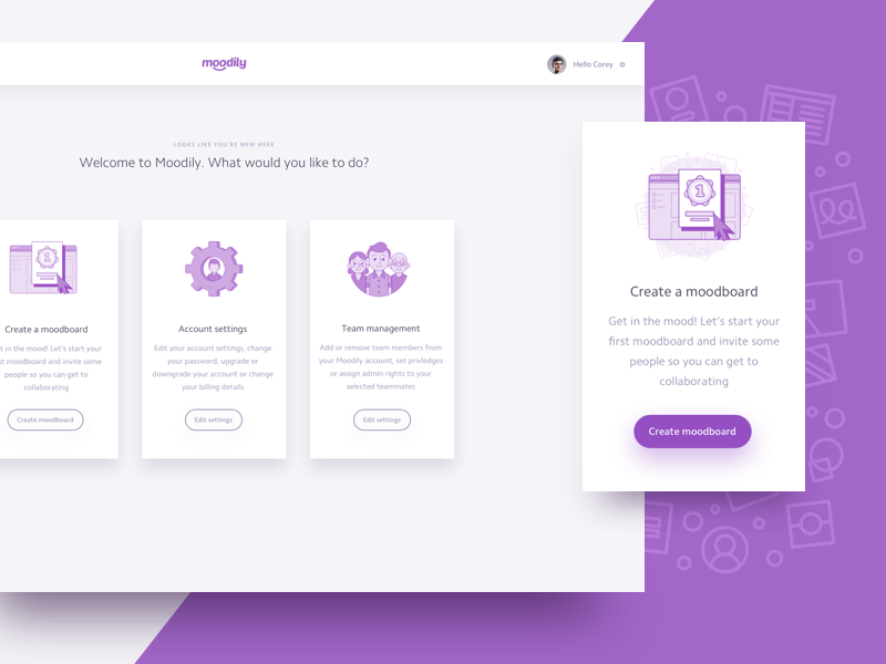
Welcome Screen
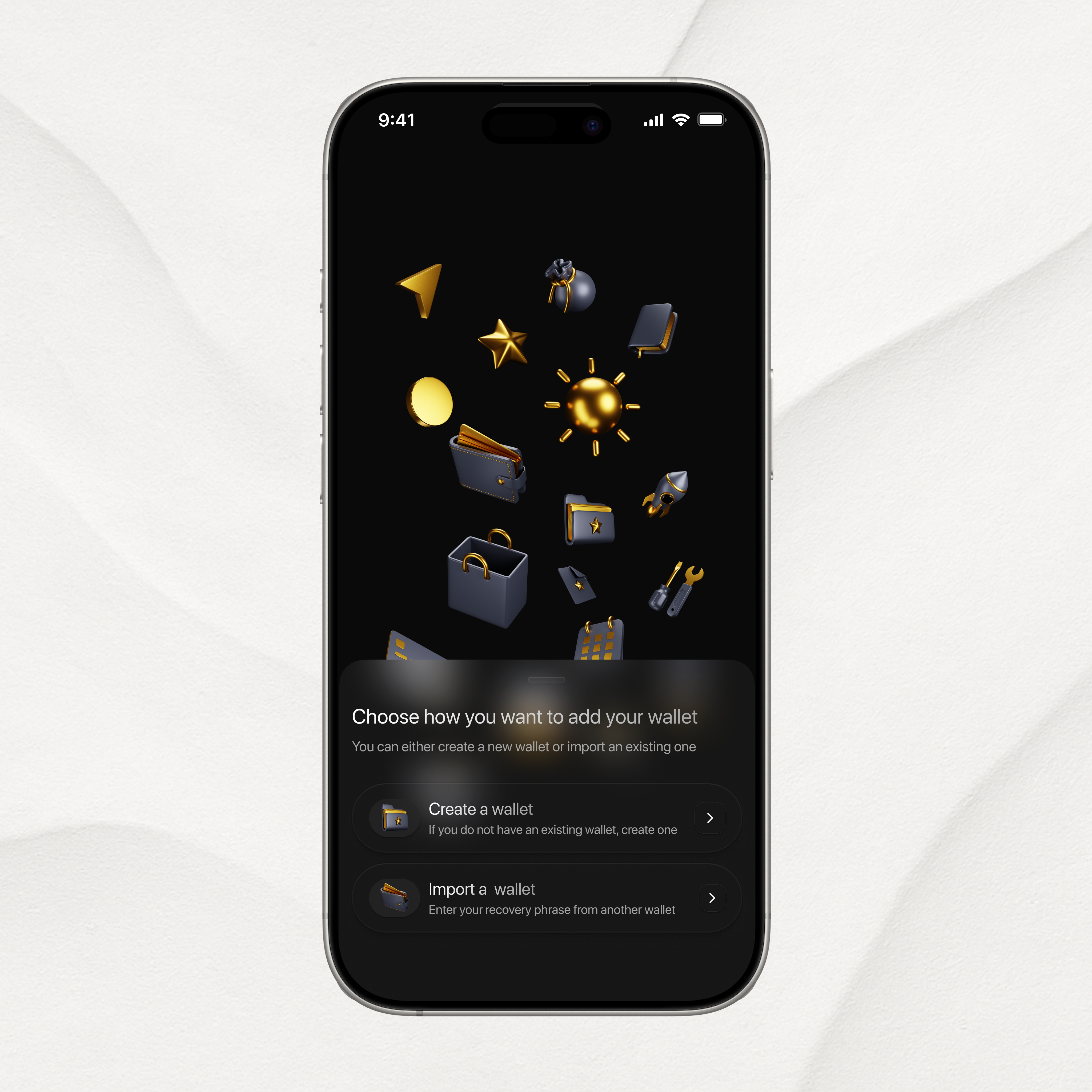
Non-Custodial Wallet Welcome Screen
This is 1% of what Muzli shows you.
Get the rest — fresh design inspiration on every new tab, free.
Add Muzli — free
Casey Winters Reveals How Pinterest Perfected User Onboarding
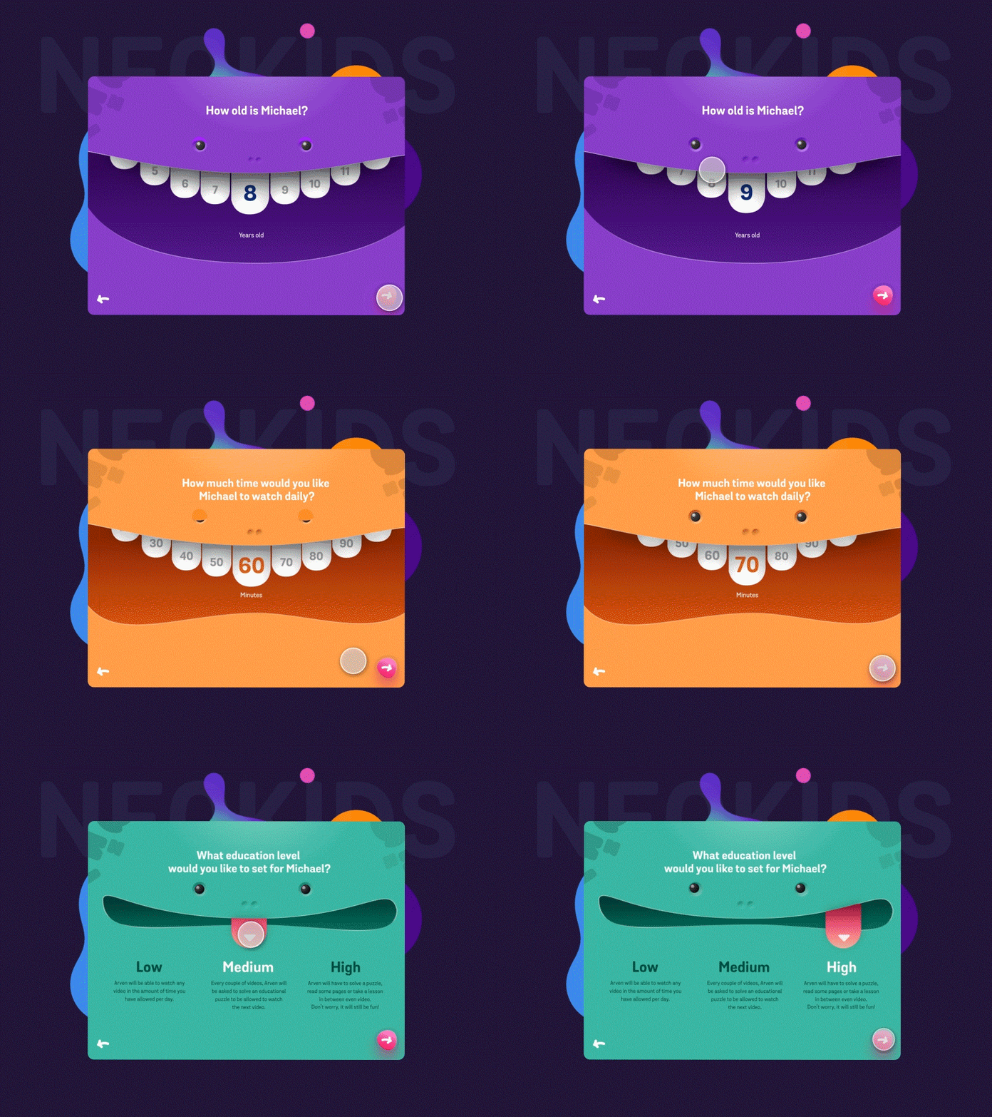
Neo Kids - Onboarding Concept
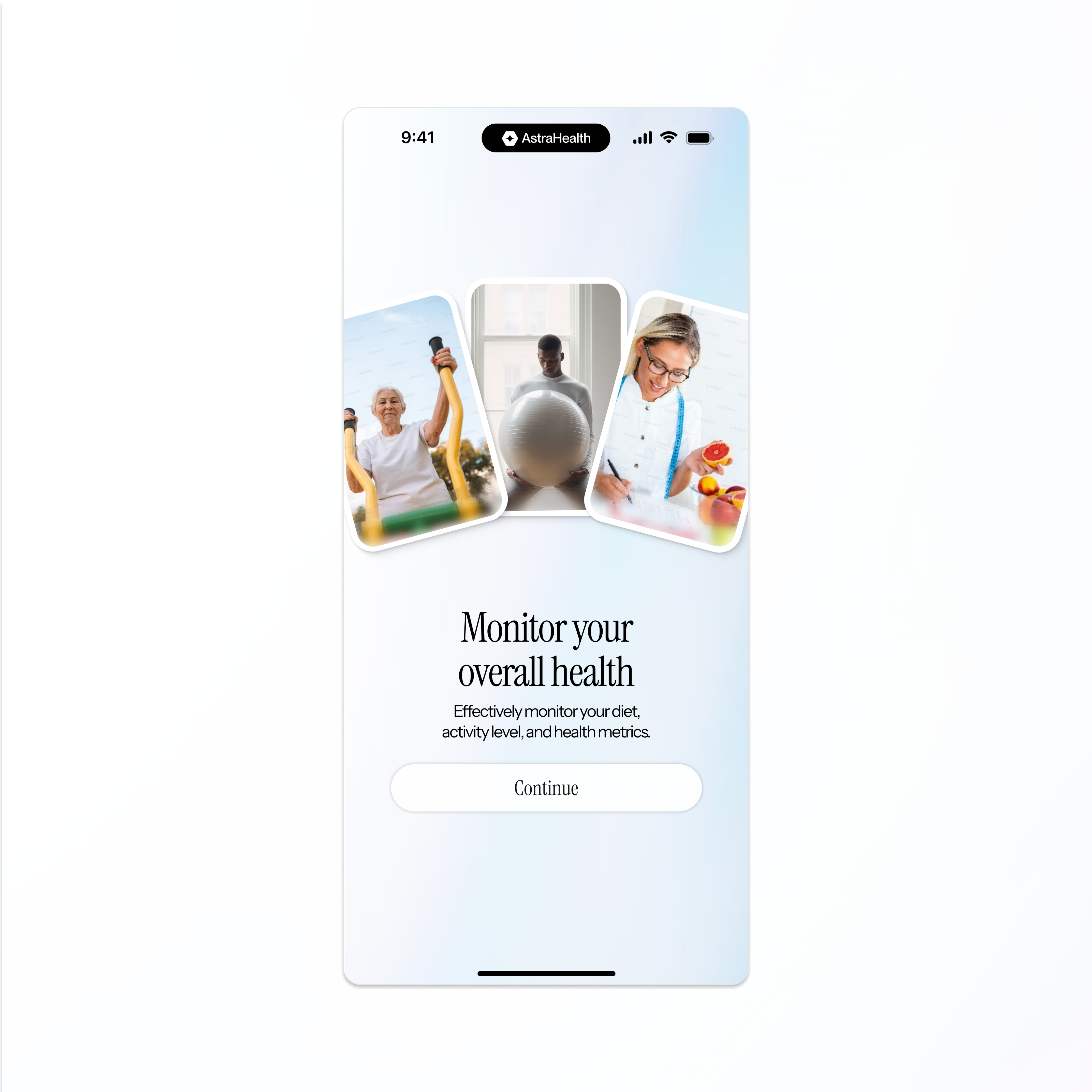
Onboarding screen

The Biggest Problem with (Most) Onboarding Experiences
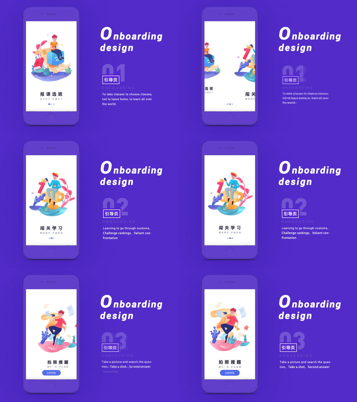
onboarding design
Education application boot page.I hope you like it

Good Questions, Bad Asks: The UX Of Questions In User Onboarding
5 Deadly Onboarding Mistakes To Ban From Your Product
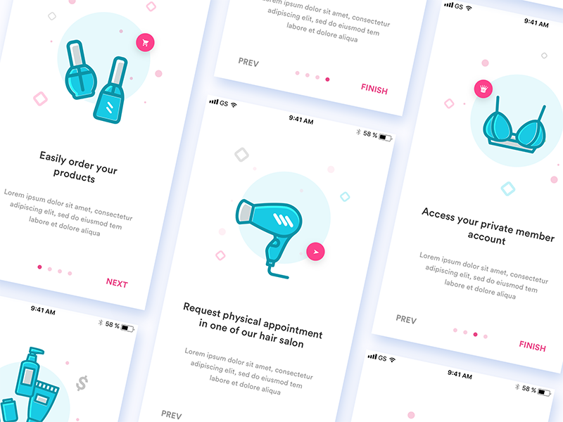
Onboarding screens
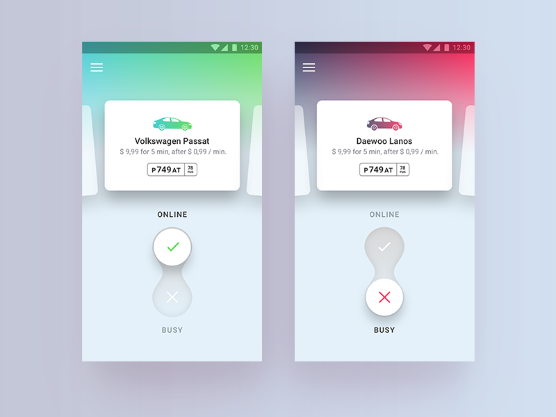
Taxi driver welcome screen
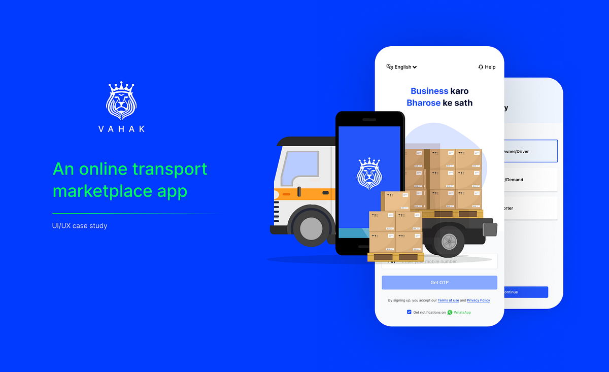
Improving Onboarding experience on Vahak — UI/UX Case Study!
Improving Onboarding experience on Vahak — UI/UX Case Study!Disclaimer — I was working in Vahak as a UI/UX designer and to redesign the onboarding flow was one of my major projects since I was the sole designer who worked on this.About VahakVahak is an online transport marketplace that provides a platform to help users who are looking for loads and lorries. The company offers features that make it easier for users to book loads & lorries, grow their network and establish an online brand presence.A glimpse of how the industry worksVahak caters to an audience who are not comfortable with digital technologies. Additionally, the users of Vahak do not have fixed roles and their responsibilities often overlap. For instance, a person who transports goods can also act as a broker while finding a truck for someone else, and can also become a shipper while arranging for the transportation of goods.Understanding the problem spaceAround 40% of the users drop after installing the app. Moreover, a major portion of the users that move forward also drop before completing the onboarding process. I identified a few significant problems with the current onboarding flow —The “Skip OTP Verification” CTA given in the OTP verification screen broke the onboarding flow.User had to go through 5 content heavy carousels to complete the walkthrough.User had to choose from two service type options, out of which one option further expands into 3 more options. This creates confusion and makes the decision making process difficult.After registering, users were asked to post load or lorry based on the service selection without providing any value proposition. Moreover, the skip option given there was not visible enough.The goal was to improve two key business metrics through onboarding:Increase the conversion rate from installation to registrationDecrease the average time taken to complete the onboarding process.My roleI was responsible for conducting user interviews, analysing user behaviour and feedback, and creating design solutions that are intuitive, efficient and easy to use.Final DesignDesign process and challengesI conducted user interviews which were quite challenging, since the audience of Vahak are impatient, they were not ready to give their time.I conducted competitive analysis, some of which were direct competitors and some were indirect. This helped me to come up with solutions to some extent.I had given lot of iterations and did usability testing to evaluate their performance in order to identify the version that was most effective.Competitive analysisI downloaded and analysed three apps. I compared the onboarding experience of each of the competitor’s app as a new and returning user.Response of qualitative and quantitative researchFrom the data team, I got to know there were major drops in “language” screen, “service type” screen and in “Create password” field.I have followed two research methods; qualitative and quantitative. In the qualitative analysis, I took interviews of 25 users based on the data which I got from the data team. Conducting user interviews helped me find their pain-points and challenges they were facing.User pain-pointsThe gap between the product and the on-ground reality was a major concern in Vahak’s case. For example: The service providers had different nomenclatures as per their region. Moreover, agents & brokers identify as transporters(Status driven society). This led to confusion on service selection and made it difficult for user to take action.Based on the user pain-points and insights, I prepared questions and surveyed 20 users to validate it.Actionable InsightsThe complexity of the “service type” screen was a major issue.Users were not sure what to write in the “company name” field.Creating password and remembering it was a huge pain for users.After conducting research and analysis, I was able to visualise the solution.High-fidelity prototypesWalkthrough: It is an additional distraction for our users as they are impatient and do not want to spend time on this process.Hence, I removed walkthrough and instead designed “Mobile Number” entry field in the same screen, reducing one extra step to make their sign-up process faster.Earlier, users had to select the language. But in the new flow we capture the users existing language on the keyboard and phone. This helped in skipping a step completely, also users can change language at any point of time during the process.OTP verification screen: “Skip OTP Verification” CTA had allowed users to skip the onboarding process which broke the flow. Vahak being a marketplace that caters to both demand and supply side of the users, this flow was difficult to provide a personalised experience, since there was no information on the users skipping the onboarding process.Hence, I removed the skip option, allowing them to complete the onboarding process which helps them to get personalised experience.Service type screen: Users had to choose from two service type options, out of which one option further expands into 3 more options. The more options available to the users, the more difficult it is for them to make a decision. If we overwhelm new users with various options and a barrage of information all at once then they are likely to struggle with decision making, losing sight of the bigger picture, and stop using the app.Simple language is what matters the most especially for less tech savvy users. Therefore, I kept it short and concise and removed the option for multiple selection. This simplified the process and made it more intuitiveCompany registration screen: “Create password” field hinders the user’s experience as users tend to forget password leading to drop-offs and less retention. Too many fields in the registration form create friction, for example; entering the location manually.I removed “Create password” field to make the company registration process smoother (This also increases the chance of retention). Moreover, the previous flow required the user to manually enter the location. However, in the new flow we capture the user’s location with just a click.Welcome screen: In this screen users can either start posting or skip posting and land on the marketplace. Right after completing the onboarding, users were asked to post without giving them any value, also the skip option is not visible enough.I added congratulatory screen post registration and also created a free business card for our users. This is a milestone moment to inform users that they’re done with their setup. Now they can share their business card, giving them the motivation they need to engage with the rest of the product.ImpactRedesigning the onboarding had a positive impact on the user experience. New onboarding flow had more conversion from installation to company registration.Average time taken to complete the onboarding process has decreased as I eliminated few steps in the new flow that simplified the process and made it more intuitive.Average time taken on the “service type” screen also decreased since users were able to take quick decisions in selecting their roles.ConclusionIt is essential to ensure that onboarding is designed to provide value to the user and encourage them to continue using the product.The main challenges faced were:Conducting user interviews, since our target users were mostly impatient and did not want to give their time for such interviews.Creating variations of certain screens to conduct usability testing to see which drives the goals up.Reducing complexity of the “Service type” screen.Improving Onboarding experience on Vahak — UI/UX Case Study! was originally published in Muzli - Design Inspiration on Medium, where people are continuing the conversation by highlighting and responding to this story.
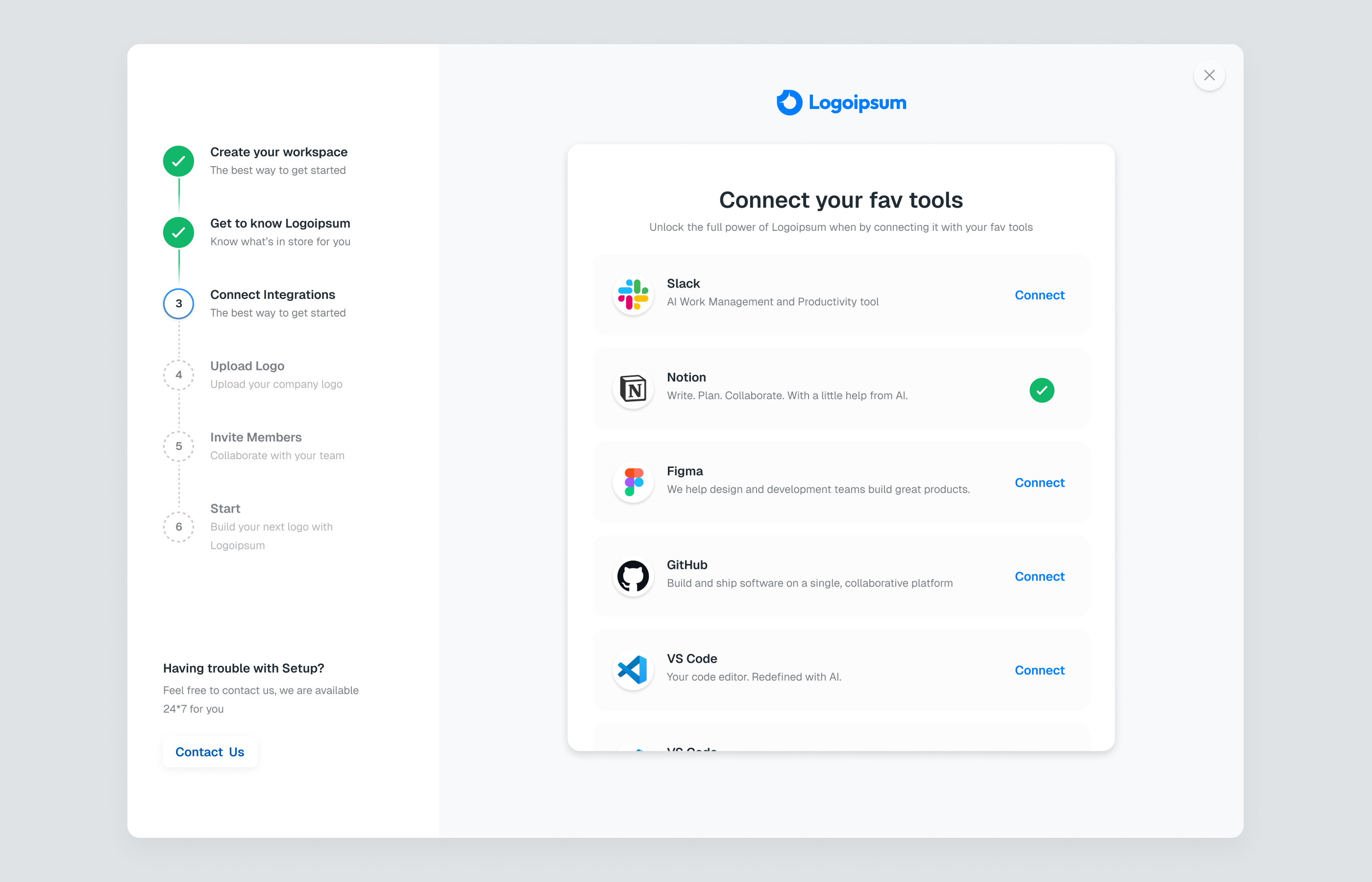
SaaS Onboarding
/filters:quality(100)/dff5110b-169d-414e-a61d-6d070e90d719-image-6-1-.png)
Onboarding
This is 1% of what Muzli shows you.
Get the rest — fresh design inspiration on every new tab, free.
Add Muzli — free
Mobile App Onboarding Screens

10 Steps for better onboarding experience
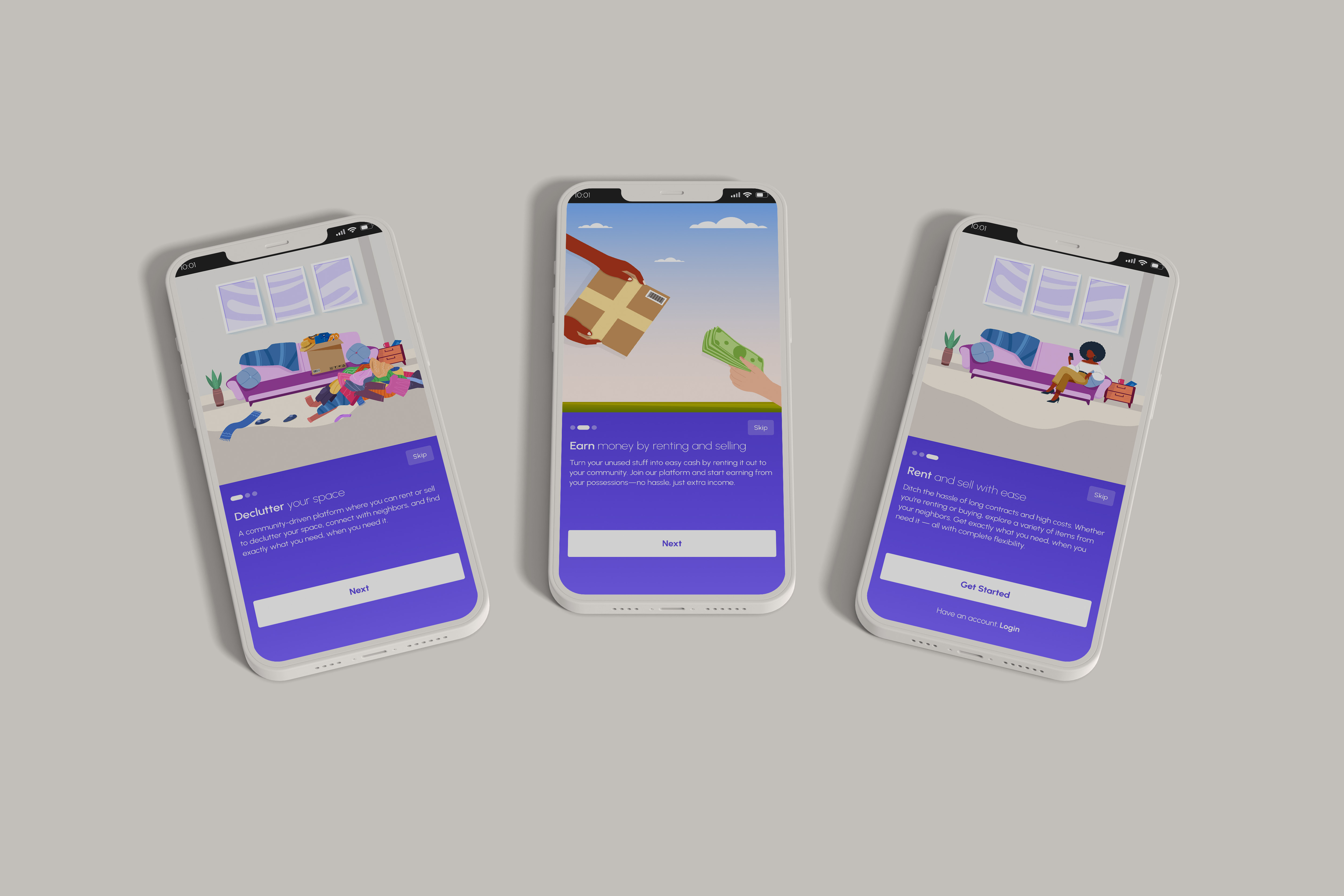
Onboarding Flow

Sign Up Onboarding Free UI Kit for Adobe XD
/filters:quality(100)/ce8e8d7f-878a-4c0c-9b45-2e9e710c67a5-Onboarding-3x.png)
Onboarding
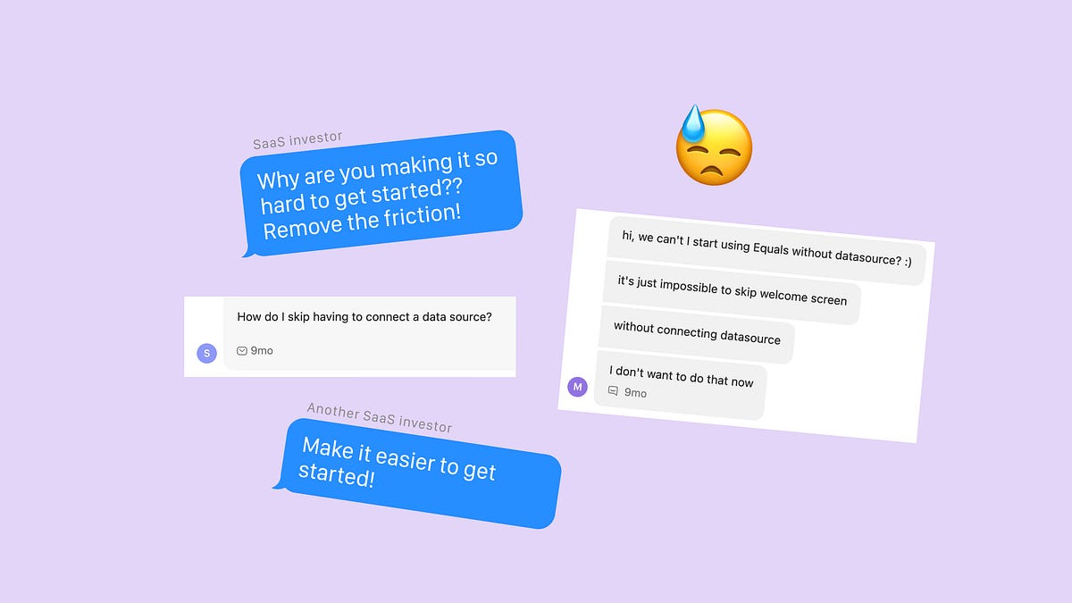
Why you should add friction to your onboarding

Cernel: Product Onboarding for Ecommerce Teams

Joboard - Onboarding, Splash
This is the Onboarding and Splash screen of Joboard, job finding & search UI Kit. JOBOARD is a UI Kit specially designed for Job Finding, Job Search, or Job Vacancy app. All the features in this UI Kit template are made for both employer and employee. In this preview, Joboard introduces a minimalist application interface, to enhance the user experience when using the platform. Do you like it? Write your comments, I would like to hear your thoughts. Press L if you like it. Thank you. Buy this product here: Our Product | IG | FB | TW --- We are Agensip, a creative digital agency focusing on UI and UX stuff. Kindly visit our website at www.agensip.com to see more detail about us. Never hesitate to contact us via email at hi@agensip.com
Mobile App Onboarding Designs for Your Inspiration
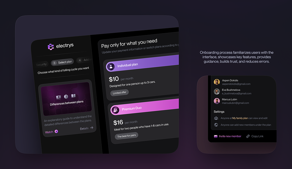
Users may better understand what they’ll need to complete through an app’s or product’s onboarding design. It’s a method of gaining the trust and confidence of your users, which benefits them and is essential to improving conversion and customer retention for your company. In case you design mobile apps, onboarding design is the key to success. Let’s check on some of the best mobile app onboarding design practices with us.8 Top App Onboarding DesignsWhether on a desktop or mobile device, user onboarding is the first interaction new users have with your product. In order to demonstrate how to use your app, this introduction frequently takes the shape of a tutorial, walkthrough, or small demonstration. Here we’ve gathered the top onboarding app design concepts created by the team. Enjoy them!1. Electrys EV Charging AppA recently released app design case on Electrys by the Fireart team, has gained a place in the UI/UX Category among other design cases on Behance. Here’s a piece of its app design for your inspiration.2. Banking Service Mobile AppLook at our vision for the neobank mobile app’s new design concept, which embodies modern banking. The app’s home screen gives users a quick overview of their accounts, including their balances, most recent transactions, and key financial data. Prioritizing important information while retaining an aesthetically pleasing layout is done with care.3. Habit Tracking Mobile AppWe’re thrilled to present our research concept for a habit-tracking software that lets you monitor several habits at once.4. Blog Edit Tool Web AppOur current project includes a section on writing and editing blog articles. Please share your thoughts with us on the app design.5. InsummmeeA mobile app called INSUMMMEE offers 24/7 support and risk-free online insurance services. Users of the application can look through a variety of insurance plans for cars, apartments, renters’ insurance, and homes.6. Online Course Platform ConceptThis app offers a selected selection of top-notch courses taught by subject matter experts, whether you’re a newbie hoping to learn the ropes or an experienced designer wishing to further up your skills. Our platform delivers a smooth learning experience, from mastering typography to excelling at UI/UX design.7. Medication Reminder AppAn app reminds you to take your meds will help you remain on top of your health and make sure you are doing so according to your doctor’s instructions. You can conveniently keep track of your courses and medicines in one location.8. Customer relation appThis one is a part of our recent customer relation project. It helps you to organize all your customers, and tasks and get relevant analytics. Share your thoughts in the comments.Wrap upA new user’s first interaction with your product is known as user onboarding. The user onboarding process typically leads new users to their “got it!” moment as early as possible and is essential to ensuring that they continue to use your tool. Prioritizing important information while retaining an aesthetically pleasing layout is vital throughout all your mobile or web app UX/UI. That’s why pay attention to excellent and functional app designs for onboarding. Stay with us for more inspiring examples to come. Hire Fireart for your mobile app design ASAP.Originally published at https://fireart.studio on September 6, 2023.Mobile App Onboarding Designs for Your Inspiration was originally published in Muzli - Design Inspiration on Medium, where people are continuing the conversation by highlighting and responding to this story.
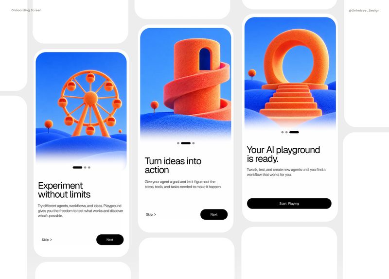
Playground Onboarding

Why Superhuman's Unusual Onboarding Is Their Secret To Sustainable Growth
/8e3bd21d-e851-4553-9d30-8908c491b63d-thumb.jpeg)
Lunar - Onboarding
This is 1% of what Muzli shows you.
Get the rest — fresh design inspiration on every new tab, free.
Add Muzli — free
User Experience: How to Design Onboarding for Your Mobile App
8 CSS & JavaScript Snippets for Creating Onboarding Carousels
/b3617970-934e-44ab-96d3-1663ddc9113d-thumb.jpeg)
Solutionx - Onboarding
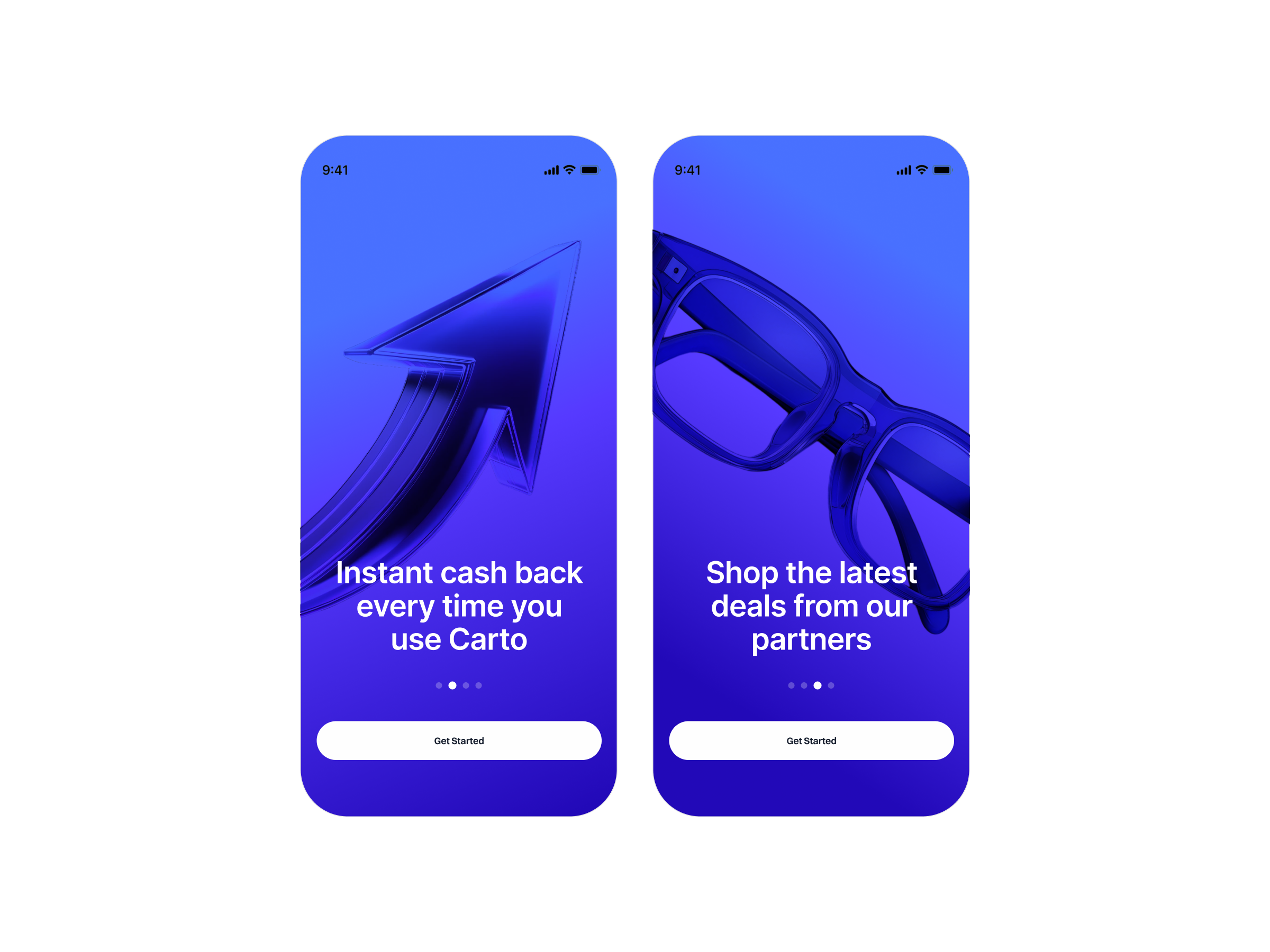
Onboarding screens
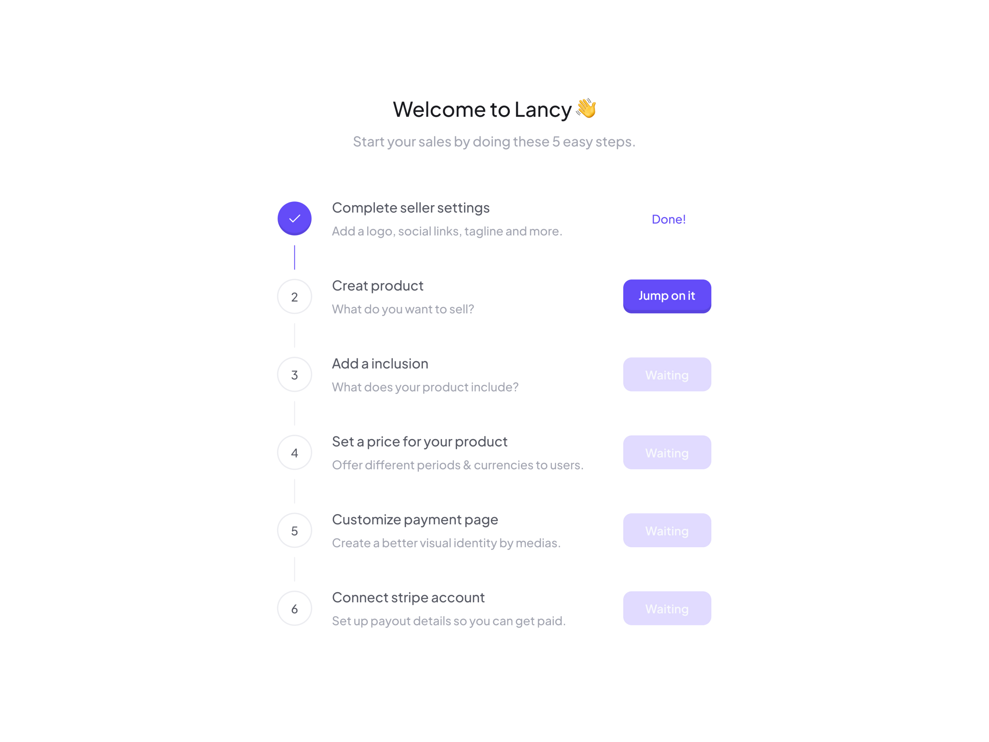
Onboarding - Checklist
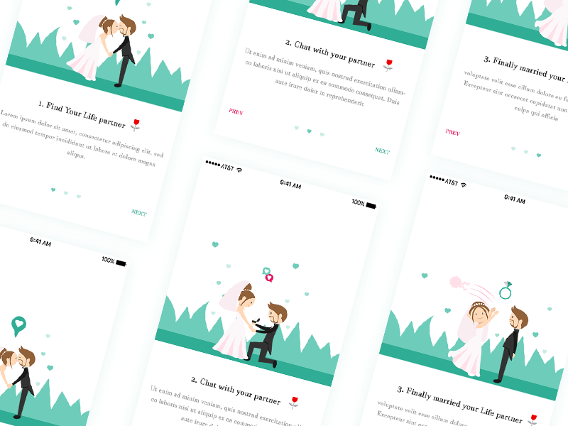
Wedding App Onboarding

Onboarding for Active Users
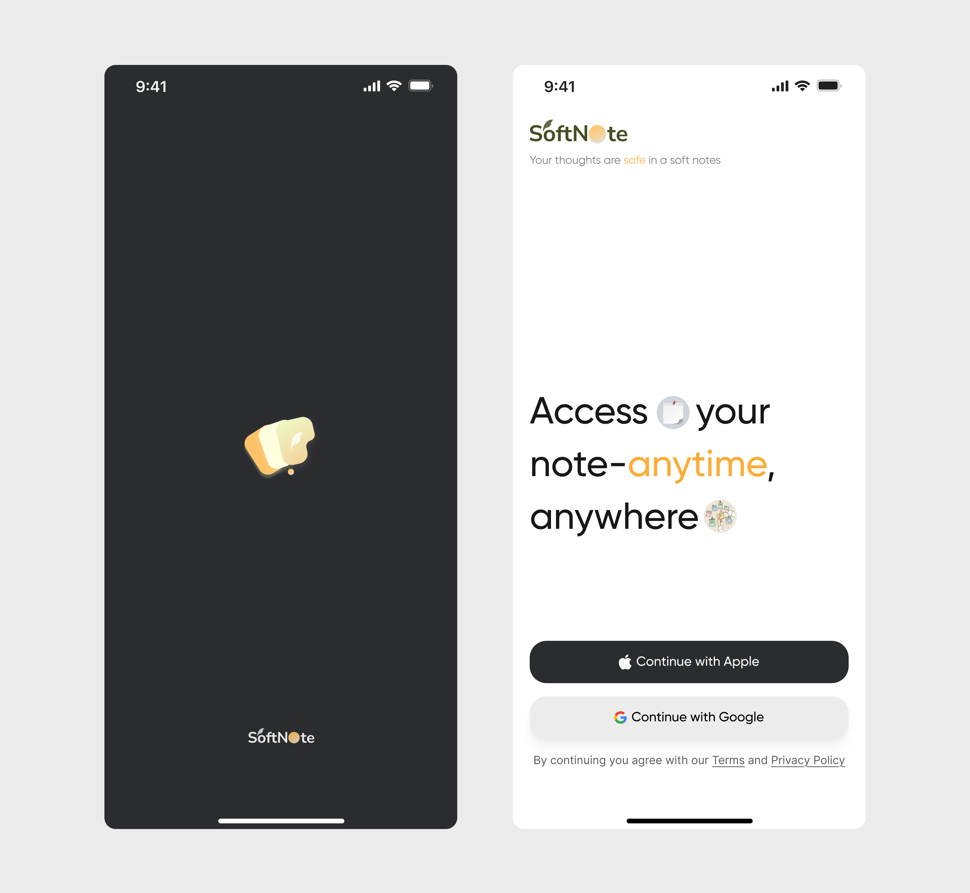
Mobile Onboarding
/filters:quality(100)/0ecddeac-dc3b-42eb-9ed1-5a35d0c6cb20-24-03-19-02.png)
Onboarding
/7c0bccba-51f8-4226-b671-8813b0e145a2-thumb.jpeg)
Onboarding
/filters:quality(100)/72be161a-b237-4084-b4e6-6b7d3ee8c8a8-Challenge-1-v-1.png)
Onboarding
/filters:quality(100)/9bf8f999-74ea-4ca5-bd2b-0562bdbac531-Frame-1597880760.png)
Onboarding Flow
This is 1% of what Muzli shows you.
Get the rest — fresh design inspiration on every new tab, free.
Add Muzli — freeOnboarding Flow
Get access to thousands of freshly updated design inspiration pieces by adding Muzli to your browser.
Loved by 900k designers worldwide, Muzli is the leading go-to browser extension for creative professionals.
What is an onboarding screen?
An onboarding screen is one of the first screens a person sees after installing an app or signing up. Its job is to get them to the first useful moment with as little effort as possible. Most flows mix three kinds of screen: a welcome that says what the app does, setup steps that collect what the app needs, and a short tour of the main features.
What makes a good onboarding flow?
Good onboarding is short and lets people leave it. Show the value before asking for an account. Ask for one thing per screen. Request permissions such as notifications or location at the moment the app needs them, with a sentence on why. Show progress when there are more than two steps, and always offer a way to skip.
How many onboarding screens should an app have?
As few as the product can work with. Three to five screens is common in consumer apps, and many products now replace the intro carousel with a guided first task inside the real interface. If a step does not change what the user sees next, it can usually wait.
Where do these onboarding examples come from?
Nearly all are screens from shipped apps documented by Mobbin, with a few concept flows from Layers. Muzli follows more than 200 design sources and lists up to 60 matching pieces on this page, favouring recent work.