
Design Inspiration
Card UI design examples
A card groups the information about one thing, such as a product, an article or a person, into a single block a user can scan and tap. These examples show card layouts for web and mobile.
We curate topical collections around design to inspire you in the design process.
This constantly-updated list featuring what we find on the always-fresh Muzli inventory.
Last update:

Elements of Flight Safety Card Design
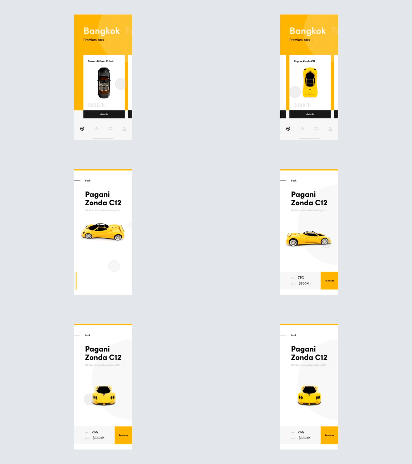
Simple Design Tips for Crafting Better UI Cards

Pure CSS Card UI
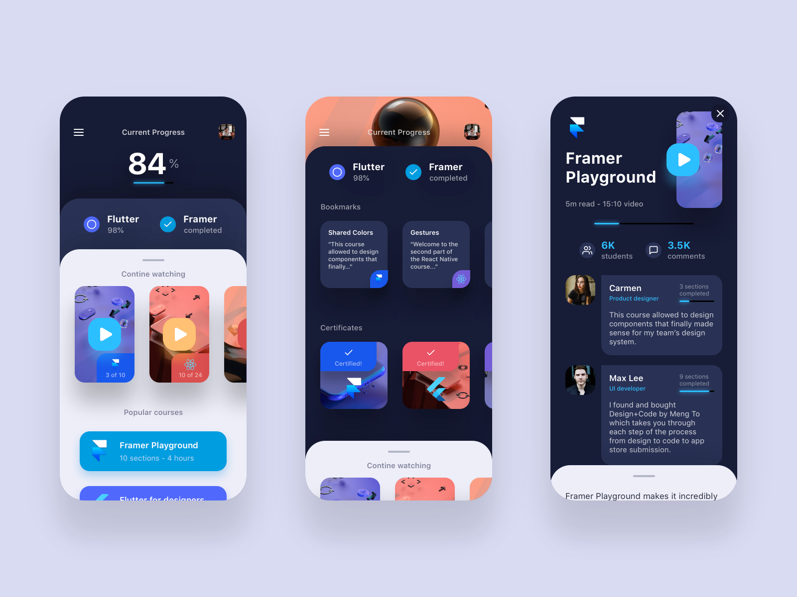
Double Cards UI
Going to try out this double cards swipe navigation for the Framer Playground course I'm currently working on.
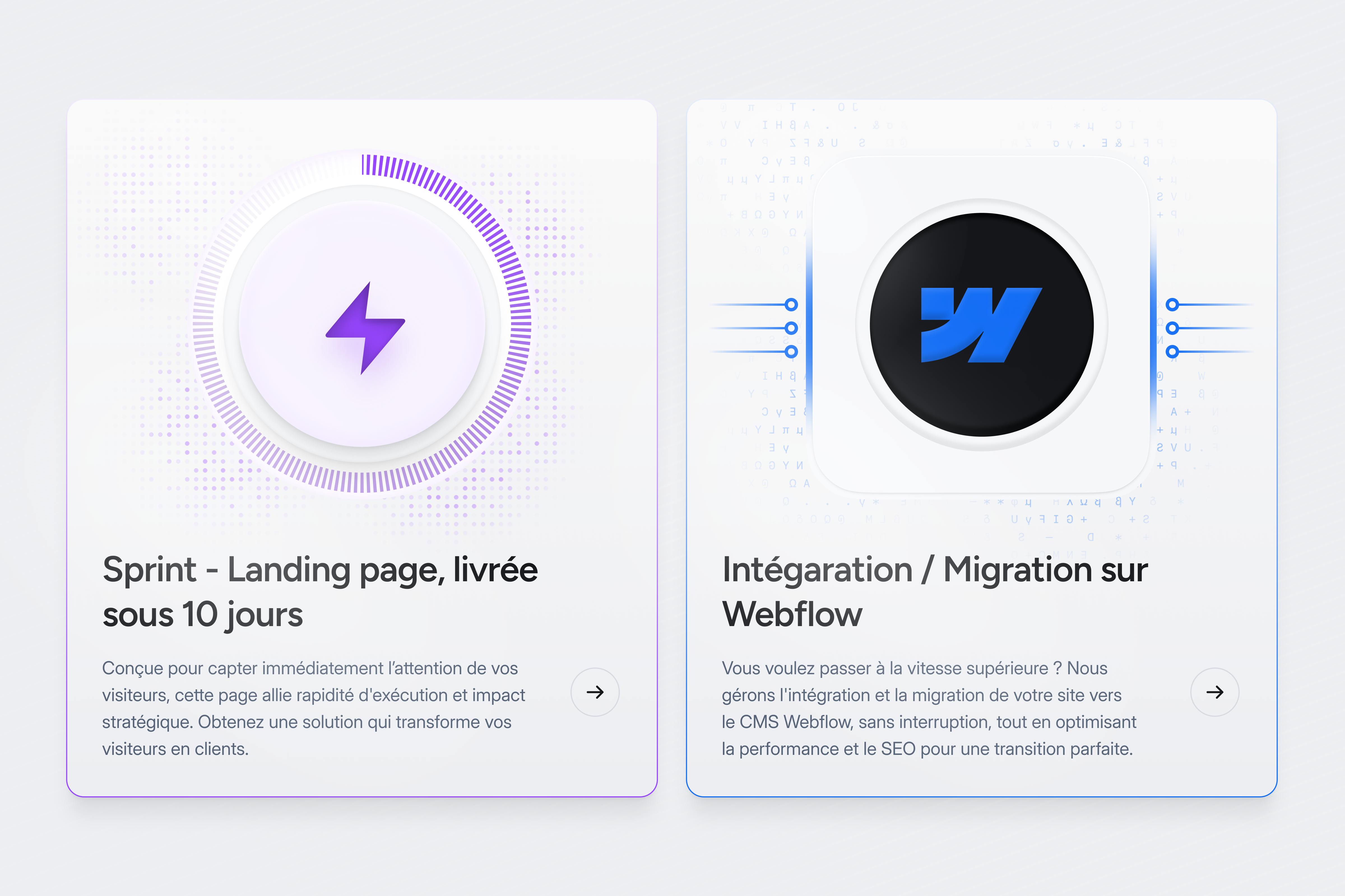
UI Cards

Product Card UI / CSS

Cards UI
Hello my dear dribbble mates, I Hope you guys all like my design. please give your most support for this design. Thanks. Follow me on : Facebook | Uplabs . For project enquiries : rajn01003@gmail.com
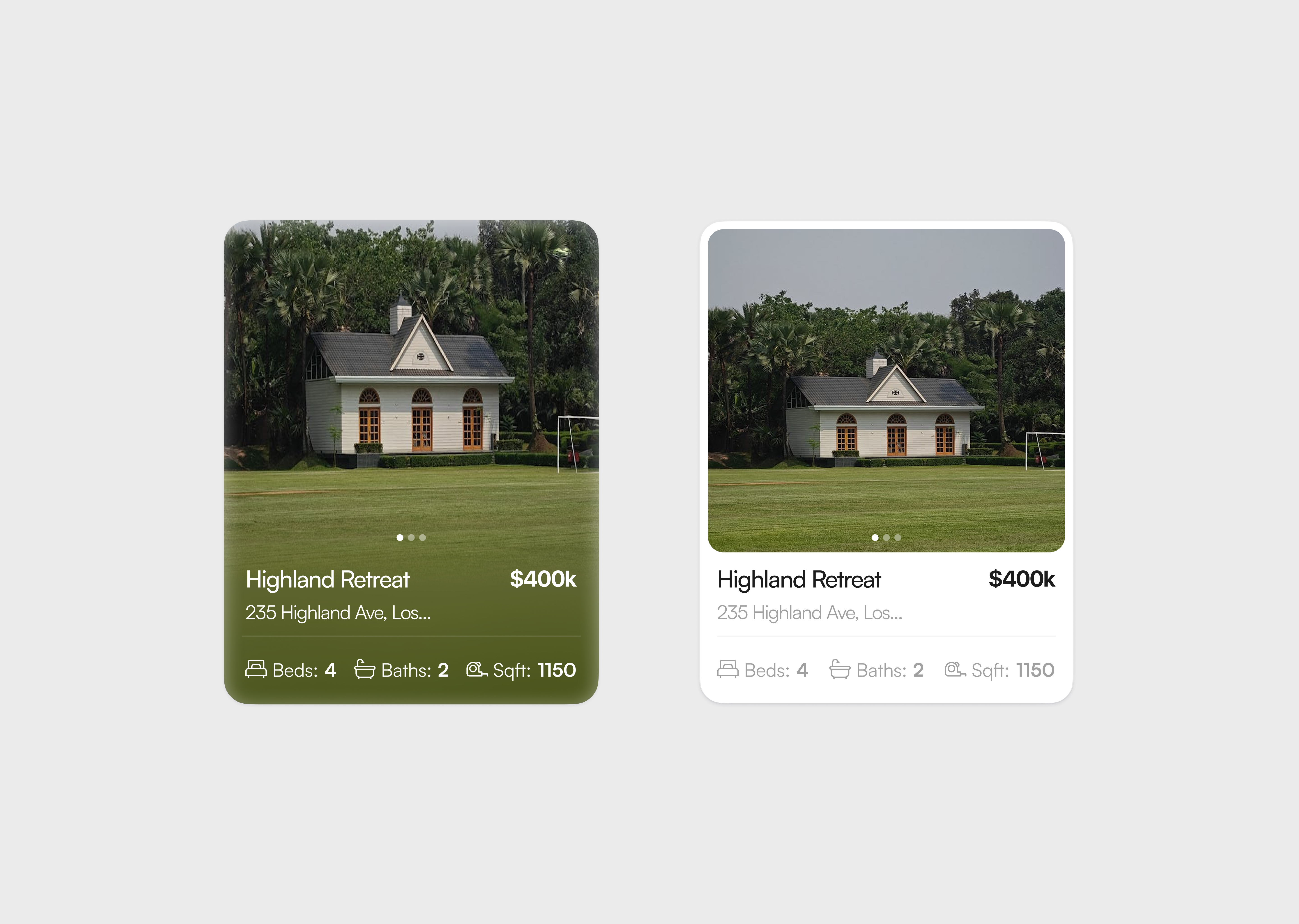
Cards Ui Design

Cards UI design in Figma
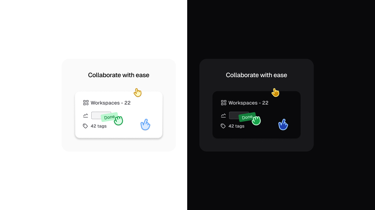
Minified UI cards
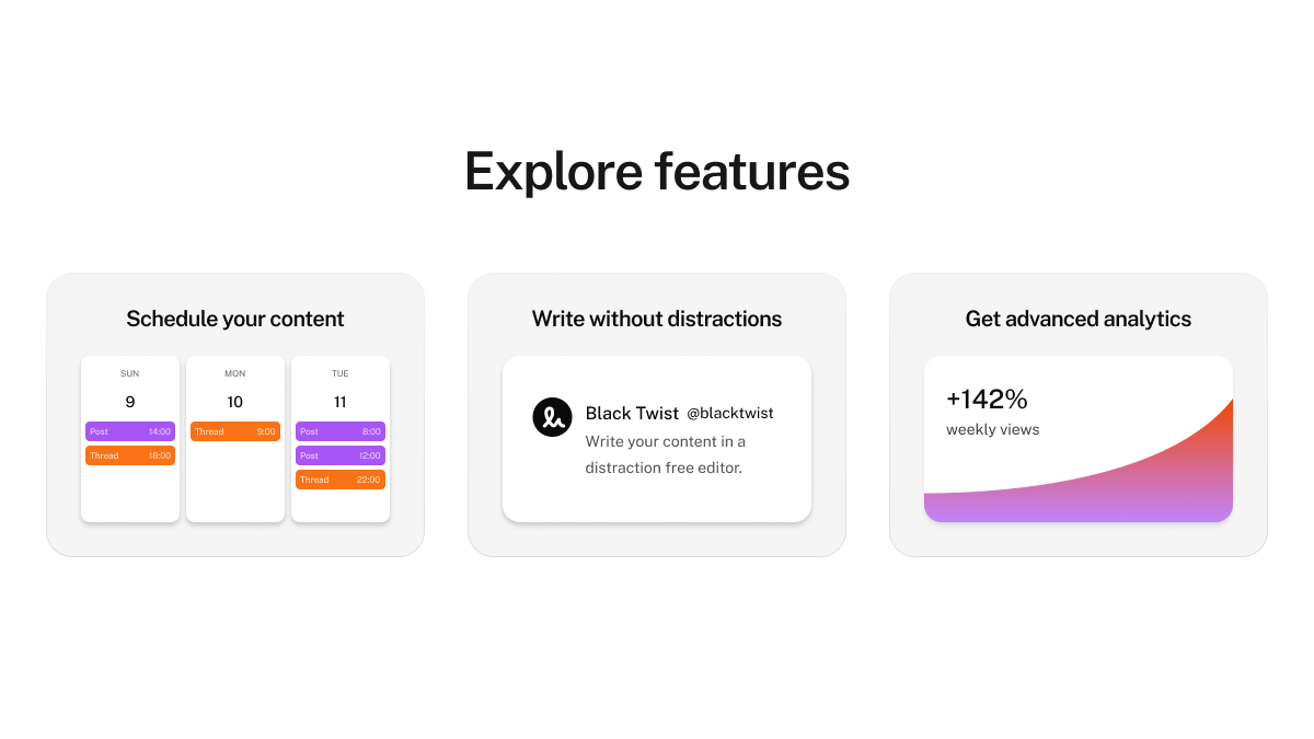
Minified UI cards
This is 1% of what Muzli shows you.
Get the rest — fresh design inspiration on every new tab, free.
Add Muzli — free
Card UI Portfolio

Invitation and Card Design Set_14
/filters:quality(100)/a9e7643b-6f6f-43d3-afa7-fad029e526da-UI-cards.png)
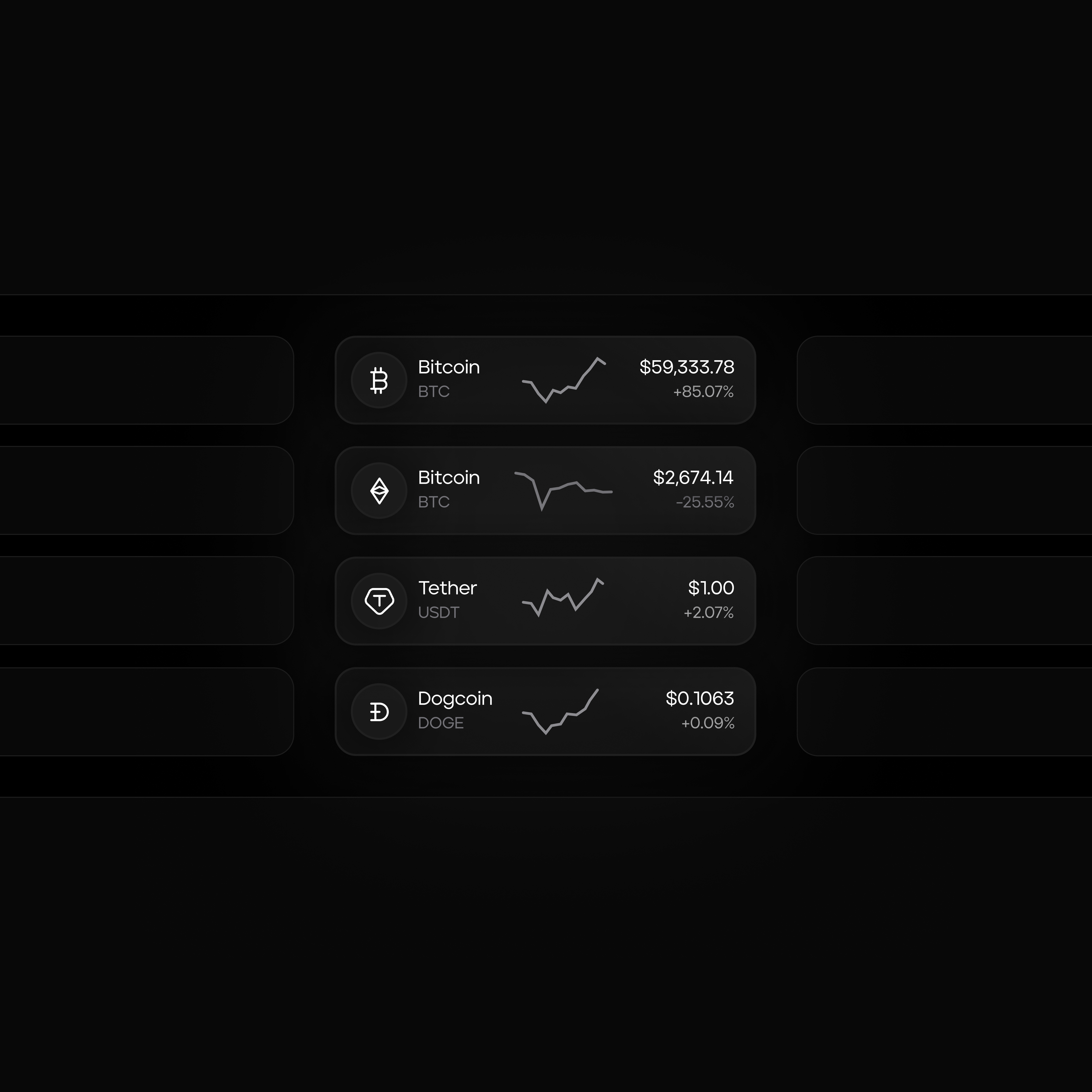
Crypto UI cards

Responsive Card Design
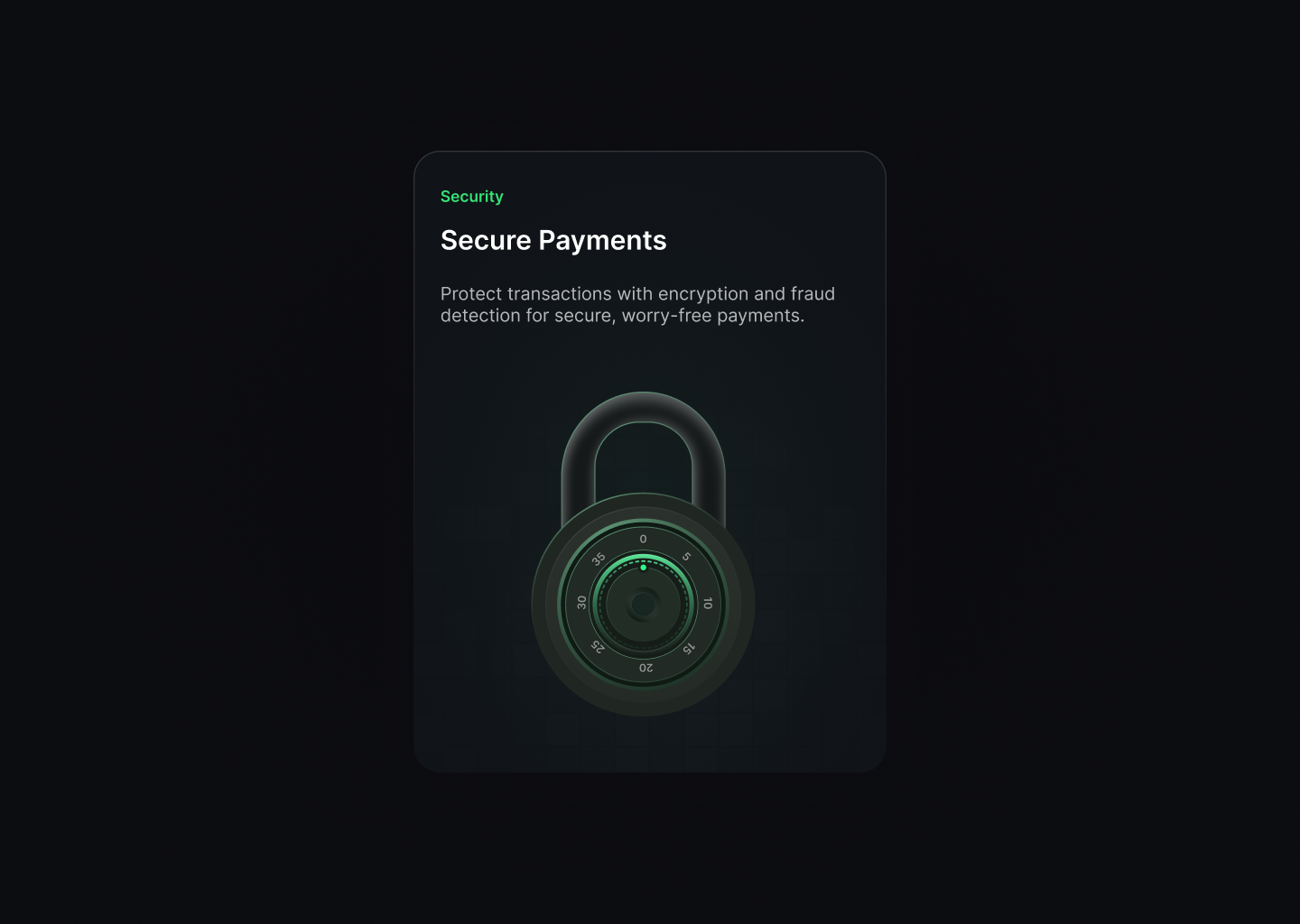
Card UI
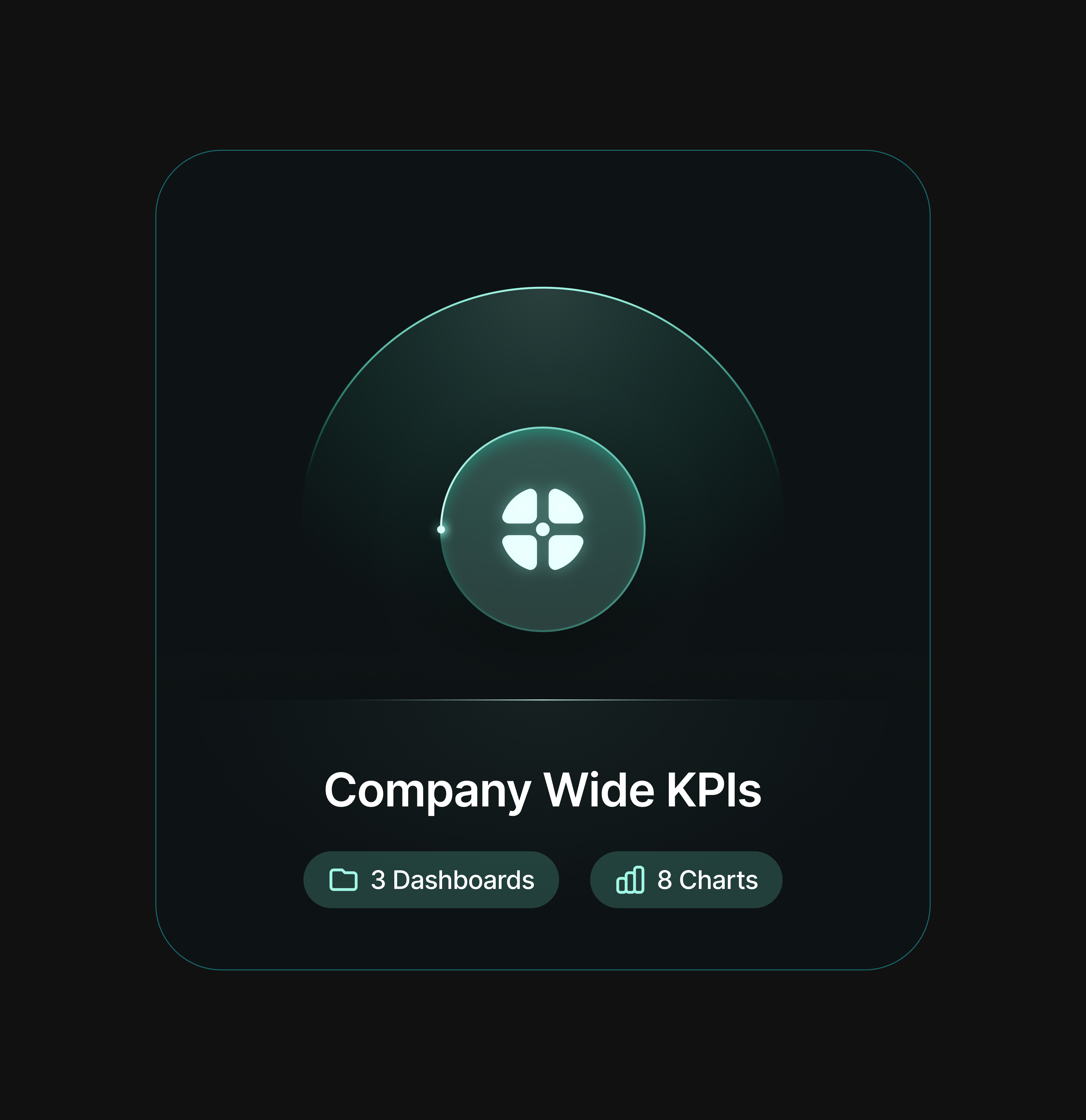
Bento Ui Cards

Dashboard UI Cards: Jobriver
Hi everybody! Today, I am sharing the Jobriver's dashboard cards that I was working on. More will come soon. I hope you like it. Hope you all enjoy it. -------- Follow Me On Behance Instagram oguzyagizkara@gmail.com
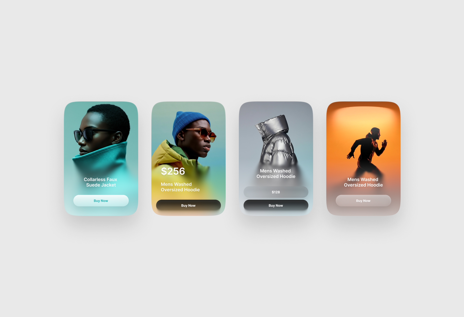
UI Cards for Figma Free
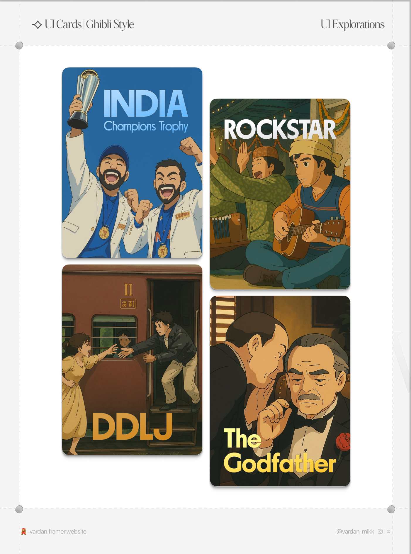
⟢ UI Cards | Ghibli Style

UI Cards for 2019
UI Cards for 2019 ---------------------------------------------------------------- Share some love by pressing 'L' if you like this shot :) We are available for taking your project to next level. Estimate your project at teamuinugget@gmail.com We design for boosting your business & making feel good to user to use this. Get more work on Behance Find us on our website Team UINugget Follow us on Instagram | Facebook ----------------------------------------------------------------
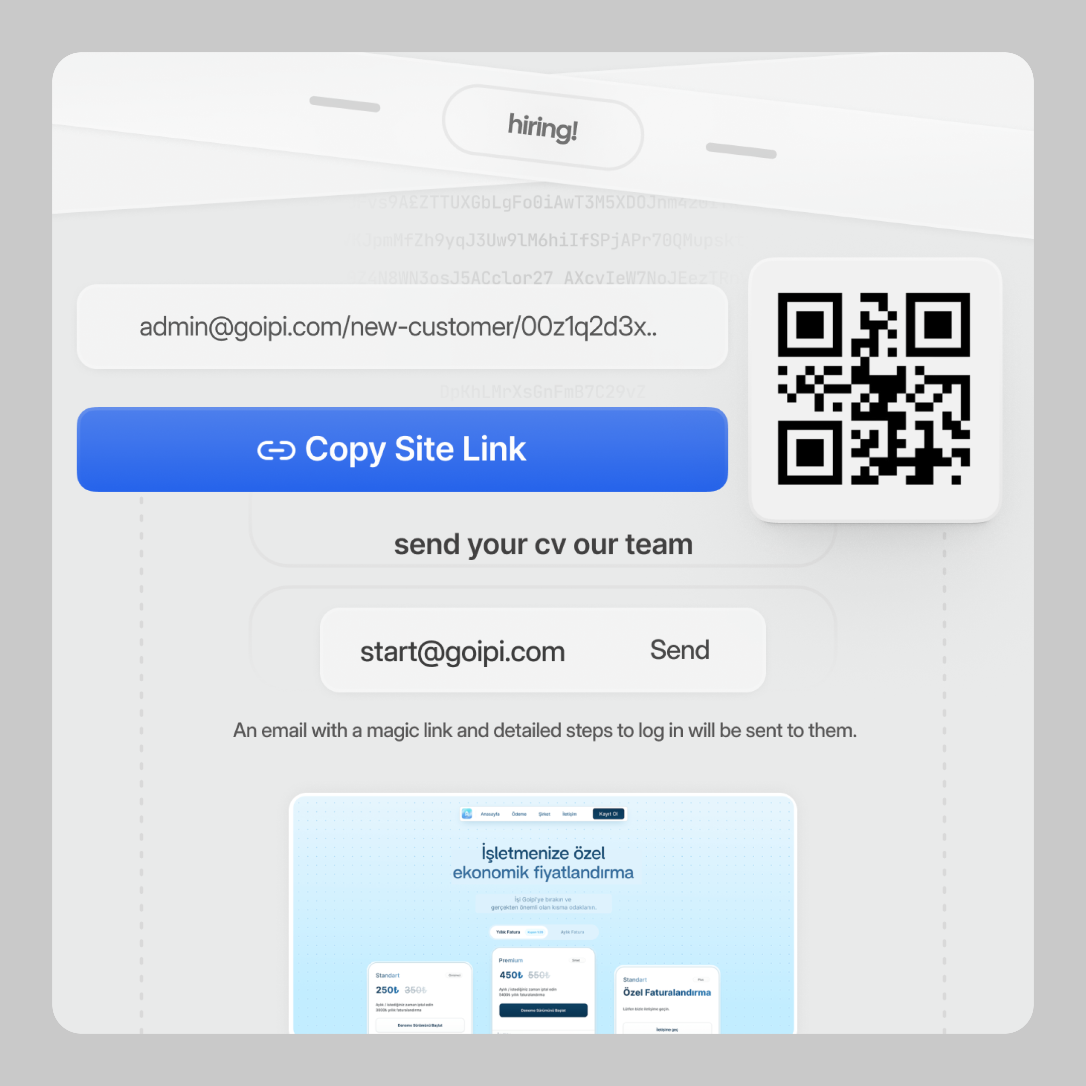
card ui
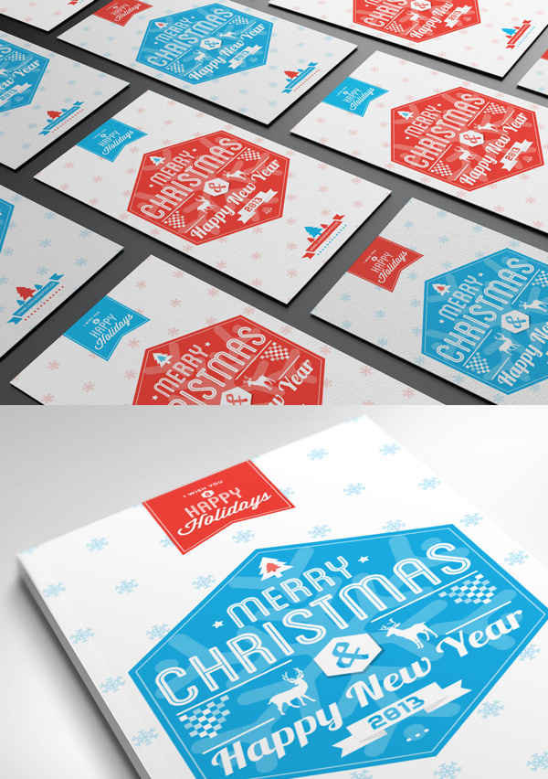
Typography Christmas Card 2013 #christmas #card #design
This is 1% of what Muzli shows you.
Get the rest — fresh design inspiration on every new tab, free.
Add Muzli — free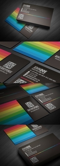
Quick response business card design ver 04 - Business Cards - Creattica #card #design #business
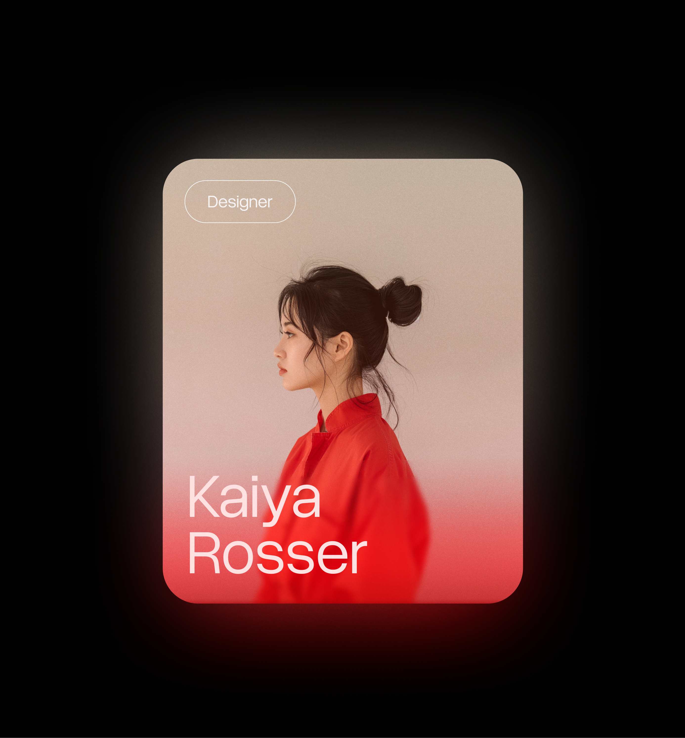
Card design 12
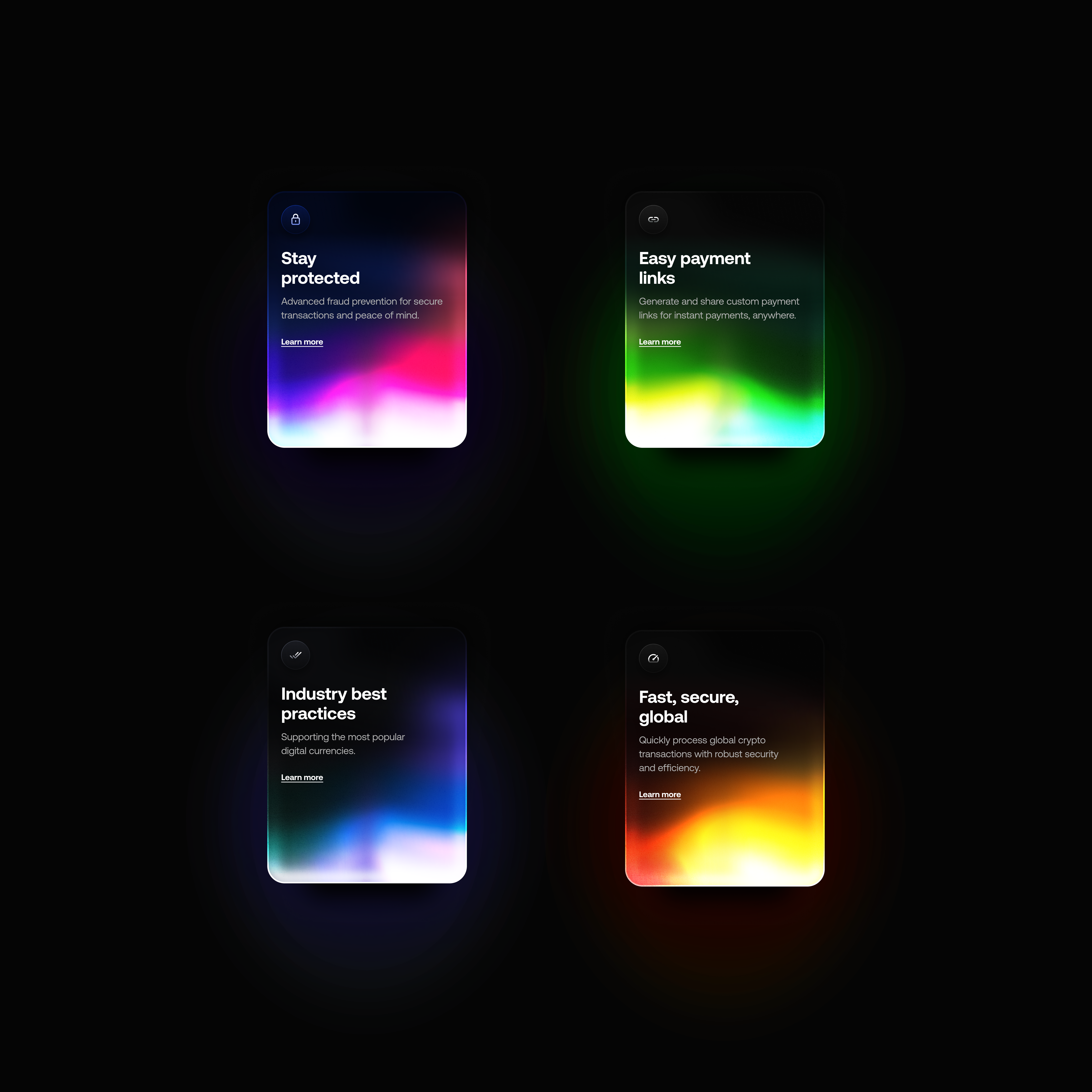
UI Cards with glowing gradient effect
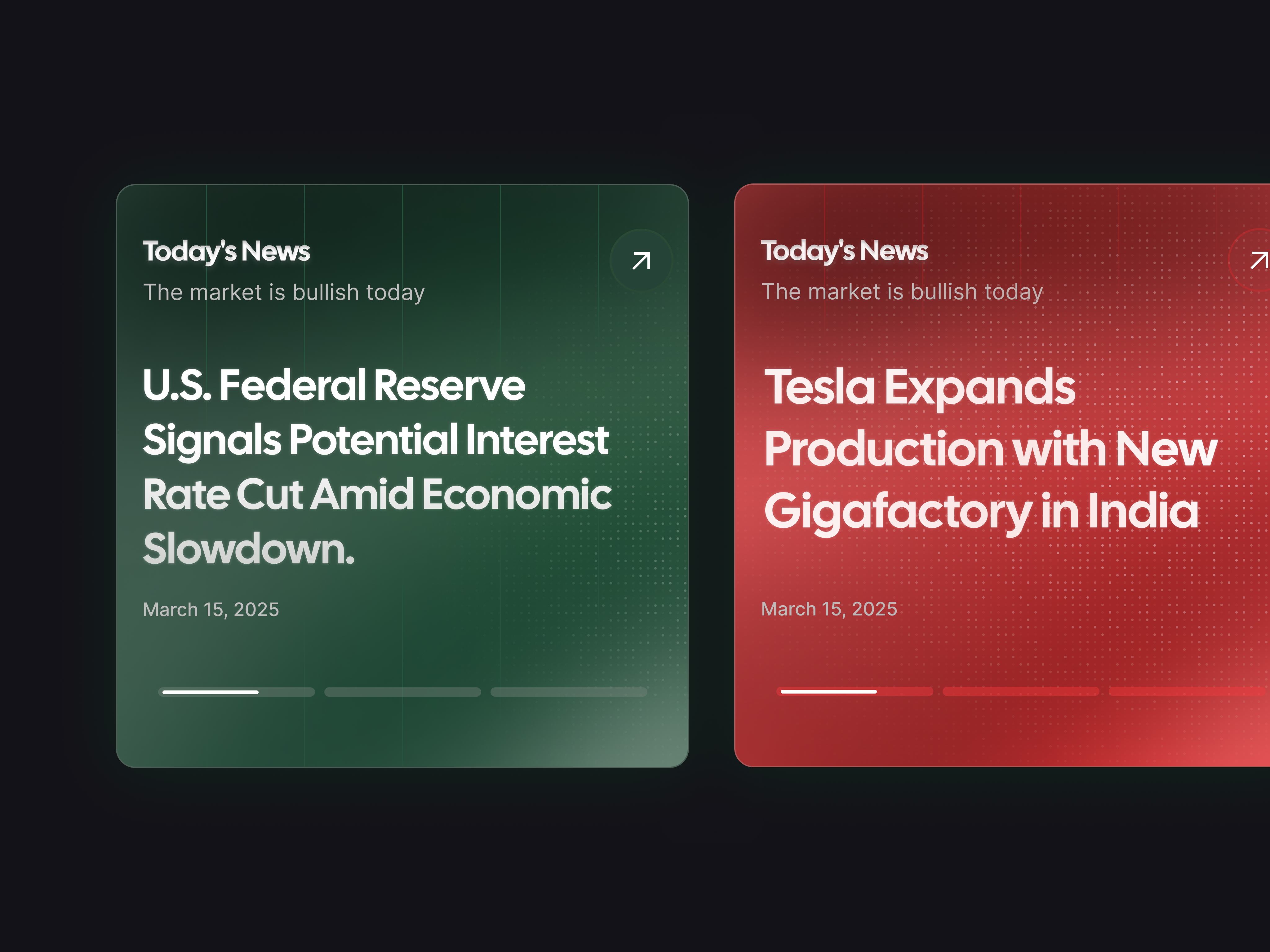
web card ui

Reward card UI
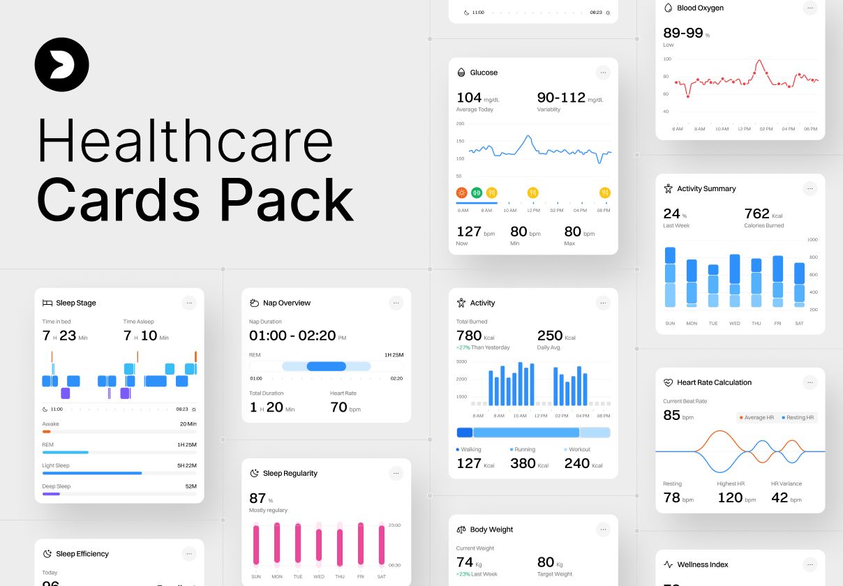
Healthcare Cards UI Kit – 100 Health & Medical Analytics Cards
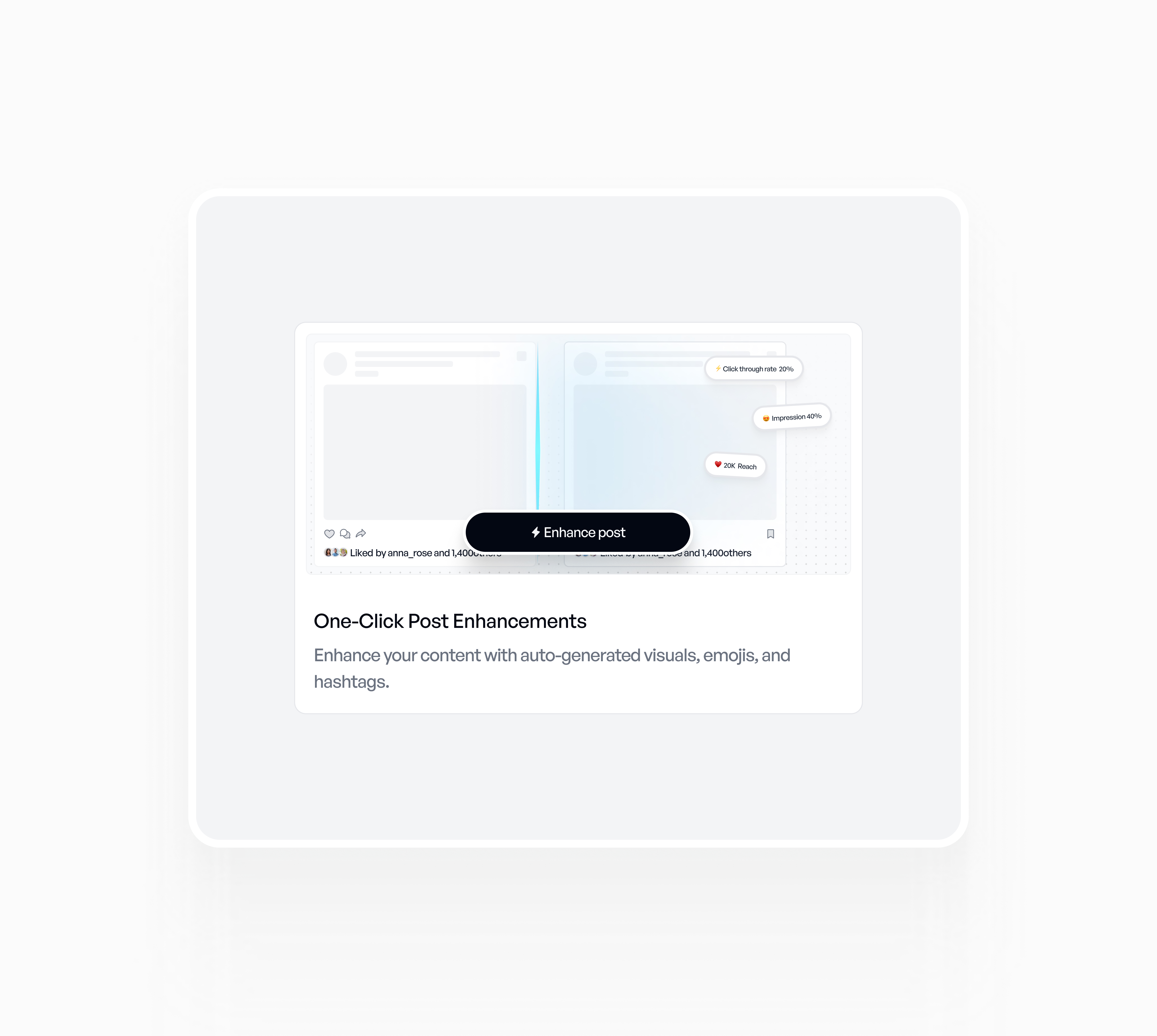
Bento card design
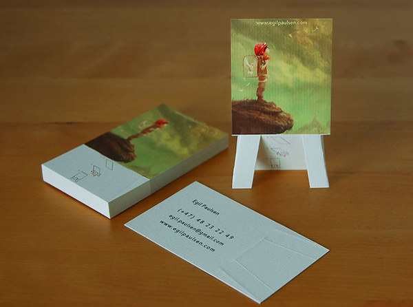
Pop up Business Card #inspiration #creative #business #card #design #unique
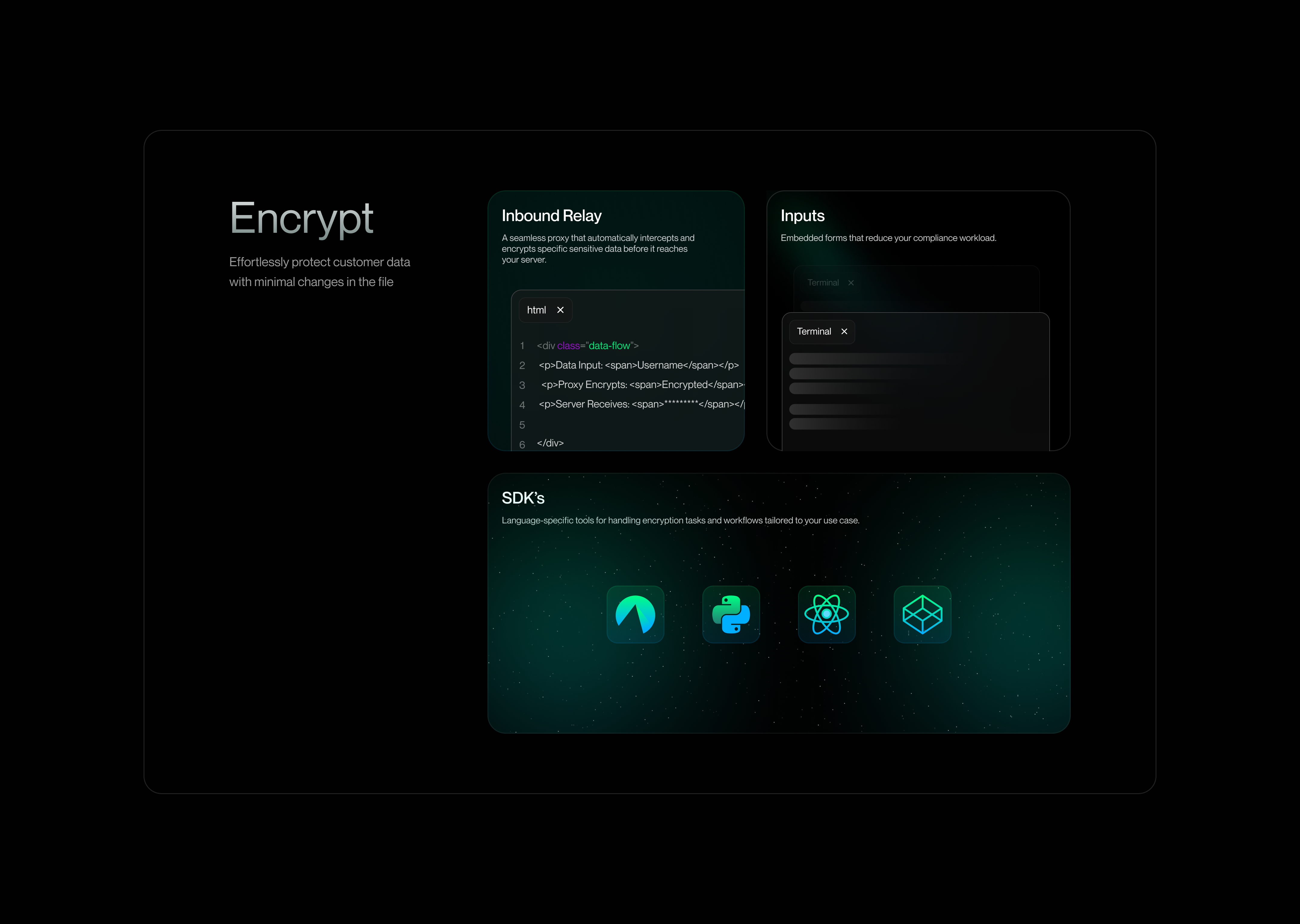
Card Design
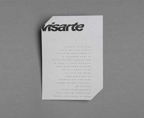
mjtj:PRINT.PMÂ /Â FBÂ /Â TWT #perspective #card #design #graphic
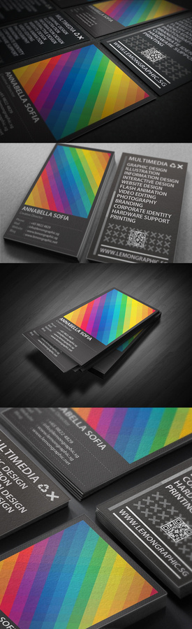
Rainbow Typography business card design #business #card #design #graphic #black #colors #rainbow #typography
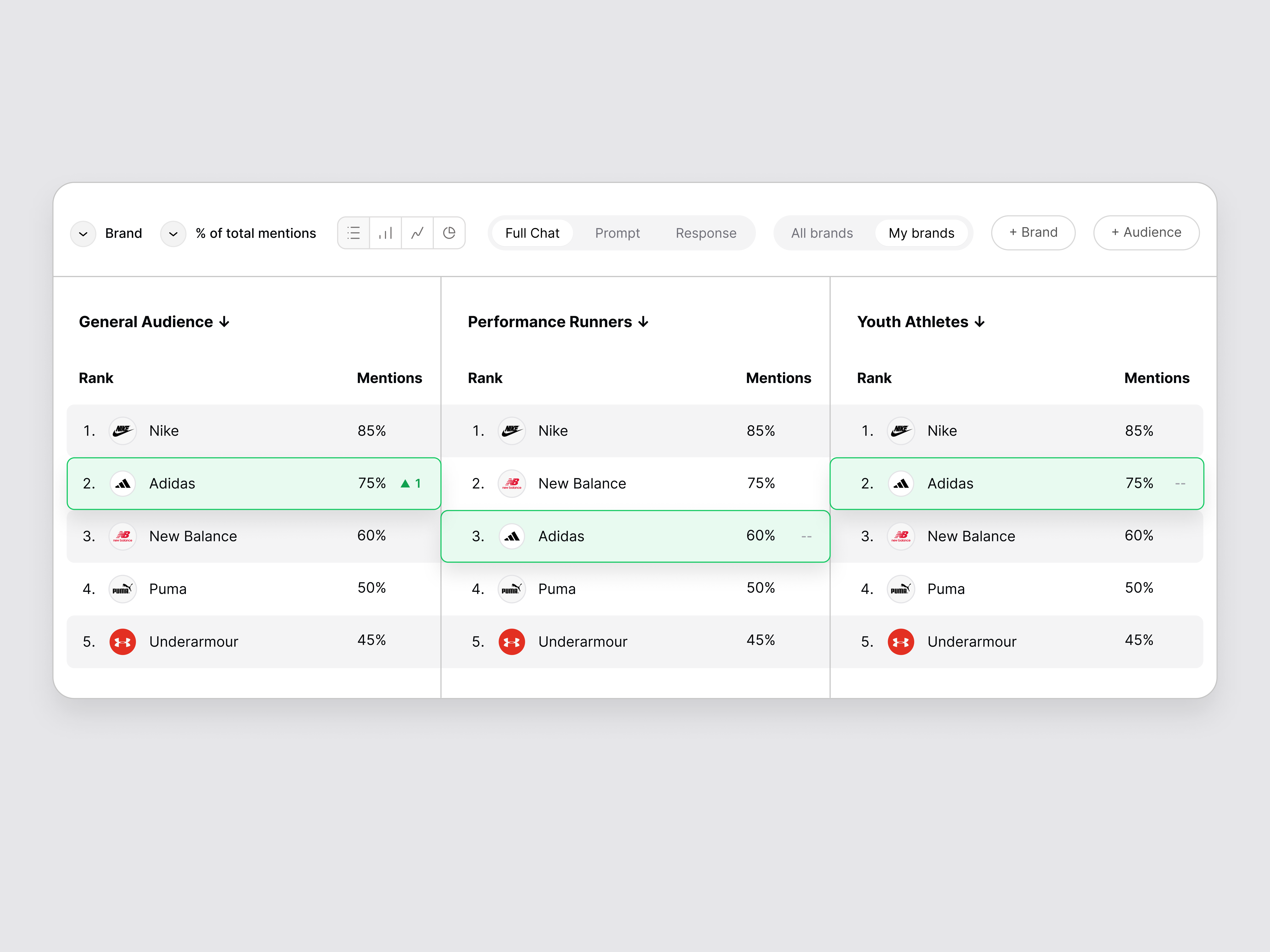
AI Brand Ranking Card UI
This is 1% of what Muzli shows you.
Get the rest — fresh design inspiration on every new tab, free.
Add Muzli — free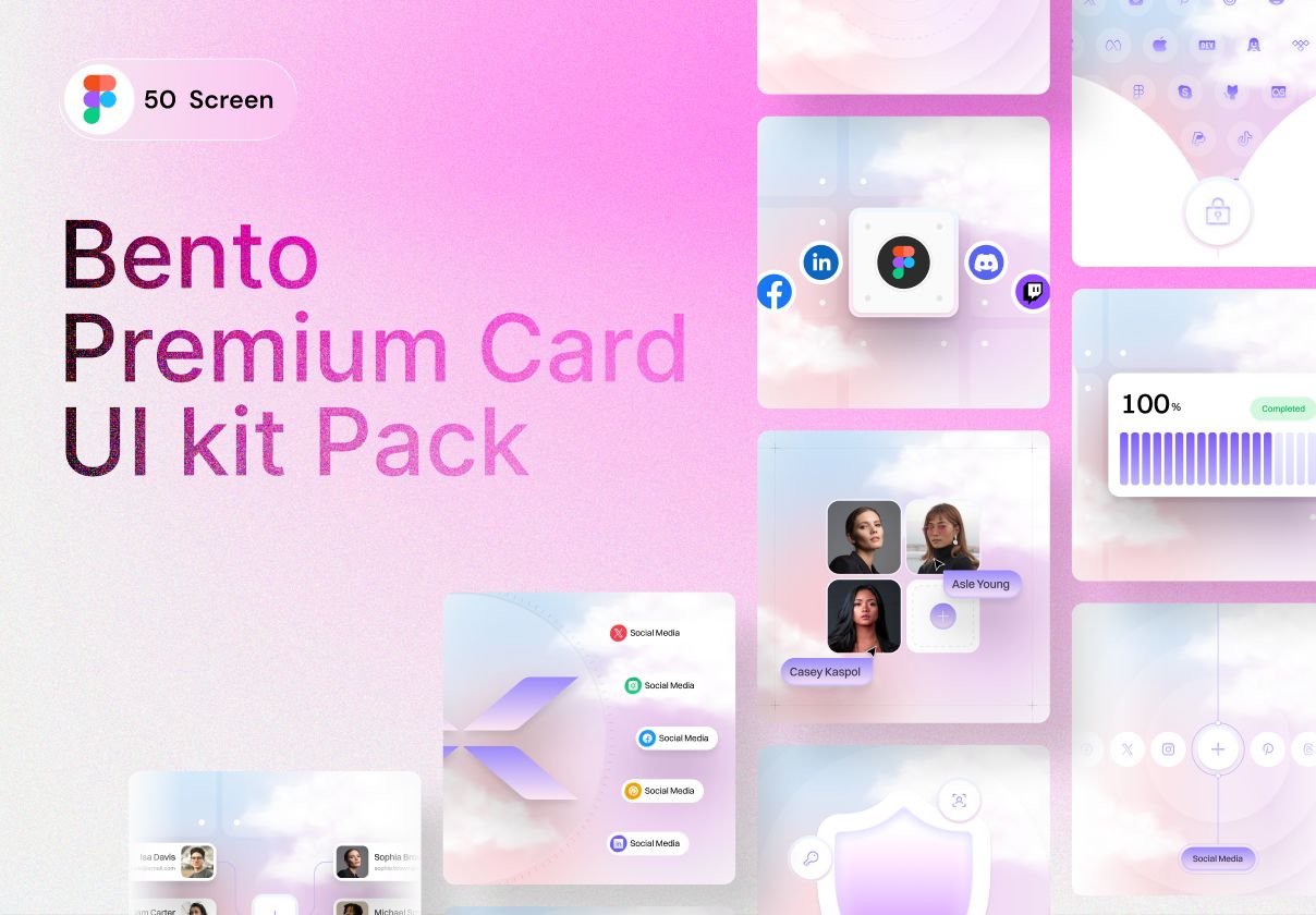
Cloud Bento Cards UI Kit – 50 Dreamy & Modern Card Designs

Cardyy - 950+ App UI Cards Kit

Feature card UI
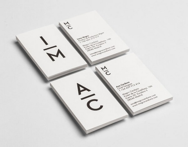
Black and white business card design. #typography
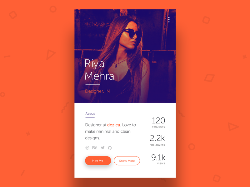
Profile Card UI

8 CSS & JavaScript Snippets for Creating Cool Card UI Hover Effects
From bold transformations to simple highlights, we share some fantastic CSS & JavaScript card UI hover effect snippets. The post 8 CSS & JavaScript Snippets for Creating Cool Card UI Hover Effects appeared first on Speckyboy Design Magazine.
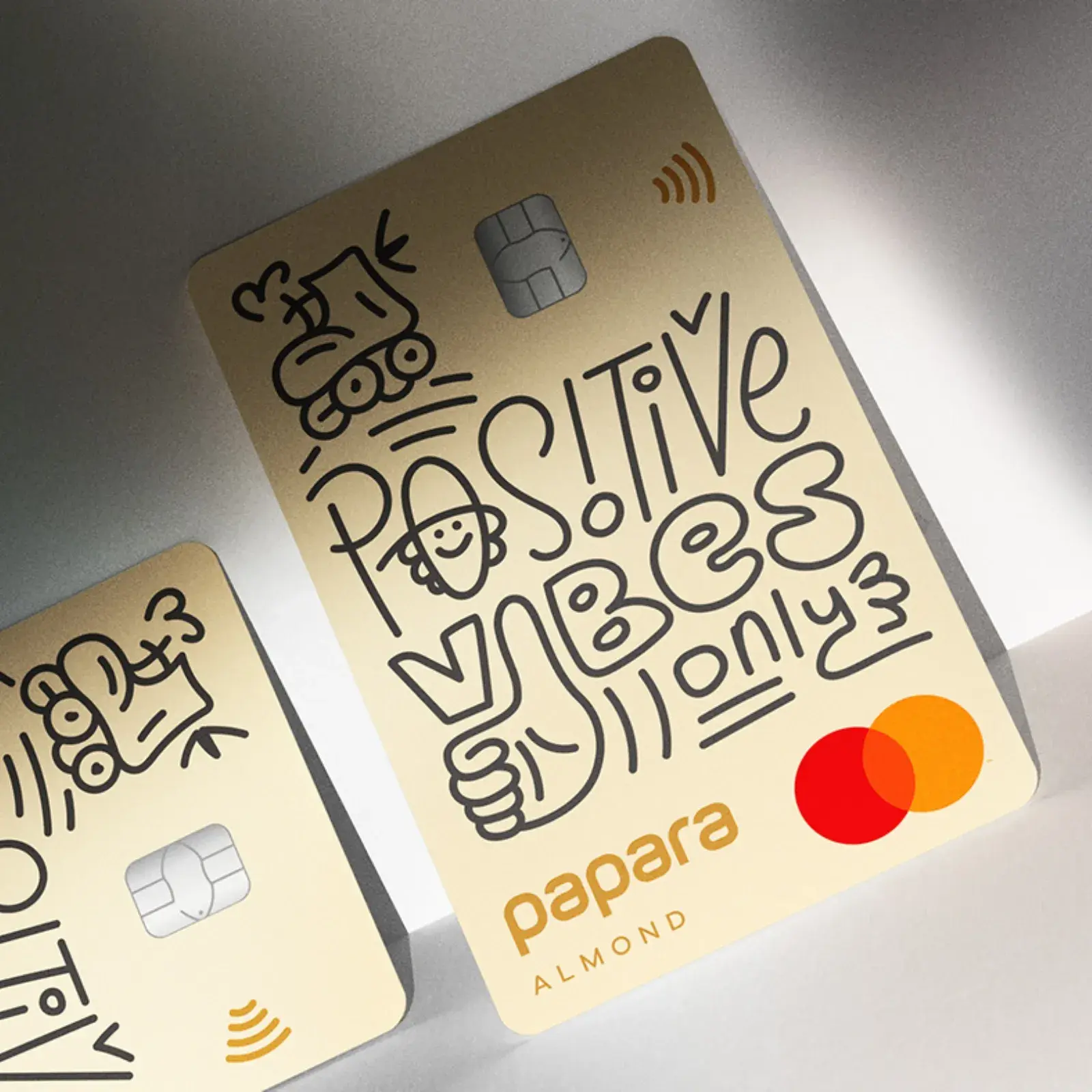
Illustration & Typography Merge in Card Design
/54fafcf4-b37a-4848-8f31-a3cdc3a112df-thumb.jpeg)
Animated Card Design
/264bdc2d-5b46-4696-ad9d-f99c019dcc23-thumb.jpeg)
Card Design

Card Design
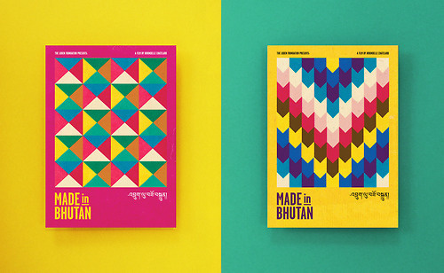
Tumblr #bhutan #pattern #card #design #graphic #poster #postcard #paper

Business card design for INTERFORUM CEO
Print technologies and materials: Keaykolor royal blue 300 gr. & Pur cotton cocaine 350 gr. Letterpress Mat silver foil stamping Silvering faces with foil
This is 1% of what Muzli shows you.
Get the rest — fresh design inspiration on every new tab, free.
Add Muzli — free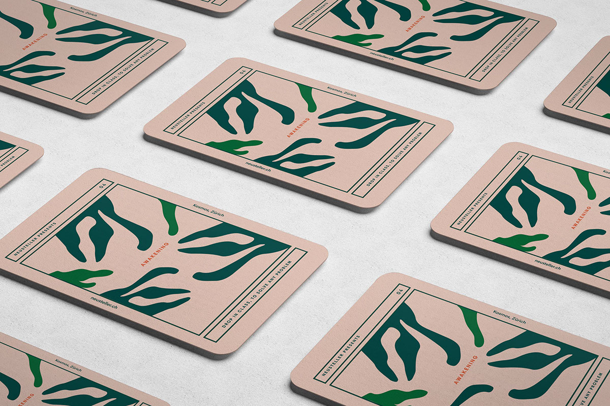
Gorgeous Tarot Card Design by Caterina Bianchini
UI Card Design
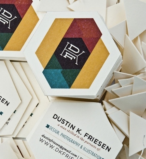
Google Reader (1000+) #card #design #business
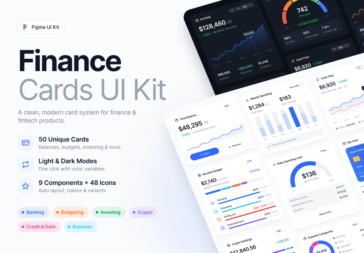
Finance Cards UI Kit – 50 Financial Cards
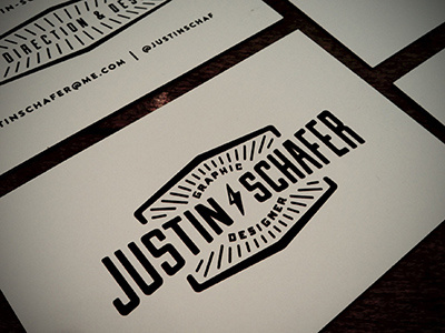
Business Cards #branding #business #card #design #retro #logo #vintage #type #typography
/775cb267-92e0-4455-9934-8d08dfe1f580-thumb.jpeg)
Campaign Analytics Card UI
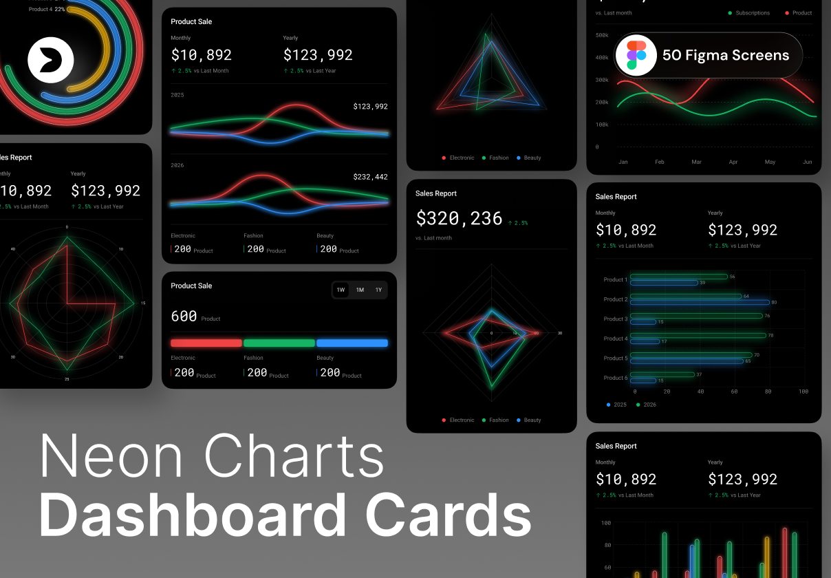
Neon Charts Dashboard Cards UI Kit – 100 Data Visualization Cards
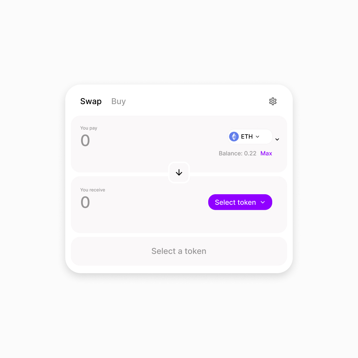
Swap Token Card | UI Exploration
/filters:quality(100)/b54148f3-c9b5-439a-a514-67463bd5e1fb-After_improving_pricing.png)
Pricing cards UI

Info Card UI Design @ildiesign
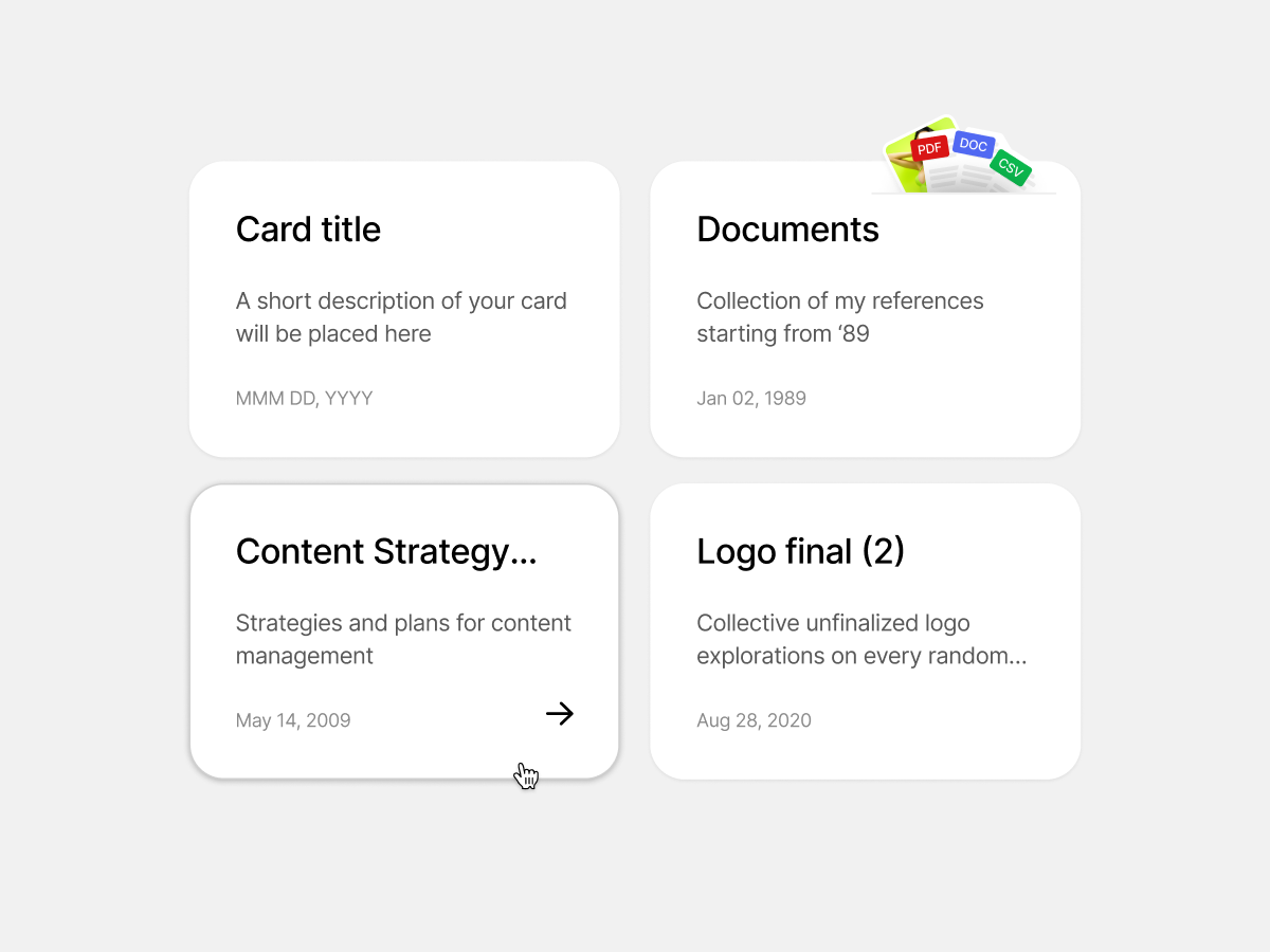
UI cards exploration
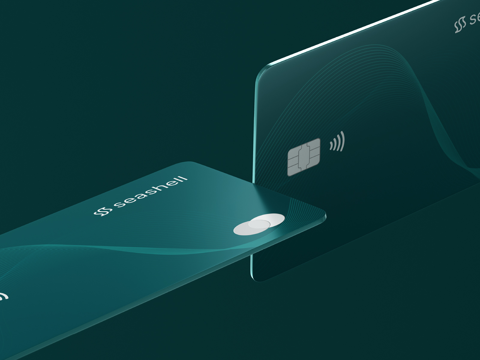
Seashell Credit Card Design
This is 1% of what Muzli shows you.
Get the rest — fresh design inspiration on every new tab, free.
Add Muzli — freeSeashell Credit Card Design
Get access to thousands of freshly updated design inspiration pieces by adding Muzli to your browser.
Loved by 900k designers worldwide, Muzli is the leading go-to browser extension for creative professionals.
What is a card in UI design?
A card is a bounded container that holds the information and actions for a single subject. A product card holds an image, a name, a price and a buy button. Because each card stands alone, cards can be laid out in grids, lists and carousels, and rearranged for any screen size without losing meaning.
When should you use cards?
Use cards when users browse items of the same kind and each item has a few pieces of mixed content, such as an image, a title and a price. Do not use them for content people need to compare line by line. A table or a plain list does that better, because cards break the eye's path across rows.
What makes a card well designed?
One clear subject per card, a visible hierarchy with the most important item first, and the same structure across the set. Make the whole card clickable if it leads to one place. If it holds several actions, keep them to two or three, in the same position on every card.
Where do these card examples come from?
Most are card designs published on Layers, with card components from the Framer marketplace, Dribbble and UI8. Muzli follows more than 200 design sources and lists up to 60 matching pieces here, favouring recent work.