Design Inspiration
Best web design examples
A curated collection of web design inspiration. This is a list featuring what we think are the best, most inspirational, well-crafted, elegant and stylish web pages in the wild.
We curate topical collections around design to inspire you in the design process.
This constantly-updated list featuring what we find on the always-fresh Muzli inventory.
Last update:
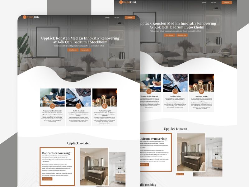
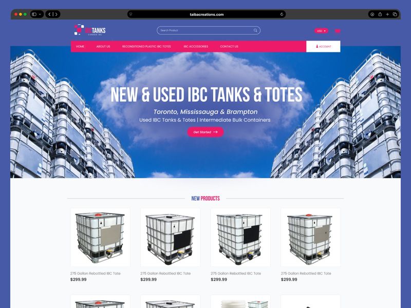
Minimalist Construction Web Design
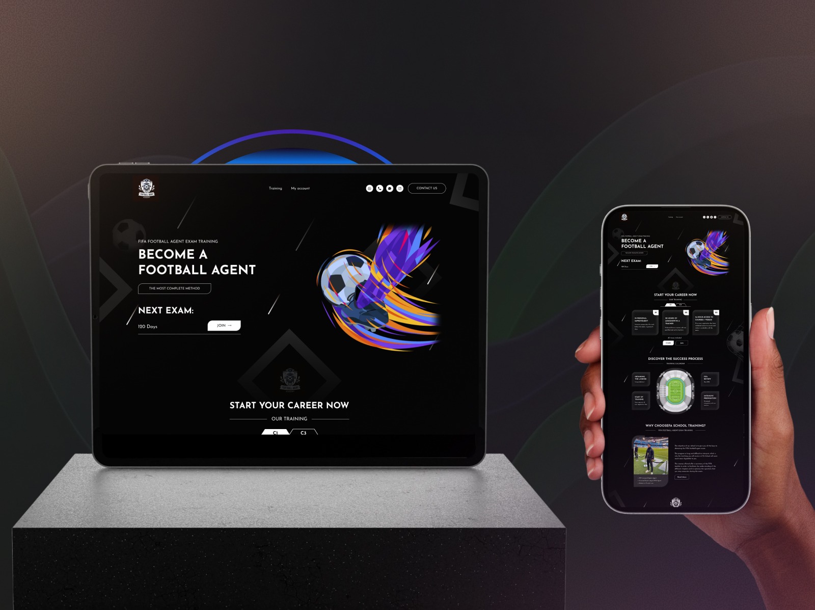
Football Agent Platform – Web Development
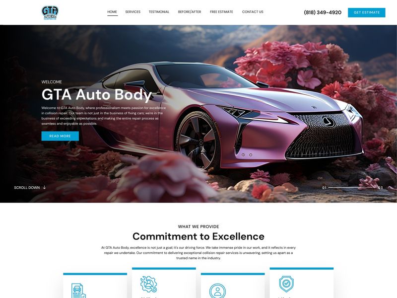
GTA Auto Body – Automotive UI/UX & Web Development
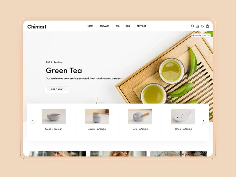
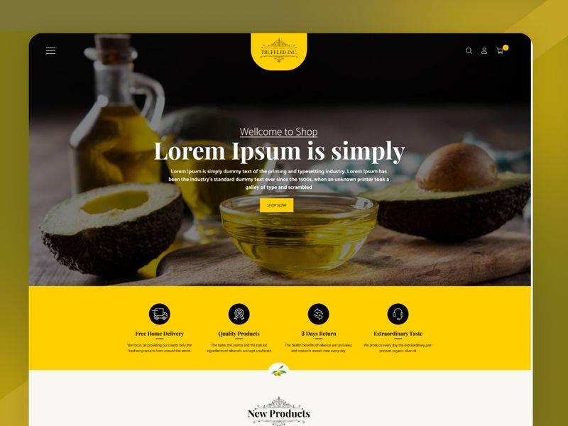
Châmart – Minimalist E-Commerce Web UI
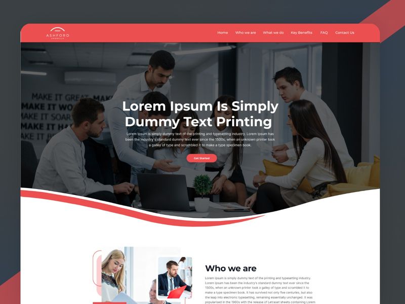
Modern Corporate Web Architecture: Ashford Umbrella
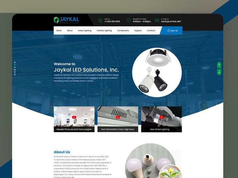
Jaykal LED Solutions – Corporate Web UI
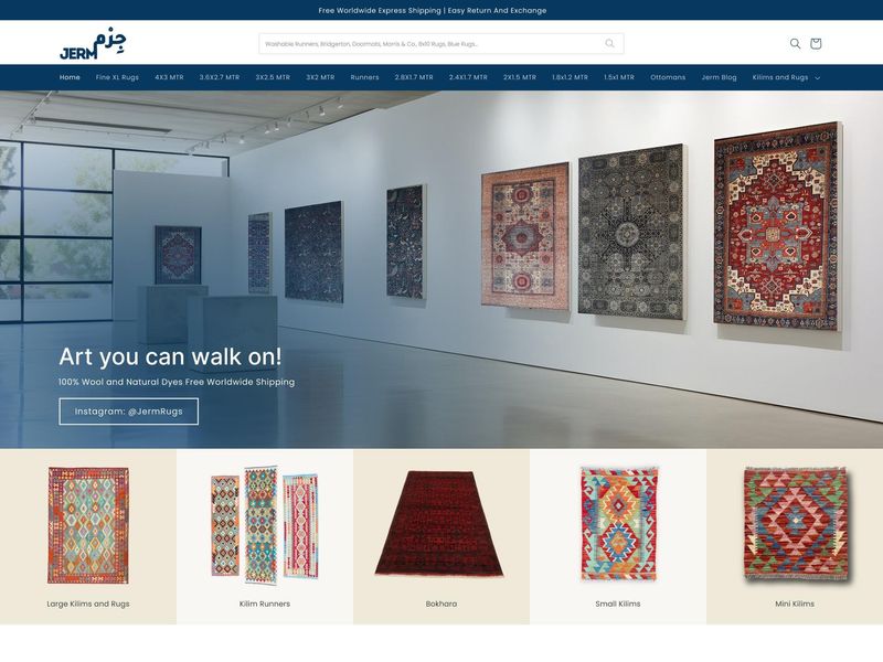
Jerm Rugs – E-Commerce Web Design
Minimalist Editorial Web UI — Masonry Grid Layout
Digital Agency Portfolio | Modern SEO Web Design
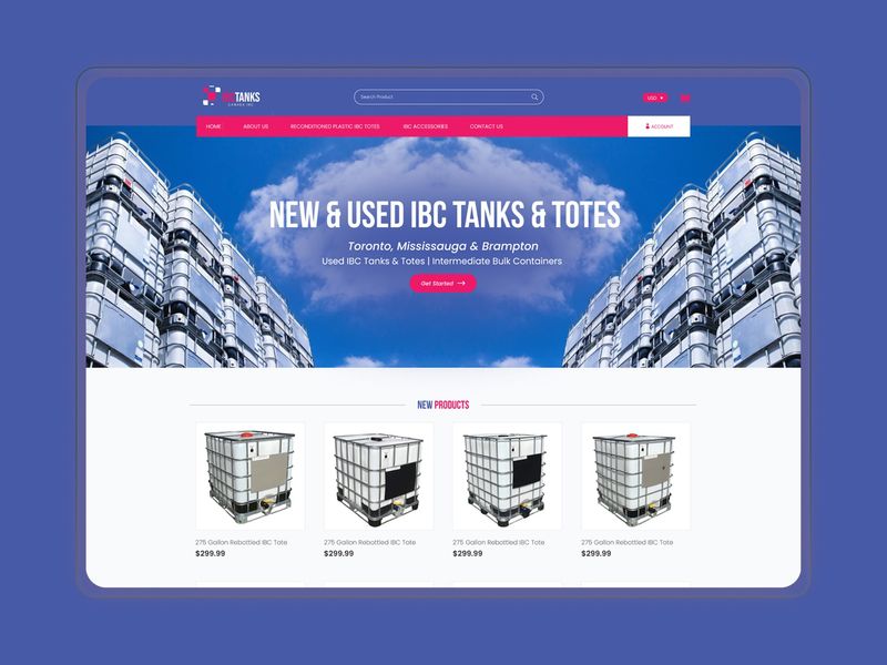
Corporate Web Development | Institutional & Agriculture Portal
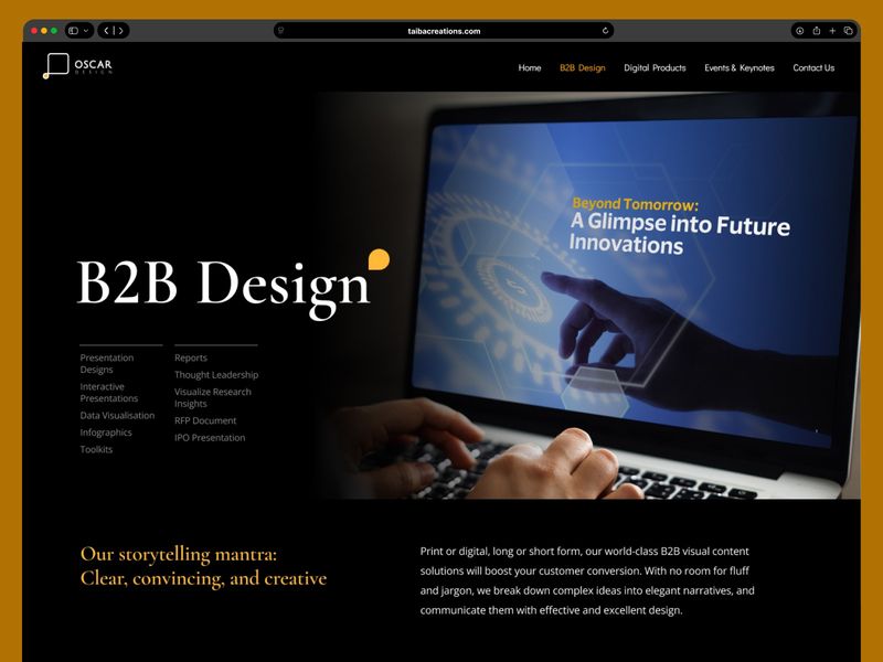
Oscar Design – B2B Agency Web UI Inspiration
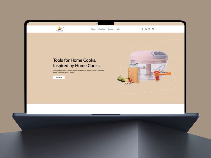
E-commerce Web Development: Home Cook Essentials
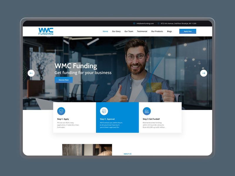
Elevating Financial Tech: WMC Funding Web Implementation
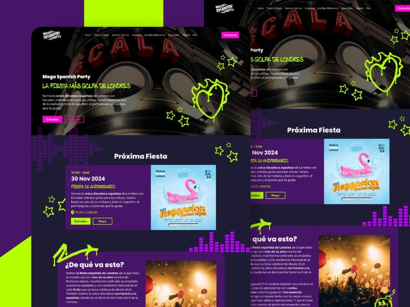
Mega Spanish Party – Neon Nightlife Web UI Concept
Web Development Showcase: Transforming Concepts into Digital Experiences
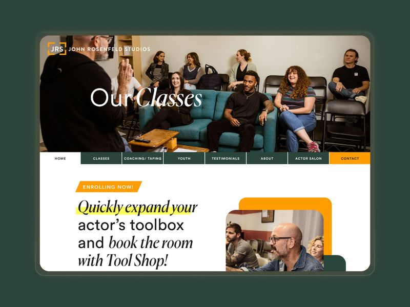
John Rosenfeld Studios — Acting Studio Web Design & UI
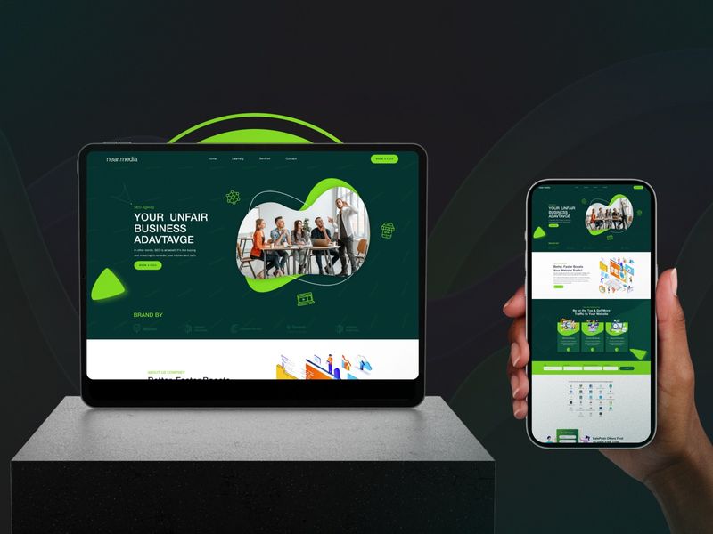
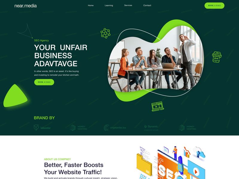
NearMedia – Marketing Agency Web Development
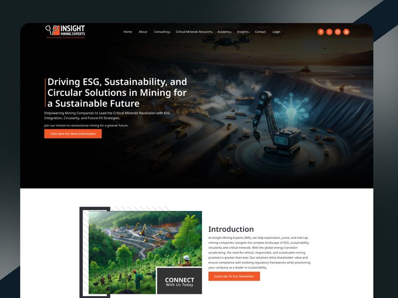
Corporate ESG Consulting Web Design | UI/UX Case Study
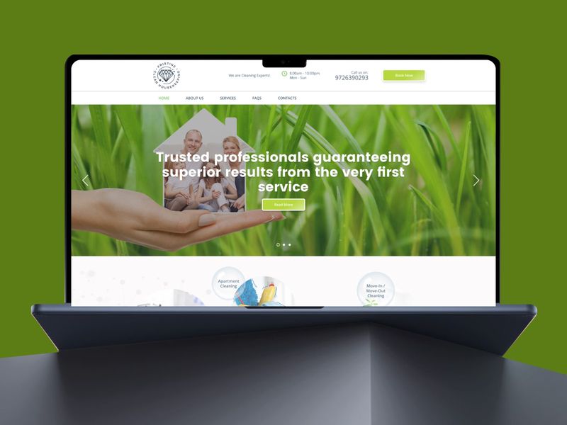
Pristine Clean Housekeeping – Premium Service Web UI
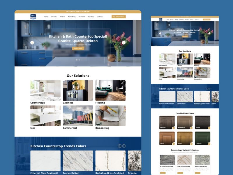
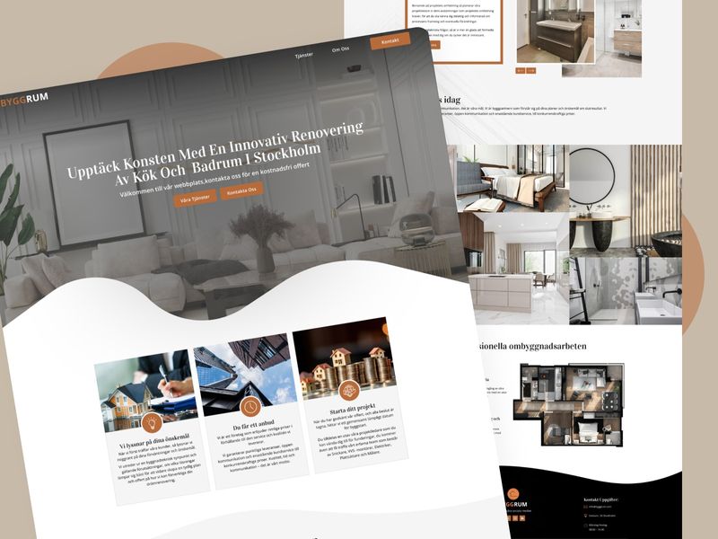
Kitchen & Bath Remodeling Web Design | UI/UX Case Study
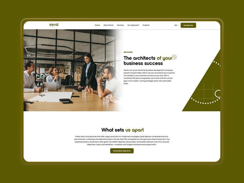
Corporate Consulting: Web Design & Development
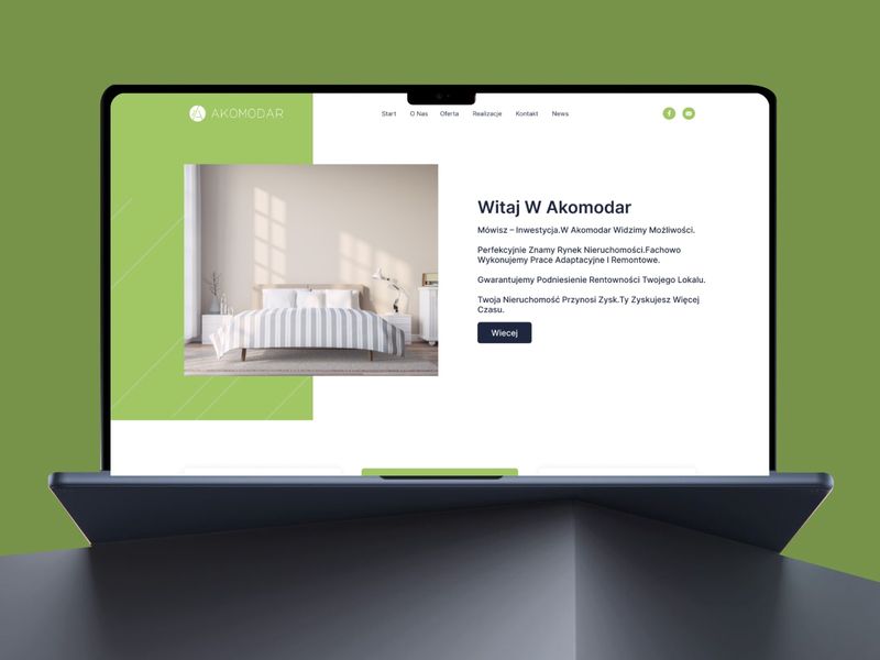
Akomodar Real Estate Web Design & Development
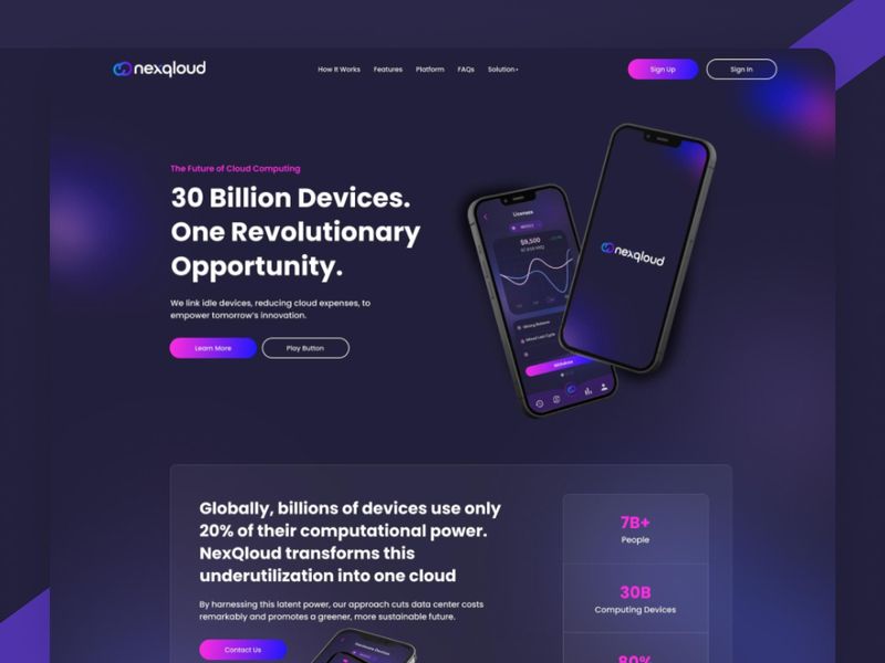
NexQloud – Cloud Computing Web Design
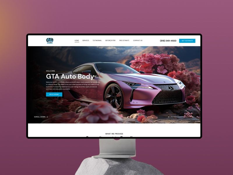
GTA Auto Body – High-End Automotive Web UI Inspiration
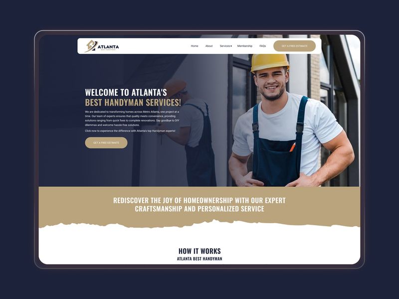
Atlanta Handyman – Local Service Web UI Design
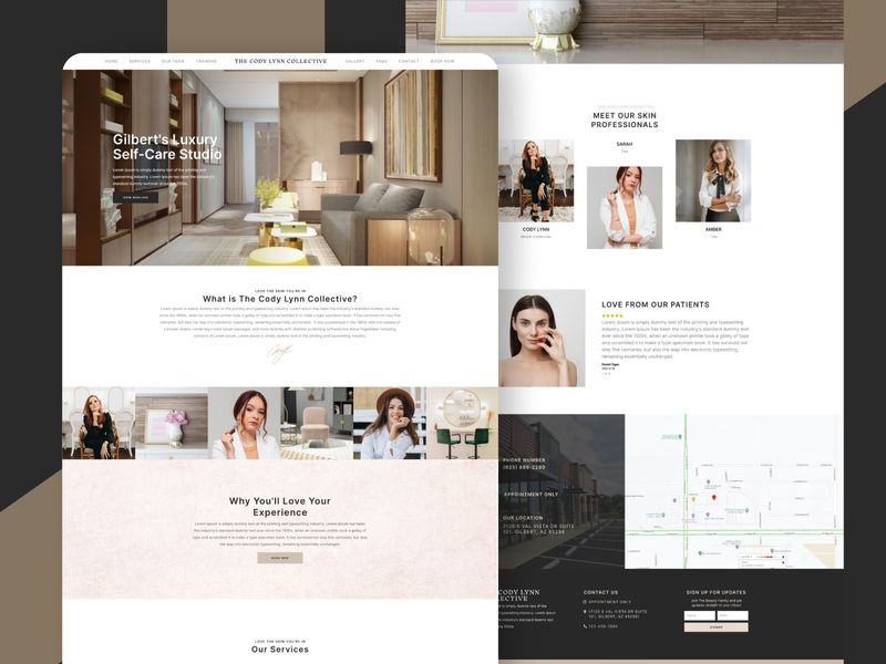
Luxury Beauty Studio: Web Design & Development
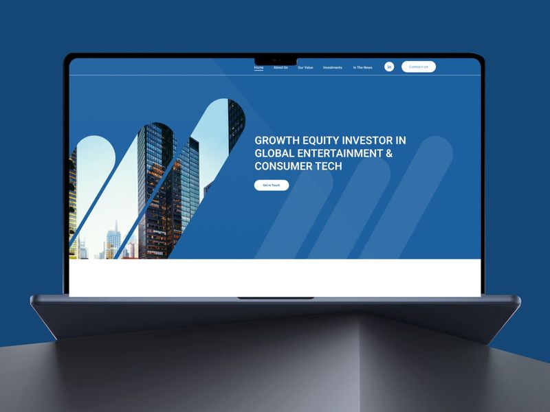
Growth Equity Web Design & Development
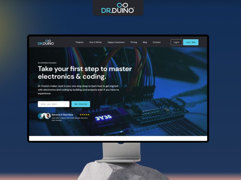
Dr Duino – EdTech Web Dev Showcase
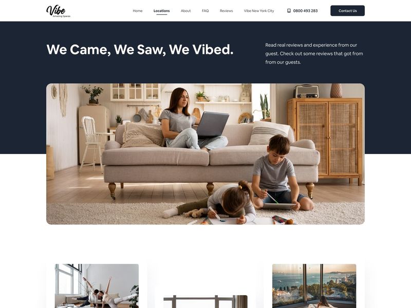
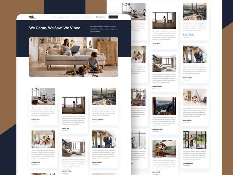
Modern Community & Review Web UI Design
Typesafe / UI / UX / Website / Web design
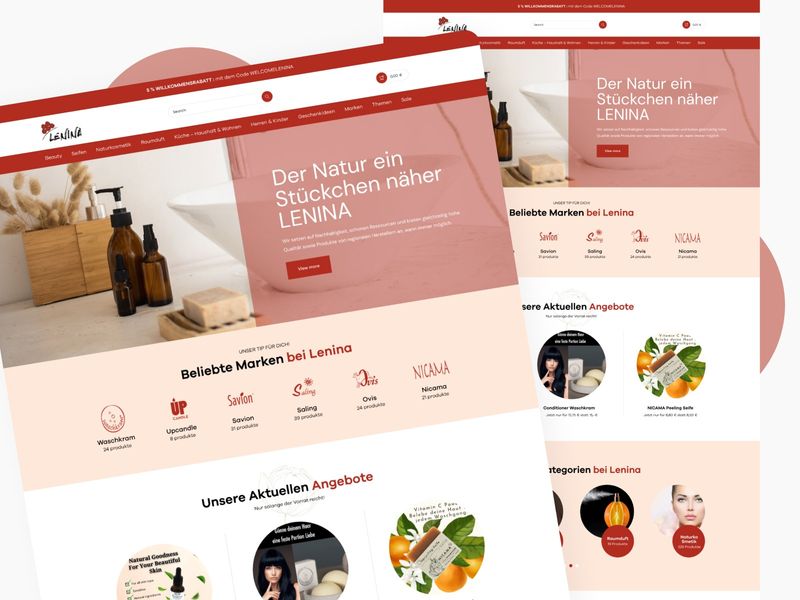
LENINA – E-commerce Web Dev Showcase
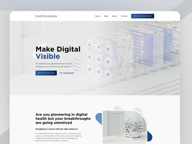
Healthonomix SaaS Platform: Clean UI Engineering & Clinical-Grade Web Architecture
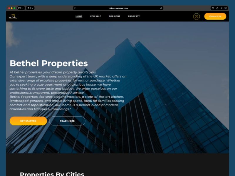
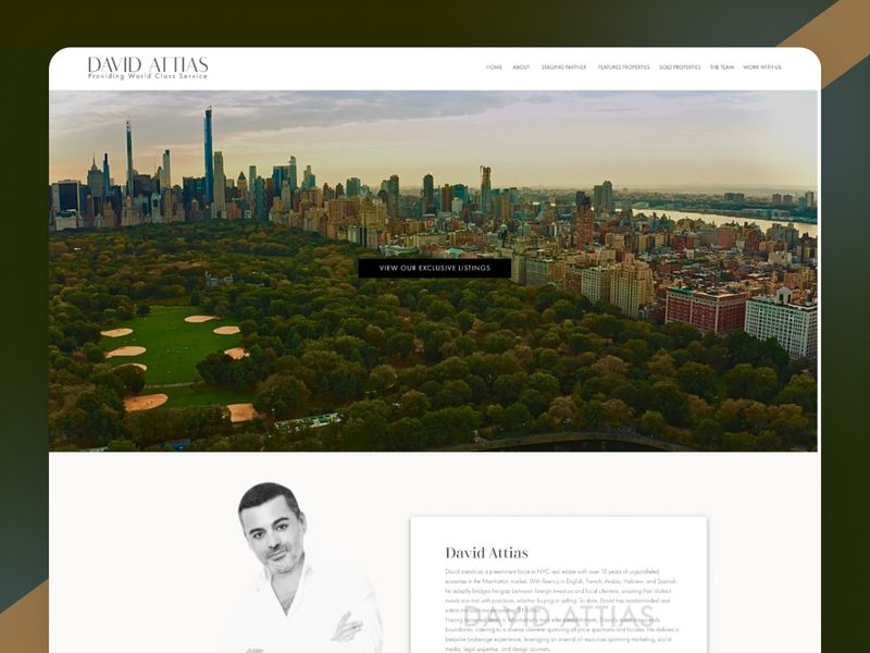
Bethel Properties – Luxury Real Estate Web Development
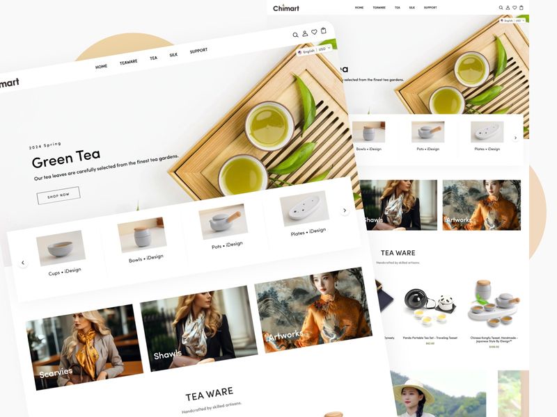
Chimart – Elegant E-Commerce Web Design
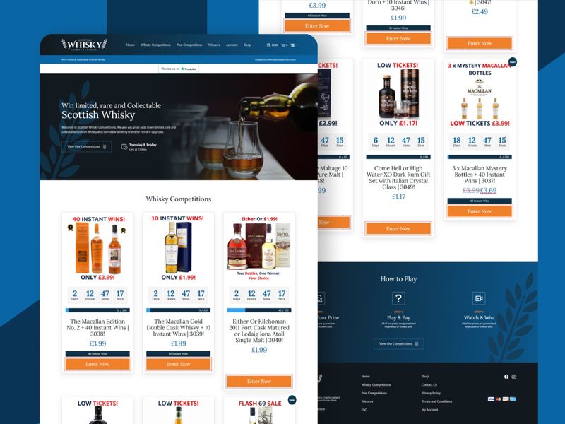
Whisky Competitions Platform: Interactive Web Engineering & Luxury E-Com Architecture
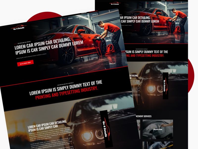
Go 4 Detailz: High-End Automotive Web Design
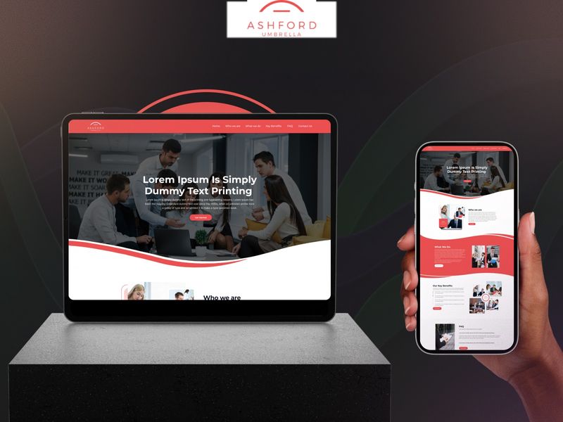
Ashford Umbrella – Premium Responsive Corporate Web UI
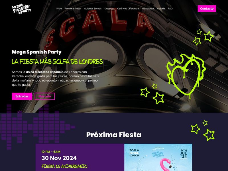
Mega Spanish Party – Vibrant Event Web Design
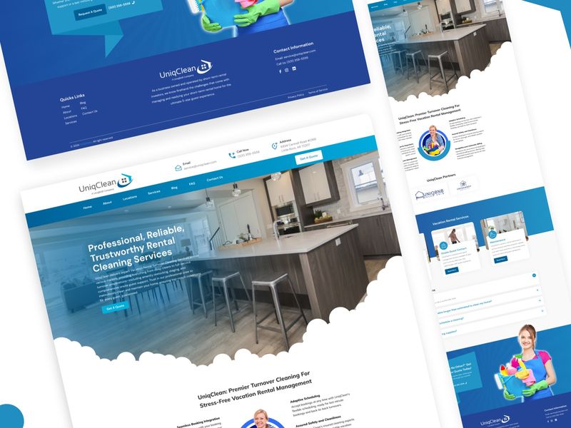
UI Spotlight: UniqClean Responsive Corporate Web Design
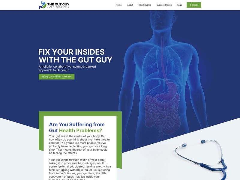
The Gut Guy – Health & Wellness Web Design
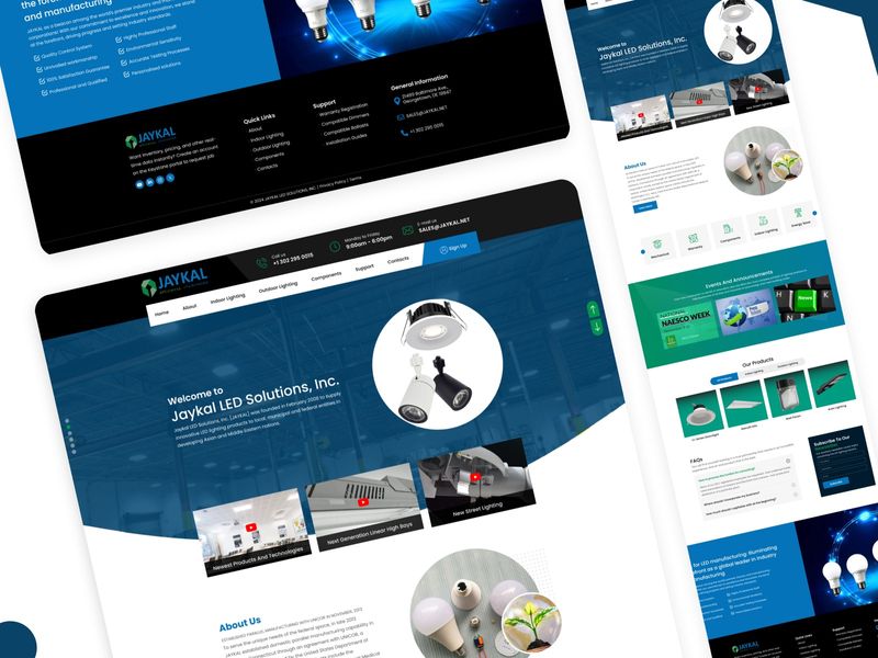
Jaykal LED Solutions: B2B Corporate UI/UX & Web Development
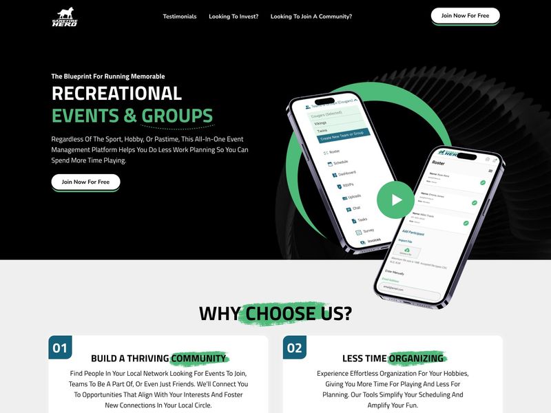
Gametime Hero – Sports SaaS Web & Mobile UI Design
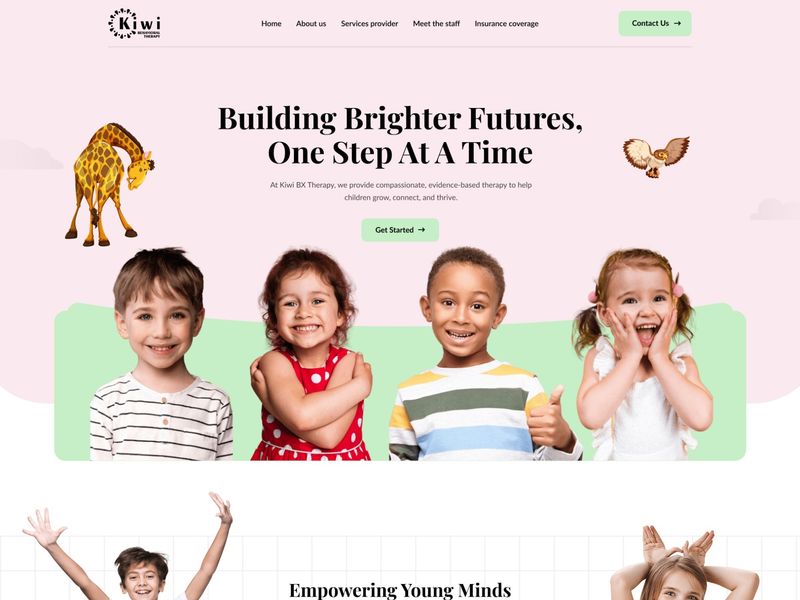
Kiwi Behavioral Therapy | Pediatric ABA Web Design
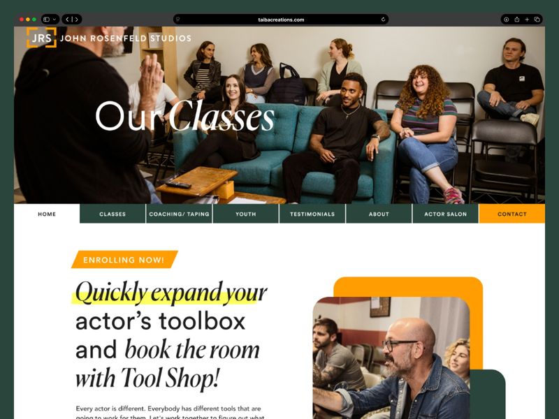
John Rosenfeld Studios: A Bespoke Educational Web Experience
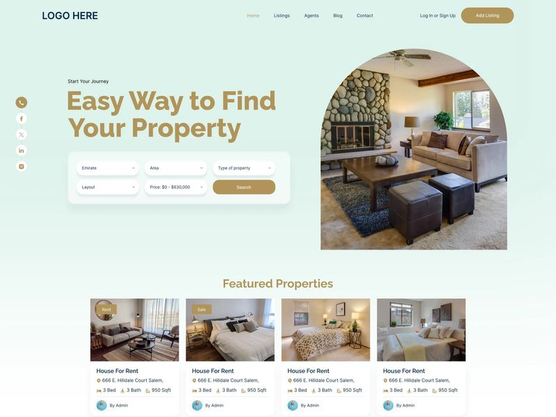
Modern Real Estate & Property Management Web UI
Fluid Section Dividers & Premium Grid Layouts in Web UI
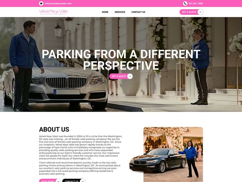
Velvet Keys Valet | Luxury Web UI Design
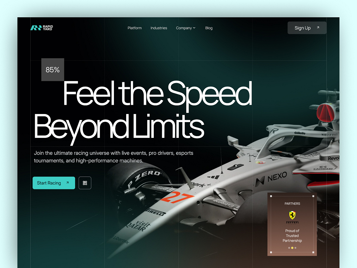
Racing Car Web UI
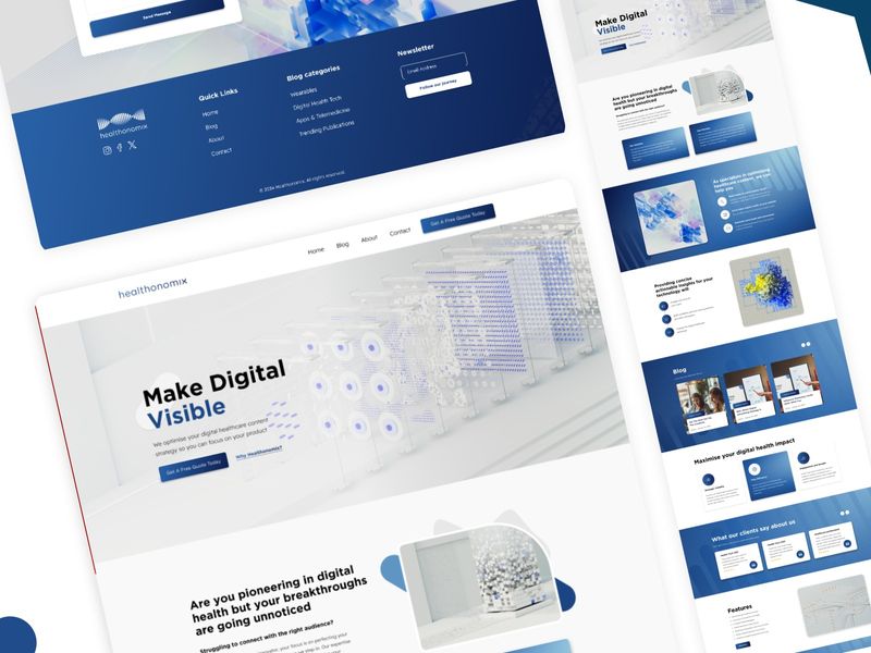
Healthonomix — B2B Health Tech Platform Web Engineering
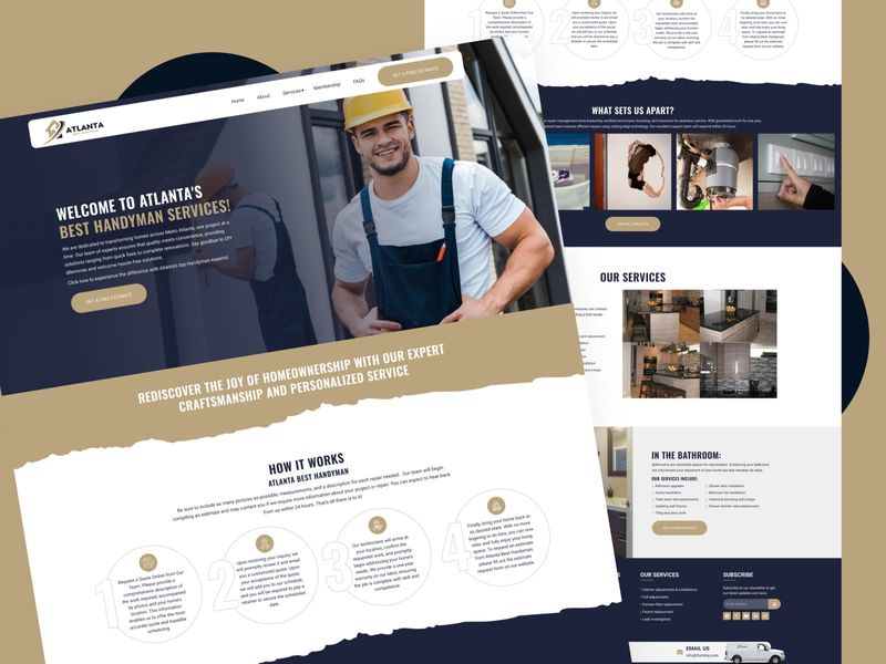
The Handyman Platform — Premium UI/UX & Web Development
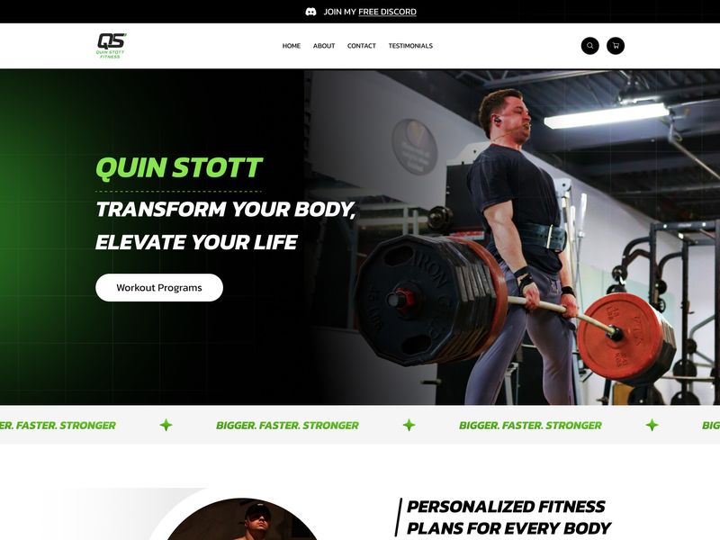
High-Octane Fitness Web UI | Quin Stott Branding
Industrial B2B E-commerce – UI/UX Web Design
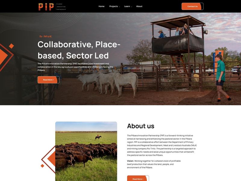
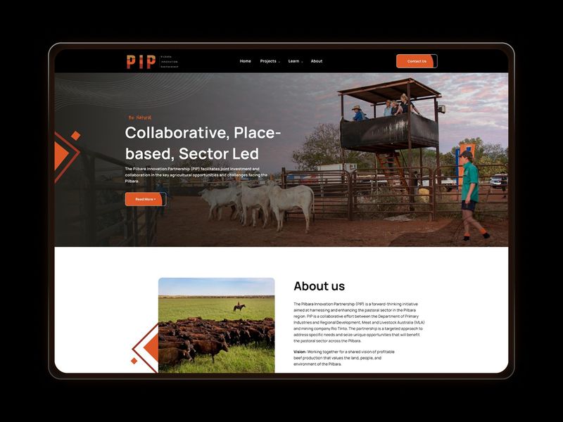
PIP — Corporate Web Engineering & Structural UI Case Study
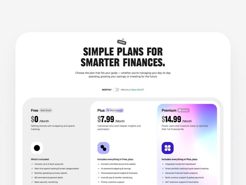
SaaS Pricing Web Design
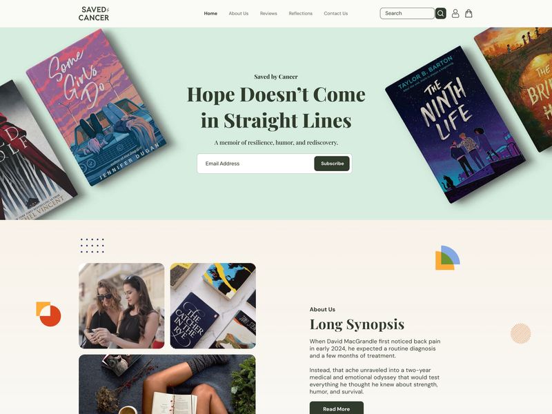
Resilience in Design: Editorial Web UI for "Saved by Cancer"
B2B Industrial E-Commerce Platform Web Design
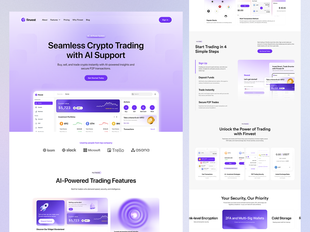
Finvest - Crypto Trading AI Assistant Web Design

Rovelia - Skincare AI & E-Commerce Web Design
Lokal - Web Experience | Liquidink Design
Lokal - Web Experience | Liquidink Design
Get access to thousands of freshly updated design inspiration pieces by adding Muzli to your browser.
Loved by 800k designers worldwide, Muzli is the leading go-to browser extension for creative professionals.
Tips & tricks for a good Web Page Design
In today's digital age, a well-designed web page is a crucial element for businesses, organizations, and individuals looking to make a strong online presence. A thoughtfully crafted web page not only enhances user experience but also plays a pivotal role in conveying information, building credibility, and driving conversions. Here are some essential considerations to keep in mind when designing a web page:
User-Centric Design: The user should be at the heart of your design process. Understanding your target audience and their needs is essential. Create a layout that is intuitive, easy to navigate, and visually pleasing. Prioritize the placement of important information, such as contact details, calls-to-action, and key messages.
Mobile Responsiveness: With the majority of internet users accessing websites through mobile devices, it's crucial to ensure your web page is responsive. A mobile-friendly design adapts seamlessly to various screen sizes, providing a consistent and enjoyable experience across devices.
Clear Visual Hierarchy: Establish a clear hierarchy of elements on your web page. Use typography, color, and spacing to guide users' attention to the most important content. A well-defined hierarchy improves readability and user engagement.
Loading Speed: In a fast-paced online environment, users have little patience for slow-loading pages. Optimize images, minimize unnecessary scripts, and choose a reliable hosting service to ensure your web page loads quickly. Faster loading times enhance user satisfaction and SEO rankings.
Consistent Branding: Your web page should reflect your brand's identity consistently. Use your brand's color palette, logo, and typography to create a cohesive and recognizable look. Consistent branding fosters trust and recognition among your audience.
Engaging Content: Compelling content keeps users engaged and encourages them to explore your web page further. Use concise and impactful copy, complemented by relevant images, videos, or infographics. High-quality content builds credibility and encourages visitors to stay longer.
Intuitive Navigation: Easy navigation is essential for helping users find the information they need quickly. Implement a logical menu structure and include a search bar if applicable. Users should be able to access different sections of your website without confusion.
Effective Calls-to-Action (CTAs): Clear and persuasive CTAs guide users toward desired actions, such as signing up, making a purchase, or contacting you. Use contrasting colors and action-oriented language to make CTAs stand out.
Accessibility: Ensure your web page is accessible to all users, including those with disabilities. Use alt text for images, maintain proper color contrast, and follow web accessibility guidelines to provide an inclusive experience for everyone.
Testing and Iteration: Designing a web page is an ongoing process. Regularly test your design across different devices and browsers to identify and address any issues. Gather feedback from users to make informed improvements and refine your design over time.