Design Inspiration
Calendar design examples
Hundreds of creative, innovative, well designed user calendar ideas & examples.
We curate topical collections around design to inspire you in the design process.
This constantly-updated list featuring what we find on the always-fresh Muzli inventory.
Last update:
Calendar Dashboard UI - June 2026 | Figma Freebie
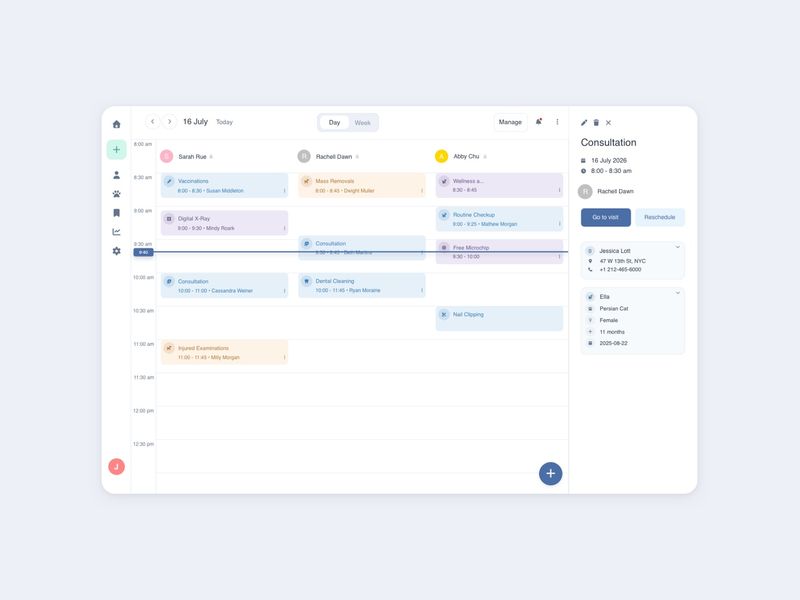
Calendar App - Day View UI | Figma Freebie | July 2026
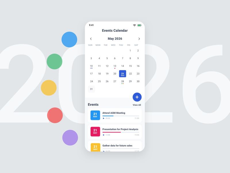
Mobile Calendar App May 2026 | Figma Freebie
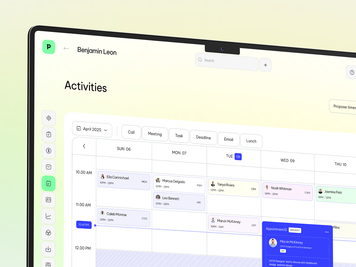
Pipedrive CRM - Calendar and Task Management Web App UI
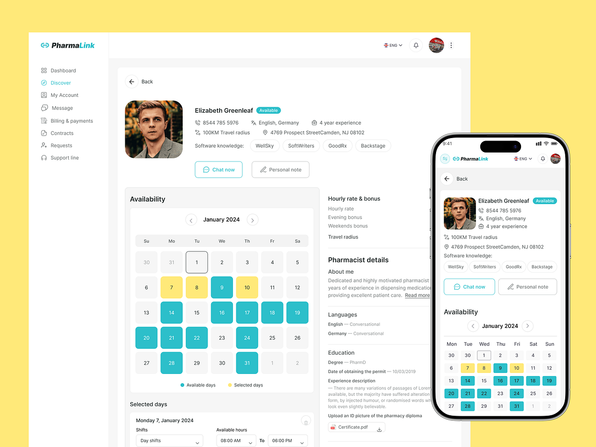
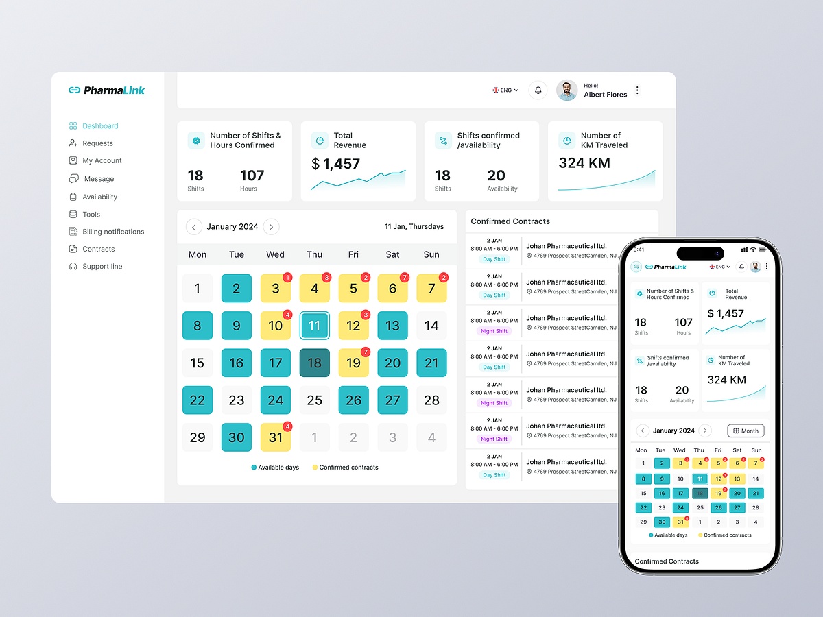
PharmaLink — Pharmacist Profile & Availability Dashboard
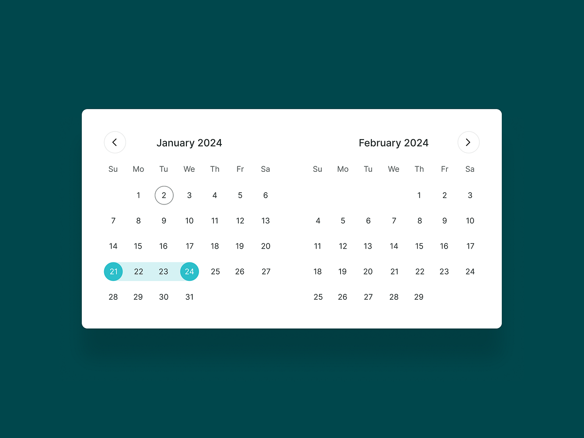
Minimal Date Range Picker UI
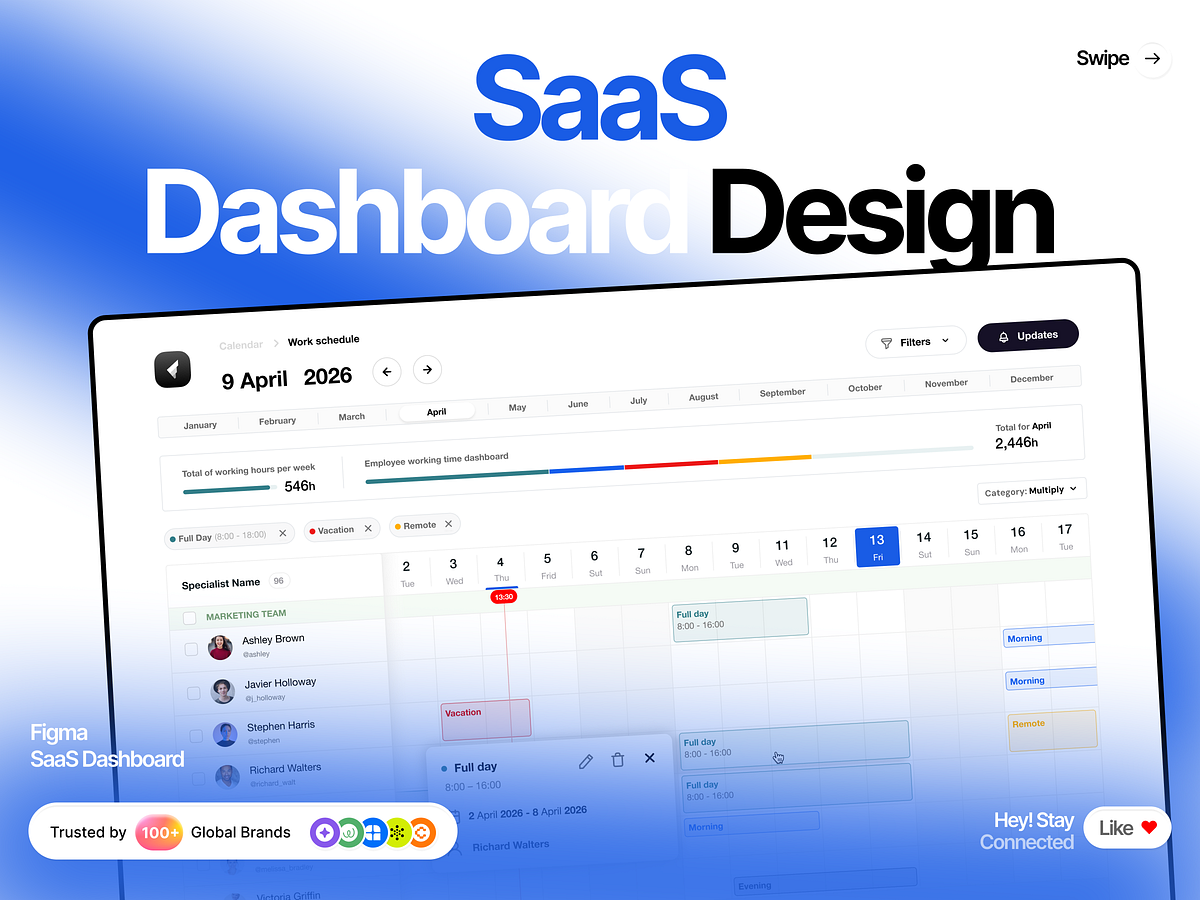
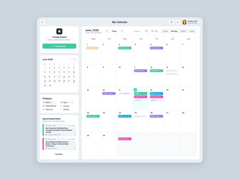
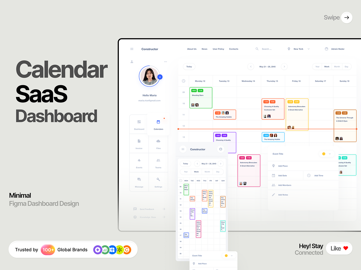
Workforce Management: Clean SaaS Calendar & Dashboard UI

Shift Contract Details Card UI
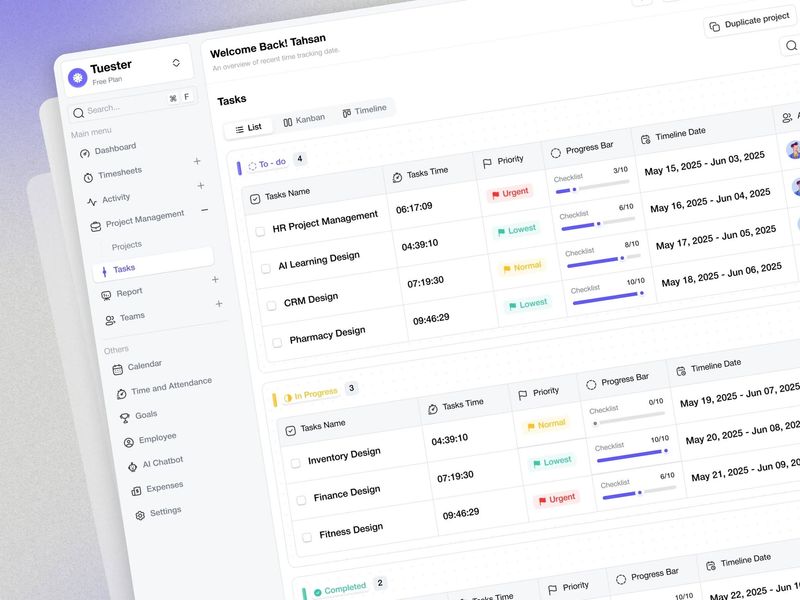
Project Management App That Actually Shows Team Progress
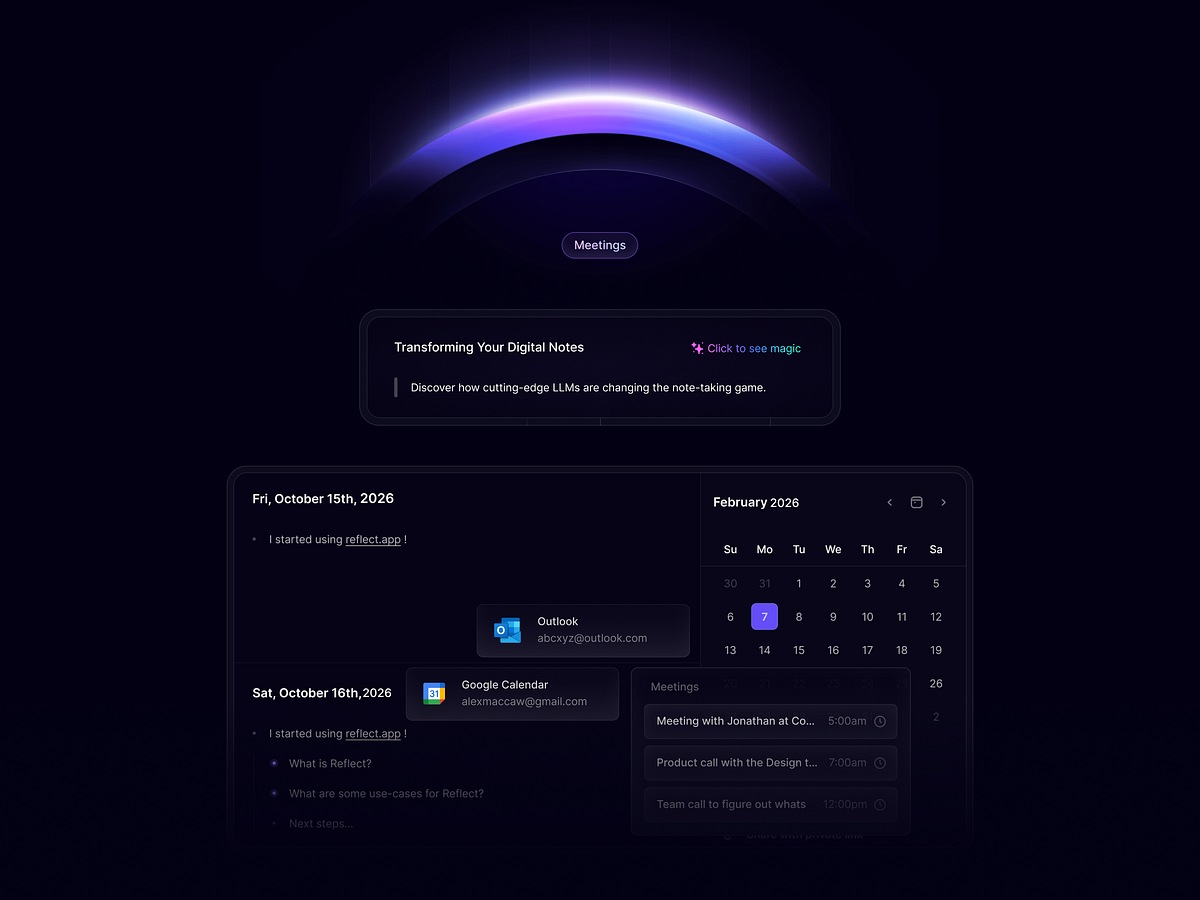
QuickThought - Smart Calendar App
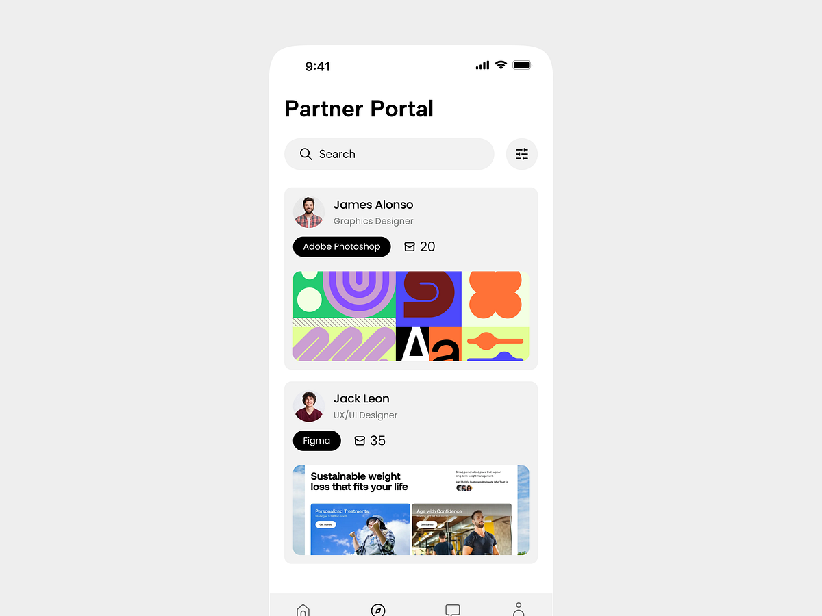
Partner Portal UI Exploration

Catch Dashboard Web App
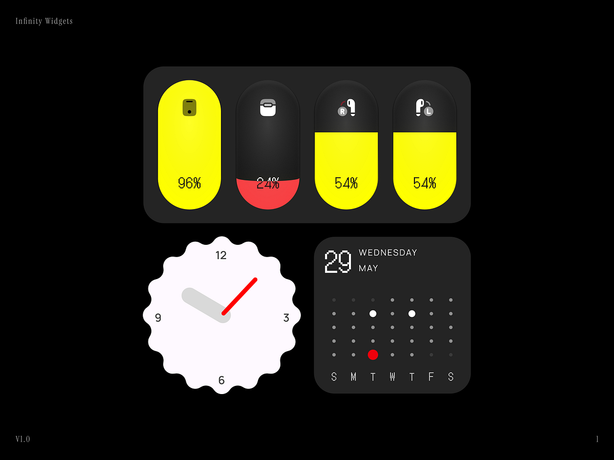
Infinity Widgets 0.1
PharmaLink Dashboard & Mobile Scheduling Experience
Random icons - Exploration

Calendar Catalyst: The High-Ticket Landing Page in Framer
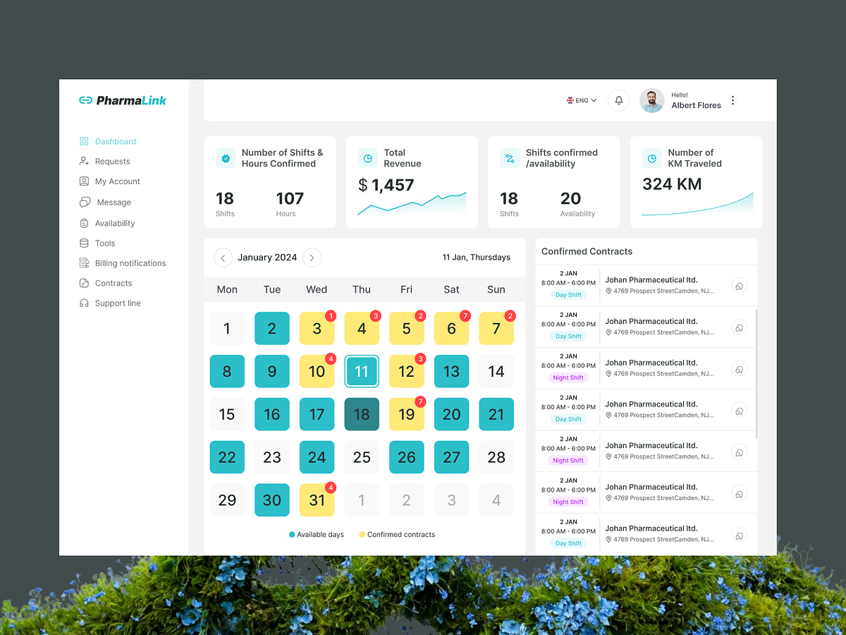
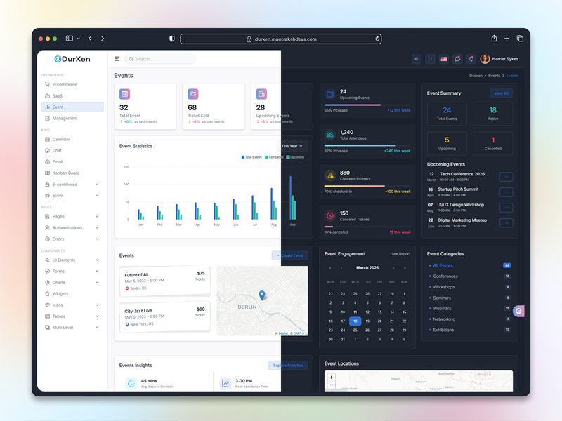
PharmaLink — Healthcare Workforce Scheduling Dashboard

Vietnamese Lunar New Year Desk Calendar 2026 | Tết Table
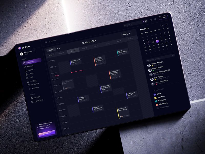
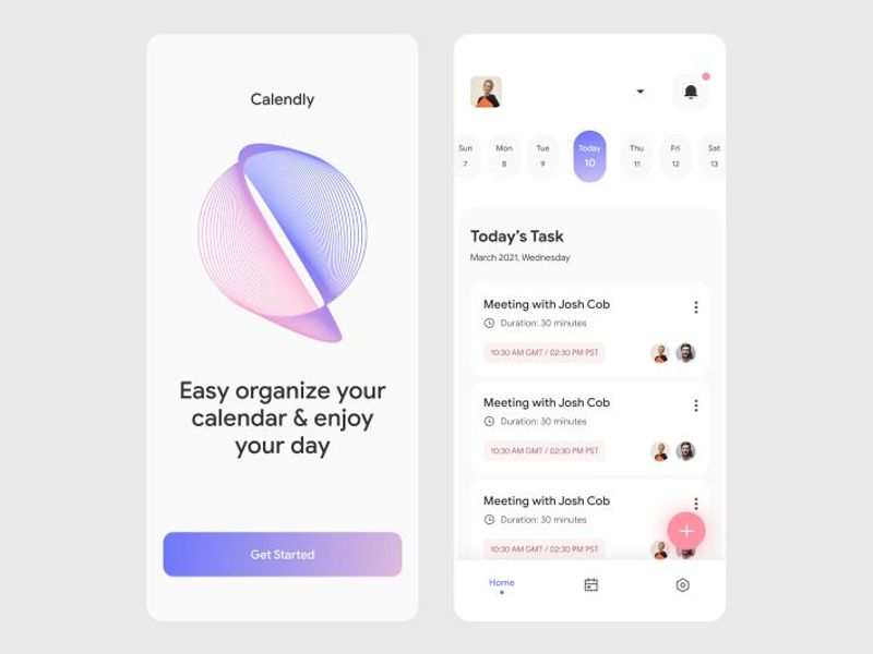
Calltimes | Calendar Flow | Sleeko
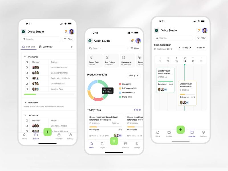
Smart Calendar & Task Management App UI
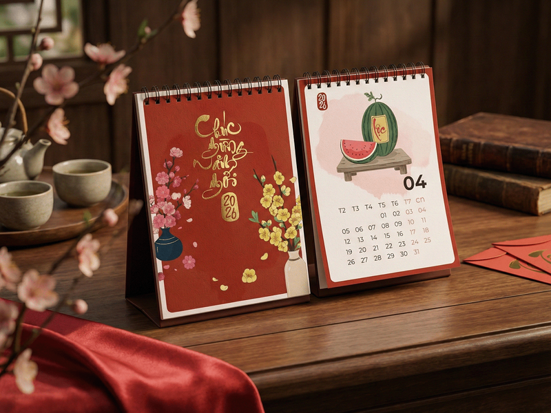
Vietnamese Lunar New Year Desk Calendar 2026

Vietnamese Lunar New Year Desk Calendar Traditional Tet Illustration Set
Mobile App UI Design – Smart Calendar Experience

SyncUp — Real-Time Collaboration & Team Intelligence App

Calltimes | Calendar Flow | Sleeko
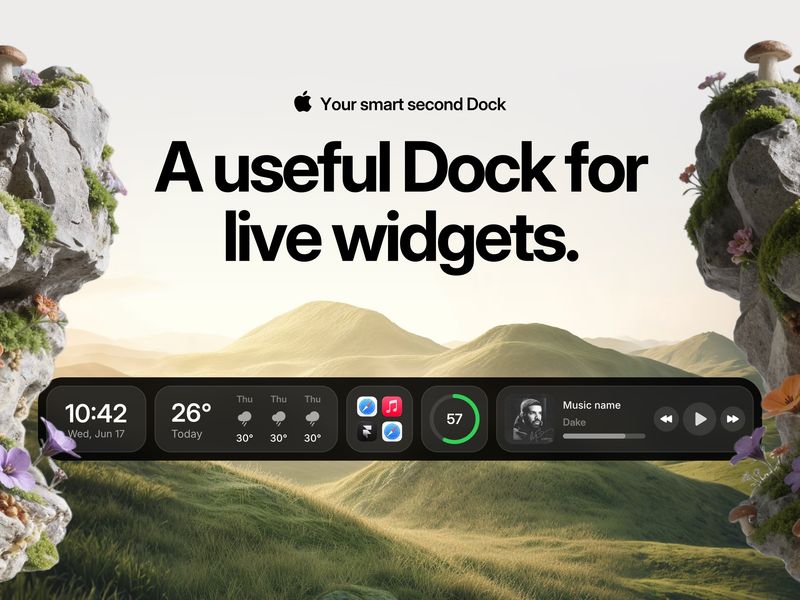
Cooldock — Smart Second Dock with Live Widgets for Mac
AI-Powered Time Tracking Tasks List Dashboard Design
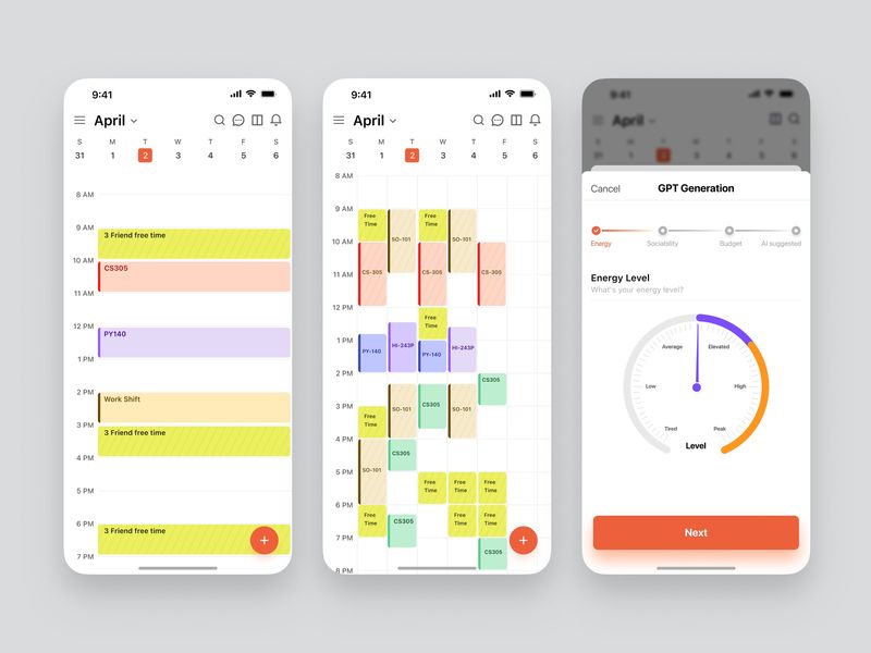
QuickThought – Smart Calendar App
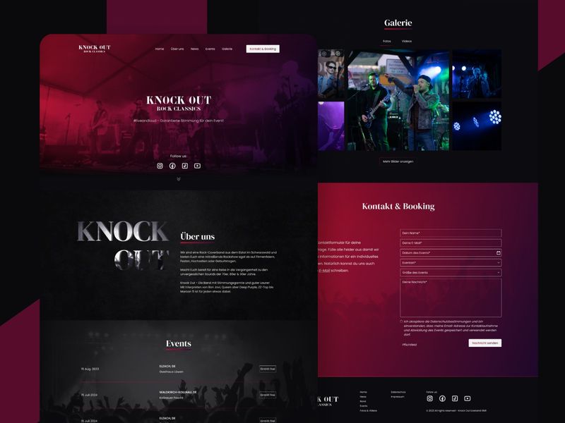
Knock Out – Rock Band UI/UX Design

Modern Warmth: Earth-Toned UI/UX for Cleaning Everest

Calorie Tracker App Design

Fitness Tracking Mobile App Design
Turning Complex Systems into Clean UI
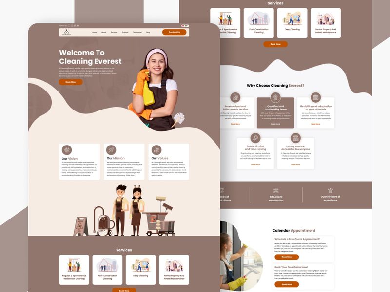
Cleaning Everest — Premium Residential Service UI Design
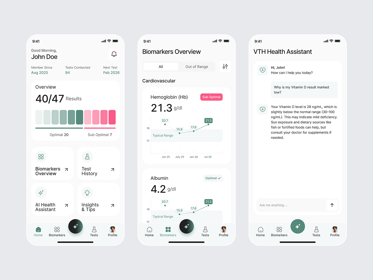
Health Tracker App
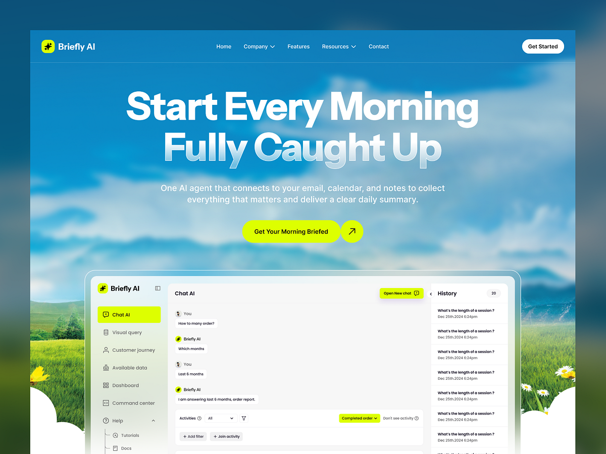
Briefly AI – SaaS Landing Page Hero

Team Sync & Workspace UI ⚡
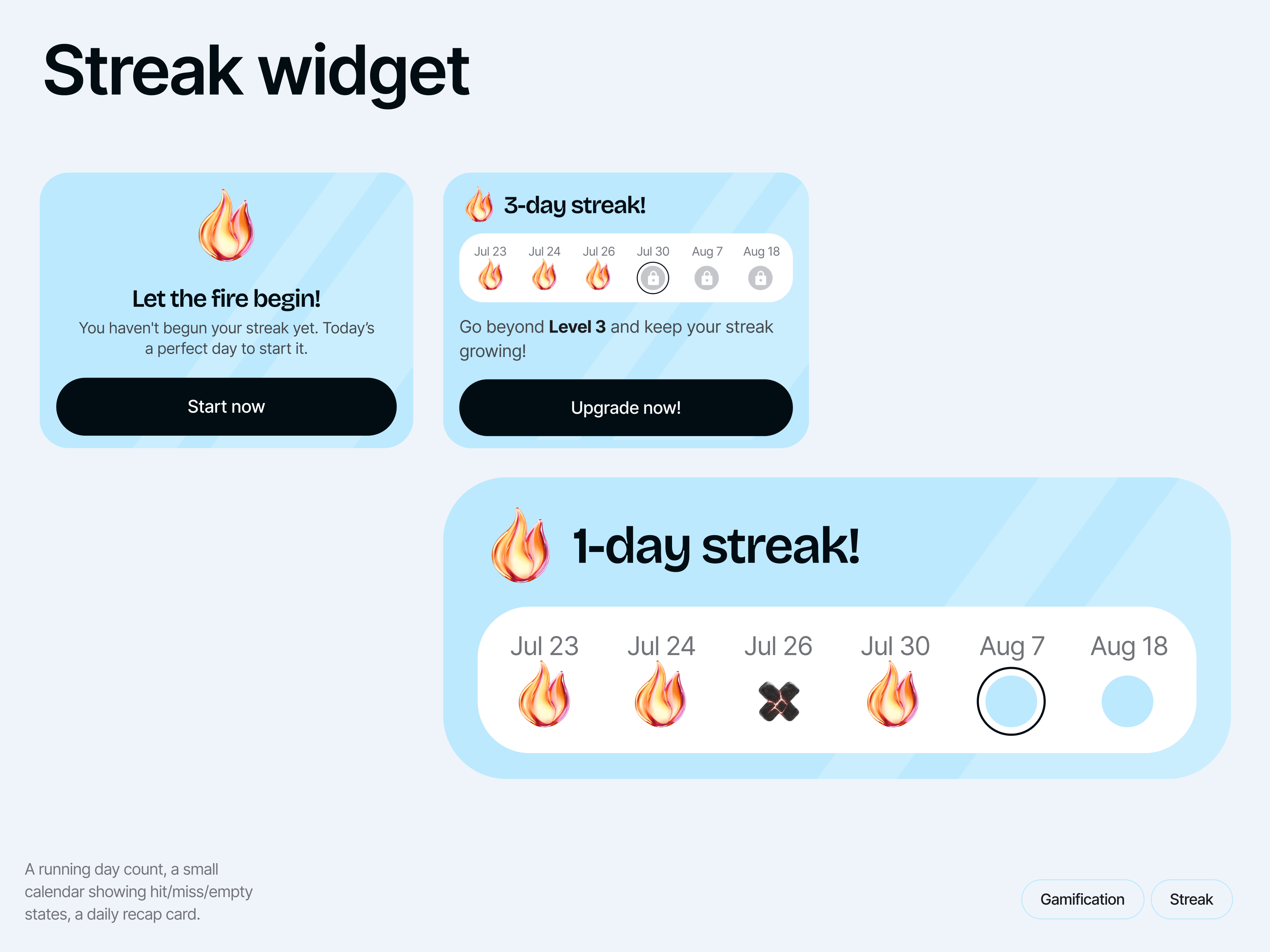
Streak Widget & Gamification States — Napa Mobile App
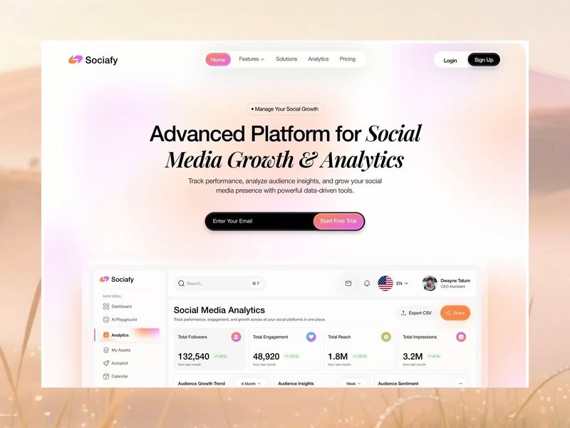
Social Media Growth & Analytics Dashboard
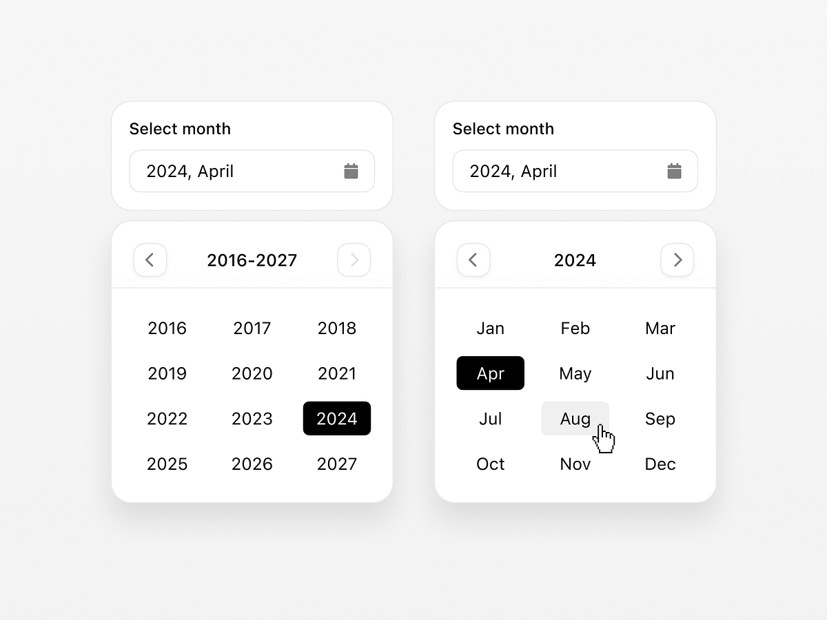
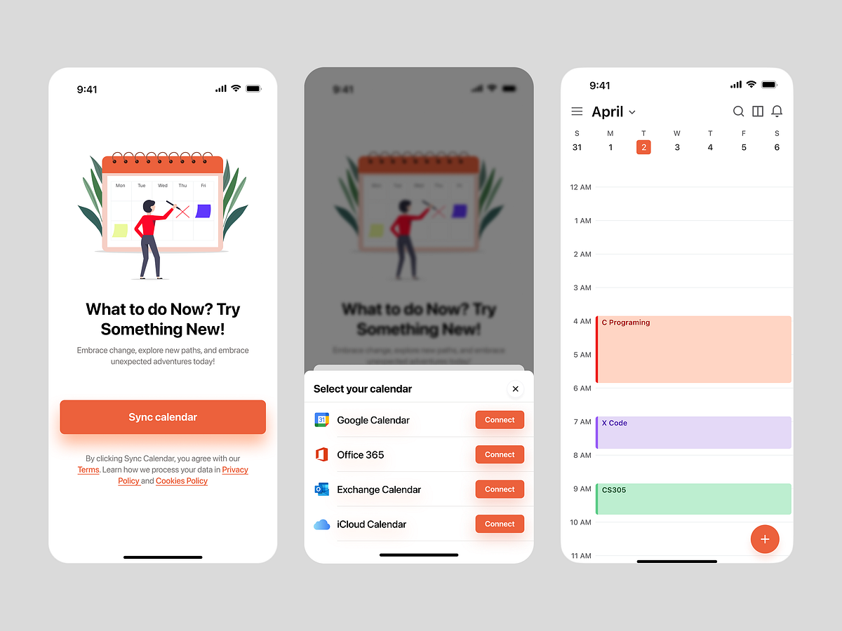
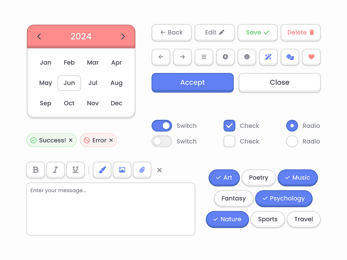
Date picker
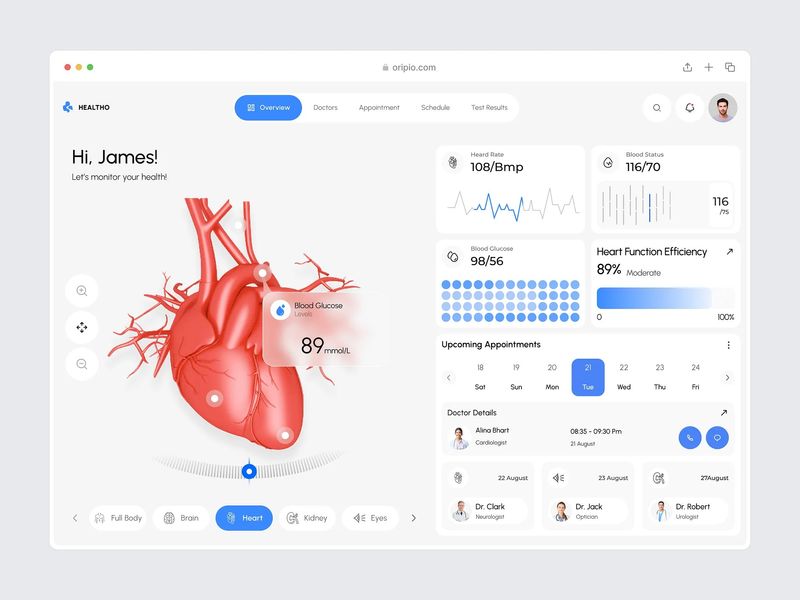
Medical Dashboard Design
Effortless Scheduling for Modern Teams / SaaS Dashboard
Project Management Dashboard — Turning Team Chaos Into Clear Progress
Task Management App
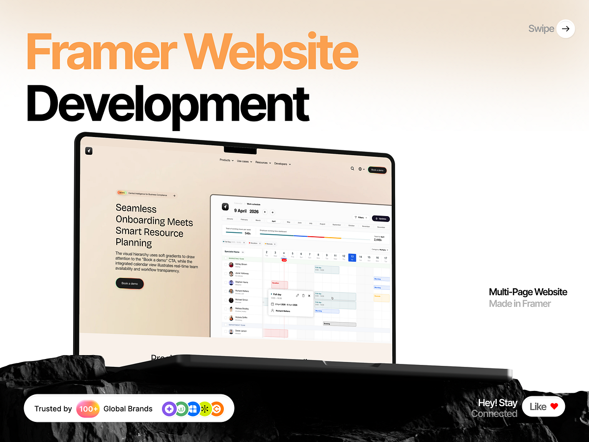
Multi-Page SaaS Website Design in Framer
Task Management Dashboard Design
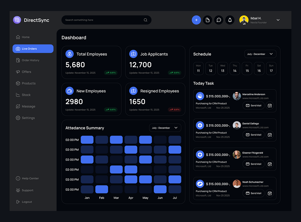
DirectSync – Management Admin Dashboard
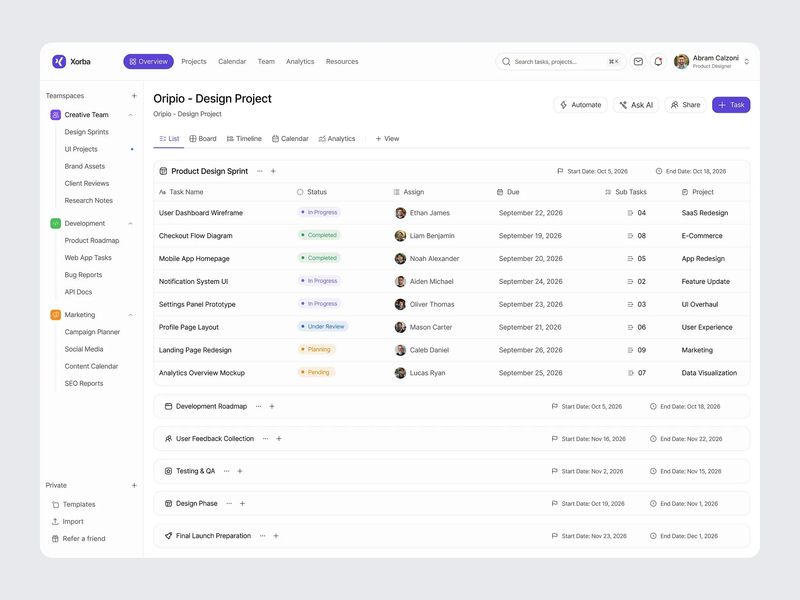
Project Management Dashboard Design
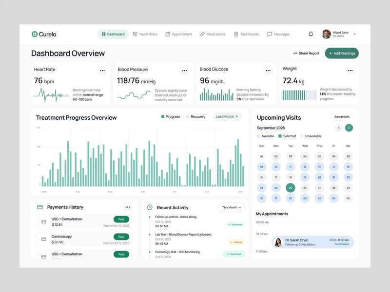
Patient Health Dashboard
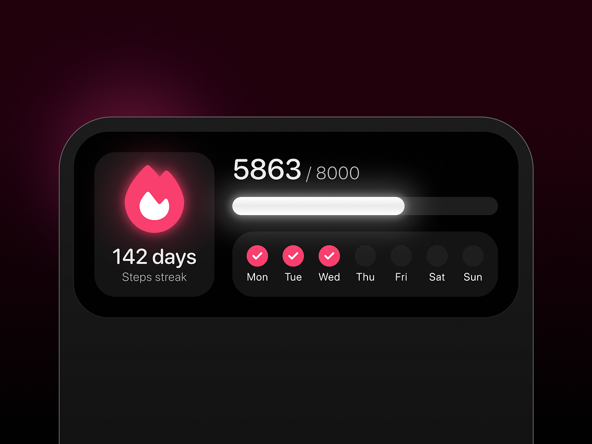
Fitness app streak widget
UI Style
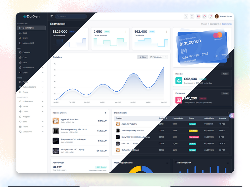
Durxen Multi-Framework Premium Admin Dashboard Builder
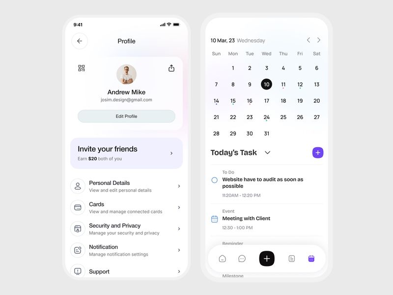
Productivity & Profile Management Mobile App UI

Enterprise Project Management – Mobile App UI
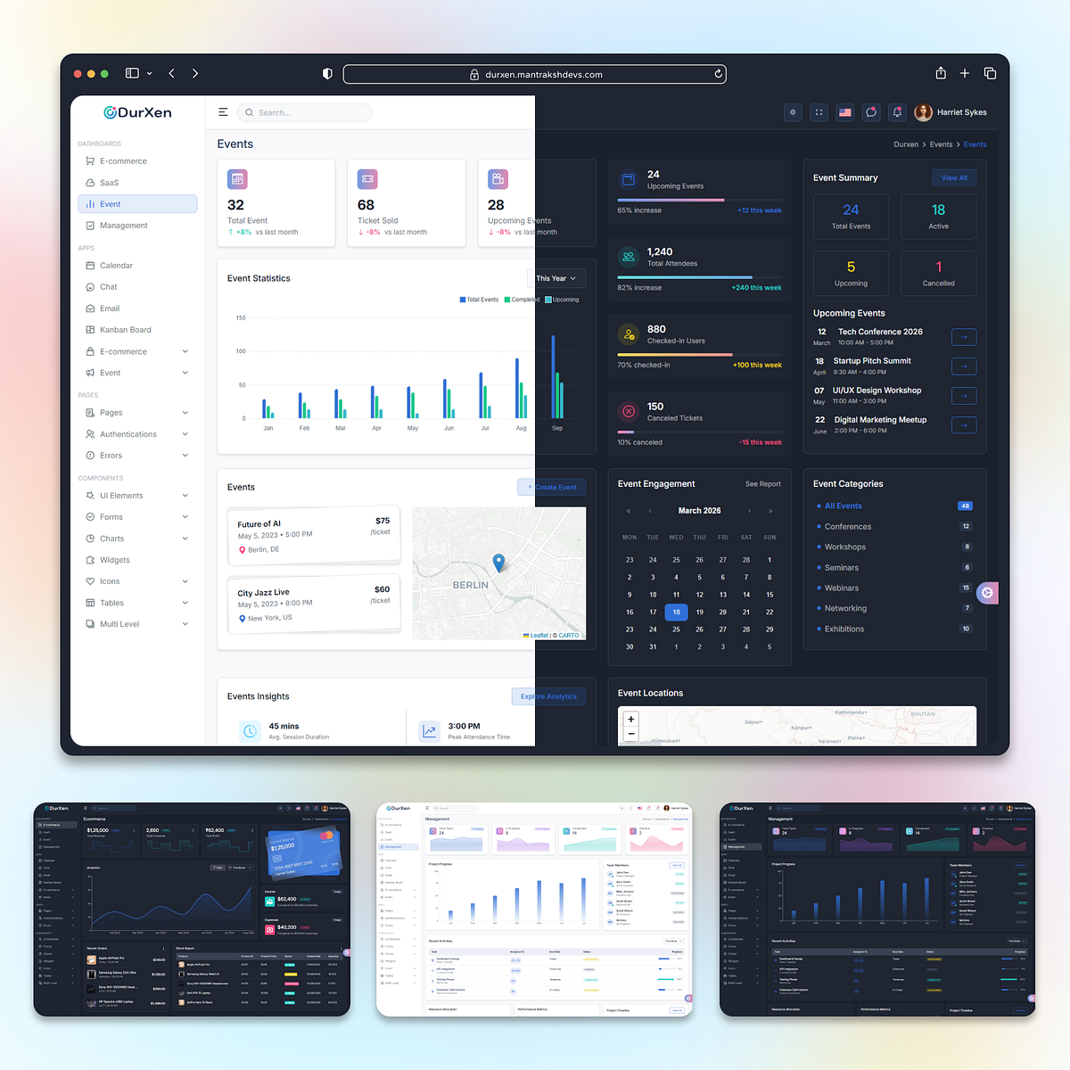
Durxen | Modern Admin Dashboard Template (React, Next.js & HTML)
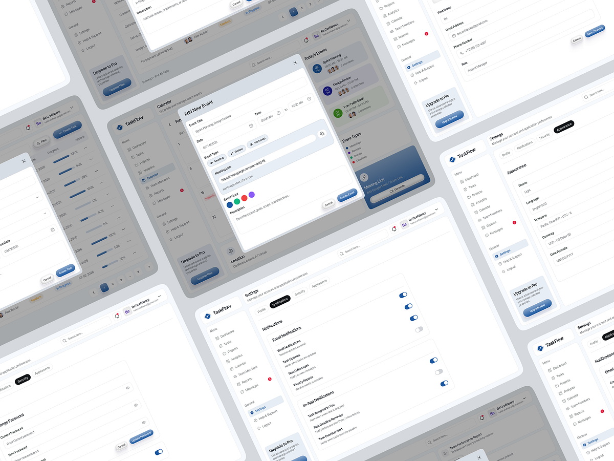
TaskFlow- Modern SaaS Task Management Dashboard System
Admin Dashboard Web App UI Design
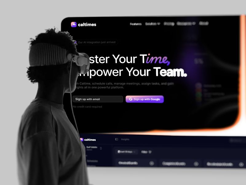
Calltimes | SaaS Landing Page Design | Sleeko
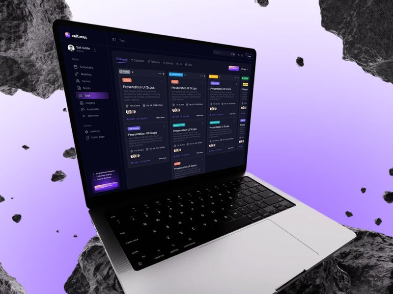
Calltimes SaaS Design | Task Flow | Sleeko
Calltimes SaaS Design | Task Flow | Sleeko
Get access to thousands of freshly updated design inspiration pieces by adding Muzli to your browser.
Loved by 800k designers worldwide, Muzli is the leading go-to browser extension for creative professionals.
What are the core design principles for calendar UI that actually works?
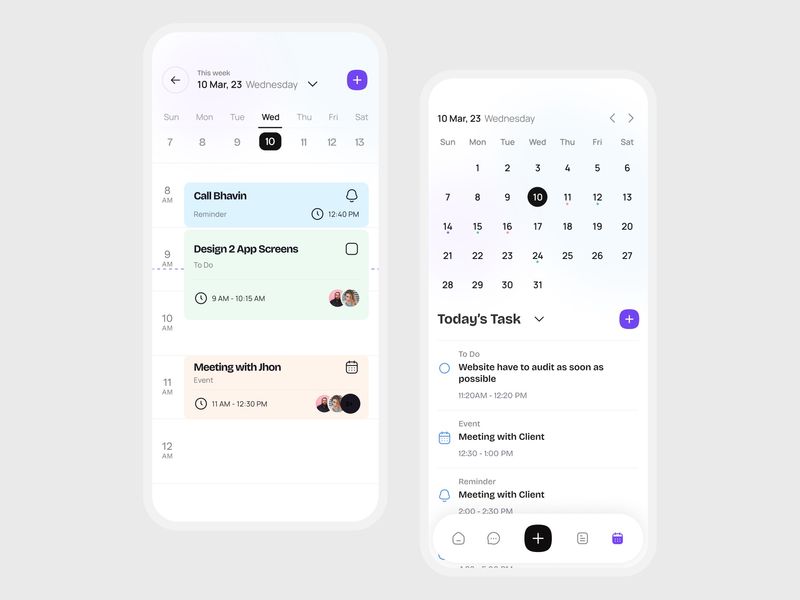
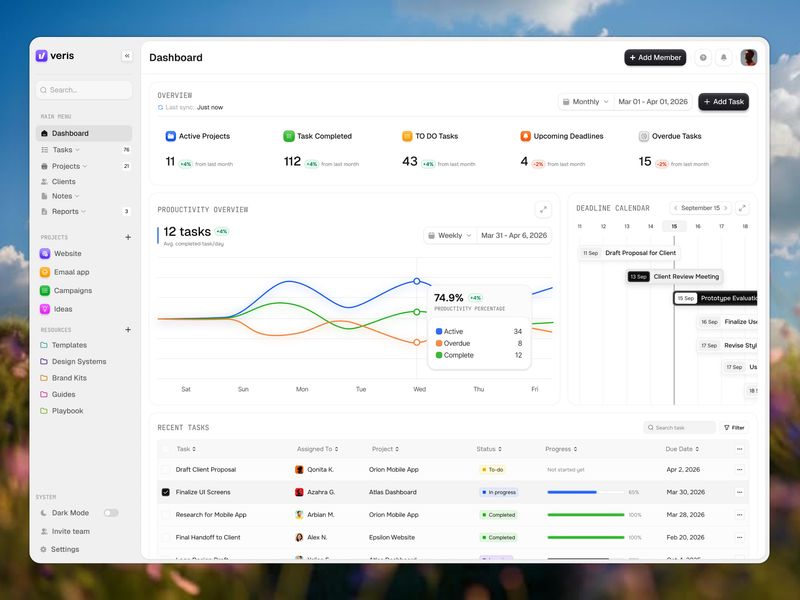
Calendar design is dense UI — it must display a large amount of structured temporal data at high information density without becoming cognitively overwhelming. The best calendar interfaces solve this through layers: a compressed monthly overview for navigation context, a detailed week or day view for active planning, and clear visual differentiation between today, selected dates, and event-occupied days. The fundamental tension in calendar design is between information completeness and visual clarity.
How should event density and overflow be handled in calendar grids?
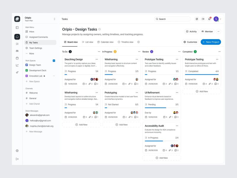
Calendar grids overflow when more events exist than visible rows allow. The standard approach shows 2–3 events with a "+N more" overflow indicator — clicking it reveals a popover or expands the cell. Event styling should communicate category, duration, and status through color, length (in week views), and optional icons. In high-density calendars, color coding by category is essential — but must be backed by pattern or icon differentiation for color-blind users.
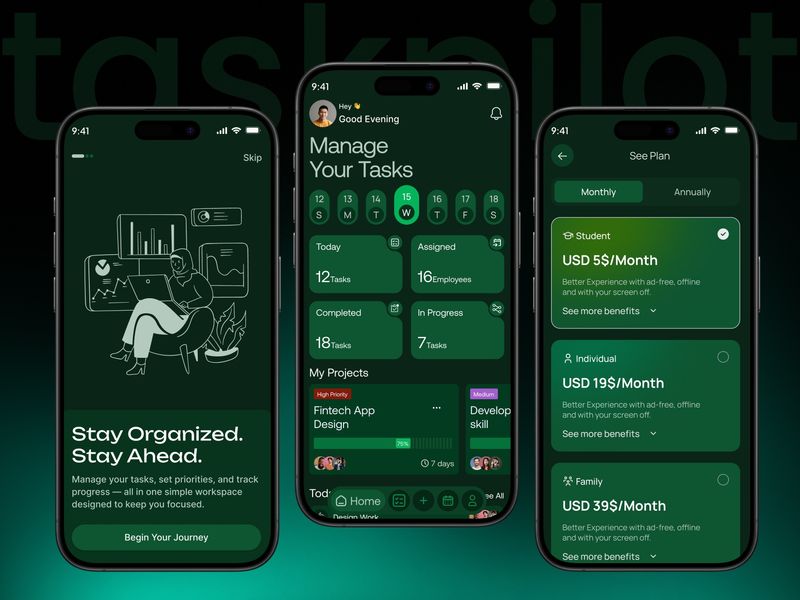
How do mobile calendar designs differ from desktop?
Mobile calendar design typically favors agenda view (chronological list) over grid view as the primary mode — grids become too small to be actionable below 360px width. Month view works as a compact navigation element at the top with the agenda list below a divider. Date selection patterns differ too: on mobile, a bottom sheet for date picking outperforms modal dialogs, and swipe gestures for month navigation are universally expected.