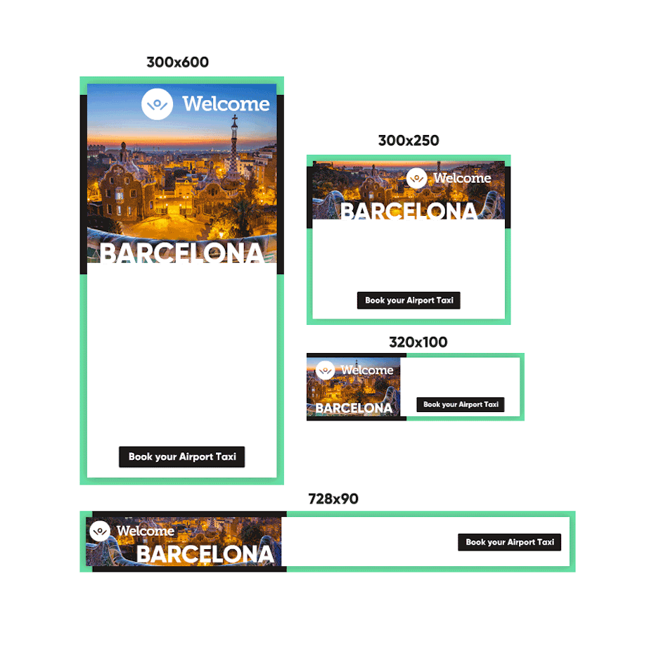
15 banner ad design tips to get more clicks
If you’re hoping to boost your online traffic with banner ads, you may be asking yourself: how can I create… The post 15 banner ad design tips to get more clicks appeared first on 99designs.
We curate topical collections around design to inspire you in the design process.
This constantly-updated list featuring what we find on the always-fresh Muzli inventory.
Last update:
If you’re hoping to boost your online traffic with banner ads, you may be asking yourself: how can I create… The post 15 banner ad design tips to get more clicks appeared first on 99designs.
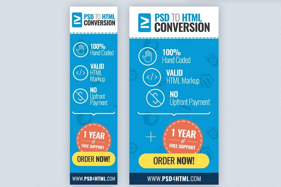
We don’t have to tell you that the interwebs is a cluttered space—and if you want to make an impact… The post 37 banner ad ideas to inspire you appeared first on 99designs.

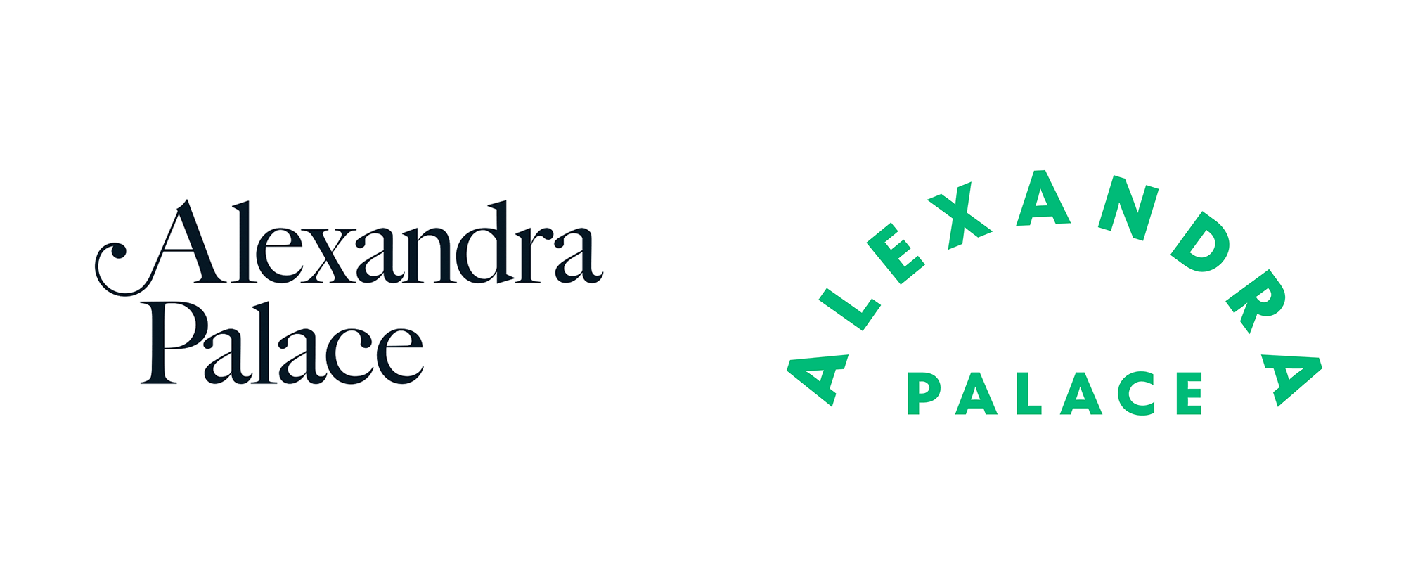
“Archery” Opened in 1873, Alexandra Palace (Ally Pally to friends) is a culture, sports, and entertainment venue in London, UK, hosting exhibitions, conferences, festivals, corporate events, and more. An Act of Parliament in 1936 established that Alexandra Park and Palace would have to be made available for the free use and recreation of the public forever regardless of who the trustee in charge was. Located in a 196-acre estate, Ally Pally offers eight different rooms and halls within the palace that can accommodate more than 10,000 people. The palace has been host to major events from its inauguration in the late 1800s to serving as a refugee camp in WWI to hosting the world's first regular high-definition public television broadcast that took place from the BBC studios that were then housed at the Palace. Needless to say, a lot of history has played out here. Recently, coinciding with the planned renovation of its East Court and Victorian theatre, Alexandra Palace is introducing a new identity designed by London-based Lovers. (The identity is not live online yet but has been implemented on site.) Ally Pally (as it's fondly known to Londoners) has been a multi-recreational Mecca since 1875. But without a coherent brand identity to champion its historic and contemporary significance, the palace's efforts were feeling fragmented. Lovers stepped in to help the brand reclaim its cherished place in the hearts of audiences.No London cultural centre contains as much eclecticism as Ally Pally; music stages, sporting arenas, skate park, theatre, boating lake and 196 acres of parkland. Our 'pleasure dome simplicity' logo seeks to put a lid on it all, along with a colour palette that celebrates breadth.Lovers project page Logo. The old logo looked elegant but that was about it, unless we want to unpack the swash in the "A" which was a little stiff and not very useful. The new logo is a direct reference to the iconic arches of Ally Pally's Great Hall. The length of "ALEXANDRA" lends itself quite well to the arch treatment -- especially with book-ending "A"s at the start and end -- and works nicely over "PALACE". Unlike other arch or type-on-a-curve wordmarks that typically look cool but without a particular reason, this one looks cool and AND is warranted. Typeset in Ganby, the arch logo serves as the more serious hinge of the identity. Business cards. Letterhead. "AP" monogram references. Complementing the wordmark is an "AP" monogram that can be found physically in certain details of the Palace and provides a charming antique ornament that speaks to the history of the venue. Used large or small, it's a quirky and peculiar device that provides a striking contrast to the main logo. Monogram totes. Notebook. Custom font. To complement the wordmark AND the monogram is a custom font that's sort of a cross between the serif in the old logo and carnival typography, yielding a very, VERY unique typeface with a lot of personality. It's hard to hate it because it's having so much fun just existing. It's a very unexpected identity element but I like how it's evocative of the architectural excess of the venue and serves as a way to convey the joy and diversity of the many events that take place here. "I AP Ally Pally" applications. Ally Pally's new brand voice channels a colourful cast of characters from its past and present, borrowing vocal techniques from BBC pioneers, Victorian daredevils and other dreamers. We jotted the recipes in a pocket book for easy reference by the palace's brand team.Lovers project page Brand voice book. Ad. Banner ad. Pencils. Coaster. Exhibit area. Banner. It's a little hard to judge the actual application as, so far, there isn't an evident system that comes through in the images shown. Yes, there is the display typeface and Granby but it's kind of hard to connect the "Whatever Next?" banner with the coaster with the image directly above. But maybe that's the point... providing these ingredients that can be mixed and matched as necessary depending on the subject matter. Signage. The examples of the signage and wayfinding look great, mixing Granby with some ornate icons. The grate-like applications are excellent, adding to the already rich textures of the building. Overall, without knowing what the old identity used to look like (but I imagine wasn't much to look at), this is a great update that manages to feel buttoned up, which is something you want as an event manager, as well as loads of fun, which is what you want as a patron.

Demon sword I did for my class VOID ART SCHOOL totally done in Zbrush low poly done in topogun and maya texture in substance painter. I have no banner no ad nothing, still, let me know if you are interested because the dream that you seeking is only for you. contact/Whatsapp- +917001789933
Programmatic advertising has changed how brands buy media. Instead of negotiating individual placements, advertisers bid on impressions in real time, targeting specific users across thousands of sites and apps. This efficiency is revolutionary for media buyers. For designers, it creates a new problem: how do you create ads that work everywhere, for everyone, at scale? Here is how to design programmatic assets that perform without burning out your creative team. The Scale Problem Traditional campaign design involves creating a handful of polished assets. A billboard, a magazine ad, a social post. Each asset is crafted by hand, reviewed by stakeholders, and approved before launch. Programmatic advertising demands hundreds or thousands of variations. Different sizes. Different messages. Different audiences. Different contexts. A single programmatic campaign might require assets in thirty display sizes, multiple languages, multiple value propositions, and multiple creative treatments for A/B testing. Hand-crafting each asset is impossible. The solution is systematic design. Building a Component Library Programmatic design starts with components, not finished ads. A headline component. A product image component. A logo component. A background component. A call-to-action button component. Each component is designed once, then recombined algorithmically. The component library must be flexible. Headlines should work at different lengths. Images should have safe cropping zones. Logos should have clear space requirements. Backgrounds should tile or scale without breaking. The key constraint is modularity. Components cannot depend on specific positioning or context. The layout engine will place them according to rules, not fixed coordinates. The Responsive Layout Grid Programmatic ads are assembled by machines, not designers. The layout engine reads a set of rules and places components into a template. The designer’s job is to define those rules. Define safe zones for each component. Where can the headline go? Where is the logo anchored? What happens when the headline is shorter than expected? Longer? What happens when the product image is square but the ad is horizontal? The most robust layouts use relative positioning. The logo sits in the top left corner, 5% from the edge. The headline sits below the logo, centered, with minimum and maximum font sizes defined. The call-to-action button sits at the bottom, centered, with padding around it. Absolute positioning breaks at scale. Relative positioning adapts. Typography for Unknown Lengths Text is the hardest variable to control in programmatic design. A headline that looks perfect with seven words may break with fourteen words. A call-to-action that fits on one line may wrap to three. Define typography in ranges, not absolutes. Minimum and maximum font sizes. Minimum and maximum line lengths. Handling for overflow. What happens when the text is too long? Does it truncate? Does it wrap? Does it shrink? Test every text component with the longest possible string and the shortest possible string. The design that works at both extremes will work for everything in between. Image Scaling and Cropping Product images come from a catalog. They have different orientations, different aspect ratios, and different focal points. A programmatic layout must accommodate all of them. Define cropping zones for each image component. For a square product shot, the focal point is the product center. For a lifestyle image, the focal point may be a face or a logo. Use image parameters that identify the focal point, then let the layout engine crop intelligently. Never stretch images to fit. Stretched images look unprofessional and damage brand perception. Crop or add padding, but maintain aspect ratio. Color and Contrast at Scale Programmatic ads appear on sites with unknown backgrounds. A white ad on a white site disappears. A dark ad on a dark site is invisible. Design programmatic assets with a border or drop shadow that creates separation from any background. Use high-contrast elements that remain readable regardless of surrounding content. Test the asset on dark backgrounds, light backgrounds, and patterned backgrounds. Brand colors should be used strategically, not dominantly. A programmatic ad that is 90% brand color may fail contrast requirements. A programmatic ad that uses brand color for the call-to-action button and headline accent will stand out while maintaining identity. Animation and Interactivity Programmatic platforms increasingly support HTML5 assets with animation and interactivity. These assets perform better than static images but introduce additional constraints. Keep animation simple. A fade, a slide, a pulse. Complex animations may fail on older devices or slower connections. Test animation performance before committing. Interactive elements must be large enough for touch. Minimum tap targets are 44×44 pixels. An interactive programmatic ad that requires precise clicking will frustrate users and underperform. Testing the System The component library and layout rules must be tested before the campaign launches. Build a test suite that generates hundreds of random variations. Review them for layout breaks, color contrast failures, and typographic errors. Automated testing can catch many issues. Missing components. Overlapping elements. Text overflow. But human review is still necessary. A layout engine can follow rules perfectly and still produce ugly ads. The designer’s eye catches what the algorithm misses. Version Control and Updates Programmatic campaigns run for weeks or months. During that time, product availability changes, pricing updates, and creative fatigues. The ability to update components without rebuilding every asset is essential. Maintain a single source of truth for each component. Update the headline library, and all ads using that headline update automatically. Update the product catalog, and all ads using those images update automatically. Version control is not just for code. It is for creative assets. Know what changed, when, and why. The Bottom Line Programmatic ad design is not traditional design. It is design for a system that designs. The designer’s role shifts from crafting individual assets to crafting the rules and components that generate those assets. Invest in the component library. Define the layout rules rigorously. Test at scale. Then trust the system to do its job. The campaigns that perform best are not the ones with the most beautiful individual assets. They are the ones with the most robust systems behind them. The post Programmatic Ad Design: Creating Assets That Scale appeared first on Designer Daily: graphic and web design blog.
Social media is one of the main pillars of online marketing. There are countless gurus all marketing various ways to reach your target audience on Facebook, Instagram and Twitter, but what do you do if your ideal customer is the type who doesn’t use social media? While some would say that these people are impossible to reach, that is far from the case. You need to get creative with your marketing. Here are five ways to make it happen. Collaborations with public figures Celebrity marketing has always been an effective way of putting your brand front and center. Online casinos have made regular use of collaborations with celebrities – whether it’s asking a public figure to promote them in a TV commercial or branding their poker rooms with the face of a well-known star, these collaborations can bear fruit. You can do this with any type of business. This is the original version of social media marketing. Mailing lists An estimated 56% of the world’s population uses at least one social media channel, which means billions don’t. Just because you cannot find them on social media certainly doesn’t mean they’re not online. Mailing list marketing is a way of forming a deeply personal connection with your target market. Provide exclusive, insightful content via your mailing list. Give incentives to sign up, such as by offering discounts and pieces of free content. Building up your mailing list is making a long-term investment in your business and can reach those who choose not to be on social media. Sponsored posts Content marketing is one of the strongest tools you have in your arsenal. The problem is that promoting these posts on social media only works if your audience is actually on social media. One way to reach a whole new audience is to produce a sponsored post. Posting your content, with a link, on someone else’s blog helps you to connect with their audience and bring them over to you. Some sponsored posts are paid and some are free, so determine what your budget is before executing this strategy. You’ll need to do your research and analyze which competing websites attract your target audience. A sponsored post won’t do any good if it has not been targeted appropriately. Traditional marketing techniques Those in the older generations are the type who may not have a social media account. If your products are aimed at people who’re unlikely to have a social media presence, go back to basics and think about traditional marketing techniques. Despite the onset of online marketing, traditional marketing still works. Paying for a billboard, sending out a mailing blast or even investing in a TV commercial are all ways you can target these individuals. It’s also one of the best ways for how to plan the perfect holiday campaign. People are still receptive to real-world marketing techniques, even as the world becomes more digital. Take note that due to the growth of online marketing, the cost of traditional marketing channels has dropped in many cases. Online streaming ads Podcasts, digital radio and YouTube ads are all ways to advertise without needing to interact with social media. Streaming ads are highly effective because they’re unaffected by conventional ad blockers. Normal banner ads and static video ads are usually never seen by most watchers, due to the effectiveness of ad blockers. Today’s online streaming ads get around ad blocking technology and force people into watching/listening to these advertisements. It’s also worth mentioning that if your ad is being read out by a radio or podcast host, you’ll get the benefit of association. Regular listeners are always going to engage more with an ad if they’re listening to a trusted voice telling them about it. Streaming ads are still relatively cost-effective, but the average price per spot is going up, due to increasing competition. Conclusion It can seem like an impossible task to capture an audience when social media is ruled out. Yet think back to a time before social media existed – it was possible to market to them then. Successful advertising without social media requires an understanding of the content your audience consumes, and reaching them there. Don’t give up on social media-less users. Think outside the box and utilize some alternative advertising options to make your mark and connect with a whole new audience. How are you advertising away from social media? The post 5 ways to advertise to adults who aren’t on social media appeared first on Designer Daily: graphic and web design blog.

Modeling, Textures, Lighting, Rendering, Compositing, CGI, 3D, 2d, light, Creative, Direction, Illustration, Production, Advertising, ad, adobe, post-production, wacom, engine, print, autodesk, art, composing, design, retouching, scenes, style, unique, graphic, metal, digital, sculpting, cg artwork, 3d artwork, strategy, marketing, agency, premium, luxury, identity, idea, method, trend, international, composition, effective, key, visual, business, concept, solution, press, design studio, brand, case, ads, making of, color, colour, inspiration, photoshop, mood, art direction, business, graphics, collection, geometry, texture, prints, digital art, startup, drawing, sketch, freelance, award, awarded, outdoor, presentation, visual, client, modern, concept, billboard, poster, brief, freelancer, digital art, trendy, skill, mood, art direction, studio, brand, editorial, sustainability, indoor, visual, architecture, presentation, landscape, unique, best, PR, banner, art direction, technique
Here Lives Amanda Amanda Cole Melbourne based Freelance Graphic Designer and Illustrator banner branding print book
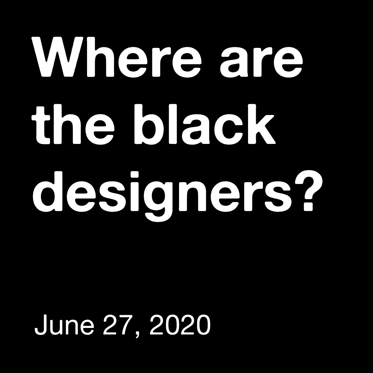
“Brand New” The design industry is lacking black voices. The 2019 AIGA Design Census reports that only 3% of designers, across disciplines, are black. How can we "design for change" when the design industry is part of the problem? Where are the Black Designers is an initiative which aims to give a platform to creatives of color. By connecting designers, educators, and creative leaders we hope to start a dialogue about change in and out of the design industry. Join us virtually for our first annual conference and step forward in initiating this conversation. The initiative will kick off with a virtual conference on June 27 that will contain a panel of designers, educators, and creative leaders who will also be giving lectures and running workshops on how we can come to together and use our skills to creatively resolves issues within this racist system as well as tackle the diversity issue within the creative and tech field. If you are interested in speaking at this event, have a question for us, or simply want to support us in this event that is open to everyone, not just designers, please head over to wherearetheblackdesigners.com where you can also RSVP for the event. Ed.'s Note: This post (and the banner ad you will see on Brand New) are being provided free of charge to the initiative. This is one small way for us to contribute to the current conversation about racism and stand in solidarity with Black Lives Matter. We would be delighted to help amplify others' similar efforts and messages intended to reach a design audience, so please don't hesitate to reach out to me at armin@underconsideration.com if you think we can help.
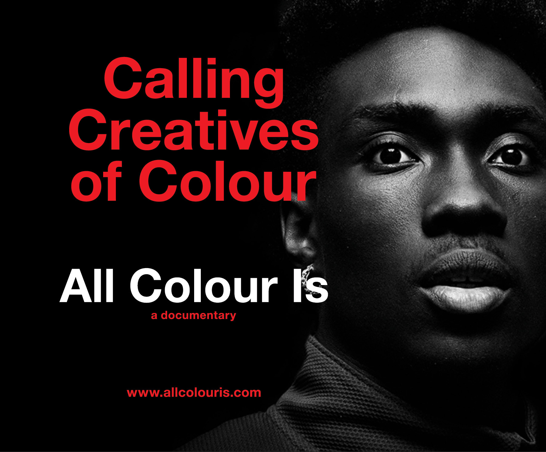
“Brand New” All Colour Is is a documentary film project into the journeys of BIPOC Creatives across various disciplines. It will tell their stories on the desire to succeed, the peaks and valleys and being more than a visible minority in one of the largest industries in the world - Design. We're wanting to speak with creatives from Graphic Design, Industrial Design, Interior Design, Architecture, Fashion, Advertising, Illustration or Photography. Those who are willing to share their stories and their insights on how and what it took to continue to do what they enjoy as a profession. If you, or know someone who would like to share their story, please get in touch: EmailInstagramLinkedInFacebook From the moment we were tearing through our first set of crayons, we knew we were creative and we knew we were different. Our challenges are and have been both both internal and external. From looking to be taken seriously and seen with respect to how we worked our way through design school, jobs and our relationships with superiors, colleagues, friends and even family. However, how would the world be able to see us if we couldn't even see ourselves in the world? What we BIPOC Creatives also share is the unique experience of not having certain opportunities and not occupying certain creative spaces because we have what the majority of individuals in creative industries do not - a darker shade of pale. Yet in spite of this uphill battle we continue to find the joy and purpose as Creatives.Michael Sinanan, director To learn about how this project came to be, you can read this post. Ed.'s Note: This post (and the banner ad you will see on Brand New) are being provided free of charge to the initiative. This is one small way for us to contribute to the current conversation about racism and stand in solidarity with Black Lives Matter. We would be delighted to help amplify others' similar efforts and messages intended to reach a design audience, so please don't hesitate to reach out to me at armin@underconsideration.com if you think we can help.

In the relentless scroll of our digital lives and the fleeting glance of a highway commute, a brand has only a moment to make an impression. In this fragmented attention economy, a disjointed ad campaign isn’t just a missed opportunity, it’s a brand liability. The modern consumer doesn’t live in one medium; they flow seamlessly from the physical to the digital, and your advertising must do the same. This is where the power of cohesive campaign design comes into play. It’s not just about using the same logo or slogan; it’s about creating a powerful visual echo, a consistent sensory experience that reinforces your message, builds recognition, and makes your brand unforgettable, whether it’s seen on a 50-foot billboard or a 3-inch smartphone screen. The Billboards: The Bold First Note A billboard is the ultimate test of visual conciseness. You have 3-5 seconds to communicate your core idea. The design must be: Bold & Simple: A single, powerful visual, minimal copy, and high-contrast colors are non-negotiable. Instantly Legible: Typography must be clear and impactful from a distance. Every element needs to earn its place. Emotionally Resonant: The imagery should evoke a feeling in an instant. Think of the billboard as the campaign’s thesis statement. It sets the tone, establishes the key visual hook, and makes a broad, sweeping promise. The Digital Ads: The Intimate Conversation Digital ads, from social media banners to pre-roll video, operate in a more intimate space. The user is engaged, often with intent. Here, the billboard’s bold statement is adapted for a two-way conversation. The design must be: Scalable & Adaptable: The core visual identity must work as a massive banner on a website and a tiny, clickable square on Instagram. Interactive & Action-Oriented: Design elements should guide the user toward a call-to-action (CTA), such as “Shop Now,” “Learn More,” “Sign Up.” Contextually Aware: A digital ad can feel native to its platform while still being unmistakably part of the larger campaign. The Magic of Cohesion: Weaving the Threads So, how do you create this visual echo? It’s about establishing a strict design system and applying it flexibly across all touchpoints. 1. A Unifying Visual Hook:This is the anchor of your campaign. It could be a distinctive color palette (think Spotify’s vibrant gradients), a unique illustration style, a recurring character, or a specific photographic treatment. This hook must be present everywhere, creating a through-line that the consumer’s brain automatically connects. 2. Consistent Typography & Voice:The font family used on your billboard should be the same one in your digital ads. Similarly, the brand’s verbal tone must remain consistent. This harmony between what the user sees and reads builds a coherent brand personality. 3. Strategic Asset Adaptation:You don’t just shrink a billboard for a Facebook ad. You adapt it. The hero image from the billboard might become a dynamic background in a video ad. The short, punchy headline might be expanded into a compelling caption. The core visual is broken down into its most potent components and reassembled for the new format. 4. Building Recognition and Trust:When a user sees your billboard on their way to work and then encounters a digital ad that feels visually familiar during their lunch break, it creates a powerful cognitive shortcut. This repetition builds recognition, which in turn fosters trust. A cohesive brand appears more professional, established, and reliable than a fragmented one. Case in Point: The Seamless Journey Imagine a campaign for a new electric vehicle: The Billboard: A stunning, minimalist shot of the car on a scenic coastal road at dawn. The only text is the car’s name and a sleek, futuristic logo. The dominant colors are the deep blue of the ocean and the warm orange of the sunrise. The Digital Ad: A user scrolling through a tech blog sees a video ad. It opens with the same coastal road, the same color palette. The camera zooms in on the car’s sleek dashboard, and a CTA appears: “Explore the Interior.” The visual and emotional connection is immediate. The billboard planted the seed of desire; the digital ad provided the path to fulfillment. They worked in concert, not in isolation. Conclusion: Design for the Ecosystem, Not the Medium In today’s cross-channel world, the most successful brands are those that design for the entire consumer ecosystem. Cohesive advertising isn’t a limitation on creativity; it’s a strategic framework that amplifies it. By creating a strong visual echo across billboards and digital ads, you ensure your brand doesn’t just capture a glance, it earns a lasting place in the consumer’s mind. Stop thinking in terms of single ads and start building visual systems that resonate, wherever your audience may be. The post Creating a Visual Echo: The Role of Cohesive Advertising Campaign Design Across Billboards and Digital Ads appeared first on Designer Daily: graphic and web design blog.
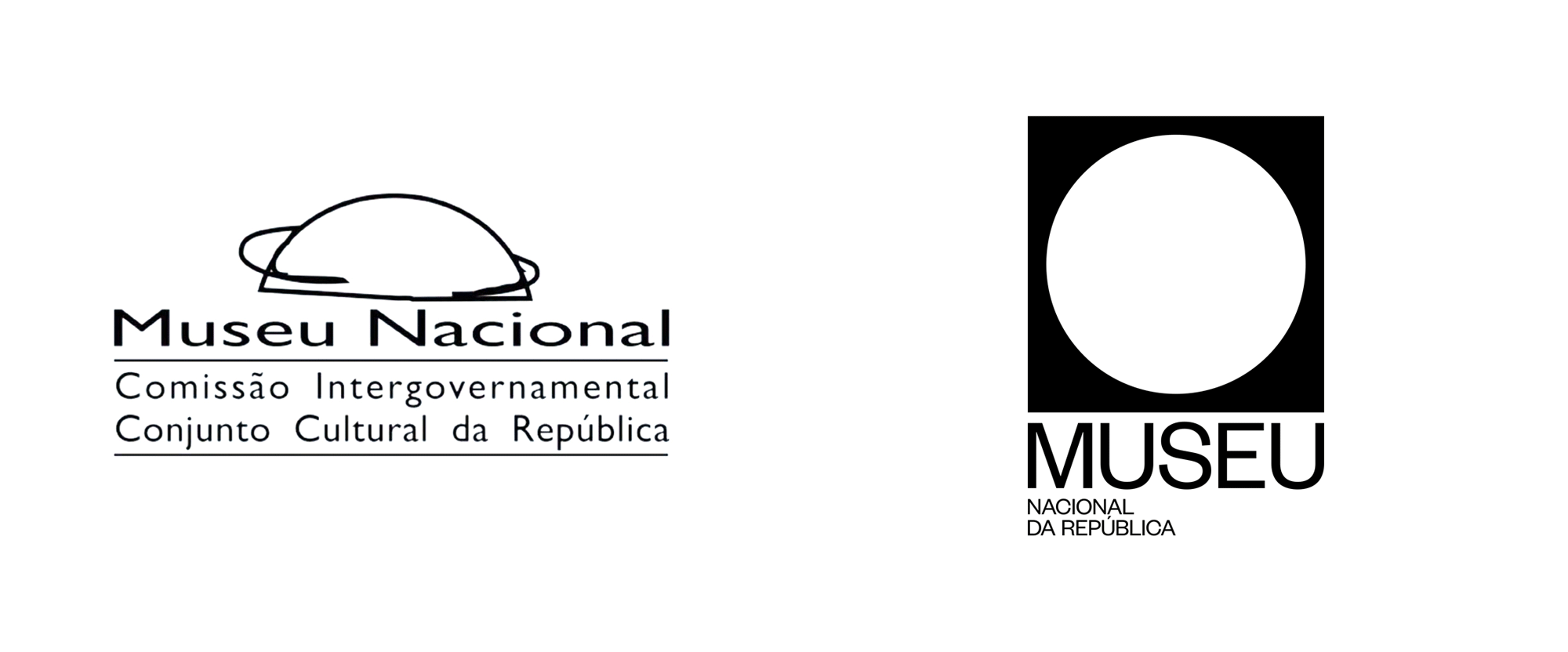
“Round Hole in a Square Peg” Established in 2006 (originally as Museu Nacional Honestino Guimarães in honor of the activist who was president of the Federation of Students of the University of Brasília and was arrested four times, disappearing after the last), Museu Nacional da República is a public art museum in Brasília, the federal capital of Brazil, administered by the government and devoted to promoting Brazilian culture and artists. The building is part of the Complexo Cultural da República ("Cultural Complex of the Republic" in Portuguese) along with the National Library building, both of which were designed by Oscar Niemeyer, considered to be one of the key figures in the development of modern architecture. Looking to increase visitation, collaborations, and profitability, the museum introduced a new identity late last year designed by Brooklyn, NY-based Porto Rocha who were commissioned by Brasília and São Paulo, Brazil-based Manufatura. The circle and square join together to create a modern symbol for Museu Nacional. As a central feature of the identity, it represents the aerial view of Niemeyer's dome while establishing the idea of "inside and outside", contrasting the relationship between these two spaces. More than what it encloses, the surrounding area of the museum acts as a bustling social hub where citizens congregate, musicians perform, activists protest, others practice yoga and so on. Like a portal, the circle also functions as a graphic device that contains different imagery, be it photography, architecture, art or video, connecting and juxtaposing these two spaces in a constant state of dialogue and tension. A contemporary take on a traditionally modern typographic style, the use of Founders Grotesk recalls the visual language employed during Brasília's early urban development while its circular letterforms allude to the museum's infinitely curved walls.Porto Rocha project page The museum. The museum from above. Logo. I probably don't have to tell you that that the old logo was... not good. A ground-level view drawing of the museum was a good idea but the execution was downright baffling and as if I didn't dislike Gill Sans enough already, seeing it stretched at least 200% wider than it is, is doubly offensive. The new logo shifts the view of the building to be seen from above and translates it into an abstract, Modernist- and Minimalist-satisfying black square with a white circle. Typically, this could come across as gratuitous Modernism/Minimalism from a museum identity but, in this case, it's perfectly appropriate as it not only aptly represents the physical space and context of the museum but reflects the building's Modernist origin. It also looks kind of bad-ass in its confidence. The wordmark emphasizes "Museu" as, reportedly, that's how locals refer to the museum, rather than by its long name, and the uppercase setting yields a very nice block of type that aligns, again, so satisfyingly, with the icon above. The "NACIONAL DA REPÚBLICA" underneath may be a tad tiny, perhaps allowing it to occupy 75% of the width instead of 50% would have been a nice gesture. The logo also includes a horizontal version (seen below) where all the type is the same size and broken into lines, which is fine but loses the really nice balance of the stacked logo. Business card. Stationery. Though the museum operates upon inclusive values that seek to provide free access to contemporary art and culture, the museum (and fine art itself) can feel intimidating and elitist. With this in mind, our utilitarian visual language paired with a warm tone of voice work together to strengthen the relationship between the museum and the people. This sentiment is reinforced through the wordplay of "SEU MUSEU", an anagram created by Manufatura meaning "YOUR MUSEUM", which highlights each individual's role within Museu Nacional's dynamic ecosystem, fostered by its contributors, crew and visitors.It is the balance between the identity's modernist rigor and the otherwise inviting tone of voice that creates a uniquely modern-Brazilian sensibility referencing both the country's significant contributions to modernist architecture and the warm energy of its people. Much like the symbiotic relationship between the museum's interior and exterior, each component of this identity comes together to form a similar notion of universality that surrounds the museum: a place for everyone.Porto Rocha project page Layout configurations. Sample layouts. Brochure. Museum guide. Poster. Instagram post and email newsletter. Instagram Stories. Instagram profile. Shelter ads. The applications are all quite nice but definitely operate within the Brutalist-lite style that is a year or two too late. Perhaps it's unfair to raise the comparison as I do think the design approach makes perfect sense in this identity and I enjoy it but there is a strong sense of Been There Done That. One great detail that I would love to see more of is in the first shelter ad above where the icon is placed over a photograph for a hollow effect, which is also exaggerated in the ambitious banner shown below -- if that ever became real, it would win application of the year. Banner. Employee ID. Tote bag. Plastic bag. Wall graphics. Entrance. This is so good. Overall, this is perfectly executed and even though for us Brand New folk the style may seem repetitive this is highly appropriate for the museum, presenting it in an elevated aesthetic that should, in turn, help elevate the status of the museum.
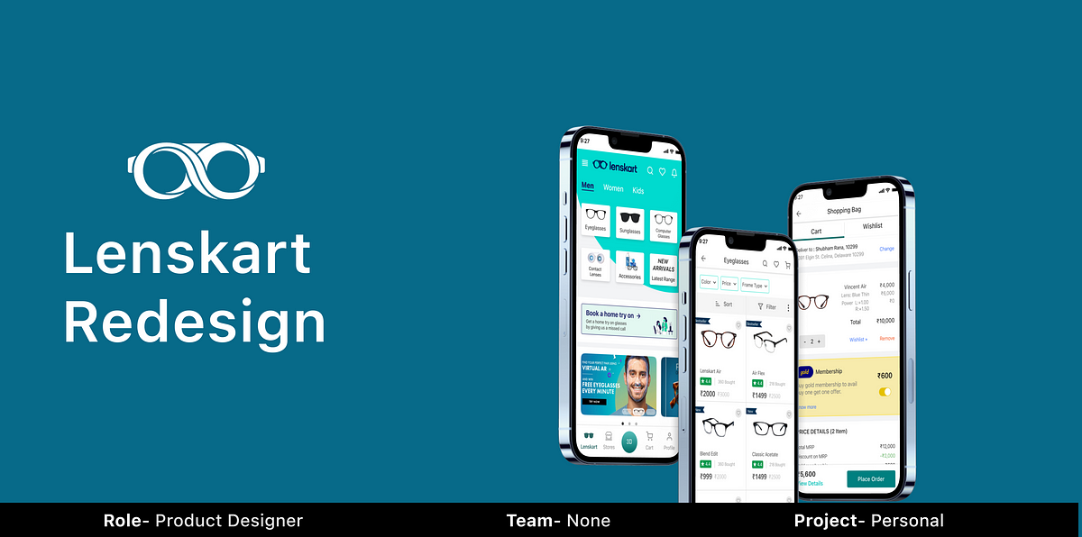
Improving the buying experience of Lenskart — UI/UX Case StudyIn this article, I will go through the existing Lenskart user flow and try to improve the user buying experience by redesigning it.Context🧵So the other day I was scrolling through the phone in the afternoon. Try to buy my next pair of eyeglasses. So like any other person, I downloaded the Lenskart app, and HOLY SH*T 😲. My first impression of the app was so awful. User flow, layout, and placement of elements are all over the place. It was total chaos. My inner designer couldn’t see it anymore. So, I thought why not redesign it. So I decided to give it an overhaul.A little Disclaimer This case study is part of my personal project on the journey of learning UX.Let’s get started..But before that who’s up for a teaser!https://medium.com/media/77ff386b62193d86285927aa25875a87/hrefAbout Lenskart 😎Lenskart is India’s biggest and leading startup in the eyewear industry. It was founded by Piyush Goyal (If you are a fan of Shark Tank India you already know him.) It has a market share of more than 30% and is valued at over $5 billion as of now.User Research 🔎But before redesigning I have to confirm is it just Mee Problem or a We problem. To validate that I did some user research. Before jumping directly to interview users, first I googled some reviews to gain more perspective and understand the pain points.I also did a quick Twitter poll to confirm before going full in.Twitter PoleOnce I get sure I dive deep to take first-hand experience from the Lenskart users themselves. For that, I interviewed 5 people on a 1:1 call. Before that, I prepared interview questions. It took me some time to prepare what question I need to ask, keeping in mind that they should not be leading one, should be natural, should not deviate from the objective & most importantly should not feel like an interview. Here are the questions I asked.https://www.notion.so/Lenskart-Interview-question-058d3d3249dc4284b84456be36ad57f0Key insight from the user research 🧐After taking the interview I got enough input to get started with my redesigning process. Here are the key insights:-4 out of 5 people admit that the checkout process is complicated, and the benefits of gold membership are not clearly defined.1 out of 5 people ordered the wrong frame size which is critical and needs to be understood why.3 out of 5 people find it annoying that you've to submit eye power after completing the purchase.4 out of 5 people find it hard to navigate through the app. Mainly because banner ads and clickable elements look the same. Also so much unnecessary info throughout the app.Diving deep into the Problem Statement📌After some research, I found out that most people are having the same sort of problems. This includes:-Confusing User flow, Users can only fill up the eye power prescription once they complete the purchase process. The window of 10 days has been given.There’s chat assistance on every page of the application which directs the user to WhatsApp or calls dialler. Dropping off from one application to another is not a good user experience.On the home page, there’s no difference between the ad and a clickable element.Try-on home feature is not evident. Most people fail to notice it.The header of the home page is filled with useless options like delivery time, computer glass, prescription, and chat with experts. They’ve to no relation whatsoever.Confusing checkout process. The benefits of gold membership are not stated clearly enough, which adds more to the confusion.User Flow🚣♂️New and existing user flowHome Screen🏠Old DesignUser lands on the home screen and gets overwhelmed and confused by the number of options presented to him.First, there is no bottom navigation in the app.There’s an endless horizontal scroll on the header, consisting of redundant options like delivery time, chat with expert, and computer glasses. Things are not grouped logically.So many subcategories under the men's section, also why kids glasses under the section and different subcategories for colored and non-colored contact lenses. Things are all over the place.Important features such as Home try-on & Find your frame size, which is the moat of lenskart are disguised as a banner ad. Many users overlook it while scrolling.Redesigned ScreenBring bottom nav for easy navigation through the app.Header is cleared and replaces the horizontal scroll with more predictable icons.Category options reduce to half. Similar subcategories are nested into each other.Gave more prominence to home try on and 3D ditto feature.Visible difference between banner ads and clickable elements.User flow of product listing page🔰Old DesignUser selects the type of eyeglass and proceeds to the product listing page. He is presented with a number of options that increase the cognitive load in the first few clicks.Have to choose between power or non-power eyeglass along with the price range.Have to select the shape of the eyeglass without knowing how would it look on his face.Also overlay of the 2nd screen which is a clickable element looks the same as the banner ad of the 4th screen, which is not clickable. Such practice inhibits the user whether he should click on it or not.flow of product listing pageRedesigned ScreenUser can proceed direct to product listing page and remove all the unnecessary steps. Price range, power, and shape of the eyeglasses all can be filtered and accessed on the listing page.User flow of selecting the frame👓Old DesignIn the secondary research and also primary research I found that many users ordered the wrong frame size. Upon auditing the app I found out that’s happening because of a number of reasons. There are three flows users go through:-Flow 1 (Results in ordering RIGHT frame size)User lands on product listing page and sees preselected wrong frame size, clicks on the frame size button.It leads to a page where the app analyzes the shape of the user's face and tells him his frame size. User continues to show his frame size.User selected the right frame size and proceeds to the product detail page.Flow 2 (Results in ordering RIGHT frame size)User lands on product listing page and fails to notice frame size button which is not evident enough and proceeds to product detail page with preselected wrong frame size.User saw frame size of the selected eyeglass and unsure about the size, user then clicks on the check frame size button.User gets to know his frame size, selects the right size, and continues to check out.Flow 3 (Results in ordering Wrong frame size)User fails to notice frame size button which is not evident enough on the product listing page and proceeds to product detail page with the preselected wrong frame size.User saw the frame size of the eyeglass, and assumes that this is his size which is not true.User also ignores the check frame size button, which looks a lot like a banner ad, and continues to checkout resulting in ordering the wrong frame size.Also, the app doesn’t ask for a review to select or change the size before adding it to the cart. Which results in ordering the wrong frame size.Redesigned ScreenUser lands on product listing page and clicks on the product card which leads him to the product detail page.On product detail page user selects his size. If user is unsure about his frame size, he clicks on the not sure button which leads him to the page which analyzes face width and tells him the frame size.User selects his frame size and proceeds to lens selection.I add an interaction button while selecting glass. It allows you to move your head sideways.Lens selection flow📸Old DesignIn the existing flow, user can only submit his lens power post order placement. A window of 10 days has been given in which lenskart executive asks for lens power.Lens selection flow of lenskartRedesigned DesignIn the redesigned flow user can submit his lens power before order placement. User is presented with 3 options.If user knows his lens power he can submit it right away by entering it manually or by uploading the prescription.If user does not know his lens power, he can add an eye test.User can also skip this part for the time being and submit it later post order placement like the previous flow.Option 1User submits the power manually which later reflected in the shopping cart.Option 2User adds an eye test which later reflected in the shopping cart.Shopping Cart🛒Old DesignIn the research phase, many users complained that gold membership is added to the cart without consent. User feel betrayed which takes away their autonomy. Also, price details are too complex to understand.Redesigned ScreenIn the redesigned shopping cart few changes have been made:-User can add or remove gold membership without compromising his autonomy.Price detail of frame and lens is given separately, which was not the case earlier.Clear visible cue that offer is applied.Price detail breakdown of shopping cart is easy to understandFinal Prototype😎Animated gif of full user flowFigma file clickable prototypehttps://medium.com/media/7aeeb7b6f064d28973b42b352a304a66/hrefFoot Notes 🤯Low fidelity sketchesLearnings & Takeaways🧐Putting yourself in the shoes of user is very useful while thinking of all the use cases.Designing cards and understanding information architecture and the importance of minute details.Since this is my first redesign case study, I understand the importance of heuristic evaluation.There’s no alternative of iteration. Keep improving and building on top of other designs.Understanding the ‘Why’ behind every decision was a major takeaway.Naming layers appropriately, it can get overwhelming as your number of screens keeps increasing.And That’s a wrap… 🤟Thank you for sticking to the last.If you want to connect you can email me at shubhambsr2021@gmail.com or drop a Hello! on Instagram or Linkedin.Improving the buying experience of Lenskart — UI/UX Case Study was originally published in Muzli - Design Inspiration on Medium, where people are continuing the conversation by highlighting and responding to this story.
News of the week about design, products and toolsHIGHLIGHTElon Musk unveils Neuralink’s plans for brain-reading ‘threads’ and a robot to insert them.ARTICLESA Product Designer’s Guide on Relaxation.Typography in Design Systems.WATCHiMac 2019 and iPhone XI concepts.Incredible archive of Apple’s promotional photos and ads.TOOLS & RESOURCESA library of a customizable avatar component for Sketch.308 Free Resources for Marketing.A little ffmpeg wrapper app for some video shortcuts.GET INSPIRED4fresh app / onboarding conceptDashboard video tutorialDIABLO Y BANANAThe DeadlinePrevious Design Digest #94.Follow us on Twitter, Facebook, Instagram, Dribbble and rivercity.ioDESIGN DIGEST 95 was originally published in Muzli - Design Inspiration on Medium, where people are continuing the conversation by highlighting and responding to this story.
How do illustrations make a brand unique, recognizable, and loved by users?Illustration: OutcrowdMany people are plagued by outdated stereotypes, believing that illustration lies squarely in the realm of art and has nothing to do with business. (Try telling that to Warner Brothers or Walt Disney Studios!) This archaic view holds your company back and makes it less profitable because today’s digital illustration is all about business.So let’s dispel these harmful misconceptions. Illustration is a marketing tool, no matter how nice and beautiful it looks. Its goal is to advance business, provide information, and attract people.Let’s take a look at the areas where illustration is especially effective. Maybe some of it will be useful for your own business.Fruits & Vegetables Delivery — Mobile App Design1. Brandingefficient visual marketingMany businesses spend huge money to stand out among the competition, make themselves noticed, and create a customer base. Forging an emotional connection and trust between your brand and the audience is a very difficult marketing task.The use of illustration in brand campaigns is a surprisingly simple and cost-effective solution.How so? Illustration is a wonderful medium of communication. Being visually concise, illustrations provide immediate recognition, make complex things easier to understand, build trust, and are effortlessly memorable. It is a psychological feature of human visual perception, happily exploited by all the smart marketers.Vertical — Branding for Music SchoolAny brand that uses illustration gains uniqueness and character. Images can tell the company’s history in a fun and informative way, addressing the audience at a visceral, emotional level.Illustrations are human. The deeper we go down the digital rabbit hole, the more important these clusters of humanity become. Handmade drawings signal your willingness to treat your users with care and affection, to address them as fellow human beings.https://medium.com/media/20d28ee9ee8473047337f1e94070825a/hrefillustrated logoThis is the best choice for startups, companies with large competition, or any businesses that want to make themselves noticed and be immediately recognized. To the average consumer, even the nicest-sounding name is nothing but a bunch of letters that they will quickly forget or fail to understand in the first place (this especially applies to acronym logos).An illustrated logo solves all these problems: it focuses attention, it makes the offer immediately apparent, it is visually memorable. Combined logos that incorporate both image and text are the most popular.Depending on the type of business and brand goals, the logo can be either a neat, abstract image or an elaborate, detailed picture.mascotA mascot is your business’s virtual ambassador. It embodies the values of your brand and audience, “talks” to people, and creates positive emotions. Mascots are so memorable you can’t forget them if you tried.brand managementIllustration can help you present your corporate culture, express your brand values, and motivate your team in a friendly way. Employees always like “inside illustrations,” as they bridge the gap between the management and the workforce and help convey the necessary message.Outcrowd Corporate DesignBranding illustrations are made on the basis of their visual identity (corporate style, logo, color palette, fonts, etc.) according to the brand requirements and current marketing tasks. To be effective, the illustrations must be geared toward specific goals, being functional rather than decorative.2. Advertising campaignsbannersAn illustrated banner is a perennial trend due to the features of human visual perception. A banner with a creative illustration is often more effective than one with a photo. The reason? Even the most minimalist of photos have lots of distracting details. You can be focused on the drops of sweat on an athlete’s forehead or admire his muscles and not even notice that it’s actually an ad for running shoes.This kind of thing doesn’t happen with illustrations. Today’s illustrations mostly convey meaning rather than imagery. Any potential distractions are eliminated. It’s a message that goes straight to the heart.printed productsIllustrated business cards, booklets, leaflets, catalogs, posters, and calendars can present your brand in an effective and original way, make an impression that will have a memorable effect. Good pictures can make promo materials so attractive that people will find them hard to throw away — or at least, not immediately. So they will keep your promos around for some time, which is all to your benefit.souvenirsIllustrations can also be used to make branded souvenirs, such as printed t-shirts or caps, mugs, pens, notebooks, etc.Outcrowd Corporate Design3. Online presencepresenting the companyIt’s increasingly more difficult to be noticed among the competition online. Unique illustrations are a great way to make your company’s online presence memorable, whether it’s a website, landing page, or social media profile. Illustrations liven up the design, spark interest in the content, establish an emotional connection with users. Custom illustrations increase a website’s conversion rates at least 7×. They are geared toward a specific audience (i.e. customer-oriented), they are emotionally engaging, and they make the interface friendlier.NFT Marketplace with IllustrationsAn illustrated character, visual metaphors, your corporate style, and the latest trends in digital illustration will all help your website design to make a vivid and lasting first impression on the users.presenting products or servicesA presentation implies drawing attention to an object or a piece of information. Illustration does this instantly, immediately winning the audience’s favor.If your product or service is difficult to describe in words, it should be illustrated. This saves your website from being overcluttered with extra content and makes the information more comprehensible.Illustration is a great seller of products and services. And it works for free!social media & mailing listsWe are bombarded with so much advertising that most offers simply go ignored. An illustrated message, however, always stands out from the bulk of formulaic ads, drawing the eye and making us interested in spite of ourselves.Creative illustrations are an easy way to draw attention to your posts and boost your brand recognition.If you regularly mail out letters or ads to your clients, illustrations will become a part of your signature style and make your mailouts friendlier and more interesting to the users.Illustration is also a useful tool for drawing attention to text. Even a small drawing is often more effective than a photo, which is nothing special these days. A drawing is a distinctive visual anchor. It encourages to read the text or at least the first paragraph. For instance, which section is your eye immediately drawn to — the left or the right one?4. Packaging designIllustration helps sell physical goods as well as digital products. Illustration is a versatile solution for packaging all kinds of products. It looks equally good on a box of pastries or a box of high-tech gadgetry. It is universally liked by both male and female audiences, regardless of age.Packaging and Branding — Wendy’s Granny ChocolateIn conclusionAs we have seen, there are many areas of business where illustration can work miracles and make your brand:stand out among the competition;fun and recognizable;easily comprehensible;emotionally engaging;trustworthy;memorable.Of course, this applies to professional illustration, not just any drawings. Before using illustration in any way, do some marketing research to determine whether it makes sense for your business and which areas will benefit from it the most.Once you’ve done it, take the time to examine the portfolios of different agencies and pick the style that best fits your business and brand character. The visual concept must always be created by marketing experts, and only then realized by artists and designers. This is the best way to turn illustration into an invaluable marketing tool that will work effectively to your company’s advantage.Illustration: OutcrowdHow to Use Illustration in Design as a Marketing Tool was originally published in Muzli - Design Inspiration on Medium, where people are continuing the conversation by highlighting and responding to this story.
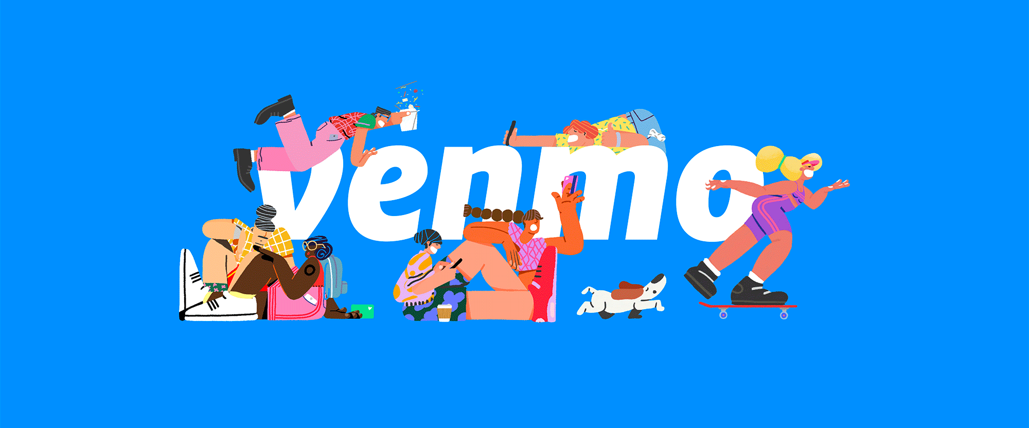
“Mo’ Money” Established in 2009, Venmo is a mobile payment service that allows people to quickly send each other money through their app. Unlike PayPal (although owned by PayPal since 2013) where there are multiple clicks and screens required to send money to a friend, the Venmo app makes this process relatively easier and quicker (at least once you have located your friends -- the few times I have used it, finding people, the right people, was confusing and uncertain). Transactions are free as long as the money is coming from a linked bank account, with money being made by PayPal from credit card transactions and from select merchants who accept Venmo as payment. In 2018, when Venmo's popularity began to rise, it processed $12 billion in volume in the first quarter alone. Apart from the ease of use, what makes Venmo interesting is that its home screen is a feed of other users transactions so you can see either complete strangers' or your friends' payment activity -- no specific amounts just who they paid and for what -- which, call me old fashioned, but the first time I realized that my transaction subjects were public it felt very invasive. You can opt out of making your transactions public, yet this is what makes Venmo, Venmo... officially a "social payments app". Starting with their social media, Venmo is rolling out a new identity designed by Koto. The new electric blue retains the heritage of the original Venmo blue. It's been tweaked to work harder and more consistently across all applications, on screen and off. A broader palette of complementary colours now sits alongside it. With its flexibility to be either bold or controlled, Athletics is the perfect typeface for Venmo, more than matching the energy of the rest of the brand. Scto Grotesk is a more functional secondary partner that still holds its own.Koto project page Logo, before and after. No, your eyes do not deceive you, there is nothing different about the logo, which remains exactly the same. The only difference is the tone of blue, which seems frivolous but, at least as a sample audience of one person, the first time I ever used Venmo, the shade of blue gave me pause in whether I would trust the service or not -- it felt like a cheap color for an app from the mid 2000s. It didn't seem right. The new blue is obviously on trend but it now fits within the vibrant Instagram/Facebook/WhatsApp shades. In terms of the logo, it's a nice wordmark with a distinctive curly-esque "v". Examples of OLD identity. I have never seen any ads from Venmo so the above image is news to me and it does look direly boring. Created in collaboration with Sebastian Curi, the new set of illustrations bring to life all the many experiences behind Venmo payments, from road trips to ramen.Koto project page Your browser does not support the video tag. Illustrations, from sketches to finished drawings. Since day one, Venmo's users have made it what it is. That's why we've evolved the brand to celebrate the story behind a payment. Dinner tabs. A dollar to say hi. Last-minute concert tickets. The $6.8M spend on 🍕 last year alone. It's an identity that reflects the real-life experiences users share - from the everyday to the totally random.Koto project page Your browser does not support the video tag. Your browser does not support the video tag. Sample illustrations. Color palette. App icon with illustrations. The new identity revolves around illustrations by Vancouver, Canada-based Sebastian Curi and, no doubt, they are pretty awesome, fun, vibrant, and exciting. You can see many more samples on his Behance project page. I do wonder, however, how sustainable this is beyond a couple of years? It looks like there is a wide library of illustrations but for how long and for how many messages can they be used? Maybe the answer is that it doesn't matter and this is indeed part of a 2- or 3-year plan as Venmo escalates into its next stage and will then be able to shed this for whatever makes sense in the future. Right now, though, the message is: This is fun, jump in, ask questions later. Already a key part of the product experience, we've rendered the Venmo payment feed as a graphic framework. This allows us to represent the app experience - and all the daily payments - in fresh and interesting ways.Koto project page Your browser does not support the video tag. Translating the feed into a visual language for ads and other applications. Sample ads. The main application, if I am understanding this correctly from the samples above, is that ads will highlight either one transaction or multiple transactions, paired with relevant illustrations and then you are supposed to understand what Venmo does. Even though I already understand what Venmo does, the three examples above confuse me. It's hard to tell if they are sample UI screens, actual ads, or just random stuff put inside a 1920 × 1080 canvas. I mean, they are fun to look at and I like the typography but I have no idea what exactly is going on. Your browser does not support the video tag. Sample of the feed on the left, sample of not sure what on the right. Your browser does not support the video tag. Socks on the left, Venmo card animation on the right. Banner ad campaign. Your browser does not support the video tag. Your browser does not support the video tag. Social media posts. Even the banner ads and social media posts which are a little more restrained in amount of elements are sort of ambiguous about the messaging, placing maybe too much emphasis on the weird ways people describe their payments or even making it too much about the names seen in the ads. I dunno, maybe I'm getting old -- today's my 42nd birthday actually, so that's probably not it, LOL -- or maybe I am expecting more straightforward messaging to appease the relative awkwardness of the app and its social component. In any case, this all makes Venmo look fun, accessible, and relevant for a younger generation with less hang-ups than me.
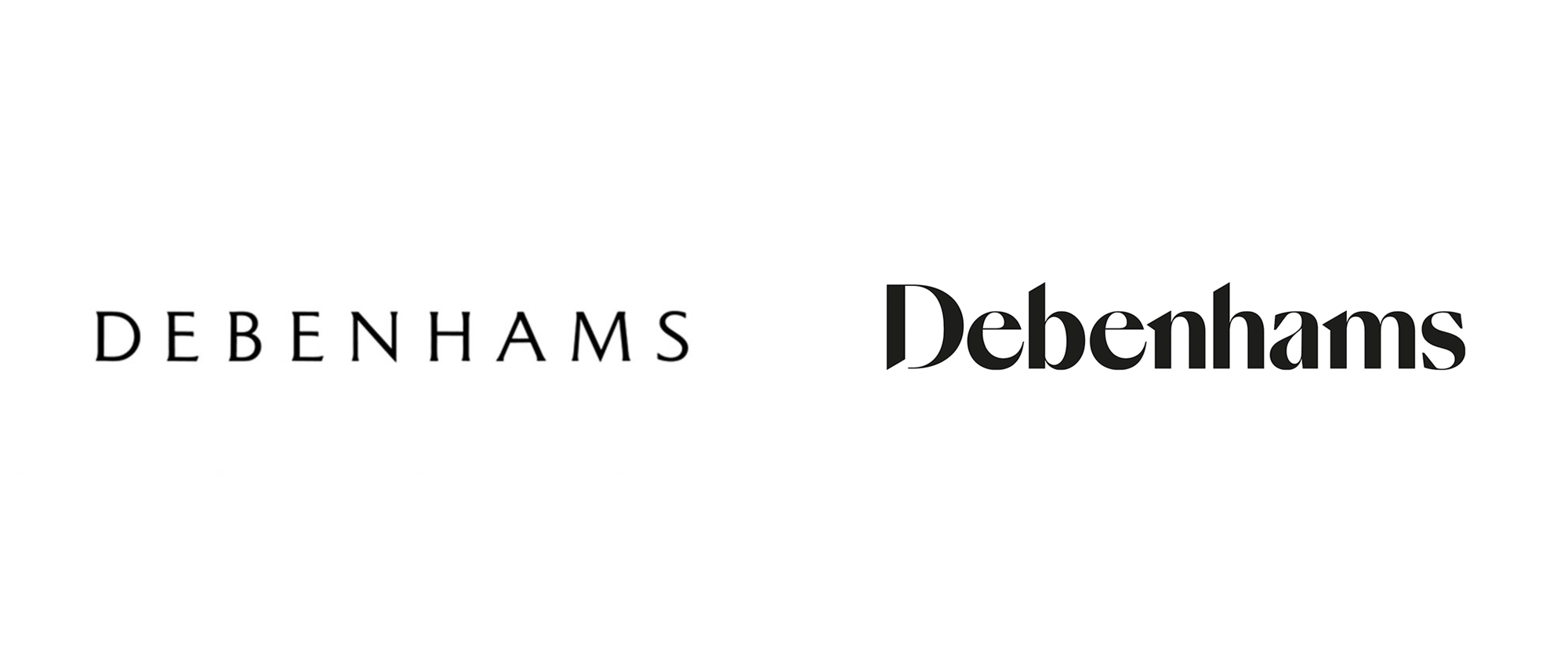
“Just do (a B)it” Dating back to 1778 but established as it's known today in 1905, Debenhams is one of the largest department store chains in the UK with 182 retail locations (ranging anywhere from 15,000 square feet to over 200,000 square feet for its flagship stores) offering a range of clothing, household items, and furniture, as well as services like cafes, personal shopping assistance, hairdressing and beauty treatments, nail bars and wedding gift services. Last year Debenhams announced it would undergo some significant changes (PDF) and that included ending its eight-year relationship with agency of record, J. Walter Thompson. Coinciding with the launch of a new store this September, Debenhams introduced a new campaign and identity designed by the London, UK, office of Mother Design. Debenhams came to us for a brand repositioning to echo the changes that are taking place internally and with the aim of bringing joy and excitement back into the shopping experience. We decided that instead of a loud call to action telling shoppers how to behave, what they needed was a friendly invitation to remind people how fun shopping can be.We created a new identity, brand purpose and visual language where every touchpoint is designed to champion the unapologetic joy of shopping once more.Mother Design project page Logo. Logo on a photo. The old logo was quite nice and it looked very convincing as a high-but-not-super-high-end beacon for a department store. (Disclaimer: I have never been into a Debenhams so that's what I gathered from my tour on Google Images.) The subtle serifs, uppercase setting, and loose spacing made it look sophisticated and somewhat timeless. The new logo is so heavy-handed not just in the literal sense that it's heavy in its weight but everything about it is, like, too much: too high a contrast between the thicks and the thins, too tight a spacing, and too dramatic the few serifs that are there. The open "D" is also very confusing and unrelated to anything else anywhere in the identity. There are some nice moments in the wordmark -- like the "ebe" relationship or how the slope of the "nh" is aligned -- but overall, it feels too dramatic and the opposite of joyful, which seems to be the overarching goal in the identity and corporate strategy. The campaign, as I'll get to below, achieves this better than the logo. Custom font based on Swiss Typeface's SangBleu. The custom type family, where the character shapes are less exaggerated than the logo, is pretty nice and manages to capture some of the elegance of the old logo while also adding personality. The new logo typeset in perhaps a middle weight of this font would have done the trick. Bags. Signage. Not much in terms of applications. Bags look nice but nothing exciting. Signage looks nice too. I know that that's not much of an opinion but that's the extent of my emotions generated by it. Campaign ads. The campaign around the slightly awkward banner of "Do a bit of Debenhams" does manage to infuse this project with some relative joy. The images and concepts can verge on the cheesy but the executions are charming and eye-catching. They also show that the logo is not quite successful as it breaks apart at small sizes and simply looks weird against the much nicer typography above it. Print ad. Sample social media. Postcards. Overall, the logo definitely signals a change that I don't know how many people will react to positively but at the same time brick-and-mortar retailers are in such a twilight zone era at the moment that I'm not sure anything they do is good or bad for them but, I guess, worth trying. To the identity's credit, one thing it does well is separate it from the recent John Lewis redesign and helps chart it into a different territory than its competitor.
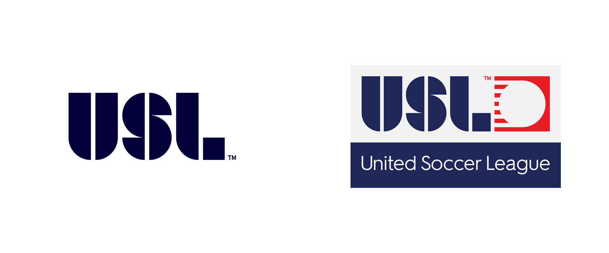
“In Leagues of their Own” Established in 2010, the United Soccer League (USL) began as a Division III league with 15 teams. In the time since, the USL has strengthened its ties with the MLS, establishing affiliate connections between their teams and last year the U.S. Soccer Federation granted the USL Division II status. Beginning in 2019, as the league continues to grow, it will be introducing a new structure, akin to European leagues, where USL becomes the corporate brand of multiple leagues: USL Championship replaces what we all knew as USL proper and becomes the pinnacle of the USL; the Premier Development League becomes USL League Two, a development soccer league; and USL Division III will become USL League One, targeting cities with a population of 150,000 to one million, mostly in cities currently without a professional team. As part of the restructuring, USL has introduced a new identity system designed by Brooklyn, NY-based Athletics. Athletics was tasked with extending the USL brand across all of the organization's events and leagues: The USL Championship, USL League 1, and USL League 2. We designed a modular color and logo system to create a flexible look and feel between each league, using a shared visual language to connect the initiatives together and with the USL brand.Athletics project page Introduction of new logo system. USL League Two and USL League One logos, before and after. Logo family. Logo explanations. (Open the image in a new tab/window for a bigger view.) The USL's new corporate logo symbolizes the growth of professional soccer in North America, incorporating 13 stripes to represent the U.S. flag. The blue letters pay homage to the league's past while the new, modern logo and the white sphere represents a soccer ball in motion - propelling our sport forward into the future.USL press release Corporate logo. The pinnacle of competition - the USL Championship features a new gold design and represents the ultimate goal for players, coaches, fans and communities, all of whom aspire for excellence both on and off the field.The foundation of professional soccer - USL League One makes its mark with a vibrant, colorful identity, as it gears up for its debut in the 2019 season with league leadership and ownership that will forge a unique identity - driven by determination, unity and inspiration.The #Path2Pro - the PDL will become USL League Two - […] maintaining its heritage with a bold, red logo, League Two will continue to forge the game's future, delivering the first taste of premier competition in an authentic national soccer environment with a hyper-local focus.USL press release Championship logo. USL League One logo. USL League Two logo. Color and configuration variations. I know there were a lot of images to scroll through before getting to any text but this wasn't a straightforward logo redesign that showed a simple before/after and I think that the main logo has to be addressed in context of all the new logos, so... In principle, the "USL" logo that was introduced in 2015 and that we've come to know well remains as is, which is good, because it's a good logo. It now serves as the anchor for the new league structure and its logos. First up is the "corporate" logo that, in a way, replaces the 2015 logo. The biggest change here is the addition of a new icon, a speeding ball leaving a trail of 13 stripes (as in the U.S. flag), which I think is pretty fantastic -- not for its patriotic-ness per se but for it's appropriateness and smart use of it. The icon has an old-school feel that goes back to the good age of minimalism and not just minimalism for minimalism's sake. The icon ties in nicely with the notches in the USL wordmark and it establishes a square element to build on with the rest of the logos. For the main league, now USL Championship, the square houses a star in a gold background. It's pretty straightforward and it does convey a sense of being the most important in the system. I get some U.S. Army logo vibes but when this lives in the context of soccer, there is not much confusion. The League One and League Two logos simply have a number in there. Again, very straightforward but also as nicely executed as it gets. All logos are now (or can be) accompanied by a geometric sans serif, Hurme Geometric Sans No.2, that, as unsurprising as it is, works very well in this system and as a complement to the logo elements. The same type family, in its various weights, is used as the brand typography throughout. Logos with brand pattern. Type treatments. Screen graphics. Instagram. Ad. Banner. Not much in terms of applications as this identity won't kick in fully until the start of next season but there is some clear potential seen here through bold but simple typographic treatments and some color coding of black and white images. Overall, the system may come across as simple and an obvious approach but the result is remarkably smart, restrained, and crisply executed.

Stop fearing the robot overlords. Here’s how artificial intelligence is acting as the ultimate design assistant, freeing us up to do the work that actually matters.We need to talk about the elephant in the studio.For the past two years, the design community has been oscillating between collective panic and ecstatic hype. Every week, a new AI tool drops that promises to turn a text prompt into a fully realized website, brand identity, or hyper-realistic photograph.The initial knee-jerk reaction for many of us was fear. Is this it? Are we obsolete? Did I really spend four years in design school just to be outpaced by a discord bot?But as the dust has settled and we’ve moved past the gimmick phase, a clearer picture is emerging. AI isn’t here to replace the designer; it’s here to replace the drudgery. It is the most significant shift in our tooling since we moved from physical paste-up to Photoshop 1.0.As designers, our value has never really been in our ability to push pixels around a canvas faster than the next person. Our value lies in empathy, strategy, and creative problem-solving. AI is now the lever that allows us to apply that value exponentially faster.Here is how the actual workflow is changing on the ground, and why it’s making us better at our jobs.1. Escalating the “Blank Page” PhaseThe hardest part of any project is often the start. Staring at an empty Figma frame or a blank Illustrator artboard can be paralyzing.Previously, ideation meant hours of scrolling through Pinterest, pulling vague references, sketching dozens of bad thumbnails, and hoping for a spark.Now, generative AI tools like Midjourney, Adobe Firefly, and ChatGPT act as partners in lateral thinking. They are idea-accelerators.If I’m working on a branding project for a sustainable coffee shop with a 1970s brutalist vibe, I don’t have to imagine it from scratch. I can prompt an AI to generate fifty variations of that concept in minutes. Forty-five of them will be terrible. Five will be weirdly brilliant in ways I wouldn’t have thought of on my own.AI allows us to “fail faster.” We can explore wild tangents without losing a whole day to them. It’s not about using the raw output; it’s about using the output as a superior starting point for human refinement.2. Automating the Grunt WorkLet’s be honest: a significant percentage of our billable hours is spent on tasks that require zero creativity.I’m talking about deep-etching fifty product photos, resizing a banner ad into fifteen different social media formats, swapping out placeholder Lorem Ipsum for realistic copy, or manually adjusting padding in a UI layout.This is the “pixel-pushing” tax we pay to get to the fun stuff. AI is effectively repealing that tax.In UI/UX: Plugins now use AI to automatically rename layers, generate design systems from a mood board, or populate mockups with context-aware data instead of generic placeholders.In Graphic Design: Photoshop’s Generative Fill has turned complex photo manipulation tasks — like expanding a background or removing an ex-boyfriend from a group shot — into a ten-second task.By offloading repetitive production tasks to AI, we gain back hours every week. That’s time we can reinvest in user research, strategic thinking, or simply polishing the final 10% of a design that truly makes it sing.3. The Shift from Creator to CuratorThis is perhaps the most profound shift in our process. As AI tools become more adept at generating high-fidelity assets, the role of the designer is shifting from “making everything from scratch” to “curating and directing.”We are becoming Creative Directors earlier in our careers.An AI can generate a beautiful UI layout, but it doesn’t know why it generated it. It doesn’t understand user flow, accessibility constraints, or business goals. It doesn’t feel empathy for the frustrated user trying to navigate a checkout screen.Our new job is to look at the AI’s output with a critical, trained eye. We need to ask: Does this align with the brand strategy? Is this ethical? Is this accessible? Is it human?The skill set of the future isn’t just knowing the pen tool; it’s knowing how to craft the right prompt, how to synthesize massive amounts of AI-generated data, and how to apply the human taste that the machine lacks.The Human AdvantageIf you are worried about AI taking your design job, stop trying to compete with it on speed or volume. You will lose.Instead, double down on the things AI is terrible at.AI cannot sit in a stakeholder meeting and read the room to understand the unspoken political dynamics blocking a project. AI cannot conduct a user interview and notice the subtle hesitation in someone’s voice that reveals a hidden pain point. AI cannot take a daring, counter-intuitive creative leap that defies logic but captures emotion.The future of design isn’t human or AI. It is human plus AI.The designers who will thrive are those who treat AI not as a threat, but as a tireless junior designer that needs strong direction. Embrace the tools, speed up your workflow, and use the saved time to be more strategic, more empathetic, and more human.Thanks for reading!I hope this article gave you a fresh perspective on how we can coexist — and thrive — alongside our new AI tools. The landscape of design is changing fast, but our creativity remains the constant.If you found value in this breakdown, please give it a round of claps 👏 (did you know you can hold the clap button down to give up to 50?)And if you want more insights on the intersection of Design, AI, and the future of creative work, hit that [Follow] button. I’ve got a lot more to share soon.See you in the next one!……💡 Stay inspired every day with Muzli!Follow us for a daily stream of design, creativity, and innovation.Linkedin | Instagram | TwitterThe Augmented Designer: How AI is Quietly Revolutionizing Our Workflow was originally published in Muzli - Design Inspiration on Medium, where people are continuing the conversation by highlighting and responding to this story.
A logo can be redesigned. A color palette can be refreshed. But changing a brand’s primary typeface years after launch is painful, expensive, and often avoided until the brand feels hopelessly dated. The best brand typography does not need to be replaced every few years. It ages gracefully, carrying the brand forward without screaming its birth decade. Here is how to choose fonts that will still look right ten or twenty years from now. The Difference Between Trendy and Timeless Trendy typefaces are easy to spot. They appear everywhere for eighteen months, then vanish. The condensed sans-serifs of the 2010s. The extreme geometrics of the early 2020s. The retro revivals that cycle every few years. These fonts work for campaigns, not for brand foundations. Timeless typefaces share common traits. They have been in continuous use for decades. They work across contexts and scales. They are legible in both print and digital environments. They do not rely on a single distinctive gimmick—an unusual ‘g’, an exaggerated x-height, a novelty curve—that will look tired when the gimmick falls out of fashion. This does not mean brands must use default system fonts. It means the distinctive elements should come from how the typeface is used, not from the typeface itself. Proven Candidates That Endure Some typefaces have proven their longevity through decades of use. They are not exciting. That is precisely why they endure. Helvetica (1957) is the most imitated typeface in history. Its neutrality is its strength. Brands that use Helvetica are not making a typographic statement. They are removing typography as a variable, letting other brand elements speak. Garamond (16th century) has been in continuous use for nearly 500 years. Its elegance is understated. It works for luxury brands and universities alike because it signals tradition without shouting. Futura (1927) carries the energy of the Bauhaus but has softened into a versatile geometric. It works for modern brands that need energy without trendiness. Times New Roman (1932) is ubiquitous but unfairly dismissed. Its legibility at small sizes is exceptional. For brands with dense text—newspapers, academic publishers, legal services—it remains a strong choice. Akzidenz-Grotesk (1898) predates Helvetica and influenced it. It has a slightly more human character while maintaining neutrality. These are not the only options. But any brand considering a different typeface should ask why these proven options were rejected. The answer should be strategic, not aesthetic. What to Avoid Certain typeface characteristics reliably date a brand. Extreme contrast (very thick thicks and very thin thins) was popular in 2010s fashion branding. It is difficult to read at small sizes and looks distinctly of its era. Overly distinctive glyphs become caricatures. A ‘g’ with an unusual ear or a ‘Q’ with an exaggerated tail may feel distinctive at launch. After five years of seeing it everywhere, it feels tiresome. Aggressive condensing signals a specific design moment. Condensed typefaces work for headlines but fail as a primary brand font. They limit applications and age poorly. Fad revivals of 1970s or 1980s display faces come and go. Using a Pac-Man-era arcade font for a brand is a decision that will require another decision in three years. The common thread is novelty. Novelty ages. Familiarity endures. The Versatility Test A brand typeface must work across a staggering range of applications: a favicon, a billboard, an embroidered hat, a laser-engraved pen, a mobile notification, a newspaper ad, a trade show banner. Each application imposes different constraints. Test every candidate at 9 pixels on a low-resolution screen. Test it at 200 points on a large monitor. Test it on a fabric tag. Test it reversed out of a dark color. Test it in all caps. Test it in sentence case. Test it with diacritics (é, ñ, ü) if your brand operates internationally. A typeface that fails any of these tests is not versatile enough to be a primary brand font. Keep it for headlines or special applications. Choose something more robust for the core identity. The Role of Customization Fully custom typefaces are expensive. But small customizations to existing typefaces can add distinctiveness without sacrificing longevity. Modifying the ‘a’ or ‘g’ to have a unique character. Adjusting the weight distribution across the alphabet. Creating a proprietary ligature for the brand initials. These changes are subtle enough that they do not date the font but distinctive enough that they make the font recognizably yours. The risk is over-customization. A font that is too unusual becomes a liability. The goal is to make the brand’s typography slightly more specific, not to invent a new alphabet. Testing Against Competitors Brand typography does not exist in a vacuum. It exists on the same screens, shelves, and billboards as competitors. A typeface that looks distinctive in isolation may look indistinguishable next to similar brands. Collect competitor materials. Set the same headline in your candidate typeface and theirs. Compare. Are they distinct? Does your choice communicate a different position, or does it blend in? The goal is not to be different for the sake of difference. The goal is to be appropriately distinct. A bank should not use the same typeface as a streetwear brand. A children’s toy company should not use the same typeface as a law firm. The Bottom Line Brand typography is a long-term investment. Choosing a font because it looks cool today guarantees that it will look dated tomorrow. Choosing a font because it is functional, versatile, and proven will serve the brand for years. Test every candidate against real-world constraints. Avoid novelty. Seek familiarity with subtle distinction. And remember: the best brand typography is the typography users do not notice. They just feel that the brand is trustworthy, professional, and right. That feeling is the goal. The font is just the tool. The post Brand Typography: How to Choose Fonts That Age Well appeared first on Designer Daily: graphic and web design blog.
In the time it takes to read this sentence, a user has already formed a lasting judgment about your website. The 5-second test, where a user sees a page for just five seconds before answering core questions, reveals a brutal truth: design is not about exploration; it’s about instant comprehension. This isn’t about aesthetics; it’s about cognitive processing speed. Users aren’t deciding if they like your site in those seconds. They’re deciding if they understand it, and if they should invest another minute of their precious attention. Here’s what the data says they process, in order, and how to design for that neurological sequence. The Cognitive Hierarchy: What the Brain Seeks in 5 Seconds Neuroscience and eye-tracking studies show a predictable pattern of scanning when a new page loads. Design must serve this hierarchy. 1. The Central Visual Anchor (0-1 Second): “What Is This?” The brain first seeks a single, dominant visual element to categorize the page. The Element: A hero image or key video that is contextually diagnostic. It must instantly communicate the product category, service, or core emotional benefit. Data Point: Pages with a clear, relevant hero image have a 47% lower bounce rate in the first 10 seconds than those with abstract or stock imagery. Design Imperative: Use imagery that shows the product in use or the outcome achieved. A fintech app should show a dashboard, not happy people in suits. A meditation app should show calm, not a generic sunrise. Avoid “mystery meat” navigation, icons or visuals that require interpretation. 2. The Headline Scan (1-2.5 Seconds): “Why Should I Care?” Immediately after anchoring, the eyes dart to the largest text near the visual anchor. The Element: The primary headline (H1). This is not your brand name. It’s a value proposition in plain language. Data Point: Users spend an average of 5.7 seconds focused on written content if the headline captures them. They spend less than 1 second if it doesn’t. The Formula for Success: [Clear Audience] + [Core Benefit] + [Differentiator]. Bad: “Innovate Your World.” Good: “For designers: Ship flawless prototypes 3x faster. The only tool with real-time AI feedback.” Design Imperative: The headline must be in the optical center (slightly above the geometric center), set in a confident, large typeface with high contrast. The supporting sub-header should add crucial detail, not fluff. 3. The Call-to-Action Triangulation (2.5-4 Seconds): “What Can I Do Here?” Once users understand the “what” and “why,” they immediately search for the “how.” The Element: The primary CTA button or link. Its visibility is non-negotiable. Data Point: A CTA with a high color contrast ratio (at least 4.5:1) against its background gets 35% more first-visit engagements. Shape and label clarity matter more than clever animation. Design Imperative: Position: Place the primary CTA in the direct sightline path from the headline. The classic F-pattern scan still holds; the top-left and center-left are prime real estate. Label: Use strong, action-oriented verbs. “Get started,” “Try free,” “View plans.” Not “Submit” or “Go.” Clarity Over Creativity: A user should never wonder if something is clickable. Underline links, use clear button affordances. 4. The Trust & Scannability Sweep (4-5 Seconds): “Can I Trust This?” In the final moments, the user’s peripheral vision performs a rapid credibility check. The Elements:Visual trust signals and content scannability. Trust Signals: Recognizable client logos, security badges (SOC2, Norton), press mentions (Forbes, TechCrunch), and clear, accessible contact information. Scannability: The presence of clear sub-headers (H2, H3), bullet points, and bolded key terms. Data Point: Pages displaying known trust logos can increase conversion by up to 42%. Lists and bullet points improve information retention by 70% for scannners. Design Imperative: Place trust signals near the CTA or in the footer. Do not hide them. Use whitespace to create clear content modules that can be parsed in chunks, not a wall of text. The 5-Second Test Itself: What to Ask & How to Interpret After showing a user your design for five seconds, ask only these questions: “What was the purpose of that page?” (Tests clarity of value prop) “What could you do on that page?” (Tests CTA clarity) “What was the most memorable element?” (Tests visual hierarchy) A failure is indicated by answers like “I’m not sure,” “Sign up for something?”, or “The color blue.” These reveal a breakdown in the cognitive hierarchy. The Optimization Framework: The “Blink Test” Checklist Before launching, run your design through this filter: [ ] The 3-Word Test: Can you describe the page’s core purpose in three words? If not, the headline is wrong. [ ] The Squint Test: Blur your eyes or step back. What single element dominates? It should be the hero image/key visual, not a navigation bar or banner ad. [ ] The Peripheral Vision Test: Look away from the center. Can you still clearly identify the primary CTA button by its color and position? It should pop. [ ] The First-Last Test: What is the first piece of information you see, and the last? The first should be the value prop. The last should be a next step or a trust signal. The Philosophical Shift: Designing for Impatience The 5-second test forces a critical shift: from designing for engagement to designing for immediate comprehension. It champions clarity over cleverness, simplicity over style, and the user’s cognitive load over the designer’s creative expression. Your homepage is not a brochure to be read. It is a billboard passed at highway speed. Every pixel must earn its place by contributing to one instantaneous, coherent message: This is for you, this is valuable, and this is what to do next. Master this, and you design not just for the user’s eyes, but for their subconscious. You design for the blink. The post Designing for the 5-Second Test: What Users Actually Decide in the Blink of an Eye appeared first on Designer Daily: graphic and web design blog.
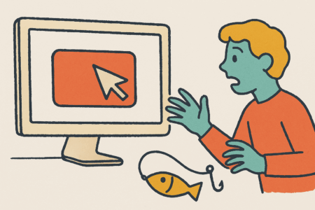
In the world of digital design, every click, swipe, and tap is the result of careful orchestration. We arrange elements, craft flows, and choose words not just to inform, but to influence. This is the realm of persuasive design, where psychology meets pixels to guide user behavior. But as designers wield increasing power over attention and action, a critical question emerges: When does helpful guidance become harmful manipulation? The Spectrum of Influence: From Nudge to Shove Let’s establish a spectrum. On one end, we have ethical persuasion: design that helps users achieve their goals while respecting their autonomy. On the other, dark patterns: design choices that trick users into actions they didn’t intend, benefiting the business at the user’s expense. The philosophical line between them is thin but significant. It’s the difference between a librarian suggesting a book and a pickpocket distracting you while stealing your wallet. The Ethical Nudge: Helpful Guidance Ethical persuasive design operates on principles of transparency, benefit, and respect. These are the practices that constitute “good” UX: 1. The Roach Motel Principle (Made Positive)The Original Sin: “Easy to get into, hard to get out of”think of subscriptions that are simple to start but require phone calls during business hours to cancel.The Ethical Flip: “Easy in, easy out.” Streaming services like Netflix let you cancel with the same ease you subscribed. This builds long-term trust rather than trapping users through friction. 2. Defaults as Gentle SuggestionsDefaults are incredibly powerful, as people tend to stick with pre-selected options. The ethical question is: whose interests do they serve?Manipulative: Pre-checked boxes for expensive insurance add-ons or newsletter subscriptions users don’t want.Ethical: Apple’s App Tracking Transparency feature defaults to “Ask Apps Not to Track”, prioritizing user privacy over advertising revenue. 3. Social Proof Without PressureShowing what others are doing can guide decisions helpfully.Manipulative: “15 people are looking at this hotel room right now!” (when they’re not) creating artificial scarcity.Ethical: “Most popular” badges based on actual purchase data, helping users make informed choices without fabricated urgency. The Dark Patterns: When Persuasion Becomes Coercion Dark patterns exploit cognitive biases intentionally. Here’s where the line is clearly crossed: 1. ConfirmshamingLanguage that guilts users into an action: “No thanks, I’d rather waste money” instead of a simple “No, thanks.” 2. Privacy ZuckeringNamed after Facebook’s CEO, this involves tricking users into sharing more information than they intended through confusing privacy settings. 3. Bait and SwitchThe interface promises one thing but delivers another. Remember when Windows 10 updates would change the “X” button’s function from “cancel” to “agree to update now”? 4. Forced ContinuityCharging users for a renewal without clear reminders, then making cancellation difficult. The Philosophical Framework: Three Guiding Questions How do we navigate this gray area? Ask these questions during design reviews: 1. The Transparency Test“Is the value exchange clear and honest?” If users understood exactly what they’re getting and giving up, would they still proceed? Dark patterns thrive on obscured information. 2. The User Benefit Test“Who primarily benefits from this design choice: the user or the business?” Ethical persuasion creates alignment: when users win, the business wins. Dark patterns create conflict: business wins at user expense. 3. The Reversibility Test“Can users easily change their mind?” Ethical design respects autonomy by making exits as clear as entrances. Manipulative design creates one-way doors. Case Study: The Cookie Consent Paradox The GDPR’s “cookie consent” requirement perfectly illustrates this tension. Many websites have turned what should be transparency into manipulation: Ethical: Clear options with equal visual weight for “Accept” and “Reject” Manipulative: Brightly colored “Accept All” button with gray, barely visible “Reject” option, sometimes buried in “Customize Settings” The very regulation designed to empower users has been subverted into a dark pattern testing ground. The Responsibility Equation As designers, we operate under a fundamental responsibility equation: Our Power Over Attention × Our Understanding of Psychology = Our Ethical Responsibility The more sophisticated our methods of influence become, the greater our duty to wield them ethically. This isn’t just philosophical, it’s practical. Users burned by dark patterns develop “banner blindness,” ad-blockers, and subscription phobia that hurt ethical businesses too. Toward Ethical Persuasion: A Manifesto Prioritize long-term trust over short-term conversion: manipulation might boost metrics today but destroys loyalty tomorrow. Design for the most vulnerable users: if your design wouldn’t trick your grandmother, it’s probably ethical. Create value alignment: find solutions where business goals and user needs genuinely intersect. Embrace radical transparency: be clearer than necessary about costs, commitments, and data usage. Establish ethical design reviews: make “would this feel manipulative?” a standard criterion in your design process. The Path Forward: Designing with Conscience The most profound shift occurs when we stop asking “How can we make users do X?” and start asking “How can we help users accomplish what they want to do?” Consider Duolingo’s gamification: it uses streaks, notifications, and rewards to encourage learning, a goal users already have. Contrast this with mobile games designed explicitly to trigger compulsive spending on loot boxes, exploiting psychological vulnerabilities. The line between persuasion and manipulation isn’t just about techniques, it’s about intent. Are we helping users become who they want to be, or are we exploiting psychological quirks for corporate gain? In an age where digital interfaces mediate more of our lives each day, ethical design isn’t a nice-to-have, it’s our professional obligation. The most persuasive design isn’t what tricks users once, but what earns their trust repeatedly. The post The Ethics of Persuasion: Where Does Good UX Cross the Line into Manipulation? appeared first on Designer Daily: graphic and web design blog.
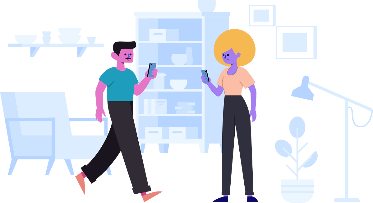
By Luke Bailey, Copywriter at UnbounceImage courtesy of the Stubborn Free Illustrations Generator.I’m sure you’ve noticed this ubiquitous illustration style by now. Depending on who you ask, these illustrations are either fun and whimsical, or strange and faceless. Maybe you see them as friendly-looking doodles … or maybe you see them as just plain weird.Whatever your opinion, one thing is for sure: these little buddies are everywhere right now. For better or worse, they have completely taken over the visual identities of many high-profile SaaS brands.Now, many marketers are wondering-how did this happen? Why are there so many similar-looking illustrations on so many different websites? How did all of these brands decide to use this style at the exact same time? And doesn’t this go against the very idea of positioning your brand as something different?For example, Jimmy Daly, Marketing Director at Animalz, recently called out this design trend on Twitter. And while he says he doesn’t dislike the style, he also isn’t sure how it got to be everywhere at once.body[data-twttr-rendered="true"] {background-color: transparent;}.twitter-tweet {margin: auto !important;}can a designer please explain this trend to me? — @jimmy_dalyfunction notifyResize(height) {height = height ? height : document.documentElement.offsetHeight; var resized = false; if (window.donkey && donkey.resize) {donkey.resize(height); resized = true;}if (parent && parent._resizeIframe) {var obj = {iframe: window.frameElement, height: height}; parent._resizeIframe(obj); resized = true;}if (window.location && window.location.hash === "#amp=1" && window.parent && window.parent.postMessage) {window.parent.postMessage({sentinel: "amp", type: "embed-size", height: height}, "*");}if (window.webkit && window.webkit.messageHandlers && window.webkit.messageHandlers.resize) {window.webkit.messageHandlers.resize.postMessage(height); resized = true;}return resized;}twttr.events.bind('rendered', function (event) {notifyResize();}); twttr.events.bind('resize', function (event) {notifyResize();});if (parent && parent._resizeIframe) {var maxWidth = parseInt(window.frameElement.getAttribute("width")); if ( 500 Here at Unbounce, we recently went through a rebrand of our own. And while we considered illustrations, our design team ultimately decided to go in a different direction. Instead of flat, geometric shapes, we chose to use custom photography to help us put our customers in the spotlight. (Although we’re not alone-custom photography seems to be another growing design trend for SaaS brands.)But going through the long, long, very long process of a rebrand got us thinking. As marketers trying to stand out in an increasingly competitive industry-is it bad for us to follow design trends? What inherent value is wrapped up in visual branding? Is it worth a heavy investment in design to look different? And how vastly different can we all truly be?Let’s dust off our old-timey magnifying glass and investigate…Why Marketers Are Obsessed with Visual BrandingIn our heart of hearts, I think every marketer is a “creative” type. We were the kids in school doodling on our notebooks, coming up with ideas for the next great Goosebumps novel, or filming half-baked comedy skits using our one friend’s video camera. (Thanks, Brad!)So really, it makes sense that we care so friggin’ much about the way our brands look. The logos, fonts, photos, illustrations, and other visuals we use are all opportunities for us to show off just how creative and different we can be. We want you to be impressed when you look at our website-or any other part of our brand’s visual identity, for that matter. It’s in our DNA.According to Sabrina Chan, Interactive Designer at Unbounce (and huge contributor to how the Unbounce brand looks today), this is part of the reason why companies seem to rebrand so often.“Coming up with a new visual brand is absolutely exciting, whether you do it by yourself or with the help of an agency. It’s a great creative challenge because-unlike most other marketing projects-you aren’t forced to play within a sandbox, or follow a specific set of rules. When you create a new visual brand … you actually get to shape the sandbox itself.”Marketers also obsess over visual branding because we’re under constant pressure to keep up with the times. (And the web changes fast, yo.) One second we’re all using gradients on our buttons and adding drop shadows to our form boxes, and the next we’re making every page element as flat as a Kansas-style pancake. If you’re still using styles that have fallen out of public favor a few years after the fact, it can raise a few eyebrows.Sabrina says the goal is for your brand to either fit in or stand out-but never fall behind.“Nobody wants their brand to look like it hasn’t been updated in years. You only get one chance to make a first impression … and most marketers and designers will do anything to make a good first impression. Especially if your competitors are all out there looking fresh and up-to-date.”At the same time, this obsession with visual branding can come with a heavy price tag. Whether you hire an agency to rebrand for you or work with a team internally like we did at Unbounce-the process can take many, many months. It’s never as simple as making “just a few quick updates to the company logo.” You almost always need to scope out a big chunk of your marketing team’s time, budget, and brainpower.According to Andy Crestodina over at Orbit Media, a “fancy site from a big web development firm” can easily run you up a bill of more than $100,000.Here at Unbounce, we spent over half a year doing research, running impression tests, creating mockups, and iterating on our new brand before we launched. And while we have gotten (mostly) great feedback on the finished results-it can still be really tricky to connect the design’s impact of a new visual brand to actual ROI.Sure, there are lots of ways to calculate how well your website is converting. But can you attribute that to the branding itself? It’s not so simple to draw a straight line between your looks and your bottom line.But Your Brand Does Matter-Maybe Now More Than EverEven if you can’t easily attribute direct revenue to your visual branding, at least you can take comfort in the fact that almost every marketer agrees it’s still pretty dang important. Potential customers take one look at your brand and form an instant impression-long before they explore your products or check out your pricing.Here’s what Vicky Bullen and James Ramsden of the design agency Coley Porter Bell said about the benefits of visual branding earlier this year.“Over the last few years we’ve seen many brands and their identities evolve into a state of homogenization … [But] many categories are having their traditional ‘design codes’ turned on their head as new or artisanal, challenger brands come along and create a completely new way to interpret a tired category.”They were speaking specifically about food brands, but the same line of thinking can apply to many software companies as well.Because in the world of SaaS, branding is particularly valuable. The space is so saturated with competition (there are over 7,040 marketing technology companies alone), that most companies are eager to stand out from the competition. A unique and authentic brand is a great way to elevate your software over everybody else.On the The Re:Growth Podcast, Dave Gearhardt, VP of Marketing at Drift, even went so far as to say that branding was a key differentiator that helped their team to succeed.“We knew in order to win, we needed to do things the opposite of how everybody else was doing it. We needed a different way to stand out. And for us, that was brand.”Chris Savage, CEO of Wistia, has also been exploring the importance of branding in a new original series called Brandwagon. According to Chris, branding is more important today because traditional marketing tactics are breaking down.“A more fragmented and less measurable customer journey means that if customers aren’t positively disposed to you before they begin their product search, you’ll never make it to the consideration set. Consumers now have access to all the information they could want on your product/service at their fingertips, including how it stacks up against competing offerings … [so] we need to move beyond solution-based value propositions.”But design trends in branding aren’t anything new, either. As part of our research for this piece, we dug into some of the many different styles that have flared up over the years.Timeline Sources:Business Insider, AIGA Design Conference, Codeburst, Web Design Museum, Instani, Line25.Image Sources:Bass Brewery’s original logo. Digital image. Zythophile.com. 28 June 2013, http://zythophile.co.uk.A vintage ad for Coca Cola from around the late 19th or early 20th century. Digital image. Smithsonian.com. 29 March 2017, https://www.smithsonianmag.com.Michelin Man educational advertising, circa 1907. Digital image.LogoDesignLove.com. 21 December 2012, https://www.logodesignlove.com.Betty Crocker, 1955. Digital image. PBS.org. 15 February 2013, http://www.pbs.org.Apple.com screenshot from 1996. Digital image. The Telegraph. 2 September 2009, https://www.telegraph.co.uk.Website design from the early 2000s. Digital image. UX-App.com. 23 July 2018, https://www.ux-app.com.Airtable custom SaaS illustration. Digital image. InternetFolks.com. 22 October 2018, https://internetfolks.com.So Where Did This Illustration Design Trend Come From?Travel in time with me all the way back to January 2017. Barack Obama was serving his last few weeks as President of the United States. Serena Williams was busy winning the Australian Open (while pregnant, no less). And a movie about sentient vehicles called Monster Trucks somehow made $33 million at the box office.It was around this time that Alice Lee, an independent illustrator and designer, started working with Slack to help them create a new illustration voice and library. She partnered with their team to create over 40 separate illustrations that they could use in a variety of different places on their website and platform.An example of an illustration on the Slack website.Many designers point to these 40 original illustrations as the possible beginning of this current visual branding trend. And in a blog post on her website, Alice details where her original inspiration for these designs came from.“I wanted to look outside the tech industry for inspiration … I referenced much of Mary Blair’s legendary body of visual development at Disney for designing warm, whimsical characters. And it was hard not to fall in love with the ‘minimal realist’ compositional balance that Charley Harper strikes.”Another possible origin of this trend is Facebook. In 2017, the social media platform was also going through a rebrand of their own. Their team worked with a design firm named Buck to come up with a new style. And in a recent post on the AIGA Eye on Design blog, illustrator Xoana Herrera described her inspiration for the project.“I started to draw characters that were defined by their actions … Dancing with their open arms, bending their bodies to play the trumpet, for example … I wanted to portray that sense of joy we feel when we’re sharing things together in community, like celebrating a goal in a bar or singing a song with a crowd at a concert.”An example of the illustrations used by Facebook, featured on the Buck website portfolio.We saw this trend continue to evolve over the following year. When Mailchimp pulled off their rebrand in September 2018, it created shockwaves that influenced the entire marketing community. The typeface! That yellow! The illustrations! It was like a breath of fresh air for an industry that was drowning in a sea of stock photos.An example of a more abstract illustration on the Mailchimp website.Here’s what Gene Lee, VP of Design at Mailchimp, said they hoped to inspire with their new brand.“With this redesign, we set out to retain all the weird, lovable elements that endeared our earliest customers to Mailchimp…We champion authenticity, originality, and expressiveness because it’s what helps us-and our customers-stand out. We hope to inspire them to be more bold and creative in their own branding efforts.”This is when the butterfly effect really started to take shape. Since September 2018, hundreds of SaaS websites have rebranded using a similar-albeit, less abstract-illustrative style.Now, there are thousands of these flat illustrations turning up on stock photo websites, entire Twitter accounts dedicated to calling out this trend, and even mix-and-match design libraries that make it easy to create your own unique illustration scenes.Image courtesy of the Stubborn Free Illustrations Generator.Why These Illustration Humans Started #TrendingAt this point, you’re probably wondering why so many companies decided to go with this Nickelodeon-esque style. And actually, there are a number of very practical reasons why these illustrations became popular…They’re representative — With illustrations, the humans you show can come in all shapes, colors, and sizes. This can be an important distinction for socially conscious brands who want to make sure they’re being inclusive for all types of people and communities.They’re flexible — A lot of SaaS companies struggle to show off their software using stock photos. (Let’s say you’re selling accounting software, for example. I hope you like messy desks with calculators.) Illustrations can help you represent complex or abstract ideas in a much more clean and simple way.They’re scalable — You don’t have to have a pricey photoshoot for every new hero image. With illustrations, you can just iterate on a style or framework that you’ve already created. What’s more-you can use them to execute fast, which is a huge win for startups in growth mode who don’t have a ton of money to invest in branding.They’re unique — I know a lot of the illustrations we’re featuring in this blog post look similar, but you can still see some wildly different approaches out there. For example, check out the style of a company like Officevibe and compare it to what Intercom is doing. Nobody is going to confuse those two companies based on their visual brands.They’re full of personality — For SaaS companies in particular, this trend is appealing because of how much personality each image can contain. The illustrative approach harkens back to children’s storybooks, making the software seem more friendly and approachable. (Take a look at the Mailchimp website, for example, and tell me it doesn’t remind you of Curious George.)At the Same Time, There Can Be Trouble with Being TrendyWhen it comes to design trends, there are always potential dangers if you jump in without doing your research first. It’s almost never a good idea to change your entire brand overnight just because “everyone else is doing it.”This is why Alice Lee, one of the originators of this trend, warns other companies to think things through before adopting a similar illustrative style.“I am often approached by companies who simply want me to reproduce work I’ve already created for past clients’ specific brands … But I do believe that to create an illustration identity that’s distinctive, new, and powerful, it’s important to take an intentional, process-driven approach.”There are other potential challenges with this trend as well…These illustrations might not match your brand personality — Well, unless your brand personality is ‘Playful’ with a capital ‘P’. If that ain’t you, then these quirky illustrations might come across as inauthentic or off-brand to your target audience.They might not be as scalable as you think — While they might be less expensive than custom photo shoots, unique illustrations also don’t come cheap. If you want non-generic doodles for your brand, you’re going to have to pay an artist to create them and have a plan in place for when you need more.This style isn’t as unique anymore — If you jumped on this trend a year or two ago, you might have been ahead of the curve. Now, you run the risk of just looking like everybody else.And while illustration can help make your brand appear more friendly, real photos of real people can be powerful in their own way. Alex Kracov, Head of Marketing at Lattice, explained in a Tweet why they moved away from illustrations.body[data-twttr-rendered="true"] {background-color: transparent;}.twitter-tweet {margin: auto !important;}@jimmy_daly Tried to buck this trend w/ the redesign that we launched today at https://t.co/gPtdvXY4wV We used to have the same illustration style, but as a People product, we felt the need to switch to photos of real humans. The CGI backdrop helps maintain the playful, approachable vibe. — @kracovfunction notifyResize(height) {height = height ? height : document.documentElement.offsetHeight; var resized = false; if (window.donkey && donkey.resize) {donkey.resize(height); resized = true;}if (parent && parent._resizeIframe) {var obj = {iframe: window.frameElement, height: height}; parent._resizeIframe(obj); resized = true;}if (window.location && window.location.hash === "#amp=1" && window.parent && window.parent.postMessage) {window.parent.postMessage({sentinel: "amp", type: "embed-size", height: height}, "*");}if (window.webkit && window.webkit.messageHandlers && window.webkit.messageHandlers.resize) {window.webkit.messageHandlers.resize.postMessage(height); resized = true;}return resized;}twttr.events.bind('rendered', function (event) {notifyResize();}); twttr.events.bind('resize', function (event) {notifyResize();});if (parent && parent._resizeIframe) {var maxWidth = parseInt(window.frameElement.getAttribute("width")); if ( 500 The bottom line is this: as marketers, it’s our responsibility to do our due diligence and discover what resonates best for our particular brand, industry, and customers. This is something Dan Cederholm, Co-Founder of Dribbble, talks about in a recent blog post.“My advice was to not worry about trends, but rather use the style best applied for the task at hand and stick to it. Go with what feels right for the problem you’re solving.”Image courtesy of the Stubborn Free Illustrations Generator.Design Trends Are a Flat CircleThis illustrative trend caught on fire so fast that many marketers were caught off guard. But this is the type of thing that happens all the time in the fashion industry. Bell-bottom jeans, choker necklaces, lumberjack plaid-they all became massively popular, died down, and then came back around to being “cool” again. It’s the circle of life, folks. (Cue The Lion King soundtrack.)Matthew Strom, Senior Product Design Lead at Bitly, noticed that more and more websites were starting to trend in a similar way, and he linked this idea to the economic principle of minimum differentiation. In short, most marketers and designers are going to put in the minimum effort and risk in order to succeed -and that means we’re going to end up making a lot of the same choices.Here’s how Matthew describes the inevitable “same-ification” of the internet.“The convergence of competition to nearly-identical products is not just a coincidence: it is inevitable. It seems irrational, but the math is sound. This is an emergent phenomenon … even if they try to differentiate themselves, all websites will eventually flock together.”So hey, maybe there’s nothing inherently wrong with following a design trend if we’re all gonna end up looking the same anyway. Marketers use up a lot of collective brainpower trying to create unique visual identities that set them apart-but perhaps we’re all just fighting a losing battle.Because in the end, there’s no real evidence that any design trend-whether it’s illustrations, custom photography, or even 3D images -is good or bad for your brand.You just need to make sure that whatever decision you make, you make it deliberately.Originally published at https://unbounce.com on August 29, 2019.Here’s How the Illustrations Design Trend Caught Fire and Why Every SaaS Is Rebranding was originally published in Muzli - Design Inspiration on Medium, where people are continuing the conversation by highlighting and responding to this story.
Abstracts — An Interview with Mauro PorciniSVP & Chief Design Officer, PepsiCo, Inc.Illustration Melvin ThambiMauro Porcini joined PepsiCo in 2012 as its first Chief Design Officer. In this newly created position, Mauro infused design thinking into PepsiCo’s culture and is now leading its approach to innovation by design across product platforms and brands. The impressive array of a line of products and brands include Pepsi, Lay’s, Mountain Dew, Gatorade, Tropicana, Doritos, Cheetos, Quaker, Aquafina, Life Wtr, Naked and SunChips, amongst many others. His focus extends beyond physical expression into the realm of virtual expressions of the brands, including product, packaging, events, advertising, licensing, retail, architecture, and digital.Mauro has been recognized throughout the design industry, being listed in Fast Company’s “Most Creative People in Business 1000”, Fortune Magazine “40 under 40” ranking rising stars, Ad Age’s “Creativity 50”, GQ 30 Best Dressed Men and featured in several books on design and innovation in multiple regions of the world including Creative Confidence, Jugaad Innovation, Il Minimo Sostenibile, and Vincere con le idee.In 2018 Mauro has been recognized with the Knighthood (Cavaliere) by the President of the Italian Republic.Welcome, Mauro to Abstracts; the spectacular journey from a product designer to SVP & Chief Design Officer, at PepsiCo. How do you feel when you look back?I’m thrilled and delighted, and it’s been a fascinating journey. I always wanted to do something that could impact the lives of people, change the world in a positive way. And, as a designer, I have had the opportunity to touch the lives of many people, different professional realms, various industries, products, and so on.By working in an organization that reaches millions of people, I am able to indirectly connect with these millions. So, I started with a project, then another and the journey just continued. Essentially, my profession started as a journey trying to figure out how to create a relevant role for the design, for me, for my teams inside this organization while leveraging design thinking and providing immense value to the society, people and the company. And fast forward to where we are today, yes, we moved from one project, one designer to a variety of different projects and activities that impact the lives of various people around the world and in the corporation.It’s been really, really exciting!Image courtesy — DESIGN + INNOVATION BOOK 2012–2018Every journey is a series of small steps in the right direction. How do you take those steps on a typical day at PepsiCo?Every day has its share of excitement and challenges. The challenges to innovation have two dimensions. One, since we are building a new capability within an established company, the challenge is to integrate design within the company and imbibe it in the day-to-day operations. Design capability is an innovation project by itself and was a new introduction in an established organization like ours. Naturally, there is this dimension of acceptance.The second one is, connected to the nature of the projects that we drive. When you do innovation, by definition, it’s complicated. You are out of the comfort zone and the regular ways of doing things. You need to talk with consumers and validate what you’re doing. To change the game and innovate is to take some risks. So, what is the right balance between the two realities? Figuring out how to balance and develop the idea and the product, the solution at a reasonable cost without impacting the integrity of the concept itself. Believe me, it is more complicated than it sounds. There are the typical challenges associated with the nature of innovation projects and design projects. In these, you find many roadblocks every day, and it is part of the game. The nature of the business and the nature of the organizations that give you once access to so many people and confidence to succeed.So, that’s the challenge aspect. But then there is the exciting part, the experience of progress; To look back where we were before and where we are and where we are headed. And that gives you an immeasurable sense of direction, energy, optimism, and inspires you to do more.Equally important is the ability to step back. If the focus is on day-to-day work, and when you get immersed in the details, the ability to constantly look at the big picture in the projects and evolving the capability may be missing. In summary, the two dimensions and YOU are the key factors. It takes only a second to lose yourself, lose inspiration, lose energy and motivation, and then it is a disaster.Thinking big is always the most important thing to do because it drives you to change the game. It also gives you that energy and that optimism that is necessary to face the challenges each day throws at you.Let’s talk about inspirations. What was the driving factor behind DESIGN + INNOVATION BOOK 2012–2018?We realized that it was essential for us to communicate both internally and externally.As designers, we were into so many different products, brands, services, and experiences in the past few years. We have so many completely different and independent brands that many people are not even aware it’s all part of Pepsico. There was never one clear and consistent story about the multiple dimensions of efforts, all delivered by one team to generate so many different kinds of exciting experiences and stories through different product experiences. So, we decided to collect everything in a visual book.We didn’t want to spend too much time telling the story of each project or each brand. And we decided instead to tell specific stories about how we look at work, what we think of the role of design innovation and also provide a glimpse of how society is changing. How ‘design innovation’ can play an important role to create value for both the company and the community itself is a story we are highlighting.It’s always that combination between theory and practice that makes everything very powerful. So, the book talks about the vision of a team and the company with some theoretical pieces, and then mostly through actions, projects, and things that went to market. This is a book designed for our internal audience and for a variety of different people out there who are interested in learning more about our world. The book is about people interested in our story and eventually interested in even joining our journey.Image courtesy — DESIGN + INNOVATION BOOK 2012–2018So at Pepsico, how do you harness the power of design to evoke an emotion and connect with people?To design something to create emotions is not particularly difficult for a talented designer, but to go massive with something that evokes an emotional response is difficult. That’s because every time you want to create an emotion, you are up against the inertia of the status quo; To evoke and evolve an emotion, we need the product to disrupt the inertia of the status quo. Your product and it’s design/other attributes create excitement in a person by initiating a form of change, emotion, or an unexpected new state within. So essentially, you are creating a surprise.In simple terms to beat the inertia and create an emotion, you need to polarize, and this could be risky because it could swing either way for the business. Achieving that perfect balance between all the different elements or that strategy that allows us to push the envelope more and more every time is the key to success here. It’s important to take risks and try out a few things, see the differences, and then push for more changes. And during the course of changes, you could augment the scope of execution from the portfolio to products to brands to the company level. This is always about trying to innovate, trying to create something on the roll. All of these create emotions, and that is how we can harness the power of design.Image courtesy — DESIGN + INNOVATION BOOK 2012–2018I’m coming to my personal favorite question. In your opinion, what role does art play in elevating the value of branding in design?Art is a territory where creative people can experiment without too many boundaries in terms of manufacturability, not requiring having to please too many individuals, nor think about finding a specific price point that is reasonable for people.So essentially, art is a virgin territory to explore with creativity. That’s why art is an element of inspiration for all designers.In art, you can experiment without constraints and use it as inspiration. In product design, unlike art, there are constraints imposed by business and market factors.Also, in the world of art, the ability of the designer to be inspired by the art and understand how to capture the charming side, some learning, some cues that can be leveraged in the creative process is paramount. So art is always a beautiful form of inspiration for the design or any creation in general.Image courtesy — DESIGN + INNOVATION BOOK 2012–2018How do you balance visual design and usability while developing a brand or during product design at PepsiCo?This is a very smart question because it’s the typical challenge for any designer. How do you find that delicate balance between emotion and rationality and also between functionality and engagement? The truth is if you dial too much of functionality at the cost of emotions or vice versa, you may fail. It is not easy, and it all starts with people talking to each other and generating insights that are actionable that can be used in the design process. Start developing a creation, make a prototype, go back to the audience, validate ideas, kill incongruous ideas, iterate, create a new prototype, and repeat until you find the magic balance between emotions and the rationality that defines the success of the product.Like everywhere, there is no success formula or recipe, and it depends on what you’re trying to design. I will give an example coming from my previous company, 3M, where we used to design products such as scotch tape dispensers and post-it dispensers. While creating new designs, a group wanted heavy dispenser that you could use with one hand, let’s call it one hand dispenser. Then you have the light dispensers of Scotch and post-its. These are dispensers you put in your drawers or even in your pocket. We developed different concepts for different kinds of audiences. One that was the shape of a shoe and another one was a little man that was climbing a desk.It was quickly ascertained that to have the weight for one hand dispenser in the kind of shape, as in the concepts, was almost impossible. So, we dialed down the functionality but dialed up the emotional part. The focus was on people here who were underserved in this category. So instead of focusing on the functionality, we drove the emotion aspect in this design. Instead of expensive or functionality of a dispenser, the focus was on the emotional connect with the people using the product. This is an example of how for certain consumers, you can dial up emotion and keep functionality a little bit down. As in other cases, balance is the key; here, between functionality and emotional connect.You were a big part of Pepsi’s transition to big, bold identity. Please share a few words about the transition and your experiences during that time.It was a complex project for a reason. Pepsi had different kinds of visual identities in different parts of the world. In many of those geographies, the brand was very successful and strong. So, there was no incentive or reason for these business units in Russia, the Middle East or China to redesign the identity of the brand or to move away from what we call the refreshment cues and to adopt a flat, high saturated, and bold blue identity.The need for a global visual identity was understood, but there was no margin for error, and the changes should not impact the business negatively. Consumers may be confused by the new identity, and they could miss our product due to the lack of refreshment cues. It was a mix of multiple disciplines coming together, design organization coming together with the ideas, communicating the right way with examples of other products from across the world. Then obviously the corporate business leaders embraced the idea and really helping us sponsor the game and push it through. It’s been a very successful project and has proved that the use of design can really add value to the organization.Image courtesy — DESIGN + INNOVATION BOOK 2012–2018What would you say are the necessary skills and qualities that of utmost importance for a design team?First of all, a very holistic approach to design is not just an industry or graphic or interior design. You need the team, especially the leader and the leadership team to have a 360 approach to design and to be business savvy.Since the design is not just about designers, one needs to understand the business implications, be able to articulate the impacts of design or changes in a business language and most importantly has to have high Emotional Quotient (EQ). “Design is about our ability to bring with us our journeys, innovations, R&D, marketing, consumer insights and all the different functions that are connected to the innovation problems.”Elaborating more on this, we need to possess empathy for others within the organization and towards customers, partners to drive those ideas that seem polarizing at first glance. We need people that are very resilient, open to advanced thoughts, design principles, optimistic about outcomes and curious.Curiosity pushes you to read, to talk with people, to travel, to observe the world that surrounds us, with the eyes of a child, with that of a pure soul.Real inspiration is in exposing yourself to new things continuously, consciously and to look at things with a different perspective. All of these are really the key characteristics of a design organization and design individuals in general.Now looking towards the future, What does Innovation in design as a concept mean to you?Historically, the design was mostly focused on graphics, packaging, and products. In a few industries like fashion, consumer electronics, and apparel the traditional design created a competitive advantage and was very important for survival. Today design is much broader and is becoming a significant competitive advantage in many different kinds of industry.The evolution of product experiences has a peaked interest and has become relevant in two areas. In brand building and new innovation. Unquestionably, the design is the future and would play a very important role in marketing, R&D, in driving innovation as well as brand building, as a partner and as the core leader, not just as an enabler.Image courtesy — DESIGN + INNOVATION BOOK 2012–2018What are the new and exciting projects happening at PepsiCo?The platform we’re really investing in is, is what we call the Itinerary iteration platform. Recently launched the equipment, with the possibility to customize your water, the level of sparkling or combination of flavors and the machine communicates with your phone, with an app so that you can customize your drink. When you are right close to the machine, the machine reads your phone with a QR code and you can immediately access your specific customized choices. That’s not all, you can do the same with your customized bottles.QR code on the bottle means the customer doesn’t even need to use the phone. The machine will recognize the bottle and will immediately know the customer preferences and makes the experience as seamless as possible. So that’s the first thing that we launched a few weeks ago in the US that focuses on hydration with a healthy solution and we are trying to be as sustainable as possible.In sustainability, we announced that we are moving all our ‘bubbly portfolio’ to non-plastic bottles. So essentially we removed the plastic bottle completely. We are moving to aluminum cans to explore the customer interest and if they embrace it, then we are going to do more and more of just that. All of this is expected to eliminate more than 8,000 metric tons of virgin plastic and approximately 11,000 metric tons of greenhouse gas emissions. This is the latest really ambitious milestones that our organization has on our sustainability journey.Image courtesy — DESIGN + INNOVATION BOOK 2012–2018You breathe and live design and it’s reflecting in your style statement. So can you please share your thoughts about your style pattern.Image courtesy — Mauro PorciniI love fashion! Fashion is a personal obsession and fashion for me is a way to define what I am and my brand, to create my own identity and to differentiate myself. And yes, to make a statement about my creativity, a little bit of my aura, one that I choose, is something that is very natural. And, these really, once again is part of my personal branding. I can tweak it and tune it and I do.There are other moments where I am more sophisticated. Essentially I always play with this idea that I need to wear things that communicate to the business community that I am part of the community and that I’m part of the business. So you will see most of the time with jackets.I want to radiate a certain calm by letting everyone know that I’m one of them but then at times I want to remind them that I am a creative person, so I’m different than them. I want to keep others’ inquisitive soul at rest and I don’t want them to search for another business person in me. Of course, there are other criteria, like being able to talk business and then as a creative person offer perspective and tweaking the message every time on the basis of the conversation.At the end of the day, all of us can become a brand. It’s called personal branding and the visual cues of your style are part of your personal brand.With more than 800 awards under your belt, would you please share your personal success mantra?Image courtesy — Mauro Porcini. In the past 6 years, his design team has won almost 800 Design and Innovation awards. Lately, the company has been recognized by Fortune in their 2018 Driven By Design list, one of only two organizations from the Food & Beverage industry.I would like to summarize this into a few factors such as:The first one is always trying to understand how to make others successful before yourself. It could be your own business, the business one works for, a business partner or your boss. If you enable others’ success then you are going to become indispensable to them. This, in turn, will make you successful in what you do. A big component of success is happiness, but happiness is much broader than that. For me, it is the consumer at the end of the day. Anybody that surrounds you should enable you to do the right thing for consumers. So that’s the mindset you should always have.Second, always think about how to disrupt and innovate. Always challenge everything from the inside out. Understanding the primary cause of a demand or a problem leads you on a path to innovation.And then the third one is what I mentioned earlier, CURIOSITY.Always, always, always remember to learn by curiosity. Never stop learning.I think if you’re able to do these three things, there is a hyper ability to be successful in what you do.Follow Mauro Porciniwww.design.pepsico.com / LinkedIn / Instagram / TwitterGive your 50 claps 👏🏻 if you find this interview informative & engaging.Abstracts — A curated perspectives section with seasoned artists from the fields of Design, Art, Motion Graphics & Advertisement. Hear from the experienced and creative, as they share their ‘art’ process and sources of inspiration.Other AbstractsAbstracts — An Interview with Chris DOAbstracts — An Interview with Drew BridewellAbstracts — An Interview with MikeAbstracts — An Interview with Jonathan CourtneyAbstracts — An Interview with Zhenya RynzhukAbstracts — An Interview with Fernando ParraAbstracts — An Interview with Sergey AndronovAbstracts — An Interview with Bryan TalkishAbstracts — An Interview with Lorenzo BocchiAbstracts — An Interview with Roshan KurichyanilStay tuned for more interviews!Melvin Thambi works as a Creative Director at RapidValue Solutions & Creative Consultant of Emm&Enn Art & Design Studio.Medium / LinkedIn / Behance / Dribbble / Instagram / Twitter / UnsplashAbstracts — An Interview with Mauro Porcini was originally published in Muzli - Design Inspiration on Medium, where people are continuing the conversation by highlighting and responding to this story.
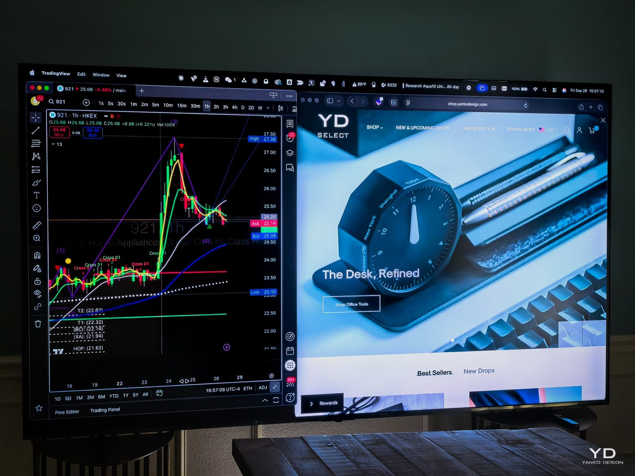
PROS: Mini-LED precision with up to 600 zones delivers 5,000:1 contrast ratios Native 144Hz gaming with sub-10ms input lag matches dedicated monitors Sophisticated Fire TV integration includes interactive Ambient Experience features Premium 2.1 audio with 50W power eliminates soundbar requirements Exceptional value at $1,899 CONS: HDR tone mapping pushes scenes brighter than filmmakers intended, particularly affecting dark movie cinematography Motion blur becomes noticeable during fast sports and action sequences at maximum refresh rates RATINGS: AESTHETICSERGONOMICSPERFORMANCESUSTAINABILITY / REPAIRABILITYVALUE FOR MONEYEDITOR'S QUOTE:Best bang for your buck: the Hisense U6QF delivers true big-screen Mini-LED performance at a price that finally makes 100 inches attainable. Over the weekend, I’m calibrating the Hisense 100U65QF’s picture settings when my neighbor walks through the front door and stops dead. “That’s not a hundred-inch TV,” he says, squinting at the massive display. “Those cost like six grand.” I pull up the Amazon listing on my phone: $1,899.99, marked down from $2,599.99. His expression shifts from skepticism to genuine shock. Designer: Hisense The neighbor’s reaction captures exactly what makes this television extraordinary. Hisense has fundamentally altered the premium television equation with Mini-LED technology, native 144Hz gaming, and Fire TV’s most advanced features at a price point that seemed impossible just two years ago. After weeks of intensive testing across streaming, and cinematic content, I can confirm this 100-inch 100U65QF delivers experiences that traditionally required spending $4,000+ on competing premium displays. What makes the 100U65QF special isn’t just the size, but how Hisense has built Fire TV into the television’s DNA rather than bolting it on as an afterthought. The result feels seamless in ways that surprised me – the TV’s picture processing and Amazon’s content algorithms work together naturally, creating the most refined Fire TV experience I’ve encountered on any brand. The Mini-LED backlighting creates dramatic contrast that basic LCD displays simply cannot match, while the massive scale transforms how content feels in your living space. The U6QF delivers far more than budget-friendly size; it directly challenges how we define premium pricing. Design / UI / UX / Ergonomics Amazon’s partnership with Hisense delivers the most refined Fire TV experience I’ve encountered across any brand implementation. The 10-foot UI design philosophy reaches its full potential on the 100U65QF’s massive screen real estate, with every interface element perfectly scaled for comfortable living room viewing distances. Beyond television viewing, this display has become my favorite work monitor, streaming wirelessly from my MacBook Pro with remarkable clarity and zero input lag that makes document editing and video calls genuinely productive at this massive scale, albeit in 1080p, which is perfectly fine for my 50-year-old eyes. The physical presence transforms how you experience your living space. At 87.8 inches wide, this display becomes the dominant architectural element in any room, yet somehow avoids feeling overwhelming. The dark charcoal finish acts as visual camouflage when powered off, allowing the TV to disappear into contemporary living spaces rather than demanding attention like traditional black bezels. The slim profile and refined proportions mean it integrates naturally with modern furniture layouts – whether flanked by bookcases or floating on a wall above a credenza. When active, the screen creates an almost window-like effect that changes your relationship with the room itself – you’re no longer watching television, but looking through a portal into other worlds. This design language speaks directly to the balance between technology and livability that defines premium home environments. Seating distances that felt too close for smaller TVs become perfectly immersive at this scale, while thoughtful cable routing eliminates visual clutter that could compromise the clean aesthetic even with multiple connected devices. Installing a 100-inch display fundamentally reshapes room dynamics in ways smaller TVs simply cannot. Furniture must be repositioned to accommodate new sight lines, while ambient lighting needs adjustment to prevent glare on the massive surface. The screen becomes both the focal point and a light source that can wash out nearby artwork or create reflections on opposite walls, demanding thoughtful interior planning that balances viewing comfort with overall room aesthetics. Performance Mini-LED backlighting changes how the 100U65QF handles dark and bright scenes. In practice, the panel delivers far deeper blacks than standard LCDs, with highlights that punch through even in daylight viewing. HDR peaks lit up bright daylight scenes without washing out, though full-screen brightness fell short of OLED’s precision. The real takeaway is how the screen feels in motion: Gotham’s alleys in The Batman looked convincingly ink-black while neon signs and explosions cut through with brilliant intensity. HDR scenes occasionally pushed brighter than intended, a side effect of the TV’s tone-mapping approach, but the overall impact was cinematic. Compared directly with OLED, the 100U65QF can’t match the perfect per-pixel black, yet in a bright living room it more than holds its own by delivering highlights OLED panels still struggle to reach. Gaming on a 100-inch screen fundamentally changes how you experience interactive entertainment. The 144Hz refresh rate transforms everything from competitive shooters to cinematic adventures into something that feels genuinely different from smaller displays. Dual HDMI 2.1 ports keep next-gen consoles and PCs running at their highest settings without compromise, while features like FreeSync Premium and G-SYNC eliminate the screen tearing that can break immersion during fast action sequences. The TV automatically switches to gaming mode when it detects console input, reducing lag to levels that make competitive play viable on this massive canvas. Fast motion does show some blur inherent to VA panel technology, but the sheer scale of the experience more than compensates. I plan to conduct comprehensive gaming testing with both PlayStation 5 and RTX 4090 gaming PC to fully explore how different game genres translate to this enormous format. Color accuracy impressed me consistently throughout testing. The quantum dot color technology achieves 90% DCI-P3 coverage with good out-of-box color accuracy, requiring minimal calibration adjustments. Audio quality surprised me more than expected from built-in TV speakers. The integrated subwoofer delivers genuine low-end punch that eliminates the tinny sound plaguing most flat panels. During action sequences, explosions carry actual weight rather than harsh treble, while dialogue stays clear and centered even at high volumes. Dolby Atmos creates convincing spatial effects for a TV-based system, though the physical limitations become apparent during complex surround passages. DTS content passes through cleanly to external systems, but the TV handles most streaming audio formats natively without issue. For casual viewing and even moderate movie nights, the sound system holds its own. However, anyone building a dedicated home theater will want to pair this display with external audio to match the visual impact. Fire TV Experience Coming from Google TV, I expected to miss a few favorite apps. I did not. Fire TV had everything I needed on day one, including Dish Anywhere and F1 TV, Apple TV, plus the usuals like Netflix and Prime Video. Voice search felt natural with the Alexa remote and returned results across the services I already subscribe to. When I asked for “dark sci-fi movies with Dolby Atmos,” it actually understood the request and surfaced relevant titles from multiple streaming services rather than just dumping generic results. If you share the TV, create separate profiles so recommendations do not get muddled. Smart home control is genuinely useful from the couch. The Smart Home Dashboard pulled up a live Ring feed with a single voice command, and Hue lighting tied in through Alexa as expected. Nest can be linked as well, though it may require extra account steps in some homes. If you want quick casting from a phone, Amazon’s Matter Casting is already rolling out on compatible Fire TVs for Prime Video, and it worked reliably in my testing. Ambient Experience is the most delightful surprise. When the TV is idle, motion near the screen triggers gentle, interactive artwork that responds to movement throughout the room. Even better, you can generate custom backgrounds with voice commands. I asked for “a moody watercolor skyline at night,” and the screen filled with an original scene that made the room feel curated rather than blank. The AI art generation actually works well, creating backgrounds that feel artistic rather than generic. Content discovery feels remarkably broad. Universal search aggregates results across installed apps, while Fire TV Channels provides access to hundreds of free, ad-supported live channels and on-demand content without requiring separate app installations. During my browsing sessions, I found everything from classic movies to niche documentaries readily available. The caveat is advertising. Autoplay promos and banner ads intrude during navigation more than I’d prefer, though the frequency has decreased compared to earlier Fire TV versions. If you value a cleaner home screen experience, Apple TV or Google TV platforms feel less cluttered. The Fire TV mobile app turns your phone into a full-featured companion for the 100U65QF, and it quickly became my go-to for day-to-day control. It doubles as a remote with playback buttons and a real keyboard for fast text entry, so signing into apps and searching feels far less tedious than hunting with the physical remote. The app also supports voice search from your phone, and it can cast Prime Video and other supported content to the TV or trigger screen mirroring when needed, which made sharing clips from my phone trivial during testing. You can browse and open apps on the TV directly from the app, which speeds up setup and lets you push content to the 100U65QF without touching the physical remote. If you lose the included remote or want private listening through headphones, the app handles that too, making the overall Fire TV experience feel more polished and complete. Compared to rival smart platforms, Fire TV strikes a middle ground between Google TV’s cleaner interface and Samsung’s Tizen with its deeper hardware integration. Where Google TV feels more polished but less connected to smart home ecosystems, and Tizen offers Samsung-specific optimizations but limited voice control, Fire TV provides the broadest app selection with genuinely useful Alexa integration that extends throughout your home. Bottom line. Fire TV on the 100U65QF feels complete, fast enough, and genuinely helpful once you lean on voice, profiles, and the Smart Home Dashboard. The platform won me over with breadth of apps, capable search, and a surprisingly artful idle mode. Keep in mind that ads are part of the deal, and plan your settings accordingly. Sustainability Hisense highlights several environmental moves around its ULED lines, most notably ambient-aware picture modes that lower peak output when a room is dim and broader corporate targets to increase recyclable packaging. Hisense Europe, for example, has publicly committed to moving product packaging to fully recyclable materials and reports progress on recycled content and waste-reduction programs. At the product level, the 100U65QF includes scene-adaptive brightness features that dial back peak output in darker rooms, and the included voice remote uses replaceable batteries rather than a sealed cell. These small details extend usable life and reduce waste. The company also delivers firmware and feature updates over Wi-Fi, and the Fire TV platform leans on cloud services for some AI and gaming features, which can reduce the need for more powerful on-board silicon for every device. Manufacturing Scale and Market Context Hisense leverages its position as the world’s fourth-largest television manufacturer with comprehensive vertical integration advantages. The company operates extensive manufacturing facilities from its Qingdao headquarters, enabling quality control throughout production while maintaining cost efficiencies through scale. This manufacturing footprint allows Hisense to offer genuine Mini-LED technology at pricing points that would be impossible for smaller manufacturers operating through contract assembly. The company commands nearly 40% market share in the 87-inch and larger segment domestically, demonstrating serious commitment to large-format displays rather than treating them as niche products. The 100U65QF benefits from Hisense’s broader momentum, including significant growth in the premium television segment during 2024 and global leadership in displays exceeding 100 inches. Build quality shows throughout daily use. The enormous screen surface maintains consistent brightness and color across every inch, something that becomes obvious when you’re sitting close enough to notice variations. During extended gaming sessions, the TV runs completely silent with no fan noise or heat issues that plague some large displays. Hisense’s ULED system feels purposeful rather than marketing fluff – the Mini-LED backlighting and quantum dots work together in ways you can actually see. This manufacturing scale lets Hisense price aggressively while competitors struggle to match both features and cost at this size. Value and Buying Considerations Amazon’s current pricing at $1,899.99 (reduced from $2,599.99 MSRP) positions the 100U65QF as a genuine market disruptor rather than budget alternative. The competitive landscape reveals the 100U65QF’s exceptional value proposition clearly: TCL’s 98-inch QM6K QLED costs $1,999 for a slightly smaller display with anti-glare coating, while Samsung’s 98-inch Q80C QLED ranges from $2,350-4,500 depending on retailer with premium brand positioning that demands higher costs. Only one major brand offers Mini-LED technology at 100 inches with native Fire TV OS integration. The 100U65QF occupies this unique market position entirely alone. Amazon ecosystem users seeking premium display technology can now bypass traditional premium pricing barriers. Best Buy financing at $87.50 monthly makes this investment accessible for budget-conscious buyers who prioritize screen size and feature density over brand prestige. Customer satisfaction metrics reinforce the value proposition consistently. Best Buy customers rate the television 4.7/5 stars, with users consistently praising the immersive experience. Representative feedback includes: “The size of the TV is mind-blowing: it’s not just a screen, it’s a full-on wall of entertainment that transforms how I experience movies and sports.” Gaming enthusiasts highlight the 144Hz refresh rate and Game Mode Pro creating “smooth, ultra-responsive experiences” that rival dedicated gaming displays. However, honest assessment requires acknowledging limitations alongside strengths. Motion handling shows blur at maximum refresh rates, while HDR tone mapping issues affect color accuracy compared to premium alternatives. For families considering large-screen television upgrades in 2025, the Hisense 100U65QF Fire TV MiniLED represents democratized access to premium display technology. This television succeeds in making 100-inch Mini-LED displays accessible at historically mid-range pricing while establishing a unique position in the Fire TV ecosystem. The market landscape shifted permanently with this launch: every competing manufacturer must justify premium pricing against the U6QF’s comprehensive feature set and performance capabilities.The post Hisense 100U65QF Review: The Fire TV Experience Scaled to 100 Inches first appeared on Yanko Design.

Executive headshots in 2026: the real price of looking like a pro Remote work has turned LinkedIn feeds into our digital first impression, and executives everywhere got the memo. Slick portraits open doors, close deals, and shape how investors size you up. In 2026, a single headshot isn’t vanity—it’s table stakes for credibility. Surveys back up the scramble. A Tech.co study found that 44 percent of job seekers plan to use AI-generated headshots, and 75 percent of recruiters say a polished AI image is perfectly acceptable. The message is loud: the market loves a sharp photo, no matter how it’s made. Prices, however, are all over the map. A quick studio session in San Francisco can run $450, while an AI platform like InstaHeadshots promises 100 ready-to-post images for just $49. That gulf leaves most of us wondering what we’re paying for. That’s exactly what we’ll unpack. We’ll compare every major path—traditional studios, on-site corporate shoots, AI generators, and high-touch branding agencies—so you can match the spend to your business goals instead of guessing. Settle in. By the end, you’ll know where the dollars hide, which corners are safe to cut, and how to lock in a headshot strategy that builds trust without torching the budget. Let’s start with the four provider types competing for your camera time. Traditional studio sessions Walk into a brick-and-mortar studio, and you can hear soft boxes humming, see backdrops rolled tight, and feel a photographer nudging your chin until the light lands just right. That craft comes with sticker shock. Across major U.S. cities, a solid studio package now sits in the $300–$500 range before extras, according to EasyHeadshots. The base fee buys 30–60 minutes in front of the camera, professional lighting, and a handful of proof shots. It rarely covers the file you later post online. After the shoot, the meter restarts. Studios charge per retouched image, often $25 to $100 each, because editing time is billable talent. Want a second outfit? That’s a new “look” and usually another fee. Rushed delivery, background swaps, or full commercial rights add more line items. Even so, many executives swear by the in-person method. A seasoned photographer can coax out confidence that AI tools miss, adjust posing on the fly, and fix a crooked tie before the shutter clicks. For people who sell trust face-to-face, such as fund managers, keynote speakers, or media CEOs, those subtleties justify the premium. For purely digital roles or large teams, though, the math tilts the other way. As we move through the remaining provider types, remember that $300 floor. It’s the benchmark every alternative tries to beat. Corporate on-site group sessions Scheduling a photographer to wheel studio lights into your office feels efficient at first glance. Everyone lines up, smiles, and gets back to work, right? Reality costs more. Traditional on-site packages in major hubs average $200–$600 per person, reports TeamShotsPro. A 50-employee shoot can cross $20,000 once setup fees, travel, and editing hit the invoice. Then come the invisible drains. Each employee burns two to three hours moving between desk, makeup chair, and photographer. At $50 an hour in loaded salary, that downtime alone adds another $100–$150 per head. TeamShotsPro tracked one consulting firm that lost $22,500 in productivity before paying a single photo fee. Hidden line items pile up fast: rush edits for the CEO’s press kit, commercial usage rights so marketing can run ads, even extra lighting for a windowless boardroom. The supposed bulk rate quickly stops looking cheap. Corporate shoots still make sense when you need brand-consistent portraits on the same backdrop and have everyone in one place, such as annual report day at headquarters. Just budget for the soft costs of coordination and brace for the true, all-in number, not the teaser rate that lands in your inbox. AI headshot platforms Upload a few selfies, grab a coffee, and within thirty minutes you’ll receive dozens of polished portraits. That’s the promise, and for many, the reality of AI headshot generators. Pricing steals the spotlight. Services start around $19 and top out near $49 for 100 or more images. One standout platform, InstaHeadshots, turns about ten casual selfies into 100 executive-grade portraits in roughly fifteen minutes, placing it squarely in that sweet spot. Compared with the $300 studio benchmark, the gap is hard to ignore. InstaHeadshots AI headshot platform pricing and executive portraits dashboard Numbers at scale back that headline price. InstaHeadshots’ team portal lists more than 20 million professional headshots generated for over 200,000 users. A built-in dashboard emails upload links, trains a custom model for each person, and returns 100 PNGs in roughly 15 minutes—fast enough for HR to refresh portraits during a lunch break instead of blocking off an entire workday. Speed follows close behind. Because the system never books a calendar slot, you can refresh your portrait the moment you shave the beard or change the hairstyle. Full commercial rights are usually baked into the sticker price, so marketing can drop the image into presentations, investor decks, or paid ads without legal wrangling. Quality has surged over the past year. Surveys show recruiters now accept high-end AI headshots with the same confidence they show traditional photos, especially for online profiles viewed at thumbnail size. Consistency is the one caveat: upload seven grainy selfies and you’ll get grainy art back. A short preset checklist solves that issue: use daylight, show multiple angles, and avoid busy backgrounds to tip the odds in your favor. For solo founders, remote teams, and fast-moving startups, AI is today’s fastest route to a credible executive image. Still, the next section will show why price alone is only half the story. Branding agencies and creative services When a headshot turns into a brand asset, companies call the storytellers. Creative agencies bundle portrait sessions with identity workshops, social banners, and sometimes a sizzle reel that follows the CEO through the office. That level of coordination starts around $800 and can break the $2,000 ceiling per person. The fee covers pre-production mood boards, professional styling, a senior art director on set, and a retoucher who polishes every pixel. Agencies earn their keep when visual cohesion is non-negotiable. Investor roadshows, IPO filings, or Fortune cover pitches demand one look that flows through print, video, and keynote slides. Because an agency controls the entire pipeline, brand colors, lighting, and crop ratios match everywhere the photo appears. The trade-off is cadence. These shoots run on agency timelines, not executive whim. Booking, concept approval, and post-production can stretch for weeks. If you only need a fresh LinkedIn avatar by Friday, this isn’t your lane. Treat agency headshots as a marketing investment, not a simple photo expense. You’re paying for strategy, narrative, and the peace of mind that every public touchpoint carries the same visual note. That peace, like most luxuries, commands a premium. Key cost factors and line-item breakdown Location and photographer experience Big-city glamour adds a surcharge. Studios in New York, San Francisco, and Los Angeles often add 50–100 percent to the bill, pushing a $300 session toward $600. Regional markets hover around $150–$350 for the same service, proof that a ZIP code alone can double your spend. Reputation stacks on top of geography. A photographer with Fortune 500 logos in the portfolio may charge $500–$1,200 a sitting. A hobbyist advertising on community boards might shoot for $75 plus gas money. The skill gap shows up in lighting, direction, and post-production finesse, but the cost gap matters when you’re hiring for an entire leadership bench. Combine both factors and the spread widens fast. A rising executive in Omaha can secure a polished portrait for the price of a single licensed image in Manhattan. Before you book, ask whether the extra shine of a marquee studio will translate into measurable business value, or if a mid-tier pro outside the high-rent district can deliver everything your LinkedIn profile needs at half the rate. Package and pricing models Most photographers split quotes in two: a “session fee” and a “selection fee.” The session fee covers time in studio and basic lighting, the cover charge to walk in the door. In most markets that ticket runs $200–$500. The second fee starts when you pick favourites. Studios either bill per finished image or per “look.” A common arrangement is three retouched photos for $125 total. Need a fourth? That single file can add another $40. If you switch from blazer to hoodie mid-shoot, many pros label that a new look and restart the meter. Extras show up quietly. Same-day turnaround costs editors sleep and you $100–$300. Hair and makeup artists add $75–$200 per sitter but save time in Photoshop. Rush delivery plus extra retouches can nearly double the original quote. AI and DIY options dodge most of these à-la-carte charges because everything is baked into one flat fee. That simplicity helps, but it also hides the craft that studio photographers price out line by line. Pay only for what you need, and read every line before you sign. Image edits and usage rights The camera captures reality; retouching decides how polished that reality appears to the world. Basic blemish cleanup is often bundled into the session price, but advanced edits such as skin smoothing, stray-hair removal, and backdrop swaps run $25 to $100 per file and scale with the image count. Licensing adds another layer of fine print. Many photographers quote personal-use rights by default. That lets you post on LinkedIn but bars the marketing team from dropping the photo on a billboard. Unlocking full commercial rights can add $100–$500 to the bill. Skip that clause and you risk an awkward cease-and-desist long after the shoot. AI vendors flip the story. Because no human shutter was pressed, most platforms grant unlimited usage in the base fee. You can print five-foot posters or run paid social without returning to a lawyer’s inbox. Studios can match that generosity, but only if you negotiate before signing. Always confirm in writing where and how you’ll use the image. A ten-minute contract check today can save thousands in relicensing fees tomorrow. Turnaround time and convenience Time is money, and headshots spend both. Traditional studios book one to three weeks out, then spend another week polishing files. Need images tomorrow? Rush editing tacks on $100–$300 and rarely covers everyone on a large team. Corporate on-site shoots reduce travel, but not the calendar. Each employee still loses two to six work hours between prep, waiting, and review—a hidden cost that can eclipse the photographer’s invoice. AI turns the timeline upside down. Upload a batch of selfies before lunch and download finished portraits before your next meeting. No commute, no rescheduling when rain hits, and no productivity dip across the team. That immediacy is why fast-growing startups now refresh profiles quarterly instead of annually; speed keeps branding aligned with reality. When deadlines rule, the fastest channel often wins, even if raw image quality lands a notch below a luxury studio’s best shot. The key is matching turnaround to the stakes. A global press tour can wait a week for bespoke lighting; a hiring sprint on LinkedIn can’t. Team discounts and volume deals Bulk buying changes the math. Photographers cut per-person rates when you guarantee a full day of back-to-back faces. A ten-person shoot might drop to $79 each, and a fifty-person lineup can slip below $60. The catch: savings hinge on flawless logistics. One late executive can stall the entire schedule and erase the discount in overtime fees. AI services offer an even cleaner model. Many platforms sell “credits” in packs: pay for fifty, send a link to every employee, and watch portraits roll in at roughly $20 per head. No calendar coordination, no studio commute, and no risk that someone forgets it’s photo day. If you manage a hybrid or global workforce, the AI bundle is hard to beat. For headquarters teams that need identical lighting and a shared group shot, a well-oiled on-site session still wins on brand consistency. Just run the numbers with lost productivity included; that invisible line item often tips the scale back toward virtual pixels. Studio, AI, and hybrid costs side by side To see where the dollars land, let’s line the three main paths shoulder to shoulder. Numbers below reflect national averages from 2026 pricing surveys. MethodUp-front costImages includedPer-image averageTurnaroundTraditional studio$300 session fee + $125 for 3 retouched files3$1421–3 weeksAI platform$49 flat for 100 files100$0.4930 minutesDIY hybrid (smartphone + paid retoucher)$0 shoot + $25 per outsourced edit × 55$251–2 days Two patterns stand out. First, studios load most of the cost into the shoot, then add fees each time you need another file. AI flips that model: the algorithm costs little to run, so providers compete on volume. Second, speed moves opposite to price. Budget-friendly AI delivers fast because bits travel faster than people. Higher pricing often buys creative direction, not just pixels: time in studio, live feedback, and bespoke retouching. Use the table as a gut-check. If your team needs a banner image for next week’s investor deck, the studio’s hundred-plus dollars per file feels heavy. But if the CEO’s portrait will anchor a global ad campaign for the next three years, the math shifts toward craftsmanship. Quality versus cost trade-offs A headshot is more than pixels; it’s a first handshake. Top-tier studios justify their price with handcrafted lighting, subtle posing cues, and micro-retouching that leaves pores intact yet polished. On a Fortune 500 bio, that nuance signals authority. AI, while far better than early face-filter apps, still leans on averages. Feed the engine crisp selfies in balanced light and it delivers results that fool most LinkedIn scrollers. Upload fuzzy phone snaps and you’ll get plastic skin or mismatched eye lines. The algorithm echoes whatever you provide. Where’s the tipping point? Social-only roles thrive on volume, not perfection, so the $0.49 per-image AI rate from the comparison table feels like found money. High-stakes brand campaigns flip the equation: one impeccable portrait viewed by millions earns its $142 studio price tag in seconds. Treat quality spend like insurance. Pay more when a mediocre photo could dent credibility. Pay less when the image fills a short-term need and will be refreshed in six months. Let your budget follow the headshot’s lifetime value, not the buzz around the newest tech. Long-term ROI considerations Headshots age like produce. New glasses, a different haircut, or ten pounds lost can date an image overnight. Traditional studios charge full price each time you step back in front of the lens, so three refreshes over five years can top $1,200. AI rewrites that math. Once the model has your upload set, generating fresh looks costs pocket change and takes minutes. Some executives now spin seasonal portraits: winter blazer, summer linen, conference badge. The total five-year spend stays under $30. Then there’s opportunity cost. Every hour a vice president sits in a studio chair is an hour not closing deals. Multiply that by a 20-person leadership team and the “cheap” $300 session balloons into thousands in lost productivity. Virtual headshots run in the background while calendars stay billable. The lesson is simple: track return in two columns—direct fees and indirect drag. Low sticker prices lose their charm if they pull people off revenue work. High fees can look like bargains when spread over a global PR cycle. Put a time horizon on your brand image and let the numbers choose for you. Conclusion Executive headshots now sit at the intersection of branding, technology, and efficiency. Traditional studios deliver handcrafted polish, on-site sessions scale that polish across teams, AI platforms democratize speed and cost, and branding agencies weave photography into a wider narrative. Match the channel to your timeline, audience, and budget, and you’ll capture an image that pays for itself long after the shutter—real or virtual—clicks. The post Executive Headshot Pricing: What Studios, AI Tools, and Agencies Actually Charge appeared first on Designer Daily: graphic and web design blog.
Get access to thousands of freshly updated design inspiration pieces by adding Muzli to your browser.
Loved by 800k designers worldwide, Muzli is the leading go-to browser extension for creative professionals.
A well-designed banner can be the gateway to capturing your audience's attention and conveying your message promptly. Whether it's on your website's homepage, a landing page, or an online advertisement, a good banner can make a lasting impression. Here are some valuable tips to help you create an impactful and engaging banner:
1. Define Your Objective: Begin by clarifying the purpose of your banner. Are you promoting a product, announcing a sale, or encouraging sign-ups? Understanding your goal will guide your design decisions and ensure that your banner delivers a focused message.
2. Keep It Simple: Simplicity is key when it comes to banners. Avoid cluttering the design with excessive text, images, or elements. A clear, concise message with a single focal point will have a stronger impact.
3. High-Quality Imagery: Use high-resolution images that are relevant to your message. Visuals should complement your text and resonate with your target audience. Avoid pixelated or stretched images, as they can diminish the overall quality of your banner.
4. Compelling Copy: Craft a brief and compelling headline or tagline that conveys the essence of your message. Use concise, action-oriented language that encourages users to take the desired action.
5. Legible Typography: Choose a legible font that aligns with your brand's style and message. Ensure that the text is easy to read even from a distance. Maintain a good balance between font sizes for different elements, such as headline, subtext, and call-to-action.
6. Color Harmony: Opt for a color palette that aligns with your brand identity and evokes the desired emotional response. Use contrasting colors to make important elements, like your CTA button, stand out. However, don't overwhelm your banner with too many colors – stick to a harmonious combination.
7. Consistent Branding: Your banner is an extension of your brand. Incorporate your logo, brand colors, and typography to maintain consistency across all your visual assets. This helps in building brand recognition and trust.
8. Strategic Placement: Position your banner where it will receive the most visibility. Above the fold on your website's homepage or at the top of a landing page are common locations. Ensure that the banner's placement doesn't interfere with the overall user experience.
9. Use Negative Space: Allow for adequate negative space around your banner elements. This not only enhances the visual appeal but also prevents a cluttered appearance.
10. Clear Call-to-Action (CTA): If your banner has a specific action you want users to take, such as "Shop Now" or "Learn More," make sure the CTA button is prominently displayed. Use contrasting colors and persuasive language to encourage clicks.
11. Mobile-Friendly Design: Given the prevalence of mobile device usage, design your banner to be responsive. Ensure that it looks appealing and functions well on various screen sizes.
12. A/B Testing: Before finalizing your banner, consider running A/B tests with slight variations to see which design elements resonate better with your audience. This data-driven approach can help you refine your banner for optimal performance.
In conclusion, a good banner combines compelling visuals, concise messaging, and strategic design to convey your message effectively. By focusing on simplicity, quality, and alignment with your brand identity, you can create banners that capture attention, engage users, and drive desired actions.