A brand identity is the visual system a company uses everywhere it appears: logo, colour palette, typography, imagery and the rules that hold them together. These are recent identity projects and rebrands.
We curate topical collections around design to inspire you in the design process. This constantly-updated list featuring what we find on the always-fresh Muzli inventory.
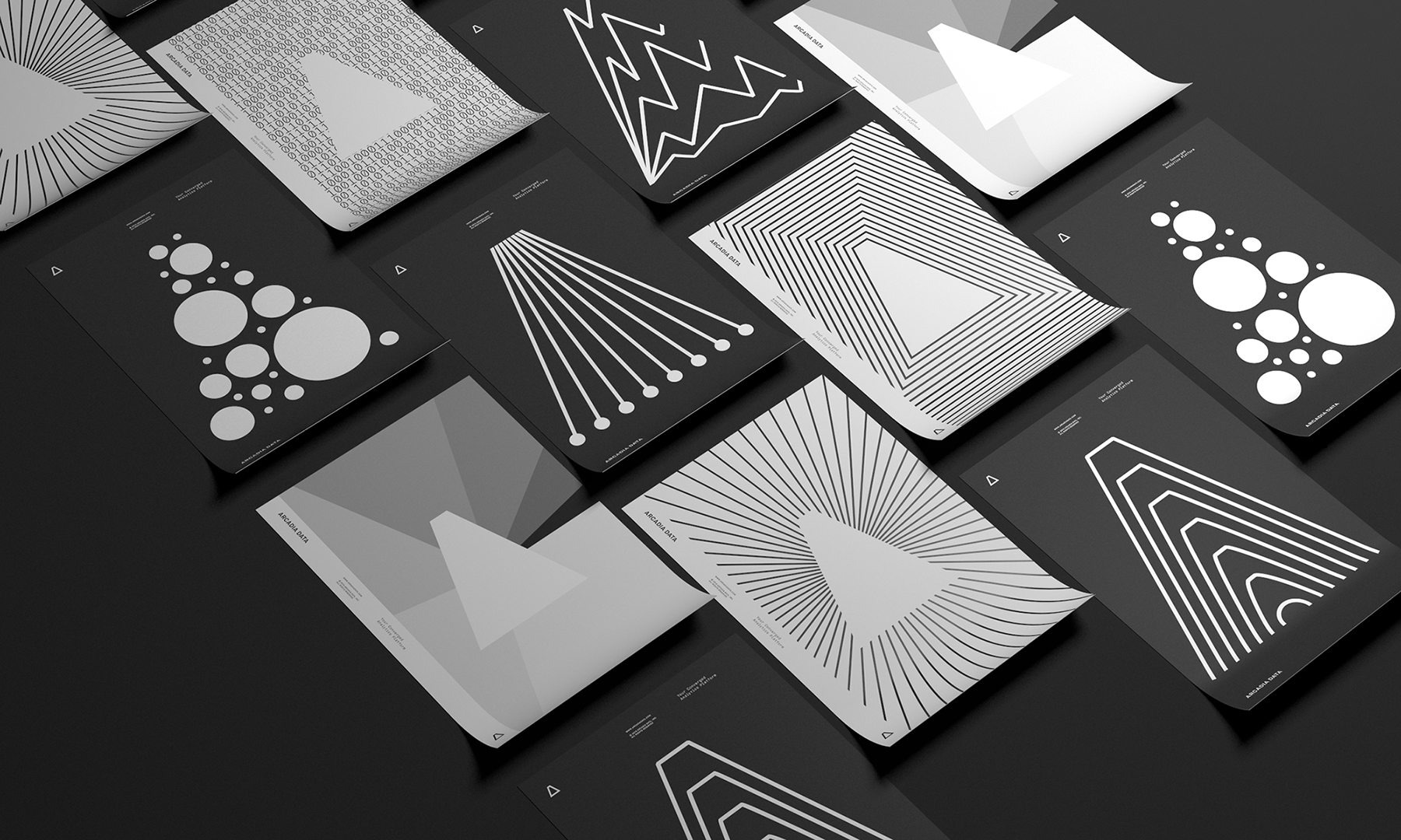
Brand Identity - Arcadia Data Rebrand
AoiroStudioApr 12, 2019
Let's start off the week (for me for sure) with a branding project that involves graphic design, illustration and lots of data. I would agree with most of you that data is quite a boring subject and quite a challenge to tackle through design. If we are looking for a UX data-driven perspective, then I would say that is a really fun thing to do because making UI design based on data will always make things even more effective but not an illustrative kind of way. Let's take a closer look at the work from Casey Martin and the rebrand at Arcadia Data.
From the Logo, Identity, Posters, Collateral, Iconography; what's striking from his approach is the tone of the colours, the contrast of the black colour on thick clean light gray lines just set everything off on the right foot. The fact you can make something boring into something beautiful but informative is just amazing.
There are millions of ways to analyze big data—most of which are pretty complicated and confusing. For analysts, investors, researchers, and opinion leaders, these statistics are a big part of life. Big data looks different for them than for the rest of us; it’s not static—it’s exciting, dynamic, even beautiful. That became the goal: to show that Arcadia Data translates raw information into something meaningful, compelling, and personal. After all, everything becomes interesting through the right lens.
Brand Identity
Credits
Brent Clouse
Jonathan Corriveau
Eric Louis Haines
Craig Mangan + Paul Charney
More information: http://www.caseymart.in.
Based on a visual language reflecting in honesty and stability that symbolizes us, we established an integrated brand system encompassing product, marketing, and internal branding. It helps our brand elevates the quality and reliability of cryptocurrency trading services.
Workers NYC is a food cart & restaurant serving delicious Korean food like bulgogi bowls and their signature burgers. Named after its target audience, they're feeding young people making their way to the top in the fastest-paced city in the world.
That's why Workers needed a visual language that would be easily understood by trendy New Yorkers in their 20–30s, that would make them stand out from all other food carts & food trucks. We developed a minimalist visual identity that may be easily customized for different seasons/occasions & various media.
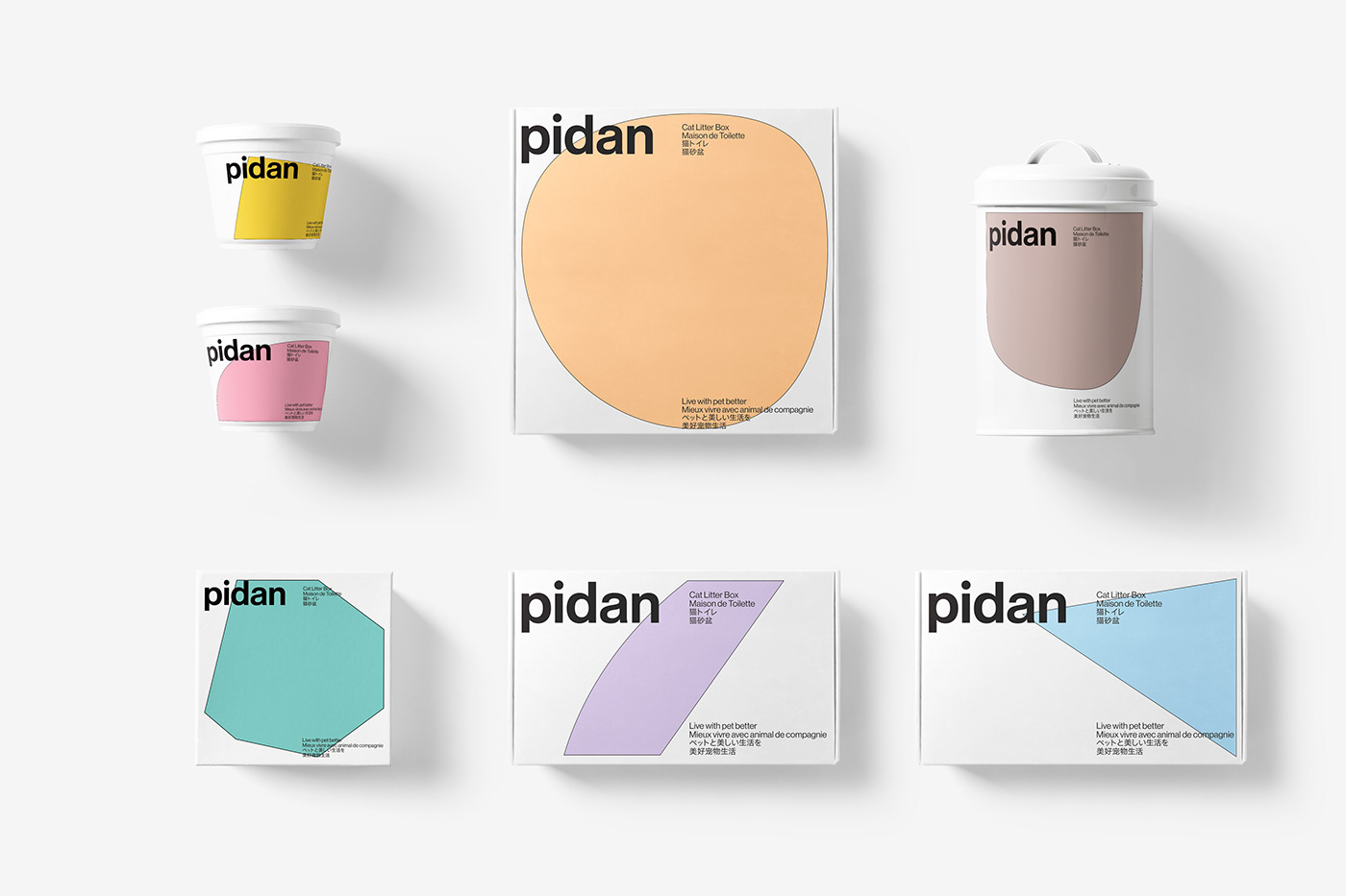
The brand reconstruction of pidan, one of the fastest growing and most influential local pet product brands in recent years, needs to endow "pets" with a brand-new understanding and definition through design.
Naming and Brand Identity Design for Arced, a renowned architectural scale model-making studio based in Vladivostok. The brand visual identity concept emphasises architectural precision, flawlessness and attention to detail. The central visual motif is the refined lines reminiscent of architectural blueprints, symbolising impeccable craftsmanship.
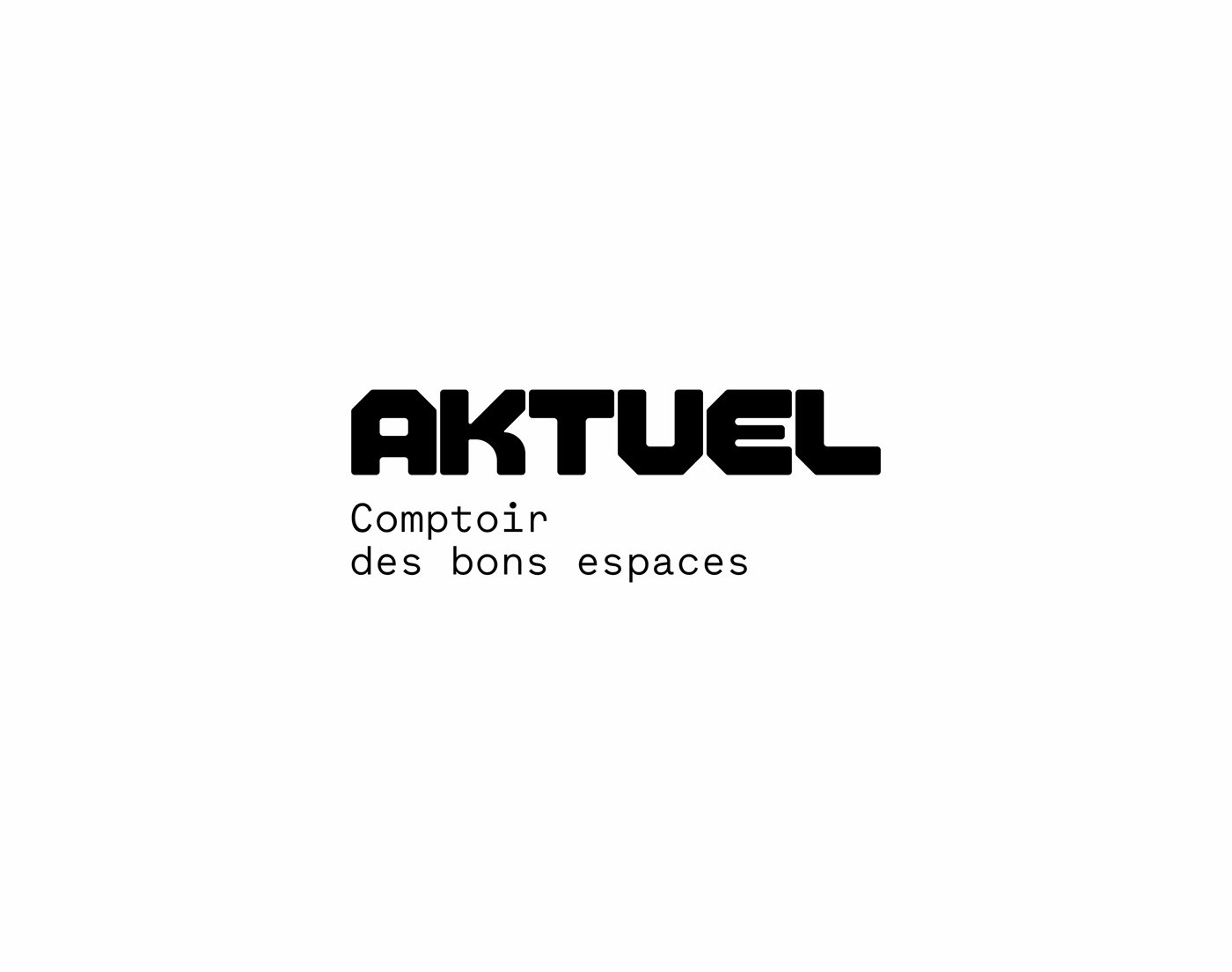
Since 1988, Aktuel has positioned itself as one of the key players in the rental of furniture, tableware and food equipment for events. The figures: 140 employees, 3 locations, 20,000m² of stock, 60 delivery vehicles, and an incalculable number of equipped events, from company conventions to major sports events and the largest trade fairs. But above all, Aktuel rightly claims, beyond its activity as a logistics provider, a human, simple and pragmatic approach, praised by all its customers for 30 years. An "office" made up of solid, reliable and committed people, a pleasant working relationship, and always successful projects.
We worked on the group's strategic repositioning, in conjunction with HDO agency in Marseille, to achieve a new signature - Comptoir des bons espaces - and a graphic translation through a new brand identity.
Our design work was based on two ideas: to talk about the historical activity of a space planner while developing the new strategic vision set up during the
24WRK is a sibling-run design studio based in Jakarta, offering brand identities, pitch decks, packaging, and more — all rooted in strategy and built to function. With an experimental and contemporary approach, the visual identity blends bold typography, a strict grid, and a custom 3D mascot to create a playful yet structured system that reflects the studio’s always-on attitude.
Hyper Farms is an agrotechnology company building the future of global agriculture through advanced field and livestock systems. From drone-integrated crop monitoring to livestock tracking via embedded chips, Hyper Farms merges technology and nature to reshape the way food is grown and managed.
The branding aims to reflect this synthesis — balancing precision, innovation, and a deep-rooted connection to the earth.
There is power in togetherness. In strong bonds formed between colleagues that become like family. In laughter and in vulnerability. In overcoming challenges as a team and realizing the potential of uniting each other's strengths.
This was our philosophy for this project, which was to create a complete visual identity from scratch.
We set on the name Hubu as the starting point; a compound of 'hub' (the effective center of a network) and 'ubuntu' (a South African ideology meaning "I am because we are").
Saul Osuna (graphic designer and art director).
Samuel T. Scofy (project manager, creative director and editor).
Samantha Ripley (copywriter).
Internet and satellite television and internet provider DIGI TV, operating on the Czech market since 2006, expands its primarily sports focus and turns into Telly. We came up with the friendly name and sharpened its look a little with a simple diagonal. First, we cut the Y in the logo and then in a visual style we added an easily applicable "wipe", an unmistakable film and video editing technique. The color scheme begins with the blue of the glowing screen and continues with the complementary RGB spectrum in shifted shades. The logo, as well as the additional typeface Neue Haas Grotesk Display, to which its morphology remotely refers, in their modernity and readability easily withstand a wide range of uses and the tooth of time. Try 30 days for FREE.
Lovea is a conceptual Milanese fine jewelry brand, imagined as a heritage house founded in 1920 on the principles of timeless elegance, quiet strength, and uncompromising craft. The challenge: give visual form to a brand that lives between opposites between gold and restraint, between a century of history and a woman buying her first piece today, between softness and steel.
This concept project encompasses the creation of a complete brand identity and visual system, built to position Lovea as the definitive jewelry house for the modern, independent woman. The goal was to make visible what a brand like this would stand for an identity that speaks immediately to who it's for and what
it represents, without explanation.
Concept:
Brand Amy Carter in a refreshing and design conscience way. Using references from her work, materials and achievements. The identity must look modern and not look dated in the future, while always giving a professional edges over her competitors.
Solution:
To create a brand identity and online presence for Amy Carter. Including Logo and logotype, brand guidelines, animated ident, business cards, cover letter, portfolio slides and a portfolio website.
'1theK (Wonder K)' is Kakao M's global K-POP channel.
K-POP artists' official music content and Kakao M's own K-POP content are delivered to connect artists with global fans.
'1theK' is proud of its position as a global K-POP brand and creating a new culture through SNS channels such as YouTube, Facebook, Twitter, and Weibo with 18 million subscribers.
-
The symbol of '1theK' is in the form of a flag containing the values ??of Leading, Wonderland and Union.
Flag symbols are created in a fast-paced form to represent content attributes. It also shows the form of 'K' and functions as a frame that can contain logotype and other content. The various vivid colors distinguish the vertical channels and represent the diversity of K-POP.
The brand identity renewal of '1theK' strengthens the status of 'Global No.1 K-POP Media Brand' and provides a new brand experience.
MONOCHROME? is the first and only brand that actively promotes oversized fashion and uses this concept as a key direction in the creating process of its collections.
everything flows and nothing stays
ström is a creative agency with headquarters in sweden and spain that addresses communication from a digital perspective and adapted to the new audiences.
based on the name ström, a swedish term full of meanings (river, fluid, electricity, energy, burning, outburst, sequence, transmission, ...) we proposed an open and dynamic visual identity with a vital, fresh and casual image; with a strong flexible vocation and in constant evolution able to reflect the dna of the agency.
a figure that flows, halfway between an s and a vertical infinity symbol and that combines graphics, movement, texture and emotion, serves as an isotype and from there we built an identity that responds to the needs of an environment where the way of communicating ?new technologies, new behaviors, new devices, new ways of interacting, new forms of advertising? changes constantly, where everything flows and nothing stays.
This is 1% of what Muzli shows you.
Get the rest — fresh design inspiration on every new tab, free.
Narka’s visual identity is built on a minimalist, elegant, and timeless aesthetic, perfectly aligned with its vocation in the field of high-end, modern architecture.The logo, defined by bold and contemporary geometric lines, embodies the precision, rigor, and creativity that characterize each of the brand’s architectural projects. Its clean typographic style conveys a forward-looking vision while maintaining a strong visual presence that inspires both trust and prestige.
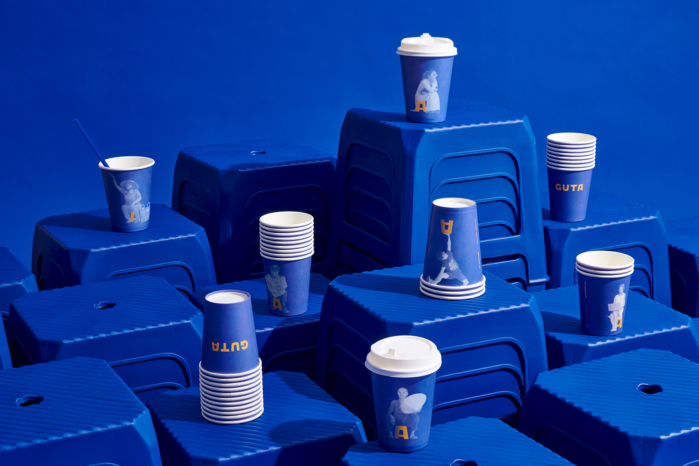
Deriving unique Vietnamese street culture, Guta Cafe? grows to be a familiar coffee brand for urban people could connect and enjoy the outdoor environment. Focusing on responsive and affordable store setup, they have grown fast, dominated Saigon and become one of the most popular convenient coffee chain for everyone in the city. Guta is from a Vietnamese verbal slang, from "gout /gu/ " in French and "ta" in Vietnamese, together stands for the term "our style". Representing for Guta's brand spirit, they proud to serve a decently good strong Vietnamese coffee. From the most common culture of Saigon, street-coffee has become a fundamental habit of not just Saigonese but also Vietnamese. Beneath the habitual culture, there's always a "plastic chair", small and convenient to setup anywhere to become a small coffee shop. The graphic system was taken over by the iconic chair as center combined with all surrounding environmental elements & people behaviors.
Toronto-based nut milk company Mylko is a favourite at local farmers markets. In relation to their luxury beverage competitors, Mylko aims to be a pantry staple, selling their product in large quantities as well as small.
As substitute products have become a widely accepted alternative to dairy, we were interested in creating something that felt like real milk. Taking cues from 1950s imagery and product design, we created a contemporary take on a retro visual identity.
Art Direction & Design: Danielle Hall and Sarah Dobson
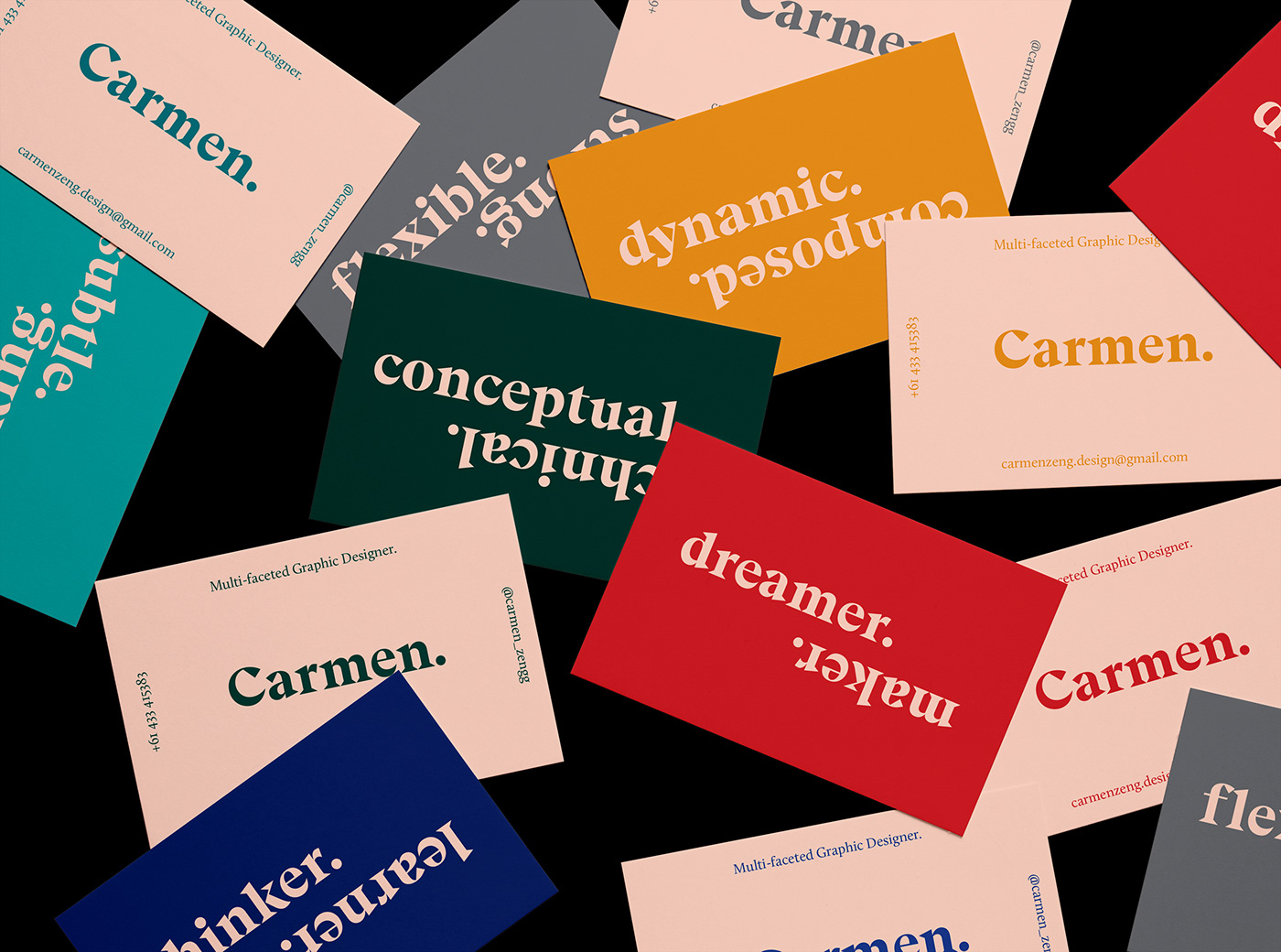
Based on the notion of duality and my personal ambitions as a designer, this branding project sought to represent the multi-faceted nature of myself as a designer. As a curious individual, I aimed to embody the various traits that I relate and aspire to throughout this brand.
Within this set, business cards, resume, tax invoice, cover letter, note cards and a concertina leave-behind is included.
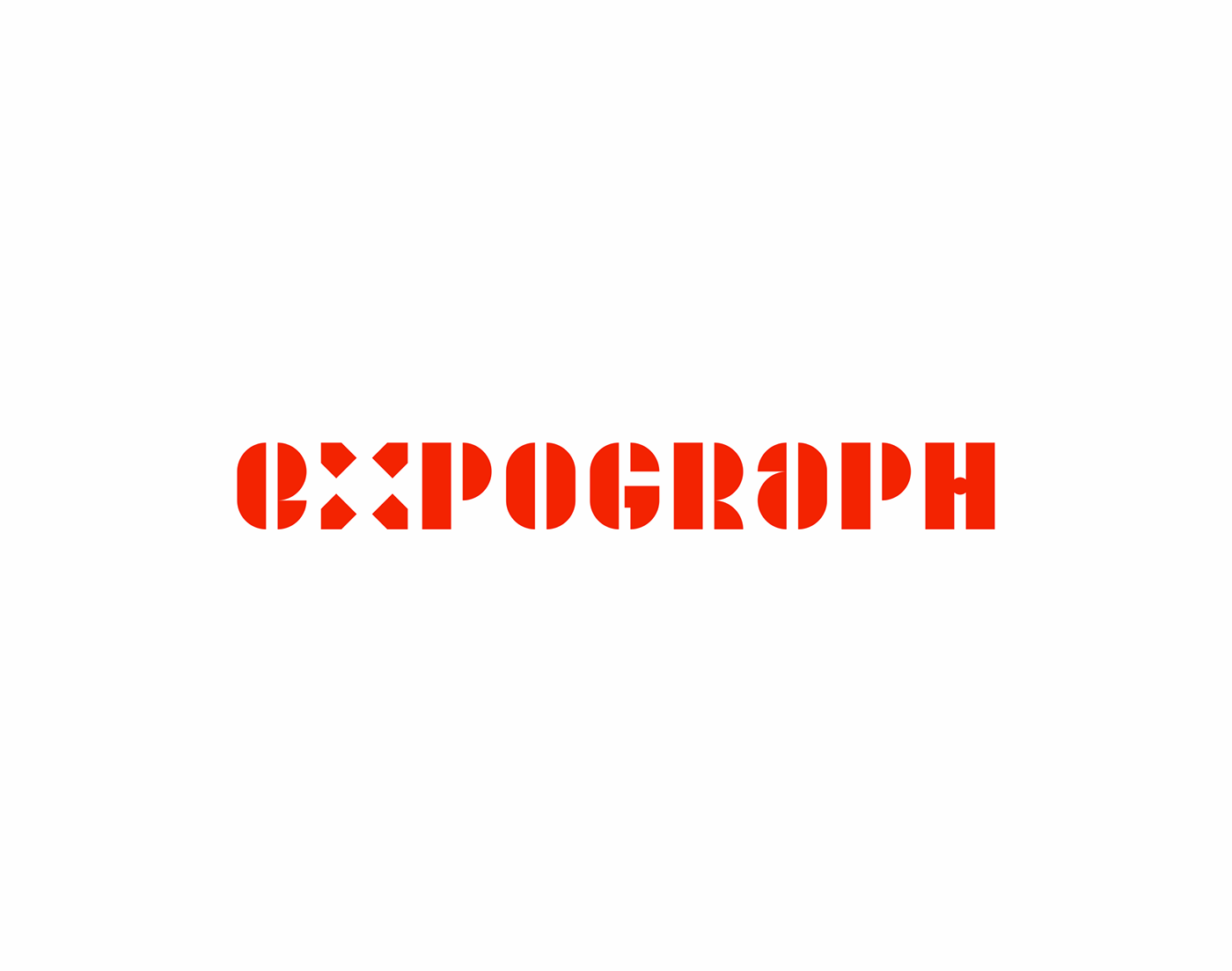
Expograph is one of the major players in signage in France. Established since 1973 at the gateway to Paris, the group specializes in the design and manufacture of signage systems, visual communication and decoration. Signs, 3D letters, marking of buildings and offices; the company, which designs and manufactures all its products in-house, now boasts a high level of expertise. In the spring of 2019, we were mandated to completely rethink the visual identity. Their mantra: inform, guide, beautify.
Our task was to create the logo & visual ID for data & data-driven marketing company NORDATA. The name of the company, which combines two words "North + Data", was our starting point. While the final solution emerged as logo, representing letter N formed from two data clusters, that have interactive connection between them.
Since the company operates in Northern region and it's name proves so, the coloristics of visual ID reflects the aurora or, in other words, northern lights.
This is 1% of what Muzli shows you.
Get the rest — fresh design inspiration on every new tab, free.
NOW are a digital product company helping brands embrace new technologies, platforms and cultures.
A diverse organisation, powered by the Havas network and spread across Asia, Europe and the US, specialises in the health and wellness sector, from brand activation through to physical product innovations.
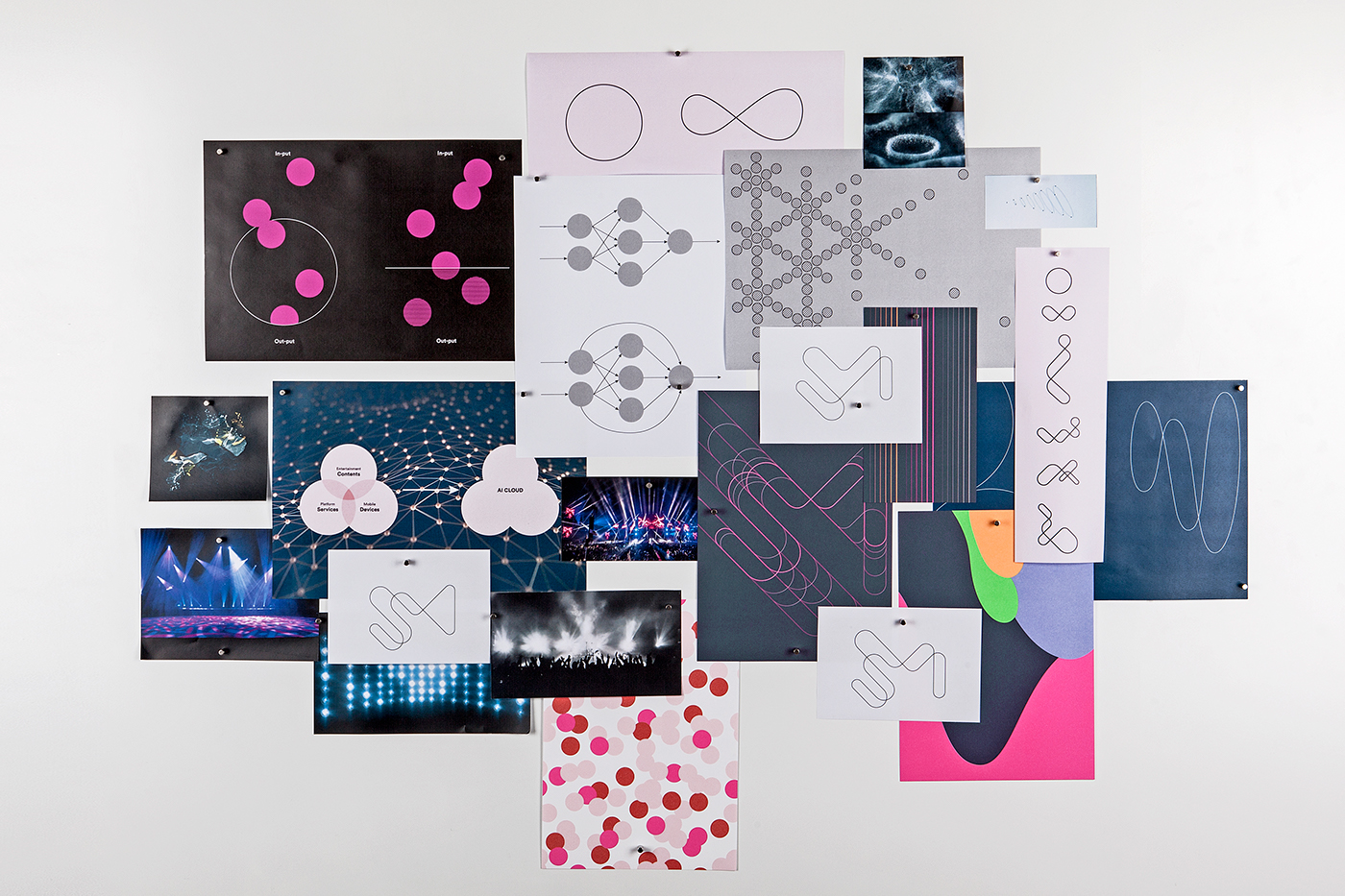
The brief was to take a fresh look at the brand identity that was already in existence. The name alone evokes transience, so we explored a constant shift of information and built a design system around a series of lenses, setting them against the past (insight, learnings), the present (innovation, harnessing the moment) and the future (the unknown, output).
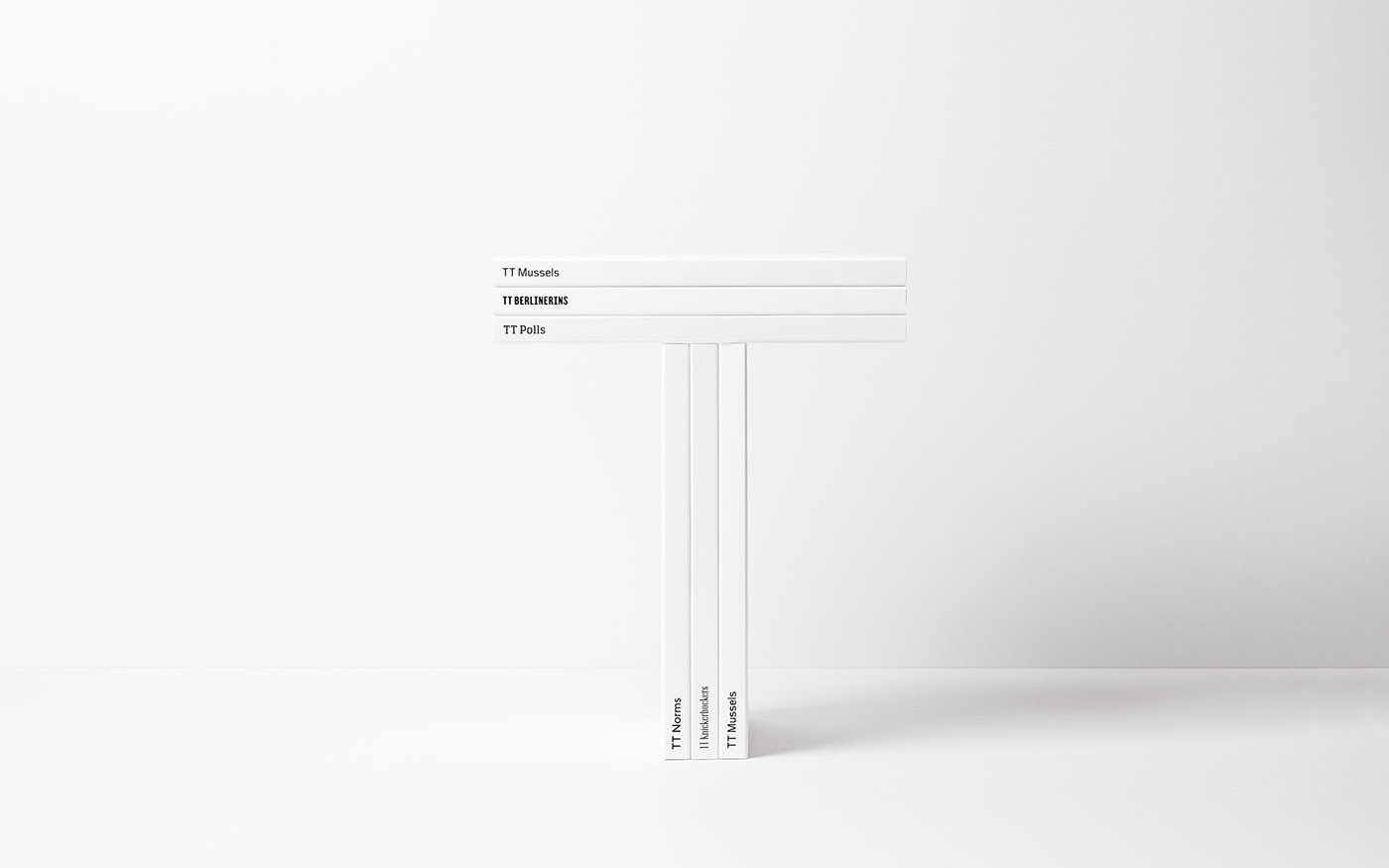
Tweag defines itself as a Software Innovation Lab, that enables well-funded deep tech startups to quickly scale their engineering performance and execute on high-risk, high-reward projects with confidence. Created in 2013 in Paris, the company is based on a team of several dozen engineers, spread over four continents, among the world's top experts in machine learning, modeling, natural language processing, blockchain, smart contract, programming tools and languages and distributed computing. The new Tweag visual identity is designed as a modular and combinatorial graphic system. Based on a bespoke character design, the Tweag logo is a raw and bold typogram that plays on curves as well as straight lines, filled areas and blanks. A simple but statutory visual marker, like a contemporary reinvention of tech imagery.
Finance is difficult. High barriers to entry mixed with abstract concepts and opaque language have created a financial system that thrives on fear and confusion. Robinhood understands this and has made it their mission to democratize finance for all.
As they've reach another growth stage, they asked us to help re articulate their brand.
Our insight? Don't just make finance "less difficult." Make it more engaging and understandable. As Noam Chomsky once said: "Optimism is a strategy for making a better future. Because unless you believe that the future can be better, it's unlikely you will step up and take responsibility for making it so."
The result: an evolved, future-focused brand that balances a high-performance product experience with a more engaging and inspiring creative expression. A Robinhood that encourages customers to imagine better futures and helps to build them.
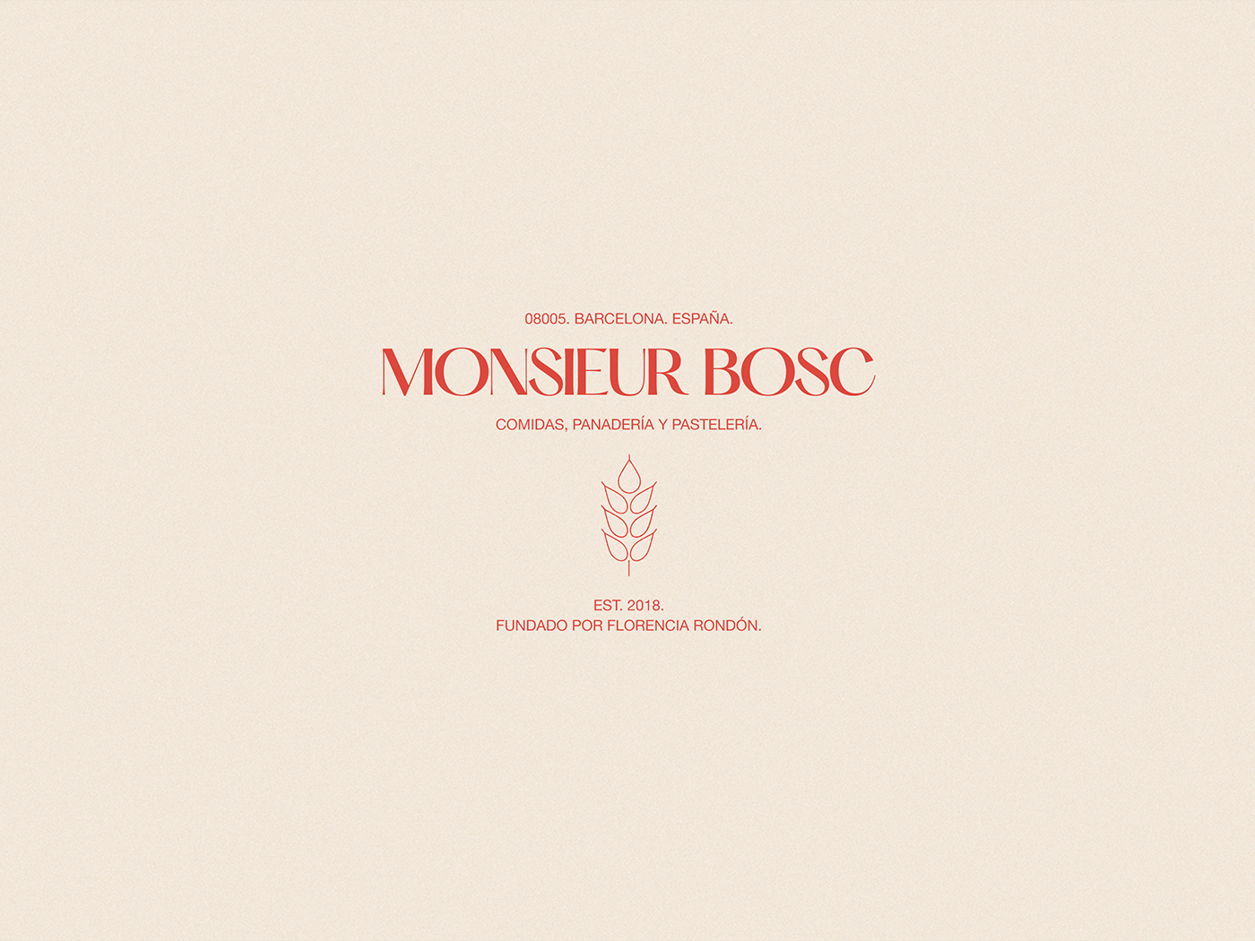
Monsieur Bosc is a charming bakery and coffee shop in Poblenou, Barcelona, that manufactures classic pastries, innovative cookies and take-away meals.
The branding consists of a business card, a loyalty card, a menu shaped as postcards, stickers for the take-away meals and for the cookies business. The fonts used are Hatton by Pangram Pangram and Neue Haas Grotesk.
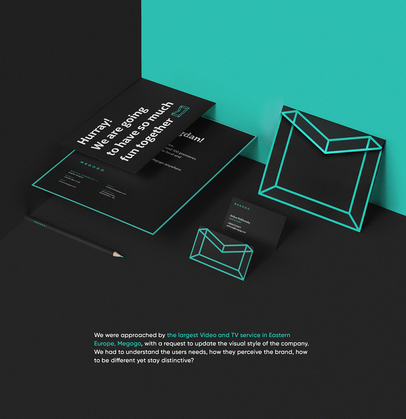
Brand Identity for the largest Video and TV service in Eastern Europe. We developed a unified visual language for all channels and platforms: website, mobile and Smart TV applications. Additionaly to the logotype and colors, we developed distinctive 3D characters for Megogo - the Super Family, who would be useful for promotional materials and commercials.
Get access to thousands of freshly updated design inspiration pieces by adding Muzli to your browser. Loved by 900k designers worldwide, Muzli is the leading go-to browser extension for creative professionals.
Brand identity design is the work of defining how a brand looks across everything it makes. The output is a system: a logo and its variations, a colour palette, typefaces, a style of imagery or illustration, and rules for combining them. The system is what lets a business card, a website and a delivery van look like they come from the same company.
What is the difference between a logo and a brand identity?
A logo is one mark. A brand identity is everything around it. A strong identity still reads as the brand when the logo is covered, because the colour, type and layout carry it. That is why identity projects are shown as applications, such as packaging and signage, and not as a logo on a white page.
What does a brand identity project include?
Usually a primary logo with secondary marks, colour values for print and screen, a type hierarchy, an image or illustration style, and a guidelines document that shows correct and incorrect use. Larger projects add motion rules, a tone of voice and templates for common formats.
Where do these brand identity examples come from?
Most are identity projects published on Behance, with rebrands and identity reviews from Abduzeedo and other design publications. Muzli follows more than 200 design sources and lists up to 60 matching pieces here, favouring recent work.