
Design Inspiration
Checkout page design examples
The checkout is the sequence of screens where a shopper enters delivery and payment details and places the order. These examples come from live apps and stores, and from recent design concepts.
We curate topical collections around design to inspire you in the design process.
This constantly-updated list featuring what we find on the always-fresh Muzli inventory.
Last update:

Checkout

Klarna’s top trends of the year | The Checkout 2022
How to Design Checkout UX Like a Pro

Amazon Checkout UX Case Study

The process: Building a better checkout
Dola - 1-click Checkout

Late Checkout
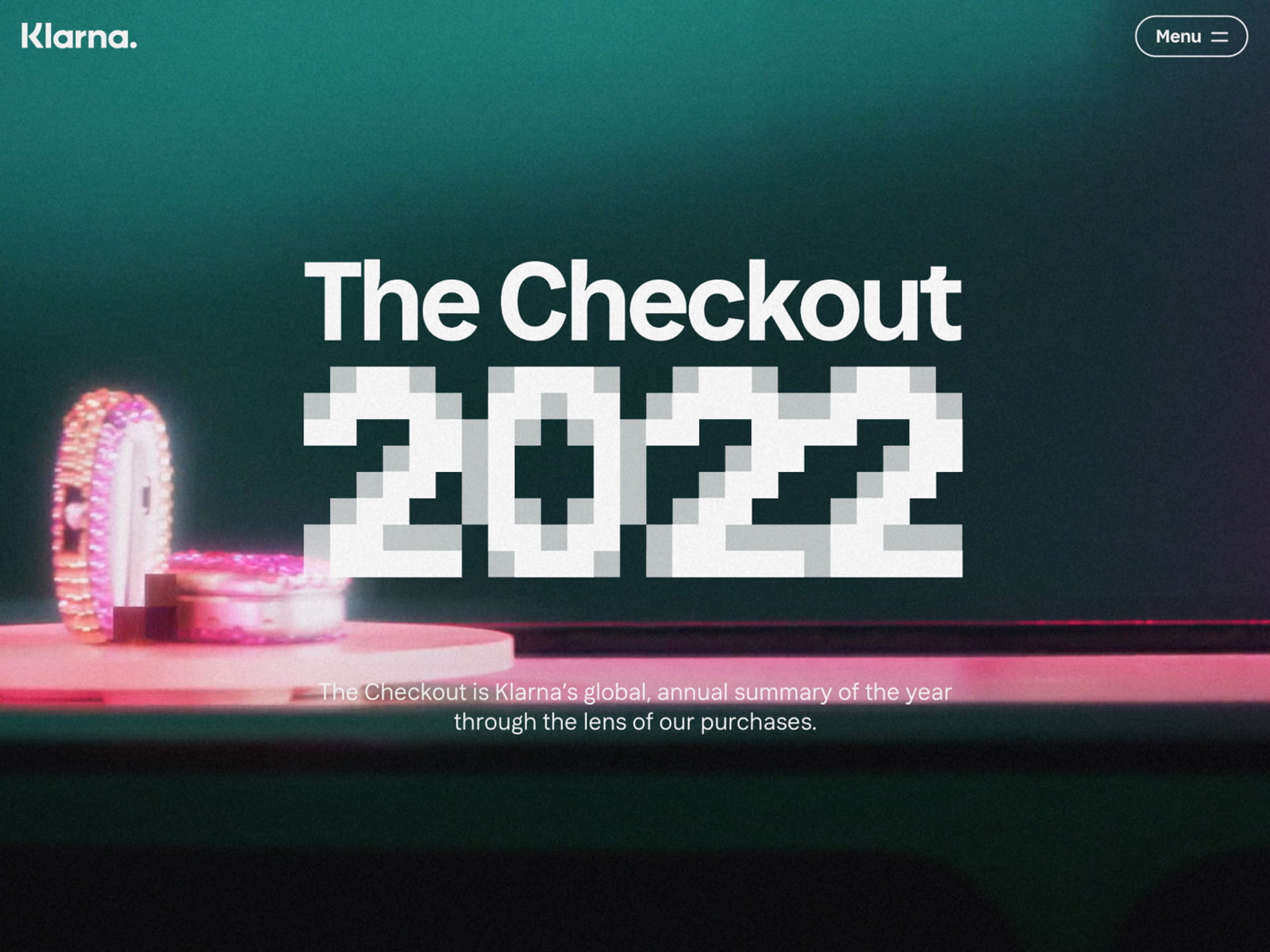
The Checkout 2022

Self-Checkout Comes To High Fashion
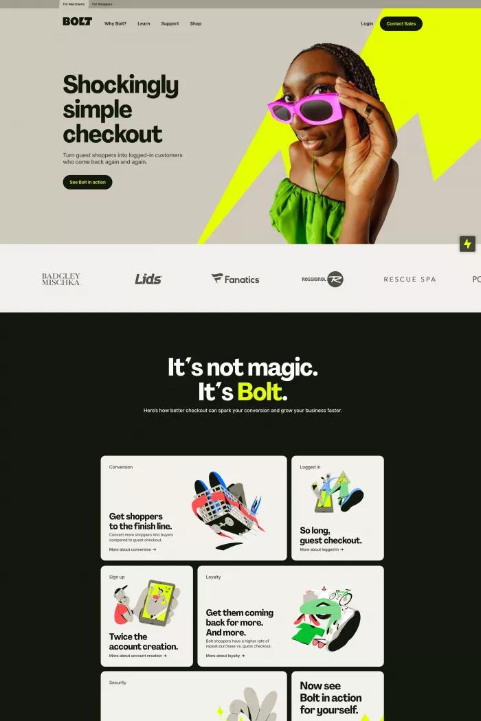
Bolt | Shockingly Simple Checkout

Checkout Redesign & Optimization Case Study
This is 1% of what Muzli shows you.
Get the rest — fresh design inspiration on every new tab, free.
Add Muzli — free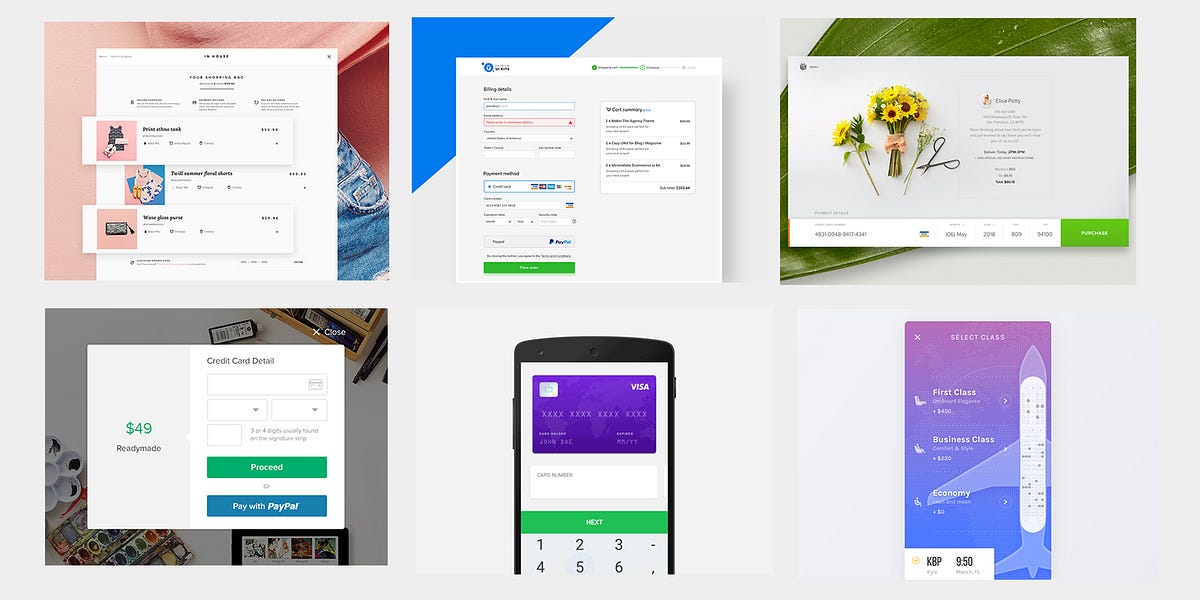
25 Inspirational Checkout Designs You Have Got To See
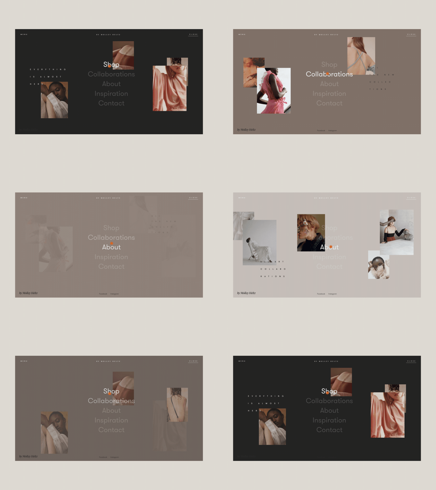
Storytelling, Checkout, 3D effect and more… Weekly interactions roundup!
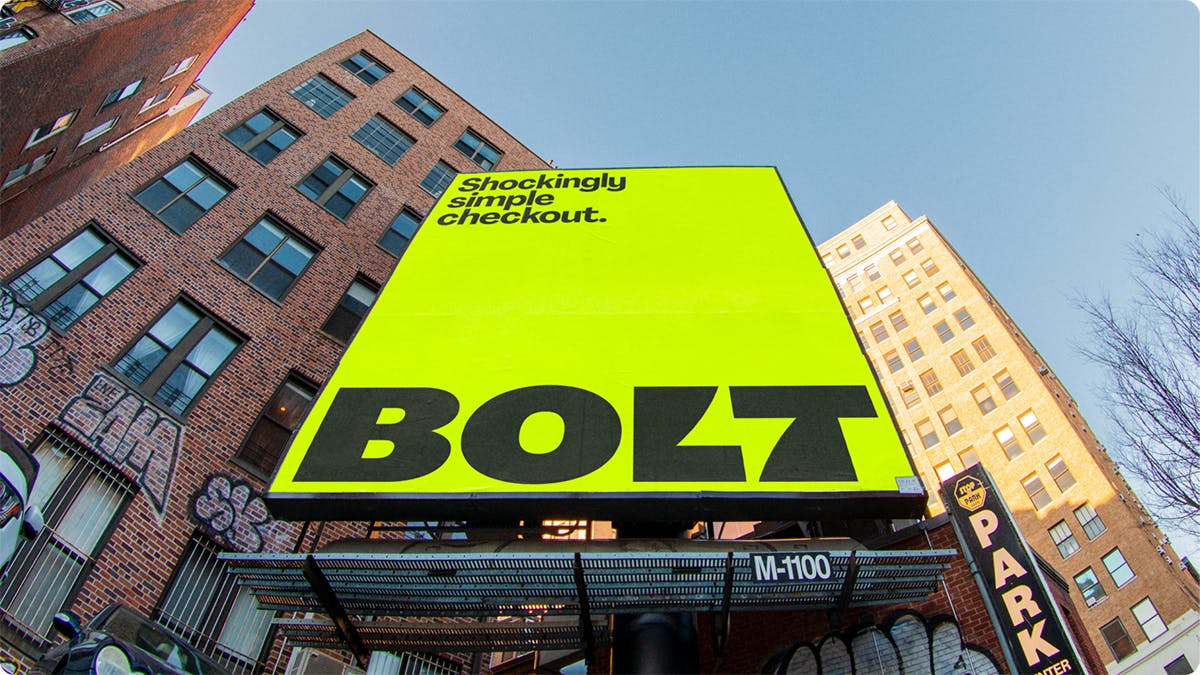
Koto juices up the branding for checkout platform Bolt
“You don’t need to be bland to feel trustworthy,” says creative director Arthur Foliard of the brand’s new fluoro-coloured identity
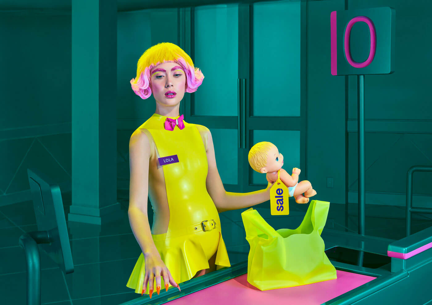
Checkout Zero: Photo Series by Pol Kurucz
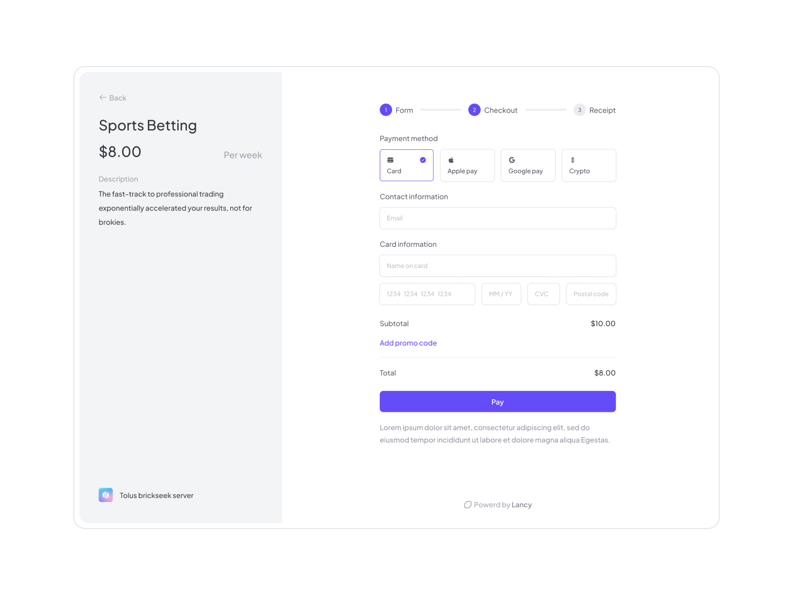
Checkout Page

The Checkout 2022
FWA of the day 08 January 2023: The Checkout 2022 Project Link The Checkout 2022 is Klarna’s global, annual summary of the year through the lens of our purchases. #FOTD #thefwa

A checkout designed for impulse purchases
Checkout Page
/filters:quality(100)/585ff4b4-ea24-49f0-8cab-cd0db1414a93-Challenge9.png)
Checkout

Klarna : The Checkout 2022
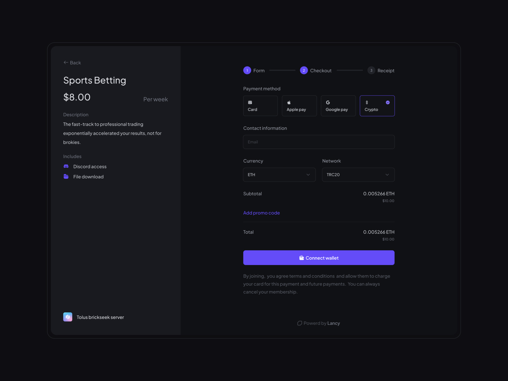
Checkout page - Dark

Instagram’s In-App Checkout Feature
Some 23 brands—including Nike, Adidas and Warby Parker—are testing a closed beta version of Instagram with an in-app point of sale. A big, blue “Checkout on Instagram” button will indicate when a product is available. Pre-stored payment information, done through Facebook, will then allow for much quicker purchasing. It’s the latest shopping feature rolling out from the app, and more developments are expected. Read more …
This is 1% of what Muzli shows you.
Get the rest — fresh design inspiration on every new tab, free.
Add Muzli — free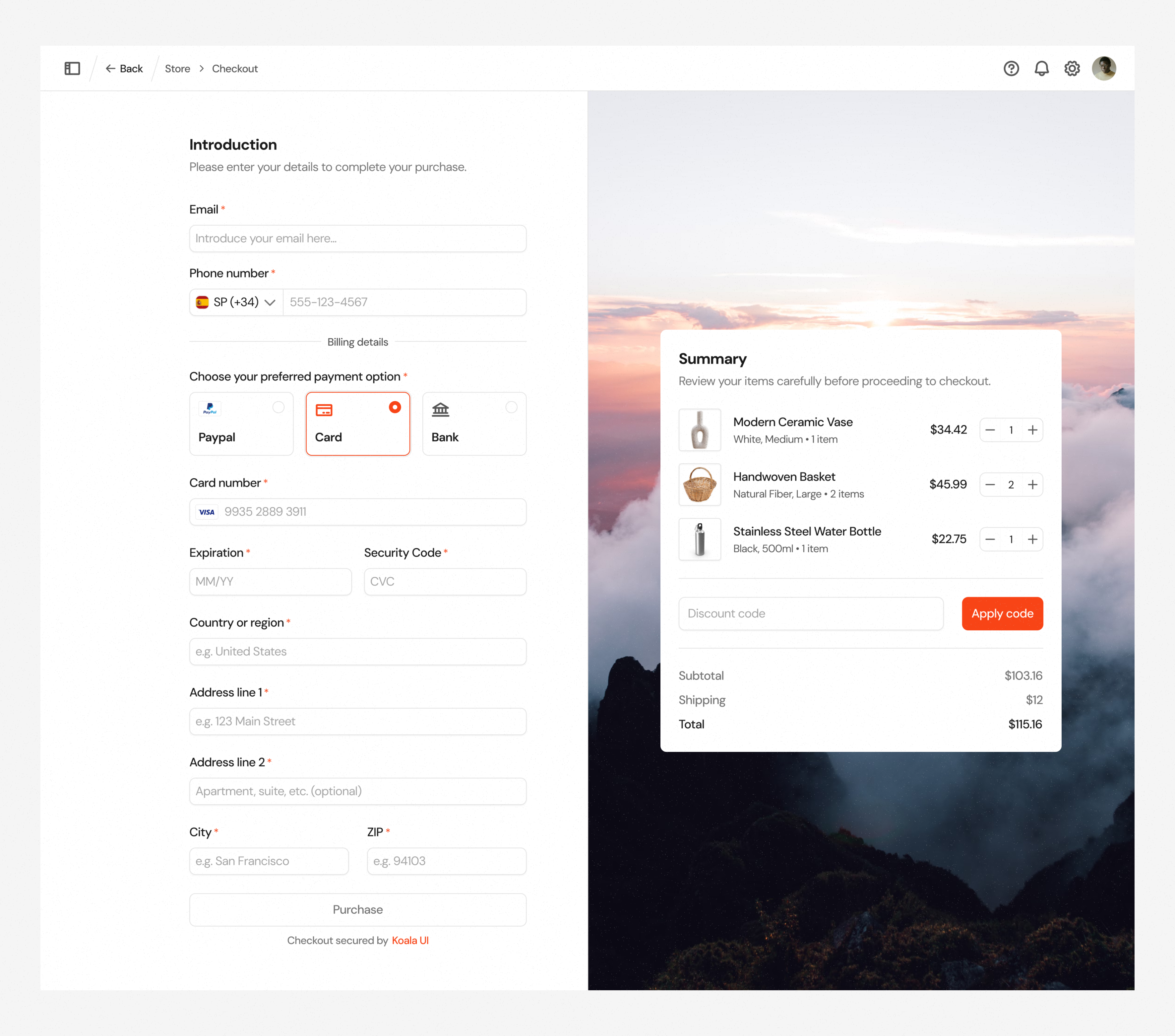
Checkout · Koala UI
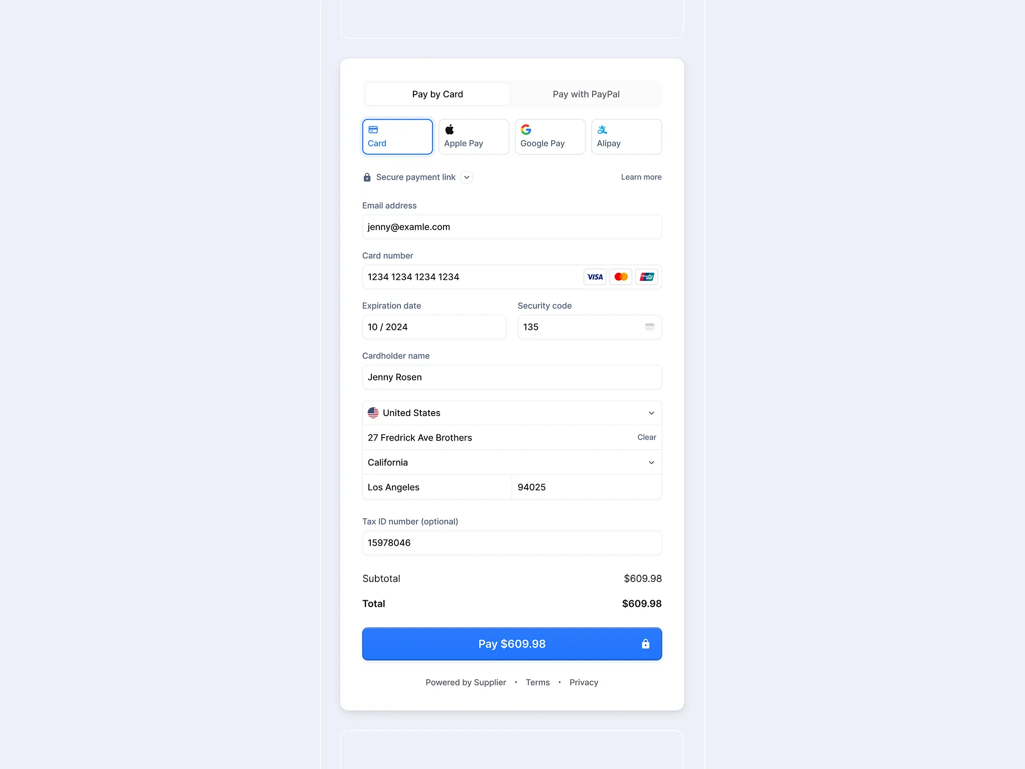
Payment Form Checkout

Amazon Checkout Redesign Exercise - Part III: Shipping and Payment
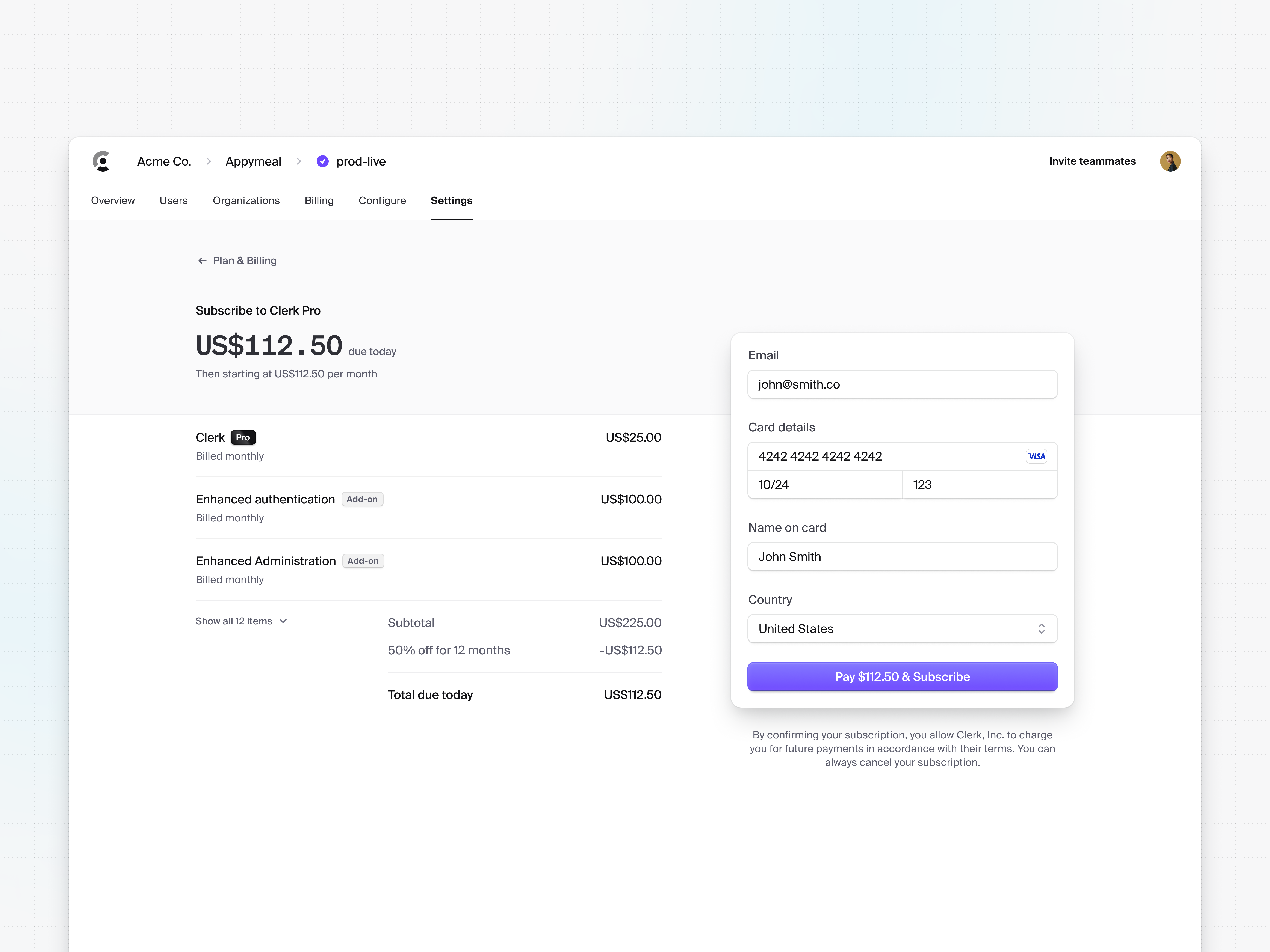
🛒 Checkout
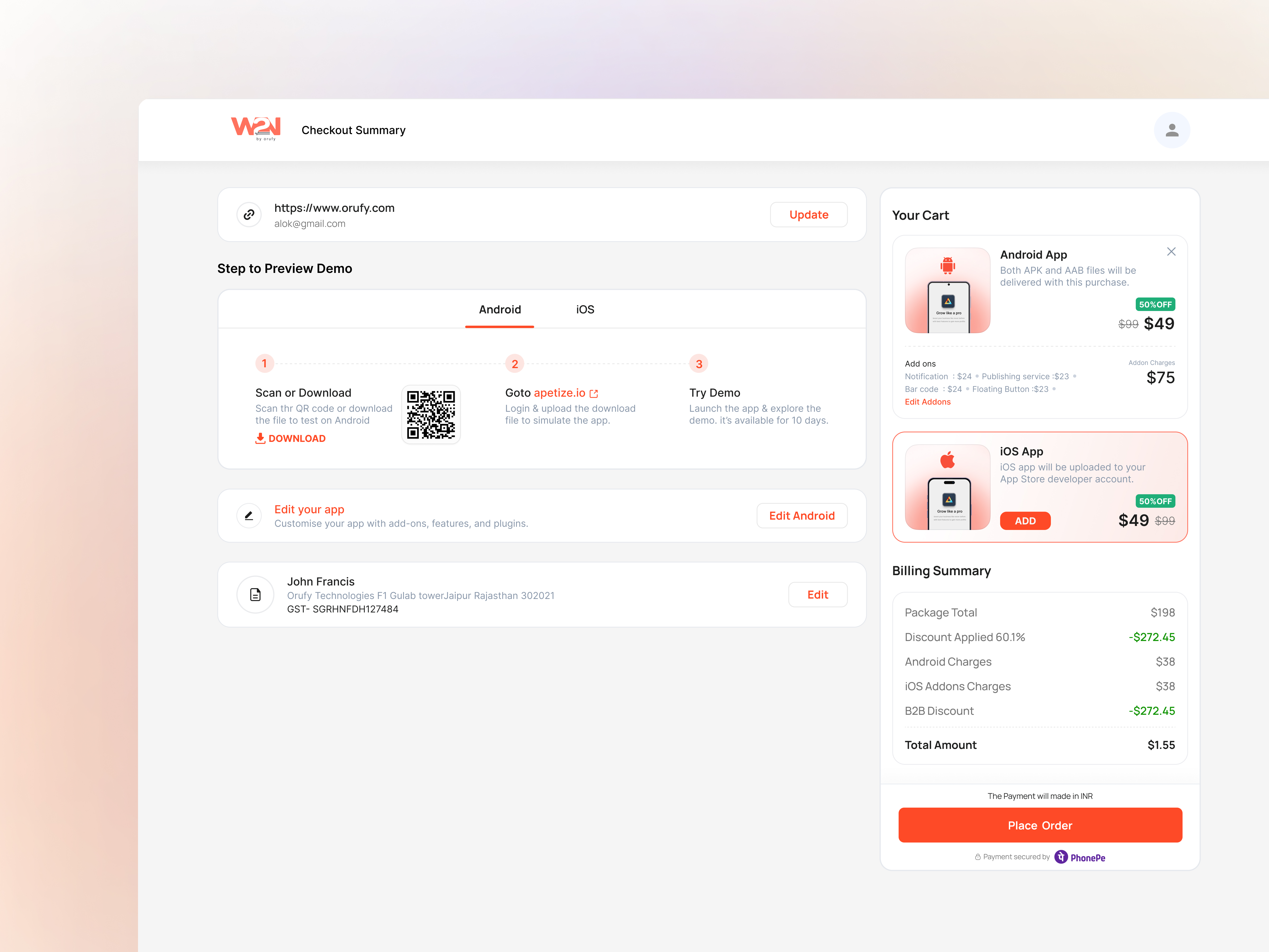
Checkout Reimagined
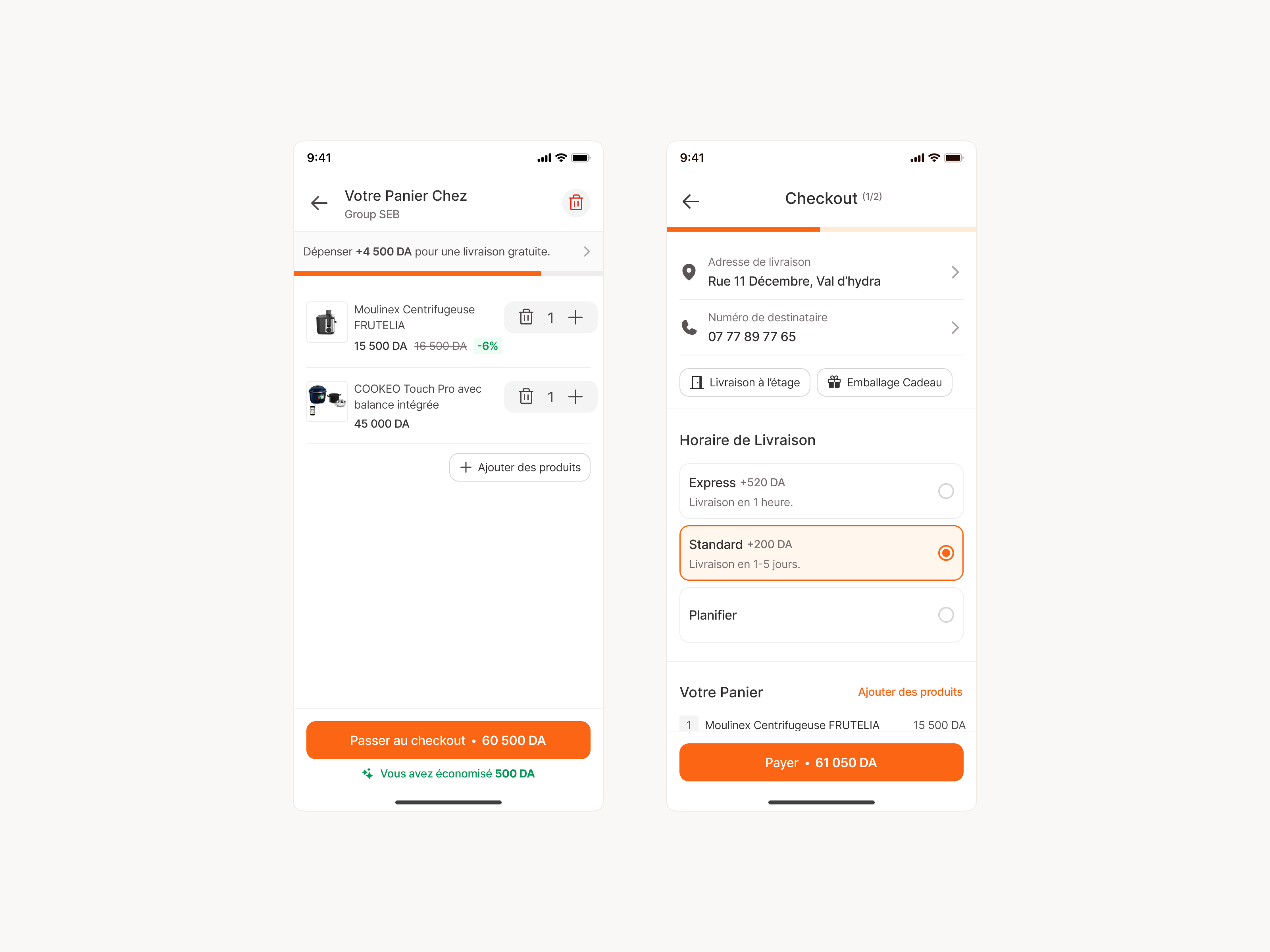
Cart & Checkout
There's No Checkout At Amazon's AI Grocery Because It Already Knows What You're Buying
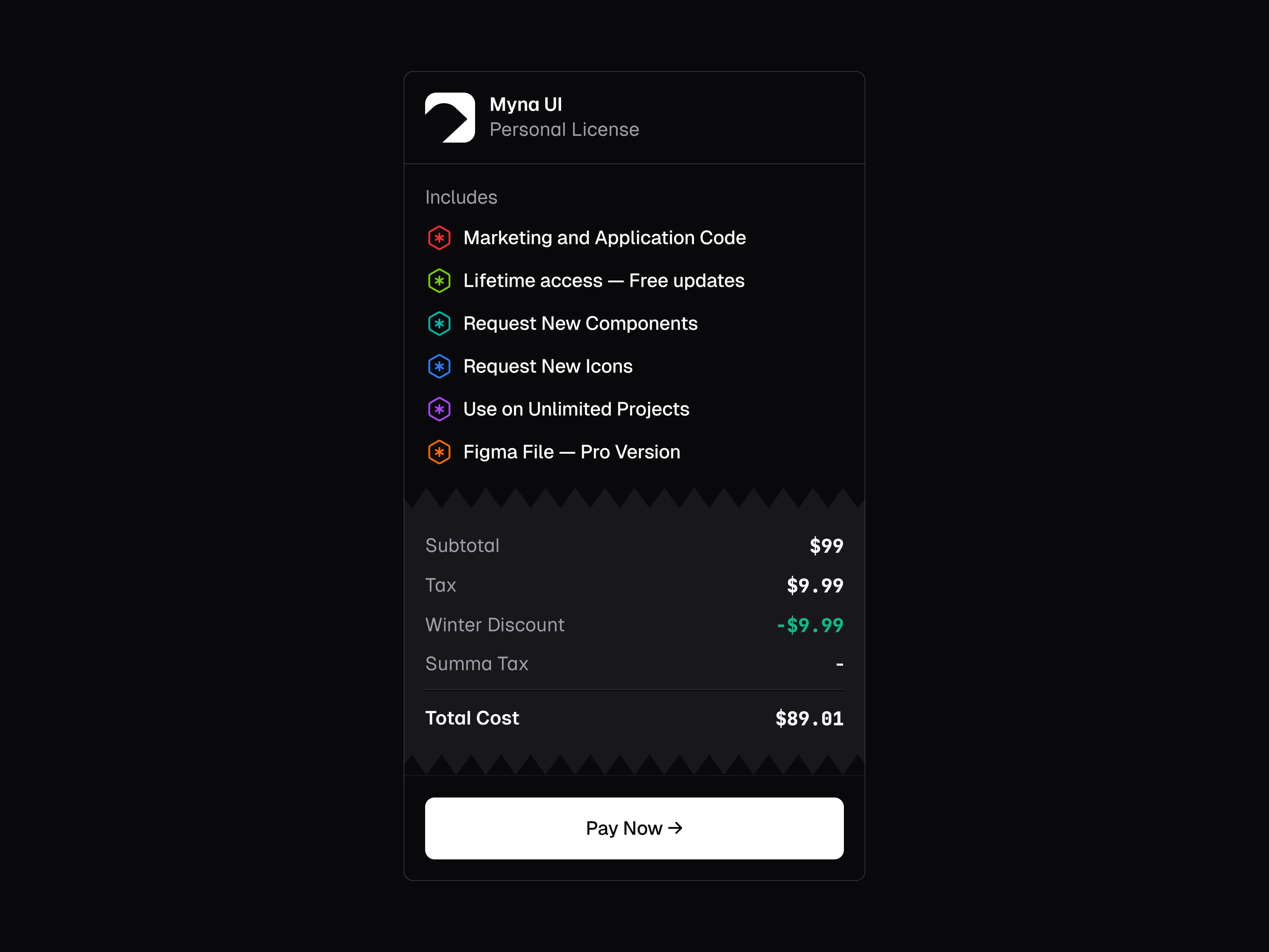
Checkout License 🧾
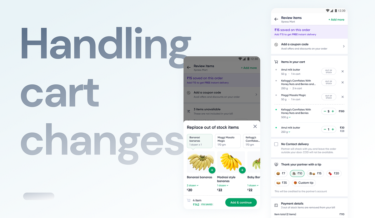
From the Desk: Designing for cart changes on checkout
🛒 How we reduced friction for users in the checkout process by handling cart changes gracefully.RoleUser Experience Designer and ResearcherCollaboratorsHaziq Mir — Head of DesignPranay Merchant — Product ManagerTimeline2–3 weeksAbbreviations usedOOS* — Out of Stock SKU* — Item Unit MOV* — Minimum Order ValueIt all started when…We started receiving feedback from our external users(LinkedIn, AppStore, etc) as well as from internal users (Slack) about how Dunzo’s handling of OOS items on checkout is confusing and a total mess!Snapshots of feedback we got from folks from social media and internallyThe problem statement…Due to a high number of out-of-stock sessions (around 15%) and unintuitive handling of the scenario, users are often dropping off at the cart due to dissatisfaction with the overall experience. This is also creating a negative impact on our brand due to the issue surfacing on social media.And a few constraints…With current tech limitations changes made on any page other than checkout are out of scopeUse of existing widgets as strictly as possibleWith current tech limitations, we cannot reduce the number of OOS sessions for a user (operational)Reservation ideology out of scope (operational)Example illustrating reservation ideologyBreaking down the facts —Total Out-of-stock cases (15% of total CP sessions), out of which —80% of sessions have some item(s) OOS,10% of sessions have all items OOS, and7% of sessions have a change in item quantity.Understanding the pain points 😫Communication is confusing — pointed out by many users.The user is still shown the bill with the delivery fee and stuff even when all items are out of stock; the user has no clear way to proceed.The permanent OOS msg box takes up an unnecessary significant space on CP.In the case of a change in item quantity, the user is blocked from continuing to pay without knowing why.Goals 🥅How might we ensure an intuitive experience for users facing stock scenarios with their cart item(s) on checkoutHow might we fulfill user needs so that they can contently place an order even after an out-of-stock scenario?How might we ensure clear communication so that the user can make an informed decision?We want to fix a broken UX loop, but there is no clear metric that this improvement would impact.AssumptionThe user is willing to place an order with the given changes in the cart.Based on the assumption outlined above, below is the flow for changes happening on the cart.Brainstorming on scenarios…We sorted the issues based on their occurrences and the level of hindrance to the overall checkout experience.Brainstorming high-level solutions for all use cases.Brainstorming high-level solutions for item out-of-stock use cases.We are going to focus on the below scenarios one by one —Some items are out of stockAll items out of stockChange in item quantityScenario 1 👉 Some item(s) out of stockExisting design & pain pointsKey focus elements💡 Insight: Some of our users have contacted customer support to report that they did not notice items were out of stock before placing an order but only realized after receiving it.Has the user acknowledged the change?Do we need to make users acknowledge the above fact forcefully? — Yes.Once acknowledged, can the user move forward intuitively?Ideating on solution approachesThere were two directions explored in which rapid prototyping was done —created at very early stage, do overlook irregularities in designs (if any) 🙈Both iterations had their pros and cons, with the major decision point being —In approach 1, a blocker would act as a possible hindrance to user flow however makes sure that the user acknowledges the change, whileIn approach 2, if we don’t block users, there is a considerable chance of the user missing out on the change — resulting in breaking the trust in the brand itselfAfter considering several factors, including user feedback from customer support and current industry practices. We decided to move forward with iteration 1, choosing the lesser of two evils.removing individual out-of-stock itemremoving all out-of-stock itemsScenario 2 👉 All items are out of stockExisting design & pain pointsKey focus elementsIs the communication intuitive and upfront?Does the user know what to do next?Are we making sure that the user acknowledges the change?Opportunitiesrecommend items on checkout based on OOS items and purchase history — can dore-direct users to the home page — can doget users notification permission to notify them about stock items — not in scopeFinal designsclearing cart with all out-of-stock itemsScenario 3 👉 Change in item quantityExisting design & pain pointsKey focus elementsIs the communication intuitive and upfront?Make sure to not over-communicateDoes the user know what to do next?Are we making sure that the user acknowledges the change?Final designsIdeas that could not make it 💔👉 Out-of-stock item recommendationsThe idea is that instead of reminiscing about an item that went out of stock, the user can add a suggested replacement (similar to the item) to their cart.👉 Notify users when an item is back in stockTrade-offsWith current tech limitations, we cannot suggest a replacement for an OOS item.Notify about items back in stock as a feature requires separate logic and timeline to be built, hence can’t be covered with this projectEnding notes 🌸We want to fix a broken UX loop, but there is no clear metric that this improvement would impact. However, with the release of this project, the number of complaints from users regarding OOS handling has become negligible.Highlighting the fact that we actively listen to our users and constantly strive to meet their needs :)That’s it, folks! For those who made it till here…https://medium.com/media/79194be57734de0c523503e7e6da9384/hrefWant to discuss more? Let’s chat about anything and everything — Say hi on Twitter or Linkedin 👋Designing for cart changes on checkout was originally published in Muzli - Design Inspiration on Medium, where people are continuing the conversation by highlighting and responding to this story.
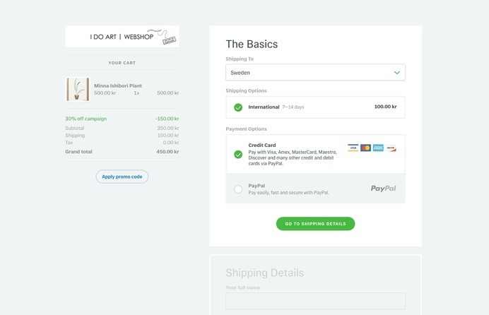
Tictail Checkout by Petter
Tictail Checkout by Petter Nilsson inspiration ux payment ui ecommerce
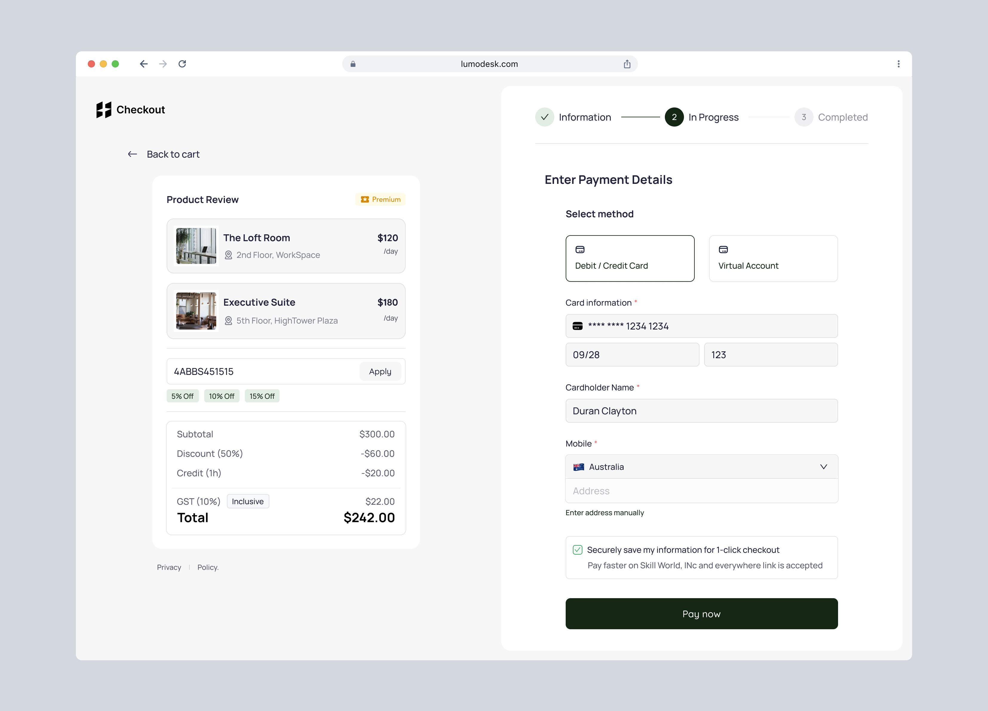
Payment Checkout - Workspace Platform
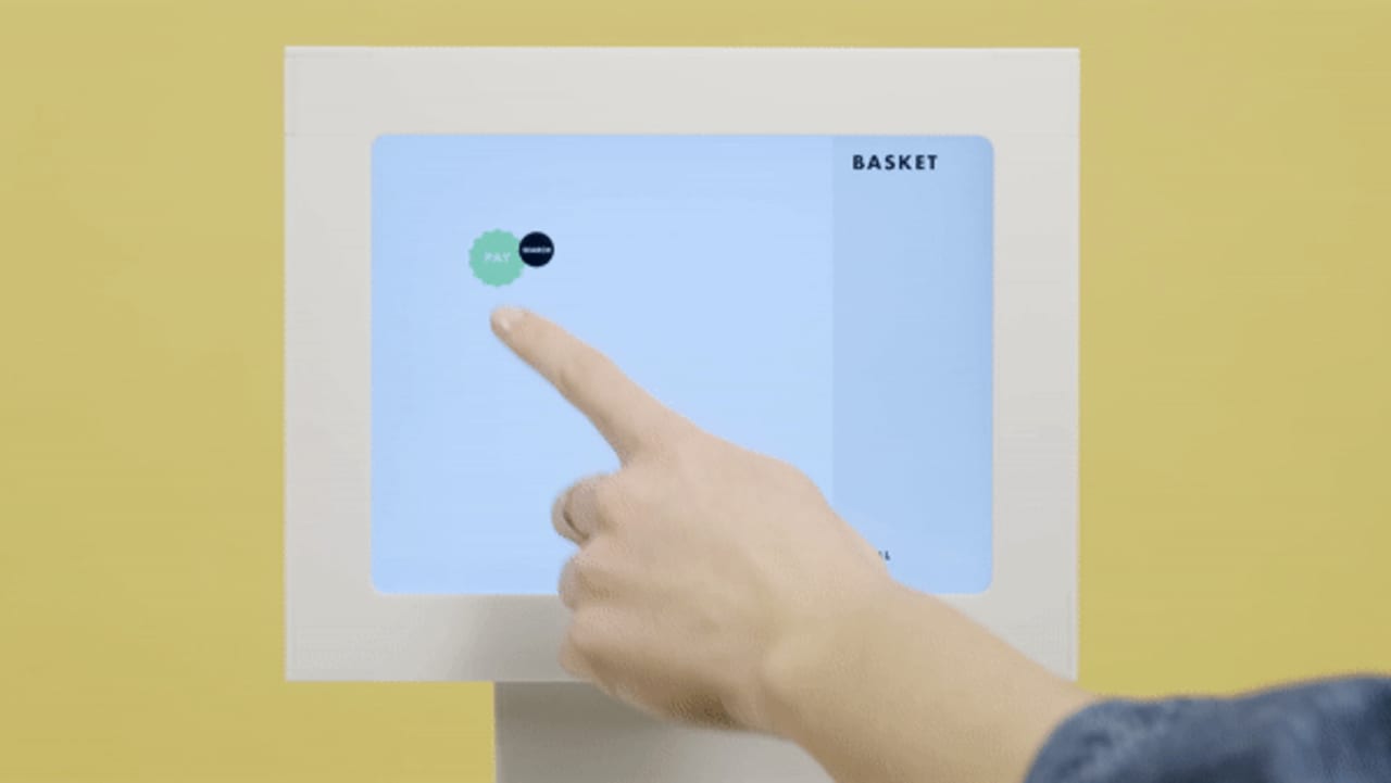
This post-COVID grocery checkout never lets two people touch the same spot
This is 1% of what Muzli shows you.
Get the rest — fresh design inspiration on every new tab, free.
Add Muzli — free/filters:quality(100)/cc0cf643-2e9e-4199-a60d-c9e5befc7f4b-CREDIT-CARD-CHECKOUT.png)
Credit Card Checkout
/filters:quality(100)/1ac37866-0cf1-440d-b2a3-29bcae0ade4d-Modal-Checkout-Web-Store.png)
Modal Checkout Web Store
![Checkout Page [Light mode]](https://layers-uploads-prod.s3.eu-west-2.amazonaws.com/e1ee5fa1-2d5b-41a4-8ed8-1c6f73fd3eaf-original-73648e8ca0184c1420b223482e92e51f.webp)
Checkout Page [Light mode]

Payment card checkout
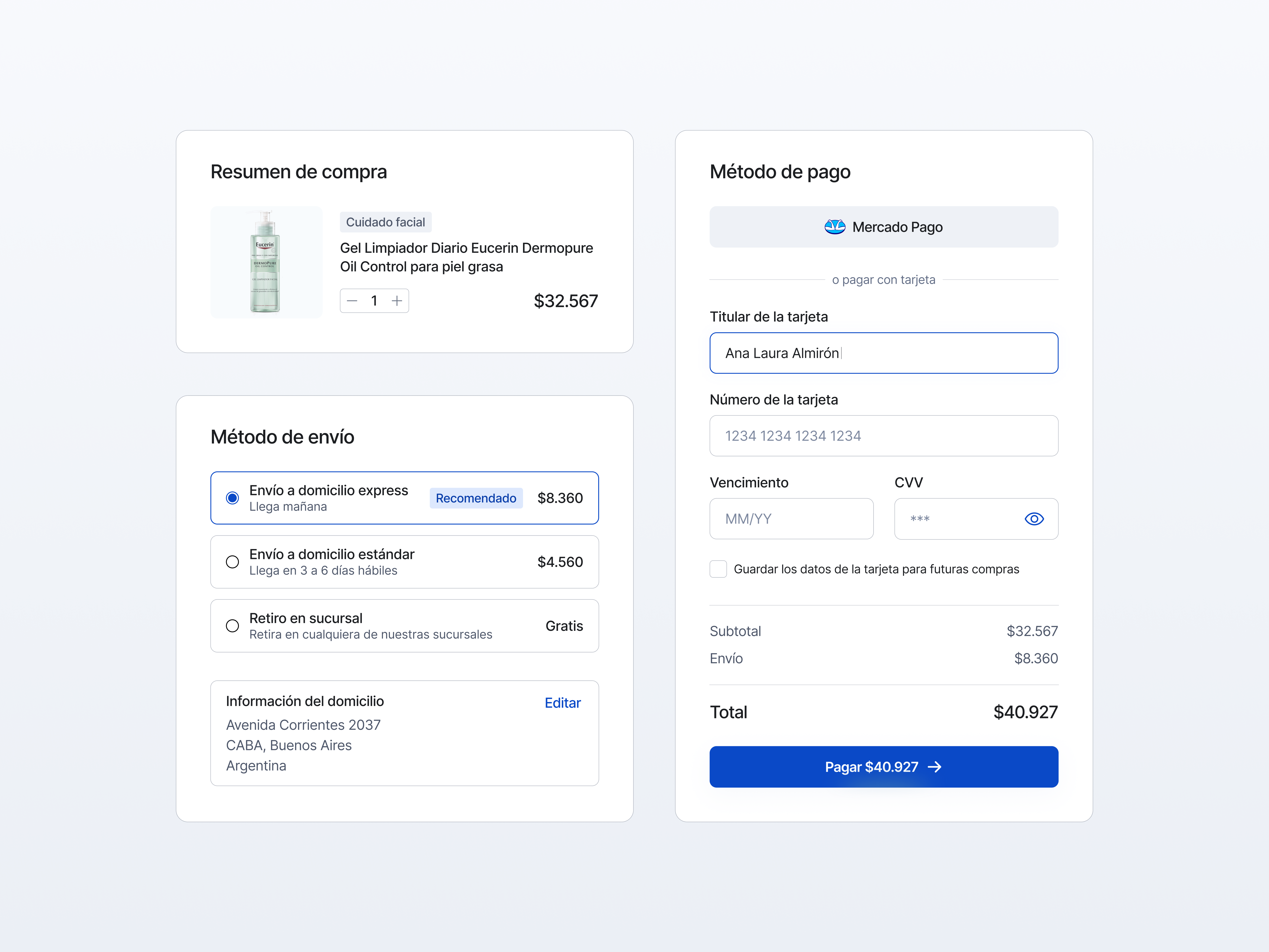
Checkout | UI Camp #09
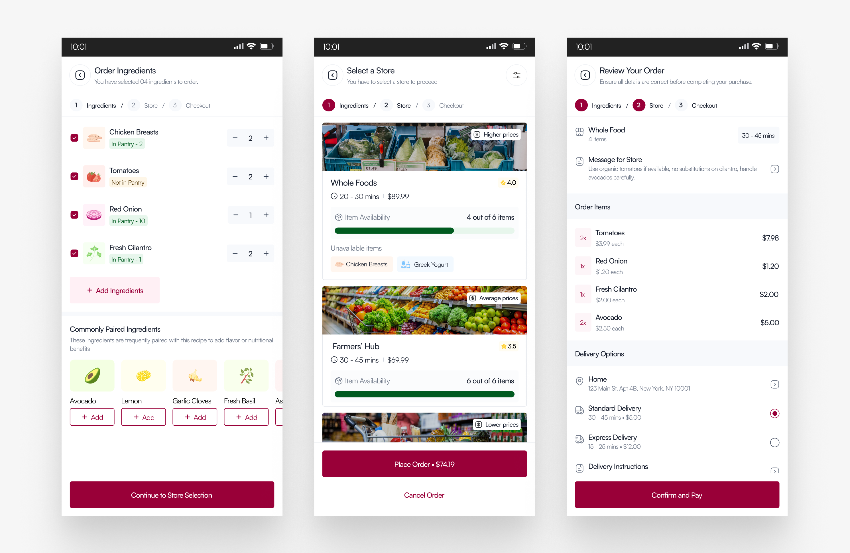
Ingredients to Checkout Flow
/b7a8a94b-ad9c-46ce-864e-5096c497b0e7-thumb.jpeg)
Zellify App - Checkout flow
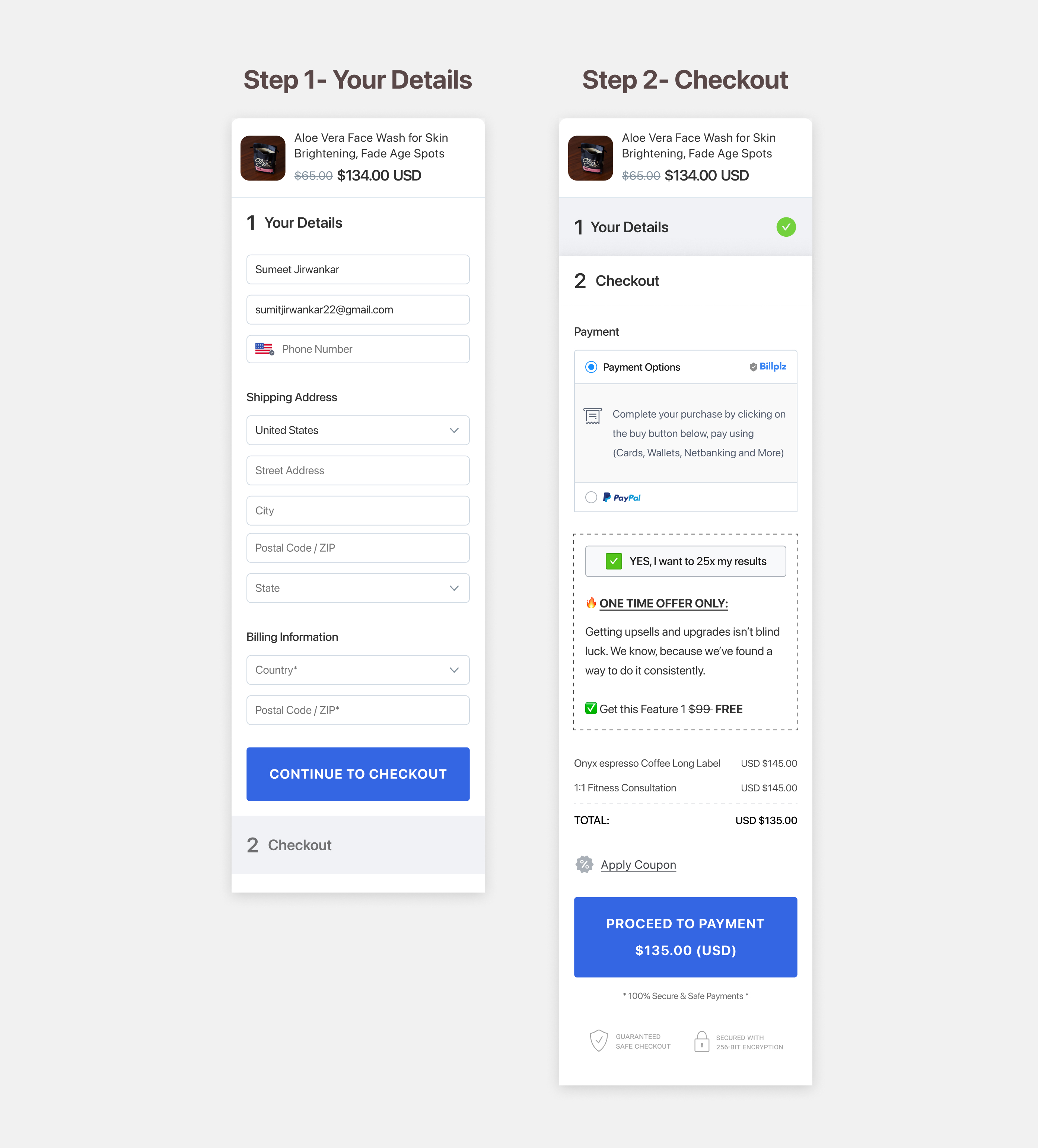
Checkout form in accordian style
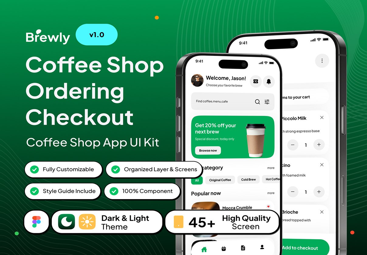
Brewly - Coffee Shop Ordering Checkout App UI Kit
/filters:quality(100)/8c986889-2c35-4f2d-942e-710a63916d07-Checkout.jpg)
Checkout
/filters:quality(100)/ac9fdcac-060b-4d52-8f81-c63fb5dd266c-Checkout002.png)
Checkout
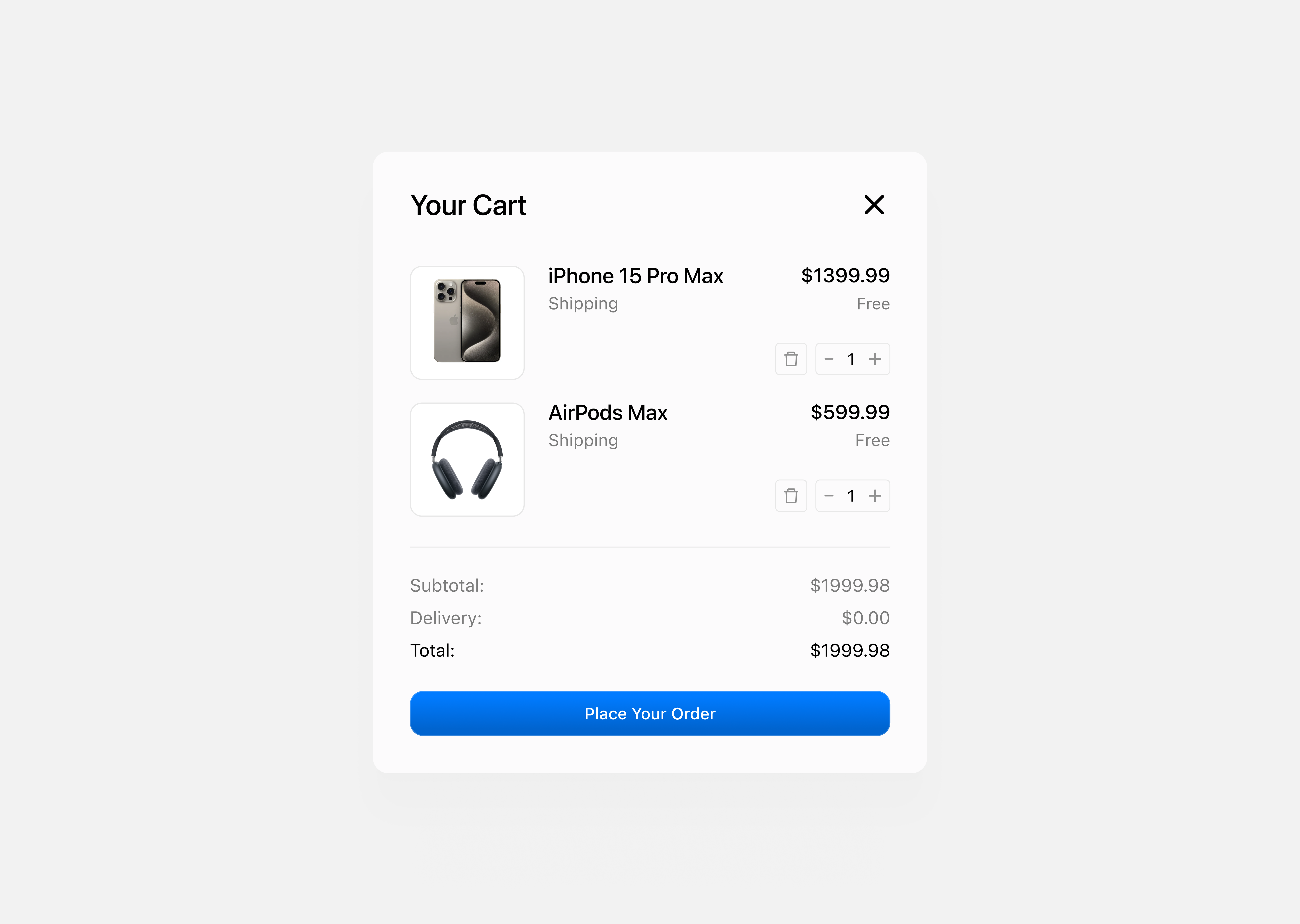
Checkout
This is 1% of what Muzli shows you.
Get the rest — fresh design inspiration on every new tab, free.
Add Muzli — free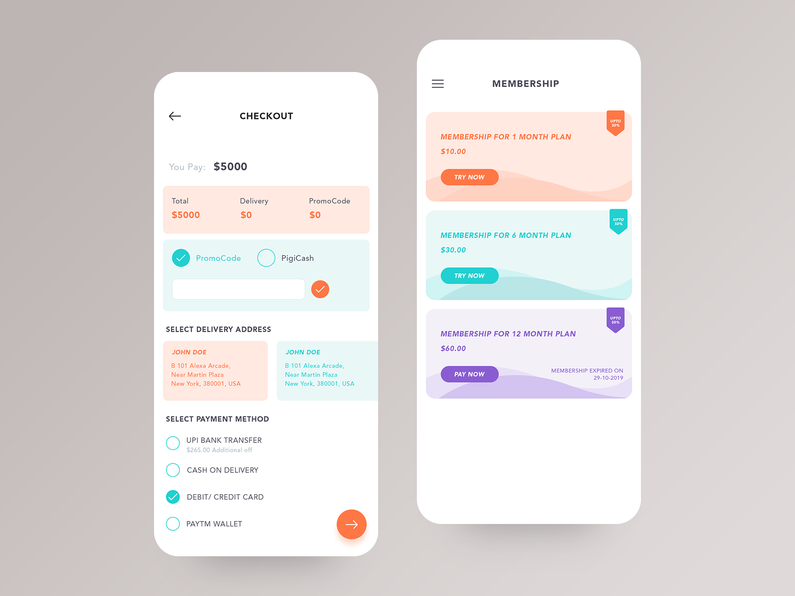
Checkout and Membership
Ecommerce app membership plan page and checkout page design... Checkout the Behance Case study: https://www.behance.net/gallery/76243153/Pigi-App-Case-Study Hope you like this. Feel free to share your views on this. Have an awesome idea? We will provide a quick analysis and free proposal for it. Don’t worry, it is secure and confidential. Contact us on http://www.mindinventory.com/inquiry.php Or sales@mindinventory.com
/filters:quality(100)/75fad2ea-d37e-4ad1-b169-7a45cf14e9ea-Day-2-Albert.png)
Credit Card Checkout Components
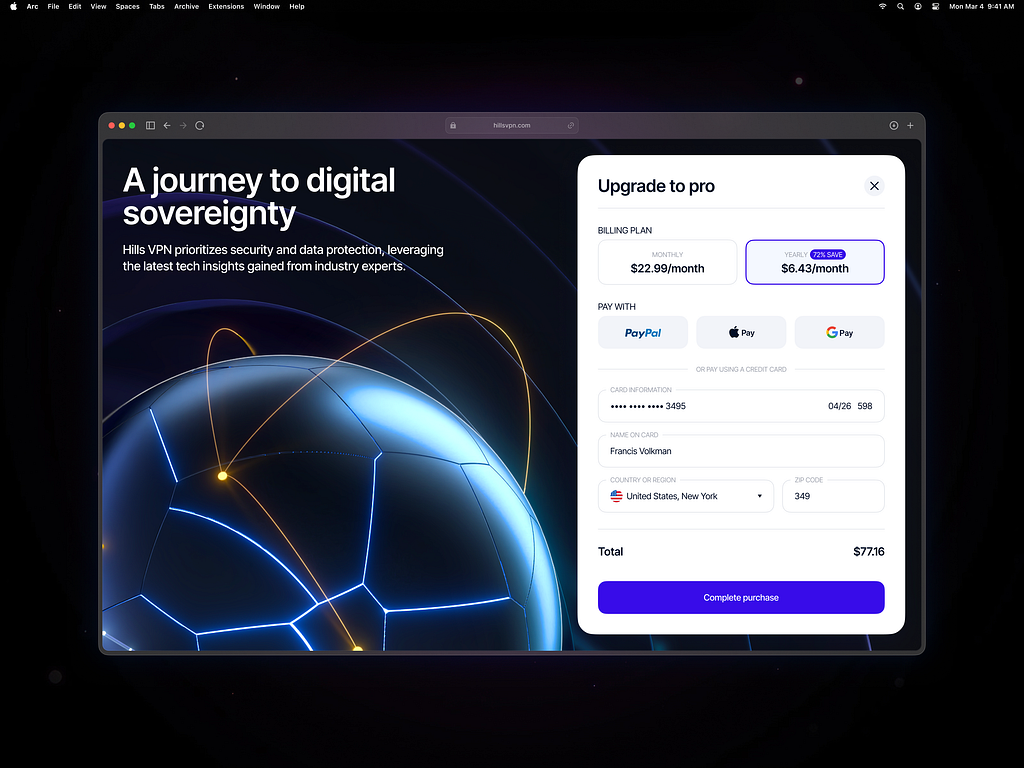
VPN Service Checkout Process
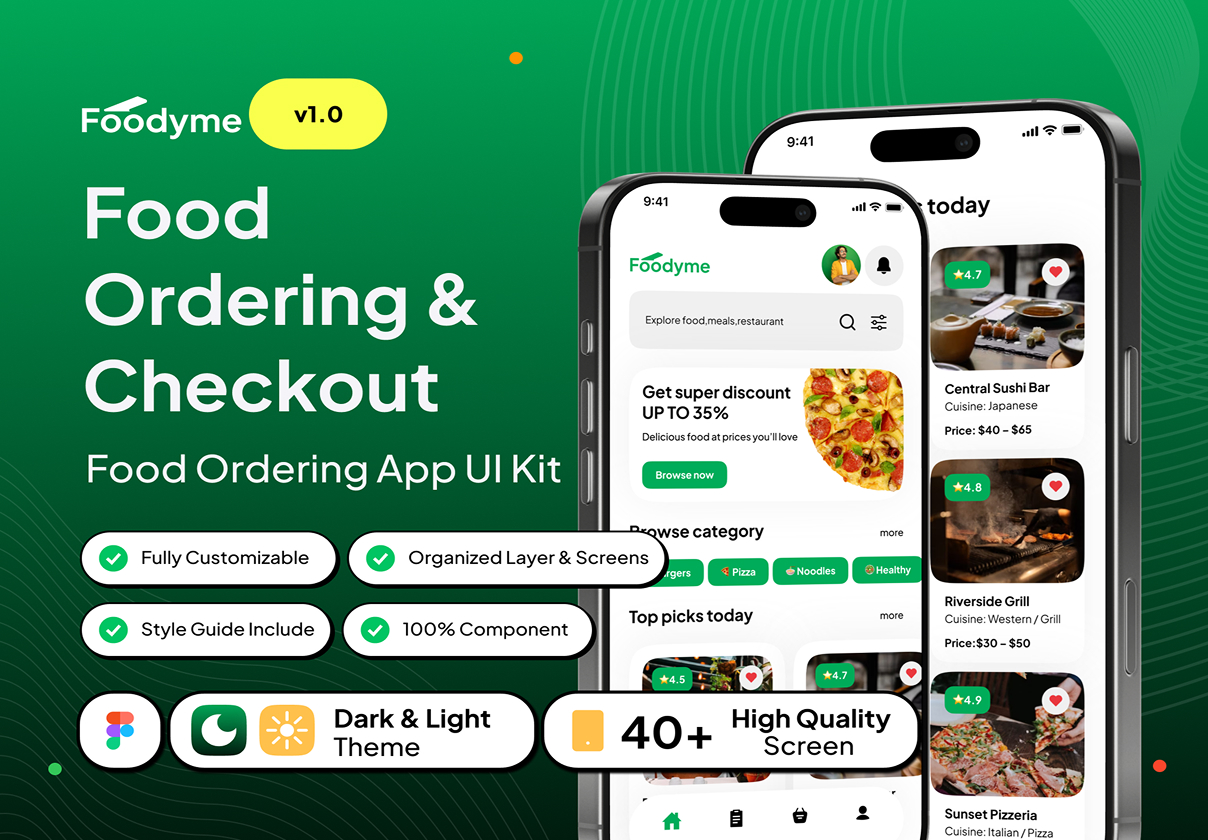
Foodyme - Food Ordering & Checkout App UI Kit
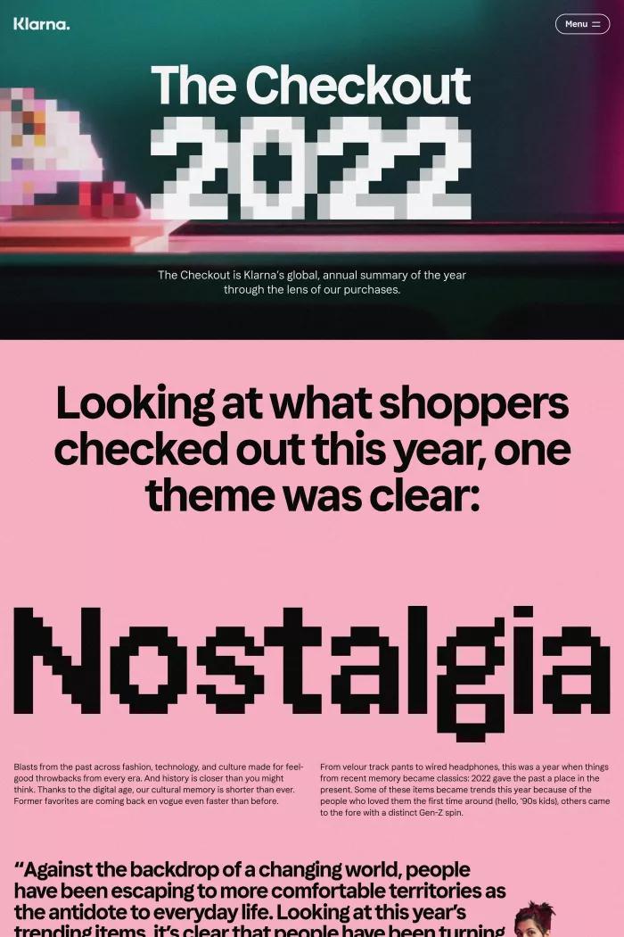
Klarna’s top trends of the year | The Checkout 2022
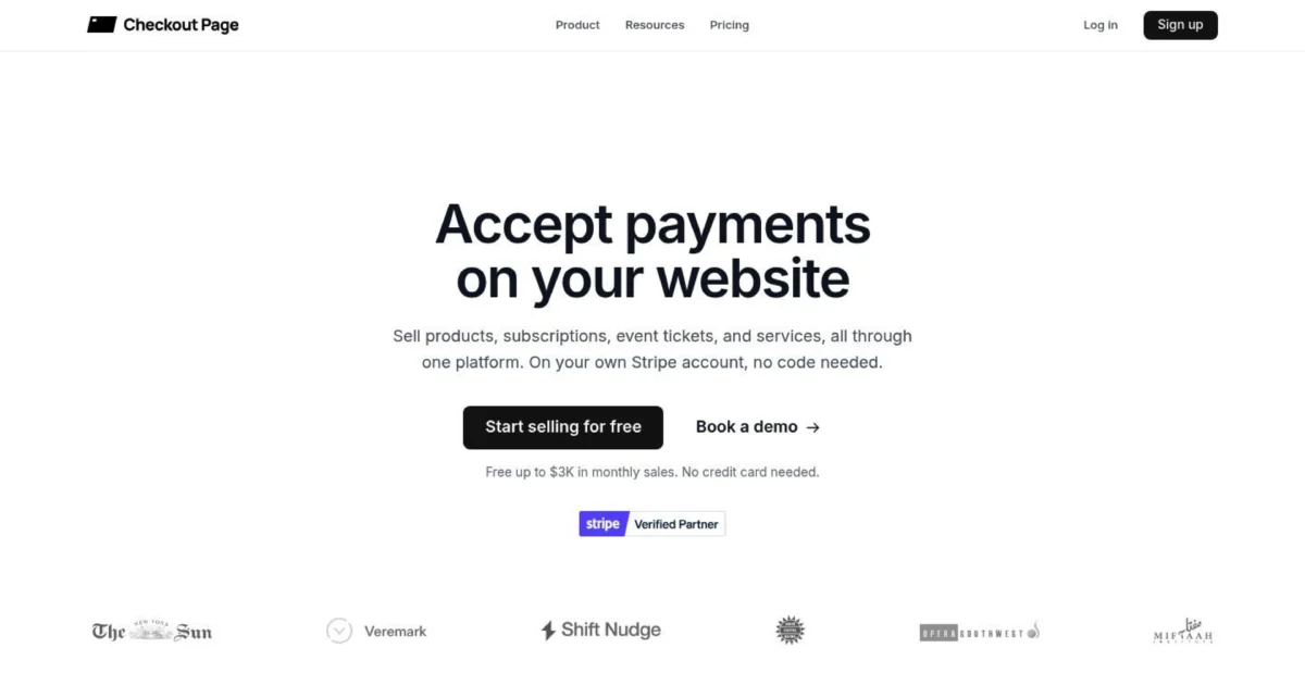
Checkout Page

Daily UI #002 Credit Card Checkout
/0c1628f6-6b2e-4bb4-ae85-71fd0040dd43-thumb.jpeg)
Checkout Page
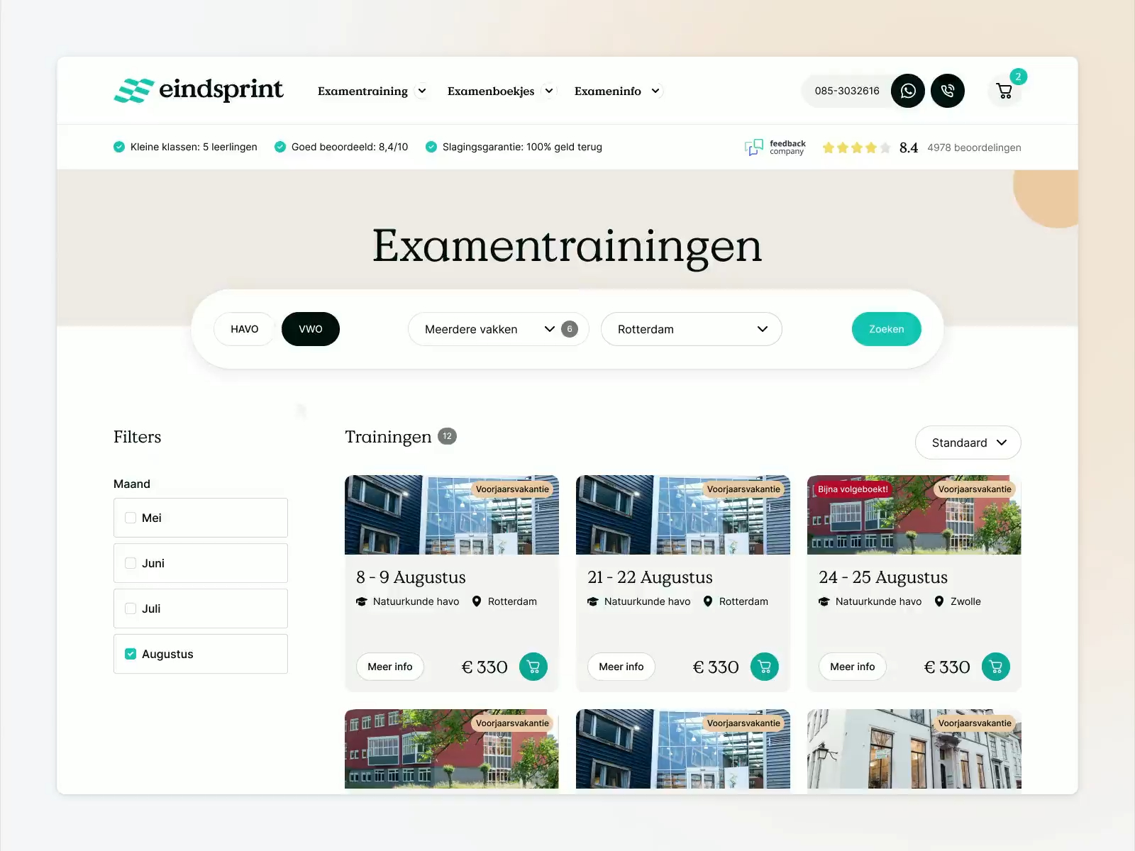
Eindsprint — E-commerce webshop checkout
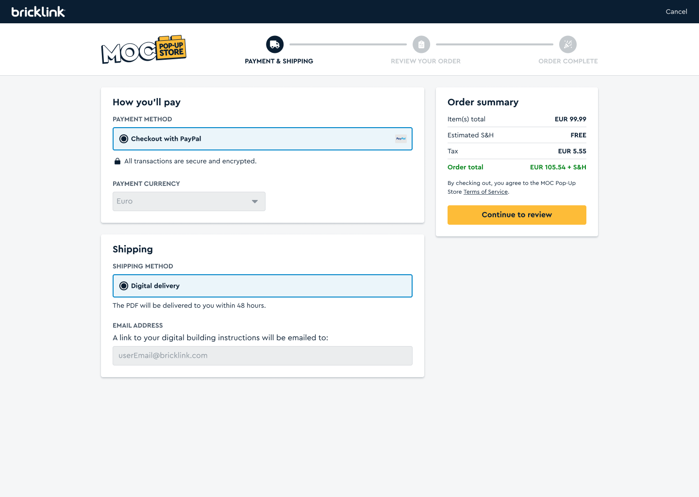
Checkout pages
/filters:quality(100)/f312d6a6-b450-4092-bc25-165c551fb757-Dia-9-Checkout.jpg)
Checkout Mobile

Food delivery - checkout
This is a food delivery application which we started working on during the lockdown with one of my dev. friend. It's a personal project which is still in development, but right now it's on hold, so let us know what do you think. Stay tuned for more, Cheers!
This is 1% of what Muzli shows you.
Get the rest — fresh design inspiration on every new tab, free.
Add Muzli — freeFood delivery - checkout
Get access to thousands of freshly updated design inspiration pieces by adding Muzli to your browser.
Loved by 900k designers worldwide, Muzli is the leading go-to browser extension for creative professionals.
What is a checkout page?
A checkout page is where a customer completes a purchase. It collects contact, delivery and payment details, shows the final price and takes the order, on one page or across several steps. It is the most measured part of any store, because every extra field or surprise cost loses orders. The Baymard Institute puts the average online cart abandonment rate at about 70%.
What makes a checkout convert?
Let people buy without creating an account. Show the full cost, with shipping and tax, before the last step. Ask only for what the order needs, and use one column so the eye moves straight down. Offer wallet payments such as Apple Pay and Google Pay where you can, since they replace most of the form.
One page or several steps?
Both work. What matters is the number of fields and how clear the progress is. A single page suits short forms. Steps suit longer ones, as long as a progress indicator shows where the shopper is and each step can be edited without starting again.
Where do these checkout examples come from?
About half are checkout screens from shipped apps documented by Mobbin. The rest are checkout designs published on Layers and checkout components from the Framer marketplace. Muzli follows more than 200 design sources and lists up to 60 matching pieces here, favouring recent work.