Design Inspiration
Dropdown menu design examples
A dropdown menu shows a list of options when the user clicks or taps a control, and hides it again after a choice. These examples cover select fields, comboboxes, action menus and profile menus.
We curate topical collections around design to inspire you in the design process.
This constantly-updated list featuring what we find on the always-fresh Muzli inventory.
Last update:

UI cheat sheet: dropdown field

Combobox vs. Multiselect vs. Listbox

Drop-down menu
See the Code - See it Full Page - See Details This Pen uses: HTML, CSS, JavaScript, and

Frustrating Design Patterns: Mega-Dropdown Hover Menus

Listboxes vs. Dropdown Lists

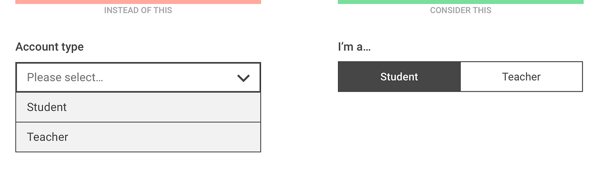
The problem with dropdown fields (and what you should use instead)

Profile Dropdown

Emerging dropdown
See the Code - See it Full Page - See Details Using SVG line animation and a stroke transition to make a dropdown menu emerge from a button. The menu animates out from the button that opens it Inspired by this dribbble shot: https://dribbble.com/shots/3398444-Dropdown This Pen uses: HTML, CSS, JavaScript, and

DirectSelect Dropdown

Profile Dropdown
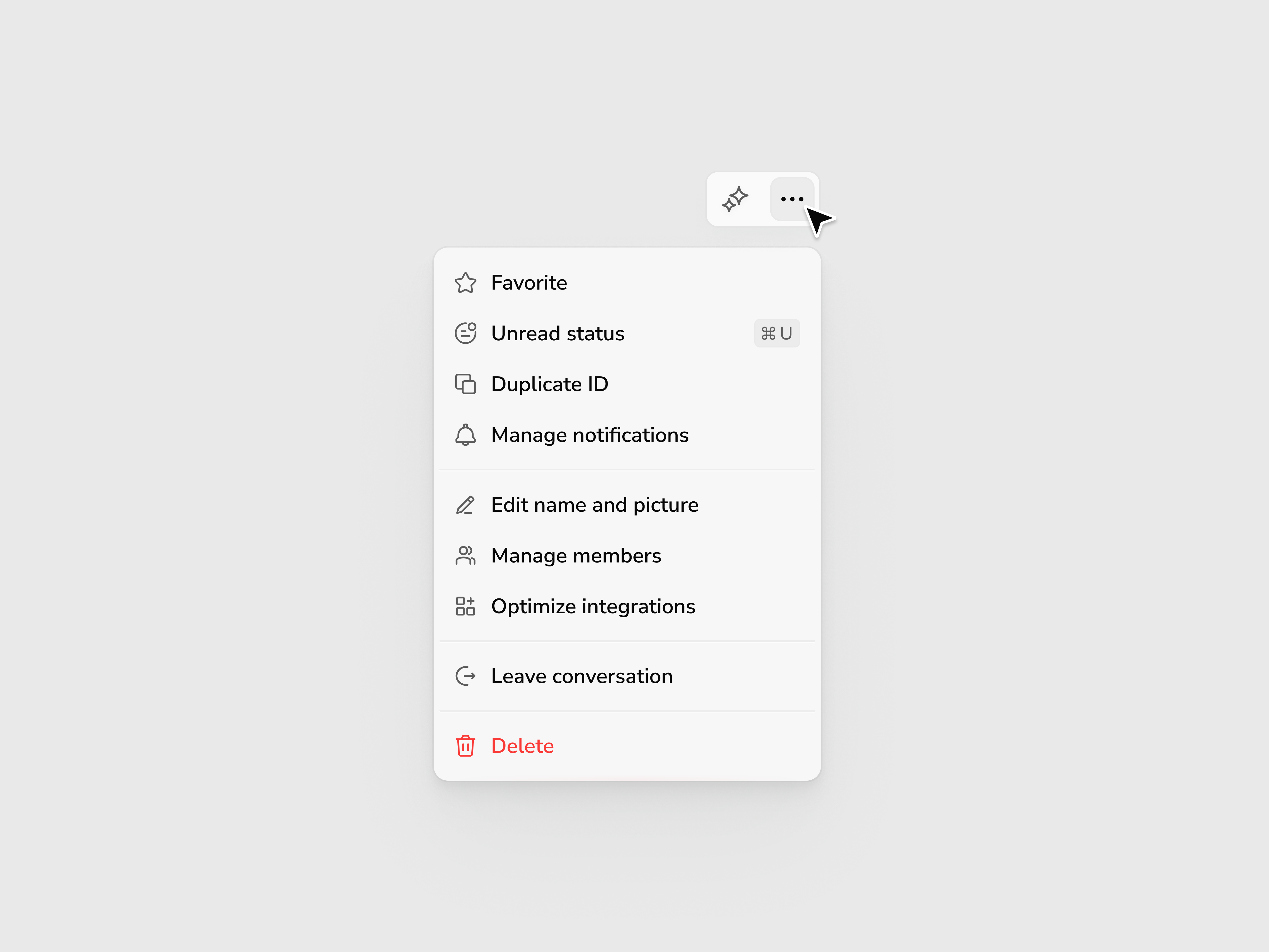
Dropdown Menu
This is 1% of what Muzli shows you.
Get the rest — fresh design inspiration on every new tab, free.
Add Muzli — free
Profile dropdown
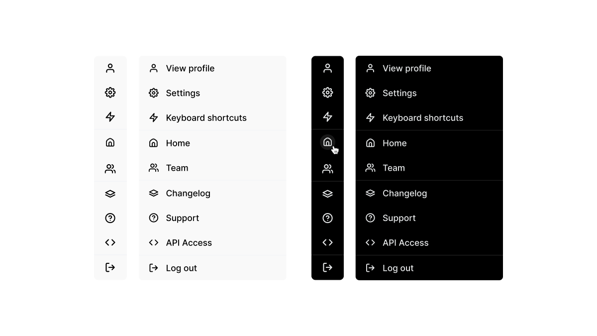
Dropdown menu
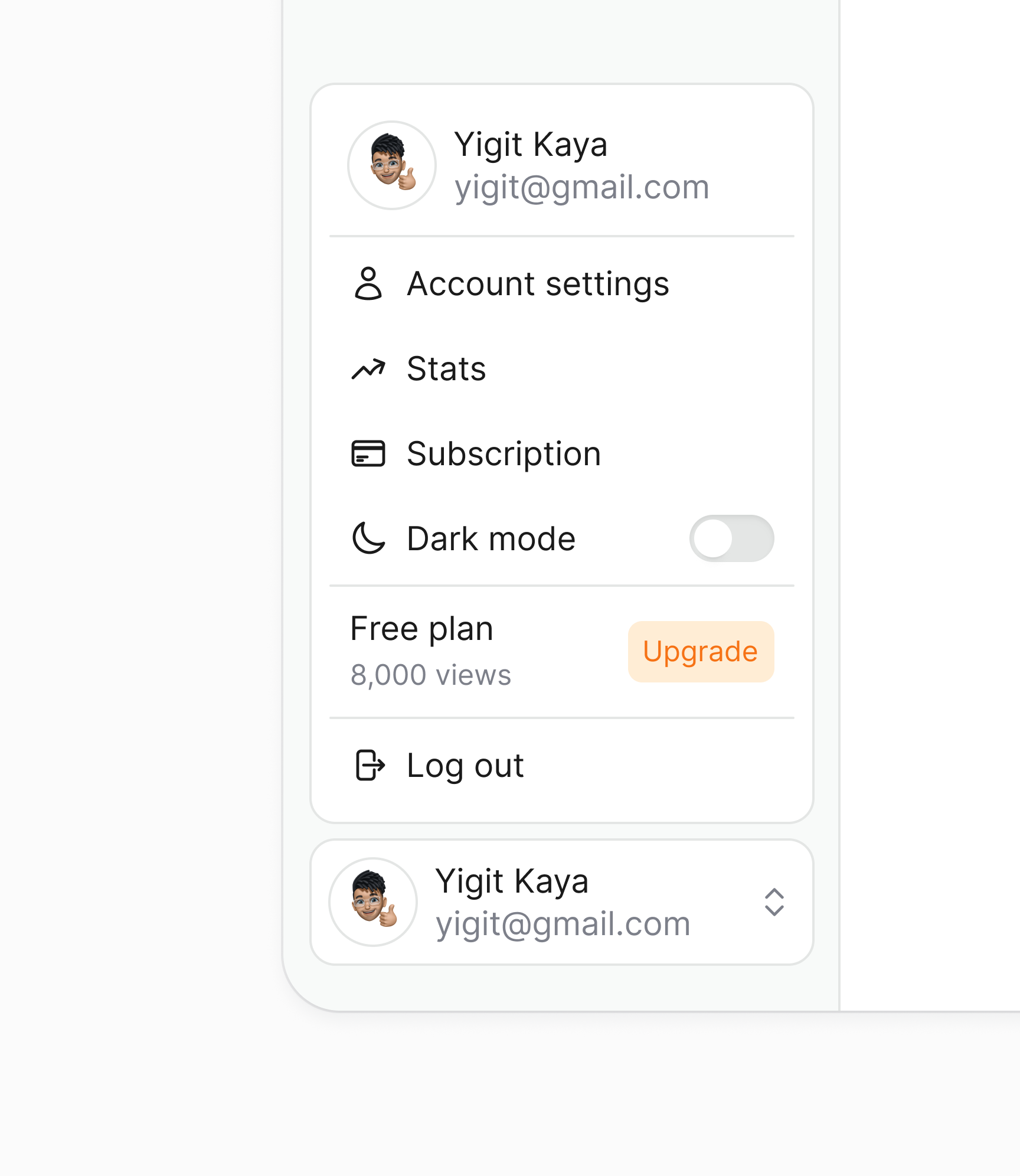
Dropdown Menu

Typographic drop-down | FELICIDAD – Fans of 1st
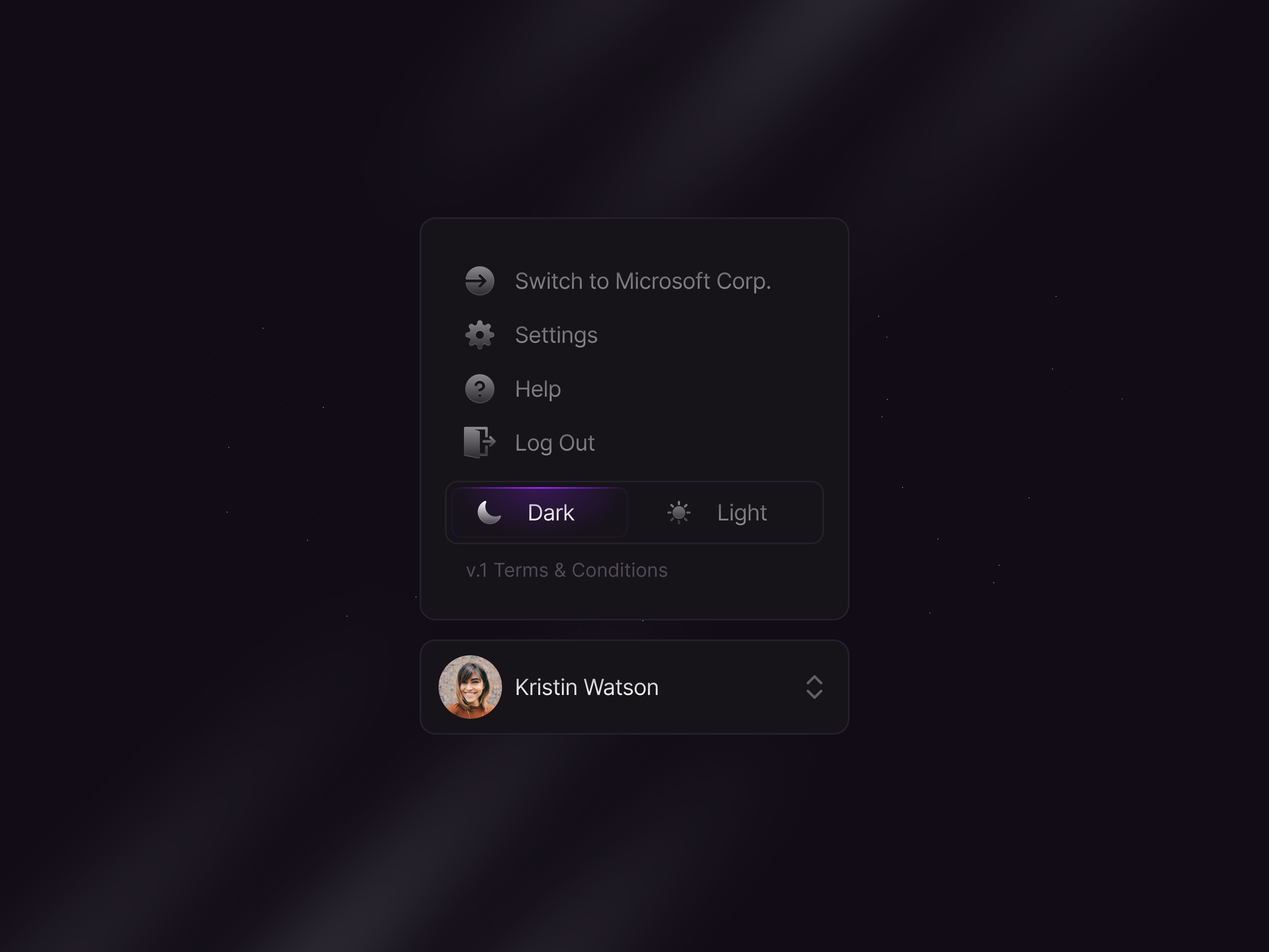
Profile Component Dropdown 🌑

CSS-Only Nested Dropdown Navigation (ARIA)
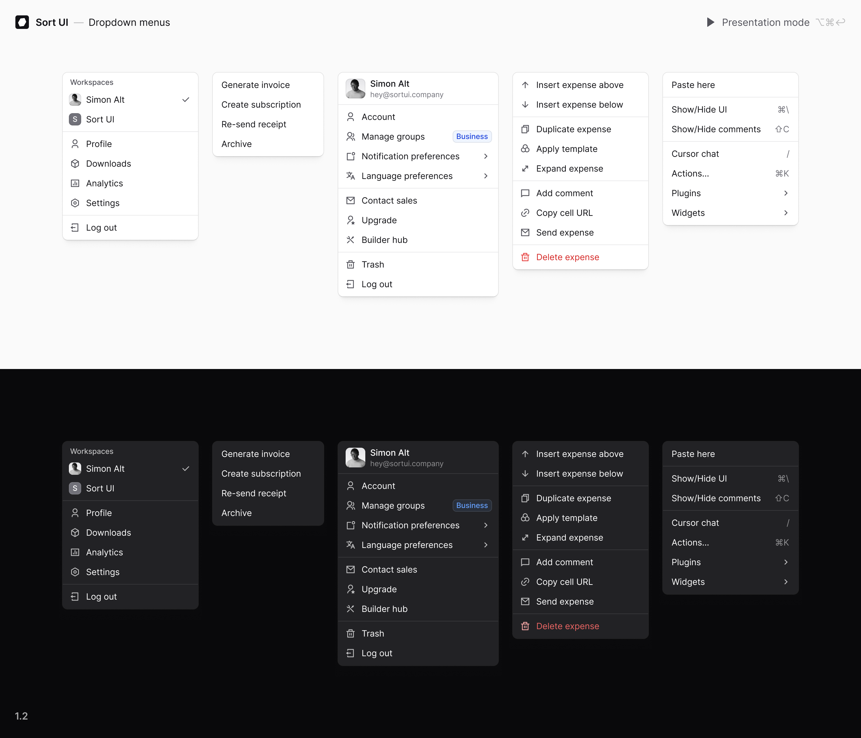
Dropdown menus | WIP
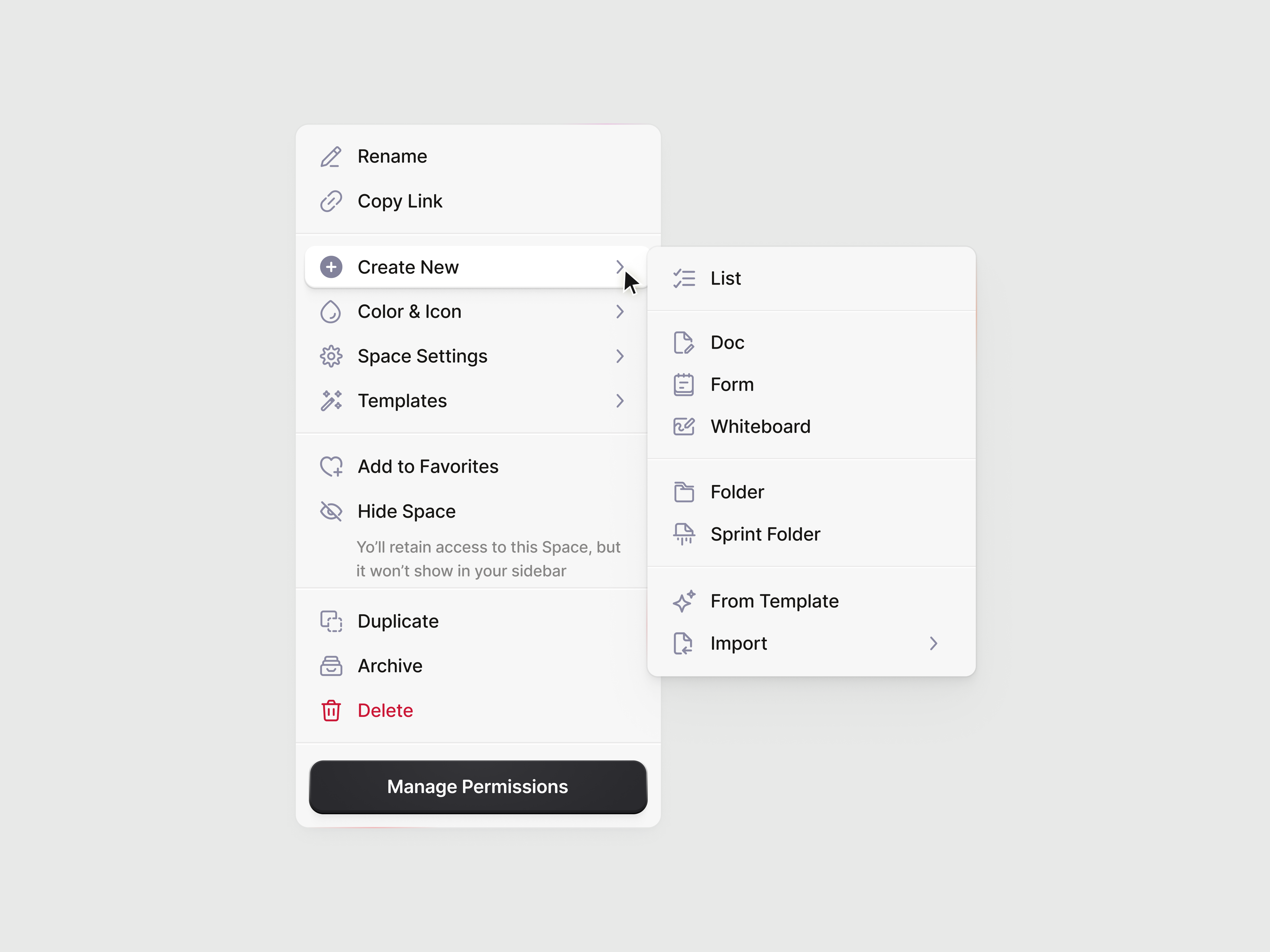
Dropdown Menu
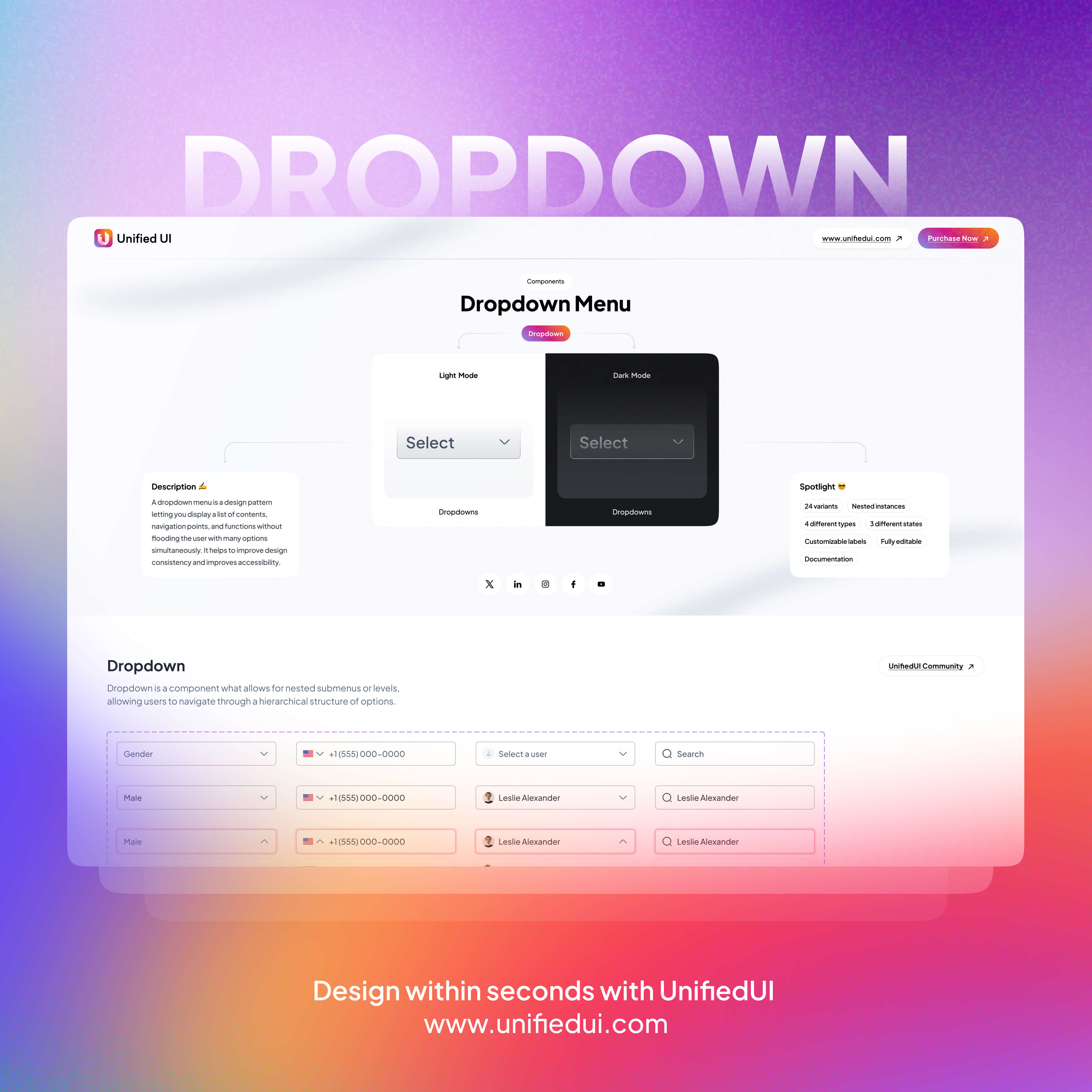
Dropdown - UnifiedUI
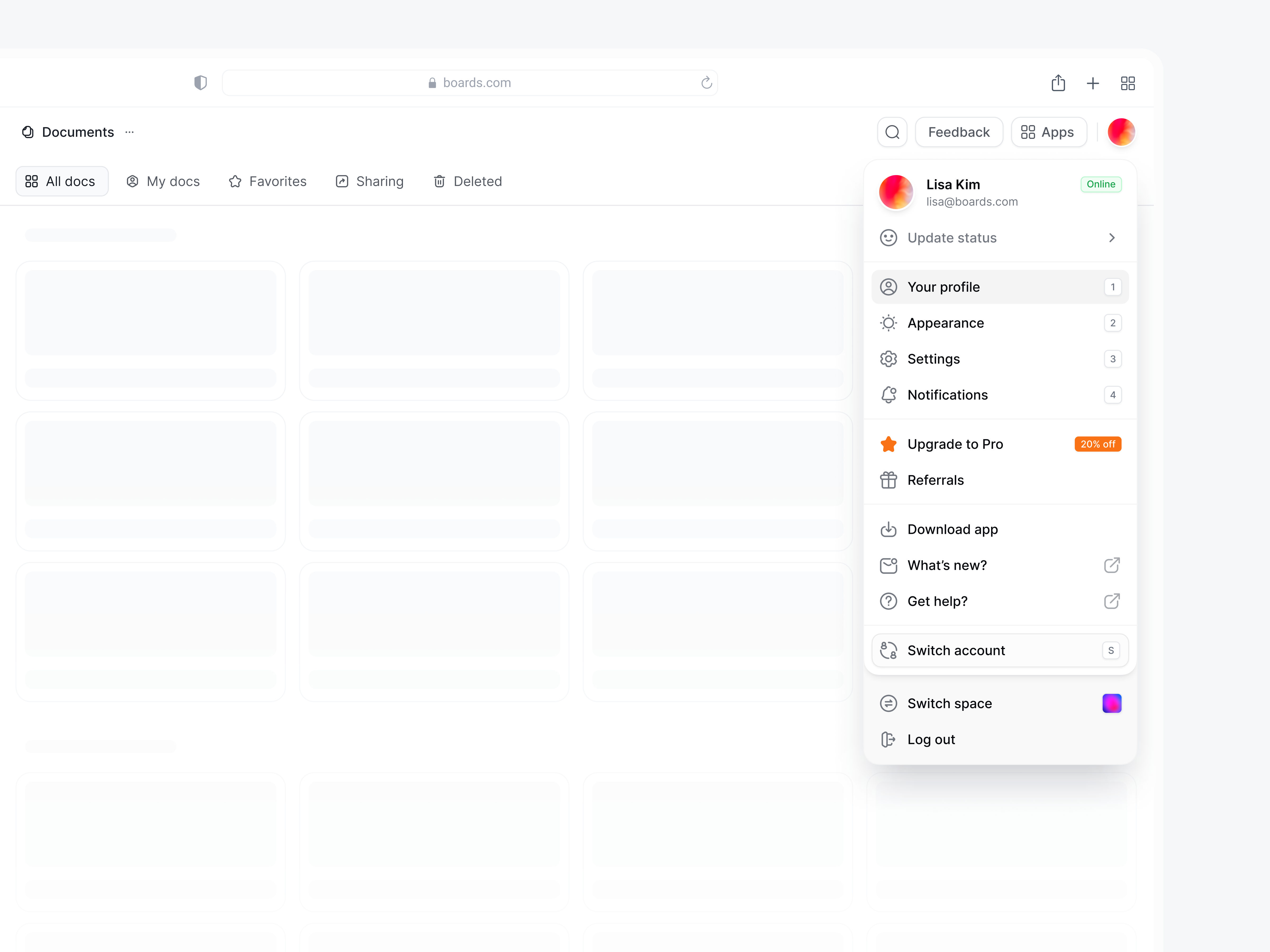
User Menu Dropdown
/b857ec89-0494-4551-851f-d30b2af8a219-thumb.jpeg)
Dropdown Menu Interaction
/filters:quality(100)/3294f8e3-c037-488c-9cde-431a613cda0e-09-03-2024.jpg)
Landing Header Dropdown 🌿
This is 1% of what Muzli shows you.
Get the rest — fresh design inspiration on every new tab, free.
Add Muzli — free
Dropdown
/filters:quality(100)/d55e7685-7d8f-4287-bb52-602f4573aaee-Day-27-Hugo.jpg)
Dropdown

Dropdown
/filters:quality(100)/7e703fcd-22c8-4aa2-a6a0-987c2751c899-Navmenu-dropdown.jpg)
Dropdown
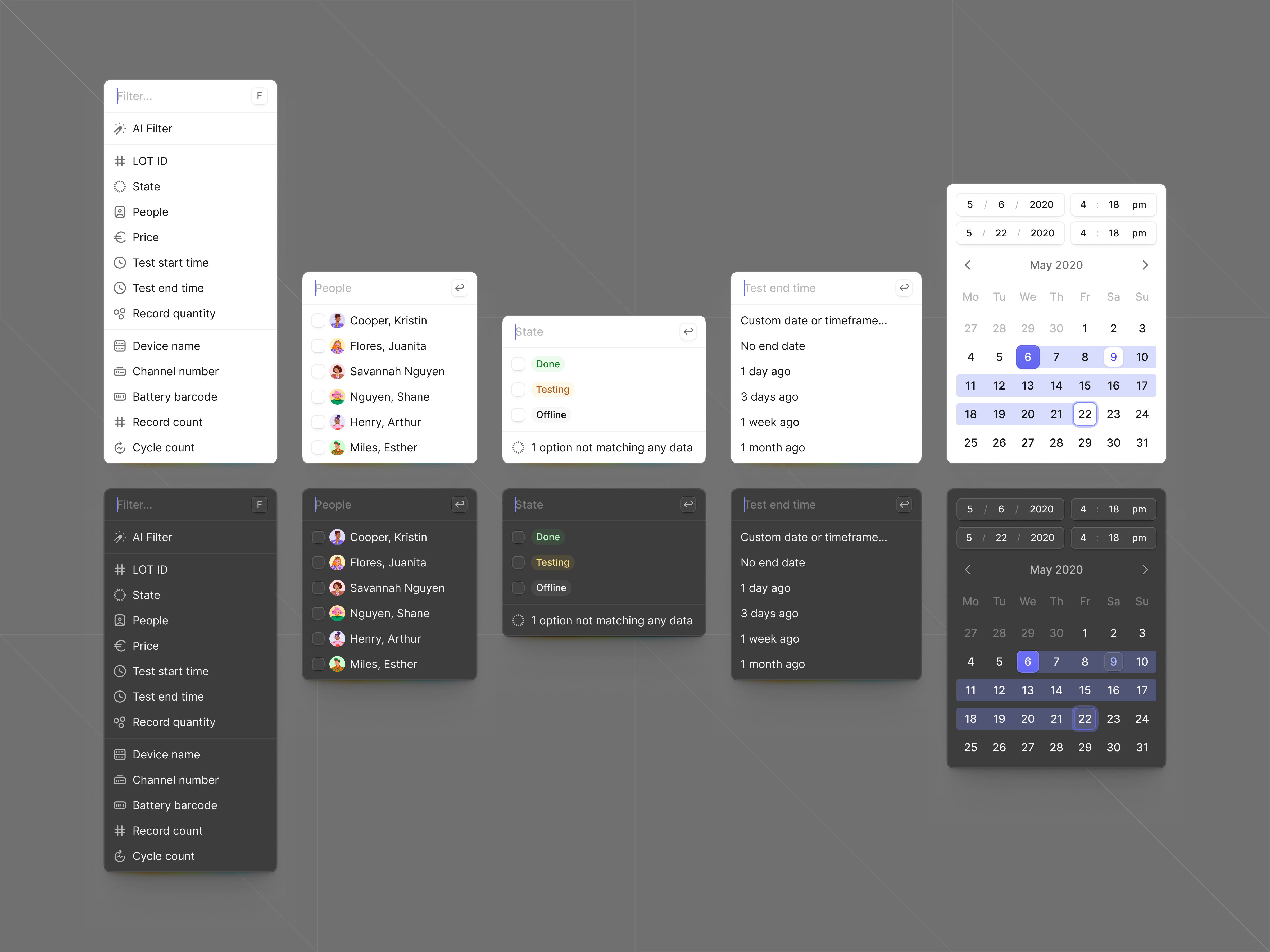
⏀ Dropdown
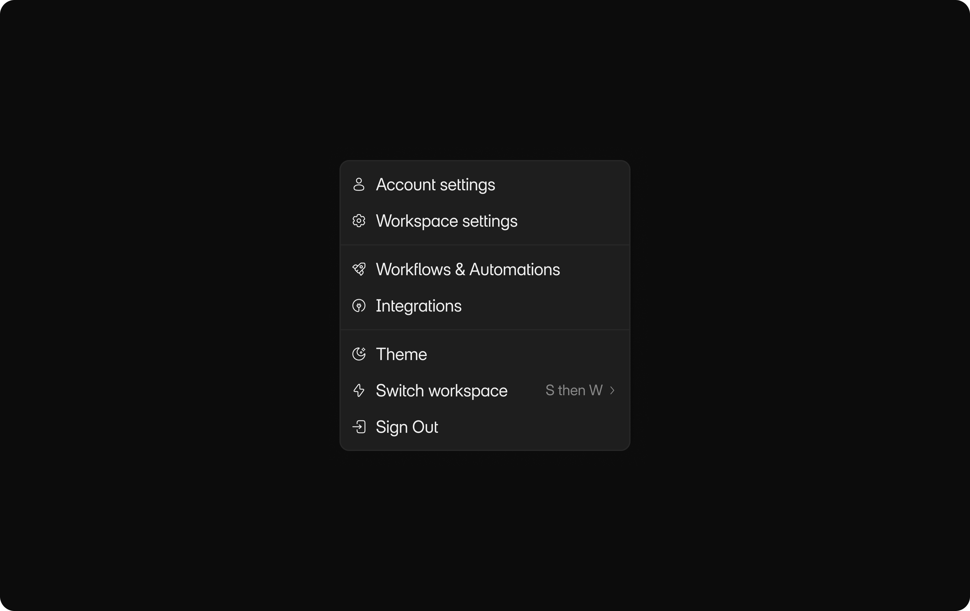
Dropdown

CSS only drop down menu
See the Code - See it Full Page - See Details This Pen uses: HTML, CSS, JavaScript, and
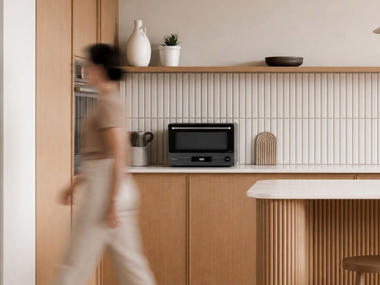
The $429 Microwave With a Drop-Down Door and No Spinning Turntable
The microwave has been one of the most stubbornly unchanged appliances in the modern kitchen. After decades of the same basic box design, with a spinning turntable, a membrane-covered button pad, and a side-swinging door, most manufacturers have focused their innovation elsewhere. The few that have attempted cosmetic updates have mostly just rearranged the same components into slightly different shapes without addressing the deeper frustrations most people have with them. The Panasonic NN-SF57RM tries to address all of that at once. It draws on Japanese design principles to arrive at a countertop microwave that looks more like a compact built-in oven than anything most people would expect to find in a kitchen. Unlike most appliance redesigns that prioritize looks over function, this one makes a strong case that the cooking technology needed rethinking just as much as the exterior. Designer: Panasonic The most immediately noticeable departure from the typical microwave format is the door. Rather than the standard left-to-right hinged swing, it drops downward like a traditional oven door, making it easier to slide dishes in and out without awkward angling. Soft-close hinges slow the door’s descent to a cushioned stop. The muted graphite exterior and minimalist button-and-dial control panel complete a look that sits comfortably next to higher-end kitchen equipment. Opening the door reveals a 1.0 cu. ft., turntable-free interior that’s flat and unobstructed. Most microwaves rely on a spinning glass plate to distribute heat, but it eats into usable space and gives food residue plenty of places to hide. A hidden antenna beneath the floor rotates microwave energy around the food, directing heat toward cooler areas while avoiding spots that are already warm, resulting in more even heating. Traditional microwaves pulse their power on and off during cooking, which explains why reheated leftovers often come out scalding in some spots and still cold in others. Inverter Technology changes this by maintaining a continuous, consistent power output throughout the entire cooking process, delivering the right level of heat at every setting without the on-off cycling that causes uneven results in most conventional models. The Genius Sensor 2.0 adds another layer of intelligence on top of all that. Earlier versions of the technology read steam released by food to estimate doneness, which can produce inconsistent results when a plate holds multiple food types. The updated system uses thermo sensors positioned at 64 points to read surface temperatures every 0.1 second, adjusting cooking time and power levels automatically to bring everything to the right temperature. All of this feeds into a one-push operation that removes most of the guesswork from everyday cooking. Place a dish inside, press the Sensor Heat button, and the microwave handles the rest. The same sensor intelligence extends to one-bowl meals, where the user adds ingredients for dishes like pasta carbonara or chili, and the microwave cooks the entire meal through without requiring manual monitoring or adjustments midway. The NN-SF57RM is currently available exclusively in the US through Panasonic’s online store, priced at $429.95. That’s higher than most countertop microwaves at this size, but the combination of Inverter Technology, a 1,200W output, the turntable-free flatbed interior, and the Genius Sensor 2.0 puts it in a different category from the plain boxes that still dominate most kitchen counters. It’s an appliance that seems to actually want to be noticed. The post The $429 Microwave With a Drop-Down Door and No Spinning Turntable first appeared on Yanko Design.
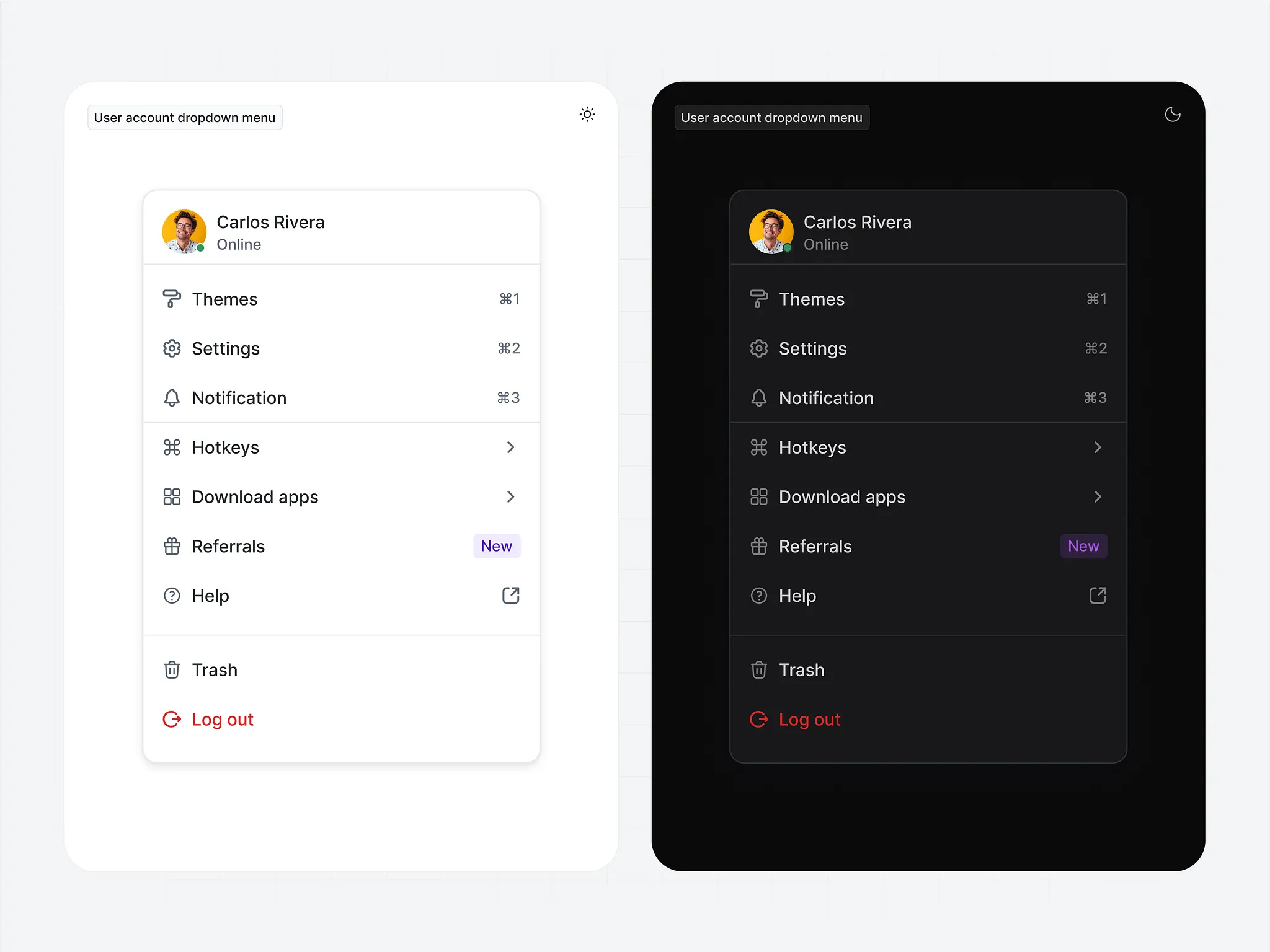
User Account Dropdown Menu

Profile Dropdown
/filters:quality(100)/270b8e1e-486b-4f4f-810d-57ce3083fc3b-Dropdown.jpg)
Dropdown⏬️

Profile dropdown
This is 1% of what Muzli shows you.
Get the rest — fresh design inspiration on every new tab, free.
Add Muzli — free/filters:quality(100)/ceb9c027-a1df-481e-8d26-dac88ab8b33f-Dropdown-Insta.png)
Dropdown component

Account Dropdown

Profile Dropdown ⛳

X Search Dropdown UI Redesign Concept
/filters:quality(100)/6c0f86a1-0cf0-437b-9f1a-0e4da7459e8c-Screen-5.png)
Phone number dropdown
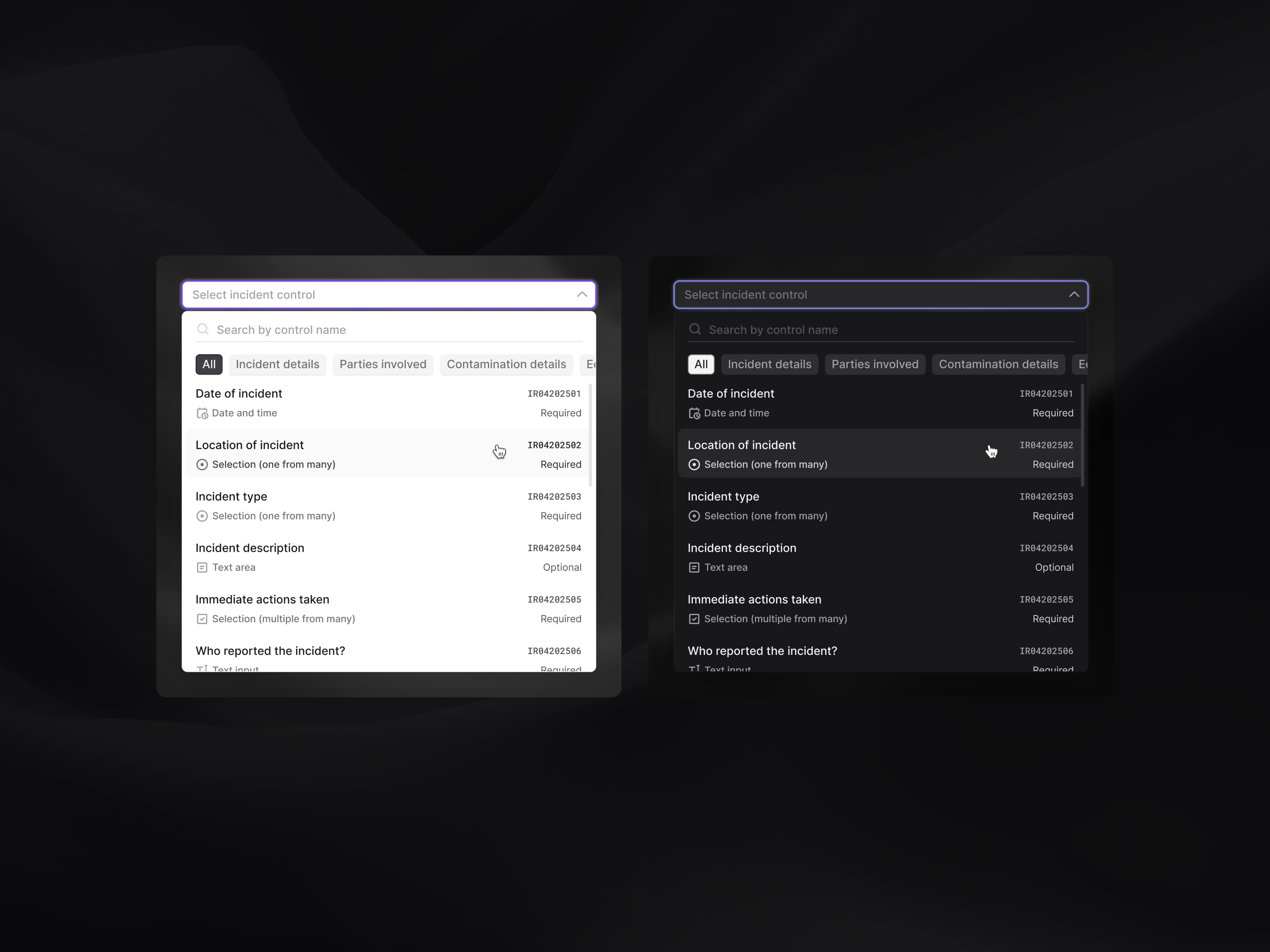
Selection dropdown widget
/1f675a8d-cb19-47da-a164-9ae950fa2e53-thumb.jpeg)
Domen - Dropdown menu

Service Dropdown 🔽
/filters:quality(100)/fa33fd23-2a0b-4397-b9c3-19984ac24cdb-30-03-2024-square.jpg)
Editor Dropdown ⏬
/filters:quality(100)/29ff4260-46d8-4a79-9357-8538e17d82e1-Day-27-Albert.jpg)
Dashboard Dropdown Menu

Simple and Functional Profile Dropdown UI for Web Apps

Dropdown for Organization Switching
This is 1% of what Muzli shows you.
Get the rest — fresh design inspiration on every new tab, free.
Add Muzli — free
Dark Header Dropdown 🖊️
/3d8ecc0b-98bd-49e3-8f86-31395ddb8ec5-thumb.jpeg)
Testing an expandable dropdown
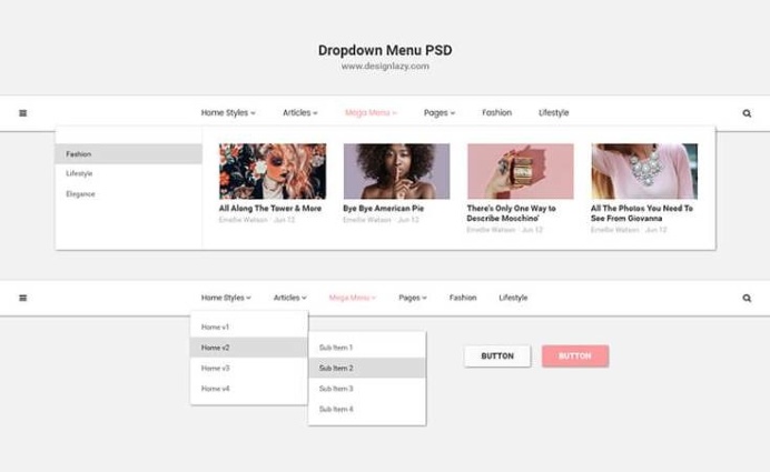
Fresh Dropdown Menu PSD

User account dropdown menu

Day 021 — Dropdown Menu | 100 days UI challenge

Cart dropdown 2 cart preview
Cart dropdown 2 cart preview

Clean & Minimal Web3 Dropdown UI

Travel app drop down to interact
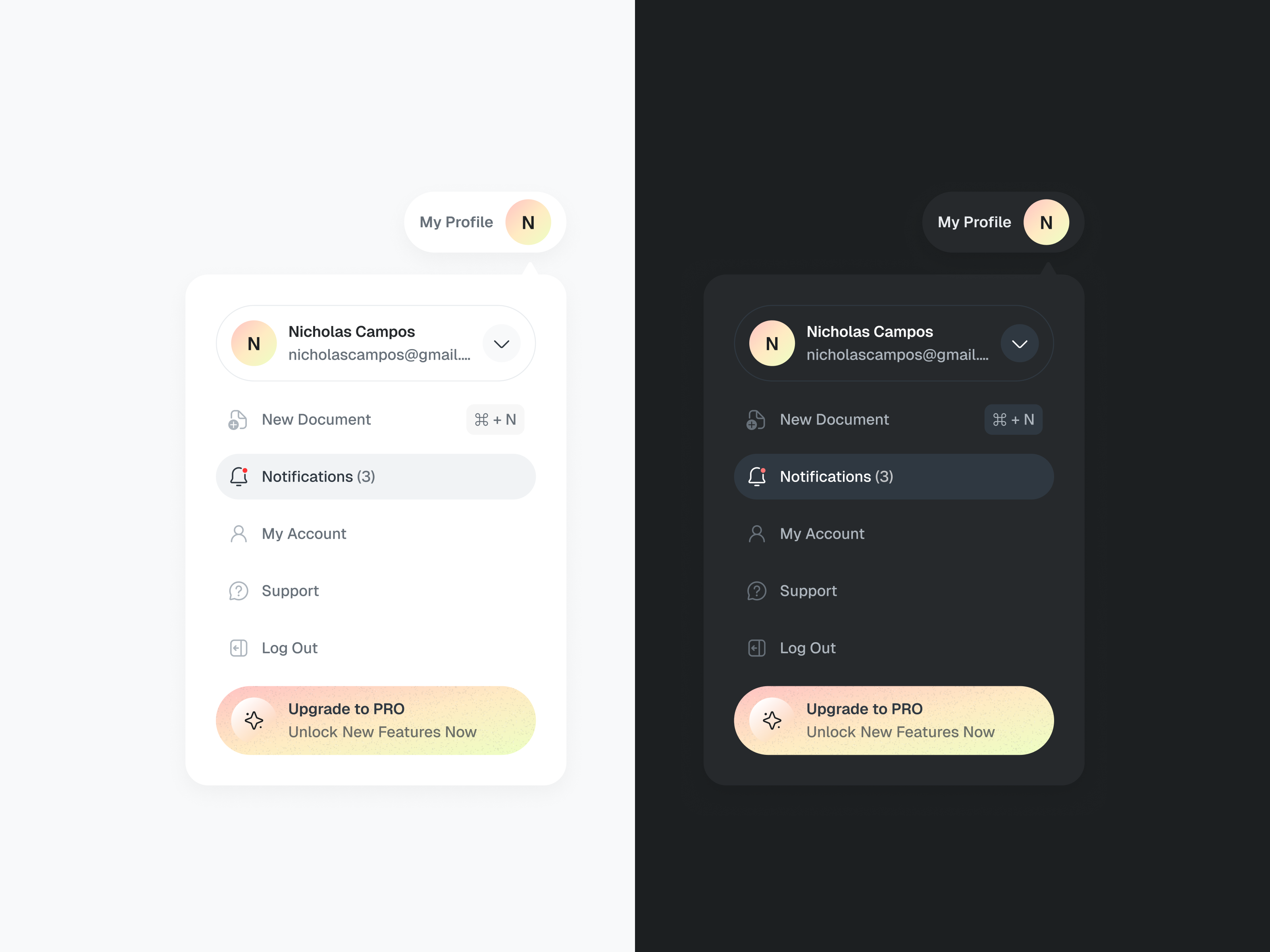
Dropdown Menu UI - Light & Dark Modes

Sort Dropdown
Working with Julius on refining a lot of UI elements that felt bloated.
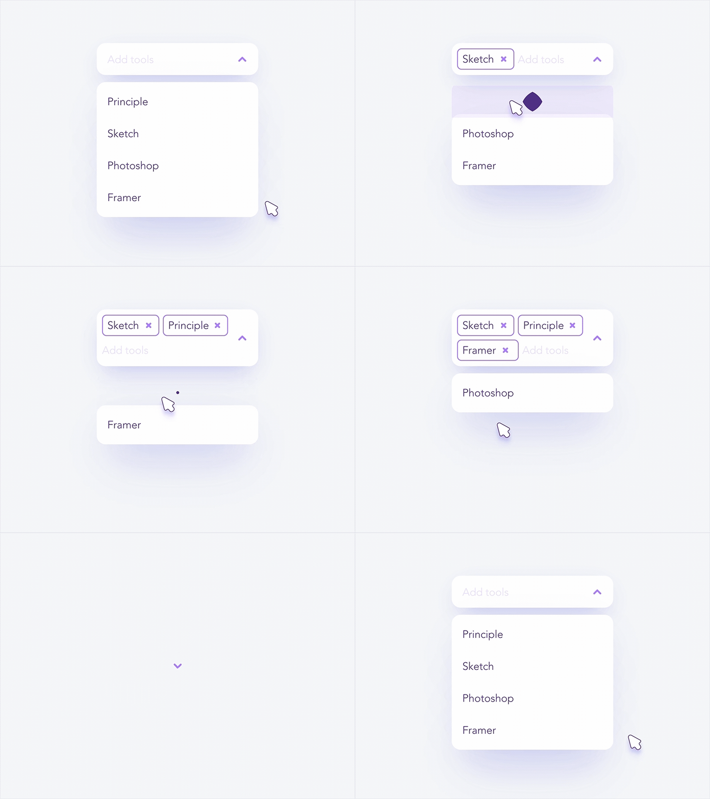
Graphics Editor Selection Drop-Down

Nav Menu Dropdown #Freebies
This is 1% of what Muzli shows you.
Get the rest — fresh design inspiration on every new tab, free.
Add Muzli — freeNav Menu Dropdown #Freebies
Get access to thousands of freshly updated design inspiration pieces by adding Muzli to your browser.
Loved by 900k designers worldwide, Muzli is the leading go-to browser extension for creative professionals.
What is a dropdown menu?
A dropdown menu is a control that reveals a list of options on click or tap and collapses after the user picks one. The name covers several patterns: a select field in a form, a combobox that filters as you type, an action menu behind a button, and a navigation or profile menu in a header.
When should you use a dropdown?
Use a dropdown when there are too many options to show at once and the user already knows roughly what they are looking for. With fewer than five options, radio buttons or a segmented control are faster because nothing is hidden. With long lists such as countries, a combobox that filters as the user types beats scrolling.
What makes a dropdown easy to use?
Show the current value in the closed state, keep option labels short, and mark the selected item in the open list. Support the keyboard: arrow keys to move, Enter to choose, Escape to close. On phones, a native picker or a bottom sheet is usually easier to hit than a small floating list.
Where do these dropdown examples come from?
Most are components from shipped products documented by Mobbin, with dropdown designs published on Layers and on the Framer marketplace. Muzli follows more than 200 design sources and lists up to 60 matching pieces here, favouring recent work.