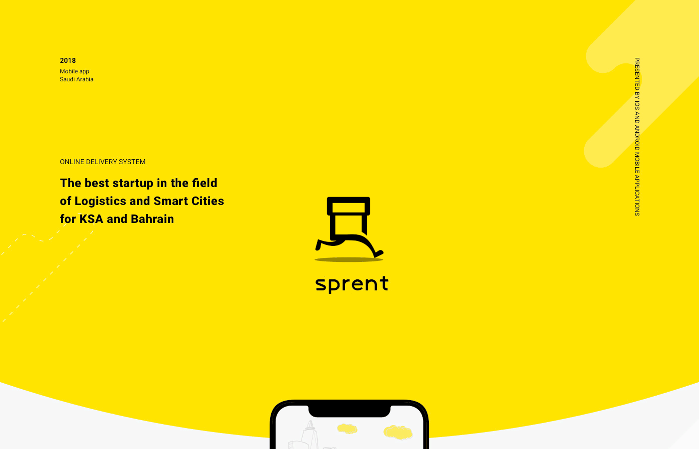
Sprent iOS & Android app
Sprent is an online delivery system that enables customers to buy anything from any store inside their city. Just open Android or iOS app, pick your category of interest and have it delivered by our team of “Sprenters” in a matter of minutes. Customers may also send urgent packages inside their city. The service works in Riyadh and Jeddah in Saudi Arabia, and expanding the coverage to other cities in the kingdom.
Uptech provided the services of UX/UI Design, Backend development, iOS & Android development.
Sprent was featured by Apple as the 1st app to launch Apple Pay in Saudi Arabia and became the best startup in the Logistics category by GESALO.
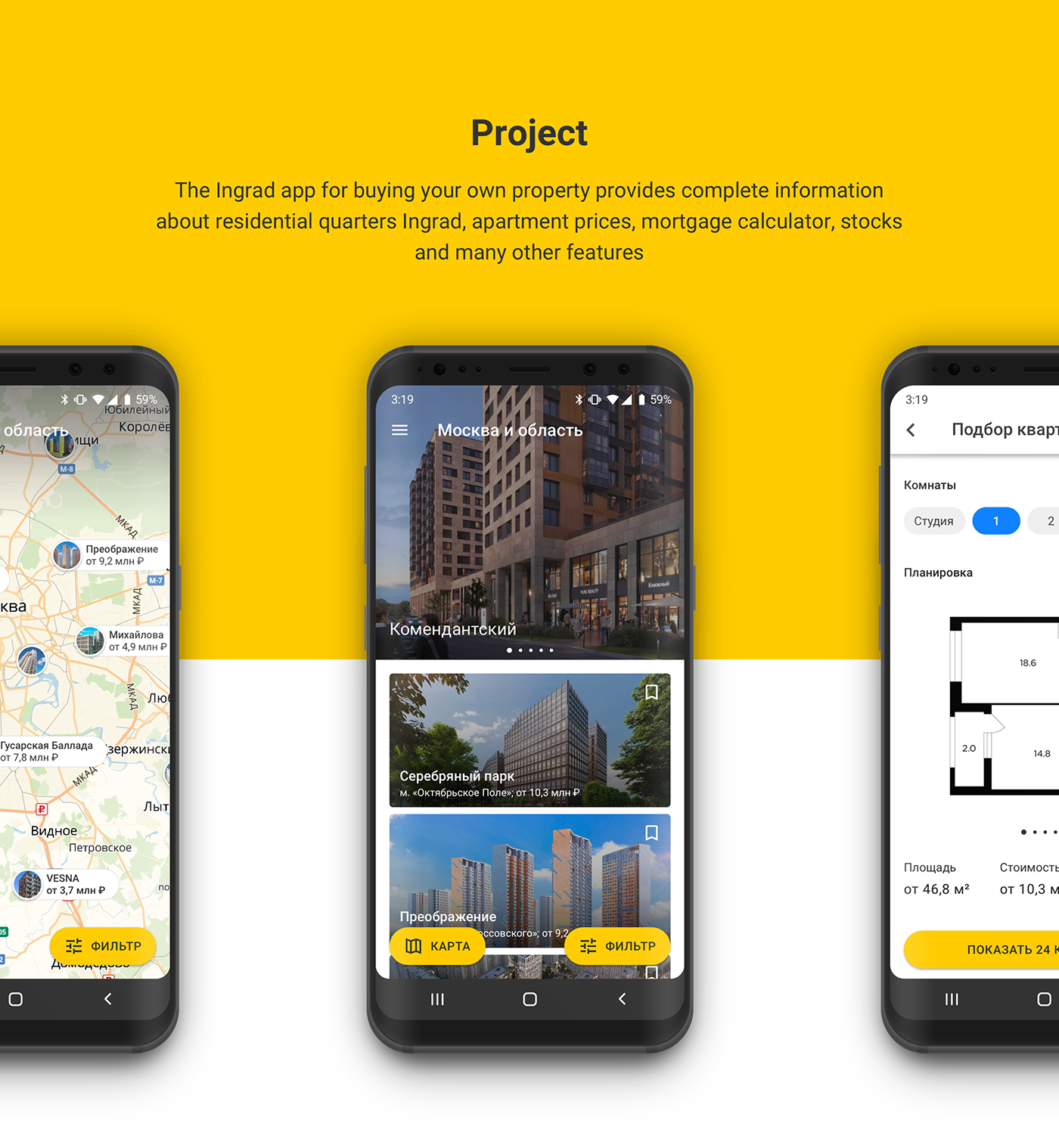
Ingrad Android App
The Ingrad app for buying your own property provides complete information about residential quarters Ingrad, apartment prices, mortgage calculator, stocks and many other features
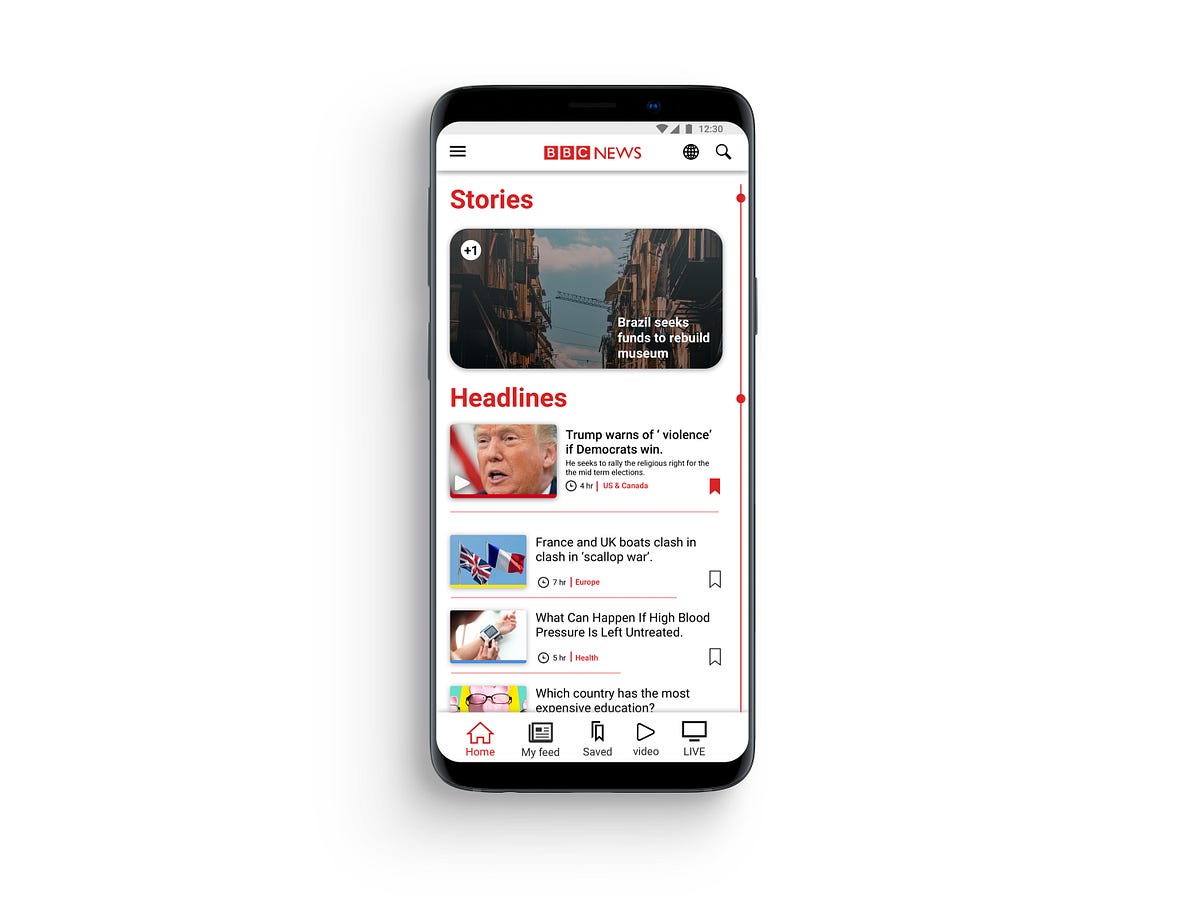
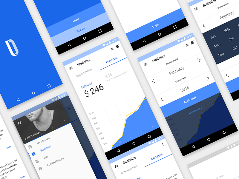
UX case study — BBC NEWS app android
UX case study — BBC NEWS app androidRecently I was searching for a news app which could pull news from around the globe. After stumbling upon BBC news app, which has over 10,000,000 downloads on play store. I thought, an app with this massive following should reward its users with a rich user-experience but BBC news app in its current state is strung together by some good ideas but heroically falls through on execution of these ideas.Problem and hypothesisReviewing other BBC apps in an attempt to understand the brand ideology and content representation across different platform, I found inconsistencies between their applications which is mostly caused due to conflicts in design guidelines provided by different organisations.I Hypothesised that by changing the user navigation flow and striking a middle ground for design standards, will give developers less headache while developing application while providing a more optimised and rewarding experience for the users.BBC android app.PersonaMy goal was to persuade a new user to use the app and turn him into a regular user. I envisioned a user persona who can be a potential user but avoided a specific user who will be a perfect candidate for their app or one who can be considered their core user.Job Story & ScenarioMy decision to choose job story over the user story was that user story has too many assumptions and doesn’t acknowledge causality. When a task is put in the format of a user story ( As a [type of user], I want [some action], so that [outcome] ) there’s no room to ask ‘why’ — you’re essentially locked into a particular sequence with no context. In contrast, Job story provides as much context as possible and focus on motivation instead of just implementation.framing design problem in a Job, focusing on the triggering event or situation, the motivation and goal, and the intended outcome.Guerrilla Usability TestingFor solidifying my hypothesis and to gather more data on the app from a user perspective. A small test group was given instructions to use the app for a span of three weeks. After three weeks I collected their verdict and overall experience. After analysing the data I found some interesting insight, Most of the users forgot to use the app after a while and didn’t feel motivated to use the app. The poorly executed navigation system was the major reason that the users felt lost and eventually lead to abandoning the app entirely.Identifying and Prioritising Pain PointsFor producing an optimal flow, I had to study and point out what is the pain point in the app. For finding pain points and organising the feedback in one place to get a view for the analysis of all data in one place I utilised affinity mapping.affinity mappingI collected data from the test group and my personal notes in the yellow sticky notes. All the feedback is gathered and arranged in the crude sections which make abstract sections/feature of the app. Blue notes represent a clear idea from all the input received from yellow notes. It helps to make note of all the useful feedback and combine it into smaller chunks for later inspection as we go from the bottom-up process. Each hierarchy represents a clear idea for the development of the feature in understanding the user needs and goal for the app set by the company. Doing this activity helped me to sort through all the comments to get a clear view of what is important for the user while satisfying business goals.Prototype and validationAfter getting a fair idea of what elements should be improved or gotten rid of completely. With help of affinity mapping, I was able to stay on track while experimenting with user flows and improving current UI design elements to fit standards proposed by Apple and Google. I took feedback on the design from my peers and tried to integrate their feedback in the design.1. finalising general layout and navigation bat .2.prototype for the index. 3. variation for stories.4. wire-framing different layout. 5. testing layout for article sectionAfter spending time with wire-framing, I moved to work on sketch to test the idea with much more fidelity. After getting an idea of the app will look in the static images I started to design HI-FI prototype in Invison.you can see and interact with the prototype here.Implementation#1 HomepageCurrent app does a poor job of delivering the content in an intuitive way. It depends on app bar for its navigation, using an app bar for navigation seems clunky and stale. It gets messy very quickly as you have to sort through myriad tabs to reach the desired topic.‘Home’ has to be the home screen of the app so it had to be welcoming and informative. To fulfil that goal I cleaned the UI and made changes to how categories are organised on the home screen, in original design spacing between the article were too tight as it resulted in an unpleasant experience where the user feels confined. Instead of just increasing the spacing, I opted for changing the layout. The Most popular article from each topic has the prominent exhibition in the section of that topic, thus headline of each section draws more attention. Each article has been marked with a tag from where the story belongs. The thumbnail of the story has a band beneath it to indicate its tag by colour. These colour tags are used in the BBC website to distinguish all the content quickly.#1.5 StoriesThe story is the distinguishing feature of the BBC app, But it was hard to locate in the original design. It just needed to be in the spotlight. To fulfil the requirement I put the story on the top section from where every user can see it in the prime spot. It could become a quick way to consume news as it is video-based content delivery in a short period of time. Having an indicator which notifies the user of new stories to make the stories more central element of the app and set apart it from its competition.#2 Navigation barAs I wanted a cohesion between android and Ios version of the app, Navigation should feel same and intuitive rather than just scrolling through tabs. Using a nav bar is the logical solution, as both apple and google support it in their guidelines. Removing the app bar navigation allowed me to allocate more space to the main activity. The navigation bar is divided in 5 section Home | My feed | saved | video | LIVE . Each section is the main feature of the app and now it is in front and centre of the app always at the user’s fingertips.#3 New navigation flowThe user still has to traverse through a myriad of topics, making navigation a painful and tiresome process. I resolved it by implementing a new system for navigation called ‘Index’. In ‘Home’ and ‘My feed‘ there is a line on the right edge of the screen. The index acts as a signifier instead of being an affordance for the user which can be triggered by tapping on it. The user will be carried to an index page where he could rifle through topics which are arranged in a linear manner. the index page gives an alternative, instead of scrolling in the home screen to get to a topic he can achieve the same result in less time. There is an indication on the left side to apprise the user of how many new articles had been affixed to the topics since the last session. The index is a more practical way to access the topics without cluttering the main screen with tabs.#4 My feedSetting up my feed was a very tedious task in the original design. My feed is a great feature of the app, I modified the interface which can bring some colour and playfulness to this screen but won’t distract the user. As you select the topics it provides more relative topics.In Old design traversing through tabs took longer than it needed, every choice that you have selected from my feed will be added to the main navigation. After a while main navigation feels like a dumping ground, I start to lose its purpose.The user gets confused and lost his way around the app quickly which cause the user to select few choices in order to keep the navigation clean.To overcome this obstacle, in my new design ‘My feed’ is similar to the home but has curated content where the home was meant to be more of a general place, My feed has the much tighter layout and packs more topics than home. It has a simple layout without making it difficult for the user to navigate to their favourite topics quickly using Index which is separate from the ‘Home’ section topics.Now there is a clear distinction between the two section and navigation for the two section.#5 Reading an articleReading an article is the most important thing in a news app. I chose a layout which will conserve the integrity of reading. The font weight is varied from the title to the main body to demonstrate different heading. Accessibility features are placed in the app bar for ease of reach. Share and save is led at bottom of the cover image which is most used feature while reading the article.SummaryJust by changing the layout and cleaning up the design to new standards of material design, makes the app more approachable and put the content that matter to the user and business to front-line without compromising anyone’s goals. The new navigation system can be a time saver when the user wants to reach to a topic very quickly. The changes made to the ‘My Feed’ are substantial and encourage the user to interact with it. After getting feedback from the same test group. They were impressed by the improvement in the experience from the proposed design for the BBC app.UX case study — BBC NEWS app android was originally published in Muzli - Design Inspiration on Medium, where people are continuing the conversation by highlighting and responding to this story.
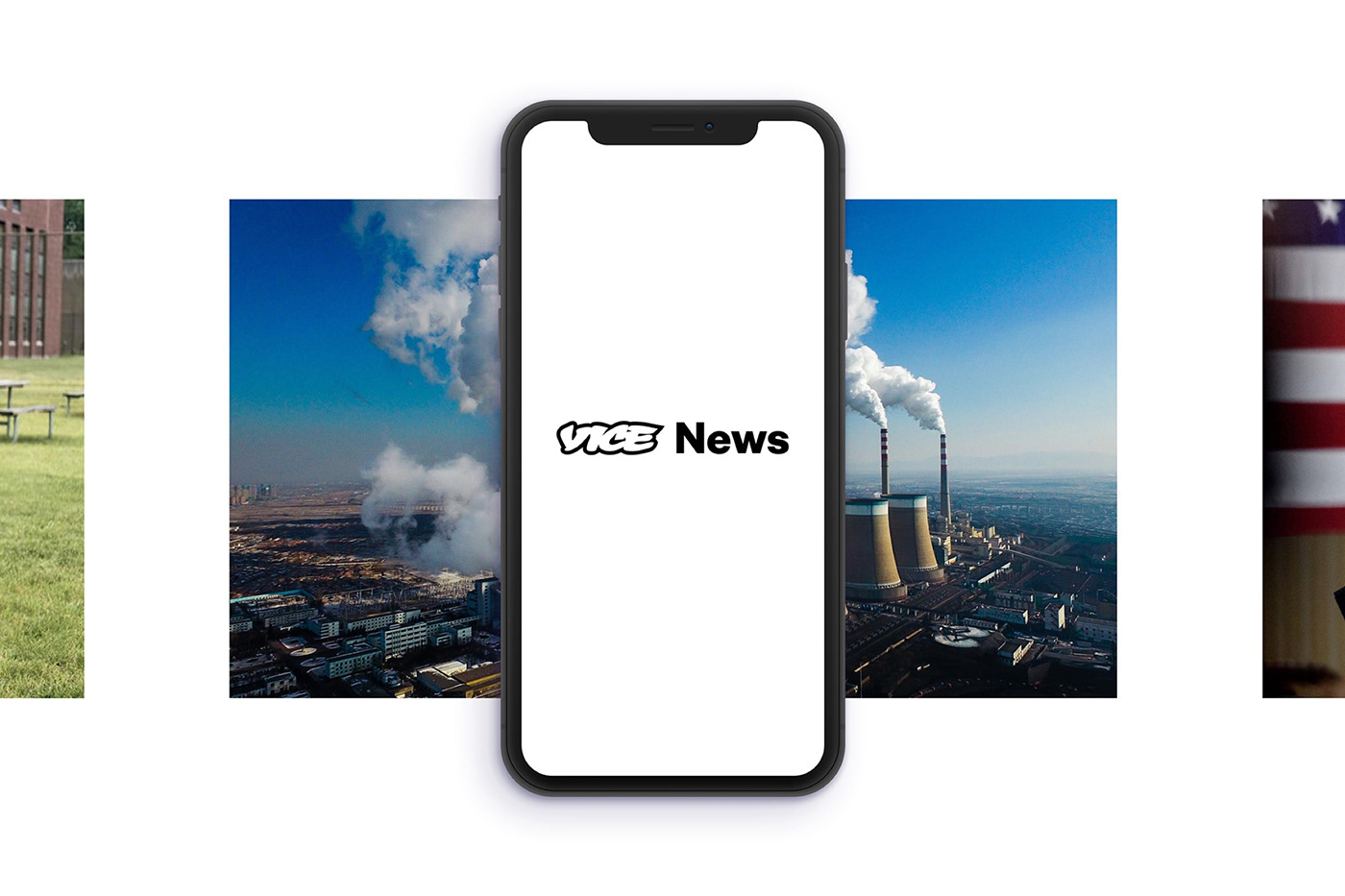
Vice News iOS & Android App
The Vice News Mobile App allows readers to stay up to date with everything that is happening in the world wherever they are. Vice News does away with the traditional news casting formula and present stories in new engaging formats. We wanted the mobile experience to be as immersive as the show no matter what device it is viewed on.
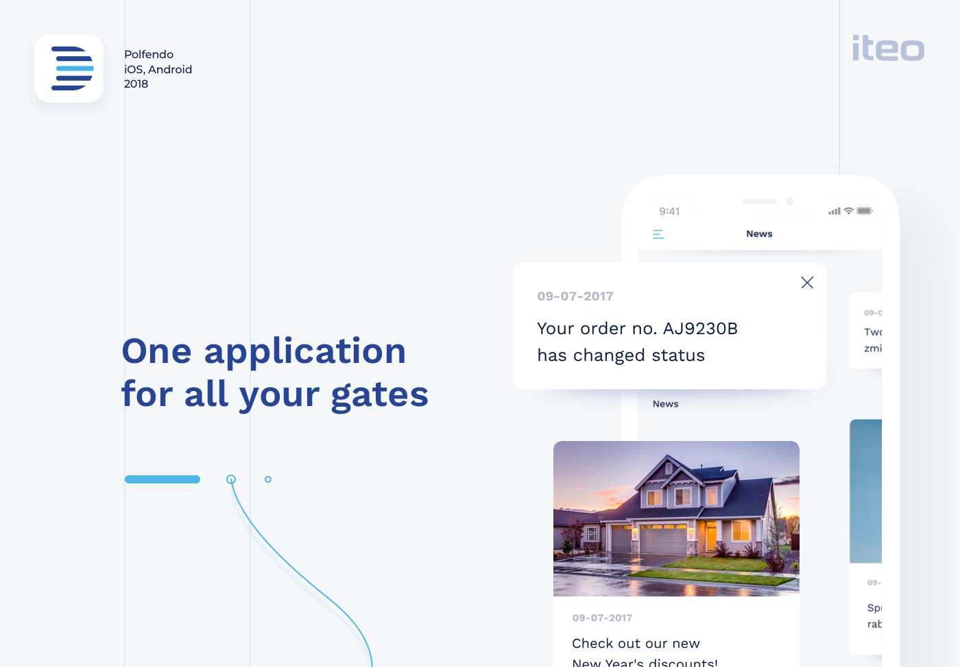
Polfendo | iOS & Android App
When we first engaged with Polfendo they were in the middle
of a growth spurt and their product was evolving. We created
customer personas for them that outlined each user’s
buying triggers and buyer’s journey.
Wireframes and prototypes were created, then tested with users
in order to determine which of the approaches was the most
functional, easy to understand and impactful to potential users.
In this way, we were able to quickly validate
or eliminate design approaches.
Blue is the most relevant color in the business.
It builds trust, feeling of loyalty, reliability, and responsibility.
We also decided to use pure white color for more
flexible handling of the application.
Clean white & blue design puts the emphasis on depth of the application
which is achieved by shadows and tiles. Simplicity allows the photographs
to stand out against smooth typography. Just as door gates float above
the ground, the UI floats above the application.
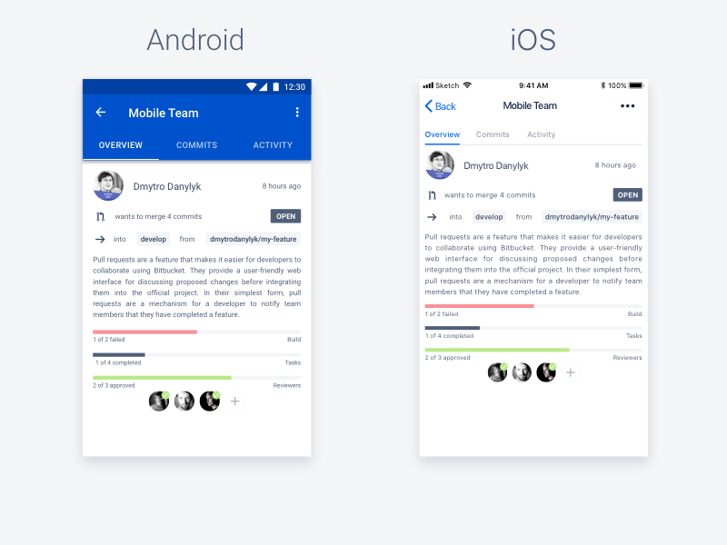
UI/UX Case Study: Adapting an app design for Android & iOS
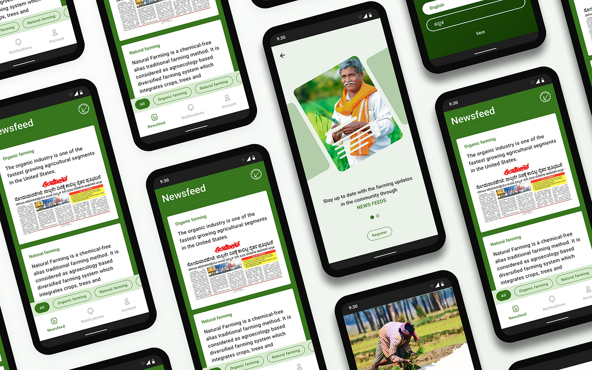
Context: The high fidelity design part (UI) of this application was created by me. After creating the high-fidelity designs for this app, we decided to go one step further. By converting these designs into HIG & Material guideline-specific designs.I won’t go into much detail on the process of designing this app. Long story short, we got a problem statement and a user group (farmers of age 18 and above). So we went through the process of user research, ideation, wireframing, and creating high-fidelity designs.Some final screensSo let’s go on the journey of understanding the differences between both iOS and Android design guidelines and implementing those in our application.I have studied both Human interaction Guidelines (HIG) and Material design systems before. In simple words, HIG focuses on flat, simple, and light design whereas Material embraces lively, intentional, animating, and flexible designs. Before implementing these two, I had to study them even deeper.Implementation in popular applications: Before studying theory and a plethora of data, I wanted to see if these kinds of conversions are worth it. If it does, what does it look like? So I went to Mobbin to study iOS and Android versions of some popular applications (Eg: Instagram, Twitter, Spotify). Here are some important design differences I found:NavigationAlignment of titles, subtitlesAny input field or button (Padding, Size, Corner Radius)iOS uses text for navigation instead of iconsDifferent font styles for the same type of elementMargin, column, & gutter differencesI could see the differences clearly. So I went ahead and started learning about the two design systems. I won’t describe it here, instead of me copy-pasting, you can go to the official sites of HIG & Material design systems to learn it in depth. Here, I’m going to describe the learnings I applied to the application.Official pages of HIG & MaterialScreen Size: While researching what screen size to design for so that my design can cover all the screens, I got to know some key points: For India, currently most common screen ratio is 360*800px with a ratio of 16:9 (source). For android, the top 5 best-selling phones have a screen ratio of 20:9. For iPhone, a large group of users uses the 375*812pt screen size (1pt = 1.33px). So I started accordingly. I planned to create the 360*800px version for Android and a 375*812pt version for iOS.Layout Grid: A layout grid is something that defines the structure of the screen. It can be in form of columns, rows, or a combination of both. Most designers and design systems use the column form of layout grids. While researching the layout grids, I came to a conclusion: In HIG, there is no use of grids and the side margin is 16px from each side. In Material, the grid has four columns with 16px of gutter and 16px of margin from each side.Screen sizes for iOS and Android with their layout guidelinesTypography: In terms of typography, both design systems have their own guidelines. One thing that sets their standard on the same level is the use of DYNAMIC TYPE fonts. Dynamic fonts change their weight based on the system settings. In simple words, static fonts have a defined set of font styles (Thin, normal, bold, etc.) whereas dynamic fonts respond to the weight input and change their properties accordingly. The default typeface used in HIG is SF Pro and in Material, it is Roboto. The design system also provides a detailed description of all the font sizes (Eg: Font size, line height, letter spacing, etc.).Typography GuidelinesThere’s no compulsion of using the system typeface for your project, but in this project, I’ve used the same typefaces used in the respective design systems.The typography used in the applicationNavigation: Navigation is an important part of the user experience. The HIG and Material design systems have clearly different navigation styles and in my opinion, they both work perfectly well. As you can see in the navigation components shown below, HIG uses text as navigation buttons so much more than Material whereas, in Material, the use of icons for navigation is applied a lot more than in HIG. (We can’t say which one works better than the other because both work and both of them are loved.)Navigation differences in both design systemsComponents: When it comes to differentiating between HIG and Material design patterns, the components play a major role. The material design just revamped its design system. In this design system, most of the components are changed. The new system is named “Material 3”. HIG brings small changes to its design system with every update of its OS. So based on the measures and standards provided in both design systems, I created all the needed elements for the HIG and Material Version. Here’s a list of elements created for both versions:Components used in the iOS version of the applicationComponents used in the Android version of the applicationConclusion: After all the learning and implementations, here are some of the outcomes we produced.This journey taught me a lot. Pioneers, rivals, or whatever you can say but these two systems are competing and learning from each other to provide a better user experience. I think designers should have a thorough knowledge of at least these two design systems so that they can create a phenomenal experience for their users by using or breaking these design rules.Peace!UI/UX Case Study: Adapting an app design for Android & iOS was originally published in Muzli - Design Inspiration on Medium, where people are continuing the conversation by highlighting and responding to this story.
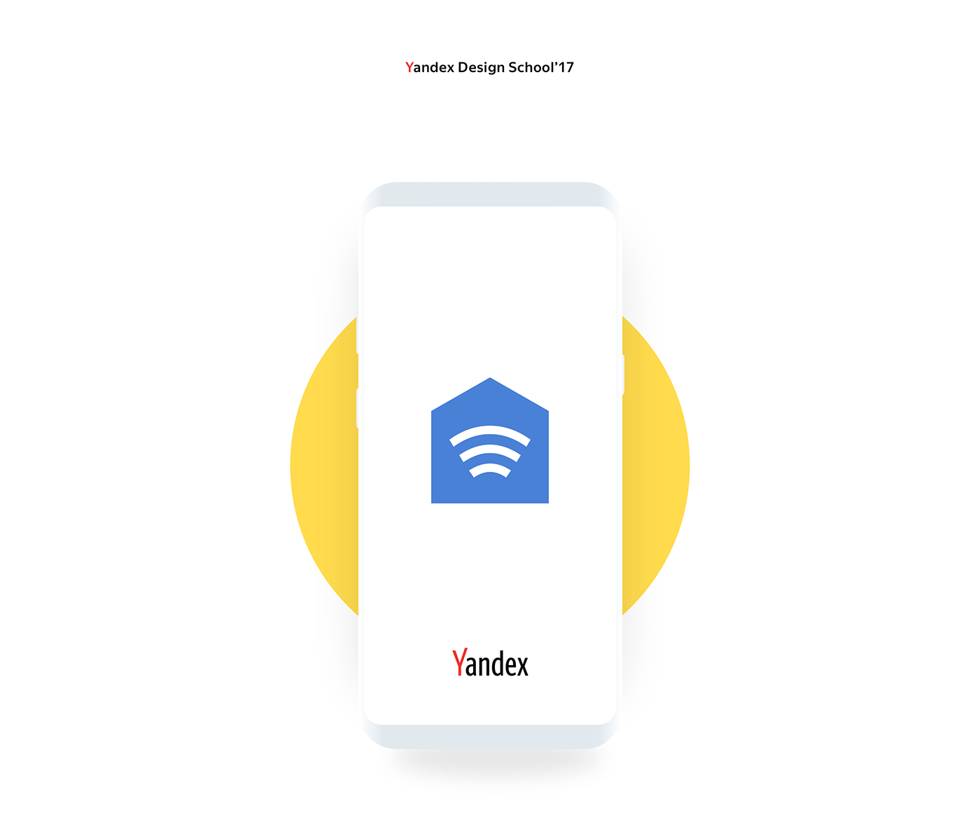
Yandex.House | Android app
In 2017, I participated in the qualifying round at the Yandex Design School. The entrance test included development of an app for smart house managing. I created the app for different people who want to manage all devices in simple way.

Android Music app. One player - four themes
Vice News iOS & Android App Design
The Vice News Mobile App allows readers to stay up to date with everything that is happening in the world wherever they are. Vice News does away with the traditional news casting formula and present stories in new engaging formats. We wanted the mobile experience to be as immersive as the show no matter what device it is viewed on.
The design guide to iOS and Android app icons
Despite the small size, an icon promotes an application in the App Store and Google Play, presents the user with it and also helps to find it on the Home screen after installation. It’s a great responsibility, and it depends on a designer if an icon can cope with that.When I faced the challenge of drawing an app icon for the first time, I had a lot of questions. I found answers on some of them only after a couple of completed projects. I decided to write this article to help the same beginners as I was, but I hope that experienced designers will find it useful too. Well, let’s get started!Why every app needs an iconAn app icon is a unique image added for every mobile application. It’s the first users see when they find an app on the App Store and Google Play. At this stage, the user decides if he wants to find more about an app; if not — he scrolls further. A good icon generates interest, provide confidence, assure the user that an app might be useful for him. At the same time, a bad icon does twice as much, but the other way around. It confuses and casts doubt on the benefit of an app. When the user installs an app, the icon’s goal changes. Now it assists in the search for the app on the Home screen among other icons. But what makes an app icon “good”?There are a lot of articles on the topic and most of them relate to Paul Rand’s design principles. And that’s not surprising! An app icon is a piece of branding. However, it’s not a logo.A logo and an app icon have different goals, ways of using and requirements respectively. It doesn’t mean a logo can’t overlap with an icon. Not at all! Popular applications often use logos in icons: Twitter, Medium, Reddit and others. But they don’t do it for no reason. They are a number of aspects that we need to take into account. Let me tell you about them by drawing on the experience and using beautiful headlines.ScalabilityAn app icon has to be small. That’s the point, and the user can’t stretch it to examine. Therefore, it’s important that an icon maintains its legibility regardless of size. Look, how small app icons are in Settings!App icons in iOS and Android SettingsThe user shouldn’t strain his eyes trying to understand the designer’s idea. Make sure to try out an icon on real devices in multiple sizes and, if necessary, finalize it. The loss of details due the reduction in the number of pixels is inevitably, but the idea has always to be clear. And that brings us to the second aspect of an app icon.RecognizabilityIf the user can’t understand your idea, you can’t hook him and he’ll move on to the next app. Designers advise simplifying app icons to increase recognizability. And it’s important to understand it right. Simplify doesn’t mean to make primitive. Look, aren’t these icons detailed?Hello Neighbor, Tiny wings, Prune, Pandora Music, Silly Sausage in Meat Land, Old Man’s JourneySimplify means to concentrate on an idea and get rid of unnecessary and repeating elements. Everything should work for the idea and help the user to understand it. However, the user hasn’t only to understand it, but also has to get interested in it.UniquenessThere are almost 2 million applications in the App Store and 2,1 million in Google Play, and each of them has an app icon. All these icons compete for the user’s attention. Big brands use their logos to draw attention, but what to do less-known applications? Show something new and unusual!Todoist uses the standard for task managers tick in an interesting compositionSpend some time on a research before starting to draw, search for the main competitors and simply applications from the same category. Think of how to stand out! If most icons are colourful, consider using a monochrome palette. If there are a lot of images of one particular item — abandon it and show something different. Always search for your way to solve problems!It’s difficult to come up with something new. Make mood boards, create mind maps, ask friends and coworkers for advice. You never know where you’ll find a great idea. But it is important not to lose touch with an application in the pursuit of originality.ConsistencyAn icon is the part of an application, they have to work hand-in-hand. An icon should describe an app and show its main features. This is especially important for games where an app can get 1 million downloads because of only one game mechanic.Slack is a good example of consistency between app and iconNo one will like if he gets a different application than expected. Don’t include screenshots and interface elements in an icon — it can mislead the user. Instead, insinuate the functionality of an app, use the same style and colours. There should not be any doubts to which app relates an icon. And guidelines can help you to achieve this!Compliance with guidelinesDespite the fact that iOS and Android starting to look the same, there are still a lot of differences which prevent us from using the same app icon on both operating systems: proportions, visual techniques and special features. Users get used to their operating systems. The less we distance from it, the more trust to an app is given.iOS (on the left) and Android (on the right) icons of the same appsIt doesn’t mean you need to draw different app icons; rather, big differences will reduce app recognition. Sometimes it’s enough to adjust the size, but in some cases it’s better to make more changes.Phew! That’s what we should pay attention to when developing an app icon. Now it’s time to create! Of course, if you don’t have even more questions along the way… What size a canvas should be? How to use grids? How to export an icon? It’s time to go deep into the technical part and find answers. Let’s start with iOS.iOS app iconsThere is much useful information in the iOS Human Interface Guidelines, but we’ll focus on the App Icon section where Apple describes technical requirements and makes recommendations on a design. We’ll follow the path of creating icons and get to the bottom of this. I use Sketch, but any other graphics editor will work too.Drawing an iOS app iconThere are many templates for creating icons, but we won’t use them for now. Let’s say we already studied the market, identified the idea, perhaps, even made a sketch by hand. And of course, created a new document in the editor.Let’s choose a canvas size first. In iOS, an icon can be found in different sizes from 40px × 40px to 1024px × 1024px. Because it’s always easier to reduce the image size, we’ll create a larger canvas. Designers who work in Sketch can cheat and create twice smaller canvas (512px × 512px) and increase it later on export.The next step is to add a grid. You can download it, find in templates and even draw. Grids help to maintain unity and integrity of the composition, control sizes and spacing. Try to place the main object within a large circle. If a grid interferes and limits your creative impulse — break it. Even structure should be limited.Finally, we can start drawing! I won’t bore you with the details, but my icon went through the manager and came back with feedback from the client a couple of times until it was ready:To present the icon, I made a simple animation:This and other stuff I share on DribbbleThe icon is ready! Let’s export it.Export an iOS app iconBefore exporting we need to remove rounded corners and stroke because the system adds it automatically. Don’t forget to hide the grid too.An icon should be exported in png with no transparency. But what about various sizes? Do we really need to do it manually? Thanks to our community, we don’t! For example, we can use Sketch plugin AEIconizer to multiply it. Besides, there are a lot of websites like MakeAppIcon, App Icon Maker and App Icon Generator that can do the same. And templates! For instance, template by Every Interaction not only exports an icon in various sizes but also shows how it’ll look on the Home screen and in the App Store.It wasn’t as hard as it looked. The next is an Android app icon!Android app iconsIn the material design specification, Google split information about Android app icons into two sections: about the style and technical requirements.Drawing an Android app iconIn Android, app icons are used in various sizes too and the largest is identical to iOS: 1024px × 1024px.Adding a grid, pay attention to a safe zone. Depending on the device, Android applies different shaped masks. Place an image within a safe zone so it won’t be clipped. The grid itself shows all the basic shapes which are used in the system: circle, square, vertical and horizontal rectangles.The final version of my icon:Export an Android app iconBefore exporting we also remove rounded corners, stroke and grid.Android Studio can multiply an icon in all required sizes, so we need only one png image with no transparency.Android Oreo introduced a new app icon format with parallax and scale effects. You can separate the foreground from the background, so then these layers will move independently on the device applying the effects. Accordingly, the foreground may include transparency.https://medium.com/media/0347507ebe7b693722c88a204c8a7c80/hrefParallax effect cannot be seen on a solid background, but it can bring dynamic in your design if you have a complex composition. In that case, you need to provide two png images for both layers. Just be ready that not all users will see the effects. At the time of writing, only 12% of all Android users use Android Oreo.Instead of a thousand wordsThe user starts to get know an app with an icon which accompanies his journey up to the end. The role of an icon is important and multifaceted, that’s why the designer should put emphasis on it. Yet never forget about an app itself! After all, it only takes a few taps to delete an app. No matter how cool your icon is, if an app isn’t useful, the user will delete it.Don’t forget to find out how to design an accessible user interface. You can find more stuff from me here: Dribbble, Behance, Instagram, Medium.The design guide to iOS and Android app icons was originally published in Muzli - Design Inspiration on Medium, where people are continuing the conversation by highlighting and responding to this story.
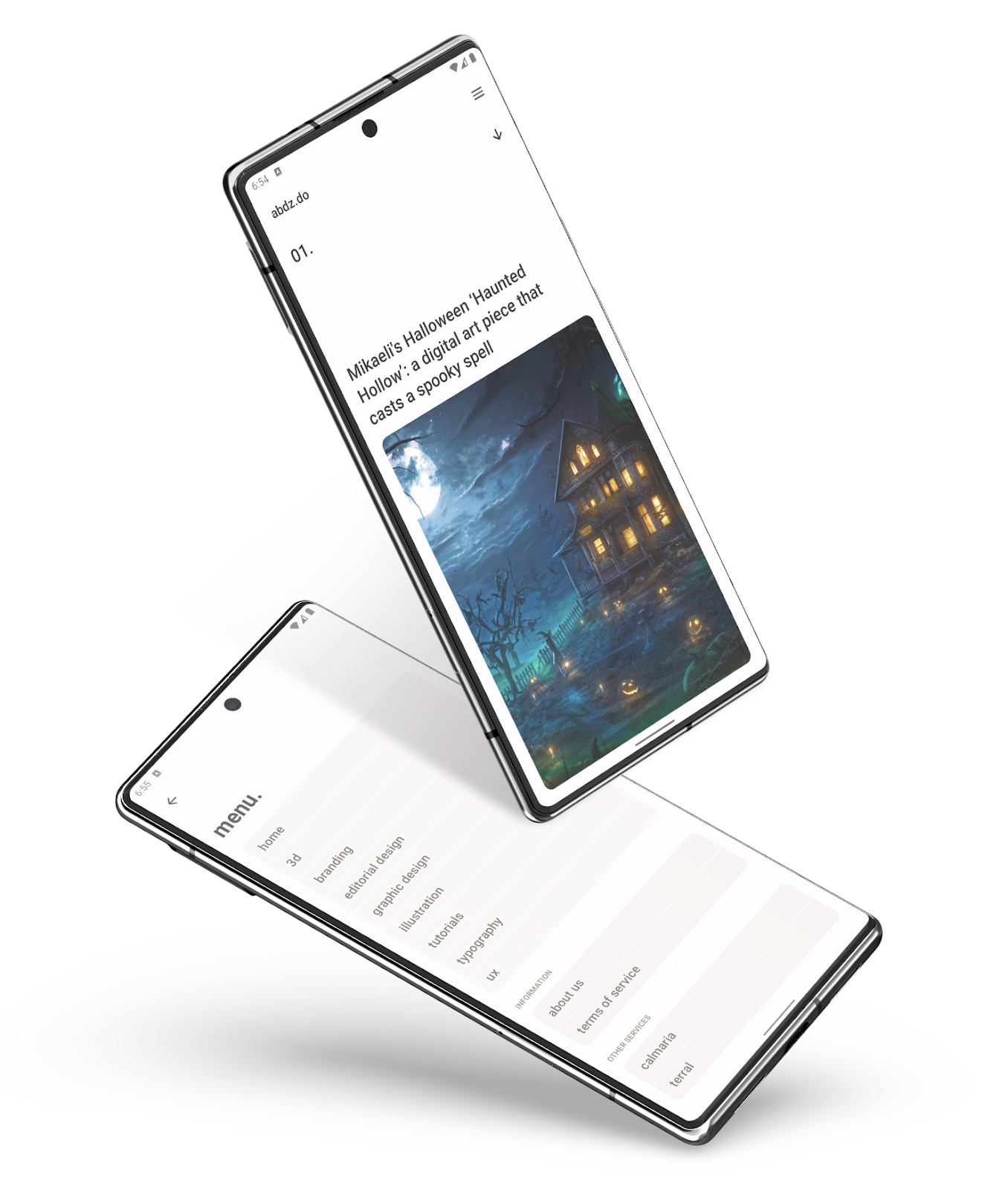
Introducing the abdz.do Android app
Lingvalien | Android App Design for learning english
Android App for learning english.
Whatsinit? iOS and Android app

How to Implement In-App Purchases in Your iOS and Android App?
Today we’ll be talking about the in-app purchases feature in mobile apps and how to integrate them with your business app. But before that, we need to take a slight detour to basics. Smartphone apps have become an essential part of our lives. These apps didn’t exist 12 years back, and now we have a...
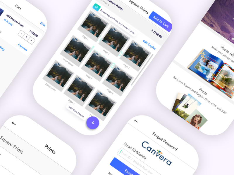
Canvera Printing App for Android

Finance App - IOS/Android
Hey, guys!Everyone who likes it and writes a comment,I'll respond in kind. Let's support each other!I am ready to take your project in the field of: Saas UI / UX, 3D, Mobile, WebSend me message 💌 Telegram / Instagram / 66desband@gmail.com
Photon robot android game app
Movie App for Android

Building the Abduzeedo Android App with Jetpack Compose: My Weekend Ride with AI
Calmaria Android App
With everything that’s going on in the world, the only certainty is anxiety. I learned about some breathing exercises to help reduce anxiety and relax. Unfortunately android lacked a good and beautiful app. It motivated me to create one. My first android app, designed and coded by me. Check it out. https://play.google.com/store/apps/details?id=com.abdz.breathing
Medical App UI by http://ramotion.com #user #watch #ux #design #interface #iwatch #ui #smart #iphone #experience #app #wear #mobile #android #medical #gui

Car Parking | Mobile App | Android Design System

Freelancer Marketplace App UI kit ( Android & iOS)
How to Build a Consistent Design System for Your Android App
Open any top-rated Android app, you will notice something they all have in common: consistency. The buttons look the same, colors feel balanced, and every screen just fits.But in reality, projects are not that simple. Quite often, applications have different fonts that don’t match, colors that seem to be chosen at random, and layouts that are not aligned. It usually happens when design and development grow fast without a shared system in place.A strong Android design system solves that. It helps you create one clear language for your app, so every screen feels connected, every element feels intentional, and your brand looks professional from start to finish.Why Android Libraries Make App Development EasierWorking on Android app development means you have a lot of things going at the same time: design, data, layouts, and performance tweaks.Libraries and design systems are like little helpers that take care of the repetitive work so that you can concentrate on the creative work. Effective Android development tools will maintain your design visually appealing, improve your app loading speed, and greatly facilitate the process of making updates. They also guide you to follow a solid Android app architecture, so your app stays stable as it grows.In simple words, design systems and libraries make app development faster, smoother, and a lot less stressful.What Exactly Is a Design System?A design system for Android applications could be visualized as the style guide of your app. It is a set of all the things that define your UI — the colors, the fonts, the icons, the buttons, the spacing, and the rules of interaction.So, design team doesn’t need to figure out the appearance of every new screen, they simply have to use the system. That way, everything stays consistent no matter who designs or codes it.A good design system usually includes:A clear color palette that defines your brandDefined typography rules for text sizes and stylesReusable components like buttons, cards, and menusGuidelines for spacing, padding, and layoutsIcons and images that match your overall toneOnce you set these up, everyone on your team can build faster and more confidently.Key Ingredients of a Strong Android Design System1. Colors That Reflect Your BrandChoose your primary and accent colors carefully.Define where and how to use them, maybe blue for main actions and grey for secondary buttons.This keeps your Android app design consistency strong and recognizable.2. Consistent TypographyPick one or two fonts that fit your brand personality and stick to them.Decide how headings, subheadings, and body text should look. It makes your app look tidy and readable on all screen sizes.3. Reusable ComponentsDon’t redesign every button or card.Create reusable components your team can drop anywhere.This not only saves time but also ensures your Android UI/UX design stays consistent.4. Spacing and LayoutGood spacing is invisible but powerful.Define grid, system margins, padding, and alignment rules to make everything feel balanced.5. Interaction and MotionAnimations and transitions bring your app to life.Set rules for gestures, button states, and movement so that interactions feel natural and predictable.Helpful Tools for Building Your Design SystemYou don’t need to build your Android design system from scratch. There are great tools to help you get started:Material Design 3: Google’s design framework gives you ready-to-use components that follow best practices.Figma or Sketch: Perfect for designers to build and organize visual elements together.Jetpack Compose: A modern way for developers to build UIs in code while keeping the design consistent.Zeplin or Storybook: Great for sharing design details with developers in one place.These tools help bridge the gap between design and development, which is key for long-term Android app design consistency.Tips for Keeping Your Design System ConsistentBuilding your design system is just the first step. Keeping it consistent as your team grows takes effort.Here are a few tips that really help:Document everything: Even small details like button corner radius or spacing should be written down.Communicate often: Designers and developers should check in regularly to avoid misalignment.Review as you grow: Update your system when you add new features or styles.Centralize your files: Store all components and rules in one shared space.Following these habits keeps your Android UI/UX design consistent and your workflow stress-free.Final Thoughts: Build Once, Scale EverywhereA consistent design system is more than just pretty colors and buttons. It’s a shared language between design and development, one that makes your team faster, your app cleaner, and your brand stronger.When your Android design system is done right, users feel it. They trust your app more, remember your brand, and enjoy smoother experiences across every screen. So, start small, define your colors, pick your fonts, and build your first components.Once your system is in place, you’ll be able to scale your Android app’s design easily, without losing consistency or creativity.Building once and scaling everywhere, that’s the power of a good design system for Android apps.……💡 Stay inspired every day with Muzli!Follow us for a daily stream of design, creativity, and innovation.Linkedin | Instagram | TwitterHow to Build a Consistent Design System for Your Android App was originally published in Muzli - Design Inspiration on Medium, where people are continuing the conversation by highlighting and responding to this story.

FoodGrid - Multivendor Food Mobile App UI Kit ( Android & iOS)
Android Version for App
App Tutorial pages for iOS and Android
hello
This is App Tutorial pages for iOS and Android
---------------------------------------------------------------
Don't Forget Press Love Button
Thank You
Follow our team
Dribbble | Behance | Twitter | Instagram |
| Twitter | Facebook |
Have a project in mind? Let's chat:
website | getironsketch@gmail.com
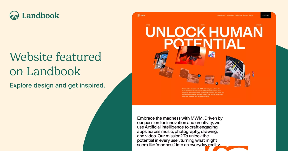
MWM: AI Apps Pioneer in French Tech for Android & iOS | App Publisher
IronOne app (Android)
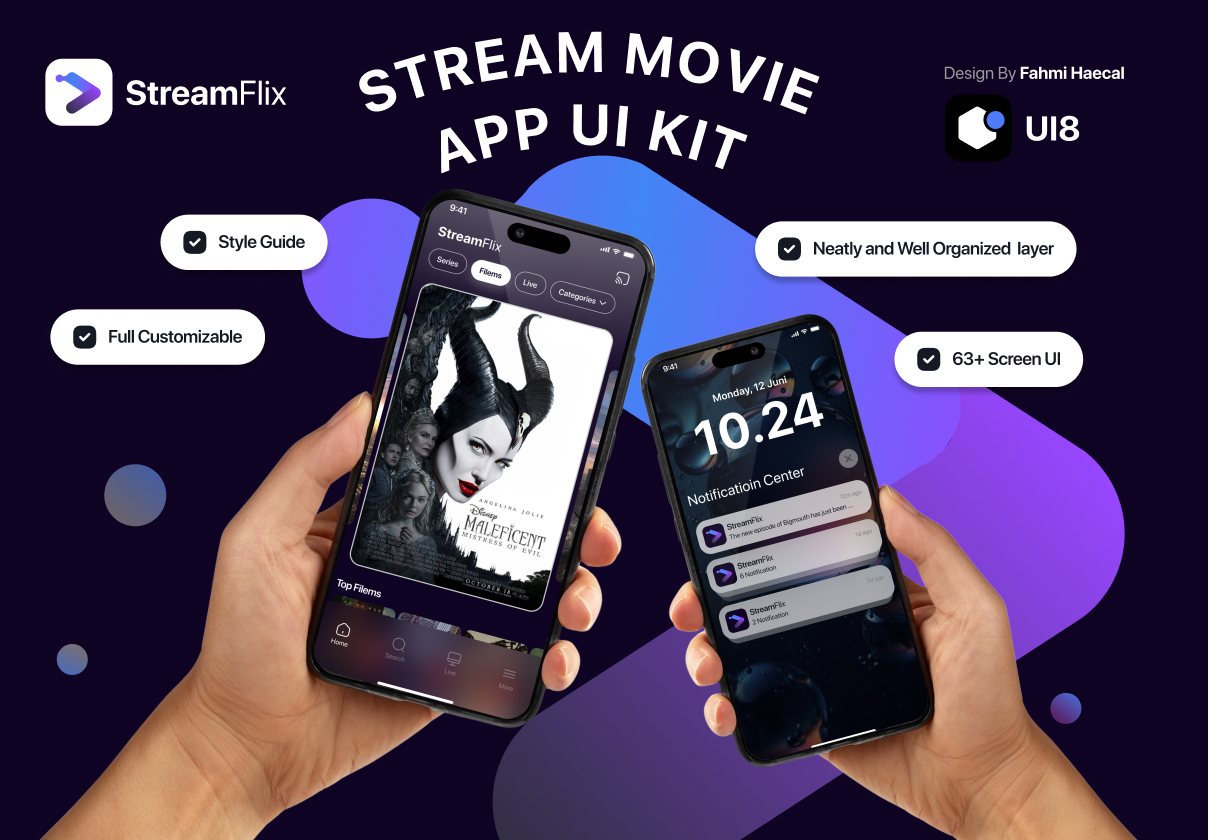
Stream Movie - StreamFlix App for iOS & Android

Movie Discovery, Trailers and Showtimes Android App
Balsamiq prototype for Android App
Android Phone App Concept
PORTAL™ // Sport UI #portable #ux #icon #ios #design #interface #icons #ui #app #mobile #android #sport

"Slon" app for Android
HealthChat Android app
Bitbucket Android App Concept
LaZooz Android App
Just a few yr old project i found on my archive. A collaborative transportation app.

Ridesafe - Conceptual app for Android
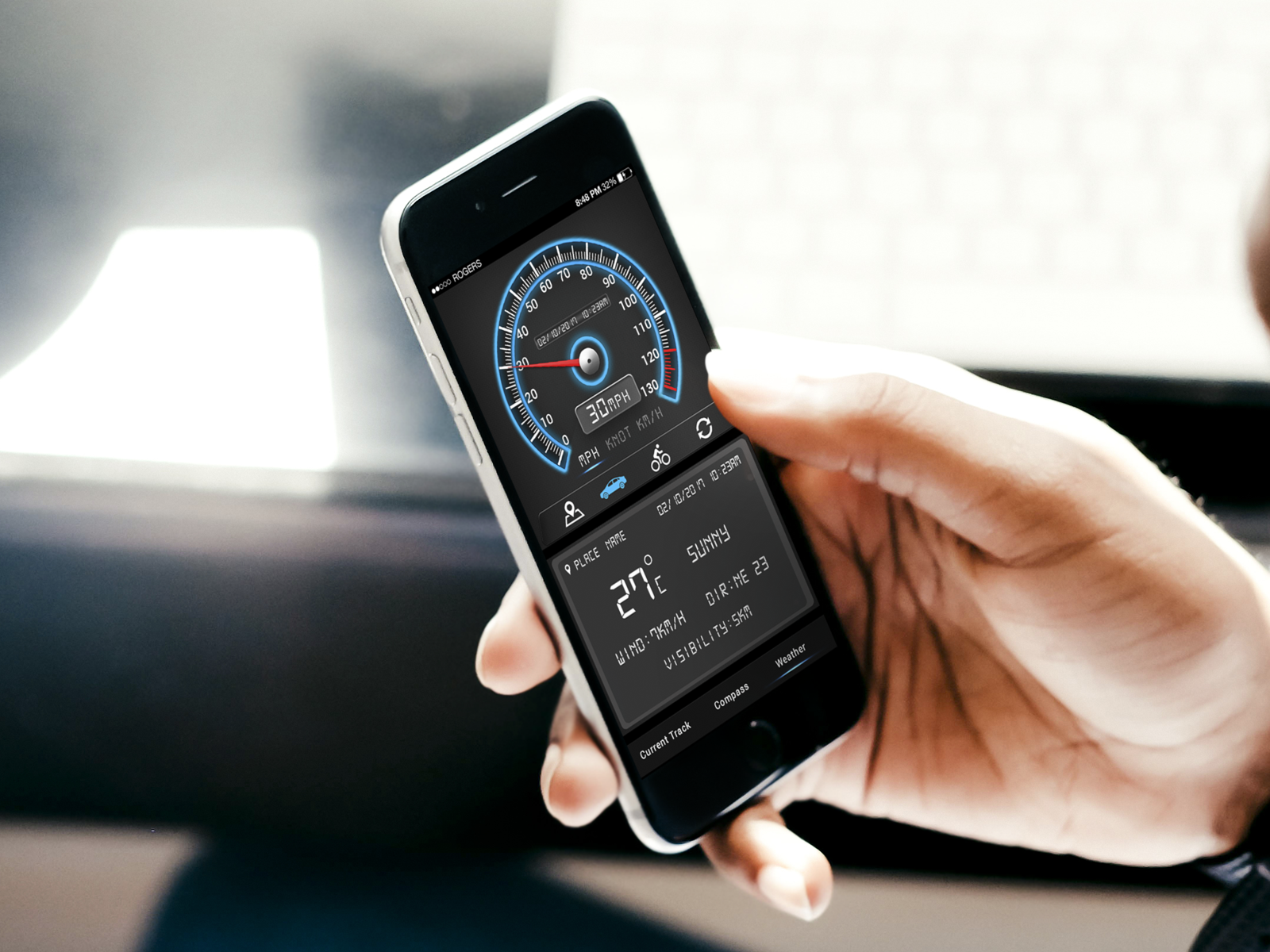
GPS speedometer and GPS odometer App for Android and iOS
GPS speedometer and GPS odometer App, this app have many features like measure current speed, total distance, average speed, total time spent on journey, top speed of your journey and many more.
Show me some ♥️ and Check Out GPS speedometer and GPS odometer App work on Behance :
https://www.behance.net/gallery/94173849/GPS-speedometer-and-GPS-odometer-App
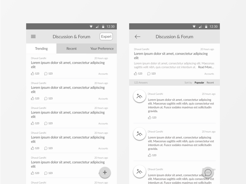
Discussion & Forum (CA Planner Android App)

Freebie - BumbleBee Android App
![Gravity Dice Demo [Android / iOS app]](https://cdn.dribbble.com/users/108183/screenshots/6362266/gravity_dice_demo_1.png)
Gravity Dice Demo [Android / iOS app]
A couple of years ago I made the Dicer — a simple iOS app is allowing a user to get a random number of 6 sided dice (this one).
A lot of people liked this app. I’m glad that the app helped people around the world to solve their problems.
Someday I got a user request. I was asked to add an opportunity to count a number of all gotten dices. The human asked me to add some kind of list with a summary of all dices. I thought why not and made a new app where you can see all your dice and therefore to count them if want. So, I’m happy to present you — Gravity Dice 😊
This app is available on Android and iOS:
🤖 Google Play
🍎 AppStore
🎼 By the way, you can use the app a musical instrument to play randomly generated melodies (feel like you are a modern conceptual musician).
Stay tuned —
Dribbble | Behance | Instagram | Twitter
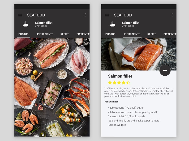
Seafood Android Native App

Maan LMS- Student Mobile App Flutter iOS & Android UI Kit
10 Android & iPhone Homescreens & Lockscreens | Part 7 #simple #minimalist #app #interface
Color overlays / imagery #phone #weather #portable #ux #icon #ios #branding #design #interface #icons #ui #iphone #app #mobile #android #sport
Weather App for Android
Hi, Dribbblers! Thanks @[2206532:rita_psh] for the invitation.
My first shot! Hope you'll like it!
SideBar for Android App
Bitbucket Android App Concept
Android Terminal App
Empowering Healthcare Through AI Mobile App (iOS & Android)
I Will Design Mobile App UI For Android Or Ios
We worked for Vitally early this year and its live in Vitally.io. Its a challenging project for us, if usually we make illustration based on story
Wigu - An android App that takes students to the next level.
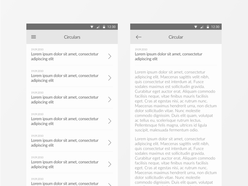
Circulars Listing & Detailed Screens (CA Planner Android App)

This Linux phone with Android app support has three kill switches for complete privacy
We live in a smartphone-dominated world clouded with privacy concerns unlike ever before. With every new smartphone, our privacy is compromised for the sake of safety, and we easily accept it and move on as usual. But do we really have to live with the microphones on the phone listening to us at all times, or apps running in the background, snooping onto the internet, and privacy at the same time? Furi Labs – like a few other mobile phones with a physical kill switch – believes not really, and so the FLX1s is born.
Furi Labs FLX1s is a $550, Linux-based smartphone, which is almost a usual mid-feature phone until you find physical metal buttons in the mid frame that shut off power directly to the microphone, cameras, and baseband chip at a click. The Hong Kong-based OEM is giving us reasons to have a more secure mobile experience that is customizable to our needs.
Designer: Furi Labs
Before we dive into the standard features of the FLX1s, let’s first discuss privacy-first hardware design. The phone has three dedicated kill switches. These physical buttons provide the user with precise and complete control of their smartphone’s sensitive elements. For instance, the first button can switch off the microphone completely, the second can kill all the cameras and the GPS modem. The third is really interesting; it cuts all cellular connectivity at the hardware level.
Besides this, the Furi Labs FLX1s is not a flagship killer when it comes to its specifications, but the 201-gram smartphone with a polycarbonate frame and glass back does have a different purpose. The phone comes with a 6.7-inch 1600x720p display that has a 90 Hz refresh rate. Powered by a MediaTek Dimensity 900 processor with Mali-G68 graphics, the phone touts 8 GB of LPDDR4X RAM paired with 128GB UFS storage. Since the phone comes in one storage variant, it supports a microSD card up to 1 TB for additional storage.
On the software side, FLX1s runs FuriOS. This is a Debian-based operating system that is flexible to the extent of permitting Android app compatibility. Interesting, the FLX1 can run multiple operating systems simultaneously with KVM virtualization support. For other features, the smartphone comes with a dual camera array on the back comprising, 20MP main camera and a 2MP macro lens. On the front is a 13MP selfie camera. The phone draws power from a 5,000 mAh battery and supports 5G, Wi-Fi 6, and Bluetooth 5.2, A2DP, LE for connectivity. Chargeable using a USB Type-C cable, the Furi Labs FLX1s is being produced in batches. The first batch is sold out, and the company is taking preorders for the second batch, slated to ship in October 2025.
The post This Linux phone with Android app support has three kill switches for complete privacy first appeared on Yanko Design.
Taxi driver app for Android
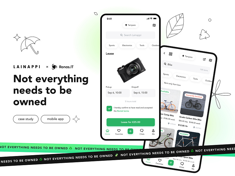
Lainappi: mobile app for renting, iOS/Android UI
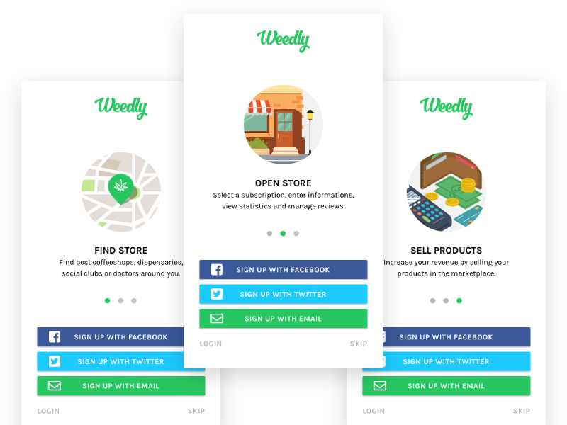
Weedly Android App
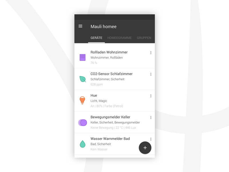
homee Android App
homee Android App
Key Considerations for Designing an Android App: A Guide for Designers
Designing an Android app presents unique challenges and opportunities compared to other platforms like iOS or web applications. Understanding these nuances is crucial for creating an intuitive, visually appealing, and functional app that meets user expectations. Here are key considerations for designing an Android app and how it differs from other platforms.
1. Understanding Material Design
Google's Material Design guidelines are the cornerstone of Android app design. Material Design emphasizes a clean, flat interface with a focus on usability and a cohesive visual language. Designers should familiarize themselves with these guidelines, which cover everything from color schemes and typography to motion and interaction design.
- Consistency: Ensure a consistent look and feel throughout the app.
- Responsive Design: Adapt to different screen sizes and orientations seamlessly.
- Intuitive Navigation: Use familiar navigation patterns like the navigation drawer and bottom navigation bar.
2. Diverse Device Ecosystem
Android's open ecosystem means apps must be designed for a wide range of devices with varying screen sizes, resolutions, and hardware capabilities. This diversity requires a flexible and responsive design approach.
- Screen Density: Consider different screen densities (mdpi, hdpi, xhdpi, xxhdpi, etc.) to ensure crisp visuals on all devices.
- Aspect Ratios: Design layouts that adapt to different aspect ratios, from widescreen to tall and narrow screens.
- Performance Optimization: Optimize graphics and interactions for smooth performance on both high-end and budget devices.
3. Platform-Specific UI Components
Android offers a variety of unique UI components that differ from other platforms, such as iOS. Leveraging these components helps in maintaining platform consistency and enhancing user experience.
- Floating Action Button (FAB): A prominent button for primary actions, floating above the content.
- Snackbar: Provides brief messages at the bottom of the screen.
- RecyclerView: A flexible view for presenting large data sets.
4. User Interaction and Gestures
Designing for Android involves understanding platform-specific gestures and interaction patterns. Android users are accustomed to certain gestures and navigation methods that differ from other platforms.
- Back Button: Android devices have a physical or virtual back button, impacting navigation flow.
- Gestures: Utilize swipe, drag, and pinch gestures appropriately, as users expect them in Android apps.
5. Integration with Google Services
Android apps often integrate with various Google services and features, enhancing functionality and user engagement.
- Google Maps: Integrate mapping and location-based services seamlessly.
- Google Pay: Enable in-app purchases and transactions using Google Pay.
- Google Assistant: Consider voice interactions and integrations with Google Assistant.
6. Customization and Personalization
Android users value customization and personalization options. Providing flexible settings and customizable features can significantly enhance user satisfaction.
- Themes and Styles: Offer light and dark modes, custom themes, and styling options.
- Widgets: Design interactive widgets that users can place on their home screens for quick access.
Differences from Other Platforms
- iOS vs. Android: iOS design tends to follow a more uniform style due to Apple's strict guidelines, whereas Android allows for more customization and flexibility. Navigation and UI components also differ significantly between the two platforms.
- Web vs. Android: Web design focuses on responsiveness across various browsers and devices, while Android design emphasizes native app performance and integration with the device's operating system features.
Conclusion
Designing an Android app requires a deep understanding of Material Design principles, attention to the diverse Android ecosystem, and leveraging platform-specific features. By considering these factors, designers can create apps that not only look great but also provide a seamless and enjoyable user experience. Keeping up with the latest Android design trends and guidelines will ensure your app stands out in the competitive app market.