13 inspiring books for product design in 2021
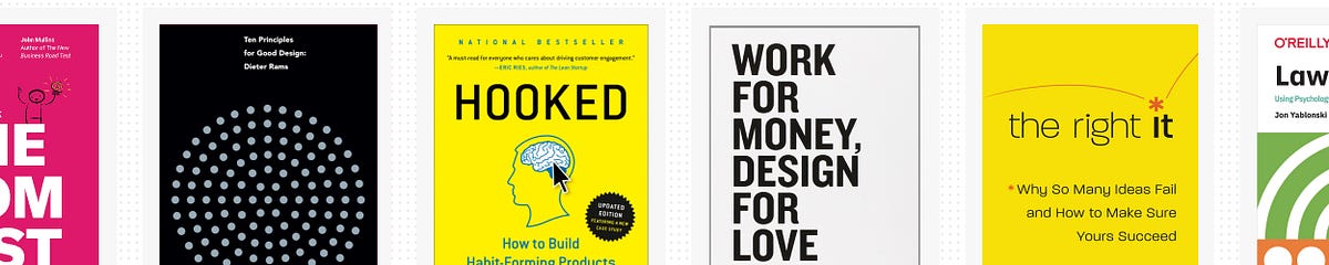
The pandemic has certainly changed our busy life and also the way we spend our free time. Some are seen picking up stitching again after years, others are surfing in the living room for real and I’m sure some returned to their favorite books, like I did. As someone who is regularly designing products I’ve found myself often crawl back to the same books from the collection I’ve hoarded over the years, so I’ve decided to create my very own selection for the good and share what I like about them.I hope dear reader whether you’re a developer, designer, product owner or someone just generally interested in product design you’ll find a book in this list which will be part of your library in the near future too and you’ll proudly share with me your list later. Happy reading! 📚*Non-disclaimer: I’m not associated with Amazon or anything I just found convenient to link the books from there in case you’re interestedDieter Rams — Ten Principles for Good DesignDieter Rams — Ten Principles for Good DesignWhile there’s certainly no shortage of books on Dieter Rams, this one is different. This edition is not just about the German legend’s life and aesthetic philosophy that continues to inspire designers worldwide, but also an ode to minimalistic design approach in general.I often find this book as an escape from our noisy notification-driven digital life and find piece in the quiet, confident layout designs of Rams’ with the showcasing imagery of his legendary 100 items. Of course you can find the classics like the famous coffee grinder, but there are some lesser-known items like shelving systems and cigarette lighters as well which makes this book unique.Andrew Couldwell — Laying the FoundationsAndrew Couldwell — Laying the FoundationsGreat read if you’re building a design system for the first time or the tenth. Couldwell goes over all the parts of building, communicating, and maintaining a proper system and provides real-life examples of how he brought systemized thinking to the handful of organizations.Also, take a look at the blog and work of Andrew Couldwell, very impressive.Austin Kleon — Steal Like an ArtistAustin Kleon — Steal Like an ArtistThese kind of books are like good candy. It’s a quick read that you can finish in one sitting, but the ideas and advice it contains will stay with you long after you’ve put it down. Some of Austin’s suggestions will validate what you’re already doing, some will challenge you to fundamentally change a creative practice, others will inspire you to grab a notebook and get to work immediately.Because it’s such a small and accessible book, you’ll want to go back to it from time to time. As you change and grow as an artist, it reveals new ideas and inspirations to you that you may have missed on a previous read. Amazing feeling.Alex Osterwalder, Yves Pigneur, Greg Bernarda, Alan Smith — Value Proposition DesignValue Proposition DesignI remember how much I’ve struggled with my first few products to synthesize the information about potential ideas. What is the actual problem? How can I grab the market’s attention? The insights were all over the place in Google docs and notes, but I could hardly build on them as they were so scattered and not very well connected.Strategyzer’s book helped me to put all this into an actionable framework, which I could follow step-by-step to have a clearer picture for designing my products. This book not only used the important aspects of jobs to be done, pains and gains from disruptive innovation literature but integrated it with experiments and lean startup in a very simple and clear way.It’s best to read with companion of the Business Model Generation from the authors as well.Nir Eyal — HookedNir Eyal — HookedAfter this book you’ll never see and design digital products the same way. In particular, I like the directives at the end of each chapter driving you to think about your own product, how you can use the Hooked principles to improve its stickiness. Also liked the Bible case study he added, though I think he should’ve made the analysis more rigorously follow the principles.All in all Nir’s book is really well organized and written (as so as his blog). Coherent, presented clearly and actionable. He also has an accompanying Skillshare course around the topic, if you prefer to sink in the knowledge that way.Chris Guillebellau — Side HustleChris Guillebellau — Side HustleRecently a friend of mine was asking for inspiration to earn some extra bucks on the side and I wasn’t hesitating to recommend this book to him. Although the title sounds cheesy, Chris’ narrative with the examples and how-tos truly help you think about a business idea and test it within a short period of time (even if it’s not 27 days exactly) focusing on feasibility, profitability and persuasion. Feels like magic after reading and also that you’ve accomplished something gives you a power up to stand up again with a new idea or just continue with the same.Don Norman — The Design of Everyday ThingsDon Norman — The Design of Everyday ThingsAfter reading this you will never look at any man-made object the same. You will question everything from doors to tea kettles to the most sophisticated computer program. The next time you fumble with an answering machine, web page, or light switch you will think back to the lessons from this book. It is almost liberating once you can see beyond the design of everyday things.Steve Krug — Don’t Make Me Think (revisited)Steve Krug — Don’t Make Me Think (revisited)This book is a gem, period. I re-read this book multiple times a year and it’s largely due to the fact that Steve Krug makes the topic of web usability genuinely entertaining. He holds a light writing style with a touch of wit that helps to keep your attention from cover to cover. Add to that the short size of the book at only a couple of hundred pages, and the vibrant but clear layout and you’ve got a book that’s in itself extremely usable and accessible.When it comes to the content itself, it couldn’t be explained clearer. Steve’s chapters are logical and concise, you won’t find any waffle in here that doesn’t help to communicate the message of the chapter. He uses an adequate number of examples to illustrate his points, and even helps to demonstrate how various stakeholders in web projects can all contribute to the usability of a site or an app.Alberto Savoia — The Right ItAlberto Savoia — The Right ItI’m not gonna lie, this book was a life-changer for me. Maybe due to its practice, maybe just the time was just right but Alberto’s words about finding the right solution first to a problem before investing a lot in nice designs and neat codebases completely re-shaped how I think about product design today. Similarly to Rob Fitpatrick’s book (which comes later on the list) opening the treasure chest about how to get market validation as fast as possible. I especially liked this one for the vast amount of possible tests (like the mechanical turk) to get your own data before relying on anyone else’s.Jon Yablonski — Laws of UXJon Yablonski — Laws of UXI love to learn from my UX designer colleagues with deep understanding of human psychology because I never really found the opportunity myself to study it well. Yablonski’s book is a great companion to my journey, as he is sharing some key principles from psychology to help design more intuitive, human-centered products and experiences. The individual examples are well structured and very knowledgeable by presenting some lesser known design “laws” too and not just stopping at Hick’s law & friends. Also, check out Jon’s other site, Humane by Design, which is a fantastic resource that provides guidance on designing ethically humane digital products.David Airey — Work for Money, Design for LoveDavid Airey — Work for Money, Design for LoveDo you have these questions in your mind: “How do I find new clients?”, “How much should I charge for my work?”. Well, this is a book written from the perspective of a one man design agency working with clients from all over the world in the field of graphic design. This is not a typical design business book, it’s unselfishly and generously sharing every single bit. It’s crazy to think about the amount of insights from the personal experience, not only of the author, but also of other creatives around the world. My favorite highlight was the last part where all those people were answering what is their motivation to design and work in a freelance/agency format.The book’s author, designer David Airey, also runs the famous blog logodesignlove.com, which is well worth a visit.Susan M. Weinschenk — 100 things every designer should know about peopleSusan M. Weinschenk — 100 things every designer should know about peopleYou can tell that this book was created by a designer. It’s visually appealing: the content is broken into colored call-out boxes with headers, effectively breaking up the flow of the page enough to keep you engaged but not enough to distract you. The headers are also useful mindful because you can go back and look over them each day when you finish reading to help remember what you’ve read.The book is conveniently divided into how people see, read, think, and what motivates people. Many things are common sense, but it is a great tool to remind oneself and backup UX/UI Design decisions. At the end of each of the 100 sections, there’s a box of takeaways, which gives practical advice on how the principles from the section can be applied to design.Rob Fitzpatrick — The Mom TestRob Fitzpatrick — The Mom TestI’m not even asking if you’ve ever wondered after a product failure about reasons why it went wrong. I admit most of my products are a failure, but I often feel I’ve realized it too late and wasted so much resources for nothing. Often when I look back many of the mistakes happened due to lack of conversations with the right users. Rob’s short book and practical advises help you eliminate some early biases about your “baby”, so you can keep yourself grounded and humble.I’ve especially liked how the book is “fixing” the typical research questions which might give you some false positive boost. Remember to don’t pitch, ask about their lives, their problems, their current solutions/workarounds but still nothing guaranteed. Keep going!Thank you so much for reaching so far in this article! 👏 I hope you’ve found some titles you’ve never heard of before so you can kill time the next time you get bored during the winter. ❄️Please don’t be hesitant to share your favorite books too in the comments below!13 inspiring books for product design in 2021 was originally published in Muzli - Design Inspiration on Medium, where people are continuing the conversation by highlighting and responding to this story.
The Chip Kidd School of Graphic Design
Photo by S O C I A L . C U T on UnsplashWe are told never to judge a book by its cover, but I often do. I’m a bit of a stickler for a good book cover. I love graphic design, and aesthetics in general, so when I see a cover that seems to have been put together in a Word doc in ten minutes for a few dollars or on Fiverr by a fourteen-year-old kid on a mobile phone app, using a terrible font and spacing, I can usually tell.“There are three responses to a piece of design — yes, no, and WOW! …”- Milton GlaserBook covers take, personally at least, the vital second spot in priorities when creating a product I can be proud of. If a book cover design doesn’t pique my interest at once, I won’t even bother to click on the ‘Look Inside’ feature on Amazon, even though a book has a thousand four or five-star reviews. It has simply failed in its task. I believe this is the same case for any other reader, too, who, like me, values good art. They could be serious readers of romance who voraciously get through ten books a week. The casual seven-books-a-year type. It doesn’t matter. There are no prejudices here.The graphic designer Chip Kidd is one of the most famous graphic designers in the world. The bespectacled New York-based art director started designing covers for the publishing house Knopf in the mid-1980s. A comic book geek and lover of popular culture, he has had a massive influence on the way book cover design had developed over the last thirty years. Not only does he believe the image is important as an artist in conveying the message of a book’s plot or theme, but he also thinks the typography plays an important role in defining hidden messages within the book’s structure. His most famous and iconic cover design is probably Jurassic Park by Michael Crichton, published in 1990.It is clean.It is clear.It is miraculous.It lets the reader know exactly what the book is about. My own personal favourite, however, is the trade paperback edition of Garth Risk Hallberg’s City on Fire. The fiery neon red fluorescent font epitomizes the era in which the novel is set, 1977 New York City, a time of the infamous Blackout and The Son of Sam murders. This, is not, nonetheless, a reflection of the book itself: at over 900 pages I failed to get even halfway through. Too wordy and self-conscious for my liking. One critic from the New York Post called it a ‘steaming pile of literary dung’.Has somebody farted?So, yes, nothing but perfection should be acceptable for a book cover if you want it to be considered professional-looking.One of the first methods to see this is to look how the cover is presented as a thumbnail image — a thumbnail image is a way readers can gauge your book cover when it is up against all the others on the Amazon landing page (or any other platform, for that matter). It is small. Thumbnail almost in size. Hence the term ‘thumbnail’. If it doesn’t look visually attractive on a small scale it most definitely won’t up close and personal. If that is the case, you need to change it. And fast. It must also be in high resolution. No faded or foggy-looking images that don’t come alive from the computer screen.Chip Kidd, Courtesy of WikiCommonsAfter you’ve done that, you can then compare it to other book covers in the same genre. Does it stand out from the crowd while at the same time beating them in the aesthetic stakes? If so, you’re definitely cooking with gas.But I hear the reader saying: ‘But shouldn’t I first do this before I commission a professional graphic designer to carry out the work?’ Of course. The method I propose only works if the cover has already been completed. If you are starting out, you should compare and contrast other book covers competing with yours on Amazon or any other online platform.A book cover should clearly represent the genre of the story. If your book is a crime fiction piece, it should give a sense of foreboding, using dark hues, menacing images. Many of the crime fiction/thriller novels I see on Amazon and other platforms show a man or woman, usually shadowed or darkened, with their back facing toward the reader and most commonly walking or running away from someone or something. This has been a popular motif in the genre for many years but has now become more fashionable than ever.Mark Dawson, an acclaimed indie author and popular writer in the crime fiction genre (and an author I highly recommend you read) does this with his John Milton series of books.“Never fall in love with an idea. They’re whores. If the one you’re with isn’t doing the job, there’s always, always, always another.”- Chip KiddCold, ominous scenes — very often rural in nature, are used frequently by the Scandinavian crime fiction writers for their book covers, Jo Nesbø and the late Henning Mankell being two good examples.It is very important that whatever genre you write in, you set the tone of the story by giving your readers some idea from the very off, and that you get the reader to ask themselves questions about the book. This comes, obviously, from the visual message of the cover. That way, in theory at least, you are not cheating them — they know exactly what they are going to get. Readers often purchase a book (though not exclusively) at a whim, at least the casual types, so the ‘initial hook’ must start with the artwork and visual presentation which can then lead them to turn to the back and the blurb, which is the ‘second hook’.Photo by Filios Sazeides on UnsplashOne mistake many authors make — and one I have made countless times myself — is by using bad quality images for my book covers. There is nothing worse than a blurry image. Because many self-published authors lack money, they see it as a necessity to download bad quality stock images that are for free or cost a few bucks at the very most. This is a huge mistake. Readers aren’t idiots. When you are competing with the big publishing houses which can afford to pay the likes of the aforesaid Chip Kidd and the amazing Rodrigo Corral to do their cover art, you know you have to be on the top of your game in the stylistic department even to stand a slight chance of attracting readers’ eyeballs. This is especially the case when your novel is in the same genre of books commissioned by these cover designers. It’s death by the electric chair even before your book has a chance to sell if you make lazy mistakes and don’t invest in good quality images.Where’s the bucket? Somebody’s on fireIf, on the other hand, you are designing your own images, either via taking photos or by being much more creative and picking up pencils, pens, coloured markers and a pair of scissors (those Andy Warhols amongst us), then you realize the final image must be of the highest quality.Do not skip on this step.“Graphic design will save the world right after rock and roll does.”- David CarsonI love fonts and typography. Whenever I read a newspaper, pick up a book at a bookstore or stare at a poster in the men’s toilet in a funky club or billboard on the street, I analyse the font — is that serif, sans-serif or slab serif? This is the kind of question I ask myself all the time now, especially since I have been hiring a new book cover designer for my work, Meghan Allbright, who has educated me in font theory since our cooperation began. We have had some interesting typographical discussions on whether the sans-serif font is better for crime fiction or not.A great book cover will be half the battle in winning the hearts and minds of potential readers. Too many big publishers, smaller independent gigs and indie authors working alone make a hash of it at the first hurdle. A mediocre cover won’t be the ‘make or break’ factor as to whether your book will be a success, but a really bad one will, I’m sure. I have had too many designers in my career who have been technically sound but not artists.Vision is key here.That is why I always have an idea of how I want my book covers to look before I liaise with the artist. Before we start on a project, I give the designer rough drawing samples, other book covers in the genre I like, pictures and photos from the internet as well as a synopsis of the plot. These things can help them build a better picture of the overall mood I envisage.One last point I feel I must add which I find important is that you don’t have to spend a fortune on covers for them to be effective. I hear of indie authors paying professional designers a few thousand dollars for a cover I believe I could have done myself in an hour. There are many good and up-and-coming graphic designers around just starting out, needing to build up their artistic portfolios. I do believe such freelancers have a lot to offer, particularly those who are also artistically inclined. Meghan Allbright studied fine art at university before she went on to do graphic design, so she possesses both the aesthetic skills as well as the technical requirements needed for such projects.Think about who you are hiring before you offer them a contract.It is important throughout everything that you are satisfied with the end product — if you are not, and this happens often — you must ask the designer to change certain things to your liking. I have never had a contract with a graphic designer stating ‘this and this needs to be done’. I usually know what I want and tell them straight away. I offer them a set fee for the work and may give them a little extra if I keep asking for changes beyond what we agreed upon in our ‘spoken agreement’.The Chip Kidd School of Graphic Design was originally published in Muzli - Design Inspiration on Medium, where people are continuing the conversation by highlighting and responding to this story.
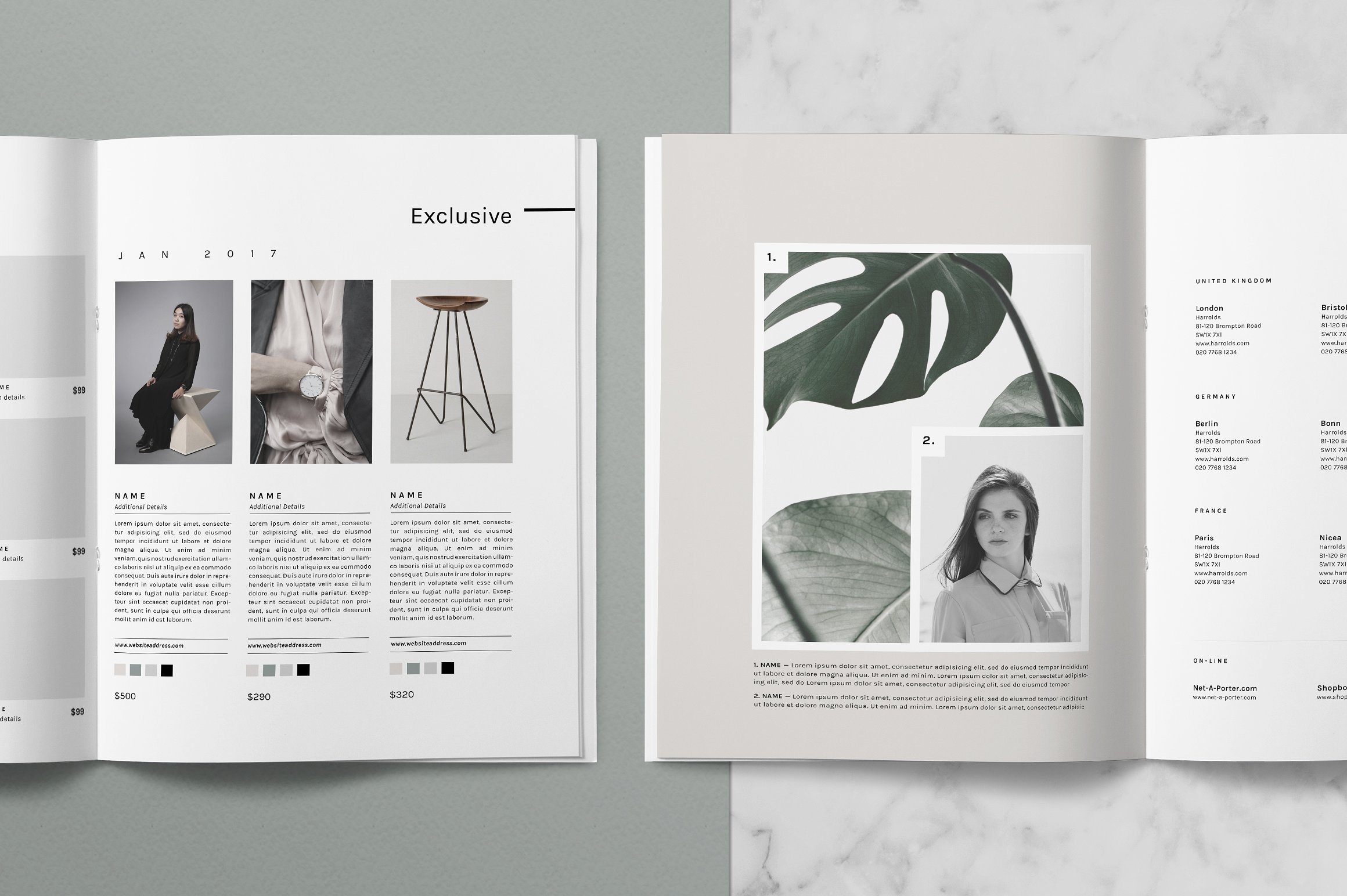
Editorial Design Inspiration for the New ABDZ
Editorial Design Inspiration for the New ABDZ
abduzeedo
Jun 19, 2018
For the past few weeks, I have been collecting visual references in branding as well as editorial design and sketching some ideas for a significant redesign for the Abduzeedo brand and site. I have been refining some of the concepts, at least, in my head they are crystal clear. For the brand, I want to make it friendlier and more abstract. For the site and overall branding collaterals, I want to keep it very simple and minimalist. So for this post, I want to share some of the visual references I have been collecting for the new website.
Most of the images for this post are editorial design examples I found on Pinterest. Each one has a particular area that caught my attention. It might have been the typography, the white space, or the way they call out a specific part of the content by the use of color. One characteristic they all share in common, the clean look with little to no color (just black and white) for content besides imagery.
I hope you like the direction we are heading and I will be sharing more about the process very soon. Till then, enjoy these editorial design inspiration.
Editorial Design
editorial design

Two books to start handling digital typography right
An effective reading list for those starting with digital typography and design.Choosing your first book on typographyThere is a moment in the life of every newborn digital designer when they realize that working with text is much more than simply playing around with fancy “fonts” in trying to achieve the best look. I can remember when text on a webpage or in an app was only a visual filler for me, when I only paid attention to how it looked in general, but not to how readable or legible it was. Indeed, text can build or ruin your design. It can be a design itself, but most of the time it plays its main role, which is to communicate information. Bearing this in mind, designers should know how to work with type so that it can be perceived by the users and deliver needed results.“It’s not visual decoration or something that gets added at the end to spice up a design. Good typography gives spirit to words and is a potent mechanism to inform and delight.”- Jason Santa MariaThe best way to learn how type works, as well as to learn how to work with type, is to familiarize yourself with all its basic principles and rules. There are plenty of books on this topic out there on the Internet, but it appears to be a real deal to find out which one can be particularly useful. Besides, they are all needed to be purchased and I understand how critical it may be to buy the wrong book and not get what you thought you paid for. In my time I conducted research and made up a list of 5 works that in my opinion deserve attention of any designer who starts learning typography. Full disclosure, I decided not to include “The Elements of Typographic Style” by Robert Bringhurst and “The New Typography” by Jan Tschichold which are considered to be the typographer’s scriptures. I decided to leave them for later, more thorough examination. I still think that it is better to read them if you already have some store of knowledge on this topic. Anyway, here is my list:The Complete Manual of Typography (James Felici).On Web Typography (Jason Santa Maria).Better Web Typography for a Better Web (Matej Latin).A Type Primer (John Kane).Designing with Type (James Craig).This list combines both works on printed and digital typography. Now, you don’t have to read all of them. I’m here to say that to start making better typesetting for web or mobile products you need only two books. You will find answers to all the bothering questions starting with “what’s the difference between “font” and “typeface”?” and ending with “are there any rules on combining different typefaces?”. I also recommend you to read them in the order they’re listed below.On Web Typography by Jason Santa MariaSource: https://abookapart.com/products/on-web-typographyBeing a volume of the “A Book Apart” series this book appears to be a great introduction to the world of web typography. Jason Santa Maria starts with explaining how people read and perceive text, what is readability and legibility and why good typography matters. I was surprised to find out that you won’t be able to read a line of text easily if you cover top halves of the letters. Humans subconsciously recognize letters by capturing specifically their top halves, since they carry more identifying features and contrast (see picture below). Cool right? Understanding how the process of reading occurs will help you to make more meaningful decisions on setting type for your next design projects.“Though the letters’ lower halves are covered, the text is still mostly legible, because much of the critical visual information is in the tops of letters.” Excerpt From: Jason Santa Maria. “On Web Typography”, p. 26The next chapters cover all the important aspects concerning type. These are typefaces’ classification, type’s anatomy, size, weight and style, line-height, tracking and more. I found the chapters about typographic systems which explain how to establish a harmonic and rhythmical relationship between text elements on a page particularly useful.“On Web Typography” immediately gives you a set of correct terminology and key principles that you will be able to use in your everyday work and thus become more confident.Better Web Typography for a Better Web by Matej LatinSource: https://betterwebtype.com/web-typography-book/This book appears to be super practical. In addition to explaining how typesetting works for web, Matej Latin leads you through the creation of a small project — website featuring tech news. I enjoyed following the author’s thinking process about choosing typefaces and setting type according to the mood and purpose of the website. You will have an opportunity to test your knowledge by trying to consider different variations together with Matej. By the way, he gives readers an amazing opportunity to tweak variations in CodePen.io using simple CSS. Actually, this book provides plenty of useful CSS pieces, but you don’t have to consider them thoroughly if you’re not into frontend development. However, this will give you a good understanding of the means by which texts styled and organized by you will be transferred onto a webpage.Of course, in “Better Web Typography for a Better Web” you will also find chapters about text perception, different typefaces, their physical traits, classifications, etc. The author presents an interesting concept of “equilateral triangle of a perfect paragraph”: a set of properties, namely type size, line-length and line-height which, if set correctly, will produce a perfectly balanced paragraph. If a certain parameter outweighs the others, for example, line-length is too long, you will have to either make the type size and line-height bigger or decrease the width of the line (see picture below). This concept will help you to remember the prerequisites of visually balanced paragraphs and to train your eye for setting them appropriately.“Lines of text in this paragraph are too long. The triangle isn’t equilateral. To fix this we’d need to either make the type size and line-height larger or decrease the length of the line.” Excerpt From: Matej Latin. “Better Web Typography for a Better Web”, p. 61To crown it allWhat I enjoyed the most is that both books are written in simple language. They are easy and comfortable to read. The authors speak to the reader without getting unnecessarily scientific. The chapters are short and precise, which allows the reader to grasp the idea quickly and not lose it in a myriad of “side” information. Moreover, all important statements in the books are followed by bright examples and explanatory images which is great.Another wonderful thing is that both authors provide you with amazing resources to use in everyday work. I can’t imagine my design process without Modular Scale or Adobe Typekit. These books helped me to discover them.Of course, it would be great if you proceed reading other books on typography. Do not avoid books about printed typography. This craft gave birth to web typography. A lot of its principles are still used to set type on screen, so it is particularly important to acknowledge them, but do not overwhelm yourself at the beginning. Start with something small and you won’t notice turning into a typography geek.I hope this information was helpful 😌 If you want to discuss the article or any UX/UI topic, do not hesitate to contact me at hanna.shylenko@gmail.comTwo books to start handling digital typography right was originally published in Muzli - Design Inspiration on Medium, where people are continuing the conversation by highlighting and responding to this story.
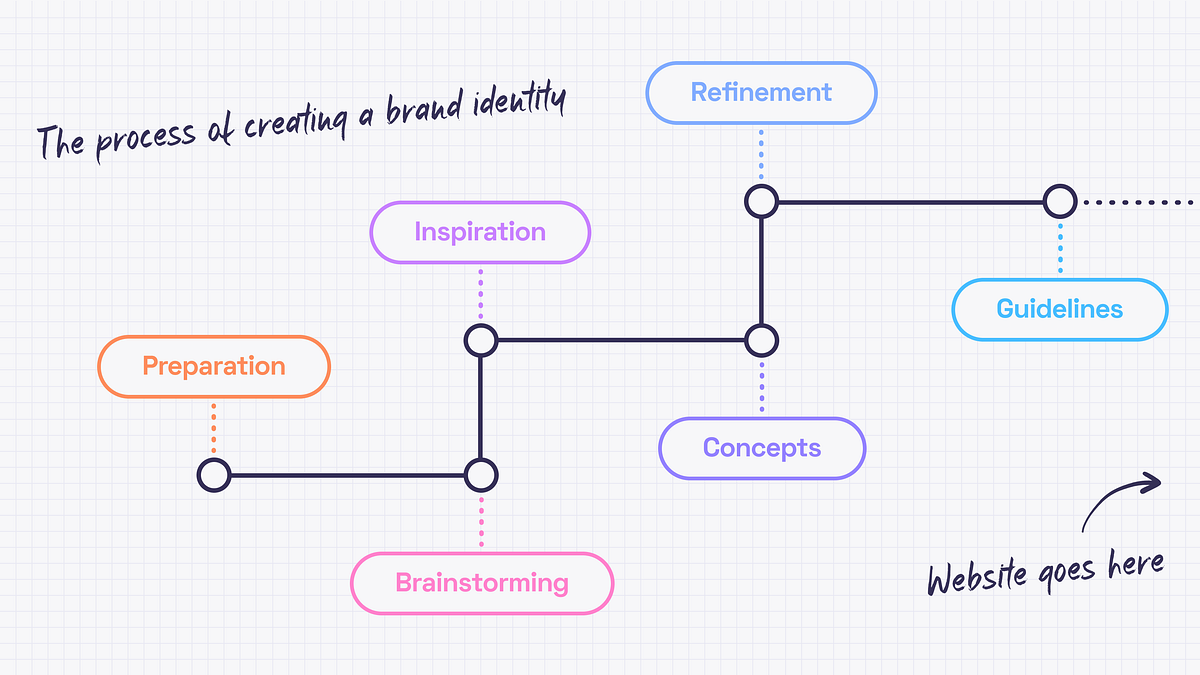
Branding in the Design Process. Part 1
Cover design by https://dribbble.com/mariablazeIn this article, we’ll cover the beginning of creating the experience — the brand identity.It may seem that there is only a good designer’s taste and a couple of weeks behind the pixels that we call a design. The truth is that since every project needs a personal approach the designer needs to get to know the business and dedicate some time to find the right inspirations.The start pointEvery design work begins from understanding the project objectives and client’s business. I inspect briefs filled out by a client, study all the materials I got, stalking the competitors, talk to the client and google. Oh, I google a lot. There is no such term as “too much data“.The aim is to collect as much relevant information as possible because preparation is a very important part of every project. It is crucial to have an understanding of what needs to be done before I diving into creating concepts.BrainstormingNo creative work can be done without brainstorming, right? I like this kind of activity because it’s a great opportunity to come together as a team and spend some time thinking, imagining, making notes and doodling. As a team, we start by discussing the data we have. It is important to make sure that everyone is on the same page. Then I define the directions of the future style and create some kind of a mind map for ideas that differ too much (if needed). There is always a room for some abstract creative thoughts, though. Let ideas flow!But since it is a part of a process everything should be documented. The best ideas have the honor to go to the summary document with the most relevant and interesting ones that should be discovered later.Getting inspiredDesign is like driving a car. You need fuel (ideas) to start the engine (create a design) and get to the destination (business goals). No fuel means no movement. And by fuel, I mean inspiration — i.e. mood board and references.So, a few directions to develop are defined. Now what? Let’s begin from the mood board. Originally a mood board is a physical piece where papercuts, fabrics, paints and photographs come together. It is very exciting but I prefer using Miro and Pinterest because collaboration and flexibility are significant for me. Thanks to a mood board, the brand’s values can be pictured and communicated without words. This must be the guidance for the design choices that will help in visualizing the emotions I want to evoke.Consistency is fundamental for a good mood board. Separate mood boards should be created for different directions. Color palettes, patterns, font combinations, photos and illustrations are the basis. It’s fine to mix them up, edit, be creative but you need to keep in mind the main idea.Here are some really nice example of mood boards ⬇️Design by Marion EijkenaarDesign by copperheartcreativeMood boards are cool and inspiring but nothing helps as much as references. While mood board expresses the… well, mood 🙂 references show the way of how to do something. How does it work? I may like the font from some book cover, colors from a retro movie poster and illustrations from a science magazine. Then I bring it all together, experiment, refine and get something completely new. That’s how I use references.Generating conceptsWhen mood boards and references are done, I can start working out concepts. It’s better to have a few to choose from. I strive for complex concepts that evoke emotions, not just colors and font pairings so finding the right theme for the whole brand identity can take some time.The ideal concept should include:Big ideaLogoColor paletteFont pairingStyle of illustrations or photosHere is the example ⬇️Design by jacknifedesignPolishing THAT special ideaWhen concepts are ready, I can show them to the client. It’s worth remembering that the concept is not a ready-made identity. It only represents the idea and key elements. Sure thing, it could be polished after the feedback session, but this is the essence of collaboration. I refine the concept until it becomes the actual identity.Brand guidelinesAnd what happens when the logo, colors and the overall style are accepted? The brand guidelines are created. Or the brand manual. Or visual identity guide. Names may differ, but all of them mean the same –the client gets a handbook to help them use the branding without asking anyone for help.The guidelines include:Information about the logo (the idea behind it, how to use it properly, and what is not allowed to do)TypographyColorsImagery styleKey graphic elementsExamples of usageThese guidelines are made for people who will be responsible for creating different kinds of content or merch — marketing team, in-house designers or other design studios. This handbook can be updated later when the website design is ready because there may be some cool examples of usage I may want to include in the manual.And speaking of websites… I also have an article where I describe the website design process.Branding in the Design Process. Part 1 was originally published in Muzli - Design Inspiration on Medium, where people are continuing the conversation by highlighting and responding to this story.
9 must-read books for designers
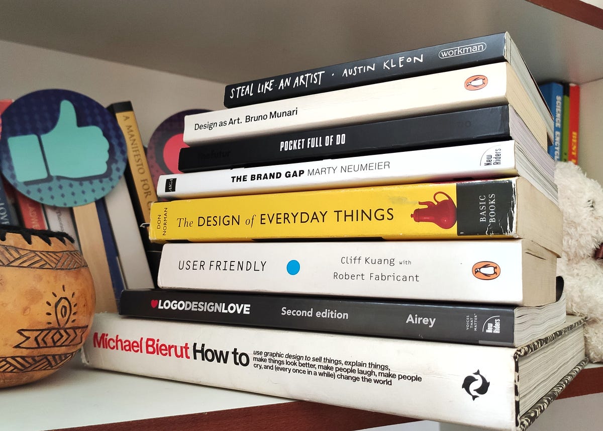
9 best must-read books for DesignersHere are my key takeaways along with this evolving list of design books that I am curating for everyone interested design careerHere in this blog, we are going to go through the list of design books I recommend to everyone who is looking to establish themselves in the design discipline.⚡ImportantAs the design books are bit on expensive side so I am not only sharing the resources to buy the book from amazon but also links to listen free but valuable podcasts/youtube videos related to them. Along with it I am adding link to read them online on kindle which is less costly option in comparison to buying actual book further in the blog.Also,I have tagged my key takeaways in form of quotes extracted from these books which I am sure are going to be like guiding light to all design enthusiasts.Here is a quick list of the books“How to” by Michael Bierut“Logo Design Love” by David Airey“The Brand Gap” by Marty Neumeier“User-friendly” by Cliff Kuang with Robert Fabricant“Steal like an artist” by Austin Kleon“Type Matters” by Jim Williams“Design as Art” by Bruno Munari“Design of everyday things” by Don Norman“Pocket full of Do” by Chris DoLet's Start and dive into each one of them🏄♂️1. “How To” by “Michael Bierut”Complete Title “How to use graphic design to sell things, explain things, make things look better, make people laugh make people cry, and every once in a while change the world.”Written by Michael BierutRecommended forGraphic designers, Brand Identity designers, UI/UX designers👉 Resources to buyView/Buy on Amazon or Read on your kindleFree related resourcesListen to the free podcast or Watch it on YoutubeSourceThe cover of the book is self-explanatory about the vision with the skillset of graphic design. There is a chapter in the book called “How to destroy the world with graphic design?” which is not only relevant to brand designers but also UX designers.I have referred to this book multiple times while facing creative block working on design projects. It covers many case studies of brand identity projects and opens up your mind to imagine new ideas and possibilities.Here are a few words from the chapter “How to create an identity without the logo?”Important characteristic of a great brand is consistency. This is different from sameness. Sameness is static & lifeless. Consistency is responsive and vibrant.— Tibor KalmanI highly recommend this book to every designer to read this book. It will guide you in developing your design process by showing you how an appreciated designer like Michael Bierut approaches his work.2. “Logo Design Love” by “David Airey”Complete Title Logo Design Love: A guide to creating iconic brand identitiesWritten by David AireyRecommended for Logo & Brand Identity designers👉Recources View/Buy on Amazon or Read on your kindleFree related resourcesWatch on Youtube | Listen to related free podcastSourceWhen I started designing I assumed logo designing as the extent of brand identity design. By reading both books (1st & 2nd in list) I understood how elaborate and intensive Brand Identity design is.This book is one step guide from learning and developing the logo design process to pitching, pricing and developing the mindset of business of design.Simplicity also makes your design easier to recognise, so it stands a greater chance of achieving a timeless, enduring quality.— David AireyIf you are looking to dive into the world of brand identity design and become an expert. This book will elevate your current skillset.3. “The Brand gap” by “Marty Neumeier”Complete Title The Brand GapWritten by Marty NeumeierRecommended for Brand Strategists & Identity designers👉Recources View/Buy on Amazon or Read on your kindleFree related resourcesWatch on Youtube by The Futur or Listen to a related free podcastSourceThe traditional view of design is that it has four possible goals: to identify, to inform, to entertain or to persuade. But with branding there is fifth: to differentiate. While the first four are tactical, the fifth is strategic, with its root deep in aesthetics — a powerful combination of logic and magic.— Marty NeumeierThis book gives practical advice on bridging the gap between brand strategy and design.It is a must-read for designers who are looking to enhance their skills and become a brand strategist.4. “User Friendly” by “Cliff Kuang with Robert Fabricant”Complete Title User Friendly: How the Hidden Rules of Design are Changing the Way We Live, Work & PlayWritten by Cliff Kuang with Robert FabricantRecommended for User Experience designers👉Recources View/Buy on Amazon or Read on your kindleFree related resourcesWatch on Youtube or Listen to related free podcastDesign is the silent salesman. — DreyfussAuthor in the book discusses that the role of designer is to know why people behave as they do — and design around their foibles and limitations, rather than some ideal.There are some real-life situations discussed in it where a certain mishap resulted due to misleading design. These scenarios depict the power design holds and how dangerous it can be when design and mental model in user’s mind do not synchronise well.5. “Steal Like an Artist” by “Austin Kleon”Complete Title Steal Like An Artist: 10 Things Nobody Told You About Being CreativeWritten by Austin KleonRecommended for Every designer👉Recources View/Buy on AmazonFree related resourcesWatch on Youtube or Listen to related free podcastSourceArt is theft. — Pablo PicassoThis book leads you to a process of design that holds stealing as its building block. You must be shocked to hear that but to understand it further you need to read the book.All creative work builds on what comes before. Nothing is completely original.— Austin KleonThis book is for every designer and artist because it has 10 things that nobody told you about being creative. And you need to know them!6. “Type Matters” by “Jim Williams”Complete Title Steal Like An Artist: 10 Things Nobody Told You About Being CreativeWritten by Jim WilliamsRecommended for Graphic Designers, Brand Identity Designers, UI designers, everyone who works with fonts👉Recources View/Buy on AmazonFree related resourcesWatch typography basics on Youtube by EnvatoSourceType Matters is a guide to typography fundamentals. Everything is explained using typographic examples. It briefly covers almost all the aspects that will help you understand the world of typography.7. “Design as Art” by “Bruno Munari”Complete Title Design as ArtWritten by Bruno MunariRecommended for Artists & Designers👉Recources View/Buy on Amazon or Read on your kindleFree related resourcesListen to the related short free podcastSourceBruno Munari (October 24, 1907, in Milan — September 30, 1998, in Milan) was an Italian artist, designer, and inventor who contributed fundamentals to many fields of visual arts (painting, sculpture, film, industrial design, graphic design) in modernism, futurism, and concrete art, and in non-visual arts (literature, poetry). I highly recommend reading and looking at his work to understand and be inspired by his exceptional work.A leaf is beautiful not because it is stylish but because it is natural, created in its exact form by its exact function. A designer tries to make an object as naturally as a tree puts forth a leaf.— Bruno MunariThis book should be read by designers and artists. Its meaning lives in the intersection of both subjects. It is of relevance to designers of all kinds of disciplines. Particularly I have come across many concepts in it which are also relevant for UX designers.8. “Design of everyday things” by “Don Norman”Complete Title Design of everyday thingsWritten by Don NormanRecommended for User Experience designers👉Resources View/Buy on Amazon or Read on your kindle or Listen free on AudibleFree related resourcesWatch Don Norman’s Ted talks on Youtube or Listen to related free podcastOne of the concepts showcased from the book!This book is for everyone — designers and non-designers. Goal of this book is to turn readers into observers of the absurd, of the poor design that gives rise to so many problems.Good design is actually a lot harder to notice than poor design, in part because good design fits our need so well that the design is invisible, serving us without drawing attention to itself. Bad design, on the other hand, screams out its inadequacies, making itself more noticeable.— Don NormanDon Norman along with Jacob Nielson established the Nielson Norman group which is a pioneer in the advocacy of user-centred design.This book is written in simple language and it talks about the user-centred design approach ie “keeping users in charge of whether a design is good or bad” and that “every design decision should be primarily inspired from the user’s need and behaviour”.This book lays the foundation of “User experience design”. It should be on top of the shelf of at least every UX designer.9. “Pocket full of Do” by “Chris Do”Complete Title Pocket full of DoWritten by Chris DoRecommended for For everyone in Design Business👉Resources Read on your kindle or Order a hardcopyFree related resourcesWatch Chris Do’s (the futur) wisdom on Youtube Listen to related free podcastSource“Pocket full of Do” is loaded with so many experiences that help you build your “design career” and “design business”. Sharing three of my key takeaways1. From Chapter Start EmptyAssumptions. Preconcieved ideas. Bias. These are all the things that conspire against your ability to listen and to truly hear and see things for what they are.2. From Chapter Fail forwardThere are only two intentions in life: one is to learn and second is to be right. You can choose to be right but you’ll be very lonely.3. From Chapter Why people buyA transaction only happens when both parties see greater value in what they get than what they give.Every sentence in this book is rich in experience and every chapter is a life lesson. I recommend this book to everyone!Appreciate your time! Hope you found reading about these books insightful as well 😇About meI am a self-taught Brand Identity & UI/UX designer who started learning and practising “graphic design” in 2017. I completed my Bachelor’s of Technology in Computer Science.For me, the task of learning graphic design fundamentals was a challenge and I had to figure out the resources on my own. I didn’t know where to start and which resource to rely on.Now with approximate 5 years of experience, I have decided to share the resources that guided me on this journey.Feel free to connect with me if you need any sort of guidance. I do not charge or sell any courses, for now, just here to share my experience. Instagram | Portfolio | LinkedIn9 must-read books for designers was originally published in Muzli - Design Inspiration on Medium, where people are continuing the conversation by highlighting and responding to this story.
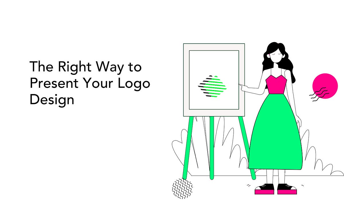
The Right Way to Present Your Logo Design
I’ve been working for years in design, and I must tell you most of my shortcomings come from me not being able to present my work in a correct way. Just sending what you created won’t work — sadly enough. Even the things you text along with your logo file can screw you over big time.When becoming a designer, you are taking on an occupation of a one-man orchestra, apart from doing the main job, you’re now a marketer, a psychologist, a sales-person, and a showman. The design won’t sell itself, so you should.It is in fact hard to make a client see through our eyes: that is why the correct presentation can play a crucial role in getting your message across. And you shouldn’t be angry at that — most of your clients don’t know anything about logo design, the latest trends, and anti-trends.So, speaking solely from my experience, I’m here to share some tips & tricks I learned along the way.Fall in Love With the ProjectThe briefing is not a technical process. This is a stage when you dive deep into the client’s sphere, services, differences, and focal points.If you want to make the client release their passion, and open their mind to you, you need to think about how to make the process comfortable for them. One way is to ask the right questions. It will ensure that both the client and you are on the same page from the outset and creates a framework for presenting the designs later on in the process.Some of the questions you might wanna ask the brand:What do you do, and why?What is your unique selling point (“We are the only company to [provide this service]“)What is your story?Who are your competitors?Who loves or may love you, and why?Are you going to influence the lifestyle of your customers and how?What emotions do you want to evoke in your customers?Tip: Before the corona crisis hit, I practiced face-to-face meetings with my client. If they lived in my area, of course. I liked to meet them at their workplace so that they could show me the things they were talking about. If the pandemic ever ends, you should try this approach too. Nothing helps to feel the project as much as seeing how it’s created.TIP: The briefing is important, but also your own effort. Apart from the information given to you by the client, try making your own research and express your opinions. This will make the client trust you more, and help them to place you into the context of their product.Give Options & DetailsAfter you confirmed the style of the design on the briefing stage, try not to ask for references. Then, offer some ideas. If you ask a client to show references, most often than not they send their competitor’s designs. Later, it will be hard for them to develop their own style.Armed with your own ideas, give your clients something to choose from. Prepare a few versions of the logos, with different designs and ideas behind them.For instance, you can provide 3 logo options, that you have come up with keeping in mind the target audience of the brand (it’s important!). Make sure you also provide detailed explanations of your design choices. Here’s my go-to list of specifications:To whom this option will appear the most?Will this logo be appealing to the mass market or maybe cover a specific demographic? Justify why this or that logo design suits the client’s target audience the most.What emotions will this option evoke?People drive on the associations, on emotions that derive from certain things. Colors, shapes, sharp angles — or round ones have the ability to evoke certain feelings. Make sure you keep that in line with the values of your client’s brand.What style is played off the best in that option?Is it a cozy, happy one, or a sharp, cold, and trendy one? Give your client an opportunity to choose the “feeling” of the brand.What is the psychology behind colors?Why did you choose this color palette? How will people react to it?What is the reason you used the fonts you used?There is no secret already that people correlate emotions even with fonts. Cursives make a whole other impression than the bolds.What story does this option tell?What story lays behind all the elements I have mentioned? The colors, fonts, styles? Does it tell the story of the brand?By including all those specifications, you don’t leave your client room for doubt: yes, you have made the task to its fullest giving choices, styles, emotions to choose between.Revert to PsychologyAre you familiar with the rule of three? People usually only remember 3 things from a list. If you’re presenting more logos than three, you should also consider the order. People remember the first position the best, then the last one, then the second, third, etc. So when it comes to presenting concepts, put the best concept first, the second-best at the end, and the third, fourth, and however many more in the middle.Add Real-Life ExamplesYou always want to showcase how your logos will look in real life — I’ve put it in bold just above. By doing it you erase the doubts your client has: ‘What it would look like on a website?”, “What if I put it on my flyer — will it look good?”. Yes, it will look good. See for yourself!Remember The BrandThe technique is not the only thing you need to create a logo your clients will approve of. Think about the visual solutions that will encompass the brand’s strategic goals, and show what problems the brand is solving.There should be a thought process behind every logo option you provide — you should be ready to justify the design. I find it also helps to actually add little notes next to visuals, describing how the design I created correlates with the goal (which I and my client established in a brief beforehand — mentioned above).Don’t Shy Away From Online ToolsYes, I know you frown on that one. Sad to admit — there are not many professional tools with the needed functionality: not enough templates, no creative designs, nothing that can show individuality.However, there are some tools that I use quite often. Here are some of them:Gingersauce.co — an online brand book creator. Just recently came across this app, looking for some templates — was impressed, not gonna lie. Creating a brand book is always a win, yet it does take quite some time. Finding a tool that helps save some of that time is a good find: easy flow, cool features like logo misuses, etc. Worth looking into!So, why use Gingersauce?Collects all the alternatives and variations;Allows you to present your logos in real-life examples;Allows you to present small versions of the logo, add misuses, logo proportions, add alternative logo variations, and more.Quick, easy, and intuitive.LiveSurface — An Illustrator plugin. If you’re using Illustrator on Mac, this tool will allow you to create those real-life examples I was talking about earlier. Easy peasy!So, why use LiveSurface?Integrates directly into Illustrator;Quick and easy to use.Logo Design Love — a website devoted to logos, and everything related to visual identity. Super interesting to check out!So, why use Logo Design Love?Weekly updated with good ideas and identity features;Great for taking inspiration;Educational.Brand New from Under Consideration — a website that covers redesigns and new designs of notable products, companies, services, and organizations across all industries and locations.P.S. They have just switched to a new subscription model, and now — no ads on the website! Phew :)So, why use Brand New?In-depth coverage of design news;Great for taking inspiration;Educational;Search by industry, colors, fonts, etc.Give Tete-a-Tete PresentationIt’s so much easier to send off your work via email, isn’t it? What if I told you that presenting your logo designs face-to-face, or even via Skype call works a lot better?Here’s what I do:I send a brand book half hour before the call, to let the client look through it;When the meeting starts I first remind the client about the goals that were set before me.Then, I like to express in what way I expect to receive my feedback. For instance, I mention that I’d appreciate it if all the comments won’t be expressed until after all designs are presented. This way you will remain in control of the presentation and will be able to get your point across without being interrupted.After you’re done with the presentation, encourage constructive feedback by asking the right questions. Why do you think this design does not correlate with the goals we set? What would help make it more correlating?Last but not least, always listen to what the client says: they know their audience better than you do after all.Few other tips on the presentation:Always think about how the client views the presentation. If you’re making a live or video presentation of your visuals while using Powerpoint-like tools to accompany it, make sure the slides work for us. Use short thesis statements and important pictures. Make sure you’re telling the most of the information by yourself.If you’re sending it by email, make sure that the information is easily understood even to those who skim through the headlined. Add more comments, background, links.Also, I have noticed that clients respond better if I put linking phrases between slides. Such as, so how did I solve this, or let’s get into details. This will allow the clients to be involved a lot better since these links imitate a dialogue.The Bottom LineI am not an expert in presentations — I make mistakes all the time still. However, these are some things that make the presentation process go a lot smoother.To recap:Make sure you’re on the same page as your client.Ask questions if you didn’t understand something. Yes, for the 3rd time is also fine.Present your visuals in the most professional way possible.Make sure you have thought through the designs you create.Do not shy away from face-to-face convos!Do you have any other tips you find helpful? Share some with me at nataivanivdesign@gmail.com! Also, if you follow any of the advice I have listed, make sure to let me know how it worked out for you — I’d love to chat!The Right Way to Present Your Logo Design was originally published in Muzli - Design Inspiration on Medium, where people are continuing the conversation by highlighting and responding to this story.
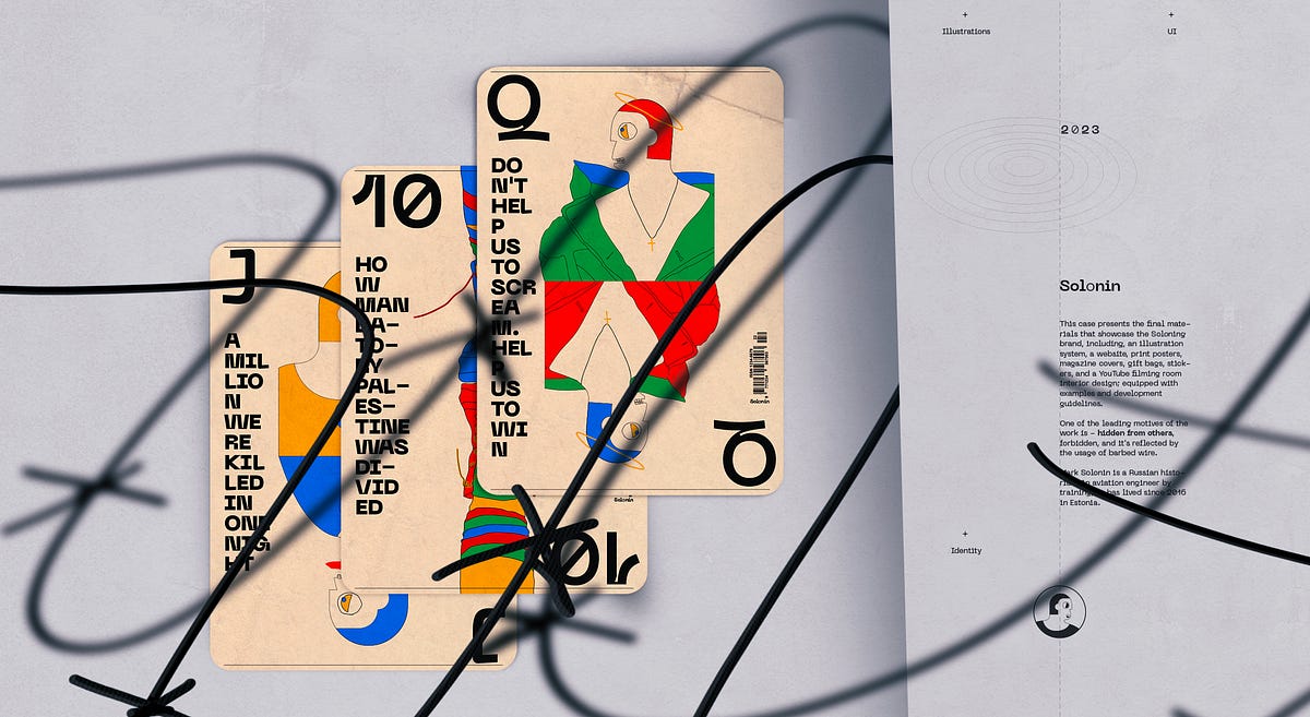
Historian Mark Solonin. Worldbuilding
This case presents the final materials that showcase the Soloning brand, including, an illustration system, a website, print posters, magazine covers, gift bags, stickers, and a YouTube filming room interior design; equipped with examples and development guidelines.+Illustrations +UI +Identity +War of Ukraine +Wars of Israel +The final solution +CrucifixionBy uncovering The Soviet Union’s and post-Soviet Union’s history we can better understand the processes of modern times in the whole world, as the influence on the world since 1917 has been very significant.Ahead of the whole planet. Moon race part no. 04One of the leading motives of the work is — hidden from others, forbidden, and it’s reflected by the usage of barbed wire.Pro barbed wire [Digital]Use the Pro barbed wire to charge your device — you remember the history, and you are connected.We are charged with unknown.The gallery mobile screen with one of the videos from the “Moon Race” series (December 2022).Desktop screen set. [ATF]War of Ukraine. [Print]GiftsGive us what we need, so we could stop it now.{The Scream}General guiding principleThe H/I direction is guided by the logo position — vertical or horizontal.Meanings[his]story taler | Every stream Mark starts by saying — “Hi to all kind people”Examples of the usageColorsGuiding principleColor red simbolise the Soviet Union’s armi (Red Army). At the same time, the Soviet Union’s and post-Soviet Union’s history is a general subject for Solonin’s research. Because of this fact, red was chosen to be the main accent color.Color paletteSometimes even barbed wire bloomsTrue history is desirable fruit.Final solutionRed since 1917The ScreamDon’t help us to scream. Help us to win. War of Ukraine. Part no. 2Give us what we need, so we could stop it now. War of Ukraine. Part no. 1A million were killed in one night. Wars of Israel. Part no. 5Guiding principle.Elements of the illustrations that are used in posters can have a dark color because, in the case of posters, we want to have a better focus on the visual message; for the other formats, the textual content is a number one priority, so other colors are used instead of the dark and only lines are dark.Why do we need to study history?We study history because history doesn’t stay behind us. Studying history helps us understand how events in the past made things the way they are today. With lessons from the past, we not only learn about ourselves and how we came to be but also develop the ability to avoid mistakes and create better paths for our societies.I beg youHouse; Sounds spelled — Chaos; only outwardly attractive.Divide and conquerHow Mandatory Palestine was divided. Wars of Israel. Part no. 1Why World War II archives are still secret. World War II. Part no. 2Just one more step. Wars of Israel. Part no. 3Why do we need to learn about the Soviet Union?By uncovering The Soviet Union’s and post-Soviet Union’s history we can better understand the processes of modern times in the whole world, as the influence on the world since 1917 has been very significant.RecommendationDo not play this game with professional cheaters. Study the history with Mark Solonin.Step by step. Video by video“Dripping water hollows out stone, not through force but through persistence.” — OvidTypefaceNeue Machina is a powerful and meticulously crafted typeface boasting monospace/geometric type features as well as apparent and deep ink traps in its heavier weights. It is inspired by the aesthetics of robotics and machines. A font suited for the future of technology. It was designed to be versatile, to blend in your designs in its lighter weights or to give them a lot of personality in its heavier ones.NewspaperDear Mark, I’m watching your channel since its inception. I’m very thankful to you for the highest level of historical and technical education you are providing. I appreciate the courage and honesty you demonstrated many times by touching on very “hot” and “inconvenient” topics of Soviet, Ukrainian, and Israeli history. Every country has its own “skeletons in the closet” — pages of history that are shameful. The faster people of respective countries would acknowledge the error of the past, the faster we will move to a better future. It seems to me that the Ukrainian people made the right choice. It is a long way but Ukraine will be successful in joining the civilized world. — Al TsaWars of IsraelMoon raceCover: “How Mandatory Palestine was divided”.LogoIndependent historian Mark Solonin -> History soloh justificationIt’s all about history. In Solonin’s case, history is the main and only subject of interest and the final product is the research result, whether in the format of a YouTube video, lection, book, or magazine publication.o justificationSome of the text styles use the letter “o” in a different style — in a ‘lighter’ font weight. This is because of the logotype where we want to highlight that Solonin is a solo historian.Main characterIconThe icon is the Solonins profile. Solonin is the main hero after all. Small icon size. The stroke is heavier than in the large version.The main character in the illustrationsI am not sure the complete truth can be figured out. Somehow each desid to believe in one or another teller’s historical version. Considering that each of us has his own understanding, history is the personification of one’s beliefs. Long story short all the characters of the illustrations are Solonins with the difference being that the icon uses more geometric elements than the illustration characters.IllustrationsOne-to-one ratio version developed for the web. For print, the position and ratio of the illustration canvas may be treated freely.Magazine coversCover: open spine, hot foil on canvasPaper: Via Felt Jute 220 g, Munken Pure Rough 150 g, 300 g Printer: Concordia Print Store — Boutique d’impressionGood day for all kind peopleGreetings.Placement: cover back.Digital materialsThis chapter includes examples from website landings on mobile and desktop, a few critical website pages including the website loader concept, video recording room interior design, and a YouTube channel example.Use the Pro barbed wire to charge your device — you remember the history, and you are connected.We are charged with unknown.Repetition is the mother of doctrineDigital posterWebsite landingWhen the new video has been published it’s also promoted on the website’s front page. This way visitors won’t miss a new publication.Video pageAll the videos are recorded in the studio that was specially designed for Solonin production shootings.Interior designVideos are the main way of communication. It’s why the interior design of the studio needs to be relevant. We have integrated the main elements of the Solonin brand into the room and clothes design.Selected screensLanding loaderGeneral guiding principle usage exampleFully loaded landing ATF sectionPlacement of the illustrationsYouTubeThe channel cover is the poster (have a more massive usage of the black color) of the latest movie.Mobile screensThe main challenge we have faced working with the mobile version of the website landings is illustration treatment. More specifically the placement of the artwork. The full-screen canvas was providing a very nice picture, but in this case, the textual content has a bit less readability, so we have decided to have a clear separation between the artwork and the textual content.I could not do this without the help of my dears:Limor Jamaica — set design and photography,&Alex Voloshin — barbed wire manufacturing.+Don’t let making you a fool. Learn the history with Solonin!______________________________꩜ In addition, you can find me on: Behance | Dribbble | Linkedin | Instagram | TwitterHistorian Mark Solonin. Worldbuilding was originally published in Muzli - Design Inspiration on Medium, where people are continuing the conversation by highlighting and responding to this story.
Artistic Search: Insights into Design Process for Illustration Set
The process of creating an illustration for a particular product or project is not only about visual expression. There’s much more behind it, as in any type of design process: apart from the illustrator’s knowledge, effort, and practical skills, it also includes research, analysis, idea and composition search, working out the best color solution, and many other aspects leading to a needed outcome. In the case of creating a consistent set of illustrations, the process gets even deeper and more extended to reach the systematic design approach. That’s what we are going to talk about today: Tubik illustrator Yaroslava is ready to unveil her creative approach to illustration sets and share a bunch of handy tips for illustrators. Join in!Whatever is your artistic manner and workstyle, the major advice from our illustrator is like that: never stop where you are. Only the constant learning process can allow you to achieve creative development and not get stuck on the sidelines of the information field.But how to search for the needed data and process it properly?These are the questions Yaroslava asked herself working on a new set of illustrations called Curious Cat. In addition, in this art project, she wanted to try new stylistic techniques that are often found in printed graphics but rarely in web illustrations.https://medium.com/media/338219aab9352cf88f07493da182f90c/hrefPractical advice: If you want to reinforce and develop a certain stylistic skill, work on a consistent set of illustrations, not a single artwork. In this case, you get a hand in it, your creative approach is more systematic and complex. What’s more, you will tackle the difficulties which may not arise in one piece of art, and the customer, seeing a series of artworks, will catch the general style more accurately and understand that this artwork is not just accidental something taken out of thin air.Stage 1: Color PaletteIn this case, the artist proceeded from a style that was based on imitation of manual printing graphics. So, she chose 3 primary colors, the overlay of which would give her all the necessary palette and convey the spirit of screen printing. To reach that effect, she selected a brush in Procreate that creates the necessary texture. A more time-consuming but also more effective method is creating your own brushes using textures from real materials. Yaroslava also added a neutral gray color and a couple of paper textures to the palette.Stage 2: ThemeThe artist was looking for an abstract theme that could have a logical sequence of illustrations and at the same time encourage her to search for new expressive techniques and compositions.As a result, the choice was focused on the theme called Process, so the illustrations aimed at reflecting various stages of research and creation process. Also, this series had a mascot character: the curious and clever Cat.The illustrator took the basic and crucial stages of the creative process as themes for the illustrations in the set:statement of a questionresearchdata systematizationanalysis of the received datahypothesessolutionStage 3: ProcessIt’s easy to see that the creative process starts much before the first line or word gets down on paper, canvas, or artboard. So, the set of artworks about the Curious Cat reflects will help us to define, describe, and illustrate the design flow for a series of digital illustrations. If you project this list of points onto the creative process for illustration, then it might flow in the following way.Statement of the questionWhat goals do I set for myself?What do I want to achieve?Which illustrators do I like?What is in their work that caught my attention?What my work is missing?What skills would I like to upgrade?How can I reveal the topic?It doesn’t mean to ask these questions all together at once, it’s enough to concentrate on a couple of aspects that are of interest at the moment since the tasks change and the entire analysis process needs to be done anew each time.ResearchThis stage includes collecting references, selecting works of illustrators whose work inspires you, reading articles on the topic under study (in this case, about different kinds and approaches to the creative process), or perhaps even not this topic directly but the one that will really motivate you to work (for example, biographies of famous creative people you like), and creating a library or mood board of photo fragments you like.Data systematizationIt is a vital stage. It defines how you processed the information gathered at the previous stages and were able to structure it. For example:The works of this group of illustrators catch my attention and emotions with the transfer of movement.In this group of photographs, I adore a beautiful combination of colors.The description I read in the article helps to convey the problem more precisely.Data AnalysisAnalysis of the obtained data in case of the illustration process lies in:creation of sketchestrying various color selectionsthinking over the plotconsidering a character image.The artist realized that this particular project needed a character. It was the best was to reach the consistency and united look of the different artworks. What’s more, a character was effective to clarify the terminology and actions as well as humanize and personalize quite abstract notions and phenomena.Here you can see the search process for the character images that went through several iterations before the Curious Cat was found as the best choice.HypothesesThis stage goes in parallel with the analysis. And often for illustrators, it looks like creating sketches and possible variations, ideas on how you can get the best for the required plot, which composition, angle, or shape is more advantageous for conveying the essence, which colors will emphasize the mood and set the needed atmosphere.SolutionThe solution is the sum of all the stages passed and implemented in the illustration. The final result may seem simple and uncomplicated at first glance, but only after deep processing and analyzing the information, this result will be not random or accidental but will be based on experience and practice. What’s more, the set of illustrations opens the broader perspective for visual storytelling.Hopefully, the stages described above will motivate you to try such a systematic approach in your illustration experience. Also, welcome to check more practical tips and examples by Yaroslava: in our earlier articles, she shared the guides on how to build up your original style of illustration and how to create illustrations for blogs and landing pages. Also, she shared the creative process step-by-step in the case studies on narrative illustration, interface illustration, and theme illustration devoted to the Olympic Games.Illustration Collections and Digital Art Case StudiesIf you want to see more collections of illustrations or discover how they work in particular design projects, here’s the set of posts for you.45 Inspiring Illustrations About Workspaces, Creativity, and ArtAnimal World: 4 Beautiful Illustration Sets About Wildlife and PetsLife in Pandemic Times: Theme Illustrations and Graphic Design ProjectTubik in Paris. Design Process for Narrative IllustrationCase Study: ABUK. Custom Book Cover Design for Audiobook AppCase Study: Moonworkers. Digital Illustrations on Film Production5 Basic Types of Images for Web ContentFunctional Art: 10 Big Reasons to Apply Illustrations in UI DesignThe article was originally published in Tubik BlogWelcome to see the designs by Tubik on Dribbble and BehanceCheck the illustrations and digital art by Tubik ArtsArtistic Search: Insights into Design Process for Illustration Set was originally published in Muzli - Design Inspiration on Medium, where people are continuing the conversation by highlighting and responding to this story.
8 Comic-Inspired Snippets Powered by CSS & JavaScript
Comics have served as an inspiration to many of us. They impact every corner of our culture. Just try going to the movies without at least one comic-based film showing. It seems nearly impossible.
Their style has also crept into web design. We see it in bold colors, outrageous typography, and unique layouts.
Advancements in both CSS and JavaScript allow designers to bring these styles to life. There is no shortage of ways to add comic-inspired flair to your website.
So, how are web designers bringing comic styles online? Let’s check out a few examples of what a combination of code and creativity can do.
Unlimited Downloads for Web Designers
Starting at just $16.50 per month, download 1,000s of HTML, Bootstrap, and Tailwind CSS, as well as WordPress themes and plugins with Envato Elements. You will also get unlimited access to millions of design assets, photos, video files, fonts, presets, addons, and much more.
Web Templates
5,800+ Templates
Bootstrap Templates
4,500+ Templates
WordPress Themes
2,700+ Themes
Start Downloading Now!
-->
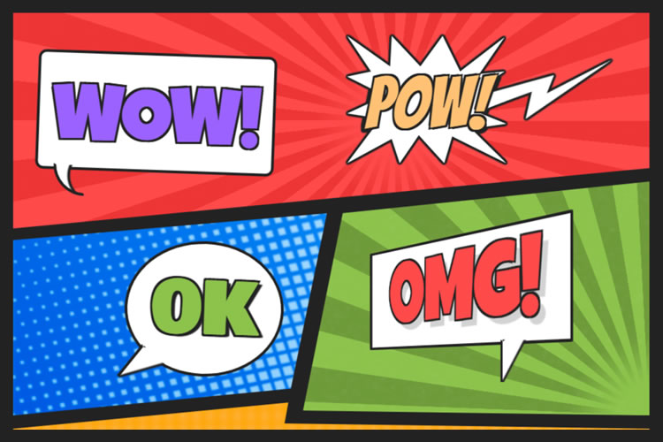
Comic Style Text Bubbles – CSS
Created by Josetxu
This snippet demonstrates a classic comic book style. Large, bold text screams on top of colorful backgrounds. CSS Grid is used to line up the various layout pieces. Bonus: click on a word to edit the text. Wow! That was cool.
See the Pen Comic Style Text Bubbles – CSS by Josetxu
Side Scroller Comic Web Template
Created by Terry Scrimsher
Here’s an example that adds movement to the mix. The side-scrolling hero area makes for an attention-grabbing experience. The animated text provides contrast and an element of fun.
See the Pen Side Scroller Web Template by Terry Scrimsher
Comic Book Style CSS UI
Created by Gabriele Corti
This experiment ponders a comic book UI. It’s a small starting point inspired by Spider-Man. However, imagine expanding it to cover every element of a website. That’s a way to stand out from the mere mortals.
See the Pen Comic Book UI by Gabriele Corti
Style Stage Comic Book CSS
Created by Katherine Kato
Let’s go a step further with a comic-inspired UI. This page manages to balance bold styling and legibility. The layout is fun but remains super clean. It shows that “comic” doesn’t have to mean inaccessible.
See the Pen Style Stage – Comic by Katherine Kato
Pure CSS Comic Coder Cat
Created by Annie Bombanie
This humorous bit pokes fun at developers. It also shows some impressive use of CSS. The black-and-white comic takes advantage of clip paths, gradients, and flexbox. The strip is also responsive.
See the Pen Comic Coder Cat – Pure CSS by Annie
Generate Comic-Style Typography
Created by Antoinette Janus
Use this snippet to generate comic-style text. Click into the box and then start typing. You’ll get a classic comic book font on top of a halftone background.
See the Pen Comic Types by Antoinette Janus
Responsive & Accessible Comic Page
Created by Sarah Frisk
It can be a challenge to make an accessible comic strip. The fonts aren’t always legible. And what if you’re using images? This snippet aims to fix these issues. It offers a “CC” mode that provides text descriptions of each panel. The result is an improved user experience.
See the Pen Responsive and Accessible Comic Page by Sarah Frisk
Comic Style Crystal Field
Created by Tibix
It’s easy to admire the groundbreaking illustrations in our favorite comics. This example combines beautiful artwork with the power of code. Click on the presentation to regenerate a new version of this crystal field.
See the Pen Comic Style Crystal Field by Tibix
Adding Some Pop to the Web
Not every website requires a staid corporate look. Comic styles offer an alternative for these sites. You can use this technique to create a fun and memorable UX.
What’s more, you don’t have to go over the top to find success. Even subtle elements of comic design can make a positive impact. Look no further than some of the examples above for proof.
Want to see even more examples of comic styles? Use your superpowers and head on over to our CodePen collection!
The post 8 Comic-Inspired Snippets Powered by CSS & JavaScript appeared first on Speckyboy Design Magazine.

Catchy Packaging Design Projects That Employ Illustration Art
A fresh collection of graphic design concepts crafted by the tubik team is up. This time, it gathers an attractive and smart set of functional and artistic packaging design concepts and identity design ideas created in different styles and following different design approaches, but all of them united by employing the power of illustration art to make catchy and original packaging that helps the business become more noticeable in today’s tight competition and transfers the mood and emotion behind the brand.Enjoy and get inspired!Stationery PackagingThis project will add to your day the vibes of bright and unlimited creativity that children teach us. Take a glance at a piece of packaging design set for the stationery brand targeted at arts and crafts for kids. The graphic design is based on vibrant and cheerful original illustrations designed for each item to transfer the consistent feeling of children’s endless creative energy and happiness of being involved in the art process.Here are examples of boxes for colored pencils and plasticine, as well as the notebook cover design.Candles PackagingThis graphic project reflects the fun, joy, and refreshing nature of winter in the packaging design for the winter edition of the candles brand. Look at the labels and boxes designed with custom illustration patterns for the candles with fresh snow and pine forest aroma.Perfume PackagingFor decades and centuries, people have been mystified and amazed by the power of fragrances and their impact on human mood and memories. No wonder perfumery has grown into a huge industry and ignited many successful businesses. This graphic design project also touches on that theme: look at the minimalistic packaging design and custom 3D illustrations for the perfume bottle based on flower fragrances.https://medium.com/media/cb8554c43207ea71afd6ac82528ff41a/hrefWine PackagingCatch the festive vibes with this graphic design project inspired by the winter holidays: here’s a glance at the custom wine bottle label designs with bright original illustrations for the special Christmas edition.Jam PackagingIn this vibrant graphic design project with the vibes of sweet and fragrant fruit and berries, we worked on packaging design for a brand of handcrafted jams and used original illustration patterns for a bright and cheerful visual style. Take a look at the consistent set of jam jar labels with juicy illustrations to give every jar a unique look but also unite them together into one recognizable and solid brand image.Chocolate Bars PackagingHere’s a glance at the elegant and neat packaging design with custom artistic graphics we developed as a part of the brand identity design for a chocolate brand.Each chocolate bar has an original look due to its specific color and sophisticated illustrations featuring the fruit added to this type of chocolate. The typography plays on the contrast of the logo wordmark using beautiful decorative font and text descriptions performing in readable sans-serif font with visual accents on the type of chocolate and the type of fruit filling. Together, this approach gives this set of items an attractive, diverse, recognizable, and consistent appearance with sweet tenderness vibes.Fruit Water PackagingThis graphic design is inspired by the vital energy of water. Here, we worked on a packaging design project for a brand of water with different fruit flavors. The design approach is built around the set of atmospheric custom illustrations with picturesque landscapes and buildings specially made for each taste of water.https://medium.com/media/9f0481f2f33e722b418b6961bfc424d4/hrefhttps://medium.com/media/bc99c3ad152573b3439d2f2a37ca9616/hrefhttps://medium.com/media/ebf959832a7854d3d8c0cedb917c9ad6/hrefHoliday Cake PackagingThis seasonal project is devoted to winter holidays, filled with fun, tasty things, time together, and hopes for another bright year. The graphic design concept features the idea for the custom winter holiday packaging for the famous Kyiv Cake, with original illustrations sharing the festive atmosphere.New design case studies from our team are coming soon. Stay tuned!More Design Case StudiesHere’s a set of more case studies sharing the design solutions and approaches for some of the design projects done by the Tubik team.12 Bright Projects on Visual Identity and Packaging DesignGofe. Packaging and Marketing Design for Coffee BrandLove Sign. Gift Box Packaging Design with Romantic VibesPierSide. Packaging Design for Tinned Fish BrandKOISI Tokyo. Packaging Design for Japanese RestaurantSidra Vivo. Vibrant Packaging Design for Cider BrandFairytale. Picture Book Illustrations and DesignAqua Dudes. Cartoonish Packaging Design for Fish Food BrandNutribite. Tasty Packaging Design for Granola BarsMilkimu. Packaging and Marketing Design for Dairy BrandOriginally written for Tubik BlogWelcome to talk to us and check designs by Tubik via:WebsiteDribbbleBehanceTubik ArtsCatchy Packaging Design Projects That Employ Illustration Art was originally published in Muzli - Design Inspiration on Medium, where people are continuing the conversation by highlighting and responding to this story.

How I Stay Creatively Inspired As A Graphic Designer
What drives me to do what I love and what inspires me to keep loving what I do?For every designer, it’s easy to fall into a rut because we’ve all been there at one point or another. Whether it’s from the same predictable routine, or simply, a lack of muse that leaves one feeling uninspired with their workflow — sometimes we begin to question our creative selves.To give some background, I am a Graphic Designer from Toronto and throughout my career, I honestly have been in that awkward creative-limbo where I’ve encountered blank slates, and at times, lacked the motivation to really stand behind the designs that I was tasked to create.However, despite those hiccups, I’ve come by a mantra that I’ve learnt to use as a constant reminder: “Do what you love, love what you do.”It’s a simple phrase, but how do you actually live by those words? This goes beyond then just gathering a Pinterest board (don’t get me wrong, those are still good design resources), but rather, it’s about discovering what drives your passion in the design field and how to inspire your creative imagination.Let me share 6 simple efforts that I personally carry out and make time for myself in order to grow my innovative curiosity and momentum.#1. Don’t just spot creative muse, actually understand why it inspired you in the first place.I like to draw creative enlightenment from random places, things and scenarios within my surroundings, where I’ve begun to coin these moments of inspiration as ‘design inspos’.Creative triggers are subjective, so my collective ‘design inspos’ are my own personal sightings that I find visually engaging. Sometimes I will spot an intricate mural on a building, a beautifully illustrated book cover in a storefront window or a cleverly designed menu while dining at a restaurant.It’s just a matter of noticing these little gems and taking a moment to actually ask yourself: “Why does this intrigue me?”When you become an observer, you learn a lot about yourself as a designer as you decipher what aspects of a design draws your attention in the first place. Overtime, I became more conscious of the creativity all around me, sometimes I would even research and look into the designers/artists behind those works to feed my inspirational fascination. When you analyze and grasp why a ‘design inspo’ speaks to you, you can begin to generate your creative ideas based on those pinpoint observations and takeaways.I was intrigued with these vines’ compositional integration with the mural’s gradient. (Art Square Cafe & Creperie, Toronto) — MY TAKEAWAY: How can I incorporate my illustrative designs with real life scenery?I drew inspiration from this artist’s distinctive style. (Mural by Thomarya Fergus, Visual Artist/Tattooist, Kensington Market, Toronto) — MY TAKEAWAY: To try experimenting with freehand-styled illustrations.#2. Get back to the basics, grab a pencil (or stylus).During my daily morning commute, I find time to doodle and jot down my free-flowing thoughts. This is an easy exercise, but it’s honestly about taking the time out of your day to have fun with it. It’s not about finalizing drafts but recording your spur-of-the-moment ideas while they’re fresh in your head.This allows you to create a starting point that could potentially branch out into passion driven side-projects. I use my daily rough sketches as reminders to expand on my potential ideas even further, sometimes even using them as a preliminary scope to begin building an envisioned concept.I took one of my rough sketches and photographed it being framed by a pair of eyeglasses. This collaborative experiment opened up a floodgate of potential creative concepts.Based on that first rough sketch, I was inspired to create more mixed media projects that incorporated my photography with my digital drawings.#3. Find passion in telling visual stories that are personal and meaningful to you.As designers, we are visual communicators, therefore we need to step back and remind ourselves that though we have bills to pay and we’re hired to tell other people’s stories, we can’t forget to also share our own.We have the power to visualize narratives and make ideas tangible, so make the effort to design something that you can feel equally as passionate about as you do when creating it.When I began to relate some of my interests and personal experiences into my design work, I became more invested and immersed with the projects that I had a connection with.Whether you are fortunate to work with a client that aligns with your interests or just being proactive enough to plan your own side-projects to share stories that resonate with you, it is a refreshing experience that’ll ignite your excitement and fulfillment as a designer.After volunteering at a cat shelter, I designed a brochure template related to nonprofit Animal Welfare organizations — not only was I able to execute a design concept that promoted a cause that I passionately supported, in the process I also had a lot of fun creating it.Three years ago, I was attending a conference in Charleston, SC when the tragic shooting took place at the Emanuel African Methodist Episcopal (AME) Church. In the aftermath, I was moved by the community’s outpour of love and continued faith in humanity, inspiring me to illustrate a dedication to the 9 victims. ❤“It’s funny, I came to Charleston to become inspired creatively profession-wise (which I totally did), but I ended up drawing inspiration from a community that held strength and love in a time of uncertainty, controversy and grievance. To the citizens of Charleston, I thank you for sharing this aspect of life, whether you intended to or not — you are truly amazing.” [Read my full excerpt]#4. Step outside of your creative comfort zone and challenge yourself with different limitations.From the previous examples so far within this blog post, you can observe that my personal design style is playful and colourful. However, sometimes I will challenge myself to switch up the way I express myself creatively.Now and then, I will take on the 7-Day Black & White Challenge via Instagram. For a week, you are limited to posting only black and white photography with no people or explanations. I usually don’t lean towards black and white visuals, so with those restrictions in mind, I’m challenged to reevaluate my usual creative approach.I’m challenged to be more observant of certain design assets that I sometimes overlook — such as this scene’s various visual textures and patterns.Without the use of colour, I’m driven to analyze and convey my surroundings with a different creative lens.The reason why I find this daily effort inspirational is because when you push yourself outside of your comfort zone (which in my case, is relying on colour for impact), it affects your design decisions and strategy. When you strip away a visual asset or style that you would often comfortably use and gravitate towards, you’re challenged to be creatively resourceful and adaptive.Are you primarily a print-focused layout designer? Then explore the challenge of designing a layout for a UI/web project. Do you often work with a specific style? Switch it up with different font choices or colour palettes. In a nutshell, venturing into different design approaches and parameters will not only grow your diversity as a designer, but may also inspire you along the way.#5. Interact with creative industry leaders and peers.It’s one thing to sign up for a conference to hear a design-related lecture or to stream an online creative talk, but also try to get involved within the Design community to directly engage with fellow industry leaders and experienced colleagues/peers.The creative mind can be like a sponge, if you feed that curiosity and get involved with individuals that you can learn from, you continue to build your passion and interests for the design field.Engage with industry leaders: A great opportunity is registering for Design workshops, discussion panels and/or meet-&-greets. This way, you can work first-hand with knowledgable and well-known Creatives within the design community, as well as converse with industry leaders up close and personal.I attended the “Make a Logo the DDC Way Workshop” hosted by Aaron Draplin, logo designer and founder of Draplin Design Co., where I got to work first-hand with this kickass designer to visualize a vector inspired by my company’s office dog.Engage with your peers: Whether you carry out weekly design critiques or brain-storming sessions, make it a habit to become more aware of what your team members are working on and ask to be involved with the process if it interests you. Even if you’re not tasked to work directly on a certain project, observing as a spectator can be influential to your own design thinking process. Ask questions, review their design ideas and become inspired by their experiences and learnings.#6. Treat yourself to a new creative outlet, exploration of different tools leads to inspiration.This last effort is about exploring different creative outlets to hone in and exercise your imagination. It’s good to focus on perfecting our digital skills and knowledge of the latest design softwares, but sometimes we need to take a break from a computer-centric environment.After all, design goes beyond what is presumably achievable on a computer screen — so try exercising your design fundamentals through different mediums as an inspirational tactic. Personally, I like to work hands-on with new tools and crafts so I can self-explore my creative self and bring my design ideas to life through experimental outlets.After taking a class to create Pysanka Ukrainian Easter Eggs (a technique that uses wax to inscribe folk designs), I later became facinated with creating different design patterns.When I attended a Galaxy watercolor painting workshop, I was inspired to continue recreating layered gradients with textures in some of my design passion projects.I also like to go back to the basics with hand brush lettering to exercise my typography…and as you tell, I like to poke fun at my hubbie, Richard, lol.Thanks for reading my first blog post :)Overall, each of us as designers have our own subjective efforts to help us cultivate inspirational muse and personal motivation — however, I hope that some of my advice was helpful in discovering your ‘design-inspos’.Please feel free to comment and let me know how you personally stay driven and inspired as a fellow creative. I would love to hear how you keep doing what you love and loving what you do!Happy creating, folks! 👏How I Stay Creatively Inspired As A Graphic Designer was originally published in Muzli - Design Inspiration on Medium, where people are continuing the conversation by highlighting and responding to this story.
Why UX Designers Should Learn about Cross-Cultural Design
Designers at global level oftentimes have to work along with the geographically distributed teams. They work on digital products designed for global consumption for clients that are located all over the world. Yet designers, overlooking the wider world out there, continue to work in a bubble and tend to be focused only around their local culture, language, and traditions.Coronavirus updates on CNN Live Stream.Indisputably presenting complex challenges, a cross-cultural design refers to variations in both linguistic and cultural patterns of product design. Despite this fact, most designers unintentionally assume that designing products for various cultures simply requires switching currencies, language translation (localization), and upgrading a few images to represent a particular local culture.As a matter of fact, the road to successful cross-cultural design with effective UX is far more complicated, and rifle with pitfalls.Examples from historyWhen launched in 2008 in India, Amazon faced issues for the lack of cultural insight and comprehensive UX research. They couldn’t find out why customers in the country weren’t using one of their chief drivers for revenue: searching for products to buy on the homepage of the mobile site.It appeared that the magnifying glass wasn’t something people associated with search in India. It made no sense to them. When UI was examined, most people found perceiving the icon represented a Ping-Pong paddle.Amazon, as a solution, continued the magnifying glass but assimilated a search field with a Hindi text label to make people know this was where they could start a search.Who will not remember the seminal cautionary myth behind why Chevrolet’s “Nova” flopped in Latin America? The whole event refers to branding failure because the name “Nova” means “no go” in Spanish. This story of substandard branding remained an object lesson for business students, reminding them about the failure to carry out reliable, in-depth cross-cultural research.However–whether or not the branding was fallen short–there’s one problem with this story: It’s not right.What should be focused?Designers–while they’re designing the cross-cultural products–should not just rely on contending with various languages, dialects, and dimensions of national culture. They certainly need to develop an even broader understanding of the cultural differences in color psychology and mental models of peoples from different target markets.Additionally, learning directly from culture to culture further adds an extra layer of complexity as text can be written right-to-left (RTL), left-to-right (LTR), and top-to-bottom.Beside some languages, “mirroring designs” is something designers need to consider when designing for both RTL and LTR languages. Consideration should be given to whole lot, i.e. from text to images, to navigation patterns and CTA (calls-to-action).Facebook homepage in EnglishFacebook homepage in Arabic where the layout is reversed (mirrored)Another thing to consider is that an image can be considered OK in some Western cultures but probably recognized inappropriate in some Middle Eastern regions. Therefore, using culturally acceptable imagery in products while reaching across cultures is also something designers should be aware of.Varying attitude towards religion, gender, and clothing in different parts of the world asks designers to become extra careful when working with images, as referred in a study by weather channel.Let’ say; a designer is not having a good know-how of a particular culture; it may become crucial for them to spend some time researching what’s appropriate from culture to culture. This way, they can be ensured about what to include in their product’s UI, i.e. text, imagery, microcopy, iconography, and more.Designers, for sure, have to account for text in different languages, acknowledged as “text-expansion.” Multiple languages, i.e. Japanese, German or even English, can yield very dissimilar results when worked for the same piece of text. For instance, proceeding from English to Italian phrases will be at times bring an expansion of around 300%!In short, not accounting for variations in word length in a range of different languages or offering UI elements ample padding will cause a boatload of work down the line. This will happen because a tsunami of screens will need to be adjusted to accommodate the switch to another language.The sign for the translation office manager in German.The seven dimension of Cross-cultural DesignDesigning for global customers — in some way — precedes designing for digital products and has been around for a long time. Cross-cultural design, in the context of global markets, has been rooted primarily in the work of two individuals: Fons Trompenaars and Geert Hofstede.A Dutch by birth, Trompenaars is known for “The Seven Dimensions of Culture,” a model he provided in his book “Riding the Waves of Culture.” This model is the outcome of interviews with more than 46,000 managers in over 40 countries.Trompenaars — rather than distinguishing cultures only by language — established seven varying qualities of culture for designers at the global level. These qualities include:1) Universalism vs particularismDo people in a particular region place emphasize on rules, laws, and dogma? Or do they postulate the world to be circumstantial?2) Individualism vs communitarianismDo people in a specific part of the world trust in personal freedom and achievement? Or they consider a group is greater than the individual?3) Specific vs diffuseDo work routines and personal lives kept isolated or do these have an overlap?4) Neutral vs emotionalDo people make considerable efforts to express their emotions or they like to remain self-controlled?5) Achievements vs ascriptionAre they valued for what they do or who they are?6) Sequential time vs synchronous timeA distinction needs to be made between people who like events to occur in a striated order and the people who believe in an interwoven continuum of the past, present, and future.7) Internal direction vs outer directionSome cultures profess to control nature and the environment, while others respect the opposite.Greet Hofstede — in his part of cross-culture design formulation — questioned conventionally narrow view of language and culture. The point he made is everyone knows that people’s spoken ascents develop based on where they grew up; less talked about, though, is that how they feel and act is also a type of accent influenced by their locale.Cultural dimensions, at the core, are cultural tendencies that separate countries (rather than individuals) from one another. The countries score on the dimensions are relative, as we are all human, and at the same time, we are all unique. For example, culture can only be utilized meaningfully by comparison.Differences in cultural dimensions in Argentina and China by Hofstede’s country comparison toolDo cultural dimensions really have an impact on designing?Here we’ve shared three examples in cultural differences with regard to how people react to authority:1) Are people see themselves as individuals?2) Do they consider themselves a part of the group?3) How calm are people in various cultures with changeability?These examples fit into cross-cultural user experience design as well as into the behavioral design, where the focus on different aspects become really important to design products for various diverse cultures successively.How do Users react to authority?Dutch social psychologist, Geert Hofstede has sited every country somewhere on his power distance index (PDI), which estimated how societies embrace power inequality. Some cultures may expect information to come from an authoritative position, while others probably put less consideration in certification and expertise.The implications of this for digital design are that authoritative language or imagery may work well in high-power distance cultures, but users in low-power distance cultures may respond poorly to the same and would choose to see something like the less informal popular imagery of everyday life.What should designers be aware of people’s thinking as an individual or as part of a group?Hofstede projected multiple aspects on his individualism vs collectivism index (IDV), where countries with more individualistic behavior are characterized by relatively higher scores.In his IDV, Hofstede stayed focus on three things:1) how do we inspire people in an individualistic culture versus a collectivist one?2) Does the specific product promote individual or collective achievement?3) Some societies place importance on youth, whereas experience and wisdom are valued elsewhere.How much are OK people with uncertainty?According to the uncertainty avoidance (UAI) dimension, cultures that believe less in rules are more inclined towards positively responding to the emotional indicators in specific product design.On the flip side, a society that’s uneasy with uncertainty prefer clear and distinct options. Now the question is that “how these different cultures respond to something unanticipated, unknown, or away from the status quo?Let’s consider an example of Germany, which scores high on the DIV index; therefore, it generally avoids unpredictability. As a result, products designed for German customers, i.e. should offer them a rational sequence of decisions to make.Countries that appear low on Hofstede’s IDV index are expected to exhibit an improved level of freedom and comfortable exploration of the product with more attention to emotion.Risk aversion is another factor that needs not to be neglected when designing products for different cultures. Let’s consider an example of risk-averse Japanese customers, who when asked to submit their credit card information during registration for an e-commerce site, may respond in a high rate of abandonment.The essence of conducting user research in cross-cultural designingCollecting micro-level insights via the direct observation is at the core of human-centered design thinking methodology.When getting into the cross-cultural designing projects, proper user research becomes essential to achieve friction-less digital user experience across regions. Generally, this refers to leaving out into the field to meet people where they work and live. Doing this helps designers understand specific needs and imagine pertinent future opportunities.The thing is that the need for designers to systematically research and understand local customs, cross-cultural psychology, cultural dimensions, and local UI patterns cannot be understated as it will either lead to success or result in failure.Types of user researches and elements to considerUser research for an effective cross-cultural design generally involves the primary devices used by the target customers as well as the potential challenges they’re facing with internet connectivity.With mediocre devices operating on less powerful network connections, designers could take advantage of AMP technology (accelerated mobile pages), use progressive web apps, or use adaptive design to boost up mobile sites.Designers — in their part — can also design mobile apps in a way that detect slow network connections and subsequently serve up stripped-down basic functionalities to work offline or with spotty connections.While getting into research for the better product design, not only is it essential to have a content specialist perform cultural checks, it’s equally important to have a local native speaker to gain linguistic prospects.The cultural checks surely can include images, abbreviations, colors, idioms, and phrases to know they’re culturally appropriate and resonate with the local audience.Any type of research–either qualitative or quantitative–can be done to find cultural differences among target markets. However, digging deep into the local customs, behaviors, and attitudes requires that a combination of both qualitative and quantitative research should be performed.Quantitative UX research typically involves intercepts, interviews, and ethnographic studies, contextual observations, and field studies; quantitative research generally progresses using secondary data and carrying out competitive analysis, and surveys.Qualitative research is somewhat a direct evaluation of behavior based on a number of observations. It is about conceiving people’s beliefs and practices on their own terms. For instance, observing people in their local environment allow designers a better chance to understand the way people live and use digital products. It helps them design products that are inherently relevant to people.Quantitative research, in its part, quantifies the problem by way of generating data that can be converted into useful statistics.Some of the conventional data gathering techniques in quantitative research include different forms of surveys, website interceptors, longitudinal examinations, product usage analytics and online polls.Examples from local phrases, idioms, and customs for text and imagesA handy selection of design tools, workflows, and fontsWhen looking at the practical side of a cross-cultural design project, we can say that before going any deeper into the project, designers must ensure they’ve selected the appropriate designing tools for them.For instance, many design tools don’t deliver the complete provision of fonts, or certain characters for a range of different languages, including Arabic, Russian Cyrillic, Japanese, and Chinese.Designers, therefore, needed to be careful while considering design tools and workflow and their final deliverables.Testing the cross-cultural design workflow during the beginning stages of the project is also very crucial for the achievement of effective final product design.Making a right selection of design tools — such as fonts — is very important because some foreign language fonts may work on the desktop in a design tool but will not render as proposed on the web with the web font version. Here’s the point to consider: Web fonts hold support for various different languages, but not all.A decent amount of focus will be required while selecting fonts that endorse support for particular language or script.Consulting with developers early about character encoding, employing web fonts, and font embedding depending on the type of digital product (site or app) will eventually pay off in spades, as will wide-reaching testing and QA.A UTF-8-encoded Japanese Wikipedia article on the web when interpreted as Windows-1252 encoding.The thing is cross-cultural design is not a walk in the park. Therefore, designers not only necessitate to contend with varying cross-cultural challenges but also often need to bridge the cultural divide with clients in terms of text expansion in different languages, communication styles, edit a variety of a languages, solving issues using their keyboards to input, and wrestle with design tools and web browsers not rendering fonts or the foreign language characters accurately.Example: Working with designers and clients across borders surely carry a significant set of challenges. Let’s consider an author (a Russian designer) worked on a project with a Brazilian client and had to actively manage the cultural gap between the client and himself throughout the design process to sidestep any misunderstandings.Working on a cross-cultural design project can raise issues with Cyrillic fonts in various design tools not rending rightly. An on-screen Cyrillic keyboard had to be used in the absence of a Cyrillic keyboard for text input and edits that can slow things down insanely.Cross-cultural design and the need for human-centered solutionsAt the time, companies at the global level are looking for ways to explore across-the-border business opportunities. During the process, they’re facing challenges in different areas, i.e. adapting to the local features of various new markets, cultural system, and the sociopolitical environment.Clearly, leaders of global businesses want to get their products to reach to the global markets as quickly as possible. But, in order to achieve best-in-class user experiences, the cross-cultural design asks for special attention.For instance, a great UX is deep-rooted in the careful examination of social and cultural context; therefore, it becomes more a designer job to put the brakes on and call for a slowdown.What has become vital for UX designers is the precise execution of in-depth UX-research, aiming to explore what people think, say, do, and feel to reveal fresh insights that help craft human-centered solutions.Experts of UX designing know that cross border projects need to be researched and tested comprehensively.Final words:At its heart, the cross-cultural design calls designers to embark on a journey, which is less traveled before. At times, it may appear a little bumpy one; until the designer get an understanding of the seven cultural dimensions, seek the best workflows, and investigate an informed perspective, tools, and processes, they’ll cover the road successfully.Have you ever conducted any UX-research for your cross-cultural design? Share your experience with us.Why UX Designers Should Learn about Cross-Cultural Design was originally published in Muzli - Design Inspiration on Medium, where people are continuing the conversation by highlighting and responding to this story.

Redesigning IRCTC: Enhancing usability, utility and profits
Revamping the IRCTC mobile application to improve user experience, provide meaningful utility and find ways to generate profitsIndian Railways (IR) runs one of the most widely used public transportation systems in the world. With a network spanning over 68,000 kilometres, it carries a staggering 23 million passengers daily.The IRCTC app, launched in 2014 to promote digital ticketing, has since receded to a slew of irrelevant and disconnected features. Despite the scale and impact, the current experience is riddled with UX flaws and is visually inconsistent and outdated.User Experience and BusinessEver since the launch, IR has grown in its functions and scale. Right now, around 63% of all online tickets are booked through the app. That amounts to roughly 800k tickets daily! While that is impressive, the app has struggled to grow alongside.App reliability is abysmal and comes crumbling down under traffic. Newer services offered by IRCTC have failed to generate substantial top line. Moreover, the interface has become increasingly noisier with disparate features competing for user attention.Basic usability is a bother.Why This Redesign?The app barely works right now and the experience is — let’s just say — not quite good. My initial premise was simple — to make the app more than just work, to make it more usable, useful and delightful.My RoleSince it is a personal project, I worked on it alone — from researching to designing the final screens.Kicking offTo get a sense of where to start, I ran a quick usability test with 6 participants to test the app’s core functionality — booking and managing a train ticket.Two out of the six people always use the IRCTC app for booking their train tickets. Three people use a third-party app (like ConfirmTkt or PayTM) for booking their tickets.Their ages ranged from 21 to 48, which is adequate to provide a balanced perspective.The goal of the exercise was to understand the challenges users faced while booking a train ticket and subsequently managing the booking. The test plan was simple, based on three questions.Can they figure out what is intended on the screen?Are they interacting with the interface the way it is intended?Do they understand what is happening?Early InsightsUsability issues were pretty evident. Following are the examples from few of the many problematic screens. Most participants struggled with all three questions.One. It was difficult to find what is intended on the screen since the information was too dense to consume at a glance.Do users get what is intended on the screen?Two. It was inconvenient to interact with the interface in the intended way. Participants resorted to using the red CTA at the bottom to blast through to the next step, before being reminded to complete a ton of actions first.Are the users interacting with the interface in the intended way?Three. It was puzzling for most users to figure out what was happening. Most interactions felt unexpected and unreliable.Do users understand what’s happening on the screen?The DiscoveryI was half-expecting the outcomes of this exercise, especially the usability issues. Even so, this effort led to some important insights.Insights from usability testing and follow-up conversationsThese insights morphed to raise several important questions:When people are having trouble using the core flow of the app, how can we expect them to use other services offered by IRCTC?If power users with powerful phones and tech literacy are facing problems, how bad is the situation for people new to technology?IR is attempting to transform its current fleet in favour of a modern one, encouraging all citizens to travel in trains. But how well-placed is the current app in terms of establishing trust and attracting young travellers?Design OpportunitiesApart from fixing usability issues, these questions exposed two major design opportunities:It’s important to design for the complete journey instead of ticketing alone, andIt’s essential to design for everyone, especially the users new to technology and the ways of Indian Railways.Secondary ResearchI set out to gauge the problems faced by people while booking and managing their tickets online and their broader railway experience.I skimmed through (a lot of) opinion posts, app store and play store reviews and benchmarked the current app against the competition. I compiled and sectioned all relevant insights into problems, competitor notes and ideas.Pain-points, competitor analysis and opportunitiesDeeper InsightsThe most evident problem in the current experience is the sheer lack of coherence. This shows up in various forms throughout the current interface.Disconnected ExperienceServices offered by IRCTC operate independently. For example, ordering food onboard is separate from managing a booking and requires navigating to different screens and filling your details again. The same disconnect exists for reserving a retiring room or a connecting train, resulting in a cumbersome user experience.Multiple entry points for multiple services, none of them work in tandemIt impacts the discoverability and utilisation rate of these services and any cross-selling opportunities are missed. This ultimately leads to revenue loss for the company.Online Solutions to Offline ProblemsConsider two scenarios:You book a train ticket from a railway reservation counter. Now, you want to cancel it but you don’t want to go to the counter. You can do so online with something called “Counter Ticket Cancellation” in the app.You book a train ticket online. On the day of journey, the train is delayed by 5 hours. Now to get a refund, you will have to file a “Ticket Deposit Receipt (TDR)” either offline at the counter or online through the app.As you can notice, these features make sense for a certain use case only, but still occupy screen real estate all the time. There are many similar features peppered throughout the app.It is crucial to centralise these features to reduce visual noise and enable users to focus on things that matter to them and the business.Poor Post–Booking ExperienceCurrently, the experience is akin to an online version of a railway reservation counter. No updates are communicated to the user about their bookings. In extreme cases (like train cancellation), an SMS is sent to the registered mobile number.This absence of post-booking updates exacerbates uncertainty, prompting users to seek alternative, potentially unreliable sources of information. It also burdens customer support and physical inquiry centres unnecessarily.Framing the ProblemThe current app is scattered and disconnected that limits integration of newer services with the existing ones. Most users don’t discover these services leading to lower utilisation rate and revenue loss. To cover up losses, IRCTC has to depend on monetising ads that degrades the already miserable user experience.The post-booking experience is non-existent. Additionally, the displeasing visual language, poor app reliability and a terrible first-time user experience causes distrust in users — both new and existing.How Might We?With the help of these insights, I came up with the following HMWs:How might we simplify the core user flows in the app?How might we centralise the user experience and design it to be more coherent with business objectives?How might we design for a better first-time user experience?How might we improve the post-booking experience?Centralising the User ExperienceCurrently, the experience broadly anchors around booking tickets, which causes everything else to either float around or stack up on top.Look at the current sitemap. I know you can’t see anything. Just notice how wide it is. This leads to confusion, navigational challenges and content discovery.Pretty low-res screenshot of the IRCTC sitemap, oops!I decided to centre the whole experience around user bookings, which would serve as a warehouse for all tickets and transactions, and a discovery centre for other features.Initial idea sketchIt is crucial to inform the user about all upcoming bookings and any immediate journeys they have to undertake, succinctly.My primary focus was on the card information architecture. It took quite a few iterations and feedback discussions to arrive at the final result.Segmented control to switch between different viewsThe objective throughout these screens was to get rid of all irrelevant data points to show plenty of entries on the viewport at a time. Auxiliary information is presented on subsequent interactions.Searching and Adding BookingsThe existing app was designed to only handle tickets booked on the device. My objective was to have a single source of truth for all bookings.Typically, any ticket booked by the user through the app would appear in the upcoming journeys section through which the user could manage it. To extend this functionality to other use cases, I mapped out all scenarios the user may find themselves in.User flow for adding external bookingsWhen user adds a new booking, their control is restricted — passenger information and destructive actions are hidden. They can track the live status of the train and receive all journey updates though.Users can verify a booking through OTP as sketched in the flow diagramThis is how the final flow turned out to be.Leveraging Digital MediumIRCTC data reveals that about 80% of all reserved tickets are booked online. It makes sense to send updates through the interface. It also offers additional benefits like guiding inexperienced passengers and showcasing situational offers.Before I could jump into designing, it was important to understand the information that would go on the screen. I mapped down all possible datapoints and established a clear hierarchy.The interface is information-heavy and would serve as a starting point for multiple flows. This demanded logical information hierarchy while designing.When a user would click on any booking, this is what they would see first. More important information is prioritised throughout the screen.On further scrolling:The interface also needs to convey a sense of urgency at critical junctures. This can be paired with timely notification alerts to help the user transition smoothly between various phases of the journey.The cancellation module is another component that changes form with time, ensuring that the user is fully aware of cancellation charges at every point.I mapped out the refund conditions flowchart for a specific booking to visualise how cancellation terms might vary in various situations.Close-up of the cancellation moduleBased on where the user is travelling, contextual promotional content can be shown to intrigue the user to increase inbound leads.The “updates centre” at the top doubles down as a button to view the live running status of the train in detail.Simplifying the Core User FlowI started out with a quick and dirty heuristic evaluation of the existing flow, mostly based on the NN/G usability heuristics.In order to find the right trains, only a handful of inputs are needed from the user. I designed the flow around these inputs, optimising for speed and efficiency.Idea sketchThe aim was to present only the information that is crucial and relevant. Everything else is moved to where it makes more sense.Side by side of before and after screensI designed slight conveniences to accelerate searching for trains and make the flow more efficient by alerting the user beforehand.Speed and efficiency of search were the main focusI anticipate that such a flow would be technically challenging to implement, but for the sake of the case study I have assumed its technical feasibility. Here’s the final search flow in action.Once the users land on the search results, the information hierarchy has to make sense for them to make an informed decision.Took a lot of iterations to arrive at the final designI designed about 50 versions before going with the final one, incorporating feedback at every level. It ranged from little UI tweaks to a complete overhaul of the flow I designed at the start.I drew this additional map in order to prioritise what’s important for majority of the users. This led to an absolute change in how information is presented to the users.In short, the focus shifted from finding the right train to finding the right date. Here is how the final screens turned out.Finally, I designed a little delightful animation at the end to congratulate the user on booking the ticket. The completion screen would take the user to ‘My Journeys’ where they can easily manage their booking.Have a look at the final design.In RetrospectionThis project subsumed a lot more than the high-level goal I had in mind when getting started. A full-scale app redesign requires a huge effort. At the end, this project feels like a start towards a more usable, useful and delightful design we all deserve.There are many things that can be improved. I feel that the flows can be revised even further, useful functionality can be added and the interactions can be fine-tuned. At many points, direction from data is something I lacked and was forced to make common-sensical decisions as a substitute.I also haven’t designed specifically for a first-time user experience even though that is supremely important. Assuming technical feasibility throughout the project helped — but working with technical constraints is something I look forward to.Thanks a lot for reading through this. Feel free to reach out with any feedback or suggestions. Hit me up to talk about technology, product, design, psychology or really anything.Redesigning IRCTC: Enhancing usability, utility and profits was originally published in Muzli - Design Inspiration on Medium, where people are continuing the conversation by highlighting and responding to this story.
Trying to design a logo?
Are you trying to design a logo for your business on your own? Are you a beginner logo designer getting logo designs rejected? Do you know the dos and don’ts of logo designing?SourceContextThis blog aims to clarify a lot of myths around logo design. Provide you with a diagnostic system (a tool) to test your logos designs😍Along with it, this blog is written keeping in mind all the non-designer’s trying to design logos for their business on their own. Follow the approach in this blog and you’ll get logo design basics right without experience.We are going to discuss1. What is a logo?2. Does a logo need to represent the business’s services?3. Should you redesign your logo and do rebranding?4. How to create an identity without a logo?5. What is logo diagnostic’s lab and how to set it up?I am pouring my experience in designing logos into this blog. I will cover the concepts in a crisp manner while discussing a few important points in detail.Disclaimer (Based on Question 4)The reason why I have written this blog is because many times startup in its early stage or solopreneures cannot hire a good profession logo & identity system designer, so they try to design their logo on their own. This blog is a guide written for them.Here in this blog, I have tried to simplify and provide a few keys ways using which someone with no design experience can design a minimalistic dentity system.Towards the end, you will come across a free tool and all resources for learning how to design a logo.Let’s start 🎉Question 1What is a logo?A logo is the face of a business.Face in the human world is key to a person’s identity. That is exactly what a logo is, the “identity of a business”. Nothing more or less. Keep this in mind while making design decisions in process of logo design and your lot of doubts will be resolved on their own.Question 2Does a logo need to represent the business’s services?Now, tell me this — Does the face of a person reveal his profession?Similarly, it is not the job of a logo to tell “What the business does?”It is not mandatory to design a logo around the business’s services but yes you can pick inspiration or extract a few ideas from it. It doesn’t have to convey the service but can convey the hint of a business idea. Let me show you two examples where one type of logo design is totally independent of the nature of business service and the other has a hint of it.1. Famous logos which reflect their idea around the business domainAll these logos have been smartly designed which has one or two features about the business domain combined in an interesting manner to form one symbol that acts as a business identity symbol (their logo). Example 1: Burger King has a burger symbol in itExample 2: Mister Cutts depicts a face with glasses and a moustache.Example 3: British heart foundation has a heart symbol with a positive depiction of an echocardiogram.Example 4: Le tour de France depicts the race place when the sun is in the sky. The bicycle is depicting the nature of the race. The Tour de France is a cycling race held in France every year.Example 5:Circus of the magazine has a circus tent at first glance. The tent folds if looked closely and presents the pages of the magazine.Example 6:The Guild of food writers brings together professional food journalists, broadcasters and authors. The same is presented uniquely but by cutting a spoon in negative space from the nib of the pen. So, beautiful😍2. Famous logos which do not reflect any idea around the business domainNow, look at all these famous logos none of them talks about their product/service. Nike doesn't have shoes in its logo and the same goes for each of them.You can choose to design your logo, either way, these kinds of logos require a professional to design a logo mark. Read through and you’ll find a simpler system (in question 4) as well but if you wanna give it a try, then I am attaching a few resources towards the end. Use them to learn how to design a brand mark like the above.Question 3Should you redesign your logo and opt for rebranding?When a logo wins the impression in the minds of people it has already succeeded at its purpose. But as this world is changing, a logo is also required to evolve so that people can feel the business is updated & active.The logo should evolve and match the pace of changing world. But evolving doesn’t mean changing it completely. Evolving means growing and that is exactly what a logo needs to go through in its life cycle.The following reasons can lead to a logo design upgrade— 1. Merger of businesses2. Expanding business into new market segments or new geographical locations3. Logo design getting outdated or design needs improvementThere can be many more reasons that can demand a logo to evolve but it is not mandatory. It's a choice of authority based on their brand strategy.You can redesign and up-grade the logo smoothly by—Transferring the essence of the old design into the new one. Method: You can choose to incorporate a similar primary colour or font or an element from the old logo.Warning — A logo going through a redesign phase is rare and should be treated carefully.Why is it important to keep the essence of old design?Transforming the entire logo design is equivalent to throwing away all hard work done to build an impression in minds of people who have come across your product/service. It takes time to build brand recognition and you don’t give that up until absolute necessity.Question 4How to create an identity without a logo?If you or your client doesn’t have enough budget to hire a good logo designer then this Instagram post is for you.You don’t need a logo to establish your business or personal brand identity. All you need is discipline and consistency.Michael Bierut in his book “How to” mentions The key to creating an identity without the logo is “consistency”.Follow this simple method on how to tackle business identity ie logo design for a business if there isn’t have enough budget to hire a good logo designer —Choose a standard typefaceChoose one decent colour of your choice or get an autogenerated colour pallette from these resources.Write the name of your business in the same typeface and use that as a logo. (Make small tweaks if you have any idea that can add to the wordmark)In case you are designing it for a personal brand, buy or use a free signature font.Make the first letter of your business in chosen font as a brand symbol, that can be used as an app icon, ie used in all places where space is less.Remember what Tibor Kalman saidImportant characteristic of a great brand is consistency. This is different from sameness. Sameness is static & lifeless. Consistency is responsive and vibrant.Now use these choices consistently but do not make them boring. Consistency when paired with creativity goes long way.Want to see examples?Observe these famous logos. How simple and impressive are they? Can you do the same with your brand logo? It is not easy to be simple, but you can note down the lessons from these designs and try to implement them for your business no matter if you are a designer or not. You can do that on your own.CautionDo not try to be over creative, take simple decisions but implement consistently.The reason I mention this caution is, that designing simple is hard. Every designer with time and practice learns to simplify their designs. So, I advise you to take easy decisions like using one font and sticking with it.How to choose a font on your own?When a professional logo designer chooses a font, they go through the personality of the font. Is it consistent with the tone of a brand personality that they are trying to build?Before diving into the design part, sit & think about what kind of personality you want your brand to have. Should it be masculine or feminine, casual or professional? Now open Google fonts and observe a bunch of them. Choose the one that appeals and has your desired look & feel.If you do that much and couple your efforts with consistency, you will have a decent brand identity without even hiring a professional logo designer.Question 5What is logo diagnostic’s lab and how to set it up?Now once you have designed your own logo. You need to pass it through the following checks — 1. Color test2. App Icon test3. Balance test4. Scalability test5. Slice test6. Pixelated and Blur test7. Attention Test8. Impression test — Visit this post to understand what exactly I personally do to test my logo designs.A free tool 💡Use this one tool 👉Logo Lab to do first 7 of above listed tests and it will take just a few minutes. Just upload your icon and you can visually analyse all the tests.For budding logo designerLooking for a reliable source to learn logo designing.Follow this link and you’ll have a direction to start with. It will take you from beginner to expert level. I also took this course at the start of my design career. About Tutor Chris Do | Looking for a free alternativeYoutube Channels you can followMohamed Achraf | The Futur Academy | Satori GraphicsBooks you can read to learn logo designLogo Design love | How to | Made by JamesInstagram Pages6 logo designer’s accounts on the Instagram that are worth followingAbout meI am a self-taught Logo & Brand Identity System designer who started learning and practising “graphic design” in 2017. I completed my Bachelor of Technology in Computer Science.For me, the task of learning graphic design fundamentals was a challenge and I had to figure out the resources on my own. I didn’t know where to start and which resource to rely on. But, you don’t need to worry!Now with approximate 5 years of experience, I have decided to share the resources that guided me on this journey.Feel free to connect with me if you need any sort of guidance. I do not charge or sell any courses, for now, just here to share my experience.Instagram | Portfolio | LinkedInTrying to design a logo? was originally published in Muzli - Design Inspiration on Medium, where people are continuing the conversation by highlighting and responding to this story.
Top UI/UX Design Trends That You Should Follow While Designing An Mobile App
The population of people using cell phones has gone from 2.1 billion every year starting from 2016 to around 2.5 billion in 2019, thus having a decent mobile application configuration will help hold clients. Clients rely upon mobile applications to convey substance and administrations. In any case, the structure of an application has a major influence in keeping the clients locked in. Regardless of what numerous individuals may accept, everything comes down to ease of use. Which is what the majority of the population is always looking for.Companies must convince people of their app’s usefulness from the first possible moment. That’s where the value proposition comes in.Almost three-quarters of respondents (72%) said completing all onboarding steps in less than a minute is important in their decision to keep using that app.(Source: Clutch)Making a decent mobile structure isn’t simple. Great applications need to have an unmistakable concentration and lucidity. In the event that the experience of the mobile application isn’t extraordinary, at that point the client will relinquish the application and never return.In any case, the question is how would you think of an application structure that is drawing in for your clients?Here are some UX tips from specialists that will assist you in improving the initial introduction of your application!Let’s see how all Mobile UX Design — Best Practices, Constraints, and Working with Developers can help you in constructing a good app.Some details to begin withIgnoring client experience makes an interpretation of to lost chances to change over clients into clients, with an undeniable effect on reality for all the mobile app designing company. This as well as organizations that don’t put resources into UX chance being abandoned by the ones that do.When Econsultancy and Adobe conducted their Annual Digital Trends report, they asked B2B companies to state the single most exciting opportunity for 2020. The results? The customer experience (or CX) came in first (beating content marketing, video marketing, and social).(Source: Super office)In fact, CX consulting firm Walker declared that customer experience will overtake price and product quality as the key brand differentiator by 2020.(Source: Linkedin)84% of customers say being treated like a person, not a number, is very important to winning their business.(Source: Salesforce)Here is When the Best Practices for Mobile UX Design comes in!Mobile UX configuration is precarious. As expressed already, there are such huge numbers of things we need to consider, including the developing rundown of cell phones, the manners in which individuals interface with them, and the way that individuals need reliable and pleasurable encounters overall gadget types.Thus here are some of the Tips for Designing a Great Mobile App.1. Exploration before planAt the point when you start another undertaking, it’s continually enticing to hop directly to a planning phase and begin structuring mockups. In any case, it’s smarter to keep away from that enticement since you have to maintain a strategic distance from the bogus accord impact (you are not your client).Statistics show that the average American spends more than two hours a day on his or her mobile device.(Source: AllBusiness)The appropriate examination will assist you with understanding who your clients are and what they truly need. The objective is to make an encounter that genuinely reverberates with your intended interest group.Reasonable suggestions:Direct a serious analysis before you hire mobile app designer. Find applications that are like the one you’re planning. Focus on which parts of the applications you like and which parts you don’t care for, and why.Recognize your clients. Assemble client personas to see better how clients will collaborate with your application (which exercises they perform and what content they anticipate).2. Customize your application UX for your clientsDespite the fact that each client is remarkable, it is a brilliant choice to plan your application client involvement in an objective market as the main priority. The one-size-fits-all methodology for UX isn’t compelling any longer, so make a point to use the intensity of information and give a tweaked understanding to your clients and thus is among top Unbeatable UX Tips to Design Best Mobile Apps.The privilege application advancement group can assist organizations in withdrawing in the correct crowd and amplify the effect by utilizing area, use conduct, and setting alternatives the correct way.Envision, it begins coming down intensely and you’re abandoned on a road, you open a taxi flagging down the application that came suggested from a companion. In the event that a client is stuck in such a circumstance, all he/she needs to do is to book a taxi, in the least time and steps. One part of personalization is to comprehend the objective of your clients and structure your application UX to convey on it.3. Screen Flexibility and Cross PlatformComposing on a little mobile screen isn’t the most agreeable experience. Truth be told, it’s frequently blundering inclined. What’s more, the most widely recognized reason for client input is rounding out a structure. Here is a couple of down to earth suggestions to make this procedure simple:Keep structures as short as conceivable by evacuating any pointless fields. The application ought to request just the absolute minimum of data from the client.Give input covers. Field concealing is a method that assists clients with organizing inputted text. A veil shows up once a client centers around a field, and it organizes the content naturally as the field is being rounded out, helping clients to concentrate on the necessary information and to all the more effectively notice mistakes.Utilize keen highlights, for example, autocomplete. For instance, rounding out a location field is frequently the most tricky piece of any enrollment structure. Utilizing devices like Place Autocomplete Address Form (which utilizes both geo-area and address prefilling to give a precise size.Progressively approve field esteems. It’s disappointing when subsequent to submitting information, mobile design, and development company needs to return and right errors. At whatever point conceivable, check field esteems following section with the goal that clients can address them immediately.You can take the help of an app development platform like a flutter. Organizations want to construct apps that provide them with a low budget; therefore brands have begun to spend in the cross-platform mobile app development. The native mobile app development should be stationary, but it needs two different teams with specific skills that are there in Swift and Objective, which also includes C or Kotlin/Java. So, What is flutter you ask?Well, Flutter is a modern app development kit by Google that is developed to construct apps for iOS, Android and Google fuchsia ( a new platform that is produced by Google)The platform makes an excellent choice for the construction of interactive cross-platform hybrid apps, and thus actively entering the race of cross-platform mobile app development.When flutter is being talked about, there are possible two scenarios that tend to cross the mind.Flutter app tends to perceive and protect the application as if they were a website and then wraps the web view into a native application.It also wraps the native controls, and would then mold with the cross-platform construct.4. Rehash components after they’ve been characterizedSuppose you’re dealing with the home screen of your mobile application. On the off chance that the buy-in button is a sure style and shading, that equivalent catch ought to be a similar style and shading on each other page.This makes support and gives clients a relationship with that button. It’s everything about being reliable. In the event that specific catch sizes, hues, and plans continue changing starting with one page then onto the next, it will simply befuddle the client before you hire mobile app developersAccordingly, they may even tap on an inappropriate catch and end up on an unexpected page in comparison to what they initially planned. This can cause disappointment and cause individuals to forsake your application.It could even give them a negative relationship with your image. So don’t befuddle your application clients and remain reliable be rehashing all recently characterized plan components.5. Application NavigationThe application route is significant for versatile structure. The application route should be natural and inviting. Catches ought to be obviously marked with appropriate qualities. Try not to compose languages that clients won’t have the option to comprehend. Menu classes ought not to cover. Permit clients to return without any problem. Connect with clients by featuring key or new highlights.According to stats, a Comparison was made of user ratings for ergonomics and one-handed use across different navigation modes. It showed the higher is better(Source: android-developers)Remember:Route ought to NEVER be covered up.Route ought to follow a similar example over the versatile application.Use tab bar for iOS and Navigation Drawer for Android for simple client connection.6. Cut out the messinessJumbling a UI over-burdens your client with an excessive amount of data — each additional catch, picture, and line of text makes the screen progressively muddled. The mess is awful on a work area, yet it’s route more terrible on cell phones where clients have constrained screen space.A well known saying by Antoine de Saint-Exupéry can be applied to a portable UX plan: “Flawlessness is accomplished when there is nothing left to remove.” It’s basic to dispose of anything in a versatile structure that isn’t totally vital in light of the fact that diminishing mess will improve perception.Down to earth suggestions:Take a stab at moderation. Concentrate on the substance that is significant for your clients and evacuate superfluous components that don’t bolster client undertakings. Insignificant utilization of improving components, for example, inclinations and drop shadows will assist you with keeping the interface light and breezy.Organize one essential activity for each screen. Attempt to plan each screen for a certain something and one thing just, without any than one source of inspiration. This makes it simpler to learn and simpler to utilize. A couple of clear screens are desirable over a solitary jumbled screen for software development company.7. Benefit from consistent smaller scale associationsA scope of large name web-based life stages, like Facebook and Instagram, just to give some examples, have without question gained by miniaturized scale associations, however, that doesn’t imply that other versatile applications can’t do likewise. To truly make a decent impression and lift your portable application UX configuration, focus on making small scale collaborations consistent.This will guarantee greater commitment and intuitive experience like clients getting warnings, conveying criticism, or sharing on social records and also android app development solutions. Simply remember the interface components on the versatile application ought to be enhanced for little screens to guarantee a consistent encounter.8. Make the design consistentConsistency is a central standard of structure. Consistency dispenses with disarray. Keeping up a general reliable appearance all through an application is fundamental.Concerning application, consistency implies the accompanying:Visual consistencyTypefaces fastens and marks should be steady over the application.Useful consistencyIntuitive components should work likewise in all pieces of your application.Outside consistencyConfiguration ought to be steady over various items. Along these lines, the client can apply earlier information when utilizing another item.Here is a percentage distribution of the design that app development company should be careful off(Souce: finances online)Here is a couple of down to earth proposals on the best way to make a plan steady:Regard stage rules.Every versatile OS has standard rules for interface configuration: Apple’s Human Interface Guidelines and Google’s Material Design Guidelines. When structuring for local stages, follow the OS’ plan rules for most extreme quality. The motivation behind why following structure rules is significant is basic: Users become acquainted with the communication examples of every OS, and anything that negates the rules will make grinding.Try not to emulate UI components from different stages.As you construct your application for Android or iOS, don’t continue UI components from different stages. Symbols, practical components (input fields, checkboxes, switches), and typefaces should have a local vibe. Utilize local segments however much as could be expected, with the goal that individuals trust your application.9. Plainly independent contentYou don’t need distinctive content to run into one another.With an end goal to be proficient in the structure of your application, it’s not generally sensible to have immense spaces between each line of text. So you’ll have to concoct different approaches to isolate the substance.Of course, you can utilize pictures or page breaks, however, you can’t go that course for each and every line of text. So iOS app development company and Android company can utilize some other simple stunts to recognize one line from another.For instance, the heading of a specific area could be all capital letters. At that point directly beneath it, switch back to customary capitalization rules.You can likewise underline text to make a detachment obstruction. Utilize striking content, differentiating hues, and change the foundation or text style of the diff10. Try not to overpower clients with an excess of dataA capacity to focus is characterized as the measure of time somebody focuses on an assignment without getting occupied. A recent report directed by Microsoft found that the normal human ability to focus has declined from 12 seconds to 8 seconds. This implies we presently have a shorter capacity to focus than goldfish. Architects need to change in accordance with adapt to this conduct, with the objective of getting individuals the data they need as fast as could reasonably be expected.Planners ought to rearrange interfaces by evacuating pointless components or substance that doesn’t bolster client assignments. Thus, hire app developers for one strategy that permits planners to accomplish that is useful moderation. Simultaneously, this doesn’t imply that encounters ought to be restricted. All data ought to be important and pertinent.11. Plan for Disabled PeopleIndividuals having situational, transitory, or perpetual inabilities communicate with items in an unexpected way. Grasping a comprehensive disposition in your structure will assist you with delivering progressively doable items for clients.A screen for dazzle individuals or individuals having low vision hears UI components and text read out loud and offers vibration criticism and acoustic signs.High-differentiate shading blends, inscriptions in sound or video content, transcripts, available sound or video components, stable route, totally responsive format, voice info, and motion acknowledgment innovations — these are about openness first methodology and may be best amongst 10 Best Practices to Enhance Your Mobile App User Experience.A human-focused plan is presently turning out advantageous client communications as well as the streamlining of advanced encounters for crippled individuals. Present-day UX configuration endeavors to make accomplishments in innovation available for everybody. Individuals with incapacities are not an exemption.A portion of the patterns 2020 is pointed explicitly for the individuals who can’t see, hear, or input orders with their hands appropriately. It has brought forth screen text scoring applications, in-application voice route instruments, vibration-put together reactions with respect to clients’ signals, and applications that could make content more differentiation.In the NutshellWe trust that the prescribed procedures that we’ve referenced will assist you in controlling the correct way. Obviously, these are only a few hints from endless approaches to improve versatile UX. A mobile app development company should give them your taste by including your own thoughts for the best outcomes. The fashioners must have the vision of what the application needs to accomplish and find some kind of harmony among usefulness and innovativeness.With every single new pattern that we have referenced over, it’s necessitous to remember that the creator’s point should consistently continue as before: utilizing new methodologies and innovations for improving clients’ lives.There are various approaches to improve client experience, yet so as to begin doing it, you have to choose the regions you need to concentrate on. A few refinements require a ton of time and assets, yet with appropriate exploration and financial plan for transforms, they will prove to be fruitful later on. Your clients will thank you later! If you have any queries related the same then you can put your question on the comment section below.Top UI/UX Design Trends That You Should Follow While Designing An Mobile App was originally published in Muzli - Design Inspiration on Medium, where people are continuing the conversation by highlighting and responding to this story.

The Mechanics Behind Making Better Design Decisions
TL;DR:Design decisions often seem simple on the surface, but beneath them involve a lot of thinking. This article covers what makes better design choices, with real-world examples and practical frameworks.Here’s what we will cover:Why design decisions aren’t as simple as they seemThe difference between junior and senior designers’ thinking, contrasting intuition-led vs. strategy-led approaches.13 key questions senior designers ask before settling on a solution, covering everything from user value to accessibility.The importance of articulating your rationale to earn trust with teammates and stakeholders.The value of sharing your design story, and not just your output.Lessons from movie characters like Sherlock Holmes and Morgan Freeman in Se7en, to illustrate how reflective decision-making works in practice.Decision-making tools like matrices and checklists to reduce bias and structure thinking.Common pitfalls to avoid such as chasing trends, ignoring user feedback, and overcomplicating simple problems.How to handle decision paralysis, with practical steps to move forward when you’re stuck between good options.Why context matters more than a one-size-fits-all solution, and how the right decision depends on users, goals, and constraints.Summary: Better design decisions come from slowing down, asking the right questions, and communicating clearly. Practice these habits and you’ll not only design better, but also become a more trusted voice in your team.The simple made complexShould that button be blue or red? Should the navigation go at the top or bottom? Should we follow the latest glassmorphism trend or stick with tried-and-tested design?Design decisions often masquerade as simple choices.To the untrained eye or even to the newer designers, these questions may seem purely visual or stylistic. But to any experienced UI/UX designer, they know that behind every element placed or interaction designed is a combination of reasoning, research, and responsibility.For instance, that trendy layout? It might conflict with accessibility guidelines. That smart animation? It could introduce cognitive friction for your target audience. Every decision is a balancing act between usability and delight, speed and scalability, brand and user need.Design should be a practice of making the complex appear simple. However, that’s not always the case. Making design decisions involves understanding users deeply, aligning with business goals, and working within technical constraints.As you can see, thoughtful design doesn’t happen by accident because it’s all engineered. In this article, we will dive deep and explore the mechanics behind truly informed design choices. Whether you’re navigating complex user flows or simply choosing between two icons, understanding the underlying forces can help you move from instinctive designing to intentional decision-making.Intuition vs. strategy: How junior and senior designers decideFor newer designers, it’s easy to go with your gut. For instance, you see an awesome animation on a Dribbble shot and think, “That looks cool, I’ll do that!” Or you pick your favorite font because it feels right. And sometimes, those choices work. But more often, they don’t hold up when put in front of real users or real-world constraints.Take this example:A junior designer adds a carousel to showcase five new features on a homepage. It looks clean. It feels interactive. But the analytics later show only 15% of users ever click past the first slide.Now compare that to a more seasoned designer’s approach.The senior asks:“Will users engage with all five features?”“Do we have data that supports putting this in a carousel?”“Could a simple vertical list or cards be more scannable?”After weighing options, they might skip the carousel entirely and show all features at once. It’s more usable, less flashy, but way more effective.It’s not that seniors hate trends…it’s just they’ve learned to zoom out!Where a junior might ask, “What looks best?”, a senior often starts with, “What’s the goal?” or “What problem are we solving?”Junior: “I love dark mode. Let’s make the whole app dark.” Or “This icon set looks minimal. I’m using it.”Whereas,Senior: “Our audience is mostly older adults. Will dark mode reduce readability?” Or “This icon might look nice, but is it universally understood?”To summarize, this is how it goes in both a junior and senior designer’s minds:Junior’s Thought Process | Senior’s Thought Process“This looks modern.” | “Is this design appropriate for our users?”“I saw this in a cool app.” | “What does our user research suggest?”“Let’s try this animation.” | “Will this slow down task completion?”“I like it this way.” |. “Will this support our business goals?”From gut to guidanceDon’t get me wrong; this is not an article to criticize juniors and only give seniors the praise. We all start with instinct. A very normal thing.But great designers learn to pause before deciding. They gather input, ask questions, test assumptions, and then make informed choices.The flashy carousel might win views on dribbble, but the plain list might win users. In design, strategy always beats style, especially when users are involved.Femke nails it when it comes to the importance of business context in design decisions:Many designers get caught up in craft and aesthetics without connecting their work to actual business outcomes. It’s critical to have a good understanding of the business context behind every design decision. I see this constantly with mid-level designers who’ve mastered the visual and usability fundamentals but struggle to gain influence with leadership. They’ll spend hours perfecting a button style or debating color choices, but can’t articulate how their design decisions impact revenue, user retention, or operational efficiency.Femke — Product designer and industry voice known for helping designers grow through practical, thoughtful guidance.The senior designer’s checklist: 13 questions for better decisionsDesign may be creative, but good decisions often come from discipline. Senior designers rely on a mental checklist and not just instincts to guide their choices. These 13 questions act as a framework to ensure every design decision serves users and hits goals.Let’s walk through each one:1. Are we solving the right problem?First and foremost, ask yourself: What’s the actual problem here?Example: Users can’t find how to update their billing info and as a result, they keep reaching out to support for help. A junior might redesign the billing page. But a senior digs deeper and realizes the real issue is poor visibility of the account settings link.2. What’s the effort vs. impact?Basically, measure how much work this could take, and is it really worth it?Example: Introducing a personalized dashboard sounds great, but if it takes about 4–6 weeks to build and only helps 5% of users, it may not be the best use of time. Don’t you agree? Instead, a simple improvement to the existing layout could offer 80% of the value at 20% of the effort.3. Is it standard practice?Does this follow familiar UX patterns users already know?Example: Instead of designing a custom toggle switch, use the OS-native one. Reinventing familiar patterns can confuse users without adding real value.4. Will users find it familiar and intuitive?Can users understand this without thinking too hard?Example: Adding a confirmation for canceling a payment can be confusing for some users. A senior would simply go with “Cancel” because it aligns with their familiarity and reduces friction.5. Is there previous user feedback or testing about this topic?Have users already told us what they need?Example: If usability testing showed users ignored your dropdown filter, don’t redesign it blindly. Start with what users said or struggled with.6. How does it align with business goals or KPIs?Does this help move the needle for the business?Example: A redesign that improves onboarding clarity directly supports a key metric: conversion. Good design aligns with both user and business success.7. Will this introduce new maintenance or support challenges?Is the design adding long-term complexity?Example: That animated 3D background might look awesome, but if it’s hard to maintain, bugs easily, or increases load time, it’s probably not worth it.8. Can it scale in the future?Will this still work as the product grows?Example: A navigation bar designed for 3 items might break when the team adds 3 more features next quarter. A senior chooses a tab system that can grow gracefully.9. Does it align with our design system?Are we using the same components and patterns?Example: Instead of creating a new custom modal, a senior uses the system modal component. It saves time, ensures consistency, and reduces development effort.10. Is it accessible to all users?Can everyone use this design, regardless of ability?Example: Light gray text on a white background might look sleek, but fails contrast checks. A senior designer ensures designs meet WCAG standards so no user is excluded.11. What are the risks or edge cases?What could go wrong?Example: A password field with a visibility toggle looks great, but is it secure on shared devices? Will it still work when users have slow connections? Senior designers think beyond the “happy path.”12. What’s the impact on other parts of the product?Does this change affect other flows or screens?Example: Adding a new “Quick Book” feature sounds great, but does it confuse users who are used to the current flow? Will support docs and help videos need updates?13. What can we learn from it?Can we test or measure this to improve later?Example: Instead of hard-coding a new layout, a senior proposes an A/B test. That way, they learn whether it truly improves engagement before going all in.Why does this checklist matter?These questions help you shift from guessing to guiding. You’ll make fewer arbitrary decisions and more intentional ones. They keep your work user-centered, aligned with the product, and mindful of the bigger picture. Before finalizing a design, pick 3 questions from this list and assess. If you are not able to get a clear answer to these questions, then that means it’s time to pause and explore further.Articulating your rationale: Building credibility with stakeholdersMaking a solid design decision is important. The one thing that sets senior designers apart is their ability to explain their decisions clearly, confidently, and with context.Rather than defending your work, focus on helping others understand your thinking. This includes why this layout, why that interaction, why not something else. When you can do that, you eventually build trust.Good designers make decisions. Great designers explain them.Let’s take an example. A checkout form was redesigned to improve conversion. Now, imagine being asked in a stakeholder review, “Why did we move the billing info below the shipping info?”A junior might say:“I just felt it flowed better that way.”A senior would say:“User testing showed that 70% of customers expected to enter shipping first. Moving billing below reduced confusion and form abandonment. It also aligns with our analytics from last quarter.”That explanation changes everything. It shifts the conversation from opinion to insight. It’s no longer a design as an art but rather as a solution.The anatomy of explaining a design choiceWhen you’re presenting or justifying a decision, try this simple structure:What was the problem?“Users were dropping off on this screen at a high rate.”What did we change?“We simplified the form into two steps instead of four.”Why this solution?“It reduced cognitive load, kept focus, and aligned with patterns users already understood.”How does it connect to user needs or business goals?“This supports our KPI of increasing checkout completions and fits with our design system.”Let’s add a practical example here. For instance, your design decision revolved around changing a text link to a prominent CTA button on a pricing page.Here’s how to explain it:“We noticed users were overlooking the link to start a free trial. It was low-contrast and not placed prominently. Based on heatmaps and user testing, we replaced it with a high-contrast button placed above the fold. Early results show a 22% increase in clicks to the sign-up flow.”This shows research, rationale, and impact. It makes the design not just a guess, but a decision backed by insight.Here are some quick tips for communicating design rationale:Don’t just say what you did, but say why.Frame explanations in terms others understand: users, data, goals.Avoid jargon. Say “We made it easier to scan” instead of “We improved cognitive affordance.”Invite feedback. It shows confidence, not weakness.Make it visibleTake it up a notch and visually show your explanations. Here are simple ways to embed rationale into your design process:Add callouts or sticky notes to Figma files explaining key choices.Include a “Decision Highlights” section in your design specs.Summarize “what we explored and why we chose this” in presentations.Maintain a lightweight Design Decision Log.And perhaps most importantly, you invite feedback and collaboration, turning a solitary choice into a shared outcome. Designs don’t speak for themselves. You do.If you’re early in your career, speak up anyway.It’s normal to feel unsure, especially as a junior designer. Maybe you think, “I don’t want to overexplain,” or “What if I sound wrong?” But here’s the truth: Sharing your thought process doesn’t expose weakness; it builds credibility.When you say, “We tried three layouts, but users in testing found this version clearest,” you show leadership. You show empathy. You show that your design wasn’t a guess, but it was a decision.A practical framework: Decision matrices and checklistsEven the most experienced designers get stuck. There’s too much input, too many trade-offs, and sometimes, too many opinions in the room. When the answer isn’t obvious, having a structured framework can turn chaos into clarity.That’s where tools like decision matrices and checklists come in.They don’t replace creativity, but they guide it. They help you step back, evaluate options fairly, and make confident choices based on what matters most.The decision matrix: When you need to compare options logicallyA decision matrix is a simple table that helps you compare multiple options against key criteria.How it works:List your design options in rows. (e.g., Card layout, List layout, Grid layout)Define your decision criteria in columns. (e.g., User impact, Dev effort, Business value, Accessibility)Score each option on a scale (e.g., 1–5) for each criterion.Add up the scores to see which solution offers the best overall balance.Here’s an example to illustrate this:An example of a decision matrixSo, in this case, Card Layout wins by a narrow margin. But more importantly, the matrix shows why and sparks deeper discussion, not just opinions. One can use this tool to remove gut bias and turn sometimes heated debates into structured conversations.How can these tools help?They reduce decision paralysis. When everything feels equal, the matrix gives you a way to choose.They help explain your choices. Stakeholders love seeing logic behind decisions.They make your process repeatable. Use the same tools across projects for more consistent outcomes.Here’s the best part: You don’t need fancy software or a Notion page. A pen and paper will do. Tools like decision matrices and checklists don’t decide for you, but they make you better at making it. They support clarity over chaos and help you back your creativity with confidence.Common decision-making pitfalls to avoidHere are some of the most common pitfalls, and how to sidestep them:1. Prioritizing aesthetics over usabilityThe mistake: A common one that we could make is focusing on what looks appealing rather than what actually works for users.Relatable example: A designer creates a sleek, minimal form with floating labels and low-contrast text. It looks stunning. But users can’t tell which field they’re typing in, or what the field is for.How to avoid it: This is where we should revisit the checklist and ask: Can users complete their task easily? Never prioritize aesthetics over clarity or functionality.2. Ignoring user feedbackThe mistake: Brushing aside usability issues or complaints because “the design feels right” or “we already decided on it.”Relatable example: A team launches a new dashboard layout. Multiple users report that they can’t find key filters. However, the team decides not to change it, assuming that they’ll get used to it.How to avoid it: Stop seeing feedback as noise and treat it as data. It signals to revisit design decisions. If five or more users stumble on the same step, it shows that it’s not their fault.3. Overlooking the business contextThe mistake: Designing in isolation from product goals or success metrics.Relatable example: A redesign adds delightful microinteractions and animations to a booking flow, but slows down the overall completion rate, frustrating users and harming conversions.How to avoid it: Tie design decisions back to KPIs. Ask, “Does this help users and the business?” Balance creativity with outcomes.4. Overcomplicating the solutionThe mistake: Solving a simple problem with a complex or clever interface.Relatable example: To help users filter content, a designer builds a multi-tabbed modal with sliders, toggles, and collapsible sections, when a simple dropdown could’ve done the job.How to avoid it: Start with the simplest version that could work. Ask, “What’s the least the user needs to get this done?” Then build up only if needed.5. Chasing trends blindlyThe mistake: Adopting the latest design trend without considering whether it suits the product or audience.Relatable example: You redesign an app with glassmorphism because it’s popular on Dribbble, but now users with vision issues can’t distinguish buttons from the background.How to avoid it: Trends can inspire, but don’t let them dictate. Test ideas in context. If it doesn’t help your users, it doesn’t belong in your product.The reality is that every designer makes mistakes, but experienced designers notice them sooner. One can steer clear of these common traps by staying curious and open to feedback. As a result, you make smarter, stronger design decisions.How to handle decision paralysisSometimes, the problem isn’t a lack of ideas but that there are too many good ones. For instance, you’ve explored multiple layouts, color schemes, and interaction flows.All of them could work and there are no wrong answers. But the more you weigh them, the harder it feels to choose. This is decision paralysis, and it happens to everyone, including senior designers.The good news is that there are simple, practical ways to move forward without second-guessing every step.Decision paralysis hits everyone, even the bestDecision paralysis isn’t just something junior designers face. It’s a shared challenge, even for the leaders in the industry. The more experienced you become, the more variables you’re aware of, which ironically, can make decisions even harder.Take it from Femke, a respected voice in the design world, who shared how she personally works through this:Decision paralysis hits us hard as designers because we see all the potential problems which affect our ability to make confident decisions. We know better than to “just pick something,” but perhaps don’t have all the information at hand to make an informed decision.To move past this, I do a few things:- Time-box the decision — give myself a hard deadline to make the decision- Consider running an experiment — small experiments let me test and iterate quickly- Break it down — instead of redesigning an entire dashboard, how can I ship this incrementally with a few users first?- Consider the goal — remind myself what we’re trying to achieve and ask “which one of these best helps us achieve the goal?”Suddenly, “good enough” becomes acceptable. Perfect information doesn’t exist, but delayed decisions definitely hurt products. Design decisions aren’t permanent, we can always iterate based on real user feedback rather than hypothetical concerns.Remember: iteration beats paralysis every time. Your next version will be better than your never-shipped perfect one.But wait! Why do we get stuck in the first place?When all options seem equally validFear of making the “wrong” choicePressure to please different stakeholdersLack of clear criteria for evaluationHow to break free from it?Here are proven strategies to overcome decision paralysis in a design context:1. Use a decision matrixStructure the choice with a simple scoring system. Just like you saw earlier with our example, assign values to criteria like usability, dev effort, user feedback, and business impact. For example, if Option A scores higher across most criteria than Option B, you’ve got a direction. It turns “gut feelings” into guided decisions.2. Prioritize by goalsAsk: What matters most right now? Is it speed to market? Accessibility? Scalability? Once you align on a priority, some options naturally fall away. For example, if your top goal is to improve accessibility, the cleanest, highest-contrast UI should likely win, no matter how stylish the alternatives look.3. Get a second opinionPull in a teammate, developer, PM, or fellow designer, and quickly walk them through your options. Fresh eyes = fresh clarity. They may spot a strength or flaw you missed.4. Test, don’t guess!If it’s hard to choose, that’s a great signal to prototype and test. You don’t have to get it perfect. You just need to validate what works. Even simple user feedback can help you move forward with confidence.5. Default to simplicityWhen in doubt, go with the simplest viable option. You can always evolve it later. Starting with complexity can be much harder to undo.Remember: You don’t have to be 100% sure; you just need to be clear enough to move forward. In design, iteration is your safety net. Paralysis feels overwhelming, but it’s often a sign that you’re being thoughtful. Use simple tools, set priorities, and lean on your team. Progress beats perfection every time.Context is key: No one-size-fits-all solutionHere’s a truth that takes time to accept in design:There’s rarely one “correct” answer.You might create two very different solutions to the same problem, and both could be right. It all depends on context.Why context mattersDesign decisions don’t live in a vacuum. They’re shaped by the product, the audience, the team, the business model, and even the timeline.A highly interactive UI with gestures and animation might be perfect for a Gen Z social app, but a poor fit for an internal tool used by busy finance teams who just want speed and clarity.Or take this, for example:Product A: A consumer-facing travel app targets digital natives. A bold, modern interface with swipe interactions feels intuitive and delightful.Product B: An enterprise HR system is used by employees in their 50s with limited tech familiarity. A clean, conventional layout with clear buttons and labeled fields works far better.Same problem: navigating between sections. Two completely different UI decisions. Both valid.Senior designers get comfortable with ambiguityAs designers grow, they stop chasing the best solution and start asking:“What’s best for this user?”“What works in this context?”“What fits our goals and constraints right now?”They might abandon a sleek new pattern, not because it’s bad, but because it doesn’t match their user base, tech stack, or business priorities. That kind of trade-off is maturity in action.Reframing “right” and “wrong”New designers often worry: “What if I choose the wrong solution?”But the better question is: “Did I choose the right solution for this moment, this product, and these people?”Even great design systems adapt. Patterns that work in one company don’t always transfer cleanly elsewhere. What matters is whether your choice serves your users, supports your business goals, and works within your constraints.That’s the “sweet spot” where good decisions live. When you design in context, you don’t just build products. You build trust!Bottom line: Practice, reflect, and communicate with confidenceTo wrap it up, better design decisions don’t happen overnight but built over time through trial, feedback, and reflection.Whether you’re just starting out or leading a design team, every project is an opportunity to improve on how you think, decide, and communicate your decisions.Let’s be real! You’ll face moments of uncertainty, trade-offs that feel tough, and times when “good” isn’t exactly clear-cut. That’s normal. It’s part of design.What matters is how you respond to those moments.Use your checklists to stay grounded.Reach for a decision matrix when you feel stuck.Reflect on what worked and what you would do differently next time.And above all, share your thinking. Let others see what you made and why it matters.You don’t have to be perfect, just thoughtfulRemember, there’s rarely one perfect answer. Because context shifts, users surprise you, and teams evolve. But the thing is when you approach decisions with care, you’ll be miles ahead. The more you practice, the more confident and trusted you’ll become.So here’s your next step:On your next task, try out that checklist. Score your options in a matrix and share your design story with your team. You might be surprised how much more trust you earn and how much stronger your designs become.Thoughtful decisions + clear communication = powerful design.And you’ve got everything you need to start making both.References:Cimpan, A. (2024, March 25). Articulating design decisions — the power of effective communication. Medium; Bootcamp. https://medium.com/design-bootcamp/articulating-design-decisions-the-power-of-effective-communication-7ade2402c194Decision Matrix for Design and User Experience Teams. (2024, January 17). Larksuite.com. https://www.larksuite.com/en_us/topics/project-management-methodologies-for-functional-teams/decision-matrix-for-design-and-user-experience-teams10 Common UX Design Mistakes and How to Avoid Them — UXVerse — 𝗨𝗫◦𝗨𝗜 𝗗𝗘𝗦𝗜𝗚𝗡𝗘𝗥 — Medium. (2025, February 3). Medium. https://medium.com/@UXVerse/10-common-ux-design-mistakes-and-how-to-avoid-them-fd025154a1cc……💡 Stay Inspired Every Day!Follow us for a daily stream of design, creativity, and innovation.Linkedin | Instagram | TwitterThe Mechanics Behind Making Better Design Decisions was originally published in Muzli - Design Inspiration on Medium, where people are continuing the conversation by highlighting and responding to this story.

7 Popular Ways to Use Photo Content in User Interfaces for Web and Mobile
Photos are the classics of web and app design imagery. They catch attention, set the mood, show how things work, and cover many other essential objectives in cases when pictures work better than words or enhance the written message. Our today’s article is also devoted to photos used for websites and mobile applications: let’s look at the main goals that push UI/UX designers to search for the best shot and review plenty of UI design examples by tubik agency team of how photos work in user interfaces.Pottery website designProduct or Service DemonstrationObviously, photos present the major tool for the visual presentation of goods on e-commerce websites where the principle “you get what you see” is a vital part of success. As long as you sell something physical, the customer expects to see it by default; that’s really the case when the picture is worth a thousand words. For shopping online, the quality and style of photos are crucial as they often become the main trigger capturing the customer’s eye as well as one of the key elements in the decision-making process under conditions you cannot see and touch the real goods.Other vital aspects of using photos effectively as a part of the e-commerce experience and brand presentation are originality and consistency. To stand out from the crowd of competitors, online stores need their photos to look unique, memorable, and instantly transfer the brand image. That’s why regular photo shootings are an integral part of e-commerce reality. Depending on the target audience, different stores choose different approaches to photo presentation: some make it friendly, informal, and as close to real-life as possible, while others present their goods in original surroundings or model-posing; some resources prefer studio shots while others take photos in special environments.Whatever the approach, an essential aspect is staying consistent in it to make it recognizable so that website or app visitors could feel it like a pattern and didn’t handle too much cognitive load. As well, a consistent approach to the cross-platform photo presentation of the brand photo content in different marketing channels such as social networks, advertising banners, newsletters, etc., sets the strong visual connection and helps shoppers recognize the brand whenever they see it.A consistent approach to a visual photo presentation of the items on the e-commerce website for a fashion brandAnyway, the photos should demonstrate the stuff from different angles and perspectives, especially on product pages. Another thing to keep in mind is that items photographed on models or in the proper environments have more chances to draw customers’ attention and look more convincing. It doesn’t mean that object photography doesn’t work, yet in most cases, seeing an outfit on a model, a toy in the hands of a kid, or a set of dishes on the served table lets the buyer easily imagine it looks and see its benefits. So, quite often, e-commerce platforms combine both types of photo presentation: a clean object photo with no distractions as well as its photo on a model or in the surroundings of use.https://medium.com/media/fd4676a078a1140f6673a06e7dd3bd38/hrefhttps://medium.com/media/0dbae34320e0fdf1557cb3c1f0a819e6/hrefCertainly, it works the same way to demonstrate the services that can be visualized with photos.Website for a massage services companyhttps://medium.com/media/40c29c670cfb134c53f1c6557e0db3fe/hrefhttps://medium.com/media/bcea89ae8d7c2e1754f1cd94d556e376/hrefOne more popular case often demanding thorough attention to photo content is the situation when the person or company has to build an online portfolio website. The visitor’s attention span is very short, so works in the portfolio should be dressed to impress. In this case, photos often become the major visual attractor and help to build a consistent presentation.Fashion models portfolio websiteSetting AtmosphereOne more point photos are highly effective at is the ability to instantly transfer the visitor to the needed atmosphere. Properly chosen quality photo creates the mood, and this way engages the users to not only see the content but also somehow feel it, connected to their own experience and imagination.Home page for the ballet company website conceptDue to that, in particular, atmospheric theme photos are quite popular to be used in hero sections of websites and landing pages. This way, designers activate the factor of emotion and delightfulness from the very start of interaction with the interface.https://medium.com/media/81b7f34eab74c170967d908d1cf7e54d/hrefWebsite design concept inspired by Moesgaard MuseumOne more popular UI design trend of a recent couple of years is using photos as a background image. Not only does this approach make the screens visually and emotionally appealing, but it also supports the feeling of the integrity of all the layout elements. On the other hand, it demands deep attention to contrast and legibility of all the elements, which may be harder to achieve than in the case of monochrome background.https://medium.com/media/0c0cc124f5366b94da456c656075521d/hrefThe impressive 404 error page for the website devoted to saving the oceans features the impressive full-screen background photo, instantly communicating the problem to the visitor.Lumen Museum website pagesMountain Resorts websiteHumanized ConnectionConsciously or unconsciously, people tend to be curious about other people. What’s even more important, in many cases, human photos look more convincing and trustworthy to us. No wonder one of the key goals behind the photos on websites or apps is making communication more human-like. Photos of teams working on a product, pictures of people to connect to, from founders and top managers to support personnel, photos of clients providing testimonials or reviews, authors of articles in the blog or media, and many other cases — all of them aim at making the user experience more human and trustworthy.Nonconventional Show website uses photos to set the direct visual connection to the podcast host and set the needed atmospherehttps://medium.com/media/192312c3599757fd60777b55df52bc35/hrefhttps://medium.com/media/3f14892aadcf957cf477b50b55838227/hrefWebsite of a fashion designer brandDesign concept for a website of a photography contesthttps://medium.com/media/57045d57161bffd807f8380c846a9d22/hrefEducation app designDirectional CuesA directional cue is an element of the user interface giving a visual hint on a certain interaction or content and helps the visitor see it quicker and easier, just like road signs and signposts do in the physical world. Directional cues are an essential factor in enhancing digital product usability, as they:enhance the page or screen scannabilitystrengthen the visual hierarchyimprove navigationincrease conversion rates.Photos integrated into the interface can also cover that role. They mostly function as pointers (a photo of a human, animal, or object pointing at the needed element and this way attracting users’ eye to it) or gaze direction (a photo of a human, animal, or character whose eyes are directed to the needed element this way stimulating a natural urge of users’ curiosity to check what it is).The hairdresser’s brand website uses a hero image on the home page that works as a directional cue: the model’s eyes attract your attention to the zone of CTA elements.https://medium.com/media/974c1a604f852ccdcc9f0fabc0e45e2d/hrefGuides and ManualsBeing highly effective and common in setting a natural visual connection with the physical world, photos often become the primary demonstration tool in diverse manuals and guides. Be it a recipe, a guide on how to use a device, to knit a scarf, to tie a neckerchief in 20 trendy ways, or even how to take a photo — whatever kind of instructions is given to a visitor, supported with good photos it will work much more user-friendly and will be far handier than just a text.Dessert recipes blogIllustrative Article ImagesOne more goal efficiently covered with photos is illustrating articles and online editorials. Photos can add visual support to the topic of the article and strengthen the text.The rule of thumb here is not to use photos as visual fillers. Both title images and photos included in the article have to work as visual helpers, not distractors, so make them meaningful, informative, or at least add the necessary mood if the article is a piece of the emotional story. If you are telling a historical or retrospective story, find proper archive photos; if that’s the article about a specific place, don’t use stock photos to show something similar but get the ones from that particular location. Relevance is a key to successful photo usage in this case.Online editorial about different generationsBartending encyclopedia websitehttps://medium.com/media/76063b0239f8b5797226dc6413b78070/hrefCreating Emotional AppealAnother big reason to integrate photo content is the emotional appeal added to user experience. Whatever logical and thought-out we try to make our actions, the emotional background of the situation plays a crucial role in engagement and decision-making. And that is the aspect where images in general and photos, in particular, are super helpful. They set strong associations and build up the necessary atmosphere, often even before a visitor starts reading, as images are perceived faster than words. With the properly chosen photo integrated into the web or mobile layout, designers are able to not only capture the user’s eye but also transfer the needed mood.Confectionery website design setting strong emotional appealhttps://medium.com/media/a4189dd917a425cd0d1b29a0dcaf0b91/hrefBook festival websitehttps://medium.com/media/14a32fef2a8ab4f50e67f24f1fb4b644/hrefAdvantages of Photos in Interface DesignThe significant advantage of photos is their ability to connect what users see on the web page with a real world of physical things and live people. Photos have been a part of human reality for many decades, much before the Internet advent, so this kind of visuals is fairly native, close, and clear for us. What’s more, with all those devices that let any of us capture something in a second, photography is really a part of everyday life for many people — so, being used on a website, it sets strong connections and associations.What’s more, photography is also a kind of art. With them, you can set the balance of realism and aesthetics in your web user interface. You can keep the necessary style appealing to your target audience and creating the required emotional background. That is one of the reasons for choosing photos to support articles on blogs and media websites.Website design for a horse-riding clubPoints to ConsiderUsing photos in web design, consider the following tips:download high-resolution photosoptimize them for the web/mobile so that too big images don’t overload the page or screen — loading speed is a crucial factor of positive user experiencegive the images enough air to breathe — keep the balance of negative spaceremember about responsiveness and test how the images look on different screens and devicesdon’t use photos as just decor — let them speak to users, transfer a message and support all the other layouts.Furniture company websiteWhere Designers Get PhotosThere are three several ways:original photo production for the particular project: this is the most expensive option, but the photos will have the highest level of exclusiveness;paid stock photos: you buy a photo you need from a photo stock that offers a variety of shots. This may be cheaper than custom photo shooting, but you may spend a lot of time searching for the photos corresponding to your tasks;free stock photos: you take the photos from the communities or teams that share them for free. It is the cheapest option, but you have to be ready that other people may do the same, so you’ll have to think well about how to make your design original under these conditions.So, it’s easy to see that the way you choose depends on a specific project, its budget and goals.Anyway, even if you are the one who runs a blog or charity with no budget on visuals or if you are creating a design concept for your portfolio, free photo stock websites offer a lot of high-quality content now. As well, some stock photo banks offer a mixed scheme, with some content or formats available for free and more on subscription; as well, from some of them, you can also order unique photos for your goals or buy already available photos to be sure they belong only to you.Among them, the following resources are often used for good photo content:Unsplash: it’s a community of photographers from all over the world sharing their photos for free. Photos are featured under thorough curation, so you won’t find trash therePexels: big bank of free stock photos on a variety of topicsMoose Photos: professional production of stock photos that effectively work together and are very flexible for a broad content strategy; is especially interesting due to the diversity of people working as modelsPixabay: a huge stock of free images, not only photos but also illustrations and vector graphics.Shutterstock: a huge bank of stock images on different topics, most content is available with a paid subscriptionDepositphotos: another massive library of stock images, especially for business and marketing goals, mostly available with a paid subscriptionKnow more resources of photo content to recommend to designers? Tell us in the comments!Useful ArticlesHere’s the set of articles on more aspects and best practices of user experience design.Motion in UX Design: 6 Effective Types of Web AnimationUX Design: Types of Interactive Content Amplifying EngagementAesthetic Usability: Beauty on Duty for User Experience5 Basic Types of Images for Web ContentTypes of Contrast in User Interface Design5 Pillars of Effective Landing Page DesignThe Anatomy of a Web Page: Basic ElementsWeb Design: 16 Basic Types of Web PagesWeb Usability: Breadcrumbs Design Tips and PracticesBasic Types of Buttons in User InterfacesOriginally written by Marina Yalanska for Tubik BlogWelcome to check designs and art by Tubik via:WebsiteDribbbleBehanceTubik Arts7 Popular Ways to Use Photo Content in User Interfaces for Web and Mobile was originally published in Muzli - Design Inspiration on Medium, where people are continuing the conversation by highlighting and responding to this story.
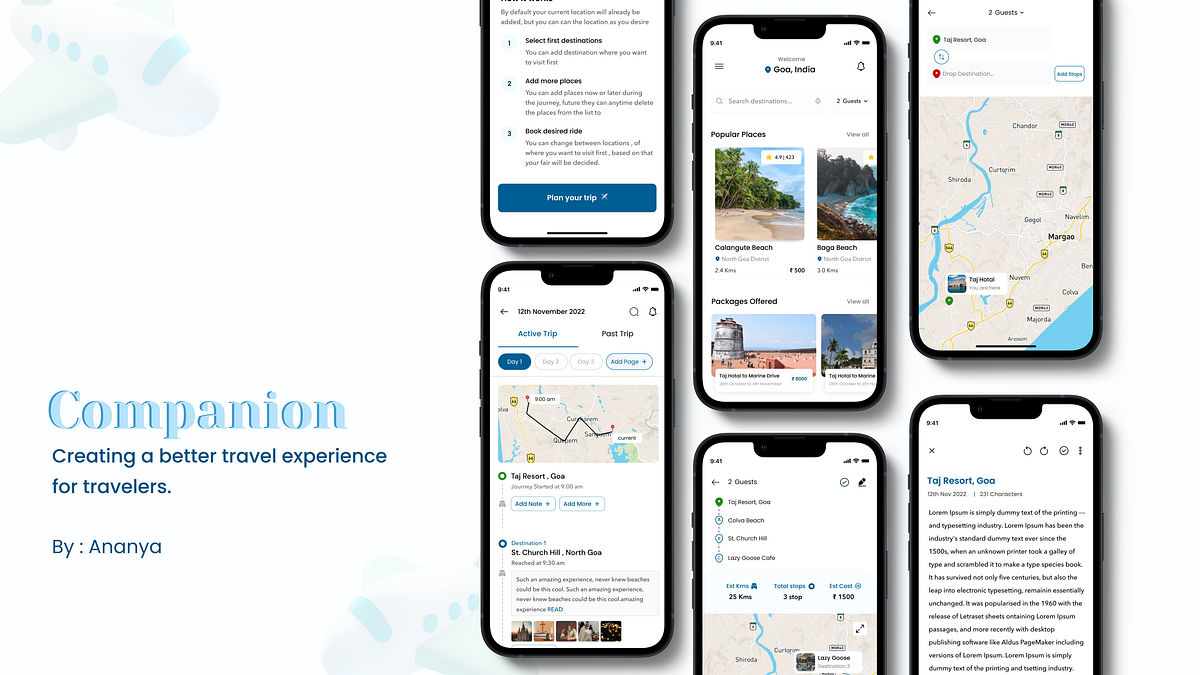
User experience case study : Creating a better travel experience for travellers.
Companion: Creating a better travel experience for travellers.In this case study I focused on designing a memorable and user -friendly experience for travellers.Made in Figma📍 Case Study ContextTraveling is an amazing way to learn a lot of things in life. A lot of people around the world travel every year to many places. Some travel to learn more while some travel to take a break from their life. In my experience, traveling came naturally to me, thus as a child, I used to travel thrice a year to various destinations in India. But in doing so my family and I faced a lot of problems. A few of the problems were:Therefore this experience served as the inspiration for the idea of this appI spoke to other friends and family members of mine who frequently travel to understand if they too face similar problems while traveling and this is what they had to sayThrough the conversation, I identified a few concerns that I would like my case study to emphasize. Those issues are as follows:🚨 Problem StatementNow that we have defined the context above, we can look at the problem associated with the contextProblem Statement👩🏻💻 Roles & ResponsibilitiesProject ContextUser Research: Desk Research, 5Ws, and 1Hs, Competitive Research, User Interview, User Persona, and Business model understanding.UI Design: Pen and Paper Sketches, VisualsTimeline of the Project: 3 weeks🗺 Plan of Action — The frameworkI started by implementing the following plan of action to make it simpler for me to move forward and spend less time selecting what to do next. I broke down the process into two main phases.Design PlanningProblem framingUser Research: Learning and comprehending the context of the problems experienced by the travelers will provide insights to confirm whether the hypothesis is correct and what are the possible outcomes and solutions for the design.Conducting User Interviews: To understand users (travelers) during the interview we ask existing or potential users questions to gain an understanding of their preferences, thoughts, and feelings.Competitive Analysis: Analyze the market for the presence of existing products, and get a further understanding as to what users might expect and how a companion as an app could improve that experience.Solution FramingInformation Architecture: With IA available, it becomes significantly easier to make key decisions for new features and implementations, understand timelines for product changes, and follow user behavior through multiple processes.Low Fidelity sketches and idea documentation: The paper sketches are a necessary part of the design process because it helps convey the information architecture and user flow of an app in a simple way. . Along with this idea documentation in the final stage helps with designing better screens since now we have better and well-structured information.Visual Design: With a solid basis of UX findings, the visual part of the app was designed, such as brand style, UI elements, mood boards, pixel-perfect mockups, and design systems.📚 User ResearchMy research process starts with understanding the problem statement. It includes both primary research and secondary research.User Research ProcessDuring the initial phase of my research, my go-to method for thoroughly understanding the problem statement is to frame the 5Ws and 1H queries. It helps in understanding the existence of the issue and serves as a roadmap for both secondary and primary research.QuestionsSecondary Research / Desk ResearchSearching the internet or other sources you can locate for relevant information is known as secondary research. I searched for this information in a variety of news stories, Quora communities, videos, and travel blogs that were written by actual travelers who were sharing their adventures and experiences.My secondary research focused on the following:What is the average percentage of travelers in India who like to explore domestic destinations?During my study on Quora, I came across a narrative in which a person discussed the value of keeping a travel journal.Quora CommunityWhat are the top problems faced by travelers?After going through travel blogs online, these are my findingsFindingsFiguring out where and when to get food and waterThis common travel problem refers specifically to whether you can drink tap water and what food sources you’re advised to avoid.Most of the time people come across restaurants or cafes that seem to do well from the outside by inside they lack in quality and this is something most travelers encounterMost of them compromise with the conditions and well other tends to bring bad taste with them about the place2. Problem with multiple transportationsThis problem primarily affects solo travelers, who place a higher value on seeing new locations. As a result, they require travel to be easier for them so they may spend more of their time on the activities they prefer.They often have to switch between numerous modes of transportation to get to their destination, which takes a lot of time and frequently results in additional time wasted.3. Expensive tour packagesThere is no way around expensive tour packages; this is a problem mostly experienced by audiences who enjoy taking group trips with their families or friends. These people are aware that tour packages are expensive, with many of them being unnecessarily expensive but they are the only way to travel without wasting time.4. Gross AccommodationThe hotel of travelers’ dreams doesn’t quite match the images online. You arrive and find; stain-covered carpets, a grime-covered bathroom, and four cockroaches crawling way too close to your wobbly bed.How do people navigate to places if they do not opt for tour cabs?Google map is a lifesaver for all people, it helps in navigating and finding easy routes, few percentages of people sometimes face a problem when maps tend to take longer routes to their destination, resulting in time loss, longer sittings, difficulty in navigation if new to the place but this is only they have their own vehicle.Those who do not own the vehicle or cannot rent them, use local transportation options, which again are very time-consuming and often leave bad taste for tourists.Do you know?It’s crazy how most people don’t know that they can find restaurants on google map, after my research I concluded that people in btw age group of 18 to 40 are well versed with technology, but there are people with 40+ age still sometimes struggle with technology, so the easiest they can go is to search directly on the internet.🔍 Primary ResearchParticipants in primary research are those who make up the intended user base. It gives us a chance to hear directly from folks who are dealing with actual issues. The primary data’s insights help to clarify the issue and suggest potential solutions.After conducting secondary research, I was able to understand better the sample space of users that we need to focus on to arrive at our target users.The user base is targeted based on secondary research data and fewer assumptions that I have madeThe target audience for the app👥 User InterviewsAfter defining the users, I set out to prepare for user interviews. I wanted to gather qualitative data to understand the users and their problems well meanwhile also trying to fill in some gaps and find answers to questions that I found during my secondary research.User Research InsightsGroup 1: Solo TravelersThese insights are gathered after interviews with 5 different solo traveler participants aged between 20 to 30 years. Here I have shown the most common problem faced by all 5 participants in general.Group AGroup 2: Group TravelersThese insights are gathered after interviews with 3 different group traveler participants among them 2 are families and 1 is a group of college friends Here I have shown the most common problem faced by all participants.Group 2General Interview InsightsAfter my research, I figured that most solo travelers make spontaneous decisions, hence they don’t do any beforehand planning and those who do not make spontaneous decisions, most have a surface-level idea of where to visit and what all places are famousGroup travelers or family travelers have less time to explore so they tend to schedule a plan beforehand and try their best to finish the plan as it is. They do not want to miss any place even if they have less time.📈 Competitive AnalysisDuring the research, I did a competitive analysis to identify existing design patterns. I studied the user flow of travel apps and websites that I thought will fit in, I went through tour booking patterns, and whether these apps provide transportation options.Competitive analysis was performed to gain a better understanding of other apps that solve the problems and understand if there is any alternative solution available to the problem.Some of the applications were :AirbnbMake my tripFabHotelsCleartripUber🤔 AssumptionIn order to work on this app, I felt it was necessary to make a few assumptions and set a few constraints.The app (companion) only works for domestic destinations which means active for Indian tour destinationsWe will go over the assumption that I have made in this case study as and when required.Without any further do let’s get started with the design🎨 Let’s DesignDesign GuideI worked on a basic design system that included buttons, iconography for screens, and card designs because I knew I would have to iterate on many different parts when I started the project. This enables me to edit the application more quickly and iterate more quickly.Design System guideAfter completing the design system, I went through the process of choosing the right colour for the app. When designing a digital application, colour psychology is important since it establishes the brand identity.Color Guide for appI tried to find inspiration for various screen aspects from online sources in order to establish a theme and a flow for the concepts.Booking InspirationJournal InspirationWireframing and Documenting IdeasI drew out some possible screen designs when I initially started working on the design problem, taking into consideration all the user insights, so that the solutions I come up with will be user-friendly.Wireframing and ideationIn order to make sure I didn’t miss anything, I simultaneously looked over my research and documentation while I was designing.Idea Brainstorming🖌 Final Solution: Visual DesignHome ScreenThe home screen serves as the starting point for all the other vital features; hence, it serves as a showcase for the user’s favorite destinations, packages that can be booked, and links to app features in the navigation.It was challenging for me to design home screen since , it does not have lot to offer but still holds a very important place amongest app screens .To create the most recent design, I went through an iteration of the home screen and its components.While designing the home screen, I went through the following questionsWhat all data points should I consider so that user does not have to spend more than 2 mins on home screen ?How should I work on being minimalist with home screen yet help users navigate easily ?How should I reduce searching efforts for users ?How should I make decision journey easy for users ?Location Card IterationsThe location card should visually describe the location and give the users an idea about the things that a particular location has to offer.Let’s take a look at the different changes I made to this card and discuss the decisions I made in terms of design at each step.The most difficult aspects of designing these cards is to determining the priority order between each data point, which information is required, and how to make these cards simple for users to follow.Helping users in booking customised rides to save time and give them more time to explore the locationsTime is crucial and becomes a constraint to so many things when you are in a new location because you have to cover so much ground quickly. This is one of those problems that both solo travellers and even group travellers have.The current solution to this is available tour cabs, but they also charge hefty sums of money just to visit one single location, which returns us to the initial point that if we devote our entire day to a trip and we only get to visit one place, that is undoubtedly a time wastage and even a financial waste.☝🏻SolutionCustomized Ride optionBased on the number of guests travelling, the user is free to book a taxi for themselves.While using the app, users can add up to 6 locations at once, When on the route, they can also add or remove locations also.Users will be charged based on the distance per km fair and peak pricingBooking prototypeDuring designing the booking flow, I asked myself the following questions?Is the information laid out in the right way for users to understand easily?How can I make my app different from the rest of the apps?How should I make it easier for users to perceive information?How should I design the content so users can browse through it easily?While designing for the booking flow, I went through the following questionsHow should I make the process understanding easy for users ?Where should I place the Add stop CTA button so that it is easily visible and also does not breaks the design?How should I ensure the right hierarchy for the information?How should I arrange the information in search bar section, so that user can easily navigate ?How many users are right handed and how many are left handed ?How should I present the information at the end so that the user have clear idea of what they have selected?How to make users feel secure while try are traveling ?Adding a travel journaling feature will make it easier for customers to gather all their priceless experiences in one location.Being emotional beings, we have a tendency to value and constantly refer to our memories whenever we can as memories play a very important part in our lives.I’ve added a personalized feature which is a travel journal so that users can record their entire journey and its experiences.“ Travel journals, are a place for you to think back on all the adventures and trips you take. It is a wonderful way to capture memories of your trips, with your emotions”Travel Journal BenefitsIt becomes a great resource: A travel journal can be a useful resource or log for your journey. Imagine visiting Manali and finding a fantastic restaurant with outstanding food and service. Make a note of any such treasures you come across. You can then recommend that to your family, friends, and coworkers when they will ask you for suggestions.Photo Memories: Photos can bring back memories of the places you visited during your travel. You can stick photos in your travel journal and revisit them later — sometimes years later.Makes a great companion: Some people just love or have to travel alone, They can capture their thoughts, share goals, or simply use a travel journal as a diary to share their experiences and learnings.Examples of how people currently make travel journals☝🏻SolutionI have therefore added a manual travel journaling feature to attempt to recreate that emotion and experience that users have while writing a travel journal.The app will record the time and location the user is in throughout this part of their journey.They can add notes below the recorded timelines and photos and videos captured from their cameras.During designing of the Travel journal flow, I asked myself the following questions?In how many clicks is the user able to complete the flow?Is the information laid out in the right way for users to understand easily?How can I make my app different from the rest of the apps?Journal ScreenFor designing the Journal screen, I answered the following questionHow should I make journalling fun for users ?What all data points will be added by default ?How should I gain the interest of the users while they are journalling ?Why is journalling is a good practice ?👋🏻 This is the end, folks!I appreciate you taking the time to read and continue to read this article; I attempted to make it clear and concise. Finally, I’d like to thank myself for continuing and never giving up 🥳 .☕️ My Takeaways: Challenges and LearningsTime Management: The case study was quite helpful in helping me understand the value of time and how to arrange my work in order to finish it on schedule.Understanding the “Why” behind each issue that the user has encountered was more important than anything else in this project,For me, the part that helped me a lot was creating documentation since it guided my research phase as well as helped me in making the right design choices.To find the best answer, I went through iterations. I came to understand that iteration is the key to any ideal design solution during this process. There is no other option.🕵🏻♀️ Behind the screensWhen I was the last working on finishing this project, which had to be finished in a short amount of time, this is how my workstation looked.👏🏻 Hey, do you see the clap icon down below? Yes, right there, bottom left of the article; if you could long press the clap icon, give it a few claps, and show your support, that would mean the world to me 😊.🤝Also, currently, I am open to opportunities as a Product Designer. Do reach out to me on LinkedIn or Twitter for any feedback, discussions, or collaborations, and I’d be more than happy to have a chat with you!You can also mail me at ananya.vashist21@gmail.com.User experience case study : Creating a better travel experience for travellers. was originally published in Muzli - Design Inspiration on Medium, where people are continuing the conversation by highlighting and responding to this story.
F5: David Kaul Talks Playing Chess, His Records, His Dog Winnie + More
Early on in his life, artist David Kaul developed a fondness for drawing on things, and he eventually began to explore graffiti, literally making his mark wherever he could – even on surfaces that weren’t his to embellish. He decided to study design and then took jobs as a screen printer and graphic designer.
Even when he became an art director in the ad world, Kaul still gravitated toward his favorite form of expression. “No matter where I was working or what kinds of projects I was doing, I kept being pulled back to walls,” he says. “It was always the thing I did on the side, whenever I could carve out time.”
Kaul moved from the state of Washington to Los Angeles in 2012, eager to immerse himself in the city’s arts scene. He later met strategist Will Cassayd-Smith, and in 2024 the pair launched Pulling Paint Murals, a studio that specializes in signage, murals, and lettering.
David Kaul
As the lead artist, Kaul is responsible for creative development and execution. His practice is grounded in craftsmanship and place-based storytelling, whether it’s a composition for a brand collaboration or a local non-profit organization. He views every wall as a canvas for both visual and emotional transformation.
For Kaul, murals are prime examples of the resonance of analog in an increasingly digital landscape. Although he may never see a piece again, he revels in the process. “At the end of the day the most rewarding part is making something with intention, and knowing it might bring someone joy, even if only for a moment,” he notes. “And if we do it well enough, maybe someone will care enough to preserve it. That’s the ultimate hope.”
Today, David Kaul joins us for Friday Five!
Photo: David Kaul
1. Playing Chess
Playing chess has always kept my mind active. Since I was a little kid, I loved putting my strategy to the test. I always had this delusion of being a guy that sits in a park and plays chess the entire day for money. I chose to make a career out of art instead. Though, it’s not too late.
Photo: David Kaul
2. My Dog Winnie
For all the dog owners, we know there is no better inspiration, motivation, or feeling one gets from being with their dog. The only thing I love more than putting paint on walls is this little punk. I’m pretty much her hero.
Photo: David Kaul
3. Signage Around Los Angeles
One of the best things about LA is all the beautiful hand-painted lettering this city has. This picture is just one example of a million others in Los Angeles. This city is rich with a hand-painted culture that’s hard to beat. Taco Via Corona’s food is pretty amazing also.
Photo: David Kaul
4. Barry McGee
Barry McGee was the first graffiti artist I ever noticed growing up in Northern California. His work as a writer was everywhere around the Bay Area. As I aspired to be an artist, I was constantly blown away by his drive and commitment to his craft. This work hangs in my house and constantly reminds me to push harder and stay focused. I’m glad I’ve been fortunate enough to be around as he has evolved and created unbelievable work throughout his life.
Photo: David Kaul
5. My Records
Music is vital to most creativity. It goes hand-in-hand with my paintings for sure. I don’t think many artists would say that it’s not a good move to work to music. Collecting records has been a source of not only motivation while I paint, but also discovery and inspiration.
Works by David Kaul and Pulling Paint Murals:
Photo: Pulling Paint Murals
Torpedo Gallery Mural
Torpedo Gallery brought us in to create something bold for their new spot in North Hollywood – a massive, photo-realistic mural that blends comic book energy with street art details. I painted a larger-than-life character that feels like it’s stepping off the wall, set against a layered floral backdrop that adds movement and contrast.
Photo: Pulling Paint Murals
Sneakertopia History Of Shoes
An immersive exhibition honoring sneaker culture, Sneakertopia gave us the chance to transform an entire space into a visual narrative. We created five original installations throughout the experience, beginning with a hand-painted line of celebrities waiting outside – as if for a drop – leading into a massive 360º mural chronicling the history of sneaker culture. Inside, interactive painted moments invited guests to become part of the story. The result was a cohesive, immersive world that celebrated the art, culture, and community of sneakers.
Photo: Pulling Paint Murals
Dr. Dre Mural at Compton High School’s Performing Arts Center
We brought to life a monumental 1,102-square-foot mural of Dr. Dre at Compton’s new Performing Arts Center – made possible by a generous donation from the hip-hop legend himself. Completed over three weeks by our team (five artists in total) using 41 gallons of specialized paint, the project pushed creative boundaries with innovative techniques designed to tackle the wall’s complex textures. The result is a powerful, large-scale tribute that not only honors Dr. Dre’s legacy, but also stands as a daily source of inspiration for the 2,000+ students set to attend the new campus this August – underscoring the transformative potential of celebrity philanthropy through public art.
Photo: Pulling Paint Murals
Parks Project Culver City Headquarters
Parks Project had just opened their new HQ and retail space in Culver City’s Arts District and brought us in to create a mural that would bring the brand to life. They wanted something that felt bold and on-mission – something that would make the space pop while staying true to their ethos. I worked closely with their team to translate that energy onto the wall, adding a visual anchor that speaks to their purpose and stands out in a saturated neighborhood.
Photo: Pulling Paint Murals
Whittier LGBTQ+ Community Center
The Whittier LGBTQ+ Community Center was a meaningful project for us. The building was undergoing a full renovation to better serve a community that’s been historically underserved in that part of LA County. We wrapped the front in a bold, geometric rainbow using 15 colors and added illustrated portraits of universally recognized historical figures with the message “All Are Welcome Here” to underscore the center’s mission of inclusion. It still stands out in the neighborhood – and we were proud to receive commendations from both the County of Los Angeles and the California State Legislature Assembly.
The Power of Digital Storytelling or How to Tell the Story Without Words
Most brand websites fail to tell a story. They have beautiful visuals, strong copy, and clear calls-to-action — but visitors leave feeling nothing.Why? Because storytelling has moved beyond words. Modern digital storytelling combines 3D environments, interactive animations, and immersive experiences that make visitors feel your brand story rather than just read it.Digital storytelling helps brands communicate their identity through immersive experiences, not just text. At Noomo, we use 3D, interaction, and motion to turn brand values into memorable journeys. This article explains the key principles of digital storytelling and how we apply them across projects like Coinbase, Intel, and more.We help clients tell their stories through immersive websites and interactive event experiences, blending 3D, motion, and bold brand activations to create moments that connect and inspire. In this guide, we will share insights and lessons learned along the way.Why storytelling matters in digital experiences.Storytelling makes brands memorable, engaging, and emotionally resonant. In digital experiences, the story is delivered through visuals, interaction, and feel — not just words.Storytelling is how we connect as humans. It’s how we share experiences, emotions, and values. For brands, storytelling is what makes them memorable and engaging, connects them with their audience, and drives meaningful engagement.A great story answers some important questions:What does this brand stand for?What makes it unique?What makes it memorable and worth engaging with?In the digital world, storytelling isn’t just about words. It’s about creating multi-dimensional experiences combining visuals, animations, 3D, and interactivity. It’s about bringing the audience into the story so they feel they’re a part of it.This type of immersive storytelling creates emotional connections that static websites simply cannot achieve.Many companies have strong stories but disconnected websites.Most brands have a strong narrative internally, but it gets lost on their websites. Digital presence must reflect brand identity because most touchpoints now happen online.Many companies come to us with a strong brand and a great story, but their story is often disconnected from their website.Nowadays, when most interactions between a brand and its customers happen online, digital presence and storytelling are at the core of a brand’s identity.There are many great resources and books about storytelling, such as Building a StoryBrand by Donald Miller, but how can storytelling be effectively translated into digital experiences?That’s what this guide addresses — the practical implementation of storytelling through web design, 3D technology, and interactive experiences.The Noomo storytelling process: from discovery to launch.Our process ensures every project starts with clarity, stays aligned, and avoids surprises. We uncover the core story in discovery, work as one team, ask “why,” and communicate continuously.https://medium.com/media/41e87cac22d962e8e1e7b97f1d3c6200/hrefAt Noomo, we follow these steps to ensure the story is at the heart of the website or digital experience:Step 1: Discovery phase — uncovering your core storyThe foundation of every great digital experience is a deep understanding of the brand’s story.That’s why we always start with the discovery phase, where, along with research, we conduct a design workshop or a series of workshops (when we need insights from different teams — marketing, sales, product, etc.). This helps ensure all stakeholders are aligned on goals, shapes the story we want to tell, and uncovers what makes the brand unique and special.This core story is what we then translate into the website.Case Study: Jasmina Denner WebsiteWhen we worked on the website for the amazing Jasmina Denner — a writer, fencer, investor, and just an incredible woman — the discovery phase was key to shaping the final design.Through our workshops, we discovered key ideas that shaped the website. Words like unstoppable, energy, inspiration,and the interplay between past, present, and future emerged as the defining characteristics of Jasmina’s personality.These insights directly influenced the design. The website became more than just a portfolio, it became a living narrative that brings her vision to life.A statue-like digital sculpture at the forefront of the homepage symbolizes Jasmina’s ability to bridge the wisdom of the past with the possibilities of the future. A continuous flowing line runs through the site, representing how she connects various ideas and disciplines. A pearl symbolizes wisdom and transformation, guiding users through her journey.But storytelling isn’t just in the visuals — it’s in the experience itself. Smooth scrolling, interactive transitions, and fluid movements make the journey feel intuitive, allowing visitors to explore her story, making the experience both immersive and personal.https://medium.com/media/8bbf5999c94349dc124e3d550a3f2085/hrefChallenges we navigated: Translating abstract concepts like “unstoppable energy” into tangible design elements required extensive exploration. We experimented with different visual metaphors before finding the right balance — motion that felt purposeful rather than chaotic, elements that connected without overwhelming.Step 2: Collaboration — working as one teamWe always work as one team with our clients.As designers, our goal aligns with theirs — we want to launch a successful product. Our clients have deep insights about their business, and we help shape those insights into a compelling story.This collaborative approach is especially important for complex brand activations and immersive experiences where multiple stakeholders need to be aligned.Step 3:Embracing feedback by asking “Why?”Many designers resist feedback, especially when it leads to changes. But let’s be honest, no client wants to make their website worse. Every change request has a reason behind it.The key is not just executing what the client asks but understanding why they’re asking for it. This brings us to the next point.When we receive feedback, we don’t argue or execute it blindly. Instead, we dig deeper — asking why. A proposed change might not seem right at first, but the reasoning behind it often leads to a better solution and, ultimately, a better user experience.Step 4: No surprises through regular check-InsSince we work as a team with our clients, regular check-ins are essential.After the discovery phase, the first thing we share is the information architecture and design direction (for example, a few blocks of the homepage). Once everyone is aligned on the direction, we continue development while keeping our clients in the loop.This transparency ensures productive discussions and avoids last-minute surprises.Case study: ai.io + Intel interactive boothA great example of teamwork was our collaboration with ai.io and Intel for an interactive experience at Amazon re:Invent.Close collaboration and fast iteration enabled us to build a high-impact, AI-powered activation showcased at major events like re:Invent, MWC, and the Olympics.We designed an AI-powered interactive booth where visitors could perform athletic drills that were analyzed in real time. This activation showcased the power of AI-driven feedback, enhancing user engagement while making it a great brand activation for ai.io’s technology.https://medium.com/media/b30eb55a4e92b1ebc6fb9537a5b8eb6b/hrefOur teams worked closely from the initial concept to the launch, ensuring everything ran smoothly — even during the event itself. The success of this project led to its showcase at MWC Barcelona and later at the 2024 Olympics in Paris.Digital storytelling examples: Real client case studies.We would like to start with one of our favorite projects:Case study 1: Coinbase x Golden State Warriors microsite.Another project where storytelling played a big role was our collaboration with Coinbase and the Golden State Warriors.https://medium.com/media/e4a1a66a2af8d657239d809f24690285/hrefWe created a mobile-first storytelling microsite that captured the Golden State Warriors’ legacy through a “golden hour” visual world and enabled fans to mint NFTs live during a game.The Golden State Warriors, the Golden Gate Bridge, and the Bay Area’s iconic golden sunsets… We wanted to capture the “golden hour” aesthetic by experimenting with material rendering, HDRI lighting, and colors to create the perfect golden sunset.The technical challenge: Stadium performanceOne of the biggest constraints was ensuring the experience worked seamlessly on mobile devices in a crowded stadium environment. We needed to optimize for:Quick loading times despite thousands of people competing for bandwidthSmooth performance on various phone modelsIntuitive interaction for fans who might be distracted by the gameTrade-offs we made: The basketball required careful optimization. We created high-poly engravings with displacement modifiers in Blender, then baked these details into normal maps on a low-poly mesh for web performance. This maintained visual quality while drastically reducing file size.To announce the experience, we designed a landing page that tied into the Golden State Warriors’ legacy. To make it meaningful, we incorporated seven golden hoops hovering above the environment, symbolizing the seven championships won by the Warriors.https://medium.com/media/7da4d2b987c1671f6dac75edf135589e/hrefThe microsite wasn’t just about NFTs; it was about making fans feel like they were part of the team. We focused on creating a mobile-first experience, making it easy for fans at the stadium to mint their unique collectible during the game. This experience was designed exclusively for Bay Area fans.What worked: The simplified approach paid off — fans at the stadium could mint collectibles effortlessly while enjoying the game. In just a few hours, this brand activation brought over 1,600 fans on-chain.Case study 2: Noomo Labs — storytelling without wordsThis website tells Noomo’s story purely through 3D, movement, and interactivity. The jellyfish symbolizes transformation and motion — and became an iconic identifier.“We used to think that a story is something written, like in a book. But for websites and digital experiences, a story is what you see, feel, and interact with.”A great example is our Noomo Labs website. We didn’t rely on a lot of words to tell our story, but even without them, users who visit the site can clearly understand who we are, what we do, and what we specialize in — all through visuals, animations, and interactions.https://medium.com/media/7ae5ef3c388c601489e68a2971a25842/hrefThe experience itself tells the story, without the need for words.The main feature on the website, the hero is a 3D jellyfish which users can customize and interact with.So, why a jellyfish? After a lot of experiments we landed on the idea because it represents constant movement and transformation, just like us. Its magical motion is unique. We wanted to make it memorable, wanted people to call it theJellyfish website — and that’s exactly what’s happening.https://medium.com/media/63f47883d776ccb981debc5ddde721fe/hrefThe unexpected challenge: Our creative developer has a jellyfish phobia. So, you can imagine how “excited” he was when he found out we decided to move forward with a jellyfish concept. But don’t worry — in the end, this jellyfish became the only one in the world that he actually likes!Technical hurdles and solutions: Creating high-quality 3D glass rendering on the web presented significant challenges. Our initial attempts failed — the glass looked like plastic or murky water. We spent extensive time experimenting with material shaders, refraction indices, and lighting before achieving the right effect.We combined two different meshes with distinct materials — one with a jellyfish texture and another with a modified glass material — to create the final stunning visual effect.The customization decision: As the website neared completion, we faced a dilemma: what color should the jellyfish be? Our team was divided — some preferred soft, subtle hues, while others leaned towards vivid, bright colors. After days of deliberation, an idea struck: why not let users decide?https://medium.com/media/0a63f1067bc6e414b9a2e38d87ced9ca/hrefWe implemented a customizer that allows users to change the jellyfish’s glass color, texture color, texture opacity, and reflectivity. This turned what could have been an endless internal debate into a feature that significantly increased engagement — users now spend an average of two minutes on the site, just playing with the jellyfish.Optimization priorities: For the main page, we avoided using post-processing effects, achieving great visuals without them. We created three different types of glass, each visually best for specific scenes, but we disable the ones not visible to the user to avoid recalculations.For mobile devices, we significantly reduced the quality of the glass while making this downgrade almost invisible to users. We also lowered the number of simulations and physics calculations. These optimizations allowed us to achieve incredible speed on mobile while retaining all 3D elements, smooth animations, and transitions.Case study 3: Noomo Beat — AI-powered personalized journeyNoomo Beat uses AI to create personalized music and immersive 3D scenes.The Noomo Beat website is a great example of how creating a storytelling website isn’t always a straightforward path. It involves a lot of experimentation, trying different options, testing ideas, and refining until we find what works best.https://medium.com/media/6f6b1ae2b54d8ec2b4d56e222a7f221d/hrefOur goal was to create a custom, personalized, and dynamic journey — making it the perfect opportunity to leverage AI.The struggle to find the right approach: However, we struggled to find the perfect “outcome” from this generation. We explored various ideas, from abstract visuals to characters, but nothing fit together seamlessly.Then one day, we decided to experiment with the Wiggle Bones library, which helped us make a 3D cloth move along with the beat — and suddenly, everything started coming together, working in sync.https://medium.com/media/95438be140d214395a30199a4f3702e9/hrefhttps://medium.com/media/00f554d0d63831b978c4d5d3c302a0ed/hrefTechnical implementation: Noomo Beat enables users to generate custom music based on their preferences, selected via an intuitive quiz. Users choose their preferred genre, mood, tempo, theme, and even color, resulting in a unique musical experience that reflects their personality.A core visual component of Noomo Beat is the collection of highly detailed 3D outfits that ‘dance’ to the rhythm of the music. Users can scroll to select different outfits, enhancing the personalization of their experience.https://medium.com/media/cd7db0f67ea3155077f87f8d9252ade0/hrefThe optimization challenge: We primarily used Blender to prepare the 3D models. However, since incorporating realistic clothing was a priority, we selected models created with Clo3D, as it provides advanced tools for fabric textures and realistic garment draping.One of the primary challenges was adapting the high-quality, detailed clothing models from Clo3D to be performance-friendly for the web. While Clo3D provided incredibly realistic textures, the models were initially too dense for web-based interaction due to high polycounts and large texture files.How we solved it:Reduced polycounts while preserving key details that maintained a realistic appearanceImplemented advanced compression techniques — the scene was too heavy, and material compilation took too much time. In addition to standard geometry compression using DRACO 3D data compression, we also converted all textures to the KTX format, which allowed us to reduce the file size by approximately 60%Continuously tested and refined lighting and textures, experimenting extensively with different light sources and textures on clothing and 3D objectsUsers can customize the scene’s color palette and the album cover design, making each experience personal.https://medium.com/media/119ed9e6db466f690483ccaaf493c19e/hrefThis type of AI-powered personalization creates deeper engagement and makes the brand activation memorable — perfect for conference booths and events.“As you may see, the projects we are working on are very different from each other. They have different goals, different styles and different levels of complexity — but what unites them — is storytelling.”Key lessons about digital storytelling.Clarity, narrative-driven design, experimentation, personalization, and human collaboration are the foundations of effective digital storytelling.Over the years, we’ve learned a few key lessons about storytelling in web design:1. Start with ClarityKnow what you’re trying to say. Whether it’s launching a product or building emotional connections, the goal needs to be clear.Without a clear narrative direction, even the most beautiful designs fail to resonate with audiences.2. Let the Story Guide the DesignEvery animation, interaction, and visual should serve the narrative. If it doesn’t help to tell the story, it’s not needed.When considering design elements — whether it’s 3D, animation, or illustration — always ask: Does this help tell the story better? Does it deepen the emotional connection with the audience?3. Experiment and IterateSome of our best ideas came from just trying things out and learning what worked.Digital storytelling often requires exploration and refinement. The final result rarely matches the initial concept — and that’s okay.4. Make It PersonalThe best stories connect emotionally. Whether it’s through AI personalization or custom design elements, find ways to make the experience unique for each user.Personalization increases engagement time and makes brand experiences more memorable.5. It’s All About PeopleAnd don’t forget, stories are created by people, for people. When you’re working on a project, it’s not just a collaboration between companies; it’s a collaboration between people from one company and people from another.At its core, it’s always about people working together.Finding the focus through storytelling.Storytelling clarified Noomo’s identity during our rebrand. By focusing on what inspires us and what we do best, we transformed direction, client fit, and positioning.We experienced the power of storytelling firsthand. During our rebrand and transformation, storytelling was the most important tool that helped us define who we are, clearly communicate it, attract the kind of clients we want to work with, and highlight our values, ultimately helping us stand out in the market.For many people (ourselves included back then), focus can feel limiting. We tend to think that focusing on one thing means closing the door to new ideas or opportunities.But in reality, focus isn’t about shutting things out. It’s about doing what you do best, what inspires you, and what you love. And when you do that, new opportunities often find you.“The important thing about storytelling — you can’t tell a story without first defining what it’s about.”You can’t just throw in 20 heroes and a dozen different plots and expect it to make sense. A story needs clear goals and focus to be compelling.In this difficult but fascinating journey, these two books can help you navigate this transformation.Recommended ResourcesThe first was The 12 Week Year: Get More Done in 12 Weeks than Others Do in 12 Months, which introduces a system that replaces annual goal-setting with a 12-week cycle. Instead of thinking in terms of yearly goals we focused on 12-week “years.”The most helpful takeaways for us were:Less is more — focus on priorities. Instead of trying to do everything we started focusing on 1–3 key goals per 12-week period.Time blocking. We allocated specific time each week for strategic sessions blocking all distractions.Build a strong vision. A clear personal and professional vision creates motivation and helps focus on things that matter the most.The second was Essentialism: The Disciplined Pursuit of Less, a guide to focusing on what truly matters and eliminating distractions. Instead of doing more, Essentialism teaches you to do less, but better.To be successful at something, you need both passion and expertise. Finding our focus wasn’t just about choosing an industry trend, it was about aligning what excites us with what we excel at.So, when choosing a focus, these two questions became our guiding principles:What are we passionate about?What are we really good at?Creating your brand’s digital story.We hope you finish this article feeling inspired to tell your story — a story that connects, engages, and stays with people long after they’ve left the website.Digital storytelling is about creating experiences that resonate emotionally and reflect your brand’s unique identity. Whether you’re building a conference booth activation, a 3D website, or an interactive brand experience, the principles remain the same: start with clarity, let the story guide the design, and create experiences that connect on a human level.Author: Olha UzhykovaCo-founder & Design Director, Noomo AgencyA Webby and Awwwards-winning design leader specializing in immersive storytelling, 3D experiences, and AI-powered brand activations. Olha leads creative direction for global brands including Salesforce, AMD, Coinbase, Intel, Red Bull, focusing on the intersection of narrative, interaction, and emerging technologies.💡 Stay inspired every day with Muzli!Follow us for a daily stream of design, creativity, and innovation.Linkedin | Instagram | TwitterThe Power of Digital Storytelling or How to Tell the Story Without Words was originally published in Muzli - Design Inspiration on Medium, where people are continuing the conversation by highlighting and responding to this story.

UX Case Study: How to Create a Super App
Modern technology has taken banking to a whole new level. Ease, speed, enjoyment, and convenience are rewriting the history of the user experience in banking. While many banks still struggle to digitize their products, new Neobanks have rapidly emerged, changing the rules of the game. One of the biggest challenges is how to create and develop a banking ecosystem that could organically deliver dozens of products with the possibility to scale up into the bank-as-a-platform in the future.Post by Alex Kreger, financial UX Strategist/Founder of UX Design Agencyhttps://medium.com/media/463cdb13610660d9bedffbaaadea2123/hrefWhat is a super app?The definition of a super app first appeared in Mike Lazaridis’ statement in 2010. A super app is an app that delivers a compelling user experience by leveraging the unique capabilities of the platform.A super app is the kind of app that people love and use every day because it offers such a seamless, integrated, contextualized and efficient experience.Unlike mono applications that offer one function in the most convenient and understandable format, the super app advantage is in building an ecosystem capable of providing a solution for different consumer needs. Such a platform collects a large amount of data about users and increases personalization and the speed of customer engagement on this basis.The most famous example of the super app is WeChat, launched in 2011 by the Chinese internet giant Tencent. WeChat messenger contains more than a million products and micro applications from financial transactions, loans and trade to games, entertainment and ticket booking. Over 800 million active users use the app every month. Other super app examples include Grab, Line and Gojek (Get).The presence of a large number of products and the flow of big data passing through the bank can become a promising basis for building a highly personalized banking ecosystem around a specific user. And, today, there are more and more advanced technological solutions of data processing and personalization through AI in banking accessible on the market.However, despite the technological opportunities, the key challenge is delivering the super app experience in a clear and user-friendly way.Banking super apps are already hereSome financial market players have already begun to take their first steps in the direction of banking super apps. In particular, Revolut is actively scaling its banking ecosystem by adding new features and products, including those provided by third-party institutions.In December 2019, the Russian Tinkoff Bank launched a banking super app that, along with financial products, includes a marketplace of goods and services, a health support system with the ability to choose a doctor and lifestyle services like travel, restaurants and events from third-party providers. The application is personalized and uses machine learning and AI to select products specifically based on the needs of a particular user.We first introduced our vision of the banking super app in 2016 in the Neobank UX Fintech Case Study. Our team visualized how a mobile banking platform can operate and expand indefinitely through aggregating third-party products via APIs.Building of the financial super app UXWhen we consider how to create a banking super app, there’s an important question to answer: how will it work technically? As this kind of financial digital product is complex, a banking super app could rely on 10 digital banking trends that you probably are already familiar with:BlockchainGamificationNudge theoryRobo advisingVoice processingBiometricsSocial integrationPersonalization via banking AIBig dataOpen API and cloudsWhen it comes to the UX architecture of this banking super app, we have to take into account that the person’s financial life involves not only the user and his money but also his/her family, friends and dozens of financial products that solve different financial needs.For example, to manage the family budget, the user has to overlook the financial status of his/her family members. Also, the ability to review the financial behaviors of a customer’s friends could provide great insights into how to better manage his/her own finances. Finally, the user would expect for the bank to provide services that would guide them, track the situation and advise on the best ways that the customer can manage his/her financial life.Considering this, we based our banking super app UX architecture on five key elements:When it comes to the financial UX process in designing this super banking app concept, the main stages we underwent were:identifying the primary user scenarios;analyzing and determining key app functionality;creating information architecture;exploring trending technologies to provide the most simple and clear solution for the user’s financial journey;creating a delightful design.Banking innovations behind the banking super appOur banking super app functionality is based on three main banking innovations.Personal financial assistant in the shape of AIA banking super app must be a champion in personalization. It should become a handy financial assistant and advisor that’s able to provide truly useful insights, based on the user’s unique needs and requirements.This can be achieved using the technology of full banking automatization, artificial intelligence in banking and predictive analytics.When it comes to personalized assistance, the core tasks of a banking super app should be to:inform the users about any situation that requires their attention;help to improve users’ financial health by monitoring it and providing recommendations;make financial forecasts and offer uniquely crafted possibilities according to the user’s specific needs and goals.In addition, AI opens up many different opportunities to take the banking customer experience to a brand new level. For example, in the near future, it should enable the users to conduct financial operations using voice processing, gestures, neuro, VR and AR.This kind of app should also be able to predict the exact moment when a user needs a specific product, and provide it by combining big data with behavior-based predictive analytics.Super bank as a platform for integrationsBanking super apps have to integrate third-party services. The apps could use the external infrastructure of banking vendors for processing payments and other financial services.The banking super app serves as a platform that unites financial solutions with retail services. This ensures a holistic banking customer experience that allows the user to manage everything they might need concerning their private and financial lives, all from a single app. This is the only way to deliver a full neobank service that covers every issue related to the user’s financial life and needs.To become bank-as-a-platform, the main challenge is reinventing the financial IT infrastructure. This could be done by using open APIs and cloud storage. Speed and transaction security would be provided through blockchain technology used by all platform members.Next level personalizationWhen it comes to banking, one of the biggest pains the users cite is filling out long and complex forms. They often ask for data that people don’t even know where to find. This is where the banking super app takes personalization to a new level.If we could get rid of these forms, at least in 90% of the cases, the users may cry tears of joy. We believe this can completely change the customer’s banking experience.To provide customized proposals for each customer, AI could be used for a more accurate customer credit scoring based not only on the user’s bank’s profile and credit history, but also social profiles and offline activity.This would allow the bank to generate a personalized proposal even before the user has requested it. So, no more struggling! All that the customers have to do is choose the proposal that best fits their needs and tap a single button.This would provide not only an amazing experience for the users but also a key factor that so many financial services of today lack─speed.How does a banking super app work?It’s time to guide you through the way we have integrated all of the previously mentioned banking innovations into this banking super app UX design concept.Effortless AuthorizationBiometrics is a must in modern financial solutions. The banks that still struggle or don’t even look for ways to implement this are putting themselves at great risk. As more and more neobanks, as well as traditional players, provide this convenient and effortless option, customers have already begun to expect it from their financial services.Users want to have access to their banking app as quickly and easily as possible. Regardless of whether it’s an urgent bill payment, quick balance check or sending money to relatives in a hurry, for the ideal banking customer experience, every second counts.Today, biometrics is a well-developed technology that provides instant access to mobile banking while maintaining an adequate level of security. It means that the traditional authentication with passwords and codes is definitely not something the users will expect to have in a modern, user-centered financial app.To maximize security, our banking super app uses multi-factor security solutions. For an effortless login, we provide a quick entry through biometrics (TouchID or FaceID/ VoiceID), but, for high-sensitivity functions (security settings, changing limits, etc.) and for transfers of large sums, additional authorization will be required.Key data at user’s fingertipsA financial status overview is the first thing users should see after opening the application.Here, a pain point the users often state is that they just simply want to see how much money they currently have without the credit limit or reserved amount.The main banking dashboard of our neobank app is easy to understand. It displays not only the user’s overall balance but also demonstrates the movement of a person’s finances and recent financial notifications. Our goal was to spotlight key data and preserve a minimal visual density to ensure transparency and ease of use.Here it’s also important to think about a scenario in which the user has multiple accounts or/and manages the family budget. The customer would want to see the status of each account and the overall balance of his/her family. Our neobank UX design offers a convenient and intuitive way to quickly switch between the accounts via a simple swipe, while the balance chart makes it easy to evaluate money movement in each account.All financial insights at a glanceTo have a proper understanding of their financial situation, the users need to know their planned balance, excluding money needed to pay routine bills.Another very convenient feature of our neobank concept is the ability to explore income and expenses for the last month and compare those to the average levels in the same period for a particular account.To provide an instant view of how much money is actually available, this banking super app concept offers a forecast of the account balance to the time of the next scheduled financial income amount.All of this is easy to discover by simply clicking on the balance summary. In this way, the users can quickly evaluate their financial situation and can plan their expenses accordingly.To reach the account menu, the user only needs to pull up the account data card. The card locks, and the menu appears below. Customers have the opportunity to get financial support through an overdraft or pre-approved fast loan with just a single click.Everything that the user needs is just a few simple clicks away in our neobank app UX concept.It’s convenient and quick to add funds to the account and to download an e-statement. Customers can also effortlessly edit the account name, configuration and its primary status.Spending insights that provide valueThe balance chart of the banking super app provides a lot of valuable information by simply taking a quick glance at it.This banking super app concept not only displays the overall dynamics of the user balance but also provides a forecast for the near future. This is a convenient way for the customers to always stay on top of their finances by having the ability to easily explore paid, unpaid and scheduled bills, as well as their budget level.The user can gain instant insight into the categories that he/she has spent the most on by clicking on the chart.This neobank UX concept goes even further by providing recommendations on potential savings generated by the app’s AI.By pulling up the card, the user can discover more spending insights, set a budget and goals and pay the bills, resulting in a delightful experience from the digital bank interface.Best banking UX for any type of an accountCustomers often have several kinds of accounts, like deposit accounts, credit accounts, investment accounts and many others. The mission of the banking super app is to provide a delightful banking user experience for any type of account, so that the activity in all accounts would be easy to review, monitor and manage.All types of financial accounts from different banks or even crypto wallets can be connected to the banking super app so users can get overall insights about their actual financial wealth in a single bank interface.On the basis of big data analysis, banking AI can determine a given client’s preferred investment strategies and make recommendations, adding some new accounts that may be beneficial to the user’s specific goals.Financial activity feed inspired by social networksWe live in a fast-paced digital world ruled by social media and technology. Why should banking lag behind if there are already such great examples of customer engagement in the social media environment?Therefore, we rethought the transaction history of a typical bank interface and transformed it into an activity feed inspired by social networks.Viewing a transaction history is the second most important user scenario after checking the balance. We believe users should get more value out of it than just simply viewing the recent account transactions that often lack any information or insights.So, we created a timeline that allows the user to conveniently review all information on transactions, suggestions from friends, system recommendations and notifications in a clear and simple way that is reminiscent of Facebook and Instagram feeds. Such a UI is familiar to the users and integrates banking into their social space.The social aspect doesn’t cover only the looks of the UI. The banking super app activity feed displays users’ friends’ opinions about various financial services and products, as well as other social-based recommendations.It also includes advice and service tips that improve the user’s financial status. Contextual recommendations are created by banking AI using predictive analytics based on big data, according to the nudge theory.These recommendations may include anything that would help to enhance the user’s financial life, for example:tips on how to reduce spending in the categories in which users spend the most;notifications about urgent financial activities that require immediate attention;recommendations about savings and investments according to the user’s goals;reminders to pay bills and make other regular payments;useful contextual messages, such as suggestions for nearby ATMs when traveling;mindful budget alerts when visiting shops, etc.To create a truly intuitive banking user experience, we placed the transactions list under the accounts screen and linked it with the balance chart. Therefore, when moving the chart, users can see all transactions for a particular period.All there is to know about transactionsDetailed information about each transaction is available by simply clicking on it. The banking super app dashboard conveniently displays details about the transaction, including the beneficiary, amount, category and even a location on the map where the transaction was made.The banking super app design makes it simple to split bills, request and send money and send a friendly reminder to friends and other beneficiaries who have forgotten to pay.Customers can also easily sort out all related transactions, edit transaction categories and report suspicious activity instantly.Payments quicker than the MessengerMoney transfers and bill payments are one of the TOP priority scenarios of the digital banking customer experience. Unfortunately, these also cause the greatest struggle to the users as they often require quite a lot of time and effort.Many traditional players have already started acting on it, adopting the Fintech experience of instant payments and payment requests. But as we all know, the traditional long payment forms with several input fields that cause headaches to the users are still common practice.What if we had to wait days to send a Whatsapp message to our friends? It would seem like we’ve gone back in time when there was no digital technology, and everyone sent letters. So, why do we have to suffer from this kind of experience while sending money?Many challenger banks have already found ways to tackle it. Users are now able to send money in seconds within the app, without commissions, regardless of the bank account you and your friends have. However, many banks still struggle to implement this.Money transfers and bill payments should be no more difficult than sending a message on Whatsapp or Facebook Messenger.In this banking super app, these options are conveniently available from the main menu. Smart contact synchronization from a core banking database, social networks and phone book should compile all of the contacts into a single list. Further, future banks should find and combine identical contacts to ensure the ultimate banking user experience.In this way, the customer would be able to use any attribute for the search recipient in the contact list (e.g., name, e-mail, phone number, account number, debit card, social ID), then select the money amount and transfer channel and simply click the “send” button, easily transferring the money in just a few seconds.After receiving the money, the recipient’s card and account number would be automatically added to the contact list. If the recipient starts using the banking super app, the user will be able to see this person’s activity in the feed according to their privacy settings.In this banking super app interface, we have taken into account and designed a full range of financial transfers, including:P2P payments;bill payments;automatic payments;international transfers with currency exchange and payment requests.All of these transfers are just a few clicks away and take a minimum amount of time and effort.Maximum safety, transparency, convenience and speed of payments would be ensured by the use of the blockchain network by all banking platform vendors and the adoption of PSD2 analogues by financial institutions from around the world, resulting in a wonderful experience for the users.Bills that take care of themselvesWhy should users waste their precious time by regularly going to the payments section to pay routine bills? We propose to use financial AI settings to automatically prepare or even pay bills. Our vision of the banking super app offers customers the opportunity to place regular bill payments into the user’s activity feed and send push notifications so the user can pay those with a single tap, as easy as that!So, how does that work? The regular payments are displayed on the financial chart, and their payment status is marked with a color.With this UX feature, it would be very difficult to forget to pay a bill, which eases the everyday lives of the users.When it comes to payments, many users state that they hate the hidden fees almost all banks have. This creates an unpleasant surprise leading to a very disappointing user experience. We believe that, in the near future, banks would not add hidden fees. But, for now, it is a must that they at least inform the customers and clearly display the fees of the service directly on the payment card UI.Financial app you can talk toTwo of the key expectations of the customers in the digital age are for everything to happen as quickly and effortlessly as possible. Our banking super app vision offers the ability to instantly perform any task or get help from the app’s support through digital banking AI voice assistant service.The user can easily submit any request, from “Send $50 to my brother” to “Find the nearest ATM” and get it done in a matter of seconds. In this way, we reinvent the banking user experience into a financial assistant that saves the user time and effort.To make conversational banking available right from our home, the Internet of Things (IoT) would integrate banking super app AI advisor with smart home assistants like Amazon Echo or Google Home. All it takes is just an authorization with voice ID biometrics… and, voila. the customer can check his/her balance, upcoming payments and even make transfers without pressing a single button… and all of this from the comforts of their couch.Let’s model an example of how the workflow of a voice assistant in the conversational banking super app would work. Suppose the customer wants to take out a personal loan. He/she taps the mic icon and voices the request. Banking AI would identify the request and offer a choice of available options that have already been prepared and approved according to the customer’s credit score. All that the user has left to do is just to tap “Confirm,” and the money would appear on his/her balance in just a few seconds.Proactivity instead of reactivity… this is one of the key principles that the future banks should integrate into their customer experience.Instead of waiting for a user’s request, the financial AI assistant would automatically prepare and approve proposals for the maximum number of services using big data-based predictive analytics. This would take the financial customer experience to a brand new level by providing an instant service, instead of long waiting times and complexity.Unlimited financial marketplaceBanks offer their customers a myriad of different financial services, but, despite that, the users aren’t able to achieve the maximum value that these products can provide. This is due to the difficulty of identifying what benefits the product would bring, whether the user needs it after all and how to apply.The ideal banking super app UX should be focused on providing the ultimate value for each customer. This means not only offering simple to use and easily understandable services but also significantly increasing the number of available products, even hundreds of times if needed.Here, it’s important to note that too many options might cause decision paralysis and confusion in customers. But this is not the case where the banking user experience is fully personalized and is able to come up with solutions that fit each customer’s specific needs in specific circumstances, right when the customers need it.The Card-UI marketplace is the best way from the UX perspective to interact with a large number of services. This is the most familiar and convenient interface format for mobile users. This UX frame provides an easy categorization of the banking services, a personal recommendation component and subscription management.Personal finance management that fits user needsMany people struggle with monitoring their finances. This is where the financial app should come in handy with help in not only providing an insightful overview but also giving recommendations.This is exactly what our banking super app concept delivers. It displays money movement in a clear and intuitive way, allowing the customers to have greater control over their finances. In this way, the users have an instant understanding of the nature of their spendings and get clear recommendations on how their financial situation could be improved.Our banking super app personal finance management allows sorting all transactions by category for which the users can set a budget. The customer can also review how expenditures are moving in any of the categories on the timeline.There’s also an ability for the customer to compare his spending levels with friends or the average bank customer. This allows the users to evaluate and optimize their financial patterns.Motivation to reach financial goalsFor the financial app to become a part of the customer’s lifestyle, it has to serve as a companion in achieving bigger financial goals─motivating and helping the customer through the process.Everyone passes certain financial milestones throughout their lives, it could be paying for university or college, buying a car or an apartment, saving for a vacation, investing or creating retirement savings, etc.To guide and support the customers through the journey toward reaching a certain financial milestone, our banking super app UX design offers templates and relevant objectives, as well as a feature to set up automatic transfers into saving or investment accounts to more quickly reach the user’s goals.Finances made excitingTechnology makes our lives more interesting, interactive and simple. Why would financial services UX lag behind and offer a dreadful experience?Our banking super app brings fun and positive emotions to the financial experience by using gamification.Gamification is the craft of deriving fun and engaging elements found typically in games and thoughtfully applying them to real-world or productive activities. This process is what I call “Human-Focused Design,” in opposition to what we normally find in society as “Function-Focused Design.” Human-Focused Design optimizes for human motivation in a system as opposed to optimizing for pure functional efficiency within the system. Yu-Kai Chou, Actionable GamificationThis is exactly what we followed by integrating the gaming elements. In the settings panel, the user has rewards points. These are given out for trying new services, sharing the user’s financial experience, participating in the banking community and achieving personal savings and investment goals. Such a banking gamification platform could also be used for cross-promotions from different partners.The financial status of the customer is also monitored and evaluated, displaying the banking experience and credibility level. For users, it will ensure service discounts or exclusive offers with limited access. Points can be redeemed for gifts or free goods and services.Users’ achievements can also be shared with their social connections to gain respect for the financial expertise.All of this information is displayed under the user profile where he/she can easily manage their settings or check their credit score and find out what could be done to enhance it. From this screen, it’s also easy to access the support chat. Furthermore, it also allows the users to contact the bank via text or make a video call.Personalized offers that care about the usersOne of the most powerful features that digital banking AI can provide is personalized promotions. This can be ensured by using predictive analytics. It should combine analysis of the user’s financial activity, their social environment and big data analysis on typical behavioral patterns, geolocation data and contextual analysis.For example, location-based push notifications about the location of local ATMs may come when the user crosses the border.Purchasing a flight ticket could be a good chance to offer an insurance policy for travel.Child expenditures or maternity grants detected by the banking AI could become an ideal reason to offer a loan on increasing the living space.Car warranty period expirations detected by leasing or insurance data is the perfect time to offer a new car purchase. Moreover, each promotional offer must provide everything needed for instant one-button receipt of goods or services.For example, a customer gets a push notification about a pre-approved loan offer for a brand new car. The user checks it out and concludes that this is actually an offer that he/she would like to consider. Now, they’re asked to log in to the banking super app and will be presented with a list of cars. All cars are divided into two categories: available right now or only on request. If the user is eager to get the new car instantly, he/she can choose the one with the best fit from the available options and receive it by the next day just by clicking the “Buy” button and confirming the agreement.The customer’s new car, with all the documents, will be delivered to his/her home in just one day, all without the tiring, time-consuming visits to several car dealerships or, bank branches. In this way, the user can purchase a car faster than in the online store. Welcome to the future of banking!The future is near (here)Four years ago, we disrupted the industry in a positive way by presenting our neobank UX concept. Today, we look back and see that a significant part of the predictions we made were realized in several Fintechs and progressive challenger bank applications like Revolut, Monzo, Moven, Klarna, N26, Monese, Starling Bank and many more. This banking super app UX case study is aiming to create a new wave of motivation for the new banks, as well as the traditional players, to strive for even better financial experiences for their users.Originally published at https://www.uxdesignagency.com.UX Case Study: How to Create a Super App was originally published in Muzli - Design Inspiration on Medium, where people are continuing the conversation by highlighting and responding to this story.
(Part 4) TOP 20 UX Dos and Don’ts: Boost the Customer Experience Instantly
Can you improve the customer experience of your financial app in just a few days? In our four-article series, we guide you through 20 examples that demonstrate how it’s possible to quickly improve the customer experience of your financial product using the power of financial UX design.Post by Alex Kreger, financial UX Strategist/Founder of UX Design AgencyThis is the final part of this series. Here’s a list of all the previous parts, if you haven’t read them yet:(Part 1) TOP 20 Financial UX Dos and Don’ts: Boost the Customer Experience Instantly(Part 2) TOP 20 Financial UX Dos and Don’ts: Boost the Customer Experience Instantly(Part 3) TOP 20 Financial UX Dos and Don’ts: Boost the Customer Experience InstantlyAll of these parts combined cover the 20 examples that clearly demonstrate the dos and don’ts leading to a great financial customer experience. We have added a detailed description of each of these examples, so you can understand where the problem lies and what exact steps you need to take in order to simplify this pain and turn your financial product design into a pleasant experience for your users.These 20 of the most interesting UI banking app examples were extracted from our unique 200+ financial solutions database, which includes BFSI financial products from Europe and the US.After reading each of the four articles, you can check in with your financial app and evaluate what user experience improvements can be made. To make it even more convenient for you, we have included a UX checklist at the end of this article.1. Help your customers increase their savingsSavings are an essential part of almost every person’s life. Many are saving for rainy days or their future, such as sending kids to college or buying a car or a house.Some people are savers by nature, but most of us are not, which creates a pain point.On one hand, it’s important to have savings; however, human nature is more oriented toward instant gratification, which is why it’s often so difficult to set money aside.Here is where the financial products can offer an effortless way to help people save money easily, making it almost unnoticeable and eliminating any frustration.Unfortunately, most retail banks don’t do that. Instead, they offer their users the option to open a savings account or term deposit to which they can make payments from their current account. There’s only one problem: the customer has to figure it all out and also execute it him/herself. It’s not intuitive, easy or effortless. So, why would a person who is already struggling with his/her finances choose such a path?In the meantime, challenger banks have gotten ahead of the traditional players by offering their customers convenient ways to save.The Fintechs are changing people’s perception of savings as something dreadful. They are making this feature fun and motivational, encouraging people to start saving with seemingly tiny amounts of money.StruggleAs we know, saving means dedicating a part of the user’s income for some long-term goal, which is often accompanied by a dilemma─choosing between instant gratification and long-term benefits. A difficult decision, right?Many banks promote the importance of savings, but, at the same, often this service is difficult for the users to set up and manage on their own.The users have to be quite self-motivated to start saving and adding money to their savings accounts on a regular basis. They have to explore how a savings account works and what features it has.It’s also important to take into account that users have different needs depending on the amount available to them to start saving. Some want to deposit a large sum, while others are interested in saving up gradually by adding a small amount each month. Some banks offer only the deposit function without the ability to add money regularly or create a separate savings account for this purpose, which can cause struggle if the user intends to save small amounts at a time.When it comes to savings and/or deposit accounts, even more problems arise, such as potential restrictions on the movement of money. For example, the users can’t withdraw money immediately without a fee, or they might have to request a money withdrawal 7–10 days in advance in order to avoid a fee.On the one hand, this could be good as it might motivate the customer not to spend his/her money. On the other hand, this can get quite unpleasant if the users know that they can’t instantly access and control all of their money or have to pay an additional fee to do so.Also, setting up a savings account is a feature that’s often only available on the desktop version and not on the financial app. In the previous article of this series, we already covered why it’s so important to have a multichannel strategy so as not to damage the customer experience.All of the aforementioned factors might create quite a lot of difficulties. This is the reason why many customers choose the option to simply create another standard account and dedicate it to savings. We can see such a case in the example on the left. The only aspect that differentiates the current account from a savings account is its name.In this case, first the user needs to go through the process of opening a new account (let’s keep in mind that the process is still not simple and quick in many banks) and transfer money to this account. Secondly, the priorities might change in the user’s life, and there may no longer be a need for the additional current account to save money. What happens then? The users don’t use this account anymore and aren’t even aware that if the account is not used for a longer period of time, the bank applies a fee for the inactive account administration.How are the users informed about that? Sadly, they usually aren’t. It can be a very unpleasant surprise to suddenly be charged by the bank, which results in negative feelings toward their financial institution.To avoid such disappointing situations, think about how easy it is to close the account in your financial application. And, how many inactive accounts do you have? Inform users about the applicable fee and provide guidelines about any potential actions with the account. The users will feel cared for and supported and appreciate this kind of support from their financial institution.Solve it with financial UXHave you followed up on how regularly your users add money to their savings accounts?Can they easily find this option in the application? These are some of the questions you should ask yourself to discover the pattern of how your customers are using the saving option on your financial product.Knowing that most humans, in general, are not good at saving their money, how can you remind them about savings? And, even more, how can you encourage and motivate your users to start saving?Your financial app has the power to provide your customers with a feeling of satisfaction in managing their money. Use it, and the customers will reward you with loyalty.Just imagine the feelings of your users when, thanks to the help of your financial app, they have saved money to fulfill their dreams: buy a family house or afford a great university for their children. They will experience pride and happiness with your application in hand. This is how financial services can improve people’s lives.Provide the ability to create a savings account quickly and easily for different savings goals. On the Revolut app, for instance, users can create a savings vault with only a few clicks. The customer has to state the name of the goal, and then the app guides him/her through the features related to the vault.Think about the reason why customers use the product. Are they interested in depositing a large sum instantly, or is it important for them to set aside smaller amounts regularly? There should be an ability to add money to the savings account if that’s the main reason why the customer is creating it.As you can see in the example on the right, the Revolut app offers regular transfers with a fixed amount and frequency from the current account, as well as an option to save the spare change from each credit card purchase.From a UX perspective, saving money using the spare change option is a good strategy for those users who have difficulties saving. It might be painful to consciously set aside some part of their monthly income, but, by using spare change, it becomes almost unnoticeable. By using the option to accelerate the difference two, three, five, times, the savings amount increases exponentially. The users get a pleasant surprise after they see that these small amounts combined actually move them closer to their goals much quicker than they had hoped.Locating the savings account separately from the current accounts list makes it easy to find and manage. Make it intuitive to add or withdraw money from the savings account as these are the main actions in this scenario. In the example on the right, you can see that the Revolut app offers actions related to the savings in the view screen, such as fund, withdraw and enable/disable regular transfers.If the savings account is displayed together with the current accounts, make sure you differentiate the two accounts by using visual elements to demonstrate the purpose of the account.Another motivational element is the progress bar that displays how close the user is to reaching his/her goal. This provides a quick insight about how quickly the user is moving toward the goal and creates an additional motivation to reach it.From the UX perspective, it’s always a good idea to add emotions and personalization to the financial products. In the Revolut example, there’s an opportunity for the user to add a picture of their choice to the vault.The visual aspect is very important as it stimulates the user’s imagination of already having the goal achieved. This increases their motivation to make their dreams come true, turning the process of saving into something exciting.2. Provide the option to view and copy account detailsViewing and copying the account details is a common pain point for users. There are often situations in which we need to quickly provide our details to receive a payment, or we need the details for a contract or an invoice. But, to the surprise of many users, the option to view the details often isn’t available, not even talking about the possibility to copy it.StruggleThe first struggle arises already when a user tries to find the account number. In some cases, this results in a huge disappointment because, after a period of intense searches, the customer discovers that there’s no such option. In a slightly better scenario, the user would finally find it but end up disappointed anyway, as there’s no ability to copy the details.Just think about how this scenario looks like: the user has his/her phone in one hand and a paper and pen in the other to manually write down the numbers and then type them in wherever they are needed. This really doesn’t reflect the era of social media and digitization, right?Even worse, if the account details aren’t available on the app, OR if those are hidden like a very precious gem and impossible to find, the user will have to turn on his PC and login to the desktop version to access the necessary information. Just think about how many inconveniences this causes for the customer and how much unnecessary effort and time is dedicated to finding such basic information.In the example on the left, there is no ability to view or copy the account number. In some cases, it gets even worse if there’s no option to name an account. Then the user has to distinguish his accounts only by their balances or by remembering the account number, which is definitely not a user-friendly solution!Solve it with financial UXProvide your users with the essential information about the products they own. Account numbers and bank details should be visible to the user so he/she is able to navigate the account freely and easily.If the user has multiple accounts, in addition to displaying the account number, the users should have an option to name each of the accounts. This makes it much easier to quickly distinguish them.In the example on the right, under the information about the account, there’s a “share” button next to the user’s account and IBAN number. By clicking on that button, the customer can easily copy the account details and share them via multiple channels. Here, the financial app has considered the “job” for which the users have “hired” this option. If the customer seeks the account details, then most probably he/she wants to share them with someone. This creates positive emotions to the users as they can quickly and easily send the account details through Airdrop, messages or social media.3. Make it clear how to review the scheduled paymentsOne of the pain points that the customers often cite is that they feel anxious about all of the regular payments they have to make every month. As there are many utility bills received through different channels, as well as other regular payments, they worry that they might accidentally miss some of these or are afraid that something could go wrong, and the scheduled payment wouldn’t go through. This anxiety is normal, as a delayed regular payment can result in a fine or, in the worst case scenario, lead to the heat, electricity or phone being disconnected.To feel in control and gain a sense of calmness, the user wants to know that everything is in order: the payments are scheduled, and it’s easy to review which ones are already safely paid and which ones are in the queue for payment.By providing such an option, the financial service offers the users a feeling of relief and satisfaction that it’s all taken care of, and the customer doesn’t have to worry about it.Unfortunately, many banks offer the option to review the scheduled payments, but it’s only available on the desktop version. As we know, having all functionality easily accessible from the mobile device is crucial to ensure a great user experience, especially in a scenario that has so many emotions attached to it.Another problem that arises is, even if the financial app provides a list of scheduled payments, it is often not intuitive and is difficult to read and understand, providing little value to the customer.StruggleIt can cause a lot of negative emotions if the customers can’t review their scheduled payments quickly.As you can see in the example on the left, there is a list of scheduled payments, but the users need to click on each payment to get information about the recipient. This is a time-consuming and annoying process, especially if the users have many payments on the list. Don’t hide essential information like the recipient’s name; show it instantly and eliminate unnecessary steps to find it.Also, don’t confuse your users with information that’s totally unnecessary for them. In the example above, all of the payments are named “Contractual Payments,” which doesn’t provide any value to the user whatsoever. Instead, the name of the recipient would provide instant insight. In this case, it’s good that the financial app at least displays the date of when the scheduled payment would be sent out.Solve it with financial UXHelp your users save time by clearly displaying the most important information about scheduled payments: name of recipient, amount and date when the payment will be made.In the example on the right, a correct structure of the information allows the user to quickly scan the list for the most important information. The recipient’s name is accompanied by their logo, which makes it even easier to distinguish between the recipients and also makes the list more visually appealing.Think about prioritizing the information. For example, emphasize the payments that are about to be paid shortly. Also, provide the ability to pay instantly, before the payment date. The users should have more flexibility in payment planning and gain control over their financial situation without being tied to a specific date.Provide the user with an easy overview of both the payments that have already been made and the scheduled ones, like Klarna has done in their financial app. Show the most recent payments and provide the option to view the full list. This is a great way to display the most essential information and not clutter up the screen, at the same time providing easy access to the full list, whenever the user needs it.4. Create a convenient budgeting and spending featureAmid the growing number of different budgeting apps, more and more banks are starting to create their own budgeting features. This is a wonderful plan as it can really provide value and improve the customers’ overall financial health. Sadly, however, often this great intent lacks a proper realization from the UX perspective and, as a result, the customers tend to avoid it.StruggleThe customer will choose to use the budgeting feature if it won’t take much time and effort to enter all of the data, and if they feel that the insights gained are beneficial. After all, the main goal of this feature is to help ease the users’ lives.Accurate budgeting and spending analytics is the bank’s responsibility. If the insights prove to be inaccurate, the customer might very quickly lose trust in the financial institution. Even worse, getting the wrong overview of the customer’s financial situation might lead to harsh consequences, such as overspending on fun and entertainment and coming short on utility bills.In the example on the left, the user is provided with an option to review all of their expenditures by week, even if the month has started in the middle of the week. There’s no ability to view the spent money in another time period, for example, the total per month. Also, there is no option to review total spending amounts in the current month.If you provide users the ability to review their expenditures, think about what kind of insights could be valuable for them. In the given example, there is only the total amount of weekly expenditures displayed, which gives the user no valuable information to understand, analyze and learn from the financial situation.Another painful aspect of many budgeting services is that the customer has to enter all of his/her expenses manually. The app doesn’t calculate the user’s spendings, so he/she must go through all the spendings by him/herself.In the example on the left, the table displayed on the screen is difficult to perceive and read. There is no visual representation of the overall situation. The customer must put in a lot of effort to analyze the data and extract any insights by him/herself.Solve it with financial UXIf you provide your users with a budgeting and spending analysis option, make sure that it really helps to improve their financial life rather than causing additional work and stress, which is sure to lead to harmful decisions. Digital products are tools that are supposed to ease people’s lives, not complicate them.In the example on the right, we can see that the Mint financial app provides several options for how the user can track their budget. First, the user can set the amount that he/she prefers to spend in a specific category during the current month. Users can also see a progress bar that provides immediate insights into how close the users are to reaching their goals. For progress bars, color coding is typically used so the user can get a sense of the overall situation by color. For instance, red usually indicates that the user is very close to overspending the maximum amount of money that was planned for a specific category.For each category, the user sees the spent amount and the amount that is still left. Here, many inconvenient budgeting features provide only information about the budget goal amount. Think about the main goal of the user who has opened this budgeting screen. It is important for a customer to understand how much money is available for spending in a specific category. If the financial app provides only the total goal amount, the user must put in additional effort to calculate the budget that is left.Another feature that the Mint financial app offers is automatic categorization of all expenditures. Therefore, the user gets information not only about the progress toward monthly budget goals, but also has an understanding of how the money has been spent.Here, it’s important to view this contextually; the users should have the ability to edit a specific transaction category. For example, if the user buys bottled water at a gas station, the app will probably automatically place this transaction into the category “Auto/Transport” or “Gas/Fuel”. This increases the accuracy and trustworthiness of the budgeting feature.Many financial apps display spending categories separately from budgeting goals. This is not bad practice, but, if you think from the user’s perspective, then often much more insights could be gained if these two features were combined. Remember that every function of your financial app should meet the user’s expectations and goals according to the specific scenario.If you provide budgeting and spending options to your users, update your customers about their progress. If the user is close to overspending, send a notification about that so they will be prepared. Inform about possible upcoming financial issues before they occur. The users will feel that their financial health is important not only to them, but also to the bank that they use. As a result, the user will see that it is not just a financial application, but a financial health advisor and companion.5. Make it easy to apply to productsIn the digital world in which we live, the user requires that everything happens immediately, on the go without any additional effort. This is a precondition for creating a delightful financial UX.If such a scenario applied to banking products can be executed only through the bank’s desktop version or, even worse, only by physically going to the banking branch, it wouldn’t be accurate for the financial institution to refer to themselves as “user centered.”There’s a single question you can ask yourself right away to find out whether your financial company meets the requirements of the customer expectations in the digital age. Does your financial institution offer the ability to apply for products right from the app?StruggleEvery bank wants their customers to use as many banking products as possible so the customer can feel the full banking experience. But, have you ever thought about the way you provide this opportunity to your customers? Many banks still do not offer the ability to utilize products right from their apps, or, if they do, there are limited products available or the application process is so complicated that the user decides not to go through with it.If the app doesn’t offer a list of products that the user can apply for, then, in most cases, the only option for the user is to contact the bank. And, as we have already mentioned in the previous articles of this series, not all banks offer a convenient way to reach them and get support for any questions.Some banks provide message templates in their apps to apply for the product. On the one hand, the bank tries to ease the application for new products, but, on the other hand, if this process is too complicated, the user won’t proceed with it anyway. Besides, there are still quite a few banks that don’t provide the opportunity to utilize these features right from the app at all.Another struggle is that often there is no information about the full list of available banking products. Since the most popular channel nowadays is mobile, then the customers can’t even have an overview of all the product types the bank offers. For example, a family might think that it would be convenient to get a payment card for their children. As they can’t find this option in the app, it might seem that the bank doesn’t offer this type of service, while, in fact, the bank might offer this option, but only in the desktop version or only at the branch.The difficulty of signing up for the products decreases the chances of people actually choosing them. If the bank stepped forward and made the process quick and simple for the customer, or even created a personalized offer, the chances of people choosing the bank’s products could increase significantly.Solve it with financial UXGive the customer the ability to experience the full range of banking products. Try to provide more information about each product so that the user can be sure which one to choose and then guide them through the journey to get it.In the example on the right, you can see that the user not only has the ability to apply for the product, but also has answers to the most common user questions about the product. By providing such information, you significantly increase the possibility that the user will apply for the product.If you offer a form to fill out to apply for the products, make sure that users don’t have to duplicate personal information. For example, don’t make the users fill in data such as name and birth date if the banking app already has this information and can display it automatically.If the option of applying for products can’t be easily added to your app, or it is required to visit the branch, you can still give your clients clues on how to do that from the app.Provide your users with insightful information about your products, so that the customers can already evaluate which product is right for them and prepare the needed data and documents to accelerate the process.Make sure the bank’s contact information with phone number and branch locations, as well as their working hours, is easy to find, so that the user can contact support with any additional questions regarding the product or book an appointment at the branch.Financial UX checklistThis was the fourth and final part in the TOP Financial UX Dos and Don’ts series. In these 4 articles, we have identified 20 user pain points your financial service can solve quickly and without huge effort.Please fill out this checklist to find out the areas in which you could improve the UX of your financial service. For your convenience, it’s also available in PDF format to print out and share with your colleagues.Originally published at https://www.uxdesignagency.com.(Part 4) TOP 20 UX Dos and Don’ts: Boost the Customer Experience Instantly was originally published in Muzli - Design Inspiration on Medium, where people are continuing the conversation by highlighting and responding to this story.
(Part 4) TOP 20 UX Dos and Don’ts: Boost the Customer Experience Instantly