UX Dos and Don’ts: Next 5 Ideas to Boost the Customer Experience Instantly
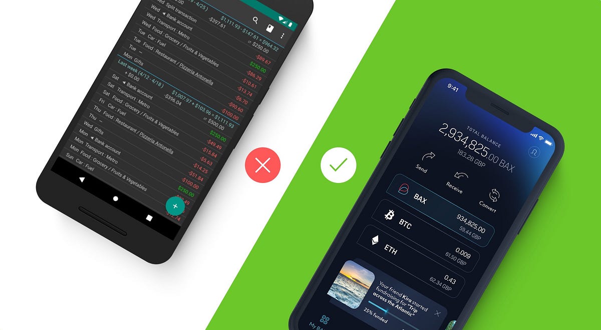
Is it possible to improve the customer experience of a financial app in just a few days? You can instantly increase the overall user satisfaction by easing their most common struggles. In our four-article series, we guide you through 20 examples that demonstrate how you can detect improvement points using the power of financial UX design, and achieve great results with little effort.Post by Alex Kreger, financial UX Strategist/Founder of UX Design AgencyThis is the second part of this series. Here’s the first part of TOP Financial UX Dos and Don’ts, if you haven’t read it yet.Using Pareto law, we can say that approximately 80% of customers use only 20% of all the functionality a financial app offers.It means that improving key user scenarios can give you a rapid, significant increase in overall user satisfaction. Moreover, this can be done in considerably less time using fewer financial resources.What you need to do is identify scenarios that cause struggles and simplify them with the help of UX design.This instantly boosts the overall experience of the digital financial product and rewards you with customer loyalty.To guide you through real-life examples, our UX architects extracted 20 of the most interesting UI banking app examples from our unique 200+ financial solutions database, which includes BFSI financial products from Europe and the US.These 20 examples clearly demonstrate the dos and don’ts leading to a great financial customer experience. We have added a detailed description of each of these examples so you can understand where the problem lies and what exact steps you need to take in order to simplify this pain and turn it into a pleasant experience in your own financial product design.In our four-article series, we will guide you through these 20 examples. After reading each of these articles, you can check in with your financial app and evaluate what user experience improvements can be made. To make it even more convenient for you, we have included a UX checklist at the end of this article.1. Security first: make it quick to block the cardMost users spend their money using payment cards, so all operations regarding cards should be easily accessible through every channel. This is especially true when it comes to nerve-wracking security situations in which immediate action is required, such as losing a card or getting robbed.StruggleMore and more banks allow users to manage their payment cards from the financial app. Here, it’s crucial that the scenarios with a huge impact are accessible in an easy way. The card allows direct access to the user’s hard-earned money. So, for the customers, it’s very important that they are able to manage the security settings.Imagine the user’s feelings and reactions if the card is stolen. First of all, the user is very anxious about his or her finances: what if somebody accesses their account? What if somebody withdraws all the cash they have? What if somebody makes fake reservations using their card?In these kinds of cases, the users should have the ability to immediately block the card. Card theft is a very stressful experience, so card blocking should be quick and immediate and not require any additional thinking, since it’s hard to be rational when you’re in an emotional state.In the example on the left, we can see that the bank offers the functionality to lock the card. But, when a user actually wants to accomplish this goal, he or she finds out that it is necessary to call the bank to do that.We can only imagine the stress this causes the user when he or she was hoping to block the card quickly from the app but now has to wait in order to be connected to the bank through a call.Solve it with financial UXGive the user the ability to manage his or her card freely. If the user can’t block the card quickly, it can have a big impact on the user’s life. Think about how else you can support your user in this unpleasant situation. In the example on the right, we can see that the bank provides the opportunity to choose the reason for blocking. This can be insightful for your financial business to understand how else you can help the customer. For example, if there have been fraudulent transactions, you can ask your user to identify them after the card blocking to facilitate the investigation.Provide users with the ability to control their credit card settings since it will give the users a powerful sense of being in control of their own finances. Be the ally who supports the users in stressful situations and helps them to regain a sense of peace about their finances.2. Don’t overload the dashboardOur everyday lives are more saturated with information than ever before. On the one hand, this provides us with a wide range of opportunities. On the other hand, navigating oneself in the midst of such information overload can be exhausting and overwhelming. That’s why simple and easy to understand financial services are in great demand.People expect that the digital tools they use will ease their lives and reduce their daily stress and anxiety, not increase it.If your financial app takes too much effort to understand, the users will reject it and choose a simpler alternative. Nobody wants to waste their time on trying to figure out and analyze complicated information.The dashboard is the screen most often used, so it is crucial that the user can easily overview the most important information in one glance. Users expect to easily access the summary of their finances, such as available account balance, list of latest transactions, upcoming payments, the performance of savings or investments and debt amount. They also need access to urgent information that the user needs to act upon, such as bills that are due, money requests, automated payments that don’t go through or important announcements from the bank.StruggleThe main purpose of the dashboard is to quickly check in with the users’ overall financial situation to make sure that everything is under control. Unfortunately, often when users arrive at the dashboard, they are forced to take unnecessary steps to get the information they need.Typically, the reason for this is that banks want to impress their users with the number of features, options, and products they have, but, in this case, it does the opposite, creating a bad first impression and ensuing frustration. Due to information overload, it’s difficult for the user to find the most important information, which results in stress and anger.In the example on the left, the financial app dashboard is overloaded with information. In a single screen, the user has access to their balance, all the transactions for the last two weeks and some calculations that don’t include any helpful explanation. The user automatically starts to process all of this in his or her mind and seeks to identify and sort out the information he or she is seeking.In this example, there is no straightforward information about what is happening with the user’s financial situation and no focus on the main element that the user is looking for─their balance. Consequently, the user then needs to find the balance on the screen and analyze all the accessible information to get a sense of the overall situation. This is energy and time-consuming and not something the user would enjoy in light of their fast-paced routine.Solve it with financial UXThe urgency to log in to the banking application depends on the situation and the environment. It can be done at home, on public transportation, on the street or in the shop. That’s why it’s crucial to provide users with the most important information ASAP, right after login.In the example on the right, you can see that the account balance and the latest transactions are easy to overview without any effort.This provides the user with a sense of control and eases his or her mind because they can simply review the incoming and outgoing money flow.Think about contextual insights that could help your users. In the example on the right, you can see that, under the main balance, there is an amount colored in green, as well as the day’s count. This is a sum that the Monzo app calculates by looking at how much of the user’s monthly cash is left compared to the number of days remaining in the month. This helps the users keep track of how much they could spend today and still stay on track for the rest of the month.When it comes to dashboard insights, another great feature is the “Safe-To-Spend” option featured in the Simple app.It can be a real struggle for users to follow up on all the bills and regular payments because they receive them through different channels like e-mail, as well as directly through the bank or biller’s system. The due dates also differ. Safe-To-Spend solves this by providing clear insights of how much money will be left after paying all the bills and regular savings each month. This is exactly what customers try to figure out themselves, delivered by the financial app in a clear and easy way. This is a great example of creating a pleasant banking experience from the user’s perspective.3. Put yourself on a map and let customers find youWe are moving toward a cashless economy. More and more customers are choosing to pay using a credit card or other technological advancements like Apple Pay because it’s simple and quick, and they don’t have to worry about carrying wallets stuffed with cash.Nevertheless, there are still situations in which cash is needed. As banks are trying to reduce the workload of the branches, ATMs can help with that. Users can not only withdraw and deposit cash but also pay the bills or even apply for bank products. As users are often busy and on the go, it’s crucial to offer a quick and convenient way for them to reach the nearest ATM right from their location.StruggleUnfortunately, many banks still don’t provide an option to find ATMs and branches on the financial app. Or, even if the functionality is available, it is not working properly.It seems ironic to expect the users to call the bank or search its homepage to quickly locate the nearest ATM or branch.In the example on the left, we can see that, to get information about the nearest ATMs, the user has to chat with a chatbot that eventually provides an answer such as “There are no options within 10 km.” The user has spent his time chatting just to get information with no value. Does this solve the user’s request? Most likely no, because the need for an ATM still remains.This example quite clearly demonstrates how the innovative chat functionality itself is integrated into the financial app, but, at the same time, it does not meet the user’s needs. This same case can be applied to a lot of other functions in many financial applications. This is inefficient, it wastes the user’s time and, in the end, doesn’t move the customer any closer to his or her goal.Solve it with financial UXMake sure that the user can access the location of your ATM or a bank branch as quickly as possible. That will reduce the workload on your branch and/or call center.When the user is seeking the nearest location of something, first he or she will need to identify their current location. After that, the mind will start filtering the information about locations in your app and decide which one is the most convenient. To make it effortless and intuitive, provide the user with a map that conveniently displays all locations of your branches and ATMs.Often a long list of street names does not prove to be helpful, especially if the user is out of town or abroad and isn’t familiar with the region.For people, it’s much easier for the brain to perceive visual objects than text. When it comes to actual navigation, this is especially important.Also add up-to-date ATM/branch details so the user won’t find themselves in a situation in which he or she finds an ATM but there is no ability to cash in or the ATM is available only during specific hours, for example.For the user, it is important to know the details about the specific ATM/branch, including the name, address, operational features, working hours (especially during holidays), and other information that’s relevant for your users.Accessing the bank in an easy way via any channel instills trust in your financial company. As we know, trustworthiness is crucial when it comes to the financial sector. Make sure to provide your clients with reasons to trust you, even in the smallest details.4. Be there for your users with accessible supportOften, financial companies hide their contact information or provide just a single contact option in order to avoid incoming message overload. If only a phone number is provided, often the user isn’t able to send any attachments like screenshots, or he’s not able to talk at that moment and would prefer chatting. Moreover, often the phone operators are so busy that the user has to wait quite a while to reach support. All of this results in a combination of negative emotions and feelings toward the financial service.Even if you create the most user-friendly app, there still needs to be an option to contact the financial service. Providing quick and easy access to a live person at the other end definitely increases reliability and a feeling of reassurance that the user will know that he or she will always be able to contact the bank almost immediately whenever a problem arises.StruggleAlmost anyone can remember a situation in which there was no way to contact the financial company. This gets nerve-wracking as people have entrusted the financial service with their money, and it’s impossible to reach them when in need.In the example on the left, we can see that there is a chat option provided to the user. Overall, this might be a convenient way to quickly solve a problem that is not complex.In the example, we see that a user has written his message in the chat, but, instead of being connected to an operator, he’s placed in the queue. This might not be anything unusual as there are often quite long queues to contact the bank either by phone or through the app, but, if we look at it from the user perspective, this struggle damages the overall experience quite badly.In this case, as with a phone chat, the app notes that there are already 6 people waiting in the queue. It’s good to know how many people are in front of the user, but it’s difficult to calculate the approximate time it would take to move up to the first place and get to chat with the support person.It would be helpful if the app calculated an approximate waiting time. If the problem is urgent, most likely the user will look for their phone number and call the bank.As a result, chat functionality is not valuable in many important and critical user situations, for example, to block the card (if this function is not available for the users themselves).There are many financial institutions that believe they can call themselves digitalized and user-friendly simply because they offer a modern-looking app design.Customer support plays a very big role in the overall experience. In situations like this, in which it’s almost impossible for the user to find the contact and then has to wait a long time to be served, frustrations ensue and damage the user experience.We should also pay attention to the confusing design of this screen. When the user starts the chat, it opens an additional window in the app and changes the location on the screen when the user starts to type. Also, the chat window is so small that the user can only view part of the message and needs to keep scrolling.Solve it with financial UXIn the example on the right, the mobile banking app is immediately generating a message to find out the topic of the conversation. If you know the most common questions the users ask, you can offer them the appropriate option to select. That will make it faster for the support specialist to understand what they will be discussing.If your bank is mid-sized or large, you may not be able to provide an opportunity for the support specialist to join the chat immediately. In that case, offer an understanding of the status of the user’s message, such as whether it has been received or seen. Secondly, let them know the approximate time it will take to get an answer.It is also important that, as in the example on the right, there is a friendly message, greeting the user by name, that gives personalized communication and a friendly attitude.The user will have the feeling that the bank cares about their financial situation, and they can trust that the bank will always be there to help him.5. Make it easy to view and copy credit card detailsIn the digital age, people make online purchases almost every day. To execute this common scenario, the user usually needs to enter the payment card details every time. The bank card number consists of 16 digits, which is typically not an easy combination to memorize. Add to that the expiration date and CVC code. If a user has to get up from his or her comfortable sofa to look for his wallet with the credit card information every time they want to buy something online, it can get quite annoying.Users typically have mobile phones by their sides 24/7, so this information should be easily looked up in the financial app with no need to retrieve a physical card.StruggleIn the example on the left, we can see that there is no option for the user to view the bank card details, such as full card number and CVC code. Every time a user makes an online payment and applies for online subscriptions, he or she has to find the physical bank card. The users have stated that they definitely expect their financial app to offer such an option to avoid this time-consuming and frustrating task.Even if the bank allows you to view the card details, there might be no option to copy them. If the user is making a purchase on their mobile device, there could be a situation in which the user must switch between apps to fill in all the card details. This results in a manual task that is inconvenient and very annoying, especially in an age in which everything is automated.Solve it with financial UXIn the example on the right, the user is able to view the full card details, including card number and CVC, so there is no need to look for a physical card. Also, the app provides an opportunity to copy the card number, so the user can paste it in whenever needed.The Revolut app has also considered security as all of this private information is available only on request and after the user is identified.Offer your users the most convenient way to use their payment cards. It seems to be a trivial detail, but the users will feel that the bank cares about them, which results in large rewards for the bank.Financial UX checklistTogether with the first part in this article series, this sums up the 10 user pain points your financial service can solve quickly and without huge effort. Stay tuned for the next articles in this series. Meanwhile, please fill in this checklist to find out the areas in which you could improve the UX of your financial service. For your convenience, it’s also available in PDF format to print out and share with your colleagues.Originally published at https://www.uxdesignagency.com.UX Dos and Don’ts: Next 5 Ideas to Boost the Customer Experience Instantly was originally published in Muzli - Design Inspiration on Medium, where people are continuing the conversation by highlighting and responding to this story.
Logo Design Process: From Start to Finish
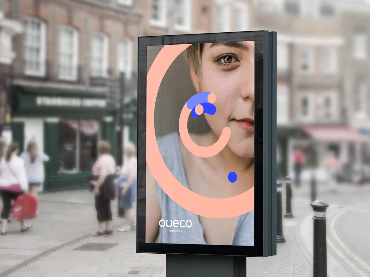
The principal stages in creating and developing a logoDesign by OutcrowdDesigning a logo is the first step in building your brand and a mark of professionalism in business. Most business people understand that today no company can thrive without a logo. But not everyone knows what a real logo is or how it works.A logo is more than just a company’s face and identifier in the online and offline markets. To the consumers, the logo is a guarantee of quality; to the business partners, it’s a signal that the company is trustworthy. This is how market reasoning goes: if a company has a high-quality logo, this quality extends to its activities, namely producing goods and rendering services. The logo helps the company stand out among the competitors, making it recognizable and memorable. The logo forms the basis for the brand’s visual identity. Exclusive rights to the logo and corporate style provide legal protection of the company’s assets.A well-designed logo is functional. It must work. A logo does not fulfill its function if it was created without regard to (or in violation of) marketing and design rules.Oveco Cosmetics — Brand DesignFunctions of the logo:Presenting the company in the marketplace.Informing the market and the audience.Shaping the brand’s image.Making the company and its product stand out among competitors.Protecting property rights.Guaranteeing quality to the consumers.Drawing attention to the brand.Increasing consumer loyalty.Serving as the basis of the corporate style.If the logo fails to accomplish any of the above tasks, it needs to be redesigned based on marketing analysis and a reappraised design concept.Oveco Cosmetics — Brand DesignAnalytics + Idea + Design Concept = RealizationThe secret to a good logo is thoughtful analysis which will logically lead to the appropriate idea and form the basis of the design concept.Learning about the process of logo development will help you see and understand how a professional logo is born and what steps it requires from the customer and the designer.Stages of logo creationStage 1. BriefA brief is a survey-like document. It comprises several logical blocks (marketing, design, administration). The brief is used to tell the designers the main information on the project, the goals and objectives, the requirements and wishes of the client.The brief minimizes errors in the project and helps the client and the designer understand each other earlier. So it’s a good idea to take the time to answer all questions of the survey.A brief also covers contact information, deadlines, and budget.Oveco Cosmetics — Brand DesignStage 2. ResearchAny research done independently by the client is priceless to the designers. Nevertheless, professional designers will always do their own analysis: study the market, the brand’s competitors, their logos and identities, examine contemporary visual trends as applicable to the project at hand. Special attention is paid to analyzing the company itself, its positioning, mission, values, goals, and priorities. Target audience research is also crucial: the brand should speak the same language and find an emotional key to its consumers.Logo & Business Card — Main TradeStage 3. Concept developmentConcept development can be provisionally divided into two elements: the intellectual part and ideas & visualization. This is the most difficult and demanding stage of creation, often requiring a team brainstorm session. Brainstorming implies several stages:Analytical conclusions — Ideological contents — Verbal description of image — Associations — Image visualizationhttps://medium.com/media/17e6423507ed9f717ffc261d3040d226/hrefThe concept for the logo is based on brand ideology and includes the versions of the visual “message” that will work toward the stated goal. The main task is creating a brand image — first as a verbal description, then through association, and ultimately as a visualization.The best versions of the concept are then used to make sketches.Stage 4. SketchingThe sketches for the logo are first drawn manually on paper. It’s customary to do between 16 and 20 versions. Photos of the sketches are sent to the client for review. This is followed by a conference-call discussion so that the client can choose the best 3 to 4 versions.Stage 5. Working on the chosen versionsThe chosen sketches are recreated in digital format (usually with Adobe Illustrator). Details are filled in, various color solutions and elements are added. Two versions for the text design are chosen: positioning relative to the graphics, size, font. In typographic logos (those that consist of text or a stylized inscription), every letter is processed and every element drawn out, transforming a mere inscription into a text sign.The finished sketches are also discussed with the client.AQ humidifier — Logo DesignStage 6. Final presentationApart from versions of the logo, the final presentation normally also includes examples of logo placements on products, in corporate paperwork, advertising communiques, etc. The logo is accompanied by a “history” — a description of the graphic’s features, its possible interpretations, advantages and disadvantages.The presentation is followed by another discussion, which concludes with the client approving the final version of the logo.AQ humidifier — Logo DesignStage 7. Delivery of workThe approved version is rendered in different formats (EPS, JPEG, TIFF) for various media. If necessary, different color versions of the logo are made: full color, monochrome, black and white. Sometimes a simplified version is presented for smaller rendering options. The finished files are delivered to the client. They will be used to implement the logo in advertising products, corporate paperwork, and so on. They will become an important basis of the company’s corporate style.In the process of creating a logo, the client and the designer agency become partners and collaborators. This tandem will result in a proper, visually perfect, and meaningful logo — a functional marketing tool.AQ humidifier — Logo DesignLogo Design Process: From Start to Finish was originally published in Muzli - Design Inspiration on Medium, where people are continuing the conversation by highlighting and responding to this story.
8 Best Examples of Ecommerce Product Video
8 Best Examples of eCommerce Product VideoCreated by Explain NinjaWhy product videos eCommerce should be used to attract users and convert them into loyal customers? How to create it and where to place it? And how do you make videos increase your conversion rate and your site’s visibility on search engines? Get some answers here, but first, let’s understand what eCommerce videos are.Benefits of Video Marketing for Your eCommerce BrandVideo is the most expensive, but also the most effective tool for engaging visitors. Video content is actively used by Amazon, Zappos, Asos, and other e-commerce giants. According to one study, visitors who view videos have an 87% higher conversion rate than those who do not.In practice, this means that the user leaves the website if there is no video on it. Today, visitors to online stores expect not only to be told about the product but also to be shown how it works, etc. Not finding a video review, they leave to look for it on YouTube or Vimeo. Or google it somewhere else.So, product videos in particular are proven to capture your eCommerce customers’ attention and deliver more useful data than any other medium available. That’s because consumers end up staying longer on websites with videos.What is an eCommerce Product Video?An eCommerce video is a video that displays your brand product, shows it in action, and highlights its key features and benefits. Ecommerce video marketing is the best way for consumers to learn more about your brand, products, or services and their benefits, especially if they are not available to view these products in a store or showroom.What is video marketing? This term refers to any kind of video that is used for marketing purposes, i.e. to promote a certain service or product. The brand name, the benefits of your product, the vision — all this is successfully distributed and popularized with the help of explainer videos.How to Implement Product Videos in Your Ecommerce Marketing?To implement your video marketing for eCommerce strategy, get prepared first and stick to a list of tips for a start. Ensure effective video marketing for eCommerce by following at least these 5 tips:1. Context is kingThe contextual ‘how’ or ‘why’ we communicate via our brand and what form that experience takes have become as important as the actual video content being delivered. To produce an effect, context is everything. Context is king. So, do not forget to think it over before you deliver the video and place it.2. Show and tellYour video should contain a clear story that tells your audience what’s what. Of course, visuals go first but do not forget about the meanings. Apply visual storytelling to amaze your viewers.3. Share your storyOr you may let your customers tell it for you. If you produce stories that go viral, your users will spread the information over and over, thus working on you as your brand advocates.4. CustomizeCustomization and personalization are important in order to cater to your target audience with the most up-to-date information 24/7 all year round. Inject some personality but don’t foster FOMO (fear of missing out).5. Include a clear CTAA clear and convincing call to action is a must, so people know how (and where) to buy. Sometimes marketers may forget about the importance of picking the right CTA button or motto for their product videos in eCommerce.11 Best Examples of Ecommerce Product Video MarketingHere you will find the list of the most incredible eCommerce product videos created by the Explain Ninja team for your inspiration. Enjoy it!1. ZalandoeCommerce product video for Zalando:Zalando Lounge2. Duds Onboarding AnimationDuds Onboarding Animation3. ShopsShops4. ShoppingShopping animation5. PsiphonAslan Almukhambetov for Fireart Studio6. Flying cafeCreated by Fireart Studio7. IndemandlyIndemandly explainer video8. Bolt Food — Picked UpOnly shape layers and parenting usedReasons why your business needs an eCommerce Product Video MarketingYou may find about five solid reasons to use video marketing in your business and succeed in no time. Here they are:1. Video improves SEOVideo marketing is the present and future of the online marketing space, making it absolutely essential for every company to make the most of video. Social platforms like Facebook or Instagram love videos.When you upload videos to these platforms, viewers become more engaged and spend more time on the site. This builds trust with visitors and signals to search engines that your site has quality content.Google loves video. If you add engaging and informative videos to your site, they can appear on the first page of the search engine giant. According to statistics, if you embed a video on your site, you are 53% more likely to appear on the first line of Google search results, all other things being equal.2. Mobile apps striveEvery day people are becoming more dependent on smartphones and tablets. A US study by Deloitte found that all Americans check their smartphones 8 billion times a day. As more people check their mobile devices to watch animated videos dozens of times a day, video marketing opportunities are growing.According to Wyzowl, 90% of users watch videos on mobile devices. This means that visitors are more likely to view your brand’s videos and ads on their smartphones. Mobile devices and video go back to back.3. Video boosts conversions & salesThis is one of the main reasons for using video in a content marketing strategy. Videos can turn your visitors into loyal customers.According to a report by Vidyard, 70% of businesses say that video content is more effective than any other form of content for engagement, driving conversions, and sales.4. Videos have a higher ROIThis is another important reason for using video in your marketing strategy. Over 83% of companies say that video delivers a high ROI.There was a time when video production was an expensive and time-consuming creative process, but thanks to the availability of online video creation tools, and professional studios, a lot of bright and spectacular amateur products got their chance to skyrocket.5. Videos form loyaltyVideo is the best way to engage your audience and spark emotions. When we talk about industry experts, YouTubers can be the most powerful social media figure to promote a brand. Make a deal with popular YouTube stars to effectively promote your brand in the digital space.Trust is the basis for the growth and increase in the income of your business. For a brand, building trust is a goal in itself. The whole concept of digital marketing is based on building trust and long-term relationships with potential customers.As a business owner, stop focusing only on sales and let your audience come to your brand by offering useful and interesting information.ConclusionUnderstanding eCommerce marketing video brings success to your marketing. When visitors view a product on an online store card, they are one step away from ordering and paying. It has been proven that users who watch a video about a product buy much more often than those who have not. Therefore, it is essential not only to shoot a good eCommerce video, but also to optimize it. With video, a potential customer can get acquainted with the product and compare it with other products without leaving your online store. Mind that!Originally published at https://explain.ninja.8 Best Examples of Ecommerce Product Video was originally published in Muzli - Design Inspiration on Medium, where people are continuing the conversation by highlighting and responding to this story.

The Mechanics Behind Making Better Design Decisions
TL;DR:Design decisions often seem simple on the surface, but beneath them involve a lot of thinking. This article covers what makes better design choices, with real-world examples and practical frameworks.Here’s what we will cover:Why design decisions aren’t as simple as they seemThe difference between junior and senior designers’ thinking, contrasting intuition-led vs. strategy-led approaches.13 key questions senior designers ask before settling on a solution, covering everything from user value to accessibility.The importance of articulating your rationale to earn trust with teammates and stakeholders.The value of sharing your design story, and not just your output.Lessons from movie characters like Sherlock Holmes and Morgan Freeman in Se7en, to illustrate how reflective decision-making works in practice.Decision-making tools like matrices and checklists to reduce bias and structure thinking.Common pitfalls to avoid such as chasing trends, ignoring user feedback, and overcomplicating simple problems.How to handle decision paralysis, with practical steps to move forward when you’re stuck between good options.Why context matters more than a one-size-fits-all solution, and how the right decision depends on users, goals, and constraints.Summary: Better design decisions come from slowing down, asking the right questions, and communicating clearly. Practice these habits and you’ll not only design better, but also become a more trusted voice in your team.The simple made complexShould that button be blue or red? Should the navigation go at the top or bottom? Should we follow the latest glassmorphism trend or stick with tried-and-tested design?Design decisions often masquerade as simple choices.To the untrained eye or even to the newer designers, these questions may seem purely visual or stylistic. But to any experienced UI/UX designer, they know that behind every element placed or interaction designed is a combination of reasoning, research, and responsibility.For instance, that trendy layout? It might conflict with accessibility guidelines. That smart animation? It could introduce cognitive friction for your target audience. Every decision is a balancing act between usability and delight, speed and scalability, brand and user need.Design should be a practice of making the complex appear simple. However, that’s not always the case. Making design decisions involves understanding users deeply, aligning with business goals, and working within technical constraints.As you can see, thoughtful design doesn’t happen by accident because it’s all engineered. In this article, we will dive deep and explore the mechanics behind truly informed design choices. Whether you’re navigating complex user flows or simply choosing between two icons, understanding the underlying forces can help you move from instinctive designing to intentional decision-making.Intuition vs. strategy: How junior and senior designers decideFor newer designers, it’s easy to go with your gut. For instance, you see an awesome animation on a Dribbble shot and think, “That looks cool, I’ll do that!” Or you pick your favorite font because it feels right. And sometimes, those choices work. But more often, they don’t hold up when put in front of real users or real-world constraints.Take this example:A junior designer adds a carousel to showcase five new features on a homepage. It looks clean. It feels interactive. But the analytics later show only 15% of users ever click past the first slide.Now compare that to a more seasoned designer’s approach.The senior asks:“Will users engage with all five features?”“Do we have data that supports putting this in a carousel?”“Could a simple vertical list or cards be more scannable?”After weighing options, they might skip the carousel entirely and show all features at once. It’s more usable, less flashy, but way more effective.It’s not that seniors hate trends…it’s just they’ve learned to zoom out!Where a junior might ask, “What looks best?”, a senior often starts with, “What’s the goal?” or “What problem are we solving?”Junior: “I love dark mode. Let’s make the whole app dark.” Or “This icon set looks minimal. I’m using it.”Whereas,Senior: “Our audience is mostly older adults. Will dark mode reduce readability?” Or “This icon might look nice, but is it universally understood?”To summarize, this is how it goes in both a junior and senior designer’s minds:Junior’s Thought Process | Senior’s Thought Process“This looks modern.” | “Is this design appropriate for our users?”“I saw this in a cool app.” | “What does our user research suggest?”“Let’s try this animation.” | “Will this slow down task completion?”“I like it this way.” |. “Will this support our business goals?”From gut to guidanceDon’t get me wrong; this is not an article to criticize juniors and only give seniors the praise. We all start with instinct. A very normal thing.But great designers learn to pause before deciding. They gather input, ask questions, test assumptions, and then make informed choices.The flashy carousel might win views on dribbble, but the plain list might win users. In design, strategy always beats style, especially when users are involved.Femke nails it when it comes to the importance of business context in design decisions:Many designers get caught up in craft and aesthetics without connecting their work to actual business outcomes. It’s critical to have a good understanding of the business context behind every design decision. I see this constantly with mid-level designers who’ve mastered the visual and usability fundamentals but struggle to gain influence with leadership. They’ll spend hours perfecting a button style or debating color choices, but can’t articulate how their design decisions impact revenue, user retention, or operational efficiency.Femke — Product designer and industry voice known for helping designers grow through practical, thoughtful guidance.The senior designer’s checklist: 13 questions for better decisionsDesign may be creative, but good decisions often come from discipline. Senior designers rely on a mental checklist and not just instincts to guide their choices. These 13 questions act as a framework to ensure every design decision serves users and hits goals.Let’s walk through each one:1. Are we solving the right problem?First and foremost, ask yourself: What’s the actual problem here?Example: Users can’t find how to update their billing info and as a result, they keep reaching out to support for help. A junior might redesign the billing page. But a senior digs deeper and realizes the real issue is poor visibility of the account settings link.2. What’s the effort vs. impact?Basically, measure how much work this could take, and is it really worth it?Example: Introducing a personalized dashboard sounds great, but if it takes about 4–6 weeks to build and only helps 5% of users, it may not be the best use of time. Don’t you agree? Instead, a simple improvement to the existing layout could offer 80% of the value at 20% of the effort.3. Is it standard practice?Does this follow familiar UX patterns users already know?Example: Instead of designing a custom toggle switch, use the OS-native one. Reinventing familiar patterns can confuse users without adding real value.4. Will users find it familiar and intuitive?Can users understand this without thinking too hard?Example: Adding a confirmation for canceling a payment can be confusing for some users. A senior would simply go with “Cancel” because it aligns with their familiarity and reduces friction.5. Is there previous user feedback or testing about this topic?Have users already told us what they need?Example: If usability testing showed users ignored your dropdown filter, don’t redesign it blindly. Start with what users said or struggled with.6. How does it align with business goals or KPIs?Does this help move the needle for the business?Example: A redesign that improves onboarding clarity directly supports a key metric: conversion. Good design aligns with both user and business success.7. Will this introduce new maintenance or support challenges?Is the design adding long-term complexity?Example: That animated 3D background might look awesome, but if it’s hard to maintain, bugs easily, or increases load time, it’s probably not worth it.8. Can it scale in the future?Will this still work as the product grows?Example: A navigation bar designed for 3 items might break when the team adds 3 more features next quarter. A senior chooses a tab system that can grow gracefully.9. Does it align with our design system?Are we using the same components and patterns?Example: Instead of creating a new custom modal, a senior uses the system modal component. It saves time, ensures consistency, and reduces development effort.10. Is it accessible to all users?Can everyone use this design, regardless of ability?Example: Light gray text on a white background might look sleek, but fails contrast checks. A senior designer ensures designs meet WCAG standards so no user is excluded.11. What are the risks or edge cases?What could go wrong?Example: A password field with a visibility toggle looks great, but is it secure on shared devices? Will it still work when users have slow connections? Senior designers think beyond the “happy path.”12. What’s the impact on other parts of the product?Does this change affect other flows or screens?Example: Adding a new “Quick Book” feature sounds great, but does it confuse users who are used to the current flow? Will support docs and help videos need updates?13. What can we learn from it?Can we test or measure this to improve later?Example: Instead of hard-coding a new layout, a senior proposes an A/B test. That way, they learn whether it truly improves engagement before going all in.Why does this checklist matter?These questions help you shift from guessing to guiding. You’ll make fewer arbitrary decisions and more intentional ones. They keep your work user-centered, aligned with the product, and mindful of the bigger picture. Before finalizing a design, pick 3 questions from this list and assess. If you are not able to get a clear answer to these questions, then that means it’s time to pause and explore further.Articulating your rationale: Building credibility with stakeholdersMaking a solid design decision is important. The one thing that sets senior designers apart is their ability to explain their decisions clearly, confidently, and with context.Rather than defending your work, focus on helping others understand your thinking. This includes why this layout, why that interaction, why not something else. When you can do that, you eventually build trust.Good designers make decisions. Great designers explain them.Let’s take an example. A checkout form was redesigned to improve conversion. Now, imagine being asked in a stakeholder review, “Why did we move the billing info below the shipping info?”A junior might say:“I just felt it flowed better that way.”A senior would say:“User testing showed that 70% of customers expected to enter shipping first. Moving billing below reduced confusion and form abandonment. It also aligns with our analytics from last quarter.”That explanation changes everything. It shifts the conversation from opinion to insight. It’s no longer a design as an art but rather as a solution.The anatomy of explaining a design choiceWhen you’re presenting or justifying a decision, try this simple structure:What was the problem?“Users were dropping off on this screen at a high rate.”What did we change?“We simplified the form into two steps instead of four.”Why this solution?“It reduced cognitive load, kept focus, and aligned with patterns users already understood.”How does it connect to user needs or business goals?“This supports our KPI of increasing checkout completions and fits with our design system.”Let’s add a practical example here. For instance, your design decision revolved around changing a text link to a prominent CTA button on a pricing page.Here’s how to explain it:“We noticed users were overlooking the link to start a free trial. It was low-contrast and not placed prominently. Based on heatmaps and user testing, we replaced it with a high-contrast button placed above the fold. Early results show a 22% increase in clicks to the sign-up flow.”This shows research, rationale, and impact. It makes the design not just a guess, but a decision backed by insight.Here are some quick tips for communicating design rationale:Don’t just say what you did, but say why.Frame explanations in terms others understand: users, data, goals.Avoid jargon. Say “We made it easier to scan” instead of “We improved cognitive affordance.”Invite feedback. It shows confidence, not weakness.Make it visibleTake it up a notch and visually show your explanations. Here are simple ways to embed rationale into your design process:Add callouts or sticky notes to Figma files explaining key choices.Include a “Decision Highlights” section in your design specs.Summarize “what we explored and why we chose this” in presentations.Maintain a lightweight Design Decision Log.And perhaps most importantly, you invite feedback and collaboration, turning a solitary choice into a shared outcome. Designs don’t speak for themselves. You do.If you’re early in your career, speak up anyway.It’s normal to feel unsure, especially as a junior designer. Maybe you think, “I don’t want to overexplain,” or “What if I sound wrong?” But here’s the truth: Sharing your thought process doesn’t expose weakness; it builds credibility.When you say, “We tried three layouts, but users in testing found this version clearest,” you show leadership. You show empathy. You show that your design wasn’t a guess, but it was a decision.A practical framework: Decision matrices and checklistsEven the most experienced designers get stuck. There’s too much input, too many trade-offs, and sometimes, too many opinions in the room. When the answer isn’t obvious, having a structured framework can turn chaos into clarity.That’s where tools like decision matrices and checklists come in.They don’t replace creativity, but they guide it. They help you step back, evaluate options fairly, and make confident choices based on what matters most.The decision matrix: When you need to compare options logicallyA decision matrix is a simple table that helps you compare multiple options against key criteria.How it works:List your design options in rows. (e.g., Card layout, List layout, Grid layout)Define your decision criteria in columns. (e.g., User impact, Dev effort, Business value, Accessibility)Score each option on a scale (e.g., 1–5) for each criterion.Add up the scores to see which solution offers the best overall balance.Here’s an example to illustrate this:An example of a decision matrixSo, in this case, Card Layout wins by a narrow margin. But more importantly, the matrix shows why and sparks deeper discussion, not just opinions. One can use this tool to remove gut bias and turn sometimes heated debates into structured conversations.How can these tools help?They reduce decision paralysis. When everything feels equal, the matrix gives you a way to choose.They help explain your choices. Stakeholders love seeing logic behind decisions.They make your process repeatable. Use the same tools across projects for more consistent outcomes.Here’s the best part: You don’t need fancy software or a Notion page. A pen and paper will do. Tools like decision matrices and checklists don’t decide for you, but they make you better at making it. They support clarity over chaos and help you back your creativity with confidence.Common decision-making pitfalls to avoidHere are some of the most common pitfalls, and how to sidestep them:1. Prioritizing aesthetics over usabilityThe mistake: A common one that we could make is focusing on what looks appealing rather than what actually works for users.Relatable example: A designer creates a sleek, minimal form with floating labels and low-contrast text. It looks stunning. But users can’t tell which field they’re typing in, or what the field is for.How to avoid it: This is where we should revisit the checklist and ask: Can users complete their task easily? Never prioritize aesthetics over clarity or functionality.2. Ignoring user feedbackThe mistake: Brushing aside usability issues or complaints because “the design feels right” or “we already decided on it.”Relatable example: A team launches a new dashboard layout. Multiple users report that they can’t find key filters. However, the team decides not to change it, assuming that they’ll get used to it.How to avoid it: Stop seeing feedback as noise and treat it as data. It signals to revisit design decisions. If five or more users stumble on the same step, it shows that it’s not their fault.3. Overlooking the business contextThe mistake: Designing in isolation from product goals or success metrics.Relatable example: A redesign adds delightful microinteractions and animations to a booking flow, but slows down the overall completion rate, frustrating users and harming conversions.How to avoid it: Tie design decisions back to KPIs. Ask, “Does this help users and the business?” Balance creativity with outcomes.4. Overcomplicating the solutionThe mistake: Solving a simple problem with a complex or clever interface.Relatable example: To help users filter content, a designer builds a multi-tabbed modal with sliders, toggles, and collapsible sections, when a simple dropdown could’ve done the job.How to avoid it: Start with the simplest version that could work. Ask, “What’s the least the user needs to get this done?” Then build up only if needed.5. Chasing trends blindlyThe mistake: Adopting the latest design trend without considering whether it suits the product or audience.Relatable example: You redesign an app with glassmorphism because it’s popular on Dribbble, but now users with vision issues can’t distinguish buttons from the background.How to avoid it: Trends can inspire, but don’t let them dictate. Test ideas in context. If it doesn’t help your users, it doesn’t belong in your product.The reality is that every designer makes mistakes, but experienced designers notice them sooner. One can steer clear of these common traps by staying curious and open to feedback. As a result, you make smarter, stronger design decisions.How to handle decision paralysisSometimes, the problem isn’t a lack of ideas but that there are too many good ones. For instance, you’ve explored multiple layouts, color schemes, and interaction flows.All of them could work and there are no wrong answers. But the more you weigh them, the harder it feels to choose. This is decision paralysis, and it happens to everyone, including senior designers.The good news is that there are simple, practical ways to move forward without second-guessing every step.Decision paralysis hits everyone, even the bestDecision paralysis isn’t just something junior designers face. It’s a shared challenge, even for the leaders in the industry. The more experienced you become, the more variables you’re aware of, which ironically, can make decisions even harder.Take it from Femke, a respected voice in the design world, who shared how she personally works through this:Decision paralysis hits us hard as designers because we see all the potential problems which affect our ability to make confident decisions. We know better than to “just pick something,” but perhaps don’t have all the information at hand to make an informed decision.To move past this, I do a few things:- Time-box the decision — give myself a hard deadline to make the decision- Consider running an experiment — small experiments let me test and iterate quickly- Break it down — instead of redesigning an entire dashboard, how can I ship this incrementally with a few users first?- Consider the goal — remind myself what we’re trying to achieve and ask “which one of these best helps us achieve the goal?”Suddenly, “good enough” becomes acceptable. Perfect information doesn’t exist, but delayed decisions definitely hurt products. Design decisions aren’t permanent, we can always iterate based on real user feedback rather than hypothetical concerns.Remember: iteration beats paralysis every time. Your next version will be better than your never-shipped perfect one.But wait! Why do we get stuck in the first place?When all options seem equally validFear of making the “wrong” choicePressure to please different stakeholdersLack of clear criteria for evaluationHow to break free from it?Here are proven strategies to overcome decision paralysis in a design context:1. Use a decision matrixStructure the choice with a simple scoring system. Just like you saw earlier with our example, assign values to criteria like usability, dev effort, user feedback, and business impact. For example, if Option A scores higher across most criteria than Option B, you’ve got a direction. It turns “gut feelings” into guided decisions.2. Prioritize by goalsAsk: What matters most right now? Is it speed to market? Accessibility? Scalability? Once you align on a priority, some options naturally fall away. For example, if your top goal is to improve accessibility, the cleanest, highest-contrast UI should likely win, no matter how stylish the alternatives look.3. Get a second opinionPull in a teammate, developer, PM, or fellow designer, and quickly walk them through your options. Fresh eyes = fresh clarity. They may spot a strength or flaw you missed.4. Test, don’t guess!If it’s hard to choose, that’s a great signal to prototype and test. You don’t have to get it perfect. You just need to validate what works. Even simple user feedback can help you move forward with confidence.5. Default to simplicityWhen in doubt, go with the simplest viable option. You can always evolve it later. Starting with complexity can be much harder to undo.Remember: You don’t have to be 100% sure; you just need to be clear enough to move forward. In design, iteration is your safety net. Paralysis feels overwhelming, but it’s often a sign that you’re being thoughtful. Use simple tools, set priorities, and lean on your team. Progress beats perfection every time.Context is key: No one-size-fits-all solutionHere’s a truth that takes time to accept in design:There’s rarely one “correct” answer.You might create two very different solutions to the same problem, and both could be right. It all depends on context.Why context mattersDesign decisions don’t live in a vacuum. They’re shaped by the product, the audience, the team, the business model, and even the timeline.A highly interactive UI with gestures and animation might be perfect for a Gen Z social app, but a poor fit for an internal tool used by busy finance teams who just want speed and clarity.Or take this, for example:Product A: A consumer-facing travel app targets digital natives. A bold, modern interface with swipe interactions feels intuitive and delightful.Product B: An enterprise HR system is used by employees in their 50s with limited tech familiarity. A clean, conventional layout with clear buttons and labeled fields works far better.Same problem: navigating between sections. Two completely different UI decisions. Both valid.Senior designers get comfortable with ambiguityAs designers grow, they stop chasing the best solution and start asking:“What’s best for this user?”“What works in this context?”“What fits our goals and constraints right now?”They might abandon a sleek new pattern, not because it’s bad, but because it doesn’t match their user base, tech stack, or business priorities. That kind of trade-off is maturity in action.Reframing “right” and “wrong”New designers often worry: “What if I choose the wrong solution?”But the better question is: “Did I choose the right solution for this moment, this product, and these people?”Even great design systems adapt. Patterns that work in one company don’t always transfer cleanly elsewhere. What matters is whether your choice serves your users, supports your business goals, and works within your constraints.That’s the “sweet spot” where good decisions live. When you design in context, you don’t just build products. You build trust!Bottom line: Practice, reflect, and communicate with confidenceTo wrap it up, better design decisions don’t happen overnight but built over time through trial, feedback, and reflection.Whether you’re just starting out or leading a design team, every project is an opportunity to improve on how you think, decide, and communicate your decisions.Let’s be real! You’ll face moments of uncertainty, trade-offs that feel tough, and times when “good” isn’t exactly clear-cut. That’s normal. It’s part of design.What matters is how you respond to those moments.Use your checklists to stay grounded.Reach for a decision matrix when you feel stuck.Reflect on what worked and what you would do differently next time.And above all, share your thinking. Let others see what you made and why it matters.You don’t have to be perfect, just thoughtfulRemember, there’s rarely one perfect answer. Because context shifts, users surprise you, and teams evolve. But the thing is when you approach decisions with care, you’ll be miles ahead. The more you practice, the more confident and trusted you’ll become.So here’s your next step:On your next task, try out that checklist. Score your options in a matrix and share your design story with your team. You might be surprised how much more trust you earn and how much stronger your designs become.Thoughtful decisions + clear communication = powerful design.And you’ve got everything you need to start making both.References:Cimpan, A. (2024, March 25). Articulating design decisions — the power of effective communication. Medium; Bootcamp. https://medium.com/design-bootcamp/articulating-design-decisions-the-power-of-effective-communication-7ade2402c194Decision Matrix for Design and User Experience Teams. (2024, January 17). Larksuite.com. https://www.larksuite.com/en_us/topics/project-management-methodologies-for-functional-teams/decision-matrix-for-design-and-user-experience-teams10 Common UX Design Mistakes and How to Avoid Them — UXVerse — 𝗨𝗫◦𝗨𝗜 𝗗𝗘𝗦𝗜𝗚𝗡𝗘𝗥 — Medium. (2025, February 3). Medium. https://medium.com/@UXVerse/10-common-ux-design-mistakes-and-how-to-avoid-them-fd025154a1cc……💡 Stay Inspired Every Day!Follow us for a daily stream of design, creativity, and innovation.Linkedin | Instagram | TwitterThe Mechanics Behind Making Better Design Decisions was originally published in Muzli - Design Inspiration on Medium, where people are continuing the conversation by highlighting and responding to this story.

Case Study: UX/UI Design of the First Licensed Digital Bank in Mexico
Traditional banks are undergoing a transformative period to stay competitive in the evolving financial landscape. In response, Banorte, a leading Mexican banking group, took a bold step to launch the first 100% digital bank in the country ─ Bineo. This groundbreaking move aimed to revolutionize the market and address the needs of tech-savvy customers, challenging common obstacles that traditional banks may face due to legal and technological constraints. Dive into this case study to learn how UXDA’s collaboration with the team at Banorte initiated a new dedicated digital banking journey for Mexicans.Story by Alex Kreger and the team of UXDAClient: Mexico’s Leading Banking Group Shakes up the Digital LandscapeGrupo Financiero Banorte, one of Mexico’s largest financial companies, came to UXDA to design Bineo, a digital bank that offers savings accounts and personal loans with the aim to compete against all-online banks, such as Brazil’s Nubank and Argentina’s Uala. Banco Banorte already has 12 million clients, making it the second largest banking group in the country when measured by credit portfolio.There’s a segment of our clients today that demands a 100% digital service,– the group’s president, Carlos Hank, said in an interview with Reuters.With ambitious goals, the bank aims to reach 2.5 to 3 million clients within the next five years. Bineo’s chairman, Carlos Hank, in the app’s presentation, emphasized the historical significance of the country’s banking history, stating that Bineo represents a fusion of over 120 years of Banorte’s financial experience empowered with the best digital technologies.Bineo distinguishes itself as Mexico’s first and only 100% digital bank, with a comprehensive banking license issued by the National Banking and Securities Commission (CNBV). Supported by Banorte, a leading Mexican bank, Bineo operates as a separate digital-only bank, capitalizing on Banorte’s security, trusted reputation and business development expertise.To design the first 100% digital bank in Mexico, the Bineo team found UXDA to be a skilled partner experienced in creating next-gen digital banking experiences empowered by emotions. Both Bineo and UXDA prioritize human-centered design and share a commitment to providing next-gen humanized banking services. Being a purpose-driven disruptor, the Bineo team aligns its brand values of transparency, customer-centricity and innovations with its mission and vision to make a positive contribution to society.Challenge: Transform Mexicans’ Perception of BanksOur primary challenge was to transform the way users perceive banks in Mexico through next-gen mobile app design and the digital experience it offers. Insights gained from stakeholder interviews uncovered a prevailing view that banks in Mexico are perceived as untrustworthy rather than supportive partners in ensuring financial stability.Address Challenges and Insecurities of Mexican Banking CustomersUXDA team research on Mexican banking customers highlighted key areas where users face challenges and insecurity. Users need control over their entire financial lives, trust their bank to help them achieve goals, and ensure financial security. Data from the Annual Financial Wellness Report (2022) by Invested reveals that Mexicans spend nearly 15 hours per month stressed about financial concerns, with money being the most overwhelming issue. Therefore, we utilized the expertise of the UXDA team to create solutions addressing Mexicans’ needs and making users’ lives more enjoyable.https://medium.com/media/6cfd1e57f1f9745c4a1a12ee1b385ca7/hrefOur strategy centered on humanizing the digital banking experience by employing straightforward language and prioritizing customer-centered information design. We aimed to create an app layout that helped Bineo customers reach their financial goals easily and feel valued. By conducting thorough user and market research and leveraging our expertise in digital product design, we aimed to discover innovative ways to deliver an unparalleled banking experience, ultimately driving success in the digital banking landscape.Navigate the Landscape From Failed Digital App LaunchesIn today’s financial landscape, traditional banks confront intense competition from digital service newcomers. To compete, they can optimize existing operations, acquire Fintech companies or venture into creating their own digital banks. However, each option involves risks like reputation damage and integration challenges. Banorte bank has evaluated these risks and opted to build the first domestic digital-only bank under its support to promptly address the evolving digital needs of Mexicans.There are plenty of examples around the world of banks that have launched their own independent digital banks. However, some of these developments weren’t as successful as they were initially supposed to be. One example is the Finn app by JPMorgan Chase Bank, launched in 2017 and closed one year later. The app was created to target millennials with its mobile-first approach. Still, it lacked differentiators both from Chase and other existing digital banking solutions on the market and couldn’t attract customers. In Finn’s case, there was a lack of understanding of user needs and a proper strategy for delivering an innovative digital customer experience.This case shows that instead of being satisfied with digital access to banking services, customers seek solutions for their needs. While crafting 100% digital solutions, banks have to ensure they understand and align the digital product with the specific requirements of their customers, delivering appropriate services to fulfill needs of modern customers. To address those needs, banks should research external factors influencing emotions and perceptions of why and how people make decisions.Another example is the Marcus app by Goldman Sachs, one of the oldest financial institutions in the world, which decided to create a separate digital-only product. Despite the leading financial institution’s business expertise, it failed to leverage available innovations and revolutionize the market with its product. While the app showed great potential upon launch, its story reveals that appropriate strategic business and design decisions were not made.To disrupt the market with an exceptional customer-centered solution, the bank should prioritize placing customers at the center of the product design process. Instead of adopting a sprinting design strategy focused solely on business profitability, it should approach it as a marathon, emphasizing continuous development.Solution: A Vibrant and Enjoyable Digital Banking ExperienceIn just a month since its launch, the Bineo app has received praise on social media with customers commending its performance and security features. There’s also interest from other regions like Argentina, requesting Bineo to extend its services.User comments on social media after the launch of the Bineo mobile appBanking Transformation with a User-Centric Digital JourneyTo achieve this remarkable outcome, we collaborated with the Bineo team to devise an emotion-driven strategy for a digital user journey. Applying UXDA’s experience pyramid and expertise in designing next-gen digital financial products, we have helped to identify and evaluate emotions we aim to evoke in customers and features that primarily meet their needs. We’ve also facilitated the integration of human banking language, creating a feeling of care from the bank in the app.Bineo banking app Dashboard screen design by UXDAAddressing customers’ demands on transparency and care, the dashboard displays not only all essential information on the customer’s financial situation but also insights into the app’s product opportunities and how customers can improve their financial well-being through them.For example, the widely-used option to hide balances in European financial apps offers Mexican customers an innovative way to maintain privacy and peace of mind when accessing accounts and checking transaction details in public places. The designed information architecture fosters the perception that Bineo is committed to enhancing customers’ financial well-being and prioritizes their care. Moreover, the users got a new experience on a 100% digital app that allows them to onboard, order a new card or apply for a loan securely from the stress-free environment of their home.The launch of the Bineo app signifies the bank’s initial step in bringing its vision and mission to life, providing Mexicans with access to the financial stability and trust central to Bineo’s mission. Given the dedication of the Bineo team to the global banking vision, the current version is just the starting point.Align Digital Banking UX Design with Brand ValuesThe Bineo app reflects the bank’s customer-centric and friendly culture, prioritizing user needs by delivering essential account information promptly. Upon accessing the app, users are greeted with a festive atmosphere characterized by personalized greetings and vibrant orange brand color.Bineo banking app Pockets / Savings screen design by UXDABy responding to users’ identified challenges, the UXDA team has integrated personalized insights on money management in the app’s design, ensuring users remain engaged and focused on activities they enjoy rather than becoming overwhelmed or lost. Considering Mexicans’ frequent habit of saving money in physical pockets, Bineo named the digital savings account accordingly. Through a well-designed savings wallet and clear information architecture, users better understand their financial situation and savings progress. The app’s design is tailored to support dreamers prepared to turn their aspirations into reality and become better versions of themselves.Local Advantage and CommitmentIn Mexico’s open market for foreign banks, Bineo’s status as a local bank gives it a significant advantage over competitors by better understanding customers’ genuine needs. Bineo can swiftly respond to customers’ digital banking needs and expectations, setting it apart from other big international banks in the market. A crucial differentiation from other digital bank competitors lies in technical and reputational support by Grupo Financiero Banorte, empowering Bineo to gain customers’ trust and compete effectively in the market.Our flexible process enables the rapid development of new and customized features in response to changing needs and customer feedback.— Victor Moya Aguilar, CEO, BineoApproach: Transform Challenges Into Opportunities for Product EnhancementOur approach to focus on transforming challenges into opportunities during the design process was fully supported by the openness of both the Bineo and vendor teams. The Bineo team was ready to take certain risks, such as changing the in-app navigation approach, which required altering existing customer behavior patterns. We strayed from the norm by offering a bottom menu instead of the hamburger menu found in the most popular apps in Mexico at the time. Before making this decision, we conducted a card sorting test to determine the optimal grouping of navigation options within the app’s five menu choices. This approach proved to be simpler and more effective, and it imposed less cognitive load on users while navigating the app. As a result, the team recognized the potential impact and remained committed to delivering the best digital experience to their customers.We were also pleased to observe how remote collaboration, initially seen as a constraint, resulted in outstanding project outcomes. The Bineo team’s swift adaptation to remote work during the COVID-19 pandemic restrictions, along with our expertise in leading remote collaboration, provided clear evidence of how a shared goal resulted in a remarkable digital banking application.Identify Market Gaps and User NeedsDuring our Mexican market research of 16 banks, the UXDA team uncovered several shortcomings that a new digital banking solution like Bineo could address. We found that many banks impose hidden charges without adequately explaining them to customers, leading to confusion and frustration. Moreover, banks often conceal product descriptions and details, making users unable to utilize all available opportunities or find assistance for their financial needs. Additionally, we have identified customers who frequently need to visit branches to resolve everyday banking issues. They are presented with features they cannot currently utilize, such as payment types unavailable to them.The findings from the market research were further supported by user interviews, which uncovered similar challenges and struggles experienced by Mexicans. Most respondents supported the necessity of a digital-only bank to enhance their independence and acquire supportive financial partners to take care of them and their finances. The Bineo team had a clear focus and a passion for creating a digital bank they would enjoy using. Drawing from their own experiences with existing banks in Mexico, the team members provided valuable insights into market specifics and customer pain points.Optimize Information Architecture in Digital Banking UXThe thoughtfully designed architecture ensures users can seamlessly and intuitively navigate the app, facilitating tasks such as viewing account balances, applying for loans or ordering new cards, thereby instilling a sense of security in app usage. The digital bank’s self-service features streamline banking tasks, reducing the need for branch visits. With enhanced communication tools, issues can now be resolved swiftly within the mobile app, saving time for users.The concept of personalized digital customer content isn’t new, but it’s still not widely implemented in digital banking apps. Addressing customers’ needs for advice on finance management, we’ve developed the idea of providing personalized suggestions. By analyzing customers’ activities, such as cash withdrawals, the Bineo app offers tailored advice on bank card usage to enhance customers’ financial management experience.The Bineo app’s UX design aligns with Mexicans’ values regarding the importance of savings and their belief in financial control. By enabling users to allocate funds among different savings accounts, set goals and track their progress, the app empowers them to witness their dreams turning into reality and take charge of their finances. According to a McKinsey report, 71% of customers now expect personalization as the default standard for engagement from the businesses they use. In response to this, our team has assessed ways to introduce personalization options for Bineo app users. For instance, by incorporating unique visualizations for each savings account, Bineo customers can personalize their savings journeys and enhance their motivation to save.Apply UI Design Principles to Enhance EmotionsBineo banking app Cards screen design by UXDABefore developing the Bineo app, the digital bank had already established its brand design. We aimed to create an app that aligns with the bank’s brand. Our designers aimed to highlight aesthetics and minimalism and support the bank’s vision of simplification. This approach is evident in the card design crafted by our UI designers. We created a sleek, black card with orange accents to create a “wow” effect for users. This design visually emphasizes how the Bineo brand seeks to simplify things while maintaining creativity, innovation and style.We have incorporated solutions to the main users’ concerns through stunning icons and festive visualizations for successful transactions, enabling a unique and humanized banking experience. We’ve ensured user confidence in the reliability of Bineo services through consistent design, smooth navigation and clear digital banking language. The vibrant orange accents visually align with the Bineo brand and convey non-verbal cues of optimism, happiness and enthusiasm.Bineo banking app Account and Transfer success screen design by UXDATo design the application, our team went beyond traditional methods to deliver a world-class digital experience and uphold the bank’s mission of fostering trust and financial empowerment for users. We have also explored non-banking industries to identify areas that could enrich personalized experiences and instill a sense of calm and security in the bank. Our goal was to assure users through our design solutions that the Bineo app is more than just a typical digital bank — it’s a trustworthy life partner capable of making their dreams a reality.Spark Unique Ideas for Humanized Banking ExperienceThe success achieved is the direct outcome of the collaborative efforts among the UXDA, Bineo and their vendor teams. The Bineo team actively contributed insights into local culture, prepared materials for user interviews and participated in collaborative workshops to enhance the user experience and help Bineo customers achieve their goals.We were able to think out of the box and create a unique list of “lovable things” — ideas for personal touches that could be implemented in the app’s further development stages. This list provided the bank with a clear roadmap for improvements, pinpointing areas where these enhancements would benefit users. An example is adding emojis to the app design to evoke a sense of care and human interaction. Together with the Bineo team, we have discussed each potential product feature for integration into the app, carefully considering the optimal placement. The Bineo team’s commitment to delivering a world-class digital banking experience kept them open-minded to new ideas for continuous app development.With the Bineo app launch, we’re excited to witness its continued development. During the app’s development phase, the team successfully streamlined its background interface, making it more simple. We’re thrilled to continue following the further updates and successes of the Bineo app in the market!Bineo mobile app in the App StoreTakeaway: Start with a Clean SlateTraditional banks with a long history, strong reputation and extensive experience have proven their abilities to sustain and align with the changing financial landscape. Today, many banks seek opportunities to incorporate new technologies and features into their digital products to enhance their customers’ everyday lives and transition from being perceived as “just a bank” to a trusted “partner” in their financial journey.To launch the Bineo digital bank, Banorte group created a separate and independent team that worked from the first principle. They were not burdened by traditional banking culture, work standards or bureaucracy. They were flexible, open-minded and hungry for innovation.And while incumbent banks struggle to adapt their service procedures to meet customer needs and digital age requirements, purpose-driven digital banks such as Bineo can unlock their potential through a human-centered approach and UX design strategy.By prioritizing user needs and offering tailored solutions, including transparency, security, clear information architecture and user-friendly language, next-gen digital banks empower users to confidently engage with banking products, fostering a positive and accessible financial experience. To achieve these improvements, challenger banks utilize UX/UI design techniques to design innovative product interfaces and elevate satisfaction levels.Digital product launches are usually divided into various development steps, and the Bineo app is only at the beginning of the development process. The initial reaction in the market has been very encouraging, but there is a lot of work ahead to process feedback and improve the user experience. As bank CEO Victor Moya Aguilar said in the interview, “the product will expand with new services and features designed to accompany the client in their life journey.”Management excellence and high-quality outcomes were the best part. I am most impressed by the research process/outcomes, the team’s knowledge, talent and professionalism, and the high UX design quality.— Jesus Perez Gutierrez, Bineo teamOriginally published at https://theuxda.com.Case Study: UX/UI Design of the First Licensed Digital Bank in Mexico was originally published in Muzli - Design Inspiration on Medium, where people are continuing the conversation by highlighting and responding to this story.

Best Dashboard Design Examples & Inspirations for 2026
Looking for more daily inspiration?Download Muzli extension, your go-to source for design inspiration!As 2026 approaches, dashboard design continues to balance functionality with creativity. The best examples today are not only clear and efficient but also visually engaging and full of character. To capture this diversity, we’ve gathered a mix of dashboards ranging from practical, real-world designs to experimental and artistic concepts that stretch the imagination.Some of these examples focus on usability, structure, and smooth workflows, while others explore new visual directions, layouts, and interactions. Together, they show how dashboards can be both reliable tools and inspiring design canvases.Take a moment to explore this collection, discover new ideas, and see how designers around the world are redefining what modern dashboards can look and feel like in 2026.WanderWheels // Dashboardby BL/S®A visually striking booking dashboard that blends futuristic design with travel utility. The soft beige interface, bold orange highlights, and clean layout create a premium experience that feels both adventurous and refined..Intelly — HealthCare App Dashboardby Sigma Software DesignA playful and uplifting medical dashboard that blends functionality with cheerful design. The use of soft pastels, rounded shapes, and friendly contrasts makes healthcare data feel approachable and full of positive energy..LifeStats — Health Dashboardby Sunny RathodA calm and futuristic fitness dashboard with glassmorphism effects and soft lighting. The transparent layers, subtle gradients, and clean data visualization create a sense of focus and serenity while presenting health stats in a visually engaging way..Teaching LMS — Classroom Management Dashboardby Khoa (JAK)A smart classroom dashboard that visualizes attendance and participation in real time. The clean layout, soft colors, and intuitive seating map make managing lessons effortless while keeping the interface friendly and human-centered..iHealth — Healthcare Tracker App Designby Sigma Software DesignA futuristic health monitoring dashboard with a clean white interface and soft blue gradients. The 3D body visualization and minimal layout create a calm, clinical atmosphere that feels both advanced and reassuring..SaaS Dashboard Designby MirhayotA dark, elegant telecom dashboard with soft lavender accents and smooth data visualization. The clear layout, refined color scheme, and subtle gradients create a polished interface that feels both modern and trustworthy..Dashboard — Darkby FelixA clean and modern dark-mode dashboard that perfectly balances clarity and style. The soft gradients, bold typography, and clear visual hierarchy make data easy to digest while keeping the interface visually engaging and professional..Hynex Healthcare Dashboard Designby Orbix StudioA sophisticated dark interface that blends fintech precision with futuristic healthcare design. The glowing accents, clean data cards, and balanced typography create a high-end look that feels intelligent, intuitive, and ready for AI-powered insights..Dashboard — Modern Admin UIby FelixA bright and structured dashboard that balances clarity with energy. The soft color palette, clean spacing, and intuitive data visualization create a friendly yet professional interface that feels approachable and efficient..Medical Admin Dashboard — ICareProby Riju RajanA clean and highly functional healthcare dashboard that prioritizes usability and clarity. The calm neutral tones, structured layout, and clear data visualization make complex medical information easy to navigate and understand..ZenWallet — CryptoZen Dashboard Design Animationby Preserve studioA sleek and modern crypto dashboard that merges dark elegance with vibrant highlights. The contrast between neon accents and minimal typography creates a futuristic feel while keeping portfolio data and performance metrics easy to track at a glance..Warehouse Inventory Dashboard UI Designby Beadaptify InnovationsA soft and elegant warehouse management dashboard that combines data visualization with smooth color coordination. The pastel tones, rounded shapes, and clear hierarchy create a calm, modern interface that feels both analytical and visually refreshing..Fintech Wallet Dashboard UI Designby Beadaptify InnovationsA bright and polished crypto dashboard with playful contrast and clean organization. The soft background paired with vivid highlights gives financial data a fresh, modern feel that makes complex information easy to follow..CRM SAAS Dashboard UI Designby Sayeed HasanA well-structured business dashboard with a clean, professional layout. The balanced use of color and typography enhances readability, while the subtle charts and cards create a clear, data-driven overview without visual clutter..Rabbet — Smart Real Estate Dashboard Designby DhruvA refined financial dashboard with a cinematic dark aesthetic and neon highlights. The use of contrast, grid precision, and sharp data visualization creates a sophisticated look that conveys clarity and control over complex metrics..Charts Mega UI Kit — Dashboard UIby Vlad TyzunA bold and futuristic finance dashboard that pairs deep blacks with vivid purple accents. The smooth gradients, clean typography, and clear modular structure give it a high-end, modern edge perfect for digital-first analytics tools..Fobework — E-learning Dashboard & Course Platform UIby Orbix StudioAn elegant education dashboard that combines a dark, focused atmosphere with luminous accent colors. Its clear hierarchy and card-based layout make complex information easy to follow while maintaining a polished, contemporary look that keeps users engaged..NobleFinance — Smart Finance Dashboard UI Designby Orbix StudioThis finance dashboard stands out with its refined dark palette and energetic green highlights. The clean typography, well-structured cards, and balanced data visuals create a sophisticated interface that feels professional, dynamic, and easy to navigate..Modern Finance Management Dashboard | Financiaby Orbix StudioA bold financial dashboard that combines dark tones with vibrant gradients for a dynamic look. The clear typography and structured data layout make it easy to analyze spending, savings, and income at a glance while maintaining a modern, high-tech feel..Lumos — Energy Management DashboardStan D. for RonDesignLabA bright and sophisticated solar management dashboard that merges data visualization with architectural 3D elements. The soft lighting, warm gradients, and precise layout convey a sense of sustainability, innovation, and modern home efficiency..AI-powered Cybersecurity Dashboardtoma ◡̈ for Fireart StudioA powerful cybersecurity dashboard with a dark, data-driven aesthetic and precise green accents. The structured layout and real-time analytics deliver a sense of control and confidence, perfectly suited for monitoring complex system health and threat activity..Rinesk — Call centre Dashboard Conceptby AnastasiiaA soft and elegant communication analytics dashboard with a pastel palette and smooth gradients. The minimalist charts and subtle highlights give it a calm, professional look that makes large amounts of data feel approachable and easy to interpret.……💡 Stay inspired every day with Muzli!Follow us for a daily stream of design, creativity, and innovation.Linkedin | Instagram | TwitterBest Dashboard Design Examples & Inspirations for 2026 was originally published in Muzli - Design Inspiration on Medium, where people are continuing the conversation by highlighting and responding to this story.
Abstracts — An Interview with Drew Bridewell
Senior Design Specialist & Design Educator at InVisionIllustration Melvin ThambiWelcome Drew to abstracts, How is your life in InVision?Exciting! Ever since I joined InVision, I have been on a wild, creative, challenging ride. I joined to help establish a new team at the company that would be full of Design Specialists.These individuals are previously lead/senior practitioners in the field who are passionate about design education, who had success in their previous roles at executing world-class design experiences, and overall a thirst to do something that would allow them to flex entirely different design muscles in their career.We recently brought on more team members and merged with the design practice team. We are now the “Design Transformation” team, led by Stephen Gates.I get to work, partner, and collaborate with some incredibly talented individuals. Chris Avore, Stephen Gates, Nabil Laoudji, Andrew Godfrey, Aarron Walter, Elijah Woolery, Leah Buley, and Emily Campbell to name a few.Life at InVision is not just about working with a talented internal team. It’s about getting to learn from and meet thousands of designers from around the world.I love learning about these teams most heartfelt pain points around processes, implementations, tooling, and cultures. These are challenges that InVision is working on every day. We have a desire to make every team in the world better designers and practitioners.Teams from around the world are building amazing experiences. It’s exhilarating to know and to be a part of this design revolution.Image courtesy : invisionapp.comCould you share your working experience at LinkedIn and talk about your initiative project ‘Practical UX Weekly’.I previously worked at LinkedIn before joining InVision. I was a part of the Lynda.com acquisition and also the Microsoft acquisition of Linkedin.It was such a fantastic experience to work at both of these companies. The people that made up Lynda.com and Linkedin were some of the most amazing people I’ve ever met. LinkedIn and Lynda are companies that understand growth mindsets. They encourage it, and we were trained as managers to be first class people managers.What I mean by that is our weekly 1:1 with our reports was all about career growth, setting them up for success, and being supportive. This manifested into meaningful relationships and removing unnecessary noise from the individual’s plate.I believe that this was a mindful practice that stemmed all the way from Jeff Weiner to the VPs, down to the design leadership and across the company.I dedicated my tenure at LinkedIn focused on Learning solutions like world-renown online learning platform Lynda.com and LinkedIn’s newer learning experience Linkedin Learning.Drew Bridewell and Andrew Rohman out on their InVision Studio demoI’ve always had a love to learn and develop myself. In doing so, I’ve become incredibly passionate about sharing content. At first, I would read article after article on Smashing Magazine and CSS tricks with Chris Coyier. I would share anything that added value to my life. I watched endless hours of Lynda.com video content to learn the tools and practices needed to be better. Then I gathered more and more experience in the field and started to develop a perspective that I wanted to share.That’s when Practical UX Weekly emerged. I realized there was so much content out there in the industry, but it was often hard for me to read an article then apply the skill that I had learned. I enjoy the video format, connecting with the teacher, and being able to put myself in place to apply the knowledge of what I learned immediately.This feeling led me to develop what is now Practical UX Weekly. A weekly series I produced and published on Lynda.com and LinkedIn Learning where I share the practices, perspectives, and methods of being a user experience designer. It’s important to me that these videos are short, concise, and engaging. Right now, there are 40 episodes, ranging from working with product management and engineers, to designing a responsive website. I also include some case studies from when I worked on the Lynda.com product.Season two of Practical UX Weekly is in the works.Cover card for Drew’s Thinking Design Systems episode on Practical UX WeeklyHow do you connect User Experience, Data & Storytelling?UX, Data, and Storytelling are all interconnected. You need a user experience to signify the context and to orient yourself to where you are at in space and time.You then need both qualitative and quantitative data to help inform and drive new hypothesises of solving problems and to validate the success of your newly designed solution.Storytelling comes on multiple fronts.The first one would be how you articulate and walk your product partners through the problem that your customer is facing. You could say that we talked to five customers and they all had the same problem, or you could pull five video clips of the customers stating the same thing. Then mix it with an introduction of the quantitative data points that were informing you in the first place that there was a problem.Thinking about storytelling at every stage of the product design lifecycle is not only going to help every member of your team understand why they are building a new feature, but it’s also going to help all parties empathize better with the customers existing experience.When you can get your team to empathize with the customer’s experience, it increases the sense of urgency and can increase the focus on implementing the right solution.Keep in mind, cognitive psychologist Jerome Bruner suggests content delivered as a story can be up to 22 times more memorable than just facts alone.I’ve read this research from others as well. So when I have a chance to jump into storytelling around user experience, I’m going to combine people, problems, data, research, along with setting the stage of walking through the solution from the first thought a customer may have, to the recurring use of that solution.To learn more about storytelling in UX check out my episode on “Storytelling in User Experience Design.”Drew at Google sharing his design education class on “Collaboration Inside InVision and Beyond”Invision is playing a major role in design education. Could you talk about some innovative projects from InVision?InVision has led the way when it comes to design education in my opinion. It’s difficult to go a week without InVision either publishing a new Inside Design at X company or a fresh new email from CEO Clark Valberg that has some of the most hilarious and meaningful CTA’s you’ve ever seen in a product.I still get asked if Clark from InVision is real when I go to a customer on sites, and the answer is always Yes. He is very much real, and an incredible human being.Then you have DesignBetter.co led by our Design Education team, a set of curated content consisting of ebooks, podcasts, workshops, and our newest section called Conversations.Our workshops hosted through DesignBetter.co teach anything from storytelling to building out design systems.As of late, the team has pioneered a new innovate project called the Design Genome Project. This is a combination of stories and data points, and practices that leading technology companies are applying to their day to day.I enjoy the Design Genome Project because it gives you an opportunity to look inside a company’s infrastructure without them giving away all their trade secrets. With this new project, we’re democratizing design knowledge that can help shed new perspectives for organizations across the world.Then you have my newly formed team of 2018. We’re called the Design Transformation Team. Our team consists of ex-head of designs, Design Leads, Design Managers, and Design Strategists.Our goal is to help elevate design practices, collaboration, and design maturity across the globe.What does this mean when it comes to working?We travel to companies to host workshops on design thinking.We’ll coach teams on getting started in the building, maintaining, and scaling of a design system.We’ll share best practices in working inside the InVision platform, and how to get the most out of it.We’ll help remove mental roadblocks for VPs, teams, and individuals who need a new way of looking at the problem.We’ll encourage looking at challenges as opportunities, and then we’ll prescribe ways for our partners to take an iterative approach to the solution.I think what InVision is doing around Design Education is a “people first” approach. It’s all about the people.That in itself is innovation, disruption, and of course, transformation.With InVision Studio, Design System Manager — DSM, InVision V7, the app marketplace, Inspect, Freehand, Boards, Craft, DesignBetter.co, Design Genome Project and the Design Transformation team, I believe this company is focusing on making a massive impact.Creativity marries with technological intelligence to create some outstanding results. How do you envision the influence of Artificial Intelligence in design?I like to think of AI in many positive ways. I believe that AI could help empower all product designers to build better products faster. I like to tie the idea and thought of AI back to things that we do day in and day out. Which could be all the tasks that are known as busy work.Think about the things we do as designers that require us to dig for details, search for artifacts, reorganize our layouts, share our files, find specific users to test, and the list goes on and on. I believe that AI mixed into our creative workflows could not only be incredibly resourceful, but it could help us solve problems faster. Imagine telling your computer the following:Hi InVision, open the sign-up flow I designed last year in September, the KPIs we were measuring, and the outcomes for the project. Can you also load our competitors sign up experience and map their existing workflow?This way you can see every step of the workflow so that you can find the strengths and weaknesses in the flow immediately. This is just one fundamental vision of how AI could empower us all to be better designers.It’s not about AI taking over and telling us what to do, it’s about us utilizing free internet data and parsing out the most meaningful information that you need to do your job better. To me this isn’t scary, this is revolutionary.Image courtesy : https://media.giphy.com/media/lpuctAFjDuZ6U/giphy.gifIt is essential as we scale new technological advancements that we are mindful of our actions and hold our society to high ethical and moral standards in the experiences we design.I have faith that we can do that even though there have been some movies and stories created to scare the living daylights out of us with regards to AI. I have to admit I still love watching them all. I’m a bit of a movie fanatic.InVision introduces a free design tool ‘Invision Studio’, How does it stand out from rest of the design tools?I first want to say that I’ve always been a lover of tools. I took my first Photoshop class in high school, and it immediately changed my life. The ability to create something you could imagine was a sense of magic for me. It was like I found my place in the world. It would challenge me, keep me inspired, and drove me to a place where I always wanted to learn more. Then it was Front Page, Illustrator, InDesign, Fireworks, then Sketch and now we’re in a world of Studio.InVision Studio has been a game changer for me with regards to how I think about design tools. I’m used to looking at a design tool to solve 1 or 2 specific use-cases. I would use Photoshop for high fidelity photo manipulation and graphic design. Then Illustrator for vector illustrations, workflow maps, and iconography.I’d use InDesign for print/pdf work that required better use of typography and grid systems. Fireworks was for everything screen design. This was one of my all-time favorite tools. I loved the pages, states, and layer model.They also were early to the component game. It made prototyping incredibly easy. Then there was Sketch. I would jump in between both Sketch and Fireworks for a period because Sketch started to blow past Fireworks from a stability perspective and I couldn’t deal with Fireworks crashing over and over.After now using Sketch for many years I have become very fond of it. It doesn’t crash, it allows for plugins and is pretty compelling.Tools need to be stable, reliable, fast and empowering. The path InVision Studio is on is incredibly exciting for me. It has taken what I love about all the screen based tools and built a foundation that can be scaled to become the world’s greatest design tool.https://medium.com/media/d800bb5137ddfeb839015455bdf46efb/hrefFrom the new developer platform for plugins, the integrated motion editor and timeline, to the in context prototyping, and simple contextual user interface. I believe the design, product, and engineering team driving this forward are genuinely incredible.It’s not just essential to have the vision of where it is going and what it can be, it’s about the team behind the experience. A lot of teams struggle because the operational side of building products is tough, painful and sometimes ruthless, but I’m feeling confident in the heart and soul behind Studio.That is what creators will connect with, and the community will be able to know that this product is going to evolve, get the proper attention, and will not be abandoned.The future needs InVision Studio. Studio’s heart and soul is being thoughtful about each of these pillars. Features will come fast, but the soul of this product is where it will win, and that’s something I believe in.Do you think design defines business? What are your tips for designers to focus on more on user experience and business thinking.User experience and business thinking need to go hand and hand.Full stop. All individuals on a team should understand the business goals, mission, vision, history, and of course the people that use the product. If you don’t know where to start for any of these, it can start by asking your manager, or senior leadership inside your organization.It’s important to understand each of the following topics because this information both qualitative (opinion based on experiences) and quantitative (metrics of usage) help inform you to create meaningful, actionable steps to solving business problems. Let’s get into practical examples.If you choose to skip the product or company’s history, you lose sight of what worked in the past, what failed, and what’s been tried. You learn about past solutions that might not have been shipped because the time in the market wasn’t the right one. Knowing the history enables you to see the evolution of the product which gives you a far better perspective.This allows for a far better strategic outlook in how you approach your thinking. Business goals are what keeps the company in business. If you don’t understand what those are then you’re disabling the possibility of innovative solutions.You’re also making it harder to help your product and engineering partners who are primarily depending on you. They rely on you to help execute, collaborate and facilitate the team’s ideas. We are the individuals who help bring our team’s hypotheses and solutions to life. If you’re not aware of what metrics help drive the business forward, then you are just a service. You’re not a participant or a contributor, you’re just more of a resource.I’ll hear from designers from time to time say that they want a seat at the table.They want to be a part of the decisions.This doesn’t come from you asking for permission. You have to KNOW that you are meant to be a driving force in the conversation. You must be included, and if you’re not, then you need to put yourself in a place where this is a basic expectation for you to do your job.Period.You need to know your company’s mission and vision because this is the WHY of your company.If you don’t know your why then again you are just a service to a more significant thing. When you get to understand the deep level of your companies mission statement and vision statement you start to truly manifest a combination of higher quality hypotheses that have higher chances of solving your company’s biggest problems.A designer’s role allows them to tap into so many different areas of a business, but where the magic comes in is when you get to interconnect all of those insights into a solution that can be tested, validated, and deployed.This is the magic of our role. The last topic is the people aspect. There is no excuse you could tell me that should stop you from talking to your customers every other week.Knowing your customers is what makes mediocre products graduate to world-class products. Why is that? It’s because you are building solutions that truly solve the problems that people are dealing with, and when you solve those basic problems, then you evolve to creating product enhancements, and that’s when true innovation occurs.I don’t think you should expect innovative solutions if your product is not functional. Once you have a beautiful, consistent, and functional user experience that’s when you start to open new doors of innovation and creativity.Sometimes you just need to build a great wheel. What you should be mindful of is where that wheel is going to live, how it can be improved, and how it could fit into other cars.Drew and part of the Design Transformation teamRemote working is the new norm. Could you share the benefits of following a remote working culture?I’ve worked at LinkedIn, Lynda.com, Crosscap, NICUSA, along with another handful of other companies. Every single company has had remote offices in multiple locations. Not one of these companies had a single space, a single entity, or a single place where everyone was co-located. What does this mean? This means that I’ve always been working remotely to a certain degree.When you’re in a position where this is your world, collaboration isn’t a choice. Your survival in the role depends on it. I also played sports my entire life before graduating from SCAD, and sports were no different. If you choose to skip a day and don’t try to be a good collaborator then you lose. Not only the game but possibly in your relationships.Drew working remotely with his grab and go gearWorking remotely is a personal choice that you must make based on your needs. It works great for me because at this stage of my career this is what I was in search of. I wanted to travel, see my son and wife more and work at a company where the entire organization embraced it. The icing on the cake is that our company is building tools and practices to help make this easier for everyone.If you’re making people’s lives better than you’re making more people and customers happy, which to me sounds like a magical transformational journey that is not only impacting InVision’s success but our entire global society.Drew with the other 500+ InVisioners singing happy birthday to his sonI also tend to think that because we have a 100% dispersed team across the globe, we are designing solutions that are uniquely diverse and inclusive. We have people from all over the world, working towards the same mission and vision, inspiring leaders and that is our secret sauce.How does a designer bring a change in the world by being a good design mentor?This one hits home for me. I feel like I’ve had some incredible managers and coworkers throughout my journey that have helped me at every stage of my career.Being a good design mentor is not just about passing along your expertise to another less experienced individual. It’s a way to help expedite a persons journey, and set them up for success. If you ever have an opportunity to do a mentorship I’d highly suggest you take it very seriously. I’d also suggest you make sure that you have mental capacity to be a people manager at the time.I bucket mentorships into four different quadrants. I look at how I’m going to support, empower, inspire, and coach the individual. If I don’t feel like I can do these four things then I’ll probably not take on the mentorship.Lets break them down.Support is what you need when you’re struggling on a topic and you need someone to talk to. You need this mentor to not judge you, not make fun of you, not try and tell you what you’re doing wrong. You want this behavior to be a moment to show your empathy. Empathy for another human being is critical to put yourself into another persons shoes. This helps you relate and truly show you can listen. This builds a bond that will last a lifetime and some of my best managers and mentors were exceptional at supporting me.Empower is what you do when you realize that your mentee is losing their confidence in what they do. Sometimes people can feel like they don’t have what it takes, or they feel like its hard to expand their skills. This is when a mentor can jump in and connect the situation into an actionable opportunity for the mentee. This could be the designer who often sees opportunities but never acts on them, and has to wait to be told to do it. This would be a great opportunity to help your mentee feel empowered that they have what it takes to do the job and you have faith in them to do it great. You’ll still be able to support them with the right expectations, but you want to enable them to do the work and make their own decisions. This way they can start building and exercising that skill.Inspire is a what you need when you least expect it. It’s normal to get stuck from time to time and if we have people around us who can help reboot our passions and excitement from time to time this can be a great trait of a good mentor. The other thing to think about is you don’t want to over do this. I like to balance out the amount of excite and inspirational conversations because I don’t want to be all inspiration and no action. I believe this is a balancing act and there needs to be a little time and space for skills to develop. You don’t have to rush.Coach is something that is probably the most important aspect of being a good mentor. If you’ve ever played in a team sport this is what will save you and your team in some of the most difficult situations. I’ve learned from playing sports that a good coach can be a game changer. They learn the tendencies of each and every player on the field. You know when you need to lift up a player, and you know when you need to tell a player to go for it. It’s situational, and a skill you learn to pick up over time. It’s similar to reading the room, reading the situation, and having 2–3 options to get you the solution.It’s essential to know that you were once in that mentee’s shoes. When you started you didn’t know what you know now. You were in a place of not knowing how something works or why it’s better to do something another way.Drew with John Maeda, and Andrew Godfrey at the end of Johns talk at IRL (InVIsion In Real LIfe)What matters most are the relationships you make. Those relationships matter more than you will ever know. You want to build bridges, not burn them. You want to help your peers and the people that want to learn and want to get better.The assistance I’m giving to product designers, engineers, product managers, marketing, and so on is having an impact on the future of design. It’s not just helping designers. We are all in this world together, making, building, fixing, and exploring things for the better.InVision’s different organizationsIt doesn’t have to be me vs you. We can help everyone become better. Then our next generation will live in a better designed world, where the society doesn’t accept mediocre experiences or mediocre ways of working together.So when it comes to mentorship remember the words you use have an impact. They can affect a person in ways you would’ve never imagined.If you want to learn more about a method for mentoring then check out the following article where I talk about a mentorship I did while I was at LinkedIn.https://www.linkedin.com/pulse/mentoring-designers-non-designers-beyond-drew-bridewell/Last question, what makes you happy now :)?I love this question on so many levels. Lots of things make me happy but if I were to prioritize my top 5 things that make me happy I would sum it up to the following items:Drew, Ehud Halberstam, and Adam Fry-Pierce in Seattle for an InVision Studio eventMaking my family happy makes me happyFeeling like I’m making a difference in this world in a way that aligns with my morals, values, and passionsExploring our world and meeting new peopleCreating and making thingsA nice warm cup of Equator coffee in the morningFollow DrewLinkedIn /Twitter / Medium / Instagram / FacebookGive your 50 claps 👏🏻 if you find this interview informative & engaging.Abstracts — A curated perspectives section with seasoned artists from the fields of Design, Art, Photography, Motion Graphics & Advertisement. Hear from the experienced and creative, as they share their ‘art’ process and sources of inspiration. An initiative from RapidGems Design Studio.Other AbstractsAbstracts — An Interview with MikeAbstracts — An Interview with Jonathan CourtneyAbstracts — An Interview with Zhenya RynzhukAbstracts — An Interview with Fernando ParraAbstracts — An Interview with Sergey AndronovAbstracts — An Interview with Bryan TalkishAbstracts — An Interview with Lorenzo BocchiAbstracts — An Interview with Roshan KurichyanilStay tuned for more interviews!Melvin Thambi works as a creative director at RapidValue Solutions & Founder of Emm&Enn Art Studio.Medium / Behance / Dribbble / Instagram / Twitter / LinkedIn / UnsplashAbstracts — An Interview with Drew Bridewell was originally published in Muzli - Design Inspiration on Medium, where people are continuing the conversation by highlighting and responding to this story.

User testing a new experience for online craft marketplaces
The Market Project: User Research and TestingThe Magic of Craft MarketsI love craft marketplaces. To me, craft marketplaces were always about spending a day on the weekend strolling through rows of brightly decorated booths displaying an array of crafts — paintings, pottery, postcards. Every booth almost like a portal to each seller’s own handcrafted world of whimsy and wonder, a proud showcase of every craftsman’s expertise. You can’t help but smile at the sellers behind the booths, who always smile back and extend you a warm welcome to explore their display of work.“My mother was the one who introduced me to crocheting and I haven’t been able to put my hook down since. They’re made by hand so there’s not another piece like it.” Sellers chip while picking up pieces of their work on the table and lifting them excitedly for you to have a look. “See?”For a long time, storytelling has been an essential part of human existence. Stories have been used in numerous contexts such as in performance, psychotherapy, education and business. With the rise of technology and online platforms such as Etsy, Artfire and Zazzle, the reach of craft marketplaces has grown to a global scale. A few clicks of a button and a handspun vase from New Mexico could be on its way to you. But in this transition online, we have forgotten something so essential to the essence of a craft marketplace — the practice of storytelling.Interactions online have become very transactional, business-oriented and less about building relationships with these sellers and listening to their story.Storytelling has played an outsized role in influencing how we buy and sellThe Market ProjectI realised that for all the benefits storytelling has to offer, it is still was not widely practised in online craft marketplaces. I wanted to bring the practice of storytelling in craft markets back and find a way for it to be introduced online. Hence, The Market Project was born. The Market Project seeks to develop and communicate the practice of storytelling in online craft marketplaces to enhance the experience of these platforms. In doing so it hopes to encourage other UX designers to think about how they might do the same.My goal for this project is to create an app that would introduce new instances for storytelling to occur within the online craft marketplace as a way to test out these solutions. Using this I could then present my learnings and findings into case studies to share with the UX design community.ObjectiveCraft marketplaces favour the strengthening of social ties among users and also the building of a specific identity and sense of belonging. This project suggests that better storytelling will create more value for both the seller and buyer in the marketplace, which will be crucial in inducing users to become active members in the community.Since sociability and community are key components in making sharing platforms revolutionary and meaningful options to the standard market, social connections and a feeling of belonging are essential in these environments. My hope for this project is to use storytelling to increase the depth and authenticity of the experience within online craft marketplaces.The project hopes to:Rethink the storytelling experience in online marketplaces.Reimagine online craft marketplaces as platforms for exchanging stories, ideas.I wanted to create a platform to offer a place where users can share something more than just goods, and along with it a sense of solidarity and belonging. By encouraging more thoughtful storytelling in the marketplace, my hope was that the marketplace could be made more social, vibrant, allow for stronger connections and foster a greater sense of community.But before I could do this, I needed to have a better understanding of the users of the marketplace.Who, What, and Why?The platform is primarily targeted at sellers while the secondary target audience are buyers within the context of online marketplaces, using storytelling as a means to enhance the experience of the marketplace.For sellersIt will allow them to enhance the experiential value of the marketplace through compelling storytelling that caters to their audience, which will benefit both sellers and buyers alike.It will foster interaction among creators and encourage them to share recommendations, make connections through the storytelling of their individual processes, and collaborate in an environment where individual creators are surrounded by like-minded folk.It will also create a stronger community base and allow for more meaningful exchanges to happen, fostering a greater sense of belonging in the environment.For buyersIt allows them to have valuable experiences within the marketplace and actively participate in more meaningful consumption practices.Commencing User ResearchObjectives of User ResearchTo begin, my research plan was to conduct interviews with sellers and buyers to find out the following:Sellers: What do marketplace sellers know about storytelling and how do they tell their stories?Seek to learn about their understanding of what storytelling means and if they consider it when creating a listing or selling their products. Additionally, would try to find out why sellers participate in craft marketplaces. I also aimed to find out the mediums that these sellers are most comfortable using to tell their stories online (e.g through photos/videos/text).2. Buyers: What do buyers expect from a story they see?Seek to understand their attitudes towards storytelling and their expectations of the stories they see. I also wanted to understand their reasons for participating in craft marketplaces and buying from these independent sellers.Hypothesis of the studyStorytelling will enhance experiences in craft marketplaces.Sellers enjoy telling their stories.Buyers are more engaged through stories.Research methodsFace to face interviewsFocus groupUser research methods: Conducting face to face interviews with sellers I reached out to (Left) and moderating a focus group of buyers (Right)I interviewed a total of 5 different sellers who were all selling different types of crafts, from pottery to artisanal ice cream but the main selection criteria was that they would all have to have sold their products online and offline before.Sellers interviewed:Samantha Fong, a linguistics undergraduate who started JustPeachy, a store selling hand made jewellery and crafts.Nigel and Sarah from Omelet Trees Studio (OTS), an independent studio specialising in handcrafted pottery.Vanessa Lim, an independent illustrator behind her brand Polka Pom, a craft brand specialising in accessories.Natasha Chiam, an ex-lawyer who started the Ice Cream Cookie Co.specialising in artisanal ice cream and cookie sandwiches.Ng Si Hui, an illustrator behind ChirashiBomb, selling prints, jackets, tote bags and stickers.Buyers in the focus group:A focus group with a sample size of 5 people was conducted with people who have patronised craft marketplaces both online and offline, meaning that they have made purchases from another peer through an online and offline channel before.The buyers in my focus group were; Michelle Leong, a marketing executive; Jeremy Toh, a freelance designer; Evangeline Chang, a graphic designer; Judith Lam, a literature teacher; and Michelle Chan, a chemistry undergraduate.InsightsSellers understand the importance of visuals but do not use them to tell a story“The photo is what gets them to click on the listing” — Samantha, SellerA screenshot from Etsy: Product images are not used to communicate a visual storyWhen I spoke to sellers, something I found very interesting was that all sellers highlighted that photo taking was a key component of their process, citing it as one of the first steps they take in creating their product listing. However, when I asked them about storytelling, most of them talked about describing their stories in the description box, as text.When sellers think of storytelling they think of text.This shows that while sellers recognise the value of well-taken photographs, they do not recognise it as an opportunity for storytelling. Despite understanding the importance of visuals on these platforms, they do not make use of visuals to communicate the product and brand story.Buyers are not engaged by long chunks of text“When the descriptions are too long I just dont read them”Examples of long listing descriptions on EtsyI also found out that buyers were not engaged by long chunks of text. The respondents in my focus group shared that they too were more attracted to visuals than to text. This revealed a big opportunity for sellers to explore the use of storytelling in product visuals as a way to effectively communicate their product story and strengthen their relationship with consumers.A sense of community is important to users in craft communities“How did you come up with this!”When asked why they participate in craft marketplaces, both buyers and sellers revealed that they did it because they valued being a part of the creative community within these marketplaces. The buyers in the focus group also shared that they had an inclination to ask questions about the sellers’ creative processes, inspiration and general questions about who the artist is, indicating that stories have a big part to play in the strengthening of the community in craft marketplaces.Using visual storytelling effectively engages buyers online.Contextual inquiryComparing the online and offline experiences of craft marketplacesIssues to address — Things missing from the online experienceHow would you introduce more instances for storytelling to occur?Current platforms mainly focused on encouraging sellers to tell their story but from my findings, buyers were as much a part of the community as sellers. So it was important to create opportunities for both sellers and buyers to participate in storytelling.2. How do you encourage sellers to use visuals to communicate their story instead of text?Sellers’ current understanding of a story is a narrative conveyed through text. I needed to help them see that visuals could be mediums for them to use to tell their stories in a manner that would engage their audience more effectively.3. How would you include a way for users to discover new stories?Exploring offline craft marketplaces allows users to discover new sellers, items and stories just by walking through the different rows of booths. This can evoke a sense of delight which contributes to enhancing the experience of the marketplace for users. However, due to the way products are categorised and organised online, the search feature is not often designed to allow users to make new discoveries.PersonasBased on the insights I found from my user research, I proceeded to develop 4 user personas — 2 sellers and 2 buyers. The personas described two types of sellers and buyers, their demographics, context, motivations, pain points and mental models. This helped me to see and understand their experience in the marketplace as a whole.Seller personasBuyer personasUser process mapI created a map of the user’s motivations when navigating the platform, mapping down the kind of tasks they would complete and which page on the site they would go to complete their goal. This was useful to me because it helped me to empathise with the needs of how users with different goals.Creating the PrototypeSketchingNow that I had an idea of the problems I wanted to tackle and a better understanding of the users’ goals and motivations I started to plan the features of the site. First I sketched out the different screens I would have and then did a quick test with users to allow me to identify the features that would need to be changed or added.Card sortingI conducted my testing by using an open card sorting method and asked 3 users to group the categories that were similar together. I then reviewed each grouping and cut down the number of features and pages so that it would not overcomplicate the app. Initially I had some ideas for interesting features I could include but after the card sorting exercise I realised that these features were seen as being very out of place to users, as such I decided not to include them in the product so as to not confuse my users. This exercise turned out to be a very eye-opening experience because had a lot of my initial assumptions overturned here because the way the users grouped the cards turned out to be different from the way I would have grouped them myself.Site mappingWhen I was done and once I had defined my main categories and sub-categories, I proceeded to draw up a site map. This helped me to visualise the flow of information on the app and all the features that would be on the app before I moved on to designing the functionality of these features. Once the site map was done, I moved the paper prototypes to a prototyping software. For this project, I used InVision to build my wireframe and prototype.Wireframing — Implementing and testing solutionsIn order to test the app and quickly identify usability issues early on in the process, I created a wireframe. I used this to work out the functionality of the pages and used it as a way to gather feedback from users without distracting them with colours and graphics. At this stage I tested for ease of use, element placement and usability.Learning points and changes:The repost icon was misleading because users felt that it looked like a refresh button. As such I redesigned the icon to look more like an arrow.Left: Before | Right: After2. Users were confused by the symbol I used to represent the Feed on the navigation bar because it looked similar to a hamburger menu which gave them the impression that this would be a menu page. So I changed it to a more distinctive icon of two cards overlapping to illustrate the movement of cards moving into the feed.Left: Before | Right: After3. The icon next to the card title (‘My Inspiration’) was distracting to users who also found the icon redundant. As such I did away with it and rearranged the layout of elements on the card so that the image would be seen first, to encourage users to use the image to communicate their story.Left: Before | Right: AfterFinal outcomeThis was the final outcome of the product that I ended up creating after rounds of user testing and development.Left to right: Home page, Livestream, Search pageVisit the microsite I created for the final product here:Market AppSummary of Key FeaturesIntroducing more instances for storytelling to occur1. Creating narrativesIn order to create a way to encourage buyers and sellers to take part in more storytelling, I created a system of cards which allowed narratives shared on the platform to be shared and reposted onto a Feed. I also created a feature that allowed users to create Marketplaces which were user-curated collections of items on the platform. In this manner, all users regardless of them being buyers or sellers would have opportunities to create and exchange narratives with their peers on the platform, increasing sociability and encouraging storytelling.Left to right: Example of a card | Repost function | Blank Marketplace template2. Visual storytellingImages take the majority of the space on every card, which functions as containers of content on the platforms. This gives images greater visual hierarchy in the interface design of each card and by extension, the platform as a whole.3. Exploring storiesI created more opportunities for users to discover new stories by introducing unconventional categories such as Process and Mood. I also introduced hashtags to the marketplace to allow users to customise the categories that their items would fall under.Read more:Visit the case study site I created to see the full rundown of features introduced with an in-depth breakdown of them and the insights that informed the design decisions here:Market ProjectPrototype TestingTo test the usability of the app, I gathered some of my users and instructed them to explore the platform and asked them to complete 3 tasks:Create a listingSearch for an itemCreate a marketplaceFindingsThe GoodSellers find it easier to create listings with the use of cards. Many of them pointed out that the cards worked very well as prompts for them to begin telling their story. They also mentioned that the design of the card helped them to keep their text to a minimum.Users are keen to share new narratives created. Buyers within the platform who created their own Marketplace felt more connected to the community when they were able to share it. Because the platform was not live yet, one buyer even took to posting her Marketplace on Instagram stories to share her creation with her friends.Users express delight and surprise when browsing the platform through the Search page. When browsing they expressed delight and surprise whenever the added a new filter to the search and found new items.“I didn’t know you could just silkscreening in this manner!”Left to right: 1. One of the sellers trying to showcase her earring collection in a new manner when creating the listing | 2. Screnshot of Instastory post shared of a Marketplace created by a user to their friends after the user testing session | 3. User expressing surprise when using the Search featureThe BadSellers felt that too much real estate on the screen was dedicated to the profile picture. They felt that more focus should be dedicated to the items instead. They also indicated that they would have wanted a space to be able to upload an image of their shop banner.Users felt that the items they ‘Like’ on the platform should be private instead of being part of their user profile. Because they used the ‘Like’ function as a way to bookmark items they were interested in and they wanted a greater sense of privacy over it.While users liked the idea of reviewing products through visuals, they felt that it was important to include a rating system so that they judge the reliability of a seller or item at one glance.Left to right: Seller profile page | Likes displayed on user profile | Product review pageThe UglyMany users were confused by the hashtags and had many questions about how they were supposed to be used. They felt that it was an arbitrary feature and would slow down the process of creating a listing.“I won’t use the hashtags, they seem unnecessary and will make the uploading of a listing more troublesome.”Including hashtags was pointed out to be an unnecessary step in creating a product listingProposal for further developmentAside from the changes to be made based on the feedback shared by users, such as to make the ‘Likes’ private and to remove the hashtag feature, speaking to users also helped me to recognise some areas that I might look into for future development of this project.Firstly, both buyers and sellers pointed out that in online commerce, the packaging of an item can play a big role in the overall experience with the seller. While I was more focused on the online experience of craft marketplaces for this project, it is also important to consider the touchpoints that extend beyond the online platform itself that also have an effect on the experience. The way a product is packaged and presented can be a good opportunity for sellers to inject another layer of storytelling into the experience for users and for future development, this could be an interesting touchpoint to develop.Additionally, since the platform was so focused on visuals and photography, users pointed out that it could be useful to include photo editing features within the platform itself. This was so that sellers would be able to upload their photos and edit them on the spot when creating a listing instead of having to edit the photo first in a third party app before uploading it. Looking into such ways to support and empower users to push their image making skills can be a meaningful way to encourage better visual storytelling within the platform.Key TakeawaysSellers are open to new ways of storytelling but only if it is easy to do. While they pointed out that creating a listing using visuals was not necessarily faster than how they would normally do it, they said that the prompts made it clearer for them to target their shots. So they know what to capture and don’t overshoot and can spend more time refining the shots they need.The smaller text field on each card also helped them to see if they were adding too much text and pushed them to use the visuals to communicate more while also being smarter with their description of the product.Seeing a lot of other well-taken photos on the platform inspired them to push their own photography and made them more confident that buyers would accept this new style of photos.Having the opportunity to create Marketplaces and share content with their friends within the platform makes the environment more social.ReflectionsFrom doing this project, I learnt that I should not let my own presumptions about users affect my design decisions. For example, I assumed that allowing the use of hashtags would be helpful for users when in fact this was found to be a hassle for users. As a designer, it is easy to make assumptions about what might be best for the product and its users but I realised that it is important to constantly remind myself that I am not designing for my own needs but for the users’ needs.Secondly, while this project taught me to pick up a range of skills from learning how to ask the right questions during user research to building a working prototype, I feel that it would have been better if I was able to work in a team environment. In an individual project, you miss out on the opportunity to bounce ideas around and ask for constructive feedback on solutions proposed. While kept myself in very close contact with my users and checked in at every key milestone of the way so that I could hear their opinions and constantly iterate on the solutions, the project would have benefitted from having other designers on the team to exchange opinions. It would have made the process a lot more efficient and more complex problems could be solved.Thanks for reading!I hope this was useful to you and if you have any thoughts about the project or have any feedback to share, I’d love to hear from you at hello.marketproject@gmail.com. As always, if you learn something from this post, share it with another designer. They’ll love you for it and so will I.Additional links:See the case study site for The Market Project here.See the product created here.User testing a new experience for online craft marketplaces was originally published in Muzli - Design Inspiration on Medium, where people are continuing the conversation by highlighting and responding to this story.
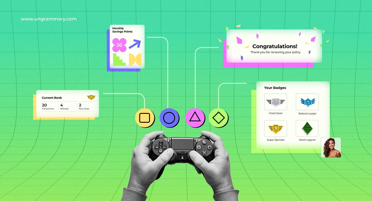
Gamification in BFSI: Creating Engaging Financial Products and Services
Table of ContentsUnderstanding Gamification in BFSIApplication in BFSI SectorKey Applications of Gamification in BFSIBenefits of Gamification in BFSIConclusionIn today’s fast-paced digital world, the Banking, Financial Services, and Insurance (BFSI) sector is on a relentless quest for innovative UX UI and product design solutions to elevate user engagement and satisfaction.Imagine a scenario where managing your finances feels like a rewarding adventure rather than a mundane chore. One powerful tool making this a reality is gamification — a dynamic strategy that infuses game-design elements into non-game contexts.By harnessing the power of gamification in product design, BFSI companies can transform routine financial tasks into captivating and rewarding experiences, making financial management not just a necessity but a delight for the customer.Understanding Gamification in BFSIGamification involves incorporating elements such as points, badges, leaderboards, and challenges into digital platforms to motivate and engage users. In the BFSI sector, this can translate to enhanced user interfaces, interactive learning modules, and rewarding user behavior, ultimately driving higher levels of engagement and satisfaction.Key Gamification Elements1. Points:Points are awarded to users for completing specific actions, such as making transactions, attending educational modules, or setting financial goals.A banking app might award points for each successful login, bill payment, or money transfer. For instance, CRED, an Indian fintech app, rewards users with points (CRED coins) for paying their credit card bills on time. These points can be redeemed for various offers and discounts.2. Badges:Badges are visual representations of achievements or milestones reached by the user.An insurance app might award badges for completing profile information, renewing policies on time, or attending financial webinars. For example, a user might receive a “Financial Guru” badge after completing a series of educational modules on investments.3. Leaderboards:Leaderboards display rankings of users based on their performance or achievements, fostering a sense of competition.A peer-to-peer payment platform might show a leaderboard of users who have made the most transactions or referred the most friends. For instance, a digital wallet app could display the top savers in a community, motivating users to save more to climb the rankings.4. Challenges:Challenges are specific tasks or goals set for users to achieve within a certain timeframe.A banking app might issue a monthly challenge to save a certain amount of money, with rewards for those who meet the goal. For example, a bank might run a “30-Day Savings Challenge” where users who save a fixed amount daily earn bonus points or cash rewards.Application in BFSI Sector1. Enhanced User Interfaces:Interactive Design: Gamified interfaces often feature engaging visuals and interactive elements that make navigating the platform enjoyable. This can include animations, progress bars, and playful elements.Monzo, an online banking platform, uses a colorful and interactive interface for its “Savings Pots” feature. Users can create separate pots for different goals, track their progress with visual aids, and receive notifications when they reach milestones.2. Interactive Learning Modules:Educational Content: Gamification can make financial education more engaging by turning learning into an interactive experience. Users can participate in quizzes, simulations, and other activities that make complex topics more accessible.Similar to how Duolingo uses gamification to teach languages, a banking app might incorporate educational quizzes and interactive modules to teach users about financial products. Users earn points and badges for completing lessons and quizzes, making learning about finance fun and rewarding.3. Rewarding User Behavior:Incentivizing Actions: Gamification can reward users for positive financial behaviors, such as saving money, making timely payments, and using specific services. This can lead to increased user satisfaction and loyalty.BBVA, a global financial group, introduced the BBVA Game in Spain to motivate customers to use its online services. Users earn points for performing various banking activities, such as making transactions or using the app. These points can be redeemed for gifts and discounts, encouraging more frequent use of the platform.Key Applications of Gamification in BFSIGamification can be applied in various ways within the BFSI sector to enhance user engagement, satisfaction, and loyalty. Here are some key applications, each explained in detail with examples.1. Customer OnboardingInteractive Tutorials: Gamified tutorials guide new customers through account setup processes, making the experience intuitive and enjoyable. Interactive tasks and rewards can encourage users to complete the onboarding process smoothly. A bank might create a step-by-step tutorial for new users, offering points for each completed step, which can later be redeemed for rewards or discounts. For example, BBVA Game motivates customers to use online services by earning points for various banking activities, redeemable for gifts and discounts. This approach not only simplifies the onboarding process but also incentivizes users to engage with the bank’s digital platform.Progress Tracking: Visual progress bars and completion badges can motivate users to complete their profiles and explore more services offered by the institution. An insurance company could use a progress bar to show how close a customer is to completing their profile, with rewards for 100% completion. For instance, users might receive a “Profile Complete” badge and earn points that can be used for premium discounts or additional services.2. Financial EducationEducational Quizzes: Integrating quizzes and trivia games can help users learn about complex financial products and services. Rewards for correct answers can incentivize users to engage more with educational content. A financial app could include a daily quiz on different investment options, rewarding users with points for correct answers, similar to how Duolingo uses gamification to teach languages. For instance, users might earn points for correctly answering questions about mutual funds or retirement planning, which they can redeem for financial advisory sessions or investment credits.Simulation Games: Virtual stock trading games or financial planning simulators provide users with hands-on experience in managing investments, budgeting, and financial planning. An app like Wealthfront could offer a simulated stock trading feature where users practice trading without real money, earning badges for successful trades. This allows users to learn about stock markets and investment strategies in a risk-free environment, building their confidence and knowledge.3. Engagement and Loyalty ProgramsReward Systems: Points and badges for activities such as saving money, making timely payments, or using specific services can encourage positive financial behavior. These rewards can be redeemed for discounts, gifts, or other benefits. Monzo, a digital bank, allows users to create “Savings Pots” for different goals. Users can set targets, track progress, and receive notifications and rewards when they reach their savings milestones. For instance, users might earn points for reaching their savings goals, which they can redeem for exclusive offers or higher interest rates on their savings.Leaderboards: Displaying user rankings based on their financial activities can foster a sense of competition and accomplishment. A peer-to-peer payment platform might show a leaderboard of users who have made the most transactions or referred the most friends. For instance, a digital wallet app could display the top savers in a community, motivating users to save more to climb the rankings and earn recognition and rewards.4. Personal Finance ManagementGoal Setting and Tracking: Gamified goal-setting features help users set financial goals, such as saving for a vacation or paying off debt. Progress tracking and rewards for achieving milestones keep users motivated. A budgeting app could allow users to set specific financial goals and track progress with visual milestones, offering rewards for reaching each milestone. For example, users might receive points for achieving monthly savings targets, which they can redeem for gift cards or cashback rewards.Challenges and Competitions: Monthly savings challenges or spending reduction competitions can encourage users to adopt healthier financial habits while making the process fun and engaging. CRED, an Indian fintech app, rewards users for paying their credit card bills on time. Users earn CRED coins, which can be redeemed for exclusive offers and discounts, promoting timely payments and enhancing user loyalty. Monthly challenges might include spending reductions or increasing savings, with rewards for the top performers.5. Customer Support and FeedbackInteractive Support Systems: Gamified chatbots and interactive FAQs can make customer support more engaging. Users can earn points for using self-service options, reducing the need for human intervention. A bank could use a chatbot that rewards users with points for successfully resolving issues using the automated system. For instance, users might earn points for using the chatbot to troubleshoot account issues or find answers in the FAQ section, which can be redeemed for discounts on banking services.Feedback and Surveys: Gamified feedback mechanisms, where users earn rewards for completing surveys or providing feedback, help BFSI companies gather valuable insights while keeping users engaged. An insurance company could offer points for completing a customer satisfaction survey, which can be redeemed for discounts on premiums. For instance, users might receive points for providing feedback on their customer service experience, encouraging them to participate and helping the company improve its services.By integrating these gamification strategies, BFSI companies can significantly enhance user engagement, satisfaction, and loyalty, creating a more interactive and rewarding experience for their customers.Benefits of Gamification in BFSIImplementing gamification in the BFSI sector offers numerous advantages that enhance user experiences and drive business success.1. Increased EngagementGamification makes financial activities more enjoyable, encouraging users to interact with the platform more frequently and explore its features.HDFC’s “Go Digital” campaign gamified the use of its digital services. Customers earned points and rewards for performing various digital transactions, such as using mobile banking or making online payments. This encouraged users to engage more frequently with HDFC’s digital platform, enhancing their familiarity and comfort with online banking services.2. Enhanced LearningUsers can gain a better understanding of financial products and services through interactive and rewarding educational tools.ICICI’s “Money Coach” feature includes interactive modules and quizzes to educate users about financial planning and investment options. Users earn points for completing these educational modules, which can be redeemed for financial advisory sessions or discounted banking services. This gamified approach makes learning about finance engaging and rewarding.3. Improved Customer LoyaltyReward systems and leaderboards can create a sense of achievement and competition, fostering customer loyalty and long-term engagement.The bank’s “Axis Bank Happy Ending Home Loan” scheme integrates gamification by offering customers an opportunity to earn rewards for timely EMI payments. Customers who consistently pay their home loan EMIs on time can get the last 12 EMIs waived, creating a strong incentive for timely payments and fostering long-term customer loyalty.4. Positive Behavioral ChangesGamified elements can motivate users to adopt healthier financial habits, such as saving regularly, paying bills on time, and investing wisely.Kotak’s “Jifi Saver” account gamifies savings by rewarding users for maintaining higher account balances and making regular deposits. Customers earn “K points” which can be redeemed for various lifestyle rewards. This encourages users to save more and manage their finances better, promoting positive financial habits.5. Valuable Data InsightsBy tracking user interactions with gamified features, BFSI companies can gather valuable data to improve their products and services.SBI uses gamified elements in its YONO app to track customer engagement and preferences. By analyzing which features users interact with the most, SBI can gain valuable insights into customer behavior. This data helps the bank to refine its offerings and tailor services to better meet customer needs.ConclusionGamification in the BFSI sector holds immense potential to transform user experiences, making financial management not only more engaging but also boost user interaction, satisfaction, and loyalty, ultimately driving their growth and success in the competitive market.Ungrammary excels in crafting digital experiences with a blend of creativity and precision, guided by its expertise in UX/UI. Stay tuned for fresh ideas and valuable insights that will elevate your digital journey.Gamification in BFSI: Creating Engaging Financial Products and Services was originally published in Muzli - Design Inspiration on Medium, where people are continuing the conversation by highlighting and responding to this story.
Letterhead Design Corporate Identity Template with business card
Hello Creative People,
Here is the New A4 size Letterhead Design Corporate Identity Template with a business card
Looking for a similar design
Say Hello to Email: shahinuddinlxp@gmail.com
WhatsApp: +8801998478017
Follow Me On:
Facebook
behance
Instagram
twitter
#cv #Design #Design inspiration #Design creative #Business #Design branding #Professional #Template# Company #Letterhead design
#Creative #Examples #Format #Design inspiration creative #Modern
#Design inspiration business #Stationery design #Template word
#Design creative layout #Idea
#Minimal #Design ideas #Design inspiration corporate
#Graphic design #Minimalist #Sample #Branding#flyer #banner #brochure #template #branding #bradidentity
How We Designed AI-Powered Spatial Banking for Apple Vision Pro
Will the launch of Apple Vision Pro start the next digital revolution? Wizards from Cupertino offer a mind-blowing spatial experience on the visionOS platform. But how could spatial banking look and feel? As industry pioneers focused entirely on finance UX consultants and designers team in UXDA have challenged themselves to design the next generation of banking experiences. And this time we’ll show more than just a UX/UI design concept for spatial banking. It’s the banking experience of the future powered by artificial intelligence.Article by Alex Kreger and the team of UXDAApple Vision Pro: Vision to Reinvent MetaverseWith the launch of Vision Pro, Apple intends to shift the digital world from mobile computing, in which they have become trendsetters, to revolutionary spatial computing. In fact, Vision Pro can become the missing bridge to the Metaverse that blends the real and digital worlds if it overcomes a number of challenges.Bring VR/AR technology into the mainstream. After all, the first VR devices went on sale back in the 90s, and, over the past 5 years, more than 100 million VR headsets have been sold, with the leading Quest from Meta selling more than 20 million units alone. But despite this, AR/VR technology has still not gone mainstream.Increase the usage cycle and retention rate on VR/AR devices. The problem is that the user experience is too complex, inconvenient and not comfortable for everyday use by most users. Unfortunately, most consumers buy, try, admire and then abandon the device. Only passionate tech geeks use VR headsets on an ongoing basis and 90% of the time for games. The Apple team has set its sights on overcoming this gaming limitation.Implement clear VR/AR interaction principles. Apple called it Spatial Computing, but it needs to be said that, in general, they are reinventing the Metaverse. For the last couple of years, everyone has been talking about the Metaverse, but no one has found an entry. To turn a toy room into the next-gen digital reality, the Apple team built the future vision of clear principles of interaction and functioning of the spatial interface, designed to achieve what other pioneers of VR/AR technology could not.Once proposed by Apple, the revolutionary iPhone interface for mobile computing became the standard for mobile devices of all brands and platforms, and the Macintosh graphical interface made personal computers accessible and understandable to everyone, not only to programmers.And it looks like Apple is once again poised to take humanity to a new experiential frontier ahead of the next digital revolution. Vision Pro is just the first step toward mixed reality, testing technology and user experience. How should the banking industry prepare for this, and what should we consider?UXDA’s Design of Spatial Banking: AI Makes the Bank AliveSo, how can we use this spatial computing opportunity to create the next generation of banking experiences? The UXDA team has spent 1000 hours of work to design its vision of AI-powered spatial banking of the future on the visionOS platform. We aimed our Spatial Banking concept at potential Vision Pro users with the appropriate income level, expectations, patterns and needs.https://medium.com/media/693203e2965e3aeb98d35e4b947c4831/hrefThe main driving force for the next-gen banking experience will be AI-powered hyper-personalization. 61% of customers want personalized recommendations from their banking provider, according to Salesforce Research 2023. And, according to a KMPG survey of 300 executives worldwide, 77% expect AI to have the greatest impact on their business out of all emerging technologies.Imagine a digital bank of the future. Unlike the traditional one, this future bank will be in constant dialogue with the user and take maximum care of the user’s financial life. At its heart will be an AI-powered advisor that constantly analyzes a multitude of data to find the best solutions for the user.With its static processes and limited user participation, the traditional banking model will give way to the dynamic and proactive approach of AI-powered banking in which the user is at the center. A virtual advisor communicates with the user all the time, providing tailored financial recommendations, personalized offers and timely actions based on extensive analysis of big data and user context. With this level of hyper-personalization, our AI-powered spatial banking will feel alive.An AI-powered Spatial Bank will have a number of advantages over traditional banking that will move the banking experience to the next-gen:1. Personalization and Contextual EngagementCustomers expect personalized financial services tailored to their unique circumstances and preferences. AI analyzes user data to present personalized offers, promotions and financial products, enhancing user engagement and satisfaction with tailored recommendations.Traditional banking services often fall short in providing personalized advice, relying on generic recommendations that may not align with individual financial goals. The AI-powered banking adviser, through conversational UI, establishes a continuous and contextual dialogue with users, ensuring that every piece of advice is relevant and specific to the user’s financial situation.This level of personalization is a stark departure from the one-size-fits-all approach of traditional banking. AI will continually learn and adapt to user behavior, ensuring that interactions become increasingly personalized and relevant over time. This adaptive nature will enhance the overall user experience, aligning services more closely with individual needs.2. Proactive Financial GuidanceCustomers seek proactive guidance to navigate complex financial landscapes and identify opportunities or risks. AI banking employs predictive analytics to offer proactive financial advice and alert users to potential issues, offering users a forward-looking perspective on their financial landscape, a capability that the reactive nature of traditional financial services lacks.AI continuously analyzes market trends, economic indicators and user preferences to provide automated, personalized recommendations, enabling users to make informed decisions without delay. This proactive approach to financial management minimizes the risk of missed opportunities or delayed responses, contributing to better financial outcomes.For example, AI can analyze spending patterns and automatically allocate surplus funds into optimized savings or investment accounts, ensuring users effortlessly maximize their savings potential without active management.3. Real-Time InsightsCustomers want instant access to their financial information and insights to make timely decisions. AI-powered banking provides real-time updates on account balances, transactions, investment opportunities and market trends, meeting the demand for immediate and actionable information.This up-to-date financial information allows users to make timely decisions based on the latest data and market trends and addresses a common limitation in traditional banking, in which information updates and communication are often delayed.For example, users receive real-time insights into their spending habits, and AI suggests immediate adjustments for budget optimization, contributing to more effective financial management and savings.4. Conversational InteractionCustomers desire a natural and interactive way to engage with their digital financial services. AI-powered banking utilizes conversational UI, enabling users to interact with virtual advisers in real-time, ask questions, seek advice and receive instant responses.This shift toward AI banking also introduces a level of user engagement and interaction that traditional banking struggles to match. The conversational UI creates an intuitive and user-friendly interface, making financial management more accessible and less intimidating.Users can easily seek advice, inquire about account details or set up real-time alerts on potential issues, fostering a sense of control and transparency in their financial affairs. For example, users can simply ask to be reminded to pay their bill next week via a notification on their smartwatch.5. Enhanced SecurityCustomers prioritize the security of their financial transactions and data. AI employs advanced algorithms for real-time fraud detection, surpassing the security measures of many traditional banking systems. AI also analyzes user behavior patterns and transaction data in real-time, swiftly identifying and preventing fraudulent activities to safeguard customer accounts and data, instilling confidence in the safety of digital banking.6. Automation for EfficiencyCustomers expect quick and efficient resolution of any issues or discrepancies. AI-powered banking streamlines customer support by providing instant responses to queries, automating routine problem-solving tasks and escalating complex issues to human agents when necessary.AI banking automates routine tasks, streamlines processes and improves overall efficiency. This automation enables quicker problem resolution, faster transaction processing and reduced manual errors, giving it a competitive edge over the often manual and time-consuming processes of traditional banks.7. Financial EducationCustomers value opportunities to enhance their financial literacy and understanding. AI-powered banking includes educational components, offering insights, tips and explanations to help users better understand financial concepts and make more informed decisions.AI banking promotes transparency by explaining financial decisions, fees and terms in an understandable manner, fostering customer trust and loyalty.To ensure all of these features are incorporated into spatial banking, we designed an always-on-display AI-advisor. Even before the user asks, an AI banking advisor will provide on-the-go consultations, suggestions and personalized offers through conversational UI chat. Integrated conversational banking builds a seamless user experience, ensuring valuable context for making financial decisions quickly and confidently.AI advice will be provided for each bank product, dashboard and user scenario, allowing users to quickly explore and prioritize tasks. This proactivity of the spatial bank will ensure a personalized user experience, creating a solid base for long-term cooperation between AI-powered banks and customers.With AI at the heart, spatial banking could become as simple and clear as possible for users. To ensure this, we must reject the traditional route and not build the spatial banking architecture around financial functions and tools. On the contrary, spatial banking should reflect the financial dimension of the consumers’ lifestyle experience as much as possible and consider the design principles of spatial computing by Apple.Spatial Experience Design: Fit to Apple’s visionOS PrinciplesTo launch a new spatial platform, Apple spent 7 years developing innovative hardware — a powerful wearable computer with unique dual‑chip design, 12 cameras, 6 microphones, 5 sensors, an eye-tracking system with OpticID and more than 5,000 patents. We’ve already seen some of these innovations in other Apple devices. But it seems these technologies in Apple devices are just being tested for a breakthrough since the Vision Pro took 7 years to create. And if lidar plays a basic role in Vision Pro for mixing reality, then, in the iPhone, it is rather an extra feature for AR apps.As a result, today, in comparison with available AR/VR headsets, VisionPro is the most advanced device designed to revolutionize the digital market. And probably the most advanced gadget on the planet.Apple’s Spatial Computing visionOS platform has core UX principles and standards that will allow millions of developers to adapt their content for a new platform in the Apple ecosystem. Just as Apple reinvented the personal computers and later became the lawmaker of the mobile era, Vision Pro could usher in a new age of digital interaction.So, let’s look at the principles behind Apple’s spatial experience that we implemented into spatial banking:Familiar. We have designed windows that live in the user’s space and feel like a familiar part of the user’s surroundings with glass material for contrast and adaptation to lighting conditions. Spatial banking windows can be moved anywhere and adapted to different sizes, allowing for a comfortable yet dynamic user experience. Well-known gesture incorporation empowers people to effortlessly navigate and engage with spatial banking, ensuring adaptability to various distances.Human-Centered. We have placed important content in the center of the user’s field of view, utilized wide landscape layouts and extended content for immersive experiences. We placed content along a natural line of users’ sight, accommodating different user positions and encouraging comfortable interaction within an arm’s reach. Spatial banking is designed for minimal movement, allowing users to recenter content by pressing and holding the Digital Crown.Dimensional. Spatial banking is designed to work in any physical space, considering infinite canvas possibilities. Spatial banking uses depth for hierarchy and focus, emphasizing different content and employing scale to provide the feeling of the content. Spatial banking UI leverages visual cues, like light emission and shadow casting, to ground objects and integrate them into the spatial environment.Immersive. Spatial banking UI can be transitioned between different states of immersion, allowing an experience of a Shared Space or a Full Space. Spatial banking directs users’ attention through motion and visual accents, with smooth transitions for a comfortable and aware experience. We aim to do more with less by meaningfully integrating content with physical surroundings, using soft edges and adding subtle animations for a feel-alive experience.Authentic. Spatial banking ensures more than quick interactions, offering unique and engaging experiences within the user’s space. We have added spatial moments of in-app interactions, enhancing the banking experience with depth and scale. Spatial banking utilizes 3D micro-interactions to make the app distinctive and memorable within the spatial visionOS platform and beyond.Vision Pro may be exactly the push the Metaverse sorely lacked to boost development. After all, the main deficiency of the Metaverse was not the lack of interaction devices but the lack of mass content and principles of interaction that would provide that magical spatial experience everyone waits for. According to the first users of the device, the Vision Pro experience cannot be called anything other than magical, especially in comparison with other VR/AR devices.So what could future banking with spatial experience in Apple’s Vision Pro be like? Our thoughts are not quite the same as what banking customers are used to today.Spatial Banking Architecture: Customer Needs at the CenterThe basic categories of customers’ financial activity are well-known to everyone. These are understanding financial situations, making easy and fast financial transactions, clearly understanding spending, budgeting and liabilities, finding and using the best opportunities and getting constant support and the highest security in all finance-related interactions. And, with AI technology, this will all be taken to a completely new level.https://medium.com/media/0a70c04a651d3c57878cb967f29ca0ba/hrefWhile designing the architectural solution, the UXDA team grouped all possible banking functions around three categories of needs: main insights and KPIs provide an actual financial overview in a Snapshot dashboard. All data to manage financial movement, spending, income, budgeting, upcoming payments and others can be found in a Cash Flow window. All financial and lifestyle products to get the best opportunity are collected in a Marketplace.Next to each window, an AI advisor chat panel will be constantly active. It provides contextual advice on-the-go and highlights the most important information, serving as the user’s financial co-pilot.For the actions, there is an Ornament below. Like watching a movie in Vision Pro, the user finds Pause, Fast-forward and Skip options in the Ornament. In spatial banking, these quick actions relate to money — Add, Send, Grow and Borrow.Above the central dashboard is a global search bar, general balance, profile and display mode. Search is context-sensitive, which prioritizes and brings to the forefront the results that are most important or relevant to the user’s current activity and screen. Let’s take a closer look at the architecture and examine each UI block in detail:SnapshotTo make the layout of the Snapshot dashboard clear and simple, we took inspiration from the card UI of Netflix and Apple TV, making it more familiar to users.On this first screen, users are presented with an up-to-date snapshot of their financial activity. They see cards with basic financial KPIs, accounts, insights, AI recommendations and recent transactions. At the same time, they can check their goals, payment cards and upcoming payments. Users can customize the arrangement of cards and rows.Four basic KPIsFour basic KPIs give an instant snapshot of the user’s financial health that is calculated based on the ability to cover all liabilities; protection from potential risks; long-term financial strategy, including savings and investments; care for family members; credit score; stress level that is calculated based on the correlation between financial health and health stress indicators from Apple Watch; and carbon footprint level to promote responsible consumption.Access to all accountsAll possible account types are available for opening, review or connection: checking account, family account, team or event account, junior account, savings, investments, other banks, crypto and eWallet accounts. Thus, users can import data from different banks and Fintech services here, thanks to the Open Banking API. Users can also set up the automatic movement of money between their accounts in case of shortages or if the account balance falls below or above a specified value.AI-powered insightsBanking AI uses big data and analyzes user behavior and patterns to show key insights. Here, users can look back on their accomplishments; stay informed about offers that can enhance upcoming events and streamline various aspects of their lives; receive ideas for their leisure time based on their spending and location; explore opportunities to reduce expenditures detected by an AI advisor; investments, saving and loans overview.GoalsIn the goals section, users can add goals that are important to them and need financing. Goals can be material objects and life events: career, self-development, education, health, family, etc. These goals will be taken into account by the AI advisor to generate a wide range of personal recommendations so users can see a unified view and future perspectives of their financial and personal dimensions.Transactions and paymentsRecent transactions and upcoming payments give us a quick look at the current flow of funds and the ability to instantly assess upcoming costs. AI constantly analyzes the payment cards the user has and correlates them with all the purchases made to ensure that the user does not miss favorable card-related offers or discounts because the conditions and promotions of cards are constantly changing. It is impossible to keep track of everything. If AI finds a good deal on an already completed purchase, then, within 24 hours, it holds the transaction and offers the user the option to switch to the card that provides more favorable conditions.AI advisor chatOn the side panel, we see a constantly open chat window with an AI advisor playing a crucial role in the spatial banking experience. The AI advisor maintains a constant dialogue in real time, drawing the user’s attention to key data that requires a decision, reporting opportunities and offering recommendations on how to use the platform.AI acts as a co-pilot, considering the context of what banking section and function is currently in use. The AI advisor delivers recommendations in the form of chat messages. When clicked, it opens a corresponding window and can accompany everything with voice. This is a full-fledged AI agent, so the user can ask questions and give tasks.Examples of AI use cases:Ask to create a plan for improving the credit scoreAsk about factors that increases the financial stress levelAsk to automatically transfer funds from one account to another in case of shortagesAsk to notify through watch when specific transactions occurAsk to notify to buy additional company shares when the stock price decreasesAI notifies about a transaction made abroad to make sure it’s not suspiciousAsk AI to show a list of all transactions during the tripAsk AI to act as a personal financial advisor or accountant that guides users through the tax preparation process by helping to scan documents and prepare reportsCash FlowThis section guides the user’s money movement, providing a crystal-clear picture of where money was spent and received.Initially, the dashboard opens with a Financial Checkup displaying cash flow, total available assets and a list of recent transactions, which users can filter or switch to map mode to see where they made the purchase or where the transfer went.Financial graphThe incoming and outgoing cash flow graph enables users to observe trends over a specific period, compare the current situation against the planned budget and receive a forecast of potential shortfalls based on spending dynamics.Wealth managementBy clicking on any category, the list of assets is shown on the right side of the screen. This acts as a wealth management window in which users can add new collectibles, real estate and other physical assets to assemble the full picture of the wealth and get appropriate advice from banking AI as a personal financial advisor.Purchase 3D viewUsers can open each transaction, spin a 360° view of the purchase in 3D or expand the shopping list from groceries to check each purchased product.24H card switchingUsers can purchase with any card and take advantage of special offers later by switching in 24 hours to a different payment card if it offers better conditions.Post purchase BNPLIs the Pay Later feature only available at the time of purchase? Not anymore. What if someone made a purchase and the next day realized that money is needed ASAP? If necessary, users can transfer it to the Pay Later mode within a week after making a purchase and immediately receive the remaining amount back into their account. This allows users to be flexible in managing financial flow and provides additional freedom of choice in spatial banking.BudgetingUsers can evaluate spending levels and detect main budget “eaters” in different categories by clicking on the spending category and filtering the transaction list.Upcoming paymentsThe upcoming payments list includes automatic e-invoices, loans, subscriptions, BNPL, recurring transactions and reminders on manual bill payments. Here users will find the total amount of their monthly obligations.Examples of AI use cases:AI can detect that you repeat the same transaction and offer to make it recurringAI can review top upcoming payments that require user attentionAsk AI to automate specific bill paymentsAI notifies about suspicious subscriptions and requests to confirm themAI offers spending insights and actions to improve financial habitsAI offers personalized savings rules, such as transferring the remaining budget in the Shopping category to savingsAsk AI how much is spent in a specific shop, place or spending categoryAI provides suggestions regarding asset proportion and opportunities to get benefits from themMarketplaceThe Marketplace section has a similar layout to Snapshot, allowing users to explore and discover thousands of financial and lifestyle products. And, with the help of AI, they will be provided personalized offers that suit their needs.Products contextual offerUsers can browse different products grouped by type, actual usage, popularity, etc. AI helps to fit groups to the user context, providing personalized and relevant experiences.Lifestyle serviceAnd this is not only about financial products. Access to the user’s data bank could offer the best deals in real estate, cars, travel, food delivery, electronics and grocery. Or, for example, personalized clothing suggestions that use the Vision Pro user’s avatar and digital body model to generate in 3D how all clothing items will look on the specific user.User’s products centerIn the My Products section, users can check and manage their active products list, such as loans, subscriptions, BNPL, Save-Now-Buy-Later, investments, savings, insurance, etc. Users can also check their product history here.Examples of AI use cases:AI can give users advice on real estate purchase and mortgage termsАsk AI to prepare a checklist for furnishing a new apartmentAI suggests key products that secure family financial safety in the futureAI activates the user’s insurance for trips and also arranges for a rental carAI checks how much the user has spent on rent in a specific period and suggests creating a savings goal for their homeOrnamentAccording to visionOS guidelines, an ornament presents a toolbar with quick actions. So, in the case of spatial banking, this is the best place for money movement actions, like Add, Send, Grow and Borrow.Deposit moneyUsers can easily add money to any of their accounts by transferring it from another account or card, depositing a check by showing it in front of the Vision Pro camera (checks are still in use in the US nowadays), transferring a cryptocurrency or requesting money from someone. The user can also see the list of persons from whom he/she frequently requests money.Send moneyTo send money, users just need to type or name the beneficiary, and the system will suggest some of the payments users made previously, find a typical approved payee or provide a smart payment form that will adapt according to payment details. Also, the user can scan the bill or invoice, and payment will be prepared automatically. And, of course, users can send crypto or transfer money between their accounts.Grow moneyThe Grow option allows users to open a savings account and move money there or make some investments by buying stocks or using mutual funds, retirement plans or commodities. Users can also count valuable assets, such as real estate, collectibles and others, to give banking AI a full picture and prepare the best possible advice to grow their capital.Borrow moneyThe Borrow option allows users to prepare and send any loan request.AI requestAll these actions and even more can be performed without clicking, just by asking a personal AI advisor for help. AI could prepare all the possible requests, split bills or make any transfer in seconds. It could move money to savings, buy stocks or prepare investment offers, as well as prepare requests for loans, if needed.UI design patternsTo make our spatial banking solution feel like a native part of the visionOS experience, UXDA designers ensured its maximum compliance with the key UI patterns of the platform:Glass UIWe utilize glass material for UI elements to craft a beautiful and lightweight canvas, enabling light from the surroundings and background to shine through. We intentionally avoided using solid colors on windows to prevent a heavy and claustrophobic feel. The use of vibrant materials allows visionOS to adapt to the ambient light, which results in a dynamic and cohesive visual experience, creating a sense that the UI is harmoniously embodied in real life. For optimal legibility and visibility, we employ white text and icons.Spatial micro-interactionsApple suggests adding spatial moments with in-app interactions, enhancing experiences with depth and scale. In banking, there are not many elements to provide a spatial experience without distracting users from key tasks. But we found a way to add a third dimension to enrich UX. First, we can show purchased products in transactions through a 3D view; second, we added 3D design to micro-interactions in confirmation, such as sending money.visionOS layoutSpatial banking UI is designed based on native layout patterns of visionOS, such as central screen positioning, using cards for content, a navigation bar on the left and an ornament below. In the landscape view, three dashboards are opened simultaneously, allowing the user to interact with the full system at a glance.Typography and IconographyTo ensure that the user can receive information in a convenient and understandable form, we employed carefully selected typography sizes and weights. For text, we primarily utilized a white color, creating more contrast for readability and reducing the potential of conflicts with colorful objects in the background. It’s important to note that all the text remains in 2D for improved readability, as 3D text can be more challenging to perceive.For icons, we used the SF Symbols 5 library from Apple. This made it possible to create a financial product with maximum immersion in the Apple design system and helps users quickly and conveniently recognize buttons and sections.ErgonomicsWe placed content in the center and used optimal window size to avoid eye or neck fatigue, keeping UI elements within the user’s field of view. Spatial banking interactive elements have a touch target area of at least 60 points with adequate spacing to prevent errors. We have followed Apple’s recommendations for paddings, margins and spacing to maintain precision in spatial computing.One More Thing…EcosystemPerhaps the most important, if not the main, advantage of VisionPro over its AR/VR competitors, especially Quest3, is the Apple products ecosystem with the army of the world’s best developers who designed and programmed about 2 million applications. By integrating Vision Pro into its ecosystem, Apple will do everything to push millions of developers to create content for the new platform. And this is exactly what competitors, in particular Quest from Meta, lack.Millions of developers are just one side; on the other hand, the Apple ecosystem is used by 1.5 billion customers. Among them, there will be enough early adopters who will accept Apple’s invitation to expand the ecosystem experience to a fundamentally new level of immersion, perception and interaction. This is because Apple will offer its users amazing and fresh context for existing content and completely new experiences in both entertainment and work. Therefore, it is highly likely that, by joining Apple’s ecosystem, the device will receive primary support in the market.This concept would be incomplete if we did not show how this solution looks on other devices from the Apple ecosystem. After all, it is the largest digital ecosystem in the world that primarily creates additional value for Apple Vision Pro and is the foundation for its launch.Of course, even though Vision Pro is the most complex electronic gadget on the planet, according to early users, such parameters as weight, battery, viewing angle and heating of the device still leave much to be desired. But, with the development of technology, each new generation of Vision Pro could become more and more convenient for the mass consumer. If we look at the iPhone, 1.39 million units were sold in the first year, and, five years later, when the sixth generation was released, annual sales increased almost 100 times and amounted to 125 million devices.Whatever the shortcomings of the pilot device, the main thing is that a visionOS platform has appeared that provides an AR/VR interaction experience that everyone has long dreamed of. And this platform was created and will be developed by the largest technology company on the planet.Takeaway: Don’t Miss the Next Digital RevolutionWhen Apple released its first iPhone, no one could have imagined how much it would change the world and what a technological boost it would give. Although VR/AR technologies have not yet become mainstream, Apple’s entry into the game could lead to a breakthrough and reinvent the gaming device as a platform for mass use. The capabilities of AR/VR technologies take consumption and interaction with digital content to a new level.To ensure this next digital revolution, Apple Vision Pro’s magical user experience has three advantages that previous generations of AR/VR technology lacked:Mixed reality3D scanning of space by the device allows Vision Pro to naturally integrate digital objects and the user’s environment, creating shadows, highlights and reflections. In this way, users can avoid being suddenly thrown into an unfamiliar or even scary space but can interact with Vision Pro in a safe, clear, and organic way in their home environment.Apple seamlessly blends digital content into the space around users by emulating headset transparency. For mass adoption, Apple uses a range of innovations to keep the user connected with the real world, which was missing in other AR/VR devices.Apple achieved minimal latency in the pass-through video experience, the lack of which has led to sensory conflict and caused motion sickness, dizziness and disorientation on other VR devices.Apple’s desire to integrate the device into everyday life makes using the headset as convenient and fast as possible since it does not require installation of the guardian border every time users dive in, as is the case with other headsets.Apple considers connection so important that it simulates the transparency of the helmet from the outside through EyeSight, providing seamless parallel interaction with external reality and giving context to others.Natural interactionExisting devices offer controllers the ability to interact with AR/VR content. But, from the point of view of user experience, this reduces the effect of presence from immersion in VR/AR reality and also complicates perception because the user needs three devices to start. Perhaps this has become one of the obstacles to mass adoption of the technology. After all, we are accustomed to the fact that our own body and sense organs are enough for us to interact with reality.By creating a digital replacement for reality, Apple provides the most intuitive control using eyes, hands and voice. And again, we remember how they reinvented the phone by solving the smartphone problem in 2007 — getting rid of the keyboard and keeping only the screen. And this control with eyes and hands is implemented in Vision Pro at an incredibly precise level.The natural interaction in AR/VR space proposed by Apple is reminiscent of something we have heard before. As Steve Jobs presented in 2007: “We’re gonna use the best pointing device in the world. We’re gonna use a pointing device that we’re all born with — we’re born with ten of them. We’re gonna use our fingers. We’re gonna touch this with our fingers. And we have invented a new technology called multi-touch, which is phenomenal. It works like magic.”Mass 3D contentSpatial computing headset is the ideal device for consuming and immersing yourself in 3D digital content. But, unlike everyone else, Apple intends to take 3D content beyond games and integrate it seamlessly into customers’ everyday lives. Every element has been crafted to have a sense of physicality. All interface objects have shadows and can be moved like objects in the real world.Vision Pro allows the creation of 3D content using the device. Users can shoot their 3D videos and photos, preserving memories or generating entertainment content in the most realistic format. And this will undoubtedly lead to users’ massive creation of 3D content. Essentially, this opens a new era for developing the creative economy. And we remember that, because of the lack of 3D content, the 3D television function disappeared a few years ago.Spatial immersion of 3D content in Augmented Reality by Apple empowered with the appropriate sound. Apple provides innovative Spatial Audio with true depth-of-sound clarity that makes sounds feel like they’re coming from user surroundings. Audio ray tracing analyzes a room’s acoustic properties to adapt and match sound to actual space with precise audio mapping.When all of this will help Apple make spatial computing technologies mainstream, the main question will be whether financial institutions have the competencies to adapt the banking experience to the new digital age. It is necessary to start searching and experimenting today to understand what the banking experience of the future will be like. And that’s exactly what the UXDA team did by introducing you to the Spatial Banking user experience concept. We hope that, as always, we managed to inspire the financial industry with our approach to designing next-gen financial products.Banks need to start thinking today about how to deliver a competitive user experience in the future. Because digital improvements require a lot of effort and time, some banks still provide a 15-year-old digital experience. In which direction should banks move to develop a cutting-edge digital strategy and be able to adapt to the future?User-Centric Approach. It is crucial to develop a user-centric culture in financial companies because it ensures services and products align with customers’ needs, enhancing satisfaction, trust and long-term relationships. Prioritize user experience (UX) and ensure that digital financial services are intuitive, easy to navigate and provide a seamless flow for customers. Explore and provide a consistent experience across all channels. Gain insights into customer behavior and preferences to offer personalized service.Innovative Technology Adoption. Identify and research the most cutting-edge technology trends that enable next-gen user experience. Implement digital identity solutions and biometrics like fingerprint, facial recognition and OpticID. Embrace open banking by using and providing APIs. Implement generative AI for customer support, account management and AI advisory services. Explore the use of blockchain technology and consider integrating cryptocurrencies into your offerings. Foster a culture of continuous learning and adaptability within your organization. Collaborate with Fintech companies, startups and technology providers.Social Responsibility. A purpose-driven business prioritizes a broader mission or cause beyond profit, often aiming to make a positive impact on society or the environment. Social responsibility certainly has a positive impact on brand reputation, customer trust and loyalty, as well as employee engagement and motivation. It is therefore important that digital financial services implement and comply with initiatives such as sustainable and eco-friendly practices, community support, serving the unbanked, ESG (Environmental, Social and Governance) compliance, green bonds, sustainable mutual funds and empowering carbon-neutral and responsible consumption.When developing this spatial banking concept, we followed three key principles, which play an increasingly important role in creating the next generation of financial products. We recommend adhering to them:Based on our experience in designing more than a hundred financial products in 36 countries, there are 3 key steps from which all digital transformations and innovations begin:Step 1: Review PrioritiesUnderstanding your business priorities is essential to ensure your digital strategy aligns with your overall business objectives. The banking industry is evolving rapidly, and it’s important to identify how digital initiatives can support your service growth, customer retention and competitive advantage.Assess your digital service strengths, weaknesses, opportunities and threats to identify where digital interventions can have the most impact. Listen to customer feedback, conduct surveys and analyze data to determine the most demanding services or features.Step 2: Define GoalsEnsure your goals are SMART (Specific, Measurable, Achievable, Relevant and Time-bound). For example, increase your mobile service adoption by 20% among millennials within the next 12 months or increase the app rating in the App Store. Focus on digital customer experience enhancing the customer journey, such as reducing response times for customer inquiries or improving self-service options.Step 3: Define NeedsAssess your technology stack by identifying the gaps in your current IT infrastructure and invest in modern, flexible systems that are needed to ensure digital innovations. Hire digital agency consultants and upskill employees with digital expertise in data analysis, UX/UI design, AI, digital strategy and cybersecurity. Collaborate with Fintech partners to gain access to cutting-edge technology, allowing for faster and more cost-effective digital transformation.The future of banking is undeniably digital, and it depends on a proactive and user-centric approach from financial institutions. Some banks have made significant strides in embracing digital technologies and enhancing the user experience, yet the industry is at different stages of readiness for the future.Financial organizations that continuously invest in technology, prioritize customer-centricity and adapt to changing customer expectations are more likely to seize new business opportunities and remain leaders in the financial sector. As the digital era unfolds, banks and other financial organizations must commit to ongoing development, innovation and agility to ensure they do not miss out on the potential benefits of the digital revolution.Check out and like UXDA’s Spatial Banking case study at Behance:https://medium.com/media/0e0ca078b56a136510d4d922dd210812/hrefOriginally published at https://theuxda.com.How We Designed AI-Powered Spatial Banking for Apple Vision Pro was originally published in Muzli - Design Inspiration on Medium, where people are continuing the conversation by highlighting and responding to this story.

10 Financial UX Design Trends of 2021 that will Transform Digital Banking
10 Financial UX Design Trends of 2021 that will Transform Digital BankingThis is NOT another article covering such 2021 UI design trends as background blur, 3D elements, vivid colors, brutal fonts, etc. The goal of this article is to go beyond the surface level. Dive deep into the true impact that design has on the financial industry. To do that, we have highlighted 10 design trends that demonstrate the evolution of digital financial products and the way financial interfaces are created and perceived by the users.Article by Alex Kreger, financial UX Strategist/Founder of UX Design AgencyWhat makes a great digital banking and finance design? When it comes to a field as specific as finance, the ability to design interface elements accounts for only a minor part of required competence! Truly great financial products are based on great usability in sync with specific user needs inside a well-developed digital ecosystem.The world is rapidly changing, and so is the financial industry. Customer expectations are growing along with the necessity to satisfy them. In this article, we will demonstrate the power financial design has in shaping the future of banking products.Delivering dozens of financial UX/UI transformations each year, we decided to show the 10 most significant financial design trends in 2021. These demonstrate the possibilities that financial UX/UI design uncovers for such diverse products as core banking, neobanks, challenger banks, wealth management, corporate finance, retail banking, ATMs, credit scores and even VR/AR mixed-reality banking.1. From default “bootstrap” to exceptional tailor-made designWhen it comes to creating digital financial products, for the past 20 years, there has been a deep-rooted belief that the role of design is minor. Mostly, design has been perceived as packaging that is nice to have for marketing purposes, while the main emphasis has always been placed on the functionality and features of the products.This kind of approach explains why it’s common practice to use standardized design templates (aka “bootstrap” design) to speed up and facilitate the product development process. Unfortunately, this also explains why many financial services seem so similar─typically plain, boring and user-unfriendly.A decade ago, the perception of design was disrupted by the emergence of Fintechs. They dared to be different by maximizing the power of design potential to attract customers.Today, we can witness an even broader paradigm shift. The new players that enter the financial industry deliberately focus on unique and innovative design that communicates and highlights their brand identity.Most customers are tired of boring and complex financial design, typical of the incumbents.Tailor-made design is a brand-new idea, providing users with something fresh and invigorating. This marks a new era of tailor-made design as a trend that skyrockets the market advantage of financial companies.A brilliant example of this is the wealth management platform by Private Wealth Systems. It’s a magnificent industry first product that executes the power of tailor-made design to provide Ultra High Net Worth Individuals (UHNWI) with the kind of luxury experience they expect from every aspect of their sophisticated lives.The UX transformation of this voluminous, highly complex solution has allowed it to become a unique gem in the industry that eases friction and makes managing complex wealth delightful. It’s powerful yet intuitive enough with a touch of luxury and refined design vision so that every Ultra-high-net-worth individual would feel the absolute necessity for it.This kind of financial UX design turns “nice to have’’ into a “must have” and has the power to fundamentally shift the behavior of the most powerful consumer cohort on the planet.This tailor-made design was tested before its official launch, and the people who tried it were over the moon. The platform excels among others as it aims to solve a myriad of pain points users encounter on a daily basis. It demonstrates that it cares about the wealth of the customers and does its best to assist in managing it.The advantage of the tailor-made design is used more and more often among different kinds of financial services, as it enhances the emotional connection between the brands and their customers.The financial institutions (FIs) that dare to break taboos and invest in creating bold and modern designs that stand out know that this will definitely pay off with increased customer loyalty and engagement.2. From limited mono-functional to upbeat super-app designhttps://medium.com/media/e87434284a787ff0a70d500fbc0021ec/hrefThe industry transition to a mobile-first approach led to the emergence of several Fintechs whose main advantage was the mono-functional approach. In a very simple and understandable manner, they offered to solve a specific user problem. For the customers, this was like a breeze of fresh air compared to the multifunctional but complex and user-unfriendly banking services. Solutions created by Fintech instantly stood out with their pleasant user experience dressed in a modern and uplifting interface design.Right now, open banking is broadening the range of possibilities to connect external services that allow the increase of functionality in any financial product. We can cite Revolut as a great example here that’s constantly scaling its functionality to gradually become a financial super app.The Fintech mono-functionality design approach seemed simple for the customers, but, as expectations grew, so did the need to present more functions in the same manner. How do you display more than 100 features in a way that’s intuitive and pleasant for the user?Digital financial solutions are becoming more and more complex, providing better functionality to the customers, but it’s not a simple task to design them in such a way that would prove enjoyable to use. This is where close collaboration among UX architects and experienced UI designers plays a major role.The main design challenge is to provide a friction-free experience by creating an intuitive product architecture and a logical, user-friendly interface layout.A great example of an intuitive multifunctional banking app is the banking super app design concept by UXDA. It provides a vibrant challenger bank design that fits dozens of banking features into a single app by using the top technology trends, such as blockchain, gamification, nudge theory, robo advising, voice processing, biometrics, social integration, personalization via banking AI, big data, open API and clouds. It’s a bank-as-a-platform design concept with endless integrations and possibilities for the users, taking the user experience to a brand-new level. Explore how this mobile banking super app was created in this case study.Digital solutions are constantly evolving. More and more well-thought-out multifunctional services are emerging that provide great usability and are able to conquer the UX of mono-functional mobile applications.This explains why so many financial institutions are striving to create their own neobank or super app. Though it really uncovers a lot of possibilities for the users, it’s extremely important to align it with the overall vision of the financial company and its ability to design and execute it.There needs to be an understanding of how to maintain a balance between user needs and the ability to satisfy them in an effortless and user-friendly way. From our experience, there have been situations in which financial brands aim to include a ton of “modern” functions in their products just because they believe it will make the solution stand out among the competition, while this might actually have an opposite effect, leading to user disappointment because of frustrating design. In such cases, during the UX research phase, these FIs should determine that their customers don’t require most of these modern functionalities but are seeking other features important to the specific audience of this brand. As a result, hugely successful financial products are designed based on the specific needs of the brand’s audience that provide extra value to the customers.A super app approach that’s based on a clear vision of the financial product, and the role of UX in it, marks a pathway toward the endless possibilities of scaling the future potential of both the product and the financial brand.3. From demotivating Excel-like interface to dopamine-rewarding gamificationhttps://medium.com/media/66899d37e7c2d9e9a8050fb9802514d3/hrefMany people not connected to the banking industry would probably be shocked to see what most of the banking back-office solutions look like. Working with those could be compared to coding, as the employees have to work with several software programs simultaneously, following instructions and manually entering codes in order to use the required function.To learn to operate such a system takes a few months. But, even years after working with it, employees still get confused and keep a notebook with the right number and letter combinations by their sides.It’s a fact that these solutions are very complex and data-driven, as there are huge lists of different kinds of data about the customers.But, in a world that’s based on the power of digitalization, how can the beating heart of all banking operations make their employees travel 20 years back in time?Many banks are trying to reduce their back-office costs, often not realizing the impact on the customer experience. This results in a paradox: banks are investing large amounts of money in digital transformation in order to improve the user experience, while cutting the costs of the core banking system leads to significant damage to customer service. Bank employees’ negative experiences affect service quality and end-customer satisfaction. Improvements in the back-office system could lead to a meaningful increase in service quality and speed, resulting in happier, more satisfied clients. Here’s an article that explains the risks behind an outdated banking back office and explores ways to turn this around.Today, when the user-centered design approach is becoming more and more popular in creating financial products, it can be applied not only to the external banking products but to the internal solutions as well.To ensure customer-centricity at all levels of the financial organization, the needs of the employees must be considered as well as the client. By creating a better design, we provide them with motivation and tools to offer a better experience for the bank’s customers.One way to significantly increase employee engagement and productivity is to design core banking solutions by using gamification. This kind of design approach allows the transformation of the entire work process by making it more modern, as seen in the case of the innovative banking back-office vendor ITTI DigitalTheir core banking could be compared to a breath of fresh air in a field of banking that hasn’t changed for decades. This intuitive, user-centered solution is unlike any other banking back-office product available on the market.To make it user-centered, our team translated huge amounts of heavy data into human language. The employees couldn’t believe their eyes when they saw the new look of the core banking solution. Their learning curve was reduced from several months to a few hours. What once seemed like the Chinese alphabet was now easy to understand and enjoyable to use. The potential of human error decreased significantly, ensuring a huge increase in service speed, employee productivity and customer satisfaction. You can explore the step-by-step process of this huge core banking UX transformation in this case study.In addition to the huge internal and external value the UX and gamification approach created, this core banking solution was also recognized on a global scale.It received one of the world’s most prestigious design prizes, the IF Design Award, alongside Apple that was awarded for its digital finance service design of the well-known Apple card.This type of approach is another example of how user-centered design and the financial UX methodology can be applied to accelerate the success of financial brands. In this case, the FI considers employees as internal users, creating the best possible experience for them so that they can guarantee the best service for the bank’s customers. This demonstrates the evolution of the design approach used by B2B and B2C.It’s an outdated belief that gamification and banking have nothing in common. In fact, they have the power to significantly improve employee productivity and motivation, thus reaching better results overall.4. From limited functionality to exciting full experience designhttps://medium.com/media/675771bc14289c6730e0abfc6cb704e3/hrefOnly five years ago, mobile apps were perceived as additional, alternative banking channels, but today they serve the majority of customer requests. Given this fact, it’s surprising that often the mobile channels have very limited functionality and offer a rather poor user experience. For example, to select transactions using filters, customers are forced to use the desktop solution. Why is it still not available in every bank app despite the fact that similar functionality is provided every day when shopping in online stores?It’s even more surprising that several banking services are still only available at branches. The pandemic highlighted the harsh truth of the situation: the financial industry is unprepared to embrace the digital age.In these circumstances, it seems absurd that there are still cases in which people have to risk their health just to visit a banking branch. What makes this situation even more unfortunate is that all the necessary technologies to avoid such situations are already available for the banks, but, for some reason, they are not utilized to guarantee a completely remote service.To significantly improve the customer experience of the financial brand, FIs can perform a full design audit of the mobile app to ensure remote users have access to the full range of services and features, and if not, brainstorm a plan to secure it in the near future.Successful Fintechs do not search for excuses, but use a design approach to deliver best-of-class remote experience to the customers.An inspiring example of this is the mobile banking application by United Arab Bank (UAB). When working with it, our main challenge was to ease the customer journey throughout all of the daily functionality, making it simple and pleasant. As UAB has a wide range of services available through the application, the UX approach allowed scaling the vision of further development to make the product even more pleasant for the customers.Optimization of user flow made it easier for users to navigate through the app, exploring new possibilities and encouraging them to use it more often, instead of contacting the bank or visiting the branch.This led to a rapid increase in customer satisfaction. Only a few months after the release of the new UAB app, their App Store and Google Play rates increased, and customers were eager to share their gratitude for the improvements that were made.This kind of holistic approach ensures that the customer experience won’t be fragmented and disappoint the customers who expect to manage all of their finances right from the mobile app.5. From legacy incumbents to confident digital outperformershttps://medium.com/media/5f99d24b17ebf2da3eeb7e617b9e1010/hrefMore and more traditional banking incumbents are daring to step out of their legacy and challenge themselves to embark on a thorough digital transformation journey.Inspired by Fintechs, the incumbents empower the potential of UX design to create products that wow their customers and motivate them to stay loyal in the long run.To do that, they team up with external and internal UX and UI designers who help to integrate the design approach at all levels of the company and the culture of the financial organization. The “fresh blood” of the design-focused teams ensure a successful, user-centered digital transformation that results in customer loyalty. As a result, these kinds of brave incumbents become strong rivals of the Fintech unicorns in the market.A brilliant example of that is VTB Bank (Georgia) (part of VTB Group). It’s a bank trusted by millions that was re-born through an upgraded customer experience and a design that exceeds the standards of the digital age. As a result, a modern online banking UX design was created that embodies trust and stability for its digital customers.As of now, the customers are sharing that the bank’s products correspond to their lifestyle and expectations. Also, the employees have stated that they are proud to be working at a well-established financial brand that lives up to the changing times and takes the best care of its customers.6. From frustrating fragmentation to an enjoyable digital ecosystemhttps://medium.com/media/6d72cfa959ce1ab66411c142646be46d/hrefOften, products provided by a single financial institution might differ visually, depending on the digital channel. This kind of fragmented approach is often caused by the fact that the products have been developed by different teams of developers and designers over different periods of time, based on different vendor solutions. This causes high fragmentation within the customer experience as the usability, information architecture and the interface itself differ.It might not harm the financial institution from the inside but will probably increase the customers’ frustration and digital friction and could result in them switching to another financial company. This is because customers expect the brand experience to be a connected, holistic flow and not separate fragments. Fragmentation breaks the customer experience by causing a lot of struggle and confusion.The main problem is caused by the lack of a united vision that would include all of the products and services provided by the financial institution. This is often due to the fact that digital channels are considered an alternative or additional form of service delivery. This was true many years ago but no longer. Stats show that, in recent years, digital has become the main delivery channel, and its popularity keeps on increasing. The COVID 19 lockdown proved it by showing no mercy.Customers expect all of the channels to be equally well designed, communicating the same visual brand language and usability patterns. It shouldn’t matter which of the platforms customers use. They all need to be holistically united to ensure consistency across all channels.A great example here is the remarkable digital ecosystem that banking software vendor CR2 has designed for its white-label products, including a desktop solution, mobile app and even an ATM. It communicates the same visual vibe and usability patterns across all of these different platforms so that the customers wouldn’t even notice switching between the channels.The main challenge when working with CR2 was to design a full-service ecosystem of products that would be able to provide the ultimate customer experience, replacing the need to visit the banking branches.The attractive white-label mobile app is customizable for any bank. It provides the ultimate way to satisfy user needs and expectations on-the-go, wherever and whenever the customer has a necessity for it. Throughout the experience, the app provides a modern look and inspires joy into the everyday lives of its users.The desktop solution speaks the same visual language as the app. It’s a unique experience for every desktop banking user that’s adjustable to the specific needs of any financial brand.Finally, there’s the emotional ATM experience. Our main goal was to create an ATM that could replace the banking branch, offering customers all the needed services without long lines and wasted hours. We made it emotional, bright and user friendly to stand out among the others.As you can see, all of these different channels are united into a connected flow that makes the user experience smooth, clear and frictionless.7. From a complex puzzle to an effective design systemhttps://medium.com/media/93465423c57c963b47c15a1261fea5c9/hrefIn order to create a well-functioning digital ecosystem, it’s essential to base it on a proper design system. When it comes to financial services, the design system is especially important to ensure a rapid and consistent digitalization due to the complexity of such products.In some cases, design files can be compared to the pieces of a puzzle. If they are not sorted out and arranged, it can get very messy and frustrating to create the “bigger picture.”When it comes to huge financial digital services that consist of thousands of screens developed by several hundred professionals spread over different continents, a carefully thought-out approach is needed.How do you maintain the consistency and usability of the design when working on a project that has thousands of puzzle pieces that need to fit at the right place and in the right time?Technology is evolving, competition in the financial market is rapidly growing, and consumer expectations are changing so frequently that digital products need to be improved daily to meet the customer needs and expectations. As digital financial services differ from many other products with their complexity, such a continuous need for iterations and improvements can turn into a mission impossible. Therefore, design systems come to the rescue, helping to organize all of UX/UI guidelines, assets and the overall vision of the product development so that all of the teams involved are always on the same page.Contextual Banking Experience (CBX), a corporate banking product by one of the most well-known banking software vendors iGTB, consists of more than 5,000 screens. It’s a one-of-a-kind contextual platform that helps any corporation manage thousands of accounts with billions of assets in a user-centered way. It would be impossible to create and develop such a product without a proper design system.When it comes to products of such a scale, it’s crucial to establish standards and frameworks (e.g., flows, storyboards, etc.) for as many UX deliverables as possible. It’s extremely important to ensure consistency across different modules and avoid mistakes, as small changes can impact much larger flows. For example, one small change might impact hundreds of screens.The use of a design system has also allowed iGTB to make all of the processes more efficient for the designers and the developers, so it’s useful to componentize features as much as possible to reuse those in the future and save time.A complete UX/UI design system ensures consistency across the platform ecosystem, resulting in a quick and effective handover of the UX and UI deliverables to the developers so that they can start working on it immediately. It also ensures that everyone working on the project is on the same page and can easily develop the product further in their specific field of responsibility. Explore the top UX insights from working with the huge CBX product in this case study.8. From cold- to warm-hearted designhttps://medium.com/media/52209b90dc044c7e7a221e20cb471f7e/hrefPeople are used to perceiving banking and finance as something formal, complex and often gray and boring. It’s no wonder as the financial products often communicate such a vibe. However, as we are living in a fast-paced world filled with different kinds of emotional messages on social media platforms like Instagram and TikTok, the contrast between finance and the rest of the world seems even more striking.The role of the media has changed. Previously, it was aimed to please advertisers, but today it’s all about providing people with value. In the digital paradigm, technology brings businesses closer to the consumers through transparent, honest and personalized communication.Why would it be any different when it comes to finance? The new generation of financial services is using this knowledge to their advantage.It often seems that the banking industry is afraid of emotions as if it would somehow reduce their notability. In fact, it’s actually the opposite. Emotions are the language that resonates with people and makes them feel heard, understood and cared about. As stats show, currently, receiving empathy and care from brands is more important than ever.Emotions allow users to make intuitive and quick decisions. We use cognition to understand and interpret our world, while emotions catalyze decision making.It’s important to remember that these financial products are used by living people, not robots, so the solutions should evoke positive emotions in order to create a bond. This can be achieved in different ways, often in tiny details and nuances that some designers don’t find relevant. Examples are color schemes, icons and animated and eye-catching illustrations and interfaces.Visual effects and microinteractions convey emotions, leading to a greater engagement from the users, than, for example, static elements and plain information.This kind of emotional and user-friendly design is used by the Simah Saudi Credit Bureau. To make difficult and sometimes even depressing credit scoring rates simple and friendly, they have integrated animated characters.When it comes to credit, emotions such as stress, frustration and even fear might arise. Often the customers are faced with an informal, impersonal or even cold attitude that seems to exacerbate the situation. The app by Simah Saudi Credit Bureau aims to turn this around and introduced the animated character as a supportive figure to guide the user through the process. It explains the credit score and provides personalized advice, making the user feel safe and cared about.The main goal of the Simah character is to help the user get his or her financial health in better shape.Many financial companies fear that, by using informal, emotional designs, they will look frivolous in the eyes of the customers. There is a justification for that because there might be designers who lack understanding of the overall functionality of the product and brand’s identity, and come up with a design that doesn’t correspond with the financial brand. However, if the product design is based on the business goals and user expectations, it can become a powerful and unique asset of brand identity that creates a remarkable market advantage over financial solutions that lack soul.9. From mobile-only to progressive VR/AR-ready designhttps://medium.com/media/5d20a3cb3a5a1c2644efcf512b804c5a/hrefThere’s no doubt that mobile apps dominate the market. It’s hard to tell when this situation could change and what would be the new top tech to replace the mobile channel. However, it has become quite clear that the focus should be directed toward VR/AR technologies.According to Statista, global VR/AR market size in 2020 is about 18.8 billion dollars. In the next seven-year period, the VR sector is expected to grow at an average of 21.6 percent every year according to Grand View Research. One in five US consumers have used VR in 2020 (AR Insider, 2020).Considering the development of this technology and the possibilities it uncovers for the users, it’s already clear that it will appear on the scene─if not completely replacing mobile applications, then as a popular side channel.It’s essential for financial companies to follow the development of the future “must-have” products in order to be prepared when it enters the mass market. VR/AR requires a different design approach, and this development has the potential to become a serious industry challenge if not explored in time.The World’s First Mixed Reality VR/AR Banking Design Concept inspires the financial industry to start seeking ways to adapt to the fast-approaching future. It is based on three core principles─simplicity, consistency and depth.First, it emphasizes the need to ensure simplicity. This is because, compared to the mobile experience, VR/AR design is not limited by the screen size, and it could be tempting to want to display all of the possible information at once. However, this could cause cognitive overload and frustration for the user.The second principle is consistency because properly structured VR design should reduce the painful effect of a mismatch caused by the difference between the eyes’ tracked movement in virtual reality and the feeling we perceive from physical reality through our other senses.The third principle is depth. One of the most significant challenges of VR/AR banking design is user interface transition from two-dimensional (2D) to three-dimensional (3D) interactions. This requires deep adaptation of UX/UI design principles and methods for the depth of volumed space.In the near future, we will see Bank 4.0, the experience era of banking, as financial influencer and founder of Moven, Brett King, puts it. A banking experience will be embedded in the real world through digital technology.It will probably take several years for the technology to be properly developed; however, when it’s done and it becomes easily available to everyone, we can expect the market to be shaken with the same impact as it was with touchscreen devices only decades ago.The perception that there are still years left is faulty, as the preparation for shift to AR/VR has to start now. In order to prepare, it’s crucial that FIs start viewing their products through the lens of the future, already generating ideas and design concepts on how those will improve the customer experience in the near future.10. From package to ideology that makes an impacthttps://medium.com/media/5b4294b3d5a30ce3ca16d3005d35854e/hrefIn the past, design teams in financial companies were considered the creators of packaging and advertising materials. Their work usually started when the product had already been created, and there was a need to sell it. The modern design approach is antipodal to that.In the world in which we live, design itself is an approach that creates an experience based on user expectations and needs. As this experience is directly dependent on products and customer service, design becomes an integral part of the business processes. We can integrate a design approach at all levels of the financial company.If we look at it from an even greater depth, it’s possible to turn the design into the company’s ideology, a cornerstone of the business DNA, as Apple did. Their specific design philosophy reflects the principles of their world view and identifies authentic ways to convey this ideology through their products, ads and bonding with the customers. This explains why Apple has established such a global impact with its products, deservedly becoming the world’s first trillion-dollar company.Challenger companies have demonstrated the ability to scale design to the level of the company philosophy. In this case, design defines the essence of the financial business.The company cannot be separated and exist without design. This is when the design reaches its maximum impact, defining the business advantage through a unique strategy and implementation.Within such a business philosophy, a product or a service primarily becomes a representation of the company’s world view. This greatly increases the value that the customer receives and, at the same time, requires much more responsibility from the company. Not every entrepreneur dares to take this kind of risk because, in this case, design is directly related to the company’s reputation.A bright example of design as an ideology is the brand-new conversational bank BELLA Loves Me. It’s powered by the idea that banking can be designed with love, truly caring about each of their customers. This ideology is embodied in their app, website and even the media appearances and statements by their executives. This is demonstrated on a regular basis through action, and not only words, thus building a tribe of followers around the idea.Here are a few examples. The BELLA Loves Me team decided not to spend a million dollars on marketing, but instead to gift this amount of money to their customers through a random cashback. Another example of this is the karma account, intended to result in random acts of kindness. Users can transfer money to this account, which will then be used to randomly pay it forward for other BELLA Loves Me customer purchases. Although it is completely anonymous, both customers can see each other’s first name in their feed. This creates an emotional connection to both the anonymous donor and also to BELLA Loves Me, and hopefully encourages the recipient to continue this act of kindness.There’s no wonder that BELLA Loves Me has already become one of the hottest topics in the finance industry. They are building a community around their mission and values, and design plays a major role in it.Building future through the impact of designFor a long time, design has been perceived as the surface, while, in reality, it’s the very depth. The world is changing at the speed of light. Brand-new technology is constantly emerging, opportunities are broadened, and communication becomes more transparent, brave and emotional. When such possibilities open up, it comes with a great responsibility and a pressure to utilize them.We hope that this article serves as a supportive guide for any CEO, product owner, UX architect, UI designer or anyone else inspired to create a long-lasting positive impact through the power of financial design. In the digital world, design, not money, becomes the decisive factor for success.Originally published at https://www.uxdesignagency.com.10 Financial UX Design Trends of 2021 that will Transform Digital Banking was originally published in Muzli - Design Inspiration on Medium, where people are continuing the conversation by highlighting and responding to this story.

Redesigning IRCTC: Enhancing usability, utility and profits
Revamping the IRCTC mobile application to improve user experience, provide meaningful utility and find ways to generate profitsIndian Railways (IR) runs one of the most widely used public transportation systems in the world. With a network spanning over 68,000 kilometres, it carries a staggering 23 million passengers daily.The IRCTC app, launched in 2014 to promote digital ticketing, has since receded to a slew of irrelevant and disconnected features. Despite the scale and impact, the current experience is riddled with UX flaws and is visually inconsistent and outdated.User Experience and BusinessEver since the launch, IR has grown in its functions and scale. Right now, around 63% of all online tickets are booked through the app. That amounts to roughly 800k tickets daily! While that is impressive, the app has struggled to grow alongside.App reliability is abysmal and comes crumbling down under traffic. Newer services offered by IRCTC have failed to generate substantial top line. Moreover, the interface has become increasingly noisier with disparate features competing for user attention.Basic usability is a bother.Why This Redesign?The app barely works right now and the experience is — let’s just say — not quite good. My initial premise was simple — to make the app more than just work, to make it more usable, useful and delightful.My RoleSince it is a personal project, I worked on it alone — from researching to designing the final screens.Kicking offTo get a sense of where to start, I ran a quick usability test with 6 participants to test the app’s core functionality — booking and managing a train ticket.Two out of the six people always use the IRCTC app for booking their train tickets. Three people use a third-party app (like ConfirmTkt or PayTM) for booking their tickets.Their ages ranged from 21 to 48, which is adequate to provide a balanced perspective.The goal of the exercise was to understand the challenges users faced while booking a train ticket and subsequently managing the booking. The test plan was simple, based on three questions.Can they figure out what is intended on the screen?Are they interacting with the interface the way it is intended?Do they understand what is happening?Early InsightsUsability issues were pretty evident. Following are the examples from few of the many problematic screens. Most participants struggled with all three questions.One. It was difficult to find what is intended on the screen since the information was too dense to consume at a glance.Do users get what is intended on the screen?Two. It was inconvenient to interact with the interface in the intended way. Participants resorted to using the red CTA at the bottom to blast through to the next step, before being reminded to complete a ton of actions first.Are the users interacting with the interface in the intended way?Three. It was puzzling for most users to figure out what was happening. Most interactions felt unexpected and unreliable.Do users understand what’s happening on the screen?The DiscoveryI was half-expecting the outcomes of this exercise, especially the usability issues. Even so, this effort led to some important insights.Insights from usability testing and follow-up conversationsThese insights morphed to raise several important questions:When people are having trouble using the core flow of the app, how can we expect them to use other services offered by IRCTC?If power users with powerful phones and tech literacy are facing problems, how bad is the situation for people new to technology?IR is attempting to transform its current fleet in favour of a modern one, encouraging all citizens to travel in trains. But how well-placed is the current app in terms of establishing trust and attracting young travellers?Design OpportunitiesApart from fixing usability issues, these questions exposed two major design opportunities:It’s important to design for the complete journey instead of ticketing alone, andIt’s essential to design for everyone, especially the users new to technology and the ways of Indian Railways.Secondary ResearchI set out to gauge the problems faced by people while booking and managing their tickets online and their broader railway experience.I skimmed through (a lot of) opinion posts, app store and play store reviews and benchmarked the current app against the competition. I compiled and sectioned all relevant insights into problems, competitor notes and ideas.Pain-points, competitor analysis and opportunitiesDeeper InsightsThe most evident problem in the current experience is the sheer lack of coherence. This shows up in various forms throughout the current interface.Disconnected ExperienceServices offered by IRCTC operate independently. For example, ordering food onboard is separate from managing a booking and requires navigating to different screens and filling your details again. The same disconnect exists for reserving a retiring room or a connecting train, resulting in a cumbersome user experience.Multiple entry points for multiple services, none of them work in tandemIt impacts the discoverability and utilisation rate of these services and any cross-selling opportunities are missed. This ultimately leads to revenue loss for the company.Online Solutions to Offline ProblemsConsider two scenarios:You book a train ticket from a railway reservation counter. Now, you want to cancel it but you don’t want to go to the counter. You can do so online with something called “Counter Ticket Cancellation” in the app.You book a train ticket online. On the day of journey, the train is delayed by 5 hours. Now to get a refund, you will have to file a “Ticket Deposit Receipt (TDR)” either offline at the counter or online through the app.As you can notice, these features make sense for a certain use case only, but still occupy screen real estate all the time. There are many similar features peppered throughout the app.It is crucial to centralise these features to reduce visual noise and enable users to focus on things that matter to them and the business.Poor Post–Booking ExperienceCurrently, the experience is akin to an online version of a railway reservation counter. No updates are communicated to the user about their bookings. In extreme cases (like train cancellation), an SMS is sent to the registered mobile number.This absence of post-booking updates exacerbates uncertainty, prompting users to seek alternative, potentially unreliable sources of information. It also burdens customer support and physical inquiry centres unnecessarily.Framing the ProblemThe current app is scattered and disconnected that limits integration of newer services with the existing ones. Most users don’t discover these services leading to lower utilisation rate and revenue loss. To cover up losses, IRCTC has to depend on monetising ads that degrades the already miserable user experience.The post-booking experience is non-existent. Additionally, the displeasing visual language, poor app reliability and a terrible first-time user experience causes distrust in users — both new and existing.How Might We?With the help of these insights, I came up with the following HMWs:How might we simplify the core user flows in the app?How might we centralise the user experience and design it to be more coherent with business objectives?How might we design for a better first-time user experience?How might we improve the post-booking experience?Centralising the User ExperienceCurrently, the experience broadly anchors around booking tickets, which causes everything else to either float around or stack up on top.Look at the current sitemap. I know you can’t see anything. Just notice how wide it is. This leads to confusion, navigational challenges and content discovery.Pretty low-res screenshot of the IRCTC sitemap, oops!I decided to centre the whole experience around user bookings, which would serve as a warehouse for all tickets and transactions, and a discovery centre for other features.Initial idea sketchIt is crucial to inform the user about all upcoming bookings and any immediate journeys they have to undertake, succinctly.My primary focus was on the card information architecture. It took quite a few iterations and feedback discussions to arrive at the final result.Segmented control to switch between different viewsThe objective throughout these screens was to get rid of all irrelevant data points to show plenty of entries on the viewport at a time. Auxiliary information is presented on subsequent interactions.Searching and Adding BookingsThe existing app was designed to only handle tickets booked on the device. My objective was to have a single source of truth for all bookings.Typically, any ticket booked by the user through the app would appear in the upcoming journeys section through which the user could manage it. To extend this functionality to other use cases, I mapped out all scenarios the user may find themselves in.User flow for adding external bookingsWhen user adds a new booking, their control is restricted — passenger information and destructive actions are hidden. They can track the live status of the train and receive all journey updates though.Users can verify a booking through OTP as sketched in the flow diagramThis is how the final flow turned out to be.Leveraging Digital MediumIRCTC data reveals that about 80% of all reserved tickets are booked online. It makes sense to send updates through the interface. It also offers additional benefits like guiding inexperienced passengers and showcasing situational offers.Before I could jump into designing, it was important to understand the information that would go on the screen. I mapped down all possible datapoints and established a clear hierarchy.The interface is information-heavy and would serve as a starting point for multiple flows. This demanded logical information hierarchy while designing.When a user would click on any booking, this is what they would see first. More important information is prioritised throughout the screen.On further scrolling:The interface also needs to convey a sense of urgency at critical junctures. This can be paired with timely notification alerts to help the user transition smoothly between various phases of the journey.The cancellation module is another component that changes form with time, ensuring that the user is fully aware of cancellation charges at every point.I mapped out the refund conditions flowchart for a specific booking to visualise how cancellation terms might vary in various situations.Close-up of the cancellation moduleBased on where the user is travelling, contextual promotional content can be shown to intrigue the user to increase inbound leads.The “updates centre” at the top doubles down as a button to view the live running status of the train in detail.Simplifying the Core User FlowI started out with a quick and dirty heuristic evaluation of the existing flow, mostly based on the NN/G usability heuristics.In order to find the right trains, only a handful of inputs are needed from the user. I designed the flow around these inputs, optimising for speed and efficiency.Idea sketchThe aim was to present only the information that is crucial and relevant. Everything else is moved to where it makes more sense.Side by side of before and after screensI designed slight conveniences to accelerate searching for trains and make the flow more efficient by alerting the user beforehand.Speed and efficiency of search were the main focusI anticipate that such a flow would be technically challenging to implement, but for the sake of the case study I have assumed its technical feasibility. Here’s the final search flow in action.Once the users land on the search results, the information hierarchy has to make sense for them to make an informed decision.Took a lot of iterations to arrive at the final designI designed about 50 versions before going with the final one, incorporating feedback at every level. It ranged from little UI tweaks to a complete overhaul of the flow I designed at the start.I drew this additional map in order to prioritise what’s important for majority of the users. This led to an absolute change in how information is presented to the users.In short, the focus shifted from finding the right train to finding the right date. Here is how the final screens turned out.Finally, I designed a little delightful animation at the end to congratulate the user on booking the ticket. The completion screen would take the user to ‘My Journeys’ where they can easily manage their booking.Have a look at the final design.In RetrospectionThis project subsumed a lot more than the high-level goal I had in mind when getting started. A full-scale app redesign requires a huge effort. At the end, this project feels like a start towards a more usable, useful and delightful design we all deserve.There are many things that can be improved. I feel that the flows can be revised even further, useful functionality can be added and the interactions can be fine-tuned. At many points, direction from data is something I lacked and was forced to make common-sensical decisions as a substitute.I also haven’t designed specifically for a first-time user experience even though that is supremely important. Assuming technical feasibility throughout the project helped — but working with technical constraints is something I look forward to.Thanks a lot for reading through this. Feel free to reach out with any feedback or suggestions. Hit me up to talk about technology, product, design, psychology or really anything.Redesigning IRCTC: Enhancing usability, utility and profits was originally published in Muzli - Design Inspiration on Medium, where people are continuing the conversation by highlighting and responding to this story.
User experience case study : Creating a better travel experience for travellers.
Companion: Creating a better travel experience for travellers.In this case study I focused on designing a memorable and user -friendly experience for travellers.Made in Figma📍 Case Study ContextTraveling is an amazing way to learn a lot of things in life. A lot of people around the world travel every year to many places. Some travel to learn more while some travel to take a break from their life. In my experience, traveling came naturally to me, thus as a child, I used to travel thrice a year to various destinations in India. But in doing so my family and I faced a lot of problems. A few of the problems were:Therefore this experience served as the inspiration for the idea of this appI spoke to other friends and family members of mine who frequently travel to understand if they too face similar problems while traveling and this is what they had to sayThrough the conversation, I identified a few concerns that I would like my case study to emphasize. Those issues are as follows:🚨 Problem StatementNow that we have defined the context above, we can look at the problem associated with the contextProblem Statement👩🏻💻 Roles & ResponsibilitiesProject ContextUser Research: Desk Research, 5Ws, and 1Hs, Competitive Research, User Interview, User Persona, and Business model understanding.UI Design: Pen and Paper Sketches, VisualsTimeline of the Project: 3 weeks🗺 Plan of Action — The frameworkI started by implementing the following plan of action to make it simpler for me to move forward and spend less time selecting what to do next. I broke down the process into two main phases.Design PlanningProblem framingUser Research: Learning and comprehending the context of the problems experienced by the travelers will provide insights to confirm whether the hypothesis is correct and what are the possible outcomes and solutions for the design.Conducting User Interviews: To understand users (travelers) during the interview we ask existing or potential users questions to gain an understanding of their preferences, thoughts, and feelings.Competitive Analysis: Analyze the market for the presence of existing products, and get a further understanding as to what users might expect and how a companion as an app could improve that experience.Solution FramingInformation Architecture: With IA available, it becomes significantly easier to make key decisions for new features and implementations, understand timelines for product changes, and follow user behavior through multiple processes.Low Fidelity sketches and idea documentation: The paper sketches are a necessary part of the design process because it helps convey the information architecture and user flow of an app in a simple way. . Along with this idea documentation in the final stage helps with designing better screens since now we have better and well-structured information.Visual Design: With a solid basis of UX findings, the visual part of the app was designed, such as brand style, UI elements, mood boards, pixel-perfect mockups, and design systems.📚 User ResearchMy research process starts with understanding the problem statement. It includes both primary research and secondary research.User Research ProcessDuring the initial phase of my research, my go-to method for thoroughly understanding the problem statement is to frame the 5Ws and 1H queries. It helps in understanding the existence of the issue and serves as a roadmap for both secondary and primary research.QuestionsSecondary Research / Desk ResearchSearching the internet or other sources you can locate for relevant information is known as secondary research. I searched for this information in a variety of news stories, Quora communities, videos, and travel blogs that were written by actual travelers who were sharing their adventures and experiences.My secondary research focused on the following:What is the average percentage of travelers in India who like to explore domestic destinations?During my study on Quora, I came across a narrative in which a person discussed the value of keeping a travel journal.Quora CommunityWhat are the top problems faced by travelers?After going through travel blogs online, these are my findingsFindingsFiguring out where and when to get food and waterThis common travel problem refers specifically to whether you can drink tap water and what food sources you’re advised to avoid.Most of the time people come across restaurants or cafes that seem to do well from the outside by inside they lack in quality and this is something most travelers encounterMost of them compromise with the conditions and well other tends to bring bad taste with them about the place2. Problem with multiple transportationsThis problem primarily affects solo travelers, who place a higher value on seeing new locations. As a result, they require travel to be easier for them so they may spend more of their time on the activities they prefer.They often have to switch between numerous modes of transportation to get to their destination, which takes a lot of time and frequently results in additional time wasted.3. Expensive tour packagesThere is no way around expensive tour packages; this is a problem mostly experienced by audiences who enjoy taking group trips with their families or friends. These people are aware that tour packages are expensive, with many of them being unnecessarily expensive but they are the only way to travel without wasting time.4. Gross AccommodationThe hotel of travelers’ dreams doesn’t quite match the images online. You arrive and find; stain-covered carpets, a grime-covered bathroom, and four cockroaches crawling way too close to your wobbly bed.How do people navigate to places if they do not opt for tour cabs?Google map is a lifesaver for all people, it helps in navigating and finding easy routes, few percentages of people sometimes face a problem when maps tend to take longer routes to their destination, resulting in time loss, longer sittings, difficulty in navigation if new to the place but this is only they have their own vehicle.Those who do not own the vehicle or cannot rent them, use local transportation options, which again are very time-consuming and often leave bad taste for tourists.Do you know?It’s crazy how most people don’t know that they can find restaurants on google map, after my research I concluded that people in btw age group of 18 to 40 are well versed with technology, but there are people with 40+ age still sometimes struggle with technology, so the easiest they can go is to search directly on the internet.🔍 Primary ResearchParticipants in primary research are those who make up the intended user base. It gives us a chance to hear directly from folks who are dealing with actual issues. The primary data’s insights help to clarify the issue and suggest potential solutions.After conducting secondary research, I was able to understand better the sample space of users that we need to focus on to arrive at our target users.The user base is targeted based on secondary research data and fewer assumptions that I have madeThe target audience for the app👥 User InterviewsAfter defining the users, I set out to prepare for user interviews. I wanted to gather qualitative data to understand the users and their problems well meanwhile also trying to fill in some gaps and find answers to questions that I found during my secondary research.User Research InsightsGroup 1: Solo TravelersThese insights are gathered after interviews with 5 different solo traveler participants aged between 20 to 30 years. Here I have shown the most common problem faced by all 5 participants in general.Group AGroup 2: Group TravelersThese insights are gathered after interviews with 3 different group traveler participants among them 2 are families and 1 is a group of college friends Here I have shown the most common problem faced by all participants.Group 2General Interview InsightsAfter my research, I figured that most solo travelers make spontaneous decisions, hence they don’t do any beforehand planning and those who do not make spontaneous decisions, most have a surface-level idea of where to visit and what all places are famousGroup travelers or family travelers have less time to explore so they tend to schedule a plan beforehand and try their best to finish the plan as it is. They do not want to miss any place even if they have less time.📈 Competitive AnalysisDuring the research, I did a competitive analysis to identify existing design patterns. I studied the user flow of travel apps and websites that I thought will fit in, I went through tour booking patterns, and whether these apps provide transportation options.Competitive analysis was performed to gain a better understanding of other apps that solve the problems and understand if there is any alternative solution available to the problem.Some of the applications were :AirbnbMake my tripFabHotelsCleartripUber🤔 AssumptionIn order to work on this app, I felt it was necessary to make a few assumptions and set a few constraints.The app (companion) only works for domestic destinations which means active for Indian tour destinationsWe will go over the assumption that I have made in this case study as and when required.Without any further do let’s get started with the design🎨 Let’s DesignDesign GuideI worked on a basic design system that included buttons, iconography for screens, and card designs because I knew I would have to iterate on many different parts when I started the project. This enables me to edit the application more quickly and iterate more quickly.Design System guideAfter completing the design system, I went through the process of choosing the right colour for the app. When designing a digital application, colour psychology is important since it establishes the brand identity.Color Guide for appI tried to find inspiration for various screen aspects from online sources in order to establish a theme and a flow for the concepts.Booking InspirationJournal InspirationWireframing and Documenting IdeasI drew out some possible screen designs when I initially started working on the design problem, taking into consideration all the user insights, so that the solutions I come up with will be user-friendly.Wireframing and ideationIn order to make sure I didn’t miss anything, I simultaneously looked over my research and documentation while I was designing.Idea Brainstorming🖌 Final Solution: Visual DesignHome ScreenThe home screen serves as the starting point for all the other vital features; hence, it serves as a showcase for the user’s favorite destinations, packages that can be booked, and links to app features in the navigation.It was challenging for me to design home screen since , it does not have lot to offer but still holds a very important place amongest app screens .To create the most recent design, I went through an iteration of the home screen and its components.While designing the home screen, I went through the following questionsWhat all data points should I consider so that user does not have to spend more than 2 mins on home screen ?How should I work on being minimalist with home screen yet help users navigate easily ?How should I reduce searching efforts for users ?How should I make decision journey easy for users ?Location Card IterationsThe location card should visually describe the location and give the users an idea about the things that a particular location has to offer.Let’s take a look at the different changes I made to this card and discuss the decisions I made in terms of design at each step.The most difficult aspects of designing these cards is to determining the priority order between each data point, which information is required, and how to make these cards simple for users to follow.Helping users in booking customised rides to save time and give them more time to explore the locationsTime is crucial and becomes a constraint to so many things when you are in a new location because you have to cover so much ground quickly. This is one of those problems that both solo travellers and even group travellers have.The current solution to this is available tour cabs, but they also charge hefty sums of money just to visit one single location, which returns us to the initial point that if we devote our entire day to a trip and we only get to visit one place, that is undoubtedly a time wastage and even a financial waste.☝🏻SolutionCustomized Ride optionBased on the number of guests travelling, the user is free to book a taxi for themselves.While using the app, users can add up to 6 locations at once, When on the route, they can also add or remove locations also.Users will be charged based on the distance per km fair and peak pricingBooking prototypeDuring designing the booking flow, I asked myself the following questions?Is the information laid out in the right way for users to understand easily?How can I make my app different from the rest of the apps?How should I make it easier for users to perceive information?How should I design the content so users can browse through it easily?While designing for the booking flow, I went through the following questionsHow should I make the process understanding easy for users ?Where should I place the Add stop CTA button so that it is easily visible and also does not breaks the design?How should I ensure the right hierarchy for the information?How should I arrange the information in search bar section, so that user can easily navigate ?How many users are right handed and how many are left handed ?How should I present the information at the end so that the user have clear idea of what they have selected?How to make users feel secure while try are traveling ?Adding a travel journaling feature will make it easier for customers to gather all their priceless experiences in one location.Being emotional beings, we have a tendency to value and constantly refer to our memories whenever we can as memories play a very important part in our lives.I’ve added a personalized feature which is a travel journal so that users can record their entire journey and its experiences.“ Travel journals, are a place for you to think back on all the adventures and trips you take. It is a wonderful way to capture memories of your trips, with your emotions”Travel Journal BenefitsIt becomes a great resource: A travel journal can be a useful resource or log for your journey. Imagine visiting Manali and finding a fantastic restaurant with outstanding food and service. Make a note of any such treasures you come across. You can then recommend that to your family, friends, and coworkers when they will ask you for suggestions.Photo Memories: Photos can bring back memories of the places you visited during your travel. You can stick photos in your travel journal and revisit them later — sometimes years later.Makes a great companion: Some people just love or have to travel alone, They can capture their thoughts, share goals, or simply use a travel journal as a diary to share their experiences and learnings.Examples of how people currently make travel journals☝🏻SolutionI have therefore added a manual travel journaling feature to attempt to recreate that emotion and experience that users have while writing a travel journal.The app will record the time and location the user is in throughout this part of their journey.They can add notes below the recorded timelines and photos and videos captured from their cameras.During designing of the Travel journal flow, I asked myself the following questions?In how many clicks is the user able to complete the flow?Is the information laid out in the right way for users to understand easily?How can I make my app different from the rest of the apps?Journal ScreenFor designing the Journal screen, I answered the following questionHow should I make journalling fun for users ?What all data points will be added by default ?How should I gain the interest of the users while they are journalling ?Why is journalling is a good practice ?👋🏻 This is the end, folks!I appreciate you taking the time to read and continue to read this article; I attempted to make it clear and concise. Finally, I’d like to thank myself for continuing and never giving up 🥳 .☕️ My Takeaways: Challenges and LearningsTime Management: The case study was quite helpful in helping me understand the value of time and how to arrange my work in order to finish it on schedule.Understanding the “Why” behind each issue that the user has encountered was more important than anything else in this project,For me, the part that helped me a lot was creating documentation since it guided my research phase as well as helped me in making the right design choices.To find the best answer, I went through iterations. I came to understand that iteration is the key to any ideal design solution during this process. There is no other option.🕵🏻♀️ Behind the screensWhen I was the last working on finishing this project, which had to be finished in a short amount of time, this is how my workstation looked.👏🏻 Hey, do you see the clap icon down below? Yes, right there, bottom left of the article; if you could long press the clap icon, give it a few claps, and show your support, that would mean the world to me 😊.🤝Also, currently, I am open to opportunities as a Product Designer. Do reach out to me on LinkedIn or Twitter for any feedback, discussions, or collaborations, and I’d be more than happy to have a chat with you!You can also mail me at ananya.vashist21@gmail.com.User experience case study : Creating a better travel experience for travellers. was originally published in Muzli - Design Inspiration on Medium, where people are continuing the conversation by highlighting and responding to this story.

19 Websites that Flawlessly Integrate Illustrations into Their Design
We humans are hardwired to love visuals. In fact, scientists say that more than half of our brain is devoted to processing visual information. This is something that many brands try to monetize. That’s why they rely so heavily on beautiful visuals to present themselves, capture the viewer’s attention, and turn visitors into customers.When it comes to crafting a unique visual identity for a brand, many companies choose illustrations over photographs. They prefer sharing their story and presenting their services as well as the personality of their business through customized drawings that allow them to offer a fresh and one-of-a-kind visual experience to the viewer.Brands also rely on illustrations when they wish to add a bit of fun to their websites, clarify concepts, express abstract ideas, create immersive storytelling experiences, and visualize data. To do all that in a particularly engaging fashion and increase the appeal of their illustrations, designers often combine drawings with terrific animations. A clever combination of beautiful illustrations and great effects is a surefire way of capturing the users’ attention and enticing them to spend more time on a site.In this article, we would like to show you how powerful illustrations can be and how they can help brands become more recognizable and easier to distinguish from competitors. The websites we will introduce you to are unique, endlessly imaginative and memorable, presenting their respective brands in the finest light. The sites we will talk about include:BrandStudioWho Cares?Mama Joyce’s Peppa SauceGenesisSamuel DayTarot-o-BotMEplace NurseryCrazy About EggsTeatr LalkaAIRSHIFUMIUselessSea HarvestPrometheus FuelsPost Familiar WineHighcourt Leisure ClubAlto PharmacyThe Metropolitan Enigma — Salvatore FerragamoCash AppRollieBrandStudioBrandStudio’s interactive website is an astounding testament to the creativity of their team. Before you access the main content, four illustrated blinking eyes briefly show up on the black screen. Then, they disappear and four clocks take their place. The design of the clock that represents Moscow differs from others. It also changes when you reload the site — sometimes it looks like a sleeping half-moon, with a sleeping hat on, other times it’s in the form of a smiley face with teeth braces and a cute little hat. When you click on one of the clocks, you access the main content. To discover information about the studio, their team, and projects, you can either use the fullscreen menu and directly access a specific section, or roam the colorful, interactive, artistic terrain using a cursor in the shape of a hand. The illustrations are nothing short of astounding. Some of them look very realistic, especially the ones of the studio’s team. They are presented in a myriad of imaginative ways, so you can see their heads on a selfie stick, slides, tied to a rocket, etc. On hover, most illustrations come to life. If the element is clickable, the hand becomes either grabby or starts touching the illustration with the pointer finger. All the while, the Sims-like music plays in the background, enhancing the site’s appeal.Who Cares?Who Cares? is an educational project devised as an interactive map that takes you through the African savanna. Your mission is to explore the map of an African village, find 10 animals on it, and photograph them. The animals are, in fact, endangered species classified as vulnerable, in danger, or critically endangered. When you do find and photograph them, a popup window appears on the screen, revealing information about the species. Colorful illustrations and subtle effects bring the African village to life, adding to the project’s appeal. Stylistically, the drawings look like something you might see in an illustrated children’s book, but the message behind their beauty is unfortunately quite gloomy. Hopefully, the team behind the project will manage to raise people’s awareness about how endangered these animals are and prevent entire species from going extinct.Mama Joyce’s Peppa SauceThe website created for Mama Joyce’s Peppa Sauce makes you want to press the “Buy Now” button so hard. From the moment you see the loading animation of a flame and the displayed temperature reach 1000°F, it’s clear something hot is coming your way. An explosion then occurs and a bottle of Mama Joyce’s Peppa Sauce appears at the center of the screen. The bottle is surrounded by large typefaces and a plethora of illustrated elements, introducing you to the story behind the sauce. The combination of uppercase sans-serif typography and thick serif fonts makes texts particularly appealing to the eye. In some sections, the cursor is shaped like a circle with the “Buy Now” text placed inside of it. In others, it goes back to the default arrow shape. As you explore this impressive one-page product presentation, you will come across a myriad of illustrations including Mama Joyce herself as well as chickens, tauruses, peppers, some herbs, and more. These cool elements accompany the text, informing the user in a fun way how to best use the sauce. Scroll-triggered animations make the entire website come to life. For instance, in the section where you learn about Guyana (the country where the sauce is made), text appears when you hover forward but it disappears from the view as you go backward. The copy is quirky and amusing, perfectly complementing the site’s aesthetic.GenesisGenesis is a plant-based alchemy restaurant concept. The design of their black-and-white website beautifully complements the brand’s name. The story of the restaurant is told through a series of biblical connotations, connecting the brand’s name with the Book of Genesis. The opening slide depicts the Garden of Eden, delivering a true artistic punch to the viewer. The three-eyed Jesus and Eve are sitting among flowers under the snake’s watchful eye. An open box with a burger inside stands at the center of the screen, as a reminder that this is not just a contemporary take on a religious story but, in fact, an imaginative restaurant website, inviting you to continue exploring it. The cursor behaves like some sort of a flashlight, shining a light on the sections you hover over. The light guides you through the five chapters of this one page website, each packed with animated illustrations and stunning typography. With each new scroll, you learn more about the restaurant. The design of the final, “Join the Team” section, references Michelangelo’s “Creation of Adam”, with two outstretched hands that never quite touch, providing a memorable closure to the story of Genesis.Samuel DaySamuel Day’s imaginative website provides an astonishing showcase of this designer’s creativity. The loading screen looks like a theater curtain that slowly disappears from view, welcoming you to Samuel’s show. It reveals an illustration of a man, i.e., Sam holding his head between his hands. The cursor is shaped like a blinking eye with “Scroll” written around it, telling you what you should do next. And once you start scrolling, the real adventure begins. The scroll-triggered animation causes the illustrated Sam to split his head in two and pull you into his universe. You then go through a series of fullscreen, illustrated presentations, each revealing more about how Sam’s creative mind works. Every chapter is marked by a specific illustration that on scroll becomes bigger until it swallows you whole, taking you to the next section. For instance, the slide where he says that he’s an award-winning designer contains an animated trophy with some snakes coming out of it. Once the Medusa-like trophy engulfs you, it transports you to a moving U-Bahn train. The passengers are clients Sam has worked with, all personified as quirky, idiosyncratic characters. You can click on them to explore each project in depth. As your journey comes to an end and you leave Sam’s head, he puts it back together. But that’s not all. If you pull the curtain rope, the curtain will close and a bunch of smiley faces will fall from the top to the bottom of the screen. They hypnotically follow the movement of the cursor, closing the site in a fun and striking way.Tarot-o-BotThe Tarot-o-Bot project was devised to mark the 7th anniversary of the design studio Illo. For the special occasion, the studio created an online tarot generator that predicts the future of the creative industry. The site is entertaining and engaging, and it encourages user interaction. In terms of graphics, the homepage is bustling with vivid, animated illustrations, including a key, an eye, a half-moon, the lucky number 7, and many others. The vibrant introduction awakens your desire to play and discover more about this amusing project, luring you into using the generator. When you press “Enter” on the keyboard (or click the button with your mouse), an illustrated loading animation appears. It consists of several connected, colorful parts that slowly narrow from the corners of the screen towards the center, revealing an eye in the middle. Soon, the eye disappears from the screen, leaving you with three illustrated cards to play with. When you finish flipping them, a humorous prediction for the future appears.MEplace NurseryIllustrations look particularly effective on websites that offer services and products for children. Just take a look at MEplace’s online presentation. This holistic nursery implemented some playful animated illustrations to their site, beautifully complementing the displayed photos of children. The smiling, illustrated characters and animated objects are scattered throughout the site, spreading happiness everywhere you look. The designers used illustrations to share the agency’s motto in a fun and somewhat unusual way, by animating it and placing it inside of a thick, swirly, shape. The colors on the site are subtle, predominantly pastel, making the content pleasant to look at. And while this entire website is undoubtedly stunning, the design of the “About Us” page stands out. The combination of delicate illustrations and vertically placed accordions reveals the story about the nursery and their values in a particularly engaging manner.Crazy About EggsCrazy About Eggs is an egg brand that makes bio-circular eggs. The site’s design beautifully reflects the company’s purpose. The loading screen shows an animated illustration of a hen hatching an egg. As soon as the egg comes out, the site’s content loads. The one-page website is filled with illustrations of roosters and hens driving bicycles, wearing chef’s hats, lifting weights, etc. Most of the illustrations are animated, so you will see hens and roosters blinking and moving their heads around. Everything is in black and blue, placed on a beige background that matches the design of CAE’s packaging. As you scroll down the page, you will come across immersive product showcases that combine illustrations with imagery and terrific effects. In some sections, there are pictures of CAE products that on scroll rotate, and as they spin, illustrated details about the brand appear on either side. The website combines vertical and horizontal navigation, stunning animations, and immersive effects, resulting in a one-of-a-kind presentation of an egg brand.Teatr LalkaTeatr Lalka is Warsaw’s oldest puppet theater. Their website is packed with illustrations of puppets that represent the plays the theater is known for. The drawings look adorable, as if they belong in a children’s illustrated book. On the homepage, the puppets are placed on some kind of a puppet stick but they’re not static. The “carabiniere” will occasionally flash a smile at you while “the horned beast” will bleat. When you click on them, they also make a short sound. They move in the opposite direction of your mouse, and the faster you move the cursor the quicker their movement is. In the fullscreen menu, pages are illustrated with appropriate drawings, e.g., the Contact page is illustrated with a director’s megaphone, the Plays page with a theater backdrop, etc. Throughout the site, the designers have blended photographs and illustrations, creating an eye-catching visual experience for the viewer.AIRSHIFUMIAirShifumi is a virtual game of shifumi (rock-paper-scissors) created to help people overcome the feeling of loneliness they may have experienced during the pandemic. In an idyllic environment, with blooming flora, tranquil waters, and a stunning sunrise/sunset, you can play the game online with someone else. Hands are presented as gigantesque, levitating 3D objects. The scenery often changes, starting among the vibrant flora and tranquil waters of planet Earth and reaching all the way to the cosmos. Even though the hands are the stars of the site, the environment in which the games are played is breathtakingly illustrated. Gorgeous, easy-on-the colors, with lots of green, soft pink, and soft yellow tones make you feel at ease. The background music is serene, enhancing the feeling of calmness. Considering how stressful life can be in the midst of a pandemic, AirShifumi’s project is a cool way of connecting with someone else and having a bit of fun.UselessUseless is a great digital platform that helps Londoners find the closest zero-waste shops. The website starts off strong, taking a playful take on the directory’s name. The word Useless is plastered over the center of the screen in gigantic, bold letters. Every so often, a gap appears between the letters “e” and “l”, leaving “Use Less” on the screen, sending a message to users to minimize the use of plastics. At the same time, illustrated plastic bottles, bags, and coffee cups fall from the top of the screen, only to disappear from it when they reach the bottom. However, by pressing the “Let’s go!” button, tons of plastic items flood the screen, while some shocking facts about the use of plastics appear on the page. The wasted plastic is obstructing your view, but you can try to get rid of it by moving your mouse around. It’s hard to do it, just like getting rid of plastics in real life is, which is why it’s important people learn about platforms like Useless and start using zero-waste products. The website features an interactive map that allows you to click on a region or use your postcode to find the nearest shop. The visuals on the site are entirely illustrated, including shop showcases as well as the handy “Survival Kit” that teaches you about plastic-free alternatives to the most common products. The illustrations are simple, yet vibrant and striking, sending their important message in a loud and immersive way.Sea HarvestSea Harvest is a seafood market in Canberra, Australia. Their website looks like an old newspaper, with details about the market presented as individual articles. The layout is divided into multiple sections and is rich with illustrations of the seafood sold at the market. When you hover on any of the black and white illustrations, they become blue, matching the color of the water. Product inner pages contain images in color, but it’s the drawings that leave a strong impression on the viewer, making the site seem as if hand-drawn. This impression is further amplified by hover effects — e.g., when users move the mouse over the menu, the links become encircled by what looks like a hand-drawn sharpie line. Moreover, the location of the market is marked on a map with an “x” that, again, seems as if hand-drawn. The preference for illustrations is evident on the Contact page as well, where visitors can enjoy a snippet from the comic strip Garfield. Typography throughout the site is interesting as well, with headings and section titles written using bold, big, all-caps serif and sans serif fonts. For body text, the designers used a monospace, typewriter-like font that further amplifies the site’s newspaper vibe. Overall, the site’s design is perhaps a bit unusual for a seafood market, but it undoubtedly helps set them apart from competitors and makes their business more memorable.Prometheus FuelsPrometheus Fuels is a company that filters atmospheric CO2 and turns it into gasoline and jet fuel. They masterfully tell their story by taking you to an illustrated, 3D, game-like universe. To explore it, you just need to use your mouse scroll. It all begins with a Ford old-timer speeding through a sandy terrain hugged by mountains. There’s also Mars in the background. On scroll, camera angles change, maintaining users’ excitement. At one point, you rise above the clouds, only to end up in Prometheus’ factory, i.e., their fuel forge. Then they explain how the fuel is made by stripping the air of CO2 and water. Using animated illustrations, they depict floating molecules that you can “energize” by using the space bar on your keyboard. After that, the story shows how the fuel ends up in trucks that then deliver it to gas stations. Then, the mustang from the beginning of the story fills up its tank with this planet-friendly fuel and finds itself on the road. The net scroll reveals an airplane that flies on 100% carbon-neutral gas, while the closing slide depicts people by the fire, watching a rocket launch. This presentation is an offbeat work of art that owes its distinct visual character to masterclass illustrations and animations. There is a cinematic quality to the entire work, and not just because of the grainy effect but also because of the way you feel completely immersed in the story, like the main protagonist.Post Familiar WinePost Familiar is a Portland-based wine company. To create a distinct visual identity for the brand, the designers blended unusual black-and-white illustrations with large typography and beautiful photographs in color. It all begins with a loading animation of a wine-filled cup that moves left and right, shaking the liquid inside of it. Then the homepage appears, where gigantic letters announce the name of the brand. What makes this introduction special are the peculiar illustrations of an eye and an amoeba-like shape. On hover, the eye blinks and follows the cursor while the amoeba grows in size. Several scrolls later, a drawing of a hand appears in the viewport. When you place your pointer on it, the fingers snap. If you were to observe these illustrations separately from the rest of the content, you’d probably think they make little sense. But when you take a look at the entire website, they are a perfect fit with all the other elements. Their specific style as well as the duotone and grainy imagery give this site an artistic vibe, making it look like an alternative magazine dedicated to wines rather than a wine company website.Highcourt Leisure ClubHighcourt Leisure Club is a membership club located in New York City. The website takes viewers through the 5 story Grosvenor Building the club is located in, introducing them to the amenities and services available on each floor. The most striking illustration of the building and its features is displayed at the top of the homepage, providing a warm welcome to all visitors. Some of its elements are even animated, so users can enjoy the depicted flora gently swaying and the water droplets twinkling in the shower. The opening illustration provides a cool overview of the experiences the Highcourt Leisure Club provides, with each floor presented in great detail further down the page. Aside from displaying photographs that demonstrate what the club looks like on the inside, the designers have combined each floor showcase with complementing illustrations. Drawings contain floor plans and illustrations of the elements one can find on every floor. The user’s progress from one floor to the next is followed by the backdrop color changes, with each new chapter marked with specific gradient colors.Alto PharmacyAlto is a US-based telehealth pharmacy that offers same-day deliveries of prescription drugs to patients. Their website is imaginative, with lovely illustrations providing a warm introduction to Alto. It all starts with a fullscreen drawing on the homepage, depicting a woman by the door with a bag of medicines in front of her and an Alto employee that delivered the package. The style of the illustration and the colors are soft and warm, setting a friendly tone for the rest of the site. The hidden menu is also adorned with a drawing of a patient and a pharmacist. And as you move the mouse from one menu link to the other, background colors in the menu change. On almost every page, the designers have combined photographs and videos with sweet illustrations that look as if hand-drawn, creating an effective, unusual, and aesthetically appealing presentation of this on-demand pharmacy.The Metropolitan Enigma — Salvatore FerragamoThe Metropolitan Enigma is an illustrated interactive digital experience presented in the form of a video game and devised to showcase Salvatore Ferragamo’s Spring/Summer 2021 “Life in Technicolor” collection. Enigma accompanies the SS21 fashion movie directed by Luca Guadagnino, taking you through Milan and some of the locations featured in the film. The collection itself was inspired by Hitchcock’s movies, and that influence is evident in both the movie and the game. Enigma puts you in the role of a detective and challenges your memory, attentiveness, and logical thinking. For instance, in the first game, you need to find a way to connect two hooks that, together, form “gancini” i.e., the brand’s logo. After you successfully complete the task, next comes the word finder game, where you have to search for “beauty”, “technicolor”, and other terms related to the collection. There’s also the memory game that features shoes, bags, and watches from the collection. The Hitchcock-tinged atmosphere and artistic, fullscreen illustrations make the adventure suspenseful, amplifying its investigative character. To access the final stage of the game, you need to sign up with your email address. This is a great marketing technique that will undoubtedly increase the company’s list of subscribers, but it will also allow you to finally resolve the metropolitan enigma.Cash AppCash App is a mobile payment service that enables users to transfer money from one phone to another via an app. The look of their website is so striking that visitors will want to explore every single page to see all the featured drawings. The designers mixed some graphic elements that don’t have too much in common, creating an unusual and eye-catching visual experience for the viewer. Aside from the illustrated dollar logo, the homepage contains drawings of several staircases, resembling M. C. Escher’s “Relativity” lithograph. Along the stairs, there is a mockup of a phone and drawings of a hamburger, a hand, a Visa card, and a sneaker. Elsewhere on the site, you will come across classical orders of ancient Greek and Roman architecture, alien life forms, a man riding a pipe as if it were a bull while money pours out from the pipe’s opening, and a plethora of illustrated icons that strikingly showcase the benefits of using the app and working for the company. The page that particularly stands out from others is the “Bitcoin” page. It tells the story of how bitcoins came to be and what they are, using cute, colorful, cartoon-like illustrations. The drawings on this page are placed at the center of the screen, and exploring the content feels like reading a terrific comic.RollieRollie is an iOS app that helps you track your transactions. This one-page site is mostly textual, with just a few sleek phone mockups located at the top of the page. To break the seriousness of the website, the designers relied on illustrations. Animated drawings of the stars, the moon, and the clouds add a touch of playfulness to the site, but they don’t make it look any less professional. Instead, the illustrated content simply helps create a softer aesthetic that’s more appealing to the users’ eyes. In some sections, drawings enhance the importance of an element and their movement captures viewers’ attention. This is evident at the bottom of the page, with pulsating arrows pointing toward the call-to-action button, encouraging users to download the app.Closing WordsAdding illustrations to your site is an effective way of creating an authentic showcase of your brand and introducing its character. You can use them as a hero image, add them to your logo, sprinkle them throughout the site or base the visual identity of your brand entirely on illustrations — no matter the scenario, they can help you stand out from the competition and spark emotional engagement with your audience. Animated illustrations are especially attractive. As you can see, some brands love including scroll-triggered or hover animation effects, which helps make the user interface particularly immersive and the overall website more memorable.If you decide to add illustrations to your site, you can try different characters, color schemes, and styles until you create an environment that best reflects your values and transfers your message. You can fine-tune them however you like until they match your requirements but also the preferences of your target audience. Whether you use them on their own or combine them with photographs, it doesn’t matter much — either way, they will help amplify the visual and emotional appeal of your presentation and make your website distinctive.Originally published at https://qodeinteractive.com.19 Websites that Flawlessly Integrate Illustrations into Their Design was originally published in Muzli - Design Inspiration on Medium, where people are continuing the conversation by highlighting and responding to this story.

Digitization of patient records: how to conduct a study and create a meaningful concept
Design Research: Shaping Interfaces for Optimal User ExperiencesA few years ago, we worked with a clinic; the goal was to develop a design concept for a patient’s medical record. Using this project as an example, we’d like to tell you how we approach the interface development process.When you switch your business online, it is not enough just to go online. It’s a mistake to try and reproduce offline features online “as is”, with all the artifacts and inconveniences that come with the physical process.In fact, at first we need to change the structure of the activity, design processes in a different way, and find new management methods. Let’s analyze how to do this using the example of the concept creation of the digital medical record.Where to begin?When designing a professional interface, UI designers often stop after designing a dashboard with impressive graphics inspired by some beautiful infographics.It doesn’t really work like that. Before working on the design, you need to understand what your clients typically require in the interface, what they use less often, and what is unnecessary and should be excluded.How can we determine what really needs to be changed? What algorithms in medical processes can we improve? How can we create a meaningful concept?To answer these questions, we’ll analyze:How to move from an abstract setting to focusing on the main problems and their solutions.A sequence of actions for defining a change vector, a general hypothesis, specific ideas, and a way of prioritizing them.The concept we created based on the proposed scenario.Part 1. How to move from an abstract setting to focusing on the main problems and their solutions.Step 1. Highlight the work areaOur workflow is based on the “double diamond” model. The process phases tend to converge and diverge. These amplitude peaks illustrate the extent of our focus on elements at different stages of the development process.When we develop a complex ecosystem of products, we often return to the very beginning of the plan, because it provides us with the primary definition of the future product. The only difference is that each new return includes knowledge about previously implemented services. This is the only way to keep the system consistent and structurally prepared for delegating to various work teams.For our example, we defined possible links between the main participants of medical processes: patients, doctors, clinics, and the state. Then we visualized the interface architecture as a module of an abstract structure.To highlight a particular area of work, we need to understand which of the communication links has the biggest amount of problems and make it the focus of the interface solution.What problems are the most critical and common for users? Why so? It could be because the process is not yet automated. Or maybe, the existing interfaces are cluttered and require a lot of time and cognitive resources. Maybe, because there are unnecessary loops in the process.For our study, we chose a doctor/patient relationship and focused our attention only on these participants. However, this level of detail is still not enough — we covered a too large area of interaction scenarios, so we continued to clarify the role and context of relationships.This is the context for which we developed the interface:Doctor/Patient → Doctor → General practitioner → Context/AppointmentStep 2: Setting up goals and tasksIn a way, designers are like doctors , as they also determine where it hurts; except for the fact that doctors see their patients, and designers examine a process in detail.Our goal was to build a new model for an interactive experience with a medical record that is better than the previous approach. The model should be based on solid knowledge and should provide proof that it meets the user’s needs. Therefore, at first we created a complete overview of a doctor’s workday. For this purpose, we chose methods and conducted research, then filtered and combined the information obtained into a Customer Journey Map.The following is a comparison of methods with their pros and cons.In our case, we used the methods that provided a more reliable result with less effort: interviews, quantitative studies, benchmarking, and expert commentary.Then we defined the tasks. In real life, we need to:Analyze people’s actual experiences as soon as possibleTest the interaction scenario on rough prototypesGradually improve the quality of analysis by incorporating finer and more time-consuming tools as you proceed (analytics that show results on a running interface).Step 3: Interviews with usersAt this stage, it was important:1. To understand the daily algorithm of the general practitioner’s actions2. To identify the insights and nuances of the doctor-patient relationship: how trust is established between them3. To identify the doctor’s personal KPI4. Also, to find out:Patients’ and doctors’ desires and motivationsBeliefs, goals, values, and normsPerception of the processHidden needsCheck out (and later use for yourself) our tailor-made interview plan with the general practitioner.Based on the results of the interviews with the doctors, we gained a number of insights for the process of medical record concept development. Here are some of them:In private clinics, the most important thing for the doctor is to get complete information on the patient to understand whether the case corresponds to the doctor’s specialization or not within the first three minutes. It is also important for the doctor to manage the schedule — to understand who is scheduled to see them today, and, if possible, to divide them into groups according to the types of requests.State clinics have printed registered forms for reporting to the Ministry of Health. These logs are used to determine the efficiency of the clinic. Filling out the forms is an important part of the doctor’s work and a task they need to perform manually if the clinic is not automated.One particularity of the work of a doctor at a rural clinic is that there are many house calls. The primary filter before an appointment with a doctor is a paramedic. In most cases, an appointment at the clinic is scheduled through a call made by a doctor.When diagnosing a child, the results of the child’s tests (compared to those of an adult) are not as important to the doctor, because children have fewer chronic diseases.Video conferences are held with relevant specialists for clarification and to make complex diagnoses; they can be held during the appointment.10–15% of a doctor’s time is taken with healthy patients who need to visit the doctor to get documents for their employers, for example.In order to clarify drug dosages and minimize the risk of errors, doctors regularly refer to medical reference books and databases.Step 4: Quantitative studiesWe have used existing research results as part of the conceptual design.The advantage of this is that they allow us not only to see the survey results at once, but also to reveal the changes in the dynamics. The main drawback is the impossibility to find a correlation between the answers and the main characteristics of respondents.For example, we referred to the annual study of doctors’ behavior on the Internet Doctor Index. With its help, we found that medical professionals are actively using electronic devices, including smartphones, at work and even during appointments. From the same source, we learned about communication between patients and doctors outside the clinic.Step 5: BenchmarkingIn our search for existing solutions for our topic, we referred to the European experience. The healthcare system in Europe is primarily focused on providing quality services and a personalized approach to health and patient needs. In a number of countries, the digitization of the medical field began at the beginning of the 2000s and continues to this day.The processes are integrated into the general communication between citizens and the state through official portals . Depending on the country, data centers — the processors of a large array of patient data — are operated by the state or private structures with shared access or access on demand.The startup products that provide telemedicine services are used on an ongoing basis. With the help of these companies, doctors conduct remote appointments with patients from any location and maintain communication with them. This effectively transforms relationships, because a medical professional becomes an indispensable attribute of a healthy lifestyle, not a consequence of diseases.Telemedicine itself is not new to Northern Europe. Back in the 20th century, sailors communicated with doctors by radio, if it was not possible to dock in a location.Medical records, along with visit histories and medical prescriptions, are available to patients via smartphone applications. The current level of visualization of such services leaves much to be desired, but the benefits of their implementation are undeniable.A single access point for all process participants and the absence of bureaucratic paperwork saves money for more important programs in the budgets of health ministries.Denmark was one of the first countries in Europe where the medical industry was digitized.More than half of the doctors in the Czech Republic use electronic medical records. There is also a separate application for patients with information about visits, appointments, and the opportunity to communicate with doctors.In Sweden, medical professionals can use a free web platform for secure remote video consultations with patients.In many ways, this gap in the development of the digitization of medicine compared to our country is due to a well-developed health insurance system.Step 6: Expert commentaryWhen we design a working interface, we don’t always have time for a sufficient number of surveys and studies. In this case, we need to rely on our own experience to solve such problems.For example, for several years, we have been developing the ecosystem of the products of a major private clinic. As part of our collaboration, we have developed a website, a user profile with the integration of data on visits and appointments, a mobile application, and a record form with an automatically updated schedule of more than a hundred doctors and the ability to select a branch without the involvement of the reception crew.We have also created a website for distance learning for doctors and CRM for dentists.The main advantage of such experience is obtaining and processing of the medical information, as well as experience in integrating third-party databases and connecting services. In addition, we are in constant communication with medical professionals and gather their feedback throughout the entire project cycle.Hypotheses, which we formulate based on personal experience, may refer to individual features as well as the service’s architecture. For example, we have modernized the familiar concept of the clinic’s presentation website into a medical e-commerce site, offering the services of both doctors and diagnostics. This change has affected the entire ecosystem of products: using common rules of layout and display of blocks, we have established this arrangement and made network interactions with the clinic intuitive for all users.Part 2. How to set up a change vector, a general hypothesis, specific ideas, and a way of prioritizing themAs a result of the research, we knew the details of a doctor’s working day. Then, to develop the interface concept, we divided it into seven phases. Each phase was written out, and we proposed ideas for implementation in the interface. Finally we came up with a general hypothesis. We put together the CJM of the doctor’s working day in table format.1. A general hypothesisBy reducing the time required to manage documents and introducing new tools, doctors will be able to:1. Treat their patients with greater attention. In the future, this will increase patients’ confidence and help remove psychological barriers in the course of treatment.2. Achieve KPI without compromising the quality of appointments and examinations.3. Improve the speed and accuracy of diagnosis by providing a more relevant and visible context in the patient’s clinical picture.2. Focus on specific ideasWe think that changes in the interface should contribute to a paradigm shift in the doctor-patient relationship from “I only need the doctor when it hurts” to “the doctor helps me maintain a healthy lifestyle.”It is important that the medical record provides opportunities for prevention without a doctor: giving recommendations on what the patient can do on their own.3. Validation and prioritization of ideasWhen drafting concepts, designers often have a tendency to let the imagination run wild and do all the work. On the one hand, this is good: this approach allows you to find unconventional and creative solutions. On the other hand, such solutions often differ from the technical capabilities on the market, require disproportionate costs, are aimed at visual presentation and not the user’s experience, or do not coincide with their actual need.How do we understand what features to include in your solution?We have adopted the RICE prioritization technique where each concept or feature is evaluated based on four parameters and eventually receives a certain number of points:ReachImpactConfidenceEffortAt the beginning of the implementation, the concept must be flexible to change — we will get a lot of feedback from real users and, subsequently, something will work completely differently than originally designed by the team. Therefore, some aspects will have to be reworked or removed.Clearly, we can’t discuss reach at the start. Therefore, we have added another more important parameter at this stage — the degree of influence on the other features (Network Effect).First, we need to offer a feature that will be used in more interaction scenarios and could potentially become the basis for minor but useful features in the future.In practice, this usually means:1. Choose a sufficiently flexible general form.2. Develop a dictionary of basic “interface words,” so that a small number of entities can cover the variety of cases we need.3. Define the basic work of the interface and compare the results with the hypothesis.Features with a high level of Network Effect (NE) should form the basis of the concept. They can be called the ‘backbone.’ With the development of the service and its scale-up, the NE level will become less significant for defining the priorities of the features, but still meaningful among other RICE indicators.For example, in our concept, we have abandoned the usual entry forms in favor of free input with context hints depending on the type of document and the doctor’s specialty.In addition to the obvious advantages — convenience and speed — this solution prepares the basis for the possible introduction of voice input and automatic text recognition in the treatment. It also allows doctors to customize or refine diagnoses with examination results using integrated blocks.There are also disadvantages. First, expensive machine training may be needed to implement this idea. Secondly, older doctors may face difficulties when switching to the new interface.Read more about RICE and the Network Effect in this article by Anton Iokov from Targetprocess: “Enhancing prioritization with networks.”Part 3. Creating a medical card conceptIn this part, based on the research carried out, we will consider the peculiarities of some stages of concept creation.LayoutThe patient’s medical record, accessed by the doctor, is divided into two areas, based on the initial problem — to quickly read all the information necessary for the visit.On the right is a block with information about the patient. It reflects their physiological data, as well as diseases that strongly affect the possible treatment or limit contact with the patient, including allergies. This area, if necessary, can be supplemented with any relevant information and does not prevent navigation in the main area on the left.On the left, there are several navigation options. The first is navigation through the main sections of the patient’s medical record: profile, diseases, tests, etc. It also has an additional indication of the presence of types of diseases according to the international classification of diseases.Open dashboard with snippetsThe second option is a special dashboard with a treatment history and widgets. With this tool, the doctor quickly identifies the patient’s latest interactions with medical structures and has access to all relevant data — from test results to assessment reports. At the same time, documents are also linked to prescriptions, so they can be found easily.Doctors’ approaches may vary greatly, so we have thought about creating a custom dashboard with the necessary information for a particular doctor. For example, whether the patient is taking antibiotics or what the dynamics of a particular substance are in the tests. The variants of such events for the records are customized separately.Open form for filling out documentsIn order to reduce the time required to fill out medical records, we have abandoned the standard paper forms on the patient’s visit in favor of easier information input and interaction with databases of diagnostics and lab tests.All the doctor has to do on this page is start typing (or press the voice input button). The system itself will offer the necessary options for document design: select frequently used headings or attach test results.Hints on the process of document filling are contextual, depending on the specialization of the doctor.Examples of interaction mechanicsIn the interface, the doctor can:1. Attach a document to a certain disease or problem.2. Click the “add test results” button, open the adaptive, filtered data dashboard, and drag the test results into the document so they can be printed.3. Get all the necessary information from the system to describe the drug treatment, make a diagnosis, and fill in complex data types.4. Work in remote mode.Remote work with the patientCommunication with the patient is not limited to chat or video communication. For example, the patient can check their test results in the chart using the snippet mechanics — data cards that are inserted into the body of the document or in the chat dialog box. And the doctor, using special forms, can form requests for measurements of health parameters, such as temperature, and record them in the system.SummaryA consistent approach to solutions allows you to work successfully on tasks whose problem is expressed in abstract or implicit form. Communicating with users helps to rethink existing solutions and identify the places that need fundamental changes.It is possible to invent your own methods of defining users’ needs or modernize the existing ones — everything depends on the context not only inside the task, but also in the area it originated from.The concept that is developed must contain the prerequisites of a form used at different levels of interface interaction. It is necessary to highlight the basic scenarios and be able to execute them in a flexible way with a small set of interface primitives.Visit our website to learn more about our approach to design of user interfaces.Digitization of patient records: how to conduct a study and create a meaningful concept was originally published in Muzli - Design Inspiration on Medium, where people are continuing the conversation by highlighting and responding to this story.
Digitization of patient records: how to conduct a study and create a meaningful concept