5 Inspiring B2B UX Design Examples
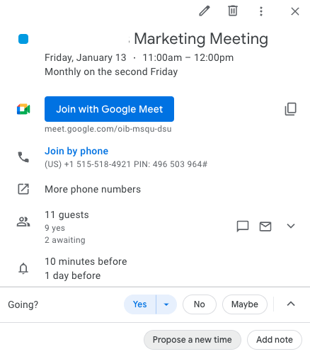
UX Design Heuristics and other design principles that make professional use of software betterGood UX design makes software products navigable, intuitive, and recognizable from interface to interface. This article shows UX design examples that make work easier for individuals, collaborators, and remote workers. Through the lens of UX design examples that align with UI and UX design principles, we will gain a deeper knowledge of UX Design related to B2B software.Businesses rely on apps every single day. From the ability to swiftly book meetings on Google Calendar to producing reports over a video call while screen-sharing on Loom, businesses thrive when UX design meets their needs and expectations. Let’s take a look at 5 inspiring UX design examples.1. Google Calendar syncs the worldUX design feature: invites with integrationsGoogle Calendar has the advantage of being part of the vast Google ecosystem. Its designers have taken full advantage of that by adding many useful integrations that simplify business.Users can add the Google Meet video conferencing app to their Google Calendar invitation with one click. They can attach files and share notes with relevant links.The integration with Google Docs shows how a simple feature can make a big difference. When a user schedules a meeting and pastes a Google Doc URL into the notes section, the top headline (a Title or H1 header) automatically populates as an option to display in place of the link URL. With one click, the user can add the doc’s title as a clickable link inside the notes section. If the invitees cannot access the document, Google Calendar will let the sender know and automatically show a pop-up where they can access the sharing options.Google Calendar integrates with Google Maps as well. This integration is useful when the invitation is linked to a physical place because users can save time and energy navigating.Users can select the integrated Google Meet video app with one click when linking to a virtual call in place of a physical location. They can also link to meetings that go off the Google platform to other platforms like Zoom.UX design feature: collaboration and cooperationUsers can seamlessly invite others when they schedule an event because of the integration with their Google email account. Predictive text populates possible contact suggestions as the user types into the text box to invite others. With one click, users can add the correct contact.If someone can’t make it, they can propose a new time rather than decline an invite. Google Calendar makes it easy for invited parties to RSVP so the organizer knows what to expect. Users can configure the guest list to be private, so no one else can see who is invited or who will be in attendance. This is an example of personalization.It’s simple to add reminders, set a time slot as busy or free, set a time zone, and even make recurring calls at highly customized intervals with specific end dates or after certain occurrences. All of these features together make Google Calendar indispensable to most businesses.2. Respondent helps researchers find qualified research participants fastRespondent UIUser research is critical for companies to prove their hypotheses, understand their target audiences, test prototypes, validate designs, and get the user feedback they need to build products and interfaces with confidence. Respondent helps researchers recruit research participants easily.Researchers already have their hands full, and a smooth participant recruitment experience seamlessly integrating with their research stack is exactly what they need. Respondent simplifies the task of finding and vetting qualified participants, scheduling, sending reminders, and paying the reward incentive, simplifying research operations.UX design feature: Intuitive Research DashboardAt a glance, users learn how many respondents who applied to participate in their study are qualified. Respondent uses its participant bios to vet and pre-qualify applicants, allowing researchers to skip forward to the next steps with quality participants.Respondent participation status can be seen at a glance, too. On a single window, the participant’s LinkedIn link, location, title, industry, gender, qualification, and payment status can be viewed. Users can see the respondent’s response data and when it was collected with one click.The key takeaway is that the dashboard highlights every useful slice of information in a simple and effective layout, enabling quick decision-making for researchers as they look to fill their projects with insightful and relevant participants.3. HubSpot email marketing dashboard provides important information at a glanceUX design feature: email marketing dashboardHubSpot’s email marketing dashboard has good usability. It allows users to see a thumbnail of the email, important details at a glance, and key metrics like open rate and top-engaged subscribers. This dashboard conveys a lot in a simple, easy-to-understand UI.HubSpot adds more value for users through graphs and charts that illustrate more than what metrics alone can convey. Pairing graphics with their associated statistics strengthens the UI. The user is able to glean important details without having to click outside the dashboard. The email marketing dashboard is convenient, efficient, and consistent with HubSpot’s larger design.4. Adobe XD allows designers to produce deliverables and iterate efficientlyAdobe Hi-fi App (left) and web (right) workflows. sourceAdobe XD is a powerful tool with good UX design for multiple reasons. It has a great workflow and makes hand-off work between stakeholders easy. Most of the hand-offs require just one click to push to the next step in the product development lifecycle.UX design feature: design modeUsers can create low or high-fidelity designs. Designers like this kind of flexibility. Sometimes they need smaller lo-fi files that can be used on social media and can be shared quickly because of the file size. Other times they will prefer hi-fi quality, for example, when creating SVG files that need to look high-quality and unpixelated when expanded.UX design feature: prototype modeOnce a design is done, it can go to prototype mode with a single click. Adobe XD allows designers to share their prototypes with stakeholders via a link, facilitating efficient iteration. When the design is validated, XD makes it incredibly easy to hand it off to developers again with a single click hand-off.The app is responsive and fast, with features like pinch zoom and the ability to open Sketch and Photoshop files.Adobe XD shares a short video introhttps://medium.com/media/3501eb1677e8838dfb9a29d0d8cc13bc/hrefAdobe XD has a fantastic UX design that allows ideas to be moved through the development lifecycle from design to prototype to development with just a few clicks.5. Loom creates options for asynchronous updatesLoom UIRemote work is the norm for tech companies. Asynchronous work is necessary when team members are spread over different time zones. Although sometimes a meeting is important for strategy sessions or pitches, a video report can suffice in many instances.With Loom, users can create videos to report to their teams and clients. They can record their screens while simultaneously displaying their face inside an adjustable, moveable circle frame. These features allow the dissemination of complex information via screen share while also increasing engagement by showing human emotion and the person behind the work.Loom is awesome because it reduces the number of meetings people need to do throughout the day. This allows users to focus on what is most important — their work.UX design feature: recognition rather than recallLoom achieves another of Nielsen’s Usability Heuristics, recognition instead of recall. In the image above, at the very bottom, users are shown the hotkey instructions for how to start and end a recording. These instructions reduce the burden of remembering how to control the recording for users.UX design feature: Visibility of system statusLoom’s UI also lets users keep track of what is happening at all times. When know users are recording or not because of recognizable buttons for example, stop recording is the red circle with a rectangle inside it.Users can clearly see what they will be sharing: screen and camera, the screen only, the camera only.It’s intuitive and useful with great usability.6. GitHub’s repository allows anyone and everyone to collaborate, contribute, and learnGitHub is an internet hosting service that uses Git version control for software development projects. Once users learn the hotkeys, GitHub is easily used to collaborate and implement version control. This software has a learning curve, but doing the required learning enables users to collaborate with anyone, anywhere, on any project. Because it is cloud-based, it enables asynchronous work.Users can make projects public, hidden, open to collaboration, or closed. They can commit changes which is equivalent to saving changes, or they can revert changes if something does not work as they need it to. They can revert to any version because of the use of Git. Once the hotkeys to commit or revert changes are typed, the UI shows which version is current and when it was last edited.UX design feature: hierarchyThe project files can be seen in the right column. The left-hand column shows a timeline for creating or editing the files. In the center, the collaborator’s notes. SourceThe visual UI lets users see each file in a file tree and know which version they are looking at, who made changes, and when. GitHub’s use of the visual file tree is an example of the UX design principles of hierarchy.When looking at GitHub’s UI, a user can interpret the file tree visually, as seen in the image below. This view lets users see which coding language the files are written in. For example, in the image below, the files are stored as .js in the build folder, so a user can see the files are written in JaveScript.Also easily gleaned from the image below, a user can understand how many files there are, how many commits there have been to the project, and how many changes have been made overall.Summary:UX design enriches the way users interact with software. From making their journey predictable and intuitive to displaying recognizable icons to providing the necessary context in one place, UX design helps shape user behavior and improve their experience.5 Inspiring B2B UX Design Examples was originally published in Muzli - Design Inspiration on Medium, where people are continuing the conversation by highlighting and responding to this story.

The App Store. A whole new design. A whole new perspective.
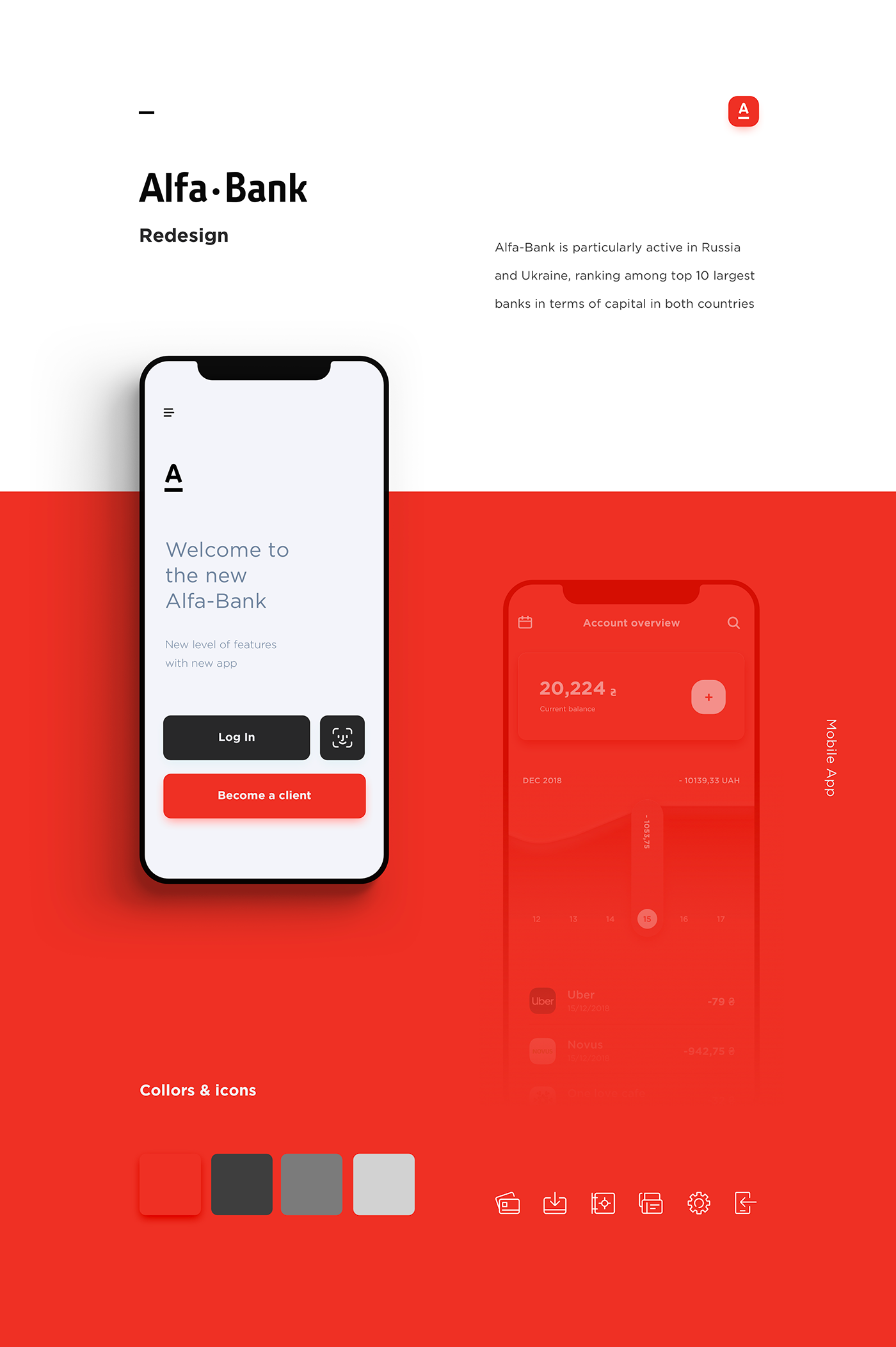
Alfa-Bank – Redesign
Alfa-Bank is particularly active in Russia and Ukraine, ranking among top 10 largest banks in terms of capital in both countries. Our goal was to create simple and user friendly banking mobile app.
Weekly Design Inspiration #200
Weekly Design Inspiration #193
Weekly Design Inspiration #216

Navigation app, AR picture, Transition effects and more… Weekly interactions roundup!
Weekly Design Inspiration #228
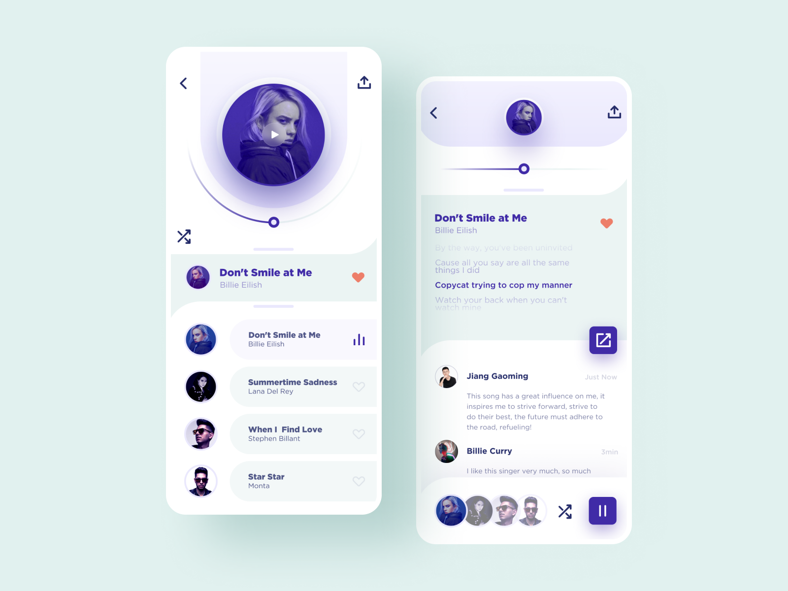
Music Player Inspiration 2017

Dashboards, Typography , Characters and more…Weekly inspiration roundup!

Smart home control, Posters, Sculpting and more…Weekly inspiration roundup!
Weekly Design Inspiration #199
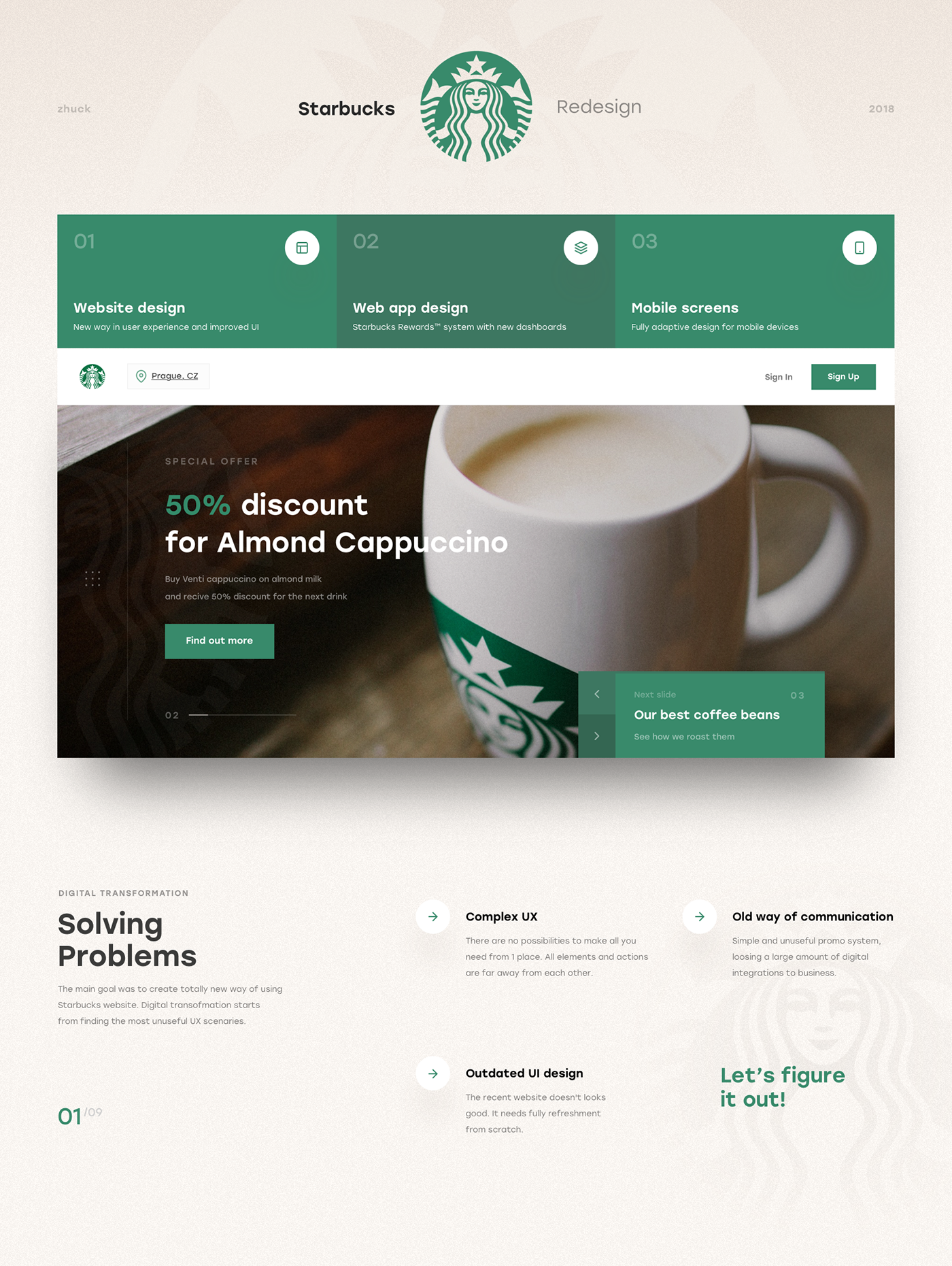
Starbucks Redesign | UX & UI
This is my biggest project ever. I made a lot of analytics, wireframes, mind maps and tons of UI design versions of each card, block and page. And here it is.
Weekly Inspiration for Designers #120
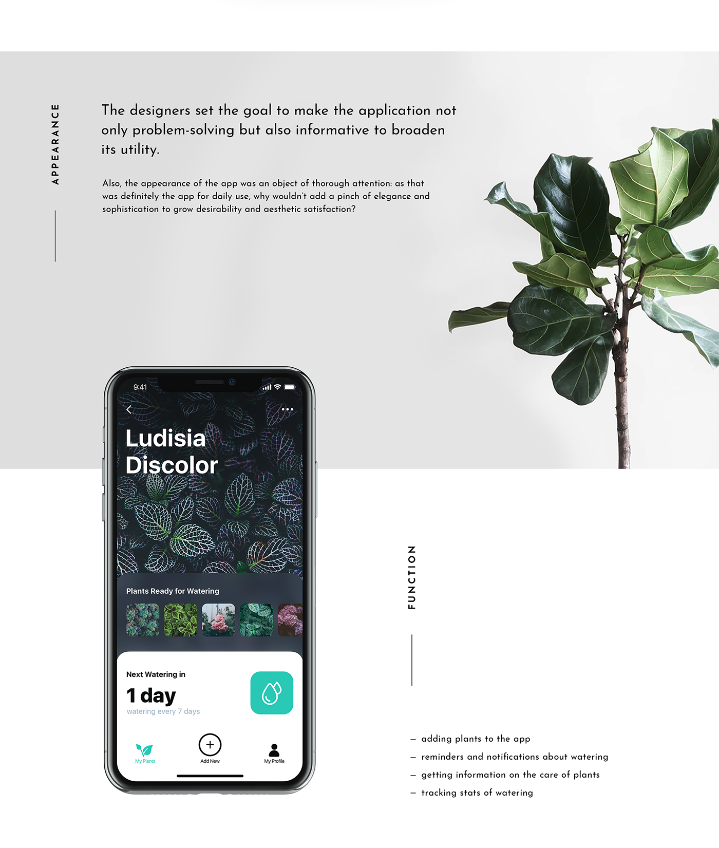
Mobile UI Design: Watering Tracker. App for Home Needs
In our routine full of diverse tasks, mobile apps have become great help. Today we share UI concept for one more called Watering Tracker, reminding users to water the plants as well as tracking the watering stats for every plant. To read a detailed case study, check Tubik Blog https://tubikstudio.com/blog/ Join in!

UI Interactions of the week #81
Weekly Design Inspiration #203

Split screen, Hover effect, Error form and more.. Weekly interactions roundup!

Time zones app, Medical ecommerce, Day statistics and more… Weekly interactions roundup!
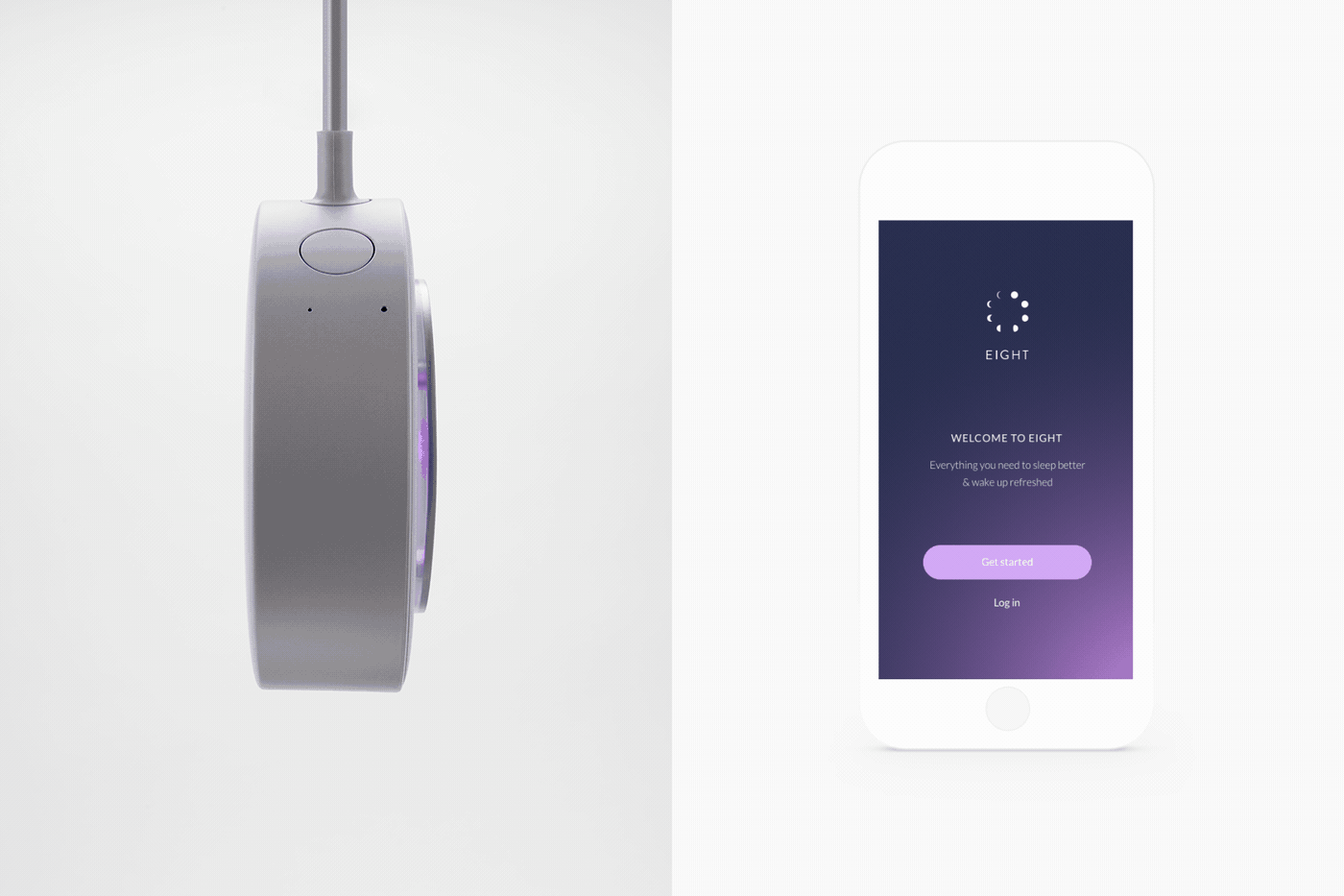
Eight App
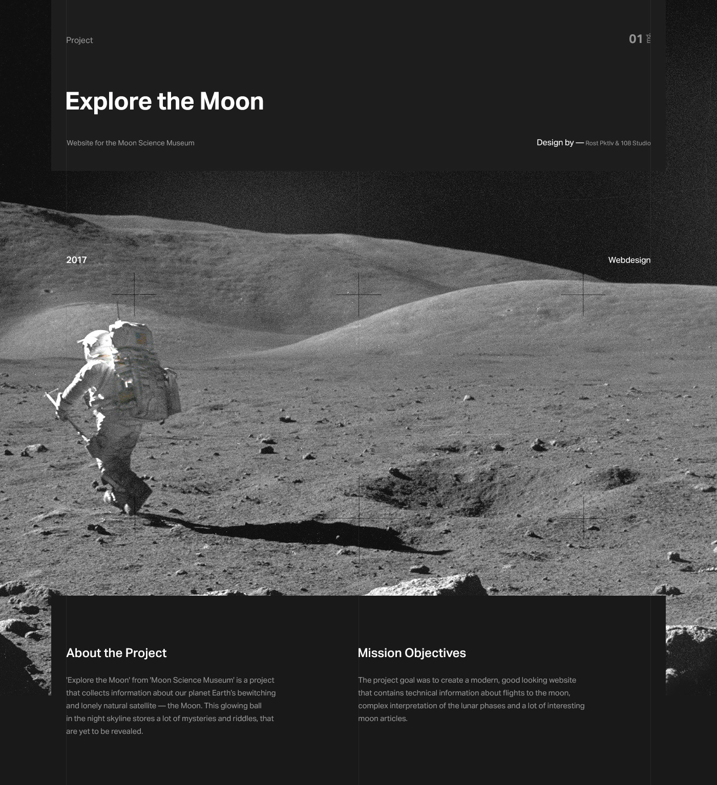
Explore the Moon
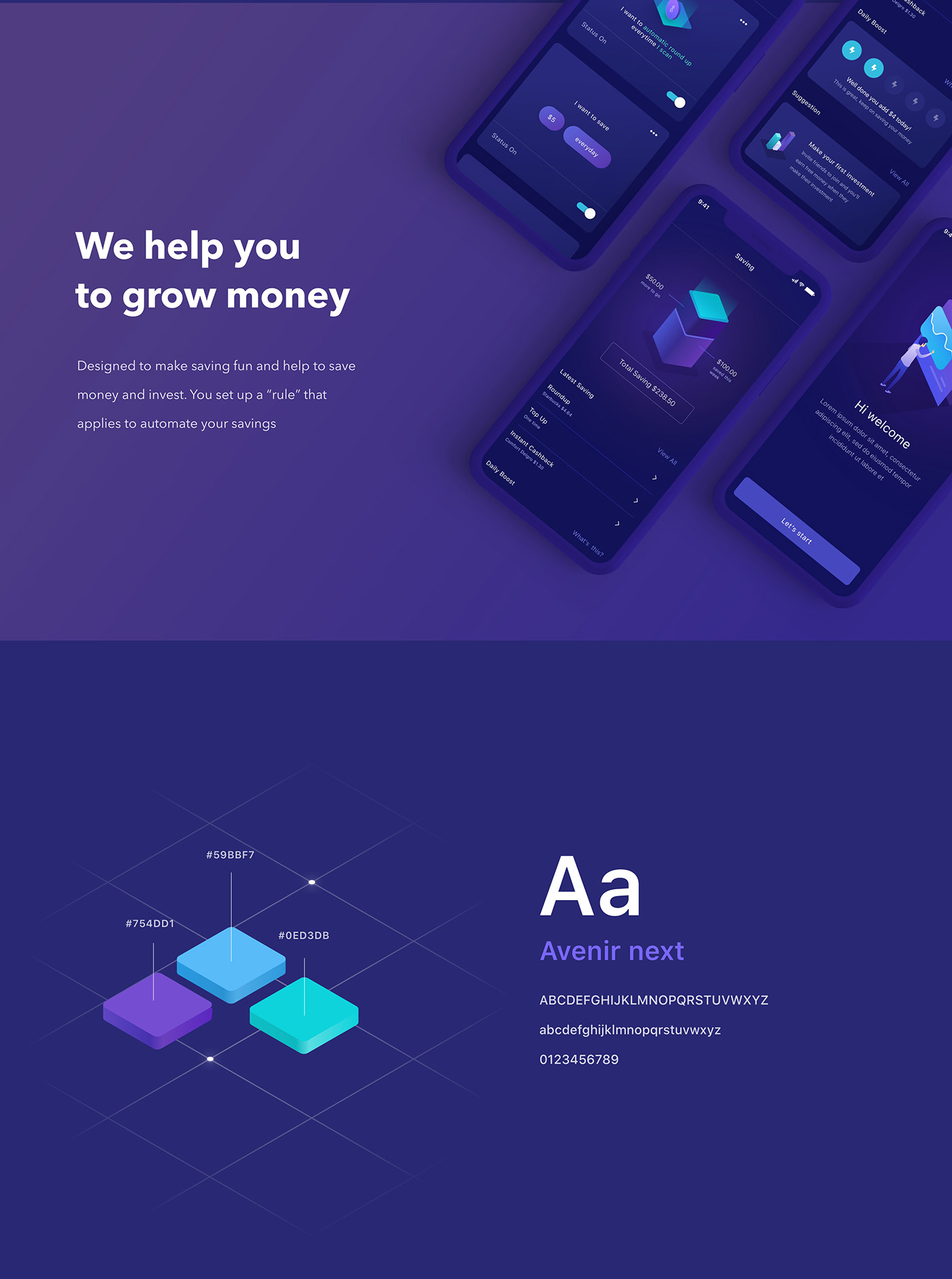
Invest Mobile App UI UX

The Cool Club X FWA - 54 Coolest Websites in History
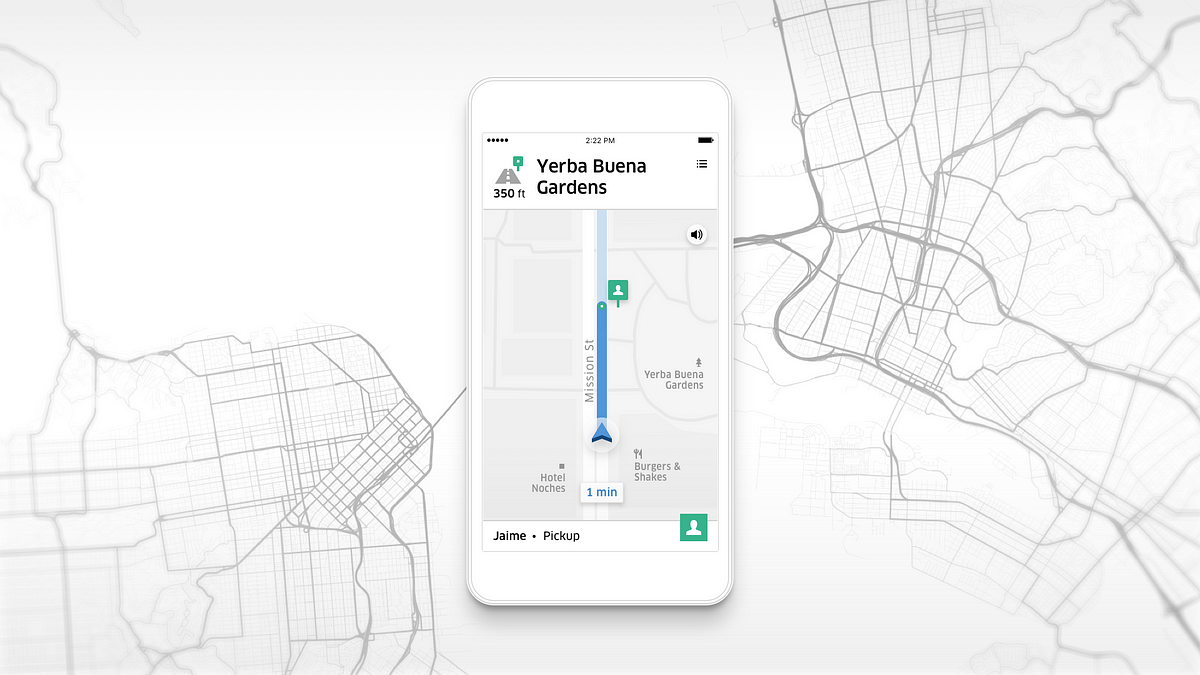
Uber Navigation
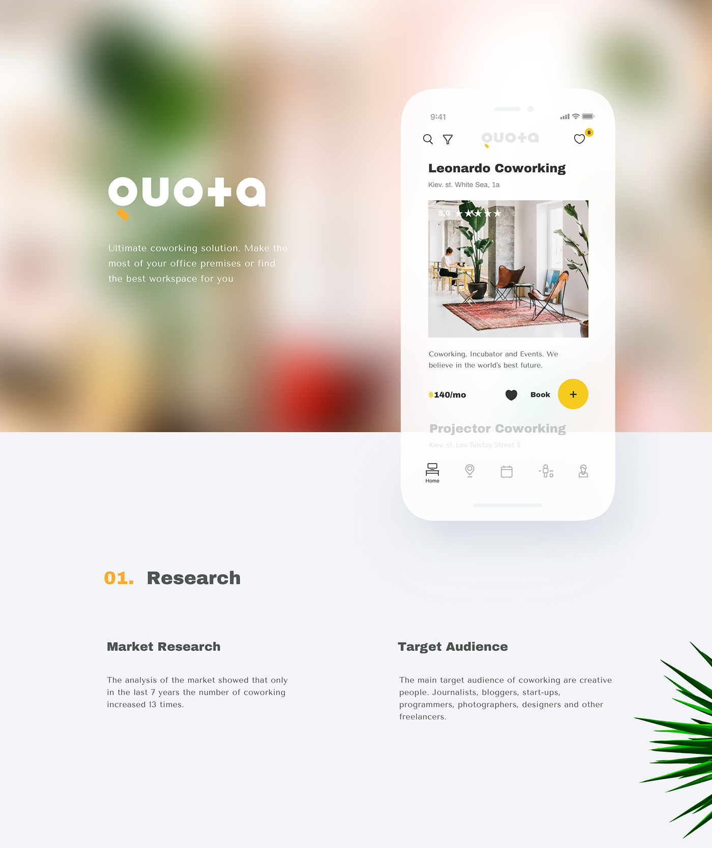
Quota. Coworking App
QUOTA - Ultimate coworking solution. Make the most of your office premises or find the best workspace for you. If you have interested in this project contact me: Works.aristov@gmail.com
Naming by Marco Sharyi.
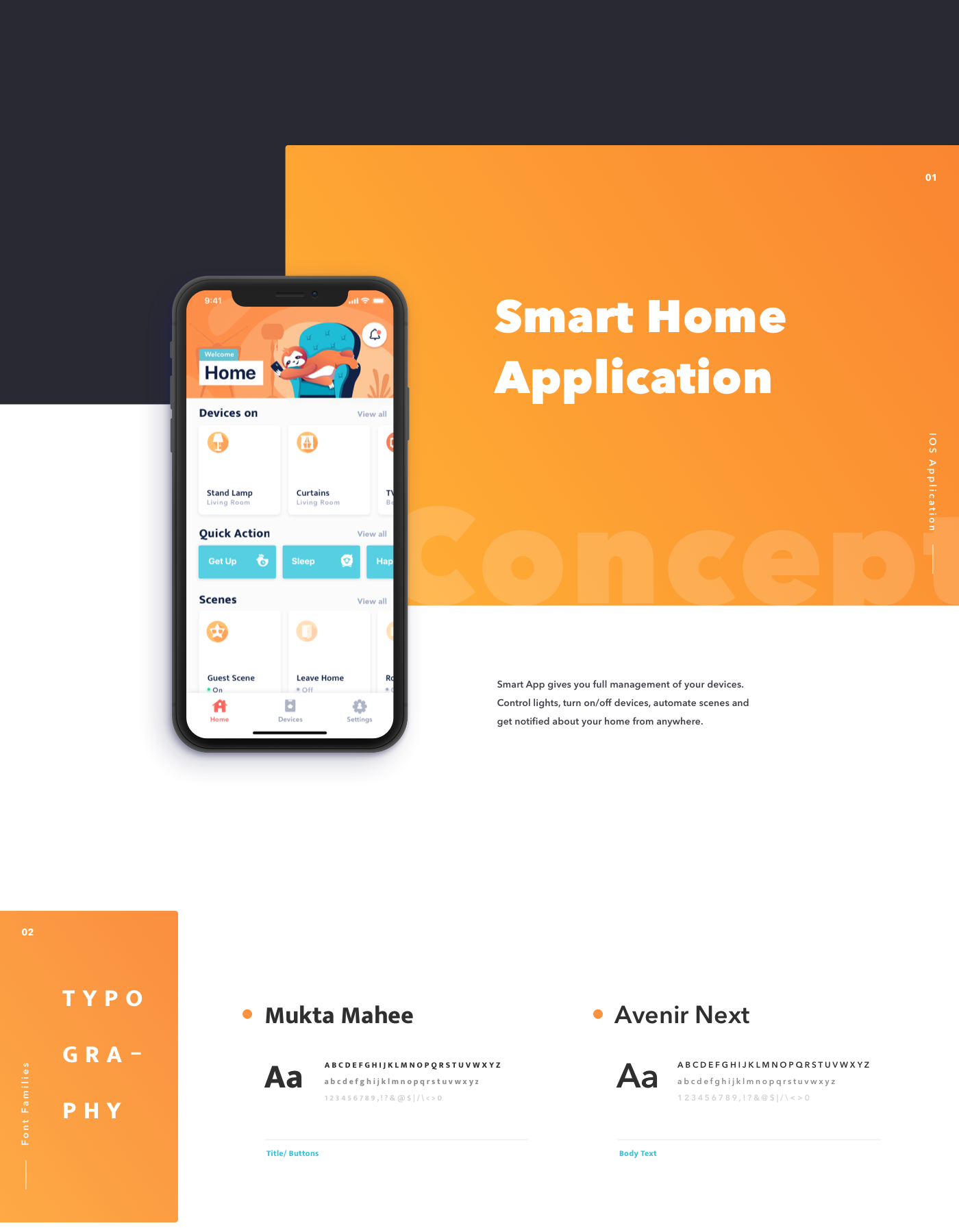
Smart Home App - IOS
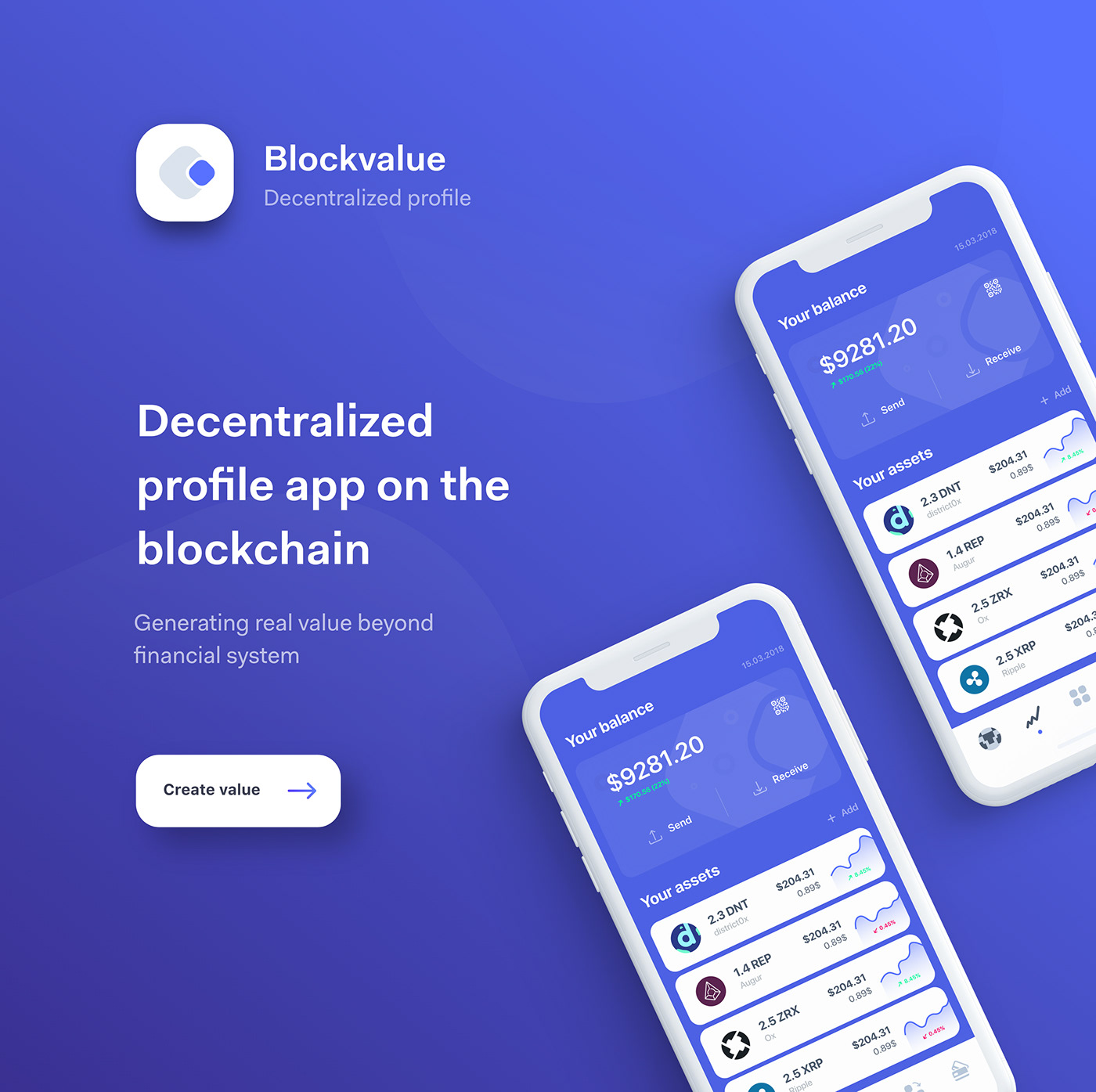
Decentralized profile app

43 free device mockups every designer should have on hand

8 critical shortcuts in Sketch
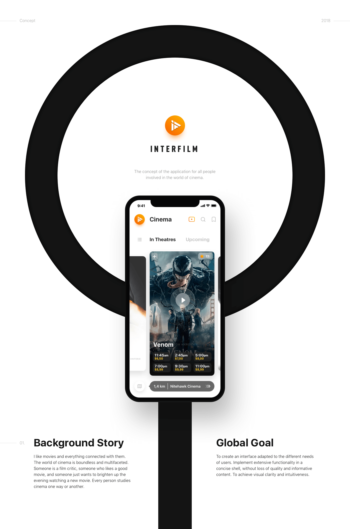
InterFilm (iOS app)
We all love good movies. We all love cinema as well. We collected all the tools of a film fan in one application and made them as convenient as possible. It was a good challenge and a wonderful experience!

Reading app, Wavy type, Van Gogh museum and more… Weekly interactions roundup!

**New** Muzli Mobile App
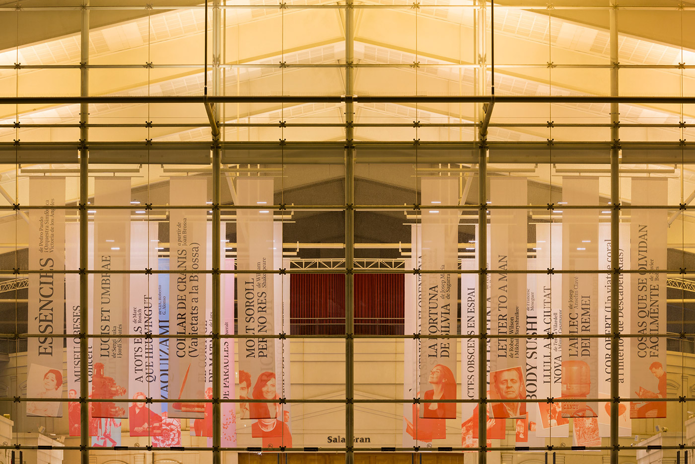
Teatre Nacional de Catalunya 16/17
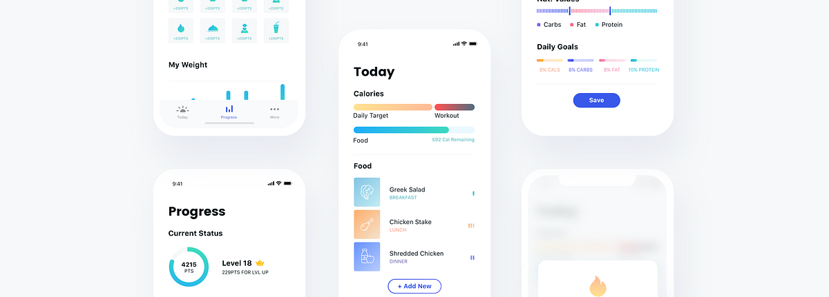
UI/UX Case Study: Nutrition Tracking App
When people start working out, much of their success or failure in reaching their goals are based on their diet. Even with a great plan, tracking your eating after every meal is very hard, and good UX can be an important factor in your success or failure in the long run. I found this as an interesting challenge to solve.Defining The ProblemI wanted to have some data to work with, so I did short interviews with 10 people who tried to track their nutrition habits and failed. This is the summary:5 people said the process took too much of their time4 people said they had problems remembering to report3 people said they couldn’t reach their goals daily and lost motivation3 people said they didn’t know how to measure amounts of foodWhile these are small numbers, it was more than enough for me and my personal project.Current SolutionsBefore diving in and bringing my own solutions, I downloaded the top nutrition apps in the Play Store and learned how they currently answer these problems. I found some nice time-saving features, and also one app which I thought was well designed and user-centered (Lifesum), but most apps weren’t intuitive, and they didn’t seem to me like they bring the best solutions for their users’ needs.My SolutionIn my solution, I focused on the two main pain points that the research showed, which are making the tracking as fast and easy as possible, and helping them remember to track their food.OnboardingThe main value of the onboarding process needs to serve, is to set initial expectations from the app, and to get the minimum information we need from the user in order to get started. I did this by showing a simple walkthrough and used forms that are as frictionless as possible with no need to type.Main User JourneyThe main usage of the app should be the daily tracking of the food and drinks consumed. For the main tab, ‘Today’, I added the current standings of the calories needed to consume according to the user’s goals & calories burnt during the day. The form for adding food needs to have the least friction as possible, and give data regarding how this food effects the daily goals, I used sliders for that. When users will search for new food to add, they’ll be able to select their favorite food, and the recent food added at that time in the past day will be shown there as well. This might help them save time as well.Food TypesSome food is measured in grams, some come in units, some in glasses. When food types are added to the database, they will include data that will make the form for adding it simple and relevant.Barcode ScanOne great feature that some apps already implemented is the ability to scan a barcode and instantly add the product with the correct nutrition value. This is a necessary feature because it makes tracking for some meals easier.GamificationIn order to encourage users to use the app for every meal, I thought gamification could be a good incentive. In the ‘Progress’ tab I added a points system, where users are rewarded for adding food and also for reaching their goals consistently. I also designed an ‘Achievements’ mechanic to encourage them to adopt healthy eating habits. In order to understand their current success, this tab will have interesting statistics regarding the past few days (or more).Testingduring the design process, I made sure to regularly get feedback from friends. I made micro-prototypes in InVision and asked them to do simple tasks, such as “please add a 200g chicken breast you ate” or “check which achievements you still haven’t completed”. If they failed, I did changes and simplified my design until I got to a result that satisfies me.I believe this concept is a good place to start. It implements good UX practices as a solution to a common problem, using the technology we have today, and it can dramatically improve the user retention for such an app. What I love about designing such products is that increasing a number such as a usage retention means making more people healthier, and this is why I enjoy working on such products so much.Thanks for reading!If you enjoyed the story, you may also enjoy:UI/UX Case Study : Designing a better cinema experienceA/B Test Case Study: iOS App Purchase ScreenSee more of my stuff: Website, Medium, Dribbble. I’m looking to work on cool projects with awesome people.UI/UX Case Study: Nutrition Tracking App was originally published in Muzli - Design Inspiration on Medium, where people are continuing the conversation by highlighting and responding to this story.
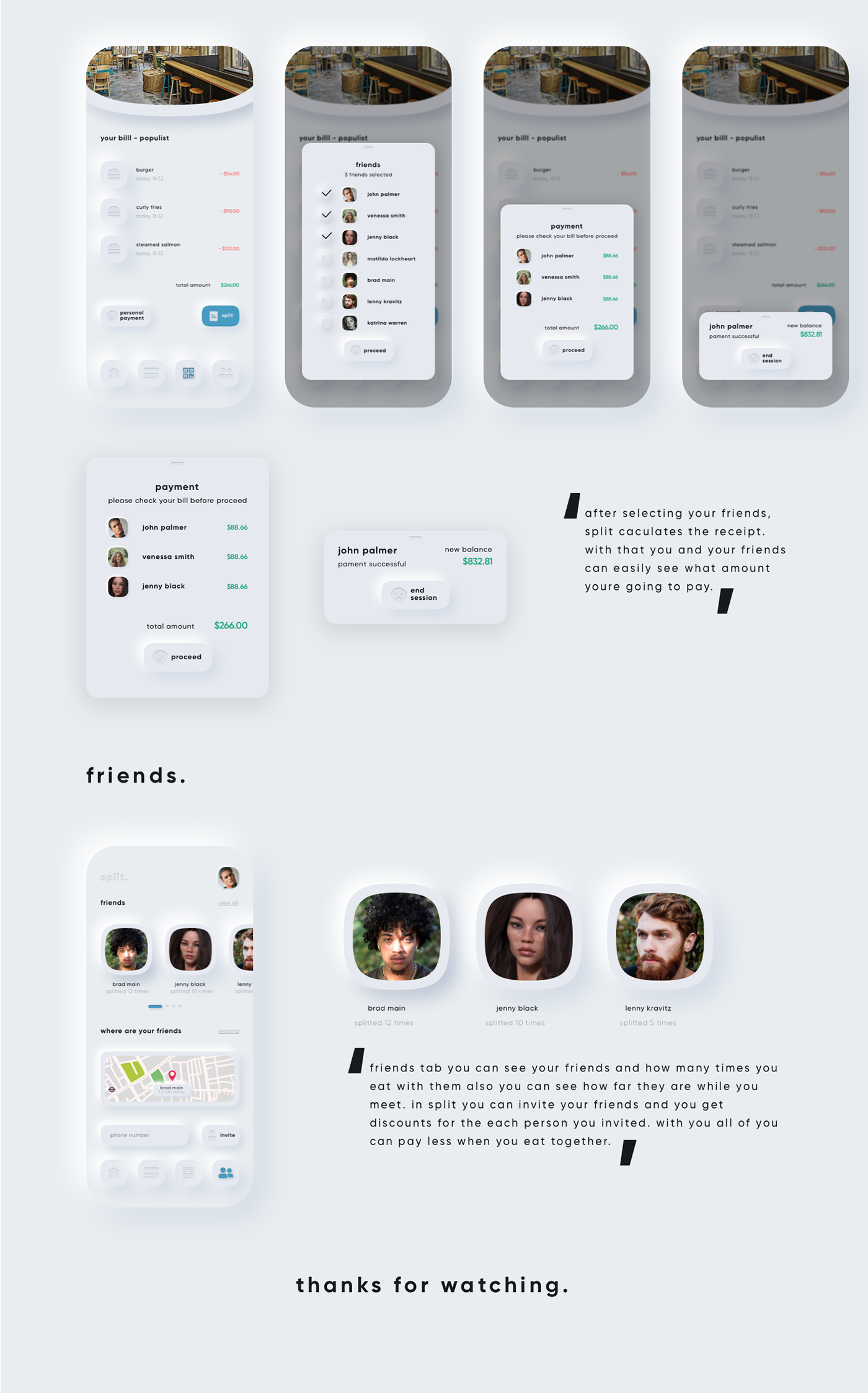
split. neumorphism ui ux payment app
split is an payment app that allows you to split the receipt with your friends and let you pay online. you don't have to wait to pay you bill just use split to pay faster.
UI Interactions of the week #214
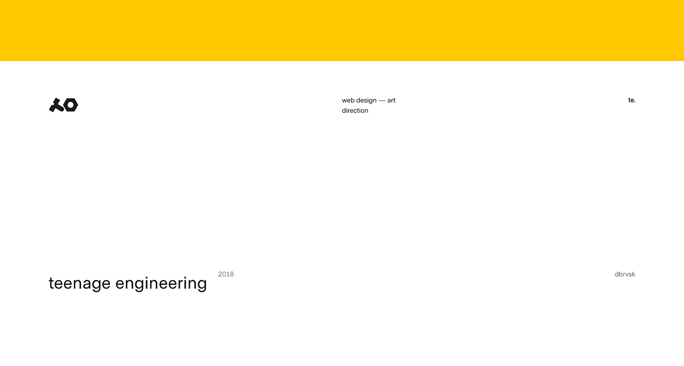
teenage engineering
teenage engineering is a swedish consumer electronics company and manufacturer founded in 2005 by jesper kuouthoofd, david eriksson, jens rudberg and david möllerstedt and based in stockholm. main aim was to create concept store with unique interection between website and the user. the screen is divided into two parts, each of which has its own functional.
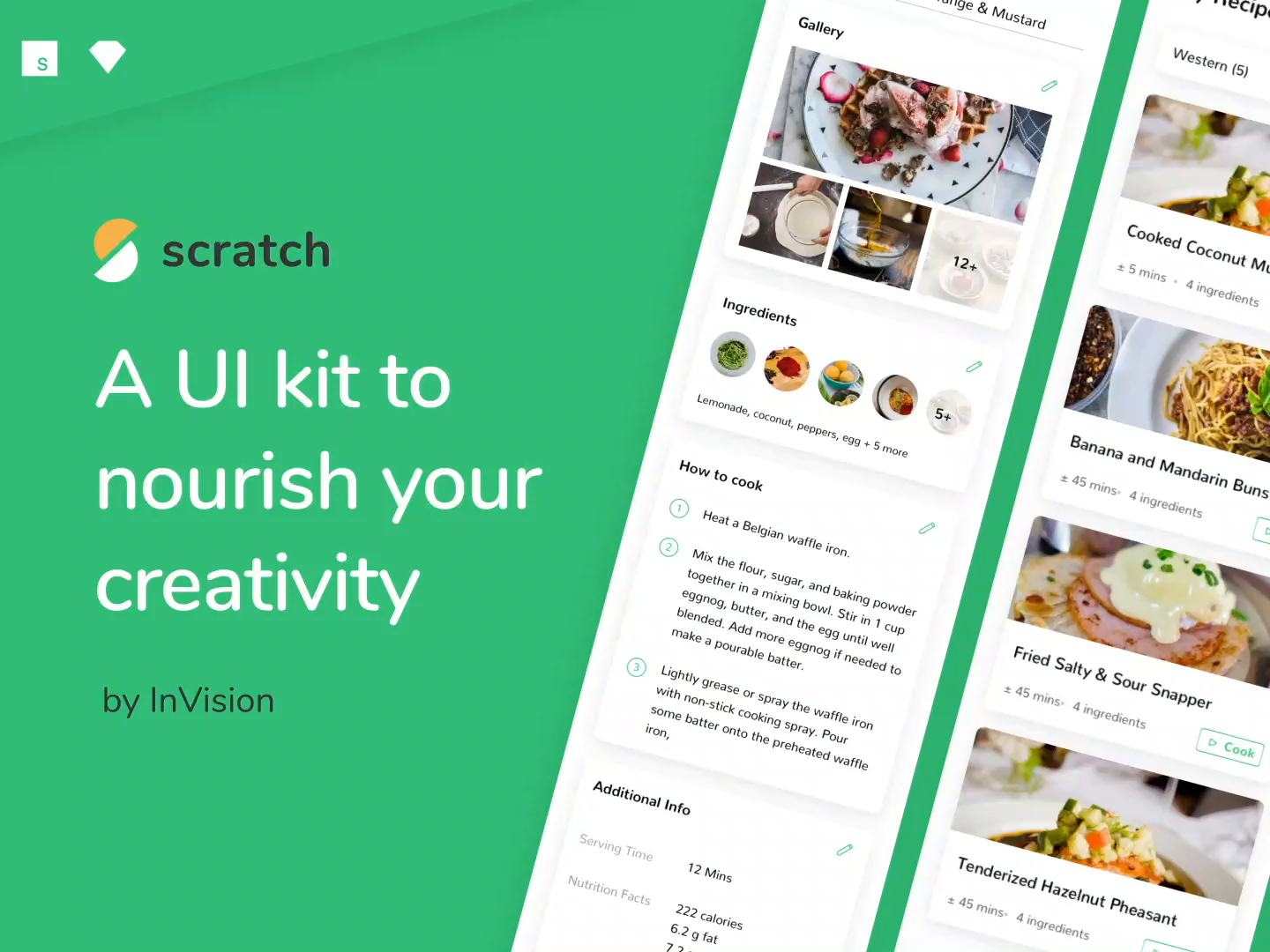
Scratch—A UI Kit to nourish your creativity by InVision

UI Interactions of the week #236

UI Interactions of the week #215
Weekly Design Inspiration #302
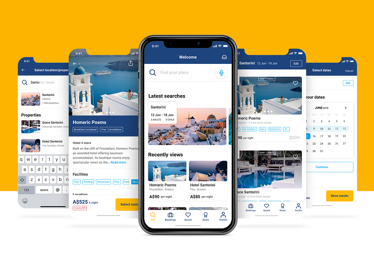
Booking.com — UX Case Study
Booking.com has grown from a small Dutch start-up to one of the largest travel e-commerce companies in the world.At Booking.com, travellers are connected with the world’s largest selection of incredible places to stay, including everything from apartments, vacation homes, and family-run B&Bs to 5-star luxury resorts, tree houses and even igloos.Each day, more than 1,550,000 room nights are reserved through the platform.Whether travelling for business or leisure, customers can instantly book their ideal accommodation quickly and easily, without booking fees.ResearchSince Booking.com was launched, many competitors have followed up the trend with a similar business model, filling the marketplace, becoming popular and In few cases working even better than Booking.com itself.To begin my research, I started to look at a few competitors or similar platforms, analysing UI, UX, User flow, IA and key features. I won’t go into detail however, as I want to keep the focus on the research which has been made on Booking.com itself.ScenarioDuring the research I identified many different scenarios and I kept my focus and develop the the following:Scenario 1: user knows dates and destination of its trip (default scenarios)Scenario 2: user knows dates but not the destination of its tripScenario 3: user knows destination but not the dates of its tripUser PersonaGoing further through the research, I identified 4 personas which have different needs and different goals. This data will be useful to improve the user experience for each one of them.The aim would be/has been to create the best itinerary and improve the functionalities to provide the best possible experience for each persona.data acquired from online research and users interviews (sample of 30 users)User reviewsI reached out good hints from users reviews which have not highlighted relevant issues about usability or functionalities. I’ve categorised the complaints in 4 categories:Booking cancellationApp BugDeal complaintsReview visualizationThe most relevant is, without any doubt, the booking cancellation. Too many users noted unjustified fees or difficulties getting in touch with the hosts.User interviewsBased on a sample group of 30 users, I tried to get further feedback from which I highlighted the following considerations:The average prices are usually higher compared to other platformsIt’s hard to find negative feedback about the properties. The system is structured to highlight positive feedbackIt’s also hard to get in touch with the host and receive responses from themI’d like to pull out one quote, which was pretty interesting because it doesn’t depart too much from the “user complaints” faced in the users reviews (deal complaints).Pain pointsSummarising the research I’ve discussed, I have develop the following considerations:There is not a proper solution to cover the scenarios that have been identified. It seems that the user needs to have all the information required to get a suitable resultThere are not functionalities to improve the user experience considering each persona identifiedUI could be improved and made more user centered rather than “sales centered”There are issues related to the booking cancellation and to reaching out the hostsLet’s start with the solutionsStarting from the pain point, I tried to find solutions to solve them and introduce new features overall to improve the user experience.HomepageOverall, I’ve made many changes on the current homepage.The searching process has been completely redesigned, trying to avoid too much information being required to get a result in the first instance.Navigation — I’ve designed a new Tab Bar, pulling out the “saved” button from the IA, so the user can quickly have the access to its own saved properties. Furthermore I introduced the new section “Deals” which I’ll explain better later.Helpful widget — As for the previous version I’ve kept the useful widgets related to the latest searches and properties view, revisiting the UI in order to improve the look and feel and the usability.Social — Nowadays, social networks are even more integrated in the user’s lifestyle. So why shouldn’t be included even in booking.com? I’ve included a new feature which allows the user to connect with their own networks and to see the latest properties chosen by them, including some quick feedback about it (i.e. like / dislike). I’ve relegated this feature to the homepage as I want to collect more data about it before rolling it out across other sections.Search — Now the process has been split in multiple steps. After the first one, the user is allowed to reach the listing page even without specifying any dates or other information. Therefore the scenario 3 is covered. Moreover, I’ve introduced the voice search which can be used by the user to make searching even easier. Based on the assumptions I took from the personas, the result of the listing page will be customised using the information from the last step of the search:1 adult — backpacker — hostel2 adult — holiday couple — hotel, guest house or B&B2 adult + child — family — apartament or hotel1 adult + business select — businessman — hotelNote: Even the facilities highlighted in the listing page will be shown based on these assumptions.Listing pageThe listing page shows many overall changes to improve the usability:I changed the filter from 3 to 2 buttons to reduce the user’s step — it also remains at the bottom to have a quicker and easier accessI added a label to identify the property typeThe main facilities offered by the property have been shown to the user In a first instance.Note: Leveraging the personas data, the property listing can be customised to highlight relevant information which each persona is looking for.I converted the price to “for night” instead of “total” to make the comparison easier between propertiesI Avoided the “deal focus”Property DetailI’ve rolled out many changes which can be introduced in the listing page.In this case the price has been shown by total, to avoid to hide potential additional fees which might affect the total price.I’d also like to highlight a minor feature related to the reviews, in which the user has been allowed to filter them by rating (sort by button). — This issue was spotted in the user reviews.DealsAt the beginning of the research I identified scenario 2 — in which the user doesn’t yet know its own destination. To provide a better user experience, I introduced a new section where the user can find packages from various destinations. Thanks to the filter, the user is be able to select the packages most suitable for its needs (period — continent — country etc…)PrototypeI built a prototype which shows the entire project, showing each one of the mockups faced before.Enjoy!ConclusionDue to time constraints, the research and consequents assumptions are based on my personal experience and a small amount of data.Deep analysis and additional testing needs to be conducted in order to refine and validate the solution.Thank you for reading! Hopeful you enjoyed this case study. If you have any feedback, I’d like to hear from you. Say hello at hello@filipporovelli.com or connect on LinkedIn.I’m not in any way affiliated with Booking.com, just a user which wanna design cool 🤘 staff!Booking.com — UX Case Study was originally published in Muzli - Design Inspiration on Medium, where people are continuing the conversation by highlighting and responding to this story.

Welcome to Wickret
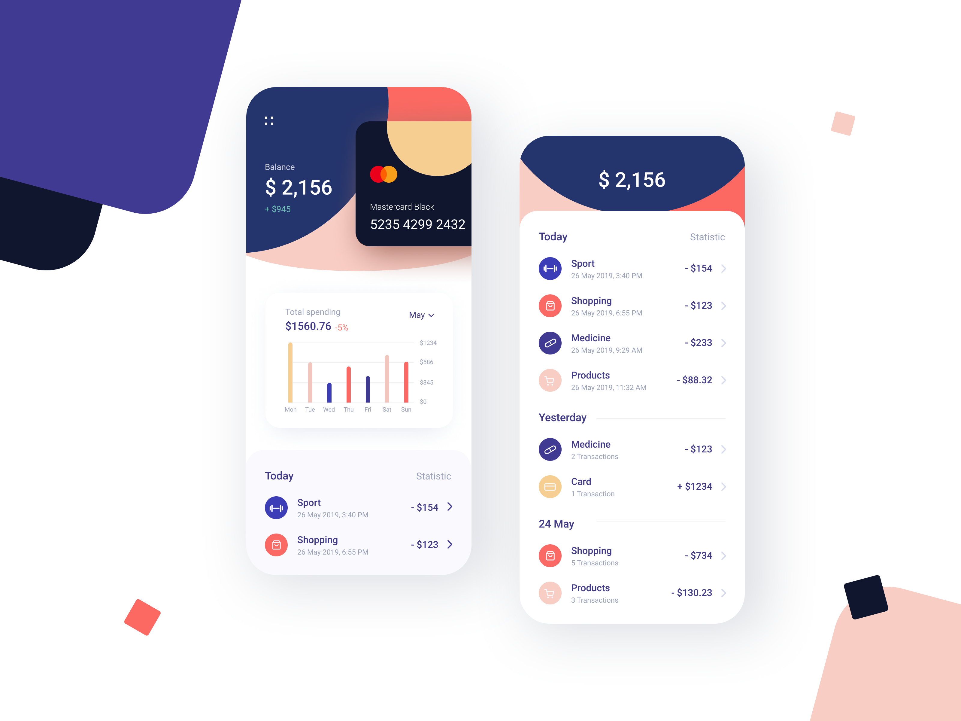
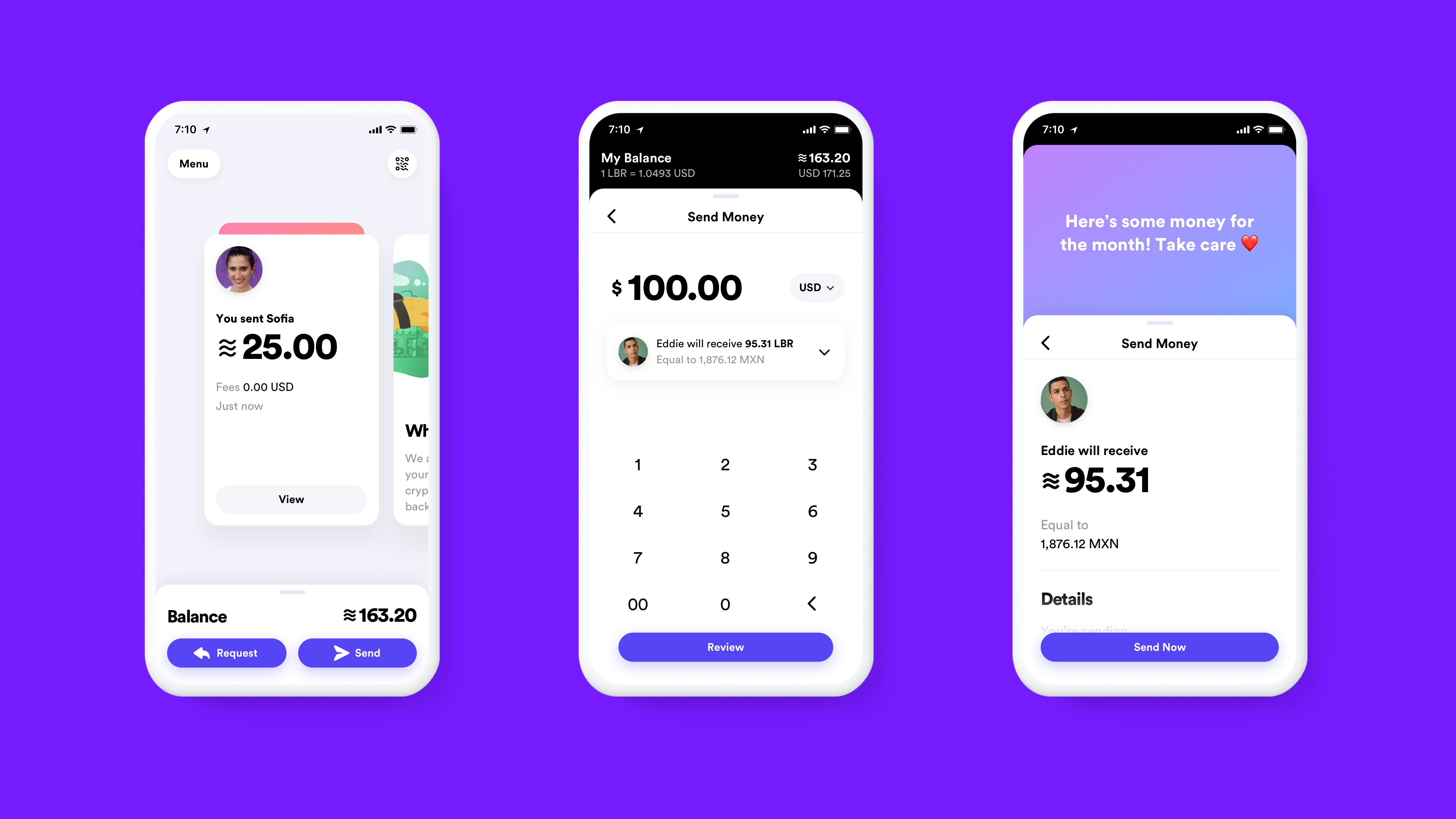
Banking App Design Inspiration
Banking App Design Inspiration
AoiroStudioAug 21, 2019
A new Pure Design Inspiration is up! One burst of inspiration roundup just for you. For this week, I decided to surf Dribbble with the mindset of 'banking app design' inspiration. With the launch of the Apple Card, designers are taking a stab at experimenting with concepts and they are filled with 'gradients'. Yes! It's coming back for real, what do you think? In this collection we are featuring the work from Vadim Drut, Brave Wings, sam angeli, Alexander Plyuto and more.
More Links
For more, check out Dribbble
via Dribbble
Vadim Drut
Brave Wings
sam angeli
Alexander Plyuto
Adrian Reznicek
Victa Wille
Wahab
Alexander Plyuto
Brave Wings
Sandro Tavartkiladze
Afterglow
Bakhtiyar
Afterglow
Bakhtiyar
Brave Wings
Brave Wings>
For more, check out Dribbble

D-ID - Create professional videos powered by AI
UI Interactions of the week #191
2019 Biggest UI Design Trend
2019 Biggest UI Design Trend
abduzeedoJun 20, 2019
So we have a new UI design trend all over us and it deserves a post here on ABDZ. It’s quite clear to notice it, just spend some time on Dribbble and you will spot it right away. This post is literally from three or for Dribbble pages of beautiful mocks. The interesting thing, and what drove me to write this post was when I saw the new Facebook product called Calibra. It features all the same UI patterns, rounded corners that in some way match the phone and screen rounded corners. My interpretation is that as phones become bezeless the screens now match the hardware form, so the software follows the same direction. Apple and Samsung have been exploring this for quite a bit, but now it seems to be all over the place. Anyways, enough talk and here is a collection of designs with the new super rounded corner widgets.
UI Design Trends
Made with Studio #55
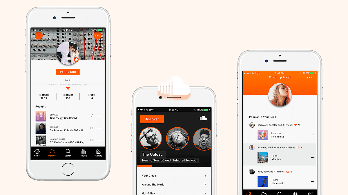
My friends and I hate SoundCloud iOS so much I redesigned it

Mobile UI Design: Basic Types of Screens
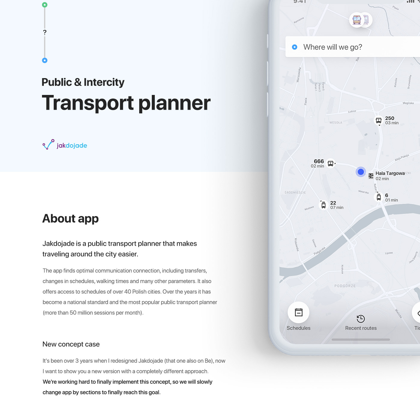
Jakdojade - Public & Intercity Transport app
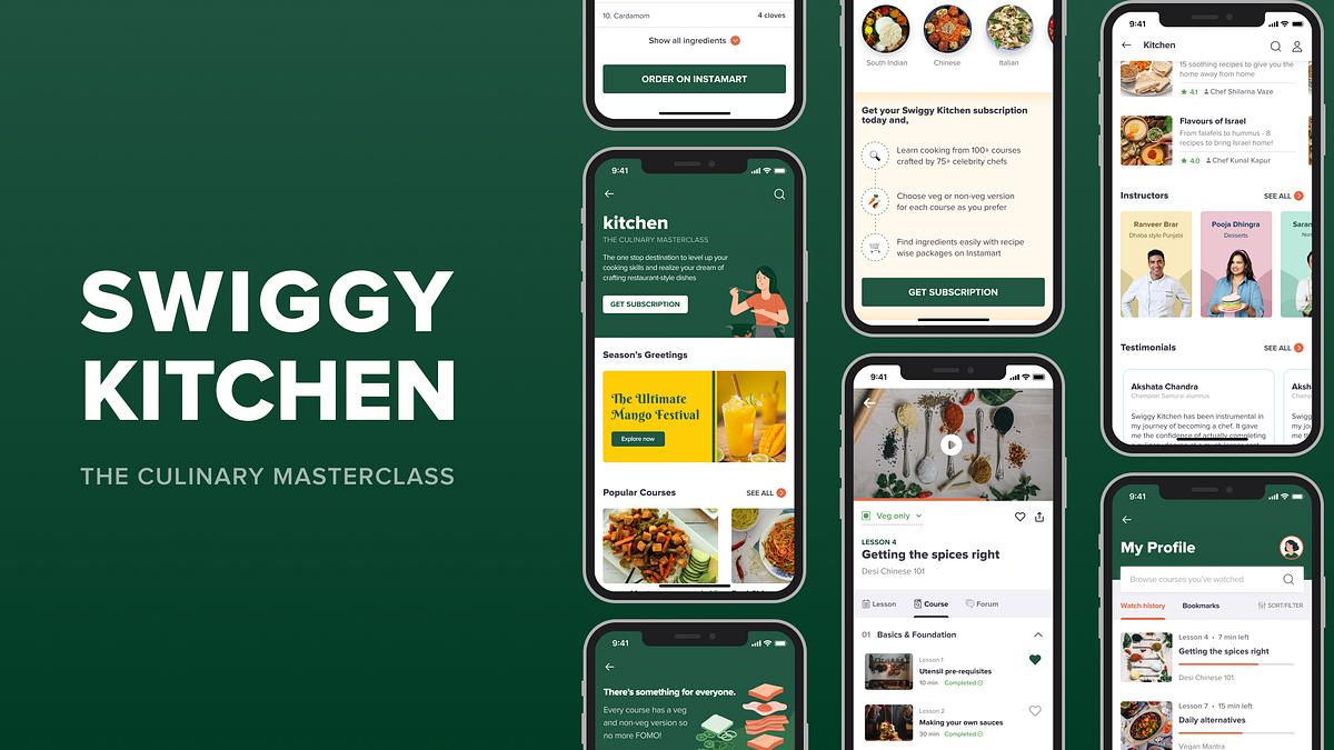
Expanding Swiggy’s user base & cross promoting verticals: a UI/UX Case Study
Expanding Swiggy’s user base & cross promoting verticals with Swiggy Kitchen: a UI/UX Case StudyIn this article, I’ll explain how I approached designing a new feature for Swiggy — India’s leading FoodTech app.DisclaimerThis is a personal project. I was in no way associated with Swiggy at the time of working on this project.❓What is Swiggy Kitchen?Swiggy Kitchen is a culinary masterclass, added as a concept feature to the very famous Indian food delivery app Swiggy through which users can learn how to cook from renowned Indian chefs.Wait. What? Why would a food delivery app teach you how to cook?If you have this question, that’s very valid because after all, we all must have seen such notifications from Swiggy where they ask us to take a break from the kitchen:Swiggy’s classic notification asking us to take a break from cookingI was initially skeptical about this idea as well, but, I did manage to find the ‘why’. Here’s how:I am a big time foodie and when I was researching about the FoodTech space in India, I found that the user group of people who want to learn cooking is largely under focused.There! Sapta said it! 😃I found through my research that there are very few options available for them to learn/explore content from. Of course there is the Internet — housing a variety of information, and there is formal education through a Culinary degree. But, this is broadly how the spectrum looks:Spectrum of resources available to learn cookingSo, if Swiggy can leverage the sweet spot between unstructured but accessible and highly structured but not easily accessible content, then a fresh user base can be targeted.Does that mean there will be lesser orders on Swiggy now?Nope. As one of the users I spoke to rightly said:“Just because I know how to cook, I’ll not give up the comfort of getting food delivered to my doorstep.”With that in mind, I worked on refining the feature further. The 2 main aspects I focused on are:Deciding the pricing model for the featureCross promoting Instamart through Kitchen1. Deciding the pricing modelBefore talking about the pricing model, I would like to acquaint you with our target users. Based on the spectrum shown above, I wanted to cater to variety of users. Three categories became clearly evident:Group 1: On the ‘Internet’ endThis group consists of users who are mostly casually exploring cooking content with no specific goal in mind and just want to give more time for their love of cooking.Group 2: On the ‘Culinary degree’ endIn this group are users who are extremely passionate about cooking and want to pursue it as a profession. As a result, they are looking for structured content in a particular niche, for example: someone who wants to learn baking and start their own bakery.Group 3: Somewhere in between the extremesThese are people who are not looking to master one particular niche, but at the same time aren’t casually exploring as it’s important for them to learn cooking. Eg.: Someone who’s moving abroad to pursue Masters and wants to learn cooking for survival.Now, based on these target groups, I had to decide which pricing model would be suitable for the feature — per course pricing? subscription model? a mixed model?Initially, I had started off with a per-course pricing model as the interests of our target users are varied — some are exploring different cuisines, some know what they want, some don’t etc. But, when I zoomed out and re-focused on our target audience, I realized:⭐️For groups 1 and 3: As they are not specifically looking for a niche, upfront commitment by paying for each course will not be suitable. And because they are majority of the target audience, I decided to go ahead with a subscription model — less expensive, can explore various courses.⭐️What about group 2 then? I wanted to consider solving for their needs as well, which is why I came up with a workaround. But, do hold tight. I’ll come to that a little later.We are almost about to dive into designs, but just one last thing before that:2. Cross promoting verticalsWhile I was doing my research with a few cooking enthusiasts, one of the main pain points they faced is finding the right ingredients. It was even harder when the ingredient was rare. They had to google the local name, look for it from store to store — a little too cumbersome. I decided to solve for this as well:Instamart to the rescue! Because Swiggy had already ventured into the grocery delivery space with Instamart, I thought of adding it as a simple plug to Kitchen. The user flow of Swiggy Kitchen is as follows:And the touchpoints are:🎨Let’s talk design!🔶Understanding Swiggy’s design systemBecause I was designing this as a part of Swiggy and not something from scratch, I had to clearly understand the existing design system of Swiggy — typography, colors, layout, spacing, variety of elements etc. I spent a lot of time taking screenshots and analyzing them, learning from them. By the end of the project, this is how my gallery looked: Clearly, Swiggy had taken over!🏠The Home ScreenThe home screen took the longest time to design as it was so content heavy and there were a lot of decisions and problems I had to tackle because this is the very first screen the users will encounter on deciding to explore the feature.I shall first give you a sneak peek and then walk you through section by section:1️⃣The intro sectionBeing the very first section, it had to clearly capture the description and the overall essence of the feature so that the user can get it at one glance. I iterated not just on the visuals, but the feature name as well in order to do so:🔍The search bar:As seen in the above iterations, I had designed the search bar similar to how it is in Instamart, but there was something off. The search experience in this feature and Instamart are slightly different.Here’s how: Imagine you are going for your monthly grocery run. The very first thing you’d usually do is check what all you already have in your kitchen and make a list of what more you’ll need. So, on Instamart, people come to the app with specific things to look for.But, here, users would primarily come to ‘browse’, similar to Netflix, Hotstar and other such streaming apps, so search need not be given so much prominence over the content itself. Which is why I redesigned it as below:2️⃣ Season’s GreetingsLocal ingredients are always easy to find and great for health and taste. To leverage this as an advantage, I introduced a section called ‘Season’s greetings’ — which will have courses dedicated to what’s in season based on the user’s location.3️⃣The course cardsWithin the home screen, this is the element that I iterated on a lot. Because this was the primary entry point into actual content, it had to be very clear and informative.The process that I followed was to do competitive analysis among different EdTech products available and try to understand what information they are conveying. What followed was a list of data points that will help a user to tap on the card, and ranking these in order of importance.At each iteration, I kept asking a few important questions:Is the information presented enough for the user to make a decision?Within the data points, has hierarchy been ensured?Is it easy to consume the information presented?Note: The early iterations have price as a data point as I had initially started off with a per-course pricing model4️⃣CategoriesThis section was added to make it easier to search for courses when someone is particular about what type of recipes they want to cook. This is the only section that has been constant since my very first iteration. I wanted to keep it very simple and neat, just how Swiggy already does it.5️⃣The Subscription CTADesigning the subscription CTA and deciding its placement has been one of the most interesting challenges for me in this project.I started off with a few simple iterations:To improve it further, I went back to our good old friend — competitive analysis — to ensure that I’m not missing out on the key aspects to consider about a subscription CTA. I explored various apps that use a subscription model. While doing so, I asked 3 main questions for each app:Within the screen, where is the CTA present?What information is conveyed before the CTA appears?On subscription, what changes? (Do you get access to more content? Or the experience gets better — like no ads, downloads etc.? — this question was to get a context of why they are doing what they are doing)Here’s how it went:What I inferred from this:Although the placement of CTA can vary based on the context, ensure that the key selling points of the app/feature are conveyed before the CTA is shown so that the user can take a decision to click on the CTA.As I had mentioned earlier, one USP of this feature is:Instamart integration to help users find ingredients easily.Along with this, there’s another USP to offer maximum value to the users:Each course has both veg and non veg versions. (Except special categories like vegan, sweets etc.)However, neither of these was conveyed evidently before the CTA was presented, which means there is not enough trigger for the user to click on the CTA. So, I got back to iterating again. I came up with 3 CTAs in addition to the one in the intro section so that:Enough information, especially about the key selling points is conveyed before the CTA appears,The CTA is reachable from different points in the screen, andCTA stands out from rest of the card and banner elements used6️⃣InstructorsThe courses have been curated by some of the very famous Indian chefs. This section highlights the instructors that are on board this venture.7️⃣TestimonialsI made sure to include social proof just before a CTA because it’s one of the key factors for users to decide on signing up.8️⃣TracksRemember we had another target user group to cater to — group 2 — wherein people are looking for structured content to master a niche? This section is targeted mainly towards them.Each track has an exclusive set of courses from beginner to advanced level to help the user master a niche. Because this is for a specific set of target audience, it doesn’t come as part of subscription. It involves a separate purchase. And it’s totally flexible — as in, each user can either buy a subscription only, or Tracks only, or both — completely based on their needs.For this section, the questions I had to answer at each phase were:Is it effectively speaking to our target audience?Have the offerings of tracks been portrayed clearly?However,Is it evident that Tracks are something to be purchased separately apart from subscription?No, because the Tracks section had blended into the screen amidst other offerings of subscription.To tackle this problem, I iterated further:But, is this an either-or situation?No, because the user can buy both subscription and Tracks. Using an ‘or’ delimiter, thus, conveyed the wrong message.Finally, when I changed the subscription CTA to appear as a section that stands out, Tracks evidently appeared as something that’s not part of subscription:9️⃣The final sectionAfter all these sections, it’s now time for the very last section in the home screen. I intended to have a list of courses here so that the users get to see more number of courses before the exit. Sounds quite simple, right?Well, I had to address some important questions for each iteration here as well:How can I improve the experience of going through a number of courses simpler and more delightful?Can I minimize the cognitive load on the user?Note: The early iterations have price as a data point as I had initially started off with a per-course pricing modelPhew! That brings us to the end of how the home screen was designed. Feels like an elaborate meal, right? But hold your horses, there’s more to come! For now, let’s take a breather and look at some of the smaller, simpler screens:💰The Subscription ScreenThis is the screen that appears once the subscription CTA is clicked. I referred to the Swiggy Super subscription screen and wanted to design something similar to that. Here’s how it looks:👤The Profile ScreenThis screen is to help a subscribed user keep track of their watch history and bookmarks.📙 The Course ExperienceWe’ll now be going through another very important part of the feature that I worked on — crucial in making the experience of actually consuming content more seamless.The 3 main components of the course experience are:The course screen — with all course details like syllabus, ratings and reviews etc.,The lesson screen — with recipe details of what’s taught in that lesson and most importantly the ‘Order on Instamart’ CTA, andThe forum — learning alone can get boring at times so I wanted to include forum as a feature for people to discuss as they learn.This framework is slightly different from most of the e-learning platforms out there like Skillshare, Udemy etc. (except Coursera) because the course screen is the very last level here and they don’t have the need for a separate lesson screen. But, it is important here to have a dedicated lesson screen to convey some crucial information that is the crux of the feature. Hence, it was quite a brain teasing problem to solve.Below are some of the initial iterations for the unsubscribed user version:I’d like to bring your attention to two things here:First, the veg/non-veg filter: Why didn’t I use the toggle that Swiggy already uses? The toggle, in its basic functionality works by hiding/showing elements. But, here how it works is, every course has a veg and veg/non-veg version. The number of lessons remains constant irrespective of what they choose. So I tried to emphasize this through a drop down instead of a toggle.The subscription CTA: Although the CTA is visually pleasing, I had to rethink its placement. Again, the main questions I asked are: i. Is the required information conveyed before CTA is presented?ii. Is it easily reachable? The first question of course was taken care of as this is one level deeper from the home screen and users have already been familiarized with quite some important information. But, because the CTA was placed at two points within the screen, it was not standing out. So, I redesigned it to be a sticky button so that it’s always reachable and made a few more changes:Now let’s see how these screens look for a subscribed user who has started watching the course:There’s an important problem I had to solve here. As mentioned earlier, this feature required me to have dedicated course and lesson screens. However, let’s go back one step. For a subscribed user who has started watching the course, this will be the entry point:Because the lesson details are highlighted in this card, a course screen opening up on tapping this did not make sense. There was also an additional problem that on landing on the course screen, the user had to manually look for the lesson, tap on it and then go to the lesson screen.Here’s how I went about solving it:And with that, I decided to have ‘Lesson’ as a tab within the course screen which made the navigation easier and also solved the above problem. This is how the screen and the different tabs look:What happens on clicking ‘Order on Instamart’?We are finally in the last part of our flow. On clicking this CTA in the lesson screen, a new screen with all the ingredients added to the cart appears, which can be customized based on the user’s needs. The idea behind this is to eliminate any blockers in the process of finding ingredients. I wanted to minimize the effort as much as possible. It’s like you walk into a grocery store and the shopping cart with all the items you need is waiting just for you!👋 That’s all, folks!If you’re reading this, then thanks to you for sticking till the end and yay to me for making it interesting (hopefully 😛). I have thoroughly enjoyed working on this project and I got to learn A LOT.Huge thanks to Chethan KVS for mentoring me throughout this project.📑 Challenges, Learnings & Takeaways:Blending into a design system — most often while working on portfolio projects, we usually tend to do everything from scratch — logo design, choosing the color palette, etc. But, with this project I got to explore the other end of the spectrum and play around with the existing design system of Swiggy and had to ensure that the ‘feel’ of Swiggy doesn’t fade away with my experimentation.The magic of iterations — never knew there is a designer in me that’s capable of coming up with so many iterations to solve various problems.When we usually look at apps, the way it looks seems so obvious, as if the screen we are seeing is the very first iteration the designer came up with. But, I understood what we get to see is version ’n’ and in the journey between version 1 and n are numerous decisions taken and plenty of problems solved.Real world design — Having seen many case studies, I had thought there is always one particular framework to follow for design thinking — that there are clearly defined phases and each phase has dedicated methods to follow, and they all work in siloes. But, here I realized how much the process we follow can vary based on context — it’s iterative, it’s a holistic approach.By the end of this project, Swiggy wasn’t just another app on my phone, I knew most of the minute details to the pixel level — I can never look at them as just screens. Whenever I open Swiggy, I go like “Hello heading, I know what your font size is!” or “Hello cards, I know your dimensions and the spacing between you guys!”Growth through the project — I have evidently seen how much faster and better I have gotten at the way I approach problem solving. Initially I was not even able to identify problems in my designs, let alone trying to solve them. But gradually, I developed this habit of asking the right questions and evaluating every decision I take.Looking at delicious food pictures, in the middle of the night, during a lockdown — not a good idea!😂 I learnt to control my cravings (I guess).I started this project when the second wave of COVID was peaking in India. It was not easy to show up everyday amidst all the sad news around. But, I’m happy now that I managed to sail through that phase.Wrapping it up with some BTS:👏It would mean a lot to me if you could long press on the clap icon, drop a few claps & show your support.🤝I’m currently open to opportunities as a Product Designer. Do reach out to me on LinkedIn or Twitter for any feedback, discussions or collaborations, I’d be more than happy to have a chat with you!Expanding Swiggy’s user base & cross promoting verticals: a UI/UX Case Study was originally published in Muzli - Design Inspiration on Medium, where people are continuing the conversation by highlighting and responding to this story.
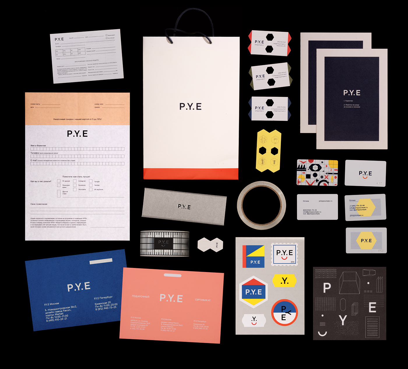
P.Y.E Identity
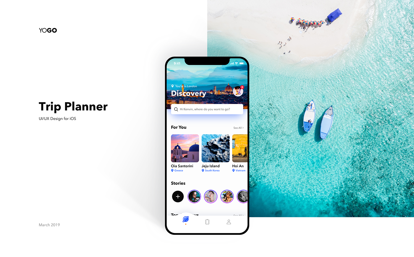
YOGO - Trip Planner App
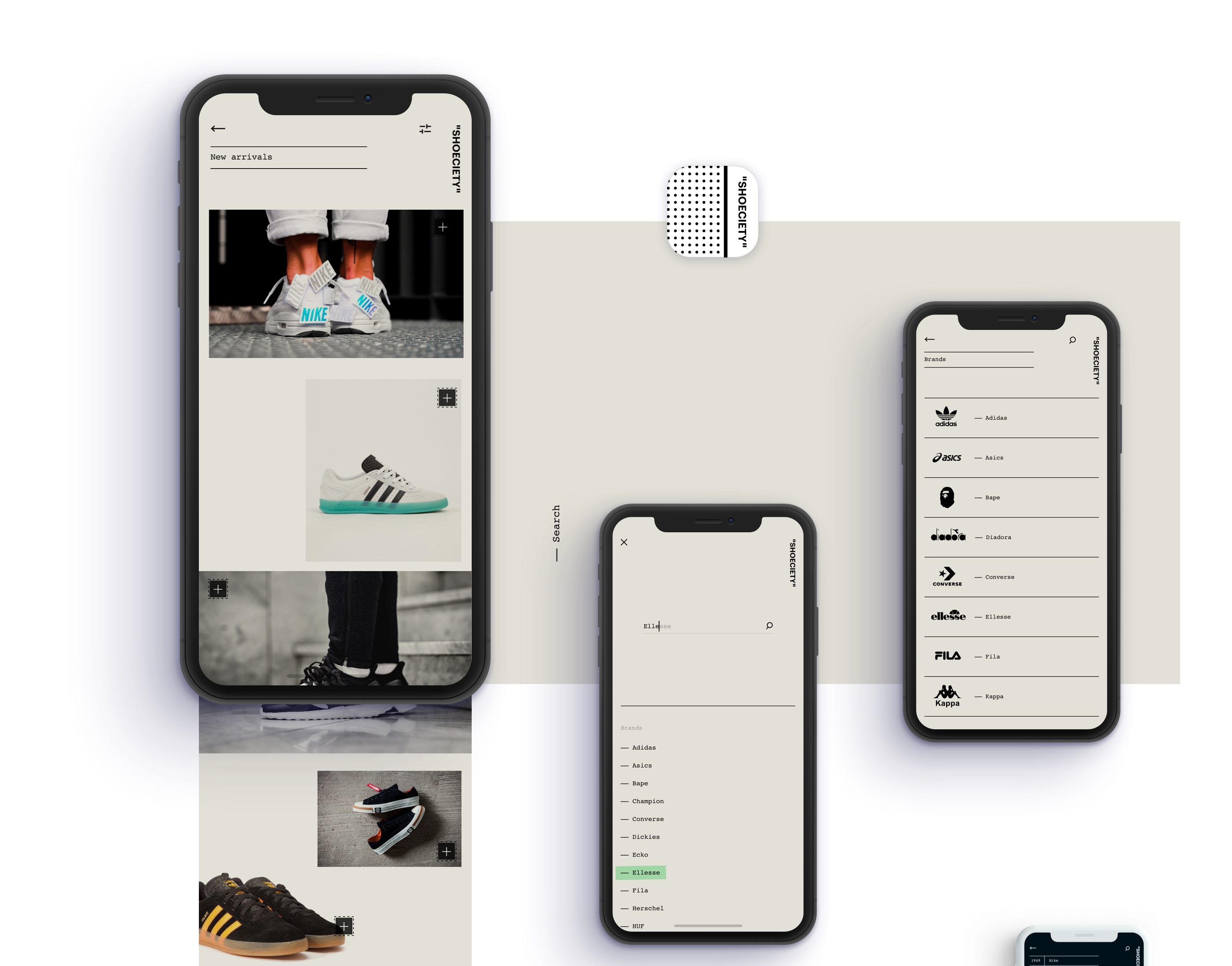
Sleek and Minimalist App Design Concept for Shoeciety
Sleek and Minimalist App Design Concept for Shoeciety
abduzeedo
Jun 27, 2018
Shoeciety is an app design concept project created and shared by Juan C. Fresno. As you might already know, I am a fan of personal projects. The fact that you take some time from your busy schedule is always something to be celebrated. If someone asked me for an advice, which I am sure no one would be that naive to do so, I would say, try to find time for personal projects. You can practice everything you want and in the end, I guarantee you that you will be better off than when you started. Look at this project that Juan shared. There are just too many things to love about it. From the branding and naming all the way to the presentation. Honestly, this is the type of projects that get me inspired.
"Shoeciety" is an app concept designed for shoe lovers. Simple and minimalist design to get a product-centered experience.
I know you might say, but there are no constraints, or the fonts are too small, or it doesn't scale. I feel that the point of these types of project, like Shoeciety, is just to exercise and develop your technical skills. For that, you don't need a full-time job or a client, just time.
App design concept
app design
UI/UX
UI Interactions of the week #179
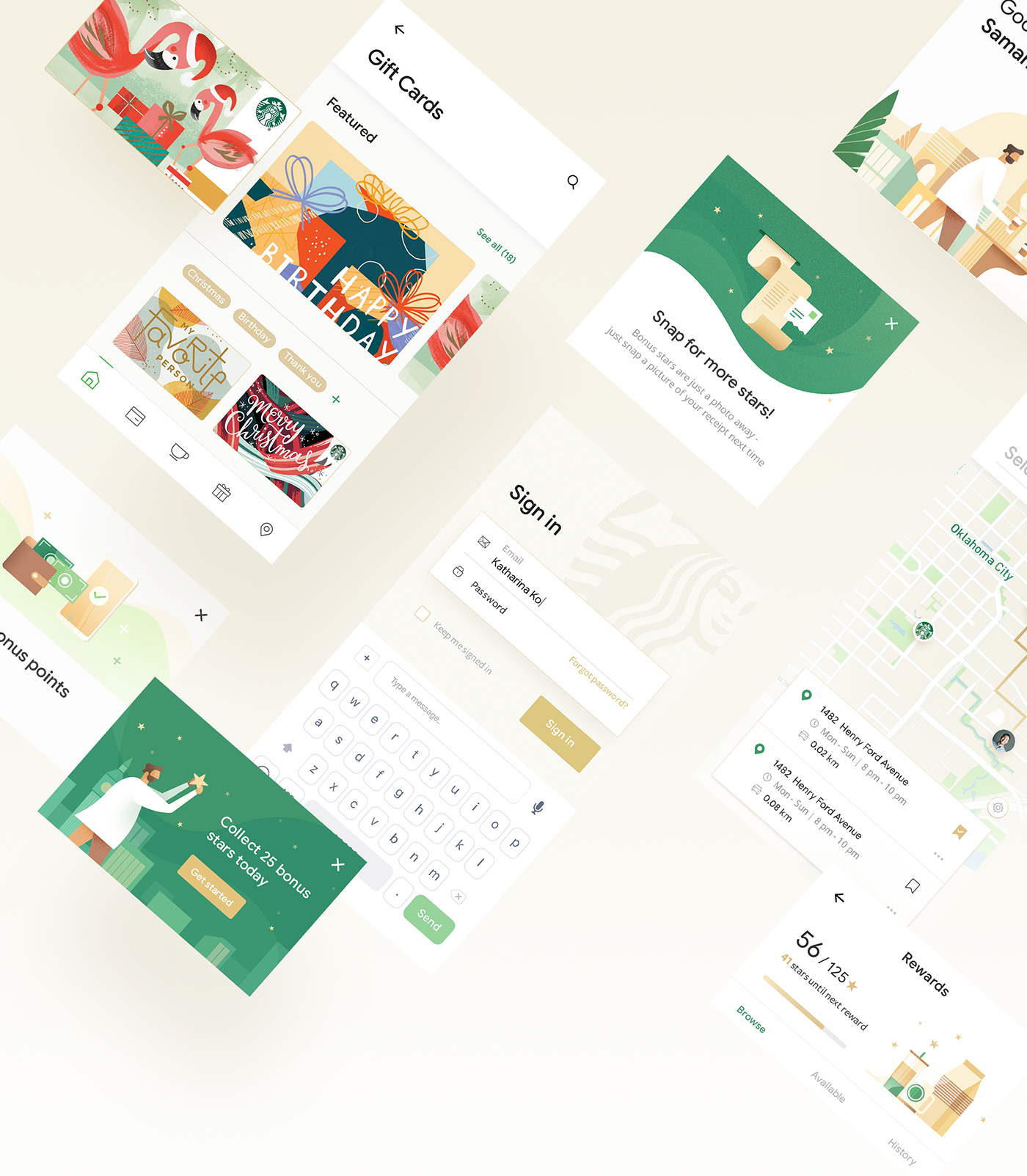
UI/UX Redesign Concept: Starbucks Mobile App
UI/UX Redesign Concept: Starbucks Mobile App
AoiroStudioJan 15, 2019
Our first redesign concept on ABDZ this year, how about from a mobile app that some use to fuel of caffeine needs. Absolute beautiful redesign of the Starbucks mobile app by Daniel Tan and Daphnie Loong. Combo Duo of two creative directors based in Kuala Lumpur, Malaysia. For starters, their visual approach is absolutely stunning. They truly give justice to how our beloved Starbucks should look. I still don't understand why we still should load our cards within the app but this redesign animation is quite solid. Definitely check out their entire project on Behance.
Credits
Daniel Tran on Behance
Daphnie Loong on Behance
UI/UX Redesign Concept
>
UI Interactions of the week #187
Powerfull Mobile UI Tutorials & Freebies
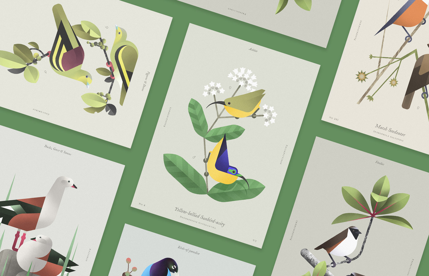
Beauty of birds
Beauty of birds