Designing the Future of Banking: Actionable UI/UX Tips for Neo Banks
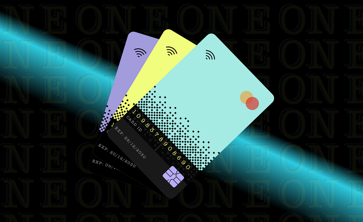
IntroductionWe have all witnessed how the COVID-19 pandemic has accelerated the pace of digital transformation across industries, and banking is no exception. With social distancing measures and lockdowns in place, consumers increasingly turned to digital banking channels to manage their finances. As a result, we’ve seen a surge in the popularity of Neo-banks, which have disrupted traditional banking models by providing a better user experience through innovative UIUX design.Since we have already explained how UIUX design plays a critical role in the success of Neo-banks, in our previous article, we decided to share some of the best UIUX design tips which can help you design a successful Neo-banks platform in this blog.If you’re a UIUX designer working in the Fin-tech industry or a business owner looking to launch a Neo-bank, this article will provide you with a comprehensive overview of the key UIUX design tips you can implement for the success of the neo-banking landscape & share what does the future of UIUX design hold for neo banks.Let’s begin,5 Actionable UI/UX Design Tips for Neo-banks to overcome user experience challenges:Seamless Onboarding: A crucial element of UI/UX Design for Neo BanksThe first impression is the last. The onboarding process is the first and critical step towards building a relationship with a user. So, ensure the process is streamlined and easy for the user.From simple sign-up forms to personalized welcome messages and tutorials, every aspect of the onboarding experience should be designed with the user in mind. This means ensuring that your design is easy to access for people with disabilities, including those who are visually impaired or have limited dexterity.We recommend avoiding the traditional way of authentication, like entering passwords and one-time codes; instead, incorporating technologies like biometric authentication and digital signatures can help make the onboarding process faster and more secure as banking users are low in patience to check or execute their financial transactions.Revolut, for example, uses AI-powered facial recognition technology to verify users’ identities, making the onboarding process a breeze.2. Simplicity is Key: Prioritize a clean and intuitive dashboardPoor UIUX can impact the success of the neo-bank. So, it is wise to focus on the hallmark of neo-banks which is creating a minimalistic design. Start by identifying the user scenarios and use cases, i.e. if the user handles multiple accounts, design an intuitive user journey to switch from one account to another with ease second, and ensure that the important information is always at the user’s fingertips by preserving a mobile-first design approach.For instance, post logging in, any neo-bank customer would like first to check all their critical financial status information upfront, like balances, transactions and so on. Hence thoughtful information architecture, visual hierarchy, effective use of whitespace, designing for smaller screens, touch interactions, and optimizing for speed is vital. Keeping the design simple and user-friendly can reduce user frustration and improve the overall satisfaction of the customer.Monzo is an excellent example of a neo-bank with a simple and intuitive UI design emphasising ease of use.3. Give a personal touch: Tailor the User Experience to boost engagement and loyaltyIn today’s highly competitive Neo-banking landscape, offering a personalized user experience can be a game-changer for boosting engagement and building customer loyalty. By using data analytics and insights, UX designers can create personalized experiences for their users based on their transaction history, location, and other factors. Neo-banks can provide this by incorporating personalized messaging, customized dashboards, and targeted offers and promotions.For example, the N26 platform has a feature that automatically categorizes users’ spending based on their transaction history, making it easier for them to track their spending habits and plan their further expenses accordingly.3. Engage Users with micro-interactions: Include small animations & gamificationBy adding subtle animations, such as a loading spinner or a checkmark when a task is completed, UIUX designers can enhance the user experience and engage users, improving personality and brand identity; however, animations shouldn’t be overwhelming and distracting to users. Gamification, to is an effective way to increase user engagement and create a fun and interactive user experience by incorporating challenges, rewards, and badges.Chime, for example, rewards users with “Chime Coins” for making purchases with their debit cards.4. Provide Real-time Feedback:Real-time feedback is essential for neo-banks to build trust and confidence with their users. Providing real-time feedback on transactions, balances, and other activities can help users feel in control of their finances, reducing the hustle of visiting the bank or waiting till the end of the day for their transaction status update. According to the nudge theory, banking AI context-based suggestions, which are powered by analytics & big data, can provide an amazing customer experience.For this, you can check how Starling Bank provides real-time transaction notifications and balance updates, helping users stay on top of their finances.5. Streamlining Payment Workflows: For Faster Payment ProcessingProviding quick and efficient payment processing is crucial for Neo Banks to stay competitive. With the rise of instant messaging apps and other fast-paced technologies, users expect payments to be processed quickly and seamlessly.UIUX designers can play a key role in improving payment processing times by simplifying the payment process and reducing the required steps. Additionally, integrating with third-party payment providers and leveraging cutting-edge payment technologies can further improve payment processing times. Ultimately, providing payments faster than instant messaging can be a key differentiator for neo-banks, increasing customer satisfaction and loyalty.Future of UIUX Design for Neo BanksThe future of UI/UX design for neo-banks is likely to be influenced by a number of trends, including personalization, voice and chat interfaces, data visualization, security, and seamless integration.As neo-banks continue to grow in popularity and expand their services, UI/UX designers must stay up-to-date with these trends and find new ways to create interfaces that meet the evolving needs of users and the industry.Overall, the focus will be on creating personalized, intuitive, and secure interfaces that provide a seamless experience for users while also leveraging new technologies and data visualization techniques to help users better understand their financial situation. By embracing these trends and staying ahead of the curve, UI/UX designers can help neo-banks continue to innovate and provide value to their customers in the years to come.Conclusion:Neo-banks need to focus on creating a user-friendly and intuitive interface to make a mark in the digital banking space. By following these tips and incorporating real-life examples, neo-banks can create a compelling and engaging user experience that keeps users coming back.Designing the Future of Banking: Actionable UI/UX Tips for Neo Banks was originally published in Muzli - Design Inspiration on Medium, where people are continuing the conversation by highlighting and responding to this story.
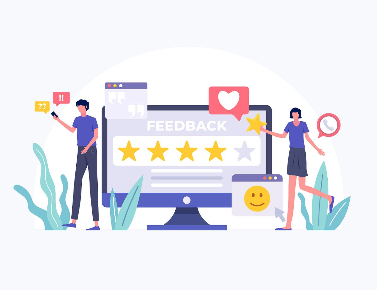
Top 10 Design Feedback Tools Every Designer Should Use in 2023
Credit: FreePikThe web design process has evolved significantly over the past couple of years. More and more agencies now work with remote clients and team members, which underscores the need to streamline the process and ensure creative collaboration between the two.Miscommunication or improper feedback could affect your workflow, delay timelines, and may even lead to work that requires heavy iteration before it’s accepted. To prevent this from happening, it’s imperative that you use design feedback tools.These tools allowed people to collaborate from geographically scattered places and work together overcoming space and time constraints.What are Design Feedback Tools?Design feedback tools effectively replace the conventional note-taking process when gathering feedback from clients. Instead of having clients explain each and every point, a design feedback tool allows them to offer more accurate feedback on individual elements, from subtle changes to the color palette to aligning smaller elements on the screen.Most design feedback tools have a built-in communication module that lets clients explain to designers what it is that they want. Some even have project management functionality built-in, which helps to reduce repetition and offers more transparency in the design process.In short, design feedback tools reduce back and forth between clients, and allow designers to understand exactly what the client wants.What To Consider For A Suitable Design Feedback Tool?Following are some of the key factors you should consider while choosing appropriate design feedback tools.Support for many file typesMarkup toolsVersioningCollaborationStatus trackingWorkflow automationComplianceReview and approvalIntegrationsNow, let’s check the best Design feedback tools & Annotation tools designers should use in 2023.The Best Design Feedback & Annotation ToolsFollowing are some of the best Design feedback tools as well as annotation tools. However, it can be a bit of a challenge to choose the appropriate design review tool and get website design feedback when there are hundred other tools out there.Here, in this collection, we’ll highlight the key features for you to consider when choosing design feedback software and then present the best free and premium tools to compare.Do note that, all design feedback software is created differently. For example, some tools offer support for limited file types, so they might be unsuitable if you are going to have other file types. Some tools let you add comments but not annotations, so the entire review and approval process becomes tricky. So, choose wisely.AtarimAtarim is a design feedback tool designed specifically for digital agencies and distributed teams. It has a handy plugin that designers can install on their clients’ WordPress websites, allowing them to pinpoint the exact changes that they want and leave comments on specific points.Designers can review those screenshots, turn them into tasks, and assign them to specific team members. Any activity updates and comments by the client can be viewed in the dashboard tool by the agency owner and team members.Why Choose Atarim?Can start collaborating within seconds for freeAuto-login lets you quickly log into all of your clients’ sitesExcellent support and a motivated team that regularly adds new featuresReduces the need to use other project management toolsExcellent team tracking options to assign tasks, track progress, time, and performanceRequest live-view screenshots of their website or a specific page, to see exactly what the client sees, including browser version and screen sizePricing:FreeStarter: $16/month — Ideal for a team of 5Expert: $29/month — Team of 10Agency: $41/month — Team of 15Enterprise: CustomizedInVisionInVision is a prototyping, collaboration, and workflow tool powering the world’s best user experiences. It lets you control your design process and allows you to create interactive mockups for your wireframes and designs.Each mockup can be rendered to give a more accurate representation of how the finished product will look. Clients don’t even have to sign up to InVision to leave their feedback; anyone can do so with a link.Once designers share a link, clients can review the mockups and leave their feedback. From replacing icons to changing active elements like the hover state or a popup window, InVision makes it easy for designers to gather feedback before moving ahead.Why choose Invision?Supports various file types, including graphics, video, audio, coding, text, spreadsheets, presentations, and fonts.Collaborate in real-time on the digital whiteboard.Provide in-context feedback on any documentManage and review design status in Kanban-style columns — On hold, In progress, Needs review, and Approved.Create rich, interactive prototypes. Import from Sketch, then gather feedback from any deviceProvides integrations with Sketch, Photoshop, JIRA, Storybook, and more.Limitations:Only available in DSM enterprise.Pricing & Plans:Free: Free foreverPro: $7.95/user/monthEnterprise: Pricing by requestFree trial: Try Pro for freeAlong with the Designer feedback tool, you can also use the User Interface Kits as well. They also help to boost your design process. For example, you can check the Sneat Figma Admin Dashboard Builder UI Kit.Sneat– Figma Admin Dashboard Builder & UI Kit (Best Figma Design System Template & UI kit🤩)The most feature-rich material design system with ready-to-use components and elements for building a seamless user experience.Sneat Figma Admin Dashboard Builder UI Kit consists of 500+ organized components. Besides, this Figma Admin Template UI kit is built with an atomic design system & auto layout. Furthermore, this Figma Design System template also offers 3 dashboards, 100+ Screens, and light & dark modes.You can now kick-start your next Figma project by using just dragging & drop the pre-made components from the Assets panel. Also, you can configure them in the right sidebar. Fast and simple, as it should be.In addition, it also helps you to easily set up colors, typography & border-radius that changes everywhere instantly in UI Kit. Also, this Figma admin dashboard UI Kit template allows you to easily update the state of the component.You don’t need to be afraid to change a variant if you edit a component. The settings you have configured will be saved, such as text, icons, and even size. Thus, it is one of the best Figma UI Kits you will ever need.Features:Atomic DesignAuto LayoutEasy to Customize500+ ComponentsText VariablesWell Organized100% VectorLight & Dark LayoutPixel Perfect100+ Screens and much more…!!Muzli Colors:Muzli color is a library where you can find many ideas and amazing color schemes. You can also discover the best web design inspiration, best websites, best logos, web trends, best mobiles sites and applications, minimalist websites, brutalist websites, innovative illustrations, design features, unique websites, photography projects, and visual art, as well as opinions and articles from design experts across the web and around the world.You can upload the image and pick the color or you can simply select it from the option. This is an endless source of ideas for designers and creative professionals.DesignDropDesignDrop helps designers capture and organize feedback, making the review process significantly more effective and less painful.Why Choose DesignDrop?Draw visual annotations directly onto the image and add comments in the sidebar to specify detailed feedback on the design.Share each design anywhere via a short URL. See the comments and annotations appear in real-time.Use one single reference point for all feedback instead of sifting through multiple email threadsLimitations:JPG and PNG files only.Pricing & Plans :FreeMockFlowMockFlow is a cloud-based tool for brainstorming user interfaces, including UI design mockups, sitemaps, documentation, and design approvals.Why Choose Mockflow?Draw UI collaboratively using role-based permissions, real-time editing, annotated comments, design approvals, and more.Organize each screen in a project by status to give a clear picture of the design’s outcome.Auto-generate design specifications and documentation from wireframes.Easily provide annotated feedback and approve the best variations.Provides integrations with Slack, Confluence, and Trello to provide a seamless workflow for UI collaboration.You can extend your UI workflow with 30+ addons called Power-ups.Pricing & Plans:Basic: freeWireframing: $14/user/monthProduct Design: $16/user/month.Enterprise: Pricing by request.ScreenlightScreenlight offers designers and videographers a simple way to collect clear creative feedback and move their projects forward.Why Choose Screenlight?File types: Upload video, audio, or images.Markup tools: Add comments at the precise timecode and keep the conversation all in one place with threaded comments.Versioning: Upload a new version and we’ll let your project team know there’s a new version for review. (You can also carry over all previous comments to ensure that each change has been made.)Collaboration: Set permissions for each individual, then share the link with relevant stakeholders. Password protects your project or set an expiry date for added security.Pricing:Screenlight has three subscription plans:Free: $0/monthProfessional: $9/user/monthEnterprise: From $500/monthHelioHelio offers a variety of features, including built-in tools for screenshots, annotation markups, presentations, project management, user testing, and prototyping. Additionally, if you’re the sort who likes to develop sites in the browser, you can collaborate on coded sites as well as flat prototypes.Why Choose Helio?Test prototypes, screens, and design ideas with ease and learn from real people in minutes.Create feedback loops, make decisions more quickly, and validate product concepts before investing time into engineering or design.Get reactions to copy, screens, images, or videos wherever you are in your production cycle.FilestageFilestage is a content review platform that gives designers and other creative professionals the power to seamlessly manage the review and approval process. Say goodbye to endless email threads: designers can upload and share their files with stakeholders in a matter of seconds. Those users can then click to add comments directly on your designs.The tool generates an automatic to-do list based on the comments, too, so that you never miss an important piece of feedback. Annotation tools can also help your stakeholders to articulate their thoughts and deliver constructive rather than confusing feedback.Filestage also helps you to track the status of your designs and get documented approval from all of your stakeholders.Key features:Collect clear and in-context annotations on your designsClients and partners can comment without having to sign upStrong version control features to track your designsAn integrated to-do list boosts productivityBounceUsing Bounce, you can easily share ideas on websites, making it ideal if you want to review web pages. Simply enter a URL, and Bounce will take a screenshot of the page. (Or, you can just upload an image file.) Then, you can mark rectangular areas, add comments, and share your reviewed file via a link.Why Choose Bounce?Simple, barebones functionality designed for the sole purpose of gathering feedbackSupports Web pages and images.Click anywhere on your screenshot, and type in what you want to say.Review screenshots, make notes, save them, and bounce them!Limitations:No Integration SupportPricing:Free to useRed PenRed Pen claims to be the fastest feedback tool for visual teams. Simply drag in a design (or a bunch of related designs), and then everyone can collaborate effortlessly.Why Choose Redpen?Markup tools: Point and click to give feedback. Everyone sees comments live as they happen.Versioning: Update or replace each image for every iteration.Collaboration: Ask colleagues and clients for feedback by giving them a private link or inviting them via email.Status tracking: Keeps your team updated about comments, additions, and new versions.Limitations:Supports Only designs and image files.Pricing & Plans:Free Trial for 14 days5 projects: $20/month10 projects: $30/month25 projects: $60/month40 projects: $90/monthThere’s also a free, basic version with no projects — just single uploads that you can share and last for 20 days.DiigoApart from the design feedback tool, Diigo is also an annotation tool that lets you save resources, like web pages, and annotate them from within your browser. Besides, It has an excellent outlining tool that you can use to quickly structure references and links, and then share them with colleagues or clients.It also offers tagging and sticky notes. Clients can even highlight specific text or features and then annotate them. Besides, it is lightweight so easily world with almost any browser and adds a host of different features.Why Choose Diigo?Simple extension with no learning curveIdeal for getting feedback from non-technical clientsOffers all core features at zero chargeSimple annotation-based toolPricing & Plans:Free TrialStandard: $40/yearProfessional: 59/yearBusiness: 120/year/userRuttlruttl is one of the most popular design feedback tools used by over 7000+ teams, that allows your design team to collaborate and easily share visual feedback.Instead of having to remember feedback or scroll through threads of emails to find that one comment, you can easily have everything in one place. All you have to do is add any URL, PDF, or image that you want to review and just start commenting on it. You can even make edits on live websites and toggle between different versions as and when required.Key featuresComment on live websitesMake live CSS changes with Edit modeGuests don’t need to sign up to commentCollaboration with teammatesVideo commentingReview both desktop and mobile webProofhubProofHub is packed with innovative features and is used by designers and developers from many industries. It allows managers to assign tasks and schedule them for team members and also includes several task views.Clients can access wireframes or prototypes, and share their feedback from within the tool itself. ProofHub also has an in-built chat function that clients can use to share their feedback.ProofHub brings scattered files and project-related information all under one roof, helping save precious time for development teams.Why Choose Proofhub?Easy to define custom roles and give access to team membersDirect messaging moduleBuilt-in markup toolsBillable hour trackingIt lets you do proofing, discussion, chat, mention, announcement, email & much morePricing & Plans:Free TrialEssential: $45/month — 40 projects, 15 GB storageUltimate: $150/month — Unlimited projects, 100 GB storageUsersnapUsersnap is a versatile user feedback platform that lets you share visual feedback right in your browser by using point-and-click annotation tools. You can use it for collaborating on new ideas, tracking bugs, and sharing the vision of your product or idea.Why Choose Usersnap?Supported file types are: Click, screenshot, and send. That’s how easy it is to send in-app visual feedback.You can pin comments on the screenshots directly.It also automatically captures Metadata such as URLs, browser info, and console logs.You can prepare product roadmap planning by referencing customer feedback and requesting trends directly.Assign, label, comment, search, and filter feedback to match your team’s workflow.Group, upvote, and assign issues and suggestions in one dashboard so that you can prioritize feedback.It comes with integrated support for JIRA, Azure DevOps, Asana, Github, Trello, Intercom, or 1,500 other third-party integrations.Pricing & Plans:Free Trial for 15 DaysBasic: $9/monthStartup: $69/monthCompany: $129/monthPremium: $249/monthEnterprise: Custom plans from $949/monthCloudAppCloudApp is an all-in-one screen recording tool to capture and embed HD videos, GIFs, screencasts, screenshots, and marked-up images throughout business workflows. You can record your screen as a video with your voice and face, an annotated image, or a GIF and instantly share it as a link to get your point across.Why Choose CloudApp?Add deeper context with annotation.Capture, annotate feedback, and share an instant link with your teammates.It offers powerful integrations with Atlassian JIRA, Slack, Trello, Zendesk, and more.Limitations:Supports only screen recording file typePricing & Plans:FreeIndividual: $9.95/monthTeam: $8/user/month.Enterprise: Pricing by request.Conclusion:Using a design feedback tool is just the first step. To reduce friction and back and forth, it’s also important that you know how to get good feedback. When working with larger clients, always choose specific points of contact, primarily those who know a thing or two about web design.More importantly, it’s best to ask for feedback that you think will help move the project along. Always keep some goals in mind when asking for feedback, and try to ask for examples so you have a better idea of what the client wants.Top 10 Design Feedback Tools 🛠 Every Designer Should Use in 2023 🤘🏻 was originally published in Muzli - Design Inspiration on Medium, where people are continuing the conversation by highlighting and responding to this story.

D-ID - Create professional videos powered by AI

Ernest - Your Financial Wellness Coach
Designing for Dark Mode: More Than Flipping a Switch
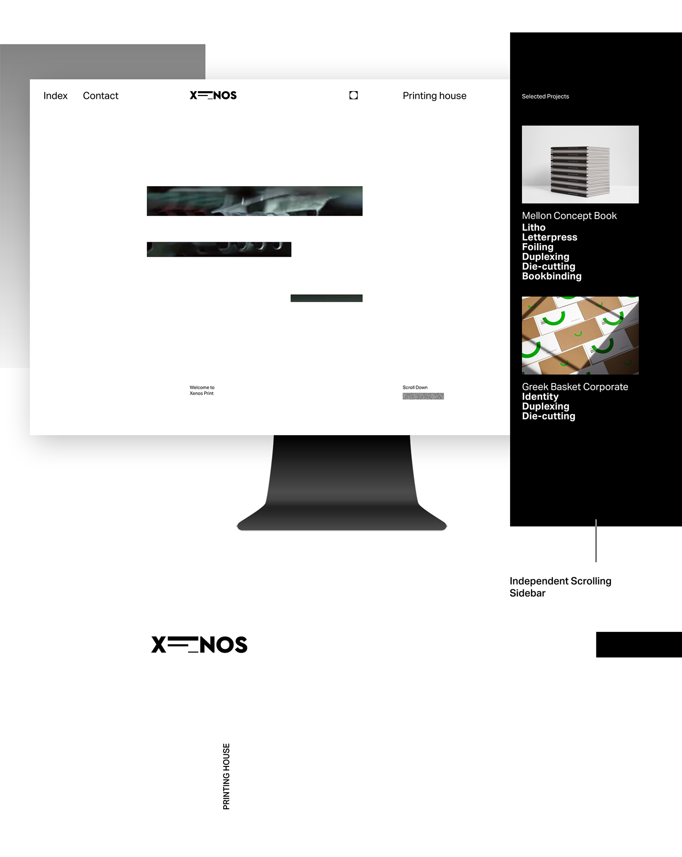
Xenos Printing House UI
UX case study — BBC NEWS app android
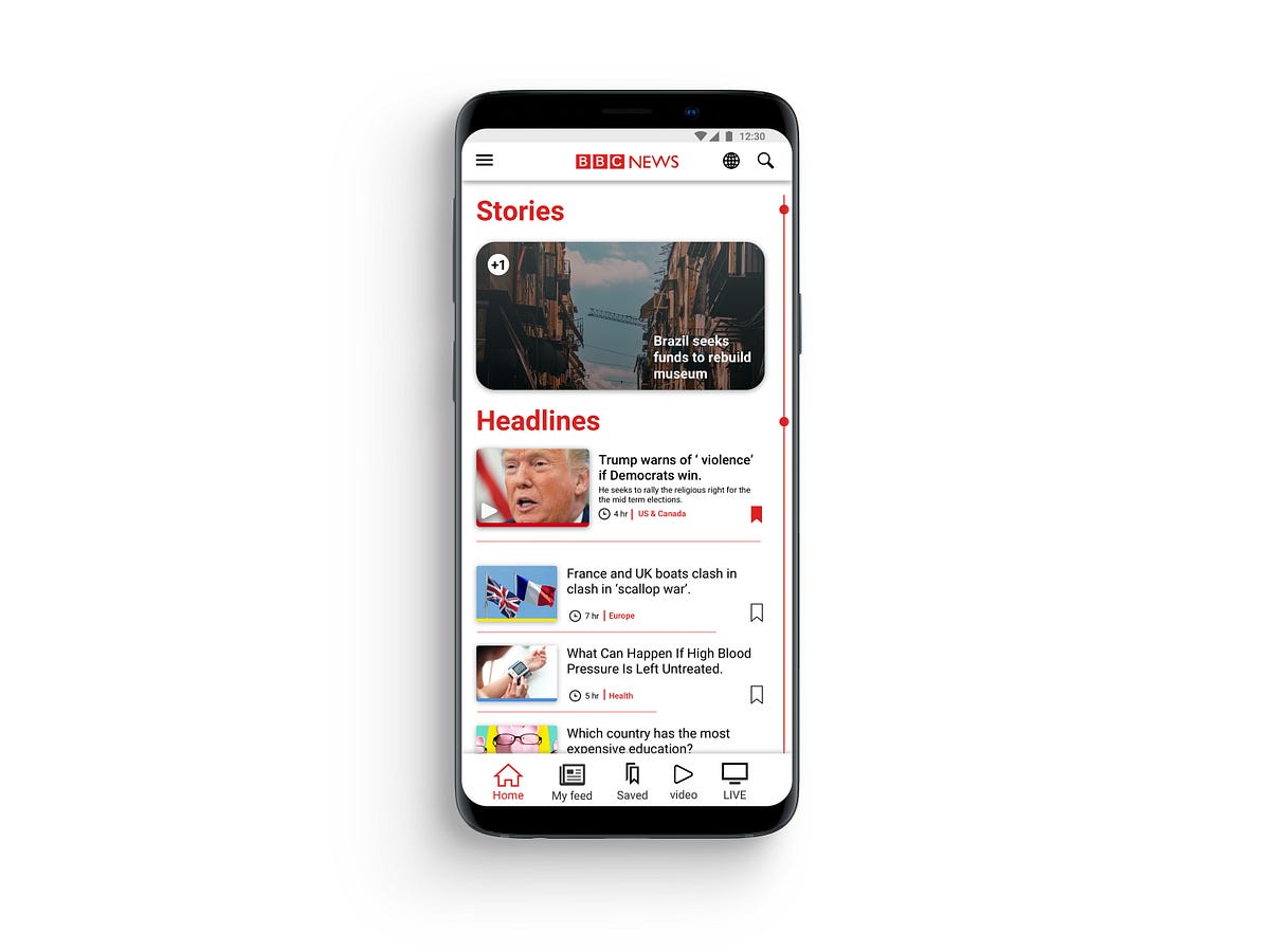
UX case study — BBC NEWS app androidRecently I was searching for a news app which could pull news from around the globe. After stumbling upon BBC news app, which has over 10,000,000 downloads on play store. I thought, an app with this massive following should reward its users with a rich user-experience but BBC news app in its current state is strung together by some good ideas but heroically falls through on execution of these ideas.Problem and hypothesisReviewing other BBC apps in an attempt to understand the brand ideology and content representation across different platform, I found inconsistencies between their applications which is mostly caused due to conflicts in design guidelines provided by different organisations.I Hypothesised that by changing the user navigation flow and striking a middle ground for design standards, will give developers less headache while developing application while providing a more optimised and rewarding experience for the users.BBC android app.PersonaMy goal was to persuade a new user to use the app and turn him into a regular user. I envisioned a user persona who can be a potential user but avoided a specific user who will be a perfect candidate for their app or one who can be considered their core user.Job Story & ScenarioMy decision to choose job story over the user story was that user story has too many assumptions and doesn’t acknowledge causality. When a task is put in the format of a user story ( As a [type of user], I want [some action], so that [outcome] ) there’s no room to ask ‘why’ — you’re essentially locked into a particular sequence with no context. In contrast, Job story provides as much context as possible and focus on motivation instead of just implementation.framing design problem in a Job, focusing on the triggering event or situation, the motivation and goal, and the intended outcome.Guerrilla Usability TestingFor solidifying my hypothesis and to gather more data on the app from a user perspective. A small test group was given instructions to use the app for a span of three weeks. After three weeks I collected their verdict and overall experience. After analysing the data I found some interesting insight, Most of the users forgot to use the app after a while and didn’t feel motivated to use the app. The poorly executed navigation system was the major reason that the users felt lost and eventually lead to abandoning the app entirely.Identifying and Prioritising Pain PointsFor producing an optimal flow, I had to study and point out what is the pain point in the app. For finding pain points and organising the feedback in one place to get a view for the analysis of all data in one place I utilised affinity mapping.affinity mappingI collected data from the test group and my personal notes in the yellow sticky notes. All the feedback is gathered and arranged in the crude sections which make abstract sections/feature of the app. Blue notes represent a clear idea from all the input received from yellow notes. It helps to make note of all the useful feedback and combine it into smaller chunks for later inspection as we go from the bottom-up process. Each hierarchy represents a clear idea for the development of the feature in understanding the user needs and goal for the app set by the company. Doing this activity helped me to sort through all the comments to get a clear view of what is important for the user while satisfying business goals.Prototype and validationAfter getting a fair idea of what elements should be improved or gotten rid of completely. With help of affinity mapping, I was able to stay on track while experimenting with user flows and improving current UI design elements to fit standards proposed by Apple and Google. I took feedback on the design from my peers and tried to integrate their feedback in the design.1. finalising general layout and navigation bat .2.prototype for the index. 3. variation for stories.4. wire-framing different layout. 5. testing layout for article sectionAfter spending time with wire-framing, I moved to work on sketch to test the idea with much more fidelity. After getting an idea of the app will look in the static images I started to design HI-FI prototype in Invison.you can see and interact with the prototype here.Implementation#1 HomepageCurrent app does a poor job of delivering the content in an intuitive way. It depends on app bar for its navigation, using an app bar for navigation seems clunky and stale. It gets messy very quickly as you have to sort through myriad tabs to reach the desired topic.‘Home’ has to be the home screen of the app so it had to be welcoming and informative. To fulfil that goal I cleaned the UI and made changes to how categories are organised on the home screen, in original design spacing between the article were too tight as it resulted in an unpleasant experience where the user feels confined. Instead of just increasing the spacing, I opted for changing the layout. The Most popular article from each topic has the prominent exhibition in the section of that topic, thus headline of each section draws more attention. Each article has been marked with a tag from where the story belongs. The thumbnail of the story has a band beneath it to indicate its tag by colour. These colour tags are used in the BBC website to distinguish all the content quickly.#1.5 StoriesThe story is the distinguishing feature of the BBC app, But it was hard to locate in the original design. It just needed to be in the spotlight. To fulfil the requirement I put the story on the top section from where every user can see it in the prime spot. It could become a quick way to consume news as it is video-based content delivery in a short period of time. Having an indicator which notifies the user of new stories to make the stories more central element of the app and set apart it from its competition.#2 Navigation barAs I wanted a cohesion between android and Ios version of the app, Navigation should feel same and intuitive rather than just scrolling through tabs. Using a nav bar is the logical solution, as both apple and google support it in their guidelines. Removing the app bar navigation allowed me to allocate more space to the main activity. The navigation bar is divided in 5 section Home | My feed | saved | video | LIVE . Each section is the main feature of the app and now it is in front and centre of the app always at the user’s fingertips.#3 New navigation flowThe user still has to traverse through a myriad of topics, making navigation a painful and tiresome process. I resolved it by implementing a new system for navigation called ‘Index’. In ‘Home’ and ‘My feed‘ there is a line on the right edge of the screen. The index acts as a signifier instead of being an affordance for the user which can be triggered by tapping on it. The user will be carried to an index page where he could rifle through topics which are arranged in a linear manner. the index page gives an alternative, instead of scrolling in the home screen to get to a topic he can achieve the same result in less time. There is an indication on the left side to apprise the user of how many new articles had been affixed to the topics since the last session. The index is a more practical way to access the topics without cluttering the main screen with tabs.#4 My feedSetting up my feed was a very tedious task in the original design. My feed is a great feature of the app, I modified the interface which can bring some colour and playfulness to this screen but won’t distract the user. As you select the topics it provides more relative topics.In Old design traversing through tabs took longer than it needed, every choice that you have selected from my feed will be added to the main navigation. After a while main navigation feels like a dumping ground, I start to lose its purpose.The user gets confused and lost his way around the app quickly which cause the user to select few choices in order to keep the navigation clean.To overcome this obstacle, in my new design ‘My feed’ is similar to the home but has curated content where the home was meant to be more of a general place, My feed has the much tighter layout and packs more topics than home. It has a simple layout without making it difficult for the user to navigate to their favourite topics quickly using Index which is separate from the ‘Home’ section topics.Now there is a clear distinction between the two section and navigation for the two section.#5 Reading an articleReading an article is the most important thing in a news app. I chose a layout which will conserve the integrity of reading. The font weight is varied from the title to the main body to demonstrate different heading. Accessibility features are placed in the app bar for ease of reach. Share and save is led at bottom of the cover image which is most used feature while reading the article.SummaryJust by changing the layout and cleaning up the design to new standards of material design, makes the app more approachable and put the content that matter to the user and business to front-line without compromising anyone’s goals. The new navigation system can be a time saver when the user wants to reach to a topic very quickly. The changes made to the ‘My Feed’ are substantial and encourage the user to interact with it. After getting feedback from the same test group. They were impressed by the improvement in the experience from the proposed design for the BBC app.UX case study — BBC NEWS app android was originally published in Muzli - Design Inspiration on Medium, where people are continuing the conversation by highlighting and responding to this story.
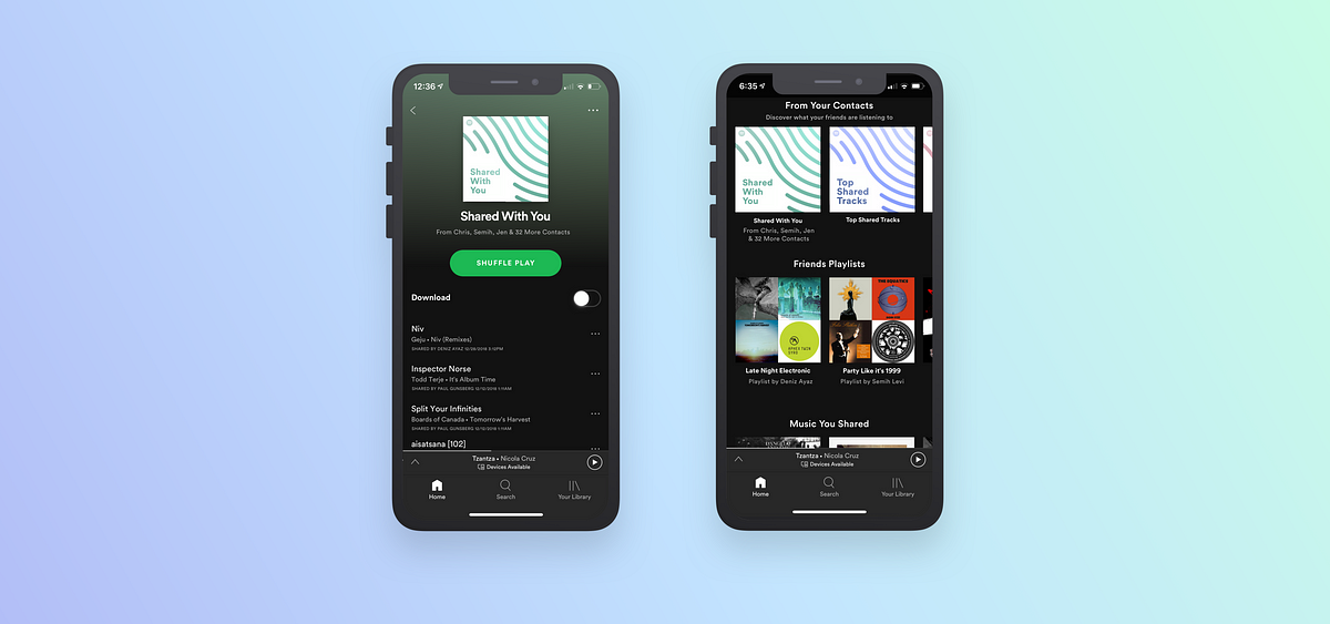
Re-imagining how we share music on Spotify - a UX case study

Ultimate Telegram redesign
Introducing the new Telegram. We have tried to rethink the current Telegram in such a way as to bring the user interaction with the application to a new level. In particular, added new functionality, gesture control, user interface has become cleaner and more attractive.
Silvia Sguotti

It's Not Violent - Website
SOS Violence Conjugale has been serving victims of domestic violence and all those affected by this issue since 1987. The organization welcomes, assesses, informs, educates and supports victims free of charge and anonymously, 24 hours a day, seven days a week. With its new campaign, the organization wanted to create an interactive experience that educates young people about a more insidious form of domestic violence, hidden in text message communications. Through four scenarios, the user must choose his responses to the sneaky messages of a false partner, in a realistic discussion which comes directly to confront him, with no possible outcome.
itsnotviolent.com

Pharmacy App
Please, check our new Mobile App for our customer, the biggest pharmacy retail in Ukraine.

Redesigning Amazon’s Kindle app for avid readers
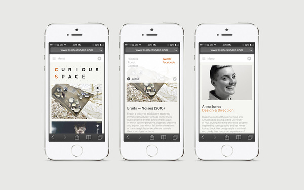
Curious Space #responsive #design #website #digital #mobile #web

Wästberg digital
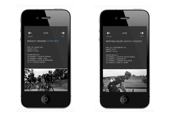
Tour Of Britain App / Interface #britain #of #interface #ui #wiggins #cycling #tour
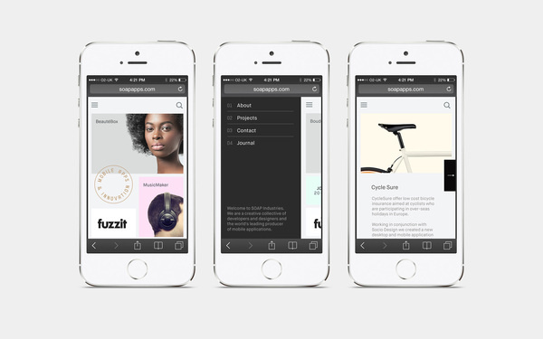
Soap Industries iphone web
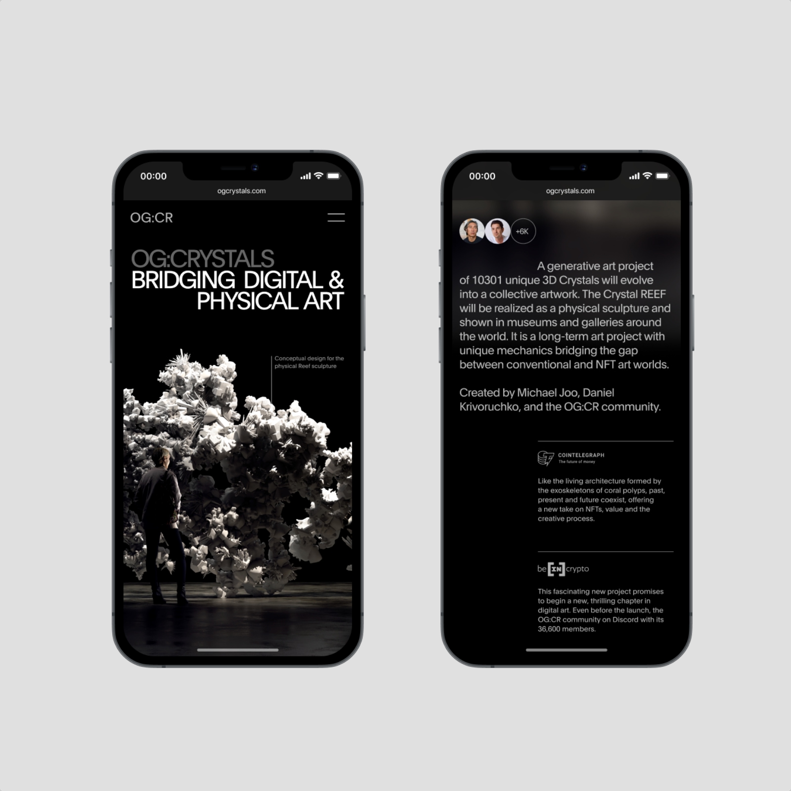
UI and UX design for OG:Crystals
Feed your mind

Konstantin options
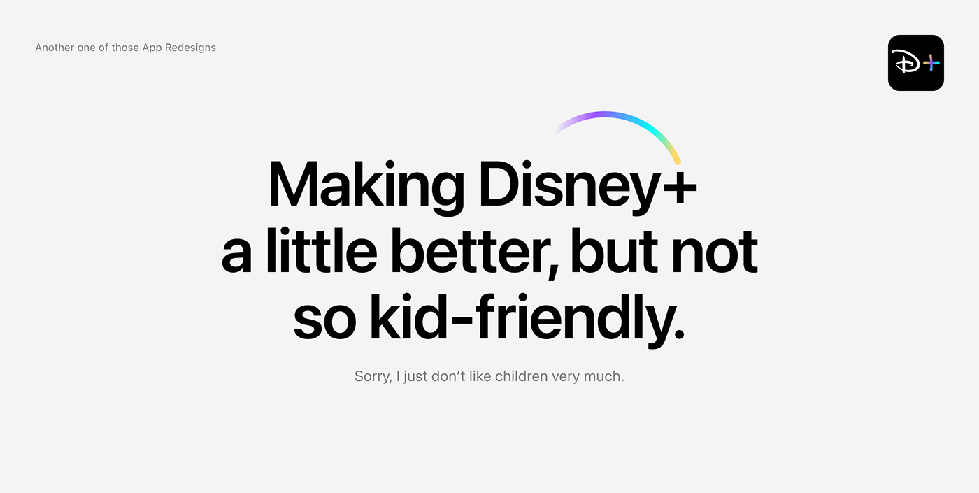
Disney+, But Better.
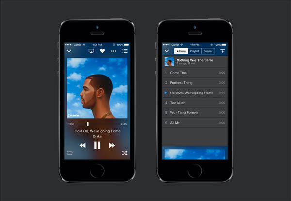
Music Player app sketch
Music Player app sketch resource
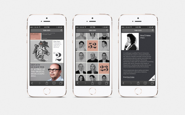
KAE Brand Identity #iphone #web
Realpixels #ui

Outstaffing Platform
Disney+, But Better.

Festival art et architecture
Festival art et architecture by Samuel Larocque web design website mobile

Goal Reacher app

Mercedes Benz EQ (Conceptual Design)
This project originated from my recent work, but this is an independent conceptual design.
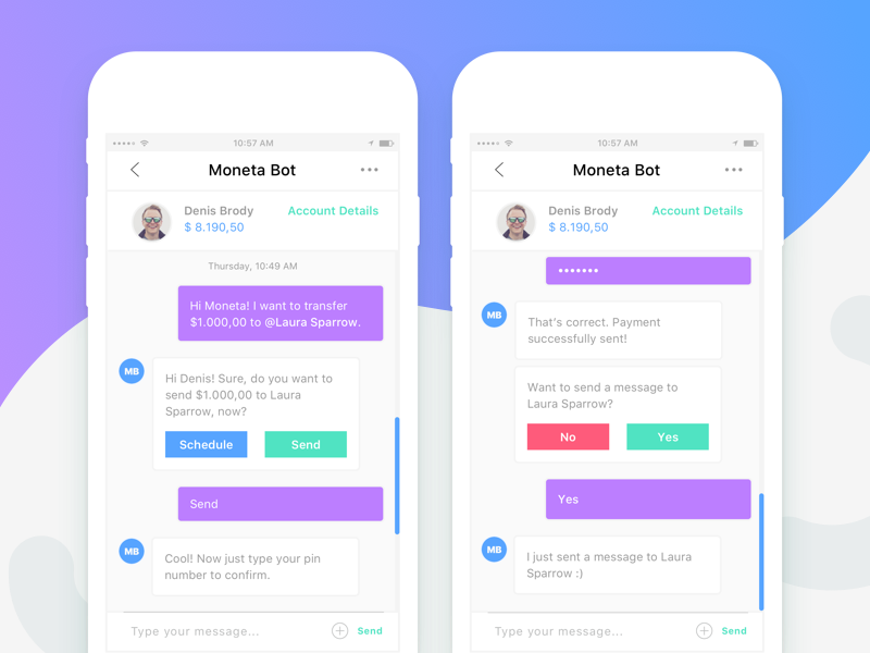
Moneta Bot - Mobile Application
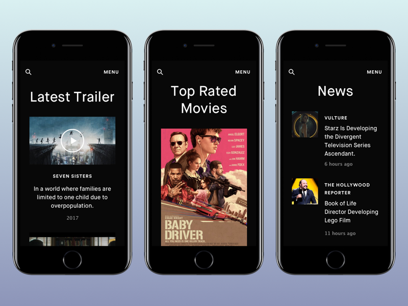
Movies Landing Mobile
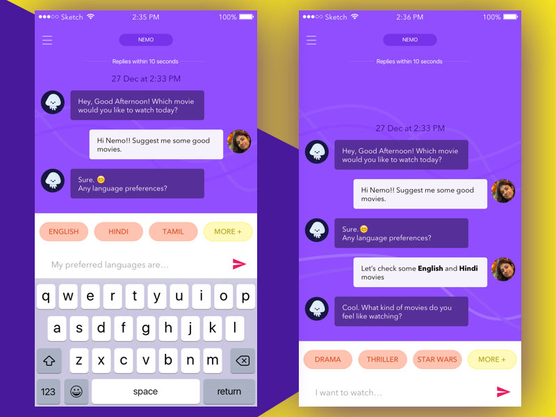
Movie Ticket Booking Chatbot

Audio Books App
Whether paper, digital or audio – no matter, what format. The beauty of any book is in the sense that it brings to the reader. And the beauty of the design is helping the user fluently accomplish their goals. In this UI shot of an audiobook app, we tried to achieve this fluency and simplicity of design that allows readers (well, listeners)🎧 to enjoy the piece and navigate smoothly through the app. Do you think we nailed it? Share your opinion in the comments below👇. Also, likes will be appreciated.Made with ❤️ at UptechCheck out more our works on Behance, Github, Medium.Do you have a project you'd like to collaborate on? Email us at hello@uptech.team

Mirablue
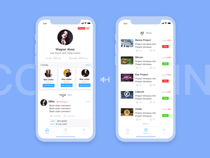
Block chain

Chat app design
We are working on chat app that allows you to tag multiple friends and invite them to a conversation.

FoodTrackr App
An app where you input your diet and it tells you what vitamins etc you are lacking.
Sign up for more ideas for free 👉 https://www.fiveideasaday.com/join

Blog/Reader iOS Wireframes

App Page
ottonova is the comprehensive private health insurance in your pocket. Easy to use and accessible from everywhere. This little tour will give our visitors a glimpse into the ottonova experience right from the browser.

chat

Records of consumption

Actions for a message
A solution to provide multiple actions for a message, you can select one message to react, copy, forward, etc actions, you can also select multiple messages to apply relevant actions.
Let me know what you think!

Tasks you love

Childcare App Concept
Quick concept and design experiment for a childcare app to validate the approach.
FollowfeedUI

Gmail Redesign Concept

New Channel pills in Twist

Fragments iOS Wireframe Kit

Work Management app
An intuitive tool for project management and task management. It is ideal for your personal organization, but also for agile and efficient teams.
Whether you want to manage projects, emails and Schedules. This offers everything you need to work together with your team to make workflows much more efficient.
- This project is non-commercial purposes. I made just for fun and study :)
Never end to learn, practice, and stay explore
Feel free for leaving your comment 😁
Need UI design?
Just let me know 😊
available for freelance works, tell me more at
suarasa.space@gmail.com
Follow me on
Behance | Instagram | Twitter
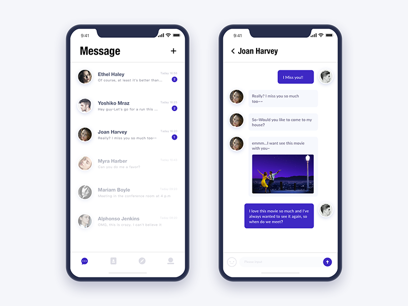
messages
Daily UI #day43

Message Reactions — Receiver
Whats app redesign
Hi Guys,
I am working on re design for whatsapp. Just trying to make it simpler for the user to switch between single chat to group chats. As the chat list becomes so long that you start missing out on messages. This is just an experiment. chat out the hi res attachments.
cheers :)
message 2

RooMee App

APP chat interface
APP聊天界面练习,提升用户聊天用户用户体验,界面清新简洁舒适
APP chat interface exercise to improve user chat user user experience, the interface is fresh, simple and comfortable
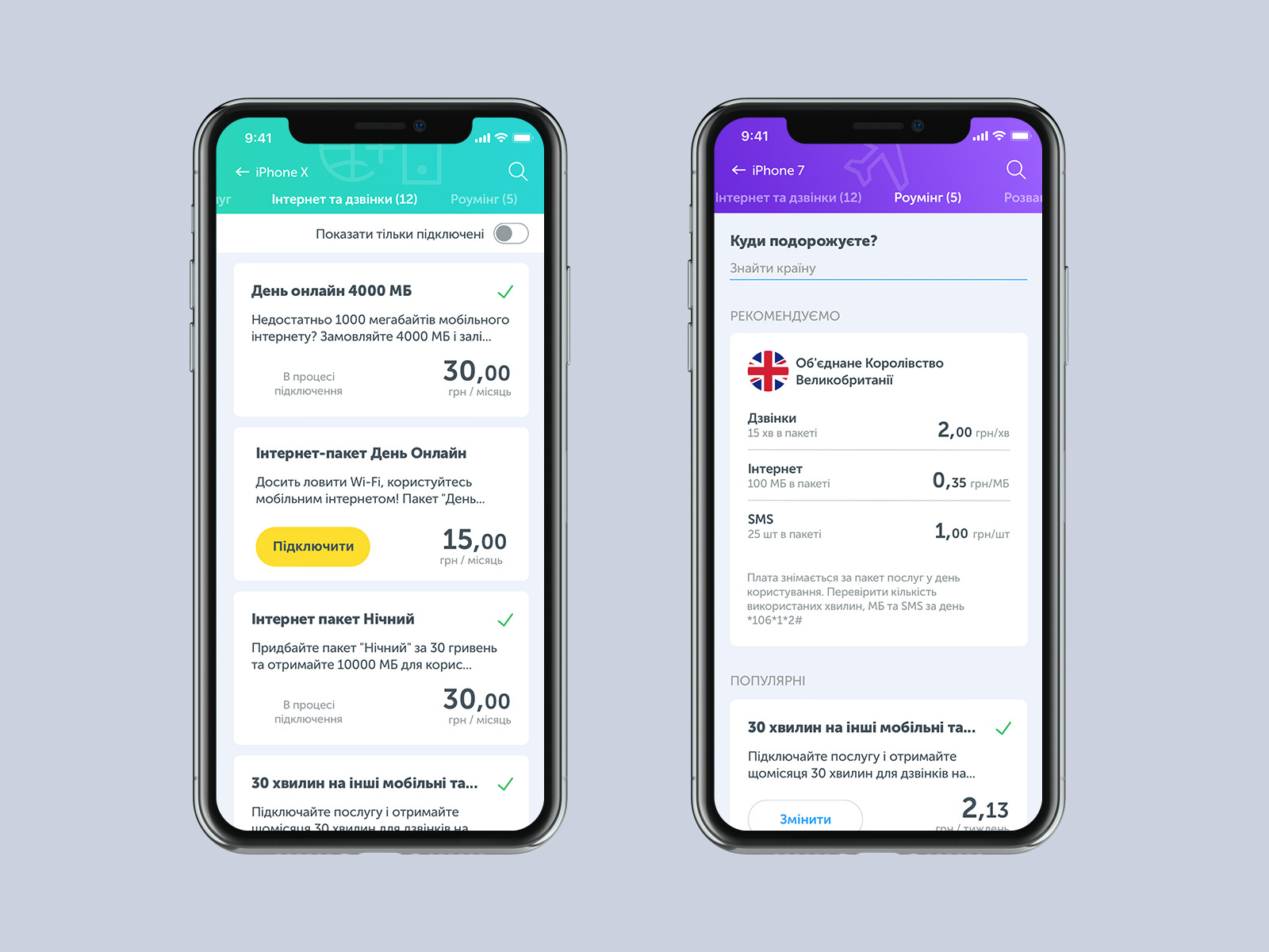
Service tabs ios app
An application for Ukrainian mobile operator. Services tabs with a list. Simple and usable.
Press "L" if you like it :)

Linkedin Visual Redesign
After a long time, back with a design I was messing around with 😁Linkedin has one the most outdated designs, so I wanted to reface it and add a little bit of spice to it in some places.For work inquiries - echreza@gmail.comFollow my Instagram

Direct messaging
Employee Rating App
Employee Rating App