
10 Examples of Innovative Contact Form Design
More so than any other element on a site, contact forms help incite and establish interaction between a user and a business. They are a medium that helps generate more leads, which is why they should not be treated as an afterthought.If a contact form is too long and time-consuming, users may outright ignore it. If it looks bland, they may not even notice it at all. Brands should carefully craft their contact forms in a way that inspires users to get in touch. To do that, they need to be mindful of their users’ interests, ask them the right questions through a form, and wrap it all up in appealing packaging. The end result should be an authentic and a well-thought-out, imaginative contact form that clients will enjoy filling out.There are a lot of brands that have found terrific ways of creating irresistible, fun, and beautiful contact forms. We will introduce you to some of the most innovative examples from the web that demonstrate what you can do to create engaging and effective contact forms. The websites we will discuss include:Zorka Agency730DCNoodz — Nothing to hideThe Covid Art MuseumCevitxefantidoteMysta ElectricWE3The Badass ProjectAlfa CharlieZorka AgencyZorka Agency is an international digital marketing agency focused on developing ROI-forecasted strategies. They’ve worked with Activision Blizzard, Hennessy, Domino’s Pizza, AliExpress, and many other notable companies. Their homepage is all about juxtapositions between the black background and white and yellow typography. Save for several geometric shapes and a smiley face, you won’t see too many visuals on the agency’s site. Instead, they manage to keep the visitor’s attention by skillfully combining uppercase sans serif typography with subtle, yet engaging hover effects that sometimes change the color as well as the position of the displayed text. The biggest surprise on the site is nestled at the bottom of the homepage. As you reach the end of the layout, the color of the typography and the background invert, with gigantic black fonts inviting you to “Say Hello” and type your full name in a designated field. The encircled “Next Step” button informs you that this is just the beginning of an imaginative contact form. Instead of listing form labels and fields in one or two columns (which is a common practice on most sites), Zorka Agency structured their contact form as a 5-step feature asking clients for required information one question at a time. Users can see five short lines on the side, suggesting the number of questions the form contains. A contact form that doesn’t immediately reveal its content seems less scary to viewers. If they were to see a lot of questions at once, they’d be more likely to skip the form. By requesting information from users one step at a time, brands ensure their audience doesn’t feel stressed out by the sheer length of the form. And that, in return, positively affects conversion rates.730DC730DC is a daily newsletter that contains all the latest news from Washington DC. It is delivered to subscribers every day at 7.30 AM, hence its name. The design of this site is extremely minimal. Its content is in grid and the screen is divided into several sections. The main navigation is at the top, with each menu link placed in a separate field. The rest of the screen is divided in half. On all of the site’s pages, the left side is intact, while the right is further divided into smaller sections with straight horizontal lines. The color palette predominantly consists of white and red hues, save for the shop page that contains colorful items. The contact form is featured on the homepage and it has only two questions. The moment you click on any field, the color of its lines goes from red to blue. And when you start typing your name or email address, the questions disappear from the view, leaving you an empty field to fill in with your details. On hover, the background color of the call-to-action button and that of the button text transpose, so that the button becomes red and the text white. Aside from signing up for the newsletter, you can also submit a story to 730DC. The design of that form matches the subscription form, except that it requires more information from the users’ end. Both forms are incredibly simple and geometric, yet it is precisely their minimalism, rawness, and slightly brutalist vibe that makes them interesting.Noodz — Nothing to hideNoodz — Nothing to hide is a brand that makes vegan oral-care products. The design of their website relies on eye-catching combinations of contrasting colors, such as yellow and dark purple, pink and dark purple, lime green and dark green, to name a few. The vivacious color palette is applied to the overlay contact form as well. The screaming lime green color is the most prominent hue of them all. It is applied to the checkbox field as well as the call-to-action and close buttons, setting them apart from the rest of the form’s content. Its vibrancy disrupts the more peaceful pink and purple hue used on the form, creating a simple yet exciting and alluring visual unit. The contact form fields are all placed inside of a rectangle that is visible at all times, so users immediately know what kind of information they are expected to provide. Beautiful font choices and the playful character of the typography further enliven the form, while a cute smiley face helps add more of a fun character to it.The Covid Art MuseumThe Covid Art Museum is the world’s first online museum for artworks created during the Covid19 pandemic. The design of the site is rather simple, with selected artworks dispersed throughout the homepage. All pieces are marked with a number. Some fields seem empty, but if you click on them, the “Keep Social Distance” text will appear. You can explore the website in dark and light modes. Depending on your choice, the color of typography changes. However, the artwork submission menu link stays red at all times, ensuring this section is noticeable regardless of the selected mode. On click, the form appears in the viewport. If you don’t like its default location (on the right-hand side of the screen), you can move it wherever you like. The form’s design is simple and clean, combining white and grey sections with black and red typography. The call-to-action button is in red, with “Submit” placed on the far left part of the field and the forward-facing arrow on the right. On hover, the two elements come closer together in the middle while the background color of the button and that of the text invert. This subtle change breaks the inertia of the form, making the “Submit” button all the more prominent.CevitxefCevitxef is a restaurant in Bilbao and their website is a stunning synergy of immersive visuals, beautiful parallax effects, and excellent typography combinations. The link to the reservation form is placed in the sticky menu, along with other navigation links. Typography in the menu is mainly black and outlined, but some words are in full color, including parts of the reservation form link (“Reserva Tu Mesa”). The words “Reserva” (reserve) and “Mesa” (table) are in bold black while “Tu” (your) is outlined. This text is placed inside of a rectangle that on hover turns neon pink. When you click on it, a brutalist-looking reservation form appears on the screen. It is entirely in black and white, with lots of grid lines. When you click on a field, a red circle appears on the text line. This attention-grabbing element injects some color into the form and signals that you should enter the required details. The call-to-action button contains scrolling text, which, in combination with the outlined and bold black typography, infuses the form with life and excitement.antidoteFor their contact form, antidote used only lowercase letters. This email and SMS marketing agency opted for a monospace font for both the labels and placeholder text. The font’s typewriter character is a great fit for the form’s slightly retro design, evoking 90s vibes. To start collaborating with this agency, you need to go through a series of questions first. The questions appear one at a time and are positioned at the center of the page where your eyes are most likely to land first. This contact form contains 7 questions that allow “antidote” to learn more about you and your business, helping them choose potential clients. The backdrop, the button background, and the placeholder text are in various shades of blue, and the calmness of these hues accentuates the whiteness of the label and button texts.Mysta ElectricMysta Electric’s contact form is placed at the bottom of his commanding one-page website. Everything is in black and white, with Mysta’s head in the background following every movement of your cursor. The site is filled with huge typography. On hover, some words reveal gorgeous examples of this tattoo artist’s outstanding work, immersing you into his world of “dark melancholy”. The contact page is simple, containing just three fields that allow you to get in touch with Mysta. When you place the mouse on any field, the cursor enlarges. Some text also appears, inviting you to fill in your details. The “Submit” button is transparent, but it becomes eye-catchingly white as soon as you hover over it. The minimalist style of the contact form perfectly blends in with the rest of the content and its simplicity ensures that Mysta’s art remains the star of the site.WE3WE3 is an internship program developed by Jam3, a design and experience agency that’s collaborated with Adidas, Levi’s, eBay, Postmates, and many other huge brands. The application form for the WE3 internship consists of 14 steps. Thanks to the practical bar displayed on the left side of the screen, you can take a look at all of the questions without entering any of your details first. The form is uncluttered, with labels and form fields taking up the majority of the screen. The homogeneity of the white background is interrupted by large, light grey, question numbers. While the form labels are pretty standard, the placeholder text is quirky and humorous. For instance, in the field where you’re supposed to enter your email address, the placeholder text says “We’re not judging you if it’s hotmail.”. Another useful feature each field contains is a character counter as well as a character limit. Even though this form may seem too long, the questions make perfect sense and are there to help find the best applicants for the program.The Badass ProjectThe Badass Project is comprised of two wedding and documentary photographers and filmmakers. The ubiquitous large typography and the interplay of black and yellow hues are among the most prominent features on their website. The design of the contact form is not any different. The backdrop is mostly black while the content is yellow, and the stark contrast between the two colors captures the viewers’ attention from the get-go. The contact form starts with an image of the two members of the team holding binoculars, signaling they are on the lookout for potential clients. Another unusual and rarely seen element on contact forms is the word “Blah”. By writing it repeatedly on the page, the Badass team added a bit of nonsensical playfulness to their form. The typography is mostly in all caps and it goes from outlined and serif to bold and sanserif. These constant style changes make the text more interesting to the viewer’s eye. The call-to-action button includes a graffiti-like font that enhances the form’s alternative vibe. The company’s email address and the phone numbers of the two members are displayed in three lines that on scroll start to move in opposite directions from one another.Alfa CharlieAlfa Charlie is a branding studio based in San Francisco. Their website looks clean, fresh, and modern, providing a beautiful insight into their impressive portfolio. The studio’s contact form stretches across the entire screen. Its design aesthetically matches the rest of the site — it is elegant and simple, with questions written in a big, refined serif typeface. The form starts off with a playful greeting. A simple “Ahoy” sets a relaxed and fun tone. It also breaks the linguistic monotony typical of most contact forms. You can’t immediately grasp the length of the form because the questions are presented to you one by one. However, if you look closely at your cursor, you will notice a circle around it. As soon as you go to the second question, one quarter of the circle becomes dark grey while the rest of it remains in a lighter shade of the same color, suggesting you have three more quarters of the form to go. This seemingly small detail ensures excellent UX because it gives users a hint of how long the form is, which can greatly increase user engagement and conversions. By knowing there aren’t too many questions to go through, users are more likely to stick around and fill in the necessary details. Below the line where you are supposed to type in your replies, you can see two arrows — one lets you go back and the other allows you to proceed with the form as soon as you are done with a question. But when you reach the end of the form, the forward-facing arrow turns into a “Send” button, signaling you’ve successfully completed all the steps.Closing WordsContact forms help bridge the gap between brands and users, which can often make them one of the most important elements on a website. This is especially true if your business hinges on generating leads. In these cases, a contact form can and should be viewed with the same significance as, say, a hero slider.The brands we’ve mentioned in this article understand the significance of contact forms. They’ve created them with just as much attention as any other element on their website, which is why their forms are so well-structured, immersive, and beautifully designed.We hope these innovative examples will be of help when you start creating your next contact form. You can organize yours in several steps if you like, as well as add imagery, illustrations, and other cool visuals to it. Even if you decide to forgo imbuing graphics, you can still inject a fun factor into your form by experimenting with entertaining copy, typography choices, letter sizes and weights, colors, and hover effects. Don’t limit yourself thinking contact, reservation, and submission forms need to be clean and prosaic. Sure, you do need to request certain information from your users, but that doesn’t mean you can’t be creative while doing so. You should incite the audience to contact you, so try your best to create visually stimulating and engaging forms that users won’t be able to resist filling out.Originally published at https://qodeinteractive.com.10 Examples of Innovative Contact Form Design was originally published in Muzli - Design Inspiration on Medium, where people are continuing the conversation by highlighting and responding to this story.
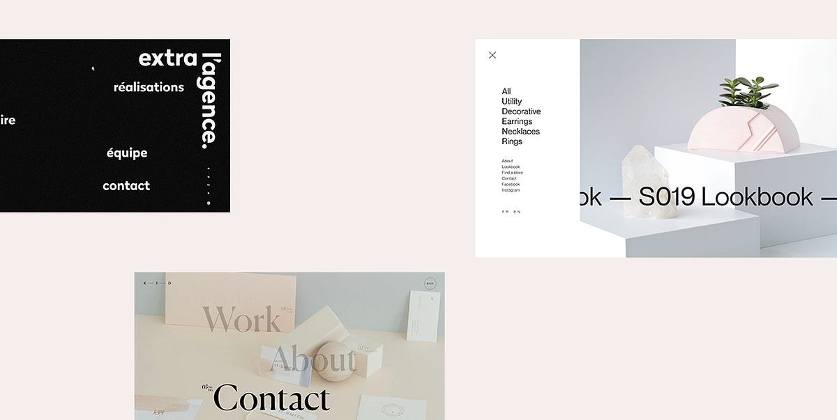
17 Exciting Examples of Hidden Menus in Web Design
The use of hidden menus in web design has been an upward trend for several years, largely due to smartphones becoming such a huge thing. The widespread use of mobile phones led designers to come up with a solution that would allow them to place multiple menu items or options in one place without sacrificing a website’s usability. And so, they created hidden menus.Hiding website navigation from immediate view is now commonplace. Contemporary websites need to look spotless on all devices, so the extensive use of pop-up menus seems like a logical choice. A hidden menu doesn’t bother visitors, but it’s there when they need it.The main navigation is shown to the user upon some sort of action. And the most common action used to reveal hidden navigations is clicking on an icon, which usually comes in the shape of three horizontal lines placed on top of each other. Arranged like that, they resemble a hamburger, hence why they’re also called hamburger icons. Of course, the way a menu icon looks can vary, mostly depending on a website’s aesthetic. You’ll come across semicircles, three dots, arrows, and combinations of various shapes and letters.Hidden menus are almost exclusively placed in one of the upper corners of the screen. They’re prominent enough for people to spot them, but they don’t overshadow other elements on a page, ensuring users stay focused on the main interface the entire time. Due to their unobtrusive appearance, hidden menus don’t clutter websites and leave a lot of room for content. Because of that, they’ve become somewhat of a designers’ staple at this point.The following examples demonstrate how sleek and subtle hidden menus are, and how much creative freedom they give to designers:CollageCanalsGlobeKitKatchMeCuspHelias OilsExtra l’AgenceDecadeBlabDaniele BuffaAlan MenkenUltima CapitalKatifoner DesignAnimalMaudCoboHarvard Film ArchiveCollageCollage is a Canadian studio that makes a wide range of hand-crafted objects. Their website oozes brutalism, with all the bold lettering, cool micro-interactions, and interesting text arrangements. The menu icon is elegantly shaped as four horizontal lines of different lengths arranged one on top of the other. It is placed in the top left corner of the page, but still easy to notice because of the striking contrast between the dark background and brightly-colored elements, as well as the smart use of white space.The menu icon is easily noticeable. On hover, its color changes from salmon pink to white, and all its lines become equally long. Once you click on the icon, the fullscreen menu appears, all in white and pastel hues, with black typefaces.Menu items are on the left-hand side, with primary links written in a larger font. When you place the cursor on a primary link, the letters become underlined. On their right, a tiny number shows up indicating how many elements are featured in the selected section. Secondary links look more subdued. Their color goes from black to light grey on hover. A picture of some of the Collage’s products takes up the large portion of the menu screen but is separated from the links by a decent amount of negative space. The products belong to their S019 collection, hence why they’ve displayed a link to that year’s lookbook over the image. The tiny section on the far right includes the link to the homepage and the online store.CanalsCanals is a great project that introduces users to the history of Amsterdam’s canals. This website comes with horizontal navigation, which gives it an editorial feel. You can either drag or scroll through sections with your mouse, discovering interesting facts about Amsterdam’s canal ring. Every story is backed up by exciting imagery, transporting you to the river banks and canal bridges.The hamburger button is in the top left corner. Its three parallel lines look demure until you click on them. The menu icon goes from three lines to one, and a burning-red menu takes up the entire screen. There are only four menu items to explore, which gave the site’s designers a large canvas to make use of. So, they decided to present the menu links in massive, bold letters. All of the menu elements are black, but on hover, the number placed next to every link turns white while the letters become strikethrough with a white line. To close the menu, you can either click on the large “X” button at the top right corner or tap the menu icon again. The “About & Sources” section is also included in the bottom right corner of the menu. If selected, it will take you straight to the page where you can discover the names of the people included in the making of this site as well as the content they used to make it all happen.GlobeKitGlobeKit is an animated interactive 3D globe that can be used in various types of projects, and its characteristics have been beautifully showcased on this one-page website. The transition from one section to the next is marked with a wavy effect that changes its color the moment you reach a new section. The hamburger icon is in the top right corner with “Menu” written right next to it, so there’s no doubt this is where you’ll find the main navigation. When you click on it, a futuristic-looking overlay menu loads. The company’s contact details are displayed on the left side of the menu, with the company inviting users to reach out to them to request a quote for their project. At the bottom left, you’ll find links for the newsletter subscription and social networks. The larger portion of the menu is taken up by six different versions of a globe, each representing one section of the website. On hover, the globes become slightly bigger, the names of pages go from white to black, while the background behind them changes its color.KatchMeKatchMe is a recruitment agency with a colorful website that includes terrific transition effects, a video background, parallax effect, and a myriad of fun animated elements. The main navigation is hidden behind “Menu” in the top right corner of the page. The word “Menu” is surrounded by a thin white circular shape that becomes larger when you place your cursor on it. On click, the baby blue fullscreen menu appears. At first glance, it’s very minimalistic, with menu items placed horizontally, one next to the other, in the middle of the page. In the background, several concentric circles follow the movement of the mouse pointer, while other, smaller circles float all over the menu screen. When you place your cursor on any link, an image appears behind it while all other menu items lose their color and become see-through. The images are round for the most part, save for occasional intentional glitches that transform them into squares for a tiny fraction of time.CuspThe Cusp website is minimal, but it comes with a compendium of interactive elements and striking animation effects that make the browsing experience all the more enjoyable and fun. The colors on the homepage are subtle, with images in beige, green, and soft black hues, while typography comes in prominent red. Once you click on the menu button in the top right corner of the screen, the web scenery changes. A black canvas drops from the top to the bottom of the page and all the colors disappear. All you see is the dark backdrop, menu items written in huge, all-caps, serif white letters, and several subtle favicons. But, that’s not all there is to Cusp’s main navigation. Since it features only four items (each link is marked by appropriate Roman numerals), the site’s designers have made things all the more interesting by adding the infinite scroll effect to the menu. The cursor is shaped like a large outlined red circle that becomes significantly smaller when placed on any clickable screen element. When you hover with it over menu items, an outlined white circular shape encircles the Roman numerals. You’ll find links to the Cusp’s social networks in the top left corner of the page, while the icon that takes you straight to their gallery is placed at the bottom left. To exit the menu, click the “Close” button in the top right corner.Helias OilsHelias Oils make natural oils and homeopathic remedies. Their website is a colorful web oasis adorned with a liquid scroll effect that imitates the movement of oil. As for the navigation, you can either click on the menu icon or explore the most important pages that are highlighted at the top of the page. The hamburger menu is more convenient for mobile users, whereas desktop users can choose the option they find more convenient. The menu icon opens a content-rich overlay menu. The four primary links are highlighted using big, black, bold letters. When you place the pointer on one of them, the color of the other primary links fades and turns light grey. Secondary links are separated by a decent amount of whitespace and are written using a smaller-sized font. Social media icons and contact details are vertically positioned in the middle of the page, while the right side of the menu features the latest posts from Helias’ Instagram feed. The images include the undulating scroll effect. When you click on any of them, you will be redirected to the brand’s Instagram page.Extra l’AgenceExtra l’Agence comes with a black-and-white website that looks very artistic because of the background that resembles a sheet of drawing paper and the use of elegant and handwritten typefaces. The main navigation is hidden behind a simple lowercase “menu” link, but you can’t possibly miss it as there’s nothing else in the top bar save from the agency’s name at the far right. While the site’s backdrop is white, once you open the menu, its color goes to black and the texture becomes grainy. The menu is very simple and features four items in white letters. When you place your mouse on any of the four, the font loses some of its weight and turns from bold to slim. The cool thing about the menu is that every time you open it, the items will be arranged in a different manner.DecadeDecade is a branding and creative studio from New York. Their website is peppered with attractive videos and imagery illustrating the projects developed by the company. At the top of the page, there’s a white section with the studio’s name written in the middle and the menu icon in the shape of a black semicircle. The choice of menu icon is a bit uncommon and interesting. However, all users have some preconceptions about where navigation will be located on a site, so they already expect to find the main navigation icon somewhere at the top. When you click on the semicircle, a fullscreen menu unrolls from the top of the page. You can learn more about the studio by exploring the “About” section on the left-hand side of the menu. To control the amount of displayed information, use “Read More” and “Read Less” links. The right side of the menu introduces you to Decade’s “Clients” and “Selected Projects”. To exit the menu altogether, you can either click on the semicircle again or on “Decade”.BlabBlab is an Italian communications agency with a website that’s filled with entertaining animation effects. The menu is positioned right above the agency’s name in the form of the three big dots. Again, this isn’t a common choice for a menu icon, but it’s easy to guess what the dots “hide”. When you place the pointer on them, they transform into a hamburger button and take you to the site’s main navigation. The pink-colored menu features red typefaces and irregular, blue pulsating shapes that enliven the menu. The name of the company is subtly incorporated into the background using a soft shade of pink. The links are organized into two sections, with primary items in bold letters on the left and secondary items in italic on the right. The contact link and social media icons are featured at the bottom of the page.Daniele BuffaThe portfolio website of Daniele Buffa is bursting with exciting animations and microinteractions that make the browsing experience smooth and enjoyable. You can reveal the hidden menu by clicking the word “List” in the top right corner of the site. When you place your mouse on it, it becomes strikethrough. The menu items load as if they’re on a spinning wheel. They stop moving the moment you access the menu. The website makers have used the infinite scroll effect here, so you feel like there’s much more to explore than the five selected works. The links are written using black typefaces, but when you start scrolling, the top and the bottom part of each letter turn to red. The faster you scroll, the more a letter becomes red. On hover, you can see the image preview of the selected project while the names of other projects become invisible. The far-right side of the menu is where the website’s sections from 01 to 04 are vertically displayed. When you put the cursor on them, you’ll see what each section is called so you can jump straight to any of them.Alan MenkenAlan Menken is a legendary composer and songwriter with a website that introduces the audience to his impressive oeuvre. Considering his profession, the use of several piano-inspired elements on his site comes as no surprise. First and foremost, the way his works are presented on the homepage resembles piano keys. On hover, each key springs to life and turns into a preview video of Alan’s projects. The three-lined menu button also looks more like piano keys than a hamburger because the bars are vertically placed. When you click on them, the dropdown menu appears, but it doesn’t take up the entire screen. Instead, the homepage is still visible and you can simply click on it to close the menu. The menu is very simple, and includes just several categories, without any audio or visual ornaments. However, the playfulness of Alan’s songs is beautifully translated in typography and the way the navigation links are written in an animated Disney-esque style.Ultima CapitalUltima Capital’s website comes with a menu hidden behind two parallel horizontal lines of different weights. The moment you put your pointer on them, they merge into one line. The fullscreen menu is in grid and it looks like a chart where each of the 8 fields contains one menu item. Everything looks clean and minimal, in black and white, so it’s easy for users to find the section they’d like to explore. On hover, the fields become dark beige (the field where the homepage link is placed is always colored in that hue) and that is the only touch of color in the menu.Katifoner DesignKatifoner Design’s website looks very modern and simple, with large typography and attractive imagery that capture the visitor’s attention. The main navigation is, even though hidden, easily noticeable and well separated from other elements by a large chunk of negative space. When you put your mouse over “Menu”, the letters take a zigzag form. The overlay menu includes just three links elegantly positioned in the middle of the page. The fonts are huge. Next to every menu item, there is a two-word description of what that section is about. And that’s not all. When you hover over any link, a fullscreen background image appears illustrating the selected section while the remaining two items become see-through.AnimalAnimal’s website is all about minimalism. The pages are not cluttered with too much content, save for a few images and witty copy. The menu icon stays in the top right corner at all times so you can access the navigation whenever you want. The menu is splayed across the whole screen and is divided into two sections — “Our Work” and “About Us”. Secondary menu items are written in a smaller font size and displayed at the bottom of the page, but still easily noticeable. On hover, the color of all menu links changes from black to light grey.MaudMaud’s website features fullscreen showcases of their projects, both imagery and videos. The menu is hidden behind a small circle at the top right corner of the screen. The word “Menu” is displayed right next to it, so you will easily spot it. When you click on the icon, the menu loads from the bottom to the top of the page. As soon as it pops up, the whole screen gets split into four equal horizontal parts. The homepage is visible in the top one. The menu items are placed in the remaining three sections along with snippets from every page included in the navigation. This kind of a menu isn’t something you see every day and it speaks volumes about the creativity of Maud’s team. You can explore each one either by clicking on or by scrolling over the item of your interest.CoboCobo is a world-renowned brand known for plastic injection molding. Their website looks very modern, with a black background, interesting typography choices, and great animation effects. The menu is hidden behind the hamburger button which is surrounded by a thin-lined circle. When you place your cursor over it, the circle becomes bouncy and starts following the movement of your cursor. When you click on the menu icon, a side menu appears on the right. It looks clean and sleek, ensuring an easy navigation experience for users. The four primary links take up the better part of the menu and are highlighted using bold and large typefaces. On hover, a short description pops up next to every menu item telling you what each section is about.Harvard Film ArchiveThe Harvard Film Archive website is imbued with numerous details that create an enthralling cinematic atmosphere. The grainy background resembles a 35mm film stock. While you wait for the content to load, the old movie countdown appears over the entire screen. The navigation is safely tucked behind the hamburger icon in the top left corner. On click, the side menu appears, featuring a handy search option. The main menu items are displayed at the very top, in sans-serif, elegant lettering. The links to HFA’s social channels are placed at the bottom of the menu. Navigation is simple and well-organized, so you can effortlessly find what you’re interested in.Final WordsWebsite navigation is, unquestionably, one of the key elements of web design. As such, it needs to be organized in a clear and logical way so that users can easily engage with your website. However, that doesn’t necessarily mean you have to display menu items in an obvious way somewhere on the main page. As the examples in our roundup illustrate, you can hide your menu from plain sight and have it appear only when visitors interact with your menu icon. Using a hidden menu on your site is a refined and simple solution that enables you to prioritize content and keep users focused on what you have to say and show.Originally published at https://qodeinteractive.com.17 Exciting Examples of Hidden Menus in Web Design was originally published in Muzli - Design Inspiration on Medium, where people are continuing the conversation by highlighting and responding to this story.

20 Best Free Responsive HTML5 Web Templates in 2018
20 Best Free Responsive HTML5 Web TemplatesResponsive HTML5 Web TemplatesWebsite template is the best solution for site building. Here are 20 best free responsive HTML5 web templates in 2018 for creative and powerful website building.In the early days of web development, good, free website templates were hard to find. Fortunately, web designers and developers are now sharing free responsive web HTML5 templates, free Bootstrap templates, and free CSS templates through the Internet.Due to the flexibility and powerful features of these website templates, demand has grown for responsive HTML5, Bootstrap and CSS web templates. Mockplus has compiled the best free responsive HTML5 web templates in 2018 that are easy to learn and implement quickly. For more free HTML5 Website Templates: at Template.net they create Premium website Designs for Free.Why did HTML5, Bootstrap, and CSS3 website templates get so popular?1. HTML5 supports all browsers and is the latest markup language for creating great websites. Due to the increasing popularity of the HTML5 language, HTML5 website templates are also popular.2. CSS3 is the latest version of the CSS language to provide the best style sites, such as unlimited color combinations, great font styles, font selection, and more. In general, the CSS3 language makes your website beautiful and stylish.3. Bootstrap has become one of the most popular front-end frameworks for user interface developers. Its advantage lies in its open source usability. It could save a lot of time for UI developers. In addition, Bootstrap has some innovative features, such as mobile-friendly, SAAS, clean and lightweight code, cross-browser compatibility, and so on. So that most designers can use this framework to create responsive websites with less time and effort.8 Best Free Responsive HTML5 Web Templates in 20181. Boxus — A Creative Website Template for Software Companies and Web Design CompaniesDevelopment Technology: HTML 5, CSS 3, JS, jQueryWebsite Features:Creative agency templateSticky navigation barGoogle MapsSocial media iconsColorful interfaceFont iconBright color schemeBoxus is a creative free responsive HTML5 website template for creative and dynamic software companies and web design companies. It has an excellent layout and responsiveness. Most importantly, it provides the latest JavaScript plugins that make the templates more efficient and powerful. An inspiring and stunning free HTML5 web template can significantly reduce the time and increase design productivity.2. AweSplash — Free HTML Splash PageDevelopment Technology: HTML 5, CSS 3, JS, jQueryWebsite Features:SliderResponsive retinal menuGhost buttonSEO friendlyDevice responsejQuery & Javascript pluginYouTube and Vimeo Player plug-insAweSplash is ideal as a welcome page or any other landing page to launch a new product or announce an upcoming event. It has four attractive presentation pages. Ghost buttons allow you link to upcoming products. The Javascript plugin called Animate Headline makes the page even more beautiful. This free HTML5 template demo has a beautiful background slide image.3. Beverages — Free Restaurant Bootstrap Responsive Website TemplateDevelopment Technology: HTML 5, CSS 3, JS, BootstrapWebsite Features:Fully responsiveSupport customizationBuild with valid HTML5 and CSS3 codeUse Google web fontsBootstrap frameworkBeverages is a 100% responsive website template with a restaurant theme that applies to the design of any food and beverage website. It is compatible with all devices and can display on all screen sizes. Because it built entirely in the Bootstrap framework, HTML5, CSS3, and JQuery, you can easily convert this template for any other type of business.4. TravelAir — A Free HTML Website Template for Travel SightseeingDevelopment Technology: HTML 5, CSS 3, JS, jQueryWebsite Features:Bootstrap 4HTML5 and CSS3Sticky titleCross-browser compatibilityGoogle FontsTravelAir has a unique and creative homepage design using a modern design layout. There is an owl carousel slider with title text on the homepage. In addition, there is a jQuery UI Calendar travel booking form. At the homepage, there are tour packages, the destinations, and sections about your company, which will impress visitors with a professional and polished webpage.5. Jessica- A Free HTML Website Template for NutritionistDevelopment Technology: HTML 5, CSS 3, JS, jQueryWebsite Features:Bootstrap V3 +Minimalist designHTML5 CSS3Google Font Download (Montserrat)Style Guide (Developer Usage and Template Design Guide)As a dietitian website template, Jessica uses a minimalist style web design, with a beautiful color scheme and appetizing food images. The nutrition website templates are fresh and attractive with topics such as health, fitness, body, food, beauty, diet, weight loss coaches, female coaches, and women’s diet.6. WonderComing Soon — Flat Responsive Widget TemplateDevelopment Technology: HTML5& CSS3, JQueryWebsite features:Fully responsiveModern and elegant designHTML5& CSS3Google FontsThis free responsive HTML5 website template is suitable for any type of website, such as website pages, launching websites, startups and more. This HTML template is 100% responsive cross-browser and compatible with all devices and all screen sizes.7. Mariela– a Responsive HTML5 E-commerce Website TemplateDevelopment Technology: HTML5& CSS3Website features:Fully responsiveRetina supportedInteractionsUtility pages (404, password pages)Google fonts (free to use)Mariela is a free E-Commerce 100%customized HTML5 template suitable for furniture, houseware website building. It’s a well-designed website with full web functionality for fast website building without code needed.8. Industrious — A Modern Business-OrientedResponsive HTML5 TemplateDevelopment Technology: HTML5& CSS3Website features:Fully responsiveVideo backgroundThis free HTML5 template could use for multiple purposes such as school, factory, company website building. Video background makes the website with an animated effect.https://idoc.mockplus.com/?hmsr=medium8 Best Free Bootstrap Website Templates in 20181. Vex — Free Bootstrap 4 Landing Page TemplateDevelopment Technology: HTML 5, CSS 3, Bootstrap 4 alpha.5, JS, jQueryWebsite features:Parallax background effectEmail subscription optionsFooter menuBootstrap 4 frameworkFriendly user interfaceVex is built with the recently released Bootstrap 4 CSS framework and is very responsive. In addition, Bootstrap 4 provides developers and users interface flexibility and Vex templates are mobile optimized for viewing on smaller screens.2. Conceit — A Free Bootstrap Responsive Web Template for EnterpriseDevelopment Technology: Bootstrap framework, HTML5, CSS3, JQueryWebsite features:100% response Bootstrap sliderIcon based on Font AwesomeHTML5 and CSS3Google FontsBootstrap frameworkImage conversion effectConceit is a 100% responsive, cross-browser, modern, website template that provides multiple pages and is multi-purpose for a variety of businesses and enterprises. It’s a high-use template that allows users to build their own creative website. This template provides a variety of convenient pages templates including about pages, contact pages, 404 pages, latest blogs and so on. The design of this template is based entirely on the Bootstrap framework, HTML5, CSS3, and JQuery built.3. Asentus — A Free Responsive HTML5 Template for Guiding PageDevelopment Technology: HTML 5, CSS 3, Bootstrap 3, JS, jQueryWebsite features:Sticky menu barSliding title backgroundGhost buttonHTML5/CSS3If you want a free corporate proxy website template that is lightweight, flexible and easy to customize, as well as free for business and personal use, Asentus is exactly what you want. This is a free HTML5 template with adaptive guidance for corporate agencies. This template is super clean and elegant.4. Landing- Landing Page Bootstrap Responsive Web TemplateDevelopment Technology: HTML5& CSS3, JQueryWebsite features:Fully ResponsiveAwesome font & iconsHover effectsValidated HTML5 & CSS3AnimationHeader navigationBootstrap Framework version 4This template focus on the landing page design of the whole website. A good landing page with nice UI design could be more helpful on user guiding, enhancing the user experience.Related: 8 Best Landing Page Design Examples for Inspiration in 20185. Cafe — Flat Bootstrap Responsive Web TemplateDevelopment Technology: HTML5, CSS3, BootstrapWebsite features:Fully responsiveEasy to UseAwesome fonts & iconsBuilt with HTML5 and CSS3 codeElegant and cleanBootstrap frameworkCafe is a flat Bootstrap responsive web template for restaurants. With the valid HTMLT5 and CSS3 code, you can customize it for hotel website and other food and drinks business website also.6. New Age — Bootstrap App Landing Page TemplateDevelopment Technology: HTML5& CSS3, Bootstrap 4Website features:Fully responsiveHTML templateCSS gradientFixed navigationAs a Bootstrap template, New Age showcases a landing page theme to help display your website and service. Fully responsive design allows you to customize it for any other devices for other business purposes.7. StylishPortfolio — A Stylish One Page Bootstrap TemplateDevelopment Technology: HTML5, Bootstrap4, jQueryWebsite features:Fully responsiveHTML createdFull page background imageSmooth page scrollingMaterial design colorStylish Portfolio is a one-pageBootstrap portfolio website template with off-canvas navigation and smooth scrolling through content sections. The whole website used Material Design colors, bright and bold.8. Creative–A Creative Bootstrap Portfolios and Businesses Website TemplateWebsite features:Fully responsiveHTML createdFixed navigationUnique, modern designImage grid with hover effectsAnimationCreated by Bootstrap 4, Creative suitable for creatives, small businesses, and other multipurpose uses. The fixed navigation menu with scrolling animations makes the website logical and clear to guide users.4 Best Free CSS Website Templates in 20181. Garage — Free HTML5 CSS3 Bootstrap Responsive Web TemplateDevelopment Technology: HTML 5, CSS 3, Bootstrap 3, JS, jQueryWebsite features:Parallax effectW3C valid tagSmooth transition effectCross-browser support100% responsive layout100% search engine friendlyGarage is a completely special creative template developed by the Webdomus development team and is particularly suitable for antique or classic car displays. This multi-page responsive HTML5 CSS3 Bootstrap template has related sections to meet customer needs.2. Graffiti Artist — Free CSS Web Page Template for Graffiti ArtDevelopment Technology: HTML 5, CSS 3,Website features:Convenient web editing portalRich tutorialDesign ToolsGraffiti is a free CSS web page template for graffiti artists, street photographers, and creative professionals. Artworks and creative projects are attractively displayed on the front and center of the template. The eye-catching black-and-white media and parallax scroll provide a perfect background for a rich and unique style.3. Treviso — A Free CSS Website TemplateDevelopment Technology: HTML5, CSS,jQueryWebsite features:Fully responsiveModern and elegantHover effectAnimatedTreviso is a free CSS template for portfolio, interior or furniture website building. As a one-page template, it has 4 columns on the whole website. The white, black, and grey colors make the site looks clean and simple to read.4. Agency- A Free CSS Website TemplatDevelopment Technology: HTML5, CSS,Bootstrap, jQueryWebsite features:Fully responsiveMulti develop language usedFixed navigationBig image backgroundAs is indicated by the name, Agency is a free CSS template suitable for all kinds of agencies, studio, or other business purpose website building. Big image background highlights the theme and easy to grasp information by users.More Free Responsive CSS Website Templates you can find here.SummaryIf you are looking for the best free responsive HTML website templates, Bootstrap web templates, and CSS web templates in 2018, just open any of the website templates above and download them for a fast building of your own website! These are some of the best ways to save time and effort.If you want to have your own website but do not know any development language, it is recommended to use a prototyping tool, such as Mockplus, to quickly complete the website template design. Simply download a built-in website template like the examples mentioned above.Besides, you can download more free website templates on the Mockplus website. Just open one of these templates in the Mockplus software and start designing by importing pictures and other components. Your HTML5 website prototype design will be completed easily!You may also interested in:Top 15 Android UI Design Tools That Designers Should Not Miss25 Best Free Personal Website Templates and Resources10 Inspiring Examples of the Best Responsive Web Design in 2017Originally published at www.mockplus.com.20 Best Free Responsive HTML5 Web Templates in 2018 was originally published in Muzli - Design Inspiration on Medium, where people are continuing the conversation by highlighting and responding to this story.
Product Page Design: Handy UX Tips and Practices
In e-commerce, the measurement of success is not the number of website visitors or clicks. It’s the number of finalized purchases. From that perspective, a product page is crucial as it is usually the spot where most decision-making on “to buy or not to buy” happens. So, designing or improving an e-commerce website or application, UX designers have to think it over and test it up to the slightest detail. That’s what our today’s article is about: let’s discuss what a product page is and how to design it effectively. Packed with plenty of examples from both known e-commerce websites and creative design concepts for niche or specific business goals.Product page design for the BlockStock websiteWhat Is Product PageThe product page is a page of an e-commerce website that provides a customer with all the needed information about the particular item, allows them to check various options if they exist, and enables a customer to quickly proceed with the purchase process if they decide upon buying the item.Unlike a real point-of-sale, an e-commerce website doesn’t provide physical contact with an item or assistance from shop staff. Product page becomes the major source of attraction, impression, information, and persuasion. That’s why its design, navigability, and usability play a crucial role in growing sales.As we mentioned in our guide to the basic web pages, a badly-designed product page may waste all the effort (usually massive and complex) taken to bring the buyer to the website and to this particular product. So, besides the attractive product presentation, focus on functionality, clarity, readability, and intuitive navigation.Product page concept for a gardening e-commerce websiteTypical Elements of Product PageBasically, a product page:shows the image of the productgives all the needed information about the productallows users to check different color/model options (if any)enables visitors to see the reviews, comments, and ratings from earlier buyersallows for adding the product to the cart or wish listshows other relevant options.Additionally, the product page may include such options as a comparison of different items, especially popular on websites selling different devices and appliances.https://medium.com/media/fbf4df9762877774580cc9ad6f038ee5/hrefBased on that, here’s a checklist of basic elements of the product page layout:name/title of the itemphotopriceitem availabilityadd to cart/add to bag/add to basket/buy buttonadd to favorites/save to wishlist buttondescriptionsocial proof: rating, reviews, the number of previous buyers, the number of people looking at the item now, etc.choice of colorchoice of modelchoice of the number of items to buysize guide or calculator (for clothes and footwear)extended details (materials, technical specifications, dimensions, weight, special features, etc.)The list above doesn’t mean that all the points are obligatory for any product page. The choice will depend on analyzing multiple factors, understanding the target audience, and careful prioritization to see which points to include and which may be eliminated from the list for this particular type of goods or kind of customer.Product page first-screen view on Walmart websiteDesign Practices for Product PagesVisual DemonstrationE-commerce platforms are the best place to prove the saying that the picture is worth a thousand words. Not able to contact the item physically, visitors will count on the visuals of the product to make their first impression about the goods. What’s more, images are noticed and decoded faster than words; they will be the first element attracting the visitor’s attention. They present the part of the content which is both informative and emotionally appealing.That’s why many e-commerce platforms:use a set of images to present one item from different points and anglesapply zoom functionality to enable a visitor to look at some parts of the photo closer, see the textures and small detailscombine the photos of the item with photos of it on a model or in the proper environment to give a better understanding of its looks and sizesProduct page first-screen view on Marks and Spencer: a combination of several photos shows the item separately and on the modelThe approaches to photo content can be different and depend on both general brand strategy and particular campaign or collection style. However, what unites them all is:originality: special shootings are organized to make custom photos that correspond to the style defined in a brand book or specific campaign guidelineshigh-quality: no doubt, the quality of photos directly influences the impression about the particular item and the brand in generaloptimization for the web: being quality, photos shouldn’t be too big as it can dramatically influence the loading time, which in turn has a great impact on SEO; also, pages loading slowly are the solid reason for high bounce rate — unless the website offers something absolutely unique and super exclusive, people will just go away instead of waiting.https://medium.com/media/0dbae34320e0fdf1557cb3c1f0a819e6/hrefExcept for images, other media, more complex or interactive, can also be used. Among them, you can now find:product videos, detailed video reviews, and instructions360-degree view of the itemaugmented reality technologies helping people to observe the item in their own environment or try it on virtuallyhttps://medium.com/media/41455d1226847ea12130dc5b5bb0e2c0/hrefhttps://medium.com/media/14946784cfbd8eaf5288cdf71010c4cc/hrefGardening Shop WebsiteObviously, these types of media are often more complicated, time-consuming, and expensive in production than photos. So, the decision on their worthwhileness is usually based on the type and price of the offered item. For example, to sell a 5-dollar T-shirt, photos may be enough, but for buying a massively more expensive fridge, smartphone, computer, or even a car, customers need more convincing in the decision-making way. And in this case, expenses on the more complex but more impressive, persuasive, and informative visuals and media could be a worthy investment.https://medium.com/media/4574e116775a0032a6295c5ec63d54c4/hrefhttps://medium.com/media/6d36ec146e7ead43e4b5ab45ce1817d4/hrefInformative but Simple DescriptionThe saying that people don’t read anymore has nothing in common with the product page: when customers are deciding upon spending their money, they do read what they need to know about the product they are going to buy. Still, it’s not the reason to overload the description, as the attention span is quite limited. The description text should be concise, factual, simple, and talking in the language of the audience. It should answer the basic questions: what the product is, what it looks like, what it does, and how it does it. And better to do it from the first lines, which have the highest chances of being read, instead of filling them with standard marketing hooks shoppers are already sick and tired of.Another rule of thumb here is connected to the previous point: show, don’t tell. Well, better to say, tell, but also show! Don’t just describe in detail how the bag looks inside — show the photo. Don’t just tell how beautifully this neckerchief matches that jacket — show the photo. Don’t just mention the size of a toy — show the child playing with it. Combine the power of words with proper images to make the experience much more effective.Product page first-screen view on Uniqlo: the page features a concise and informative description of the item and puts the details on materials and care in another tab, both in the pre-scroll area of the page. Another good thing is a clear definition of the model's size on the photo, allowing the customers to instantly understand the proportionshttps://medium.com/media/fb1c390085eaaae2df3836596da418b8/hrefSuper Obvious Call to ActionCalls to action (CTA) should be instantly noticeable. In e-commerce interfaces, CTA elements are the core factor of effective interaction with the product; they play a crucial role in usability and navigability and, therefore, in getting profits. When all the path of interaction and transitions is built clearly for users, but the CTA element is not obvious, misplaced, or designed badly, the risk gets higher that users will get confused and need to make additional effort trying to achieve their goals — which is annoying. Therefore, the risk of poor conversion rates and bad user experience grows.ASOS product page first screen: the CTA button differs from everything else on the page due to color contrast and is instantly noticed in the light airy layout.Focus on the ItemNo doubt, thinking about the layout and content of the product page, both stakeholders and designers feel the urge to fill it with everything possible, and even more, to make the page super informative. However, be careful as this strategy may do a dirty trick: in that flood of information, the focus gets blurred, and visitors can get too distracted to make a decision. How to find the balance?On the one hand, it’s recommended not to overload the page with a great deal of information that will overwhelm customers and distract their attention from the major goal — to make the purchase. On the other hand, visitors aren’t ready to jump from one page to another to get different information about the item they are interested in. Therefore, the designer has to take the time for thorough research on the issue, prioritize carefully, and find the balance of data that needs to be provided on the product page.Is there a golden rule for all e-commerce websites? No way, as different customers and markets have different needs, and the type of the product also influences the choice of core and secondary information to show. The analysis of the target audience and user testing can give clues on what information is required for the specific categories of items or services.https://medium.com/media/26962819154291eb06645ebc01b7f1da/hrefThe more pricey, uncommon, or innovative the product, the more information the customers usually want to get about it. And even for common stuff, there may be tons of questions and hesitations. Sure, all the needed information should be accessible from the product page, and the challenge for UX designers here is to find a way to organize it properly. Technical details, materials, weight and size, size chart or calculator for clothing and footwear, functionality for comparing the item with a similar one, and so on, and so forth — any of those details can play the premier violin in a story of a particular item.Use the principle of the inverted pyramid and uncover information gradually, from the most important and demanded shown first to more and more specific details unveiled further.Instead of creating intrigue, be open, direct, and clean in content presentation.Try to put all core information in highly readable form on the above-the-fold part of the page.And test, test, test again, analyze the time on the page, heatmaps and clicks, ask and analyze to know what buyers really need and what makes shopping convenient for them.The product page on Amazon is based on the principle of the inverted pyramid: this above-the-fold view shows the core information and functionality buyers want and need to know about this type of product first of all. Engaging social proof is marked by the label of #1 New Release and showing what other products are often bought together with this one.The second screen uncovers more about the actions of other customers interested in this theme: two sections, visually attractive due to the focus on product images, uncover other items customers view or bought.And only after that, scrolling further, can users find the extended information, editorial reviews, etc., based on text without visuals.Intuitive NavigationEvery button, link, and card design can change the conversion rate significantly. It’s vital to always remember: in the intense competition we observe in e-commerce now, buyers aren’t ready to wait or waste their time on unnecessary operations or efforts to understand where’s what they need. What they do demand from e-commerce is an experience that is faster, easier, and more convenient compared to going to the actual store. If this website doesn’t give it to them, they will look for it somewhere else.So, adding to obvious CTA, make sure that users can effortlessly do common steps, for example:find search fielduse breadcrumbs helping to quickly understand the current position in the website hierarchy and probably take a step or two back instead of just going awaybe totally sure which elements on the page are clickablesee if the item is already in the cartsee the number of items in the shopping cart or bag (usually, in the website header)use the power of visual dividers and common directional cues to perceive the information fasterfind the contact information and navigation links in the website footerProduct page first-screen view on Target: multiple photos of the item, both clean and integrated into the environment, clear and instantly noticeable controls for choice of color, the obvious search field in the header, breadcrumbs creating the secondary navigation level, social proof in the form of ratings and questions, and clear call-to-action element.ConsistencyConsistency means that the product communicates with the user in the same or similar way, whatever point or channel of communication. In terms of user experience, it means that similar elements look and function similarly, this way reducing the cognitive load and making interactions more smooth and more intuitive.In an e-commerce interface, it touches both:Internal consistency is about different parts of your interface or brand that look and behave as one clear system. For example, when you make all the CTA buttons on different pages or screens of your product colored and designed the same way, visitors can learn fast and will be able to quickly distinguish them at any step of their user journey.External consistency is about parts of your interface that look and behave as typical patterns for most products of this kind. That’s, for example, when you use a shopping cart even on the website selling non-tangible products or underline the text links to give users a hint that they are clickable.Sephora product page first-screen view: expected navigation in the website header, easily recognizable for e-commerce shoppers, super obvious call-to-action button, arrows used as the clearest directional cues for most users around the web, focus on the item presented in different visuals and highlights important and influencing decision-making for the target audience.Power of Known PatternsAdding to the previous point, UX designers would better never underestimate the power of habit. In UI for e-commerce, especially in the red-ocean spheres, the primary goal is not to shock and awe. Basically, UX designers become a friend or at least supportive shop assistant who greets visitor, guides them around the store, takes them right to the items they want, and make the checkout as fast and simple as possible. To make that all possible, designers should base their decisions on how actual customers behave.There are many articles and videos calling creative people to hear their hearts, trust their guts and think out of the box. However, design is not just pure creativity striving to show all the power of original solutions. First of all, it’s a way to solve the problem and make users happier. So, it’s vital to look at the interface from the user’s perspective and find a way to make interactions that will provide a smooth and easy way to purchase.The power of habit plays a big role in products of this kind. Choosing layouts, menus, or icons, which stand too far from the ones users are generally accustomed to, often brings confusion and frustration. For a simple example, the usage of any other image instead of a magnifying glass to mark the search field can result in a bad user experience as buyers know that visual symbol and will look for it. If you are ready for such experiments, take time to test them well and ensure that customers are ready for them, too.H&M product page design is based on a minimalist approach: the first-screen view is designed around prominent images, model choice options, elegant and readable basics (product title, color name, and price), a heart icon as a well-recognized visual trigger of adding the item to favorites and a noticeable CTA button. Even the size options are hidden in the dropdown menu to put the number of controls to a minimum and focus all the attention on the visuals. Sure, it means additional clicks and scrolling; however, the approach may be reasonable and effective if the customers are used to this flow and appreciate this particular style, consistently reflecting the brand image in general.In the article on home page design strategies, we mentioned: the website is made not for creative contests or galleries of fame but for real users. The positive impact of habit in terms of user experience can be stronger than the wish for revolution. No doubt, the dose of uniqueness is needed, but not so much to knock down the user. In e-commerce UI design, often aimed at quite a diverse target audience, too much of a revolution might scare and provoke hesitations: do I really need to buy this thing, a user may think, if it’s so hard to get it? Study the interaction patterns and typical products for that particular target audience to make their habits their power. And don’t forget to check that all the icons on the screen don’t have a double meaning; support them with text labels where needed. Strive for the balance between innovation and traditions.Narrowing the focus, we may also talk about the power of habit for a particular e-commerce website. You could have read numerous reviews of the “poor UX design” of this or that e-commerce giant, breathing fire and brimstone into old-fashioned solutions or complex navigation. However, thinking deeper, it’s easy to understand that they activate the power of habit as a major approach of respect to their buyers, as plenty of their customers have been with them for many years. It’s not because they don’t know how to change; it’s because, at some stages of business development, the cost of change may be too high. It doesn’t mean that the changes are never made; they are just not as revolutionary and made in small steps.Product page above-the-fold view on Etsy marketplaceScannability and SkimmabilityIt’s already well-known that coming to a website or app, users don’t usually read and observe all the content on the page or screen. Instead, they start with quick scanning to understand if it contains something they need or want. Knowing the eye-tracking models, Gestalt principles, and laws of visual hierarchy, designers and information architects can put the core data and interactive elements into the zones of high and natural visibility. Other factors making product pages scannable are readable typography and enough white space.There are numerous things that have an impact on decision-making, and harmony is one of them. Eye-tensing color combinations, unreadable or not combining fonts, aggressive background, intrusive pop-ups or animations, annoying sounds, or pages loading for ages — any point of that stuff can spoil the experience quickly, distract users and move them away, sometimes even without a clear explanation what they didn’t like. Details matter; think over them and organize them well.First-screen view of the product page on George: due to the light airy layout, the page looks clean and simple, but at the same time, it’s highly informative even at the stage of fast scanning.https://medium.com/media/534253dc2ee6fbeba0c2ab38afc082f7/hrefFewer ClicksIf going from page to page or jumping from screen to screen is not a part of the journey into the sales funnel, save every user’s click possible. Too many operations are tiring and annoying, which is a kind of negative emotion. And emotions have a huge impact on user experience and make retaining users much harder. Minimize the number of clicks on the way of choosing and buying whenever it’s possible — this way, you respect the user’s time better than the politest words of thanks. For example, avoid dropdowns for a small number of choices in basic options such as color or model choice.Product page first-screen view on Sportsdirect website: no information is hidden in dropdown menus, so it’s super easy to scan the availability of models and sizes, the CTA is seen immediately, the number of items is changed easily by typing or manipulating plus/minus controls, arrows show how to see more images, and breadcrumbs help to jump back to choosing other items easily.Exotic Fruit e-commerce app uses a tab for adding the needed number of products with a simple tapThe OldNavy product page integrates the section of offered combinations with other items from the website, and it is not just an image to get buyers inspired: on hover, the shopper gets the list of links to items with basic information, which enables them to easily get engaged in further shopping and makes the relevant product accessible quickly.Social ProofSocial proof is an impactful factor in the decision-making process in both the physical and digital worlds. It is a psychological and social phenomenon of people copying the actions of others to undertake behavior in a certain situation. This term was introduced by Robert Cialdini in his 1984 book Influence; the concept is also called informational social influence.In e-commerce, the experience of the previous buyers influences the behavior of the next ones greatly; that’s why ratings, comments, and reviews are needed, especially on mass-market platforms. They help customers feel united with a group of similar buyers, which is easy to feel in the actual store among other shoppers but even more needed in the online shopping experience when you are shopping alone in front of a computer or mobile screen. What’s more, reviews can answer the questions the customer has, and this way support the positive decision about buying — or prevent from buying the wrong item and getting a negative experience.Here’s the product page on OldNavy: the first screen view, among all other details, includes the social proof showing the rating of the item with the number of people that marked it. Scrolling down, buyers are getting even more engaged: except for relevant products to combine this item with for the perfect outfit, the page uncovers the relevant items other customers looked at and liked and further customers’ photos and details on reviews.InteractivityWith more and more buyers online, brands and retailers can analyze more data about their behavior, needs, and wishes and integrate new approaches on that basis. Interactivity that imitates seeing the item from different angles and manipulating it, trying on the clothing or footwear, testing the make-up options on your face, virtually placing the piece of furniture or decor into your room — all that and diversity of other innovations are becoming more and more accessible and affordable due to the creativity, customer experience care, and new technologies. And sure, they help customers to make a decision.Another vital aspect of interactivity in e-commerce now is personalization and customization, when people can customize their purchase instead of just choosing it from the catalog. Choosing a custom combination of flowers for a bouquet, customizing the burger or pizza with favorite ingredients, collecting a personal outfit or family look instead of just buying ready-made ones — able to add their own personality to the offer, many shoppers feel ready to buy.Tasty Burger app allowing for creating custom burgers to buyMobile AdaptationNeedless to say, how many daily things people do with their smartphones nowadays, and shopping is getting to one of the top options. Besides, mobile adaptation is among the core web vitals of search engine optimization. If you want an e-commerce website to be googled successfully and let the visitors have a seamless shopping experience from any device, make the product page mobile-friendly and reconsider the layout to make the interface convenient and navigable for mobile devices. Some e-commerce platforms go even further and also invest in creating their native applications for iOS and Android, but for many small businesses, it may appear not affordable or even not reasonable. Anyway, the product page, as well as the rest of the website pages, should be responsive and mobile-friendly, no matter if the native app exists or not.Minimalistic product page for a fashion brand e-commerce website focused on photos, easy choice of color, and responsive to be used on any device.404 ErrorWith product pages intensively used and often updated, there are different cases of running into an error. People can accidentally mistype a letter in the URL, or the page they saved before may not already exist as the product is already out of stock. Make sure not to let customers come across an empty error page and go away. Connect them to other pages, offer relevant options or categories, and do everything to take advantage of the error page involving a customer checking something else.Bottom LineSure, the decision on the design practices to choose for a particular e-commerce project is a matter of thorough thinking, and the solutions on what to use and what to leave will be based on many subjective factors, from the type of product and market segment to the company budget, employers’ skills, individual tastes and specific needs of the target audience. The approach to mass-market e-commerce differs from the approach to a narrow niche. The approach to various generations of customers will be different.Yet, all the practices mentioned above won’t work properly if the major condition of the commercial world is not followed, which is: the product should be good above everything else. All the other steps, investments, and practices make sense if the website sells quality goods and makes a website or app its channel of sales, not the place of lies and tricks. Anyway, if the products you offer are good and the customer is already on the website, let the product page show the item in its best light and help the shopper to feel it like home, convenient, clear, and friendly.Useful ArticlesHere’s a bunch of articles to dive deeper into the theme of usability and user experience design.UX Design: Types of Interactive Content Amplifying Engagement5 Basic Types of Images for Web ContentUX Design for E-Commerce: Principles and StrategiesUser Experience Design: 7 Vital User AbilitiesMotion in UX Design: 6 Effective Types of Web AnimationTypes of Contrast in User Interface Design5 Pillars of Effective Landing Page DesignHow to Make Web Interface ScannableThe Anatomy of a Web Page: Basic ElementsError Screens and Messages: UX Design PracticesWeb Design: 16 Basic Types of Web PagesOriginally written by Marina Yalanska for Tubik BlogWelcome to check designs and art by Tubik via:WebsiteDribbbleBehanceTubik ArtsProduct Page Design: Handy UX Tips and Practices was originally published in Muzli - Design Inspiration on Medium, where people are continuing the conversation by highlighting and responding to this story.

4 UX Artifacts to Help You Craft Beautiful Websites
Designed by FireartThe designer’s responsibility is to make sure that the team and the client are on the same page and agree upon project expectations. It is advisable to do this before the layouts appear. And the key UX artifacts will help you a lot.What are the UX artifacts?What is an artifact?Artifact is a description of a product from a certain point of view in a given format. It helps all participants in the process to agree, but the end-user will not see it.Artifacts in design may be a solution to a problem. With their help, we communicate business goals and user experience. Designers may rely on them while defending a project as a fixed agreement. Other designers and team members may work out artifacts because most artifacts speak clear, human language, not graphics, business intelligence, or code.Nevertheless, not all existing artifacts may and should be applied to a project. Not even all of them may be delivered by the designer: some artifacts may be delivered by the product owner or other team members. The client may come with ready-made CJMs, persons, and US. Or a project consultant may create this together with the client during a workshop. Sometimes no one will deliver them simply because the client may not need them.Everything that is not a finished product is an artifact, including models in Figma, unreleased prototypes, etc.Source: Dribbble4 Key UX design artifactsThe task is to spend as little effort as possible to clarify the picture for all project participants. With experience, you will be able to estimate which artifacts need to be used for a specific task. It’s cool to try everything: you will understand what you are comfortable with, how much time and effort it takes to compile this or that artifact.Delivering UX research artifacts much depends on the client demands and the cooperation type, but most often on a part of a designer there’s a need to createSometimes — usability reviews, and seldom — JTBD. So, good UXers are more likely to work with the artifacts like this.CJMA CJM (customer journey map) is a tool for visualizing a customer with a product or service. Creating a CJM is both an analysis process and a method of generating new product/service improvement ideas.CJM displays the interaction that unfolds in time, decomposed into atomic components. The interaction components are related to a process (customer goals and objectives, their actions, expected results, problems, and barriers that prevent them from moving to the next step. It also has the touchpoints, materials, tools, equipment, KPIs from a business point of view, etc.) and the psycho-emotional state of the customers (thoughts, feelings, emotions).ScenariosIt is also a tool for visualizing, discussing, and optimizing interaction scenarios. The map of scenarios shows the steps in the script, with questions, comments, and ideas for each.A scenario map can be used both to analyze an existing process (reality map), where you indicate how users solve their problems and are created in cooperation with them. And for a projected, desired interaction (design map), where scenarios are created by a design team without user input, their goal is to help the team quickly explore new interactions that the product can and should support.PersonasThis one is a user archetype that represents a specific behavioral pattern. In other words, this is a description of a group of users with their expectations, experiences, desires, and needs, embodied within one unified profile. A person from such a profile is a user archetype that represents a specific behavioral model.WireframesA wireframe is a static schematic illustration of a page (form) that displays the location and content of individual user interface (UI) elements. The task of the layout is to show the content of a particular page, the relative position of blocks, and individual elements. In the vast majority of cases, interface layouts do not reveal the peculiarities of visual design (black/white color and their shades, standard fonts, or simple icons are used).ReferencesDesign reference is created at the beginning of a visual design and is a compilation of images that the designer will then rely on when creating a design layout. It may include examples of color schemes, fonts, individual block designs, interface photos, layouts, and individual graphics.The selection may be:structured (each block is signed, the purpose of each example is unambiguously clear),or chaotic (a pile of pictures, from which the general mood can be considered, but not specific decisions).In the second case, in fact, the reference turns into a mood board.Mood boardsThe word mood board is often referred to as a set of images created before the design. The difference is that mood boards are trying to convey not specific design decisions but emotions, which should arise in those who will interact with the final design.In design practice, the mood board is more difficult to use later on because it is far from always obvious how to build a bridge from the desired mood to specific decisions that may cause it.Both the moodboards and references are often used as one and the same notion.Created by Fireart StudioTo Wrap it UpInteractions artifacts UI UX are a way to understand whether a team is thinking in one direction and to agree upon the optimal and most effective way of work: not on mock-ups, not in code, but literally in words.What are the artifacts that you can use to tell your story UX? There are a lot of them; you need to select them to suit your needs. They can be handled by almost every member of the team, but usually — a product owner, analyst, and designer take an active part in their delivery.At the beginning of a project, it’s great to start with personas, customer journeys, and scenarios that are great when you have an innovative product or a new market.Personas are great for increasing user empathy for all team members. Or be a stand-alone artifact if character building is difficult. They may be used during workshops and appealed to their archetypes in disputes.In any case, you are welcome with your design & development projects for an expert review.Update:Originally published at https://fireart.studio on November 16, 2021.4 UX Artifacts to Help You Craft Beautiful Websites was originally published in Muzli - Design Inspiration on Medium, where people are continuing the conversation by highlighting and responding to this story.
52 Impressive Examples of Beige Websites
Beige is traditionally perceived as a neutral, simple, and pretty much foolproof color. While some people may consider it dull or say it lacks a wow factor, the allure of this hue lies precisely in its subtle, pristine, soothing vibes.Beige oozes equanimity and warmth no matter the scenario you use it in. It suits numerous different styles and complements virtually any other color. It even has a certain mimicry-like quality that allows it to take on the attributes of other hues it is paired with, while simultaneously enabling those other colors to come to prominence. Due to its inconspicuous character, this medley of off-white and earthy, light brown hues has become a widely used backdrop color.Websites with beige backgrounds became popular around 2019. Up to that point, it seemed the web was full of bright palettes and multi-colored gradients. But as creatives slowly started experimenting with beige, they realized there was a certain power in its tranquil neutrality. There was something inherently familiar, perhaps even nostalgic about large beige backdrops. Something that evokes the age-old sensation of writing on old paper. The more they played with this hue, the more they realized it could act as the perfect foundation for any type of project and help them evoke a variety of moods and aesthetics, ranging from elegant or earthy to dreamy, feminine, relaxing, and more.While the number of websites with a beige background is undoubtedly large, we have prepared a carefully curated collection of designs that demonstrate the multi-layered beauty of this sophisticated color:Thibaud AllieAngela MilosevicTiffanie MazellierMarvin SchwaiboldCraig RaynoldsDundervilleTabletLaura BizeChungi YooZhenya RynzhukNeuebel & MarkVictor WorkÉrika MoreiraCuspChiara LuzzanaBruegel — Once in a LifetimeThe Queen and the CrownSea HarvestProvider StoreNorm ArchitectsKarimoku Case StudyGeorge Nakashima Woodworkers&TraditionLoeven MorcelEham696 NYCKarst Stone PaperMaurèleÆbele InteriorsDDD HotelHomecultRino & PelleDDNALafaurieDéplacé MaisonWannabe — ToysChartogne-TailletDiscovered WildfoodsKenkashiBrews & GroovesEnidCraftedBASICAntara StudioKacper ChlebowitzVeley / RossAēsop — Aromatique CandlesTypologyF. Miller SkincareMaison d’EttoMuseum of Peace & QuietMonasteryThibaud AllieBeauty, simplicity, and elegance — three words that best describe Thibaud Allie’s portfolio website. This one-page introduction to his creativity bears an unmistakable magazine vibe. Enormous captions and large, colorful images are masterfully placed against a beige background that, thanks to its unimposing nature, helps put the site’s content into the spotlight. The highlighted project is displayed at the top of the page. The preview image is initially slightly askew but then it grows larger in size, straightens, and blends in with the rest of the content. If you reload the page, another featured image will appear. In general, Allie didn’t go overboard with visuals. There’s only one more section on the site where preview images from a number of his projects appear as you move the cursor across that particular part of the site. When you click on them, you will be redirected to a site of one of Allie’s clients or his Behance page dedicated to the selected project.Angela MilosevicAngela Milosevic is an art director and digital designer working at Squarespace. For her personal website, she created a simple yet engaging one-page layout that combines big, black typography with immersive hover effects. As you move the cursor over project names, grainy visuals appear in the viewport, following the pointer and leaving a trail behind. The clarity of the light background allowed Angela to experiment with interesting effects and interlace her site with cool imagery that speaks volumes of her creative genius.Tiffanie MazellierTiffanie Mazellier’s website starts off with a fun loading animation in the shape of a mouse that runs from one side of the screen to the other leaving a white trail behind. As the mouse reaches the end of its road, the black screen turns to beige, revealing Tiffanie’s short introduction. She combines large, all-caps letters with lowercase typography and creates a playful typographic scenery with sans serif and serif fonts. Most letters are colored in black, but she did implement a red typeout effect into some sections, adding to the appeal of the textual content and injecting life into it. The cursor is in the shape of a small circle, but as you place it on preview images of her projects, the circle grows bigger and begins to fluctuate. Uppercase text also appears inside of it, inviting you to discover more about her work. The “About” page is a beautiful testament to this artist’s creativity. There is an outlined drawing of Tiffanie, but when you put the pointer on it, it turns into a black-and-white image that swirls and distorts, mimicking the movement of your mouse. In general, there aren’t that many colors on the site, save for project pages that contain a more vivid palette. Everything is predominantly in black-and-white and beige tones, with sporadic splashes of red. The subtle beige background is a constant, gluing all elements together in a visually appealing, congruous unit.Marvin SchwaiboldThe website of Marvin Schwaibold gives viewers a lovely insight into his artistry. He displayed a number of preview images from some of his most notable projects on the homepage. The colorfulness of the visuals is beautifully enhanced by the tame beige hue in the background. The backdrop on most pages and in the fullscreen menu is colored in beige tones, creating a sense of consistency throughout the site. The pages are not swamped with too much content nor are there any wild effects, so you can stay fully focused on Schwaibold’s amazing work. The typography on the site looks refined but there’s a slight edge to it, as he coupled an elegant serif font with a clean sans serif type. The contrast between dark typography and the light beige background ensures excellent readability at all times.Craig RaynoldsCraig Raynolds is a photographer and art director. His website is bursting with visuals that seem to appear in the viewport wherever you move your mouse. While you hover over Raynolds’ name displayed at the top of the page, several preview images emerge on the screen, giving you a taste of his artistry. When you move the mouse over his project titles, the letters change their color from light grey to black. Preview photos also appear behind titles, following the movement of your pointer. Considering the visual richness of the site, the choice of the beige background makes perfect sense. In fact, its tame character helps bring out the beauty of Raynolds’ work.DundervilleDunderville is a creative motion studio from Sweden. The story of the studio is told as the “Chronicle of Dunderville”, which is why the site’s design resembles newspapers. On every page, the content is divided into multiple sections using a precise grid system. The color of the background goes from beige to black to soft, light pink, but the majority of the vibrant content is placed on a beige backdrop. The studio added lots of animated, multi-colored elements and illustrations to the site, so the background had to be more demure. One of the most interesting sections is the area where studio founders introduce themselves. You can press a button to hit them (i.e. the photos of them) with virtual lightning. The screen then goes from beige to black and an illustration of their skull and their interests briefly appear on the page.TabletTablet is an online Jewish magazine. The beige background on their website looks like a piece of paper through and through. On its surface, you will see a myriad of articles organized into multiple sections. At first glance, featured images appear to be black-and-white, but when you place the cursor on them, they spring to life and gain color. Some elements and call-to-action buttons are colored in red, and as such are impossible to miss on a beige backdrop. The “Scroll” section is particularly fun to explore. It is hidden on the right-hand side of the screen, behind the “Explore the Scroll” invitation in all red. On click, you will reveal a collection of selected articles from all categories featured in the magazine. The background stays beige at all times, bringing the content into the spotlight.Laura BizeYou can explore Laura Bize’s website in two modes — dark and light. Both the black background and the beige allow her content to fully shine. This is especially evident on the brightly colored illustrations of flowers that appear wherever you click on the screen and the colorful project previews. The beige background creates a more gentle atmosphere in which Bize introduces herself and her skills in an appealing fashion. On some pages, she even combines both black and beige sections, making the backdrop more interesting to the eye. Elegant typography wonderfully complements the site’s charming vibe, while all elements combined paint an adorable picture of who Bize is and what she can do.Chungi YooChungi Yoo’s website combines various shades of beige in the background with occasional splashes of pastel yellow and pink. This interactive project is visually rich, with lots of colorful pictures and illustrations, large typography, combinations of bold and regular letters, cool microinteractions, and playfully animated elements. The whole site is fun to browse, bustling with action. If you click on the asterisk in the top right corner, a virtual playground will launch. It is filled with rotating pink and red circles that fall from the top of the screen towards the bottom. A bunch of them also follow the movement of your mouse. The beige background on the site provides a beautiful canvas to play on.Zhenya RynzhukZhenya Rynzhuk is an art director and a visual designer. The loading animation on her site consists of a simple “Hey!” placed against two circles in soft pink and orange. Once the site loads, you notice that Zhenya juxtaposed the beige background with fiery orange elements dispersed all over it. That way, she managed to set up a lively, gripping scenery for the presentation of her artistry. Other pages on the site are colored in soft pink and light grey colors, but beige is still a dominant backdrop hue. At the very top of the homepage, you can catch a glimpse of some of her projects. When you place the cursor on the photo of Zhenya with her head bowed down, preview images start to change in quick succession. You can also launch a fullscreen showreel that fully immerses you into Zhenya’s creativity. A rotating asterisk invites you to “Click Click” on it, and when you do several orange and light pink circles appear in the top section of the homepage, moving in the opposite direction of your mouse. All pages are imbued with lots of scroll-triggered actions and animated elements that mesmerize viewers and keep them wanting to learn more about Zhenya’s work. Given the omnipresent vivaciousness of the entire website, the contrasting subtlety of background colors provides a sense of creative calm and adds stability to this stunning portfolio presentation.Neuebel & MarkNeuebel & Mark is a micro graphic and type design studio. Their website is designed as a modern and refined celebration of their 2020–2021 font catalog. It starts off strong, with the name of the studio written in a fiery red shade, clashing with the calmness of the beige background. Red is dispersed throughout the site, breaking the monotony of dark typography and enlivening the pages. There is also an interesting photo in cerulean and white tones at the top of the homepage providing a lovely contrast to the beige canvas and ensuring a striking introduction to the studio’s catalog. The all-black texts placed on the beige backdrop look sharp, with every detail of the letters clearly visible. Inner pages don’t contain many visuals, save for the “About” page that includes photos of Neuebel’s team. It’s all about the fonts made by the studio and the way they are captivatingly showcased on the beige background.Victor WorkVictor Work’s one-page portfolio website is a compelling presentation of this creative’s skills. The loading animation consists of the dark blue shade splashed all over the screen. Once the content loads, the blue background disappears from the view like a theater drape, revealing the site’s content. The backdrop is then in beige while the content displayed at the top of the page is in the dark blue hue that was used for the loading screen. The combination of beige and blue is a regal site opener, leaving a terrific first impression on the viewer. After several scrolls, the background changes its color — it becomes baby blue while the content turns red. As you keep going further down the page, the practice of changing colors after a few scrolls continues until you reach the final section. All color schemes you will come across on the site are displayed at the bottom of the homepage. You can select one and view the content entirely in that particular color combination. All pairings look terrific, but dark blue and beige are a particularly effective and attention-grabbing combination, which is probably why Work used it at the top of the site.Érika MoreiraThe loading animation in the form of fullscreen hero text lures you into Érika Moreira’s portfolio website. This stunning online presentation is a terrific example of how well beige can blend with other colors. The background is beige by default, but as soon as you place the cursor on any of the listed project names, the background color changes to some other hue, such as black, yellow, and brown, to name a few. At the same time, three undulating island-like areas appear on the screen, giving viewers a preview of the selected work. The moment you move the pointer away from the project name, the background becomes beige again. By using the subtle, neutral beige as the main color on the site, Érika was able to experiment and play with other hues more.CuspExploring Cusp’s website is a highly enjoyable experience. The homepage is filled with playfully animated content. As you move your cursor over displayed images, their surface becomes wavy thanks to the exciting distortion effect. The dominant colors on the photos are black, white, dark olive green, and light brown. The names of the collective’s projects are written using big, crimson red letters, while inner pages include black typography. The circular cursor is also colored in the prominent red hue. The beige background, which is used on the entire site, blends beautifully with this color scheme, no matter how eye-catching or subdued any other hue may be, connecting all the elements into an aesthetically cohesive unit.Chiara LuzzanaUpon accessing Chiara Luzzana’s website, you will see her brief introduction in large, all-caps blackletter typography. She tells you that she is a sound designer and invites you to enable the sound on the site, to fully enjoy the browsing experience. The featured music is probably what beige color would sound like if it were turned into music — soft and easy on your senses. The background on all pages is beige, perfectly complementing the site’s minimalist design. The neutral quality of the backdrop allowed Luzzana to go slightly more wild with typography, so textual content is at the forefront. She combined bold uppercase fonts with outlined letters as well as serifs with sans-serifs, creating a lively typographic play for viewers. Letters are black on all pages, save for the fullscreen menu, where the color of the fonts and the background inverts.Bruegel — Once in a LifetimeBruegel — Once in a Lifetime is a terrific interactive project created by the Art History Museum in Vienna to commemorate the 450th anniversary of Pieter Bruegel the Elder’s death. All pages are bustling with engaging multimedia content. You can enjoy not just the visual aspect of the site, but also the audio material that entirely immerses you into Bruegel’s world. For instance, one of his paintings, the “Peasant Wedding”, is brought to life with remarkable animations and sound effects that make you feel like a guest at the celebratory wedding lunch. There is also a video of the museum’s director introducing you to this exhibition. The use of the warm neutral beige background is spot on because a warm beige background enhances the magnificence of Bruegel’s works, flawlessly blending with every color palette he used on paintings. This website is a great example of how well a beige backdrop can fit any analog project. Whenever you wish to present drawings or anything analog, you won’t go wrong with beige because it resembles real-life paper. The earthy hue of the backdrop does not steal your attention, but it does help create a warm, pleasant atmosphere for exploring Bruegel’s Renaissance artistry.The Queen and the CrownThe Queen and the Crown website introduces viewers to the costumes used in the shows “The Queen’s Gambit” and “The Crown”. This interactive project takes you into a virtual beige museum with luxurious beige walls that level out the colors of the displayed costumes. You can go from one costume to the next simply by clicking on any of the mannequins. And if you click on the “+” button placed next to all exhibited pieces, you will discover more information about the selected outfit and see close-up photos of it. Some presentations even include clips from the show in which the actors wore that piece of clothing. The background, i.e. the museum interior remains beige at all times, creating a sophisticated environment for viewing the gorgeous costumes.Sea HarvestSea Harvest is a seafood market in Canberra, Australia. The design of the website resembles a poster or old newspapers with content that looks as if drawn on the beige surface with a pencil. The font combinations are interesting, uniting a monospace font with large, bold sans serif uppercase letters. The pages are filled with gorgeous illustrations and typography in all black. On hover, they all turn to the color of the sea. Photographs on inner pages are initially in black-and-white, and so is the fun snippet from Garfield, the comic strip featured on the contact page. The graphic content on the site gains color when you place your cursor on it. But no matter how many different hues the visuals may include, all of them seamlessly blend with the beige background.Provider StoreProvider Store is an e-commerce website where you can purchase slow-made Japanese homeware. The beige background perfectly matches the simple, unique beauty of the products and the overall color palette on the site, which is delicate and easy on the eye. There are lots of greys, whites, browns, and powder blue tones. The beauty of the pictures, typography, and cute illustrations is amplified by the beige background, ensuring a highly appealing browsing experience for the viewer.Norm ArchitectsNorm Architects website is bathed in earthy and nude tones, with beige, grey, and soft brown shades dominating the digital scenery and providing a harmonious and enjoyable visual experience for viewers. The site’s aesthetic looks sophisticated from the first scroll to the last. Every layout is rich in photos that present the studio’s work in a stunning light. The homepage starts off with a suave image slider, providing a striking welcome to visitors and a taste of what they are about to experience on the site. The design of every page is refined and perfectly balanced, reflecting the studio’s philosophy of “soft minimalism”.Karimoku Case StudyKarimoku is a Japanese furniture manufacturer and Karimoku Case Study is their architect-designed collection. The project was devised in collaboration with the Norm Architects studio and Keiji Ashizawa Design. All collections are featured in a horizontally scrolling layout on the homepage. You can learn more about each studio that participated in the project, read the related news, and find the nearest dealer of this furniture. The imagery on the site looks minimal, inviting, and often subtly bathed in sunlight. The warmth of the imagery and the furniture entirely made of wood is mirrored by the beige background that perfectly matches the site’s soft, elegant aesthetic.George Nakashima WoodworkersGeorge Nakashima Woodworkers website embodies the company’s philosophy that “the shapes and the colors of the wood speak to those who listen”. The colors typical of wood and the forest can be seen on the entire website, with lots of elements in various shades of green and brown. There are many images not just of the furniture, but of nature as well, the company’s biggest inspiration. The beige background glues all the elements together, and this lovely website is the further proof that beige is one of the best background colors for online furniture presentations.&Tradition&Tradition is a company that creates furnishings and luxurious home items. At the top of the homepage, a video presentation of some of their works stretches across the entire screen, completely immersing you into &Tradition’s world. The site contains lots of visuals and textual content, inviting visitors to learn as much as possible about selected pieces, discover how they were created, tour the studio, and much more. It contains a myriad of photographs, illustrations, and lots of video material, ensuring an engaging browsing experience for viewers. Featured elements are rich in colors, all wrapped in a beige weil that brings out the ritzy quality of the &Tradition’s pieces.Loeven MorcelLoeven Morcel is a studio that makes custom high-end furniture and the design of their website complements the look of their pieces. The first thing you see is the grandiose uppercase serif typeface. It is used in the most prominent sections on the site, such as surtitles and headlines, announcing the featured imagery and copy with fanfare. A typeface like that matches the grandeur of the studio’s furniture, and so does the beige backdrop. The neutral color helps set up an elegant environment in which viewers can inspect Loeven Morcel’s works up-close.EhamEham is a manufacturing company that’s been around for several decades. The top section of their homepage includes an image slider that introduces viewers to the quiet luxury of Eham’s products and, as they say, the source of the brand’s strength — the Bavarian Alps. The pages are filled with imagery, videos, and stories about the company’s creative process and their projects, bringing them closer to their audience. This brand unites sophistication and nature, hence a tame color palette on the site. The beige background seamlessly blends in with the hues typical of a natural landscape and further elevates the refined character of Eham’s stunning creations.696 NYC696 NYC sells ceramics and other handmade objects created by Japanese manufacturers. The displayed products are mainly colored in neutral shades of blue, brown, pink, and white. To match the aesthetic dictated by the showcased items, the designers opted for a light beige hue in combination with some smaller white areas. As a result, they created a site that resembles a gorgeous oasis of tranquility that is easy on all of the user’s senses, relaxing them and helping them appreciate gratitude, conversation, and the act of sharing meals with others.Karst Stone PaperKarst Stone Paper makes notebooks, journals, and planners out of stone paper that consists of recycled calcium carbonate. Even if you’re not familiar with the brand, the illustrated loading animation in the shape of a notebook provides enough of a hint about what they do. The site’s pages are imbued with gorgeous visuals that demonstrate the beauty and versatility of Karst’s products. Visitors can specify a variety of notebook qualities they are looking for and the site will eventually offer them the product that best matches their criteria. The colors on the site are ranging from blue, red, and black to pink, yellow, and green. However, the designers opted for calmer shades that are not aggressive on the viewer’s eye. The backdrop is predominantly colored in beige, matching the color of the paper found in notebooks.MaurèleMaurèle is a brand that invites all of us to slow down, read, write, and think. They are dedicated to creating customizable and sustainable stationery which is breathtakingly showcased on their website. Elegant typography adorns all pages, further inciting viewers to pick up a pen and jot down their ideas on Maurèle’s paper. Users can even customize papers according to their requirements by selecting a specific template and typeface or by entering their monogram. As for colors, the palette on the site consists of the hues typical of forests and nature in general. The dominant beige backdrop is coupled with dark green areas. The two create a powerful amalgamation that is not only appealing to the eye but it also amplifies the sophisticated character of Maurèle’s products.Æbele InteriorsÆbele Interiors is a high-end interior design studio catering to a sophisticated clientele. The design of their website is a facsimile of the opulence typical of their projects. The colors of gold, copper, and sand are dominant on all pages. They are placed on a light beige surface, oozing elegance from one pixel to the next. Typographic choices carry the same vibe, in particular the italicized cursive font. The site is packed with gorgeous imagery that delicately appears on the screen, showcasing the studio’s impressive portfolio in an impressive light.DDD HotelThe background on DDD Hotel’s website represents a mixture of neutral colors such as beige and grey. The calmness of these two hues is occasionally interspersed with deep green sections. The symbiosis of these three hues provides an ideal basis for showcasing the beauty of the hotel. Displayed photos are dark, grainy, mysterious, bearing a distinct cinematic feel and an irresistible charm. The site is designed so that it truthfully reflects the hotel’s contemporary minimalist design, hence the use of shades belonging to the neutral color spectrum. Exploring the site’s content is a highly pleasant affair, not just because of the satisfying color palette, but also thanks to the enrapturing effects. For instance, as soon as you place the pointer on the menu, the top left corner of the screen becomes black. If you click on the menu, the previously tiny black area grows large and assumes the shape of a half-circle, swiping away the content you were enjoying. The same thing happens every time you wish to switch from one page to the next.HomecultThe Homecult website celebrates the modern and sleek projects created by this interior design studio. The project page and single project layouts all come with a beige backdrop, beautifully complementing the elegant appeal of the displayed imagery. The mouse pointer is shaped like a circle and colored in eye-catching red. When you place it on menu links, it grows in size. At the same time, the letters you hover over spur into action and start to follow the movement of your mouse. As you hover over images, they become red also, contrasting the calmness of the beige canvas. The backdrop of the fullscreen menu is beige, too. Its neutrality additionally highlights the already vibrant red line that appears below each menu link on hover.Rino & PelleThe first thing you see on Rino & Pelle’s website is the following description — “Luxurious and contemporary appeal for every woman”. And the design of their site reflects the same idea. The typography and the color palette on the site ooze elegant vibes. Images and videos depicting the brand’s collection include lots of pastel, sandy, and toffee shades, all attractively displayed on a beige backdrop. The way the content is animated and how softly it appears on the screen adds to the site’s appeal, making it all the more enjoyable for the viewer. For instance, as you explore the homepage, you will come across a fullscreen photo. On scroll, that image starts to drift away from you, becoming smaller with each scroll while more pictures in different sizes assemble around it, offering a charming overview of some of Rino & Pelle’s creations.DDNADDNA is a brand that creates “jewelry with meaning”. Floating purple bubbles placed on a tranquil beige background instantly catch your eye, inciting you to continue exploring the site to discover what DDNA has to offer. After several scrolls, the bubbles disappear from view, leaving an open space for the inviting imagery and texts that slowly slide onto the screen. The “Collections” page includes a horizontal image slider, arrestingly presenting DDNA’s products. The jewelry depicted on the site comes in various colors and shapes, but that’s not a problem for the beige backdrop as it can effortlessly match any style and design.LafaurieAs we could observe on some earlier examples, a beige backdrop is a safe choice for websites that include a myriad of multicolored elements. Lafaurie, a French fashion house, used it along with light grey and white to create a warm and soft basis to present their collection. At the top of the homepage, you will see a list of categories that their items have been organized into. When you place the cursor on any category, a colorful preview photo appears, contrasting the peaceful neutral background and keeping you focused on the image. Even though the displayed items aren’t particularly wild in terms of colors, every page features a great number of images, so the beige background helps infuse the site with clarity and simplicity.Déplacé MaisonDéplacé Maison creates urban trekking shoes and accessories. You can experience their website in two modes — light and dark (i.e. the ink mode). The amalgamation of distinct visuals, typography, and animation effects evokes cool alternative vibes. The cursor is shaped as a restless, liquid form resembling a splash of ink. As you move it around a page, it leaves a trail of tiny dots behind that are also in motion. The page on which all products are displayed includes the enjoyable infinite scroll effect while the items move on their own as if placed on a vertical conveyor belt. The site is packed with imagery and illustrations that highlight the authenticity of the sneakers. The majority of the brand’s collection is in white, grey, olive green, and black colors with orange and gold detailing. Not only does beige go great with all these hues, but it also helps accentuate their allure.Wannabe — ToysWannabe is an independent online store that specializes in selling high-end collectibles of action figures and props. The design of the site is simple yet imbued with a few peculiar surprises here and there. The peacefulness of the beige background on the homepage is shaken up with the 3D model of a skull wearing a hat that follows the movement of your mouse. Typography is in large, bold, black serifs, standing out against the light backdrop. The “Index” page contains some sort of a wheel that you can move on scroll or by dragging the cursor sideways. The wheel introduces you to product categories, each marked by a specific action figure. On click, you will reveal the entire collection. The mixture of the beige color and classic typography with terrific animation and hover effects gives this site an irresistible appeal.Chartogne-TailletChartogne-Taillet’s website is a majestic example of how a presentation of an alcoholic drink can be designed in a picturesque and imaginative way. The interactive map that shows the vineyards and the region where this champagne is made looks as if illustrated on a soft, beige, textured drawing paper. Upon clicking on a vineyard of your choice, a watercolor illustration of a vineyard appears. It consists of tiny, colorful circles resembling champagne bubbles that, as you begin to scroll down the page, rise toward the top of the screen, much like the bubbles do in a glass. While you enjoy the bucolic presentation of the Chartogne-Taillet brand, classical music plays in the background, making you feel as if you had just joined a sophisticated party in the French countryside.Discovered WildfoodsDiscovered Wildfoods is a sustainable wild game brand based in Australia. The visual content and the colors on the site evoke strong natural, earthy vibes. They speak loudly to an audience interested in sustainability and purchasing high-quality meat. The grainy beige and dark green background has a relaxing effect on the viewer, much like nature does. Some of the images appear in the viewport with the parallax effect, fully immersing visitors into the Discovered Wildfoods world. Strong, bold typography amplifies the brand’s message regarding sustainability and helps increase users’ interest in the company’s offer.KenkashiKenkashi makes microbial composting additives. Their mission is to contribute to improving the quality of the soil and making it more healthy. The choice of the beige background on their site beautifully complements the visuals. The synergy of green texts on a beige surface makes viewers think of nature, matching the style and the content of the displayed photographs. There are also several sweet, seemingly hand-drawn illustrations in a slightly darker shade of beige, enhancing the site’s charm.Brews & GroovesBrews & Grooves is a fun website that finds perfect musical pairings for specific beers. While you wait for the site to load, a can of beer and an album cover show up on the beige screen, giving you a taste of what you’re about to experience. Once the content loads, the background color changes to black, but beige still remains a prominent color on the site. Specks of this hue are dispersed all over the backdrop and the typography is, for the most part, in a warm shade of beige. Red is also used as a highlight color throughout the site. The combination of sandy shades and the contrasting red and black colors creates a slightly retro aesthetic. When you open the hidden menu, the colors of the background and typography invert. The menu backdrop becomes beige, with menu links in black. However, once you hover over a menu item, the color of the letters changes to the attention-grabbing red. The site is packed with action, with immersive hover and scroll-triggered effects. For example, as you move the mouse over the list of available pairings, project previews appear on the page, waking up your curiosity and inciting you to continue exploring.EnidEnid is a digital studio based in the UK. The creativity of their team is clear from the onset — the beige loading screen features several logo variants that appear one after the other in quick succession. This commanding one-page website fuses several pastel colors, including pink, green, and beige. The content is placed on a grainy beige background, which gives the site a warm retro look. The layout is split in two, with the projects this creative studio has worked on listed as folders on the left-hand side of the screen. Going through them feels like a never-ending action because of the infinite loop effect. If you do not enjoy it, you can turn it off by clicking on a wavy line in the top right corner. Contact information takes up a significantly smaller portion of the page and stays glued to the right side of the screen at all times.CraftedCrafted is a platform and an initiative created by the BASIC agency. This project unites artists from San Francisco and encourages cultural exchange between them. The site’s design is essentially simple — it includes lots of images and accompanying text, but the overall appeal lies in the way the content is presented. In the first section of the homepage, images are characterized by the constant vertical movement. In other sections of the site, photos have been edited so that they appear to be grainy, reminding you of hangouts during summers passed. The beige background complements the cosy atmosphere depicted on images and in videos. The seriousness of the website is occasionally interrupted by some quirky animated illustrations such as a pizza slice riding a skateboard, an icecream cone with sunglasses, a talking mouth with feet, etc. They appear while the content is loading, but you can also see some of them at the bottom of the screen at all times.BASICThe grainy backdrop on BASIC’s website carries a strong cinematic vibe and its interesting appearance amalgamates the site’s alternative aesthetic. The color of the background ranges from beige on some pages to black on others, surprising the user with the unexpected change. Uppercase sans serif typography is omnipresent on the site, in headlines and body text alike. On layouts with a black background, texts are in a soft pink shade, making them particularly prominent against the dark surface. Beige and black together are a particularly eye-catching pairing and the contrast between the two hues helps enhance the beauty of the displayed content.AntaraAntara is a multidisciplinary design studio with a simple and refined website. The background on the site is not entirely homogeneous — in the top left corner, there is a small grey-ish area, and on the right-hand side of the screen, you’ll notice a splash of yellow color. The sunny yellow shade adds a touch of warmth to the light grey-ish backdrop, giving it a sandy-like, beige vibe. As you scroll down the homepage, the content elegantly appears on the screen. The studio used a gorgeous, attention-grabbing serif font in headlines and project titles. When you place your cursor on project names, featured images appear. As that happens, only the title of the selected work stays fully black while the other project names stay on the sidelines and become grey. Project single pages also contain splashes of color similar to those on the homepage. Depending on the project you’re viewing, their color will change to match the dominant color of that specific brand or design. The use of the neutral background allowed for this dynamic and playful use of color.Kacper ChlebowitzKacper Chlebowitz is an art director focused on motion and interaction design, and that shows on his terrific portfolio website that’s bustling with cool effects. The first thing you see once the site loads is his last name in gigantic letters splayed across the better part of the screen while a background video provides an insight into Kacper’s work. After some horizontal scrolling that reveals his last name in its entirety, the backdrop changes to beige. The homepage contains a selection of his works, placed in rectangular shapes with some geometric forms on them. On click, project single pages reveal information about each piece while the background changes to varying shades of grey or brown. In some cases, it stays beige. Project names are displayed in a slightly askew text marquee that imbues the pages with a subtle dynamicity. Featured images seem to be placed in some sort of a wheel that you can scroll through for an in-depth look at Kacper’s work.Veley / RossWedding websites are known for their sophisticated and clean design, and a beige background can greatly help enhance such a look. Veley / Ross opted for a light background that looks lovely coupled with elegant, occasionally outlined dark green and grey typography. The importance of using a neutral background on projects with lots of colorful content is particularly evident on the “Gallery” page. It contains pictures only, dispersed all over the screen. You can drag your cursor in any direction you like to explore the gallery.Aēsop — Aromatique CandlesIn 2020, Aēsop launched a collection of candles inspired by ancient astronomy. The trio of aromatique candles is named after astronomers Ptolemy, Aganice, and Callippus. The website designed for the occasion is a majestic work of art where the flicker of candles is compared to that of the stars. It includes stunning illustrations by Mattis Dovier who’s known for his pixelated monochrome art. At first, you see an animated illustration of the sea and starry sky, with lots of shooting stars falling into the water. You can drag your mouse horizontally to explore your surroundings and to start discovering more information about the candles. Dovier also created a movie for the occasion, poetically showing how candles came to be from shooting stars. The beige color on the site exudes the warmth of the candles. The sandy hue is used for pixel art and typography. It is also applied to the background on some product pages, where its subtle character completes the story about aromatic candles in an enchanting, ethereal, and subtle way.TypologyMost beauty brands strive to achieve a fresh and inviting look on their websites. The goal is to attractively show viewers what benefits they can expect from using the company’s products and a beige background is a great basis for creating such an aesthetic. Typology is a French skincare brand focused on producing vegan and cruelty-free products. Most of their skincare items are brown-ish and yellow-ish, and the warmth of these hues translates onto the bright background. The site includes lots of stunning photos and inviting videos that lure you into purchasing some of their terrific items.F. Miller SkincareGrid design is heavily deployed on the F. Miller Skincare website. Large and delicately beautiful visuals coalesce with green typography and a bright background, revealing the subtle beauty of this brand to their audience. On hover, a rippled effect appears on images, simulating the movement of water, a strong symbol of freshness. The website includes lots of open, breathable areas that enable viewers to easily soak up the content featured on the site.Maison d’EttoMaison d’Etto have achieved the perfect aesthetic equilibrium on their site by combining large visuals with more subtle graphic and textual details. The warm, earthy palette and the beige backdrop enhance the specific design of the perfume bottles inspired by contemporary art and architecture. The green color seen on the domed perfume cap and the packaging is interspersed throughout the site, forming a powerful and enjoyable synergy with the interchanging beige and white sections.Museum of Peace & QuietMuseum of Peace & Quiet is a contemporary fashion brand that encourages people to find their inner peace and focus on things that truly matter. They specialize in crafting simplistic clothing and accessories. That is why most of the items showcased on the site don’t have any embellishments and come in neutral colors, including various shades of brown and green. The background is beige, beautifully complementing the site’s earthy color palette. On the “Shop” page, items are displayed against a light grey surface. Some product sections are empty, which allows the site to breathe and the viewer to enjoy some peace and quiet while they scroll down to the next product. The design of the site complements the aesthetic of their products and the use of grids highlights the overall simplicity they advocate in life.MonasteryMonastery is a brand that makes skincare products from high-quality plant oils and absolutes. Their website is further proof that neutral and pastel colors fit cosmetic and beauty websites like a glove. The color of the background varies from one page to the next, ranging from cerulean, soft orange, and beige to white and taupe, sometimes even combining a few of them in the same layout. All of these hues are highly enjoyable to look at and as such, a delightful cornerstone for “the best that Nature has to offer”.Closing WordsBeige is an extremely versatile color, suitable for all types of brands, including skincare companies, interior and furniture design studios, architecture firms, food manufacturers, jewelry designers, clothing manufacturers, and many others. There are simply no limits to what you can achieve with this gorgeous hue. You can create any kind of setting you like with it and use it to depict a range of different emotions that resonate with your audience.Due to its subtle character, beige is a safe color, and as such, it can be coupled with any other hue. It all just depends on what kind of a visual identity you aim to create on your site. As some of the examples on our list illustrate, you can use it to achieve a tender, elegant aesthetic. On the other hand, some brands rely on it because it helps them bring out the sharpness and colorfulness of their projects. Whatever your goal may be, you simply can’t go wrong with the subtlety of the beige background. No matter what elements and colors you pair it with, its multifaceted potential is tremendous, making it the ideal background color.Originally published at https://qodeinteractive.com.52 Impressive Examples of Beige Websites was originally published in Muzli - Design Inspiration on Medium, where people are continuing the conversation by highlighting and responding to this story.
Split Screen Layout in Use: 20 Best Examples
The split screen is by no means a new technique. In fact, some of the earliest works of the silent film era featured this technique, used to present two actions or two situations within a single screen, divided vertically, horizontally, or even diagonally. In web design, however, the split screen layout has become increasingly prominent over the last five or so years, especially for hero sections. Let’s see why that is.The Role of Split ScreenFirst of all, a split screen is an excellent way to convey two messages simultaneously. When used for the hero section of the homepage, split screen is what the users see first, and what makes the first and the strongest impression. Therefore, you want to place your most important messages — both textual and visual — right there. Being made up of two parts, split screen can help you convey not one but two messages, and also allows you to combine visual storytelling with plain text.This sort of section structuring can also help introduce a streamlined, modular layout for pages, with content organized in blocks or sections for easier viewing. In addition, split screen sections can be animated to add dynamicity and increase engagement with the content.From the strictly visual point of view, split screens, being inherently dualist, create a sort of positive tension between two juxtaposed parts, and when those parts are carefully calibrated and matched together, they can create a truly superb piece of design that complements the brand style and aesthetic.Now, there are a lot of ways you can design a split screen section. It can be animated or static, symmetrical or asymmetrical, straight or skewed, simple or layered. It can contain video, interactive elements, CTAs, digital art objects or just plain images. The choice of content is dictated by the sort of website the section is used for, its context, content and intended effect.To really get a clear picture of how a split screen can be used and what sort of effect it can create, it’s best to examine some of the actual examples of this sort of layout in use. That’s why we compiled this list of websites that feature different sorts of split screen and showcase its versatility in the best possible way. Here’s what we will be looking at:Empty StateVisionnaireLetterRestore Hope Appeal by CompassionGeoff LevyInfraredMaxim AksenovBennett TeaBoynton YardsDon Barber & GroomComboA.N. OtherPenzGidroMashPandoraF. MillerCouro AzulTotêmeCapsul’inLeandro FarinaPenumbraEmpty StateEmpty State is a design studio, or rather a brand, that creates configurable lighting, developed by the London-based Cameron Design House. The website opens with a seemingly static hero section composed of image and text, however, as soon as we start scrolling, it reveals to be a split screen section, or rather a split screen slider, with the left and the right part moving in the opposite directions. There are five slides altogether, and once we go through all of them, we return to the first one, from where we can navigate further and explore the products, learn about the studio or reach out through the contact page. The palette is neatly defined and consists of warm greyish pastels combined with a bold navy blue. The dualism of the colors fits well with the balance provided by the split screen slider and its symmetricity, so the overall tone of the website is one of measure and skill.VisionnaireVisionnaire is a Toulouse-based casual clothing brand with a distinctively youthful and contemporary character. Their online shop offers a modern, colorful display of the available items, opening with a split screen hero section that introduces the current collection. In fact, the entire website is neatly sectioned — the topmost part is reserved for the news ticker, followed by a prominent header menu, and, further down the page, the product categories introduced in tightly-packed and symmetrically arranged fullscreen sections. The intensity of the palette and the densely arranged images are countered by a sense of order that comes from this split or dual arrangement of content, balancing the entire layout.LetterHigh-end financial services deserve high-end design, and that’s precisely what the banking and financial platform Letter got when they commissioned a website from the Bristol-based Green Chameleon agency. It opens with a striking split screen hero section with one side in white, containing hero text, and the other side with dark background, featuring the image of a credit card contained within a sharp-edged iridescent prism. The entire section communicates not so much luxury as class and wealth, with a touch of tech aesthetics. A scroll-initiated animation brings the right section to full width, as the prism breaks into a dozen small pieces, releasing the card. This could have easily been an intro video section, but the designers smartly made it a user-triggered animation instead, which certainly required more effort and time but yielded a much more exciting result.Restore Hope Appeal by CompassionCompassion is an Australian Christian charity that organizes child sponsorship programs and other charity and outreach efforts. Last year, they launched Restore Hope Appeal, a website dedicated exclusively to collecting funds for disaster-stricken areas around the world. The website opens with an intro page consisting of a split screen with two quite opposing sections — one in a beautiful sky blue, communicating hope and compassion, equipped with donation buttons, and the other dark, serious, with devastating images of disaster-affected areas, and a large circle inviting us to find out more. This excellent standalone page contains everything we need to get informed and make a donation, and its visual appeal strikes as perhaps more elaborate than what we’re used to from charity and donation organizations.Geoff LevyThe split screen layout makes a particularly good choice for cinema and video-related websites, as it offers a dynamic and immersive viewing experience and makes a strong impression. A good example of this use is the portfolio website of Geoff Levy, an award-winning Cuban-American film and video director based in New York City. His website opens with a beautiful fullscreen split screen, one side of which is static and dedicated to his photography work, while the other features a video background and links to Levy’s film projects. The division is neither fixed nor definitive, though — the proportions of the two sections change depending on the cursor movement. If we lean to the left, the photography section will expand, take up more room and display links to related works, and the same happens with the right section. For those who prefer a more conventional user experience, the page is available in a grid layout as well, accessed through a simple icon placed on top of the divider line.InfraredInfrared is a company offering spa services in Texas, with a particular accent on infrared sauna treatment. The website opens with a striking split screen hero section in an appropriate red palette, combined with pink, orange and other warm, intense colors that communicate heat and light. The left section offers a beautiful combination of large pink typography on a coral red background, and the right one contains the image of an infrared lamp used in saunas. As we scroll down, the split screen layout diversifies, changes color, assumes a lighter character and offers a series of textual information and images. Some of the sections are animated, mostly with slide-in animations, and occasional animated icons serve as delightful interface details.Maxim AksenovMaxim Aksenov is a multidisciplinary designer and art director from Russia. His portfolio website represents a showcase of some of his most important projects, and is a fine piece of web design in itself. This single-page website is divided into numbered sections — it opens with an About section and then proceeds to the Work, which, logically, occupies most of the page. The introductory section, or a hero section if you wish, features a split screen neatly divided by a sharp and thin separator line. A blurry photograph of Aksenov is on the left, and a short introduction, alongside the logo, is to the right. After this initial section, we are invited to scroll further down and discover the featured projects. These too are presented in a dualist manner, with images on one side and white space on the other, giving the visuals a necessary breathing room and occasionally featuring brief text regarding the project.Bennett TeaBennett Tea is a tea brand that, according to its own statement, has “the vision to be the world’s most respected private label tea company,” a goal that it aims to achieve by providing outstanding services and superior quality tea to discerning tea drinkers and connoisseurs around the world. The entire Bennett Tea website, and the tea store section in particular, represent a fine piece of web design, with a carefully chosen color palette based on reds, pinks and dark blues. The shop comes in a split screen slider layout, with the left side containing the image of the tea tin, and the right side offering information about the origin, aroma, flavor and texture of the tea. When scrolled, the slides change smoothly, one tea after another, as the image background consisting of geometric shapes changes order and colors to reflect the design of the tin.Boynton YardsBoynton Yards is a brand new science and innovation campus located in Somervile, Massachusetts, and one of the state’s largest campuses of its kind. This massive project consisting of lab and office buildings, apartments and a huge park area represents an ambitious endeavor whose promotion includes a modern, clean and informative website. It opens with a split screen section consisting of a hero image and hero text in white typography on black background. Serious and professional, the layout is free from superfluous embellishments and conveys perfectly the innovative, tech-oriented spirit behind the project. The text-image dynamic is maintained in several sections of the homepage, combined with text marquee, fullscreen images and even some illustrations. It’s a fairly straightforward design, typical of the tech and architecture niche, but a design done with skill and a great focus on balance.Don Barber & GroomLocated in the heart of Athens, Greece, Don Barber & Groom offers superior barber and grooming services for men in a beautifully designed and decorated space, using the highest quality products. The website, which places equal focus on the quality of services and on the team that provides them, reflects the care and attention that the salon management put in all aspects of their work, including style and branding. A split screen hero section offers a glimpse into the salon’s interior on one side, while the other introduces the team, the salon motto and a welcome message in a text marquee. Elegant but unpretentious, the website takes on a character that, not being overly masculine, is meant for gentlemen, not macho types.ComboMuch like its name suggests, Combo is an agency that combines a set of skills and services, from strategic consultancy to design and branding and from customer research to retail and product design. The website opens with a very simple, very minimalist hero section containing just the name of the agency. One click anywhere on the page reveals a split screen layout with a wide vertical band that serves as a separator and remains static as the page is scrolled. The left and right sections feature selected agency projects, presented in the form of photographs, videos, animations and illustrations. What’s interesting is that the individual project pages also feature a split screen layout, each side presenting different elements from a project, including a brief case study.A.N. OtherThe world of niche perfumes isn’t exactly known for stripped-down branding. On the contrary, in the majority of cases, these companies really go out of their way to create complex brand narratives with meticulously created aesthetics, to the point we sometimes find ourselves wondering what it is that we’re buying — the fragrance or the brand. That’s exactly what A.N. Other wanted to avoid. This Miami-based niche perfume house takes particular pride in its philosophy of “No Rules. No Limits. No Nonsense” and has a website to prove it. Far from austere or under-designed, the website offers a clean, finely styled and elegant display of the fragrances, their creators and their story. The split screen homepage features interchanging sections of images and text, minimalist and airy, with no unnecessary embellishments whatsoever. The split screen layout adds to the dynamicity of the page, making up for the lack of colors and interface details, and stays perfectly in line with the company’s ethos.PenzGidroMashAlthough so often featured in portfolio websites, split screen sections have found ample use across all industries and niches, including tech, manufacturing and construction. One particularly fine example of this sort of design is the website of the Russian company PenzGidroMash, specializing in manufacturing of systems and components for the oil, gas and petrochemical industries. The opening section introduces blue as the brand’s main color on one side of the screen, and an image of a large industrial tank on the other, conveying all the necessary brand information before the entire background turns dark grey and various content sections take turn one after another, introducing further information about the company and its activities and products. The industrial tank remains present throughout the website, animated to change place, rotate and zoom in and out. The entire design is precise, modern and easy to navigate, and does a great job at conveying brand identity.PandoraIn another excellent example of split screen sections with video content, the award-winning production company Pandora created an immersive full-screen experience with two videos playing independently on each side of the split screen slider. The slides, consisting of video clips from projects and campaigns, change upon scroll, one side moving up, the other moving down. The smooth movement of the slider animation, as well as the video content itself, create a dynamic and quite impressive environment and help lure the visitor deeper into the company’s creative vision. The layout is rather minimalist — in addition to the fullscreen split screen slider, there’s a couple of navigation links at the top, very brief information about the projects, and that’s it. When clicked, the navigation links open in split screen as well — the new content takes up one slide, while the other keeps looping the video. Not only does this approach help keep the company’s work in focus, but it also assures a balanced and consistent atmosphere of the entire website.F. MillerF. Miller is a line of botanical skincare products based on the principle of “effective, utilitarian essentials,” and it’s precisely this principle that most likely dictated the design choices made for the brand website, especially “utilitarian.” While it’s definitely not stripped-down, the website is decisively minimalist, with a delicate, light palette consisting of off-whites and light blues. The layout is characterized by thin, sharp lines that divide the page into sections — the header and the footer and, most notably, the split screen section with a hero image on one side and text on the other. The lines give the layout a clean and serious look, while also accentuating the minimalist character of the page. Product images are also arranged in split screen sections, and this layout is present in individual product pages as well. The website has a sort of magazine feel to it, with clean geometric sections present throughout, borrowing perhaps some of the inspiration from the Swiss Style and its predilection for the grid.Couro AzulCouro Azul is a Portuguese company specializing in manufacturing of technical leather for the automobile and aeronautical industries. It is a rather impressive line of work and one that Couro Azul is very successful in, and that’s precisely the atmosphere and the message their website sets out to convey. After a fullscreen video intro section, the homepage splits in two — one side animated to display some of the brand’s most prominent leather products, the other continuing to display the teaser video from the introduction. The balance and contrast between the two sides lies not only in their arrangement on the screen but also in the interplay between a light and a dark background. This dynamicity between black and white is featured throughout the website, in other, differently structured sections as well, providing a coherent and consistent atmosphere.TotêmeTotême is a Stockholm-based fashion brand with a singular aesthetic that takes pride in the meticulous craftsmanship of its items and a superior quality of the fabrics it uses. Contemporary, minimalist and perhaps even a bit stern, the brand aesthetics are reflected in the website as well. Thin, neat lines separate the header menu items and most of the homepage content is presented in two split screen sections — the first one featuring an image and a video, and the other one with two images. The split screen layout is repeated in several editorial pages, with images and text alternating within the sections. Grid lines and geometric sections are present throughout the website, most notably in category pages and individual product pages. These lines communicate order and elegance and fit remarkably well with the brand’s ethos.Capsul’inIn one of the most impressive examples of immersive interactive web design, the Paris-based Index Studio brings Capsul’in, a website created for the French manufacturer of aluminum coffee capsules of the same name. The website is paginated into six narrative units, covering design, engineering, customization, experience, specifications and contact. The interactivity is triggered upon scroll in a beautiful, smooth sequence of transitions. Each movement of the scroll prompts a new section to come into the viewport, and the sections themselves are geometrical, based on rectangles, and perfectly synchronized in terms of colors. While not all sections are designed as split screen (some of them actually serve a transitional or even decorative purpose), the split layout is the dominant one, presenting content that is relevant for the chapter it is featured in. As we scroll, the two parts of the split screen overlap, merge, slide in and out, zoom in and out in a beautifully orchestrated dance of elements, creating a stunning visual narrative.Leandro FarinaLeandro Farina is a British photographer and art director working with interiors and still life, whose work has been featured in a number of renowned magazines and publications, from Vogue and Dazed to the New Yorker. His website is a stunning display of simplicity that stems from visual duality. It opens with a minimalist split screen, the left side empty and airy, containing merely a switcher where we can choose between viewing the Editorial or the commissioned works, and the right side displaying the photographer’s work. The right side scrolls vertically, with image backgrounds in meticulously arranged colors, while the left side remains still, providing a sort of homebase. When we switch to view the commissioned works, the division of the screen changes, so the vertical image slider is now on the left. As a beautiful exercise in simplicity, this website represents a perfect example of the power of the split screen.PenumbraFinally, it would be a shame not to mention our own predilection for the split screen. At Qode Interactive, we have used this particular slider layout a lot when designing our themes. One of the examples we’re most proud of is the landing page for the Penumbra theme. We wanted to make this theme available in two modes or skins — dark and light. The landing page features a neatly divided split screen that offers a preview of both modes and hints to some of the distinctive design elements that are present in both — the grid lines and a combination of chromatic minimalism and bold, bright, optimistic colors. When clicked, each of the sides expands but without pushing out the other side completely. This allows for the striking contrast to linger some more, before the user picks a mode and starts exploring.Wrapping It UpAs we could see in all the stunning examples we went through above, split screen is a sort of layout that, when done right and applied properly, can represent an incredibly valuable asset for any website, regardless of the niche. We saw it in tech and industry websites, in cosmetics, fashion and photography — and it looked terrific each time, didn’t it?The split screen layout can liven up a dull design, engage the visitor and add character to the page. If you’re looking for an exciting, elegant and striking device to open your website with, then you should definitely give split screen a go. There are a couple of things to keep in mind, though. First of all, conveying multiple messages and combining visually diverse content in two adjacent layout panels requires some skill, so this sort of design might not be a good choice for everyone. In addition, this sort of layout works best with minimalist designs. Content-heavy pages with split screen sections can easily come off as overbearing and the information you wish to convey may be lost in the clutter.Split Screen Layout in Use: 20 Best Examples was originally published in Muzli - Design Inspiration on Medium, where people are continuing the conversation by highlighting and responding to this story.

Error Screens and Messages: Tips and Practices
Any way to success is made of not only achievements but also failures and errors. With digital products it works the same way: only in the perfect world, do people and apps communicate with no mistakes, misunderstandings, technical faults, and unpredictable scenarios. Well, none of us is there, we are in the real world. Here diverse errors present an integral part of any user experience, so there is no chance for designers and developers to avoid dealing with them.Let’s get well-prepared: today we’ve gathered an article devoted to various errors in user interfaces. Here we’ll talk about types and reasons for errors as well as design strategies and practices for reducing the negative effect they may bring up.What Is Interface ErrorInterface error is the state or condition when the app cannot do what the user wants. It usually happens in three typical cases:the app fails to do what’s requested (literally, like there is no such a technical possibility or function)the app cannot understand the input from the user (or the input is invalid)the user tries to combine operations that cannot work together (that usually happens because the user isn’t aware of the processes inside the app)Sure, errors present a kind of annoying or even frustrating part of the user experience. Yet, there is no way to avoid them, so designers, developers, and UX writers have to think about ways to make that kind of interaction more user-friendly and smooth. Why is that important? Because as well as in real life, virtual mistakes make a significant psychological impact and form a negative emotional background. For example, the research measuring the psychological stress caused by smartphone interactions showed the direct connection between appearing error messages and the level of cortisol, a known biomarker of stress. It can increase the anxiety feeling and provoke a user to stop trying to interact with the product before they even start analyzing what’s the reason. So, let’s see what to do with those situations.This is what the error of filling the subscription form on the Tubik Blog website looks likeBest UX Practices for ErrorsErrors are like fights: the best one is the one that never happened. There are different strategies for error prevention, like tooltips, prompts, tutorials, directional cues, suggestions, highlights, limitations, and the like. Yet, what should you do with users that already experience the error? Let’s cover some points that are effective in designing errors that wouldn’t make the user instantly turn their back to your app.Make the error instantly noticeableIt may seem obvious, but don’t get tricked by it: what seems obvious has to be thought about twice. The worst thing that may happen about the error is the user totally uninformed about what’s going on and gets lost in the process. Be always honest with the user and don’t try to mask the error. Even if the interface is super minimalist and any alien inclusion hurts your perfectionist designer’s eye and soul. Beauty doesn’t matter if it doesn’t work.For example, if the user is filling the form made of 10 different fields, don’t just inform them that the form is not filled correctly, don’t make them search from one field to another where they made a mistake, and don’t hope they will do it. Make the field with a mistake super visible and save users’ energy and time.Use well-recognized visual markersKnowing mental models and well-known patterns of user behavior, user experience designers can reduce the cognitive load. That’s particularly essential in the error situations that are quite unpleasant by default. Error screens and messages may be not the best place for experiments, so consider markers that are quickly recognized by most users. The red color and exclamation marks are still among the most popular ways to attract users’ attention to the errors. Yet, be careful using the color as the only way to mark the error: check if it works for color-blind users. Also, mind the high level of readability on different devices.Here’s how the registration error is marked on ArtStation: the system marks the field with color and explains the issue with a text prompt.Explain what happenedWhatever is the reason for the error, you may feel the urge not to explain anything, just to proceed with solving the issue. And that’s a mistake. Firstly, you risk getting a user back in this error situation again and again as they don’t understand what is wrong with their actions or app response. Secondly, we’ve already mentioned that errors literally provoke a psychological state of anxiety, and you may not predict if this error becomes a part of the wrong interaction pattern. So, be sure to find a way to quickly explain the nature of the error and keep users informed. For instance, instead of just informing (“You cannot log in to the app”) make the message explanatory like (“The username or password do not match”).Don’t add more actions than neededAnother thing you may feel like doing is putting all the errors on separate pages or pop-up windows to make them as catchy as possible. Don’t overplay with it: in most cases, it’s enough just to make a color contrast marker in the interactive zone instead of popping up the additional modal window with the message requiring another unnecessary click to get the user back to the same page. Imagine that you are filling in the registration form and get that kind of pop-up for errors; no doubt, you will hate it very fast. Don’t make your users experience that: aim at providing inline validation and keep the message close to the field in error.Yet, a pop-up window will be helpful if the user needs to be redirected to another page because of the error. So, for each case take into account all pros and cons and target your solutions well.This is how the error is marked on the Tubik website when the user tries to complete sending the contact form without adding an email.Write simplyIt’s crucial to make the error message as simple and clear as possible. Clear for the target user, not for the designers or developers creating that product. Avoid special terminology and jargon which you may use with QA engineers, for example (Like “Error 4.7 occurred” or “syntax error happened”). Don’t use long complex sentences. Don’t make long and ornate introductions, it’s not the best place for them. Go quick to the point and make it decent.Don’t blame a userThere’s an easy way to make a bad situation even worse: just tell the users that they are not clever enough to interact with this app and that is why the errors happen. Offensive, isn’t it? Whatever form you wrap this message in, it will hurt the user who is already worried about things going not the way they wanted. So, don’t blame a user, be polite, friendly, and helpful, that’s important for setting the right emotional background of the situation. Try using clear instructions instead of blaming: for example, say “Enter the valid email address” instead of “You’ve entered the invalid email address”.Be constructiveInforming the user about the error in the right way is not enough: whatever friendly is the information that you got lost, it isn’t super worthy if you don’t know what to do next. So, be quick to let the user know how to solve the issue. Some of the popular practices are the following:If that’s a web interface, give the options to move to other pages of the website, first of all, the home pageIn the mobile interface, make it easy to take a step back or quickly connect to the spot of the errorIn case of complex forms and processes, do it for each step instead of at the end of all the processesThis 404 page of the fashion brand's e-commerce website gives the visitor various options to jump to, marking the ability to get back to the home page as the main call-to-actionConsider using images and iconsIt’s not a secret that people perceive and decode images faster than words. So, thoughtful use of an icon or image on the error screen can make communication faster saving the users’ energy and good mood. What’s more, images have a big potential for emotional appeal which can reduce the tension of dealing with an error.https://medium.com/media/33ce2d875fa61260198c9fcfcb88ebbb/hrefTest and analyzeDon’t have an illusion that work on error presentation is finished with the UI/UX design stage of the project. It never stops, because the feedback from real users is the best way to improve the user flow. A/B test different options, analyze carefully what are the most vulnerable zones and interactions, and use the findings to prevent errors where possible and smoothen the process where the mistakes are unavoidable.Add fun if that’s appropriateThe page or screen of an error message can use gamification, interactive content, or other ways to add fun and this way reduce the negative effect. One of the good examples is the 404 page on Dribbble: as its target audience is designers, the resource uses their natural creative curiosity to add fun to the error situation, so users can see the collection of popular designs organized along with a similar color palette. On the page, users can continue the game and try other colors or search for what they need using the search field integrated into the error page.Well-Done Errors ChecklistSo, to sum up, well-crafted errors would rather stick to the following points:readable and cleareasily noticedconstructiveeffort-savingpolite and friendlyreasonably emotionalWe will continue the theme of dealing with errors in interfaces effectively in our next article, stay tuned!Useful UX Design ArticlesHere’s the set of articles on more aspects and best practices of user experience design.The Anatomy of a Web Page: Basic ElementsMotion in UX Design: 6 Effective Types of Web Animation5 Basic Types of Images for Web ContentAesthetic Usability: Beauty on Duty for User ExperienceTypes of Contrast in User Interface Design5 Pillars of Effective Landing Page DesignHow to Make Web Interface ScannableHow to Design Effective SearchWeb Design: 16 Basic Types of Web PagesBasic Types of Buttons in User InterfacesOriginally written by Marina Yalanska for Tubik BlogWelcome to check designs and art by Tubik via:WebsiteDribbbleBehanceTubik ArtsError Screens and Messages: Tips and Practices was originally published in Muzli - Design Inspiration on Medium, where people are continuing the conversation by highlighting and responding to this story.
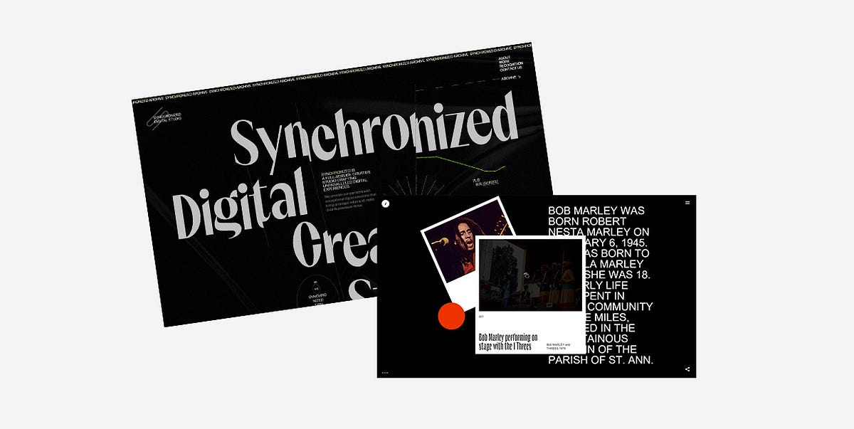
25 Inspiring Examples of Black Websites
Black is, arguably, the queen regnant of all colors. It emanates dominance, mystery, elegance, and reflects a wide spectrum of emotions. Depending on the context, it can be conservative or unconventional, luxurious or minimal. Its usefulness simply knows no bounds.Thanks to its versatility, black plays an important role in all forms of art. In design, it is often used as a standalone color, mostly in logos, as it can help add a touch of power and sophistication to a brand. Think of Louis Vuitton, Gucci, Chanel, Adidas, or Nike, to name a few. However, black can also serve as a spectacular backdrop for websites. It helps put all other elements in the spotlight and accentuates the brightness and vivaciousness of surrounding colors.Below you’ll discover 25 stunning examples that prove the potency of black as a background color. While some of them use the simple yet timeless combination of black and white, others combine a variety of colors with their black backgrounds. But they all unquestionably illustrate how dark designs can help brands and individuals differentiate themselves from the crowd and create awe-inspiring projects. The websites we’ll introduce you to are:Synchronized StudioTrip in the DarkAndrew LeguayYuto TakahashiClement MerouaniSam PhlixA Day OutSpatzek StudioDigital Marketing ConferenceDesign CanadaThrowbacks MusicMav FarmEclipse SRLAkufenMysta ElectricMaxillaLongshot FeaturesCultishJuraj MolnárGucci MarmontIntro to Coding for DesignersKontrapunktMasters 1987WiseslangSkyline FilmsSynchronized StudioSynchronized Studio is a team of creatives and experts in digital art direction, branding, web design, and much more. A word that best describes this website is — powerful. There’s a loading animation that looks like a lightning bolt tearing the dark background as the numbers go from 0 to 100 indicating the loading status. The background is particularly interesting. For one, it’s not static. It resembles black silk wrinkled sheets, and the movement of your mouse causes the “sheets” to stir. The cursor leaves a lime-colored trace behind that adds a touch of color to the homepage. Inner pages are black and white, save for the projects page which is especially fun to explore because of the horizontal drag effect.Trip in the DarkTrip in the Dark is an astonishing project created by the Voskhod digital agency that I could wax poetic about ad infinitum. While the website loads, you first see a blinking eye placed on a black background inviting you to be patient while you await for your adventure in the dark to begin. You can then choose the way in which you wish to experience the site — with your ears, eyes, and/or by using your voice to interact with it. Once that’s settled, you’re introduced to Volodya, a not-your-typical tour guide. The background is initially white, but as he begins to narrate his experience and informs you that he’s visually impaired, the light switches off and you’re enveloped in darkness. He tells you his story using his voice as well as through a series of spectacular illustrations that lead you to a crossroads. There you can choose between exploring places or getting to know locals. If you select the former, you’ll be able to make your own map based on the real sounds of the city. You can select a maximum of 5 sounds that you should place in designated slots to then see your route through Yekaterinburg. If you go right and choose to meet locals, you’ll have the opportunity to hear several interesting stories that highlight the importance of listening to sounds, both external and the ones within ourselves.Andrew LeguayAndrew Leguay is a designer who specializes in branding, digital products, and lifestyle marketing. His creativity is evident in every single pixel of his commendable portfolio website. As you wait for it to load, the screen becomes more and more chaotic with each passing second. Words such as organization, strategy, branding, marketing, culture, product, framework ambush the screen and are all you can see at one point. It all clears out in an instant and then you get the chance to explore Andrew’s work. The entire website is designed using just three colors — black, white, and dark orange. The background is black, which allows the featured elements to stand out. The font choices are interesting and unusual, especially the typefaces used in headlines. And when it comes to animation effects, the glitching on scroll effect wonderfully complements the cool vibe of the entire site.Yuto TakahashiYuto Takahashi is an art director and a web and graphic designer. His website is mesmerizing from the get-go. The homepage starts off with a somber background image of a woman that appears to be submerged underwater. This composition looks calming and mystical, and it stands as an alluring invitation into Yuto’s creative world. To dive into it, you must first hold down the mouse button for a few seconds. What you’ll discover are his works masterfully displayed on a black background. The color palette he used on the website is not overpowering and it subtly contrasts the dark background. While you scroll and the projects appear on the screen one after the other, you’ll notice how their surface is wavy, resembling turbulent waters. As soon as the scrolling stops, the scroll-triggered animation effect is gone and the images become still. If you click on any of the pictures, you’ll see an in-depth presentation of the featured projects.Clement MerouaniThe website of Clement Merouani, a French art director and photographer, looks like a modern online art exhibition that you can visit and admire from the comfort of your home. You can control the carousel of his colorful works with your mouse. As you scroll or drag from left to right or vice versa, you’ll notice how the edges of displayed images become protuberant. The side towards which they lean depends on the direction in which you scroll. Clement’s website is essentially minimal and well thought out. The background is dark, elegant, and it ensures his works are in the spotlight. There are no distractions, no redundant elements that might draw your attention away. All the while you stay focused solely on his art. If you click on Index at the top left corner of the screen, you’ll see all of Clement’s works displayed in the Pinterest style on a black background.Sam PhlixSam Phlix’s website is minimal to the core and a perfect example of how you don’t have to go overboard with special effects to make an eye-catching online presentation of your work. There’s a black backdrop, big white letters, and monochromatic imagery. Oh, and a carousel, the “wild child” of this site. If you bring the pointer on the wheel and hold the mouse button, the carousel will start to spin, simultaneously inverting the website’s colors — the background becomes white and the letters turn to black.A Day OutA Day Out’s works are displayed in large, irregularly-shaped, multi-colored blocks dotted all over the dark background. The masterminds behind this studio have cleverly used colors and the shapes of displayed elements so that you can’t help but feel the strong pull to explore their portfolio. Even as you click on a project of your choice to learn more about it, the black background will still be there with large imagery added on top of it to show you every single aspect of the selected project. Back on the homepage, the studio’s name is written in large typography and is visible at all times. As you scroll, the letters start to move, going from one side of the screen to the next, often swapping places. The fonts these guys used are very simple, colored in white, and placed in stark contrast with the darkness behind them.Spatzek StudioSpatzek Studio’s website looks powerful and bold from the first scroll to the last. The riveting visuals and witty textual content form the perfect amalgam that illustrates the studio’s creative genius and their skillset. They say they don’t want to over-complicate things but rather care about emotions and creating projects for humans. It goes without saying that their homepage looks spectacular, but the about page is probably unlike anything you’ve seen before. There are yes / no questions to which you must answer before getting to read the studio’s bio. The text alone is fun to read, but thanks to the hilarious videos they’ve added to the description, things become all the more fun for the visitor. There’s a lot going on no matter what part of the website you go to. Lots of motion, large fonts, video content, etc. but everything looks harmonious because of the neutral black background.Digital Marketing ConferenceThe Digital Marketing Conference is organized every year by the famous Russian creative agency Possible. The website they’ve made for the 2019 edition is nothing short of majestic. You feel like you’re suspended in the air, exploring the continuously rotating dark universe of the conference by dragging the mouse cursor in every which direction while eerie sounds play in the background. All you see is black and white, with traces of red here and there. Above you are the starry skies with the DMC 2019 logo shining bright in the middle of it. If you keep looking up, the logo fades away, the stars spin harder and lose their form, and you feel like you’re sucked into some kind of digital vortex. Before you get dizzy, it all clears out after a few seconds, and the sky goes back to being starry again. Interactive links are placed at eye level and they carry info about the event, its program, speakers, etc. If you look down, you’ll see a map of Moscow with a clearly marked conference hall. The creativity of this 360° project doesn’t cease to amaze from one pixel to the next, and you can experience it even in VR.Design CanadaDesign Canada is a documentary film that introduces us to the finest Canadian graphic designs. The website was created by the phenomenal Locomotive agency. They’ve designed it in quite a simple yet compelling way, relying mostly on the colors of the Canadian flag — red and white. The background is black, which helped accentuate the iconic logos and other design examples. Animation effects, transitions, and micro-interactions are engaging, and they help make the browsing experience smooth, enjoyable, and entertaining.Throwbacks MusicThe majestic Throwbacks Music takes us back in time and gives us an entertaining, interactive 3D music experience. The black background is omnipresent on the entire website. We can listen to the great old songs that are popular to this day and learn more about musicians who created them. The library of featured artists is displayed in the form of a carousel, and as you move from one artist to the next, you feel as if spinning a record. The pictures of artists are black and white until you stop “spinning”, which is when they gain color. When you find a musician you like, you can hear a preview of whichever of their songs is included in Throwbacks Music’s music catalog. To listen to the song in its entirety, all you need to do is press and hold the spacebar. That action will take you to the page where, besides hearing the song, you can read more about the selected artist. Before you scroll away to the next musician, you can have some more fun and play virtual guitar strings by moving your mouse over them.Mav FarmMav Farm’s website is definitely something else. While it loads, you can see the name of the app written in futuristic-looking blue and purple letters across the screen. Once the content’s ready, an eyeball pops up at the bottom of the page luring you in and inviting you to click on it to enter the website. And then, you step into a surreal universe where WebGL scroll navigation rules everything. There are lots of colors, futuristic elements, complementing typography and terrific animation effects that look breathtaking on a black background while truthfully portraying the description of the company, which is — A new network and an alternate reality.Eclipse SRLThe website of the Italian agency Eclipse SRL is minimal and very fun to explore. Its ambient is very dark, matching the brand’s name. The homepage background is black and its monotony is occasionally disrupted by the passing dark moon. You’re encouraged to hold the mouse button and “draw” on this virtual blackboard. As you drag the mouse pointer across the page in whatever direction you please, you’ll leave a white trace made up of words in different sizes behind. If you click on the crescent moon at the top right corner of the screen, you’ll see a page filled with images depicting different lunar stages. On hover, some of them turn into Super Mario, Michael Jackson, or the iconic Pink Floyd’s Dark Side of the Moon album cover art. This is also where you can read more information about the agency and explore their projects.AkufenThe first thing you see as the Akufen’s website loads are floating 3D cubes that levitate towards the middle of the screen. They form a large unit at the center that follows the movement of your mouse. Everything’s in black and dark grey hues, save for white typefaces. Exploring their portfolio feels very smooth thanks to the infinite scroll effect. The projects line up one after the other while the background remains dotted with dark cubes. The 404 page is charming and in stark contrast with the rest of the website. Its background is black, but there are occasional colorful, full-screen glitches interrupting the black and white synthesis.Mysta ElectricMysta Electric is a phenomenal tattoo artist that creates “dark graphic tattoos with beautiful melancholy” and his website perfectly matches that vibe. It’s entirely monochromatic, oozing coolness from one pixel to the next. The first thing you see is Mysta’s head in the background. Wherever you may move your cursor, the head will follow the movement. As you start to scroll, large typefaces take up the screen telling you Mysta’s story. If you hover over some words, you’ll see pictures of Mysta at work and with some of his clients. There’s also an extensive image gallery containing some of his awe-inspiring and idiosyncratic tattoos, as well as a black and white video that gives us a glimpse into the artist’s creative process.MaxillaMaxilla is a visual studio and a digital agency coming from Japan. Besides an interesting name and a cool logo, they also have a website that serves as an example of the striking things you can achieve with a black canvas and a lot of imagination. They start off with a bang — the first thing you see is a majestic radial menu featuring their portfolio. The names of projects are written in large, all-caps, white types, but on hover, your cursor turns into a big, black spot that sucks the white out of letters and leaves them outlined in the dark. Inner pages also reflect the agency’s creative approach to design, in particular, their about page. There’s an illustration of the white deer’s head at the center that follows every movement of your mouse. Next comes some short text informing you about what the agency does, and then — bam! You see a picture of a huge plush deer caught in the headlights, placed in the middle of the street. A few scrolls later, as if nothing happened, the deer is gone and Maxilla’s contact details appear.Longshot FeaturesLongshot Features is a production company with a terrific horizontal-scrolling website that introduces us to their wonderous world of film. It’s filled with remarkable animated art of the pointillism master Mattis Dovier. When you click on any of the featured cinematic illustrations, you’ll reveal the story of the studio, the films they’ve made, etc. The stunning pixel art and the whole website are made relying on the black and white hues, proving once more the undisputed creative power of this timeless color pairing.CultishCultish is a South African creative studio with a beautiful website that fuses seemingly unmatchable elements. The first thing you see is Penitent Saint Peter, a Jusepe De Ribera’s painting from the 17th century. As you move your mouse over it, the parts of the image where the cursor is placed twirl leftwards, giving this classic composition a modern twist. Again, there aren’t that many colors on the homepage — the background is black and the letters are white or blue. But somehow the website doesn’t ever look dull. Aside from the large painting taking up the upper part of the page, you’ll also discover images of the studio’s projects while moving your mouse through the darkness. Inner pages are predominantly monochromatic as well, adorned with sporadic splashes of blue.Juraj MolnárJuraj Molnár’s website proves, once again, that black is possibly the best choice for portfolio websites, and that less is certainly more. The transitions from one section of the site to the next are smooth and subdued, with the progress bar displayed at the left-hand side of the screen. This is a mainly typographic site with a mix of bold and outlined letters. When you hover over the names of Juraj’s projects, a few images show up on the screen, inviting you to explore in greater depth the selected work. I especially liked the animated outlined illustration of a beating heart. It’s placed right next to the list of awards Juraj has won so far, indicating that he probably holds all those accolades close to his heart.Gucci MarmontThe creativity of the people behind Gucci is inspiring, and not just on the runway. The websites their team has created for their big campaigns are all picturesque and mesmerizing. The one they made for the Gucci Marmont collection is no different. The website shows the Marmont bags as parts of still life paintings reminiscing the Renaissance era. The paintings are hung on a wall, and as you study them, you almost forget that the purses are the charming intruders that don’t naturally belong to any of these artworks. Given the colorfulness of the images, the choice of the black background is ideal.Intro to Coding for DesignersIntro to Coding for Designers is a beginner’s class that teaches designers the fundamentals of coding. The color choice for this website is not surprising. The black background along with white, orange, blue, and green elements are all typical of coding in Javascript, CSS, and HTML, which are the programming languages this course teaches you about. This website is quite simple, but it’s amusing to explore. There’s a playful feel to it, as the authors have added a bunch of geometric shapes that run away from your mouse pointer as soon as you hover over them.KontrapunktKontrapunkt is one of the leading Scandinavian design agencies and they’ve created a stunning online exhibition celebrating the Kontrapunkt typeface. They’ve singled out eight projects in which this font is used, demonstrating its versatility. The agency has opted for the predominantly dark color palette on the homepage, with lots of black and grey elements that are contrasted with white and yellow textual content. The typeface overview is informative and comes with lots of beautiful cursor animations. You can explore each project further by clicking on it. The exciting project pages shine more light on the typeface and demonstrate how it looks in action.Masters 1987Masters 1987 is an event production company from Los Angeles whose client list includes Oscar, Netflix, HBO, among many others. The use of a black background allowed them to promote their services in a striking way by opting for vivid imagery, all-caps typefaces, and snazzy interactions that ensure a cool browsing experience. The cursor looks especially charming. It’s like a comet that turns into a spotlight when you move it across letters. When placed on images, it puts them in commotion. The pictured objects zoom in and out, the photograph surface seemingly becomes undulating, and the color of the area where the mouse pointer is inverts.WiseslangWiseslang is a platform that gathers creatives from various fields. Their website looks subtle and impressive at the same time. The darkness throughout is filled with floating white dots or particles that assemble into all kinds of shapes. To navigate the website, you should use the arrows placed on the left and right sides of the screen. You can learn more about Wiseslang and the projects they’ve worked on, and regardless of the section you decide to explore, the playful white particles stay on the screen all the time.Skyline FilmsSkyline Films come with a website that all cinephiles will appreciate. The movies are displayed on what looks like an infinite cinematic canvas that you can explore by holding & dragging your mouse in any direction you wish. When you stumble upon a movie you like and stop moving the cursor around, a trailer for that specific feature will start to play. And if you click on the movie’s name, you’ll discover more information about it, its storyline, etc. The featured movies are all bursting with color, so the choice of a black background is not surprising in the slightest.Final WordsBlack is an exceptional, visually appealing backdrop color that gives a sense of depth to any project and highlights featured contrasting items. It helps brands tell their story in an attractive and unusual way that sets them apart from competitors and makes them more memorable.As the websites from our roundup depict, black looks best when paired with lighter hues. When you use brightly-colored typography on a dark background, you don’t have to worry about readability, which is a common issue in dark design. And to create arresting projects, you don’t need to go wild with special effects. As you could see, sometimes all it takes are two colors, a couple of cool animation effects, and simple graphic content to make a memorable and astounding website.Originally published at https://qodeinteractive.com on August 28, 2020.25 Inspiring Examples of Black Websites was originally published in Muzli - Design Inspiration on Medium, where people are continuing the conversation by highlighting and responding to this story.
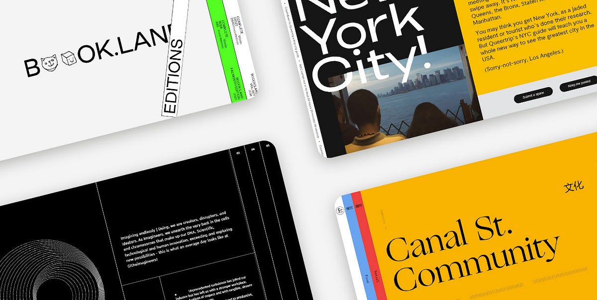
11 Stunning Examples of Tab Based Navigation
Tabs are extremely practical elements that allow for a clutter-free UI. And while they’re most commonly used to group related content within a single website page, some designers have experimented with them and started employing tabs as a navigational device for entire sites. Instead of displaying pages as simple links, they started placing them into beautifully designed and clean tabbed menus, creating visually appealing and intuitive website navigation systems.Over the last few years, vertically placed, full-height navigation tabs became particularly popular in modern web design. The typography on these tabs is often perpendicular, making the menus look a bit unusual and interesting to the eye. In some cases, tabbed menus aren’t even placed at the top. They often take up either the entire screen or a significant portion of it, becoming an important part of the page content. Moreover, both vertical and horizontal tabs are often adorned with engaging effects that enhance their appeal and make them more prominent.In this article, we are going to share a collection of websites that illustrate how creative you can be when designing tab-based navigation and implementing tabs into your projects. The brands that illustrate the versatility and flexibility of tabbed navigation include:Book.LandQueertripCanal Street MarketSpace — de SpaceTablet MagazineVine TrailOff SeasonG!theimagineersEmbassy of InternetEDA ArchitectsGreat JonesBook.LandBook.Land is a terrific project for collaborative storytelling. It was devised by Harry Boyd, a graphic designer, with the goal of encouraging audiences worldwide to write a novel together. Each user needs to continue the story where it was left off and also add some illustrations to complement the text. The site’s layout is unusual and interesting to the eye. The homepage opens with an amusing logo animation, where letters turn into doodles for a split second — the two o’s morph into a cat, smiley face, an envelope, etc. On either side of the screen, there are vertical tabs, resembling books placed on a shelf. This design perfectly complements the site’s purpose. The homepage gives off brutalist vibes, with uppercase sans serif typography and the screaming fluorescent green clashing with the surrounding calmness of the neutral white color. The tabs at both sides of the screen contain a brief description of their content. Inner pages are divided into two parts, with doodles on the left and stories on the right side of the screen. The title of each story is animated in an electrifying way, breaking the inertia of the surrounding content and announcing the novel in an attention-grabbing way. There is also a barcode — a standard element on physical book copies. But instead of the 8-digit number, the barcode on this website displays the time.QueertripQueertrip is an LGBT travel agency. The project was devised with the goal of introducing those who identify as queer to the places they can travel to without having to worry about their safety. The homepage shows a rotating illustration of the Earth and an animated arrow that travels around the globe. At the same time, the color of the background, elements, and typography changes every few seconds, mirroring the colors of the rainbow. On the right-hand side of the screen, you’ll notice two tabs. One is in black and the other in white. They both feature perpendicular, animated typography, informing you about the content that hides behind these tabs. Even though the homepage is bursting with colors, the scrolling typography and the monochromatic color palette of the tabs are just as attention-grabbing. When you place the cursor on either tab, they slightly expand, revealing a small part of the content they feature. On click, the content takes up almost the entire portion of the screen, but the tabs remain visible on the side, so you can jump from one to the other whenever you want.Canal Street MarketCanal Street Market is a retail market, food hall, and community space located in New York City. The website’s content is organized into colorful tabs. Each section is presented using a different hue. The homepage includes a subtle white backdrop, while other pages have more vibrant backdrops, including blue, red, and orange shades. The switch from one color to the next enhances the site’s visual appeal and makes it appear more exciting to your eye. When you click on tabs, they elegantly stretch across the screen, showcasing the beauty of featured content. Aside from the gorgeous visuals, some pages also include animated lines. For instance, in the upper section of the homepage, there is a zig-zag line that incessantly flows from one side of the screen toward the other. On the other hand, toward the bottom of the homepage, you’ll come across animated dotted lines. The movement of the lines as well as the vivacious color palette on the site perfectly balance out and soften the rigidness of tabs, creating a fun and engaging environment for users to explore.Space — de SpaceSpace — de Space was a place in Luzern where artists could exhibit their work. Even though the website includes a program from 2018, we added this example to the list because it exemplifies a particularly creative implementation of tabs on a site. The homepage evokes alternative vibes. The name of the organization is depicted using a combination of cursive typography and geometric shapes. It’s hardly readable and it looks more like an ornament that amplifies the site’s appeal. Each exhibition is presented as a tab. The tabs overlap, with only their tops peaking, revealing the name of the artist, the date, and a glimpse of the content featured inside. Each tab is colored in a different hue. However, since the majority of the tabs are painted in pastel shades, the homepage, despite containing a lot of elements, isn’t hard on the eyes. In fact, the transitions from powdery pink and soft yellow to baby blue and delicate violet make the page appear more exciting to explore. The way tabs are arranged one on top of the other makes exploring the homepage feel like going through a well-organized file drawer.Tablet MagazineTablet is an online Jewish magazine. Its design resembles the look of printed newspapers, with a paper-like background and grid-based layout. The content is in black-and-white with call-to-action buttons in red. However, when you hover over images, they gain color, enlivening the site. On the far-right part of the screen, you’ll notice an invitation to explore the magazine’s sections. The all-caps, red letters encourage you to click on them. When you put the cursor over that section of the page, you’ll see it slightly expand, revealing two more tabs. When you click on them, a collection of selected articles appears in the viewport, stretching across the entire screen. Article previews and featured visuals are all organized into tabs. You can explore them by using the horizontal navigation, which helps make this section more immersive and fun to browse. The articles appear in threes, so the entire screen stays covered in tabs all the time.Vine TrailVine Trail sources, imports, sells and distributes wines from France, Northern Spain, and Italy. The homepage opens with a stunning fullscreen animated photo, transporting you to one of the breathtaking wine regions. And while the homepage provides a beautiful introduction to the brand, if you want to learn more about the growers and discover the full wine list, you should click on the two eye-catching blue and orange tabs on the right-hand side of the screen. When you click on them, they take up the entire surface of the screen. Both tabs contain long lists of data organized into columns either alphabetically (growers) or by the region (wines). You can also apply handy filters to find the content that interests you the most. Implementing tabs on the site allowed the designers to display a lot of information in a visually appealing way without cluttering the screen and overwhelming you. Instead, you can elegantly click on the section you want to learn more about and immerse yourself in the fullscreen, vividly colored content.Off SeasonOff Season is a design and photo studio that specializes in working with musicians. Their website represents a compelling combination of grid lines and tabs. The layout is unusual and interesting to explore. On the left-hand side, a small portion of the screen includes a short description of the studio. Underneath the text, there are two intersecting squares. They interact with your cursor — the closer you bring your mouse to the squares, the further apart they drift and vice versa. The rest of the layout consists of menu sections presented as tabs. When you click on them, each folder expands, revealing its colorful content. Before each section title, there is a small, outlined circle that on hover and on click becomes black, signaling that the tab is in an “active” state.G!theimagineersG!theimagineers is a production studio that combines architecture, scenography, light, image, and sound in their work. The most obvious elements on the site are grid lines and a variety of geometric shapes that stand out against the black background. The overall design is minimalist and simple, but the clever and playful implementation of lines makes the site engaging and immersive. The grid lines form full-height tabs that include main menu links. When you click on the tabs, they expand, revealing the featured content. No matter the page you open, the other tabs stay visible on the screen so you can quickly go to some other section on the site. Inner pages are split into several parts using grid lines. On the left-hand side, they usually include animated geometric shapes, such as circles, while other areas on the page include information about the studio and what they do.Embassy of InternetEmbassy of Internet is an experimental platform created with the scope of encouraging discussions about the future of the Internet and its role in our society. Even though this project is no longer active, we added it to our list because of the creative use of tabs on the site. When you hover over each section, a short description of the pages appears. At the same time, the color of typography and the background invert. The blue color used on the page is very specific — it resembles the blue screen of death we used to see in older versions of Windows, giving the site a retro feel. The homepage also evokes strong brutalist vibes. It includes attention-grabbing, large, uppercase sans serif typography and there are almost no visuals save for the pulsating large blue circle at the bottom right corner of the screen. Even though the entire website is text-based, you never feel bored exploring it. The combination of blue and grey hues makes the pages exciting to the eye, luring you into reading more about the project.EDA ArchitectsEDA Architects is an architecture, interior design, and planning firm. On their website, the menu sections are presented as vertical tabs. There is an element of surprise when exploring the site because you can’t even see a glimpse of the content behind the tabs. Some pages include a fullscreen slider while others feature exciting galleries. Animation effects are terrific, especially the scroll-triggered animations added to the “About” page. At one point, you enjoy a fullscreen photo. Then, on scroll, the screen splits in two, with one image on each side. Then, a small photo remains on one side while the accompanying text appears on the right. The changes on each scroll make the page appear dynamic and more fun to explore. The dominant monospace typography amplifies the modernist character of the studio’s buildings and wonderfully complements the minimalist vibe of some of the layouts. The pages about the services EDA provides and their contact information contain only text, but the monospace font and the use of grid lines make them beautiful to look at and explore.Great JonesGreat Jones is a cookware brand founded in 2018. The main navigation is placed at the top, with gorgeous tabs inciting visitors to learn more about the company and explore their products. The colors used on the tabs are beautiful — deep shades of pink, green, and yellow serve as an appealing introduction to the site. They also stand as harbingers of what Great Jones items are like. The company is known for its colorful products and their beauty stands out against a beige background. As soon as you start to scroll down any page, the tabs disappear and the menu sections show up in the header. As soon as the transformation occurs, the menu becomes sticky, allowing users to easily go to any section of the site.Closing WordsThe brands featured on our list have nailed the tabbed navigation design. They have demonstrated that tabs are just as flexible as any other UX element and that they allow a lot of room for expressing your creativity.As you can see, you can place tabs in the header next to each other or one below the other. Alternatively, you can make room for them on one side of the screen or display one tab and arrange that the rest of them appear on hover. If you like, you can also organize your entire content into tabs and then arrange them across the whole screen.To make your tabs more prominent, you can consider coloring them in vivid colors. And if you feel like experimenting with hover effects, you can rely on them to further amplify the appeal of your tabbed navigation. You could have tabs change color on hover, add some animated objects to them, or increase their size. Don’t be afraid to express your creativity, but also be mindful your tabbed navigation stays clear and intuitive at all times.Originally published at https://qodeinteractive.com.11 Stunning Examples of Tab Based Navigation was originally published in Muzli - Design Inspiration on Medium, where people are continuing the conversation by highlighting and responding to this story.
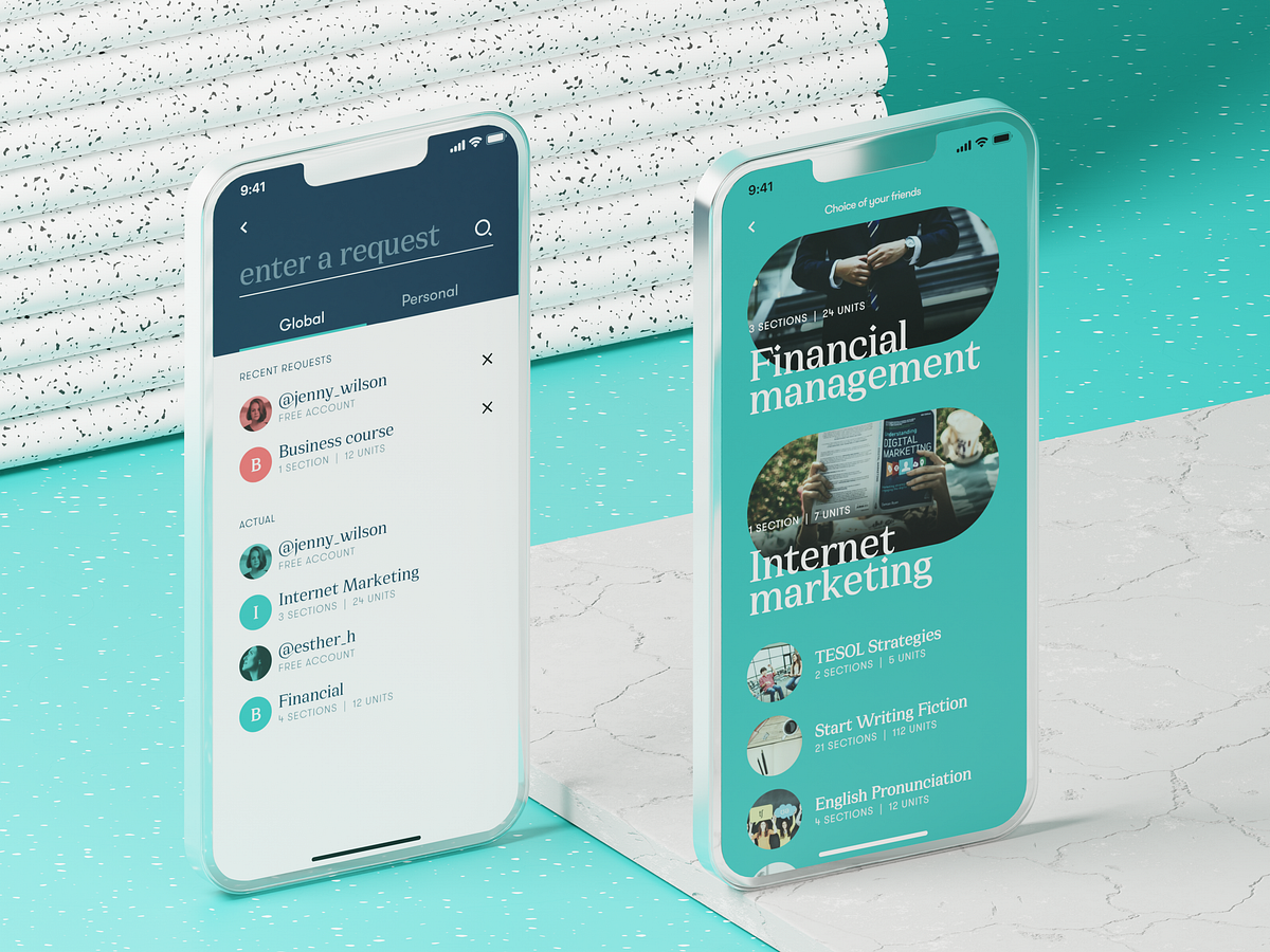
Effective Practices on Preventing Errors in User Interfaces
No doubt, the best mistake is the one that wasn’t made. However, life isn’t like that, and user experience as well: mistakes are an integral part of both. In our previous article, we shared some handy tips on dealing with error screens and messages, but is there a way to prevent users from making at least some of those errors? Yes, and today’s article is all about them. Here’s a set of design practices to consider, with various examples from UI designs by Tubik or from well-known digital products we often use.Directional CuesDirectional cue is an element of the user interface that gives a visual hint on specific interaction or content to let the user see it faster and easier. As well as road signs and signposts do in the physical world. They guide a visitor or user to the key elements, text lines, and call-to-action elements, this way making the conversion reachable and users’ problems solved quicker. Arrows, pointers, and other visual prompts help to navigate users through the interface and make it easier to avoid unnecessary clicks and interactions.The Nonconventional Show website on mobile plays out with slight and elegant arrows directing users’ eyes to the buttonsThe landing page for the service of hiring digital artists uses pointers as a directional cue focusing users’ attention on the CTA button and tagline.https://medium.com/media/d048b7a92440a05ac16278e3f7be2f78/hrefOnboarding Tutorials and TooltipsOnboarding is a set of techniques and interactions whose objective is to comfort the user and give a concise introduction to the product. One of the ways to quickly introduce the app to the user is in the onboarding tutorial, which is a set of several screens that are shown to the first-time users and explain the benefits and functionality. Here you may show some vital things that differ the interface from the others, and this way prevent the errors which could arise later.https://medium.com/media/bc5f60e4967310444d6a97e25ae85b0b/hrefAnother onboarding technique that has a significant influence on error prevention is tooltips. These are prompting messages tied to particular layout elements or user actions. They usually appear in modal windows rather than separate screens. Tooltips present a proactive way to guide the user to the right option and avoid misunderstandings.Visualized LimitationsOne more way to prevent the user from wasting their time and effort is by showing the visual limitations, if they exist, right in the process. One of the classical examples is Twitter. There is a limitation of 140 characters per tweet, and the platform shows you clearly if you exceed that number: the extra part is highlighted with color, the number of extra characters is shown, and the button of the tweet becomes inactive. Such an approach saves users time and effort and prevents unnecessary clicks.Text PromptsUX designers know much more about user interfaces and interactions than an average user, but that knowledge can sometimes play a dirty trick on them. Why? Because what’s obvious for designers may appear confusing to users. The function behind the particular field or button may seem super clear to you but not for users of an app or a website. Keep that in mind and support them with short and clear text prompts. Usability testing will help you to find the pain points where it’s needed most of all. One of the popular examples is a text prompt in the search field or simple clues in the fields of a contact form.Education app features a text prompt integrated into the search field.However, keep in mind that text prompts and fillers should be obvious as examples. Try using lower contrast for them compared to the real input text, or integrate the words indicating that like “e.g.” or “example.” In case the text filler looks too realistic, it may create the wrong impression that the field is already filled with information.https://medium.com/media/40a9c92e33b36bc7df68c91146a9fabb/hrefPreviewsPreview functionality lets a user review the results before the feature is activated. For example, if you offer the user to choose between several color themes or different font sizes, show the preview in the process of choice so that the user can be sure he or she really wants that change. That may also touch on more complex things: CMS platforms, emailing services, and showcase platforms usually allow users to preview a piece of content before they publish or send it to make sure that everything is just right.WordPress CMS enables a writer to preview all the changes in the post before publishing or updating it.SuggestionsAutocomplete and other suggestions present another popular feature that helps users quickly find what they want and avoid unnecessary interactions or extra clicks. Here’s how it looks in the process of search in Tubik Blog. When the user starts typing the search query, the website offers some relevant options immediately, and the full list is shown after the request is completed.Clear ExplanationOne of the vital points behind UX writing is guiding a user through interactions with simple instructions and updates. Use this checklist to review the texts you write to support interactions. It should be:clear (users understand what you talk about, the core message isn’t blurred or complicated)concise (the piece of text is meaningful, laconic, and concentrated on the goal, no empty talk is included)useful (the copy gives users necessary information or helps with interactions)consistent (the copy within the interface of one digital product keeps the same style, tone, voice, and terminology).Focus on informing users and explaining what’s going on and how to deal with it instead of diving into technological details or explaining that it isn’t your fault. Make your explanations slang-free and cut off everything secondary. This way, you will lead the users to what they need and help them avoid mistakes.The screen of a camera in the Pazi app features a clear text instructionInline ValidationIn basic terms, inline validation is a way to inform the user about the error or successful completion of the needed action right in the process of interaction. Most often, users deal with it in the process of filling in different forms (registration, login/signup, contact form, subscription form, etc.) Such an approach is really effective, especially for long forms with many fields: you update the user at every step instead of making them fill all the numerous fields and then telling them that “something went wrong.”However, there are some important points to remember:don’t integrate premature validation: it happens when the user just puts the cursor into the empty field, and it immediately gets marked as “wrong” before the user even has a chance to type something in. It will have a bad effect as you create an additional distraction and evoke negative emotional feedback on users being blamed for something they didn’t even start doing.don’t just mark the error; explain it: it’s not enough to show there is an error and leave the user confused about what is going on. Don’t just say “error” or “something went wrong,” but give a short and clear explanation letting users understand how to make it right.use color and visual markers known to most users: whatever your personal association with red color as a marker of an error, it seems there is a way or pattern better recognized globally to instantly let users understand that error is made. As well as the sign of a tick or a thumbs up marking the successful action. Think about markers that won’t require much cognitive load and won’t distract users much.Inline validation of filling a subscription form on Tubik BlogOne more way to prevent the user from an error is to make controls inactive until the error is solved. Sure, it should be done by giving the user a clear understanding of how to solve the problem.Here’s how the Buffer app, the tool for automation of social media posting, does it:When you open the window for a Twitter post to plan for publishing, the text prompt informs you that there’s nothing to publish. The button for scheduling the post is inactive.When you start adding the content, the button gets active. You can add up to four images to the post, so if you haven’t reached that number, you can see a free slot for media.If you added all four possible images, there is no more slot for another one. In case you exceed the number of possible characters, the button gets inactive again, and the extra part is marked by both color and filling the lines — this way, the error will be more accessible for people with color blindness.Just this simple case shows how many different details and scenarios should be considered to prevent a user from making mistakes.Here’s another interesting example of inline validation for the user flow of item customization: that’s the e-commerce service where users can customize their hot dogs before buying them. Tick symbols in the checklist show what stages are already done, keeping the user updated and confident. This way, it prevents the errors connected to missing something before making an order.Color AccentsColor is one of the most powerful factors of visual communication with users and visitors, so it seems to be quite logical to employ it and help users avoid mistakes. Think over applying color accents as a part of navigation, guiding a user, and drawing attention to the core interactive details or zones. This way, you increase the chances of correct clicks and taps instead of getting lost between a bunch of homogenous layout elements.https://medium.com/media/0554a763bc03d3ffe8e1dc36c3433ace/hrefOtozen app for safer driving uses color marking as a part of user experience design, helping users quickly scan and understand different categories of datahttps://medium.com/media/b7c56abbb1ff5c68243da40b55f73e08/hrefThe website for a food delivery service uses the color accent to inform the user about the current number of items in the cart, this way preventing unnecessary interactions and getting back to the shopping cart page to check if the item is in it.https://medium.com/media/c845201849695c96c68d305e0ac2cf64/hrefFamiliar IconsChoosing icons, especially for very basic interaction elements, always think twice before diving into a sort of creative experiment. Although icons are small, their impact on usability is huge: they give users quick visual clues, especially in the case of users with poor reading skills or disabilities, environments inconvenient for reading text, or not-that-perfect knowledge of a particular language. What’s more, icons are processed by the brain much faster than words, so they can make interactions faster and reduce cognitive load. Yet one of the reasons for that is the integration of icons that are instantly associated with particular functions or actions.For example, make no mistake that needing to search through the content of your website, users will be looking for an icon of a magnifying glass. If you start experimenting with it, the risk of errors, mistaps, and misclicks gets higher. Familiar icons make the product feel like home for users and give them more confidence.Bauhaus Event page uses well-recognized icons to mark the core information (date, time, and location) and make it easily found on the page.Gallery App features a set of easily recognized icons such as search, user profile, and shopping bag in the tab bar. As well, the icons for followers, comments, adding to favorites, and sending a message are integrated into artists’ profiles.Recognizable PatternsThis point continues the previous: not only icons but also other interaction patterns sticking to typical mental models may prevent app or website users from errors. For example, consider the following points:study typical scanning patterns and use them to make the core navigation intuitive and instantly visibleput contact information into the website footer where users tend to look for itapply breadcrumbs on a website to let users trace their journey and get back when neededconsider lazy registration via social network accountsmake the logo in the header clickable and returning the user to the home pagemake the text links underlined to show that they are clickableput a cart button into the header on the ecommerce websitesuse plus icons for controls aimed at adding itemsThese and many more options for patterns that are well-known to users and make interactions easier and error-proof. Thoughtfully done user research and usability testing will help you to pick the ones that will provide the most user-friendly solutions.https://medium.com/media/d3ee2e6cef1af4861412e9813cf89fd1/hrefThe control for creating a new storyboard in the Designer AI tool features a plus button supported with a text instructionIcon LabelsEven though icons are a powerful element of usability and are perceived faster than words, there is another side of the coin: the aspect of meaning. People can perceive icons super fast, but if the message they transfer is not clear and can have double-reading, this speed will not bring a positive user experience. Fast capturing of the icon bringing wrong understanding cannot be defined as recognition, it’s just fast noticing. Recognition means not only speed but also the right action or information that this icon should bring to the user. Only in this case will it work as a factor preventing users from errors.There are tons of easily recognized icons such as a telephone receiver for a phone call, an envelope for mail, a magnifier for a search, and so on. Sure, using these icons, you create a much faster perception of the UI functionality than using copy instead of them. Nevertheless, in cases when the image of an icon is not so obvious, its usage should be thoughtfully contemplated. If the icon doesn’t correspond with the goal and meaning it is assigned to, the speed of recognition doesn’t matter. That’s why there are cases when text transfers the idea or data more clearly, and sometimes it is more effective to use the double scheme when the icon is supported by the text label.Mindfulness App uses icons supported with text labels in the tab bar to avoid misunderstanding as the meaning of the graphics may not be obvious to all users.The Watering Tracker application uses icons with text labels in the tab bar to make sure that double meanings are excluded and avoid mistaps.https://medium.com/media/f211b9186784d65c945688e27341ac02/hrefThe field for creating a new post on the LinkedIn feed features the icon supported with a clear text label for a core interaction. The icons of adding media like images or videos are secondary and aren’t supported by the text. Anyway, the icons chosen for them are easily recognizable without a copy for most users.Progress AnimationWhen users interact with a digital product, they want to know what is going on at every single step. Making users wait in uncertainty is the risk of losing those users. Still, when users are informed, waiting can be not so annoying and stressful, and users don’t make extra actions and mistakes. So, this aspect should always be taken into account, and there are many ways to support it via interface animation and text explanations.Grammarly Plagiarism Checker tool supports the process of search with loading animation and text explanation of what is going on.https://medium.com/media/e6956d46b4742c07845bf1b2723c730d/hrefhttps://medium.com/media/1a45408653ce556321d84661d15d310c/hrefHere we’ve mentioned some of the popular error prevention practices; more ideas and examples on this and other UX design aspects will be shown in our upcoming articles, so keep up with the updates.Useful ArticlesHere’s the set of articles on more aspects and best practices of user experience design.Motion in UX Design: 6 Effective Types of Web AnimationUX Design: Types of Interactive Content Amplifying EngagementAesthetic Usability: Beauty on Duty for User Experience5 Basic Types of Images for Web ContentTypes of Contrast in User Interface Design5 Pillars of Effective Landing Page DesignThe Anatomy of a Web Page: Basic ElementsWeb Design: 16 Basic Types of Web PagesWeb Usability: Breadcrumbs Design Tips and PracticesBasic Types of Buttons in User InterfacesOriginally written by Marina Yalanska for Tubik BlogWelcome to check designs and art by Tubik via:WebsiteDribbbleBehanceTubik ArtsEffective Practices on Preventing Errors in User Interfaces was originally published in Muzli - Design Inspiration on Medium, where people are continuing the conversation by highlighting and responding to this story.
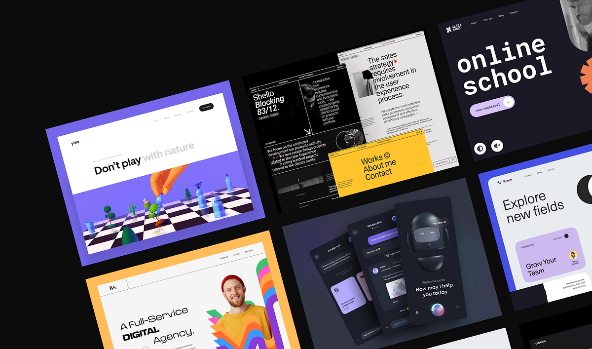
The Hottest Web Design Trends 2022
What’s effective today and what will we take with us into the future?Web design trends by OutcrowdWhy is it important to follow trends? Trends are not only about the present. They form the image of the future. Marketing and design trends are interconnected, and their dynamics are in sync. So it pays to be an attentive viewer!Let’s take a look at 2022 web design trends that will definitely keep in 2023. They have one thing in common: they all do their job.As we study the examples and draw inspiration, let’s keep in mind that each trend is effective in its own marketing realm. Design choices must be based on the company’s positioning and the needs of the audience, not on the mere fact that it’s the trendy thing to do.Yolo — Web Design for Ecologically Sustainable Development by Outcrowd1. New Minimalism2022 saw a new wave of minimalism that strives to stand out from the competition and grab the user’s attention. The trend includes bold, vivid, bright colors and a lot of “air.” This helps emphasize the essentials while maintaining visual clarity. The content looks gorgeous and exciting, but at the same time simple and easy to understand.TABU by Hrvoje Kraljević for BORNFIGHT STUDIO®Clean, clear, and vivid minimalism remains popular in branding, as well. This is where it truly shines. A minimalist design with lots of air and bright highlights is an instant attention-grabber that makes the brand look fresh and relevant.The new minimalist design is enhanced when it’s tastefully contrasted against a dark theme.Kohaku Bot — Dark mode — Mobile App by Tran Mau Tri Tam for UI8But all this doesn’t mean that soft-colored minimalist design is dead. For some businesses, a vivid palette with bright elements is simply inappropriate. They continue to use minimalist monochrome designs, although increasingly often enhanced by bright splashes of color.Here’s a good example:A new way of cross-border payments by Cuberto2. Neo-BrutalismBrutalism seems to feed off a fountain of youth since it began back in the 1950s. Over the decades, the style has evolved, constantly updating itself to stay relevant. Neo-brutalism is perfect for brands that promote creativity, boldness, edginess, and novelty. Need an instant eye-catcher? Give neo-brutalism a call. (Be careful, though, because it may upset the aesthetic gatekeepers.)https://medium.com/media/cccaedc1e6923b2b82a2598ae366b1d5/hrefSo what’s the secret behind this trend’s longevity? The brutalist style implies something that is raw and unpolished, a bit rough around the edges. The viewer has a subliminal desire to improve upon it, to finish the job. This engages the viewer emotionally, and the picture gets imprinted on their mind, along with the information. In marketing, that’s invaluable.Brutalist design requires a high degree of professionalism. The designer must be keenly aware of the thin line that separates the viewer’s desire to improve from the impression that they’re just seeing a botched design beyond any improvement.Task Management Landing Page by Bogdan Falin for QClayDigital neo-brutalism is minimalist and bold. It relies on roughness and “visual shocks”: high contrast, rough shadows, conflicting colors, simple backgrounds, asymmetry, and unedited photos. Neo-brutalism is fond of standard bold fonts, preferring readability over eye candy.Studio / Designer — Website by Tomasz Mazurczak for STUDIOHere’s an example of a neo-brutalist website: howilearnedtolovetheindiestry.info3. Engaging InteractivesBased on importance alone, this trend should be topmost on any list. As technology progresses, interactions between humans and digital products increase. Engaging interactions have become so much more than just a responsive interface. Today, it’s already about psycho-physiological communication. Engaging interactions aim to affect all human senses: vision, hearing, smell, touch, taste, and kinesthesia.https://medium.com/media/1b8b6a6c524c79051900e84487b08bb2/hrefThis trend aims to help the user come in contact with the product and feel real sensations. The most relevant content is the one that triggers an emotional response and the corresponding physiological reactions. A video of a steaming hot pie makes the viewer salivate while chasing a virtual opponent gives them an adrenaline rush.Engaging interaction is also a substitute for physically touching the product: it’s an opportunity to rotate the object and see it from different angles, zoom in on the details, choose the size, model, and color.https://medium.com/media/8bf291630aa25ee7fa76fb67b33ffe08/hrefTactile sensations during interaction are not fingers tapping the screen. It’s a mental contact between the user and the virtual world, it’s the enjoyment of playing a game with elements of design, and it’s a realistic feel of their surface and texture.Engaging interactions enable users to customize the interface to their taste and manage it at their discretion.https://medium.com/media/a419bc2efe1943a141777399cdad3437/hrefEngaging interactions include all types of virtual communication, not only with other people but also with the software itself. The more responsive and understandable the interface, the more engaged, committed, and loyal the users.Engaging interactive design is our present and future.4. Focus on People and Storytelling2022 has highlighted the fact that storytelling and emotional photos of people elicit a lively response from users. As far as minimalism goes, the most popular trend is using expressive photos of people accompanied by a short text: a memorable slogan, an impressive excerpt from a larger narrative, or a quote from a story.https://medium.com/media/c51cfca68a76b5da96227a508c9d5426/hrefThe main screen is not cluttered with long reads. The story unfolds laconically and gradually as the user scrolls down the page, through highlighted images, headlines, videos, or animations. Alternately, the user can click to find out more details.Expressive photos of people are also used as effective visuals to attract attention.Vultura Entertainment Brand Identity by Halo Branding for Halo Lab 🇺🇦This trend also includes large banners under the top menu on the main page. It’s the first thing users see on the website, instantly engaging their emotions.Scrollytelling is a close cousin to storytelling. It’s a gradual visual narrative. These days, people increasingly tend to scan their eyes across the page without really reading it or getting to the end of the story. The scrolling process itself is also tiring. A story that unfolds before the user’s eyes like a controllable movie is a great solution.https://medium.com/media/06a435d9668263618fe3588b09cea965/hrefScrollytelling is perfect for presenting sizable narratives, such as a description of the company or product, scientific data, or any cognitively demanding content. It’s especially good for learning and memorizing new information.The principle of “abridged” scrollytelling is successfully used for displaying selling propositions. It’s a way to quickly and effectively showcase the product’s advantages and convey the most salient information.https://medium.com/media/01979d81b558bd6b4667ca6708ac4031/href5. 3D GraphicsThe 3D graphics trend is definitely a keeper since it’s one of the best tools for retaining user attention. 3D images are perceived as realistic, no matter how fantastical their shapes are. A shape that has volume is eye-catching and mesmerizing. The user spends more time on the page just to admire the design.https://medium.com/media/c3a565a6ba3c976e00b71fe575e68aaa/hrefFar from losing steam, the 3D trend has even found its way into branding. An animated 3D logo grabs the viewer’s attention and holds it much longer than a conventional 2D image.https://medium.com/media/252254c7d1f30abbe1395a46a2037955/href6. Abstract IllustrationAnother 2022 trend was using illustrations with abstract geometric shapes. They are widely used as primary images for websites and apps, social media posts, and packaging designs.https://medium.com/media/505941d729f7cff57faec51c69919ca1/hrefAbstract illustrations are so successful because of their attractive vividness and contrast, visual aesthetics, and minimalist simplicity. They act as color highlights and add superior visual clarity to the overall design.Abstract illustrations and geometric shapes have also been used in branding. Their role here is similar: drawing attention to the brand name through color and form.DSM — Hero Header v3 by Tran Mau Tri Tam ✪ for UI87. Oversized TypographyWhat makes this trend special is that the typographical elements here are independent. The fonts are not used merely to convey information. They make up an important part of the page’s visuals, shaping the design and acting as powerful visual highlights in their own right.The advantage of oversized typography is that it goes well with many design styles. Large bold fonts are good for both minimalist and maximalist designs and their combinations. They harmonize perfectly with thin and fine fonts, emphasizing their elegance with their brutality.https://medium.com/media/624bfcd1ee1db3a7fdac2165497559ab/hrefAnother benefit of oversized typography is the ability to reduce the use of images on the website, cut loading times, and improve mobile usability.The important thing is to choose fonts that are easily readable and fit the branding concept.In conclusionWe have been following design trends for several years. Year after year, we see the same thing: the best trends survive and remain in the next year, except with new solutions added. The best ones are those that work toward the project goal and help garner a large audience. The stuff that gets left behind is not necessarily outdated; it’s just that it doesn’t work toward the goal as well as it used to.We have reviewed the most popular trends. Here’s what we have this year and what will continue to inspire us tomorrow:New Minimalism;Neo-Brutalism;Engaging Interactions;Focus on People;3D Graphics;Abstract Illustration;Oversized Typography.Use the trends but don’t let the trends use you!The Hottest Web Design Trends 2022 was originally published in Muzli - Design Inspiration on Medium, where people are continuing the conversation by highlighting and responding to this story.
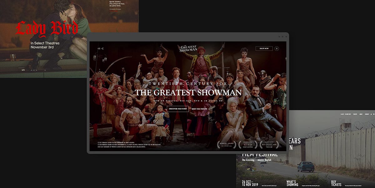
24 Stunning Examples of Movie Industry Websites
Websites within the movie industry are typically used to promote projects, drum up hype, and dish out news about casting, filming, and other intriguing aspects of production. To achieve those goals, such sites combine stunning designs, entertaining concepts and expert marketing tactics to create digital juggernauts that make viewers hooked to the product.Immersive, fullscreen visual stimuli are an excellent starting point. Most good movie and production company websites use enrapturing images and videos to suck viewers into their artistic vortex and incite them to discover more about showcased works. They often implement interactive features to the site with the idea of increasing user engagement. Viewers are encouraged to play games related to a movie, take a look behind the scenes, perform actions that will affect the way the content is displayed on a site, and so on. Websites sometimes even integrate movie scores as background music to create a certain atmosphere and ensure a more immersive browsing experience.Having analyzed a great number of websites dedicated to various movies, shows, production studios, and directors, we have compiled a list of highly imaginative, authentic projects that cleverly capture the attention of their audience. We divided all the examples into two groups as their goals and designs are essentially different — one group contains movie presentation sites while the other includes sites dedicated to the overall works of production studios and directors. Let’s kick things off with movie presentation websites.Movie Presentation WebsitesMovie websites are devised so that they thematically and stylistically match the film they are dedicated to. The goal is to translate the storyline and the emotion of a film to the web as vividly and effectively as possible. To that end, all site elements, from copy and visuals to audio and accompanying effects are carefully orchestrated to enrapture viewers and bring them closer to the film. Oftentimes, the graphical richness of a movie site and the power of the added effects are so impressive that they make viewers feel as if they were a guest on the set or a member of the crew who decides in which direction the storyline should go.The following examples are among the finest movie presentation websites we have come across. They are all immensely creative and enthralling, demonstrating the power of superb filmic design:For the Love of BreadLady BirdMank: the UnmakingThe Greatest ShowmanDark: The Official GuideNaïve New Beaters — “Words Hurt”LOVE DEATH + ROBOTSWaterlooThe Capitol.pnAmerican DocumentaryFor the Love of BreadFor the Love of Bread is an eight-part series that takes viewers on a trip around the world to meet the best bread makers. The show’s fully immersive website is rich with beautiful visuals, including fullscreen black-and-white cinematic background videos that provide a taste of what the show is about. On scroll, episode previews play one after the other, introducing you to the countries and cities the show will take you to. Transitions from one video to the next appear as colorful distortions, giving the site a slight alternative touch. The cursor is shaped like a large circle with “Play” written inside of it, encouraging viewers to watch the show (when launched, episodes are in full color). Titles are written using a huge, all-caps sans serif typeface and its simplicity and bold white color are a nice contrast to the buzzing atmosphere of the video in the background. The episode list contains the names of the countries and cities featured on the show, with titles written using large typography. On hover, episode previews appear, but this time not across the entire screen but rather as subtle invitations to discover the charm of For the Love of Bread.Lady BirdLady Bird is a coming-of-age movie directed by Greta Gerwig. The film follows the life of Christine “Lady Bird” McPherson, a high school senior. It tells the story about her relationship with her mother and family, while also documenting her trials of love and self-discovery. The website dedicated to the movie is sadly no longer available, but we couldn’t overlook it as it was beautifully thought out. We added a link to the project’s Behance page, where you can see screenshots from the site and get an idea of its overall aesthetic. The site included a predominantly beige background on which the authors placed black, serif typography, and large, playful, fiery-red sans serif titles. Overall, its design, much like the aesthetic of the movie itself, evokes the spirit and nostalgia of the late 90s. Aside from enjoying the grainy, fullscreen imagery from the movie and getting acquainted with the plot and the crew, viewers could also play a game in which they were prompted to choose what memories of home they cherished the most. The memories were presented on tarot-like cards that contained illustrations of holding hands, a hand pierced by an arrow, etc.Mank: the UnmakingMank is an oscar-nominated biopic about Herman Jacob Mankiewicz. Directed by David Fincher, this movie covers Mankiewicz’s most famous project — co-writing Citizen Kane with eccentric actor and director Orson Welles. To celebrate the release of the movie, a team of creatives made an art book about the project and launched the Mank: the Unmaking website. The site represents a digital take on the book. It was devised by the Watson Design Group, a digital design studio known for their authentic and award-winning movie websites. The site’s layout evokes the feeling of going through book pages, learning more about the movie in a visually staggering fashion. Visuals are mostly presented as thumbnails, but on click, they may take up the entire surface of the screen. There are several parts of the movie you can explore, and, if you click on “Index” you will be presented with a list of available information about that specific part, such as actors, score, costume designers, and more. Everything you wish to learn about this black-and-white movie, you can discover on the Mank: the Unmaking website.The Greatest ShowmanThe interactive website for the movie The Greatest Showman was designed by Bahaa Samir. The site is bustling with scroll-triggered actions that reveal stunning fullscreen photo and video material, getting viewers better acquainted with the movie. As you go from one section to the next, music from the movie plays in the background. On some slides, text appears across the screen, instructing you to, for instance, move the mouse to the right, to reveal more content. As you do that, a character depicted in the background rotates their body, following your movement. Or, if you wish to see where you can purchase the movie, you’re instructed to tap and hold a button to enjoy the show, i.e. see a trailer from the movie after which you’re presented with a list of platforms you can get the feature from. You can also take a 360° look behind the scenes, view interviews with the cast and crew, and watch how the show came to be. The hidden menu lets you quickly jump to a specific area of the site. You can find out more about the plot, the characters, or the awards the show has won. Menu links are displayed in a purely cinematic style as if they were movie titles. When you hover over them, specific background images appear for each link. This site is a remarkably engaging project that ensures a fully immersive browsing experience for everyone who visits it.Dark: The Official GuideDark is a time-travel science-fiction drama on Netflix. The show’s complex plot centers on four families in the fictional city of Winden, Germany that fight for control over time travel. To help viewers learn more about the characters, events, and the places mentioned in the show, Netflix has created the Dark: The Official Guide website. The site’s mysterious visual character matches that of the series. Such an atmosphere was created by coalescing stunning, dark visuals and beautiful effects with some eerie background music. The surface of the black backdrop looks creased, with one of the rumples following the movement of your cursor. The triquetra symbol, which is used throughout the site, represents the show’s three seasons. In the show itself, triquetra symbolizes the past, the present, and the future and their interconnection. You can explore the three seasons episode by episode, study a family tree to better understand complex character relations, or select a character and see a part of their story.Naïve New Beaters — “Words Hurt”The Naïve New Beaters’ video for their “Words Hurt” song is an interactive, filmic music video that puts you in control of the protagonist’s destiny. You are encouraged to make choices on his behalf that will determine the course of future events. It all starts with you deciding whether he cheats on his exam or not. You are supposed to help your hero (played by the band’s frontman Michael Bensoussan a.k.a. David Boring or Estéban) face some moral dilemmas and assist him in navigating the challenges of adulthood. He can end up anywhere, from participating in a war or ending up glued to the screen playing computer games to leading anti-war movements, becoming a president, and much more. The choose-your-own-adventure approach ensures an engaging experience for audiences that are sure to have some fun while enjoying the band’s song. The remarkably creative video was directed by Romain Chassaing.LOVE DEATH + ROBOTSLOVE DEATH + ROBOTS is an adult anthology series on Netflix that explores the multifaceted nature of humans. It consists of short stories animated in a variety of styles, from cartoony to photorealistic, immersing viewers into the imaginative world of sci-fi, fantasy, horror, and comedy. The artistic diversity on the show is mirrored on the site that provides an overview of the episodes and an introduction to the creative team behind the project. There are fullscreen visuals, games viewers can play, as well as embedded videos and texts about the project and its development. The cursor is shaped like a white circle that enlarges when you place it on clickable elements. It also tells you that you can interact in some way with specific elements and sections (e.g. it tells you to “Play” content, “Skip” it, etc.). When you place it on some elements, the color of the circle and the element that you’re hovering over inverts. This is a subtle yet interesting effect that helps draw you in even more as you interact with the site’s already intriguing environment.WaterlooWaterloo is a movie about the famous battle of Waterloo which marked the end of the Napoleonic wars. The movie takes viewers on a historic journey and places them directly on the battlefield. The website includes a myriad of fullscreen graphics, both photos, and videos, which helps keep visitors engaged and interested in what’s to come. On some pages, there are even 3D images of the actors that help make the site all the more immersive. Viewers can go through the movie synopsis, meet the team behind the movie, watch the trailer in three languages, take a look behind the scenes, read the latest news related to the projects, and more. At the top of the screen, there is a sticky button that takes viewers to the project’s official Facebook page where they can also play the Waterloo game.The Capitol.pnThe Capitol.pn is a project devised to market the movie Hunger Games: Mockingjay Part 1. The site is sadly no longer available, but we loved its design, so we included its Behance page. The Capitol.pn was designed as the official website of Panem’s government (Panem is the fictional world in which The Hunger Games take place). When people would visit the site, a pixelated image would greet them. They were prompted to identify as inhabitants of one of Panem’s 13 districts and then share the site’s message on Twitter. As more visitors engaged in that action, the pixelated image became clearer. This was an ingenious way of creating user engagement and drumming up hype about both the site and the movie. The Capitol.pn website had an extremely clean, futuristic look and a minimalist interface. It was designed using predominantly white color while its layouts contained terrific 3D visuals. In fact, the site’s design resembled what you might imagine a future government web presentation would look like. It featured interviews with Panem’s fictional characters and speeches of Coriolanus Snow (Panem’s president), which were aired on Capitol TV. This entire project was tremendously well-thought-out and, considering its interactivity and the mélange of engaging elements it included, it undoubtedly managed to spark viewers’ interest in the movie.American DocumentaryAmerican Documentary is a clean, beautifully organized website that provides a lovely introduction to the world of documentary films. Its layout irresistibly reminds of magazines — movie overviews look like article previews, with a featured image and a short description displayed below. The content is organized into several categories, all of which include an image in full color displayed at the top section of the site. The rest of the visuals are in black-and-white until you hover over them, which is when they spring to a colorful life. The most prominent hues on the site are black and a fiery orange that often appears as you hover over typography. You can browse the movies by category, topic, and type, and then watch them directly on the site.Production Studio and Director WebsitesWebsites of production studios and directors are usually designed in a way that best showcases their cinematic oeuvre and skillset. That’s why they mostly look like portfolios, with lots of galleries, project showcases, and effects that enhance the style and the authenticity of the creatives’ work.Sometimes, the aesthetic of these websites truthfully mirrors a particular style a director or a studio may be recognizable for. For instance, if they are known for their love of a black-and-white aesthetic and minimalism, that preference is most likely going to show on their site as well.While the number of production studio and director websites is undoubtedly large, there are some particularly effective presentations that, for us, stood out from the rest. These sites are imaginative, striking, informative, and memorable, perfectly showcasing the art of the studio or an individual they were created for:Tandem FilmsSkyline FilmsLongshot FeaturesBurnish CreativeEasy TigerTabo Tabo FilmsA24Faliro HouseBrother Film20/20 FilmsAli AliEdoardo SmerilliWill MayerDexter NavyTandem FilmsTandem Films is a production company based in Madrid, Spain. Their website starts off with a beautiful fullscreen video that subtly lures viewers into the creative universe of their movies. There is no navigation in the typical sense, but rather four useful links placed in each corner of the screen, written using outlined, uppercase, sans serif typography. When you hover over movie titles, the color of the background changes every time, making that section of the site look more alive and appealing to the eye. The site also includes news in the journal section that looks more like a gallery because of the featured poetic imagery. On click, photos reveal the featured story. Each page includes a combination of huge, serifless, attention-grabbing typography and cinematic graphics that look stunning placed on plain backdrops.Skyline FilmsSkyline Films is a Hollywood movie and TV production company from London. Their portfolio includes movies such as Sherlock Holmes, Rocknrolla, Jane Eyre, King Arthur, Green Zone, and many others. All of their works are presented on an infinity canvas that you can browse in any direction you desire. Each movie includes a short video preview, and its name is written in an outlined serifless font. When you place the cursor on the name of the movie, the letters become white. On click, the video preview enlarges, taking you straight into the world of the selected feature. Single pages include movie quotes that slowly appear on the screen in the typeout effect as you scroll down the page. You can read a synopsis, watch the full trailer, browse photo galleries, and discover exactly what kind of work the studio did on the film. The fullscreen menu is simple, containing just three navigation links that match the typographic style of the movie titles on the homepage. And if the infinity movie canvas is not your cup of tea, the designers made sure to include a list of the movies that you can explore on scroll, with featured images appearing on hover.Longshot FeaturesThe website of Longshot Features is an astounding project that showcases the works of Joe Talbot and his company in a mesmerizing fashion. Much of its alternative and enchanting character is based on the idiosyncratic 8-bit animated art of Mattis Dovier. The horizontal scroll navigation, which is a great choice for the site’s storytelling nature, takes you on a journey through the company’s selected works. The animated illustrations are clickable, revealing the story behind each project. The body text is written using a monospace font and its tech-y, simple vibe beautifully complements the visual complexity of the content. And to further enhance the site’s authenticity and its enrapturing artistic character, the designers added the possibility of playing background music composed by Joe.Burnish CreativeBurnish Creative is an Emmy-winning production and post-production company from Los Angeles. Their website’s homepage consists of a collection of fullscreen background videos that the studio has worked on, and large, outlined words displayed on top of the videos, covering the entire screen. Whenever a video changes in the back, a selection of words becomes white, revealing basic information about Burnish. Some inner pages include horizontal navigation, giving visitors an overview of the company’s creative achievements. Project single pages are packed with scroll-triggered animations that lead to colorful visuals and project details appearing in the viewport. The studio’s logo is stylized either as red letters placed on a white background or vice versa, and the color of the fonts on the site matches that of the logo — texts are mostly in red and white, save for the black body text. That way, Burnish achieved a stylistic homogeneity and ensured their audience can easily make the connection between the brand and their site.Easy TigerEasy Tiger is a French company that produces features and short movies. The homepage includes a slider in the widescreen format that introduces audiences to some of their projects. As you scroll from one slider to the next, the videos split into several smaller screens which then merge again, showing the new video. The complete collection of the studio’s works is displayed under the “Films” menu section. Similar to the style of the slider transitions, the projects here are showcased as a collection of smaller screens organized into two horizontally-scrolling rows. The vivaciousness and colorfulness of these elements is balanced out with a black backdrop. Users can explore the names of Easy Tiger’s directors and learn what projects each of them has worked on. Transition effects from one page to the other are subtle yet eye-catching, with the current content slowly disappearing from right to left and new content taking its place, sliding onto the screen from left to right. The “About” page contains a particularly interesting typographic element — the name of the studio written in enormous letters. While at first sight viewers may think there is nothing out of the ordinary about this, on closer examination, they will notice a pink animated tiger in the background, coloring the otherwise outlined letters in pink to match the brand’s logo.Tabo Tabo FilmsTabo Tabo Films is a French production company that creates movies, tv projects and short films. This is instantly evident on their site, where these three categories are displayed on the fullscreen slider. As you hover on any of the categories, video previews begin to play. If you click on a category name, you will reveal a collection of movies that belong to that specific group. They are all listed one below the other, with the names of the movies written on top of the full-width preview images. The image you place your mouse on is displayed in full color while other projects appear to be slightly dimmed and less noticeable. Inner pages are essentially simple, as they include just a few visuals and not that much text — the information is succinct and written with a clean sans serif font. Moreover, it is presented in an easy-to-consume way using contrasting colors for the text and the background. Aside from learning more about the company’s movies, viewers can read a selection of news about Tabo Tabo, discover information about the company, etc.A24A24 is an independent company that specializes in film distribution as well as film and television production. Their homepage begins with fullscreen background imagery and videos from some of their projects, giving users a glimpse of their artistry. The immersive introductory section is followed by a medley of items from the official shop, a selection of the studio’s works, news, as well as invitations to play their podcast. The designers decided to display a little bit of everything on the homepage, announcing what sort of content viewers can find on the site. There are several sections you can explore, all of which are featured in the sticky menu at the top of the screen. Most pages come with some filters, helping you discover interesting projects with greater ease. The “Shop” page even has a mega menu, which allows for a quick and easy online shopping experience. Animation and transition effects on the site aren’t too wild. They are, in fact, quite unobtrusive, matching the simplicity of the displayed content and typography. Layouts are clean, with lots of white space, and as such easy to digest.Faliro HouseThe website of Faliro House begins with animated images that look like paintings come to life. This interesting detail is a great site opener and an impressive introduction to this production company from Greece. The site is filled with black-and-white imagery that oozes a timeless appeal, perfectly complementing the film industry. There are some pictures in full color, too, shaking up the atmosphere and making the content more exciting for viewers. For instance, the “Locations” page includes a list of places in Greece where filming a project would be good. When you hover over any of those names, an image of the selected place appears in the background in full color. And when you click on the name, a separate page dedicated to the chosen location opens, showing you all the best spots at the place in question. The fonts on the site are interesting to the eye as the company has mingled the elegant, attention-seeking serif font with a monospace typeface. Everything is well-balanced out, informative, and engaging, ensuring an enjoyable browsing experience for all users.Brother FilmBrother Film is a creative company that makes music as well as movies and commercials. On the homepage, you are encouraged to decide which section you would like to explore first — the studio’s music or the movies they have worked on. You can scroll up to learn more about Brother Music or down to reveal info about Brother Film. The background on the site is black and its grainy texture is a subtle nod to the film industry. As you start to scroll, the letters (Brother Film) begin to dissipate into several rows, providing a bit of an unusual introduction to the rest of the content. As you scroll down to the movies the company has worked on, you will notice that the letters used for project titles are styled in the same way as the ones at the top. The titles are displayed in several interlaced rows above the featured images, so you can’t really make out the title of the project in all that abstractness. However, they are placed below every picture, too, as well as around it, in a clear and easy-to-read fashion. The cursor is shaped like a white square, but when placed on clickable elements, it rotates and either enlarges or becomes outlined. Its look, especially when rotated, is similar to the company’s logo which consists of two B’s merged within a square. The “Films” section on the site is chock-full with movie posters, but if you would like to speed up the process of finding a specific movie, you can use a set of handy filters. Single project pages include lots of visual content and brief information about the selected film, offering gorgeous insight into the studio’s work.20/20 Films20/20 Films is a company that specializes in commercial and photo production. Their website is predominantly in black-and-white, with lots of large images that often look as if scratched a bit on the surface. The same scratching pattern appears when you place your mouse over menu links. The design of the letters in menu links is particularly interesting. The menu itself is sticky and the letters are by default black. However, as you start to explore the site, they become transparent or white, depending on the color of the content you’re viewing. In most sections, the screen is divided into two parts. Photos of directors are displayed on one side. To see the work of a specific creative, simply click on their image and their projects will appear on the other side of the screen. The “Films” page is an eye-catching one. It looks like a collection of cinema billboards, advertising the now-airing and upcoming movies. Typography is large and in all caps throughout the whole site. But no matter the size and their geometric character, the letters do not overpower the visuals. In fact, their robustness beautifully adds to the site’s cinematic aesthetic.Ali AliAli Ali is a commercial director known for his work with many notable brands, such as Coca-Cola, Diesel, Bud, Amazon, Lavazza, and many others. His website is a striking minimalist showcase of his artistry and a terrific reflection of Ali’s love for minimalism and typography. Navigation is simple, consisting of just three links — Bio, Work, and Contact. The background on each of those pages is grainy, but its color changes from black to white and, lastly, grey, adding a bit of stylistic divergence to the site. The content elegantly appears in the viewport, slowly assembling into a captivating showcase of Ali Ali’s portfolio. The “Work” page is designed using a modular grid layout. As you start to explore that page, video thumbnails slide onto the screen. And when you hover over them, commercial previews start to play. On click, you launch a video player. While a commercial plays, you can scroll down to read more information about it. As you do that, the audio slightly fades out, allowing you to fully focus on the text in front of you.Edoardo SmerilliEdoardo Smerilli is a multidisciplinary movie director based in Bologna, Italy. His interactive idiosyncratic website starts with a fullscreen image from one of his projects. As you move the cursor over it, the surface of the photo distorts. If you hold the mouse button, the photo becomes smaller and slightly convex, and its bottom right corner twists, encouraging you to get acquainted with Smerilli’s artistry by flipping the project pages as if you were going through a book. Alternatively, you can click on the “All Projects” button to see a list of all of his works. The overview comes with the infinite scroll effect and appears to be convex, too. Project names are written using an outlined font that on hover becomes white. When you place the mouse on a project title, preview images appear in the background, inviting you to discover more details about a project in question. Project single pages include a gripping combination of the horizontal scroll effect and a vertical menu, making them particularly interesting to browse. The design of the “Archive” page is gripping, and the content can be explored by dragging the mouse across the screen. The combination of different navigation styles on the site amplifies its riveting appeal and the captivating beauty of Smerilli’s artistry.Will MayerWill Mayer is an American film director. His website is essentially simple, with the layout divided into two rectangular sections. In the smaller one, he nestled a vertical menu, while the larger one houses attractive project previews with a horizontally scrolling navigation. The “Video” page features a colorful progress bar, where a specific color and a small fraction of the bar correspond to one video embed. Viewers can explore Mayer’s videos either by using the horizontal navigation, skipping to a specific section on the progress bar or by clicking on the “view all” button that reveals a list of all of his projects. When placed on video previews, the cursor assumes the form of a play button. On click, users are redirected to a Vimeo page where they can view the video in its entirety. The light, grainy background adds a touch of warmth to the site and balances out the colorful visuals. Fonts are mostly simple, with lots of lowercase typography, although he did use bold letters to display project names, instantly capturing the viewer’s attention.Dexter NavyDexter Navy’s website is an empire of floating, edgy visuals, dispersed all over a black canvas. Visitors can move the cursor in any direction they like to explore the studio’s extensive portfolio. On hover, project names appear at the bottom left corner of the screen in the eye-catching, bold, white color. The same typographic style is used for the menu that consists of three sections, enabling users to explore just the films or photos as well as view the studio’s contact information. Project single pages include only images and horizontal navigation. There is no copy. Instead, visuals do all the talking on this site designed to showcase Dexter Navy’s astonishing creativity.Closing WordsTo create memorable and engaging movie industry websites, designers experiment with various elements and effects that highlight and enhance the beauty of the presented movies as well as the appeal of production companies’ and directors’ portfolios. They add movie trailers to sites, as well as behind-the-scenes materials, interviews with the cast, episode guides, and sometimes even choose-your-own-adventure elements and movie-themed games, increasing the level of user’s excitement and engagement.All the examples we reviewed are characterized by clever and immersive combinations in terms of visual content, special effects, interactions, navigation styles, as well as color and font choices. The final results aesthetically and thematically match the movie and the style of the filmmaker or production company these sites were devised for. They also put the product into the spotlight and are easy to navigate, no matter how wild and prominent animation, transition, and hover effects may be. You can use these sites as an inspiration in your work and a reminder that there are no limits to the techniques and features you can implement in your next movie-industry-related website.Originally published at https://qodeinteractive.com.24 Stunning Examples of Movie Industry Websites was originally published in Muzli - Design Inspiration on Medium, where people are continuing the conversation by highlighting and responding to this story.

19 Websites that Flawlessly Integrate Illustrations into Their Design
We humans are hardwired to love visuals. In fact, scientists say that more than half of our brain is devoted to processing visual information. This is something that many brands try to monetize. That’s why they rely so heavily on beautiful visuals to present themselves, capture the viewer’s attention, and turn visitors into customers.When it comes to crafting a unique visual identity for a brand, many companies choose illustrations over photographs. They prefer sharing their story and presenting their services as well as the personality of their business through customized drawings that allow them to offer a fresh and one-of-a-kind visual experience to the viewer.Brands also rely on illustrations when they wish to add a bit of fun to their websites, clarify concepts, express abstract ideas, create immersive storytelling experiences, and visualize data. To do all that in a particularly engaging fashion and increase the appeal of their illustrations, designers often combine drawings with terrific animations. A clever combination of beautiful illustrations and great effects is a surefire way of capturing the users’ attention and enticing them to spend more time on a site.In this article, we would like to show you how powerful illustrations can be and how they can help brands become more recognizable and easier to distinguish from competitors. The websites we will introduce you to are unique, endlessly imaginative and memorable, presenting their respective brands in the finest light. The sites we will talk about include:BrandStudioWho Cares?Mama Joyce’s Peppa SauceGenesisSamuel DayTarot-o-BotMEplace NurseryCrazy About EggsTeatr LalkaAIRSHIFUMIUselessSea HarvestPrometheus FuelsPost Familiar WineHighcourt Leisure ClubAlto PharmacyThe Metropolitan Enigma — Salvatore FerragamoCash AppRollieBrandStudioBrandStudio’s interactive website is an astounding testament to the creativity of their team. Before you access the main content, four illustrated blinking eyes briefly show up on the black screen. Then, they disappear and four clocks take their place. The design of the clock that represents Moscow differs from others. It also changes when you reload the site — sometimes it looks like a sleeping half-moon, with a sleeping hat on, other times it’s in the form of a smiley face with teeth braces and a cute little hat. When you click on one of the clocks, you access the main content. To discover information about the studio, their team, and projects, you can either use the fullscreen menu and directly access a specific section, or roam the colorful, interactive, artistic terrain using a cursor in the shape of a hand. The illustrations are nothing short of astounding. Some of them look very realistic, especially the ones of the studio’s team. They are presented in a myriad of imaginative ways, so you can see their heads on a selfie stick, slides, tied to a rocket, etc. On hover, most illustrations come to life. If the element is clickable, the hand becomes either grabby or starts touching the illustration with the pointer finger. All the while, the Sims-like music plays in the background, enhancing the site’s appeal.Who Cares?Who Cares? is an educational project devised as an interactive map that takes you through the African savanna. Your mission is to explore the map of an African village, find 10 animals on it, and photograph them. The animals are, in fact, endangered species classified as vulnerable, in danger, or critically endangered. When you do find and photograph them, a popup window appears on the screen, revealing information about the species. Colorful illustrations and subtle effects bring the African village to life, adding to the project’s appeal. Stylistically, the drawings look like something you might see in an illustrated children’s book, but the message behind their beauty is unfortunately quite gloomy. Hopefully, the team behind the project will manage to raise people’s awareness about how endangered these animals are and prevent entire species from going extinct.Mama Joyce’s Peppa SauceThe website created for Mama Joyce’s Peppa Sauce makes you want to press the “Buy Now” button so hard. From the moment you see the loading animation of a flame and the displayed temperature reach 1000°F, it’s clear something hot is coming your way. An explosion then occurs and a bottle of Mama Joyce’s Peppa Sauce appears at the center of the screen. The bottle is surrounded by large typefaces and a plethora of illustrated elements, introducing you to the story behind the sauce. The combination of uppercase sans-serif typography and thick serif fonts makes texts particularly appealing to the eye. In some sections, the cursor is shaped like a circle with the “Buy Now” text placed inside of it. In others, it goes back to the default arrow shape. As you explore this impressive one-page product presentation, you will come across a myriad of illustrations including Mama Joyce herself as well as chickens, tauruses, peppers, some herbs, and more. These cool elements accompany the text, informing the user in a fun way how to best use the sauce. Scroll-triggered animations make the entire website come to life. For instance, in the section where you learn about Guyana (the country where the sauce is made), text appears when you hover forward but it disappears from the view as you go backward. The copy is quirky and amusing, perfectly complementing the site’s aesthetic.GenesisGenesis is a plant-based alchemy restaurant concept. The design of their black-and-white website beautifully complements the brand’s name. The story of the restaurant is told through a series of biblical connotations, connecting the brand’s name with the Book of Genesis. The opening slide depicts the Garden of Eden, delivering a true artistic punch to the viewer. The three-eyed Jesus and Eve are sitting among flowers under the snake’s watchful eye. An open box with a burger inside stands at the center of the screen, as a reminder that this is not just a contemporary take on a religious story but, in fact, an imaginative restaurant website, inviting you to continue exploring it. The cursor behaves like some sort of a flashlight, shining a light on the sections you hover over. The light guides you through the five chapters of this one page website, each packed with animated illustrations and stunning typography. With each new scroll, you learn more about the restaurant. The design of the final, “Join the Team” section, references Michelangelo’s “Creation of Adam”, with two outstretched hands that never quite touch, providing a memorable closure to the story of Genesis.Samuel DaySamuel Day’s imaginative website provides an astonishing showcase of this designer’s creativity. The loading screen looks like a theater curtain that slowly disappears from view, welcoming you to Samuel’s show. It reveals an illustration of a man, i.e., Sam holding his head between his hands. The cursor is shaped like a blinking eye with “Scroll” written around it, telling you what you should do next. And once you start scrolling, the real adventure begins. The scroll-triggered animation causes the illustrated Sam to split his head in two and pull you into his universe. You then go through a series of fullscreen, illustrated presentations, each revealing more about how Sam’s creative mind works. Every chapter is marked by a specific illustration that on scroll becomes bigger until it swallows you whole, taking you to the next section. For instance, the slide where he says that he’s an award-winning designer contains an animated trophy with some snakes coming out of it. Once the Medusa-like trophy engulfs you, it transports you to a moving U-Bahn train. The passengers are clients Sam has worked with, all personified as quirky, idiosyncratic characters. You can click on them to explore each project in depth. As your journey comes to an end and you leave Sam’s head, he puts it back together. But that’s not all. If you pull the curtain rope, the curtain will close and a bunch of smiley faces will fall from the top to the bottom of the screen. They hypnotically follow the movement of the cursor, closing the site in a fun and striking way.Tarot-o-BotThe Tarot-o-Bot project was devised to mark the 7th anniversary of the design studio Illo. For the special occasion, the studio created an online tarot generator that predicts the future of the creative industry. The site is entertaining and engaging, and it encourages user interaction. In terms of graphics, the homepage is bustling with vivid, animated illustrations, including a key, an eye, a half-moon, the lucky number 7, and many others. The vibrant introduction awakens your desire to play and discover more about this amusing project, luring you into using the generator. When you press “Enter” on the keyboard (or click the button with your mouse), an illustrated loading animation appears. It consists of several connected, colorful parts that slowly narrow from the corners of the screen towards the center, revealing an eye in the middle. Soon, the eye disappears from the screen, leaving you with three illustrated cards to play with. When you finish flipping them, a humorous prediction for the future appears.MEplace NurseryIllustrations look particularly effective on websites that offer services and products for children. Just take a look at MEplace’s online presentation. This holistic nursery implemented some playful animated illustrations to their site, beautifully complementing the displayed photos of children. The smiling, illustrated characters and animated objects are scattered throughout the site, spreading happiness everywhere you look. The designers used illustrations to share the agency’s motto in a fun and somewhat unusual way, by animating it and placing it inside of a thick, swirly, shape. The colors on the site are subtle, predominantly pastel, making the content pleasant to look at. And while this entire website is undoubtedly stunning, the design of the “About Us” page stands out. The combination of delicate illustrations and vertically placed accordions reveals the story about the nursery and their values in a particularly engaging manner.Crazy About EggsCrazy About Eggs is an egg brand that makes bio-circular eggs. The site’s design beautifully reflects the company’s purpose. The loading screen shows an animated illustration of a hen hatching an egg. As soon as the egg comes out, the site’s content loads. The one-page website is filled with illustrations of roosters and hens driving bicycles, wearing chef’s hats, lifting weights, etc. Most of the illustrations are animated, so you will see hens and roosters blinking and moving their heads around. Everything is in black and blue, placed on a beige background that matches the design of CAE’s packaging. As you scroll down the page, you will come across immersive product showcases that combine illustrations with imagery and terrific effects. In some sections, there are pictures of CAE products that on scroll rotate, and as they spin, illustrated details about the brand appear on either side. The website combines vertical and horizontal navigation, stunning animations, and immersive effects, resulting in a one-of-a-kind presentation of an egg brand.Teatr LalkaTeatr Lalka is Warsaw’s oldest puppet theater. Their website is packed with illustrations of puppets that represent the plays the theater is known for. The drawings look adorable, as if they belong in a children’s illustrated book. On the homepage, the puppets are placed on some kind of a puppet stick but they’re not static. The “carabiniere” will occasionally flash a smile at you while “the horned beast” will bleat. When you click on them, they also make a short sound. They move in the opposite direction of your mouse, and the faster you move the cursor the quicker their movement is. In the fullscreen menu, pages are illustrated with appropriate drawings, e.g., the Contact page is illustrated with a director’s megaphone, the Plays page with a theater backdrop, etc. Throughout the site, the designers have blended photographs and illustrations, creating an eye-catching visual experience for the viewer.AIRSHIFUMIAirShifumi is a virtual game of shifumi (rock-paper-scissors) created to help people overcome the feeling of loneliness they may have experienced during the pandemic. In an idyllic environment, with blooming flora, tranquil waters, and a stunning sunrise/sunset, you can play the game online with someone else. Hands are presented as gigantesque, levitating 3D objects. The scenery often changes, starting among the vibrant flora and tranquil waters of planet Earth and reaching all the way to the cosmos. Even though the hands are the stars of the site, the environment in which the games are played is breathtakingly illustrated. Gorgeous, easy-on-the colors, with lots of green, soft pink, and soft yellow tones make you feel at ease. The background music is serene, enhancing the feeling of calmness. Considering how stressful life can be in the midst of a pandemic, AirShifumi’s project is a cool way of connecting with someone else and having a bit of fun.UselessUseless is a great digital platform that helps Londoners find the closest zero-waste shops. The website starts off strong, taking a playful take on the directory’s name. The word Useless is plastered over the center of the screen in gigantic, bold letters. Every so often, a gap appears between the letters “e” and “l”, leaving “Use Less” on the screen, sending a message to users to minimize the use of plastics. At the same time, illustrated plastic bottles, bags, and coffee cups fall from the top of the screen, only to disappear from it when they reach the bottom. However, by pressing the “Let’s go!” button, tons of plastic items flood the screen, while some shocking facts about the use of plastics appear on the page. The wasted plastic is obstructing your view, but you can try to get rid of it by moving your mouse around. It’s hard to do it, just like getting rid of plastics in real life is, which is why it’s important people learn about platforms like Useless and start using zero-waste products. The website features an interactive map that allows you to click on a region or use your postcode to find the nearest shop. The visuals on the site are entirely illustrated, including shop showcases as well as the handy “Survival Kit” that teaches you about plastic-free alternatives to the most common products. The illustrations are simple, yet vibrant and striking, sending their important message in a loud and immersive way.Sea HarvestSea Harvest is a seafood market in Canberra, Australia. Their website looks like an old newspaper, with details about the market presented as individual articles. The layout is divided into multiple sections and is rich with illustrations of the seafood sold at the market. When you hover on any of the black and white illustrations, they become blue, matching the color of the water. Product inner pages contain images in color, but it’s the drawings that leave a strong impression on the viewer, making the site seem as if hand-drawn. This impression is further amplified by hover effects — e.g., when users move the mouse over the menu, the links become encircled by what looks like a hand-drawn sharpie line. Moreover, the location of the market is marked on a map with an “x” that, again, seems as if hand-drawn. The preference for illustrations is evident on the Contact page as well, where visitors can enjoy a snippet from the comic strip Garfield. Typography throughout the site is interesting as well, with headings and section titles written using bold, big, all-caps serif and sans serif fonts. For body text, the designers used a monospace, typewriter-like font that further amplifies the site’s newspaper vibe. Overall, the site’s design is perhaps a bit unusual for a seafood market, but it undoubtedly helps set them apart from competitors and makes their business more memorable.Prometheus FuelsPrometheus Fuels is a company that filters atmospheric CO2 and turns it into gasoline and jet fuel. They masterfully tell their story by taking you to an illustrated, 3D, game-like universe. To explore it, you just need to use your mouse scroll. It all begins with a Ford old-timer speeding through a sandy terrain hugged by mountains. There’s also Mars in the background. On scroll, camera angles change, maintaining users’ excitement. At one point, you rise above the clouds, only to end up in Prometheus’ factory, i.e., their fuel forge. Then they explain how the fuel is made by stripping the air of CO2 and water. Using animated illustrations, they depict floating molecules that you can “energize” by using the space bar on your keyboard. After that, the story shows how the fuel ends up in trucks that then deliver it to gas stations. Then, the mustang from the beginning of the story fills up its tank with this planet-friendly fuel and finds itself on the road. The net scroll reveals an airplane that flies on 100% carbon-neutral gas, while the closing slide depicts people by the fire, watching a rocket launch. This presentation is an offbeat work of art that owes its distinct visual character to masterclass illustrations and animations. There is a cinematic quality to the entire work, and not just because of the grainy effect but also because of the way you feel completely immersed in the story, like the main protagonist.Post Familiar WinePost Familiar is a Portland-based wine company. To create a distinct visual identity for the brand, the designers blended unusual black-and-white illustrations with large typography and beautiful photographs in color. It all begins with a loading animation of a wine-filled cup that moves left and right, shaking the liquid inside of it. Then the homepage appears, where gigantic letters announce the name of the brand. What makes this introduction special are the peculiar illustrations of an eye and an amoeba-like shape. On hover, the eye blinks and follows the cursor while the amoeba grows in size. Several scrolls later, a drawing of a hand appears in the viewport. When you place your pointer on it, the fingers snap. If you were to observe these illustrations separately from the rest of the content, you’d probably think they make little sense. But when you take a look at the entire website, they are a perfect fit with all the other elements. Their specific style as well as the duotone and grainy imagery give this site an artistic vibe, making it look like an alternative magazine dedicated to wines rather than a wine company website.Highcourt Leisure ClubHighcourt Leisure Club is a membership club located in New York City. The website takes viewers through the 5 story Grosvenor Building the club is located in, introducing them to the amenities and services available on each floor. The most striking illustration of the building and its features is displayed at the top of the homepage, providing a warm welcome to all visitors. Some of its elements are even animated, so users can enjoy the depicted flora gently swaying and the water droplets twinkling in the shower. The opening illustration provides a cool overview of the experiences the Highcourt Leisure Club provides, with each floor presented in great detail further down the page. Aside from displaying photographs that demonstrate what the club looks like on the inside, the designers have combined each floor showcase with complementing illustrations. Drawings contain floor plans and illustrations of the elements one can find on every floor. The user’s progress from one floor to the next is followed by the backdrop color changes, with each new chapter marked with specific gradient colors.Alto PharmacyAlto is a US-based telehealth pharmacy that offers same-day deliveries of prescription drugs to patients. Their website is imaginative, with lovely illustrations providing a warm introduction to Alto. It all starts with a fullscreen drawing on the homepage, depicting a woman by the door with a bag of medicines in front of her and an Alto employee that delivered the package. The style of the illustration and the colors are soft and warm, setting a friendly tone for the rest of the site. The hidden menu is also adorned with a drawing of a patient and a pharmacist. And as you move the mouse from one menu link to the other, background colors in the menu change. On almost every page, the designers have combined photographs and videos with sweet illustrations that look as if hand-drawn, creating an effective, unusual, and aesthetically appealing presentation of this on-demand pharmacy.The Metropolitan Enigma — Salvatore FerragamoThe Metropolitan Enigma is an illustrated interactive digital experience presented in the form of a video game and devised to showcase Salvatore Ferragamo’s Spring/Summer 2021 “Life in Technicolor” collection. Enigma accompanies the SS21 fashion movie directed by Luca Guadagnino, taking you through Milan and some of the locations featured in the film. The collection itself was inspired by Hitchcock’s movies, and that influence is evident in both the movie and the game. Enigma puts you in the role of a detective and challenges your memory, attentiveness, and logical thinking. For instance, in the first game, you need to find a way to connect two hooks that, together, form “gancini” i.e., the brand’s logo. After you successfully complete the task, next comes the word finder game, where you have to search for “beauty”, “technicolor”, and other terms related to the collection. There’s also the memory game that features shoes, bags, and watches from the collection. The Hitchcock-tinged atmosphere and artistic, fullscreen illustrations make the adventure suspenseful, amplifying its investigative character. To access the final stage of the game, you need to sign up with your email address. This is a great marketing technique that will undoubtedly increase the company’s list of subscribers, but it will also allow you to finally resolve the metropolitan enigma.Cash AppCash App is a mobile payment service that enables users to transfer money from one phone to another via an app. The look of their website is so striking that visitors will want to explore every single page to see all the featured drawings. The designers mixed some graphic elements that don’t have too much in common, creating an unusual and eye-catching visual experience for the viewer. Aside from the illustrated dollar logo, the homepage contains drawings of several staircases, resembling M. C. Escher’s “Relativity” lithograph. Along the stairs, there is a mockup of a phone and drawings of a hamburger, a hand, a Visa card, and a sneaker. Elsewhere on the site, you will come across classical orders of ancient Greek and Roman architecture, alien life forms, a man riding a pipe as if it were a bull while money pours out from the pipe’s opening, and a plethora of illustrated icons that strikingly showcase the benefits of using the app and working for the company. The page that particularly stands out from others is the “Bitcoin” page. It tells the story of how bitcoins came to be and what they are, using cute, colorful, cartoon-like illustrations. The drawings on this page are placed at the center of the screen, and exploring the content feels like reading a terrific comic.RollieRollie is an iOS app that helps you track your transactions. This one-page site is mostly textual, with just a few sleek phone mockups located at the top of the page. To break the seriousness of the website, the designers relied on illustrations. Animated drawings of the stars, the moon, and the clouds add a touch of playfulness to the site, but they don’t make it look any less professional. Instead, the illustrated content simply helps create a softer aesthetic that’s more appealing to the users’ eyes. In some sections, drawings enhance the importance of an element and their movement captures viewers’ attention. This is evident at the bottom of the page, with pulsating arrows pointing toward the call-to-action button, encouraging users to download the app.Closing WordsAdding illustrations to your site is an effective way of creating an authentic showcase of your brand and introducing its character. You can use them as a hero image, add them to your logo, sprinkle them throughout the site or base the visual identity of your brand entirely on illustrations — no matter the scenario, they can help you stand out from the competition and spark emotional engagement with your audience. Animated illustrations are especially attractive. As you can see, some brands love including scroll-triggered or hover animation effects, which helps make the user interface particularly immersive and the overall website more memorable.If you decide to add illustrations to your site, you can try different characters, color schemes, and styles until you create an environment that best reflects your values and transfers your message. You can fine-tune them however you like until they match your requirements but also the preferences of your target audience. Whether you use them on their own or combine them with photographs, it doesn’t matter much — either way, they will help amplify the visual and emotional appeal of your presentation and make your website distinctive.Originally published at https://qodeinteractive.com.19 Websites that Flawlessly Integrate Illustrations into Their Design was originally published in Muzli - Design Inspiration on Medium, where people are continuing the conversation by highlighting and responding to this story.
15 Best Digital Product Design Examples To Inspire Your Next Project
The world is full of nitty gritty details, recognising and appreciating these help form great experiences. Let that be appreciating the sound of birds on rainy mornings, or something as mundane as the little notification sounds your phone makes when your food is just about to arrive.As designers, it can be an overwhelming task to figure out how to improve the user’s experience (that’s what they claim this whole shindig is about anyways). A well-designed filter, a smooth animation, or even a cool button is designed to aid the user and make their experience more memorable. Being able to take away an ounce of inspiration and find a way to translate it into the products we build allows us to grow and shape the world around us.Good digital product design is a key goal for any designer looking to create physical or digital products. It’s the process of developing new products by integrating user experience, visuals, and other essential digital attributes. In simpler terms, it’s about creating a product that people want to use and gets the job done.A good digital product designer will think about how users will interact with their creations from start to finish. They’ll also think about how they can make it as intuitive as possible while still being aesthetically pleasing and representative of the brand. Good product design is a combination of the emotional, functional, and artful dimensions.Answering questions like, what emotional response does my product invoke in my user helps understand the emotional dimension of product design.The functional experience seeks to answer the basic question; what basic functional need does this product serve? What is the core purpose of this product?As humans, we are attracted to beautiful experiences. One way of ensuring a great user experience is by making sure your product is artful and appeals to the user aesthetically.Borrowing inspiration is nothing but the ability to keep your eyes and ears open along your journey as a designer. A great way to get started; is to always be on the hunt. Using and understanding products that have a certain experience and theme is a good method to find that spark you may be wanting. Believe it or not, there is inspiration in even the tiniest click or ring. Here’s a list that will pique your interest and perhaps you may find something to be inspired by.1. SpotifyLet’s get started with the all-time favorite; Spotify. For those of you who are living under a rock, Spotify is a music streaming app with over 61 million users. It is one of the best examples of great design out there. Period.✨ Key featureMade for you - Personalisation is something Spotify has completely nailed down. They believe in the opposite of a “one-size-fits-all” experience and one of their core design principles is to stay ‘relevant’. They have found the right ability to show the user exactly what they want when they need it and in the right context.This human connection makes the user feel valued and brings about a feeling of belonging. Playing on these emotional strings, keeps the user returning to Spotify as compared to their competitors. The next time you’re putting together a product, ask yourself, what value does this product bring to my user that will keep them returning and how can I make the most of it?📎 Spotify also continuously experiments with its very clean and sleek-looking UI. To go in-depth into Spotify’s design process and decisions, check out spotify.design.P.S: Spotify, if you’re listening; can you please make the search bar in my ‘Liked Songs’ sticky when I scroll? Thank you.2. UberUber’s design system, Base, is one of the cleanest, most efficient, and extensively customizable design systems out there. Base allows Uber to build on great functional and visual consistency. Functional consistency allows a user to predict how certain elements will behave which gives them more freedom to interact with the product whereas visual consistency helps users cognitively classify UI elements. The use of this system in combination with its immaculate design language makes Uber a great source of UI and UX inspiration.✨ Key feature🏃🏼 49% of users hold their phones with one hand specifically while they are on the go.One-handed use — As a designer, we want to make our product as easy and comfortable to use as possible. Most of Uber’s users are looking to book cabs in a hurry while getting from one place to another or while they’re running late. Playing on this, Uber’s entire app is designed to be used by just one hand.Users shouldn’t have to struggle to reach important parts of the app; like the menu or main CTAs. Understanding the user’s mindset and strategically placing the right features in the right places is essential to great product design. Concepts like progressive disclosure, flyout menus, and gestures all aid in designing for better one-handed use.3. AirbnbAirbnb allows users to rent out their homes/hotels to people who are looking for accommodation in specific locales. Airbnb revolves around building trust and designing for everyone. They dedicate a lot of time, money, and research to conducting user research and using data scientists to help them decipher their learnings.✨ Key featureAdvanced search — At the heart of Airbnb is its flexible search options. This carefully regulated search option can amaze users across their journey and show them just what they’re looking for. Moreover, the addition of their ‘I’m flexible’ feature has changed the way users now think about travel. Inculcating these complex features into the product while still keeping the UI and user flows easy and clutter-free is central to Airbnbs success as a great product.Remember to keep it simple. Understand why your user is here and how they’re going to maneuver their way through your product. If the user journey is more open-ended and complicated, keep your UI simple. The use of white space, legible fonts, and straightforward navigation is the greatest gift you could give your users.4. Nike Run ClubNike, overall, is one of the cleanest, smoothest products to use out there. Right from their shoes to their apps and websites, they deliver the ultimate feeling of grandiosity in the simplest possible way; by the correct use of white space. One of their apps, Nike Run Club allows you to track runs, challenge friends and stay motivated while you go on your fitness journey.✨ Key featureUser engagement — The Nike Run Club app allows its users to enter their goals and encourages them to get there. While they’re not the only ones to do it, they make smart use of gamification to keep their users committed and eager to come back. They celebrate progress using personalized messages; this touch of continuous encouragement boosts users’ confidence which in turn raises engagement in the app.As designers, we’re constantly on the lookout to provide more than just a great experience to our users, we want our product to better their lives in unimaginable ways. Nike Run Club is a great example of how great product design helps people become better versions of themselves, not just better users.5. MediumMedium is an open writing platform where writers can write, publish and promote their stories to a huge audience. A clean white background with minimal clutter allows the user to focus on reading or writing while using the platform. Medium has been through many makeovers through the years and is always looking to optimize its reading/writing experience.✨ Key featurePolite design — The concept of polite design revolves around designing products to behave like a likeable person. Some key points are to be considerate of your user’s time, be perceptive of their situation and anticipate their needs. While reading, users are usually concentrating quite hard. Medium does a great job of gracefully and tactfully nudging users for their attention by using subtle UI and notifications; for example to renew their subscription.As the user’s engagement with a product gets deeper and more layered, as designers it should be our goal to start considering them as social interactions. We need to bring a feeling of trust around by sharing control and respecting the user’s choices and decisions. Start asking your users, “Hey, I am going to do this now, is this okay with you?” is a good way to get started. People tend to respond positively when the product experience is subtle and respectful of their attention.6. StripeWhenever I’m stuck designing a product, I immediately open Stripe and begin hunting. For a website that does something as complicated (and boring) as offering payment APIs, Stripe does a pretty good job of flaunting it. Great copy, smooth animations, and elegant UI leave one inspired.Additionally, if you’re on the hunt for dashboard design inspiration, Stripe has a great one. While being able to use almost all the real estate on your screen, their dashboards are clean, easy to navigate through, and consistent.✨ Key featureSeamless navigation — Even though there are over a dozen pages on their website, one can always find their way around Stripe through their well-designed navigation. All menu items are well-categorized with unique icons and color schemes. This encourages users to spend more time on the website and explore. Moreover, it helps them find the information they are looking for quickly and without any obstacles.Easing the user’s ability to use your product is the core principle of being a designer. One of the best and most basic ways of doing this is by allowing them to explore their options and find just what they’re looking for. Spend some time building IA diagrams and mapping out user flows to give your user the experience they are looking for.7. FigmaWhat do all the best product designs mentioned here have in common? They all use the same design tool — Figma. Figma is utilized widely not only by designers but also by those who are not designers, defying the limitations of its total addressable market. Figma came in 2016, and its growth has been exponential, stealing away the users of its competitors.✨ Key featureBrowser-based — Figma was the first design tool that could be used without having to download RAM-destructive tools. Since the design could be done on the cloud, teams could collaborate on projects, keep track of revision history, share design libraries, and get input from various stakeholders in one location. This significantly improved the way teams collaborated, making it all in real-time.Figma conducted research to find out the unique value proposition that would differentiate it from its competitors. Every time you design a product, look for the unique value that your product will provide that will give you an edge over your competitors.We, at Wednesday, have a team of experts well-versed with Figma. We even wrote an article that goes deep into their latest product update. If you need to talk to a team of designers to help with your product design, feel free to book a call with us.8. NotionAn all-in-one workspace that allows you to take notes, manage projects and store important information. Notion helps users keep all aspects of their life synchronized, moreover, the platform seems to satisfy a user’s need to feel organized satisfyingly. Notion is a great inspiration for design; from complex sorting options to the hierarchical way, information is displayed on any page.✨ Key featureHighly customizable — Notion caters to a wide range of audiences, from people who just want to use it to take minutes of the meeting to users who are planning out detailed project roadmaps. This ability for the user to control how personalized of an experience they are looking for attracts users and helps them adapt to the product.Everyone wants to see the world in their own way. Customization allows users to select what they want to see and how they want to see it. It enhances user experience as it gives the users the ability to control their interactions and make the product their own. It increases their happiness and drives customer loyalty. Try to take time out to think about what sort of controls can you leave in the hands of your users that would drive their satisfaction.9. Google PayWhen Google Pay launched in India, first under the name Tez, it was all the hype! The concept of being able to send money instantly via your phone in less than 5 minutes was mind-boggling. To reach a vast audience and generate hype, Google Pay had to come off as one of a kind. They also added a level of gamification to reward users and generate exposure through word of mouth.✨ Key featureMade for everyone — Google Pay has the innate ability to be easily understood and used by almost anyone! It is simple to use, doesn’t require any technical knowledge, and caters to all age groups and social classes. Google Pay is used throughout India from vegetable sellers to educational institutes and even banks! They achieve this through a beautiful, sleek design language, that displays the futuristic abilities of the product.Designing for all users is any designer’s biggest duty. Products like Google Pay, which are potentially used by almost every individual, must be designed and structured in a way that is understandable and easy to use for everyone, with no exceptions. To design great digital products, a user must be able to complete their goals easily without encountering difficulties or frustrations. It’s that simple.10. NetflixDoes this product even need an introduction? No matter who you are, where you’re from, or what you do; you have used or heard of Netflix. In the world of digital media, gone are the days of banging your set-top box, now it’s all about “Netflix and chill”. In a sea of competition, Netflix seems to be the clear winner in creating an all-around immersive experience that leaves the user utterly satisfied with their viewing experience.✨ Key featureKeeping it interesting — Netflix churns out millions of data sets every day to display to users at the end of their long, tiring, mundane days. Even though the broader data set is the same TV shows or movies being rotated throughout the platform, it is how they display this information that keeps the users entertained. They use smart copy and distinctive categorization to appeal to different users. They also change up their artwork based on the user’s preferences and display what would be the most persuasive to you.Humans tend to get bored easily. In a world where digital products are being churned out in the millions, the key to standing out is by keeping your user immersed. The next time you’re stuck in your design process, wondering what that edge is; ask yourself how do I keep my user interested? How do I give them the most satisfactory experience?11. SlackFor most users, Slack is quite easy to figure out. You get messages, and you reply to them, just like any chatbot. Fit this concept into a digital workspace, with the ability to react with emojis, perform advanced searching using modifiers, and pick a theme that suits you best, you’ve got one of the best digital products out there!✨ Key featureGoing above and beyond — Slack has nailed down the regular asynchronous communication bit down. More than that, they provide features that aid the user’s day and their communications in unimaginable ways. But they don’t stop there, they’re always looking for ways to go an extra step. With the addition of their shared channels across workspaces, you can now communicate externally and completely eradicate the need for emails, WhatsApp groups, and the such. How can a user complain then?Never stop imagining what you could do for your user as a designer. It is in our blood to better the user experience to a level that the user would feel empty without us. Push yourself above and beyond to add that extra touch to your product and know that it can never be complete or perfect. Whether it is adding more options for customization or a better notification sound, you can always do better and Slack is a great source of inspiration for that.12. DuolingoThere’s so much to learn from Duolingo, the global language learning app that made learning fun and addictive! Pick a language and begin learning. Just like that. Duolingo’s three main goals are to help people learn, to grow by increasing the number of people who use it, and in turn generate money to support their cause for free, accessible education.✨ Key featureMinimal cognitive overload — For a product that is teaching you something as complex as a language, Duolingo has managed to make the information to show at any particular time easy to consume and digest. Courses are divided into tiny tiny chapters, that merely take minutes to finish and you can only move on if you complete the current chapter. This helps the user focus on the task at hand with their utmost attention and reduces cognitive overload.User attention is your most precious resource as a designer. As time ticks, your user gets more and more distracted. Focusing on what to show your user, in what quantity and what best possible way is one of the best product design practices to follow. Minimize cognitive overload by reducing unnecessary visual clutter and by building on what users already know, like navigations are always on the top, so leave them there!13. HeadspaceIn today’s world, mindfulness has become a key buzzword. One such product that brought this concept to life in a great way is Headspace. Headspace is a meditation and mindfulness app that focuses on improving your mental health. Not only is it valuable to us as consumers but it is a great source of product design inspiration. At the core of Headspace, the main component is a voice clip. Most products use text or images but Headspace is built around short voice clips that demand the user’s undivided attention.✨ Key featureAttention to detail — For a mindfulness app, the design language is key to attracting users and allowing them to feel safe and welcomed. Headspace has created a visual language that allows any user to feel related to it. They non-ambiguous characters of all shapes and sizes in different color combinations to create a warm, safe space that feels all-inclusive.Headspace was able to pick on just the right aspects of the design language system and find its voice. As designers, we use visual language to communicate with our users. The fonts you choose, the colors, icons, and shapes all play a very important role in how users perceive your product. Spend some time and resources into really understanding your brand voice and shape and remember that every little curve and stroke counts!14. CREDCRED has been the latest craze in the Indian market for a while now. It is a members-only app that rewards users for paying their credit card bills. While many others tried, CRED was able to get the Indian market into a frenzy, with their out-of-the-box, edgy design language.✨ Key featureAesthetics matter — Certain trends just seem to take over the design world one being, neumorphism; a different take on skeuomorphism. The Indian product market is mainly saturated with round-of-the-mill designs, using that to their advantage CRED was able to stand out from the rest and generate buzz. Overall, the app’s design is clean, minimalistic, and intuitive.As designers, what we can learn from CRED is their confidence to experiment. They recently changed their entire design language again read more here. Spend 20 minutes in a day keeping yourself up to date with the latest design trends and when the time (or product) is right, use your design language and UI to make yourself shine from the rest.15. ClueClue is a scientifically backed menstrual tracking app and resource for bettering your health. Although, not the first of its type Clue has become one of the most popular period tracking apps used by women over the world. With over 30 different tracking options, Clue uses simple yet descriptive icons to display the options and allows the user to customize them as per their will.✨ Key featureEmotional connect — With something as sensitive as period tracking, Clue does a great job at connecting with its users emotionally. They don’t use advertising and have a strict no-sell data policy, which reassures the user and helps them feel space. Moreover, they use the larger data set to explore topics in female health that could have a real-world impact. This helps the user feel like they are a part of something bigger.Emotion matters. As designers we focus on designing for the user’s needs but focusing on their responses is equally important. Emotional design invokes emotions and in turn, leads to positive user experiences. Every decision and consideration you make during your design process has the power to make your user feel something. Understanding your product’s emotional value and designing with that in mind is key to good product design.Take inspiration from everythingAs designers, even as humans, it is in our nature to be amazed by anything we look at if we choose to. Being open to all sorts and sources of inspiration is something one must train their mind to do. The next time you get a notification or you use a product with no primary CTA, take some time out and try to break down the value it serves the user.There are millions of products out there, each with its unique design language and experience; whether bad or good. The products mentioned in this article are only some of the best out there. You can use these as inspiration for your next product design. We, at Wednesday, believe the key to successful product design is always thinking from the user’s perspective and understanding their needs and pain points. If you’d like to talk more about product design or need help building your next product, book a call with us or drop an email.About the AuthorUmmesalama is a UI & UX designer at Wednesday Solutions. She loves making mood boards, listening to Kings of Leon, and endlessly staring out windows.Originally published at https://www.wednesday.is. If you’d like to be the first to read what we write please follow us on LinkedIn here.15 Best Digital Product Design Examples To Inspire Your Next Project was originally published in Muzli - Design Inspiration on Medium, where people are continuing the conversation by highlighting and responding to this story.
The design development process in 6 steps
https://medium.com/media/3c582667bd787f062722c218c31065fe/hrefDesign is one of the stages of website building process. How does design development begin? What are the most essential design process steps? Many people believe it begins with a cup of aromatic coffee, as if it is enough to just make a wish and something handy and smart appears after the double-click of the mouse.Application design processHere we’ll elaborate on design and development process steps. Design and development takes a lot of hard work, especially when the initial design concept is something like this:“Make it beautiful. Like this, but better. And put my photo in the logo.” — CustomerThe quote above is funny because it’s also true. A lot of customers don’t have a very solid idea of what they are looking for at the early stages of the graphic design development process. That’s why it takes a skilled team like ours to put together a good design development process.A designer’s work is a craft, one that needs skills that should be constantly sharpened. To design a successful and living project that is adaptable as time goes on, we must start from scratch and end with fully complete design.Below is a step by step description (and great example) of what a design development process looks like.Step 1: Communicate with the customer before starting design and development processThe first step of the whole design process begins with the customer. We discuss all of the important details with them in order to better understand the project’s purpose, the audience it caters to, the problems it can solve, and the overall vision of the customer.Step 2: Do the researchAfter talking with the customer, we begin our research. We look at particular details about the product in order to better understand the market it is going into.At the very least, we:define the project’s target audience. A project for everybody is a project for nobody and it will not be in demand.study competitors in the market, revealing their strong and weak points.decide on an approximate style of the site or application.form a collection of elements that will fit in the product.select graphic styles, conceptual materials, and think over color schemes and fonts.Once we’ve completed our research, we show everything to the customer. We provide our customers with a detailed document that includes our findings and a graphic moodboard that helps assess the visual look of the project and adjust it, if needed. After discussing these with the customer and getting their feedback, we provide an estimate of the time required for development.Step 3: Wireframe design processIf the customer gives the project concept a “go”, the next step is to create wireframes. Wireframes are interactive schematic pages of the site or application’s screens, like a screen blueprint. Although the wireframes have little design go into them initially, they allow us to make a skeleton of the project that shows how different screen blocks connect and what the product’s functionality will be like.One of the principles of design philosophy among professionals is called Norman’s stool. This is an abstract three-legged stool, the legs of which represent:1. the business and its problems2. the users, their needs, and habits of information perception3. technologies (opportunities and resources).If you take any of the legs away, the product will not work. All three legs are extremely important and each of them should be equally taken into account while developing the product’s interface.Wireframes development cannot be carried out without constant feedback and communication with the customer. We provide good examples of what we want to do, get feedback from the customer, make changes, and get feedback again. These iterations are repeated until all of the project’s details are thought over well, carried out, and approved by the client.In order to create a handy, intuitive interface, it’s important to be user-oriented. It is also important to nail down the smallest details of the product and how it will interact with the user while creating the wireframes. Because a large part of the design process takes place in the minds of the people involved, it’s common to see crucial aspects of the product being missed until they are mocked up.During this stage, it should become clear which details of the project were missed and what can still be improved or changed. The idea is to find all those missing details here before moving onto HTML/CSS coding or backend development, because making changes there will be a bigger headache than creating a few extra wireframes. Projects that begin with well thought-out wireframes that meet the customer’s needs and overall vision of the product are more successful in development.After completing the wireframing and verifying the product’s logics and workflow, we proceed with design.Step 4: Determining the design development processWireframing helps us begin developing the project’s visual features. With the wireframes, we can move on to designing a conceptual logo and the application’s homepage or first few screen designs. To do so, we take into account the wireframes and moodboard which was created after doing the research.It is often the case that early design ideas stick and become a part of the final product as the customer gets accustomed to the look and feel of it. Once we complete the logo and finalize the rest of the homepage designs, we get feedback from the customer and make any corrections required.After the homepage is approved, we begin working on the design of the site or application’s internal pages. This stage takes a lot of development time because there is a large volume of simple to complex pages and various interface elements that must be created. The smallest details need to be considered in advance; things like entry fields, drop-down menus, potential mistakes, and lost page designs are all factored in at this stage of the process.If the customer approves the design of these internal pages, we will start to customize the design for mobile devices and tablets. This is a fairly simply task as the overall style of the product has already been established and approved by the customer. However, more minor things should be evaluated at this stage, such as the look of the menu when it’s closed and which blocks should be shown in full or should be substituted by sliders. The behavior of forms and text blocks on the page must be thought over carefully. If the time to create an adaptive design isn’t taken, the final project will not look professional to users that use multiple devices.Step 5: Preparing resources for post-launchAs the customer checks the final designs of the product pages, our team has time to prepare the resources needed after product launch. When designing an application, all of the icons and pictures must be adjusted to fit the platform being used and colors and font sizes for various screens should be described.For web projects, a mock up with all of these elements, including color palettes, fonts, and vector icons should be provided to the customer. This will be necessary for future developers to familiarize themselves with the project’s style and design quickly and easily.At this stage, the designer no longer needs to communicate with the customer as the project is over. These resources are only needed in the case that there will be further development to the project and we are happy to provide this documentation to our customers.Step 6: Enjoy the final product after design and development stages!After all of the hard work has been done, after you’ve taken the 6 steps of the design process, the final product is launched and our customers can revel in the celebrations!If you are looking for a team of designers for your project or if you have more questions about the design process, please don’t hesitate to contact us!And check out our Dribbble and Behance portfolio.The design development process in 6 steps was originally published in Muzli - Design Inspiration on Medium, where people are continuing the conversation by highlighting and responding to this story.
15 Websites with Inspiring Menu Design
A few things are so essential to user experience as the menu is. Serving as a roadmap for the site, and also, to an extent, as a “means of transportation” for the users to get to a specific location, the menu is the number one navigational element and, as such, needs to be carried out perfectly.There’s a lot to be said about what constitutes a good website menu, UX-wise. Clean, clear, intuitive and logical — these are just some of the attributes of a well-executed menu. And you don’t even have to be a design wiz to understand that. Even as laymen, we are already intuitively aware of what a menu should look like and how it should work. We are used to finding it in certain places — quite commonly it’s going to be a header menu, located at the top of the page, or a side menu, located to the left or to the right of the main content. More and more frequently, designers opt for hidden fullscreen menus, accessed through hamburger icons or variously shaped openers. Either way, we rarely actually have to look for the menu. That is, if the navigation has been designed right.The same goes for interactions. Menus (and their items) don’t have to be animated, but it’s often best if they are. Microinteractions serve as indications that a certain action has been carried out or that it will take place if we click, scroll or hover. Take hover animations, for instance — they indicate that if we click on an item, it will take us to a place.And so on, and so forth. So far, we’re basically just stating the obvious. A good menu means good navigation, good navigation means good UX and good UX means success. But today we actually want to talk about something else. We want to examine the menus that stand out, design-wise.The thing about web design is that when it’s good, it’s good in every single aspect — functional and aesthetic. You can have a perfectly honest, functional and practical menu that does nothing for you because it is bland, dull, forgettable. You can also have a dashing menu with elaborate interactions, gorgeous typography and loads of embellishments, but if your visitors find it hard to use, if they even have to think about how to use it, it’s good for literally nothing.A website menu can be both. It can be innovative and practical, gorgeous and utilitarian.So, let’s try to figure out exactly what makes a menu stand out. To do that, we’re going to check out some of our favorite websites that feature innovative, dazzling, stylish, elegant, irreverent menus. In short, we’re going to try to figure out what makes an inspiring menu design. Stay tuned as we go through:Julia JohnsonBaillat StudioNiccolò MirandaMUTEK MontrealVerholy Relax ParkCraie CraieFan Study by SpotifyLe PuzzCommonwealth Fusion SystemsAroz JewelryMatthew FisherJon Way StudioGlenn CatteeuwKacper ChlebowiczBridge TourJulia JohnsonFor her portfolio website, the photographer Julia Johnson created a beautiful combination of retro aesthetics and modern, interactive web design elements, dominated by the large logo in Helvetica. The bold character of the typeface is reflected in the menu opener, consisting of two thick black dashes. When clicked, the icon opens a menu that follows the aesthetic line of the homepage — the Helvetica typeface sets the dominant mood, skillfully coupled with a vibrant orange background. The somewhat stripped-down character of the menu becomes more dynamic as we hover over the menu items, which prompts the background color change and portfolio images popping up, so we basically have two moods here — one minimalist and the other louder and more substantial.Baillat StudioThe website of the Montreal-based Baillat Studio, specializing in branding, design, motion and creative direction, is definitely not a minimalist one. Attention-grabbing custom typography, full-width video sections, interactive lists and oversized text occupy the homepage in a somewhat loud manner, so the layout basically has no room for essential navigation links — at least not without resulting in clutter. That’s why the designers tucked the menu away, behind a round opener in the upper right corner — a good place for it, too, considering most people would intuitively look for it there. When clicked, the icon opens a fullscreen menu, which has a much airier and tidier layout with large horizontal sections of interactive text. Massive black typography on a light background creates a fine balance, and the thin separator lines give the menu a tidy look. A welcome touch is the oversized X that closes the menu, as we know how difficult to spot and click those menu closers can be.Niccolò MirandaWhen it comes to gorgeously designed, inspiring menus, we can’t help but revisit one of our old acquaintances, whose website we talked about in our article on poster style in web design, Niccolò Miranda. For his portfolio website, the talented web designer and developer set out to recreate a newspaper-style layout with lots of delightful details and twists that hint to the printed media and old school television. It is also a skillful exhibition of web interaction and animation, and the website menu is one of the best examples. A simple icon opens a fullscreen menu with a torn paper effect, a newspaper heading-style title and large Canopee typography that gives the design a retro character. The item indicating the section we’re currently on has a red overline and the letters expand a bit when hovered upon. And that’s pretty much it. It’s a functionally simple and visually very well crafted menu that can serve as an example of menu UX done right.MUTEK MontrealFor the 2022 edition of the renowned festival of digital creativity and electronic music — MUTEK Montreal — the designers opted for a loud, even flashy style with large typography, neon colors and strong navigational elements. The menu opener, located in the upper right corner, has a geometric quality to it — when clicked, it becomes a square containing a circle containing an X that can be moved with the cursor. The menu text is large and partially overlaps with other text, but is essentially just white letters on a light blue background. The left portion of the menu is static and consists of an image. There’s nothing really revolutionary about this menu, no super-innovative interactions, 3D graphics or mind-bending effects. It is, however, a well-designed, informative and practical menu that fits perfectly with the overall vibe of the website and does an excellent job at serving its actual purpose, which is to provide any essential information a visitor might have regarding the festival.Verholy Relax ParkTucked away in the forests of the Poltava region, Ukraine, the Verholy Relax Park is a spa hotel that promises a perfectly relaxing immersion with nature in a luxury ambiance. The hotel website is elegant and refined, combining dark green background with subtle and light interface lines and icons. The menu is accessed by clicking on the icon in the upper left-hand corner of the homepage, and opens as a fullscreen layout consisting of two sections. The left section features numbered interactive links to the appropriate pages, while the right one displays images related to the section in question. The two sections are connected by a fine curved line, serving as a contrast to the more strict grid lines featured in the layout. Another contrasting point to the straight and sharp elements of the menu is the cursor — a small dot that grows larger when hovered over menu items.Craie CraieCraie Craie is a Lyon-based architecture and interior design studio known for exquisite style and impeccable taste, which is evident from its portfolio website, too. Combining a very light pink with bright red, the grid-based layout of the homepage spells creativity and individualism, but the real visual treat is hidden behind the star-shaped menu opener. The full-screen menu opens from the bottom in a rather swift but smooth transition, filling the screen with a lovely bright red. Subtle light pink grid lines are matched by the vertical text in the same color, serving as links to the Projects, Studio and Contact pages. The studio logo, as well as several smaller instances of text, are white, which was a smart choice — pink alone would render the design perhaps a bit feminine or maybe trendy (pink and red have been among the hottest color combinations for years now), while white on red would cause too strong a contrast. The entire composition is topped by a small black dot for the cursor, visually tying the whole menu together.Fan Study by SpotifyAnother website that is so gorgeous we just have to write about it repeatedly (remember our article on purple websites?), Fan Study by Spotify is in our focus today because of its innovative approach to menu design. We’re generally used to finding menus either in the header or behind a menu opener tucked in a corner of the page. This time, we’re looking at the center. An interactive icon resembling volume or bass lines is located in the middle of the header, red on purple background, in line with the website’s initial color palette. When clicked, the icon opens a full-width menu consisting of draggable items, going from one to 15. Poster-like gradient infographics are color-coded and thematically grouped in metrics including Reach, Engagement, Release and Merch. Each item can, of course, be clicked to reveal more detailed information. What’s interesting is that the menu doesn’t offer links to other pages — instead, the very same content is offered below, in the body of the page, so to speak. The menu is, therefore, simply an alternative way to visually present the data — in a digest form, as the sections below are more elaborate and detailed, complete with links to additional resources.Le PuzzIf our next website doesn’t cheer you up today, nothing will. Marketed as Wonderfully Whimsical Weirdo Wigsaw Wuzzle Wumpany, Le Puzz collects, trades and creates random-cut puzzles with a vintage quality and vibe. Not only does Le Puzz recreate the aesthetics of the 1970’s and 1980’s, but they also promise that the quality of their puzzles (the thickness of the pieces, among other things) can be matched only by those old school puzzles we had as kids that were so solid you could pick them up from the table in one piece once they’re done. Le Puzz website is delightfully weird and playful, but don’t think for a second the vibe isn’t a result of meticulous design work. From the layout design to the palette, from fonts to animations, every single design element is spot-on. The main brand color is a warm yellow with a retro vibe, used both for the puzzle boxes and for select website elements, such as the header. Le Puzz opted for a simple and straightforward header menu, divided by grid lines into several tidy sections, ensuring the visitors can quickly and easily find their way to whatever they are interested in. The colors of the menu sections revert on hover, turning from yellow to black, and that’s about it. Simple and clean, it’s a menu that supports the overall style of the website perfectly and does its job without any fancy pretensions.Commonwealth Fusion SystemsDedicated to finding, researching and producing clean energy, Commonwealth Fusion Systems is a company that aims to deliver the most efficient path to fusion energy for commercial use. Its work combines science, technology and engineering using state-of-the-art solutions, and the company website is appropriately modern and functional. Note that when we say “modern” we don’t mean intricate motion design and complex pages that take forever to load. Rather, we mean simple, clean design that only considers the most practical and efficient elements in modern web design trends. The menu is a good example — placed in grid, with clean, geometric sections and legible, professional NB International Mono typography, it gives off an air of knowledge and innovation. The sections are hollow but fill in with white when hovered upon, indicating they can be clicked. They are also in a bit of asymmetry — the left part contains four sections with menu items while the right part, which serves as a holder for the company name at the far right side, is longer. Still, there’s no sense of imbalance here, perhaps because the entire menu looks like it follows some mathematical order that we don’t necessarily have to be aware of in order to appreciate its elegant simplicity.Aroz JewelryThe use of grid lines in web design is certainly one of the most efficient ways to assure clean layouts with content that is easy to consume. When they are thin and subtle, grid lines also add a touch of elegance to a design, which is why we so often see them in websites across all niches. Aroz Jewelry, for instance, opted for thin lines that divide parts of the header (or, rather, the header propper and the top bar) both horizontally and vertically — defining the sections and keeping the content well-organized. The transparent header houses elegant white items with no dividing lines, creating a breezy, light feel. Some of the menu items, when hovered upon, reveal a mega menu with solid white background, as here readability and precision are vital, while others can simply be clicked to lead the visitor to separate pages.Matthew FisherWe have lately been seeing a rise in websites whose design relies to a great extent on typography — loud, large, distinctive or idiosyncratic typefaces that constitute a big chunk of the site’s visual identity. The portfolio of the New York-based visual artist and designer Matthew Fisher is one example of this trend. It’s an elegant and finely polished display of Fisher’s work that’s not as image-heavy as one would expect from his line of work. A big counter serves as the preloader, followed by a slider displaying select imagery, and then we are welcomed by a hero section that states “Art Objects” in large letters. The menu is clearly marked in the upper left corner, and opens with a fluid animated transition with something of a curtain effect. A vertical, numbered section on the left displays menu items that combine serif and sans-serif typography and feature a roll-over and font change effect on hover. Hovering also prompts a change in images that appear to the left — each menu item has a designated image that appears when that particular item is engaged with. The menu is entirely monochromatic — white letters on black background, with black and white images. It is an elegant and striking design, and the inconsistency in typography adds a bit of an edge to it.Jon Way StudioJon Way is a creative brand partner and strategist with over 13 years of experience with brands, companies and individuals. Way has invested a lot of care and attention into his portfolio website, using custom typography, video sections and a modern, clean layout defined by horizontal grid lines. The menu is of a “classic” type, if there’s even such a thing. It’s a transparent header menu, with clean, readable items without any dividers or lines between them. When hovered upon, the menu items get a dotted underline to indicate clickability. This clean and tidy look serves as a counterweight for the somewhat busier hero section that features a dynamic interplay between very large and very small typography, followed by a noisy video section. In addition, it assures good UX through clean and straightforward navigation.Glenn CatteeuwStatic noise, grid and a finely tuned monochromatic character are the main stylistic components of the portfolio website of Glenn Catteeuw, a Belgium-based digital designer. Never once breaking the website’s unique atmosphere, Catteeuw created an exciting and seemingly simple layout based on a grid pattern that resembles project papers and has a somewhat analog quality to it. The menu is cleverly placed in the bottom right corner of the grid, or, to be more precise, in a part that actually lacks a few squares of the grid. Geometric and precise, like the rest of the layout, the menu is unpretentious yet striking. It features simple hand-written effects upon hover — an overline or a circle, which adds a touch of charm and warmth to the design. Animations and interactions are discrete and designed with good measure, contributing to the cohesive and consistent page design.Kacper ChlebowiczA thick, hyper-stylized, animated letter K greets us as a preloader for the website of the Polish art director Kacper Chlebowicz, before taking its place in the upper left corner as the site logo. Meanwhile, Chlebowicz’s last name in huge letters takes center stage, against an animated backdrop of abstract forms. After this initial sequence, we are invited to scroll down and explore the featured work, divided into categories on a vertical carousel. All the while, as we scroll and drag the page, exploring the projects, one thing remains constant and unmovable — the menu. Located not at the top but at the actual bottom of the page, this sticky menu is simple, clean, minimalist. It features just three menu items — Work, About and Contact, with a simple underline effect upon hover. This choice of a simple, even basic menu, shows Chlebowicz’s good sense and fine taste — he could have gone with a full-screen menu replete with interactions and visual content, but, given the nature of the rest of the website, that would have been too much. Instead, he chose to balance the page out with a clean and tidy menu, creating a great navigational pathway for his visitors.Bridge TourAfter years of constantly developing, perfecting and polishing our best-selling theme, Bridge, at some point we decided it deserved a proper showcase, and that’s how the Bridge Tour was born. Showcasing not just the 610+ meticulously designed demos that come with the theme, but also some of the innovative design and animation solutions we used for it, the Bridge Tour offers an immersive, exciting and engaging narrative that takes the visitor on a journey through one of our greatest accomplishments. The entire storytelling experience is based on the scroll action — as the user scrolls, the content starts to transform, blend and travel in and out of the viewport. After the initial sequence, an elegant, transparent, grid-based menu appears in the header, featuring the theme logo and a couple of links. The most important element of the menu is the icon in the far right corner that essentially tells the user what to do in order to engage with the website — in most cases it’s the scroll action, but at certain points the user is prompted to wiggle the mouse, to focus, or to play a video. The subtle lines give the menu a very polished and modern look, and the arrangement of the sections bears a distinct geometric quality, communicating order and precision.Wrapping It UpAs we saw from this short but inspiring trip through various menu designs, there’s no definitive or universally applicable rule when it comes to designing a website menu. Well, in fact, there is something that can be considered a good rule of thumb and a solid starting point and that is — always consider the wider content of a website when designing a menu.Some websites, like Kacper Chlebowicz’s, for instance, will benefit the most from a clean, neat menu that balances an otherwise rich design. Some will work best if in grid, like the one we designed for our Bridge Tour. Minimalist layouts, like Matthew Fisher’s, can make great use of full-screen menus which, again, provide some form of balance to the overall design. It’s okay to go all in with elements and animations in a menu, as long as it does not hamper the UX in any way. Like we said earlier, navigation represents the backbone of a website, and the backbone needs to be in perfect health in order for the body to do its thing.Again, functional and practical does not and should not mean plain or dull. It is completely possible to design a website menu that is as beautiful as it is functional, and every single menu on this list achieves just that. As it’s often the case, the beauty lies in small details — the choice of color, the typography, the animation. Combine your most flattering visual elements with a perfectly mapped out navigation experience, and you got yourself a menu that will keep the visitors coming back.15 Websites with Inspiring Menu Design was originally published in Muzli - Design Inspiration on Medium, where people are continuing the conversation by highlighting and responding to this story.
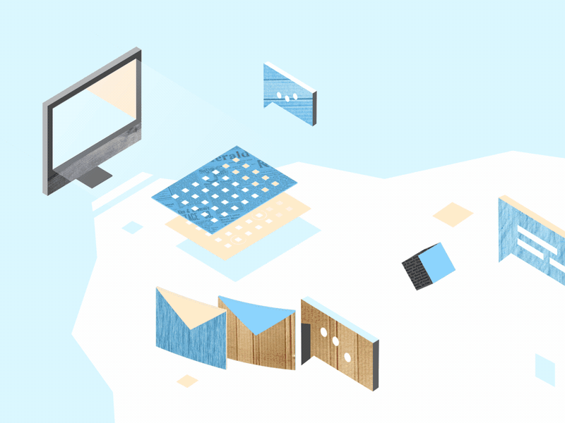
8 Best Examples of Ecommerce Product Video
8 Best Examples of eCommerce Product VideoCreated by Explain NinjaWhy product videos eCommerce should be used to attract users and convert them into loyal customers? How to create it and where to place it? And how do you make videos increase your conversion rate and your site’s visibility on search engines? Get some answers here, but first, let’s understand what eCommerce videos are.Benefits of Video Marketing for Your eCommerce BrandVideo is the most expensive, but also the most effective tool for engaging visitors. Video content is actively used by Amazon, Zappos, Asos, and other e-commerce giants. According to one study, visitors who view videos have an 87% higher conversion rate than those who do not.In practice, this means that the user leaves the website if there is no video on it. Today, visitors to online stores expect not only to be told about the product but also to be shown how it works, etc. Not finding a video review, they leave to look for it on YouTube or Vimeo. Or google it somewhere else.So, product videos in particular are proven to capture your eCommerce customers’ attention and deliver more useful data than any other medium available. That’s because consumers end up staying longer on websites with videos.What is an eCommerce Product Video?An eCommerce video is a video that displays your brand product, shows it in action, and highlights its key features and benefits. Ecommerce video marketing is the best way for consumers to learn more about your brand, products, or services and their benefits, especially if they are not available to view these products in a store or showroom.What is video marketing? This term refers to any kind of video that is used for marketing purposes, i.e. to promote a certain service or product. The brand name, the benefits of your product, the vision — all this is successfully distributed and popularized with the help of explainer videos.How to Implement Product Videos in Your Ecommerce Marketing?To implement your video marketing for eCommerce strategy, get prepared first and stick to a list of tips for a start. Ensure effective video marketing for eCommerce by following at least these 5 tips:1. Context is kingThe contextual ‘how’ or ‘why’ we communicate via our brand and what form that experience takes have become as important as the actual video content being delivered. To produce an effect, context is everything. Context is king. So, do not forget to think it over before you deliver the video and place it.2. Show and tellYour video should contain a clear story that tells your audience what’s what. Of course, visuals go first but do not forget about the meanings. Apply visual storytelling to amaze your viewers.3. Share your storyOr you may let your customers tell it for you. If you produce stories that go viral, your users will spread the information over and over, thus working on you as your brand advocates.4. CustomizeCustomization and personalization are important in order to cater to your target audience with the most up-to-date information 24/7 all year round. Inject some personality but don’t foster FOMO (fear of missing out).5. Include a clear CTAA clear and convincing call to action is a must, so people know how (and where) to buy. Sometimes marketers may forget about the importance of picking the right CTA button or motto for their product videos in eCommerce.11 Best Examples of Ecommerce Product Video MarketingHere you will find the list of the most incredible eCommerce product videos created by the Explain Ninja team for your inspiration. Enjoy it!1. ZalandoeCommerce product video for Zalando:Zalando Lounge2. Duds Onboarding AnimationDuds Onboarding Animation3. ShopsShops4. ShoppingShopping animation5. PsiphonAslan Almukhambetov for Fireart Studio6. Flying cafeCreated by Fireart Studio7. IndemandlyIndemandly explainer video8. Bolt Food — Picked UpOnly shape layers and parenting usedReasons why your business needs an eCommerce Product Video MarketingYou may find about five solid reasons to use video marketing in your business and succeed in no time. Here they are:1. Video improves SEOVideo marketing is the present and future of the online marketing space, making it absolutely essential for every company to make the most of video. Social platforms like Facebook or Instagram love videos.When you upload videos to these platforms, viewers become more engaged and spend more time on the site. This builds trust with visitors and signals to search engines that your site has quality content.Google loves video. If you add engaging and informative videos to your site, they can appear on the first page of the search engine giant. According to statistics, if you embed a video on your site, you are 53% more likely to appear on the first line of Google search results, all other things being equal.2. Mobile apps striveEvery day people are becoming more dependent on smartphones and tablets. A US study by Deloitte found that all Americans check their smartphones 8 billion times a day. As more people check their mobile devices to watch animated videos dozens of times a day, video marketing opportunities are growing.According to Wyzowl, 90% of users watch videos on mobile devices. This means that visitors are more likely to view your brand’s videos and ads on their smartphones. Mobile devices and video go back to back.3. Video boosts conversions & salesThis is one of the main reasons for using video in a content marketing strategy. Videos can turn your visitors into loyal customers.According to a report by Vidyard, 70% of businesses say that video content is more effective than any other form of content for engagement, driving conversions, and sales.4. Videos have a higher ROIThis is another important reason for using video in your marketing strategy. Over 83% of companies say that video delivers a high ROI.There was a time when video production was an expensive and time-consuming creative process, but thanks to the availability of online video creation tools, and professional studios, a lot of bright and spectacular amateur products got their chance to skyrocket.5. Videos form loyaltyVideo is the best way to engage your audience and spark emotions. When we talk about industry experts, YouTubers can be the most powerful social media figure to promote a brand. Make a deal with popular YouTube stars to effectively promote your brand in the digital space.Trust is the basis for the growth and increase in the income of your business. For a brand, building trust is a goal in itself. The whole concept of digital marketing is based on building trust and long-term relationships with potential customers.As a business owner, stop focusing only on sales and let your audience come to your brand by offering useful and interesting information.ConclusionUnderstanding eCommerce marketing video brings success to your marketing. When visitors view a product on an online store card, they are one step away from ordering and paying. It has been proven that users who watch a video about a product buy much more often than those who have not. Therefore, it is essential not only to shoot a good eCommerce video, but also to optimize it. With video, a potential customer can get acquainted with the product and compare it with other products without leaving your online store. Mind that!Originally published at https://explain.ninja.8 Best Examples of Ecommerce Product Video was originally published in Muzli - Design Inspiration on Medium, where people are continuing the conversation by highlighting and responding to this story.

Web & UI Design With AI: Prototyping at the Speed of Thought
The gap between “client description” and “first visual” has always been the most anxiety-inducing part of web design. What if you could close that gap from days to minutes? What if you could show clients not just wireframes, but styled mockups, before you’ve even decided on a color palette? Welcome to AI-powered web design.
Your Web Design AI Toolkit
Uizard ($12-49/month)
Best for: Transforming sketches/text into wireframes
Magic: Upload a napkin sketch → get a digital wireframe
Diagram (Figma Plugin)
Best for: Generating entire UI sections from text
Prompt: “User profile section with avatar, stats, and edit button”
ChatGPT + Claude (For copy & structure)
Best for: Generating sitemaps, user flows, and UX copy
Example: “Write the microcopy for a SaaS pricing page”
Hostinger AI Website Builder / Framer AI
Best for: Complete site generation from a prompt
Best for: Quick client presentations, not final builds
Galileo AI (Focused on UI generation)
Best for: Generating high-fidelity UI from text descriptions
The Complete AI-Enhanced Web Design Process
Phase 1: Discovery → Instant Sitemap & Content
Instead of starting blank:
Client gives you their goals
Prompt to ChatGPT: “Create a sitemap for a boutique fitness studio website. Include: Home, About, Classes, Pricing, Blog, Contact. Suggest 3 unique page ideas that would differentiate them.”
Get structured outline in seconds
Refine with client immediately
Phase 2: Wireframing → From Text to Layout in Minutes
Old way: Draw 3 wireframe options (2-3 hours)AI way:
Option A (Text to Wireframe):“Wireframe for fitness studio homepage: hero with class schedule CTA, 3 featured classes with images, testimonial section, newsletter signup, footer with contact. Mobile-first design.”Feed to Uizard/Diagram → Get 3 wireframe options in 5 minutes
Option B (Sketch to Wireframe):
Sketch rough layout on paper
Photograph, upload to Uizard
Get cleaned-up digital wireframe
Phase 3: Visual Design → Generating Complete Mockups
Now for the magic. Using your wireframe as guide:
For individual sections:
“Design a testimonial section for a fitness website. Clean, modern, with profile photos, quotes, and star ratings. Use colors: #3A86FF (primary), #1A1A2E (dark), #FFFFFF (light).”
Generate multiple styles, pick best, implement in your design tool.
For complete page mockups:
“High-fidelity mockup of a SaaS dashboard for project management. Include: sidebar navigation, main content area with project timeline, team activity feed, quick stats cards. Dark mode, professional, using IBM Plex Sans.”
Use as inspiration, not final deliverable.
The “AI → Figma/Webflow” Bridge
The key is using AI outputs as starting points:
Screenshot the best AI-generated sections
Drag into Figma as reference images
Build over them with actual components from your design system
Replace AI-generated placeholder content with real copy/images
Result: AI-inspired design with your polish and practicality
Advanced: Generating Complete Design Systems
Step 1: Foundation from prompt
“Create a color palette for a mental wellness app. Calm, trustworthy, accessible. Include primary, secondary, accent, and background colors with hex codes.”
Step 2: Components
“Design a button component system for the above app. Include primary, secondary, ghost, and disabled states. With hover and active states.”
Step 3: Typography scale
“Create a typography scale for the app. Include: h1-h6, body, caption, button text. With appropriate line heights and weights for readability.”
Step 4: Spacing system
“8-point spacing system for the app with examples of usage in cards, padding, and margins.”
All generated in 10 minutes. Refine and implement in 1 hour. Traditional process: Half a day.
Real Client Case: Local Restaurant Website Redesign
Old timeline:
Discovery: 2 hours
Wireframes: 4 hours
Client review/revision: 2 hours
Mockups: 8 hours
Total to first visual: 16 hours over 5 days
AI-enhanced timeline:
Day 1, Hour 1:
ChatGPT: “Write a sitemap and content outline for ‘Mario’s Trattoria’ website”
Get: Home, Menu, About, Reservations, Contact, Gallery structure
Client approves immediately
Day 1, Hour 2:
Uizard: Generate 3 wireframe options from text description
Client picks favorite, suggests tweaks
Revised wireframe ready
Day 1, Hour 3-4:
Generate hero section: “Restaurant website hero with food photography, reservation CTA, warm Italian colors”
Generate menu section: “Interactive menu display with categories, descriptions, prices”
Generate 5 more sections similarly
Day 1, Hour 5:
Assemble best AI elements in Figma
Add real content (from client)
Apply consistent styling
Result: Complete homepage mockup in 5 hours, not 16. Client sees vision immediately.
UX Copy & Microcopy Generation
Often overlooked but crucial:
ChatGPT prompt:
“Write UX microcopy for:
Empty state when no reservations are booked
Success message after booking reservation
Error message when payment fails
Tooltip explaining how to modify booking
Tone: Friendly, helpful, professionalBrand voice: Mario’s Trattoria – family-owned, authentic Italian”
Get 20 pieces of perfect copy in 60 seconds.
Accessibility Testing with AI
Use ChatGPT to audit your designs:
“Review this color combination for accessibility: #3A86FF on #1A1A2E. Provide WCAG contrast ratios and suggestions for improvement.”
“Analyze this form design for accessibility issues. [Describe form]. Suggest improvements for screen readers and keyboard navigation.”
Pricing Your AI-Enhanced Web Design
Value-based pricing factors:
Speed of delivery (clients love quick turnarounds)
More options presented (3 mockups instead of 1)
Included copywriting (traditionally extra)
Custom illustrations/textures (premium feature)
Sample project pricing:
Basic 5-page site (traditional): $3,000-5,000
Same site (AI-enhanced, 50% faster): $2,500-4,000
But: Offer “premium” package with AI custom imagery, copy, etc. for $4,000-6,000
You’re not charging less—you’re delivering more value in less time.
Client Communication Strategy
Initial proposal language:
“Using AI-assisted design tools, I can show you multiple design directions faster than traditional methods. This means we spend less time on early concepts and more time perfecting the final design that converts visitors.”
During presentation:
“This mockup incorporates AI-generated elements that I’ve customized for your brand. The layout was generated from our conversation, then I applied my expertise to ensure usability and brand alignment.”
Your AI Web Design Workflow Cheat Sheet
Brief → Sitemap: ChatGPT in 5 min
Sitemap → Wireframes: Uizard/Diagram in 15 min
Wireframes → Section Concepts: AI image generators, 30 min
Concepts → Mockup: Assemble in Figma/XD, 2-3 hours
Polish & Review: Your expertise, 1-2 hours
Content Generation: ChatGPT for copy, AI for images, 30 min
Total for first mockup: 4-5 hours vs. traditional 8-16
Limitations & When NOT to Use AI
Avoid AI for:
Final, pixel-perfect production files
Complex interactions (animations, advanced states)
ADA compliance (use as helper, not validator)
Replacing user research/testing
Best uses:
Ideation and concepting
Generating starting points
Creating presentation materials
Rapid iteration based on feedback
Action Steps
Redesign your own portfolio homepage using this AI workflow
Create a “UI section prompt library” for common elements (headers, footers, cards, forms)
Practice the “AI → Figma” bridge on a dummy project
Update your web design service description to include AI capabilities
You’re not becoming an “AI web designer.” You’re becoming a strategic designer who uses every available tool to deliver better results faster. The AI generates possibilities; your expertise makes them real.
The post Web & UI Design With AI: Prototyping at the Speed of Thought appeared first on Designer Daily: graphic and web design blog.
Ten Common Misconceptions About Graphic Design Busted
Graphic design has come a long way and is an ever-evolving art form. The more it evolves, the more myths appear around it. There are common misconceptions about graphic design that many designers and non-designers believe even today! They may discredit design value, so are better to be busted.Why graphic design is often being misunderstood?The term was first introduced by a famed typographer, illustrator, and book designer William A. Dwiggins in the early 20th century. Dwiggins is the most noted for coining the term ‘Graphic Designer’ back in 1922 which he used in reference to his works and design work style.And the concept of graphic design has grown and changed a lot since the term first appeared in the 1920s. By the end of the 1950s, the term was widely used to describe the creation of visual materials such as posters, print ads, and user-friendly signage, etc.But as technology has changed over time, so has the application of graphic design. Now its use goes far beyond just printed materials, embracing the world of digital reality. With iterations of graphic design like this over the years, it’s no surprise that there are some serious mistakes as to what the term actually refers to. That is why it still remains much spoken and thus, heavily mystified.Mr. Dwiggins, Source: WikiThe greatest graphic design mythsThe graphic design usage area has shifted a lot over the years and has evolved to match the changing technology and user behavior. And yet, these misconceptions still exist, which only spoils the reputation of this exquisite creative work. Let’s talk about the most common and incredible graphic design myths that need to be busted once again.Myth#1 Graphic design is all about brandingIt’s common that a logo is the face of any brand that is designed for the target audience to interact with the brand through it. So it is definitely important that a professional graphic designer produces logos and is keen on branding.Of course, logo branding is one of the important sections of professional graphic design. However, graphic design is about more than just creating designs of brand logos. Limiting logo design to the only thing that forms the basis of the whole graphic design industry is a big mistake.Today graphic design is the art of creating visual content to convey a specific message. Any message. This may be applied to a huge variety of media: be it posters, magazines, album covers, brand presentations, digital marketing infographic, etc.Myth#2 Graphic design is all about fontsThe art of text layout is one of the key elements for creating a beautiful design. However, it’s not just about choosing a font that looks good. You have to think about what type of font is right to communicate your brand, values, and target audience, but typography isn’t the only thing to consider when it comes to graphic design.It’s all about the interaction between text and other elements on the page, including images, graphics, shapes, lines, borders, and white space. To create a powerful design, they all need to work together in perfect synchronicity.Myth#3 Graphics is for printed media onlySo wrong! In the last decades, the world has been almost completely digitalized, the application of graphic design, in fact, is used more on digital platforms than on print media.Website design, social media design, video design, email design, and more are just a few examples that can clearly debunk this graphic design myth. Whether it’s YouTube channel design, email headers, Facebook covers, or blog banners, every web or social media platform uses different graphic designs.Myth#4 Graphic design has nothing to do with motionsGraphic design is no longer limited to regular images or graphics. And video continues to emerge as one of the most powerful advertising media out there.Animation and video are becoming an important part of the graphic design toolbox. This includes GIFs, graphics for YouTube videos, animated infographics, and social media ads with slideshows of images and graphics, etc.Myth#5 Graphic design is all about creating 100% original designsUniqueness is important. It makes your brand stand out from the crowd and outrun the competitors. However, this does not mean that there’s a need to create designs from scratch each time you need typical visuals.Even professional graphic designers create multiple templates to optimize the processes in case they have to create similar assets on a regular basis. It allows them to achieve consistency across all brand materials. That’s normal to use samples.Myth#6 You don’t need to budgetIn fact, this is one of the most misleading graphic design myths. Since graphic design, today has become an essential part of effective branding and marketing for any business, large or small, only experienced designers may understand the nuances and importance of using properly designed graphics. And this is already about the budget as they should be paid up.Moreover, visuals today play a key role in creating a name for a brand and determine the success of a company, both on and off the digital platform. This is why it is also so important to create a graphic design budget for your business.Myth#7 Graphic design is all about beautiful designsOne of the biggest common misconceptions about graphic design is that it simply makes things beautiful or aesthetically pleasing. However, this is not always the case.The design challenge is not always to make the audience think, “Oh, this is beautiful!”The beauty of the design is essentially a pillar that helps grab the attention of potential customers. Sometimes it shocks the viewer, makes them emotion, makes them think, or even makes them react & interact, etc.Myth#8 Graphic design is all about following visual trendsJust like in product design, or any other creative industry, the trends in graphic design come and go quickly. In 2021, it was all about handwritten fonts, pastel colors, and textures or whiteboards. It’s more likely that 2022 will bring a new crop of visuals.The job of graphic designers is to stay conscious but not become the slaves of changeable trends-all good what ends good.Myth#9 You need to be talented to do graphic designIt’s common that the majority of graphic designers are people with a nice taste, and visual flair, which is why they gravitate towards this field. However, you don’t have to be a born creator to make up effective designs. Like any other activity, graphic design is a skill that can be mastered.It’s not just about feeling or seeing something unique and magically bringing it to life. Graphic design is not only about art but about science. There is a method and technique for this that begins with an awareness of the various elements that make up a powerful and effective design. Talent is not a guarantee and you have to learn a lot to polish your skills.Myth#10 Graphic designers know everythingThe truth is that they are not prophets of your brand vision or business goals. It must be understood that for a design project to be successful, there must be utmost clarity between the designer and the client.It is essential that you, as a client, be clear about your vision and expectations from collaboration. Providing a detailed brief and communication from both sides will provide a common vision of the concept, eliminate misunderstandings and increase chances for success with minimum iterations.Along with these graphic severe design myths, some myths are just ridiculous but also need to be destroyed. These may include (but are not limited to): Graphic design being very EASY, Graphic design making your business strive and really fast, editing and fixing the design being a snap, or calling anyone with basic Photoshop skills or similar — a professional designer, etc.To Sum UpNow you’ve reminded some of the most common graphic design myths. They have been around for a long time in the industry and must be debunked at all costs. While some may sound funny, all of these myths can have serious consequences if left unchecked by the clients before hiring the teams. Professionals may explain all the nuances to eliminate misconceptions of what does myth fulfill in graphic design.You too have been a victim of some of these misconceptions until now? In that case, we hope you will learn to divide between reality and fiction in terms of designs and act according to your practical graphic design projects with exceptional realism.Illustrated by Fireart StudioOriginally published at https://explain.ninja.Ten Common Misconceptions About Graphic Design Busted was originally published in Muzli - Design Inspiration on Medium, where people are continuing the conversation by highlighting and responding to this story.

How to Boost a Low Conversion Rate
If you want your website to be successful, you need it to have a reasonably high conversion rate. Otherwise, all the traffic in the world won’t be enough to provide you with meaningful revenue.
So what are your options if you currently have a low or nonexistent conversion rate? How can you build it up to be sustainable?
Diagnosing the Issues
You probably won’t be in a position to boost your low conversion rate until you understand why it’s low in the first place. In other words, you need to diagnose the issues that are in play before you attempt to fix those issues.
This can be challenging, as the issues with your conversion rate probably arose from deliberate strategies and tactics that you thought would make your conversion rate higher, or at least acceptable. You may or may not have an intuition for what the problems with your conversion rate are, but in either case, it’s a good idea to work with outside experts, or at least boost your own knowledge, before proceeding.
One option is to find a fractional CMO. A fractional CMO is similar to a traditional CMO in terms of experience and capabilities, but they work on a much more flexible, part-time basis. These marketing professionals can help compensate for your blind spots and introduce you to concepts you may not have considered.
In most cases, a low conversion rate is a byproduct of one or more of the following:
· The offer. In most scenarios, a conversion is some kind of an exchange. You’ll make an offer, and you’ll need people to accept that offer if you want them to convert. For example, if you’re selling a product, you’ll need to convince people that it’s worth whatever you’re charging for it. If you’re simply interested in having people fill out a form, you’ll typically need to give them something in exchange for providing their contact information, such as a piece of premium content. If your offer isn’t sufficiently compelling, your conversion rate is going to suffer. Start the analysis here to make sure the balance is optimal.
· Web design. Low conversion rates are sometimes a byproduct of poor web design. If your website is unappealing, if it doesn’t accurately reflect your brand, or if it creates confusion about how to go through the conversion process, it’s going to fail. There are many schools of thought when it comes to web design and best practices for conversion, but there are some clear fundamentals that you can iron out before digging into these nuances.
· Web functionality. The functionality of your website also matters. You need to make sure that people can get to your website, navigate it quickly and reliably, and complete your conversion process with no errors or bugs. If your website doesn’t work correctly, you won’t have an ideal conversion rate.
· Audience targeting. You also need to think about audience targeting. A nearly perfect landing page for one demographic might have no discernible effect on another. The better you understand who your target demographics are and how they think, the more effectively you’ll be able to create persuasive messaging for them. You can’t hope for a good conversion rate if you’re trying to appeal to the masses.
· Lead quality. Along similar lines, you need to make sure that your web traffic is optimized for success and that you have genuinely high-quality leads. Building a lead funnel can set you up for success, helping you filter out people who aren’t necessarily interested in products like yours.
Fixing the Problems
Once you’ve identified the biggest problems responsible for your low conversion rate, you will be in an excellent position to begin fixing them.
· Collaborate. Try to collaborate with other people in your marketing department to come up with ideas for how to improve things like design, copywriting, and your central offer.
· Brainstorm. With creative brainstorming, you and your team can generate unique ideas for how to make your web presence stand out, and how to better appeal to your target demographics. Many minds working together can reduce blind spots and come up with more creative ideas.
· Review successful examples. You may also want to review examples of successful landing pages and other conversion opportunities. They might give you the inspiration you need to push forward.
Testing and Refinement
There’s no such thing as a perfect conversion rate, as there are always opportunities for improvement and refinement. Use AB testing and other forms of experimentation to figure out which elements are going to work best for your customers.
The most important principles to remember when testing your new tactics are:
· Try bold new things. Experimentation is your time to try bold new strategies, so don’t get too complacent – or restrict yourself to only attempting mainstream, familiar ideas. Don’t be afraid to go against the grain.
· Introduce one variable at a time. When testing a new variation, consider introducing only a single variable as the difference between your “A” and “B” sample. This way, you’ll be able to pinpoint exactly why one version is performing better than the other.
· Compare apples to apples. As much as possible, you need to compare “apples to apples.” If you test two different versions of your landing page with different traffic sets or under different conditions (like at different times of the day), you’ll introduce more variables that can compromise the reliability of your experiment.
· Figure out the “why.” Don’t just settle for the fact that one version is better than another; try to conceptualize why that version is better. For example, why do people like the brighter colors? This can help you generate new ideas to push your conversion rate higher.
· Gradually build a better system. Experimentation is an ongoing process, so keep pushing your conversion rate higher with gradual adjustments.
A low conversion rate isn’t a death sentence, even if your business is struggling. If you’re willing to analyze the issues with your web presence, and work through those issues proactively, you can push your conversion rate closer to where you want it to be.
Featured Image by Carlos Muza on Unsplash
The post How to Boost a Low Conversion Rate appeared first on noupe.

The Power of Microinteractions: How to Create Small Moments of Delight in Your Products
In today’s digital world, products don’t just have to function well — they also need to delight and engage users. One way designers achieve this is through microinteractions.What are Microinteractions?Microinteractions are small, functional user interfaces that aim to make a product more usable and enjoyable. They provide feedback, guide users, and add moments of surprise and delight.Some examples of microinteractions include:Animated loading spinners that indicate a task is in progressHover effects or animations that respond to cursor movementsSwipe or scroll based gestures to reveal hidden menusTap and hold buttons that display expanded optionsNotifications and alerts that provide feedback on actionsMicrointeractions often operate in just 1–4 seconds, but small moments like these have an outsized impact on the user experience.The Importance of MicrointeractionsMicrointeractions may seem minor, but thoughtfully designed ones have an outsized positive impact on user experience in the following ways:Providing FeedbackSimple loading animations, sounds, and confirmation messages provide closure that an action is occurring, reducing user anxiety and frustration.For example:Slack’s unobtrusive “sending…” text and animation next to a message reassures users their message is on the way without needing to interrupt workflow.One study by NNGroup found that just displaying page load progress reduced anxiety by 27% compared to static wait screens.Guiding UsersSubtle UI elements like search suggestions, non-intrusive coach marks, and animated cues guide users to complete tasks more efficiently.Autogenerated tooltips can anticipate points of confusion and provide helper text. Research by Userlane found adding tooltips to software products reduced support queries by over 20%.Animated cues help direct attention. Eye tracking studies show animated cues increased desired action conversion rates by over 200% compared to static UI text.Reinforcing BrandingPlayful animations, mascots, and pleasing sounds that match brand personality differentiate products and create emotional connections.For example, Mailchimp’s animated chimp mascot Freddie brings a fun, playful tone aligned with the email service’s friendly identity.Research shows interfaces with brand-congruent microinteractions rate over 35% higher in likeability.Increasing Perceived SpeedMotion and activity during waits deceives the mind and increases perceived speed. This improves subjective experience of slower processes.One Nielsen Norman Group study found that just displaying a simple progress spinner animation reduced perceived wait time by 34%.Improving UsabilitySmall optimizations like tabs reordering based on usage and reminder prompts tailored to user context streamline workflows.A Microsoft study found that adaptive “micro-personalization” optimizations to menus and flows reduced the need for manual customization by over 70%.Creating DelightIncorporating unexpected moments of surprise and whimsy adds an element of joy to otherwise mundane interactions.When ATM startup Umpqua Bank installed a digital dog that returns forgotten ATM cards, they saw transaction times increase by 23% due to increased engagement.Overall, research by Devumi indicates microinteractions can increase user engagement by up to 40%. When designed intentionally, microinteractions have an outsized impact on product experience.Types of MicrointeractionsMicrointeractions serve a range of purposes. Common types include:Feedback MicrointeractionsLoading indicators — Animated spinners, progress bars and meters visually signal ongoing processes.Confirmation animations — Checkmarks, swirls, fades or sounds confirm success like form submission or file deletion.Error notifications — Shakes, bounces or noises notify of errors requiring user action.Status indicators — Dots, bars and timers show states like volume levels or connectivity strength.Real-time highlights — Bolding, underlining or coloring text as it’s typed improves legibility.Transition MicrointeractionsScreen transitions — Motion between views maintains context. Fades, slides and swipes show relationships.Expand/collapse — Elements like accordions gracefully open and close to hide and reveal content.Carousels — Content rotates through like a slideshow, often revealing additional details.Loading sequences — Multi-step progress indicators display complex workflows.Animated sorting — Lists reorganize with animated sorting to maintain item relationships.Notification MicrointeractionsPush notifications — External alerts about new messages, events or activities.Status bar alerts — Icons and numbers in status bars signal alerts and updates.Feed updates — Real-time feed notifications about social activity.Milestone markers — Popups, sounds or animations celebrate achievements like task completions.Reminders — Time or location-based reminders of pending actions.Instructional MicrointeractionsTooltips — Contextual helper text explains features on hover or click.Coach marks — Spotlights, arrows and overlays walk users through workflows.Videos and GIFs — Embedded media guides complex processes.Interactive tutorials — Prompts within the live interface introduce functionality.Lifecycle tips — Popup suggestions optimize and educate at key moments.Response MicrointeractionsHover reactions — Elements highlight, enlarge and transform on hover for discovery.Click animations — Buttons depress, swell and change color when pressed.Scroll effects — Reveals, parallax motions and sticky elements respond to scrolling.Drag gestures — Draggable objects tilt, stretch and move in response to dragging.Seasonal/timed — Interfaces change for holidays, time of day or upcoming events.Delight MicrointeractionsHidden Easter eggs — Secret interactions and whimsical surprises reward discovery.Success confetti/fireworks — Celebrate achievements and milestones with flair.Playful error messages — Add humor and wit to soften errors.Fun loading text — Waits are spiced up with entertaining messages.Seasonal themes — Visually transforming interfaces for events and holidays.Thoughtfully chosen microinteractions tailored to goals can dramatically improve usability while delighting users. Small flourishes make a big experiential difference.Microinteraction Design TipsCrafting excellent microinteractions requires thoughtfulness and restraint. Here are some key tips:Have a clear purposeEvery microinteraction should serve a specific goal like providing feedback, reinforcing branding, or guiding users. Lacking purpose results in superfluous interactions.For example, an animated loading spinner reassures that a task is in progress.Use subtle animationAnimation grabs attention, but too much movement can overwhelm users. Craft subtle flourishes.Apple’s unobtrusive pinch-to-zoom animation transitions smoothly without overpowering screen content.Leverage sound and hapticsSound effects or vibrations when actions occur enhances feedback. But use judiciously to avoid annoyance.Facebook’s simple “tada!” sound when making a new friend adds positivity.React in real timeInteractions should respond instantly to input like button presses for best results. Laggy feedback frustrates users.Google Docs’ collaborator presence indicators light up immediately when co-editors join a doc.Customize interactionsTailor animations and microeffects to match context for relevance. For example, a finance app could use coin animations.Local context also matters. Adapt date formats, currencies and units.Be consistentMaintain cohesive interactions and styles across the product for clear associations and harmony.Apple’s loaders, prompts and warnings feature consistent brand aesthetics.Prioritize utilityAvoid superfluous interactions that provide no real utility. Too many gimmicks fatigue users.Focus microinteractions on enhancing core tasks. Extras can come later.Test and iterateSeek user feedback on interactions through usability testing and observations. Refine interactions based on learnings.A/B test new microinteractions against old to quantify impact.By following UX best practices, microinteractions can be designed to provide added value without distraction.Microinteractions in ActionLeading digital products integrate microinteractions throughout their interfaces to make interactions intuitive, engaging, and fun. Some examples:UberThe app’s animated map pin elegantly drops down on your pickup location, immediately orienting you to where you’ll be picked up without effort.Smoothly sliding the bar to hail a ride elicits a sense of speed. According to Uber, this increased conversions by 9%.Vibrating feedback when a car is approaching gives assurance even before you look at the screen.SlackSlack injects its playful brand personality into interactions. If you make a mistake like trying to send an empty message, the UI bounces in a silly way.The satisfying “knocking” sound when new messages arrive gives a sense of realism. User tests found it made Slack feel more welcoming.Status indicators like “Suni is typing…” hype upcoming responses with anticipation-building animations.InstagramCreative tools like Boomerang which makes mini looping videos and Super-Zoom add a fun twist to Stories.90% of Instagram users interact with Stories, in part driven by whimsical AR effects like face filters.Prompt animations for reactions and questions keep users engaged as they peruse Stories.WhatsAppCustom contact chat colors create a sense of identity. Users have a color unique to each contact thread.Subtle visual flourishes like animated status indicators and chat checkmarks increase perceived responsiveness.WhatsApp kept interactions lean yet engaging. 95% of its actions are achieved in just one to three taps.PinterestScrolling reveals clever animations. Boards expand in a cascading tile effect and search bars slide up from the bottom.Pinners engage heavily with microinteractions like animated hearts when saving Pins. This sparks delight while providing feedback.Pinterest created a custom haptic engine for iPhone to deliver uniquely branded vibrations for reactions.As these examples show, integrating microinteractions tailored to brand and experience can transform products from merely functional to truly delightful.These and countless other examples demonstrate how microinteractions elevate products beyond basic utility, creating interfaces that users actively enjoy engaging with.By thoughtfully incorporating microinteractions, designers can craft interfaces that are not just functional, but also memorable, delightful, and human. Small details make a big difference.The Power of Microinteractions: How to Create Small Moments of Delight in Your Products was originally published in Muzli - Design Inspiration on Medium, where people are continuing the conversation by highlighting and responding to this story.

How to Make a Superb Multilingual Website
To answer the question “What is a multilingual website?” — it’s a website with content in different languages. Multiregional websites cater to more than one country or geographic region. It’s challenging to make your website multilingual, especially if you have little to no experience in the area.We’ve collected best practices for developing multilingual and multiregional website development to make it simpler.Multilingual user experienceStart with translationIs expanding to new countries and regions the next step for your business? It’s likely that your website content was originally written in one or maximum two languages. This chapter answers the “How to translate a website into another language?” question.Source: public domainYou could hire a professional to translate your website content. But depending on the target language and the amount of content, this can be a rather expensive endeavor. Still, a professional translator will be able to adapt your website not only in terms of language but also in terms of culture, catering it more to the needs of your new target audience.Although creating multilingual websites using Google Translate is considered faux pas, opting for machine translation, does prove to be cheaper and faster than the other alternatives.Many multiple language websites turn to software-as-a-service translation solutions that offer a variety of web and mobile localization services. Let’s look at the specific examples of companies that apply best practices for website localization.LocalizeSource: Localizejs.comLocalize offers a variety of translation tools for translating websites and web applications, backend elements (emails, SMS messages, notifications, etc.), and iOS, Android, and hybrid mobile applications in more than 80 language pairs. They also offer technology for translating uploaded files in CSV, YAML, XML, and other formats.Localize features include:a translation dashboard with intuitive reporting, custom HTML and CSS, and file and content hosting;tools for automation, including automatic content and language detection, plug-and-play integrations, and search engine optimization;translation tools such as an in-context editor, a glossary, and a style guide;tools for team collaboration with support for different user roles and permissions;on-demand human translation from the platform’s partners;client support and consultation;privacy and security, including network security, input control, two-factor authentication, and an activity stream;BablicCapSource: Bablic.comBablic is an online service for website translation. It offers comprehensive translations via a simple process, which you can test within the 14-day free trial:log into the platform;type in your website’s URL;select the source and target languages;сhoose the language selector. You can go with labels (English, Deutsch), short code (EN, DE), or flags (which we don’t advise, but more on that later);сhoose the translation type. There are options for selecting manually editable machine translation, manually editable professional translation, and pure manual translation.Your website is then converted in Bablic’s visual editor where you can view the interface as it would be seen on desktop computers, tablets, and smartphones and manually edit each website element as necessary.CrowdinSource: Crowdin.comCrowdin is a web-based SaaS tool for localizing desktop software, mobile apps, websites, web applications, documents, video games, and video content. The three main services that Crowdin provides are management and organization, localization for developers, and translation and proofreading.management and organization constitutes a set of features for taking care of translation files and teams. It also offers analytical reports and automated budget calculations;localization for developers is a set of features for integrating translation into the development process. Crowdin offers a free open-source command line interface, a RESTful API, and a number of supporting plugins and integrations;translation and proofreading is a service that automates and simplifies the translation process. Crowdin’s online editor offers collaboration features, translation integrity, machine translation engines, translation memory, glossaries, and many other tools;TransifexSource: Transifex.comTransifex offers a collection of tools and features for comfortable and high-quality content and software localization. They offer:file and content hosting. Supporting over 25 different file formats, Transifex allows you to prioritize content for translation and track changes within files;team management and collaboration. This feature allows you to comfortably manage teams, including organizing people into teams and controlling their roles and permissions;translation tools. Transifex’s comprehensive translation editor allows you to comfortably search through files, perform translation checks, and keep count of translated characters. Transifex also offers a translation memory feature, the ability to upload visual content and translate video subtitles, HTML and variable placeholders, a glossary, and a style guide;translation workflow management. A feature for setting up advanced translation workflows lets you control and fine-tune translation workflows of any complexity. It also offers an ability to set up translation crowdsourcing;detailed insights and analytical reporting. The translation dashboard offers insights on the overall progress of translation projects. You can view a list of languages for which translation has been completed, languages waiting for translation, and issues waiting to be resolved.SmartlingSource: Smartling.comSmartling is a translation management platform for localizing websites, digital content, mobile applications, documents, customer support content, marketing content, audio, video, and so on. Their solutions include a translation management system, a global delivery network, and a number of collectors and translation services.the Smartling translation management system allows you to capture, organize, and spread translated content across an entire organization. Users can see a visual representation of translated content in real-time, manage translation tasks and processes, and create fully customized workflows. Translation memory allows you to centralize, reuse, and share translations. Vendor management allows you to control and organize translation agencies, freelancers, and other people involved in the process. Cloud-based computer-assisted translation offers a comprehensive set of tools for quick and comfortable translation. A system of reports and analytics allows you to analyze each translation process step-by-step to increase quality and productivity;a translation proxy helps with automating the process of translating websites, web apps, and web services. It offers simple content extraction through scheduled content crawls, context visualisation, efficient translation processes, content control and delivery, and information security;translation connectors allow for integrating Smartling’s services with a variety of content management, marketing automation, eCommerce, code repository, and customer support platforms.POEditorSource: Poeditor.comPOEditor is a comfortable localization management platform for software translation. Currently it supports 15 file formats, but POEditor is constantly working on widening their horizons. Among the features offered by POEditor are:a REST API for automating localization workflowsintegration with version control systems including GitHub, Bitbucket, GitLab, and VSTS for file management optimizationintegration with HipChat and Slack for live communication and reporting on translation processescrowdsourced translation for community-based translationsdetailed statistics for detailed reports on translation activitytranslation memory for the ability to reuse translated textsreal-time translation updates to increase the overall efficiency of translation collaborationthe ability to access human translation services directly within the platformmachine translation services based on translation engines from Google and MicrosoftThink about navigationThe most important part of multilingual design is comfortable language navigation. And although it’s likely that your website will detect the user’s language automatically, translating content based on geographic location, there should still be an option to manually change website language.Drop-down or a separate page?We suggest the usual types of language navigation as most users are already comfortable with them.A drop-down menu is the most common option. It’s a button that, when clicked, reveals a list of languages that users can scroll through and select from. Here’s an example from Airbnb.com:Source: Airbnb.comThe language drop-down is accessed by clicking on the Language and currencybutton in the bottom right corner. Once opened, it reveals two drop-downs: one for language and one for currency. Offering a choice of both language and currency is common for marketplaces.International websites also often use drop-down menus without scrolling, like on Booking.com:Source: Booking.comThe language selector is, again, next to the currency selector, and is marked with a flag. It first displays a list of the languages most common in the user’s geographic area, then lists all available languages.A similar option is to start with a list of regions as opposed to languages. Here’s an example from the Fujitsu Global website:Source: Fujitsu.comThis is an option for businesses whose services vary from market to market, since it redirects users to country-specific pages with unique experiences that are relevant to particular countries.A similar approach could also be implemented with a separate page for country selection. This is how Nintendo does it:Source: Nintendo.comNintendo’s region page offers an extensive list of countries and regions, helping users comfortably find relevant content.Next, we discuss how to represent languages and countries for website language navigation.Flags or words?It’s considered bad taste when multilingual websites use flags for language navigation. Since flags represent countries, not languages, they can complicate language selection especially in cases where the website is targeted at a country with two or more official languages. If you still want to use flags though, avoid something like this:Source: British-airways.esky.comAnd opt for a variant with languages or country names written out:Source: Nike.comBeware of Left-to-Right and Right-to-Left differencesSome languages are written and read from left to right (LTR) and some from right to left (RTL). A multilingual site that deals with markets that use RTL languages should be adapted to the peculiarities of RTL languages.Source: Facebook.comHere’s a summary of our article about RTL design specifics. If you’d like to read the whole piece, you can find it here: Right-to-Left (RTL) Website Development: Tips & Tricks.Typography. Be careful with the fonts you choose for ornamental scripts. We recommend Noto fonts, as this is what Google recommends. If you want to use a different font, make sure you resize it to preserve legibility since traditional Latin typefaces tend not to fit RTL properly. Also, avoid italicized and bold fonts as they decrease the readability of RTL scripts.Numerals. The majority of Arab countries use Western Arabic numerals. However, Iran, Afghanistan, parts of Egypt and Sudan, and some other countries use Eastern Arabic numerals. In order to make your website comfortable for a variety of people, make sure that users see numbers they’re comfortable with.Icons. When choosing icons for Arabic interfaces:mirror icons with explicit directions and icons depicting movement or text direction.don’t mirror symmetrical icons, icons with an explicit purpose, and icons depicting English characters, but do localize them.pay attention to the cultural implications of icons (consider not using piggy banks to represent thriftiness, etc.)Read also: SteelKiwi’s article on Smashing Magazine about Right-to-Left Development in Mobile DesignApart from icons, you should also mirror the interface, logos and navigation buttons, form fields, breadcrumbs, media players, dates, calendars, and tables to fit RTL design.Make adaptive UI elementsThe size of words can shrink and expand depending on the language. For a multilingual website, it’s important that no matter the language, there’s enough space for the words. Take a look at this example from Adidas:Source: Adidas.comIf it wasn’t for designers’ careful planning, the search box would be all over the place, moving to the right and to the left depending on the word size.Remember about encoding and fontsUse UTF-8 encoding to make sure that special characters are displayed properly regardless of the language. This is achieved by placingin the page header. This will not only make sure languages are displayed properly but will also support several languages on a page at once.When it comes to fonts, there are ones that support Latin scripts but don’t support Cyrillic scripts just as there are ones that work perfectly for Latin and Cyrillic scripts yet don’t support RTL or Asian languages. You can refer to Google Fonts in order to choose appropriate free typefaces for your website.Source: Fonts.google.comChoose appropriate URLsA website URL contains important information about the site’s content. Not only does it clue users to what sort of information they might find there, it can also show which country the website is targeted to (for instance, by indicating a German website with the .de top-level domain). Apart from being informative, URLs help search engines improve search results by displaying pages relevant to a particular region first.For the purposes of multilingual websites, it’s better to go with a country-code top-level domain name (ccTLD), as they’re a strong indication that the website is designed for a specific country. This way the version of your website for the Japanese market won’t show up in the US. However, ccTLDs are often unavailable and tend to be more expensive than other domain types.There are two options you can go for instead, combining a generic top-level domain name (gTLD) with either a subdomain or a subdirectory.gTLD + subdomain: uk.website-name.netThis will make it clear to search engines that the website is targeted at the UK, but users might have a hard time understanding that the URL goes to a version of the website in English.gTLD + subdirectory: website-name.org/jpUsually subdirectories help structure content, but if you include a country indicator, they can also show search engines that the website is targeted at a specific country (in this case, Japan). This is a great option as you can set not only the country but also the language, which is convenient for countries with two or more official tongues:- website-name.com/ca-en/ for the English version of a Canadian website- website-name.com/ca-fr/ for the French version of a Canadian websiteDon’t duplicate contentIt’s often the case that websites in the same language are targeted at different countries, and hence need to have separate pages. So a company working with the US, Australia, and New Zealand can have three separate pages for these countries but they would all be in English, as it’s the primary language spoken in all three. Search engines would treat this as content duplication unless you specify that each page is for a specific country. This is how that looks in code:Search engines would treat this as content duplication unless you specify that each page is for a specific country. This is how that looks in code:The first link indicates content in German for Germany, the second for Austria, and the third for Switzerland. Once search engines see these indications, they no longer consider your website to be duplicating content and won’t penalize it.Offer multilingual customer serviceIf your website’s users run into issues, they’ll likely want to talk to customer service. And it’s only natural that they expect customer service representatives to understand them given that they can view your website in their native language.Source: public domainIt could be a nuisance, however, to hire employees who speak several languages. This might not be so much of an issue for large companies, but it’s a real issue for startups.What you could go for instead is a functional intelligent chatbot. They’ve proven useful in a variety of industries and can do a great deal when it comes to solving your customers’ issues. If you would like to learn more, read our article about the benefits of chatbot technology.Finally, don’t forgetThere are a couple of smaller yet very important things to keep in mind when creating a website for more than one language.Dates, time zones and orthographyDate and time formats aren’t the same everywhere. While the US and Commonwealth of Nations countries use 12-hour time, the rest of the world uses 24-hour time. And although most people understand both formats, you should use the country-appropriate time format to create a more personalized experience.When it comes to dates, it’s better to have them formatted according to each country’s official standards. If a date is written 2/5/2018, a US user will understand it as the 5th of April, while for a European it would be the 2nd of May. You can find the full list of day/month/year formats by country here.Keep in mind that your website’s users might need to communicate not only across borders, but also across different time zones. Consider this during both design and development.As for orthography, you’ll have to look into the specifics of each country and language. One example is how decimal places are separated: with a dot in the US (28.3) and a comma in Europe (28,3).CaptchasGo for numeric captchas as they can be understood universally, regardless of the website language.Source: public domainPhone numbersAdding country codes to phone numbers makes for a more pleasant experience. You can find a list of all country codes here.Develop a multilingual website with SteelKiwiMultilingual website development is complex and involves following many rules. And the more languages, the more rules there are to follow. We have a lot of experience developing multilingual and multiregional products — everything from websites to mobile applications, including:Automated employment and payment platform JobMatchItSnaapy, a promotional mobile application with ERP features SnaapyRadonmeters — CRM and ERP for an online service that provides full-cycle indoor radon measurementPossio, a GPS-enabled solution for ensuring vehicle safety in Europe and the United StatesIf you’re looking for a top-quality service provider to develop a functional and beautiful multilingual product, contact one of our sales representatives and we’ll start working on your project today.How to Make a Superb Multilingual Website was originally published in Muzli - Design Inspiration on Medium, where people are continuing the conversation by highlighting and responding to this story.
UX/UI Design Trends for 2026 — From AI to XR to Vibe Creation
UX/UI Design Trends for 2026 — From AI to XR to Vibe CreationWe saw a bunch of new UX/UI design trends emerge thanks to the AI bubble, new technology in the field of mix reality, unexpected design tool updates, and more.UX/UI Design Trends for 20261. Mixed Reality In The Day-To-DayIn October, we saw Mark Zuckerberg embarrass himself on stage when the demo of the RayBan Meta Display glasses backfired. However, the demo aside, this new device imploded the mixed reality trend. This launch helped other alternatives (which are cheaper) to get the limelight they needed.Samsung Galaxy XR in actionThis combined with the launch of Samsung’s Galaxy XR headset (which is half the price of Apple’s Vision Pro) really shows the amount of money that companies are pouring into this field. On the plus side, designers get better opportunities in the space of XR or MR design.Meta Neural Band — GesturesAs a designer, it’s exciting to see new modes of interacting with the Meta Neural Band which allows you to control your device with unique gestures — pinch and twist to zoom, double tap your fingers to select, and more.This also gives rise to a new type of interface design — VBIs, which is short for Vision Based Interfaces. This includes eye tracking, facial expression analysis, head movement tracking, gesture controls, and more. This means an almost hands free experience is viable in the future.Learning how interface design can blend with real world experiences will be crucial since that is where the next tech is headed. We’re seeing more of these floating displays entering the real world, so learning this before they truly blow up will be the next step. Here’s a guide I found that might help you — https://krystianzun.gumroad.com/l/xrdesignroadmap.2. Voice Based Interface DesignVoice has recently blown up in a major way with AI software using voice based interfaces and voice based interactions. So, instead of typing in, you are conversing with the software to ask for answers or request an on screen action.Gemini Live — voice based interactionsA great example of this is Google Gemini’s live voice assistant which allows users to point their camera onto anything and ask questions based on this. Here computer vision is in full display with voice being that main mode of interaction. We see such an interaction in most major AI apps including ChatGPT, Claude, Perplexity and others following along.We also see voice based interfaces playing a major role in wearable technologies, where typing or gestures become difficult to carry out. I’m sure you’ve seen people on their Apple watches or Android smart devices asking the device to do something through voice commands.Apple HomepodThe same interaction carries over to smart home assistance (Alexa comes to mind), smart home devices, and even AI standalone gadgets.The industry is catching up with voice technologies, and so are software companies creating new tools to make this happen. As designers you can try out Protopie’s voice prototyping features — https://www.protopie.io/learn/docs/voice-prototyping/getting-started.3. Glass is Here To Stay (Other Materials Too)I have Apple to blame for this. Ever since the launch of liquid glass with iOS 26 and its counterparts, every company has been following this trend. I believe it is due to its aesthetic appeal and interesting effect that this design trend has truly been hyped up.Microsoft app icon update 2025This trend has trickled down to other areas of design — graphics, visuals, iconography, etc. Microsoft’s new app icon designs are a major change to brand’s look. This implements 3D materials like glass, metal, and more.The same goes for Apple’s new app icon update — more glassy and shiny than before, truly leaning into the liquid glass effect.Such trends aregiven a boost if the software used to design them follow along. Figma launched a glass effect update that solidified that designers love using this effect. I’ve also observed major websites slowly implement glass style backgrounds, buttons, and cards.Figma glass effect update4. Motion Takes a Big LeapMotion design is more accessible and easy to implement today than ever before. With tools like LottieFiles Creator, LottieLabs and even Rive taking the front seat.I recently spoke to someone from LottieFiles who showed me a mind blowing update. Lottie animations can now respond to user input and can have their own functionality! So if a user selects one option out of many, an animation can be played based on conditions, without any external code required. It’s called state machine, and you must try it out here.LottieFiles state machinesAt the same time, tools like LottieLabs have brought forth a Figma plugin that converts your UI elements into an animated Lottie sequence with AI — called Magic Animator.We also see advance animations in tools like Rive, that allow non motion designers to create something unique with ease. Rive, just like LottieFiles, allows designers to add interactions without code. It’s simple to add hover or pressed animations which can be embedded or added to other no-code tools like Webflow or Framer.5. War of The AI BrowsersA lot of browser companies have shifted their focus towards AI based or agent based browsing, where the users ask the agent to find something or do a certain task, and the browser does it for them in real time.ChatGPT Atlas browserNow, why is the important for UX/UI designers? Designers used to focus on the business and users only, but with the rising era of AI agents and browsers, they will also have to focus on Agentic UX. This means that we will be creating experiences for AI systems and agents as well, looking at how these agents interact with websites and apps. Many different companies including Perplexity, OpenAI, The Browser Companies, and others.Some companies might even ask designers to build unique experiences for AI platforms like ChatGPT or Gemini. A great example of this is Apps in Chatgpt, a major update to ChatGPT that allows third party companies to launch mini apps inside ChatGPT.ChatGPT AppsWe now see AI trickling into all different facets of user experiences, hence designers with specialized skills will be more valuable for these companies.6. Morphing is The New ScrollingWhile cool scroll animations and parallax effects still blow me away. As a designer I’m always looking for the next thing. Recently, a lot of different mainstream websites are moving to a morphing effect between each section of their land page.Case in point Meta Rayban website:Scroll animations on Meta’s websiteHere is another great example of this:7. 100% Height on EverythingThe theme of most websites these days is immersive. We’re seeing more websites embrace full height images and videos, along with text placed at the top and bottom of each section to add to the immersion.Apple Airpods websiteSince the product or service is at the center of these websites, you will also observe bottom aligned titles and text based feature sections.When I was starting out, designers tried to stuff in as much into one scroll as possible, however designers are become risk takers! The bottom aligned title or navigation used to be very “aesthetic” and niche, but it’s more common today.This comes after years of data and research showing how immersive experiences and videos work better than static content, and designers have leaned into it for sure.8. Moving Away From The Term “UX Design”This year we saw major companies like Duolingo and Shopify got rid of the tag of UX design and replaced it with designer and content designers are now called writers.This sparked a huge debate because this causes confusion and makes it hard to differentiate between specialties. On the other hand, some people liked this decision since UX is often confused with UI or visual design decisions, so this would possibly remove that confusion.What these companies have tried to explain is that tools and AI have helped bridge the gap between design skills, i.e. UI designers can now do UX design, UX designers can now build coded prototypes, and content designers can now do UX copy, and the list just goes on. While I do agree with this a little, the value of specialized skills in creative fields can not be replaced with a common title, nor is the effort that each designer bring to the project.Duolingo took a better approach than ShopifyThis does open up a huge plethora of questions that designers have when it comes to starting a career in UX design. Only adding to the weird identity crisis that designers with unique skills usually have.Now, it’s still uncertain what effect this will have on the creative job market, but if enough companies follow suite, we may soon have completely new standards for what design truly means to employers. Stay tuned for more updates like this by following me!Read a detailed article I wrote on this controversy here.9. AI Based Design As a Career PathThe number of jobs that now have “AI” in the title is crazy. I often stumble across job posts where companies want either “AI enabled” designers or specifically AI designers for tasks related to AI only.This image above is just a small segment from a random Google search I did. These are either looking for designers for AI products, which makes a lot of sense. The other posts are about designers who can use AI tools to create designs.Personally I wouldn’t want to be a designer who just uses AI tools to churn out designs or content all day. However, if the future follows what’s happened in the past, most designers will have to find a balance and use both at the same time.10. Custom Cursors Are Back?I remember a time when using custom cursors was considered a sin in the web design industry. This was due to some of these cursors being distracting and harmful to usability, they’ve recently made a solid comeback to landing pages.From the iconic Figma cursors designed for collaboration and teams, to animated circular cursors, there are really no limits.Custom cursor feature in FramerThanks to tools like Framer, cursors are now more than ways to navigate a website, but they can often display extra content like images or videos over hover and indicate what you’re interacting with. A great example of this is how cursors change to a play button when hovering over a playable video.I would say these cursors are definitely reserved for more stylized or creativity first websites, as compared to more functional or more product focused websites.11. The End of The Dark PatternDark patterns have been a staple in the UX design field for years now. Marketers use it, UX and web designers use it, and businesses encourage it. However, there have been some major advancements in how users perceive dark patterns and how governments feel about it.Recently the EU (European Union) banned and enforced certain rules on implementing dark patterns on your digital platform and it includes a lot of major and commonly used dark patterns.Fake Urgency — Designers can no longer create false timers or elements for urgency to make users purchase faster. Major examples of this are “Only 2 seats remaining” or “12 hours left to buy”. The EU now says that unless the timer is real or shows a real urgency, you can not implement it.Pre-Ticked Boxes — A lot of websites pre-check checkboxes in forms to make users sign up to a newsletter or opt-in to options they did not select on their own will. The are now, also banned.Emotional CTA — This is a BIG one! Most Sass and agency websites implement emotional CTAs like “Failing to get leads, contact us” or “Struggling to make your sales deadline, join our bootcamp now”. According to the EU, these CTAs can toy with a user’s emotions or manipulate them into buying something.This article does an amazing job detailing these laws and explaining them in its entirety. If your website is published in Europe, make sure you focus on these if you don’t want to be fined or get your website banned.12. Vibe Coding Replaces Complex PrototypingThere are a bunch of tools like Protopie, Origami Studio and Proto IO that can add advance interactions and real user touchpoints to your prototypes.However, AI stepped into this field with something I’m sure you’ve heard of — Vibe Coding. Now, even though the name has coding in it, it’s more of a no-code solution for designers and developers to build life like functional prototypes. That means instead of a “dummy” form, you can actually add areal working form that can take input from users; or instead of a just adding visual success animations you can also make the phone vibrate for like like app experiences.For example Jacques Debeuneure Jr. made this amazing like clock and weather website which plays calming music using Figma Make:Some major tools like Lovable, Bolt, Google AI Studio are at the center of the vibe coding revolution, with features that cater to designers like us. Some of them boast a Figma import feature and some of them have a live editable canvas to work with. Most companies like Figma or Framer who are playing it smart, are introducing their very own vibe coding platforms to work alongside their main apps.Here is a very useful guide on vibe coding if you’re looking to get started: https://www.codecademy.com/learn/intro-to-vibe-coding13. Variable Fonts Got a New PersonalityEarlier we used to utilize variable fonts in a more systematic or simple manner, now designers are going all ballistic with them.Mix these variable fonts and font styles with shapes, animations and SVGs and you have a very interesting and fun Hero section that users and clients love.Here are some interesting examples:Hero section of Jitter.videoHero section of truus.coTitle of webdesignerdepot.comHere is a great getting-started guide by Figma: https://www.figma.com/typography/variable-fonts/14. Designs Based on Real World ContextYou know what’s worse than an app that isn’t up to date? An app that doesn’t understand what’s going on in the real world.Recently it’s become very common for companies to want themed websites and apps based on festivals, special occasions, or even personalized user events like birthdays or anniversaries.Zomato Diwali app updateSome apps even work with relevant artists and celebrities to collaborate with them on seasonal gifting sections and special events.Uber gifting season app updatesThose were my top picks for the best UX/UI design trends that we can see happen in the coming year, i.e. 2026! If you’re reading this around the new year, then Happy New Year to you and your family! 🎉Follow me for more design content throughout the year! Do leave a *clap* if you found this article helpful.……💡 Stay inspired every day with Muzli!Follow us for a daily stream of design, creativity, and innovation.Linkedin | Instagram | TwitterUX/UI Design Trends for 2026 — From AI to XR to Vibe Creation was originally published in Muzli - Design Inspiration on Medium, where people are continuing the conversation by highlighting and responding to this story.
Digitization of patient records: how to conduct a study and create a meaningful concept
Design Research: Shaping Interfaces for Optimal User ExperiencesA few years ago, we worked with a clinic; the goal was to develop a design concept for a patient’s medical record. Using this project as an example, we’d like to tell you how we approach the interface development process.When you switch your business online, it is not enough just to go online. It’s a mistake to try and reproduce offline features online “as is”, with all the artifacts and inconveniences that come with the physical process.In fact, at first we need to change the structure of the activity, design processes in a different way, and find new management methods. Let’s analyze how to do this using the example of the concept creation of the digital medical record.Where to begin?When designing a professional interface, UI designers often stop after designing a dashboard with impressive graphics inspired by some beautiful infographics.It doesn’t really work like that. Before working on the design, you need to understand what your clients typically require in the interface, what they use less often, and what is unnecessary and should be excluded.How can we determine what really needs to be changed? What algorithms in medical processes can we improve? How can we create a meaningful concept?To answer these questions, we’ll analyze:How to move from an abstract setting to focusing on the main problems and their solutions.A sequence of actions for defining a change vector, a general hypothesis, specific ideas, and a way of prioritizing them.The concept we created based on the proposed scenario.Part 1. How to move from an abstract setting to focusing on the main problems and their solutions.Step 1. Highlight the work areaOur workflow is based on the “double diamond” model. The process phases tend to converge and diverge. These amplitude peaks illustrate the extent of our focus on elements at different stages of the development process.When we develop a complex ecosystem of products, we often return to the very beginning of the plan, because it provides us with the primary definition of the future product. The only difference is that each new return includes knowledge about previously implemented services. This is the only way to keep the system consistent and structurally prepared for delegating to various work teams.For our example, we defined possible links between the main participants of medical processes: patients, doctors, clinics, and the state. Then we visualized the interface architecture as a module of an abstract structure.To highlight a particular area of work, we need to understand which of the communication links has the biggest amount of problems and make it the focus of the interface solution.What problems are the most critical and common for users? Why so? It could be because the process is not yet automated. Or maybe, the existing interfaces are cluttered and require a lot of time and cognitive resources. Maybe, because there are unnecessary loops in the process.For our study, we chose a doctor/patient relationship and focused our attention only on these participants. However, this level of detail is still not enough — we covered a too large area of interaction scenarios, so we continued to clarify the role and context of relationships.This is the context for which we developed the interface:Doctor/Patient → Doctor → General practitioner → Context/AppointmentStep 2: Setting up goals and tasksIn a way, designers are like doctors , as they also determine where it hurts; except for the fact that doctors see their patients, and designers examine a process in detail.Our goal was to build a new model for an interactive experience with a medical record that is better than the previous approach. The model should be based on solid knowledge and should provide proof that it meets the user’s needs. Therefore, at first we created a complete overview of a doctor’s workday. For this purpose, we chose methods and conducted research, then filtered and combined the information obtained into a Customer Journey Map.The following is a comparison of methods with their pros and cons.In our case, we used the methods that provided a more reliable result with less effort: interviews, quantitative studies, benchmarking, and expert commentary.Then we defined the tasks. In real life, we need to:Analyze people’s actual experiences as soon as possibleTest the interaction scenario on rough prototypesGradually improve the quality of analysis by incorporating finer and more time-consuming tools as you proceed (analytics that show results on a running interface).Step 3: Interviews with usersAt this stage, it was important:1. To understand the daily algorithm of the general practitioner’s actions2. To identify the insights and nuances of the doctor-patient relationship: how trust is established between them3. To identify the doctor’s personal KPI4. Also, to find out:Patients’ and doctors’ desires and motivationsBeliefs, goals, values, and normsPerception of the processHidden needsCheck out (and later use for yourself) our tailor-made interview plan with the general practitioner.Based on the results of the interviews with the doctors, we gained a number of insights for the process of medical record concept development. Here are some of them:In private clinics, the most important thing for the doctor is to get complete information on the patient to understand whether the case corresponds to the doctor’s specialization or not within the first three minutes. It is also important for the doctor to manage the schedule — to understand who is scheduled to see them today, and, if possible, to divide them into groups according to the types of requests.State clinics have printed registered forms for reporting to the Ministry of Health. These logs are used to determine the efficiency of the clinic. Filling out the forms is an important part of the doctor’s work and a task they need to perform manually if the clinic is not automated.One particularity of the work of a doctor at a rural clinic is that there are many house calls. The primary filter before an appointment with a doctor is a paramedic. In most cases, an appointment at the clinic is scheduled through a call made by a doctor.When diagnosing a child, the results of the child’s tests (compared to those of an adult) are not as important to the doctor, because children have fewer chronic diseases.Video conferences are held with relevant specialists for clarification and to make complex diagnoses; they can be held during the appointment.10–15% of a doctor’s time is taken with healthy patients who need to visit the doctor to get documents for their employers, for example.In order to clarify drug dosages and minimize the risk of errors, doctors regularly refer to medical reference books and databases.Step 4: Quantitative studiesWe have used existing research results as part of the conceptual design.The advantage of this is that they allow us not only to see the survey results at once, but also to reveal the changes in the dynamics. The main drawback is the impossibility to find a correlation between the answers and the main characteristics of respondents.For example, we referred to the annual study of doctors’ behavior on the Internet Doctor Index. With its help, we found that medical professionals are actively using electronic devices, including smartphones, at work and even during appointments. From the same source, we learned about communication between patients and doctors outside the clinic.Step 5: BenchmarkingIn our search for existing solutions for our topic, we referred to the European experience. The healthcare system in Europe is primarily focused on providing quality services and a personalized approach to health and patient needs. In a number of countries, the digitization of the medical field began at the beginning of the 2000s and continues to this day.The processes are integrated into the general communication between citizens and the state through official portals . Depending on the country, data centers — the processors of a large array of patient data — are operated by the state or private structures with shared access or access on demand.The startup products that provide telemedicine services are used on an ongoing basis. With the help of these companies, doctors conduct remote appointments with patients from any location and maintain communication with them. This effectively transforms relationships, because a medical professional becomes an indispensable attribute of a healthy lifestyle, not a consequence of diseases.Telemedicine itself is not new to Northern Europe. Back in the 20th century, sailors communicated with doctors by radio, if it was not possible to dock in a location.Medical records, along with visit histories and medical prescriptions, are available to patients via smartphone applications. The current level of visualization of such services leaves much to be desired, but the benefits of their implementation are undeniable.A single access point for all process participants and the absence of bureaucratic paperwork saves money for more important programs in the budgets of health ministries.Denmark was one of the first countries in Europe where the medical industry was digitized.More than half of the doctors in the Czech Republic use electronic medical records. There is also a separate application for patients with information about visits, appointments, and the opportunity to communicate with doctors.In Sweden, medical professionals can use a free web platform for secure remote video consultations with patients.In many ways, this gap in the development of the digitization of medicine compared to our country is due to a well-developed health insurance system.Step 6: Expert commentaryWhen we design a working interface, we don’t always have time for a sufficient number of surveys and studies. In this case, we need to rely on our own experience to solve such problems.For example, for several years, we have been developing the ecosystem of the products of a major private clinic. As part of our collaboration, we have developed a website, a user profile with the integration of data on visits and appointments, a mobile application, and a record form with an automatically updated schedule of more than a hundred doctors and the ability to select a branch without the involvement of the reception crew.We have also created a website for distance learning for doctors and CRM for dentists.The main advantage of such experience is obtaining and processing of the medical information, as well as experience in integrating third-party databases and connecting services. In addition, we are in constant communication with medical professionals and gather their feedback throughout the entire project cycle.Hypotheses, which we formulate based on personal experience, may refer to individual features as well as the service’s architecture. For example, we have modernized the familiar concept of the clinic’s presentation website into a medical e-commerce site, offering the services of both doctors and diagnostics. This change has affected the entire ecosystem of products: using common rules of layout and display of blocks, we have established this arrangement and made network interactions with the clinic intuitive for all users.Part 2. How to set up a change vector, a general hypothesis, specific ideas, and a way of prioritizing themAs a result of the research, we knew the details of a doctor’s working day. Then, to develop the interface concept, we divided it into seven phases. Each phase was written out, and we proposed ideas for implementation in the interface. Finally we came up with a general hypothesis. We put together the CJM of the doctor’s working day in table format.1. A general hypothesisBy reducing the time required to manage documents and introducing new tools, doctors will be able to:1. Treat their patients with greater attention. In the future, this will increase patients’ confidence and help remove psychological barriers in the course of treatment.2. Achieve KPI without compromising the quality of appointments and examinations.3. Improve the speed and accuracy of diagnosis by providing a more relevant and visible context in the patient’s clinical picture.2. Focus on specific ideasWe think that changes in the interface should contribute to a paradigm shift in the doctor-patient relationship from “I only need the doctor when it hurts” to “the doctor helps me maintain a healthy lifestyle.”It is important that the medical record provides opportunities for prevention without a doctor: giving recommendations on what the patient can do on their own.3. Validation and prioritization of ideasWhen drafting concepts, designers often have a tendency to let the imagination run wild and do all the work. On the one hand, this is good: this approach allows you to find unconventional and creative solutions. On the other hand, such solutions often differ from the technical capabilities on the market, require disproportionate costs, are aimed at visual presentation and not the user’s experience, or do not coincide with their actual need.How do we understand what features to include in your solution?We have adopted the RICE prioritization technique where each concept or feature is evaluated based on four parameters and eventually receives a certain number of points:ReachImpactConfidenceEffortAt the beginning of the implementation, the concept must be flexible to change — we will get a lot of feedback from real users and, subsequently, something will work completely differently than originally designed by the team. Therefore, some aspects will have to be reworked or removed.Clearly, we can’t discuss reach at the start. Therefore, we have added another more important parameter at this stage — the degree of influence on the other features (Network Effect).First, we need to offer a feature that will be used in more interaction scenarios and could potentially become the basis for minor but useful features in the future.In practice, this usually means:1. Choose a sufficiently flexible general form.2. Develop a dictionary of basic “interface words,” so that a small number of entities can cover the variety of cases we need.3. Define the basic work of the interface and compare the results with the hypothesis.Features with a high level of Network Effect (NE) should form the basis of the concept. They can be called the ‘backbone.’ With the development of the service and its scale-up, the NE level will become less significant for defining the priorities of the features, but still meaningful among other RICE indicators.For example, in our concept, we have abandoned the usual entry forms in favor of free input with context hints depending on the type of document and the doctor’s specialty.In addition to the obvious advantages — convenience and speed — this solution prepares the basis for the possible introduction of voice input and automatic text recognition in the treatment. It also allows doctors to customize or refine diagnoses with examination results using integrated blocks.There are also disadvantages. First, expensive machine training may be needed to implement this idea. Secondly, older doctors may face difficulties when switching to the new interface.Read more about RICE and the Network Effect in this article by Anton Iokov from Targetprocess: “Enhancing prioritization with networks.”Part 3. Creating a medical card conceptIn this part, based on the research carried out, we will consider the peculiarities of some stages of concept creation.LayoutThe patient’s medical record, accessed by the doctor, is divided into two areas, based on the initial problem — to quickly read all the information necessary for the visit.On the right is a block with information about the patient. It reflects their physiological data, as well as diseases that strongly affect the possible treatment or limit contact with the patient, including allergies. This area, if necessary, can be supplemented with any relevant information and does not prevent navigation in the main area on the left.On the left, there are several navigation options. The first is navigation through the main sections of the patient’s medical record: profile, diseases, tests, etc. It also has an additional indication of the presence of types of diseases according to the international classification of diseases.Open dashboard with snippetsThe second option is a special dashboard with a treatment history and widgets. With this tool, the doctor quickly identifies the patient’s latest interactions with medical structures and has access to all relevant data — from test results to assessment reports. At the same time, documents are also linked to prescriptions, so they can be found easily.Doctors’ approaches may vary greatly, so we have thought about creating a custom dashboard with the necessary information for a particular doctor. For example, whether the patient is taking antibiotics or what the dynamics of a particular substance are in the tests. The variants of such events for the records are customized separately.Open form for filling out documentsIn order to reduce the time required to fill out medical records, we have abandoned the standard paper forms on the patient’s visit in favor of easier information input and interaction with databases of diagnostics and lab tests.All the doctor has to do on this page is start typing (or press the voice input button). The system itself will offer the necessary options for document design: select frequently used headings or attach test results.Hints on the process of document filling are contextual, depending on the specialization of the doctor.Examples of interaction mechanicsIn the interface, the doctor can:1. Attach a document to a certain disease or problem.2. Click the “add test results” button, open the adaptive, filtered data dashboard, and drag the test results into the document so they can be printed.3. Get all the necessary information from the system to describe the drug treatment, make a diagnosis, and fill in complex data types.4. Work in remote mode.Remote work with the patientCommunication with the patient is not limited to chat or video communication. For example, the patient can check their test results in the chart using the snippet mechanics — data cards that are inserted into the body of the document or in the chat dialog box. And the doctor, using special forms, can form requests for measurements of health parameters, such as temperature, and record them in the system.SummaryA consistent approach to solutions allows you to work successfully on tasks whose problem is expressed in abstract or implicit form. Communicating with users helps to rethink existing solutions and identify the places that need fundamental changes.It is possible to invent your own methods of defining users’ needs or modernize the existing ones — everything depends on the context not only inside the task, but also in the area it originated from.The concept that is developed must contain the prerequisites of a form used at different levels of interface interaction. It is necessary to highlight the basic scenarios and be able to execute them in a flexible way with a small set of interface primitives.Visit our website to learn more about our approach to design of user interfaces.Digitization of patient records: how to conduct a study and create a meaningful concept was originally published in Muzli - Design Inspiration on Medium, where people are continuing the conversation by highlighting and responding to this story.

Sunlight Casts Shadows of Phrases Exploring Theories of Time in a Street Art Installation by DAKU

Sunlight Casts Shadows of Phrases Exploring Theories of Time in a Street Art Installation by DAKU
Pseudonymous Indian street artist DAKU recently installed an immersive text-based work in Panjim, Goa. Placed along 31st January Road, a fishnet structure suspends letters above pedestrians. The region’s abundant sunlight pours through to cast shadows on the street, spelling out tropes about the passage of time. Some of the phrases include, “Time works wonders. Time moves. Time flies over us, but leaves its shadow behind. Time fades. Time is an illusion.” The temporary installation, titled Theory of Time, was supported by the public art nonprofit St+art India. More
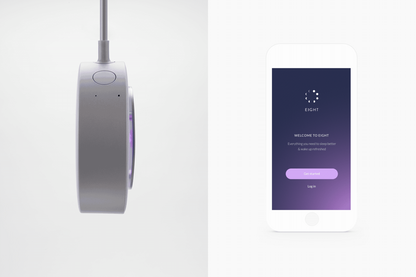
Eight App
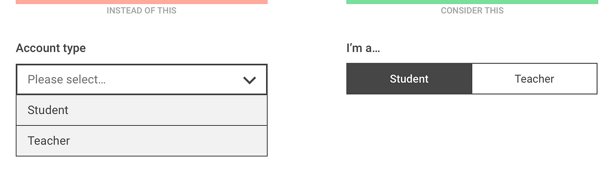
Dropdown alternatives for better (mobile) forms
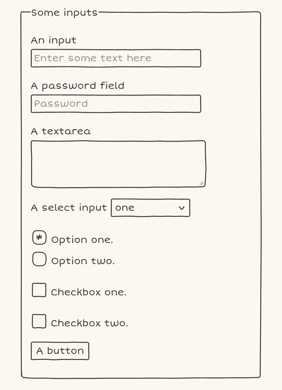
Doodle CSS
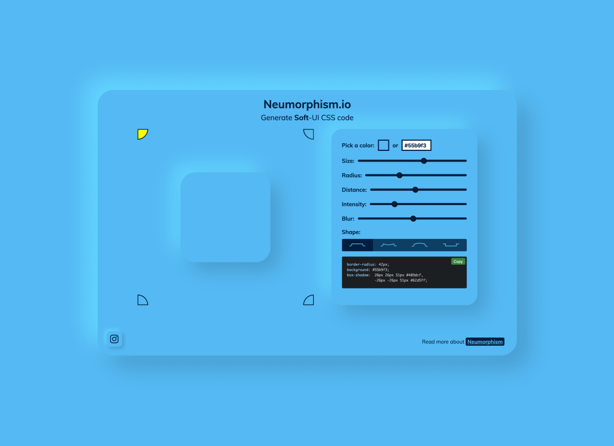
Neumorphism/Soft UI CSS shadow generator
Logic Magazine

Glass Insects Small Enough to Balance on the Tip of Your Finger by Wesley Fleming
Glass sculptor Wesley Fleming creates life-size and anatomically correct sculptures of a variety of bizarre and well-known insects. The colorful creatures are small enough to balance gently on the tip of his finger, like a neon orange spider barely larger than his nail. The artist began working with the medium more than 15 years ago at the MIT Glass Lab and has pushed his technique ever since, learning flameworking, sculpting with borosilicate, and the Italian technique of sculpting soft glass on the Venetian island of Murano in 2005. More
Terrible UX Trends for 2017
Weekly Design Inspiration #295
via Muzli design inspirationdesign by Denys LazutkinDesigners’ Secret SourceThe best design inspiration — expertly curated for you.Muzli is a new-tab Chrome extension that instantly delivers relevant design stories and inspiration. Learn moreBanking App by Katerina KrukovaRegular spendings management by by SELECTOEferbarn | Neobank dashboard by by Alexander PlyutoLanding UI by DStudio®Metajive — Concept from 2019 by by Anthony GoodwinKeep calm and backup your files by Denys LazutkinPokemon Bag by Mohamed Chahinhttps://medium.com/media/1710a6e08cb2223528b426cc1cbdbcfc/hrefDaft Punk 1993–2021 by by Brian CarrollSteampunk Skull by Angga TantamaDistortion Collection 02 Designed by Supply.Family by Chrisb MarquezGame of the Ox by Thinking RoomThe Burrow Sculpture by Thomas WightmanJames Bond x Theory 11 by Russ GrayScence: the future of sustainable skincare by Kingdom & SparrowWeekly Design Inspiration #295 was originally published in Muzli - Design Inspiration on Medium, where people are continuing the conversation by highlighting and responding to this story.
Explore DOM Events
The United Fonts of America

Password Strength Visualization
Jaime Hayon Designs His First Piece of Contract Furniture for Fritz Hansen
A trio of contract seating options designed for collaboration, concentration, or even relaxation.

Lifelike Sculpted Figures and Immersive Monochrome Environments by Hans Op de Beeck

Thirst
"username or password incorrect" is bullshit

A Barcelona Apartment Goes From Two Bedrooms to One
A Barcelona-loving couple's transformed apartment goes from two bedrooms down to one.
Baugeld Spezialisten - Branding, Identity
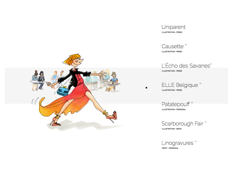
Marie Morelle | Illustratrice
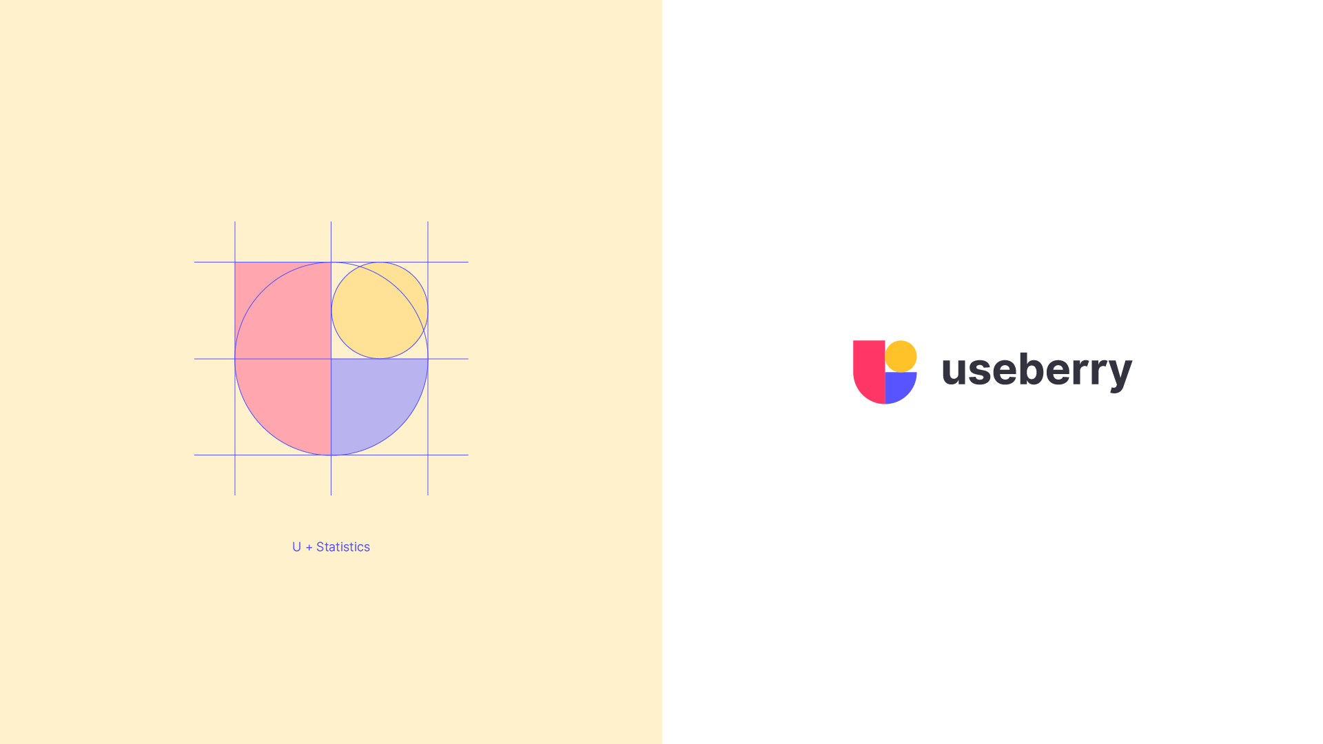
Undivided Rebranding & UI/UX for Useberry
Undivided Rebranding & UI/UX for Useberry
AoiroStudioMay 20, 2019
holy ™ is an agency of all sorts of services, from branding all the way to the user interface design. Based in Athens, Greece, they shared on their Behance, a major rebranding & UI/UX for Useberry. They have revamped their entire look from visual identity, UI/UX, iconography, illustrations, animations and even copywriting. Useberry is an intuitive user-testing tool, which provides codeless prototype analytics. Props to the entire team at holy ™ for this amazing work, I love the fact they used the Inter UI font by Rasmus Andersson. I also appreciate the fact they shared UI design for the results page for example. Something we dearly get to see on published projects, usually we rarely get passed the "sign-up onboarding".
A great challenge though was useberry platform’s UI/UX design, which not only needed to be light, clean and intuitive, but also able to address design community’s claims for functional and good design.
More Links
Studio Site
Behance
Visual Identity
User Onboarding
Dashboard
Test Sharing
Prototype Creation
Results
Follow holy™ on Behance
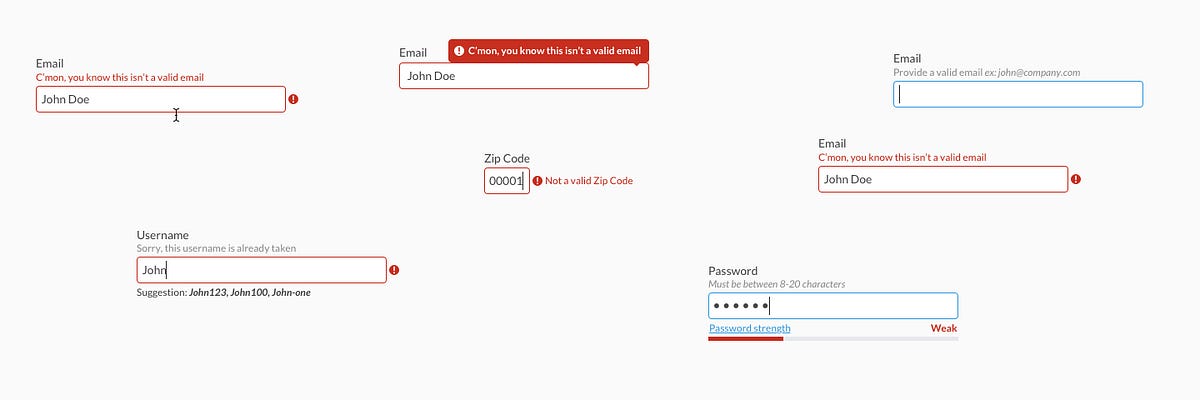
Forms Need Validation
Designing for the Arab User - Basic Arabic UX for Business
Alphredo: Alpha colors generator
The Evolution of Material Design's Text Fields
Someone is pretending to be me

Jeweller. Wireless Technology
Building a Design System Library
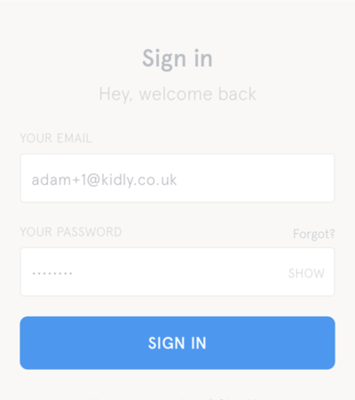
But sometimes links look like buttons (and buttons look like links)

ATMOS - by Leeroy
Storybook Composition – combine Storybooks into one design system
Why Does a Design Look Good?
Uber | Where To?

Enid.fm
Genesis USA
Genesis USA