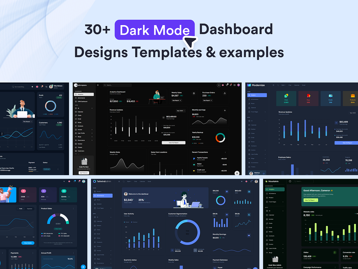
Design Inspiration
Dark mode screen design examples
A curated collection of dark-themed user interface designs and inspirations. Explore the best dark mode UI examples from popular websites and apps.
We curate topical collections around design to inspire you in the design process.
This constantly-updated list featuring what we find on the always-fresh Muzli inventory.
Last update:
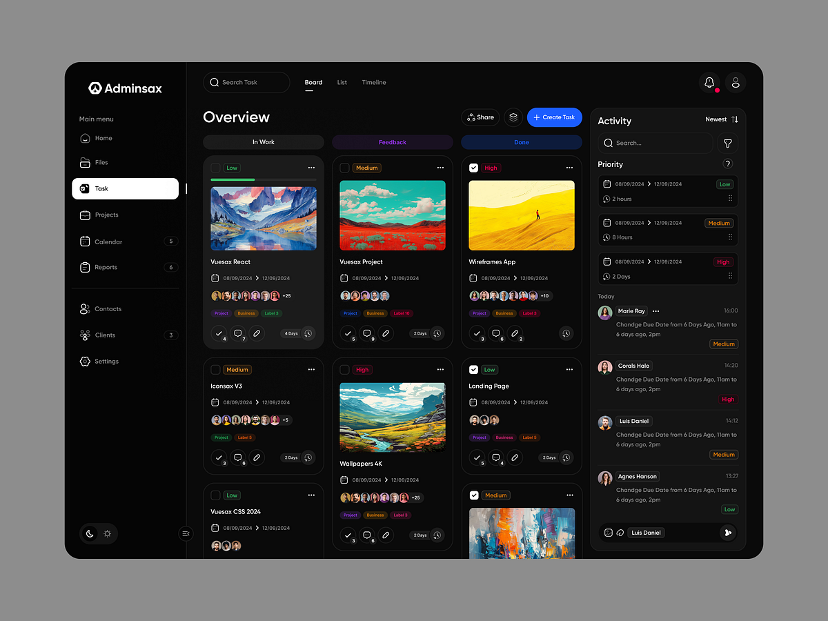
Vuesax Admin Task Dark Mode
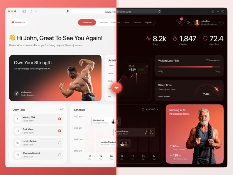
HealthVibe, Fitness Dashboard UI (Light & Dark Mode)
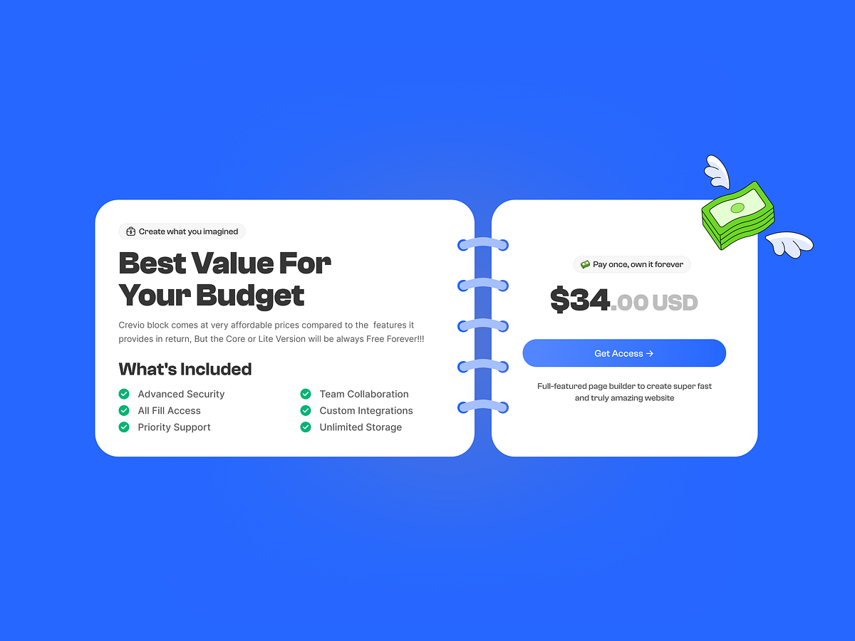
Pricing Card UI – Light & Dark Mode
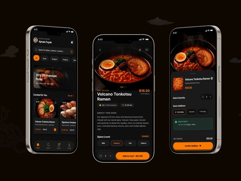
Dark Mode Restaurant App
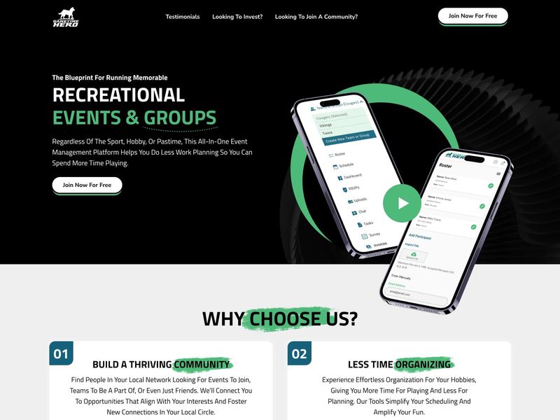
Dark Mode App Landing Page — UI/UX Inspiration
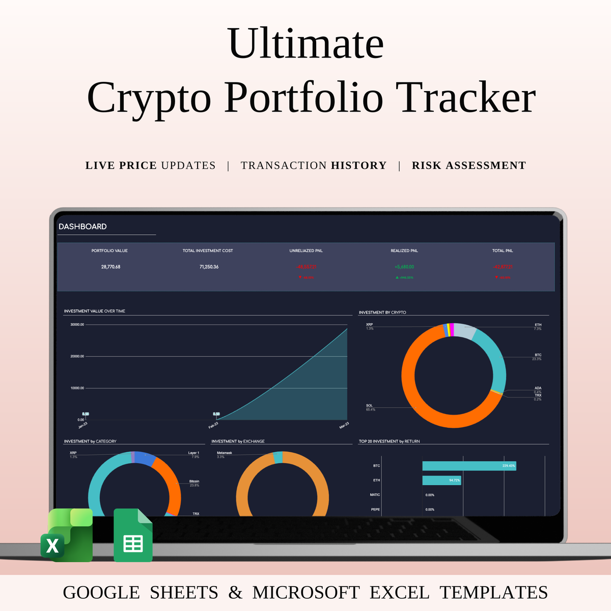
Ultimate Crypto Portfolio Tracker Excel | Dark Mode
Fintech UI Inspiration: Sleek Dark Mode & Neon Blue Accents

Stock & Dividend Tracker Excel | Dark Mode Dashboard
Fintech UI Inspiration: Sleek Dark Mode & Neon Accents
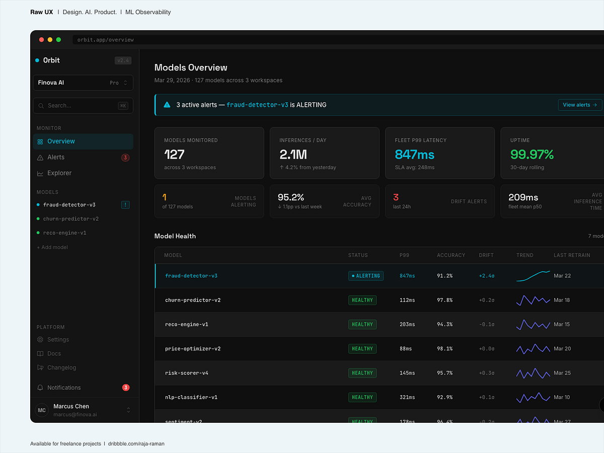
Orbit | ML model monitoring dashboard | Dark UI
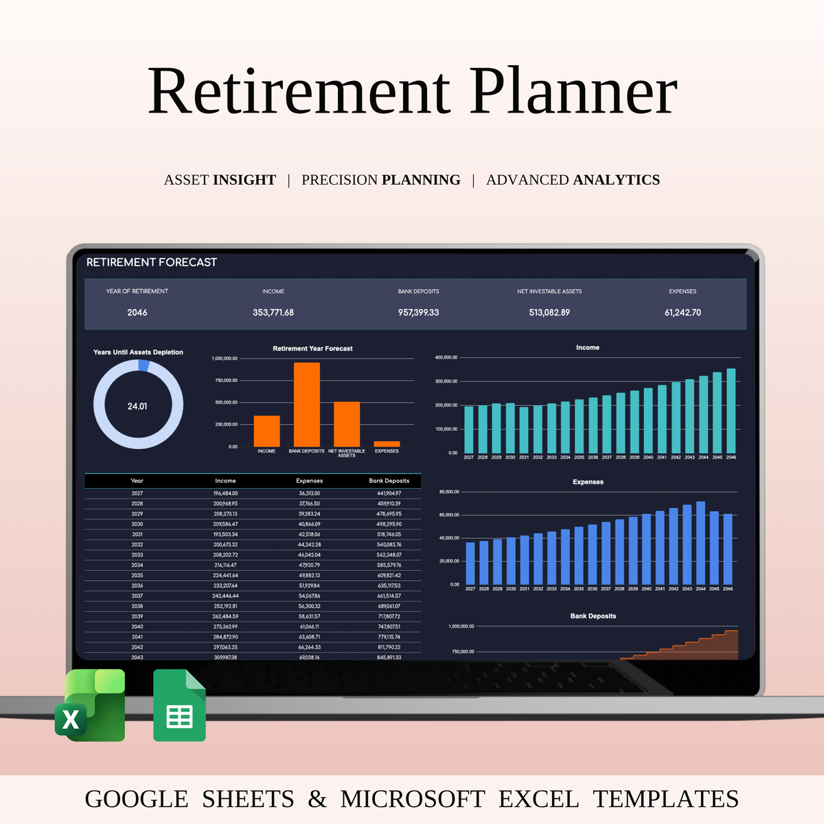
Retirement Portfolio Tracker Excel | Dark Mode

Real Estate Portfolio Tracker | Dark Mode Investment Dashboard
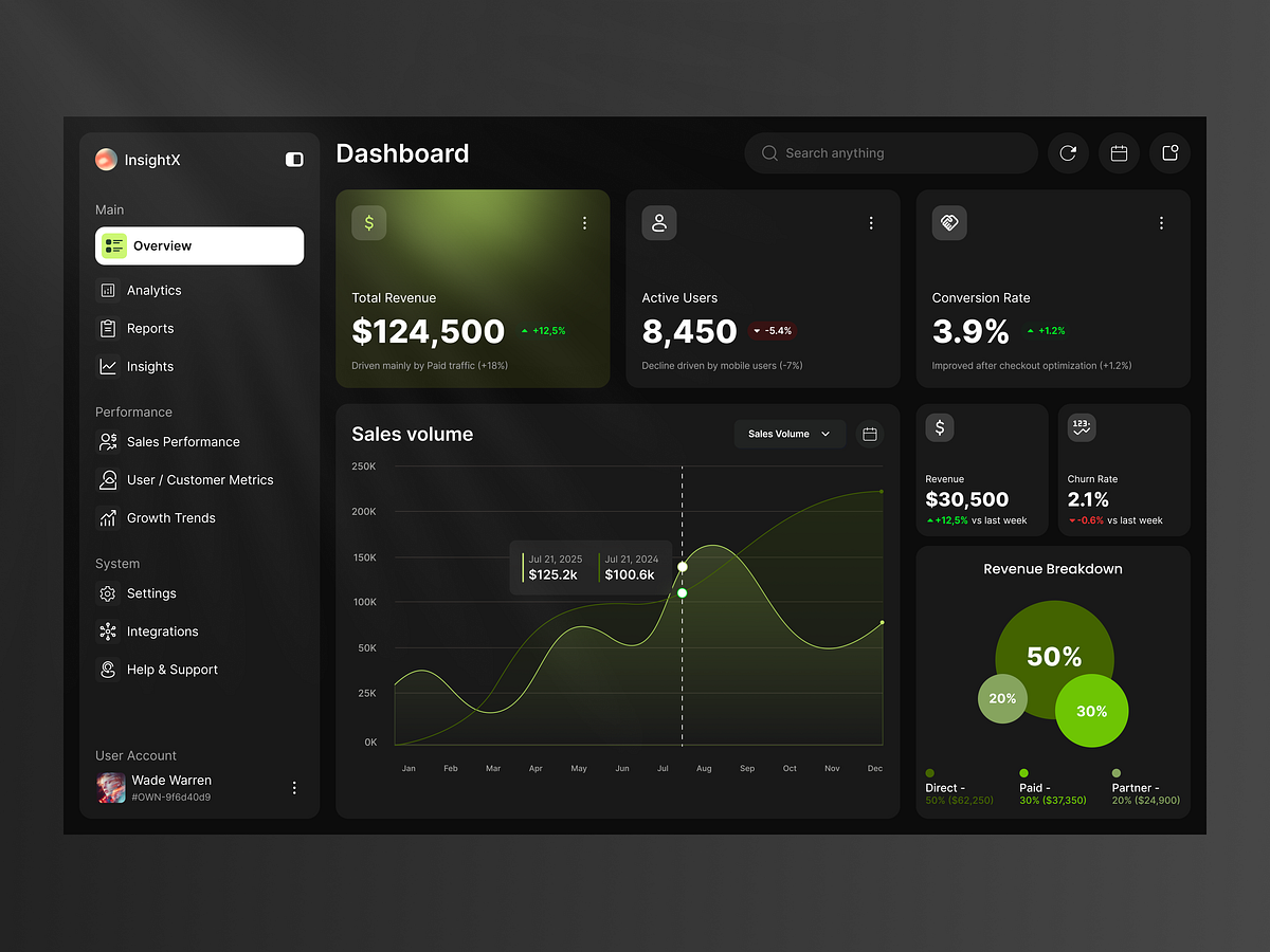
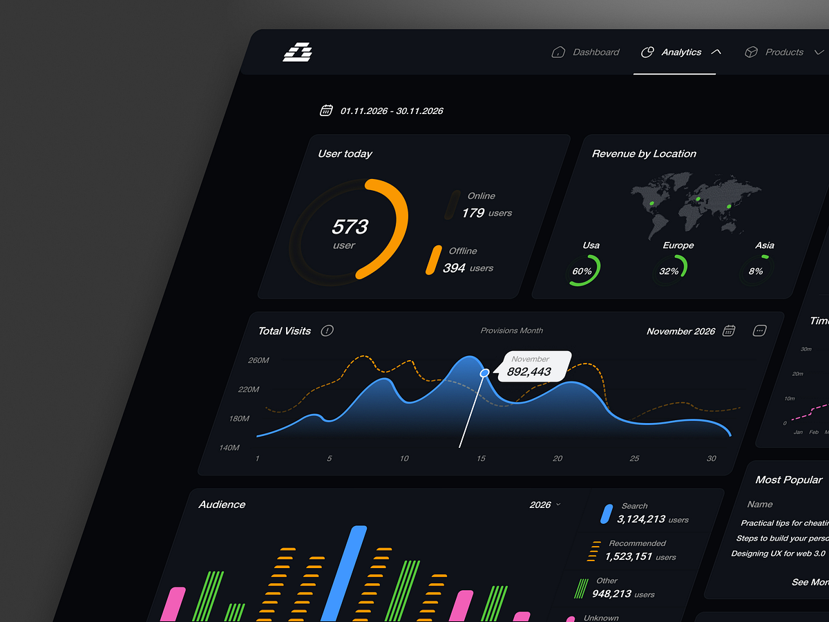
InsightX — Dark Mode SaaS Analytics Dashboard UI Design
Analytics Dashboard – Dark Mode UI - SaaS
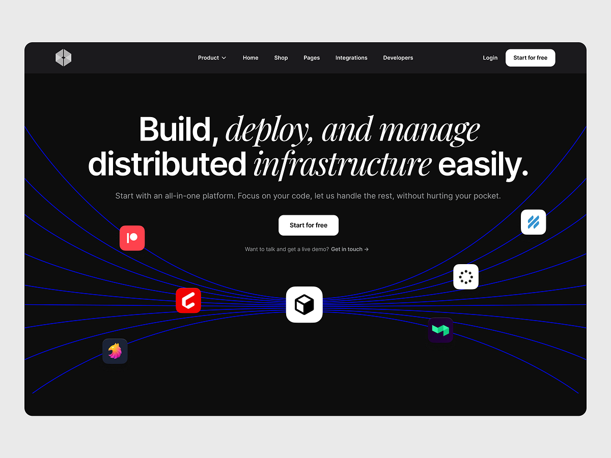
Developer Platform Landing Page – Dark Mode
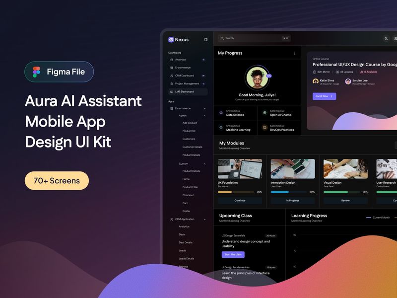
Nexus - Modern SaaS Dashboards & Applications UI Kit (Light & Dark Mode)
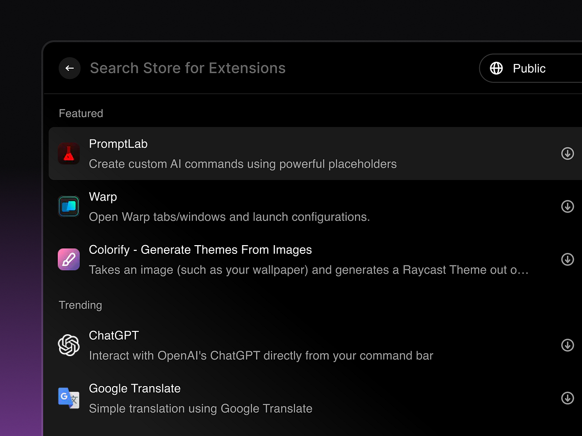
Spotlight Search — Extensions & Plugins / Dark Mode UI
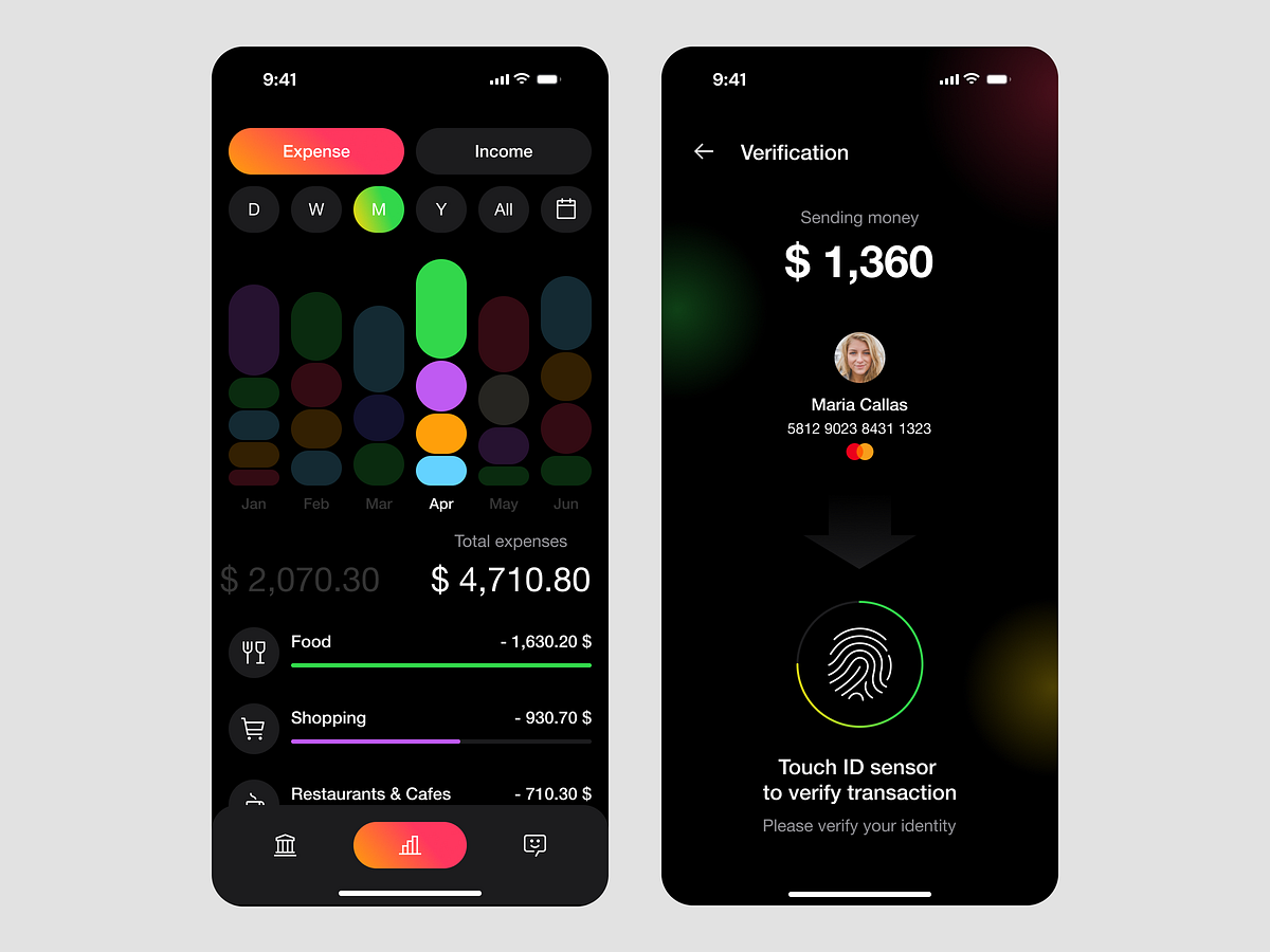
💳 Smart Finance Tracker – Dark Mode Expense Analytics UI/UX
Next-Gen Business Messaging Dashboard – Dark Mode UI
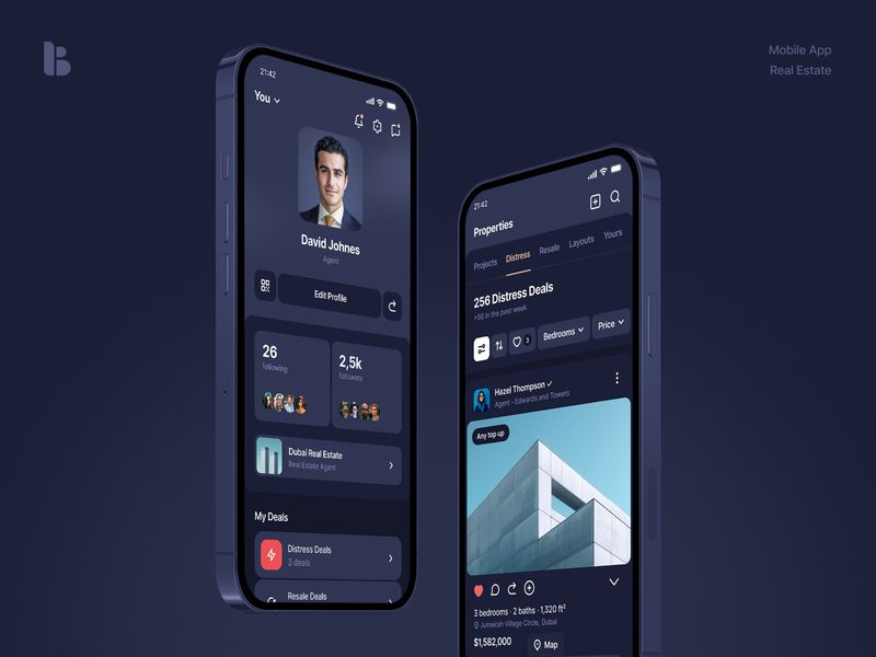
Behomes • Dark Mode
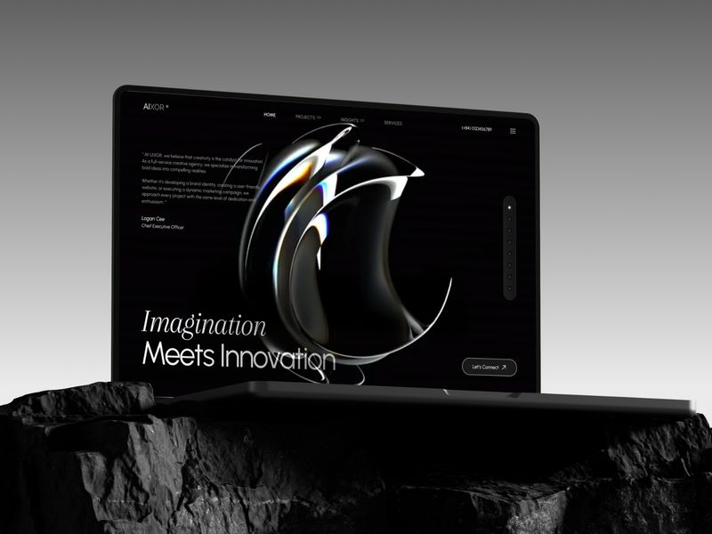
AIXOR Agency
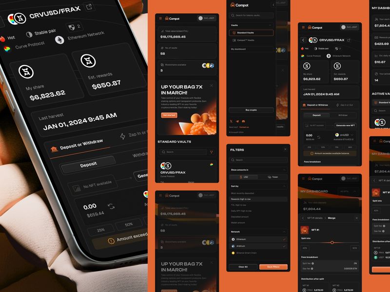
CompotFi Mobile
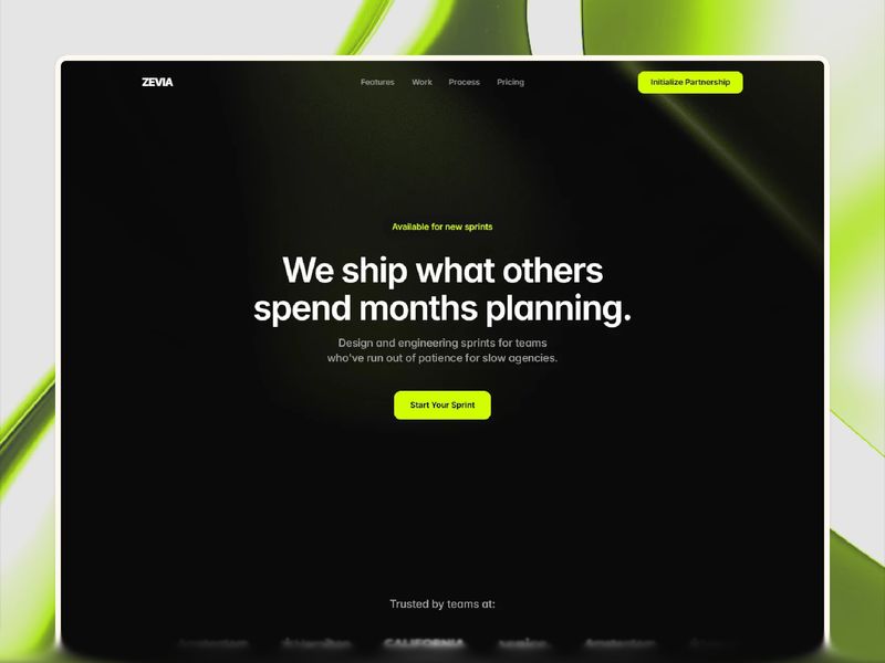
Zevia — Dark Agency Framer Template

A place for my drawings

Dark footer with CTA section

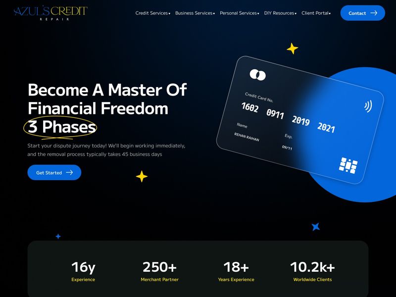
Secure Fintech Landing Page & Dark Mode SaaS - Web Design
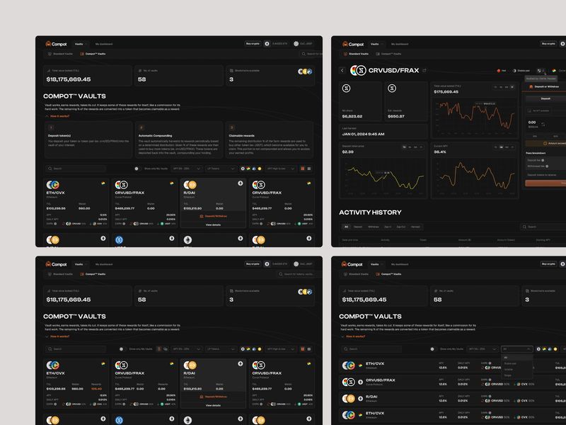
CompotFi - DeFi Dashboard UI
Centered Parallax Image CTA | Redesignee
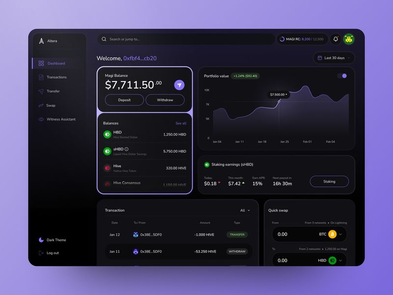
Crypto Dashboard

Cosmic Bento — AI-Driven Intelligence Modules | UIUX
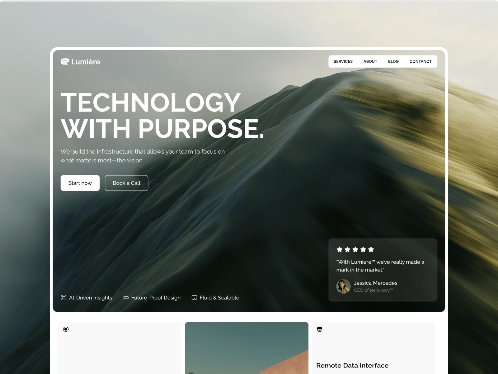
Lumières: Free AI Website Template by Shaigexp — Framer Marketplace
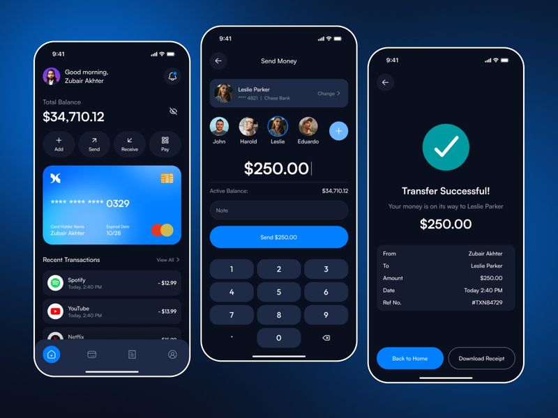
Nevo | Finance Mobile App Design
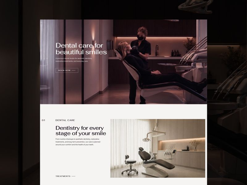
DENTRY - template for boutique dental clinics
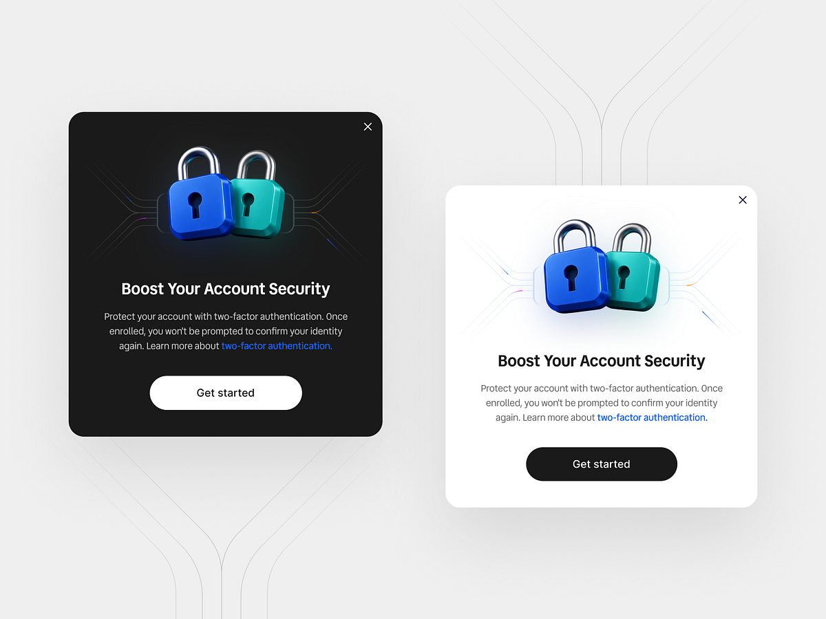
2FA Security Popup Modal UI Design
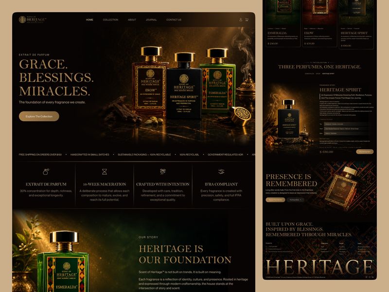
Scent of Heritage Where Fragrance Becomes Legacy.✨
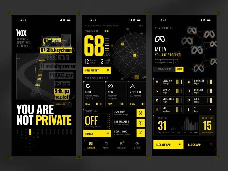
NOX • Privacy Monitoring App
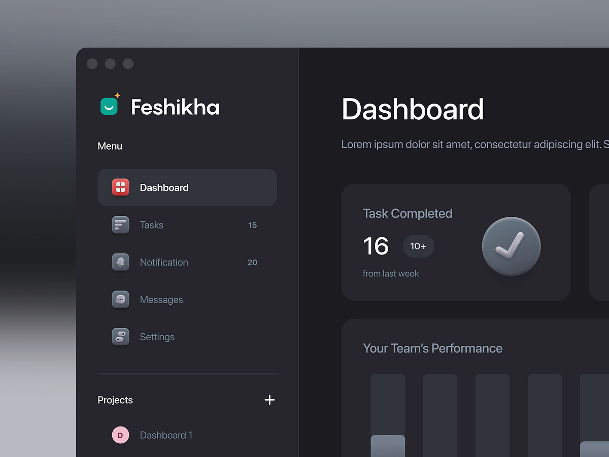
Task Management Dashboard - Exploration

HosPtal - Premium Hospital Admin Dashboard
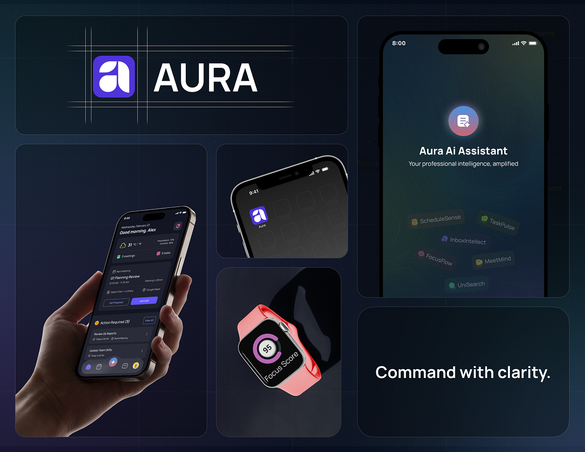
AI Assistant Mobile App Design with Branding

🚀 DiBold - Admin Dashboard Template Modern RTL & Dark
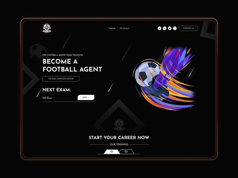
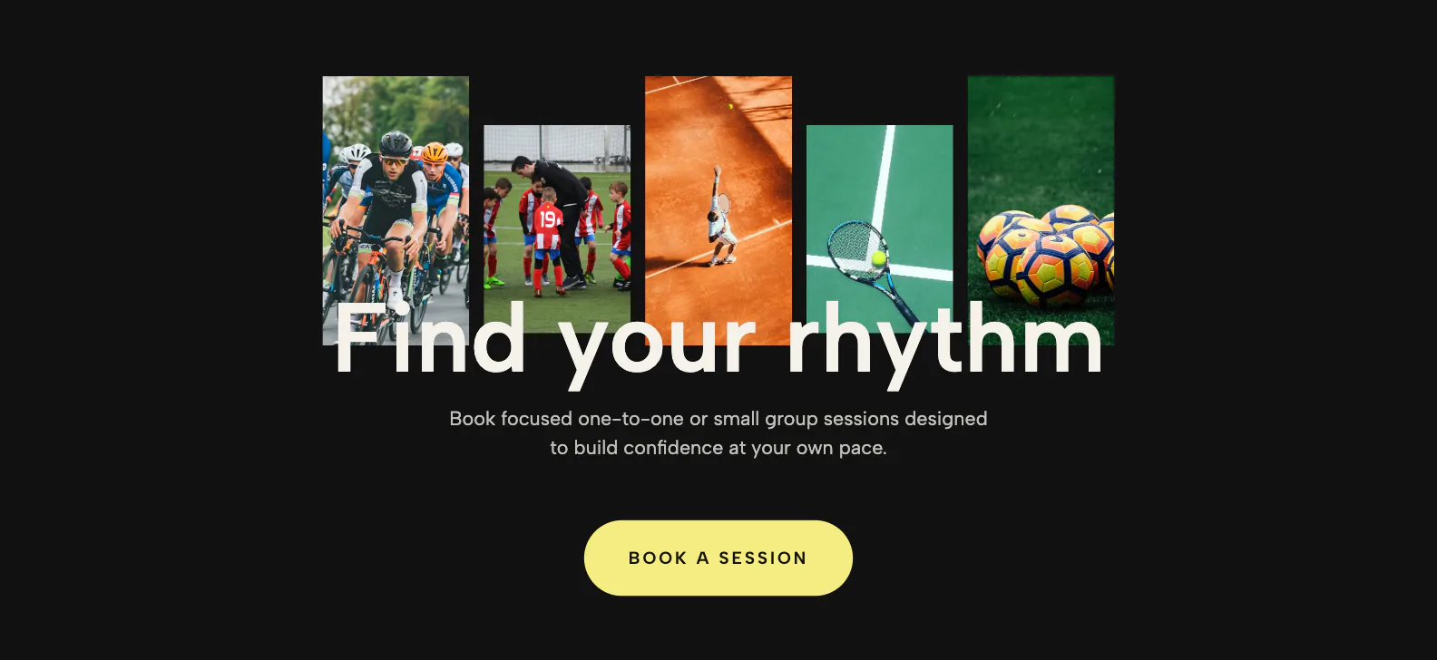
Sports Academy Landing Page – Premium Dark UI
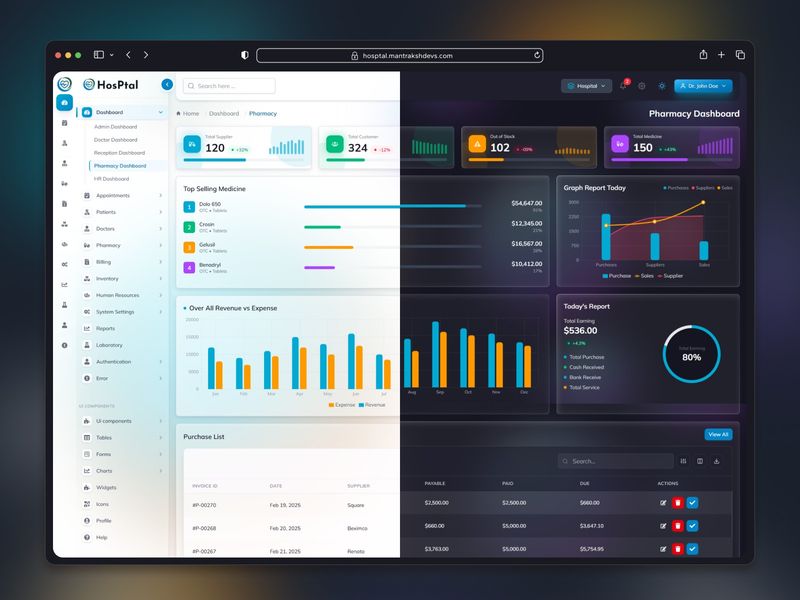
HosPtal - Premium Hospital Admin Dashboard

Global Kartel- website design
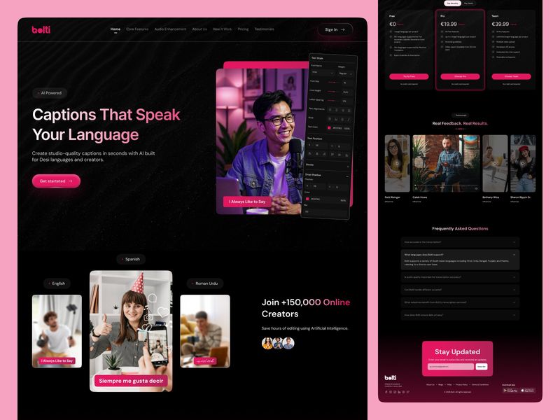
Speak Every Language. Reach Every Audience. 🌍

Jobupp - Modern Job Portal & Hiring Board UI

FIFA 2026 Live Center - Sports Analytics Dashboard Design
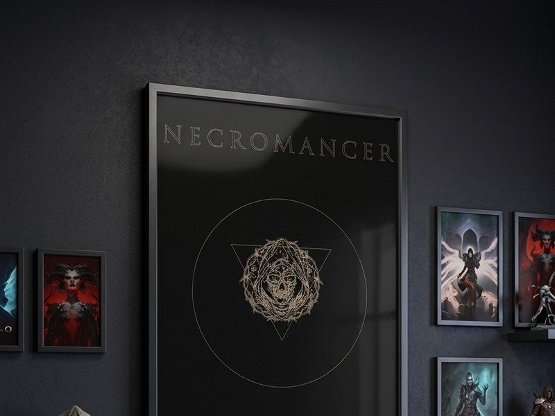
"NECROMANCER" – Dark Fantasy Poster & Key Art Design
Creative Agency Website Design

AmardenVox – Full-Service Digital Marketing & Web Agency

Vyom V — Designer
Pattern Breaking - Fast Fashion's Dirty Tricks

Smart Home Automation Mobile App UI
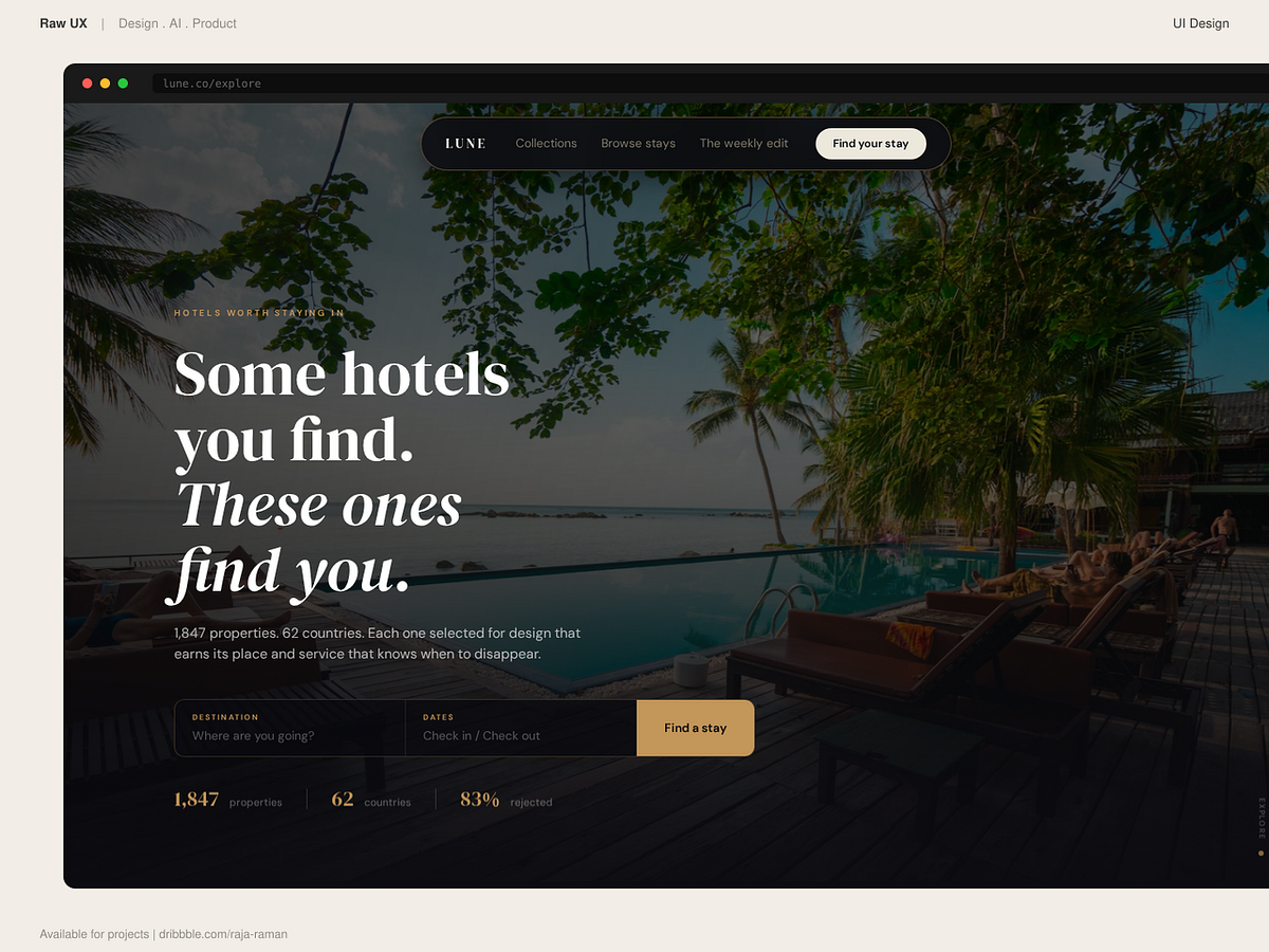
Lune | Luxury travel editorial designs
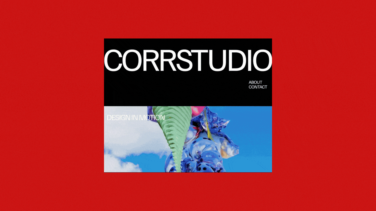
CORR - Dark Editorial Creative Readymag Portfolio Template
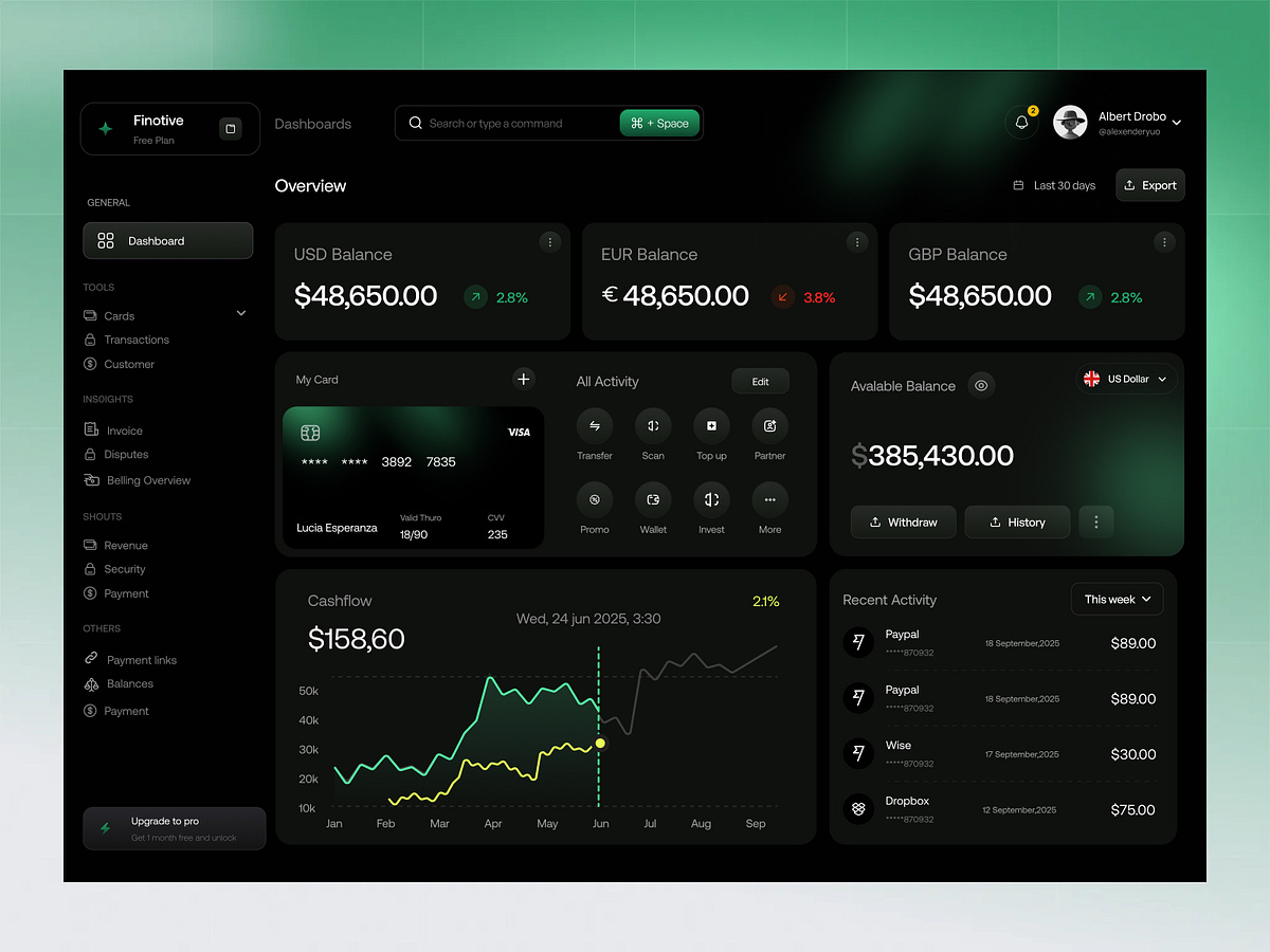
Finance Dashboard Design
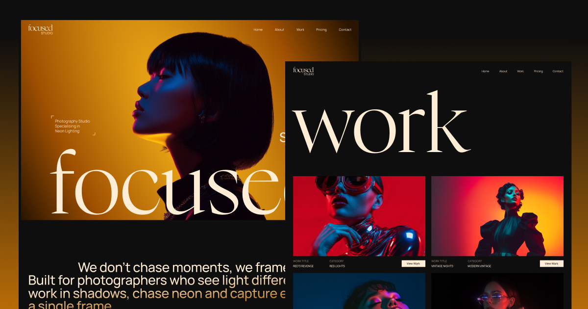
Focused - Webflow HTML website template
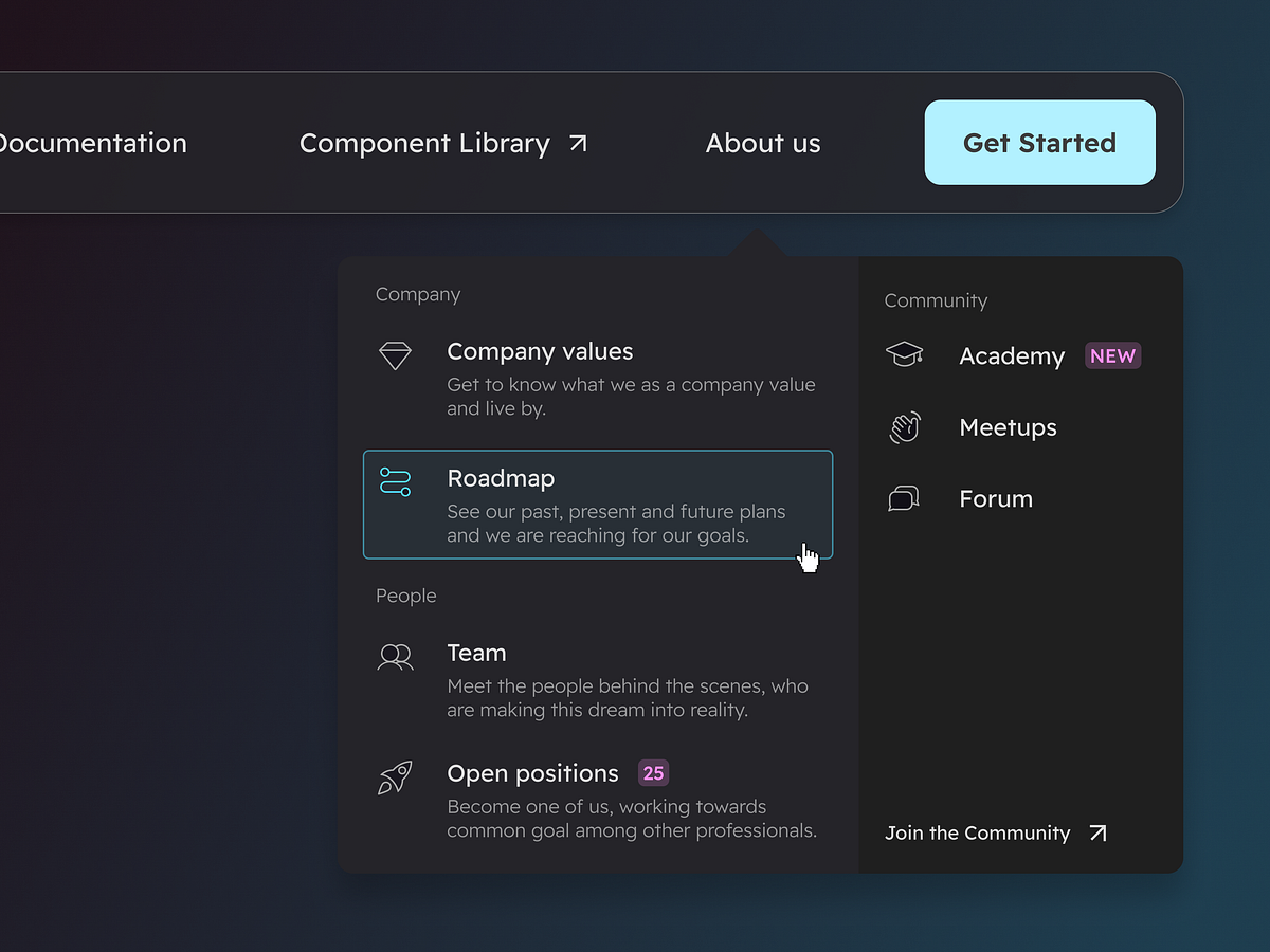
Dropdown navigation menu - Dark mode
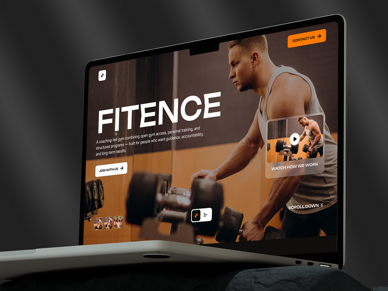
Fitence — Premium Gym & Fitness Website Design
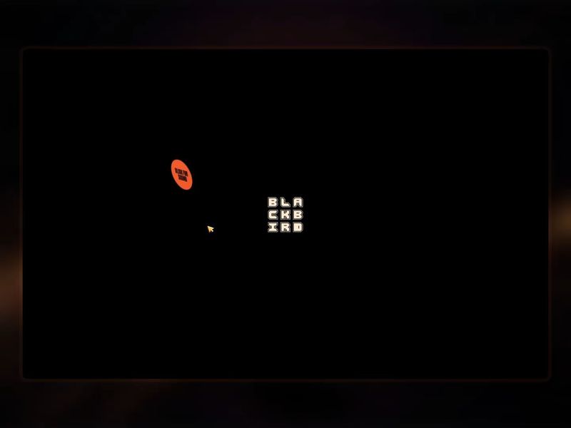
The Blackbird Awards | Where Creative Minds Fuse With the Digital Universe
The Blackbird Awards | Where Creative Minds Fuse With the Digital Universe
Get access to thousands of freshly updated design inspiration pieces by adding Muzli to your browser.
Loved by 800k designers worldwide, Muzli is the leading go-to browser extension for creative professionals.
Dark Modes: Why and How
Dark mode, sometimes referred to as night mode, has become an increasingly popular feature in UI/UX design. As its prevalence grows, the question arises: Why should applications adopt dark mode, and how should it be implemented effectively? Let's delve into the reasons and best practices.
Why Adopt Dark Mode?
1. Eye Comfort
In low-light environments, a bright screen can strain the eyes. Dark mode reduces the amount of light emitted by screen displays, thus minimizing eye fatigue and reducing the risk of blue light exposure, which can interfere with sleep patterns.
2. Power Efficiency
For devices with OLED or AMOLED screens, pixels are individually lit. Dark mode reduces power consumption as fewer pixels need to be lit, especially if the background is pure black.
3. Aesthetic Preferences
Many users prefer dark mode simply because of its sleek and modern appearance. Offering a dark mode option can meet these aesthetic preferences and enhance user satisfaction.
4. Reduced Screen Glare
By decreasing the overall brightness of the screen, dark mode can reduce screen glare, making it easier to view content in various lighting conditions.
How to Implement Dark Mode Effectively:
1. Offer Flexibility
Provide users with an easy option to toggle between dark mode and the standard mode. Some users might prefer one mode over the other depending on the time of day or their activity.
2. Ensure Contrast
While the background is dark, it's essential to ensure that text and UI elements stand out sufficiently. This doesn't mean making them glaringly bright but ensuring that readability isn't compromised.
3. Test Extensively
Ensure that the dark mode theme is tested extensively across different devices and screen types. Colors might appear differently on various screens, so it's crucial to ensure consistency.
4. Adapt Icons and Graphics
It's not just about inverting colors. Icons, images, and other graphic elements may need to be tweaked to fit the aesthetics of dark mode, ensuring they are visible and appear coherent.
Conclusion:
Dark mode isn't just a trendy feature; it offers genuine benefits in terms of user comfort and power efficiency. By understanding the reasons behind its adoption and following best practices in implementation, designers can create an optimal dark-themed user experience.