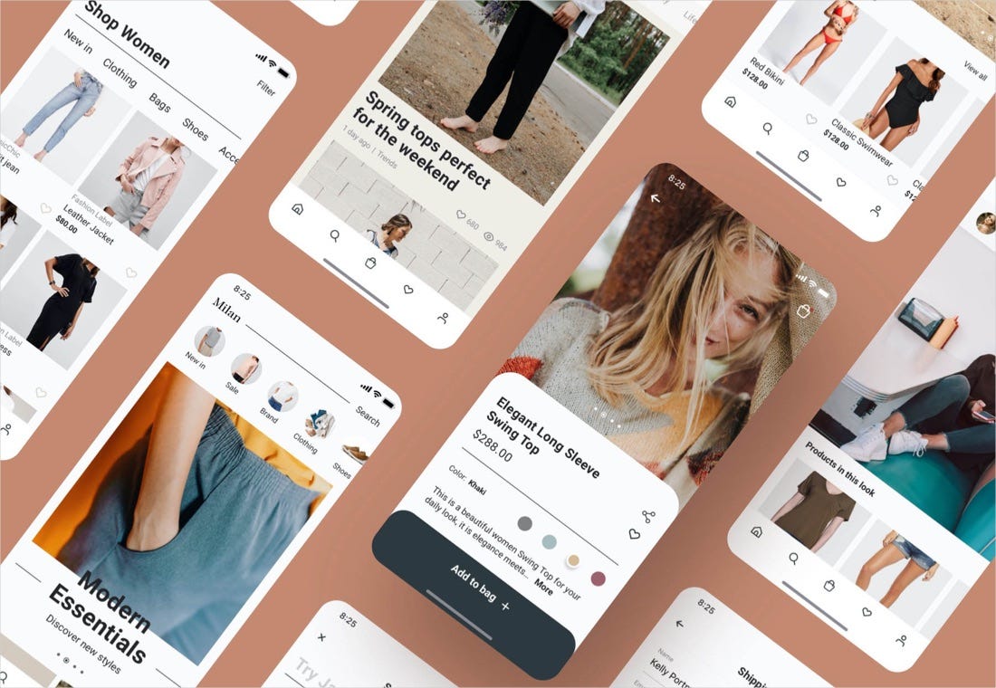
Top 12 Shopping App UI Design Case Study
Mobile technology has changed the way we live, especially under the pandemic situation. As a result, mobile shopping trends are evolving rapidly during the year. Consumer buying behaviour has changed significantly because of the work from home culture, and it will continue to grow in the future.If you are looking to make a shopping app for your online store or your client, below are the top 12 of the shopping app design case study that you can get inspiration from:Handmade Ceramic Store AppThe main purpose of this app is to connect people and ceramic artisans. People can search for and buy beautiful ceramics without effort, and ceramic artisans can show and sell their works on the app. View the full case study hereApp Design by Sumi KimApp Design by Sumi KimApp Design by Sumi KimUniqlo AppThe redesign of Uniqlo shopping app includes new features like coupons, visual search, store locator, look book and other shopping features. View the full case study hereApp design by ZionApp design by ZionApp design by ZionZara AppThe redesign of Zara app provides a convenient overview of new product entries, fashion catalogs, collections and lookbooks on weekly basic. View the full case study hereApp design by Akveo Design TeamApp design by Akveo Design TeamBalenciaga Stylist AppBalenciaga Stylist App was born from the ambition to create a bespoke and personal shopping experience dedicated to the customers of the brand. Empowered by AI tools across all segments of the app, the experience provides a unique experience within the brand ecosystem. View the full case study hereApp design by Jonathan Da CostaApp design by Jonathan Da CostaASOS AppThe redesign of ASOS app focuses on customer translates into product usability. This means offering customers easy navigation across the app with options to purchase, shop and track orders. View the full case study hereApp Design by Michel AchkarApp Design by Michel AchkarBorsalino E-commerce AppThe ecommerce mobile design is a methodical order of components to enhance a welcoming user experience in order to elevate and represent the ideals of the brand. View the full case study hereDesign by Sabbath StudioDesign by Sabbath StudioEcoalf Ecommerce DesignView the full case study hereDesign by Alina KDesign by Alina KLuxury Store AppThe ecommerce app for finding expensive premium clothing. The user interface focused on luxury and elegant product using colours and fonts. View the full case study hereApp design by Nikita OgurechnikovApp design by Nikita OgurechnikovTimberland Shopping AppThe redesign concept represents the modern look and feel of Timberland brand with enhanced ecommerce shopping features. View the full case study hereDesign by Alex BukinDesign by Alex BukinDesign by Alex BukinMonroe Ecommerce AppMonroe Shop is a concept of an clothing and outwear app. The clean and solid style creates a user-friendly and aesthetic app that improves the user’s experience in online shopping. View the full case study hereDesign by Zanik DesignDesign by Zanik DesignSneakers Ecommerce AppThe app design brings the users a simple, smooth shopping experience in the process of getting their hands on all the freshest drops. View the full case study hereDesign by Patryk PolakDesign by Patryk PolakMilan Fashion AppThe Milan fashion app is designed for modern clothing store with shopping features like visual search, lookbooks, fashion blogs, collections, etc. View the full case study hereDesign by Interface MarketDesign by Interface MarketDesign by Interface MarketWe hope these case studies can inspire you to design better user interface for your ecommerce app. If you enjoyed this article, please share it so that other UI designers and startup founders can find it! 🙏Visit our website https://interfacemarket.com/Interface MarketEasily create engaging illustrations for your website, mobile app, blog and social media channels right in your browser.Try free ➡ artitor.comMore UI design inspirationTop 10 Travel App UI Design Case StudyTop 10 Banking App UI Design Case Study12 Beautiful Mobile App UI Animations Inspiration5 Best Mobile App Ideas for Food Business StartupsTop 12 Shopping App UI Design Case Study was originally published in Muzli - Design Inspiration on Medium, where people are continuing the conversation by highlighting and responding to this story.
Weekly Design Inspiration #382
via Muzli design inspirationThe best design inspiration — expertly curated for you.Muzli is a new-tab Chrome extension that instantly delivers relevant design stories and inspiration. Learn moreWebsitesEast Continental Gems X Marvel.Klarna’s Top Trends Of The Year | The Checkout 2022.Best Sports Moments Of 2022.Andreas Antonsson — Interaction Designer & Creative DeveloperProductsSocialSizes — Image and Video sizesfor Social Media..MidJourney Prompt Tool.Gamma — Write like a doc Present like a deck.Glyphs — Mac font editor that puts you in controlDribbbleCollaborative Photo Editing Software UI by Awsmdhttps://medium.com/media/29de7b87e886c1ccf9afd10896a42eb0/hrefHealthcare service — Mobile app by Anastasia GolovkoEducation Platform by Bogdan Falinhttps://medium.com/media/db237776ed4facba902265aeada0af2c/hrefAI Art#midjourney — tigeristic fashion, intricate details , high resolution photography by Cradly#midjourney — Beautiful flowers in the style of Bob Eggleton and Dale Chihuly by amamo#midjourney — retro futuristic soldier standing in front of an 80s diner, color corrected, saturated, directed by James Cameron by Jbrashear3#midjourney — a surreal, dreamlike landscape, a forest with a glowing, iridescent river. The colors bright and ethereal, giving a sense of wonder and magic, vector illustration by CamberGraphic Design & TypographyILLUSTRATIONS 2022 by Huston Wilson1772 — Livre anniversaire Henry Lemoine by Studio Vicente GrangerCUBIC3 三立方咖啡 Branded Items Design by low key DesignAdobe MAX 2022 by My Name is Wendy StudioDesign resourcesGestures: 3D Emoji Pack.Isometric Ecommerce and Online Shopping.Kaboom — Agency Website Template.Jaylin — Portfolio Website TemplateWeekly Design Inspiration #382 was originally published in Muzli - Design Inspiration on Medium, where people are continuing the conversation by highlighting and responding to this story.
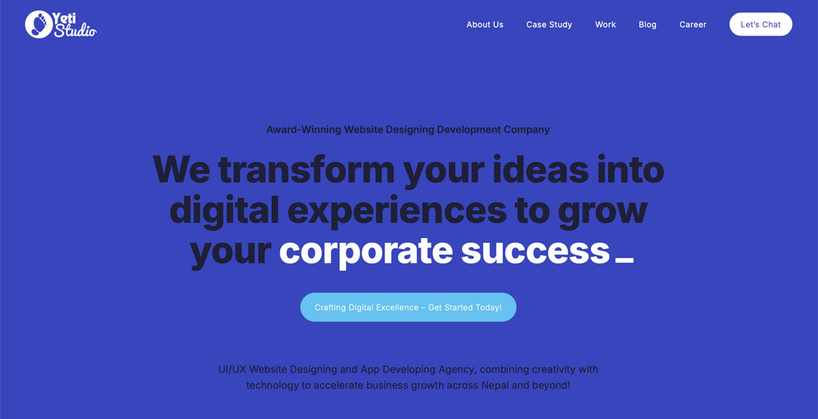
Yeti Studio
We are a team of dedicated experts offering digital solutions to businesses seeking to transform their digital vision into reality. Our creative team specializes in Mobile App Development, Website Development, Digital Marketing, UI/UX Design, Graphic Design and Branding, e-commerce website development, and SEO services.
Our Major Services includes:
UI/UX Design:
Our innovative team specializes in creating UI/UX designs that enhance your digital experiences. We focus on usability and continuously refine our designs to meet our client’s needs.
Branding and Identity:
We develop effective and relevant branding strategies that help to engage with your target audience and make your business unique from the competitors.
Digital Marketing:
We enhance your brand’s reach by creating and implementing effective digital marketing strategies. We help you maximize your reach and engagement, on all digital platforms.
Mobile App Development:
Our experienced team creates innovative mobile apps for iOS and Android platforms. We bring your ideas into reality with powerful mobile applications that help to drive business growth.
Website Development:
We build responsive, user-friendly websites that are not only visually appealing to your users but also are fully optimized for Search Engine Rankings.
Graphics & Motion Design:
Our creative designers create visually appealing designs craft timeless brand identities and produce motion graphics that enhance your brand presence.
E-commerce Website Development:
Build your online store into an interactive digital experience. Our expert team builds eCommerce websites with stunning visuals and smooth shopping experience.
Search Engine Optimization:
We help your website rank to rank in the top of the search engine results page to help you gain organic traffic to your business. With SEO-optimized content and effective strategies, we create a strong online presence for you.
We combine creativity with technology to create engaging digital experiences that meet the needs of our unique clients. We transform your digital vision into reality. At YetiStudio we value our client’s vision and goals and help them achieve their business objectives with tailored digital solutions.
The post Yeti Studio appeared first on CSS Nectar Web Design Awards.
Designers’ Pick: Top Color Trends to Inspire You in 2022
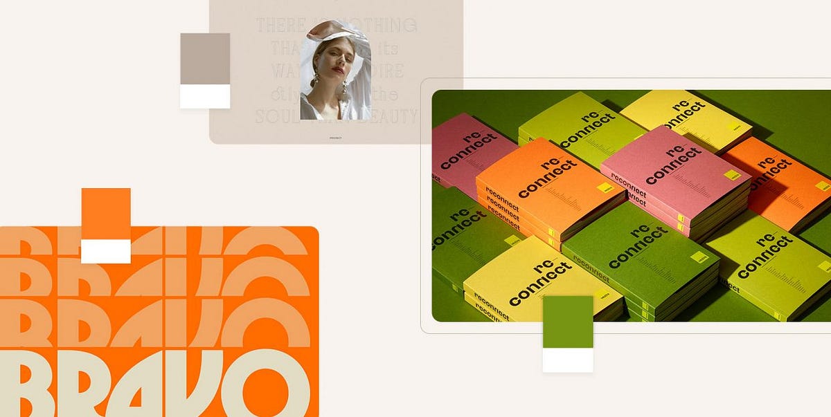
Pinpointing, let alone predicting the design trends has become notoriously hard in this day and age when things move, shift and transform at warp speed. What’s in today might be totally out as soon as next month, and color trends can be particularly tricky as they tend to move with seasons and to follow current events which are, by their nature, unpredictable. Still, some things tend to stick more than others and to mark the defining trends.We already wrote extensively about the top web design trends for the year, focusing perhaps more on the UX side of things, on animation and interactivity, on website architecture as a whole. This time around we want to welcome the warmer weather with an exploration of some of the color trends that we noticed not just in web design but also in fashion, furniture and home decor, and perhaps give our readers a few chromatic hints for the rest of the year.Our very own Marijana Obradovic, the author of the stunning Solene and Konsept themes, is a keen observer and researcher of the design comings and goings, and she came up with these color trends for 2022:It’s All About the NeutralsFor the Love of GreenOrange CrushWhen Orange Meets GreenBurgundy, the KingIt’s All About the NeutralsCream, warm beige, cold beige, cream gray, gray cream, macchiato, pampas, marble, powder, ivory, nude, taupe, hazel…You name it — you’ll find it in 2022, in the streets, in the shop windows, in furniture and home decor and, yes, in web design, too. The spectrum between the lightest cream and the deep, brownish hues, with tints of red, pink, blue and even green, is marking this year’s trends and we can see it paired with other neutrals or with more saturated, louder colors.Julia Derevianko for Gotoinc proposes an eCommerce layout for a jewelry store that uses an off-white, creamy background to create an elegant backdrop for the featured photographs and jewelry pieces. Julia combines several complementary hues, from Carrara to Pampas, in a color scheme that provides breathability but at the same time adds depth and even some degree of quiet intensity.Alexandra Holodnaya made excellent use of a soft, warm beige with a hint of pink in her project for a magic and esotery shop and online learning platform Golden Venum. She skillfully alternates backgrounds in this gorgeous layout between light tones and black ones, creating an exciting tension of elements held together by the lovely old gold typography.We spot a similar chromatic inspiration in the Modern Font Bundle by New Tropical Design, where the warm cream tone is paired with burgundy (which we’re going to touch upon later on in this article), as well as a deep, atmospheric orange and a dark mossy green.While the colors from the beige and cream part of the spectrum work wonderfully when paired with more intense, vivid colors, it’s also worth mentioning they can look amazing in beige-on-beige sets or combinations of beige with colors just a hue away. A terrific example of this combination, which is definitely a 2022 trend we’re seeing a lot, is the creative visualization project that Notoo Studio did for 41zero42, specifically for their Superclassica series of floor and wall tiles.Another color that looks and works amazingly well when paired with, well, basically itself, is the warm gray. Alina Gaan explored this concept in her jewelry website project Juff, proposing a look that basically sports no contrast at all, and yet manages to work just fine for a website layout.But enough with the neutrals, let’s move on to louder trends for this year.For the Love of GreenGreen is another definitive trend for this year and it comes in all possible variants — from earthy and muddy deep greens to vibrant grass tones and, of course, neons.Marlow, the minimalist branding mockup scene creator by Moyo Studio, is heavily based on grays in various tones, mostly on the colder side of the range. The project includes several adjacent colors that complement the grays and give them depth and character, most notably the wonderful, elegant dark olive green, as well as browns with a significant portion of green component to them.Semi Permanent Hotel by Highsnobriety was a short-term takeover of the Paramount House Hotel in Sydney, featuring a range of artists, musicians, designers and other creators. The website for the project is based on the monochromatic layout with colorful, intense imagery and interface details in a lovely shade of bright green with a touch of cyan. The green is used for the favicon, the pagination bullets, select typography as well as for selected (or hovered) areas of the 3D model representing the hotel. This quite moderate addition of color breaks up the monochromatic interface without hampering its character, and the choice of green adds vitality and energy to the mood.Ogeh Ezeonu opted for a green on green combination for her website, using a very, very dark forest green as the background color (in some parts of the page it comes in form of gradient, too) and a lighter, brighter leaf green for select interface details, such as the boxed sections with links and button outlines. This way, she created a gorgeously balanced atmosphere that packs a lot of character without being too loud or bold.The Dutch brand development and design studio Maibru did a similar thing with incorporating a refreshing green shade to its website in form of various interface details — for instance, the menu items (indicating the current location, as well as color change on hover), language and mode switcher, cursor and navigation, and so on. The same green color is used for both the light and the dark mode, and it looks great in both instances, bringing vibrance and joy to a muted layout.A brand we already wrote about in our piece on innovative footer design, the furniture manufacturer Sol’ace opted for an interesting brownish green (or greenish brown?) as the background for some of the page sections, combined with a lovely warm gray. A fitting choice for a brand with a strong focus on natural materials and sustainable manufacturing practices.But muted, pastel and earthy greens are not the only ones marking this year’s color trends — in fact, we’re seeing a lot (and really, a lot) of super-vibrant greens, electric greens and neons.For instance, the Chinese Reesaw Studio incorporated a lot of bold, vibrant colors in their branding project for GLZ Super Park, with the neon lime green as the main color featured in the logos, packaging, even the accompanying materials such as masks, duct tapes and so on.The designer and art director Stas Bondar chose an interesting and vibrant shade of green (with a lot of yellow to it) for his online portfolio, available in two modes: “casual” (black background with green details) and “fancy,” in which the said color is used for the background and combined with black interface elements. It’s interesting that the same color assumes different characters depending on the mode — in the “casual” mode, the dark background makes it appear more yellow, while in the light “fancy” mode it is definitely more green.Finally, let’s not forget one of the loveliest green shades — the mint green. The digital production studio 9P featured this color in various interface details (the oversized cursor, the buttons, the logo and menu items, to name a few) on their website, coupled with the black background for a striking and modern contrast, and they also used it for one end of the gradient for the hero text.Orange CrushAs a color that communicates joy, optimism, warmth and fun, it’s no wonder that orange is going to be a massive trend in 2022, a year when the world finally seems to take a break (hopefully permanent!) from the pandemic. From couture to streetwear, web design and even product design, various hues of this fantastic color can be seen everywhere.Tiare Payano incorporated a neon carrot orange into the palette for the brand identity project for Silkaen, a natural skincare brand. Payano paired it with different shades of red, burnt sienna, deep pink and other warm colors, creating a balanced, feminine and elegant palette.Design for the Gesture issue of the Sociotype Journal also features a lot of orange, albeit in a more toned-down variant. This particular brick orange works great on paper, as it complements the paper texture and gives the overall design a warm, deep character.Moving on to louder, bolder tones, the design for the Bravo Musique music and artist label features a stunning, somewhat vintage range of oranges, from the classic safety orange to hibiscus and royal orange.The visual identity for the Still Young interior design company by Low Key Design pairs an intense orange, almost a cinnabar, with a grayscale palette in an exciting, elaborate design concept based around the “law of three.” The entire visual system revolves around the numbers 3, 6 and 9, and the orange serves as the third chromatic element in the palette (in addition to the white and black that basically constitute the grayscale), sustaining the concept but also bringing a welcome contrast and dynamics to the design.The website and redesign concept for the restaurant Máirtain by Daria Shakula features an elegant, mostly monochromatic palette skilfully broken up by a vivid pumpkin orange used for a few select interface details, the footer and the fullscreen menu. Paired with the orange in some of the featured imagery, this particular use of color reinforces the brand identity and gives it a strong, well-built character, freshens up the concept and brings vitality without appearing vulgar or loud.Finally, here’s a layout that celebrates the power of orange in all its glory: the web design for the packaging-free grocery store in Los Angeles, re_grocery, uses an orangish red, or a reddish orange, for basically all interface elements, from title and paragraph typography to buttons, from navigation elements to the footer, which is entirely orange. It was a risky choice but one definitely worth making, as the result is a flattering, modern and engaging design that we can only assume does wonders for the company’s business bottom line.When Orange Meets GreenIf this combination reminds you of a clown suit, think again. Depending on the particular hues used in the palette, the orange and green combo can actually be quite sophisticated and convey a sense of opulent elegance. Let’s take a look.The UI Kit for Figma by Alexsander Barhon proposes modules for building web pages, with imagery that features small yet striking details in a lovely muted orange, combined with deep moss green, olive and mud, creating a wonderful sense of warmth and depth.Tiare Payano did a similar thing combining deep oranges and greens on a dark background for Nancy, a family-owned cafe in the Dominican Republic. The palette is based around deep, warm, earthy hues such as orange, terracotta and brick, combined with a dark green that seems to have a touch of warmth to itself, too — or perhaps it’s the oranges and pinks that bring that quality in the otherwise cold color.The green and orange combination works well in brighter tones with a bit of a pastel character, too, as evident from the Vestre Inspiration Book 2022. In this project, we get to feast our eyes on wonderful pairings, such as true orange and grass green, but also yellow and purple. These combinations are based on the principle of complementary colors, and as such they aim to create an intense and dynamic effect, but thanks to the careful selection of particular tones and textures, they also appear quite soothing and pleasant.Green smoke, apricot orange and a range of light pinks and warm grays dominate the palette of the Absolution Cosmetics website, where the orange and green work as particular accents and can even be considered chromatic leitmotifs of the layout, even though they appear very sporadically on the pages. The dynamics between these two add much needed intensity to the light, airy layouts.The brand identity project for Lande Architects includes a wonderful palette of muted greens, warm earthy tones and siennas, combined with a vibrant yellow with plenty of orange hints to it. The stationery and the calling cards are printed on a heavily textured paper with relief typography, which, combined with the colors, gives the project a distinct organic character.Finally, while not exactly focused on the interplay between green and orange in particular, the website of the oil and salsa manufacturer Frantoio Cavalli does play around with the two, by juxtaposing the delicate greens of oils with warm orange, yellow and red hues from salsas, both in featured imagery and in product packaging.Burgundy, the KingTimeless and sophisticated, burgundy appears to finally be making a comeback — and long overdue, if we dare say. This elegant color, traditionally associated with wealth, opulence and royalty, is actually an extremely versatile pairing color for palettes and combinations that require contrast, depth and warmth.Being a dark, intense color, in web design burgundy is best if used for details or select sections, like Sloane Street did on their homepage. This choice of color adds a touch of class to the design, pairs wonderfully with the rest of the palette and the page’s white space, and even communicates with the imagery on the page.La Maison Plisson, on the other hand, opted for a very subtle use of burgundy, applying it to the button outlines, underlines, some of the typography and the wine glass icon, completing the brand narrative that revolves around exquisite gastronomy, the finest ingredients and the best wines. It may be an obvious choice, but it is done with such good measure and taste it actually works perfectly.Burgundy can also be a fitting choice for various technology and industry niches, as well as for finance, which are often plagued by quite pedestrian blues, grays and plain reds. The brand strategy and visual identity for Refactor Capital by the Play Studio features a striking rusty red which, in combination with a deep grayish blue and plain white, creates a firm, stable palette that communicates professionalism and expertise.The gorgeous branding project that supports female entrepreneurship, Wo’men Entrepreneurs by Ben&Jo bases the palette around a dark green, with color accents in yellow, teal and pink. This combination is supported by a lovely warm burgundy in a slightly lighter variant, used as the backdrop in the project imagery, giving it depth and warmth.Something similar was done in the visual identity project for Périples, where a stunning deep teal was used as the main background color, combined with a range of muted warm tones, including burgundy, which adds contrast and warmth, as well as a hint of vintage character.Wrapping It UpSoothing cream, beige and gray, exciting orange and optimistic green, topped by the royal burgundy — it’s clear that this year’s color trends do not follow a strict, cohesive narrative but rather aim to expand the reach of chromatic potential through contextualisation. We hope that the wonderful examples featured in this article will inspire you and give you some fresh ideas for your future projects. If you have a color you feel might mark the current year, don’t hesitate to share it with us in the comments section.Designers’ Pick: Top Color Trends to Inspire You in 2022 was originally published in Muzli - Design Inspiration on Medium, where people are continuing the conversation by highlighting and responding to this story.

Web Design Inspiration: 11 Functional and Eye-Pleasing Projects
One more collection of web design concepts crafted by the tubik agency team is up, so welcome to review. This time, it gathers an attractive and smart set of functional web layouts and impressive design ideas created to cover a variety of goals, from business and e-commerce to education, innovations, and healthcare. Below, you will find a bunch of designs created in different styles and following different design approaches. Still, all of them are united with one objective: to help the business or institution become more noticeable in today’s tight competition and make their clients satisfied and happy. Enjoy and get inspired!University Website“The roots of education are bitter, but the fruit is sweet,” Aristotle said, and through ages and generations, this thought remains actual and truthful. This design project was also inspired by the education theme: the university website concept, neat and functional, friendly and informative, with a positive user experience supported by solid composition and visual hierarchy, thoughtful content arrangement, and smooth animation.https://medium.com/media/dd04cfa1a5b98d0262bb892f22cd767a/hrefhttps://medium.com/media/8b8ecf3612fc1b9a047dd6400e2c1b79/hrefhttps://medium.com/media/237626309b9a48fe958fc51999bd15a2/hrefhttps://medium.com/media/e1f945f71b75f8f08c7ccf6918c2c4ed/hrefhttps://medium.com/media/ff2fa899e531515b1d67920dc813dbe8/hrefhttps://medium.com/media/8fd9bd1a09192a13d2b1aab917596193/hrefNeon Signs Ecommerce WebsiteThis e-commerce website was designed for the company selling a variety of neon signs to help businesses and interesting spots stand out from the crowd. The dark background and elegantly integrated animation make the abstract graphics and bold taglines even more atmospheric, while a clear layout and intuitive navigation help users quickly find what they want. The product page demonstrates a well-thought-out approach to organizing different information and ways to tune the offered item.https://medium.com/media/d11494e0439bf4b323753ffa58f06ba4/hrefhttps://medium.com/media/27b7acf7e5c2d0b763c3f7f1e272eb96/hrefhttps://medium.com/media/948cf628b2eab0bcc2db74b13a745d26/hrefhttps://medium.com/media/534253dc2ee6fbeba0c2ab38afc082f7/hrefClinic WebsiteHere’s the web design project connected to the healthcare theme: it’s the clinic website, elegant and balanced, airy and credible, supported with the neat content arrangement, eye-pleasing and harmonious color palette, engaging interactions, and smooth motion. Solid visual hierarchy and different types of contrast used wisely help to make the web pages scannable and well-structured.https://medium.com/media/192312c3599757fd60777b55df52bc35/hrefhttps://medium.com/media/3f14892aadcf957cf477b50b55838227/hrefhttps://medium.com/media/d048b7a92440a05ac16278e3f7be2f78/hrefhttps://medium.com/media/72f8610a9f04d3dd6915a35861508593/hrefAstrology WebsiteThis web design concept is deep, mystic, and captivating: it’s done for the website devoted to astrology and zodiacs, inviting visitors to the endless universe of mysteries and energies. Most pages use text content as the core element of composition and communication with the visitors, so typography plays a vital role in setting the mood, supported by the interesting combination of photos, line illustrations, and custom 3D graphics, stylish and hypnotic web animation, attractive visuals, and harmonious composition. Catch the atmosphere!https://medium.com/media/92e3eaf43f846c2ee3ff379440ddb4cb/hrefhttps://medium.com/media/90fbe0aea141d9e8df5bed122b29ef56/hrefhttps://medium.com/media/bb876111be3ecc0d9ce16f69c127105d/hrefhttps://medium.com/media/91a198e11bc298083b098c7209ac619a/hrefTech Product WebsiteTake a glance at the user experience design project devoted to a tech product helping people cope with hearing disabilities using innovative technologies and live their lives to the fullest. Check the design solutions for an elegant, eye-pleasing, and informative website design promoting the product and uncovering its benefits, as well as enhancing the general online presence of the company producing innovative tech products.https://medium.com/media/b0e3e98013503fce21c55d3f5492392c/hrefhttps://medium.com/media/7b6e9f71ab04a960e209dc00f07a4cb0/hrefMusical Instruments Producer WebsiteThis is a website design concept for the company producing and selling different musical instruments: bold typography, deep dark background, prominent 3D graphics, elegant and brutal layouts, and smooth, eye-pleasing animation make it informative, atmospheric, and attractive.https://medium.com/media/7562413adb6e5ff70a859420138df0f8/hrefhttps://medium.com/media/028c859ece8ded9ead7fab0c6801b6e4/hrefGin School WebsiteThis web design project will let you feel the taste of strong drinks: take a glance at the stylish and functional design for a booking website for a gin-making experience at a distillery. The website features atmospheric and informative photo content, eye-pleasing typography, smooth motion, an interactive questionnaire, and a solid visual hierarchy to make the pages easy to scan and read.https://medium.com/media/bcea89ae8d7c2e1754f1cd94d556e376/hrefhttps://medium.com/media/ef3763adcfe6b3bc2a6cf81e16324902/hrefhttps://medium.com/media/e661496bb43f7159a47c34dd42e99bf5/hrefJazz Music WebsiteHere’s the captivating and functional website concept designed for Jazz Magazine, setting the online spot for those who appreciate jazz music and want to learn more about it. Bold typography, stylish color palette with a deep dark background and eye-pleasing contrasts, theme video and photo content, cool web animation, thoughtfully arranged content, and interactive elements set the mood from the first seconds and engage visitors to dive into the jazz magic.https://medium.com/media/7306d8116b835568b0b39893769c10a9/hrefhttps://medium.com/media/2500bf7802f183604427cc3bf36405da/hrefhttps://medium.com/media/17145238cca2fbf0041f2a07dded62af/hrefKids Health WebsiteCatch the vibes of the healthy energy of childhood with our web design project for the service that provides diverse and comprehensive support to make kids’ lives healthy. Vibrant colors, readable typography, solid visual hierarchy, neat minor graphics, and a well-balanced combination of photo content and custom 3D images make the pages informative, attractive, functional, and emotional.Pet Store WebsiteThis cute website design concept was created for an ecommerce pet store. It uses a playful and cheerful color palette to set a positive mood and presents and arranges the content about items and their benefits in a way that is informative but also smooth and not overwhelming. The atmospheric photos and video content help to demonstrate the items in real-life conditions, and together with original cute illustrations, set solid emotional appeal from the first seconds.https://medium.com/media/58b191492abc75b61b50fa2ffec3bac6/hrefhttps://medium.com/media/6d36ec146e7ead43e4b5ab45ce1817d4/hrefhttps://medium.com/media/c1dc44a4a2bc848f425761efab7cdb00/hrefSpa Space WebsiteRelaxation and restoration are vital for staying strong and productive in all facets of life, and this web design project is up to share that vibe. Here’s a glance at the website design concept for the spa center. It uses a tender palette, sophisticated typography, eye-pleasing photo and video content, and smooth motion to impress visitors and immediately set the atmosphere, while the well-thought-out content organization helps to find all the needed information with no effort.https://medium.com/media/973a369c06a673acf1574b896b7258ea/hrefhttps://medium.com/media/e5a2df0cd0031cca9decb73d60ab9ecb/hrefhttps://medium.com/media/b7c56abbb1ff5c68243da40b55f73e08/hrefNew web and mobile design collections and design case studies by our team are coming soon — don’t miss the updates!Tubik Design Collections and ArticlesIf you want to check more creative sets and useful articles on UX design for web and mobile, here are some of them.10 UI Design Trends We Start 2024 With6 Essential Elements of a Company Website DesignBig Little Details: 7 Helpful Elements of Web UsabilityApp Design Ideas: 7 Nifty Mobile Application Design ProjectsProduct Page Design Inspiration: 17 Ecommerce Web Designs23 Impressive Web Design Concepts for Various Business ObjectivesUX Design: Types of Interactive Content Amplifying EngagementMotion in UX Design: 6 Effective Types of Web Animation5 Pillars of Effective Landing Page DesignThe Anatomy of a Web Page: Basic ElementsOriginally written for Tubik BlogWelcome to talk to us and check designs by Tubik via:WebsiteDribbbleBehanceTubik ArtsWeb Design Inspiration: 11 Functional and Eye-Pleasing Projects was originally published in Muzli - Design Inspiration on Medium, where people are continuing the conversation by highlighting and responding to this story.
10 Elegant and Handy User Interface Design Projects
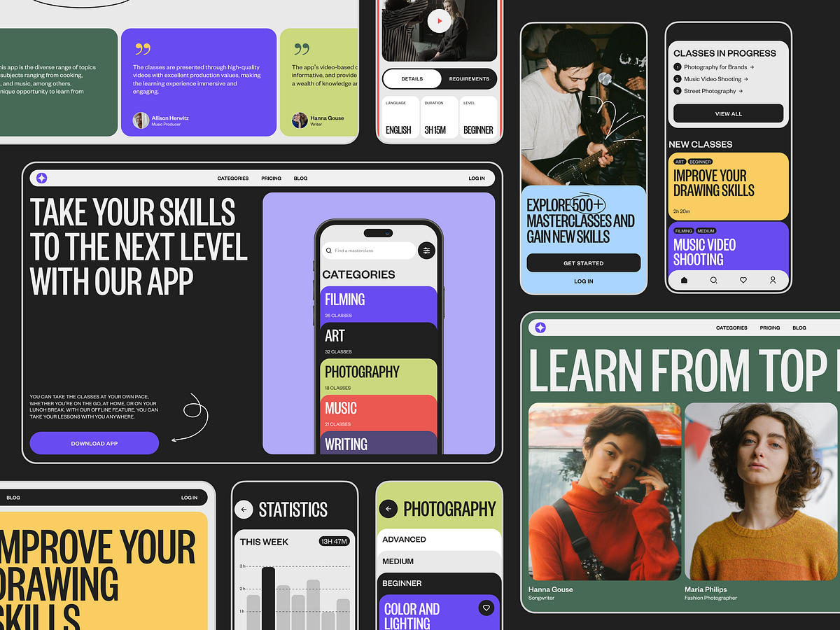
Time to review another fresh collection of UI design concepts crafted by the tubik team. This time it gathers an eye-pleasing set of functional mobile and web layouts and impressive design ideas created to cover a variety of goals from business and e-commerce to education, innovations, and communication. Below you will find a bunch of inspiring interface designs created in different styles and following different design approaches. Still, all of them are united with one objective to help the user to reach their goal and solve their problems, as well as help businesses effectively communicate and sell to those who need their product or service. Enjoy and get inspired!Poster Store Ecommerce AppThis UI/UX design project is inspired by the widespread human desire to surround ourselves with the beauty of art. That is the design for the e-commerce mobile application for the poster store where customers can find their perfect poster and even try it on their own interior, this way adding the element of personalization to the customer experience. The color palette uses a dark background on most screens, which works effectively for the image-driven interface. Also, the landing page was designed to promote it and amplify its online presence, keeping the consistency of style with the product and using impressive web animation effects.https://medium.com/media/de4ad4f24f695a363fb7833c65b3723a/hrefhttps://medium.com/media/9b48f18045e0f82530f30af441bb12f3/hrefhttps://medium.com/media/79390f3015da11fdddd8256d213bfd69/hrefBartending School WebsiteSip some elegance and style with this web design project: that’s the website for the bartending school and courses for those who strive for knowledge and practice in the sphere. Stylish layout playing with typographic hierarchy, contrast, and negative space, well-arranged theme photo and video content, smooth motion, custom graphics, and cool trendy mask shapes of glasses together make the pages not only informative but also eye-pleasing and emotional.https://medium.com/media/b88d0150d87d6d082e49b52262486be9/hrefhttps://medium.com/media/91083743f388458e7b2fbfa59b62f63a/hrefhttps://medium.com/media/44503db23d0e706c6878ceab05afedfd/hrefCrypto ApplicationThis UI/UX design concept and interactions are made for a functional and stylish crypto application helping users to dive into the diversity of the crypto world and manage all their data effectively.https://medium.com/media/5581f216e57b0417c0740237155a8645/hrefhttps://medium.com/media/5010d3e1900030eff1a04e5ae1e83715/hrefhttps://medium.com/media/4031b455a37d51b5c698542bd3b4afa8/hrefhttps://medium.com/media/5bb07596dec1a6e2537c2f9c6ec38ca9/hrefAR Based Social Network AppHere are some UI/UX and interaction design solutions for the vibrant and engaging mobile application concept of the AR-based social network. This user interface design concept combines well-recognized mental models for communication in social networks with innovative elements and approaches that consider new technologies involved in this process. In addition, the landing page was designed to strengthen the online presence and recognizability of the mobile app brand.https://medium.com/media/798370d93c9bbaf013c4a2a9c599a8a2/hrefhttps://medium.com/media/925b11b313a98dab803b761986886f14/hrefhttps://medium.com/media/93d5670fccea4b51c8b13dad585b2478/hrefhttps://medium.com/media/bf96e213198e9fcdf346d92c3c9acb84/hrefhttps://medium.com/media/56735e37c9d6fad15cc1e378c8def6e8/hrefhttps://medium.com/media/77911c528d36feeff71327d2500617b0/hrefhttps://medium.com/media/bb6a76f660869586830c29d078de4a68/hrefMasterclasses Platform“An investment in knowledge pays the best interest,” Benjamin Franklin once said, and that’s the reason why many people never stop their education and strive to get more knowledge all the time. This UI/UX design project is aimed right at that type of audience: it is a stylish, handy, and functional educational platform where users can join a variety of masterclasses and workshops. Take a glance at the user experience, interface, and interactions for the mobile application, as well as the web design for the platform.https://medium.com/media/49bc2744446c3ff0704d1d2958e6ccb3/hrefhttps://medium.com/media/d9a96a64ed640b7391f96cae806110e2/hrefFashion Marketplace WebsiteThis sophisticated web design concept was created for a marketplace presenting an ecommerce hub for a variety of modern Ukrainian brands to be promoted and sold. The approach combines bold and daring presentations to highlight the creators and the exclusive stuff they sell, with intuitive e-commerce functionality to make the purchase process fast, convenient, and clear.The project features the following cool brands:Gunia Project website instagramMakhno Studio website instagram workshop ART OF HOMEALL THE KHMARAS Dido Ceramic Art ToysEtnodim website instagramKatimo websiteGorn Ceramics website instagramAndrij Bokotei websitehttps://medium.com/media/145eb54b45359d84b57c5b84a32f8fb4/hrefhttps://medium.com/media/f6f90734cc86a661e433716ac5db83a9/hrefhttps://medium.com/media/bc42e848d13e67f73aa2ec6f741f709d/hrefhttps://medium.com/media/9872162aeabcbba538f898dc81e9c74e/hrefWater Brand WebsiteCatch the refreshing vibes with our air, neat, and exquisite design for the atmospheric ecommerce website of a niche water brand. Well-arranged content, impressive videos and photos, a limited color palette creating an atmosphere and literal feeling of freshness, custom graphics, solid visual hierarchy, and smooth motion design make the website captivating and informative for visitors.https://medium.com/media/56738719eef418f9cf60fafad4c74aa2/hrefhttps://medium.com/media/e14904a891d2fa225f73059eadefa6e0/hrefhttps://medium.com/media/c03618536dc60c7595a2a5a134eda7ab/hrefSports and Fitness App DesignThis app design project is filled with the vibes of an active lifestyle, fitness energy, and a sportive focus on the goal. Take a closer look at the mobile application supporting users in their sports, fitness, and diet routines and goals, as well as at the elegant, informative, and attractive landing page uncovering the app’s benefits and engaging users to try it.https://medium.com/media/c80a9f1376688d360515964a9e83460e/hrefhttps://medium.com/media/aba4734cee180c264d2735e013c73f7a/hrefhttps://medium.com/media/d0d2f368ae5eeb92ce24509ef178c3b6/hrefWildfarm Drinks Ecommerce WebsiteEnjoy the beauty of wild nature and the healthy energy it shares with people in this web design project. Here’s the atmospheric e-commerce website of a company that produces and sells a diversity of teas and drinks based on plants and flowers grown on a wild farm in conditions as close to wild as possible. The web pages are filled with light and air; photos and videos share the atmosphere of harmony in the wild fields; sophisticated decorative typography and custom graphics make the page look emotional and stylish. And the well-crafted navigation supporting effectively structured catalog and product pages enhance the process of purchase.https://medium.com/media/af146864dc4d003ba1420bb353b56f3c/hrefhttps://medium.com/media/10dac3dc8ef80da3ca92cc885c33c679/hrefhttps://medium.com/media/6e0c01595eef7f7e435e2df4e06616cd/hrefhttps://medium.com/media/ae3773ed5a429a7ede4d3e4fb695205f/hrefHearing Support Tech ProductThis conceptual user experience design project is devoted to a tech product helping people cope with hearing disabilities using innovative technologies and live their life to full. Check the design solutions for the functional, dynamic, and stylish mobile application and elegant, eye-pleasing, and informative landing page for the product.https://medium.com/media/d4cf78d32f7ab1ac4eb3cc5ee7f0d400/hrefhttps://medium.com/media/e172040d747ce30b50d576c737a0e43a/hrefhttps://medium.com/media/b89e6920fbf8822d4ee328719f101fe8/hrefNew web and mobile design collections and design case studies by our team are coming soon — don’t miss the updates!Tubik Design Collections and ArticlesIf you want to check more creative sets and useful articles on UX design for web and mobile, here are some of them.8 Web Design Projects To Inform and Impress UsersDigital Agency Experience: 7 Observations from Creative Projects for Clients6 Essential Elements of a Company Website DesignWeb Design: 11 Diverse Functional and Awe-Inspiring Website DesignsUI Design Process for Web and Mobile: 3 Detailed Video CasesDainty UI Design Projects Inspired by Food and DrinksApp Design Ideas: 7 Nifty Mobile Application Design ProjectsProduct Page Design Inspiration: 17 Ecommerce Web DesignsMotion in UX Design: 6 Effective Types of Web AnimationThe Anatomy of a Web Page: Basic ElementsOriginally written for Tubik BlogWelcome to talk to us and check designs by Tubik via:WebsiteDribbbleBehanceTubik Arts10 Elegant and Handy User Interface Design Projects was originally published in Muzli - Design Inspiration on Medium, where people are continuing the conversation by highlighting and responding to this story.
Mobile Design: 7 User-Friendly Application Designs
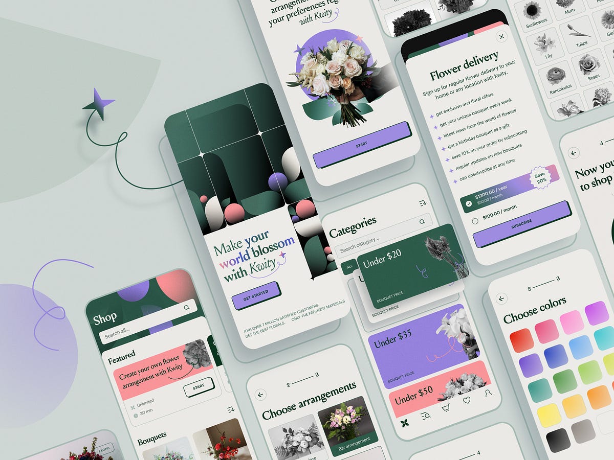
Let us share a fresh big bunch of practical app design ideas by the tubik design team, which is never tired of trying new approaches and experimenting with design techniques. This collection shares app design examples showing how mobile user experience can work to help users solve their problems elegantly. The app design cases also feature landing pages as a tool for boosting mobile app branding and promotion. Have fun and get inspired!Flower Store Application“If you look the right way, you can see that the whole world is a garden,” Frances Hodgson Burnett once said, and her words share the inspiration behind our design project spirited with the beauty and power of flowers and plants. Check the design solutions for a mobile application of an ecommerce flower store, allowing customers to choose and combine perfect bouquets for any occasion and a landing page promoting the service and amplifying its online presence.https://medium.com/media/af9987a1c65c908d4bd1ff8526fe30a9/hrefRegistration screen designFlower store mobile app screensFlower store mobile app screensFlower store mobile applicationLanding page promoting the flower store mobile appLanding page promoting the flower store mobile appDrinks Delivery AppWelcome to dive into vibes of fun and party with the bright project we worked on for Heineken Mexico. This project is about Glup, a bright and functional mobile application that allows users to buy beer and associated stuff like snacks, cups, and the like and get the orders delivered quickly.https://medium.com/media/d563951dc6da5f5551ea0728efce27fd/hrefThe task for the tubik team was to develop the branding and user experience design for the Glup mobile app, consistently reflecting brand identity and aesthetics, making the customer experience integral, engaging, and smooth.https://medium.com/media/8671e9b6693d398a6739e3189d0a50fd/hrefLanding page design for Gluphttps://medium.com/media/5cc75b0dce1a58a7c657bd30e7c6ca6d/hrefLearn more about the project in the Glup design case study.Mindfulness AppHere’s the mindfulness application helping people to dive into the peace and energy of yoga and meditation to stay focused and unleash their inner power. Deep and thoughtful work on colors, minimalist interface, harmonious video and photo content integration, and smooth atmospheric motion effects and graphics make it intuitive, attractive, and user-friendly.https://medium.com/media/073283c794d77d8602bccfd9a41298ff/hrefhttps://medium.com/media/f352a4919af01584f2e04396193ad53f/hrefStatistics screensMindfulness application screensLanding page for mindfulness applicationhttps://medium.com/media/fac11a7a6bf3a827a36dd492ab4dc47d/hrefHabit Trackerit’s a mobile application helping users to build new habits and supporting their consistency which is crucial for success in this case. Stylish interface in the dark theme, with solid visual hierarchy and intuitive navigation for users of any age — that’s what we aimed at.https://medium.com/media/fbe9066845feeebbfac06cd9e43bc830/hrefhttps://medium.com/media/9617083d78d955cb04a30a2417028b09/hrefHabit builder mobile screensHabit screenshttps://medium.com/media/35d241b71682b6897534d0c678475425/hrefMusic Learning App“Music is the universal language of mankind,” Henry Wadsworth Longfellow once said, and hundreds of years later, we still share the same feeling. Take the overview of our design concept that also supports that theme: this is the user interface and some interactions for the music learning app that helps users practice playing different musical instruments.https://medium.com/media/e2b8bfe65101206aa173dd3e93d62fc1/hrefhttps://medium.com/media/4e15fe231f9688bd1ddb8208eba3c333/hrefhttps://medium.com/media/8f2b7a3ca40362a8a72b76bdce35b752/hrefhttps://medium.com/media/67e2fd26f28a8eab94958bf95cf58235/hrefhttps://medium.com/media/c9bbdb89cf2d2333465ce3025c943740/hrefhttps://medium.com/media/84e8ad7ef42a327a4da4a059c131fbba/hrefDance Learning App“Dance is your pulse, your heartbeat, your breathing. It’s the rhythm of your life. It’s the expression in time and movement, in happiness, joy, sadness, and envy,” Jacques d’Amboise, the American ballet dancer and choreographer, once said. Here’s the design concept echoing the idea: the online platform and mobile application that offers users to take dance classes and participate in programs on various styles and kinds of dancing.Uncluttered and informative layout, atmospheric photo and video content, smooth motion, well-balanced hierarchy, and solid consistency of web and mobile products make the user experience design eye-pleasing, emotional and engaging.https://medium.com/media/a23c7759a4f43b81c3c7638401a4f1e4/hrefhttps://medium.com/media/a6b1b31f012869f07e1af07bb4857650/hrefDance classes app screensDance classes app screensDance classes app on a smartwatchhttps://medium.com/media/cbb517bf84a3d73043172e0ce72de3ba/hrefhttps://medium.com/media/599be1ebb2276e134762b13258d92793/hrefWebsite for dance classes platformSafe Driving AppHere’s a glance at the app design for OtoZen, innovative technology for safe driving, operating via the hardware device connected with a mobile application. It helps users to turn any car into a smart, distraction-free vehicle. It is the all-in-one safe driving assistant that keeps drivers focused, organized, and connected to friends and family. Users can quickly pair the OtoZen device with their Apple or Android phones via Bluetooth and install the OtoZen Pod in split seconds, with no tools, wiring, or professional installation required.In this project, tubik specialists were involved in auditing and improving UI and UX design for the mobile application, as well as creating custom graphics and a website that would strengthen the product’s web presence.https://medium.com/media/d1aefb31f75aae28c1397608ba7a8426/hrefOtozen app My Trips screensOtozen app screens for connecting with the hardware device and tuning the app settingsOtozen mobile applicationLanding page promoting Otozen technology for safer drivingLearn more about the design process and solutions and check more mobile screens for this project in the OtoZen app design case study.Education App“An investment in knowledge pays the best interest,” Benjamin Franklin once mentioned, stating the idea that has never lost its relevance. Our new mobile design project also touches on that topic: take another glance at the mobile application that allows users to access the vast diversity of various education courses, from general to narrow-focused, from professional to those that develop a broader outlook and deeper understanding of yourself. Functional, readable, and solid, using the power of negative space, effective color combinations, and different types of contrast, focused on intuitive navigation and compelling content presentation, it helps users invest much in their knowledge.https://medium.com/media/6f60365dc2a28995f536a6fb75c6016d/hrefhttps://medium.com/media/55c76bcb80ab82d6ac4a10ce5be3b04a/hrefEducation app profile screenEducation app search and coursesEducation app course screensNew web and mobile design collections and design case studies by our team are coming soon — don’t miss the updates!Tubik Design Collections and ArticlesIf you want to check more creative sets and useful articles on UX design for web and mobile, here are some of them.Web Design: 11 Diverse Functional and Awe-Inspiring Website DesignsProduct Page Design Inspiration: 17 Ecommerce Web DesignsInformation Beautified: Media and Editorial Website DesignsUX Design for Traveling: Impressive Web Design Concepts23 Impressive Web Design Concepts for Various Business ObjectivesUX Design: Types of Interactive Content Amplifying EngagementMotion in UX Design: 6 Effective Types of Web Animation5 Pillars of Effective Landing Page DesignThe Anatomy of a Web Page: Basic ElementsBig Little Details: 7 Helpful Elements of Web UsabilityOriginally written for Tubik BlogWelcome to talk to us and check designs by Tubik via:WebsiteDribbbleBehanceTubik ArtsMobile Design: 7 User-Friendly Application Designs was originally published in Muzli - Design Inspiration on Medium, where people are continuing the conversation by highlighting and responding to this story.
How the new design of Symbol, an online luxury store, resulted in a 76% increase in conversion rate
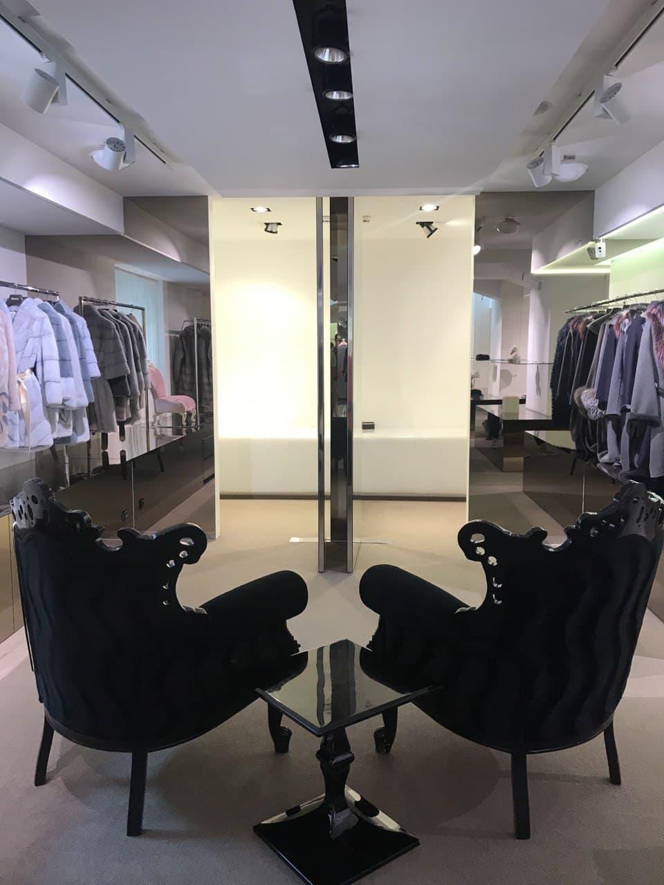
How the new design of Symbol, an online retailer in the fashion luxury segment, resulted in a 76% increase in conversion rateDenis Studennikov, the head of the UX/UI department at Turum-burum, shared insights about the new design of the web store of the luxury segment. Below is a list of features and custom solutions that helped increase the conversion rate for Symbol company upon the redesign of the web store.Project overviewSymbol is the official distributor of over 200 worldwide brands in Ukraine. The distributor has been on the market for over 20 years. Currently, the retailer has been working with such flagship brands as Fendi, Dolce & Gabbana, Gucci, Stefano Ricci, David Koma, Brunello Cucinelli, Balmain, Philosophy di Lorenzo Serafini, Peserico, among others.The brand chain is represented by 38 boutiques of the luxury segment and an online store.In 2021, the owners decided to redesign the website of the online store to improve the efficiency of its work in order to correspond to the status of an exclusive designer clothing store and to provide the best service, not only offline but also online.The main problem:The offline and online sales processes have been significantly different. At the brick-and-mortar store, everything has been very well-organized, perfectly balanced, and status-oriented, but at the online store, this has not been the case.The objective:To develop a design for an online store of luxury products. The site should be simple and user-friendly, but at the same time, appeal to high-end customers.The specifics and nuances of the online clothing store of the luxury segmentEven though our Turum-burum team has more than 12 years of experience working with eCommerce projects in the fashion industry, the creation of an online luxury clothing store was a new challenge.Besides gathering analytical data, it was crucial for us to understand the business specifics, learn how the customers of the luxury segment behave and know how they make decisions. That is why we visited the physical store, where we had a tour and had a chance to better understand the luxury clothing retail business.Symbol luxury clothing store in Kharkiv, UkraineFor example, the target market of the physical store are men and women with an income much higher than the average household income, who prefer to try out the product in person before buying it. Most customers are just not tech-savvy enough and may not know how to shop online using mobile devices.Development of a user-friendly interface for selling exclusive productsAfter collecting information and analyzing analytics data, we proceeded to redesign the interface of the Symbol online store using the RSR (Revolutionary Site Redesign) approach. Our primary concern when redesigning the interface was to focus on minimalism, simplicity, and functionality.Personalized approachThe target audience of the luxury segment requires customized treatment and quality of service. To provide a more personalized offer, we divided the visitors after their first visit to the homepage according to the following key parameters: women, men, and children category. Thanks to this solution, the store can now offer the most relevant products for each customer.The Symbol Store HomepageOffline and online as a unified systemTo make customers feel like they’re shopping in a physical store, we made the site layout and the background of the product cards the same color. This created a very interesting effect that made you feel as if you were browsing around in a real physical store without feeling confined by the borders of an online store.The site layout and the background of the product cards are the same color on the desktop… and the mobileThe background and the merchandise blend together such that the customer is not distracted from the product of interest.Customer Service ExcellenceThe key advantages of the store are mentioned on the first screen, demonstrating the level of service and customer care such as free shipping, fitting, and the Apple Pay payment method. According to the analytics, most of the mobile traffic comes from iOS devices, and that’s why we place emphasis on the likelihood of making quick-and-easy payments at the first touch.Free shipping and Apple Pay payment method are the main competitive advantagesUnique entry pointsWe implemented innovative blocks on the homepage as additional entry points, i.e. Look of the Day and Symbol Podium. They can look like pages out of a glossy magazine, featuring a collection of ready-made styles. The customers can immediately go to the product card they like.The “Look of the Day” block on the Symbol websiteThe “Look of the Day” block as seen on the mobileThe “Look of the Day” block as seen on the mobileThe range of looks and styles on the Symbol websiteWe structured a block with navigation and prioritized categories according to the analytics data. We expanded the list of entry points by adding tags with brands and popular titles for the quick-search feature and shifting them to different categories.Tags for the quick-search feature in the Symbol online store menuTags on the Symbol online store homepageFocus on productsWhen designing a product listing page, we used the usual pattern for fashion theme stores, i.e., the panel with filters and sorting was transferred to the horizontal menu. This allowed us to increase the preview of the product cards and place the main focus on the products of interest.The category listing on the Symbol websiteThe category listing on the Symbol websiteThe product page also features large images of the products, so that the user can examine the item in detail and look at it from different angles. The user can also check the way how the item would look like on the model wearing it. The most highlighted feature of the product card is its extraordinary scrolling feature.When scrolling, the photos of the product are usually displayed horizontally, while the extraordinary scrolling feature scrolls the photos of the product vertically.The product card as seen on the mobileOnline fitting roomThis functionality allows the user to choose their own look, according to certain parameters such as brand, size, skin color, etc. Thus, it becomes easier to understand whether the product suits a particular person or not and how to combine it to put together a finished look.On the right side of the page, there is a preview of the products that includes the price. If customers like the item, they can go to the product page. The page can be opened in a new tab so that the options in the online fitting room will not be lost.Customers can send the entire look to the cart just by pressing a single button.An example of how the “Online fitting room” feature works on the Symbol websiteHow worldwide brands became more accessibleAs a result of redesigning the Symbol online store using the RSR approach, we managed to create an interface that made buying worldwide brands easier and smoother by doing the following:Placed more focus on the uniqueness and status of the goods;Optimized the navigation of the site;Emphasized the level of service (such as free shipping, fitting, returns & exchanges, bonus programs, etc.) at different stages of the funnel;Implemented new tools and features (such as the “Online fitting room”, “Podium,” and others) to simplify the process of searching for goods for the customer.After the release, we faced a large number of factors that influenced the before-and-after results measurement. Still, a significant increase in the conversion rate was recorded both in seasonal and non-seasonal periods. For example, when comparing the organic traffic in the off-season period, the growth of the conversion rate was 76.34%.How the new design of Symbol, an online luxury store, resulted in a 76% increase in conversion rate was originally published in Muzli - Design Inspiration on Medium, where people are continuing the conversation by highlighting and responding to this story.

User Experience: How Design Consistency Works
Clinic website designOverwhelmed with the modern world’s rush and the incredible amount of information around, people tend to choose simplicity, sometimes even without thinking about that choice. To reduce the cognitive load, users seek shortcuts, patterns, and models that make interactions with a digital world and numerous channels of communication effortless and straightforward. In user experience design, one of the factors supporting that objective is consistency. That’s the theme to discuss in our today’s article and illustrate with the UX design projects we did at tubik agency.Welcome to read what consistency is, why it is important, what types of consistency exist, and how to reach it in an app or website you design.Juno website designhttps://medium.com/media/8fd9bd1a09192a13d2b1aab917596193/hrefhttps://medium.com/media/1d784be6722980f8ae975d23464df38e/hrefWhat Is ConsistencyOne of the definitions the Cambridge English Dictionary gives to the term “consistency” is the quality of always behaving or performing in a similar way, or of always happening in a similar way, aka “being the same.” And that’s perhaps the simplest way to put it. It means that the product communicates with the user in the same or similar way, whatever point or channel of communication. In terms of user experience, it means that similar elements look and function similarly, this way reducing the cognitive load and making interactions more smooth and more intuitive.Considering the fact that today people are overloaded with information, they tend to choose products that are easy to understand and interact with. What’s more, consistency builds a reliable foundation for the feeling of harmony in both how the product looks and how it works. And harmony is always a desirable part of any experience we have. Consistency makes user interfaces predictable and learnable while brands get a solid and united presentation and performance due to it.Consistency is one of 10 fundamental usability heuristics, which are core principles for interaction design defined by Jakob Nielsen back in 1994. Consistency in this list is based on the principle that users should not have to wonder whether different words, situations, or actions mean the same thing.Website design for THThttps://medium.com/media/af9987a1c65c908d4bd1ff8526fe30a9/hrefConsistent mobile design and landing page for the Flower Store applicationWhy Design Consistency Is ImportantPut shortly, the consistent approach to user experience design leads to the following benefits:the interface gets much easier to learn for new usersfewer errors happen as users are less confusedit reduces cognitive load this way, saving users’ time and effortconsistency supports a strong brand image for a website or applicationSo, consistency connects different UI elements into a system of predictable and clear interactions. Actually, that’s what we do in the physical world, too, to make our everyday life easier and avoid the need to focus on the same operations again and again. For example, we all keep dishes and utensils in our kitchens, so even coming to someone’s place for the first time, you won’t try to search for a cup and a spoon in the bathroom just because it’s the pattern known and followed by most people.https://medium.com/media/d4a8943594e3601c7eedd0051bbaf45c/hrefThe consistent web, mobile and branding design for Vertt car-sharing servicehttps://medium.com/media/e974e3f2e7b94dade5b1fe57fe4be4fe/hrefTypes of ConsistencyFrom the perspective of the impact factors, consistency can be visual and functional.Visual consistency is based on making similar objects or elements look the same. It is critical to make the connections between the elements clear and build a solid visual hierarchy. It’s about icons, fonts, image sizes, buttons, labels, and other vital stuff. For example, when you organize an article, all the types of text elements (heading, subheadings, main text body, quotations, etc.) should use the same typographic presentation system to be scannable and feel structured. If you are creating a blog or a media with multiple types of posts, they have to stick to the same system of visual performance so that they could be perceived as one whole publication, not a mess of random posts.Web pages for Lumen Museumhttps://medium.com/media/522d0e0e1409b7e5baa0cb8a301d7b16/hrefhttps://medium.com/media/a6b1b31f012869f07e1af07bb4857650/hrefhttps://medium.com/media/599be1ebb2276e134762b13258d92793/hrefFunctional consistency means that similar objects behave the same way. For example, most websites use a logo or a publication name in the top left corner of the website header, and by clicking it, users return to the home page or refresh it. Most users are accustomed to this pattern and expect it to function that way, even on the websites they visit for the first time.https://medium.com/media/4790fe5b367ad5e3b501a4c32d0801d3/hrefFrom the perspective of connections and scale, consistency can be internal and external.Internal consistency is about different parts of your interface or brand that look and behave as one clear system. For example, when you make all the CTA buttons on different pages or screens of your product colored and designed the same way, users will be able to quickly distinguish them at any step of their user journey.Mobile and web design for Kaiten food marketplaceMindfulness application and websiteMusical instruments websiteExternal consistency is about parts of your interface that look and behave as typical patterns for most products of this kind. That’s, for example, when you use a shopping cart even on the website selling non-tangible products or underline the text links to give users a hint that they are clickable.Screens for Exotic Fruit appHow to Make Design ConsistentHere is a checklist with 7 points you’d better consider if you strive to reach the consistency of your website or mobile application design.Implement recognizable patternsThere are tons of behavior patterns and habits users already have before they come across your app or website. This set of knowledge is based on their previous experience and depending on how designers approach it, it may help or ruin the user experience.For example, even before the popularity of digital products, for stats and charts, most users associated red with a negative balance or decrease and green with a positive balance or increase. Using this pattern known to millions of people of different ages and nationalities, you support the product’s external consistency and make it easy to understand data visualization. As well, coloring the button of accepting an incoming call green and rejecting the call red reduces the cognitive load for the users as they are accustomed to such a model and won’t need to think about what button to hit.https://medium.com/media/2bc18c58e5bf5e9585aa1b304aab0dbb/hrefAlso, this point may deal with internal consistency, and it’s especially critical for complex products with a large number of screens and interactions. When you onboard the users, educate them on how to deal with the interface, and use a consistent set of interactions from one page to another, they don’t need to focus on how to deal with each new page, so they feel the interface quite intuitive. But if you break that consistency, users will need time and effort to understand what’s going on.For instance, when you use galleries of images with a vertical scroll on most pages but then use a not-so-obvious horizontal slider for them on another one, it can make users struggle with the content or miss it at all. Or let’s imagine that you used a plus button in the bottom part of the screens for a long time, and users got used to finding it there, but then you moved it to the top part and hid it in the hamburger menu. Or, let’s say you make the phone number tappable and interactive on some screens and non-interactive on others, although everywhere it looks the same. That is inconsistent. Sure, in this case, users will need some time to switch from one pattern to another. This experience may be quite annoying so take care of smoothing it with tooltips or other techniques.Of course, that doesn’t mean that you have to stick only to known patterns. There’s always room for creative and out-of-the-box solutions; just keep in mind to think over their connection with what the target users already know and use, and if that connection is weak, think about how to support users and not transform design creativity into user’s annoyance. What’s more, strive for logic and similarity of interactive patterns — even if they are non-common but consistent across all the product screens, the process of getting accustomed to them will be quick and easy.The concept for a website on furniture and interior decorBe cautious with experiments on UI componentsBased on the previous point, it is easy to see that any experiments with UI elements should be thought out twice for the sake of consistency. That’s especially true for the basic elements used across thousands of apps and websites. People know them so well that, in most cases, they don’t even need to think much.For example, whatever website or app users deal with, when they need to find something, they will be looking for a magnifier icon marking the search button or field. If you hide the search functionality behind another image or icon, it may ruin the experience and confuse the user. Instead of interacting with the content, they will try to find the field for searching for it. Or, trying to find a way to contact, most website visitors will be looking for the link to the Contact Us page or form in the header or the contact data in the footer of the page; bearing that in mind, you can make a shortcut to conversion and happy customers. The same applies to other basic and widespread functions like bookmarks, shopping carts, chats, and messengers, saving items to wish lists, making calls, adding new items, and so on and so forth. If you decide to experiment with their appearance, placement, and performance, test them well, and make sure users will be able to interact with them.Task Tracker AppMind typography and color similarityAmong the most impactful factors of visual consistency, UX designers will often mention color and typography. No secret, they both have the power to influence the visual style and emotional background, and user behavior. Being that crucial for visual performance, both allow users to feel the product is integral and united if used consistently. That’s why there should be a well-thought-out design system of using specific fonts and colors for text content and layout elements; this way, the website or app will feel clear, and the users won’t need to get used to new looks and combinations from one screen to another.https://medium.com/media/41daa37f5123c920f680fce91a83b457/hrefAs was already mentioned above, colors also can be a factor of external consistency. In the vast majority of cases, color is perceived by the human eye before the brain decodes the icons, images, or text, so it’s better to analyze this factor and make it helpful in building intuitive navigation and a positive user experience. Remember the example with colors for the buttons for accepting or rejecting a call? If you want to ruin that experience, just exchange their colors and make the button of accepting the call red, for example, justifying it with the fact that red is super noticeable. That can end up with a sort of fiasco: even if the icon looks absolutely clear, most users will mistake it for the rejecting button just because they see and decode color much faster than the icon or text, especially for such a basic operation.https://medium.com/media/192312c3599757fd60777b55df52bc35/hrefWebsite design for a confectioneryBuild up a system with visualsImages play a great role in not only adding beauty and style to the interface; being perceived faster and easier than text, but they also support usability, amplify the message, and add their big two cents to setting the needed mood and atmosphere. However, it doesn’t mean that designers just take different images they like and put them into the interface. As well as typography, images have to present a system, not just a random set. In this case, they become another factor in providing a consistent user experience.Consistent visual system of brand identity and mobile app design for Carricarehttps://medium.com/media/eef8355382c474b365d9c498682080c6/hrefhttps://medium.com/media/ade8d2b9e33629e4ee33d63b7284c63a/hrefDesign of identity graphics for UplyfeCustom book covers design for ABUK, audiobook appProperly structurize contentRemember that classic picture explaining data visualization with Lego Blocks?Image sourceIt’s always easier to deal with any data when it’s structured. Even fiction books present an organized system of chapters, so how could interfaces of any kind avoid it? Making the content well-structured allows the user to focus on the information without the preliminary job of trying to arrange it and understand the connections. And it should be done not for particular screens or pages but a website or app as a whole, making it feel straightforward and consistent at any point of interaction.For example, using a consistent system of visual performance for different elements in an article (heading, subheadings, bullets, quotes, images and image galleries, text links, etc.), you make the interaction with a blog or news media effortless, as users can quickly catch how it works, scan pages, and find what they need. As well, using stats and infographics, make them look and work similarly across the app or website to reduce the cognitive load.https://medium.com/media/16050324548acf8eef40dfabf5c3bff4/hrefhttps://medium.com/media/9686ef61321f485800dbb7839f0f90c8/hrefFollow one identity across multiple channelsA brand with a solid identity should demonstrate a consistent connection of it with its online presence across different channels: website, application, social networks, presentations, corporate documentation, and correspondence should all be united in one system, first of all, due to the consistent use of brand colors and fonts.https://medium.com/media/d563951dc6da5f5551ea0728efce27fd/hrefConsistency of identity and mobile design for the Glup delivery applicationThe consistent design of a landing page and posters promoting a mobile banking serviceThe consistent use of a company mascot in the design for ShipDaddyWork on effective UX writingAs we mentioned in the article about crafting good texts for interfaces, they are based on 4 foundation stones and have to beclear (users understand what you talk about, and the core message isn’t blurred or complicated)concise (the piece of text is meaningful, laconic, and concentrated on the goal, no empty talk is included)useful (the copy gives users necessary information or helps with interactions)consistent (the copy within the interface of one digital product keeps the same style, tone, voice, and terminology)UX writing defines how the interface communicates with the user, the brand’s tone and voice, and it is another factor that demands a consistent approach. As well as in communication with humans, with digital products, users expect friendly and somehow predictable behavior. Even the inconsistent use of title case and sentence case across the app may cause a sort of discomfort.Order screens for the Tasty Burger appEducation app designWe will talk about more design practices on reaching consistency in UX design in our future articles, so stay tuned and keep up with the updates!Useful ArticlesHere’s a set of articles on more aspects and best practices of user experience design.5 Pillars of Effective Landing Page DesignThe Anatomy of a Web Page: 14 Basic ElementsTypes of Contrast in User Interface DesignTake My Money: UX Practices on Product Page DesignVisual Dividers in User Interfaces: Types and Design TipsBest Practices on Preventing Errors in User InterfacesHow to Design Effective Search in User InterfaceBasic Types of Buttons in User Interfaces5 Basic Types of Images for Web ContentWeb Design: 16 Basic Types of Web PagesOriginally written by Marina Yalanska for Tubik BlogWelcome to check designs and art by Tubik via:WebsiteDribbbleBehanceTubik ArtsUser Experience: How Design Consistency Works was originally published in Muzli - Design Inspiration on Medium, where people are continuing the conversation by highlighting and responding to this story.
Product Page Design: Handy UX Tips and Practices
In e-commerce, the measurement of success is not the number of website visitors or clicks. It’s the number of finalized purchases. From that perspective, a product page is crucial as it is usually the spot where most decision-making on “to buy or not to buy” happens. So, designing or improving an e-commerce website or application, UX designers have to think it over and test it up to the slightest detail. That’s what our today’s article is about: let’s discuss what a product page is and how to design it effectively. Packed with plenty of examples from both known e-commerce websites and creative design concepts for niche or specific business goals.Product page design for the BlockStock websiteWhat Is Product PageThe product page is a page of an e-commerce website that provides a customer with all the needed information about the particular item, allows them to check various options if they exist, and enables a customer to quickly proceed with the purchase process if they decide upon buying the item.Unlike a real point-of-sale, an e-commerce website doesn’t provide physical contact with an item or assistance from shop staff. Product page becomes the major source of attraction, impression, information, and persuasion. That’s why its design, navigability, and usability play a crucial role in growing sales.As we mentioned in our guide to the basic web pages, a badly-designed product page may waste all the effort (usually massive and complex) taken to bring the buyer to the website and to this particular product. So, besides the attractive product presentation, focus on functionality, clarity, readability, and intuitive navigation.Product page concept for a gardening e-commerce websiteTypical Elements of Product PageBasically, a product page:shows the image of the productgives all the needed information about the productallows users to check different color/model options (if any)enables visitors to see the reviews, comments, and ratings from earlier buyersallows for adding the product to the cart or wish listshows other relevant options.Additionally, the product page may include such options as a comparison of different items, especially popular on websites selling different devices and appliances.https://medium.com/media/fbf4df9762877774580cc9ad6f038ee5/hrefBased on that, here’s a checklist of basic elements of the product page layout:name/title of the itemphotopriceitem availabilityadd to cart/add to bag/add to basket/buy buttonadd to favorites/save to wishlist buttondescriptionsocial proof: rating, reviews, the number of previous buyers, the number of people looking at the item now, etc.choice of colorchoice of modelchoice of the number of items to buysize guide or calculator (for clothes and footwear)extended details (materials, technical specifications, dimensions, weight, special features, etc.)The list above doesn’t mean that all the points are obligatory for any product page. The choice will depend on analyzing multiple factors, understanding the target audience, and careful prioritization to see which points to include and which may be eliminated from the list for this particular type of goods or kind of customer.Product page first-screen view on Walmart websiteDesign Practices for Product PagesVisual DemonstrationE-commerce platforms are the best place to prove the saying that the picture is worth a thousand words. Not able to contact the item physically, visitors will count on the visuals of the product to make their first impression about the goods. What’s more, images are noticed and decoded faster than words; they will be the first element attracting the visitor’s attention. They present the part of the content which is both informative and emotionally appealing.That’s why many e-commerce platforms:use a set of images to present one item from different points and anglesapply zoom functionality to enable a visitor to look at some parts of the photo closer, see the textures and small detailscombine the photos of the item with photos of it on a model or in the proper environment to give a better understanding of its looks and sizesProduct page first-screen view on Marks and Spencer: a combination of several photos shows the item separately and on the modelThe approaches to photo content can be different and depend on both general brand strategy and particular campaign or collection style. However, what unites them all is:originality: special shootings are organized to make custom photos that correspond to the style defined in a brand book or specific campaign guidelineshigh-quality: no doubt, the quality of photos directly influences the impression about the particular item and the brand in generaloptimization for the web: being quality, photos shouldn’t be too big as it can dramatically influence the loading time, which in turn has a great impact on SEO; also, pages loading slowly are the solid reason for high bounce rate — unless the website offers something absolutely unique and super exclusive, people will just go away instead of waiting.https://medium.com/media/0dbae34320e0fdf1557cb3c1f0a819e6/hrefExcept for images, other media, more complex or interactive, can also be used. Among them, you can now find:product videos, detailed video reviews, and instructions360-degree view of the itemaugmented reality technologies helping people to observe the item in their own environment or try it on virtuallyhttps://medium.com/media/41455d1226847ea12130dc5b5bb0e2c0/hrefhttps://medium.com/media/14946784cfbd8eaf5288cdf71010c4cc/hrefGardening Shop WebsiteObviously, these types of media are often more complicated, time-consuming, and expensive in production than photos. So, the decision on their worthwhileness is usually based on the type and price of the offered item. For example, to sell a 5-dollar T-shirt, photos may be enough, but for buying a massively more expensive fridge, smartphone, computer, or even a car, customers need more convincing in the decision-making way. And in this case, expenses on the more complex but more impressive, persuasive, and informative visuals and media could be a worthy investment.https://medium.com/media/4574e116775a0032a6295c5ec63d54c4/hrefhttps://medium.com/media/6d36ec146e7ead43e4b5ab45ce1817d4/hrefInformative but Simple DescriptionThe saying that people don’t read anymore has nothing in common with the product page: when customers are deciding upon spending their money, they do read what they need to know about the product they are going to buy. Still, it’s not the reason to overload the description, as the attention span is quite limited. The description text should be concise, factual, simple, and talking in the language of the audience. It should answer the basic questions: what the product is, what it looks like, what it does, and how it does it. And better to do it from the first lines, which have the highest chances of being read, instead of filling them with standard marketing hooks shoppers are already sick and tired of.Another rule of thumb here is connected to the previous point: show, don’t tell. Well, better to say, tell, but also show! Don’t just describe in detail how the bag looks inside — show the photo. Don’t just tell how beautifully this neckerchief matches that jacket — show the photo. Don’t just mention the size of a toy — show the child playing with it. Combine the power of words with proper images to make the experience much more effective.Product page first-screen view on Uniqlo: the page features a concise and informative description of the item and puts the details on materials and care in another tab, both in the pre-scroll area of the page. Another good thing is a clear definition of the model's size on the photo, allowing the customers to instantly understand the proportionshttps://medium.com/media/fb1c390085eaaae2df3836596da418b8/hrefSuper Obvious Call to ActionCalls to action (CTA) should be instantly noticeable. In e-commerce interfaces, CTA elements are the core factor of effective interaction with the product; they play a crucial role in usability and navigability and, therefore, in getting profits. When all the path of interaction and transitions is built clearly for users, but the CTA element is not obvious, misplaced, or designed badly, the risk gets higher that users will get confused and need to make additional effort trying to achieve their goals — which is annoying. Therefore, the risk of poor conversion rates and bad user experience grows.ASOS product page first screen: the CTA button differs from everything else on the page due to color contrast and is instantly noticed in the light airy layout.Focus on the ItemNo doubt, thinking about the layout and content of the product page, both stakeholders and designers feel the urge to fill it with everything possible, and even more, to make the page super informative. However, be careful as this strategy may do a dirty trick: in that flood of information, the focus gets blurred, and visitors can get too distracted to make a decision. How to find the balance?On the one hand, it’s recommended not to overload the page with a great deal of information that will overwhelm customers and distract their attention from the major goal — to make the purchase. On the other hand, visitors aren’t ready to jump from one page to another to get different information about the item they are interested in. Therefore, the designer has to take the time for thorough research on the issue, prioritize carefully, and find the balance of data that needs to be provided on the product page.Is there a golden rule for all e-commerce websites? No way, as different customers and markets have different needs, and the type of the product also influences the choice of core and secondary information to show. The analysis of the target audience and user testing can give clues on what information is required for the specific categories of items or services.https://medium.com/media/26962819154291eb06645ebc01b7f1da/hrefThe more pricey, uncommon, or innovative the product, the more information the customers usually want to get about it. And even for common stuff, there may be tons of questions and hesitations. Sure, all the needed information should be accessible from the product page, and the challenge for UX designers here is to find a way to organize it properly. Technical details, materials, weight and size, size chart or calculator for clothing and footwear, functionality for comparing the item with a similar one, and so on, and so forth — any of those details can play the premier violin in a story of a particular item.Use the principle of the inverted pyramid and uncover information gradually, from the most important and demanded shown first to more and more specific details unveiled further.Instead of creating intrigue, be open, direct, and clean in content presentation.Try to put all core information in highly readable form on the above-the-fold part of the page.And test, test, test again, analyze the time on the page, heatmaps and clicks, ask and analyze to know what buyers really need and what makes shopping convenient for them.The product page on Amazon is based on the principle of the inverted pyramid: this above-the-fold view shows the core information and functionality buyers want and need to know about this type of product first of all. Engaging social proof is marked by the label of #1 New Release and showing what other products are often bought together with this one.The second screen uncovers more about the actions of other customers interested in this theme: two sections, visually attractive due to the focus on product images, uncover other items customers view or bought.And only after that, scrolling further, can users find the extended information, editorial reviews, etc., based on text without visuals.Intuitive NavigationEvery button, link, and card design can change the conversion rate significantly. It’s vital to always remember: in the intense competition we observe in e-commerce now, buyers aren’t ready to wait or waste their time on unnecessary operations or efforts to understand where’s what they need. What they do demand from e-commerce is an experience that is faster, easier, and more convenient compared to going to the actual store. If this website doesn’t give it to them, they will look for it somewhere else.So, adding to obvious CTA, make sure that users can effortlessly do common steps, for example:find search fielduse breadcrumbs helping to quickly understand the current position in the website hierarchy and probably take a step or two back instead of just going awaybe totally sure which elements on the page are clickablesee if the item is already in the cartsee the number of items in the shopping cart or bag (usually, in the website header)use the power of visual dividers and common directional cues to perceive the information fasterfind the contact information and navigation links in the website footerProduct page first-screen view on Target: multiple photos of the item, both clean and integrated into the environment, clear and instantly noticeable controls for choice of color, the obvious search field in the header, breadcrumbs creating the secondary navigation level, social proof in the form of ratings and questions, and clear call-to-action element.ConsistencyConsistency means that the product communicates with the user in the same or similar way, whatever point or channel of communication. In terms of user experience, it means that similar elements look and function similarly, this way reducing the cognitive load and making interactions more smooth and more intuitive.In an e-commerce interface, it touches both:Internal consistency is about different parts of your interface or brand that look and behave as one clear system. For example, when you make all the CTA buttons on different pages or screens of your product colored and designed the same way, visitors can learn fast and will be able to quickly distinguish them at any step of their user journey.External consistency is about parts of your interface that look and behave as typical patterns for most products of this kind. That’s, for example, when you use a shopping cart even on the website selling non-tangible products or underline the text links to give users a hint that they are clickable.Sephora product page first-screen view: expected navigation in the website header, easily recognizable for e-commerce shoppers, super obvious call-to-action button, arrows used as the clearest directional cues for most users around the web, focus on the item presented in different visuals and highlights important and influencing decision-making for the target audience.Power of Known PatternsAdding to the previous point, UX designers would better never underestimate the power of habit. In UI for e-commerce, especially in the red-ocean spheres, the primary goal is not to shock and awe. Basically, UX designers become a friend or at least supportive shop assistant who greets visitor, guides them around the store, takes them right to the items they want, and make the checkout as fast and simple as possible. To make that all possible, designers should base their decisions on how actual customers behave.There are many articles and videos calling creative people to hear their hearts, trust their guts and think out of the box. However, design is not just pure creativity striving to show all the power of original solutions. First of all, it’s a way to solve the problem and make users happier. So, it’s vital to look at the interface from the user’s perspective and find a way to make interactions that will provide a smooth and easy way to purchase.The power of habit plays a big role in products of this kind. Choosing layouts, menus, or icons, which stand too far from the ones users are generally accustomed to, often brings confusion and frustration. For a simple example, the usage of any other image instead of a magnifying glass to mark the search field can result in a bad user experience as buyers know that visual symbol and will look for it. If you are ready for such experiments, take time to test them well and ensure that customers are ready for them, too.H&M product page design is based on a minimalist approach: the first-screen view is designed around prominent images, model choice options, elegant and readable basics (product title, color name, and price), a heart icon as a well-recognized visual trigger of adding the item to favorites and a noticeable CTA button. Even the size options are hidden in the dropdown menu to put the number of controls to a minimum and focus all the attention on the visuals. Sure, it means additional clicks and scrolling; however, the approach may be reasonable and effective if the customers are used to this flow and appreciate this particular style, consistently reflecting the brand image in general.In the article on home page design strategies, we mentioned: the website is made not for creative contests or galleries of fame but for real users. The positive impact of habit in terms of user experience can be stronger than the wish for revolution. No doubt, the dose of uniqueness is needed, but not so much to knock down the user. In e-commerce UI design, often aimed at quite a diverse target audience, too much of a revolution might scare and provoke hesitations: do I really need to buy this thing, a user may think, if it’s so hard to get it? Study the interaction patterns and typical products for that particular target audience to make their habits their power. And don’t forget to check that all the icons on the screen don’t have a double meaning; support them with text labels where needed. Strive for the balance between innovation and traditions.Narrowing the focus, we may also talk about the power of habit for a particular e-commerce website. You could have read numerous reviews of the “poor UX design” of this or that e-commerce giant, breathing fire and brimstone into old-fashioned solutions or complex navigation. However, thinking deeper, it’s easy to understand that they activate the power of habit as a major approach of respect to their buyers, as plenty of their customers have been with them for many years. It’s not because they don’t know how to change; it’s because, at some stages of business development, the cost of change may be too high. It doesn’t mean that the changes are never made; they are just not as revolutionary and made in small steps.Product page above-the-fold view on Etsy marketplaceScannability and SkimmabilityIt’s already well-known that coming to a website or app, users don’t usually read and observe all the content on the page or screen. Instead, they start with quick scanning to understand if it contains something they need or want. Knowing the eye-tracking models, Gestalt principles, and laws of visual hierarchy, designers and information architects can put the core data and interactive elements into the zones of high and natural visibility. Other factors making product pages scannable are readable typography and enough white space.There are numerous things that have an impact on decision-making, and harmony is one of them. Eye-tensing color combinations, unreadable or not combining fonts, aggressive background, intrusive pop-ups or animations, annoying sounds, or pages loading for ages — any point of that stuff can spoil the experience quickly, distract users and move them away, sometimes even without a clear explanation what they didn’t like. Details matter; think over them and organize them well.First-screen view of the product page on George: due to the light airy layout, the page looks clean and simple, but at the same time, it’s highly informative even at the stage of fast scanning.https://medium.com/media/534253dc2ee6fbeba0c2ab38afc082f7/hrefFewer ClicksIf going from page to page or jumping from screen to screen is not a part of the journey into the sales funnel, save every user’s click possible. Too many operations are tiring and annoying, which is a kind of negative emotion. And emotions have a huge impact on user experience and make retaining users much harder. Minimize the number of clicks on the way of choosing and buying whenever it’s possible — this way, you respect the user’s time better than the politest words of thanks. For example, avoid dropdowns for a small number of choices in basic options such as color or model choice.Product page first-screen view on Sportsdirect website: no information is hidden in dropdown menus, so it’s super easy to scan the availability of models and sizes, the CTA is seen immediately, the number of items is changed easily by typing or manipulating plus/minus controls, arrows show how to see more images, and breadcrumbs help to jump back to choosing other items easily.Exotic Fruit e-commerce app uses a tab for adding the needed number of products with a simple tapThe OldNavy product page integrates the section of offered combinations with other items from the website, and it is not just an image to get buyers inspired: on hover, the shopper gets the list of links to items with basic information, which enables them to easily get engaged in further shopping and makes the relevant product accessible quickly.Social ProofSocial proof is an impactful factor in the decision-making process in both the physical and digital worlds. It is a psychological and social phenomenon of people copying the actions of others to undertake behavior in a certain situation. This term was introduced by Robert Cialdini in his 1984 book Influence; the concept is also called informational social influence.In e-commerce, the experience of the previous buyers influences the behavior of the next ones greatly; that’s why ratings, comments, and reviews are needed, especially on mass-market platforms. They help customers feel united with a group of similar buyers, which is easy to feel in the actual store among other shoppers but even more needed in the online shopping experience when you are shopping alone in front of a computer or mobile screen. What’s more, reviews can answer the questions the customer has, and this way support the positive decision about buying — or prevent from buying the wrong item and getting a negative experience.Here’s the product page on OldNavy: the first screen view, among all other details, includes the social proof showing the rating of the item with the number of people that marked it. Scrolling down, buyers are getting even more engaged: except for relevant products to combine this item with for the perfect outfit, the page uncovers the relevant items other customers looked at and liked and further customers’ photos and details on reviews.InteractivityWith more and more buyers online, brands and retailers can analyze more data about their behavior, needs, and wishes and integrate new approaches on that basis. Interactivity that imitates seeing the item from different angles and manipulating it, trying on the clothing or footwear, testing the make-up options on your face, virtually placing the piece of furniture or decor into your room — all that and diversity of other innovations are becoming more and more accessible and affordable due to the creativity, customer experience care, and new technologies. And sure, they help customers to make a decision.Another vital aspect of interactivity in e-commerce now is personalization and customization, when people can customize their purchase instead of just choosing it from the catalog. Choosing a custom combination of flowers for a bouquet, customizing the burger or pizza with favorite ingredients, collecting a personal outfit or family look instead of just buying ready-made ones — able to add their own personality to the offer, many shoppers feel ready to buy.Tasty Burger app allowing for creating custom burgers to buyMobile AdaptationNeedless to say, how many daily things people do with their smartphones nowadays, and shopping is getting to one of the top options. Besides, mobile adaptation is among the core web vitals of search engine optimization. If you want an e-commerce website to be googled successfully and let the visitors have a seamless shopping experience from any device, make the product page mobile-friendly and reconsider the layout to make the interface convenient and navigable for mobile devices. Some e-commerce platforms go even further and also invest in creating their native applications for iOS and Android, but for many small businesses, it may appear not affordable or even not reasonable. Anyway, the product page, as well as the rest of the website pages, should be responsive and mobile-friendly, no matter if the native app exists or not.Minimalistic product page for a fashion brand e-commerce website focused on photos, easy choice of color, and responsive to be used on any device.404 ErrorWith product pages intensively used and often updated, there are different cases of running into an error. People can accidentally mistype a letter in the URL, or the page they saved before may not already exist as the product is already out of stock. Make sure not to let customers come across an empty error page and go away. Connect them to other pages, offer relevant options or categories, and do everything to take advantage of the error page involving a customer checking something else.Bottom LineSure, the decision on the design practices to choose for a particular e-commerce project is a matter of thorough thinking, and the solutions on what to use and what to leave will be based on many subjective factors, from the type of product and market segment to the company budget, employers’ skills, individual tastes and specific needs of the target audience. The approach to mass-market e-commerce differs from the approach to a narrow niche. The approach to various generations of customers will be different.Yet, all the practices mentioned above won’t work properly if the major condition of the commercial world is not followed, which is: the product should be good above everything else. All the other steps, investments, and practices make sense if the website sells quality goods and makes a website or app its channel of sales, not the place of lies and tricks. Anyway, if the products you offer are good and the customer is already on the website, let the product page show the item in its best light and help the shopper to feel it like home, convenient, clear, and friendly.Useful ArticlesHere’s a bunch of articles to dive deeper into the theme of usability and user experience design.UX Design: Types of Interactive Content Amplifying Engagement5 Basic Types of Images for Web ContentUX Design for E-Commerce: Principles and StrategiesUser Experience Design: 7 Vital User AbilitiesMotion in UX Design: 6 Effective Types of Web AnimationTypes of Contrast in User Interface Design5 Pillars of Effective Landing Page DesignHow to Make Web Interface ScannableThe Anatomy of a Web Page: Basic ElementsError Screens and Messages: UX Design PracticesWeb Design: 16 Basic Types of Web PagesOriginally written by Marina Yalanska for Tubik BlogWelcome to check designs and art by Tubik via:WebsiteDribbbleBehanceTubik ArtsProduct Page Design: Handy UX Tips and Practices was originally published in Muzli - Design Inspiration on Medium, where people are continuing the conversation by highlighting and responding to this story.
Re-Thinking Amazon’s Product Pages on the Web
What is the first thing that comes to your mind when you think of e-commerce? We all can safely guess that for most of you it’s Amazon that flashes though or the image of the richest man in the world.Photo by Morning Brew on UnsplashHi, Today I wish to share with you all my perspective on a very simple yet important aspect of any e-commerce site and take on it from a designer’s perspective on what must be changed/improved.Whenever, we get online to buy products, we head over to the online commerce site, click on the search and enter the thing we want. Then from the list of search results, we choose one item that is favourable to us and here we stop for a moment to go through it. And it’s here where all the magic happens. On the product pages.I’m from India. Amazon India and Flipkart (National e-commerce site) are two of the most famous online stores anyone in this country with 1.3 billion people will look forward to when making a purchase. However, there is a very strict contrast on how both the platforms approch the user. Now before I dig in into my views, I want you to take a look at the following two links in seperate browser tabs.MI Superbass Headphones — Product Page on Amazon IndiaMI Superbass Headphones — Product Page on FlipkartBoth the pages show the same product. But Flipkart clearly stands out in providing a better user experience. Please don’t get confused between experience and interface. I’m not talking about the color, font or layout, but the overall arrangement of information for the user to easily navigate and be attracted towards the product. Persnally to me and many others, we are more likely to buy the product from Flipkart. Here is the quick comparision image:Direct Comparision of Flipkart and Amazon’s Product PagesIf you are new to the field of UX, it might be a bit difficult to notice the experience pain points. Let me help you through. Before we dig deeper, I want to let know exactly why I am doing this anyway. And here is the outline of how we can approach the solution.OutlineWhy is this important?User Research FindingsHow well both the companies understood the userWireframing based on observationsFinal Mockup for a better UXSo, let’s dive in…Why is this important?Product pages by any means are easily the places where user spends the maximum amount of time and effort on an online store. Product Pages are the only part of the website that convert visitors into potential customers. Understanding the importance is thus very crucial in how we approach users on this page. For better inderstanding of how important the product pages are, visit this link where Racheal Jacobs of Big Commerce describes the examples and shows the best practises.Effective Ecommerce Product Page ExamplesUser Research is one of important and essential part of User Experience Design process. We can have poorly built webpages when proper user research is not done. Amazon is an international site. However, when they are focusing on people of India, they need to understand how different are they compared to others and thus how well we can polish the page for them.User Research FindingsI conducted some secondary research on this topic on what are most important things an average Indian looks upto when making an online purchase. For those who are not familiar with the term secondary research, it is the research in which you refer to the study conducted by other people in the same area.Secondary Research is essentially the collation or synthesis of already existing research data. Doing secondary research before any project is essential to gain valuable insights.To know more click here.For this exersice I limited myself to secondary research as it was becoming increasingly difficult to go out and do a primary research during COVID-19. However, I also interviewed some of my friends and family members on the experience they expect when they land on product pages and some other important questions.Here are some of the valuable insights I found from the study:Indian people prefer to see Price, Ratings & Offers immediately on the product page.There needs to be a simple way to check in the first place if the order will be deliverable to their location.The ratings should be clear and easy to see soon when a product is clicked upon.Should have the ability to add a product to favourites.Color selection must be visually easy to click upon and understand.When the page is scrolled down, the product’s image should be fixed on the left.These are small but some of the very valuable conclusions users made and getting them right seperates the good UX from the bad.How well both the companies understood the userA Bad Experience 👎Flipkart has almost all the needs discussed above, addressed. Just even without scrolling down we can clearly see the important aspects of the experience are present clearly in front of the user. However, what Flipkart doesn’t do well is the color choice. From a distance the color selection element looks same for all the colors.On the other hand, Amazon fails to address most of the user needs showing that a significant amount of User Research has not been done by the company in the Indian markets. The most annoying thing the users said about purchasing on Amazon is the checkout process. Although it is not the concern for us now, we still need to understand this. If a product is not deliverable to a person’s location, he/she won’t know that until the final checkout stage of the process on Amazon. The product’s color selction is also poor. However, people say Amazon has a lot of products compared to Flipkart and that’s keeping them glued to it.Both of them has their own ups and downs. But here, we are redesigning the Amazon’s product page.Wireframing based on observationsI took all the aspects into account and started off by making many wireframes with trail and error method. I also wanted the Amazon’s top nav bar to be clutter free and still fit in all the options it provides now.Here is what I came up with:This simple wireframe shows how I planned on keeping things simple and clutter free on the page. The menu button beside profile photo will contact all the controls hidden and still easy to access. The top nav bar has only a few important elements. The bar below the search contains essential Amazon services and product categories.I also wanted to remove the burger menu you see on the original Amazon website that consists of categories. It feels outdated. I though of incorporating it directly into search.You can download the Wireframe UI Kit I used here:Adobe Hand-drawn Wireframes UI Kit.Final Mockup for a better UXAnd here we are in the final stage. There is a lot of process between Wireframes stage and this one. However, since we are only focusing on single page, there is not a lot to describe. The critical part is where we must implement changes that we thought of while still keeping the Amazon’s Style guide.Here is my final product page mockup:Observe how different it is compared to the original site. The Wireframe actually helped a lot for the skeleton of the page.Key Changes that people will love:Simple and Clutter free Navigation and Search fields.Visually appealing product categories on top.The main page focuses on the product.Easy to Bookmark and add the product as gift with simple buttons on top of product image.The quantity of product can be easily increased with “+” button rather than the drop down in original site which is pretty outdated.The product color selection is easy and simple.The line dividing the product images and details gives a clear view.All the details like price, description, specs, return policy are clearly mentioned in a visually attractive manner.To the far right, user can easily check the delivery availability to his location by entering the area PIN Code.Finally, Amazon can atake advantage over other platforms by adding it’s Alexa into the picture which can help users know more about the product, seller and can checkout with voice.And so yeah, that’s it for now on how user research and can help make some of the most important pages in the site very valuable and turn visitors into customers.What are your comments? You too might have some sights you think are poor with UX. Try remaking them by conducting good user research and you will be astonished to see the results.Hope you liked the article 🥰 !!!Re-Thinking Amazon’s Product Pages on the Web was originally published in Muzli - Design Inspiration on Medium, where people are continuing the conversation by highlighting and responding to this story.

You Can't Stop Us | Nike
Vimeo AI-Powered Video Platform

Shopify

Website Builder - Create a Free Website Today | Wix.com

Frame.io
Wise: The international account | Money without borders | Wise Germany
Protect & Strengthen: For Every Hair Type & Texture - OLAPLEX, Inc
Typeform: People-Friendly Forms and Surveys

Truly Custom Haircare and Skincare | Prose

Invest in Single Family Rentals (SFR) at scale
Nobody's Child | Carefully Crafted Fashion
WHOOP | Unlock Your Potential
Google Chrome - The Fast & Secure Web Browser Built to be Yours
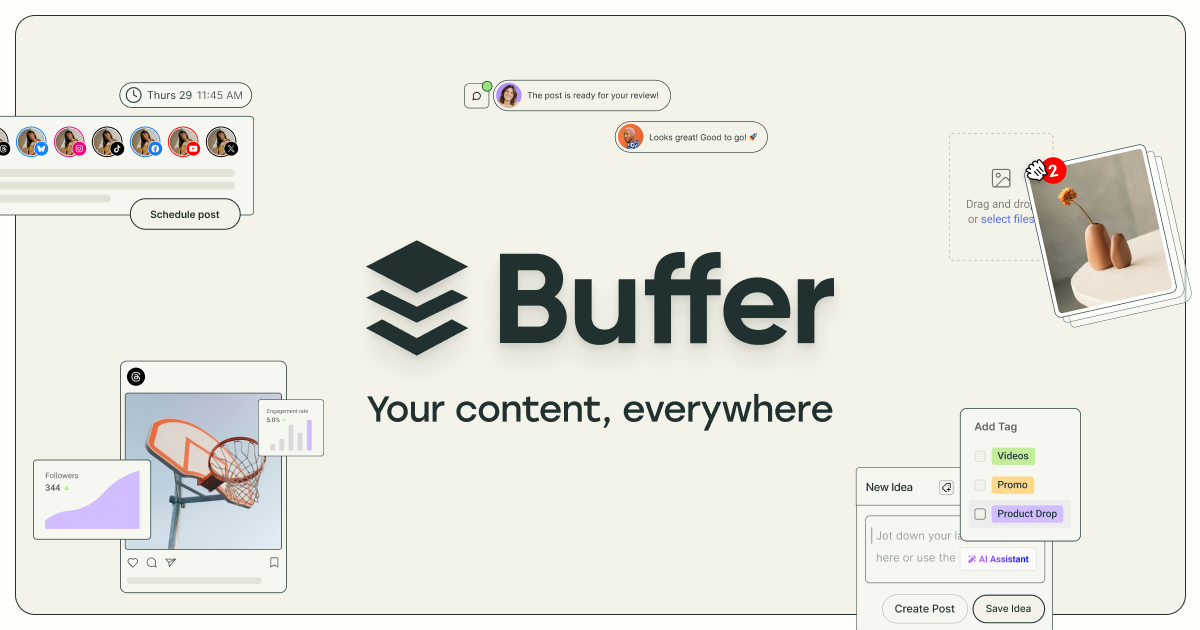
Buffer: Social media management for everyone

Promo I The Easiest Way To Create Marketing Videos
Power your entire business | Square

The Mythbuster Challenge
Life Time Healthy Way of Life | Join Life Time
Zapier: Automate AI Workflows, Agents, and Apps
Rivian - Electric Adventure Vehicles

Webflow: Create a custom website | Visual website builder

Ray

OpenAI

Billie

Lifeforce: Your Longevity Partner
Current | Future of Banking

Retool | A better way to build custom software

mishmash® — Creative tools
Open
Sonos | Wireless Speakers and Home Sound Systems
Your connected workspace for wiki, docs & projects | Notion
Framer: Create a professional website, free. No code website builder loved by designers.

Telehealth for a healthy, handsome you | hims
.webp)
Pencil - Make Ads That Work
Online code, design, and project management courses • SuperHi

Book by the seat | The Private Jet Experience | Aero™

B2B Sales Platform Powered by AI | Apollo
The #1 AI agent and next-gen Helpdesk for customer service

SARAH & SEBASTIAN | Australian Fine Jewellery

Bloom & Wolf | Leider in luxe zijden bloemen

Freewrite: Distraction-Free Writing Tools

Gamma: Instant Presentations, Websites, and More with AI
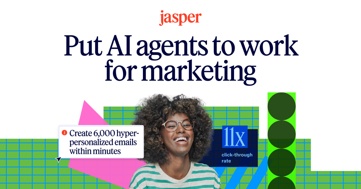
AI that’s built for marketing – Jasper
Current | Future of Banking

Grandpa - Good people, good products, good impact
rabbit
Handshake: Careers start here | Handshake

Ffern - Organic Eau De Parfum | Ffern
Framer - The internet is your canvas
Framer - The internet is your canvas