
Error Screens and Messages: Tips and Practices
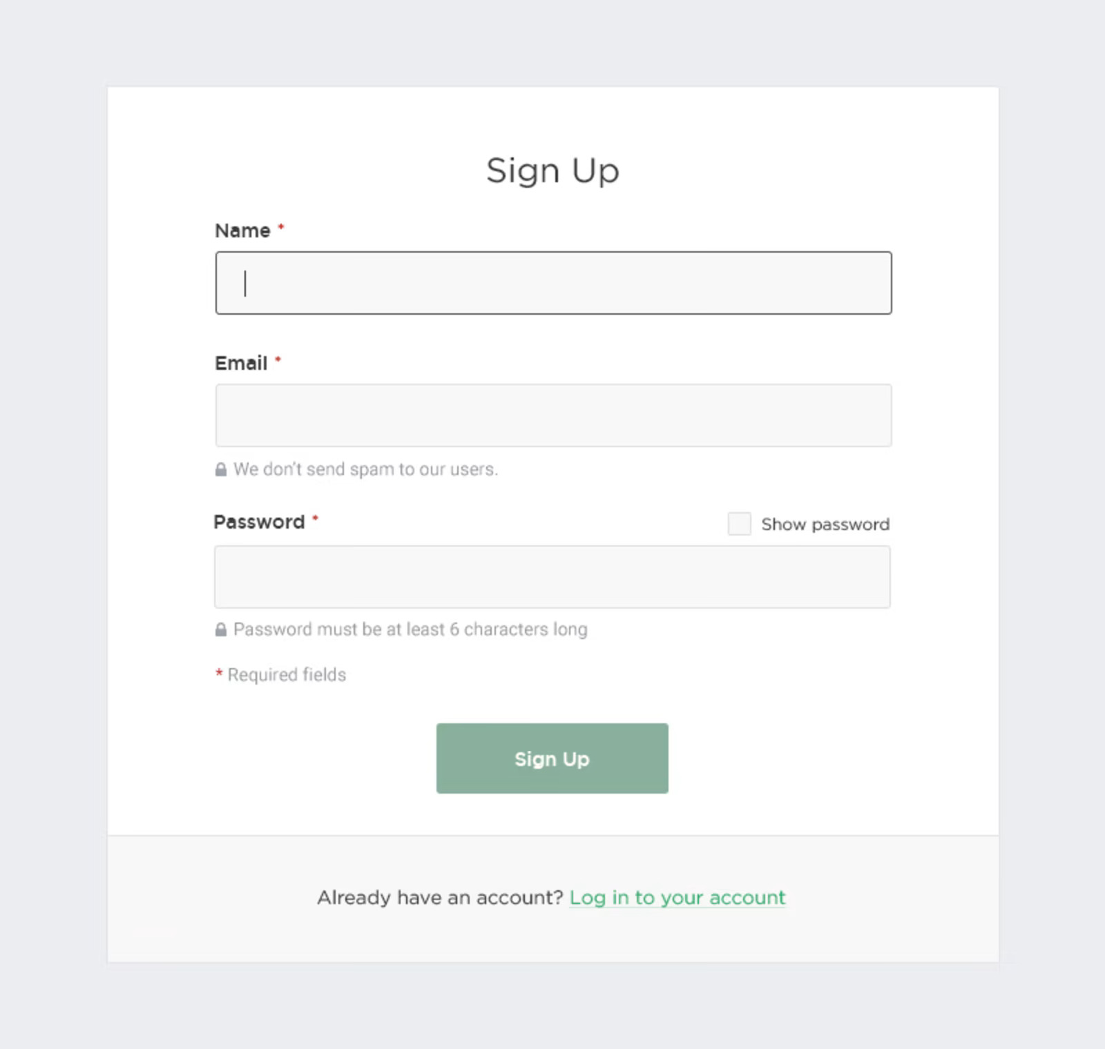
Any way to success is made of not only achievements but also failures and errors. With digital products it works the same way: only in the perfect world, do people and apps communicate with no mistakes, misunderstandings, technical faults, and unpredictable scenarios. Well, none of us is there, we are in the real world. Here diverse errors present an integral part of any user experience, so there is no chance for designers and developers to avoid dealing with them.Let’s get well-prepared: today we’ve gathered an article devoted to various errors in user interfaces. Here we’ll talk about types and reasons for errors as well as design strategies and practices for reducing the negative effect they may bring up.What Is Interface ErrorInterface error is the state or condition when the app cannot do what the user wants. It usually happens in three typical cases:the app fails to do what’s requested (literally, like there is no such a technical possibility or function)the app cannot understand the input from the user (or the input is invalid)the user tries to combine operations that cannot work together (that usually happens because the user isn’t aware of the processes inside the app)Sure, errors present a kind of annoying or even frustrating part of the user experience. Yet, there is no way to avoid them, so designers, developers, and UX writers have to think about ways to make that kind of interaction more user-friendly and smooth. Why is that important? Because as well as in real life, virtual mistakes make a significant psychological impact and form a negative emotional background. For example, the research measuring the psychological stress caused by smartphone interactions showed the direct connection between appearing error messages and the level of cortisol, a known biomarker of stress. It can increase the anxiety feeling and provoke a user to stop trying to interact with the product before they even start analyzing what’s the reason. So, let’s see what to do with those situations.This is what the error of filling the subscription form on the Tubik Blog website looks likeBest UX Practices for ErrorsErrors are like fights: the best one is the one that never happened. There are different strategies for error prevention, like tooltips, prompts, tutorials, directional cues, suggestions, highlights, limitations, and the like. Yet, what should you do with users that already experience the error? Let’s cover some points that are effective in designing errors that wouldn’t make the user instantly turn their back to your app.Make the error instantly noticeableIt may seem obvious, but don’t get tricked by it: what seems obvious has to be thought about twice. The worst thing that may happen about the error is the user totally uninformed about what’s going on and gets lost in the process. Be always honest with the user and don’t try to mask the error. Even if the interface is super minimalist and any alien inclusion hurts your perfectionist designer’s eye and soul. Beauty doesn’t matter if it doesn’t work.For example, if the user is filling the form made of 10 different fields, don’t just inform them that the form is not filled correctly, don’t make them search from one field to another where they made a mistake, and don’t hope they will do it. Make the field with a mistake super visible and save users’ energy and time.Use well-recognized visual markersKnowing mental models and well-known patterns of user behavior, user experience designers can reduce the cognitive load. That’s particularly essential in the error situations that are quite unpleasant by default. Error screens and messages may be not the best place for experiments, so consider markers that are quickly recognized by most users. The red color and exclamation marks are still among the most popular ways to attract users’ attention to the errors. Yet, be careful using the color as the only way to mark the error: check if it works for color-blind users. Also, mind the high level of readability on different devices.Here’s how the registration error is marked on ArtStation: the system marks the field with color and explains the issue with a text prompt.Explain what happenedWhatever is the reason for the error, you may feel the urge not to explain anything, just to proceed with solving the issue. And that’s a mistake. Firstly, you risk getting a user back in this error situation again and again as they don’t understand what is wrong with their actions or app response. Secondly, we’ve already mentioned that errors literally provoke a psychological state of anxiety, and you may not predict if this error becomes a part of the wrong interaction pattern. So, be sure to find a way to quickly explain the nature of the error and keep users informed. For instance, instead of just informing (“You cannot log in to the app”) make the message explanatory like (“The username or password do not match”).Don’t add more actions than neededAnother thing you may feel like doing is putting all the errors on separate pages or pop-up windows to make them as catchy as possible. Don’t overplay with it: in most cases, it’s enough just to make a color contrast marker in the interactive zone instead of popping up the additional modal window with the message requiring another unnecessary click to get the user back to the same page. Imagine that you are filling in the registration form and get that kind of pop-up for errors; no doubt, you will hate it very fast. Don’t make your users experience that: aim at providing inline validation and keep the message close to the field in error.Yet, a pop-up window will be helpful if the user needs to be redirected to another page because of the error. So, for each case take into account all pros and cons and target your solutions well.This is how the error is marked on the Tubik website when the user tries to complete sending the contact form without adding an email.Write simplyIt’s crucial to make the error message as simple and clear as possible. Clear for the target user, not for the designers or developers creating that product. Avoid special terminology and jargon which you may use with QA engineers, for example (Like “Error 4.7 occurred” or “syntax error happened”). Don’t use long complex sentences. Don’t make long and ornate introductions, it’s not the best place for them. Go quick to the point and make it decent.Don’t blame a userThere’s an easy way to make a bad situation even worse: just tell the users that they are not clever enough to interact with this app and that is why the errors happen. Offensive, isn’t it? Whatever form you wrap this message in, it will hurt the user who is already worried about things going not the way they wanted. So, don’t blame a user, be polite, friendly, and helpful, that’s important for setting the right emotional background of the situation. Try using clear instructions instead of blaming: for example, say “Enter the valid email address” instead of “You’ve entered the invalid email address”.Be constructiveInforming the user about the error in the right way is not enough: whatever friendly is the information that you got lost, it isn’t super worthy if you don’t know what to do next. So, be quick to let the user know how to solve the issue. Some of the popular practices are the following:If that’s a web interface, give the options to move to other pages of the website, first of all, the home pageIn the mobile interface, make it easy to take a step back or quickly connect to the spot of the errorIn case of complex forms and processes, do it for each step instead of at the end of all the processesThis 404 page of the fashion brand's e-commerce website gives the visitor various options to jump to, marking the ability to get back to the home page as the main call-to-actionConsider using images and iconsIt’s not a secret that people perceive and decode images faster than words. So, thoughtful use of an icon or image on the error screen can make communication faster saving the users’ energy and good mood. What’s more, images have a big potential for emotional appeal which can reduce the tension of dealing with an error.https://medium.com/media/33ce2d875fa61260198c9fcfcb88ebbb/hrefTest and analyzeDon’t have an illusion that work on error presentation is finished with the UI/UX design stage of the project. It never stops, because the feedback from real users is the best way to improve the user flow. A/B test different options, analyze carefully what are the most vulnerable zones and interactions, and use the findings to prevent errors where possible and smoothen the process where the mistakes are unavoidable.Add fun if that’s appropriateThe page or screen of an error message can use gamification, interactive content, or other ways to add fun and this way reduce the negative effect. One of the good examples is the 404 page on Dribbble: as its target audience is designers, the resource uses their natural creative curiosity to add fun to the error situation, so users can see the collection of popular designs organized along with a similar color palette. On the page, users can continue the game and try other colors or search for what they need using the search field integrated into the error page.Well-Done Errors ChecklistSo, to sum up, well-crafted errors would rather stick to the following points:readable and cleareasily noticedconstructiveeffort-savingpolite and friendlyreasonably emotionalWe will continue the theme of dealing with errors in interfaces effectively in our next article, stay tuned!Useful UX Design ArticlesHere’s the set of articles on more aspects and best practices of user experience design.The Anatomy of a Web Page: Basic ElementsMotion in UX Design: 6 Effective Types of Web Animation5 Basic Types of Images for Web ContentAesthetic Usability: Beauty on Duty for User ExperienceTypes of Contrast in User Interface Design5 Pillars of Effective Landing Page DesignHow to Make Web Interface ScannableHow to Design Effective SearchWeb Design: 16 Basic Types of Web PagesBasic Types of Buttons in User InterfacesOriginally written by Marina Yalanska for Tubik BlogWelcome to check designs and art by Tubik via:WebsiteDribbbleBehanceTubik ArtsError Screens and Messages: Tips and Practices was originally published in Muzli - Design Inspiration on Medium, where people are continuing the conversation by highlighting and responding to this story.
The Gestalt Principles in Practice: A Visual Guide to How Our Brains Perceive Design
As designers, we often operate on intuition. We “feel” when a layout is right or when a button is in the wrong place. But what if that intuition could be backed by a century-old psychology that explains exactly how our brains make sense of visual information?
Enter the Gestalt Principles.
Born from German psychology in the 1920s, Gestalt (meaning “unified whole”) theory is built on the idea that our brains are hardwired to see structure, patterns, and relationships by default. Instead of perceiving a collection of disconnected elements, we group them into a coherent whole.
For UI/UX designers, these principles are not just academic trivia; they are the bedrock of creating intuitive, user-friendly, and effective designs. Let’s break down the key Gestalt principles with real-world examples from the interfaces you use every day.
1. Proximity: Elements that are close together are perceived as related.
The Gist: Our brains group objects that are near each other, separating them from those that are farther apart. This is one of the most powerful tools for creating structure and organization without adding visual clutter.
UI/UX in Practice:Think of any form you’ve ever filled out online. How do you know which label corresponds to which input field?
Bad Example: Labels are equidistant from multiple input fields, causing confusion.
Good Example: The label “First Name” is placed in close proximity to its text box, and there is clear, generous space between that group and the “Last Name” group. This visual grouping happens instantly, without the need for lines or boxes.
Takeaway: Use white space strategically to imply relationships. Group related interface elements (like a label and its input, or an icon and its text) by placing them close together.
2. Similarity: Elements that share similar attributes are perceived as related.
The Gist: Objects that look alike—whether through color, shape, size, or orientation—are perceived as part of the same group or as having the same function.
UI/UX in Practice:Navigation menus are the classic example. But let’s look at a product listing.
Each product card has the same structure: image, title, price, and a button. Because they share the same visual attributes (same size, same font treatments, same button style), we instantly understand that they are the same type of object. Furthermore, if one “Add to Cart” button were a different color, we would perceive it as different—perhaps it’s out of stock, or already in the cart.
Takeaway: Establish consistent styles for similar elements (like all primary buttons) to create a predictable and scannable interface. Conversely, make different elements (like a “Delete” action) look distinctly different.
3. Closure: Our brains fill in the gaps to see a complete object.
The Gist: When presented with a complex arrangement of elements, we tend to look for a single, recognizable pattern. We will mentally “close” gaps to perceive a complete shape.
UI/UX in Practice:Logo design famously uses this principle (see the WWF panda or the NBC peacock). In UI, it’s often used in loading animations and icon design.
The IBM logo is made of disconnected blue stripes, but we effortlessly read the letters “IBM.” In a UI, a loading spinner might be a circle with gaps, but our brain perceives a single, rotating shape. This allows designers to create recognizable forms with minimal elements, reducing cognitive load.
Takeaway: You don’t have to show every detail. Use suggestive shapes and negative space to create elegant, simple icons and graphics that the user’s mind will complete.
4. Common Region: Elements within a bounded area are perceived as a group.
The Gist: This is proximity’s powerful cousin. By placing elements inside a clearly defined boundary—like a box, a background color, or a subtle shadow—you create a strong perceived group.
UI/UX in Practice:Look at any modern web app’s card-based layout.
On a dashboard, a “Statistics” card might contain a title, a chart, and a data point. Even if these elements are spaced out, the shared background and subtle border firmly group them together, separating them from the “Recent Activity” card right next to it. This is why cards are so effective for organizing diverse pieces of information on a single screen.
Takeaway: When proximity alone isn’t enough to create a strong group, use a common background, border, or shadow to define a “container” for related content.
5. Figure/Ground: We instinctively separate elements into foreground (the figure) and background (the ground).
The Gist: This is the basis for how we perceive depth and focus. The “figure” is the focal element, and the “ground” is the backdrop. A clear distinction is crucial for readability and hierarchy.
UI/UX in Practice:Modal windows and pop-ups are the most direct application.
When a modal appears, the rest of the interface is often darkened or blurred. This immediately pushes the background content into the “ground,” making the modal the clear “figure” that demands the user’s attention. Without this effect, the modal would feel less distinct and more difficult to parse.
Takeaway: Use contrast, color, and blur to create a clear hierarchy between interactive elements (figures) and their context (ground). This is essential for overlays, modals, and navigation menus.
6. Focal Point (Prägnanz): The mind will interpret ambiguous images in the simplest way possible.
The Gist: Also known as the “law of simplicity,” this overarching principle states that we naturally order our experience in a manner that is regular, orderly, and simple. Every stimulus is perceived in its most simple form.
UI/UX in Practice:A cluttered, confusing user interface violates this principle. A clean, well-organized one embraces it.
Consider the Google homepage. What do you see? A logo, a search bar, and two buttons. It’s the simplest possible interpretation of a search engine. There is no ambiguity. Your brain doesn’t have to work to figure out what to do. A competing, cluttered portal page with countless links and modules is complex and ambiguous, forcing the user to parse and simplify it themselves.
Takeaway: Reduce complexity. Strive for clarity and simplicity above all else. The easiest design for the brain to process is the one it will prefer.
Design with the Brain in Mind
The Gestalt Principles aren’t a set of rigid rules to be followed blindly. They are a framework for understanding the unconscious processes of visual perception. By designing with these principles in mind, you work with the user’s brain, not against it.
You create interfaces that feel intuitive because they are built on the very psychology that defines intuition itself. So the next time you’re refining a layout, ask yourself: How is my design using proximity, similarity, and closure to tell a clear, simple story? The answer will lead you to better design.
The post The Gestalt Principles in Practice: A Visual Guide to How Our Brains Perceive Design appeared first on Designer Daily: graphic and web design blog.
The Best UX Design Trends for Fintech 2022
You often need to create great interfaces of high quality for your Fintech startup or your graphic design for digital business transformation in 2022, and you do not know where to start. Look through the significant industry trends to make the final decision.Design taken on DribbbleThe beauty is that the annual trend formation makes it possible to reinvent your business’s design completely. And given the challenging 2021, the trends of 2022 are a breath of fresh air for everyone.Five useful UX trends to look for in 2022Now the visual component of any business is no less important for promotion than its content and you can’t simply ignore it. To know which web design trends of 2022 will help you modernize your brand, grab user attention, and increase conversions, look through these UX trends for good.1. Personalized interfacesThe ability to personalize the interface and make it individual has come to the taste of many, especially in mobile applications. Apple eagerly picked up this trend, creating widgets in different sizes and with other content in the latest iOS 14 update. This also includes familiar “dark” and “light” themes.In addition, polls are also may be a part of the user’s choice and personalized interfaces — they enthral visitors to the page, ask their opinion, and thus personalize the product or service. If you apply them in your website design — you win.A Crypto Exchanging Platform iOS App design sample2. Unusual screen loadingTheir task is simple — to interest, distract, delay, make people stop looking, etc. It is recommended that you pay attention to the loading screen that may appear when navigating between pages.The so-called skeletal loading screens are trendy today, in other words, empty pages that are gradually filled with information through the user’s interaction with them or following a given algorithm.For example, information blocks may gradually emerge one after another at intervals of several seconds or appear only after the next touch or click of the user. And, of course, why not use funny animated screens that show the user how long to wait or entertain them instead of pauses.A Crypto Wallet Dashboard design sample3. Bright coloursDesign trends are multiplying, competition is increasing, and users are becoming more and more selective. Trying to stand out, designers experiment with colours as well — in recent months, bright, very bright interfaces, backgrounds and illustrations are increasingly popular.Benefits of using bright colours in UX / UI design:Increase the beauty of the resource;They influence the mood of users, form a unique positive and therefore attractive atmosphere;Form strong associations with a brand, product or service;It distinguishes promotional call to action and key actions, thus increasing the conversion and profitability of the business.Due to the brightness and catchiness, the interface may also suffer from usability issues. The necessary elements cannot be found in a riot of colours and decrease the readability.Therefore, it is essential to carefully select a palette, keep a balance between creativity and convenience, and carefully think over the site or application’s structure. And, of course, apply the theory of colour — the colour wheel of contrasts and a thorough analysis of the best examples in this style will come in handy.Cryptocurrencies, Source: Dribbble4. Blurry, colourful backgroundsBright burry or the so-called blur in the background is another trend in 2021. It is remarkable because it creates a catchy yet comfortable effect for the eyes, which favourably emphasizes objects in the foreground. A blurry bright background is a beneficial marketing technique.3 key benefit of blurred backgrounds:· Blur in the background brings focus to the foreground where the object or text is. They become more noticeable in the eyes of the user and are better remembered in all details;· A blurry picture is universal — it can be used as the basis for the visual design of the interface, as well as a corporate identity for a brand can be built using it;· Blur works well with almost any content — photo, image, video, text, animation. The main thing is to take into account the rules of contrast and colour combinations.By the way, this trend is often combined with glassformism — the frosted glass effect gives an excellent blur. The popularity of such backgrounds spurred the release of Apple’s macOS Big Sur system, already mentioned above, at the end of 2020.Another Finance — Mobile banking App best practice5. Authentic imagesThe trend that transferred from web design to UX is using authentic images. The point is that The Black Lives Matter movement represented a watershed moment in a global protest. Hopefully, there is just the beginning of a reassessment of systemic biases that will continue to be felt across all the industries in 2021, including design. Nevertheless, it’s still in vogue and may be applied whenever suitable.A simple trading app from Fireart StudioWhy is it important to consider trends in UX / UI design?‘Every $ 1 invested in user interface design returns $ 100 to the business.’ (Forrester research)This equates to a return of 9,900%. Ignoring the development of UX / UI design is like letting the process of user interaction with your resource down. This means that the efficiency of the site or application will noticeably decrease, which will inevitably lead to loss of profit and, possibly, to the death of the business.To avoid sad prospects, it is important to be aware of the latest trends in interface design and user experience, and be able to quickly put into practice what will be useful for you. Want to know which web design trends of 2021 will help you modernize your brand and capture the peak of user attention? — Feel free to ask design experts.To sum upModern design trends are not just a tribute to fashion but an absolute necessity that may provide your business with effective promotion & guarantee growth in the most turbulent times. We hope you are now full of inspiration to build your website, mobile application, or improve existing business with great design solutions. Use them to increase user interaction and attract even more new customers to your products and services. We wish you successful design and development at all times.The Best UX Design Trends for Fintech 2022 was originally published in Muzli - Design Inspiration on Medium, where people are continuing the conversation by highlighting and responding to this story.
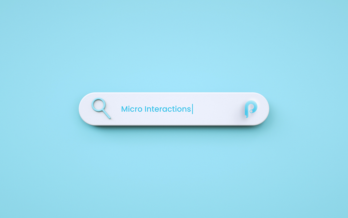
5 Easy UI interactions in Principle that will make your design stand out
Designing a user interface with animations and transitions in mind is a great way to plan a better user experience (UX) for your next app. Animated micro-interactions are the perfect way to stimulate user engagement, in a world of short attention spans. This is why Airbnb recently introduced Lottie — it’s a “new open-source tool that makes adding animation to native apps a snap.”Projects like Lottie show the increasing importance of adding motion as a new element for crafting enhanced UX for both apps and websites. Like everything that is put into the interface and the process of interaction with it, animations must be a functional element, not just a decor. Animation in UI should adhere to a thoughtful approach and always needs to have a clear purpose set behind it. The experience for users is much smoother when the animation feels like icing on the cake as opposed to just a fly in the ointment.Principle is a fantastic tool to make your UI interaction ideas come to life. The interface is Mac-friendly and was built to work seamlessly with your Sketch and Figma files. Principle automates most of the animation and transition effects for you. All you need to do is apply a trigger to a shape on one artboard, and change any property for the elements you want to animate on the final artboard.You can download a free Principle trial here.In this tutorial, you are going to learn 5 easy and highly effective UI animation techniques using Principle for Mac. After you’ve gone through this guide, you’ll be able to turn dull and static mockups into an interactive prototype with subtle interactions that delight users.These will be the interactive animations we will be covering:Horizontal Parallax Scroll EffectAnimated Search Bar InteractionSubmit Button Splash MessagePagination Animation between SectionsExpand Cards with a Sticky Element1. Horizontal Parallax Scroll EffectParallax effects can be used for both vertical and horizontal sections in digital design. A few decades after it was first introduced in video games, the parallax effect made its way into web design, and then gradually into mobile apps, using static or slow-moving background images against faster-moving foreground images to create a multi-layered 3D scrolling feature. This made for a much more immersive user experience, captivating users with its subtleties.Why this adds a wow factor -Digital screens may be a two-dimensional space, but designers can get creative and sculpt their flat pixels into having a sense of depth and dimensionality. This is where subtle parallax effects can come into play.Parallax scrolling effects add action and the illusion of depth by taking different visual elements and moving them at different speeds in an interface design.Let’s go over two examples of parallax scroll effects designed in Principle. You can find the downloadable files for these interactions attached with the examples.1. Weapon Cards for a Mobile GameWeapon cards by Hassan MahmudOne of the most optimal places for parallax effects is while scrolling through cards or sections vertically or horizontally on a mobile app or website. The most fluid part of the experience is felt on the last card or section, similar to the rubber band effect that Apple introduced when you scroll to the end of a particular list.You can find the downloadable Principle file for this interaction here.2. Nike App Promotional CardsNike promotional cards by Jardson AlmeidaThis is an example of the parallax scroll effect created for a Nike app concept for promoting upcoming product launches. The design takes it up one level by bringing out the foreground elements — the shoes, to expand beyond the edges of the background cards. This effect is complemented by the background color change that happens in conjunction with the scroll.You can find the downloadable Principle file for this interaction here.As you might have seen from the examples, well-crafted parallax effects interactions can easily help you stand out from the crowd and create a lasting impression for your visitors. Do not think of parallax as purely decorative. Similar to any other technique you use, it should be incorporated in a way that adds real value to your visitors.However, note that too much movement within parallax effects can cause harm for those with vestibular disorders. The illusion of movement and depth can cause dizziness or disorientation. If you do use these designs as inspiration for your own, remember to follow some of these guidelines for accessible parallax effect design:Keep the number of parallax effects to a minimum.Constraint movement effects within a small area of the screen.Don’t let your effects distract users from important information.Moving on to the next interaction — the interactive, animated search bar.2. Animated Search Bar InteractionSearch bars are one of the most common graphical elements that users will interact within your mobile app or web designs. In this type of animation, The interface usually only has a search icon and when you click on it, the search input field appears with an elastic animation.Why this adds a wow factor — By adding a subtle animation to the search element, designers can achieve 2 fundamental goals:Adding delight to one of the most common interactions in digital products — querying and searching through data.Utilizing white space effectively by expanding the search bar only when users need to type their search input.Let’s look at an example of a search icon interaction designed in Principle below.Search transform by Alex PronskyThis design shows the magnifying bar as a circular icon that animates to expand as a pill-shaped search element when clicked on. This is a very lightweight interaction design that can be achieved in less than 5 screens on Principle and is as simple development-wise to implement in your app or website.You can find the downloadable Principle file for this interaction here.3. Submit Button Splash MessageThis animation follows after the users press the submit button after filling out a form or making certain selections in an app. Splash animations are also used when an app is first launched and all the app cache and data are being fetched. Launcher animations typically consist of the logo and the name of the app and usually appear on the screen for a fleeting moment before the app opens up.Why this adds a wow factor -Splash screens are great at providing an anchor of engagement for users while the app enters a loading phase to fetch or upload data.However, ideally, they could go much further than that by providing an interactive experience that strongly impacts the UX.Let’s take a look at an example of an interactive splash screen.Submit splash screen by KhaiThis design shows a splash animation after users complete the submit interaction in the app. The bouncing ball creates a playful experience while the data gets sent to the database and the following tick mark provides feedback to the user that their action has been successful, an important UX implementation.You can find the downloadable Principle file for this interaction here.The following are some best practices to adhere to when putting together an app splash screen.Keep the duration to under 2 seconds.Reduce this to 1 second or lesser for interactions that users are likely to interact with several times in the app, like making multiple submissions.When evaluating design ideas, go for simple and bold over complex and intricate.The same for animation; overly complicated sequences will only appear showy, and likely make users feel that their time isn’t valued.A strong background color or even a background image can be a good option. However, if your splash screen features an animation, a basic solid or gradient background will likely work better, providing a clean canvas against which the action can take place.Follow the above guidelines and you’ll likely end up with a well-designed splash screen that delights users.4. Pagination Animation between SectionsPagination is a sequence of pages that are connected and have similar content. It is important to note that even though the content on a section of a page can be split into distinct pages, we still define the concept as pagination. The advantages include easier navigation, better user experience, smoother buyer journey, among many others. A good example here would be e-commerce sites.Why this adds a wow factor -While most traditional websites and apps use separate pages for splitting content, leading to a disconnected UX due to longer page loading times, newer design systems have started using a smoother pagination interaction leading to lower churn rates and higher customer retention.By using a smooth pagination animation, we can create the illusion of a single page interaction for content that would conventionally require navigation through several pages.Let’s look at a simple example of a pagination component that can be used to swipe between sections that can be animated to create a delightful user experience.Pagination by André GonçalvesThis is an example of a popular pagination animation in mobile apps called stretched pagination which creates a fluid user experience when users are navigating between sections. It can be used in apps where users have to quickly swipe between sections such as browsing product images in e-commerce, reading different sections of information in education apps, or going through steps to create a recipe for a food app.You can find the downloadable Principle file for this interaction here.5. Expand Cards with a Sticky ElementIn UI design, a card list is a convenient method of presenting information in easily digestible chunks. Taking its cue from real-world methods of memorizing and organizing information using physical cards — such as flashcards or post-its — a card list shows a series of cards, each containing a small amount of bite-sized information. However, not all information that needs to be conveyed to the users can be boiled down to bite-sized data that can be displayed on cards. The real challenge of design therefore, is to balance the delivery of information in way that doesn’t overwhelm the users.Why this adds a wow factor — While navigating through the cards, users should get a clear picture of the information being conveyed while having an option to expand on this information and dig deeper, should the users choose to do so. Maintaining the continuity and fluidity of this expansion should be smooth and feel like a well-connected experience. This is where a simple animation like using a sticky element on the cards that stick when the card is expanded can be used to create a subtle, dynamic interaction.Like with all the above interactions, let’s take a look at an example of such an interaction design made in Principle.MVMT concept by Lukas GuschlbauerThis design is used in an e-commerce concept app for watches to display cards of items that can be bought. The main information such as the price and rating needs to be displayed with each card. Expanding the card reveals additional information such as features and recommendations. The watch sticks to the expanded view to create a more connected experience when consuming the information needed for making a buying decision.You can find the downloadable Principle file for this interaction here.Intuitive to use and — when done right — often also aesthetically pleasing, an expansive card list can be an excellent way of structuring a responsive design for greater usability. This is especially true when aiming to improve the experience of navigating particularly content-heavy and information-laden apps.Where to go from hereHead over to the tutorials provided on the official Principle website to get a better understanding of the tool that design teams from companies like Apple, Amazon, Netflix, and Microsoft are using.Windows users can check out alternatives to Principle such as UXPin and ProtoPie which provide a similar experience to prototyping designs.If you found this helpful, please feel free to share it with fellow design enthusiasts. Join the conversation and head over to our Twitter to comment and leave your learnings.Author: Samarth ZalteOriginally appeared on https://www.wednesday.is/writing-articles/5-easy-ui-interactions-in-principle5 Easy UI interactions in Principle that will make your design stand out was originally published in Muzli - Design Inspiration on Medium, where people are continuing the conversation by highlighting and responding to this story.
7 Modern UI/UX Designs
Modern UI is hard to imagine without a solid professional team that stands behind and caters to best UI practices while working on a particular project for your users. Let’s glance at what’s behind the curtain of what we now call a modern UI design.Fireart DribbbleWhat is Modern UI Design?How would you describe modern UI principles? A modern UI conforms to your audience’s existing experience and perspective of what they think a modern interface is and qualifies as a credible visual experience. Components of interface design include especially user-centric visual trends, design usability, element patterns, and structures that flow with the hand-eye layout and motion qualify as part of a modern UI.Principles of Modern UI DesignTo better understand modern UI designs, make sure you’re aware of the most important principles of modern UI design the top teams often follow during their work:Maintain clarity.A simple and clear design solution always allows the users to move through the website or app intuitively without any extra strains attached. Stick to the primary principle no matter how complex the product will be.Experiential design.The main aim is to improve the experience for your user. Background, form, font, or color you choose all matter. The position of the elements, the interval between them and so much more — all matter to the user and how they interact with your creation.Maintain consistency.Design consistency is what ties all the UI elements together with some distinguishable and predictable patterns of actions. This is a key to the greatest product experience and an important principle for a designer. Make sure to avoid empty space traps in the design construction.Preserve aesthetics.There’s no way without beauty. The products you create should look and feel aesthetic and really drive emotions and trigger desires to use it. Apply illustration design, animation, or photos but keep them functional within the general beauty of the structure.Scannable Content.Creative, not always! But filling in your design structure with the content should be up to your business concept, tone of the voice, target needs, etc. The main thing is to create it easy to scan and consume, allowing to grab what the user needs at once. Be opt for flat design and utilize UX writing.How to Create a Modern UI DesignHere you may find a couple of advices on how to create a modern UI design with a user in mind and keeping UI principles at hand while developing a UI concept. Here they are.1. Take practicality over aestheticsIn a site interface design, the needs of the user are in the first place, but not the significance of the web, application, or vision of a product owner or developer. Modern designs are not just about aesthetics, but about functionality which should serve the user on their journey.2. Try to maintain simplicityThe interface simplicity should come first. One of the secrets lies in the fact that the appearance of the page improves gradually, and therefore should not force users to adapt to abrupt sudden changes. It is convenient for site visitors to get used gradually3. Set the narrativeA user story at its core should be able to describe something the user wants to accomplish by using the product design. For product designers utilizing the narrative mainly serve as a good reminder of user goals and an incredible way to organize and prioritize how every screen will be designed.4. Enable learning without learningThe user interface which is designed in a better way should enable learners to easily navigate through any web resources or apps and get the data they need asap. They discover faster the elements they need and dwell on trust from the familiar help. For this, they do not need any extra skills because your UI is built intuitive enough.7 Modern UI Design ExamplesFireart has exclusively handpicked the best illustration examples of modern UX design for your consideration. These are pieces of various software tools and other products with great UI. Here we go:Privacy Firewall SiteYouTube AnalyticsPrivacy Firewall AppAR Navigation AppCar Rental AppHabit tracking appE-book AppNew approaches to interface design are emerging, but it seems that the visual interface will still be the main way the user interacts with devices. There is a lot of room for innovation, as well as optimization of old interfaces. It’s no surprise that big players like Microsoft and Google are investing significant resources into experimenting with new user interface aesthetics and interaction models.ConclusionInterface design is always about finding the most effective solution that is based on an understanding of the user’s goals, motivations, and usage circumstances, while at the same time taking into account the goals, opportunities, and constraints of business and technology. Modern UI is hard to imagine without a solid professional team that stands behind that. If you want your new product interface to define a fantastic interaction boundary between classes or components, welcome to hire a ui developer and give it a try.7 Modern UI/UX Designs was originally published in Muzli - Design Inspiration on Medium, where people are continuing the conversation by highlighting and responding to this story.

Neurodesign in UX: What cognitive science can teach us about better interfaces
Image created with AI assistanceLet’s be honest — most of us don’t think about the human brain while designing a screen. We focus on layouts, spacing, and colors. But here’s the thing: design doesn’t happen on a screen — it happens in the user’s brain. That’s where neurodesign comes in.Neurodesign is all about applying cognitive psychology and neuroscience to build interfaces that feel intuitive, effortless, and even a little delightful. I didn’t study neuroscience, but once I started learning how the brain actually works, it changed the way I design completely.Here’s what I’ve learned — backed by real examples, UX laws, and a few book gems you might want to check out.1. The Brain is lazy (In a good way)Our brains are built to conserve energy. That means people will almost always go for the path of least resistance. When your UI is too complex or overloaded with options, the brain says, “Nope.”Remember Hick’s lawThe more choices you offer, the longer it takes to make a decision.Think of how Google’s homepage is just a logo and a search bar. That’s no accident — it’s designed to reduce cognitive load.Google.comWhat you can do:Prioritize primary actionsKeep forms short (like Typeform does)Remove elements that don’t serve a purpose2. People see before they thinkDesign is processed emotionally before logically. This means color, layout, and even animation can shape trust in the first seconds.Let’s look at the example: Duolingo’s app uses friendly illustrations, a fun tone, and small rewards that feel like a brain “pat on the back.” It lowers the emotional barrier to learning a new language.Image credit — pittssburgh magazineHere is a great tip from the book “Neuro Web Design” by Susan Weinschenk:“We don’t make logical decisions. We make emotional ones, and then justify them logically.”What you can do:Use warm, friendly design languageLet onboarding feel like hand-holding, not a quizAdd subtle motion to make actions feel responsive (like how Apple uses bounces or fades in iOS)3. Familiarity feels goodThe brain loves patterns. When users see something they recognize, they feel safe and in control.Remember Jakob’s LawUsers spend most of their time on other websites. So, they expect your product to work the same way.Lets look at the examples : Instagram’s bottom tab bar, Amazon’s cart icon, or Gmail’s compose button — they all follow common visual metaphors that reduce learning curves.What you can do:Follow native platform conventionsUse common icons and terms (don’t call a cart “My Bag” unless you’re Zara)Avoid unnecessary reinvention unless you have a strong reason4. Memory is short — like, really shortCognitive science tells us that users can only hold about 4 items in their working memory at a time. So if your app relies on people remembering instructions, it’s setting them up to fail.Here comes the ‘Miller’s Law’The average person can only keep 7 (plus or minus 2) items in their short-term memory.Real-world fail: Ever tried to fill out a form where the error messages only show up after submission, and you forget what field had what issue? That’s a memory nightmare.What you can do:Break tasks into small, manageable steps (like Airbnb’s step-by-step host setup)Use inline validationsKeep labels close to inputs (don’t make users scroll or guess)5. Feedback = SafetyThe brain constantly checks: Did that work? Am I in control? If the UI doesn’t respond to input, users feel unsure — even if everything’s working fine in the background.There is an UX law : Feedback loop principlePeople need immediate feedback to understand the result of their actions.For example — Slack shows a “sending…” animation and checkmarks when a message goes through. This builds trust, especially in fast-moving conversations.What you can do:Show loading states, success messages, or error nudgesLet users undo actions (like Gmail’s “Undo Send”)Animate transitions to signal system statusBook recommendations if you want to dig deeperHere are a few books that really helped me connect the dots between neuroscience and UX:“Neuro Web Design” by Susan Weinschenk — Super readable, packed with examples“Neuro Web Design” by Susan Weinschenk“100 Things Every Designer Needs to Know About People” by Susan Weinschenk — A designer’s favorite“100 Things Every Designer Needs to Know About People” by Susan Weinschenk“Don’t Make Me Think” by Steve Krug — Not neuroscience, but totally aligns with how brains behave“Don’t Make Me Think” by Steve Krug“The Design of Everyday Things” by Don Norman — Classic insights into human-centered design thinking“The Design of Everyday Things” by Don NormanGood UX isn’t just about making things look nice. It’s about understanding how the human brain works — and designing around that. Neurodesign reminds us that we’re not designing screens; we’re designing experiences in the mind.And when we do that well, everything just “clicks.”So next time you’re tweaking a layout or reworking a flow, ask yourself:What would feel easiest to the brain right now?That one question has helped me make better decisions than any fancy tool ever has.……💡 Stay Inspired Every Day!Follow us for a daily stream of design, creativity, and innovation.Linkedin | Instagram | TwitterNeurodesign in UX: What cognitive science can teach us about better interfaces was originally published in Muzli - Design Inspiration on Medium, where people are continuing the conversation by highlighting and responding to this story.
Interaction Design as System Design: How Systemic Thinking Changes the Way We Build UI
When we talk about “UI design”, people still picture screens: buttons, layouts, icons, a nice dark mode.In reality, your interface is just the visible tip of a much larger system.Change a button label in a banking app and you might change:How many support calls come inHow often people abandon signupHow often risk checks get triggeredHow finance forecasts revenueThat tiny UI change sits inside a web of policies, data flows, incentives, and human habits. Systemic thinking is about seeing and designing for that web — not just for the pixels on top.What is systemic thinking (for UI designers)?Systems thinking looks at problems as part of a larger system. Instead of asking “What’s wrong with this screen?”, you ask “What system is this screen part of, and how do the parts influence each other over time?” UX Design InstituteKey ideas, in simple terms:Everything is connected. UI, API, policies, marketing, support, and user behavior affect each other.Behavior comes from structure. Repeated problems (e.g., drop-offs, confusion, errors) are usually symptoms of deeper structures: rules, incentives, workflows, or mental models. research.fit.eduFeedback loops rule the game. Design changes feed into user behavior, which feeds into metrics, which feeds into organizational decisions, which feed back into the product.Different people see different systems. Product, legal, marketing, and users all experience different parts of the same system. Soft Systems Methodology (SSM) was built exactly to deal with this kind of “messy human system”. Wikipedia+1For interaction design, this means: your job is not only to “make it usable”, but to understand how interface changes ripple through an ecosystem.From screens to ecosystemsLet’s take a simple example: a newsletter signup modal on an e-commerce site.A traditional UI question might be:“Is the modal clear, accessible, and well placed?”A systemic question sounds more like:“Where in the whole customer journey should we ask for email, with which promise, and how does that affect unsubscribes, spam reports, repeat purchases, and support load over 12 months?”Same UI element, completely different lens.Systemic thinking pushes you to:Look beyond a single session and think in time (weeks, months).Look beyond a single persona and think in networks (customers, support agents, merchants, legal, marketing).Look beyond a single KPI (CTR) and think in trade-offs (CTR vs. trust, unsubscribes, complaints, brand perception).Research in UX and design shows that systems thinking helps teams avoid “local fixes that cause bigger problems somewhere else” by revealing these hidden connections and trade-offs. The Interaction Design Foundation+1The iceberg model: looking under the UI surfaceDonella Meadows popularized a simple but powerful metaphor: the iceberg model. You see an “event” on the surface (what happened today), but most of the system sits under the waterline: patterns, structures, and mental models. The Academy for Systems ChangeApplied to interaction design, the iceberg looks like this:Events (top of the iceberg)“Users keep abandoning this form.”“Error rate spiked after the latest release.”Patterns over timeAbandonment increases around certain campaigns or seasons.Errors spike when support load is high or when marketing changes messaging.System structuresConfusing pricing logic behind the form.Legal constraints that force certain steps.Fragmented ownership: marketing writes copy, design does flows, legal approves, no one owns the end-to-end experience.Mental models & beliefs (deepest level)“More form fields = more qualified leads.”“Legal risk is worse than customer frustration.”“Support exists to fix bad UX after the fact.”Systemic interaction design tries to work down the iceberg: not just tweaking UI events, but reshaping structures and beliefs that generate those events.Systemic vs. traditional UI thinkingTraditional UI lensFocuses on isolated touchpoints (“this screen”, “this dropdown”).Measures local metrics: clicks, scroll depth, error rate on that page.Solves observable symptoms: “People miss the button — make it bigger.”Systemic UI lensFocuses on relations between touchpoints (before/after, channel shifts, handovers).Measures journey-level patterns: time to value, multi-session paths, cross-channel behavior. UX PlanetSolves root causes in structure: unclear policy, incentive misalignment, broken data model, conflicting messaging.A small visual example:You change an error message from “Invalid input” to a helpful explanation. Usability on that field improves. Good.The systemic lens goes further:Why does this error happen so often?Why is the rule behind “valid input” so complex?Which teams own those rules?What happens downstream if we relax the rule?Instead of polishing the symptom forever, you start asking for changes in policy, validation rules, or flow architecture.Soft Systems Methodology as inspiration for UXSoft Systems Methodology (SSM), created by Peter Checkland, is not a UX method, but it is very relevant to complex product and service problems. Wikipedia+1SSM assumes:The problem is messy and social.People disagree on what the problem even is.There is no single “correct” model of reality.Sound familiar?Here is a simplified SSM-inspired flow for interaction design:Explore the messy situationTalk to people across roles: users, support, finance, marketing, legal, operations.Collect stories, screenshots, examples.Do not rush to define “the UX problem”; stay curious.Draw a “rich picture” of the systemVisual map of actors, tools, channels, data, and tensions.Include emotions, conflicts, incentives, not just boxes and arrows.Define multiple viewpoints“User trying to complete a refund.”“Support agent trying to follow policy.”“Finance team trying to reduce fraud.”Create simple conceptual modelsFor each viewpoint, sketch: how should the system behave if it worked well for them?These are not wireframes yet; think flows and responsibilities.Compare models with realityWhere does the current system block each viewpoint?Where are conflicts unavoidable? Where are they design or policy leftovers?Plan feasible and desirable changesSmall UI tweaksStructural changes (e.g., self-service flows, clearer policies)Social changes (e.g., better communication, new roles, shared definitions)SSM is valuable because it treats design as a learning process, not a linear “requirements → solution” pipeline. betterevaluation.org+1Practical tools for systemic interaction designYou do not need heavy academic methods to be systemic. You can start with a few simple tools that fit into normal product work.System mapping for a single UI elementPick a “simple” UI element you are redesigning — for example, account deletion.Map:Before: How do people arrive here? From email? From a help article? From within settings after a bad support experience?After: Where do they go next? What happens to their data, subscriptions, legal obligations, shared content?Around: Which teams get affected? Support (fewer angry tickets), analytics (lost history), marketing (cannot email them), legal (retention obligations).A short workshop with product, legal, support, and marketing where you walk through this map already moves the team from “designing a screen” to “designing a system”.Resources on systemic design show that even simple shared maps reduce siloed decisions and reveal conflicting policies early. designcouncil.org.uk+2systemicdesigntoolkit.org+2Feedback loop sketchingOn paper or a whiteboard, sketch loops like:“We make notifications more aggressive →more users click →more daily active users →leadership pushes for more of the same →more people mute or uninstall the app →long-term retention drops.”Look for:Reinforcing loops (“the more we do X, the more X happens”).Balancing loops (“pushing harder triggers resistance”).Notice where your UI decisions plug into these loops. This helps you avoid short-term wins that damage long-term trust.The Iceberg for UI issuesFor any recurring UI problem, force yourself to answer:Event: What happened this week?Pattern: How has it looked over 6–12 months?Structure: Which rules, processes, or handovers create this pattern?Mental model: Which belief in the company keeps that structure alive?This is a simple template you can put into Notion, Miro, or FigJam and use in retros.Systemic thinking inside design systemsDesign systems are already a form of systemic thinking: reusable components and tokens help you keep consistency within a complex system of screens.But many design systems stop at visual and component levels. A systemic approach goes further:Interaction patterns as policies“We never hide critical actions behind icons without labels.”“We always offer a graceful recovery for destructive actions.”These are system rules that shape behavior across the product.Ethical and legal constraints baked inConsent flows, dark-pattern bans, data-minimization guidelines.UI patterns that refuse to make manipulation easy.Governance and change processHow does a new pattern get proposed, tested, and adopted?Who can veto patterns that harm trust or accessibility?Systemic thinking reminds you: a design system is not just a library of parts, but a living structure of rules, roles, and feedback loops.Working as a systemic design leaderAs you grow into a lead or head-of-product-design role, your leverage is less about pushing pixels and more about shaping the system in which design happens.Recent writing on systems thinking for design leaders highlights a few practices: UX Collective+1Create shared maps, not just decksRun short workshops where teams map journeys, handovers, and failure modes together. These maps help everyone see the same system.Connect local UI problems to strategic goalsShow how improving a tiny form field supports bigger goals: lower churn, higher trust, reduced support costs. Frame your work in terms of the whole system.Normalize prototypes as system experimentsTreat every design as a hypothesis about how the system behaves. Define what you expect to happen beyond the focal UI: in support tickets, NPS, behavior in other channels.Watch incentives and power, not just flowsSystemic design is also about who has power to change which parts of the system. If support agents cannot change broken policies, no amount of UI polish will fix user pain.Build systems literacy across the orgShare simple tools — iceberg model, feedback loops, system maps — with non-designers. When more people can “think in systems”, design work becomes easier and more aligned.Common traps when you start thinking systemicallyWhen you first take on a systemic lens, a few traps are common:Trap 1: Zooming out so far that you never shipYes, everything is connected, but you still need to release something. Use systemic thinking to set better boundaries, not to avoid action. Define: “This is the part of the system we are actively redesigning now; here is how we monitor side effects.”Trap 2: Over-complicating communicationStakeholders do not want a lecture on systems theory. They want clearer decisions and fewer bad surprises. Use simple visuals, concrete examples, and short stories about real users.Trap 3: Ignoring your own systemYour team is a system too:How work enters the pipelineHow decisions get madeHow designers and developers talkHow success is measuredIf your internal system rewards speed over learning, or local success over shared outcomes, systemic interaction design will always be hard. Addressing team processes is part of the job.A simple 5-step starting frameworkHere is a light-weight way to bring systemic thinking into your UI work without changing your entire process overnight:Start with a system questionWhen a request arrives (“Improve this checkout screen”), reframe it as:“What larger outcome is this part of, and where in the system does it sit?”Draw a tiny system map (20–30 minutes)Who touches this flow?Which upstream events lead here?What happens right after?Which policies and data streams are involved?Use the iceberg templateFor the main problem (e.g., abandonment), list events, patterns, structures, and mental models.Choose two levels of interventionOne surface-level UI improvement (what everyone expects).One structural change you will at least explore or advocate (e.g., simpler policy, better communication, a new automatic state).Define system-level metricsBesides usual UI metrics, pick one or two signals that live elsewhere in the system: support tickets, complaints, retention, cross-channel behavior. Track them before and after your change.This is enough to change the nature of your design conversations. You move from “I think this button should be green” to “Here is how this flow affects our risk system, support load, and long-term trust — and here is the smallest systemic change that moves us in the right direction.”Why this matters nowDigital products are no longer single apps. They are ecosystems of services connecting people, organizations, data, AI models, and physical infrastructure. As systemic design scholars keep stressing, complexity is not going away; it is the new standard environment for design. designcouncil.org.uk+1If interaction designers stay focused only on screens:We will keep solving symptoms and recreating the same problems elsewhere.We will be easy to overrule by people who “own the system” (operations, finance, policy).We will miss our chance to shape products that are not only easy to use, but fair, sustainable, and trustworthy over time.Systemic thinking does not replace classic UX methods. It gives them depth and direction. Usability tests, A/B tests, and heuristics still matter. You simply place them inside a bigger frame:“How does this change the system our users and colleagues live in every day?”Once you start seeing your UI as a visible part of a living system, your role shifts: from interface decorator to system designer, and from ticket taker to partner in how your organization understands and shapes reality.ReferencesCheckland, P. (1981). Systems thinking, systems practice. Wiley. WikipediaCheckland, P., & Poulter, J. (2010). Soft systems methodology. In Systems approaches to managing change: A practical guide (pp. 191–242). Springer. Projekteportfolio+1Design Council. (n.d.). Systemic design framework. Retrieved from Design Council website. designcouncil.org.ukDonella Meadows Project. (n.d.). Systems thinking resources. Retrieved from donellameadows.org. The Academy for Systems Change+1Interaction Design Foundation. (n.d.). What is systems thinking? Retrieved from interaction-design.org. The Interaction Design Foundation+1Systemic Design Toolkit. (n.d.). Systemic design toolkit: Methodology and tools. Retrieved from systemicdesigntoolkit.org. systemicdesigntoolkit.orgUX Design Institute. (2025, January 31). What is systems thinking and how can you apply it to design? UXDI Blog. UX Design InstituteUX Planet. (2021, May 16). What is systemic design? UX Planet. UX PlanetUX Planet. (2024, November 23). Applying systems thinking in product design. UX Planet. UX Planetuxdesign.cc. (2024, November 12). Using systems thinking as a design leader. UX Collective. UX CollectiveThe Systems Thinker. (n.d.). Integrating systems thinking and design thinking. The Systems Thinker. The Systems ThinkerMedium / The Overlap. (2015). What is systemic design? Medium. Medium💡 Stay inspired every day with Muzli!Follow us for a daily stream of design, creativity, and innovation.Linkedin | Instagram | TwitterInteraction Design as System Design: How Systemic Thinking Changes the Way We Build UI was originally published in Muzli - Design Inspiration on Medium, where people are continuing the conversation by highlighting and responding to this story.
Effective Practices on Preventing Errors in User Interfaces
No doubt, the best mistake is the one that wasn’t made. However, life isn’t like that, and user experience as well: mistakes are an integral part of both. In our previous article, we shared some handy tips on dealing with error screens and messages, but is there a way to prevent users from making at least some of those errors? Yes, and today’s article is all about them. Here’s a set of design practices to consider, with various examples from UI designs by Tubik or from well-known digital products we often use.Directional CuesDirectional cue is an element of the user interface that gives a visual hint on specific interaction or content to let the user see it faster and easier. As well as road signs and signposts do in the physical world. They guide a visitor or user to the key elements, text lines, and call-to-action elements, this way making the conversion reachable and users’ problems solved quicker. Arrows, pointers, and other visual prompts help to navigate users through the interface and make it easier to avoid unnecessary clicks and interactions.The Nonconventional Show website on mobile plays out with slight and elegant arrows directing users’ eyes to the buttonsThe landing page for the service of hiring digital artists uses pointers as a directional cue focusing users’ attention on the CTA button and tagline.https://medium.com/media/d048b7a92440a05ac16278e3f7be2f78/hrefOnboarding Tutorials and TooltipsOnboarding is a set of techniques and interactions whose objective is to comfort the user and give a concise introduction to the product. One of the ways to quickly introduce the app to the user is in the onboarding tutorial, which is a set of several screens that are shown to the first-time users and explain the benefits and functionality. Here you may show some vital things that differ the interface from the others, and this way prevent the errors which could arise later.https://medium.com/media/bc5f60e4967310444d6a97e25ae85b0b/hrefAnother onboarding technique that has a significant influence on error prevention is tooltips. These are prompting messages tied to particular layout elements or user actions. They usually appear in modal windows rather than separate screens. Tooltips present a proactive way to guide the user to the right option and avoid misunderstandings.Visualized LimitationsOne more way to prevent the user from wasting their time and effort is by showing the visual limitations, if they exist, right in the process. One of the classical examples is Twitter. There is a limitation of 140 characters per tweet, and the platform shows you clearly if you exceed that number: the extra part is highlighted with color, the number of extra characters is shown, and the button of the tweet becomes inactive. Such an approach saves users time and effort and prevents unnecessary clicks.Text PromptsUX designers know much more about user interfaces and interactions than an average user, but that knowledge can sometimes play a dirty trick on them. Why? Because what’s obvious for designers may appear confusing to users. The function behind the particular field or button may seem super clear to you but not for users of an app or a website. Keep that in mind and support them with short and clear text prompts. Usability testing will help you to find the pain points where it’s needed most of all. One of the popular examples is a text prompt in the search field or simple clues in the fields of a contact form.Education app features a text prompt integrated into the search field.However, keep in mind that text prompts and fillers should be obvious as examples. Try using lower contrast for them compared to the real input text, or integrate the words indicating that like “e.g.” or “example.” In case the text filler looks too realistic, it may create the wrong impression that the field is already filled with information.https://medium.com/media/40a9c92e33b36bc7df68c91146a9fabb/hrefPreviewsPreview functionality lets a user review the results before the feature is activated. For example, if you offer the user to choose between several color themes or different font sizes, show the preview in the process of choice so that the user can be sure he or she really wants that change. That may also touch on more complex things: CMS platforms, emailing services, and showcase platforms usually allow users to preview a piece of content before they publish or send it to make sure that everything is just right.WordPress CMS enables a writer to preview all the changes in the post before publishing or updating it.SuggestionsAutocomplete and other suggestions present another popular feature that helps users quickly find what they want and avoid unnecessary interactions or extra clicks. Here’s how it looks in the process of search in Tubik Blog. When the user starts typing the search query, the website offers some relevant options immediately, and the full list is shown after the request is completed.Clear ExplanationOne of the vital points behind UX writing is guiding a user through interactions with simple instructions and updates. Use this checklist to review the texts you write to support interactions. It should be:clear (users understand what you talk about, the core message isn’t blurred or complicated)concise (the piece of text is meaningful, laconic, and concentrated on the goal, no empty talk is included)useful (the copy gives users necessary information or helps with interactions)consistent (the copy within the interface of one digital product keeps the same style, tone, voice, and terminology).Focus on informing users and explaining what’s going on and how to deal with it instead of diving into technological details or explaining that it isn’t your fault. Make your explanations slang-free and cut off everything secondary. This way, you will lead the users to what they need and help them avoid mistakes.The screen of a camera in the Pazi app features a clear text instructionInline ValidationIn basic terms, inline validation is a way to inform the user about the error or successful completion of the needed action right in the process of interaction. Most often, users deal with it in the process of filling in different forms (registration, login/signup, contact form, subscription form, etc.) Such an approach is really effective, especially for long forms with many fields: you update the user at every step instead of making them fill all the numerous fields and then telling them that “something went wrong.”However, there are some important points to remember:don’t integrate premature validation: it happens when the user just puts the cursor into the empty field, and it immediately gets marked as “wrong” before the user even has a chance to type something in. It will have a bad effect as you create an additional distraction and evoke negative emotional feedback on users being blamed for something they didn’t even start doing.don’t just mark the error; explain it: it’s not enough to show there is an error and leave the user confused about what is going on. Don’t just say “error” or “something went wrong,” but give a short and clear explanation letting users understand how to make it right.use color and visual markers known to most users: whatever your personal association with red color as a marker of an error, it seems there is a way or pattern better recognized globally to instantly let users understand that error is made. As well as the sign of a tick or a thumbs up marking the successful action. Think about markers that won’t require much cognitive load and won’t distract users much.Inline validation of filling a subscription form on Tubik BlogOne more way to prevent the user from an error is to make controls inactive until the error is solved. Sure, it should be done by giving the user a clear understanding of how to solve the problem.Here’s how the Buffer app, the tool for automation of social media posting, does it:When you open the window for a Twitter post to plan for publishing, the text prompt informs you that there’s nothing to publish. The button for scheduling the post is inactive.When you start adding the content, the button gets active. You can add up to four images to the post, so if you haven’t reached that number, you can see a free slot for media.If you added all four possible images, there is no more slot for another one. In case you exceed the number of possible characters, the button gets inactive again, and the extra part is marked by both color and filling the lines — this way, the error will be more accessible for people with color blindness.Just this simple case shows how many different details and scenarios should be considered to prevent a user from making mistakes.Here’s another interesting example of inline validation for the user flow of item customization: that’s the e-commerce service where users can customize their hot dogs before buying them. Tick symbols in the checklist show what stages are already done, keeping the user updated and confident. This way, it prevents the errors connected to missing something before making an order.Color AccentsColor is one of the most powerful factors of visual communication with users and visitors, so it seems to be quite logical to employ it and help users avoid mistakes. Think over applying color accents as a part of navigation, guiding a user, and drawing attention to the core interactive details or zones. This way, you increase the chances of correct clicks and taps instead of getting lost between a bunch of homogenous layout elements.https://medium.com/media/0554a763bc03d3ffe8e1dc36c3433ace/hrefOtozen app for safer driving uses color marking as a part of user experience design, helping users quickly scan and understand different categories of datahttps://medium.com/media/b7c56abbb1ff5c68243da40b55f73e08/hrefThe website for a food delivery service uses the color accent to inform the user about the current number of items in the cart, this way preventing unnecessary interactions and getting back to the shopping cart page to check if the item is in it.https://medium.com/media/c845201849695c96c68d305e0ac2cf64/hrefFamiliar IconsChoosing icons, especially for very basic interaction elements, always think twice before diving into a sort of creative experiment. Although icons are small, their impact on usability is huge: they give users quick visual clues, especially in the case of users with poor reading skills or disabilities, environments inconvenient for reading text, or not-that-perfect knowledge of a particular language. What’s more, icons are processed by the brain much faster than words, so they can make interactions faster and reduce cognitive load. Yet one of the reasons for that is the integration of icons that are instantly associated with particular functions or actions.For example, make no mistake that needing to search through the content of your website, users will be looking for an icon of a magnifying glass. If you start experimenting with it, the risk of errors, mistaps, and misclicks gets higher. Familiar icons make the product feel like home for users and give them more confidence.Bauhaus Event page uses well-recognized icons to mark the core information (date, time, and location) and make it easily found on the page.Gallery App features a set of easily recognized icons such as search, user profile, and shopping bag in the tab bar. As well, the icons for followers, comments, adding to favorites, and sending a message are integrated into artists’ profiles.Recognizable PatternsThis point continues the previous: not only icons but also other interaction patterns sticking to typical mental models may prevent app or website users from errors. For example, consider the following points:study typical scanning patterns and use them to make the core navigation intuitive and instantly visibleput contact information into the website footer where users tend to look for itapply breadcrumbs on a website to let users trace their journey and get back when neededconsider lazy registration via social network accountsmake the logo in the header clickable and returning the user to the home pagemake the text links underlined to show that they are clickableput a cart button into the header on the ecommerce websitesuse plus icons for controls aimed at adding itemsThese and many more options for patterns that are well-known to users and make interactions easier and error-proof. Thoughtfully done user research and usability testing will help you to pick the ones that will provide the most user-friendly solutions.https://medium.com/media/d3ee2e6cef1af4861412e9813cf89fd1/hrefThe control for creating a new storyboard in the Designer AI tool features a plus button supported with a text instructionIcon LabelsEven though icons are a powerful element of usability and are perceived faster than words, there is another side of the coin: the aspect of meaning. People can perceive icons super fast, but if the message they transfer is not clear and can have double-reading, this speed will not bring a positive user experience. Fast capturing of the icon bringing wrong understanding cannot be defined as recognition, it’s just fast noticing. Recognition means not only speed but also the right action or information that this icon should bring to the user. Only in this case will it work as a factor preventing users from errors.There are tons of easily recognized icons such as a telephone receiver for a phone call, an envelope for mail, a magnifier for a search, and so on. Sure, using these icons, you create a much faster perception of the UI functionality than using copy instead of them. Nevertheless, in cases when the image of an icon is not so obvious, its usage should be thoughtfully contemplated. If the icon doesn’t correspond with the goal and meaning it is assigned to, the speed of recognition doesn’t matter. That’s why there are cases when text transfers the idea or data more clearly, and sometimes it is more effective to use the double scheme when the icon is supported by the text label.Mindfulness App uses icons supported with text labels in the tab bar to avoid misunderstanding as the meaning of the graphics may not be obvious to all users.The Watering Tracker application uses icons with text labels in the tab bar to make sure that double meanings are excluded and avoid mistaps.https://medium.com/media/f211b9186784d65c945688e27341ac02/hrefThe field for creating a new post on the LinkedIn feed features the icon supported with a clear text label for a core interaction. The icons of adding media like images or videos are secondary and aren’t supported by the text. Anyway, the icons chosen for them are easily recognizable without a copy for most users.Progress AnimationWhen users interact with a digital product, they want to know what is going on at every single step. Making users wait in uncertainty is the risk of losing those users. Still, when users are informed, waiting can be not so annoying and stressful, and users don’t make extra actions and mistakes. So, this aspect should always be taken into account, and there are many ways to support it via interface animation and text explanations.Grammarly Plagiarism Checker tool supports the process of search with loading animation and text explanation of what is going on.https://medium.com/media/e6956d46b4742c07845bf1b2723c730d/hrefhttps://medium.com/media/1a45408653ce556321d84661d15d310c/hrefHere we’ve mentioned some of the popular error prevention practices; more ideas and examples on this and other UX design aspects will be shown in our upcoming articles, so keep up with the updates.Useful ArticlesHere’s the set of articles on more aspects and best practices of user experience design.Motion in UX Design: 6 Effective Types of Web AnimationUX Design: Types of Interactive Content Amplifying EngagementAesthetic Usability: Beauty on Duty for User Experience5 Basic Types of Images for Web ContentTypes of Contrast in User Interface Design5 Pillars of Effective Landing Page DesignThe Anatomy of a Web Page: Basic ElementsWeb Design: 16 Basic Types of Web PagesWeb Usability: Breadcrumbs Design Tips and PracticesBasic Types of Buttons in User InterfacesOriginally written by Marina Yalanska for Tubik BlogWelcome to check designs and art by Tubik via:WebsiteDribbbleBehanceTubik ArtsEffective Practices on Preventing Errors in User Interfaces was originally published in Muzli - Design Inspiration on Medium, where people are continuing the conversation by highlighting and responding to this story.
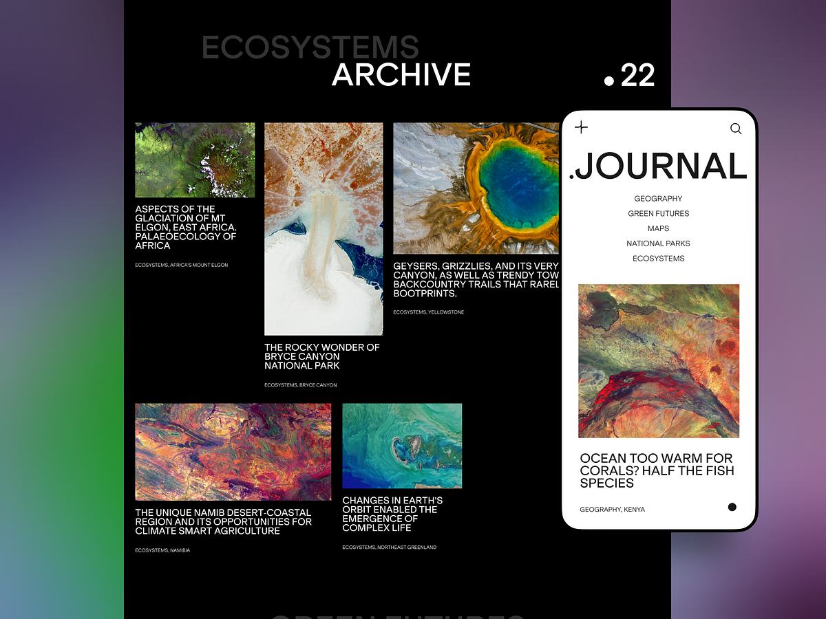
Captivating Web Design Concepts Inspired by Travel Spirit
“I am not the same, having seen the moon shine on the other side of the world,” the writer and artist Mary Anne Radmacher once said, and each and every traveler would probably support her idea. Our new design collection is also on that side: welcome to review another bunch of practical web design examples devoted to the theme of traveling, sightseeing, recreation, visiting amazing locations, learning more about environments, history, and life in amazing places, and booking good spots for the next holiday destination.Check the set of websites designed by tubik team, trying different styles and design approaches, interactive pages and creative graphics, smooth motion, and skillful use of photo and video content to set the atmosphere and enhance the message to the visitor. Enjoy and get inspired!Mountain Resorts WebsiteThis website design invites you to get stunned by the atmospheric mountain resorts and instantly sets the mood with the impressive video content and elegant typography. The website visitors are welcome to explore a variety of destinations with many interesting details smoothly integrated into the web page design, for example, the latitude and longitude of the specific spots. Also, the design concept literally plays with typographic contrast and uses the prominent cut-off typographic part at the top of some pages or the combinations of different fonts within one headline.https://medium.com/media/9bc15aabf9aabe8d57e85681fc33522e/hrefhttps://medium.com/media/e9e229f06b349217faf7a4f0bfefa0b7/hrefhttps://medium.com/media/feee33af7c16b5205bbb24a6132671f6/hrefhttps://medium.com/media/56f30d3b12b37a977d8bf56e3eba2543/hrefhttps://medium.com/media/ca59c2f0839ddc5f2a6d844f1fa9f8b7/hrefLumen Museum WebsiteHere’s the website of Lumen Museum, the charming place that gives this fascination a photographic home with breathtaking views and interesting insights. The museum harmonically combines history and innovations, interactivity, and exploration, covering the subject of mountain photography from diverse perspectives. The website design features a variety of elegant pages, smooth animation, engaging scroll, video integration, and other design solutions to present the amazing museum content online.All the major pages of the website are based on a minimalist layout, impressive visuals, a light background, and mastered negative space, which makes them full of air and freshness and lets the visitors feel it from the first seconds. Also, such an approach ensures that all the diverse visual content, from archive black and white photos to modern shots and videos, will look good on the pages.https://medium.com/media/f7b25bfc9908a2caec0d76738050e2b2/hrefhttps://medium.com/media/e36573fce8898137e28dcdf3384b2493/hrefhttps://medium.com/media/264513353575d5ccd0770640fcc2296b/hrefhttps://medium.com/media/18428996981c9fd26b647b5111828b73/hrefLearn more about this project in the case study about Lumen Museum website designNature Expeditions WebsiteHere’s the concept of the website promoting expeditions that allow travelers to explore unspoiled nature and enjoy unusual destinations. The breathtaking full-screen hero video lets the visitors dive into the mood and get impressed immediately. Trendy shapes, elegant, neat fonts playing with upper case and lower case within one piece of copy, colored page backgrounds, and cool motion graphics pack the information in a stylish, emotional, and attractive dress.https://medium.com/media/cee91b1cabedf556d83eb5aaab9e4e58/hrefhttps://medium.com/media/d5b5aca1975575be01416df15e5b08b7/hrefhttps://medium.com/media/a96c0b1f1cb54e17fce4e3aa820ac05e/hrefEcotourism WebsiteThis website was designed to support people that want to try ecotourism and have some rest deep in nature and far from the urban hustle and bustle. The design shows the balance of readability and decoration in typography choice, solid visual hierarchy, and thoughtful combination of different types of visuals such as photos and custom theme illustrations.The home page features a stunning hero illustration, while the Discover web page tells more about the destinations and types of holidays to book, with video integration to amplify the effect. Mobile adaptation helps to save visual harmony and allows users to interact successfully with the website from any device.https://medium.com/media/3d7e5dd0329eaaa1acf84ac8efa008da/hrefhttps://medium.com/media/8eb1dd5f9c916ed27ddc4235142b6b9c/hrefhttps://medium.com/media/b1dee632561656528e7dce66ef7041a3/hrefhttps://medium.com/media/636b5b5da513301454df9cb18a192e38/hrefhttps://medium.com/media/d9213881792d20333736131f565eb9a4/hrefMuseum Website Concept“A people without the knowledge of their past history, origin, and culture is like a tree without roots,” Marcus Garvey once said, and that may be the reason why museums will never be out of fashion. This design also touches on that important theme: it’s the website concept for Moesgaard Museum, a Danish regional museum dedicated to archaeology and ethnography. Impressive full-screen photo background lets the visitor instantly plunge into the atmosphere, while a solid typographic hierarchy supports both readability and visual elegance. The website uses interactivity to make the pages more engaging, and the pages demonstrate a thoughtful approach to data organization and visualization.https://medium.com/media/0c0cc124f5366b94da456c656075521d/hrefhttps://medium.com/media/07ad0e1770d0c8e23523e6fc6e85ad2b/hrefhttps://medium.com/media/81b7f34eab74c170967d908d1cf7e54d/hrefGeography BlogThis is the user experience design concept for a niche blog devoted to the topics connected with the environment, ecology, geography, and all things the modern state of nature. Here the design impresses the visitor with the spectacular photo and video content, illustrating informative and important text content and enhancing its emotional communication with the readers.https://medium.com/media/871932108e180b2046f197ae90479239/hrefhttps://medium.com/media/c533c900ba29a2a018abc1318bd645c9/hrefEvent Booking WebsiteThis design concept gives you a look at the website that helps visitors choose and book diverse events and experiences. The home page is made highly functional, with the form allowing users to search for the event in the above-the-fold area. In general, the website employs a variety of trendy shapes and minor geometric elements and makes shape and color contrast the primary tool of expressiveness, supporting beautiful photo and video content.https://medium.com/media/f433b7b918892974bd32b3e4586ad2c8/hrefhttps://medium.com/media/14a32fef2a8ab4f50e67f24f1fb4b644/hrefhttps://medium.com/media/903117bfa33f4afcf12072c61061f8b2/hrefhttps://medium.com/media/0a5c62dc3ce3160b0fc241ab7d80eea4/hrefWinter Holidays WebsiteTake a look at atmospheric web design for the service helping to book accommodation and build routes for amazing winter holidays. The visitors dive into the magic of winter instantly due to the breathtaking video content naturally integrated into a minimalistic and airy web layout.https://medium.com/media/d312dae3fe7818a2a1b7544bec548a90/hrefhttps://medium.com/media/161db9b76fdac5f812edd725c109a2f2/hrefhttps://medium.com/media/32484a07a833a65b8bd908d6d852f576/hrefhttps://medium.com/media/5c88210f477cf2f59db7ea172020f451/hrefhttps://medium.com/media/07188dc205a6a365f0c47a276f06ec2a/hrefYacht Hiring WebsiteTake a look at the website designed for the service allowing users to find and hire yachts. Atmospheric videos and beautiful photos, as well as the color palette, help visitors dive into the theme of sailing immediately. Interactive yacht visualizations assist in making the process of yacht choice both straightforward and fun, while sophisticated typography, functional color accents, smooth motion, and intuitive navigation make the web pages and their mobile adaptation attractive and easy to use.https://medium.com/media/c845201849695c96c68d305e0ac2cf64/hrefhttps://medium.com/media/0fe83275e862a7b93df2c1c014f25387/hrefhttps://medium.com/media/14946784cfbd8eaf5288cdf71010c4cc/hrefhttps://medium.com/media/36d52947051fcb040820dd4f1827933c/hrefNew web and mobile design collections by our team are coming soon — don’t miss the updates!More Design CollectionsIf you want to check more creative sets of web, app, and graphic design examples, here are some of them.App Design Ideas: 7 Nifty Mobile Application Design Projects23 Impressive Web Design Concepts for Various Business ObjectivesWeb Design: 16 Basic Types of Web PagesTubik Design Case StudiesInformation Beautified: Media and Editorial Website DesignsMobile Design: 14 Stylish and User-Friendly App Design ConceptsDesign for Sales: 10 Creative UI Designs for EcommerceSave the Planet: Web Designs on Environment and Ecological IssuesLogofolio: 16 Logo Designs for Different Business GoalsOriginally written for Tubik BlogWelcome to check designs and art by Tubik via:WebsiteDribbbleBehanceTubik ArtsCaptivating Web Design Concepts Inspired by Travel Spirit was originally published in Muzli - Design Inspiration on Medium, where people are continuing the conversation by highlighting and responding to this story.
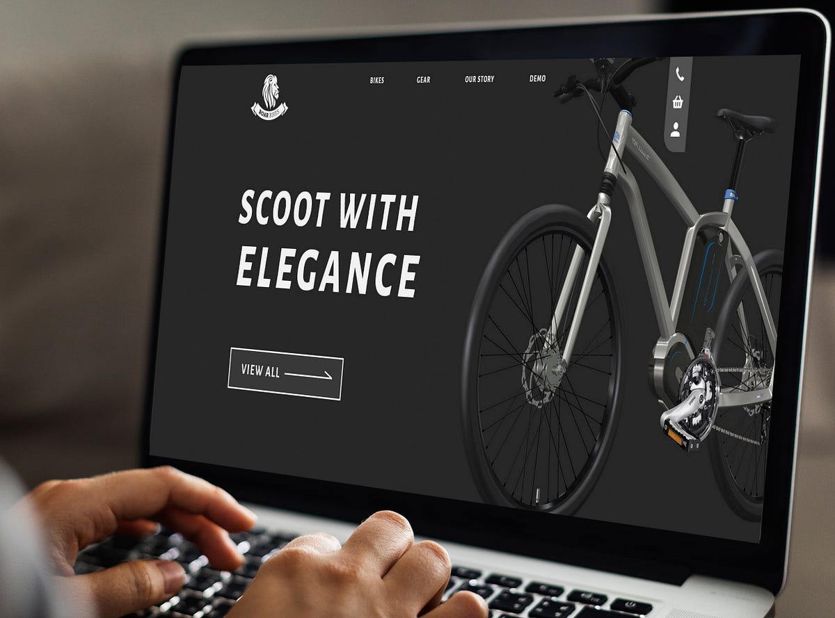
Case Study: Roar Bikes, an E-commerce website
An UI/UX case study of an emerging local bicycle brandOverviewRoar Bikes is a manufacturer of small run, contemporary bicycles sold exclusively from their own website. They currently have 3 models of bikes to purchase having at least 4 different versions for each.The bikes are customizable and unique in a way that professional sport bikers fancy. They also cater to the simplicity and dapper personalities of commoners who like to cycle their way to workplaces or just prefer mosey round the city.This project is actually part of a design course by Daniel Walter Scott on Udemy called “User Experience Design Essentials — Adobe XD UI UX Design”. It is a class project at the end of the course to test the newly developed skills.Project Duration8th April 2021–24th April 2021Design ProcessDrawing from the traditional design process, I’d divide it as Research-Analysis-Ideate-TestDesign thinking processResearchWith User Persona at hand, I started my research with understanding the nature and needs of the average customer and how I could meet the best of their wants into the design effectively and provide for a smooth experience. To get a better grasp I also read a few customer reviews on trustpilot and other bicycle websites to know the problems they had while making a purchase.Apart from this I did a comparative research of three major bicycle brands — Yeti cycles, Swifty Scooters and Santacruz Bicycles who could be the strong competitors for Roar Bikes to get a basic idea of what a bicycle website usually looks like. I tried to catch on the overall structure, user flow, micro-interactions, usability and other aspects of design. Also this being a class project I had several other versions of Roar Bikes from fellow classmates to be inspired from.AnalysisBeing a designer himself one can collect form the user persona that Jake must value design that stands out. He has a unique perspective for mundane things and is a big supporter of local crafts among other things. Hence, the webpage should look edgy, gripping and at the same time shouldn’t lose its esse of being an easy-going, not too flashy, simple local brand.User PersonaFrom the reviews it turned out customers mostly had issues with the bikes and its pricing but for a few the instructions weren’t clear.Coming to the UI of the previously mentioned bicycle brands, I particularly liked the user flow of the Yeti cycles website. Its product page is engaging but requires a lot of scrolling for information about features, details and geometry. Santacruz bicycles have made a separate nav link for each one of those which eases the task. Swifty scooters has a clean and precise product page but not much different than any other e-commerce website.IdeateAfter getting an idea of the overall structure of a bicycle website I drew a few rough wireframes on the paper. By tweaking and retweaking it again and again I created a few versions of it.Lo fi wireframesHi fi WireframeClinging to the mood board I chose a color theme that looked modern, exciting and clean. To make the website engaging I implemented the parallax scroll and made the elements on the page bigger in size to take up the most screen resolution but also let them breathe with providing enough whitespace. It also made them stand out.Picking the best of the items from the inspirations I had, I separated the features, details and geometry and made each section fun to scroll down. This also meant there would be less confusion on getting any information regarding the bikes.TestingI was taking feedback at almost every stage of creating the Visual Design. My elder brother would suggest me changes right from the colors that I used to the size of page elements. The first thing he didn’t like about the website was the almost black color I used for the hero slider. He said that the website should look ‘welcoming’ and not ‘intimidating’. Although I agree with him I also wanted it to look edgy; many a times the user doesn’t know what’s really off, colors are easy to blame. So, I tweaked the color slightly and experimented with different typeface, font size and design elements and it worked.He didn’t seem to have much problem navigating on the prototype except for the fact that it was unclear which buttons were clickable. I also tested it with a friend who had the similar problem.PrototypeNow for unmoderated testing, I had shared the prototype within a few design communities on Discord and they had some great insights over a few confusing sections that needed to be corrected, consistency and colors of course. I made the necessary changes and it was fine then.Parallax ScrollApart from that I also created a project on Useberry and shared the link with some of my friends without them knowing what they were getting into. As a result few of them dropped off. The task was to get to the product page of Bengal Bikes. I watched the session recordings and it seems like people were confused because they didn’t know which buttons worked and hence they skipped the task. Out of 8 people 4 could complete the task successfully.ConclusionWhat I learnt?It’s important to make your website relatable to the user. They should feel welcomed and colors have a lot to do with how they perceive the website.I also tried my hand on copy writing. I’ve written a few articles as a content writer before but copy writing is very different as it needs to be attractive and precise at the same time.Also it’s really difficult to maintain users’ attention on the page! People have short attention span and +skipping habit because of which most people didn’t even read what the task was.What would I change?There is a scope for a lot of changes like changing the images, typeface and even user flow but it all should blend well together as a whole. More micro interactions can be added to make users remember their last actions and just have a fun experience.In future…I’ll try to make designs that are less confusing. This was my sincere effort in learning UI/UX Design and my first proper project. I’m sure I can do better but this is it for now. It was a great learning experience, from user research to user testing and there’s still a lot to learn. Iterating new ideas with a creative block is frustrating but to keep the creative juices flowing is something a designer needs to work upon with constant daily efforts.And that’s that friends. Thanks a lot for staying till the end!Case Study: Roar Bikes, an E-commerce website was originally published in Muzli - Design Inspiration on Medium, where people are continuing the conversation by highlighting and responding to this story.
Web Usability Practices: Breadcrumbs as a Part of User Experience
Whatever beautiful and elegant a website is, whatever useful content, services, or products it offers, all the benefits may easily be ruined by only one factor: poor navigation. In this article, we continue the theme of web usability, this time to discuss breadcrumbs as an element of web navigation. Let’s learn what this term means and explore the types of breadcrumbs and best UX practices to make them work effectively.What Are BreadcrumbsBreadcrumbs are navigation elements used mostly in web design and supporting users in a journey around the website. Due to breadcrumbs, users get aware of where they are on the website and can get used to the website structure easier, which means that breadcrumbs present a tool for better wayfinding. Yet, breadcrumbs don’t replace the primary navigation menu; they present the secondary level of navigation and increase website usability in case it has lots of pages.Breadcrumbs on the product page on AmazonWhy such a funny name is used for this interactive element? If you think it resembles something from a fairytale rather than from design terminology, you are right. The term echoes Grimm Brothers’ tale about Hansel and Gretel: in it, the characters used breadcrumbs to mark the way home and not get lost. On the web, it works the same way: breadcrumbs visualize the path or the users’ journey from the perspective of the website hierarchy. That’s why they are also called a breadcrumb trail.Types of BreadcrumbsAs for classification, there are three basic types of breadcrumbs:Location-based: they show the visitors where they are according to a website hierarchy, usually applied to websites with complex navigation schemes consisting of multiple levels.Image sourceAttribute-based: they show the visitors the trail of attributes of the page they are on.Image sourcePath-based: these show the visitors the trail of steps they took to arrive on the page they are on. This type is often referred to as less effective compared to previous ones and is not recommended to apply.Why Use BreadcrumbsAmong the benefits of breadcrumbs as a navigation element, we would mention the following.increased findability: the more complex is the website architecture, the more content it has, the better organized it should be to be found quickly. Breadcrumbs give users another touchpoint to the content and help to understand the structure of the website easierfewer clicks needed: with breadcrumbs, website visitors can jump from one level of the hierarchy to any previous step with no effort and no need to take all the way back, which means it takes fewer clicks and transitions to reach the page they wanteffective use of screen space: crafted well, breadcrumbs take a narrow horizontal line with plain-looking text elements that don’t need much space, so users get navigated but designers have no need to overload the pageno misinterpretation: breadcrumbs present the element which is hardly ever misunderstood by users: the behavior pattern for them has solidified through years and people rarely mistake this element for anything elselower bounce rate: breadcrumbs are great support for first-time visitors or people that have no everyday experience of dealing with complex websites, so the more confident they feel the slimmer are the chances of them bouncing the page. What’s more, it’s an effective way of engagement for the users directed to a particular landing page: seeing it as a part of the bigger structure shown via breadcrumbs, users can get interested in jumping to other pages and seeing more.The minimalist product page by tubik for an e-commerce website uses breadcrumbs to follow the typical mental model users expect and help them with quick navigation.Design Practices for BreadcrumbsHere’s a bunch of UX design tips and practices that can help to master breadcrumbs as a supportive and handy element of web navigation. Bear in mind that none of these practices is a cure-all to apply for any website: the examples below show you how different products approach this navigation element to cover their priorities.Don’t use breadcrumbs as the primary navigationThe key rule of thumb for breadcrumbs is using them as an addition to major navigation. They shouldn’t be seen and used as a replacement for global navigation, usually found in the website header or menu. Instead, they support and amplify primary navigation.Place breadcrumbs above the H1 headingThe most common place where users expect to find breadcrumbs and where they work effectively as a part of the general layout is above the H1 heading. It may be the name of the category, the product, the article’s title, etc. Sure, not all the pages have visually defined H1 heading; in this case, designers find the most appropriate place, typically in the top part of the layout.For instance, on the George website, the product page features the classic approach to the breadcrumbs: they are placed right above the H1 heading, with a slight line used as a visual divider between them. However, on the category page, which doesn’t have an obvious H1 title, the breadcrumbs just keep at the same position at the layout, below the top navigation, and visual dividers help to clearly separate the trail from other navigation elements and filters.Consider starting a breadcrumb trail with a link to the home pageNoticeable and easy-to-reach link to the home page that allows the user to jump to the website’s main page from any point of the journey is still an essential part of web navigation. Although more and more users are getting used to the pattern when the logo featured in the website header is clickable and helps to jump to the home page, there are still many those for whom this flow is not obvious. As the breadcrumbs let users quickly define the website hierarchy and their current position in it, it’s logical to start the trail from the main page of the website.However, if there is a text link to the home page in the primary navigation, for instance, in the header, you don’t need to double it in the breadcrumbs.As well, in the case of a polyhierarchical website, you may want to concentrate users’ attention on a particular level or category instead of sending them to the home page. For example, Uniqlo starts the trail from the name of the major category user is browsing at the moment, letting the logo in the top left corner do the job of moving visitors to the home page.Make the current location look non-clickable (or don’t show it)There are two different approaches to the last item of the breadcrumb trail: you may show the name of the current page or finish it with the previous step, which means that the current page’s name isn’t shown at all. Whatever your choice, ensure all the elements cover a particular goal and help users. If you suppose that adding the current location to the breadcrumbs is necessary to support usability, make it clear that it’s not clickable and thus looks different from the interactive elements. For the mobile experience, it’s better not to show the current location at all, as the screen space is very limited.On the contrary, for all the other elements of the breadcrumb trail, make it obvious that they look clickable and are clickable.Example of a breadcrumb trail on the Walmart websiteClearly separate the elementsOne of the most popular separating symbols for the elements of the breadcrumb trails is the symbol “greater than” (>), which typically defines hierarchy and features the movement from the parent category to the child category. Other frequently used symbols are slash (/), right-angle quotation mark (»), and arrow to the right (→). So, designers do have what to choose from, don’t they? Some also separate breadcrumbs with the color putting them into the colored tabs that imitate the line of elements, each colored in a different shade.Mind readability and white spaceAs well as for any text element, the primary goal of breadcrumbs is to make the information packed in written form perceived and absorbed easily and in no time. So, take care of making them highly readable rather than decorative. And make sure there is enough space between the elements so that it is easy to read them, visually separate the pieces of text, and click.A clear and unobtrusive breadcrumb trail on the Google Support websiteShow the website hierarchy instead of the interaction historyUnlike the fairytale characters who used breadcrumbs to mark all their way, web designers would do much more effectively turning to show users the clear hierarchy of the pages instead of all the way they got through to reach this page. Such an approach will always look more logical and, furthermore, will clarify the clear and simple path back for the visitor who could get lost otherwise. What’s more, in this case, breadcrumbs don’t work at all for users who landed on a particular page and didn’t take any steps yet.As Jacob Nielsen mentioned in his article, “a history trail can also be confusing: users often wander in circles or go to the wrong site sections. Having each point in a confusing progression at the top of the current page doesn’t offer much help.”Don’t clutter the page with too many elementsWhat if the breadcrumb trail gets too long? Sure, it won’t be good to overload the page, especially at the secondary navigation level. In the case of the too long breadcrumb trail, some of them in the middle can be hidden behind the ellipsis. But never hide the first and the last element so as not to break the logic.In his article about breadcrumbs, Alex Zlatkus recommends not to let breadcrumbs take more than half of the page and think about such a shortening with an ellipsis inside when the trails get more than 5 items.Image sourceSure, the final decision is up to the designers of the particular project. It should be based on usability testing, as there can be different creative design solutions that allow for organizing longer breadcrumb trails effectively.Don’t emphasize breadcrumbs visually in the webpage layoutIf you feel the urge to find a super bright and catchy solution for the breadcrumbs, consider refocusing that on the other object of the web page layout. Breadcrumbs are not the primer violin in this show; that’s not the goal behind them, so keep them stylish but moderate. No need for bright accents, bigger sizes, and impressive fonts — breadcrumbs should just provide the secondary level of wayfinding, not scream into users’ faces distracting them from more important things that solve users’ problems.For example, the OldNavy website uses super minimalist and non-distractive breadcrumbs placed in the top left corner right below the header with primary navigation, this way sticking to a common left-to-right reading and scanning pattern. That makes breadcrumbs almost unnoticed when you don’t need them but easily found when needed.Don’t use multiple lines of breadcrumbs on mobileThe most precious asset of any mobile app screen is space. So, optimizing your website for mobile, take special care about that aspect: if the breadcrumbs trail is just copied from the website to mobile, it may take several lines, which snips off the big part of the limited screen space. So, by that, you get into the higher risk that some critical elements, for example, the name of the product on the product page or the introductory text, won’t be seen at once just due to the lack of space.Don’t apply breadcrumbs to the websites with a flat or simple hierarchyAs well as with internal website search, breadcrumbs are needed and helpful in cases when the website has multiple pages and a complex hierarchy consisting of multiple layers. Breadcrumbs are common — and expected by users — in big e-commerce websites and platforms, media and news websites, blogs, and magazines covering a wide range of topics, etc. If that’s not your case and your website has a simple hierarchy, primary navigation will be enough to let the users effectively interact with it.Example of a breadcrumb trail on the California State University websiteBreadcrumbs present the perfect example of how much details matter in user experience design for the web. Being far from primary and critical functionality but approached thoughtfully and crafted well, this interaction element can contribute much to making interactions easier and user-centered. Nevertheless, think twice and test twice before deciding upon them, as there may be more effective secondary navigation options to solve a particular task for a certain project.Useful ArticlesHere’s a bunch of articles to dive deeper into the theme of web usability and user experience design.Motion in UX Design: 6 Effective Types of Web AnimationTypes of Contrast in User Interface DesignThe Anatomy of a Web Page: 14 Basic ElementsUX Design: How to Make Web Interface ScannableUX Design: Types of Interactive Content Amplifying Engagement5 Pillars of Effective Landing Page DesignWeb Design: 16 Basic Types of Web Pages5 Basic Types of Images for Web ContentError Screens and Messages: UX Design PracticesFrom Zero to Hero: Look at Hero Images in Web DesignOriginally written by Marina Yalanska for Tubik BlogWelcome to check designs and art by Tubik via:WebsiteDribbbleBehanceTubik ArtsWeb Usability Practices: Breadcrumbs as a Part of User Experience was originally published in Muzli - Design Inspiration on Medium, where people are continuing the conversation by highlighting and responding to this story.

Aesthetic Usability: How Beauty Influences User Experience
What is design? In a nutshell, it’s the way to solve people’s problems and satisfy their wishes employing logic and beauty. In this article, we offer to discuss the role of beauty in user experience design: let’s check how it makes both users and businesses happy.Product manager concept for a foldable deviceWhy Beauty Is Important for DesignWe often hear that the functionality of a digital product is a priority for users — and that’s true. The website or mobile application should solve their problem effectively, easily, and intuitively. But what happens next, when the product is not the only one, not something exclusive and unique anymore, and natural competition comes into play? People start to look deeper and strive for more. They add aesthetic pleasure and emotional appeal to the list of their wishes. And between two equally good functional products, in the vast majority of cases, the user will choose the beautiful one.Based on the hierarchy of needs, the higher people get, the more sophisticated and intellectually driven their choices become. Education and income level engage them in thinking beyond functionality: except it, users strive for harmony and aesthetics. So, the role of beauty gets higher.Maslow’s pyramid, demonstrating the hierarchy of needsHere is a bunch of reasons why beauty works that way in user experience design:It makes design emotional, aka human-likeIt keeps the connection of digital things with the real worldIt supports usabilityIt satisfies the aesthetic needsIt unites different things with one styleIt lets the product stand out from the competition.Website design for FarmSense, the innovative agricultural serviceBeauty and aesthetics are the solid bridge between the past, present, and future of design. Today, new layouts and graphics are based on the rich heritage of the world culture collected for hundreds of years. Modern designers and artists rework it with a pinch of trends and innovations: building a new circle of cultural history, they preserve the work of the best artists of all generations. That’s when art and aesthetic appeal works for purpose in design. We aren’t reinventing the wheel — we are making it modern and letting it solve people’s problems.https://medium.com/media/07d49192ec138ae5b0880e17520ebde2/hrefHowever, we should think deeper. “When you start your next design project, keep this principle in mind: people will forgive shortcomings, follow your lead, and sing your praises if you reward them with positive emotion,” Aarron Walter mentioned in his book, and in his idea, we only get not only proof of the aesthetic and emotionality importance but also a hint of being reasonable with the limited nature of these effects. The beauty and emotional appeal of the digital product will definitely help users interact with it more straightforwardly, trust it faster, and be tolerant of minor issues. But they will not help with major problems if the product has them.Aesthetic-Usability EffectGurus of user experience design Nielsen Norman Group describe it as a phenomenon of aesthetic-usability effect. It refers to users’ tendency to perceive attractive products as more usable. People tend to believe that things that look better will work better — even if they aren’t actually more effective or efficient. This effect is a significant reason why a good user experience can’t just be a functional UI — designing an interface that’s attractive, as well as functional, is worth the effort.In the practice of human-computer interaction, it was first studied in 1995 by the Hitachi Design Center. Researchers Masaaki Kurosu and Kaori Kashimura tested 26 variations of an ATM UI, with 252 study participants, asking them to rate each design on ease of use and aesthetic appeal. Having analyzed the results, they discovered a correlation between the ratings of aesthetic appeal and perceived ease of use more evident than the correlation between the ratings of aesthetic appeal and real ease of use. Therefore, studies concluded that the powerful impact of the aesthetics of any interface is made on users, even when they try to evaluate the system’s functionality.Based on that, let’s consider the influence of beauty on UX goals. There are 4 fundamental aspects of UX design, and attractive appearance and visual harmony present the factors that empower all the points.Usability means that the product works and users understand how.https://medium.com/media/d1aefb31f75aae28c1397608ba7a8426/hrefhttps://medium.com/media/8c7abf1f68ff9acb8e8eaa9452e20224/hrefhttps://medium.com/media/4fd505ac3816c95716243c91b8354589/hrefAccessibility allows the interface to work for different people with different abilities and across various devices.The landing page for the Pass-On application keeps visual consistency and is accessible for the visitors speaking either English or Arabic, the languages that work in a totally different way and demand different design approaches, as well as keeps its beauty and functionality if used on mobile.https://medium.com/media/4e15fe231f9688bd1ddb8208eba3c333/hrefhttps://medium.com/media/c9bbdb89cf2d2333465ce3025c943740/hrefUtility means that it solves the problem.https://medium.com/media/b42d19b01fc71ecdbadda6b2b7d4a337/hrefhttps://medium.com/media/170629612598eb37f38185dc08e8de9c/hrefhttps://medium.com/media/eaabd499faed20d5afde017040d6e237/hrefhttps://medium.com/media/a3b1286cc4c6ef782679ae026e30f0ea/hrefhttps://medium.com/media/0a5c62dc3ce3160b0fc241ab7d80eea4/hrefDesirability means it’s pleasurable and makes users happy.https://medium.com/media/2f8fca718116465dbae9c3830cf28411/hrefhttps://medium.com/media/fbe9066845feeebbfac06cd9e43bc830/hrefhttps://medium.com/media/4c4b6f29a46c058414a4859126195964/hrefBusiness goalsHowever, companies that start new products or improve well-known ones also have to think from another perspective. It operates via various financial factors, conversions, sales, and all the other business stuff.Does beauty on the screen influence their business goals? Yes, indeed. Color theory and psychology, harmony on the screen, readable text content, and attractive images are essential not only for making users happy. They also sell and make businesses happy too.https://medium.com/media/1267cde0ded3d5533314a44092dd9866/hrefhttps://medium.com/media/e6956d46b4742c07845bf1b2723c730d/hrefhttps://medium.com/media/5baf80acca7cabd2077edfc08efa5d5a/hrefElements of UX AestheticsDifferent elements allow beauty to get integrated into user interfaces and build its aesthetics, among them:TypographyLayoutPhotosIllustrations3D graphicsAnimationVideoCharactersAll these elements form the aesthetics of interactions and have a direct impact on a positive user experience. Let’s check some practical examples below.https://medium.com/media/c565a2406c8f701807489a72edfcd151/hrefhttps://medium.com/media/e1f945f71b75f8f08c7ccf6918c2c4ed/hrefhttps://medium.com/media/31ae662f6cfcc17668888e7adef3d110/hrefCrypto blog design uses a limited color palette to make it look serious but not dull, as well as echoes the traditional layout of the broadsheet to set strong aesthetics of printed media migrating to the digital world.https://medium.com/media/aacb271966d9f506986b1d374c5eb96b/hrefhttps://medium.com/media/6d36ec146e7ead43e4b5ab45ce1817d4/hrefhttps://medium.com/media/fb1c390085eaaae2df3836596da418b8/hrefConsistencyAnother core point to consider from the aesthetic-usability effect lies at the crossroad of UX and business — it is consistency. As Jacob Nielsen said, “Consistency is one of the most powerful usability principles: when things always behave the same, users don’t have to worry about what will happen.”In fact, it goes much further than interactions. It also works in building up a strong brand. Logo and branded items, website, app, emails, and social networks — each and every touchpoint of the product with its user should follow one general idea and set of values as well as get packed in a consistent and integral style.It works when you make a decision upon system, limitations, and rules, when you decide not only what can be done with a brand image but also, even more importantly, what can’t be done. For example, let’s take IBM design language or Material Design principles. They define how the elements should look, how the interactions should be built, and even how the interface copy should be written. What’s more, their principles answer the more profound question: why it should be done that way.https://medium.com/media/a5660e40d698e550d25ec382c18da45b/hrefhttps://medium.com/media/a0721ce6a0589b65adcb329fbdc3c727/hrefhttps://medium.com/media/22f5a2c7aa3faa9aa93c7632932ea1cf/hrefhttps://medium.com/media/cb16a180d15b7e6818ba6446a0f8e6ed/hrefGlobally, all the design solutions should answer one question — why? World-famous expert in leadership Simon Sinek says: People don’t buy what you do; they buy why you do it. And what you do simply proves what you believe. That’s what makes products and services consistent and inspiring. All the decisions we make should start with “Why,” which will form how to talk to the user, whatever is the source of communication. Whatever is the connection point with the brand, you should be sure what communicates with you. That builds the feeling of trust and makes the brand stronger, and that is where beauty helps make the user experience more solid and helpful.Useful ArticlesHere’s a bunch of articles to dive deeper into the theme of usability and user experience design.Big Little Details: 7 Helpful Elements of Web UsabilityThe Anatomy of a Web Page: Basic ElementsUser Experience Design: 7 Vital User AbilitiesMotion in UX Design: 6 Effective Types of Web AnimationUX Design: Types of Interactive Content Amplifying Engagement5 Basic Types of Images for Web ContentTypes of Contrast in User Interface Design5 Pillars of Effective Landing Page DesignNegative Space in Design: Tips and Best PracticesOriginally written by Marina Yalanska for Tubik BlogWelcome to talk to us and check designs by Tubik via:WebsiteDribbbleBehanceTubik ArtsAesthetic Usability: How Beauty Influences User Experience was originally published in Muzli - Design Inspiration on Medium, where people are continuing the conversation by highlighting and responding to this story.
UX/UI Design Trends for 2026 — From AI to XR to Vibe Creation
UX/UI Design Trends for 2026 — From AI to XR to Vibe CreationWe saw a bunch of new UX/UI design trends emerge thanks to the AI bubble, new technology in the field of mix reality, unexpected design tool updates, and more.UX/UI Design Trends for 20261. Mixed Reality In The Day-To-DayIn October, we saw Mark Zuckerberg embarrass himself on stage when the demo of the RayBan Meta Display glasses backfired. However, the demo aside, this new device imploded the mixed reality trend. This launch helped other alternatives (which are cheaper) to get the limelight they needed.Samsung Galaxy XR in actionThis combined with the launch of Samsung’s Galaxy XR headset (which is half the price of Apple’s Vision Pro) really shows the amount of money that companies are pouring into this field. On the plus side, designers get better opportunities in the space of XR or MR design.Meta Neural Band — GesturesAs a designer, it’s exciting to see new modes of interacting with the Meta Neural Band which allows you to control your device with unique gestures — pinch and twist to zoom, double tap your fingers to select, and more.This also gives rise to a new type of interface design — VBIs, which is short for Vision Based Interfaces. This includes eye tracking, facial expression analysis, head movement tracking, gesture controls, and more. This means an almost hands free experience is viable in the future.Learning how interface design can blend with real world experiences will be crucial since that is where the next tech is headed. We’re seeing more of these floating displays entering the real world, so learning this before they truly blow up will be the next step. Here’s a guide I found that might help you — https://krystianzun.gumroad.com/l/xrdesignroadmap.2. Voice Based Interface DesignVoice has recently blown up in a major way with AI software using voice based interfaces and voice based interactions. So, instead of typing in, you are conversing with the software to ask for answers or request an on screen action.Gemini Live — voice based interactionsA great example of this is Google Gemini’s live voice assistant which allows users to point their camera onto anything and ask questions based on this. Here computer vision is in full display with voice being that main mode of interaction. We see such an interaction in most major AI apps including ChatGPT, Claude, Perplexity and others following along.We also see voice based interfaces playing a major role in wearable technologies, where typing or gestures become difficult to carry out. I’m sure you’ve seen people on their Apple watches or Android smart devices asking the device to do something through voice commands.Apple HomepodThe same interaction carries over to smart home assistance (Alexa comes to mind), smart home devices, and even AI standalone gadgets.The industry is catching up with voice technologies, and so are software companies creating new tools to make this happen. As designers you can try out Protopie’s voice prototyping features — https://www.protopie.io/learn/docs/voice-prototyping/getting-started.3. Glass is Here To Stay (Other Materials Too)I have Apple to blame for this. Ever since the launch of liquid glass with iOS 26 and its counterparts, every company has been following this trend. I believe it is due to its aesthetic appeal and interesting effect that this design trend has truly been hyped up.Microsoft app icon update 2025This trend has trickled down to other areas of design — graphics, visuals, iconography, etc. Microsoft’s new app icon designs are a major change to brand’s look. This implements 3D materials like glass, metal, and more.The same goes for Apple’s new app icon update — more glassy and shiny than before, truly leaning into the liquid glass effect.Such trends aregiven a boost if the software used to design them follow along. Figma launched a glass effect update that solidified that designers love using this effect. I’ve also observed major websites slowly implement glass style backgrounds, buttons, and cards.Figma glass effect update4. Motion Takes a Big LeapMotion design is more accessible and easy to implement today than ever before. With tools like LottieFiles Creator, LottieLabs and even Rive taking the front seat.I recently spoke to someone from LottieFiles who showed me a mind blowing update. Lottie animations can now respond to user input and can have their own functionality! So if a user selects one option out of many, an animation can be played based on conditions, without any external code required. It’s called state machine, and you must try it out here.LottieFiles state machinesAt the same time, tools like LottieLabs have brought forth a Figma plugin that converts your UI elements into an animated Lottie sequence with AI — called Magic Animator.We also see advance animations in tools like Rive, that allow non motion designers to create something unique with ease. Rive, just like LottieFiles, allows designers to add interactions without code. It’s simple to add hover or pressed animations which can be embedded or added to other no-code tools like Webflow or Framer.5. War of The AI BrowsersA lot of browser companies have shifted their focus towards AI based or agent based browsing, where the users ask the agent to find something or do a certain task, and the browser does it for them in real time.ChatGPT Atlas browserNow, why is the important for UX/UI designers? Designers used to focus on the business and users only, but with the rising era of AI agents and browsers, they will also have to focus on Agentic UX. This means that we will be creating experiences for AI systems and agents as well, looking at how these agents interact with websites and apps. Many different companies including Perplexity, OpenAI, The Browser Companies, and others.Some companies might even ask designers to build unique experiences for AI platforms like ChatGPT or Gemini. A great example of this is Apps in Chatgpt, a major update to ChatGPT that allows third party companies to launch mini apps inside ChatGPT.ChatGPT AppsWe now see AI trickling into all different facets of user experiences, hence designers with specialized skills will be more valuable for these companies.6. Morphing is The New ScrollingWhile cool scroll animations and parallax effects still blow me away. As a designer I’m always looking for the next thing. Recently, a lot of different mainstream websites are moving to a morphing effect between each section of their land page.Case in point Meta Rayban website:Scroll animations on Meta’s websiteHere is another great example of this:7. 100% Height on EverythingThe theme of most websites these days is immersive. We’re seeing more websites embrace full height images and videos, along with text placed at the top and bottom of each section to add to the immersion.Apple Airpods websiteSince the product or service is at the center of these websites, you will also observe bottom aligned titles and text based feature sections.When I was starting out, designers tried to stuff in as much into one scroll as possible, however designers are become risk takers! The bottom aligned title or navigation used to be very “aesthetic” and niche, but it’s more common today.This comes after years of data and research showing how immersive experiences and videos work better than static content, and designers have leaned into it for sure.8. Moving Away From The Term “UX Design”This year we saw major companies like Duolingo and Shopify got rid of the tag of UX design and replaced it with designer and content designers are now called writers.This sparked a huge debate because this causes confusion and makes it hard to differentiate between specialties. On the other hand, some people liked this decision since UX is often confused with UI or visual design decisions, so this would possibly remove that confusion.What these companies have tried to explain is that tools and AI have helped bridge the gap between design skills, i.e. UI designers can now do UX design, UX designers can now build coded prototypes, and content designers can now do UX copy, and the list just goes on. While I do agree with this a little, the value of specialized skills in creative fields can not be replaced with a common title, nor is the effort that each designer bring to the project.Duolingo took a better approach than ShopifyThis does open up a huge plethora of questions that designers have when it comes to starting a career in UX design. Only adding to the weird identity crisis that designers with unique skills usually have.Now, it’s still uncertain what effect this will have on the creative job market, but if enough companies follow suite, we may soon have completely new standards for what design truly means to employers. Stay tuned for more updates like this by following me!Read a detailed article I wrote on this controversy here.9. AI Based Design As a Career PathThe number of jobs that now have “AI” in the title is crazy. I often stumble across job posts where companies want either “AI enabled” designers or specifically AI designers for tasks related to AI only.This image above is just a small segment from a random Google search I did. These are either looking for designers for AI products, which makes a lot of sense. The other posts are about designers who can use AI tools to create designs.Personally I wouldn’t want to be a designer who just uses AI tools to churn out designs or content all day. However, if the future follows what’s happened in the past, most designers will have to find a balance and use both at the same time.10. Custom Cursors Are Back?I remember a time when using custom cursors was considered a sin in the web design industry. This was due to some of these cursors being distracting and harmful to usability, they’ve recently made a solid comeback to landing pages.From the iconic Figma cursors designed for collaboration and teams, to animated circular cursors, there are really no limits.Custom cursor feature in FramerThanks to tools like Framer, cursors are now more than ways to navigate a website, but they can often display extra content like images or videos over hover and indicate what you’re interacting with. A great example of this is how cursors change to a play button when hovering over a playable video.I would say these cursors are definitely reserved for more stylized or creativity first websites, as compared to more functional or more product focused websites.11. The End of The Dark PatternDark patterns have been a staple in the UX design field for years now. Marketers use it, UX and web designers use it, and businesses encourage it. However, there have been some major advancements in how users perceive dark patterns and how governments feel about it.Recently the EU (European Union) banned and enforced certain rules on implementing dark patterns on your digital platform and it includes a lot of major and commonly used dark patterns.Fake Urgency — Designers can no longer create false timers or elements for urgency to make users purchase faster. Major examples of this are “Only 2 seats remaining” or “12 hours left to buy”. The EU now says that unless the timer is real or shows a real urgency, you can not implement it.Pre-Ticked Boxes — A lot of websites pre-check checkboxes in forms to make users sign up to a newsletter or opt-in to options they did not select on their own will. The are now, also banned.Emotional CTA — This is a BIG one! Most Sass and agency websites implement emotional CTAs like “Failing to get leads, contact us” or “Struggling to make your sales deadline, join our bootcamp now”. According to the EU, these CTAs can toy with a user’s emotions or manipulate them into buying something.This article does an amazing job detailing these laws and explaining them in its entirety. If your website is published in Europe, make sure you focus on these if you don’t want to be fined or get your website banned.12. Vibe Coding Replaces Complex PrototypingThere are a bunch of tools like Protopie, Origami Studio and Proto IO that can add advance interactions and real user touchpoints to your prototypes.However, AI stepped into this field with something I’m sure you’ve heard of — Vibe Coding. Now, even though the name has coding in it, it’s more of a no-code solution for designers and developers to build life like functional prototypes. That means instead of a “dummy” form, you can actually add areal working form that can take input from users; or instead of a just adding visual success animations you can also make the phone vibrate for like like app experiences.For example Jacques Debeuneure Jr. made this amazing like clock and weather website which plays calming music using Figma Make:Some major tools like Lovable, Bolt, Google AI Studio are at the center of the vibe coding revolution, with features that cater to designers like us. Some of them boast a Figma import feature and some of them have a live editable canvas to work with. Most companies like Figma or Framer who are playing it smart, are introducing their very own vibe coding platforms to work alongside their main apps.Here is a very useful guide on vibe coding if you’re looking to get started: https://www.codecademy.com/learn/intro-to-vibe-coding13. Variable Fonts Got a New PersonalityEarlier we used to utilize variable fonts in a more systematic or simple manner, now designers are going all ballistic with them.Mix these variable fonts and font styles with shapes, animations and SVGs and you have a very interesting and fun Hero section that users and clients love.Here are some interesting examples:Hero section of Jitter.videoHero section of truus.coTitle of webdesignerdepot.comHere is a great getting-started guide by Figma: https://www.figma.com/typography/variable-fonts/14. Designs Based on Real World ContextYou know what’s worse than an app that isn’t up to date? An app that doesn’t understand what’s going on in the real world.Recently it’s become very common for companies to want themed websites and apps based on festivals, special occasions, or even personalized user events like birthdays or anniversaries.Zomato Diwali app updateSome apps even work with relevant artists and celebrities to collaborate with them on seasonal gifting sections and special events.Uber gifting season app updatesThose were my top picks for the best UX/UI design trends that we can see happen in the coming year, i.e. 2026! If you’re reading this around the new year, then Happy New Year to you and your family! 🎉Follow me for more design content throughout the year! Do leave a *clap* if you found this article helpful.……💡 Stay inspired every day with Muzli!Follow us for a daily stream of design, creativity, and innovation.Linkedin | Instagram | TwitterUX/UI Design Trends for 2026 — From AI to XR to Vibe Creation was originally published in Muzli - Design Inspiration on Medium, where people are continuing the conversation by highlighting and responding to this story.
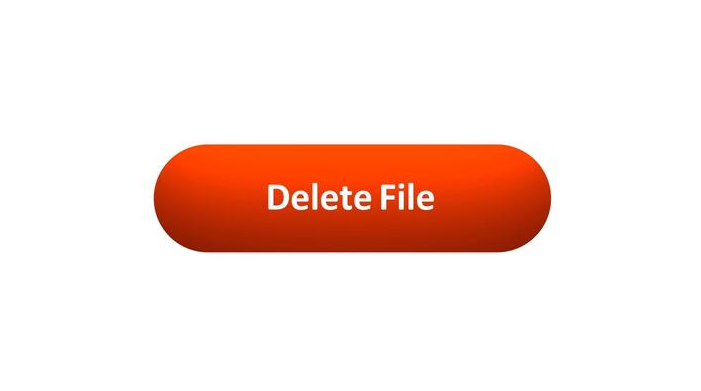
The Designer’s Guide to Basic UX Writing & Microcopy: Focus on the Power of Words in UI
As designers, we obsess over pixels, grids, and color palettes. But there’s an invisible material in our interfaces that is just as crucial: language. The words we choose can be the difference between a user who feels guided and empowered, and one who is confused and frustrated.
This is the domain of UX writing and microcopy—the small but mighty bits of text that guide users through your product. It’s the button label, the error message, the placeholder text. It’s not just “copy”; it’s a core component of the user interface.
When done well, microcopy is invisible. It quietly does its job, building user confidence and paving the way for a seamless experience. Let’s break down the principles for writing clear, concise, and helpful text for the most critical UI elements.
Why Microcopy Matters: More Than Just Words
Before we dive in, let’s reframe what these words are:
Button Text: Not just a label, but a commitment. It tells the user what will happen when they click.
Error Messages: Not just an alert, but a solution. They should help the user fix the problem, not just announce it.
Labels & Instructions: Not just a description, but a guide. They prevent errors before they happen.
With that in mind, here are the fundamental principles.
Principle 1: Write Button Text that Builds Confidence
Buttons are the primary call-to-action (CTA) points in your interface. Their text needs to be specific, action-oriented, and predictable.
❌ What to Avoid:
Vague commands: “Submit,” “Go,” “Ok”
Technical jargon: “Configure,” “Execute,” “Transmit”
The classic, unhelpful: “Click Here”
✅ Principles & Examples:
Be Specific and Action-Oriented: Use a strong verb that describes the exact result of the action.
Instead of: Submit
Write: Sign Up for Free or Publish Post or Send Invoice
Use the Active Voice: Focus on what the user is doing.
Instead of: Your profile can be edited here.
Write: Edit Profile
Create a Sense of Value: When possible, hint at the benefit.
Instead of: Download
Write: Get My Ebook or Save Preferences
Real-World Example:
Notice how the button doesn’t just say “Ok” or “Confirm.” It explicitly repeats the destructive action, Delete Document, leaving no room for misunderstanding.
Principle 2: Write Error Messages that Solve Problems
Nothing halts user momentum like an error. A bad error message adds insult to injury; a good one turns a moment of failure into a moment of guidance.
❌ What to Avoid:
Technical gibberish: “Error 500: Internal Server Fault.”
Vague blame: “Invalid Input.”
Condescending tone: “You did it wrong.”
✅ Principles & Examples:
Explain the Problem in Plain Language: Clearly state what went wrong.
Instead of: Form Submission Error.
Write: We couldn't save your profile.
Provide the Solution (Most Importantly!): Tell the user exactly how to fix it.
Instead of: Invalid Email.
Write: Please enter a valid email address (e.g., name@example.com).
Be Humane and Respectful: The tone should be helpful, not accusatory. Use “we” to take responsibility where possible.
Instead of: You forgot to fill out the required fields.
Write: We need a few more details to complete your registration.
Principle 3: Write Labels & Instructions that Prevent Errors
The best error message is the one you never have to show. Clear labels and instructions set user expectations correctly from the start.
❌ What to Avoid:
Inconsistent terminology (e.g., “Client Name” in one place, “Customer Name” in another).
Ambiguous language.
Instructions that are paragraphs long.
✅ Principles & Examples:
Be Clear and Consistent: Use the same word for the same concept everywhere.
Instead of: Handle (What does that mean? Username? Nickname?)
Write: Username
Put the Key Information First: In placeholder text or hints, lead with the most important detail.
Instead of: Enter your phone number, including the area code first.
Write: Phone Number (including area code)
Use Sentence Case: Capitalize only the first word for labels and buttons (e.g., “Email address”). It’s easier and faster to read than Title Case.
Show Examples: When format matters, show, don’t just tell.
Instead of: Enter your date of birth.
Write:
Label: Date of Birth
Placeholder: MM/DD/YYYY
Real-World Example:
The labels are simple and standard. The placeholders provide a clear formatting template, preventing user guesswork and ensuring the data is collected correctly.
The Golden Thread: Tone & Voice
Underpinning all these principles is a consistent Tone of Voice. Is your product a trusted professional? A friendly guide? A witty companion? Your microcopy should reflect this consistently.
Be Concise: Omit needless words.
Be Useful: Your primary job is to help the user complete a task.
Be Human: Write like you speak (to a colleague, not a stranger).
Your Words are Part of the Design
The next time you’re designing a form, a modal, or an empty state, don’t treat the text as a last-minute filler. Wireframe with real, purposeful copy. Prototype with the exact messages.
Ask yourself: Is this button text a clear promise? Does this error message help the user move forward? Do these labels prevent confusion?
When you wield words with the same intention as you wield color and layout, you elevate your design from a mere visual arrangement to a coherent, helpful, and human-centered conversation.
The post The Designer’s Guide to Basic UX Writing & Microcopy: Focus on the Power of Words in UI appeared first on Designer Daily: graphic and web design blog.

Serif Fonts 101: Everything You Need To Know
So you’re curious to learn all about serif fonts, huh? Well you’ve come to the right place.This little guide will tell you everything you need to know about serif fonts and why they matter. Serif fonts are those fonts that have little feet or tails at the ends of letters.You’ve been reading them your whole life in books, newspapers, and magazines.Serif fonts are classic, and traditional, and tend to evoke a sense of authority or history. But they’re not just for your grandparents — serif fonts can also be used in many modern designs.In this article will look we will dive into the wonderful world of serif fonts.Let’s get started.600+ Free Designer ResourcesVisit Learnn, and get access to 600+ Free Designer Resources. Join our Discord Design Comunity → discord.io/learnn.What Are Serif Fonts?Serif fonts have those little feet, or serifs, at the ends of letters. They’re the fonts you’re used to seeing in books, newspapers, and magazines.Fonts like Times New Roman, Georgia, and Garamond are all serif fonts.They’re considered more traditional and tend to evoke a formal tone. Many people also find serif fonts easier to read in print because the serifs help guide the eye from letter to letter.For digital reading, though, serif fonts aren’t always the most legible. The low resolution of computer screens can make the serifs look blurry or uneven.That’s why many websites opt for sans-serif fonts, like Arial or Helvetica, which have a cleaner, more minimal look.Still, serif fonts absolutely have their place on the web.They can convey a stylish, authoritative tone and work well for long-form articles. Just make sure to choose a font size large enough to render the serifs clearly and increase the line height for easier reading.With the right considerations, serif fonts can be a great choice for adding a polished, timeless feel to your website.Anatomy of Serif FontsSerif fonts get their name from the little feet at the ends of each letter. Those tiny lines and curves are called serifs. They help guide the reader’s eye across the page and make text easier to read in print.Within the serif font family, you’ll find varieties like:Bracketed serifs: Times New Roman, GeorgiaUnbracketed serifs: Minion Pro, PalatinoSlab serifs: Rockwell, CourierCompared to sans-serif fonts like Arial or Helvetica, serif fonts tend to look more traditional and formal.They’re popular for body copy in books, newspapers, and magazines. If you’re looking to add a classic, polished touch to your design, serif fonts are the way to go.Best Uses for Serif FontsWhen it comes to using serif fonts, certain applications are particularly well-suited.1. Traditional and formal documentsSerif fonts, with their classic, polished look, are perfect for conveying authority and professionalism. Use them in:Legal documents like contracts to appear as officialAcademic papers seem scholarlyCorporate reports to look distinguished2. Branding and logosWant your business to seem established and prestigious?A serif font in your logo, signage or stationery can do just that. Serif fonts imply sophistication, elegance, and tradition.3. Print and digital mediaWith their variable stroke widths, serif fonts are highly legible in print and online.They make text easier to read, which is why many newspapers, magazines, and book publishers choose serif fonts. On screens, serif fonts may appear slightly blurry, so consider your medium when selecting a font.Pairing Serif FontsWhen combining serif fonts, keep in mind that less is more.Using two serif fonts together can appear cluttered, so choose wisely. Opt for serifs with distinct personalities to create visual contrast, like pairing a traditional font with an unconventional one.For example, try pairing Minion Pro, a classic serif, with Playfair Display, an ornamental serif font.Minion Pro’s simple, elegant letterforms balance well with Playfair Display’s decorative swashes and ligatures. Using one serif for headings and the other for body copy is an easy way to achieve harmony.Experiment with different serif fonts in various weights and styles.Combining a bold condensed serif with a light expanded serif can result in an interesting mix of thick and thin lettering. Just be sure to give each font enough breathing room so they don’t compete for attention.Serif Fonts in Web DesignSerif fonts add a classic, polished look to web designs. Their little feet, or serifs, guide the eye along the line, creating a formal yet readable style.ChallengesSerif fonts can be tricky to implement on screens.Low-resolution displays often make serif fonts look blurry or jagged. But with a higher resolution screen and font smoothing technology, serifs have made a comeback.Choose web-safe serif fonts like Georgia, Times New Roman, Cambria or Constantia are designed to look good even on lower-resolution screens.Use CSS techniques like @font-face to load custom serif fonts. Make sure to include multiple file formats (TTF, WOFF, WOFF2) for maximum browser support.Set larger font sizes (16px and up) and line heights to improve legibility.Limit use of serif fonts to headings and short blocks of text. Sans serif fonts may still work better for long-form reading on screens.With the right font choice and implementation, serif fonts can convey authority and class on the web.Serif Fonts in UI/UX DesignWhen designing user interfaces, serif fonts can be a great choice for enhancing the user experience. Serif fonts, with their little feet and rounded edges, often appear more traditional and polished.They convey a sense of authority and classiness that sans-serif fonts lack.1. User-FriendlySerif fonts are typically very readable, especially in print.Their rounded letterforms and variation in stroke width make them easy on the eyes over long passages of text. For this reason, many books, newspapers, and magazines rely on serif fonts like Times New Roman or Georgia.Leveraging this in your UI can make for a pleasant, user-friendly experience.2. Aesthetically PleasingSerif fonts simply look beautiful. Their ornamental details give them a stylish, decorative quality that complements many design esthetics.When used well in an interface, a serif font helps create an overall impression of high quality, artistic merit and visual harmony.Examples of serif fonts that achieve this include Baskerville, Palatino, and Garamond.3. When to UseAny time you want to convey tradition, authority or class in your UI, a serif font is a great choice. They work well for:Content-heavy sites like news publicationsE-commerce stores selling high-end or luxury goodsFinancial or educational platformsUsed judiciously in the right context, serif fonts can balance esthetics and functionality to create memorable user experiences.ConclusionSo there you have it, everything you need to know about serif fonts to get started. Now that you understand the origins and different categories of serifs, you’ll be able to make more informed font choices in your own designs and writing.Next time you’re picking out a font for your newsletter, blog post or school paper, you’ll know just which serif to choose to convey the right tone and make the right impression.Go forth and serif!600+ Free Designer ResourcesVisit Learnn, and get access to 600+ Free Designer Resources. Join our Discord Design Comunity → discord.io/learnn.Serif Fonts 101: Everything You Need To Know was originally published in Muzli - Design Inspiration on Medium, where people are continuing the conversation by highlighting and responding to this story.

Sunlight Casts Shadows of Phrases Exploring Theories of Time in a Street Art Installation by DAKU
Product Page Design: Handy UX Tips and Practices
In e-commerce, the measurement of success is not the number of website visitors or clicks. It’s the number of finalized purchases. From that perspective, a product page is crucial as it is usually the spot where most decision-making on “to buy or not to buy” happens. So, designing or improving an e-commerce website or application, UX designers have to think it over and test it up to the slightest detail. That’s what our today’s article is about: let’s discuss what a product page is and how to design it effectively. Packed with plenty of examples from both known e-commerce websites and creative design concepts for niche or specific business goals.Product page design for the BlockStock websiteWhat Is Product PageThe product page is a page of an e-commerce website that provides a customer with all the needed information about the particular item, allows them to check various options if they exist, and enables a customer to quickly proceed with the purchase process if they decide upon buying the item.Unlike a real point-of-sale, an e-commerce website doesn’t provide physical contact with an item or assistance from shop staff. Product page becomes the major source of attraction, impression, information, and persuasion. That’s why its design, navigability, and usability play a crucial role in growing sales.As we mentioned in our guide to the basic web pages, a badly-designed product page may waste all the effort (usually massive and complex) taken to bring the buyer to the website and to this particular product. So, besides the attractive product presentation, focus on functionality, clarity, readability, and intuitive navigation.Product page concept for a gardening e-commerce websiteTypical Elements of Product PageBasically, a product page:shows the image of the productgives all the needed information about the productallows users to check different color/model options (if any)enables visitors to see the reviews, comments, and ratings from earlier buyersallows for adding the product to the cart or wish listshows other relevant options.Additionally, the product page may include such options as a comparison of different items, especially popular on websites selling different devices and appliances.https://medium.com/media/fbf4df9762877774580cc9ad6f038ee5/hrefBased on that, here’s a checklist of basic elements of the product page layout:name/title of the itemphotopriceitem availabilityadd to cart/add to bag/add to basket/buy buttonadd to favorites/save to wishlist buttondescriptionsocial proof: rating, reviews, the number of previous buyers, the number of people looking at the item now, etc.choice of colorchoice of modelchoice of the number of items to buysize guide or calculator (for clothes and footwear)extended details (materials, technical specifications, dimensions, weight, special features, etc.)The list above doesn’t mean that all the points are obligatory for any product page. The choice will depend on analyzing multiple factors, understanding the target audience, and careful prioritization to see which points to include and which may be eliminated from the list for this particular type of goods or kind of customer.Product page first-screen view on Walmart websiteDesign Practices for Product PagesVisual DemonstrationE-commerce platforms are the best place to prove the saying that the picture is worth a thousand words. Not able to contact the item physically, visitors will count on the visuals of the product to make their first impression about the goods. What’s more, images are noticed and decoded faster than words; they will be the first element attracting the visitor’s attention. They present the part of the content which is both informative and emotionally appealing.That’s why many e-commerce platforms:use a set of images to present one item from different points and anglesapply zoom functionality to enable a visitor to look at some parts of the photo closer, see the textures and small detailscombine the photos of the item with photos of it on a model or in the proper environment to give a better understanding of its looks and sizesProduct page first-screen view on Marks and Spencer: a combination of several photos shows the item separately and on the modelThe approaches to photo content can be different and depend on both general brand strategy and particular campaign or collection style. However, what unites them all is:originality: special shootings are organized to make custom photos that correspond to the style defined in a brand book or specific campaign guidelineshigh-quality: no doubt, the quality of photos directly influences the impression about the particular item and the brand in generaloptimization for the web: being quality, photos shouldn’t be too big as it can dramatically influence the loading time, which in turn has a great impact on SEO; also, pages loading slowly are the solid reason for high bounce rate — unless the website offers something absolutely unique and super exclusive, people will just go away instead of waiting.https://medium.com/media/0dbae34320e0fdf1557cb3c1f0a819e6/hrefExcept for images, other media, more complex or interactive, can also be used. Among them, you can now find:product videos, detailed video reviews, and instructions360-degree view of the itemaugmented reality technologies helping people to observe the item in their own environment or try it on virtuallyhttps://medium.com/media/41455d1226847ea12130dc5b5bb0e2c0/hrefhttps://medium.com/media/14946784cfbd8eaf5288cdf71010c4cc/hrefGardening Shop WebsiteObviously, these types of media are often more complicated, time-consuming, and expensive in production than photos. So, the decision on their worthwhileness is usually based on the type and price of the offered item. For example, to sell a 5-dollar T-shirt, photos may be enough, but for buying a massively more expensive fridge, smartphone, computer, or even a car, customers need more convincing in the decision-making way. And in this case, expenses on the more complex but more impressive, persuasive, and informative visuals and media could be a worthy investment.https://medium.com/media/4574e116775a0032a6295c5ec63d54c4/hrefhttps://medium.com/media/6d36ec146e7ead43e4b5ab45ce1817d4/hrefInformative but Simple DescriptionThe saying that people don’t read anymore has nothing in common with the product page: when customers are deciding upon spending their money, they do read what they need to know about the product they are going to buy. Still, it’s not the reason to overload the description, as the attention span is quite limited. The description text should be concise, factual, simple, and talking in the language of the audience. It should answer the basic questions: what the product is, what it looks like, what it does, and how it does it. And better to do it from the first lines, which have the highest chances of being read, instead of filling them with standard marketing hooks shoppers are already sick and tired of.Another rule of thumb here is connected to the previous point: show, don’t tell. Well, better to say, tell, but also show! Don’t just describe in detail how the bag looks inside — show the photo. Don’t just tell how beautifully this neckerchief matches that jacket — show the photo. Don’t just mention the size of a toy — show the child playing with it. Combine the power of words with proper images to make the experience much more effective.Product page first-screen view on Uniqlo: the page features a concise and informative description of the item and puts the details on materials and care in another tab, both in the pre-scroll area of the page. Another good thing is a clear definition of the model's size on the photo, allowing the customers to instantly understand the proportionshttps://medium.com/media/fb1c390085eaaae2df3836596da418b8/hrefSuper Obvious Call to ActionCalls to action (CTA) should be instantly noticeable. In e-commerce interfaces, CTA elements are the core factor of effective interaction with the product; they play a crucial role in usability and navigability and, therefore, in getting profits. When all the path of interaction and transitions is built clearly for users, but the CTA element is not obvious, misplaced, or designed badly, the risk gets higher that users will get confused and need to make additional effort trying to achieve their goals — which is annoying. Therefore, the risk of poor conversion rates and bad user experience grows.ASOS product page first screen: the CTA button differs from everything else on the page due to color contrast and is instantly noticed in the light airy layout.Focus on the ItemNo doubt, thinking about the layout and content of the product page, both stakeholders and designers feel the urge to fill it with everything possible, and even more, to make the page super informative. However, be careful as this strategy may do a dirty trick: in that flood of information, the focus gets blurred, and visitors can get too distracted to make a decision. How to find the balance?On the one hand, it’s recommended not to overload the page with a great deal of information that will overwhelm customers and distract their attention from the major goal — to make the purchase. On the other hand, visitors aren’t ready to jump from one page to another to get different information about the item they are interested in. Therefore, the designer has to take the time for thorough research on the issue, prioritize carefully, and find the balance of data that needs to be provided on the product page.Is there a golden rule for all e-commerce websites? No way, as different customers and markets have different needs, and the type of the product also influences the choice of core and secondary information to show. The analysis of the target audience and user testing can give clues on what information is required for the specific categories of items or services.https://medium.com/media/26962819154291eb06645ebc01b7f1da/hrefThe more pricey, uncommon, or innovative the product, the more information the customers usually want to get about it. And even for common stuff, there may be tons of questions and hesitations. Sure, all the needed information should be accessible from the product page, and the challenge for UX designers here is to find a way to organize it properly. Technical details, materials, weight and size, size chart or calculator for clothing and footwear, functionality for comparing the item with a similar one, and so on, and so forth — any of those details can play the premier violin in a story of a particular item.Use the principle of the inverted pyramid and uncover information gradually, from the most important and demanded shown first to more and more specific details unveiled further.Instead of creating intrigue, be open, direct, and clean in content presentation.Try to put all core information in highly readable form on the above-the-fold part of the page.And test, test, test again, analyze the time on the page, heatmaps and clicks, ask and analyze to know what buyers really need and what makes shopping convenient for them.The product page on Amazon is based on the principle of the inverted pyramid: this above-the-fold view shows the core information and functionality buyers want and need to know about this type of product first of all. Engaging social proof is marked by the label of #1 New Release and showing what other products are often bought together with this one.The second screen uncovers more about the actions of other customers interested in this theme: two sections, visually attractive due to the focus on product images, uncover other items customers view or bought.And only after that, scrolling further, can users find the extended information, editorial reviews, etc., based on text without visuals.Intuitive NavigationEvery button, link, and card design can change the conversion rate significantly. It’s vital to always remember: in the intense competition we observe in e-commerce now, buyers aren’t ready to wait or waste their time on unnecessary operations or efforts to understand where’s what they need. What they do demand from e-commerce is an experience that is faster, easier, and more convenient compared to going to the actual store. If this website doesn’t give it to them, they will look for it somewhere else.So, adding to obvious CTA, make sure that users can effortlessly do common steps, for example:find search fielduse breadcrumbs helping to quickly understand the current position in the website hierarchy and probably take a step or two back instead of just going awaybe totally sure which elements on the page are clickablesee if the item is already in the cartsee the number of items in the shopping cart or bag (usually, in the website header)use the power of visual dividers and common directional cues to perceive the information fasterfind the contact information and navigation links in the website footerProduct page first-screen view on Target: multiple photos of the item, both clean and integrated into the environment, clear and instantly noticeable controls for choice of color, the obvious search field in the header, breadcrumbs creating the secondary navigation level, social proof in the form of ratings and questions, and clear call-to-action element.ConsistencyConsistency means that the product communicates with the user in the same or similar way, whatever point or channel of communication. In terms of user experience, it means that similar elements look and function similarly, this way reducing the cognitive load and making interactions more smooth and more intuitive.In an e-commerce interface, it touches both:Internal consistency is about different parts of your interface or brand that look and behave as one clear system. For example, when you make all the CTA buttons on different pages or screens of your product colored and designed the same way, visitors can learn fast and will be able to quickly distinguish them at any step of their user journey.External consistency is about parts of your interface that look and behave as typical patterns for most products of this kind. That’s, for example, when you use a shopping cart even on the website selling non-tangible products or underline the text links to give users a hint that they are clickable.Sephora product page first-screen view: expected navigation in the website header, easily recognizable for e-commerce shoppers, super obvious call-to-action button, arrows used as the clearest directional cues for most users around the web, focus on the item presented in different visuals and highlights important and influencing decision-making for the target audience.Power of Known PatternsAdding to the previous point, UX designers would better never underestimate the power of habit. In UI for e-commerce, especially in the red-ocean spheres, the primary goal is not to shock and awe. Basically, UX designers become a friend or at least supportive shop assistant who greets visitor, guides them around the store, takes them right to the items they want, and make the checkout as fast and simple as possible. To make that all possible, designers should base their decisions on how actual customers behave.There are many articles and videos calling creative people to hear their hearts, trust their guts and think out of the box. However, design is not just pure creativity striving to show all the power of original solutions. First of all, it’s a way to solve the problem and make users happier. So, it’s vital to look at the interface from the user’s perspective and find a way to make interactions that will provide a smooth and easy way to purchase.The power of habit plays a big role in products of this kind. Choosing layouts, menus, or icons, which stand too far from the ones users are generally accustomed to, often brings confusion and frustration. For a simple example, the usage of any other image instead of a magnifying glass to mark the search field can result in a bad user experience as buyers know that visual symbol and will look for it. If you are ready for such experiments, take time to test them well and ensure that customers are ready for them, too.H&M product page design is based on a minimalist approach: the first-screen view is designed around prominent images, model choice options, elegant and readable basics (product title, color name, and price), a heart icon as a well-recognized visual trigger of adding the item to favorites and a noticeable CTA button. Even the size options are hidden in the dropdown menu to put the number of controls to a minimum and focus all the attention on the visuals. Sure, it means additional clicks and scrolling; however, the approach may be reasonable and effective if the customers are used to this flow and appreciate this particular style, consistently reflecting the brand image in general.In the article on home page design strategies, we mentioned: the website is made not for creative contests or galleries of fame but for real users. The positive impact of habit in terms of user experience can be stronger than the wish for revolution. No doubt, the dose of uniqueness is needed, but not so much to knock down the user. In e-commerce UI design, often aimed at quite a diverse target audience, too much of a revolution might scare and provoke hesitations: do I really need to buy this thing, a user may think, if it’s so hard to get it? Study the interaction patterns and typical products for that particular target audience to make their habits their power. And don’t forget to check that all the icons on the screen don’t have a double meaning; support them with text labels where needed. Strive for the balance between innovation and traditions.Narrowing the focus, we may also talk about the power of habit for a particular e-commerce website. You could have read numerous reviews of the “poor UX design” of this or that e-commerce giant, breathing fire and brimstone into old-fashioned solutions or complex navigation. However, thinking deeper, it’s easy to understand that they activate the power of habit as a major approach of respect to their buyers, as plenty of their customers have been with them for many years. It’s not because they don’t know how to change; it’s because, at some stages of business development, the cost of change may be too high. It doesn’t mean that the changes are never made; they are just not as revolutionary and made in small steps.Product page above-the-fold view on Etsy marketplaceScannability and SkimmabilityIt’s already well-known that coming to a website or app, users don’t usually read and observe all the content on the page or screen. Instead, they start with quick scanning to understand if it contains something they need or want. Knowing the eye-tracking models, Gestalt principles, and laws of visual hierarchy, designers and information architects can put the core data and interactive elements into the zones of high and natural visibility. Other factors making product pages scannable are readable typography and enough white space.There are numerous things that have an impact on decision-making, and harmony is one of them. Eye-tensing color combinations, unreadable or not combining fonts, aggressive background, intrusive pop-ups or animations, annoying sounds, or pages loading for ages — any point of that stuff can spoil the experience quickly, distract users and move them away, sometimes even without a clear explanation what they didn’t like. Details matter; think over them and organize them well.First-screen view of the product page on George: due to the light airy layout, the page looks clean and simple, but at the same time, it’s highly informative even at the stage of fast scanning.https://medium.com/media/534253dc2ee6fbeba0c2ab38afc082f7/hrefFewer ClicksIf going from page to page or jumping from screen to screen is not a part of the journey into the sales funnel, save every user’s click possible. Too many operations are tiring and annoying, which is a kind of negative emotion. And emotions have a huge impact on user experience and make retaining users much harder. Minimize the number of clicks on the way of choosing and buying whenever it’s possible — this way, you respect the user’s time better than the politest words of thanks. For example, avoid dropdowns for a small number of choices in basic options such as color or model choice.Product page first-screen view on Sportsdirect website: no information is hidden in dropdown menus, so it’s super easy to scan the availability of models and sizes, the CTA is seen immediately, the number of items is changed easily by typing or manipulating plus/minus controls, arrows show how to see more images, and breadcrumbs help to jump back to choosing other items easily.Exotic Fruit e-commerce app uses a tab for adding the needed number of products with a simple tapThe OldNavy product page integrates the section of offered combinations with other items from the website, and it is not just an image to get buyers inspired: on hover, the shopper gets the list of links to items with basic information, which enables them to easily get engaged in further shopping and makes the relevant product accessible quickly.Social ProofSocial proof is an impactful factor in the decision-making process in both the physical and digital worlds. It is a psychological and social phenomenon of people copying the actions of others to undertake behavior in a certain situation. This term was introduced by Robert Cialdini in his 1984 book Influence; the concept is also called informational social influence.In e-commerce, the experience of the previous buyers influences the behavior of the next ones greatly; that’s why ratings, comments, and reviews are needed, especially on mass-market platforms. They help customers feel united with a group of similar buyers, which is easy to feel in the actual store among other shoppers but even more needed in the online shopping experience when you are shopping alone in front of a computer or mobile screen. What’s more, reviews can answer the questions the customer has, and this way support the positive decision about buying — or prevent from buying the wrong item and getting a negative experience.Here’s the product page on OldNavy: the first screen view, among all other details, includes the social proof showing the rating of the item with the number of people that marked it. Scrolling down, buyers are getting even more engaged: except for relevant products to combine this item with for the perfect outfit, the page uncovers the relevant items other customers looked at and liked and further customers’ photos and details on reviews.InteractivityWith more and more buyers online, brands and retailers can analyze more data about their behavior, needs, and wishes and integrate new approaches on that basis. Interactivity that imitates seeing the item from different angles and manipulating it, trying on the clothing or footwear, testing the make-up options on your face, virtually placing the piece of furniture or decor into your room — all that and diversity of other innovations are becoming more and more accessible and affordable due to the creativity, customer experience care, and new technologies. And sure, they help customers to make a decision.Another vital aspect of interactivity in e-commerce now is personalization and customization, when people can customize their purchase instead of just choosing it from the catalog. Choosing a custom combination of flowers for a bouquet, customizing the burger or pizza with favorite ingredients, collecting a personal outfit or family look instead of just buying ready-made ones — able to add their own personality to the offer, many shoppers feel ready to buy.Tasty Burger app allowing for creating custom burgers to buyMobile AdaptationNeedless to say, how many daily things people do with their smartphones nowadays, and shopping is getting to one of the top options. Besides, mobile adaptation is among the core web vitals of search engine optimization. If you want an e-commerce website to be googled successfully and let the visitors have a seamless shopping experience from any device, make the product page mobile-friendly and reconsider the layout to make the interface convenient and navigable for mobile devices. Some e-commerce platforms go even further and also invest in creating their native applications for iOS and Android, but for many small businesses, it may appear not affordable or even not reasonable. Anyway, the product page, as well as the rest of the website pages, should be responsive and mobile-friendly, no matter if the native app exists or not.Minimalistic product page for a fashion brand e-commerce website focused on photos, easy choice of color, and responsive to be used on any device.404 ErrorWith product pages intensively used and often updated, there are different cases of running into an error. People can accidentally mistype a letter in the URL, or the page they saved before may not already exist as the product is already out of stock. Make sure not to let customers come across an empty error page and go away. Connect them to other pages, offer relevant options or categories, and do everything to take advantage of the error page involving a customer checking something else.Bottom LineSure, the decision on the design practices to choose for a particular e-commerce project is a matter of thorough thinking, and the solutions on what to use and what to leave will be based on many subjective factors, from the type of product and market segment to the company budget, employers’ skills, individual tastes and specific needs of the target audience. The approach to mass-market e-commerce differs from the approach to a narrow niche. The approach to various generations of customers will be different.Yet, all the practices mentioned above won’t work properly if the major condition of the commercial world is not followed, which is: the product should be good above everything else. All the other steps, investments, and practices make sense if the website sells quality goods and makes a website or app its channel of sales, not the place of lies and tricks. Anyway, if the products you offer are good and the customer is already on the website, let the product page show the item in its best light and help the shopper to feel it like home, convenient, clear, and friendly.Useful ArticlesHere’s a bunch of articles to dive deeper into the theme of usability and user experience design.UX Design: Types of Interactive Content Amplifying Engagement5 Basic Types of Images for Web ContentUX Design for E-Commerce: Principles and StrategiesUser Experience Design: 7 Vital User AbilitiesMotion in UX Design: 6 Effective Types of Web AnimationTypes of Contrast in User Interface Design5 Pillars of Effective Landing Page DesignHow to Make Web Interface ScannableThe Anatomy of a Web Page: Basic ElementsError Screens and Messages: UX Design PracticesWeb Design: 16 Basic Types of Web PagesOriginally written by Marina Yalanska for Tubik BlogWelcome to check designs and art by Tubik via:WebsiteDribbbleBehanceTubik ArtsProduct Page Design: Handy UX Tips and Practices was originally published in Muzli - Design Inspiration on Medium, where people are continuing the conversation by highlighting and responding to this story.
Designers’ Pick: Top Color Trends to Inspire You in 2022
Pinpointing, let alone predicting the design trends has become notoriously hard in this day and age when things move, shift and transform at warp speed. What’s in today might be totally out as soon as next month, and color trends can be particularly tricky as they tend to move with seasons and to follow current events which are, by their nature, unpredictable. Still, some things tend to stick more than others and to mark the defining trends.We already wrote extensively about the top web design trends for the year, focusing perhaps more on the UX side of things, on animation and interactivity, on website architecture as a whole. This time around we want to welcome the warmer weather with an exploration of some of the color trends that we noticed not just in web design but also in fashion, furniture and home decor, and perhaps give our readers a few chromatic hints for the rest of the year.Our very own Marijana Obradovic, the author of the stunning Solene and Konsept themes, is a keen observer and researcher of the design comings and goings, and she came up with these color trends for 2022:It’s All About the NeutralsFor the Love of GreenOrange CrushWhen Orange Meets GreenBurgundy, the KingIt’s All About the NeutralsCream, warm beige, cold beige, cream gray, gray cream, macchiato, pampas, marble, powder, ivory, nude, taupe, hazel…You name it — you’ll find it in 2022, in the streets, in the shop windows, in furniture and home decor and, yes, in web design, too. The spectrum between the lightest cream and the deep, brownish hues, with tints of red, pink, blue and even green, is marking this year’s trends and we can see it paired with other neutrals or with more saturated, louder colors.Julia Derevianko for Gotoinc proposes an eCommerce layout for a jewelry store that uses an off-white, creamy background to create an elegant backdrop for the featured photographs and jewelry pieces. Julia combines several complementary hues, from Carrara to Pampas, in a color scheme that provides breathability but at the same time adds depth and even some degree of quiet intensity.Alexandra Holodnaya made excellent use of a soft, warm beige with a hint of pink in her project for a magic and esotery shop and online learning platform Golden Venum. She skillfully alternates backgrounds in this gorgeous layout between light tones and black ones, creating an exciting tension of elements held together by the lovely old gold typography.We spot a similar chromatic inspiration in the Modern Font Bundle by New Tropical Design, where the warm cream tone is paired with burgundy (which we’re going to touch upon later on in this article), as well as a deep, atmospheric orange and a dark mossy green.While the colors from the beige and cream part of the spectrum work wonderfully when paired with more intense, vivid colors, it’s also worth mentioning they can look amazing in beige-on-beige sets or combinations of beige with colors just a hue away. A terrific example of this combination, which is definitely a 2022 trend we’re seeing a lot, is the creative visualization project that Notoo Studio did for 41zero42, specifically for their Superclassica series of floor and wall tiles.Another color that looks and works amazingly well when paired with, well, basically itself, is the warm gray. Alina Gaan explored this concept in her jewelry website project Juff, proposing a look that basically sports no contrast at all, and yet manages to work just fine for a website layout.But enough with the neutrals, let’s move on to louder trends for this year.For the Love of GreenGreen is another definitive trend for this year and it comes in all possible variants — from earthy and muddy deep greens to vibrant grass tones and, of course, neons.Marlow, the minimalist branding mockup scene creator by Moyo Studio, is heavily based on grays in various tones, mostly on the colder side of the range. The project includes several adjacent colors that complement the grays and give them depth and character, most notably the wonderful, elegant dark olive green, as well as browns with a significant portion of green component to them.Semi Permanent Hotel by Highsnobriety was a short-term takeover of the Paramount House Hotel in Sydney, featuring a range of artists, musicians, designers and other creators. The website for the project is based on the monochromatic layout with colorful, intense imagery and interface details in a lovely shade of bright green with a touch of cyan. The green is used for the favicon, the pagination bullets, select typography as well as for selected (or hovered) areas of the 3D model representing the hotel. This quite moderate addition of color breaks up the monochromatic interface without hampering its character, and the choice of green adds vitality and energy to the mood.Ogeh Ezeonu opted for a green on green combination for her website, using a very, very dark forest green as the background color (in some parts of the page it comes in form of gradient, too) and a lighter, brighter leaf green for select interface details, such as the boxed sections with links and button outlines. This way, she created a gorgeously balanced atmosphere that packs a lot of character without being too loud or bold.The Dutch brand development and design studio Maibru did a similar thing with incorporating a refreshing green shade to its website in form of various interface details — for instance, the menu items (indicating the current location, as well as color change on hover), language and mode switcher, cursor and navigation, and so on. The same green color is used for both the light and the dark mode, and it looks great in both instances, bringing vibrance and joy to a muted layout.A brand we already wrote about in our piece on innovative footer design, the furniture manufacturer Sol’ace opted for an interesting brownish green (or greenish brown?) as the background for some of the page sections, combined with a lovely warm gray. A fitting choice for a brand with a strong focus on natural materials and sustainable manufacturing practices.But muted, pastel and earthy greens are not the only ones marking this year’s color trends — in fact, we’re seeing a lot (and really, a lot) of super-vibrant greens, electric greens and neons.For instance, the Chinese Reesaw Studio incorporated a lot of bold, vibrant colors in their branding project for GLZ Super Park, with the neon lime green as the main color featured in the logos, packaging, even the accompanying materials such as masks, duct tapes and so on.The designer and art director Stas Bondar chose an interesting and vibrant shade of green (with a lot of yellow to it) for his online portfolio, available in two modes: “casual” (black background with green details) and “fancy,” in which the said color is used for the background and combined with black interface elements. It’s interesting that the same color assumes different characters depending on the mode — in the “casual” mode, the dark background makes it appear more yellow, while in the light “fancy” mode it is definitely more green.Finally, let’s not forget one of the loveliest green shades — the mint green. The digital production studio 9P featured this color in various interface details (the oversized cursor, the buttons, the logo and menu items, to name a few) on their website, coupled with the black background for a striking and modern contrast, and they also used it for one end of the gradient for the hero text.Orange CrushAs a color that communicates joy, optimism, warmth and fun, it’s no wonder that orange is going to be a massive trend in 2022, a year when the world finally seems to take a break (hopefully permanent!) from the pandemic. From couture to streetwear, web design and even product design, various hues of this fantastic color can be seen everywhere.Tiare Payano incorporated a neon carrot orange into the palette for the brand identity project for Silkaen, a natural skincare brand. Payano paired it with different shades of red, burnt sienna, deep pink and other warm colors, creating a balanced, feminine and elegant palette.Design for the Gesture issue of the Sociotype Journal also features a lot of orange, albeit in a more toned-down variant. This particular brick orange works great on paper, as it complements the paper texture and gives the overall design a warm, deep character.Moving on to louder, bolder tones, the design for the Bravo Musique music and artist label features a stunning, somewhat vintage range of oranges, from the classic safety orange to hibiscus and royal orange.The visual identity for the Still Young interior design company by Low Key Design pairs an intense orange, almost a cinnabar, with a grayscale palette in an exciting, elaborate design concept based around the “law of three.” The entire visual system revolves around the numbers 3, 6 and 9, and the orange serves as the third chromatic element in the palette (in addition to the white and black that basically constitute the grayscale), sustaining the concept but also bringing a welcome contrast and dynamics to the design.The website and redesign concept for the restaurant Máirtain by Daria Shakula features an elegant, mostly monochromatic palette skilfully broken up by a vivid pumpkin orange used for a few select interface details, the footer and the fullscreen menu. Paired with the orange in some of the featured imagery, this particular use of color reinforces the brand identity and gives it a strong, well-built character, freshens up the concept and brings vitality without appearing vulgar or loud.Finally, here’s a layout that celebrates the power of orange in all its glory: the web design for the packaging-free grocery store in Los Angeles, re_grocery, uses an orangish red, or a reddish orange, for basically all interface elements, from title and paragraph typography to buttons, from navigation elements to the footer, which is entirely orange. It was a risky choice but one definitely worth making, as the result is a flattering, modern and engaging design that we can only assume does wonders for the company’s business bottom line.When Orange Meets GreenIf this combination reminds you of a clown suit, think again. Depending on the particular hues used in the palette, the orange and green combo can actually be quite sophisticated and convey a sense of opulent elegance. Let’s take a look.The UI Kit for Figma by Alexsander Barhon proposes modules for building web pages, with imagery that features small yet striking details in a lovely muted orange, combined with deep moss green, olive and mud, creating a wonderful sense of warmth and depth.Tiare Payano did a similar thing combining deep oranges and greens on a dark background for Nancy, a family-owned cafe in the Dominican Republic. The palette is based around deep, warm, earthy hues such as orange, terracotta and brick, combined with a dark green that seems to have a touch of warmth to itself, too — or perhaps it’s the oranges and pinks that bring that quality in the otherwise cold color.The green and orange combination works well in brighter tones with a bit of a pastel character, too, as evident from the Vestre Inspiration Book 2022. In this project, we get to feast our eyes on wonderful pairings, such as true orange and grass green, but also yellow and purple. These combinations are based on the principle of complementary colors, and as such they aim to create an intense and dynamic effect, but thanks to the careful selection of particular tones and textures, they also appear quite soothing and pleasant.Green smoke, apricot orange and a range of light pinks and warm grays dominate the palette of the Absolution Cosmetics website, where the orange and green work as particular accents and can even be considered chromatic leitmotifs of the layout, even though they appear very sporadically on the pages. The dynamics between these two add much needed intensity to the light, airy layouts.The brand identity project for Lande Architects includes a wonderful palette of muted greens, warm earthy tones and siennas, combined with a vibrant yellow with plenty of orange hints to it. The stationery and the calling cards are printed on a heavily textured paper with relief typography, which, combined with the colors, gives the project a distinct organic character.Finally, while not exactly focused on the interplay between green and orange in particular, the website of the oil and salsa manufacturer Frantoio Cavalli does play around with the two, by juxtaposing the delicate greens of oils with warm orange, yellow and red hues from salsas, both in featured imagery and in product packaging.Burgundy, the KingTimeless and sophisticated, burgundy appears to finally be making a comeback — and long overdue, if we dare say. This elegant color, traditionally associated with wealth, opulence and royalty, is actually an extremely versatile pairing color for palettes and combinations that require contrast, depth and warmth.Being a dark, intense color, in web design burgundy is best if used for details or select sections, like Sloane Street did on their homepage. This choice of color adds a touch of class to the design, pairs wonderfully with the rest of the palette and the page’s white space, and even communicates with the imagery on the page.La Maison Plisson, on the other hand, opted for a very subtle use of burgundy, applying it to the button outlines, underlines, some of the typography and the wine glass icon, completing the brand narrative that revolves around exquisite gastronomy, the finest ingredients and the best wines. It may be an obvious choice, but it is done with such good measure and taste it actually works perfectly.Burgundy can also be a fitting choice for various technology and industry niches, as well as for finance, which are often plagued by quite pedestrian blues, grays and plain reds. The brand strategy and visual identity for Refactor Capital by the Play Studio features a striking rusty red which, in combination with a deep grayish blue and plain white, creates a firm, stable palette that communicates professionalism and expertise.The gorgeous branding project that supports female entrepreneurship, Wo’men Entrepreneurs by Ben&Jo bases the palette around a dark green, with color accents in yellow, teal and pink. This combination is supported by a lovely warm burgundy in a slightly lighter variant, used as the backdrop in the project imagery, giving it depth and warmth.Something similar was done in the visual identity project for Périples, where a stunning deep teal was used as the main background color, combined with a range of muted warm tones, including burgundy, which adds contrast and warmth, as well as a hint of vintage character.Wrapping It UpSoothing cream, beige and gray, exciting orange and optimistic green, topped by the royal burgundy — it’s clear that this year’s color trends do not follow a strict, cohesive narrative but rather aim to expand the reach of chromatic potential through contextualisation. We hope that the wonderful examples featured in this article will inspire you and give you some fresh ideas for your future projects. If you have a color you feel might mark the current year, don’t hesitate to share it with us in the comments section.Designers’ Pick: Top Color Trends to Inspire You in 2022 was originally published in Muzli - Design Inspiration on Medium, where people are continuing the conversation by highlighting and responding to this story.

Sunlight Casts Shadows of Phrases Exploring Theories of Time in a Street Art Installation by DAKU
Pseudonymous Indian street artist DAKU recently installed an immersive text-based work in Panjim, Goa. Placed along 31st January Road, a fishnet structure suspends letters above pedestrians. The region’s abundant sunlight pours through to cast shadows on the street, spelling out tropes about the passage of time. Some of the phrases include, “Time works wonders. Time moves. Time flies over us, but leaves its shadow behind. Time fades. Time is an illusion.” The temporary installation, titled Theory of Time, was supported by the public art nonprofit St+art India. More

Travel Spirit: Impressive Web Designs Inspired by Traveling Theme
“I am not the same, having seen the moon shine on the other side of the world,” the writer and artist Mary Anne Radmacher once said, and each and every traveler would probably support her idea. This UX design collection is also on that side: welcome to review another bunch of practical web design examples devoted to the theme of traveling, sightseeing, recreation, visiting amazing locations, learning more about environments, history, and life in amazing places, and booking good spots for the next holiday destination. Check the set of websites designed by tubik team, trying different styles and design approaches, interactive pages and creative graphics, smooth motion, and skillful use of photo and video content to set the atmosphere and enhance the message to the visitor. Enjoy and get inspired!Mountain Resorts WebsiteThis website design invites you to get stunned by the atmospheric mountain resorts and instantly sets the mood with the impressive video content and elegant typography. The website visitors are welcome to explore a variety of destinations with many interesting details smoothly integrated into the web page design, for example, the latitude and longitude of the specific spots. Also, the design concept literally plays with typographic contrast and uses the prominent cut-off typographic part at the top of some pages or the combinations of different fonts within one headline.https://medium.com/media/9bc15aabf9aabe8d57e85681fc33522e/hrefhttps://medium.com/media/e9e229f06b349217faf7a4f0bfefa0b7/hrefhttps://medium.com/media/feee33af7c16b5205bbb24a6132671f6/hrefhttps://medium.com/media/56f30d3b12b37a977d8bf56e3eba2543/hrefhttps://medium.com/media/ca59c2f0839ddc5f2a6d844f1fa9f8b7/hrefMountain resorts website designLumen Museum WebsiteHere’s the website of Lumen Museum, the charming place that gives this fascination a photographic home with breathtaking views and interesting insights. The museum harmonically combines history and innovations, interactivity, and exploration, covering the subject of mountain photography from diverse perspectives.The website design features a variety of elegant pages, smooth animation, engaging scroll, video integration, and other design solutions to present the amazing museum content online. All the major pages of the website are based on a minimalist layout, impressive visuals, a light background, and mastered negative space: that makes them full of air and freshness and lets the visitors feel it from the first seconds. Also, such an approach ensures that all the diverse visual content, from archive black and white photos to modern shots and videos, will look good on the pages.https://medium.com/media/f7b25bfc9908a2caec0d76738050e2b2/hrefhttps://medium.com/media/e36573fce8898137e28dcdf3384b2493/hrefhttps://medium.com/media/264513353575d5ccd0770640fcc2296b/hrefhttps://medium.com/media/18428996981c9fd26b647b5111828b73/hrefLumen Museum website calendar pageLearn more about this project in the case study about Lumen Museum website designNature Expeditions WebsiteHere’s the concept of the website promoting expeditions that allow travelers to explore unspoiled nature and enjoy unusual destinations. The breathtaking full-screen hero video lets the visitors dive into the mood and get impressed immediately. Trendy shapes, elegant neat fonts playing with upper case and lower case within one piece of copy, colored page backgrounds, and cool motion graphics pack the information in a stylish, emotional, and attractive dress.https://medium.com/media/cee91b1cabedf556d83eb5aaab9e4e58/hrefhttps://medium.com/media/d5b5aca1975575be01416df15e5b08b7/hrefhttps://medium.com/media/a96c0b1f1cb54e17fce4e3aa820ac05e/hrefNature Expeditions website designNature Expeditions website design on mobileEcotourism WebsiteThis website was designed to support people that want to try ecotourism and have some rest deep in nature and far from urban hustle and bustle. The design shows the balance of readability and decoration in typography choice, solid visual hierarchy, and thoughtful combination of different types of visuals such as photos and custom theme illustrations. The home page features a stunning hero illustration while the Discover web page tells more about the destinations and types of holidays to book, with the video integration to amplify the effect. Mobile adaptation helps to save visual harmony and allows users to interact successfully with the website from any device.https://medium.com/media/3d7e5dd0329eaaa1acf84ac8efa008da/hrefhttps://medium.com/media/8eb1dd5f9c916ed27ddc4235142b6b9c/hrefhttps://medium.com/media/b1dee632561656528e7dce66ef7041a3/hrefhttps://medium.com/media/636b5b5da513301454df9cb18a192e38/hrefhttps://medium.com/media/d9213881792d20333736131f565eb9a4/hrefEcotourism website designMuseum Website Concept“A people without the knowledge of their past history, origin, and culture is like a tree without roots,” Marcus Garvey once said, and that may be the reason why museums will never be out of fashion. This design also touches on that important theme: it’s the website concept for Moesgaard Museum, a Danish regional museum dedicated to archaeology and ethnography. Impressive full-screen photo background lets the visitor instantly plunge into the atmosphere, while a solid typographic hierarchy supports both readability and visual elegance. The website uses interactivity to make the pages more engaging, and the pages demonstrate a thoughtful approach to data organization and visualization.https://medium.com/media/0c0cc124f5366b94da456c656075521d/hrefhttps://medium.com/media/31ae662f6cfcc17668888e7adef3d110/hrefhttps://medium.com/media/81b7f34eab74c170967d908d1cf7e54d/hrefMuseum website design conceptGeography BlogThis is the user experience design concept for a niche blog devoted to the topics connected with the environment, ecology, geography, and all things the modern state of nature. Here the design impresses the visitor with the spectacular photo and video content, illustrating informative and important text content and enhancing its emotional communication with the readers.https://medium.com/media/871932108e180b2046f197ae90479239/hrefhttps://medium.com/media/c533c900ba29a2a018abc1318bd645c9/hrefGeography and ecology blogGeography and ecology blogGeography and ecology blog on mobileEvent Booking WebsiteThis design concept gives you a look at the website that helps visitors choose and book diverse events and experiences. The home page is made highly functional, with the form allowing users to search the event in the above-the-fold area. In general, the website employs a variety of trendy shapes and minor geometric elements and makes shape and color contrast the primary tool of expressiveness, supporting beautiful photo and video content.https://medium.com/media/f433b7b918892974bd32b3e4586ad2c8/hrefhttps://medium.com/media/14a32fef2a8ab4f50e67f24f1fb4b644/hrefhttps://medium.com/media/903117bfa33f4afcf12072c61061f8b2/hrefhttps://medium.com/media/0a5c62dc3ce3160b0fc241ab7d80eea4/hrefEvent booking website home pageEvent booking website menuEvent booking website on mobileEvent booking website on mobileEvent booking website on mobileWinter Holidays WebsiteTake a look at atmospheric web design for the service helping to book accommodation and build routes for amazing winter holidays. The visitors dive into the magic of winter instantly due to the breathtaking video content naturally integrated into a minimalistic and airy web layout.https://medium.com/media/d312dae3fe7818a2a1b7544bec548a90/hrefhttps://medium.com/media/161db9b76fdac5f812edd725c109a2f2/hrefhttps://medium.com/media/32484a07a833a65b8bd908d6d852f576/hrefhttps://medium.com/media/5c88210f477cf2f59db7ea172020f451/hrefhttps://medium.com/media/07188dc205a6a365f0c47a276f06ec2a/hrefYacht Hiring WebsiteTake a look at the website designed for the service allowing users to find and hire yachts. Atmospheric videos and beautiful photos, as well as the color palette, help visitors dive into the theme of sailing immediately. Interactive yacht visualizations assist in making the process of yacht choice both straightforward and fun, while sophisticated typography, functional color accents, smooth motion, and intuitive navigation make the web pages and their mobile adaptation attractive and easy to use.https://medium.com/media/c845201849695c96c68d305e0ac2cf64/hrefhttps://medium.com/media/0fe83275e862a7b93df2c1c014f25387/hrefhttps://medium.com/media/14946784cfbd8eaf5288cdf71010c4cc/hrefhttps://medium.com/media/36d52947051fcb040820dd4f1827933c/hrefYacht hiring website designNew web and mobile design projects by our team are coming soon — don’t miss new articles and case studies!Design Case StudiesHere’s a set of more case studies sharing the design solutions and approaches for some of the design projects done by the Tubik team.BlockStock. Brand Identity and Website for Minecraft Models ResourceCSConnect. Website Design for Immersive Experience Marketing PlatformFulfill. Illustrations and Web Design for 3PLs MarketplaceRoebuck. Mobile Design and Illustrations for Educational AppKaiten. Identity and Product Design for Food MarketplaceGlup. Delivery App Branding and UX DesignTHT. Website Design for Electrical Engineering ServiceBEGG. Brand Packaging and Web Design for Food Product EcommerceCrezco. Brand Identity and UI/UX Design for Fintech ServiceFarmSense. Identity and Web Design for Agricultural TechnologyOriginally written for Tubik BlogWelcome to talk to us and check designs by Tubik via:WebsiteDribbbleBehanceTubik ArtsTravel Spirit: Impressive Web Designs Inspired by Traveling Theme was originally published in Muzli - Design Inspiration on Medium, where people are continuing the conversation by highlighting and responding to this story.
UX Writing: Handy Tips on Texts That Improve User Experience
“One day I will find the right words, and they will be simple,” Jack Kerouac once said without any idea that his words will perfectly reflect the essence of UX writing. We mostly think about design as something visually appealing and easy to use, with visual images coming to mind first. However, the type of content with which users deal most often and diversely is text. Our today’s article is right about it: let’s review the essence of UX writing, the features of effective interface copy, and well-checked practices for its improvement, supported by UX design examples by Tubik.What Is UX Writing?UX writing is a professional activity of writing texts for user interfaces both web and mobile. It includes creating texts from small labels of buttons and icons to taglines, error messages, notifications, navigation prompts and instructions, guidelines, and so on.What is crucial to keep in mind is thattext is a part of designtext is a part of user experience.The term UX Writing is often replaced with Copywriting. Do they mean the same?Basically, no, they define different types of activities. Copywriters’ main goal is creating texts that sell something, be it products, services, tools, intellectual and creative stuff, etc. UX writers’ task is to create texts that support and enhance users’ communication with interfaces, let them clearly understand what’s going on, and lighten the negative experience in case of errors or problems of interaction.Nevertheless, coming from the advertising sphere, the term “copy” as a synonym of “text” quickly got a toehold in UI/UX design as well. Based on that, people creating texts for interfaces were also called copywriters, much before the term “UX writer” came into play. What’s more, in many companies people writing marketing texts and interface texts are pretty much the same people. So, don’t be confused too much: although the terms define different tasks, they are still often used as synonyms, and text pieces in UI are usually called copy.https://medium.com/media/1267cde0ded3d5533314a44092dd9866/hrefIs Text Needed for All Types of Interactions?We have already touched on this issue in our article devoted to relations between icons and copy in user interfaces. Indeed, visuals are transmitted to the brain much faster than text and important pieces of information are often fixed by the brain as images even if they were obtained via text perception. In user interfaces, where basic interactions should take seconds, this aspect is crucial and it can be seen as the real reason to turn hell out of everything into the graphics. On the other hand, there is the aspect of meaning: users can perceive images super fast but if the message they transfer is not clear and can have double-reading, this speed will not bring a positive user experience.There are loads of widely recognized graphics and associations such as a telephone receiver for a phone call, an envelope for mail, a magnifier for a search, and so on. Certainly, using them, you create a much faster perception of the UI functionality than using copy instead of an image. Nevertheless, in cases when the image of an icon is not so obvious, its usage should be thoughtfully contemplated. There are cases when text transfers the idea or data more clearly so it is an effective solution to use the double scheme when the icon is supported by the text.Travel Planner App doesn’t support icons with text as they clearly mark the types of contenthttps://medium.com/media/17e7d10e70da9eacd202dc1a0d436a77/hrefhttps://medium.com/media/9307b095e7952ae663e3ee23fceee636/hrefhttps://medium.com/media/190b138ea4e6633cd514d8ed2a6b6cda/href4 Basic Features of Effective UX TextThe text content in any interface is based on 4 foundation stones: it has to beclear (users understand what you talk about, the core message isn’t blurred or complicated)concise (the piece of text is meaningful, laconic, and concentrated on the goal, no empty talk is included)useful (the copy gives users necessary information or helps with interactions)consistent (the copy within the interface of one digital product keeps the same style, tone, voice, and terminology)Now, let’s review some practices helping to create texts that support the positive user experience.https://medium.com/media/f0cf76e18e1059018f2051e792241e84/hrefUseful Tips on UX Writing1. Integrate real copy in UI as early as possibleWorking on early versions of a user interface, UX designers tend to use the so-called Lorem Ipsum. It’s a kind of popular placeholder text that looks like Latin but really doesn’t mean anything. It’s aimed at creating a natural-looking piece of text in the layout of a webpage, mobile screen, magazine or newspaper page, etc.Onboarding screens for the Manuva app at the UI design stage, using Lorem Ipsum for placeholder copy blocks at the initial stages of designWhen you are deep in the design process, it is really tempting to just copy-paste the nonsense text into the places planned for copy blocks. Why is it a not-so-good idea?Firstly, the text is a part of the design. Various letter combinations look different. Words have different volumes and structures. It’s especially true for a tagline that presents one of the most important elements of webpage visual hierarchy and is scanned in the first seconds of interaction. So, what pleases your eye in Lorem Ipsum may not work with real text that will be used on the page or screen.https://medium.com/media/6fee74e0228e7af91c593bc8601cc0a5/hrefSecondly, by using the realistic text you make a prototype feel genuine and natural. Let’s say, if you design a website selling cooking equipment, you won’t use photos or illustrations of agriculture machines for placeholders, even at the earliest stages of the design process, will you? Why? Because it won’t connect the design concept with the goals set for this product. The same happens with the text part of the layout. The copy you use should create a united image and experience with all the other elements of the layout. What’s more, you can spend hours working out the great looks for notification pop-ups, system messages, and webpage text blocks — and all that effort will be wasted when you realize that the real copy to be used in this UI is different in its length, structure and perhaps even message.https://medium.com/media/6f9b9c5397cb16142f46096fd35ae3a7/href2. Build a solid text hierarchy allowing users to scan the contentIn our article devoted to web scannability, we have already mentioned the well-checked fact: users don’t start an interaction by reading every text element on the page or screen. They scan it in search of the hooks that can catch their attention: if they are convincing enough, the user makes a decision to give the resource a second look, attentive and diving into detail. Although pictures of any kind are much more catchy and faster perceived, in many cases text becomes the element that plays a crucial part in decision-making. One of the reasons is that from one generation to another, we are traditionally accustomed to seeing a text as a main source of information.https://medium.com/media/e5a483efed9fdfcc43ad77ac29f61fda/hrefGrounded on that, keep in mind that the main message presented in text form would better be quickly found in the first seconds of interaction. All the text elements should be organized according to the typographic hierarchy so that by scanning the page or screen, the user could quickly understand which part carries the core message and which is less important. Also, it’s advisable to make text harmonically work together with key images on the page or screen (illustration, photo, 3D rendered image, etc.)Health Blog Home Page where all the copy elements are connected to the hero imagehttps://medium.com/media/132872203f3b6bf6bede98e071ded66a/href3. Catch attention with numbers and marked elementsOne of the investigations of user behavior provided by Nielsen Norman Blog shared an interesting finding: based on eye-tracking studies while users scan web pages, numerals often stop the wandering eye and attract fixations, even when they’re embedded within a mass of words that users otherwise ignore. People subconsciously associate numbers with facts, stats, sizes, and distance — something potentially useful for them. So they are hooked with the numbers included in the copy while words representing numerals can be missed in the bulk of the text. In addition, whatever numbers represent, they are more compact than their textual variant, which enables designers to make the content concise and time-saving for skimming the data.https://medium.com/media/c434f1633b320fb2589f6c07aee13d0d/hrefEverything mentioned above can be a reason to break some rules and habits. Traditionally, we are recommended to spell the numbers at the beginning of the sentences, spell the numbers from zero to ten, etc., and you may follow all that successfully in articles and other types of copy content presented with a big amount of text. However, for the texts accompanying the interactions, you should be as focused as possible, and it’s a good idea to catch users’ attention with numbers.Upper App makes the number-presented information super obvioushttps://medium.com/media/a0721ce6a0589b65adcb329fbdc3c727/hrefAlso, don’t forget about the ways of marking out the specific information that came from book and magazine design: bold and italic fonts, word sizes, negative space, different colors, or highlighting — all that stuff worked many years ago and still works successfully today. Just don’t overact, don’t overwhelm users with too many elements trying to catch their attention. As Aarron Walter said, “If everything yells for your viewer’s attention, nothing is heard.”https://medium.com/media/3c1b41fab074fd2147ffd25ee38370a2/href4. Be focused and grammar-flexibleNo doubt, clarity and grammar correctness build the foundation of a good experience when it comes to text. However, it may work differently if you write a microcopy for a button or the message is limited to a rather small number of characters on a pop-up screen. So, here you have to decide on being grammar-flexible which means avoiding complicated constructions and reducing the elements that do not play a vital role.For example, the Material Design guide on writing advises avoiding unnecessary punctuation such as periods in copy for labels, hover text, bulleted lists, dialog body text, or colons after labels.As well, for UX copy, they recommend using present tenses but in their simple forms.Also, keep in mind that choosing Active Voice instead of Passive whenever it’s possible is a good idea. In most cases, it looks more natural and clear; in addition, it may be more user-friendly for users who are not advanced in English.Just always remember that the main goal of the text in mobile or web interface is to inform. Daily overwhelmed with tons of information, users want to get it quickly and effortlessly — so give it to them. It’s not about breaking all the rules and communicating with unnatural phrases. It’s about the best expression of text minimalism cutting off the stuff that’s not essential. It’s about using simple and direct language clear to various users.https://medium.com/media/55042074bc13df7c55c0c9e4abd1694b/hrefNielsen Norman Group even posted the article sharing the list of cringe-worthy words and phrases that you would better avoid in UI texts, among which:very (and other intensifiers):utilizeenablewe understand (in today’s fast-paced world…) and other blah-blah stuffend-userThat’s especially true for mobile interfaces which are strictly limited in space that can be used for copy content, and with them, you have to take into account that users often deal with apps on the go. The issue of being clear and readable directly influences user experience and conversion level. So, a question like “Save changes?” looks more effective here than “Would you like to save the changes?” or “Do you want to save the changes?” or “Please confirm that you would like to save the changes” and so on.https://medium.com/media/a6b1b31f012869f07e1af07bb4857650/hrefDelivery screens for Tasty Burger Apphttps://medium.com/media/bc82de22bd6981a1c6b7532fdbf1d2ec/href5. Do A/B testing for the copy of interactive elementsButtons copy is one of the crucial parts of user experience: if you are not into UX design and writing, you could be surprised how much time and effort should be devoted to these small but impactful elements of the layout. What is written on the button should direct users to the action and let them understand what happens next. So, as well as you test design solutions such as color, placement, or the size of the button, you are recommended to make the text of the button label another object of A/B testing. Especially, if you are not a part of the core target audience: for instance, you create the product for elderly people with a low level of tech literacy while you yourself are a young advanced user of various software and gadgets. Testing will give you an understanding of how real users perceive the label and what kind of text is more convincing for them.Landing page for the web platform to find and hire artistsButtons often offer the choices to a user: we can accept, delay or cancel something. Writing text for such elements, remember the idea shared in one of the recent explorations by Nielsen Norman Group: “The copy that you use in choices on your interface asks people to agree with a statement. That statement is often about themselves or the actions that they wish to take. It’s important from a user-experience standpoint and from a business perspective to write interface copy that supports rather than undermines the decision-making process. Trust, expectations, and positive self-image all shape the associations that users will have with a product. An honest, direct presentation of choices creates trust and positive emotion.”Checkout screens for Exotic Fruit application6. Build natural and consistent dialogueThe best thing you can do for your user with the written content is to create a feeling of communication with a human. A human that has a clear style and voice of communication, is helpful and doesn’t try to reinvent the wheel at every step just to emmarvel you. Decide upon the main terminology and names of operations — and use them throughout the messages and notifications: for example, use the word “delete” every time when this action is meant to be done, and don’t replace it with “remove” for some screens if the action is the same. Synonyms are good for making language bright and vivid in articles or books, but they may ruin the user experience by making users find the connections between synonymic terms instead of just using the product for solving their problems.Here’s another example from the Material Design guide on writing.https://medium.com/media/ffc42d744c9a78538425ebc871acb821/hrefhttps://medium.com/media/3ad10edc434e70b74816e85c1c75e9f7/href7. Make your text feel like the users’ friendSupporting the previous idea, keep the style of the dialogue that corresponds to the target audience’s expectations. Being clear and friendly is more important here than being linguistically elaborate — the only exception is when target users do expect this kind of language. User research is your homework in this case: it allows both designers and writers to clarify a proper style choice for not only visual but also copy solutions.https://medium.com/media/8f2b7a3ca40362a8a72b76bdce35b752/hrefProfile creation screens for Inspora, the virtual stylist, setting the app’s communication with the user8. Avoid slangBy slang, we mean here any kind of specific and technical terms that can confuse users. For example, when you inform a user that the video is buffering, are you sure he or she knows what that means? If yes, that’s a good choice of text. If not, look for a simpler word. Don’t use “enable” instead of “turn on” which is much clearer for most people. Here’s an example from Alfresco Writing Guide.https://medium.com/media/366b43f88aca97b31d82f798258707e4/hrefhttps://medium.com/media/d1aefb31f75aae28c1397608ba7a8426/href9. Don’t forget about capitalizationBasically, capitalization is writing or printing in capital letters or with an initial capital. There are three levels of capitalization:all-caps (all the letters are capital)title case (the first letter of each word is capitalized excluding prepositions up to 4 letters and articles)sentence case (you only capitalize the first letter of the first word and proper nouns, as you would in a sentence).The landing page for the security app uses all-caps for a short and bold tagline working solidly in combination with the original hero imageNow, there are hot discussions about using sentence case instead of title case as it feels more friendly and informal. However, for English speakers, it’s still a natural feature of the language that apart from feeling the text as less or more formal marks the levels of text hierarchy. So, the decision is up to you, of course, but consider the following tips about capitalization:Use Title Style Caps to mark field labels, actions, menu items, and page titlesChoose Sentence style caps for longer copy such as page or field descriptions and tooltipsApply ALL-CAPS moderately, only to super important items (short taglines, brand name, core navigation points in website header, short call-to-action text, and abbreviations like OK), and avoid it in all the rest of the cases.Whatever choice you make, what’s really important: be consistent. Make a decision once — and follow it through the whole interface. If you decided to use a title case for all the buttons, check that you keep that rule all the time. Inconsistency distracts and even annoys users.Sign-up screen for a restaurant app10. Start from the most important informationThis piece of advice seems to be super simple, but people dealing with copy frequently don’t follow it. In the case of short text, instruction, message, focus only on valuable information, don’t distract users with too much lead-in and warm-up text. Sure, it doesn’t mean that you have to come up with only dry unemotional information-only texts, yet try to minimize the supportive part and maximize the active one. For longer texts, such as articles, guides, product descriptions, and the like, consider using the principle from journalism called the Inverted Pyramid Principle. It’s when you go from what’s needed to know to what’s nice to know, from the core message to the details which may be not that vital.The landing page for Tasty Burger presents the core feature first: you can create the burger by yourself, customizing it to what’s perfect for your taste.https://medium.com/media/0a5c62dc3ce3160b0fc241ab7d80eea4/hrefhttps://medium.com/media/fb1c390085eaaae2df3836596da418b8/hrefhttps://medium.com/media/4790fe5b367ad5e3b501a4c32d0801d3/hrefAll the mentioned tips are not the cure-all: the decisions upon them have to be based on studies and analysis for each particular case. There are numerous factors that influence the creation of copy for interfaces, from purely design ones to a general brand strategy that defines the style of communication with users. Anyway, we hope that the list collected above will help you to come up with the creative lines supporting a positive user experience. Sure, there are more points, cases, and examples to discuss and consider in the domain of UX writing, so we will continue the theme in our upcoming posts.Useful ReadingCopywriting for Mobile and Web Interfaces: Types of UI CopyMaterial Design: Writing3C of Interface Design: Color, Contrast, ContentInverted Pyramid: Writing for ComprehensionInterface Copy Impacts Decision Making16 Rules of Effective UX WritingHow to Make Web Interface ScannableTypes of Contrast in User Interface Design5 Pillars of Effective Landing Page DesignThe Anatomy of a Web Page: Basic ElementsHow to Design Effective SearchOriginally written by Marina Yalanska for Tubik Blog, all design examples by TubikWelcome to check designs and art by Tubik via:WebsiteDribbbleBehanceTubik ArtsUX Writing: Handy Tips on Texts That Improve User Experience was originally published in Muzli - Design Inspiration on Medium, where people are continuing the conversation by highlighting and responding to this story.
UI animation guide for After Effects
How can you use animation?Concept presentationWe often use animations to help make a good first impression. Motion design brings our UI to life and shows how all of the features work without coding. Here is one of the concepts that we animated to present our design to a client.https://medium.com/media/b4ab2a34cbb75b90c36e85d820582ad0/hrefBring illustrations to liveSometimes we keep animation of the website/app simple but spend time to bring illustrations to life. Animated illustrations, even the smallest, really make a big difference.https://medium.com/media/1bf8a70752644a2e29a0666d818b8b17/hrefSimplify implementationMotion design always helps to implement your design faster. How? Firstly, you can animate a website or an app to show developers how it should work. You can animate all parts of the design or just some transitions/reveals that are not standard. Secondly, if you animated illustrations in After Effects, you can export them into Lottie files format. That way they will be implemented quickly and it will save developers a lot of time.https://medium.com/media/3464739e9f7777fe84bc456d11a30b51/hrefImprove your portfolioStatic design presentations are great, but let’s be honest — people love videos. They are simple, impressive, engaging, and entertaining to watch. If you are a motion design, you can create loads of cool animations: play with parallax effect, include 3d animations into UI, play around with distortion effects on photos, animate illustrations, etc.If you’re a UI/UX designer, even simple scroll and reveals will help to bring more attention to your design and make your portfolio outstanding.Static VS AnimatedWork with the design sourceImport from SketchImport from Sketch is much easier. You also will need AEUX plugin for After Effects and Sketch.Organize your source in groups and name all the layers properly.2. Adjust settings for import in the AE plugin. In plugin settings, you can choose where to import sources — new or existed composition. Also, plugin can: precompose groups, auto-build artboards, change frame rate and size of the composition, etc. (you can read the detailed information about the settings here).3. Go to plugins panel, choose AEUX and click “send to AE”. In the latest version of the plugin a source from Sketch will open automatically in After Effects.Import from FigmaIn that process, you will need the help of the AEUX plugin for After Effects and online Figma plugin.After installing (instructions here):1. Make sure that you downloaded fonts used in the design.2. Check that all the layers are named properly. It’s very important because if not, you will spend a tone of time organizing everything in After Effects.3. Adjust settings for import in the After Effects as you did in Sketch.4. Go to plugins panel, development, choose AEUX. Adjust settings if needed and click “send to AE”. In the latest version of the plugin a source from Figma will open automatically in After Effects.Animation processPrepare after effect sourcePrecomposesAs we know, there’re two types of people: 1. Love precomposes and use them all the time; 2. Prefer not to use precomposes.We use them only for organizing not animated or only slightly animated parts of the design: header, footer, cards, and toolbars.Why? You often lose flexibility in the animation process. For example, if you need to animate the scroll and you have animations of the screen parts in precomposes when adjusting timing, you will go back and forth in compositions, which is quite timeconsuming.Also, some layer effects may not work properly if you made an animation in precompose (CC bend, 3d layers, etc).Color organization and parentingIf you don’t use precomposes, you still need to organize layers somehow.We always use color code to spread layers into groups and NULL objects, which helps us to animate and find layers faster.As you animate, change the color for all the layers of each animated screen (like on the left image) or color code parts of the screen (like on the right image). For example, we have a screen with Title and then 3 columns with content. The first option is to apply the same color to all the screen elements, the second — apply the unique color to each column. Then Create NULL objects and parent all the layers of the screen to that NULL.Color coding and parentingAnimation tipsFinally, you’re ready to animate. We won’t teach you how to animate basic properties but we’ll give you some animation tips we learned ourselves.Essential Free plugins to simplify your workMOTION TOOLSWe can’t imagine even a day animating without this plugin. It helps to optimize your workflow and saves plenty of time. All instructions about how to use it in this video.EASY COPYThat’s another simple but handy plugin. It has only one simple function — copying your easing from one keyframe to the other. How to use it? Just select keyframes when you already adjusted easing, press “copy”, select the keyframes on which you need the same easing and press “paste”.BODYMOVIN and LOTTIE FILESWe use plugins to export our illustration, preloader, and icon animations. Those plugins convert After Effects compositions to JSON format files that can be used on iOS, Android, web, and React Native without modification.You can get more information about those plugins and Lottie animations from our article Top Principles How to Design Lottie Animations.EasingsGood easing is the most important thing in animation! It’s a key to everything and we will teach you how to do good easings.NO Easings VS WITH EasingsIn UI motion you will be animating 2 things all the time: scrolls and reveals.To animate them, you will use standard properties: position, opacity, scale, rotation.For example, you’re animating scroll. All your layers are ready and organized. You’ve already created NULL for scroll and parented layers to it (we talked about creating NULLs for each screen. Now you need to parent them to scroll NULL). Good, it’s time to do the magic.https://medium.com/media/420019735254ffa95a2204ca7670efe1/hrefTap on scroll NULL and activate Position property (press “P” on keyboard).Create keyframes for start and endpoints.Select keyframes and go to the graph editor. Choose the speed graph if it’s not active yet.Adjust curve like on the image.Go back to the timeline and adjust the time if needed.Common mistake! When you finally did that perfect scroll, you try to use the same timing everywhere. Sad news — it’s not gonna work like that. In most cases, you don’t need to adjust the curve form but need to change the timing of scroll animation.RevealsNow it’s time to talk about animation reveals of the objects. You’ve already animated scroll movement but it’s not enough. To make a good looking motion you will need to animate reveals of the layers you’re scrolling to.How to animate reveals?https://medium.com/media/8879e7950944093adbe77f67f1c2a262/hrefSelect layers, press “P” and “T” on the keyboard to choose position and opacity properties.Move 20 frames forward and create keyframes.Move back. Animate opacity to 0, Y position to +20.Create easings as you see on the graph below.Preview animation and you will see that all the movements look much smoother now.OffsetsSo you’ve animated scroll movement, reveals and added easings but something is still missing… Offsets! They always make a big difference.NO OFFSETS (left) VS OFFSETS (right)What does “Offsets” mean?It means that animation isn’t simultaneous. For example, the animation of every next layer will start 2 frames later than the animation of the previous layer.https://medium.com/media/02a9d366e1072e2d0be3fd1a05a5bf12/hrefCreate offsets — move every layer by 2 frames further (move each layer keyframes one by one or use MDS plugin to do it in one click). Watch the animation sample for easy understanding.Preview and adjust animation if needed. You will see a big difference now. So don’t forget to use offsets in your animation. It always helps!Photo animationWhen you mastered basic animation it’s time to get more creative. You can use simple but good looking animations.Photo revealsAdd masks, scale, rotation or even distortion to your photo reveals and it will instantly make the difference.For example, here you can see added scale animation and mask to reveal. It’s really simple to animate but looks much better then standard reveal by opacity.Photo effectsApart from reveals, you can add distortion effects to the photos that will appear by hover or even will be visible all the time.Creating distortions is quite a complex and sometimes complicated process, but you can use our ready presets which are coming soon. Here is a small sneak peek of them and good example how photo effects can look on websites.https://medium.com/media/38b0c19aff5d4c6850dfeca545bb3cdc/hrefText animationMost of the time we use simple animations for text, but sometimes you will want to add some interesting details to basic animations.TText animation examplesText effects animation is easy to learn. If you type “text animation in After Effects” on youtube, you will see a lot of tutorials. But if you don’t want to spend your time learning text animation, we can help you. Our ready text presets will be available for downloading soon. They can be used for both the titles and main text animations. We even prepared kinetic typography animations that you can use as a graphic element.Take a look at how text animations can help to create impressive video.https://medium.com/media/649d907ffe58d7f1e9368d41365087a5/hrefIllustrations animationBring your illustrations to life and your design 100% will become more impressive.Static images VS Animated imagesWe always animate illustrations for websites/apps. It’s fast, easy, and simple to implement.When animation is complete, developers will need JSON format files. To create them we use Bodymovin plugin or Lottie files plugin for After Effects. Most of the time effects won’t work in Lottie format so we try to create nice animation with basic properties: position, rotation, scale, opacity, and path animation.You can find more information about why you should use Lottie and how to use them in our article Top principles how to create Lottie animations.Check when you finished animatingWhen you’ve completed creating, check a couple of things:Preview complete animation (in AE) many times. Not just once — at least five times. Check that everything looks as you wanted.2. Make everything look pretty in the project panel. All sources in separate folders. Precomposes properly named and collected together in one folder. Create folder “Archive” and keep all versions of animations here (Just trust us on that one).3. Render and check rendered animation again. Be patient and check it at least 5 times, you are likely to find some bugs there.Tips for social media posting and renderingIf you are new to all that animation stuff, we have some tips for you.RenderingUse Adobe Media Encoder. Yes, you can render .mov straight in After Effects, but it’s not the best format. MOV weights a lot and sometimes it won’t play correctly on the web. Of course, you can render in MOV and then use online converters to render in MP4 or GIF format butIn Media Encoder render in h.264. Most often standard settings will be enough for you. If you need, you can change the frame rate or size of the video here without going back to AE. Just check that your render is set to “Mercury Playback Engine GPU Acceleration (Metal)”.Sometimes you will need to optimize your video so it weights less. To do that we recommend HandBrake application. It’s very easy and intuitive to use. Here you can reduce the file of the video, optimize for Web, change the size, bitrate or framerate.Social media tipsFirst and most important — thumbnail. The most common mistake is forgetting about good thumbnail. As a result, you might have an empty or unattractive thumbnail which will mess up all the work you’ve done.ThumbnailsThe second thing to work on — looped animation. It’s something that makes the animation look nicer and smoother. Especially in dribble shots, it’s good for the animation to be looped.Not looped animation VS LoopedIf you want to take a closer look on thumbnails and animation cycles, here is our portfolio on Dribbble.NetrixConclusionsRemember to take one step at a time. If you’re a beginner, just start with simple reveals. Master easings and timing, and only after that move to more complex animations.When basic animations look good, try to add some sparkle to them — masks, complex reveals with scale position movement and even distortions.Try to animate illustrations and icons — that will make your animations more attractive.Always keep in mind the purpose of animation. If it’s for developers, make sure that it’s not too fast so they can see every detail of animation. Presentation for a client must be impressive and animation should help bring more attention to the great UX solutions and beautiful UI that designers created.Keep your source clean! You will be thankful to yourself for this later.Animation is concentration. So take your time and focus on quality rather than on quantity.Prepared by Vera Sprenne and Netrix team ❤UI animation guide for After Effects was originally published in Muzli - Design Inspiration on Medium, where people are continuing the conversation by highlighting and responding to this story.
The Death of User Interfaces
Dive into how product design has shifted towards a UI focus and how the AI “revolution” is gradually phasing out the “traditional user interfaces.”Hello, friends 👋It’s been a while, but life hasn’t been easy lately. Lots of work, thankfully 🙏This time, I’m discussing how I feel our beloved field of product design is changing and where it might be heading. To be clear, these are just my opinions, and I could be wrong (I most likely am), so please take them with a grain of salt. I’m no expert in futurology, and I wouldn’t stake my life on any predictions I’ll make below. However, I found thinking about it exciting, and honestly, it has been enjoyable pondering over it. So, I guess I just want to share these thoughts!Shall we begin?The Death of “Traditional” User InterfacesLife was simpler before “blinking RGB bordered buttons”… I remember when I started working on what I didn’t realize was product design. It was about 8 years ago when I launched my first startup, EzyCities. It was essentially a platform for booking experiences, similar to Airbnb Experiences, which, incidentally, edged us out of the market. Back then, I had to design the entire platform, both web and apps, all by myself 🤯. I started with Illustrator because it was easier for me at the time. Sketch was somewhat “new,” and Figma, although it already existed, wasn’t on my radar.Looking back, my job focused more on how people could quickly create and purchase experiences rather than on the app’s appearance or its components.I get the impression that product design was more concerned with the user experience and conversion rates than aesthetics, but maybe I’m mistaken. Don’t misunderstand; aesthetics have always been crucial for attracting users to a product, but I firmly believe they weren’t the top priority. Consider the major players back then, like eBay, Amazon, or Craigslist. Their focus was on making it fast and easy for users to perform actions on their websites, with less emphasis on minimalism, animations, and sleek components.It seems to me that a lot has changed in the last 8 years. We’ve reached a point where, sometimes, appearance matters more than functionality. This shift may be partly due to the increase in digital product offerings and some markets becoming saturated. However, I also attribute it to today’s “show-off” culture. Nowadays, it appears the shinier a product is, the more attention it garners, regardless of its functionality. Designers seek content for their social media, so a button with RGB blinking border animations gets more likes.Re-reading this, I sound like an old grumpy man lamenting the new era — I’m not (though I do have the back pain to match).Before you joke about my grey hairs, let me clarify: I appreciate a well-executed micro-interaction. What irks me are the “macro interactions” (have I just coined a term?).Have you ever visited a site or landing page where everything moves? It’s overwhelming, like a carnival without the food — the fun part. It makes me dizzy — and I assure you, I’m not that old.But let’s get back on track. I’m not saying animations or interactions are inherently bad; it’s just that we might be overdoing it a bit.Yet, I don’t believe designers are solely to blame. Users also play a role, as they now prioritize aesthetics over functionality. I’ve had friends tell me they signed up for services simply because they looked cool. While this underscores the value of design — we create cool things — it also highlights a part of our job that involves simplifying things and making users’ lives easier.The End of User InterfacesWhat a headline, right? It’s not entirely accurate, but I liked how it sounded, so it stayed.Let me explain…Lately, I’ve noticed a trend in digital products aiming to “erase boring internet tasks.” Software and apps like Arch Search and another one I can’t remember right now are designed to search the internet for you or perform tasks on websites using AI.For instance, Arc Search (the creators of that cool Arc browser) recently launched what they call a “Google competitor” (if such a thing truly exists), with the promise to “Find Everything, Faster.” Their software lets you enter a question or keywords, and it navigates and reads the top 3 or 4 search results using AI. Then, it creates a simple, text-based “site” summarizing information from those sources.Arc Search for iOSAnother software doing something similar is MultiOn, a new AI start-up that promises to “make daily tasks quicker and easier”. It basically does things for you in your browser, like booking cabs or getting groceries, so you don’t have to. You just tell MultiOn what you need by giving it a prompt, and it bypasses all the page's UI to do those tasks with little to no interaction needed from your side. You can watch how MultiOn works in this video.This shift towards functionality over form raises questions about the future role of UI design. If trends continue in this direction (which I could bet an arm it will), we might see a landscape where the aesthetic elements of a website become secondary to how efficiently a task can be performed. This doesn’t mean the end of UI design but rather a transformation. UI designers might need to adapt by focusing more on creating interfaces that integrate seamlessly with AI technologies, ensuring that the user experience is not just for users but also machines (and web crawlers).Imagine a future where UI design is not about the most eye-catching button or the slickest transition but about creating an ecosystem where AI and design work hand in hand to provide users with what they need before they even know they need it. The challenge for designers will be to innovate within these constraints, finding new ways to make the interface engaging and intuitive without relying solely on visual appeal.You might be wondering (as I was): What about the UI for these UI “killer” tools? Well, they would be among the last to shake up the UI world in the apocalyptic scenario of UI’s end — okay, I’m being a bit dramatic. But, returning to reality, if the AI revolution has taught us one thing, it’s how to achieve greatness without relying on complex or flashy UI designs. Consider these two examples from the leading AI innovators out there:ChatGPT: It’s essentially just a chat interface with a few buttons, nothing flashy, and almost no animations. Even their landing page is remarkably straightforward. Additionally, creating your own “version” of ChatGPT is done through the chat interface — no special UI for it.MidJourney: These guys embraced a minimalist approach to UI by not having one in the traditional sense. They use a third-party UI (Discord) to run their software. Even though they have millions of users and generate millions of dollars.Just want to highlight that both these platforms have gained immense popularity without depending on fancy visual effects like border gradients on their elements. Instead, they prioritize simplifying the user’s experience, saving them the hassle of navigating websites, using different software, or clicking through numerous buttons and links — emphasizing more UX than UI.So, while the provocative title ‘The End of UI’ might not be entirely accurate, it was meant to highlight a significant shift in our approach to and interaction with digital products. It might not mean that UI is dead, but that our concept and interaction with digital products are about to change.That’s not all…If you thought that this was “bad enough” for UI designers, wait until I tell you about Humane AI Pin and Rabbit R1…These aren’t characters from Star Wars but rather hardware and software that aim to eliminate your interaction with the “traditional UI”. Think of voice-activated devices that let you interact with websites, and APIs, read images, “click” buttons, “fill in” forms, and complete tasks. Yes, they can do all these things and probably more. It’s like if Alexa and Siri took AI steroids!To give you a better idea of what I’m talking about, let me quickly explain (or try) what both these pieces of hardware (and software, of course) do.Starting with Humane AI Pin: Released on Nov. 9th, this gadget envisioned by two former Apple execs is a visionary gadget aiming for a screen-free future. It’s a small device that clips onto your clothes and acts as a voice-activated assistant using AI. It can handle tasks like answering questions, making calls, and sending texts. It features a camera for recognizing items and providing information, a “Trust Light” for privacy awareness, and a mini projector for displaying visuals on your hand.Credit: HumaneYou can learn everything about it on the Humane website, or in this cool article about it.Rabbit R1 (my personal favorite), on the other hand, has more resemblances with a phone (even though it isn’t a phone), meaning that it will probably also have more “early adopters” (check my article on familiarity biases to understand why). It is a fun-sized, smart orange, and beautiful box (designed by the cool folks of Teenage Engineering) that wants to simplify how you use apps with the help of AI. It’s not a phone (they need to make this clear), but a personal assistant that fits in your hand. Instead of swiping and tapping on apps, you talk to it to get things done — like ordering pizza or playing music on Spotify, using a special AI to learn how to do tasks by itself. Plus, it can even make phone calls (not a phone).If you got as excited by it as I did, check out their website or watch their video presentation on CES 2024.So, now that you know about this, you can start worrying (I’m joking of course).What’s left for UI/UX designers?If you ask me to look into the future, I’d say the world of product design is about to see some big changes, but it’s not going anywhere. UI design, too, isn’t going away anytime soon. However, what we as designers focus on is going to shift. We’re going to spend more time thinking about how people interact with the data and features in our apps, rather than just making sure everything looks pretty.We’re also going to need to learn new skills or get better at things like voice control, sound effects, and haptics, which are all about how things feel when you touch them. It’s about looking beyond just the screen and buttons and thinking more about the whole experience someone has when they use our products. Plus, we’ll need to find creative ways to make our products stand out and be easy to use without just adding more visuals like flashy buttons, fancy fonts, and bright colors.Another big thing is that we have to design not only for people but also for computers and AI. This means we have to make our websites and apps easy for AI to use too, with writing that’s clear, links that make sense, and information that’s easy to find and understand.For someone who loves to learn and try new things, like me, all these changes in product design are pretty exciting. I’ve seen a lot of change since I started working in this field, and this is just another new challenge. The best part is, that product designers are good at adapting to new things, so I’m confident we’ll all do just fine with whatever comes our way.So, there you have it. Product design is changing, and we’ve got to change with it. We’re going to learn new stuff and think differently about how we design. But I’m excited, and you should be too. It’s a chance for us to do some cool things.I’m curious about what you think. How do you see the future of UI? Drop your thoughts in the comments.If you liked this article, please give it a clap 👏. It helps more people find it, and don’t forget to follow me here, X (Twitter), and LinkedIn. You’ll be the first to know when I post something new, and check my work (outside writing). You can also throw in some ideas for articles or just talk about design and products with me.Catch you later 👋The Death of User Interfaces was originally published in Muzli - Design Inspiration on Medium, where people are continuing the conversation by highlighting and responding to this story.
Eight App
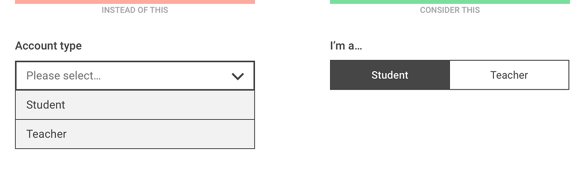
Dropdown alternatives for better (mobile) forms
Doodle CSS
Weekly Design Inspiration #295
via Muzli design inspirationdesign by Denys LazutkinDesigners’ Secret SourceThe best design inspiration — expertly curated for you.Muzli is a new-tab Chrome extension that instantly delivers relevant design stories and inspiration. Learn moreBanking App by Katerina KrukovaRegular spendings management by by SELECTOEferbarn | Neobank dashboard by by Alexander PlyutoLanding UI by DStudio®Metajive — Concept from 2019 by by Anthony GoodwinKeep calm and backup your files by Denys LazutkinPokemon Bag by Mohamed Chahinhttps://medium.com/media/1710a6e08cb2223528b426cc1cbdbcfc/hrefDaft Punk 1993–2021 by by Brian CarrollSteampunk Skull by Angga TantamaDistortion Collection 02 Designed by Supply.Family by Chrisb MarquezGame of the Ox by Thinking RoomThe Burrow Sculpture by Thomas WightmanJames Bond x Theory 11 by Russ GrayScence: the future of sustainable skincare by Kingdom & SparrowWeekly Design Inspiration #295 was originally published in Muzli - Design Inspiration on Medium, where people are continuing the conversation by highlighting and responding to this story.
Neumorphism/Soft UI CSS shadow generator
How 3D Product Models Can Improve Ecommerce UX Without Hurting Usability
3D product experiences are showing up on more product pages every year. Interactive viewers, configurable objects, AR placement tools — the range keeps expanding. And on the surface, richer product visualisation sounds like a straightforward win. More detail, better understanding, higher confidence.But here's the thing: a more complex experience is not automatically a better one.3D adds interaction cost. It adds cognitive load. It adds weight to the page. Done right, it answers real user questions that flat photography can't. Done wrong, it introduces friction that pushes users toward the exit, not the checkout.The question worth asking as a product designer isn't "should we add 3D?" It's "what problem does 3D solve for this user, and does our implementation actually solve it?"Why Designers Are Adding 3D to Product ExperiencesThe case for interactive product visualisation is strongest in categories where form, material, and spatial fit are decision drivers. Furniture, footwear, consumer electronics, jewellery, equipment — products where "what does this look like from the side" and "how big is this really" are genuine questions before purchase.Static imagery forces users to mentally extrapolate. A well-executed 3D viewer lets them rotate, inspect, and zoom. The interaction replaces imagination with direct observation, which reduces uncertainty — and uncertainty is one of the primary friction points in high-consideration ecommerce.When 3D is doing its job, users spend less time wondering and more time deciding.What Good 3D UX Actually Helps Users DoInspect detail fasterA single interaction — a slight rotation or a zoom gesture — can surface a construction detail, a texture, or a port placement that three supplementary photos couldn't communicate. For products where specific details are part of the purchase decision (hardware features, fabric weave, joint construction), interactive inspection is genuinely more efficient than a photo gallery.Understand form and scaleThis is where flat product imagery consistently fails. Width and height in centimetres are abstract. Seeing a product rotate in three-dimensional space, especially at accurate scale in an AR context, gives users a spatial reference that a number on a spec sheet can't provide.Explore options without page navigationConfigurable 3D viewers — where users can change finish, colour, or component variants and see the result update in real time — compress what would otherwise be multiple product pages into a single coherent experience. That's fewer page loads, less navigational overhead, and a tighter feedback loop between "what if I tried the walnut finish?" and seeing it.Benchmark the Pattern Before You Design ItBefore designing an interactive product experience, spend time with existing ones. Not for visual inspiration — for behavioural analysis.How does the viewer initialise? What happens on slow connections? Where are the controls placed, and are they discoverable without a tooltip? How does the interaction behave on a mid-range Android phone? What does the model look like at low zoom versus close inspection?When designers start benchmarking interactive product experiences, curated references such as best 3d model Websites can help them compare realism, loading behaviour, and interaction patterns across real implementations. Benchmarking real examples tells you things that specs and case studies don't — like which interaction paradigms users have already learned, and which require re-teaching every time.Maserati's MC20 configurator, for instance, layers 3D exploration, micro-interactions, and deep-dive features in a way that earns its complexity. The scale of the product justifies the depth of the experience. Not every product page gets to operate at that level — and most shouldn't try.Where 3D Starts to Hurt UsabilitySlow loading and poor mobile behaviourThis is the most common failure mode. A 3D asset that performs beautifully in Chrome on a powerful laptop may load in a way that pushes LCP into a range that triggers abandonment on a mid-range mobile device.The majority of ecommerce traffic is mobile. If the 3D viewer wasn't tested on real mid-range phones, with real network throttling, on real device memory constraints, the interaction may be actively hurting the experience for the most common user.Asset weight is a design decision. A 50MB model is a UX decision, not just a technical one.Hidden controls and unclear affordancesIf users don't know the object is interactive, they won't interact with it. A 3D product viewer with no visible affordance — no rotation hint, no drag cursor, no introductory animation — often functions as an unusually heavy static image.And once users do interact, if the controls are unpredictable (drag axes that don't feel natural, zoom that jumps rather than scales, no reset button), the frustration compounds fast. Interactive complexity without predictable interaction behaviour is a usability problem, not a feature.Too much novelty, not enough utilityNot every product needs a 3D viewer. A candle, a notebook, a t-shirt — these are products where a well-photographed flat gallery and a good zoom feature probably serve users better than an interactive model. The added interaction cost (loading time, learning the controls, interpreting the model) isn't justified when the product can be understood clearly from photography.3D earns its place when it answers a question that photography can't. If it's there because it looks impressive, it's decoration — and decoration at the cost of page speed is a poor trade.What Product Teams Need From the Asset WorkflowEven when 3D is clearly the right call, the asset question is non-trivial. Generic 3D files from stock libraries are often built for rendering, not for web deployment — high polygon counts, heavy textures, formats that don't play nicely with Three.js or model-viewer implementations.What a product page needs is fundamentally different from what a CGI pipeline produces. Web-ready assets need to be lightweight, built to spec for the viewer implementation, exported in the right format (GLB, USDZ, or both for cross-device AR), and tested for performance on target devices.If a team needs custom, web-ready assets instead of off-the-shelf files, a 3d product modeling company may support the workflow with models built around product, UX, and channel requirements. The alternative — adapting existing high-fidelity models for web use — is technically possible but often resource-intensive, and the optimisation shortcuts taken under time pressure tend to show up in performance metrics later.A Better Pattern for 3D in Product DesignStart with the user questionWhat does this user need to understand before they can confidently purchase? If the answer is "the exact colour of this finish under living room lighting" — 3D may not help. If the answer is "how this chair's proportions relate to the desk I already own" — AR placement is directly relevant.Define the question before choosing the tool.Keep interactions obviousThe initial state of the viewer should communicate that the object is interactive. An auto-rotate that stops when the user grabs it, a drag hint, a rotation arrow — something that signals "you can move this." Controls should feel familiar to existing paradigms (drag to rotate, pinch to zoom, double-click to reset).Progressive disclosure works well here. Default behaviour should be immediately useful. Advanced controls (angle locks, cross-section views, technical specs overlaid) can be discoverable but don't need to dominate the interface.Design for speed firstTarget 5MB or under for web-deployed models. Use GLB format for modern browsers. Lazy-load the viewer until user interaction. Test on real devices at 3G equivalent. If the viewer hurts Largest Contentful Paint, it's introducing friction before the interaction even starts.Let static content and 3D work togetherThe 3D viewer shouldn't replace the product image gallery — it should complement it. A user scanning quickly is better served by a sharp static image. A user who's already interested and wants to inspect further is the target for the interactive viewer. Design the visual hierarchy so both users can accomplish what they came to do.3D Should Behave Like Product Design, Not DecorationThe same principles that govern any UI decision apply to 3D product experiences. Does this element serve the user's task? Does it do so efficiently? Does it maintain usability across devices and contexts?The difference with 3D is that the failure modes are heavier — both in page weight and in friction. An unnecessary button takes up 40 pixels. An unnecessary 3D viewer adds seconds of loading time, confuses users who can't figure out how to interact with it, and potentially degrades the entire page experience for users on lower-powered devices.When 3D is justified, built well, and integrated into the product page with the same discipline as every other design decision, it genuinely extends what a product page can communicate. When it's added because immersive feels modern, it usually just adds cost — for the team that built it, and for the user trying to get past it.The best 3D product experiences don't announce themselves. They just make the right answer easier to find.……💡 Stay inspired every day with Muzli!Follow us for a daily stream of design, creativity, and innovation.Linkedin | Instagram | TwitterHow 3D Product Models Can Improve Ecommerce UX Without Hurting Usability was originally published in Muzli - Design Inspiration on Medium, where people are continuing the conversation by highlighting and responding to this story.

Glass Insects Small Enough to Balance on the Tip of Your Finger by Wesley Fleming
Glass sculptor Wesley Fleming creates life-size and anatomically correct sculptures of a variety of bizarre and well-known insects. The colorful creatures are small enough to balance gently on the tip of his finger, like a neon orange spider barely larger than his nail. The artist began working with the medium more than 15 years ago at the MIT Glass Lab and has pushed his technique ever since, learning flameworking, sculpting with borosilicate, and the Italian technique of sculpting soft glass on the Venetian island of Murano in 2005. More
Jaime Hayon Designs His First Piece of Contract Furniture for Fritz Hansen
A trio of contract seating options designed for collaboration, concentration, or even relaxation.
Logic Magazine
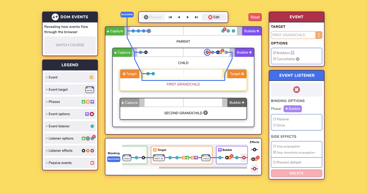
Explore DOM Events

Lifelike Sculpted Figures and Immersive Monochrome Environments by Hans Op de Beeck
Terrible UX Trends for 2017
"username or password incorrect" is bullshit
The Kumaon: A Minimalist Hotel Hidden in the Himalayas Offers More Than Just Incredible Views

Thirst
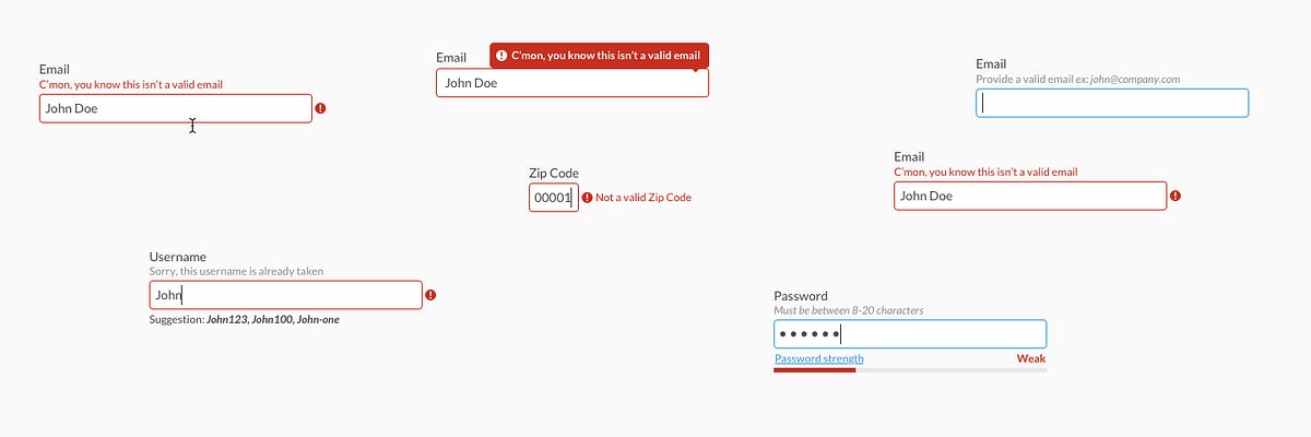
Forms Need Validation
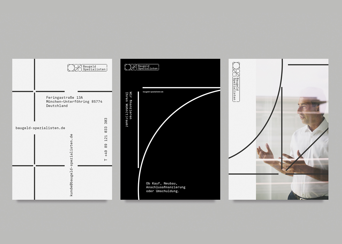
Baugeld Spezialisten - Branding, Identity
Alphredo: Alpha colors generator

Password Strength Visualization

A Barcelona Apartment Goes From Two Bedrooms to One
A Barcelona-loving couple's transformed apartment goes from two bedrooms down to one.
Someone is pretending to be me
Storybook Composition – combine Storybooks into one design system

ATMOS - by Leeroy
Designing for the Arab User - Basic Arabic UX for Business
But sometimes links look like buttons (and buttons look like links)
Undivided Rebranding & UI/UX for Useberry
Undivided Rebranding & UI/UX for Useberry
AoiroStudioMay 20, 2019
holy ™ is an agency of all sorts of services, from branding all the way to the user interface design. Based in Athens, Greece, they shared on their Behance, a major rebranding & UI/UX for Useberry. They have revamped their entire look from visual identity, UI/UX, iconography, illustrations, animations and even copywriting. Useberry is an intuitive user-testing tool, which provides codeless prototype analytics. Props to the entire team at holy ™ for this amazing work, I love the fact they used the Inter UI font by Rasmus Andersson. I also appreciate the fact they shared UI design for the results page for example. Something we dearly get to see on published projects, usually we rarely get passed the "sign-up onboarding".
A great challenge though was useberry platform’s UI/UX design, which not only needed to be light, clean and intuitive, but also able to address design community’s claims for functional and good design.
More Links
Studio Site
Behance
Visual Identity
User Onboarding
Dashboard
Test Sharing
Prototype Creation
Results
Follow holy™ on Behance
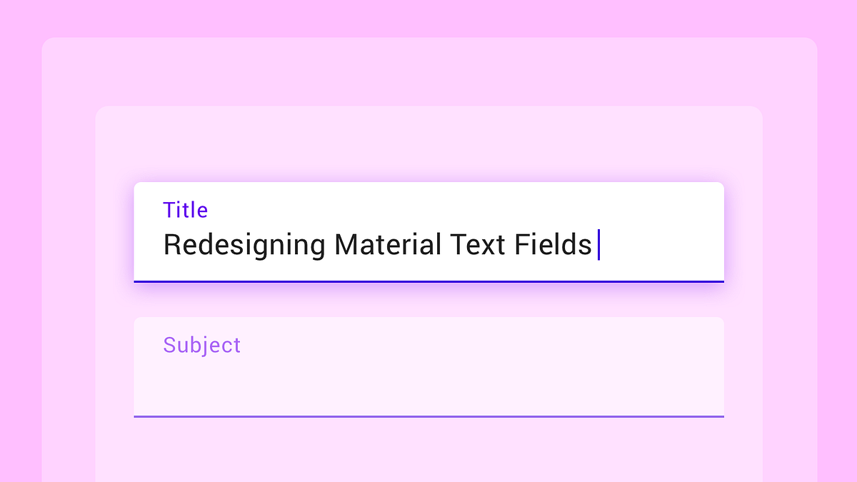
The Evolution of Material Design's Text Fields

Jeweller. Wireless Technology
Marie Morelle | Illustratrice
Writing for UX: some practical tips

Enid.fm

That’s Just How I Scroll

A 19th Century Victorian Becomes Bright and Spacious
Uber | Where To?

The Never-Ending Job of Selling Design Systems

Designing for a data-heavy platform

Monolith Inception Kitchen by Richard T. Anuszkiewicz
Monolith Inception Kitchen by Richard T. Anuszkiewicz