Graphic Design Inspiration: GRYFFIN's album
Graphic Design Inspiration: GRYFFIN's album
abduzeedoDec 19, 2018
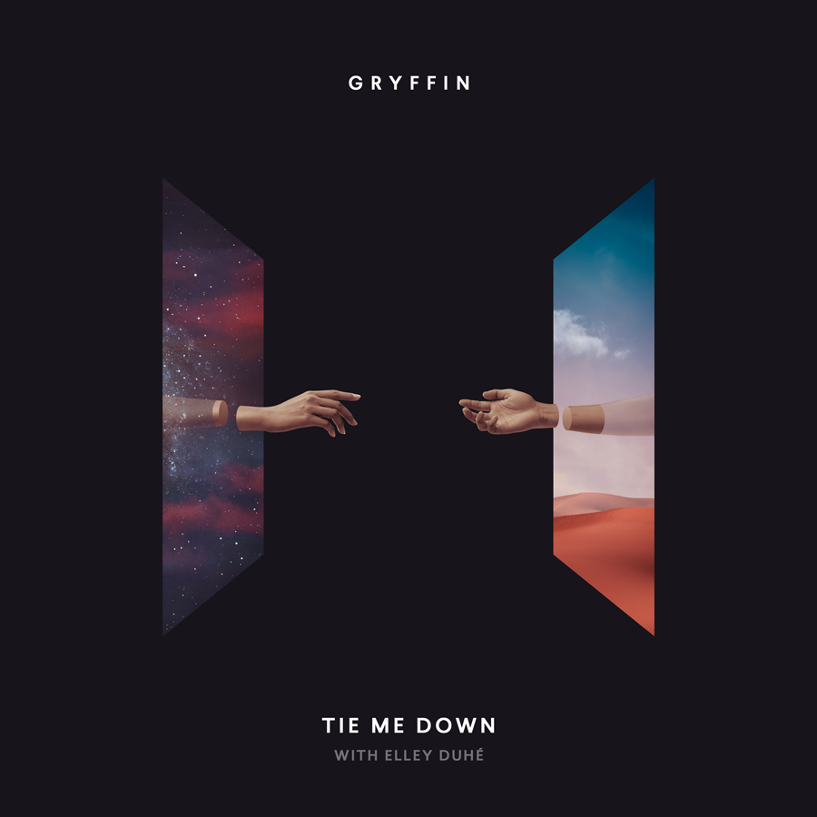
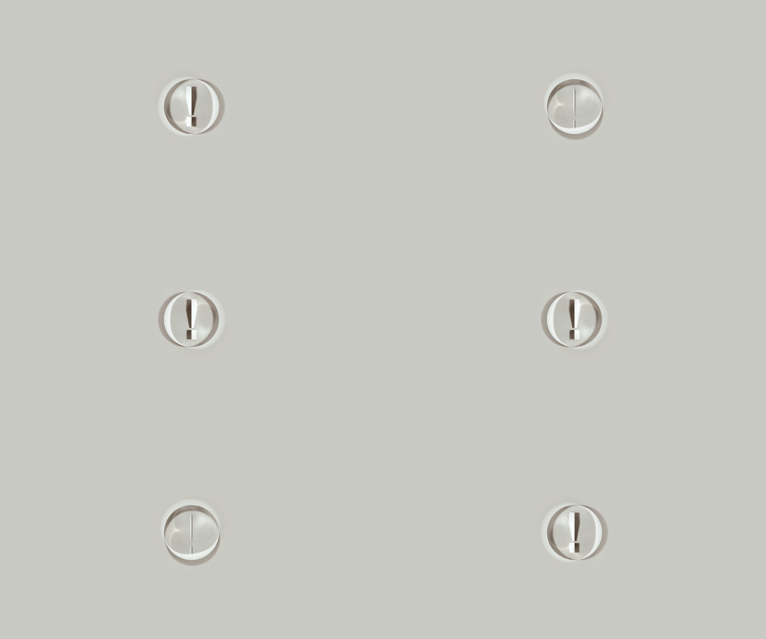
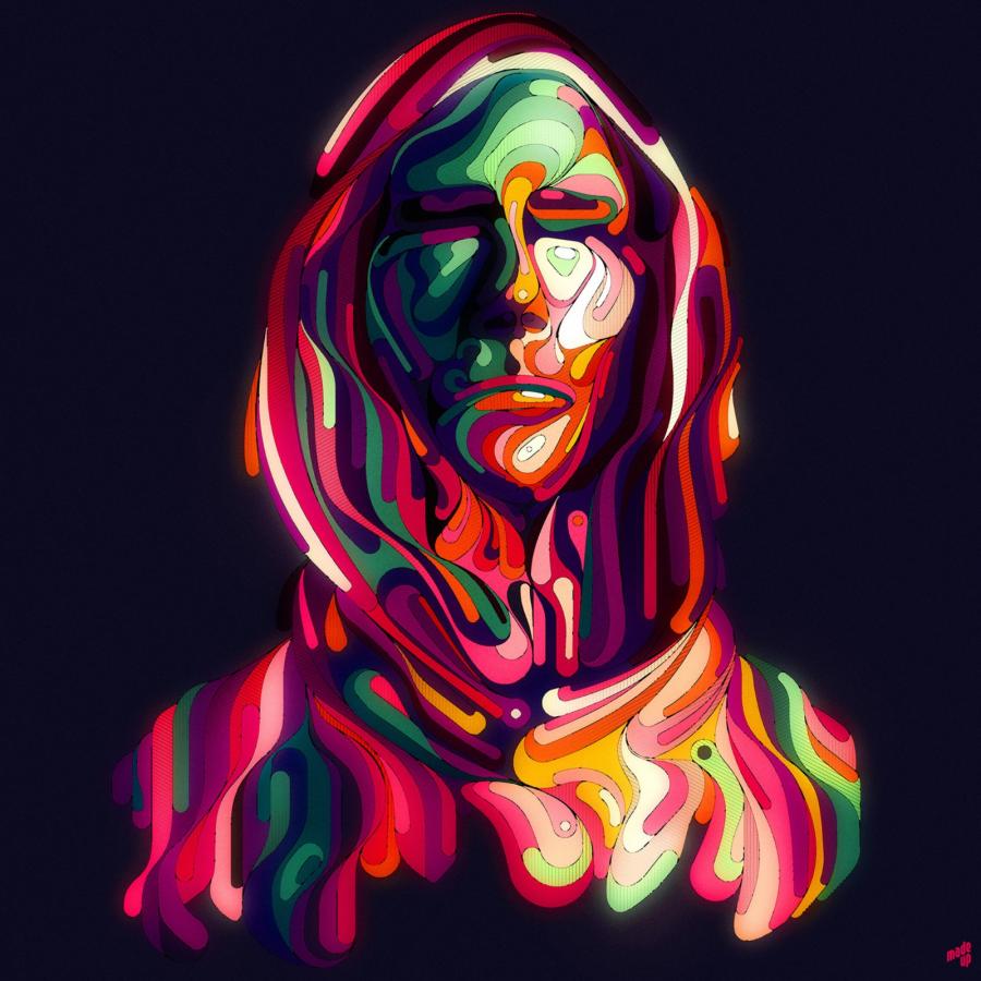
Anxo Vizcaíno has been commissioned by Red Yellow Blue to create this collection of cover artworks for the first GRYFFIN's album (Interscope Records). Under the concepts and creative direction of Jordan Miles Rosenheck, they designed a series of portals that "are metaphors for having access to anywhere and anything we want, because we're made of everything". Each piece is related to a track that has been released separately, previous to the main album 'Gravity Pt. 1' containing 6 songs and of which cover is the door to this GRYFFIN's universe. They also went above and beyond, making a loopable animation for that one.
Personally, I am a fan of Anxo's work. They have that space theme combined with a sort of surreal touch that you will find familiar to some of my early tutorials if you followed the blog since the first years. I highly recommend that you check out Anxo's full portfolio at http://www.anxovizcaino.com/
Graphic Design
Credits
Client: GRYFFIN
Label: Interscope Records
Agency: Red Yellow Blue
Art direction: Jordan Miles Rosenheck
Design and animation: Anxo Vizcaíno

A whimsical introduction to graphic design for filmmaking

Moving From Graphic Design to UX Design

Illustrations & Graphic Design by Tomasz Wozniakowski | Daily design inspiration for creatives | Inspiration Grid

Art Direction & Graphic Design: RUH

Graphic Design Portfolio

Gradwatch 2017: Kingston’s Graphic Design degree show

Graphic Design Festival Scotland

Brutalist Graphic Design: Why It’s Ugly, Bold, and Trending in 2025!
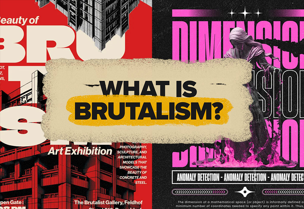
Brutalism: it’s raw, it’s messy, and it’s unapologetically bold. Whether you love it or hate it, there’s no denying its impact on design today. From clunky websites to avant-garde posters, Brutalist design is everywhere—and it’s making a comeback. But why? And how can you use it in your own work?Stick around as we break it all down in this deep dive into Brutalist graphic design.
► Brutalism Design Templates – https://spoon.graphics/3DZ8bsW
► Black Brutalism Art Design Flyer – https://spoon.graphics/3WfptZn
► Streetwear Brutalism Instagram Post Template – https://spoon.graphics/4fQ5Ain
► Neo Brutalism Creative Business Agency Flyer Set – https://spoon.graphics/4fQRs8I
► Fashion Brutalism Instagram Post Template – https://spoon.graphics/427UAd9
Subscribe to the Spoon Graphics YouTube Channel
The post Brutalist Graphic Design: Why It’s Ugly, Bold, and Trending in 2025! appeared first on Spoon Graphics.

Your design here: a timeline exploring graphic design template trends
This Summer It’s Nice That is partnering with Adobe Stock on a series of articles that celebrate their library of over 90 million high-quality images, graphics, video motion graphics, templates, and branding materials. Over the coming weeks, we will be providing an insight into how the Adobe Stock library can benefit your creative practice.
Read more

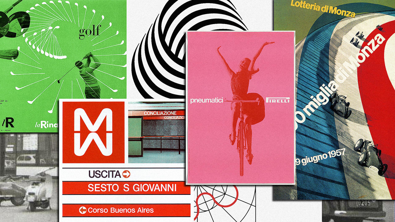
Italy’s Overlooked Graphic Design Greats Get An Online Museum

Graphic Design Trends 2024
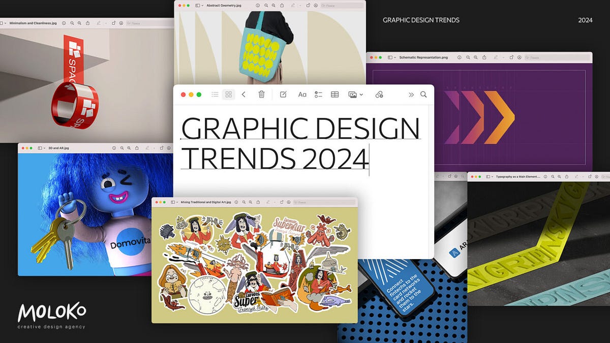
Inclusive design, brand sprints, risograph, and many more — what awaits us in 2024As a real agency specializing in crafting high-quality and “talking” designs that resonate with their audience, we cannot but highlight the main trends, in our opinion, that will shape the industry in 2024. Last time, we talked about the trends of 2023; now, let’s see which graphic design trends have gained strength and whether new ones have emerged.80% of small businesses say that the design of their branding/marketing materials is important, and 50.5% of marketers state that visual content is very important.It is expected that by 2031, the demand for graphic design specialists will increase by 3% due to the growing need for creative content in various industries.Here is our shortlist of graphic design trends for 2024:Minimalism and CleanlinessThis trend emphasizes the use of simple and strong visual solutions, including clean lines, limited color palettes, and human-readable fonts. Minimalism seeks to create impact by minimizing the number of elements used.Brand Identity for the RBU2Typography as the Main ElementIn this graphic design trend, the emphasis is on innovative and creative use of fonts and text compositions. This includes experimenting with layout, size, color, and style for uniqueness and expressiveness.Afisha Logo DevelopmentMixing Traditional and Digital ArtThis trend implies the integration of classical artistic methods with modern digital technologies to create unique visual effects. It involves using styles of famous artists or designers in graphic design while adapting them to modern methods.FRANCISK SKARYNA — «EUROPEAN SUPERSTAR»Multicultural and Inclusive DesignHere, the main role is played by the importance of representing the diversity of cultures and communities in design. This direction emphasizes diversity and inclusivity in visual communications.73% of companies invest in graphic design to differentiate their brand.https://medium.com/media/70cfafb2e1a45142df5669f6c9fd0dab/href3D and ARThe development and integration of 3D graphics and augmented reality (AR) open new opportunities for interactivity and immersion in brands. This means that generative design will increasingly save financial and time resources for companies.RisographThis 1980s printing technique from Japan has evolved significantly. Since 2023, this trend has been completely rethought for digital abstract graphics. The graininess of textures adds depth and noise to the minimalism style and is increasingly seen in agency cases.19% of companies spend more than $10,000 a year on graphic design.Risograph technique case — Cà Phê Con LecheEl Malo Risograph CaseAnti-DesignGoing against the “rules” and traditional canons has never been so appealing! Today, a trend is emerging that moves against pop culture and popular trends, such as minimalism or flat design, featuring bright color schemes. Its main characteristics include asymmetric shapes, bold typography, and a dark color palette.Working with a Subscription AgencyThis is also noted as one of the growing graphic design trends by the agency Primary. The sector is developing dynamically; some designers are still working remotely, while others are doing side projects or opening small studios. At the same time, design tools and the use of AI increase the speed at which designers can work, communicate, and deliver results. Customers expect much more in less time, and designers are seeking new ways to work so that income is predictable and regular. As a result, the productization of design work increases: designers offer package tariffs with a fixed set of services. Customers pay for a monthly subscription. Almost every web development agency offers this.Brand SprintsIn today’s business environment, making smart and quick decisions is very important. Therefore, the direction of business sprints is gaining popularity, where designers quickly assemble graphic solutions in a short period without conducting thorough selection or limiting themselves in ideas.Kinetic Identity is Still Gaining PopularityToday, kinetic typography is increasingly used as a central element of branding. Its strength lies in the fact that such a solution emphasizes dynamism and movement in design, which is highly valued in projects.94% of people believe their first impression of a company is design-related.Mailchimp case by DIAAbstract GeometryAbstract geometry is gaining popularity in 2024, as designers increasingly adopt the idea of “organized chaos.” This involves using a large number of geometric shapes and compositions that are abstract and do not carry a simple and quickly readable meaning.Branding for the Orchestra of the Americas AcademySchematic RepresentationIn modern design, conveying complex concepts in an easily accessible manner is more important than ever. Therefore, graphic designers are increasingly using schematic representations, as they create a clearer visual story that is easier to understand, especially when the project or solution is quite complex.Schematic explanation of the logo for MAM from PentagramEco-Orientation is Still a TrendIt is also important to seek design solutions that are environmentally friendly not only in visual presentation but also in implementation, which will help to use resources more efficiently. This trend also affects the avoidance of “cloying” and “artificiality” — today, more and more designers are striving for an organic feel, and especially in the FMCG category, they often emphasize environmental friendliness through design solutions.That’s it! You can find out more about branding and our works on mlk.global.Graphic Design Trends 2024 was originally published in Muzli - Design Inspiration on Medium, where people are continuing the conversation by highlighting and responding to this story.

Graphic Design Archive

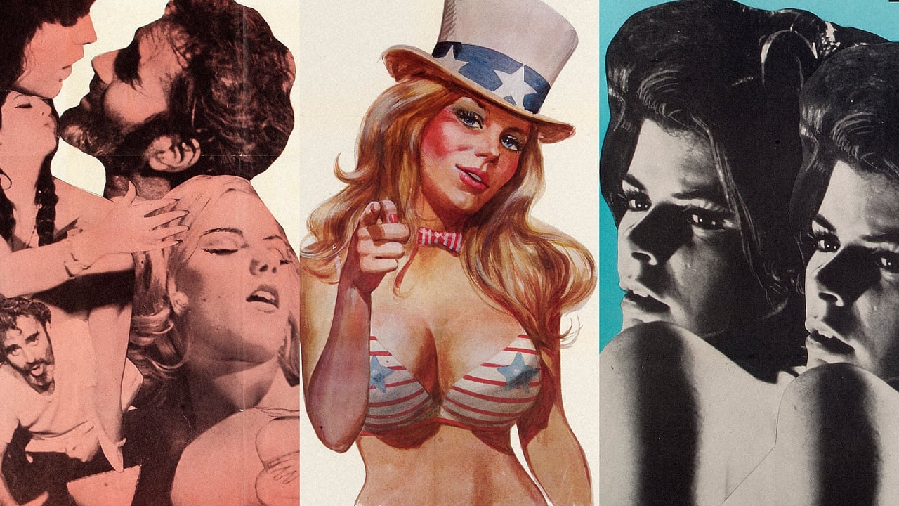
The Glorious Graphic Design Of ’70s Porn (NSFW)

The 8 types of graphic design you need to know
Before we dive into the 8 types of graphic design, let’s start with the basics: What is graphic design? Graphic…
The post The 8 types of graphic design you need to know appeared first on 99designs.

Revisiting The Golden Age Of Canadian Graphic Design

Gradwatch 2017: Chelsea Graphic Design Communication

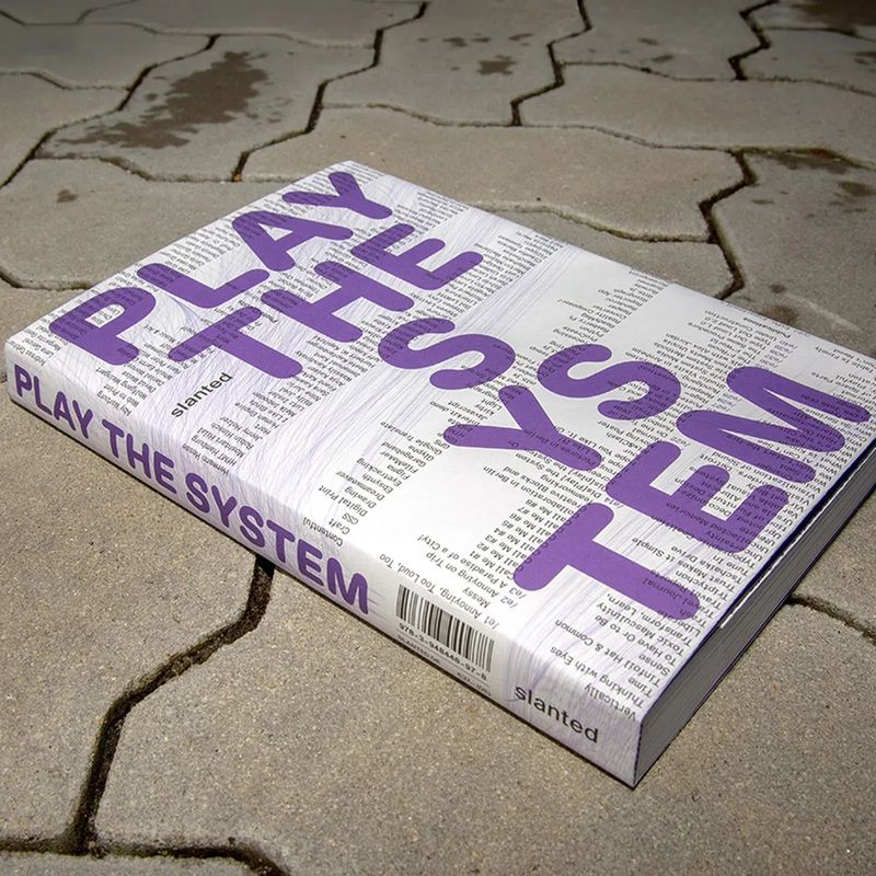
Play the System: Parametric Design Approaches in Graphic Design

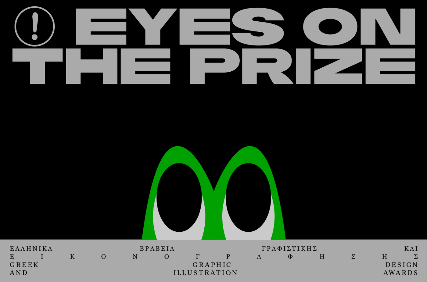
Greek Graphic Design and Illustration Awards 2017

90s Look is Coming Back - Graphic Design Collection
90s Look is Coming Back - Graphic Design Collection
abduzeedoFeb 19, 2019
We have been posting a series of posts featuring graphic design and web design work that, in a way, brings back the 90s in terms of aesthetics and style. It’s hard to define that, it might vary from person to person. For me, while the 80s was all about neon, futuristic computer-generated images with chrome, unicorns running across a digital grid, and of course the RGB colors. The 90s is the complete destruction of the form. Typography is pushed to the limit of being even legible, forms are deformed and distorted. You also notice some effects like when the CMYK colors are printed with problems in the alignment, with color leaks, light leaks, textures, and dirt.
For this post, I would love to share some examples of this style. They are not from the 90s per se, however, they illustrate quite well what I just describe. Make sure to click on the link to visit the authors. Disclaimer, they are images I found on Pinterest.
90s Graphic Design Look

Plasticbionic | Art Direction, Graphic Design & Illustration

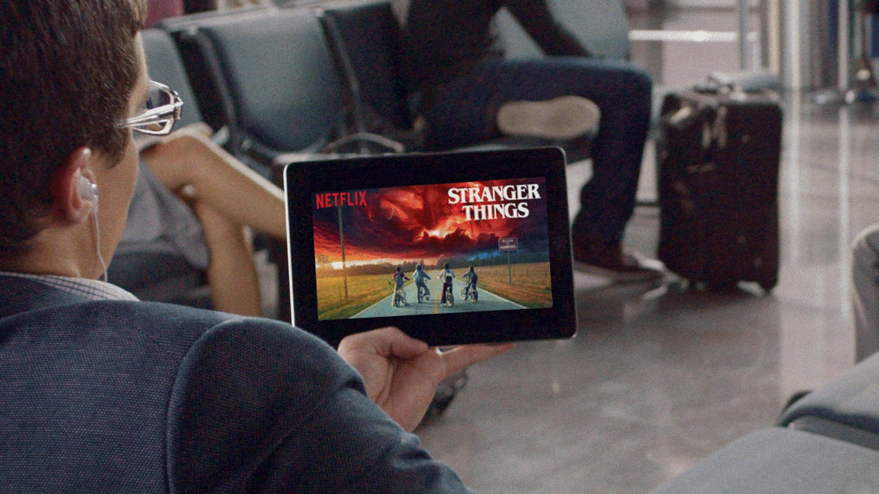
Netflix Is Even Personalizing Its Graphic Design To You Now

Branding & Graphic Design by TRÜF

Graphic Design for Adidas Predator by Gordon Reid
Graphic Design for Adidas Predator by Gordon Reid
abduzeedoMar 25, 2019
Gordon Reid shared a beautiful graphic design project for Adidas and one of their most iconic soccer (football) boots in history, The Predator. Adidas London wanted to create a range of new print, digital and social ads to mark the relaunch of this historic boot along with the launch of two new boots, the X and Nemeziz.
Gordon worked with the strapline for each boot to create illustrated assets for each boot. Each created to compliment the culture, history and design of each of the boots. For Instance, the Predator played on more of a retro, bold and graphic feel, whereas the X artwork played on the enhanced speed element and Nemeziz was all about being agile. Each artwork was brought to life using a bold color palette and strong graphical elements that could be used throughout the advertising.
Graphic Design

Expressionism in graphic design
Why does the fearful face emoji seem so familiar to us? The simple answer? Because it’s the modern reincarnation of…
The post Expressionism in graphic design appeared first on 99designs.

Motion and Graphic Design: Grand Yellow - On My Way

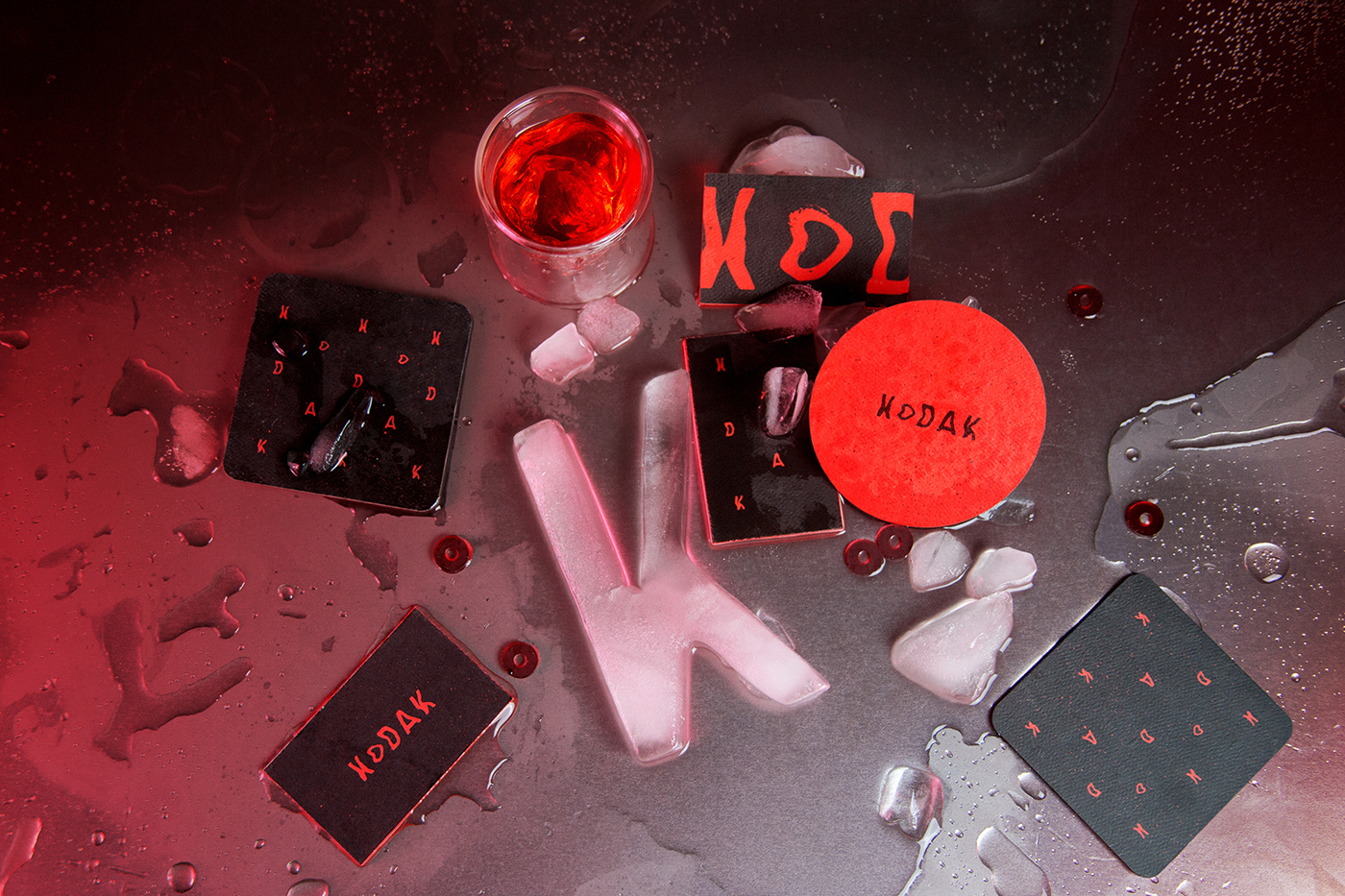
Visual Identity and Graphic Design for Kodak

Greek Graphic Design and Illustration Awards 2019
The obsession of animals with food, which is the driving force for survival is compared and correlated to the need of the designer for acquiring an EBGE and enjoying recognition.
The instinct for distinction, a fundamental component of the creative journey is presented as a primary need with a colourful, humorous and festive visual identity.

12 inspiring graphic design trends for 2022
With the year 2020, graphic design trends have reached an important milestone. It’s the dawn of a new decade, and…
The post 10 stunning graphic design trends for 2020 appeared first on 99designs.

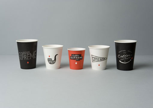
hardhat_coffeesupreme_06 #design #graphic #identity

Paper Cut | Abstract edition - Graphic Design
I decided to practice more with an illustrator. I wanted to copy the paper cut effect on the computer. I love abstract art, so I chose this. Enjoy watching!

Perhaps design graphic
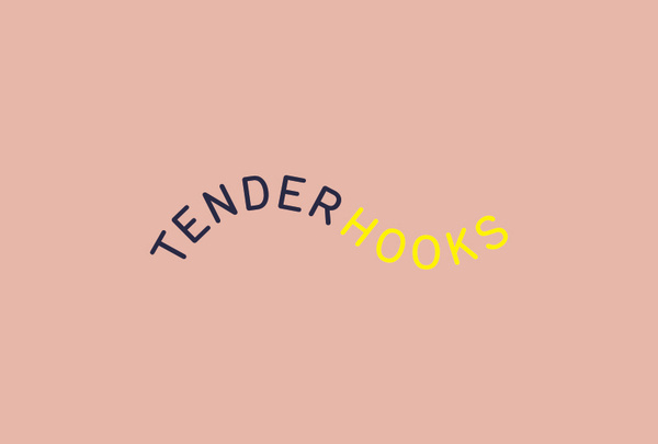
Perhaps design graphic identity logo typography

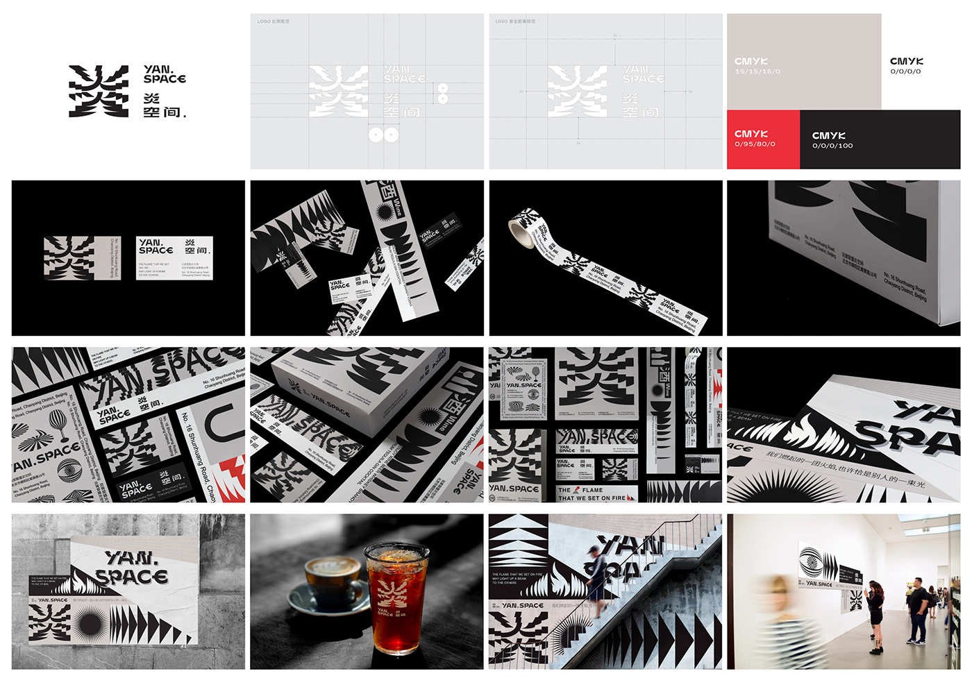
???VI/YAN SPACE VI/graphic /interior design/brand

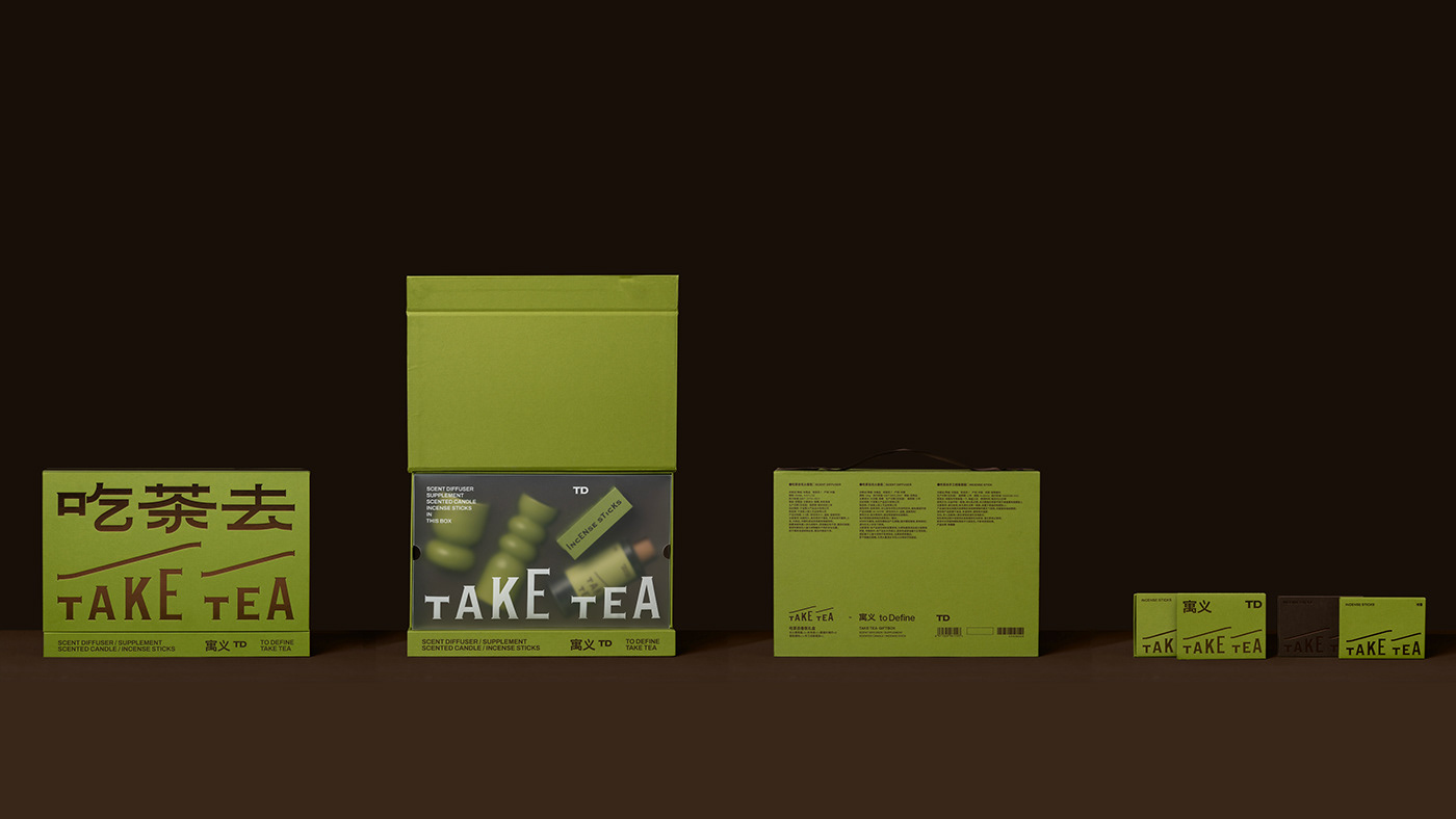
????? TAKE TEA Graphic and Package Design

How Western Michigan Quietly Became A Graphic Design Hotspot

10 graphic design trends 2025

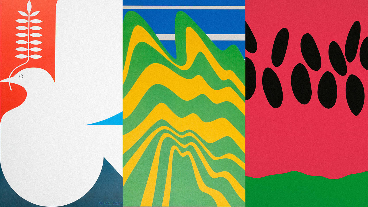
Poster Design Inspiration #design #graphic #poster

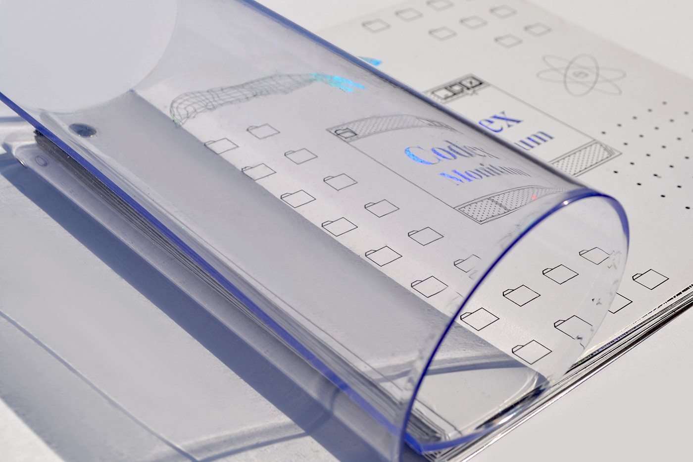
CODEX MONITUM | MA Graphic Design Thesis
Graphic Design MA Thesis on artificial intelligence and a posthuman future.

Moving From Graphic Design to UX Design

FreeStack - Collection of Free Design Tools & Resources for Graphic Designers

The best graphic design of 2019

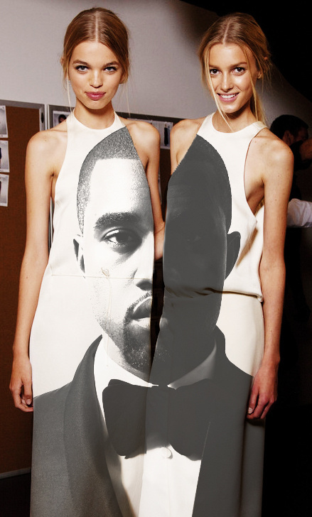
dress design #dress #graphic

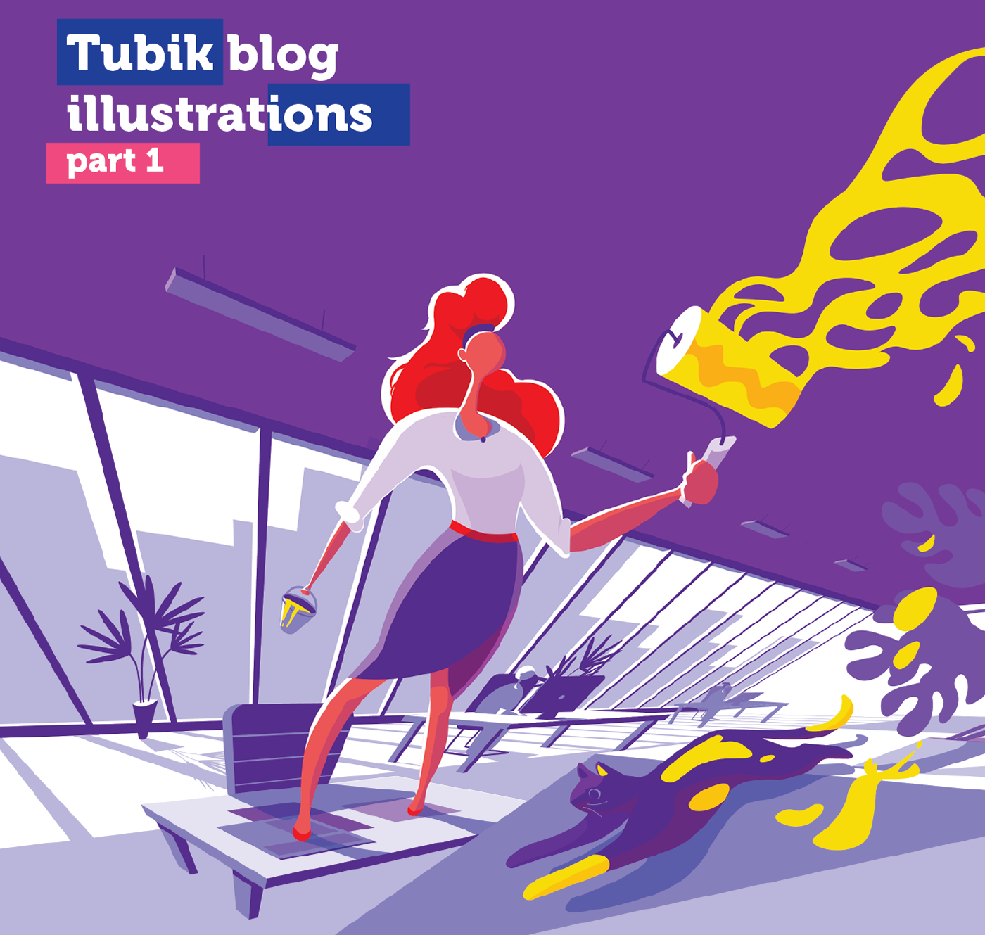
Graphic Design: Tubik Blog Illustrations
Digital illustrations have been one of the hot trends in design for the last couple of years. You may see them in web and mobile interfaces, advertising, posters and tutorials, they are used in infographics, manuals, and books. Today we offer you to check the set of custom illustrations created for Tubik blog articles on design issues. To read more articles and case studies as well as check more illustrations, welcome to Tubik Blog (https://tubikstudio.com/blog)

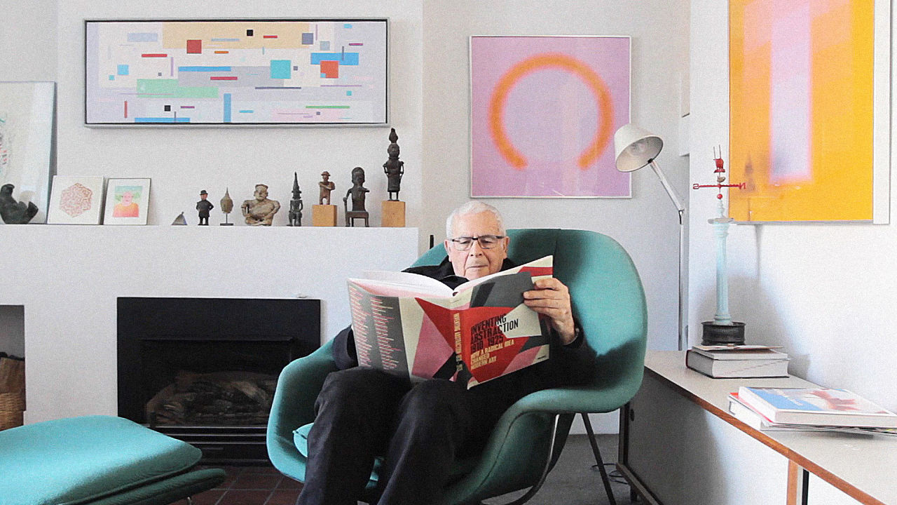
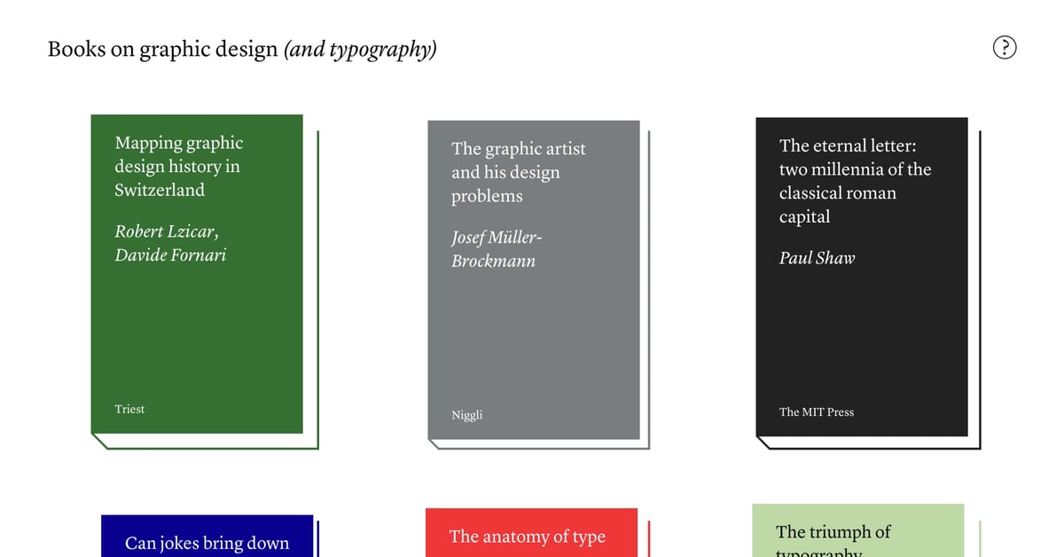
Books on graphic design

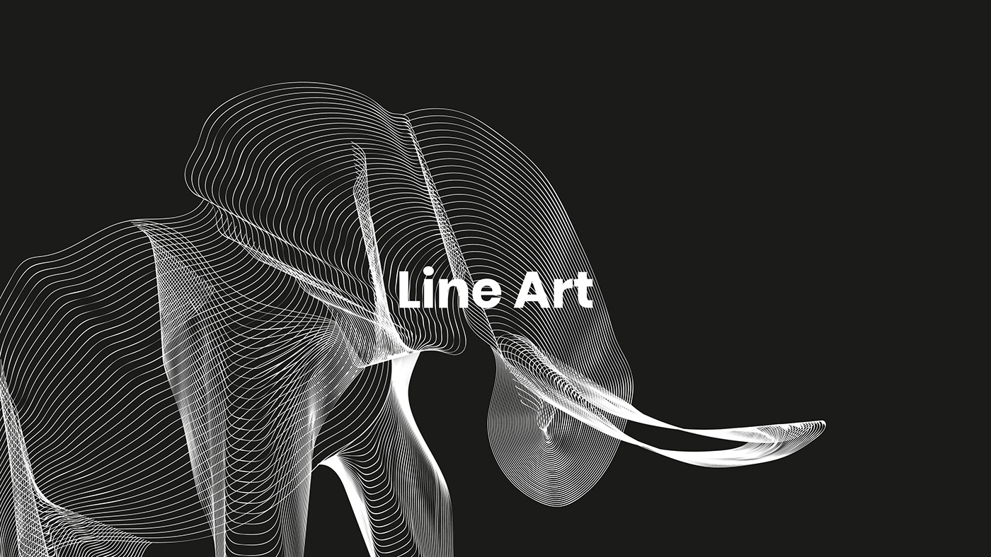
Line Art | Animal edition - Graphic Design
I wanted to have some time for myself. I decided to learn a new art. I love abstract, line art and clean design. I decided to recreate my favorite animals in Illustrator. If you are interested in the work files, send me an e-mail.

Review of the Year 2018: Top 25 Graphic Design
You can’t have failed to notice how much attention It’s Nice That focuses on graphic design. This year we have, as ever, cast a gaze over everything from big name commercial work to the fantastic self-initiated projects that feel as fresh now as they did the first day they arrived perfectly formed in our inbox. Practitioners and enthusiasts alike, consider this a crash course in the year that was in graphic design.
h3. Supported by Google
Read more

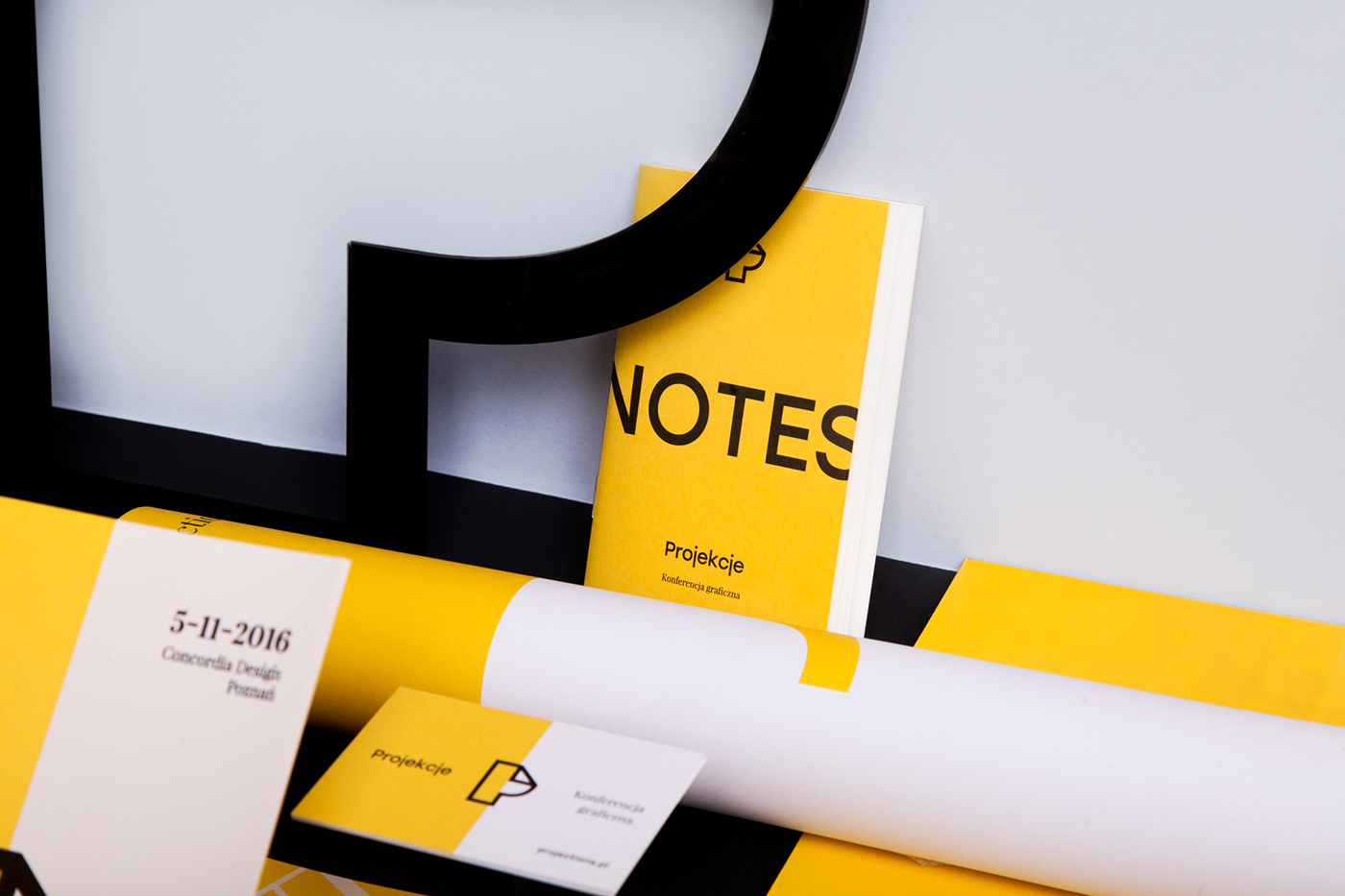
Projections 2016 / Graphic Design Conference

Poster graphic design poster
Poster graphic design poster

Graphic design #design #graphic

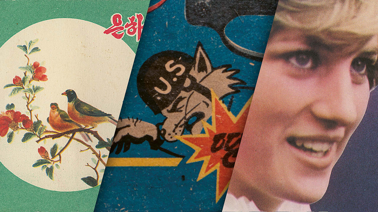
Seeing North Korea Through Its Graphic Design

Disrupting The Rules: The Boldest Graphic Design Trends in 2020
Illustration by Julia Hanke for Fireart StudioOur today is limited with so many rules, especially due to the recent Coronavirus lockdown we have been forced to experience. The soul is thirsty for more dynamics, brightness, and beauty. To reinforce the inner engine of creativity, we sometimes need a pinch of inspiration from other creative geeks who are still working hard to produce new original styles and fresh aesthetics for the modern digital world.To empower designers, illustrators, and other cool creative professionals, we have collected the most prominent graphic design trends that are breaking the rules in 2020. Moving away from the traditional and closer to innovative, we’re welcoming you to the garden with the blossoming digital trends.The Beauty in BrutalismDesign by Eugene Paryhin for Fireart StudioThe new decade unlocks myriads of incompatible combinations and immersive designs, united into one stylistic family — brutalism. Mark Alan Andre, a famous architectural designer said it once about brutalism in architecture, but it perfectly describes the essence of the concept in digital design too:“I’m drawn to brutalism because of its simplicity and honesty to its materials. It’s a very “pure” form of architecture when it’s done well.”This style is about brutal honesty without excessive decorations. It is characterized by deliberate plainness, crudity, or violence of the imagery. It is almost screaming about breaking the traditional rules.Brutalism doesn’t align with a classical understanding of composition or color aesthetics in graphic design. It adds more sharp edges, unexpected views, dynamics, and bold colors. This style intentionally attempts to look raw, haphazard, or unadorned. It can satisfy the aesthetic tastes of the most outrageous, brave, and ambitious graphic design gourmets. Below, you can enjoy a few brutalist designs, which we have found to be particularly beautiful.Design by OkalphaDesign by Giga TamarashviliCyberpunk Renaissance“Science fiction is reality ahead of schedule.” — Syd Mead, Blade Runner concept designerAnimation by META on BehanceWe can describe cyberpunk with nearly the same words since it’s a sci-fi sub-genre. It’s not easy to give a precise definition of cyberpunk.This concept rooted in the new wave science fiction movement of the 1960s and 1970s and spanned film, fashion, and design industries. It is both a style in digital design and a massive culture. Cyberpunk features advanced science and technology in the future urban world. When you think of cyberpunk, you usually envision incredibly high skyscrapers, shimmering neon lights, futuristic color palette, and dystopian backdrops.This style has become slightly kitsch in the digital design on the edge of millennials, but in 2020, it has gained a second life. Take your sunglasses and enjoy the dazzling and breathtaking blast from the past in the cyberpunk design examples provided below.Illustration by Yulliia Dobrokhod for Fireart StudioDesign by Romain TrystramUltra-Thin Geometry“The line is a rich metaphor for the artist. It denotes not only boundary, edge or contour, but is an agent for location, energy, and growth. It is literally movement and change — life itself.” - Lance EsplundDesign by Eugene Paryhin for Fireart StudioIn the attempts to create new futuristic aesthetics, designers combine ultra-thin geometry with flowing liquid curves. This incredible mix of styles attracts many companies that incorporate these breezing aesthetics into their branding styles and visual materials. Below, you can see a few samples of the ultra-thin geometry implemented in ultra-beautiful designs, breathing with elegance and minimalism.When we think of a form, the first thing we see is a line, defining the overall silhouette. The shape and nature of the object live in the line. It is the primary element of every image. This year, we can see the art of line in a very extraordinary form — ultra-thin geometry. It has already gained widespread acceptance in the electronic, industrial, and computer industries. However, in 2020, this style is gaining momentum in graphic design too.Design by Demih KodarlakDesign by Ian DouglasLoud Bold Typography“Be bold, proclaim it everywhere: They only live who dare.”- VoltaireIn recent years, bold typography has become a big trend. Saying “big,” we mean that it is literally gigantic. Just look at this huge typography below!Design by Andy Selimov for Fireart StudioIf used in the right place and the right quantity, bold typography has the potential to uncover the brand’s soul, character, and mood. There are a few designers and entrepreneurs who are ready to apply this outrageous font style to brand identity. But, a sensei of typography who knows how to combine bold letters, colors, and digital design in a visual perfection, can bring a lot of popularity to a brand and admiration among a target audience.Design via Sagmeister & WalshAbsolute Monochrome“Color provokes a psychic vibration. Color hides a power still unknown but real, which acts on every part of the human body.” — Wassily KandinskyMono-mania obeys the hearts of many designers, brands, and customers worldwide. The monochromatic color palette has become widely adopted in the digital world. Today, we can see it in website design, mobile app design, branding, and other areas of design. It refers to the use of varying tones of a single color. It is versatile, timeless, refreshing, and easy to style.Even though a monochromatic coloring operates around different hues of the same color, it looks much more exciting and unusual than plenty of other more “colorful” designs. Of course, the designer should be a real master to choose a tone combination that doesn’t look boring and, on the contrary, it evokes a lot of interest and visual satisfaction.The particular value of monochrome is hidden in the ability to focus the viewer’s attention on the key elements in the content. It doesn’t distract with unnecessary details or switching colors. Monochrome brings the person’s high concentration on a promoted product or service.Design by Rokas AleliunasIllustration by Dani RayneMind-Blowing Art CollagesCollage by Jorge TorresThe art collage has become very popular in digital design during the last few years. It is an extraordinary visualization technique that implies an assemblage of different forms, materials, and sources, creating a new whole. It usually includes newspaper or magazine clippings, ribbons, bits of colored or hand-made papers, and photographs glued or photoshopped together on the canvas.In collages, designers mix the worlds, the universes, and different angles of views on the same topics. They often try to create interesting visual effects tricking the eye and mind. The collage is one cohesive image constituted by several realities. Would you like to see what we really mean? Welcome to a few mind-blowing worlds introduced in these art collages.Animated Collage by AndrianaCollage by Anna YashinaNot Saying Goodbye“If I had asked the public what they wanted, they would have said a faster horse.”- Henry Ford, Founder of Ford Motor CompanyAnimation by Aslan AlmukhambetovThe functionality is the horse. One of the designer’s primary tasks is to endow this horse with a silver horn and airy wings. Besides the functionality, we also need a visually stunning design that inspires and lets our imagination fly high. Hopefully, these graphic design examples will help you give a fresh update to your art and empower you to do new creative experiments. Let’s move this world forward to innovation and unconventional beauty!Disrupting The Rules: The Boldest Graphic Design Trends in 2020 was originally published in Muzli - Design Inspiration on Medium, where people are continuing the conversation by highlighting and responding to this story.

Your 80s Graphic Design Inspiration for the Weekend
Your 80s Graphic Design Inspiration for the Weekend
abduzeedoFeb 07, 2020
Jack Crossing is a graphic designer and image maker from London. He has an incredible portfolio, especially if you are into the 80s aesthetics of vintage chrome and neo-surrealistic subjects (if that’s even a term). One thing for sure, if you are like me, browsing through his work will bring you so many memories from the old days where the dream of a digital life was much nicer than what it turns out to be. Well, that was a bit too dramatic, but it sounded good, not as good as Jack’s.
For more information make sure to check out http://www.jackcrossing.com/
80s Graphic Design

Dear Ueno: How do I transition from graphic design to product design?

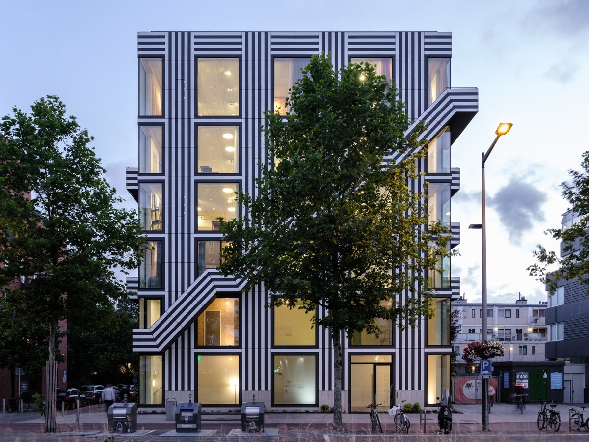
Should more graphic designers design buildings?
Fresh from designing their own building in Amsterdam, Thonik’s Nikki Gonnissen and Thomas Widdershoven discuss what sets graphic designers apart from architects and what that could mean for a more collaborative future
The post Should more graphic designers design buildings? appeared first on Creative Review.

Graphic Design & Illustrations by Carly Berry

Is graphic design too trendy?

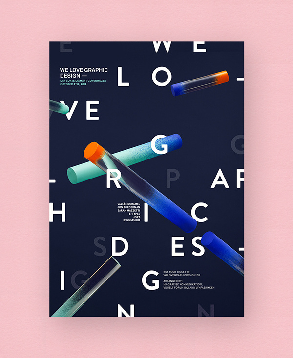
We Love Graphic Design #branding #design #graphic #poster #typography

Art Text — Professional Graphic Design Software for Mac

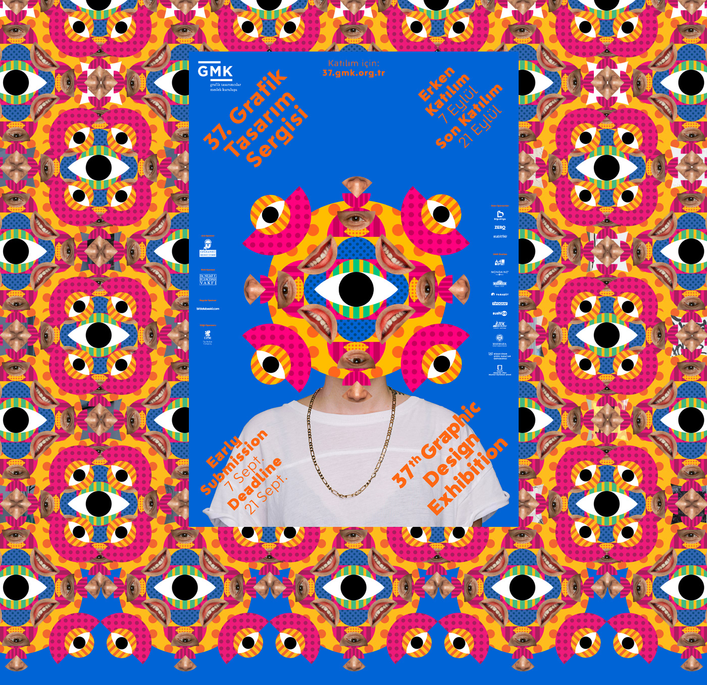
37th GMK Graphic Design Festival Identity
Turkish Graphic Designers Association 37th Graphic Design Exhibihition

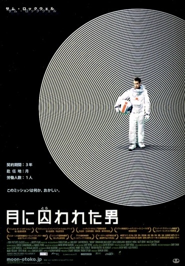
Gurafiku: Japanese Graphic Design #japanese #graphic #design #poster #film

Gurafiku: Japanese Graphic Design #japanese #graphic #design #poster #film
The Art of Graphic Design: From Creativity to Communication
Graphic design is a dynamic and influential field that plays a pivotal role in shaping how we perceive and interact with the world. It's the art of visual communication, combining creativity, technology, and psychology to convey messages, evoke emotions, and inspire action. In this article, we'll delve into the world of graphic design, exploring its significance, principles, and the essential skills every graphic designer should possess.
What is Graphic Design?
At its core, graphic design is the process of using visual elements, typography, and layout to communicate a message effectively. Whether it's a logo, poster, website, or packaging, graphic design is everywhere, influencing our choices and perceptions in ways we may not even consciously realize.
The Significance of Graphic Design
Visual Communication: Graphic design is the language of visual communication. It can simplify complex ideas, make information more accessible, and create memorable impressions.
Branding: A strong visual identity, crafted through graphic design, helps businesses stand out and establish a unique brand presence in a competitive marketplace.
Emotional Connection: Design can evoke emotions, making it a powerful tool for storytelling and creating connections between brands and their audience.
User Experience: In digital design, graphic elements contribute significantly to the overall user experience, affecting how users navigate and interact with websites and apps.
Principles of Graphic Design
Balance: Achieving visual equilibrium by distributing elements harmoniously within a design. Balance can be symmetrical or asymmetrical, depending on the desired effect.
Contrast: The juxtaposition of different elements (e.g., colors, fonts, shapes) to create visual interest and hierarchy.
Emphasis: Highlighting a specific element or message to draw attention and guide the viewer's eye.
Unity: Ensuring all elements in a design work together cohesively, creating a sense of completeness and purpose.
Proximity: Grouping related elements close together to signify their connection and separate unrelated elements.
Essential Skills for Graphic Designers
Creativity: The ability to think outside the box and come up with original, innovative concepts and designs.
Typography: Mastery of typography is crucial, as it directly affects readability and the overall impact of a design.
Color Theory: Understanding the psychology of colors and their combinations is essential for conveying emotions and messages effectively.
Software Proficiency: Proficiency in graphic design software like Adobe Illustrator, Photoshop, and InDesign is a must.
Communication: Effective communication skills are vital for understanding client needs and conveying your design rationale.
Adaptability: The graphic design landscape is constantly evolving. Staying up-to-date with trends and technologies is essential.
The Creative Process
Research: Understand the project's goals, target audience, and context before diving into design.
Conceptualization: Brainstorm ideas, sketch rough drafts, and develop a design concept that aligns with the project's objectives.
Execution: Bring your concept to life using design software, carefully selecting colors, typography, and visual elements.
Feedback: Share your design with others for constructive feedback and iterate based on the input received.
Finalization: Polish your design, ensuring it meets all project requirements and is ready for delivery.
Conclusion
Graphic design is more than just aesthetics; it's a powerful means of communication that influences our daily lives. From advertising to branding, graphic design shapes how we perceive the world around us. By mastering the principles and skills of graphic design, designers can create visually compelling, meaningful, and impactful designs that resonate with audiences and leave a lasting impression. Whether you're a seasoned professional or just starting, the world of graphic design offers endless opportunities for creativity and expression.
