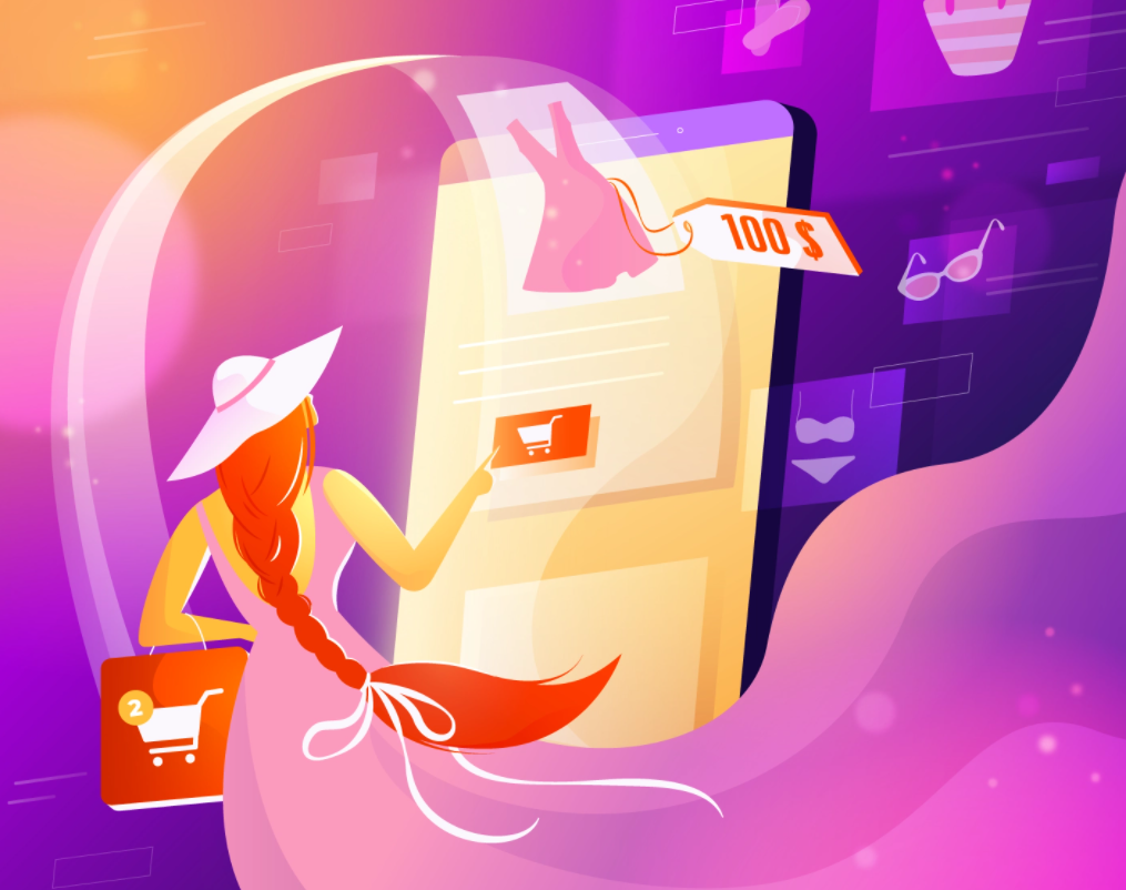
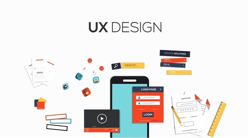
Inspiration: 7 Amazing Ecommerce Website Design Examples
Like any other digital industry resource, e-commerce platforms are developing at a rapid pace. What kind of UX do modern users of e-commerce sites need to keep up with the world pace and be on the top? Here you will find the most awesome eCommerce website examples to inspire beautiful, highly effective, and competitive platform designs for your business. Enjoy it!What are the Best Ecommerce Website Design Ideas?In the UX of modern e-commerce sites, logic, consistency, and a focus on foreseeing consumer behavior should be well integrated. It is also necessary to lay a backlash for the possible changes that will come in the near future. This is important since UX/UI trends change quickly, user requests are growing, and UI design changes should not disrupt the structure of your resource.And here are the top quality concepts of eCommerce website design inspiration to reach out to:1) Fashion Store Mobile Version2) E-Commerce UI Components3) Point Of Sales iOs App4) Furniture Shop5) Marketcapital homepage design concept6) Furniture Shop Dashboard7) Cosmetic Website ConceptAll design concepts are retrieved from Dribbble.Why E-Commerce Design?The number of e-commerce projects is growing steadily. If back in 2018, the US users increase was only 4%, the rise in e-commerce design is about 20% now. This also includes corporate businesses from the B2B sector, looking for clients on the Internet. What does this mean for e-commerce platforms?This primarily means that competition is on the rise, and you will need top-notch eCommerce website design examples for inspiration.To Sum UpSumming up, the competition is constantly growing, and standing out from the crowd of similar sites is not only important but necessary for the survival of your business. At the same time, just a beautiful bright design is not enough. Your site should be more exciting and user-friendly than competitors’ sites. Now, this is a challenging task. The difference between them is not only in trendy design, fonts, or well-tested templates.The main difference is in the logic these sites are built. That is why the key emphasis must be placed on the design of e-commerce sites; carefully consider the logic of interaction and user experience, and the changeable user behavior as well as the market.Feel free to add!Update:Originally published at https://fireart.studio on February 2, 2022.Inspiration: 7 Amazing Ecommerce Website Design Examples was originally published in Muzli - Design Inspiration on Medium, where people are continuing the conversation by highlighting and responding to this story.
8 Best Web Design Portfolio Examples for Learning in 2018
Excellent design is integral for an effective web design portfolio. These 8 fresh online web design portfolio examples will provide you with inspiration.Web Design Portfolio = Web Page Facade + AbilityWhether a web design portfolio includes simple websites, creative sites, or highly technical pages, there is one common thread: behind all good web design portfolios lie hard work and effort by designers who glean inspiration from various sources. A web design portfolio is not only a facade but also the embodiment of a designer’s professionalism. As a web designer, there is nothing more important than taking your portfolio design seriously if you want to attract clients.Study online web design portfolios to get inspirationGood design work is not simply inspirational. It speaks to the viewer and conveys insights that shares design concepts and shows a glimpse of the designer himself. A well-crafted web design portfolio not only creates job opportunities but cements your reputation. To help you enhance your portfolio and attract more work, Mockplus has picked 8 of the best web design portfolio examples in 2018. Peruse them and use them as learning resources for your own development.8 Best Web Design Portfolio Examples for Learning1. Personal portfolioDesigner: MikeSource: DribbbleURL: https://dribbble.com/shots/4353012-Bryan-Lane-Pers...Mike is a graphic designer with a wealth of design experience. He is good at user-oriented graphic design, website design, application design, game design, and user interface design that incorporate logos, icons, and illustrations.Personal Portfolio is a typical graphic design oriented web design, but unique in its conspicuous background with bright 3D illustrations. The combination of graphic design and 3D design is eye-catching.2. Designer ProfilesDesigner: Ben SchadeSource: DribbbleURL: https://dribbble.com/shots/3299965-Designer-Profil...Ben Schade is a web interface designer highly popular on Dribbble. From his design portfolio, you can see that he prefers flat UI design style with a clean and simple interface.The fresh and elegant flat UI color gives people a very comfortable visual experience. The color matching, icons, and pictures in this web design portfolio are very simple and clean. As the slogan in the lower left corner says “design less, think more”. It’s the best example of “less is more”. The portfolio is to focus on the work itself, not just for showing off.3. Personal Site — JS InteractionsDesigner: Drew EndlySource: DribbbleURL: https://dribbble.com/shots/3124285-Personal-Site-J...Drew Endly is a very creative designer. He pays great attention to the clever use of visual and interactive design, including color matching, dynamic design.JS Interactions is a web design portfolio based on interactive design. The simple landing page design, smooth dynamic design, and all the visual effects are very fascinating and eye-catching. The interactive action design naturally guides the display and reading experience of the whole website. The use of pop-ups and slide interactions adds an element of fun to the website.An integrated design includes the preproduction of interactive prototype building with tools such as Mockplus. It also needs various developing skills, such as JS, to achieve the real interaction on the website. Given this, we believe this web design portfolio is a worthy reference.4. Portfolio ExplorationDesigner: Adrián SomozaSource: DribbbleURL: https://dribbble.com/shots/2343357-Portfolio-Explo...Adrián Somoza is a senior designer, design consultant, and mentor. His clients include Adidas, Google, Nike, Samsung and Netflix.This is a typical personal web design portfolio which is a collection of character design, personal profile, display of works and achievement showcase. It can be considered as a classic example of portfolio design with personal works and experience.Even though it was a web design created in 2015, its design concepts are still worth studying. You can see how popular it is based on the number of views. What you can learn is the use of dynamic effects; for example, floating scroll settings, that makes the focus of the web page switch from characters to personal experiences and display of works. Even with today’s new design concepts, this portfolio has elements that are still applicable.For a beginner who wants to achieve scrolling of web content, the first step is to choose the right design tool. Design tool Mockplus, with its scroll box components, icons and text components, and flexible settings is an excellent place to start.5. PortfolioDesigner: Dennys HessSource: DribbbleURL: https://dribbble.com/shots/4527247-PortfolioThis portfolio may not be gorgeous, but the switch animation of the content page is very creative. The paper-based page flip interactions go beyond common page transition and give people a sense of realism while reading.6. Lank — Creative Design Agency & Personal Portfolio HTML TemplateDesigner: Reejo GeorgeSource: ThemeforestURL: https://themeforest.net/item/lank-creative-design-...Reejo George is a freelance designer from India who sells his web design work on Themeforest.This is a responsive web design example that is based on the Bootstrap Framework and is easy to customize. You can use it as a design agency, personal resume, or personal web design portfolio template. One-page layout, modern and clean responsive user interface design, 100% pixel perfect design, cross-browser compatibility, etc. are the advantages of this modern web design example.7. Active Theory Interactive Intro PageDesigner: ACTIVE THEORYSource: AwwwardsURL: https://www.awwwards.com/sites/active-theory-v4Active Theory is a creative digital production studio in Venice, California. This web design features a digital loading design on the landing page and a ripple effect on the homepage. The dynamic website background picture combined with the water ripple effect generated by the mouse sliding makes the entire web page appear very chic. Gradual transition effects link to the display of design works.The modern style background image and the piano key sidebar show that the studio has a special preference for the use of animation design on web pages.8. Trons — Clean Portfolio & Agency WordPress ThemeDesigner: pegoSource: ThemeforestURL: https://themeforest.net/item/trons-clean-portfolio...Trons is a web design portfolio of WordPress themes. It provides a clean, concise, and responsive minimalist WordPress theme for a creative portfolio design. You can use this website theme for agency websites, individual portfolio websites, architect agencies, photo studios, painter portfolios, artist portfolios, web design works, illustrators, freelance designers, and more. Responsive design supports applies to various device browsers. 、Summary:These above 8 web design portfolio examples for 2018 are very useful for designers in 2018. In addition to the designer’s innate talent, hard work and the willingness to continuously learn are crucial to good web design. Keep up with the latest design examples for web design, portfolio design, UI/UX design, and the practical tools for prototyping design. Always be open to learning and hone your craft to stay ahead of the pack.8 Best Web Design Portfolio Examples for Learning in 2018 was originally published in Muzli - Design Inspiration on Medium, where people are continuing the conversation by highlighting and responding to this story.
11 Stunning Examples of Tab Based Navigation
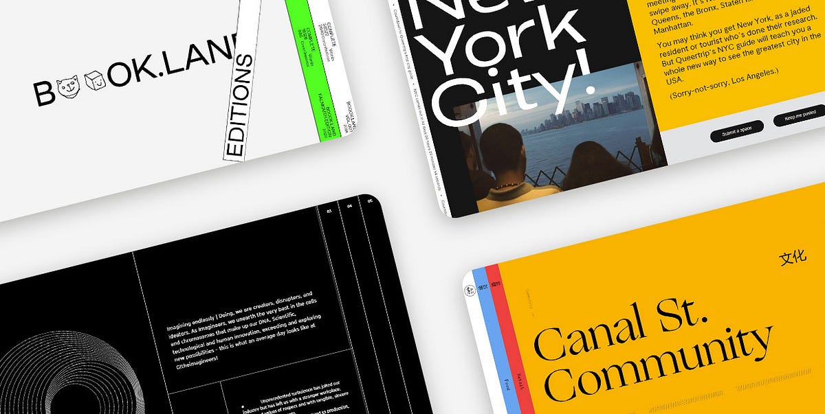
Tabs are extremely practical elements that allow for a clutter-free UI. And while they’re most commonly used to group related content within a single website page, some designers have experimented with them and started employing tabs as a navigational device for entire sites. Instead of displaying pages as simple links, they started placing them into beautifully designed and clean tabbed menus, creating visually appealing and intuitive website navigation systems.Over the last few years, vertically placed, full-height navigation tabs became particularly popular in modern web design. The typography on these tabs is often perpendicular, making the menus look a bit unusual and interesting to the eye. In some cases, tabbed menus aren’t even placed at the top. They often take up either the entire screen or a significant portion of it, becoming an important part of the page content. Moreover, both vertical and horizontal tabs are often adorned with engaging effects that enhance their appeal and make them more prominent.In this article, we are going to share a collection of websites that illustrate how creative you can be when designing tab-based navigation and implementing tabs into your projects. The brands that illustrate the versatility and flexibility of tabbed navigation include:Book.LandQueertripCanal Street MarketSpace — de SpaceTablet MagazineVine TrailOff SeasonG!theimagineersEmbassy of InternetEDA ArchitectsGreat JonesBook.LandBook.Land is a terrific project for collaborative storytelling. It was devised by Harry Boyd, a graphic designer, with the goal of encouraging audiences worldwide to write a novel together. Each user needs to continue the story where it was left off and also add some illustrations to complement the text. The site’s layout is unusual and interesting to the eye. The homepage opens with an amusing logo animation, where letters turn into doodles for a split second — the two o’s morph into a cat, smiley face, an envelope, etc. On either side of the screen, there are vertical tabs, resembling books placed on a shelf. This design perfectly complements the site’s purpose. The homepage gives off brutalist vibes, with uppercase sans serif typography and the screaming fluorescent green clashing with the surrounding calmness of the neutral white color. The tabs at both sides of the screen contain a brief description of their content. Inner pages are divided into two parts, with doodles on the left and stories on the right side of the screen. The title of each story is animated in an electrifying way, breaking the inertia of the surrounding content and announcing the novel in an attention-grabbing way. There is also a barcode — a standard element on physical book copies. But instead of the 8-digit number, the barcode on this website displays the time.QueertripQueertrip is an LGBT travel agency. The project was devised with the goal of introducing those who identify as queer to the places they can travel to without having to worry about their safety. The homepage shows a rotating illustration of the Earth and an animated arrow that travels around the globe. At the same time, the color of the background, elements, and typography changes every few seconds, mirroring the colors of the rainbow. On the right-hand side of the screen, you’ll notice two tabs. One is in black and the other in white. They both feature perpendicular, animated typography, informing you about the content that hides behind these tabs. Even though the homepage is bursting with colors, the scrolling typography and the monochromatic color palette of the tabs are just as attention-grabbing. When you place the cursor on either tab, they slightly expand, revealing a small part of the content they feature. On click, the content takes up almost the entire portion of the screen, but the tabs remain visible on the side, so you can jump from one to the other whenever you want.Canal Street MarketCanal Street Market is a retail market, food hall, and community space located in New York City. The website’s content is organized into colorful tabs. Each section is presented using a different hue. The homepage includes a subtle white backdrop, while other pages have more vibrant backdrops, including blue, red, and orange shades. The switch from one color to the next enhances the site’s visual appeal and makes it appear more exciting to your eye. When you click on tabs, they elegantly stretch across the screen, showcasing the beauty of featured content. Aside from the gorgeous visuals, some pages also include animated lines. For instance, in the upper section of the homepage, there is a zig-zag line that incessantly flows from one side of the screen toward the other. On the other hand, toward the bottom of the homepage, you’ll come across animated dotted lines. The movement of the lines as well as the vivacious color palette on the site perfectly balance out and soften the rigidness of tabs, creating a fun and engaging environment for users to explore.Space — de SpaceSpace — de Space was a place in Luzern where artists could exhibit their work. Even though the website includes a program from 2018, we added this example to the list because it exemplifies a particularly creative implementation of tabs on a site. The homepage evokes alternative vibes. The name of the organization is depicted using a combination of cursive typography and geometric shapes. It’s hardly readable and it looks more like an ornament that amplifies the site’s appeal. Each exhibition is presented as a tab. The tabs overlap, with only their tops peaking, revealing the name of the artist, the date, and a glimpse of the content featured inside. Each tab is colored in a different hue. However, since the majority of the tabs are painted in pastel shades, the homepage, despite containing a lot of elements, isn’t hard on the eyes. In fact, the transitions from powdery pink and soft yellow to baby blue and delicate violet make the page appear more exciting to explore. The way tabs are arranged one on top of the other makes exploring the homepage feel like going through a well-organized file drawer.Tablet MagazineTablet is an online Jewish magazine. Its design resembles the look of printed newspapers, with a paper-like background and grid-based layout. The content is in black-and-white with call-to-action buttons in red. However, when you hover over images, they gain color, enlivening the site. On the far-right part of the screen, you’ll notice an invitation to explore the magazine’s sections. The all-caps, red letters encourage you to click on them. When you put the cursor over that section of the page, you’ll see it slightly expand, revealing two more tabs. When you click on them, a collection of selected articles appears in the viewport, stretching across the entire screen. Article previews and featured visuals are all organized into tabs. You can explore them by using the horizontal navigation, which helps make this section more immersive and fun to browse. The articles appear in threes, so the entire screen stays covered in tabs all the time.Vine TrailVine Trail sources, imports, sells and distributes wines from France, Northern Spain, and Italy. The homepage opens with a stunning fullscreen animated photo, transporting you to one of the breathtaking wine regions. And while the homepage provides a beautiful introduction to the brand, if you want to learn more about the growers and discover the full wine list, you should click on the two eye-catching blue and orange tabs on the right-hand side of the screen. When you click on them, they take up the entire surface of the screen. Both tabs contain long lists of data organized into columns either alphabetically (growers) or by the region (wines). You can also apply handy filters to find the content that interests you the most. Implementing tabs on the site allowed the designers to display a lot of information in a visually appealing way without cluttering the screen and overwhelming you. Instead, you can elegantly click on the section you want to learn more about and immerse yourself in the fullscreen, vividly colored content.Off SeasonOff Season is a design and photo studio that specializes in working with musicians. Their website represents a compelling combination of grid lines and tabs. The layout is unusual and interesting to explore. On the left-hand side, a small portion of the screen includes a short description of the studio. Underneath the text, there are two intersecting squares. They interact with your cursor — the closer you bring your mouse to the squares, the further apart they drift and vice versa. The rest of the layout consists of menu sections presented as tabs. When you click on them, each folder expands, revealing its colorful content. Before each section title, there is a small, outlined circle that on hover and on click becomes black, signaling that the tab is in an “active” state.G!theimagineersG!theimagineers is a production studio that combines architecture, scenography, light, image, and sound in their work. The most obvious elements on the site are grid lines and a variety of geometric shapes that stand out against the black background. The overall design is minimalist and simple, but the clever and playful implementation of lines makes the site engaging and immersive. The grid lines form full-height tabs that include main menu links. When you click on the tabs, they expand, revealing the featured content. No matter the page you open, the other tabs stay visible on the screen so you can quickly go to some other section on the site. Inner pages are split into several parts using grid lines. On the left-hand side, they usually include animated geometric shapes, such as circles, while other areas on the page include information about the studio and what they do.Embassy of InternetEmbassy of Internet is an experimental platform created with the scope of encouraging discussions about the future of the Internet and its role in our society. Even though this project is no longer active, we added it to our list because of the creative use of tabs on the site. When you hover over each section, a short description of the pages appears. At the same time, the color of typography and the background invert. The blue color used on the page is very specific — it resembles the blue screen of death we used to see in older versions of Windows, giving the site a retro feel. The homepage also evokes strong brutalist vibes. It includes attention-grabbing, large, uppercase sans serif typography and there are almost no visuals save for the pulsating large blue circle at the bottom right corner of the screen. Even though the entire website is text-based, you never feel bored exploring it. The combination of blue and grey hues makes the pages exciting to the eye, luring you into reading more about the project.EDA ArchitectsEDA Architects is an architecture, interior design, and planning firm. On their website, the menu sections are presented as vertical tabs. There is an element of surprise when exploring the site because you can’t even see a glimpse of the content behind the tabs. Some pages include a fullscreen slider while others feature exciting galleries. Animation effects are terrific, especially the scroll-triggered animations added to the “About” page. At one point, you enjoy a fullscreen photo. Then, on scroll, the screen splits in two, with one image on each side. Then, a small photo remains on one side while the accompanying text appears on the right. The changes on each scroll make the page appear dynamic and more fun to explore. The dominant monospace typography amplifies the modernist character of the studio’s buildings and wonderfully complements the minimalist vibe of some of the layouts. The pages about the services EDA provides and their contact information contain only text, but the monospace font and the use of grid lines make them beautiful to look at and explore.Great JonesGreat Jones is a cookware brand founded in 2018. The main navigation is placed at the top, with gorgeous tabs inciting visitors to learn more about the company and explore their products. The colors used on the tabs are beautiful — deep shades of pink, green, and yellow serve as an appealing introduction to the site. They also stand as harbingers of what Great Jones items are like. The company is known for its colorful products and their beauty stands out against a beige background. As soon as you start to scroll down any page, the tabs disappear and the menu sections show up in the header. As soon as the transformation occurs, the menu becomes sticky, allowing users to easily go to any section of the site.Closing WordsThe brands featured on our list have nailed the tabbed navigation design. They have demonstrated that tabs are just as flexible as any other UX element and that they allow a lot of room for expressing your creativity.As you can see, you can place tabs in the header next to each other or one below the other. Alternatively, you can make room for them on one side of the screen or display one tab and arrange that the rest of them appear on hover. If you like, you can also organize your entire content into tabs and then arrange them across the whole screen.To make your tabs more prominent, you can consider coloring them in vivid colors. And if you feel like experimenting with hover effects, you can rely on them to further amplify the appeal of your tabbed navigation. You could have tabs change color on hover, add some animated objects to them, or increase their size. Don’t be afraid to express your creativity, but also be mindful your tabbed navigation stays clear and intuitive at all times.Originally published at https://qodeinteractive.com.11 Stunning Examples of Tab Based Navigation was originally published in Muzli - Design Inspiration on Medium, where people are continuing the conversation by highlighting and responding to this story.

20 Best Free Responsive HTML5 Web Templates in 2018
20 Best Free Responsive HTML5 Web TemplatesResponsive HTML5 Web TemplatesWebsite template is the best solution for site building. Here are 20 best free responsive HTML5 web templates in 2018 for creative and powerful website building.In the early days of web development, good, free website templates were hard to find. Fortunately, web designers and developers are now sharing free responsive web HTML5 templates, free Bootstrap templates, and free CSS templates through the Internet.Due to the flexibility and powerful features of these website templates, demand has grown for responsive HTML5, Bootstrap and CSS web templates. Mockplus has compiled the best free responsive HTML5 web templates in 2018 that are easy to learn and implement quickly. For more free HTML5 Website Templates: at Template.net they create Premium website Designs for Free.Why did HTML5, Bootstrap, and CSS3 website templates get so popular?1. HTML5 supports all browsers and is the latest markup language for creating great websites. Due to the increasing popularity of the HTML5 language, HTML5 website templates are also popular.2. CSS3 is the latest version of the CSS language to provide the best style sites, such as unlimited color combinations, great font styles, font selection, and more. In general, the CSS3 language makes your website beautiful and stylish.3. Bootstrap has become one of the most popular front-end frameworks for user interface developers. Its advantage lies in its open source usability. It could save a lot of time for UI developers. In addition, Bootstrap has some innovative features, such as mobile-friendly, SAAS, clean and lightweight code, cross-browser compatibility, and so on. So that most designers can use this framework to create responsive websites with less time and effort.8 Best Free Responsive HTML5 Web Templates in 20181. Boxus — A Creative Website Template for Software Companies and Web Design CompaniesDevelopment Technology: HTML 5, CSS 3, JS, jQueryWebsite Features:Creative agency templateSticky navigation barGoogle MapsSocial media iconsColorful interfaceFont iconBright color schemeBoxus is a creative free responsive HTML5 website template for creative and dynamic software companies and web design companies. It has an excellent layout and responsiveness. Most importantly, it provides the latest JavaScript plugins that make the templates more efficient and powerful. An inspiring and stunning free HTML5 web template can significantly reduce the time and increase design productivity.2. AweSplash — Free HTML Splash PageDevelopment Technology: HTML 5, CSS 3, JS, jQueryWebsite Features:SliderResponsive retinal menuGhost buttonSEO friendlyDevice responsejQuery & Javascript pluginYouTube and Vimeo Player plug-insAweSplash is ideal as a welcome page or any other landing page to launch a new product or announce an upcoming event. It has four attractive presentation pages. Ghost buttons allow you link to upcoming products. The Javascript plugin called Animate Headline makes the page even more beautiful. This free HTML5 template demo has a beautiful background slide image.3. Beverages — Free Restaurant Bootstrap Responsive Website TemplateDevelopment Technology: HTML 5, CSS 3, JS, BootstrapWebsite Features:Fully responsiveSupport customizationBuild with valid HTML5 and CSS3 codeUse Google web fontsBootstrap frameworkBeverages is a 100% responsive website template with a restaurant theme that applies to the design of any food and beverage website. It is compatible with all devices and can display on all screen sizes. Because it built entirely in the Bootstrap framework, HTML5, CSS3, and JQuery, you can easily convert this template for any other type of business.4. TravelAir — A Free HTML Website Template for Travel SightseeingDevelopment Technology: HTML 5, CSS 3, JS, jQueryWebsite Features:Bootstrap 4HTML5 and CSS3Sticky titleCross-browser compatibilityGoogle FontsTravelAir has a unique and creative homepage design using a modern design layout. There is an owl carousel slider with title text on the homepage. In addition, there is a jQuery UI Calendar travel booking form. At the homepage, there are tour packages, the destinations, and sections about your company, which will impress visitors with a professional and polished webpage.5. Jessica- A Free HTML Website Template for NutritionistDevelopment Technology: HTML 5, CSS 3, JS, jQueryWebsite Features:Bootstrap V3 +Minimalist designHTML5 CSS3Google Font Download (Montserrat)Style Guide (Developer Usage and Template Design Guide)As a dietitian website template, Jessica uses a minimalist style web design, with a beautiful color scheme and appetizing food images. The nutrition website templates are fresh and attractive with topics such as health, fitness, body, food, beauty, diet, weight loss coaches, female coaches, and women’s diet.6. WonderComing Soon — Flat Responsive Widget TemplateDevelopment Technology: HTML5& CSS3, JQueryWebsite features:Fully responsiveModern and elegant designHTML5& CSS3Google FontsThis free responsive HTML5 website template is suitable for any type of website, such as website pages, launching websites, startups and more. This HTML template is 100% responsive cross-browser and compatible with all devices and all screen sizes.7. Mariela– a Responsive HTML5 E-commerce Website TemplateDevelopment Technology: HTML5& CSS3Website features:Fully responsiveRetina supportedInteractionsUtility pages (404, password pages)Google fonts (free to use)Mariela is a free E-Commerce 100%customized HTML5 template suitable for furniture, houseware website building. It’s a well-designed website with full web functionality for fast website building without code needed.8. Industrious — A Modern Business-OrientedResponsive HTML5 TemplateDevelopment Technology: HTML5& CSS3Website features:Fully responsiveVideo backgroundThis free HTML5 template could use for multiple purposes such as school, factory, company website building. Video background makes the website with an animated effect.https://idoc.mockplus.com/?hmsr=medium8 Best Free Bootstrap Website Templates in 20181. Vex — Free Bootstrap 4 Landing Page TemplateDevelopment Technology: HTML 5, CSS 3, Bootstrap 4 alpha.5, JS, jQueryWebsite features:Parallax background effectEmail subscription optionsFooter menuBootstrap 4 frameworkFriendly user interfaceVex is built with the recently released Bootstrap 4 CSS framework and is very responsive. In addition, Bootstrap 4 provides developers and users interface flexibility and Vex templates are mobile optimized for viewing on smaller screens.2. Conceit — A Free Bootstrap Responsive Web Template for EnterpriseDevelopment Technology: Bootstrap framework, HTML5, CSS3, JQueryWebsite features:100% response Bootstrap sliderIcon based on Font AwesomeHTML5 and CSS3Google FontsBootstrap frameworkImage conversion effectConceit is a 100% responsive, cross-browser, modern, website template that provides multiple pages and is multi-purpose for a variety of businesses and enterprises. It’s a high-use template that allows users to build their own creative website. This template provides a variety of convenient pages templates including about pages, contact pages, 404 pages, latest blogs and so on. The design of this template is based entirely on the Bootstrap framework, HTML5, CSS3, and JQuery built.3. Asentus — A Free Responsive HTML5 Template for Guiding PageDevelopment Technology: HTML 5, CSS 3, Bootstrap 3, JS, jQueryWebsite features:Sticky menu barSliding title backgroundGhost buttonHTML5/CSS3If you want a free corporate proxy website template that is lightweight, flexible and easy to customize, as well as free for business and personal use, Asentus is exactly what you want. This is a free HTML5 template with adaptive guidance for corporate agencies. This template is super clean and elegant.4. Landing- Landing Page Bootstrap Responsive Web TemplateDevelopment Technology: HTML5& CSS3, JQueryWebsite features:Fully ResponsiveAwesome font & iconsHover effectsValidated HTML5 & CSS3AnimationHeader navigationBootstrap Framework version 4This template focus on the landing page design of the whole website. A good landing page with nice UI design could be more helpful on user guiding, enhancing the user experience.Related: 8 Best Landing Page Design Examples for Inspiration in 20185. Cafe — Flat Bootstrap Responsive Web TemplateDevelopment Technology: HTML5, CSS3, BootstrapWebsite features:Fully responsiveEasy to UseAwesome fonts & iconsBuilt with HTML5 and CSS3 codeElegant and cleanBootstrap frameworkCafe is a flat Bootstrap responsive web template for restaurants. With the valid HTMLT5 and CSS3 code, you can customize it for hotel website and other food and drinks business website also.6. New Age — Bootstrap App Landing Page TemplateDevelopment Technology: HTML5& CSS3, Bootstrap 4Website features:Fully responsiveHTML templateCSS gradientFixed navigationAs a Bootstrap template, New Age showcases a landing page theme to help display your website and service. Fully responsive design allows you to customize it for any other devices for other business purposes.7. StylishPortfolio — A Stylish One Page Bootstrap TemplateDevelopment Technology: HTML5, Bootstrap4, jQueryWebsite features:Fully responsiveHTML createdFull page background imageSmooth page scrollingMaterial design colorStylish Portfolio is a one-pageBootstrap portfolio website template with off-canvas navigation and smooth scrolling through content sections. The whole website used Material Design colors, bright and bold.8. Creative–A Creative Bootstrap Portfolios and Businesses Website TemplateWebsite features:Fully responsiveHTML createdFixed navigationUnique, modern designImage grid with hover effectsAnimationCreated by Bootstrap 4, Creative suitable for creatives, small businesses, and other multipurpose uses. The fixed navigation menu with scrolling animations makes the website logical and clear to guide users.4 Best Free CSS Website Templates in 20181. Garage — Free HTML5 CSS3 Bootstrap Responsive Web TemplateDevelopment Technology: HTML 5, CSS 3, Bootstrap 3, JS, jQueryWebsite features:Parallax effectW3C valid tagSmooth transition effectCross-browser support100% responsive layout100% search engine friendlyGarage is a completely special creative template developed by the Webdomus development team and is particularly suitable for antique or classic car displays. This multi-page responsive HTML5 CSS3 Bootstrap template has related sections to meet customer needs.2. Graffiti Artist — Free CSS Web Page Template for Graffiti ArtDevelopment Technology: HTML 5, CSS 3,Website features:Convenient web editing portalRich tutorialDesign ToolsGraffiti is a free CSS web page template for graffiti artists, street photographers, and creative professionals. Artworks and creative projects are attractively displayed on the front and center of the template. The eye-catching black-and-white media and parallax scroll provide a perfect background for a rich and unique style.3. Treviso — A Free CSS Website TemplateDevelopment Technology: HTML5, CSS,jQueryWebsite features:Fully responsiveModern and elegantHover effectAnimatedTreviso is a free CSS template for portfolio, interior or furniture website building. As a one-page template, it has 4 columns on the whole website. The white, black, and grey colors make the site looks clean and simple to read.4. Agency- A Free CSS Website TemplatDevelopment Technology: HTML5, CSS,Bootstrap, jQueryWebsite features:Fully responsiveMulti develop language usedFixed navigationBig image backgroundAs is indicated by the name, Agency is a free CSS template suitable for all kinds of agencies, studio, or other business purpose website building. Big image background highlights the theme and easy to grasp information by users.More Free Responsive CSS Website Templates you can find here.SummaryIf you are looking for the best free responsive HTML website templates, Bootstrap web templates, and CSS web templates in 2018, just open any of the website templates above and download them for a fast building of your own website! These are some of the best ways to save time and effort.If you want to have your own website but do not know any development language, it is recommended to use a prototyping tool, such as Mockplus, to quickly complete the website template design. Simply download a built-in website template like the examples mentioned above.Besides, you can download more free website templates on the Mockplus website. Just open one of these templates in the Mockplus software and start designing by importing pictures and other components. Your HTML5 website prototype design will be completed easily!You may also interested in:Top 15 Android UI Design Tools That Designers Should Not Miss25 Best Free Personal Website Templates and Resources10 Inspiring Examples of the Best Responsive Web Design in 2017Originally published at www.mockplus.com.20 Best Free Responsive HTML5 Web Templates in 2018 was originally published in Muzli - Design Inspiration on Medium, where people are continuing the conversation by highlighting and responding to this story.

Practical UI Patterns That Were Used In Real And Conceptual Applications.
Design better user flows by learning from proven productsFinding design inspiration is needlessly painful. Each of us would like to develop a new, innovative solution for a given function when designing. Unfortunately, sometimes it is not worth wasting time inventing the wheel for a new one and you should use ready-made design solutions. Instead of going through hundreds of bad or unrealistic examplesReal world UI PatternsMany wonderful people simplified this process for us and created online libraries with ready-made solutions that were used in real and conceptual applications. These websites help you find what you need right away.Browse interesting apps, broken down by feature. Analyze the features, understand how they work and get inspiration for your own projects.But where to get inspiration and solutions?Here are list of these websites to find real world UI patterns, that can help you and your team figure out common flows like Onboarding, Empty State, Loading, Profile & Account Verification,Home, Error State, Search/Filters, Invite & Share, Checkout, Gamification and so on?Hurry? scroll all the way down to quickly copy all the websites and bookmark them for later01. ScreenlaneGet inspired and keep up with the latest web & mobile app UI design trends.Screenlanehttps://screenlane.com/02. PageflowsSee how top brands design their onboarding, upgrading, downgrading and other key user flows.Pageflowshttps://pageflows.com/03. Mobbin. designMobbin is a hand-picked collection of latest design patterns from mobile apps that reflect the best in design. Over 150 apps and 8,000 patterns are currently available on the platformMobbin. designMobbin - The world's largest mobile app design reference library04. UX ArchiveUXArchive is the leading destination to find mobile UX trends from the world’s top mobile appsUX ArchiveUXArchive - Made by Waldo05. UI SourcesDesign better apps. Real design inspiration & insights from the world’s best designed products.UI Sourceshttps://www.uisources.com/interactions06. ScrnshtsScrnshts is a hand-picked collection of the finest app store design screenshots.Scrnshtshttps://scrnshts.club/07. UI PatternsUser Interface Design patterns are recurring solutions that solve common design problems. Design patterns are standard reference points for the experiencedUI PatternsUI-Patterns.com08. UI GarageUI Sources helps you save time by benchmarking against some of the world’s best apps. Save product development time and compare against the industry standard. 800+ interaction videos sorted by patterns. 2,400+ screenshots organized by Flows.UI GarageUI Garage - Specific UI Design inspiration & Pattern for your design.09. PatttternsA free and open catalog of interaction design patterns that’s used to document, learn, train on building products. Design patterns are frequently used by professionals in Architecture and Software buildingPatttternsPATTTTERNS10. LandbookLand-book — website design inspiration gallery … Find the best hand-picked website design inspiration. They are curated web design gallery for CreativesLandbookLand-book - website design inspiration gallery11. Lookup DesignBrowse handpicked UI and UX design examples and find inspiration for your next website or app.https://lookup.design/landing-pageslookup.design - ui examples12. Site inspireA showcase of the best web design inspiration, featuring over 7000 websites and profiles of the digital agencies, designers and developers who made them.Site inspireSiteinspire - Web Design Inspiration13. Saas landing pageSaaS Landing Page showcases the best landing page examples created by top-class SaaS companies. Get ideas and inspirations for your next design project.Saas landing pageshttps://saaslandingpage.com/14. LandingfolioLandingfolio is a gallery featuring the best landing pages design. Browse more than 445 landing page examples in 54 different categoriesThe Best Landing Page Design Inspiration, Templates and More15. Lapa.ninjaLapa Ninja was created to help designers find inspiration, learn, and improve their design skills. Content is selected from some of the best designs on the web.4953 Landing Page Design Inspiration - Lapa Ninja16. Minimal GalleryFor the love of beautiful, clean and functional websites.https://minimal.gallery/17. UI JarHandpicked design inspiration for your real life projects.UI Jar18. Godly.WebsiteAstronomically good web design inspiration from all over the Internethttps://godly.website/19. AwwwardsAwwwards are the Website Awards that recognize and promote the talent and effort of the best developers, designers and web agencies in the world.Awwwards - Website Awards - Best Web Design Trends20. CSS winnerCSS Winner is a website design award gallery for web designers and developers to showcase their best web design worksCSS Winner - Web Design Awards - CSS Award Gallery for Website Design Inspiration - Website Awards21. CSS Design AwardsBe inspired, Be inspiring. Submit your website to the world’s best CSS awards for a chance to win Site of the Day, UI awards UX awardsCSS Design Awards - Website Awards - Best Web Design Inspiration - CSS Awards22. Design InspirationAn image & color search engine for creating mood boards and finding art, design, logos, photographyhttps://www.designspiration.com/23. Brutalist websitesTruly artistic inspirationBrutalist WebsitesTo know more about Brutalism check this articleReference: https://elementor.com/blog/brutalism-in-web-design/24. Admire the webDaily web design inspiration from around the web specialising in minimal, clean and responsive websites. They showcase the very best to keep you inspired.Homepagewww.admiretheweb.com25. Best Website GalleryThe most beautiful websites handpicked for you — since 2008!Best Website Gallery - Web Design Inspiration - by @davidhellmann26. abduzeedoabdz. is a collective of individual writers sharing articles about design, photography, and UX as well as tutorials for Photoshop and other toolsUI/UX27. Top CSS GalleryTop CSS Gallery, Access to Best Designer. Portfolios & Finest Web Design Inspiration Awards Gallery. The world-wide viewers of Top CSS GALLERY websitewww.topcssgallery.com/28. BetalistBetaList is a community of makers and early adopters showcasing their startups and exchanging feedback.https://betalist.com/29. HttpsterA curated showcase of shit-hot web design with a less-is-more bent . Httpster is an inspiration resource and showcase of totally rocking websites made by heapsTotally rocking websites | httpster30. Commerce CreamThey collect and highlight the most beautiful commerce experiences on Shopify to help inspire designers, developers and merchants to create amazing things.https://commercecream.com/31. Nicely doneNicely done is a library of UX/UI design examples from web apps. It features a wide range of proven products from leading companies around the world.nicely done clubNicely done32. SiiimpleSiiimple is a minimalist css gallery. Hand-picked, obsessively curated collection of the most beautiful websites on the internets.SiiimpleSiiimple * A Minimalist Website Gallery33. Design made in GermanyA showcase of the best web design inspiration.designmadeingermanyhttp://www.designmadeingermany.de/sites-we-like/Bonus34. Web Design MuseumDiscover Forgotten Trends in Web Design. Web Design Museum exhibits over 2000 unique designs from the years 1991 to 2006. Discover forgotten trends in web design.designs from the years 1991 to 2006https://www.webdesignmuseum.org/References:https://screenlane.com/https://pageflows.com/https://mobbin.design/https://uxarchive.com/https://www.uisources.com/interactionshttps://scrnshts.club/UI-patterns.comhttps://uigarage.net/https://patttterns.net/https://lookup.design/landing-pageshttps://land-book.com/www.siteinspire.comhttps://saaslandingpage.com/www.landingfolio.comwww.lapa.ninjahttps://minimal.gallery/https://uijar.com/https://godly.website/https://www.awwwards.com/www.csswinner.comwww.cssdesignawards.comhttps://www.designspiration.com/brutalistwebsites.comwww.admiretheweb.combestwebsite.galleryabduzeedo.comwww.topcssgallery.com/https://betalist.com/httpster.nethttps://commercecream.com/nicelydone.clubhttps://siiimple.com/https://www.calltoidea.com/Did you know? 👏You can give up to 50 Claps for an article?Tap and hold the clap button for a few seconds.Thanks for Reading ☺️PS. I’d love to see any other missed websites for Practical UI Patterns, feel free to leave them here.Let’s connect here: Twitter / LinkedInPractical UI Patterns That Were Used In Real And Conceptual Applications. was originally published in Muzli - Design Inspiration on Medium, where people are continuing the conversation by highlighting and responding to this story.
Top 20 Dashboard Inspiration Ideas for the New 2022 from Fireart Studio
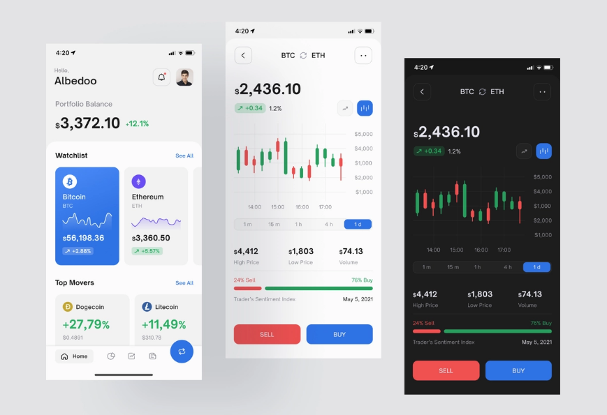
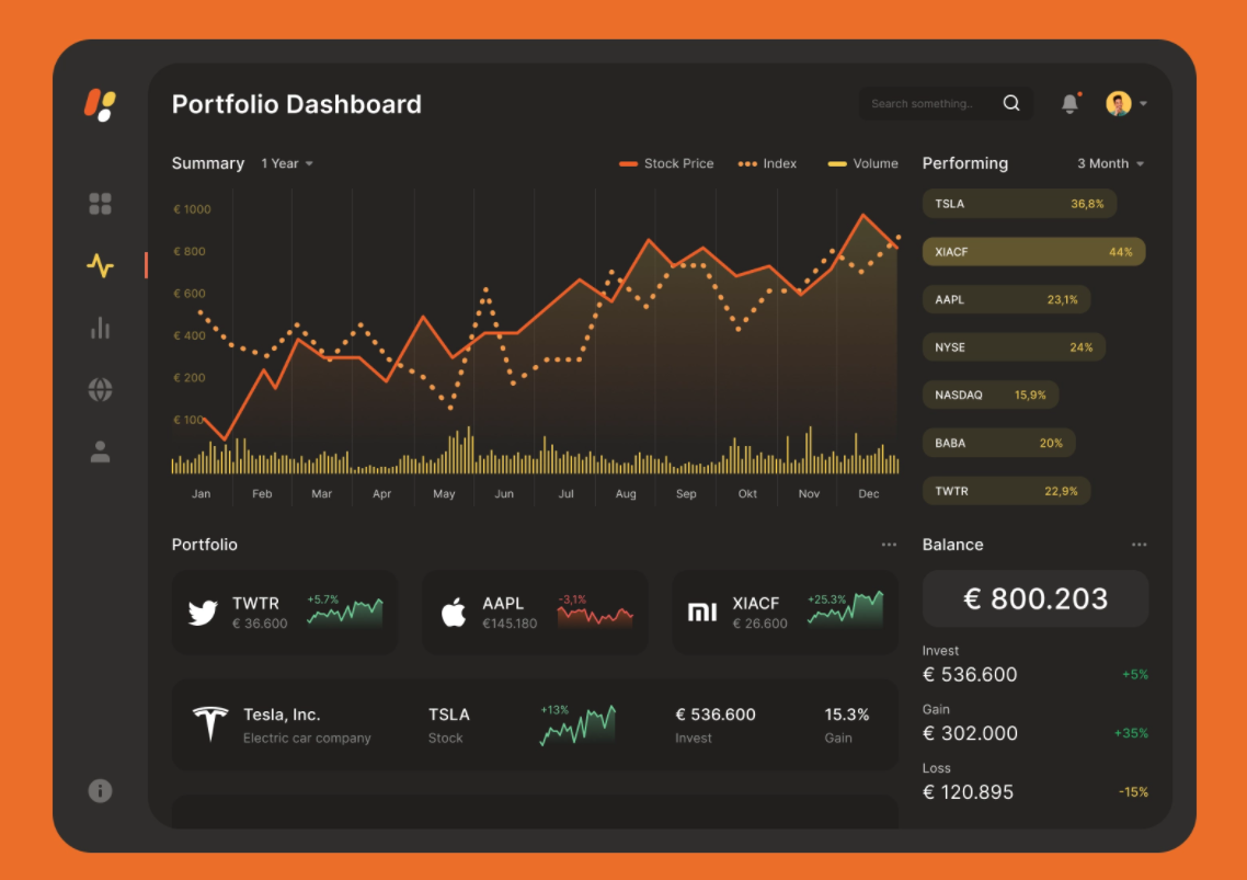
Designed by Fireart StudioInspiration is an essential thing in design. It does not necessarily obey the laws of logic and systematization. But it aims to make functional things also look beautiful and trigger the right feelings within the users. With its help, you may try to understand what really causes joy and inspiration in your website or mobile app design end users. Here’s the top inspiration list of UI dashboard designs that will definitely help you get inspired and shape your own style in 2022 and beyond. Enjoy them!Best Website & Mobile App UI Examples for InspirationHere you may look through the top-notch examples of website dashboards user interfaces for your inspiration, designed by Fireart Studio. That’s how some of the best examples of digital dashboard designs are created:1) Social Networking & Forum Mobile AppThis one is a concept created for a forum mobile app. Feel free to share your opinion about the design.2) Mobile Audiobook AppHere’s one of our recent concepts for a reading app. Besides listening to audiobooks, users may also connect with their friends, keep track of their bookmarks and even assign specific emotional responses to quotes with its help.3) Running app conceptHere’s the concept for a running app designed in classy white & black. Whether you run in the morning or evening the app will adjust to the light or dark mode.4) Hotel iOs AppHere is the concept for a hotel app we worked on. We’ve tried to keep the style really minimalistic and clean to allow users to be concentrated on searching for the best apartments and enjoy the experience.5) Point Of Sales iOs AppHere’s our new exploration of the POS app. You’re welcome to share your thoughts.6) Gallery AR appHere is a new concept of a gallery visit app with AR features as a guide. This design concept allows you to view the museum’s collections and view information about them.7) Personal Finance AppDiscover our Personal Finance Dashboard concept and we’d love to share our proposal for its mobile version.8) Audio Meeting iOs AppHere are the screens from the audio meeting app that we’ve recently worked on. Enjoy it!9) Malware Scanner Mobile AppAnother mobile version of the malware dashboard that we’d created for good. Let us know what you think.10) File Transfer AppWe’re also sharing with you a concept we’ve done for a file transferring app. It allows you easily drop any files between any devices in your workgroup.11) Fintech Dashboard ExplorationThis is another web version of the app that we’ve created recently. Let us know what you think.12) Freelancer Dashboard AppThis is an exploration concept for a freelancer app. Feel free to share it.13) Stock Portfolio DashboardAn original color solution for our latest concept for the stock portfolio dashboard which helps you manage all your assets, losses, and profits.14) Uptime Monitoring Service DashboardWelcome to explore a dashboard that helps you to monitor all your services in one place. Share your opinion in the comments.15) Agile Project Management Tool Landing PageHere is also the landing page for one of our projects we’ve shared recently.16) SNKRNWS website conceptFeel free to view our new design concept for a website where you can read sneaker news and find where to buy them.17) Marketcapital homepage design conceptAn incredible dark design for the concept of the website designed for the company that buys different online businesses.18) Agile Project Management Tool DashboardAnother concept of Agile Project Management Tool Dashboard for project management that allows you to easily plan your sprints, team load, tasks, etc.19) Social Media Analytics DashboardAnother dashboard that allows you to collect all your stats from most of the popular media and social platforms and provides you with useful insights is at your disposal.20) Home Listings DashboardDiscover a snapshot of our latest project for a company providing home/property listing services.To Wrap It UpOf course, the majority of people often belong to visuals. They perceive the world around them primarily due to their vision. At the same time, the concept of beauty is different for everyone. Therefore, it is useful to compare your creations with others. It is best to be inspired by the work of real professionals. To do this, you may visit sites that specialize in web design, including Fireart.There are much quality works there; each can inspire the user to create their own project, and the client — to hire the team who can make their product idea a reality.Getting on our Dribbble will also be very easy. Only the best from the top world’s designers is kept here. Don’t miss the chance to open it up, stay tuned in, and be on the top of the world in product design.Update:Originally published at https://fireart.studio on January 11, 2022.Top 20 Dashboard Inspiration Ideas for the New 2022 from Fireart Studio was originally published in Muzli - Design Inspiration on Medium, where people are continuing the conversation by highlighting and responding to this story.
Why UX Designers Should Learn about Cross-Cultural Design
Designers at global level oftentimes have to work along with the geographically distributed teams. They work on digital products designed for global consumption for clients that are located all over the world. Yet designers, overlooking the wider world out there, continue to work in a bubble and tend to be focused only around their local culture, language, and traditions.Coronavirus updates on CNN Live Stream.Indisputably presenting complex challenges, a cross-cultural design refers to variations in both linguistic and cultural patterns of product design. Despite this fact, most designers unintentionally assume that designing products for various cultures simply requires switching currencies, language translation (localization), and upgrading a few images to represent a particular local culture.As a matter of fact, the road to successful cross-cultural design with effective UX is far more complicated, and rifle with pitfalls.Examples from historyWhen launched in 2008 in India, Amazon faced issues for the lack of cultural insight and comprehensive UX research. They couldn’t find out why customers in the country weren’t using one of their chief drivers for revenue: searching for products to buy on the homepage of the mobile site.It appeared that the magnifying glass wasn’t something people associated with search in India. It made no sense to them. When UI was examined, most people found perceiving the icon represented a Ping-Pong paddle.Amazon, as a solution, continued the magnifying glass but assimilated a search field with a Hindi text label to make people know this was where they could start a search.Who will not remember the seminal cautionary myth behind why Chevrolet’s “Nova” flopped in Latin America? The whole event refers to branding failure because the name “Nova” means “no go” in Spanish. This story of substandard branding remained an object lesson for business students, reminding them about the failure to carry out reliable, in-depth cross-cultural research.However–whether or not the branding was fallen short–there’s one problem with this story: It’s not right.What should be focused?Designers–while they’re designing the cross-cultural products–should not just rely on contending with various languages, dialects, and dimensions of national culture. They certainly need to develop an even broader understanding of the cultural differences in color psychology and mental models of peoples from different target markets.Additionally, learning directly from culture to culture further adds an extra layer of complexity as text can be written right-to-left (RTL), left-to-right (LTR), and top-to-bottom.Beside some languages, “mirroring designs” is something designers need to consider when designing for both RTL and LTR languages. Consideration should be given to whole lot, i.e. from text to images, to navigation patterns and CTA (calls-to-action).Facebook homepage in EnglishFacebook homepage in Arabic where the layout is reversed (mirrored)Another thing to consider is that an image can be considered OK in some Western cultures but probably recognized inappropriate in some Middle Eastern regions. Therefore, using culturally acceptable imagery in products while reaching across cultures is also something designers should be aware of.Varying attitude towards religion, gender, and clothing in different parts of the world asks designers to become extra careful when working with images, as referred in a study by weather channel.Let’ say; a designer is not having a good know-how of a particular culture; it may become crucial for them to spend some time researching what’s appropriate from culture to culture. This way, they can be ensured about what to include in their product’s UI, i.e. text, imagery, microcopy, iconography, and more.Designers, for sure, have to account for text in different languages, acknowledged as “text-expansion.” Multiple languages, i.e. Japanese, German or even English, can yield very dissimilar results when worked for the same piece of text. For instance, proceeding from English to Italian phrases will be at times bring an expansion of around 300%!In short, not accounting for variations in word length in a range of different languages or offering UI elements ample padding will cause a boatload of work down the line. This will happen because a tsunami of screens will need to be adjusted to accommodate the switch to another language.The sign for the translation office manager in German.The seven dimension of Cross-cultural DesignDesigning for global customers — in some way — precedes designing for digital products and has been around for a long time. Cross-cultural design, in the context of global markets, has been rooted primarily in the work of two individuals: Fons Trompenaars and Geert Hofstede.A Dutch by birth, Trompenaars is known for “The Seven Dimensions of Culture,” a model he provided in his book “Riding the Waves of Culture.” This model is the outcome of interviews with more than 46,000 managers in over 40 countries.Trompenaars — rather than distinguishing cultures only by language — established seven varying qualities of culture for designers at the global level. These qualities include:1) Universalism vs particularismDo people in a particular region place emphasize on rules, laws, and dogma? Or do they postulate the world to be circumstantial?2) Individualism vs communitarianismDo people in a specific part of the world trust in personal freedom and achievement? Or they consider a group is greater than the individual?3) Specific vs diffuseDo work routines and personal lives kept isolated or do these have an overlap?4) Neutral vs emotionalDo people make considerable efforts to express their emotions or they like to remain self-controlled?5) Achievements vs ascriptionAre they valued for what they do or who they are?6) Sequential time vs synchronous timeA distinction needs to be made between people who like events to occur in a striated order and the people who believe in an interwoven continuum of the past, present, and future.7) Internal direction vs outer directionSome cultures profess to control nature and the environment, while others respect the opposite.Greet Hofstede — in his part of cross-culture design formulation — questioned conventionally narrow view of language and culture. The point he made is everyone knows that people’s spoken ascents develop based on where they grew up; less talked about, though, is that how they feel and act is also a type of accent influenced by their locale.Cultural dimensions, at the core, are cultural tendencies that separate countries (rather than individuals) from one another. The countries score on the dimensions are relative, as we are all human, and at the same time, we are all unique. For example, culture can only be utilized meaningfully by comparison.Differences in cultural dimensions in Argentina and China by Hofstede’s country comparison toolDo cultural dimensions really have an impact on designing?Here we’ve shared three examples in cultural differences with regard to how people react to authority:1) Are people see themselves as individuals?2) Do they consider themselves a part of the group?3) How calm are people in various cultures with changeability?These examples fit into cross-cultural user experience design as well as into the behavioral design, where the focus on different aspects become really important to design products for various diverse cultures successively.How do Users react to authority?Dutch social psychologist, Geert Hofstede has sited every country somewhere on his power distance index (PDI), which estimated how societies embrace power inequality. Some cultures may expect information to come from an authoritative position, while others probably put less consideration in certification and expertise.The implications of this for digital design are that authoritative language or imagery may work well in high-power distance cultures, but users in low-power distance cultures may respond poorly to the same and would choose to see something like the less informal popular imagery of everyday life.What should designers be aware of people’s thinking as an individual or as part of a group?Hofstede projected multiple aspects on his individualism vs collectivism index (IDV), where countries with more individualistic behavior are characterized by relatively higher scores.In his IDV, Hofstede stayed focus on three things:1) how do we inspire people in an individualistic culture versus a collectivist one?2) Does the specific product promote individual or collective achievement?3) Some societies place importance on youth, whereas experience and wisdom are valued elsewhere.How much are OK people with uncertainty?According to the uncertainty avoidance (UAI) dimension, cultures that believe less in rules are more inclined towards positively responding to the emotional indicators in specific product design.On the flip side, a society that’s uneasy with uncertainty prefer clear and distinct options. Now the question is that “how these different cultures respond to something unanticipated, unknown, or away from the status quo?Let’s consider an example of Germany, which scores high on the DIV index; therefore, it generally avoids unpredictability. As a result, products designed for German customers, i.e. should offer them a rational sequence of decisions to make.Countries that appear low on Hofstede’s IDV index are expected to exhibit an improved level of freedom and comfortable exploration of the product with more attention to emotion.Risk aversion is another factor that needs not to be neglected when designing products for different cultures. Let’s consider an example of risk-averse Japanese customers, who when asked to submit their credit card information during registration for an e-commerce site, may respond in a high rate of abandonment.The essence of conducting user research in cross-cultural designingCollecting micro-level insights via the direct observation is at the core of human-centered design thinking methodology.When getting into the cross-cultural designing projects, proper user research becomes essential to achieve friction-less digital user experience across regions. Generally, this refers to leaving out into the field to meet people where they work and live. Doing this helps designers understand specific needs and imagine pertinent future opportunities.The thing is that the need for designers to systematically research and understand local customs, cross-cultural psychology, cultural dimensions, and local UI patterns cannot be understated as it will either lead to success or result in failure.Types of user researches and elements to considerUser research for an effective cross-cultural design generally involves the primary devices used by the target customers as well as the potential challenges they’re facing with internet connectivity.With mediocre devices operating on less powerful network connections, designers could take advantage of AMP technology (accelerated mobile pages), use progressive web apps, or use adaptive design to boost up mobile sites.Designers — in their part — can also design mobile apps in a way that detect slow network connections and subsequently serve up stripped-down basic functionalities to work offline or with spotty connections.While getting into research for the better product design, not only is it essential to have a content specialist perform cultural checks, it’s equally important to have a local native speaker to gain linguistic prospects.The cultural checks surely can include images, abbreviations, colors, idioms, and phrases to know they’re culturally appropriate and resonate with the local audience.Any type of research–either qualitative or quantitative–can be done to find cultural differences among target markets. However, digging deep into the local customs, behaviors, and attitudes requires that a combination of both qualitative and quantitative research should be performed.Quantitative UX research typically involves intercepts, interviews, and ethnographic studies, contextual observations, and field studies; quantitative research generally progresses using secondary data and carrying out competitive analysis, and surveys.Qualitative research is somewhat a direct evaluation of behavior based on a number of observations. It is about conceiving people’s beliefs and practices on their own terms. For instance, observing people in their local environment allow designers a better chance to understand the way people live and use digital products. It helps them design products that are inherently relevant to people.Quantitative research, in its part, quantifies the problem by way of generating data that can be converted into useful statistics.Some of the conventional data gathering techniques in quantitative research include different forms of surveys, website interceptors, longitudinal examinations, product usage analytics and online polls.Examples from local phrases, idioms, and customs for text and imagesA handy selection of design tools, workflows, and fontsWhen looking at the practical side of a cross-cultural design project, we can say that before going any deeper into the project, designers must ensure they’ve selected the appropriate designing tools for them.For instance, many design tools don’t deliver the complete provision of fonts, or certain characters for a range of different languages, including Arabic, Russian Cyrillic, Japanese, and Chinese.Designers, therefore, needed to be careful while considering design tools and workflow and their final deliverables.Testing the cross-cultural design workflow during the beginning stages of the project is also very crucial for the achievement of effective final product design.Making a right selection of design tools — such as fonts — is very important because some foreign language fonts may work on the desktop in a design tool but will not render as proposed on the web with the web font version. Here’s the point to consider: Web fonts hold support for various different languages, but not all.A decent amount of focus will be required while selecting fonts that endorse support for particular language or script.Consulting with developers early about character encoding, employing web fonts, and font embedding depending on the type of digital product (site or app) will eventually pay off in spades, as will wide-reaching testing and QA.A UTF-8-encoded Japanese Wikipedia article on the web when interpreted as Windows-1252 encoding.The thing is cross-cultural design is not a walk in the park. Therefore, designers not only necessitate to contend with varying cross-cultural challenges but also often need to bridge the cultural divide with clients in terms of text expansion in different languages, communication styles, edit a variety of a languages, solving issues using their keyboards to input, and wrestle with design tools and web browsers not rendering fonts or the foreign language characters accurately.Example: Working with designers and clients across borders surely carry a significant set of challenges. Let’s consider an author (a Russian designer) worked on a project with a Brazilian client and had to actively manage the cultural gap between the client and himself throughout the design process to sidestep any misunderstandings.Working on a cross-cultural design project can raise issues with Cyrillic fonts in various design tools not rending rightly. An on-screen Cyrillic keyboard had to be used in the absence of a Cyrillic keyboard for text input and edits that can slow things down insanely.Cross-cultural design and the need for human-centered solutionsAt the time, companies at the global level are looking for ways to explore across-the-border business opportunities. During the process, they’re facing challenges in different areas, i.e. adapting to the local features of various new markets, cultural system, and the sociopolitical environment.Clearly, leaders of global businesses want to get their products to reach to the global markets as quickly as possible. But, in order to achieve best-in-class user experiences, the cross-cultural design asks for special attention.For instance, a great UX is deep-rooted in the careful examination of social and cultural context; therefore, it becomes more a designer job to put the brakes on and call for a slowdown.What has become vital for UX designers is the precise execution of in-depth UX-research, aiming to explore what people think, say, do, and feel to reveal fresh insights that help craft human-centered solutions.Experts of UX designing know that cross border projects need to be researched and tested comprehensively.Final words:At its heart, the cross-cultural design calls designers to embark on a journey, which is less traveled before. At times, it may appear a little bumpy one; until the designer get an understanding of the seven cultural dimensions, seek the best workflows, and investigate an informed perspective, tools, and processes, they’ll cover the road successfully.Have you ever conducted any UX-research for your cross-cultural design? Share your experience with us.Why UX Designers Should Learn about Cross-Cultural Design was originally published in Muzli - Design Inspiration on Medium, where people are continuing the conversation by highlighting and responding to this story.
Fundamental Principles of Dark UI
Dark UI design is pretty much in vogue these days. Many users like it. It’s also a vast UX trend. But how is it chosen for digital products? Are there any reasons why more and more companies today choose it as a brand style? What are the principles?6 Principles of Dark UI DesignThough the physicists say that black is not a color, it is instead the absence of light, the majority of users will call a dark theme black. Sir Isaac Newton did not even look for it in the color scheme! Nevertheless, color is not the only thing to consider while speaking on the fundamental black UI design principles. There are about five more to consider.1) ColorThe background color is something that comes first when we discuss dark-themed screens. In fact, the dark theme is not necessarily related to the use of black color. Better to think of it as a dimly lit theme because the colors may be used from dark blue to grey and others for the dark theme interfaces.Most designers believe that black forms a strong contrast. However, according to TopTal expert views, you shouldn’t use true black (# 000000) for the background or surface color. It works great for borders or other smaller UI elements. There’s much sense in it.2) ContrastOne of the biggest challenges in designing dark UI elements is achieving optimal contrast in colors. Contrast is necessary to separate visual elements and to create intelligible text.Particular attention should be paid to the contrast of text in a dark user interface. Google’s Material Design dark theme recommends using dark gray (# 121212) as the surface color.It is also worth checking the contrast between other UI elements such as maps, buttons, fields, and icons across different displays and electronic devices. However, the design will look too primitive if there is an imperceptible separation between the UI elements.As per the Web Content Accessibility Guidelines ( WCAG), the visual presentation of text must have a contrast ratio of at least 4.5:1. An exception is large-scale texts with a contrast ratio of at least 3: 1. Therefore, designers should always make sure that the text does not cause problems when reading against the dark background. Thus, also mind light vs dark mode while choosing.3) Negative spaceOne of the most fundamental elements of a successful dark theme is the skillful use of negative space.Basically, a negative space — or white space, as it’s often called — is the area of the layout that is left empty. It may be not only around the objects you place.(design4users)Minimalist design is not only about what there is, but also about what is not. Used wisely, negative space will make a dark interface more readable and make it easier for people to assimilate information.In a poorly designed interface, a dark theme can make digital products heavy and oversaturated. To counterbalance this, designers may lighten the dark theme by using negative space in sparse minimal designs.4) TypographicsTypographics is all about styling words.Every piece of text in the dark interface requires careful study. The problem is twofold: readability and contrast.First, pay attention to the font size. The text should be large enough for good readability (small text on a dark background is more difficult to read).Second, there must be sufficient contrast between the text and the background.Thousands of digital fonts make it easy to highlight headlines and main messages. Designers may reduce readability issues by increasing contrast and adjusting font sizes, character spacing, line heights, etc.5) ElevationIn terms of drawing, the depths or elevation means creating objects that show the front or side of something. As if you are looking down on the room from the ceiling and see the tops of everything. However, you can’t view the object’s side, front, or back.Why do we need that depth? Depth helps to emphasize the visual hierarchy of the interface. Most modern design systems use elevation levels to convey the depth. The sense of depth corresponds to the natural world. Our eyes perceive depth and we live in a three-dimensional world.A dark theme does not mean a flat interface. In light themes, lighting and shadows create a sense of depth. Dark themes are more difficult to achieve depth because they contain predominantly dark surfaces with rare color accents. However, designers may use three or four elevation levels for text with appropriate color schemes to convey this depth.6) Dark UI vs. Light UIThe black UI design should always be considered alongside the light one. The decision largely depends on a variety of factors, covering not only the user’s perspective, but also business goals, market conditions, and current trends in interface design. That is why light vs dark will also be a criterion.6 Dark UI Design Best PracticesAmong the leading design, studios work out there, you may find the best dashboard practices of applying dark themes in product design color palettes. Here are the greatest that were handpicked to prove the best practices of their usage:1) Marketcapital homepage design concept2) App Settings3) Metaverse4) Music Distribution Web App5) Fintech Dashboard Exploration6) Banking AppPros and Cons of Dark UIDark user interface designs can be seen on everything from mobile screens to massive TVs. A dark theme can express power, luxury, sophistication, and elegance. Or altogether. However, creating a dark user interface often is accompanied by numerous risks and pitfalls and will not fulfill the expectations if implemented poorly. Before diving into the “dark side,” designers need to think twice before jumping in. here are the pros & cons:When to use dark interfaces will be a real pro:If it is justified by the brand’s color scheme.The design is modest and minimalistic with several types of content only.Suitable for context and use, such as nightly entertainment applications, etc.It is necessary to reduce the strain on the eyes, for example, analytics pages that are in use for a long time, dashboards, etc.To create a bright, effective look.To evoke controversy, strong emotions, add a halo of intrigue and mystery.Create a sense of luxury and prestige.Maintain visual hierarchy.When to stay away from dark interfaces is a better idea:For B2B applications with a lot of forms, components, and widgets.If the design requires a wide range of colors dark mode UI design will also be a con.In the case, you have more proof of right, and wrong dark theme uses, welcome with your suggestions in the comments below.Do you want to create your own website?The decision to apply a dark theme UI design for your next interface instead of the traditional one must be approached with extreme realism. It should not be chosen for the wrong reasons, either business or users — to look stylish, fashionable, to be different from others, or to imitate someone else’s design, etc.Designers need to have a compelling justification for their choice and consider the content, context of usage, and the device on which the design will be displayed. And justify the business goals of the product. Hire professionals to help with that when feeling hopeless.ConclusionThus, awesome dark themes may be suitable for some unique digital products but challenging to implement for the regular ones without a real necessity. Simplicity is the key to success. They will be a good solution for presenting minimalistic content, data visualizations, media sites, and entertainment platforms. And are more likely to poorly fit some complex B2B platforms with varieties of data, many text blocks, or pages with varied content. So, take your time to think it over and make the right decision.Best Examples of Dark UI DesignHere are some more successful design cases to discover: DribbbleUpdate:Originally published at https://fireart.studio on January 19, 2022.Fundamental Principles of Dark UI was originally published in Muzli - Design Inspiration on Medium, where people are continuing the conversation by highlighting and responding to this story.

10 Best Call-to-Action Examples in Website Design
It is known to us all that a call to action is used to prompt an audience to take a specific action. A powerful CTA can direct people whether to purchase, subscribe, book or do any other activity that serves the business’s goal. As for website design, the most popular manifestation of a call to action comes in the form of clickable buttons that when clicked, perform an action (e.g. “Buy this now!”) or lead to a web page with additional information (e.g. “Learn more…”) that asks the user to take action.Alt: CTAIf you are looking for inspiration for your next website design project, then this article is for you. In this post, we will share with you why you need a strong call to action and the 10 best call-to-action examples to get you inspired.Now let’s dive in.Table of contents:What is a call to action(CTA)?Why do you need a call to action in website design?How to create a call to action for your website?10 best call-to-action examples in website designWhat is a call to action (CTA)?By definition, a call to action or CTA is a prompt that tells your audience to take some specified action. Generally speaking, it can be a command or action phrase, such as ‘Sign Up’ or ‘Buy Now’ and takes the form of a button or hyperlink. For website design, a Call to Action is an instruction to the visitor in order to encourage them to take some kind of action like“Call us now”, “Find out more”, or “Subscribe to our Newsletter”.Once you have devoted time, effort and money to finish your website design, you need to encourage the visitor to take action, rather than merely reading and leaving your site. Then a call to action is one of the effective ways to help you generate conversions and ultimately boost sales for your product or business.Why do you need a call to action in website design?Now let’s read on to learn why you need a CTA and how using the right CTA can help create a better user experience and keep them engaged with your brand.Alt: Call to actionTo boost conversion ratesConversion rates are crucial for any business. Therefore, it is important to take time crafting your CTA because it will turn your leads into conversion. As website designers, if you want to make your visitors take action, you need to offer them clicks. Just make sure that you CTAs are not too aggressive, and that customers feel benefitted by clicking through them. Well-built CTA-s result in conversion, the poor ones make visitors bounce. If you use the right CTA and get all your CTAs in order, you will get those neat conversion rates.To grow your audience and motivate your sales funnelCTAs are not just important for business — customers want and expect them. Many of them depend upon the CTA on your website page to take the next step. If you have CTA buttons, it will be easy for customers to do what you want them to do. Not having strong CTAs like“Call Now!” or other CTA buttons will make customers feel confused and disappointed. If you do strong calls to action on your websites that meet your customers’ expectations, then your audience will certainly grow. What’s more, the CTAs serve as transitions between the phases of the buyer’s journey. They can help to instruct the user on what to do next and prompt them to take immediate action. Giving your visitors an eye-catching, brightly colored button to guide them to the next phase of the buying process can help to activate the sales funnel and then increase sales.To boost the success of digital advertisingIn the digital marketing landscape, designers need to design a website around a sole CTA. This is because the CTA can help to generate hype about your product or service, grab the attention of consumers, and encourage them to seal the deal. For example, a specific service page needs to provide an option to shoot an inquiry to a team, helping to show the scope for numerous CTAs in website designing. Without a CTA, your copy messaging will fall flat and you will not be able to inspire customers to take the next step. CTAs are of great importance in pay-per-click (PPC) advertising for websites. Adding a call to action to your PPC campaign will help you convey the intent of the campaign to your audience.How to create a call to action for your website?The best call to action is one that is concise, catchy, and gets the audience to click over to your website. Here we have five best practices to help you create a strong and effective call to action.Alt: CTA for websiteUse action words to start your CTAYou don’t have a ton of space on your website to get your point across, so it is important to get straight to the point with direct action words. The best calls to action use action words that let viewers know the specific action they should take next. Just let your audience know exactly what you want them to do and make them start the CTA with the desired action. For e-commerce website, you can use action words like“buy,” “shop,” or “order”, which will be more likely to increase click-through rate. If you use words like “Our latest white paper is available”, visitors might not be sure where or when they can expect to get their hands on it. Use words that are more direct and informative can help to improve your CTR.Use persuasive writing skills to provoke emotionUsing persuasive language can make people follow your direction. You can keep your CTA copy concise to build intrigue and make your audience want to learn more. By using a CTA like “buy now and get 50% off!”will excite visitors about the notion of a family trip and make them eager to click on your site. Keep in mind to have a small, yet effective element like an exclamation point on your CTA to provoke emotion and enthusiasm.Create a sense of urgencyFor creating a sense of urgency, you can take the tactic of FOMO to provoke fear of missing out in your CTA to get you some additional clicks. You can use the powerful phrases like “Only X days left.””Available today only.””Offer ends on X date.” or “Act now while supplies last.” All of these phrases can create a sense of urgency. Having these phrases on your website will make customers have the scarcity mindset. Then they are driven to take action now, thus the clicks on your site will be increased.Alt: create a sense of urgencyDesign your CTA buttonsHow can you make your call to action stand out to get the CTA right? Now let’s check some practical CTA tips to help you design a perfect CTA button. At first, you need to use white space effectively to make our button stand out and then use color wisely to make it contrasts with the colors on the rest of the page. If it is necessary, you can frame the button to create contrast. What’s more, do not forget to pay attention to the size of the button and optimize the CTA button for mobile. If you need still have some problems, you can check this article about the most important UI design principles for UI designer to get further help.Test your CTAAfter you finished your design, it’s time to see how your CTA is working. It may get you discouraged if you need to take a lot of time to find the right CTA button. The best way for you to figure out which one is the best is by conducting user testing. The best way to do this is by split testing. You can experiment with button color and size, button text, text links, form, page design, and CTA placement to quickly create an A/B split test, which is an essential part of creating the perfect CTA. However, if you use a design tool like Mockplus, you can easily create a CTA button with a drag and drop, and share and test your CTA design with a single click.10 best call-to-action examples in website designAs for website design, you do not always have to start from scratch or reinvent the wheel when creating a call to action. Here are 10 best CTA examples that can inspire you. Now let’s check them one by one.The Budgetnista — CTA: Sign Up For Weekly GoodiesAlt: The BudgetnistaThe Budgetnista, a one stop shop for personal finance, is run by personal financial educator and author Tiffany Aliche. She is not only good at providing content that delights her audience, but also a pro at creating inviting CTAs. The language “Sign Up For Weekly Goodies”she uses is much for interesting than “sign up for my newsletter”, which could be more intriguing for visitors. This friendly and creative use of language “Sign Up For Weekly Goodies”encourages more visitors to take the desired action. This kind of language bridges the distance between her and the visitors, mirroring Aliche’s personality and helping to personalize the interaction.2. Heyday — CTA: Sign Up and SaveAlt: HeydayHeyday is on a mission to cut through the noise in the skincare industry and teach you about your unique skin, so you can put your best face forward. It is a bit of a rebel in the facial industry. It takes a minimalist and no-frills approach, making it being loved by a majority of people who just want to see an aesthetician without the fuss and upselling. The CTA also reflects its minimalist but friendly approach. It makes use of some models with glowing skin, enticing and encouraging viewers to sign up for their newsletter with a discount. The CTA button “sign up and save”is very persuasive and also employs humor with the words “No thanks, I prefer full-price skincare” hyperlink to opt out.In a nutshell, this CTA employed beautiful aesthetics, a discount, and humor to encourage visitors to take the desired action.3. Zoom — CTA: Why ZoomAlt: ZoomZoom’s frictionless communications platform is the only one that started with video as its foundation, and it has set the standard for innovation ever since. Zoom has created its CTA success on the homepage with this powerful opening statement “Zoom is ranked #1 in customer reviews.” As Zoom is well known as a top video-conferencing platform around the globe. The CTA “Why Zoom” and “Sign up, it’s free.” are for those who may not be customers yet. Zoom also uses customer testimonials to empower its CTA and drive users to sign-up and learn more about why Zoom is ranked so high. This kind of combined effect entices more visitors to take the desired action.4. Huemor — CTA: View Our WorkAlt: HuemorHuemor’s homepage CTA, being placed above the fold and being in a bright pink color, can easily grab visitors’ attention and right away. The smaller text describes what it does and how it can help users create and develop visually appealing, memorable websites. The words “ View Our Word” do not say how great its design can be to live up to its standards and convince people they are worth investing in. This further helps to increase the effectiveness of the CTA because, instead of telling users to book an appointment or see a pricing plan, it urges them to view their work examples. In a word, this CTA makes the audience have a solid and clear idea of the type of work they do so they attract the right customers.5. GiftRocket — CTA: Send a GiftRocketAlt: GiftRocketGiftRocket was born out of our frustration with gift cards. This company wanted to create a gift that was thoughtful, but flexible and convenient. It manages to combine gift certificates and off-the-shelf greetings cards into a surprisingly compelling package that can actually result in a decent gift for the people you love. The CTA here allows your to“Send a GiftRocket,”which is a very interesting and exciting way to send a gift. This landing page uses simple but striking imagery, combining with short sentences and active verbs, thus creating a compelling experience. In this way, visitors are more intrigued to click the CTA to send a gift.6. Basecamp — CTA: Give Basecamp a TryAlt: BasecampBasecamp, a project management software platform, is designed with ease in mind. Everything on this website, from the style, tone to its imagery, takes a minimalist approach, intending to simplify life for project managers everywhere. The CTA here is so effective because it uses less intimidating words “Give Basecamp a try” rather than “Start Free Trial Now”, thus reinforcing the risk-free nature of the free trial. Basecamp does not make an aggressive pitch with a potentially confrontational CTA. This is very clever and entices more users to click the button.7. Khan Academy — CTA: Learners, start hereAlt: Khan AcademyKhan Academy is one of the largest free online academies in the world. It offers practice exercises, instructional videos, and a personalized learning dashboard that empower learners to study at their own pace in and outside of the classroom. The CTA“Learners, start here”tells visitors that they can start learning on Khan Academy with a simple click. It uses“learners” instead of“new users” or “guests”, which is much more personal and directed, meaning that all users are welcome in the academy. “Start here” is a classic call to action example, but being combined with “learners”here, making it a much more effective CTA.8. Miro — CTA: Start a whiteboardAlt: MiroMiro empowers remote, in-office, and hybrid teams to communicate and collaborate across formats, tools, channels, and timezones — without the constraints of physical location, meeting space, and whiteboards. Miro offers an experience that’s as close to a digital whiteboard as possible. The CTA here highlights the fact by prompting you to “Start a whiteboard”. You can see the real hook is tucked right below the CTA. If you read that copy, you will know that you can use 3 boards and unlimited teammates for free, forever.9. Stickermule — CTA: Shop now & Get samplesAlt: StickermuleStickermule aims to build an incredible experience for ordering custom products. It deftly places two call to actions side by side on the homepage of their site, which are two of the highest value actions a user can take. For users who know what they want get started shopping by clicking “Shop now”, and for those who do not know what they want, they can easily access samples by clicking “Get samples”. More than that, the words “Shop now” is highlighted in a contrasting blue button color, helping to quickly draw the eye from the orange backdrop of the site.10. Pagerduty — CTA: See all customer storiesAlt: PagerdutyPagerDuty is transforming critical work for modern business. Its powerful and unique platform makes sure customers can take the right action, when seconds matter. As for the CTA design, it puts a unique and updated spin on the button that is focused on highlighting customer stories. The number “19,000” can easily catch the eye of someone casually scrolling down the page. The creative button copy such as “See all customer stories” is a clever tactic and it carries a sense of longing, encouraging visitors to see all stories that other customers have.Wrap upOver the past few years, marketing has changed a lot, but the ultimate goal has remained the same. You need to drive customers to take the desired action. CTAs are essential for making this happen. Use this blog post as a powerful resource for your business, using the examples above to inspire and create your own CTAs that convert.10 Best Call-to-Action Examples in Website Design was originally published in Muzli - Design Inspiration on Medium, where people are continuing the conversation by highlighting and responding to this story.

Neurodesign in UX: What cognitive science can teach us about better interfaces
Image created with AI assistanceLet’s be honest — most of us don’t think about the human brain while designing a screen. We focus on layouts, spacing, and colors. But here’s the thing: design doesn’t happen on a screen — it happens in the user’s brain. That’s where neurodesign comes in.Neurodesign is all about applying cognitive psychology and neuroscience to build interfaces that feel intuitive, effortless, and even a little delightful. I didn’t study neuroscience, but once I started learning how the brain actually works, it changed the way I design completely.Here’s what I’ve learned — backed by real examples, UX laws, and a few book gems you might want to check out.1. The Brain is lazy (In a good way)Our brains are built to conserve energy. That means people will almost always go for the path of least resistance. When your UI is too complex or overloaded with options, the brain says, “Nope.”Remember Hick’s lawThe more choices you offer, the longer it takes to make a decision.Think of how Google’s homepage is just a logo and a search bar. That’s no accident — it’s designed to reduce cognitive load.Google.comWhat you can do:Prioritize primary actionsKeep forms short (like Typeform does)Remove elements that don’t serve a purpose2. People see before they thinkDesign is processed emotionally before logically. This means color, layout, and even animation can shape trust in the first seconds.Let’s look at the example: Duolingo’s app uses friendly illustrations, a fun tone, and small rewards that feel like a brain “pat on the back.” It lowers the emotional barrier to learning a new language.Image credit — pittssburgh magazineHere is a great tip from the book “Neuro Web Design” by Susan Weinschenk:“We don’t make logical decisions. We make emotional ones, and then justify them logically.”What you can do:Use warm, friendly design languageLet onboarding feel like hand-holding, not a quizAdd subtle motion to make actions feel responsive (like how Apple uses bounces or fades in iOS)3. Familiarity feels goodThe brain loves patterns. When users see something they recognize, they feel safe and in control.Remember Jakob’s LawUsers spend most of their time on other websites. So, they expect your product to work the same way.Lets look at the examples : Instagram’s bottom tab bar, Amazon’s cart icon, or Gmail’s compose button — they all follow common visual metaphors that reduce learning curves.What you can do:Follow native platform conventionsUse common icons and terms (don’t call a cart “My Bag” unless you’re Zara)Avoid unnecessary reinvention unless you have a strong reason4. Memory is short — like, really shortCognitive science tells us that users can only hold about 4 items in their working memory at a time. So if your app relies on people remembering instructions, it’s setting them up to fail.Here comes the ‘Miller’s Law’The average person can only keep 7 (plus or minus 2) items in their short-term memory.Real-world fail: Ever tried to fill out a form where the error messages only show up after submission, and you forget what field had what issue? That’s a memory nightmare.What you can do:Break tasks into small, manageable steps (like Airbnb’s step-by-step host setup)Use inline validationsKeep labels close to inputs (don’t make users scroll or guess)5. Feedback = SafetyThe brain constantly checks: Did that work? Am I in control? If the UI doesn’t respond to input, users feel unsure — even if everything’s working fine in the background.There is an UX law : Feedback loop principlePeople need immediate feedback to understand the result of their actions.For example — Slack shows a “sending…” animation and checkmarks when a message goes through. This builds trust, especially in fast-moving conversations.What you can do:Show loading states, success messages, or error nudgesLet users undo actions (like Gmail’s “Undo Send”)Animate transitions to signal system statusBook recommendations if you want to dig deeperHere are a few books that really helped me connect the dots between neuroscience and UX:“Neuro Web Design” by Susan Weinschenk — Super readable, packed with examples“Neuro Web Design” by Susan Weinschenk“100 Things Every Designer Needs to Know About People” by Susan Weinschenk — A designer’s favorite“100 Things Every Designer Needs to Know About People” by Susan Weinschenk“Don’t Make Me Think” by Steve Krug — Not neuroscience, but totally aligns with how brains behave“Don’t Make Me Think” by Steve Krug“The Design of Everyday Things” by Don Norman — Classic insights into human-centered design thinking“The Design of Everyday Things” by Don NormanGood UX isn’t just about making things look nice. It’s about understanding how the human brain works — and designing around that. Neurodesign reminds us that we’re not designing screens; we’re designing experiences in the mind.And when we do that well, everything just “clicks.”So next time you’re tweaking a layout or reworking a flow, ask yourself:What would feel easiest to the brain right now?That one question has helped me make better decisions than any fancy tool ever has.……💡 Stay Inspired Every Day!Follow us for a daily stream of design, creativity, and innovation.Linkedin | Instagram | TwitterNeurodesign in UX: What cognitive science can teach us about better interfaces was originally published in Muzli - Design Inspiration on Medium, where people are continuing the conversation by highlighting and responding to this story.
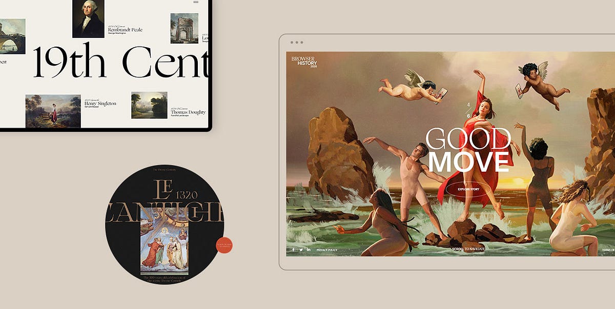
An Exploration of the Renaissance Trend in Web Design
The Renaissance was an all-encompassing movement that flourished in Florence, Italy in the 14th century, in no small part thanks to shifting political, economical, and cultural changes. After the long period of scientific, intellectual, and artistic stagnation better known as the Dark Ages, people were ready for a rebirth, i.e. a renaissance in all aspects of life.One of the most significant things to be reawakened during the Renaissance was culture, in particular art. Rich merchants (as well as the Church) financially supported most works, which were heavily influenced by the ideas of humanism. The humanists considered the ancient world to be the peak of human civilization, and that belief translated onto art.Renaissance works of art often depicted classical gods and mythological creatures. Portraits became popular along with depictions in the nude. Artists wanted to create deep, complex works and realistically display emotions through their paintings and sculptures. Striving for realism, they developed ways to emulate perspective, as well as advanced techniques for recreating natural light and shadow.The Renaissance masterpieces have left an ever-lasting impact on all forms of art and their beauty remains breathtaking to this day. They never cease to amaze, continuing to inspire creatives several centuries later. In fact, implementing Renaissance elements in your work is currently a popular trend in web design.In this article, we would like to take you on a journey to explore just how much the Renaissance has influenced modern media. Some of the projects on our list were inspired by the Middle Ages and Baroque period. The former was the predecessor of the Renaissance, while the latter followed it in the 17th century. These three eras have made a huge impact on all modern forms of art, including contemporary web design, as you will see in the following examples:Le Cantiche 1320Bruegel — Once in a LifetimeGucci MarmontGucci HallucinationKäthe Kollwitz MemorialThe Witcher — NetflixYuto TakahashiLudmilla MauryExpodcast — Centre de Musique Baroque de VersaillesGiampiero BodinoBrowser History 2020 by SquarespaceTypography Principles — Obys AgencyDieu Neo — WebsitePrado MuseumCaravaggio — Art Brutalism UI ConceptHelen Sobiralski — CockaignesqueDominique AgiusChristy Lee RogersAguilar Studio — CaravaggioThierry Bansront — NeoclassicalJosef FischnallerNima Benati — Rubens Dolce & GabannaColdplay — “Viva la Vida”Hold Your Horses — “70 Million”R.E.M. — “Losing My Religion”The Carters — “Apes**it”Joji — “777”Blood Orange — “Benzo”Le Cantiche 1320Le Cantiche 1320 is a website created in honor of the 700th anniversary of Dante’s momentous Divine Comedy, completed in 1320. This work acts as somewhat of a bridge between the Middle Ages and the Renaissance. Dante wrote it predominantly in the Tuscan dialect. At the time, that was a controversial thing to do because Latin was believed to be the only suitable language for literature. Dante’s radical move paved the way for the widespread use of vernacular languages in Renaissance literary works. The Divine Comedy is imbued with religious themes, but Dante made it clear he did not believe enjoying this life and obtaining salvation upon death were two mutually exclusive things. He wanted people to become more involved in political life and considered religion should have nothing to do with politics. These ideas heavily influenced humanists and became widely popular during the Renaissance.The Divine Comedy is considered by many the greatest literary work of all time. The Le Cantiche 1320 website celebrates this masterpiece and is purposefully designed to look like an open book. You can go through it by dragging the cursor left and right or by using the horizontal scroll. The site is divided into five sections which can be navigated using the unobtrusive vertical menu. The pages contain large typography and predominantly full-height images and illustrations depicting Dante’s journey through Hell, Purgatory, and Paradise. The transition and hover effects are highly enjoyable, with pictures and letters often assembling before your eyes. And if you click on the asterisk in the top right corner, again, a book-like, horizontal-scrolling layout will appear, containing memorable verses from the poem.Bruegel — Once in a LifetimeBruegel — Once in a Lifetime is a project created by the Art History Museum in Vienna to mark the 450th anniversary of the death of Pieter Bruegel the Elder — one of the most important representatives of Dutch and Flemish Renaissance painting. This audio-visual and interactive presentation contains some of his most notable works, such as “The Tower of Babel”, “Two Monkeys”, and “Hunters in the Snow”. But what leaves a lasting impression is the first painting we see on the site — “Peasant Wedding”. The characters depicted on it are animated so that they appear to be engaged in a lively conversation. You can hear soft chatter, laughter, the clatter of dishes, and music, all of which instantly transports you to the depicted Renaissance wedding. The site contains a mixture of audio, photo, and video materials, introducing you to this remarkable artist and the way he created his paintings. The designers went far and beyond to highlight Bruegel’s magnificent artistic skills and his great attention to detail. On some highly intricate images, they made certain areas clickable. There are pulsating white dots that on click reveal the story about the selected part of the image while simultaneously zooming in on it, fully immersing you into the depicted scene.Gucci MarmontThe Gucci Marmont website gives us an overview of the famous brand’s Renaissance-style bag collection. The bags are presented as parts of still life paintings that appear to be hung on a gallery wall. While the background on the site is dark, the colors on the paintings are in contrasting rich colors. On scroll, you start to move from one painting to the next, while the chiaroscuro effect, which originated during the Renaissance era, takes on full effect. Once you place your mouse on any of the displayed paintings, the interplay of light and shadow becomes even more prominent.Gucci HallucinationGucci Hallucination introduces us to Gucci’s Spring / Summer 2018 collection through a series of imaginative visuals inspired by the works of Old Masters, i.e. painters who worked in Europe before the 19th century. The famous Renaissance artworks, such as Jan van Eyck’s “The Arnolfini Marriage” and Hieronymus Bosch’s “The Garden of Earthly Delights” were digitally manipulated so that the depicted characters appear to be wearing Gucci clothes and accessories. Aside from these Renaissance paintings, the site contains several other works of Old Masters, placed in a modern setting and brought to life with interesting animation effects. This whimsical website mixes classic art with pop culture, surrealism, utopism, and cutting-edge designs, resulting in an unforgettable showcase of Gucci’s creations.Käthe Kollwitz MemorialThe Käthe Kollwitz Memorial website tells us the story of the life and work of this great German artist. While her artistry is most commonly associated with Expressionism, she was also influenced by early Renaissance art. While you scroll your way through this one-page website, countless scroll-triggered animations, transitions, and interactions will appear. Once you get acquainted with Käthe’s artistry, you will reach the “Let’s Draw” section. As you move the pencil across the virtual board creating your own work of art, you will notice that the strokes reminisce Käthe’s style.The Witcher — NetflixThe Witcher is a medieval fantasy drama on Netflix. Due to the show’s intricate structure, spanning several time periods and often jumping suddenly from one to the other, Netflix released an interactive map, to help viewers better understand where and when each episode occurs. Besides a hand-drawn map, resembling those from the Middle Ages, the creators also added a timeline to make the site easier to navigate. The timeline is marked with important events you can learn more about. The site includes a search bar as well, so you can quickly find information on characters, events, and places of your interest, and connect the dots about the show more easily.Yuto TakahashiYuto Takahashi is a web and graphic designer as well as an art director. His eclectic website oozes Renaissance vibes. The homepage contains a background picture of a woman seemingly submerged under water. The way Takahashi edited that image makes it look as if it were painted by a Renaissance artist. The chiaroscuro effect is in full swing and can be seen in the majority of photos featured on the site. The fonts he used on the pages slightly resemble the “cursiva humanistica”, i.e. the formal style of writing developed by the humanists during the Renaissance era. The scroll-triggered, liquid-like animations add a contemporary touch to the site and make it exciting to explore.Ludmilla MauryLudmilla Maury is a French art director and web designer. Her website is simple, clean, and typography-heavy. The serif fonts look like Renaissance-style cursive letters. They are colored in golden hues, which were often used in Renaissance paintings. Whenever the artists wanted to depict celestial and heavenly settings, they used a golden palette. Even though this is a portfolio site, the previews of Maury’s projects appear only when you hover over their name in the portfolio list. The homepage also contains several illustrations of circles, where the smaller circle lies inside the bigger one. They start to rotate on scroll. During the Renaissance, the circle symbolized perfection, just like it did in Antiquity.Expodcast — Centre de Musique Baroque de VersaillesThe Centre for French baroque music has launched “Expodcast”, a virtual exhibition on French baroque music. The interactive website introduces visitors to the music and musicians of the Royal Chapel, the jewel of the Palace of Versailles. While listening to any of the six featured podcast episodes, it is possible to explore the accompanying photo and video content. That way, you can enjoy the Chapel’s wonderful artworks, which symbolize the beauty and the sumptuousness of the French Baroque, learn about musicians who played for the King, find out how they were paid, and discover many other interesting details.Giampiero BodinoGiampiero Bodino is an artist and a jeweler whose work is heavily influenced by the Renaissance. His website is adorned accordingly, with jewelry showcases accompanied by illustrations of famous antique sculptures, which were popular during the Renaissance era. This is a one-page site, with a timeline displayed in the sidebar. You can use it to instantly skip from one section to the next. Alternatively, you can scroll through the site and enjoy photographic and video showcases of Bodino’s collections.Browser History 2020 by SquarespaceBrowser History 2020 celebrates successful creatives and Squarespace customers who made the most of 2020. The company hired the Spanish artist Ignasi Monreal to create portraits of the selected few in the Renaissance style, a trait his works are famous for. He presented common users as heroes and made them a part of Renaissance settings. You can see them posing as sculptures from antiquity or riding chariots in the style of Greek gods. All this is depicted using the fresco technique, which was popular during the Renaissance era. Each slide contains an “Explore Story” button, inviting you to learn more about the users while Classical music plays in the background. The hidden menu includes direct links to the presentations of all the featured creatives. As you move the cursor from one name to the next, the background color changes accordingly.Typography Principles — Obys AgencyThe Obys Agency created the Typography Principles website to share their tips on typography with users. They opted for scroll navigation, which, in addition to the fun animation and transition effects, helped make the browsing experience smoother and more enjoyable. The site contains four sections, three of which are about fonts and how to use them, and one representing a ‘thank you’ page. The informative and helpful copy is paired with striking and recognizable works of art, including those from the Renaissance era, such as the iconic “Mona Lisa”. Paintings also appear on hover, which is best seen in the hidden menu (images appear while you hover over the links) and in the ‘thank you’ section. When you place the cursor on any letter, that letter will rise higher above others and the painting attached to it will appear on the screen.Dieu NeoDieu Neo is a Behance project created by Rron Berisha. This project celebrates classical art and the works of some of the best-known painters, including Rembrandt, Gilbert Stuart, Charles Baugniet, J. R. Miles, and many others. The site contains information about each artist, a collection of their best-known works, as well as information about exhibitions where their paintings are displayed. The layout is modern and attractive, with just the right amount of text mixed with compelling visuals. Large, serif fonts used in headlines are an excellent match for a website dedicated to art and they further enhance its elegant appeal.Prado MuseumThe Behance project created for the Prado Museum is nothing short of stunning. This art museum located in Madrid, Spain contains a vast collection of European art, in particular Spanish, Italian, and Flemish works. The project introduces you to both the artists and their art pieces through a series of large, often fullscreen images. As for typography, the designers opted for the sleek and elegant combination of serif and sans-serif letters, beautifully complementing the sophisticated vibe of the exhibited paintings. The goal of this project was to enable people to explore the museum’s collection without visiting the place. And what better way to do that than with virtual reality. The designers included a 360° VR simulation of the museum, allowing you to move through the halls and explore the art. There are clickable objects wherever you turn, enabling you to learn more about everything that interests you.Caravaggio — Art Brutalism UI ConceptCaravaggio — Art Brutalism UI Concept is a creative Behance project made by Nikita Resh. It is dedicated to one of the most influential painters of the late 16th and early 17th century — Michelangelo Merisi da Caravaggio. This great artist had the power to vividly and realistically capture human emotions on canvas. He achieved that mostly by playing with the chiaroscuro technique, often taking the contrast between the light and the dark to the extreme. Many people believe that the Renaissance ended and Baroque began when he rose to prominence. Caravaggio is known for introducing tenebrism to painting, a style perfectly complemented by the brutalist vibe of Resh’s project. The designer uses large typefaces and long chunks of texts contrasted by mostly white, grey, or black backgrounds, depending on the color of the letters. This site provides an overview of Caravaggio’s creative oeuvre and is imbued with his masterpieces and details about them. Resh displayed the great artist’s paintings as backgrounds, magazine covers, and as parts of a book on his art, introducing people to Caravaggio in a striking and creative way.Helen Sobiralski — CockaignesqueHelen Sobiralski is a photographer that primarily focuses on fashion photography, portraits, and conceptional stagings. Cockaignesque is her series of pictures about opulence. The title of the project is connected to the word cockaigne, i.e. the name of a medieval mythical place of great luxuries and pleasures. The photos are idiosyncratic, with lots of rich, deep colors. They contain fauna and elements typical of still life paintings, such as vases and fruit. The contrast between light and dark is particularly prominent. With these pictures that look like artworks from the Renaissance and Baroque eras, Sobiralski managed to blur the lines between paintings and photographs.Dominique AgiusDominique Agius is a French photographer and a university teacher. He came up with the idea to pay homage to the Grand Masters of Renaissance and Baroque painting. To that end, he created Vanité — a project that consists of a series of images inspired by these two magnificent eras. Agius’ photos feature recurrent subjects of Renaissance and Baroque art, such as an alchemist (alchemy flourished during the Renaissance, with alchemists reviving the knowledge of the old Greek and Islamic scholars). Some images are a direct nod to several masterpieces, including Georges de la Tour’s “Magdalene with the Smoking Flame” and Caravaggio’s “Supper at Emmaus”. Just like the great painters before him, Agius incorporated the elements of perspective and chiaroscuro into his work. The photographs look rich, intimate, with lighter elements and subjects juxtaposed with dark backgrounds. Vanité is an impressive project that instantly transports you to the compelling art world of several centuries ago.Christy Lee RogersChristy Lee Rogers is a visual artist from Hawaii. She is known for creating Baroque-inspired photographs of subjects submerged underwater. The images look dramatic and suspenseful, as if hand-painted. Christy uses rich, vibrant colors. The refraction of light in water helps her enhance the interplay of dark and light in each shot. Some photos are colored entirely in a golden palette, giving off a Renaissance vibe.Aguilar Studio — CaravaggioAguilar Studio’s Caravaggio project consists of a series of images inspired by the great artist’s work. With the help of models and modern technologies, the studio managed to successfully enact some of Caravaggio’s best-known paintings, including “The Calling of Saint Matthew”, “Supper at Emmaus”, “Saint Jerome Writing”, “The Lute Player”, and several others. The photographs look exciting and the chiaroscuro effect enhances the drama of pictured scenarios.Thierry Bansront — NeoclassicalThierry Bansront’s Neoclassical project is a collection of photographs inspired by Neoclassicism. This cultural movement developed in the second half of the 18th century and it was heavily influenced by classical antiquity, just like the Renaissance was. It also adopted symmetry, harmony, clarity, and proportion, all of which were celebrated during the Renaissance era. Bansront said that his goal was to create “artworks modeled as neoclassical paintings”. He loves that era, and this project was his way of paying homage to it. The shots of models in the nude look clear and harmonious, which are the unmistakable traits of neoclassical art. Bansront experimented with colors and light while using little to no ornaments. He went for simplicity and natural looks, knowing that the use of subtle hues and specific body poses will be enough to make people think of Neoclassicism.Josef FischnallerJosef Fischnaller is a fashion and advertising photographer. His portraits and still-life images are inspired by the works of the Renaissance artists and Old Masters. That is evident in the color palette he’s using, the models’ postures, and overall photo compositions. Fischnaller’s work looks refined and timeless, but almost every photo comes with a modern twist. He often adds contemporary objects to his works, such as pieces of plastic, a toy helicopter, tiny figurines, tissue papers, and many others.Nima Benati — Rubens Dolce & GabannaNima Benati is a photographer that worked on Dolce & Gabanna’s Rubens-inspired project. Peter Paul Rubens was possibly the most important representative of the Flemish Baroque era. His paintings often portrayed great movement, but he was no stranger to erotically depicting his subjects, surrounded by great opulence. Rubens often painted women with fuller bodies, presenting them as symbols of beauty and fertility. That sentiment translates onto Benati’s project, which oozes romantic and tranquil vibes, even on photos that feature male models. Overall, the photographs look elegant and inviting. The pink-ish color palette makes them appear particularly soft and it also helps enhance the models’ femininity.Coldplay — “Viva la Vida”Coldplay’s “Viva la Vida” video was directed by Hype Williams. In it, the band is seen performing in front of Eugène Delacroix’s painting “Liberty Leading the People”. Although Delacroix belonged to the romantic era, his inspiration came from Rubens and the artists of the Venetian Renaissance. “Liberty Leading the People” epitomizes the spirit of the French 1830 revolution. It shows revolutionaries led by a woman personified as Liberty. The song “Viva la Vida” tells the story of the final moments of King Louis XVI, who was the last king of France before the monarchy fell apart during the Revolution. The video itself looks like a painting came to life. The screen resembles a canvas, with all its dents and imperfections. Band members are dressed similar to revolutionaries, with colors and lights matching the style of the painting.Hold Your Horses — “70 Million”“70 Million” is a remarkable video by the band Hold Your Horses, directed by l’Ogre. It is a beautiful ode to art that sees band members enact some of the best-known paintings of all time, including Leonardo da Vinci’s “The Last Supper”, Sandro Botticelli’s “The Birth of Venus”, Rembrandt’s “The Anatomy Lesson of Dr. Nicolaes Tulp”, Michelangelo’s “The Creation of Adam”, Edvard Munch’s “The Scream”, Pablo Picasso’s “Portrait of Dora Maar Seated”, Vincent Van Gogh’s “Sunflowers”, and many others. Every painting reconstruction matches the original to the smallest of details, taking viewers on a beautiful journey through art history.R.E.M. — “Losing My Religion”R.E.M.’s “Losing My Religion” video was directed by Tarsem Singh. The director drew inspiration from Gabriel García Márquez’s short story “A Very Old Man with Enormous Wings”, Andrei Tarkovsky’s film “The Sacrifice”, and Caravaggio’s paintings. Light and dark are beautifully juxtaposed in the video. Some scenes are recreations of Caravaggio’s well-known works, including “The Entombment of Christ” and “The Incredulity of Saint Thomas”. There is also a direct reference to the Renaissance painter Il Sodoma and his famous work “St Sebastien”, as well as scenes with Hindu deities. The director masterfully combined all of these elements into a commanding video that continues to impress viewers even several decades after it was released.The Carters — “Apes**t”In June 2018, Beyoncé and Jay-Z dropped a surprise joint album. “Apes**t” was released as the first single, and the spectacular video for it was filmed in the Louvre. The museum’s outstanding art collection plays a huge role in the video. The opening scene features The Carters standing in front of Leonardo da Vinci’s “Mona Lisa”. Over the course of six minutes, we witness spotless performances of the pair and their dancers before astonishing art pieces, such as “Oath of the Horatii”, “The Consecration of the Emperor Napoleon and the Coronation of Empress Josephine”, “The Intervention of the Sabine Women”, and “Madame Récamier”, all by Jacques-Louis David, then “Pietà” by Rosso Fiorentino, “Portrait of a Black Woman” by Marie-Guillemine Benoist, and many others. The video was directed by Ricky Saiz and is incredibly well-thought-out, addressing modern-day social and political issues, in particular the position of two sexes and people of color in society.Joji — “777”Joji’s beautiful video for “777” was directed by Saad Moosajee. The scenery, costumes, and lighting capture the essence of the Renaissance spirit. 777 is believed to be the angel number, which is why we see creatures of the afterlife and the depiction of Heaven in the video. Joji, Moosajee, and their team created an astounding project that feels like witnessing a remarkable Renaissance painting come to life in the full chiaroscuro effect.Blood Orange — “Benzo”The surreal video for “Benzo” was directed by Blood Orange a.k.a. Dev Hynes himself. It features characters wearing powdered wigs, turtlenecks, gowns, culottes, and elegant jewelry, all typical of the French nobility. Hynes created a gender-bent representation of the French court, in which he is the entertainer who needs to amuse the queen, i.e. Marie Antoinette, who is actually a black man. All other characters are black, too. Playing with the Renaissance aesthetic, Hynes created an imaginative work of art that celebrates black and queer culture.Final ThoughtsThe Renaissance is an important era in human history during which culture and art reached impressive heights. People felt liberated from the confines of the Middle Ages, and art mirrored their newfound sense of freedom. Painters depicted humanist ideals, nature, and still life in a way that continues to inspire artists to this day.The primary focus of our article was to show you how big the Renaissance trend is in modern web design. We also wanted to highlight how Renaissance elements are celebrated through and incorporated into contemporary media, but we couldn’t help but mention works inspired by the Middle Ages and Baroque, as these two eras are so closely tied to the Renaissance.In the end, our artistic adventure showed us that combining the old with the new leads to the creation of distinct, awe-inspiring, and memorable projects. So don’t be scared to experiment in your work and combine seemingly incompatible styles. Play, use art to tell your story and address issues you can relate to, and your work surely won’t go unnoticed.Originally published at https://qodeinteractive.com.An Exploration of the Renaissance Trend in Web Design was originally published in Muzli - Design Inspiration on Medium, where people are continuing the conversation by highlighting and responding to this story.
Web & UI Design With AI: Prototyping at the Speed of Thought
The gap between “client description” and “first visual” has always been the most anxiety-inducing part of web design. What if you could close that gap from days to minutes? What if you could show clients not just wireframes, but styled mockups, before you’ve even decided on a color palette? Welcome to AI-powered web design.
Your Web Design AI Toolkit
Uizard ($12-49/month)
Best for: Transforming sketches/text into wireframes
Magic: Upload a napkin sketch → get a digital wireframe
Diagram (Figma Plugin)
Best for: Generating entire UI sections from text
Prompt: “User profile section with avatar, stats, and edit button”
ChatGPT + Claude (For copy & structure)
Best for: Generating sitemaps, user flows, and UX copy
Example: “Write the microcopy for a SaaS pricing page”
Hostinger AI Website Builder / Framer AI
Best for: Complete site generation from a prompt
Best for: Quick client presentations, not final builds
Galileo AI (Focused on UI generation)
Best for: Generating high-fidelity UI from text descriptions
The Complete AI-Enhanced Web Design Process
Phase 1: Discovery → Instant Sitemap & Content
Instead of starting blank:
Client gives you their goals
Prompt to ChatGPT: “Create a sitemap for a boutique fitness studio website. Include: Home, About, Classes, Pricing, Blog, Contact. Suggest 3 unique page ideas that would differentiate them.”
Get structured outline in seconds
Refine with client immediately
Phase 2: Wireframing → From Text to Layout in Minutes
Old way: Draw 3 wireframe options (2-3 hours)AI way:
Option A (Text to Wireframe):“Wireframe for fitness studio homepage: hero with class schedule CTA, 3 featured classes with images, testimonial section, newsletter signup, footer with contact. Mobile-first design.”Feed to Uizard/Diagram → Get 3 wireframe options in 5 minutes
Option B (Sketch to Wireframe):
Sketch rough layout on paper
Photograph, upload to Uizard
Get cleaned-up digital wireframe
Phase 3: Visual Design → Generating Complete Mockups
Now for the magic. Using your wireframe as guide:
For individual sections:
“Design a testimonial section for a fitness website. Clean, modern, with profile photos, quotes, and star ratings. Use colors: #3A86FF (primary), #1A1A2E (dark), #FFFFFF (light).”
Generate multiple styles, pick best, implement in your design tool.
For complete page mockups:
“High-fidelity mockup of a SaaS dashboard for project management. Include: sidebar navigation, main content area with project timeline, team activity feed, quick stats cards. Dark mode, professional, using IBM Plex Sans.”
Use as inspiration, not final deliverable.
The “AI → Figma/Webflow” Bridge
The key is using AI outputs as starting points:
Screenshot the best AI-generated sections
Drag into Figma as reference images
Build over them with actual components from your design system
Replace AI-generated placeholder content with real copy/images
Result: AI-inspired design with your polish and practicality
Advanced: Generating Complete Design Systems
Step 1: Foundation from prompt
“Create a color palette for a mental wellness app. Calm, trustworthy, accessible. Include primary, secondary, accent, and background colors with hex codes.”
Step 2: Components
“Design a button component system for the above app. Include primary, secondary, ghost, and disabled states. With hover and active states.”
Step 3: Typography scale
“Create a typography scale for the app. Include: h1-h6, body, caption, button text. With appropriate line heights and weights for readability.”
Step 4: Spacing system
“8-point spacing system for the app with examples of usage in cards, padding, and margins.”
All generated in 10 minutes. Refine and implement in 1 hour. Traditional process: Half a day.
Real Client Case: Local Restaurant Website Redesign
Old timeline:
Discovery: 2 hours
Wireframes: 4 hours
Client review/revision: 2 hours
Mockups: 8 hours
Total to first visual: 16 hours over 5 days
AI-enhanced timeline:
Day 1, Hour 1:
ChatGPT: “Write a sitemap and content outline for ‘Mario’s Trattoria’ website”
Get: Home, Menu, About, Reservations, Contact, Gallery structure
Client approves immediately
Day 1, Hour 2:
Uizard: Generate 3 wireframe options from text description
Client picks favorite, suggests tweaks
Revised wireframe ready
Day 1, Hour 3-4:
Generate hero section: “Restaurant website hero with food photography, reservation CTA, warm Italian colors”
Generate menu section: “Interactive menu display with categories, descriptions, prices”
Generate 5 more sections similarly
Day 1, Hour 5:
Assemble best AI elements in Figma
Add real content (from client)
Apply consistent styling
Result: Complete homepage mockup in 5 hours, not 16. Client sees vision immediately.
UX Copy & Microcopy Generation
Often overlooked but crucial:
ChatGPT prompt:
“Write UX microcopy for:
Empty state when no reservations are booked
Success message after booking reservation
Error message when payment fails
Tooltip explaining how to modify booking
Tone: Friendly, helpful, professionalBrand voice: Mario’s Trattoria – family-owned, authentic Italian”
Get 20 pieces of perfect copy in 60 seconds.
Accessibility Testing with AI
Use ChatGPT to audit your designs:
“Review this color combination for accessibility: #3A86FF on #1A1A2E. Provide WCAG contrast ratios and suggestions for improvement.”
“Analyze this form design for accessibility issues. [Describe form]. Suggest improvements for screen readers and keyboard navigation.”
Pricing Your AI-Enhanced Web Design
Value-based pricing factors:
Speed of delivery (clients love quick turnarounds)
More options presented (3 mockups instead of 1)
Included copywriting (traditionally extra)
Custom illustrations/textures (premium feature)
Sample project pricing:
Basic 5-page site (traditional): $3,000-5,000
Same site (AI-enhanced, 50% faster): $2,500-4,000
But: Offer “premium” package with AI custom imagery, copy, etc. for $4,000-6,000
You’re not charging less—you’re delivering more value in less time.
Client Communication Strategy
Initial proposal language:
“Using AI-assisted design tools, I can show you multiple design directions faster than traditional methods. This means we spend less time on early concepts and more time perfecting the final design that converts visitors.”
During presentation:
“This mockup incorporates AI-generated elements that I’ve customized for your brand. The layout was generated from our conversation, then I applied my expertise to ensure usability and brand alignment.”
Your AI Web Design Workflow Cheat Sheet
Brief → Sitemap: ChatGPT in 5 min
Sitemap → Wireframes: Uizard/Diagram in 15 min
Wireframes → Section Concepts: AI image generators, 30 min
Concepts → Mockup: Assemble in Figma/XD, 2-3 hours
Polish & Review: Your expertise, 1-2 hours
Content Generation: ChatGPT for copy, AI for images, 30 min
Total for first mockup: 4-5 hours vs. traditional 8-16
Limitations & When NOT to Use AI
Avoid AI for:
Final, pixel-perfect production files
Complex interactions (animations, advanced states)
ADA compliance (use as helper, not validator)
Replacing user research/testing
Best uses:
Ideation and concepting
Generating starting points
Creating presentation materials
Rapid iteration based on feedback
Action Steps
Redesign your own portfolio homepage using this AI workflow
Create a “UI section prompt library” for common elements (headers, footers, cards, forms)
Practice the “AI → Figma” bridge on a dummy project
Update your web design service description to include AI capabilities
You’re not becoming an “AI web designer.” You’re becoming a strategic designer who uses every available tool to deliver better results faster. The AI generates possibilities; your expertise makes them real.
The post Web & UI Design With AI: Prototyping at the Speed of Thought appeared first on Designer Daily: graphic and web design blog.
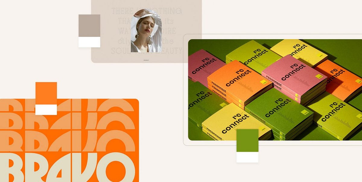
Designers’ Pick: Top Color Trends to Inspire You in 2022
Pinpointing, let alone predicting the design trends has become notoriously hard in this day and age when things move, shift and transform at warp speed. What’s in today might be totally out as soon as next month, and color trends can be particularly tricky as they tend to move with seasons and to follow current events which are, by their nature, unpredictable. Still, some things tend to stick more than others and to mark the defining trends.We already wrote extensively about the top web design trends for the year, focusing perhaps more on the UX side of things, on animation and interactivity, on website architecture as a whole. This time around we want to welcome the warmer weather with an exploration of some of the color trends that we noticed not just in web design but also in fashion, furniture and home decor, and perhaps give our readers a few chromatic hints for the rest of the year.Our very own Marijana Obradovic, the author of the stunning Solene and Konsept themes, is a keen observer and researcher of the design comings and goings, and she came up with these color trends for 2022:It’s All About the NeutralsFor the Love of GreenOrange CrushWhen Orange Meets GreenBurgundy, the KingIt’s All About the NeutralsCream, warm beige, cold beige, cream gray, gray cream, macchiato, pampas, marble, powder, ivory, nude, taupe, hazel…You name it — you’ll find it in 2022, in the streets, in the shop windows, in furniture and home decor and, yes, in web design, too. The spectrum between the lightest cream and the deep, brownish hues, with tints of red, pink, blue and even green, is marking this year’s trends and we can see it paired with other neutrals or with more saturated, louder colors.Julia Derevianko for Gotoinc proposes an eCommerce layout for a jewelry store that uses an off-white, creamy background to create an elegant backdrop for the featured photographs and jewelry pieces. Julia combines several complementary hues, from Carrara to Pampas, in a color scheme that provides breathability but at the same time adds depth and even some degree of quiet intensity.Alexandra Holodnaya made excellent use of a soft, warm beige with a hint of pink in her project for a magic and esotery shop and online learning platform Golden Venum. She skillfully alternates backgrounds in this gorgeous layout between light tones and black ones, creating an exciting tension of elements held together by the lovely old gold typography.We spot a similar chromatic inspiration in the Modern Font Bundle by New Tropical Design, where the warm cream tone is paired with burgundy (which we’re going to touch upon later on in this article), as well as a deep, atmospheric orange and a dark mossy green.While the colors from the beige and cream part of the spectrum work wonderfully when paired with more intense, vivid colors, it’s also worth mentioning they can look amazing in beige-on-beige sets or combinations of beige with colors just a hue away. A terrific example of this combination, which is definitely a 2022 trend we’re seeing a lot, is the creative visualization project that Notoo Studio did for 41zero42, specifically for their Superclassica series of floor and wall tiles.Another color that looks and works amazingly well when paired with, well, basically itself, is the warm gray. Alina Gaan explored this concept in her jewelry website project Juff, proposing a look that basically sports no contrast at all, and yet manages to work just fine for a website layout.But enough with the neutrals, let’s move on to louder trends for this year.For the Love of GreenGreen is another definitive trend for this year and it comes in all possible variants — from earthy and muddy deep greens to vibrant grass tones and, of course, neons.Marlow, the minimalist branding mockup scene creator by Moyo Studio, is heavily based on grays in various tones, mostly on the colder side of the range. The project includes several adjacent colors that complement the grays and give them depth and character, most notably the wonderful, elegant dark olive green, as well as browns with a significant portion of green component to them.Semi Permanent Hotel by Highsnobriety was a short-term takeover of the Paramount House Hotel in Sydney, featuring a range of artists, musicians, designers and other creators. The website for the project is based on the monochromatic layout with colorful, intense imagery and interface details in a lovely shade of bright green with a touch of cyan. The green is used for the favicon, the pagination bullets, select typography as well as for selected (or hovered) areas of the 3D model representing the hotel. This quite moderate addition of color breaks up the monochromatic interface without hampering its character, and the choice of green adds vitality and energy to the mood.Ogeh Ezeonu opted for a green on green combination for her website, using a very, very dark forest green as the background color (in some parts of the page it comes in form of gradient, too) and a lighter, brighter leaf green for select interface details, such as the boxed sections with links and button outlines. This way, she created a gorgeously balanced atmosphere that packs a lot of character without being too loud or bold.The Dutch brand development and design studio Maibru did a similar thing with incorporating a refreshing green shade to its website in form of various interface details — for instance, the menu items (indicating the current location, as well as color change on hover), language and mode switcher, cursor and navigation, and so on. The same green color is used for both the light and the dark mode, and it looks great in both instances, bringing vibrance and joy to a muted layout.A brand we already wrote about in our piece on innovative footer design, the furniture manufacturer Sol’ace opted for an interesting brownish green (or greenish brown?) as the background for some of the page sections, combined with a lovely warm gray. A fitting choice for a brand with a strong focus on natural materials and sustainable manufacturing practices.But muted, pastel and earthy greens are not the only ones marking this year’s color trends — in fact, we’re seeing a lot (and really, a lot) of super-vibrant greens, electric greens and neons.For instance, the Chinese Reesaw Studio incorporated a lot of bold, vibrant colors in their branding project for GLZ Super Park, with the neon lime green as the main color featured in the logos, packaging, even the accompanying materials such as masks, duct tapes and so on.The designer and art director Stas Bondar chose an interesting and vibrant shade of green (with a lot of yellow to it) for his online portfolio, available in two modes: “casual” (black background with green details) and “fancy,” in which the said color is used for the background and combined with black interface elements. It’s interesting that the same color assumes different characters depending on the mode — in the “casual” mode, the dark background makes it appear more yellow, while in the light “fancy” mode it is definitely more green.Finally, let’s not forget one of the loveliest green shades — the mint green. The digital production studio 9P featured this color in various interface details (the oversized cursor, the buttons, the logo and menu items, to name a few) on their website, coupled with the black background for a striking and modern contrast, and they also used it for one end of the gradient for the hero text.Orange CrushAs a color that communicates joy, optimism, warmth and fun, it’s no wonder that orange is going to be a massive trend in 2022, a year when the world finally seems to take a break (hopefully permanent!) from the pandemic. From couture to streetwear, web design and even product design, various hues of this fantastic color can be seen everywhere.Tiare Payano incorporated a neon carrot orange into the palette for the brand identity project for Silkaen, a natural skincare brand. Payano paired it with different shades of red, burnt sienna, deep pink and other warm colors, creating a balanced, feminine and elegant palette.Design for the Gesture issue of the Sociotype Journal also features a lot of orange, albeit in a more toned-down variant. This particular brick orange works great on paper, as it complements the paper texture and gives the overall design a warm, deep character.Moving on to louder, bolder tones, the design for the Bravo Musique music and artist label features a stunning, somewhat vintage range of oranges, from the classic safety orange to hibiscus and royal orange.The visual identity for the Still Young interior design company by Low Key Design pairs an intense orange, almost a cinnabar, with a grayscale palette in an exciting, elaborate design concept based around the “law of three.” The entire visual system revolves around the numbers 3, 6 and 9, and the orange serves as the third chromatic element in the palette (in addition to the white and black that basically constitute the grayscale), sustaining the concept but also bringing a welcome contrast and dynamics to the design.The website and redesign concept for the restaurant Máirtain by Daria Shakula features an elegant, mostly monochromatic palette skilfully broken up by a vivid pumpkin orange used for a few select interface details, the footer and the fullscreen menu. Paired with the orange in some of the featured imagery, this particular use of color reinforces the brand identity and gives it a strong, well-built character, freshens up the concept and brings vitality without appearing vulgar or loud.Finally, here’s a layout that celebrates the power of orange in all its glory: the web design for the packaging-free grocery store in Los Angeles, re_grocery, uses an orangish red, or a reddish orange, for basically all interface elements, from title and paragraph typography to buttons, from navigation elements to the footer, which is entirely orange. It was a risky choice but one definitely worth making, as the result is a flattering, modern and engaging design that we can only assume does wonders for the company’s business bottom line.When Orange Meets GreenIf this combination reminds you of a clown suit, think again. Depending on the particular hues used in the palette, the orange and green combo can actually be quite sophisticated and convey a sense of opulent elegance. Let’s take a look.The UI Kit for Figma by Alexsander Barhon proposes modules for building web pages, with imagery that features small yet striking details in a lovely muted orange, combined with deep moss green, olive and mud, creating a wonderful sense of warmth and depth.Tiare Payano did a similar thing combining deep oranges and greens on a dark background for Nancy, a family-owned cafe in the Dominican Republic. The palette is based around deep, warm, earthy hues such as orange, terracotta and brick, combined with a dark green that seems to have a touch of warmth to itself, too — or perhaps it’s the oranges and pinks that bring that quality in the otherwise cold color.The green and orange combination works well in brighter tones with a bit of a pastel character, too, as evident from the Vestre Inspiration Book 2022. In this project, we get to feast our eyes on wonderful pairings, such as true orange and grass green, but also yellow and purple. These combinations are based on the principle of complementary colors, and as such they aim to create an intense and dynamic effect, but thanks to the careful selection of particular tones and textures, they also appear quite soothing and pleasant.Green smoke, apricot orange and a range of light pinks and warm grays dominate the palette of the Absolution Cosmetics website, where the orange and green work as particular accents and can even be considered chromatic leitmotifs of the layout, even though they appear very sporadically on the pages. The dynamics between these two add much needed intensity to the light, airy layouts.The brand identity project for Lande Architects includes a wonderful palette of muted greens, warm earthy tones and siennas, combined with a vibrant yellow with plenty of orange hints to it. The stationery and the calling cards are printed on a heavily textured paper with relief typography, which, combined with the colors, gives the project a distinct organic character.Finally, while not exactly focused on the interplay between green and orange in particular, the website of the oil and salsa manufacturer Frantoio Cavalli does play around with the two, by juxtaposing the delicate greens of oils with warm orange, yellow and red hues from salsas, both in featured imagery and in product packaging.Burgundy, the KingTimeless and sophisticated, burgundy appears to finally be making a comeback — and long overdue, if we dare say. This elegant color, traditionally associated with wealth, opulence and royalty, is actually an extremely versatile pairing color for palettes and combinations that require contrast, depth and warmth.Being a dark, intense color, in web design burgundy is best if used for details or select sections, like Sloane Street did on their homepage. This choice of color adds a touch of class to the design, pairs wonderfully with the rest of the palette and the page’s white space, and even communicates with the imagery on the page.La Maison Plisson, on the other hand, opted for a very subtle use of burgundy, applying it to the button outlines, underlines, some of the typography and the wine glass icon, completing the brand narrative that revolves around exquisite gastronomy, the finest ingredients and the best wines. It may be an obvious choice, but it is done with such good measure and taste it actually works perfectly.Burgundy can also be a fitting choice for various technology and industry niches, as well as for finance, which are often plagued by quite pedestrian blues, grays and plain reds. The brand strategy and visual identity for Refactor Capital by the Play Studio features a striking rusty red which, in combination with a deep grayish blue and plain white, creates a firm, stable palette that communicates professionalism and expertise.The gorgeous branding project that supports female entrepreneurship, Wo’men Entrepreneurs by Ben&Jo bases the palette around a dark green, with color accents in yellow, teal and pink. This combination is supported by a lovely warm burgundy in a slightly lighter variant, used as the backdrop in the project imagery, giving it depth and warmth.Something similar was done in the visual identity project for Périples, where a stunning deep teal was used as the main background color, combined with a range of muted warm tones, including burgundy, which adds contrast and warmth, as well as a hint of vintage character.Wrapping It UpSoothing cream, beige and gray, exciting orange and optimistic green, topped by the royal burgundy — it’s clear that this year’s color trends do not follow a strict, cohesive narrative but rather aim to expand the reach of chromatic potential through contextualisation. We hope that the wonderful examples featured in this article will inspire you and give you some fresh ideas for your future projects. If you have a color you feel might mark the current year, don’t hesitate to share it with us in the comments section.Designers’ Pick: Top Color Trends to Inspire You in 2022 was originally published in Muzli - Design Inspiration on Medium, where people are continuing the conversation by highlighting and responding to this story.

Design System Examples
Design systems are structured on three key points: design, code, and documentation. This article compiles documentation-related examples.Last update: 29.08.2022Design systems are becoming increasingly prevalent every day. As a designer who has focused on design system development processes in recent years and enjoys working in-depth on this topic, I have come across various open-source design systems while conducting research. I had the opportunity to examine how these systems approach and solve problems. You are already researching other design systems if you are an active participant in design system development processes, especially if you add a new component to the system based on requirements or attempt to develop a systematic solution to an existing problem. Researching, analyzing, and learning how these systems approach similar problems to become daily tasks.Every design system is developed in a structured manner to ensure the integrity of the rules. It is possible to learn alternative sustainability practices by looking at the system and comprehending the underlying causes of the systematic approach. You can incorporate these practices into your own development procedures. So you can gain access to priceless solution awareness! That’s why every “Aha!” is so profound. You can consider yourself fortunate. Yes, you are fortunate, as it also indicates that you are gaining new knowledge. The design systems that I have compiled in this article through a process of “digital curation,” as well as a significant number of others that I have not yet seen examined, have thankfully taken their places as open source on the internet. Salute to open source!You can experience solution practices in full transparency with publicly accessible design systems. However, some design systems may limit access for privacy and business reasons. On the other hand, some design systems have a strict user-access policy.While developing a design system, you should systematically adopt ready to use solutions with all the assets that are based on the design methodologies approaches. While the infrastructure work on how to code these solutions and how to offer them as a service progresses, there is also the production of “documentation” on how this information can be consumed by the designer, developer, and all other stakeholders — namely the users — who will use the system in the production cycle. Nevertheless, this calls for more work.In terms of documentation, you can get ideas from the examples I’ve given. Each of them has a structure that combines its own target users, production technologies, and products.I hope you find it helpful and stimulating!If you wish to gain a thorough understanding of what the design system entails, I suggest you read the following article…Design SystemContent-related design systems are those that I’ve had the opportunity to examine. I will revise this article accordingly as I evaluate new systems over time. So, stay tuned… If you wish to include a design system in this article, I would appreciate it if you would share it with me.1. Material DesignMaterial DesignGoogle’s Material design system is the first thing that comes to mind when discussing design systems. This long-standing design system has been in our lives for years as an open source to develop Google’s own ecosystem. It has set a precedent for many frameworks, particularly with its overall design philosophy. Currently, the Material You (V3) transition is ongoing.2. The GuardianThe Guardian digital design style guideThe design system documentation style of The Guardian, a British daily newspaper, is also notable.3. Momentum Design SystemMomentum DesignIt creates a shared design language for all Webex products using the Cisco Momentum design system.4. GrommetGrommetYou can streamline app development and create responsive, accessible mobile-oriented web projects with a simple component library by using the Grommet design system.5. Solar Design SystemSolar design systemBulb, an energy supply company with a solar design system, offers consistent experiences.6. Carbon Design SystemCarbon Design SystemThe Carbon design system, the sole building block of the IBM ecosystem, is a design system emerged from its design philosophy. It distinguishes itself from other examples with its 2x grid structure and unique infrastructure.7. Fish Tank Design SystemFish Tank Design SystemFish Tank, Bloomberg BNA’s design system, is a collection of essential styles and reusable components that power the digital product family.8. Help Scout Brand GuidelinesHelp Scout Brand GuidelinesHelp Scout, a help desk software provider, stands out by its design system documentation style.9. BBC GELHomepageThe BBC’s design system, Global Experience Language, bridges the gap between users and technology. It stands out as a design system with particularly abundant cultural resources.10. Goldman Sachs DesignHome - Goldman Sachs DesignThe design system of Goldman Sachs, which is a multinational investment institution, tailor-made for corporate finance, and enables teams to develop digital products.11. Fluent Design SystemMicrosoft DesignIt is Microsoft’s open-source design system for creating consistent cross-platform product experiences. The Fluent design system simplifies the lives of designers and developers who work in the Microsoft ecosystem.12. Clarity Design SystemClarity Design SystemThe Clarity design system, which enables rapid prototyping-to-product development, gives the VMware product line a solid foundation and attracts attention with its Angular infrastructure.13. Ant DesignAnt Design - The world's second most popular React UI frameworkAnt Design allows you make effective corporate interfaces, especially for desktop software. This opens the door to creating an efficient and enjoyable work experience.14. CookbookCookbookThe ecosystem of Yelp’ is dependent on the Cookbook design system.15. MongoDBLeafyGreen - MongoDB Design SystemIt is MongoDB’s design system.16. Blocks Design SystemBlocks by CBRE BuildIt is the design system of CBRE, a commercial real estate services and investment company.17. Atlassian Design SystemAtlassian Design SystemAtlassian, as one example that always comes to mind when discussing design systems, offers its users perfect consistency and experience across applications as a result of the design system developed for its own product line.18. Biings Design SystemBiings Design SystemThe Biings design system is a set of assets and rules for creating uniform user experiences across its products.19. LexiconLiferay Lexicon | An Experience Language for Crafting Beautiful UIThe Lexicon design system is the design language that provides a common interface framework for the entire Liferay product ecosystem components.20. Lightning Design SystemLightning Design SystemSalesforce’s Lightning design system, a classic among design system examples, attracts attention with its comprehensive design philosophy and approach documentation. I highly recommend that you investigate the motion system Kinetik.21. Repsol Digital SystemRepsol Digital SystemThe design system of the Spanish oil and gas company Repsol.22. Pajamas Design SystemPajamas Design SystemThe Pajamas design system of GitLab, a DevOps platform, contains all materials and guidelines for its ecosystem’s requirements.23. The Beeline Design SystemThe Beeline Design SystemThe Beeline design system sets design standards that can be applied to the creation of Beeline products.24. The QuickBooks Design SystemQuickBooks Design System - Design success starts hereQuickBooks’s design system, which is part of the Intuit product line, builds intelligent online accounting software for small businesses on a foundation of sustainability.25. Infor DesignInfor DesignWith the help of tools, components, and rules, Infor Design, which is part of Infor, a company that makes enterprise resource planning (ERP) solutions, makes it possible to create great brand experiences.26. Rivet Design SystemRivet Design System - Indiana UniversityIndiana University offers its users sustainable and consistent experiences with the Rivet design system, which is one of the good examples of how the design system can be extended to other institutions or organizations.27. Fiori Design GuidelinesSAP Fiori Design GuidelinesSAP, an application used for years, creates a system that brings great user experience to its corporate applications with Fiori design system.28. Giffgaff Designgiffgaff designThe design system of giffgaff, a GSM company, attracts attention in the world of design systems, particularly for its interface design characteristics.29. Audi Design SystemRedefining ProgressThe Audi CI Portal provides guidelines for developing brand-consistent interactions.30. Shopify PolarisShopify PolarisShopify offers complete solutions for an online store. It gives its customers the tools, assets, and infrastructure they need to make their own stores using the Polaris design system in a simple way. The information in the application design guidelines section is particularly impressive.31. Human Interface GuidelinesHuman Interface GuidelinesThe Human Interface Guidelines, the design system that ensures perfect compatibility across all platforms in Apple’s ecosystem, offer simple and easily implementable infrastructure solutions with their assets and primitive components. It has a long history that sets it apart from its competitors, and its structure is always being updated as technology changes.32. Primer Design SystemPrimer Design SystemThe Primer design system is an excellent good fit for GitHub’s ecosystem, given its user base.33. SpectrumSpectrum, Adobe's design systemSpectrum is an Adobe design system that has parts and tools that will help product teams work more efficiently and make Adobe applications more compatible with each other.34. U.S. Web Design System (USWDS)USWDS: The United States Web Design SystemThe USWDS design system, which is one of the best examples of design systems created for government-run services, ensures consistency in digital services through its instructions and components.35. SolidWTF is Solid?BuzFeed’s solid design system provides a solid foundation for the user experience.36. Pulse.pulsePulse, the design system of Heartbeat Agency, is distinguished by its documentation style.37. AXA Design SystemAXA Design System WebsiteAXA is a multinational company that focuses on investments, pensions, and insurance. Its design system offers users an international experience that fits with what it does.38. CanvasCanvas Design SystemHubSpot, a company that develops software products for marketing, sales, and customer service, utilizes the Canvas design system to ensure the consistency of its services.39. EvergreenEvergreenEvergreen is the design system that develops Segment’s product experiences.40. Heroku DesignHeroku DesignHeroku, a cloud-based platform service, employs Purple3 for its product design frameworks and Shibori3 for its marketing design frameworks.41. Latitude DesignLatitude Design SystemFlexport’s Latitude design system focuses on supply chain management and logistics, including design guidelines, component documentation, and all other interfacing resources.42. LunaLunaThe Luna design system combines guidelines, tools, and documentation to facilitate the development of immersive experiences for any Sainsbury’s brand.43. MarvelStyleguide - MarvelMarvel Style guide is the design system for rapid prototyping, testing, and handoff management for design teams utilized by the Marvel application. It stands out for its minimal design.44. PatternFlyPatternFly 4PatternFly is an open-source design system created to promote uniformity and teamwork.45. Mozilla ProtocolMozilla ProtocolThe Mozilla Protocol is a design system for Firefox and Mozilla websites. It develops a standardized design language and provides reusable coded components. It includes high-level content and accessibility guidelines.46. Swarm Design SystemSwarm Design SystemMeetup, a social networking application that facilitates in-person group gatherings, utilizes the Swarm design system.47. ThumbprintThumbprintThumbprint is the design system of the American home services company Thumbtack.48. Hudl DesignHudl DesignUnique documentation structure attracts attention to Hudl’s design system, which offers analysis tools to improve the performance of athletes.49. Workday Canvas Design SystemHomeWorkday is a company that develops solutions for the management of finances, human resources, planning, and expenditures. It provides the infrastructure of the Canvas design system to its clients.50. Zendesk GardenZendesk GardenGarden becomes a source of tools and standards when creating Zendesk products.51. GOV.UK Design SystemHomeThe United Kingdom is aligning its government services with the GOV.UK design system. Another excellent example of design systems developed for government services.52. Cedar Design SystemCedar Design System | REI Co-opThe design system of REI provides outdoor brands, equipment, apparel, and products.53. Digital.NSWHome | Digital.NSWIt is the design system of the NSW government.54. Orbit Design SystemOrbit design systemIt is the KIWI design system, a provider of online travel technology.55. StacksStacksStacks provide users with all the tools they require to quickly design and develop standardized experiences across Stack Overflow.56. Wanda Design SystemWanda Design SystemWanda is a design system developed to make using Wonderflow’s digital products a complete and enjoyable experience.57. Finastra Design SystemFinastra design systemFinastra is a financial software company. It accelerates the development of financial applications by providing its users with open-source application templates and sample applications.58. Duet Design SystemDuet Design SystemThe Duet design system provides an organized set of tools, models, and applications that serve as the foundation for the digital products LocalTapiola and Turva.59. SeedsSeedsThe Seeds design system houses all the tools and resources necessary to comprehend the Sprout brand, express it creatively, and inspire meaningful customer experiences.60. Mixpanel Design SystemMixpanel Design SystemIt is the design system of Mixpanel, a business analytics service.61. BaristaBarista - the Dynatrace design system.As a coffee enthusiast, the Barista design system, which bases documentation on a beautiful concept, is the design system of the global technology company Dynatrace.62. BlackpackBackpack - Skyscanner's Design SystemBlackpack is a design system composed of design resources, reusable components, and construction guidelines for Skyscanner products.63. It Design SystemHomeIt is the official design system of Italy, and it includes sustainable solutions for official national and government institutions.64. Mailchimp Pattern LibraryColorThe design system of the marketing automation platform and email marketing service Mailchimp comes to mind as an example of a design system.Having reached the conclusion of the examples, I would like to add a few design system-related remarks:Dear developer friends;The design system is not just for designers. It exists to make your life easier during the production cycle and to assist you in writing code that is simpler and more efficient. Not only is it necessary to code the designs presented in the product development processes, but also to internalize the flow designs and comprehend the underlying cause-and-effect relationship…Dear designer friends;A design system is more than just a collection of user interface styles. It is insufficient to learn the function of each component while applying only interface designs. It is necessary to comprehend the anatomical properties of the components as well as the micro and macro methods of systematic use in order to design experiences that are more systematic.Other stakeholders who will use the design system;The design system is an investment in your product! You will understand it better as time passes and as you utilize it. Start thinking about your design system immediately, especially if you’re developing products in multiple teams without a design system. As demonstrated by numerous examples, the vast majority of those are already available as open source. Don’t forget that as your product evolves and expands, the design system will make every stage of your development processes more sustainable, consistent, scalable, and effective.If you enjoyed this article, applause or sharing may help it reach a wider audience; thank you for your support!As a person eager to learn constantly and likes to share knowledge, you can check out my other articles here. Also, you can reach me out via LinkedIn.Design System Examples was originally published in Muzli - Design Inspiration on Medium, where people are continuing the conversation by highlighting and responding to this story.

How to Make an Eye-Catching Hero Image That Makes Your Website Stand Out From the Crowd?
If you’re looking to make your website stand out from the crowd and capture the attention of your visitors, then a great hero image can help you do just that. Also known as banner images or sticky headers, hero images are large graphical elements placed at the top of a web page or within the header section. Not only do they look visually appealing, but they also help convey your message in an interesting and engaging manner. In this article, we’ll take a look at what makes a hero image so effective and how you can create one for yourself.What Is a Hero Image?A hero image is typically a large graphical element that takes up a significant portion of the screen when displayed on your website. It’s often placed at the top of a web page within the header area, and its role is to capture the attention of your visitors and engagingly convey your website’s message.Website hero image exampleSimply put, it’s designed to attract the eye and make your website stand out from the crowd. And since people tend to scan websites rather than reading them word-for-word, hero images are typically used as an introduction or summary of what a web page is about.In addition to capturing the attention of your site visitors, hero images can be a great way to showcase products or services. They can also be used as a visual call-to-action (CTA) button or link that directs users to another part of your website.Why Are Hero Images Important?They might seem like simple graphical elements at first glance, but there are several different reasons why they’re so crucial for your website:1. They help engage visitors and keep them on your site longer:As mentioned previously, visitors typically scan websites rather than read them in detail. What’s more, they’re only willing to stay on a website for 15–20 seconds before deciding whether or not it’s worth their time and attention.Hero images help draw visitors into the content they visit and keep them engaged, thereby improving your site’s overall conversion rate. In fact, research has shown that simply adding a large banner image can boost conversion rates by as much as 27% compared to non-hero image sites.2. They tell your brand story:While you probably have an elevator pitch about who you are and what your business does, telling this story visually is much more effective than doing so through text alone. By using visual storytelling through hero images, you can engage your visitors’ emotions and feelings, which helps them remember your brand better.3. They make the most of limited real estate:With users having less patience than ever before, it’s critically important to use every last bit of space on your website wisely. And since hero images are typically placed at the top of a page and take up a large amount of screen estate, they’re an effective way to get more value out of the small spaces you have available for content on each web page.4. They can be used as CTAs:Not only do hero images help explain what your business is about and increase conversions by keeping people on your site longer, but many businesses also use them as visual CTAs that encourage people to click through to other pages and learn more about your products or services. This not only helps you capture leads but also exposes them to additional content on your website, which can help increase brand awareness and loyalty over time.Benefits of Using Hero Images on Your WebsiteAny website owner will tell you that their main goal is to attract visitors and engage them with the content on their site. That’s where hero images come into play, as they can help you achieve those goals by creating an eye-catching visual element that draws attention to your website and encourages visitors to explore your content further. Some of the other benefits of using hero images include:Add visual appeal and interestOne of the main advantages of using a hero image is that it adds visual interest to your website. By incorporating stunning graphics or beautiful photographs in your design, you can make your site more visually appealing and engaging for visitors. This can be especially effective if you’re aiming to provide information about a new product or service that might otherwise seem boring or mundane.Promote brand identity and recognitionA strong image helps your website stand out from other competitors by promoting your unique brand identity and increasing visitor recognition. When people see a familiar logo, color scheme, typeface, or other graphical elements on another website or in print, they are more likely to remember your brand and become loyal customers.Increase conversion ratesA recent study found that using high-impact visual elements like hero images can increase conversions by up to 85%. This is because a well-designed image draws the eye and focuses attention on the main message or call to action, which encourages visitors to take the desired action.Let you share information quickly and easilyInformation conveyed through an image can often be understood much faster than text. In fact, studies show that people can process what’s in a picture in as little as 13 milliseconds! Therefore, when used properly, a hero image can help you quickly communicate important information about your product or service with minimal effort from site visitors.Best Hero Images Types and ExamplesStatistics show that users focus 80% of their attention at the top of the page and mostly scroll through the rest of the content. This is why it’s essential to be able to grab your target audience’s attention as quickly as possible during this stage. A well-chosen hero image should be visually appealing and help boost conversions, which can result in increased revenue and more happy customers. We’ll use some real-life examples of popular and successful companies to show you what types of hero images work best and how you can apply them to your own website or blog in order to make it stand out from the crowd.1) Hero images using photoOne of the most popular types of hero images is one that uses photo manipulation to convey the message and theme of the website. These are usually very creative and visually appealing, which helps catch people’s attention right away.Images on the hero imageLet’s look at one of our Gapsy studio designer’s projects. Just look at how we incorporated photos into the site. We have chosen a photo of a plantation for the MyLagro project where farmers can sell their crops. This photo helps to portray a warm and inviting impression on the site. Such a photo adds an authentic touch to the page. Lastly, we have placed several photos of different types of crops around the website to emphasize the variety and freshness that customers can expect when they purchase from MyLagro.2) Hero images with product pictureAnother type of hero images that are very effective is one that uses a product picture to create a sense of urgency, especially when there’s limited stock available for purchase. Apple does this very well on their products page.This image allows users to quickly see which products are available and how many units are left. There’s also a prominent “Buy” button placed right above to the product picture, which makes it very easy for people to purchase immediately.Product picture on the hero image3) Hero images that push emotionsAnother way to capture attention is by using a hero image that conveys emotion or tells a story. This can help people connect with your website on an emotional level and inspire them to take action, whether it’s purchasing a product or subscribing to your newsletter in order to receive more information about your latest offers. CoulCreative does this really well with their hero image:How to push emotion with hero imageThe visual of laughing people very uplifting and makes you want to learn more about the website and its services. It’s a great way to make people feel happy, which can also inspire them to get involved with the cause. In addition, the UI design colors choice is very relaxing and helps create a welcoming atmosphere for visitors.4) Behind the Scenes Hero imagesFinally, another way to use a hero image is by giving people an “inside look” or showing them what they might miss out on if they don’t sign up or make a purchase. This can work especially well if you’re offering exclusive access to your website or product, such as Company Arrival does with its hero image. They used a video as a hero image about the British electric vehicle manufacturer. This is a great way to inspire people to learn more about your website and how they can benefit from it.Behind the scenes on the hero image5) Hero-images with CTAAnother effective way to use hero images is by including a call-to-action (CTA) within your image.Hero image that uses CTAFor example Veloretti company which sells bicycles. Their hero image with CTA allows you to go straight to the details of the models and make a successful purchase. This helps create an expectation that people will be able to find these products on the website, which can help boost your conversion rates and increase sales.6) Multiple hero-imagesAnother effective way to use hero images is by using multiple images throughout your website. Maserati’s website does this really well with their homepage, as they use different hero images to highlight different aspects of their business and products. This helps create a sense of variety and keeps users engaged as they scroll down the page and explore all the different product lines.Hero with multiple images7) Hero-images that outline company benefitsTo really grab people’s attention and encourage them to explore your website, you can also use a hero image to outline some of the key benefits that your products or services offer. This can be especially effective if you have a well-known brand or sell high-quality products that are in demand.Hero image that outlines company’s advantagesFor example, Apeel company plant-based protection that helps the produce you love stay fresh for longer.This can help inspire trust in potential customers and encourage them to explore your website further.Overall, there are many different ways you can use hero images to capture attention and engage visitors on your website. Whether you’re highlighting a new product or service, showing behind-the-scenes footage, or simply using multiple images throughout your site, hero images can be an effective way to engage visitors and encourage them to stay on your website longer. By experimenting with various types of hero images and utilizing the tips above, you can create a more engaging and eye-catching website that helps you stand out from the crowd and increase your conversion rates.Tips on How to Create the Right Hero Images for a WebsiteIf you’re looking to create hero images for your website, here are a few tips and tricks to help you get started:1. Focus on qualityThe most important factor in creating effective hero images is focusing on quality. This means using high-resolution photos or videos that are crisp and clear so that they really stand out and grab people’s attention. You may even want to work with a professional photographer or video producer to create high-quality hero images that really make an impact.2. Consider your target audience and their needs when choosing imagesIt’s also important to think about your target audience and their needs when creating hero images for your website. For example, if you’re trying to sell a new product or service, you may want to include hero images that highlight the key features and benefits of your offering. Or if you’re trying to build trust with potential customers, you may want to focus on showing behind-the-scenes footage or highlighting customer testimonials in your hero images.3. Experiment with different types of hero imagesFinally, be sure to experiment with different types of hero images and see what resonates most with your audience. You may want to start by using a single top-quality image that takes up the entire screen, but you can also try using multiple smaller images throughout your website or even videos for an added touch of impact. By testing out different types of hero images, you can find the ones that work best for your website and increase engagement with visitors.4. Keep your branding in mindWhen creating hero images for your website, it’s also important to keep your branding in mind and make sure that the images are consistent with your overall look and feel. This means using similar fonts, colors, and styling throughout all of your photos or videos so that they create a cohesive visual experience for visitors on your site.5.Improve conversion rate by adding CTA elementsAnother way to improve the effectiveness of your hero images is by including CTA elements such as buttons or text prompts that encourage visitors to take a specific action. By prompting visitors to sign up for an email list, download an ebook, or make a purchase directly from your hero image, you can increase conversion rates and boost engagement with your website. Overall, if you want to create eye-catching hero images that really stand out and grab attention on your website, there are many different tips and tricks you can try. By focusing on quality, considering your audience’s needs, experimenting with various types of images, and keeping branding in mind, you can create expertly-designed hero images that engage visitors and help your website stand out from the crowd.6.Optimize the image for different screen sizesOne final tip to keep in mind when creating hero images for your website is that you should optimize the image for different screen sizes. This means using high-resolution photos or videos no matter what type of device or screen size your visitors are using, so that they always get a clear and crisp view of the image. By optimizing your hero images for different screen sizes, you can help ensure that they always look great and make a strong impression on visitors to your site.SummaryA hero image is an effective way to make your website stand out from the crowd, drawing in new visitors and increasing engagement. To create an eye-catching hero image, you should start by choosing an engaging and relevant subject for your image. You should then carefully plan and edit the composition of your photo to ensure that it is visually appealing and on-brand. Finally, you should take steps to optimize your image for search engines, so that it can reach a wider audience online. With the right approach, you can create an engaging and effective hero image that will help your website stand out and succeed.How to Make an Eye-Catching Hero Image That Makes Your Website Stand Out From the Crowd? was originally published in Muzli - Design Inspiration on Medium, where people are continuing the conversation by highlighting and responding to this story.
How to Make an Eye-Catching Hero Image That Makes Your Website Stand Out From the Crowd?