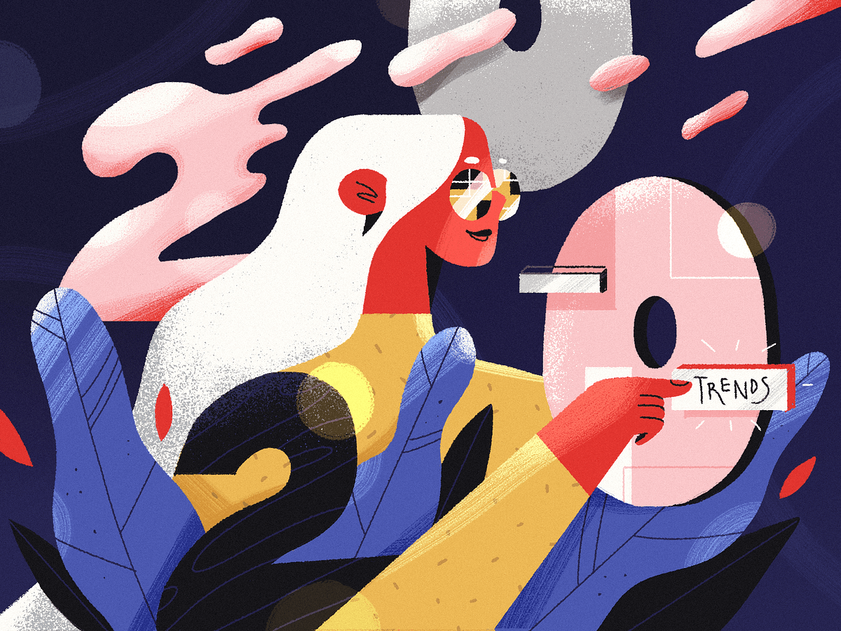
Disrupting The Rules: The Boldest Graphic Design Trends in 2020
Illustration by Julia Hanke for Fireart StudioOur today is limited with so many rules, especially due to the recent Coronavirus lockdown we have been forced to experience. The soul is thirsty for more dynamics, brightness, and beauty. To reinforce the inner engine of creativity, we sometimes need a pinch of inspiration from other creative geeks who are still working hard to produce new original styles and fresh aesthetics for the modern digital world.To empower designers, illustrators, and other cool creative professionals, we have collected the most prominent graphic design trends that are breaking the rules in 2020. Moving away from the traditional and closer to innovative, we’re welcoming you to the garden with the blossoming digital trends.The Beauty in BrutalismDesign by Eugene Paryhin for Fireart StudioThe new decade unlocks myriads of incompatible combinations and immersive designs, united into one stylistic family — brutalism. Mark Alan Andre, a famous architectural designer said it once about brutalism in architecture, but it perfectly describes the essence of the concept in digital design too:“I’m drawn to brutalism because of its simplicity and honesty to its materials. It’s a very “pure” form of architecture when it’s done well.”This style is about brutal honesty without excessive decorations. It is characterized by deliberate plainness, crudity, or violence of the imagery. It is almost screaming about breaking the traditional rules.Brutalism doesn’t align with a classical understanding of composition or color aesthetics in graphic design. It adds more sharp edges, unexpected views, dynamics, and bold colors. This style intentionally attempts to look raw, haphazard, or unadorned. It can satisfy the aesthetic tastes of the most outrageous, brave, and ambitious graphic design gourmets. Below, you can enjoy a few brutalist designs, which we have found to be particularly beautiful.Design by OkalphaDesign by Giga TamarashviliCyberpunk Renaissance“Science fiction is reality ahead of schedule.” — Syd Mead, Blade Runner concept designerAnimation by META on BehanceWe can describe cyberpunk with nearly the same words since it’s a sci-fi sub-genre. It’s not easy to give a precise definition of cyberpunk.This concept rooted in the new wave science fiction movement of the 1960s and 1970s and spanned film, fashion, and design industries. It is both a style in digital design and a massive culture. Cyberpunk features advanced science and technology in the future urban world. When you think of cyberpunk, you usually envision incredibly high skyscrapers, shimmering neon lights, futuristic color palette, and dystopian backdrops.This style has become slightly kitsch in the digital design on the edge of millennials, but in 2020, it has gained a second life. Take your sunglasses and enjoy the dazzling and breathtaking blast from the past in the cyberpunk design examples provided below.Illustration by Yulliia Dobrokhod for Fireart StudioDesign by Romain TrystramUltra-Thin Geometry“The line is a rich metaphor for the artist. It denotes not only boundary, edge or contour, but is an agent for location, energy, and growth. It is literally movement and change — life itself.” - Lance EsplundDesign by Eugene Paryhin for Fireart StudioIn the attempts to create new futuristic aesthetics, designers combine ultra-thin geometry with flowing liquid curves. This incredible mix of styles attracts many companies that incorporate these breezing aesthetics into their branding styles and visual materials. Below, you can see a few samples of the ultra-thin geometry implemented in ultra-beautiful designs, breathing with elegance and minimalism.When we think of a form, the first thing we see is a line, defining the overall silhouette. The shape and nature of the object live in the line. It is the primary element of every image. This year, we can see the art of line in a very extraordinary form — ultra-thin geometry. It has already gained widespread acceptance in the electronic, industrial, and computer industries. However, in 2020, this style is gaining momentum in graphic design too.Design by Demih KodarlakDesign by Ian DouglasLoud Bold Typography“Be bold, proclaim it everywhere: They only live who dare.”- VoltaireIn recent years, bold typography has become a big trend. Saying “big,” we mean that it is literally gigantic. Just look at this huge typography below!Design by Andy Selimov for Fireart StudioIf used in the right place and the right quantity, bold typography has the potential to uncover the brand’s soul, character, and mood. There are a few designers and entrepreneurs who are ready to apply this outrageous font style to brand identity. But, a sensei of typography who knows how to combine bold letters, colors, and digital design in a visual perfection, can bring a lot of popularity to a brand and admiration among a target audience.Design via Sagmeister & WalshAbsolute Monochrome“Color provokes a psychic vibration. Color hides a power still unknown but real, which acts on every part of the human body.” — Wassily KandinskyMono-mania obeys the hearts of many designers, brands, and customers worldwide. The monochromatic color palette has become widely adopted in the digital world. Today, we can see it in website design, mobile app design, branding, and other areas of design. It refers to the use of varying tones of a single color. It is versatile, timeless, refreshing, and easy to style.Even though a monochromatic coloring operates around different hues of the same color, it looks much more exciting and unusual than plenty of other more “colorful” designs. Of course, the designer should be a real master to choose a tone combination that doesn’t look boring and, on the contrary, it evokes a lot of interest and visual satisfaction.The particular value of monochrome is hidden in the ability to focus the viewer’s attention on the key elements in the content. It doesn’t distract with unnecessary details or switching colors. Monochrome brings the person’s high concentration on a promoted product or service.Design by Rokas AleliunasIllustration by Dani RayneMind-Blowing Art CollagesCollage by Jorge TorresThe art collage has become very popular in digital design during the last few years. It is an extraordinary visualization technique that implies an assemblage of different forms, materials, and sources, creating a new whole. It usually includes newspaper or magazine clippings, ribbons, bits of colored or hand-made papers, and photographs glued or photoshopped together on the canvas.In collages, designers mix the worlds, the universes, and different angles of views on the same topics. They often try to create interesting visual effects tricking the eye and mind. The collage is one cohesive image constituted by several realities. Would you like to see what we really mean? Welcome to a few mind-blowing worlds introduced in these art collages.Animated Collage by AndrianaCollage by Anna YashinaNot Saying Goodbye“If I had asked the public what they wanted, they would have said a faster horse.”- Henry Ford, Founder of Ford Motor CompanyAnimation by Aslan AlmukhambetovThe functionality is the horse. One of the designer’s primary tasks is to endow this horse with a silver horn and airy wings. Besides the functionality, we also need a visually stunning design that inspires and lets our imagination fly high. Hopefully, these graphic design examples will help you give a fresh update to your art and empower you to do new creative experiments. Let’s move this world forward to innovation and unconventional beauty!Disrupting The Rules: The Boldest Graphic Design Trends in 2020 was originally published in Muzli - Design Inspiration on Medium, where people are continuing the conversation by highlighting and responding to this story.

11 Incredible Summertime Illustration Designs for Your Inspiration
Often, the creative text is not enough for any impressive design, illustrations may be needed. Since mastering illustration design for creating incredible digital products in the shortest possible time is a challenging task, we suggest using the following samples for inspiration. At least searching for ideal readymade visuals, as well as the right graphic designers for your future projects will be a good start.Best Illustration Design ExamplesHere you will find an awesome compilation of the freshest summer-themed illustrations especially created and handpicked by the Fireart team for your inspiration. Enjoy it! Here we go:Sweet sunny dispositionPlumeriaLife in the villageThe beauty of HistorySummertimeRetro vibesWild colorsUntitledEverything indeed changesScintillating summerAfroPunkTo Wrap it UpDesigners, editors, product owners, and marketers constantly have to look for colorful illustrations for various occasions — from making landing pages to emails or creatives for social networks or ads. We have collected 11 cool and convenient designs from the artists that may help you in any case. Feel free to ask for more incredible design trends & ideas with us. Hire the team for your product design.11 Incredible Summertime Illustration Designs for Your Inspiration was originally published in Muzli - Design Inspiration on Medium, where people are continuing the conversation by highlighting and responding to this story.

7 Modern UI/UX Designs
Modern UI is hard to imagine without a solid professional team that stands behind and caters to best UI practices while working on a particular project for your users. Let’s glance at what’s behind the curtain of what we now call a modern UI design.Fireart DribbbleWhat is Modern UI Design?How would you describe modern UI principles? A modern UI conforms to your audience’s existing experience and perspective of what they think a modern interface is and qualifies as a credible visual experience. Components of interface design include especially user-centric visual trends, design usability, element patterns, and structures that flow with the hand-eye layout and motion qualify as part of a modern UI.Principles of Modern UI DesignTo better understand modern UI designs, make sure you’re aware of the most important principles of modern UI design the top teams often follow during their work:Maintain clarity.A simple and clear design solution always allows the users to move through the website or app intuitively without any extra strains attached. Stick to the primary principle no matter how complex the product will be.Experiential design.The main aim is to improve the experience for your user. Background, form, font, or color you choose all matter. The position of the elements, the interval between them and so much more — all matter to the user and how they interact with your creation.Maintain consistency.Design consistency is what ties all the UI elements together with some distinguishable and predictable patterns of actions. This is a key to the greatest product experience and an important principle for a designer. Make sure to avoid empty space traps in the design construction.Preserve aesthetics.There’s no way without beauty. The products you create should look and feel aesthetic and really drive emotions and trigger desires to use it. Apply illustration design, animation, or photos but keep them functional within the general beauty of the structure.Scannable Content.Creative, not always! But filling in your design structure with the content should be up to your business concept, tone of the voice, target needs, etc. The main thing is to create it easy to scan and consume, allowing to grab what the user needs at once. Be opt for flat design and utilize UX writing.How to Create a Modern UI DesignHere you may find a couple of advices on how to create a modern UI design with a user in mind and keeping UI principles at hand while developing a UI concept. Here they are.1. Take practicality over aestheticsIn a site interface design, the needs of the user are in the first place, but not the significance of the web, application, or vision of a product owner or developer. Modern designs are not just about aesthetics, but about functionality which should serve the user on their journey.2. Try to maintain simplicityThe interface simplicity should come first. One of the secrets lies in the fact that the appearance of the page improves gradually, and therefore should not force users to adapt to abrupt sudden changes. It is convenient for site visitors to get used gradually3. Set the narrativeA user story at its core should be able to describe something the user wants to accomplish by using the product design. For product designers utilizing the narrative mainly serve as a good reminder of user goals and an incredible way to organize and prioritize how every screen will be designed.4. Enable learning without learningThe user interface which is designed in a better way should enable learners to easily navigate through any web resources or apps and get the data they need asap. They discover faster the elements they need and dwell on trust from the familiar help. For this, they do not need any extra skills because your UI is built intuitive enough.7 Modern UI Design ExamplesFireart has exclusively handpicked the best illustration examples of modern UX design for your consideration. These are pieces of various software tools and other products with great UI. Here we go:Privacy Firewall SiteYouTube AnalyticsPrivacy Firewall AppAR Navigation AppCar Rental AppHabit tracking appE-book AppNew approaches to interface design are emerging, but it seems that the visual interface will still be the main way the user interacts with devices. There is a lot of room for innovation, as well as optimization of old interfaces. It’s no surprise that big players like Microsoft and Google are investing significant resources into experimenting with new user interface aesthetics and interaction models.ConclusionInterface design is always about finding the most effective solution that is based on an understanding of the user’s goals, motivations, and usage circumstances, while at the same time taking into account the goals, opportunities, and constraints of business and technology. Modern UI is hard to imagine without a solid professional team that stands behind that. If you want your new product interface to define a fantastic interaction boundary between classes or components, welcome to hire a ui developer and give it a try.7 Modern UI/UX Designs was originally published in Muzli - Design Inspiration on Medium, where people are continuing the conversation by highlighting and responding to this story.
![Top UI/UX Design Trends for Mobile Apps [2020]](https://cdn-images-1.medium.com/max/599/1*V1C99wQw5Zisu0SnaVivCA.gif)
Top UI/UX Design Trends for Mobile Apps [2020]
Hyper-intuitive and visually incredible interface design trends awaiting us in 2020.UI Design by Valeria Rimkevich for Fireart StudioMobile technologies are a fast-evolving medium for implementing our boldest business ideas. They allow interaction with customers at a new level, build stronger relationships with brands, and present them in the modern digital world, which is becoming even more mobile today.Alongside the evolution of mobile apps from a technical perspective, we can also monitor the disruptive transformations in UI/UX design. In 2020, mobile users will see innovative design approaches implemented in hyper-intuitive and visually incredible interface designs. Here we are going to immerse into the top seven most mind-blowing trends in UI/UX design that are awaiting in 2020.Dynamic Visual ExperienceAnimation by Guillaume KurkdjianWe could see lots of dynamics in user interfaces designed in recent years. Although 2020 is predicted to feature even more widely applied motion graphics, lovely micro-movements, and macro-animations.UI Concept by Arjuni KaniDealing with high-speed Internet connection standards this year, designers can take up the challenge of designing more dynamic user experiences. Short videos, artistic animated illustrations, and slightly visibly yet impressive micro-interactions — these are just several examples of how you can apply a new trend of Dynamic Visual Experience in mobile application design.We expect to enjoy more dynamism, higher speed, and fewer limitations in the app idea implementation.Convenient Voice InteractionsSiri, Alexa, Google Assistant, and plenty of other AI-powered voice-controlled technologies are now dictating the future of user experience design. The voice search queries are continually growing. Voice shopping, voice-driven smart home management, voice searching for everything possible in search engines — our modern technologies have started to listen to us even more.In-App Animation by TinoFranAccording to Quoracreative, voice-based shopping is expected to jump to $40 billion in 2022. Statista reports that “the immense popularity of smartphones and their integrated virtual assistants such as Siri or Google Assistant have led to an explosion of voice search usage.”These impressive statistics prove predictions about a complete transformation of mobile user interfaces for voice technologies. Mobile apps are turning into whole new voice experiences step by step.Designers have already started deploying innovative design of voice interfaces powered by artificial intelligence and spiced up with fantastic motion design effects.More Extravagant Digital Illustration2020 is coming with new trends in digital illustration, including 3D surrealism, skeuomorphic design, a limited color palette, soft gradients, imitation of real-life textures, innovative approaches to depicting a human body, and beyond.Illustration by Yuliia Dobrokhod for Fireart StudioUI Design by Victor NikitinIt has also influenced the mobile app design. You can see user interfaces with bold and fun digital illustrations even more often. Driven by the desire to innovate and implement artistic experiments, designers aren’t afraid of experimenting with bright and brave illustrations in UI design.Now, almost every user interaction is accompanied by lovely micro-animations or supporting illustrations. And today, they really look like more extravagant artworks! You can see various art styles, techniques, and new digital illustration trends combined into one memorable picture that creates a powerful emotional impact on users.The Passwordless FutureAre you still logging in mobile apps using an email address or phone number? There will be no such an option in mobile interfaces very soon. Modern UX design is quickly moving forward passwordless authentication.In-App Animation by Gleb Kuznetsov✈Today, we can see a lot of applications empowered by a biometrical recognition feature. Fingerprint scanning, pattern detection, facial identification, and sign-in links. Companies such as Medium, Slack, Twitter, and WhatsApp are already using them, and even Google’s new login screens hint at a future beyond passwords.In-App Animation by AneeshDuring the last few years, we have seen the constant upgrading of facial recognition technology. Famous mobile phone brands, like Apple, Samsung, and Google, have even implemented it as a basic hardware feature that demonstrated the significant influence of this trend on the mobile development industry.In 2020, face ID is expected to dominate over all other biometric authentication methods. It also means disappearing of the Home button in new user interfaces and further deployment of even more innovative design focused on gaining as much as possible from mobile front cameras and facial identification algorithms.Advanced AnimationMicro-interactions by Jakub AntalikThe dynamism of modern mobile app designs is emphasized by eye-catching animations. Nowadays, UI designers don’t hesitate to uncover the power of engagement in artistic animations.Short animated videos, animated UI decorations, and micro-interactions — each of these elements has become a must-have for mobile apps across almost all industries. Animation in all its manifestations can create emotional appeal and bring aesthetic satisfaction to users. It also helps brands establish a more personal connection with a target audience and build user loyalty to a company.Animated Onboarding ScreensFurthermore, animation concepts can maintain the overall company’s style and reveal a brand voice. By repeating some of the branded elements in the mobile app animation, businesses attempt to instill strong associations with their brand styles in the customer’s perception and raise brand awareness.Liquid Swipe and Buttonless DesignUI animation by Taras MigulkoYou might see that buttons have already almost disappeared from mobile devices giving mobile app designers more space for imagination. Buttonless design of smartphones and tablets has led to a tendency of gesture-driven UI design of mobile applications. Tinder swipes and Instagram scrolls are the brightest examples.The number of buttons has decreased alongside with the decreased attention to the role of in-app gestures. 100% of interactive user interfaces have become one of the most prominent UI design trends in 2020.UI and UX Design for People with DisabilitiesIn-App Animation by KlausHuangToday is calling for humanism. Human-centered design is now twisting out not only convenient user interactions but the optimization of digital experiences for disabled people. Modern UX design strives to make achievements in technology accessible for everyone. People with disabilities are not an exception.Some of the trends 2020 are aimed specifically for those who can’t see, hear, or input commands with their hands properly. It has given birth to screen text scoring apps, in-app voice navigation tools, vibration-based responses on users’ gestures, and apps that could make content more contrast.Voice Recognition Animation by Cristian HurhuiConclusionMobile app design trends 2020 surprise us with entirely new approaches to user experience. UX designers pay more attention to the needs of people with disabilities and optimize user experiences employing emerging technologies. Buttonless and passwordless interfaces, voice input, face ID, fingerprint scanning, and in-app gestures — these are just a few examples of a genuinely human-centered design without exceptions for anybody.The world is changing; the trends are passing. However, there still are some permanent values in our life — beauty and humanity. Design is one of the ways to build the future. Digital user experiences are a part of it. So, let’s make them beautiful and accessible to everyone!Top UI/UX Design Trends for Mobile Apps [2020] was originally published in Muzli - Design Inspiration on Medium, where people are continuing the conversation by highlighting and responding to this story.
5 Ways To Improve Your Mobile App User Experience With Illustrations
Illustration is a visual communication of a text, concept or process. When we apply illustration on websites, mobile apps or other digital products, it can improve the user experience by helping visually explain a range of services, introduce new features, and bring vibrancy to the interface design that please your user.The recent trends of brands and startups using illustration for their mobile app is one of the popular practices to happen to the digital world. Headspace app is one of the great examples that using stylish branded illustrations comprehensively across the mobile app. The illustrations play as a key element for almost each screen that give their users a consistent and delightful mobile app experience.Headspace app screens designHere are the 5 ways to improve your mobile app user experience with illustrations — and perhaps you may consider applying them in your mobile app product.OnboardingOnboarding is the most popular way to use illustration. When a user installs and opens your mobile application for the first time, it’s a critical moment to introduce what your app does and keep the user going to the next log in or sign up section.Onboarding illustrationsHow can illustration help?Using custom illustrations to highlight the key features and benefits of your app will be a great way to engage your users and present the app look and feel better in the first place.Artitor - Online illustrations for websites and appsApp Permissions RequestIf your mobile app requires permission from users, such as push notifications, access location or contacts, make sure that they understand why you need the permission and what value they get. Users are more likely to agree to app permissions when they get asked after or during important tasks where permission is needed.Request contacts access illustrationHow can illustration help?With the help of friendly and functional illustrations, it eases the tension and increases the trust when the user get asked for app permissions. As most of the people perceive images faster than words, so it’s always better than just a few words to ask for permissions, right?Error/Empty StatesWhen users encounter error or search content with no results found on your app, a well-designed error/empty state will let them know what’s happening, why it’s happening, and what action should they do next.Illustration for search with no results screenHow can illustration help?By adding a delightful illustration along with clear copywriting, the empty screen will become something more personal and engaging. It also reduces stress and have positive impact on the user experience.Reward SystemIf your app has a reward system that designed for users to keep track of their progress or how much they achieved their goals, you will definitely need some visual elements to encourage them along the way. Some examples are fitness app, coffee loyalty app, food delivery app, etc.How can illustration help?Instead of only using icons, a set of custom cheerful illustrations can bring encouragement and positivity into the different levels of your users’ rewards journey. It gives a consistent visual experience with humanistic approach to the progress.InfographicsSome mobile apps may need to use infographics to present data-driven content, like medical app, nutrition app, gardening app, etc, it’s important to make it easier for your users to comprehend your message than with text and chart only.Illustration for plant growing appHow can illustration help?Visualising data-driven content with functional illustrations can help your users receive the message and data faster, and make the app experience more fun and enjoyable.ConclusionToday, more than 1 million different apps are available for users to download and use, so your app probably need to be attractive enough to get their attention first. Using custom illustrations could be a smart way to impress your users on a deeper emotional level. Let’s create something memorable, interesting, and unique to your mobile app.We hope these UI design tips can inspire you to design better user interface for your app project. If you enjoyed this article, please share it so that other UI UX designers and startup founders can find it! 🙏Visit our website https://interfacemarket.com/Interface MarketEasily create engaging illustrations for your website, mobile app, blog and social media channels right in your browser.Try free ➡ artitor.comMore UI design inspirationTop 10 Useful Apps UI/UX Design Case StudiesTop 10 Travel Apps UI/UX Design Case StudiesTop 10 Banking Apps UI/UX Design Case Studies12 Beautiful Mobile App UI Animations Inspiration5 Ways To Improve Your Mobile App User Experience With Illustrations was originally published in Muzli - Design Inspiration on Medium, where people are continuing the conversation by highlighting and responding to this story.
Artistic Search: Insights into Design Process for Illustration Set
The process of creating an illustration for a particular product or project is not only about visual expression. There’s much more behind it, as in any type of design process: apart from the illustrator’s knowledge, effort, and practical skills, it also includes research, analysis, idea and composition search, working out the best color solution, and many other aspects leading to a needed outcome. In the case of creating a consistent set of illustrations, the process gets even deeper and more extended to reach the systematic design approach. That’s what we are going to talk about today: Tubik illustrator Yaroslava is ready to unveil her creative approach to illustration sets and share a bunch of handy tips for illustrators. Join in!Whatever is your artistic manner and workstyle, the major advice from our illustrator is like that: never stop where you are. Only the constant learning process can allow you to achieve creative development and not get stuck on the sidelines of the information field.But how to search for the needed data and process it properly?These are the questions Yaroslava asked herself working on a new set of illustrations called Curious Cat. In addition, in this art project, she wanted to try new stylistic techniques that are often found in printed graphics but rarely in web illustrations.https://medium.com/media/338219aab9352cf88f07493da182f90c/hrefPractical advice: If you want to reinforce and develop a certain stylistic skill, work on a consistent set of illustrations, not a single artwork. In this case, you get a hand in it, your creative approach is more systematic and complex. What’s more, you will tackle the difficulties which may not arise in one piece of art, and the customer, seeing a series of artworks, will catch the general style more accurately and understand that this artwork is not just accidental something taken out of thin air.Stage 1: Color PaletteIn this case, the artist proceeded from a style that was based on imitation of manual printing graphics. So, she chose 3 primary colors, the overlay of which would give her all the necessary palette and convey the spirit of screen printing. To reach that effect, she selected a brush in Procreate that creates the necessary texture. A more time-consuming but also more effective method is creating your own brushes using textures from real materials. Yaroslava also added a neutral gray color and a couple of paper textures to the palette.Stage 2: ThemeThe artist was looking for an abstract theme that could have a logical sequence of illustrations and at the same time encourage her to search for new expressive techniques and compositions.As a result, the choice was focused on the theme called Process, so the illustrations aimed at reflecting various stages of research and creation process. Also, this series had a mascot character: the curious and clever Cat.The illustrator took the basic and crucial stages of the creative process as themes for the illustrations in the set:statement of a questionresearchdata systematizationanalysis of the received datahypothesessolutionStage 3: ProcessIt’s easy to see that the creative process starts much before the first line or word gets down on paper, canvas, or artboard. So, the set of artworks about the Curious Cat reflects will help us to define, describe, and illustrate the design flow for a series of digital illustrations. If you project this list of points onto the creative process for illustration, then it might flow in the following way.Statement of the questionWhat goals do I set for myself?What do I want to achieve?Which illustrators do I like?What is in their work that caught my attention?What my work is missing?What skills would I like to upgrade?How can I reveal the topic?It doesn’t mean to ask these questions all together at once, it’s enough to concentrate on a couple of aspects that are of interest at the moment since the tasks change and the entire analysis process needs to be done anew each time.ResearchThis stage includes collecting references, selecting works of illustrators whose work inspires you, reading articles on the topic under study (in this case, about different kinds and approaches to the creative process), or perhaps even not this topic directly but the one that will really motivate you to work (for example, biographies of famous creative people you like), and creating a library or mood board of photo fragments you like.Data systematizationIt is a vital stage. It defines how you processed the information gathered at the previous stages and were able to structure it. For example:The works of this group of illustrators catch my attention and emotions with the transfer of movement.In this group of photographs, I adore a beautiful combination of colors.The description I read in the article helps to convey the problem more precisely.Data AnalysisAnalysis of the obtained data in case of the illustration process lies in:creation of sketchestrying various color selectionsthinking over the plotconsidering a character image.The artist realized that this particular project needed a character. It was the best was to reach the consistency and united look of the different artworks. What’s more, a character was effective to clarify the terminology and actions as well as humanize and personalize quite abstract notions and phenomena.Here you can see the search process for the character images that went through several iterations before the Curious Cat was found as the best choice.HypothesesThis stage goes in parallel with the analysis. And often for illustrators, it looks like creating sketches and possible variations, ideas on how you can get the best for the required plot, which composition, angle, or shape is more advantageous for conveying the essence, which colors will emphasize the mood and set the needed atmosphere.SolutionThe solution is the sum of all the stages passed and implemented in the illustration. The final result may seem simple and uncomplicated at first glance, but only after deep processing and analyzing the information, this result will be not random or accidental but will be based on experience and practice. What’s more, the set of illustrations opens the broader perspective for visual storytelling.Hopefully, the stages described above will motivate you to try such a systematic approach in your illustration experience. Also, welcome to check more practical tips and examples by Yaroslava: in our earlier articles, she shared the guides on how to build up your original style of illustration and how to create illustrations for blogs and landing pages. Also, she shared the creative process step-by-step in the case studies on narrative illustration, interface illustration, and theme illustration devoted to the Olympic Games.Illustration Collections and Digital Art Case StudiesIf you want to see more collections of illustrations or discover how they work in particular design projects, here’s the set of posts for you.45 Inspiring Illustrations About Workspaces, Creativity, and ArtAnimal World: 4 Beautiful Illustration Sets About Wildlife and PetsLife in Pandemic Times: Theme Illustrations and Graphic Design ProjectTubik in Paris. Design Process for Narrative IllustrationCase Study: ABUK. Custom Book Cover Design for Audiobook AppCase Study: Moonworkers. Digital Illustrations on Film Production5 Basic Types of Images for Web ContentFunctional Art: 10 Big Reasons to Apply Illustrations in UI DesignThe article was originally published in Tubik BlogWelcome to see the designs by Tubik on Dribbble and BehanceCheck the illustrations and digital art by Tubik ArtsArtistic Search: Insights into Design Process for Illustration Set was originally published in Muzli - Design Inspiration on Medium, where people are continuing the conversation by highlighting and responding to this story.

Muzli Publication — Weekly Digest
Weekly Designers Update #448Web design inspiration, weekly recapRead now.UX Design Is Rapidly Changing — Can You Keep Up?UX design is a profession that was introduced to help companies solve problems creatively. However, it has taken an all-new avatar in the past 2 years. It is frightening and exciting at the same time! Through this article, I wish to clear out some of the fog and be your industry insider…Read now.UX Design Psychology: Enhancing Human ExperiencesThe Art and Science Behind Crafting Engaging Digital Interactions.Read now.Navigating decision fatigue as a designerEvery day, product designers make lots of small decisions, from micro-decisions pertaining to minor design details to overarching project choices. The constant need for context switching between tasks adds layers to the mental load.Read nowSource: Folio Illustration Agency on Dribbble.Crafting Creative Storytelling Websites: Principles and Inspiring Examples.In the digital age, websites are the canvases on which brands paint their stories. More than just arrangements of pixels, fonts, and images, each website carries a unique narrative waiting to be unfolded…Read nowDesigners’ Secret SourceLooking for more daily inspiration? Download Muzli extension your go-to source for design inspiration!Get Muzli extension for freeMuzli Publication — Weekly Digest was originally published in Muzli - Design Inspiration on Medium, where people are continuing the conversation by highlighting and responding to this story.
100 Days of Illustration
On learning how to draw digitally illustrating 100 musiciansI recently participated in #The100DayProject illustrating 100 musicians from the 1920s to 2010s.I’m a product designer who dabbles in music on the side. I chose music as a way to keep my interest high throughout the project blending my love for music history and digital design.You can see the illustrations set to music and more @melsmithdesign.My favorite musician illustrations from each decadeMy project goals were to:learn how to use the iPad as a design toolexplore digital illustration stylesexperiment with colorIn this article, I share my learnings. I hope they’re useful to anyone starting to draw digitally. :)Day 0 • Choose a drawing app and learn the basicsGet familiar with your drawing app options.I started off using the Adobe Fresco app. (I later switched to Procreate — I found the brushes and gestural controls superior in Procreate and speak to this later in the article. You can read about the differences here).I learned the basics of Adobe Fresco from Rich Armstrong’s Abstract Shapes Skillshare class. You can see my student project for the class below.My student project for Rich Armstrong’s Abstract Shapes classDay 1–10 • Know that you may hate work that you create, but it may inspire you laterLearning a new skill takes time.You will likely hate pieces you create, especially early on:Who needs a chin (or upper lip) anyways? Overrated.However, you may come back to your dreaded drawing for inspiration. 😅I experimented with rectangle size and texture in the next string of illustrations:Can’t stop (drawing blocks), Won’t stop (drawing blocks)Day 11–20 • Color palettes convey a feeling of consistency throughout your workConsider experimenting with a color palette. It can be a helpful constraint.I studied how artists worked with palettes (ie. observing the primary color in a composition, color placement, color contrast).A few of my favorite profiles and palettes:Artists that inspire me — michelapicchi, maus__haus, amber_vittoriaTip: To help you get started with color, you can browse “palette generator” sites like coolors.co and design-seeds.com for inspiration.I experimented with the following palette for 20 or so pieces, taking inspiration from my favorite artists and palette generator sites:My experimental paletteDay 21–30 • Ask yourself what inspires you about another artist’s workDraw inspiration from other people’s work.A friend shared an artist’s profile with me and I loved the use of the thick, paint penned lines in contrast to the narrow line art I had been making.I experimented with thick lines for a few drawings:Sam Larson uses thick, paint penned lines (left). I explored thick lines in a future drawing (right).Day 31–40 • Monochrome is your friendHaving color palette woes? 🙋🏽I kept things simple for a set of drawings and used single hues.I learned how powerful one hue can be, and that a few tweaks to saturation and lightness can make a portrait come alive:You perty. I like you.Day 41–50 • Procreate is the industry standard for illustrationAdobe Fresco was released in late 2019; the product is in its infancy 👶. I personally felt I hit a wall in my creative pursuits, and had Procreate FOMO — I kept hearing about the array of brushes and slick user experience in Procreate. Hello, shortcut and gestural heaven!I decided to make the switch, and after many painful drawings, found an inner smurf style:SmurflandiaDay 51–60 • Level up and stay inspired with coursesEarlier I mentioned Skillshare as a great way to learn tips and tricks — lowkey obsessed.I finally hit the halfway point in #the100dayproject! 🎉 I was in a rut and still strug-g-ling to ramp up on Procreate (ie. learning features only accessible by shortcut, getting used to brush types and settings).Charly Clement’s class introduced me to brush techniques (ie. texturized hair) and encouraged me to play with exaggerated facial features:Larger-than-life eyes and lipsDay 61–70 • Oscillate between “one-trick pony mode” and “stretch mode”Give yourself permission to explore different styles.I started the 100 days with simple line drawings. As I got faster at these, I found it easy to default to my “safety” style. One of my personal goals for the project was to explore various styles.Creating line art one day and chunkier illustrations the next was a good way to push me out of my comfort zone:Bouncing between line art posts and chunky color postsDay 71–80 • Learn about colorYou may have learned about “the color wheel” and “color prisms” in school. These are important concepts, but most helpful in my research has been The Interaction of Color (I stumbled across it creeping on Bret Victor’s bookshelf).The Interaction of Color by Josef AlbersThe author speaks to the idea that color does not exist in a vacuum. Instead, we should study “color action” and “color relatedness”.The color studies in the book encouraged me to be more playful with my color usage and tweak colors as color action exposed itself while drawing.A color study from The Interaction of Color: You might see two colors at first glance. In fact, there are three colors. The x’s are the same color (a third color). This demonstrates how color is context-dependent.Day 81–90 • Revisit graphic design basicsStart from first principles.As I experimented with various illustrative styles, returning to visual design principles (ie. Gestalt Theory) gave me ideas to explore new directions in the composition.Rule of Thirds principle (left). Gestalt Theory examples (center) source: saravrabel.wordpress.com. Continuation principle (right).Day 91–100 • Make it funChoose an interesting drawing topic.Music helped keep me motivated through the months. I loved learning about the people in my project — listening to their full albums and watching music documentaries while drawing.A few of my favorites rockumentaries for fellow musicophiles:Bessie SmithBob Dylan: No Direction HomeAmy WinehouseWould I do it again?Yep. For me, it was worth every day. My highlight reel:Becoming proficient on iPad • It has been an incredibly helpful tool in my design workflow – from virtual whiteboarding, remote interviewing, to wireframing.Apple Pencil > trackpad (for some things) • I realized how much easier it is for me to work with Apple Pencil vs on a trackpad, bleck. I’m empowered to whip up a quick storyboard by digital hand.Going deep on one topic as a learning method • In 100 days, I did not find my illustration “mojo”. However, I did make a serious dent in my understanding of digital drawing and unlocked a new path for creativity.Connecting with the global #the100dayproject community helped keep me accountable and inspired.Have you participated in a 100-day project? Are there other accountability communities or learning approaches that you’ve found effective?Would love to hear from you in the comments. :)100 Days of Illustration was originally published in Muzli - Design Inspiration on Medium, where people are continuing the conversation by highlighting and responding to this story.
Abstract design trend 2018
Tips and tricks for reproducing the style with finesse.By Eleana GkogkaBy now, you might think that everything has been done before and there is no room for innovation in Digital Design. But this couldn’t be further from the truth. New ideas or creative recycling/refurbishing of older ideas keep popping up as brands try to attract attention and designers to impress. Useful and valuable ideas stick around and eventually become design trends.Useful and valuable ideas stick around and eventually become design trends.Lately, we’ve seen brands and designers experimenting with a combination of organic and geometric design elements, focusing more on the general look and feel rather than the accurate description of a concept. It seems like the return of abstract design!Geometric shapes such as circles, rectangles and polygons, have been present in Digital Design for a while and they have been very successful so far. They help with organising content by creating structure and clarity. In Illustration, they add an element of simplicity, allowing our imagination to add layers of detail and the message to shine.The clean geometric style has now evolved with the addition of organic, natural and free-form shapes. Wavy lines, dynamic curves, and powerful arches stand in contrast to the geometric, more functional style, creating unique, engaging and attention-grabbing compositions. The result is often abstract, symbolic and less descriptive, leaving plenty of room for discover-ability and interpretation. This can be both a good and a bad thing, depending on the context. The designer comes to decide if the style is appropriate for the given situation.This abstract, organic and geometric style inclination can influence and shape 2018’s design direction. Familiarising with the hidden meanings and perceptual impact of shapes is now more significant than ever.Geometric shapesGeometric shapes are balanced and easily recognisable. They usually suggest structure, order and efficiency.Squares and rectangles are the most popular. They create a sense of equality and conformity. They are perceived to be stable and trusting.Circles and ovals are the most friendly. They represent unity, wholeness, and infinity. They are perceived to be protective, harmonious and graceful.Triangles are the most controversial. They are tense, bold and actionable. They can be unstable, creating feelings of nervousness, conflict and aggression or stable representing the law, science and religion.Spirals are the most creative. They suggest growth and evolution. They convey ideas of transformation, life and mysticism. Clockwise spirals can imply intent while counterclockwise spirals imply fulfillment.Crosses are the most spiritual. They symbolise balance, healing, wisdom, hope and faith. Vertically-oriented crosses are thought of strong, while horizontal peaceful.Organic shapesOrganic shapes are irregular, free-flowing and less symmetrical. They usually represent or resemble elements found in nature. Organic shapes tent to get their meaning from the natural elements they represent or resemble.Spiky shapes are the most rebellious. They are spontaneous, playful, unpredictable and attention-grabbing.Cloudy shapes are the most pleasant. They are friendly, warm, comforting and kind.Wavy shapes are the most chilled. They are relaxing, smooth and sometimes unpredictable which makes them compelling.Abstract shapesAbstract shapes are simplified versions of common elements or forms. They are mostly based on organic and geometric shapes although lacking definition.Abstract shapes are usually arbitrary since they can take many different forms. They can communicate various ideas or emotions a depending on their basic form and details. Abstract shapes can get exceptionally interesting and unique. They can be edgy, playful, mysterious, relaxing or even purposely confusing. They can be anything we want!Now that we know a bit more about the basic elements of the abstract style we can work towards refining our designs, making more out of our compositions. We can add some depth, personality and interest by using colours, gradients, textures, patterns, typography and photography.ColourColour has the ability to communicate, influence or support emotions, messages and ideas. It’s bound to our perception of the world as we involved.White the safe — Innocent, pure and cleanBlack the mysterious — Formal, enigmatic and sophisticatedRed the energetic — Dangerous, powerful and passionateOrange the warming — Creative, enthusiastic and encouragingYellow the optimistic — Energetic, loyal and joyfulGreen the harmonious — Fresh, natural and safeBlue the trustworthy — Confident, intelligent and wisePurple the noble — Luxurious, wise and ambitiousPink the charming — Sweet, tender and playfulIn visual perception a color is almost never seen as it really is — as it physically is. This fact makes color the most relative medium in art.Josef AlbersOf course, colours are more complicated than that and different shades, tints and colour combinations, could have different perceptual effects. They could also convey different emotions or meanings for different people. Age, race, culture, gender, impaired vision and even mood can influence their perception. That’s why we shouldn’t rely solely on colour for communicating a message or action. We should take a step back to consider our goals and audience first.GradientsA gradient is a graduated blend of two or more colours or tints of the same colour. Gradients are everywhere in nature that’s why they feel pleasant and familiar. They can bring depth and dimension to compositions producing something that looks fresh, unique and modern.We can get viewers attention by using bright colour combinations or we can create depth and definition by using a darker palette. Using colours that are closer to each other, on the colour wheel, will create a smoother and brighter transition while using colours that are further away will generate a more neutral middle colour, which isn’t always appealing. We can solve this problem by adding a third brighter colour between these colours.We can get creative by adjusting the opacity, changing the rotation or messing the gradient for some unique results. We can definitely get inspired by nature for creating some pretty smooth gradients.PatternsPatterns are the repetition of more than one visual elements. They bring unity, texture and detail within the artwork and can enhance visual excitement by enriching surface interest. Patterns can also add visual noise, so simplicity and subtlety are keys.Patterns add a sense of rhythm and movement in our abstract composition. There are five types of visual rhythm, random, regular, alternating, flowing and progressive. Each can offer endless combinations and possibilities. We can use patterns either inside simple shapes or in the background.TexturesTextures refer to the surface quality and are great for adding an extra level of interest, visual complexity and depth in our abstract design. They can be used to illustrate not only how a surface looks but also how it feels and they can be quite powerful in communicating sensations. A texture can be rough, rough, smooth, soft, silky, shiny, fuzzy, liquid and so on. It can be natural or artificial/synthetic, thick or thin, solid or fluid.TypographyTypography is the art and technique of choosing and arranging typefaces. When it comes to choosing a typeface, we will first have to identify the purpose and audience of our design. What is the message we want to convey? What kind of emotions do we want to communicate? Who do we want to attract, challenge, convince, inform etc.?Typography is key to setting mood, tone and style in our design. Each typeface has its own personality. It can be friendly, fancy, serious, aggressive, playful and so on. Its personality can influence how we feel about the copy we’re reading, but also how well we can absorb and process the information within.There are times where we need to break out of our comfort zone and explore, using different typefaces to create a visual contrast. We can achieve this by using different styles of fonts, font sizes, weights, and colours. We need to be careful though because it’s easy to go too far, using way too many different typefaces can result in a confusing and not as professional design.PhotographyWith the use of photography, we can add even more depth, emotion and character to our design. Choosing the right photo can make a big difference, and it has to be in line with the theme and style of our design to create better impact.There are many different types of photography depending on the theme, technique and style. There’s landscape photography, portrait, still life, black and white, fashion, beauty, nature, aerial, street, conceptual and so on. And to add to all these different types, we can manipulate these photos, making them unrecognisable. We can make them lighter, brighter, darker, we can change their colours, crop them, trace them, blurry them, distort them etc. The possibilities here are truly endless.We can also get creative with how we apply photography. We can use it as a background or we can mask it, we can use it whole or just parts of it, we can also zoom in and use it as a texture. We can write on it, colour it, trace it, break it, tear it, frame it and so on.Visual hierarchy, contrast & balanceSo, how do we combine all these different visual elements without ending up with a beautiful mess? Hierarchy, contrast and balance will help us create attention-grabbing and easy to read compositions. Here are some design principles to help us tame our design.Size — Enlarging an object’s size is an easy and quite effective way of adding some visual importance. Using different scales of elements will naturally guide the eye to the most prominent.Colour — We are naturally attracted to colour. Bright colours are hard to miss, but in a canvas full of colour nothing will stand out. Using attention-grabbing colours sparingly and purposefully is the key. We can play with different colour temperatures, shades, tints and saturation. We can use bright or muted colours strategically, creating high and low contrast areas in our design.White space — Spacing is a powerful design tool for guiding the viewer’s eye around the design, separating the different visual elements and creating visual hierarchy. White space can give the eyes a place to rest, travel smoothly and identify focal points.Movement — Our eyes are drawn naturally to points of interest and movement is one of them. Movement indication will help point towards specific elements and make them stand out.Symmetry & Asymmetry — Visual balance that derives from symmetry can bring harmony and order. Disturbing this balance with some asymmetrical elements will add interest and intensity.*Some other useful tools to consider are the Golden Ration for balanced, natural looking compositions. Gestalt principles for visual grouping and Alignment for structure. The Visual Triangle for some emphasis or the Rule of Thirds for creating a strong composition.Use with cautionA few well balanced examples. From to left to right DotStudio, Takeshi Oide, Rajapack.Hopefully, you now have a better understanding of the different elements that can work together to achieve the abstract design style and a useful set of tools at your disposal.At this point, you have to keep in mind that everyone is different and arbitrary compositions could get arbitrary readings depending on the viewer. Use this style with caution, avoiding it when your message isn’t clear enough or its understanding is heavily relying on the visual elements.ConclusionMany contemporary brands are already embracing the abstract style, take a look at Geex Arts, Intercom and Upperquad. The careful application of this trend offers endless possibilities for communicating different moods and shifting the look & feel of entire projects. Knowing more about the communicative properties of the available design elements can help us reproduce the style; use it effectively and wisely.A new world of exciting design opportunities lies ahead!Abstract design trend 2018 was originally published in Muzli -Design Inspiration on Medium, where people are continuing the conversation by highlighting and responding to this story.

26 Awesome Explainer Video Examples You Need to See
Are you looking for explainer video examples to inspire one for your brand, company, or service? Then you’ve come to the right place!We’ve rounded up 26 of the best explainer video examples in different styles to inspire your own creations.What Is An Explainer Video?Motion graphics, on the other hand, is timeless and will always be around. What might change are the color schemes and style of design. In some cases, brands use unique an unusual approach to their explainer videos.Now let’s take a look at our selection of 25 of the most awesome explainer videos, separated into sections for easier browsing.2D Animated Explainer Videos / Motion GraphicsThe most common explainer videos are cartoon, illustration or whiteboard drawings in a two-dimensional style. A few years ago, whiteboard explainer videos were the big thing, then it was cartoon characters and lately, it’s colorful illustrations of humans.Thankfully, some animators and designers know how to think out of the box to create amazing explainer videos for their clients. Take a look at our favorites.Illustrated Explainer VideosFirst up, 2D animation illustrated explainer videos. Almost every explainer video lately is designed with illustrations. So much so, that most of them look similar to each other. Then there are the unique and special ones, and here are some of them.1. Crazy EggThe style of this Crazy Egg explainer video is made up of one character interacting with different sections visualizing the content of the voiceover. The scene doesn’t move too much, just enough to keep the viewer’s attention.The character has a humorous angle and the style has a vintage look.https://medium.com/media/c9621fc90f995e3071b8bf21e0edf450/href2. L’BlendThe explainer video for L’Blend working space is simple with just the minimal frill to its illustration. The animations visualize all the different aspects of the co-working space in fun and interesting animations.https://medium.com/media/3cb5b12f4d2382a52ea564389f4cd9c4/href3. Mobile MusterThis explainer video is for mobile muster, an initiative to teach people about mobile phone recycling. The 2D line illustration visualizes what a mobile phone is made of with in-and-out interactions in a flat style.https://medium.com/media/b52fff801f0937a06f8171fd5077fc1c/hrefAchieving a 3D look with a 2D illustrated animation isn’t always easy. This explainer video is quite unique in the fact that there’s a sense of depth even if it’s 2D.The designers created a set of characters to interact in the video which helped make this explainer video unforgettable.4. Security@MeAchieving a 3D look with a 2D illustrated animation isn’t always easy. This explainer video is quite unique in the fact that there’s a sense of depth even if it’s 2D.The designers created a set of characters to interact in the video which helped make this explainer video unforgettable.https://medium.com/media/614676cc65cf17856ed2954a8a89963d/href5. McDonald’s Going TechThis is a different style of an explainer video. It’s more editorial or journalistic than promotional. The designers were inspired by the 70’s style of illustrations with bright contrasting colors and simple animations.https://medium.com/media/42d3529411647c31be82a0ffe1bc69f7/href6. Ahrefsis a cute and entertaining animation that moves horizontally to the right as the elements jump and down on the screen. There are two versions of the video, one without voiceover that you can watch below, and The Ahrefs explainer video another with voiceover.https://medium.com/media/c8d5d35250a04c59fdbb3240aa40926f/href7. BaaSThis explainer video is a futuristic take on the usual animated linear illustration we see on many explainer videos. The dark background looks great with glowing lines that explain the concept of Build as a Business. The use of gradients is particularly unique and beautiful.https://medium.com/media/c83e9d45c2d4bc1cbecdef69bd7bee58/href8. DoctorooDoctoroo has a cute explainer video in soft muted colors. The characters are designed in the classic illustrated style that is so trendy right now. An explainer video like this always does well with audiences because they make you feel good.https://medium.com/media/a7a534a028e8a6ea2873dad3142efbc3/href9. Purina OneThis explainer video is the perfect example of what an animated explainer video with 2D illustrations looks like.https://medium.com/media/829b2f75ad5d25b17892b9397c83045e/hrefWhiteboard Explainer VideosBefore all the explainer videos were made with colorful animated illustrations, the trend was all about whiteboard animations. Unfortunately, whiteboard animations had less unforgettable examples than illustrated explainer videos.Nevertheless, there are some animated whiteboard explainer videos that we do love.10. National History MuseumThe National History Museum created this explainer video for their exhibition about 100 years of the human story. The designers used a classic whiteboard style but with a unique take of already drawn elements mixed in.https://medium.com/media/60dae33a1f49b31f3baf9ddbb5fe675e/href11. RSA Re-Imagining WorkThe whiteboard animated explainer video about Re-Imagining Work is very elaborate. There are plenty of predesigned elements in the animations. But what they have done quite successfully is the texture of the marker over whiteboard.The live-action hand writes and draws on the board to add details.https://medium.com/media/1c3c5ff89f8ae877ffd7381080bb0f81/href3D Animated Explainer VideosOne of our personal favorite styles of explainer videos is 3D animation. The difference between 2D and 3D is the depth of field and the type of movement in the video. Keep scrolling below to see some great 3D explainer videos.12. VismeThe Visme animated explainer video has a brand character that takes you on a trip around its digital environment full of design, creation and human interaction. Our team worked hard to make it happen and we’re really proud of it. You can read more about it here.https://medium.com/media/a7e3709775ef197e529521de59e98e04/href13. BoostationThe Boostation 3D animation explainer video is fun and vibrant with an isometric style design. A mobile phone screen turns into an animated city with street corners that represent working apps in the device. It’s interesting and cute all at the same time.https://medium.com/media/da9fd1d6534415eb2cba9ff6833c2de6/href14. CredifluxCrediflux created a unique animation of wooden balls rolling around on a contraption that selects the best of them and then turns them into digital code. The first part of the 3D animation is very realistic and grabs the eye of the audience very easily.https://medium.com/media/52b51dcacc31d745d51c150300bf9abf/href15. WorkflowOn a different note, workflow created a 3D animated explainer video with claymation. This is a style that involves characters and elements made of clay, or playdough.In this case, the action takes place on a real-live desk with cute characters that visualize the story of the brand and what it does.https://medium.com/media/158a116cdfefa2a60ab225de3f800079/hrefLive-Action and Animation Hybrid Explainer VideosUsing live-action videos or live-action elements mixed with animation is a great way to appeal to a wide audience. These types of explainer videos come in all shapes and sizes, from simple presentation slides that include animation to full-fledged fusion designs.16. VntanaThe 3D explainer video for Vntana is a nice animated mix of 3D designs and live-action videos. Their business is all about optimizing the use of 3D in design so it’s not surprising their explainer video does a great job of incorporating it with some 2D elements to make the 3D visuals stand out.https://medium.com/media/5a6215c32959fcc0feeb5b39831d592d/href17. CodemeetThis explainer video example has a very achievable style to inspire your own. It’s made of slides with video backgrounds and animated elements on top. It’s a very classic approach to animation and it still grabs the viewer’s attention.https://medium.com/media/d4360210a141f35a934a3f56dfcba939/href18. Morgan CrossingAnother option for an explainer video is to use a minimal style live-action and animation hybrid. In some cases, the animations can be very elaborate but in this case, all it needs is simplicity and clean design.The live-action video is the main aspect while animation is a complement.https://medium.com/media/00a76bb4b0825b11862a7df340a92c3d/href19. Zendesk GuideThe start of this Zendesk Guide explainer video starts like any other animated illustration and then it switches to live-action seamlessly.It doesn’t surprise that animated elements start to show up in between fish in a fish tank, goldfish cookies and a person dressed as a shark.https://medium.com/media/7653310c98a31347ce75ad0d026935e4/href20. Move GuidesSimilar to the video above, Move Guides uses a seamless combination of live-action videos and animated elements. In this case, the animations are layered above the video but also look like they are part of the video.https://medium.com/media/8750009ec4c8da85545106cff1691644/href21. SlackThis Slack explainer video starts with a clip of the CEO and founder talking about how channels in Slack can replace email. Then it moves to simple animations to visualize what email is missing and how Slack can fix it.The last two examples are from the industrial sector. These are usually a bit different to other types of businesses because they need to show processes and actual products. Designers recreate the products into animated elements to make the video more attractive.https://medium.com/media/91e356b98985bcc3da45ba03e2d0b137/href22. BartecThis motion graphics explainer video is a visualization of the process of the Barte remote bus system. The mechanism pieces are digitized and animated into a successful motion graphics explainer videohttps://medium.com/media/b36a943eb5e778b8a88a9eb100354652/href23. GE DigitalIn the explainer video for GE Digital, motion graphics combine with animated elements. This explainer video does a good job of visualizing what could potentially be a dry topic.https://medium.com/media/7b9c6c57c021e4f10ff3f46f609c20a6/hrefUnique and Unusual Explainer VideosLast but not least, there’s always the unique and unusual explainer videos that stand out from all the rest. Here are three explainer video examples that don’t fit in any of the above categories while also fitting into all of them.24. BhubThe Bhub explainer video is truly unique. It’s created in a collage style with lots of colors mixed with black and white photography and video. Funny enough, this explainer video is all about a studio that makes explainer videos.https://medium.com/media/2f3c7134b3472ef50907e61e7d980266/href25. GogoroMixing motion graphics, 2D and 3D animation all in one video isn’t always easy to achieve. This video for Gogoro mixes all three while maintaining the same color scheme, speed, and personality seamlessly.https://medium.com/media/81c39751337fc0ceb8d175ee02f83d2b/href26. How Does Sunscreen Work?Less of an explainer video for a company, but more of an educational explainer video. With a fun and creative outlook, this video breaks all the right rules and is interesting to watch.https://medium.com/media/27d03b5be8041095c80053f0850b7e60/hrefAre You Inspired?Hopefully, this list of explainer videos has sparked some curiosity to look for more videos. Or maybe to make your own explainer video. We chose 26 of our favorite videos but if you go to Behance.com and enter “explainer video” in the search bar you’ll find even more.For more inspiration, go to YouTube and search for explainer videos there. You will find some great ones and not so great ones. Some you might have already seen on this list on even on social media.When an explainer video is good, it makes a good impression and is shared on social media. In some cases, TV commercials are created like explainer videos. Hence why we know these types of videos work!We hope this article inspired you to look further into your video marketing strategy and create your own explainer videos.The original version of this post first appeared on Visme’s Visual Learning Center.26 Awesome Explainer Video Examples You Need to See was originally published in Muzli - Design Inspiration on Medium, where people are continuing the conversation by highlighting and responding to this story.
Weekly Designers Update #461
via Muzli design inspirationHey design lovers,It’s fantastic to have you back this week! Recently, I spent some time experimenting with AI-powered music creation tools. If you’ve been following us on all channels, you’ve probably heard the new Muzli hits. I must admit, they turned out much better than I imagined. You can listen to the new Muzli hits in these posts, and I’d love to hear what you think:Hit 1 | Hit 2This got me thinking, how much longer do we have to enjoy design inspiration created by humans?In the meantime, let’s dive into this week’s top design inspirations:Office Of Overview — Twenty Three Degrees: A stunning showcase of minimalist design with dynamic grid layouts.Artlist: A treasure trove of high-fashion photography and avant-garde styling.100+ RETRO STICKERS: A versatile collection of editable retro stickers for any project.Figma plugin: Enhance your designs with over 60 customizable effects.Online Radio: An innovative and sleek UI for an online radio platform.Check out the full list below and see you around next week,Eyal from MuzliLooking for more daily inspiration?Download Muzli extension — your go-to source for design inspiration!Web design inspirationSamson - Arta bold and unconventional website showcasing Samson’s work! The site features daring graphic design and unique art that blend digital and traditional styles..Office Of Overview — Twenty Three DegreesWe’re highlighting OverviewOffice for their unique take on minimalism and dynamic grid layouts. Their designs blend creativity with functionality, infusing humor and originality into every project..ArtlistArtlist Paris is a treasure trove of stunning visual artistry. The site features a diverse array of high-fashion photography, avant-garde styling, and creative direction..Accordion ProductionsAccordion Productions stands out with its dynamic portfolio of film and photography projects. The site highlights their innovative and creative approach, blending high-end production with artistic storytelling..Design Resources100+ RETRO STICKERSThis package comes with all manner of excellent items included, with 100+ RETRO STICKERS designed for easy editing, adjustment, and mastering..Kids mental Health and bullying illustrationModern & creative illustration set for Fintech, Kids mental Health and bullying niche.Pavon — Tropical Display FamilyIntroducing Pavon — a brand-new modern typeface family inspired by the elegance.Atomic — Creative Professional Framer WebsiteThe Atomic template is more than just a design solution, it’s a powerhouse for creative professionals, design agencies and all type of businesses seeking to showcase their prowess in the most visually stunning way..Product SpotlightInspotypeWhere inspiration meets design. Sit back and explore our curated fonts and colors on real designs..Zebracat Video Generation AITurn text into impactful videos in minutes with AI.Filter / effects — Figma pluginA powerful Filter breaks into your workflow!There are currently more than 60 customizable effects available..Wave & Сurve — Figma pluginWith «Wave & Curve» you can easily create a variety of waves and interesting patterns!.Recommended articles — —Design inspirationBudget by BN Finance for BN Digital⬤ POST ALT | Gallery Page — 178 by EDUARDO ⬤ CARBALLO → UX/UIGolf Pro Website by Halo UI/UX for HALO LABUI Exploration: Online Radio by Giga TamarashviliBrushstroke — Art Portfolio Header by Erin Kristina for GinteraVARIOUS ILLUSTRATIONS 23–24 by Florian Schommer and Closer&Closer Artistssofi illustration by Alexandra Zutto老广凉方 by 凌云 创意Packaging|千秋一白 Qianqiu Yibai by 7654321 DesignCztery Ściany by FLOV® STUDIOMayer by Jae young Park, Nineworks Seoul, Hyung Pin Kim and Hye Jeong HaHell yeah! Uvnt Art Fair x Las Rozas Village by CACHETE JACKWeekly Designers Update #461 was originally published in Muzli - Design Inspiration on Medium, where people are continuing the conversation by highlighting and responding to this story.
Weekly Designers Update #469
Looking for more daily inspiration?Download Muzli extension — your go-to source for design inspiration!Hello Designers,Ready for a fresh dose of inspiration? This week, we’ve handpicked a variety of standout projects to spark your creativity and expand your design horizons:Following WildfireA thought-provoking initiative empowering Canadians to manage wildfires using social media and AI technology.PlutoConnecting people across dimensions, Pluto brings a new level of immersive human interaction, transcending physical location.3D Empty State Icon SetA visually captivating collection of 15 3D icons designed to elevate your empty state screens.Auto Layout Fixed Aspect RatioA Figma resource for effortlessly maintaining fixed aspect ratios within your layouts, complete with detailed documentation and examples.And there’s so much more! Dive into the full post for cutting-edge tools, design resources, and inspiring projects that will elevate your creative work.Stay inspired and keep creating!Eyal from MuzliWeb design inspirationFollowing WildfireLast year, forest fires set records for their duration and destruction, impacting people, communities and wildlife. #FollowingWildfire helps empower Canadians to actively participate in protecting their communities and help manage wildfires via social media and AI-powered technology..UnansweredUnanswered, is a poignant exhibit dedicated to Evan Gershkovich, our colleague and Wall Street Journal reporter who has been wrongfully detained in Russia since March 2023. At the heart of the exhibit, you’ll find a digital guestbook where you can leave personal messages of solidarity for Evan and his family. These messages symbolize a collective voice advocating for justice and press freedom. We look forward to the day when Evan can read your messages himself. We’ll keep telling his story, until he can tell his own..How realignment left college football with four major conferencesMapping out the major realignments in college football ahead of the 2024 season, how we got here and what’s next..Pluto | We help humanity transcend physical location.We help people connect from all dimensions, as if they were in person..Design ResourcesOutline Isometric Illustration Set for FigmaElevate your designs with our comprehensive isometric illustration package, now.3D Empty State Icon Set15 Empty State 3D Icon Set.SkrinUI — 1000+ Screen UI All PurposeScreen UI All Purpose.Product SpotlightCompressXOffline media compression.Stippling — Figma pluginCreating stippling in Figma has never been easier.WebLens: Powered by GrowthBookA/B test your website using autogenerated insights..Auto Layout Fixed Aspect RatioThis file contains a fixed aspect ratio spacer that can be placed inside Auto Layout image-fill frames so they resize at specified fixed aspect ratios. I’ve documented how it works, how to use the component, and how to add overlays. Also included are dialog box, horizontal card, and vertical story examples.— — Recommended articles — —.Design inspirationBrisk — Smarter Financial Management for Modern Businesses by PLATFORM.Staking Web Platform by Ronald Olsen for Awsmd.Massive Noir — Character Illustration by Agum Satria for Gintera.Renewable Energy Plant Website Design | Orbix Studio by Orbixstudio Orbix Studio | Website — Web Apps — Landing Pages — Dashboards — MVP Design for Orbixstudio.Music event poster by OVCHARKA INDUSTRIESLament of the Last Man (sketch) by McKenzie Design.The Square by Maksim Arbuzov by Anna Khabarova.UPCOMING23 — catalogue and exhibition design by Ania Wieluńska, Łukasz Izert and Piotr Welk.Weekly Designers Update #469 was originally published in Muzli - Design Inspiration on Medium, where people are continuing the conversation by highlighting and responding to this story.
Muzli Publication — Weekly Digest
Welcome to this week’s Muzli newsletter! Here you’ll find the latest articles and content from the Muzli blog, featuring top design trends, insights, and inspiration. Enjoy exploring the best in design!Weekly Designers Update #453Web design inspiration, weekly recapRead now.Weekly RoundupThe most engaged with content on MuzliRead now.How framing affects your decisionsExplore how the framing effect shapes your choices in UX design. Learn about positive, negative, comparative, and statistical framing, and how to apply these strategies ethically. Enhance user experience by understanding user psychology, setting clear goals, and testing different approaches.Read now.An in-depth look at the best websites that use creative illustrations.Dive into the world of websites that masterfully use illustrations to captivate and engage audiences. Learn how illustrations enhance visual appeal, improve user experience, foster emotional connections, and boost engagement metrics. Discover best practices and see top examples of illustration use in web design.Read now.Case Study: UX/UI Design of the First Licensed Digital Bank in MexicoExplore the creation of Bineo, Mexico’s first 100% digital bank, by Banorte and UXDA. Learn how they tackled user trust issues, enhanced digital banking experiences, and addressed customer needs through innovative UX/UI design. This case study showcases the transformation of traditional banking perceptions in Mexico.Read nowDesigners’ Secret SourceLooking for more daily inspiration? Download Muzli extension your go-to source for design inspiration!Get Muzli extension for freeMuzli Publication — Weekly Digest was originally published in Muzli - Design Inspiration on Medium, where people are continuing the conversation by highlighting and responding to this story.
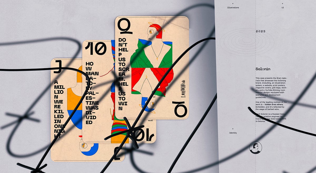
Historian Mark Solonin. Worldbuilding
This case presents the final materials that showcase the Soloning brand, including, an illustration system, a website, print posters, magazine covers, gift bags, stickers, and a YouTube filming room interior design; equipped with examples and development guidelines.+Illustrations +UI +Identity +War of Ukraine +Wars of Israel +The final solution +CrucifixionBy uncovering The Soviet Union’s and post-Soviet Union’s history we can better understand the processes of modern times in the whole world, as the influence on the world since 1917 has been very significant.Ahead of the whole planet. Moon race part no. 04One of the leading motives of the work is — hidden from others, forbidden, and it’s reflected by the usage of barbed wire.Pro barbed wire [Digital]Use the Pro barbed wire to charge your device — you remember the history, and you are connected.We are charged with unknown.The gallery mobile screen with one of the videos from the “Moon Race” series (December 2022).Desktop screen set. [ATF]War of Ukraine. [Print]GiftsGive us what we need, so we could stop it now.{The Scream}General guiding principleThe H/I direction is guided by the logo position — vertical or horizontal.Meanings[his]story taler | Every stream Mark starts by saying — “Hi to all kind people”Examples of the usageColorsGuiding principleColor red simbolise the Soviet Union’s armi (Red Army). At the same time, the Soviet Union’s and post-Soviet Union’s history is a general subject for Solonin’s research. Because of this fact, red was chosen to be the main accent color.Color paletteSometimes even barbed wire bloomsTrue history is desirable fruit.Final solutionRed since 1917The ScreamDon’t help us to scream. Help us to win. War of Ukraine. Part no. 2Give us what we need, so we could stop it now. War of Ukraine. Part no. 1A million were killed in one night. Wars of Israel. Part no. 5Guiding principle.Elements of the illustrations that are used in posters can have a dark color because, in the case of posters, we want to have a better focus on the visual message; for the other formats, the textual content is a number one priority, so other colors are used instead of the dark and only lines are dark.Why do we need to study history?We study history because history doesn’t stay behind us. Studying history helps us understand how events in the past made things the way they are today. With lessons from the past, we not only learn about ourselves and how we came to be but also develop the ability to avoid mistakes and create better paths for our societies.I beg youHouse; Sounds spelled — Chaos; only outwardly attractive.Divide and conquerHow Mandatory Palestine was divided. Wars of Israel. Part no. 1Why World War II archives are still secret. World War II. Part no. 2Just one more step. Wars of Israel. Part no. 3Why do we need to learn about the Soviet Union?By uncovering The Soviet Union’s and post-Soviet Union’s history we can better understand the processes of modern times in the whole world, as the influence on the world since 1917 has been very significant.RecommendationDo not play this game with professional cheaters. Study the history with Mark Solonin.Step by step. Video by video“Dripping water hollows out stone, not through force but through persistence.” — OvidTypefaceNeue Machina is a powerful and meticulously crafted typeface boasting monospace/geometric type features as well as apparent and deep ink traps in its heavier weights. It is inspired by the aesthetics of robotics and machines. A font suited for the future of technology. It was designed to be versatile, to blend in your designs in its lighter weights or to give them a lot of personality in its heavier ones.NewspaperDear Mark, I’m watching your channel since its inception. I’m very thankful to you for the highest level of historical and technical education you are providing. I appreciate the courage and honesty you demonstrated many times by touching on very “hot” and “inconvenient” topics of Soviet, Ukrainian, and Israeli history. Every country has its own “skeletons in the closet” — pages of history that are shameful. The faster people of respective countries would acknowledge the error of the past, the faster we will move to a better future. It seems to me that the Ukrainian people made the right choice. It is a long way but Ukraine will be successful in joining the civilized world. — Al TsaWars of IsraelMoon raceCover: “How Mandatory Palestine was divided”.LogoIndependent historian Mark Solonin -> History soloh justificationIt’s all about history. In Solonin’s case, history is the main and only subject of interest and the final product is the research result, whether in the format of a YouTube video, lection, book, or magazine publication.o justificationSome of the text styles use the letter “o” in a different style — in a ‘lighter’ font weight. This is because of the logotype where we want to highlight that Solonin is a solo historian.Main characterIconThe icon is the Solonins profile. Solonin is the main hero after all. Small icon size. The stroke is heavier than in the large version.The main character in the illustrationsI am not sure the complete truth can be figured out. Somehow each desid to believe in one or another teller’s historical version. Considering that each of us has his own understanding, history is the personification of one’s beliefs. Long story short all the characters of the illustrations are Solonins with the difference being that the icon uses more geometric elements than the illustration characters.IllustrationsOne-to-one ratio version developed for the web. For print, the position and ratio of the illustration canvas may be treated freely.Magazine coversCover: open spine, hot foil on canvasPaper: Via Felt Jute 220 g, Munken Pure Rough 150 g, 300 g Printer: Concordia Print Store — Boutique d’impressionGood day for all kind peopleGreetings.Placement: cover back.Digital materialsThis chapter includes examples from website landings on mobile and desktop, a few critical website pages including the website loader concept, video recording room interior design, and a YouTube channel example.Use the Pro barbed wire to charge your device — you remember the history, and you are connected.We are charged with unknown.Repetition is the mother of doctrineDigital posterWebsite landingWhen the new video has been published it’s also promoted on the website’s front page. This way visitors won’t miss a new publication.Video pageAll the videos are recorded in the studio that was specially designed for Solonin production shootings.Interior designVideos are the main way of communication. It’s why the interior design of the studio needs to be relevant. We have integrated the main elements of the Solonin brand into the room and clothes design.Selected screensLanding loaderGeneral guiding principle usage exampleFully loaded landing ATF sectionPlacement of the illustrationsYouTubeThe channel cover is the poster (have a more massive usage of the black color) of the latest movie.Mobile screensThe main challenge we have faced working with the mobile version of the website landings is illustration treatment. More specifically the placement of the artwork. The full-screen canvas was providing a very nice picture, but in this case, the textual content has a bit less readability, so we have decided to have a clear separation between the artwork and the textual content.I could not do this without the help of my dears:Limor Jamaica — set design and photography,&Alex Voloshin — barbed wire manufacturing.+Don’t let making you a fool. Learn the history with Solonin!______________________________꩜ In addition, you can find me on: Behance | Dribbble | Linkedin | Instagram | TwitterHistorian Mark Solonin. Worldbuilding was originally published in Muzli - Design Inspiration on Medium, where people are continuing the conversation by highlighting and responding to this story.
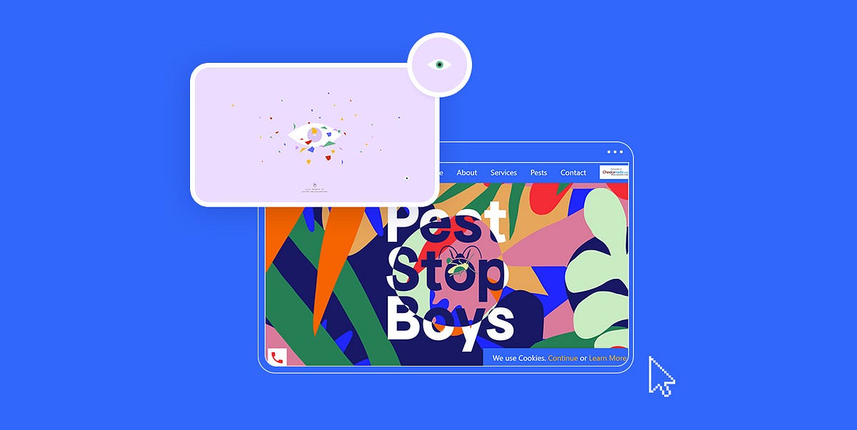
10 Examples of Imaginative Mouse Cursor Design
The invention of the mouse and implementation of the cursor led to a revolution in user interaction. Until then, data had to be entered and manipulated by using commands on a keyboard, which, at times, was quite time-consuming and tiring. But in the 1960s, Douglas Engelbart created the world’s first mouse, forever changing the way people interact with computers.The first cursor was designed as a simple arrow pointing up. However, back in the day, computer displays had low resolution, which made the small vertical arrow hard to notice on the screen. Engelbart then decided to tilt the arrow at an approximately 45° angle. And the rest is history. Steve Jobs then used the angled pointer on Apple’s first Mac, opting for the all-black design with a white outline. Microsoft debuted a pointer on their Windows 98 operating system, but they inverted the colors, making the outline black and the inner part white.From then on, designers began to experiment with the appearance of mouse pointers, sometimes using illustrations or even images as cursors. Depending on the site or the software, we’ve probably all operated watermelon and pizza slices, rockets, sharpies, and different hand gestures in place of the arrow.Mouse cursors have an immense functional value, and because of that, it’s important their design is well-thought-out. They should look good, but also incite immersive hover and transition effects on a site to make the browsing experience more intuitive and enjoyable for the user. The following roundup illustrates how beautiful and effective mouse pointer design can be and just how much it can help enhance the appeal of the entire website. More importantly, these websites also demonstrate how cursors can vastly improve user interactions on a site and provide feedback about specific actions while simultaneously showcasing the creativity of its creators. The sites we will discuss include:Pest Stop BoysMasters 1987Qode KaleidoscopeLe Cantiche 1320The Current: Violent White SupremacySamuel DayGroupe Castor & PolluxThe New CompanyGlenn CatteeuwJulie GuzalPest Stop BoysPest Stop Boys is a holistic pest control service located in South England. Their website is a true rhapsody of colors. It is rich with stunning animation effects and microinteractions, introducing the pest control service in a highly imaginative way. Cool scroll-triggered effects bring various types of bugs into the viewport, making your browsing experience just a bit more interesting. The cursor is initially shaped like an undulating splash of color, but as you begin to move it around, it dissolves into several colorful splotches. What makes this pointer particularly fun is the mix-blend-mode effect added to it, defining how the hovered element will blend with its background. Even when the cursor breaks into a few smaller dots, each of them includes the blend mode. When you hover over several differently colored elements at the same time (e.g., you partly place the mouse over a letter but you also cover a portion of the background and another abstract element), the cursor colors all of them in different hues. The mix-and-blend effect is a great way of breathing new life into your content with one simple hover and presenting displayed elements in several different, creative ways.Masters 1987Masters 1987 is an event production company based in Los Angeles. Their website beautifully exemplifies the power of uppercase sans serif typography which is used in various sizes on all pages. The background is black while the typography is mostly white, apart from some highlighted words in orange. The colors and fonts are simple, and that gave the designers room to implement a variety of effects and play around with the site’s elements, especially the cursor. The movement of the circular pointer mirrors that of a comet — as soon as you move it in any direction, it leaves an animated trail behind that fades away once the movement stops. The pointer includes the blend mode effect which makes it look like some sort of a spotlight. Not only does it invert the colors of the hovered elements, but it also enlivens them. This is particularly obvious when you place the cursor on images. On the “Portfolio” page, as you hover over portfolio categories, the cursor turns outlined letters white while the blend mode is also in full effect.Qode KaleidoscopeQode Kaleidoscope is a carefully curated collection of Qode Interactive’s themes that highlights the importance of colors in modern web design. The loading screen includes an illustration of an eye and a myriad of tiny, colorful pieces that resemble the stained glass of kaleidoscopes. The cursor on this part of the site looks just like the aforementioned eye. But, when you move it around the page, the eye breaks into several pieces. The pupil remains the primary mouse pointer, with the cornea, conjunctiva, and other parts trailing behind it. As soon as the movement stops, all parts come together and form the whole eye again. The scattered glass-like elements magnetically follow the movement of your mouse, enlivening the page. You can click anywhere you want to access the vibrant website and enjoy its attractive visuals as well as the engaging motion and transition effects that let you experience WordPress through a different lens.Le Cantiche 1320Le Cantiche 1320 is a remarkable Renaissance-inspired website. It was created to mark the 700th anniversary since Dante’s pivotal work, The Divine Comedy was completed. This whole site is a work of art in its own right. It is bustling with visuals that depict Dante’s journey through Hell, Purgatory, and Paradise. The featured animation and transition effects, along with the horizontal navigation effect, make the content appear all the more immersive and the journey more vivid. The cursor is very prominent and designed as a large, red circle. Within the circle, you’ll notice some text, encouraging you to take some sort of action, like scrolling with your mouse or dragging the pointer to explore more content. Inserting instructions into a cursor is an excellent way of making the website exploration more intuitive for the user and helping them find their way around with greater ease. Moreover, the cursor on the Le Cantiche 1320 website features the mix-and-blend effect. When you place it on images, the area that you’re hovering over turns into a negative.The Current: Violent White SupremacyJigsaw is a unit within Google that relies on technology to investigate global problems, such as human trafficking, terrorism, cybercrime, and many other societal threats. The Current is Jigsaw’s publication that ensures access to information, in particular to all those who live in oppressive societies. In their second edition, which has won the prestigious Webby award, they tackle the subject of violent white supremacy. At first glance, the top section on the homepage seems plain white. But as you move the cursor around, you will see an illustration of a child with their arms outstretched, along with several more pairs of hands. The pointer reveals parts of the image in its wake, but when the movement stops, everything becomes white again save for the area where you’ve stopped the mouse. This is the only section on the site where the cursor interacts in this way with the content, ensuring an impressive introduction to the issue.Samuel DaySamuel Day is a Berlin-based designer. His idiosyncratic website provides an immersive insight into his creative mind. The stunning scroll-triggered animations take you on a peculiar journey filled with stunning illustrations that tell you Samuel’s story. The cursor is shaped like an eye that occasionally even blinks. All the illustrated characters on the site have their eyes designed in the same way. When you reach the section with the train passing by, you will notice that the passengers actually embody Samuel’s projects. On hover, the eyeball turns into an animated logo of the company in question, inviting you to click on it and explore the project in depth. As the color of the background changes, so does the color of the cursor. This website is a great example of how good design can make a cursor a part of the creative story that illustrates a designer’s attention to detail as well as their skillset.Groupe Castor & PolluxGroupe Castor & Pollux is a digital communication group. On the page where they discuss their CSRs (Corporate Social Responsibilities), you can see a beautiful oversized pointer in action. The round cursor is blue, but toward the edges, the intensity of the color slightly fades, making the pointer look like it has a slight gradient effect. When you place it on the hero text, it becomes huge and a down-facing arrow appears within the circle, instructing you to continue scrolling to discover more about the company’s CSR experience. In some other sections, the cursor colors otherwise black typography in vibrant pink and purple gradients. Again, text appears inside of it, inviting you to read more on a particular topic. By implementing these effects, the designers not only made sure they would direct the users attention to specific elements on the site, but also improved the overall UX by providing clear signals indicating what the user should do next. They also added some purely decorative interactions. For example, when the cursor is placed on imagery, the image shifts slightly, and then starts following the movement of the mouse. On some other pages of the site, the pointer’s design is equally interesting. For example, on the “Agence” page, the oversized cursor turns black typography into outlined lettering. It also reveals some background imagery that can only be seen within the borders of the cursor. Outside of the edges of the pointer, the background remains white.The New CompanyThe New Company is a strategic design agency based in San Francisco and Los Angeles. Their website is filled with beautiful imagery that depicts the studio’s creativity. Photos are thoughtfully arranged on the white background and their vibrancy breaks the calmness of the neutral backdrop. Another particularly prominent element on the site is the red cursor. Its color is eye-catching and intense, which allows it to stand out even when you place it on colorful pictures. The pointer is shaped like a circle, but when you move it around, you’ll see it split into two parts, with a smaller circle in front and a larger one following it with a very dynamic motion effect. As soon as the movement stops, the circles merge again. While located on the slider at the top of the site, the cursor will transform into triangular arrows as you move it to either edge of the screen, inviting you to explore all of the slides. This seemingly small interaction is, in fact, a great and unobtrusive way of making the website exploration more intuitive and ensuring better user experience on your site. The pointer is, by default, oversized. But in some sections, when you place it on the displayed images, its size decreases. On most sites, usually, the opposite happens, but the New Company decided to switch things up a bit and surprise viewers. Hover effects are engaging, with featured videos playing the moment you hover over photos.Glenn CatteeuwGlenn Catteeuw is a multidisciplinary designer and art director. The background on his one-page website is designed as a grainy, grey canvas, giving off cinematic vibes. The content is in black-white. There are also lots of outlined geometric shapes that slightly move on hover, awakening from their default inactive state. The cursor is shaped like an arrow until you place it over an image. It then turns into a billowy shape that adds a negative effect to a small portion of the photo. As you move the cursor around, the negative splotch follows its movement. This unusual detail amplifies the site’s alternative vibe and makes project presentations more effective and eye-catching.Julie GuzalJulie Guzal is a freelance designer. Her portfolio website looks minimalist, starting off with Julie’s simple introduction on a plain white background. The peacefulness of the layout is gently shaken up by the cursor that leaves a bubbly trace in its wake, with animated dots slowly evaporating from the screen. The cursor trail is colored in an elegant deep green shade, breaking the monochromatic character of the opening slide. As soon as you start to scroll down the page, the dancing dots disappear from the view, leaving the plain white arrow on the screen. This entire site’s simplicity beautifully complements the vibrant examples of Julie’s works that appear in the viewport with each new scroll, allowing them to capture the viewer’s undivided attention.Closing WordsEven though they are most often small in size, mouse cursors offer a lot of room for expressing your creativity and improving the user experience on your site. Sure, you can always go for the tried-and-true arrow or hand design option. But users are guaranteed to appreciate innovative pointer designs that can not only complement the aesthetic of a site but also make the entire presentation more memorable.We recognized those qualities on the sites featured on our list and we enjoyed exploring their content using some truly terrific mouse pointers. As you can see, in a lot of cases mouse pointers become crucial elements of a site, ensuring an easy, intuitive, and interesting browsing experience.We hope you will find these cursor designs just as amusing, cool, and beautiful as we did, and that you will use them as inspiration when coming up with an innovative mouse pointer for your own website or next project. You can go for interesting graphic solutions, use the cursor to ignite color changes on sliders, or add engaging hover effects to your content. The possibilities are endless. At the end of the day, a beautifully designed cursor is, on its own, a great addition to a project, but you can further enhance the appeal of your website if you manage to implement the cursor into the overall experience and use it to both amuse and guide visitors.Originally published at https://qodeinteractive.com.10 Examples of Imaginative Mouse Cursor Design was originally published in Muzli - Design Inspiration on Medium, where people are continuing the conversation by highlighting and responding to this story.

Green UI/UX Trends: Designing with Sustainability in Mind
That’s not a guide and not even an overview of trends. It’s a collection of thoughts, facts, and practices. It’s a call to set our own design trends with sustainability in mind.Sustainability in Design by habitatThe Earth is a big mom embracing all of us in its huge hugs. Awful things are now happening around the world. They aren’t an accidental event coincidence. The Earth is breathing harder than earlier. I’m not speaking paranoically, and I’m not a fan of pro-apocalyptic videos on YouTube. I’m talking about very obvious and globally known things soaring in the air and trying to whisper to everyone, “think of sustainability for your own future…”The world has already lost 80% of its forests and we’re continually losing them at a rate of 375 km2 per day! More: Consequences of Depletion of Natural Resources27% of our coral reefs have been destroyed. If the rate continues, the remaining 60% will be gone in 30 years. More: Threats on Coral ReefsWe have a garbage island floating in our ocean, mostly comprised of plastics — the size of India, Europe and Mexico combined! More: Garbage Islands in the OceanAnd finally…Thanks, God! “Antarctica is still the cleanest place on Earth protected by anti-pollution laws”, according to the Australian Antarctic Program. But it seems too small for humankind to live there in the future, isn’t it? :)Let SpaceX Mars Program be a good opportunity, not the only option for next generations“We are living on this planet as if we had another one to go to.” — Terry Swearingen, Nurse & Winner of Goldman Environmental Prize in 1997Mars colony by Pavel TsenevIn 2021, we can say that we will probably have another “planet to go to” indeed. Applauses to Elon Musk and his legendary SpaceX Mars program! He understands that humankind is unceasingly destroying its own home. With a passion for “being among the stars,” he is preparing a Plan B for humans.However, is it really so necessary to destroy our Earth? Let’s leave Plan B for interplanetary travels and consider Mars as a second home (not the only home) in the future. As designers, you have the power to evoke the product user’s consciousness for “sustainable thinking.” Here I’m sharing some design and non-design views on how we can implement it altogether.Sustainability — the buzzword. But do we really know what is it?Today, the word “sustainability” is widely applied to define the processes, measures and actions through which humanity avoids the exhaustion of natural resources to maintain an ecological balance that doesn’t allow the quality of life of modern societies to decrease. It has three dimensions: social, economic, and environmental.Illustration by Fabin_Raj for Fireart StudioThe term “sustainability” is also used to describe “improvements in areas like natural resources overexploitation, manufacturing operations (its energy use and polluting subproducts), the linear consumption of products, the direction of investments, citizen lifestyle, consumer purchasing behaviors, technological developments or business and general institutional changes.” (YouMatter)What I like about Wikipedia is that it’s sometimes so amazingly laconic:“Sustainability is the ability to exist constantly.” — WikipediaSo, what should we do to “exist constantly” as a species on this planet?The change of global mindset. The product designer’s role in itGrowth Mindset by Abby A.Before writing this article, I have read pretty many resources about “green UX,” and do you know what I find out? There are a lot of amazing practices on how UX designers can implement green, sustainable UX. However, I understood that the green UX engine would be more powerful if it aims to change the user’s mindset. It’s how a UX designer can contribute to global sustainability processes.“We cannot solve our problems with the same thinking we used when we created them.” — Albert EinsteinWe can remind people about their own responsibility for the Earth, educate them on green consumerism, and popularize sustainable thinking through well-known UI/UX design trends.New Year Edition: Top UX/UI Design Trends Rushing to Us in 2021Sustainable UI/UX design inspiration: see it before you do it“See it before you do it” by Graham TypeFrom unobtrusive pro-environmental notifications and friendly animations to products oriented towards reducing CO2 emissions — there are so many ways to implement it in design. Consider also designing digital experiences that promote green energy, less energy consumption, inclusiveness, and accessibility.You can start by creating in-app green consumerism reminders and daily “green” inspiration in animations and illustrations. Provide opportunities for users to learn more about environmental problems and solve them right within your UX design. You can make “sustainable UX” your product user’s reality.The best way to skill up is to learn from someone’s work done. Here I share a few “sustainable” design ideas and inspiration from other creative professionals.Popularize social diversity & equityElements by Madison MehargThe environment is the primary but not the only consideration within sustainability. It’s also important to consider human welfare. Social diversity and equity are components of social sustainability. They are equally important as the environmental and economic dimensions of the sustainable future.I like how Fireart Studio popularizes social diversity through website design. These guys created web animations that depict their teammates and how different they are. All of them are unique in their own way.Animation by Aslan Almukhambetov for Fireart StudioRemind of 3 Rs: recycling, reusing, reducingThe environmental sustainability aspect is often based on 3 Rs (recycling, reusing, and reducing). Recycling is using old products in new ways. Reusing refers to using items more than once. Reducing means minimizing the amount of waste we create and lower energy consumption.You can create an onboarding user experience with 3 Rs in mind. What if you incorporate animations or illustrations reminding users about recycling, reusing, and reducing into several app screens? There are endless ways to implement it. Here is how Jessica Flores has done it through illustration.Sustainable Fashion Concept by Jessica FloresAnother great example is the illustration created by Koen Speelman. It’s his way of telling people about the threat of plastic pollution that may cause the disappearance of some species. The logical outcome is that we need to recycle, reuse, and reduce the amount of plastic in oceans.“Fish stuck in a jar” by Koen SpeelmanCreate inclusive design, illustrations & animationsGoogle Innovations, Inclusive Mindset by OrangeSprocketInclusive design is one of today’s biggest UX trends. It implies design for all people, including those with disabilities. In one of my articles, I mention that we can “humanize” our technologies by using empathy-driven and user-oriented design.“From designing body prostheses and home appliances to creating mobile and web experiences — try to be helpful and empower people to get a more enjoyable and comprehensive experience. That’s where genuine empathy is hidden.”Humanizing Technology: The Essentials of Empathy-Driven UX DesignWeb Design by Eugene Paryhin for Fireart StudioPromote environmental & social values in web designLuckily, sustainability has become a new trend in the modern digital world. It’s revealed not only in design but also in marketing. The next aspect I’d like to consider is sustainable marketing. It is the promotion of environmental and socially responsible products, practices, and brand values.Designers can motivate their clients to incorporate environmentally and socially “conscious” design elements into the brand’s websites and mobile apps. If the company hasn’t considered sustainability as one of its corporate values before, it’s probably the right moment to inspire your client for it.Web Design by MoniAn excellent example of the brand that incorporated sustainability in its tone of voice is LEGO. They dedicated a section of their site to its sustainability programs:“Our mission is to make all LEGO® bricks sustainably by 2030. Why? Because being sustainable is good for the planet! We want to make bricks out of things that we can grow again or are recycled. This is not easy as we want sustainable LEGO bricks to have the same high quality that you are used to, but what we know is this: big ideas may start small, but they will help us build a greener planet one brick at a time.”Model what may happen if we don’t…It’s quite a radical method. When if nothing else works, you must be tough to break your “green” message through the digital noise. We, humans, don’t want to know about global problems like they refer to everyone besides us (for example, “Why the world has needed the coronavirus?”)In this case, the only option is to look at the problem from a different angle and model what will happen with the Earth if we don’t stop recklessly consuming and depleting natural resources. Here is how two illustrators, Daniele Simonelli and Cristina Susano, communicated it to the audience.India coal addiction by Daniele SimonelliEarth Day by Cristina SusanoTeach users about green consumerismThey won’t tell you about it. But they need it. It would be great to educate your product users about green consumerism and its positive impact on everyone’s life. We can use in-app notifications, hidden tooltips, and content suggestions. There is a wide variety of UI/UX design practices that we can use for a “green purpose.”Top UI/UX Design Trends for Mobile Apps in 2020 [by Fireart Studio] - Fireart Studio“Stuff I wish they’d taught us” by Call On CourageNobody will save the Earth… Until we do 🕊“The greatest threat to our planet is the belief that someone else will save it.” — Robert Swan, AuthorI’m sorry to break it to you: nobody will save the Earth. Nobody but you. Nobody will build our future until we do it. Our future is now.In this article, we have considered the concept of sustainability, why do we need it, and how other creative professionals design with sustainability in mind. Now it’s your turn. Go and create something very “green” for your users and your Earth. And I don’t mean the color. ;)Green UI/UX Trends: Designing with Sustainability in Mind was originally published in Muzli - Design Inspiration on Medium, where people are continuing the conversation by highlighting and responding to this story.

On art & design — how art has changed through the ages and crept its way into our products in the…
On art & design — how art has changed through the ages and crept its way into our products in the digital worldInterface design has come a long way from the early days of the internet. From keeping things bare-bones, to incorporating various visual styles and ‘trends’, we’ve always drawn inspiration from art (& real life) to make experiences delightful. By making elements look realistic (skeumorphism), to simplifying them for digital (flat design), to bringing back some elements of realism (neumorphism & glassmorphism), we’re always trying ways to keep things fresh.What seems to be the problem here?Popular trends can sometimes result in all websites looking very similar (think: the Linear effect), so if you want to make your product stand out visually, it can help to revisit the past and remix it.If you squint, they all look the same. If you don’t, they all look the same. credit: Austin ByrdDifferent art styles are like different outfits — they each create a specific mood and feeling. Just like how you wouldn’t wear a fancy suit to the beach, you wouldn’t use the same design style for a serious business app and a fun, casual game.If you want your product to feel classy and expensive, you’d choose something different than if you want it to feel playful and easygoing (spoiler: it’s hard to do both together but you can mix & match similar styles).There have been plenty of art movements over the past few hundred years, but knowing about these is a good place to start. You can (& should) read up on other movements in between, because trust me — the rabbit hole goes deep.Art Nouveau (1890s — 1910s)What is Art Nouveau?Art Nouveau is French for ‘New Art’. It’s an international style of art (especially decorative arts) and architecture.The art movement was often inspired by natural forms such as the sinuous curves of plants and flowers. Other characteristics of Art Nouveau were a sense of dynamism and movement, often given by -Asymmetry or whiplash linesThe use of modern materials, particularly iron, glass, ceramics and later concrete, to create unusual forms and larger open spacesHow did it come about?It gained popularity during the Belle Epoque era as a reaction against the rigidness, mix-and-match style, and constant reference to the past in 19th-century architecture and decorative art.The first Art Nouveau houses and interior decoration appeared in Brussels in the 1890s, in the architecture and interior design. It quickly spread to Paris, where the work in Brussels was applied to the new entrances of the Paris Metro. It reached its peak at the 1900 Paris International Exposition, which introduced the Art Nouveau work of artists such as Louis Tiffany (the first design director at Tiffany & Co., the jewellery company).However by 1914, with the beginning of the First World War, Art Nouveau was largely exhausted. In the 1920s, it was replaced as the dominant architectural and decorative art style by Art Deco and then Modernism.Art Nouveau in the physical worldWhat sets it apart?One major objective of Art Nouveau was to break down the traditional distinction between fine arts (especially painting and sculpture) and applied arts. It was most widely used in interior design, graphic arts, furniture, glass art, textiles, ceramics, jewellery and metal work.Art Nouveau in the graphic/digital worldHow can it be used?Despite Art Nouveau’s significance in the applied arts, it hasn’t carried over as much in UI. Its artistic, ornamental nature makes it hard to directly translate over to interface design. Nonetheless, here are some base elements that one can incorporate to capture the essence of the style —Organic shapes like flowers, leaves, and animals — this could be considered when picking the graphic/illustration style.Flowing lines, stylised natural forms like exaggerated curves, and repeated patterns.Rich colours like gold, red, and purple to create a sense a drama and vibrancy.Elegance & sophistication, reflected in the use of fine materials (think: textures & noise), intricate craftsmanship and a fine aesthetic.Serif typefaces or elaborate display typefaces for headings, for a more classy look.Elements of Art Nouveau in modern interface designMidjourney’s (quite literal) interpretation of an Art Nouveau websiteExamples & prominent artistsHenry van de VeldeAlphonse MuchaRené LaliqueLouis Comfort TiffanyArt Deco (1910–1930s)What is Art Deco?Art Deco is a style of art and design that characterises the use of geometric shapes, bold colours, and stylised forms. Geometric shapes like triangles, circles and shapes are often used to create patterns and textures.Art Deco can also be identified by the usage of opulent & regal colours such as gold, red, black and some shades of green & purple.How did it come about?Art Deco emerged with the rise of the status of decorative artists, who until late in the 19th century were considered simply artisans. During its heyday, it represented luxury, glamour, exuberance, and faith in social and technological progress. Some designers even refused to mass produce items and insisted that each piece be made individually.The movement featured rare and expensive materials, such as ebony and ivory, and exquisite craftsmanship. The style was used to decorate the first-class salons of ocean liners, deluxe trains, and skyscrapers.Art Deco in the physical worldWhat sets it apart?The influence of Art Deco in interface design can be seen in the use of clean lines, metallic accents, and vintage typography. Art Deco elements are often used to create interfaces that are elegant and sophisticated, and they can also be used to evoke a sense of nostalgia or glamour.Elements of Art Deco in digital/graphic designHow can it be used?Interfaces that need to signal luxury, exclusivity and timelessness can benefit from drawing inspiration from Art Deco.Due to Art Deco’s somewhat maximalist and artsy nature, it can difficult to directly recreate a website (or app) in this style. However, you can incorporate some elements into your app that still give the vibe you’re going for, such as -Colours: Gold, black, darker shades of green, blue, purplePatterns & stylised forms: Geometric line patterns with shapes like chevrons, sunbursts and zigzags, or UI elements with pointed edges. This could also come through in the illustration style you’re going for.Serif typefaces: In general, serif typefaces are used in digital media to evoke a sense of elegance, regality, and classiness.Elements of art deco in interface designExamples & prominent artistsSome prominent artists associated with this movement include —Paul FollotÉmile-Jacques RuhlmannLouis SüeBauhaus(1930s)What is Bauhaus?Bauhaus is German for ‘Building House’. It was a German school of art that was operational from 1919–1933 that combined crafts & fine arts.Bauhaus is sometimes mistakenly called a style. This is not true. Bauhaus is not a style. However, several specific features are identified in its forms and shapes: simple geometric shapes like rectangles and spheres, without elaborate decorations.How did it come about?The school became famous for its approach to design, which attempted to unify individual artistic vision with the principles of mass production and emphasis on function.The Bauhaus style later became one of the most influential currents in modern design, modernist architecture, and architectural education. The Bauhaus movement had a profound influence on subsequent developments in art, architecture, graphic design, interior design, industrial design, and typography.Elements of Bauhaus in the physical worldWhat sets it apart?The bauhaus aesthetic is characterised by simple geometric shapes like rectangles and spheres, without elaborate decorations.Buildings, furniture, and fonts often feature rounded corners and sometimes rounded walls. Other buildings are characterised by rectangular features, for example protruding balconies with flat, chunky railings facing the street, and long banks of windows.Furniture often uses chrome metal pipes that curve at corners. Some outlines can be defined as a tool for creating an ideal form, which is the basis of the architectural concept.Why are the colours red, yellow, blue associated with the Bauhaus aesthetic?Kandinsky, a professor at the bauhaus conducted a survey to find the innate shapes of colours. Picking the shapes triangle, red and circle and the 3 primary colours, he asked his students to map the shapes to colours they felt were more appropriate.The result of the survey proved his argument, as the majority of respondents answered according to his model, which was this -Yellow triangle, blue circle, red squareYellow was a psychologically “sharp” colour, full of outward movement, and thus corresponded with the pointed form of the triangle.Blue was a “deeper” colour that receded from the picture plane and thus aligned with the ”restful” roundness of the circle.Red was one of the most important colours, its “assertive” and “forceful” nature corresponding with the “inner tension” of the square plane.While some disputed the validity of Kandinsky’s shape-colour pairings & the scientific basis of his survey results, geometric shapes and primary colours became associated with the Bauhaus aesthetic, especially in graphic design.Elements of Bauhaus aesthetic in digital designHow can it be used?In interface design, these elements can bring about this aesthetic —Usage of the colours blue, red, yellow, black (& their varying shades)Geometric & seamless illustration styles (especially using circles & parts of circles, rectangles & parts of rectangles)Usage of geometric typefaces with heavier weights for headingsElements of Bauhaus aesthetic in interface designExamples & prominent artistsSome prominent artists associated with this movement include —Ludwig Mies van der RoheMarianne BrandtWomen of the BauhausBrutalism (1950s)What is Brutalism?Brutalism is a style of art and architecture that emerged in the 1950s. It is characterised by its use of raw, unfinished materials and a strong emphasis on functionality.How did it come about?Stylistically, brutalism is a strict, modernistic design language that has been said to be a reaction to the architecture of the 1940s, much of which was characterised by a retrospective nostalgia. As an architectural style, it is said to have originated in the United Kingdom among the reconstruction projects of the post-war era, but commonly known for its presence in post-war communist nations.Housing complexes in communist nationsWhat sets it apart?Brutalism (in architecture) was all about showing the materials & their qualities. Think: exposed bricks, visible building blocks, grey & textured cement, wooden slats, metal, etc.. Brutalist pieces (be it art or architecture) are characterised by minimalist constructions that showcase the bare building materials and structural elements over decorative design.This is in contrast to more stylistic art styles (like Art Deco, Art Nouveau, Baroque, etc.) where the base structure is mostly covered by ornamentation to display a more finished, polished look.Brutalist architecture vs Stylistic architectureHow can it be used?In interface design, brutalism can be expressed by -Hard linesBold use of colourA strong emphasis on functionality by stripping the design to its essential elements.The usage of strong contrasts and asymmetrical layouts further contribute to the boldness of the style.Brutalism (and neo-brutalism) as a visual style conveys functionality and straightforwardness, but also fun, approachability and multi-purpose. One can consider this visual style if one’s brand holds similar values.Elements of brutalism in digital/graphic designWhat’s the difference between brutalism and neo-brutalism?Neo-Brutalism is a more recent style that emerged in the 2010s. I like to think of it as brutalism’s more colourful sibling. It is a reinterpretation of Brutalism that uses its raw aesthetic to create bold and eye-catching designs.Elements of brutalism vs neo-brutalism in interface designExamples & prominent artistsSome prominent artists associated with this movement include —Alison and Peter SmithsonLe CorbusierPaul RudolphErnő GoldfingerPop Art (1950s)What is Pop Art?Pop art is a style of art that emerged in the 1950s. It is characterised by its use of popular culture imagery, bold use of colour and its playful and irreverent attitude. Pop art is widely interpreted as a reaction to the then-dominant ideas of abstract expressionism, as well as an expansion of those ideas. It often takes imagery that is currently in use in advertising (or popular culture in general).How did it come about?In the United States, pop art marked a return to hard-edged (aka contrasting colour blocking without any variations in shades — see image below) compositions & representational art. To counter the personal symbolism and almost “messy” style of abstract expressionism, Pop artists employed mundane imagery, irony, and parody to create a more objective and controlled aesthetic.By contrast, the origins of pop art in post-War Britain, while employing irony and parody, were more academic. Early pop art in Britain was a matter of ideas fuelled by American popular culture when viewed from afar.Soft edged vs hard edged artWhat sets it apart?Pop art often takes imagery that is currently in use in advertising. Product labelling and logos figure prominently in the imagery chosen by pop artists, seen in the labels of Campbell’s Soup Cans, by Andy Warhol. Even the labelling on the outside of a shipping box containing food items for retail has been used as subject matter in pop art. Apart from advertising, we can also see pop art imagery in comic books & movie posters.Overall, pop art merges popular and mass culture with fine art while injecting humour, irony, and recognisable imagery/content into the mix.Classic examples of Pop ArtHow can it be used?Some pop art characteristics to embody in interface design are -The use of bold & colourful graphics, perhaps in the illustration style of comicsPunchy, witty and playful copyBright and contrasting colours to capture attentionElements of pop art in interface designWhat’s the difference between pop and neo-pop art?Pop art was the edgy teenager of the art world in the 50s. It ripped apart the traditional definition of art and plastered everyday objects like soup cans and comic book characters onto canvases, challenging the status quo and poking fun at consumerism.Neo-pop, its older, more sophisticated sibling, emerged in the 80s. While it still embraced pop culture references, it also delved into deeper contemporary themes like politics, social issues, and technology. It drew inspiration from a wider spectrum, incorporating music, television, and film.Neo-pop wasn’t just playful; it was layered, sometimes subversive, and a reflection of the anxieties and complexities of the modern world. Imagine pop art as the rebellious teenager making a statement, while neo-pop is the introspective adult analysing the world with a critical eye.Pop vs Neo-popExamples & prominent artistsSome prominent artists associated with this movement include —Andy WarholRoy LichtensteinClaes OldenburgNiki de Saint PhalleMinimalism (early 1960s)What is minimalism?By definition, minimalism is a design philosophy that emphasizes simplicity, clarity and the idea of keeping only what’s absolutely necessary. It’s characterised by its use of clean lines, white space, and a limited colour palette.How did it come about?The movement (& art style) emerged as a reaction to the ‘maximalist’ art styles of Art Deco, Expressionism, Fauvism, etc. It was championed by artists who sought to create a more pure, functional style. As a specific movement in the arts it is identified with developments in post–World War II Western Art, most strongly with American visual arts in the 1960s and early 1970s.Maximalism vs minimalismWhat sets it apart?It’s had a profound impact on web and mobile design because of it’s versatility and adaptability across the board (from interior design to art to interface design). It makes an especially strong case in interface design since it’s principles of simplicity, clarity and focus are well-suited to the digital medium.Minimalism in the physical worldHow can it be used?Minimalism can especially be used for interfaces where the information being presented needs maximum emphasis. For example, an image-heavy website like Unsplash, or a content/text-heavy website like Medium. Any other style can be used, but you have to be careful so as to not distract from what needs focus. After all, it’s about what to remove, not what to add.Minimalism in interface designExamples & prominent artistsSome prominent artists associated with this movement include —Tony SmithDonald JuddAgnes MartinAnne TruittLazy vs MinimalWhile Minimalism can be cool, there’s a growing trend called “small m minimalism” that’s taking things too far. It’s basically where everything — buildings, logos, even benches — looks the same, stripped of any character or details that make it unique.This trend is problematic because it makes everything bland and forgettable. Imagine if every building looked like an IKEA bookcase — it wouldn’t be very interesting, would it? Plus, it erases cultural identity, making everything feel generic and meaningless.Think about it this way: what makes a phone booth iconic? It’s not just the shape; it’s the details like the colour, the mouldings, and the little decorations. These things give it personality and make it stand out. But “small m minimalism” takes away all that personality, leaving us with a bunch of boring, empty boxes.Objects: now vs thenThis lack of effort & intention could be because we don’t have anything interesting to say anymore.Buildings like the Gothic cathedral are full of meaning and symbolism, but many modern buildings just kind of… exist. They don’t say anything, they don’t make you feel anything, they’re just there.Buildings: now vs thenAnd that’s the problem with “small m minimalism:” it creates a world with no identity, no expression, no personality. It’s just a bland, sterile wasteland where everything looks and feels the same.In conclusion,I’m hardly in a position to be giving advice on incorporating art styles in UI, but Bard had some useful tips.(I found sections 1 & 4 particularly useful)1. Researching art stylesDon’t limit yourself: Dive into different styles, the unexpected can spark amazing ideas.Understand the “why” behind each style: Knowing their core principles helps you use them effectively.Time travel through art: Learn how visual language has evolved and how to use that knowledge in modern design.2. Art history insightsSpot recurring patterns: These can inspire consistent themes and motifs relevant to your design.Culture shapes art: Understanding cultural influences helps you create designs with deeper meaning.Learn from the masters: Discover how artists throughout history have used visual communication to engage viewers.3. Infusing art into UILess is more: Subtle artistic touches can be more impactful than going overboard.Art should enhance, not hinder: Ensure your design remains usable and user-centred.Abstract or literal? Experiment: Find the perfect balance of artistic interpretation for your specific design goals.4. Balancing art and designUser experience comes first: Artistic flourishes shouldn’t make the interface confusing or hard to use.Consistency is key: Maintain a cohesive visual identity while allowing for artistic variations.It’s a journey, not a destination: Continuously refine your design to find the ideal balance between art and functionality.Ask your users: Get feedback to understand how they perceive and interpret your artistic elements.Hope you learnt something new, peace!✌🏼On art & design — how art has changed through the ages and crept its way into our products in the… was originally published in Muzli - Design Inspiration on Medium, where people are continuing the conversation by highlighting and responding to this story.
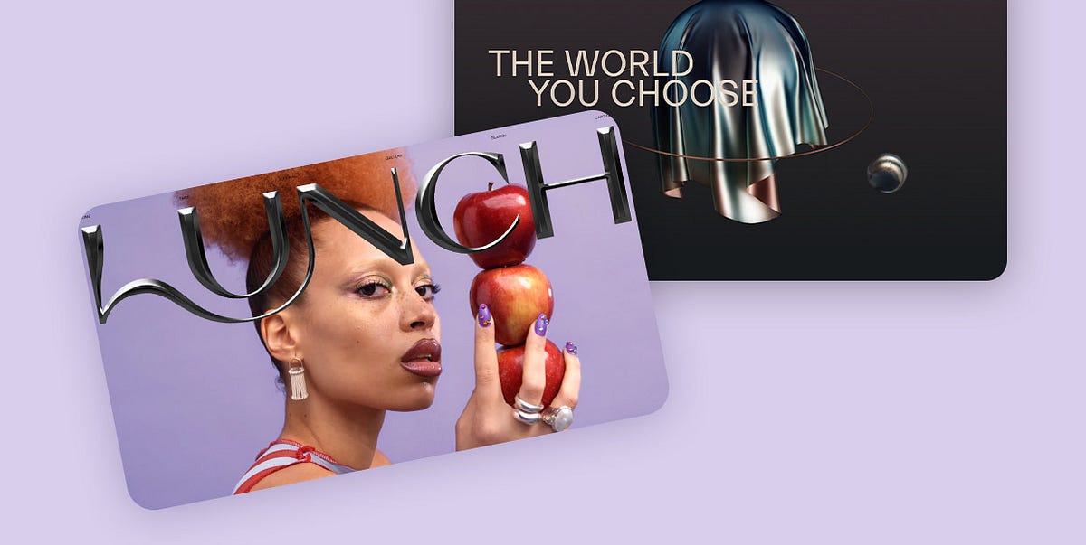
10 Captivating Examples of the Liquid Metal Effect in Web Design
There’s something about liquid metal that just mesmerizes. A steady flow of silvery, viscous fluid bears a distinct ASMR quality, with its pristine, spotless surface and motion that seems to confuse our brain — metal is supposed to be solid, right? Okay, we all know there are some not so solid metals, like mercury. We also know that many types of metal can be melted into a liquid form. So we can’t say it’s something supernatural or uncanny, and yet, we can’t take our eyes off it.Our fascination with liquid metal isn’t a new thing, but it’s definitely an “it” thing at the moment. Flat and static designs have long stepped down and surrendered the throne to weird, experimental and innovative design solutions — just think of the acid graphics revival and all the microtrends that sprouted from it. The dissemination of content on social media is moving at the speed of light, pumping in hundreds of new concepts at a head-spinning rate, delighting users but perhaps putting designers in the awkward position of always having to churn out new, exciting, boundary-pushing projects. To do this, they often reach back into past cultural and artistic traditions looking for inspiration.One possible source of inspiration for this trend is certainly the visual tradition of science fiction. Liquid metal can be seen on quite a few book covers from the genre, especially paperbacks, where designers really used to go wild. From spaceships to cyborgs, there was a lot of glimmering iridescence of the smooth, flowing metallic surfaces. The aesthetic was soon transposed to cinema — one particularly familiar example is T-1000, the bone-chilling shapeshifting assassin from James Cameron’s cult Terminator 2. The way he can turn into a puddle of liquid chrome only to assume human form again and brutally annihilate whomever is in his way remains for many the single most striking visual from the movie.Then, of course, there’s metal music with its array of subgenres, some of which, such as progressive metal, continue to nurture a predilection for this sort of aesthetics, which, in turn, stem from comic books and graphic novels. And let’s not forget the 1990’s and the obsession with speed, power and technology.Actually managing to trace the inspiration back to its origins is almost an impossible task. As is always the case in pop culture, there has been so much borrowing, recontextualizing and reinventing of certain motifs that the pathways are too difficult to untangle. Let’s return to the present moment instead.A quick stroll around Behance looking for chrome-based design yields some remarkable results and shows that there are quite a few talented designers exploring this style. The Italian motion graphics designer Sic Est, for example, did a wonderful job with applying liquid metal textures and CGI for the Versace Timeless SS18 campaign, while the Beauty Alchemist editorial for Schön! Magazine explores liquids in the context of makeup. The liquid metal trend is so hot right now you can even get chromatic toolkits to use for your next design.Instagram is a likewise rich source of inspiration when it comes to chrometype and liquid metal effects. The #chrometype hashtag has over 77k posts, there’s an account dedicated entirely to this style, and there are, of course, liquid metal filters you can apply to your stories for a weird, futuristic or cyborgian look.Finally, it’s worth remembering that, in the last decade or two, mainstream pop music has been the single most influential herald of visual trends and aesthetics. As artists strive to offer cutting-edge, innovative visuals accompanying their material to help build their persona in a holistic way, a lot of what we see on album covers and in music videos is immediately picked up, emulated and reworked, often finding its way down to the most mundane levels, such as Hot Topic garment items and so on. When it comes to liquid metal, we have seen it around a lot, most notably in the artwork for Lady Gaga’s Chromatica, Rosalía’s single Aute Cuture and Rina Sawayama’s tour merch.Today, however, we’re going to focus on some of the most successful examples of the liquid metal and chrometype trend in web design. Here are the websites we’re going to visit:Thibaut FoussardLunch ConceptHanai World&WalshYuta KawaguchiBlobmixerTwomuch StudioHenri HeymansStudio PushSofia PapadoloulouThibaut FoussardIf Thibaut Foussard doesn’t move you to pursue a career in creative development, perhaps by signing up for a couple of online courses for the job, no one will. This French developer and JavaScript enthusiast created for himself a gorgeous portfolio website, a modern layout with geometric motifs and light that changes gradually, from dark to light, as we scroll down and explore the website. Thin, sharp lines and circles are counterbalanced by large, irregular drops of dark liquid metal, gently floating upwards. The entire page has a grainy texture, and some of the largest drops (or blobs) also have a surface that’s not perfectly smooth. This texture adds depth and a life-like quality to the design and wraps it in a distinctive, cinematic atmosphere.Lunch ConceptA brand that we already wrote about in our exploration of innovative hero typography, the concept store Lunch Concept opens with a stunning video section with huge metallic typography across. Despite mimicking cold, sharp metal, the type has a slight sensual quality to it, perhaps because of its matte texture and the curve connecting the letters L and N, or perhaps because of the underlying video that lends some of its atmosphere to the logo as well. Even more than fluidity, the matte black buff of the letters communicates tactility and texture, while the sharp point of the letter C adds a bit of an edge to the character. The letters look bendable and hollow on the backside, and the overall effect is a desire to touch, explore and play around with the logo.Hanai WorldMarketed as a mixed reality social platform, Hanai World is set to deploy in late 2021 and is planned to involve a community of creators, developers and tech companies working together to provide synchronous physical and digital experiences, primarily in the field of entertainment. For now, the only glimpse into the platform (and the movement, as the creators call it) is the website calling for new team members, creators and developers. Judging from the design, it’s going to be one modern, future-oriented environment for creatives and developers to basically compete with each other in who can deliver a more innovative experience with a heavy emphasis on aesthetics. The dynamic background in a pastel gradient gives off a vibe of cosmic melancholia, a mood supported by a number of objects, mostly spheres, made in liquid metal, orbiting around each other or simply floating in and out of view. A pair of liquid metal hands reaches out from windows to some parallel worlds, welcoming new members. The entire composition supports the idea of creating new universes within our existing one and bypassing the walls between physical and digital realms.&Walsh&Walsh is a New York-based branding and advertising agency with a distinct, modern vibe and a dedicated but playful approach to work. In addition to providing an excellent illustration of the liquid metal trend, their homepage also serves as proof of how important context is in web design. The agency logo consists of a large metallic ampersand in calligraphic style, with matte black surface. Alone, the logo could even be perceived as classic, as it appears to be made of wrought iron. However, certain elements of the type design here, the way the logo is nested in a modern layout and, most of all, the video section underneath it all give the ampersand a more contemporary feel, and its material and texture don’t feel as vintage as they would outside of this environment.Speaking of the video section, it too represents an inspired investigation of the potential of liquid metal in design. The initial sequence features metallic shapes that flower and spread on a woman’s face, forming the ampersand, and then cuts to a sequence representing a sea of molten metal, from which a lava-like mass emerges, then forms, again, an ampersand, which then sinks back into the fluid, releasing a cloud of vapor and smoke. It’s a fine piece of branding that simultaneously shows the multifaceted nature of liquid metal, showing it doesn’t always need to be high-gloss and gleaming and doesn’t have to pertain to a dystopian, futuristic or high-tech narrative.Yuta KawaguchiYuta Kawaguchi is a Japanese designer with an unmistakable, edgy style. His work is known for 3D type forms that feel sharp as a knife, or perhaps a shuriken, as many of them feature forms inspired by this weapon. His designs are usually set in bold, ultra-vivid environments with soylent greens, radioactive yellows and post-atomic blues. The typography style borrows inspiration from the 1980’s and 1990’s B-production action movies and horrors, as well as from heavy metal iconography and hip-hop culture. It’s a radical, loud and aggressive mix of influences, with each piece carried out to perfection. His liquid metal designs are particularly striking, as they have a distinct physical quality — they look like they could cut right through the screen, and their gleaming surfaces reflect colors that speak of dystopian times.Blobmixer14islands is a Swedish creative design and development studio with a number of major projects and awards under its belt. The studio also creates fun, interesting projects for no apparent purpose other than to delight the users and, well, showcase its team’s skills. One such project is Blobmixer, an online tool (or toy, if you wish) for creating 3D blob shapes which can be viewed and interacted with in VR, as well as downloaded or shared with friends. The tool is extremely simple and intuitive, and can be used by anyone. In addition to the tool itself, the website features a showcase of some of the best blobs made with it. Some of them feature a liquid metal texture, and one is even named after the above mentioned T-1000. Other featured materials include water, plastic, lava, slime, liquid makeup, and so on.Twomuch StudioHere’s a design that seems to be all over the place and yet in some sort of weird harmony. The Twomuch Studio website opens with a cluttercore-ish mess of floating objects on a sterile white background, complete with a corner menu with what appear to be Patrick Starfish’s eyes. The assortment of floating objects includes a few screens, some bricks, a giant pencil, a megaphone, and several objects that are hard to identify. As they turn around, their surfaces transform from plaster-like white to liquid metal, first matte, then iridescent and shiny. And behind all this, the barely legible metallic logo of the studio, also shifting and changing color and texture as its metallic fluid flows and swells. Oversized, pixelated cursor arrows float alongside the 3D objects, too, and combined with the menu, add a brutalist touch to the design.Henri HeymansFor his 2021 portfolio website, the independent front-end developer Henri Heymans opted for a page centerpiece that explores movement and texture using liquid metal as the medium. A planet-like metallic orb rotates around itself in the hero section of the website as its uneven, grainy surface flows and melts, resembling something between fine sand and TV static, while its sharper lines bring to mind smooth passages between colors in a gasoline rainbow. The orb is never still — it’s either turning around itself, or following the cursor movement. The page then proceeds to a rather conventional display of selected works, so the orb serves as an emblem of the author’s skills and also as a striking opening of the website.Studio PushBrutalist design and liquid metal seem to be a particularly hip combination right now. It actually makes sense — brutalism is about exaggeration and irreverence, and chrometype, being not only flashy but often also hard to read, fits into the ethos perfectly. The international multidisciplinary Studio Push from Paris, working with creative coding to create boundary-blurring graphic and typography experiences, is a good example. The homepage features a stripped-down, basic layout with essentially just plain black text on white background and gives off a raw vibe reminiscent of the earliest web pages. This decisively brutalist aesthetic is contrasted or, better yet, complemented, by a large marquee featuring the studio logo in chrometype, combining the liquid metal technique with the graffiti style, and also giving off an impression of text that was made by dripping thick fluid from a paint tube. The logo somewhat interferes with the reading of the text, and the experience becomes even more unfriendly when the text is clicked upon — clicking basically anywhere on the page prompts an image from a project to open, and further clicking opens new images without closing the previous ones. The result is an unnerving heap of images and text, complete with the logo marquee that never ceases to move across the screen. It’s a cheeky approach to design that basically yells “I don’t care about UX” but, as such, sparks curiosity and, paradoxically, a degree of appreciation.Sofia PapadoloulouSofia Papadopoulou is a Greek visual designer and art director who creates immersive, forward-thinking digital experiences. Her website embodies one of the principles she pursues in her work — to “uncomplicate and beautify.” It is a dark, elegant, modern design, featuring grey text on a black background, with a single star cursor that sheds light on the text it hovers upon, revealing that, despite the darkness, the sentiment behind the design is one of optimism and joy. The central, albeit discrete element of this single-page website is an animated 3D object, an irregular sphere with a wavy surface, made of a matte black material that resembles metal, perhaps iron, but it could also be a smooth piece of lava stone. As we scroll down the page, the object transforms, flows, morphs under a changing light, but never does its presence or its transformation take focus away from the main content — the text.Wrapping It UpAnimated, static, chrome-like or matte, liquid metal is bound to add that extra oomph to a design. Sure, it can’t possibly be a good choice for just any website and any brand — as we saw, liquid metal needs a specific context in order to work. While many would automatically associate this style with futurism, it’s important to remember that at this point there’s really nothing futuristic about liquid metal. Retro-futuristic, then? Sure. Future-nostalgic? Definitely. The world we’re living in right now is in trouble and hauntological melancholia has been a pervading concept ever since we realized just how deep the trouble was, which accounts for so many derivative aesthetics and seemingly anachronistic references to past trends and concepts. But liquid metal in web design is more than just a nod to a cool past aesthetic. In web design, metal, or really any other matter, is free from the limitations of its physical form. It can shift, bend, drip and melt in any possible and impossible way and, as such, it’s an amazing resource for designers looking to imagine, construct and direct their own vision of the future, bright or bleak.10 Captivating Examples of the Liquid Metal Effect in Web Design was originally published in Muzli - Design Inspiration on Medium, where people are continuing the conversation by highlighting and responding to this story.
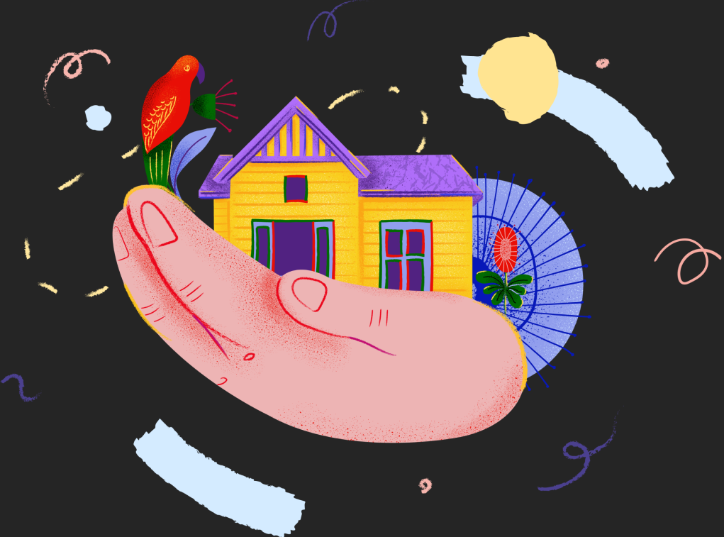
An in-depth look at the best websites that use creative illustrations.
In the expansive digital landscape, where countless websites compete for attention, the use of illustrations has emerged as a powerful tool to captivate and engage audiences. Far from mere decorative elements, illustrations serve as a vital medium for storytelling, infusing websites with personality, emotion, and depth. This article explores the transformative role of illustrations in web design, showcasing examples of best illustration websites that have masterfully harnessed this art form to elevate their narrative and connect with their viewers on a more intimate level.The magic of using illustrations on websites.Illustrations offer a unique blend of aesthetics and functionality, bringing complex ideas to life in an accessible and visually engaging manner. Through color, form, and composition, they can convey mood, tone, and brand identity, enriching the user’s experience and fostering a deeper connection with the content. Beyond their visual appeal, illustration website have the power to simplify intricate concepts, guide users through a digital journey, and create memorable interactions that resonate on a personal level.Using illustrations on websites can significantly increase engagement and improve various metrics. Here’s an overview of how illustrations can make a difference:1. Enhanced visual appealIllustrations add a unique visual element that can make a website more attractive. Unlike stock photos, custom illustrations can be tailored to match the brand’s identity and message, creating a cohesive and visually appealing experience. This can lead to longer visit durations and lower bounce rates as users are more likely to stay and explore a visually engaging site.2. Improved user experienceWebsites with illustrations can simplify complex information, making it more digestible for users. Infographics, for example, can turn data-heavy content into an engaging visual story, helping users understand and retain information more easily. This improved user experience can lead to higher satisfaction and increased likelihood of return visits.3. Emotional connection with audienceWell-crafted illustrations can evoke emotions and create a connection between the website and its visitors. This emotional engagement can enhance the user’s overall experience, making them more likely to interact with the content, share it on social media, and convert into customers or subscribers.4. Increased social sharingUnique and visually appealing illustrations are more likely to be shared on social media platforms. When users find content visually interesting, they are more inclined to share it with their networks, increasing the website’s reach and driving more traffic.5. Better brand recallCustom illustrations that align with the brand’s identity help in creating a memorable experience. Users are more likely to remember and recognize a brand that uses distinctive visuals. This can lead to improved brand recall and loyalty.6. Higher conversion ratesIllustrations can be strategically used to guide users through a website, directing their attention to key areas such as call-to-action buttons. By highlighting these elements effectively, illustrations can help improve conversion rates, whether the goal is to get users to sign up for a newsletter, make a purchase, or fill out a form.7. SEO benefitsWhile illustrations themselves don’t directly impact SEO, they can enhance user engagement, which is a key factor in search engine rankings. Longer visit durations, lower bounce rates, and higher social sharing all contribute to improved SEO performance, helping the website rank higher in search engine results pages.8. AccessibilityIllustrations can also be used to make a website more accessible. For instance, illustrations that include alternative text descriptions can help visually impaired users understand the content. This not only improves the user experience for all visitors but also ensures compliance with accessibility standards.The best examples of illustrated websites.1. ITG.digital — illustration website and online builder.ITG.digital stands as a prime example of how illustrations can be the heartbeat of a website. This platform, designed as a repository for digital illustrations, not only showcases the art form but also embodies it in every aspect of its design. The website uses animated illustrations to demystify its offerings, making the digital assets feel tangible and relatable. Through vivid and diverse illustrations, ITG.digital invites users into a world where creativity knows no bounds, encouraging exploration and discovery.https://medium.com/media/3464739e9f7777fe84bc456d11a30b51/href2. The Silly Bunny — illustrated website for children’s book.The Silly Bunny’s website takes users on a whimsical adventure, where playful illustrations become the main characters of the story. This approach not only captivates the imagination but also creates a unique brand identity that stands out in the digital crowd. The use of animation brings the illustrations to life, adding a layer of interactivity that enhances the narrative and engages users in a dynamic, immersive experience.You can read more about this website in this Case study.https://medium.com/media/6c916a7b9dfe021e55ed05490c0b52c4/href3. Middle Finance — fintech website.Middle Finance tackles the often daunting world of mortgages with a friendly and approachable demeanor, thanks to its clever use of illustrations. These website with illustrations serve to demystify financial concepts, making them more accessible and less intimidating for users. By personifying the mortgage process through engaging visual narratives, Middle Finance breaks down barriers and fosters a sense of trust and ease, inviting users to explore their services without apprehension.You can read more about this website in this Case study.4. Illustrated promo website for AI-powered product.This website leverages illustrations to humanize and simplify AI technology, presenting it as a friendly and accessible tool. The visual narrative helps dispel myths and fears about AI, showcasing its benefits in a light-hearted and positive manner.5. Kukwo website with illustrations — promoting an app that allows users to get the core points of non-fiction books on the go.Custom illustrations and animations on this website make it easy to understand the core features and benefits of the app.6. Joint Base — an illustrated venture website.Simple illustrations on this website play a big role in visually supporting information, making the brand closer to the audience.https://medium.com/media/44e358d0663d4d80bc9023c0c3120f80/hrefConclusion — the role of illustrations for website.Illustrations for websites play a very important ro e. Illustrations in web design go beyond mere decoration; they are a powerful storytelling tool that can evoke emotion, convey messages, and create a memorable brand identity. The websites highlighted above exemplify the diverse ways in which illustrations can enhance the digital experience, making complex concepts more understandable, engaging users on a deeper level, and transforming the web into a canvas for creativity.Here you can find more examples of craft storytelling websites:The Silly Bunny — A highly immersive and interactive website for children’s book, with AR experiences and 3D animations. (You can find more details in our Case Study and do not forget read our article How to create an immersive website with AR and 3D.)ITG Digital — a craft and creative website for SaaS product.Middle — a fintech website for a game-changing digital platform for the mortgage industry in Australia. (You can find more details in our Case Study)OrCad — an enterprise website design built with Webflow. (You can find more details about design process in this article How to effectively implement 3D animation on a website and, of course check our Case Study)Design director portfolio website (You can find more details about design process in this article Beyond Pixels and Code: Crafting your unique story trough creative website design.Cathey & Miles attorneys website — Craft website design for a law firm.An in-depth look at the best websites that use creative illustrations. was originally published in Muzli - Design Inspiration on Medium, where people are continuing the conversation by highlighting and responding to this story.
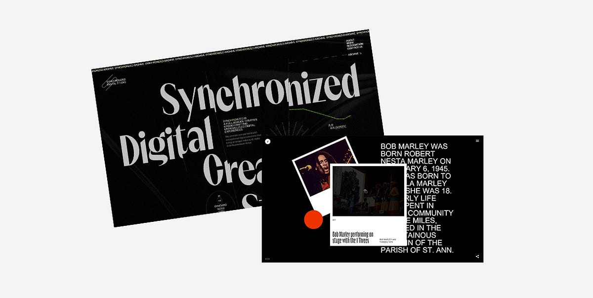
25 Inspiring Examples of Black Websites
Black is, arguably, the queen regnant of all colors. It emanates dominance, mystery, elegance, and reflects a wide spectrum of emotions. Depending on the context, it can be conservative or unconventional, luxurious or minimal. Its usefulness simply knows no bounds.Thanks to its versatility, black plays an important role in all forms of art. In design, it is often used as a standalone color, mostly in logos, as it can help add a touch of power and sophistication to a brand. Think of Louis Vuitton, Gucci, Chanel, Adidas, or Nike, to name a few. However, black can also serve as a spectacular backdrop for websites. It helps put all other elements in the spotlight and accentuates the brightness and vivaciousness of surrounding colors.Below you’ll discover 25 stunning examples that prove the potency of black as a background color. While some of them use the simple yet timeless combination of black and white, others combine a variety of colors with their black backgrounds. But they all unquestionably illustrate how dark designs can help brands and individuals differentiate themselves from the crowd and create awe-inspiring projects. The websites we’ll introduce you to are:Synchronized StudioTrip in the DarkAndrew LeguayYuto TakahashiClement MerouaniSam PhlixA Day OutSpatzek StudioDigital Marketing ConferenceDesign CanadaThrowbacks MusicMav FarmEclipse SRLAkufenMysta ElectricMaxillaLongshot FeaturesCultishJuraj MolnárGucci MarmontIntro to Coding for DesignersKontrapunktMasters 1987WiseslangSkyline FilmsSynchronized StudioSynchronized Studio is a team of creatives and experts in digital art direction, branding, web design, and much more. A word that best describes this website is — powerful. There’s a loading animation that looks like a lightning bolt tearing the dark background as the numbers go from 0 to 100 indicating the loading status. The background is particularly interesting. For one, it’s not static. It resembles black silk wrinkled sheets, and the movement of your mouse causes the “sheets” to stir. The cursor leaves a lime-colored trace behind that adds a touch of color to the homepage. Inner pages are black and white, save for the projects page which is especially fun to explore because of the horizontal drag effect.Trip in the DarkTrip in the Dark is an astonishing project created by the Voskhod digital agency that I could wax poetic about ad infinitum. While the website loads, you first see a blinking eye placed on a black background inviting you to be patient while you await for your adventure in the dark to begin. You can then choose the way in which you wish to experience the site — with your ears, eyes, and/or by using your voice to interact with it. Once that’s settled, you’re introduced to Volodya, a not-your-typical tour guide. The background is initially white, but as he begins to narrate his experience and informs you that he’s visually impaired, the light switches off and you’re enveloped in darkness. He tells you his story using his voice as well as through a series of spectacular illustrations that lead you to a crossroads. There you can choose between exploring places or getting to know locals. If you select the former, you’ll be able to make your own map based on the real sounds of the city. You can select a maximum of 5 sounds that you should place in designated slots to then see your route through Yekaterinburg. If you go right and choose to meet locals, you’ll have the opportunity to hear several interesting stories that highlight the importance of listening to sounds, both external and the ones within ourselves.Andrew LeguayAndrew Leguay is a designer who specializes in branding, digital products, and lifestyle marketing. His creativity is evident in every single pixel of his commendable portfolio website. As you wait for it to load, the screen becomes more and more chaotic with each passing second. Words such as organization, strategy, branding, marketing, culture, product, framework ambush the screen and are all you can see at one point. It all clears out in an instant and then you get the chance to explore Andrew’s work. The entire website is designed using just three colors — black, white, and dark orange. The background is black, which allows the featured elements to stand out. The font choices are interesting and unusual, especially the typefaces used in headlines. And when it comes to animation effects, the glitching on scroll effect wonderfully complements the cool vibe of the entire site.Yuto TakahashiYuto Takahashi is an art director and a web and graphic designer. His website is mesmerizing from the get-go. The homepage starts off with a somber background image of a woman that appears to be submerged underwater. This composition looks calming and mystical, and it stands as an alluring invitation into Yuto’s creative world. To dive into it, you must first hold down the mouse button for a few seconds. What you’ll discover are his works masterfully displayed on a black background. The color palette he used on the website is not overpowering and it subtly contrasts the dark background. While you scroll and the projects appear on the screen one after the other, you’ll notice how their surface is wavy, resembling turbulent waters. As soon as the scrolling stops, the scroll-triggered animation effect is gone and the images become still. If you click on any of the pictures, you’ll see an in-depth presentation of the featured projects.Clement MerouaniThe website of Clement Merouani, a French art director and photographer, looks like a modern online art exhibition that you can visit and admire from the comfort of your home. You can control the carousel of his colorful works with your mouse. As you scroll or drag from left to right or vice versa, you’ll notice how the edges of displayed images become protuberant. The side towards which they lean depends on the direction in which you scroll. Clement’s website is essentially minimal and well thought out. The background is dark, elegant, and it ensures his works are in the spotlight. There are no distractions, no redundant elements that might draw your attention away. All the while you stay focused solely on his art. If you click on Index at the top left corner of the screen, you’ll see all of Clement’s works displayed in the Pinterest style on a black background.Sam PhlixSam Phlix’s website is minimal to the core and a perfect example of how you don’t have to go overboard with special effects to make an eye-catching online presentation of your work. There’s a black backdrop, big white letters, and monochromatic imagery. Oh, and a carousel, the “wild child” of this site. If you bring the pointer on the wheel and hold the mouse button, the carousel will start to spin, simultaneously inverting the website’s colors — the background becomes white and the letters turn to black.A Day OutA Day Out’s works are displayed in large, irregularly-shaped, multi-colored blocks dotted all over the dark background. The masterminds behind this studio have cleverly used colors and the shapes of displayed elements so that you can’t help but feel the strong pull to explore their portfolio. Even as you click on a project of your choice to learn more about it, the black background will still be there with large imagery added on top of it to show you every single aspect of the selected project. Back on the homepage, the studio’s name is written in large typography and is visible at all times. As you scroll, the letters start to move, going from one side of the screen to the next, often swapping places. The fonts these guys used are very simple, colored in white, and placed in stark contrast with the darkness behind them.Spatzek StudioSpatzek Studio’s website looks powerful and bold from the first scroll to the last. The riveting visuals and witty textual content form the perfect amalgam that illustrates the studio’s creative genius and their skillset. They say they don’t want to over-complicate things but rather care about emotions and creating projects for humans. It goes without saying that their homepage looks spectacular, but the about page is probably unlike anything you’ve seen before. There are yes / no questions to which you must answer before getting to read the studio’s bio. The text alone is fun to read, but thanks to the hilarious videos they’ve added to the description, things become all the more fun for the visitor. There’s a lot going on no matter what part of the website you go to. Lots of motion, large fonts, video content, etc. but everything looks harmonious because of the neutral black background.Digital Marketing ConferenceThe Digital Marketing Conference is organized every year by the famous Russian creative agency Possible. The website they’ve made for the 2019 edition is nothing short of majestic. You feel like you’re suspended in the air, exploring the continuously rotating dark universe of the conference by dragging the mouse cursor in every which direction while eerie sounds play in the background. All you see is black and white, with traces of red here and there. Above you are the starry skies with the DMC 2019 logo shining bright in the middle of it. If you keep looking up, the logo fades away, the stars spin harder and lose their form, and you feel like you’re sucked into some kind of digital vortex. Before you get dizzy, it all clears out after a few seconds, and the sky goes back to being starry again. Interactive links are placed at eye level and they carry info about the event, its program, speakers, etc. If you look down, you’ll see a map of Moscow with a clearly marked conference hall. The creativity of this 360° project doesn’t cease to amaze from one pixel to the next, and you can experience it even in VR.Design CanadaDesign Canada is a documentary film that introduces us to the finest Canadian graphic designs. The website was created by the phenomenal Locomotive agency. They’ve designed it in quite a simple yet compelling way, relying mostly on the colors of the Canadian flag — red and white. The background is black, which helped accentuate the iconic logos and other design examples. Animation effects, transitions, and micro-interactions are engaging, and they help make the browsing experience smooth, enjoyable, and entertaining.Throwbacks MusicThe majestic Throwbacks Music takes us back in time and gives us an entertaining, interactive 3D music experience. The black background is omnipresent on the entire website. We can listen to the great old songs that are popular to this day and learn more about musicians who created them. The library of featured artists is displayed in the form of a carousel, and as you move from one artist to the next, you feel as if spinning a record. The pictures of artists are black and white until you stop “spinning”, which is when they gain color. When you find a musician you like, you can hear a preview of whichever of their songs is included in Throwbacks Music’s music catalog. To listen to the song in its entirety, all you need to do is press and hold the spacebar. That action will take you to the page where, besides hearing the song, you can read more about the selected artist. Before you scroll away to the next musician, you can have some more fun and play virtual guitar strings by moving your mouse over them.Mav FarmMav Farm’s website is definitely something else. While it loads, you can see the name of the app written in futuristic-looking blue and purple letters across the screen. Once the content’s ready, an eyeball pops up at the bottom of the page luring you in and inviting you to click on it to enter the website. And then, you step into a surreal universe where WebGL scroll navigation rules everything. There are lots of colors, futuristic elements, complementing typography and terrific animation effects that look breathtaking on a black background while truthfully portraying the description of the company, which is — A new network and an alternate reality.Eclipse SRLThe website of the Italian agency Eclipse SRL is minimal and very fun to explore. Its ambient is very dark, matching the brand’s name. The homepage background is black and its monotony is occasionally disrupted by the passing dark moon. You’re encouraged to hold the mouse button and “draw” on this virtual blackboard. As you drag the mouse pointer across the page in whatever direction you please, you’ll leave a white trace made up of words in different sizes behind. If you click on the crescent moon at the top right corner of the screen, you’ll see a page filled with images depicting different lunar stages. On hover, some of them turn into Super Mario, Michael Jackson, or the iconic Pink Floyd’s Dark Side of the Moon album cover art. This is also where you can read more information about the agency and explore their projects.AkufenThe first thing you see as the Akufen’s website loads are floating 3D cubes that levitate towards the middle of the screen. They form a large unit at the center that follows the movement of your mouse. Everything’s in black and dark grey hues, save for white typefaces. Exploring their portfolio feels very smooth thanks to the infinite scroll effect. The projects line up one after the other while the background remains dotted with dark cubes. The 404 page is charming and in stark contrast with the rest of the website. Its background is black, but there are occasional colorful, full-screen glitches interrupting the black and white synthesis.Mysta ElectricMysta Electric is a phenomenal tattoo artist that creates “dark graphic tattoos with beautiful melancholy” and his website perfectly matches that vibe. It’s entirely monochromatic, oozing coolness from one pixel to the next. The first thing you see is Mysta’s head in the background. Wherever you may move your cursor, the head will follow the movement. As you start to scroll, large typefaces take up the screen telling you Mysta’s story. If you hover over some words, you’ll see pictures of Mysta at work and with some of his clients. There’s also an extensive image gallery containing some of his awe-inspiring and idiosyncratic tattoos, as well as a black and white video that gives us a glimpse into the artist’s creative process.MaxillaMaxilla is a visual studio and a digital agency coming from Japan. Besides an interesting name and a cool logo, they also have a website that serves as an example of the striking things you can achieve with a black canvas and a lot of imagination. They start off with a bang — the first thing you see is a majestic radial menu featuring their portfolio. The names of projects are written in large, all-caps, white types, but on hover, your cursor turns into a big, black spot that sucks the white out of letters and leaves them outlined in the dark. Inner pages also reflect the agency’s creative approach to design, in particular, their about page. There’s an illustration of the white deer’s head at the center that follows every movement of your mouse. Next comes some short text informing you about what the agency does, and then — bam! You see a picture of a huge plush deer caught in the headlights, placed in the middle of the street. A few scrolls later, as if nothing happened, the deer is gone and Maxilla’s contact details appear.Longshot FeaturesLongshot Features is a production company with a terrific horizontal-scrolling website that introduces us to their wonderous world of film. It’s filled with remarkable animated art of the pointillism master Mattis Dovier. When you click on any of the featured cinematic illustrations, you’ll reveal the story of the studio, the films they’ve made, etc. The stunning pixel art and the whole website are made relying on the black and white hues, proving once more the undisputed creative power of this timeless color pairing.CultishCultish is a South African creative studio with a beautiful website that fuses seemingly unmatchable elements. The first thing you see is Penitent Saint Peter, a Jusepe De Ribera’s painting from the 17th century. As you move your mouse over it, the parts of the image where the cursor is placed twirl leftwards, giving this classic composition a modern twist. Again, there aren’t that many colors on the homepage — the background is black and the letters are white or blue. But somehow the website doesn’t ever look dull. Aside from the large painting taking up the upper part of the page, you’ll also discover images of the studio’s projects while moving your mouse through the darkness. Inner pages are predominantly monochromatic as well, adorned with sporadic splashes of blue.Juraj MolnárJuraj Molnár’s website proves, once again, that black is possibly the best choice for portfolio websites, and that less is certainly more. The transitions from one section of the site to the next are smooth and subdued, with the progress bar displayed at the left-hand side of the screen. This is a mainly typographic site with a mix of bold and outlined letters. When you hover over the names of Juraj’s projects, a few images show up on the screen, inviting you to explore in greater depth the selected work. I especially liked the animated outlined illustration of a beating heart. It’s placed right next to the list of awards Juraj has won so far, indicating that he probably holds all those accolades close to his heart.Gucci MarmontThe creativity of the people behind Gucci is inspiring, and not just on the runway. The websites their team has created for their big campaigns are all picturesque and mesmerizing. The one they made for the Gucci Marmont collection is no different. The website shows the Marmont bags as parts of still life paintings reminiscing the Renaissance era. The paintings are hung on a wall, and as you study them, you almost forget that the purses are the charming intruders that don’t naturally belong to any of these artworks. Given the colorfulness of the images, the choice of the black background is ideal.Intro to Coding for DesignersIntro to Coding for Designers is a beginner’s class that teaches designers the fundamentals of coding. The color choice for this website is not surprising. The black background along with white, orange, blue, and green elements are all typical of coding in Javascript, CSS, and HTML, which are the programming languages this course teaches you about. This website is quite simple, but it’s amusing to explore. There’s a playful feel to it, as the authors have added a bunch of geometric shapes that run away from your mouse pointer as soon as you hover over them.KontrapunktKontrapunkt is one of the leading Scandinavian design agencies and they’ve created a stunning online exhibition celebrating the Kontrapunkt typeface. They’ve singled out eight projects in which this font is used, demonstrating its versatility. The agency has opted for the predominantly dark color palette on the homepage, with lots of black and grey elements that are contrasted with white and yellow textual content. The typeface overview is informative and comes with lots of beautiful cursor animations. You can explore each project further by clicking on it. The exciting project pages shine more light on the typeface and demonstrate how it looks in action.Masters 1987Masters 1987 is an event production company from Los Angeles whose client list includes Oscar, Netflix, HBO, among many others. The use of a black background allowed them to promote their services in a striking way by opting for vivid imagery, all-caps typefaces, and snazzy interactions that ensure a cool browsing experience. The cursor looks especially charming. It’s like a comet that turns into a spotlight when you move it across letters. When placed on images, it puts them in commotion. The pictured objects zoom in and out, the photograph surface seemingly becomes undulating, and the color of the area where the mouse pointer is inverts.WiseslangWiseslang is a platform that gathers creatives from various fields. Their website looks subtle and impressive at the same time. The darkness throughout is filled with floating white dots or particles that assemble into all kinds of shapes. To navigate the website, you should use the arrows placed on the left and right sides of the screen. You can learn more about Wiseslang and the projects they’ve worked on, and regardless of the section you decide to explore, the playful white particles stay on the screen all the time.Skyline FilmsSkyline Films come with a website that all cinephiles will appreciate. The movies are displayed on what looks like an infinite cinematic canvas that you can explore by holding & dragging your mouse in any direction you wish. When you stumble upon a movie you like and stop moving the cursor around, a trailer for that specific feature will start to play. And if you click on the movie’s name, you’ll discover more information about it, its storyline, etc. The featured movies are all bursting with color, so the choice of a black background is not surprising in the slightest.Final WordsBlack is an exceptional, visually appealing backdrop color that gives a sense of depth to any project and highlights featured contrasting items. It helps brands tell their story in an attractive and unusual way that sets them apart from competitors and makes them more memorable.As the websites from our roundup depict, black looks best when paired with lighter hues. When you use brightly-colored typography on a dark background, you don’t have to worry about readability, which is a common issue in dark design. And to create arresting projects, you don’t need to go wild with special effects. As you could see, sometimes all it takes are two colors, a couple of cool animation effects, and simple graphic content to make a memorable and astounding website.Originally published at https://qodeinteractive.com on August 28, 2020.25 Inspiring Examples of Black Websites was originally published in Muzli - Design Inspiration on Medium, where people are continuing the conversation by highlighting and responding to this story.
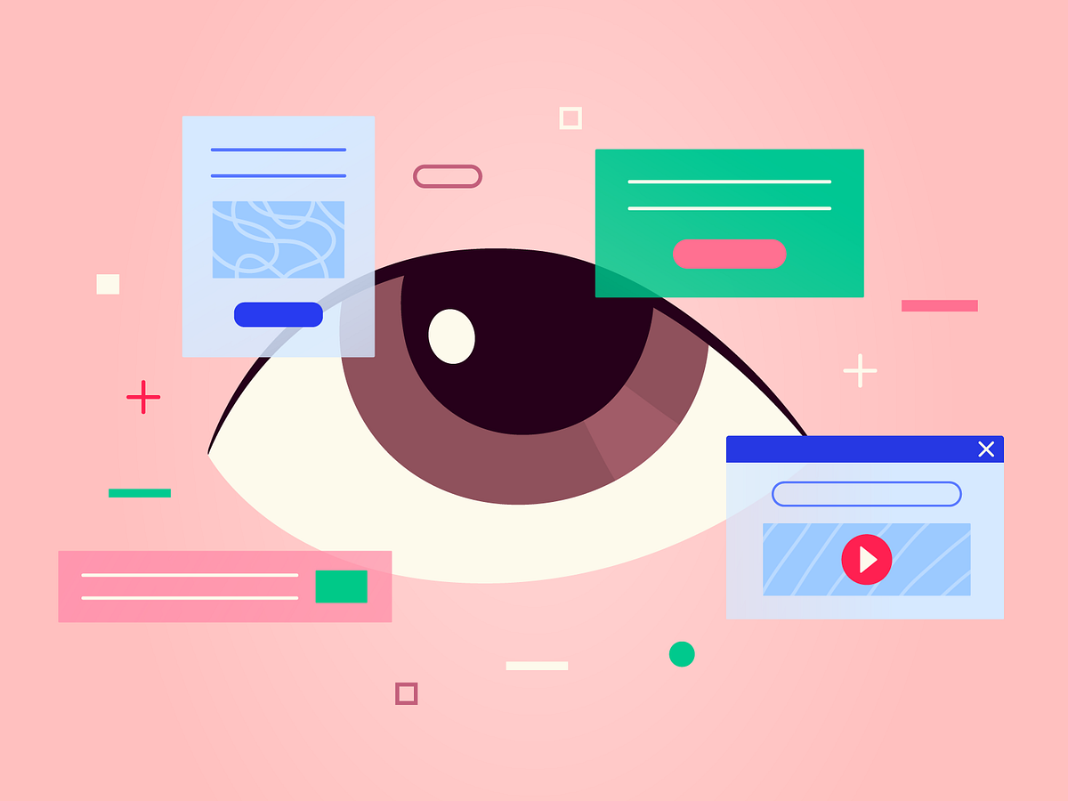
How you can learn from the world to become a great designer
Source: Anita Mura on DribbbleIn the design field, many begin by studying existing designs to master the basics, understand trends, and learn successful techniques. However, this approach has significant limitations. When young designers focus solely on replicating existing designs, their work often lacks originality and inspiration.This problem is rooted in the echo chamber effect.When designers rely solely on existing ideas, they risk producing repetitive solutions. This inward focus stifles creativity and innovation. It prevents the development of fresh perspectives.Moreover, without exploring beyond existing designs and engaging with the world around them, designers struggle to address real-world problems effectively.This broader understanding is essential for creating solutions that truly meet real-world challenges.Chuck Jones (a renowned animator and director known for his work at Warner Bros. during the Golden Age of Animation) found inspiration for his cartoons by observing human behavior, wildlife, and nature — followed by adding his signature touch as an additive to his keen and sharp observation.This is the crux of our argument: merging creative individual thinking with keen observation of diverse elements can lead to truly groundbreaking work.By combining personal creativity with insights drawn from a wide array of sources, designers can produce innovative and impactful solutions.Some examples where the real world informs the design1. GPS navigationGPS navigation apps draw inspiration from traditional paper maps and compasses. It has visual representation of routes, markers for destinations, and the use of directional cues.2. Calendar systemsDigital calendar apps often draw inspiration from traditional paper calendars. They mimic the visual layout of months, weeks, and days.3. Email inboxThe concept of an email inbox draws inspiration from physical mailboxes. It organizes incoming messages, allows users to prioritise and archive them.4. Digital walletsDigital wallet apps, like Apple Wallet, mimic the functionality of physical wallets by storing payment cards, tickets, loyalty cards, and coupons in a digital format.How you can learn from the world aroundTo break free from the echo chamber, designers must learn from the world and the diverse culture around them.Here’s how:1. Study real-world problemsInstead of just focusing on what other designers have done, it’s important to look at the real problems people face.By observing how people behave and what challenges they encounter in their daily lives, designers can create solutions that truly help.For instance, if you are a designer working in the banking space, it is crucial to understand how banking functions and core concepts work. By closely observing and interacting with users, you can gain insights into their pain points and workflows, which helps identify inefficiencies and areas for improvement.2. Explore interdisciplinary knowledgeDesign extends beyond aesthetics; it involves a profound understanding of human behavior and needs. By incorporating insights from disciplines such as psychology, sociology, and technology, designers can attain a broader perspective. This interdisciplinary approach enables them to craft designs that resonate more deeply with individuals, fostering a stronger and more meaningful connection.For instance, By understanding principles of psychology, a designer can work on design that actually harks on real human responses.3. Spend time with non-designersDesigners can get new perspectives by working with experts from different fields like engineering, marketing, or sales. This collaboration can spark creativity and lead to designs that are innovative and practical.For instance, Designers can benefit immensely by interacting with people from eclectic backgrounds, as it provides them with a richer context of the real world. Engaging with individuals from diverse fields and experiences offers designers unique perspectives and insights that can enhance the relevance and impact of their work.This exposure helps designers to create more nuanced and culturally resonant designs that speak to a broader audience.4. Stay curious and open-mindedDesign is always changing, so it’s important for designers to keep learning and trying new things. Being curious about new trends, technologies, and the world, helps.Observing the world is what makes a good designer, a great designerBy staying curious, seeking out diverse influences, and always looking beyond the obvious, we can create designs that are not only functional but also deeply resonant with its users.The world is full of lessons waiting to be learned and insights waiting to be discovered.To gain a mature understanding of problem statements, improve our craft, and become great designers, we need to look beyond the design community and experience the world.Canvs Editorial regularly brings you insightful reads on design and anything related. Check out the work we do at Canvs Club.The Canvs Editorial team comprises of Editorial Writer and Researcher — Paridhi Agrawal, the Editor’s Desk- Aalhad Joshi, and Content Operations- Abin Rajan. Follow Canvs on Instagram for more design-related content.While you are here, do check out Cassini, a quick and easy way to review designs, websites and collect screenshots, all in one place.How you can learn from the world to become a great designer was originally published in Muzli - Design Inspiration on Medium, where people are continuing the conversation by highlighting and responding to this story.
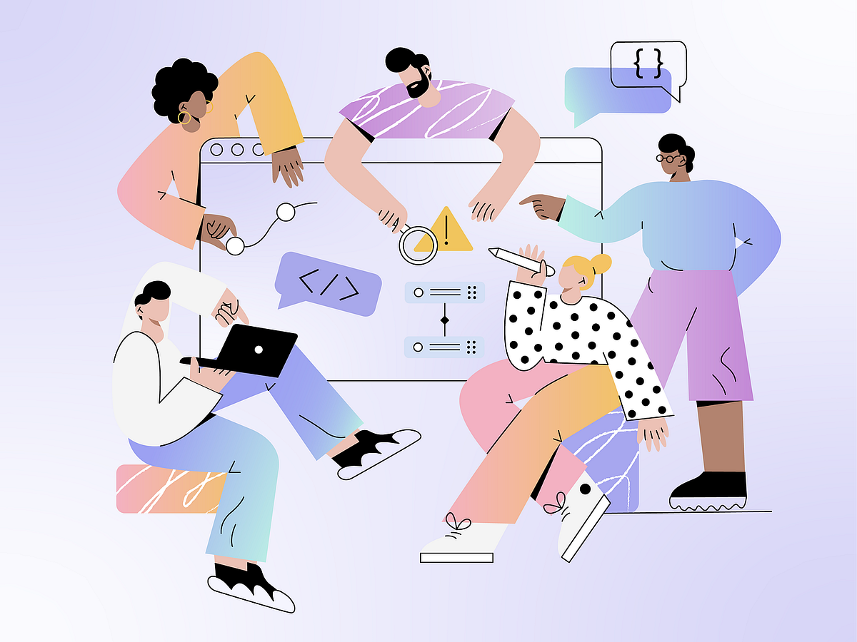
Good UI is Good UX
Source: Inna K on DribbbleDid you know that when Google changed the shade of blue on their ad links, they earned an extra $200 million in annual revenue?This simple UI adjustment had a massive impact on user interaction and company profits.Some see these UI and UX as separate: UI deals with how things look, while UX focuses on how products work and feel.While, we argue that they’re tightly linked. UI is the face of UX — the first thing users see and interact with.Good UI design ensures that every click, swipe, and interaction feels intuitive and seamless, ultimately defining how satisfied users are with a product.What is the aesthetic usability effect?People have a natural bias towards aesthetics. This means users often perceive well-designed products as more usable, even if there’s no real improvement in efficiency or effectiveness.A beautifully designed interface can make users feel more confident and satisfied, leading them to overlook minor usability issues. Conversely, a poorly designed interface can make even the most functional product feel difficult to use.This is the aesthetic usability effect.The tangible impact of visual aesthetics on the UXSource: Inna K on Dribbble1. First impressionsAesthetic appeal plays a critical role in forming initial user impressions. When users first encounter a product, a well-designed interface creates a positive perception, making users more inclined to explore further.This immediate positive impression can increase user curiosity and engagement from the outset.2. User engagement:When users find a product visually appealing, they are more likely to interact with it. Engaging visuals make the user experience more enjoyable, increasing the likelihood that users will spend more time on the platform and return in the future.3. Perceived usability:Aesthetics can enhance perceived usability, even if the functionality remains unchanged. Users often judge ease of use based on appearance. A well-designed interface makes a product seem simpler and more intuitive.4. Brand perception:How a product looks shapes how users see the brand. Consistent and attractive design makes a brand more memorable and trustworthy. Using the same colors and fonts that match the brand’s values can show professionalism and reliability. Poor design, however, can hurt a brand’s reputation and trustworthiness.Core elements that impact the aesthetic-usability effect1. IllustrationsTines uses illustrations on their website to make it visually appealing, engaging, and explain complex info.Usability and clarity: Illustrations can aid in clarifying complex processes or instructions, visually guiding users through tasks or workflows. It reduces the learning curve, making interactions more intuitive and efficient.Brand personality: Unique and consistent illustration styles contribute to shaping brand identity and personality. They help differentiate a product/service, making it recognisable.Emotional connection: Illustrations evoke emotions and can establish a connection with users on a deeper level. They can convey feelings of empathy, joy, or inspiration.2. TypographyShopify using clear layouts, visual hierarchy, and fonts to make info absorption easier.Visual hierarchy: Good typography enhances the visual hierarchy, guiding users to key points and improving overall comprehension.Readability: Well-chosen fonts, appropriate sizing, and balanced spacing make text easy to read, reducing eye strain and cognitive load.Information absorption: Clear typography helps users quickly absorb information and navigate through content efficiently.3. Color theoryNetflix used red and black to give users the theatre feeling.Emotional impact: Colors evoke emotional responses; for example, blue can convey tranquility and professionalism, while yellow can evoke positivity and energy, influencing how users perceive and interact with a product.Navigation and focus: Colors can guide user navigation and emphasise important elements. It can bring attention to certain CTAs which designers want users to click.Brand recognition: When colors align with a brand’s personality and values, users develop a stronger connection and trust with the product.4. Layout and white spaceApple uses ample negative space for visual focus on the iPhone, aesthetics, and better usability.Visual clarity: White space (or negative space) around elements helps in organising content and improving readability by reducing clutter and emphasising important information.User focus: Clear hierarchies guides user focus and attention. It helps with navigation and finding what they need quickly.Aesthetic appeal: A clean and uncluttered design looks more visually pleasing, creates a sense of sophistication, and spaciousness. It also communicates a sense of professionalism and usability.5. AnimationsAsana using whimsical unicorn animation for task completion for delight and completion feedback. (Source)Visual delight: Animations add a layer of delight to the user experience, creating a sense of polish and sophistication. They can make interactions feel more natural and fluid.Functional clarity: Animations can clarify functionality by showing relationships between elements and actions. For instance, hover animations on buttons can indicate clickable areas, improving usability and reducing confusion.Attention management: Animations can manage user attention effectively by drawing focus to important information or actions. They can guide users’ eyes through the interface, directing them to key features or content.Rethinking the UI/UX RelationshipUI design goes beyond aesthetics — it encompasses function, usability, and guiding user behavior, all of which deeply influence user experience. Similar to how architecture lays the groundwork for a building’s usability, UI serves as the foundation for digital interactions, shaping how users navigate and engage with interfaces.By prioritizing these elements alongside visual appeal, designers can create interfaces that not only look appealing but also function intuitively.Canvs Editorial regularly brings you insightful reads on design and anything related. Check out the work we do at Canvs Club.The Canvs Editorial team comprises of Editorial Writer and Researcher — Paridhi Agrawal, the Editor’s Desk- Aalhad Joshi, and Content Operations- Abin Rajan. Follow Canvs on Instagram for more design-related content.While you are here, do check out Cassini, a quick and easy way to review designs, websites and collect screenshots, all in one place.Good UI is Good UX was originally published in Muzli - Design Inspiration on Medium, where people are continuing the conversation by highlighting and responding to this story.

19 Websites that Flawlessly Integrate Illustrations into Their Design
We humans are hardwired to love visuals. In fact, scientists say that more than half of our brain is devoted to processing visual information. This is something that many brands try to monetize. That’s why they rely so heavily on beautiful visuals to present themselves, capture the viewer’s attention, and turn visitors into customers.When it comes to crafting a unique visual identity for a brand, many companies choose illustrations over photographs. They prefer sharing their story and presenting their services as well as the personality of their business through customized drawings that allow them to offer a fresh and one-of-a-kind visual experience to the viewer.Brands also rely on illustrations when they wish to add a bit of fun to their websites, clarify concepts, express abstract ideas, create immersive storytelling experiences, and visualize data. To do all that in a particularly engaging fashion and increase the appeal of their illustrations, designers often combine drawings with terrific animations. A clever combination of beautiful illustrations and great effects is a surefire way of capturing the users’ attention and enticing them to spend more time on a site.In this article, we would like to show you how powerful illustrations can be and how they can help brands become more recognizable and easier to distinguish from competitors. The websites we will introduce you to are unique, endlessly imaginative and memorable, presenting their respective brands in the finest light. The sites we will talk about include:BrandStudioWho Cares?Mama Joyce’s Peppa SauceGenesisSamuel DayTarot-o-BotMEplace NurseryCrazy About EggsTeatr LalkaAIRSHIFUMIUselessSea HarvestPrometheus FuelsPost Familiar WineHighcourt Leisure ClubAlto PharmacyThe Metropolitan Enigma — Salvatore FerragamoCash AppRollieBrandStudioBrandStudio’s interactive website is an astounding testament to the creativity of their team. Before you access the main content, four illustrated blinking eyes briefly show up on the black screen. Then, they disappear and four clocks take their place. The design of the clock that represents Moscow differs from others. It also changes when you reload the site — sometimes it looks like a sleeping half-moon, with a sleeping hat on, other times it’s in the form of a smiley face with teeth braces and a cute little hat. When you click on one of the clocks, you access the main content. To discover information about the studio, their team, and projects, you can either use the fullscreen menu and directly access a specific section, or roam the colorful, interactive, artistic terrain using a cursor in the shape of a hand. The illustrations are nothing short of astounding. Some of them look very realistic, especially the ones of the studio’s team. They are presented in a myriad of imaginative ways, so you can see their heads on a selfie stick, slides, tied to a rocket, etc. On hover, most illustrations come to life. If the element is clickable, the hand becomes either grabby or starts touching the illustration with the pointer finger. All the while, the Sims-like music plays in the background, enhancing the site’s appeal.Who Cares?Who Cares? is an educational project devised as an interactive map that takes you through the African savanna. Your mission is to explore the map of an African village, find 10 animals on it, and photograph them. The animals are, in fact, endangered species classified as vulnerable, in danger, or critically endangered. When you do find and photograph them, a popup window appears on the screen, revealing information about the species. Colorful illustrations and subtle effects bring the African village to life, adding to the project’s appeal. Stylistically, the drawings look like something you might see in an illustrated children’s book, but the message behind their beauty is unfortunately quite gloomy. Hopefully, the team behind the project will manage to raise people’s awareness about how endangered these animals are and prevent entire species from going extinct.Mama Joyce’s Peppa SauceThe website created for Mama Joyce’s Peppa Sauce makes you want to press the “Buy Now” button so hard. From the moment you see the loading animation of a flame and the displayed temperature reach 1000°F, it’s clear something hot is coming your way. An explosion then occurs and a bottle of Mama Joyce’s Peppa Sauce appears at the center of the screen. The bottle is surrounded by large typefaces and a plethora of illustrated elements, introducing you to the story behind the sauce. The combination of uppercase sans-serif typography and thick serif fonts makes texts particularly appealing to the eye. In some sections, the cursor is shaped like a circle with the “Buy Now” text placed inside of it. In others, it goes back to the default arrow shape. As you explore this impressive one-page product presentation, you will come across a myriad of illustrations including Mama Joyce herself as well as chickens, tauruses, peppers, some herbs, and more. These cool elements accompany the text, informing the user in a fun way how to best use the sauce. Scroll-triggered animations make the entire website come to life. For instance, in the section where you learn about Guyana (the country where the sauce is made), text appears when you hover forward but it disappears from the view as you go backward. The copy is quirky and amusing, perfectly complementing the site’s aesthetic.GenesisGenesis is a plant-based alchemy restaurant concept. The design of their black-and-white website beautifully complements the brand’s name. The story of the restaurant is told through a series of biblical connotations, connecting the brand’s name with the Book of Genesis. The opening slide depicts the Garden of Eden, delivering a true artistic punch to the viewer. The three-eyed Jesus and Eve are sitting among flowers under the snake’s watchful eye. An open box with a burger inside stands at the center of the screen, as a reminder that this is not just a contemporary take on a religious story but, in fact, an imaginative restaurant website, inviting you to continue exploring it. The cursor behaves like some sort of a flashlight, shining a light on the sections you hover over. The light guides you through the five chapters of this one page website, each packed with animated illustrations and stunning typography. With each new scroll, you learn more about the restaurant. The design of the final, “Join the Team” section, references Michelangelo’s “Creation of Adam”, with two outstretched hands that never quite touch, providing a memorable closure to the story of Genesis.Samuel DaySamuel Day’s imaginative website provides an astonishing showcase of this designer’s creativity. The loading screen looks like a theater curtain that slowly disappears from view, welcoming you to Samuel’s show. It reveals an illustration of a man, i.e., Sam holding his head between his hands. The cursor is shaped like a blinking eye with “Scroll” written around it, telling you what you should do next. And once you start scrolling, the real adventure begins. The scroll-triggered animation causes the illustrated Sam to split his head in two and pull you into his universe. You then go through a series of fullscreen, illustrated presentations, each revealing more about how Sam’s creative mind works. Every chapter is marked by a specific illustration that on scroll becomes bigger until it swallows you whole, taking you to the next section. For instance, the slide where he says that he’s an award-winning designer contains an animated trophy with some snakes coming out of it. Once the Medusa-like trophy engulfs you, it transports you to a moving U-Bahn train. The passengers are clients Sam has worked with, all personified as quirky, idiosyncratic characters. You can click on them to explore each project in depth. As your journey comes to an end and you leave Sam’s head, he puts it back together. But that’s not all. If you pull the curtain rope, the curtain will close and a bunch of smiley faces will fall from the top to the bottom of the screen. They hypnotically follow the movement of the cursor, closing the site in a fun and striking way.Tarot-o-BotThe Tarot-o-Bot project was devised to mark the 7th anniversary of the design studio Illo. For the special occasion, the studio created an online tarot generator that predicts the future of the creative industry. The site is entertaining and engaging, and it encourages user interaction. In terms of graphics, the homepage is bustling with vivid, animated illustrations, including a key, an eye, a half-moon, the lucky number 7, and many others. The vibrant introduction awakens your desire to play and discover more about this amusing project, luring you into using the generator. When you press “Enter” on the keyboard (or click the button with your mouse), an illustrated loading animation appears. It consists of several connected, colorful parts that slowly narrow from the corners of the screen towards the center, revealing an eye in the middle. Soon, the eye disappears from the screen, leaving you with three illustrated cards to play with. When you finish flipping them, a humorous prediction for the future appears.MEplace NurseryIllustrations look particularly effective on websites that offer services and products for children. Just take a look at MEplace’s online presentation. This holistic nursery implemented some playful animated illustrations to their site, beautifully complementing the displayed photos of children. The smiling, illustrated characters and animated objects are scattered throughout the site, spreading happiness everywhere you look. The designers used illustrations to share the agency’s motto in a fun and somewhat unusual way, by animating it and placing it inside of a thick, swirly, shape. The colors on the site are subtle, predominantly pastel, making the content pleasant to look at. And while this entire website is undoubtedly stunning, the design of the “About Us” page stands out. The combination of delicate illustrations and vertically placed accordions reveals the story about the nursery and their values in a particularly engaging manner.Crazy About EggsCrazy About Eggs is an egg brand that makes bio-circular eggs. The site’s design beautifully reflects the company’s purpose. The loading screen shows an animated illustration of a hen hatching an egg. As soon as the egg comes out, the site’s content loads. The one-page website is filled with illustrations of roosters and hens driving bicycles, wearing chef’s hats, lifting weights, etc. Most of the illustrations are animated, so you will see hens and roosters blinking and moving their heads around. Everything is in black and blue, placed on a beige background that matches the design of CAE’s packaging. As you scroll down the page, you will come across immersive product showcases that combine illustrations with imagery and terrific effects. In some sections, there are pictures of CAE products that on scroll rotate, and as they spin, illustrated details about the brand appear on either side. The website combines vertical and horizontal navigation, stunning animations, and immersive effects, resulting in a one-of-a-kind presentation of an egg brand.Teatr LalkaTeatr Lalka is Warsaw’s oldest puppet theater. Their website is packed with illustrations of puppets that represent the plays the theater is known for. The drawings look adorable, as if they belong in a children’s illustrated book. On the homepage, the puppets are placed on some kind of a puppet stick but they’re not static. The “carabiniere” will occasionally flash a smile at you while “the horned beast” will bleat. When you click on them, they also make a short sound. They move in the opposite direction of your mouse, and the faster you move the cursor the quicker their movement is. In the fullscreen menu, pages are illustrated with appropriate drawings, e.g., the Contact page is illustrated with a director’s megaphone, the Plays page with a theater backdrop, etc. Throughout the site, the designers have blended photographs and illustrations, creating an eye-catching visual experience for the viewer.AIRSHIFUMIAirShifumi is a virtual game of shifumi (rock-paper-scissors) created to help people overcome the feeling of loneliness they may have experienced during the pandemic. In an idyllic environment, with blooming flora, tranquil waters, and a stunning sunrise/sunset, you can play the game online with someone else. Hands are presented as gigantesque, levitating 3D objects. The scenery often changes, starting among the vibrant flora and tranquil waters of planet Earth and reaching all the way to the cosmos. Even though the hands are the stars of the site, the environment in which the games are played is breathtakingly illustrated. Gorgeous, easy-on-the colors, with lots of green, soft pink, and soft yellow tones make you feel at ease. The background music is serene, enhancing the feeling of calmness. Considering how stressful life can be in the midst of a pandemic, AirShifumi’s project is a cool way of connecting with someone else and having a bit of fun.UselessUseless is a great digital platform that helps Londoners find the closest zero-waste shops. The website starts off strong, taking a playful take on the directory’s name. The word Useless is plastered over the center of the screen in gigantic, bold letters. Every so often, a gap appears between the letters “e” and “l”, leaving “Use Less” on the screen, sending a message to users to minimize the use of plastics. At the same time, illustrated plastic bottles, bags, and coffee cups fall from the top of the screen, only to disappear from it when they reach the bottom. However, by pressing the “Let’s go!” button, tons of plastic items flood the screen, while some shocking facts about the use of plastics appear on the page. The wasted plastic is obstructing your view, but you can try to get rid of it by moving your mouse around. It’s hard to do it, just like getting rid of plastics in real life is, which is why it’s important people learn about platforms like Useless and start using zero-waste products. The website features an interactive map that allows you to click on a region or use your postcode to find the nearest shop. The visuals on the site are entirely illustrated, including shop showcases as well as the handy “Survival Kit” that teaches you about plastic-free alternatives to the most common products. The illustrations are simple, yet vibrant and striking, sending their important message in a loud and immersive way.Sea HarvestSea Harvest is a seafood market in Canberra, Australia. Their website looks like an old newspaper, with details about the market presented as individual articles. The layout is divided into multiple sections and is rich with illustrations of the seafood sold at the market. When you hover on any of the black and white illustrations, they become blue, matching the color of the water. Product inner pages contain images in color, but it’s the drawings that leave a strong impression on the viewer, making the site seem as if hand-drawn. This impression is further amplified by hover effects — e.g., when users move the mouse over the menu, the links become encircled by what looks like a hand-drawn sharpie line. Moreover, the location of the market is marked on a map with an “x” that, again, seems as if hand-drawn. The preference for illustrations is evident on the Contact page as well, where visitors can enjoy a snippet from the comic strip Garfield. Typography throughout the site is interesting as well, with headings and section titles written using bold, big, all-caps serif and sans serif fonts. For body text, the designers used a monospace, typewriter-like font that further amplifies the site’s newspaper vibe. Overall, the site’s design is perhaps a bit unusual for a seafood market, but it undoubtedly helps set them apart from competitors and makes their business more memorable.Prometheus FuelsPrometheus Fuels is a company that filters atmospheric CO2 and turns it into gasoline and jet fuel. They masterfully tell their story by taking you to an illustrated, 3D, game-like universe. To explore it, you just need to use your mouse scroll. It all begins with a Ford old-timer speeding through a sandy terrain hugged by mountains. There’s also Mars in the background. On scroll, camera angles change, maintaining users’ excitement. At one point, you rise above the clouds, only to end up in Prometheus’ factory, i.e., their fuel forge. Then they explain how the fuel is made by stripping the air of CO2 and water. Using animated illustrations, they depict floating molecules that you can “energize” by using the space bar on your keyboard. After that, the story shows how the fuel ends up in trucks that then deliver it to gas stations. Then, the mustang from the beginning of the story fills up its tank with this planet-friendly fuel and finds itself on the road. The net scroll reveals an airplane that flies on 100% carbon-neutral gas, while the closing slide depicts people by the fire, watching a rocket launch. This presentation is an offbeat work of art that owes its distinct visual character to masterclass illustrations and animations. There is a cinematic quality to the entire work, and not just because of the grainy effect but also because of the way you feel completely immersed in the story, like the main protagonist.Post Familiar WinePost Familiar is a Portland-based wine company. To create a distinct visual identity for the brand, the designers blended unusual black-and-white illustrations with large typography and beautiful photographs in color. It all begins with a loading animation of a wine-filled cup that moves left and right, shaking the liquid inside of it. Then the homepage appears, where gigantic letters announce the name of the brand. What makes this introduction special are the peculiar illustrations of an eye and an amoeba-like shape. On hover, the eye blinks and follows the cursor while the amoeba grows in size. Several scrolls later, a drawing of a hand appears in the viewport. When you place your pointer on it, the fingers snap. If you were to observe these illustrations separately from the rest of the content, you’d probably think they make little sense. But when you take a look at the entire website, they are a perfect fit with all the other elements. Their specific style as well as the duotone and grainy imagery give this site an artistic vibe, making it look like an alternative magazine dedicated to wines rather than a wine company website.Highcourt Leisure ClubHighcourt Leisure Club is a membership club located in New York City. The website takes viewers through the 5 story Grosvenor Building the club is located in, introducing them to the amenities and services available on each floor. The most striking illustration of the building and its features is displayed at the top of the homepage, providing a warm welcome to all visitors. Some of its elements are even animated, so users can enjoy the depicted flora gently swaying and the water droplets twinkling in the shower. The opening illustration provides a cool overview of the experiences the Highcourt Leisure Club provides, with each floor presented in great detail further down the page. Aside from displaying photographs that demonstrate what the club looks like on the inside, the designers have combined each floor showcase with complementing illustrations. Drawings contain floor plans and illustrations of the elements one can find on every floor. The user’s progress from one floor to the next is followed by the backdrop color changes, with each new chapter marked with specific gradient colors.Alto PharmacyAlto is a US-based telehealth pharmacy that offers same-day deliveries of prescription drugs to patients. Their website is imaginative, with lovely illustrations providing a warm introduction to Alto. It all starts with a fullscreen drawing on the homepage, depicting a woman by the door with a bag of medicines in front of her and an Alto employee that delivered the package. The style of the illustration and the colors are soft and warm, setting a friendly tone for the rest of the site. The hidden menu is also adorned with a drawing of a patient and a pharmacist. And as you move the mouse from one menu link to the other, background colors in the menu change. On almost every page, the designers have combined photographs and videos with sweet illustrations that look as if hand-drawn, creating an effective, unusual, and aesthetically appealing presentation of this on-demand pharmacy.The Metropolitan Enigma — Salvatore FerragamoThe Metropolitan Enigma is an illustrated interactive digital experience presented in the form of a video game and devised to showcase Salvatore Ferragamo’s Spring/Summer 2021 “Life in Technicolor” collection. Enigma accompanies the SS21 fashion movie directed by Luca Guadagnino, taking you through Milan and some of the locations featured in the film. The collection itself was inspired by Hitchcock’s movies, and that influence is evident in both the movie and the game. Enigma puts you in the role of a detective and challenges your memory, attentiveness, and logical thinking. For instance, in the first game, you need to find a way to connect two hooks that, together, form “gancini” i.e., the brand’s logo. After you successfully complete the task, next comes the word finder game, where you have to search for “beauty”, “technicolor”, and other terms related to the collection. There’s also the memory game that features shoes, bags, and watches from the collection. The Hitchcock-tinged atmosphere and artistic, fullscreen illustrations make the adventure suspenseful, amplifying its investigative character. To access the final stage of the game, you need to sign up with your email address. This is a great marketing technique that will undoubtedly increase the company’s list of subscribers, but it will also allow you to finally resolve the metropolitan enigma.Cash AppCash App is a mobile payment service that enables users to transfer money from one phone to another via an app. The look of their website is so striking that visitors will want to explore every single page to see all the featured drawings. The designers mixed some graphic elements that don’t have too much in common, creating an unusual and eye-catching visual experience for the viewer. Aside from the illustrated dollar logo, the homepage contains drawings of several staircases, resembling M. C. Escher’s “Relativity” lithograph. Along the stairs, there is a mockup of a phone and drawings of a hamburger, a hand, a Visa card, and a sneaker. Elsewhere on the site, you will come across classical orders of ancient Greek and Roman architecture, alien life forms, a man riding a pipe as if it were a bull while money pours out from the pipe’s opening, and a plethora of illustrated icons that strikingly showcase the benefits of using the app and working for the company. The page that particularly stands out from others is the “Bitcoin” page. It tells the story of how bitcoins came to be and what they are, using cute, colorful, cartoon-like illustrations. The drawings on this page are placed at the center of the screen, and exploring the content feels like reading a terrific comic.RollieRollie is an iOS app that helps you track your transactions. This one-page site is mostly textual, with just a few sleek phone mockups located at the top of the page. To break the seriousness of the website, the designers relied on illustrations. Animated drawings of the stars, the moon, and the clouds add a touch of playfulness to the site, but they don’t make it look any less professional. Instead, the illustrated content simply helps create a softer aesthetic that’s more appealing to the users’ eyes. In some sections, drawings enhance the importance of an element and their movement captures viewers’ attention. This is evident at the bottom of the page, with pulsating arrows pointing toward the call-to-action button, encouraging users to download the app.Closing WordsAdding illustrations to your site is an effective way of creating an authentic showcase of your brand and introducing its character. You can use them as a hero image, add them to your logo, sprinkle them throughout the site or base the visual identity of your brand entirely on illustrations — no matter the scenario, they can help you stand out from the competition and spark emotional engagement with your audience. Animated illustrations are especially attractive. As you can see, some brands love including scroll-triggered or hover animation effects, which helps make the user interface particularly immersive and the overall website more memorable.If you decide to add illustrations to your site, you can try different characters, color schemes, and styles until you create an environment that best reflects your values and transfers your message. You can fine-tune them however you like until they match your requirements but also the preferences of your target audience. Whether you use them on their own or combine them with photographs, it doesn’t matter much — either way, they will help amplify the visual and emotional appeal of your presentation and make your website distinctive.Originally published at https://qodeinteractive.com.19 Websites that Flawlessly Integrate Illustrations into Their Design was originally published in Muzli - Design Inspiration on Medium, where people are continuing the conversation by highlighting and responding to this story.
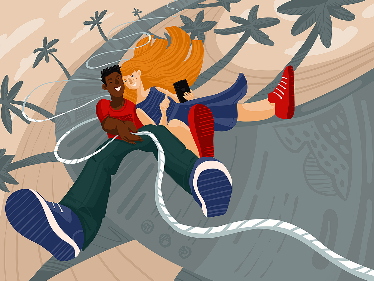
UX Writing: Handy Tips on Texts That Improve User Experience
“One day I will find the right words, and they will be simple,” Jack Kerouac once said without any idea that his words will perfectly reflect the essence of UX writing. We mostly think about design as something visually appealing and easy to use, with visual images coming to mind first. However, the type of content with which users deal most often and diversely is text. Our today’s article is right about it: let’s review the essence of UX writing, the features of effective interface copy, and well-checked practices for its improvement, supported by UX design examples by Tubik.What Is UX Writing?UX writing is a professional activity of writing texts for user interfaces both web and mobile. It includes creating texts from small labels of buttons and icons to taglines, error messages, notifications, navigation prompts and instructions, guidelines, and so on.What is crucial to keep in mind is thattext is a part of designtext is a part of user experience.The term UX Writing is often replaced with Copywriting. Do they mean the same?Basically, no, they define different types of activities. Copywriters’ main goal is creating texts that sell something, be it products, services, tools, intellectual and creative stuff, etc. UX writers’ task is to create texts that support and enhance users’ communication with interfaces, let them clearly understand what’s going on, and lighten the negative experience in case of errors or problems of interaction.Nevertheless, coming from the advertising sphere, the term “copy” as a synonym of “text” quickly got a toehold in UI/UX design as well. Based on that, people creating texts for interfaces were also called copywriters, much before the term “UX writer” came into play. What’s more, in many companies people writing marketing texts and interface texts are pretty much the same people. So, don’t be confused too much: although the terms define different tasks, they are still often used as synonyms, and text pieces in UI are usually called copy.https://medium.com/media/1267cde0ded3d5533314a44092dd9866/hrefIs Text Needed for All Types of Interactions?We have already touched on this issue in our article devoted to relations between icons and copy in user interfaces. Indeed, visuals are transmitted to the brain much faster than text and important pieces of information are often fixed by the brain as images even if they were obtained via text perception. In user interfaces, where basic interactions should take seconds, this aspect is crucial and it can be seen as the real reason to turn hell out of everything into the graphics. On the other hand, there is the aspect of meaning: users can perceive images super fast but if the message they transfer is not clear and can have double-reading, this speed will not bring a positive user experience.There are loads of widely recognized graphics and associations such as a telephone receiver for a phone call, an envelope for mail, a magnifier for a search, and so on. Certainly, using them, you create a much faster perception of the UI functionality than using copy instead of an image. Nevertheless, in cases when the image of an icon is not so obvious, its usage should be thoughtfully contemplated. There are cases when text transfers the idea or data more clearly so it is an effective solution to use the double scheme when the icon is supported by the text.Travel Planner App doesn’t support icons with text as they clearly mark the types of contenthttps://medium.com/media/17e7d10e70da9eacd202dc1a0d436a77/hrefhttps://medium.com/media/9307b095e7952ae663e3ee23fceee636/hrefhttps://medium.com/media/190b138ea4e6633cd514d8ed2a6b6cda/href4 Basic Features of Effective UX TextThe text content in any interface is based on 4 foundation stones: it has to beclear (users understand what you talk about, the core message isn’t blurred or complicated)concise (the piece of text is meaningful, laconic, and concentrated on the goal, no empty talk is included)useful (the copy gives users necessary information or helps with interactions)consistent (the copy within the interface of one digital product keeps the same style, tone, voice, and terminology)Now, let’s review some practices helping to create texts that support the positive user experience.https://medium.com/media/f0cf76e18e1059018f2051e792241e84/hrefUseful Tips on UX Writing1. Integrate real copy in UI as early as possibleWorking on early versions of a user interface, UX designers tend to use the so-called Lorem Ipsum. It’s a kind of popular placeholder text that looks like Latin but really doesn’t mean anything. It’s aimed at creating a natural-looking piece of text in the layout of a webpage, mobile screen, magazine or newspaper page, etc.Onboarding screens for the Manuva app at the UI design stage, using Lorem Ipsum for placeholder copy blocks at the initial stages of designWhen you are deep in the design process, it is really tempting to just copy-paste the nonsense text into the places planned for copy blocks. Why is it a not-so-good idea?Firstly, the text is a part of the design. Various letter combinations look different. Words have different volumes and structures. It’s especially true for a tagline that presents one of the most important elements of webpage visual hierarchy and is scanned in the first seconds of interaction. So, what pleases your eye in Lorem Ipsum may not work with real text that will be used on the page or screen.https://medium.com/media/6fee74e0228e7af91c593bc8601cc0a5/hrefSecondly, by using the realistic text you make a prototype feel genuine and natural. Let’s say, if you design a website selling cooking equipment, you won’t use photos or illustrations of agriculture machines for placeholders, even at the earliest stages of the design process, will you? Why? Because it won’t connect the design concept with the goals set for this product. The same happens with the text part of the layout. The copy you use should create a united image and experience with all the other elements of the layout. What’s more, you can spend hours working out the great looks for notification pop-ups, system messages, and webpage text blocks — and all that effort will be wasted when you realize that the real copy to be used in this UI is different in its length, structure and perhaps even message.https://medium.com/media/6f9b9c5397cb16142f46096fd35ae3a7/href2. Build a solid text hierarchy allowing users to scan the contentIn our article devoted to web scannability, we have already mentioned the well-checked fact: users don’t start an interaction by reading every text element on the page or screen. They scan it in search of the hooks that can catch their attention: if they are convincing enough, the user makes a decision to give the resource a second look, attentive and diving into detail. Although pictures of any kind are much more catchy and faster perceived, in many cases text becomes the element that plays a crucial part in decision-making. One of the reasons is that from one generation to another, we are traditionally accustomed to seeing a text as a main source of information.https://medium.com/media/e5a483efed9fdfcc43ad77ac29f61fda/hrefGrounded on that, keep in mind that the main message presented in text form would better be quickly found in the first seconds of interaction. All the text elements should be organized according to the typographic hierarchy so that by scanning the page or screen, the user could quickly understand which part carries the core message and which is less important. Also, it’s advisable to make text harmonically work together with key images on the page or screen (illustration, photo, 3D rendered image, etc.)Health Blog Home Page where all the copy elements are connected to the hero imagehttps://medium.com/media/132872203f3b6bf6bede98e071ded66a/href3. Catch attention with numbers and marked elementsOne of the investigations of user behavior provided by Nielsen Norman Blog shared an interesting finding: based on eye-tracking studies while users scan web pages, numerals often stop the wandering eye and attract fixations, even when they’re embedded within a mass of words that users otherwise ignore. People subconsciously associate numbers with facts, stats, sizes, and distance — something potentially useful for them. So they are hooked with the numbers included in the copy while words representing numerals can be missed in the bulk of the text. In addition, whatever numbers represent, they are more compact than their textual variant, which enables designers to make the content concise and time-saving for skimming the data.https://medium.com/media/c434f1633b320fb2589f6c07aee13d0d/hrefEverything mentioned above can be a reason to break some rules and habits. Traditionally, we are recommended to spell the numbers at the beginning of the sentences, spell the numbers from zero to ten, etc., and you may follow all that successfully in articles and other types of copy content presented with a big amount of text. However, for the texts accompanying the interactions, you should be as focused as possible, and it’s a good idea to catch users’ attention with numbers.Upper App makes the number-presented information super obvioushttps://medium.com/media/a0721ce6a0589b65adcb329fbdc3c727/hrefAlso, don’t forget about the ways of marking out the specific information that came from book and magazine design: bold and italic fonts, word sizes, negative space, different colors, or highlighting — all that stuff worked many years ago and still works successfully today. Just don’t overact, don’t overwhelm users with too many elements trying to catch their attention. As Aarron Walter said, “If everything yells for your viewer’s attention, nothing is heard.”https://medium.com/media/3c1b41fab074fd2147ffd25ee38370a2/href4. Be focused and grammar-flexibleNo doubt, clarity and grammar correctness build the foundation of a good experience when it comes to text. However, it may work differently if you write a microcopy for a button or the message is limited to a rather small number of characters on a pop-up screen. So, here you have to decide on being grammar-flexible which means avoiding complicated constructions and reducing the elements that do not play a vital role.For example, the Material Design guide on writing advises avoiding unnecessary punctuation such as periods in copy for labels, hover text, bulleted lists, dialog body text, or colons after labels.As well, for UX copy, they recommend using present tenses but in their simple forms.Also, keep in mind that choosing Active Voice instead of Passive whenever it’s possible is a good idea. In most cases, it looks more natural and clear; in addition, it may be more user-friendly for users who are not advanced in English.Just always remember that the main goal of the text in mobile or web interface is to inform. Daily overwhelmed with tons of information, users want to get it quickly and effortlessly — so give it to them. It’s not about breaking all the rules and communicating with unnatural phrases. It’s about the best expression of text minimalism cutting off the stuff that’s not essential. It’s about using simple and direct language clear to various users.https://medium.com/media/55042074bc13df7c55c0c9e4abd1694b/hrefNielsen Norman Group even posted the article sharing the list of cringe-worthy words and phrases that you would better avoid in UI texts, among which:very (and other intensifiers):utilizeenablewe understand (in today’s fast-paced world…) and other blah-blah stuffend-userThat’s especially true for mobile interfaces which are strictly limited in space that can be used for copy content, and with them, you have to take into account that users often deal with apps on the go. The issue of being clear and readable directly influences user experience and conversion level. So, a question like “Save changes?” looks more effective here than “Would you like to save the changes?” or “Do you want to save the changes?” or “Please confirm that you would like to save the changes” and so on.https://medium.com/media/a6b1b31f012869f07e1af07bb4857650/hrefDelivery screens for Tasty Burger Apphttps://medium.com/media/bc82de22bd6981a1c6b7532fdbf1d2ec/href5. Do A/B testing for the copy of interactive elementsButtons copy is one of the crucial parts of user experience: if you are not into UX design and writing, you could be surprised how much time and effort should be devoted to these small but impactful elements of the layout. What is written on the button should direct users to the action and let them understand what happens next. So, as well as you test design solutions such as color, placement, or the size of the button, you are recommended to make the text of the button label another object of A/B testing. Especially, if you are not a part of the core target audience: for instance, you create the product for elderly people with a low level of tech literacy while you yourself are a young advanced user of various software and gadgets. Testing will give you an understanding of how real users perceive the label and what kind of text is more convincing for them.Landing page for the web platform to find and hire artistsButtons often offer the choices to a user: we can accept, delay or cancel something. Writing text for such elements, remember the idea shared in one of the recent explorations by Nielsen Norman Group: “The copy that you use in choices on your interface asks people to agree with a statement. That statement is often about themselves or the actions that they wish to take. It’s important from a user-experience standpoint and from a business perspective to write interface copy that supports rather than undermines the decision-making process. Trust, expectations, and positive self-image all shape the associations that users will have with a product. An honest, direct presentation of choices creates trust and positive emotion.”Checkout screens for Exotic Fruit application6. Build natural and consistent dialogueThe best thing you can do for your user with the written content is to create a feeling of communication with a human. A human that has a clear style and voice of communication, is helpful and doesn’t try to reinvent the wheel at every step just to emmarvel you. Decide upon the main terminology and names of operations — and use them throughout the messages and notifications: for example, use the word “delete” every time when this action is meant to be done, and don’t replace it with “remove” for some screens if the action is the same. Synonyms are good for making language bright and vivid in articles or books, but they may ruin the user experience by making users find the connections between synonymic terms instead of just using the product for solving their problems.Here’s another example from the Material Design guide on writing.https://medium.com/media/ffc42d744c9a78538425ebc871acb821/hrefhttps://medium.com/media/3ad10edc434e70b74816e85c1c75e9f7/href7. Make your text feel like the users’ friendSupporting the previous idea, keep the style of the dialogue that corresponds to the target audience’s expectations. Being clear and friendly is more important here than being linguistically elaborate — the only exception is when target users do expect this kind of language. User research is your homework in this case: it allows both designers and writers to clarify a proper style choice for not only visual but also copy solutions.https://medium.com/media/8f2b7a3ca40362a8a72b76bdce35b752/hrefProfile creation screens for Inspora, the virtual stylist, setting the app’s communication with the user8. Avoid slangBy slang, we mean here any kind of specific and technical terms that can confuse users. For example, when you inform a user that the video is buffering, are you sure he or she knows what that means? If yes, that’s a good choice of text. If not, look for a simpler word. Don’t use “enable” instead of “turn on” which is much clearer for most people. Here’s an example from Alfresco Writing Guide.https://medium.com/media/366b43f88aca97b31d82f798258707e4/hrefhttps://medium.com/media/d1aefb31f75aae28c1397608ba7a8426/href9. Don’t forget about capitalizationBasically, capitalization is writing or printing in capital letters or with an initial capital. There are three levels of capitalization:all-caps (all the letters are capital)title case (the first letter of each word is capitalized excluding prepositions up to 4 letters and articles)sentence case (you only capitalize the first letter of the first word and proper nouns, as you would in a sentence).The landing page for the security app uses all-caps for a short and bold tagline working solidly in combination with the original hero imageNow, there are hot discussions about using sentence case instead of title case as it feels more friendly and informal. However, for English speakers, it’s still a natural feature of the language that apart from feeling the text as less or more formal marks the levels of text hierarchy. So, the decision is up to you, of course, but consider the following tips about capitalization:Use Title Style Caps to mark field labels, actions, menu items, and page titlesChoose Sentence style caps for longer copy such as page or field descriptions and tooltipsApply ALL-CAPS moderately, only to super important items (short taglines, brand name, core navigation points in website header, short call-to-action text, and abbreviations like OK), and avoid it in all the rest of the cases.Whatever choice you make, what’s really important: be consistent. Make a decision once — and follow it through the whole interface. If you decided to use a title case for all the buttons, check that you keep that rule all the time. Inconsistency distracts and even annoys users.Sign-up screen for a restaurant app10. Start from the most important informationThis piece of advice seems to be super simple, but people dealing with copy frequently don’t follow it. In the case of short text, instruction, message, focus only on valuable information, don’t distract users with too much lead-in and warm-up text. Sure, it doesn’t mean that you have to come up with only dry unemotional information-only texts, yet try to minimize the supportive part and maximize the active one. For longer texts, such as articles, guides, product descriptions, and the like, consider using the principle from journalism called the Inverted Pyramid Principle. It’s when you go from what’s needed to know to what’s nice to know, from the core message to the details which may be not that vital.The landing page for Tasty Burger presents the core feature first: you can create the burger by yourself, customizing it to what’s perfect for your taste.https://medium.com/media/0a5c62dc3ce3160b0fc241ab7d80eea4/hrefhttps://medium.com/media/fb1c390085eaaae2df3836596da418b8/hrefhttps://medium.com/media/4790fe5b367ad5e3b501a4c32d0801d3/hrefAll the mentioned tips are not the cure-all: the decisions upon them have to be based on studies and analysis for each particular case. There are numerous factors that influence the creation of copy for interfaces, from purely design ones to a general brand strategy that defines the style of communication with users. Anyway, we hope that the list collected above will help you to come up with the creative lines supporting a positive user experience. Sure, there are more points, cases, and examples to discuss and consider in the domain of UX writing, so we will continue the theme in our upcoming posts.Useful ReadingCopywriting for Mobile and Web Interfaces: Types of UI CopyMaterial Design: Writing3C of Interface Design: Color, Contrast, ContentInverted Pyramid: Writing for ComprehensionInterface Copy Impacts Decision Making16 Rules of Effective UX WritingHow to Make Web Interface ScannableTypes of Contrast in User Interface Design5 Pillars of Effective Landing Page DesignThe Anatomy of a Web Page: Basic ElementsHow to Design Effective SearchOriginally written by Marina Yalanska for Tubik Blog, all design examples by TubikWelcome to check designs and art by Tubik via:WebsiteDribbbleBehanceTubik ArtsUX Writing: Handy Tips on Texts That Improve User Experience was originally published in Muzli - Design Inspiration on Medium, where people are continuing the conversation by highlighting and responding to this story.
Weekly Designers Update #459
via Muzli design inspirationHeyya,Hey, design people,How are you?I’ve just read an article about heatwaves sweeping the globe. Looks worrisome… But hey, if you’re looking for a bright side, it’s a perfect time to find some shade, take a sip of your favorite cold drink, and enjoy the best design pieces I’ve found this week:Beautiful digital postcards from Italy by ET StudioRefreshing web design by IglooUnique spinning experience by SINKAugmented Reality project by Laura NormandInteresting mobile website design by RonasFOOD coffee block by One Object Design StudioPlus more inspiration, quite a few design related summer sales and many interesting AI resources.Check out the full list below and see you around next week,Eyal from MuzliLooking for more daily inspiration?Download Muzli extension — your go-to source for design inspiration!Web design inspirationDracarys — Robert Borghesi LAB.Francobolli Per La Lessinia.Igloo Inc..SINK.Product SpotlightTake Your Designs Further With Wix StudioTransform your Figma designs into advanced, high-converting websites with Wix Studio, the platform for agencies and enterprises..Invoke - AI Image Generator for Your BusinessInvoke is a powerful, secure, and easy-to-deploy generative AI platform for professional studios to create visual media. Train models on your intellectual property, control every aspect of the production process, and maintain complete ownership of your data, in perpetuity..Ozone — Edit videos in seconds using AIRemove silences, generate captions, and animate your content — instantly. Create engaging videos in seconds using our first-of-its-kind creative tool in the browser. Ozone unites AI, pro video editing tools, and real-time collaboration..Zebracat — Turn text into impactful videos in minutes with AIZebracat is a text-to-video platform designed for marketers and entrepreneurs to create impactful videos quickly and easily. Turn text prompts, scripts, or blog posts into engaging videos with human-like AI voiceovers, music, and effects..Design ResourcesUI8 — Epic Summer SaleHundreds of premium products for up to 90% off until the end of the month.Craftwork — Summer SaleUp to 44% off on all Craftwork products and subscription plans.FinAI — Startup & SaaS Business Framer TemplateWhere innovation meets design: Immerse yourself in sleek 3D imagery, gradient aesthetics, and captivating animations, setting the stage for your business to shine..Asiya Device Mockups07 device mockups.Recommended articles — —Design inspirationStats by DStudio®Salesforce CRM — AI Workbench Scheduler SaaS by Jack R. for RonDesignLab ⭐️Bank by Slava Kornilov for Geex ArtsMobile Website Design Concept by Ronas IT | UI/UX TeamBouquet — Augmented Reality Card by Laura NormandPally | Restaurant Branding by velvele ™, Valeryia Herasimava and Çağıl AygenFOOD Coffee Block by One Object Design StudioFlip Clock 3D Illustration by Shakuro GraphicsThe Blue Clown by STAR ✨by DuArte DesignGoogle Chrome OS | Wallpapers and Avatar by sLeo NatsumeWeekly Designers Update #459 was originally published in Muzli - Design Inspiration on Medium, where people are continuing the conversation by highlighting and responding to this story.
52 Impressive Examples of Beige Websites
Beige is traditionally perceived as a neutral, simple, and pretty much foolproof color. While some people may consider it dull or say it lacks a wow factor, the allure of this hue lies precisely in its subtle, pristine, soothing vibes.Beige oozes equanimity and warmth no matter the scenario you use it in. It suits numerous different styles and complements virtually any other color. It even has a certain mimicry-like quality that allows it to take on the attributes of other hues it is paired with, while simultaneously enabling those other colors to come to prominence. Due to its inconspicuous character, this medley of off-white and earthy, light brown hues has become a widely used backdrop color.Websites with beige backgrounds became popular around 2019. Up to that point, it seemed the web was full of bright palettes and multi-colored gradients. But as creatives slowly started experimenting with beige, they realized there was a certain power in its tranquil neutrality. There was something inherently familiar, perhaps even nostalgic about large beige backdrops. Something that evokes the age-old sensation of writing on old paper. The more they played with this hue, the more they realized it could act as the perfect foundation for any type of project and help them evoke a variety of moods and aesthetics, ranging from elegant or earthy to dreamy, feminine, relaxing, and more.While the number of websites with a beige background is undoubtedly large, we have prepared a carefully curated collection of designs that demonstrate the multi-layered beauty of this sophisticated color:Thibaud AllieAngela MilosevicTiffanie MazellierMarvin SchwaiboldCraig RaynoldsDundervilleTabletLaura BizeChungi YooZhenya RynzhukNeuebel & MarkVictor WorkÉrika MoreiraCuspChiara LuzzanaBruegel — Once in a LifetimeThe Queen and the CrownSea HarvestProvider StoreNorm ArchitectsKarimoku Case StudyGeorge Nakashima Woodworkers&TraditionLoeven MorcelEham696 NYCKarst Stone PaperMaurèleÆbele InteriorsDDD HotelHomecultRino & PelleDDNALafaurieDéplacé MaisonWannabe — ToysChartogne-TailletDiscovered WildfoodsKenkashiBrews & GroovesEnidCraftedBASICAntara StudioKacper ChlebowitzVeley / RossAēsop — Aromatique CandlesTypologyF. Miller SkincareMaison d’EttoMuseum of Peace & QuietMonasteryThibaud AllieBeauty, simplicity, and elegance — three words that best describe Thibaud Allie’s portfolio website. This one-page introduction to his creativity bears an unmistakable magazine vibe. Enormous captions and large, colorful images are masterfully placed against a beige background that, thanks to its unimposing nature, helps put the site’s content into the spotlight. The highlighted project is displayed at the top of the page. The preview image is initially slightly askew but then it grows larger in size, straightens, and blends in with the rest of the content. If you reload the page, another featured image will appear. In general, Allie didn’t go overboard with visuals. There’s only one more section on the site where preview images from a number of his projects appear as you move the cursor across that particular part of the site. When you click on them, you will be redirected to a site of one of Allie’s clients or his Behance page dedicated to the selected project.Angela MilosevicAngela Milosevic is an art director and digital designer working at Squarespace. For her personal website, she created a simple yet engaging one-page layout that combines big, black typography with immersive hover effects. As you move the cursor over project names, grainy visuals appear in the viewport, following the pointer and leaving a trail behind. The clarity of the light background allowed Angela to experiment with interesting effects and interlace her site with cool imagery that speaks volumes of her creative genius.Tiffanie MazellierTiffanie Mazellier’s website starts off with a fun loading animation in the shape of a mouse that runs from one side of the screen to the other leaving a white trail behind. As the mouse reaches the end of its road, the black screen turns to beige, revealing Tiffanie’s short introduction. She combines large, all-caps letters with lowercase typography and creates a playful typographic scenery with sans serif and serif fonts. Most letters are colored in black, but she did implement a red typeout effect into some sections, adding to the appeal of the textual content and injecting life into it. The cursor is in the shape of a small circle, but as you place it on preview images of her projects, the circle grows bigger and begins to fluctuate. Uppercase text also appears inside of it, inviting you to discover more about her work. The “About” page is a beautiful testament to this artist’s creativity. There is an outlined drawing of Tiffanie, but when you put the pointer on it, it turns into a black-and-white image that swirls and distorts, mimicking the movement of your mouse. In general, there aren’t that many colors on the site, save for project pages that contain a more vivid palette. Everything is predominantly in black-and-white and beige tones, with sporadic splashes of red. The subtle beige background is a constant, gluing all elements together in a visually appealing, congruous unit.Marvin SchwaiboldThe website of Marvin Schwaibold gives viewers a lovely insight into his artistry. He displayed a number of preview images from some of his most notable projects on the homepage. The colorfulness of the visuals is beautifully enhanced by the tame beige hue in the background. The backdrop on most pages and in the fullscreen menu is colored in beige tones, creating a sense of consistency throughout the site. The pages are not swamped with too much content nor are there any wild effects, so you can stay fully focused on Schwaibold’s amazing work. The typography on the site looks refined but there’s a slight edge to it, as he coupled an elegant serif font with a clean sans serif type. The contrast between dark typography and the light beige background ensures excellent readability at all times.Craig RaynoldsCraig Raynolds is a photographer and art director. His website is bursting with visuals that seem to appear in the viewport wherever you move your mouse. While you hover over Raynolds’ name displayed at the top of the page, several preview images emerge on the screen, giving you a taste of his artistry. When you move the mouse over his project titles, the letters change their color from light grey to black. Preview photos also appear behind titles, following the movement of your pointer. Considering the visual richness of the site, the choice of the beige background makes perfect sense. In fact, its tame character helps bring out the beauty of Raynolds’ work.DundervilleDunderville is a creative motion studio from Sweden. The story of the studio is told as the “Chronicle of Dunderville”, which is why the site’s design resembles newspapers. On every page, the content is divided into multiple sections using a precise grid system. The color of the background goes from beige to black to soft, light pink, but the majority of the vibrant content is placed on a beige backdrop. The studio added lots of animated, multi-colored elements and illustrations to the site, so the background had to be more demure. One of the most interesting sections is the area where studio founders introduce themselves. You can press a button to hit them (i.e. the photos of them) with virtual lightning. The screen then goes from beige to black and an illustration of their skull and their interests briefly appear on the page.TabletTablet is an online Jewish magazine. The beige background on their website looks like a piece of paper through and through. On its surface, you will see a myriad of articles organized into multiple sections. At first glance, featured images appear to be black-and-white, but when you place the cursor on them, they spring to life and gain color. Some elements and call-to-action buttons are colored in red, and as such are impossible to miss on a beige backdrop. The “Scroll” section is particularly fun to explore. It is hidden on the right-hand side of the screen, behind the “Explore the Scroll” invitation in all red. On click, you will reveal a collection of selected articles from all categories featured in the magazine. The background stays beige at all times, bringing the content into the spotlight.Laura BizeYou can explore Laura Bize’s website in two modes — dark and light. Both the black background and the beige allow her content to fully shine. This is especially evident on the brightly colored illustrations of flowers that appear wherever you click on the screen and the colorful project previews. The beige background creates a more gentle atmosphere in which Bize introduces herself and her skills in an appealing fashion. On some pages, she even combines both black and beige sections, making the backdrop more interesting to the eye. Elegant typography wonderfully complements the site’s charming vibe, while all elements combined paint an adorable picture of who Bize is and what she can do.Chungi YooChungi Yoo’s website combines various shades of beige in the background with occasional splashes of pastel yellow and pink. This interactive project is visually rich, with lots of colorful pictures and illustrations, large typography, combinations of bold and regular letters, cool microinteractions, and playfully animated elements. The whole site is fun to browse, bustling with action. If you click on the asterisk in the top right corner, a virtual playground will launch. It is filled with rotating pink and red circles that fall from the top of the screen towards the bottom. A bunch of them also follow the movement of your mouse. The beige background on the site provides a beautiful canvas to play on.Zhenya RynzhukZhenya Rynzhuk is an art director and a visual designer. The loading animation on her site consists of a simple “Hey!” placed against two circles in soft pink and orange. Once the site loads, you notice that Zhenya juxtaposed the beige background with fiery orange elements dispersed all over it. That way, she managed to set up a lively, gripping scenery for the presentation of her artistry. Other pages on the site are colored in soft pink and light grey colors, but beige is still a dominant backdrop hue. At the very top of the homepage, you can catch a glimpse of some of her projects. When you place the cursor on the photo of Zhenya with her head bowed down, preview images start to change in quick succession. You can also launch a fullscreen showreel that fully immerses you into Zhenya’s creativity. A rotating asterisk invites you to “Click Click” on it, and when you do several orange and light pink circles appear in the top section of the homepage, moving in the opposite direction of your mouse. All pages are imbued with lots of scroll-triggered actions and animated elements that mesmerize viewers and keep them wanting to learn more about Zhenya’s work. Given the omnipresent vivaciousness of the entire website, the contrasting subtlety of background colors provides a sense of creative calm and adds stability to this stunning portfolio presentation.Neuebel & MarkNeuebel & Mark is a micro graphic and type design studio. Their website is designed as a modern and refined celebration of their 2020–2021 font catalog. It starts off strong, with the name of the studio written in a fiery red shade, clashing with the calmness of the beige background. Red is dispersed throughout the site, breaking the monotony of dark typography and enlivening the pages. There is also an interesting photo in cerulean and white tones at the top of the homepage providing a lovely contrast to the beige canvas and ensuring a striking introduction to the studio’s catalog. The all-black texts placed on the beige backdrop look sharp, with every detail of the letters clearly visible. Inner pages don’t contain many visuals, save for the “About” page that includes photos of Neuebel’s team. It’s all about the fonts made by the studio and the way they are captivatingly showcased on the beige background.Victor WorkVictor Work’s one-page portfolio website is a compelling presentation of this creative’s skills. The loading animation consists of the dark blue shade splashed all over the screen. Once the content loads, the blue background disappears from the view like a theater drape, revealing the site’s content. The backdrop is then in beige while the content displayed at the top of the page is in the dark blue hue that was used for the loading screen. The combination of beige and blue is a regal site opener, leaving a terrific first impression on the viewer. After several scrolls, the background changes its color — it becomes baby blue while the content turns red. As you keep going further down the page, the practice of changing colors after a few scrolls continues until you reach the final section. All color schemes you will come across on the site are displayed at the bottom of the homepage. You can select one and view the content entirely in that particular color combination. All pairings look terrific, but dark blue and beige are a particularly effective and attention-grabbing combination, which is probably why Work used it at the top of the site.Érika MoreiraThe loading animation in the form of fullscreen hero text lures you into Érika Moreira’s portfolio website. This stunning online presentation is a terrific example of how well beige can blend with other colors. The background is beige by default, but as soon as you place the cursor on any of the listed project names, the background color changes to some other hue, such as black, yellow, and brown, to name a few. At the same time, three undulating island-like areas appear on the screen, giving viewers a preview of the selected work. The moment you move the pointer away from the project name, the background becomes beige again. By using the subtle, neutral beige as the main color on the site, Érika was able to experiment and play with other hues more.CuspExploring Cusp’s website is a highly enjoyable experience. The homepage is filled with playfully animated content. As you move your cursor over displayed images, their surface becomes wavy thanks to the exciting distortion effect. The dominant colors on the photos are black, white, dark olive green, and light brown. The names of the collective’s projects are written using big, crimson red letters, while inner pages include black typography. The circular cursor is also colored in the prominent red hue. The beige background, which is used on the entire site, blends beautifully with this color scheme, no matter how eye-catching or subdued any other hue may be, connecting all the elements into an aesthetically cohesive unit.Chiara LuzzanaUpon accessing Chiara Luzzana’s website, you will see her brief introduction in large, all-caps blackletter typography. She tells you that she is a sound designer and invites you to enable the sound on the site, to fully enjoy the browsing experience. The featured music is probably what beige color would sound like if it were turned into music — soft and easy on your senses. The background on all pages is beige, perfectly complementing the site’s minimalist design. The neutral quality of the backdrop allowed Luzzana to go slightly more wild with typography, so textual content is at the forefront. She combined bold uppercase fonts with outlined letters as well as serifs with sans-serifs, creating a lively typographic play for viewers. Letters are black on all pages, save for the fullscreen menu, where the color of the fonts and the background inverts.Bruegel — Once in a LifetimeBruegel — Once in a Lifetime is a terrific interactive project created by the Art History Museum in Vienna to commemorate the 450th anniversary of Pieter Bruegel the Elder’s death. All pages are bustling with engaging multimedia content. You can enjoy not just the visual aspect of the site, but also the audio material that entirely immerses you into Bruegel’s world. For instance, one of his paintings, the “Peasant Wedding”, is brought to life with remarkable animations and sound effects that make you feel like a guest at the celebratory wedding lunch. There is also a video of the museum’s director introducing you to this exhibition. The use of the warm neutral beige background is spot on because a warm beige background enhances the magnificence of Bruegel’s works, flawlessly blending with every color palette he used on paintings. This website is a great example of how well a beige backdrop can fit any analog project. Whenever you wish to present drawings or anything analog, you won’t go wrong with beige because it resembles real-life paper. The earthy hue of the backdrop does not steal your attention, but it does help create a warm, pleasant atmosphere for exploring Bruegel’s Renaissance artistry.The Queen and the CrownThe Queen and the Crown website introduces viewers to the costumes used in the shows “The Queen’s Gambit” and “The Crown”. This interactive project takes you into a virtual beige museum with luxurious beige walls that level out the colors of the displayed costumes. You can go from one costume to the next simply by clicking on any of the mannequins. And if you click on the “+” button placed next to all exhibited pieces, you will discover more information about the selected outfit and see close-up photos of it. Some presentations even include clips from the show in which the actors wore that piece of clothing. The background, i.e. the museum interior remains beige at all times, creating a sophisticated environment for viewing the gorgeous costumes.Sea HarvestSea Harvest is a seafood market in Canberra, Australia. The design of the website resembles a poster or old newspapers with content that looks as if drawn on the beige surface with a pencil. The font combinations are interesting, uniting a monospace font with large, bold sans serif uppercase letters. The pages are filled with gorgeous illustrations and typography in all black. On hover, they all turn to the color of the sea. Photographs on inner pages are initially in black-and-white, and so is the fun snippet from Garfield, the comic strip featured on the contact page. The graphic content on the site gains color when you place your cursor on it. But no matter how many different hues the visuals may include, all of them seamlessly blend with the beige background.Provider StoreProvider Store is an e-commerce website where you can purchase slow-made Japanese homeware. The beige background perfectly matches the simple, unique beauty of the products and the overall color palette on the site, which is delicate and easy on the eye. There are lots of greys, whites, browns, and powder blue tones. The beauty of the pictures, typography, and cute illustrations is amplified by the beige background, ensuring a highly appealing browsing experience for the viewer.Norm ArchitectsNorm Architects website is bathed in earthy and nude tones, with beige, grey, and soft brown shades dominating the digital scenery and providing a harmonious and enjoyable visual experience for viewers. The site’s aesthetic looks sophisticated from the first scroll to the last. Every layout is rich in photos that present the studio’s work in a stunning light. The homepage starts off with a suave image slider, providing a striking welcome to visitors and a taste of what they are about to experience on the site. The design of every page is refined and perfectly balanced, reflecting the studio’s philosophy of “soft minimalism”.Karimoku Case StudyKarimoku is a Japanese furniture manufacturer and Karimoku Case Study is their architect-designed collection. The project was devised in collaboration with the Norm Architects studio and Keiji Ashizawa Design. All collections are featured in a horizontally scrolling layout on the homepage. You can learn more about each studio that participated in the project, read the related news, and find the nearest dealer of this furniture. The imagery on the site looks minimal, inviting, and often subtly bathed in sunlight. The warmth of the imagery and the furniture entirely made of wood is mirrored by the beige background that perfectly matches the site’s soft, elegant aesthetic.George Nakashima WoodworkersGeorge Nakashima Woodworkers website embodies the company’s philosophy that “the shapes and the colors of the wood speak to those who listen”. The colors typical of wood and the forest can be seen on the entire website, with lots of elements in various shades of green and brown. There are many images not just of the furniture, but of nature as well, the company’s biggest inspiration. The beige background glues all the elements together, and this lovely website is the further proof that beige is one of the best background colors for online furniture presentations.&Tradition&Tradition is a company that creates furnishings and luxurious home items. At the top of the homepage, a video presentation of some of their works stretches across the entire screen, completely immersing you into &Tradition’s world. The site contains lots of visuals and textual content, inviting visitors to learn as much as possible about selected pieces, discover how they were created, tour the studio, and much more. It contains a myriad of photographs, illustrations, and lots of video material, ensuring an engaging browsing experience for viewers. Featured elements are rich in colors, all wrapped in a beige weil that brings out the ritzy quality of the &Tradition’s pieces.Loeven MorcelLoeven Morcel is a studio that makes custom high-end furniture and the design of their website complements the look of their pieces. The first thing you see is the grandiose uppercase serif typeface. It is used in the most prominent sections on the site, such as surtitles and headlines, announcing the featured imagery and copy with fanfare. A typeface like that matches the grandeur of the studio’s furniture, and so does the beige backdrop. The neutral color helps set up an elegant environment in which viewers can inspect Loeven Morcel’s works up-close.EhamEham is a manufacturing company that’s been around for several decades. The top section of their homepage includes an image slider that introduces viewers to the quiet luxury of Eham’s products and, as they say, the source of the brand’s strength — the Bavarian Alps. The pages are filled with imagery, videos, and stories about the company’s creative process and their projects, bringing them closer to their audience. This brand unites sophistication and nature, hence a tame color palette on the site. The beige background seamlessly blends in with the hues typical of a natural landscape and further elevates the refined character of Eham’s stunning creations.696 NYC696 NYC sells ceramics and other handmade objects created by Japanese manufacturers. The displayed products are mainly colored in neutral shades of blue, brown, pink, and white. To match the aesthetic dictated by the showcased items, the designers opted for a light beige hue in combination with some smaller white areas. As a result, they created a site that resembles a gorgeous oasis of tranquility that is easy on all of the user’s senses, relaxing them and helping them appreciate gratitude, conversation, and the act of sharing meals with others.Karst Stone PaperKarst Stone Paper makes notebooks, journals, and planners out of stone paper that consists of recycled calcium carbonate. Even if you’re not familiar with the brand, the illustrated loading animation in the shape of a notebook provides enough of a hint about what they do. The site’s pages are imbued with gorgeous visuals that demonstrate the beauty and versatility of Karst’s products. Visitors can specify a variety of notebook qualities they are looking for and the site will eventually offer them the product that best matches their criteria. The colors on the site are ranging from blue, red, and black to pink, yellow, and green. However, the designers opted for calmer shades that are not aggressive on the viewer’s eye. The backdrop is predominantly colored in beige, matching the color of the paper found in notebooks.MaurèleMaurèle is a brand that invites all of us to slow down, read, write, and think. They are dedicated to creating customizable and sustainable stationery which is breathtakingly showcased on their website. Elegant typography adorns all pages, further inciting viewers to pick up a pen and jot down their ideas on Maurèle’s paper. Users can even customize papers according to their requirements by selecting a specific template and typeface or by entering their monogram. As for colors, the palette on the site consists of the hues typical of forests and nature in general. The dominant beige backdrop is coupled with dark green areas. The two create a powerful amalgamation that is not only appealing to the eye but it also amplifies the sophisticated character of Maurèle’s products.Æbele InteriorsÆbele Interiors is a high-end interior design studio catering to a sophisticated clientele. The design of their website is a facsimile of the opulence typical of their projects. The colors of gold, copper, and sand are dominant on all pages. They are placed on a light beige surface, oozing elegance from one pixel to the next. Typographic choices carry the same vibe, in particular the italicized cursive font. The site is packed with gorgeous imagery that delicately appears on the screen, showcasing the studio’s impressive portfolio in an impressive light.DDD HotelThe background on DDD Hotel’s website represents a mixture of neutral colors such as beige and grey. The calmness of these two hues is occasionally interspersed with deep green sections. The symbiosis of these three hues provides an ideal basis for showcasing the beauty of the hotel. Displayed photos are dark, grainy, mysterious, bearing a distinct cinematic feel and an irresistible charm. The site is designed so that it truthfully reflects the hotel’s contemporary minimalist design, hence the use of shades belonging to the neutral color spectrum. Exploring the site’s content is a highly pleasant affair, not just because of the satisfying color palette, but also thanks to the enrapturing effects. For instance, as soon as you place the pointer on the menu, the top left corner of the screen becomes black. If you click on the menu, the previously tiny black area grows large and assumes the shape of a half-circle, swiping away the content you were enjoying. The same thing happens every time you wish to switch from one page to the next.HomecultThe Homecult website celebrates the modern and sleek projects created by this interior design studio. The project page and single project layouts all come with a beige backdrop, beautifully complementing the elegant appeal of the displayed imagery. The mouse pointer is shaped like a circle and colored in eye-catching red. When you place it on menu links, it grows in size. At the same time, the letters you hover over spur into action and start to follow the movement of your mouse. As you hover over images, they become red also, contrasting the calmness of the beige canvas. The backdrop of the fullscreen menu is beige, too. Its neutrality additionally highlights the already vibrant red line that appears below each menu link on hover.Rino & PelleThe first thing you see on Rino & Pelle’s website is the following description — “Luxurious and contemporary appeal for every woman”. And the design of their site reflects the same idea. The typography and the color palette on the site ooze elegant vibes. Images and videos depicting the brand’s collection include lots of pastel, sandy, and toffee shades, all attractively displayed on a beige backdrop. The way the content is animated and how softly it appears on the screen adds to the site’s appeal, making it all the more enjoyable for the viewer. For instance, as you explore the homepage, you will come across a fullscreen photo. On scroll, that image starts to drift away from you, becoming smaller with each scroll while more pictures in different sizes assemble around it, offering a charming overview of some of Rino & Pelle’s creations.DDNADDNA is a brand that creates “jewelry with meaning”. Floating purple bubbles placed on a tranquil beige background instantly catch your eye, inciting you to continue exploring the site to discover what DDNA has to offer. After several scrolls, the bubbles disappear from view, leaving an open space for the inviting imagery and texts that slowly slide onto the screen. The “Collections” page includes a horizontal image slider, arrestingly presenting DDNA’s products. The jewelry depicted on the site comes in various colors and shapes, but that’s not a problem for the beige backdrop as it can effortlessly match any style and design.LafaurieAs we could observe on some earlier examples, a beige backdrop is a safe choice for websites that include a myriad of multicolored elements. Lafaurie, a French fashion house, used it along with light grey and white to create a warm and soft basis to present their collection. At the top of the homepage, you will see a list of categories that their items have been organized into. When you place the cursor on any category, a colorful preview photo appears, contrasting the peaceful neutral background and keeping you focused on the image. Even though the displayed items aren’t particularly wild in terms of colors, every page features a great number of images, so the beige background helps infuse the site with clarity and simplicity.Déplacé MaisonDéplacé Maison creates urban trekking shoes and accessories. You can experience their website in two modes — light and dark (i.e. the ink mode). The amalgamation of distinct visuals, typography, and animation effects evokes cool alternative vibes. The cursor is shaped as a restless, liquid form resembling a splash of ink. As you move it around a page, it leaves a trail of tiny dots behind that are also in motion. The page on which all products are displayed includes the enjoyable infinite scroll effect while the items move on their own as if placed on a vertical conveyor belt. The site is packed with imagery and illustrations that highlight the authenticity of the sneakers. The majority of the brand’s collection is in white, grey, olive green, and black colors with orange and gold detailing. Not only does beige go great with all these hues, but it also helps accentuate their allure.Wannabe — ToysWannabe is an independent online store that specializes in selling high-end collectibles of action figures and props. The design of the site is simple yet imbued with a few peculiar surprises here and there. The peacefulness of the beige background on the homepage is shaken up with the 3D model of a skull wearing a hat that follows the movement of your mouse. Typography is in large, bold, black serifs, standing out against the light backdrop. The “Index” page contains some sort of a wheel that you can move on scroll or by dragging the cursor sideways. The wheel introduces you to product categories, each marked by a specific action figure. On click, you will reveal the entire collection. The mixture of the beige color and classic typography with terrific animation and hover effects gives this site an irresistible appeal.Chartogne-TailletChartogne-Taillet’s website is a majestic example of how a presentation of an alcoholic drink can be designed in a picturesque and imaginative way. The interactive map that shows the vineyards and the region where this champagne is made looks as if illustrated on a soft, beige, textured drawing paper. Upon clicking on a vineyard of your choice, a watercolor illustration of a vineyard appears. It consists of tiny, colorful circles resembling champagne bubbles that, as you begin to scroll down the page, rise toward the top of the screen, much like the bubbles do in a glass. While you enjoy the bucolic presentation of the Chartogne-Taillet brand, classical music plays in the background, making you feel as if you had just joined a sophisticated party in the French countryside.Discovered WildfoodsDiscovered Wildfoods is a sustainable wild game brand based in Australia. The visual content and the colors on the site evoke strong natural, earthy vibes. They speak loudly to an audience interested in sustainability and purchasing high-quality meat. The grainy beige and dark green background has a relaxing effect on the viewer, much like nature does. Some of the images appear in the viewport with the parallax effect, fully immersing visitors into the Discovered Wildfoods world. Strong, bold typography amplifies the brand’s message regarding sustainability and helps increase users’ interest in the company’s offer.KenkashiKenkashi makes microbial composting additives. Their mission is to contribute to improving the quality of the soil and making it more healthy. The choice of the beige background on their site beautifully complements the visuals. The synergy of green texts on a beige surface makes viewers think of nature, matching the style and the content of the displayed photographs. There are also several sweet, seemingly hand-drawn illustrations in a slightly darker shade of beige, enhancing the site’s charm.Brews & GroovesBrews & Grooves is a fun website that finds perfect musical pairings for specific beers. While you wait for the site to load, a can of beer and an album cover show up on the beige screen, giving you a taste of what you’re about to experience. Once the content loads, the background color changes to black, but beige still remains a prominent color on the site. Specks of this hue are dispersed all over the backdrop and the typography is, for the most part, in a warm shade of beige. Red is also used as a highlight color throughout the site. The combination of sandy shades and the contrasting red and black colors creates a slightly retro aesthetic. When you open the hidden menu, the colors of the background and typography invert. The menu backdrop becomes beige, with menu links in black. However, once you hover over a menu item, the color of the letters changes to the attention-grabbing red. The site is packed with action, with immersive hover and scroll-triggered effects. For example, as you move the mouse over the list of available pairings, project previews appear on the page, waking up your curiosity and inciting you to continue exploring.EnidEnid is a digital studio based in the UK. The creativity of their team is clear from the onset — the beige loading screen features several logo variants that appear one after the other in quick succession. This commanding one-page website fuses several pastel colors, including pink, green, and beige. The content is placed on a grainy beige background, which gives the site a warm retro look. The layout is split in two, with the projects this creative studio has worked on listed as folders on the left-hand side of the screen. Going through them feels like a never-ending action because of the infinite loop effect. If you do not enjoy it, you can turn it off by clicking on a wavy line in the top right corner. Contact information takes up a significantly smaller portion of the page and stays glued to the right side of the screen at all times.CraftedCrafted is a platform and an initiative created by the BASIC agency. This project unites artists from San Francisco and encourages cultural exchange between them. The site’s design is essentially simple — it includes lots of images and accompanying text, but the overall appeal lies in the way the content is presented. In the first section of the homepage, images are characterized by the constant vertical movement. In other sections of the site, photos have been edited so that they appear to be grainy, reminding you of hangouts during summers passed. The beige background complements the cosy atmosphere depicted on images and in videos. The seriousness of the website is occasionally interrupted by some quirky animated illustrations such as a pizza slice riding a skateboard, an icecream cone with sunglasses, a talking mouth with feet, etc. They appear while the content is loading, but you can also see some of them at the bottom of the screen at all times.BASICThe grainy backdrop on BASIC’s website carries a strong cinematic vibe and its interesting appearance amalgamates the site’s alternative aesthetic. The color of the background ranges from beige on some pages to black on others, surprising the user with the unexpected change. Uppercase sans serif typography is omnipresent on the site, in headlines and body text alike. On layouts with a black background, texts are in a soft pink shade, making them particularly prominent against the dark surface. Beige and black together are a particularly eye-catching pairing and the contrast between the two hues helps enhance the beauty of the displayed content.AntaraAntara is a multidisciplinary design studio with a simple and refined website. The background on the site is not entirely homogeneous — in the top left corner, there is a small grey-ish area, and on the right-hand side of the screen, you’ll notice a splash of yellow color. The sunny yellow shade adds a touch of warmth to the light grey-ish backdrop, giving it a sandy-like, beige vibe. As you scroll down the homepage, the content elegantly appears on the screen. The studio used a gorgeous, attention-grabbing serif font in headlines and project titles. When you place your cursor on project names, featured images appear. As that happens, only the title of the selected work stays fully black while the other project names stay on the sidelines and become grey. Project single pages also contain splashes of color similar to those on the homepage. Depending on the project you’re viewing, their color will change to match the dominant color of that specific brand or design. The use of the neutral background allowed for this dynamic and playful use of color.Kacper ChlebowitzKacper Chlebowitz is an art director focused on motion and interaction design, and that shows on his terrific portfolio website that’s bustling with cool effects. The first thing you see once the site loads is his last name in gigantic letters splayed across the better part of the screen while a background video provides an insight into Kacper’s work. After some horizontal scrolling that reveals his last name in its entirety, the backdrop changes to beige. The homepage contains a selection of his works, placed in rectangular shapes with some geometric forms on them. On click, project single pages reveal information about each piece while the background changes to varying shades of grey or brown. In some cases, it stays beige. Project names are displayed in a slightly askew text marquee that imbues the pages with a subtle dynamicity. Featured images seem to be placed in some sort of a wheel that you can scroll through for an in-depth look at Kacper’s work.Veley / RossWedding websites are known for their sophisticated and clean design, and a beige background can greatly help enhance such a look. Veley / Ross opted for a light background that looks lovely coupled with elegant, occasionally outlined dark green and grey typography. The importance of using a neutral background on projects with lots of colorful content is particularly evident on the “Gallery” page. It contains pictures only, dispersed all over the screen. You can drag your cursor in any direction you like to explore the gallery.Aēsop — Aromatique CandlesIn 2020, Aēsop launched a collection of candles inspired by ancient astronomy. The trio of aromatique candles is named after astronomers Ptolemy, Aganice, and Callippus. The website designed for the occasion is a majestic work of art where the flicker of candles is compared to that of the stars. It includes stunning illustrations by Mattis Dovier who’s known for his pixelated monochrome art. At first, you see an animated illustration of the sea and starry sky, with lots of shooting stars falling into the water. You can drag your mouse horizontally to explore your surroundings and to start discovering more information about the candles. Dovier also created a movie for the occasion, poetically showing how candles came to be from shooting stars. The beige color on the site exudes the warmth of the candles. The sandy hue is used for pixel art and typography. It is also applied to the background on some product pages, where its subtle character completes the story about aromatic candles in an enchanting, ethereal, and subtle way.TypologyMost beauty brands strive to achieve a fresh and inviting look on their websites. The goal is to attractively show viewers what benefits they can expect from using the company’s products and a beige background is a great basis for creating such an aesthetic. Typology is a French skincare brand focused on producing vegan and cruelty-free products. Most of their skincare items are brown-ish and yellow-ish, and the warmth of these hues translates onto the bright background. The site includes lots of stunning photos and inviting videos that lure you into purchasing some of their terrific items.F. Miller SkincareGrid design is heavily deployed on the F. Miller Skincare website. Large and delicately beautiful visuals coalesce with green typography and a bright background, revealing the subtle beauty of this brand to their audience. On hover, a rippled effect appears on images, simulating the movement of water, a strong symbol of freshness. The website includes lots of open, breathable areas that enable viewers to easily soak up the content featured on the site.Maison d’EttoMaison d’Etto have achieved the perfect aesthetic equilibrium on their site by combining large visuals with more subtle graphic and textual details. The warm, earthy palette and the beige backdrop enhance the specific design of the perfume bottles inspired by contemporary art and architecture. The green color seen on the domed perfume cap and the packaging is interspersed throughout the site, forming a powerful and enjoyable synergy with the interchanging beige and white sections.Museum of Peace & QuietMuseum of Peace & Quiet is a contemporary fashion brand that encourages people to find their inner peace and focus on things that truly matter. They specialize in crafting simplistic clothing and accessories. That is why most of the items showcased on the site don’t have any embellishments and come in neutral colors, including various shades of brown and green. The background is beige, beautifully complementing the site’s earthy color palette. On the “Shop” page, items are displayed against a light grey surface. Some product sections are empty, which allows the site to breathe and the viewer to enjoy some peace and quiet while they scroll down to the next product. The design of the site complements the aesthetic of their products and the use of grids highlights the overall simplicity they advocate in life.MonasteryMonastery is a brand that makes skincare products from high-quality plant oils and absolutes. Their website is further proof that neutral and pastel colors fit cosmetic and beauty websites like a glove. The color of the background varies from one page to the next, ranging from cerulean, soft orange, and beige to white and taupe, sometimes even combining a few of them in the same layout. All of these hues are highly enjoyable to look at and as such, a delightful cornerstone for “the best that Nature has to offer”.Closing WordsBeige is an extremely versatile color, suitable for all types of brands, including skincare companies, interior and furniture design studios, architecture firms, food manufacturers, jewelry designers, clothing manufacturers, and many others. There are simply no limits to what you can achieve with this gorgeous hue. You can create any kind of setting you like with it and use it to depict a range of different emotions that resonate with your audience.Due to its subtle character, beige is a safe color, and as such, it can be coupled with any other hue. It all just depends on what kind of a visual identity you aim to create on your site. As some of the examples on our list illustrate, you can use it to achieve a tender, elegant aesthetic. On the other hand, some brands rely on it because it helps them bring out the sharpness and colorfulness of their projects. Whatever your goal may be, you simply can’t go wrong with the subtlety of the beige background. No matter what elements and colors you pair it with, its multifaceted potential is tremendous, making it the ideal background color.Originally published at https://qodeinteractive.com.52 Impressive Examples of Beige Websites was originally published in Muzli - Design Inspiration on Medium, where people are continuing the conversation by highlighting and responding to this story.

1925 or 2025, usability testing is always around
Usability testing might seem like it was conceptualised in the 2010s, but it has its roots tracing back to the early 20th century in a far more sobering context — war.During World War I and II, the military realised that their poorly designed machinery was leading to fatal mistakes. To avoid that, they heavily invested in human factors research to make sure they could yield more precision with shorter training sessions and minimise self-inflicted injuries.The same reality was with pilots as well, non-intuitive designs led to plane crashes and critical errors.Good usability became a necessity for survival, not just convenience.Human body size in military aircraft and personal equipment (Source)Fast forward to the 1980s, personal computers started making their way into average households. But they were built in a way that only the technically sound found it easy to use. Those computers’ interfaces were clunky, complex, and unintuitive. For an average Joe, it was frustrating to navigate them and they felt more like a chore than the exciting new technology.The frustration of people not knowing how to use these groundbreaking devices led to the growth of usability testing.Now we know the need for good usability has been around for a century, and today, it’s even more necessary, as we craft digital products in the palms of billions of people.While, the goal has always been the same — making sure people can easily use what you’ve built, the way of approaching it, has changed a lot.We explore that thought in this piece.What is usability testing, in a nutshellUsability testing is the process of observing real users interact with your product to evaluate its ease of use.Overview of usability testing goals:Collect feedback on how intuitive the interface is.Make design adjustments based on users’ struggles, delays, or confusion.Read some of the case studies of how usability testing brought out rich insights.Traditional and modern usability testing, what’s changed?Over the years, usability testing has evolved quite a bit, cutting down on cost, time, and effort. Let’s have a look at what the key differences are in the then vs now approach.a. Time taken:Then: Testing was a lengthy process that took weeks, even months.Traditional usability testing used to be a slow, drawn-out process. It would take weeks to recruit participants, conduct tests in person, and then analyse the results. Bottlenecks were created due to manual collection of data and the need for physical setups.This doesn’t fit into a lean or agile process anymore. Designers need the feedback fast to quickly optimise their changes.Now: You can get feedback the same day.Error analysis in a product analytics tool (Source)With online product analytics tools, you get instant report of where users struggled. It has removed many of the logistical hurdles.An e-commerce platform reduced their testing time by over 50% by integrating automated testing. They also increased the detection of usability issues by 40%.b. Cost and effortThen: Expensive lab setups and equipmentBack in the day, the perception was that only companies like IBM and Microsoft could afford to run expensive usability tests since this required access to expensive labs and specialised hardware.These labs often included cameras for recording, one-way mirrors for observation, and various tools for taking notes and tracking user behaviour.Plus, the setup was intimidating for the users who came in for testing.https://medium.com/media/e49cac9d9c381910c0a65f8fbbbb23ec/hrefNow: Run a usability test from a coffee shop with just a laptopNow, with the emergence of remote usability testing, all you need is a laptop and an internet connection. You can conduct one from virtually anywhere. Modern software tools will take care of everything end-to-end.c. Access to usersThen: Limited pool and manual participant recruitmentHaving access to real users was one of the biggest bottlenecks. Designers often relied on whoever was available in the area — personal networks, friends, family, colleagues.The user pool was small.With recruitment being localised and small-scale, it was incredibly difficult to get representative feedback. It didn’t truly reflect a range of demographics.This lack of diversity in feedback led to skewed results.Now: Diverse and access to users from around the globe.SourceToday, recruitment has become far more accessible.Digital platforms like UserTesting and Maze have made it possible to reach a global and diverse audience. These platforms allow you to filter participants as per your requirements.This way, your insights can be more relevant.d. Data collection and analysisThen: Manual data collection and subjective interpretationsBack in the day, there weren’t many tools available for collecting different types of quantitative data.Teams had to rely on video recordings and in-person interviews. They would have to manually take notes of user actions.Post this, going through data, reviewing, and transcribing interviews was a painstaking task. Then, pulling out meaningful insights, and making sense of them, often relied on designers’ own interpretations. That brought a certain level of subjectivity — two testers might come up with conflicting conclusions.Now: Product analytics toolsHeatmaps (Source)Today, we have product analytics tools — Hotjar, Mixpanel, and Contentsquare to name a few, to collect data.Such tools can help you know exactly what your customers are doing on your product — whether or not they are interacting with a specific feature or finding it difficult to navigate.Heatmaps, session replays, error analysis, and more such analytics allow you to visually track users’ behaviour.However, it still requires human insight. While these can give you data, they can’t tell you the “why” behind it.An experienced designer is required to make sense of the patterns and identify the pain points.What remains the same are the challenges1. Getting the right users:Despite having access to global users, one of the biggest challenges is finding the right users for the testing, who genuinely represent your target audience.To solve that, you need to clearly define your user group, down to the tiniest detail — the demographics, their wants, needs, fears, and behaviours.If not done properly, it will lead to skewed results and incorrect observations. No one wants that.2. Making sense of the feedback/data collected:Whether it’s a 60-page report or a single-page Google form survey, making sense of the data is still an art.One needs to know what feedback is worth acting on, and what isn’t. Additionally, knowing what to prioritise takes a designer’s keen understanding of user behaviour and intuition, which comes with experience. This is especially so in the case of conflicting/ambiguous results.3. Getting a buy-in from the stakeholders:This is something that has spanned across every industry for many years — getting a buy-in from the stakeholders.Designers, even today, sometimes struggle to convince stakeholders who don’t see the value in their usability findings. They’re looked at as “optional” or “nice to have”, but not as an important cog in the wheel.Arriving at usability results and getting stakeholders to act upon them, remains a critical gapWhat’s in store for usability testing1. AI and automation:AI, like in many other areas, will help speed up usability testing even further. Here are some of the ways it can do that.Natural Language Processing (NLP): NLP can be used to analyse user feedback and identify patterns in users’ open-ended responses.Sentiment analysis: You can detect positive or negative tones in user comments.Prototype generation: AI quickly creates prototypes based on user data and specifications, speeding up the design testing process.Predictive modelling: AI can help predict how design changes might impact future user behaviour.2. Emotion and facial expression readingWhile it is important to measure whether someone can complete a task, it is equally important to care about how they feel when they use a product. Current tools provide a lot of IQ but lack EQ and the methods to track it.Affectiva is an emotion AI tool that can analyse non-verbal cues such as facial expressions and body language to gauge frustration or delight.I tried out the demo of the tool. They showed me a video and scanned my facial expressions in real time through my webcam.https://medium.com/media/f12a596e03f48c45f7e98f91251b9e73/hrefMy facial expressions reportA century apart, ease of use still sellsUsability testing is evolving. Tools to make that happen are evolving. They’re getting faster, more precise, and easily accessible. All that’s required is for the designers to understand the test’s end goal, the best way to execute it, carry it out, pick out the relevant results, and implement them in the product.💡 Stay Inspired Every Day!Follow us for a daily stream of design, creativity, and innovation.Linkedin | Instagram | Twitter1925 or 2025, usability testing is always around was originally published in Muzli - Design Inspiration on Medium, where people are continuing the conversation by highlighting and responding to this story.

Pixels of the Month: March 2024
Mixed-Reality F1 Concept, Paris Olympics 2024 Posters, RIP Akira Toriyama, Decathlon Branding Revamp, The Rise of AI Actors, etc.March has come to fruition, unveiling a myriad of captivating designs and creative discoveries. Here is my carefully curated selection:Mixed-Reality F1 ConceptParis Olympics 2024 Posters3D Sculpting with Dreams and KreaAiRIP Akira ToriyamaColor Trends in Movie Posters DesignDecathlon Branding RevampSingapore 3D OOH BillboardThe Rise of AI ActorsMixed-Reality F1 Concepthttps://medium.com/media/1474948a5ebd524df6bb56572764bc88/hrefThis mixed reality F1 concept shows what the Apple Vision Pro could do for sportsIt’s not hard to imagine how Spatial Computing could change sports once you see it. This demo of an F1 companion app is a perfect example. From a marketing standpoint, this opens up new possibilities for brands as well.Paris Olympics 2024 PostersIllustrations credits: Ugo GattoniA captivating and fantasised representation of Paris adorned with a multitude of details and Olympic symbolism.Created by French illustrator Ugo Gattoni, who has dedicated over 2,000 hours to this masterpiece, the 2024 Paris Olympics and Paralympics posters are officially here, and they are absolutely stunning.The arena sends us back to the grandeur of the games in Ancient Athens, while the colorful isometric 2D illustrations exude the energy of modern gaming arenas.A brilliant fusion of the past and present, creating a diptych that transcends time, evoking a sense of universality and joy. Une merveille ! 🇨🇵3D Sculpting with Dreams and Krea.aihttps://medium.com/media/25584e6817ee13c401c50907b3b00d4f/hrefThis 3D sculpture was made by Martin Nebelong using Dreams on PS5 and transformed with Krea.ai.This is by far the fastest way to sculpture in 3d anywhere.Imagine when it’s possible to convert this to an actual 3d model, to animate it, and to integrate it into projects.RIP Akira ToriyamaIllustrations Credits: Akira ToriyamaAs a French individual born in the 1980s and partly raised by the iconic Club Dorothée children’s TV show, which introduced Japanese animation to French audiences, Akira Toriyama captivated my imagination and instilled in me a lifelong passion for drawing.From the whimsical world of Dr. Slump to the epic saga of Dragon Ball (Z), and extending through works like Chrono Trigger and Dragon Quest, Toriyama’s style remains consistently distinctive:His characters are memorable with simple yet expressive designs. His fluid and dynamic drawing style imbues static scenes with a sense of movement and action. He seamlessly incorporates subtle humorous elements and infuses his environments with a wealth of details.Looking back, I realise that Toriyama’s impact on my life goes way beyond mere entertainment. His work sparked my creativity and imagination, shaping my artistic aspirations and indirectly influencing my academic and career path.Today, as I fondly recall the memories of my youth, I am reminded of the profound legacy left behind by this visionary artist.RIP Akira Toriyama 🕊️Color Trends in Movie Posters Designhttps://medium.com/media/10e632a40a7071ac1ac3104604f6f526/hrefWhile searching for examples of color psychology usage in ads, I came across this video of James Verdesoto for Vanity Fair.James Verdesoto is an artist and creative director who has designed iconic posters for movies such as Pulp Fiction, Ocean’s Eleven, and more.Watching him explaining how color schemes are used in movie posters is fascinating for anyone in the industry.Decathlon Branding RevampIllustrations/Photos Credits: DecathlonDecathlon has just unveiled its new brand identity. What do you think?This evolution comes — amongst others — with a bold new logo and a fresh new purpose to ‘Move People Through the Wonders of Sport’.The revamped logo features a new symbol called the ‘Orbit,’ which acts as a springboard to propel the brand into the digital era. Here are some key points about it:✅ The design heritage is maintained with the iconic tilted ‘C’ and ‘A’ seamlessly integrated into the new logo.✅ The graphic representation of a mountain, a sail, and a wave recalls the brand’s two favorite universes.✅ The movement of the logo symbolises the brand’s commitment to circularity.✅ The vibrant new blue colour revitalises the brand with digital-friendly tones.✅ The emblem is designed to be easier to use on physical and social networks.However, this new identity is more than just a visual upgrade; it represents a redefinition of their values and a global deployment of the brand, hence the switch to an English slogan.Singapore 3D OOH Billboardhttps://medium.com/media/58aa3f41f4dd04892c19afae6e4f48e7/href3D billboards take over five major cities globally, offering would-be tourists an unexpected journey through Singapore’s local experiences.The Singapore Tourism Board continues its ‘Passion Made Possible’ destination brand campaign with this new initiative 3D out-of-home billboard that shines the spotlight on three iconic Singapore experiences.The campaign was executed by BBH Singapore alongside The Shophouse @ Publicis.The Rise of AI Actorshttps://medium.com/media/e842ec897109eacf671d43a4e5d73005/hrefProduced using a tool such as arcads.ai, this video features a genuine actor initially commissioned for a few moves and facial expressions.Then comes the AI overlay allowing lip-synching to a specific script and most likely background and clothes changes based on the video topic.The emergence of such tools raises some considerations:➡️ Surge in untrusted content proliferation online.➡️ Escalation in AI-generated content and interaction (20 to 40% of all interactions on Facebook already).➡️ Progressive decline of traditional influencers (which, admittedly, has its perks).In any case, I can’t wait to see brands leveraging actors chosen by their competitors to present an opposite narrative.Typically, ‘Actor X’ is used to promote a vegan lifestyle for Brand X one moment, until Brand Y employs the same actor to endorse a carnivorous diet.👋🏻 I’m Rémy — a multidisciplinary designer and business owner with a particular enthusiasm for digital experiences.Follow me for more posts on Creativity, Innovation, and Strategy. 🚀🎨Pixels of the Month: February 2024Are designers ready for a product-first process?How to Spot an Effective Design TeamUnmasking the truth in designSource: Wingify on DribbbleBias and assumptions in user research refer to the ways our thinking can sometimes be influenced without us even realizing it. It means we might see things in a certain way because of our own beliefs or experiences, which can affect how we interpret information.It can make our research less accurate and lead us to make decisions that might not be the best for everyone.For example, bias might make us only pay attention to information that supports what we already think, ignoring anything that doesn’t. This can make our research results not completely true or fair. And assumptions can lead us to design products or services that don’t really meet users’ needs because we haven’t taken the time to find out what they really want.Here’s an article that discusses 10 different types of cognitive biases in User Research, and how a designer can avoid it.Impact of bias and assumptions on research outcomesHere’s how having cognitive biases can impair your valuable research.1. Distorted insightsBias and assumptions cloud researchers’ interpretations of data, resulting in skewed insights that do not accurately reflect users’ realities or needs.2. Missed opportunitiesBy overlooking diverse perspectives and discounting alternative viewpoints, there’s a risk of missing out on valuable insights and innovative solutions. This narrow focus can limit the exploration of new ideas and hinder the discovery of improvement opportunities or differentiation in the market.3. Ineffective solutionsBiased research can result in misguided conclusions, leading to the development of products or services that miss the mark. Without a clear understanding of user needs and preferences, solutions may fail to resonate with users or adequately address their requirements, ultimately resulting in poor adoption or satisfaction.Tools and methods for reducing bias and assumptionsNow, let’s look at some of the ways that can help avoid the above outcomes.1. Assemble diverse teamsSource: UIGO Design on DribbbleUsing a diverse team in user research is having a team made up of people from different backgrounds and experiences. When we have this mix, it helps to avoid making unfair assumptions.Each person brings their own ideas and perspectives, which means we can question each other’s assumptions and make our research better. Also, having a diverse team makes it easier to find the right people to take part in our research.And when we involve people from different backgrounds, it makes the research more credible and inclusive.2. Rely on multiple data sourcesSource: UIGO Design on DribbbleQuantitative data offers objective metrics, while qualitative data provide richer context. Hence, instead of relying solely on one source of information, such as surveys or interviews, researchers should utilize multiple sources, such as analytics and documents.By drawing from diverse data sets, this approach enables a balanced integration of quantitative and qualitative information, giving a comprehensive understanding of the research topic.Through this process, researchers can minimise the risk of cognitive biases and avoid overgeneralization by recognizing nuances in the data.3. Use reframing techniquesSource: UIGO Design on DribbbleReframing techniques, such as “how might we” questions and point of view statements, are valuable tools for reducing bias in user research. These techniques encourage researchers to approach problems from different angles and challenging assumptions.“How might we” questions encourage brainstorming and creativity, prompting researchers to consider multiple potential solutions rather than settling on a single assumption. Point of view statements encourage empathy and perspective-taking, helping researchers understand the diverse viewpoints of users.Overall, reframing techniques enable exploratory approach to user research and help uncover deeper insights.4. Validate with user testingSource: UIGO Design on DribbbleBy observing how users interact with prototypes or products, we can confirm or challenge our assumptions and make necessary adjustments. This hands-on approach helps identify any unexpected issues early on, preventing potential problems down the line.Additionally, gathering feedback directly from users helps minimise reliance on subjective opinions, enhancing the reliability of our decisions.In essence, user testing is essential for creating user-friendly designs while reducing bias in our research process.5. Find techniques to empathise with usersSource: UIGO Design on DribbbleOne-on-one interviews allows researchers to listen actively to users’ stories, experiences, and challenges. This helps researchers develop a deeper understanding of users’ perspectives and emotions.Second way is observing users in their natural environment or while interacting with products or services provides valuable insights into their behaviors, preferences, and pain points. This firsthand observation can uncover unmet needs or frustrations that users may not articulate verbally.Another way is using empathy maps. It visually represent users’ thoughts, feelings, and behaviors. They prompt researchers to step into users’ shoes and empathise with their experiences.This shift helps steer away from relying on personal opinions or assumptions.This tangible evidence validates or challenges researchers’ assumptions, leading to more accurate insights and actionable solutions.6. Have proper training & check-ins for user research teamsSource: UIGO Design on DribbbleProper training and check-ins for user research teams are vital for making sure research is fair and accurate. Training helps team members understand and recognise biases, while regular check-ins provide opportunities to discuss any problems and find solutions together.Following standardised processes keeps things consistent and reduces the chances of bias. Encouraging diverse perspectives and continuous learning ensures research is inclusive and improves over time.Unlearn what you have learned, as best as you canReducing bias in user research is crucial for getting accurate insights and ensuring that everyone’s needs are considered. When researchers aim to be fair and thorough, they can uncover new opportunities and create solutions that truly work for users.Ultimately, this approach improves the quality of our offerings, leading to higher user satisfaction and business success.Canvs Editorial regularly brings you insightful reads on design and anything related. Check out the work we do at Canvs Club.The Canvs Editorial team comprises of Editorial Writer and Researcher — Paridhi Agrawal, the Editor’s Desk- Aalhad Joshi and Debprotim Roy, and Content Operations- Abin Rajan. Follow Canvs on Instagram for more design-related content.While you are here, do check out Cassini, a quick and easy way to review designs, websites and collect screenshots, all in one place.Pixels of the Month: March 2024 was originally published in Muzli - Design Inspiration on Medium, where people are continuing the conversation by highlighting and responding to this story.

Current UI trends: how to impress users with your designs
What is a trend? It’s a change to something new or different. There are major trends that shape the industry for a year or longer. They have predominantly become the must-haves and no product in the related niche can do without them. Such trends are here to stay. Also, there are hot trends — they come and go, yet have a strong transformational power.I’ll focus on both types of trends — but in terms of digital product design. For convenience, I’m going to expand on the topic in 2 parts: one for UI trends, and the other one for UX trends.Let’s start with the visual part and focus on the latest UI trends. Examples included.Current UI design trendsTrending UI design is about changing the patterns and placing boldness at the heart. Of course, the predictable design still works and is already a best practice. But it is somewhat boring.Designers are moving beyond the ‘typical’ to jump into experimenting with color palettes, textures, and art. They are embracing the eclectic UI trend and center their designs around two extremes.I’ll group the trends by category — layout, color, form, and style. The best thing about them is that you can combine them all and create a harmonious mix of seemingly incompatible elements.Non-standard layoutsTrivial grid layouts with static text blocks have been put on the back burner of interface design trends. Now, non-standard immersive layouts coupled with ‘scrollytelling’ are setting the direction for innovative UI design.Design by Resn for JUST EggOnce a user lands on the website and starts scrolling, they activate the dynamic narrative, which takes them on an adventure. With each move, the user uncovers the new element of the interface that contributes to the story told. They become the immediate participants and get absorbed by the events on the screen. This is uncommon and therefore, keeps users focused as they want to get to the bottom of the story.Trending UI colorsWhen talking about modern UI colors, it’s difficult — and even impossible — to point to a single color or color palette, which can automatically make the interface design trendy. It all depends on how you align it with other visual elements and whether it corresponds to the product’s nature.I believe any designer is familiar with the psychology of color. We apply it to trigger the intended user response — be it an emotion or behavior. With carefully selected color palettes, designers can manipulate human perceptions and shift them to the product’s advantage.PastelPastels are associated with calmness and purity. The impact of pale colors is best felt when they are used collectively.Minimalist interfaces in muted colors are clean, have a lot of negative space, and communicate a friendly atmosphere. However, if the idea is to create a monochromatic design, make sure to use different hues of a single color paired with the right typography. You can also add a complementary pastel color that is not too contrasting. That way you will likely create a trending UI.More so, pastels do a good job when used as a ‘canvas’ for the elements that you want to stand out. They fall back and help the user focus on the highlighted image.Design by Trellis for Slate MilkNeonNeons are attention-grabbing and thus, can be included in the list of bold UI design trends. They enhance interface elements where needed and scream the message out loud. They remind us of night parties, fun, and carelessness.It is recommended to use neons for accents only to avoid a color clash. They are too bold and demanding by nature. So, if overused in the interface, the viewer may feel overwhelmed and as a result, find it annoying, which in turn, may result in a deteriorated user experience.Neons are often used in Memphis design that brings the user back to the 1980s. It is popular for its vibrant colors and contrasting shapes.Design by Anatoliy Demyanchuk on DribbbleThe designer can go in one direction — either pastel or neon — or combine them. Even a single neon hue will add an electrifying touch to pastel elements.Form trends in UIRanging from astonishingly realistic to highly symbolic, a multitude of design approaches are making the waves today. It’s very empowering because of the creative freedom that comes together with these new UI UX trends. Every designer can find something that resonates with them and craft genuine digital artwork.AbstractionHere, the designer can unlock their inner Pablo Picasso and add a distinct style to the product’s design. Abstraction is not tied to real-world imagery and therefore, is perceived by people in their own way. You can play with non-standard shapes, lines, and colors, combining them in the boldest ways in a bid to create a trending UI design.Often, abstract illustrations convey little meaning, but we can’t stop looking at them. We examine every small detail, trying to grasp the concept.Abstraction goes well with a flat design, whereas the color palette can be bold.Inspired by 10×19HyperrealismIt’s all about details and realism. Hyperreal elements are more emotional than abstractions, which can be both good and bad. To create an impactful hyperreal illustration, a designer takes a fresh look at the object and pays close attention to its textures, imperfections, patterns. They then mimic the real object and can even exaggerate some details.Combined with 3D effects, hyperreal images can enhance the immersive user experience and create the illusion of a new reality.Design by estudio/nk for Tío LuchínOnce mixed, abstraction and hyperrealism can make for a highly futuristic and modern UI design.Modern UI stylesOver its history, design has gone through many transformations, trying on different styles — the post-modern 80s with pixelated elements, contrast-rich aesthetic of the 90s, skeuomorphism, flat design.Trends are cyclical. And you can still use these styles in modern designs.FlatA flat UI design trend is here to stay. Its focus is on simple shapes, minimal textures, and two-dimensional objects. Flat designs are centered around functionality. All decorative elements are seen as clutter that makes information difficult to scan.But even if you are a fan of minimalistic flat designs, it won’t hurt to make them slightly more dynamic with shadows and gradients. Experimenting with rich tones or highlights will breathe new life into logos, icons, illustrations, and even type.Design by Toma Li on Dribbble3DExpect to see the rise of a 3D UI trend in everything — from typography to icons to illustrations. This is a surefire way of getting user attention. Bold designers can try combining hyperreal elements with 3D effects and motion for a stronger impact. This is something that your visitors will clearly remember.Or, you can dive into neumorphism. Its central focus is on making interface elements look as if they were real. There’s no exaggerated realism in such designs. They just resemble physical objects and materials they are made from. This adds a sharp modern touch to the product’s UI.Design by Filip Legierski on DribbbleIt’s now more common to intertwine the styles. All-flat designs look insipid, while all-3D ones are too bulky. The key to success here is a perfect balance between the two UI UX trends.Mix’em all“Don’t try to follow trends. Create them.”Earlier, designers were only groping for the right path and used UI design trends in a cautious manner. If they had an idea to use abstractionism, there was no room for other forms and shapes. Now, it’s finally time when designers don’t have to play by the rules. Feel free to mix anything you like.In trying to wow users, all methods work. Treat the design process as a puzzle game. Take different trends from all the above categories and put them together as pieces of the puzzle. If they go well together, that’s it — you’ve found your formula for success. If not, try other combinations. As simple as that.As you now know, there’s only one major trend in UI design, and it’s experimenting. Are you bold enough to use it?Current UI trends: how to impress users with your designs was originally published in Muzli - Design Inspiration on Medium, where people are continuing the conversation by highlighting and responding to this story.
Top 100 Most Creative and Unique Portfolio Websites of 2024
Looking for more daily inspiration?Download Muzli extension — your go-to source for design inspiration!As we delve into the world of innovative web design, we’ve explored hundreds of portfolio websites, carefully selecting the 100 most creative and visually striking examples that truly stand out in 2024. These sites embody the best of modern design, blending originality, beauty, and a unique perspective. Our curated list showcases what’s truly at the forefront of web design today.Please note that the order of the websites is entirely random, and the numbers have no bearing on their quality or significance. Each website on this list is exceptional in its own right.That said, it’s important to remember that not every portfolio that pushes the boundaries of creativity will necessarily align with your specific needs or objectives. Choosing a portfolio style that represents your personal or professional goals is key to ensuring it truly reflects who you are.Spotted a portfolio that deserves a spot here? Let us know in the comments, and we may feature it in our next update!……1 . Federico Pian — Freelance Creative DeveloperFederico Pian is a freelance creative developer and co-founder at Overpx Studio.2. Den.Cool — Independent design studio — Branding, Interface, MotionDen.Cool is an small, independent design studio built on principle and driven by passion. Den.Cool specializes in creative ideation, user experience, content creation, art direction, design, motion design, animation & 3D, web development, e-commerce, game concept and creation, digital installations and activations..3. Nael Messaoudene — Freelance Creative Developer PortfolioFrench Freelance creative developer passionate about pushing boundaries with WebGL experiments and crafting captivating UI animations. Bringing innovation and artistry to digital experiences..4. Rogier de Boevé — Creative DeveloperPortfolio of Rogier de Boevé, Belgium-based creative developer.5. AW — Creative Developer Freelance — FranceCreative Developer with 15+ years and 140+ projects, specializing in animation-driven, high-impact websites. Partnering with designers to craft memorable UX..6. Grégory Lallé — Creative developerCreative developer focused on animations and user interactions, to create immersive online experiences..7. Ylli RamadaniYlli Ramadani. Creative developer specializing in front-end and motion..8. Robert Borghesi — Creative DevRobert Borghesi an economist turned into a Creative Coder specialised in WebGL and immersive experiences..9. Sanni SahilAs a passionate digital designer and independent design director, I am committed to creating visual narratives that engage and inspire..10. Seb® → DesignerDesigner • Founding Partner ++hellohello • Design Jury @Awwwards.11. Swiss director of photography — Thibaud FellayThibaud Fellay is a swiss cinematographer whose creativity is deeply influenced by the mountains..12. Thomas Monavon — Interactive DesignerFreelance Designer & Awwwards Jury 24' based in France. Crafting original web experiences based on motion, creative layouts and minimalism..13. Spencer GaborSpencer Gabor is an illustrator, designer and muralist based in Brooklyn, New York..14. Rhythm Influence | Influencer Marketing StudioA talent first full-service influencer marketing studio with unparalleled access to the best talent in the world, empowering the voices that define modern culture..15. Studio MoveWelcome to Studio Move where motion and design come together in the heart of Montréal. We bring our ideas to life, partnering with companies like Nike, Polestar or Leica to create compelling visuals and interactive experiences..16. Radiance — The creative team for digital and brand experiencesWe practice fresh and straight in the face way to create brands, design and digital experiences..17. AthleticsAthletics is a brand studio. We help clients design their place in the world..18. Richard Prescott — PhotographerRichard Prescott — Advertising, commercial, editorial photography.19. AirborneAirborne Studio creates impactful brands with empathy, ambition, and a focus on meaningful change..20. Ten years of Source.parisA retrospective of building a design agency, from the beginning to today’s challenges. A story about people and what they can achieve..21. Bruut — Video production & distributionEnd-to-end video production and video distribution, enabling brands to create their best work. We make video work for your business..22. Inette — Crafting Digital IdentitiesInette is the creative studio of Trieu Anh, specializing in beautifully crafted websites, unique branding, and captivating visuals. We focus on transforming ideas into visually stunning digital experiences that reflect your brand’s identity..23. Media.WorkMedia.Work is a collective of innovators, designers, artists and creators, who are exploring visual ways to convey ideas — in collaborations with ambitious organizations and independently..24. Eric Hu StudioEric Hu Studio works across the disciplines of design, art direction, typography, and code to produce striking visual identities and experiences..25. Dorst & Lesser: Social Media Agency AmsterdamDorst & Lesser, the full service social media agency, empowers top brands to thrive in the digital landscape through social media strategies..26. Otherlife Creative Agency | Unconventional SolutionsOtherlife is a creative agency building unconventional solutions at the forefront of brand, digital design, web experience and engineering..27. Design — Alec TearAlec Tear is an independent Amsterdam-based designer & lettering artist who can’t stand speaking about himself in the third person..28. HuncwotCrafting digital products that AI can only dream of..29. Hardik Bhansali | Designing The WebWelcome to the world of Hardik Bhansali: where creativity meets design! Explore the portfolio of this visual web designer extraordinaire and be inspired..30. THE HYPERSONIC STUDIO — MachMach Studio is a creative studio that partners with innovative brands to craft meaningful brand experiences. Combining technology, art, and creativity, their team of directors, creators, and designers push the boundaries of storytelling and design using cutting-edge technologies..— — Recommended articles — —.31. Deeo Studio — A creative digital design studioDeeo is a design studio led by Yianni Mathioudakis and Monica Sanchez. We focus on designing extraordinary experiences through curiosity and exploration. Branding • Design • Web • 3D.32. Valentin Cheval | UX/UI & Brand Design LeaderI’m an award winning product designer specialized in financial products. I working for Financial Products in Fintech, crypto and Web3..33. FISKFISK is a creative practice focused on the enhancement of art and design in our daily lives..34. Monkey Talkie — Creative Video AgencyWelcome to Monkey Talkie, we are not your typical creative agency. Keep your eyes open, expect the unexpected..35. TWOMUCH.STUDIOTWOMUCH is a Digital Design Studio formed by Benjamin Chan (BC) and Malone Chen (MC) operating between London and Vancouver. We play within the fields of Digital Art Direction, Websites, Interactive Design and 3D animation..36. funkhaus / Creative Studio für Websites & BrandsWe help brands stand out from the noise of digital media through motion design and bold web experiences..37. Animation Studio London | The Line StudioWe are a BAFTA-nominated animation studio based in London. We specialise in 2D animation, 3D animation, commercials, films, & games..38. LEEROY Agence Créative à Montréal — Web & MarketingCreative agency in Montreal specializing in Web Development, Design, Brand Strategy, and Digital Marketing. Turning your ideas into reality..39. Cosmos Studio | UI/UX & Brand Design StudioDigital design studio from Ukraine. We help IT tech companies with bringing immersive UI/UX and Brand design to their projects..40. Check | Unconventional Design CompanyWe are a global design company creating unique experiences for brands and products through unconventional designs backed by design thinking and innovation..41. Sage EastSage East is a visual storytelling photographer and director based between New York and Los Angeles. Sage East has gained recognition for her compelling and emotional work within the advertising and editorial spaces. Her work consists large clients such as Google, Netflix, Meta, Nike, and Amazon..42. STUDIO GRUHL — DREAM MOREStudio Gruhl is a creative studio for brand and digital design. Being deeply rooted in today’s subcultures, we enable new visual worlds to bloom. Dream More..43. TerradactylSpecialist and bespoke quality assurance for the creative tech industry | led by QA veterans who’ve delivered 100+ high-profile projects..44. Studio Now — Digital Design Studiombrs is the multidisciplinary digital design studio for brands to unlock their full potential..45. Locomotive | Montreal web agencyLocomotive® offers a wide range of creative and strategic services for remarkable brands, companies and organizations. Over the 15 years, Locomotive® has become a go-to for meaningful, innovative, results-driven digital experiences, web design and branding. Freshness guaranteed..46. Bigpicture CompanyAn integrated outdoor and online advertising agency specializing in advertising planning, production, and execution..47. MM • Frontend DeveloperMy name is Max, and I’m a front-end developer, who creates websites with a special focus on animations and user interaction. I’m ready to bring your ideas to life and add a touch of originality to the online space..48. ButtermaxExplore Buttermax: Your Gateway to ‘Buttery Smooth’ Digital Experiences. Immerse yourself in creativity, innovation, and playful delights on our Home page..49. Petra Garmon · A creative production companyWelcome to Petra Garmon, your destination for quality content production. With full-service options for commercials, documentaries, music videos, and films. We bring your projects to life!.50. Rich Brown | Freelance UX UI Designer, UKAward-winning Freelance UX UI Product Designer & Art Director. 25 years designing immersive user-centric websites, interactive experiences & mobile apps..51. Cacá BarabásGraphic designer based in Los Angeles, CA..52. Digital Product & Brand Experience Agency — GladeyeGladeye is a creative digital agency in New Zealand — working for the world. We blend storytelling with technology to craft beautiful brands, websites, experiences and products..53. Premium Branding for Serious Startups | SERIOUS.BUSINESSSERIOUS.BUSINESS is a premium branding agency for startups. We excel at creating brands that make people smile by connecting creativity with strategy..54. Noomo Agency — Creative design agency | Los Angeles | San FranciscoWe are a Los Angeles-based digital design agency specializing in creating interactive digital experiences, 3D storytelling websites, applications, and immersive experiences..55. SALT AND PEPPERSALT AND PEPPER is a multidisciplinary agency that specialises in web and mobile development, whilst maintaining the human touch in communication..56. Strange FamilyStrange Family is an international branding, advertising and technology collective. We tell stories and design experiences that help brands lead, define and break with category norms..57. Creative Agency | Video Production Company | Animus StudiosGet Industry-Leading, Full-Service Video Production From Animus Studios. Get In Touch With Our Renowned Team For The Best Video & Film Production Experience And Find Your Fascinating..58. SLAPS — An independent creative companySLAPS is a Barcelona-based creative studio founded in 2020, focusing on pushing culture forward. They specialize in disruptive brand solutions and campaigns that challenge the status quo of modern advertising..59. KreativesWe are a creative studio pushing the world forward with strategy, design and storytelling. For people and the planet..60. UNOXUNOWe are UNOXUNO®, a production and modeling agency..— — Recommended articles — —.61. Studio Sentempo | 3D, Art Direction & MotionWe are an Italian design studio focused on CGI, art direction & motion.62. Jordan Gilroy | Freelance Web Designer & Webflow DeveloperI craft websites that align with your brand and engage your audience — creating meaningful and memorable experiences. As a freelance web designer and Webflow developer, I specialize in bespoke designs and interactive elements that make your website stand out and captivate visitors..63. Brand, Design, and Development — Non-Linear StudioIndependent studio crafting digital experiences connecting design and technology, based in the Wasatch Mountains of Utah and the Baltic Sea in Tallinn..64. Evan Fasquelle — Digital designerFrance-based Digital Designer & Art Director passionate about creating memorable experiences and helping companies with fresh ideas and user friendly solutions..65. Samson:ArtArtist Samson’s work and life.66. Accordion ProductionsA production company. We’re a tight-knit collective of artists and creative minds dedicated to crafting unique film and photographic works that entertain and engage..67. Ashfall Studio | Empowering Brands Through Strategy, Design and TechnologyAshfall Studio is a global creative and technology company. We bring the magnitude of brands’ unrealized potential to the surface..68. Rodeo Film, creative production collective — Rodeo FilmRodeo Film is a collective based on the association of diverse talents : comprising directors, photographers, editors, designers, and composers..69. Oliver Jeffers | Visual Artist & AuthorOliver Jeffers is a visual artist and author known for his expertise in painting, bookmaking, illustration, collage, performance, and sculpture..70. Sonar MusicSonar Music is a renowned music and sound studio based in Disney Studios, Australia, that houses the nation’s most distinguished composers and sound designers. Armed with a unique, collaborative and holistic approach, Sonar crafts the highest calibre of sound design and original composition across the fields of film, television, commercial & new media..71. UNVEIL®Technology-driven creative studio..72. Bemo — Experience Worlds UnseenA creative multimedia studio designing experiences through art that visualizes unseen worlds, sparking curiosity and imagination..73. Clarisse Michard | Freelance Webdesigner — Creation of custom websitesCreative webdesign for a better digital experience. I’m Clarisse, french webdesigner and co-founder of Okey Studio..74. Douglas LilliequistDouglas Liliequist, a creative developer with over 5 years of industry experience, is dedicated to utilizing graphics and interactive technologies to craft inspiring and intriguing experiences. Notable clients he has collaborated with include Google, Spotify, The Wall Street Journal, and L’Oréal..75. The Sand StudioThe Sand Studio is described as more than a design studio. They portray themselves as a collective of innovative minds exploring uncharted creative territories. Their tagline: “Small Team. Big Ideas..76. DES® | Design Education Series® by Obys®Design Education Series is a new format of an original mini-series on the main principles of design, where we share all insights gained during our experience at Obys Agency. Typography Princples, Colors Combinations, Grids are the titles of the first three seasons of the series..77. Active Theory · Creative Digital ExperiencesFounded in 2012. We blend story, art & technology as an in-house team of passionate makers. Our industry-leading web toolset consistently delivers award-winning work through quality & performance..78. Studio de motion design Doze — Crafting Motion, Shaping BrandsDoze is a creative advertising studio based in Nantes since 2012. Specializing in motion design and brand identity, we bring all your projects to life. Keep moving!.79. Hero CollectiveWe turn brands into heroes.80. Work by Claudio guglieriGuglieri.com represents the work of Claudio Guglieri..81. Danilo De Marco — Visual and Type Designer DesignerDanilo De Marco is an award-winning Italian visual designer working in branding, UI, design for event, type design..82. Peter TarkaPeter Tarka produces immersive illustrations using forms, shapes, and bold colors to elevate aesthetics for the most recognizable brands on the planet..83. InkfishBig agency thinking, small agency attitude..84. Studio Kleiner, Photography & ImageryStudio Kleiner is a Stockholm-based creative studio that brings ideas to life..85. PEDEN+MUNK Director / Photo Team — PEDEN+MUNKTaylor Peden and Jen Munk-vold Director / Photo Team based in NY.86. Heyday Studio — Creative Studio, Branding & Places, ToulouseA graphic design studio based in Toulouse, specializing in branding, logo creation, and interior design..87. Photographer — Axel VanhesscheAxel Vanhessche is a french talented portrait photographer based in Paris who captures the essence of his subjects through his lens..88. Oscar Pico — Digital DesignerA digital designer with over 3 years of experience, specialised in visual and interface design. Also, a lover and enthusiast of art direction and all existing forms of design. Always looking towards the future to learn new skills, like motion or 3D design..89. Agence web lyonAkaru is a web agency based in Lyon, specializing in web design and custom website creation. We offer tailor-made showcase websites and e-commerce solutions..90. Little TroopLittle Troop is a design partnership bouncing between Brooklyn and Melbourne..91. The Variable | The Different AgencyWe believe the future isn’t inevitable. Because it’s inventable. From business and brand strategy to creative campaign concepting with performance analytics and reporting, we specialize in crafting unique solutions tailored to your business. Discover how we can differentiate your brand for growth today..92. Local™ — Branding & Digital StudioLocal™, based in Paris and Bangkok, is a design studio that creates strategic and creative solutions to support businesses in their growth..93. Redchurchcreative studio built on two key pillars.94. Dion Pieters Amsterdam Based Freelance DeveloperHi my name is Dion Pieters. By working for industry-leading agencies like Active Theory and Build in Amsterdam, I’ve been able to craft multiple immersive digital experiences for a variety of clients such as Spotify, Louis Vuitton, Google, Squarespace and many more..95. Even/OddEven/Odd is a creative studio and production company for bold campaigns, experiences, and original content..96. Crazy CreativeCrazy Creative is a solo design agency with super powers..97. Fernando Puente — Art direction, design, photographyI’m an art director, designer & photographer based in Madrid.<br/> I currently work as creative & design director at EL GRITO & EC Brands Studio at El Confidencial..98. hhart ® — web design and photography studioWe are a creative studio crafting unique visual content to empower people and brands..99. Your MajestyYour Majesty — Amsterdam based strategy-led design and technology agency | Powering brands and digital products for fashion and technology pioneers..100. Rob Hemus | Design CollectiveCreative solutions across Graphic Design, Web Design, Web Development, 3D, Videography & the digital landscape.Want even more inspiration?Follow us on social media for your daily dose of design, innovation, and creativity right in your feed!Linkedin | Instagram | TwitterTop 100 Most Creative and Unique Portfolio Websites of 2024 was originally published in Muzli - Design Inspiration on Medium, where people are continuing the conversation by highlighting and responding to this story.
Case Study: Pass-On. Designing Landing Page for Delivery Application
Another design case study from tubik agency is up, and this time it supports the idea of landing page importance in building a solid brand for a mobile application. Check the design process on the landing page for Pass-On, the application that helps people connect and organize deliveries conveniently across Saudi Arabia.ProjectLanding page promoting the mobile application supporting convenient deliveries in Saudi Arabia.ProcessA well-designed landing page is a tool of great importance for building up the mobile app branding and amplifying its online presence. It plays a crucial role if the case is mobile-only and the app doesn’t correlate with a website. In general, it is a web page designed to focus on a specific, relatively narrow goal and a quick way of accomplishing a particular action. So, for a mobile app like the Pass-On application, the goal is app installation, and the landing page concisely covers its benefits and functions. In addition, creating a landing page based on geographic, gender, psychographic, demographic, and behavioral targeting is an effective way to reach potential app users and give them a quick presentation of the application, which will tell much more than just screenshots on the AppStore or PlayMarket and will make the brand communication more emotional and informative.To uncover more about the essence of the app, Pass-On is a digital platform (native Android and iOS app) that aims to provide easy, economic, and fast courier service. It is positioned as a community marketplace that connects travelers with available boot space to the sender with a parcel to be delivered. The client wanted the web design to be vibrant and classy, simple, and trustworthy.Let us give you a glance at the design solution for the landing page design for Pass-On, clean, bold, and scannable in the best traditions of design for web marketing. One more point to mention is that it had to be adapted for two languages, English and Arabic, as the application is used in Saudi Arabia.The main design features that determine the general design concept for the Pass-On landing page are the following:color palette based on bold contrast of clean basic colors — white, black, and red, echoing the main colors in the application; no gradients, no multicolored combinationsbackground colors separating web page sections to make content more organized and clearreadable typography with prominent catchy taglinescustom illustrations and motion graphicsmobile screens demonstrating the application’s user interface and functionalityinstantly noticeable call-to-action elementsintuitive navigation based on well-established mental models of web interactionsOne of the catchy features of the landing page is the animated map used as a hero image that visually connects the visitor to the core idea of the service. Scrolling down, users see the section uncovering three primary benefits in a sort of animated interactive slider based on corresponding mockups demonstrating the particular screens of the application, enhanced with minor graphics giving visual hints to the text explanations.https://medium.com/media/dbecb3f0a4ff423847750d09eab93709/hrefAnother section also lets the visitor dive deeper into the benefits in a set of short, concise headlines. When the headline is clicked or hovered, the more detailed description is open, and theme photos also change to give it visual and emotional support. Due to such an approach, the page looks airy and uncluttered, although it contains a lot of information.https://medium.com/media/13a2a11c042081a0a9bbe9fa9fc51de3/hrefThe landing page uses a diverse set of consistent illustrations. They support text information with visual hints and metaphors and make text content look neat, organized, and systematized. What’s more, the graphics add their two cents to make the whole landing page concept look more emotional and integral.To make the landing page attractive and functional on any device users come from, the mobile version was also well-thought-out and designed with attention to detail.One more big challenge of this project was to think over the Arabic version of the landing page, as this language uses a different text direction in writing, the general perception of both copy and graphic content had to be inverted, and the text itself looks absolutely different. It means that in fact, the page needed not just localization, but a sort of new design and layout to make the text content and images work properly in totally different conditions. Take a look at the result.New design case studies from our team are coming soon. Stay tuned!More Design Case StudiesHere’s a set of more case studies sharing the design solutions and approaches for some of the design projects done by the Tubik team.Nonconventional Show. Website Design for PodcastuMake. Branding and Website for 3D Design ToolBEGG. Brand Packaging and Web Design for Food Product EcommerceCrezco. Brand Identity and UI/UX Design for Fintech ServiceFarmSense. Identity and Web Design for Agricultural TechnologyReal Bitcoin. Creating Website IllustrationsCarricare. Identity and UX Design for Safe Delivery ServiceOOP. Brand Identity Design for Online Flea MarketOtozen. Mobile App Design for Safe DrivingBennett. Identity and Website Design for Tea BrandOriginally written for Tubik BlogWelcome to talk to us and check designs by Tubik via:WebsiteDribbbleBehanceTubik ArtsCase Study: Pass-On. Designing Landing Page for Delivery Application was originally published in Muzli - Design Inspiration on Medium, where people are continuing the conversation by highlighting and responding to this story.
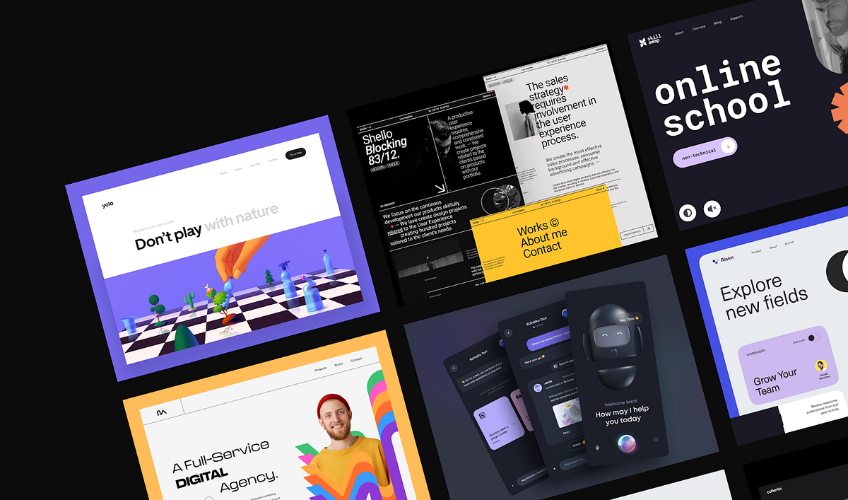
The Hottest Web Design Trends 2022
What’s effective today and what will we take with us into the future?Web design trends by OutcrowdWhy is it important to follow trends? Trends are not only about the present. They form the image of the future. Marketing and design trends are interconnected, and their dynamics are in sync. So it pays to be an attentive viewer!Let’s take a look at 2022 web design trends that will definitely keep in 2023. They have one thing in common: they all do their job.As we study the examples and draw inspiration, let’s keep in mind that each trend is effective in its own marketing realm. Design choices must be based on the company’s positioning and the needs of the audience, not on the mere fact that it’s the trendy thing to do.Yolo — Web Design for Ecologically Sustainable Development by Outcrowd1. New Minimalism2022 saw a new wave of minimalism that strives to stand out from the competition and grab the user’s attention. The trend includes bold, vivid, bright colors and a lot of “air.” This helps emphasize the essentials while maintaining visual clarity. The content looks gorgeous and exciting, but at the same time simple and easy to understand.TABU by Hrvoje Kraljević for BORNFIGHT STUDIO®Clean, clear, and vivid minimalism remains popular in branding, as well. This is where it truly shines. A minimalist design with lots of air and bright highlights is an instant attention-grabber that makes the brand look fresh and relevant.The new minimalist design is enhanced when it’s tastefully contrasted against a dark theme.Kohaku Bot — Dark mode — Mobile App by Tran Mau Tri Tam for UI8But all this doesn’t mean that soft-colored minimalist design is dead. For some businesses, a vivid palette with bright elements is simply inappropriate. They continue to use minimalist monochrome designs, although increasingly often enhanced by bright splashes of color.Here’s a good example:A new way of cross-border payments by Cuberto2. Neo-BrutalismBrutalism seems to feed off a fountain of youth since it began back in the 1950s. Over the decades, the style has evolved, constantly updating itself to stay relevant. Neo-brutalism is perfect for brands that promote creativity, boldness, edginess, and novelty. Need an instant eye-catcher? Give neo-brutalism a call. (Be careful, though, because it may upset the aesthetic gatekeepers.)https://medium.com/media/cccaedc1e6923b2b82a2598ae366b1d5/hrefSo what’s the secret behind this trend’s longevity? The brutalist style implies something that is raw and unpolished, a bit rough around the edges. The viewer has a subliminal desire to improve upon it, to finish the job. This engages the viewer emotionally, and the picture gets imprinted on their mind, along with the information. In marketing, that’s invaluable.Brutalist design requires a high degree of professionalism. The designer must be keenly aware of the thin line that separates the viewer’s desire to improve from the impression that they’re just seeing a botched design beyond any improvement.Task Management Landing Page by Bogdan Falin for QClayDigital neo-brutalism is minimalist and bold. It relies on roughness and “visual shocks”: high contrast, rough shadows, conflicting colors, simple backgrounds, asymmetry, and unedited photos. Neo-brutalism is fond of standard bold fonts, preferring readability over eye candy.Studio / Designer — Website by Tomasz Mazurczak for STUDIOHere’s an example of a neo-brutalist website: howilearnedtolovetheindiestry.info3. Engaging InteractivesBased on importance alone, this trend should be topmost on any list. As technology progresses, interactions between humans and digital products increase. Engaging interactions have become so much more than just a responsive interface. Today, it’s already about psycho-physiological communication. Engaging interactions aim to affect all human senses: vision, hearing, smell, touch, taste, and kinesthesia.https://medium.com/media/1b8b6a6c524c79051900e84487b08bb2/hrefThis trend aims to help the user come in contact with the product and feel real sensations. The most relevant content is the one that triggers an emotional response and the corresponding physiological reactions. A video of a steaming hot pie makes the viewer salivate while chasing a virtual opponent gives them an adrenaline rush.Engaging interaction is also a substitute for physically touching the product: it’s an opportunity to rotate the object and see it from different angles, zoom in on the details, choose the size, model, and color.https://medium.com/media/8bf291630aa25ee7fa76fb67b33ffe08/hrefTactile sensations during interaction are not fingers tapping the screen. It’s a mental contact between the user and the virtual world, it’s the enjoyment of playing a game with elements of design, and it’s a realistic feel of their surface and texture.Engaging interactions enable users to customize the interface to their taste and manage it at their discretion.https://medium.com/media/a419bc2efe1943a141777399cdad3437/hrefEngaging interactions include all types of virtual communication, not only with other people but also with the software itself. The more responsive and understandable the interface, the more engaged, committed, and loyal the users.Engaging interactive design is our present and future.4. Focus on People and Storytelling2022 has highlighted the fact that storytelling and emotional photos of people elicit a lively response from users. As far as minimalism goes, the most popular trend is using expressive photos of people accompanied by a short text: a memorable slogan, an impressive excerpt from a larger narrative, or a quote from a story.https://medium.com/media/c51cfca68a76b5da96227a508c9d5426/hrefThe main screen is not cluttered with long reads. The story unfolds laconically and gradually as the user scrolls down the page, through highlighted images, headlines, videos, or animations. Alternately, the user can click to find out more details.Expressive photos of people are also used as effective visuals to attract attention.Vultura Entertainment Brand Identity by Halo Branding for Halo Lab 🇺🇦This trend also includes large banners under the top menu on the main page. It’s the first thing users see on the website, instantly engaging their emotions.Scrollytelling is a close cousin to storytelling. It’s a gradual visual narrative. These days, people increasingly tend to scan their eyes across the page without really reading it or getting to the end of the story. The scrolling process itself is also tiring. A story that unfolds before the user’s eyes like a controllable movie is a great solution.https://medium.com/media/06a435d9668263618fe3588b09cea965/hrefScrollytelling is perfect for presenting sizable narratives, such as a description of the company or product, scientific data, or any cognitively demanding content. It’s especially good for learning and memorizing new information.The principle of “abridged” scrollytelling is successfully used for displaying selling propositions. It’s a way to quickly and effectively showcase the product’s advantages and convey the most salient information.https://medium.com/media/01979d81b558bd6b4667ca6708ac4031/href5. 3D GraphicsThe 3D graphics trend is definitely a keeper since it’s one of the best tools for retaining user attention. 3D images are perceived as realistic, no matter how fantastical their shapes are. A shape that has volume is eye-catching and mesmerizing. The user spends more time on the page just to admire the design.https://medium.com/media/c3a565a6ba3c976e00b71fe575e68aaa/hrefFar from losing steam, the 3D trend has even found its way into branding. An animated 3D logo grabs the viewer’s attention and holds it much longer than a conventional 2D image.https://medium.com/media/252254c7d1f30abbe1395a46a2037955/href6. Abstract IllustrationAnother 2022 trend was using illustrations with abstract geometric shapes. They are widely used as primary images for websites and apps, social media posts, and packaging designs.https://medium.com/media/505941d729f7cff57faec51c69919ca1/hrefAbstract illustrations are so successful because of their attractive vividness and contrast, visual aesthetics, and minimalist simplicity. They act as color highlights and add superior visual clarity to the overall design.Abstract illustrations and geometric shapes have also been used in branding. Their role here is similar: drawing attention to the brand name through color and form.DSM — Hero Header v3 by Tran Mau Tri Tam ✪ for UI87. Oversized TypographyWhat makes this trend special is that the typographical elements here are independent. The fonts are not used merely to convey information. They make up an important part of the page’s visuals, shaping the design and acting as powerful visual highlights in their own right.The advantage of oversized typography is that it goes well with many design styles. Large bold fonts are good for both minimalist and maximalist designs and their combinations. They harmonize perfectly with thin and fine fonts, emphasizing their elegance with their brutality.https://medium.com/media/624bfcd1ee1db3a7fdac2165497559ab/hrefAnother benefit of oversized typography is the ability to reduce the use of images on the website, cut loading times, and improve mobile usability.The important thing is to choose fonts that are easily readable and fit the branding concept.In conclusionWe have been following design trends for several years. Year after year, we see the same thing: the best trends survive and remain in the next year, except with new solutions added. The best ones are those that work toward the project goal and help garner a large audience. The stuff that gets left behind is not necessarily outdated; it’s just that it doesn’t work toward the goal as well as it used to.We have reviewed the most popular trends. Here’s what we have this year and what will continue to inspire us tomorrow:New Minimalism;Neo-Brutalism;Engaging Interactions;Focus on People;3D Graphics;Abstract Illustration;Oversized Typography.Use the trends but don’t let the trends use you!The Hottest Web Design Trends 2022 was originally published in Muzli - Design Inspiration on Medium, where people are continuing the conversation by highlighting and responding to this story.

Design Thinking 101: Increase Users’ Performance 72% Faster with A/B Testing & SUS Scoring
a UX Case Study on Ajaib — Indonesian Investment PlatformIllustration: Stock analyzingBlessed with more than 270 million people who live in diversity, Indonesia is the fourth-largest country in terms of population size, the world’s 10th largest economy in terms of purchasing power parity, and a member of the G-20. However, 66% of population are “unbanked” (don’t own a bank account).According to The Jakarta Post, many Indonesians, especially those living in rural areas, remain unbanked or have yet to become part of financial inclusion. Being unbanked means not having access to financial products and services such as transactions, payments, savings accounts, credit and insurance.¹The number of domestic investors in the Indonesian capital market increased by a half to close to 2.5 million in 2019, reflecting growing interests among locals to invest in financial instruments like stocks, mutual funds and bonds according to a report by The Jakarta Globe.²However, that number is still very small considering the total population of 270 million people. Meanwhile, the number of productive age (working-age population) in Indonesia is 189 million and the number of domestic investors is only 4.16 million people or around 2.2 percent.³About AjaibLogo Ajaib GroupAjaib is an online investment platform for millennials in Indonesia. Seeing the current low level of financial inclusion & financial literacy in Indonesia, Ajaib Group seeks to take this opportunity by increasing the financial inclusion rate of the Indonesian people through investment. Ajaib allows their users to trade stocks and invest in mutual funds through the Ajaib mobile app. In this study, we will learn about who Ajaib’s target market is and what kind of core problems they face in investing.Design Process (Approach)Design Thinking was chosen as the perfect approach to solving problems. A creative approach that helps individuals or teams to identify real problems and solve them. Apart from being an affordable approach, design thinking doesn’t require a lot of time and resources.The five stages of Design ThinkingKeep in mind that this stage does not have to be sequential from stage 1 to stage 5, but the facilitator/researcher can start from any stage as needed.EmpathisePlease leave your assumptions at the door. If you have ones, challenge them! Assumption will only keep you away from your customers. You have to really know your users, and the great way to get to know your customers or users is to ask them. Conducting interviews can give you tons of useful insights into what your customers think about your product and what your customers really need.Conduct ResearchThe very first step to do was research with real target users. Ajaib Group is targeting millennial users for their products, so the sample population in this study had to be between 24–39 years old and are first-time investors (or enthusiastic about investing).In-depth Interview (Qualitative)Go out and ask the right questions. Start asking simple, clear and open-ended questions to find out more information about their behavior, their views on the product and to the core problems they face in their daily lives.Interview key findingInsight directly from participants:Many unfamiliar words in the investment terms.Hard to recognize end-products from the issuer (publicly listed company).Assume that stock investment requires millions of rupiah (around USD $100) for one transaction.Survey (Quantitative)Distributing surveys will support research quantitatively. Aside from cost-effective and easy, surveys can reach remote respondents by simply sending them an online form. Google Forms was chosen as the survey tool for creating, distributing and gathering responses at free cost.Partial survey results with Google FormsData collection was carried out by distributing surveys to non-randomly selected respondents (non-random sampling).Conclusion of survey results:An investment management company (stock brokerage) with a brand background of giant bank has succeeded in gaining top-of-mind awareness.2 out of 3 respondents know and learn about the stock market from online video sharing and social media platforms (YouTube) and will approach their friends to understand more about investing.Almost half of the respondents will spend IDR200k - 500k (US$15–35) to invest/month. Meanwhile, the GDP per capita in Indonesia was last recorded at US$3.911,7 in 2020.⁴26.7% of respondents consider the halal/haram as a serious concern in stock investment.DefineAfter conducting interviews, emphasizing the insights, distributing and analyzing the survey results, it’s time to define the real problem.PersonaAll the information from the research is now converted into Persona, a useful design tool to reflect the targeted user in the interview session.PersonaCreating a persona can help researcher in identifying users’ needs more deeply, knowing their behavior and the goals they want to achieve. Moreover, persona can be used to guide design decisions and prioritize user’s problems.Problem StatementsBased on the research results, here are the problems decided to focus on:Users need to know what end-products (product brands) of the issuer (publicly listed company) is producing.Users need guidance on the app for choosing stocks to invest in.Most novice (first time investors) find investing confusing because of the confusing investing terms.Business GoalsIncrease users’ awareness of stocks that appeal to them.Encourage users to make simple stock choices to invest in.Educate and inform users about terms in investing.IdeateStart generating ideas and solutions. Based on the research results, we have sharpened the core problem and are ready to come up with solutions.There are hundreds of ideation techniques to help you in your ideation sessions. You want an ideation technique that combines your conscious and unconscious mind — fusing the rational with the creative.⁵The proposed solution is to group the stocks list into a theme. Stock theme is a feature that easily understandable groups stocks based on what users are exposed to in their daily lives and they can easily understand.Examples of stock themes are 100 most popular stocks, a group of Indonesia’s State-owned Enterprises, a group of product brands, and a group of basic categories such as Food, Drink, Telecommunication, etc. The category is meant to help users discover stocks more easily based on their preferences or values.PrototypeBefore getting into craft work, there’s one small thing to do to clarify where the proposed solution will be placed. User flow is another great design tool to do that job and for analyzing the user’s steps in completing a task.According to Technopedia, user flow is a term for the description of a set of tasks that a user must do to complete some process. In IT and on the Web, professionals might analyze user flows to try to make websites or technologies more user-friendly, and to understand the goals of the user as well as the goals of the company.⁶User flow/app flowSketchesPrepare the craft tools. Having some paper and a pencil is a good start before drawing sketches. Remember, you don’t have to be a genius to draw a square, so, be confident and put all your creativity and ideas on that paper.Sketching wireframesVisualizing ideas into a rough sketch will help us to explore the possibilities and work on it immediately and quickly.Hi Fi MockupAfter tons of sketches and possibilities, let’s move forward into high fidelity mockups. Converted the sketches into beautiful design, gave it a nice color palette and we are ready to jump into Usability Testing.Existing designNew design (proposed solution)TestAre you ready to face the reality? Usability testing was conducted to validate the proposed solution. Don’t lose hope if you find the solution doesn’t work out, you can still go back to the ideate phase to generate more ideas.The usability testing was applied with five participants. In line with Nilsen, elaborate usability tests are a waste of resources. The best results come from testing no more than 5 users and running as many small tests as you can afford.⁷A/B TestingThe A/B testing was conducted to verify the proposed solution can produce better performance. In this scenario, we will find out how good users are at exploring a feature, so we will assign some tasks to the users and track how fast they can complete the tasks between the two designs.First scenario: Indonesians know Indomie as a famous instant noodle brand produced by the Indonesian company, but only few people know the name of the company (issuer). In this test, we will challenge participants to find the ICBP ticker code (issuer/stock symbol) in the stock list. We prevent participants from using the search box feature, because our goal is to encourage users to discover stocks based on what they are exposed to in their daily lives and to make stock choices.Usability testingSecond scenario: PT Telkom Indonesia is a multinational company from Indonesia. Telkom is known as a communications company. In this test, the participants will be challenged to find the TLKM ticker code in the stock list.A/B Testing ResultsThe results of these experiments show that the majority of users were able to complete these 2 scenarios faster through the new design, and had recorded that the average user performance increased 72% faster for the new design than the existing design.A/B test results: Task completion rate per unit of time (minutes)A/B test results detailsSystem Usability ScaleIn order to strengthen validation on A/B testing, several metrics have been defined to measure the experiment. By following the scoring of System Usability Scale (SUS) methodology, the findings clearly indicate that the new design gains an “A” (average SUS score 86) that describes Best Imaginable for the user experience.System usability scale averageSystem usability scale resultsGrading scale of SUS scoresThe final survey was distributed to collect feedback from participants. The aim of the survey was to determine the participants’ views between the interface and the experience.Final surveyResultsBased on the tests and analysis that has been done, these experiments clearly confirmed that:In the existing design, users spent more time in completing the tasks, this is due to the user’s difficulty in identifying Telkom company which is included in the infrastructure industry sector and difficulty in identifying some companies in the consumer sector.With the new design, users have accomplished the task very well, because the stock categories are grouped according to the user’s knowledge and based on what they are exposed to in their daily lives.Design Is Not Just What It Looks Like And Feels Like. Design Is How It Works — Steve JobsTo have a beautiful interface in your product is indeed an important thing. However, the interface isn’t the only product’s success metric. If we consider it as a whole thing, it’s about users understanding and finding it easily, and always wanting to use it again which makes the design look great.ConclusionThis study has found that Indonesia has the most valuable potential for the digital economy and the demographic bonus should be able to boost the next level of economic growth. The collaborative partnership between the public and private sector can unleash the business potential of the digital economy. For instance, the government can provide assistance in the form of infrastructure development and invent a legal foundation breakthrough to help startup companies. On the other hand, the private sector can help by educating Indonesians about the benefits of investing and how to manage finances wisely.In the design section, it is crucial to understand the users’ point of view, but the good design doesn’t only speak users’ language yet meet the business goals as well, whilst the best product is about balancing users needs with business goals and meets technical feasibility.References[1] Wiradji, Sudibyo. ( April 15, 2021). Grassroot strategy to realize financial inclusion in Indonesia. The Jakarta Post. Retrieved from https://www.thejakartapost.com/life/2021/04/15/grassroot-strategy-to-realize-financial-inclusion-in-indonesia.html[2] Prasetyo, Wisnu Bagus. ( December 30, 2019). IDX Registers 860.000 New Investors in 2019. Jakarta Globe. Retrieved from https://jakartaglobe.id/business/idx-registers-860000-new-investors-in-2019[3] Uly, Yohana Artha. (October 22, 2020). Jumlah Investor Pasar Modal Indonesia Masih Tertinggal dari Singapura dan Malaysia. Kompas.com. Retrieved from https://money.kompas.com/read/2020/10/22/103000226/jumlah-investor-pasar-modal-indonesia-masih-tertinggal-dari-singapura-dan?page=all[4] Badan Pusat Statistik. (February 05, 2021). Ekonomi Indonesia 2020 Turun sebesar 2,07 Persen (c-to-c). BPS — Statistics Indonesia. Retrieved from https://www.bps.go.id/pressrelease/2021/02/05/1811/ekonomi-indonesia-2020-turun-sebesar-2-07-persen--c-to-c-.html[5] Ideation. Interaction Design Foundation. Retrieved from https://www.interaction-design.org/literature/topics/ideation[6] User Flow. Technopedia. Retrieved from https://www.techopedia.com/definition/31852/user-flow[7] Nielsen, Jakob. ( March 18, 2000). Why You Only Need to Test with 5 Users. Nielsen Norman Group. Retrieved from https://www.nngroup.com/articles/why-you-only-need-to-test-with-5-users/Thank you for reading and congratulations on completing what you’ve started!View my experience details on LinkedIn | View my portfolio on Dribbblep.s. I was not affiliated with Ajaib Group at the point of publication.Design Thinking 101: Increase Users’ Performance 72% Faster with A/B Testing & SUS Scoring was originally published in Muzli - Design Inspiration on Medium, where people are continuing the conversation by highlighting and responding to this story.
Abstracts — An Interview with Mauro Porcini
Abstracts — An Interview with Mauro PorciniSVP & Chief Design Officer, PepsiCo, Inc.Illustration Melvin ThambiMauro Porcini joined PepsiCo in 2012 as its first Chief Design Officer. In this newly created position, Mauro infused design thinking into PepsiCo’s culture and is now leading its approach to innovation by design across product platforms and brands. The impressive array of a line of products and brands include Pepsi, Lay’s, Mountain Dew, Gatorade, Tropicana, Doritos, Cheetos, Quaker, Aquafina, Life Wtr, Naked and SunChips, amongst many others. His focus extends beyond physical expression into the realm of virtual expressions of the brands, including product, packaging, events, advertising, licensing, retail, architecture, and digital.Mauro has been recognized throughout the design industry, being listed in Fast Company’s “Most Creative People in Business 1000”, Fortune Magazine “40 under 40” ranking rising stars, Ad Age’s “Creativity 50”, GQ 30 Best Dressed Men and featured in several books on design and innovation in multiple regions of the world including Creative Confidence, Jugaad Innovation, Il Minimo Sostenibile, and Vincere con le idee.In 2018 Mauro has been recognized with the Knighthood (Cavaliere) by the President of the Italian Republic.Welcome, Mauro to Abstracts; the spectacular journey from a product designer to SVP & Chief Design Officer, at PepsiCo. How do you feel when you look back?I’m thrilled and delighted, and it’s been a fascinating journey. I always wanted to do something that could impact the lives of people, change the world in a positive way. And, as a designer, I have had the opportunity to touch the lives of many people, different professional realms, various industries, products, and so on.By working in an organization that reaches millions of people, I am able to indirectly connect with these millions. So, I started with a project, then another and the journey just continued. Essentially, my profession started as a journey trying to figure out how to create a relevant role for the design, for me, for my teams inside this organization while leveraging design thinking and providing immense value to the society, people and the company. And fast forward to where we are today, yes, we moved from one project, one designer to a variety of different projects and activities that impact the lives of various people around the world and in the corporation.It’s been really, really exciting!Image courtesy — DESIGN + INNOVATION BOOK 2012–2018Every journey is a series of small steps in the right direction. How do you take those steps on a typical day at PepsiCo?Every day has its share of excitement and challenges. The challenges to innovation have two dimensions. One, since we are building a new capability within an established company, the challenge is to integrate design within the company and imbibe it in the day-to-day operations. Design capability is an innovation project by itself and was a new introduction in an established organization like ours. Naturally, there is this dimension of acceptance.The second one is, connected to the nature of the projects that we drive. When you do innovation, by definition, it’s complicated. You are out of the comfort zone and the regular ways of doing things. You need to talk with consumers and validate what you’re doing. To change the game and innovate is to take some risks. So, what is the right balance between the two realities? Figuring out how to balance and develop the idea and the product, the solution at a reasonable cost without impacting the integrity of the concept itself. Believe me, it is more complicated than it sounds. There are the typical challenges associated with the nature of innovation projects and design projects. In these, you find many roadblocks every day, and it is part of the game. The nature of the business and the nature of the organizations that give you once access to so many people and confidence to succeed.So, that’s the challenge aspect. But then there is the exciting part, the experience of progress; To look back where we were before and where we are and where we are headed. And that gives you an immeasurable sense of direction, energy, optimism, and inspires you to do more.Equally important is the ability to step back. If the focus is on day-to-day work, and when you get immersed in the details, the ability to constantly look at the big picture in the projects and evolving the capability may be missing. In summary, the two dimensions and YOU are the key factors. It takes only a second to lose yourself, lose inspiration, lose energy and motivation, and then it is a disaster.Thinking big is always the most important thing to do because it drives you to change the game. It also gives you that energy and that optimism that is necessary to face the challenges each day throws at you.Let’s talk about inspirations. What was the driving factor behind DESIGN + INNOVATION BOOK 2012–2018?We realized that it was essential for us to communicate both internally and externally.As designers, we were into so many different products, brands, services, and experiences in the past few years. We have so many completely different and independent brands that many people are not even aware it’s all part of Pepsico. There was never one clear and consistent story about the multiple dimensions of efforts, all delivered by one team to generate so many different kinds of exciting experiences and stories through different product experiences. So, we decided to collect everything in a visual book.We didn’t want to spend too much time telling the story of each project or each brand. And we decided instead to tell specific stories about how we look at work, what we think of the role of design innovation and also provide a glimpse of how society is changing. How ‘design innovation’ can play an important role to create value for both the company and the community itself is a story we are highlighting.It’s always that combination between theory and practice that makes everything very powerful. So, the book talks about the vision of a team and the company with some theoretical pieces, and then mostly through actions, projects, and things that went to market. This is a book designed for our internal audience and for a variety of different people out there who are interested in learning more about our world. The book is about people interested in our story and eventually interested in even joining our journey.Image courtesy — DESIGN + INNOVATION BOOK 2012–2018So at Pepsico, how do you harness the power of design to evoke an emotion and connect with people?To design something to create emotions is not particularly difficult for a talented designer, but to go massive with something that evokes an emotional response is difficult. That’s because every time you want to create an emotion, you are up against the inertia of the status quo; To evoke and evolve an emotion, we need the product to disrupt the inertia of the status quo. Your product and it’s design/other attributes create excitement in a person by initiating a form of change, emotion, or an unexpected new state within. So essentially, you are creating a surprise.In simple terms to beat the inertia and create an emotion, you need to polarize, and this could be risky because it could swing either way for the business. Achieving that perfect balance between all the different elements or that strategy that allows us to push the envelope more and more every time is the key to success here. It’s important to take risks and try out a few things, see the differences, and then push for more changes. And during the course of changes, you could augment the scope of execution from the portfolio to products to brands to the company level. This is always about trying to innovate, trying to create something on the roll. All of these create emotions, and that is how we can harness the power of design.Image courtesy — DESIGN + INNOVATION BOOK 2012–2018I’m coming to my personal favorite question. In your opinion, what role does art play in elevating the value of branding in design?Art is a territory where creative people can experiment without too many boundaries in terms of manufacturability, not requiring having to please too many individuals, nor think about finding a specific price point that is reasonable for people.So essentially, art is a virgin territory to explore with creativity. That’s why art is an element of inspiration for all designers.In art, you can experiment without constraints and use it as inspiration. In product design, unlike art, there are constraints imposed by business and market factors.Also, in the world of art, the ability of the designer to be inspired by the art and understand how to capture the charming side, some learning, some cues that can be leveraged in the creative process is paramount. So art is always a beautiful form of inspiration for the design or any creation in general.Image courtesy — DESIGN + INNOVATION BOOK 2012–2018How do you balance visual design and usability while developing a brand or during product design at PepsiCo?This is a very smart question because it’s the typical challenge for any designer. How do you find that delicate balance between emotion and rationality and also between functionality and engagement? The truth is if you dial too much of functionality at the cost of emotions or vice versa, you may fail. It is not easy, and it all starts with people talking to each other and generating insights that are actionable that can be used in the design process. Start developing a creation, make a prototype, go back to the audience, validate ideas, kill incongruous ideas, iterate, create a new prototype, and repeat until you find the magic balance between emotions and the rationality that defines the success of the product.Like everywhere, there is no success formula or recipe, and it depends on what you’re trying to design. I will give an example coming from my previous company, 3M, where we used to design products such as scotch tape dispensers and post-it dispensers. While creating new designs, a group wanted heavy dispenser that you could use with one hand, let’s call it one hand dispenser. Then you have the light dispensers of Scotch and post-its. These are dispensers you put in your drawers or even in your pocket. We developed different concepts for different kinds of audiences. One that was the shape of a shoe and another one was a little man that was climbing a desk.It was quickly ascertained that to have the weight for one hand dispenser in the kind of shape, as in the concepts, was almost impossible. So, we dialed down the functionality but dialed up the emotional part. The focus was on people here who were underserved in this category. So instead of focusing on the functionality, we drove the emotion aspect in this design. Instead of expensive or functionality of a dispenser, the focus was on the emotional connect with the people using the product. This is an example of how for certain consumers, you can dial up emotion and keep functionality a little bit down. As in other cases, balance is the key; here, between functionality and emotional connect.You were a big part of Pepsi’s transition to big, bold identity. Please share a few words about the transition and your experiences during that time.It was a complex project for a reason. Pepsi had different kinds of visual identities in different parts of the world. In many of those geographies, the brand was very successful and strong. So, there was no incentive or reason for these business units in Russia, the Middle East or China to redesign the identity of the brand or to move away from what we call the refreshment cues and to adopt a flat, high saturated, and bold blue identity.The need for a global visual identity was understood, but there was no margin for error, and the changes should not impact the business negatively. Consumers may be confused by the new identity, and they could miss our product due to the lack of refreshment cues. It was a mix of multiple disciplines coming together, design organization coming together with the ideas, communicating the right way with examples of other products from across the world. Then obviously the corporate business leaders embraced the idea and really helping us sponsor the game and push it through. It’s been a very successful project and has proved that the use of design can really add value to the organization.Image courtesy — DESIGN + INNOVATION BOOK 2012–2018What would you say are the necessary skills and qualities that of utmost importance for a design team?First of all, a very holistic approach to design is not just an industry or graphic or interior design. You need the team, especially the leader and the leadership team to have a 360 approach to design and to be business savvy.Since the design is not just about designers, one needs to understand the business implications, be able to articulate the impacts of design or changes in a business language and most importantly has to have high Emotional Quotient (EQ). “Design is about our ability to bring with us our journeys, innovations, R&D, marketing, consumer insights and all the different functions that are connected to the innovation problems.”Elaborating more on this, we need to possess empathy for others within the organization and towards customers, partners to drive those ideas that seem polarizing at first glance. We need people that are very resilient, open to advanced thoughts, design principles, optimistic about outcomes and curious.Curiosity pushes you to read, to talk with people, to travel, to observe the world that surrounds us, with the eyes of a child, with that of a pure soul.Real inspiration is in exposing yourself to new things continuously, consciously and to look at things with a different perspective. All of these are really the key characteristics of a design organization and design individuals in general.Now looking towards the future, What does Innovation in design as a concept mean to you?Historically, the design was mostly focused on graphics, packaging, and products. In a few industries like fashion, consumer electronics, and apparel the traditional design created a competitive advantage and was very important for survival. Today design is much broader and is becoming a significant competitive advantage in many different kinds of industry.The evolution of product experiences has a peaked interest and has become relevant in two areas. In brand building and new innovation. Unquestionably, the design is the future and would play a very important role in marketing, R&D, in driving innovation as well as brand building, as a partner and as the core leader, not just as an enabler.Image courtesy — DESIGN + INNOVATION BOOK 2012–2018What are the new and exciting projects happening at PepsiCo?The platform we’re really investing in is, is what we call the Itinerary iteration platform. Recently launched the equipment, with the possibility to customize your water, the level of sparkling or combination of flavors and the machine communicates with your phone, with an app so that you can customize your drink. When you are right close to the machine, the machine reads your phone with a QR code and you can immediately access your specific customized choices. That’s not all, you can do the same with your customized bottles.QR code on the bottle means the customer doesn’t even need to use the phone. The machine will recognize the bottle and will immediately know the customer preferences and makes the experience as seamless as possible. So that’s the first thing that we launched a few weeks ago in the US that focuses on hydration with a healthy solution and we are trying to be as sustainable as possible.In sustainability, we announced that we are moving all our ‘bubbly portfolio’ to non-plastic bottles. So essentially we removed the plastic bottle completely. We are moving to aluminum cans to explore the customer interest and if they embrace it, then we are going to do more and more of just that. All of this is expected to eliminate more than 8,000 metric tons of virgin plastic and approximately 11,000 metric tons of greenhouse gas emissions. This is the latest really ambitious milestones that our organization has on our sustainability journey.Image courtesy — DESIGN + INNOVATION BOOK 2012–2018You breathe and live design and it’s reflecting in your style statement. So can you please share your thoughts about your style pattern.Image courtesy — Mauro PorciniI love fashion! Fashion is a personal obsession and fashion for me is a way to define what I am and my brand, to create my own identity and to differentiate myself. And yes, to make a statement about my creativity, a little bit of my aura, one that I choose, is something that is very natural. And, these really, once again is part of my personal branding. I can tweak it and tune it and I do.There are other moments where I am more sophisticated. Essentially I always play with this idea that I need to wear things that communicate to the business community that I am part of the community and that I’m part of the business. So you will see most of the time with jackets.I want to radiate a certain calm by letting everyone know that I’m one of them but then at times I want to remind them that I am a creative person, so I’m different than them. I want to keep others’ inquisitive soul at rest and I don’t want them to search for another business person in me. Of course, there are other criteria, like being able to talk business and then as a creative person offer perspective and tweaking the message every time on the basis of the conversation.At the end of the day, all of us can become a brand. It’s called personal branding and the visual cues of your style are part of your personal brand.With more than 800 awards under your belt, would you please share your personal success mantra?Image courtesy — Mauro Porcini. In the past 6 years, his design team has won almost 800 Design and Innovation awards. Lately, the company has been recognized by Fortune in their 2018 Driven By Design list, one of only two organizations from the Food & Beverage industry.I would like to summarize this into a few factors such as:The first one is always trying to understand how to make others successful before yourself. It could be your own business, the business one works for, a business partner or your boss. If you enable others’ success then you are going to become indispensable to them. This, in turn, will make you successful in what you do. A big component of success is happiness, but happiness is much broader than that. For me, it is the consumer at the end of the day. Anybody that surrounds you should enable you to do the right thing for consumers. So that’s the mindset you should always have.Second, always think about how to disrupt and innovate. Always challenge everything from the inside out. Understanding the primary cause of a demand or a problem leads you on a path to innovation.And then the third one is what I mentioned earlier, CURIOSITY.Always, always, always remember to learn by curiosity. Never stop learning.I think if you’re able to do these three things, there is a hyper ability to be successful in what you do.Follow Mauro Porciniwww.design.pepsico.com / LinkedIn / Instagram / TwitterGive your 50 claps 👏🏻 if you find this interview informative & engaging.Abstracts — A curated perspectives section with seasoned artists from the fields of Design, Art, Motion Graphics & Advertisement. Hear from the experienced and creative, as they share their ‘art’ process and sources of inspiration.Other AbstractsAbstracts — An Interview with Chris DOAbstracts — An Interview with Drew BridewellAbstracts — An Interview with MikeAbstracts — An Interview with Jonathan CourtneyAbstracts — An Interview with Zhenya RynzhukAbstracts — An Interview with Fernando ParraAbstracts — An Interview with Sergey AndronovAbstracts — An Interview with Bryan TalkishAbstracts — An Interview with Lorenzo BocchiAbstracts — An Interview with Roshan KurichyanilStay tuned for more interviews!Melvin Thambi works as a Creative Director at RapidValue Solutions & Creative Consultant of Emm&Enn Art & Design Studio.Medium / LinkedIn / Behance / Dribbble / Instagram / Twitter / UnsplashAbstracts — An Interview with Mauro Porcini was originally published in Muzli - Design Inspiration on Medium, where people are continuing the conversation by highlighting and responding to this story.
The fundamental of designing for privacy
Source: Folio Illustration Agency on DribbbleRemember when we all found out our personal info on Facebook had been scooped up by Cambridge Analytica without our consent? Back in 2018, it hit the news that this company had used data from millions of us to try and influence the 2016 U.S. presidential election.This incident serves as a stark reminder of the delicate balance between innovative digital experiences and the importance of protecting user privacy.As we dive into creating user journeys, let’s use this lesson to guide us in making sure we always respect and protect our users’ privacy every step of the way.Here’s how to effectively approach this.1. Understand the contexta. Recognize the purpose of information collection, storage, and sharing:GPay specifies why they are collecting certain infoFirst, understand why information is being collected in the first place. Each piece of data should serve a specific purpose. It can be to enhance user experience, provide personalized services, or comply with legal requirements.This maintains transparency with users and justifies the data collection process.b. Determine the benefits for the user and business:Strava lets its users know the benefit of sharing their locationData collection should clearly benefit both the business, through insights and compliance, and the user, by improving service quality, personalisation, and security.Highlighting these benefits helps gain user consent and participation, making them feel valued and respected.c. Consider the legal and ethical implications of information usage:Compliance with privacy laws and regulations is just the starting point. Ethical considerations should guide how information is used, ensuring it’s in line with societal norms and expectations.This includes respecting user consent, avoiding manipulative practices, and ensuring fairness and equality in data processing and decision-making processes.d. Define information scope and boundaries to align with user goals:Set clear boundaries on what information is collected, how long it’s stored, and who it’s shared with. Limit data collection to what’s necessary to achieve the stated goals and avoid overreach that can lead to privacy concerns and mistrust.2. Inform and ask for consenta. Get consent before collecting and storing personal information:Task Rabbit asks for consent before collecting the dataAlways get consent first. Before collecting any personal data, make sure users agree to it. This is not just about following laws; it’s about respecting user autonomy and building a foundation of trust.b. Clearly explain the type of information needed, its purpose, and retention period:Spotify has clear information on how they intend to use the dataBe clear and straightforward about what data you need, why you need it, how you’ll use it, and how long you’ll keep it. Avoid legal jargon. Use simple language so users can easily understand what they’re agreeing to.c. Provide users with opt-in/opt-out options:Spotify provides easy opt-in/opt-out optionsGive users the power to choose by providing opt-in and opt-out options. This empowers them to make decisions about their data and shows that you value their preferences and privacy.d. Offer easy ways for users to access, update, or delete their information:Intuit offers users a clear & easy way to download, delete, and correct their dataMake it simple for users to see, change, or delete their personal information. This could be through user account settings or direct contact options. Giving users control over their data reinforces trust.e. Stay transparent, accountable, and comply with data protection laws:N26 shows that they’re compliant with data protection lawsBe open about your data practices and comply with data protection laws (like GDPR). This includes being ready to show how you’re using data and taking responsibility if things go wrong.3. Minimise and secure the informationa. Collect only necessary and relevant information:Signal is designed to never collect or store any sensitive informationLimit data collection to what’s strictly needed for your service or product. This means evaluating each piece of information you ask for and ensuring it has a clear purpose.Avoid the temptation to collect data “just in case” it might be useful later. This also reduces data management complexity and storage costs.b. Restrict access and store information securely:Signal stores the info with encryptionOnce you’ve collected user data, it’s crucial to protect it with strong security measures. Use encryption to safeguard data both in transit and at rest, making it unreadable to unauthorized users.Additionally, access to this data should be limited to employees or systems that need it to perform their job functions.c. Reduce risks of data breaches, misuse, or loss:Adopt a proactive stance towards data security to minimise the risks of breaches, misuse, or loss. Conduct regular security audits, employ up-to-date cybersecurity tools, and train staff on data protection best practices.Have a response plan in place for potential data breaches, which includes notifying affected users and regulatory bodies as required by law. By preparing in advance, you can mitigate the impact of any security incidents.4. Design for empathy and respecta. Consider the emotional and psychological impact on users:Klarna uses a delightful UI and UX copy to get permissionsThink about how users will feel when they interact with your service or product. Every design decision, from the way information is requested to how feedback is provided, can affect a user’s mood and stress levels.Strive to create a user experience that is considerate and supportive, reducing anxiety and frustration wherever possible.b. Focus on creating a positive user experience that respects user autonomy:Duolingo provides users with the autonomy to give access to info collectionThis includes giving users control over their data, offering clear choices, and making it easy for them to opt-in or opt-out of features.Simplify these processes to remove any barriers or confusing details, making it straightforward for users to exercise their rights and preferences.Respect their decisions without penalizing them for choosing more privacy-focused options.5. Test and iterate the user journeysa. Involve real or representative users in testing:Bring in actual users who represent your target audience to test the user journeys. This approach ensures that the feedback and insights you gather are grounded in real user experiences and preferences. It helps identify any gaps or issues in the user journey.b. Observe user interactions, understanding, and feelings towards the information:During testing, pay close attention to how users interact with your product or service. Notice not just what they do, but also how they feel and what they understand from the information presented to them. This observation can reveal a lot about the clarity of your messaging, the intuitiveness of your design, and the emotional impact of your user journey.c. Gather user feedback to refine user journeys:After observing user interactions, actively seek out feedback from the participants. Ask them about their experience, what they liked, what confused them, and how they felt during the process.Use this feedback to make targeted improvements to your user journeys.6. Seek inspiration from existing productsSeveral other apps that handle data and user privacyLook at products or services in your field or related areas that manage similar types of information. How do they approach user privacy and data handling? Analysing these examples can spark ideas, helping you understand what resonates with users and what does not.Look for:Communication strategies: How are users informed about data usage? What language or visuals are employed to make this clear and engaging?Consent mechanisms: Observe how consent is sought. Are there innovative approaches that make opting in or out user-friendly?Data handling practices: Note how data minimisation and security are implemented. Are there particular technologies or policies that stand out?Design and testing: Analyse the design elements that contribute to a respectful and empathetic user experience. How are user tests conducted to gather feedback?It’s ultimately about building users’ trustCrafting user journeys that respect privacy and make communication crystal clear isn’t just good practice — it’s what builds real trust and loyalty with your users.When you show you care about their data and choices, you’re not just ticking compliance boxes; you’re making your brand shine brighter in a crowded market.Canvs Editorial regularly brings you insightful reads on design and anything related. Check out the work we do at Canvs Club.The Canvs Editorial team comprises of Editorial Writer and Researcher — Paridhi Agrawal, the Editor’s Desk- Aalhad Joshi, and Content Operations- Abin Rajan. Follow Canvs on Instagram for more design-related content.While you are here, do check out Cassini, a quick and easy way to review designs, websites and collect screenshots, all in one place.The fundamental of designing for privacy was originally published in Muzli - Design Inspiration on Medium, where people are continuing the conversation by highlighting and responding to this story.

14 Inspiring Examples of Interactive Maps in Web Design
Adding interactive elements to your website is an effective way of ensuring users become actively involved with your content. Instead of letting them lurk around and passively discover information about your business, interactivity will help you capture their attention and increase user engagement.Of all interactive elements, interactive maps, in particular, have become increasingly popular in web design. The reason for that lies in their multifaceted potential. Companies use them for more than merely showing their location. They can be turned into 3D games or educational projects as well as used for creating immersive tours of exciting locations around the world and much more.Depending on the purpose of a project, interactive maps often contain 360° imagery as well as engaging audio and visual elements. They are rich with useful links that enable users to quickly zoom in on the locations of their interest but also discover more about a brand. That way, interactive maps become a precious tool for illustrating a company’s ideas and bringing them closer to the user.In this roundup, we will share a list of some of the most inspiring examples of immersive and interactive maps we have seen on the web. You will discover numerous imaginative ways you can incorporate maps into your site and learn how they can help make your content more memorable and appealing. The projects we will delve into include:Chartogne-TailletMarseille 2021Who Cares?KodeMarussia BeveragesBitSummit GaidenThe Witcher — NetflixStatskogmillionenHouse at KhlebnyDigital Marketing ConferenceUn Printemps SuspenduHidden Worlds of the National ParksGoogle Street View Treks: PetraBastille: Eye of the StormersChartogne-TailletChartogne-Taillet is a brand of French champagne. As soon as you enter the site, you will see an interactive map that looks as if hand-drawn on paper, with vineyards, houses, and trees illustrated on it. Soft, classical music plays in the background while you explore the French countryside by dragging your mouse across the map. To discover more details about a specific vineyard in the Montagne de Reims region, just click its name on the map and a beautiful animation effect will zoom in on that area. You will find yourself in the midst of a beautiful watercolor illustration of a vineyard. As you start to scroll down the page, the watercolors turn into champagne bubbles and scatter across the screen in a stunning effect, revealing the featured story. You can also find the names of all vineyards listed at the bottom of the screen. When you click on the names in the list, you are immediately transferred to the selected vineyard on the map. The hidden menu is placed in the top left corner of the screen, ensuring an unobstructed view of the map at all times. There’s also a “Map” button in the upper right corner of the page — if you click on it, you will get a look at the entire region from high up above.Marseille 2021Marseille 2021 is a website that introduces us to the city of Marseille using a 3D map that renders in real-time, as you move through it. There are tiny circles on all sides of the screen containing numbers and arrows pointing in different directions. Important buildings and historic sights are marked on the map. When you hover on those places, you will see their name. And if you want to learn more about the selected spot, click on it. You will be transported to the place of your choice where you can enjoy a fullscreen 360° view. At the bottom of the screen, is an “All Places” button that reveals a list of interactive links, each leading to a featured location on the map.Who Cares?The goal of the Who Cares? project is to raise awareness about endangered animal species in the African savanna. It is designed as a game in which you need to find 10 animals that are classified as either vulnerable, in danger, or critically endangered. To locate them, you have to move your mouse over the illustrated map, i.e. a virtual village placed in a savanna. And when you do find them, you can take their picture with a single mouse click. A pop-up window will then appear on the screen, revealing more details about the pictured species. While you drag your mouse over the map, you will also stumble upon some of the inhabitants of the virtual village going about their day, which helps make the game all the more immersive. The visuals and accompanying audio effects make up for an engaging map and a website that educates us on some heartbreaking facts about the animal kingdom.KodeKode is a sports club that will be opened in 2022 in New Cairo. The website gives you a virtual tour of the entire complex and shows you what you can expect when everything’s ready. The entire site is like a vibrant, colorful game. You explore the map by moving a virtual character through a 3D view of the club. The site even has a settings menu, that, among other things, lets you customize the look of your character. There are staff members scattered around the map, and you can talk to them to discover more about the facilities. Moreover, you can also collect cards that reveal some values promoted by the club, play games, unlock achievements, and more. You can either move your avatar from one area of the club to the next or click on the map preview at the bottom of the screen and jump to a specific facility or court. There are links that help you keep track of your achievements, discover more about the club, as well as become their member.Marussia BeveragesMarussia Beverages produces and distributes wines and spirits. The website introduces you to all of the network’s subsidiaries located on several continents. The site’s background contains a map of the word. And while you can’t interact with it directly, parts of it do come in and out of view as you move the mouse over them, providing a sense of exploration. When you scroll down, you’ll see a list of the company’s subsidiaries. Click on any of them, and the map will zoom in on that specific area of the world and display more information about the distributor in question.BitSummit GaidenBitSummit Gaiden is a Japan’s festival that celebrates indie games. The website’ design is simple, with a minimal color scheme. Most elements are colored in blue and yellow hues with occasional splashes of pink. In fact, the site itself looks like an intro to some retro game. It consists of an interactive map of several islands, each representing a certain type of game with popular Japanese superheroes and monsters. There are games with kaiju, samurai, riders, rangers, and robots. The depicted characters are animated, so you witness a kaiju shooting damaging rays from its eyes at a nearby building or a samurai swirling his shining sword around. As you click on any of these characters or islands, you will see a list of games that belong to the selected category. In the water surrounding the islands, you will find some important links, such as the one to the BitSummit’s shop (it’s placed on a ship that’s under attack by an octopus), Nintendo’s and PlayStation’s websites, and several others.The Witcher — NetflixThe Witcher is a fantasy show on Netflix. Its plot is complex, with episodes often jumping from one time period to the next. To ensure viewers can keep up with the intricate plot, Netflix has created an interactive Medieval-like map of the land where the show’s action occurs. As you move across the map, you will notice that the various kingdoms and areas depicted on it are clickable, allowing you to discover more about those places and characters related to them. There is also a timeline placed at the bottom of the screen, helping you understand the chronological order of significant events. And if you are interested in something in particular regarding the series, you can use the search option.StatskogmillionenStatskog is a Norweigan company in charge of managing state forests and mountain real estate. Statskogmillionen is their initiative to donate one million Norweigan kroner each year to support various projects throughout the country, all of which are featured on the interactive topographic map on their website. You can explore these projects by year using the timeline on the left side of the site, or you can choose to have them displayed all at once. Besides the map, you can select the “List” view and browse through projects on a horizontally scrolling page. In the map view, the projects are showcased as luminous dots dispersed all over Norway. On click, each dot reveals the name of the project it represents and the amount of money raised for it. If you click on its name, you will be taken to a dedicated project page with more useful information.House at KhlebnyHouse at Khlebny is a luxurious building located in one of Moscow’s prestigious neighborhoods. The website is rich with watercolor illustrations, large photos, and elegant typography. The “Location” page is particularly interesting because it includes a watercolor map of the area, with museums, kindergartens, and restaurants marked on it. When you click on each highlighted place, a sidebar will slide in on the left side of the screen, containing an image of the selected spot and a short description of it. That way, anyone who might be thinking of buying an apartment in the House at Khlebny can understand if the neighborhood suits their needs. The style in which the map was designed matches the rest of the site, creating a visually cohesive unit.Digital Marketing ConferenceBrowsing the website created for the 2019 edition of the Digital Marketing Conference is an unforgettable creative adventure. The site represents a dark digital universe with you in the middle. Interactive links encircle you, inviting you to discover more about the conference. Thanks to the 360° view, you can move the mouse and look in any direction you like. If you look down, you will see the map of Moscow from the bird’s eye view. All buildings are displayed as outlined, sharp objects, but there is a large, red dot in front of the Conference hall, so you can’t miss it. You can see the nearest metro station and parking lot as well. There is also a highlighted route showing you the easiest way to reach the hall from the metro station. For a fully immersive experience, you can explore the site in VR.Un Printemps SuspenduUn Printemps Suspendu is a project that takes you on an Alpine adventure combining real-time 3D interactive elements with accompanying audio and video material. It consists of six episodes, each dedicated to one of the Alps’ iconic summits. Every one of the featured summits is showcased on a revolving 3D map. There is also music in the background. When you hold your mouse button and move the cursor around the map, the song starts to play in an extremely slowed-down tempo. As you release the mouse button, the beat returns to normal. Upon pressing the “View episode” button, you are taken on a tour of the summit. The tour combines the 3D map view with engaging video material of the skiers climbing the Alps and the challenges they faced on the road. With a double mouse click, you can move to the next chapter of the story. Once each episode ends, you can roam the area freely, zoom in and out and drag the cursor in any direction you please.Hidden Worlds of the National ParksHidden Worlds of the National Parks is a remarkable project developed by Google Arts & Culture. The website takes you on a virtual tour through the wonderous world of America’s national parks — Bryce Canyon, Dry Tortugas, Kenai Fjords, Hawaii Volcanoes, and Carlsbad Caverns. And while Google Maps are not interactive per se (you can see where each park is located on a featured map), what happens on the website depends solely on your actions and choices. Each tour starts with an introductory video of the park and your ranger guide explaining the history of the place. You can then join the ranger on several fun activities, such as swimming through the coral reef, climbing into the Crevasse, visiting volcanic cliffs, marveling at the Hercules and Big Dipper constellations, and many other educational endeavors. The 360° visuals, exciting stories, and activities you can engage in using only your mouse allow you to discover nature’s beauty in an immersive and unique way.Google Street View Treks: PetraGoogle Street View Treks: Petra takes you on an interactive adventure through Jordan’s historic city. The journey consists of several stops. You can visit them all one by one or open a map and select a particular site you’d like to jump to. The 360° imagery enables you to explore Petra in great detail while interactive hotspots provide you with some useful facts about the city of the ancient Nabataeans. Sound effects play a big part in making this journey seem more realistic. For example, you can hear footsteps moving across the gravel path as well as the Queen Rania Al-Abdullah of Jordan’s voice as she narrates the story about the rose-red city.Bastille: Eye of the StormersBastille: Eye of the Stormers is a project the English indie pop band Bastille created in collaboration with Spotify to accompany the release of their album “Wild World”. It consists of an interactive 3D map of the Earth, i.e. the Wild World, showing the cities where the band’s music is being streamed the most. The more streams in a city, the brighter the “storm” above it on the map is. You can move the cursor all over the world and click on the city that interests you the most to see which five Bastille songs are the most popular. On the left-hand side of the screen, there is a list of cities with the biggest number of streams. You can click on them and the map will take you straight to the selected place.Final ThoughtsInteractive maps can be beneficial for all types of businesses, from popular TV shows and liquor companies to streaming platforms, nature-related projects, and many others. They are an unquestionably important tool that, if used wisely, can be a highly valuable asset for your brand.If you are thinking of adding them to your website, it is important to think about your audience and how they could benefit from an interactive map. Consider what kind of information could be interesting to them, what would you like them to know, and then work on the content you could add to the map and how to best present it to your customers.Interactivity allows for a lot of creative experimenting, letting you turn your maps into engaging exploration games or exciting educational adventures. You have room to incorporate video and audio materials into them, which allows you to create fully immersive and unforgettable user experiences. As for the appearance of interactive maps, you can go with any style you like, be it a 3D, illustrated, painted, or pixelated interactive map. Play with colors and font combinations, make your maps as simple or as complex as you need them to be, just make sure they are intuitive and easy to use.Originally published at https://qodeinteractive.com.14 Inspiring Examples of Interactive Maps in Web Design was originally published in Muzli - Design Inspiration on Medium, where people are continuing the conversation by highlighting and responding to this story.
ChatGPT & Beyond: A Next-Gen Wave in Personalized UX/UI Design
Illustration by Joana RicardoIn the realm of digital design, generative AI emerges as a transformative force, poised to revolutionized the way UX/UI designers craft exceptional user experiences. This remarkable tool, with its autonomous content generation capabilities, holds the promise of automating repetitive tasks, fostering creative co-creation, and unlocking personalized, adaptive, and dynamically evolving user interfaces. As generative AI continues to evolve, its impact on UX/UI design is poised to transcend boundaries, shaping the future of digital interactions in profound ways.AI’s Influence on UI ParadigmsIn the ever-evolving landscape of UX/UI design, the convergence of artificial intelligence (AI) brings forth a multitude of challenges and opportunities. This discourse isn’t about AI replacing design tools; it’s an exploration of AI’s substantial impact on UX/UI design. Our task as designers is to uncover effective strategies for harnessing AI’s potential to craft engaging and user-centric digital experiences.Jacob Nielsen’s prophetic vision foresees a future where AI significantly shapes user interfaces. This impending transformation prompts a comprehensive revaluation of the UI paradigms that have underpinned design for decades.Understanding the evolution of these paradigms offers invaluable insights. Let’s revisit the historical progression. Nielsen’s quote underscores a pivotal shift: “ User interfaces will be imbued with more AI than ever before”. This compositional change inherently alters the roles of UX professionals. To comprehend this shift holistically, it’s crucial to trace the trajectory of UI paradigms.The first paradigm traces back to the era of batch processing. Specifications were handed to computers, and outcomes were produced after extensive processing periods.Image via effectrodeThe second paradigm, which reigns supreme today, revolves around command-based interaction. Users initiate actions, manipulate outputs, and iteratively steer towards desired outcomes.Photo by freestocks on UnsplashHowever, the advent of AI introduces a paradigm that transcends mere command-based interactions. Enter the third paradigm: intent and outcome-based interactions. This paradigm is exemplified by contemporary AI-driven tools, particularly evident in image generation. Consider the AI-driven image creation process, where the DALL-E-inspired design philosophy reigns supreme. This approach pivots from a command-driven structure to a more conversational interface. An essential feature of this new interface mindset is the introduction of a prompt at the core of the input. Herein lies the transformation — a shift in the user’s role.No longer are users instructed step-by-step; instead, they articulate the desired outcome. This marks the emergence of the intent-based outcome specification — the third UI paradigm.AI & Machine Learning Will Change UX Research & Design (Video)Exploring third paradigmTo delve into the third paradigm in our current landscape, let’s examine a prime example: ChatGPT. With the public release of ChatGPT, a new era of content generation and interaction has emerged. While the concept of chatbots and digital assistants isn’t novel, what sets ChatGPT apart is its ability to deliver more personalized and higher-quality responses to user queries. This remarkable capability has spurred numerous platforms to seize the opportunity and integrate generative AI features.However, a prevalent issue among these applications lies in the flawed input methods employed. As we’ve previously discussed, the third paradigm emphasizes intent and outcome expectations. Yet, current applications predominantly utilize a chat box method for input with AI systems. Consider the recent feature of the Bunq app, introducing Finn, an AI assistant within a banking app. While Finn claims to assist with recognizing spending patterns and budgeting, it appears constrained by the chat box interaction method.Finn promotionl material from Bunq.For instance, the feature could enhance user experience by integrating financial projections directly into the app, rather than relying solely on user queries. The chatbot design, by confining itself to a specific interaction method, limits the potential of generative AI models in elevating individual aspects of an application.Another illustrative example involves the use of generative AI in media. AI models have been leveraged to create images and videos, revealing a friction between intent and generated results. Experimenting with these models highlights the significance of context clues and knowledge in our daily lives.For instance, when I asked Microsoft Bing to generate images of a Star Wars-inspired café, the initial results fell short of my expectations.Initial Results from first promptWith additional iterations and contextual information, the AI eventually produced results that aligned more closely with my preferences. Below I have shown some of the examples that comes closer to what I wanted when I gave the initial prompt.Final results gathered from multiple prompt iterationsThis scenario in my opinion is a glowing example of constraints of chat box style of interaction method and struggle with third dilemma within the design space for generative AI currently. The first set of images generated serves as a good result of prompt I had given but it fails to consider my personal knowledge set and preferences.I as a user have no understanding of the what toolsets the AI will be using and its understanding of its my current preferences and needs. I would be in need for a retro vibe today but in a years times, my preference can change and become a new standard. This creates a scenario where as my knowledge set and preferences changes but the initial query I had will be same with different expected results. Since the input method creates an expectation of receiving the result envisioned by user, this interaction can ultimately lead to feeling of disappointed form the interaction carried out.One way to mitigate this problem of AI’s understanding of knowledge set of user, is to allow them to give custom data to AI so they can adapt to the user preferences. OpenAI to recently added custom data set for the ChatGPT so it can have a base level of understanding from a custom data set but it still is limited with the level of understanding provided from it. It also brings the issue related to the preferences in data sets that AI has been trained on creating preferences for certain data. In the next section we will discuss some ways that can help with challenging the paradigm.Rethinking AI InteractionAdobe has been exploring various methods to assist designers in generating content within their Creative Cloud applications. Their approach in Photoshop involves an additional layer of interaction before the text input box, allowing users to select a specific area and instruct the AI to generate content within those boundaries, taking into account the existing image content and adapting to the prompt provided.Adobe photoshop showcasing the generative fill feature. Image form AdobeThis selection menu serves two purposes: it focuses the AI’s attention on a particular section of the image, providing more context, and it guides users towards achieving more specific results.These efforts echo similar AI integration challenges we’ve encountered in the past. Google Lens, an AI-powered tool that identifies objects and text in the real world, comes to mind. Adrian Zumbrunnen, in a compelling presentation on context-based interfaces and AI, addressed the difficulty in keeping users engaged while the camera scans and processes the surrounding environment. He explained that a lack of visual feedback can make the process feel unresponsive and confusing.Visual lookup feature showing the white dots around objects being scanned. image from GoogleZumbrunnen’s solution was to introduce an animation that visualizes the AI’s object identification process, providing users with a clear understanding of what’s happening behind the scenes. This visual feedback fosters engagement and encourages users to interact more actively with the AI tool. We can try to bridge the gap with some of the lessons we have learned currency to bring more context to the interface for AI. This exercise highlights the importance of considering input methods and user intent when designing AI interfaces.https://medium.com/media/c1bf8c2d9d53d69109e9d57f16c57cab/hrefWe can draw inspiration from Spark AI, which enables users to prompt the AI to assist in composing emails. While the implementation still encourages an iterative approach and introduces some ambiguity, it partially addresses this by providing options for proofreading, response length, and tone. These defined context points help users anticipate the outcome with greater clarity.Spark AI feature list, Image via SparkGoogle Duet AI, which recently debuted, offers similar features for word processing applications. However, it still faces the challenge of understanding contextual nuances. For instance, when selecting the option “make text sound more casual,” individual users may have varying interpretations of “casual.” This lack of shared understanding can limit the usefulness of these features. One potential solution is to provide more explicit descriptions for each option, clarifying their intended effect and the range of potential outcomes.A more ambitious approach involves introducing visual representations of the AI’s decision-making process. Seeing the AI “work” (represented visually) can enhance understanding and provide users with a greater sense of control over the AI’s actions. Animations showcasing image generation or text creation after a prompt is provided can effectively convey the AI’s workings and foster trust in its capabilities.As Zumbrunnen’s research suggests, without proper animations, automation and AI can be perceived as less responsive. His studies indicate that users generally prefer animations over instant results, as they provide a glimpse into the underlying processes.Current AI implementations often fall short in this regard, as the AI’s decision-making process often involves multiple steps. When users lack insights into these decisions and how they can influence them, the interaction becomes a guessing game. This lack of transparency can lead to disappointment and uncertainty in the UX.Apple Visual lookup feature showing contextual information form the images. Image via AppleApple’s approach to AI integration offers valuable lessons. Their Photos app has been regularly updated with useful features like plant identification and laundry instructions. Apple calls this feature “Visual Lookup,” and it seamlessly identifies specific objects in photos, such as animals, plants, and landmarks, providing relevant context information.In contrast to current AI interactions that rely on chat boxes, Visual Lookup is integrated directly into the Photos app, without the need for explicit user input. The AI’s findings are presented within the app’s “Info” section, accompanied by clear explanations of the identified objects and their significance. This approach makes it easy for users to understand how the AI arrived at its conclusions and fosters trust in its capabilities.ConclusionBridging the gap between users and AI requires a multi-pronged approach that combines clear input methods, visual representations of AI processes, and seamless integration into existing workflows. By adopting these strategies, we can create AI interfaces that are more intuitive, engaging, and responsive, ultimately enhancing the overall user experience.ChatGPT & Beyond: A Next-Gen Wave in Personalized UX/UI Design was originally published in Muzli - Design Inspiration on Medium, where people are continuing the conversation by highlighting and responding to this story.
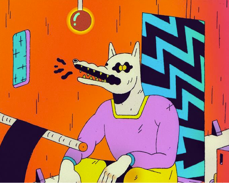
Baubauhaus.
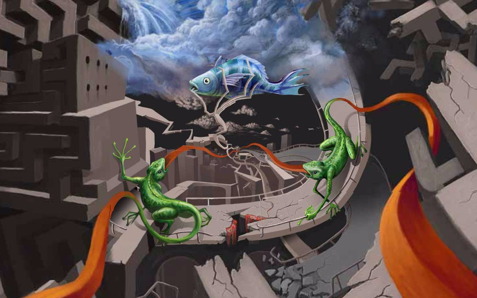
Zoomquilt
The Side Effects of Vaccines - How High is the Risk?
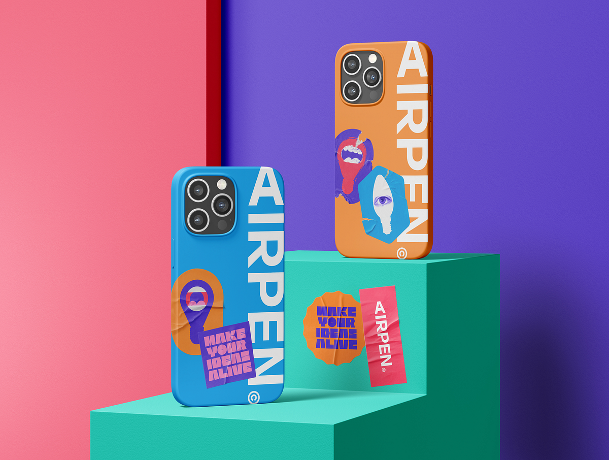
The Best Examples of Dynamic Brand Identity for Startups.
In today’s fast-paced market, establishing a strong brand identity is crucial for startups aiming to stand out and connect with their target audience. But what takes a brand identity beyond just being recognizable to becoming truly dynamic and adaptable? Let’s explore the concept of dynamic brand identity and logos, their importance for startups, and showcase some leading examples.What is Brand Identity?Brand identity is the collection of all elements that a company creates to portray the right image to its consumer. It goes beyond a logo or visual aesthetics to encompass the company’s values, tone of communication, and the overall experience it promises to deliver. A well-crafted brand identity is a beacon that guides marketing strategies, product development, and customer engagement.The Evolution and Impact of Dynamic Brand Identity.Dynamic brand identity represents a significant evolution in the way companies approach their branding. This adaptive, flexible style of branding allows businesses to stay relevant and responsive in the rapidly changing market landscape. Let’s delve deeper into its application, benefits, and notable examples from both startups and established brands.Dynamic brand identity goes beyond the traditional fixed logo and consistent color palette. It’s about creating a brand system that can adapt to various contexts, messages, and audiences while maintaining its core identity. This approach reflects a brand’s agility and its capacity to evolve without losing its essence. This could mean a logo that adapts to different contexts, marketing materials that change based on the audience, or even a brand narrative that evolves over time.AI sturtup brand identity. Credits Noomo.A dynamic logo, for instance, might alter its color, shape, or form depending on the platform it’s displayed on or the message it intends to convey, offering a flexible tool for engaging with diverse audiences.Historical Context and Adoption.The concept of dynamic brand identity started gaining traction in the early 2000s as brands sought to become more interactive and personalized in their approach. Google’s Doodle is an early example, where the company alters its logo to celebrate events, anniversaries, and significant dates, showing a playful and engaged side to the brand while keeping the underlying logo recognizable.https://doodle.com/Big brands like MTV, Spotify, and Apple have since embraced dynamic branding, using it to cater to different audiences and touchpoints without diluting their brand identity. These brands demonstrate the power of dynamic identity in staying relevant and engaging with audiences across diverse platforms.Why Dynemic Brand Identity is Important for Startups.For startups, crafting a distinctive brand identity is essential for several reasons:1.First Impressions Count. In the crowded startup ecosystem, making a memorable first impression is crucial. A dynamic brand identity sets a startup apart, signaling innovation and forward-thinking from the outset.2. Connection.It fosters a deeper connection with your audience, translating into loyalty and trust.3. Communication. Your brand identity communicates your values and mission, aligning customer perceptions with your brand’s essence.4. Adaptability. Startups operate in a fast-paced environment where changes happen quickly. A dynamic brand identity allows for adjustments in branding elements to reflect new product launches, partnerships, or market expansions seamlessly.Airpen — AI startup brand identity. Source5. Engagement Across Touchpoints. With the proliferation of digital platforms, startups need to engage with audiences across diverse channels. Dynamic identities enable startups to tailor their messaging and visuals to different platforms while maintaining brand cohesion.6. Storytelling and Growth. As startups grow, their stories evolve. A dynamic brand identity can encapsulate various chapters of a startup’s journey, making storytelling a central part of the brand experience. This not only enhances brand recall but also builds an emotional connection with the audience.Netrix dynemic logo. Source7. Narrative Flexibility.A dynamic brand identity is like a living story that adapts and grows. For startups, this means the ability to highlight different aspects of their offering or mission as they expand, ensuring the brand remains relevant and engaging.Source8. Cultural Responsiveness. In an increasingly global marketplace, the ability to adapt branding to different cultural contexts can significantly broaden a startup’s appeal. Dynamic identity allows for such flexibility, making the brand more inclusive and globally accessible.9. Visual Innovation and fun. Through dynamic logos, color schemes, and imagery, startups can showcase their innovative edge, visually communicating their unique approach to solving problems or enhancing lives.Dynamic brand identity is particularly suited for startups due to its inherent flexibility and adaptability — qualities that startups themselves often embody. As startups grow and evolve, their brand can seamlessly adapt to new markets, products, and customer insights without losing its essence.Advantages of Dynamic Brand Identity.Engagement: By tailoring the brand experience to different contexts, companies can increase engagement and interaction with their audience.SourceRelevance: Dynamic identities allow brands to stay current, adapting their branding for special occasions, trends, or user behaviours.Inclusivity: Adapting a brand to reflect diverse cultures and communities can enhance inclusivity, making the brand appealing to a broader audience.8 of the Best Recent Examples of Dynamic Brand Identity.1.Airpen — AI builder for lllustrations: This startup’s identity showcases versatility through a dynamic logo that can adapt its form across different media, illustrating creativity and adaptability, core traits for a platform based on customization. This startup’s dynamic identity visually communicates the endless possibilities of illustration, adapting its branding to showcase different styles and themes, emphasizing creativity and flexibility.Credits Noomo Agency2. World Culture Festival 2023: This event’s branding demonstrates how a dynamic identity can encapsulate the diversity and vibrancy of world cultures, using adaptable visual elements that celebrate global unity. Its dynamic identity, with adaptable visual elements, represents the myriad cultures and traditions, highlighting the event’s global inclusivity.More information about World Culture Festival 2023 is in this Case study.https://medium.com/media/34fc8bf007c30c69ad5e52944e4416af/hrefBrand identity for one of the biggest events in Washington DC, 2023 — World Culture Festival.3.Noomo Agency: With the recent rebranding, the Los Angeles-based creative design agency Noomo has unveiled a new dynamic brand identity that represents their core values.Read more about their rebranding.https://medium.com/media/8e5862e62adbb7339fef6ff4a0143cf0/href4. The Handl Visual Identity: Handl’s brand identity stands out for its dynamic use of color and form, symbolizing the startup’s innovative approach to handling (managing) diverse tasks or services.Dynemic brand identity created by Noomo Agency5. Sigma Brand Identity and Dynemic Logo : Sigma’s brand identity is a masterclass in blending simplicity with dynamism. The logo’s adaptability across various platforms showcases the startup’s forward-thinking and versatile approach to data analysis.Source6. Lite — Brand Identity for a Home Loans Startup. Specializing in data analysis for Home loans, Lite’s dynamic identity is sleek and modern, using shapes and patterns that adapt across different platforms to represent data fluidity and analytical precision.7. Emma — A Guiding Light into a World of Loans: This startup uses its brand identity to simplify the complex world of loans. The dynamic aspects of its branding make financial services more accessible and less intimidating.8. Dynamic typography in the personal branding of design director Olha Uzhykova. This logo design incorporates dynamic typography in order to create cohesive and engaging visual identity. It involved in designing custom typeface which is compatible with various graphics and can easily be adapted to different contexts and platforms.You will find more details on how this brand identity was effectively incorporated into the website design in this article: Crafting your unique story through creative website design.ConclusionFor startups, venturing into dynamic brand identity is not just about keeping up with design trends; it’s a strategic approach to ensure that their brand remains relevant, flexible, and deeply connected with their audience, even as they scale. By adopting a dynamic brand identity, startups can ensure that their brand grows with them, through every pivot and milestone. This adaptability not only enhances brand engagement but also solidifies the brand’s place in a competitive market landscape.The Best Examples of Dynamic Brand Identity for Startups. was originally published in Muzli - Design Inspiration on Medium, where people are continuing the conversation by highlighting and responding to this story.
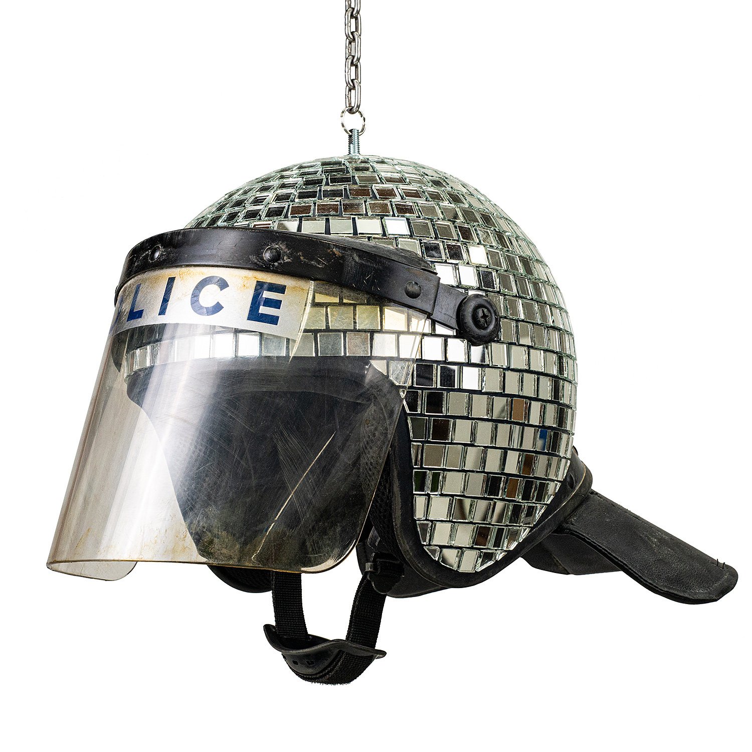
Art, design, and visual culture.
JUST Eggs
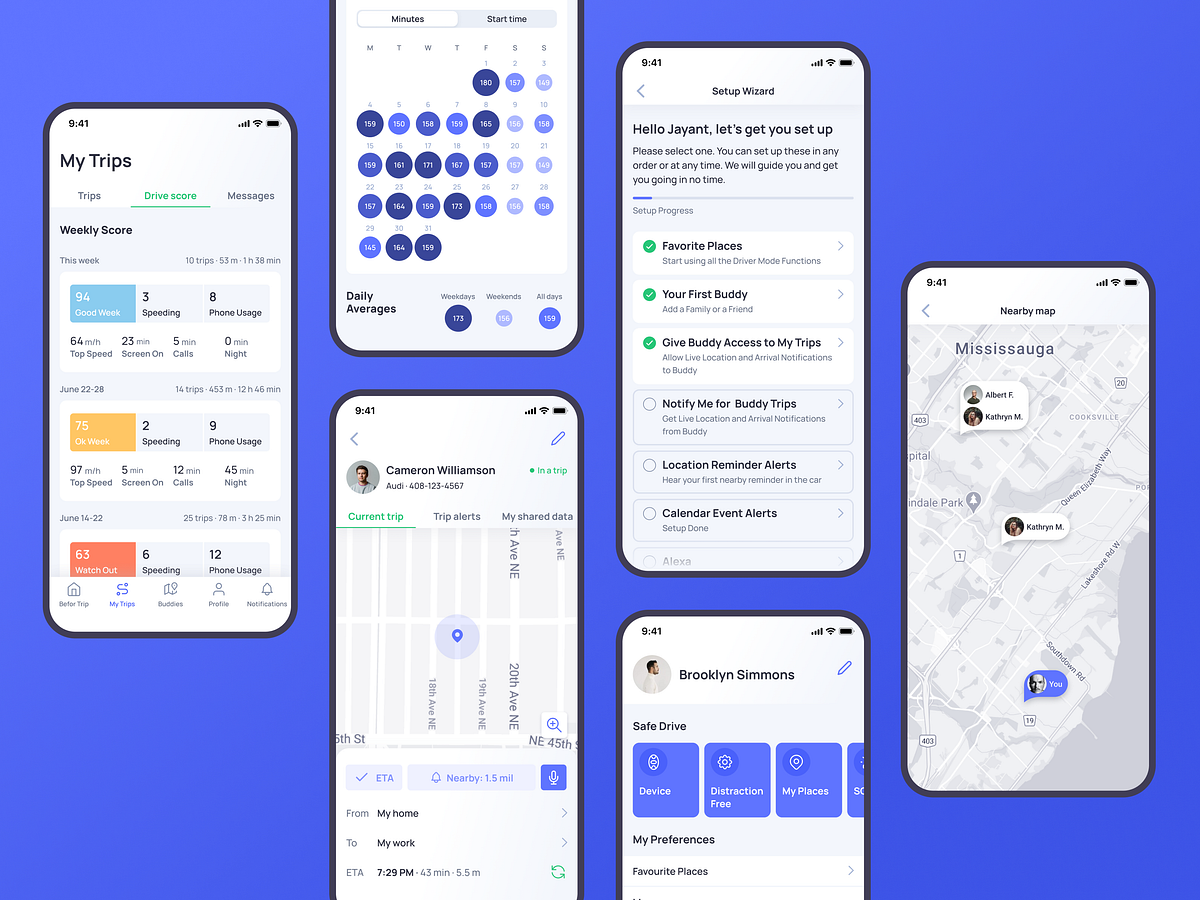
Case Study: Otozen. Mobile Application Design for Safe Driving
“The one thing that unites all human beings, regardless of age, gender, religion, economic status, or ethnic background, is that, deep down inside, we all believe that we are above-average drivers,” famous author and columnist Dave Barry once mentioned, and this point is getting more and more influence on people’s lives all over the world. Our new design case study also touches on that issue: let us unveil the story of user experience design by tubik agency for Otozen, the technology that strives to support the idea of safe driving.ProjectOtoZen is an innovative technology for safe driving, operating via a hardware device connected with a mobile application. It helps users to turn any car into a smart, distraction-free vehicle. It is the all-in-one safe driving assistant that keeps drivers focused, organized, and connected to friends and family. Users can quickly pair the OtoZen device with their Apple or Android phones via Bluetooth and install the OtoZen Pod in split seconds, with no tools, wiring, or professional installation required.In this project, tubik specialists were involved in auditing and improving UI and UX design for the mobile application, as well as creating custom graphics and a website that would strengthen the product’s web presence.App DesignFrom the perspective of user experience design, the Otozen application was a complex project that included a diversity of manipulations with different data, some of which are changing in real-time mode and should be updated and distributed appropriately. Another concern was dealing with a lot of personal data security and privacy issues. So, the design process had to start with diving deep into the slightest details of functionality and user problems solved by the application. This is what the application looked like at the start of the process.The client came to us with the prototype that had to be reviewed, discussed, and reconsidered. In general, the technology is built around the following primary directions:safe, distraction-free driving: texting-while-driving prevention, reduced audio distractors, high-speed alerts, feedback on driving safety level, autodial to call help for emergencywell-used driving time and organized reminders: location/time-based reminders, audio calendar alerts, joining meetings hands-free, simplified expense reports with mileage trackingconvenient connection and communication with other people, for example, family and friends: requesting live location and ETA of other drivers, getting easily updated with automated notifications, full control of privacy and visibilitySo, having analyzed the diverse functionality and data the app had to process, considering the objectives behind the application, our team made a deep review of the pain points and blind spots in the existing prototype. That process of design audit was grounded on constant communication with clients to find out the slightest details that could have an effect on user experience and grew into tons of graphs, charts, tables, and schemes. That’s a good example demonstrating that a huge part of the user experience design process is not about visuals but about analyzing, structuring, connecting the dots, considering details, and building systems. Here’s a look at just a small part of the process.A part of multiple systematic tables textually organized different information about the product, questions and issues to discuss, and suggestions that could improve user experience, to support collaboration between the clients and the creative team and let them stay on the same page.A glance at the process of analysis and structuring user interactions with the application and issues arising in the processThe process of building a particular piece of user scenarioSo, the core tasks for the UX designer were to think over data organization, visualization, and navigation which would make complex flows of information and functions feel intuitive and straightforward and wouldn’t overwhelm users. Supporting that idea, the choice was made on a light and airy interface with contrasting but not overbright colors for critical visual elements, and buttons, and a highly-readable sans-serif font to make the screens scannable and easy to use on the go.One of the significant points for the user experience design of the mobile application was effective onboarding and registration flow. The account creation process is divided into several simple steps, with a progress indicator keeping the user updated about the current stage.My Trips section opens the feed and gives an opportunity to easily tune what the user wants to see. This application is a good example of how well-crafted icons support the usability and navigability of the mobile interface and help set instant visual connections with different types of information. The map screen shows the trip details. It also uses color marking for the various points, such as speeding or telephone usage, this way visualizing quickly how often the issue happened during a particular trip.Opening the calendar, the user can see daily time stats in minutes. The drive score section opens the information on issues that influence driving safety.The tab bar lets users switch between five core interactive zones: Alerts, My Trips, Buddies, Profile, and Notifications. To maximize the influence and make it clear for users, it combines elegant line icons and text labels to quickly inform what users will find in each tab.And here’s a glance at the flow of interactions with the app.https://medium.com/media/d1aefb31f75aae28c1397608ba7a8426/hrefThe Alerts section organizes all types of incoming alerts and helps to switch between them smoothly.Profile screen shows different data about settings and preferences, neatly organized in groups. Here users also can add, edit, and review their emergency contacts, vehicle details, and places.One more important and valuable feature of the Otozen application is Buddies. This function allows users to connect, make their trips trackable, and notify the chosen buddy about the needed information, such as the current point on the route or arrival. It can be super helpful for various issues, for example, when the app user needs to know where the family member is but doesn’t want to distract them from driving with calls or messages.One of the points the technology creators describe as the most essential and show deep care on is personal data security. So, in the Buddies functionality, this aspect had to be well-thought-out, and sharing/accepting access to tracking the other users’ trip, OtoZen users needed to be sure that they can control the level to which they open data to their buddy in the app. That resulted in another neatly organized set of settings in the application that had to be clear and straightforward.The major challenge behind the application UX design was to get together all the multiple flows of information, notifications, alerts, macro and micro settings, and decide upon the most user-friendly way to organize them.Web DesignOne of the well-checked tools for building a solid mobile application brand and effective promotion is creating a landing page or website to present the benefits and connect users to the product in an efficient, informative, and captivating way. So, the website was another task for our team to allow the OtoZen product to cover this aspect of digital marketing and set another major channel of communication with its users, letting them catch the idea and uncovering the answers to all the questions that may arise.The general layout and website style echo basic color accents and the airy, light layout of the application. The information about the technology is divided into concise sections to be scannable and skimmable. The hero section presents the immediate visual connection to the technology via the prominent image demonstrating both the device and the app and giving the main idea about the product and its value for users via an informative tagline and short description. The call-to-action button in the hero section is instantly visible due to the color contrast. It works in pair with the ghost button, allowing visitors who want more information to watch the video.For the last few years, original illustrations applied to user interfaces have been one of the most popular and solid UX design trends. Not only do original graphics contribute to the general brand image and enhance its recognizability and memorability, but also they set a solid emotional connection between the product and its user. What’s more, they add much to the usability and visual storytelling, especially when consistent photos cannot be obtained for all the necessary demonstration needs, especially in the cases of highly technological products. The Otozen website took advantage of the custom illustrations keeping a consistent style and effectively supporting information blocks. Also, many of the pictures feature people, adding a human element to the communication. Mobile adaptation of the website makes it look attractive and work effectively from any device.“We are very pleased with the outcome. The app UI/UX is well received by our customers. There was a consistent app UI/UX theme that was maintained throughout the development, and having the same designer working with us helped us achieve this,” the client company’s CEO wrote in his review on Clutch; what could be the better way to finish the design story?New design case studies from our team are coming soon. Stay tuned!More Design Case StudiesHere’s a set of more case studies sharing the design solutions and approaches for some of the design projects done by the Tubik team.PointZero25. Identity and Website Design for Event AgencyNonconventional Show. Website Design for PodcastuMake. Branding and Website for 3D Design ToolBEGG. Brand Packaging and Web Design for Food Product EcommerceUplyfe. Identity Design for Health AppOK Boomer. Trivia Game Design and BrandingCrezco. Brand Identity and UI/UX Design for Fintech ServiceReal Bitcoin. Creating Website IllustrationsFarmSense. Identity and Web Design for Agricultural TechnologyCarricare. Identity and UX Design for Safe Delivery ServiceOOP. Brand Identity Design for Online Flea MarketOriginally written for Tubik BlogWelcome to talk to us and check designs by Tubik via:WebsiteDribbbleBehanceTubik ArtsCase Study: Otozen. Mobile Application Design for Safe Driving was originally published in Muzli - Design Inspiration on Medium, where people are continuing the conversation by highlighting and responding to this story.

Zoomquilt 2

How to create an immersive web experience with AR and 3D.
Join us as we take you behind the scenes of our journey to design a website for a children’s book. We will share with you how we’ve created a highly immersive and interactive digital experience that blurs the line between the real world and the fairytale.The story behind.The Silly Bunny is a unique tale, crafted by the imagination of a six-year-old girl almost three decades ago.“When I was six years old, I complained to my mother after reading a fairytale that it was not very interesting. She replied, “Then write a better one!” Thus, this book was born.Nearly 30 years have passed and I’ve decided to publish this story and dedicated it to my daughter Olivia. I want her to know that nothing is impossible for her and she can do anything in the world.”Helgi Mart.https://medium.com/media/28d2a660b0ce33451d26a49397175879/hrefThe first step of our work on this project was book design. We started with a storyboard and moved to the process of crafting the main characters. After a brainstorming session and a few rounds of sketching, we had options for our main character — the Silly Bunny.Sketches for children’s bookWe narrowed it down to three options which were tested with kids from 2 to 5 years. The “big head” bunny was everyone’s favorite and drove the style for all other illustrations.Illustrations for kids bookAs we mentioned, this book has a very special story, so we wanted to make the book special as well. This led us to the next topic — AR experience.Book with AR (Augmented Reality) experience — meet the Bunny.We wanted to give book readers the ability to closely meet the main character. Who didn’t want to bring their favorite storybook heroes to life when they were a kid? So we made it happen. This approach not only added an interactive element to the book but also helped increase engagement and encourage exploration of the story’s world.You can order the book here and try all the magic by yourself 😉https://medium.com/media/9c16d6d22c5e12d68737919a0a59c2cc/hrefWhat it takes to add magic to the website.A website for a children’s book can’t be boring. It should capture attention, be colorful, and be interactive. At the very beginning, we decided that it should have a little magic as well.Our goal was to introduce the book to parents and kids and get the first pre-orders while the book was still in production. To achieve this, we decided not only to tell about the book and show the main characters but to create a truly engaging and memorable experience. To accomplish this, we used Augmented Reality, a blend of 3D and 2D illustrations, animations, magical transitions between blocks, and many cute small details.A blend of 3D and 2D illustrations.To create an immersive visual experience that connects the physical book, website, and AR experience, we combined 3D and 2D illustrations. Our aim was to make it feel like these different worlds were seamlessly intertwined. We established guidelines for how the styles would interact with each other. The 2D illustrations were crafted to resemble cut-out pages from the book and were animated with simple stop-motion for a touch of life. Meanwhile, the 3D elements were given a more polished appearance with realistic animations. By merging these styles together, we were able to form a harmonious and engaging visual experience.2D and 3d characters illustrations for websiteImplementing Augmented Reality experience on the website.The book already had an AR experience and it seemed like implementing it on the website would be a perfect fit as well. It gives users the ability to touch the magic of the Silly Bunny world even before they get the book.To make it even more engaging, we hid four QR codes on the website that launch unique AR experiences. The main experience has some hints — when you hover over the bunny animation, the cursor changes to “click on me”. Other codes are hidden behind animated 3D illustrations (like a bird on the screen below).Let us know if you can find all of them. You can go and launch an AR experience right know -> Website with an AR experience 😉QR codes to launch AR experiencesCreating an AR experience is a thrilling endeavor, but it comes with its fair share of challenges.One of the biggest obstacles we faced was managing the size of the files and navigating the technical limitations of animation. To work around these issues, we employed a number of tactics, such as baking materials into UV maps for color, roughness, and normal values. This enabled us to use textures in both Augmented Reality and web experiences.However, we had to forget to use certain compression options, as they would damage the files for AR, particularly the usdz format used for Apple devices. This meant we had to make some sacrifices, such as using only certain elements of a scene for the AR version. Another consideration was the limited list of functions that can be exported to AR, so we kept our animation techniques simple, using armatures and avoiding modifiers or constraints. Additionally, we had to ensure that every animation was prepared in two formats: glb/gltf for Android users and usdz for iOS. This required a lot of testing and editing to ensure everything functioned properly across both platforms.3D animations for website.Creating an immersive experience for the Silly Bunny website required careful consideration of various animation options. Initially, we attempted to use a sequence that would respond to scrolling, but the weight and smoothness of movement were not up to our standards. We ultimately decided to adapt the 3D scene for use in three.js, allowing us to reduce the weight of the animation and improve its smoothness. Our 3D designer remeshed the entire topology of the models and compressed the textures for better performance. To add an interactive element, we separated the animation of the bird from the rest of the scene and tied it to the user’s scroll actions with ScrollTrigger from GSAP. This way, the user can still influence the animation while maintaining a cohesive and immersive visual experience.https://medium.com/media/3641660933c4c33abf9804ffc3453cec/hrefMagical transitions.To capture the essence of the story and make the website truly come alive, we put a lot of thought into the transitions between sections. Rather than simply scrolling, the content is revealed in a captivating and enchanting way. For instance, one section might fade into the background, obscured by clouds, while the next section emerges from behind the clouds, creating a sense of wonder and magic. While this may seem straightforward in theory, it was a bit more challenging to achieve in practice. However, we believe the final outcome is worth the effort.https://medium.com/media/03c4968bd597a9067f5aed113fe8de28/hrefWe decided to utilize three.js for website transitions in order to add a sense of magic and whimsy to the user experience. We created a transition between a slider and a text block by using planes with textures of clouds and blurred ellipses that appear to come closer to the camera as the user scrolls, giving a sense of volume and perspective. We also wanted to highlight certain elements of the website, such as the bunny character, by allowing users to interact with it and launch an AR experience. We achieved this by fixing the block in place and making it stand out.https://medium.com/media/e95d43daceddc64066b41ae27166a6db/hrefTo enhance the connection between the website and the book, we designed a slider featuring the book's characters as pieces of paper cited out from the book. To emphasize it even further, we made the transition between characters look like the pieces of paper are falling down from the wall. This small detail adds a cohesive touch to the overall experience.https://medium.com/media/41f0f501ec08c7997a245ec12417772c/hrefFinal words.Our goal was to make the website for Silly Bunny just as enchanting as the story itself. So, we merged 3D and 2D illustrations, added 3d animations, and utilized three.js to create smooth transitions. With AR, we also let users delve into the magic of the book by interacting with the main characters. The end result? A website that totally captures the magic of the story.Here you can find more award winning website design examples we’ve recently created:Design director portfolio website (You can find more details about design process in this article Beyond Pixels and Code: Crafting your unique story trough creative website design.ITG Digital — a craft and creative website for SaaS product.Middle — a fintech website for a game-changing digital platform for the mortgage industry in Australia.OrCad — an enterprise website design built with Webflow.Cathey & Miles — creative website design for a law firm.Originally published at https://netrixdigital.com.We are on Dribbble, LinkedIn, and Youtube.More cool stuff about UI/UX design and design trends you can find in our Blog.How to create an immersive web experience with AR and 3D. was originally published in Muzli - Design Inspiration on Medium, where people are continuing the conversation by highlighting and responding to this story.

Landscapes by Jason Anderson Blend Precise Pixelation and Hazy Abstraction
U.K.-based artist Jason Anderson creates abstract urban landscapes using pixelated patches of pastel-toned oil paint. Each work on linen has a single focal point of bright yellow usually representing the rising or setting sun, though in the painting above the illumination comes from an approach train. Anderson balances the natural and manmade by primarily featuring infrastructure—ships, marinas, trains, buildings—that appears small and distant within each pastel haze.
Anderson’s career began with stained glass restoration projects at cathedrals and he shares in a statement that his training in the jigsaw-like aspects of stained glass design and repair continue to inform his style as a painter. More

Artist Transforms a Fallen Redwood Tree into A Gigantic Eight-Tentacle Sea Creature
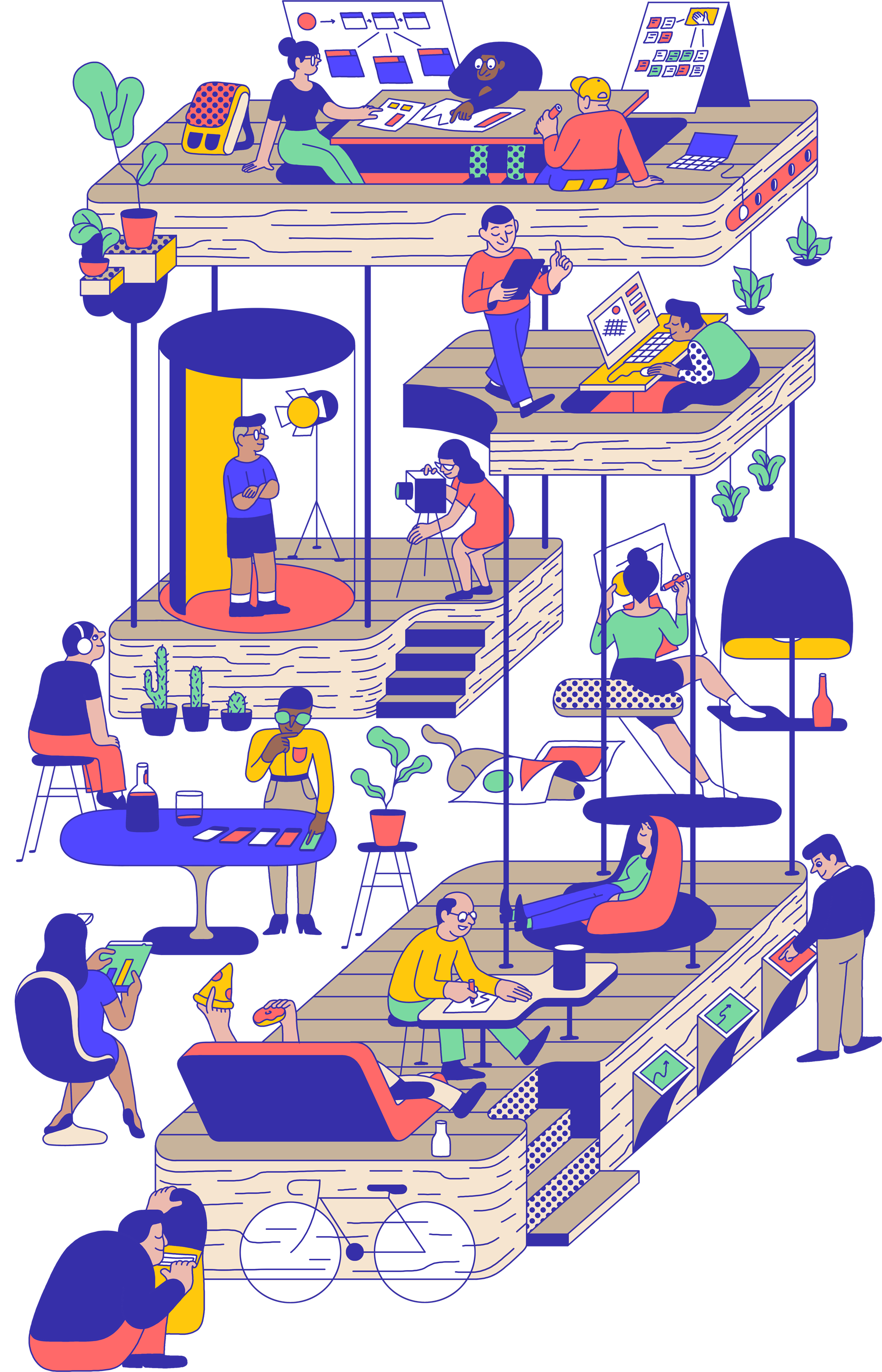
NEA - Future Of Design

Vivid Botanicals Bloom from the Coats of Charismatic Cats in Watercolor Works by Hiroki Takeda
Japan-based artist Hiroki Takeda adds a dose of whimsy to his otherwise faithful portrayals of friendly felines. Largely rendered in shades of pink and purple with intermittent splashes of blues and greens, Takeda’s watercolor works blend flora and fauna into affectionate cats and kittens caught lounging around or mid-snooze. Vines and grasses add fur-like texture and outline the creatures’ figures, which the artist then completes with sprawling gardens brimming with leaves, blossoms, and butterflies. More
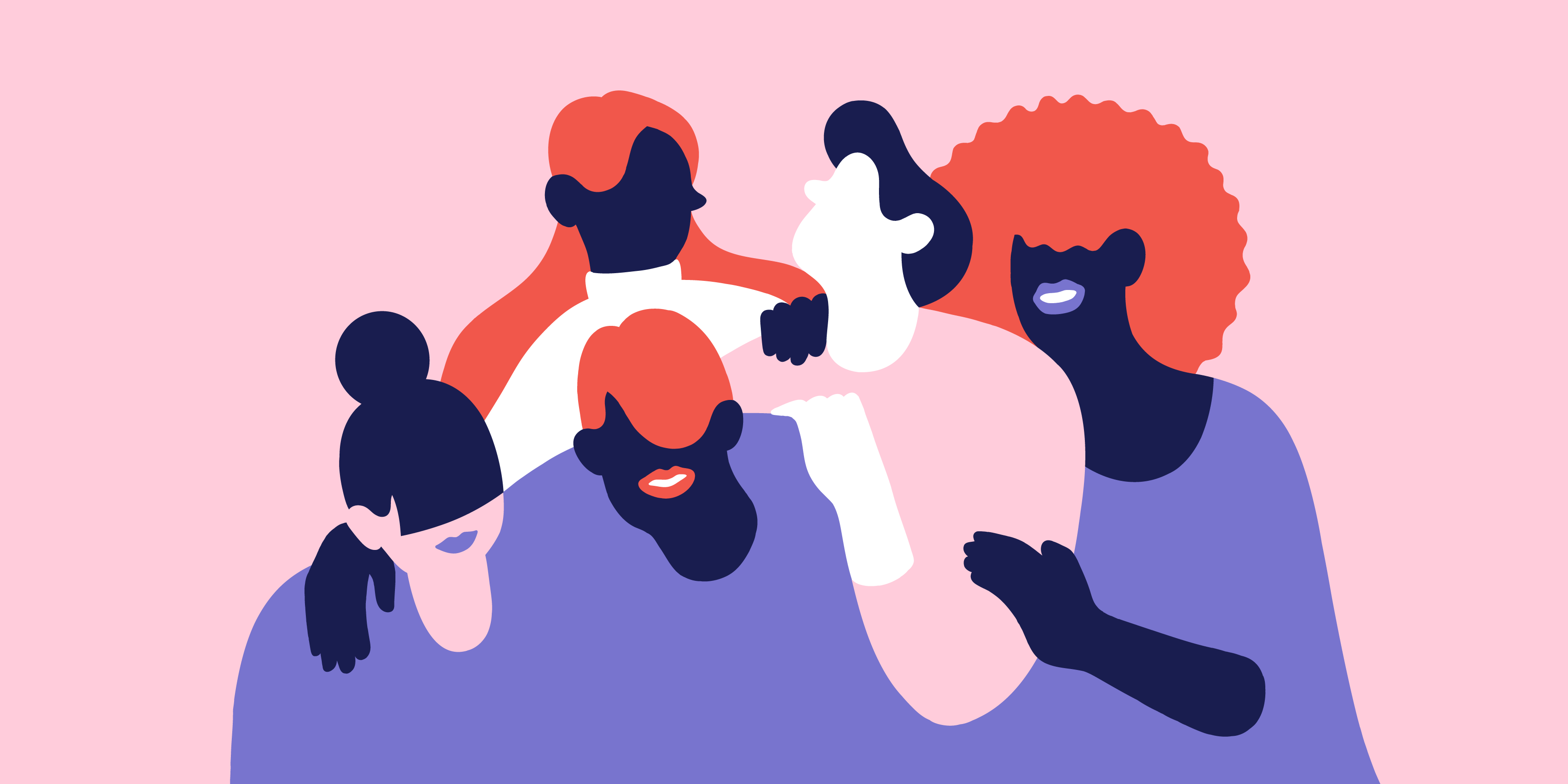
Bond
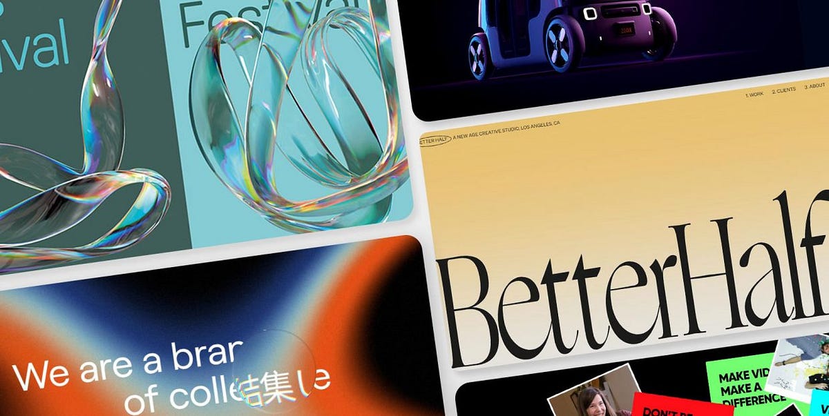
Designers’ Pick: 10 Design Trends to Watch Out for in 2022
While no one would really admit to actually following trends (the ultimate “uncool” thing to do since high school mentality said so — we all want to set trends, not follow them, right?), there’s no denying that trends do matter and that we do follow them to some degree. Not only there’s nothing wrong with that, but actually quite the contrary: trends are a reflection of our collective mindset at a certain point, an expression of what’s occupying, motivating, or moving us. And there’s something really beautiful and comforting about being together like that. Especially after what we’ve been through in 2020 and 2021. So, this time around, we want to talk about design trends for the coming year.Web design is a field that, much like graphic design, has been in a state of perpetual turmoil of styles and inspirations for a while. It seems that things have never been so exciting as they are right now. If you’re a designer looking for inspiration or just a “civilian” who enjoys looking at pretty things online, you can easily find yourself spending hours and hours online, admiring all the different directions the web design has taken lately. At least that’s what we at Qode Interactive often catch ourselves doing, with all the “oohs” and “aahs” as we stumble upon a gorgeously designed layout or a stunning new typeface.And because we’re so keen on all the comings and goings in the design world, we’ve decided to ask our talented and hard-working design team to share their predictions of top design trends for 2022. So, jump right in as we talk about:Serif Display FontsChrome and Liquid MetalPlastics, Fluids and MoldablesHero Video Sections3D GraphicsDaring Colors and CombinationsBorders and GridsKinetic TypographyCreative PointersScrolling EffectsSerif Display FontsFor our designer Milica Andjelkovic, the author of the Shoshin theme, one of the highlights for 2022 would have to be the evident rise in the use of serif display typography. For a long while, sans serif typefaces have been the golden standard in web design. They were perceived as clean, modern and sleek, while serif fonts were used mostly for designs with a strong aesthetic personality. In 2022, we are going to see more serifs in headlines of all sorts and across all niches — even in tech. Serif display fonts are expected to bring a breath of fresh air and add more character, which is definitely a welcome thing.Louie RestaurantThe designer duo of Violaine & Jeremy were commissioned for art direction and complete visual identity for the London restaurant Louie, and they sure did a tremendous job. From the hand-drawn monograms and illustrations to beautiful color pairings, Louie’s visual identity is unmistakably chic, and a lot of it is based around the restaurant logo. The playful and elegant serif typeface evokes the classy decadence of the French court and the golden era of New Orleans, with a touch of Art Nouveau inspiration that has been having a big comeback lately.Voyage by Viola&JeremyAnother exciting creation by the creative duo Viola&Jeremy, Voyage is a romantic, curvy display serif font created in 2019 and packed with 55 stylistic ligatures and 26 variants. Its hairlines provide a lovely contrast and make this exciting font quite readable. Created as open-type, the variants allow the user to choose the glyph to alternate, opening up almost endless possibilities and guaranteeing maximum usability.The Canvas AgencyThe New York and Toronto-based Canvas Agency, which works with up-and-coming contemporary artists, opted for a striking logo in a custom serif typeface, with interrupted font forms that somewhat resembles the stencil technique, but with an arty flair. The logo is combined with selected images from the artists the agency represents, some of which are covering the logo, giving the layout a bit of an anarchic character.Bit of DenimA brand that seems to nurture equal passion for typography as it does for upcycled jeans, Bit of Denim opens with brand initials in a clean, thin, vintage font and follows up with large serif typography in the hero section. The font is equal parts playful and elegant, perhaps even a bit romantic and definitely a tad quirky — the lopsided O’s, the curvy ligatures and embellishments make for an unforgettable first impression and create an exciting contrast with the more strict Space Mono used for the navigation.Chrome and Liquid MetalHere’s a trend we’ve already covered in detail in our article on inspiring examples of the liquid metal effect in design — chrometype and liquid metal are making a huge comeback and this year we’re bound to see more of this exciting style. Used both for typography effects and for exciting 3D and digital art, the liquid metal adds a touch of retro futurism and also serves as a great exhibition of skill and design craft. Our Marijana Obradovic, who authored the wonderful Konsept theme, picked a couple of exciting examples of this trend.Mortar&BrickThe Danish studio Hugmun did a lovely job at highlighting some of the core values of the property consultancy agency Mortar&Brick — integrity, quality, but also femininity. This last trait is perhaps most evident in the stylized ampersand used in the logo. One of the variants of the hand-drawn symbol was designed with a beautiful liquid metal effect in glossy black. The ampersand is delicate and solid at the same time, conveying the complex and all-encompassing nature of the agency.Henri HeymansThe talented front-end developer Henri Heymans wanted to harness the wealth of meanings that liquid metal conveys, as well as explore all the different faces of this style, through a metallic orb that serves as the centerpiece of his portfolio, with a grainy, flowing surface in black and white. The combination of the static-like texture and monochromatic gradients gives the orb a vintage feel, while its perpetual rotation adds dynamicity to the page.Lunch ConceptThe first thing that strikes us when we land on Lunch Concept’s homepage is the stunning video section with large black metallic typography. The letters are soft and pointy at the same time, with a distinct physical quality. The metallic effect here conveys a sensual character that is also perhaps a bit edgy, while the line that connects the letters L and N gives it a touch of elegance and sophistication.Plastics, Fluids and MoldablesAnother thing that Marijana sees as the defining trend for 2022 ist the design that explores and utilizes the plastic quality of various materials. As new design and UX tools are developed, more and more designers venture out to explore the plasticity, moldability and fluidity of materials. The result? An exciting array of graphics, often animated, that mimic the physical qualities of materials they represent, adding a sense of innovation and skill to layouts they’re used in. Let’s take a look at some of the examples.The TideThe Tide is a series of flowing pathways along the Thames on the Greenwich Peninsula near London. This gorgeously designed public space, which hosts the Turning Tides festival, among other events, has a singular fluid character, which the creative team responsible for the location’s visual identity set out to reflect in the accompanying designs. Abstract shapes made of water, transparent with hints of colorful reflections, are the linchpin of the visual identity created for the location (and the festival), communicating motion and flexibility.Montreal International Jazz FestivalLast year’s edition of the renowned Montreal International Jazz Festival was all about summer vibes. Bright, bold colors, summer motifs and illustrations and the modular nature of the design instill an unmistakable sense of optimism and joy in this light-hearted but visually masterful piece of design. Bended flip-flops, reflective sunglasses and carelessly spilt water from a glass are almost palpable, their materials easily discernible in this exploration of textures and shapes.PolyU Fashion Show 2021For the 2021 edition of the annual PolyU Fashion Show by the Hong Kong Polytechnic University, the Atelier Avocado came up with a visual identity based around the concept and the process of molding, resulting in a series of shapes and objects that are so “physical” in their appearance one almost wants to reach to the screen and touch them. Surfaces, textures and directions in which materials bend and come into shape are explored to the utmost detail in this skillfully executed and stylistically spotless project.Hero Video SectionsFor Marina Pavlovic, the designer behind the lovely JoinUp theme, intro video sections opening homepages are going to be one of the defining trends in 2022. The days when Flash videos on pages slowed the loading down or crashed the pages so much it drove the visitors insane (and away) are, fortunately, behind us. Today, new scripts and technologies allow for more versatility, creativity and, what’s most important — better UX. With technical difficulties out of the way, more and more designers opt for strong intro or hero sections featuring exciting, inspiring and engaging video content that creates an immersive experience and can be an amazing visual storytelling tool. Let’s check out some of Marina’s picks.BeyonityBeyonity is a Swiss real estate company with a unique and modern approach to the business, reflected in the design of their website. It opens with a bright and exciting intro video section, featuring objects that float, move and dance around each other in an interplay between textures, surfaces and colors. The fullscreen section provides a uniquely immersive experience before the user scrolls down to more conventional parts of the page.Abdulla Al Gurg Global InvestmentsFor the company website, Abdulla Al Gurg Global Investments opted for an absolutely breathtaking aerial shot of Dubai at night, presented in a smooth video that looks like it was shot by someone just casually cruising in mid-air. The video background is coupled with the layout with grid lines and clean, intuitive menu and makes a nice contrast with the simpler, cleaner mid-section that follows as the visitor scrolls down to explore the website.Sol’aceThe website of the furniture and home decor shop Sol’ace is all about softness and breathability, which is evident from the way the video is incorporated both as an intro and as a hero section. After a short and delicate dance of images in the intro, the video assumes position in the hero section — a seemingly static interior shot, except for an airy, softly moving curtain that almost makes you feel the fresh spring air on your face. Several other pages also feature a video section at the top of the page, maintaining consistency throughout the website.3D GraphicsAlthough we’ve already seen plenty of 3D graphics over the past years, the Qode Interactive designers seem to be in complete agreement that 3D will continue to be a massive 2022 trend across all niches. What started in 2020 and absolutely exploded in 2021 is going to be taken up a notch when it comes to ideas and inspirations, as we see more and more designers playing around with 3D graphics and pushing the boundaries of this medium, experimenting with textures and materials, combining illustrations and photographs, and creating everything from realistic to abstract attention-grabbing projects.Vivid+CoThe full-service agency and strategic advisory Vivid+Co has a mission of “putting the pieces together,” which is cleverly reflected in the centerpiece of the website’s hero section — a beautiful 3D glass prism made of smaller prisms or cubes, revolving around itself as new pieces appear to complement it in a Tetris-like manner. This 3D object, with its iridescent reflections, makes a lovely contrast to the dark background and adds to the decisively modern character of the website.HyperframeHyperframe is a company that produces steel components that basically snap and click together, making the framing processes much easier. In order to illustrate the power of this astonishingly simple but innovative concept, the company website features impressive 3D renders of steel frames, beautifully photographed, that move, come closer, fit and literally snap into place as we scroll the website. It’s a simple but quite impressive design element that does an amazing job at conveying the company’s single most important selling point.PerimeterWatchThe network infrastructure and security industry is a fast-growing one and, unsurprisingly, doesn’t lack in excellent pieces of design innovation. A great example is PerimeterWatch, a company offering network security intelligence and other digital security services. Their website features a morphing 3D animated object that is made up of smaller 3D particles, animated to fit with each other in various compositions. The animation is scroll- and drag-based and the object changes from an orb representing the planet Earth to a bug that stands for common online threats and malware. The interplay between the particles and the whole reflects the fact that online security is an all-encompassing and complex issue that needs to be tackled both on the macro and on the micro levels.ViborVibor is the Italian manufacturer of industrial sensors and pressure switchers, with a quite minimalist website based around black, white and red. The element that makes the website design really stand out is the section featuring 3D renditions of the company products — different kinds of switches doing different jobs, each designed and animated to perfection, conveying a sense of power and reliability.ZooxTo further illustrate the trend of 3D graphics in web design, here’s one of our old acquaintances, Zoox, which we’ve covered in our article on inspiring purple websites. This mobility-as-service company develops driverless vehicles that can be rented like a taxi, and, logically, a 3D graphic rendition of the vehicle is in the spotlight of the website. The design of the vehicle instills a sense of security and trust — vital qualities for this sort of product, while the metallic reflections in dystopian colors give it a futuristic vibe. The Zoox could have been presented through a plain photograph, of course, but the choice to make it a 3D object was very clever — being an innovative and progressive project, it only makes sense for it to be featured in a way that is equally progressive and technologically advanced.Total Property NetworkThe website of the Japanese real estate company Total Property Network (TPN) sports a distinctly elegant and dark mood, completed — or, rather, broken up — by a set of floating 3D objects, mostly circular and tubular, arranged in abstract forms, with no apparent functional purpose at all, except to enrich the design. These objects, with their soft floating, give the layout a certain enigmatic quality, which adds to the interest in the company and its work.SuperlistThose who remember the good ol’ Wunderlist will be happy to hear the founders of the popular productivity app have a new product called Superlist. More than just a to-do tool, Superlist promises an array of features and a unique, personalized and collaborative approach to work. To support this effort, the company website opens with a 3D graphic representing the conglomerate of productivity tools, from a simple pen to the tablet and keyboard. The object is animated and responds to the movement of the mouse. As we scroll down the page, we encounter additional 3D objects, albeit simpler — a sphere, a cube, a set of tokens, all animated in a choreography that reflects efficient personal and collaborative work.Daring Colors and CombinationsAnother thing our design team agrees wholeheartedly on is — when it comes to colors, old rules no longer apply. You shouldn’t mix green and yellow? Says who? Magenta shouldn’t be paired with red? Just watch me do it. According to Elena Kostic, the author of the gorgeous Micdrop theme, the sense of irreverence for the old no-no’s combined with the prevailing trend of visual experimentation has led designers to discover some outstanding color combinations, and in 2022 they’re just going to keep questioning the old canons. Here are a couple of designs that should persuade even the most color-conservative designers:Infrared Mind + BodyFor their striking website we’ve already talked about in our piece on split screen layouts, the infrared sauna and spa center Infrared Mind + Body chose a fittingly fiery palette based on a gorgeous combination of coral and light pink. Additional colors include violet (another color you’re “not supposed” to mix with red) and a light gray that keeps things balanced.Squad CapitalPurple on orange, pink on red, light gray on maroon, light yellow on lilac…the homepage and art direction for the Berlin-based venture capital company Squad Capital by Marvin Schwaibold doesn’t lack bold, daring compositions. In fact, you could say the entire identity is based around them. Each combination is just as daring as it is pleasing to the eye, proving the amazing potential that can be unleashed once we overcome the fear of chromatic experimentation.Borders and GridsWe’ve already discussed the value of grid lines in web design in detail so we won’t go into it here, but it definitely bears mentioning that grids and borders are going to remain a massive trend in 2022 as well. Grid never really falls out of vogue, as it is one of the most elegant and convenient ways to group page content and instill a sense of order into layouts. Here are a couple of websites to remind you of all the virtues of grids and borders:Family TypeThe Family Type foundry opted for a dynamic and modern layout to display their fonts — a minimalist, black and white design in which each font has its own rectangular area, sectioned off by subtle white lines. What’s more, the left and right sections move in different directions when the page is scrolled. To add to the dynamic character of the website, certain sections contain animated letters, some individual, the others grouped together — and the borders (or grid lines) keep it all well-organized and easy to consume.Sar StudioThe India-based furniture designers of the Sar Studio wanted to provide an airy, clean layout for their web presentation, one that would reflect their commitment to functional design with a strongly defined aesthetic personality. The content is neatly arranged in rectangular sections divided by thin lines, and the borders are used for the menu as well. The design plays with the pleasant tension between vertically and horizontally arranged elements, and the minimalist approach helps keep things clean and breathable.HonextThe Barcelona-based company Honext, which upcycles waste fibers into eco-friendly panels, has a clear vision — to help build a world in which everything is made of reclaimed materials. The design of their website reflects this mission through the choice of palette, with prevailing gray and earthy colors in light hues. Thin lines divide the layout in asymmetric sections that convey balance and order, and the fine circular border is there to highlight the cyclical nature of their manufacturing processes.Kinetic TypographyThe power of kinetic typography in drawing attention and providing delight has been proven time and time again. In 2022, we expect to see even more of it, as motion designers and creative developers gain more tools and skills required to design and animate letters that twirl, grow, shrink, rotate, slide in and out and dance around the screen on their own, or triggered by user action. Here’s a quick glimpse at just how powerful kinetic typography can be and why it’s going to mark 2022:Safari RiotWe’ve already encountered Safari Riot back when we discussed innovative hero typography trends, and the website’s kinetic text was, in fact, the number one reason why it made our list back then. The LA-based artist development company opens its website with a bang — the opening section features massive, bold Fit Variable typography that bears links to the Artists and Depts sections. The font is animated to shrink and expand in response to the cursor. Even without the animation, the font itself is a bit hard to read, and has a somewhat grotesque character, which lends the entire page a very strong personality and leaves a lasting impression.Markus“Boring is bad for business,” claims the website of the Swedish creative and design agency Markus the moment we land on its homepage. And the website itself is definitely everything but boring. The designers made sure to keep us entertained and delighted using a number of tricks of the trade, but kinetic typography certainly serves as the centerpiece and main medium for conveying this anti-boredom philosophy. The irreverent, purposely imperfect Aggrandir typeface moves horizontally on the screen as if it’s shaking its hips, as the letters expand and shrink, lulling the visitor in its silent but powerful rhythm.Better HalfBetter Half is a Los Angeles-based creative agency whose website achieves that subtle balance between playfulness and professionalism, minimalism and saturation, order and creativity. The website uses the Ogg typeface, a calligraphic serif that is both decorative and readable. Quite impressive in itself, the typeface is here animated to respond to the cursor by bending and sliding sideways, as if some invisible hand was gently pushing it to the side, lightly distorting it, but never past the point of illegibility. The animation is simple and limited to just two sections of the website, assuring the usability and cleanliness of the layout are preserved.Creative PointersUsing all sorts of objects and shapes instead of the good ol’ arrow is not a new thing — web designers have experimented with cursors for well over a decade. However, those early pointers, shaped like pizza slices, hand gestures or rockets, were often plagued with bad UX. They were glitchy to the point of driving the visitors mad. Today, when design and development have made massive strides, a pointer that is both imaginative and fully functional is not hard to create. As designers embrace experimentation and introduce creativity way past the illustrations and animations, we’re seeing more and more websites with creative pointers in all sorts of shapes and sizes. This is going to be a continuing trend in 2022 as well, so let’s check out some of the most successful examples:Monopo LondonThe London-based and Tokyo-born design agency Monopo takes the cursor design to a whole new level — shaped like a lens or a bubble, the huge circular cursor serves not only its original purpose, but also as a translation device. As we move it across the hero text in English, the lens reveals the same text in Japanese. For the sake of good UX, this effect is reserved for the hero text alone, while the rest of the page can be navigated in a usual manner, without the translation.MyriadThe creative video agency Myriad from North Carolina has a pretty straightforward website that combines basic information with select video content, but with one element added specifically to spice things up — the cursor. It starts off as a tiny magenta triangle that transforms when hovered over certain elements. Certain links and images make it appear as a play button, indicating the elements are clickable and leading to video content, and near the menu it turns into a circle with a smaller white circle within. The magenta is reflected in several interface elements, such as the exclamation mark in the agency logo, several text underlines and the menu logo as well, tying the entire composition together.ImperoFor their website, the creative agency Impero opted for a sizable yellow dot that doesn’t necessarily work as a cursor but rather as its companion that follows the conventional arrow around the screen as the user explores the website. The circle interacts with certain elements (the wireframe 3D object, the menu items), causing them to change shape or color when hovered upon, but for the most part it serves merely as a creative addition whose color creates a welcome contrast with the background that changes from black to gray, then to green and finally to purple.Illuminating RadioactivityHere’s a website whose design merits are too numerous to go through in one article: Illuminating Radioactivity, a complex and important project that aims to demystify radiation using science, policy and creative expertise. The background is sprinkled with stickers or bits of paper each bearing a different myth, prejudice or buzzword related to radioactivity. As we move the cursor, shaped like a large particle, perhaps a proton, followed by a string of smaller ones, it deletes those stickers one by one, until we finally reveal the hero text — “Illuminating Radioactivity.” This way we symbolically shed off the weight of the prejudice and negative propaganda surrounding one of the potentially most beneficial sources of energy.Scrolling EffectsInnovative and inspiring scrolling effects constitute an important part of visual storytelling, as they unite interface navigation with other visual elements that communicate messages on a website. Here at Qode Interactive, we’re big fans of creative scrolling and often use it in our themes — whenever it makes sense, of course. We are generally used to seeing scrolling as a predominantly vertical event, a means for taking the user down a page. In 2022, however, we are going to be seeing a lot of scrolling that is more about the journey then about the destination, like in the examples below:Paper Play by MoooiPaper Play is a truly spectacular kinetic journey centered around a plissé paper lamp presented by the Dutch interior design and lighting studio Moooi. Part of a three-piece journey through the studio’s projects and pieces, Paper Play takes us through textures and colors, fan-like ornaments, flowers and birds, showcasing discretely the highlighted products — the lamp, a cabinet, a carpet and room fragrance. The journey is scroll-based, so the user can dictate the tempo in which the visuals will unfold, complete with masterfully matched music.Bugatti SmartwatchesThe Bugatti Ceramique by Bugatti Smartwatches is marketed as the world’s most luxurious smartwatch, so designing a website that unites high scale aesthetics and technology was basically a must. The website keeps in line with the design of the watch — a dark layout with red, blue, black and white as main colors, reflecting the three available bezels. Strength, resilience and class are the prevailing character traits of the watch — and the website — and the story around this luxurious item is built mainly using the scroll. After a rather cinematic opening showcase of the watch, the scroll takes us through its most important features using fullscreen sections, video, photography and animation.No-Code ConferenceFor the 2021 edition of the No-Code Conference, the designers created a lovely scroll-based animated section with an illustration representing a system or a process in a rather simplified form, with levers, openings, rolls and bars, somewhat resembling those wooden toys kids use to practice building, stacking, fitting and structuring, but with colors, textures and shapes that bring some of Moebius’ work to mind. As we scroll, a couple of balls and levers move gently towards their destinations. This animation, coupled with bright but soothing colors (especially pinks and yellows) instills a sense of ease, something all of us could certainly use in these hectic times.Bridge TourFinally, what better way to illustrate the predilection our team has for scroll effects than Bridge Tour, the showcase of our best-selling Bridge theme? In this endeavor, which we are particularly proud of, we set out to create an immersive, engaging narrative through one of Qode Interactive’s greatest accomplishments. For the Tour, we based the entire storytelling experience around the scroll — it pulls the visitor in as the content transforms and blends, new pieces coming in and out in a rhythm set out by the user himself. The sense of control couples with the immersiveness of the experience, creating a delightful and exciting effect, with plenty of twists, details and delightful surprises, all the while remaining clear, easily navigable and informative. The scroll is not the only user action here — certain parts of the narrative prompt the visitor to focus the cursor, wiggle the mouse or click to play a video. Still, the scroll action remains the motor of the experience and ties the entire composition together.Wrapping It UpThat was quite a journey, wasn’t it? We’re absolutely positive that 2022 is going to be a wonderful journey too, judging from the trends and tendencies we have witnessed in the previous year. More excitement, more showing off of skills, better UX and even more experimentation — we are in for a lot of fun.The list is far from exhaustive — we all have our own predictions and predilections and we couldn’t possibly list them all. That being said, give us a shout in the comments section and tell us about your own predictions for 2022, design-wise.Designers’ Pick: 10 Design Trends to Watch Out for in 2022 was originally published in Muzli - Design Inspiration on Medium, where people are continuing the conversation by highlighting and responding to this story.
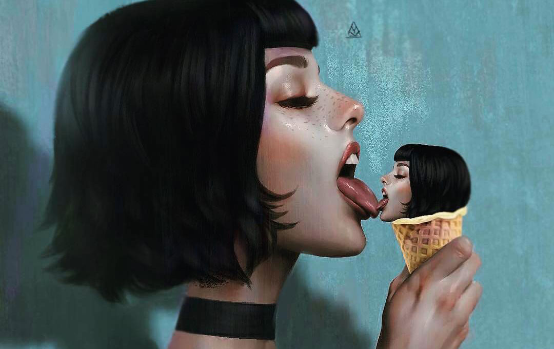
The Poetic And Haunting Illustrations Of Aykut Aydogdu

Collection of hand-drawn Logotypes from 2016
Logotypes from 2016.
All logos are drawn by hand and got digitalized with vectors.
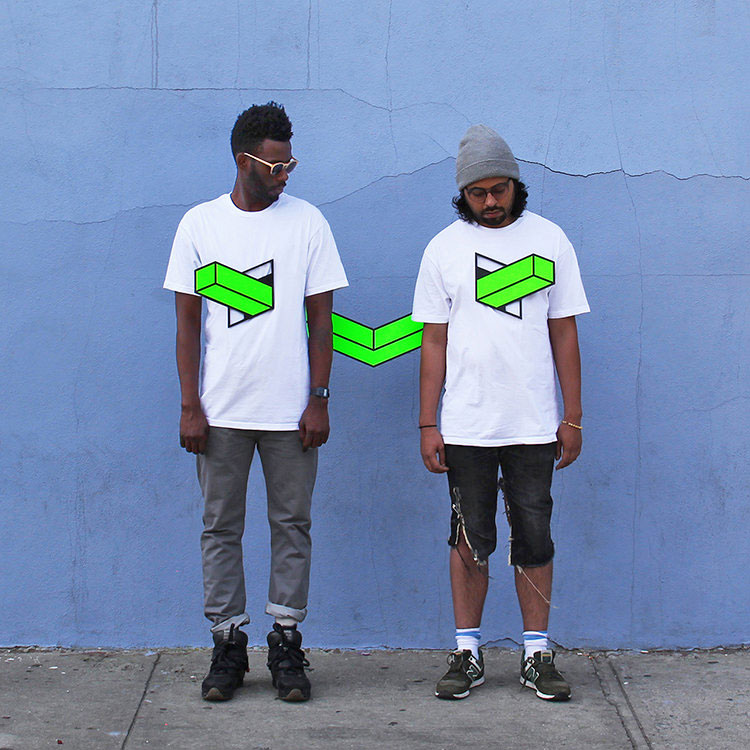
OUTDOOR — Aakash Nihalani

A Stained Glass Cabin Hidden in the Woods by Neile Cooper

Lovely Storybook Illustrations of People Communing with Nature by Jin Xingye

Camouflaged Self-Portraits Conceal Photographer Cecilia Paredes Against Bright Floral Patterns

Camouflaged Self-Portraits Conceal Photographer Cecilia Paredes Against Bright Floral Patterns
Peruvian artist Cecilia Paredes is the subject of her own richly patterned photographs, yet her figure is often difficult to locate at first. For each portrait she hangs boldly printed fabrics as the backdrop, which she then matches either with her painted skin, custom clothing, or both. Her torso, arms, and face fade into the background, as the curvature of her body and brown hair become some of the only indicators of her presence. More

Fight the Ship
Fight the Ship