Design Inspiration
Infographics design and inspiration
Hundreds of creative, innovative, well designed infographics ideas & examples.
We curate topical collections around design to inspire you in the design process.
This constantly-updated list featuring what we find on the always-fresh Muzli inventory.
Last update:

The Roman Empire’s 250,000 Miles of Roadways Imagined as a Subway Transit Map
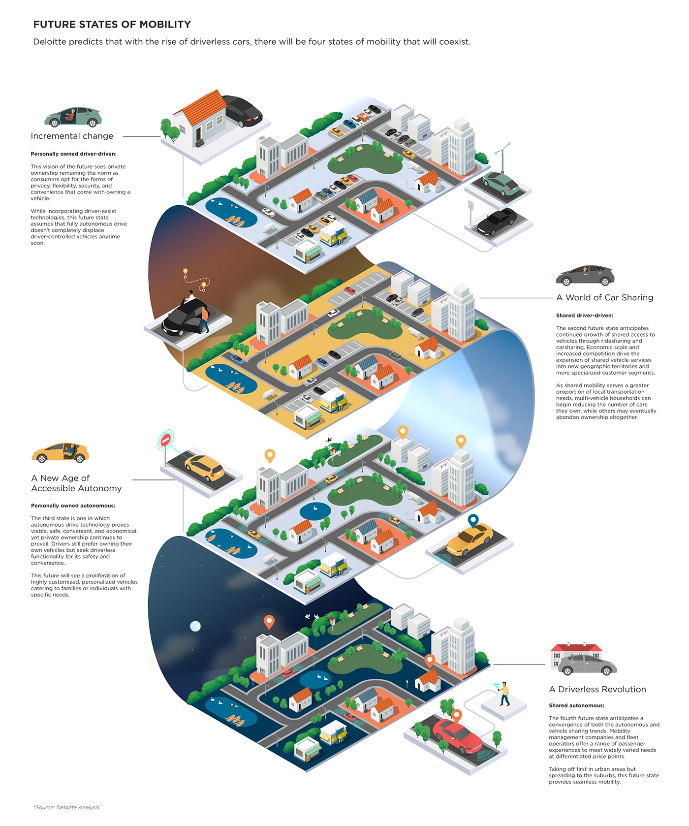
Future of the world we live in
.
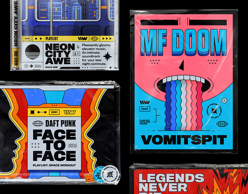
\\WAVES – (in motion) season one
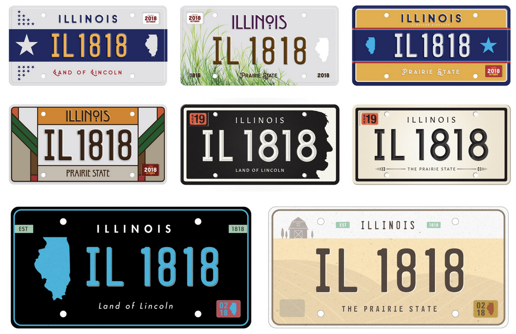
Illinois has the single worst license plate in the country.
Google_art google lewis web

Journey Mapping is Key to Gaining Empathy
The Newest Email Design Trends of 2017
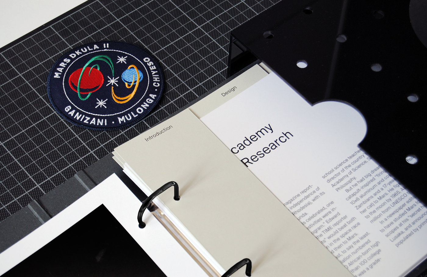
Zambia Academy of Space Research ? Identity
Future of the world we live in
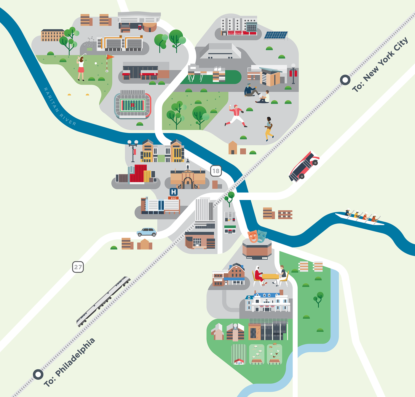
Rutgers University maps
.

Large Scale
Our world with technology

????????? 2017 "???????. ???? ? ??????????"
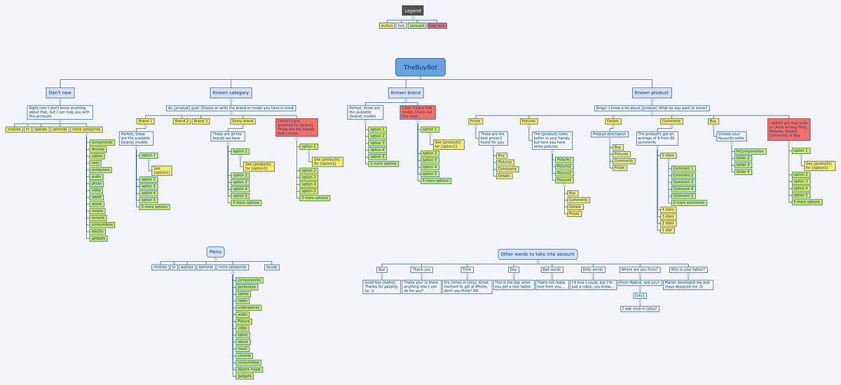
Design Framework for Chatbots
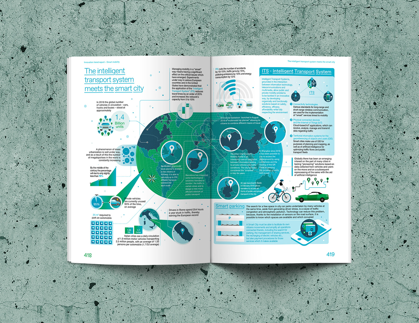
INTESA SANPAOLO - Innovation Trend Report
INTESA SANPAOLO Innovation Trend Report Smart Mobility Infographics and illustrations designed for the Italian Bank Intesa Sanpaolo
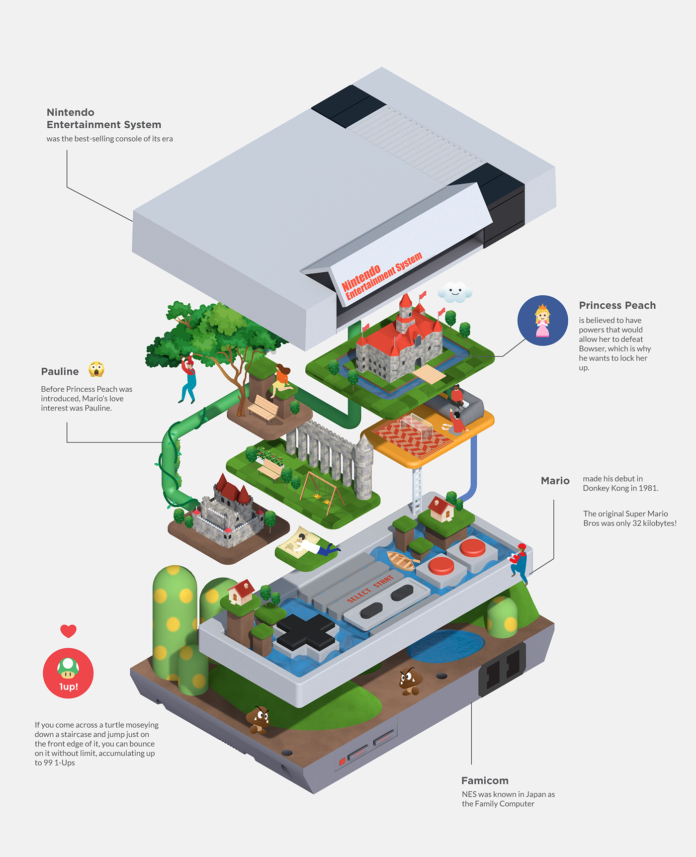
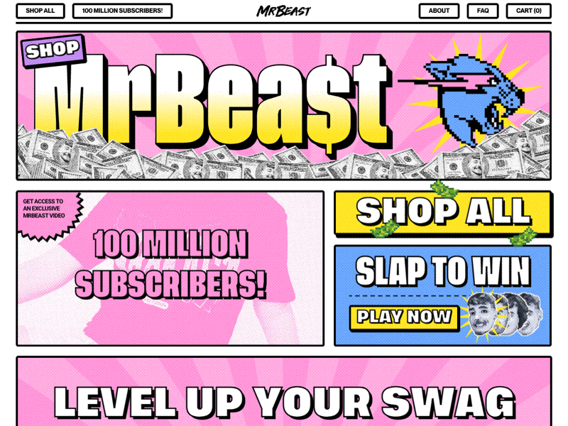
Level Up
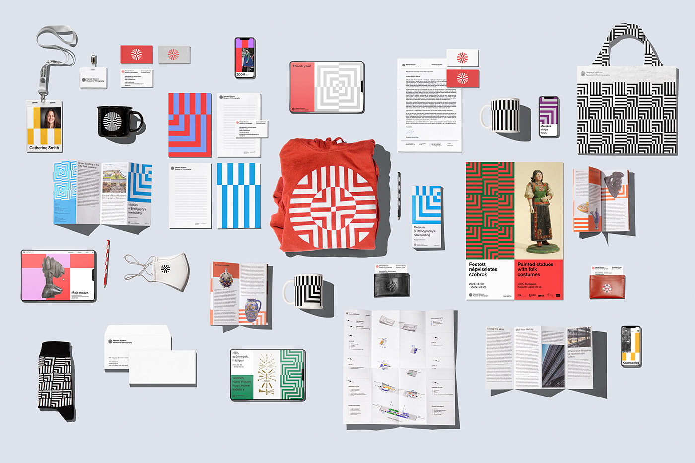
Museum of Ethnography
Museum of Ethnography, Budapest Brand Design & Identity 2022 In 2022, the Museum of Ethnography has a place worthy of its mission, sizable collection, and role in the heart of Budapest. The aim was to design a visual identity that could be adapted to the cultural diversity of ethnography, mirroring the diverse world of motifs of the museum's Hungarian and international collections of objects. One of our main inspirations was the monumental building of Ferencz Marcel (NAPUR Architect). The graphic elements of the logo are a fusion of the four continents into one shape, referring to the diverse collection that spans all continents. This symbol reflects the museum's previous identity, but the new logo is a single composite symbol instead of three distinct ones. An essential aspect of the renewal is ensuring that the visual identity is relevant in the present and future digital environment and can represent the institution on the international stage.
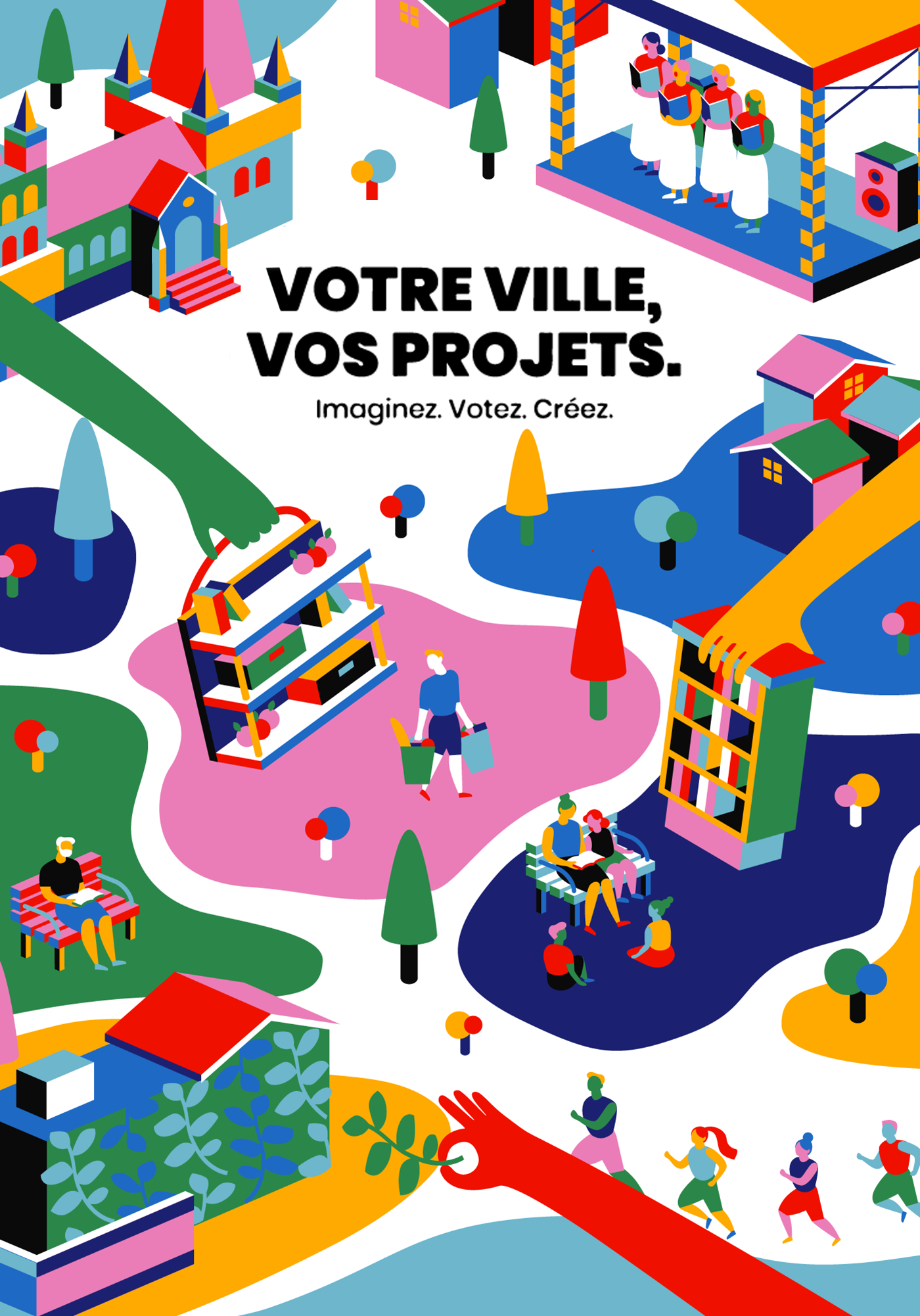
Lausanne City Campaign
It is a campaign project with a concept of participatory budgeting in the city of Lausanne, Switzerland. The campaign promotes the Lausanne's citizens to suggest what to build in their neighborhood and become an active part of deciding where the money is allocated. For that, I designed a set of illustrated elements incorporating into the visual identity of the project.
The Boolean Game
Adobe Pawtraits

MACAO DESIGN WEEK 2018
The theme of Macau design week 2018 is “Bring you to the universe to find stories”. The design was trying to convey this message: Walk through the three-dimensional space, from Macao to the international; climb the mountain peaks of the world, chase the good things; Climb up Mount Fuji with you, in order to regain the experience; go to the end of the universe, find interesting stories; search for the current topical and influential design Works, Macao Design Week aims to lead you to the universe to search for stories.
HPE Research
An infographic project with HPE on technology, computing science, and data.
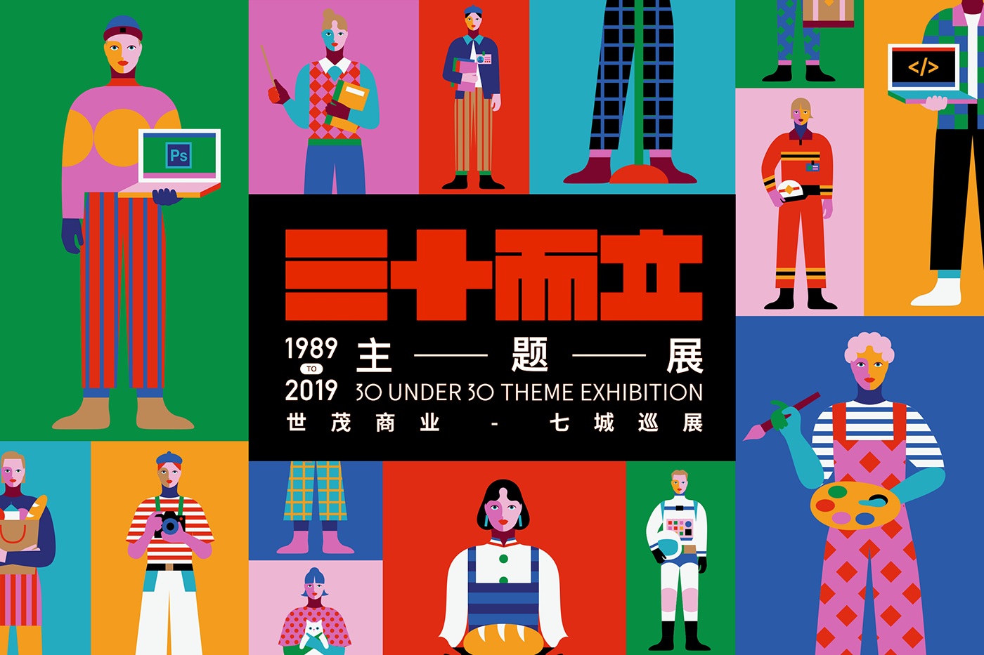
30 Under 30 Exhibition
I had a great opportunity to hold this interactive exhibition called '30 under 30' in seven cities around China to celebrate the 30 year anniversary of SHIMAO with OUTPUT. We interviewed 30 year old people working in diverse industries, and used the voices talking about their stories of being 30 as part of the exhibition. Audiences can combine each part to build a complete figure and listen to the related story. The exhibition is running until Feb 14th 2020!
design work life » cataloging inspiration daily #frommelt #infographics #eric #illustration #data
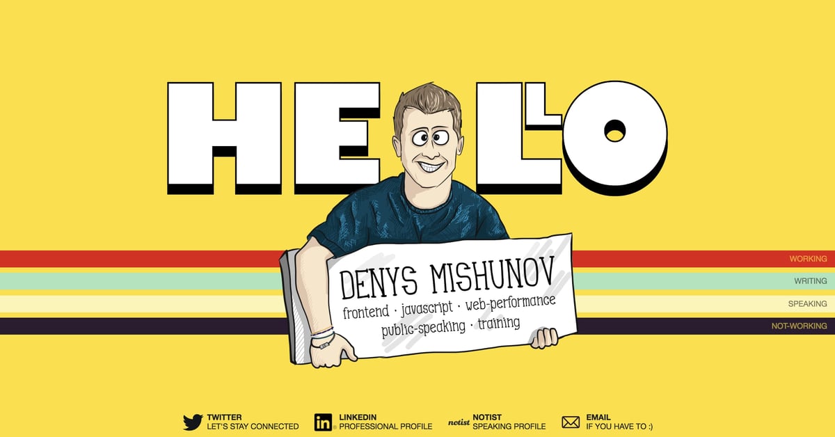
Denys Mishunov
Colorful One Pager with loads of personality for developer and speaker, Denys Mishunov. Note the neat adaption to vertical stripes on mobile. Full Review
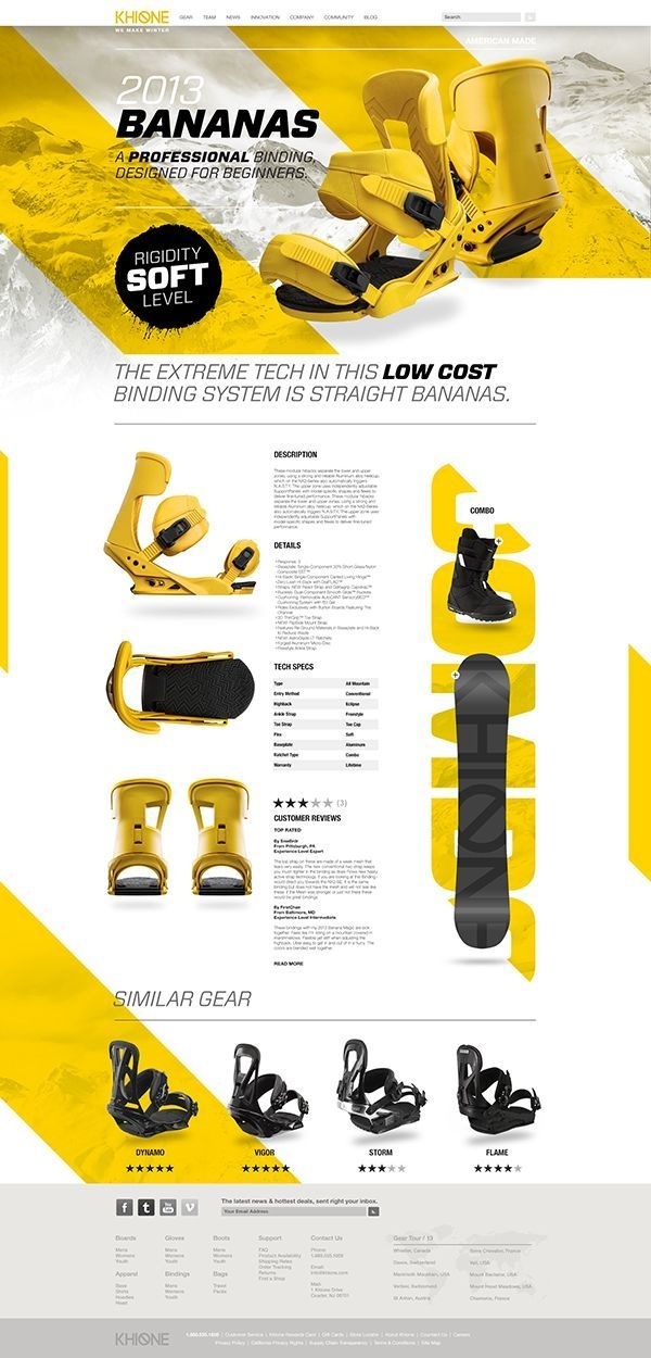
Khione #web

ITU animation

One Forty 移工生活全圖解
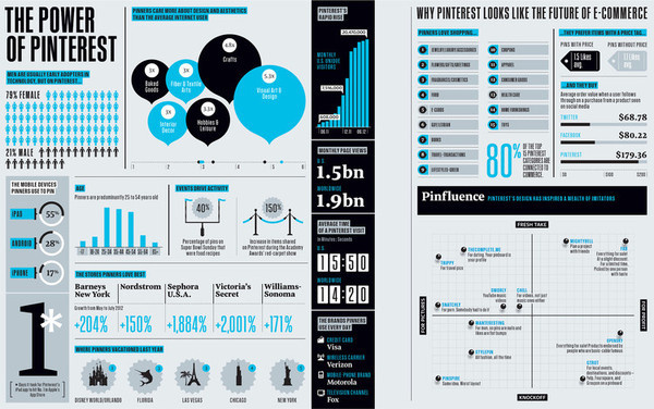
Infographic for Pinterest #infographic #design #layout

Luaka Bop
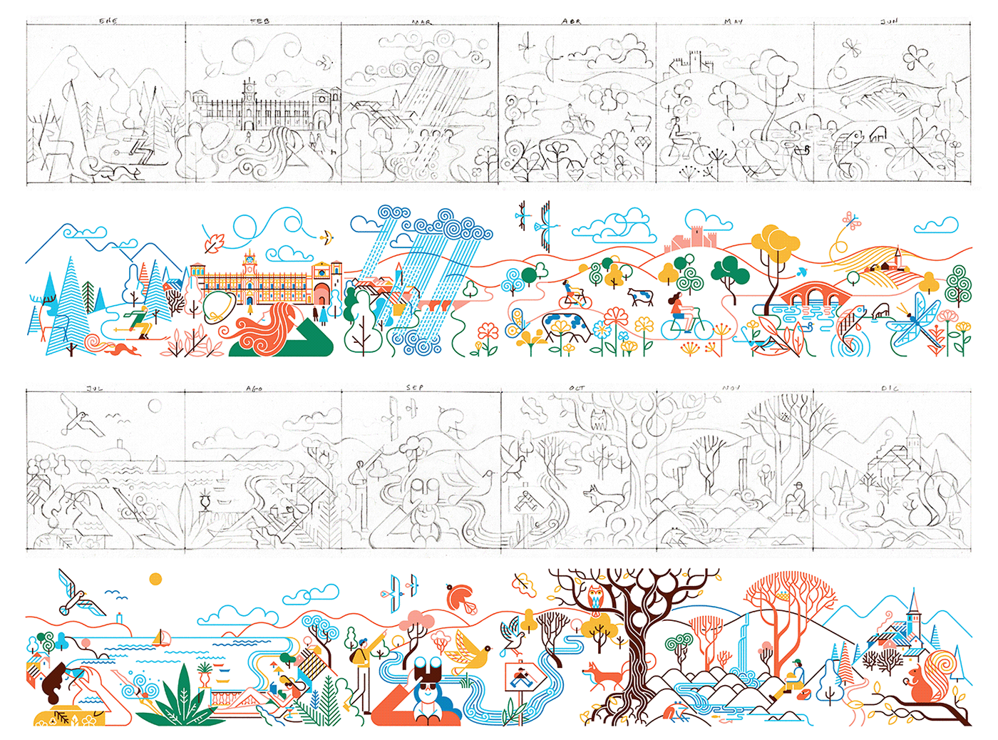
Paradores de Turismo - 2021 Calendar
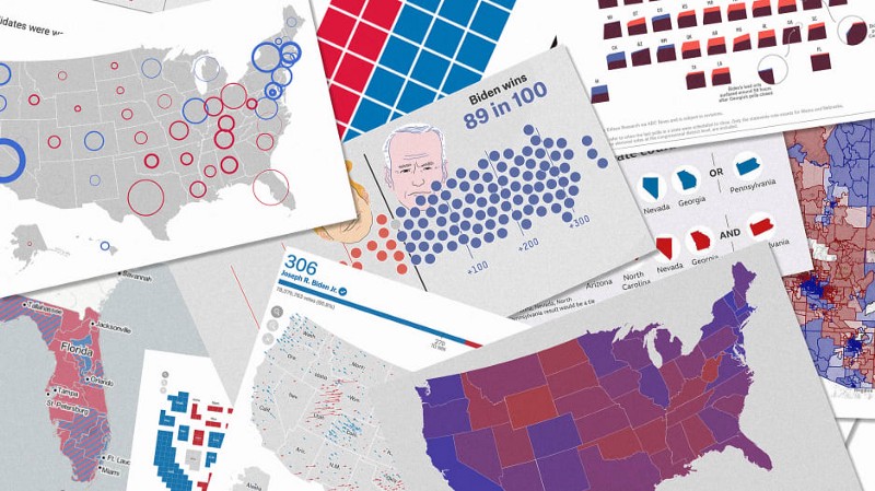
How we watched the election at Stamen: our favorite maps and charts of 2020
Infografia infographic
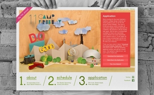
Camp Firebelly 2011 | The Strange Attractor #website #papercraft #diorama #handmade
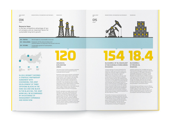
"Rosneft", Annual Report 2011 on Behance #illustration #book #brochure #report
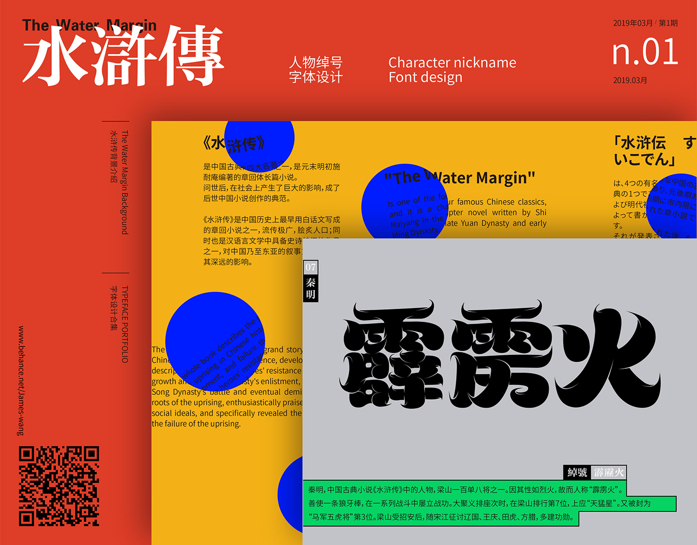
Typeface Portfolio vol.4
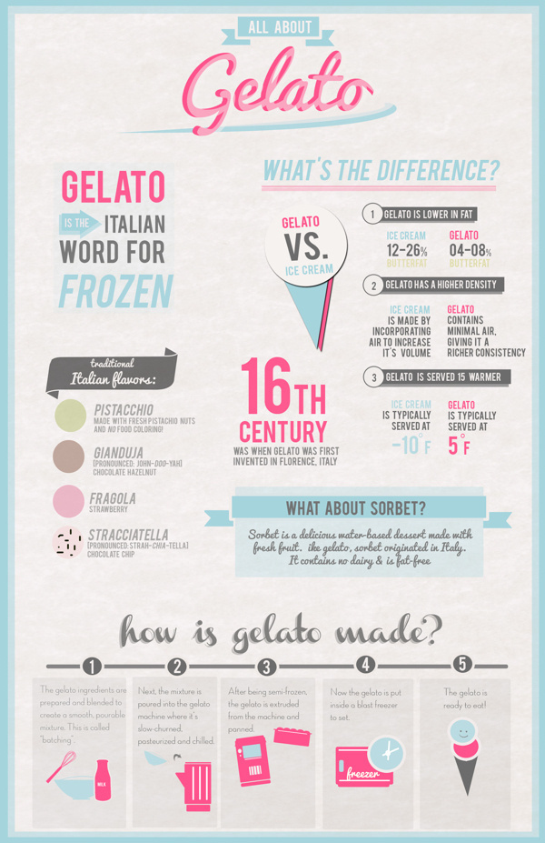
Gelato Design #branding #shop #infographic #print #design #graphic #decor #cream #gelato #educational #poster #cute #ice #typography
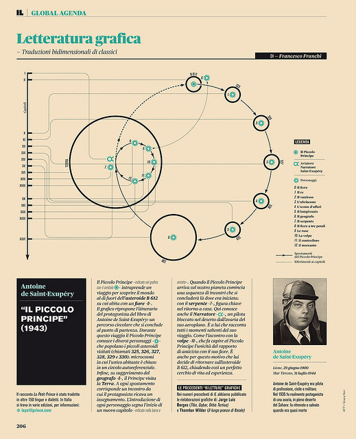
Litteratura grafica - Il piccolo principe #infographic
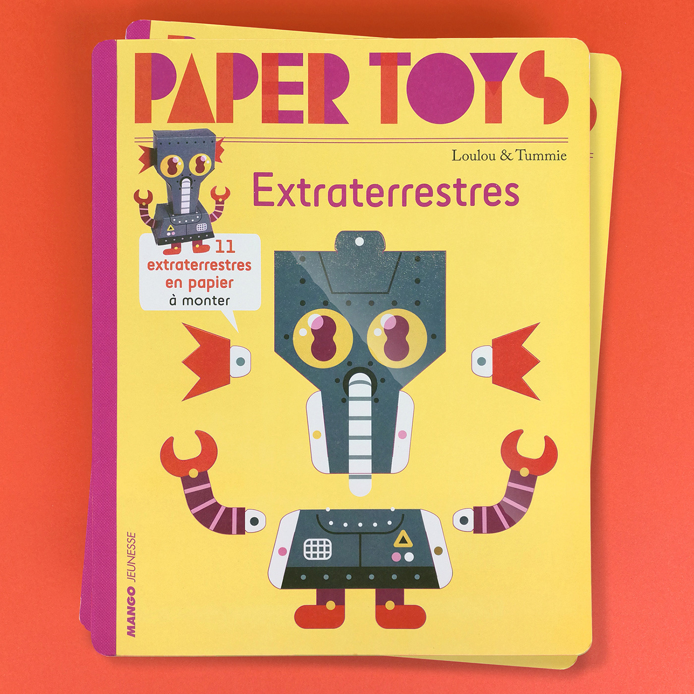
PAPERTOYS EXTRATERRESTRES
We created all the papertoys and artwork for the Papertoys book 'Papertoys Extraterrestres'
Infographics How to Strike
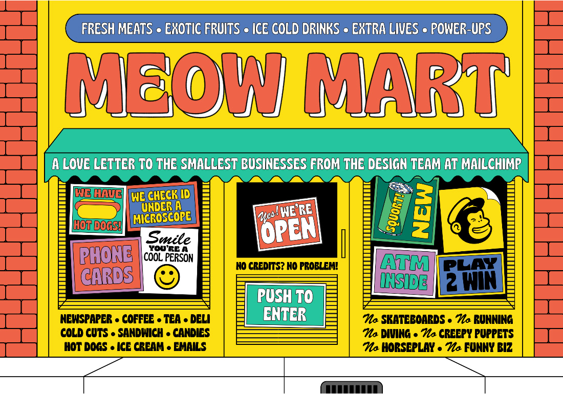
Meow Mart
Meow Mart is about the perils of running a small business told through the eyes of a cat in a corner store fixing a vending machine Dodge fiery snacks Earn coins Buy nice hats
partly-3.jpg #infographic #interface
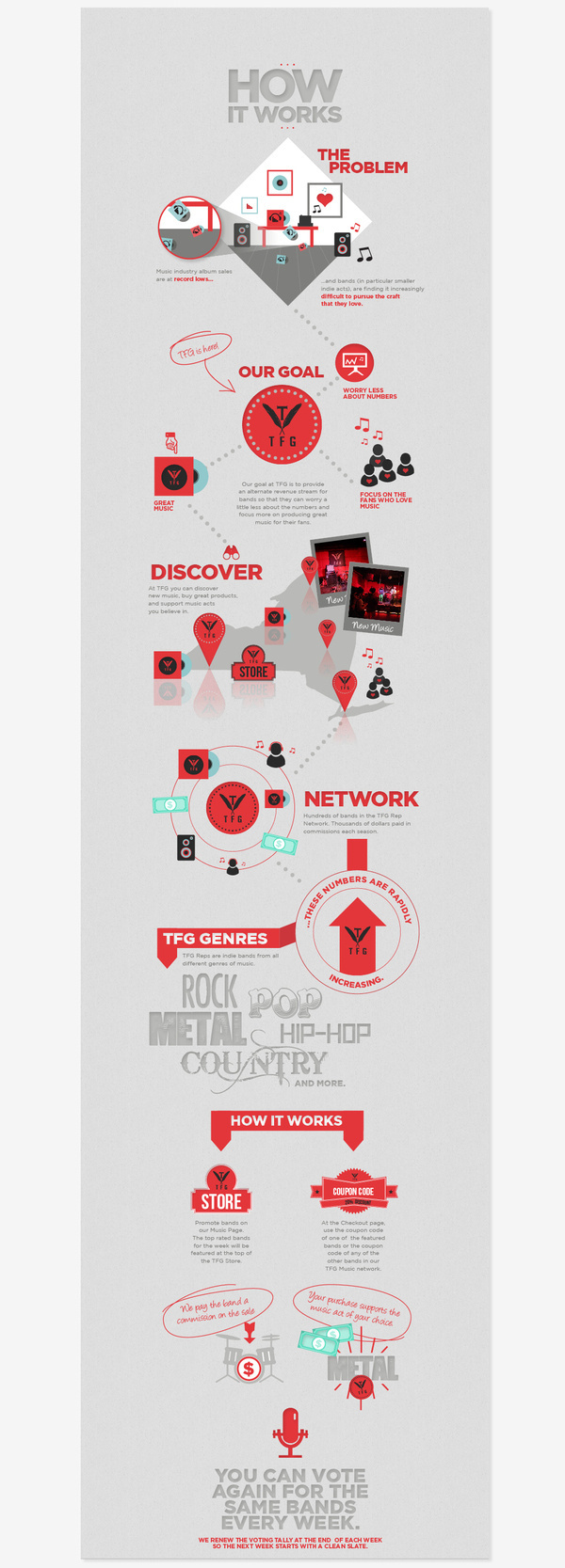
TFG How It Works Infographics
TFG How It Works Infographics on Behance infographics icons texture info stats graphics
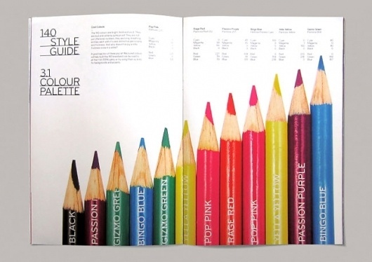
140 | Identity Designed #branding #guide #guidelines #book #brand #education #identity #standards #style
Infographics infografias
Infographics infografias
Infografía, infographic
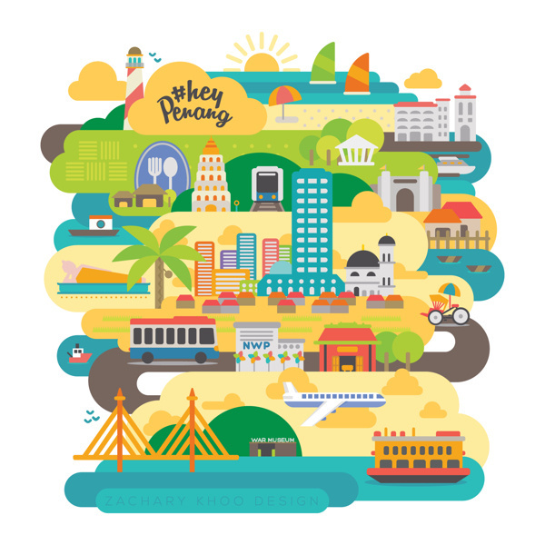
HashTag Hey Penang #tourism #campaign #malaysia #illustration #penang #media #social
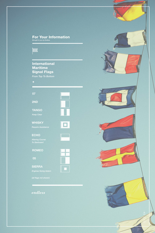
The work of Ben Biondo #naval #flags
AisleOne - Graphic Design, Typography and Grid Systems #guidelines #branding
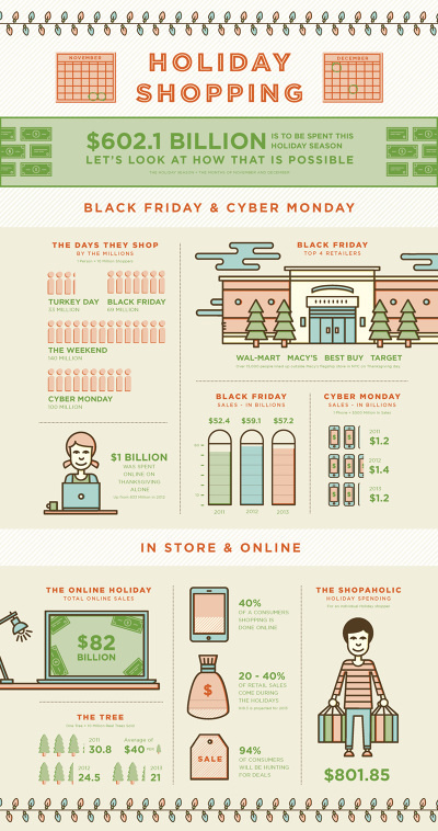
Holiday Shopping #shopping #icon #friday #infographic #black #christmas #holiday #type
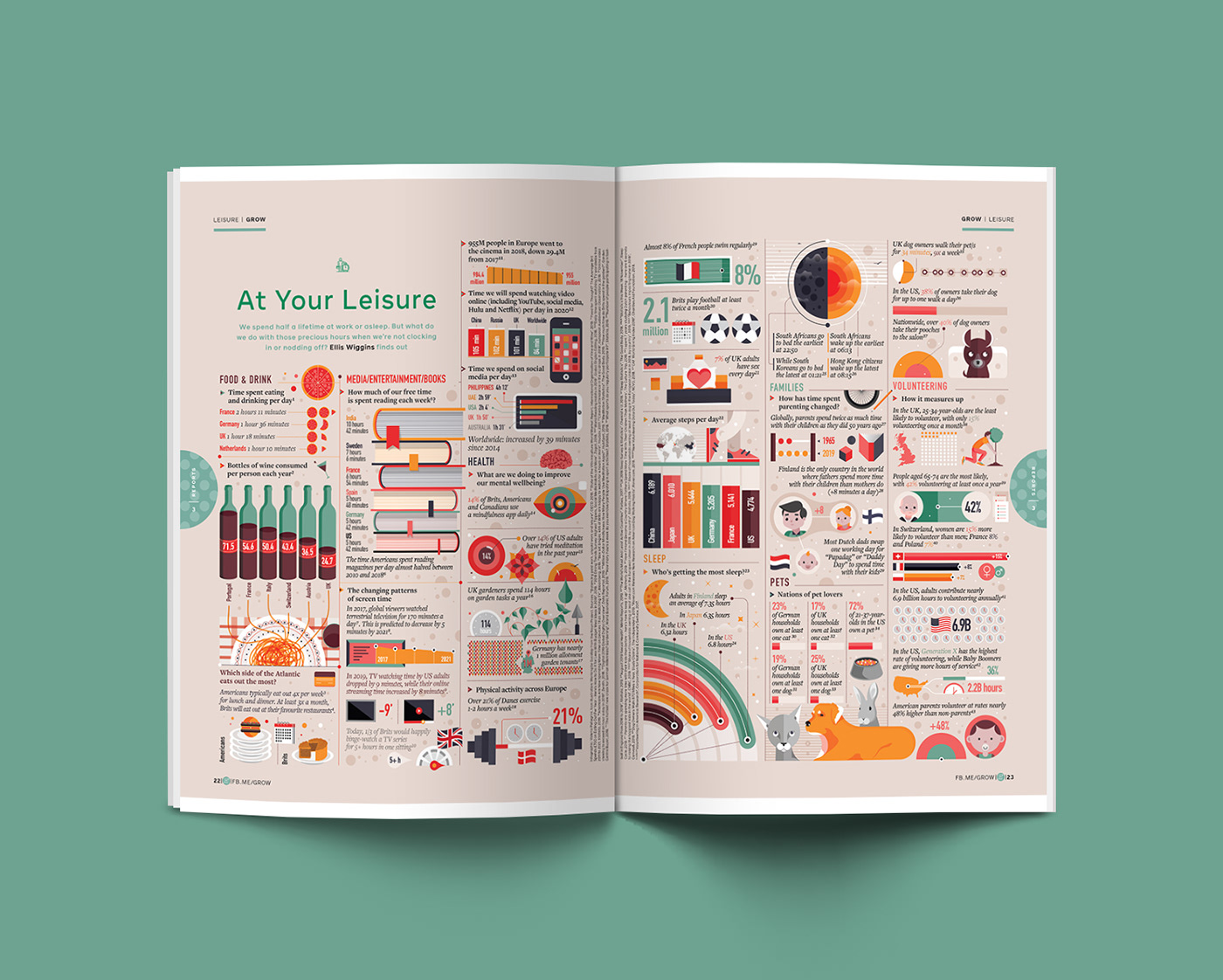
GROW by FACEBOOK - At Your Leisure
GROW by FACEBOOK At Your Leisure Infographic and illustration for GROW by Facebook
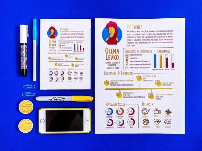
Free Infographic CV Template
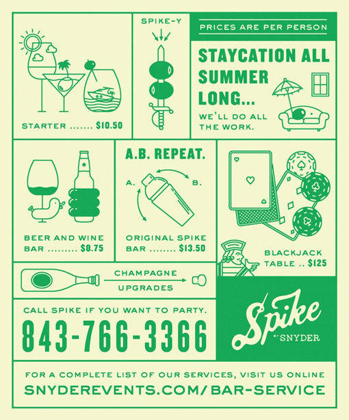
Fuzzco_SnyderEventRentals_08 #drinks
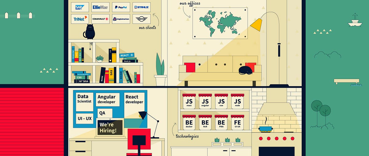
Building an SVG virtual stand
A responsive illustrated website with CSS GridNerdearla is an annual conference with talks and workshops about technology and science here in Buenos Aires.As sponsors of the event with Leniolabs, we used to have a stand where people could come by and say hi, play games with us, talk about technologies we love, and get some of our alien merch. It was the perfect excuse to get to know each other in this community.Leniolabs’ merchandising in events.Then the pandemic changed everything. And the event as we knew it was not possible anymore. They resolved to make this last edition online, so we decided to build a site to still be able to interact with people and play the games we’ve been developing. We didn’t know what to expect. Trying to keep closer in the distance was a challenge for us. But at the same time, there was a bigger audience to connect to, as many speakers and attendees could be present from any part of the world.We first attempted to create an interactive city to chat in bars or share articles in the library, talk in the theatres, or play games in the park. But all those places seemed far away from our reality at that moment.First idea. Leniolabs city.Then the popular #stayathome hashtag hit us: why not illustrate our own house at Leniolabs?Each room would refer to one area of the company; we had our videos of workshops and talks in the garage, our blog posts in the home library, the live chat in the living room, the games in the garden, the trivia challenges in the loft, our lab in the basement, the Bootcamp we were cooking at the kitchen, and the job section in the office room. And everyone was invited; we wanted to share what happens inside Leniolabs, our internal workshops, and articles we write to share our knowledge.Leniolabs’ house website design.Coding the design and making it responsiveThere was a challenge to make this website mobile-friendly as the whole site was a big illustration. After playing around with different approaches, we decided to use Layoutit to build a CSS Grid. We exported every room as a single SVG and made every SVG a component. Then we created a grid where every grid item was one of these components. We changed the layout and the position of the grid areas depending on the screen size, going from 4 column layout on large screens to a single column on mobile.CSS grid and SVG components.The technology usedWe chose Nuxt as we needed a site that would last 5 days but with one month to build it from scratch. No time was lost in router configuration, auto imported components, and a nice folder structure in a pre-rendered site. And we chose Netlify as we needed to iterate and share the results often. A free, serverless platform to push and deploy.CSS animationsWe used some small animations on hover to make the house a little bit more alive—all with preferred reduce-motion for accessibility.Night mode and easter eggsAfter a certain hour, the house switches off, some of the lights are out, and others are on. The sleeping cat is now catching a spider; Leni (our alien mascot) falls asleep outside the house. We love the idea that the more you visit the site, the more details you’ll find hidden. Every SVG is a reusable component that appears on each internal page and changes as the dark mode turns on.Day mode — Night mode.Between 4 pm and 7 am, this function adds a class to the container of the site to activate the dark mode: ... export default { data() { return { isDark: false }; }, methods: { updateTime() { if (process.client) { const hours = new Date().getHours(); this.isDark = hours 16; } }, },...This ended up being our official event site for Nerdearla, as they will continue doing it online and we are part of the 2021 edition from 20 to 23rd of October. We will be hosting games and sending gifts to everyone who will join us this year! But even if you don’t join the conference you can still visit our virtual stand at https://nerdearla.leniolabs.comMore details about the making of the site are in this talk (Spanish version):https://medium.com/media/a17497a853bfeebb54a8247083276e4e/hrefBuilding an SVG virtual stand was originally published in Muzli - Design Inspiration on Medium, where people are continuing the conversation by highlighting and responding to this story.
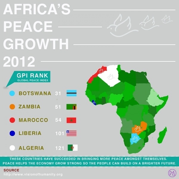
INFOGRAPHIC information gpi
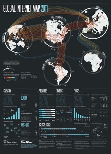
Tumblr #infographic #datavisualisation

El arte por el arte.
El arte por el arte is a collective of visual artists (illustrators / as, painters, sculptors, photographers) that advocate a free style, without labels, that are nourished by the new graphic tendencies. They flee from extreme reasoning and drink from all possible currents. They create community to give free rein to experimentation, both individually and in groups.
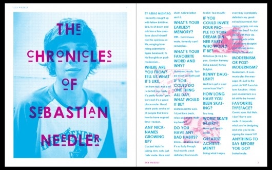
T H E C H R O N I C L E S O F S E B A S T I A N N E E D L E R #halftone #zine #page #cyan #design #graphic #magenta #lca #abbas #spread #double #mushtaq #layout #magazine
Infographic #infographic
Infographic #infographic
Get access to thousands of freshly updated design inspiration pieces by adding Muzli to your browser.
Loved by 800k designers worldwide, Muzli is the leading go-to browser extension for creative professionals.
How do you design infographics that actually communicate complex information clearly?
Infographics are visual arguments — they should prove a point, not just decorate data. The most effective infographic design starts with identifying the single insight the audience should take away, then selecting the visualization type that makes that insight obvious. A bar chart comparing two values communicates faster than a pie chart; a timeline makes process sequence clear in a way that bullet lists cannot. The failure mode of most infographics is overloading — trying to show everything rather than the most important thing.
How do you choose the right chart type for an infographic?
Match the chart to the relationship you're showing: bar charts for comparison across categories, line charts for change over time, scatter plots for correlation, maps for geographic distribution. Pie charts should be used only for part-to-whole relationships with fewer than 5–6 segments — beyond that, a bar chart is more readable. Avoid 3D charts; they distort perceived proportions. When uncertain, default to bar charts — they're the most universally understood visualization form.
What are the typography and color rules for infographic design?
Hierarchy in an infographic runs: headline → key statistic or insight → supporting data → source attribution. Use 3 font sizes maximum with clear weight distinctions. Color should reinforce the data, not decorate it: one accent color for the most important data point, a neutral palette for everything else. Every infographic must include the data source — it's the difference between communication and misinformation.