
Interior design inspiration
Get inspired by hundreds of creative, innovative, well designed interior design ideas.
We curate topical collections around design to inspire you in the design process.
This constantly-updated list featuring what we find on the always-fresh Muzli inventory.
Last update:


Bishop Design by Paul Bishop | Interior Design | Dubai UAE
Bakes Flagship | Brand & Interior Design
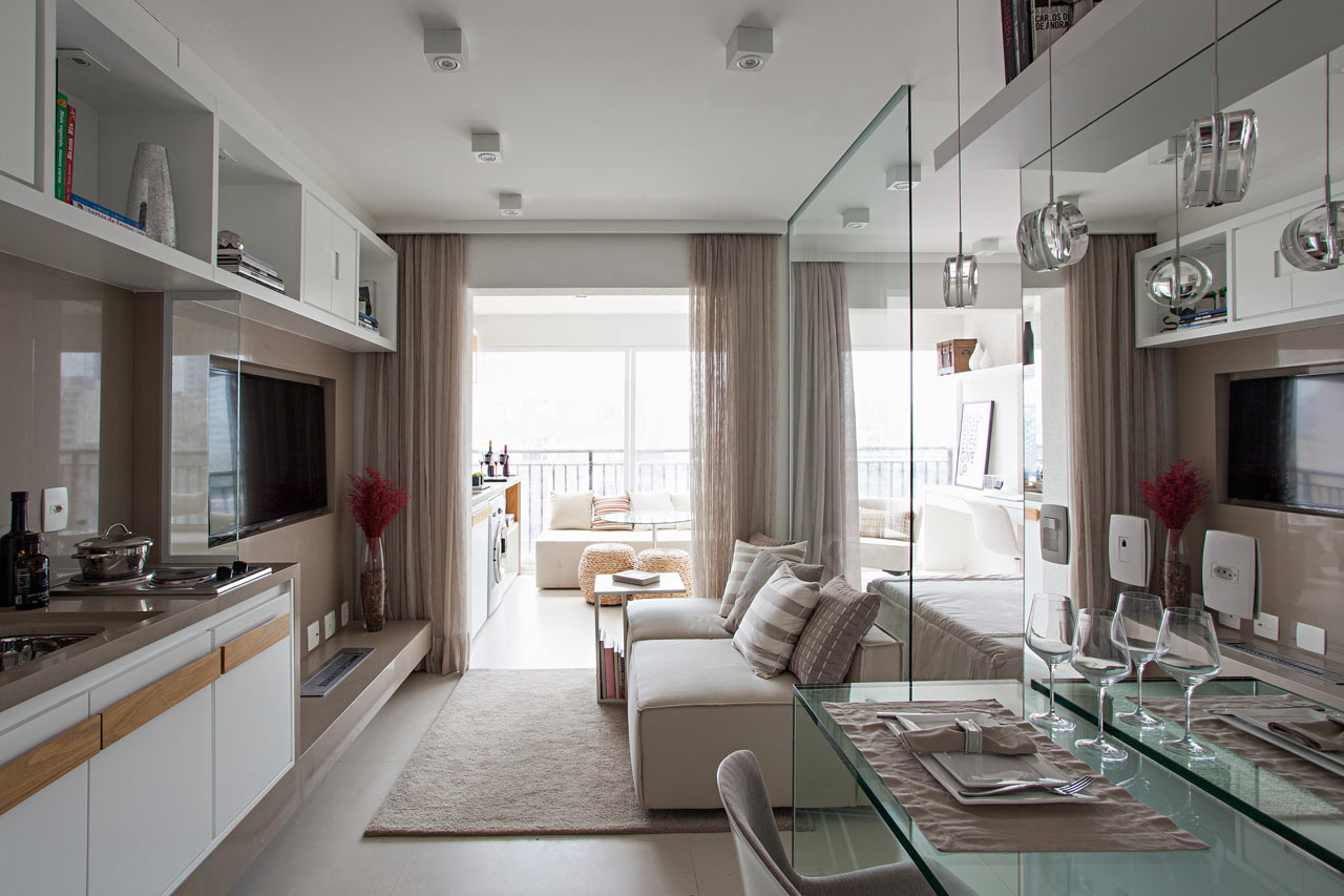
Best Interior Design Posts of 2018
We're taking a look back to see the most popular interiors that we featured in 2018.
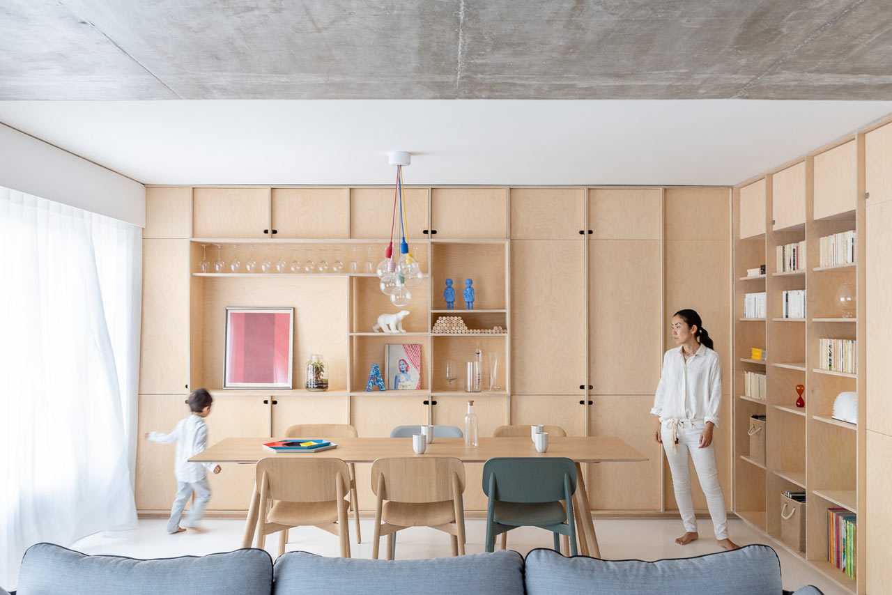
Best Interior Design Posts of 2019
Now that the year is ending, we're looking back and revisiting the most popular interior design posts from 2019.
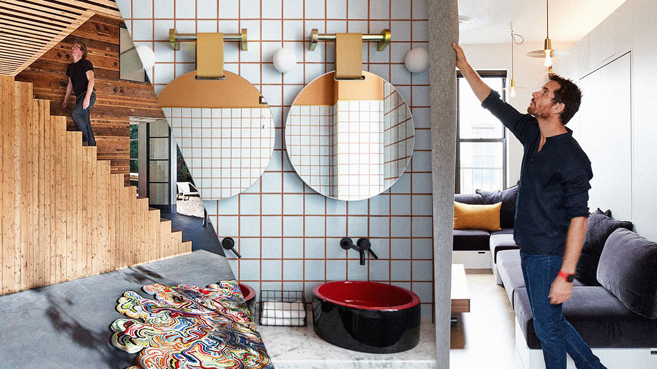
The Most Inspiring Interior Design Of 2016
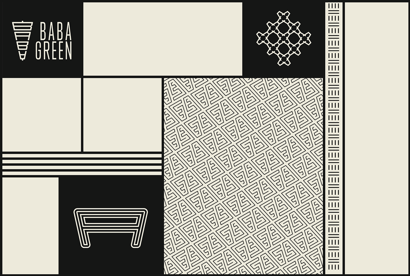
Baba Green ? Branding & Interior Design
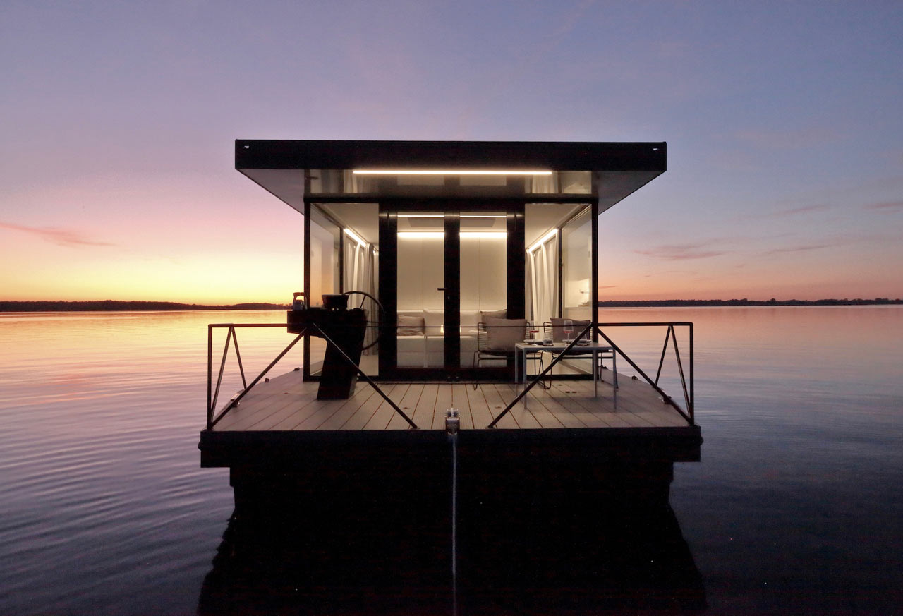
Best Interior Design Posts of 2020
From minimalist to extravagant, micro living to over-the-top, renovation to extension, we shared everything in modern interior design.
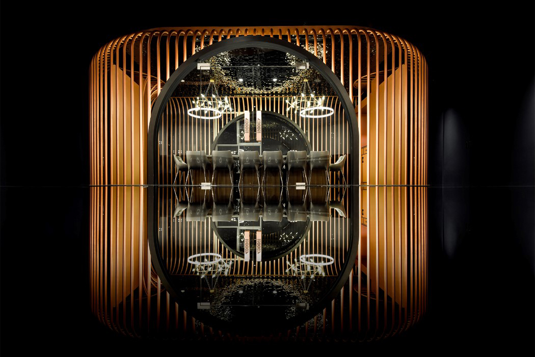
Your 2021 Interior Design Lookbook – Winning Interior Projects from the A’ Design Award
Your 2021 Interior Design Lookbook – Winning Interior Projects from the A’ Design AwardI’m aware that the world spent all of last year locked indoors, but believe me, if these ‘indoors’ looked anything like the ones I’m about to...
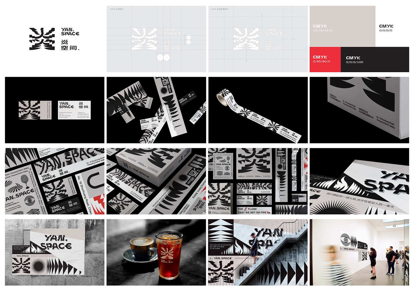
???VI/YAN SPACE VI/graphic /interior design/brand
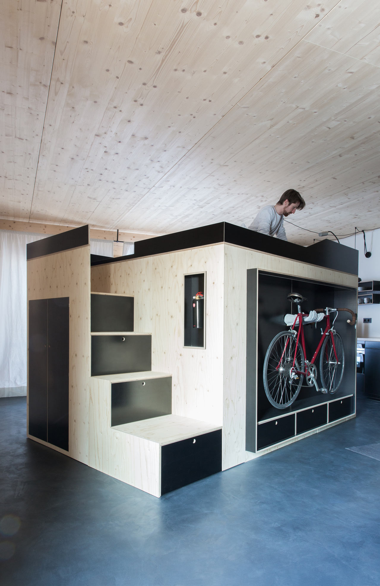
Best Interior Design Posts of 2017
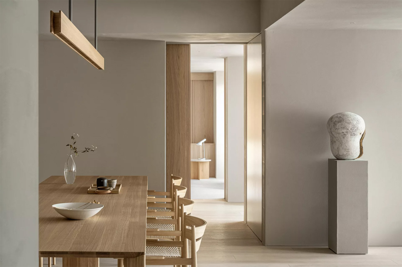
Top 10 interior design trends of 2023
Top 10 interior design trends of 2023As the terror of the pandemic slowly fades away, and our lives return to a semblance of normalcy, a question that rightfully lingers on our...
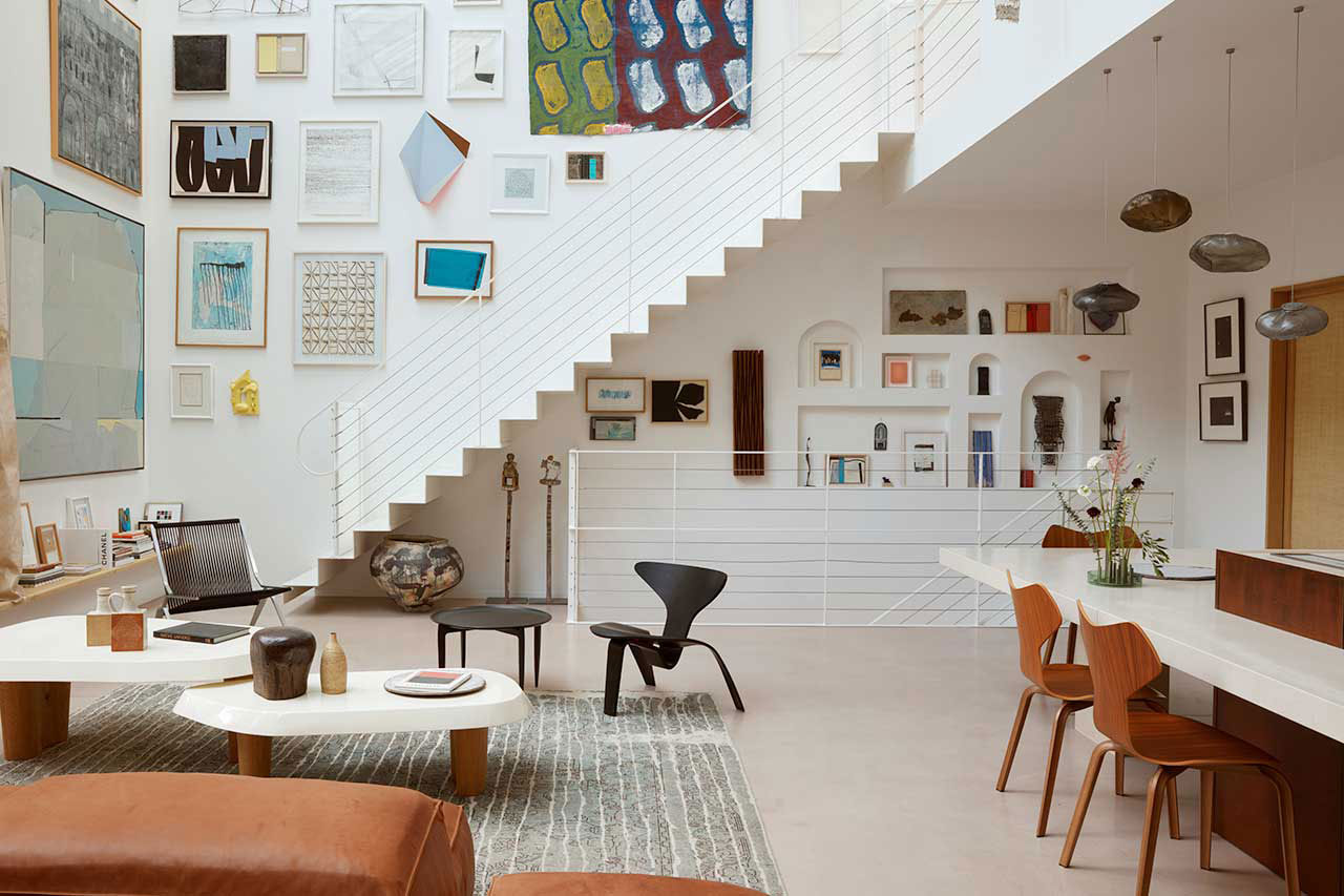
Top 10 Interior Design Posts of 2023
Revisit Design Milk's most popular interior design posts of 2023, from a tiny apartment with a Murphy bed to a lakeside home built like Minecraft.
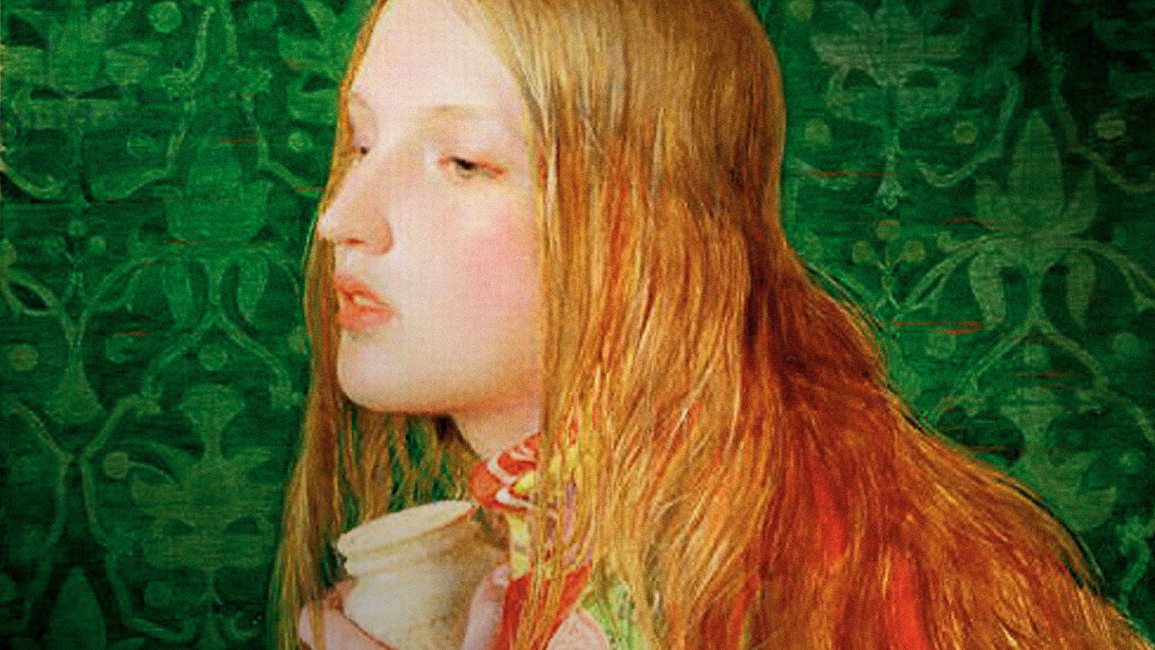
When Interior Design Killed
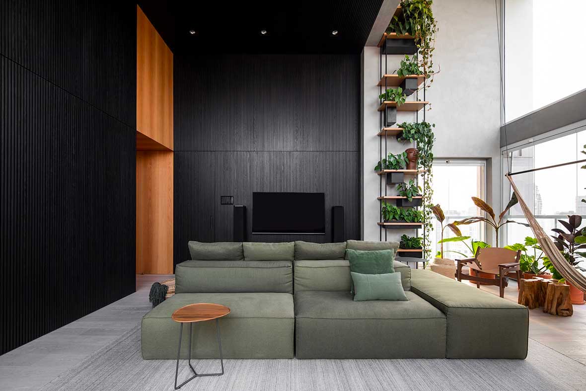
Top 10 Interior Design Posts of 2022
Design Milk shared spaces for everyone when it came to interior design in 2022 and now we revisit the top 10 interiors posts of the year.
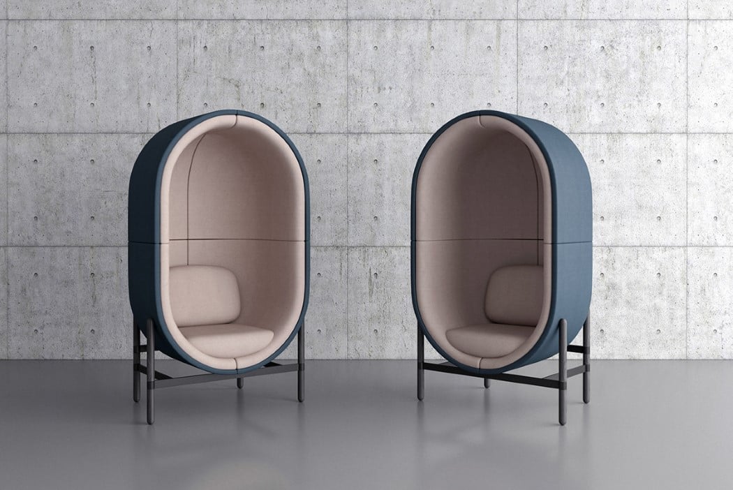
Furniture for interior-design-loving introverts!
Furniture for interior-design-loving introverts!The Capsule Chair/Sofa set, with its soft felt fabric and its perfect geometric design is simply inviting. Pastel colors and soft curves give the capsule its...

Top 10 Interior Design Posts of 2024
10. A Renovated House Gives Nod to 1970s Polish Modernism In Katowice, Poland, a house from the 1970s has undergone a renovation, by Grzegorz Layer and Aleksander Krajewski of Blomm Architecture. Spread across 2,422 square feet, this terraced house has been redesigned to embrace a contemporary, open-plan layout while paying homage to the classic aesthetics of 1970s Polish modernism. 9. A 1930s Ranch Transforms for Southern California Contemporary Living Once a dated 1930s ranch in Los Angeles’ Los Feliz neighborhood has emerged with California contemporary luxury, thanks to a collaboration between Klein Agency and SITU Development. The designers reimagined the home’s layout in order to maximize both space and functionality. The footprint was expanded, adding two additional bedrooms, an interior courtyard, and a deck with a pool resulting in sprawling views of the San Gabriel Mountains. 8. A Paris Apartment That Blends Parisian Heritage + Modern Australian Design In Paris’s 4th arrondissement near the historic Place de Bastille, a renovation within the prestigious Hotel de Sagonne was completed by Wood Marsh, who transformed one of the units with a unique reinterpretation, merging the rich history of the building with contemporary design principles. The approach carefully balances the restoration of original details with the removal of mid-20th century alterations, providing a new canvas for contemporary living without erasing the apartment’s heritage character. 7. Suprematism Apartment: A Modern Tribute to Ukrainian Avant-Garde On the 15th floor with sweeping views of Kyiv, the 452-square-foot Suprematism Apartment is now home to a young couple. Designed by Yevheniia Sytnyk of Dihome, the project draws inspiration from the Ukrainian avant-garde style, particularly the works of Kazimir Malevich, who is considered the founder of the Suprematism Movement. 6. Maryland’s Ginko House: Where History Meets Modernity Stepping onto the grounds of this Bethesda, Maryland home, visitors are greeted by the majestic ginkgo trees that frame the entrance. This renovated 1920s center-hall colonial – dubbed the Ginko House – has undergone a major transformation by Colleen Healey Architecture. The updates include bringing the same open brightness to the original part of the house and to upgrade the finishes throughout to form a more cohesive aesthetic. 5. A Playful Gurugram Penthouse Inspired by Soft Fluffy Marshmallows Imagine living in a home where fresh pastel tones blend seamlessly with smooth, curving lines, enveloping you in a serene and happy atmosphere. That is precisely the experience that Marshmallow, a delightful penthouse in Gurugram, India, offers. Designed by Design Doodle Studio, this project redefines modern luxury and comfort with a bit of magic in hopes of making the owners feel like they’re wrapped in a giant marshmallow. 4. 10 Modern Homes With Living Trees Growing Inside While not for everyone, an unexpected design element like a tree planted inside a house is a clever way to incorporate biophilic design. This approach seeks to incorporate elements of nature into architecture and interior design, aiming to reconnect people with the natural world. We rounded up 10 modern houses where designers have found unique ways to explore this idea with actual trees growing inside the home. 3. A Tiny Apartment in Singapore Maximizes Space With a New Loft Located in Singapore, this apartment underwent renovations by Metre Architects to add a loft structure and to tailor the design to the lifestyle needs of the young professional couple who owns it. The pair requested a loft to be added to the compact 441-square-foot space with a 15-1/2-foot-tall ceiling, which is reached by a sculptural wood box staircase comprising alternating half steps. 2. A Small Kyiv Apartment Elevated With a Kaleidoscope of Primary Colors During of the first months of the invasion of Ukraine, the 560-square-foot 2BM Apartment in Kyiv was designed by TOP LAB Interiors as a bold experiment with color and unconventional materials. Their goal was to create a vibrant haven for a client who didn’t originally like the green. They decided to trust the process throughout the space, and the result is a happy interior where bright primary colors take center stage. And the top interior design post of 2024 is… 1. Kelly Behun Reimagines London Department Store into Dreamy Contemporary Apartment A former department store in London underwent a major transformation for residential and hospitality purposes. The first residence completed was a three-bedroom apartment curated by the renowned New York City-based designer, Kelly Behun. Behun’s design philosophy beautifully blends old-world charm with contemporary vibrancy, drawing inspiration from both the building’s rich history and its surroundings. The color palette, featuring rich golds, verdant greens, dusky roses, and lavenders, takes cues from Hyde Park’s proximity, creating a warm, modern environment. Check out the rest of Design Milk’s end of the year coverage here!
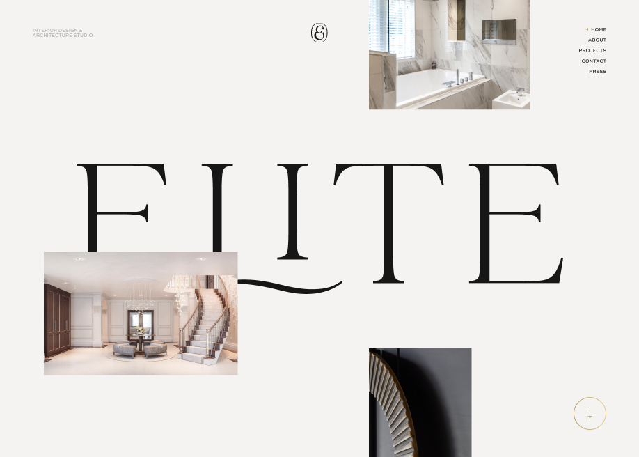
Elite Interior Design
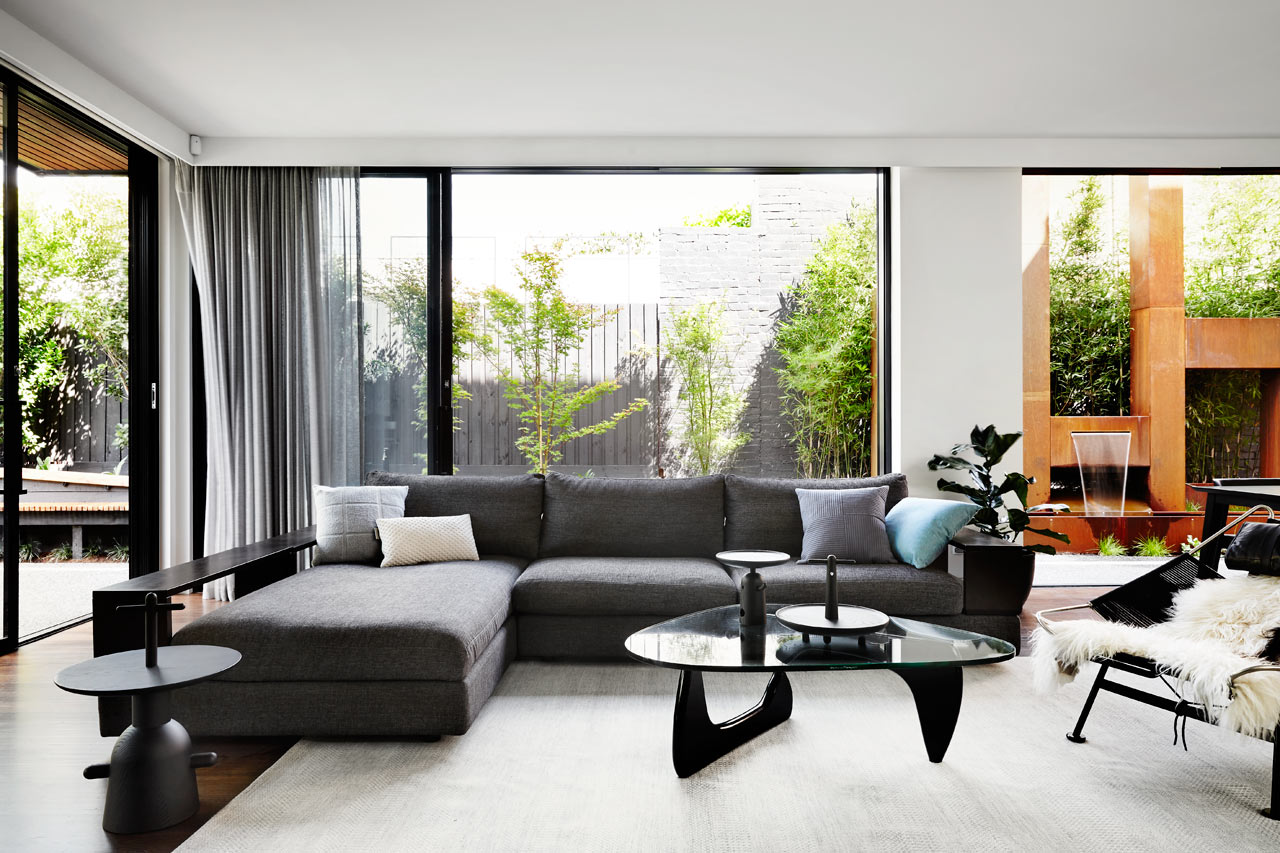
A Contemporary, Monochromatic Home in Melbourne by Sisalla Interior Design
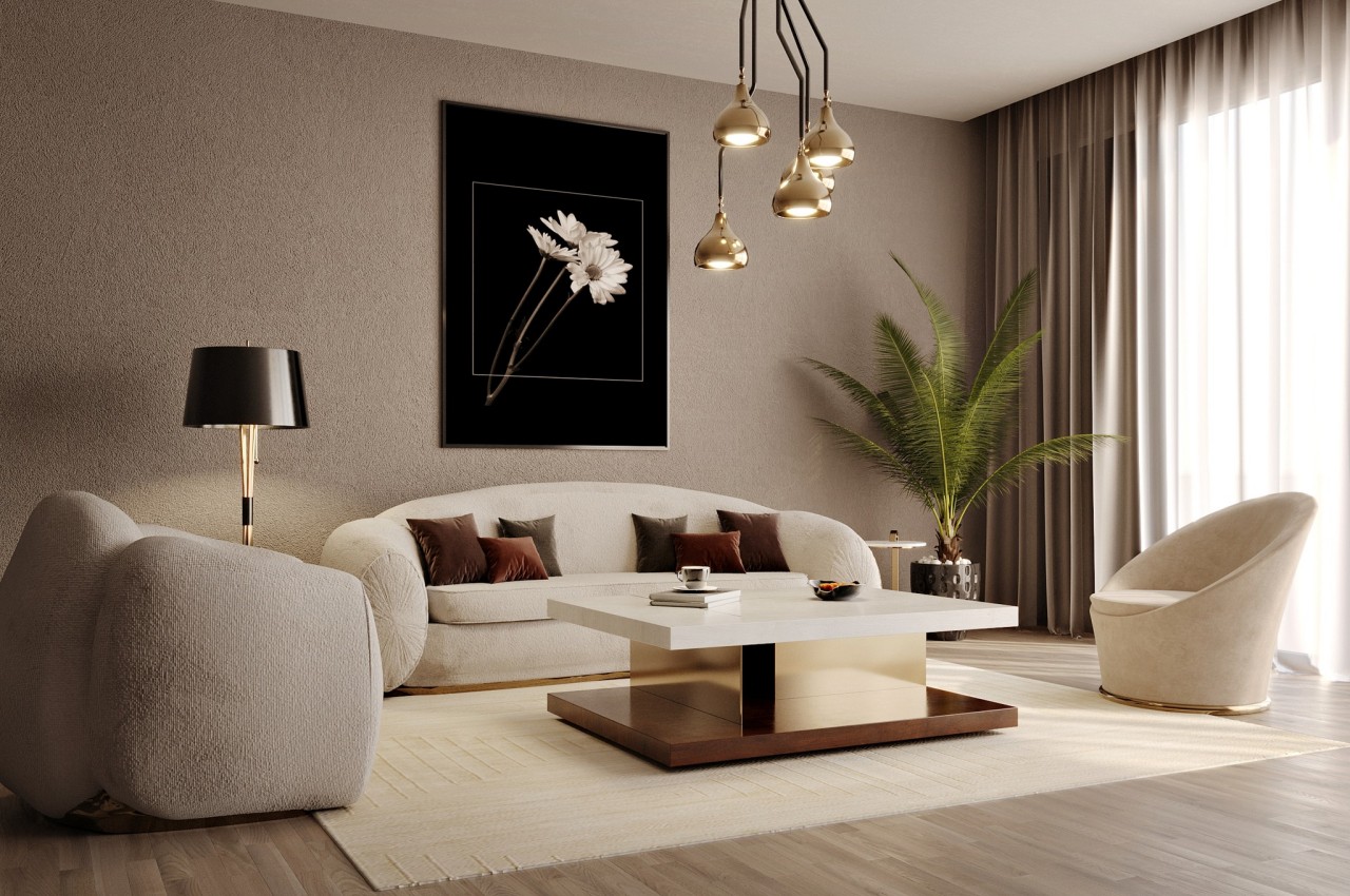
Your interior design style according to your Zodiac sign
Your interior design style according to your Zodiac signAstrology has been around for ages, and as per studies, people from each of the 12 sun signs have their distinct personality traits and habits....
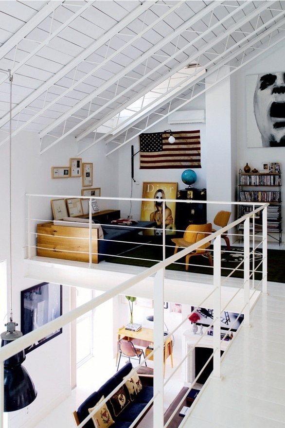
Tumblr #interior #design #home
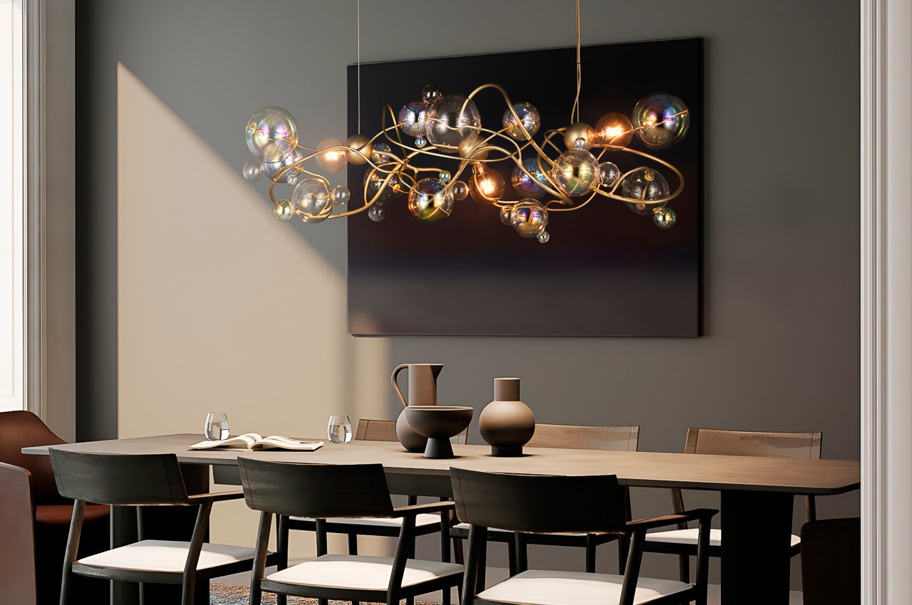
Elements of Interior Design: Lighting
Elements of Interior Design: LightingLight forms an important design element in interior design that transforms the space, creates different moods and determines the way we perceive color and texture....
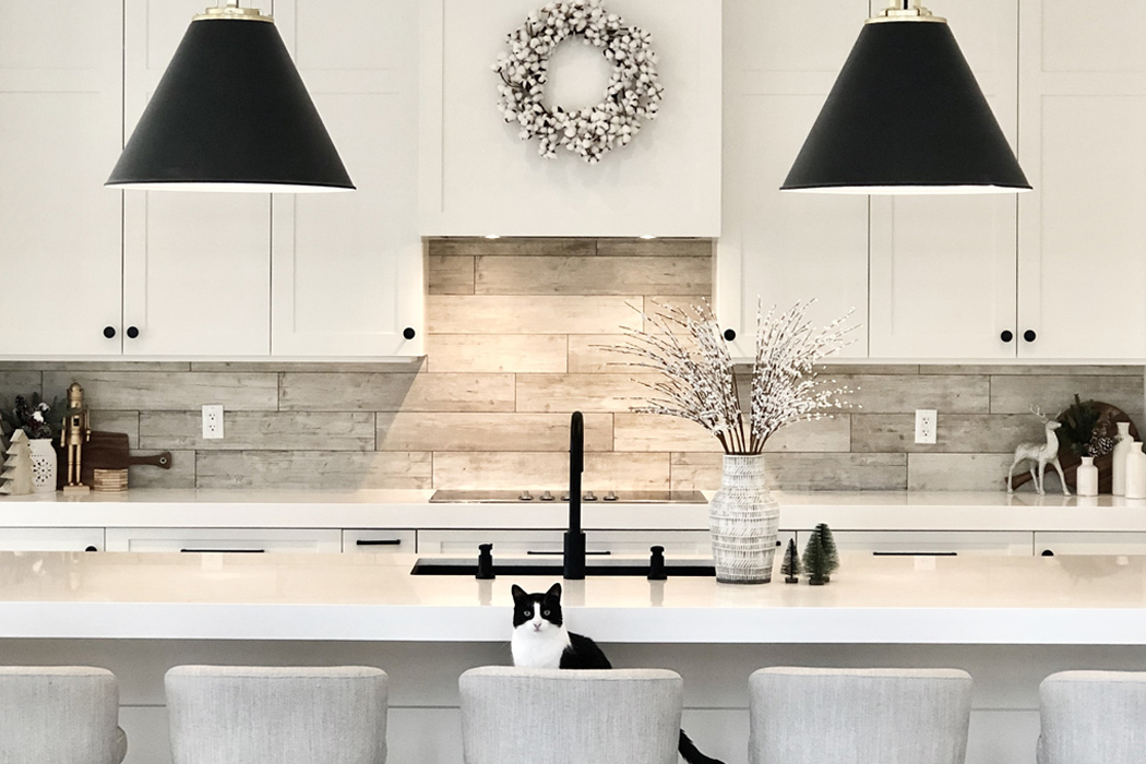
Kitchen Designs that become your interior design inspiration!
Kitchen Designs that become your interior design inspiration!Growing up in a large extended family, gatherings were common and they would all center around the kitchen. Kitchens have always held a special space in...
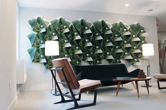
Pentagram #interior #design
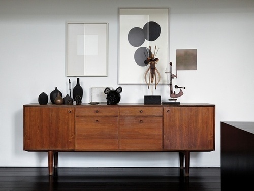
Interior design #interior design
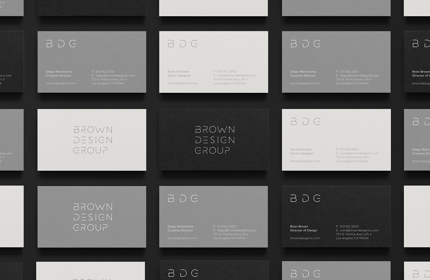
Brown Design Group — LA Interior Design + Build Firm
Brown Design Group, established in 1998, is one of the California´s leading residential and commercial interior design firms with offices in Los Angeles and Santa Barbara. Their passion for creating stylish, organic and contemporary spaces is matched by the efficiency and creativity they bring to every project. Minimalism, cleanliness and elegance are the main elements to develop this identity. It has been built from the main principle of modernity, following the representative forms of architecture and interior design, as well as a visual aesthetic line between art and industrial design. We have chosen a range of neutral and elegant colours, accompanied by a contemporary and modern typography, very close to the world of design. We have also sought the use of few graphic elements in the construction of the logo, making a fully customized logo and creating a unique typography. Services: Brand identity, Stationery, Print collaterals, Web design and Development.
Redesigning A Digital Interior Design Shop
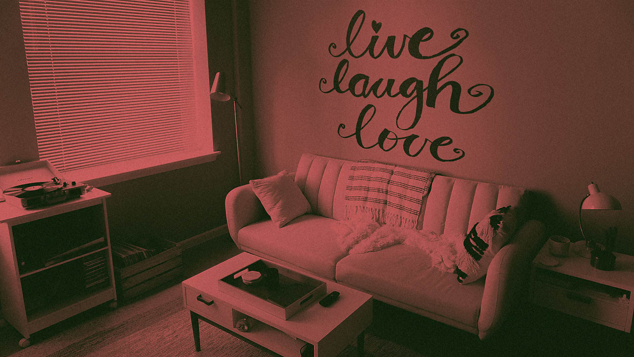
These are the most-hated interior design trends of our time
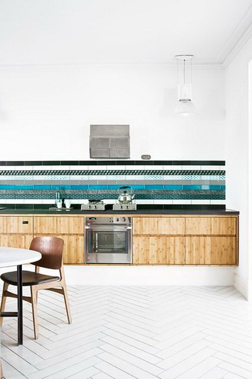
Interior design #interior #design

Design Studio | AM-ARC | Architecture & Interior
Carolyn Parker Interior Design
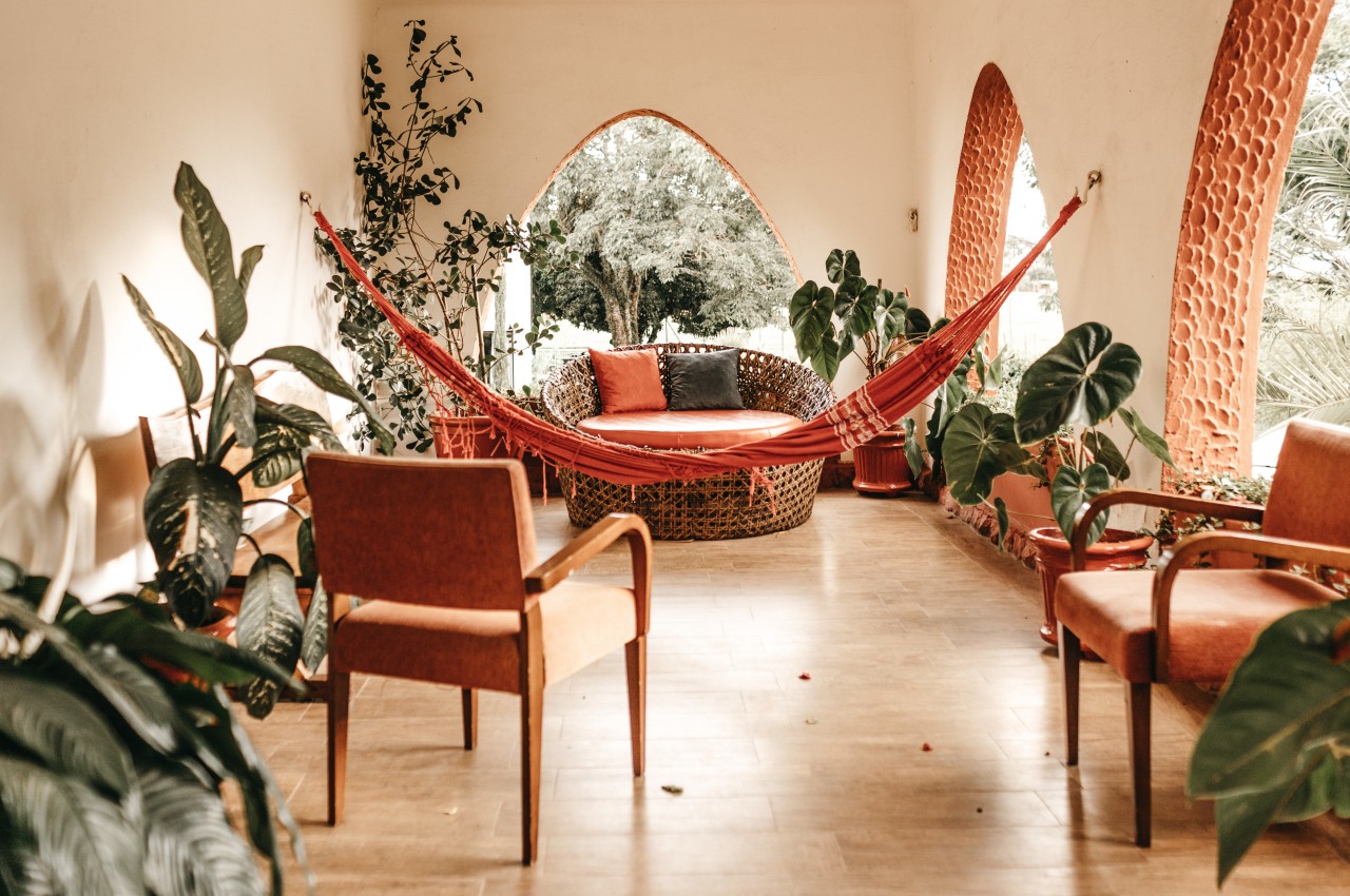
How To Design For Wellness In Interior Design
How To Design For Wellness In Interior DesignWellness design’ is on the rise, focusing on prioritizing people’s health in the design process by considering factors like lighting, air quality, and connections to...

Luxury Architecture, Interior Design & Construction Company London | Rigby & Rigby
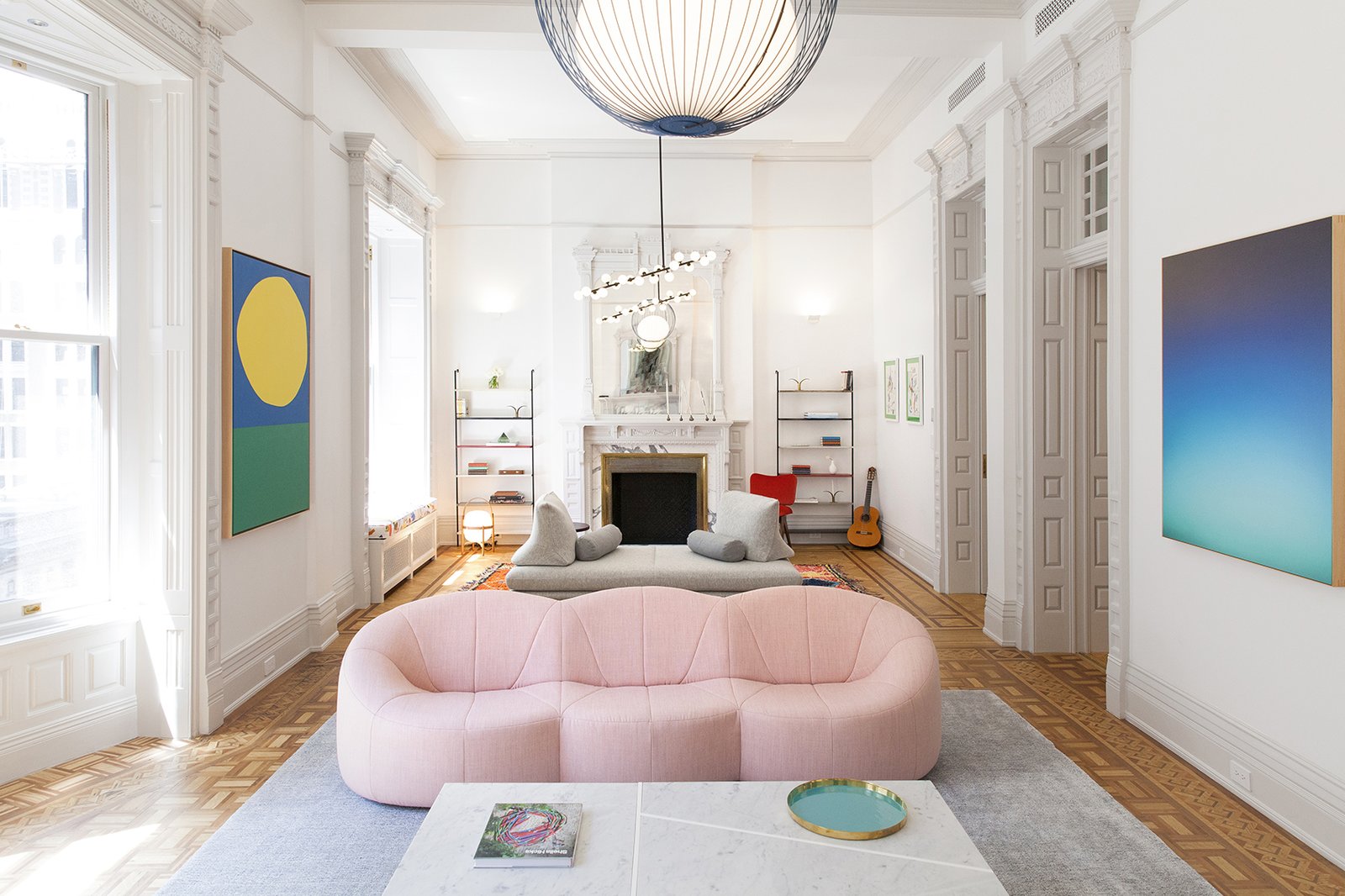
Here Are the 10 Interior Design Trends That Will Rule 2020
Our crystal ball of interior design says 2020 is going to be all about these trends.
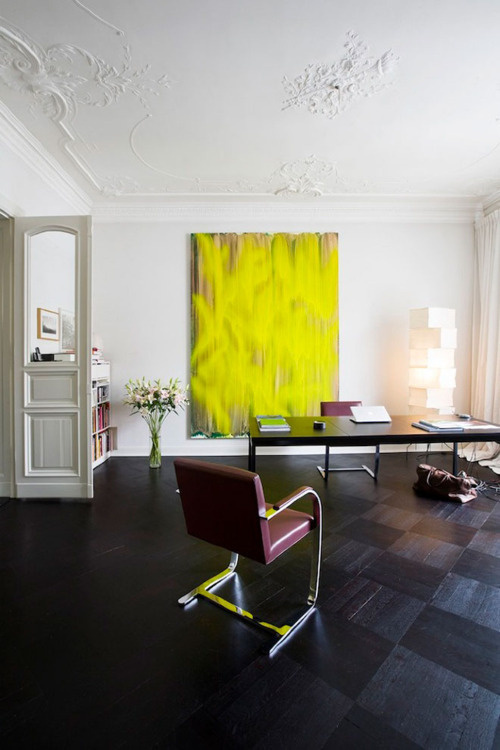
Interior design #interior #design
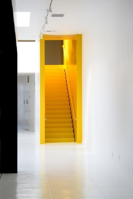
Interior design #interior #design
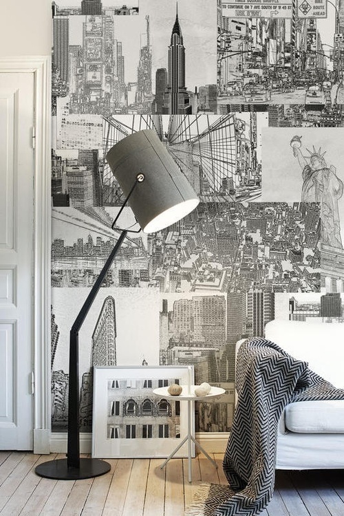
Interior design #interior design

AvroKO — Interior Design
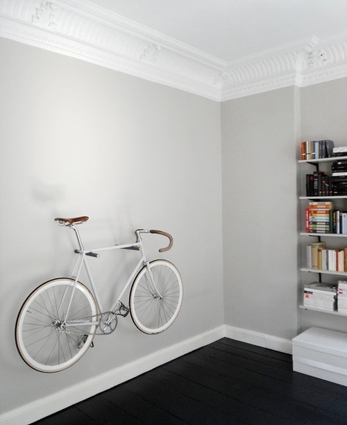
Interior design #interior #design
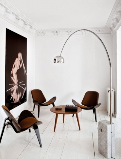
Merde! - Interior design #interior #design
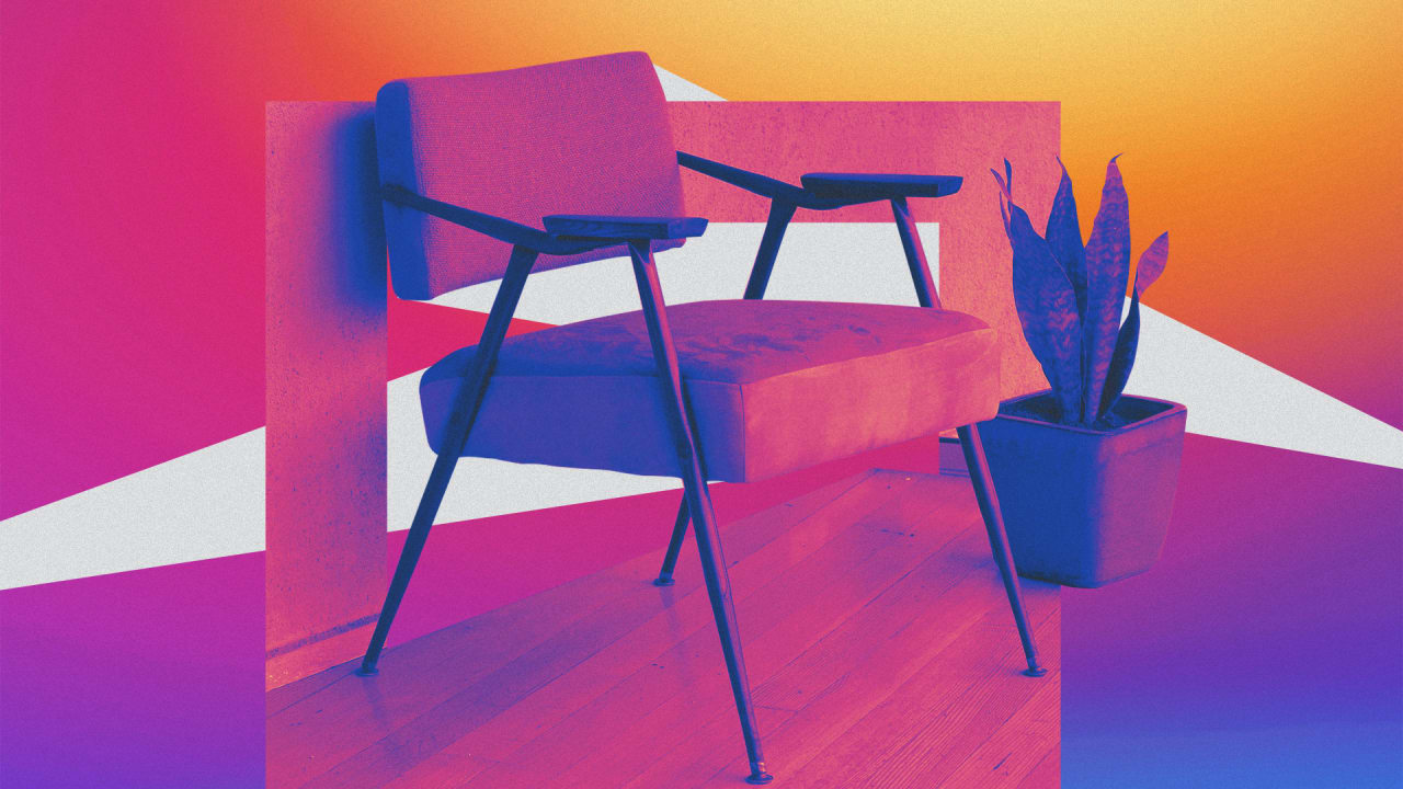
Instagram is reshaping the $10B business of interior design
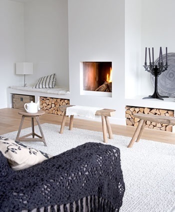
The Design Chaser: Interior Styling | Vintage Benchseats #interior #design #decor #deco #decoration
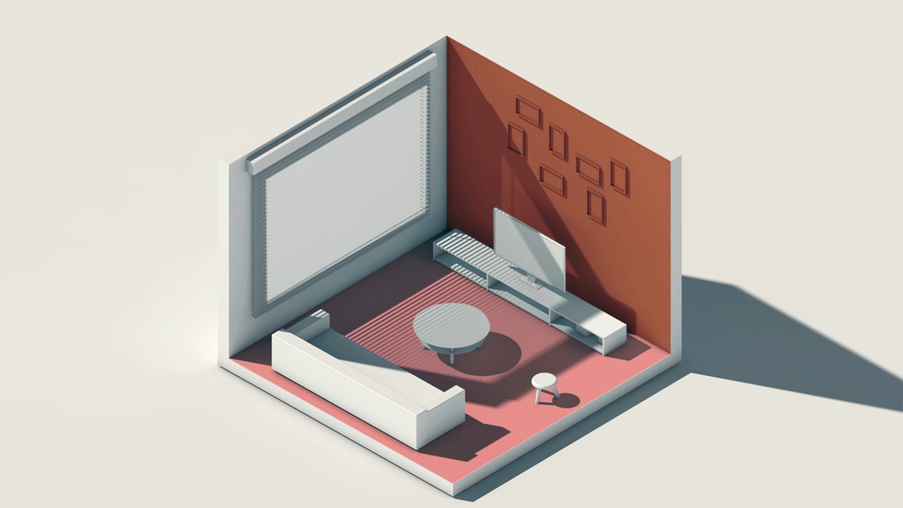
The interior design of the future will seem like magic
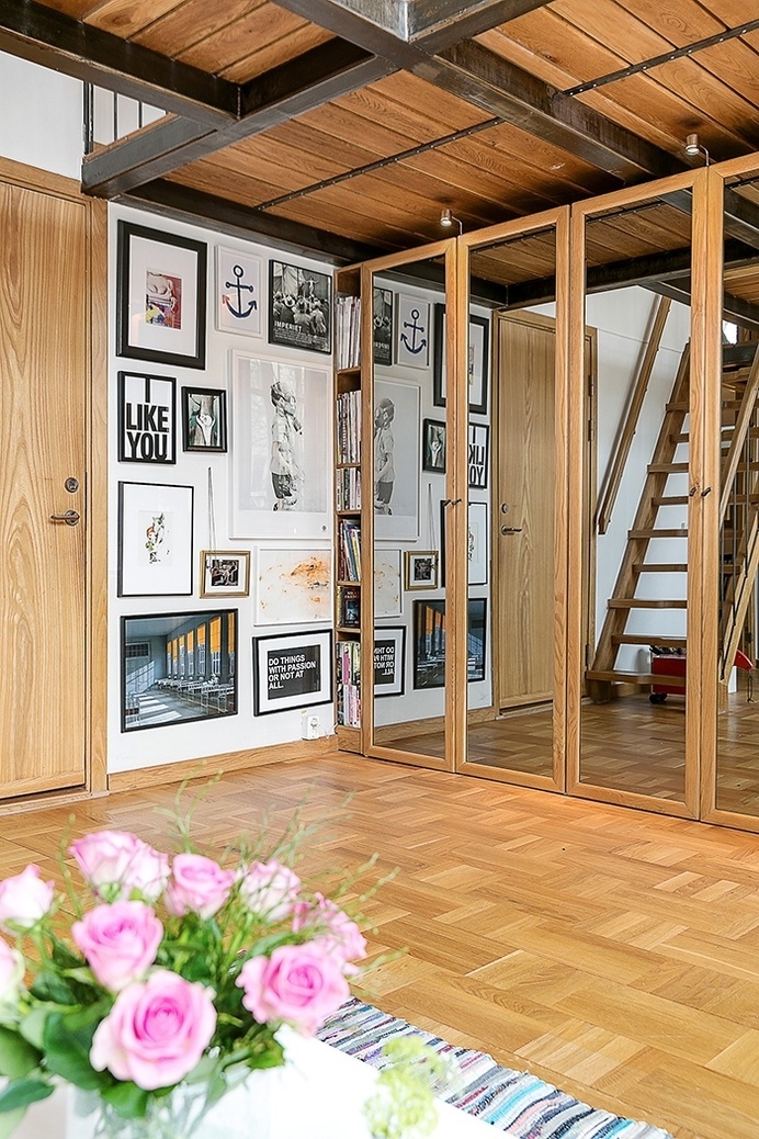
interior design, decoration, decor, deco #interior #design
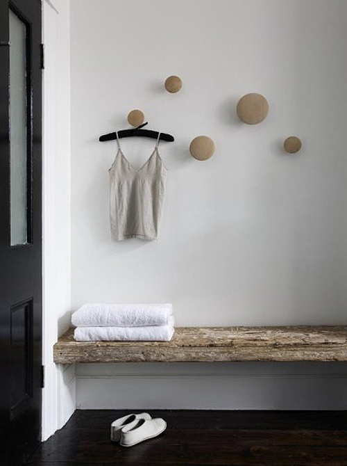
The Design Chaser: Interior Styling | Rustic Bathrooms #interior #design #decor #deco #decoration
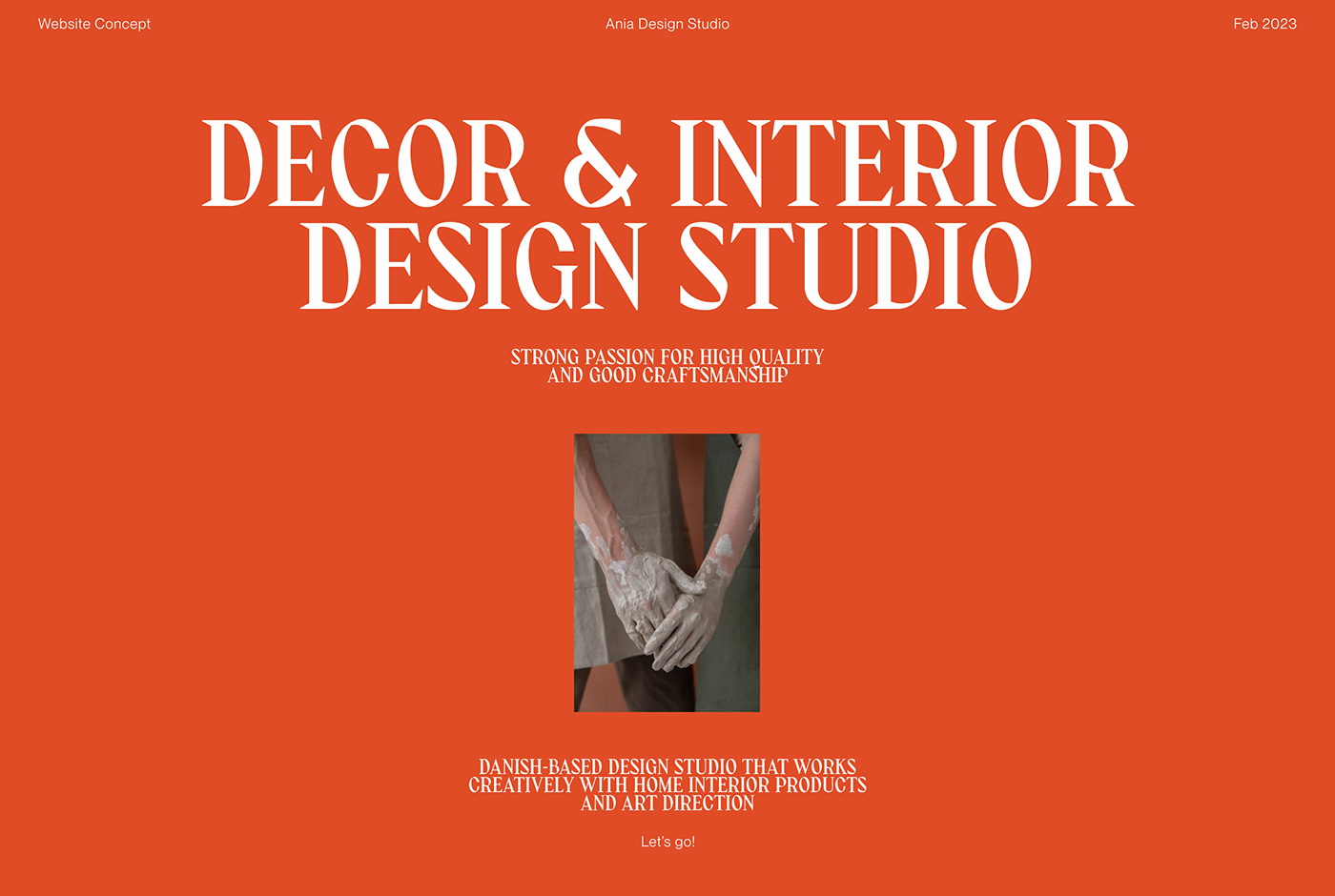
Decor & Interior Design Studio
This is a design and teamwork experiment project. We were inspired by the aesthetics of products made by Ania Design studio and decided to present our vision of the new website. Minimalism, warm bright colors and creative atmosphere. We collaborated in a small team of 7 people, each was responsible for their part of work. And then everything was put together in a single presentation. We hope you enjoy the result.
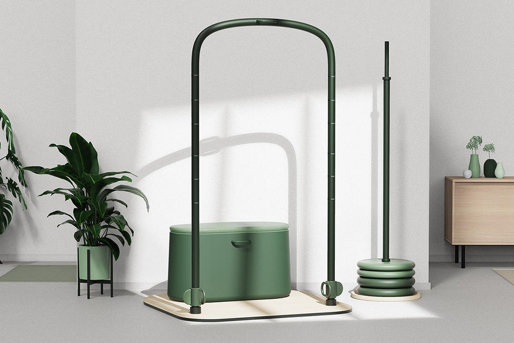
Architecture-inspired workout equipment that balances your workout and your interior design!
Architecture-inspired workout equipment that balances your workout and your interior design!I was not an active person before 2020. If you, like me, never had a desire to work out, didn’t enjoy running, or were in terrible...
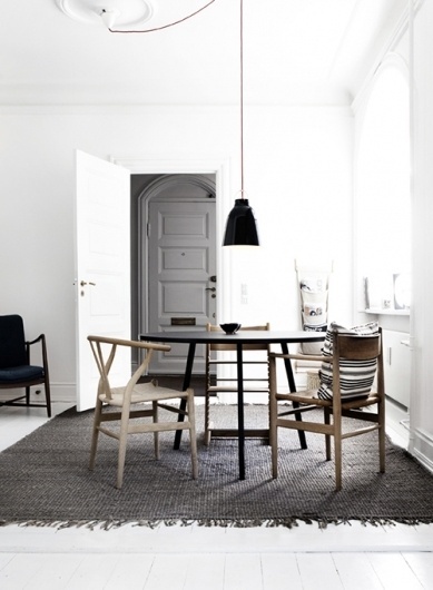
Merde! - Interior design #interior #design
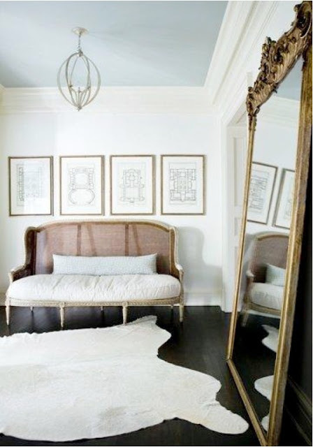
The Design Chaser: Interior Styling | Oversized Mirrors #interior #mirror #design

Redesigning an interior design service website
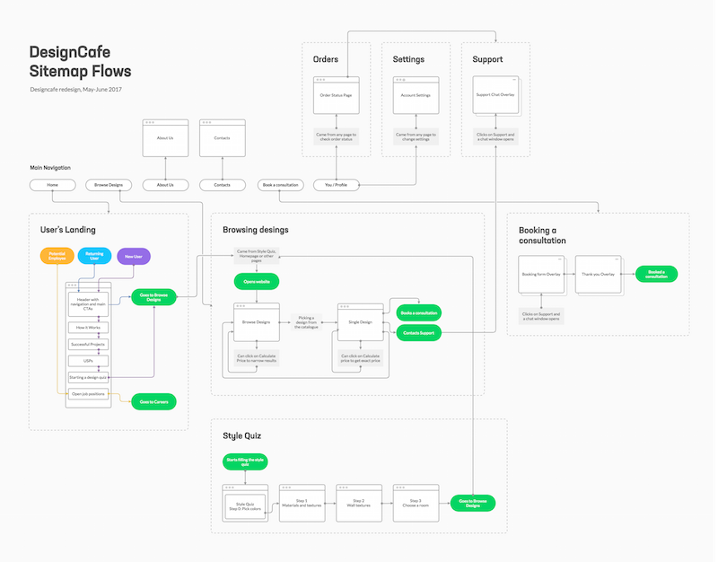
A UI/UX Case Study.Concept2Design ( Referred to as C2D) is an interior design company in Bangalore. They are a commercial and residential turnkey interior design services founded by young entrepreneurs who love challenges and are confident enough to meet them. Their mission is to create unique and life-changing concepts and designs reflective of the clients’ desire, ideas and lifestyle.C2D needed a top-to-bottom website redesign which relied on smart content and responsive functionality to embody their mission: “To create unique and life-changing concepts and designs reflective of the clients’ desire, ideas and lifestyle”In this article, I try my best to write a detailed account of my design journey and the entire UX case study of the redesign of the website. I am thankful to Concept2Design for allowing me to work on their website.Stakeholder InterviewThe first part of the job was an interview with the stakeholders to get an idea about the problems that the current website faces and the ideology that they want the website to represent. I believe that it’s really important to understand the thought process of the stakeholders and to know more about their views and business before you start working on their project. Talking to the stakeholders made me aware of the problem that they’re currently facing and the expectations that they have from the redesignPain Points (My Observation)The Website was outdated, didn’t reflect the brand ideology and couldn’t communicate to customers.It was difficult to navigate through the website, the flow of the website was unclear.The website couldn’t address customer needs based on their requirements.These were the main Pain Points that I observed during my analysis of the website, based on these pain points and Stakeholder interview, I set a few goals :Make it easier for customers to get in touch and navigate through the website.Find a way to distinguish between new, returning and potential customers and address their needs in different ways.Explain the brand’s values, ideology and process in an easier manner and increase user satisfaction.Competitive AnalysisI started with a list of competitors offering similar services and started comparing the features that they had in common and the distinctions that they had made.Comparison of four direct competitorsUser InterviewsIt is very important to validate the pain points with user testing and to build a better understanding of the current C2D ecosystem and determine whether users already had an existing understanding we conducted three 1on1 user interviews.I choose 3 Users who had used a similar use case or product so they could better understand the pain points or problems in the current flow, all the interviews were conducted over telephonic conversations.Key InsightsAll of the users were familiar with interior designing websites and all of them agreed that the current website lacked a proper flow, some key insights that I discovered are:There was no clear way for users to get quotationsThere was a lack of clarity in the process for users unfamiliar with interior design services.The users felt that the website couldn’t establish trustUser PersonasBased on my research, I was able to define 2 clear user types, around which I developed the following personasUser Personas created through surveysIdeation & Working towards a solutionBased on Stakeholder Interviews, Competitor Analysis and User Interviews, I made an affinity diagram and started prioritizing and combining items in chunks. The problem statement that I decided to design for was :“How can I make the website more engaging for current users and easier to navigate”Content StrategyMy Content Strategy was to distinguish the 3 core categories of online users and to fabricate design solutions for each core user :Skimmers want to find the information they need and get out as quickly as possible. In this case, it would be ideal to have a clear CTA Button to direct the user to the portfolio.Lurkers will go a little deeper and browse more of the website. Here, I included a short trip through the main unique selling points (USPs) of the service and an option to view the services offeredDivers want to take it all in and spend time exploring. For this user, the flow throughout the homepage was made easy to navigate through so the user could learn all about C2D and then a small part at the end of the page had a CTA button to contact C2D.Content Strategy tested out over a low fidelity wireframeThe SolutionI created a structural diagram ( Sitemap Flows) which showed the relationship between all components of the website, this allowed the entire team to evaluate the scope of the project and also acted as a checklist for designing and codingSitemap Flow for the projectThis is the design solution that I came up with that had a solution for every journeyThe previous home page was cluttered, it needed to establish trust while maintaining proper flow. The proposed design divided the homepage into several sections carefully separated so that each target group’s attention can be captured and can be directed to either the portfolio or directly to the contact us page.Colours & TypographyThe right balance for colour and typography is very important to set the theme that will represent the brand. It was important for the website to radiate simplicity, stability and to set a calm reflective mood. After experimenting with shades of teal, green and different typefaces, I decided upon a combination of celadon green and skobeloff used alongside champagne pink as an accent colour, the colour scheme gave a sense of simplicity and calmness. After many iterations, I found that a combination of Libre Baskerville and Poppins worked best with the colour scheme and gave a modern yet sober look to the website.Colours and TypographyWireframes and PrototypesThe three stages of Wireframing were:Paper prototype was the rough initial draft of the home screen where I experimented with different layoutsLow fidelity digital Prototype made on adobe XD that was used to finalize user journeyHigh fidelity digital Prototype made on adobe XD that incorporated the desired colour scheme and typography.The three phases of prototypingFinal Product & TakeawaysRedesign and user experience doesn’t begin with a pretty mockup, it’s founded on strategic planning and a design vision that focuses on User Feedback at every step of the process. The primary objective was to provide a digital solution to Concept2Design which would help their business, not to make an aesthetically pleasing website.The final productThe Redesign of a website is built on strategic planning, the design solution that I’ve provided now needed to be carefully user-tested thoroughly to make further improvements. As a UI/UX Designer, I believe that my job isn’t complete until the solution that I’ve provided brings significant progress to the business.Harsh Vardhan SinghRedesigning an interior design service website was originally published in Muzli - Design Inspiration on Medium, where people are continuing the conversation by highlighting and responding to this story.
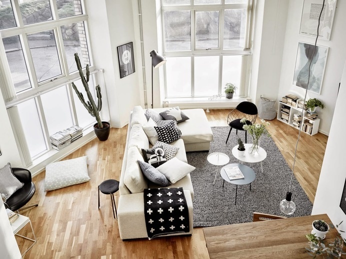
Living room #scandinavian #design #interior
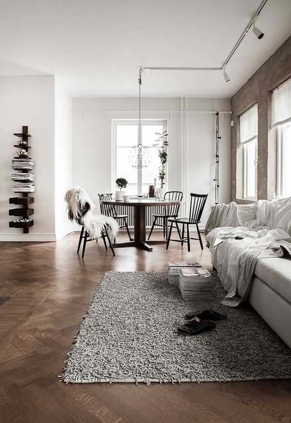
The Design Chaser: Interior Styling | Two Toned Wood #interior #design #decor #deco #decoration
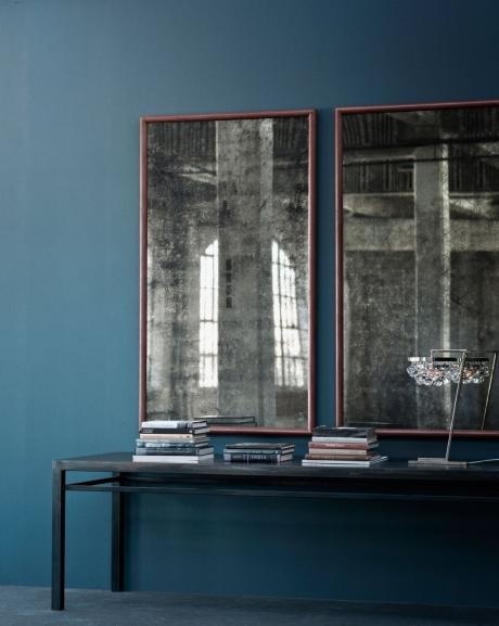
Interior design #interior #design
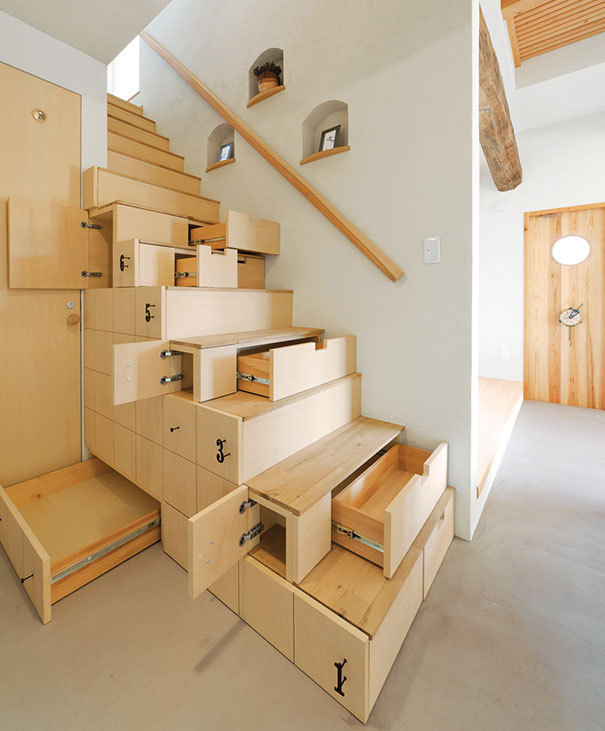
creative-stair-design-1 #interior #stairs #design

Interior design is a human right, not a luxury

Decor & Interior Design Studio
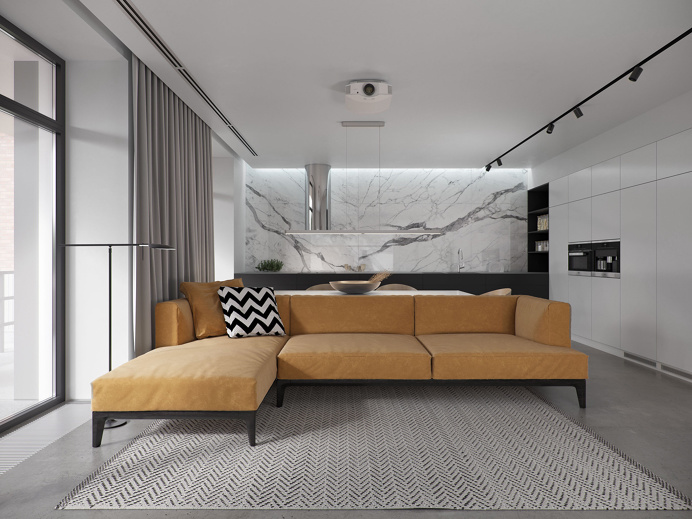
House R163 interior design
House R163 interior design minimal luxury beautiful new modern marble mindsparkle mag
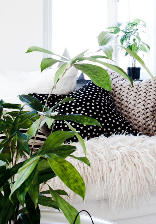
Interior design #interior #design

Interior Design and digby Launch the Metaverse Architecture and Design Awards
Submissions are currently open for this first-of-its-kind, web3-driven program Marking a first for the design industry, Interior Design and digby have started an awards program geared specifically for the metaverse. Currently open for submissions, the Metaverse Architecture and Design Awards (MAD) will recognize and solidify the burgeoning creative community within the new digital space. Across eight categories—Metaverse Destination, Impossible Physics, Workplace Extension, Digital Twinning, Immersive Digital …
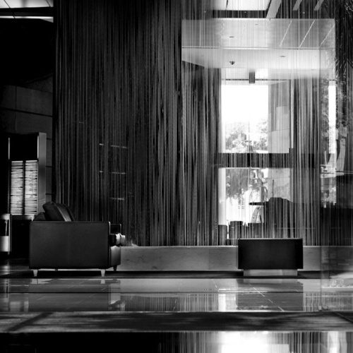
Merde! - Interior design #interior #design

Merde! - Interior design #interior #design
Get access to thousands of freshly updated design inspiration pieces by adding Muzli to your browser.
Loved by 800k designers worldwide, Muzli is the leading go-to browser extension for creative professionals.
The Intriguing Correlation Between Interior Design and User Interface Design
At first glance, interior design and user interface (UI) design might seem like two entirely different disciplines. One deals with arranging physical spaces and decor to create a visually appealing and functional environment, while the other revolves around crafting the visual elements of a software application to offer an intuitive and engaging user experience. But look closer, and it's evident that they share a lot more in common than meets the eye.
1. Purpose-Driven Design Both interior designers and UI designers begin their projects with a singular goal in mind: serving the user. In interior design, this means crafting spaces that are not only beautiful but also functional, ensuring that residents can navigate the space efficiently. In UI design, this means creating interfaces that help users accomplish tasks with ease.
2. The Importance of Aesthetics In both disciplines, aesthetics play a crucial role. A well-designed room or application should be a joy to use and evoke certain feelings or emotions. In interior design, this might mean selecting the perfect color palette to set a mood or choosing furniture that adds character. For UI designers, it's about choosing the right typography, colors, and visual elements to make the software application both attractive and intuitive.
3. Flow and Navigation Whether you're moving through a room or navigating a website, the journey should be smooth and intuitive. Interior designers position furniture and accessories in a way that encourages natural movement and flow. Similarly, UI designers arrange elements to guide users seamlessly through a task, ensuring they can find what they need effortlessly.
4. Consistency is Key Imagine a modern living room with one antique chair that doesn't match the rest of the decor. It would feel out of place, right? Similarly, in UI design, consistent elements – like buttons, icons, and fonts – ensure that users don't get confused. Both fields emphasize the importance of maintaining a consistent theme or style.
5. Adapting to Trends Both interior design and UI design are affected by changing trends. Whether it's the resurgence of mid-century modern furniture or the shift towards dark mode in apps, professionals in both fields must keep abreast of what's popular and consider whether and how to incorporate these trends.
6. Attention to Detail The devil, as they say, is in the details. In interior design, a misplaced ornament or an ill-fitted curtain can disrupt the harmony of a room. In UI design, a misaligned icon or a confusing color scheme can hinder user experience. Both professions demand a meticulous eye for detail to achieve perfection.
7. Feedback and Iteration Just as interior designers might tweak a space based on the occupants' feedback, UI designers rely on user feedback to refine and improve interfaces. Iterative design is integral to both fields, ensuring that the end result serves the user in the best possible way.
In Conclusion The parallels between interior design and UI design underscore a fundamental principle: good design, regardless of its application, focuses on the user. Both disciplines, though different in their mediums, seek to craft experiences that are aesthetic, functional, and centered around human needs. Recognizing the similarities between the two can lead to cross-pollination of ideas, further enriching both fields.