Design Inspiration
iOS app examples
Best iOS app design examples.
We curate topical collections around design to inspire you in the design process.
This constantly-updated list featuring what we find on the always-fresh Muzli inventory.
Last update:
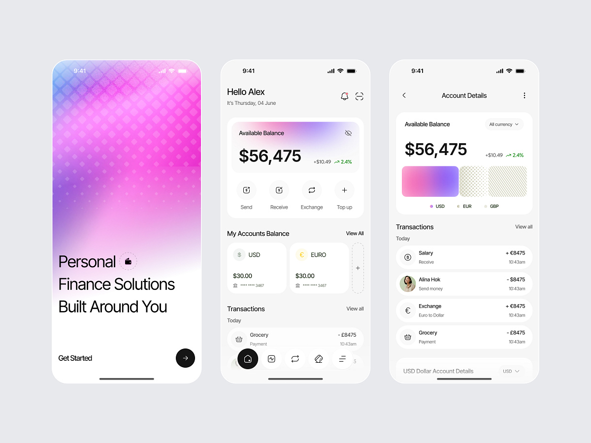
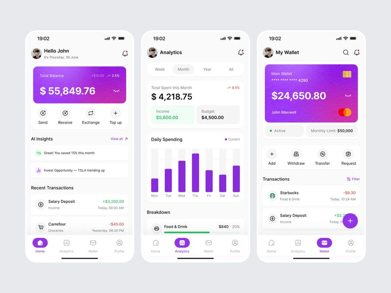
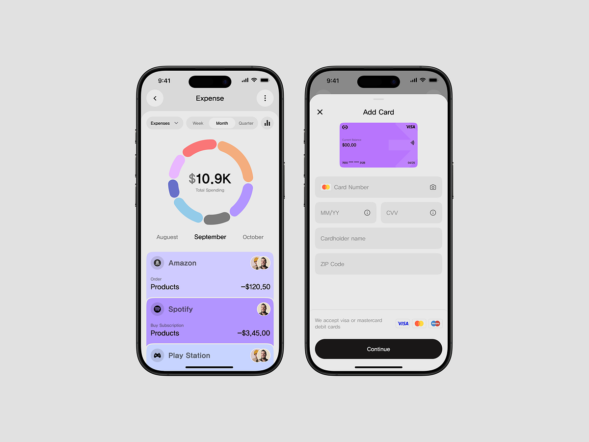
Personal Finance iOS App

Fintech Payment App UI Design

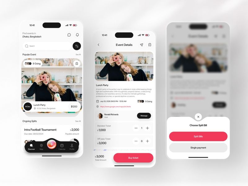
Ticket UI iOS App
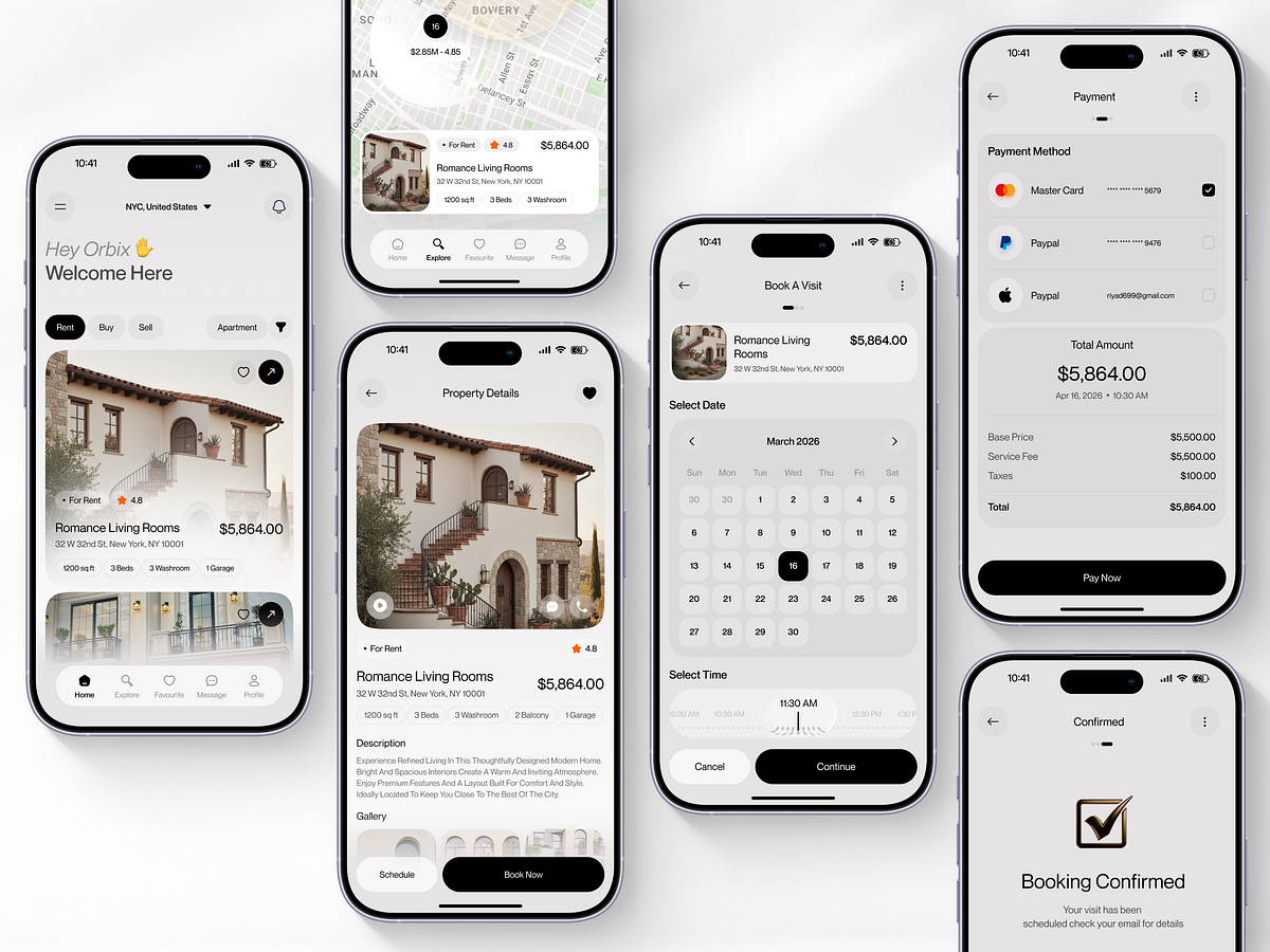
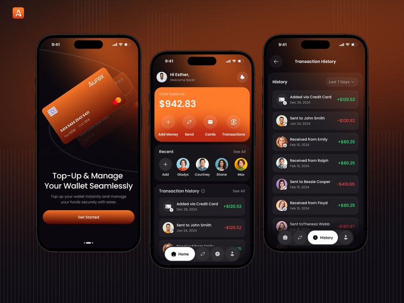
Aurex Living — Real Estate Mobile App Design

Catch Platform iOS App
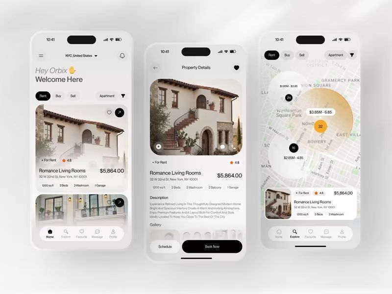
Aurex Living | Real Estate App UI

BikeOS E-bike mobile app UI

Payno- Fintech Investment App UI Design

Fitness Tracking Mobile App Design
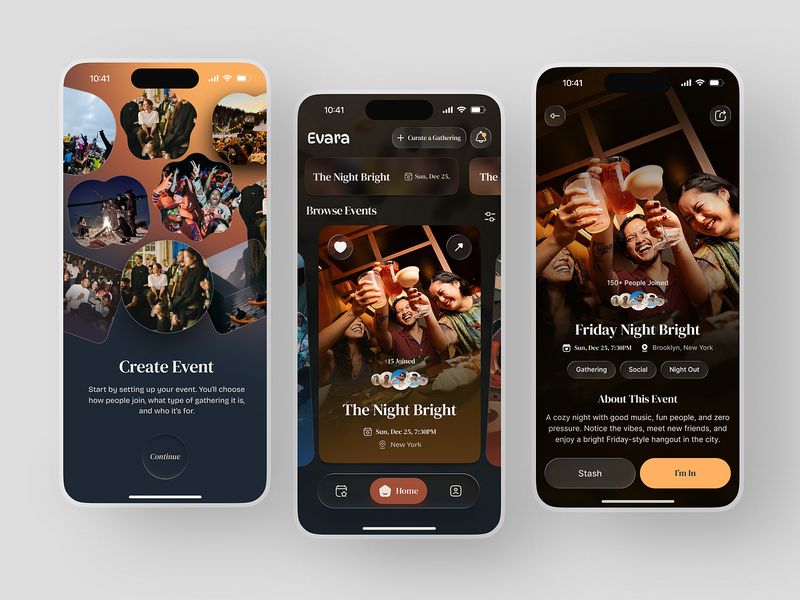
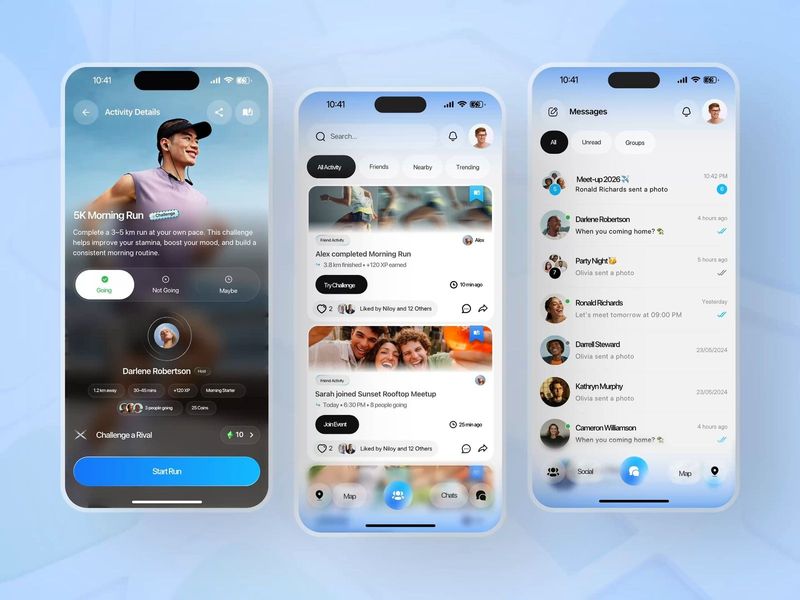
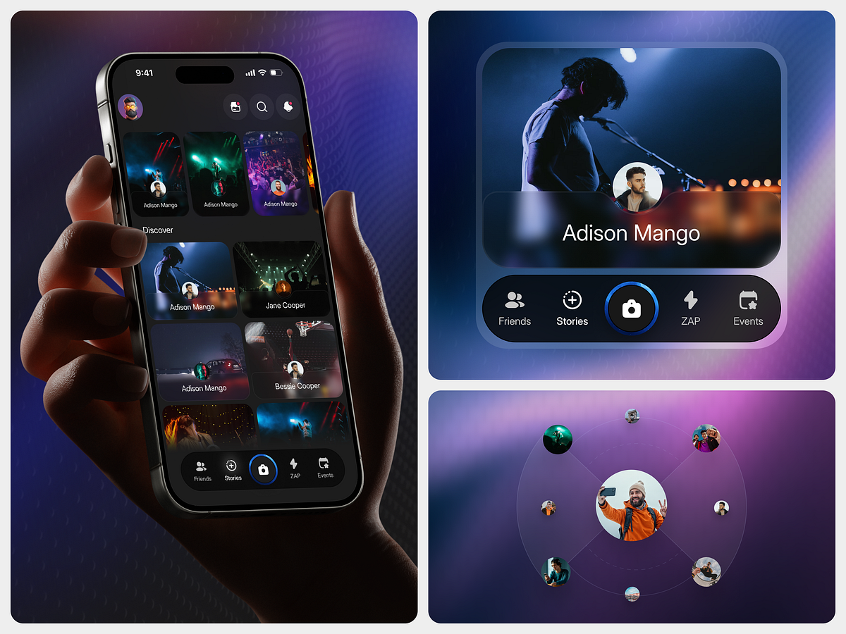
Evara - Social Gathering App UI, Event Discovery & Community Design
Finance App Design
This is 1% of what Muzli shows you.
Get the rest — fresh design inspiration on every new tab, free.
Add Muzli — free
InvestIQ — Passive Investment Mobile App Design
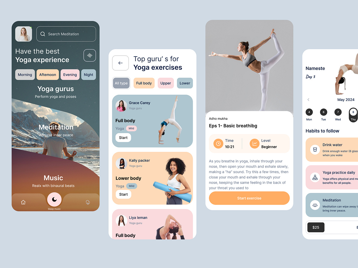
Yoga Mobile App Design
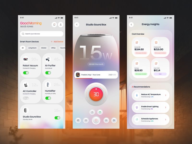
Smart Home App UI
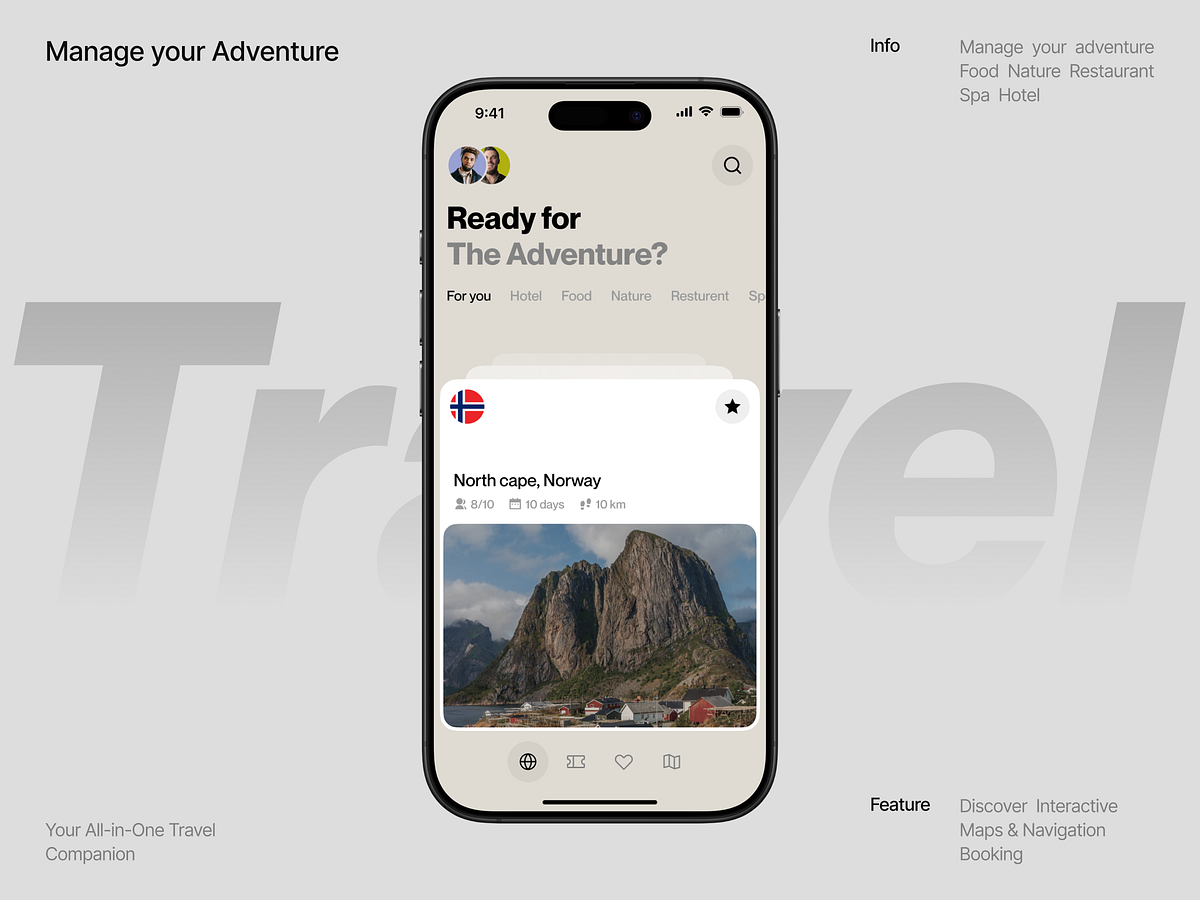
Travel Mobile App UI

Calorie Tracker App Design

Finance App Design
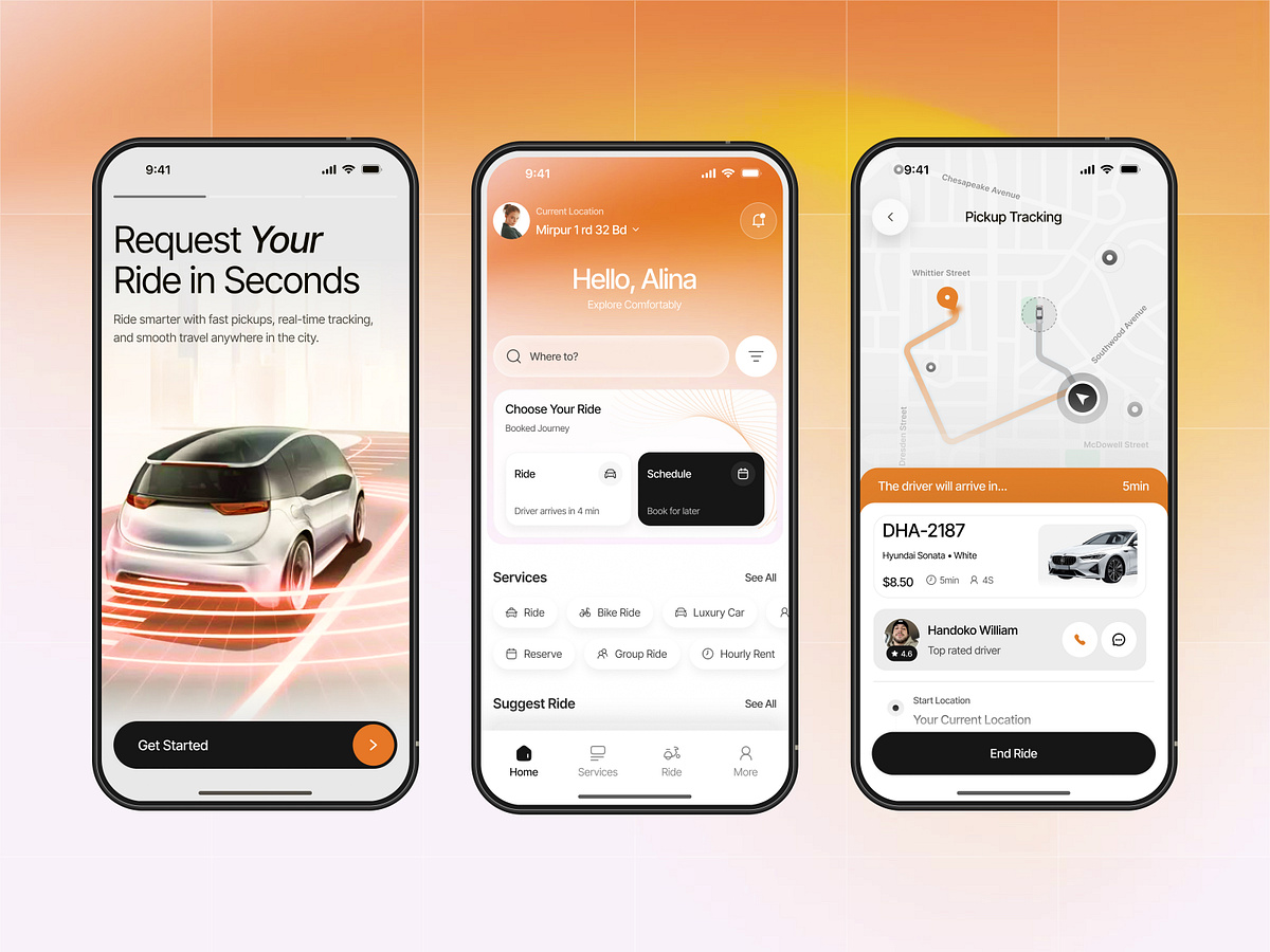
Taxi Booking Mobile App Design
Social Gamification App UI Design
Fintech Mobile App UI Design
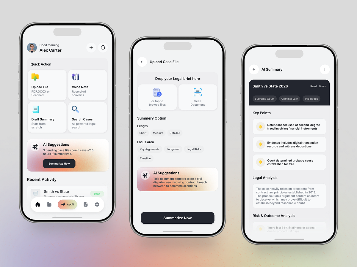
AI Legal Assistant Mobile App Design
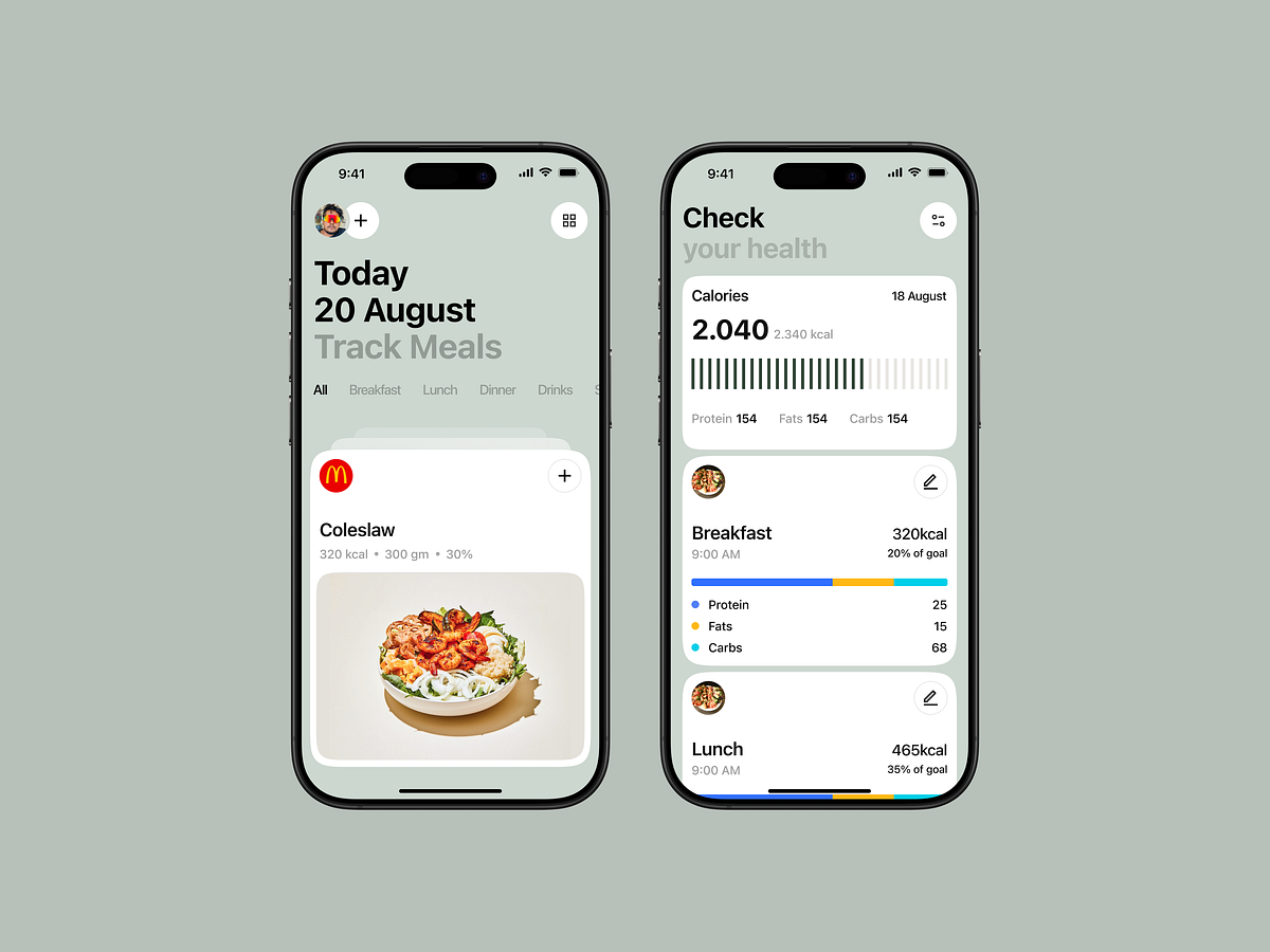
Meal Tracking Mobile App

Daily Routine Skincare App
This is 1% of what Muzli shows you.
Get the rest — fresh design inspiration on every new tab, free.
Add Muzli — free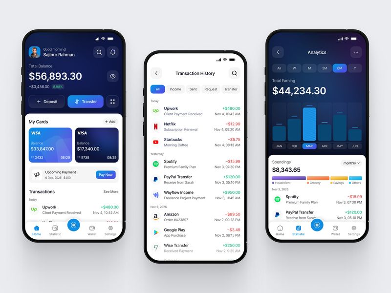
Mobile App for Finance
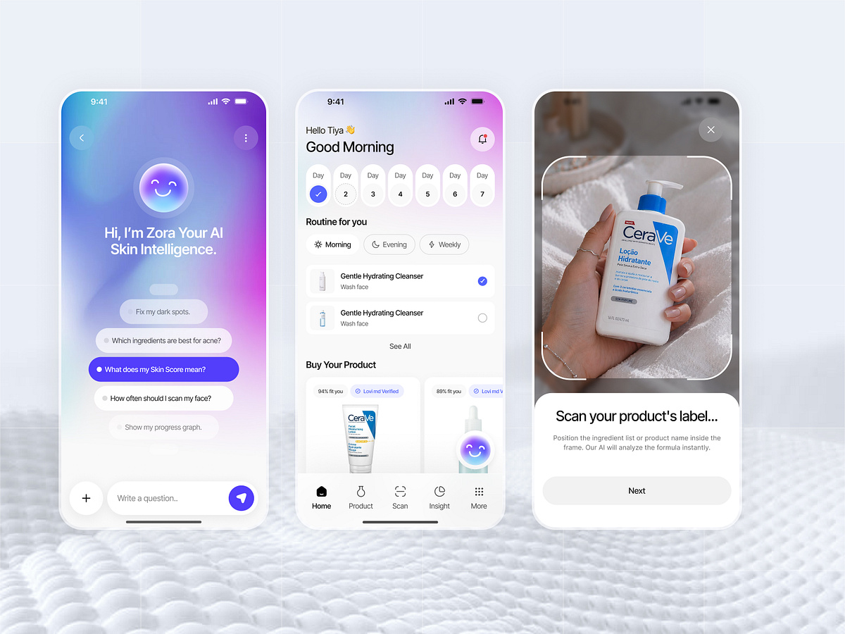
AI Skincare Mobile App Design

Career Growth Mobile App UI
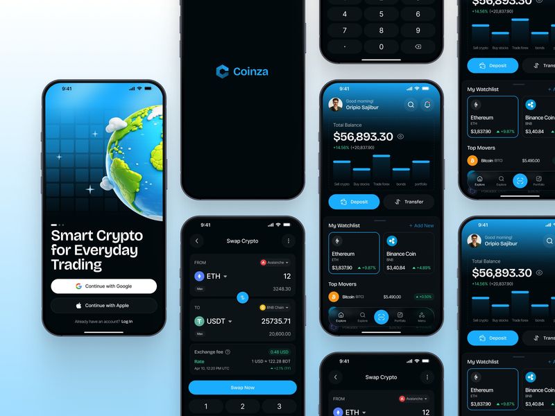
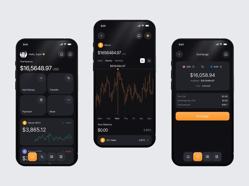
Crypto App Design
Crypto Wallet Mobile App Design
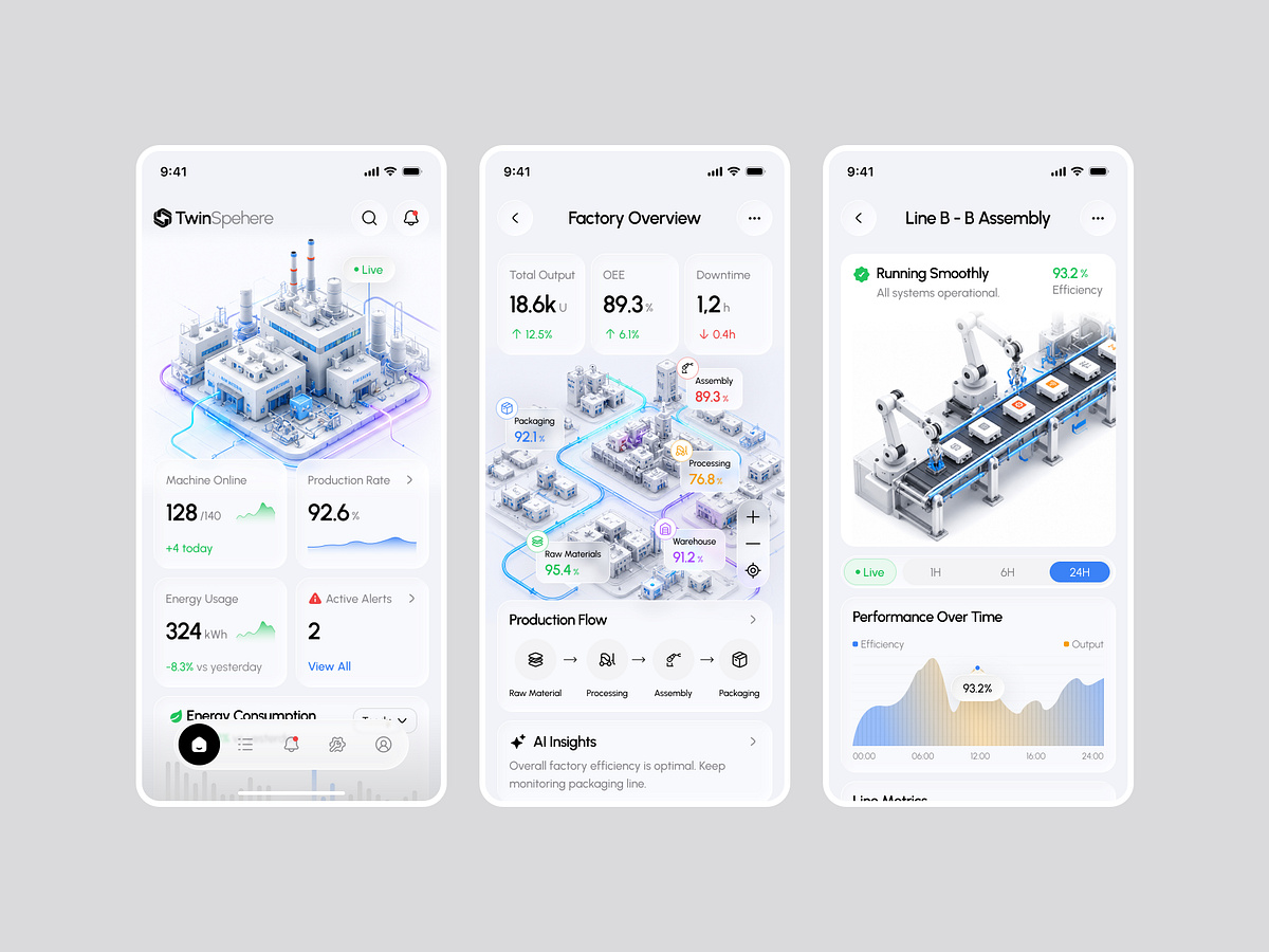
Mobile App for Manufacturing & Industrial SaaS | Radiyal | UIUX
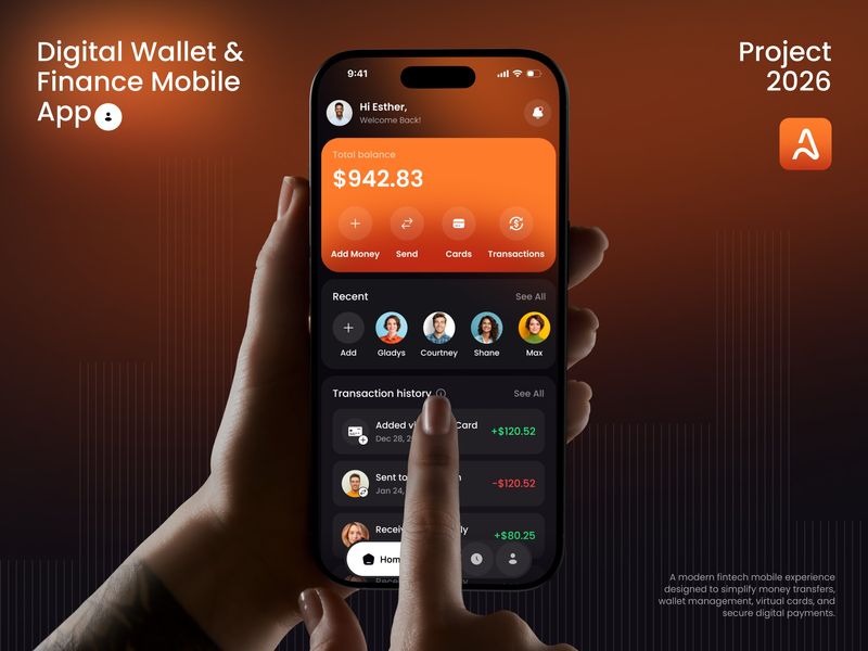
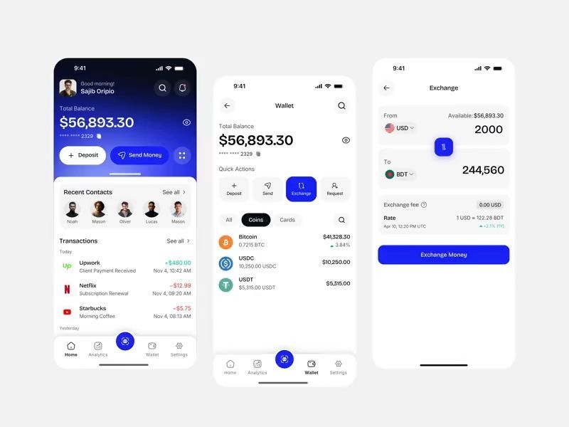
Finance Mobile App — Digital Wallet UI

Fintech Wallet App UI
Momento - Dark Social Stories App Design
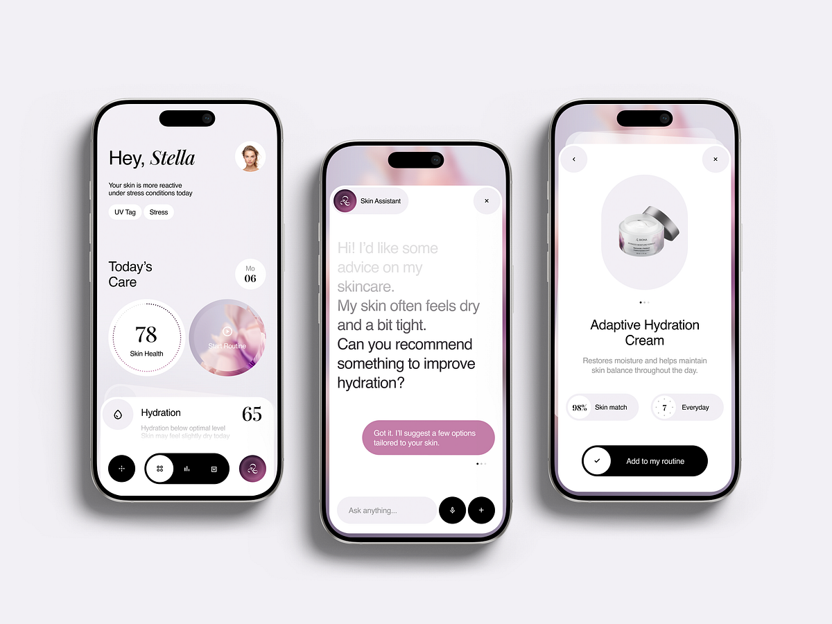
Skin Health App Chat UI
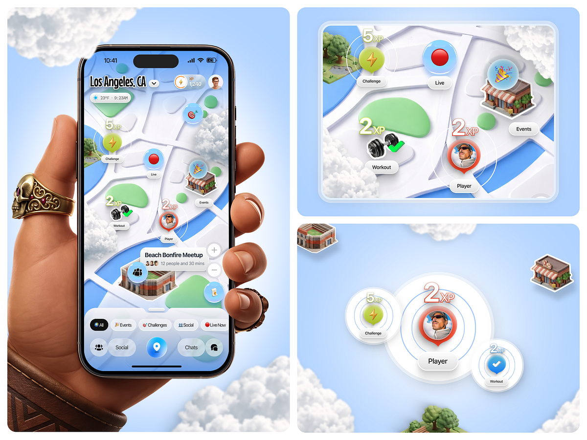
Questveil - Real-World RPG Mobile Game Design

Flexpay Payment App UI
This is 1% of what Muzli shows you.
Get the rest — fresh design inspiration on every new tab, free.
Add Muzli — free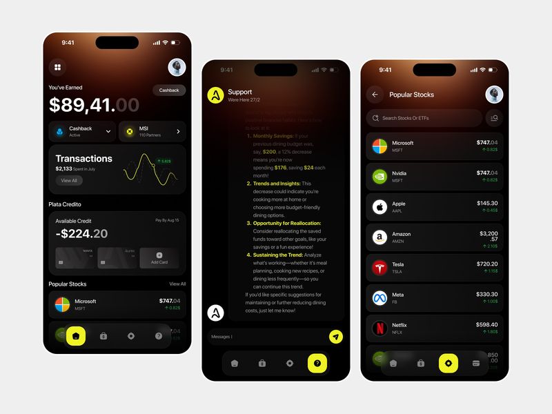
Finance - Mobile App
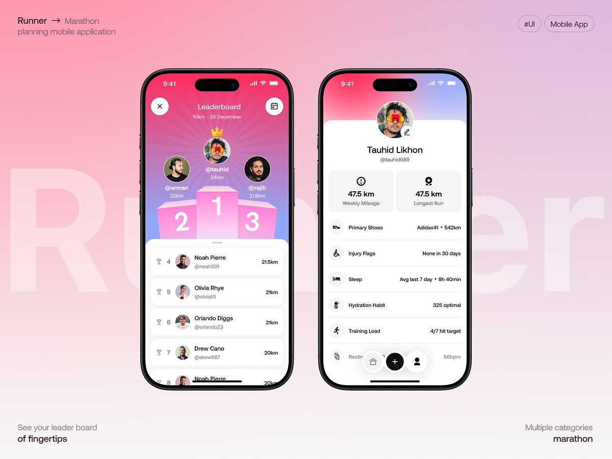
Runner Marathon Training App
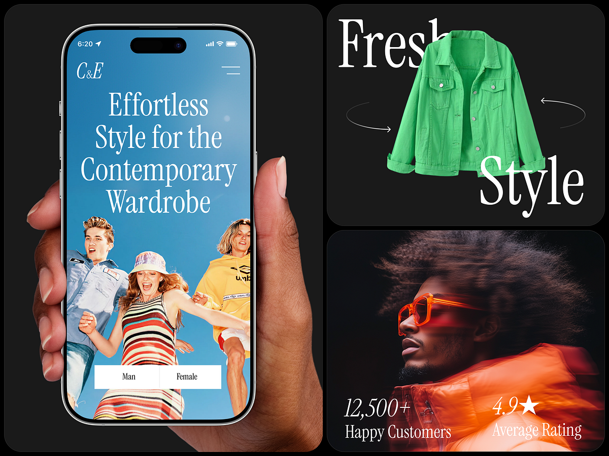
Fashion eCommerce Mobile App UI
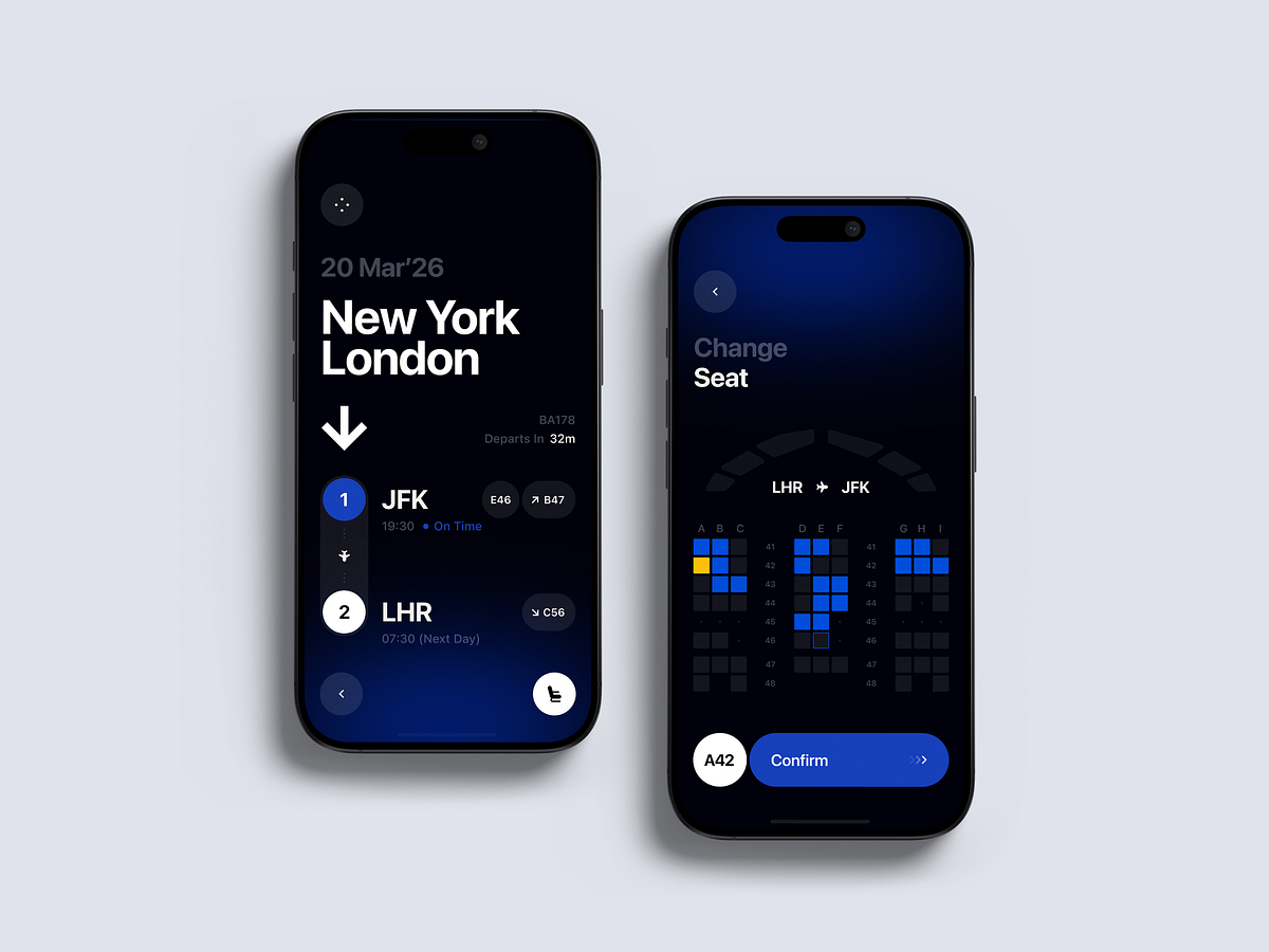
Flight Details App UI

Deuce · Court Management SaaS Mobile App | Fivecube
Social Gamification App Design
Finance Mobile App UI
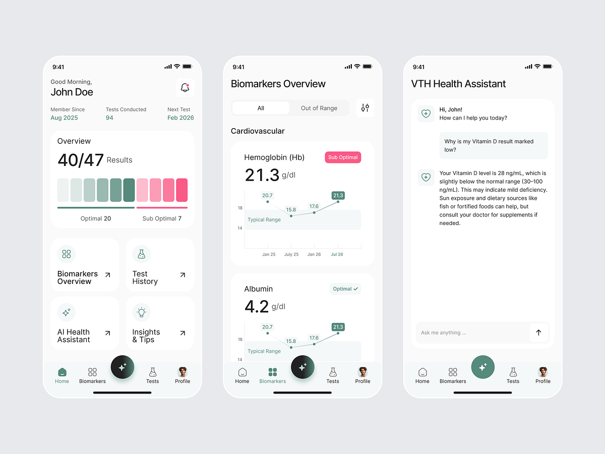
Health Tracker App

Health Tracking Mobile App Design
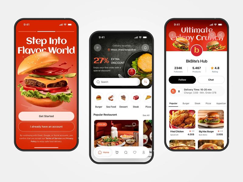
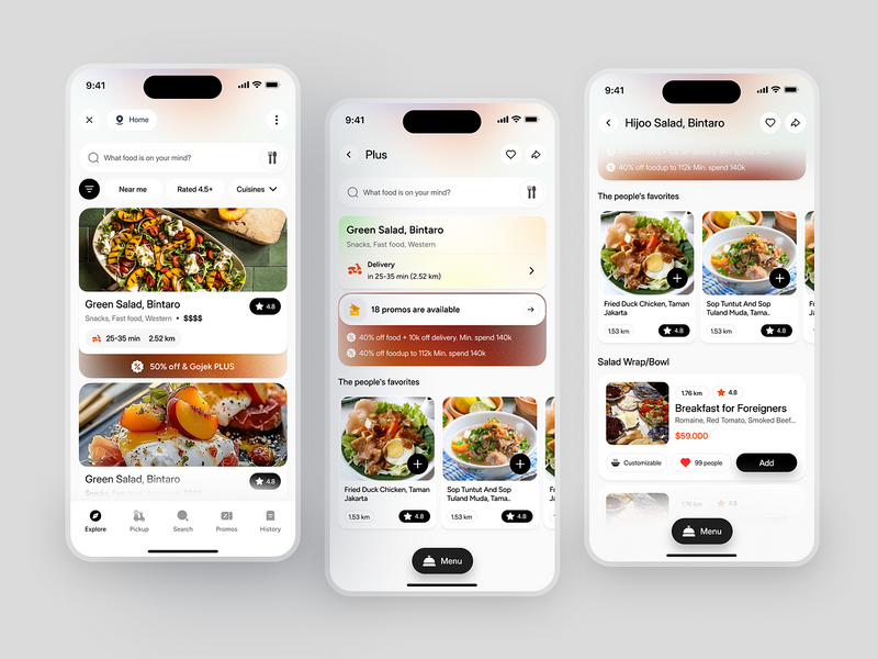
Food Delivery Mobile App Design
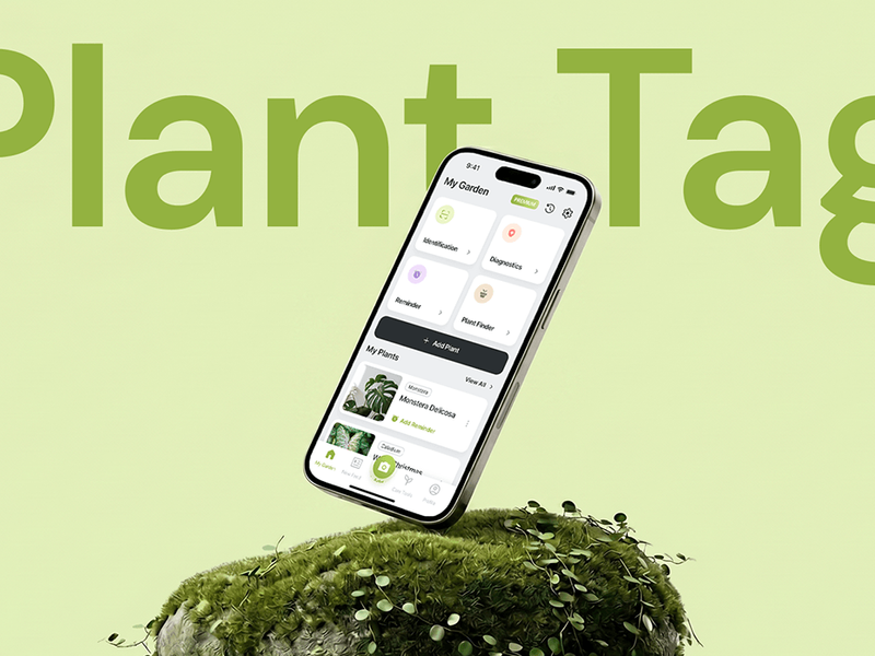
Plant Tag: AI Plant ID & Care
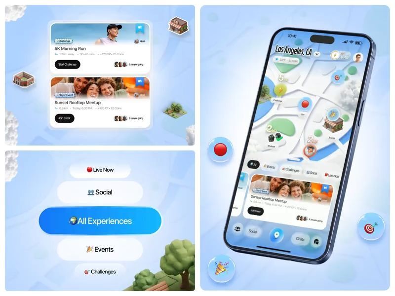
Event Discovery & Ticketing Mobile app
This is 1% of what Muzli shows you.
Get the rest — fresh design inspiration on every new tab, free.
Add Muzli — free
Yoga And Meditation Mobile App
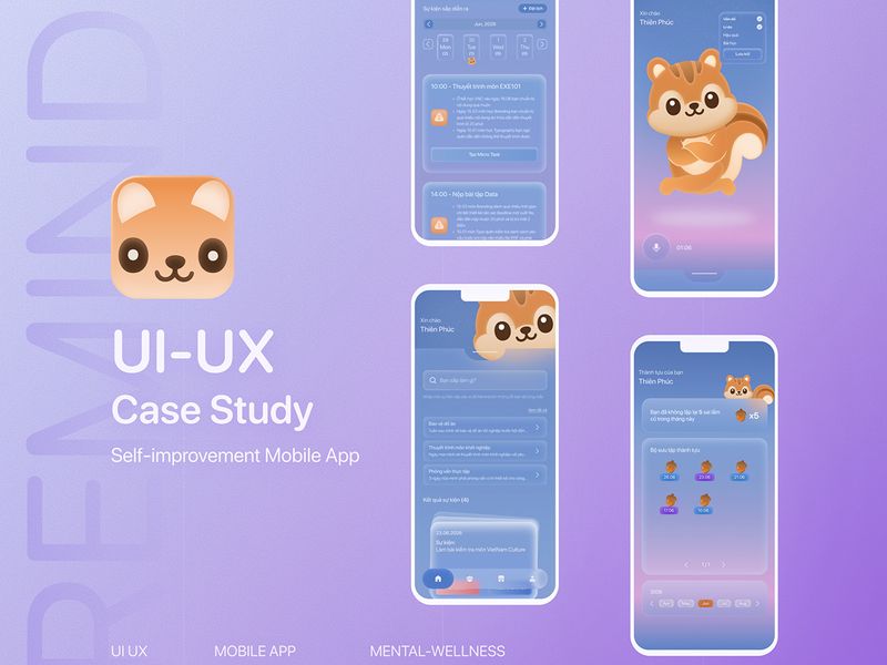
Remind — Self Improvement Mobile App | UI UX Case Study

App Widget UI

App UI Redesign — Meditation Onboarding Mobile Screens
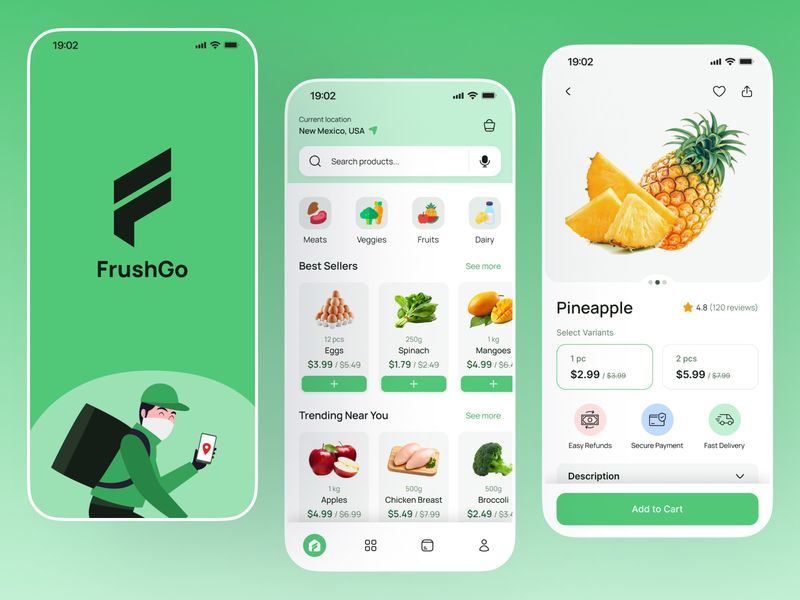
Grocery Delivery Mobile App UI Design — FrushGo

Nexcoin Investment App UI
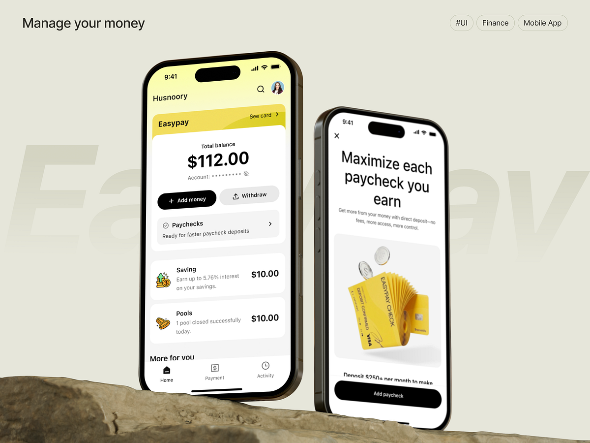
EasyPay Finance App UI

Workout Mobile App
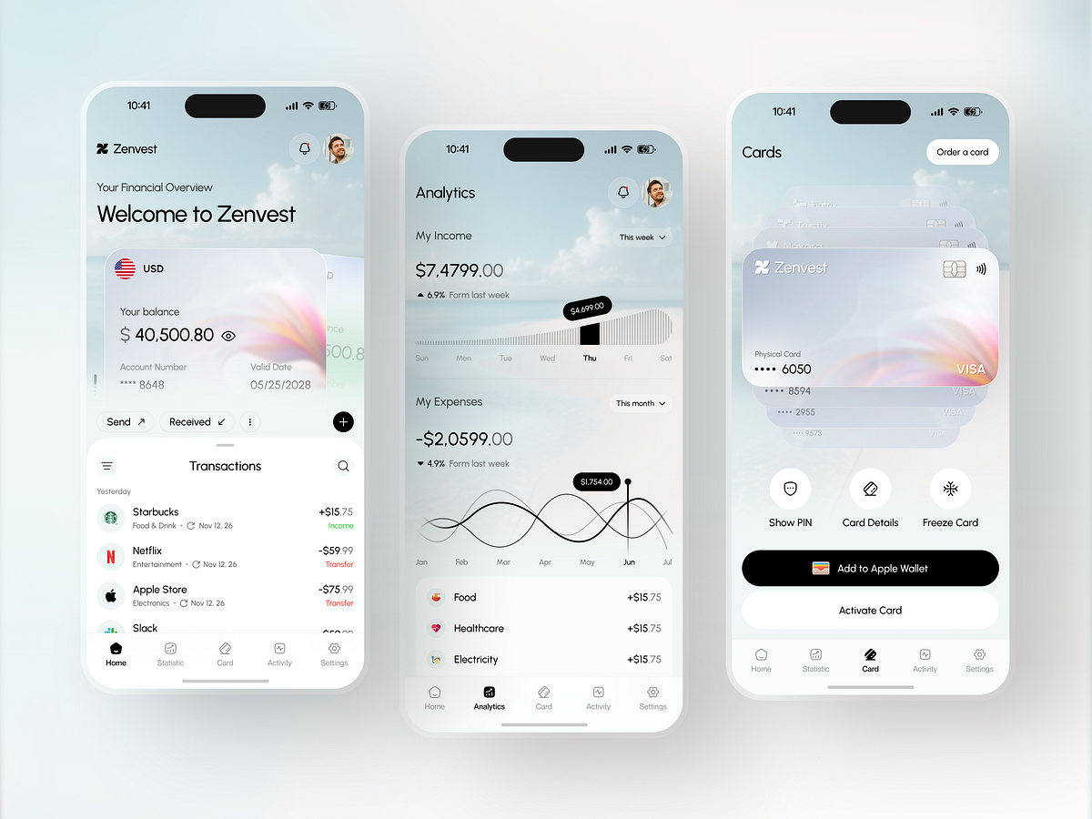
Zenvest - Personal Finance and Digital Banking UI Concept
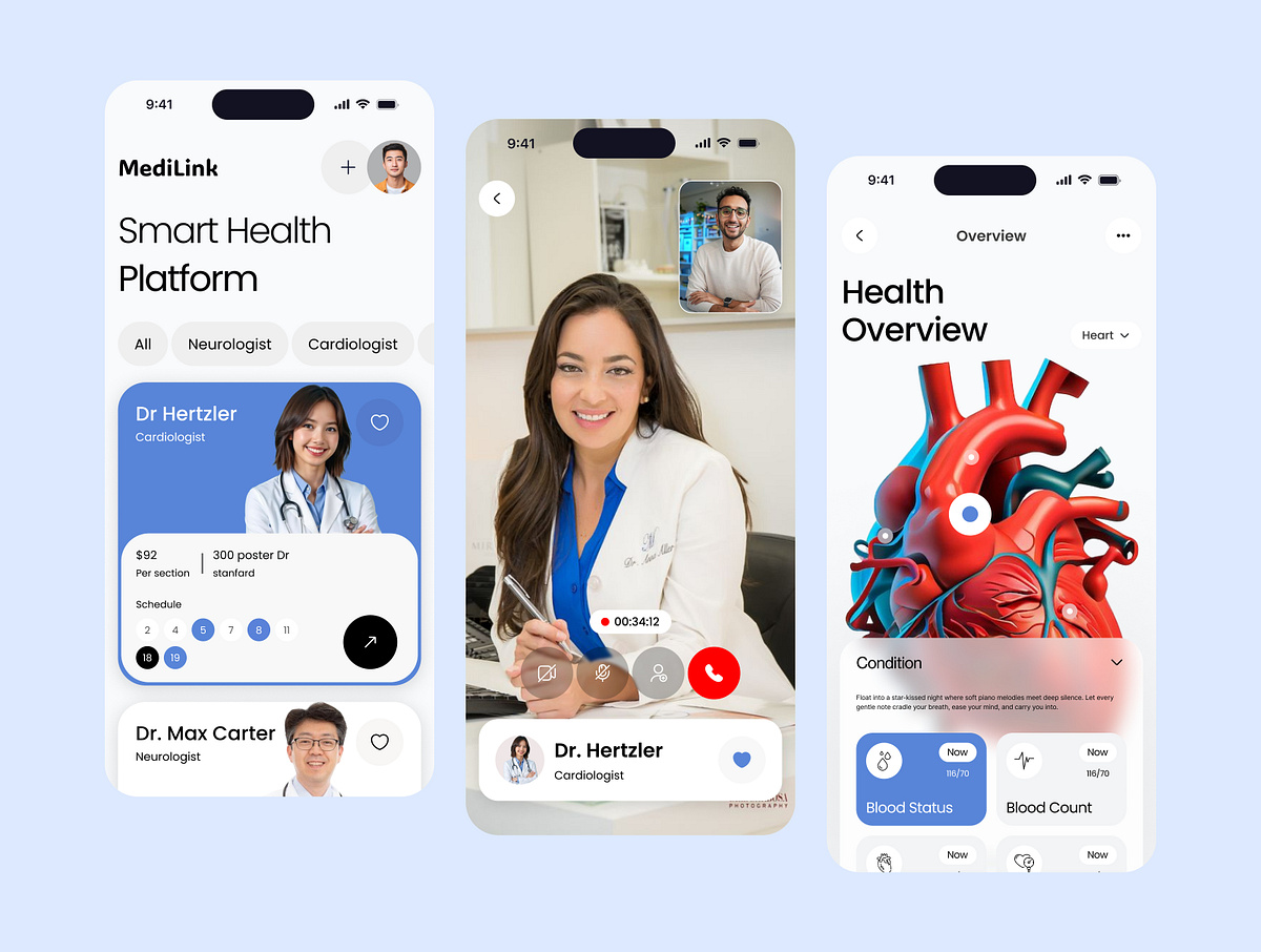
Healthcare Mobile App Design
Crypto App Design

Parcelio - Parcel Delivery Mobile App
This is 1% of what Muzli shows you.
Get the rest — fresh design inspiration on every new tab, free.
Add Muzli — freeParcelio - Parcel Delivery Mobile App
Get access to thousands of freshly updated design inspiration pieces by adding Muzli to your browser.
Loved by 800k designers worldwide, Muzli is the leading go-to browser extension for creative professionals.
Creating Outstanding iOS App Designs
Designing an iOS app is a thrilling creative adventure where aesthetics meets functionality. In today's rapidly evolving mobile app landscape, crafting an iOS app that's both visually captivating and user-friendly is essential for making a mark in the App Store and providing users with an unforgettable experience. In this article, we'll delve into the key considerations for designers when working on iOS app projects.
User-Centric Design
Start your iOS app design journey by putting users at the heart of everything. Dive into user research, create user personas, and actively seek feedback to ensure your app aligns with the needs and expectations of your target audience.
iOS Design Guidelines
Apple's Human Interface Guidelines (HIG) are your holy grail for iOS app design. These guidelines offer a solid framework for creating apps that harmonize with Apple's design philosophy. Staying faithful to HIG guarantees your app's consistency within the iOS ecosystem, helping it feel right at home on the platform.
Responsive Design
iOS apps need to adapt gracefully to various screen sizes and orientations, from the smallest iPhone SE to the largest iPad Pro. Prioritize responsive design principles and leverage tools like Auto Layout to maintain a seamless look and feel across devices.
Intuitive Navigation
Simplicity is key when it comes to navigation within an iOS app. Establish a clear hierarchy and rely on conventional navigation patterns, such as tab bars, navigation bars, and intuitive gestures like swiping. Make sure users can move through your app effortlessly and without any guesswork.
Typography and Readability
Typography plays a vital role in your iOS app's design. Choose legible fonts and maintain a well-considered hierarchy of text sizes to guide users through your content. Pay close attention to factors like line spacing, contrast, and color choices to enhance readability.
Visual Consistency
Consistency is the secret sauce for a polished iOS app. Stick to a coherent color scheme, typography, and iconography throughout your app. Consistency not only boosts visual appeal but also aids users in navigation and comprehension.
Icon Design
Icons are the unsung heroes of iOS app design, conveying actions, features, and content. Invest effort into designing icons that are visually appealing, easily recognizable, and compliant with Apple's guidelines. Consider vector-based icons for a sharp look across various screen sizes.
Accessibility
Make your iOS app accessible to all users, including those with disabilities. Utilize dynamic type for scalable text, provide alternative text for images, and ensure compatibility with VoiceOver for a seamless experience for everyone.
Performance and Speed
A responsive and swift iOS app keeps users engaged. Prioritize performance by optimizing images and animations, minimizing unnecessary network requests, and implementing lazy loading to improve loading times. A slow app can lead to user frustration and abandonment.
User Testing and Iteration
User testing is gold. Collect feedback from real users regularly and use it to refine your design continuously. This iterative approach ensures a continually improving user experience, addressing any usability issues as they arise.
Designing an iOS app is a creative journey that marries form and function. Embrace user-centric design, adhere to iOS design principles, and pay attention to critical elements like navigation, typography, and performance to create an exceptional iOS app that resonates with users and stands out in the competitive app market. Remember that the journey doesn't stop with the app's launch—it's an ongoing process of refinement and improvement to keep your users engaged and satisfied.