Design Inspiration
iPhone Mockups
When you're starting on a new mobile app project, the first step is to create a truly high-quality prototype. With this carefully handpicked collection of the best iPhone mockups, your design will get off to a great start!
We curate topical collections around design to inspire you in the design process.
This constantly-updated list featuring what we find on the always-fresh Muzli inventory.
Last update:
Dark Lens Wallpaper Pack

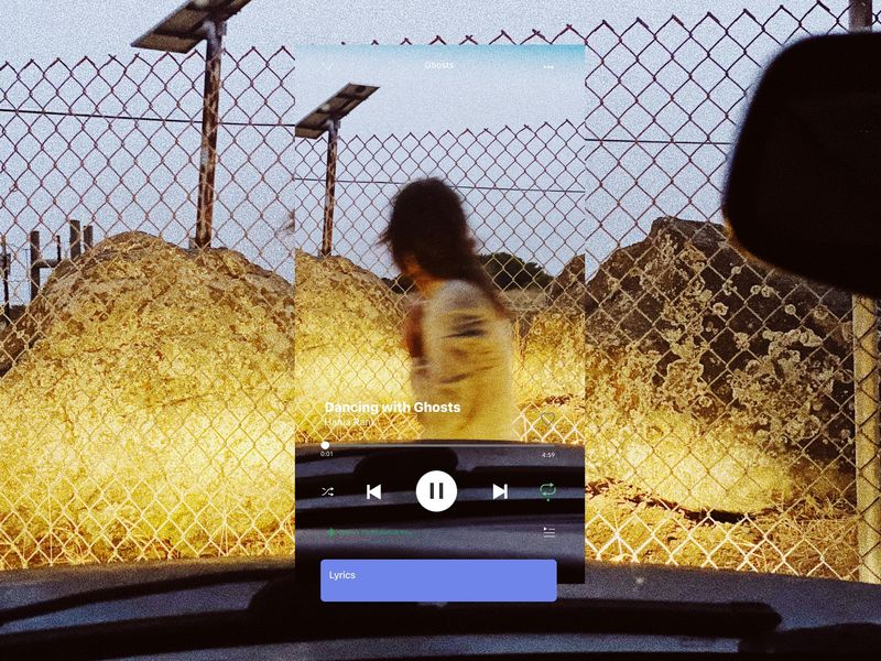
Sava Video
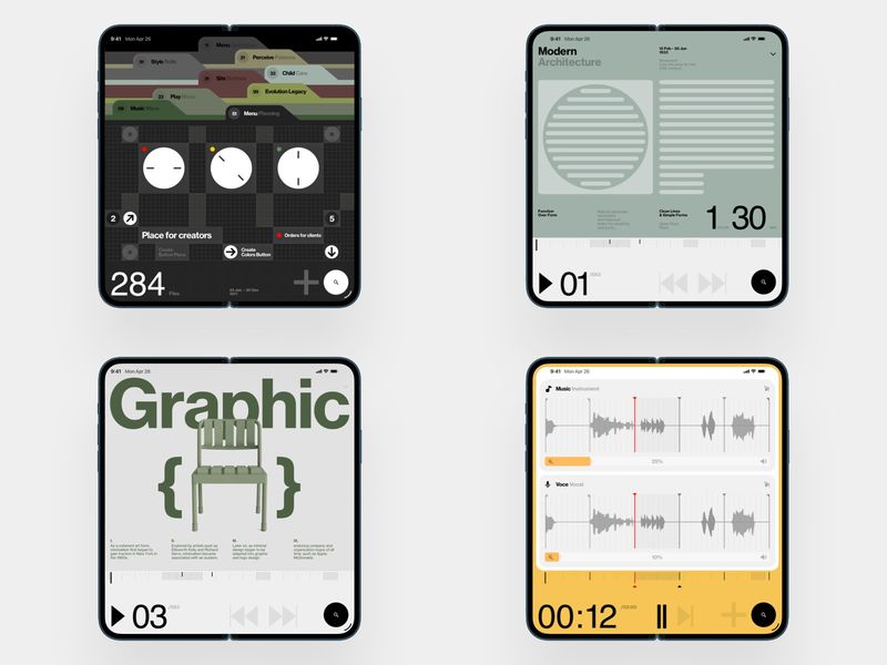
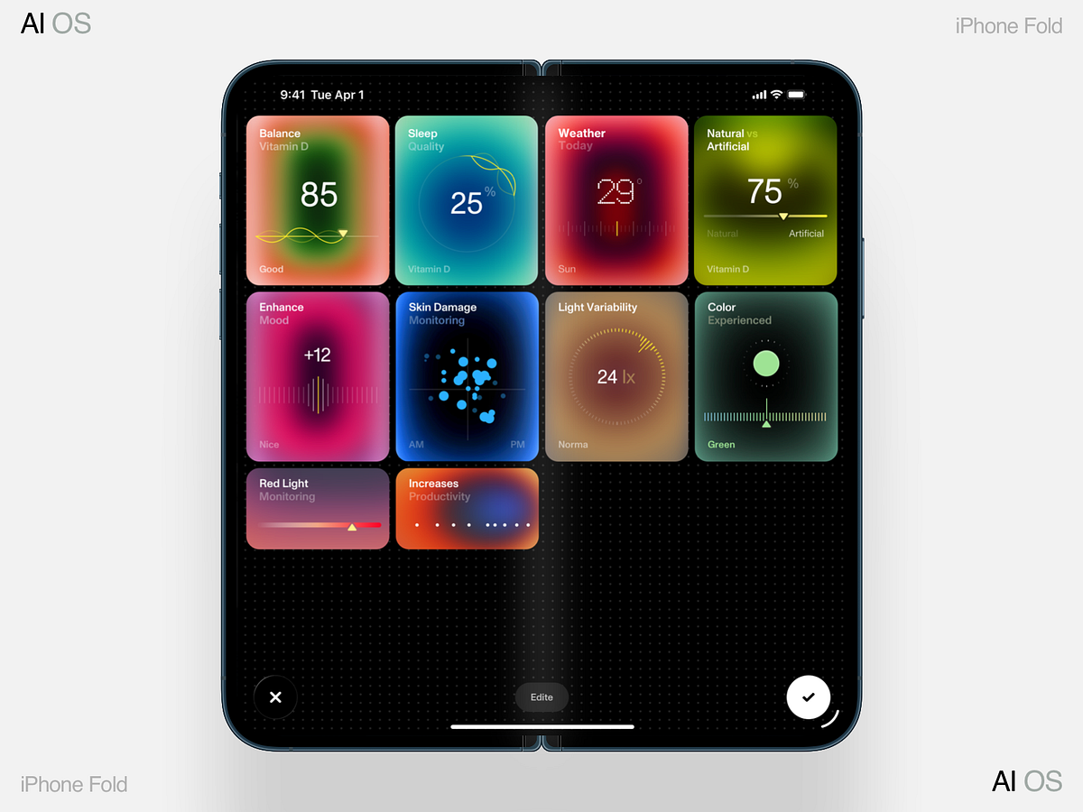
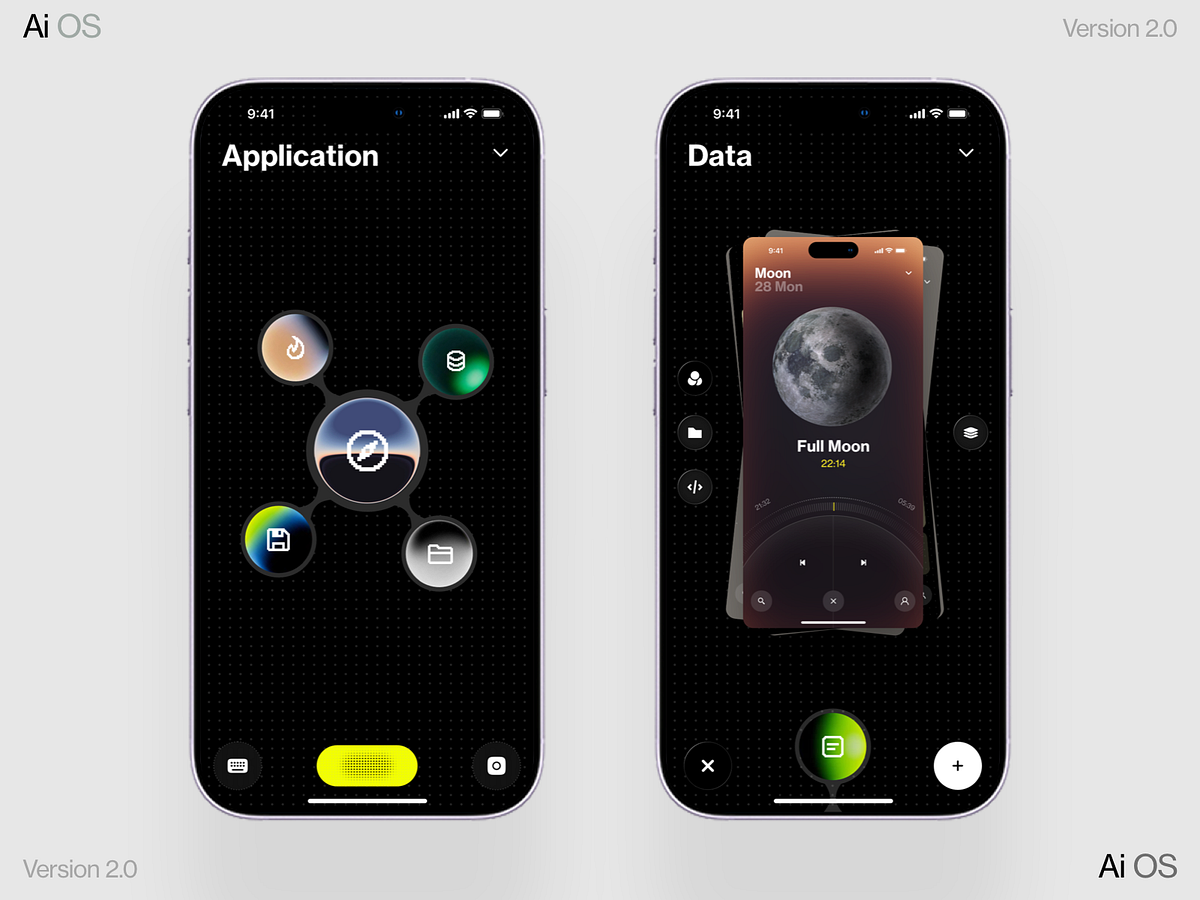
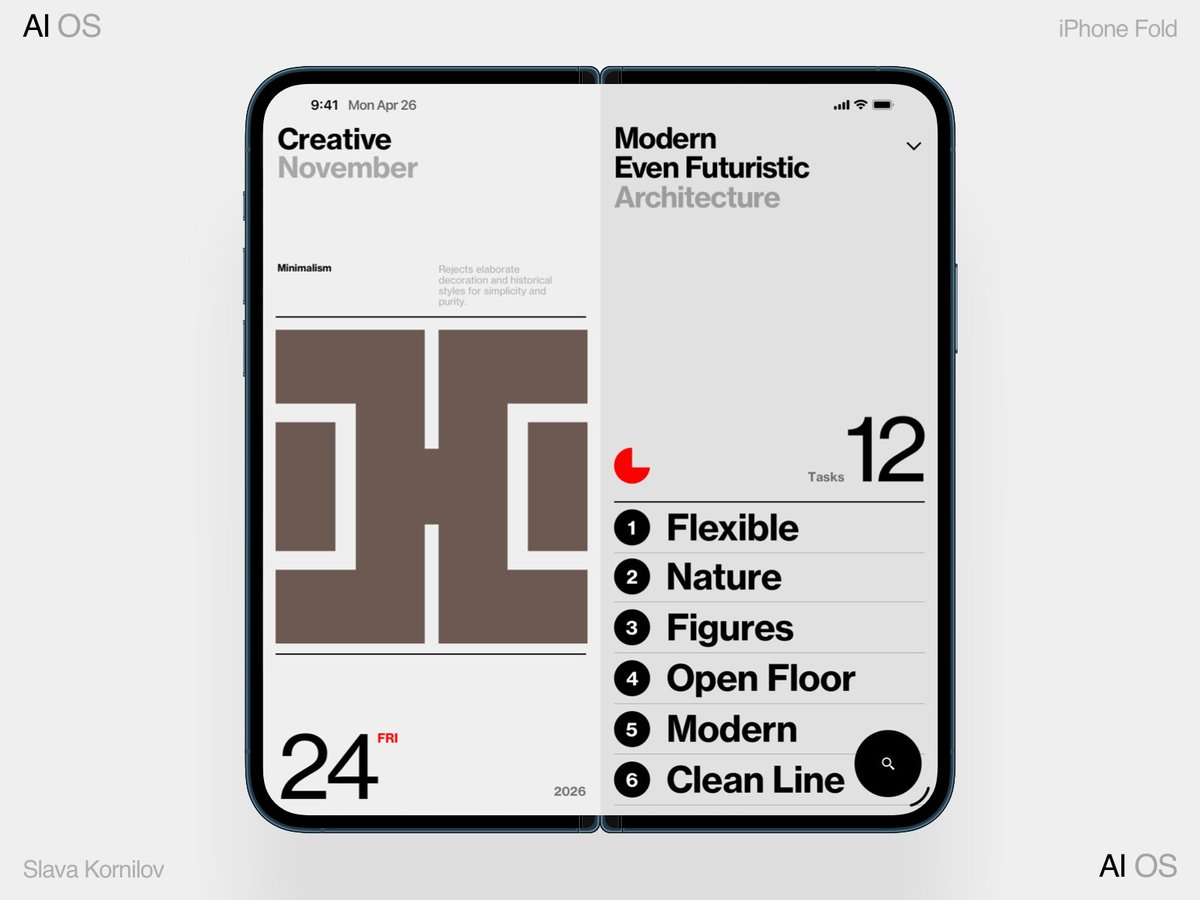
AI OS Data
Apple Device Mockups

Contra // CNCPT Fashion App
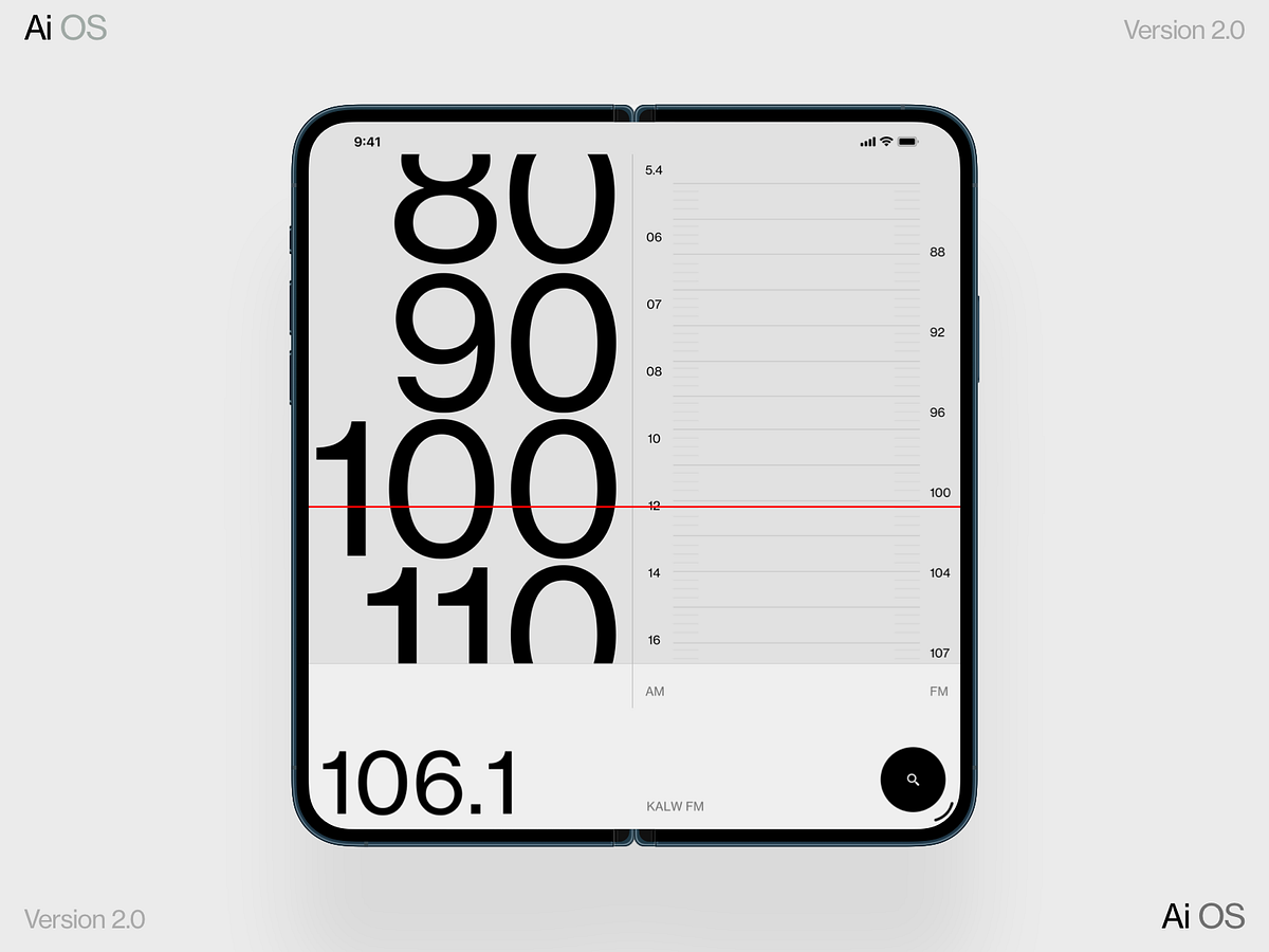
Radio iPhone Fold
iPhone Fold (Ultra)
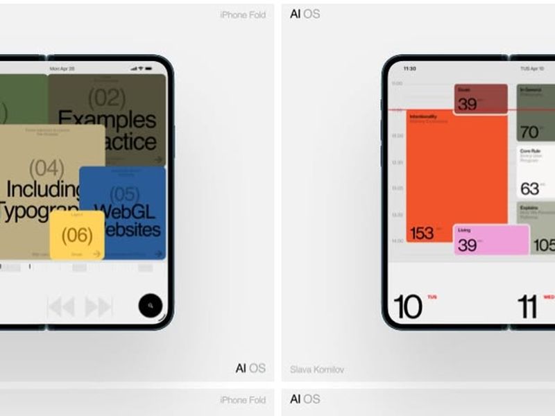
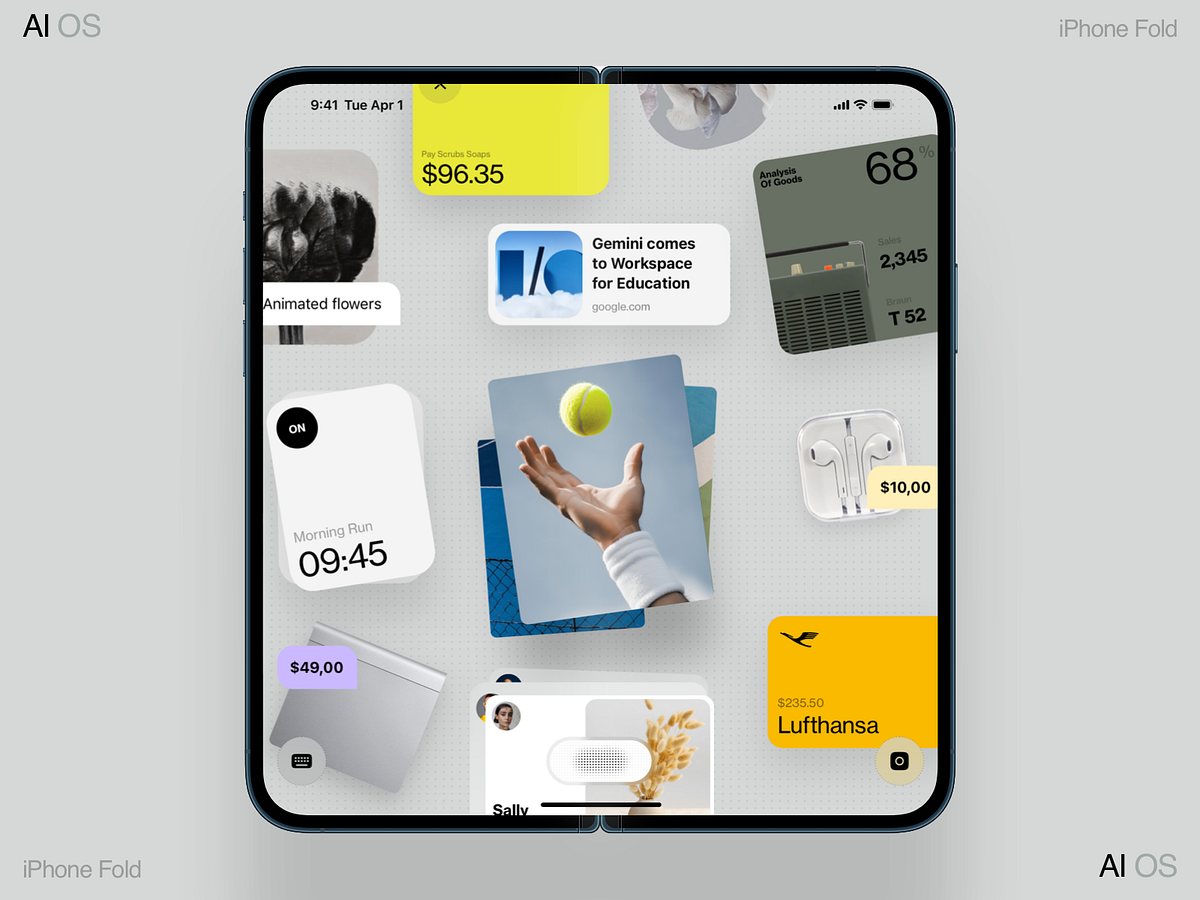
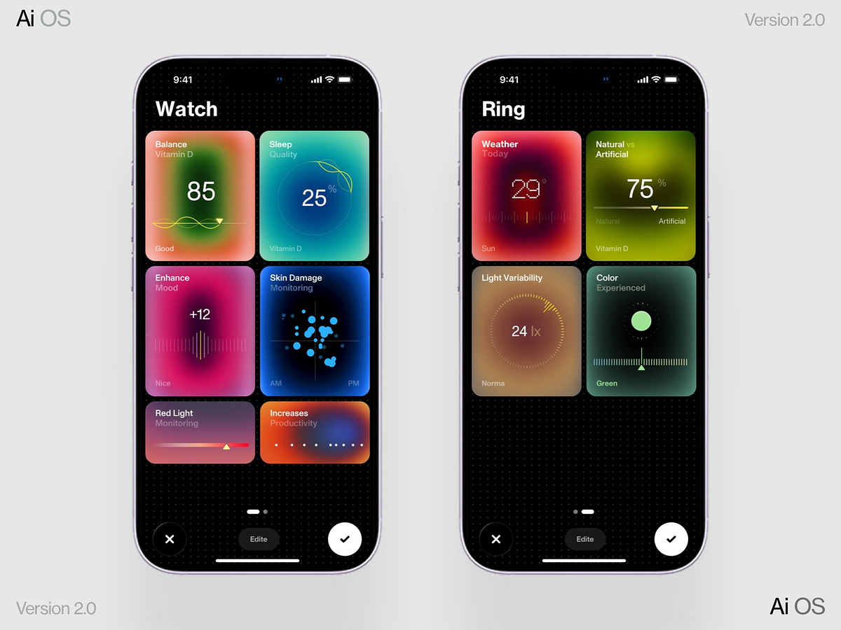
AI OS 2.0 iPhone Fold (Ultra)
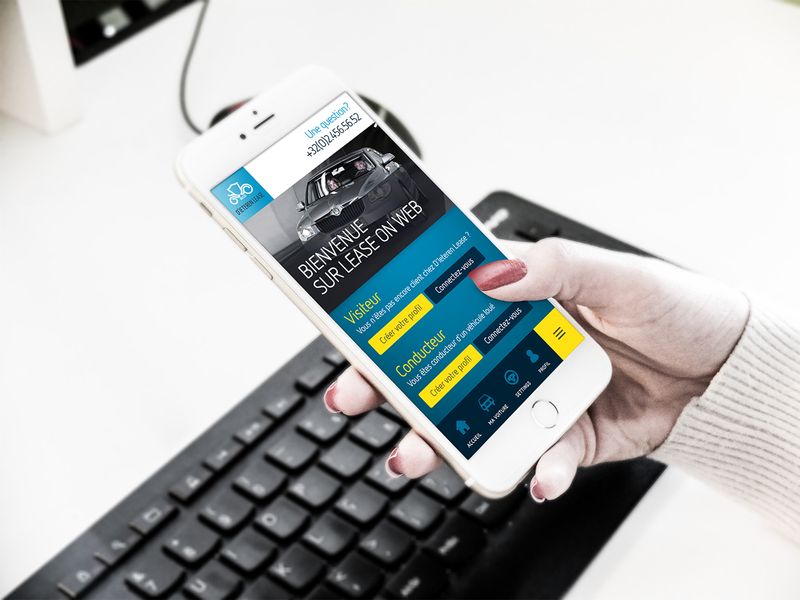
D'Ieteren Lease
If I Weren’t a Product Designer, I’d Be Shooting Spotify Covers on my Phone
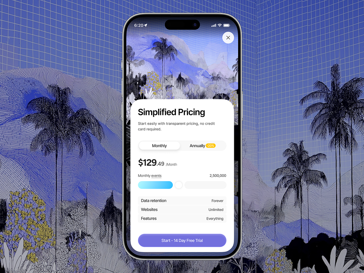
Simplified Pricing UI — Mobile SaaS Experience

Frames, Film Photography Notebook iOS Toolbar Animation
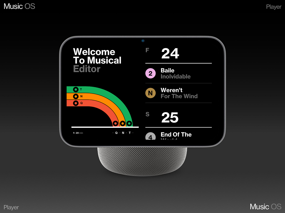
Apple HomePod 3
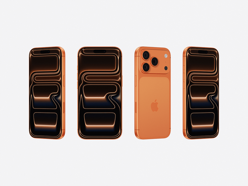
iPhone 17 Pro Mockups
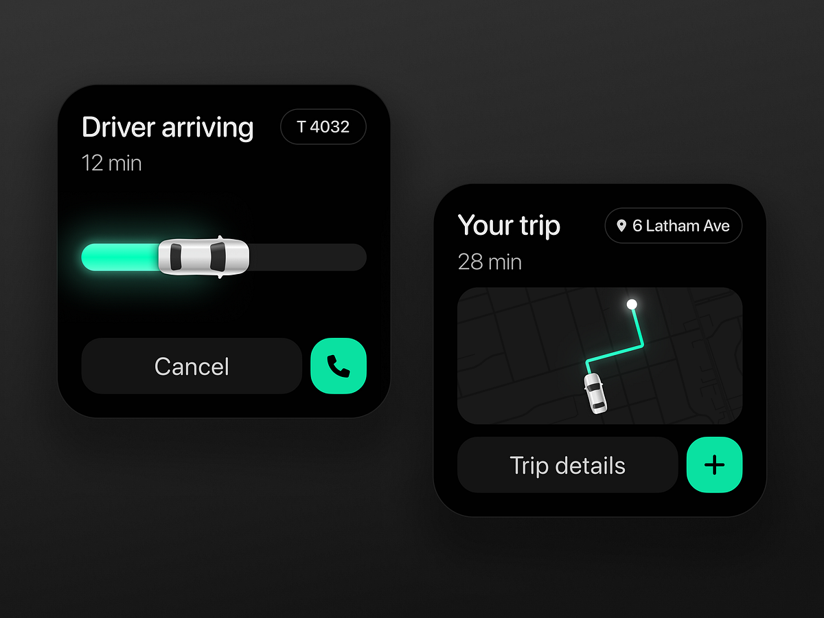
Taxi app widget
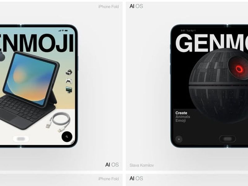
Genmoji for iPhone Fold (ultra)
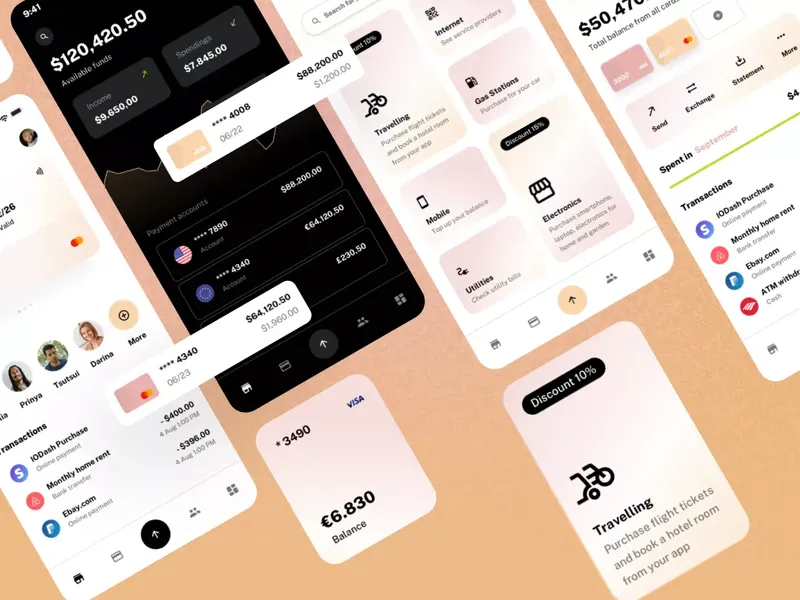
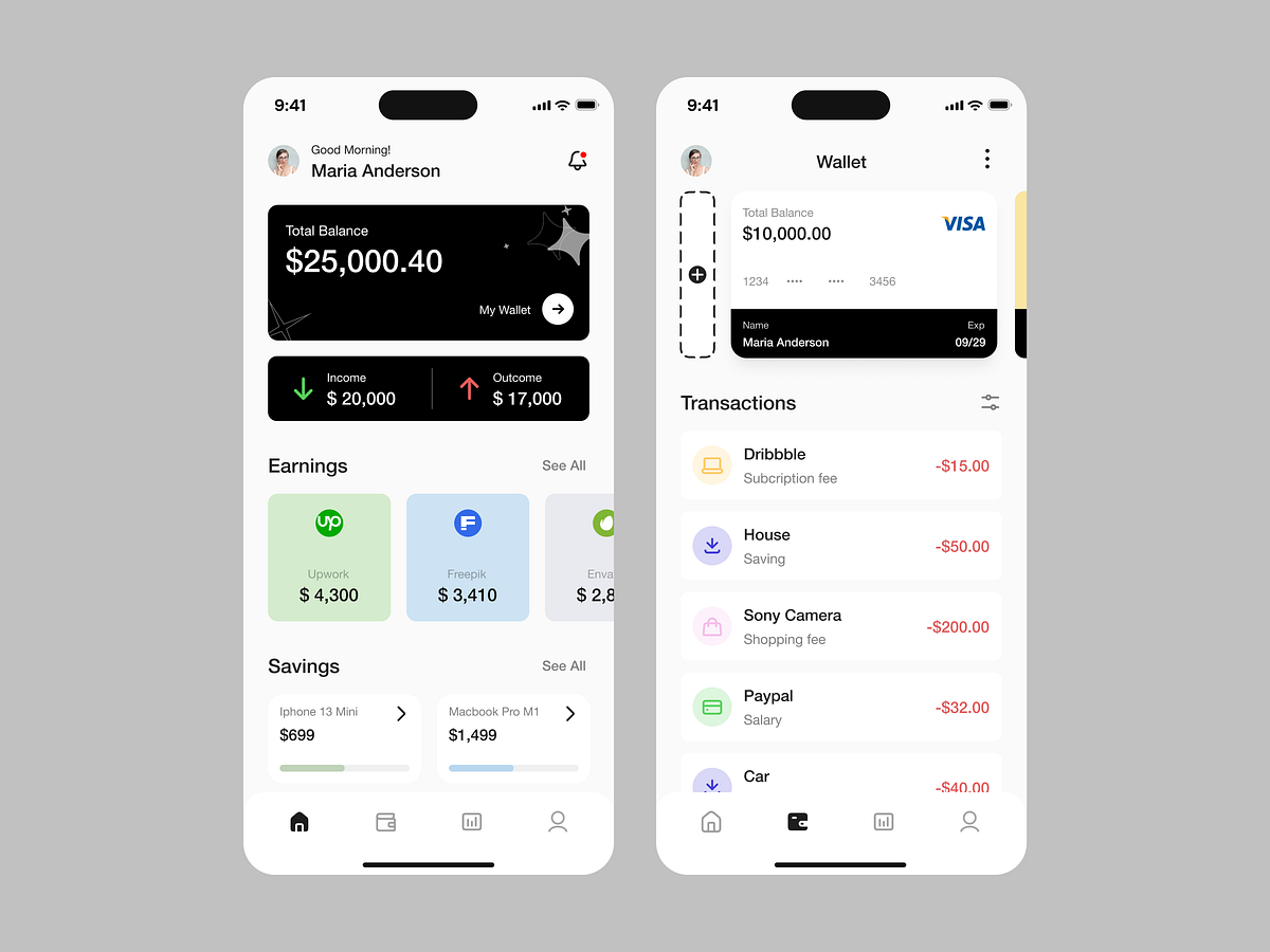
Payloo - mobile financial and payments app design
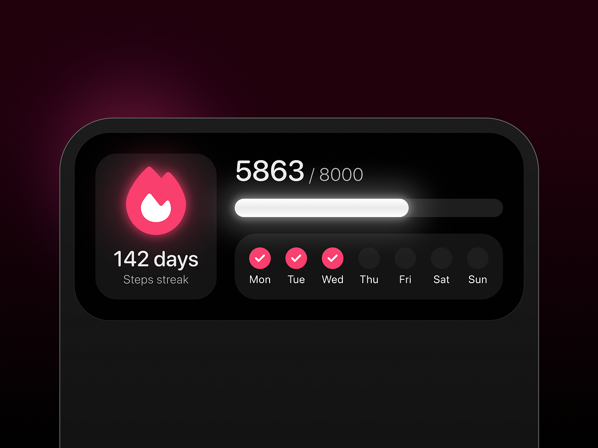
Fitness app streak widget
AI for iOS Create simple apps on your iPhone
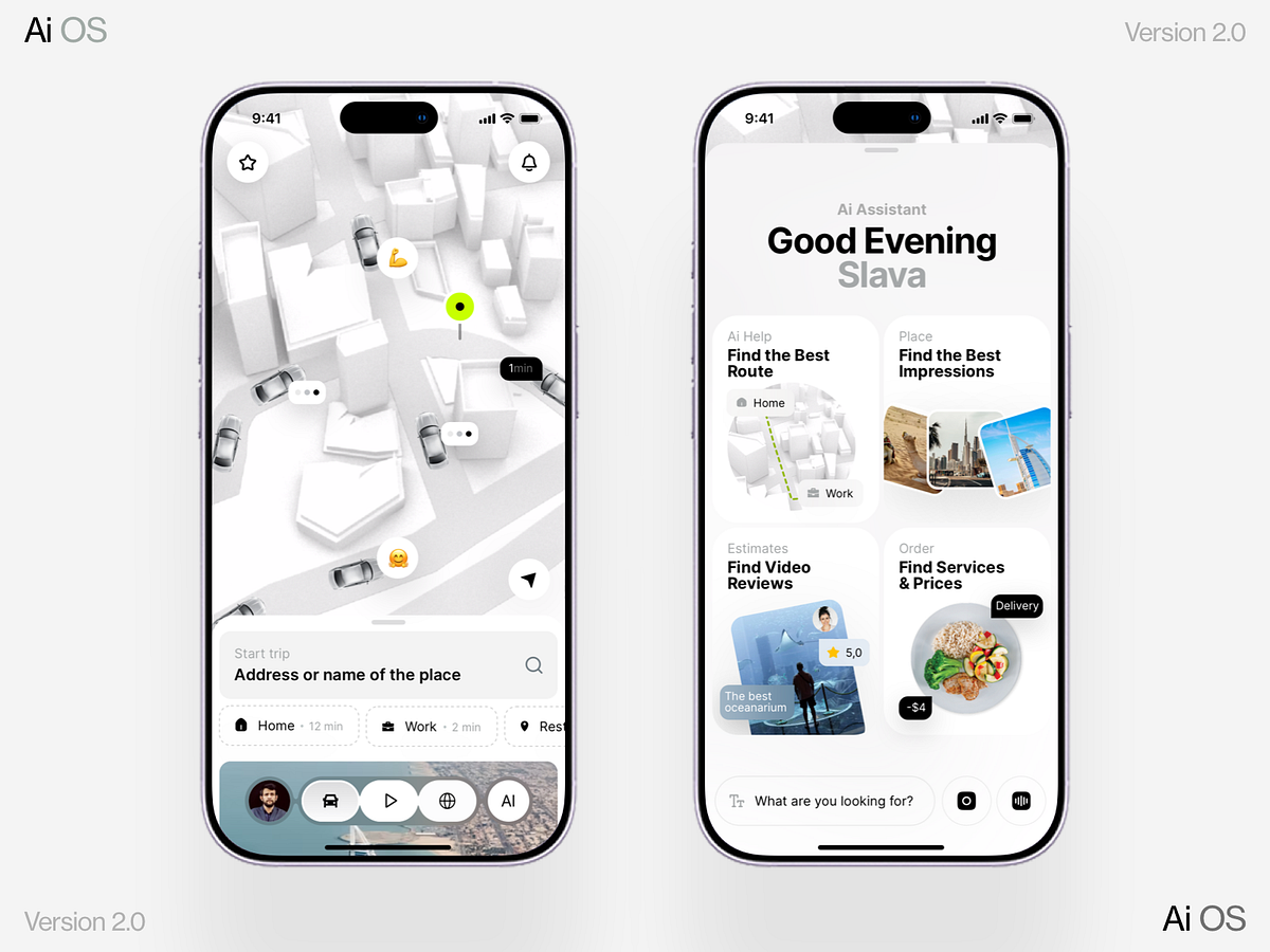
AI OS 2.0 for iPhone Fold (ultra)
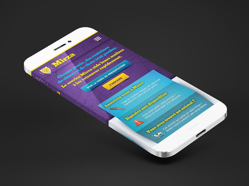
Mirza, find my pet.

Kaizen - Habit Tracker Mobile APP UI
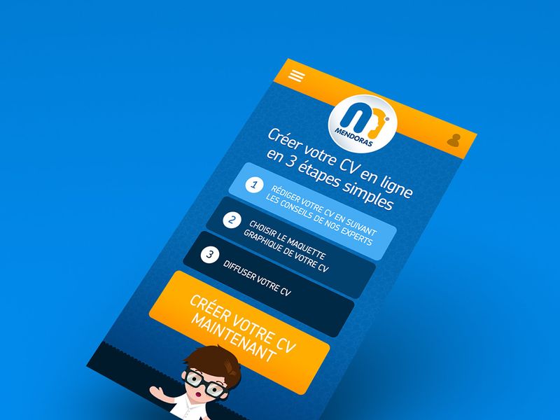
Mendoras
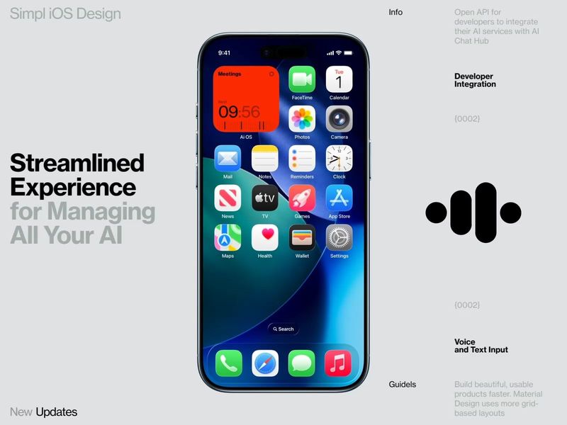
AI OS
Film Photography App Recorder - Frames
Data AI Device
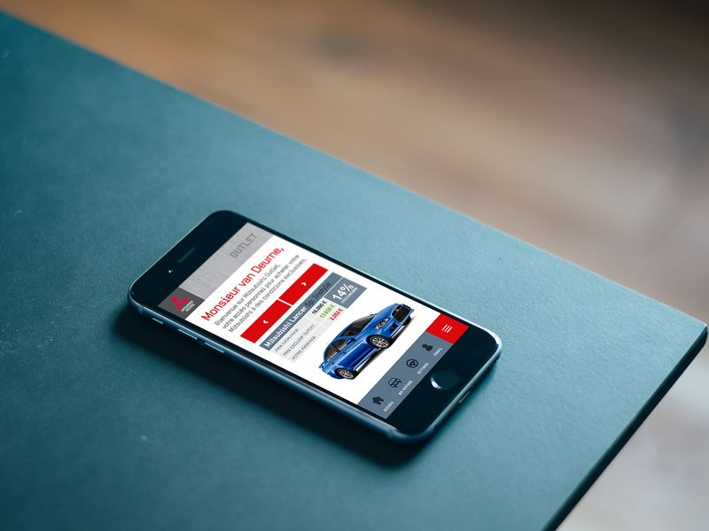
Mitsubishi Outlet
Shop
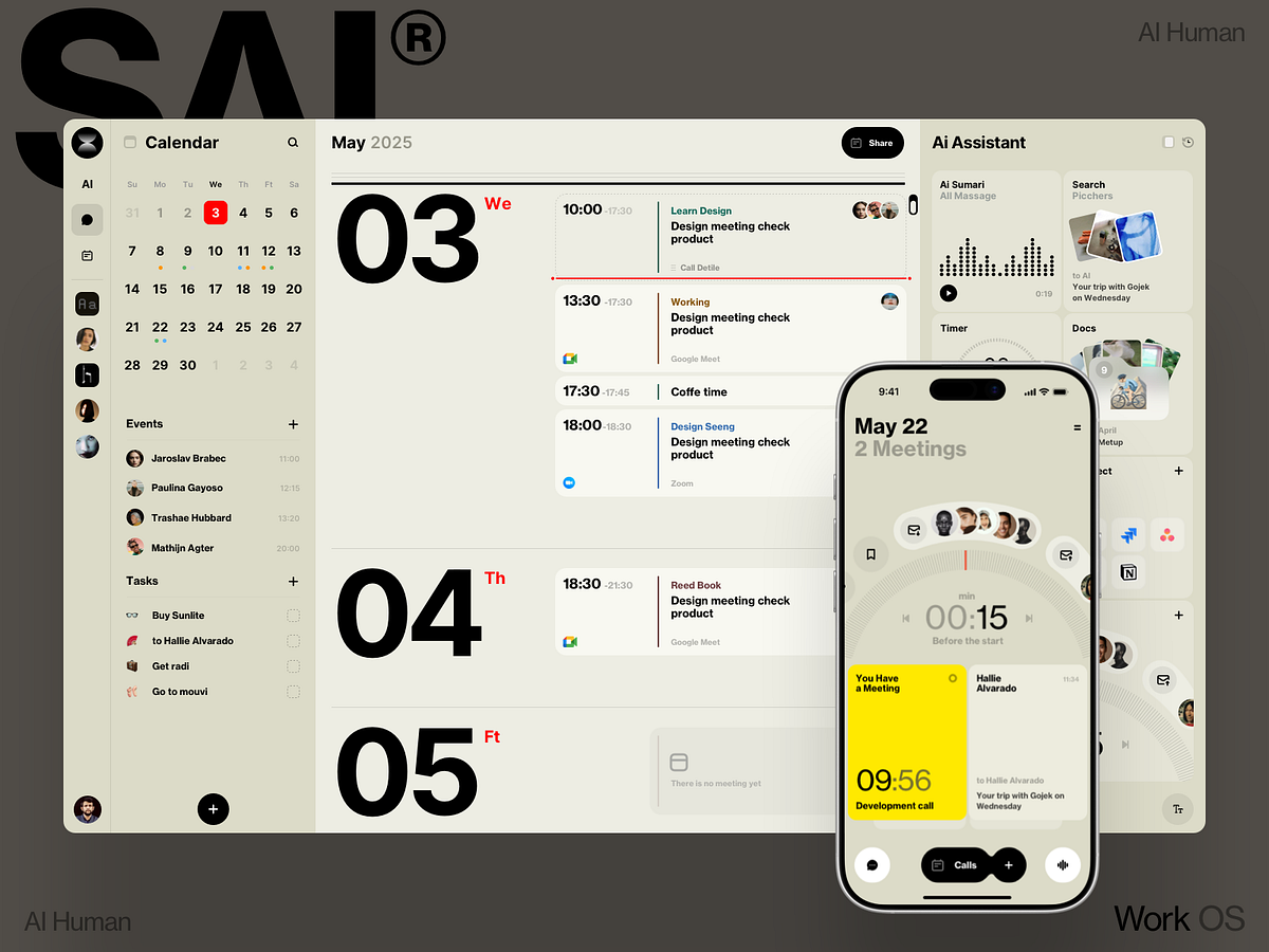
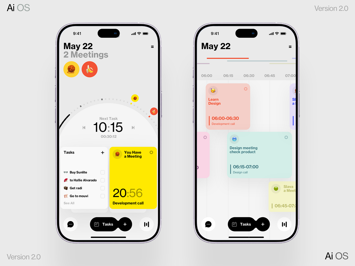
AI Calendar
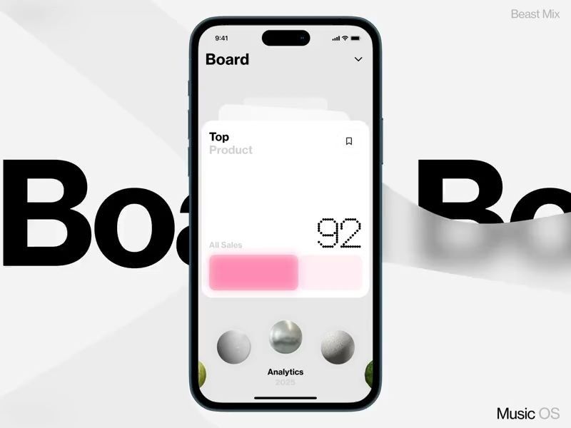
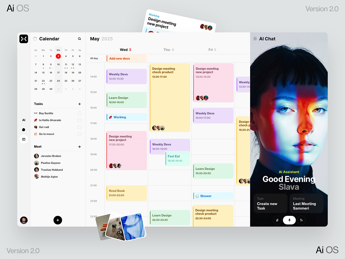
Board Data
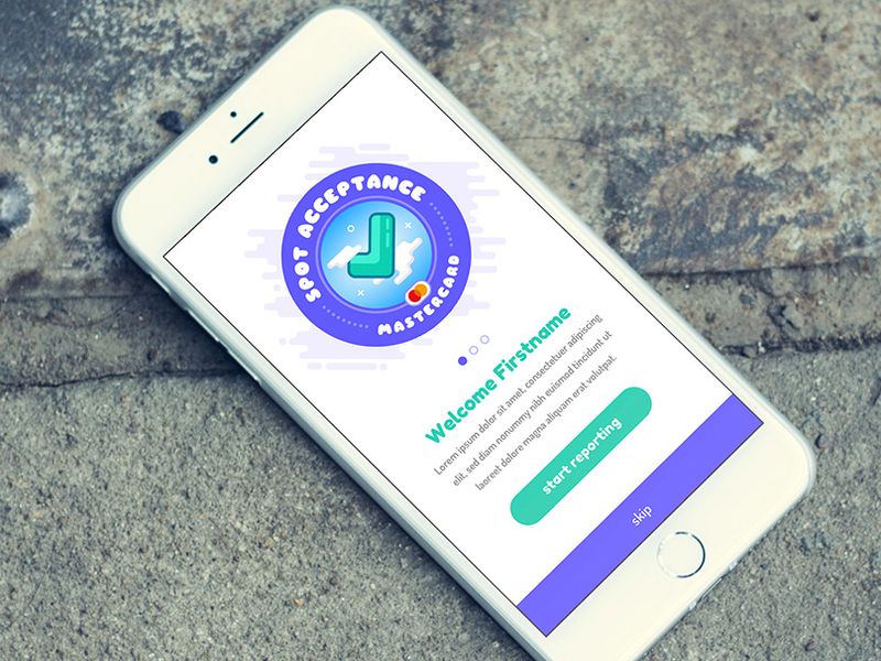
Mastercard Spot Acceptance App
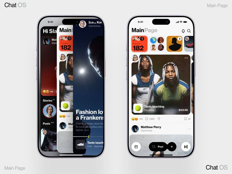
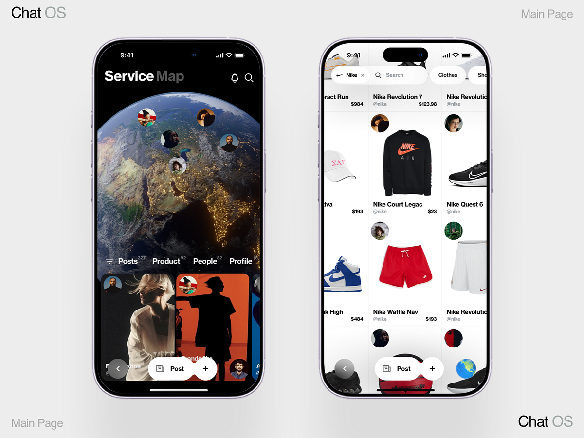
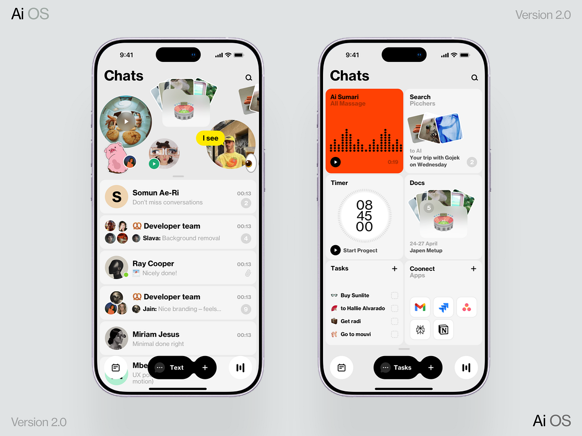
Chat OS
Create Ai Data for Your App
AI Taxi
Wiggle App Promo Video
Vibe coding map
Meetings
Chat

Renoria — Mobile Responsive Architecture Template
Meeting
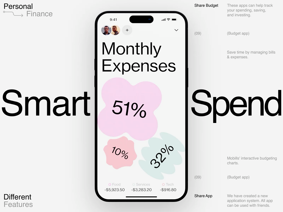
FinTrack — Minimalist Personal Finance App UI/UX Design
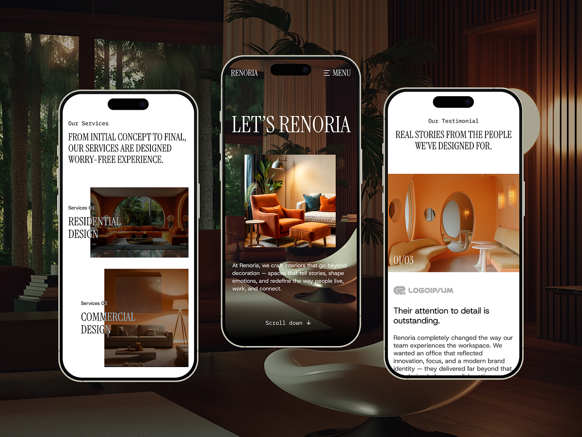
Renoria — Mobile Responsive Architecture Template
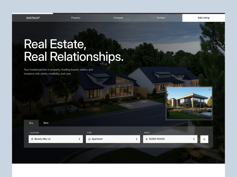
Mobile Real Estate UX — Eastalio App Architecture

Mobile Responsive Design - Marketing Agency UI
Tasks AI OS 2.0
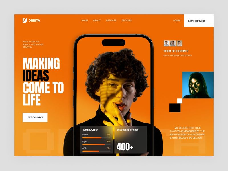
Bold Creative Agency Hero Concept | Premium Web & Mobile UI
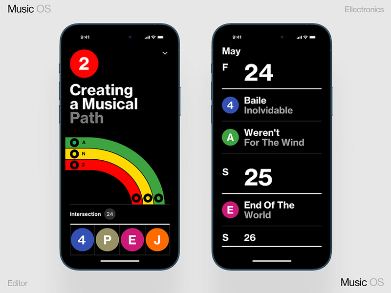
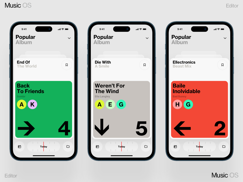
Сreating Music
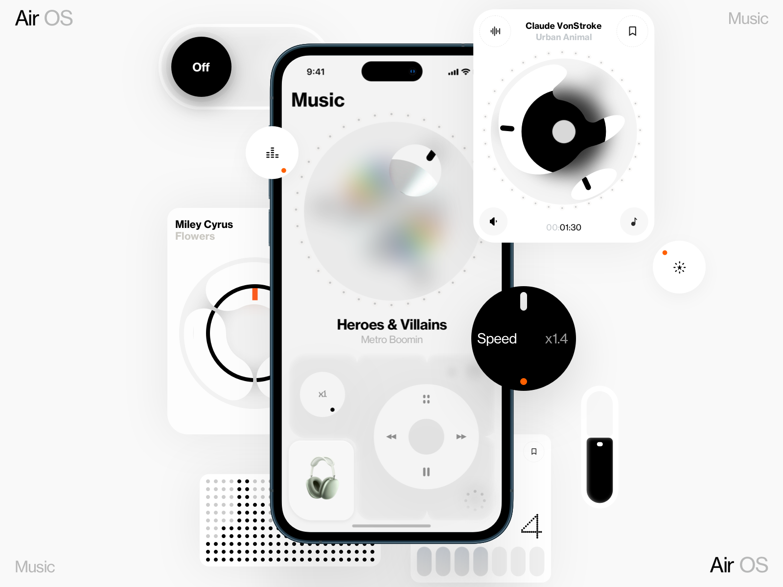
Air OS
Album by Geex Arts on Dribbble
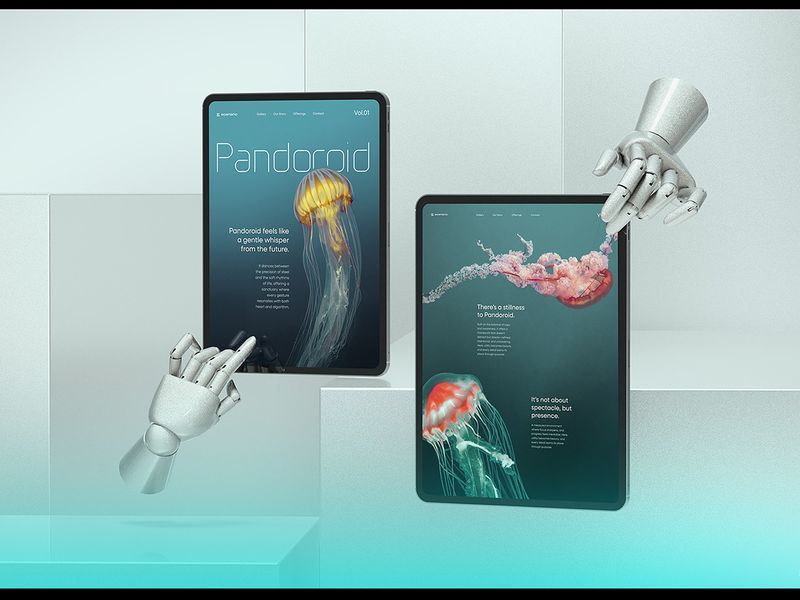
Pandoroid — 10 Tablet Mockup Scenes Vol.01

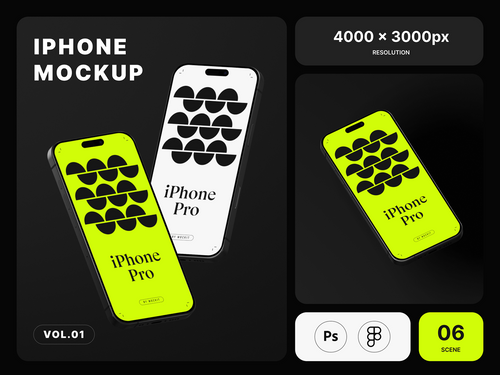
Free iPhone Mockup
Beam Phonecase | Daily Objects | 3D Launch Video :: Behance
iPhone 16 pro_Vol.01 :: Behance

Stay Stealthy: Discovering Street Photography with Your iPhone 🔮. | by Pasha Francuz | Oct, 2024 | Medium
iPhone 16 Pro Mockups Vol.02 :: Behance
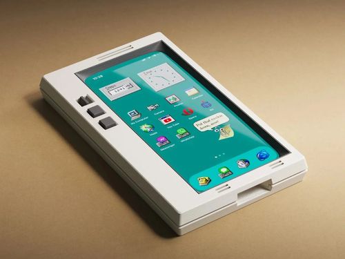
THIS RETRO IPHONE CASE TRANSFORMS YOUR PHONE INTO A MINI OLD-SCHOOL WINDOWS PC - Xaya Design

FLORA black :: Behance
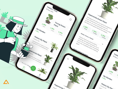
BloomBuddy - The Plant Care App 🍃📱 :: Behance
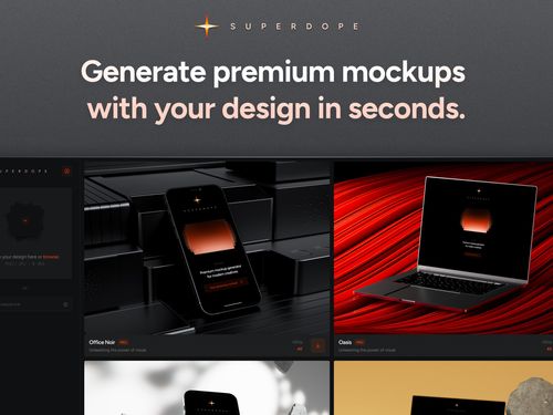
Premium Mockup Generator for Creatives - Superdope
Premium Mockup Generator for Creatives - Superdope
Get access to thousands of freshly updated design inspiration pieces by adding Muzli to your browser.
Loved by 800k designers worldwide, Muzli is the leading go-to browser extension for creative professionals.
What makes a great iPhone mockup for UI presentations?
iPhone mockups give your designs context — they show clients and stakeholders exactly how an interface will look in the real world. The best mockups balance realism with clarity: they should enhance your UI, not overshadow it. For client presentations, lifestyle mockups with natural lighting and realistic shadows communicate polish. For developer handoffs or portfolio work, clean isometric or flat perspective mockups keep the focus on the interface itself.
How do I choose the right mockup perspective?
Flat front-facing mockups work best when every pixel of the UI needs to be visible — pricing tables, onboarding screens, or complex navigation patterns. Angled and perspective mockups (typically 30–45°) add depth and visual interest for hero images, social media content, and landing pages. Floating mockups with soft shadows work across both contexts and have become the dominant format in SaaS and app marketing.
What file formats and resolutions should iPhone mockups use?
Export at 2x minimum for all digital presentations — the standard iPhone screen is 390×844pt at 3x pixel density. Mockup files should be provided in Figma, Sketch, or layered PSD/AI format so the interface layer is easily replaceable. PNG with transparency is the universal output for web use; use WebP for production pages where load time matters.