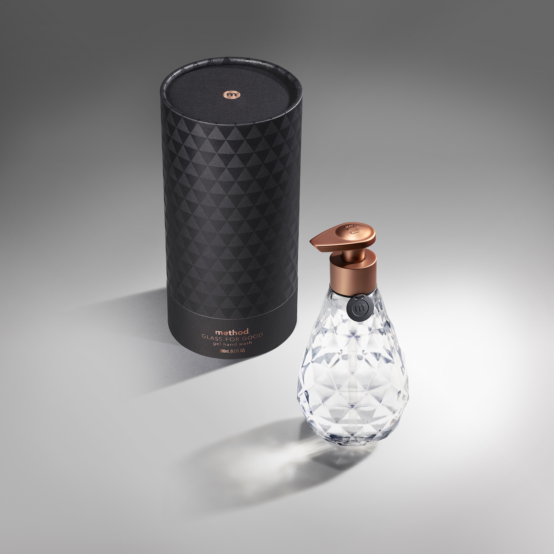
Packaging Design Love: method + SFMOMA's ‘Glass for Good’ Limited-Edition Faceted Glass Bottle
Packaging Design Love: method + SFMOMA's ‘Glass for Good’ Limited-Edition Faceted Glass Bottle
abduzeedo
Nov 13, 2018
For the packaging design lovers out there, Method, the design-forward and planet-friendly soap company you all may know from the aisles of your local market, has partnered with SFMOMA to launch the method x SFMOMA ‘Glass for Good’ bottle—a contemporary interpretation inspired by the iconic method teardrop hand wash bottle. Dubbed ‘Glass for Good’ the bottle was designed with aesthetics and sustainability in mind, allowing consumers to refill and reuse at home in an effort to offset plastic waste. Filled with a fragrance called Violet Noir, we've discovered the violet leaf, lavender, and cedarwood scent pleasing to all discerning noses. And that's not all, proceeds from the bottles will directly benefit SFMOMA’s arts education programs. We're also really digging the geometry of the external packaging inspired by the faceted elements of the bottle.
“As we thought about how to approach method’s first glass bottle in collaboration with such a distinguished partner as SFMOMA, I wanted the design to draw a strong link to nature. The end result was heavily inspired by gems and how they are cut in a way that maximizes reflections and internal luminosity," said method designer Sean McGreevy.
“We are delighted to partner with method on this uniquely designed product,” said Jana Machin, director of the SFMOMA Museum Stores. “Since method has generously donated the glass bottles, the profits from each sale directly benefit our education programs, which serve more than 60,000 students, teachers, and families each year.”
The method x SFMOMA ‘Glass for Good’ limited-edition bottle is available now exclusively through the SFMOMA Museum Store and online at museumstore.sfmoma.org. Only 5,000 glass bottles were created, making the beautiful bottle a truly limited-edition event. For $15 this is our go-to for this season's holiday gift giving while providing a give-back that we can all stand behind.
Packaging Design
package design
method
SFMOMA

Amazing Branding and Visual Identity for Rapscallion Soda
Amazing Branding and Visual Identity for Rapscallion Soda
abduzeedoFeb 24, 2020
Daniel Freytag and Greig Anderson shared an incredible branding and visual identity project they worked on for Rapscallion Soda, a drinking company that specializes in fresh fruit, low sugar sodas, handmade in Glasgow, Scotland. They're a new kind of soft drink - better ingredients, better tasting, better for you. Rapscallion.com
Approach
Rapscallion started punting handmade soft drinks down an alleyway in Glasgow back in 2016.
Their goal was simple: make the best tasting drinks possible without using artificial ingredients. Fast forward to 2020 and Rapscallion are growing, moving into a 1500 sqft railway arch in the Gorbals, more reminiscent of a scientific lab than a brewery.
Consumer tastes have also changed. They’re now actively seeking out low-sugar, well crafted alternatives to mass produced sugar-laden brands. The time was right to redefine the Rapscallion brand.
We've been working with founder Gregor Leckie to create a punchy new packaging design (new 250ml can) with real shelf standout. We wanted to build on the subversive nature of the Rapscallion name and better communicate the all natural ingredients. A product naming strategy was developed to work alongside a distinct and rebellious brand voice.
A sterile approach to layout, bold use of color and minimal type treatments help to differentiate core range and seasonal product lines. The deliberate short stop label highlights the cans base metal, hinting at a more clinical and scientific approach to production.
Project summary
Visual Identity
Packaging
Merchandise
Print
Project team
3D visualisations: Render Studio
Branding and Visual Identity
Noted: New Logo and Packaging for Denver Distillery by O Street
“A Tear Drop in the Bucket”
(Est. 2018) "In the historic Baker neighborhood, Denver Distillery is the city's first distillery-pub in town. Denver Distillery's spirits evoke a feeling of historic Denver, the 'Queen City of the Plains'. Our hand-built stills and old world techniques pull out the unique subtleties from the finest regionally sourced, non-GMO ingredients giving our spirits flavors that haven't been experienced since the 1800s."
Design by
O Street
Related links
O Street project page
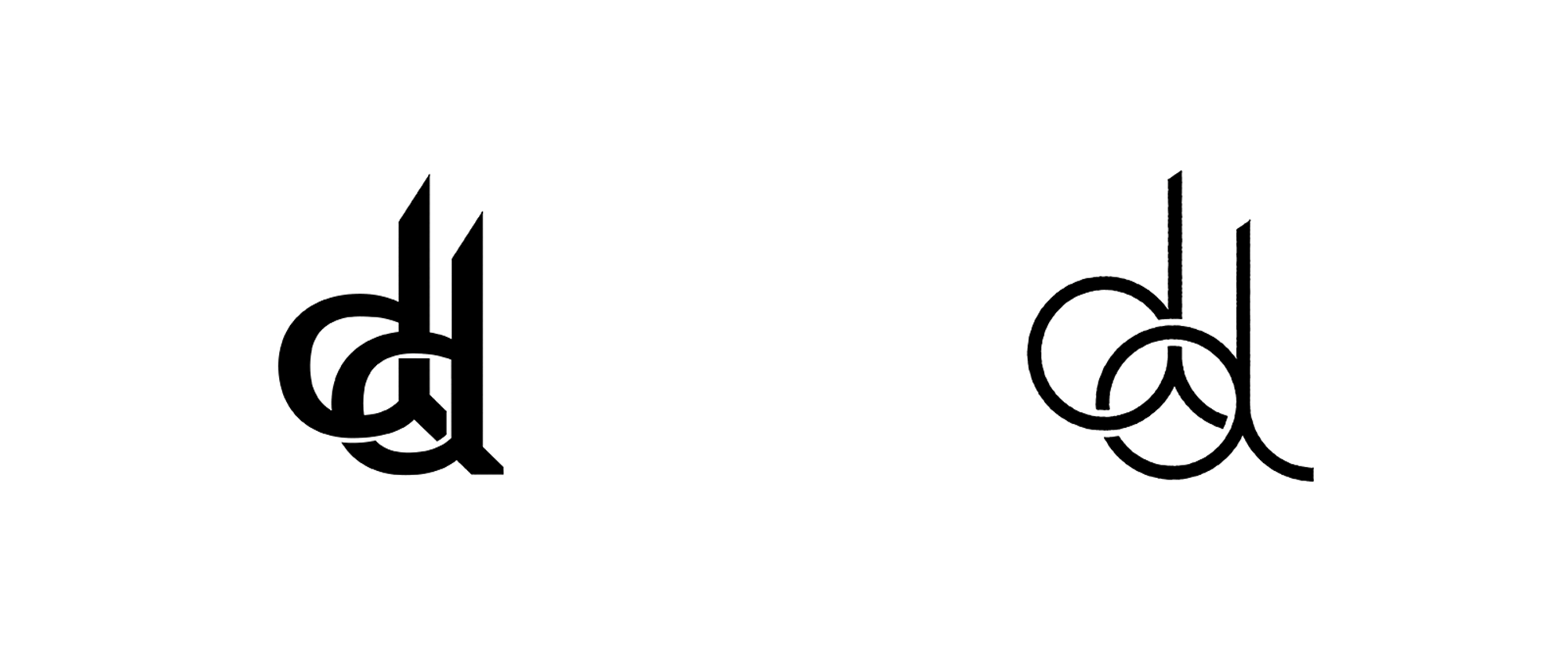
Relevant quoteThe first task was to reflect the value of handcrafting in their brand. O Street redrew their logo, drawing on the sculpted iron version that appears over the doorway to the distillery. Working with the distillery’s historic working-class neighborhood, O Street then specified typography and designed a suite of logo lockups with an appropriate feel.Denver Distillery’s charismatic owner Ron Tarver and his wider team, are deeply interested in the stories and art that “define the human condition and experience”. The studio, led by Design Director (and part-time illustrator) Josh Peter, used this as a concept behind the packaging, capturing the spirit of lore and legend through a multitude of hand painted illustrations. With help from the distillery’s marketing manager Jen Anderson-Tarver—who happens to be an art history aficionado—each piece of art was then paired with a spirit.Then came the bottles. The distillery employs three different bottle shapes and produces over a dozen unique spirits, from sweet potato vodka to moonshine and small-batch bourbon. O Street helped the distillery organize their product hierarchy to pave the way for a unifying brand structure. As a way of visually unifying these products, they developed a unique layout and die-cut teardrop label shape. The teardrop adds a consistent and familiar shape across the entire range, while also sitting flatter on the concave bottle shapes.
Images (opinion after)
Logo.
Logo on photo.
Badges and lock-ups.
Typography.
Illustrations.
OLD packaging.
Packaging.
In situ.
Opinion
I’m not a big fan of the old or new double-“d” monogram but the new one is definitely an improvement with cleaner lines and a better interaction between the two letters. The badges and lock-ups seem somewhat gratuitous… they are very heavy on the awkward-badge trend and it’s 3 or 4 years too late, not to mention that the lock-ups have no real relation to the monogram and much less to the packaging which is when this project gets good. Real good. The old packaging was kind of sad and had a heaviness to it that wasn’t too enticing. The new teardrop-shaped labels do wonders to make the bottles look almost bespoke and it’s a great way to unify the various spirits offered and the three different bottle shapes. A lovely range of illustrations take center stage on each label and the typography is neatly arranged around it while accentuating the label’s contour. Overall, the packaging redesign is so successful that it probably would have been good to rethink the logo based on where they landed on that instead of trying to hold on to the monogram.
Reviewed: Friday Likes 328: From Olssøn Barbieri, behalf studio, and Mythology and Joe Doucet
“From Olssøn Barbieri, behalf studio, and Mythology and Joe Doucet”
Two distillery products serve as elegant bookends for some crazy funkiness this week, with work from Oslo, Ho Chi Minh City, and New York.
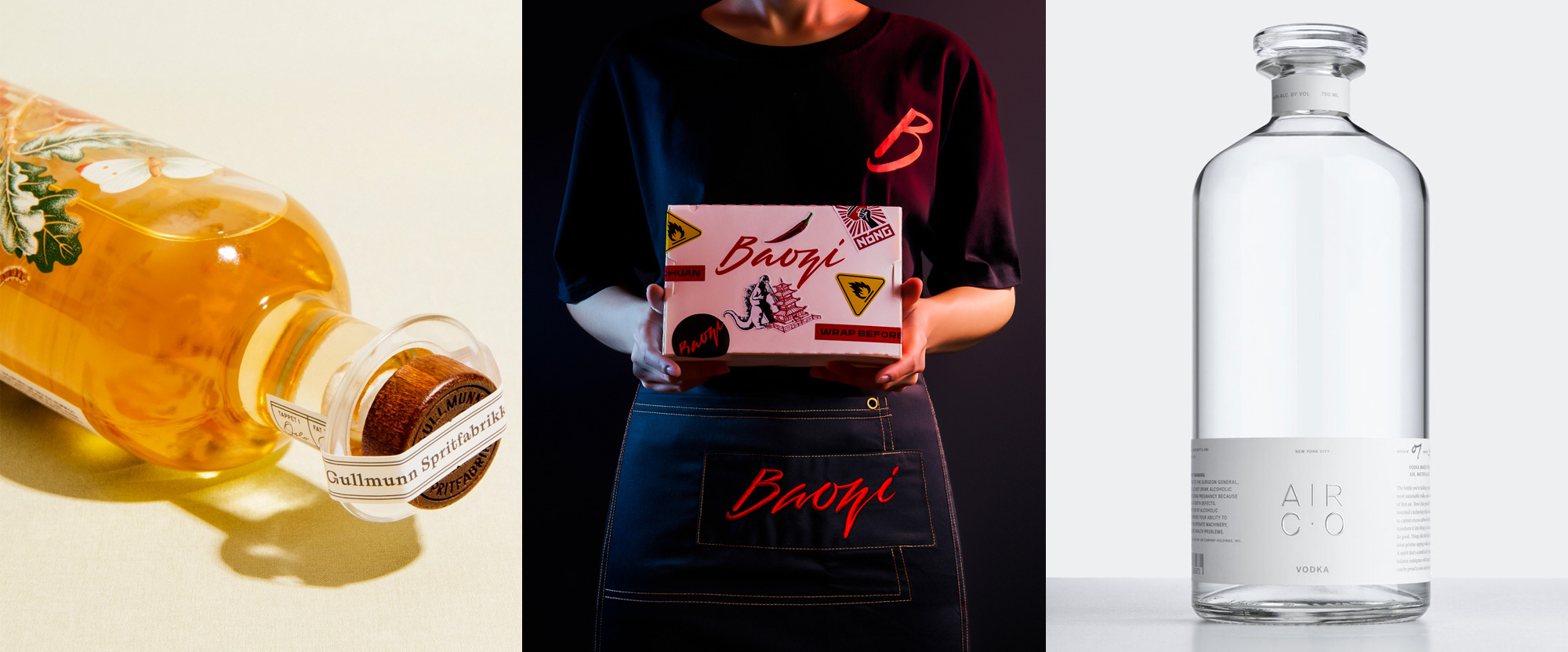
Gullmunn by Olssøn Barbieri
Gullmunn is a new, small brand of aquavit available in Norway, created by Marthe Bøhn, a cognac distiller, and produced at Oslo Craft Distillery. The packaging, designed by Oslo, Norway-based Olssøn Barbieri, has a lovingly typeset label on the front -- inspired by taxonomical documents -- with a lot of great typographic details. This is contrasted by a stunning 7-color, silkscreen-printed, pointillism illustration of acorns, butterflies, and green leaves that looks great against the golden hue of the aquavit. Di-still my beating heart. See full project
Baozi by behalf studio
Baozi is a small chain of fast-food restaurants in Ho Chi Minh City, Vietnam, offering bao and other "label-less selection of Asian fusion food". The identity, designed by local firm behalf studio, is self-described as "Banksy got drunk in Chinatown", which should be a design category all its own like Brutalism or Minimalism because this is so much raging fun... and chaotic. Fueled by a series of dark (as in their content, not their hue and brightness) illustrations that reference about a dozen different things each, from culture to art, the identity calms down a little in most of the applications by adorning all of its take-out materials with knock-off and parody versions of well-known logos (like Hot Wheels) or objects (like Campbell's Soup). Amidst all of this, the logo is pretty great and looks awesome in the uniforms. There is not much rhyme or reason to all of it together but that's what happens when Banksy gets drunk in Chinatown so it's best to just accept it. See full project
Air Co. by Mythology and Joe Doucet
Air Co. is Brooklyn, NY-based innovation and social-good-minded company that makes products by extracting carbon dioxide from the air -- their carbon converting system has received awards from NASA and the United Nations. Its first product is a vodka that uses only two ingredients, air and water, as opposed to the usual fermented grains such as corn, potato, or wheat. Billed as "the world's purest, most sustainable vodka", the packaging needed to match the claim. Designed by New York-based Mythology and Joe Doucet, the bottle certainly oozes purity, with a slick and sturdy silhouette, anchored by a bare-minimum label -- adhered, btw, with a custom natural, non-toxic adhesive -- at the bottom, allowing the crystal-clearness of the product to shine through. The label's most exuberant element is a very elegant, thin sans serif type treatment for "Air Co" that is sumptuously embossed. Don't get me wrong, it's all a little on the pretentious side but it's unquestionably nice and at $65 a bottle, it better be. See full project
Reviewed: New Logo and Packaging for Not Your Father's by Hype Group
“Luke, I am… Thirsty”
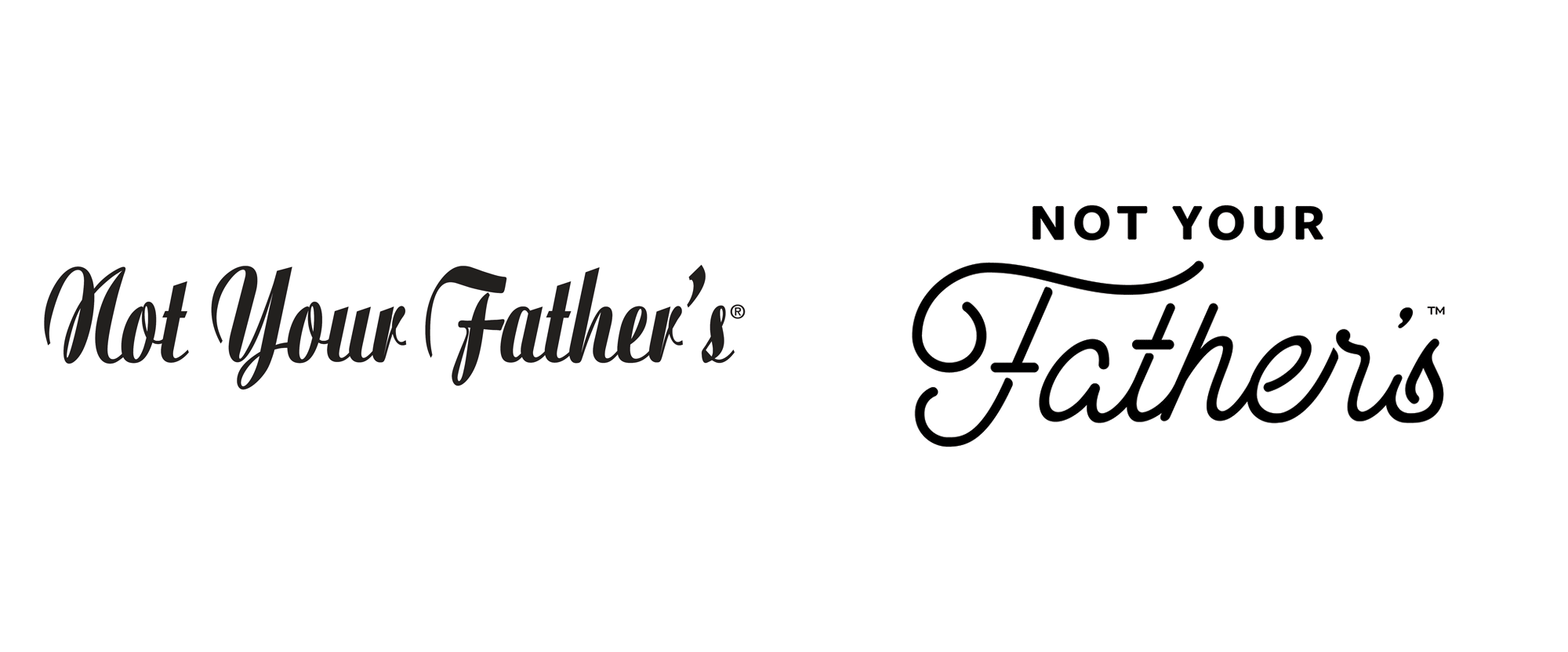
First released in 2012 in its original root beer flavor with a whopping 19.5% alcohol by volume (abv), Not Your Father's is a brand of "hard soda" or flavored beer, depending on how you want to look at it. Created by Small Town Brewery in Wauconda, IL, the Not Your Father's brand has grown to include lemonade, ginger ale, vanilla cream ale, and the original root beer now in a more modest 5.9% abv. In 2015, Small Town Brewery partnered with Pabst Brewing Company for distribution and the root beer became the number one selling "craft" package of that year. Recently, Pabst introduced a new logo and packaging, starting with lemonade and root beer, designed by St. Petersburg, FL-based Hype Group.
The resulting logotype is a combination of bold sans-serif with rounded edges and a custom monoline script with strategically placed separations. To make the brand more flexible, we created a shortened "NYF" mark derived from the sans serif type. This short-mark allows the brand to live beyond its lengthy name and exist in a more confined space in both vertical and horizontal applications.Hype Group project page
Logo.
Shorthand.
The old logo, in a cheap-looking font that nobody bothered to kern its apostrophe, was pretty bad, even if we took into account its cheeky name, humble beginnings, and possibly its intention to look home-made. The new logo reflects the goal to reinvigorate the brand and make it more widely attractive through a combination of a large and friendly script lettering and unassuming sans serif. The emphasis on "Father's" is perhaps a little strong but the light weight of it does play well and match nicely with the bold weight of "NOT YOUR". Although I visually like the notches or reverse shadows in the script my mind keeps trying to rationalize their dimensionality and it does not compute. Nonetheless, it's visually pleasing and a major improvement over the old. The "NYF" shorthand, which makes appearances in the packaging, is a little cold and industrial in comparison.
OLD packaging and labels.
We simplified the label design by infusing it with significant white space, allowing the logotype to take center stage and be the dominant brand element across all SKUs. We split the label into thirds, locking down the primary flavor color to the bottom third of the label and overlaying a secondary color block to house the flavor name. A texture was also applied to create more dimension throughout the packaging, and is also a consistent piece of the overall brand - found on the bottle label itself, on the website, and on social media graphics. Custom icons were also designed to further delineate each flavor in the NYF suite, plus creative copy across the labels to demonstrate the personality of the brand.Hype Group project page
Bottle, before and after.
The old packaging was very heavy-handed with the old-timey-ness and while that has its own breadth of appeal it just wasn't that interesting or well done. The new packaging may fall bluntly in the trendy, hipster aesthetic of beers (and other beverages) but it's hard not to see it is an improvement and a more attractive consumer product in the year 2019. The hierarchy on the bottles is clear and efficient with a few pieces of flair to liven it up and support the logo, which now takes center stage.
Root beer.
Lemonade.
Angled shots.
Hero shots.
Lifestyle shots.
6-pack.
Caps.
Overall, what I think I like best is that the old packaging did look like my father's or grandfather's beer and this new one does pay off of the name with an aesthetic that isn't built on previous generations' graphic nostalgia.
Capri Sun’s hilarious new packaging is graphic design at its most honest
Drinking a Capri Sun isn’t just about the flavor. It’s about the satisfaction of stabbing the iconic pouch with a straw, and the gratification of drinking it until it’s squeezed flat. Like Pringles, the iPhone, or Tiffany & Co., the packaging is part of the experience.
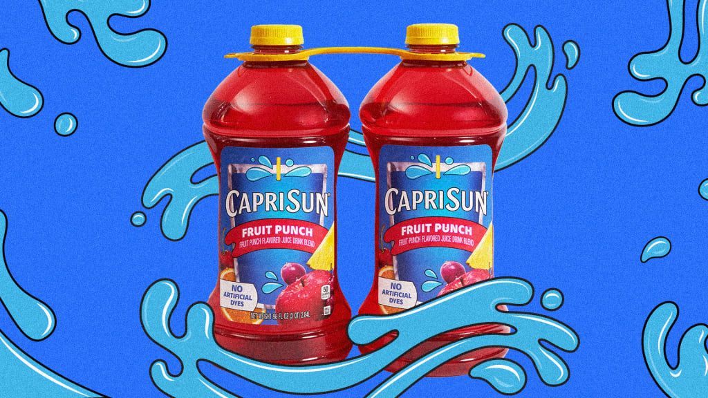
Kraft Heinz, the maker of Capri Sun, just announced they’re doing away with the pouch for a special two-pack family-size serving of the drink. But they’re not getting rid of it entirely. To acknowledge just how central the pouch is to the product, the new bottle will prominently feature a picture of the pouch on its label.
A nesting doll of packaging
The new Capri Sun multi-serve bottle carries 96 ounces of the beverage (split into a two-pack). That’s equal to 32 pouches’ worth of juice, according to the company. Kraft Heinz says they made the jump to bottles because of consumer demand: 76% of the suggestions their Capri Sun call center received between 2020 and 2023 were for a larger product size.
“We’re now able to delight those fans who grew up on Capri Sun with an offering that suits their needs,” Jordan Mann, the company’s senior brand manager, said in a statement. “They’ve outgrown the serving size of the pouch, but not their love for Capri Sun.”
The packaging does indeed look like it’s straddling the line between a toddler juice box and geriatric fruit juice. It’s not high design by any means, but at least it’s honest.
The new packaging comes only in Fruit Punch flavor for now, and it helps the drink expand into club retailers. The bottles will be sold at BJ’s Wholesale Club, Sam’s Club, and select Costco locations at a time when consumers are turning to these stories for value and bulk purchases, according to Kraft Heinz.
The brand tried expanding beyond the pouch more than 20 years ago, though it didn’t last. It sold 16.5-oz bottled “Capri Sun Island Refreshers” in 2003 as a play for 16- to 25-year olds, but they’re no longer for sale.
Reviewed: New Logo and Packaging for Carlsberg by Taxi Studio
“Probably the Most Subtle Beer Logo Evolution in the World”
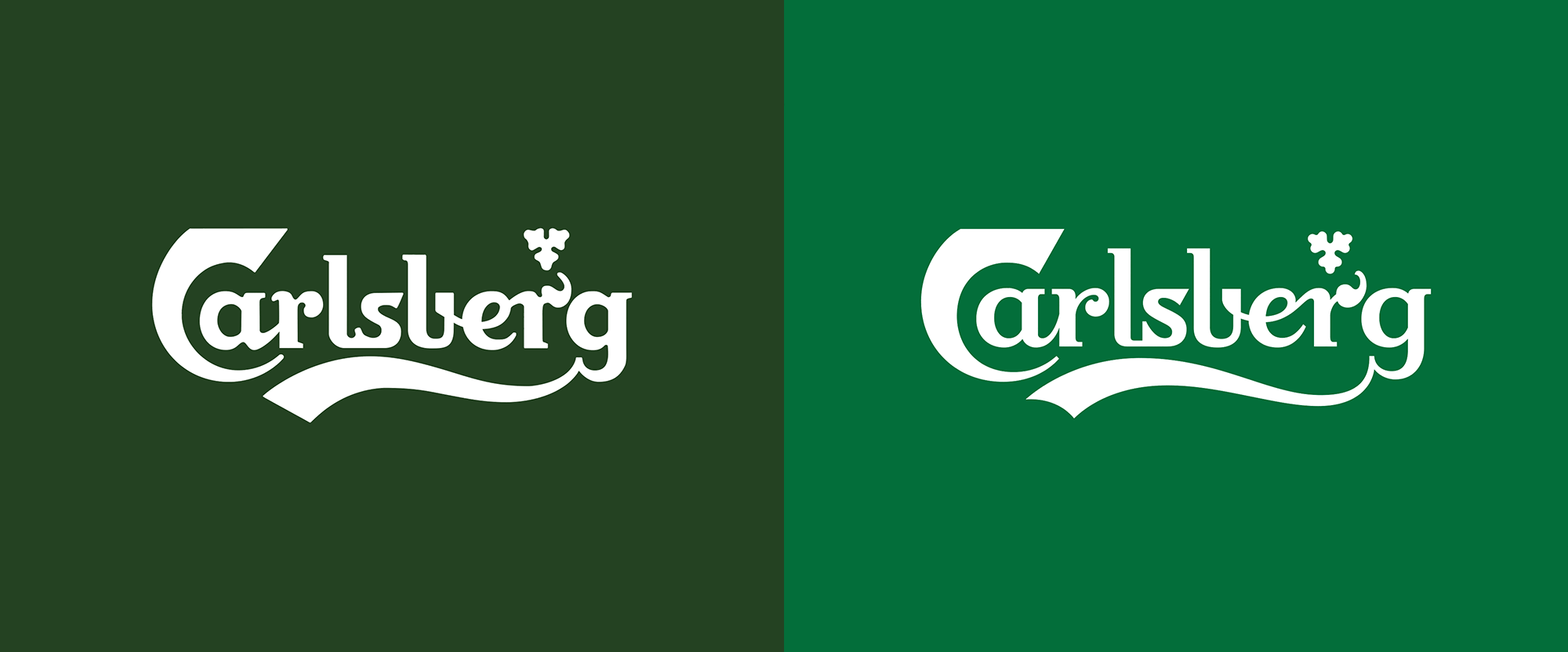
First brewed in 1904, Carlsberg, a pilsner, is the flagship brand of Carlsberg Group (established in 1847 in Copenhagen, Denmark). Dubbed "Probably the best beer in the world" (as its tagline) since 1973, Carlsberg was created by Carl Jacobsen, son of Carlsberg Group's founder J.C. Jacobsen and is now distributed in more than 150 markets. This month, Carlsberg introduced a new identity designed by Bristol, UK-based Taxi Studio in collaboration with Liverpool , UK-based Tom Lane.
We've collaborated with Carlsberg on a major global rebrand, unifying its diverse markets with a simple yet versatile identity system that champions the principles of great Danish design...Following extensive research into the brand's 171-year heritage, Carlsberg's famous brand elements have been carefully re-crafted for the first time in several years, striking the perfect balance between form and function.These assets combine to form a coherent master brand-led identity system that works across packaging, promotions and POS materials for all of Carlsberg's global variants. The core elements include the logo, hop leaf, crown and brand typeface, as well as the signature of Carlsberg founder JC Jacobsen.Taxi Studio news page
Introduction to new look.
Logo.
Your browser does not support the video tag.
Logo evolution.
The Carlsberg logo has been basically the same since its inception, evolving with over 100 years of technology innovations and sometimes suffering with jumps in reproduction techniques, leading to what we all most recently know today, which is an extremely recognizable mark but one that, when looked at closely, isn't the most finessed piece of lettering. The new logo maintains everything about the original but gives it a much needed trim, thinning the letters and accentuating some of its quirks, like the leafy "r" and totally whack "C" (which we've come to accept but does not take away from the fact that it is certifiably whack).
There are a few great evolutions in this logo, like the placement of the hop leaf that is now more naturally nestled above the notch of the "r" or the way the curve unifies the "ber" part, flowing nicely from one letter to the next. The only awkward moment is the connection in the "ls" pair which feels very strict and forced in comparison to the rest of the letters but it's a small quibble in what's otherwise a great evolution that will allow the logo to survive (and thrive) for another 100 years.
Your browser does not support the video tag.
Hop leaf evolution.
Your browser does not support the video tag.
Signature evolution.
The hop leaf and signature evolutions are pretty nice too. Nothing overly exciting but certainly an improvement.
Extended type and graphics around the logo.
Logo with bottle.
Bottle, before and after.
Locking down a "before" shot of the bottle was a little difficult as I think there are a number of bottle designs spread across different markets -- this one came from the Denmark website, so I decided to use it. I won't spend a lot of time talking about the old one as the bottle might be different to other people but this particular one was nice in its use of the physical bottle to reproduce the logo with a small label in the neck. The new bottle, while crisper-looking because of the logo, feels somewhat cheap with the new label. I don't know if it's the white stroke or simply the fact that it's a generic paper label in contrast to some good, old-fashioned glasswork as in the previous bottle that makes this less premium or interesting. Again, the design looks nice but I think so much work went into the logo that that same attention to detail doesn't quite come across here.
Bottle.
Stemmed glass.
Carlsberg today announced a series of ground-breaking innovations including its new Snap Pack, which is set to reduce plastic waste globally by more than 1200 tonnes a year - the equivalent to 60 million plastic bags.The Snap Pack replaces the plastic wrapping used around Carlsberg's six packs with a pioneering technology that glues its cans together. A world first for the beer industry, it will reduce the amount of plastic used in traditional multi-packs by up to 76%.Carlsberg Group press release
"Snap Pack" cans.
Can detail.
The cans look way cooler and better than the bottles. The size of the logo on them makes for a much more impactful and memorable product. And big props for the innovation on the glue to keep the six-pack together. I'm surprised they didn't make a video of it. (I looked.) I bet it would be immensely satisfying to see the cans snap away from each other.
Bottle and can.
Product family.
Overall, it's a solid evolution that maintains the Carlsberg-ness inherent in the logo but positions the system as more flexible and accessible across all markets.
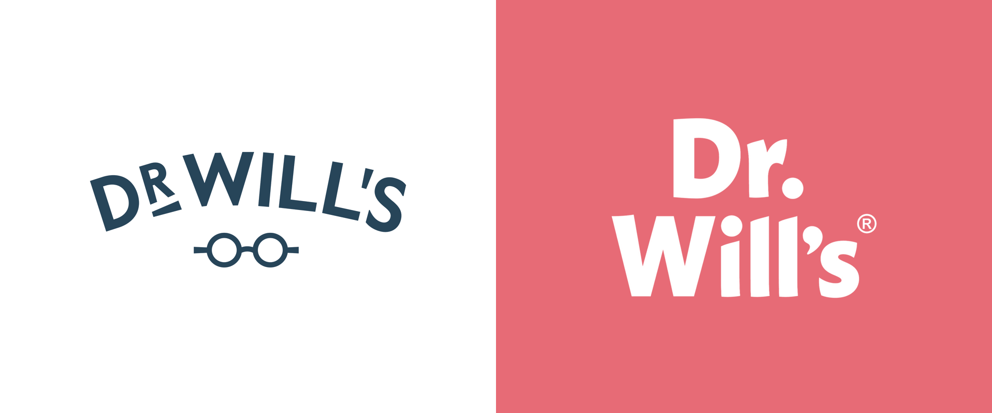
Noted: New Logo and Packaging for Dr Will's by B&B Studio
“What’s Up, Doc!”
(Est. 2016) "Dr Will's are the UK 's first all natural condiment brand. We make naturally sweet, honestly delicious products and prove that natural sugar sources are better than the artificial alternative." The brand is named after its founder, an actual doctor, Dr Will Breakey, who partnered with restaurateur Josh Rose.
Design by
N/A
Related links
B&B Studio (London, UK)
Relevant quoteB&B’s design brings flavour to the forefront with full-colour labels that create a rich and foodie palette across the range. The design introduces a new brand equity – an exclamation mark – executed on pack in complementary colour tones and featuring an ever-changing dot to designate flavour. From a tomato or beetroot on ketchups, to an egg or avocado on mayos, the dot delivers additional taste cues in a fresh and witty way.As a small brand in categories heavily dominated by big mainstream players, Dr Will’s has to make an impact where it matters – on the supermarket shelf. Traditionally, niche sauce brands conform to premium codes that successfully communicate their product superiority, but can get lost on shelf and tend to alienate more mainstream consumers. For B&B, creating design that captured ‘mainstream premium’ was essential, enabling the brand to broaden the appeal of better-for-you sauces and encourage consumers to question what goes into the dominating brands. The exclamation mark was the perfect design solution – instantly grabbing attention at shelf and challenging the habitual behaviour that characterises shopping within the sauce aisle.
Images (opinion after)
Logo.
Your browser does not support the video tag.
Logo with different exclamation points.
Your browser does not support the video tag.
Same but realistic.
OLD packaging.
Packaging.
Your browser does not support the video tag.
Bottle 360.
Bottle with tomatoes.
Label details.
Ad.
Opinion
The old logo had a pretty decent wordmark, typeset on a curve, and accompanied by some charming glasses that when paired with the word “Doctor” instantly make you think of, well, a doctor. Nothing amazing but pretty good. The new logo drops the doctor-ness and simply introduces a buoyant wordmark in a slightly quirky sans serif. On its own, it’s not much but it’s enjoyable and sets the tone for a more playful identity punctuated by the new exclamation point where the dot changes to reflect the product. It’s a fun graphic device and it looks great on the new packaging that uses bold, flat colors and some pretty good typography. The main problem is now the disconnect between the name of the product and the look of the product… nothing about the new design says “doctor” in any way so I feel like there is a little bit of a strategic/branding/synergy issue at the root of the project that the design, as nice as it is, doesn’t quite fit. Still, as mentioned, it’s all very enjoyable and very nicely done.
Reviewed: Friday Likes 330: From Javas Lehn Studio, Essen International and Carl Nas Associates, and After
“From Javas Lehn Studio, Essen International and Carl Nas Associates, and After”
A bevy of nice bottles and their accompanying designs this week, with work from New York, Stockholm, and Lima.
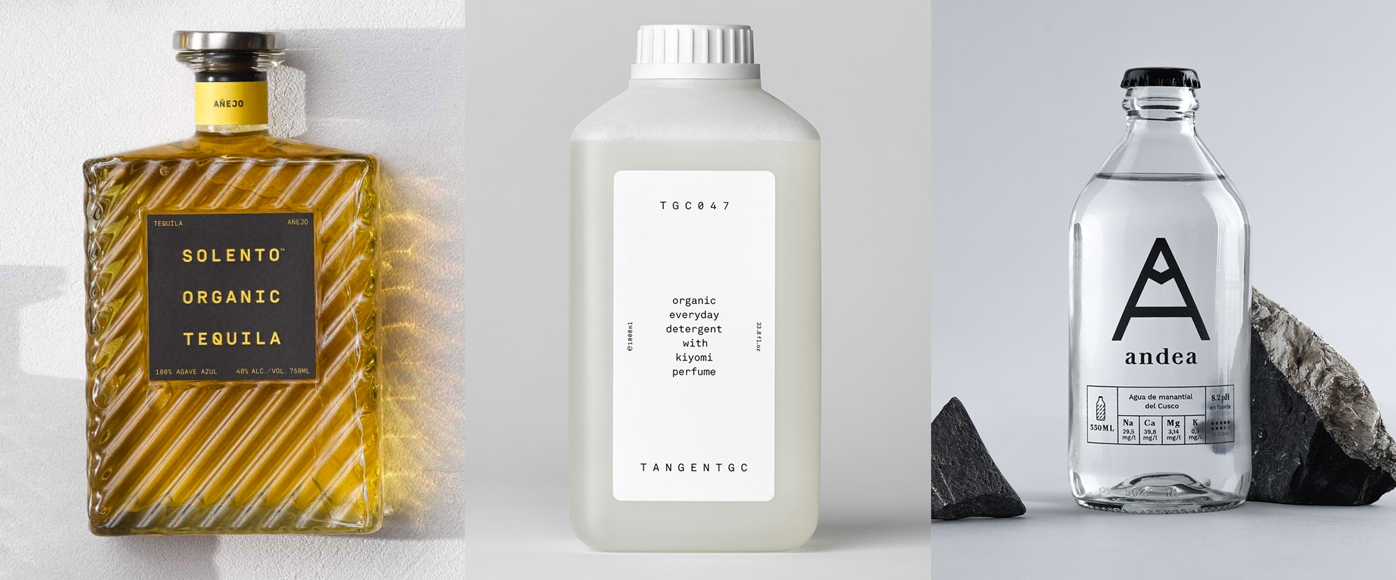
Solento by Javas Lehn Studio
Solento is a small-batch brand of tequila founded in Encinitas, CA, by legendary surf filmmaker Taylor Steele in collaboration with a distillery in Mexico. The name is a contraction of the Spanish words sol (sun) and lento (slow) and the design, by New York, NY-based Javas Lehn Studio, is as chill as a slow-setting sun. With such a textural and unique bottle, the design elements are pared back to the bare minimum but they still pack a punch with the bold color contrast of the labels across the three different tequila styles. A monospace font is probably not what one thinks of when thinking about tequila but when you have three words with the same amount of letters, it's almost a crime to NOT use a monospace font but, beyond that, it simply looks quite nice. I particularly like how the full name of the product forms an invisible square that sits at the center of the square label -- it's the small pleasures in life that bring me joy. See full project
Tangent GC by Essen International and Carl Nas Associates
In other cool-bottle, monospace-font news we have Tangent GC, a brand of laundry, shoe, and skin care products based in Stockholm, Sweden, but available worldwide with select stockists. The identity, initially designed by Essen International and extended by Carl Nas Associates -- Carl Nas worked on this project while he was at Essen -- may be a little too spartan for many of you, I think it might even be so for me and I love me some spartan-looking things but the big, hunky bottles with the stout caps are somehow super cool and the extra plain labels are an enjoyable complement. Additional products, follow a similar typographic structure while adapting to smaller labels or boxes and boldly displaying the product's name instead of the ingredients. While nice, I'm still mostly smitten by the laundry bottle -- would love to reduce reuse recycle that bad boi. See full project
Andea by after
In yet another cool-bottle, but no monospace-font news we have Andea, a brand of natural spring water that comes from a mountain in Cusco, Peru. The new packaging and identity, designed by Lima, Peru-based After is probably one of the most dramatic before-and-after comparisons possible, going from a terribly generic bottle and label combination into a delightfully sophisticated bottle with the designed silkscreened on it so there that annoying line you get across the top and bottom when using clear labels isn't there. The "A" on the front of the bottle includes a little mountain peak to allude to its origins and is complemented by a simple wordmark in lowercase serif for the name. One really nice detail are the caps, where white caps are for water without gas and black caps for water with gas, so the design of the bottle doesn't need to change, keeping production costs lower. One of the client goals of the redesign was to have a product that restaurants would be proud to carry and offer to their guests and I'm a prime example of this working out: last February when I was in Lima, stuffing my face with delicious food -- yes, I ordered two dishes, don't judge me -- I ordered water, was given a bottle of Andea, and I immediately took my phone out to photograph it without knowing anything about it. The next day, I had the pleasure of seeing After founder Alfonso Fernandez present this project at Ladfest. Moral of the story: I have no idea but the bottle is lovely. See full project

Noted: New Logo and Packaging for OATH by B&B Studio
“The Best of Oath Worlds”
(Est. 2019) "At OATH™ we share a passion that food should be absolutely delicious while healing our bodies at the same time. We believe that a healthy body empowers a curious mind. Our organic and vegan oat protein milks harness the true promise of plants, from protein-rich oats, nuts and seeds to naturally delicious spices and botanicals. Each OATH™ protein drink is expertly blended for real health benefits and the most sensational mouthfeel ever (no aftertaste). Plant Proteins are key to providing the building blocks for healthy muscles and tissues. They are often lower in calories and fat than animal proteins and HIGHER in fiber and essential nutrients. We stopped at nothing to provide a functional beverage that would excite your taste buds while benefiting your mind and your body. We are always organic, vegan, kosher, ethically sourced and never made with gums, dairy, soy, gluten, processed sugars or GMO's, and that is our promise to ourselves and to you."
Design by
B&B Studio (London, UK)
Related links
B&B Studio press releaseOATH press release
Relevant quoteOATH’s brand design goes against the traditional codes of the functional product category, which often focus on a product’s impact on physical health. Instead, OATH’s visual identity reflects the creative freedom that is unleashed through optimum nutrition.B&B has designed a range of bespoke patterns to be used across all brand touch-points. Each flavour in the range, from Indian Rose to Golden Turmeric and Double Chocolate, is finished with a unique illustrative graphic, illustrated in-house, with colour combinations denoting the taste profile.These illustrations are seen on each bottle, encased within the vertical OATH logo which features a graphic of a single oat within the ‘O’. The visual identity comes to life across the complete brand world, reflecting the ‘OATH life’ of empowered mental wellbeing. The bespoke patterns encase delivery vans and give added energy to influencer boxes, stickers, posters and other merchandise.
Images (opinion after)
Logo.
Packaging.
Lots of hero shots.
Website.
Swag.
Ad.
Opinion
There are so many new kinds of drinks coming to market these days that, for some of them, there are no pre-established expectations of what it should look like and this one is a perfect example: what does an organic and vegan oat protein milk brand look like? Who knows. But here is one initial take: a hand-drawn, marker-thick logo that plays on the organic-ness of the product in a bold way. The “T” is a little awkward somehow but the other letters have a good shape and heft to them. The abstract oat in the counterspace of the “O” is a fun bonus, which I had not noticed until I read the press release and at first I had found the little spike distracting — I wonder how many people do see an oat, since oats are so… unmemorable. The packaging is lively with the logo serving as a window for some catchy-looking illustrations that are meant to represent the flavors. Other than the Golden Turmeric, which has the most figurative shapes, I like all of them a lot. The logo looks great sideways and against the white label and it’s paired really well with the slab serif for the flavors. Overall, if I saw this on the shelf, I would definitely be intrigued and pick it oath… sorry, pick it up.

Catchy Packaging Design Projects That Employ Illustration Art
A fresh collection of graphic design concepts crafted by the tubik team is up. This time, it gathers an attractive and smart set of functional and artistic packaging design concepts and identity design ideas created in different styles and following different design approaches, but all of them united by employing the power of illustration art to make catchy and original packaging that helps the business become more noticeable in today’s tight competition and transfers the mood and emotion behind the brand.Enjoy and get inspired!Stationery PackagingThis project will add to your day the vibes of bright and unlimited creativity that children teach us. Take a glance at a piece of packaging design set for the stationery brand targeted at arts and crafts for kids. The graphic design is based on vibrant and cheerful original illustrations designed for each item to transfer the consistent feeling of children’s endless creative energy and happiness of being involved in the art process.Here are examples of boxes for colored pencils and plasticine, as well as the notebook cover design.Candles PackagingThis graphic project reflects the fun, joy, and refreshing nature of winter in the packaging design for the winter edition of the candles brand. Look at the labels and boxes designed with custom illustration patterns for the candles with fresh snow and pine forest aroma.Perfume PackagingFor decades and centuries, people have been mystified and amazed by the power of fragrances and their impact on human mood and memories. No wonder perfumery has grown into a huge industry and ignited many successful businesses. This graphic design project also touches on that theme: look at the minimalistic packaging design and custom 3D illustrations for the perfume bottle based on flower fragrances.https://medium.com/media/cb8554c43207ea71afd6ac82528ff41a/hrefWine PackagingCatch the festive vibes with this graphic design project inspired by the winter holidays: here’s a glance at the custom wine bottle label designs with bright original illustrations for the special Christmas edition.Jam PackagingIn this vibrant graphic design project with the vibes of sweet and fragrant fruit and berries, we worked on packaging design for a brand of handcrafted jams and used original illustration patterns for a bright and cheerful visual style. Take a look at the consistent set of jam jar labels with juicy illustrations to give every jar a unique look but also unite them together into one recognizable and solid brand image.Chocolate Bars PackagingHere’s a glance at the elegant and neat packaging design with custom artistic graphics we developed as a part of the brand identity design for a chocolate brand.Each chocolate bar has an original look due to its specific color and sophisticated illustrations featuring the fruit added to this type of chocolate. The typography plays on the contrast of the logo wordmark using beautiful decorative font and text descriptions performing in readable sans-serif font with visual accents on the type of chocolate and the type of fruit filling. Together, this approach gives this set of items an attractive, diverse, recognizable, and consistent appearance with sweet tenderness vibes.Fruit Water PackagingThis graphic design is inspired by the vital energy of water. Here, we worked on a packaging design project for a brand of water with different fruit flavors. The design approach is built around the set of atmospheric custom illustrations with picturesque landscapes and buildings specially made for each taste of water.https://medium.com/media/9f0481f2f33e722b418b6961bfc424d4/hrefhttps://medium.com/media/bc99c3ad152573b3439d2f2a37ca9616/hrefhttps://medium.com/media/ebf959832a7854d3d8c0cedb917c9ad6/hrefHoliday Cake PackagingThis seasonal project is devoted to winter holidays, filled with fun, tasty things, time together, and hopes for another bright year. The graphic design concept features the idea for the custom winter holiday packaging for the famous Kyiv Cake, with original illustrations sharing the festive atmosphere.New design case studies from our team are coming soon. Stay tuned!More Design Case StudiesHere’s a set of more case studies sharing the design solutions and approaches for some of the design projects done by the Tubik team.12 Bright Projects on Visual Identity and Packaging DesignGofe. Packaging and Marketing Design for Coffee BrandLove Sign. Gift Box Packaging Design with Romantic VibesPierSide. Packaging Design for Tinned Fish BrandKOISI Tokyo. Packaging Design for Japanese RestaurantSidra Vivo. Vibrant Packaging Design for Cider BrandFairytale. Picture Book Illustrations and DesignAqua Dudes. Cartoonish Packaging Design for Fish Food BrandNutribite. Tasty Packaging Design for Granola BarsMilkimu. Packaging and Marketing Design for Dairy BrandOriginally written for Tubik BlogWelcome to talk to us and check designs by Tubik via:WebsiteDribbbleBehanceTubik ArtsCatchy Packaging Design Projects That Employ Illustration Art was originally published in Muzli - Design Inspiration on Medium, where people are continuing the conversation by highlighting and responding to this story.
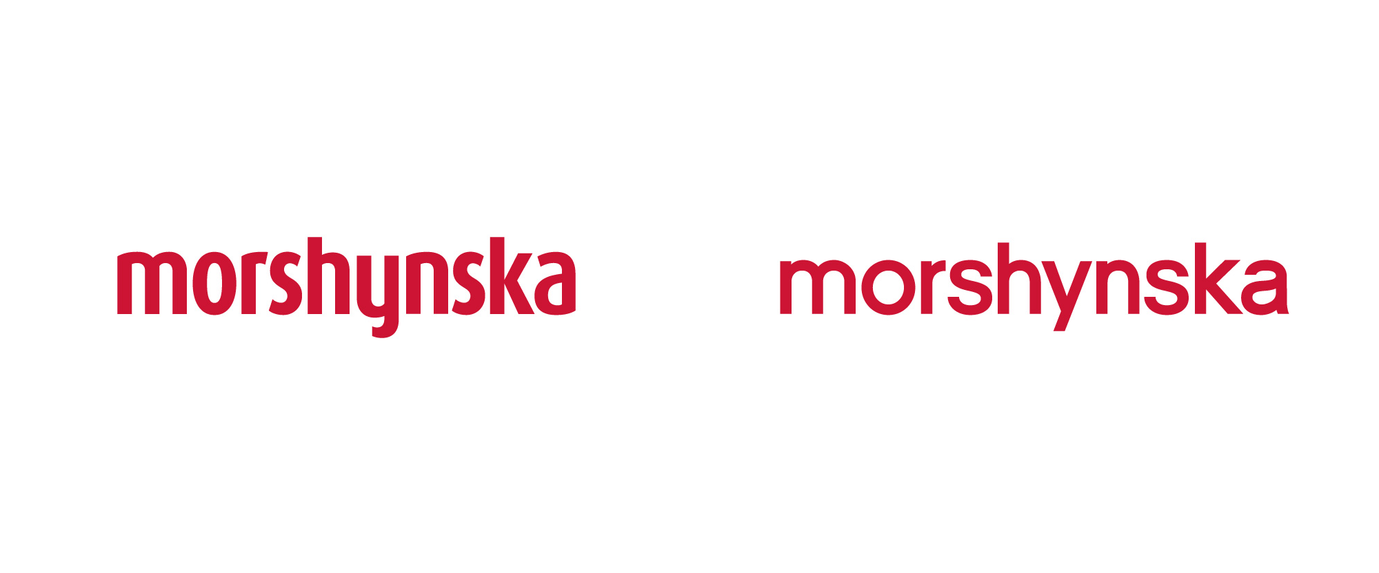
Noted: New Logo and Packaging for Morshynska by Reynolds and Reyner
“Drink a Sigh of Relief”
(Est. 2004) "Morshynska is unique natural table water originating in a preserved region of Prykarpatye from the Carpathian source called Morshynska. The city of Morshyn (Lviv oblast, Ukraine) is situated on a hillside in the eastern part of the Carpathian mountain range, 340m above sea level. Virgin Carpathian forests surround the city, ensuring the areas ancient ecological purity. The Madonna source, from which Morshynska rises, was discovered in 1879 and has long been the subject of legend. A decree by the Cabinet of Ministers of Ukraine classified the Morshyn deposit as Unique. Being a leader among bottled waters in Ukraine, Morshynska is successfully exported to the Balkans, CIS countries, Poland and Germany. Nowadays for millions of people Morshynska has become an example of the natural product, for it is one of a few true natural waters, available to the customers."
Design by
Reynolds and Reyner (Kiev, Ukraine)
Related links
Reynolds and Reyner project pageNew bottle microsite
Relevant quoteThe new bottle is much more comfortable and pleasant to hold in your hand and now contains 15% less plastic thanks to the use of innovative technologies in designing and manufacturing the bottle. This is a very important step towards preserving the environment in Ukraine.In addition to the bottle itself, Morshynska has also updated its look. The logo is now larger and simpler, the embossing of geometric spruces and mountains looks more modern and noticeable, and the size of the bottleneck and the crown-lid was reduced to make the bottle lighter. The label of the new Morshynska bottle has a more minimalistic look, with its shorter height and smaller number of elements depicted. Only elements key to brand recognition remain.The brand has received an evolutionary redesign. Nearly two years were spent on implementation and testing. Most customers will not even notice the difference, but if you put the two bottles side by side, the difference is evident. The color of the carbonation level (blue, white, and green) remains unchanged in order to preserve continuity with the old design which customers are used to.
Images (opinion after)
Logo in Latin and Cyrillic.
Bottle, before and after.
Bottle.
Rendering.
Lots of sexy renders.
Spot introducing the new bottle.
Opinion
The old logo, in the spurless sans serif style that I heavily dislike by default, was not good and not only because I don’t like the typeface but look at the awfully uneven horizontal line at the top of the x-height — it’s just painful. And it looked like a telco more than a water brand. The new logo is more Evian-esque with a deadpan neo-grotesque that I don’t quite like either but, eh, I don’t dislike it. The Cyrillic version looks nicer than the Latin, mostly because of the initial “М” which has some personality. But we are not here for the logo update as the real hero is the new bottle design that has a literally and metaphorically groovy new design of abstract mountains and trees built into it. The different relief textures are great and even without the option to see or hold one in real life myself I can feel its tactility. The labels are an improvement too, with nicer-looking trees and a bigger logo — nothing amazing but crisp and slick enough for a mainstream product. Overall, a commendable improvement in the design but a really great improvement in the UI and UX of the product itself.
Reviewed: New Master Brand for Heinz by Jones Knowles Ritchie
“Beheinz Every Great Ketchup is a Great Tomato”
Established in 1869, Heinz is an American food processing company headquartered in Pittsburgh, PA, where it was founded by Henry J. Heinz 151 years ago when we first started selling horseradish, pickles, and vinegar. Today, Heinz manufactures thousands of food products in plants on six continents and markets these products in more than 200 countries and territories. In 2015, Kraft and Heinz merged to form The Kraft Heinz Company, the third-largest food and beverage company in North America and the fifth-largest food and beverage company in the world. Earlier this year, Heinz introduced a new master brand designed by Jones Knowles Ritchie.
(Yes, I'm aware we've had a lot of Jones Knowles Ritchie-ness this month with Popeyes last week and Foot Locker yesterday. For the record, they are not being given any kind of preference or priority, it's just how the brand rollouts and case study publications have synched.)
The new cohesive brand identity unites Heinz's expansive portfolio across over 20 product categories globally and features refreshments to the logo, visual identity, brand strategy, packaging, tone of voice and brand experience touchpoints. Since the redesign began to hit shelves in the UK earlier this year, Heinz has reached over 32 million customers and seen an 11% average lift in year on year sales volume.Jones Knowles Ritchie provided text
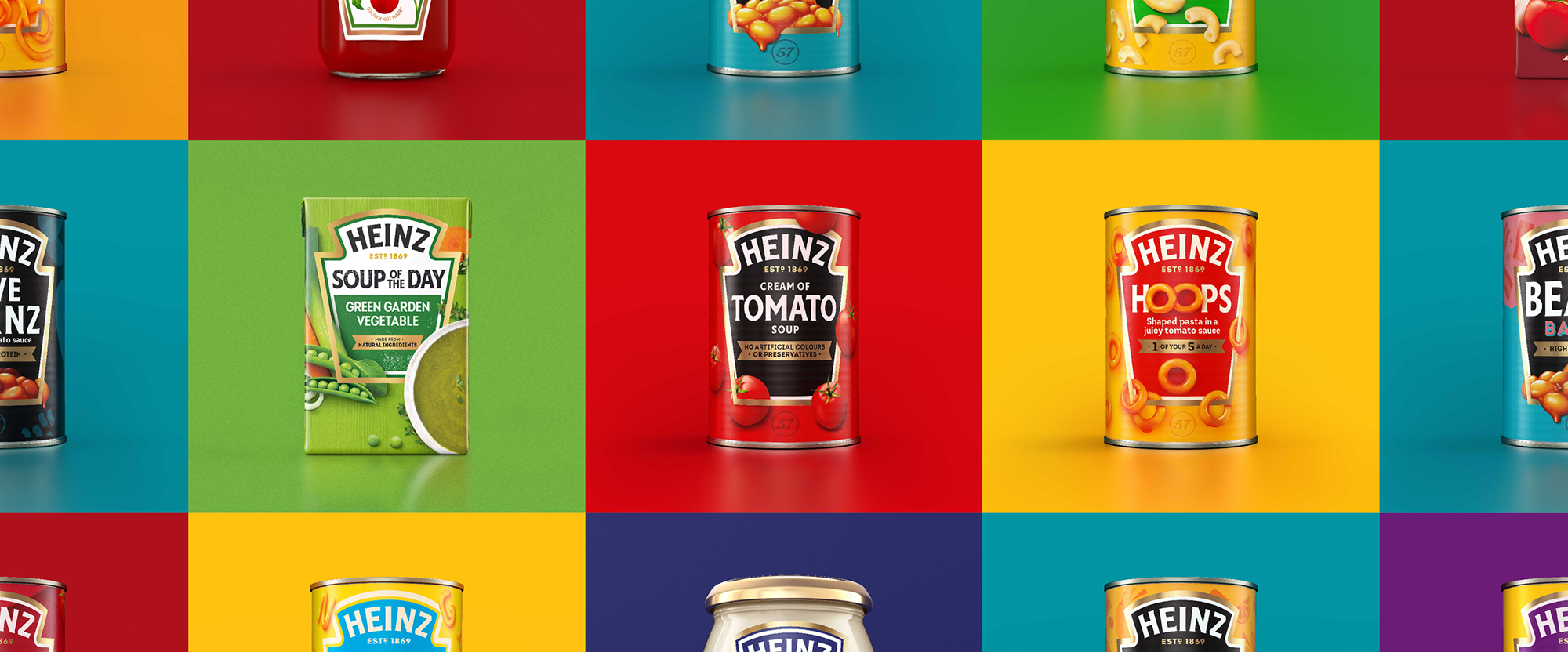
Packaging examples, after.
When I first received the project I was having a hard time framing my thoughts around it because everything made sense and looked very attractive as presented but I was missing a point of comparison to get a better sense of how much real improvement was happening here. So I used the very pretty image above to cobble together some "before" examples to help me (and you). As a disclaimer, these may not be the 100% correct before images or they may differ from what's available in your market but I limited the image search to images from the last year so it should be fairly representative of what existed before and, yup, it was all over the place.
Packaging examples, before.
Packaging examples, before and after (GIF).
Beanz.
Tomato soup.
Hoops.
The premise of the packaging hasn't really changed from the previous versions: whatever the container is, the iconic keystone shape is placed front and center (and large) with product photography and descriptions in it. There are a few significant improvements: There is now only two strokes to the keystone graphic, whereas before it could be three, it could be four, or it could be an inline treatment -- the ketchup bottle seems to get a pass, as it still has four strokes. There is no more curved typography other than the Heinz logo, which now allows it to stand out more instead of blending in with all the other type-on-a-curve treatments. There is now a limit on typefaces used with only a few examples using anything other than the brand typeface, Label Sans. This instantly creates not just more consistency but elegant consistency, which is not something we often associated with Heinz products. Finally, the obligatory depictions of the ingredients and/or product on the packaging seem to have a more realistic illustrative style. Overall, the new packaging system looks infinitely better while retaining everything that is recognizable about Heinz.
"We know that iconic, distinctive assets are key to enhancing the effectiveness of your brand through all channels - whether that be paid, earned or owned. Working with JKR, we have created a cohesive set of assets that will help align the Heinz brand across all markets, uniting everyone behind the brand purpose to help deliver growth long-term" said Victoria Sjardin, Vice President of Marketing for the International Zone at Kraft Heinz.Jones Knowles Ritchie provided text
Identity elements.
Brand typeface, Label Sans.
Part of what makes the new master brand work so well is the custom typeface that builds on the flared sans serif logo (below) to give Heinz a consistent and cohesive typographic visual language that is Heinz-ish from beginning to end. Also, condensed flared sans serifs are not all the rage right now so this helps set them apart quite easily. The identity is complemented by Fontfabric's Intro, which comes in a variety of styles including script and inline, all of which are very happy and bouncy.
Logo detail on a can.
"Heinz is a brand for everyone, loved by everyone. You can find it in Michelin-starred restaurants through to roadside cafes around the world," said Jonny Spindler, Managing Director at JKR. "With that in mind, we wanted to create brand unification across categories, geographies and brand experience touch points so that no matter how or where you experience Heinz, you're able to celebrate its simple greatness.""Our primary ambitions were to distinctively connect each element of the brand's design ecosystem and to utilise iconic assets, like the Heinz keystone, in new and interesting ways," said Spindler.Jones Knowles Ritchie provided text
Keystone treatments.
Using the keystone graphic in these more "abstract", minimalist compositions is a great way of building even more equity into this iconic shape and establishing an instant connection between it and staples like ketchup, mayo, and beans Beanz.
Phone cases.
Pins.
Overall, this is a really great evolution that integrates the existing iconography of Heinz as a more purposeful set of ingredients that come together in a more sophisticated way but without becoming too fancy or trying to be anything it's not. I can also see this leading the way to a slew of covetable brand merch a la KFC or Dunkin', which not all brands can pull off.
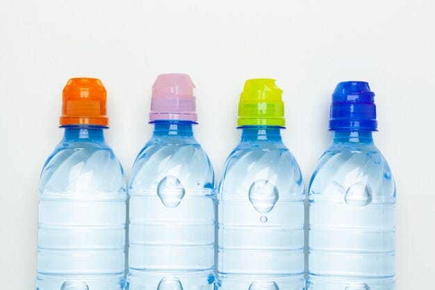
The Colours on Everyday Packaging We Think Are Codes (But Aren’t)
When we notice colour before we read words.A blue bottle feels safe.A green label feels natural.A black package feels premium.Over time, we start believing that every colour we see on a product is a deliberate signal meant for us. That these colours are codes we’ve learned to decode.Some of them are.Many of them aren’t.When colour feels like informationIn design, colour often carries meaning.Brands use colour to:Create recognitionCommunicate product variantsTrigger emotional responsesReduce decision effortSo it’s natural for users to assume that all visible colour is intentional communication.But packaging design serves more than one audience. And not all colours are chosen to speak to the consumer.Water bottle caps and assumed meaningThere is no universal or legally enforced system for water bottle cap colours. However, many beverage brands use colour as a quick visual identifier to help consumers distinguish between product variants at a glance.Common industry patterns include:Blue capsCommonly used for regular packaged drinking water, such as natural spring or standard mineral water.White or clear capsOften seen on processed or treated water, including RO-purified, distilled, or demineralised water.Green capsFrequently used for flavoured or infused waters, such as lemon, mint, or herbal variants.Black capsTypically used for premium variants, including alkaline or high-pH water.Red capsSometimes used for sparkling water or electrolyte-enhanced beverages.These associations are brand conventions, not strict rules. A blue cap does not guarantee purity, and a black cap does not certify quality. Colour here supports branding and shelf differentiation, not scientific classification.The toothpaste colour-strip mythOne of the most persistent packaging myths appears on toothpaste tubes.That small coloured rectangle at the back or bottom of the tube is often believed to indicate:Green = natural ingredientsRed = chemicalsBlack = harmfulBlue = medicinalIn reality, this rectangle is a printer’s colour mark.It exists to help packaging machines:Align printed materialDetect cutting and sealing pointsMaintain colour consistency during mass productionThe colours typically correspond to standard printing inks:CyanMagentaYellowBlackThis mark has no relationship to the product’s ingredients, safety, or formulation.It is not designed for consumer interpretation.It is a technical signal meant for machines.Why these interpretations feel convincingThese beliefs spread because they feel logical.Colour is processed faster than language.It reduces cognitive effort.It helps us make quick decisions.Design teaches us that colour often carries meaning — so when we encounter unexplained colour, we assume there is hidden information behind it.Sometimes, that assumption is correct.Sometimes, it’s simply misplaced.Packaging speaks to more than just usersGood packaging design operates on multiple layers:Front-facing design speaks to consumersStructural and alignment elements speak to machinesRegulatory information speaks to authoritiesWhen we read every visible element as consumer communication, misunderstandings emerge.What is meant for production is mistaken for messaging.What is meant for branding is mistaken for science.The real design takeawayNot every colour on a product is a signal.Some colours:Communicate emotionSupport recognitionEnable manufacturingMaintain efficiencyUnderstanding this distinction helps us become better readers of design — and more informed consumers.Design isn’t always trying to tell us something.Sometimes, it’s just making sure everything works.……💡 Stay inspired every day with Muzli!Follow us for a daily stream of design, creativity, and innovation.Linkedin | Instagram | TwitterThe Colours on Everyday Packaging We Think Are Codes (But Aren’t) was originally published in Muzli - Design Inspiration on Medium, where people are continuing the conversation by highlighting and responding to this story.
2024 Best Modern Gifts Under $25
These little gems are perfect for adding that something special for someone you care for this year. The holidays are usually a frantic time of year, so help yourself out with these goodies for the design-minded individual within us all. At under $25, this gift guide can fill out an existing gift on a budget, get someone a little something extra for the holidays, or just treat yourself!
Stojo Collapsible Cup \\\ $20
Stojo is a New York City-based brand, born out of a fascination with the cumbersome task of transporting food and drink in the city that won’t sleep. With the Stojo Collapsible Cup, which comes in 16, 20, and 24 oz sizes, your drinks will stay warm and inside the vessel, offering a leak-proof seal. The body is made of high-quality silicone, and comes with a straw for iced beverages. They also offer food storage containers, perfect for an office commute or snacks throughout the day.
LATTLinen Waffle Towel \\\ $11.25 and up
These linen waffle towels from LATTLinen make for perfect dishcloths, kitchen linens, or bath towels. They come in a selection of gorgeous muted colors, with the texture of the waffle allowing the hues to shine. In three sizes, the smallest would be appropriate for a washcloth, while the largest is great for the bath. Be sure to check out the rest of the collection for matching washcloths, towels, duvet covers, and more.
Tools To Live By 8″ Scissors \\\ $24
These chic scissors from accessories brand Tools to Live By offer a smart form, effortlessly maneuverable tapered blades, and a surprisingly ergonomic grip. Made from Japanese stainless steel with a rubber handle for a better grip, the body is coated with Teflon, so glue and other adhesives don’t stand a chance. This pair is available in black and gold, for a tool to work wonderfully and look good doing so.
Weak Knees Gochujang Sriracha \\\ $12.99
Four words: put this on everything. The Weak Knees Gochujang Sriracha from Bushwick Kitchen has a beautiful blend of sweet, smoky, and spicy that will leave you saying those four magical words as well. The spice level is not overpowering (they give it a three out of five chilies), lending more flavor than heat to any dish it graces. Perfect for anyone who enjoys food, they also offer gift sets for anyone interested in trying the entire Bushwick Kitchen collection.
Jisulife Handheld Fan \\\ $17.99
If you know anyone that tends to run hot, they probably always have a fan going in at least one room, no matter the time of year. Why not make it personal? The Jisulife Handheld Fan includes five speed settings and is relatively quiet for how strong it is, cute and quiet even in enclosed spaces such as cars or trains.
ban.do Grippy Socks \\\ $13.95
These fuzzy socks with grippy dots on the soles from ban.do are a great choice for those that run on the colder side. With super plush, vibrant microfiber fleece, these socks are going to keep you warm for a while with four colors to match any type of cozy outfit. Maximalist socks are the perfect way to spice up any colorblocked outfit. Now, where’s the cider?
AMO Hexagon Huggie \\\ $25
AMO NYC is a beautiful shop on Prince Street, nestled right in between huge names in jewelry and fashion. The incredibly helpful owner of the store always offers suggestions, and lets you browse the extensive selection of pieces in the tight quarters of the clean, bright interior. There is also a limited selection of options available online, sure to suit anyone looking to add a bit of bling to their life.
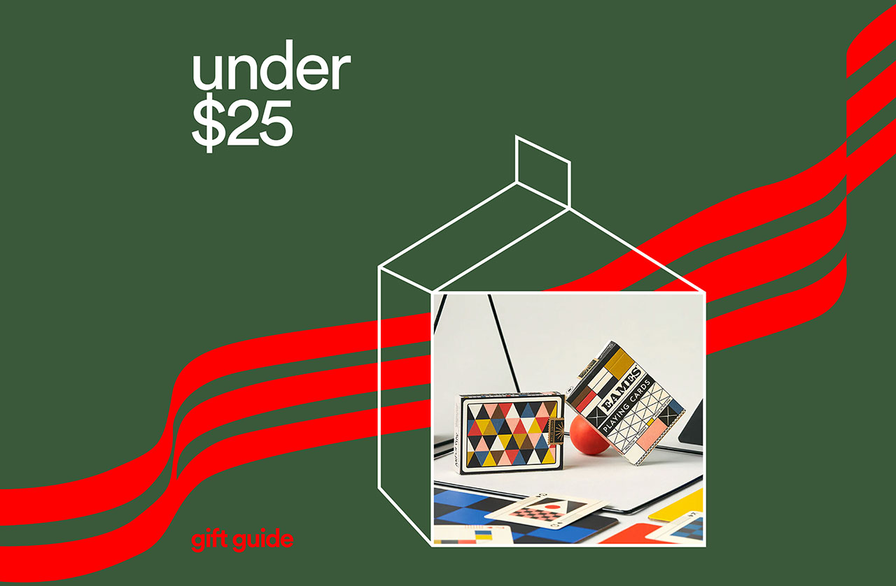
Eames “The Little Toy” Playing Cards \\\ $18
These mod playing cards bring us back to another era, perfectly reminiscent of the color palette and graphic nature of The Toy, an Eames classic. The iconic triangles are used thoughtfully, and the color palette is dead on for hues in vogue at that time. The fourth edition of these fan favorite playing cards, each one celebrates a different Eames original, honoring their incredible legacy in the history of design.
2024 Pantone Color of the Year Espresso Cup \\\ $14
Pantone, global color authority, has released a Color of the Year since 1999 to much critical acclaim. Psychology, trends, and world events all effect color choice, and this year was no different. The 2024 Pantone Color of the Year is Peach Fuzz, signaling a time for sensitivity, reflection, and compassion. In a time when so many of us feel disconnected, this choice was one of gathering and empathy, softly looking towards the future.
Incausa Resin Incense \\\ $20
These incense sticks are unique visually and physically, with a super long burn time of 50 minutes. Incausa specializes in specific resin blends from the Almacega tree found in the Amazon, used in ritualistic and Ayurvedic healing. Relax into four distinct scents as a treat for yourself, or go with gift sets that will suit almost everyone on your list.
Follow along so you don’t miss any of our 2024 Gift Guides this year!
This post contains affiliate links, so if you make a purchase from an affiliate link, we earn a commission. Thanks for supporting Design Milk!

Cutting Through the Clutter: How Beverage Brands Can Stand Out in a Crowded Market
When Every Shelf Looks the Same
Walk into any supermarket beverage aisle, and the story is the same—rows of products promising refreshment, flavour, or health benefits, all jostling for attention. In a category where product formats and flavours are often similar, customers default to what’s familiar, or what catches their eye first.
For brands, that’s a tough environment to grow in. Competing purely on price can erode margins. Betting on seasonal flavours or limited-time releases may drive short spikes in sales, but it’s not a long-term differentiator. Standing out requires a combination of strategic positioning and a brand identity that buyers recognise instantly.
Why New Entrants Can Shake the Market So Quickly
The barrier to entry in the beverage market isn’t as high as it once was. Pop-up stalls, franchise beverage concepts, and direct-to-consumer online brands can launch quickly, sometimes with little more than a compelling social media presence and an outsourced production line.
These newcomers often lean on novelty—unexpected flavour pairings, nostalgic branding, or influencer partnerships that create immediate buzz. Established brands can lose share almost overnight, not because their product quality changed, but because consumers are drawn to something fresh.
If your brand hasn’t refreshed its image or message in years, it’s at risk of looking tired next to the energy of these challengers.
The Power of Distinctive Brand Identity
Consumers don’t just buy drinks—they buy the story, the feeling, and the promise behind them. That’s why some brands can charge more, even when their ingredients and production methods are similar to cheaper options.
A distinctive brand identity goes beyond a good logo. It shapes how your product feels in someone’s hand, how it photographs for social media, and how instantly recognisable it is in a busy retail environment. The beverage brands that stay ahead often treat their brand as a living, evolving asset—not a box to tick at launch.
Packaging as a Silent Salesperson
In beverages, packaging is often your first and only chance to grab a shopper’s attention. The most successful designs don’t just “look nice”—they communicate the product’s personality and positioning within seconds.
Consider the difference between a mass-produced energy drink and a boutique cold-pressed juice. One screams high-energy performance; the other whispers health and sophistication. That’s not by accident—it’s a deliberate packaging choice aligned with audience expectations.
Working with a packaging design agency Sydney based can be a game-changer for brands in this space. These agencies understand not just visual trends, but also how to navigate local market preferences, retailer requirements, and printing constraints. They can help translate your brand values into packaging that stands out both on-shelf and online.
Beyond the Bottle: Multi-Channel Brand Consistency
Today’s beverage purchase journey often starts before someone sees the product in person. Social media, influencer posts, and online reviews play a big role in shaping perception.
If your product looks bold and premium in-store but underwhelming in digital campaigns, you’re missing opportunities. Consistency across touchpoints—whether it’s Instagram, an e-commerce listing, or event sponsorship—builds trust. People remember and gravitate toward brands that look and feel the same wherever they encounter them.
Innovating Without Losing the Core
One mistake brands make when trying to stand out is overhauling everything at once. In chasing trends, they risk alienating their existing customer base.
The better approach is to evolve while staying anchored to what makes you, you. If your audience loves your brand for its playful tone, keep that personality, but explore new product lines or collaborations that fit naturally. If your heritage is a selling point, weave it into modernised packaging or marketing campaigns that feel current without erasing your history.
Staying Agile in a Fast-Moving Category
The beverage market moves quickly—seasonal fads, viral TikTok drinks, and new functional ingredients can emerge overnight. The brands that thrive aren’t necessarily the fastest to jump on every trend, but they are quick to assess whether a trend aligns with their positioning and audience.
Agility comes from having a clear brand foundation and a marketing setup that can scale campaigns quickly. This way, you can launch a limited-edition flavour, redesign a label, or create a social media push without starting from scratch each time.
Standing Out Is a Strategic Decision
In a crowded beverage market, distinctiveness isn’t luck—it’s strategy. Whether it’s through sharp positioning, standout packaging, or consistent storytelling, the brands that succeed are the ones that take control of their image rather than letting it drift.
By investing in a clear brand identity and making sure every touchpoint—from packaging to promotions—works together, you don’t just fight for attention. You become the brand customers look for first.
The post Cutting Through the Clutter: How Beverage Brands Can Stand Out in a Crowded Market appeared first on Designer Daily: graphic and web design blog.
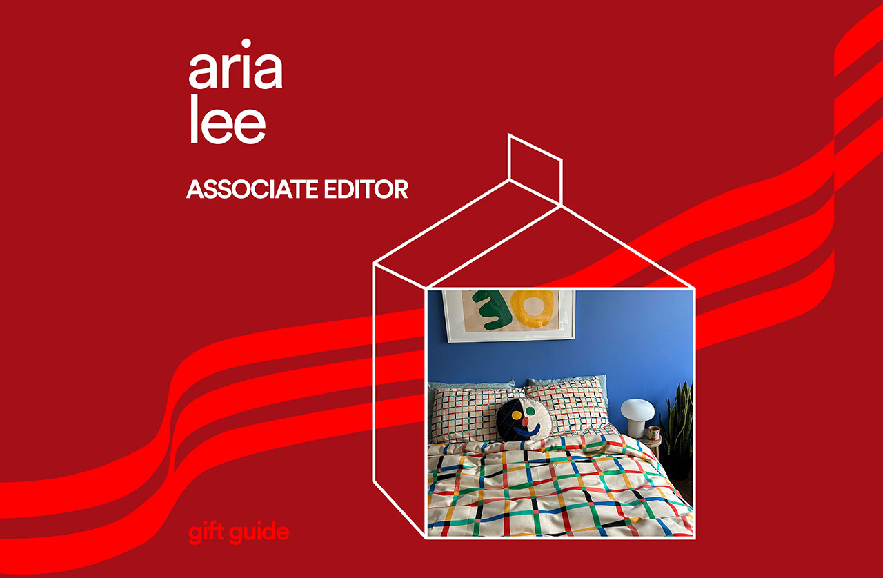
2024 Modern Gift Ideas From Associate Editor Aria Lee
This is a pretty good snapshot of just some of the shiny things I love this year: perfume, pasta earrings, and a Poplight or two. Dive into my curated gift picks for 2024 – imagine the beauty of a hot cider sipped from a Drippy Mug on a chilly winter morning with steam curling into the air. Provide for inner peace with beautiful, lasting objects that bring joy. You won’t regret it.
Disco by Zernell Gillie \\\ $120
Zernell Gillie, a Chicago-based DJ sitting at the helm of his own record label and clothing line, decided a perfume house was next on his list. Disco launched in 2022 to much indie acclaim. It’s layered, complex, and has an incredible lasting power. This is his signature – warm, comforting, yet with an air of mysterious, alluring ambiguity. The tea and bergamot start at a fresh point that settles into the amber and myrrh notes, but never too much to lose any sophistication. The sillage is fantastic, I would notice light wafts whenever I turned my head that were a joy to experience, and a great reminder of the value you’re getting. I also have a sample of Techno, a slightly more feminine scent that lasts just as long. One spray to last all day.
Scallop Edge Serving Bowl by Sugarhouse Ceramic Co \\\ $52
This speckled, eggshell-colored bowl is perfect for serving salads, soups, grains, or any other food in style. Brett and Natasha make all their lovely wares by hand in Nova Scotia, blending natural hues with biomimetic design to create modern yet timeless pieces. Their sensitivity to color and texture is exquisite, a nod to Natasha’s roots as an illustrator. They celebrate the beauty of making art with art, offering ceramics for the studio painter, home barista, and artist on the go.
The Meadow Salt Set \\\ $36
The Meadow is a quaint, homey shop on Mulberry Street in Manhattan, nestled in between small boutiques and bakeries. The store employs an ingenious salt delivery system (fresh popcorn), setting the stage for a great buying experience. Popcorn is tossed in each individual salt, and presented in beautiful glass jars. Each flavor sits next to various sized jars of the featured salt, the different aromas wafting in and around the store in an intoxicating way. This set is the perfect gift for foodies, those wanting to become more adventurous with their palate, or just a salt lover, like me.
French Butter Keeper by Sawyer Ceramics \\\ $54
As a bread enthusiast, my natural enemy is cold butter. We all know the drudgery of attempting to spread cold butter on warm toast, crushing the crumb and leaving unmelted bits floating like sad icebergs across a frozen toast lake. This French Butter Keeper is a beautiful way to keep your butter fresh and room temperature, cold butter simply a distant memory. Sawyer Ceramics, founded by John Sawyer in 2009, produces all their products in their San Diego workshop. This one-roof approach ensures a high-quality and long-lasting product, with the handmade touch of a master ceramicist.
The Poplight \\\ $95
The Poplight is a beautiful, functional, renter-friendly lighting solution that comes in enough colors to suit any interior. Pick from seven modern hues (including their new cobalt blue shade), with dimmable options and three light temperatures, perfect for any time of day. The rechargeable battery is removable for easy charging, and the sleep timer helps you save energy and keep your circadian rhythm regular. You might recognize the Poplight from Shark Tank, proudly LGBTQ+ and women owned, making it easy to support underrepresented designers and great design in the process. Renters can rest easy knowing their lighting won’t cost them their deposit, and look great doing so.
Delicacies Pasta Obsessed Earring Set \\\ $110
Do you ever wish you could tell the world how much you love pasta, but in an elegant way? Enter the Pasta Obsessed Earring Set from Delicacies Jewelry. This set features the smallest ravioli, macaroni, farfalle, and penne, perfect for a mismatched stud look. Available in sterling silver or plated gold, Delicacies Jewelry uses their food-themed jewelry to raise awareness about hunger throughout the world. Partnering with community-led organizations such as Loaves & Fishes, El Renacer Del Mayab, and Welcome to Chinatown, these are a good gift for anyone who likes giving, and giving back as well.
Rica Room Spray \\\ $40
Rica bath + body is a holistic skincare and housewares brand that aims to bring fresh, made-to-order products to promote wellness and rejuvenation. Available in 19 stunning fragrances, that can all be paired with a matching candle, body butter, and roll-on perfume. Taking Rica “beyond the bathtub” into an immersive, luxurious, yet cozy environment, they also offer retreats at their Bungalow Out East, making easy work of living large.
Drippy Cylinder Mug \\\ $65
I can’t help but smile every time I use my Drippy Mug, the thick glaze making a perfect little rest for my other hand to feel the warmth of my coffee. Handmade in Philadelphia, these Cylinder Mugs come in all types of fun pastel color combinations, sure to hold even the most serious of lattes. Explore the full range of Drippy products, including planters, bowls, and one-of-a-kind weirdos.
Ersa Fibers Duvet Cover \\\ $255
What I wouldn’t give to wake up to this under the tree. Ersa Fibers takes pride in providing high-quality garments and home goods made to last a lifetime. Brilliant patterns and color-blocked styles dot the collection, with bold black and white options crafted with exceptional fit, to colorful pieces sure to get you noticed. This duvet cover lets beds have fun too. In lieu of the matching sheet set, pulling specific colors from this colorful cover ensures you always have a clean, chic set of sheets without breaking your budget.
Loewe Tomato Leaves Candle \\\ From $120
Darling fashion brand Loewe presents their Tomato Leaves candle, reminiscent of the iconic fruit in early summer, just about to burst into bloom. The notes are fir balsam, oak moss, and blackcurrant, with a distinctly green overtone. The candle arrives in lovely packaging, perfect for gifting to others or oneself. It sits in a modern ceramic vessel, made in Spain, a brilliant red in homage to the note of the hour.
Follow along so you don’t miss any of our 2024 Gift Guides this year!
This post contains affiliate links, so if you make a purchase from an affiliate link, we earn a commission. Thanks for supporting Design Milk!
This genius app idea will tell you which menu options are better for the environment
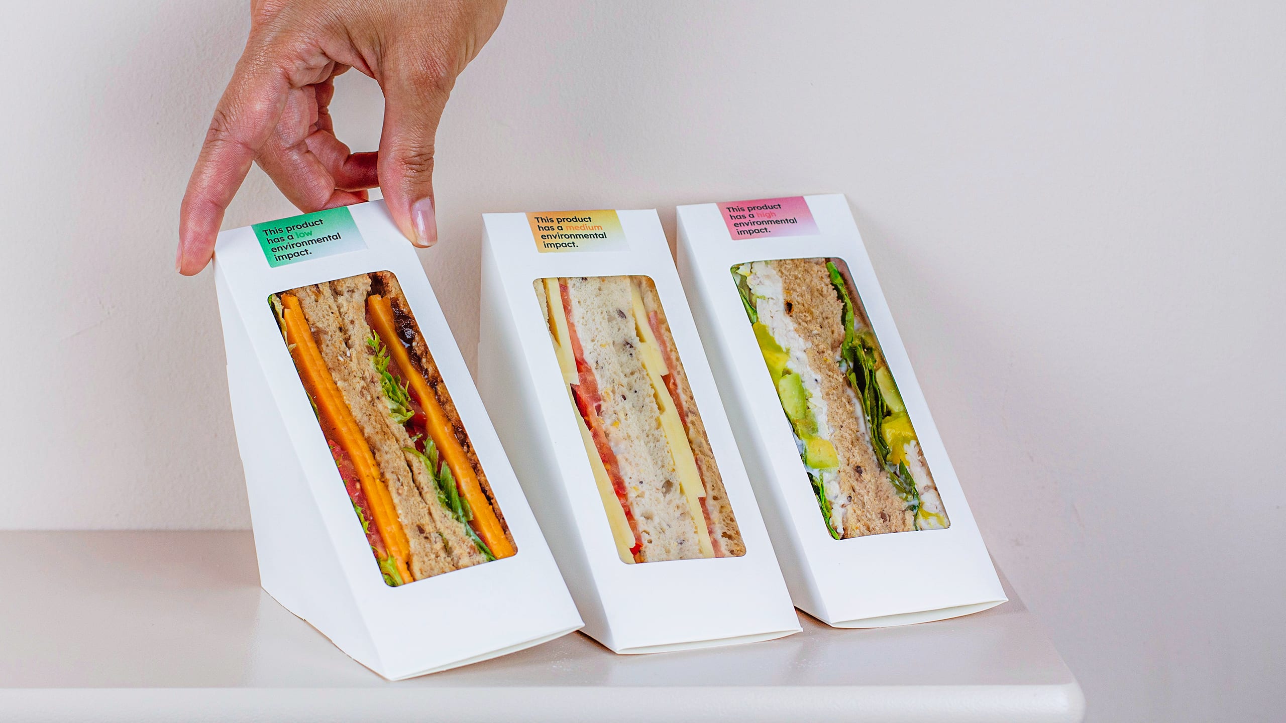
It’s lunchtime. You’re standing in your favorite cafe, salivating in front of a row of prepackaged triangle sandwiches. You reach for the roast beef, because you love roast beef, but suddenly you notice a red label taped over the packaging. It reads “this product has a high environmental impact.” You frown—you really love roast beef—but right next to it, you notice another sandwich with a yellow label, and then another sandwich with a green label that reads “low environmental impact.”
Which do you choose?
A similar scenario (minus, perhaps, the obsession with roast beef) played out over the course of a week last October, when the University of Bristol’s School of Experimental Psychology ran a study in four cafes across its campus. Only 11 students participated and filled out a survey afterwards, but more than half of them reported that the labels had a “positive impact” on their decision-making.
The color-coded labels were designed by London design agency Special Projects, which has built an impressive track record of thoughtful UI projects like Moving Buttons—a post-COVID grocery store touchscreen that moves the buttons after every customer so that no two people touch the same spot; or the SloMo app, which helps people with psychosis “slow” their thoughts.
Following the study, the team has now launched a project called Eco Lenses, which amounts to five digital solutions that could help people make more sustainable food choices. Think an app that lets you scan a restaurant menu and rearranges the dishes from most to least sustainable; or a food delivery app feature that displays a sustainability score for your chosen meal. All solutions are conceptual for now, but the technology required to develop these apps very much exists. Plus, the project is a masterclass in behavioral design.
[GIF: Special Projects]
The food sector is responsible for 30% of global greenhouse gas emissions, but not all foods are equal in their carbon footprint. Some ingredients—like beef, cheese, coffee, and yes, avocados—have higher CO2 emissions than others, meaning that a diet change could lower our carbon footprint.
For the triangle sandwiches, Special Projects collaborated with a team research associates and Marcus Munafo, a professor of biological psychology at the University of Bristol, to develop a “traffic light” color system that is universally understood across countries and cultures. They then retrofitted the existing packaging of three of the most popular sandwiches at the cafes, following research-based criteria like water usage, biodiversity loss, and greenhouse gas emissions to determine which color to associate with each sandwich. No intimidating warning symbols, no sustainability jargon, no outwardly guilt-inducing messaging. Just plain, clear, color-coded information.
At the end of the study, the team arrived at an important conclusion: If you give people an easy and convenient alternative, they are more likely to choose the more sustainable option. “We’re saying ‘this is bad, but look, two centimeters to your right, there is a better alternative,'” says Special Projects’ cofounder and creative director Clara Gaggero Westaway, in reference to the three types of sandwiches sitting on the same shelf.
It’s worth noting that while the percentage of students who said they changed their mind was promising to the designers, there are many factors at play that could lead to an even higher number. For example, if only “red” options were left by the end of the lunch rush, that could have affected the overall result. The University if Bristol is planning to run a second study in the spring. In the meantime, Special Projects is continuing to explore other applications that might inform how people choose what to eat.
[GIF: Special Projects]
Many of the solutions the team has come up with require an app or a smartphone. If you’re at Prêt à Manger, for example, you could take out your phone, snap a photo of the board menu on the wall, and watch the sustainable options light up on your screen while the others remain grayed out. If you’re buying groceries online and searching for ingredients to make a Spaghetti alla Carbonara, an AI-enhanced feature could suggest a more sustainable (and similarly priced) recipe and propose ingredients to make vegan lemon spaghetti instead. As Special Projects founder (and Clara’s husband) Adrian Westaway points out, these features could be combined into one overarching app, spread across individual apps, or in an ideal world, integrated in your phone’s operating system.
The reliance on technology isn’t a silver bullet and will have to be combined with a physical alternative for those who either don’t care enough to pull out a smartphone, or those who simply don’t have one. But as Clara explains, the potential for impact is wider if you give consumers the option to download an app that can analyze every restaurant menu, than if you have to convince every single restaurant to redesign their menu.
Plus, the act of pulling out our phones while shopping is already a familiar user experience thanks to apps like Yuka or Vivino, both of which let you scan a product like the barcode on a dry shampoo or the label of a wine bottle, and help you make a more informed purchase. “Most of us have devices in our pocket, and we use them to check people out on Instagram,” says Clara. “What if we can put this technology to good use?”
This simple carbonated water gadget could upend the beverage industry
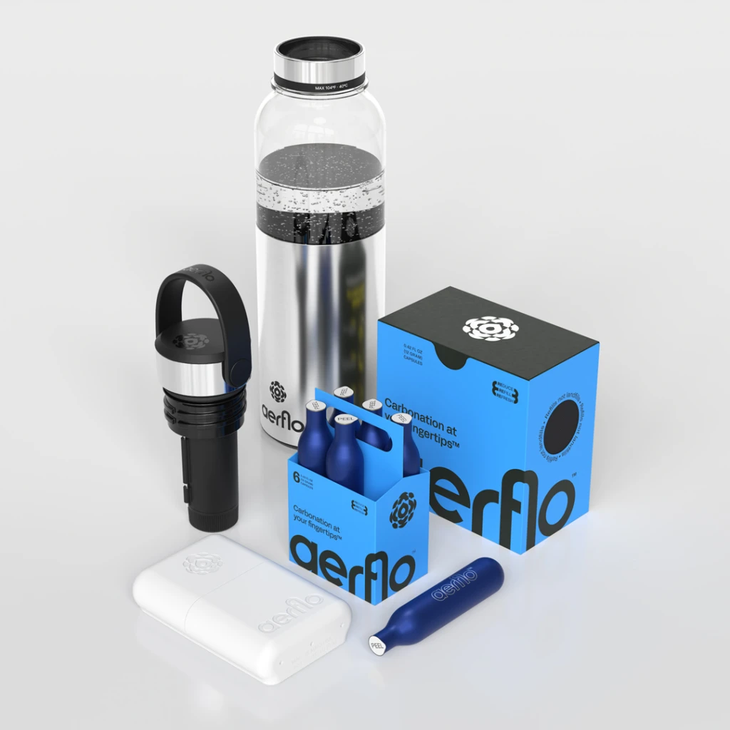
I love carbonated water, but I hate the waste of packaged carbonated water. And while a Sodastream might have been a solution a decade ago, it doesn’t allow you to refill your bottle when the water is gone and you are 12 subway stations and two transfers away from your kitchen. Which is why I’m excited about the Aer1, a portable bottle that sparkles the hell out of your favorite liquid—anywhere, anytime, at the the push of a button. It may very well become the game-changer for the millions of people who love their bubbles but hate the environmental toll of single-use cans and bottles.
Made by a New Jersey startup called Aerflo, the Aer1 Bottle is a simple concept: it combines a reusable bottle with a carbonating device. The system comes with 13 reusable CO2 capsules, each capable of carbonating the equivalent of four 16 oz bottles of water. These finger-sized capsules lock right inside a sleek carbonation device built into its cap. When a capsule runs out, you simply replace it with a new one from the included pack.
[Photo: Aerflo]
But what really sets Aer1 apart is the sustainability of its design. The used capsules aren’t tossed in the trash. They’re sent back to Aerflo’s facility in neat packaging with a preprinted post label (think old Netflix years, without the subscription).
In that custom-designed, custom-built, fully-automated facility, they’re inspected using optical and mechanical sensors, thoroughly sterilized, and finally refilled for another round of use. The company doesn’t send you back your capsules because the moment you ship your used capsule pack back, a package of newly filled capsules ships immediately.
The company says nothing gets trashed and you can keep three extra capsules on hand, so you never run out of bubbles while your new capsules are en route.
[Photo: Aerflo]
When I saw the Aer1 bottle in action over a video conference with the Aeroflo founders—Buzz Wiggins and John Throp—it all seemed deceptively simple. One of those “oh yes!” moments followed by the usual, stupid “why hasn’t anyone done this before?” thought.
It turns out that making the Aer1 was a major design challenge. Aer1’s founders say in total, the product took four years full of mechanical challenges and regulatory nightmares to come to life. It started with designing a cap that injects the bubbles into your favorite liquid, and ended with creating a shipping package and label design that had to go through three years of revisions and approvals before the United States Postal Service and the Department of Transportation’s Pipeline and Hazardous Materials Safety Administration (PHMSA) approved the refillable CO2 capsules for shipping.
A nightmare design trip
Wiggins and Throp, long-time friends, had talked about starting a company for years before they landed on the concept for Aerflo. Throp, who has a background in venture capital and hardware businesses, recalls the moment they realized they were onto something. “We saw our entire peer group carrying around reusable bottles, and we started to think about those as a platform. We asked ourselves, ‘How could you bring beverage customization to the bottle that someone is carrying around with them every single day?’”
The answer they found was carbonation, which they identified as the fastest-growing beverage category in North America. However, portable carbonation solutions were almost non-existent, aside from single-use options, which didn’t fit with their vision of sustainability. So, they set out to develop a system that could carbonate water in a portable bottle while being environmentally friendly.
The first prototype was little more than a bike pump rigged to inject CO2 into a bottle. “I can’t believe this worked,” Wiggins says with a laugh, showing me their ACME contraption. But while that initial device proved the concept was possible, it was far from market-ready. They started to miniaturize the design until they reached a key point. “When we were able to get five bottles of sparkling water out of one capsule, that’s when we knew we had something,” Wiggins points out.
One of the most significant hurdles was creating a pressure relief valve small enough to fit into the bottle’s cap, yet robust enough to manage the carbonation process safely. Wiggins recalls how everyone told them it was impossible to do. “I designed this valve 50 times before we found one that was market viable,” he says.
The duo’s relentless pursuit of perfection led them to take on tasks that most would consider far outside their wheelhouse. When the COVID-19 pandemic disrupted global supply chains, finding manufacturers willing to produce their custom pressure relief valve became nearly impossible.
Faced with a six-week wait and a $3,000 price tag from the only company that didn’t laugh at their proposal, Wiggins decided to do it himself. “I told John, for $1,000 in two weeks, I can purchase a lathe, go learn how to use it on YouTube, and do this,” he says. And that’s exactly what he did. This hands-on approach not only kept their project on track but also built a deep understanding of every aspect of their product.
[Photo: Aerflo]
Seven rings of regulatory hell
Traditional CO2 cartridges used in carbonation devices are single-use and made of steel—heavy, expensive to ship, and environmentally damaging, particularly when they’re filled overseas and shipped to the U.S. “We looked at that entire model, and for us, it was just a huge breakdown,” Wiggins explains. “The core of our company and the nexus of what we worked on for so long is this thing here,” he says, holding up one of their deep blue reusable capsules. “This is made out of aluminum, and what that does for us is it makes it so that we are allowed to refill it.”
Refining this idea took years of negotiation and innovation. The refillable CO2 capsules had to meet stringent safety standards, and getting them approved by the U.S. Department of Transportation was no small feat.
Wiggins recalls their initial conversations with regulators: “I’ll never forget on that call, the person we were talking to said, ‘I told you somebody was going to come up with this idea.’”
Three years later, Aerflo had an approved capsule design and packaging that the USPS can safely ship. Today, Aerflo operates out of a 5,000 square foot, custom-built facility in New Jersey, where used capsules are accumulated and then refilled.
[Photo: Aerflo]
A cheaper sparkling water
With traditional sparkling water costing between $2.55 and $6.33 per liter, the Aer1 system can produce sparkling water for around $1 per liter—up to 70% less than buying single-use bottles or cans. It took a lot of effort, but the result could change the market of carbonated beverages without screwing up the planet.
Aerflo is launching the Aer1 system on August 27, with the first 1,000 units available for preorder on its website. These early units come with custom engraving options and a 50% discount on the first refill pack. Full availability will follow in late September, with the system priced at $99 and replacement packs of 12 capsules available for $25.
Waterdrop A2 RO Hot Cold Water Dispenser Review: Clean Water Meets Contemporary Design
PROS:
Sleek, minimalist aesthetic blends into modern kitchen environments
Effective 5-stage filtration and efficient 3:1 pure-to-drain ratio
Hot and Cold water dispenser with six temperature settings
No complicated installation required, tool-free filter replacement
Substantial positive environmental impact and cost savings
CONS:
Temperatures might not be hot or cold enough for some uses
May require frequent refilling during peak usage periods
RATINGS:
AESTHETICSERGONOMICSPERFORMANCESUSTAINABILITY / REPAIRABILITYVALUE FOR MONEYEDITOR'S QUOTE:The Waterdrop A2 whispers sophistication while shouting sustainability, transforming your countertop from cluttered chaos into a sleek sanctuary of instant hot, cold, and pure hydration.
Imagine groggily stumbling into your kitchen at 6 AM, desperately craving that perfect cup of coffee, only to discover your tap water tastes like it traveled through rusty pipes from the previous century. Sound familiar? Modern households battle an increasingly frustrating relationship with water quality, and honestly, we’re all getting tired of it. Municipal systems crumble under aging infrastructure while microplastics and mystery chemicals turn our daily hydration into a guessing game.
Meanwhile, bottled water promises salvation but secretly drains both your wallet and the planet’s future. Traditional solutions feel like choosing between bad and worse: under-sink filters demand expensive installation and hide behind cabinet doors like guilty secrets, while those massive water dispensers transform your kitchen into an office break room. Then there’s the Waterdrop A2, strutting onto the scene like the cool kid who actually delivers on their promises. This sleek countertop marvel claims to solve every water headache you’ve ever had, so we decided to put it through the ultimate test.
Designer: Waterdrop Filter
Click Here to Buy Now: $379.05 $499 ($119.95 off, use coupon code “YDREADERA2”). Hurry, deal ends in 48-hours!
Aesthetics
Walking into a kitchen with the Waterdrop A2 feels like discovering a secret that everyone else missed. This isn’t your grandmother’s clunky water filter; it’s a masterpiece that happens to purify water. The design whispers sophistication instead of screaming “appliance,” with curves that flow like water itself and lines so clean they could cut glass. Every angle feels deliberate, every surface intentional.
The color story reads like a love letter to modern design sensibilities. Matte gray dominates the landscape, punctuated by silver accents that catch the light without demanding attention. This restrained palette works magic in virtually any kitchen environment, from stark minimalist temples to cozy Scandinavian sanctuaries. The finish resists fingerprints like it has superpowers, maintaining that fresh-from-the-showroom appearance even after your toddler discovers it makes interesting sounds.
Size matters, especially when counter real estate costs more than Manhattan apartments. At 15.9 inches tall, 8.2 inches wide, and 15.7 inches deep, the Waterdrop A2 occupies roughly the same footprint as your premium coffee maker. But here’s the magic trick: it doesn’t feel heavy or imposing because that transparent pitcher and translucent water tank create visual breathing room. Smart design choices make small spaces feel bigger rather than cramped.
That frosted reservoir deserves its own standing ovation for pure design genius. Instead of hiding water storage like a shameful secret, Waterdrop transformed the 1.25-gallon (160oz) capacity into eye candy. You can watch water levels drop and rise, turning a mundane maintenance task into something oddly satisfying. It’s functional art that happens to hold water.
Material selection tells a story of thoughtful engineering wrapped in premium aesthetics. High-grade plastics blend seamlessly with strategic metal touches, creating an illusion of luxury without the corresponding weight penalty. Surfaces vary subtly between smooth matte finishes and gentle texturing, providing both visual interest and practical grip where you need it most. Every component feels substantial yet approachable.
Cable management receives the attention it deserves through clever routing channels that keep power cords organized and unobtrusive. However, this thoughtfulness exposes one minor hiccup: you need proximity to electrical outlets, which might cramp your style if you prefer island or peninsula placement. Extension cords can solve the problem but might compromise that pristine aesthetic you’re chasing.
The touch display integration represents design perfection in miniature form. Rather than slapping a separate control panel onto the front facade, Waterdrop embedded the interface seamlessly into the overall composition. The result feels like holding tomorrow’s technology today, reminiscent of those premium appliances that typically cost twice as much. Icons are intuitive, responses immediate, and the whole experience just feels right.
Stacking the A2 against traditional alternatives reveals how far countertop water purification has traveled aesthetically. Those industrial water coolers look like relics from another century, while pitcher filters appear temporary and apologetic. First-generation countertop reverse osmosis systems often resembled laboratory equipment that accidentally wandered into your kitchen. The A2 transforms water purification from embarrassing necessity into attractive centerpiece.
Kitchen harmony becomes effortless thanks to the Waterdrop A2’s chameleon-like ability to complement existing appliances. Stainless steel setups find perfect neutral companions, while white kitchen suites discover seamless color matching. Even bold, dramatic kitchens can embrace the A2’s understated presence without visual warfare or attention competition.
Ergonomics
Living with the A2 reveals those tiny details that separate good design from greatness. Every touch interaction feels responsive and satisfying, like the device actually wants to help rather than tolerate your presence. The interface responds instantly to finger contact, providing that subtle haptic feedback that confirms your commands are registered successfully. Learning the six temperature settings becomes second nature faster than you’d expect.
Volume controls demonstrate thoughtful engineering through five preset options that cover everything from quick hydration sips to full water bottle refills. No more guessing games or wasteful over-dispensing; just select your desired amount and trust the system to deliver precisely. Temperature selection ranges from ice-cold refreshment to steaming hot perfection for tea brewing, eliminating the need for separate heating or cooling equipment entirely.
Water tank maintenance transforms from potential nightmare into surprisingly pleasant routine. Ergonomic grip points make handling secure and comfortable even when the reservoir reaches full capacity, while balanced weight distribution prevents those awkward lifting positions that strain your wrists. The wide opening accommodates various sink configurations, making refilling straightforward regardless of your kitchen’s unique personality.
Filter replacement deserves recognition for achieving the impossible: making maintenance actually enjoyable. The tool-free design eliminates frustration, while clear visual indicators prevent guesswork about timing. Actual replacement takes seconds rather than minutes, requiring zero specialized knowledge or professional assistance.
Moving the A2 around your space becomes surprisingly manageable despite its substantial capabilities. The weight distribution allows single-person relocation without heroic effort, though two hands provide optimal stability and safety. Power cord length accommodates most standard counter placements, though longer distances from outlets might require extension cords that could impact the clean aesthetic you’re working to achieve.
Performance
Reverse osmosis sounds intimidating until you understand the magic happening inside that compact housing. Unlike basic carbon filters that improve taste or simple UV systems that kill germs, reverse osmosis operates at the molecular level, using semi-permeable membranes to separate contaminants from pure water. This process removes dissolved solids, heavy metals, bacteria, viruses, and pharmaceutical residues that other methods completely miss.
The five-stage filtration system orchestrates multiple technologies into one comprehensive treatment process. Sediment pre-filtration protects subsequent stages from larger particles, while activated carbon eliminates chlorine and volatile organic compounds that affect taste and odor. The reverse osmosis membrane performs the heavy lifting, screening contaminants down to 0.0001 microns. Post-carbon polishing provides final taste refinement, while UV sterilization ensures no harmful microorganisms survive the complete cycle.
This systematic approach tackles virtually every water quality concern you might encounter, from minor aesthetic issues to serious health threats. Taste improvements become immediately apparent, transforming previously questionable tap water into something you actually crave. Odor elimination works like magic, while the visual clarity improvement makes you realize how cloudy your previous water actually appeared.
Temperature control capabilities separate the A2 from basic filtration competitors through rapid heating and efficient cooling that expand usage possibilities dramatically. Heating reaches 203°F (95°C) within seconds, providing optimal brewing temperatures without waiting for kettles or stovetop preparation. Cooling achieves 50°F (10°C) just as quickly for refreshing hydration that rivals refrigerated options, though extreme temperature preferences might still require grabbing that electric kettle or reaching for the freezer.
Six temperature settings provide precision control for different applications and personal preferences. Cold options are perfect for post-workout refreshments, room temperature choices are ideal for medication consumption, and various hot settings are optimized for different beverage types or instant food preparation. This versatility eliminates multiple appliances while delivering performance that exceeds basic heating or cooling alternatives.
Tank capacity strikes an intelligent balance between practicality and countertop space constraints through the 1.25-gallon (4.7-liter) reservoir that handles most household needs effectively. Smaller households find this capacity more than adequate for daily consumption patterns, while larger families might require strategic refill timing during peak usage periods. Recovery between different temperature requests happens faster than traditional separate appliances could manage.
Sustainability
Environmental mathematics reveal staggering potential when the Waterdrop A2 replaces bottled water habits that drain both wallets and planetary resources. Each household switching to this system eliminates approximately 4,000 plastic bottles annually, creating a substantial positive impact when multiplied across communities and regions. These numbers become even more impressive considering many families purchase multiple cases weekly, especially during active seasons or for fitness-focused lifestyles.
Water efficiency improvements distinguish the A2 from traditional reverse osmosis installations through engineering optimization that reduces waste without compromising purification effectiveness. Conventional systems often waste three to four gallons for every purified gallon produced, while the A2’s advanced technology achieves improved 3:1 “pure to drain” ratios that conserve precious resources. This efficiency becomes particularly valuable in water-scarce regions where conservation efforts matter deeply.
Waterdrop’s commitment extends beyond individual product performance into comprehensive corporate responsibility that touches every aspect of its operations. Manufacturing processes incorporate renewable energy sources while packaging reduction initiatives minimize waste throughout distribution networks. Supply chain optimization reduces transportation impacts through strategic facility placement and efficient logistics planning that considers environmental costs alongside economic factors.
Value
Economic analysis reveals compelling advantages when comparing the Waterdrop A2’s $499 initial investment against ongoing bottled water expenses that relentlessly drain household budgets. Typical families spending $50-75 monthly on bottled water recover system costs within 8-12 months, while filter replacements averaging $70 annually maintain significant ongoing savings thereafter. Energy consumption adds minimal utility impact compared to operating separate heating, cooling, and filtration appliances.
Premium feature justification becomes clear when evaluating capabilities that distinguish the A2 from basic alternatives available at lower price points. Multiple temperature settings and UV sterilization represent exceptional value compared to purchasing separate appliances for heating, cooling, and filtration needs. Child safety features add particular importance for families, preventing accidental hot water dispensing through intuitive locking mechanisms.
Design value transcends functional performance through aesthetic contribution and space optimization that urban dwellers especially appreciate. Compact living situations benefit enormously from consolidated functionality that eliminates multiple countertop appliances, while renters value installation-free operation that accommodates frequent relocations without professional service calls or property modification complications. Design-conscious consumers prioritizing aesthetics alongside functionality, environmentally aware individuals seeking sustainable alternatives to bottled water dependency, and quality-focused households willing to invest in long-term convenience solutions will appreciate the value that this innovative RO system brings to the table, or rather, the kitchen counter. It’s also perfect for offices and RVs where installing water filters is not just impractical but also almost impossible.
Verdict
The Waterdrop A2 successfully redefines water purification for contemporary living spaces, bridging functionality gaps while maintaining aesthetic integrity that design-conscious consumers demand. Performance capabilities consistently exceed expectations for countertop units, delivering professional-grade filtration with convenient temperature control that transforms daily hydration routines. This system particularly suits urban households, environmentally conscious individuals, and families seeking sustainable alternatives to bottled water dependency.
Design achievements include seamless integration into modern kitchen environments and intuitive user experiences that prioritize both form and function without compromise. Minor limitations include capacity constraints for larger households and electrical outlet proximity requirements that might limit positioning flexibility. However, these considerations pale compared to the convenience, sustainability, and aesthetic benefits the A2 delivers consistently.
The A2 transforms water purification from hidden necessity into attractive kitchen feature that enhances rather than detracts from carefully curated interior design schemes. For households prioritizing clean water, environmental responsibility, and contemporary aesthetics, the Waterdrop A2 represents a compelling solution that delivers on ambitious promises while exceeding reasonable expectations for performance and design excellence.
Click Here to Buy Now: $379.05 $499 ($119.95 off, use coupon code “YDREADERA2”). Hurry, deal ends in 48-hours!The post Waterdrop A2 RO Hot Cold Water Dispenser Review: Clean Water Meets Contemporary Design first appeared on Yanko Design.

Blob Opera
Elaborate Landscapes Carved Out of Books by Artist Guy Laramée
This is the Tesla Semi truck

YUNI YOSHIDA

Japanese Artist Turns Product Packaging Into Amazing Artworks
Vision Mercedes-Maybach 6 Cabriolet: Revelation of luxury

Smashed Can Sculptures That Mimic Traditional Ming Dynasty Porcelain by Lei Xue

Contemporary Ceramic Artists Who Are Redefining the Age-Old Medium

First Look at Nintendo Labo
Re:Birth — Tom le French
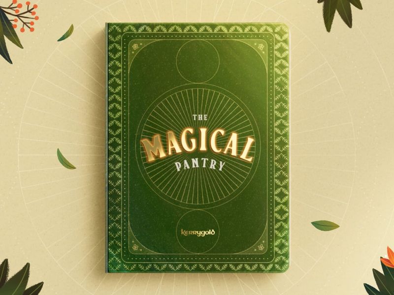
Kerrygold | The Magical Pantry

Gross Domestic Product: Banksy Opens a Dystopian Homewares Store
Tony the Frosted Flakes tiger sacrificed as a living room rug, wooden dolls handing their babies off to smugglers in freight truck trailers, and welcome mats stitched from life jackets: rather than offering an aspirational lifestyle, one South London storefront window depicts a capitalist dystopia. Created by Banksy and appearing overnight, Gross Domestic Product is the latest installation to critique global society’s major issues of forced human migration, animal exploitation, and the surveillance state. More

Artist Reveals The Hidden Life Of Starbucks’ Mermaid By Transforming Their Cups

Blob Opera

Colorful Cubist Tattoos Inked by Mike Boyd

Polluted Water Popsicles: Faux Frozen Treats Highlight Taiwan’s Water Pollution Problem

An Origami Pineapple Pavilion Opens Inside Berrington Hall’s 18th-Century Garden

Black and White Figural Tattoos With a Macabre Twist by Korean Tattoo Artist Oozy

Hand-Cut Paper Anatomy by Ali Harrison

Ceramist Anna Whitehouse Created 100 Unique Clay Vessels in 100 Days
U.K.-based ceramic artist Anna Whitehouse set a goal on January 1, 2018 to create a new bottle each day for 100 days. By limiting herself to a single form, Whitehouse was able to stretch her creativity to formulate new designs previously unexplored in her practice. Each white ceramic bottle was uniformly shaped, but the designs she created on the surface differed each day. Some bottles were punctured with tiny repetitive holes, while others were covered in leaf-like applications or floral motifs. More

DISTORTION. A Stop motion Animation by Guldies
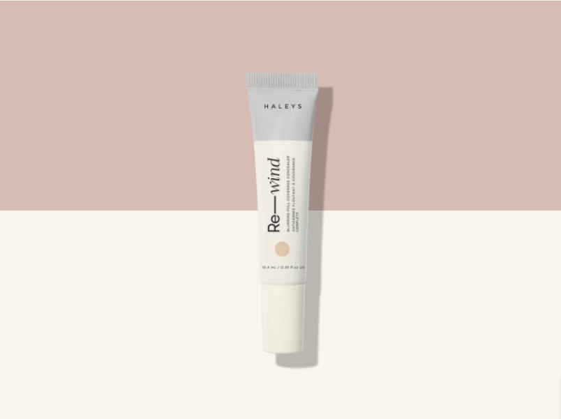
HALEYS Beauty Cruelty-Free Makeup

Stay Cool, Calm & Collected With Recess CBD Infused Seltzer Water

Wood Tables and Wall Art Embedded with Glass Rivers and Lakes by Greg Klassen

Printed Short Stories That Double as Wine Bottle Labels

F.Miller Skincare
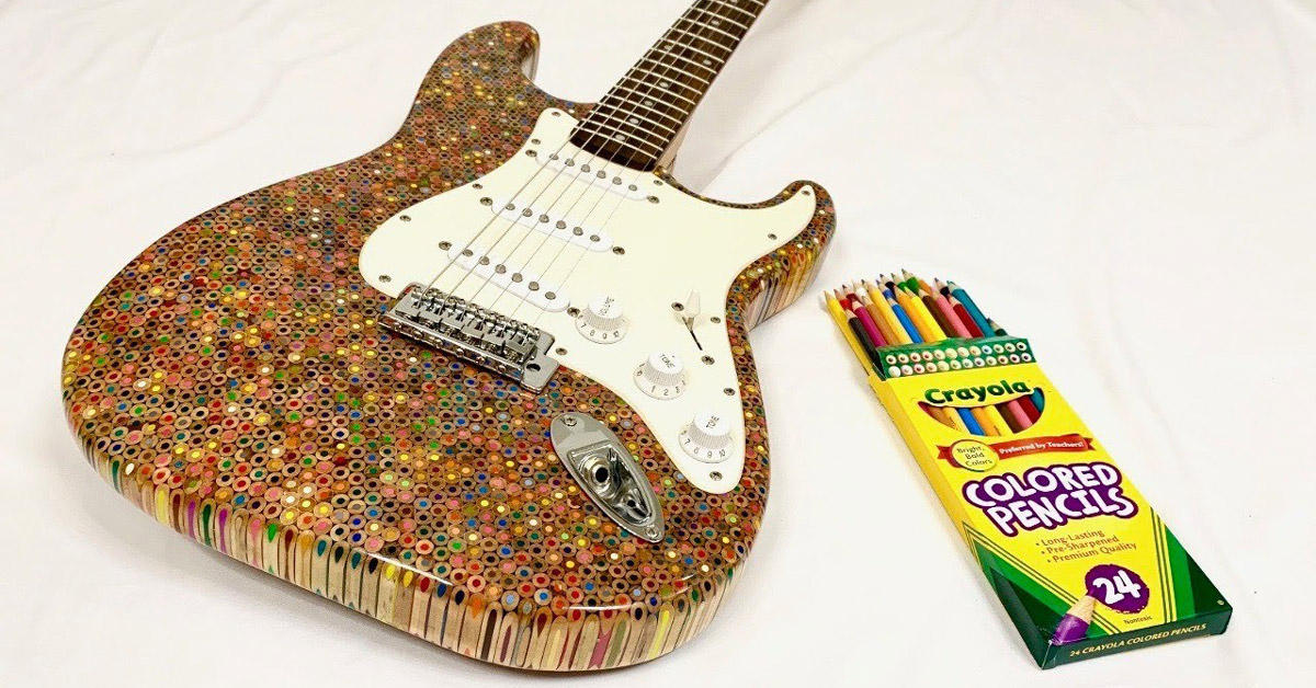
1,200 crayola colored pencils form the body of this electric guitar

Antique Ceramic Dinnerware Punctured into Pieces of Wearable Art by Gésine Hackenberg
Amsterdam-based jewelry designer Gésine Hackenberg is classically trained as a goldsmith, yet works with objects that are extracted from the everyday. After becoming bored with the traditional ideas of jewelry in her original field, she began to twist the function of common pieces like ceramic dinnerware to create unique designs. For her line of ceramic jewelry, Hackenberg first finds vintage plates and bowls from secondhand shops, which she then punctures to create small circular “pearls.” These are either strung together to create an ornate necklace, or set in silver for a pair of earrings or brooch. More

Stockholm Design Lab

Snow Covered Vending Machines Illuminate a Frozen Hokkaido
The 78 Best Book Covers of 2019

M.R. Tape Dispenser
Design: CW&TWhere to preorder: kickstarter.com

Mesmerizing New Serpentine Tattoos by Mirko Sata

Ceramic Origami Plates and Dishware by Moij Design

Rainbow Drip Vessels by Brian Giniewski Ceramics

'Designed by Apple in California' - Book design

Dive Into the Incredibly Satisfying Art of Japanese Wood Joinery
Since the 12th Century, Japanese artisans have been employing a construction technique that uses just one simple material: wood. Rather than utilize glue, nails, and other fasteners, the traditional art of Japanese wood joinery notches slabs of timber so that the grooves lock together and form a sturdy structure. Yamanashi-based carpenter Dylan Iwakuni demonstrates this process in the endlessly satisfying video above, which depicts multiple styles of the angular joints and how they’re slotted together with the tap of a mallet. More
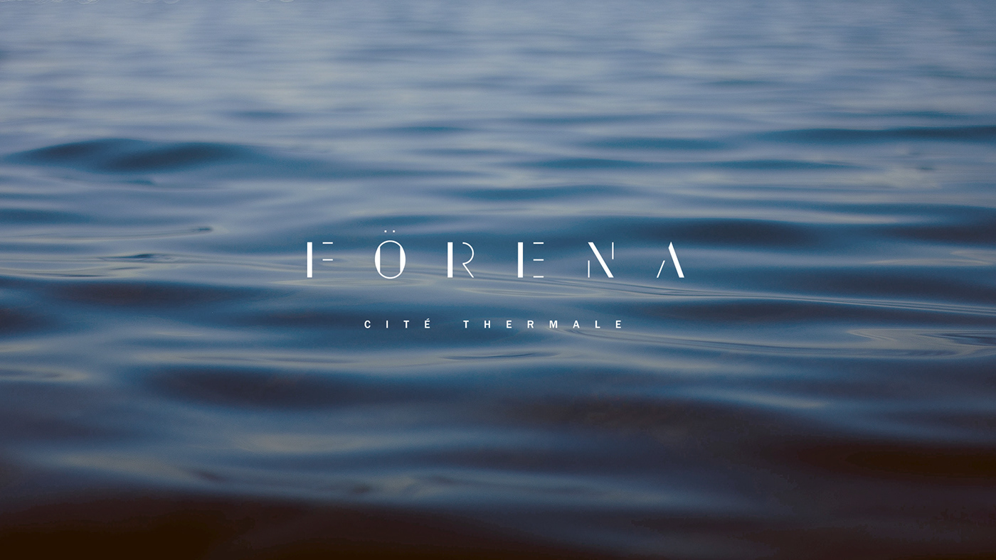
Förena spa identity
Identity for a brand new type of spa in North America. The visual identity of Förena was designed to support the vision of a great spa city: we have tried to extract all the necessary presence, expressing it in a soft and ethereal tone. The design of the logotype was inspired by the idea of contrasts, inherent in the occupation of the place (hot / cold, emptying / refueling). Thus, each letter explores this contrast through the thickness of its lines, through the full and empty which form the whole. Then, graphic motifs that recall both the rippling water, the steam and the topography of Mont-Saint-Bruno are exploited through a visual system that wants to be elegant and imbued with a certain mystery.

Technicolor Tattoos Mix Psychedelic Graphics with Memphis-Inspired Patterns
Oregon-based tattoo artist Dave, a.k.a. Winston the Whale, uses a wide spectrum of colors in his trippy tattoos. The works merge a 60s aesthetics with inspirations from Scandinavian folk art to Memphis design. Traditional floral and vine motifs border prismatic mouths and starry-eyed bats, while other pieces focus more on an 80s appeal with graphic grids and squiggly yellow lines. You can see more psychedelic compositions and brightly colored animals on Dave’s Instagram. More
Snapple Spiked
Snapple Spiked