Design Inspiration
Login screen design and inspiration
Login screens are one of the first things that visitors see when they visit your site. Whether they're on a computer, phone, or other device, the login screen is what greets them and helps them get on their way. It's worth putting some thought into how you want to design this screen because it can have an impact on your site's conversion rate.
We curate topical collections around design to inspire you in the design process.
This constantly-updated list featuring what we find on the always-fresh Muzli inventory.
Last update:

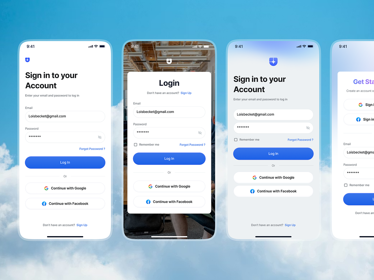
DeepSift - AI Content Detection Login Page UI UX Flow Design
Mobile App UI — EdTech Learning App Onboarding & Login Flow
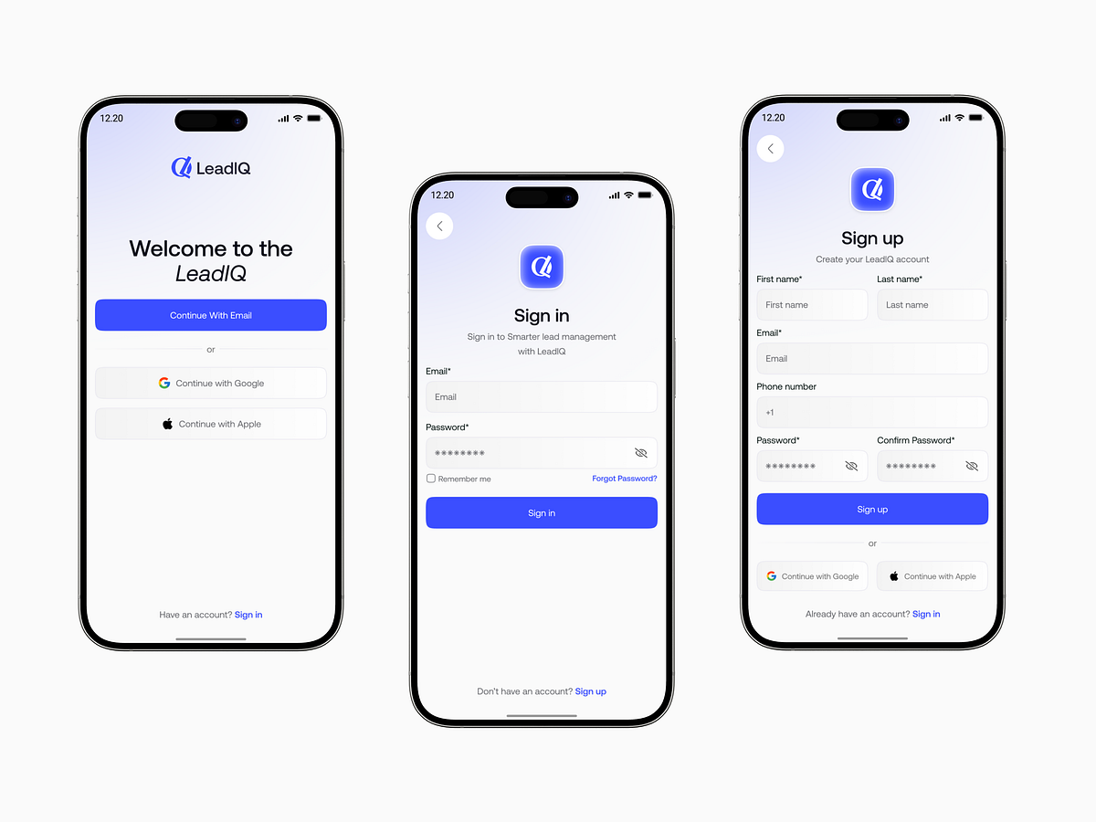
Login & Signup Page UI Design | AI-Powered Sales CRM Mobile App
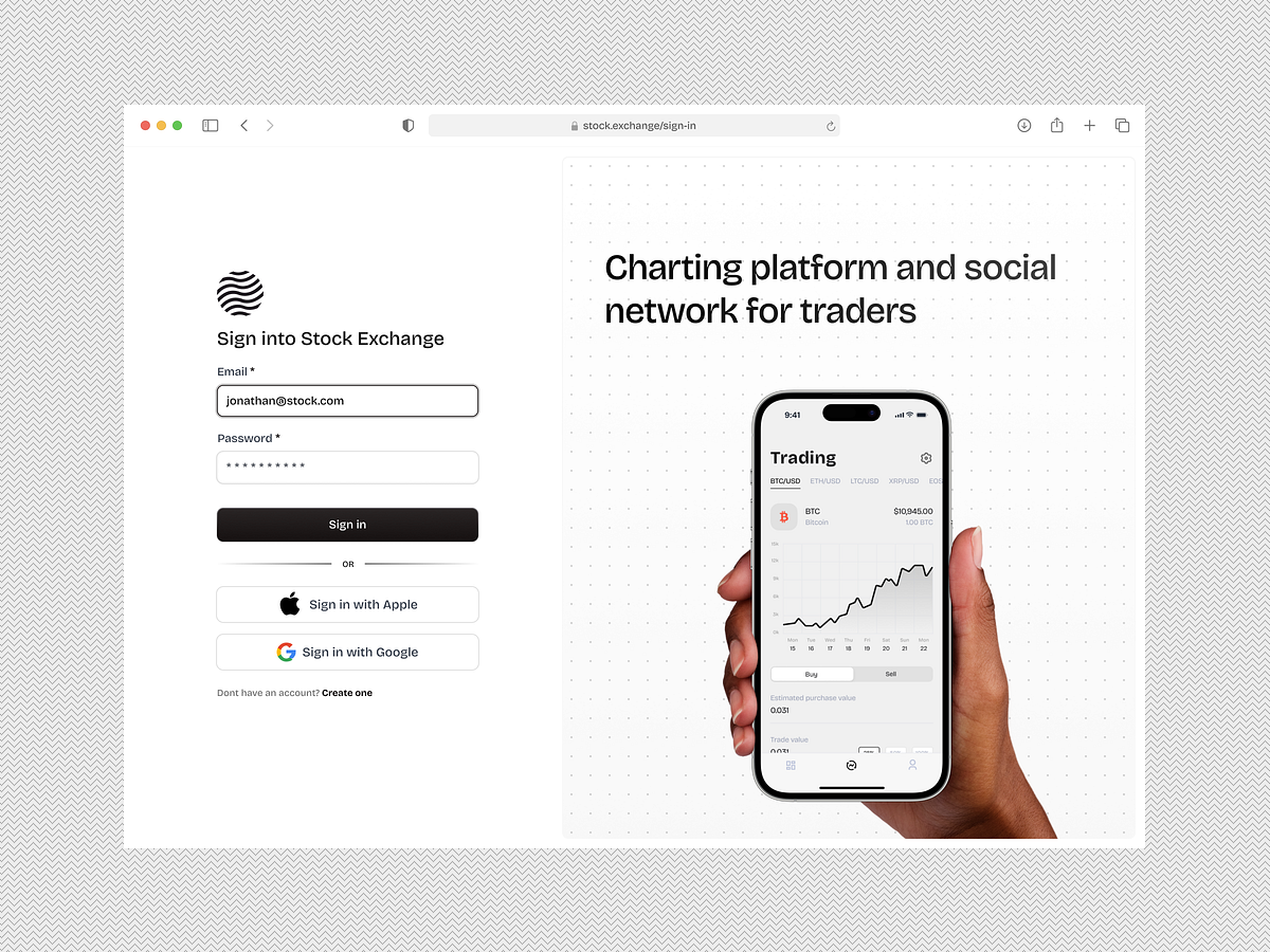
Stock Exchange Sign-In Experience 💹

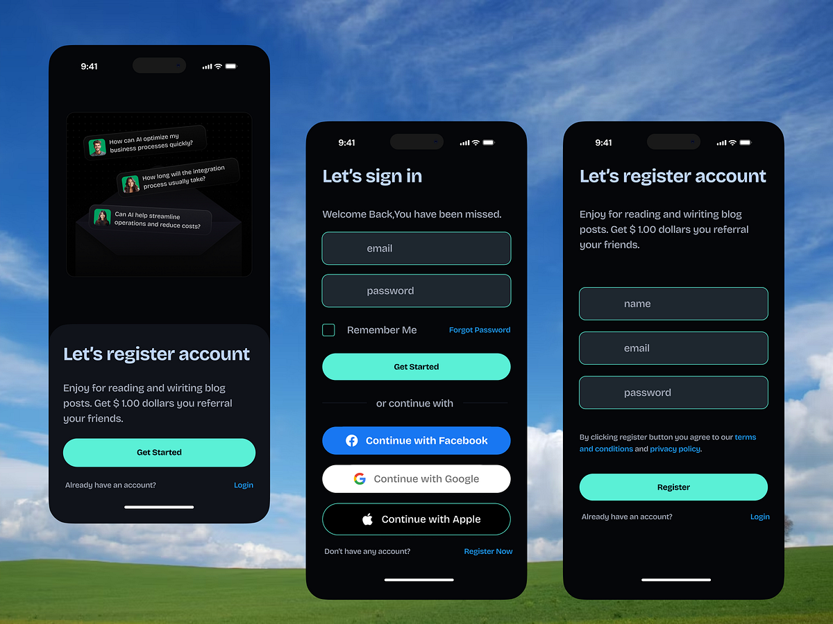
Registration, login, forgot process
Log in / Sign in Experiences - UI/UX - Minimal Design

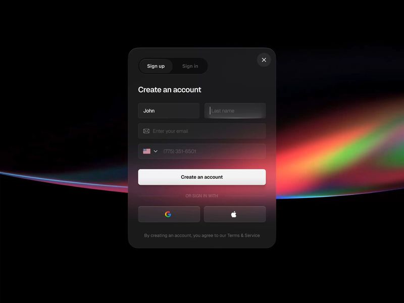
Create a New Account - Consistent UI
Login & Signup Page - AI Website
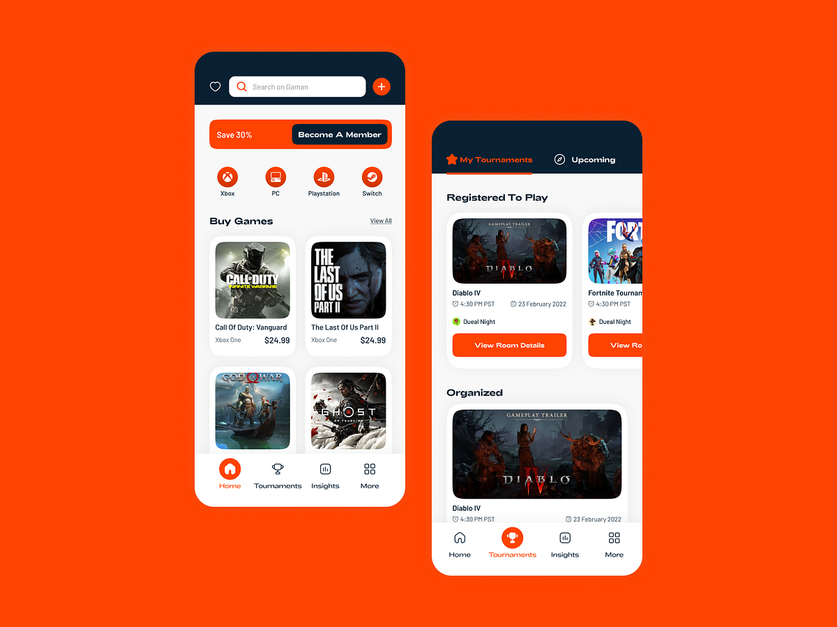
Buy, Sell and Rent Games App UI Design
AI-Ready Auth Flow ✨
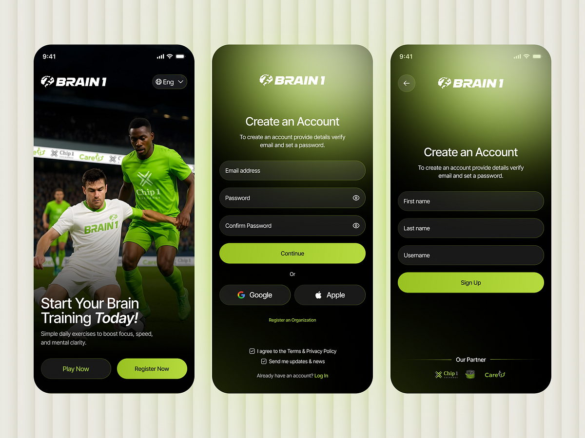
Brain Training Mobile App UI Design
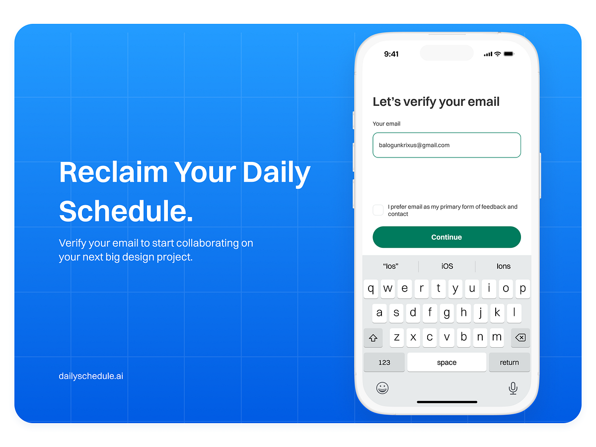
Email Verification Flow – Mobile App UI/UX Design

AI Journal: A Holistic Mental Wellness & Mindfulness Platform
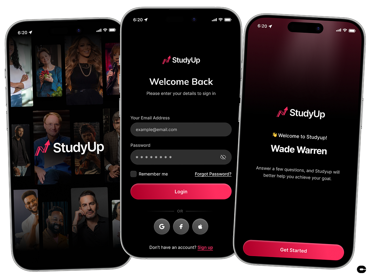
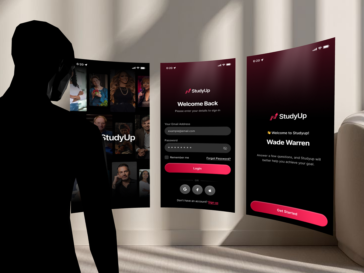
StudyUp — Online Course App UI | Onboarding & Login Flow
Smart Onboarding Flow UI/UX
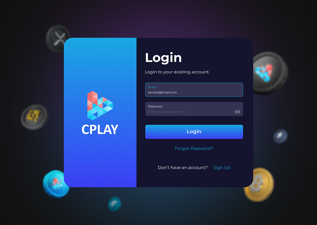
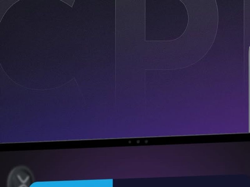
Login Page for NFT app store 'CPLAY'

Kaizen - Progress Tracker App Login Page Design

Padel Sports App UI Design – Modern Onboarding & Login flow

Login - Consistent UI

Authentication Flow UX design - NN Wholesale Fashion App
Sign up sing in login registration modal screen
Login signup page design
Mobile Apps: Splash and Login Screen Design
NFT App Store Login and Sign Up Screens

Tutor Finding Mobile Application
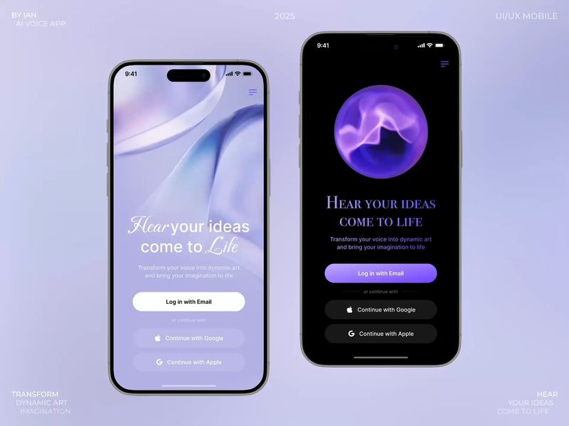
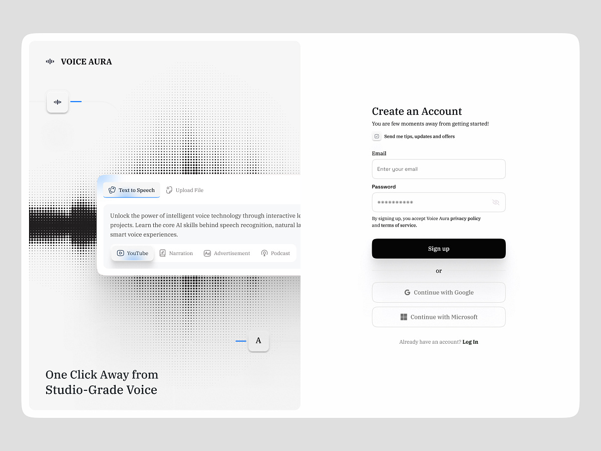
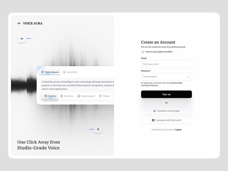
AI Voice App
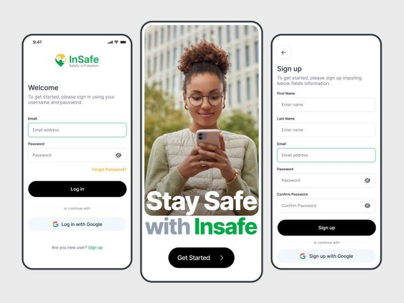
InSafe – Safety & Authentication Mobile App UI
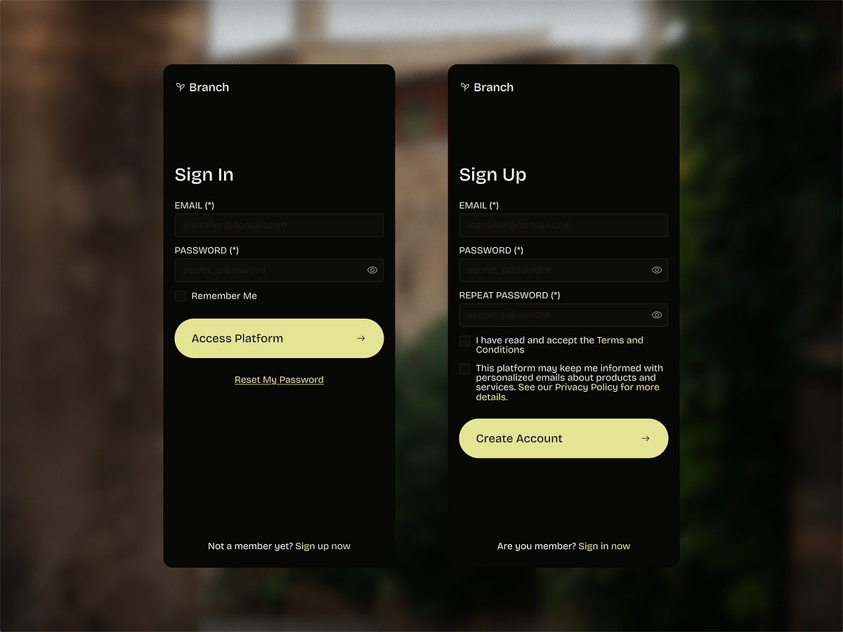
Branch Platform - SignIn/SignUp

Finance Mobile App
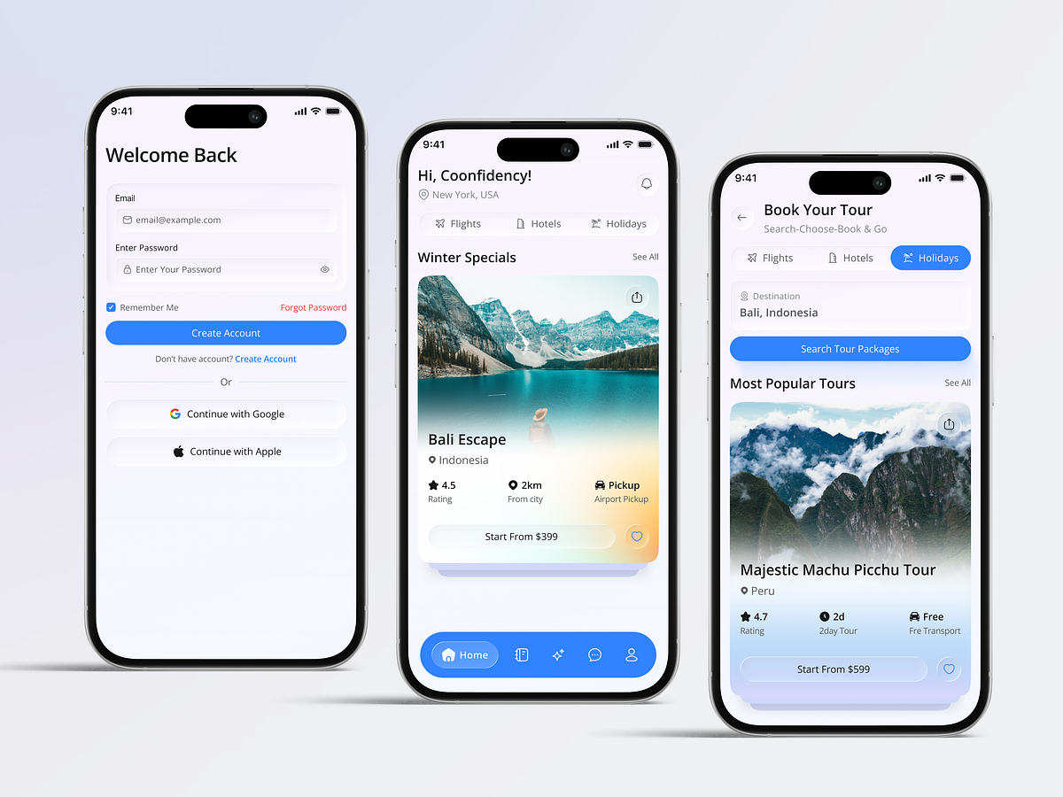
Travel Booking Mobile App UIUX Design
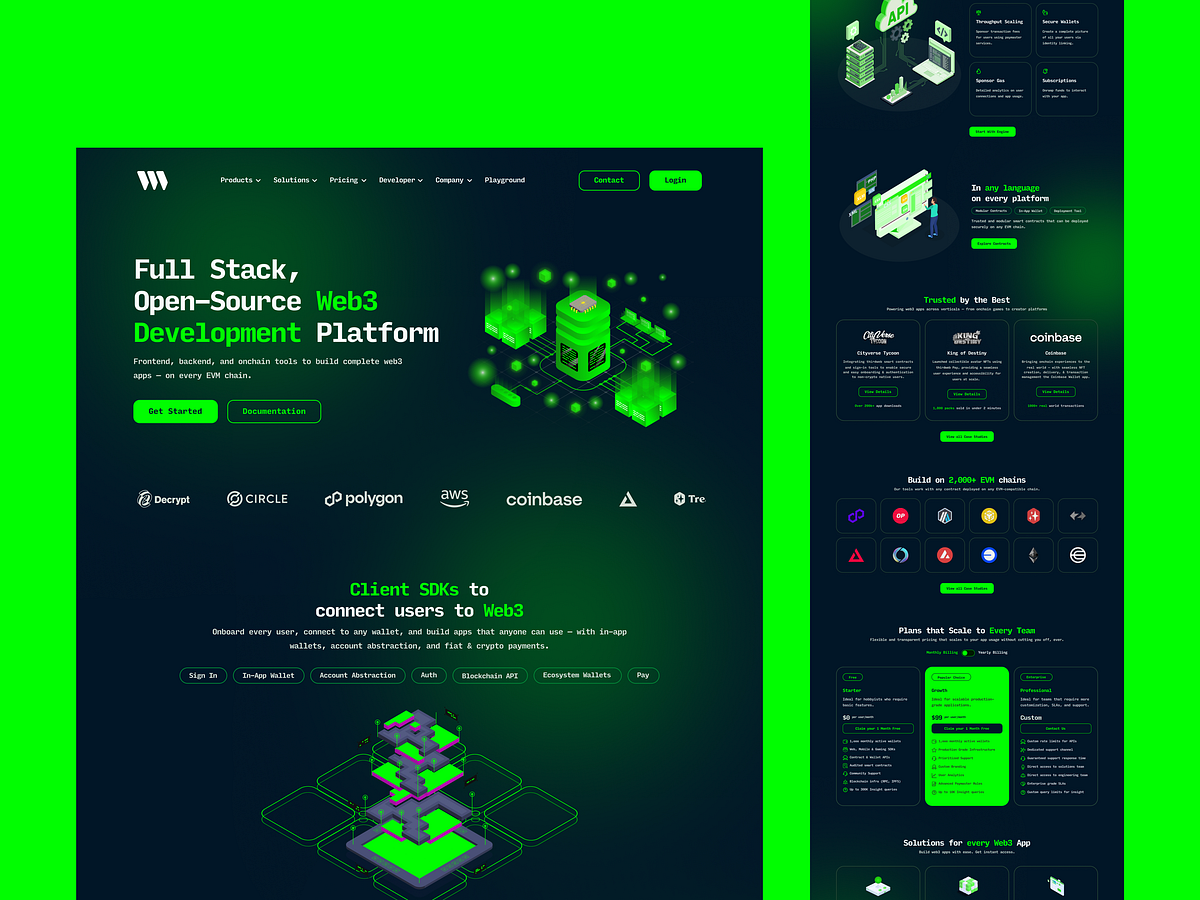
Web3 Development Platform Product Landing Page
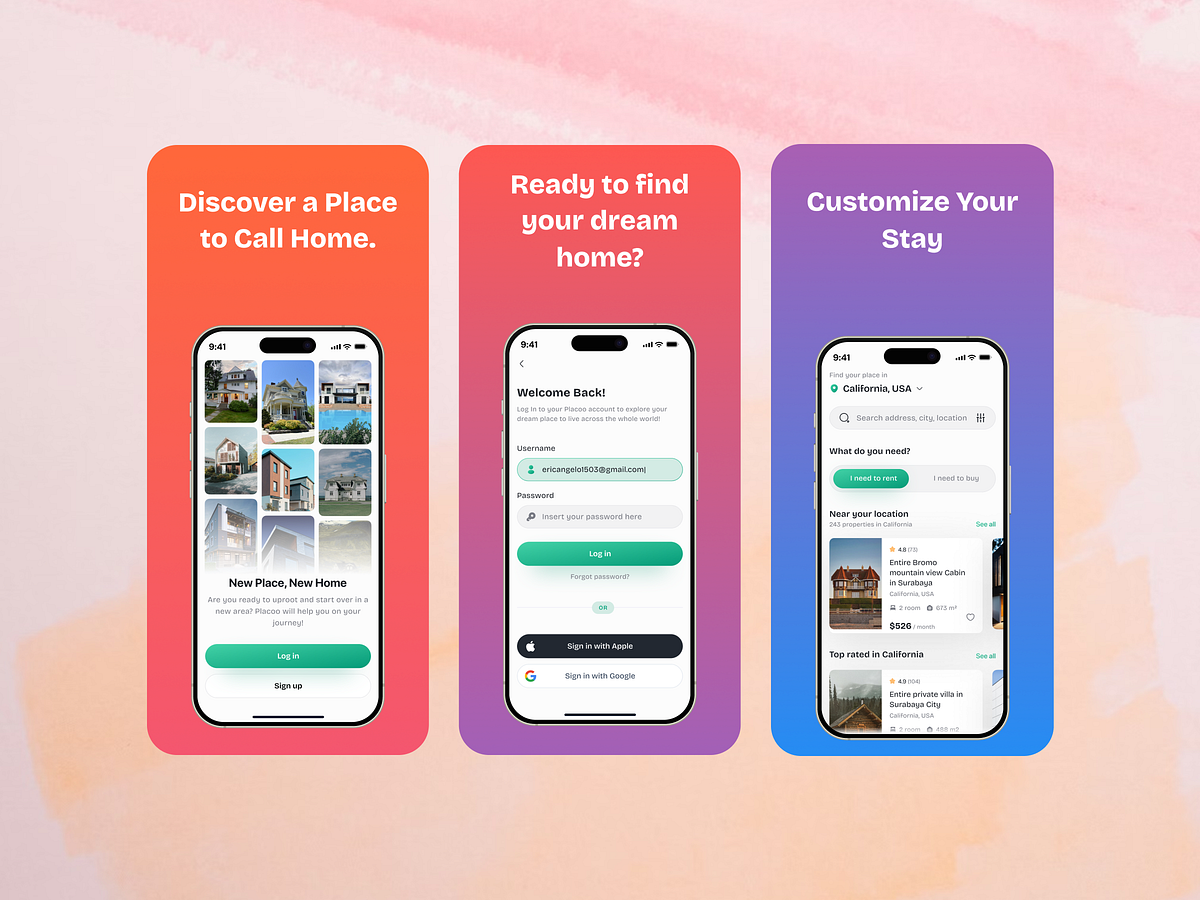
Modern Real Estate Discovery
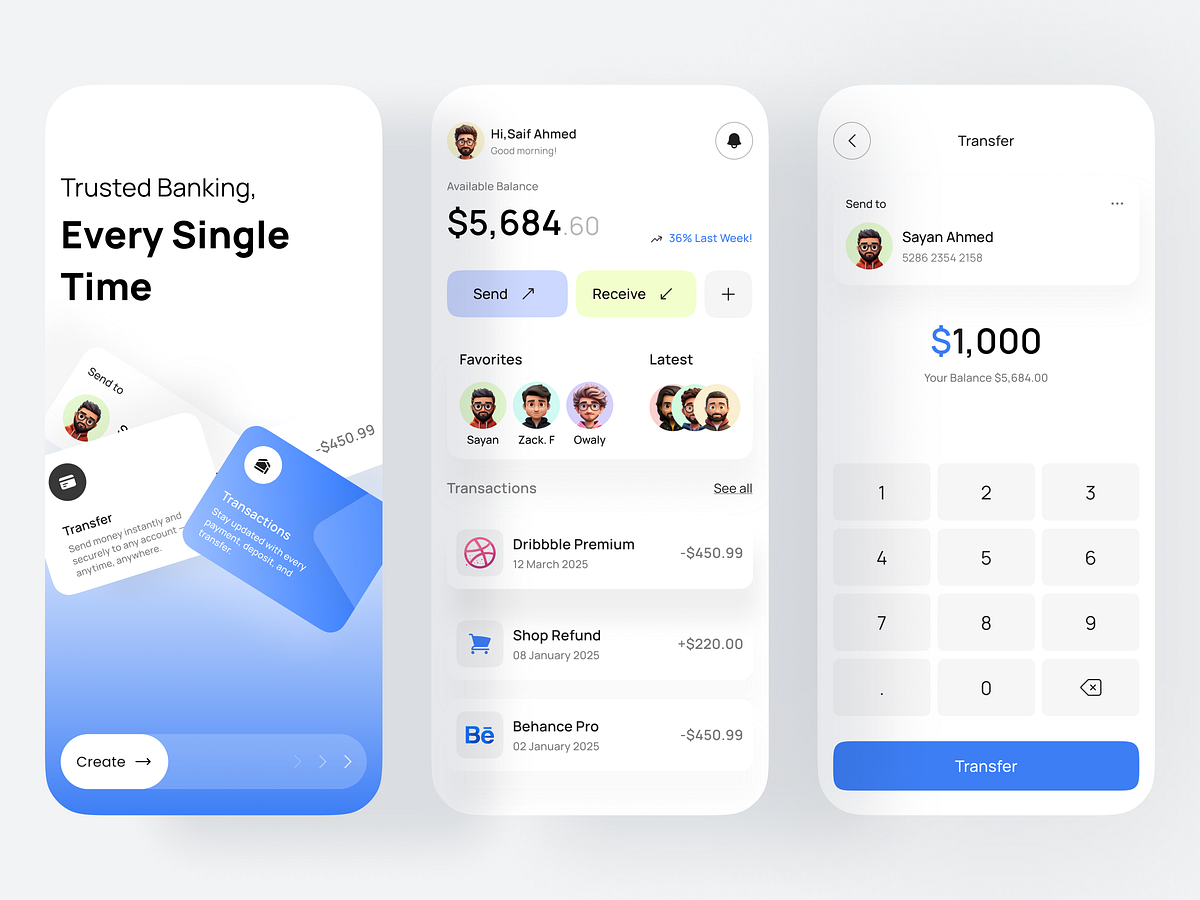
Finance Mobile App
Clean & Elegant Login Screen for Hotel Booking
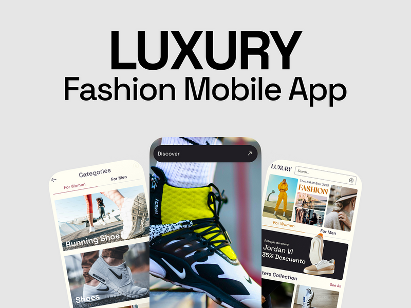
✨ Luxury Fashion Mobile App – Visualsage
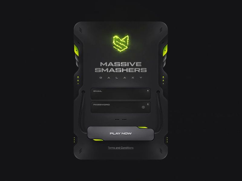
Gaming login card design
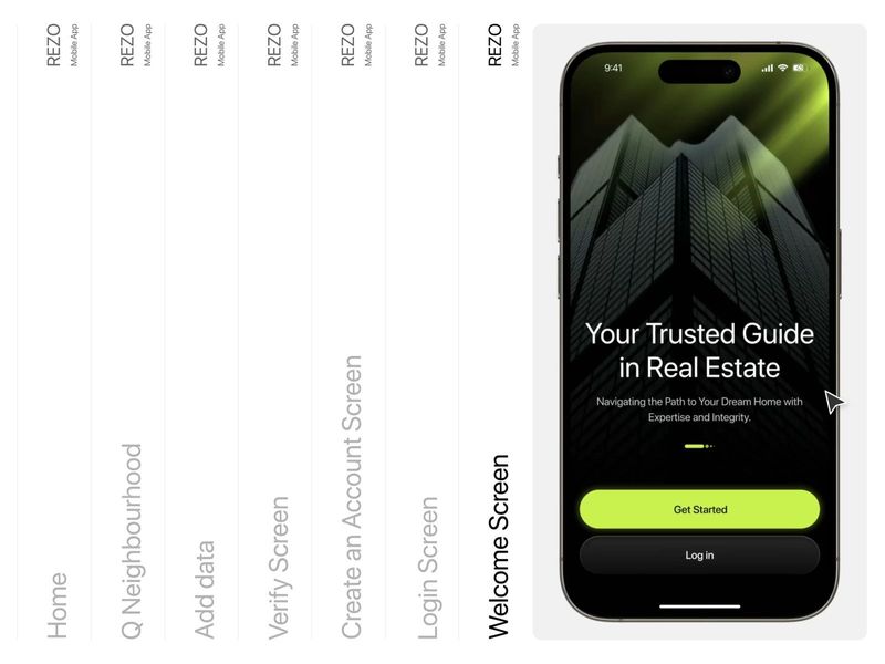
Real Estate App | Login Flow
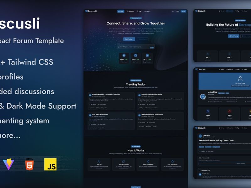
Forum Community Website UI Design
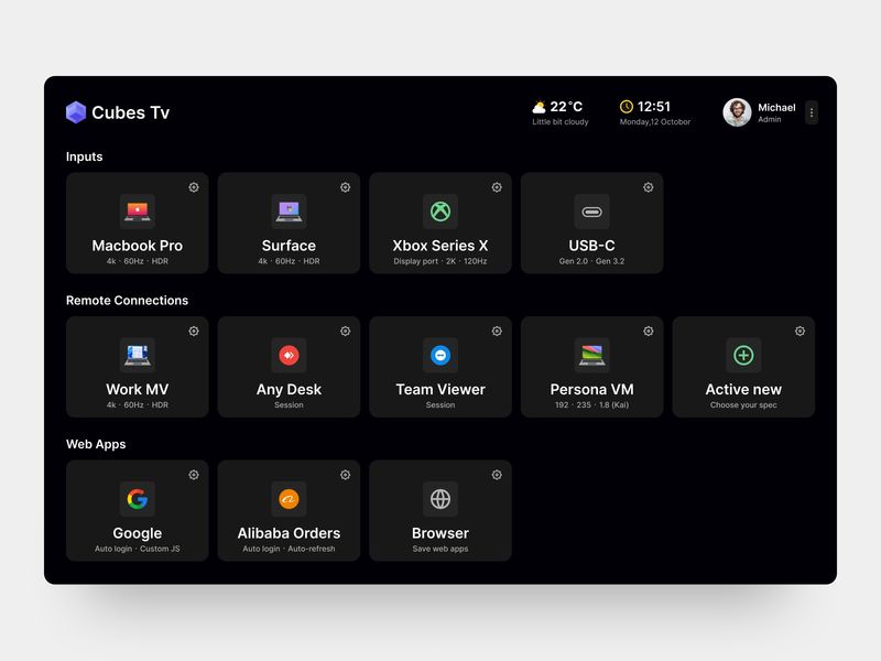
Cubes OS — TV Operating System | SaaS UI Design
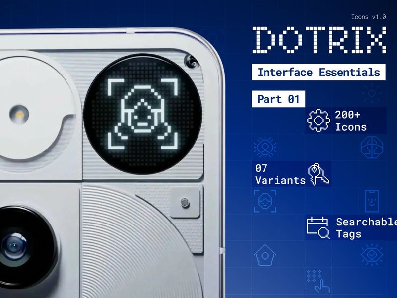
DOTRIX · Interface Essentials · Part 1

iSeeCars Website
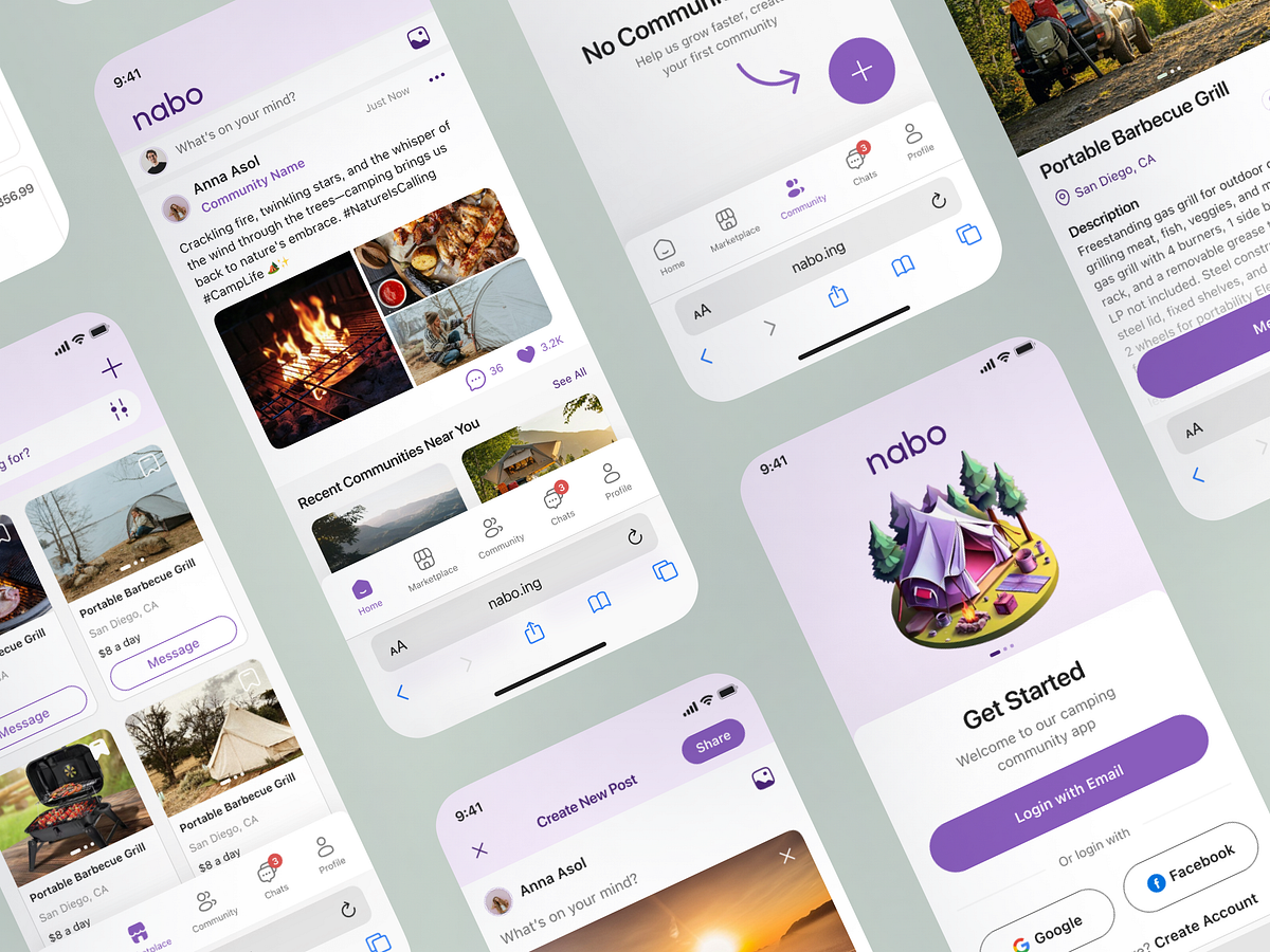
UI/UX Mobile App Design for a Camping Community App + E-commerce
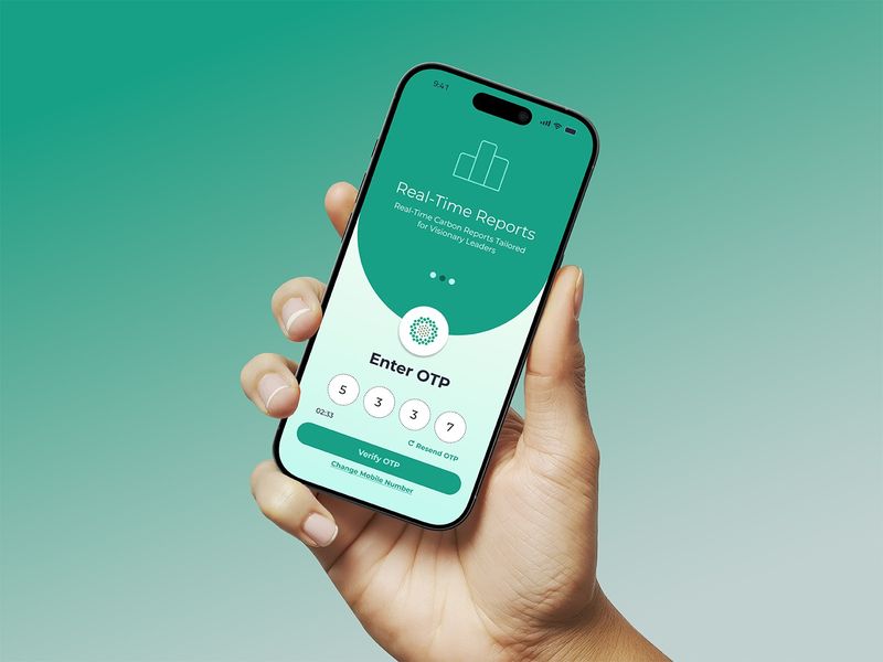
Mobile App OTP Screen UI
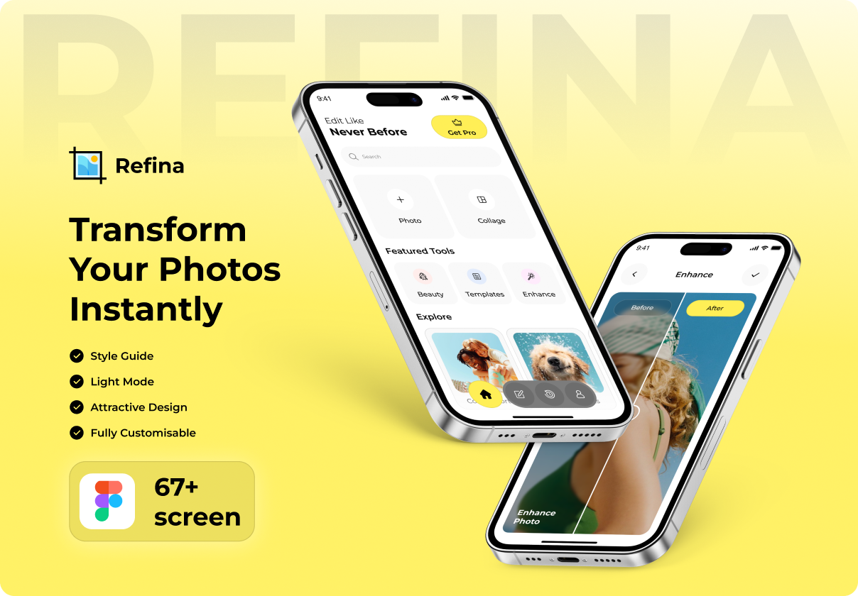
Refina | Photo Editor App UI Kit for Figma
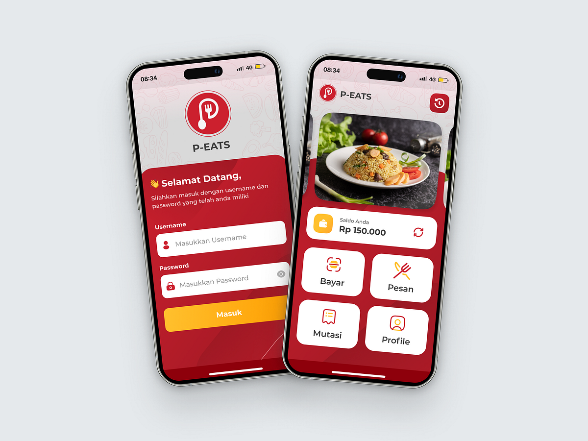
P-EATS – Internal Canteen App Redesign
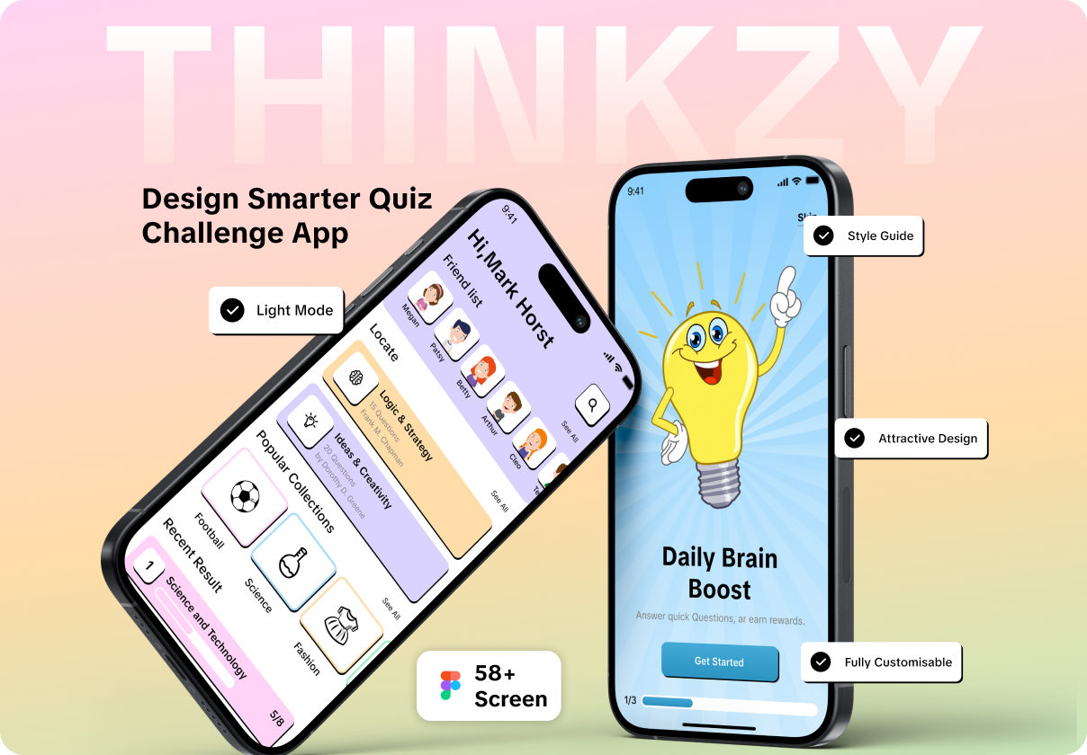
Thinkzy | Quiz Challenge App UI Kit for Figma
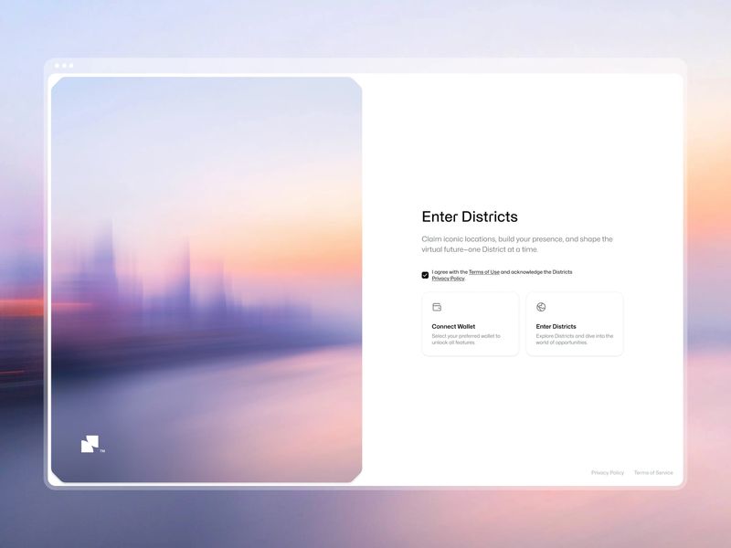
Districts - Onboarding

OTTi Smart Home
Meta Code Login - Page UI UX Design - Case Study
Mobile Login UI
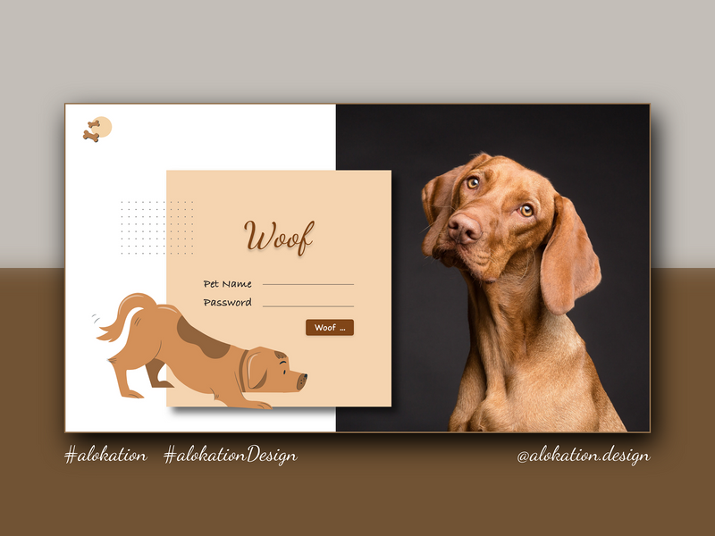
D for Dog by Alok Kumar
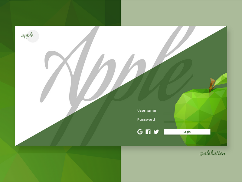
A for Apple by Alok Kumar
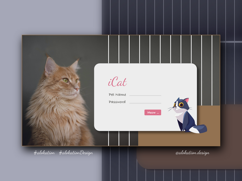
C for Cat by Alok Kumar
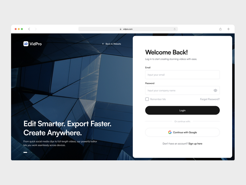
Vidpro - Sign up Page
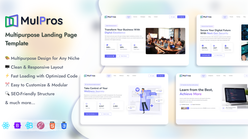
MulPros – Multipurpose Landing Page Template React + Bootstrap
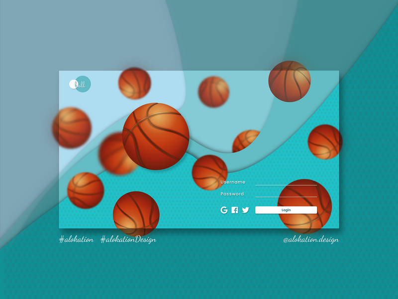
B for Ball by Alok Kumar
Fashion eCommerce Website UI Design
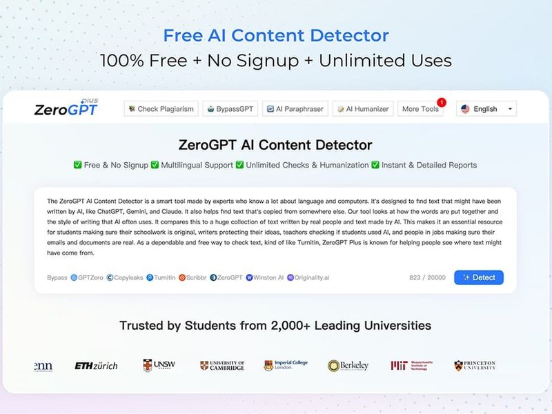
ZeroGPT Plus
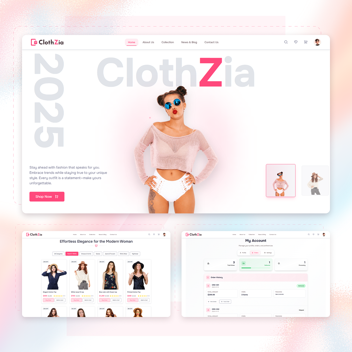
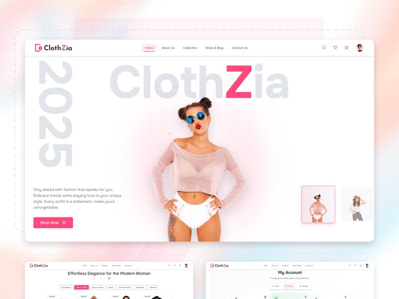
Clothzia – Fashion eCommerce Template
Clothzia – Fashion eCommerce Template
Get access to thousands of freshly updated design inspiration pieces by adding Muzli to your browser.
Loved by 800k designers worldwide, Muzli is the leading go-to browser extension for creative professionals.
Why is login screen design more critical to user experience than it appears?
The login screen is typically the first interaction a returning user has after deciding to use your product. Friction here directly impacts daily active user rates — password recovery flows, slow load times, and confusing error states all add latency to returning engagement. For consumer apps, the login screen also serves as a brand touchpoint that reinforces the product's visual identity. Enterprise tools have different priorities: SSO support and clear security signaling matter more than visual sophistication.
What are the most common design mistakes in login screen UX?
The four most impactful login UX problems are: unclear error messaging (say "Incorrect email or password" not "Login failed"), no password visibility toggle, poor mobile keyboard behavior (email fields should trigger the email keyboard), and missing "remember me" functionality for non-sensitive applications. Over-designing the login screen at the expense of mobile performance is another common issue — heavy background images slow the initial load considerably.
How should social login and email login be presented together?
When offering both social and traditional email login, the design hierarchy should reflect the actual usage split for your audience. Consumer apps: social login (Google, Apple) as primary CTAs, email below. B2B tools: email and SSO as primary, social login as secondary. The "Or continue with email" divider pattern has become a universal convention. Always show SSO options before individual social logins for enterprise products — IT administrators specifically look for this as a security feature signal.