Logo Design Process: From Start to Finish
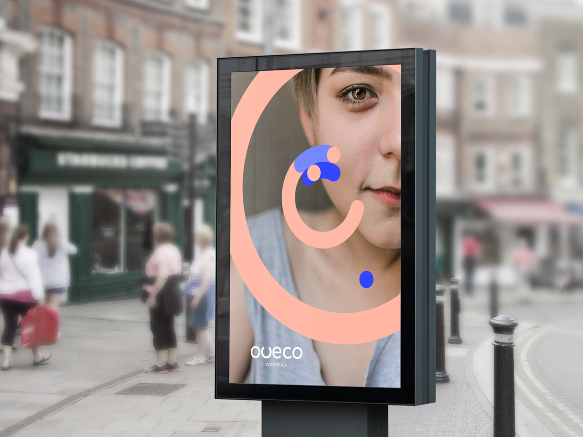
The principal stages in creating and developing a logoDesign by OutcrowdDesigning a logo is the first step in building your brand and a mark of professionalism in business. Most business people understand that today no company can thrive without a logo. But not everyone knows what a real logo is or how it works.A logo is more than just a company’s face and identifier in the online and offline markets. To the consumers, the logo is a guarantee of quality; to the business partners, it’s a signal that the company is trustworthy. This is how market reasoning goes: if a company has a high-quality logo, this quality extends to its activities, namely producing goods and rendering services. The logo helps the company stand out among the competitors, making it recognizable and memorable. The logo forms the basis for the brand’s visual identity. Exclusive rights to the logo and corporate style provide legal protection of the company’s assets.A well-designed logo is functional. It must work. A logo does not fulfill its function if it was created without regard to (or in violation of) marketing and design rules.Oveco Cosmetics — Brand DesignFunctions of the logo:Presenting the company in the marketplace.Informing the market and the audience.Shaping the brand’s image.Making the company and its product stand out among competitors.Protecting property rights.Guaranteeing quality to the consumers.Drawing attention to the brand.Increasing consumer loyalty.Serving as the basis of the corporate style.If the logo fails to accomplish any of the above tasks, it needs to be redesigned based on marketing analysis and a reappraised design concept.Oveco Cosmetics — Brand DesignAnalytics + Idea + Design Concept = RealizationThe secret to a good logo is thoughtful analysis which will logically lead to the appropriate idea and form the basis of the design concept.Learning about the process of logo development will help you see and understand how a professional logo is born and what steps it requires from the customer and the designer.Stages of logo creationStage 1. BriefA brief is a survey-like document. It comprises several logical blocks (marketing, design, administration). The brief is used to tell the designers the main information on the project, the goals and objectives, the requirements and wishes of the client.The brief minimizes errors in the project and helps the client and the designer understand each other earlier. So it’s a good idea to take the time to answer all questions of the survey.A brief also covers contact information, deadlines, and budget.Oveco Cosmetics — Brand DesignStage 2. ResearchAny research done independently by the client is priceless to the designers. Nevertheless, professional designers will always do their own analysis: study the market, the brand’s competitors, their logos and identities, examine contemporary visual trends as applicable to the project at hand. Special attention is paid to analyzing the company itself, its positioning, mission, values, goals, and priorities. Target audience research is also crucial: the brand should speak the same language and find an emotional key to its consumers.Logo & Business Card — Main TradeStage 3. Concept developmentConcept development can be provisionally divided into two elements: the intellectual part and ideas & visualization. This is the most difficult and demanding stage of creation, often requiring a team brainstorm session. Brainstorming implies several stages:Analytical conclusions — Ideological contents — Verbal description of image — Associations — Image visualizationhttps://medium.com/media/17e6423507ed9f717ffc261d3040d226/hrefThe concept for the logo is based on brand ideology and includes the versions of the visual “message” that will work toward the stated goal. The main task is creating a brand image — first as a verbal description, then through association, and ultimately as a visualization.The best versions of the concept are then used to make sketches.Stage 4. SketchingThe sketches for the logo are first drawn manually on paper. It’s customary to do between 16 and 20 versions. Photos of the sketches are sent to the client for review. This is followed by a conference-call discussion so that the client can choose the best 3 to 4 versions.Stage 5. Working on the chosen versionsThe chosen sketches are recreated in digital format (usually with Adobe Illustrator). Details are filled in, various color solutions and elements are added. Two versions for the text design are chosen: positioning relative to the graphics, size, font. In typographic logos (those that consist of text or a stylized inscription), every letter is processed and every element drawn out, transforming a mere inscription into a text sign.The finished sketches are also discussed with the client.AQ humidifier — Logo DesignStage 6. Final presentationApart from versions of the logo, the final presentation normally also includes examples of logo placements on products, in corporate paperwork, advertising communiques, etc. The logo is accompanied by a “history” — a description of the graphic’s features, its possible interpretations, advantages and disadvantages.The presentation is followed by another discussion, which concludes with the client approving the final version of the logo.AQ humidifier — Logo DesignStage 7. Delivery of workThe approved version is rendered in different formats (EPS, JPEG, TIFF) for various media. If necessary, different color versions of the logo are made: full color, monochrome, black and white. Sometimes a simplified version is presented for smaller rendering options. The finished files are delivered to the client. They will be used to implement the logo in advertising products, corporate paperwork, and so on. They will become an important basis of the company’s corporate style.In the process of creating a logo, the client and the designer agency become partners and collaborators. This tandem will result in a proper, visually perfect, and meaningful logo — a functional marketing tool.AQ humidifier — Logo DesignLogo Design Process: From Start to Finish was originally published in Muzli - Design Inspiration on Medium, where people are continuing the conversation by highlighting and responding to this story.
The Perfect System For Branding. Help Your Brand Be Born
How to find a unique idea and become the proud parent of a successful brandIllustration: OutcrowdMy friend is a famous architect. Guess what she told me when I asked her how she became the best architect in the country. Do you think she described her experience or creative approach? Think again!“Every idea is my child,” she said. “I plan it, give birth to it, raise it. Once it becomes self-sufficient, I let it out into the world.”I was deeply impressed by these words. They hold the key to any project’s success. An idea has to grow and develop, to become self-sufficient. Only then will it be brilliantly realized. A project that has been “raised and nurtured” will live and grow. It’s a perfect system for branding.Flowcast — Brand Identity for PodcastsYou decided to give birth to a brandOur studio is often approached by clients who don’t know where to start working on a brand. Some people find it difficult to complete the brief about their company or product. We tell them about everything, analyze the market and competitors, and come up with various ideas and designs. This is convenient for clients, and it’s a common practice. But!Consider the situation through the lens of “family planning.” It will strike you as absurd.The client doesn’t mind having a child but delegates the child’s conception to a specialist. After all, there’s no time to waste. Boy or girl? It doesn’t matter, as long as the baby is beautiful. Like the neighbor’s, only better. What color eyes? Whatever, let’s forgo the eyes for now. What do you mean, legs? Let’s skip the legs. We’ll come back to them later. What’s it going to be when it grows up? Come on, it’s not even born yet! All I have is the name… So is baby Brandy ready to go home?Sounds ridiculous, doesn’t it? And yet this happens in any design agency. Designers make the “baby” look nice and presentable. She’s not her parent’s daughter, she is more ill than well, and she’s headed for trouble. How to avoid it? The answer is obvious: do the most important thing yourself. In other words, you must consider and formulate the concept of branding.Let’s call it creative conception. :)https://medium.com/media/b6ca4d178ae0d0c548eb75a528cfb480/hrefWhat a loving parent needs to knowA brand has a soul and a body. The conceptual and material components of the image. Don’t rush into raising the body! First you need to breathe soul into it. Otherwise, the poor fellow will not survive.Below is the so-called Brand Wheel. The first four circles are concept zones. This is your area of parental responsibility. Only the last circle is in the hands of designers: the visual realization of the idea.Your task is to grow the idea to the level of independence where it can be released into the world (passed into development).The humorous example of baby Brandy suggests that the clients don’t understand the first thing about children. To create a brand, you need to figure out for yourself what a brand is. Even if you think that at this stage you don’t need anything beyond a logo. The time you spend on this is an investment in your project, as valuable as anything else. The necessary minimum of branding knowledge helps you choose the right path for your business from the very beginning, avoiding mistakes and needless expenses.After learning the basics, you’ll find that you almost adopted a foundling! You already have a brand, even if you don’t know it. A brand and a business are born simultaneously.Branding for Business. How to Make Your Company AttractiveThe initial task is usually this: baby Brandy has to be brought out into the light and thoroughly examined.Cube — Brand Identity for Marketing Agency1. Doing researchCompanies arrive at brand building at different stages of their activities. This means they encounter Brandy at different stages of her development: a small girl that is easy to raise; an unruly teenager; a mature and hardened woman who needs a rescue team.As you can see, the sooner you start taking care of Brandy, the easier it is to shape her.Research at this stage means an impartial examination of your company (product), that is, the current positioning of the brand. Wipe away your tears: Brandy has her whole life ahead of her! For now, study her advantages and disadvantages, her distinctive features and potential, and evaluate your financial opportunities and risks.Cube — Brand Identity for Marketing Agency2. Planning for the futureTo help your brand child, you need to understand her and see things as they are. No blind parental love here! You’ve got things to work on. Strategic positioning is a sign of a wise parent.Nobody has met baby Brandy yet. How do you fix that? What does she have to be to become famous? Picture her ideal future. She will be smart, beautiful, and famous. Everyone will love her! But what will make her famous and loved? What do you have to do to achieve it?3. A brand needs a soulTo make people aware of the features and benefits of your brand, examine your idea. What does the brand offer people? What is its essence?The concept of the brand is not an accidental epiphany. It requires effort to be built: analyzing the market and competition, finding solutions to consumer problems, creating a USP, and developing a positioning strategy.Outer — Logo Design for Big DataThe more you rely on someone else’s solutions at the outset, the less likely you are to get a unique product. You can be easily led astray or offered a standard idea. False focus will take you away from the original idea with every step. No designer will define the brand essence for you. No marketer will see its features until you show them where to look. This is your brand. This is your idea. You are the parent. Look into the soul of your baby brand. If it’s empty, fill it with meaning.The brand essence is the main idea that reflects its unique value. That special thing distinguishes a brand from the competition and makes it valuable in the eyes of the target audience.These are not just pretty words. This is a clear message to the market and users about what exactly they are getting and how it is going to improve their lives. But to be able to convey this message, your brand needs character and image.MAY — Web & Brand Design for Perfume Store4. A brand needs characterUnderstanding how a brand can be characterized is key to its further development and one of the ways to elevate its position.The brand character must meet the expectations of the audience; otherwise it will not arouse affection and response. It’s impossible to develop adequate brand attributes without understanding its character.Here are the examples of the main types of brand characters:Winner (Nike, Jordan, Marine Corps, Gatorade)Innovator (Jeep, Discovery Channel, Trader Joe’s)Good guy (Dove, H2O, Sesame Street, Whole Foods)Rebel (Red Bull, Harley Davidson, GoDaddy)Protector (Johnson & Johnson, Allstate, Kraft, Berger)Source of Knowledge (Harvard, Bloomberg, Forrester, Wall Street Journal)Magician (Apple, Pixar, Lotto, Viagra, Disney World)Seducer (Victoria’s Secret, DeBeers, Courvoisier, Axe)Fun guy (M&M’s, Snickers, Dr Pepper, Looney Tunes, Comedy Central)Honest (Levi’s, Jim Beam, Wrangler Jeans)Inspiring (Lego, YouTube, iPad, Nikon, Photoshop)Leader (Porsche, Rolex, Tiffany, Chanel, American Express)Each character sums up the brand values in its own way, addressing the audience in its own language. Each character has its own visual style, voice, even taste, and smell.To find your character, you need to thoroughly study both the features of the company (or product) and the target audience. Your brand must find acceptance!Record Creatives — Brand Identity5. A brand needs individualityA company or product may have special features or solutions to a problem. These are your advantages. Your main task is to make people see them, believe in them, and remember them.For a brand to become noticed and attractive, you have to work on its individuality in three directions:conceptual uniqueness;visual uniqueness;emotional uniqueness.People see first and feel second; only then does reasoning kick in. However, work on individuality must be done in reverse. First you develop a brand concept and then look for visual and emotional ways of expressing it.The fuller you flesh out the idea and the more information you can provide, the easier it will be for designers to create an original and memorable visual identity which reflects your brand’s goals and character.DesiLearn — Brand Identity for Design School6. A brand needs emotionsThe emotions that a brand transmits are inextricably linked with its essence, purpose, and character. They create a bond with users and turn them into loyal customers. Emotional branding is so important that it has become a separate area of marketing.Try to gauge the needs and requirements of your target group and understand what they will find exciting. For each group, you can find separate emotional triggers that also correspond to the essence and character of the brand.Tally — Logo Design & Brand BookHere are some sample emotional triggers:Love / romanceDominance / power / strengthI’m better than youDesire to controlFamily valuesFun as a rewardSelf-improvementWish fulfillmentCareQuick passage of timePatriotismExciting discoveriesThe brand’s tone of voice can also be emotional. It creates and maintains the necessary mood and the connection to users. So it’s better to consider the tone in advance.7. A brand needs a nameA good parent will choose the name for the baby brand responsibly. Naming requires taking into account the brand’s positioning, analyzing the competition and consumers, checking for unwanted associations, looking for accidental matches in databases, and testing consumer reactions.How to Create the Perfect Brand Name8. A brand needs a bodyA body is something material, visible, and tangible. This is what designers actually create. But let’s not forget that the idea has to grow and take shape, becoming a self-sufficient whole.As you work on the concept, your vision will become clearer. You will be able to visualize your brand yourself. It will be not a random fantasy or whim but rather a logical result of processing information. You’ll be able to picture the desired logo, corporate colors, branded advertising banners, mascot… If you know what it all should look like, it means your idea has become self-sufficient and is close to being realized. Now it’s up to the designers.https://medium.com/media/72a611e62621633f1227f48c0e2460f4/hrefA self-sufficient idea is not necessarily perfect. But it’s sufficiently complete and informative to be passed on to the next stage of development with no risk of being misunderstood. This will help you avoid common problems in developing visual identity and end up saving you time, money, and brain cells. Most importantly, you’ll be able to let your idea out into the world, and rest assured that it will blossom into a successful and unique brand.You may also find this helpful:Brand Book & GuidelineLogo Design Process: From Start to FinishMake Your Logo Work for YouThe Basics of Brand PositioningThe Perfect System For Branding. Help Your Brand Be Born was originally published in Muzli - Design Inspiration on Medium, where people are continuing the conversation by highlighting and responding to this story.

Blurring the visual line of brand identity
“Could you make the logo bigger?”. This is the most common client objection I get and I’m sure it’s the same thing for most designers too. It is a fact that clients overestimate the value of their logo. They want it everywhere, on their website, social media content, merch, stationary, etc… If it wasn’t too much, they’d have it tattoed on the necks of their employees!Why we have logosA logo is the first piece of identification to a brand. For most people, it’s synonymous to the brand itself. It’s so much so that many people don’t even know the difference. So let’s get a few things clearYour logo is not your brandYes, up until as recent as the twentieth century, a logo was literally a symbol on the other end of a branding iron. Branding meant literally putting your logo on stuff for people to know it’s yours.https://www.123rf.com/stock-photo/branding_iron.html?oriSearch=branding&sti=lj5upoeng6memgwd31|&mediapopup=73974491It turns out that the term “brand” derives from the Old Norse word “brandr” or “to burn,” and refers to the practice of branding livestock, which dates back more than 4,000 years to the Indus Valley, in the northwestern regions of South Asia, somewhere around modern-day Pakistan. It used to be just cattle, but it spread to be used on packaging items such as wooden boxes, leather patches, and paper sacks. A branding agency in the elder days would’ve been a forge shop that manufactures logos and puts them at the other end of a stick.However, today, a brand is so much more than an identity system. It has to do with value, status, reason, and emotion.“A brand is the set of expectations, memories, stories and relationships that, taken together, account for a consumer’s decision to choose one product or service over another.”_Seth GodinSo no, a brand is no longer just a logo, but a logo still has the same basic premise. Telling which people made this.A logo is about identificationSagi Haviv is a world renown logo designer and a partner in the design firm Chermayeff & Geismar & Haviv. These are the guys responsible for some of the world’s most recognizable logos. He says that logos are for identification, not communication. At heart, a logo’s job is to tell us with whom we’re dealing and make sure we don’t confuse them with their competitors or anybody else for that matter.Logos from Chermayeff & Geismar & Haviv’s portfolioHowever, I feel the need to highlight the fact that just because a logo’s primary goal is to identify, doesn’t mean it shouldn’t communicate. If we look at CGH’s clients, they’re large corporations with established communication outreaches so it makes sense why their logos don’t have to bear the burden of telling people about a company. However, this might not be the case with my clients and your clients.A very simple way of demonstrating this is with luxury brands. Have you ever been walking in a mall and you stumbled upon a new shop, a brand that you’ve never seen before. Have you ever made the decision to not go in because it looked too expensive? Or did you go in and see the price tags and made that “I knew it” smirk? Logos do play a communication role, but that’s not their immediate role.Why logos aren’t sufficientSo yes, a logo is your identification champion. The problem though is that it is easily detachable. I don’t mean physically. I mean that a logo and the item on which it’s placed are two sperate things and the link between them is as feeble as the glue holding togetherThe point is that when your users or customers are interacting with your brand, they’re in direct contact with the value proposition you’re supposed to be giving, not the shell. It is, therefore, necessary for us to build brand identity into the offer(product/service) itself. that means thinking of identifiers not as something we stick on our offer, but parts of the offer itself.Brand Identity is not limited to sensory perception. It transcends the visual, audible and tactile to the essence of what makes a brand stand outVisual identity though is the part of brand identity that is related to visual perception, the things we directly see. We’re going to take it from there and go up in abstraction levels and see how identifier become one with the brandAn abstraction level is a classification that takes into account how specific vs abstract an item is. The higher the abstraction level, the stronger the identifier is, but the more time it takes to benefit from. The lower the abstraction level, the more direct the results, yet the tighter the applications can be.Low abstraction level identifiers:This is the obvious stuff. It’s basically deliverables of your entry level “branding” job.logosAs we discussed, The logo is the first identifier that comes to mind. Earlier brands used to just write the name of the company or person making the product for a logo. They didn’t use symbols. Those are called Wordmarks or LogoTypes.CocaCola (1886) | Levi’s ( 1853) | Colgate ( 1873)In general, there seems to be a trend of going back to this approach. Think Instagram, Google, Pinterest, Uber, etc… Wordmarks give a direct tie to the name as opposed to something abstract like the Toyota Logo for instance. They have proven to be more “time-proof”. There are also Monotypes which are just letters instead of the whole words. Examples include Luis Vuitton, General Electric and the New York Yankees.ColorsAnd then you have the colors. Some brands have just monopolized some colors to the point that you probably can guess identify them just by looking at the color paletteMcDonald’s | RedBull | Mountain-Dew | GoogleColor is not just about the palette. We can also talk about color grading which is essentially a way of modifying the colors of a picture. The perfect example of this is CocaCola’s photography.cocacola.comAdmittedly, there’s a lot going on to the CocaCola photography than just the color grade. The choice of subject, the diversity, the feel, the way it’s all about family and friends, how wholesome it is… These are just some of the things that go into it. But the color grade plays a big role too!PatternsAside from that, you have brand patterns. Patterns reinforce brand recognition on larger scales without being too obtrusive. They’re great on merch, stationery, and signage. Clothing is one of the perfect applications for patterns.Burberry | Louis Vuitton | VansThe great think about these low abstraction level identifiers is that they’re easy to use. If you have just the slightest bit of taste, you can probably arrange them to the delight of your customer and still get great identification. The downside is that since they’re so simple, they’re easy to replicate and they can make you look like everyone else. The even worse news is that they are to varying degrees things you stick on your offer, they’re not part of the offer itself.High abstraction level identifiersDesign languageA design language is not a design system. It’s an even more abstract concept that governs how every product, service and interaction looks and feelsMany designers have probably been in this situation: you can’t get your work to look perfectly alike. Whether you’re a photographer, illustrator, editor or animator, chances are then when you first started out, your work wasn’t really consistent in style. We’re not talking good or bad. We’re talking consistency. It’s easy to make similar things look alike right? Because it’s basically duplication. But when you want to play around with the compositions, spice up the color palette, try new subjects, explore new patterns, it gets really tough doesn’t it? But we can all look to any piece of work by Monet and tell it’s Monet even though we didn’t take a contemporary art class at CalArts!Look at the paintings. They’re all from the impressionist school, all about transportation, all in the same general style, painted in the same era. Heck, if you looked at them just for pure recreation, you probably can’t tell that one of them is different. Two of them are made by Monet. One is made by William Turner who is some other dude from the same era. Can you tell the odd one out?https://en.wikipedia.orgIt’s number 1, but it’s okay if you didn’t pick it out of the lineup. That’s not the goal. The goal is that now that you know, you can go back and you’ll see it very obviously. And you can say it’s the confirmation bias kicking in and maybe it is, but we all have something that we can pick from a thousand similar things.Now, unless you’ve got some sort of advanced art training, you probably can’t pinpoint exactly what makes it look different. Right? Even though I feel this is somewhat a misleading exercise because these are cherry-picked examples and it’s easy to tell and ridiculously hard to tell at the same time. The point I’m trying to is this: Every artist has his own flair that lets you tell his work. Companies also try to replicate the same effect in their designs. It’s called a design language.The easiest way to tell what a design language is is to think of Apple, big surprise! When you see an Apple product, you know it’s Apple. Other companies try to replicate what Apple does to profit from its association to quality. But they fail more often than not. Look at the Huawei Matebook line of laptops and Xiaomi Air notebook. They’re nothing but carbon copies of the MacBooks but it still shows even to the non-enthusiast. Copying a design system is not hard. Copying a design language, however, is very hard. It’s like trying to paint your own Monet. You probably can’t.What I like about the name “design language” is that it is really like a language. You can sure as hell learn English, but for most people, until you spend a few years in the US or England, any native speaker can tell directly that you’re not. There probably are rules that you can follow to get there, as evident by the advancements in text to speech software like Siri, Alexa, and the mesmerizing Google Duplex, but it’s so complicated that it takes a lot of time to be able to do it flawlessly, to get the stressed letters right, to get the intonations, the speed, the rhythm, the pitch, the pauses, the slang and all the components of the accent, let alone Grammar, vocabulary, idioms, etc… For the native person, it makes perfect sense right out of the gate, and they don’t think about it. But for a foreigner, it’s really hard to tell.One of the best examples to show this in action is in industrial design, especially in cars. A perfect example is the headlights. What brand makes these lights?Anybody that had the slightest interest in cars will tell you directly that it’s Audi, right? Here’s the challenge: Can you find one thing in common between all of them that you wouldn’t find in another brand? Probably no. Definitely no. And they can keep changing them every year adding Xeon lights, laser light, HID, LED… They can make them tiny, big, round, straight, Doesn’t matter. It always looks like an Audi. And the big brand name manufacturers all do this, Mercedes, BMW, Aston Martin, etc… But try to apply this to a Korean or French brand and the distinction becomes so blurry. No wonder their brands pale in comparison.Editorial lineAnother very abstract identifier is the editorial line. Think about a BBC documentary. If nobody told you it’s from the BBC and you watch a lot of documentaries, you’d probably get it yourself. Same thing from Canal+, History, or Telemundo. Some smaller media organizations have this too. Vox, Vice, Cut are perfect examples or Youtube channels with a solid editorial line.It’s not just the tone of voice, it’s not how the piece is structured, it’s not the language (because you can still get it even if it’s translated), it’s not the color grading either. It’s all of that and more. It’s how the story is being told, how the bits an pieces fit together, it’s how the feelings inside of the viewer are being built. And there you go, you just crossed the visual line. Because you can’t dissociate the editorial line form the video itself. It’s a part of it and it’s what makes it identifiable at the same time. If you would publish a Vox video on Cut, people will be able to tell in 3 seconds.There’s a lot of subtilties to these identifiers depending on the domain. Things like the choice of material, a certain cut if you’re in fashion design… I know a pizza place that opens only for 3 hours a day for no other reason than to be known as the pizza place that opens for three hours a day. As far as brand identity goes, they’re Genius.-Did you try a pizza at L’Antica?- Which one is that?- It’s that pizza place that opens only from 5 to 8.- Oh yeah, that one, I was there Yesterday.Boom, Identification.Brands spend a lot of time and energy innovating, coming up with new ways of doing things better. If these things are not being directly linked back to them, then the efforts are not reaching their full potential. So, instead of making the logo on your website bigger, think of other ways you are identifiable. It can be something clear like your design system with strong typography and good use of color, or something subtle like the greeting words your employees use to greet your customers.Blurring the visual line of brand identity was originally published in Muzli - Design Inspiration on Medium, where people are continuing the conversation by highlighting and responding to this story.
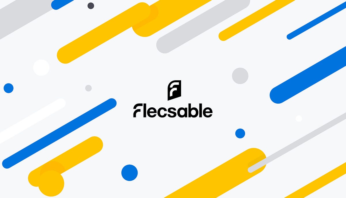
Branding Case Study: Flecsable — Trainingsdesign for the IT Industry
Branding Case Study: Flecsable — Trainingsdesign for the IT IndustryThe founding couple had the idea to bundle their 25 years of industry experience in the area of software product training and management / team development in one company. The new service company, called Flecsable, sees its main field of activity in the transfer and processing of knowledge regarding to software products that require explanation.Challenge & AssumptionIn the eyes of the customer, their unrivalled company only needed a logo and a website to convince the German IT market of their services.At that time there was no clear answer to central questions about positioning, target group, unique selling proposition and visual orientation. But answering these questions is the foundation of successful brand communication. It must be ensured that the uniqueness and orientation of the service are reflected in the company’s positioning in order to translate them successfully into the visual brand identity.GoalsFlecsable needed a brand development that would bring their brand to life and make it attractive to software companies and their distribution partners.The brand workshop then forms the basis for the visual brand identity, which is reflected in corporate design, logo, images / key visuals and website.Brand process1. Brand DefinitionTranslate the clients gut feeling about the brand into words2. Brand VisualizationTranslate the definition into images to create the brand identity3. Brand ApplicationsUse the identity and mirror it to other media, such as the company brand website1. Defining the Brand — Brand WorkshopThrough a series of exercises within a one-day brand strategy workshop we were able to extract and refine the most important points of the brand. Together with the two founders of flecsable, we developed the strategy for their new service and brand. In a branding session, we found out who the ideal customers are and what their challenges and goals are.During the workshop, they were able to prioritize the needs and goals of the company and their customers. This became the basis for the brand identity (logo, business cards, etc.) and all other measures such as the website.Positioning-StatementWhoWe help software companies and their distribution partners, …What… to standardize, multiply and make your software trainings more efficient …How… by applying our industry and training experience in proven tools, methods and our own incorporate process …Why… this enables the customer to conduct his own software training.Brand Attributes condensed into two Visual TermsBrand attributes condensed into two visual termsStarting with the brand attributes and condens-ing the statements to the most important terms. (CORE-Methode)Group the terms and reduce them to max. 3 more visual words, which are the basis for the Stylescapes / Moodboard 2.02. Brand Visualization — Translating words into imagesThrough our brand workshop we were able to bring some very important basics of the brand to the surface. We formulated the company’s positioning, defined the target group (personas) and condensed the brand characteristics (Attributes) and reduced them to two visual words.These two terms formed the basis for the further procedure, the translation of the words into images.For this process step we use stylescapes, moodboards 2.0 to show the customer different lines regarding key-visual, font, logo design, iconography, picture language and other media like web design, business cards, flyers, etc.We decided to prepare 3 stylescapes to give the customer the widest possible spectrum to choose from. The visual line „Dynamic“ was further divided into „Young“ and „Structured“.Stylescapes / Moodboards 2.0* the stylescape for the „self-confident“ line was excluded by the customer.But you can find the stylescape on my dribble or instagram account3. Brand ApplicationsTogether with the client, we discussed which of the stylescapes would suit the company well and, above all, which visual line would appeal to the potential target group.It is important that the customer is completely committed to the appearance of a single stylescape and only wants to adapt a few elements from another stylescape.Based on the client’s decision we developed logo design, icons, graphic design elements, business applications and merchandising and website. You can see some of the results here.Logo DesignConstruction of the LogoLogo Save AreaLogo on White BackgroundLogo on Black BackgroundApplication ExamplesFlecsable Application ExamplesDesign elementsFlecsable Brand Design ElementsIconographyIcons & SymbolsUX & UI Brand WebsiteIf you want to know more about the Brand, Design and Stylescapes, please contact me and ask me your questions:Dribbble | Instagram | Behance | WebpageMaking the Design Process transparent with StylescapesStylescape Moodboard 2.0 BRAND KEY WORD "cultural + modern"Sytlescape Moodboard 2.0Branding Case Study: Flecsable — Trainingsdesign for the IT Industry was originally published in Muzli - Design Inspiration on Medium, where people are continuing the conversation by highlighting and responding to this story.
Branding in the Design Process. Part 1
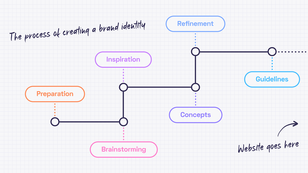
Cover design by https://dribbble.com/mariablazeIn this article, we’ll cover the beginning of creating the experience — the brand identity.It may seem that there is only a good designer’s taste and a couple of weeks behind the pixels that we call a design. The truth is that since every project needs a personal approach the designer needs to get to know the business and dedicate some time to find the right inspirations.The start pointEvery design work begins from understanding the project objectives and client’s business. I inspect briefs filled out by a client, study all the materials I got, stalking the competitors, talk to the client and google. Oh, I google a lot. There is no such term as “too much data“.The aim is to collect as much relevant information as possible because preparation is a very important part of every project. It is crucial to have an understanding of what needs to be done before I diving into creating concepts.BrainstormingNo creative work can be done without brainstorming, right? I like this kind of activity because it’s a great opportunity to come together as a team and spend some time thinking, imagining, making notes and doodling. As a team, we start by discussing the data we have. It is important to make sure that everyone is on the same page. Then I define the directions of the future style and create some kind of a mind map for ideas that differ too much (if needed). There is always a room for some abstract creative thoughts, though. Let ideas flow!But since it is a part of a process everything should be documented. The best ideas have the honor to go to the summary document with the most relevant and interesting ones that should be discovered later.Getting inspiredDesign is like driving a car. You need fuel (ideas) to start the engine (create a design) and get to the destination (business goals). No fuel means no movement. And by fuel, I mean inspiration — i.e. mood board and references.So, a few directions to develop are defined. Now what? Let’s begin from the mood board. Originally a mood board is a physical piece where papercuts, fabrics, paints and photographs come together. It is very exciting but I prefer using Miro and Pinterest because collaboration and flexibility are significant for me. Thanks to a mood board, the brand’s values can be pictured and communicated without words. This must be the guidance for the design choices that will help in visualizing the emotions I want to evoke.Consistency is fundamental for a good mood board. Separate mood boards should be created for different directions. Color palettes, patterns, font combinations, photos and illustrations are the basis. It’s fine to mix them up, edit, be creative but you need to keep in mind the main idea.Here are some really nice example of mood boards ⬇️Design by Marion EijkenaarDesign by copperheartcreativeMood boards are cool and inspiring but nothing helps as much as references. While mood board expresses the… well, mood 🙂 references show the way of how to do something. How does it work? I may like the font from some book cover, colors from a retro movie poster and illustrations from a science magazine. Then I bring it all together, experiment, refine and get something completely new. That’s how I use references.Generating conceptsWhen mood boards and references are done, I can start working out concepts. It’s better to have a few to choose from. I strive for complex concepts that evoke emotions, not just colors and font pairings so finding the right theme for the whole brand identity can take some time.The ideal concept should include:Big ideaLogoColor paletteFont pairingStyle of illustrations or photosHere is the example ⬇️Design by jacknifedesignPolishing THAT special ideaWhen concepts are ready, I can show them to the client. It’s worth remembering that the concept is not a ready-made identity. It only represents the idea and key elements. Sure thing, it could be polished after the feedback session, but this is the essence of collaboration. I refine the concept until it becomes the actual identity.Brand guidelinesAnd what happens when the logo, colors and the overall style are accepted? The brand guidelines are created. Or the brand manual. Or visual identity guide. Names may differ, but all of them mean the same –the client gets a handbook to help them use the branding without asking anyone for help.The guidelines include:Information about the logo (the idea behind it, how to use it properly, and what is not allowed to do)TypographyColorsImagery styleKey graphic elementsExamples of usageThese guidelines are made for people who will be responsible for creating different kinds of content or merch — marketing team, in-house designers or other design studios. This handbook can be updated later when the website design is ready because there may be some cool examples of usage I may want to include in the manual.And speaking of websites… I also have an article where I describe the website design process.Branding in the Design Process. Part 1 was originally published in Muzli - Design Inspiration on Medium, where people are continuing the conversation by highlighting and responding to this story.

How to design a timeless logo (+24 inspiring examples)
via Muzli design inspirationA logo is usually the first interaction a customer has with your business. Research shows that, on average, a person sees around 5,000 logos per day. Insane? Absolutely. But at the same time, the data is clear about one thing: the importance of a brand’s logo is higher than ever. User surveys show that a company’s branding is closely related to trust, conveys a brand’s personality, and can significantly impact buyers’ decisions.With these findings in mind, only a couple of questions remain: how do we create a successful logo, and where do we start?This situation is probably familiar to every designer, but no worries, we have your back. In this post, we will dive deeper into what makes a good logo, how to approach creating one, where to get design inspiration ideas, and showcase the best examples from top current logo designers.Good luck trying to stand out in Times Square. Owen Barker ©The importance of a good logo designFirst, let’s dive deeper into the statistics. The good news is that, for once, the data is unanimous about something: the logo’s design is incredibly important. According to statistics, 73% of customers say they are more likely to trust and make a purchase from a brand they recognize. Furthermore, 42% of people feel that a brand’s personality can be understood from its logo.This is great news for graphic designers. Once we know for a fact that logo design is important and worth investing in, it’s easier to communicate this value to our clients. But at the same time, the stakes are also higher, since a brand’s reputation is closely linked to its visual identity. This means one thing — it’s crucial to focus on quality.Did you know that the first Apple logo featured Isaac Newton sitting under the apple tree?What elements make a logo design memorable and timeless?Of course, we all heard the stories of iconic logo examples by McDonald’s, Nike, Starbucks, Adidas, etc. Some of them were meticulously designed from the start, while others began as simple 20$ sketches that evolved over time until they were completely transformed. But what is the secret behind a logo design that might one day become a classic?Here’s what our creative director Eyal has to say about:First, I strongly believe that a good logo should focus on simplicity, making it both memorable and versatile. A high quality logo looks great at any size, from a tiny website favicon to a large billboard.Memorability is also key — unique designs help people easily remember the brand in a very visually busy world.However, I’m not a huge fan of chasing the latest industry trends. By avoiding fast-changing fashions and staying true to your own ideas, a logo can remain more effective over time.You can call it an unpopular opinion, but I don’t believe that a logo has to be conventionally beautiful to be effective. Many successful logos aren’t particularly attractive at first glance but excel in functionality and brand representation in the long run.— Eyal Zuri, Creative Director of MuzliBlue is by far the most popular colour choice for logos.How to find inspiration ideas for designing your logo?When the industry is saturated with logos, creating a fresh design becomes a challenging task. However, there are several approaches that could help you develop an initial concept if you’re feeling stuck. Here are some useful tips from industry leaders:Delve into your brand history: Explore the founders’ motivations behind starting the business or brand. What specific tone of voice does the business use to communicate with customers? What feelings are associated with this brand? What are their ambitions for the future?Analyze iconic logo examples: Take time to study what made the iconic logos we see today special. Was it the standout bright color? The distinctive and memorable shape? Or perhaps it was the incorporated relatable symbol?Observe the world around you: Remember, design happens not only in your browser window. Look for inspiration in everyday surroundings. Perhaps there’s a line in car design that resonates with you? What about that famous building you pass by everyday? What about your clothing? Or nature? Inspiration is everywhere.Seek inspiration from top graphic designers: Explore not only iconic logo designs from industry giants but also discover what current talent has to offer. Platforms like Muzli are excellent for finding inspiration and understanding the current state of the design field.— -Looking for more logo inspiration?Download Muzli extension — your go-to source for resources from world’s top designers.— -Stages of creating a professional logoOnce you have a clear idea what the brand wants to communicate, what their associations should be and what art direction you want to go, it’s time to go to the design itself. The standard logo creation process includes these steps:Conceptualization: Freely explore the visual ideas that the research phase brought you. Sketch out rough concepts or create mood boards to explore different visual directions.Design Development: Once a concept is chosen, designers should start refining the design. This involves creating digital mockups, experimentation with typography, colors, shapes, and symbols.Feedback and Revision: Designers present the initial logo concepts to the client for feedback. Based on the feedback received, revisions are made.Finalization: Once the final design is agreed upon, the final touches are made: creating different file formats, various color combinations for different applications. The finalized logo files are delivered to the client, who then implements the logo across various materials.After completing these steps and using the logo in the ‘real world’ for some time, it’s very important not to forget to evaluate its effectiveness in achieving the brand’s goals.Can I skip it all and use a logo generator instead?As you can see, creating a logo design can become a tedious process that involves a lot of different steps. At the same time, today it’s easier than ever to generate a logo with just a few clicks by employing one of the dozens of logo generators. We know, it sounds too good to be true. But are they worth it?The answer is not that simple. It depends. If you are just starting out in your business and do not have enough experience to create a quality logo yourself and no additional budget to invest for professional logo design services, then an online logo maker can be a quick and easy (even if pretty generic) solution. However, keep in mind that changing a logo and undergoing a rebranding in a later stage of the business might require more effort and be a pretty costly process. Also, online generators vary in quality and pricing, so don’t forget to do your research.Alternatively, these generators could be used as an inspiration source for drafting your logo design ideas. It’s a very quick and efficient way to decide: Do you prefer your name in red or blue? Should the font be very clean and minimalistic or fancy and handwritten? Is it just your brand name, or do you want to include additional design elements, too?We gave one of the generators a go. What do you think about the results?Perfect? By no means. But it’s way easier to imagine the final result when you have a solid sketch in front of your eyes.Logo design inspiration sources:If, after reading these tips, you are still feeling stuck, we have handpicked the best modern logo design ideas from industry leaders to get your creativity flowing.If you want even more, check out Muzli — a free browser extension that curates and showcases the best design content from all over the web..25 fresh and modern logos for your inspiration:Tired of big corporation logos mentioned in lists like this? Yup, we feel you, that’s why why picked some fresh logos from upcoming studios ant brands.Wood Mood by No5 IstanbulThe Makers by KommigraphicsSaga Noren by Samosoboy BrandingMononova by Studio CommenceTacos Del Alma by Haidart DesignSao Gerald by Jean CreateGrin by Manarr GraphixJoyful Woof by Derek SieberCurv Studio by 4040creativeLegg by Sérgio FonsecaBallpark by Paul von ExciteUniversity of the Arts Helsinki by Bond AgencyKukuriku by Dan Alexander & Co.Re:Wear by Studio MOBlackbound by RamsiinoThe Frida Cinema by Cory SchmitzOffe by SipouquilliumZapier by AthleticsnycTilda by Luis VaskWoove by Hugo BarbosaCubic by DavidSquirrels by Supple StudioFluency by Elbu StudioMosaica by Benii DesignJetter by ObrazurHow to design a timeless logo (+24 inspiring examples) was originally published in Muzli - Design Inspiration on Medium, where people are continuing the conversation by highlighting and responding to this story.
Influential Branding Trends in 2022
How to improve your branding design? It’s worth considering the most influential branding trends 2022 to look out for in the coming year and beyond to assist your logo design project improvements and so much more. Here we’ll check the top branding trends.What is branding design?At a basic level, branding is the process of researching, developing, creating, and iterating your brand experience to accurately convey your vision, mission, identity, and purpose. Encompassing everything from visual design to messages and tone of voice, branding consists of all the external perceptions, ideas, and concepts that differentiate a business from its competitors.Why branding design is important?Brand building is the key to business success these days. Branding provides companies with an identity beyond products and services alone, creating something unique so that customers can relate to. No matter if you are a project owner or a designer working on a branding project for a client, building a strong, relevant, and recognizable brand is essential to grow your business and build a loyal, scalable customer base.Are you ready to make your brand design new again? Whether you’re looking to build a brand, change its look, or keep up with the hottest branding styles right now, here are the top trends to look out for handpicked by our video production team.1. Animated logosCommonly, a logo is the visual identification of your brand. As a rule, a modern logo animation (or animated logos) as a trend allows adding incredible animations into your logo designs or applying motion graphics where needed. This artwork is vital to assist in keeping in mind the brand’s values and purpose so that we may translate these ideas into a high-quality animation.ByNext Logo Animation2. Brand activismBrand activism is by no means one of the latest branding trends. It has never been more essential to show your soul and demonstrate that you are committed to what you believe in (and not just in words). Your product users want to interact with brands that share their values, from sustainability to social justice, as well. So, Brand activism is all it takes to communicate your commitment to positive change-and see it through!3. MinimalismHow a brand “fits in” with a consumer’s values, belief system, and lifestyle is likely to determine whether they buy a particular product or service or not. And the mission and purpose of a brand play a huge role in who people consistently buy from and decide to do business with. Minimalism is always in vogue as one of the major design dogmas. Adhering to the “less is more” mantra, minimalism in graphics is based on using only basicelements such as basic shapes, plain text, limited color palettes, and white space — to create a clean aesthetic with organic elements.4. BauhausThe Bauhaus is a modern design direction that originated in the famous German art school, which gained momentum at the beginning of the 20th century. It combines both elements trends in branding of art and industry, manifested in geometric shapes, clear lines, and sharp corners. Similar to minimalism, the Bauhaus has a minimalist, modern and functional style that draws on retro design elements, making it an ideal and versatile choice for your product design branding.5. NostalgiaMissing the past and an obsession with nostalgia has become a dominant force in branding and marketing nowadays. For many reasons, the past continues to be a rich source of inspiration, and as a result, many take a fresh look at much-loved symbols, cartoons, animations, instantly recognizable icons, and more. We are also seeing a resurgence of design elements and pop culture references from more recent music history, namely the 1990s and 2000s, appearing in films, TV shows, commercials, marketing materials, branding, and social media feeds.6. GradientsA well-designed gradient does not irritate the eye. We often see gradients used in a variety of contexts-for example, in photo overlays that connect images to a brand’s color palette, in animation transitions, as a way to add extra visual interest to the motion, text, and as a subtle or vibrant backdrop for illustrations, etc. Applying three or more colors that complement each other that are monochromatic or similar will create an incredible effect. While radial and linear gradients are typical, triangular ones have multiple light sources for depth and dimension, giving you a more modern, timeless look.7. Quirky BrandingOther branding trends 2022 are the so-called quirky branding which means it may use everything in a row: from monogram to neon, from the hand-drawn whiteboard, illustrations, and whimsical images to overlapping elements, asymmetries, disruptive motion graphics, or chaotic designs.This is a trend that has been adopted by a wide range of brands and in traditional industries such as finance and health insurance too. Whimsical branding is all about breaking the rule and using unexpected design elements to create a sense of fun and individuality.8. Bold Playful TypeFinally, we’ve approached the brand identity trends in lettering and font choice. Sure, a picture is used instead of thousand words, but you never underestimate the power of a fun, playful text for your storytelling. When you convey your brand message, choosing the right font or font family is an integral part of the process.Add some movement and bold colors like 3D fonts, animated letters, kinetic typography, and shape-shifting sentences to bring your desire to life. By wrapping words in the proper line packaging, you can convey a powerful message that matches your brand tone. If your brand is bold, fun, and playful, this is the trend.Love or FameDo you want to create your own animated brand design?Branding Design Trends you may look through and choose to apply in your digital products will help to spice them up and make them stand out from the competition. In this case, you need to carefully choose, feel free to rely on expert logo design and motion graphics team that cope with any brand project complexity.ConclusionSince the brand building is the key to business success, it’s worth looking through the brand design trends 2022 to form a clear vision of your identity that goes beyond products and services alone, creating something unique that customers can relate to. When you are a business owner or a designer working on a branding project for a client, building a strong, relevant, and recognizable trends brand name is essential to grow your business and build a loyal, scalable customer base. So, take your time!Originally published at https://explain.ninja.Influential Branding Trends in 2022 was originally published in Muzli - Design Inspiration on Medium, where people are continuing the conversation by highlighting and responding to this story.
The Best Examples of Dynamic Brand Identity for Startups.
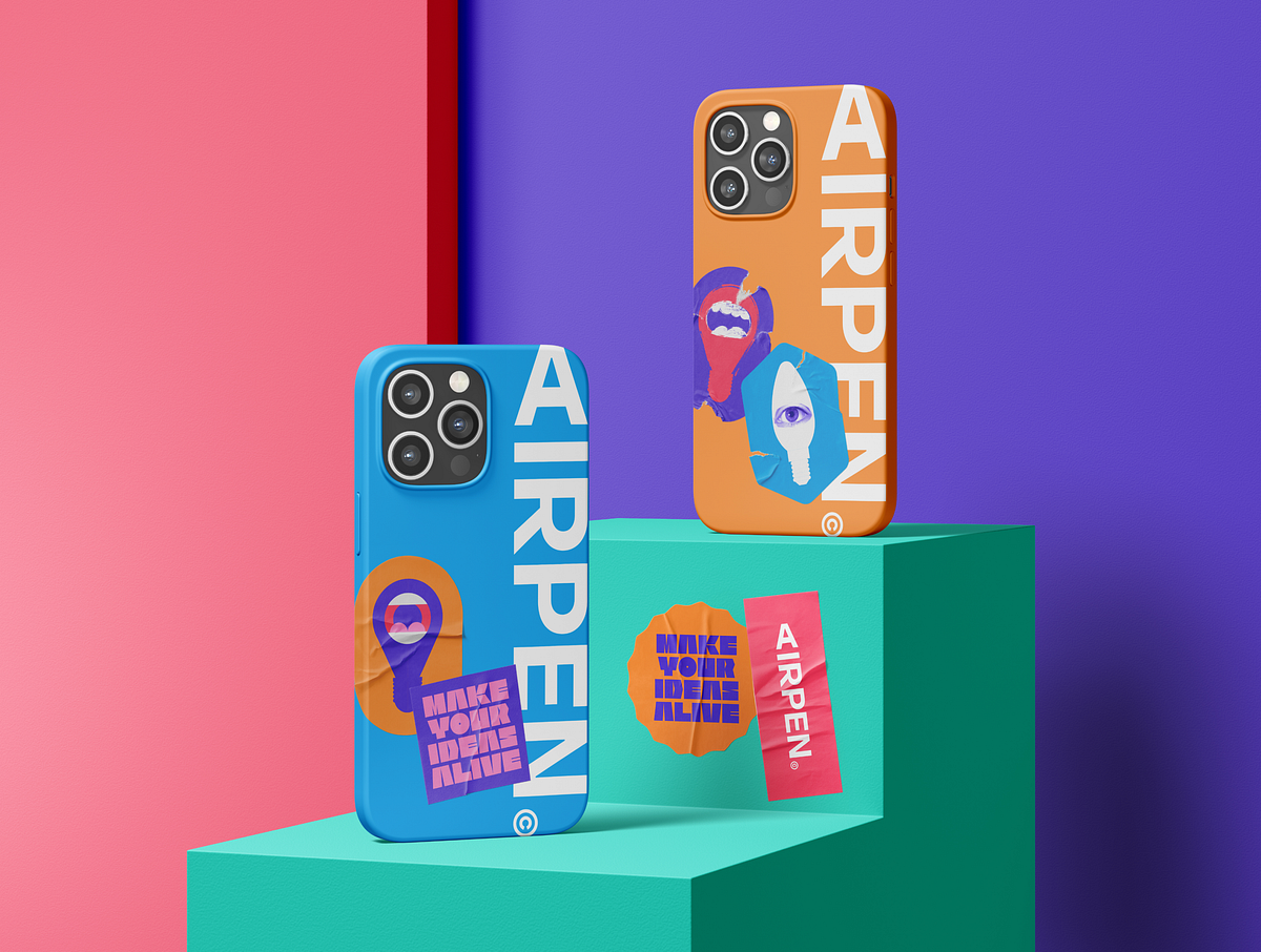
In today’s fast-paced market, establishing a strong brand identity is crucial for startups aiming to stand out and connect with their target audience. But what takes a brand identity beyond just being recognizable to becoming truly dynamic and adaptable? Let’s explore the concept of dynamic brand identity and logos, their importance for startups, and showcase some leading examples.What is Brand Identity?Brand identity is the collection of all elements that a company creates to portray the right image to its consumer. It goes beyond a logo or visual aesthetics to encompass the company’s values, tone of communication, and the overall experience it promises to deliver. A well-crafted brand identity is a beacon that guides marketing strategies, product development, and customer engagement.The Evolution and Impact of Dynamic Brand Identity.Dynamic brand identity represents a significant evolution in the way companies approach their branding. This adaptive, flexible style of branding allows businesses to stay relevant and responsive in the rapidly changing market landscape. Let’s delve deeper into its application, benefits, and notable examples from both startups and established brands.Dynamic brand identity goes beyond the traditional fixed logo and consistent color palette. It’s about creating a brand system that can adapt to various contexts, messages, and audiences while maintaining its core identity. This approach reflects a brand’s agility and its capacity to evolve without losing its essence. This could mean a logo that adapts to different contexts, marketing materials that change based on the audience, or even a brand narrative that evolves over time.AI sturtup brand identity. Credits Noomo.A dynamic logo, for instance, might alter its color, shape, or form depending on the platform it’s displayed on or the message it intends to convey, offering a flexible tool for engaging with diverse audiences.Historical Context and Adoption.The concept of dynamic brand identity started gaining traction in the early 2000s as brands sought to become more interactive and personalized in their approach. Google’s Doodle is an early example, where the company alters its logo to celebrate events, anniversaries, and significant dates, showing a playful and engaged side to the brand while keeping the underlying logo recognizable.https://doodle.com/Big brands like MTV, Spotify, and Apple have since embraced dynamic branding, using it to cater to different audiences and touchpoints without diluting their brand identity. These brands demonstrate the power of dynamic identity in staying relevant and engaging with audiences across diverse platforms.Why Dynemic Brand Identity is Important for Startups.For startups, crafting a distinctive brand identity is essential for several reasons:1.First Impressions Count. In the crowded startup ecosystem, making a memorable first impression is crucial. A dynamic brand identity sets a startup apart, signaling innovation and forward-thinking from the outset.2. Connection.It fosters a deeper connection with your audience, translating into loyalty and trust.3. Communication. Your brand identity communicates your values and mission, aligning customer perceptions with your brand’s essence.4. Adaptability. Startups operate in a fast-paced environment where changes happen quickly. A dynamic brand identity allows for adjustments in branding elements to reflect new product launches, partnerships, or market expansions seamlessly.Airpen — AI startup brand identity. Source5. Engagement Across Touchpoints. With the proliferation of digital platforms, startups need to engage with audiences across diverse channels. Dynamic identities enable startups to tailor their messaging and visuals to different platforms while maintaining brand cohesion.6. Storytelling and Growth. As startups grow, their stories evolve. A dynamic brand identity can encapsulate various chapters of a startup’s journey, making storytelling a central part of the brand experience. This not only enhances brand recall but also builds an emotional connection with the audience.Netrix dynemic logo. Source7. Narrative Flexibility.A dynamic brand identity is like a living story that adapts and grows. For startups, this means the ability to highlight different aspects of their offering or mission as they expand, ensuring the brand remains relevant and engaging.Source8. Cultural Responsiveness. In an increasingly global marketplace, the ability to adapt branding to different cultural contexts can significantly broaden a startup’s appeal. Dynamic identity allows for such flexibility, making the brand more inclusive and globally accessible.9. Visual Innovation and fun. Through dynamic logos, color schemes, and imagery, startups can showcase their innovative edge, visually communicating their unique approach to solving problems or enhancing lives.Dynamic brand identity is particularly suited for startups due to its inherent flexibility and adaptability — qualities that startups themselves often embody. As startups grow and evolve, their brand can seamlessly adapt to new markets, products, and customer insights without losing its essence.Advantages of Dynamic Brand Identity.Engagement: By tailoring the brand experience to different contexts, companies can increase engagement and interaction with their audience.SourceRelevance: Dynamic identities allow brands to stay current, adapting their branding for special occasions, trends, or user behaviours.Inclusivity: Adapting a brand to reflect diverse cultures and communities can enhance inclusivity, making the brand appealing to a broader audience.8 of the Best Recent Examples of Dynamic Brand Identity.1.Airpen — AI builder for lllustrations: This startup’s identity showcases versatility through a dynamic logo that can adapt its form across different media, illustrating creativity and adaptability, core traits for a platform based on customization. This startup’s dynamic identity visually communicates the endless possibilities of illustration, adapting its branding to showcase different styles and themes, emphasizing creativity and flexibility.Credits Noomo Agency2. World Culture Festival 2023: This event’s branding demonstrates how a dynamic identity can encapsulate the diversity and vibrancy of world cultures, using adaptable visual elements that celebrate global unity. Its dynamic identity, with adaptable visual elements, represents the myriad cultures and traditions, highlighting the event’s global inclusivity.More information about World Culture Festival 2023 is in this Case study.https://medium.com/media/34fc8bf007c30c69ad5e52944e4416af/hrefBrand identity for one of the biggest events in Washington DC, 2023 — World Culture Festival.3.Noomo Agency: With the recent rebranding, the Los Angeles-based creative design agency Noomo has unveiled a new dynamic brand identity that represents their core values.Read more about their rebranding.https://medium.com/media/8e5862e62adbb7339fef6ff4a0143cf0/href4. The Handl Visual Identity: Handl’s brand identity stands out for its dynamic use of color and form, symbolizing the startup’s innovative approach to handling (managing) diverse tasks or services.Dynemic brand identity created by Noomo Agency5. Sigma Brand Identity and Dynemic Logo : Sigma’s brand identity is a masterclass in blending simplicity with dynamism. The logo’s adaptability across various platforms showcases the startup’s forward-thinking and versatile approach to data analysis.Source6. Lite — Brand Identity for a Home Loans Startup. Specializing in data analysis for Home loans, Lite’s dynamic identity is sleek and modern, using shapes and patterns that adapt across different platforms to represent data fluidity and analytical precision.7. Emma — A Guiding Light into a World of Loans: This startup uses its brand identity to simplify the complex world of loans. The dynamic aspects of its branding make financial services more accessible and less intimidating.8. Dynamic typography in the personal branding of design director Olha Uzhykova. This logo design incorporates dynamic typography in order to create cohesive and engaging visual identity. It involved in designing custom typeface which is compatible with various graphics and can easily be adapted to different contexts and platforms.You will find more details on how this brand identity was effectively incorporated into the website design in this article: Crafting your unique story through creative website design.ConclusionFor startups, venturing into dynamic brand identity is not just about keeping up with design trends; it’s a strategic approach to ensure that their brand remains relevant, flexible, and deeply connected with their audience, even as they scale. By adopting a dynamic brand identity, startups can ensure that their brand grows with them, through every pivot and milestone. This adaptability not only enhances brand engagement but also solidifies the brand’s place in a competitive market landscape.The Best Examples of Dynamic Brand Identity for Startups. was originally published in Muzli - Design Inspiration on Medium, where people are continuing the conversation by highlighting and responding to this story.
Branding: The Little Secrets of Big Success
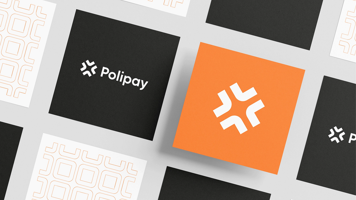
How to build a cohesive and effective brandBranding for digital payment platform by OutcrowdToday, I’d like to share something I have come to realize over the years of doing branding and brand design work. I hope it will help some readers get a new perspective on branding, find inspiration, and apply this approach in practice — both for marketing and design.Here’s an experience most people will be familiar with: you visit a place of business that looks good and is properly branded. You get serviced, leave the place — and immediately forget what it was called.Why does it happen? What did they miss?They failed to make their brand cohesive, valuable, and memorable.Brand cohesion is formed in people’s minds.A successful brand is always cohesive. But a lot of people don’t really understand what brand cohesion is. They’ll say it’s about a consistent corporate style, cohesive advertising, or cross-platform recognition. However, these are merely parts of a greater whole.KMBCH — Product photoshootThe brand as a mini-universeThink of video games and how addictive they can be. What is a game? It’s a world with its own rules, setting, and tasks. The player pursues an objective and gets rewarded for achieving it. All the players interact, compete against each other, and try to win. The more unique and cohesive the game world, the more addictive and immersive it is. The number of players grows, and the profits of the creator gods skyrocket.Approach your brand like game developers approach their games, and you will see some astounding results.So what can gamedev teach us about branding?Polipay — Branding for digital payment platform1. Build a unifying a worldThe processes, people, and objects in our world are interconnected and united by a common goal: to live and continue. It’s the same in any other world. Unity between a company’s management, employees, customers, and partners is what sustains it. Management problems directly affect the cohesion of any project. (This is useful to know even if you’re not a manager.) Disunity trickles down and affects teamwork. Can you expect anything cohesive as a result?A brand begins with an Idea. Whatever your concept is, use it to unite people, both in your company and outside.Each sector of a cohesive brand has:unifying values and ideas;common strategy;common rules;common vision;common motivation and incentives;communication, interaction, responsiveness;pride in achievements and victories.Cohesion at the basic level ensures the right branding development vector.Omega — Logo & brand identity for the financial service company2. Strive for visual cohesionA unity of style is absolutely necessary for any brand, and not just for aesthetic reasons. A unified style builds the brand universe, differentiating it from competitors. That’s what creates the feeling of cohesion, order, and harmony in people’s minds. It makes people trust the brand and the quality of its products.Branding is laconic. It thrives on symbols and metaphors. Like in a game, where opposing teams are designated by flags and colors, good branding is deliberate. There are no random palettes or metaphors. Logos are battle flags that broadcast the right messages to the audience.Strive to achieve a unity of style to build the brand universe.This is achieved through good, professional design.Brand Book & GuidelineMake Your Logo Work for YouUnity of Style in Web DesignHomly — Logo and brand identity for a real estate agency3. Prepare an introduction strategyConsumers take a brief contact for granted and quickly forget about it. Games are a perfect example of complete and lasting immersion.A smart, catchy brand enters a person’s life and becomes part of it. Not only does it make every interaction enjoyable, but it also makes people want to repeat the experience and spend their precious time on it. This is where brand strategy comes in. It’s not about posting flyers on every street corner. A brand introduction strategy is about introducing the brand into a person’s mind and everyday life. It starts with stimulating a desire to own the product and ends with a habit of owning it.A habit forms when the customer interacts with the brand frequently and regularly, but not intrusively.A cohesive brand (mini-universe) is committed to immersion. Solving the customer’s problem is not enough. You need to retain the customer by creating enjoyable experiences: communication, motivation, support, new information, inspiring ideas, visual aesthetics, pleasure.Designing for User Retention That WorksLook for ways to cement your brand’s long-term presence in your customers’ lives.Swif — Brand’s additional visual assets4. Focus on the customer’s imageA mediocre brand tries to stand out by focusing on its own brand image. Effective brands work differently: they focus on their customer’s image. By using X brand products, the customer becomes better: healthier, more successful, better-looking, stronger, etc. The product doesn’t just solve their problem, it elevates their status and self-esteem.“A good housewife always buys X” and “X is the best” are examples of different focuses.In video games, the player identifies with a character. They have an image of their successful self: intelligent, strong, attractive, deft, brave, smart. Successful brands use the same tactic of increasing the sense of self-worth.Give your customers the image they want.Transform your customer into the character they want to identify with! Ideally, this image should be visualized: a visible image is emotionally engaging, memorable, and easy to own.Relos — Branding design for the CRM startup platform5. Boost the sense of significanceThere’s nothing we humans love more than being in control. It’s an integral part of any good game. Branding is more limited in this regard than gamedev, but you should use every available chance to put the customer in control. Make them feel that Product X puts them in charge; that it helps them improve, upgrade, solve, or manage some aspects of their life.“Lawnmower X will help you make your lawn look better than your neighbor’s” is an example.Freedom of choice is just as effective. An ability to choose tells the customer that the brand respects their tastes and is trustworthy.Control means situational awareness and the ability to make decisions in order to reach the desired goal. A brand must always strive to satisfy this desire.Make your customers feel significant.Vabio — Branding design for the payment service startup6. Involve your customers in your missionA brand needs to maintain a special, trust-based relationship with its customers. This implies an in-depth knowledge of your audience and a constant monitoring of its desires and attitudes.There are many different tools of engagement, but that’s a subject for another time. Right now I’d like to emphasize the brand mission as an important social cause. People want to be involved in a mission. They like being part of a common cause, they enjoy the feeling of unity. Games have missions and alliances, and that’s more engaging than anything else.Give your customers the opportunity to show off, to share their experience of brand interaction across different platforms.Offer people more than just the product.Swif — Branding design for the messenger application7. Reward winnersThe goal of a game is to win, to get a dopamine hit. And again, and again. This is another similarity between branding and gamedev: buying the product of your dream feels good. But how do you boost that dopamine release?Winning in a game is deserved. Branding doesn’t offer any obstacles to be overcome, but it does use the deserving theme: your customers deserve to live better or have better things.In a game, a perk is something that makes the player stronger. This can be efficiently used in branding, as well: we should emphasize a specific improvement for the customer.Perks and rewards are a great way of reminding customers about the brand and emphasizing that they have earned it.Make your customers feel they deserve rewards.Hint — Branding for a language learning platform8. Engage emotionsGames excite human emotions, which is why they’re so addictive. Branding can do it too.These are positive emotions, as a rule. Yet the most common gaming emotion is frustration. Smart marketing exploits this feeling. “I’m frustrated because I couldn’t solve my problem. If only I knew about Product X!”Fear is a different matter, to be approached with caution. Strong brands target some specific and fundamental human fear, then offer an antidote. “This is your pain. This is our medicine.”Many games have enemies you need to fight. Crafting an image of the enemy can be useful in branding, as well: dust on the furniture, flu, a pimple on the nose… Create a convincing enemy, and the customer will enjoy fighting it.Excite your customers’ emotions!Wellcast — Brandbook and guidelines for the podcast platform9. Stimulate accomplishmentGames make players feel a sense of accomplishment. One victory is followed by another. A good brand stays dynamic, constantly offering the audience new victories and new opportunities.Beating a level in a game creates the illusion of improvement. Branding likewise emphasizes improvement for the customers and their lives. The important thing is to make it clear that the accomplishment is entirely theirs, while the brand is merely a means to an end.Give your customers a tool for improving themselves or their circumstances.Neuro — Branding for educational platform10. AdaptBrand cohesion is the sum of all your mini-universe-building efforts. In this universe, the customer protagonist fights enemies, creates and destroys, pursues a goal, improves his or her skills, becomes stronger, and wins rewards. The use of gaming methods in branding is a way to ensure popularity and achieve phenomenal success.“Cohesive” does not mean that the brand is complete and final. It must live and change, adapting to the latest trends and audience preferences.Cnnct — Branding design for the social network platformIn conclusion, some food for thought:“What is a unified style?” The answers to this question will vastly differ depending on who you ask. Something like this:Businessman: A unified style means that the company follows a clear set of rules, so everything is organized and purpose-driven.Employee: A unified style shows that we’re a team. It’s our uniforms, products, packaging, office design.Marketer: A unified style is continuity in advertising. A cohesive brand image makes it instantly recognizable and viable.Designer: It means cohesive and harmonious visuals adapted to various platforms.Customer: It’s a guarantee of the product’s quality: logo, colors, styling, popularity.All five are correct, each in their own way. But to achieve a truly cohesive corporate style, you need to satisfy each of them and prevent any misunderstandings between them. :)That’s something to think about and work on!Branding: The Little Secrets of Big Success was originally published in Muzli - Design Inspiration on Medium, where people are continuing the conversation by highlighting and responding to this story.

Case Study: Glup. Brand identity and UX Design for Delivery App
Case Study: Glup. Brand Identity and UX Design for Delivery AppWelcome to glance at the design story filled with vibes of party fun and the hiss of beer cans opening. In this case study, we share the details of tubik collaboration with Heineken Mexico on brand identity design and mobile application design for Glup, a cool and functional delivery app.Challenge and ClientTo broaden its ways of reaching the audience and set an effective sales channel using mobile technology, Heineken Mexico strived to launch a mobile application that would allow users to buy beer and associated stuff like snacks, cups, and the like and get the orders delivered quickly. This is how the Glup application started.The clients approached the tubik team with a range of design tasks: we worked on logo audit and tweaks, extended brand identity development, delivery application UI/UX design from scratch, website design, and creating custom 3D icons and 3D illustrations for marketing and user experience objectives.https://medium.com/media/d563951dc6da5f5551ea0728efce27fd/hrefThe creative process included two major directions: developing a flexible identity and creating a consistent functional UX design for the application.Brand Identity DesignFirstly, it was essential to work on powerful branding that would be effectively applied to both marketing goals and mobile interactions, providing the integrity of the customer experience.The brand already had a logo, but it had to be enhanced to get a more attractive and trendy look appealing to the target audience and become more pliable for a variety of brand advertising and marketing objectives.Original logo color variationsGlup logo redesignCertainly, the team took advantage of color power and its remarkable ability to set the needed mood in split seconds. The primary brand colors were yellow, setting the cheerful spirit and giving instant association to the beer theme, and deep purple, setting the effective contrast and playfulness and supporting the flexibility of the palette for the defined objectives. Also, an extended palette for different ways of product presentation was developed.https://medium.com/media/3d5e8ac60c99523e77431705a93c23c9/hrefAnother element of visual branding was the set of abstract geometric shapes to be consistently used across various branded items, advertising materials, delivery bags, social networking, and mobile application screens. What’s more, these shapes reflected the parts of the clock face setting a solid association with the speed of delivery as one of the key features. Take a look at the variety of branded items and advertising design.Outdoor advertisingSocial network posting templatesSocial network posting templatesBillboard designDelivery backpack designRange of variants for delivery motorbike brandingBranded T-shirts designBranded cap designUser Experience DesignThe second direction of work was to think about the flawless and intuitive user experience for the mobile application. The interaction design was thoroughly thought-out to make the sales funnel work successfully and let the users move through the whole purchase flow smoothly.The onboarding screens and categories use trendy and balanced 3D graphics presenting the products and setting friendly communication. Having a different visual style, these original graphics don’t distract users’ attention from the offered items.App onboarding screenshttps://medium.com/media/b52957cd53aff58472816af7e3624128/hrefThe icons working as visual, illustrative markers for the different categories of items in the application also moved through several iterations and evolved from 2D graphics consistent with the general concept of visual branding and echoing its graphic elements to the big set of 3D icons following the style of 3D illustrations used across the app and in the onboarding process. Here’s a quick glance at the stages of the process.Creative search process for different illustration stylesAiry light screens of the application effectively show the products, while branded colors, graphics, and eye-pleasing gradients help to set attractive color accents for interactive elements, making navigation clear and intuitive. Custom icons in the interface also echo the brand palette, supporting both usability and consistency of brand performance. The customers are offered several ways to surf the range of provided items, including browsing the entire catalog, using filters to customize it, or using the internal search to quickly find the needed item. Plus button on each card on the catalog screens sets the shortcut to add the items directly to the basket without opening a card, which saves time and effort in cases when users have some faves and order the same items multiple times.Here’s a quick look at the category screen. All categories are illustrated with stylish theme 3D graphics that instantly set the theme but do not overload the screen with too much detailing.The shopping cart screen is informative and functional, based on the principles of external consistency and well-recognized mental models so that users can finalize their orders easily and effortlessly. A special progress bar with a text hint is used to visualize the ability to get free shipping for the order.The home screen and promotions screen also feature sliders with banners for special offers or hot sales to attract more attention to them immediately.https://medium.com/media/8671e9b6693d398a6739e3189d0a50fd/hrefOne of the essential elements of building a solid mobile app brand and enhancing its online presence is supporting it on the web with a concise and informative landing page that uncovers the benefits and engages new users to try it. The landing page for the Glup application echoes the design approach of visual identity for the brand. It’s based on bright background in primary brand colors separating different content sections, a solid visual hierarchy of text blocks, clear and visible call-to-action elements, and prominent visuals that present the balanced mixture of app screens and thematic 3D graphics to instantly set the connection with the essence of the offered service. Smooth web animation makes the user experience even more lively and dynamic.Landing page design for the Glup applicationhttps://medium.com/media/5cc75b0dce1a58a7c657bd30e7c6ca6d/hrefSo, as a result of the project, the Glup brand obtained a solid and effective sales channel via the easy-to-use mobile application, consistently reflecting brand identity and making the customer experience integral, engaging, and smooth.New design case studies from our team are coming soon. Stay tuned!More Design Case StudiesHere’s a set of more case studies sharing the design solutions and approaches for some of the design projects done by the tubik team.Nibble Health. Identity and UX Design for Healthcare Fintech ServiceProAgenda. Identity and Website Design for Golf Management ServiceBlockStock. Brand Identity and Website for Minecraft Models ResourceKaiten. Identity and Product Design for Food MarketplaceKomuso. Website Design for Wellness TooluMake. Branding and Website for 3D Design ToolCrezco. Brand Identity and UI/UX Design for Fintech ServiceFulfill. Illustrations and Web Design for 3PLs MarketplaceFarmSense. Identity and Web Design for Agricultural TechnologyCarricare. Identity and UX Design for Safe Delivery ServiceOriginally written for Tubik BlogWelcome to talk to us and check designs by Tubik via:WebsiteDribbbleBehanceTubik ArtsCase Study: Glup. Brand identity and UX Design for Delivery App was originally published in Muzli - Design Inspiration on Medium, where people are continuing the conversation by highlighting and responding to this story.
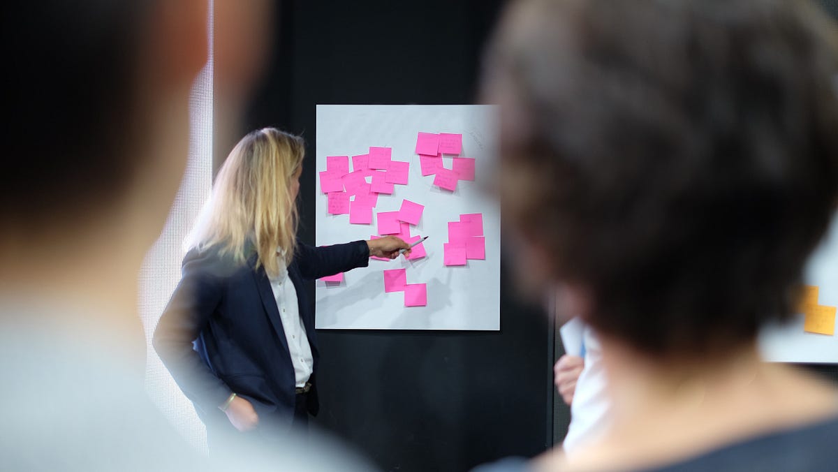
Demystifying The Brand Identity Design Process
Photo by Bonneval Sebastien on UnsplashSo you’ve decided to take the plunge. Open up that business. Dive into that side-hustle. Setup that online store or launch that product. And you quickly realise that you need a logo or a brand identity designed for your new endeavour.It can be hard to know where to begin and what to expect from a logo design process. Especially as your head is still spinning from planning out your services and business structure.I know from my own experience, setting up a new business can be an incredibly exciting time. But it can also be a stressful time because you need to think of so many things.So I have put together this indicative Brand Identity Design process guide for your reference so that you can breathe more evenly and have one less unknown to stress about.Here are some typical process steps, although they may vary slightly from designer to designer.1. Initial Discovery MeetingAfter your initial Google search for designers, or a personal recommendation from someone you know, you will reach out to some designers. No self-respected designer would be able to send you a price for your project without talking to you and understanding your requirements. So usually they would arrange either a phone or a face-to-face meeting.Hold up just a second — I just want a logo! Why can’t they give me a standard price?This may shock you, but you may not even need a logo. If you go through a proper brand strategy and define your brand positioning, what you may find is that an elaborate ‘logo’ would not communicate your positioning accurately. Sometimes, you can get on just fine with your business name typeset in an appropriate font.In most cases, you do need a recognisable visual identifier for your business — so that customers and prospects can start to create associations with your brand.So in your initial discovery meeting with the designer, they will take you through a set of questions that will help them to understand your services and products better. From there, they should be able to advise their recommendation for you and talk about their unique process.2A. Brand Strategy WorkshopA strategically inclined designer will typically recommend that before you consider creating a logo you should think about your overall brand strategy. Again… what? I just want a logo. Yes — but hear me out. As designers, we tend to act like doctors. Where our initial actions may be painful or uncomfortable, but only so that you can thrive brighter and better in the future.Look at a Brand Strategy Workshop as a priceless investment. It will help you figure out your business goals, your ideal customer demographics, your brand purpose (your reason for creating a business in the first place beyond making money), and more. Ultimately, it will help you get crystal clear on what you should focus on to have a winning business going forward.So like a doctor diagnosing a patient, a good strategic designer can help diagnose what brand actions will push the needle for your business.2B. ResearchWhether or not you decide to go through the recommended Brand Strategy process, a research phase would still most likely be carried out by the designer.This stage of the process will help fill any blanks for your brand that are left unanswered from the initial Discovery meeting and/or Brand Workshop. Your competition will be analysed, with their positioning and brand identities reviewed to see where and how you can fit and stand out in the market.Your target market will be researched, with potential customer interviews taking place to get their perspective on your brand and/or your industry. All of this will help ensure the designer has a bird-eye-view of all of the components, and therefore enable them to create the most accurate roadmap and Brand Identity for you.2C. Brand Strategy PresentationAt this stage, the designer will retreat to base temporarily, and put on their creative thinking and strategic hats. They will now work on packaging up all those insights from the workshop and research stages into some key findings and recommendations. It may take a couple of weeks, depending on the designer — this is a crucial document that’s going to define your brand going forward!The resulting presentation document will typically include the type of customers you should target. What your brand tone and messaging should be, including examples. Your brand personality and potential mood boards for what your brand could look like. But most importantly, it will contain a positioning statement, a golden idea, or some other distilled concept, which will guide all of your branding activities.And let me tell you, making business and branding decisions will become a whole lot easier when you have an anchor like this to refer back to. Look at it as your North Star — a guiding beacon.3. Logo Sketches and or Stylescape PresentationOnce you have your Brand Strategic Document in tow, your designer will go away and work on either logo sketches or more customised mood boards called stylescapes.Stylescapes are like mood boards, in that they communicate what your brand could look like. But in comparison to the mood boards, where the majority of elements are just inspiration pulled off from the internet, stylescapes may contain mockups and rough explorations for logo/colours/typography for your actual brand.As part of this process, the designer may also show you either their sketch explorations or their shortlisted 2–3 sketches for logo direction. The intention here is to have you come on the creation journey, rather than just seeing the finished product without having any involvement.This is your opportunity to comment and discuss what you are drawn to and what doesn’t resonate as much. So that the designers can either provide feedback and recommendations or adjust the visual approach.4. Brand Identity Designs PresentationThe number of logo concepts, as well as the extent of the work presented, will vary from designer to designer. But typically, after approval of the sketches and/or stylescapes, you will be presented with some logo concepts, so that you can decide on the most appropriate one for your business and brand.Personally, at this stage, I present one fully fleshed out logo concept, including color scheme, imagery and supporting graphics, and additional application examples that show the logo and graphics in ‘real-world scenarios’. That may include indicative brochure covers, website home page, and business cards. Essentially a ‘full package’ deal so you can really visualise your brand come to life across the different touchpoints.Alternatively, depending on the designer’s process you may receive several logo concepts without application examples. If that’s that case, still try to see ‘beyond’ the logo. Try to imagine what feelings you get when looking at each concept and visualise what that would look like on your website, your business cards, your Facebook page, and social media accounts.Whatever approach your designer proposes, make sure to not go with the gut-feeling when judging the presented ideas. In design matters, this tactic doesn’t always work. Design tends to be an innovation medium. Sometimes innovative and winning design takes time to process and digest. So sleep on it and let it marinate before you make your final decision.5. Brand Identity Files SuppliedOnce you have selected your winning logo for your business, the designer will prepare and send you the necessary files for your finalised logo. So that you can start using them on social media, sending it to your printer and web designer/developer.Congratulations — you are now the owner of a brand new baby… a pretty little logo. But just like with a newborn, the work doesn’t end there. You need to continue to nurture and take care of it — by using the logo appropriately, as recommended by your designer. If their process includes it, they will send you a Guideline Document (also known as a Style Guide) which will help you decide what is appropriate or inappropriate use for your logo.Of course, a logo does not live in a vacuum. When used in real-life scenarios, it will have other brand elements around it including your messaging, imagery, and more. A well-crafted logo and Brand Identity System has flexibility while making sure it is not misused in any way.This flexibility will help you get as much value out of your Brand Identity long-term. Consistent and appropriate use of your logo and brand assets will ensure that your customers continue seeing your brand as worthy of their loyalty.6. Implementation & SupportThe journey of your brand doesn’t end there. You will likely need assistance to apply your new Brand Identity, create various stationery materials for use, and carefully think about how you want to roll out your new brand.Depending on the size and requirements of your business this can be a quick rollout or a lengthy process, carefully planned and orchestrated by your designer. It took several months to roll out new collateral (PowerPoint templates, business cards, social media posts, website re-skinning) for a skincare brand I designed and helped launch.Keep in mind that typically this rollout phase is an additional budget item for you to consider, as the circumstances and requirements are different for every business.Now Over To YouDo you need a Brand Identity Designer for your project? Or have you already worked with a designer to craft your logo or brand identity? What was your experience? Did they have a different process? Please reach out via email or on Instagram, I’d love to hear from you!If you enjoyed reading this article, consider signing up to the Studeo Insider, and receive more insights like this one. If you know someone who might enjoy this article, please share it.Demystifying The Brand Identity Design Process was originally published in Muzli - Design Inspiration on Medium, where people are continuing the conversation by highlighting and responding to this story.
The rules about using fonts in logos
There is more to a logo design than a picture and some fancy fonts, a logo is a brand visual identifier and its sole purpose is to do just that. Potential customers must be able to identify your business, understand who you are and what you do just be seeing your logo. If you think of some of the biggest brands out there you will understand what I mean for instance some of my favorite brands to use as examples are Apple, Kellogg’s, FedEx, Nike, Adidas, MacDonalds, etcSo logo plays a very big major identical role in bringing up an image to the company so one should be really careful while working on the branding.The logos wherein you see text are been classified into two types Wordmark Logo Design & Lettermark / Monogram Logo DesignWordmark logo designOffice Max, Home Depot, and Walmart all represent the most commonly used type of logo — the wordmark. Typically, this type of logo relies on text, typeface, and unique typographic treatments to express the brand’s identity. Because there are no graphic elements to convey messaging, the text is often exactly literal, stating the name of the company and sometimes even what it does.When to UseWordmarks work best for companies whose names describe what they do, or for those with a distinctive name, even if it’s not yet a household word. This type of logo can be cost-effective for companies with limited marketing budgets that need to focus their efforts on building name recognition. It can also help associate your brand name with products or services more concisely than a symbol mightLettermark logo designThink of a lettermark logo as a monogram for your business. Like a wordmark, a lettermark is entirely text, but rather than the entire name of business the logo relies on initials to represent the brand. Lettermarks can be a simple monogram or an anagram. CNN is an example of a monogram lettermark logo — it uses the initial letters of the company’s full name, Cable News Network, to create the logo. FedEx represents an anagram lettermark logo, drawing on the first few letters of each word of the corporate name — Federal Express.When to useLettermarks are great if your initials look better in graphics than your full company name. They can also allow you to create a visual link between subsidiaries and parent companies. A word of caution, however — lettermarks work best for companies that have sufficient existing brand recognition and can afford the time it may take to educate consumers on what the lettermark means.Now some rules to look forward:Learn the basics:If you’re new to its principles, you may think designing is just a straightforward practice. The truth is, it’s pretty complex because it’s a combination of art and science.Understand kerning:Kerning is the act of fine-tuning the space between characters to produce a streamlined, unified pairing. Its main goal is to ensure that the space between each character is aesthetically even to create well-arranged text.Limit your fonts:One of the common slip-ups designers — especially newbies — do is using too many fonts and styles. If you need more than one, make sure to limit your fonts to just two to three typefaces.Prioritize readability:Whatever you design, make sure people can easily read your message. This means dark text on a dark background is a big no-no. Even worse, avoid using a small font over a high-contrast image.Avoid stretching fonts:A common reason people stretch their fonts is to make them a bit taller or wider. Fonts are created with meticulous attention to the details (shapes and measurements) of every letter-form. Stretching a font takes away its efficiency and value.I would add one more rule: Don’t break copyright law (for fonts).If this is for a business, penalties can be harsh if you use a font that is not licensed for logos. (if you are a really big enterprise, it can be millions!).Don’t use a font that you didn’t buy. Or if it’s “free” font on the web see below.Many high-end fonts require a special payment for logo use or forbid it entirely. Read your font’s license, many fonts are fine. Or contact the foundry you bought it from.If the font is free, read the license, if a free font has no license, contact the font’s author for permission or move on (lots of free fonts are actually pirated/stolen and can get you in trouble if the real font company notices it). Or use only fonts that have an OpenFont SIL license, you can do almost anything with those (most Google fonts are SIL as are many others).I hope this has helped you conclude how to and where to use type for a logo the story is been complied taking inputs from many sources. Don't forget to clap..clap.The rules about using fonts in logos was originally published in Muzli - Design Inspiration on Medium, where people are continuing the conversation by highlighting and responding to this story.
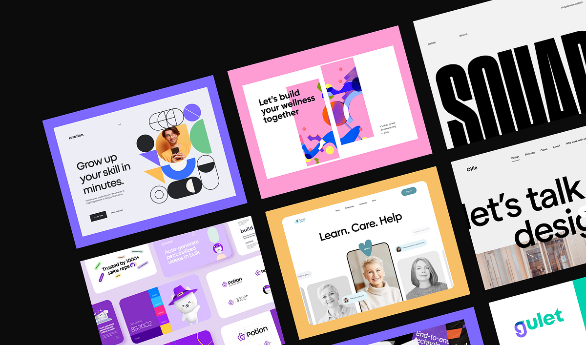
The Hottest Brand Identity Trends 2022–2023
Finding the right solution for the futureDesign by OutcrowdA successful brand always stays one step ahead of the competition. That’s because it’s guided by a special vision that may seem miraculous.But it’s no miracle.This vision is based on observing market trends and how they are reflected in design.So let’s keep our finger on the pulse: follow branding trends and analyze them instead of merely observing.Keepers vs. One-Hit WondersThe longest-lived trends are those that address global and long-term business objectives. These old-timers worked yesterday, they work today, and they’ll still work tomorrow. Temporary trends, on the other hand, are one-hit wonders. They’re flashy and work well for achieving immediate short-term goals, such as drawing attention to something today or attracting audience interest right now.We must learn to tell the oldies from the newbies, i.e. differentiate between constant and temporary trends. We risk getting stuck with an obsolete identity by using a “one-hit wonder” for a long-term goal. By inviting an old-timer to solve a very current problem, we risk failing to arouse any user interest. But remixing an oldie with a one-hit wonder is a great way to draw crowds. In other words, an old trend may use elements of newer ones when it’s appropriate.Unlimited Branding by Claudia Carvalho for BrunoNow let’s take a look at the most effective trends of this year and the next one. Some of them are keepers, others are one-hit wonders. When you study the designs, keep in mind your brand’s current goals and individuality. Take note of those that are successful in solving problems that are similar to yours. Separate constant trends from temporary ones and use them depending on whether you’re dealing with short- or long-term goals.1. Brand ActivismThis trend is a potential keeper with a long future ahead of it. It’s more about ideas than style. Brand Activism is no youngster. It has been used successfully for a long time, but now it has a name. Even though it was nameless before, this trend has been effective for years and will remain so in the future.Brand Activism is a visual way of saying “I walk the talk.” This brand’s second name is I Care. It means caring about the world, about people and their social, economic, mental, physical, and spiritual issues.Meet— Clean hero header concept by Tran Mau Tri TamBrand Activism will always have its supporters because it seeks and offers solutions to problems, appeals to human feelings, captures hearts, and unites people around common interests. Marketing-wise, it’s the most powerful trend. However, it only works when it’s tailored to a specific target group, conceptually justified, and supported by professional design. Brand Activism thrives on memorable slogans, emotional and expressive visuals. Shock, insight, emotional jolt — anything goes here.Curiously, Brand Activism can use “one-hit wonders” as part of its identity a lot more than any other trend (picture a gray-haired dude dancing at a disco). This trend often employs elements of hip design to speak out and draw attention to a contemporary issue.Some examples include temporarily incorporating the colors of the Ukrainian flag into the brand identity to show support, using LGBTQ+ rainbow colors, an environmental palette, etc.Overall, activist brands always have a visual identity that clearly broadcasts their goals, position, and intentions. The best of them motivate users, encouraging them to act.Youth against sexual violence by Emilie CarmonaBrand Activism in design:broadcasts a specific idea;unites people around a common cause;achieves emotional resonance (via emotional visuals, storytelling, or powerful slogans);solves human problems in pursuit of admirable goals;motivates and engages the user;visually addresses current social issues.As you see, this trend has taken all the best cues from religion. This one’s definitely a keeper!2. Clear SimplicityMinimalism is an old-timer by now. Clarity and simplicity remain powerful and effective trend. The more visual clutter and chaos we see around us, the larger the cognitive load and exhaustion. This is why users increasingly turn to simple, lightweight visuals.Simple, easy-to-use customizable elements, attractive color schemes, lots of “air” — all these things will certainly keep.When it comes to brand identity, simplicity means knowing how to pick the essentials. You need to get rid of any extraneous visuals to isolate and emphasize the important stuff. The era of cryptic ciphers, riddles, and puzzles is gone. Today’s trends are about the bare essentials: air, clarity, vivid colors, and positive vibes.Banner for Psychological Support Center by OutcrowdClear Simplicity in design:presents information using a limited set of elements;emphasizes the most important thing (product or idea);attracts visual attention;makes the brand recognizable;looks attractive, clear, and modern;simplifies understanding, offers easy solutions to users.Simplicity is power!3. GeometryThis trend, which has also been around for quite a while, succeeds because of its insistence on clarity and minimalism. Geometric shapes are easily and immediately recognizable on sight. They’re simple and understandable. At the same time, the geometric style is very flexible. Lines and shapes are endlessly variable and combinable. All this makes this trend essential for brand design. Geometric elements are used to create easily identifiable logos and identity elements. These forms can be easily grouped and structured; recognizable patterns and ornaments can be integrated into the corporate style.Rotation — Hero header exploration by Tran Mau Tri TamGeometry in design:is an attention-grabber;lightens the visual load;helps build a corporate style;makes it easy to create recognizable patterns;creates a visual structure and clarity;is associated with clarity and professionalism.Many users perceive geometric design as more “intellectual.”4. Inclusion and ToleranceThis is a relatively new but immensely promising trend. It’s definitely no one-hit wonder. Many companies are going global and expanding their customer base. They gain access to people from different cultural, religious, and social backgrounds. Tolerant and inclusive design offers a great opportunity to attract more customers and increase sales.This kind of design only works when tolerance is already part of the company’s corporate culture. A discrepancy between professed values and reality can be fatal for the brand. To build a tolerant brand, you need to study the culture, preferences, and needs of your users; you must honestly empathize with them and want to help them.Social Care — Web Design for Social Help Center by OutcrowdA tolerant brand design is a visual reflection of the company’s caring about its users. It can include readable, high-contrast, customizable fonts for the visually impaired, a color palette geared toward colorblindness, or versions of the website adapted for people with special needs. A tolerant trend relies on photos and videos that show people of different body sizes, skin colors, social backgrounds, and so on.An inclusive and tolerant design is not a gimmicky “let’s-add-some-body-positivity-to-our-photos” promo. It means constantly surveying the audience and testing its responses. An attempt to attract new groups may drive away older loyal users. Even global brands have been known to make this misstep.This is a very humane trend that requires thoroughly researching the needs of your audience.5. Adaptable LogosTo grow, thrive, and keep expanding the audience, a company’s brand has to be promoted through all possible channels: websites, apps, social media, mailing lists, and ads. In each case, the brand needs an adaptable logo that can be adjusted to suit different platforms and media.G logo by Pixtocraft — Logo Designer for Knacky StudioAn adaptable logo can be visualized on a descending scale of complexity:a detailed original logo design on the website;a somewhat simplified design for branded merchandise;a simple logo for social media accounts and mailing lists.It’s important to keep the adapted image recognizable while matching its specific visual environment.This trend is important and is not going anywhere in the foreseeable future.6. Type OnlyThis trend offers a typography-based identity. Its popularity is a logical continuation of the minimalist style. Stripped of unnecessary flourishes, a clear and simple wordmark broadcasts confidence, reliability, power, and quality. Such a logo is instantly readable and memorable. Most major companies follow this trend for their identity. But it’s also a good choice for a startup.Squad Capital — Homepage by Marvin SchwaiboldWhat’s great about typography is that it can convey mood and brand essence as well as an image but is immediately and easily readable. Many companies design their own fonts and font combinations to stand out from the competitors. Such fonts make a brand unique, distinctive, and recognizable.This trend is here to stay.Service page loading animation by7. Vivid Bright ColorsThe 2022 trend toward bright and bold colors is also a keeper, for the simple reason that vivid colors are always great for grabbing attention, establishing a mood, and making a brand identity look positive and lively. The use of color enables you to create unique and unorthodox solutions, which is always important for standing out.However, the trend of using clashing color schemes with heavy bold fonts may not be with us for long.Potion Rebranding by Cuberto8. Dynamic IdentityDynamic Identity is a way of adapting a set of elements to suit any medium or task while retaining the brand concept.This trend is quite relevant today. It makes the brand lively, active, and exciting, finding new creative solutions for various platforms. Importantly, the brand identity remains recognizable and easily readable.A dynamic identity requires more effort and expense from designers and developers than a conventional one, but it’s highly likely that in the future this process will be made much simpler by specialized software.DSM— Hero header concept — Dark mode by Tran Mau Tri Tam ✪ for UI8In conclusionTrends always have one foot in the present and one in the future.If you want to be able to see ahead, following design trends is not enough. A lot of pertinent info can be gleaned from movies, books, and articles on economics, sociology, ecology, medicine, and even politics. Keep an eye on new discoveries, technologies, and inventions (especially AI-related).It’s safe to say that those brands that can unite and consolidate society, contribute to solving global problems, and help people share the values of a new, more responsible world will emerge victorious. Today we’re already witnessing a departure from individualism and status, an emphasis on saving resources, a sustainable and caring approach to the environment.Whatever future awaits us, it will surely favor the brands that offer tangible benefits, not just pretty words and pictures.The Hottest Brand Identity Trends 2022–2023 was originally published in Muzli - Design Inspiration on Medium, where people are continuing the conversation by highlighting and responding to this story.
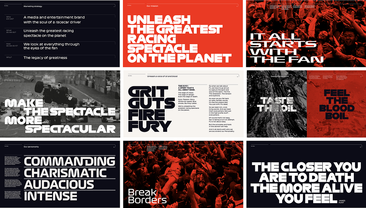
Development of a brandbook for a sports brand. What should be taken into account?
How to create an effective brandbook for a sports brand, which will become the basis for successful promotion in the most competitive market.A brandbook is a document that confirms the existence of a brand. This is his bible, the sacred key to identity, a guide describing DNA — many metaphors describe the importance of a brandbook. However, all of them cannot fully convey the specifics of a sports brand. In this article, we will look at how to create an effective brandbook for a sports brand, which will become the basis for successful promotion in the most competitive market.Globally, the structure of the brandbook of a sports brand is similar to the classic one, which describes the essence and the melting point of using two main sections: the brand platform and corporate identity. As in classic brandbooks, the nature and positioning of the brand, its philosophy, mission, vision, character, slogan, description of the target audience, and communication with it are indicated here. The Visual Identity Guide also plays by the standard rules: it provides a guide on using a logo, a system of fonts, colors, patterns, and branding of various corporate identity media. Sometimes a sports brandbook is presented in more than one document but has abbreviated versions, for example, a guideline on the use of logos. However, certain differences are typical ONLY for sports brands and this is their strength.Inspiration from leadersThe main feature of the brandbook of a sports brand is to inspire from the first pages. Therefore, in most cases, it begins with a welcome speech from the president of the sports club, the sports committee, the board of directors, or the head coach. In some cases, an introductory inspirational text is used, in which the brandbook is presented as a guide on how to feel a sports brand with all your heart.An inspiring message in the CHELSEAFC brandbook from Peter Kenyon, executive director of Chelsea Football Club.The spirit of the sports brandAn important motivational block that helps to understand “who we are”, and “what we believe in”, as well as exactly how fans, the city, and the world should perceive a sports brand. Therefore, the history of the brand, its background, and sometimes even a legend are described here, which leads to a description of the essence of the brand and its positioning. Next, the personality and character of the brand, its mission and vision, philosophy and values, USP, attributes, and RTB are revealed. Instead of the usual enumeration of strengths, try to present them as proof of leadership in your direction. Feel free to talk about what brings victories, even defeats, and imagine in a motivating way. Pay special attention to the slide with the brand manifesto and its appeal to the fans. This will be the culmination of the description of the sports brand platform.The main task of the section is to energize the brand, so often bright photos with vivid emotions of people, accent typography, and extremely emotional copyrights are used in this block to create the right mood. For comparison, below are examples of the design of the brand platform in the brandbooks of several sports brands.The Manchester United brandbook. Live photo content in a brief but emotional description of the brand platform.Formula 1® brandbook. Large typography with character and integrated photo content in the description of the brand platform.The Atlanta Falcons brandbook. Bright photos and emotional, but large text blocks in the oversaturated description of the brand’s platform.The brandbook of the English Premier League Premiership Rugby. An analog of the classic brand pyramid with an emotional descriptive part.As can be seen from the examples, the standard presentation of the brand platform loses in terms of emotional charge. Therefore, we recommend that you look at this part of the brandbook as an advertising tool: use brief emotional copyrights and descriptions, high-quality mudboards, and find your own layout form that reflects the character from the first page.Communication with fansPerhaps the most vivid description of the brand’s target audience. The sports audience is diverse: Professional athletes, sponsors, team fans, sports enthusiasts, or people who lead an active lifestyle.Often the primary audience is the fans. Here it is necessary not only to form the image of fans but also to reveal their insights, why they love the sports brand, what motivates them, and why they come to stadiums every time and proudly present the brand’s merch. This forms the slogan and description of the tone of communication. Be sure to specify the keywords in the brandbook that should be used in communication with the target audience. The verbal language used by sports brands should inspire, excite, and inspire fans with a sense of awe and belonging. After all, they are the basis of a sports brand.The following describes the channels of communication with fans and the principles of communication with the audience. Each sports brand has its pool of channels, but they are mainly focused on digital (groups and social media accounts, forums, platforms, and websites), which should be taken into account in visual communication.The brandbook of ASTON VILLA FOOTBALL CLUB. Communication with the audience of fans.Terminology and abbreviationsThis section can be specified at the beginning or the end of the entire document. It is necessary to explain both football terms and marketing ones here. Depending on the type of sport and layout, the section can take up to 2 pages.It is important to specify in as much detail as possible all possible permitted variations of abbreviations and abbreviations of the sports brand name — this is important for the proper operation of branding of corporate identity carriers and communication with fan communities.The LOS ANGELES RAMS 2020 SEASON brandbook. Compact layout of terminology, and abbreviations of the sports brand name.The brandbook of PREMIERSHIP RUGBY. Extended layout of terminology and abbreviations.Articles of ChampionsMake sure to make a separate slide describing the attributes that lead the brand to victories. This will be a kind of transition between the description of the verbal and semantic identity to the visual one.Formula 1 brandbook, description of brand attributes.Duquesne Athletics brandbook, description of brand attributes.Brandbook of the 2023 Olympic Games, description of brand attributes.The corporate identity of the sports brandThis section of the brandbook contains a detailed guide on the use of a logo, emblem, colors and their combinations, fonts and typography, a system for working with graphic elements and patterns, a branding system for corporate identity media, a guide on photo and video content, as well as principles of working with logos of a sports brand and its sponsors/partners.The Formula 1 brandbook. An excerpt from the logo guide.The Formula 1 brandbook. An excerpt from the color guide.The Formula 1 brandbook. An excerpt from the font guide and conceptual typography.Formula 1 brandbook. An excerpt from the manual on working with graphic elements and patterns.The Manchester United brandbook, is a brief system for using the logo emblem.NVBS brandbook (New Vision Badminton Sport), a system for working with graphic elements.The concept is the best striker of a sports brandDevelop a corporate identity concept and describe its idea in a brandbook. This will increase the involvement not only of the brand’s team but also of its fans, which means that it will make the brand more attractive to sponsors.To visualize the concept, use as many options of objects and objects of offline and online communication as possible, which will be able to reflect the idea and character of the sports brand. Use high–quality mockups, 3D models, interesting layout formats — everything that will help to reveal the idea as best as possible. This section should arouse a desire to purchase and wear sports brand merch.An example of using the concept in the development and branding of various media of the corporate identity of the sports brand FC Dynamo Minsk.The brandbook of the DUQUESNE ATHLETICS football and basketball brand. The branding system of corporate identity carriers presented on mockups.The Formula 1 brandbook. A branding system for corporate identity carriers.Photo and Video Content GuideIn sports, it is customary to create game “moments”. The same principle is typical for a brandbook. Here it is important to add a guide for creating and using photographic and video content: style, angle, dimension, foci, elements, and so on. This is a style mudboard that tells you which brand should be in everyone’s eyes (for example, dramatic, stylish, or powerful), which images to choose to tell the story of the brand, to grow its personality, character, and greatness.The Atlanta Falcons brandbook. Mudboards and a description of the principles of working with photo content for fans and athletes.The Manchester United Foundation brandbook. Description of the principles of working with photos and videos.Sports Brand Brand TeamAn important part of a sports brandbook is the description of the brand architecture. Here it is necessary to show a clear scheme of interaction between all brands and sub-brands of the club, sponsors, and fan communities, as well as a design system for using logos together. Sometimes they also add a guide for fan artwork, and brand logo modifications for special events.The Formula 1 brandbook. Representation of the architecture of a sports brand.The brandbook of the New York City Football Club. Presentation of the architecture of the sports brand, the structure, and the design system of working with the logos of sponsors and partners.The development of a brandbook for a sports brand should be comprehensive and detailed. It is important to make it close to the field of sports, and understandable to everyone. To do this, in the description of the sections, draw semantic analogies between the marketing elements of the brandbook and sports, combining these formats. Brandbook navigation should be clear and structured, like on a sports field. Take into account the insights of fans and partners, develop conceptual design systems, and show the principles of working with it through branding as many corporate identity carriers as possible. As a result, everyone who studies the brandbook of a sports brand will become a true fan of it.Development of a brandbook for a sports brand. What should be taken into account? was originally published in Muzli - Design Inspiration on Medium, where people are continuing the conversation by highlighting and responding to this story.
9 must-read books for designers
9 best must-read books for DesignersHere are my key takeaways along with this evolving list of design books that I am curating for everyone interested design careerHere in this blog, we are going to go through the list of design books I recommend to everyone who is looking to establish themselves in the design discipline.⚡ImportantAs the design books are bit on expensive side so I am not only sharing the resources to buy the book from amazon but also links to listen free but valuable podcasts/youtube videos related to them. Along with it I am adding link to read them online on kindle which is less costly option in comparison to buying actual book further in the blog.Also,I have tagged my key takeaways in form of quotes extracted from these books which I am sure are going to be like guiding light to all design enthusiasts.Here is a quick list of the books“How to” by Michael Bierut“Logo Design Love” by David Airey“The Brand Gap” by Marty Neumeier“User-friendly” by Cliff Kuang with Robert Fabricant“Steal like an artist” by Austin Kleon“Type Matters” by Jim Williams“Design as Art” by Bruno Munari“Design of everyday things” by Don Norman“Pocket full of Do” by Chris DoLet's Start and dive into each one of them🏄♂️1. “How To” by “Michael Bierut”Complete Title “How to use graphic design to sell things, explain things, make things look better, make people laugh make people cry, and every once in a while change the world.”Written by Michael BierutRecommended forGraphic designers, Brand Identity designers, UI/UX designers👉 Resources to buyView/Buy on Amazon or Read on your kindleFree related resourcesListen to the free podcast or Watch it on YoutubeSourceThe cover of the book is self-explanatory about the vision with the skillset of graphic design. There is a chapter in the book called “How to destroy the world with graphic design?” which is not only relevant to brand designers but also UX designers.I have referred to this book multiple times while facing creative block working on design projects. It covers many case studies of brand identity projects and opens up your mind to imagine new ideas and possibilities.Here are a few words from the chapter “How to create an identity without the logo?”Important characteristic of a great brand is consistency. This is different from sameness. Sameness is static & lifeless. Consistency is responsive and vibrant.— Tibor KalmanI highly recommend this book to every designer to read this book. It will guide you in developing your design process by showing you how an appreciated designer like Michael Bierut approaches his work.2. “Logo Design Love” by “David Airey”Complete Title Logo Design Love: A guide to creating iconic brand identitiesWritten by David AireyRecommended for Logo & Brand Identity designers👉Recources View/Buy on Amazon or Read on your kindleFree related resourcesWatch on Youtube | Listen to related free podcastSourceWhen I started designing I assumed logo designing as the extent of brand identity design. By reading both books (1st & 2nd in list) I understood how elaborate and intensive Brand Identity design is.This book is one step guide from learning and developing the logo design process to pitching, pricing and developing the mindset of business of design.Simplicity also makes your design easier to recognise, so it stands a greater chance of achieving a timeless, enduring quality.— David AireyIf you are looking to dive into the world of brand identity design and become an expert. This book will elevate your current skillset.3. “The Brand gap” by “Marty Neumeier”Complete Title The Brand GapWritten by Marty NeumeierRecommended for Brand Strategists & Identity designers👉Recources View/Buy on Amazon or Read on your kindleFree related resourcesWatch on Youtube by The Futur or Listen to a related free podcastSourceThe traditional view of design is that it has four possible goals: to identify, to inform, to entertain or to persuade. But with branding there is fifth: to differentiate. While the first four are tactical, the fifth is strategic, with its root deep in aesthetics — a powerful combination of logic and magic.— Marty NeumeierThis book gives practical advice on bridging the gap between brand strategy and design.It is a must-read for designers who are looking to enhance their skills and become a brand strategist.4. “User Friendly” by “Cliff Kuang with Robert Fabricant”Complete Title User Friendly: How the Hidden Rules of Design are Changing the Way We Live, Work & PlayWritten by Cliff Kuang with Robert FabricantRecommended for User Experience designers👉Recources View/Buy on Amazon or Read on your kindleFree related resourcesWatch on Youtube or Listen to related free podcastDesign is the silent salesman. — DreyfussAuthor in the book discusses that the role of designer is to know why people behave as they do — and design around their foibles and limitations, rather than some ideal.There are some real-life situations discussed in it where a certain mishap resulted due to misleading design. These scenarios depict the power design holds and how dangerous it can be when design and mental model in user’s mind do not synchronise well.5. “Steal Like an Artist” by “Austin Kleon”Complete Title Steal Like An Artist: 10 Things Nobody Told You About Being CreativeWritten by Austin KleonRecommended for Every designer👉Recources View/Buy on AmazonFree related resourcesWatch on Youtube or Listen to related free podcastSourceArt is theft. — Pablo PicassoThis book leads you to a process of design that holds stealing as its building block. You must be shocked to hear that but to understand it further you need to read the book.All creative work builds on what comes before. Nothing is completely original.— Austin KleonThis book is for every designer and artist because it has 10 things that nobody told you about being creative. And you need to know them!6. “Type Matters” by “Jim Williams”Complete Title Steal Like An Artist: 10 Things Nobody Told You About Being CreativeWritten by Jim WilliamsRecommended for Graphic Designers, Brand Identity Designers, UI designers, everyone who works with fonts👉Recources View/Buy on AmazonFree related resourcesWatch typography basics on Youtube by EnvatoSourceType Matters is a guide to typography fundamentals. Everything is explained using typographic examples. It briefly covers almost all the aspects that will help you understand the world of typography.7. “Design as Art” by “Bruno Munari”Complete Title Design as ArtWritten by Bruno MunariRecommended for Artists & Designers👉Recources View/Buy on Amazon or Read on your kindleFree related resourcesListen to the related short free podcastSourceBruno Munari (October 24, 1907, in Milan — September 30, 1998, in Milan) was an Italian artist, designer, and inventor who contributed fundamentals to many fields of visual arts (painting, sculpture, film, industrial design, graphic design) in modernism, futurism, and concrete art, and in non-visual arts (literature, poetry). I highly recommend reading and looking at his work to understand and be inspired by his exceptional work.A leaf is beautiful not because it is stylish but because it is natural, created in its exact form by its exact function. A designer tries to make an object as naturally as a tree puts forth a leaf.— Bruno MunariThis book should be read by designers and artists. Its meaning lives in the intersection of both subjects. It is of relevance to designers of all kinds of disciplines. Particularly I have come across many concepts in it which are also relevant for UX designers.8. “Design of everyday things” by “Don Norman”Complete Title Design of everyday thingsWritten by Don NormanRecommended for User Experience designers👉Resources View/Buy on Amazon or Read on your kindle or Listen free on AudibleFree related resourcesWatch Don Norman’s Ted talks on Youtube or Listen to related free podcastOne of the concepts showcased from the book!This book is for everyone — designers and non-designers. Goal of this book is to turn readers into observers of the absurd, of the poor design that gives rise to so many problems.Good design is actually a lot harder to notice than poor design, in part because good design fits our need so well that the design is invisible, serving us without drawing attention to itself. Bad design, on the other hand, screams out its inadequacies, making itself more noticeable.— Don NormanDon Norman along with Jacob Nielson established the Nielson Norman group which is a pioneer in the advocacy of user-centred design.This book is written in simple language and it talks about the user-centred design approach ie “keeping users in charge of whether a design is good or bad” and that “every design decision should be primarily inspired from the user’s need and behaviour”.This book lays the foundation of “User experience design”. It should be on top of the shelf of at least every UX designer.9. “Pocket full of Do” by “Chris Do”Complete Title Pocket full of DoWritten by Chris DoRecommended for For everyone in Design Business👉Resources Read on your kindle or Order a hardcopyFree related resourcesWatch Chris Do’s (the futur) wisdom on Youtube Listen to related free podcastSource“Pocket full of Do” is loaded with so many experiences that help you build your “design career” and “design business”. Sharing three of my key takeaways1. From Chapter Start EmptyAssumptions. Preconcieved ideas. Bias. These are all the things that conspire against your ability to listen and to truly hear and see things for what they are.2. From Chapter Fail forwardThere are only two intentions in life: one is to learn and second is to be right. You can choose to be right but you’ll be very lonely.3. From Chapter Why people buyA transaction only happens when both parties see greater value in what they get than what they give.Every sentence in this book is rich in experience and every chapter is a life lesson. I recommend this book to everyone!Appreciate your time! Hope you found reading about these books insightful as well 😇About meI am a self-taught Brand Identity & UI/UX designer who started learning and practising “graphic design” in 2017. I completed my Bachelor’s of Technology in Computer Science.For me, the task of learning graphic design fundamentals was a challenge and I had to figure out the resources on my own. I didn’t know where to start and which resource to rely on.Now with approximate 5 years of experience, I have decided to share the resources that guided me on this journey.Feel free to connect with me if you need any sort of guidance. I do not charge or sell any courses, for now, just here to share my experience. Instagram | Portfolio | LinkedIn9 must-read books for designers was originally published in Muzli - Design Inspiration on Medium, where people are continuing the conversation by highlighting and responding to this story.
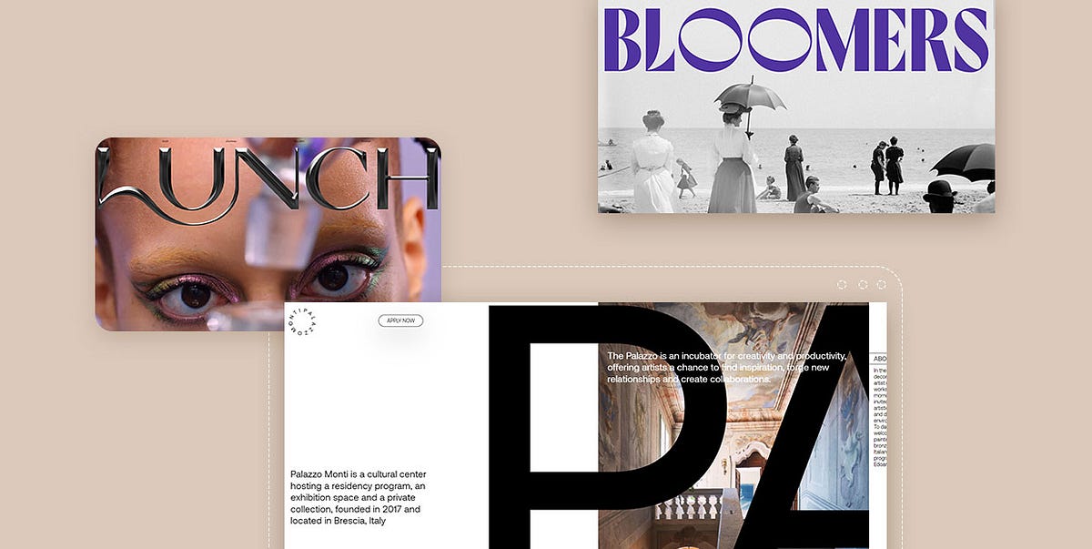
15 Examples of Innovative Hero Typography Trends
Hero sections are often the most important part of a website. And while there’s no doubt that it’s the graphical content of a hero section that usually catches our eye first, hero text is the element that actually gets the message across, hooks us and keeps us scrolling. It doesn’t just matter what the text says, what’s also important is how it says what it says — how it’s presented and designed. When done right, typography powers the hero copy, makes the message more compelling and allows it to linger in the visitor’s mind for longer.While there is no definitive recipe for designing the perfect hero text, one thing is certain: there have never been as many inspiring, creative, breathtaking examples of hero typography as there are these days. Dynamic and kinetic lettering, retro styles, oversized or disruptive text, retro-futurism and overall experimentation are just some of the trends we’ve been witnessing lately, and with great delight too — some examples of hero text are so masterfully executed they almost make you forget about the rest of the page. So let’s take a look at some of them:BloomersLunch ConceptPalazzo MontiSafari RiotEkipa AgencyBuckSavio ParsonsDEMO FestivalSchauspielhaus ZürichMarx DesignButt StudioLamanna BakeryRedo BureauCharlie Le MaignanBon Iver’s VisualizerBloomersBloomers is a Brazilian agency developing strategies for brands and businesses with a very distinct approach. Their method consists of detailed brand research with a particular focus on past events, looking for common threads that can create a unique and inspiring story. And this approach is clear right from the start, as the agency’s homepage features some distinctly retro hero typography. A gorgeous full-width black and white photo of a 1980s beach scene is topped by large ‘60s-style typography in a funky purple hue. To add a touch of curiosity and humor to the section, the designers of the Bloomers website animated the two O’s in the agency’s logo, making them spin around like two strange eyes or some curious spinner from a county fair.After this initial section, the agency delivers its main message in a similar vein — with large retro typography in a silvery grey hue. This color motif is sustained throughout the website, as is the vintage quality of typography and interface elements, which is in line with the agency’s mission of reaching into the past to discover solutions for the future.Lunch ConceptSometimes a hero section is so impressive and immersive it almost makes you forget what you came there for in the first place. Lunch Concept’s website opens with a fullscreen video that you just want to keep watching ad infinitum — the costume, the set design, the animations, they are brimful of details you simply don’t want to miss.This show-stopping video is topped by a similarly striking logo that looks like it’s made of dark matte metal with a convincing 3D effect. The logo has a distinct tactile quality to it — it makes you want to examine its surface with your fingers, feel it on the other side to check if it’s filled or hollow like a mould, to see how sharp its edges and corners are. Together with the background video, the typography rounds up the hero section and lends the entire website a sensual, electrifying vibe.Palazzo MontiThe website of the Brescian cultural hub, gallery space, collection and artistic incubator, Palazzo Monti, is a beautiful example of typography taking center stage, at least in the hero section of the website. The website opens with a large numerical preloader positioned in the lower left corner of the screen and accompanied by a rotating circular logo of this cultural center. We are then welcomed to a horizontally oriented one-page website with the initial or hero section featuring short blocks of text and introducing the name of the center in enormous typography. The huge letters in the Aeonik typeface that spell out the name of the center are rhythmically interrupted by other content — informative sections with photographs, testimonials, galleries and everything else a website for an institution of this kind should contain. As we mentioned, the website moves horizontally, and these sections unfold in a fluid manner. The enormous typography doesn’t hamper the design in any way — in fact, the large letters are arranged within the layout in a way that assures their perfect integration with the rest of the content.Safari RiotSafari Riot is an LA-based company specializing in artist development. It provides a full stack of services, from investments and financing to technical and creative development. The company website is modern, monochromatic, and could even be considered somewhat strict if it weren’t for the hero section featuring enormous typography. And, in fact, it’s precisely the typography that lends most of the visual identity to the section, and consequently to the entire website. The giant Fit Variable typeface spells out the words “Artists” and “Depts,” serving as navigation to appropriate sections. Now, as for this specific font, it needs to be said that it is quite hard to read. On top of that, here it’s also animated, which makes things even harder. This is not a design mistake, though — in fact, according to the creator of the typeface, David Jonathan Ross of the DJR foundry, it’s not even meant to be used for content that requires high readability — its main purpose is “filling up space with maximum impact.” And that’s precisely what it does here. Sure, it requires some effort to penetrate the meaning of these gargantuan letters, but it’s not impossible, and the effect is nothing short of powerful.Ekipa AgencyEkipa Agency is a booking agency specializing in electronic music. Proudly working with a small roster of international artists, the Berlin-based agency nurtures a close approach to the musicians it represents, working with them from the earliest stages of their careers and helping them shape their sound and artistic persona. It only makes sense for an agency with such a finely-tuned ethos to have a website that is just as carefully crafted.Ekipa’s website places particular focus on the typography, especially for the logo, placed in the hero section of the page. There is essentially no imagery here, just black text on a background that changes color each time the page is loaded. The designer took a deconstructivist approach, forming the logo from stick-like black rectangles, reflecting the agency’s approach to artist management: talent is key. Without the artists, there is no Ekipa agency, just like there is no Ekipa logo without the individual rectangles forming it.The homepage features a lot of delightful twists — links to inner pages, in Neuzeit typeface, are scattered all over the screen and are almost completely blacked out when hovered upon. The cursor is a playful black dot and the background changes color each time the page is reloaded. It’s a masterfully crafted page that is equal parts fun, informative and brand-aligned.BuckBuck is a global creative company providing services in the fields of design, branding and art direction. The company has offices in Los Angeles, New York City, Sydney and Amsterdam and has over 100 employees and collaborators. Some of its more prominent projects include the Netflix anthology series We the People, projects for Nike, Spotify, Mailchimp, Coca-Cola, Hulu, and many more. Their website is a youthful, vibrant display of the company’s most notable works, as well as its mission and philosophy. It opens with a bright, airy hero section featuring the Buck logo — a beautiful piece of design with a strong architectural character, in which each letter represents a unique approach to design. The letters, each bearing their individual approach, come together in a systematic design solution, which is the way the company approaches their projects — as a collective made up of different perspectives. The section also contains a menu below the logo, with links to the most important parts of the website, as well as a short text in the candid, and straightforward Mabry typeface informing the visitor about the company and its activities. It is a masterfully simple design that checks all the boxes.Savio ParsonsSavio Parsons is an architecture studio from Sydney, founded by Gemma Savio and Anthony Parsons. Their website doesn’t reveal much, biographically speaking, which is probably very deliberate, as the website is designed to place a complete emphasis on the visual representation of the work, rather than on facts and information. In fact, the desktop version doesn’t feature a single clickable element, and it appears to “eat up” your cursor. On mobile devices, though, it does follow classic navigational practices, but it doesn’t feature the gorgeous hero section that can be seen on desktop.The website opens with an elegant, smart section with the studio logo — stylized initials “S” and “P,” in sharp, geometric letters with strong architectural influence. They resemble floors of a long, wide building, and they smoothly slide into their place from the edges of the screen. The white on black palette conveys seriousness and simplicity, which we can assume is the studio’s architectural disposition as well. As we proceed further down the page, the logo seems to follow us, taking up different positions. Since the page with images of featured works is rather long, the logo accompanying the scrolling is a strong branding element that assures the authorship of the displayed work remains clear.DEMO FestivalBorn from a great love for motion visuals, animation and design, Design in Motion (DEMO) Festival is a traveling showcase that celebrates and promotes the best motion work from studios, designers and academies from all across the world. The festival website is, quite expectedly, all about motion. As such, it contains lots of videos and rich animated sections, but they’re all carefully balanced with more “plain” sections providing information and toning the tempo down a bit. It opens with a big, poster-like hero section with a huge black logo on a red background, combined with light grey for the menu, homepage link and a link to the festival aftermovie. Even if it were static, the section would be nothing short of impressive, as it masterfully recreates the aesthetics of film posters from a certain era. In fact, it almost makes you want to print it out and put it on your wall. But, it’s not static — the huge Graphik Wide letters are animated to change upon hover, becoming asymmetrically “fat,” elongated and shortened. There’s an element of fun in that, and the animation is also in line with the festival’s main point of interest — motion.Schauspielhaus ZürichSchauspielhaus is a drama theatre located in Zürich that is considered to be one of the most important playhouses in the German-speaking world. Founded in 1892, the theatre today takes a modern approach to classic repertoires, but frequently features contemporary playwrights as well. One of the testimonies to this approach is the homepage for the new 2021/22 theatrical season, particularly the hero section.The page opens with a squiggly outline of the numbers “2021/22” marking the new season, giving the hero section a comic book-quality and landing a touch of humor to the overall mood. The text welcoming the audience to the new season is given in a simple black-on-white Magister typeface, resembling a newspaper announcement. As we scroll down the page, more black and white outlines introduce the programme and the plays, and that’s when we notice that some of the elements start filling with color upon hover. Finally, on the scroll up, the entire page suddenly assumes full color, and it does so quite gloriously. There are clouds and doves, explosions and thunderbolts, and as we scroll back up to the hero section, we find the outlined “2021/22” now written out in smoke in the sky. The entire section inspires hope and enthusiasm and makes a fitting introduction to the renowned theatre’s new season.Marx DesignMarx Design is an agency working with all elements of brand identity and communication, design and packaging. The agency’s philosophy is that the best design comes from following the hard path, never settling for the status quo, always challenging the norms and asking the hard questions. This uncompromising attitude is reflected in the agency’s website, especially the homepage that basically bursts onto the screen in a bright flash of light after a dark and somewhat tense fullscreen preloader. Hero content here is basically a huge agency logo in black sans serif typography featuring the name of the agency (and its founder). Instead of assuming the central position in the section, the logo is aligned slightly to the left, while the menu opener is tucked away in the top right corner of the page. So far, nothing revolutionary here, but the real action starts when you move the cursor anywhere within the hero section — the motion causes the logo to shift and bend, as if it’s dragging it or disturbing some viscous surface upon which the letters lie. The effect is somewhat unnerving but definitely striking. It’s a jolt that wakes the visitor up and invites him to dig deeper and discover more about the agency and its work.Butt StudioDespite its humorous name, Butt Studio has some pretty impressive clients under its belt, from brands like Nike, MTV and Warner Music to artists of such prominence as Tame Impala, Dua Lipa and Planningtorock. The studio founder Harry Butt is a graphic designer by vocation, but his passion for animation and innovative digital tools has led him to some rather mind-bending projects, many of which can be found on the studio website.The website opens with the name of the studio in large Sometimes Times typeface, nice and elegant, with a lot of breathing air. This simple hero text is topped by pieces of digital art that change each time the page is loaded — unidentifiable, slightly unsettling objects covered in hair, grass or thorns, slippery or gummy shapes sprawling across the section. What appears to be a CTA button inviting the visitor to learn more about the studio is actually not a button at all — it evades being clicked by changing position every time the cursor comes near it. Playing on the duality of conventional, formal aesthetics and weird digital art, this is a playful, humorous and auto-ironic piece of design that speaks volumes about the studio’s approach to creativity.Lamanna BakeryLamanna is an Italian bakery and pizza place in Toronto, founded by second-generation immigrants from Puglia and Sicily. The bakery is rather famous throughout the city thanks to some rather decadent menu items — the Big Slice Pizza, which is, indeed, outrageously big, birthday cake pizzas, strawberry shortcake-filled donuts and such. The over-the-top character of the menu is perfectly reflected in the bakery’s website. The homepage opens with a huge, flashy hero section in red and yellow with enormous typography, accentuating the word “BIG,” followed by photo of a juicy, mouth-watering slice of pepperoni pizza, a sun-shaped “Order Now” button and icons representing pizza, cannoli and, to top it all off, the Italian hand gesture. The designer opted for the Right Grotesk’s boldest, loudest style, paired with Ohno Blazeface and Nimbus Sans. The choice of the typefaces and their color give the page a flashy, fun, exaggerated character, just like the items the bakery offers to its devoted customers. The website is pure delight, leaving the viewer craving for some carby guilty pleasures.Redo BureauThe website of Redo Bureau, a Russian full-service design studio specializing in development, art direction and visual identities, is all about neons and metallics, dominated by the large logo appearing to be made of liquid metal. The logo, which is a contemporary nod to 1980’s design trends, can be moved around and rotated by moving the mouse around the page, by almost 180 degrees both on the vertical and on the horizontal axis. Such an elaborate section is the perfect (if not exactly modest) exhibition of the studio’s skill and talent in terms of both design and web development, so it makes sense it basically takes up the entire page. And to keep the page functional and to observe the best UX practices, the section is topped with menu links leading to inner pages, as well as a very brief blurb about the studio itself in the bottom part of the section. These elements are quite discrete, allowing the centerpiece of the section — the floating logo — to capture the full attention of the visitor. In fact, don’t be surprised if you catch yourself just moving your cursor idly around the screen, daydreaming about all the lost futures of your youth.Charlie Le MaignanWhen you are an interactive designer, you simply cannot afford to have a website that’s anything short of spectacular in terms of dynamicity and animation. Charlie Le Maignan understands this perfectly — specializing in typography and animation, his website is a celebration of the art of the typeface with all its complexities. Starting right from the hero section, everything on the page is in motion, every element is engaged in its own choreography, like a silent disco where each dancer swings to their own tune. Colors are bold and matched in a way that gives off a slight ’70s feel. In the hero section, huge white-on-black letters spell out the name of the designer, flowing from left to right and changing from quite plump (one might even say — fat) to slim, and back. This uninterrupted wavy motion lends the typography a marked sense of fluidity, while the monochromatic contrast serves great to introduce the website’s bold mood.Bon Iver’s VisualizerIn 2019, Bon Iver released I, I (stylized as i, i) as their fourth studio album. In addition to the physical release, the album was also released on all services including, most notably, Spotify. And this is precisely the part we’re interested in here — to accompany the release of the album on the popular platform, the band launched Viisualiizer — a standalone platform, an immersive, almost hypnotic website that was created with the idea to augment the listening experience and to do so using — text.The website is a complicated, highly innovative project. It mirrors the album streaming stats on Spotify, displaying the number of listeners at any given moment, with history and real-time data. Each streaming instance is represented with a letter “i,” in line with the album title. The album was immensely popular when it came out, so the number of i’s created a complex matrix, so dense it’s almost hard to discern the individual letters. The website opens with a single “i” which then starts multiplying almost infinitely, forming a dense pattern. Clicking on Enter, the pattern bursts, some of the air is cleared allowing the word Viisualiizer to appear in italic lettering. But even that italic lettering is made up of thousands of those tiny “i” characters, which then merge into the shape of the planet Earth and there are even some fireworks to celebrate the success of the album. The movement of the mouse erases parts of the pattern like a wisp of smoke, and as it dissipates, the i’s from the pattern reappear again and “seal” the pattern. To contrast this almost hypnotic background, three randomly placed 1990’s-looking boxes provide the essential info about the platform in all-uppercase GT America Mono typeface, and a strong black button invites the viewer to dive even deeper in this interactive experience.Closing WordsThese were just some of the terrific examples of the hero text game done right. From animation and interactivity to playful irreverence towards the rules and canons, these websites don’t shy away from experimentation, and the result is nothing short of rewarding.We saw that these days designers are almost trying to “out-design” each other when it comes to this important part of visual branding. Experimentation, humor and exaggeration seem to be the driving forces behind these designs, and this vibrant, progerssive trend definitely inspires optimism and makes us excited for what’s yet to come.15 Examples of Innovative Hero Typography Trends was originally published in Muzli - Design Inspiration on Medium, where people are continuing the conversation by highlighting and responding to this story.
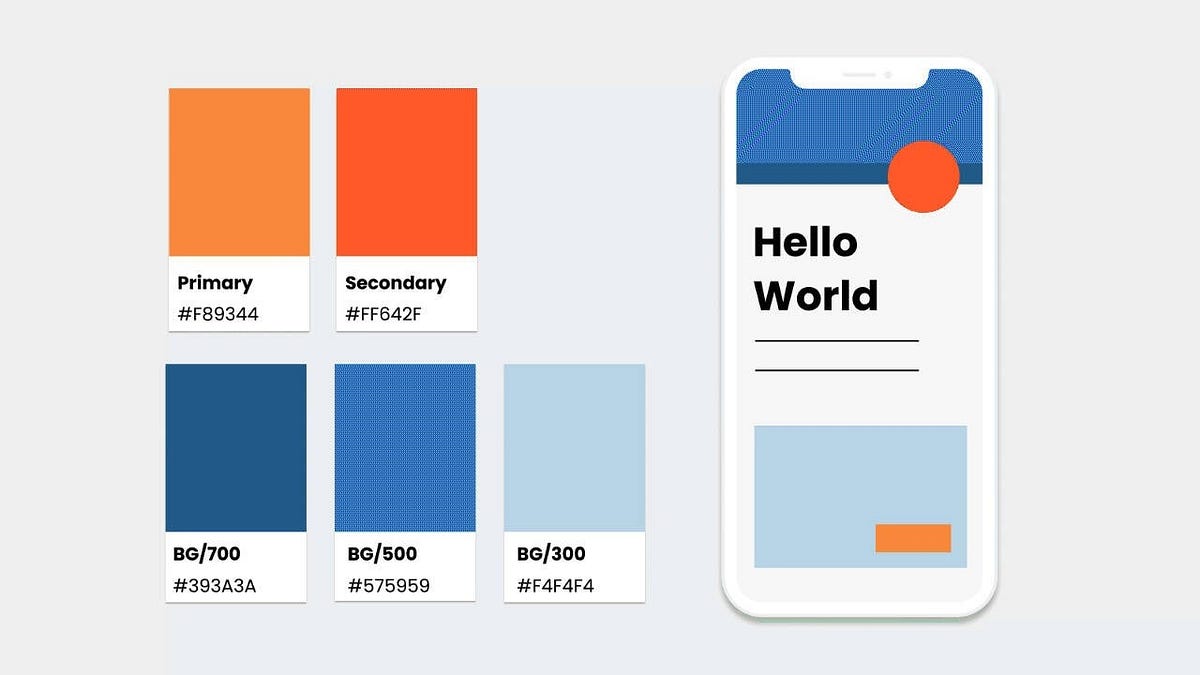
The Impact of Color Psychology in User Experience Design
Painting Experiences with EmotionIntroduction:In the vast canvas of user experience design, color serves as a brushstroke of emotion, guiding users through a journey of visual storytelling. It’s the subtle hues and vibrant tones that evoke feelings, associations and ultimately, drive actions. In this blog, we’ll dive deep into the world of color psychology, unraveling its influence on user perceptions, behaviors, and the art of UX design.Defining Color TheoryColor theory is a set of guidelines and principles that explain how colors interact with each other and how they can be combined to create visually appealing compositions.It helps artists, designers, and anyone working with colors understand concepts like color mixing, harmony, contrast, and the psychological effects of different colors. In simple terms, color theory helps people use colors effectively to create beautiful and impactful designs.The Psychology of ColorColor psychology delves into the emotional and cognitive impact of color on human perception.Each color carries its own narrative: red ignites passion and urgency, blue instills trust and calmness, yellow evokes warmth, happiness, and energy, while green symbolizes growth and harmony. By using these emotional cues, designers can make users feel a certain way and influence their overall experience.Why is color psychology important for UI/UX designers?Invoke the desired emotions: Colors have the ability to evoke specific emotions and associations. Understanding color psychology allows designers to create experiences that resonate with users on a deeper, emotional level.Design memorable experiences: Memorable experiences are often linked to emotional connections. By strategically using colors, designers can leave a lasting impression and foster meaningful interactions with users.Improve sales and conversions: The right color choices can influence purchasing decisions and drive conversions. By tapping into the psychological triggers of colors, designers can optimize user flows and enhance the overall user experience.Applying Color to Designs:Follow brand and style guidelines: Colors should align with the brand’s identity and messaging. For example, Coca-Cola’s use of red reinforces its bold and dynamic brand personality.Ensure consistency in the use of color: Consistency fosters familiarity and reinforces brand recognition. Facebook’s consistent use of blue instills trust and reliability among users.Use the 60–30–10 rule: Distribute colors harmoniously, with 60% as the dominant color, 30% as the secondary color, and 10% as accent colors. Airbnb’s use of neutral tones with pops of vibrant colors follows this rule effectively.Ensure better localization: Consider cultural and regional differences when choosing colors. For instance, green symbolizes luck and prosperity in some cultures but signifies jealousy in others.Use good contrast: High contrast improves readability and accessibility. Slack’s use of bold colors against a neutral background ensures clear visual hierarchy and readability.Test your color choices: Conduct A/B testing to evaluate the effectiveness of color choices in achieving desired outcomes. Google regularly tests different shades of blue for its links to optimize user engagement.The strategic use of color can transform a design from mere pixels into a captivating narrative. For instance:In e-commerce, the use of orange for “Sale” buttons triggers a sense of urgency and excitement, driving users to explore offers.Health and wellness apps often employ calming shades of green and blue to evoke feelings of tranquility and well-being, promoting relaxation and mindfulness.How Color Affects Conversion RatesColor has a direct impact on user behavior and conversion rates. A study by HubSpot found that red call-to-action buttons outperformed green ones by 21% in conversion rates. Similarly, Amazon strategically uses yellow for its “Add to Cart” button, as it is associated with optimism and impulsiveness, prompting users to make quick purchasing decisions.Let’s explore more real-world examples of color psychology in action:Netflix’s use of red in its logo and interface evokes feelings of excitement and entertainment, aligning with its brand identity as a source of fun and leisure.The calming blue hues of meditation apps like Headspace create a serene atmosphere, encouraging users to unwind and focus on mindfulness practices.McDonald’s Golden Arches: The vibrant red and yellow hues used in McDonald’s branding evoke feelings of energy, urgency, and happiness. These colors are strategically chosen to stimulate appetite and create a sense of excitement, enticing customers to indulge in their favorite fast food treats.Facebook’s Blue: Facebook’s iconic blue color scheme is synonymous with trust, reliability, and stability. By using blue prominently throughout its interface, Facebook fosters a sense of security and authenticity, encouraging users to connect and share content with confidence.Spotify’s Green: Spotify’s use of green in its branding and interface design conveys a sense of growth, harmony, and freshness. This choice aligns with Spotify’s mission to provide users with a dynamic and ever-expanding library of music and podcasts, fostering a sense of discovery and exploration.Target’s Bullseye Logo: Target’s iconic red bullseye logo is instantly recognizable and synonymous with excitement and value. The bold red color exudes energy and passion, while the contrasting white creates a sense of clarity and simplicity, making Target’s branding both memorable and impactful.Nike’s Swoosh: Nike’s iconic swoosh logo, typically displayed in black or white, conveys a sense of power, movement, and speed. The simplicity of the design combined with the boldness of the color creates a strong visual identity that resonates with athletes and sports enthusiasts worldwide.Apple’s Minimalist Aesthetic: Apple’s minimalist design aesthetic, characterized by clean lines and neutral colors like white and silver, exudes sophistication and elegance. This choice reflects Apple’s commitment to simplicity and innovation, creating products that are both visually appealing and user-friendly.Coca-Cola’s Red: Coca-Cola’s use of vibrant red in its branding evokes feelings of joy, excitement, and nostalgia. The iconic red color is synonymous with the brand’s signature beverage, creating a sense of warmth and familiarity that resonates with consumers around the world.By strategically using color psychology in their branding and design, these companies create experiences that resonate with users on an emotional level, fostering connections, driving engagement, and ultimately, building brand loyalty.Epilogue: Color psychology is a powerful tool in the UX designer’s toolkit, capable of shaping user perceptions, behaviors, and overall experience. By understanding the principles of color theory and the emotional resonance of each hue, designers can craft immersive and impactful experiences that resonate with users on a deeper level. As the legendary designer Paul Rand once said:“Design is so simple. That’s why it’s so complicated.”Indeed, the simplicity of color masks its complexity in stirring emotions and prompting actions. Let’s use its power to paint unforgettable experiences that captivate and inspire users across the digital landscape.👋Hey there, If you are interested in more UX/UI-related design topics or learning UX/UI Design with me, do follow me on LinkedIn, Medium, and Instagram. If you want some guidance check out my Topmate.The Impact of Color Psychology in User Experience Design was originally published in Muzli - Design Inspiration on Medium, where people are continuing the conversation by highlighting and responding to this story.
How to Attract Customers In a Sea of Noise and Sameness
Photo by TK Hammonds on UnsplashTake a moment to imagine some products for a specific category. Let’s say men’s deodorants. What types of brands come to mind first?Perhaps it’s Gillette, or maybe Lynx (Axe in the USA) or Old Spice.Why might we remember these brands more than others?And more importantly, why do we tend to gravitate towards them when standing in the aisle of a shop (because the probability is we are choosing those products when buying too)?Everything with branding is contextual and is many layers deep. However, at least one major factor that probably drives you and me to remember and choose those brands is the brand personality for each.Whether we’re aware of it or not, we have a connection to the character of those brands.If you’re a brand builder or business owner, I invite you to examine these brand personalities with me. And how they can be used to stand out in a sea of sameness.Why Do We Choose Certain Brands Over Others?Out of the three men’s deodorant examples, Gillette probably has the least remarkable brand personality (at least on the surface).It has a high brand salience, a long presence in the market, and a high market share in adjacent categories. And therefore, through that long-term exposure, the brand has built strong links within your memory, along with associations to certain products.But you also likely gravitate towards Gillette because the company feels stable, promises certain excellence, and makes you feel in control. These gut-level responses to Gillette are triggered by their Ruler Archetype. One of 12 timeless and commonly recognized archetypes we all intrinsically understand.Whereas Gillette’s personality quietly bubbles away somewhere below the surface, Lynx and Old Spice seemingly turn theirs up to eleven.Lynx uses their memorable marketing campaigns and adverts that promise transformation and a little magic, by leaning into the Magician Archetype.And Old Spice communicates their Jester Archetype by reminding us to have a good time, and not take life too seriously. With every Archetype-led brand, the chosen personality permeates through whatever they do. Old Spice even has whacky deodorant names (Swagger, NightPanther, and Wolfthorn) to align with their defined personality.Today, brands act more and more like humans, communicating certain values and personality traits. Whereas in the past, humans could only connect to other humans. (Okay, maybe also to other members of our tribes like pets, on some level).That has changed with the evolution of brands (and significantly impacted how businesses show up in the world).Evolution of Corporations Into Brands.Before we dive into some brand personality frameworks, I’d like to invite you into my time machine and travel back in time.To a time when we discussed where the word brand originated from. Originally it meant ‘to burn’, as translated from Old Norse. To ‘brand’ meant to ‘mark’ livestock with a unique symbol to communicate ownership and origin.Erik (or Bjørn or Frode) the cattle/business owner was essentially the business. And his brand was the symbol he used to mark his product. If he exchanged cattle for some other products or services but couldn’t deliver on his side of the deal, the other party could probably take his other possessions, his house, maybe his land. He was personally liable.That all changed with the creation of something called a limited liability corporation. What’s known as a legal fiction, it’s an entity that can act as if it were a person — take out insurance, buy and sell products and much more.If Erik’s fictitious (but very real in a legal sense) entity — his company — goes bankrupt, Erik can usually still keep his personal assets.Over time, somewhere along the lines, language and definitions began to merge and change. Although there are distinctions between a limited liability corporation and a brand, from my observations, many consumers started to associate the word brand with these fictitious entities. And since these could seemingly act the same way that a human would (whilst remaining imaginary), we needed to assign some human characteristics to them for it all to make sense in our fragile minds.And we can now use a Brand Personality framework to determine what characteristics and traits our brands should have.Choosing a Brand Personality WiselyThere are at least two prominent frameworks to establish a Brand Personality.The first model was developed by Jennifer Aaker. Not dissimilar to the Big-5 human personality scale, Jennifer has put forward that brands tend to fall somewhere on the scale of 5 Brand Personality Dimensions.Sincerity, excitement, competence, sophistication, and ruggedness.For instance, you would not be surprised that Red Bull is a great example of a brand that falls within the ‘excitement’ dimension. A brand that is perceived as being imaginative, inspiring, and edgy.Another prominent framework can be referred to as the Jungian Archetypes. A set of universally understood characters that carry with them inherent values, symbols, and meaning on an innate level, as popularised by Carl Jung, a Swiss psychiatrist.If I mention Hero, Outlaw, or Magician, for example, we can all picture what type of values, character traits, and motivations each might represent. There are 12 commonly understood archetypes in total. Typically represented visually as a wheel that’s split pizza-style into 12 slices.While each of the 12 archetypes represents a key human desire or motivation, they are also segmented into 4 quadrants. Stability, Freedom, Mastery, and Belonging.With the human personality frameworks for example, like the Big-5 or the Myers-Briggs Type Indicator, we often have some ‘dominant’ traits and drivers. But we also tend to exhibit less dominant characteristics (for example very few people are truly extroverted or introverted, with most falling slightly off to the center to either side).Similarly, brands can associate themselves with a combination of archetypes or dimensions, but for the most effective implementation of a personality, they tend to lean more into one key character or dimension.Leveraging a Brand Personality For Your Business.As I mentioned, a Brand Personality tool (whichever one you choose) is one of many available to brand builders. But they are some of the most effective to create a coherent brand identity.Why?Because with a focused brand personality a brand can establish a clear voice, consistent messaging style, and a set of distinctive brand assets (logo, supporting graphics, sonic logo).Intentionally bringing a specific personality to life, a brand can become the obvious choice for their ideal clients by cutting through all the clutter, sameness, and noise of their market category.As humans, we crave connection. We also crave to establish a unique identity. And we place ourselves in those types of environments and surround ourselves with anything that can further reinforce that identity for us.Because certain brands are intentional with aligning to a specific brand personality, we can connect to them on an intrinsic level (just like we connect with similar-minded humans). And we bring those brands into our world (by purchasing their products and services) to reinforce our own identity.Will you take advantage of Brand Personalities in your own branding efforts?How Can You Discover Your Brand Personality?As I mentioned, honing in on your core Brand Personality can help you to establish a consistent brand tone of voice. This is critical to attracting (and keeping) your ideal customers. People who resonate with your brand tone of voice and those who are ‘picking up what you’re putting down’ will generally be the ones who rave about you to others (not a bad by-product, huh?).As a general rule of thumb, once you know how you want to show up for your customers through your brand personality, tone of voice, and messaging is to make sure you communicate that way consistently.Pivoting over time for strategic reasons is okay, but make sure it feels like an organic evolution rather than a sporadic personality swap.So the big question is, how do you know how to show up? What Brand Personality is right for your business?Often the founders’ unique personalities (or the individual personality of one founder) can help to inform the personality of the brand as well. But in addition to that, you can picture your business as if it were a person. Give it a human name. Imagine it in various real-life scenarios. How would they talk, what causes would they care about, what kind of people (and brands) would they want to surround themselves with?Answering some of these questions can also help:Hand-to-heart, do you feel that your product or service is innovative in terms of what it’s bringing to the market and customers, or is it more about providing a reliable outcome?Which would your customers value more: an honest, down-to-earth approach or a sense of exclusivity and glamour?If your product or service was to shine a light on some glaring gaps or inadequacies of your industry, would your customers resonate more with some humor or a call-to-arms?Which does your business value more: learning from mistakes and overcoming challenges in continuously new ways or reliable expertise, quality and confidence?How do you not want your brand to be perceived (how not to show up can help you establish how you should): uptight, domineering, experimental, goofy, fake, daring?Now Over To YouIf you enjoyed reading this article, or know someone who might enjoy this article, please share it. If you have any questions or would like a chat, please reach out, I’d love to hear from you!How to Attract Customers In a Sea of Noise and Sameness was originally published in Muzli - Design Inspiration on Medium, where people are continuing the conversation by highlighting and responding to this story.
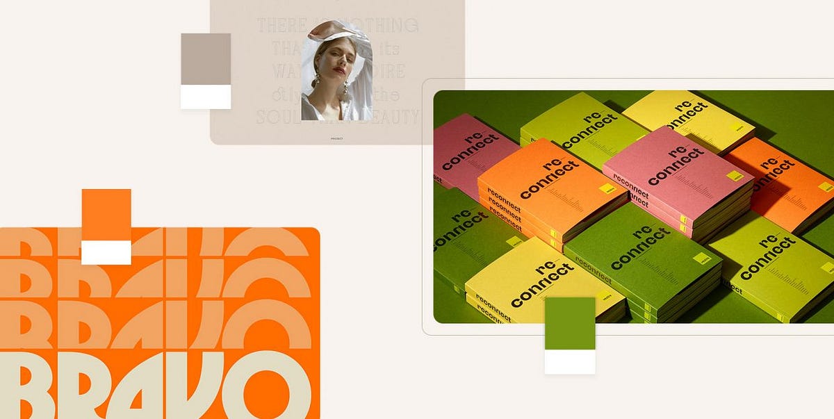
Designers’ Pick: Top Color Trends to Inspire You in 2022
Pinpointing, let alone predicting the design trends has become notoriously hard in this day and age when things move, shift and transform at warp speed. What’s in today might be totally out as soon as next month, and color trends can be particularly tricky as they tend to move with seasons and to follow current events which are, by their nature, unpredictable. Still, some things tend to stick more than others and to mark the defining trends.We already wrote extensively about the top web design trends for the year, focusing perhaps more on the UX side of things, on animation and interactivity, on website architecture as a whole. This time around we want to welcome the warmer weather with an exploration of some of the color trends that we noticed not just in web design but also in fashion, furniture and home decor, and perhaps give our readers a few chromatic hints for the rest of the year.Our very own Marijana Obradovic, the author of the stunning Solene and Konsept themes, is a keen observer and researcher of the design comings and goings, and she came up with these color trends for 2022:It’s All About the NeutralsFor the Love of GreenOrange CrushWhen Orange Meets GreenBurgundy, the KingIt’s All About the NeutralsCream, warm beige, cold beige, cream gray, gray cream, macchiato, pampas, marble, powder, ivory, nude, taupe, hazel…You name it — you’ll find it in 2022, in the streets, in the shop windows, in furniture and home decor and, yes, in web design, too. The spectrum between the lightest cream and the deep, brownish hues, with tints of red, pink, blue and even green, is marking this year’s trends and we can see it paired with other neutrals or with more saturated, louder colors.Julia Derevianko for Gotoinc proposes an eCommerce layout for a jewelry store that uses an off-white, creamy background to create an elegant backdrop for the featured photographs and jewelry pieces. Julia combines several complementary hues, from Carrara to Pampas, in a color scheme that provides breathability but at the same time adds depth and even some degree of quiet intensity.Alexandra Holodnaya made excellent use of a soft, warm beige with a hint of pink in her project for a magic and esotery shop and online learning platform Golden Venum. She skillfully alternates backgrounds in this gorgeous layout between light tones and black ones, creating an exciting tension of elements held together by the lovely old gold typography.We spot a similar chromatic inspiration in the Modern Font Bundle by New Tropical Design, where the warm cream tone is paired with burgundy (which we’re going to touch upon later on in this article), as well as a deep, atmospheric orange and a dark mossy green.While the colors from the beige and cream part of the spectrum work wonderfully when paired with more intense, vivid colors, it’s also worth mentioning they can look amazing in beige-on-beige sets or combinations of beige with colors just a hue away. A terrific example of this combination, which is definitely a 2022 trend we’re seeing a lot, is the creative visualization project that Notoo Studio did for 41zero42, specifically for their Superclassica series of floor and wall tiles.Another color that looks and works amazingly well when paired with, well, basically itself, is the warm gray. Alina Gaan explored this concept in her jewelry website project Juff, proposing a look that basically sports no contrast at all, and yet manages to work just fine for a website layout.But enough with the neutrals, let’s move on to louder trends for this year.For the Love of GreenGreen is another definitive trend for this year and it comes in all possible variants — from earthy and muddy deep greens to vibrant grass tones and, of course, neons.Marlow, the minimalist branding mockup scene creator by Moyo Studio, is heavily based on grays in various tones, mostly on the colder side of the range. The project includes several adjacent colors that complement the grays and give them depth and character, most notably the wonderful, elegant dark olive green, as well as browns with a significant portion of green component to them.Semi Permanent Hotel by Highsnobriety was a short-term takeover of the Paramount House Hotel in Sydney, featuring a range of artists, musicians, designers and other creators. The website for the project is based on the monochromatic layout with colorful, intense imagery and interface details in a lovely shade of bright green with a touch of cyan. The green is used for the favicon, the pagination bullets, select typography as well as for selected (or hovered) areas of the 3D model representing the hotel. This quite moderate addition of color breaks up the monochromatic interface without hampering its character, and the choice of green adds vitality and energy to the mood.Ogeh Ezeonu opted for a green on green combination for her website, using a very, very dark forest green as the background color (in some parts of the page it comes in form of gradient, too) and a lighter, brighter leaf green for select interface details, such as the boxed sections with links and button outlines. This way, she created a gorgeously balanced atmosphere that packs a lot of character without being too loud or bold.The Dutch brand development and design studio Maibru did a similar thing with incorporating a refreshing green shade to its website in form of various interface details — for instance, the menu items (indicating the current location, as well as color change on hover), language and mode switcher, cursor and navigation, and so on. The same green color is used for both the light and the dark mode, and it looks great in both instances, bringing vibrance and joy to a muted layout.A brand we already wrote about in our piece on innovative footer design, the furniture manufacturer Sol’ace opted for an interesting brownish green (or greenish brown?) as the background for some of the page sections, combined with a lovely warm gray. A fitting choice for a brand with a strong focus on natural materials and sustainable manufacturing practices.But muted, pastel and earthy greens are not the only ones marking this year’s color trends — in fact, we’re seeing a lot (and really, a lot) of super-vibrant greens, electric greens and neons.For instance, the Chinese Reesaw Studio incorporated a lot of bold, vibrant colors in their branding project for GLZ Super Park, with the neon lime green as the main color featured in the logos, packaging, even the accompanying materials such as masks, duct tapes and so on.The designer and art director Stas Bondar chose an interesting and vibrant shade of green (with a lot of yellow to it) for his online portfolio, available in two modes: “casual” (black background with green details) and “fancy,” in which the said color is used for the background and combined with black interface elements. It’s interesting that the same color assumes different characters depending on the mode — in the “casual” mode, the dark background makes it appear more yellow, while in the light “fancy” mode it is definitely more green.Finally, let’s not forget one of the loveliest green shades — the mint green. The digital production studio 9P featured this color in various interface details (the oversized cursor, the buttons, the logo and menu items, to name a few) on their website, coupled with the black background for a striking and modern contrast, and they also used it for one end of the gradient for the hero text.Orange CrushAs a color that communicates joy, optimism, warmth and fun, it’s no wonder that orange is going to be a massive trend in 2022, a year when the world finally seems to take a break (hopefully permanent!) from the pandemic. From couture to streetwear, web design and even product design, various hues of this fantastic color can be seen everywhere.Tiare Payano incorporated a neon carrot orange into the palette for the brand identity project for Silkaen, a natural skincare brand. Payano paired it with different shades of red, burnt sienna, deep pink and other warm colors, creating a balanced, feminine and elegant palette.Design for the Gesture issue of the Sociotype Journal also features a lot of orange, albeit in a more toned-down variant. This particular brick orange works great on paper, as it complements the paper texture and gives the overall design a warm, deep character.Moving on to louder, bolder tones, the design for the Bravo Musique music and artist label features a stunning, somewhat vintage range of oranges, from the classic safety orange to hibiscus and royal orange.The visual identity for the Still Young interior design company by Low Key Design pairs an intense orange, almost a cinnabar, with a grayscale palette in an exciting, elaborate design concept based around the “law of three.” The entire visual system revolves around the numbers 3, 6 and 9, and the orange serves as the third chromatic element in the palette (in addition to the white and black that basically constitute the grayscale), sustaining the concept but also bringing a welcome contrast and dynamics to the design.The website and redesign concept for the restaurant Máirtain by Daria Shakula features an elegant, mostly monochromatic palette skilfully broken up by a vivid pumpkin orange used for a few select interface details, the footer and the fullscreen menu. Paired with the orange in some of the featured imagery, this particular use of color reinforces the brand identity and gives it a strong, well-built character, freshens up the concept and brings vitality without appearing vulgar or loud.Finally, here’s a layout that celebrates the power of orange in all its glory: the web design for the packaging-free grocery store in Los Angeles, re_grocery, uses an orangish red, or a reddish orange, for basically all interface elements, from title and paragraph typography to buttons, from navigation elements to the footer, which is entirely orange. It was a risky choice but one definitely worth making, as the result is a flattering, modern and engaging design that we can only assume does wonders for the company’s business bottom line.When Orange Meets GreenIf this combination reminds you of a clown suit, think again. Depending on the particular hues used in the palette, the orange and green combo can actually be quite sophisticated and convey a sense of opulent elegance. Let’s take a look.The UI Kit for Figma by Alexsander Barhon proposes modules for building web pages, with imagery that features small yet striking details in a lovely muted orange, combined with deep moss green, olive and mud, creating a wonderful sense of warmth and depth.Tiare Payano did a similar thing combining deep oranges and greens on a dark background for Nancy, a family-owned cafe in the Dominican Republic. The palette is based around deep, warm, earthy hues such as orange, terracotta and brick, combined with a dark green that seems to have a touch of warmth to itself, too — or perhaps it’s the oranges and pinks that bring that quality in the otherwise cold color.The green and orange combination works well in brighter tones with a bit of a pastel character, too, as evident from the Vestre Inspiration Book 2022. In this project, we get to feast our eyes on wonderful pairings, such as true orange and grass green, but also yellow and purple. These combinations are based on the principle of complementary colors, and as such they aim to create an intense and dynamic effect, but thanks to the careful selection of particular tones and textures, they also appear quite soothing and pleasant.Green smoke, apricot orange and a range of light pinks and warm grays dominate the palette of the Absolution Cosmetics website, where the orange and green work as particular accents and can even be considered chromatic leitmotifs of the layout, even though they appear very sporadically on the pages. The dynamics between these two add much needed intensity to the light, airy layouts.The brand identity project for Lande Architects includes a wonderful palette of muted greens, warm earthy tones and siennas, combined with a vibrant yellow with plenty of orange hints to it. The stationery and the calling cards are printed on a heavily textured paper with relief typography, which, combined with the colors, gives the project a distinct organic character.Finally, while not exactly focused on the interplay between green and orange in particular, the website of the oil and salsa manufacturer Frantoio Cavalli does play around with the two, by juxtaposing the delicate greens of oils with warm orange, yellow and red hues from salsas, both in featured imagery and in product packaging.Burgundy, the KingTimeless and sophisticated, burgundy appears to finally be making a comeback — and long overdue, if we dare say. This elegant color, traditionally associated with wealth, opulence and royalty, is actually an extremely versatile pairing color for palettes and combinations that require contrast, depth and warmth.Being a dark, intense color, in web design burgundy is best if used for details or select sections, like Sloane Street did on their homepage. This choice of color adds a touch of class to the design, pairs wonderfully with the rest of the palette and the page’s white space, and even communicates with the imagery on the page.La Maison Plisson, on the other hand, opted for a very subtle use of burgundy, applying it to the button outlines, underlines, some of the typography and the wine glass icon, completing the brand narrative that revolves around exquisite gastronomy, the finest ingredients and the best wines. It may be an obvious choice, but it is done with such good measure and taste it actually works perfectly.Burgundy can also be a fitting choice for various technology and industry niches, as well as for finance, which are often plagued by quite pedestrian blues, grays and plain reds. The brand strategy and visual identity for Refactor Capital by the Play Studio features a striking rusty red which, in combination with a deep grayish blue and plain white, creates a firm, stable palette that communicates professionalism and expertise.The gorgeous branding project that supports female entrepreneurship, Wo’men Entrepreneurs by Ben&Jo bases the palette around a dark green, with color accents in yellow, teal and pink. This combination is supported by a lovely warm burgundy in a slightly lighter variant, used as the backdrop in the project imagery, giving it depth and warmth.Something similar was done in the visual identity project for Périples, where a stunning deep teal was used as the main background color, combined with a range of muted warm tones, including burgundy, which adds contrast and warmth, as well as a hint of vintage character.Wrapping It UpSoothing cream, beige and gray, exciting orange and optimistic green, topped by the royal burgundy — it’s clear that this year’s color trends do not follow a strict, cohesive narrative but rather aim to expand the reach of chromatic potential through contextualisation. We hope that the wonderful examples featured in this article will inspire you and give you some fresh ideas for your future projects. If you have a color you feel might mark the current year, don’t hesitate to share it with us in the comments section.Designers’ Pick: Top Color Trends to Inspire You in 2022 was originally published in Muzli - Design Inspiration on Medium, where people are continuing the conversation by highlighting and responding to this story.

Crafting Creative Storytelling Websites: Principles and Inspiring Examples.
In the digital age, websites are the canvases on which brands paint their stories. More than just arrangements of pixels, fonts, and images, each website carries a unique narrative waiting to be unfolded. This narrative not only distinguishes a brand from its competitors but also resonates with its audience on a personal level, transforming viewers into loyal customers. With goals ranging from lead generation to knowledge sharing, the essence of a successful website lies in its ability to narrate a compelling story.The Essence of Storytelling in Website DesignA storytelling website transcends traditional design paradigms by weaving a brand’s ethos, values, and vision into a coherent narrative that engages and inspires. It’s an opportunity for brands to showcase their uniqueness, not just through what visitors see but how they make them feel. The inception of such a website doesn’t start with technical aspects like coding or design aesthetics but with “THE idea” — the core story you wish to tell.Key Principles for Creating a Storytelling Website1. Start with THE Idea.Before diving into design elements, pinpoint the core idea or story your brand wants to convey. This story should be distinctive enough that applying a competitor’s logo to your website would make it lose its essence. It’s about infusing every detail with purpose and ensuring they collectively narrate your unique brand story.https://medium.com/media/f006579d572ff44b186dc09e195f3741/hrefNoomo Agency website is a great example of digital transformation and storytelling. Each design detail and interactive piece adds to the story, using the latest technology and creative ideas to draw people in.https://medium.com/media/a7ab61c77827b59f71a2de02f09e2a07/hrefThe site is easy to navigate, filled with engaging content, and interactive, making it a perfect example of how to share a brand’s journey and growth. Noomo’s change is a big moment for them and shows other brands how to share their own stories effectively.Read more about redesign of creative agency website.2. Authenticity as important part of website design.The story told should be genuine and reflective of the brand’s true values and mission. Authentic storytelling builds trust and establishes a deeper connection with the audience.https://medium.com/media/39f359dcedfc77409f456bb601ebc79e/hrefThe Cathey Miles Law Firm’s website stands out for its ability to humanize and demystify legal services through design and storytelling. This unique website design differentiates Cathey & Miles from other law firms. It represents them as possessing enough wealth and power to wear jeans and sneakers, illustrating that they are not your typical, mundane lawyers. They love what they do and have fun doing it. While this may sound unusual for a law firm, having fun does not equate to being unprofessional. It means they are strong enough to push barriers and do what it takes for their clients while enjoying their work.The website challenges preconceived notions about law firms by inviting users into a story that is both informative and engaging, making legal assistance feel more accessible and personal.Read more about website design for attorneys.3. Detail-Oriented Design.From layout to typography, every design element should contribute to the story. The choice of colors, fonts, and imagery should not only be visually appealing but also convey the brand’s message and evoke the desired emotions in the audience.Olha Uzhykova’s Portfolio WebsiteOlha Uzhykova’s website is a masterclass in personal brand storytelling. The use of cultural and personal symbolism — like the clever nod to her surname with snake motifs and the Japanese aesthetic — infuses the site with layers of meaning. The decision to incorporate elements reminiscent of her identity and profession, such as the sensei concept, elevates the user’s experience from mere browsing to engaging with a story.The site’s design, with its focus on textures and animations that respond to user interaction, not only showcases her expertise and services but does so in a way that is intimately connected to her personal journey and creative philosophy. This alignment of design and narrative, where every element serves a purpose, exemplifies storytelling that is both deeply personal and professionally resonant.Read more about unique portfolio website design.4. User Experience as Storytelling.How a user interacts with your website is part of the narrative. Engaging, intuitive, and seamless interactions ensure that the story unfolds in a way that captivates and retains the audience’s attention.https://medium.com/media/0b4a971330efff293511dfef96fb4c53/hrefOrCAD’s website demonstrates the effectiveness of 3D technology in storytelling by making complex information accessible and engaging. The interactive 3D models serve not just as visual aids but as integral parts of the narrative, allowing users to engage with the content on a deeper level.https://medium.com/media/79d86f3da61db953e02837e12447275a/hrefThis interactive approach to storytelling not only aids in understanding but also in retention, as users are more likely to remember information that they have interacted with. OrCAD’s use of 3D elements showcases how technological innovations can be harnessed to tell a story that is both informative and captivating.5. Innovation and Creativity.Employing innovative design techniques and creative storytelling can distinguish your website from the rest. This could mean integrating interactive elements, animations, or even AR and 3D to make the story more immersive.https://medium.com/media/d1ead44d8054bcbaa655d80ec66ae471/hrefThe Silly Bunny’s website exemplifies the power of interactive storytelling through advanced technology. By leveraging AR and 3D, the site transforms the user’s journey into an immersive experience that goes beyond traditional navigation.https://medium.com/media/9373af627bade913a9d425b69257bf96/hrefThis digital playground invites users to explore and interact, making each visit a unique adventure. The use of cutting-edge technology not only captures the user’s attention but does so in a way that enriches the brand’s narrative, creating a memorable experience that enhances engagement and reinforces the brand’s innovative spirit.Read more about creating an interactive and immersive website with AR and 3D for children’s book.Use of Micro animations and interactions.Animations play a critical role in storytelling by adding motion and life to the narrative. Use animations to draw attention to key information, guide the user’s journey through the site, and provide feedback for user actions. This dynamic interplay between the user and the interface ensures that the website’s story is not just seen but experienced. The use of animations extends beyond functionality; it’s a form of visual storytelling that complements the written narrative and imagery. Through carefully choreographed movements, the website unfolds like a story, with each scroll revealing a new chapter. This approach not only captivates the user’s attention but also enhances the overall narrative, making the brand’s message more memorable.https://medium.com/media/69dc06d013c5ba1bbea0d888432a8a78/hrefDevStark’s website stands as an exemplary model of how micro-interactions and animations can elevate the storytelling experience on a digital platform. The website, with its seamless integration of interactive elements, creates a dynamic environment that engages users from the moment they arrive. What sets DevStark apart is its sophisticated use of micro-interactions, particularly noticeable in their contact form. These interactions are not just aesthetically pleasing but also functionally intuitive, guiding users through the process in a way that feels both engaging and effortless.Each of these examples illustrates a unique approach to weaving narratives into the fabric of a website. From personal branding and professional services to technological showcases, they prove that storytelling in web design is not just about the story itself but how you choose to tell it. Through strategic design choices, interactive elements, and a focus on user experience, these websites manage to not only tell a story but to engage and inspire their audiences in a way that is memorable and impactful.Crafting Creative Storytelling Websites: Principles and Inspiring Examples. was originally published in Muzli - Design Inspiration on Medium, where people are continuing the conversation by highlighting and responding to this story.
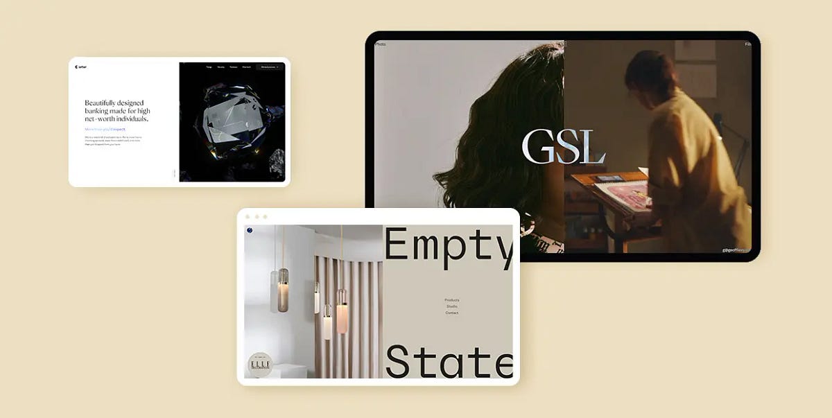
Split Screen Layout in Use: 20 Best Examples
The split screen is by no means a new technique. In fact, some of the earliest works of the silent film era featured this technique, used to present two actions or two situations within a single screen, divided vertically, horizontally, or even diagonally. In web design, however, the split screen layout has become increasingly prominent over the last five or so years, especially for hero sections. Let’s see why that is.The Role of Split ScreenFirst of all, a split screen is an excellent way to convey two messages simultaneously. When used for the hero section of the homepage, split screen is what the users see first, and what makes the first and the strongest impression. Therefore, you want to place your most important messages — both textual and visual — right there. Being made up of two parts, split screen can help you convey not one but two messages, and also allows you to combine visual storytelling with plain text.This sort of section structuring can also help introduce a streamlined, modular layout for pages, with content organized in blocks or sections for easier viewing. In addition, split screen sections can be animated to add dynamicity and increase engagement with the content.From the strictly visual point of view, split screens, being inherently dualist, create a sort of positive tension between two juxtaposed parts, and when those parts are carefully calibrated and matched together, they can create a truly superb piece of design that complements the brand style and aesthetic.Now, there are a lot of ways you can design a split screen section. It can be animated or static, symmetrical or asymmetrical, straight or skewed, simple or layered. It can contain video, interactive elements, CTAs, digital art objects or just plain images. The choice of content is dictated by the sort of website the section is used for, its context, content and intended effect.To really get a clear picture of how a split screen can be used and what sort of effect it can create, it’s best to examine some of the actual examples of this sort of layout in use. That’s why we compiled this list of websites that feature different sorts of split screen and showcase its versatility in the best possible way. Here’s what we will be looking at:Empty StateVisionnaireLetterRestore Hope Appeal by CompassionGeoff LevyInfraredMaxim AksenovBennett TeaBoynton YardsDon Barber & GroomComboA.N. OtherPenzGidroMashPandoraF. MillerCouro AzulTotêmeCapsul’inLeandro FarinaPenumbraEmpty StateEmpty State is a design studio, or rather a brand, that creates configurable lighting, developed by the London-based Cameron Design House. The website opens with a seemingly static hero section composed of image and text, however, as soon as we start scrolling, it reveals to be a split screen section, or rather a split screen slider, with the left and the right part moving in the opposite directions. There are five slides altogether, and once we go through all of them, we return to the first one, from where we can navigate further and explore the products, learn about the studio or reach out through the contact page. The palette is neatly defined and consists of warm greyish pastels combined with a bold navy blue. The dualism of the colors fits well with the balance provided by the split screen slider and its symmetricity, so the overall tone of the website is one of measure and skill.VisionnaireVisionnaire is a Toulouse-based casual clothing brand with a distinctively youthful and contemporary character. Their online shop offers a modern, colorful display of the available items, opening with a split screen hero section that introduces the current collection. In fact, the entire website is neatly sectioned — the topmost part is reserved for the news ticker, followed by a prominent header menu, and, further down the page, the product categories introduced in tightly-packed and symmetrically arranged fullscreen sections. The intensity of the palette and the densely arranged images are countered by a sense of order that comes from this split or dual arrangement of content, balancing the entire layout.LetterHigh-end financial services deserve high-end design, and that’s precisely what the banking and financial platform Letter got when they commissioned a website from the Bristol-based Green Chameleon agency. It opens with a striking split screen hero section with one side in white, containing hero text, and the other side with dark background, featuring the image of a credit card contained within a sharp-edged iridescent prism. The entire section communicates not so much luxury as class and wealth, with a touch of tech aesthetics. A scroll-initiated animation brings the right section to full width, as the prism breaks into a dozen small pieces, releasing the card. This could have easily been an intro video section, but the designers smartly made it a user-triggered animation instead, which certainly required more effort and time but yielded a much more exciting result.Restore Hope Appeal by CompassionCompassion is an Australian Christian charity that organizes child sponsorship programs and other charity and outreach efforts. Last year, they launched Restore Hope Appeal, a website dedicated exclusively to collecting funds for disaster-stricken areas around the world. The website opens with an intro page consisting of a split screen with two quite opposing sections — one in a beautiful sky blue, communicating hope and compassion, equipped with donation buttons, and the other dark, serious, with devastating images of disaster-affected areas, and a large circle inviting us to find out more. This excellent standalone page contains everything we need to get informed and make a donation, and its visual appeal strikes as perhaps more elaborate than what we’re used to from charity and donation organizations.Geoff LevyThe split screen layout makes a particularly good choice for cinema and video-related websites, as it offers a dynamic and immersive viewing experience and makes a strong impression. A good example of this use is the portfolio website of Geoff Levy, an award-winning Cuban-American film and video director based in New York City. His website opens with a beautiful fullscreen split screen, one side of which is static and dedicated to his photography work, while the other features a video background and links to Levy’s film projects. The division is neither fixed nor definitive, though — the proportions of the two sections change depending on the cursor movement. If we lean to the left, the photography section will expand, take up more room and display links to related works, and the same happens with the right section. For those who prefer a more conventional user experience, the page is available in a grid layout as well, accessed through a simple icon placed on top of the divider line.InfraredInfrared is a company offering spa services in Texas, with a particular accent on infrared sauna treatment. The website opens with a striking split screen hero section in an appropriate red palette, combined with pink, orange and other warm, intense colors that communicate heat and light. The left section offers a beautiful combination of large pink typography on a coral red background, and the right one contains the image of an infrared lamp used in saunas. As we scroll down, the split screen layout diversifies, changes color, assumes a lighter character and offers a series of textual information and images. Some of the sections are animated, mostly with slide-in animations, and occasional animated icons serve as delightful interface details.Maxim AksenovMaxim Aksenov is a multidisciplinary designer and art director from Russia. His portfolio website represents a showcase of some of his most important projects, and is a fine piece of web design in itself. This single-page website is divided into numbered sections — it opens with an About section and then proceeds to the Work, which, logically, occupies most of the page. The introductory section, or a hero section if you wish, features a split screen neatly divided by a sharp and thin separator line. A blurry photograph of Aksenov is on the left, and a short introduction, alongside the logo, is to the right. After this initial section, we are invited to scroll further down and discover the featured projects. These too are presented in a dualist manner, with images on one side and white space on the other, giving the visuals a necessary breathing room and occasionally featuring brief text regarding the project.Bennett TeaBennett Tea is a tea brand that, according to its own statement, has “the vision to be the world’s most respected private label tea company,” a goal that it aims to achieve by providing outstanding services and superior quality tea to discerning tea drinkers and connoisseurs around the world. The entire Bennett Tea website, and the tea store section in particular, represent a fine piece of web design, with a carefully chosen color palette based on reds, pinks and dark blues. The shop comes in a split screen slider layout, with the left side containing the image of the tea tin, and the right side offering information about the origin, aroma, flavor and texture of the tea. When scrolled, the slides change smoothly, one tea after another, as the image background consisting of geometric shapes changes order and colors to reflect the design of the tin.Boynton YardsBoynton Yards is a brand new science and innovation campus located in Somervile, Massachusetts, and one of the state’s largest campuses of its kind. This massive project consisting of lab and office buildings, apartments and a huge park area represents an ambitious endeavor whose promotion includes a modern, clean and informative website. It opens with a split screen section consisting of a hero image and hero text in white typography on black background. Serious and professional, the layout is free from superfluous embellishments and conveys perfectly the innovative, tech-oriented spirit behind the project. The text-image dynamic is maintained in several sections of the homepage, combined with text marquee, fullscreen images and even some illustrations. It’s a fairly straightforward design, typical of the tech and architecture niche, but a design done with skill and a great focus on balance.Don Barber & GroomLocated in the heart of Athens, Greece, Don Barber & Groom offers superior barber and grooming services for men in a beautifully designed and decorated space, using the highest quality products. The website, which places equal focus on the quality of services and on the team that provides them, reflects the care and attention that the salon management put in all aspects of their work, including style and branding. A split screen hero section offers a glimpse into the salon’s interior on one side, while the other introduces the team, the salon motto and a welcome message in a text marquee. Elegant but unpretentious, the website takes on a character that, not being overly masculine, is meant for gentlemen, not macho types.ComboMuch like its name suggests, Combo is an agency that combines a set of skills and services, from strategic consultancy to design and branding and from customer research to retail and product design. The website opens with a very simple, very minimalist hero section containing just the name of the agency. One click anywhere on the page reveals a split screen layout with a wide vertical band that serves as a separator and remains static as the page is scrolled. The left and right sections feature selected agency projects, presented in the form of photographs, videos, animations and illustrations. What’s interesting is that the individual project pages also feature a split screen layout, each side presenting different elements from a project, including a brief case study.A.N. OtherThe world of niche perfumes isn’t exactly known for stripped-down branding. On the contrary, in the majority of cases, these companies really go out of their way to create complex brand narratives with meticulously created aesthetics, to the point we sometimes find ourselves wondering what it is that we’re buying — the fragrance or the brand. That’s exactly what A.N. Other wanted to avoid. This Miami-based niche perfume house takes particular pride in its philosophy of “No Rules. No Limits. No Nonsense” and has a website to prove it. Far from austere or under-designed, the website offers a clean, finely styled and elegant display of the fragrances, their creators and their story. The split screen homepage features interchanging sections of images and text, minimalist and airy, with no unnecessary embellishments whatsoever. The split screen layout adds to the dynamicity of the page, making up for the lack of colors and interface details, and stays perfectly in line with the company’s ethos.PenzGidroMashAlthough so often featured in portfolio websites, split screen sections have found ample use across all industries and niches, including tech, manufacturing and construction. One particularly fine example of this sort of design is the website of the Russian company PenzGidroMash, specializing in manufacturing of systems and components for the oil, gas and petrochemical industries. The opening section introduces blue as the brand’s main color on one side of the screen, and an image of a large industrial tank on the other, conveying all the necessary brand information before the entire background turns dark grey and various content sections take turn one after another, introducing further information about the company and its activities and products. The industrial tank remains present throughout the website, animated to change place, rotate and zoom in and out. The entire design is precise, modern and easy to navigate, and does a great job at conveying brand identity.PandoraIn another excellent example of split screen sections with video content, the award-winning production company Pandora created an immersive full-screen experience with two videos playing independently on each side of the split screen slider. The slides, consisting of video clips from projects and campaigns, change upon scroll, one side moving up, the other moving down. The smooth movement of the slider animation, as well as the video content itself, create a dynamic and quite impressive environment and help lure the visitor deeper into the company’s creative vision. The layout is rather minimalist — in addition to the fullscreen split screen slider, there’s a couple of navigation links at the top, very brief information about the projects, and that’s it. When clicked, the navigation links open in split screen as well — the new content takes up one slide, while the other keeps looping the video. Not only does this approach help keep the company’s work in focus, but it also assures a balanced and consistent atmosphere of the entire website.F. MillerF. Miller is a line of botanical skincare products based on the principle of “effective, utilitarian essentials,” and it’s precisely this principle that most likely dictated the design choices made for the brand website, especially “utilitarian.” While it’s definitely not stripped-down, the website is decisively minimalist, with a delicate, light palette consisting of off-whites and light blues. The layout is characterized by thin, sharp lines that divide the page into sections — the header and the footer and, most notably, the split screen section with a hero image on one side and text on the other. The lines give the layout a clean and serious look, while also accentuating the minimalist character of the page. Product images are also arranged in split screen sections, and this layout is present in individual product pages as well. The website has a sort of magazine feel to it, with clean geometric sections present throughout, borrowing perhaps some of the inspiration from the Swiss Style and its predilection for the grid.Couro AzulCouro Azul is a Portuguese company specializing in manufacturing of technical leather for the automobile and aeronautical industries. It is a rather impressive line of work and one that Couro Azul is very successful in, and that’s precisely the atmosphere and the message their website sets out to convey. After a fullscreen video intro section, the homepage splits in two — one side animated to display some of the brand’s most prominent leather products, the other continuing to display the teaser video from the introduction. The balance and contrast between the two sides lies not only in their arrangement on the screen but also in the interplay between a light and a dark background. This dynamicity between black and white is featured throughout the website, in other, differently structured sections as well, providing a coherent and consistent atmosphere.TotêmeTotême is a Stockholm-based fashion brand with a singular aesthetic that takes pride in the meticulous craftsmanship of its items and a superior quality of the fabrics it uses. Contemporary, minimalist and perhaps even a bit stern, the brand aesthetics are reflected in the website as well. Thin, neat lines separate the header menu items and most of the homepage content is presented in two split screen sections — the first one featuring an image and a video, and the other one with two images. The split screen layout is repeated in several editorial pages, with images and text alternating within the sections. Grid lines and geometric sections are present throughout the website, most notably in category pages and individual product pages. These lines communicate order and elegance and fit remarkably well with the brand’s ethos.Capsul’inIn one of the most impressive examples of immersive interactive web design, the Paris-based Index Studio brings Capsul’in, a website created for the French manufacturer of aluminum coffee capsules of the same name. The website is paginated into six narrative units, covering design, engineering, customization, experience, specifications and contact. The interactivity is triggered upon scroll in a beautiful, smooth sequence of transitions. Each movement of the scroll prompts a new section to come into the viewport, and the sections themselves are geometrical, based on rectangles, and perfectly synchronized in terms of colors. While not all sections are designed as split screen (some of them actually serve a transitional or even decorative purpose), the split layout is the dominant one, presenting content that is relevant for the chapter it is featured in. As we scroll, the two parts of the split screen overlap, merge, slide in and out, zoom in and out in a beautifully orchestrated dance of elements, creating a stunning visual narrative.Leandro FarinaLeandro Farina is a British photographer and art director working with interiors and still life, whose work has been featured in a number of renowned magazines and publications, from Vogue and Dazed to the New Yorker. His website is a stunning display of simplicity that stems from visual duality. It opens with a minimalist split screen, the left side empty and airy, containing merely a switcher where we can choose between viewing the Editorial or the commissioned works, and the right side displaying the photographer’s work. The right side scrolls vertically, with image backgrounds in meticulously arranged colors, while the left side remains still, providing a sort of homebase. When we switch to view the commissioned works, the division of the screen changes, so the vertical image slider is now on the left. As a beautiful exercise in simplicity, this website represents a perfect example of the power of the split screen.PenumbraFinally, it would be a shame not to mention our own predilection for the split screen. At Qode Interactive, we have used this particular slider layout a lot when designing our themes. One of the examples we’re most proud of is the landing page for the Penumbra theme. We wanted to make this theme available in two modes or skins — dark and light. The landing page features a neatly divided split screen that offers a preview of both modes and hints to some of the distinctive design elements that are present in both — the grid lines and a combination of chromatic minimalism and bold, bright, optimistic colors. When clicked, each of the sides expands but without pushing out the other side completely. This allows for the striking contrast to linger some more, before the user picks a mode and starts exploring.Wrapping It UpAs we could see in all the stunning examples we went through above, split screen is a sort of layout that, when done right and applied properly, can represent an incredibly valuable asset for any website, regardless of the niche. We saw it in tech and industry websites, in cosmetics, fashion and photography — and it looked terrific each time, didn’t it?The split screen layout can liven up a dull design, engage the visitor and add character to the page. If you’re looking for an exciting, elegant and striking device to open your website with, then you should definitely give split screen a go. There are a couple of things to keep in mind, though. First of all, conveying multiple messages and combining visually diverse content in two adjacent layout panels requires some skill, so this sort of design might not be a good choice for everyone. In addition, this sort of layout works best with minimalist designs. Content-heavy pages with split screen sections can easily come off as overbearing and the information you wish to convey may be lost in the clutter.Split Screen Layout in Use: 20 Best Examples was originally published in Muzli - Design Inspiration on Medium, where people are continuing the conversation by highlighting and responding to this story.
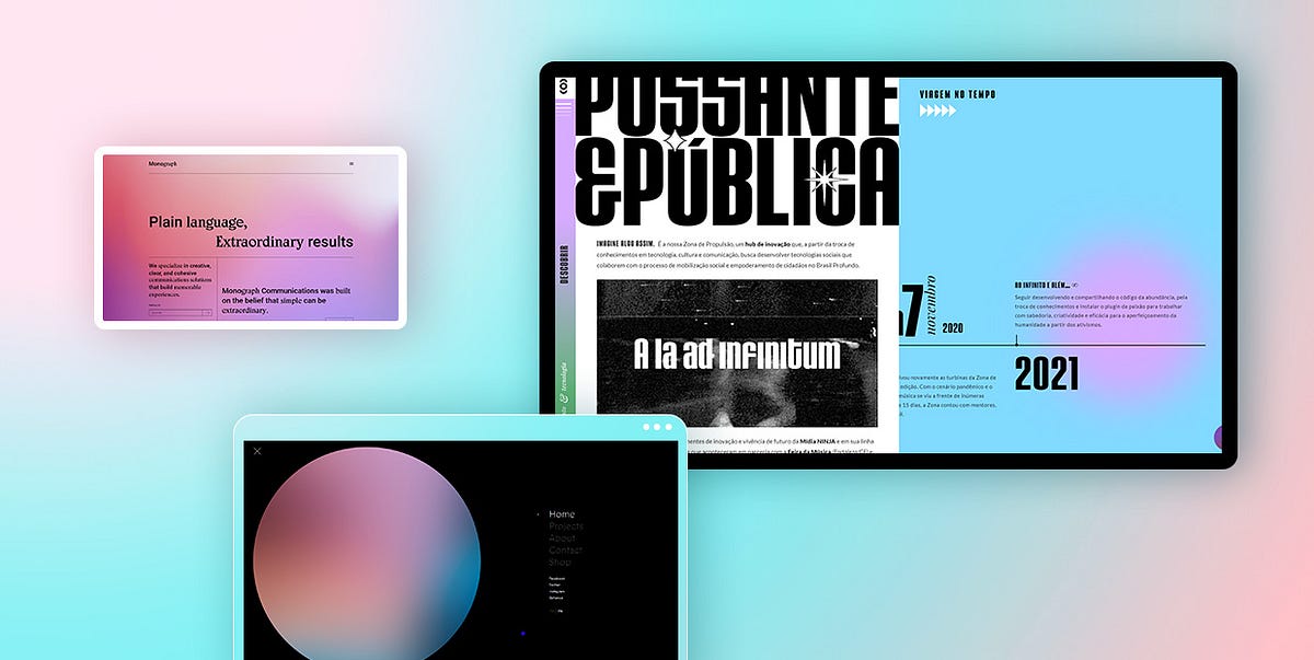
24 Beautiful Examples of Gradient Websites
Gradients are among the most prominent styles in graphic design. They became a huge thing in the ’90s and were widely used on all types of websites. But by the start of the 2010s, they were pushed to the side in favor of flat designs and minimalism. However, around 2016, perhaps a bit unexpectedly, gradients resurged. In that year, the social media giant, Instagram, redesigned their logo, opting for a somewhat flat solution with a striking gradient splashed all over it. While many of its users demanded the company revert back to the previous design, the vibrant logo stuck around, marking the comeback of the gradient design trend.A lot of other large brands followed in Instagram’s footsteps and started experimenting with gradients. But unlike the early 2000’s websites, this time round gradients were far more subtle. We can see them mostly on backgrounds, logos, and image overlays. Designers embraced them because gradients allow them to mix colors they want and combine them with other effects, such as duotone (e.g. Spotify). The end results are unique styles and colorful schemes that add a whole new dimension to their projects.A confluence of two or more colors can be seen on a myriad of modern websites, and we’ve selected the most interesting examples that demonstrate how gradients can enhance the appeal of a site. We will talk about:MurmureZeus JonesMonograph CommunicationsSt. Martin AgencyVirgile GuinardJemimaZona de PropulsãoEarCOUTUREHaiku-HaikuThirstDICEPrism DataBetter HalfFrançois HuletAntara StudioMichelberger HotelLēonardGucci Beauty FoundationWorksmithsLife In VogueJam3 — FWA 100Memory WorkListen! FestivalBlobmixerMurmureMurmure is a French creative agency with offices in Caen and Paris. Their homepage is predominantly in black and white. At the top of the page, you can see the studio’s logo with a dotted sphere in the background. As soon as you bring the cursor close to the sphere, the dots morph into strips and the whole shape starts to look like some kind of pom-pom. The more you move the mouse over it, the messier its shape becomes. The colorful project previews and the blue cursor break the monochromatic aesthetic of the site. There are strategically placed gradients throughout the site’s imagery, usually combined with black and white backgrounds, which makes the vibrant colors pop even more. But the most prominent use of gradients, perhaps, is in the hidden menu. Once you open it, you will notice links on the right side of the screen, while the left is dominated by a large circle with a gradient that changes color depending on the page you’re currently on. When you click on any of the links, the circle expands, taking up the entirety of the viewport and serving as a beautiful transition effect. The way Murmure uses gradients sparsely demonstrates just how effective they can be, especially when combined with a mostly monochromatic and minimalist interface.Zeus JonesZeus Jones is a creative agency based in Milan. Their homepage starts off with a plain black background with the text “Most people can only see today.” displayed on it. But if you wait for a few seconds, more text will show up on the page and the background will transform into a restless sea of black and grey hues before, finally, as the words “We help brands imagine a new world.” appear on the screen, it reaches a crescendo and turns into a colorful, animated gradient of blue, violet, yellow, and orange hues. The gradation of colors complements the textual content and highlights the agency’s powerful message. This vibrant site opener captures the attention from the onset, encouraging viewers to find out more about Zeus Jones.Monograph CommunicationsEvery page of the Monograph Communications website contains a gradient in the background. The exciting aesthetic invites viewers to discover more about this brand that specializes in communications solutions. Gradient colors change from one layout to the next, ranging from fuchsia to soft pink, orange and yellow to lime green, and cerulean to purple. The site is typography rich and filled with grid lines. Even though there are no visuals, the liveliness of the gradients and the contrasting content in black creates a visually exciting unit that viewers will enjoy exploring.St. Martin AgencySt. Martin is a creative agency that works with small businesses. The background on their homepage is adorned with a psychedelic, undulating gradient in orange, yellow, pink, blue, and green hues. Its movement and colorfulness clash with the seriousness of the black elements displayed on the homepage. The menu is placed at the bottom, with each of the five straight black lines representing one menu section. The background on the inner pages is a lot more tame and in one color only, but you can still spot gradients here and there. For example, on the “Team” page, images of the team members have a red duotone gradient effect. Moreover, the background behind some elements contains a subtle red gradient, making the content more attention-grabbing.Virgile GuinardVirgile Guinard is a French photographer based in Paris. His homepage seemingly consists of rectangles of varying sizes, with each rectangle colored in different gradient colors. On hover, they turn into project previews, containing both photo and video material. Project single layouts are designed in the same style. In some sections, gradient rectangles remain in the background, with photographs and videos highlighted at the forefront. In others, they remain visible until the content loads. Then they disappear from view. Considering the richness and variety of colors used for gradients, other elements on the site had to be more demure. Typography is in a simple, slightly geometric white font. Menu links are unobtrusively placed in the corners of the screen — you can see them, but Guinard’s projects remain in the spotlight at all times.JemimaJemima is a graphic designer that specializes in print, editorial, and book design. On her portfolio website, she combines a grainy, alluring, predominantly blue and orange gradient with white typography. The homepage includes only project names. When you click on them, you will be redirected to project single pages that contain the grainy gradient in blue. Even though the displayed imagery has lots of colors, their vivaciousness does not clash with the vibrancy of the gradient effect. To avoid bad UX, Jemima made sure her photos have flat backgrounds that separate the displayed content from the gradients. That way, she ensured the colors of the gradient and those on the pictures do not overshadow each other and that her work is the star of the site.Zona de PropulsãoZona de Propulsão is an innovation hub where different types of cultural projects come to life. The loading screen of this one-page website includes an animated GIF of TV static — a beautiful harbinger announcing the impressively designed website. This one-pager is packed with large typography, terrific animation effects, and microinteractions that bring the content to life. The layout is mostly divided into two columns, with a vertical menu on the left side of the screen. Gradients in green and lavender hues define the site’s visual identity. The cursor is designed as a medium-sized circle colored in the blue and green gradient. When you place it on the site’s content or on the white space, it changes to a gradient consisting of red and pink hues. At the same time, it also colors the elements you place it onto in playful gradients.EarCOUTUREEarCOUTURE is an audio shop. The homepage contains a fullscreen slider that puts a few of the selected products into the spotlight. Gradients are noticeable in the background and slightly on product images. The colorful gradient backdrop contains some abstract elements, lines, swirls, and light fractions that make the slider all the more interesting to the viewer’s eye. Slide transitions include an edgy effect that slightly distorts the content, immersing you into the world of EarCOUTURE’s products. Gradients are applied to other site sections as well. For instance, page transitions include a subtle gradient that moves from the bottom of the page to the top, slowly revealing the new content. The colorfulness of gradients shakes up the quiet palette used on the majority of the pages, with white backgrounds and content mostly in black.Haiku-HaikuHaiku-Haiku is a cool website developed by Ezekiel Aquino. This is the place where people can participate in writing haikus with other website visitors. The layout is split into two parts. On the right, you can explore the list of completed haikus. And on the left-hand side of the screen, you will find the collection of haikus that still need to be completed. The gradient background is in eye-catching colors that change as you move the cursor across the screen. When you open the “About” page, a transparent layover text appears on a grey background, but you can still see the gradients shifting behind it.ThirstThirst is a packaging agency that specializes in working with drink brands. Their website starts off with an animated rainbow gradient that gives the site a dreamy vibe. Menu items and a brief introduction to what this company does are placed in the middle of the screen, enveloped by the beauty of the delicate gradient. Other pages include a white background with lots of immersive, colorful visuals, but the striking gradient remains the most memorable feature of this website.DICEDICE is a music and discourse festival held in Berlin. The homepage includes a stunning gradient in blue and purple shades. In the middle of the screen, you’ll see an animated 3D object with a gradient effect. Various shades of orange and pink mix and merge as the object rotates, making the homepage look particularly memorable and striking. The homepage also contains lots of uppercase sans serif typography, with performers’ names appearing in the viewport with an infinite loop effect. The simplicity of the fonts beautifully balances out the untamed spirit of the gradients, making the site easy to digest yet attention-grabbing.Prism DataPrism Data is a transaction intelligence platform used for getting financial insights and predicting risk scores. The pages on their website are predominantly in black or white, with gradients subtly appearing in the background. For instance, at the top of their homepage, the animated gradient initially appears only in the far right part of the screen. But, then it begins to move towards the middle of the screen, breaking into three separate colors that find their way back together again. As you scroll down the page, a straight line follows your movement, connecting one section to the other, with several colorful gradients dispersed throughout the page. Inner pages also contain gradients that look particularly delicate against a white backdrop. Prism Data’s website is a great example of how even the smallest touch of gradients can define the visual character of a website and how these striking elements can be used by all types of businesses.Better HalfBetter Half is a creative studio based in Los Angeles. Their one-page website begins and ends with a sandy gradient that gives warmth to the entire presentation. Elsewhere on the site, there aren’t so many colors. In fact, save for a few colorful images and the ochre gradient, most of the content is in black while the background is predominantly white. The overall design is simple, but there are some majestic hover animations that occur when you place the cursor on the studio’s logo at the top and the bottom of the page. The letters bend and move in the opposite direction of the mouse. At the top, project images also appear on hover. Even though the effects, typographic choices, and imagery are all impressive, the coziness that the gradient evokes makes all the difference. Its unobtrusiveness and lovely color provide a warm welcome to the site, as well as a sweet send-off.François HuletFrançois Hulet is a Belgian designer. On his homepage, he briefly introduces himself and immediately states his love for gradients. His passion for blending colors and creating transitions from one hue to the next is evident on every page of his website. He blends dark and light blue as well as powdery pink and cerulean shades to create eye-appealing transitions from one color to another. But he also goes a step further, using the mouse cursor as a tool that allows visitors to play around and modify the look of the site’s backgrounds. Whichever page you visit, the cursor will shine a faint light on the backdrops, turning the already vivacious backgrounds into fully interactive canvases. This can be seen best on the “Lab” page. While this is the only page on the site with a flat black background, the pointer shines some indigo blue onto it. So as you move the mouse around the page, the blue circle follows you around, creating a regal gradient by merging black and indigo blue hues. This interactive element lets you further experiment with Hulet’s gradients and experience all the variety you can get from them, depending on where the cursor is located on the screen at any given moment.Antara StudioAntara is a multidisciplinary design studio. On their website, they created a gradient effect by adding unobtrusive splashes of yellow and grey to a light background. The shades are delicate and non-distracting. You can clearly notice the gradients, but both colors elegantly blend in with the featured content without stealing its spotlight. The subtleness of the gradients beautifully complements the sophisticated serif font and the minimalist, yet refined vibe of the site. All elements are in perfect harmony, highlighting Antara’s work in an appealing fashion.Michelberger HotelMichelberger Hotel is one of Berlin’s top hotels known for its authentic and playful interiors. The style the hotel is famous for beautifully translates onto their website. The first screen you see is completely white, with the hotel’s logo written on it. The cursor on this screen is fittingly shaped like a prism, and once you click, the white light is split into a colorful spectrum, turning the background into a rainbow gradient . The homepage includes the infinite loop effect so the gradient seems never-ending. On its surface, there are only the names of inner pages listed one below the other. The transition from one section to the next is followed by the color changes in the background. Inner pages don’t contain gradients but they are colored in hues that constitute the rainbow. For example, the link to the “Restaurant” page is placed on an orange part of the rainbow, and the backdrop on this page is in that same shade.LēonardLēonard is an inventive agency located in Paris. When the site’s loading animation appears, the screen is initially grey. As the content loads, a gradient in a lighter shade of grey appears on one side of the screen and an orange gradient shows up on the other end. The closer you get to content fully loading, the more prominent the gradients become. They are not static. They continue to move over the edges of the screen while you explore the site’s content. Gradients are displayed on every page, but you can also spot them in the fullscreen menu. The backdrop in the menu is white, but the links contain an animated gradient effect. You can observe as the fiery orange gradient travels from the top link to the last one, leaving fonts in light blue and light grey shades behind.Gucci Beauty FoundationGucci Beauty Foundation is a website that celebrates one of the brand’s latest foundations. Like all the other websites created in celebration of Gucci’s products, this one, too, mesmerizes viewers with its creativity. The loading screen consists of a house of cards that collapses. Several cards then slowly assemble in front of you, as if you were holding them in your hand. The background turns into an eye-appealing gradient that changes its colors every few seconds. Even though each displayed image i.e. card contains a vivid color palette, their colorfulness does not interfere with the vibrancy of the gradients. If anything, the content on the cards looks even more prominent, capturing the viewer’s attention from the get-go. The site contains lots of video tutorials, interactive shade picker palettes, as well as a quiz — all the cool and smart ways to increase user engagement.WorksmithsWhen the Worksmiths website loads, all you see is a black background with white typography on it. But as you start to scroll down the page and reveal more about this branding studio, you come across soft, pastel pink gradients that gently awaken the entire site. Worksmiths played with gradient and black backdrops, using them to mark transitions from one section of their one-page site to the next. Besides pink and black, bold yellow is another prominent color on the site. You can spot it in quirky animated illustrations and on some uppercase typography. Its vividness contrasts the calmness of the pink gradient and the neutrality of the black color, but the disparity between the three colors is what makes this site so striking and beautiful.Life In VogueLife In Vogue is Vogue Italia’s annual event when they open their Milan offices to the public. However, due to the ongoing Covid-19 pandemic, this year’s edition couldn’t be held. Instead, Vogue created this interactive platform, i.e. a virtual replica of Vogue’s offices in Milan that anyone can tour from the comfort of their own home. As the “Life in Vogue” text and the illustration of the magazine appear on the loading screen, the peachy colored gradient appears in the background. It stays there when you flip the first page of the magazine, revealing a 3D pop-up book depicting Cadorna Square with Condé Nast’s building on it. The softness of the gradient perfectly fits the pastel color palette used for the pop-up book, creating a highly enjoyable visual experience for viewers. Upon turning the page once again, you find yourself inside the elevator, where each floor corresponds to one area of the site. Vogue’s virtual rooms were designed by a team of six designers who were allowed to unbridle their creativity and place stunning, imaginative worlds inside Vogue’s offices.Jam3 — FWA 100Jam3 — FWA 100 is a project created by the Jam3 design agency to commemorate their 100 FWA wins. This website is filled with eye-appealing animated gradients in lavender, violet, and blue shades. You can see them in the background the entire time you explore this terrific project but also on some other website elements. For example, as you explore the site, you will stumble upon a 3D rock. You are encouraged to draw on it by holding your mouse. The longer you press the mouse button, the larger the stone and its gradient-colored spikes become. Ultimately, they all explode into a myriad of colorful gradient triangles. By coloring this website and its content almost exclusively in gradients, Jam 3 gave a new, more interesting life to the displayed 3D virtual objects, creating a remarkable celebration of their creative achievements.Memory WorkMemory Work is a research-based scenario and immersive speculative soundscape, indicating possible futures of women’s labor. The website contains a soft color palette, with lots of violet, pink, blue, green, and yellow elements. In the top section of the homepage, the aforementioned colors are all blended together, creating a tranquil gradient sea of pastel hues. Elsewhere on the site, gradients are applied to the menu. When you hover over the menu links, a bold gradient appears, coloring the selected link in the colors of the rainbow.Listen! FestivalListen! is an electronic music festival held in Brussels. Their website is bathed in delicate gradients of powdery pink and baby blue hues which can be spotted in the background on the majority of the pages. The top section of the homepage includes a magnetic horizontal animation of interlocking 3D rings colored in a chromatic rainbow gradient. While the rings move from one side of the screen to the next, a swirling delicate gradient in the background amplifies the dynamicity of the page. Imagery is in black-and-white (photos gain color on hover), but the delicate gradient in the background softens the slight edginess of the visuals, resulting in a highly enjoyable visual experience for users.BlobmixerBlobmixer is your virtual playground for creating 3D art. You can craft your own animated blob and style it to your taste by using a myriad of customization options. For example, you can adjust the roughness levels of the blob and the environment map values, set specific distortion levels, modify the animation speed, change the size of the blob, as well as its color. You can opt for a flat hue, but the site allows you to play with a gradient map and blend a palette you like the most. You can then change the color of the background, to make it suit the style of your blob. There’s also a cool library of selected blobs, showcasing the creativity of the site’s visitors.Closing WordsWhen used in a well-thought-out manner, gradients are a surefire way of increasing the vibrancy and appeal of your designs. They will make your projects more memorable and help them stand out from the competition. Whether you skillfully apply them to larger surfaces such as the background on your site or add them only to cursors or call-to-action buttons, they are always impossible to miss.As the websites on our list demonstrate, there is no need to go overboard with flashy colors and overwhelm viewers with too intense visual experiences. You can still add a unique feel to your projects even if you opt for a subtle, delicate gradient color scheme. No matter how subdued the mixed hues may seem, they will still elevate your work. You can also use all types of animation effects to amplify the beauty of the gradients and make them more eye-catching. All that matters is that you ensure gradients don’t steal the viewer’s attention but rather help direct it to your work, sparking users’ interest in learning more about what you do.Originally published at https://qodeinteractive.com.24 Beautiful Examples of Gradient Websites was originally published in Muzli - Design Inspiration on Medium, where people are continuing the conversation by highlighting and responding to this story.
Top 100 Most Creative and Unique Portfolio Websites of 2024
Looking for more daily inspiration?Download Muzli extension — your go-to source for design inspiration!As we delve into the world of innovative web design, we’ve explored hundreds of portfolio websites, carefully selecting the 100 most creative and visually striking examples that truly stand out in 2024. These sites embody the best of modern design, blending originality, beauty, and a unique perspective. Our curated list showcases what’s truly at the forefront of web design today.Please note that the order of the websites is entirely random, and the numbers have no bearing on their quality or significance. Each website on this list is exceptional in its own right.That said, it’s important to remember that not every portfolio that pushes the boundaries of creativity will necessarily align with your specific needs or objectives. Choosing a portfolio style that represents your personal or professional goals is key to ensuring it truly reflects who you are.Spotted a portfolio that deserves a spot here? Let us know in the comments, and we may feature it in our next update!……1 . Federico Pian — Freelance Creative DeveloperFederico Pian is a freelance creative developer and co-founder at Overpx Studio.2. Den.Cool — Independent design studio — Branding, Interface, MotionDen.Cool is an small, independent design studio built on principle and driven by passion. Den.Cool specializes in creative ideation, user experience, content creation, art direction, design, motion design, animation & 3D, web development, e-commerce, game concept and creation, digital installations and activations..3. Nael Messaoudene — Freelance Creative Developer PortfolioFrench Freelance creative developer passionate about pushing boundaries with WebGL experiments and crafting captivating UI animations. Bringing innovation and artistry to digital experiences..4. Rogier de Boevé — Creative DeveloperPortfolio of Rogier de Boevé, Belgium-based creative developer.5. AW — Creative Developer Freelance — FranceCreative Developer with 15+ years and 140+ projects, specializing in animation-driven, high-impact websites. Partnering with designers to craft memorable UX..6. Grégory Lallé — Creative developerCreative developer focused on animations and user interactions, to create immersive online experiences..7. Ylli RamadaniYlli Ramadani. Creative developer specializing in front-end and motion..8. Robert Borghesi — Creative DevRobert Borghesi an economist turned into a Creative Coder specialised in WebGL and immersive experiences..9. Sanni SahilAs a passionate digital designer and independent design director, I am committed to creating visual narratives that engage and inspire..10. Seb® → DesignerDesigner • Founding Partner ++hellohello • Design Jury @Awwwards.11. Swiss director of photography — Thibaud FellayThibaud Fellay is a swiss cinematographer whose creativity is deeply influenced by the mountains..12. Thomas Monavon — Interactive DesignerFreelance Designer & Awwwards Jury 24' based in France. Crafting original web experiences based on motion, creative layouts and minimalism..13. Spencer GaborSpencer Gabor is an illustrator, designer and muralist based in Brooklyn, New York..14. Rhythm Influence | Influencer Marketing StudioA talent first full-service influencer marketing studio with unparalleled access to the best talent in the world, empowering the voices that define modern culture..15. Studio MoveWelcome to Studio Move where motion and design come together in the heart of Montréal. We bring our ideas to life, partnering with companies like Nike, Polestar or Leica to create compelling visuals and interactive experiences..16. Radiance — The creative team for digital and brand experiencesWe practice fresh and straight in the face way to create brands, design and digital experiences..17. AthleticsAthletics is a brand studio. We help clients design their place in the world..18. Richard Prescott — PhotographerRichard Prescott — Advertising, commercial, editorial photography.19. AirborneAirborne Studio creates impactful brands with empathy, ambition, and a focus on meaningful change..20. Ten years of Source.parisA retrospective of building a design agency, from the beginning to today’s challenges. A story about people and what they can achieve..21. Bruut — Video production & distributionEnd-to-end video production and video distribution, enabling brands to create their best work. We make video work for your business..22. Inette — Crafting Digital IdentitiesInette is the creative studio of Trieu Anh, specializing in beautifully crafted websites, unique branding, and captivating visuals. We focus on transforming ideas into visually stunning digital experiences that reflect your brand’s identity..23. Media.WorkMedia.Work is a collective of innovators, designers, artists and creators, who are exploring visual ways to convey ideas — in collaborations with ambitious organizations and independently..24. Eric Hu StudioEric Hu Studio works across the disciplines of design, art direction, typography, and code to produce striking visual identities and experiences..25. Dorst & Lesser: Social Media Agency AmsterdamDorst & Lesser, the full service social media agency, empowers top brands to thrive in the digital landscape through social media strategies..26. Otherlife Creative Agency | Unconventional SolutionsOtherlife is a creative agency building unconventional solutions at the forefront of brand, digital design, web experience and engineering..27. Design — Alec TearAlec Tear is an independent Amsterdam-based designer & lettering artist who can’t stand speaking about himself in the third person..28. HuncwotCrafting digital products that AI can only dream of..29. Hardik Bhansali | Designing The WebWelcome to the world of Hardik Bhansali: where creativity meets design! Explore the portfolio of this visual web designer extraordinaire and be inspired..30. THE HYPERSONIC STUDIO — MachMach Studio is a creative studio that partners with innovative brands to craft meaningful brand experiences. Combining technology, art, and creativity, their team of directors, creators, and designers push the boundaries of storytelling and design using cutting-edge technologies..— — Recommended articles — —.31. Deeo Studio — A creative digital design studioDeeo is a design studio led by Yianni Mathioudakis and Monica Sanchez. We focus on designing extraordinary experiences through curiosity and exploration. Branding • Design • Web • 3D.32. Valentin Cheval | UX/UI & Brand Design LeaderI’m an award winning product designer specialized in financial products. I working for Financial Products in Fintech, crypto and Web3..33. FISKFISK is a creative practice focused on the enhancement of art and design in our daily lives..34. Monkey Talkie — Creative Video AgencyWelcome to Monkey Talkie, we are not your typical creative agency. Keep your eyes open, expect the unexpected..35. TWOMUCH.STUDIOTWOMUCH is a Digital Design Studio formed by Benjamin Chan (BC) and Malone Chen (MC) operating between London and Vancouver. We play within the fields of Digital Art Direction, Websites, Interactive Design and 3D animation..36. funkhaus / Creative Studio für Websites & BrandsWe help brands stand out from the noise of digital media through motion design and bold web experiences..37. Animation Studio London | The Line StudioWe are a BAFTA-nominated animation studio based in London. We specialise in 2D animation, 3D animation, commercials, films, & games..38. LEEROY Agence Créative à Montréal — Web & MarketingCreative agency in Montreal specializing in Web Development, Design, Brand Strategy, and Digital Marketing. Turning your ideas into reality..39. Cosmos Studio | UI/UX & Brand Design StudioDigital design studio from Ukraine. We help IT tech companies with bringing immersive UI/UX and Brand design to their projects..40. Check | Unconventional Design CompanyWe are a global design company creating unique experiences for brands and products through unconventional designs backed by design thinking and innovation..41. Sage EastSage East is a visual storytelling photographer and director based between New York and Los Angeles. Sage East has gained recognition for her compelling and emotional work within the advertising and editorial spaces. Her work consists large clients such as Google, Netflix, Meta, Nike, and Amazon..42. STUDIO GRUHL — DREAM MOREStudio Gruhl is a creative studio for brand and digital design. Being deeply rooted in today’s subcultures, we enable new visual worlds to bloom. Dream More..43. TerradactylSpecialist and bespoke quality assurance for the creative tech industry | led by QA veterans who’ve delivered 100+ high-profile projects..44. Studio Now — Digital Design Studiombrs is the multidisciplinary digital design studio for brands to unlock their full potential..45. Locomotive | Montreal web agencyLocomotive® offers a wide range of creative and strategic services for remarkable brands, companies and organizations. Over the 15 years, Locomotive® has become a go-to for meaningful, innovative, results-driven digital experiences, web design and branding. Freshness guaranteed..46. Bigpicture CompanyAn integrated outdoor and online advertising agency specializing in advertising planning, production, and execution..47. MM • Frontend DeveloperMy name is Max, and I’m a front-end developer, who creates websites with a special focus on animations and user interaction. I’m ready to bring your ideas to life and add a touch of originality to the online space..48. ButtermaxExplore Buttermax: Your Gateway to ‘Buttery Smooth’ Digital Experiences. Immerse yourself in creativity, innovation, and playful delights on our Home page..49. Petra Garmon · A creative production companyWelcome to Petra Garmon, your destination for quality content production. With full-service options for commercials, documentaries, music videos, and films. We bring your projects to life!.50. Rich Brown | Freelance UX UI Designer, UKAward-winning Freelance UX UI Product Designer & Art Director. 25 years designing immersive user-centric websites, interactive experiences & mobile apps..51. Cacá BarabásGraphic designer based in Los Angeles, CA..52. Digital Product & Brand Experience Agency — GladeyeGladeye is a creative digital agency in New Zealand — working for the world. We blend storytelling with technology to craft beautiful brands, websites, experiences and products..53. Premium Branding for Serious Startups | SERIOUS.BUSINESSSERIOUS.BUSINESS is a premium branding agency for startups. We excel at creating brands that make people smile by connecting creativity with strategy..54. Noomo Agency — Creative design agency | Los Angeles | San FranciscoWe are a Los Angeles-based digital design agency specializing in creating interactive digital experiences, 3D storytelling websites, applications, and immersive experiences..55. SALT AND PEPPERSALT AND PEPPER is a multidisciplinary agency that specialises in web and mobile development, whilst maintaining the human touch in communication..56. Strange FamilyStrange Family is an international branding, advertising and technology collective. We tell stories and design experiences that help brands lead, define and break with category norms..57. Creative Agency | Video Production Company | Animus StudiosGet Industry-Leading, Full-Service Video Production From Animus Studios. Get In Touch With Our Renowned Team For The Best Video & Film Production Experience And Find Your Fascinating..58. SLAPS — An independent creative companySLAPS is a Barcelona-based creative studio founded in 2020, focusing on pushing culture forward. They specialize in disruptive brand solutions and campaigns that challenge the status quo of modern advertising..59. KreativesWe are a creative studio pushing the world forward with strategy, design and storytelling. For people and the planet..60. UNOXUNOWe are UNOXUNO®, a production and modeling agency..— — Recommended articles — —.61. Studio Sentempo | 3D, Art Direction & MotionWe are an Italian design studio focused on CGI, art direction & motion.62. Jordan Gilroy | Freelance Web Designer & Webflow DeveloperI craft websites that align with your brand and engage your audience — creating meaningful and memorable experiences. As a freelance web designer and Webflow developer, I specialize in bespoke designs and interactive elements that make your website stand out and captivate visitors..63. Brand, Design, and Development — Non-Linear StudioIndependent studio crafting digital experiences connecting design and technology, based in the Wasatch Mountains of Utah and the Baltic Sea in Tallinn..64. Evan Fasquelle — Digital designerFrance-based Digital Designer & Art Director passionate about creating memorable experiences and helping companies with fresh ideas and user friendly solutions..65. Samson:ArtArtist Samson’s work and life.66. Accordion ProductionsA production company. We’re a tight-knit collective of artists and creative minds dedicated to crafting unique film and photographic works that entertain and engage..67. Ashfall Studio | Empowering Brands Through Strategy, Design and TechnologyAshfall Studio is a global creative and technology company. We bring the magnitude of brands’ unrealized potential to the surface..68. Rodeo Film, creative production collective — Rodeo FilmRodeo Film is a collective based on the association of diverse talents : comprising directors, photographers, editors, designers, and composers..69. Oliver Jeffers | Visual Artist & AuthorOliver Jeffers is a visual artist and author known for his expertise in painting, bookmaking, illustration, collage, performance, and sculpture..70. Sonar MusicSonar Music is a renowned music and sound studio based in Disney Studios, Australia, that houses the nation’s most distinguished composers and sound designers. Armed with a unique, collaborative and holistic approach, Sonar crafts the highest calibre of sound design and original composition across the fields of film, television, commercial & new media..71. UNVEIL®Technology-driven creative studio..72. Bemo — Experience Worlds UnseenA creative multimedia studio designing experiences through art that visualizes unseen worlds, sparking curiosity and imagination..73. Clarisse Michard | Freelance Webdesigner — Creation of custom websitesCreative webdesign for a better digital experience. I’m Clarisse, french webdesigner and co-founder of Okey Studio..74. Douglas LilliequistDouglas Liliequist, a creative developer with over 5 years of industry experience, is dedicated to utilizing graphics and interactive technologies to craft inspiring and intriguing experiences. Notable clients he has collaborated with include Google, Spotify, The Wall Street Journal, and L’Oréal..75. The Sand StudioThe Sand Studio is described as more than a design studio. They portray themselves as a collective of innovative minds exploring uncharted creative territories. Their tagline: “Small Team. Big Ideas..76. DES® | Design Education Series® by Obys®Design Education Series is a new format of an original mini-series on the main principles of design, where we share all insights gained during our experience at Obys Agency. Typography Princples, Colors Combinations, Grids are the titles of the first three seasons of the series..77. Active Theory · Creative Digital ExperiencesFounded in 2012. We blend story, art & technology as an in-house team of passionate makers. Our industry-leading web toolset consistently delivers award-winning work through quality & performance..78. Studio de motion design Doze — Crafting Motion, Shaping BrandsDoze is a creative advertising studio based in Nantes since 2012. Specializing in motion design and brand identity, we bring all your projects to life. Keep moving!.79. Hero CollectiveWe turn brands into heroes.80. Work by Claudio guglieriGuglieri.com represents the work of Claudio Guglieri..81. Danilo De Marco — Visual and Type Designer DesignerDanilo De Marco is an award-winning Italian visual designer working in branding, UI, design for event, type design..82. Peter TarkaPeter Tarka produces immersive illustrations using forms, shapes, and bold colors to elevate aesthetics for the most recognizable brands on the planet..83. InkfishBig agency thinking, small agency attitude..84. Studio Kleiner, Photography & ImageryStudio Kleiner is a Stockholm-based creative studio that brings ideas to life..85. PEDEN+MUNK Director / Photo Team — PEDEN+MUNKTaylor Peden and Jen Munk-vold Director / Photo Team based in NY.86. Heyday Studio — Creative Studio, Branding & Places, ToulouseA graphic design studio based in Toulouse, specializing in branding, logo creation, and interior design..87. Photographer — Axel VanhesscheAxel Vanhessche is a french talented portrait photographer based in Paris who captures the essence of his subjects through his lens..88. Oscar Pico — Digital DesignerA digital designer with over 3 years of experience, specialised in visual and interface design. Also, a lover and enthusiast of art direction and all existing forms of design. Always looking towards the future to learn new skills, like motion or 3D design..89. Agence web lyonAkaru is a web agency based in Lyon, specializing in web design and custom website creation. We offer tailor-made showcase websites and e-commerce solutions..90. Little TroopLittle Troop is a design partnership bouncing between Brooklyn and Melbourne..91. The Variable | The Different AgencyWe believe the future isn’t inevitable. Because it’s inventable. From business and brand strategy to creative campaign concepting with performance analytics and reporting, we specialize in crafting unique solutions tailored to your business. Discover how we can differentiate your brand for growth today..92. Local™ — Branding & Digital StudioLocal™, based in Paris and Bangkok, is a design studio that creates strategic and creative solutions to support businesses in their growth..93. Redchurchcreative studio built on two key pillars.94. Dion Pieters Amsterdam Based Freelance DeveloperHi my name is Dion Pieters. By working for industry-leading agencies like Active Theory and Build in Amsterdam, I’ve been able to craft multiple immersive digital experiences for a variety of clients such as Spotify, Louis Vuitton, Google, Squarespace and many more..95. Even/OddEven/Odd is a creative studio and production company for bold campaigns, experiences, and original content..96. Crazy CreativeCrazy Creative is a solo design agency with super powers..97. Fernando Puente — Art direction, design, photographyI’m an art director, designer & photographer based in Madrid.<br/> I currently work as creative & design director at EL GRITO & EC Brands Studio at El Confidencial..98. hhart ® — web design and photography studioWe are a creative studio crafting unique visual content to empower people and brands..99. Your MajestyYour Majesty — Amsterdam based strategy-led design and technology agency | Powering brands and digital products for fashion and technology pioneers..100. Rob Hemus | Design CollectiveCreative solutions across Graphic Design, Web Design, Web Development, 3D, Videography & the digital landscape.Want even more inspiration?Follow us on social media for your daily dose of design, innovation, and creativity right in your feed!Linkedin | Instagram | TwitterTop 100 Most Creative and Unique Portfolio Websites of 2024 was originally published in Muzli - Design Inspiration on Medium, where people are continuing the conversation by highlighting and responding to this story.
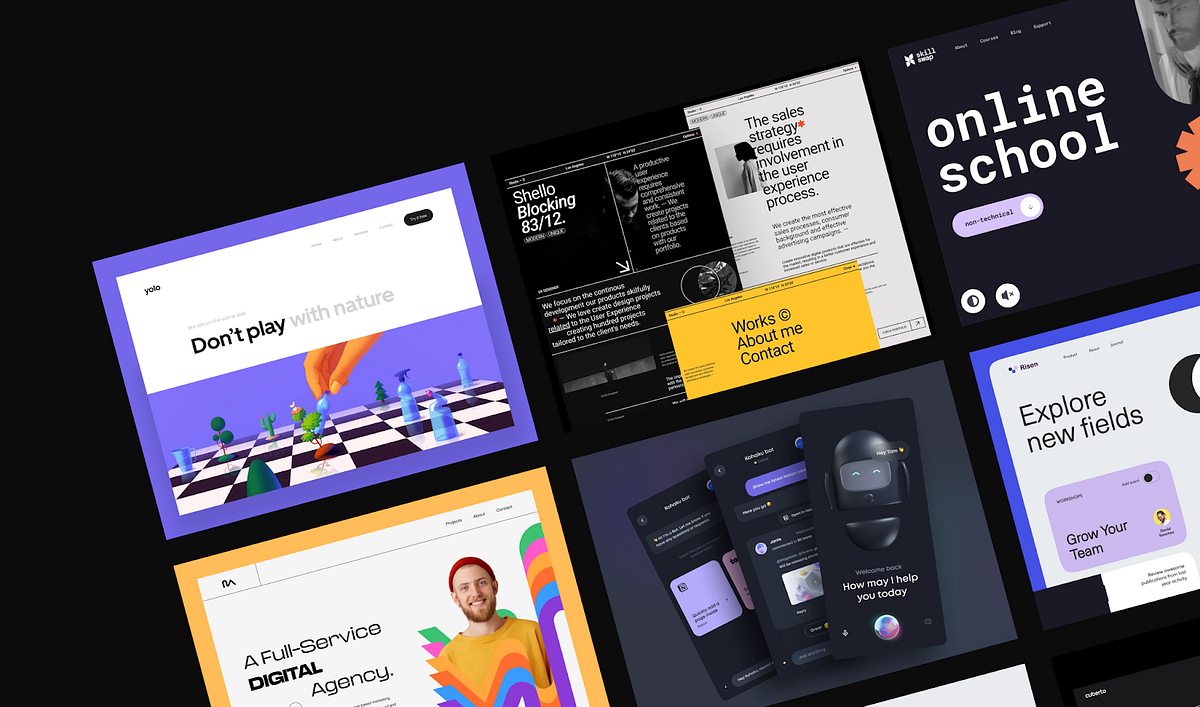
The Hottest Web Design Trends 2022
What’s effective today and what will we take with us into the future?Web design trends by OutcrowdWhy is it important to follow trends? Trends are not only about the present. They form the image of the future. Marketing and design trends are interconnected, and their dynamics are in sync. So it pays to be an attentive viewer!Let’s take a look at 2022 web design trends that will definitely keep in 2023. They have one thing in common: they all do their job.As we study the examples and draw inspiration, let’s keep in mind that each trend is effective in its own marketing realm. Design choices must be based on the company’s positioning and the needs of the audience, not on the mere fact that it’s the trendy thing to do.Yolo — Web Design for Ecologically Sustainable Development by Outcrowd1. New Minimalism2022 saw a new wave of minimalism that strives to stand out from the competition and grab the user’s attention. The trend includes bold, vivid, bright colors and a lot of “air.” This helps emphasize the essentials while maintaining visual clarity. The content looks gorgeous and exciting, but at the same time simple and easy to understand.TABU by Hrvoje Kraljević for BORNFIGHT STUDIO®Clean, clear, and vivid minimalism remains popular in branding, as well. This is where it truly shines. A minimalist design with lots of air and bright highlights is an instant attention-grabber that makes the brand look fresh and relevant.The new minimalist design is enhanced when it’s tastefully contrasted against a dark theme.Kohaku Bot — Dark mode — Mobile App by Tran Mau Tri Tam for UI8But all this doesn’t mean that soft-colored minimalist design is dead. For some businesses, a vivid palette with bright elements is simply inappropriate. They continue to use minimalist monochrome designs, although increasingly often enhanced by bright splashes of color.Here’s a good example:A new way of cross-border payments by Cuberto2. Neo-BrutalismBrutalism seems to feed off a fountain of youth since it began back in the 1950s. Over the decades, the style has evolved, constantly updating itself to stay relevant. Neo-brutalism is perfect for brands that promote creativity, boldness, edginess, and novelty. Need an instant eye-catcher? Give neo-brutalism a call. (Be careful, though, because it may upset the aesthetic gatekeepers.)https://medium.com/media/cccaedc1e6923b2b82a2598ae366b1d5/hrefSo what’s the secret behind this trend’s longevity? The brutalist style implies something that is raw and unpolished, a bit rough around the edges. The viewer has a subliminal desire to improve upon it, to finish the job. This engages the viewer emotionally, and the picture gets imprinted on their mind, along with the information. In marketing, that’s invaluable.Brutalist design requires a high degree of professionalism. The designer must be keenly aware of the thin line that separates the viewer’s desire to improve from the impression that they’re just seeing a botched design beyond any improvement.Task Management Landing Page by Bogdan Falin for QClayDigital neo-brutalism is minimalist and bold. It relies on roughness and “visual shocks”: high contrast, rough shadows, conflicting colors, simple backgrounds, asymmetry, and unedited photos. Neo-brutalism is fond of standard bold fonts, preferring readability over eye candy.Studio / Designer — Website by Tomasz Mazurczak for STUDIOHere’s an example of a neo-brutalist website: howilearnedtolovetheindiestry.info3. Engaging InteractivesBased on importance alone, this trend should be topmost on any list. As technology progresses, interactions between humans and digital products increase. Engaging interactions have become so much more than just a responsive interface. Today, it’s already about psycho-physiological communication. Engaging interactions aim to affect all human senses: vision, hearing, smell, touch, taste, and kinesthesia.https://medium.com/media/1b8b6a6c524c79051900e84487b08bb2/hrefThis trend aims to help the user come in contact with the product and feel real sensations. The most relevant content is the one that triggers an emotional response and the corresponding physiological reactions. A video of a steaming hot pie makes the viewer salivate while chasing a virtual opponent gives them an adrenaline rush.Engaging interaction is also a substitute for physically touching the product: it’s an opportunity to rotate the object and see it from different angles, zoom in on the details, choose the size, model, and color.https://medium.com/media/8bf291630aa25ee7fa76fb67b33ffe08/hrefTactile sensations during interaction are not fingers tapping the screen. It’s a mental contact between the user and the virtual world, it’s the enjoyment of playing a game with elements of design, and it’s a realistic feel of their surface and texture.Engaging interactions enable users to customize the interface to their taste and manage it at their discretion.https://medium.com/media/a419bc2efe1943a141777399cdad3437/hrefEngaging interactions include all types of virtual communication, not only with other people but also with the software itself. The more responsive and understandable the interface, the more engaged, committed, and loyal the users.Engaging interactive design is our present and future.4. Focus on People and Storytelling2022 has highlighted the fact that storytelling and emotional photos of people elicit a lively response from users. As far as minimalism goes, the most popular trend is using expressive photos of people accompanied by a short text: a memorable slogan, an impressive excerpt from a larger narrative, or a quote from a story.https://medium.com/media/c51cfca68a76b5da96227a508c9d5426/hrefThe main screen is not cluttered with long reads. The story unfolds laconically and gradually as the user scrolls down the page, through highlighted images, headlines, videos, or animations. Alternately, the user can click to find out more details.Expressive photos of people are also used as effective visuals to attract attention.Vultura Entertainment Brand Identity by Halo Branding for Halo Lab 🇺🇦This trend also includes large banners under the top menu on the main page. It’s the first thing users see on the website, instantly engaging their emotions.Scrollytelling is a close cousin to storytelling. It’s a gradual visual narrative. These days, people increasingly tend to scan their eyes across the page without really reading it or getting to the end of the story. The scrolling process itself is also tiring. A story that unfolds before the user’s eyes like a controllable movie is a great solution.https://medium.com/media/06a435d9668263618fe3588b09cea965/hrefScrollytelling is perfect for presenting sizable narratives, such as a description of the company or product, scientific data, or any cognitively demanding content. It’s especially good for learning and memorizing new information.The principle of “abridged” scrollytelling is successfully used for displaying selling propositions. It’s a way to quickly and effectively showcase the product’s advantages and convey the most salient information.https://medium.com/media/01979d81b558bd6b4667ca6708ac4031/href5. 3D GraphicsThe 3D graphics trend is definitely a keeper since it’s one of the best tools for retaining user attention. 3D images are perceived as realistic, no matter how fantastical their shapes are. A shape that has volume is eye-catching and mesmerizing. The user spends more time on the page just to admire the design.https://medium.com/media/c3a565a6ba3c976e00b71fe575e68aaa/hrefFar from losing steam, the 3D trend has even found its way into branding. An animated 3D logo grabs the viewer’s attention and holds it much longer than a conventional 2D image.https://medium.com/media/252254c7d1f30abbe1395a46a2037955/href6. Abstract IllustrationAnother 2022 trend was using illustrations with abstract geometric shapes. They are widely used as primary images for websites and apps, social media posts, and packaging designs.https://medium.com/media/505941d729f7cff57faec51c69919ca1/hrefAbstract illustrations are so successful because of their attractive vividness and contrast, visual aesthetics, and minimalist simplicity. They act as color highlights and add superior visual clarity to the overall design.Abstract illustrations and geometric shapes have also been used in branding. Their role here is similar: drawing attention to the brand name through color and form.DSM — Hero Header v3 by Tran Mau Tri Tam ✪ for UI87. Oversized TypographyWhat makes this trend special is that the typographical elements here are independent. The fonts are not used merely to convey information. They make up an important part of the page’s visuals, shaping the design and acting as powerful visual highlights in their own right.The advantage of oversized typography is that it goes well with many design styles. Large bold fonts are good for both minimalist and maximalist designs and their combinations. They harmonize perfectly with thin and fine fonts, emphasizing their elegance with their brutality.https://medium.com/media/624bfcd1ee1db3a7fdac2165497559ab/hrefAnother benefit of oversized typography is the ability to reduce the use of images on the website, cut loading times, and improve mobile usability.The important thing is to choose fonts that are easily readable and fit the branding concept.In conclusionWe have been following design trends for several years. Year after year, we see the same thing: the best trends survive and remain in the next year, except with new solutions added. The best ones are those that work toward the project goal and help garner a large audience. The stuff that gets left behind is not necessarily outdated; it’s just that it doesn’t work toward the goal as well as it used to.We have reviewed the most popular trends. Here’s what we have this year and what will continue to inspire us tomorrow:New Minimalism;Neo-Brutalism;Engaging Interactions;Focus on People;3D Graphics;Abstract Illustration;Oversized Typography.Use the trends but don’t let the trends use you!The Hottest Web Design Trends 2022 was originally published in Muzli - Design Inspiration on Medium, where people are continuing the conversation by highlighting and responding to this story.

Pixels of the Month: March 2024
Mixed-Reality F1 Concept, Paris Olympics 2024 Posters, RIP Akira Toriyama, Decathlon Branding Revamp, The Rise of AI Actors, etc.March has come to fruition, unveiling a myriad of captivating designs and creative discoveries. Here is my carefully curated selection:Mixed-Reality F1 ConceptParis Olympics 2024 Posters3D Sculpting with Dreams and KreaAiRIP Akira ToriyamaColor Trends in Movie Posters DesignDecathlon Branding RevampSingapore 3D OOH BillboardThe Rise of AI ActorsMixed-Reality F1 Concepthttps://medium.com/media/1474948a5ebd524df6bb56572764bc88/hrefThis mixed reality F1 concept shows what the Apple Vision Pro could do for sportsIt’s not hard to imagine how Spatial Computing could change sports once you see it. This demo of an F1 companion app is a perfect example. From a marketing standpoint, this opens up new possibilities for brands as well.Paris Olympics 2024 PostersIllustrations credits: Ugo GattoniA captivating and fantasised representation of Paris adorned with a multitude of details and Olympic symbolism.Created by French illustrator Ugo Gattoni, who has dedicated over 2,000 hours to this masterpiece, the 2024 Paris Olympics and Paralympics posters are officially here, and they are absolutely stunning.The arena sends us back to the grandeur of the games in Ancient Athens, while the colorful isometric 2D illustrations exude the energy of modern gaming arenas.A brilliant fusion of the past and present, creating a diptych that transcends time, evoking a sense of universality and joy. Une merveille ! 🇨🇵3D Sculpting with Dreams and Krea.aihttps://medium.com/media/25584e6817ee13c401c50907b3b00d4f/hrefThis 3D sculpture was made by Martin Nebelong using Dreams on PS5 and transformed with Krea.ai.This is by far the fastest way to sculpture in 3d anywhere.Imagine when it’s possible to convert this to an actual 3d model, to animate it, and to integrate it into projects.RIP Akira ToriyamaIllustrations Credits: Akira ToriyamaAs a French individual born in the 1980s and partly raised by the iconic Club Dorothée children’s TV show, which introduced Japanese animation to French audiences, Akira Toriyama captivated my imagination and instilled in me a lifelong passion for drawing.From the whimsical world of Dr. Slump to the epic saga of Dragon Ball (Z), and extending through works like Chrono Trigger and Dragon Quest, Toriyama’s style remains consistently distinctive:His characters are memorable with simple yet expressive designs. His fluid and dynamic drawing style imbues static scenes with a sense of movement and action. He seamlessly incorporates subtle humorous elements and infuses his environments with a wealth of details.Looking back, I realise that Toriyama’s impact on my life goes way beyond mere entertainment. His work sparked my creativity and imagination, shaping my artistic aspirations and indirectly influencing my academic and career path.Today, as I fondly recall the memories of my youth, I am reminded of the profound legacy left behind by this visionary artist.RIP Akira Toriyama 🕊️Color Trends in Movie Posters Designhttps://medium.com/media/10e632a40a7071ac1ac3104604f6f526/hrefWhile searching for examples of color psychology usage in ads, I came across this video of James Verdesoto for Vanity Fair.James Verdesoto is an artist and creative director who has designed iconic posters for movies such as Pulp Fiction, Ocean’s Eleven, and more.Watching him explaining how color schemes are used in movie posters is fascinating for anyone in the industry.Decathlon Branding RevampIllustrations/Photos Credits: DecathlonDecathlon has just unveiled its new brand identity. What do you think?This evolution comes — amongst others — with a bold new logo and a fresh new purpose to ‘Move People Through the Wonders of Sport’.The revamped logo features a new symbol called the ‘Orbit,’ which acts as a springboard to propel the brand into the digital era. Here are some key points about it:✅ The design heritage is maintained with the iconic tilted ‘C’ and ‘A’ seamlessly integrated into the new logo.✅ The graphic representation of a mountain, a sail, and a wave recalls the brand’s two favorite universes.✅ The movement of the logo symbolises the brand’s commitment to circularity.✅ The vibrant new blue colour revitalises the brand with digital-friendly tones.✅ The emblem is designed to be easier to use on physical and social networks.However, this new identity is more than just a visual upgrade; it represents a redefinition of their values and a global deployment of the brand, hence the switch to an English slogan.Singapore 3D OOH Billboardhttps://medium.com/media/58aa3f41f4dd04892c19afae6e4f48e7/href3D billboards take over five major cities globally, offering would-be tourists an unexpected journey through Singapore’s local experiences.The Singapore Tourism Board continues its ‘Passion Made Possible’ destination brand campaign with this new initiative 3D out-of-home billboard that shines the spotlight on three iconic Singapore experiences.The campaign was executed by BBH Singapore alongside The Shophouse @ Publicis.The Rise of AI Actorshttps://medium.com/media/e842ec897109eacf671d43a4e5d73005/hrefProduced using a tool such as arcads.ai, this video features a genuine actor initially commissioned for a few moves and facial expressions.Then comes the AI overlay allowing lip-synching to a specific script and most likely background and clothes changes based on the video topic.The emergence of such tools raises some considerations:➡️ Surge in untrusted content proliferation online.➡️ Escalation in AI-generated content and interaction (20 to 40% of all interactions on Facebook already).➡️ Progressive decline of traditional influencers (which, admittedly, has its perks).In any case, I can’t wait to see brands leveraging actors chosen by their competitors to present an opposite narrative.Typically, ‘Actor X’ is used to promote a vegan lifestyle for Brand X one moment, until Brand Y employs the same actor to endorse a carnivorous diet.👋🏻 I’m Rémy — a multidisciplinary designer and business owner with a particular enthusiasm for digital experiences.Follow me for more posts on Creativity, Innovation, and Strategy. 🚀🎨Pixels of the Month: February 2024Are designers ready for a product-first process?How to Spot an Effective Design TeamUnmasking the truth in designSource: Wingify on DribbbleBias and assumptions in user research refer to the ways our thinking can sometimes be influenced without us even realizing it. It means we might see things in a certain way because of our own beliefs or experiences, which can affect how we interpret information.It can make our research less accurate and lead us to make decisions that might not be the best for everyone.For example, bias might make us only pay attention to information that supports what we already think, ignoring anything that doesn’t. This can make our research results not completely true or fair. And assumptions can lead us to design products or services that don’t really meet users’ needs because we haven’t taken the time to find out what they really want.Here’s an article that discusses 10 different types of cognitive biases in User Research, and how a designer can avoid it.Impact of bias and assumptions on research outcomesHere’s how having cognitive biases can impair your valuable research.1. Distorted insightsBias and assumptions cloud researchers’ interpretations of data, resulting in skewed insights that do not accurately reflect users’ realities or needs.2. Missed opportunitiesBy overlooking diverse perspectives and discounting alternative viewpoints, there’s a risk of missing out on valuable insights and innovative solutions. This narrow focus can limit the exploration of new ideas and hinder the discovery of improvement opportunities or differentiation in the market.3. Ineffective solutionsBiased research can result in misguided conclusions, leading to the development of products or services that miss the mark. Without a clear understanding of user needs and preferences, solutions may fail to resonate with users or adequately address their requirements, ultimately resulting in poor adoption or satisfaction.Tools and methods for reducing bias and assumptionsNow, let’s look at some of the ways that can help avoid the above outcomes.1. Assemble diverse teamsSource: UIGO Design on DribbbleUsing a diverse team in user research is having a team made up of people from different backgrounds and experiences. When we have this mix, it helps to avoid making unfair assumptions.Each person brings their own ideas and perspectives, which means we can question each other’s assumptions and make our research better. Also, having a diverse team makes it easier to find the right people to take part in our research.And when we involve people from different backgrounds, it makes the research more credible and inclusive.2. Rely on multiple data sourcesSource: UIGO Design on DribbbleQuantitative data offers objective metrics, while qualitative data provide richer context. Hence, instead of relying solely on one source of information, such as surveys or interviews, researchers should utilize multiple sources, such as analytics and documents.By drawing from diverse data sets, this approach enables a balanced integration of quantitative and qualitative information, giving a comprehensive understanding of the research topic.Through this process, researchers can minimise the risk of cognitive biases and avoid overgeneralization by recognizing nuances in the data.3. Use reframing techniquesSource: UIGO Design on DribbbleReframing techniques, such as “how might we” questions and point of view statements, are valuable tools for reducing bias in user research. These techniques encourage researchers to approach problems from different angles and challenging assumptions.“How might we” questions encourage brainstorming and creativity, prompting researchers to consider multiple potential solutions rather than settling on a single assumption. Point of view statements encourage empathy and perspective-taking, helping researchers understand the diverse viewpoints of users.Overall, reframing techniques enable exploratory approach to user research and help uncover deeper insights.4. Validate with user testingSource: UIGO Design on DribbbleBy observing how users interact with prototypes or products, we can confirm or challenge our assumptions and make necessary adjustments. This hands-on approach helps identify any unexpected issues early on, preventing potential problems down the line.Additionally, gathering feedback directly from users helps minimise reliance on subjective opinions, enhancing the reliability of our decisions.In essence, user testing is essential for creating user-friendly designs while reducing bias in our research process.5. Find techniques to empathise with usersSource: UIGO Design on DribbbleOne-on-one interviews allows researchers to listen actively to users’ stories, experiences, and challenges. This helps researchers develop a deeper understanding of users’ perspectives and emotions.Second way is observing users in their natural environment or while interacting with products or services provides valuable insights into their behaviors, preferences, and pain points. This firsthand observation can uncover unmet needs or frustrations that users may not articulate verbally.Another way is using empathy maps. It visually represent users’ thoughts, feelings, and behaviors. They prompt researchers to step into users’ shoes and empathise with their experiences.This shift helps steer away from relying on personal opinions or assumptions.This tangible evidence validates or challenges researchers’ assumptions, leading to more accurate insights and actionable solutions.6. Have proper training & check-ins for user research teamsSource: UIGO Design on DribbbleProper training and check-ins for user research teams are vital for making sure research is fair and accurate. Training helps team members understand and recognise biases, while regular check-ins provide opportunities to discuss any problems and find solutions together.Following standardised processes keeps things consistent and reduces the chances of bias. Encouraging diverse perspectives and continuous learning ensures research is inclusive and improves over time.Unlearn what you have learned, as best as you canReducing bias in user research is crucial for getting accurate insights and ensuring that everyone’s needs are considered. When researchers aim to be fair and thorough, they can uncover new opportunities and create solutions that truly work for users.Ultimately, this approach improves the quality of our offerings, leading to higher user satisfaction and business success.Canvs Editorial regularly brings you insightful reads on design and anything related. Check out the work we do at Canvs Club.The Canvs Editorial team comprises of Editorial Writer and Researcher — Paridhi Agrawal, the Editor’s Desk- Aalhad Joshi and Debprotim Roy, and Content Operations- Abin Rajan. Follow Canvs on Instagram for more design-related content.While you are here, do check out Cassini, a quick and easy way to review designs, websites and collect screenshots, all in one place.Pixels of the Month: March 2024 was originally published in Muzli - Design Inspiration on Medium, where people are continuing the conversation by highlighting and responding to this story.
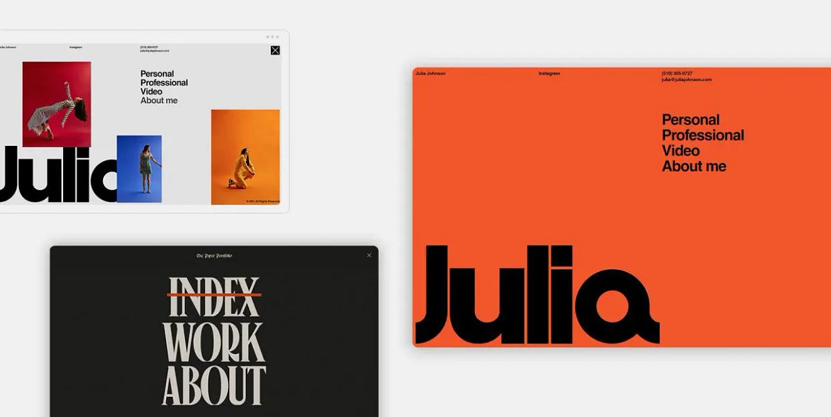
15 Websites with Inspiring Menu Design
A few things are so essential to user experience as the menu is. Serving as a roadmap for the site, and also, to an extent, as a “means of transportation” for the users to get to a specific location, the menu is the number one navigational element and, as such, needs to be carried out perfectly.There’s a lot to be said about what constitutes a good website menu, UX-wise. Clean, clear, intuitive and logical — these are just some of the attributes of a well-executed menu. And you don’t even have to be a design wiz to understand that. Even as laymen, we are already intuitively aware of what a menu should look like and how it should work. We are used to finding it in certain places — quite commonly it’s going to be a header menu, located at the top of the page, or a side menu, located to the left or to the right of the main content. More and more frequently, designers opt for hidden fullscreen menus, accessed through hamburger icons or variously shaped openers. Either way, we rarely actually have to look for the menu. That is, if the navigation has been designed right.The same goes for interactions. Menus (and their items) don’t have to be animated, but it’s often best if they are. Microinteractions serve as indications that a certain action has been carried out or that it will take place if we click, scroll or hover. Take hover animations, for instance — they indicate that if we click on an item, it will take us to a place.And so on, and so forth. So far, we’re basically just stating the obvious. A good menu means good navigation, good navigation means good UX and good UX means success. But today we actually want to talk about something else. We want to examine the menus that stand out, design-wise.The thing about web design is that when it’s good, it’s good in every single aspect — functional and aesthetic. You can have a perfectly honest, functional and practical menu that does nothing for you because it is bland, dull, forgettable. You can also have a dashing menu with elaborate interactions, gorgeous typography and loads of embellishments, but if your visitors find it hard to use, if they even have to think about how to use it, it’s good for literally nothing.A website menu can be both. It can be innovative and practical, gorgeous and utilitarian.So, let’s try to figure out exactly what makes a menu stand out. To do that, we’re going to check out some of our favorite websites that feature innovative, dazzling, stylish, elegant, irreverent menus. In short, we’re going to try to figure out what makes an inspiring menu design. Stay tuned as we go through:Julia JohnsonBaillat StudioNiccolò MirandaMUTEK MontrealVerholy Relax ParkCraie CraieFan Study by SpotifyLe PuzzCommonwealth Fusion SystemsAroz JewelryMatthew FisherJon Way StudioGlenn CatteeuwKacper ChlebowiczBridge TourJulia JohnsonFor her portfolio website, the photographer Julia Johnson created a beautiful combination of retro aesthetics and modern, interactive web design elements, dominated by the large logo in Helvetica. The bold character of the typeface is reflected in the menu opener, consisting of two thick black dashes. When clicked, the icon opens a menu that follows the aesthetic line of the homepage — the Helvetica typeface sets the dominant mood, skillfully coupled with a vibrant orange background. The somewhat stripped-down character of the menu becomes more dynamic as we hover over the menu items, which prompts the background color change and portfolio images popping up, so we basically have two moods here — one minimalist and the other louder and more substantial.Baillat StudioThe website of the Montreal-based Baillat Studio, specializing in branding, design, motion and creative direction, is definitely not a minimalist one. Attention-grabbing custom typography, full-width video sections, interactive lists and oversized text occupy the homepage in a somewhat loud manner, so the layout basically has no room for essential navigation links — at least not without resulting in clutter. That’s why the designers tucked the menu away, behind a round opener in the upper right corner — a good place for it, too, considering most people would intuitively look for it there. When clicked, the icon opens a fullscreen menu, which has a much airier and tidier layout with large horizontal sections of interactive text. Massive black typography on a light background creates a fine balance, and the thin separator lines give the menu a tidy look. A welcome touch is the oversized X that closes the menu, as we know how difficult to spot and click those menu closers can be.Niccolò MirandaWhen it comes to gorgeously designed, inspiring menus, we can’t help but revisit one of our old acquaintances, whose website we talked about in our article on poster style in web design, Niccolò Miranda. For his portfolio website, the talented web designer and developer set out to recreate a newspaper-style layout with lots of delightful details and twists that hint to the printed media and old school television. It is also a skillful exhibition of web interaction and animation, and the website menu is one of the best examples. A simple icon opens a fullscreen menu with a torn paper effect, a newspaper heading-style title and large Canopee typography that gives the design a retro character. The item indicating the section we’re currently on has a red overline and the letters expand a bit when hovered upon. And that’s pretty much it. It’s a functionally simple and visually very well crafted menu that can serve as an example of menu UX done right.MUTEK MontrealFor the 2022 edition of the renowned festival of digital creativity and electronic music — MUTEK Montreal — the designers opted for a loud, even flashy style with large typography, neon colors and strong navigational elements. The menu opener, located in the upper right corner, has a geometric quality to it — when clicked, it becomes a square containing a circle containing an X that can be moved with the cursor. The menu text is large and partially overlaps with other text, but is essentially just white letters on a light blue background. The left portion of the menu is static and consists of an image. There’s nothing really revolutionary about this menu, no super-innovative interactions, 3D graphics or mind-bending effects. It is, however, a well-designed, informative and practical menu that fits perfectly with the overall vibe of the website and does an excellent job at serving its actual purpose, which is to provide any essential information a visitor might have regarding the festival.Verholy Relax ParkTucked away in the forests of the Poltava region, Ukraine, the Verholy Relax Park is a spa hotel that promises a perfectly relaxing immersion with nature in a luxury ambiance. The hotel website is elegant and refined, combining dark green background with subtle and light interface lines and icons. The menu is accessed by clicking on the icon in the upper left-hand corner of the homepage, and opens as a fullscreen layout consisting of two sections. The left section features numbered interactive links to the appropriate pages, while the right one displays images related to the section in question. The two sections are connected by a fine curved line, serving as a contrast to the more strict grid lines featured in the layout. Another contrasting point to the straight and sharp elements of the menu is the cursor — a small dot that grows larger when hovered over menu items.Craie CraieCraie Craie is a Lyon-based architecture and interior design studio known for exquisite style and impeccable taste, which is evident from its portfolio website, too. Combining a very light pink with bright red, the grid-based layout of the homepage spells creativity and individualism, but the real visual treat is hidden behind the star-shaped menu opener. The full-screen menu opens from the bottom in a rather swift but smooth transition, filling the screen with a lovely bright red. Subtle light pink grid lines are matched by the vertical text in the same color, serving as links to the Projects, Studio and Contact pages. The studio logo, as well as several smaller instances of text, are white, which was a smart choice — pink alone would render the design perhaps a bit feminine or maybe trendy (pink and red have been among the hottest color combinations for years now), while white on red would cause too strong a contrast. The entire composition is topped by a small black dot for the cursor, visually tying the whole menu together.Fan Study by SpotifyAnother website that is so gorgeous we just have to write about it repeatedly (remember our article on purple websites?), Fan Study by Spotify is in our focus today because of its innovative approach to menu design. We’re generally used to finding menus either in the header or behind a menu opener tucked in a corner of the page. This time, we’re looking at the center. An interactive icon resembling volume or bass lines is located in the middle of the header, red on purple background, in line with the website’s initial color palette. When clicked, the icon opens a full-width menu consisting of draggable items, going from one to 15. Poster-like gradient infographics are color-coded and thematically grouped in metrics including Reach, Engagement, Release and Merch. Each item can, of course, be clicked to reveal more detailed information. What’s interesting is that the menu doesn’t offer links to other pages — instead, the very same content is offered below, in the body of the page, so to speak. The menu is, therefore, simply an alternative way to visually present the data — in a digest form, as the sections below are more elaborate and detailed, complete with links to additional resources.Le PuzzIf our next website doesn’t cheer you up today, nothing will. Marketed as Wonderfully Whimsical Weirdo Wigsaw Wuzzle Wumpany, Le Puzz collects, trades and creates random-cut puzzles with a vintage quality and vibe. Not only does Le Puzz recreate the aesthetics of the 1970’s and 1980’s, but they also promise that the quality of their puzzles (the thickness of the pieces, among other things) can be matched only by those old school puzzles we had as kids that were so solid you could pick them up from the table in one piece once they’re done. Le Puzz website is delightfully weird and playful, but don’t think for a second the vibe isn’t a result of meticulous design work. From the layout design to the palette, from fonts to animations, every single design element is spot-on. The main brand color is a warm yellow with a retro vibe, used both for the puzzle boxes and for select website elements, such as the header. Le Puzz opted for a simple and straightforward header menu, divided by grid lines into several tidy sections, ensuring the visitors can quickly and easily find their way to whatever they are interested in. The colors of the menu sections revert on hover, turning from yellow to black, and that’s about it. Simple and clean, it’s a menu that supports the overall style of the website perfectly and does its job without any fancy pretensions.Commonwealth Fusion SystemsDedicated to finding, researching and producing clean energy, Commonwealth Fusion Systems is a company that aims to deliver the most efficient path to fusion energy for commercial use. Its work combines science, technology and engineering using state-of-the-art solutions, and the company website is appropriately modern and functional. Note that when we say “modern” we don’t mean intricate motion design and complex pages that take forever to load. Rather, we mean simple, clean design that only considers the most practical and efficient elements in modern web design trends. The menu is a good example — placed in grid, with clean, geometric sections and legible, professional NB International Mono typography, it gives off an air of knowledge and innovation. The sections are hollow but fill in with white when hovered upon, indicating they can be clicked. They are also in a bit of asymmetry — the left part contains four sections with menu items while the right part, which serves as a holder for the company name at the far right side, is longer. Still, there’s no sense of imbalance here, perhaps because the entire menu looks like it follows some mathematical order that we don’t necessarily have to be aware of in order to appreciate its elegant simplicity.Aroz JewelryThe use of grid lines in web design is certainly one of the most efficient ways to assure clean layouts with content that is easy to consume. When they are thin and subtle, grid lines also add a touch of elegance to a design, which is why we so often see them in websites across all niches. Aroz Jewelry, for instance, opted for thin lines that divide parts of the header (or, rather, the header propper and the top bar) both horizontally and vertically — defining the sections and keeping the content well-organized. The transparent header houses elegant white items with no dividing lines, creating a breezy, light feel. Some of the menu items, when hovered upon, reveal a mega menu with solid white background, as here readability and precision are vital, while others can simply be clicked to lead the visitor to separate pages.Matthew FisherWe have lately been seeing a rise in websites whose design relies to a great extent on typography — loud, large, distinctive or idiosyncratic typefaces that constitute a big chunk of the site’s visual identity. The portfolio of the New York-based visual artist and designer Matthew Fisher is one example of this trend. It’s an elegant and finely polished display of Fisher’s work that’s not as image-heavy as one would expect from his line of work. A big counter serves as the preloader, followed by a slider displaying select imagery, and then we are welcomed by a hero section that states “Art Objects” in large letters. The menu is clearly marked in the upper left corner, and opens with a fluid animated transition with something of a curtain effect. A vertical, numbered section on the left displays menu items that combine serif and sans-serif typography and feature a roll-over and font change effect on hover. Hovering also prompts a change in images that appear to the left — each menu item has a designated image that appears when that particular item is engaged with. The menu is entirely monochromatic — white letters on black background, with black and white images. It is an elegant and striking design, and the inconsistency in typography adds a bit of an edge to it.Jon Way StudioJon Way is a creative brand partner and strategist with over 13 years of experience with brands, companies and individuals. Way has invested a lot of care and attention into his portfolio website, using custom typography, video sections and a modern, clean layout defined by horizontal grid lines. The menu is of a “classic” type, if there’s even such a thing. It’s a transparent header menu, with clean, readable items without any dividers or lines between them. When hovered upon, the menu items get a dotted underline to indicate clickability. This clean and tidy look serves as a counterweight for the somewhat busier hero section that features a dynamic interplay between very large and very small typography, followed by a noisy video section. In addition, it assures good UX through clean and straightforward navigation.Glenn CatteeuwStatic noise, grid and a finely tuned monochromatic character are the main stylistic components of the portfolio website of Glenn Catteeuw, a Belgium-based digital designer. Never once breaking the website’s unique atmosphere, Catteeuw created an exciting and seemingly simple layout based on a grid pattern that resembles project papers and has a somewhat analog quality to it. The menu is cleverly placed in the bottom right corner of the grid, or, to be more precise, in a part that actually lacks a few squares of the grid. Geometric and precise, like the rest of the layout, the menu is unpretentious yet striking. It features simple hand-written effects upon hover — an overline or a circle, which adds a touch of charm and warmth to the design. Animations and interactions are discrete and designed with good measure, contributing to the cohesive and consistent page design.Kacper ChlebowiczA thick, hyper-stylized, animated letter K greets us as a preloader for the website of the Polish art director Kacper Chlebowicz, before taking its place in the upper left corner as the site logo. Meanwhile, Chlebowicz’s last name in huge letters takes center stage, against an animated backdrop of abstract forms. After this initial sequence, we are invited to scroll down and explore the featured work, divided into categories on a vertical carousel. All the while, as we scroll and drag the page, exploring the projects, one thing remains constant and unmovable — the menu. Located not at the top but at the actual bottom of the page, this sticky menu is simple, clean, minimalist. It features just three menu items — Work, About and Contact, with a simple underline effect upon hover. This choice of a simple, even basic menu, shows Chlebowicz’s good sense and fine taste — he could have gone with a full-screen menu replete with interactions and visual content, but, given the nature of the rest of the website, that would have been too much. Instead, he chose to balance the page out with a clean and tidy menu, creating a great navigational pathway for his visitors.Bridge TourAfter years of constantly developing, perfecting and polishing our best-selling theme, Bridge, at some point we decided it deserved a proper showcase, and that’s how the Bridge Tour was born. Showcasing not just the 610+ meticulously designed demos that come with the theme, but also some of the innovative design and animation solutions we used for it, the Bridge Tour offers an immersive, exciting and engaging narrative that takes the visitor on a journey through one of our greatest accomplishments. The entire storytelling experience is based on the scroll action — as the user scrolls, the content starts to transform, blend and travel in and out of the viewport. After the initial sequence, an elegant, transparent, grid-based menu appears in the header, featuring the theme logo and a couple of links. The most important element of the menu is the icon in the far right corner that essentially tells the user what to do in order to engage with the website — in most cases it’s the scroll action, but at certain points the user is prompted to wiggle the mouse, to focus, or to play a video. The subtle lines give the menu a very polished and modern look, and the arrangement of the sections bears a distinct geometric quality, communicating order and precision.Wrapping It UpAs we saw from this short but inspiring trip through various menu designs, there’s no definitive or universally applicable rule when it comes to designing a website menu. Well, in fact, there is something that can be considered a good rule of thumb and a solid starting point and that is — always consider the wider content of a website when designing a menu.Some websites, like Kacper Chlebowicz’s, for instance, will benefit the most from a clean, neat menu that balances an otherwise rich design. Some will work best if in grid, like the one we designed for our Bridge Tour. Minimalist layouts, like Matthew Fisher’s, can make great use of full-screen menus which, again, provide some form of balance to the overall design. It’s okay to go all in with elements and animations in a menu, as long as it does not hamper the UX in any way. Like we said earlier, navigation represents the backbone of a website, and the backbone needs to be in perfect health in order for the body to do its thing.Again, functional and practical does not and should not mean plain or dull. It is completely possible to design a website menu that is as beautiful as it is functional, and every single menu on this list achieves just that. As it’s often the case, the beauty lies in small details — the choice of color, the typography, the animation. Combine your most flattering visual elements with a perfectly mapped out navigation experience, and you got yourself a menu that will keep the visitors coming back.15 Websites with Inspiring Menu Design was originally published in Muzli - Design Inspiration on Medium, where people are continuing the conversation by highlighting and responding to this story.

How to Make an Eye-Catching Hero Image That Makes Your Website Stand Out From the Crowd?
If you’re looking to make your website stand out from the crowd and capture the attention of your visitors, then a great hero image can help you do just that. Also known as banner images or sticky headers, hero images are large graphical elements placed at the top of a web page or within the header section. Not only do they look visually appealing, but they also help convey your message in an interesting and engaging manner. In this article, we’ll take a look at what makes a hero image so effective and how you can create one for yourself.What Is a Hero Image?A hero image is typically a large graphical element that takes up a significant portion of the screen when displayed on your website. It’s often placed at the top of a web page within the header area, and its role is to capture the attention of your visitors and engagingly convey your website’s message.Website hero image exampleSimply put, it’s designed to attract the eye and make your website stand out from the crowd. And since people tend to scan websites rather than reading them word-for-word, hero images are typically used as an introduction or summary of what a web page is about.In addition to capturing the attention of your site visitors, hero images can be a great way to showcase products or services. They can also be used as a visual call-to-action (CTA) button or link that directs users to another part of your website.Why Are Hero Images Important?They might seem like simple graphical elements at first glance, but there are several different reasons why they’re so crucial for your website:1. They help engage visitors and keep them on your site longer:As mentioned previously, visitors typically scan websites rather than read them in detail. What’s more, they’re only willing to stay on a website for 15–20 seconds before deciding whether or not it’s worth their time and attention.Hero images help draw visitors into the content they visit and keep them engaged, thereby improving your site’s overall conversion rate. In fact, research has shown that simply adding a large banner image can boost conversion rates by as much as 27% compared to non-hero image sites.2. They tell your brand story:While you probably have an elevator pitch about who you are and what your business does, telling this story visually is much more effective than doing so through text alone. By using visual storytelling through hero images, you can engage your visitors’ emotions and feelings, which helps them remember your brand better.3. They make the most of limited real estate:With users having less patience than ever before, it’s critically important to use every last bit of space on your website wisely. And since hero images are typically placed at the top of a page and take up a large amount of screen estate, they’re an effective way to get more value out of the small spaces you have available for content on each web page.4. They can be used as CTAs:Not only do hero images help explain what your business is about and increase conversions by keeping people on your site longer, but many businesses also use them as visual CTAs that encourage people to click through to other pages and learn more about your products or services. This not only helps you capture leads but also exposes them to additional content on your website, which can help increase brand awareness and loyalty over time.Benefits of Using Hero Images on Your WebsiteAny website owner will tell you that their main goal is to attract visitors and engage them with the content on their site. That’s where hero images come into play, as they can help you achieve those goals by creating an eye-catching visual element that draws attention to your website and encourages visitors to explore your content further. Some of the other benefits of using hero images include:Add visual appeal and interestOne of the main advantages of using a hero image is that it adds visual interest to your website. By incorporating stunning graphics or beautiful photographs in your design, you can make your site more visually appealing and engaging for visitors. This can be especially effective if you’re aiming to provide information about a new product or service that might otherwise seem boring or mundane.Promote brand identity and recognitionA strong image helps your website stand out from other competitors by promoting your unique brand identity and increasing visitor recognition. When people see a familiar logo, color scheme, typeface, or other graphical elements on another website or in print, they are more likely to remember your brand and become loyal customers.Increase conversion ratesA recent study found that using high-impact visual elements like hero images can increase conversions by up to 85%. This is because a well-designed image draws the eye and focuses attention on the main message or call to action, which encourages visitors to take the desired action.Let you share information quickly and easilyInformation conveyed through an image can often be understood much faster than text. In fact, studies show that people can process what’s in a picture in as little as 13 milliseconds! Therefore, when used properly, a hero image can help you quickly communicate important information about your product or service with minimal effort from site visitors.Best Hero Images Types and ExamplesStatistics show that users focus 80% of their attention at the top of the page and mostly scroll through the rest of the content. This is why it’s essential to be able to grab your target audience’s attention as quickly as possible during this stage. A well-chosen hero image should be visually appealing and help boost conversions, which can result in increased revenue and more happy customers. We’ll use some real-life examples of popular and successful companies to show you what types of hero images work best and how you can apply them to your own website or blog in order to make it stand out from the crowd.1) Hero images using photoOne of the most popular types of hero images is one that uses photo manipulation to convey the message and theme of the website. These are usually very creative and visually appealing, which helps catch people’s attention right away.Images on the hero imageLet’s look at one of our Gapsy studio designer’s projects. Just look at how we incorporated photos into the site. We have chosen a photo of a plantation for the MyLagro project where farmers can sell their crops. This photo helps to portray a warm and inviting impression on the site. Such a photo adds an authentic touch to the page. Lastly, we have placed several photos of different types of crops around the website to emphasize the variety and freshness that customers can expect when they purchase from MyLagro.2) Hero images with product pictureAnother type of hero images that are very effective is one that uses a product picture to create a sense of urgency, especially when there’s limited stock available for purchase. Apple does this very well on their products page.This image allows users to quickly see which products are available and how many units are left. There’s also a prominent “Buy” button placed right above to the product picture, which makes it very easy for people to purchase immediately.Product picture on the hero image3) Hero images that push emotionsAnother way to capture attention is by using a hero image that conveys emotion or tells a story. This can help people connect with your website on an emotional level and inspire them to take action, whether it’s purchasing a product or subscribing to your newsletter in order to receive more information about your latest offers. CoulCreative does this really well with their hero image:How to push emotion with hero imageThe visual of laughing people very uplifting and makes you want to learn more about the website and its services. It’s a great way to make people feel happy, which can also inspire them to get involved with the cause. In addition, the UI design colors choice is very relaxing and helps create a welcoming atmosphere for visitors.4) Behind the Scenes Hero imagesFinally, another way to use a hero image is by giving people an “inside look” or showing them what they might miss out on if they don’t sign up or make a purchase. This can work especially well if you’re offering exclusive access to your website or product, such as Company Arrival does with its hero image. They used a video as a hero image about the British electric vehicle manufacturer. This is a great way to inspire people to learn more about your website and how they can benefit from it.Behind the scenes on the hero image5) Hero-images with CTAAnother effective way to use hero images is by including a call-to-action (CTA) within your image.Hero image that uses CTAFor example Veloretti company which sells bicycles. Their hero image with CTA allows you to go straight to the details of the models and make a successful purchase. This helps create an expectation that people will be able to find these products on the website, which can help boost your conversion rates and increase sales.6) Multiple hero-imagesAnother effective way to use hero images is by using multiple images throughout your website. Maserati’s website does this really well with their homepage, as they use different hero images to highlight different aspects of their business and products. This helps create a sense of variety and keeps users engaged as they scroll down the page and explore all the different product lines.Hero with multiple images7) Hero-images that outline company benefitsTo really grab people’s attention and encourage them to explore your website, you can also use a hero image to outline some of the key benefits that your products or services offer. This can be especially effective if you have a well-known brand or sell high-quality products that are in demand.Hero image that outlines company’s advantagesFor example, Apeel company plant-based protection that helps the produce you love stay fresh for longer.This can help inspire trust in potential customers and encourage them to explore your website further.Overall, there are many different ways you can use hero images to capture attention and engage visitors on your website. Whether you’re highlighting a new product or service, showing behind-the-scenes footage, or simply using multiple images throughout your site, hero images can be an effective way to engage visitors and encourage them to stay on your website longer. By experimenting with various types of hero images and utilizing the tips above, you can create a more engaging and eye-catching website that helps you stand out from the crowd and increase your conversion rates.Tips on How to Create the Right Hero Images for a WebsiteIf you’re looking to create hero images for your website, here are a few tips and tricks to help you get started:1. Focus on qualityThe most important factor in creating effective hero images is focusing on quality. This means using high-resolution photos or videos that are crisp and clear so that they really stand out and grab people’s attention. You may even want to work with a professional photographer or video producer to create high-quality hero images that really make an impact.2. Consider your target audience and their needs when choosing imagesIt’s also important to think about your target audience and their needs when creating hero images for your website. For example, if you’re trying to sell a new product or service, you may want to include hero images that highlight the key features and benefits of your offering. Or if you’re trying to build trust with potential customers, you may want to focus on showing behind-the-scenes footage or highlighting customer testimonials in your hero images.3. Experiment with different types of hero imagesFinally, be sure to experiment with different types of hero images and see what resonates most with your audience. You may want to start by using a single top-quality image that takes up the entire screen, but you can also try using multiple smaller images throughout your website or even videos for an added touch of impact. By testing out different types of hero images, you can find the ones that work best for your website and increase engagement with visitors.4. Keep your branding in mindWhen creating hero images for your website, it’s also important to keep your branding in mind and make sure that the images are consistent with your overall look and feel. This means using similar fonts, colors, and styling throughout all of your photos or videos so that they create a cohesive visual experience for visitors on your site.5.Improve conversion rate by adding CTA elementsAnother way to improve the effectiveness of your hero images is by including CTA elements such as buttons or text prompts that encourage visitors to take a specific action. By prompting visitors to sign up for an email list, download an ebook, or make a purchase directly from your hero image, you can increase conversion rates and boost engagement with your website. Overall, if you want to create eye-catching hero images that really stand out and grab attention on your website, there are many different tips and tricks you can try. By focusing on quality, considering your audience’s needs, experimenting with various types of images, and keeping branding in mind, you can create expertly-designed hero images that engage visitors and help your website stand out from the crowd.6.Optimize the image for different screen sizesOne final tip to keep in mind when creating hero images for your website is that you should optimize the image for different screen sizes. This means using high-resolution photos or videos no matter what type of device or screen size your visitors are using, so that they always get a clear and crisp view of the image. By optimizing your hero images for different screen sizes, you can help ensure that they always look great and make a strong impression on visitors to your site.SummaryA hero image is an effective way to make your website stand out from the crowd, drawing in new visitors and increasing engagement. To create an eye-catching hero image, you should start by choosing an engaging and relevant subject for your image. You should then carefully plan and edit the composition of your photo to ensure that it is visually appealing and on-brand. Finally, you should take steps to optimize your image for search engines, so that it can reach a wider audience online. With the right approach, you can create an engaging and effective hero image that will help your website stand out and succeed.How to Make an Eye-Catching Hero Image That Makes Your Website Stand Out From the Crowd? was originally published in Muzli - Design Inspiration on Medium, where people are continuing the conversation by highlighting and responding to this story.
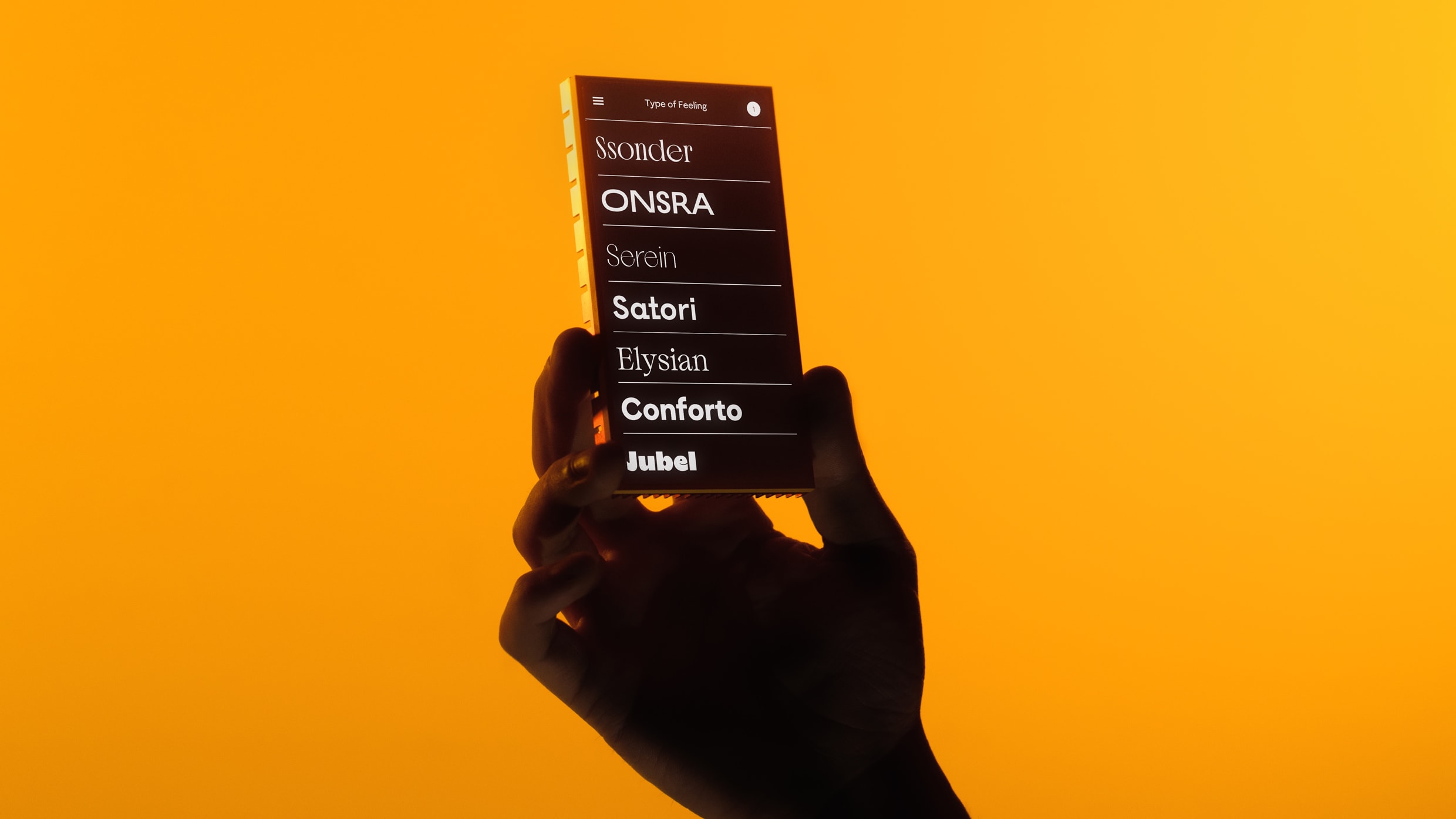
Jessica Walsh just launched a new type foundry where every font gets a feeling
Jessica Walsh has never shied away from feeling her feelings. She’s also never been shy about turning them into design side projects. A few such examples: her public quest to become a more empathetic person, her campaign to foster dialogue around mental health, and her viral dating experiment.So it tracks that feelings are at the core of her new type foundry that launches today. That foundry, Type of Feeling, was created with an unusual premise. She and her team sought to reverse-engineer fonts around a wide berth of sentiments and moods, from joy to longing. “I’m a big believer that all the best design work has some sort of emotion in it,” she says. “It was quite fun to find these different feelings or emotions and then figure out how to design a typeface around them.”[Image: Type of Feeling]During the downtime of the pandemic, the founder and creative director of &Walsh and her sister, Lauren Walsh, who heads up strategy and new business at the studio, sought ways to keep their full roster employed and utilize their talents in different ways. Like many studios, the team at &Walsh had a wealth of scrapped custom type left over from previous projects—and in it, they found the inspiration for the new endeavor. [Image: Type of Feeling]Type of Feeling will offer both retail and bespoke typefaces (ideally, they hope the foundry will be a 50/50 mix of the two). Initially, the foundry is launching with seven offerings, and the team currently has some 30 works-in-progress. Walsh hopes to release two or so a year. As for the pricing strategy of the retail faces, Walsh notes that the foundry is focused on accessibility and getting their typefaces into the hands of as many people as possible.To that end, prices vary based on size and scope: a print license for a single user for, say, Jubel, runs $35. The license for 25 employees rises to $250. For 500 employees, $2,500. Walsh says the team plans to offer a low flat rate for personal use of all the faces, and will also work with nonprofits or similar organizations to adjust pricing to their needs.[Image: Type of Feeling]Building a business around feelingsThe Western type world is dominated by a few behemoth distributors and players—notably Monotype, which owns the rights to such stalwarts as Helvetica and Times New Roman—but the most exciting stuff often tends to come from the many indies out there. Tapping into feelings is a nice hook for the new business, and a logical throughline with Walsh’s previous work, but it isn’t a gimmick. She believes human emotion can enhance brand identities and resonate deeply with audiences, allowing products to stand out in crowded marketplaces.[Image: Type of Feeling]“You don’t even need to have much else in a visual identity system if you have a strong and distinct typeface,” Walsh says. When hunting for typefaces for projects, she adds, it’s difficult to find one that’s distinct but not so trendy it will have limited shelf life. Display type (think headlines and large size uses) fits that profile, and is the niche Walsh hopes Type of Feeling will fill.“There are so many beautifully designed workhorse sans serif typefaces [out there], and those, truthfully, are going to be the money makers,” she says with a laugh. “But what was hard for us to find were those more unusual but timeless typefaces. So as a passion project, that’s really what we wanted to focus on.”[Image: Type of Feeling]The emotion of typeType of Feeling’s first typefaces run the aesthetic gamut. Consider Jubel, a word that means “joy” in different languages; the team wanted it to feel as if it were shouting with exuberance, which they accomplished via bold letterforms that have thick strokes and curves to convey excitement. (Walsh’s favorite part—the lowercase ‘e,’ which appears to be smiling at the viewer.) [Image: Type of Feeling]Or, take Sonder. The typeface is named after the feeling of realization that everyone you pass by in the course of daily life has an inner world as rich as your own. Sonder focuses on an intricate web of connectedness, with curiously joined ligatures and other features. Elsewhere, the other terminals, tails and typographic details seek to convey a variety of nuanced notions. Satori interprets the Japanese term for a spiritual awakening; Onsra distills the Boro language’s word for longing; Serein riffs on the French for, yes, serenity.[Image: Type of Feeling]Perhaps surprisingly, the site carries no &Walsh branding and no obvious indications that this standalone venture is a project from Jessica Walsh—or, well, much branding at all. And that is by design. “We wanted the brand to take a backseat to the typefaces,” Walsh says. “We don’t even have a logo for Type of Feeling. It’s just the name set in random typefaces from the collection, which changes every time you log on to the site. So it was really just about letting the typefaces speak for themselves.”[Image: Type of Feeling]The specimens truly shine, showing a vast range of expressions and applications, from signage to packaging to garments to books and beyond. Love it or hate it, fonts absolutely elicit feelings. And in the age of AI everything, Walsh and her sister are betting on that fact.“We just really feel like it’s going to be a period where brands need to work even harder to find distinction, and we really believe in typography,” says Lauren Walsh, managing director of the new venture. “We hope that we can continue to work with brands to really help them see the value . . . that typography can bring—and the longevity it can bring.”
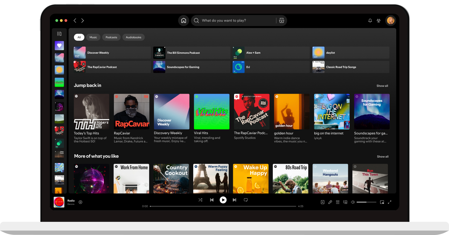
Heardle - Like Wordle, but for Music
Analytics - Google Fonts
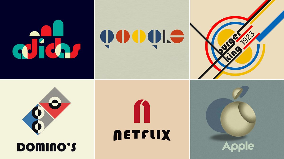
BBC Arts - BBC Arts - 'Haus work: Famous logos redesigned to mark Bauhaus centenary

AirPods Max - Apple

Stumbled

if modern internet companies existed in 1970s - early 1990s

The Comeback of Fun in Visual Design
Weekly Inspiration For Designers #187
Designer Challenges Himself To Create Logos With Hidden Meanings For A Year
Prototyping in Sketch by InVision
Netflix | The Witcher | Welcome to the Continent

Free font ideas from Google fonts - Brandmark font generator
Brooklyn Film Festival 2020
Branding for the Brooklyn Film Festival 2020
Type With Pride
A new brand identity for Slack
Listeners Playlist

Unique
Formula 1 unveils new identity by Wieden + Kennedy London
How to Stop UX Research being a Blocker
Moving Letters | Text animated with JavaScript & anime.js
Iconoir: SVG Icons Library
ThoughtLab | Full Service Creative & Digital Marketing Agency

Ichigo Ichie Art Studio / Vi
一期一絵美術教室(中国/広東省広州市)VIデザイン

Ornate Insect Embroideries by Humayrah Bint Altaf Incorporate Antique Materials and Metallic Beads
This year’s must-do conference: Loupe 2019
Nylon

? presents Aftermath

Malik Bros - Tailor Goods

Redo Bureau
Minimalissimo – Minimalism in Design

Slack: Say hello, new logo.

Pigment by ShapeFactory | Easy to use color palette generator
Pigment by ShapeFactory | Easy to use color palette generator