Hundreds of creative, innovative, well designed mascot ideas & examples.
We curate topical collections around design to inspire you in the design process. This constantly-updated list featuring what we find on the always-fresh Muzli inventory.
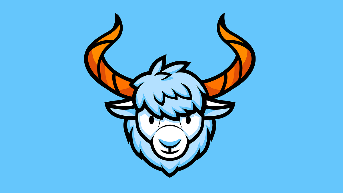
A new case study is up, and this time it will share a story about creating a funny character for marketing goals. Welcome to check the design flow from tubik agency for creating a mascot for the brand identity of PackYak, a shipping and fulfillment service.ProjectDesign of a friendly animalistic mascot for branding and marketing goals of the shipping service PackYak aiming at providing faster shipping times, lower shipping costs, and hands-off order fulfillment for e-commerce stores.ProcessFor years, both marketers and designers have been aware that most people like communication focused on their needs and directed to them personally. The element of personification thoughtfully applied to the product or service can boost a positive user experience as well as enhance brand recognizability and brand awareness. That’s why creating a mascot becomes a part of the general marketing and content strategy.Basically, mascots are images that visually represent the brand, product, or service identity and become its symbolic convention on various marketing channels and promotional activities. They represent the element of identity and work as an inter-connector between the customer and the product. Moreover, mascots can reflect any character traits, follow any style needed for product positioning, and communicate with the customer via a broad set of visual techniques. These branded characters push the limits of personification and give the chance to create unexpected combinations of elements or make fantastic and non-existing characters alive.PackYak shipping service also strived to take advantage of a mascot as a part of its brand identity. As a hint on it was already hidden in the brand name, it seemed natural to create the yak character that would work as a part of a logo and across the website or other channels of communication. The character had to look young but not childish, playful and cheerful but also experienced and confident, transferring the vibes of trustworthiness and reliability.The mascot design included two global tasks: the image for the brand logo and the set of illustrations for various communication goals and website pages.Logo DesignFor the logo, it was decided to work on the headshot image. Here’s a glance at some of the early sketches in the creative search process.After discussions and some research, the creative team and client decided upon the more detailed option with long horns and thick fur around the neck, open and friendly but serious and confident at the same time. Here’s the final version of the logo image.Here’s how it looks with the typographic part of the logo. It uses a solid and highly legible geometric font, which supports the icon and doesn’t compete with it. The mascot image can be used both with a typographic part or independently if the particular case of usage needs it or there is not enough space for the whole combination mark. Here’s the primary version of the logo, with the vertical placement of the elements.Another version with the horizontal placement was also developed for higher flexibility of the identity design. This option sets more focus on the wordmark. In particular, it is used in PackYak’s website header.And here are some brand color background versions to see how the logo effectively works in different environments.Mascot IllustrationsUsers of both digital and physical products or services usually appreciate the element of direct communication and personal attention to them, and a mascot is one of the effective ways to provide it. There are plenty of ways to strengthen the element of personal communication using a mascot: it can communicate directly, provide visual prompts via posing, dynamics, and various facial expressions, reflect the mood with different graphic variations, provide helpful instructions, and congratulate on the achievements. For users, it can make a big difference in interaction with the brand: communication with a particular character often provides a much more positive and dynamic user experience than impersonal instructions sent by the system. What’s more, the mascot used across various website pages, branded items, and social networks helps make the brand more memorable and recognizable.So, another stage of PackYak’s mascot development was creating a set of illustrations sharing different visual hints and metaphors as well as setting the proper mood and powerful emotional connection with the customers of the service. Here’s a sneak peek at the sketches for the variety of situations where the mascot could work: unlike the logo, this set uses not the headshot only but the full figure of the yak in diverse posing, states, moods, and compositions.After discussing and approving the set of general ideas and compositions, the illustrator developed the polished and detailed color versions of the 2D artworks presenting a mascot in various plots and making it flexible for a variety of marketing needs. Take a look at the set below and catch the vibes.PackYak branding design was another great opportunity for our team to work on a cool mascot from scratch and give it not only face but also character and story by means of original graphics.https://medium.com/media/b74c142181bc6c2cf095c20c51b7bf9a/hrefNew design case studies from our team are coming soon. Stay tuned!More Design Case StudiesHere’s a set of more case studies sharing the design solutions and approaches for some of the design projects done by the Tubik team.PointZero25. Identity and Website Design for Event AgencyuMake. Branding and Website for 3D Design ToolBEGG. Brand Packaging and Web Design for Food Product EcommerceNonconventional Show. Website Design for PodcastCrezco. Brand Identity and UI/UX Design for Fintech ServiceFarmSense. Identity and Web Design for Agricultural TechnologyCarricare. Identity and UX Design for Safe Delivery ServiceOOP. Brand Identity Design for Online Flea MarketUplyfe. Identity Design for Health AppBennett. Identity and Website Design for Tea BrandOriginally written for Tubik BlogWelcome to talk to us and check designs by Tubik via:WebsiteDribbbleBehanceTubik ArtsCase Study: PackYak. Brand Mascot Design for Shipping Service was originally published in Muzli - Design Inspiration on Medium, where people are continuing the conversation by highlighting and responding to this story.
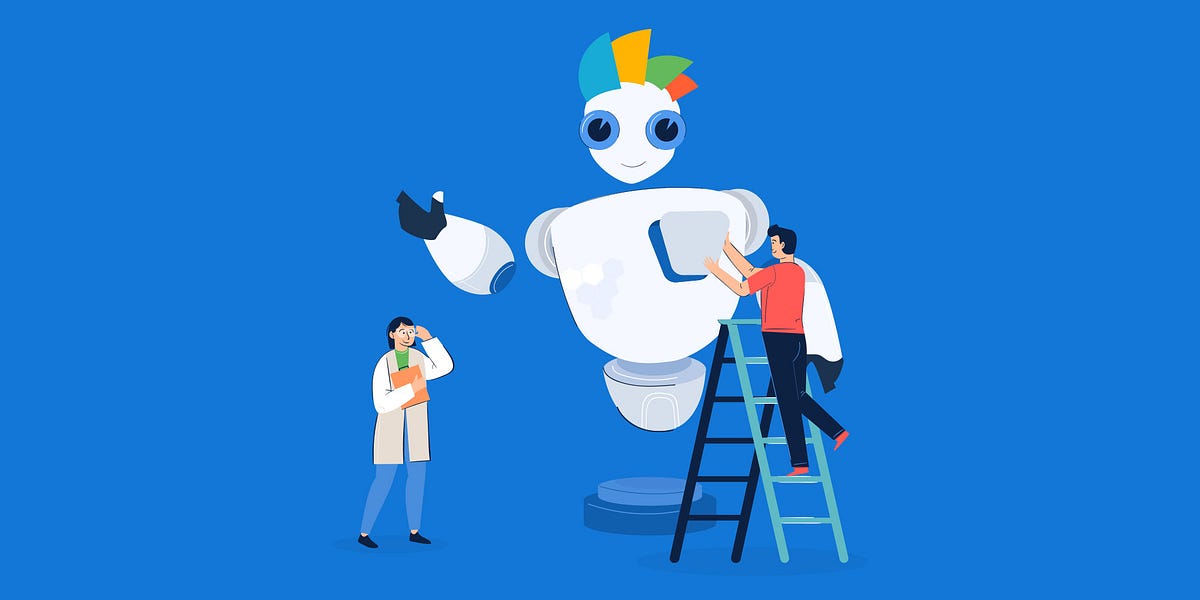
Choosing The Right Type of Mascot For Our BrandA brand mascot is a common visual tool for any company to connect their client base. It creates relationships with users and takes a brand name to a whole new level. After 6 years since we Launched Visme, it was time to introduce a mascot that is a reflection of our brand and helps to bring it to lifeWhen we started brainstorming a mascot or character that would represent us, we had to consider a number of different things. First, the Visme brand is all about pushing boundaries in the ever-expanding visual communication niche. Second, our tool helps non-designers in all fields create virtually any type of content while also maintaining our own sense of personality.We knew we needed a character that was unique and different from what you would expect from a brand mascot. Looking at other mascots used by a number of companies, some of them are robots or a type of artificial character. Other brands use animals or animal-like creatures as mascots.While doing some research about mascots and brand characters we discovered that sometimes the character is depicted only in the logo while in others it is alive and has adventures or experiences that depict the brand. The Mailchimp logo, for example, used to be more of a mascot than a logo but is still remembered fondly. The Kellog’s frosted flakes tiger is a classic example of an anthropomorphic character personifying a brand.Then, on the other hand, are the Android and Vidyard robots that have a limited range of action and emotion. Even the cute MeedEdgar octopus is a static character. The closest thing to what we were envisioning, neither animal nor robot was the animated M&M’s. But still not quite right for us.Our mascot had to be different. As much as we love happy robots, cute animals, and anthropomorphic chocolates, they weren’t the right choice for us. Robots depict automation, the future, and advancement. Animals (such as chimps, penguins, etc) give a positive vibe and can easily depict emotions. I felt that our mascot needed to depict both sides of the coin, with a different angle. We needed a mascot/character that would tell the right story and be unique to Visme.Striving for Emotion and AuthenticityThe Visme mascot needed to be a sidekick, a complement to everyday visual content creation. We wanted to have a character that showed emotion while also representing a semi-artificial intelligence. The Visme character needed to be friendly, helpful, relatable and inspiring all rolled into one.Brainstorming with the team we noted that animal mascots were cute and friendly, while robots were fun and cool but also emotionless. We wanted our character to be a mix of both. It needed to personify the Visme brand as flexible, fast, powerful and friendly, sometimes cute, funny or even a little cheesy. It needed to be some kind of humanoid that could show emotion.It turned out to be much more difficult to achieve than we initially thought.How could we create a character that wasn’t human or animal but could also carry emotions?How could we create a mascot that had emotions but would also resemble AI capabilities?Creating the Backstory for the Visme MascotOnce we knew what we wanted for our mascot in a broad sense, it was time to get to the nitty-gritty. It was time to create a visual story for a character that would personify our brand. We had to create a backstory from our brand values to then give life to a character that would represent everything that Visme stands for.Visme as a brand strives on being unique, original and inspiring. As a team, we stand for empowerment, inspiration and a strong human connection. The Visme brand does not discriminate nor marginalize, it’s used by both large companies, small businesses, and individuals. We are serious professionals but we’re also not that serious.Visme, as a product, thrives on being a powerful and easy-to-use tool. It’s fierce but not scary, it’s diverse and versatile. It’s different but still recognizable. We wanted to portray interactivity and animation, ease of motion that lets the imagination fly.Creating a story for our mascot required us to look at how Visme could be personified. How could an all-in-one visual communication tool be represented as a friendly pet or companion? A sidekick type of character that could empathize with all of our users, regardless of their industry or visual creation needs.With all these considerations and a good idea of a backstory, we started to brainstorm and sketch.Behind The Scenes Look at The Design ProcessOur team designer, Monfa Cabrera got down to business and began the design process for the Visme character. Monfa knows our brand very well, I work closely with him regularly and together designed a number of illustrations for our website. You could say he has the Visme visual brand in his blood.Let’s follow the design process and how our character/mascot came to life with Monfa designing and me supporting.Taking into account the Visme brand logo and all visual aspects of design, we looked for ways to incorporate the logo into our mascot. It was important to give him big eyes to represent friendliness and personify the visual importance of the brand. His body needed to look strong and powerful, almost like a friendly giant we could count on.Monfa’s first set of sketches had a positive outcome. The first iterations of the mascot looked like a happy giant with a wide torso and powerful legs and arms. Monfa used the brand colors to design a type of hairstyle, along with a number of different eye styles and body positions.After some revisions, we kept the hair idea but used the exact shapes from the logo so it had a more direct visual union. The brand logo was transformed into a digital crest with natural movement on the mascot’s head and we all loved it! The eyes were also given the same design as the circle in the Visme logo and the face was done.This iteration of a strong and friendly giant looked fun, powerful and could portray emotions, but it needed something more. It lacked agility and ease of movement. The legs were turned into a futurist transformable wheel and rocket base, the torso was minimized to match the base and the hands were given more human features to portray better body language.All the joints from the original robot were transformed into magnetic connectors that permitted a larger range of movement. With these changes, the character could roll, fly, and move in any direction smoothly and gracefully.In the end, after a long design process, our Visme character has a fun and positive visual appeal. A mix between a robot and a humanoid full of emotion and a little bit of sass. Its agile body shape represents the way that Visme inspires smooth content creation processes. It has large eyes that gives him a friendly appearance, which along with its colorful crest, is a playful use of our logo.The Visme character isn’t just the Visme mascot, it IS Visme. It personifies the brand more than any animal or robot mascot ever could.Creating The Character’s Animated UniverseOnce the character was finalized visually, it was time to bring it to life! All the considerations we had for designing the character also applied to the animations and videos we wanted to create around it.The mascot’s movements and interactions needed to represent all of Visme’s ambitions, powers and sense of humor. Just another flat illustration or simple motion graphic design wasn’t going to cut it. We needed it to be different, to visualize the next level and the next generation.When animating the character, it needed to have gestures that would empathize with the viewer. They needed to be relatable and inspire smiles and positive emotions. When animating the mascot, it was important to portray a feeling of constant movement and a seamless change of direction.The animated environment around it needed to be timeless yet futuristic, human, real and people-centered. A white infinite background adds to the endless possibilities of creation and ideation. White is timeless; it also gives a sense of cleanliness.https://medium.com/media/51bd6181662cf27c8687d4e9a02f22d1/hrefWhat’s Next for Visme, The SaaS in The Cloud?The most important aspect of Visme’s brand is that people always come first. That’s why the Visme character is both a sidekick for existing users and an invitation for new ones to discover. We have lots of plans for Visme to show the possibilities of our tool in many different ways.Its purpose is not to sell our product, but to show how Visme can turn the world of content creation into a more agile space. Visme is an expansive creative space to be discovered and this character is here to show everyone all the adventures that can be had in it.This is just the beginning, a stepping stone into what’s to come. We will see the Visme character in lots of situations, having many adventures which we’ll share with everyone. Thanks for joining in for the ride!Meet Visme’s Animated Mascot and See How it Personifies the Brand was originally published in Muzli - Design Inspiration on Medium, where people are continuing the conversation by highlighting and responding to this story.
How do illustrations make a brand unique, recognizable, and loved by users?Illustration: OutcrowdMany people are plagued by outdated stereotypes, believing that illustration lies squarely in the realm of art and has nothing to do with business. (Try telling that to Warner Brothers or Walt Disney Studios!) This archaic view holds your company back and makes it less profitable because today’s digital illustration is all about business.So let’s dispel these harmful misconceptions. Illustration is a marketing tool, no matter how nice and beautiful it looks. Its goal is to advance business, provide information, and attract people.Let’s take a look at the areas where illustration is especially effective. Maybe some of it will be useful for your own business.Fruits & Vegetables Delivery — Mobile App Design1. Brandingefficient visual marketingMany businesses spend huge money to stand out among the competition, make themselves noticed, and create a customer base. Forging an emotional connection and trust between your brand and the audience is a very difficult marketing task.The use of illustration in brand campaigns is a surprisingly simple and cost-effective solution.How so? Illustration is a wonderful medium of communication. Being visually concise, illustrations provide immediate recognition, make complex things easier to understand, build trust, and are effortlessly memorable. It is a psychological feature of human visual perception, happily exploited by all the smart marketers.Vertical — Branding for Music SchoolAny brand that uses illustration gains uniqueness and character. Images can tell the company’s history in a fun and informative way, addressing the audience at a visceral, emotional level.Illustrations are human. The deeper we go down the digital rabbit hole, the more important these clusters of humanity become. Handmade drawings signal your willingness to treat your users with care and affection, to address them as fellow human beings.https://medium.com/media/20d28ee9ee8473047337f1e94070825a/hrefillustrated logoThis is the best choice for startups, companies with large competition, or any businesses that want to make themselves noticed and be immediately recognized. To the average consumer, even the nicest-sounding name is nothing but a bunch of letters that they will quickly forget or fail to understand in the first place (this especially applies to acronym logos).An illustrated logo solves all these problems: it focuses attention, it makes the offer immediately apparent, it is visually memorable. Combined logos that incorporate both image and text are the most popular.Depending on the type of business and brand goals, the logo can be either a neat, abstract image or an elaborate, detailed picture.mascotA mascot is your business’s virtual ambassador. It embodies the values of your brand and audience, “talks” to people, and creates positive emotions. Mascots are so memorable you can’t forget them if you tried.brand managementIllustration can help you present your corporate culture, express your brand values, and motivate your team in a friendly way. Employees always like “inside illustrations,” as they bridge the gap between the management and the workforce and help convey the necessary message.Outcrowd Corporate DesignBranding illustrations are made on the basis of their visual identity (corporate style, logo, color palette, fonts, etc.) according to the brand requirements and current marketing tasks. To be effective, the illustrations must be geared toward specific goals, being functional rather than decorative.2. Advertising campaignsbannersAn illustrated banner is a perennial trend due to the features of human visual perception. A banner with a creative illustration is often more effective than one with a photo. The reason? Even the most minimalist of photos have lots of distracting details. You can be focused on the drops of sweat on an athlete’s forehead or admire his muscles and not even notice that it’s actually an ad for running shoes.This kind of thing doesn’t happen with illustrations. Today’s illustrations mostly convey meaning rather than imagery. Any potential distractions are eliminated. It’s a message that goes straight to the heart.printed productsIllustrated business cards, booklets, leaflets, catalogs, posters, and calendars can present your brand in an effective and original way, make an impression that will have a memorable effect. Good pictures can make promo materials so attractive that people will find them hard to throw away — or at least, not immediately. So they will keep your promos around for some time, which is all to your benefit.souvenirsIllustrations can also be used to make branded souvenirs, such as printed t-shirts or caps, mugs, pens, notebooks, etc.Outcrowd Corporate Design3. Online presencepresenting the companyIt’s increasingly more difficult to be noticed among the competition online. Unique illustrations are a great way to make your company’s online presence memorable, whether it’s a website, landing page, or social media profile. Illustrations liven up the design, spark interest in the content, establish an emotional connection with users. Custom illustrations increase a website’s conversion rates at least 7×. They are geared toward a specific audience (i.e. customer-oriented), they are emotionally engaging, and they make the interface friendlier.NFT Marketplace with IllustrationsAn illustrated character, visual metaphors, your corporate style, and the latest trends in digital illustration will all help your website design to make a vivid and lasting first impression on the users.presenting products or servicesA presentation implies drawing attention to an object or a piece of information. Illustration does this instantly, immediately winning the audience’s favor.If your product or service is difficult to describe in words, it should be illustrated. This saves your website from being overcluttered with extra content and makes the information more comprehensible.Illustration is a great seller of products and services. And it works for free!social media & mailing listsWe are bombarded with so much advertising that most offers simply go ignored. An illustrated message, however, always stands out from the bulk of formulaic ads, drawing the eye and making us interested in spite of ourselves.Creative illustrations are an easy way to draw attention to your posts and boost your brand recognition.If you regularly mail out letters or ads to your clients, illustrations will become a part of your signature style and make your mailouts friendlier and more interesting to the users.Illustration is also a useful tool for drawing attention to text. Even a small drawing is often more effective than a photo, which is nothing special these days. A drawing is a distinctive visual anchor. It encourages to read the text or at least the first paragraph. For instance, which section is your eye immediately drawn to — the left or the right one?4. Packaging designIllustration helps sell physical goods as well as digital products. Illustration is a versatile solution for packaging all kinds of products. It looks equally good on a box of pastries or a box of high-tech gadgetry. It is universally liked by both male and female audiences, regardless of age.Packaging and Branding — Wendy’s Granny ChocolateIn conclusionAs we have seen, there are many areas of business where illustration can work miracles and make your brand:stand out among the competition;fun and recognizable;easily comprehensible;emotionally engaging;trustworthy;memorable.Of course, this applies to professional illustration, not just any drawings. Before using illustration in any way, do some marketing research to determine whether it makes sense for your business and which areas will benefit from it the most.Once you’ve done it, take the time to examine the portfolios of different agencies and pick the style that best fits your business and brand character. The visual concept must always be created by marketing experts, and only then realized by artists and designers. This is the best way to turn illustration into an invaluable marketing tool that will work effectively to your company’s advantage.Illustration: OutcrowdHow to Use Illustration in Design as a Marketing Tool was originally published in Muzli - Design Inspiration on Medium, where people are continuing the conversation by highlighting and responding to this story.
How to find a unique idea and become the proud parent of a successful brandIllustration: OutcrowdMy friend is a famous architect. Guess what she told me when I asked her how she became the best architect in the country. Do you think she described her experience or creative approach? Think again!“Every idea is my child,” she said. “I plan it, give birth to it, raise it. Once it becomes self-sufficient, I let it out into the world.”I was deeply impressed by these words. They hold the key to any project’s success. An idea has to grow and develop, to become self-sufficient. Only then will it be brilliantly realized. A project that has been “raised and nurtured” will live and grow. It’s a perfect system for branding.Flowcast — Brand Identity for PodcastsYou decided to give birth to a brandOur studio is often approached by clients who don’t know where to start working on a brand. Some people find it difficult to complete the brief about their company or product. We tell them about everything, analyze the market and competitors, and come up with various ideas and designs. This is convenient for clients, and it’s a common practice. But!Consider the situation through the lens of “family planning.” It will strike you as absurd.The client doesn’t mind having a child but delegates the child’s conception to a specialist. After all, there’s no time to waste. Boy or girl? It doesn’t matter, as long as the baby is beautiful. Like the neighbor’s, only better. What color eyes? Whatever, let’s forgo the eyes for now. What do you mean, legs? Let’s skip the legs. We’ll come back to them later. What’s it going to be when it grows up? Come on, it’s not even born yet! All I have is the name… So is baby Brandy ready to go home?Sounds ridiculous, doesn’t it? And yet this happens in any design agency. Designers make the “baby” look nice and presentable. She’s not her parent’s daughter, she is more ill than well, and she’s headed for trouble. How to avoid it? The answer is obvious: do the most important thing yourself. In other words, you must consider and formulate the concept of branding.Let’s call it creative conception. :)https://medium.com/media/b6ca4d178ae0d0c548eb75a528cfb480/hrefWhat a loving parent needs to knowA brand has a soul and a body. The conceptual and material components of the image. Don’t rush into raising the body! First you need to breathe soul into it. Otherwise, the poor fellow will not survive.Below is the so-called Brand Wheel. The first four circles are concept zones. This is your area of parental responsibility. Only the last circle is in the hands of designers: the visual realization of the idea.Your task is to grow the idea to the level of independence where it can be released into the world (passed into development).The humorous example of baby Brandy suggests that the clients don’t understand the first thing about children. To create a brand, you need to figure out for yourself what a brand is. Even if you think that at this stage you don’t need anything beyond a logo. The time you spend on this is an investment in your project, as valuable as anything else. The necessary minimum of branding knowledge helps you choose the right path for your business from the very beginning, avoiding mistakes and needless expenses.After learning the basics, you’ll find that you almost adopted a foundling! You already have a brand, even if you don’t know it. A brand and a business are born simultaneously.Branding for Business. How to Make Your Company AttractiveThe initial task is usually this: baby Brandy has to be brought out into the light and thoroughly examined.Cube — Brand Identity for Marketing Agency1. Doing researchCompanies arrive at brand building at different stages of their activities. This means they encounter Brandy at different stages of her development: a small girl that is easy to raise; an unruly teenager; a mature and hardened woman who needs a rescue team.As you can see, the sooner you start taking care of Brandy, the easier it is to shape her.Research at this stage means an impartial examination of your company (product), that is, the current positioning of the brand. Wipe away your tears: Brandy has her whole life ahead of her! For now, study her advantages and disadvantages, her distinctive features and potential, and evaluate your financial opportunities and risks.Cube — Brand Identity for Marketing Agency2. Planning for the futureTo help your brand child, you need to understand her and see things as they are. No blind parental love here! You’ve got things to work on. Strategic positioning is a sign of a wise parent.Nobody has met baby Brandy yet. How do you fix that? What does she have to be to become famous? Picture her ideal future. She will be smart, beautiful, and famous. Everyone will love her! But what will make her famous and loved? What do you have to do to achieve it?3. A brand needs a soulTo make people aware of the features and benefits of your brand, examine your idea. What does the brand offer people? What is its essence?The concept of the brand is not an accidental epiphany. It requires effort to be built: analyzing the market and competition, finding solutions to consumer problems, creating a USP, and developing a positioning strategy.Outer — Logo Design for Big DataThe more you rely on someone else’s solutions at the outset, the less likely you are to get a unique product. You can be easily led astray or offered a standard idea. False focus will take you away from the original idea with every step. No designer will define the brand essence for you. No marketer will see its features until you show them where to look. This is your brand. This is your idea. You are the parent. Look into the soul of your baby brand. If it’s empty, fill it with meaning.The brand essence is the main idea that reflects its unique value. That special thing distinguishes a brand from the competition and makes it valuable in the eyes of the target audience.These are not just pretty words. This is a clear message to the market and users about what exactly they are getting and how it is going to improve their lives. But to be able to convey this message, your brand needs character and image.MAY — Web & Brand Design for Perfume Store4. A brand needs characterUnderstanding how a brand can be characterized is key to its further development and one of the ways to elevate its position.The brand character must meet the expectations of the audience; otherwise it will not arouse affection and response. It’s impossible to develop adequate brand attributes without understanding its character.Here are the examples of the main types of brand characters:Winner (Nike, Jordan, Marine Corps, Gatorade)Innovator (Jeep, Discovery Channel, Trader Joe’s)Good guy (Dove, H2O, Sesame Street, Whole Foods)Rebel (Red Bull, Harley Davidson, GoDaddy)Protector (Johnson & Johnson, Allstate, Kraft, Berger)Source of Knowledge (Harvard, Bloomberg, Forrester, Wall Street Journal)Magician (Apple, Pixar, Lotto, Viagra, Disney World)Seducer (Victoria’s Secret, DeBeers, Courvoisier, Axe)Fun guy (M&M’s, Snickers, Dr Pepper, Looney Tunes, Comedy Central)Honest (Levi’s, Jim Beam, Wrangler Jeans)Inspiring (Lego, YouTube, iPad, Nikon, Photoshop)Leader (Porsche, Rolex, Tiffany, Chanel, American Express)Each character sums up the brand values in its own way, addressing the audience in its own language. Each character has its own visual style, voice, even taste, and smell.To find your character, you need to thoroughly study both the features of the company (or product) and the target audience. Your brand must find acceptance!Record Creatives — Brand Identity5. A brand needs individualityA company or product may have special features or solutions to a problem. These are your advantages. Your main task is to make people see them, believe in them, and remember them.For a brand to become noticed and attractive, you have to work on its individuality in three directions:conceptual uniqueness;visual uniqueness;emotional uniqueness.People see first and feel second; only then does reasoning kick in. However, work on individuality must be done in reverse. First you develop a brand concept and then look for visual and emotional ways of expressing it.The fuller you flesh out the idea and the more information you can provide, the easier it will be for designers to create an original and memorable visual identity which reflects your brand’s goals and character.DesiLearn — Brand Identity for Design School6. A brand needs emotionsThe emotions that a brand transmits are inextricably linked with its essence, purpose, and character. They create a bond with users and turn them into loyal customers. Emotional branding is so important that it has become a separate area of marketing.Try to gauge the needs and requirements of your target group and understand what they will find exciting. For each group, you can find separate emotional triggers that also correspond to the essence and character of the brand.Tally — Logo Design & Brand BookHere are some sample emotional triggers:Love / romanceDominance / power / strengthI’m better than youDesire to controlFamily valuesFun as a rewardSelf-improvementWish fulfillmentCareQuick passage of timePatriotismExciting discoveriesThe brand’s tone of voice can also be emotional. It creates and maintains the necessary mood and the connection to users. So it’s better to consider the tone in advance.7. A brand needs a nameA good parent will choose the name for the baby brand responsibly. Naming requires taking into account the brand’s positioning, analyzing the competition and consumers, checking for unwanted associations, looking for accidental matches in databases, and testing consumer reactions.How to Create the Perfect Brand Name8. A brand needs a bodyA body is something material, visible, and tangible. This is what designers actually create. But let’s not forget that the idea has to grow and take shape, becoming a self-sufficient whole.As you work on the concept, your vision will become clearer. You will be able to visualize your brand yourself. It will be not a random fantasy or whim but rather a logical result of processing information. You’ll be able to picture the desired logo, corporate colors, branded advertising banners, mascot… If you know what it all should look like, it means your idea has become self-sufficient and is close to being realized. Now it’s up to the designers.https://medium.com/media/72a611e62621633f1227f48c0e2460f4/hrefA self-sufficient idea is not necessarily perfect. But it’s sufficiently complete and informative to be passed on to the next stage of development with no risk of being misunderstood. This will help you avoid common problems in developing visual identity and end up saving you time, money, and brain cells. Most importantly, you’ll be able to let your idea out into the world, and rest assured that it will blossom into a successful and unique brand.You may also find this helpful:Brand Book & GuidelineLogo Design Process: From Start to FinishMake Your Logo Work for YouThe Basics of Brand PositioningThe Perfect System For Branding. Help Your Brand Be Born was originally published in Muzli - Design Inspiration on Medium, where people are continuing the conversation by highlighting and responding to this story.
Zooba is an Egyptian street food restaurant based in Cairo. Their food is a modern twist on traditional classics. With the opening of their first store in NYC, they came to us for a new brand identity. We went to Cairo and were inspired by the beauty of the layered visuals we saw on the streets: the hand-painted typography on foul carts, geometric patterned tapes, mix & matched colored tiles, posters, and painted illustrations on walls.
Get access to thousands of freshly updated design inspiration pieces by adding Muzli to your browser. Loved by 800k designers worldwide, Muzli is the leading go-to browser extension for creative professionals.
What makes a brand mascot design that stands the test of time?
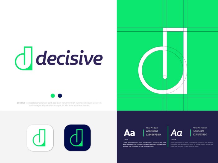
A great mascot becomes more recognizable than the brand name itself — think the Michelin Man or Mailchimp's Freddie. The difference between a mascot that lasts and one that gets retired after a rebrand is whether it was designed as a character with genuine personality or as decoration. Effective mascots encode the brand's values in their visual design: a bold geometric mascot communicates precision and modernity; a soft, rounded character communicates approachability and warmth.
What are the core principles of mascot character design?
Silhouette clarity is the primary test: a strong mascot reads at 16px as a favicon and at 10 feet on a trade show banner. Simplify until only the identifying features remain — focus on 2–3 distinctive characteristics (unusual head shape, specific color, signature accessory) that make the character memorable. Expressions should be designed as a set of 5–8 emotional variants from launch: a mascot that can only smile becomes limiting. Human-adjacent characters achieve broader identification than literal human mascots.
How do you design a mascot system that scales across brand touchpoints?
The mascot core shape should work in a single flat color for embroidery, embossing, and single-color print contexts. Define 3 canonical poses: a neutral standing version, a hero action pose, and a compact version for small formats. Animation guidelines written at the design stage — weight, speed, bounce and squash ratios — ensure consistent motion across web, social, and video. Designers who create mascots should deliver a companion specification document, not just artwork files.